/


Автор: Moore D.S. Notz W.I.
Теги: statistics probability theory mathematical statistics data analysis
ISBN: 978-1-319-38369-5
Год: 2021


Текст
The Basic Practice of Statistics
The Basic Practice of Statistics
Ninth Edition
David S. Moore
Purdue University
William I. Notz
The Ohio State University
Senior Vice President, STEM: Daryl Fox
Program Director, Math, Statistics, Earth Sciences, and Environmental
Science: Andrew Dunaway
Program Manager: Sarah Seymour
Executive Content Development Manager, STEM: Debbie Hardin
Development Editor: David Dietz
Executive Project Manager, Content, STEM: Katrina Mangold
Director of Content, Math and Statistics: Daniel Lauve
Executive Media Editor: Catriona Kaplan
Associate Editor: Andy Newton
Assistant Editor: Justin Jones
Marketing Manager: Leah Christians
Marketing Assistant: Morgan Psiuk
Director of Content Management Enhancement: Tracey Kuehn
Senior Managing Editor: Lisa Kinne
Senior Content Project Manager: Edward Dionne
Project Manager: Heidi Allgair, SPi Global
Senior Workflow Project Manager: Paul Rohloff
Production Supervisor: Robert Cherry
Director of Design, Content Management: Diana Blume
Design Services Manager: Natasha Wolfe
Cover Design: Laura de Grasse
Interior Design: Vicki Tomaselli
Art Manager: Matthew McAdams
Director of Digital Production: Keri deManigold
Media Project Manager: Hanna Squire
Executive Permissions Editor: Cecilia Varas
Rights and Billing Editor: Alexis Gargin
Composition: SPi Global
Printing and Binding: LSC Communications
ISBN 978-1-319-38369-5 (ePub)
© 2021, 2018, 2015, 2012 by W. H. Freeman and Company
All rights reserved.
Printed in the United States of America
1 2 3 4 5 6
25 24 23 22 21 20
Macmillan Learning
One New York Plaza
Suite 4600
New York, NY 10004-1562
www.macmillanlearning.com
BRIEF CONTENTS
Chapter 0 Getting Started
Part I Exploring Data
EXPLORING DATA: Variables and Distributions
Chapter 1 Picturing Distributions with Graphs
Chapter 2 Describing Distributions with Numbers
Chapter 3 The Normal Distributions
EXPLORING DATA: Relationships
Chapter 4 Scatterplots and Correlation
Chapter 5 Regression
Chapter 6 Two-Way Tables*
Chapter 7 Exploring Data: Part I Review
Part II Producing Data
PRODUCING DATA
Chapter 8 Producing Data: Sampling
Chapter 9 Producing Data: Experiments
Chapter 10 Data Ethics*
Chapter 11 Producing Data: Part II Review
Part III From Data Production to Inference
PROBABILITY AND SAMPLING DISTRIBUTIONS
Chapter 12 Introducing Probability
Chapter 13 General Rules of Probability*
Chapter 14 Binomial Distributions*
Chapter 15 Sampling Distributions
FOUNDATIONS OF INFERENCE
Chapter 16 Confidence Intervals: The Basics
Chapter 17 Tests of Significance: The Basics
Chapter 18 Inference in Practice
Chapter 19 From Data Production to Inference: Part III Review
Part IV Inference about Variables
QUANTITATIVE RESPONSE VARIABLE
Chapter 20 Inference about a Population Mean
Chapter 21 Comparing Two Means
CATEGORICAL RESPONSE VARIABLE
Chapter 22 Inference about a Population Proportion
Chapter 23 Comparing Two Proportions
Chapter 24 Inference about Variables: Part IV Review
Part V Inference about Relationships
INFERENCE ABOUT RELATIONSHIPS
Chapter 25 Two Categorical Variables: The Chi-Square Test
Chapter 26 Inference for Regression
Chapter 27 One-Way Analysis of Variance: Comparing Several
Means
Part VI Optional Companion Chapters
(Available Online)
Chapter 28 Nonparametric Tests
Chapter 29 Multiple Regression*
Chapter 30 Two-Way Analysis of Variance
Chapter 31 Statistical Process Control
Chapter 32 Resampling: Permutation Tests and the Bootstrap
*Starred material is optional and can be skipped without loss of continuity.
CONTENTS
Why Did You Do That?
Preface
Acknowledgments
About the Authors
Chapter 0 Getting Started
0.1 How the Data Were Obtained Matters
0.2 Always Look at the Data
0.3 Variation Is Everywhere
0.4 What Lies Ahead in This Book
Part I Exploring Data
Chapter 1 Picturing Distributions with Graphs
1.1 Individuals and Variables
1.2 Categorical Variables: Pie Charts and Bar Graphs
1.3 Quantitative Variables: Histograms
1.4 Interpreting Histograms
1.5 Quantitative Variables: Stemplots
1.6 Time Plots
Chapter 2 Describing Distributions with Numbers
2.1 Measuring Center: The Mean
2.2 Measuring Center: The Median
2.3 Comparing the Mean and the Median
2.4 Measuring Variability: The Quartiles
2.5 The Five-Number Summary and Boxplots
2.6 Spotting Suspected Outliers and Modified Boxplots*
2.7 Measuring Variability: The Standard Deviation
2.8 Choosing Measures of Center and Variability
2.9 Examples of Technology
2.10 Organizing a Statistical Problem
Chapter 3 The Normal Distributions
3.1 Density Curves
3.2 Describing Density Curves
3.3 Normal Distributions
3.4 The 68–95–99.7 Rule
3.5 The Standard Normal Distribution
3.6 Finding Normal Proportions
3.7 Using the Standard Normal Table
3.8 Finding a Value Given a Proportion
Chapter 4 Scatterplots and Correlation
4.1 Explanatory and Response Variables
4.2 Displaying Relationships: Scatterplots
4.3 Interpreting Scatterplots
4.4 Adding Categorical Variables to Scatterplots
4.5 Measuring Linear Association: Correlation
4.6 Facts about Correlation
Chapter 5 Regression
5.1 Regression Lines
5.2 The Least-Squares Regression Line
5.3 Examples of Technology
5.4 Facts about Least-Squares Regression
5.5 Residuals
5.6 Influential Observations
5.7 Cautions about Correlation and Regression
5.8 Association Does Not Imply Causation
5.9 Correlation, Prediction, and Big Data*
Chapter 6 Two-Way Tables*
6.1 Marginal Distributions
6.2 Conditional Distributions
6.3 Simpson’s Paradox
Chapter 7 Exploring Data: Part I Review
Part I Skills Review
Test Yourself
Supplementary Exercises
Online Data for Additional Analyses
Part II Producing Data
Chapter 8 Producing Data: Sampling
8.1 Population versus Sample
8.2 How to Sample Badly
8.3 Simple Random Samples
8.4 Trustworthiness of Inference from Samples
8.5 Other Sampling Designs
8.6 Cautions about Sample Surveys
8.7 The Impact of Technology
Chapter 9 Producing Data: Experiments
9.1 Observation Versus Experiment
9.2 Subjects, Factors, and Treatments
9.3 How to Experiment Badly
9.4 Randomized Comparative Experiments
9.5 The Logic of Randomized Comparative Experiments
9.6 Cautions About Experimentation
9.7 Matched Pairs and Other Block Designs
Chapter 10 Data Ethics*
10.1 Institutional Review Boards
10.2 Informed Consent
10.3 Confidentiality
10.4 Clinical Trials
10.5 Behavioral and Social Science Experiments
Chapter 11 Producing Data: Part II Review
Part II Skills Review
Test Yourself
Supplementary Exercises
Part III From Data Production to Inference
Chapter 12 Introducing Probability
12.1 The Idea of Probability
12.2 The Search for Randomness*
12.3 Probability Models
12.4 Probability Rules
12.5 Finite Probability Models
12.6 Continuous Probability Models
12.7 Random Variables
12.8 Personal Probability*
Chapter 13 General Rules of Probability*
13.1 The General Addition Rule
13.2 Independence and the Multiplication Rule
13.3 Conditional Probability
13.4 The General Multiplication Rule
13.5 Showing That Events Are Independent
13.6 Tree Diagrams
13.7 Bayes’ Rule*
Chapter 14 Binomial Distributions*
14.1 The Binomial Setting and Binomial Distributions
14.2 Binomial Distributions in Statistical Sampling
14.3 Binomial Probabilities
14.4 Examples of Technology
14.5 Binomial Mean and Standard Deviation
14.6 The Normal Approximation to Binomial
Distributions
Chapter 15 Sampling Distributions
15.1 Parameters and Statistics
15.2 Statistical Estimation and the Law of Large
Numbers
15.3 Sampling Distributions
15.4 The Sampling Distribution of x̄
15.5 The Central Limit Theorem
15.6 Sampling Distributions and Statistical Significance*
Chapter 16 Confidence Intervals: The Basics
16.1 The Reasoning of Statistical Estimation
16.2 Margin of Error and Confidence Level
16.3 Confidence Intervals for a Population Mean
16.4 How Confidence Intervals Behave
Chapter 17 Tests of Significance: The Basics
17.1 The Reasoning of Tests of Significance
17.2 Stating Hypotheses
17.3 P-Value and Statistical Significance
17.4 Tests for a Population Mean
17.5 Significance from a Table*
Chapter 18 Inference in Practice
18.1 Conditions for Inference in Practice
18.2 Cautions about Confidence Intervals
18.3 Cautions about Significance Tests
18.4 Planning Studies: Sample Size for Confidence
Intervals
18.5 Planning Studies: The Power of a Statistical Test of
Significance*
Chapter 19 From Data Production to Inference: Part III
Review
Part III Skills Review
Test Yourself
Supplementary Exercises
Part IV Inference about Variables
Chapter 20 Inference about a Population Mean
20.1 Conditions for Inference about a Mean
20.2 The t Distributions
20.3 The One-Sample t Confidence Interval
20.4 The One-Sample t Test
20.5 Examples of Technology
20.6 Matched Pairs t Procedures
20.7 Robustness of t Procedures
Chapter 21 Comparing Two Means
21.1 Two-Sample Problems
21.2 Comparing Two Population Means
21.3 Two-Sample t Procedures
21.4 Examples of Technology
21.5 Robustness Again
21.6 Details of the t Approximation*
21.7 Avoid the Pooled Two-Sample t Procedures*
21.8 Avoid Inference about Standard Deviations*
Chapter 22 Inference about a Population Proportion
22.1 The Sample Proportion p̂
22.2 Large-Sample Confidence Intervals for a
Proportion
22.3 Choosing the Sample Size
22.4 Significance Tests for a Proportion
22.5 Plus Four Confidence Intervals for a Proportion*
Chapter 23 Comparing Two Proportions
23.1 Two-Sample Problems: Proportions
23.2 The Sampling Distribution of a Difference between
Proportions
23.3 Large-Sample Confidence Intervals for Comparing
Proportions
23.4 Examples of Technology
23.5 Significance Tests for Comparing Proportions
23.6 Plus Four Confidence Intervals for Comparing
Proportions*
Chapter 24 Inference about Variables: Part IV Review
Part IV Skills Review
Test Yourself
Supplementary Exercises
Part V Inference about Relationships
Chapter 25 Two Categorical Variables: The Chi-Square Test
25.1 Two-Way Tables
25.2 The Problem of Multiple Comparisons
25.3 Expected Counts in Two-Way Tables
25.4 The Chi-Square Statistic
25.5 Examples of Technology
25.6 The Chi-Square Distributions
25.7 Cell Counts Required for the Chi-Square Test
25.8 Uses of the Chi-Square Test: Independence and
Homogeneity
25.9 The Chi-Square Test for Goodness of Fit*
Chapter 26 Inference for Regression
26.1 Conditions for Regression Inference
26.2 Estimating the Parameters
26.3 Examples of Technology
26.4 Testing the Hypothesis of No Linear Relationship
26.5 Testing Lack of Correlation
26.6 Confidence Intervals for the Regression Slope
26.7 Inference about Prediction
26.8 Checking the Conditions for Inference
Chapter 27 One-Way Analysis of Variance: Comparing
Several Means
27.1 Comparing Several Means
27.2 The Analysis of Variance F Test
27.3 Using Technology
27.4 The Idea of Analysis of Variance
27.5 Conditions for ANOVA
27.6 F Distributions and Degrees of Freedom
27.7 Follow-up Analysis: Tukey Pairwise Multiple
Comparisons
27.8 Some Details of ANOVA*
Notes and Data Sources
Tables
TABLE A Standard Normal Cumulative Proportions
TABLE B Random Digits
TABLE C t Distribution Critical Values
TABLE D Chi-Square Distribution Critical Values
TABLE E Critical Values of the Correlation r
Answers to Selected Exercises
Index
Part VI Optional Companion Chapters
(Available Online)
Chapter 28 Nonparametric Tests
28.1 Comparing Two Samples: The Wilcoxon Rank Sum
Test
28.2 The Normal Approximation for W
28.3 Examples of Technology
28.4 What Hypotheses Does Wilcoxon Test?
28.5 Dealing with Ties in Rank Tests
28.6 Matched Pairs: The Wilcoxon Signed Rank Test
28.7 The Normal Approximation for W+
28.8 Dealing with Ties in the Signed Rank Test
28.9 Comparing Several Samples: The Kruskal–Wallis
Test
28.10 Hypotheses and Conditions for the Kruskal–Wallis
Test
28.11 The Kruskal–Wallis Test Statistic
Chapter 29 Multiple Regression*
29.1 Adding a Categorical Variable in Regression
29.2 Estimating Parameters
29.3 Examples of Technology
29.4 Inference for Multiple Regression
29.5 Interaction
29.6 A Model with Two Regression Lines
29.7 The General Multiple Linear Regression Model
29.8 Correlations between Explanatory Variables
29.9 A Case Study for Multiple Regression
29.10 Inference for Regression Parameters
29.11 Checking the Conditions for Inference
Chapter 30 Two-Way Analysis of Variance
30.1 Beyond One-Way ANOVA
30.2 Two-Way ANOVA: Conditions, Main Effects, and
Interaction
30.3 Inference for Two-Way ANOVA
30.4 Some Details of Two-Way ANOVA*
Chapter 31 Statistical Process Control
31.1 Processes
31.2 Describing Processes
31.3 The Idea of Statistical Process Control
31.4
Charts for Process Monitoring
¯
x
31.5 s Charts for Process Monitoring
31.6 Using Control Charts
31.7 Setting Up Control Charts
31.8 Comments on Statistical Control
31.9 Don’t Confuse Control with Capability
31.10 Control Charts for Sample Proportions
31.11 Control Limits for p Charts
Chapter 32 Resampling: Permutation Tests and the
Bootstrap
32.1 Randomization in Experiments as a Basis for
Inference
32.2 Permutation Tests for Two Treatments with
Software
32.3 Generating Bootstrap Samples
32.4 Bootstrap Standard Errors and Confidence
Intervals
*Starred material is optional and can be skipped without loss of continuity.
WHY DID YOU DO THAT?
The Authors Answer Questions about The Basic
Practice of Statistics
Welcome to the ninth edition of The Basic Practice of Statistics. As the
title suggests, this text provides an introduction to the practice of
statistics that aims to equip students to carry out common statistical
procedures and to follow statistical reasoning in their fields of study
and in their future employment.
There is no single best way to organize our presentation of statistics
to beginners. That said, our choices reflect thinking about both
content and pedagogy. Here are comments on several frequently
asked questions about the order and selection of material in The
Basic Practice of Statistics.
Why Did You Write The Basic Practice of
Statistics?
Several factors influenced the writing of The Basic Practice of
Statistics. Easy-to-use statistical software with graphical tools made it
possible for students to explore and analyze data on their own.
Statistics educators recognized that actually doing statistics—
exploring data, analyzing data, thinking about what the data are
telling us, and assessing the validity of the conclusions we make
from data—is an effective way to learn statistics. Teachers also
recognized the importance of using real data from actual studies to
reinforce the fact that statistics is invaluable for answering realworld questions. Finally, an introductory course in statistics should
expose students to how statistics is actually practiced by
researchers. At the time of the writing of the first edition, few, if any,
textbooks for courses intended for students with only college
algebra as the mathematics prerequisite incorporated these ideas.
With this in mind, The Basic Practice of Statistics was designed to
reflect the actual practice of statistics, where data analysis and
design of data production join with probability-based inference to
form a coherent science of data. The Basic Practice of Statistics was
also designed to be accessible to college and university students with
limited quantitative background—just “algebra” in the sense of being
able to read and use simple equations.
Why Should I Use The Basic Practice of
Statistics to Teach an Introductory
Statistics Course?
The Basic Practice of Statistics is based on three principles: balanced
content, experience with data, and the importance of ideas. These
principles are widely accepted by statisticians concerned about
teaching and are directly connected to and reflected by the themes
of the College Report of the Guidelines in Assessment and
Instruction for Statistics Education (GAISE) Project.
The GAISE guidelines include six recommendations for introductory
statistics. The content, coverage, and features of The Basic Practice of
Statistics are closely aligned to these recommendations:
1. Teach statistical thinking.
Teach statistics as an investigative process of problem solving and
decision making. In The Basic Practice of Statistics, we present a
four-step process for solving statistical problems. This begins
by stating the practical question to be answered in the
context of a real-world setting and ends with a practical
conclusion, often a decision to be made, in the setting of the
real-world problem. The process is illustrated in the text by
revisiting data from a study in a series of examples or
exercises. Different aspects of the data are investigated in
different examples and exercises, with the ultimate goal of
making some decision based on what has been learned.
Give students experience with multivariable thinking. The Basic
Practice of Statistics exposes students to multivariate thinking
early in the book. Chapters 4, 5, and 6 introduce students to
methods for exploring bivariate data. In Chapter 7, we
include online data with many variables, inviting students to
explore aspects of these data. In Chapter 9, we discuss the
importance of identifying the many variables that can affect
a response and including them in the design of an
experiment and the interpretation of the results. In Part V,
we introduce students to formal methods of inference for
bivariate data, and in the online supplemental chapters, we
discuss multiple regression, two-way ANOVA, and statistical
process control.
2. Focus on conceptual understanding. A first course in statistics
introduces many skills, from making a stemplot and calculating
a correlation to choosing and carrying out a significance test. In
practice (even if not always in the course), calculations and
graphs are automated. Moreover, anyone who makes serious
use of statistics will need some specific procedures not taught in
their college statistics course. The Basic Practice of Statistics,
therefore, emphasizes conceptual understanding by making
clear the larger patterns and big ideas of statistics—not in the
abstract but in the context of learning specific skills and
working with specific data. Many of the big ideas are
summarized in graphical outlines. Three of the most useful of
these appear opposite the title page. Formulas without guiding
principles do students little good once the final exam is past, so
it is worth the time to slow down a bit and explain the ideas.
3. Integrate real data with a context and a purpose. The study of
statistics is supposed to help students work with data in their
varied academic disciplines and in their unpredictable later
employment. Students learn to work with data by working with
data. The Basic Practice of Statistics is full of data from many
fields of study and from everyday life. Data are more than mere
numbers: they are numbers with a context that should play a
role in making sense of the numbers and in stating conclusions.
Examples and exercises in The Basic Practice of Statistics, though
intended for beginners, use real data and give enough
background to allow students to consider the meaning of their
calculations.
4. Foster active learning. Fostering active learning is the business of
the teacher, though an emphasis on working with data helps. To
this end, we have created interactive applets to our
specifications that are available online. These are designed
primarily to help in learning statistics rather than in doing
statistics. We suggest using selected applets for classroom
demonstrations even if you do not ask students to work with
them. The Correlation and Regression, Confidence Intervals,
and P-Value of a Test of Significance applets, for example,
convey core ideas more clearly than any amount of chalk and
talk.
For each chapter (except the review chapters), web exercises are
provided online. Our intent is to take advantage of the fact that
most undergraduates are web savvy. These exercises require
students to search the web for either data or statistical examples
and then evaluate what they find. Teachers can use these as
classroom activities or assign them as homework projects.
5. Use technology to explore concepts and analyze data. Automating
calculations increases students’ ability to complete problems,
reduces their frustration, and helps them concentrate on ideas
and problem recognition rather than mechanics. At a
minimum, students should have a “two-variable statistics”
calculator with functions for correlation and the least-squares
regression line as well as for the mean and standard deviation.
Many instructors will take advantage of more elaborate
technology, as ASA/MAA and GAISE recommend. And many
students who don’t use technology in their college statistics
course will find themselves using (for example) Excel on the
job. The Basic Practice of Statistics does not assume or require use
of software except in Part V, where the work is otherwise too
tedious. It does accommodate software use and provides
students with knowledge that will enable them to read and use
output from almost any source. There are regular “Examples of
Technology” sections throughout the text. Each of these
sections displays and comments on output from the same three
technologies, representing graphing calculators (the Texas
Instruments TI-83 or TI-84), spreadsheets (Microsoft Excel), and
statistical software (JMP, Minitab, R, and CrunchIt!). The output
always concerns one of the main teaching examples so that
students can compare text and output.
6. Use assessments to improve and evaluate student learning. Within
chapters, a few “Apply Your Knowledge” exercises follow each
new idea or skill for a quick check of basic mastery—and also to
mark off digestible bites of material. Each of the first four parts
of the book ends with a review chapter that includes a point-bypoint outline of skills learned, problems students can use to test
themselves, and several supplementary exercises. (Instructors
can choose to cover any or none of the chapters in Part V, so
each of these chapters includes a skills outline.) The review
chapters present supplemental exercises without the “I just
studied that” context, thus asking for another level of learning.
We think it is helpful to assign some supplemental exercises.
Many instructors will find that the review chapters appear at the
right points for pre-exam review. Students can use the “Test
Yourself” questions to review, self-assess, and prepare for
exams. In addition, assessment materials in the form of a test
bank and quizzes are available online.
Why Did You Choose to Order Topics as
Listed in the Book?
There are good pedagogical reasons for beginning with data analysis
(Chapters 1 through 7), then moving to data production (Chapters 8
through 11), and then to probability and inference (Chapters 12
through 27). In studying data analysis, students learn useful skills
immediately and get over some of their fear of statistics. Data
analytics is much in the media these days, and by discussing data
analysis, instructors can link the course material to the current
interest in data analytics. Data analysis is a necessary preliminary to
inference in practice because inference requires clean data.
Designed data production is the surest foundation for inference, and
the deliberate use of chance in random sampling and randomized
comparative experiments motivates the study of probability in a
course that emphasizes data-oriented statistics. The Basic Practice of
Statistics gives a full presentation of basic probability and inference
(16 of the 27 chapters in the printed text) but places it in the context
of statistics as a whole.
Why Does the Distinction between
Population and Sample Not Appear in
Part I?
There is more to statistics than inference. In fact, statistical
inference is appropriate only in rather special circumstances. The
chapters in Part I present tools and tactics for describing data—any
data. These tools and tactics do not depend on the idea of inference
from sample to population. Many data sets in these chapters (for
example, the several sets of data about the 50 states) do not lend
themselves to inference because they represent an entire
population. Likewise, many modern big data sets are also viewed as
information about an entire population, for which formal inference
may not be appropriate. John Tukey of Bell Labs and Princeton, the
philosopher of modern data analysis, insisted that the population–
sample distinction be avoided when it is not relevant. He used the
word batch for data sets in general. We see no need for a special
word, but we think Tukey was right.
Why Not Begin with Data Production?
We prefer to begin with data exploration (Part I), as most students
will use statistics mainly in settings other than planned research
studies in their future employment. We place the design of data
production (Part II) after data analysis to emphasize that dataanalytic techniques apply to any data. However, it is equally
reasonable to begin with data production; the natural flow of a
planned study is from design to data analysis to inference. Because
instructors have strong and differing opinions on this question,
these two topics are now the first two parts of the book, with the text
written so that it may be started with either Part I or Part II while
maintaining the continuity of the material.
Another reason for beginning with data exploration is to give
students experience exploring data and thinking about how to
interpret what they discover. This experience provides a context for
how data production affects the reliability of conclusions one might
draw from data.
Why Do Normal Distributions Appear
in Part I?
Density curves such as the Normal curves are just another tool to
describe the distribution of a quantitative variable, along with
stemplots, histograms, and boxplots. Professional statistical
software offers to make density curves from data just as it offers
histograms. We prefer not to suggest that this material is essentially
tied to probability, as the traditional order does. And we find it
helpful to break up the indigestible lump of probability that troubles
students so much. Meeting Normal distributions early does this and
strengthens the “probability distributions are like data distributions”
way of approaching probability when we get there.
Why Not Delay Correlation and
Regression Until Late in the Course, as
Was Traditional?
The Basic Practice of Statistics begins by offering experience working
with data and gives a conceptual structure for this
nonmathematical, but essential, part of statistics. Students profit
from more experience with data early and from seeing the
conceptual structure worked out in relationships among variables as
well as in describing single-variable data. Correlation and leastsquares regression are very important descriptive tools and are
often used in settings where there is no population–sample
distinction, such as studies of all of a firm’s employees. Perhaps
most importantly, The Basic Practice of Statistics asks students to think
about what kind of relationship lies behind the data (confounding,
lurking variables, association not implying causation, and so on)
without overwhelming them with the demands of formal inference
methods. Inference in the correlation and regression setting is a bit
complex, demands software, and often comes right at the end of the
course. We find that delaying all mention of correlation and
regression to that point often means that students don’t master the
basic uses and properties of these methods. We consider Chapters 4
and 5 (correlation and regression) essential and Chapter 26
(regression inference) optional.
Why Use the z Procedures for a
Population Mean to Introduce the
Reasoning of Inference?
This is a pedagogical issue, not a question of statistics in practice.
The two most popular choices for introducing inference are z for a
mean and z for a proportion. (Another option is resampling and
permutation tests. We have included material on these topics but
have not used them to introduce inference.)
We find z for means quite accessible to students. Positively, we can
say up front that we are going to explore the reasoning of inference
in the overly simple setting described in the box on page 367 titled
“Simple Conditions for Inference about a Mean.” As this box
suggests, assuming an exactly Normal population and a true simple
random sample are as unrealistic as known s. All the issues of
practice—robustness against lack of Normality and application when
the data aren’t an SRS as well as the need to estimate s—are put off
until, with the reasoning in hand, we discuss the practically useful t
procedures. This separation of initial reasoning from messier
practice works well.
Negatively, starting with inference for p introduces many side issues:
no exact Normal sampling distribution but a Normal approximation
to a discrete distribution; use of p̂ in both the numerator and
denominator of the test statistic to estimate both the parameter p
and p̂’s own standard deviation; loss of the direct link between test
and confidence interval; and the need to avoid small and moderate
sample sizes because the Normal approximation for the test is quite
unreliable.
There are advantages to starting with inference for p. Starting with z
for means takes a fair amount of time, and the ideas need to be
rehashed with the introduction of the t procedures. Many
instructors face pressure from client departments to cover a large
amount of material in a single semester. Eliminating coverage of the
“unrealistic” z for means with known variance enables instructors to
cover additional, more realistic applications of inference. Also,
many instructors believe that proportions are simpler and more
familiar to students than means.
Why Didn’t You Cover Topic X?
Introductory texts ought not to be encyclopedic. We chose topics on
two grounds: they are the most commonly used in practice, and they
are suitable vehicles for learning broader statistical ideas. Students
who have completed the core of the book, Chapters 1 through 12 and
15 through 24, will have little difficulty moving on to more elaborate
methods. Chapters 25 through 27 offer a choice of slightly more
advanced topics, as do the optional supplemental chapters, available
online.
Why Are Some Chapters and Sections
Listed as Optional?
Many users have requested that we include the content listed as
optional. However, as noted above, many instructors face pressure
from client departments to cover many topics in a single semester.
We have identified some material that can safely be omitted because
it is not required for later parts of the book. Instructors can cover
this optional content if they wish, but they can also omit it in order
to cover topics that client departments have requested.
The content we designate as optional is not less important than other
material in the book. For example, many instructors will want to
cover Chapters 6 and 25 because they consider relationships
between categorical variables an essential topic for their students.
We have enjoyed the opportunity to once again rethink how to help
beginning students achieve a practical grasp of basic statistics. What
students actually learn is not identical to what we teachers think we
have “covered,” so the virtues of concentrating on the essentials are
considerable. We hope this new edition of The Basic Practice of
Statistics offers a mix of concrete skills and clearly explained
concepts that will help many teachers guide their students toward
useful knowledge.
PREFACE
Empowering Problem Solving and Real-World Decision
Making
Now available with Macmillan’s new, ground-breaking online
learning platform Achieve, the ninth edition of The Basic Practice
of Statistics teaches statistical thinking through an investigative
process of problem solving with pedagogy designed to help
students of all levels. Examples and exercises from a wide
variety of topic areas use current, real data to provide students
with insight into how data is used to make decisions in the real
world.
Achieve for The Basic Practice of Statistics connects the book’s
trusted Four-Step problem-solving approach and real-world
examples to rich digital resources that foster understanding and
facilitate the practice of statistics. The tools in Achieve support
learning before, during, and after class for students and equip
instructors with class performance analytics in an easy-to-use
interface.
Overview of key features
Support for Learners on Every Page
Four-Step Problem-Solving examples guide students through
the Four-Step process for working through statistical problems:
State, Plan, Solve, Conclude. Students are instructed to apply
this process in designated exercises.
Apply Your Knowledge exercises at the end of each section
encourage students to read actively and to cement new concepts
by applying them as they learn.
Examples of Technology, located where most appropriate,
display and comment on the output from popular statistical
software applications (notably Excel, Minitab, JMP, and R) and
TI 83/84 graphing calculators in the context of worked
examples. Students learn to interpret output from any standard
statistical package.
Definition and Theorem Boxes in the text alert students to key
concepts, terms, and procedures.
Caution Boxes warn students of common mistakes or
misconceptions.
Statistics in Your World margin notes further connect statistics
topics to the real world, highlighting interesting examples and
applications from a variety of fields.
The main themes of the text are strongly aligned to the GAISE
guidelines (from the Guidelines in Assessment and Instruction
in Statistics Education College Report).
New to the Ninth Edition
Examples and exercises clearly emphasize reaching
conclusions and making decisions based on data exploration
and statistical inference.
Chapter Summaries are in concise list form, and Skills Reviews
(in Review Chapters) refer to relevant chapter sections to help
students check their knowledge and review for exams.
Data in examples and exercises have been updated for
relevance, and new examples and exercises explore
contemporary issues such as social media usage.
Displayed in boldface type, key terms are clearly defined in
running text or in the margin, to build understanding without
focusing on vocabulary.
Highlight Four-Step Problem-Solving
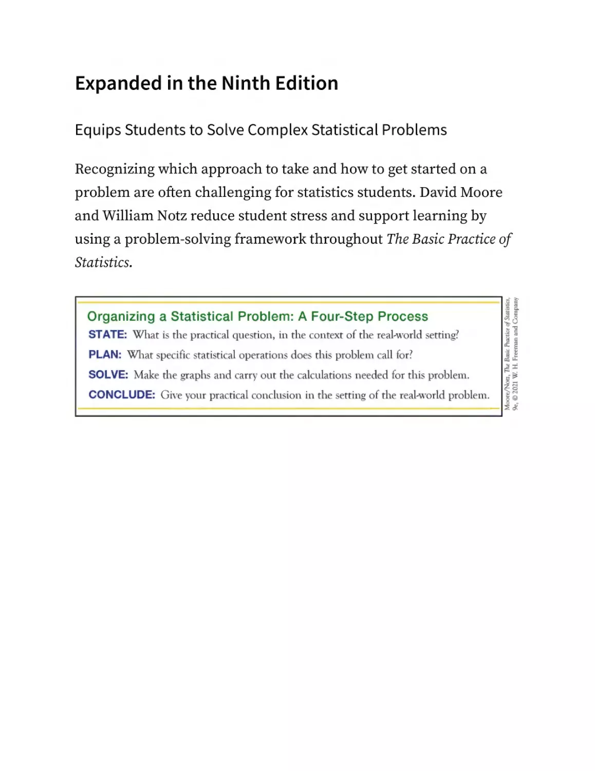
Expanded in the Ninth Edition
Equips Students to Solve Complex Statistical Problems
Recognizing which approach to take and how to get started on a
problem are often challenging for statistics students. David Moore
and William Notz reduce student stress and support learning by
using a problem-solving framework throughout The Basic Practice of
Statistics.
“The Basic Practice of Statistics has a great history and improves with each version. [It]
always has a polished presentation with excellent explanations.”
—Patricia Buchanan, Professor, Pennsylvania State University
Achieve is the culmination of years of development work put toward
creating the most powerful online learning tool for statistics
students. It houses all of our renowned assessments, multimedia
assets, e-books, and instructor resources in a powerful new
platform.
Achieve supports educators and students throughout the full range
of instruction, including assets suitable for pre-class preparation, inclass active learning, and post-class study and assessment. The
pairing of a powerful new platform with outstanding statistics
content provides an unrivaled learning experience.
For more information or to sign up for a demonstration of Achieve,
contact your local Macmillan representative or visit
macmillanlearning.com/achieve
Robust tutorial-style assessment tools in Achieve help students
develop problem-solving and statistical reasoning skills. Achieve
contains more than 3,000 assessment questions designed for both
pre-class foundational learning and post-class homework. For select
questions, our formative assessment environment responds to
students’ incorrect answers with feedback to guide their study. This
Socratic feedback mechanism emulates the office-hours experience,
encouraging students to think critically about their identified
misconceptions. Students make the most out of homework with
Achieve’s hallmark hints, detailed feedback, and fully worked
solutions.
LearningCurve Adaptive Quizzing
LearningCurve’s game-like quizzing motivates students to engage
with the course content, and reporting tools help teachers get a
handle on what their class needs.
Using the Power of Computing to Work with
Data
Students are provided with a wealth of multimedia resources and
opportunities for practice, to coach them toward fuller conceptual
understanding and proficiency in solving problems.
Video Technology Manuals are brief, focused instructional videos
that show students how to use particular applications (Excel,
Minitab, R, etc.) to perform specific tests and other calculations
covered in The Basic Practice of Statistics.
Powerful analytics, viewable in an elegant dashboard, offer
instructors a window into student progress. Achieve gives you the
insight to address students’ weaknesses and misconceptions before
they struggle on a test.
Achieve’s Rich Digital Resources
Multimedia resources, such as interactives and videos, serve as an
extension of the carefully constructed examples and exercises in the
text.
A variety of videos in Achieve provide additional exposure to key
concepts and examples. All videos are narrated and close-captioned,
and many include linked assessment questions. Video types include
whiteboard-style problem-solving videos, animated lecture videos,
software assistance videos, and documentary-style video lessons
that illustrate real-world scenarios involving statistics.
Statistical Applets, referenced and displayed in the text, are visual
interactives originally designed by David Moore. This feature
enables students to manipulate data in calculations and see the
results graphically. Applets are associated with questions in Achieve
that assess students’ comprehension. Achieve includes updated
versions of the applets, powered by Desmos.
A variety of instructor resources accompany the ninth edition of The
Basic Practice of Statistics:
Instructor’s Guide
Instructor Solutions Manual
Test Bank
PowerPoint Image Slides
Lecture Slides
Clicker Questions
Practice Quizzes
ACKNOWLEDGMENTS
We are grateful to colleagues from two-year and four-year colleges
and universities who reviewed and commented on the previous
edition of The Basic Practice of Statistics, in preparation for this
revision, or who commented on the ninth edition manuscript.
Todd Burus, Eastern Kentucky University
Rita Chattopadhyay, Eastern Michigan University
Elijah Dikong, Michigan State University
Kimberly Druschel, Saint Louis University
Cathy Frey, Norwich University
Petre Ghenciu, University of Wisconsin–Stout
Billie-Jo Grant, California State Polytechnic University
Mark Hardwidge, Danville Area Community College
Lisa Kay, Eastern Kentucky University
Michael Macon, Green River Community College
Connie Marberry, Kirkwood Community College
Andrew McDougall, Montclair State University
Juli Moore, Oregon State University
Roland Moore, Florida State University
Thomas Oliveri, University of Massachusetts–Lowell
Christina Pierre, Saint Mary’s University of Minnesota
Mohammed Quasem, University of South Carolina
Joshua Roberts, Georgia Gwinnett College
N. Paul Schembari, East Stroudsburg University
Hilary Seagle, Southwestern Community College
Kristi Spittler-Brown, Arkansas Tech University
Tim Swartz, Simon Fraser University
Susan Toma, Madonna University
Carol Weideman, St. Petersburg College
We extend our appreciation to Sarah Seymour, Debbie Hardin, David
Dietz, Katrina Mangold, Catriona Kaplan, Andy Newton, Justin
Jones, Lisa Kinne, Edward Dionne, Paul Rohloff, Diana Blume, John
Callahan, Vicki Tomaselli, and other publishing professionals who
have contributed to the development, design, production, and
cohesiveness of this book and its online resources.
Jack Miller and Mark McKibben are to be commended for their work
on the full solutions manuals, as well as the back-of-book answers
and exercise evaluations—offering their backgrounds in statistics
and dedication to education. John Samons went above and beyond
to ensure the accuracy, flow, and consistency of the presentation in
the text, back-of-book answers, and full solutions. We thank all three
of you for embracing the project in the spirit of teamwork and
collaboration.
We also extend our gratitude to the following collaborators who
contributed their expertise to the instructor and student resources
for this edition:
Nicole Dalzell, Wake Forest University, revised the Clicker
Questions and the Test Bank.
Terri Rizzo, Lakehead University, accuracy reviewed the Clicker
Questions, Practice Quizzes, and Test Bank.
Mark Gebert, University of Kentucky, revised the Lecture Slides
and Practice Quizzes.
Michelle Duda, Columbus State Community College, revised the
Instructor’s Guide.
Karen Starin, Columbus State Community College, accuracy
reviewed the Instructor’s Guide.
We would like to thank Robert Wolf, University of San Francisco;
Eugene Komaroff, Keiser University; Stephen Doty; and Aaron
Gladish for pointing out errors in the previous edition and for
helpful suggestions.
Portions of information contained in this book are printed with
permission of Minitab, LLC. All such material remains the exclusive
property and copyright of Minitab, LLC. All rights reserved.
Finally, we are indebted to the many statistics teachers with whom
we have discussed the teaching of our subject over many years; to
people from diverse fields with whom we have worked to
understand data; and, especially, to students whose compliments
and complaints have changed and improved our teaching. Working
with teachers, colleagues in other disciplines, and students
constantly reminds us of the importance of hands-on experience
with data and of statistical thinking in an era when computer
routines quickly handle statistical details.
David S. Moore and William I. Notz
ABOUT THE AUTHORS
David S. Moore is Shanti S. Gupta Distinguished Professor of
Statistics, Emeritus, at Purdue University and was 1998 president of
the American Statistical Association. He received an AB from
Princeton and a PhD from Cornell, both in mathematics. He has
written many research papers in statistical theory and served on the
editorial boards of several major journals. Professor Moore is an
elected fellow of the American Statistical Association and of the
Institute of Mathematical Statistics and an elected member of the
International Statistical Institute. He has served as program director
for statistics and probability at the National Science Foundation.
In recent years, Professor Moore has devoted his attention to the
teaching of statistics. He was the content developer for the
Annenberg/Corporation for Public Broadcasting college-level
telecourse “Against All Odds: Inside Statistics” and for the series of
video modules “Statistics: Decisions through Data,” intended to aid
the teaching of statistics in schools. He is the author of influential
articles on statistics education and of several leading textbooks.
Professor Moore has served as president of the International
Association for Statistical Education and has received the
Mathematical Association of America’s national award for
distinguished college or university teaching of mathematics.
William I. Notz is Professor Emeritus at The Ohio State University.
He received a BS in physics from Johns Hopkins University and a
PhD in mathematics from Cornell University. His first academic job
was as assistant professor in the Department of Statistics at Purdue
University. While there, he taught the introductory statistics
concepts course with Professor Moore and developed an interest in
statistical education. Professor Notz is a co-author of the Electronic
Encyclopedia of Statistical Examples and Exercises and co-author of
Statistics: Concepts and Controversies. His research interests have
focused on experimental design and computer experiments. He is
the author of several research papers and of a book on the design
and analysis of computer experiments. William Notz is an elected
fellow of the American Statistical Association and has served as the
editor of the journal Technometrics and as editor of the Journal of
Statistics Education. At The Ohio State University, he has served as
the director of the Statistical Consulting Service, as acting chair of
the Department of Statistics, and as an associate dean in the College
of Mathematical and Physical Sciences. Professor Notz is a winner of
Ohio State’s Alumni Distinguished Teaching Award.
CHAPTER 0
GETTING STARTED
When you complete this chapter, you will be able to:
0.1 Describe how the method used to collect data can affect the reliability of conclusions
based on those data.
0.2 Recognize that looking at data by producing graphs and numerical summaries is the best
way to begin most data analyses.
0.3 Describe the relationships among variation in data, uncertainty in the conclusions we can
make from data, and statistics.
In this chapter we begin to think about how data can be used to
answer practical questions. We raise some important issues about
data and their use, which we will explore in detail in later chapters.
What’s hot in popular music this week? SoundScan knows.
SoundScan collects data electronically from the cash registers in
more than 39,000 retail outlets around the world1 and also collects
data on download sales from websites. When you buy a CD or
download a digital track, the checkout scanner or website is
probably telling SoundScan what you bought. SoundScan provides
this information to Billboard magazine, MTV, and VH1, as well as to
record companies and artists’ agents.
Should women take hormones such as estrogen after menopause,
when natural production of these hormones ends? In 1992, several
major medical organizations said “yes.” In particular, women who
took hormones seemed to reduce their risk of heart attack by 35% to
50%. The risks of taking hormones appeared small compared with
the benefits. But in 2002, the National Institutes of Health declared
these findings wrong. Use of hormones after menopause
immediately plummeted. Both recommendations were based on
extensive studies. What happened?
Is the global climate warming? Is it becoming more extreme? An
overwhelming majority of scientists now agree that the earth is
undergoing major changes in climate. Enormous quantities of data
are continuously being collected from weather stations, satellites,
and other sources to monitor factors such as the surface
temperature on land and sea, precipitation, solar activity, and the
chemical composition of air and water. Climate models incorporate
this information to make projections of future climate change and
can help us understand the effectiveness of proposed solutions.
SoundScan, medical studies, and climate research all produce data
(numerical facts)—and lots of them. Using data effectively is a large
and growing part of most professions, and reacting to data is part of
everyday life. In fact, we define statistics as the science of learning
from data.
Although data are numbers, they are not “just numbers.” Data are
numbers with a context. The number 8.5, for example, carries no
information by itself. But if we hear that a friend’s new baby
weighed 8.5 pounds at birth, we congratulate her on the healthy size
of the child. The context engages our background knowledge and
allows us to make judgments. We know that a baby weighing 8.5
pounds is a little above average and that a human baby is unlikely to
weigh 8.5 ounces or 8.5 kilograms (over 18 pounds). The context
makes the number informative.
Data are used to answer some practical questions. To gain insight
from data, we make graphs and do calculations. But graphs and
calculations are guided by ways of thinking that amount to educated
common sense. Let’s begin our study of statistics with an informal
look at some aspects of statistical thinking.2
0.1 How the Data Were Obtained
Matters
Although data can be collected in a variety of ways, the type of
conclusion that can be reached from data depends on how the data
were obtained. Observational studies and experiments are two
common methods for collecting data. Let’s take a closer look at the
hormone replacement data to understand the differences.
EXAMPLE 0.1 Hormone Replacement
Therapy
What’s behind the flip-flop in the advice offered to women about
hormone replacement? The evidence in favor of hormone
replacement came from a number of observational studies that
compared women who were taking hormones with others who were
not. But women who choose to take hormones are very different
from women who do not: they tend to be better educated and more
affluent. Because of this, as a group, they are more proactive about
their health care and have the motivation and the means to seek
preventive health care, including healthier diets and increased
exercise. It isn’t surprising that the group that takes better care of
their health will have fewer heart attacks.
Large and careful observational studies are expensive, but they are
easier to arrange than careful experiments. Experiments don’t let
women decide what to do. They assign women either to hormone
replacement or to dummy pills that look and taste the same as the
hormone pills. The assignment is done by a coin toss so that all
kinds of women are equally likely to get either treatment. No longer
will the women in the group receiving hormone therapy be better
educated and more affluent than those who don’t receive hormone
therapy. Part of the difficulty of a good experiment is persuading
women to accept the result—invisible to them—of the coin toss. By
2002, several experiments agreed that hormone replacement does
not reduce the risk of heart attack, at least for older women. Faced
with this better evidence, medical authorities changed their
recommendations.3
Women who chose hormone replacement after menopause were, on
average, better educated and more affluent than those who didn’t.
No wonder they had fewer heart attacks. We can’t conclude that
hormone replacement reduces heart attacks just because we see this
relationship in data. In this example, education and affluence are
background factors that help explain the relationship between
hormone replacement and good health.
Children who play soccer do better in school (on the average) than
children who don’t play soccer. Does this mean that playing soccer
increases school grades? Children who play soccer tend to have
prosperous and well-educated parents. Once again, education and
affluence are background factors that help explain the relationship
between soccer and good grades.
Almost all relationships between two observed characteristics, or
“variables,” are influenced by other variables lurking in the background.
To understand the relationship between two variables, you must
often look at other variables. Careful statistical studies try to think of
and measure possible lurking variables in order to correct for their
influence. As the hormone saga illustrates, this doesn’t always work
well. News reports often just ignore possible lurking variables that
might ruin a good headline like “Playing soccer can improve your
grades.” The habit of asking, “What might lie behind this
relationship?” is part of thinking statistically.
Of course, observational studies are still quite useful. We can learn
from observational studies how chimpanzees behave in the wild or
which popular songs sold best last week or what percentage of
workers were unemployed last month. SoundScan’s data on popular
music and the government’s data on employment and
unemployment come from sample surveys, an important kind of
observational study that chooses a part (the sample) to represent a
larger whole. Opinion polls interview perhaps 1000 of the 254
million adults in the United States to report the public’s views on
current issues. Can we trust the results? We’ll see that this isn’t a
simple yes-or-no question. Let’s just say that the government’s
unemployment rate is much more trustworthy than opinion poll
results—and not just because the Bureau of Labor Statistics
interviews 60,000 households rather than 1000. We can, however, say
right away that some samples can’t be trusted. Consider the
following write-in poll.
EXAMPLE 0.2 Would You Have Children
Again?
The advice columnist Ann Landers once asked her readers, “If you
had it to do over again, would you have children?” A few weeks later,
her column was headlined “70% OF PARENTS SAY KIDS NOT
WORTH IT.” Indeed, 70% of the nearly 10,000 parents who wrote in
said they would not have children if they could make the choice
again. Those 10,000 parents were upset enough with their children
to write Ann Landers. Because of this, the views of these parents are
not representative of parents in general. Most parents are happy with
their kids and don’t bother to write.
On August 24, 2011, Abigail Van Buren (the twin sister of Ann
Landers) revisited this question in her column “Dear Abby.” A reader
asked, “I’m wondering when the information was collected and what
the results of that inquiry were, and if you asked the same question
today, what the majority of your readers would answer.”
Ms. Van Buren responded, “The results were considered shocking at
the time because the majority of responders said they would NOT
have children if they had it to do over again. I’m printing your
question because it will be interesting to see if feelings have
changed over the intervening years.”
In October 2011, Ms. Van Buren wrote that this time the majority of
respondents would have children again. That is encouraging, but
this was, again, a write-in poll.
Statistically designed samples, even opinion polls, don’t let people
choose themselves for the sample. They interview people selected
by impersonal chance so that everyone has an equal opportunity to
be in the sample. Such a poll showed that 91% of parents would have
children again. Where data come from matters a lot. If you are careless
about how you get your data, you may announce 70% No when the
truth is close to 90% Yes. Understanding the importance of where
data come from and their relationship to the conclusions that can be
reached is an important part of learning to think statistically.
0.2 Always Look at the Data
Yogi Berra, the Hall of Fame New York Yankee, said it: “You can
observe a lot by just watching.” That’s a motto for learning from
data. A few carefully chosen graphs are often more instructive than great
piles of numbers. Consider the outcome of the 2000 presidential
election in Florida.
EXAMPLE 0.3 Palm Beach County
Elections don’t come much closer: after much recounting, state
officials declared that George Bush had carried Florida by 537 votes
out of almost 6 million votes cast. Florida’s vote decided the 2000
presidential election and made George Bush, rather than Al Gore,
president. Let’s look at some data. Figure 0.1 displays a graph that
plots votes for the third-party candidate Pat Buchanan against votes
for the Democratic candidate Al Gore in Florida’s 67 counties.
FIGURE 0.1
Votes in the 2000 presidential election for Al Gore and Patrick Buchanan in Florida’s 67
counties. What happened in Palm Beach County?
What happened in Palm Beach County? The question leaps out from
the graph. In this large and heavily Democratic county, a
conservative third-party candidate did far better relative to the
Democratic candidate than in any other county. The points for the
other 66 counties show votes for both candidates increasing together
in a roughly straight-line pattern. Both counts go up as county
population goes up. Based on this pattern, we would expect
Buchanan to receive around 800 votes in Palm Beach County. He
actually received more than 3400 votes. That difference determined
the election result in Florida and in the nation.
The graph demands an explanation. It turns out that Palm Beach
County used a confusing “butterfly” ballot, in which candidate
names on both left and right pages led to a voting column in the
center. It would be easy for a voter who intended to vote for Gore to
in fact cast a vote for Buchanan. The graph is convincing evidence
that this in fact happened.
Most statistical software will draw a variety of graphs with a few
simple commands. Examining your data with appropriate graphs
and numerical summaries is the correct place to begin most data
analyses. These can often reveal important patterns or trends that
will help you understand what your data have to say and, ultimately,
help you answer the question that prompted you to examine the
data.
0.3 Variation Is Everywhere
The company’s sales reps file into their monthly meeting. The sales
manager rises. “Congratulations! Our sales are up 2% this month, so
we’re all drinking champagne this morning. You remember that
when sales were down 1% last month I fired half of our reps.” This
picture is only slightly exaggerated. Many managers overreact to
small short-term variations in key figures. Here is Arthur Nielsen,
former head of the country’s largest market research firm,
describing his experience:
Too many business people assign equal validity to all numbers printed on paper. They accept
numbers as representing Truth and find it difficult to work with the concept of probability.
They do not see a number as a kind of shorthand for a range that describes our actual
knowledge of the underlying condition.4
Business data such as sales and prices vary from month to month for
reasons ranging from the weather to a customer’s financial
difficulties to the inevitable errors in gathering the data. The
manager’s challenge is to say when there is a real pattern behind the
variation. We’ll see that statistics provides tools for understanding
variation and for seeking meaningful patterns behind the screen of
variation. Let’s look at some more data.
EXAMPLE 0.4 The Price of Gas
Figure 0.2 plots the average price of a gallon of regular unleaded
gasoline each week from August 1990 to August 2019.5 There
certainly is variation! But a close look shows a yearly pattern: gas
prices go up during the summer driving season, then down as
demand drops in the fall. On top of this regular pattern, we see the
effects of international events. For example, prices rose when the
1990 Gulf War threatened oil supplies and dropped when the world
economy turned down after the September 11, 2001, terrorist attacks
in the United States. The years 2007 and 2008 brought the perfect
storm: the ability to produce oil and refine gasoline was
overwhelmed by high demand from China and the United States and
continued turmoil in the oil-producing areas of the Middle East and
Nigeria. Add in a rapid fall in the value of the dollar, and prices at
the pump skyrocketed to more than $4 per gallon. This increase was
quickly followed by a downturn caused by the worldwide financial
crisis of 2008. In 2010, the Gulf oil spill also affected supply and
hence prices. In 2015 and 2016, slowing growth in emerging markets
—and, most importantly, in China—along with rising oil supplies led
to sharp drops in oil prices. The data carry an important message:
because the United States imports much of its oil, we can’t control
the price we pay for gasoline.
FIGURE 0.2
Variation is everywhere: the average retail price of regular unleaded gasoline, mid-1990 to
mid-2019.
Slowing growth in emerging markets, most importantly in China,
has led to sharp drops in commodity prices almost across the board.
Rising supply has been at least as important as falling demand.
Variation is everywhere. Individuals vary; repeated measurements on the
same individual vary; almost everything varies over time. One reason
we need to know some statistics is that it helps us deal with variation
and describe the uncertainty in our conclusions. Let’s look at
another example to see how variation is incorporated into our
conclusions.
EXAMPLE 0.5 The HPV Vaccine
Cervical cancer, once the leading cause of cancer deaths among
women, is the easiest female cancer to prevent with regular
screening tests and follow-up. Almost all cervical cancers are caused
by human papillomavirus (HPV). The first vaccine to protect against
the most common varieties of HPV became available in 2006. The
Centers for Disease Control and Prevention recommends that all
girls be vaccinated at age 11 or 12. In 2011, the CDC made the same
recommendation for boys, to protect against anal and throat cancers
caused by the HPV virus.
A natural question to ask is “How well does the vaccine work?”
Doctors rely on experiments (called “clinical trials” in medicine) that
give some women the new vaccine and others a dummy vaccine.
(This is ethical when it is not yet known whether or not the vaccine
is safe and effective.) The conclusion of the most important trial was
that an estimated 98% of women up to age 26 who are vaccinated
before they are infected with HPV will avoid cervical cancers over a
three-year period.
Women who get the vaccine are much less likely to get cervical
cancer. But because variation is everywhere, the results are different
for different women. Some vaccinated women will get cancer, and
many who are not vaccinated will escape. Statistical conclusions
about the questions data are intended to answer are “on the average”
statements only, and even these “on the average” statements have an
element of uncertainty. Although we can’t be 100% certain that the
vaccine reduces risk on the average, statistics allows us to state how
confident we are that this is the case.
Because variation is everywhere, conclusions are uncertain. Statistics
gives us a language for talking about uncertainty that is used and
understood by statistically literate people everywhere. In the case of HPV
vaccine, the medical journal used that language to tell us: “Vaccine
efficiency. . . was 98% (95 percent confidence interval 86% to
100%).”6 That “98% effective” is, in Arthur Nielsen’s words,
“shorthand for a range that describes our actual knowledge of the
underlying condition.” The range is 86% to 100%, and we are 95
percent confident that the truth lies in that range. We will soon learn
to understand this language. We can’t escape variation and
uncertainty. Learning statistics enables us to live more comfortably
with these realities.
0.4 What Lies Ahead in This Book
The purpose of Basic Practice of Statistics is to give you a working
knowledge of the ideas and tools of practical statistics. We will
divide practical statistics into three main areas:
Data analysis concerns methods and strategies for looking at
data—for exploring, organizing, and describing data using
graphs and numerical summaries. Your thoughtful exploration
allows data to illuminate reality. Chapters 1 through 6 discuss
data analysis.
Data production provides methods for producing data that can
give clear answers to specific questions. Where data come from
matters and is often the most important limitation on their
usefulness. Basic concepts about how to select samples and
design experiments are some of the most influential ideas in
statistics. These concepts are the subject of Chapters 8 and 9.
Statistical inference moves beyond the data in hand to draw
conclusions about some wider universe. Statistical conclusions
aren’t yes-or-no answers; they must take into account that
variation is everywhere—variability among people, animals, or
objects and uncertainty in data. To describe variation and
uncertainty, inference uses the language of probability,
introduced in Chapter 12. Because we are concerned with
practice rather than theory, we need only a limited knowledge
of probability. Chapters 13 and 14 offer more probability for
those who want it. Chapters 15 through 18 discuss the reasoning
of statistical inference. These chapters are the key to the rest of
the book. Chapters 20 through 24 present inference as used in
practice in the most common settings. Chapters 25 through 27
concern more advanced or specialized kinds of inference.
Because data are numbers with a context, doing statistics means
more than manipulating numbers. You must state a problem in its realworld context, plan your specific statistical work in detail, solve the
problem by making the necessary graphs and calculations, and
conclude by explaining what your findings say about the real-world
setting. We’ll make regular use of this four-step process to
encourage good habits that go beyond graphs and calculations to
ask, “What do the data tell me?”
Statistics does involve lots of calculating and graphing. The text
presents the techniques you need, but you should use technology to
automate calculations and graphs as much as possible. Because the
big ideas of statistics don’t depend on any particular level of access
to technology, Basic Practice of Statistics does not require software or
a graphing calculator until we reach the more advanced methods in
Part V of the text. Even if you make little use of technology, you
should look at the “Using Technology” sections throughout the book.
You will see at once that you can read and apply the output from
almost any technology used for statistical calculations. The ideas
really are more important than the details of how to do the
calculations.
Unless you have access to software or a graphing calculator, you will
need a basic calculator with some built-in statistical functions.
Specifically, your calculator should find means and standard
deviations and calculate correlations and regression lines. Look for
a calculator that claims to do “two-variable statistics” or mentions
“regression.”
Although ability to carry out statistical procedures is very useful in
academics and employment, the most important asset you can gain
from the study of statistics is an understanding of the big ideas
about working with data. Basic Practice of Statistics tries to explain the
most important ideas of statistics rather than just teach methods.
Some examples of big ideas that you will meet (one from each of the
three areas of statistics) are “always plot your data,” “randomized
comparative experiments,” and “statistical significance.”
You learn statistics by doing statistical problems. As you read, you will
see several levels of exercises, arranged to help you learn. Short
“Apply Your Knowledge” problem sets appear after each major idea.
These are straightforward exercises that help you solidify the main
points as you read. Be sure you can do these exercises before going
on. The end-of-chapter exercises begin with multiple-choice “Check
Your Skills” exercises (with odd-numbered answers in the back of
the book). Use them to check your grasp of the basics. The regular
“Chapter Exercises” help you combine all the ideas of a chapter.
Finally, the four Part Review chapters (Chapters 7, 11, 19, and 24)
look back over major blocks of learning, with many review
exercises. At each step, you are given less advance knowledge of
exactly what statistical ideas and skills the problems will require, so
each type of exercise requires more understanding.
The key to learning is persistence. The main ideas of statistics, like the
main ideas of any important subject, took a long time to discover
and take some time to master. The gain will be worth the pain.
Chapter 0 Exercises
CHAPTER 0 EXERCISES
0.1 Observational Studies and Experiments. A study published
in the Journal of Epidemiology and Community Health
investigated the effect of vitamin C on health. A group of
healthy men and women were followed for 16 years and their
health tracked. Those people whose blood samples had the
highest levels of vitamin C at the beginning of the study had
significantly lower risks of dying at the end of the study.
An online article describing the study says that
While higher vitamin C levels are associated with people who practice healthier
behavior patterns, this study nonetheless shows striking reductions in mortality rates
in those with the highest blood levels of vitamin C.7
a. Reread Example 0.1 (page 2) and the comments
following it. Explain why observational studies might
suggest that vitamin C reduces the risk of dying by
describing some lurking variables.
b. A randomized controlled trial is a type of experiment.
How does “higher vitamin C levels are associated with
people who practice healthier behavior patterns” explain
how people with higher levels of vitamin C could have
lower risks of dying in observational studies but might
not in experiments?
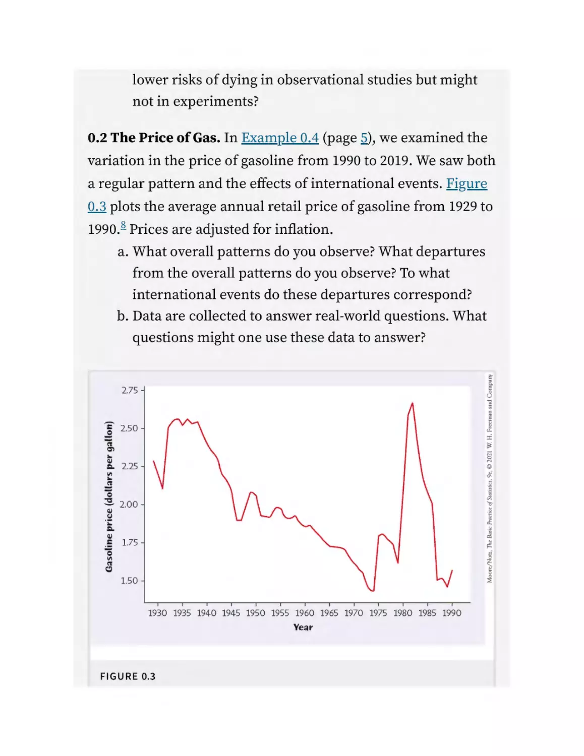
0.2 The Price of Gas. In Example 0.4 (page 5), we examined the
variation in the price of gasoline from 1990 to 2019. We saw both
a regular pattern and the effects of international events. Figure
0.3 plots the average annual retail price of gasoline from 1929 to
1990.8 Prices are adjusted for inflation.
a. What overall patterns do you observe? What departures
from the overall patterns do you observe? To what
international events do these departures correspond?
b. Data are collected to answer real-world questions. What
questions might one use these data to answer?
FIGURE 0.3
The average annual retail price of gasoline, 1929 to 1990. Prices are adjusted for
inflation.
0.3 Online Polls. In 2016, MSNBC posted an online poll asking
the question “What do you think? Has Europe let in too many
refugees?”9 Approximately 32% of those responding online said
“no.”
a. This poll has some of the same problems as the Ann
Landers poll of Example 0.2 (page 3). Do you think that
the proportion of Americans who feel this way is higher,
lower, or close to 32%? Explain.
b. For this poll, 3000 people responded (as of August 26,
2019). Among those responding, 946 or 32% said “no.” Do
you think the results would have been more trustworthy
if 30,000 people had responded instead of 3000? Explain.
0.4 Traffic Fatalities and 9/11. Figure 0.4 (page 10) provides
information on the number of fatal traffic accidents by month
for the years 1996–2001.10 The vertical blue line above each
month gives the lowest to highest numbers of fatal crashes for
that month for the years 1996–2000. For example, in January the
number of fatal crashes for the five years from 1996 through
2000 was between about 2600 and 2900. The blue dots give the
number of fatal crashes for each month in 2001. The numbers
of fatal crashes from January through September of 2001 follow
the general pattern for the five preceding years, as we see the
blue dots are well within the blue lines for each month.
FIGURE 0.4
Number of fatal traffic accidents in the United States in 1996 through 2000 versus
2001. For each month, the blue lines represent the range of the number of fatal
accidents from 1996 through 2000, and the blue dot gives the number of fatal
accidents in 2001.
a. What happened in the last three months of 2001? The
number of fatal crashes in October through December of
2001 are consistently at or above the values for the
previous five years. How can you tell this from the
graph?
b. On September 11, 2001, terrorists hijacked four U.S.
airplanes and used them to strike various targets in the
eastern United States. In part (a), we saw from the graph
that fatal traffic accidents seemed to be unusually high
in the three months following the attacks. Did the
terrorists cause fatal crashes to increase? Can you give a
simple explanation for the apparent increase in fatal
crashes during these months? (Hint: Think about the
effect of the September 11 attacks on air travel and hence
the effect on alternative means of travel.)
PART I
Exploring Data
EXPLORING DATA: Variables and Distributions
Chapter 1 Picturing Distributions with Graphs
Chapter 2 Describing Distributions with Numbers
Chapter 3 The Normal Distributions
EXPLORING DATA: Relationships
Chapter 4 Scatterplots and Correlation
Chapter 5 Regression
Chapter 6 Two-Way Tables*
Chapter 7 Exploring Data: Part I Review
“What do the data say?” is the first question we ask in any statistical
study. Data analysis answers this question through open-ended
exploration of the data. The tools of data analysis are graphs such as
histograms and scatterplots and numerical measures such as means
and correlations. At least as important as the tools are principles
that organize our thinking as we examine data. The seven chapters
in Part I present the principles and tools of statistical data analysis.
They equip you with skills that are immediately useful when you
deal with numbers.
These chapters reflect the strong emphasis on exploring data that
characterizes modern statistics. Sometimes, we hope to draw
conclusions that apply to a setting that goes beyond the data in
hand. This is statistical inference, the topic of much of the rest of the
book. Data analysis is essential if we are to trust the results of
inference, but data analysis isn’t just preparation for inference.
Roughly speaking, you can always do data analysis, but inference
requires rather special conditions.
One of the organizing principles of data analysis is to first look at
one thing at a time and then at relationships. Our presentation
follows this principle. In Chapters 1, 2, and 3 you will study variables
and their distributions. Chapters 4, 5, and 6 cover relationships
among variables. Chapter 7 reviews this part of the text.
CHAPTER 1
PICTURING DISTRIBUTIONS
WITH GRAPHS
When you complete this chapter, you will be able to:
1.1 Identify the individuals and variables in a given set of data and distinguish between
variables that take on numerical values and variables that simply place individuals in
different categories.
1.2 Explore data involving categorical variables using bar graphs and pie charts.
1.3 Draw a histogram to present the distribution of a variable that takes on numerical values.
1.4 Explore and understand data sets by interpreting histograms.
1.5 Make a stemplot to present the distribution of a variable that takes on numerical values.
1.6 Make a time plot to present variables whose values are varying over time.
Practical statistics uses data to draw conclusions about some
broader universe. In our study of practical statistics, we will divide
the subject into three main areas. In exploratory data analysis,
graphs and numerical summaries are used for exploring,
organizing, and describing data so that the patterns become
apparent. Data production concerns where the data come from and
helps us to understand whether what we learn from our data can be
generalized to a wider universe. And statistical inference provides
tools for generalizing what we learn to a wider universe.
In this chapter, we will begin to explore data analysis. A data set can
consist of hundreds of observations on many variables. Even if we
consider only one variable at a time, it is difficult to see what the
data have to say by scanning a list containing many data values. A
graph provides a visual tool for organizing and identifying patterns
in data and is a good starting point in the exploration of the
distribution of a variable.
Statistics is the science of data. The volume of data available to us is
overwhelming. For example, the U.S. Census Bureau’s American
Community Survey collects data from about 3,000,000 housing units
each year. Astronomers work with data on tens of millions of
galaxies. The checkout scanners at Walmart’s more than 11,000
stores in 27 countries record hundreds of millions of transactions
every week, all saved to inform both Walmart and its suppliers. The
first step in dealing with such a flood of data is to organize our
thinking about data. Fortunately, we can do this without looking at
millions of data points.
1.1 Individuals and Variables
Any set of data contains information about some group of individuals. The
information is organized in variables.
Individuals and Variables
Individuals are the objects described by a set of data. Individuals may be people, but they may also
be animals or things.
A variable is any characteristic of an individual. A variable can take different values for different
individuals.
A college’s student database, for example, includes data about every
currently enrolled student. The students are the individuals described by
the data set. For each individual, the data contain the values of variables
such as date of birth, choice of major, and grade point average (GPA). In
practice, any set of data is accompanied by background information that
helps us understand the data. When you plan a statistical study or explore
data from someone else’s work, consider the following questions:
1. Who? What individuals do the data describe? How many individuals
appear in the data?
2. What? How many variables do the data contain? What are the exact
definitions of these variables? In what unit of measurement is each
variable recorded? Weights, for example, might be recorded in
pounds, in thousands of pounds, or in kilograms.
3. Where? Student GPAs and SAT scores (or lack of them) will vary from
college to college, depending on many variables, including
admissions “selectivity” for the college.
4. When? Students change from year to year, as do prices, salaries, and
so forth.
5. Why? What purpose do the data have? Do we hope to answer some
specific questions? Do we want answers for just these individuals or
for some larger group that these individuals are supposed to
represent? Are the individuals and variables suitable for the intended
purpose?
STATISTICS IN YOUR WORLD
Data!
Despite the traditional image of lab-coated scientists peering through microscopes, experiments in
modern particle physics produce digital data rather than directly observable phenomena. The
documentary Particle Fever recreates the excitement of the Large Hadron Collider (LHC) experiment.
When the first collisions of highly accelerated protons are recorded live in the film, American
physicist Monica Dunford exclaims, “We have data. It’s unbelievable how fantastic this data is.”
Some variables, such as a person’s sex or college major, simply place
individuals into categories. Others, like height and GPA, take numerical
values for which we can do arithmetic. It makes sense to give an average
income for a company’s employees, but it does not make sense to give an
“average” sex. We can, however, count the numbers of female and male
employees and do arithmetic with these counts.
Categorical and Quantitative Variables
A categorical variable places an individual into one of several groups or categories.
A quantitative variable takes numerical values for which arithmetic operations such as adding and
averaging make sense. The values of a quantitative variable are usually recorded with a unit of
measurement such as seconds or kilograms.
EXAMPLE 1.1 The American Community
Survey
At the U.S. Census Bureau website, you can view the detailed data
collected by the American Community Survey, though of course the
identities of people and housing units are protected. If you choose the file
of data on people, the individuals are the people living in the housing units
contacted by the survey. More than 100 variables are recorded for each
individual. Figure 1.1 displays a very small part of the data.
FIGURE 1.1
A spreadsheet displaying data from the American Community Survey, for Example 1.1.
Each row records data on one individual. Each column contains the
values of one variable for all the individuals. Translated from the U.S.
Census Bureau’s abbreviations, the variables are
SERIALNO
PWGTP
AGEP
JWMNP
SCHL
An identifying number for the household.
Weight in pounds.
Age in years.
Travel time to work in minutes.
Highest level of education. The numbers designate
categories, not specific grades. For example, 9 = high school graduate,
10 = some college but no degree, and 13 = bachelor’s degree.
SEX
Sex, designated by 1 = male and 2 = f emale.
WAGP
Wage and salary income last year, in dollars.
Look at the highlighted row in Figure 1.1. This individual is a 53-year-old
man who weighs 234 pounds, travels 10 minutes to work, has a bachelor’s
degree, and earned $83,000 last year.
In addition to the household serial number, there are six variables.
Education and sex are categorical variables. The values for education and
sex are stored as numbers, but these numbers are just labels for the
categories and have no units of measurement. The other four variables
are quantitative. Their values do have units. These variables are weight in
pounds, age in years, travel time in minutes, and income in dollars.
The purpose of the American Community Survey is to collect data that
represent the entire nation to guide government policy and business
decisions. To do this, the households contacted are chosen at random
from all households in the country. We will see in Chapter 8 why choosing
at random is a good idea.
Most data tables follow this format: each row is an individual, and each
column is a variable. The data set in Figure 1.1 appears in a spreadsheet
program that has rows and columns ready for your use. Spreadsheets are
commonly used to enter and transmit data and to do simple calculations.
APPLY YOUR KNOWLEDGE
1.1 Fuel Economy. Here is a small part of a data set that describes the
fuel economy in miles per gallon (mpg) of model year 2019 motor
vehicles:
Make
and
Vehicle
Class
Transmission
Type
Model
Number
of
City
mpg
Highway
mpg
Cylinders
Annual
Fuel
Cost
⋮
Subaru
Impreza
Midsize
Manual
4
24
32
$1,450
Nissan
Small
Automatic
4
25
32
$1,400
Rogue
Sport
station
wagon
Hyundai
Midsize
Automatic
4
28
37
$1,200
Large
Automatic
6
19
28
$1,750
Elantra
Chevrolet
Impala
⋮
The annual fuel cost is an estimate assuming 15,000 miles of travel a
year (55% city and 45% highway) and an average fuel price.
a. What are the individuals in this data set?
b. For each individual, what variables are given? Which of these
variables are categorical, and which are quantitative? In what
units are the quantitative variables measured?
1.2 Students and Exercise. You are preparing to study the exercise
habits of college students. Describe two categorical variables and two
quantitative variables that you might measure for each student. Give
the units of measurement for the quantitative variables.
1.2 Categorical Variables: Pie
Charts and Bar Graphs
Statistical tools and ideas help us examine data in order to describe
their main features. This examination is called exploratory data
analysis. Like an explorer crossing unknown lands, we want first to
simply describe what we see. Here are two principles that help us
organize our exploration of a set of data.
exploratory data analysis
Use of graphs and numerical summaries to describe the variables in a data set and the
relationships among them.
Exploring Data
1. Begin by examining each variable by itself. Then move on to study the relationships
among the variables.
2. Begin with a graph or graphs. Then add numerical summaries of specific aspects of
the data.
We will follow these principles in organizing our learning. Chapters
1 through 3 present methods for describing a single variable. We
study relationships between two or more variables in Chapters 4
through 6. In each case, we begin with graphical displays and then
add numerical summaries for more complete description.
The proper choice of graph depends on the nature of the variable.
To examine a single variable, we usually want to display its
distribution.
Distribution of a Variable
The distribution of a variable tells us what values it takes and how often it takes these
values.
The values of a categorical variable are labels for the categories. The distribution of a
categorical variable lists the categories and gives either the count or the percentage of
individuals who fall in each category.
EXAMPLE 1.2 Which Major?
Approximately 1.5 million full-time, first-year students enrolled in
colleges and universities in 2017. What did they plan to study? Here
are data on the percentages of first-year students who planned to
major in several discipline areas:1
Field of Study
Percentage of Students
Biological sciences
15.5
Business
13.8
Health professions
11.7
Engineering
11.5
Social sciences
11.0
Arts and humanities
8.8
Math and computer science
6.2
Education
4.4
Physical sciences
2.7
Other majors and undeclared
13.1
Total
98.7
It’s a good idea to check data for consistency. The percentages
should add to 100%. In fact, these data add to 98.7%. What
happened? It is possible that there are errors in the data, but we
believe there is another explanation. The data from which the table
was created actually consist of the percentage of students who plan
to major in a number of subfields. For example, for Education, the
data consist of the percentage of students planning to major in
Elementary Education, Music/Art Education, Physical
Education/Recreation, Secondary School Teacher in a non-STEM
subject, Special Education, or Other Education. The percentage
listed under Education in the table is the sum of these percentages.
Each of these percentages is rounded to the nearest tenth. The exact
percentages for all of these subfields would add to 100, but the
rounded percentages only come close. This is roundoff error.
Roundoff errors don’t point to mistakes in our work, just to the effect
of rounding off results.
roundoff error
The difference between the exact value of a number and its estimated value, occurring when
results of calculations are altered by reducing the number of decimal places.
Columns of numbers take time to read. You can use a pie chart or a
bar graph to display the distribution of a categorical variable more
vividly. Figures 1.2 and 1.3 illustrate these displays for the
distribution of intended college majors.
FIGURE 1.2
You can use a pie chart to display the distribution of a categorical variable. This pie chart,
created with the JMP Pro 14 software package, shows the distribution of intended majors of
students entering college. Statistical analysis relies heavily on statistical software, and JMP is
one of the most popular software choices both in industry and in colleges and schools of
business. Computer output from other statistical packages like Minitab, SPSS, and R is
similar, so you can feel comfortable using any one of these packages. Spreadsheet programs
such as Excel also can produce pie charts and other graphs.
Pie charts show the distribution of a categorical variable as a “pie”
whose slices are sized by the counts or percentages for the
categories. Pie charts are awkward to make by hand, but software
will do the job for you.
A pie chart must include all the categories
that make up a whole. Use a pie chart only when you want to emphasize
each category’s relationship to the whole. We need the “Other majors
and undeclared” category in Example 1.2 to complete the whole (all
intended majors) and allow us to make the pie chart in Figure 1.2.
Bar graphs represent each category as a bar. The bar heights show
the category counts or percentages. Bar graphs are easier to make
than pie charts and also easier to read. Figure 1.3 displays two bar
graphs of the data on intended majors. The first graph orders the
bars alphabetically by field of study. It is often better to arrange the
bars in order of height (as the majors are listed on page 16), as in
Figure 1.3(b). This helps us immediately see which majors appear
most often.
bar graph
A graph that shows the distribution of a categorical variable by representing each category as a
bar, with the height of each bar representing the count or percentage for the corresponding
category.
FIGURE 1.3
Bar graphs of the distribution of intended majors of students entering college. In part (a), the
bars follow the alphabetical order of fields of study. In part (b), the same bars appear in
order of height. These figures were created with the JMP Pro 14 software package.
Bar graphs are more flexible than pie charts. Both graphs can
display the distribution of a categorical variable, but a bar graph can
also compare any set of quantities that are measured in the same
units.
EXAMPLE 1.3 What Audio Brands Do
12–34s Listen To?
What audio brands do Americans aged 12–34 years listen to? Edison
Research asked which of several audio brands people in that age
group listen to. Here are the percentages by brand.2
Brand
Percentage of 12–34s Who
Have Listened to Each Brand
Pandora
36
Spotify
46
iHeartRadio
14
Apple Music
20
Amazon Music
10
SoundCloud
23
Google Play All Access
8
We can’t make a pie chart to display these data. Each percentage in
the table refers to a different brand, not to parts of a single whole.
Notice that the percents do not add to 100. Figure 1.4 is a bar graph
comparing the seven brands. We have again arranged the bars in
order of height.
FIGURE 1.4
You can use a bar graph to compare quantities that are not part of a whole. This bar graph
compares the percentages of Americans aged 12–34 who have listened to each audio brand,
for Example 1.3.
Bar graphs and pie charts are mainly tools for presenting data: they
help your audience grasp data quickly. Because it is easy to
understand data on a single categorical variable without a graph, bar
graphs and pie charts are of limited use for data analysis. We will
move on to quantitative variables, where graphs are essential tools.
APPLY YOUR KNOWLEDGE
1.3 Social Media Preferences for Younger Audiences. By a
small margin, Facebook remains the top choice of social media
over all ages, with 29% using Facebook most often among those
using social media sites. However, more visually oriented social
networks such as Snapchat and Instagram continue to draw in
younger audiences. When asked “Which one social networking
brand do you use most often?” here are the top brands chosen
by Americans aged 12–34 who currently use any social
networking site or service:3
Social Media Site
Percentage That Use Most Often
Facebook
29
Snapchat
28
Instagram
26
Twitter
6
Pinterest
1
a. What is the sum of the percentages for these top social
media sites? What percentage of Americans aged 12–34
use other social media sites most often?
b. Make a bar graph to display these data. Be sure to
include an “Other social media brand” category.
c. Would it be correct to display these data in a pie chart?
Why or why not?
d. Data are collected to answer real-world questions. What
questions might one use these data to answer?
1.4 How Do Students Pay for College? The Higher Education
Research Institute’s Freshman Survey includes more than
120,000 first-time, full-time freshmen who entered college in
2017.4 The survey reports the following data on the sources
students use to pay for college expenses:
Source for College Expenses
Students
Family resources
69.9%
Student resources
55.4%
Aid—not to be repaid
70.2%
Aid—to be repaid
47.6%
a. Explain why it is not correct to use a pie chart to display
these data.
b. Make a bar graph of the data. Notice that because the
data contrast related groups such as family and student
resources, it is better to keep these bars next to each
other rather than to arrange the bars in order of height.
1.5 Never on Sunday? Births are not, as you might think, evenly
distributed across the days of the week. Here are the average
numbers of babies born on each day of the week in 2017:5
Day
Births
Sunday
7,164
Monday
11,008
Tuesday
11,943
Wednesday
11,949
Thursday
11,959
Friday
11,779
Saturday
8,203
Present these data in a well-labeled bar graph. Would it also be
correct to make a pie chart? Suggest some possible reasons why
there are fewer births on weekends.
1.3 Quantitative Variables: Histograms
Quantitative variables often take many values. The distribution tells us what values the variable
takes and how often it takes these values. A graph of the distribution is clearer if nearby values
are grouped together. The most common graph of the distribution of one quantitative variable is
a histogram.
histogram
A graph of the distribution of one quantitative variable. The horizontal axis is marked in the units of measurement for the variable. The
range of the data is divided into classes of equal width. Bars on the graph each represent a class, with the base of each bar covering the
class on the horizontal axis. The vertical axis displays the scale of counts, and each bar’s height is the class count.
STATISTICS IN YOUR WORLD
What’s That Number?
You might think that numbers, unlike words, are universal. Think again. A “billion” in the United States means 1,000,000,000 (nine
zeros). In Europe, a “billion” is 1,000,000,000,000 (12 zeros). OK, those are words that describe numbers. But those commas in big
numbers are periods in many other languages. This is so confusing that international standards call for spaces instead, so that an
American billion is written 1 000 000 000. And the decimal point of the English-speaking world is the decimal comma in many other
languages, so that 3.1416 in the United States becomes 3,1416 in Europe. So what is the number 10,642.389? It depends on where
you are.
EXAMPLE 1.4 Making a Histogram
What percentage of your home state’s high school students graduate within four years? Data
about graduation rates can help answer the question “How successful is my state in graduating
students and how does my state compare to others?” The Freshman Graduation Rate (FGR)
counts the number of high school graduates in a given year for a state and divides this by the
number of ninth-graders enrolled four years previously. The FGR neglects high school students
moving into and out of a state and may include students who have repeated a grade. Several
alternative measures are available, and states had been free to choose their own, but the
resulting rates could differ by more than 10%. Federal law now requires all states to use a
common, more rigorous computation, the Adjusted Cohort Graduation Rate, which tracks
individual students. The use of the Adjusted Cohort Graduation Rate was first required for 2010–
2011, and this finally allowed accurate comparisons of the graduation rates among states. Table
1.1 presents the data for 2016–2017.6
Table 1.1 Percent of state high school students graduating on time
State
Percent
Region
Alabama
89.3
S
Alaska
78.2
Arizona
State
Percent
Region
State
Percent
Region
Louisiana
78.1
S
Ohio
84.2
MW
W
Maine
86.9
NE
Oklahoma
82.6
S
78.0
W
Maryland
87.7
S
Oregon
76.7
W
Arkansas
88.0
S
Massachusetts
88.3
NE
Pennsylvania
86.6
NE
California
82.7
W
Michigan
80.2
MW
Rhode Island
84.1
NE
Colorado
79.1
W
Minnesota
82.7
MW
South
83.6
S
South
Dakota
83.7
MW
Tennessee
89.8
S
Carolina
Connecticut
87.9
NE
Mississippi
83.0
S
Delaware
86.9
S
Missouri
88.3
MW
Florida
82.3
S
Montana
85.8
W
Texas
89.7
S
Georgia
80.6
S
Nebraska
89.1
MW
Utah
86.0
W
Hawaii
82.7
W
Nevada
80.9
W
Vermont
89.1
NE
Idaho
79.7
W
New
88.9
NE
Virginia
86.9
S
Hampshire
Illinois
87.0
MW
New Jersey
90.5
NE
Washington
79.4
W
Indiana
83.8
MW
New Mexico
71.1
W
West Virginia
89.4
S
Iowa
91.0
MW
New York
81.8
NE
Wisconsin
88.6
MW
Kansas
86.5
MW
North
Carolina
86.6
S
Wyoming
86.2
W
Kentucky
89.7
S
North Dakota
87.2
MW
District of
73.2
S
Columbia
The individuals in this data set are the states. The variable is the percentage of a state’s high
school students who graduate within four years. The states vary quite a bit on this variable, from
71.1% in New Mexico to 91% in Iowa. It’s much easier to see how your state compares with other
states from a histogram than from the table. To make a histogram of the distribution of this
variable, proceed as follows:
Step 1. Choose the classes. Divide the range of the data into classes of equal width. The data in
Table 1.1 range from 71.1 to 91.0, so we decide to use these classes:
percentage on-time graduates between 70.0 and 72.5 (70.0 to < 72.5)
percentage on-time graduates between 72.5 and 75.0 (72.5 to < 75.0)
⋮
percentage on-time graduates between 90.0 and 92.5 (90.0 to < 92.5)
It is important to specify the classes carefully so that each individual falls into exactly one class.
Our notation 70.0 to < 72.5 indicates that the first class includes states with graduation rates
starting at 70.0% and up to, but not including, graduation rates of 72.5%. Thus, a state with an
on-time graduation rate of 72.5% falls into the second class, whereas a state with an on-time
graduation rate of 72.4% falls into the first class. It is equally correct to use classes 70.0 to < 72.0,
, and so forth. Just be sure to specify the classes precisely so that each individual
72.0 to < 74.0
falls into exactly one class.
Step 2. Count the individuals in each class. Here are the counts:
Class
Count
Class
Count
70.0 to < 72.5
1
82.5 to < 85.0
10
72.5 to < 75.0
1
85.0 to < 87.5
11
75.0 to < 77.5
1
87.5 to < 90.0
14
77.5 to < 80.0
6
90.0 to < 92.5
2
80.0 to < 82.5
5
Check that the counts add to 51, the number of individuals in the data set (the 50 states and the
District of Columbia).
Step 3. Draw the histogram. Mark the scale for the variable whose distribution you are
displaying on the horizontal axis. That’s the percentage of a state’s high school students who
graduate within four years. The scale runs from 70.0 to 92.5 because that is the span of the
classes we chose. The vertical axis contains the scale of counts. Each bar represents a class. The
base of the bar covers the class, and the bar height is the class count. Draw the bars with no
horizontal space between them unless a class is empty so that its bar has height zero. Figure 1.5
is our histogram. Remember, an observation on the boundary of the bars—say, 75.0—is counted
in the bar to its right.
FIGURE 1.5
Histogram of the distribution of the percent of on-time high school graduates in 50 states and the District of Columbia, for Example
1.4. This figure was created with the JMP 14 software package.
Although histograms resemble bar graphs, their details and uses are different. A histogram
displays the distribution of a quantitative variable. The horizontal axis of a histogram is marked
in the units of measurement for the variable. A bar graph compares the sizes of different
quantities. The horizontal axis of a bar graph simply identifies the quantities or categories being
compared and need not have any measurement scale. These quantities may be the values of a
categorical variable, but they may also be unrelated, like the sources used to learn about music
in Example 1.3 (page 18). Draw bar graphs with blank space between the bars to separate the
quantities being compared. Draw histograms with no space to indicate that all values of the
variable are covered. A gap between bars in a histogram indicates that there are no values for
that class.
Our eyes respond to the area of the bars in a histogram.7 Because the classes are all the same
width, area is determined by height, and all classes are fairly represented. There is no one right
choice of the classes in a histogram. Too few classes will give a “skyscraper” graph, with all
values in a few classes with tall bars. Too many will produce a “pancake” graph, with most
classes having one or no observations. Neither choice will give a good picture of the shape of the
distribution. You must use your judgment in choosing classes to display the shape. Statistics
software will choose the classes for you. The software’s choice is usually a good one, but you can
change it if you want. The histogram function in the One-Variable Statistical Calculator applet on
the text website allows you to change the number of classes by dragging with the mouse so that
it is easy to see how the choice of classes affects the histogram.
APPLY YOUR KNOWLEDGE
1.6 The Changing Face of America. In 1980, approximately 20% of adults aged 18–34 were
considered minorities, reporting their ethnicity as other than non-Hispanic White. By the
end of 2013, that percentage had more than doubled. How are minorities between the ages
of 18 and 34 distributed in the United States? In the country as a whole, 42.8% of adults aged
18–34 are considered minorities, but the states vary from 8% in Maine and Vermont to 75%
in Hawaii. Table 1.2 presents the data for all 50 states and the District of Columbia.8 Make a
histogram of the percents using classes of width 10% starting at 0%. That is, the first bar
covers 0% to < 10%, the second covers 10% to < 20%, and so on. (Make this histogram by
hand, even if you have software, to be sure you understand the process. You may then want
to compare your histogram with your software’s choice.)
Table 1.2 Percent of state population aged 18–34 who are minorities
State
Percent
State
Percent
State
Percent
45
Ohio
23
Oklahoma
37
Alabama
39
Louisiana
Alaska
40
Maine
Arizona
51
Maryland
52
Oregon
27
Arkansas
31
Massachusetts
31
Pennsylvania
26
California
67
Michigan
28
Rhode Island
31
Colorado
35
Minnesota
23
South Carolina
41
Connecticut
39
Mississippi
48
South Dakota
19
Delaware
23
Missouri
23
Tennessee
30
8
Florida
52
Montana
15
Texas
61
Georgia
51
Nebraska
23
Utah
22
Hawaii
75
Nevada
54
Vermont
8
Idaho
20
New Hampshire
11
Virginia
41
Illinois
42
New Jersey
51
Washington
34
Indiana
23
New Mexico
67
West Virginia
9
Iowa
16
New York
48
Wisconsin
22
Kansas
27
North Carolina
41
Wyoming
18
Kentucky
17
North Dakota
15
District of Columbia
53
1.7 Choosing Classes in a Histogram. The data set menu that accompanies the OneVariable Statistical Calculator applet includes the data on the percentage of minorities
between the ages of 18 and 34 in the states from Table 1.2. Choose these data and then click
on the “Histogram” tab to see a histogram.
a. How many classes does the applet choose to use? (You can click on the graph outside
the bars to get a count of classes.)
b. Click on the graph and drag to the left. What is the smallest number of classes you
can get? What are the lower and upper bounds of each class? (Click on the bar to find
out.) Make a rough sketch of this histogram.
c. Click and drag to the right. What is the greatest number of classes you can get? How
many observations does the largest class have?
d. You see that the choice of classes changes the appearance of a histogram. Drag back
and forth until you get the histogram that you think best displays the distribution.
How many classes did you use? Why do you think this is best?
1.4 Interpreting Histograms
Making a statistical graph is not an end in itself. The purpose of graphs
is to help us understand how the data help us answer some real-world
question. After you make a graph, always ask, “What do I see?” Once
you have displayed a distribution, you can see its important features
as follows.
Examining a Histogram
In any graph of data, look for the overall pattern and for striking deviations from that
pattern.
You can describe the overall pattern of a histogram by its shape, center, and variability. You
will sometimes see variability referred to as spread.
An important kind of deviation is an outlier, an individual value that falls outside the overall
pattern.
One way to describe the center of a distribution is by its midpoint,
the value with roughly half the observations taking smaller values
and half taking larger values. In Chapter 2, we will formally define
the midpoint as the median. To find the midpoint, order the
observations from smallest to largest, making sure to include
repeated observations as many times as they appear in the data.
First cross off the largest and smallest observations, then the largest
and smallest of those remaining, and continue this process. If you
initially had an odd number of observations, you will be left with a
single observation, which is the midpoint. If you initially had an
even number of observations, you will be left with two observations,
and their average is the midpoint.
For now, we will describe the variability of a distribution by giving
the smallest and largest values. We will look at better ways to describe
center and variability in Chapter 2. The overall shape of a
distribution can often be described in terms of symmetry or
skewness, defined as follows.
Symmetric and Skewed
Distributions
A distribution is symmetric if the right and left sides of the histogram are approximately
mirror images of each other.
A distribution is skewed to the right if the right side of the histogram (containing the half of
the observations with larger values) extends much farther out than the left side. It is skewed
to the left if the left side of the histogram extends much farther out than the right side.
EXAMPLE 1.5 Describing a Distribution
Look again at the histogram in Figure 1.5. To describe the
distribution, we want to look at its overall pattern and any
deviations.
SHAPE: The distribution has a single peak, which represents states
in which between 87.5% and 90.0% of students graduate high school
on time. The distribution is skewed to the left. There is only one
observation to the right of the peak, while to the left of the peak,
most of the remaining states have graduation rates between 77.5%
and 87.5%, but several states have much lower percents, so the
graph extends quite far to the left of its peak.
CENTER: Arranging the observations from Table 1.1 in order of size
shows that 86.0% is the midpoint of the distribution. There are a
total of 51 observations, and if we cross off the 25 highest graduation
rates and the 25 lowest graduation rates, we are left with a single
graduation rate of 86.0%, which we take as the center of the
distribution.
VARIABILITY: The graduation rates range from 71.1% to 91.0%,
which shows considerable variability in graduation rates among the
states.
OUTLIERS: Figure 1.5 shows no observations outside the overall
single-peaked, left-skewed pattern of the distribution. Figure 1.6 is
another histogram of the same distribution, with classes of width 2%
rather than 2.5%. Now New Mexico at 71.1% and the District of
Columbia at 73.2% are more clearly separated from the remaining
states. Are New Mexico and the District of Columbia outliers or just
the smallest observations in a strongly skewed distribution?
Unfortunately, there is no rule. Let’s agree to call attention to only
strong outliers that suggest something special about an observation
—or an error such as typing 10.1 as 101. Although the District of
Columbia is often included with the other 50 states in data sets, for
many variables it can differ markedly from the remaining states.
FIGURE 1.6
Another histogram of the distribution of the percentage of on-time high school graduates,
with narrower class widths than in Figure 1.5. A histogram with more classes shows more
detail but may have a less clear pattern.
Figures 1.5 and 1.6 remind us that interpreting graphs calls for
judgment. We also see that the choice of classes in a histogram can
influence the appearance of a distribution. Because of this, and to avoid
worrying about minor details, concentrate on the main features of a
distribution that persist with several choices of class intervals. Look
for major peaks, not for minor ups and downs, in the bars of the
histogram. When you choose a larger number of class intervals, the
histogram can become more jagged, leading to the appearance of
multiple peaks that are close together. Always be sure to check for
clear outliers, not just for the smallest and largest observations, and
look for rough symmetry or clear skewness.
Here are more examples of describing the overall pattern of a
histogram.
EXAMPLE 1.6 Iowa Tests Scores
Figure 1.7 displays the scores of all 947 seventh-grade students in the
public schools of Gary, Indiana, on the vocabulary part of the Iowa
Test of Basic Skills.9 The distribution is single-peaked and symmetric.
Real data are almost never exactly symmetric. We are content to
describe Figure 1.7 as symmetric. The center (half above, half
below) is close to 7. This is seventh-grade reading level. The scores
range from 2.1 (2nd-grade level) to 12.1 (12th-grade level).
FIGURE 1.7
Histogram of the Iowa Test vocabulary scores of all seventh-grade students in Gary, Indiana,
for Example 1.6. This distribution is single peaked and symmetric.
Notice that the vertical scale in Figure 1.7 is not the count of students
but the percentage of students in each histogram class. A histogram
of percents rather than counts is convenient when we want to
compare several distributions. To compare Gary with Los Angeles, a
much bigger city, we would use percents so that both histograms
have the same vertical scale.
When describing the vertical scale of a histogram, you will
sometimes see count referred to as frequency and percentage
referred to as relative frequency, particularly when choosing an
option for the vertical scale using software.
EXAMPLE 1.7 Who Takes the SAT?
Depending on where you went to high school, the answer to this
question may be “almost everybody,” “many but not everybody,” or
“almost nobody.” Figure 1.8 is a histogram of the percentage of high
school graduates in each state who took the SAT in 2018.10
FIGURE 1.8
Histogram of the percentage of high school graduates in each state who took the SAT
Reasoning test, for Example 1.7. The graph shows three groups of states: ACT states (where
few students take the SAT) at the left, states where many take the SAT and some the ACT, and
SAT states at the right.
To create the histogram with bars covering only the range 0% to
100%, we had to choose the class intervals wisely. A few states had
100% of high school students take the SAT. The lowest percentage is
2% for North Dakota. We would like to avoid having a class interval
that begins at 100% and includes values larger than 100% (which is
impossible) and would result in a histogram that suggests values
larger than 100% in the data. We therefore used class intervals of
0.01% to < 10.01%, 10.01% to < 20.01%, etc. However, we have only
displayed percents to the nearest integer on the horizontal scale.
The histogram shows three peaks: a high peak at the far left
representing percents 10% and below, a lower peak in the 60.01% to
< 70.01%
class, and a high peak representing percents above 90%.
The presence of more than one peak suggests that the distribution
mixes several kinds of individuals. That is the case here. There are
two major tests of readiness for college, the ACT and the SAT. Most
states have a strong preference for one or the other. In some states,
many students take the ACT exam and few take the SAT; these states
form the peak on the left. In other states, some students take the
ACT and some the SAT; these states are the bars near the peak in the
60.01% to < 70.01% class. In yet other states, almost all students
take the SAT and very few choose the ACT; these states form the high
peak at the far right.
Giving the center and variability of this distribution is not very
useful. The midpoint falls in the 50.01% to < 60.01% class, between
the peaks. The story told by the histogram is in the three peaks
corresponding to primarily ACT states, states in which students take
both, and primarily SAT states.
The overall shape of a distribution provides important information
about a variable (although describing the shape of a bar graph for
categorical data is not useful). Some variables have distributions
with predictable shapes. Many biological measurements on
specimens from the same species and sex—lengths of bird bills,
heights of young women—have symmetric distributions. On the
other hand, data on people’s incomes are usually strongly skewed to
the right. There are many moderate incomes, some large incomes,
and a few enormous incomes. Many distributions have irregular
shapes that are neither symmetric nor skewed. Some data show
other patterns, such as the three peaks in Figure 1.8. Use your eyes,
describe the pattern you see, and then try to explain the pattern.
APPLY YOUR KNOWLEDGE
1.8 The Changing Face of America. In Exercise 1.6 (page 22),
you made a histogram of the percentage of minority residents
aged 18–34 in each of the 50 states and the District of Columbia.
These data are given in Table 1.2. Describe the shape of the
distribution. Is it closer to symmetric or skewed? What is the
center (midpoint) of the data? What is the variability in terms of
the smallest and largest values? Are there any states with an
unusually large or small percentage of minorities?
1.9 Lyme Disease. Lyme disease is caused by a bacterion called
Borrelia burgdorferi and is spread through the bite of an infected
black legged tick, generally found in woods and grassy areas.
There were 383,846 confirmed cases reported to the Centers for
Disease Control and Prevention (CDC) between 2001 and 2017,
and these are broken down by age and sex in Figure 1.9.11
FIGURE 1.9
Histogram of the ages of individuals infected with Lyme disease for cases reported
between 2001 and 2017 in the United States, for males and females, for Exercise 1.9.
Here is how Figure 1.9 relates to what we have been studying.
The individuals are the 383,846 people with confirmed cases,
and two of the variables measured on each individual are sex
and age. Considering males and females separately, we could
draw a histogram of the variable age using class intervals 0 to
< 5
years old, 5 to < 10 years old, and so forth. Look at the
leftmost two bars in Figure 1.9. The blue bar shows that almost
10,000 of the males were between 0 and 5 years old, and the
green bar shows slightly fewer females were in this age range. If
we were to take all the blue bars and put them side by side, we
would have the histogram of age for males using the class
intervals stated. Similarly, the green bars show females.
Because we are trying to display both histograms in the same
graph, the bars for males and females within each class interval
have been placed alongside each other for ease of comparison,
with the bars for different class intervals separated by small
spaces.
a. Describe the main features of the distribution of age for
males. Why would describing this distribution in terms
of only the center and variability be misleading?
b. Suppose that different age groups of males spend
differing amounts of time outdoors. How could this fact
be used to explain the pattern that you found in part (a)?
Remember to use your eyes to describe the pattern you
see and then try to explain the pattern.
c. A 45-year-old male friend of yours looks at the histogram
and tells you that he is planning on giving up hiking
because this graph suggests he is in a high-risk group for
getting Lyme disease. He will resume hiking when he is
65, as he will be less likely to get Lyme disease at that
age. Is this a correct interpretation of the histogram?
d. Comparing the histograms for males and females, how
are they similar? What is the main difference, and why
do you think it occurs?
1.5 Quantitative Variables:
Stemplots
Histograms are not the only graphical display of distributions. For
small data sets, a stemplot is quicker to make and presents more
detailed information.
stemplot
A graph of the distribution of a quantitative variable. Each observation is shown as a stem,
consisting of all but the final (rightmost) digit, and a leaf, the final digit. The unique stems are
stacked in a vertical column with the smallest at the top, and a vertical line appears to the right of
the column. Each leaf for a stem appears in a row to the right of the stem.
Stemplot
To make a stemplot:
1. Separate each observation into a stem, consisting of all but the final (rightmost) digit,
and a leaf, the final digit. Stems may have as many digits as needed, but each leaf
contains only a single digit.
2. Write the stems in a vertical column with the smallest at the top and draw a vertical
line at the right of this column. Be sure to include all the stems needed to span the
data, even when some stems will have no leaves.
3. Write each leaf in the row to the right of its stem, in increasing order out from the
stem.
EXAMPLE 1.8 Making a Stemplot
Table 1.2 (page 23) presents the percentage of adults aged 18–34 who
were considered minorities in each of the states and the District of
Columbia. To make a stemplot of these data, first write the percents
8 and 9 as 08 and 09 so that all the percents are two-digit numbers.
Take the tens place (leftmost digit) of the percentage as the stem and
the final digit (ones) as the leaf. Write stems from 0 for Maine,
Vermont, and West Virginia to 7 for Hawaii. Now add leaves. Texas,
61%, has leaf 1 on the 6 stem. California and New Mexico, at 67%,
each place a leaf of 7 on the same stem. These are the only
observations on this stem. Arrange the leaves in order, so that 6|177
is one row in the stemplot. Figure 1.10 is the complete stemplot for
the data in Table 1.2.
FIGURE 1.10
Stemplot of the percentages of minorities aged 18–34 in the states, for Example 1.8. The tens
place of the percentage is the stem, and the ones place is the leaf.
A stemplot looks like a histogram turned on end, with the stems
corresponding to the class intervals. The first stem in Figure 1.10
contains all states with percents between 0% and 10%. Examine the
histogram in Figure 1.11, which is a histogram of the minority data
using class intervals 0% to < 10%, 10% to < 20%, and so forth.
Although Figures 1.10 and 1.11 display exactly the same pattern, the
stemplot, unlike the histogram, preserves the actual value of each
observation.
FIGURE 1.11
Histogram of the percentages of minorities aged 18–34 in the states, for Example 1.8. The
class widths have been chosen to agree with the widths of the stems in the stemplot in
Figure 1.10.
In a stemplot, the classes (the stems of a stemplot) are given to you.
Histograms are more flexible than stemplots because you can
choose the classes more easily.
Stemplots do not work well for
large data sets, where each stem must hold a large number of leaves.
Don’t try to make a stemplot of a large data set, such as the 947 Iowa
Test scores in Figure 1.7.
Consider making a stemplot of the high school graduation rate data
in Table 1.1 (page 21). If we use the tenths as the leaves, the
neccesary stems begin at 71 for New Mexico and end at 91 for Iowa,
requiring a total of 21 stems. When there are too many stems, as in
this case, there are often no leaves or just one or two leaves on many
of the stems. The number of stems can be reduced if we first round
the data. In this example, we can round the data for each state to the
nearest percent before drawing the stemplot. Here is the result:
Now it seems that there are too few stems. You can also split stems
in a stemplot to double the number of stems when all the leaves
would otherwise fall on just a few stems, as occurred when we
rounded to the nearest percent. Each stem then appears twice.
Leaves 0 to 4 go on the upper stem, and leaves 5 to 9 go on the lower
stem. If you split the stems with the data rounded to the nearest
percent, the stemplot becomes:
which makes the left skew pattern clearer. In fact, the stems in the
previous stemplot correspond to the class intervals used in the
histogram of Figure 1.5 (page 22), although there are minor
differences in the histogram and the stemplot because the data were
rounded for the stemplot but not for the histogram. When drawing
stemplots, some data require rounding but don’t require splitting
stems, some require just splitting stems, and other data require
both. The One-Variable Statistical Calculator applet on the text website
allows you to decide whether to split stems so that it is easy to see
the effect.
STATISTICS IN YOUR WORLD
The Vital Few
Skewed distributions can show us where to concentrate our efforts. Ten percent of the cars
on the road account for half of all carbon dioxide emissions. A histogram of CO emissions
2
would show many cars with small or moderate values and a few with very high values.
Cleaning up or replacing these cars would reduce pollution at a cost much lower than that of
programs aimed at all cars. Statisticians who work at improving quality in industry make a
principle of this: distinguish “the vital few” from “the trivial many.”
A dotplot is another graphic for displaying small data sets. Dotplots
are often used when the data have relatively few distinct values—for
example, a small range of integer values such as 1 to 10. A dotplot is
like a stemplot in which the leaves for each stem are replaced by
dots. A dotplot is typically oriented like a histogram, with the stem
values listed along the horizontal axis and the dots forming a
vertical column above each stem. As such, dotplots resemble
histograms. Figure 1.12 is a dotplot of the data in Table 1.1,
corresponding to the split stemplot above. Dotplots, like stemplots,
help us visualize the distribution of small data sets. We prefer
stemplots to dotplots, and in the remainder of this book we will use
stemplots rather than dotplots for small data sets.
FIGURE 1.12
Dotplot of the data in Table 1.1.
Comparing Figures 1.11 (right-skewed) and 1.5 (left-skewed)
reminds us that the direction of skewness is the direction of the long tail,
not the direction where most observations are clustered.
APPLY YOUR KNOWLEDGE
1.10 The Changing Face of America. Figure 1.10 gives a
stemplot of the percentages of adults aged 18–34 who were
considered minorities in each of the states and the District of
Columbia.
a. Make another stemplot of this data by splitting the
stems, placing leaves 0 to 4 on the first stem and leaves 5
to 9 on the second stem of the same value. Does splitting
the stems gives a different impression of the
distribution? Explain.
b. Draw a histogram of this data which uses class intervals
that give the same pattern as the stemplot that you drew
in part (a).
1.11 Health Care Spending. Table 1.3 shows the 2015 per capita
total expenditure on health in 35 countries with the highest
gross domestic product in that year.12 Health expenditure per
capita is the sum of public and private health expenditures (in
PPP, international $) divided by population. Health
expenditures include the provision of health services, familyplanning activities, nutrition activities, and emergency aid
designated for health; health expenditures exclude the
provision of water and sanitation. Make a stemplot of the data
after rounding to the nearest $100 (so that stems are thousands
of dollars and leaves are hundreds of dollars). Split the stems,
placing leaves 0 to 4 on the first stem and leaves 5 to 9 on the
second stem of the same value. Describe the shape, center, and
variability of the distribution. Which country is the high outlier?
Table 1.3 Per capita total expenditure on health (international
dollars)
Country
Dollars
Country
Dollars
Country
Dollars
Argentina
1390
Indonesia
369
Saudi
Arabia
3121
Australia
4492
Iran
1262
South
1086
Africa
Austria
5138
Italy
3351
Spain
3183
Belgium
4782
Japan
4405
Sweden
5299
Brazil
1392
Korea,
2556
Switzerland
7583
1064
Thailand
610
South
Canada
4600
Malaysia
China
762
Mexico
1009
Turkey
Colombia
853
Netherlands
5313
United Arab
996
2426
Emirates
Denmark
5083
Nigeria
215
France
4542
Norway
6222
United
Kingdom
4145
United
9536
States
Germany
India
5357
Poland
1704
238
Russia
1414
Venezuela
106
1.6 Time Plots
Many variables are measured at intervals over time. We might, for
example, measure the height of a growing child or the price of a
stock at the end of each month. In these examples, our main interest
is change over time. To display change over time, make a time plot.
Time Plot
A time plot of a variable plots each observation against the time at which it was measured.
Always put time on the horizontal scale of your plot and the variable you are measuring on
the vertical scale. Connecting the data points by lines helps emphasize any change over
time.
EXAMPLE 1.9 Water Levels in the
Everglades
Water levels in Everglades National Park are critical to the survival
of this unique region. Data on water levels can help us answer
questions about threats to the survival of the region. The photo
shows a water-monitoring station in Shark River Slough, the main
path for surface water moving through the “river of grass” that is the
Everglades. Each day the mean gauge height, the height in feet of the
water surface above the gauge datum, is measured at the Shark River
Slough monitoring station. (The gauge datum is a vertical control
measure established in 1929 and is used as a reference for
establishing varying elevations. It establishes a zero point from
which to measure the gauge height.) Figure 1.13 is a time plot of
mean daily gauge height at this station from January 1, 2000, to
August 27, 2019.13
FIGURE 1.13
Time plot of average gauge height at a monitoring station in Everglades National Park over a
19-year period, for Example 1.9. The yearly cycles reflect Florida’s wet and dry seasons. This
figure was created with the JMP 14 software package.
When you examine a time plot, look once again for an overall
pattern and for strong deviations from the pattern. Figure 1.13
shows strong cycles—regular up-and-down movements in water level.
The cycles show the effects of Florida’s wet season (roughly June to
November) and dry season (roughly December to May). Water levels
are highest in late fall. If you look closely, you can see the year-toyear variation. The dry season in 2003 ended early, with the first-ever
April tropical storm. In consequence, the dry-season water level in
2003 did not dip as low as in other years. The drought in the
southeastern portion of the country in 2008 and 2009 shows up in
the steep drop in the mean gauge height in 2009, and the lower
peaks in 2006 and 2007 reflect lower water levels during the wet
seasons in these years. Finally, in 2011, an extra-long dry season and
a slow start to the 2011 rainy season compounded into the worst
drought in the southwest Florida area in 80 years, which shows up as
the steep drop in the mean gauge height in 2011. Hurricane Irma
struck Florida in September 2017.
Another common overall pattern in a time plot is a trend, a longterm upward or downward movement over time. Many economic
variables show an upward trend. Incomes, house prices, and (alas)
college tuitions tend to move generally upward over time. Figure
1.14 plots the mean annual CO concentration from 1959 to 2017,
2
with a steady upward trend.
FIGURE 1.14
A time plot of the mean CO concentration (in parts per million) in the
2
atmosphere from 1959 to 2017. This figure was created with the JMP 14
software package.
Histograms and time plots give different kinds of information about
a variable. The time plot in Figure 1.13 presents time series data
that show the change in water level at one location over time.
time series data
Measurements of a variable taken repeatedly, recording the time as well as the value of each
measurement.
A histogram displays cross-sectional data, such as water levels at
many locations in the Everglades at the same time.
APPLY YOUR KNOWLEDGE
1.12 The Cost of College. Here are data on the average tuition
and fees charged to in-state students by public four-year
colleges and universities for the 1980 to 2018 academic years.
Because almost any variable measured in dollars increases over
time due to inflation (the falling buying power of a dollar), the
values are given in “constant dollars,” adjusted to have the same
buying power that a dollar had in 2018.14
Year
Tuition
Year
Tuition
Year
Tuition
Year
Tuition
1980
$2440
1990
$3690
2000
$5120
2010
$8820
1981
$2500
1991
$3900
2001
$5350
2011
$9240
1982
$2660
1992
$4180
2002
$5740
2012
$9510
1983
$2900
1993
$4430
2003
$6370
2013
$9590
1984
$2980
1994
$4600
2004
$6830
2014
$9680
1985
$3090
1995
$4640
2005
$7080
2015
$9960
1986
$3250
1996
$4780
2006
$7180
2016
$10130
1987
$3300
1997
$4880
2007
$7490
2017
$10270
1988
$3360
1998
$5020
2008
$7560
2018
$10230
1989
$3440
1999
$5080
2009
$8270
a. Make a time plot of average tuition and fees.
b. What overall pattern does your plot show?
c. Some possible deviations from the overall pattern are
outliers, periods when charges went down (in 2018
dollars) and periods of particularly rapid increase. Which
are present in your plot, and during which years?
d. In looking for patterns, do you think that it would be
better to study a time series of the tuition for each year
or the percentage increase for each year? Why? Think
about what questions these data might answer.
Chapter 1 Summary and Exercises
CHAPTER 1 SUMMARY
Chapter Specifics
A data set contains information on a number of individuals. Individuals may
be people, animals, or things. For each individual, the data give values for one
or more variables. A variable describes some characteristic of an individual,
such as a person’s height, sex, or salary.
Some variables are categorical, and others are quantitative. A categorical
variable places each individual into a category, such as male or female. A
quantitative variable has numerical values that describe some characteristic of
each individual using a unit of measurement, such as height in centimeters or
salary in dollars.
Exploratory data analysis uses graphs and numerical summaries to describe
the variables in a data set and the relationships among them.
After you understand the background of your data (individuals, variables, units
of measurement), almost always the first thing to do is plot your data.
The distribution of a variable describes what values the variable takes and
how often it takes these values. Pie charts and bar graphs display the
distribution of a categorical variable. Bar graphs can also compare any set of
quantities measured in the same units. Histograms and stemplots graph the
distribution of a quantitative variable.
When examining any graph, look for an overall pattern and for notable
deviations from the pattern.
Shape, center, and variability describe the overall pattern of the distribution of a
quantitative variable. Some distributions have simple shapes, such as
symmetric or skewed. Not all distributions have a simple overall shape,
especially when there are few observations.
FIGURE 1.15
Symmetric, right-skewed, and left-skewed distributions.
Outliers are observations that lie outside the overall pattern of a distribution.
Always look for outliers and try to explain them.
When observations on a variable are taken over time, make a time plot that
graphs time horizontally and the values of the variable vertically. A time plot
can reveal trends, cycles, or other changes over time.
CHECK YOUR SKILLS
The multiple-choice exercises in Check Your Skills ask straightforward questions
about basic facts from the chapter. Answers to odd-numbered exercises appear in the
back of the book. You should expect almost all your answers to be correct.
1.13 Here are the first lines of a professor’s data set at the end of a statistics
course:
Name
Major
Total Points
Grade
ADVANI, SURA
COMM
397
B
BARTON, DAVID
HIST
323
C
BROWN, ANNETTE
BIOL
446
A
CHIU, SUN
PSYC
405
B
CORTEZ, MARIA
PSYC
461
A
The individuals in these data are
a. the students.
b. the total points.
c. the course grades.
1.14 According to the National Household Survey on Drug Use and Health,
when asked in 2017, 31.0% of those aged 18 to 25 years said they had used
cigarettes in the past year, 7.7% said they had used smokeless tobacco, 39.4%
said they had used illicit drugs, and 7.8% said they had used pain relievers or
sedatives.15 To display this data, it would be correct to use
a. either a pie chart or a bar graph.
b. a pie chart, provided that a category for other is added to get to 100%.
c. a bar graph but not a pie chart.
1.15 A description of different houses on the market includes the variables
square footage of the house and the average monthly gas bill.
a. Square footage and average monthly gas bill are both categorical
variables.
b. Square footage and average monthly gas bill are both quantitative
variables.
c. Square footage is a categorical variable, and average monthly gas bill is
a quantitative variable.
1.16 A political party’s data bank includes the zip codes of past donors, such as
47906 34236 53075 10010 90210 75204 30304 99709
Zip code is a
a. quantitative variable.
b. categorical variable.
c. unit of measurement.
1.17 Figure 1.6 (page 25) is a histogram of the percentage of on-time high
school graduates in each state. The rightmost bar in the histogram covers
percents of on-time high school graduates ranging from about
a. 85% to 90%.
b. 88% to 92%.
c. 90% to 92%.
1.18 Here are the exam scores of 10 students in a statistics class:
50 35 41 97 76 69 94 91
23 65
To make a stemplot of these data, you would use stems
a. 2, 3, 4, 5, 6, 7, 9.
b. 2, 3, 4, 5, 6, 7, 8, 9.
c. 20, 30, 40, 50, 60, 70, 80, 90.
1.19 Where do students go to school? Although 78% of first-time first-year
students attended college in the state in which they lived, this percentage
varied considerably over the states. Here is a stemplot of the percentage of
first-year students in each of the 50 states who were from the state where they
enrolled. The stems are tens, and the leaves are ones. The stems have been
split in the plot.16
The midpoint of this distribution is
a. 60%.
b. 73.5%.
c. 80%.
1.20 The shape of the distribution in Exercise 1.19 is
a. skewed to the left.
b. skewed upward.
c. skewed to the right.
1.21 The state with the smallest percentage of first-year students enrolled in
the state has
a. 0.33% enrolled.
b. 3.3% enrolled.
c. 33% enrolled.
1.22 You look at real estate ads for houses in Naples, Florida. There are many
houses ranging from $200,000 to $500,000 in price. The few houses on the
water, however, have prices up to $15 million. The distribution of house prices
will be
a. skewed to the left.
b. roughly symmetric.
c. skewed to the right.
CHAPTER 1 EXERCISES
1.23 Medical Students. Students who have finished medical school are
assigned to residencies in hospitals to receive further training in a medical
specialty. Here is part of a hypothetical database of students seeking residency
positions. USMLE is the student’s score on Step 1 of the national medical
licensing examination.
Name
Medical School
Sex
Age
USMLE
Abrams, Laurie
Specialty Sought
Florida
F
28
238
Family medicine
Brown, Gordon
Meharry
M
25
205
Radiology
Cabrera, Maria
Tufts
F
26
191
Pediatrics
Ismael, Miranda
Indiana
F
32
245
Internal medicine
a. What individuals does this data set describe?
b. In addition to the student’s name, how many variables does the data set
contain? Which of these variables are categorical, and which are
quantitative? If a variable is quantitative, what units is it measured in?
1.24 Buying a Refrigerator. Consumer Reports will have an article comparing
refrigerators in the next issue. Some of the characteristics to be included in the
report are the brand name and model; whether it has a top freezer, bottom
freezer, or side-by-side layout; the estimated energy consumption per year
(kilowatts); whether or not it is Energy Star compliant; the width, depth, and
height in inches; and both the freezer and refrigerator net capacity, in cubic
feet. Which of these variables are categorical, and which are quantitative? Give
the units for the quantitative variables and the categories for the categorical
variables. What are the individuals in the report?
1.25 What Color Is Your Car? The most popular colors for cars and light trucks
vary with region and type of vehicle and over time. In North America, silver
and white are the most popular choices for midsize cars, silver and black for
convertibles and coupes, and white for light trucks. Despite this variation,
overall white remains the top choice worldwide for the eighth consecutive
year, increasing its lead by 2% over the previous year. Here is the distribution
of the top colors for vehicles sold globally in 2018:17
Color
Popularity
White
39%
Black
17%
Gray
12%
Silver
10%
Natural
7%
Red
7%
Blue
7%
Green
Fill in the percentage of vehicles that are in green, Make a graph to display the
distribution of color popularity.
1.26 High School Tobacco Use. Despite the intense anti-smoking campaigns
sponsored by both federal and private agencies, smoking continues to be the
single-biggest cause of preventable death in the United States. How has the
tobacco use of high school students changed over the past few years? For each
of several tobacco products, high school students were asked whether they had
used each of them in the past 30 days. Here are some of the results:18
Year
Product
2011
2012
2013
2014
2015
2016
2017
2018
Any tobacco
product
24.3
23.3
22.9
24.6
25.3
20.2
19.6
27.1
Cigarettes
15.8
14.0
12.7
9.2
9.3
8.0
7.6
8.1
Cigars
12.6
11.6
11.9
8.2
8.6
7.7
7.7
7.6
Pipes
4.5
4.0
4.1
1.5
1.0
1.4
0.8
1.1
Smokeless tobacco
7.3
6.4
5.7
5.5
6.0
5.8
5.5
5.9
E-cigarettes
1.5
2.8
4.5
13.4
16.0
11.3
11.7
20.8
The first row of the table gives the percentages of high school students who
had used any tobacco product, including cigarettes, pipes, cigars, smokeless
tobacco, e-cigarettes, hookahs, snus, bidis, or dissolvable tobacco, in the past
30 days for the years 2011–2018. The remaining rows give the percentage of
high school students using the most common tobacco products in each of
these years.
a. Using the information in the first row of the table, draw a bar chart that
shows the change in the use of any tobacco product between 2011 and
2018. How would you describe the pattern of change in this usage?
b. Draw a bar chart that illustrates the change in usage in these years for
the individual tobacco products. If your software allows it, give a single
bar chart that contains the information for all products. Otherwise,
provide a separate bar chart for each product.
c. Using the bar charts in parts (a) and (b), give a simple description of the
changes in the use of tobacco products by high school students between
2011 and 2018.
1.27 Deaths among Young People. Among persons aged 15–24 years in the
United States, there were 32,025 deaths in 2017. The leading (distinct) causes of
death and number of deaths were accidents, 13,441; suicide, 6252; homicide,
4905; cancer, 1374; heart disease, 1126; symptoms, signs, and abnormal
clinical and laboratory findings, 501; congenital defects, 362.19
a. Make a bar graph to display these data.
b. Can you make a pie chart using the information given? Explain
carefully why or why not.
1.28 Student Debt. At the end of 2016, the average outstanding student debt for
bachelor’s degree recipients at public and private nonprofit four-year
institutions was $28,500. Figure 1.16 is a pie chart showing the distribution of
outstanding education debt.20 About what percentage of students had an
outstanding debt between $20,000 and $49,999? $50,000 or more? You see that it
is hard to determine numbers from a pie chart. Bar graphs are much easier to
use. (Many agencies include the percents in their pie charts to aid in
interpretation.)
FIGURE 1.16
Pie chart of the distribution of outstanding education debt, for Exercise 1.28.
1.29 Mobile Apps We Cannot Go Without. Smartphone users have many apps
on their phones. Which ones do they say they must have? Here is the
percentage of smartphone users who say they cannot go without Amazon and
without Google Search by age group:21
Age Group
Amazon
Google Search
18 to 34 years
35
11
35 to 54 years
30
21
55 years and over
24
39
a. If your software allows it, draw a bar graph with adjacent bars for
Amazon and Google Search percents for each of the three age
categories, allowing easy comparison of these percents within each age
category. If your software does not allow this, draw two bar charts, one
for Amazon and the second for Google Search.
b. Describe the main differences in the Amazon and Google Search
percents by age group.
c. Explain carefully why it is not correct to make a pie chart for the
Amazon or the Google Search percents.
1.30 Do Adolescent Girls Eat Fruit? We all know that fruit is good for us. Many
of us don’t eat enough. Figure 1.17 is a histogram of the number of servings of
fruit per day claimed by 74 17-year-old girls in a study in Pennsylvania.22
Describe the shape, center, and variability of this distribution. Are there any
outliers? What percentage of these girls ate six or more servings per day? How
many of these girls ate fewer than two servings per day?
FIGURE 1.17
The distribution of fruit consumption in a sample of 74 17-year-old girls, for Exercise 1.30.
1.31 IQ Test Scores. Figure 1.18 is a stemplot of the IQ test scores of 78
seventh-grade students in a rural midwestern school.23
a. Four students had low scores that might be considered outliers.
Ignoring these, describe the shape, center, and variability of the
remainder of the distribution.
b. We often read that IQ scores for large populations are centered at 100.
What percentage of these 78 students have scores above 100?
FIGURE 1.18
The distribution of IQ scores for 78 seventh-grade students, for Exercise 1.31.
1.32 Returns on the S&P. The return on a stock is the change in its market
price plus any dividend payments made over some period. Total return is
usually expressed as a percentage of the beginning price. Figure 1.19 is a
histogram of the distribution of the annual combined returns for all stocks
listed on the S&P 500 from 1928 to 2018 (91 years).24
a. Describe the overall shape of the distribution of monthly returns.
b. What is the approximate center of this distribution? (For now, take the
center to be the value with roughly half the years having lower returns
and half having higher returns.)
c. Approximately what were the smallest and largest annual returns? (This
is one way to describe the variability of the distribution.)
d. A return less than zero means that stocks lost value in that year. About
what percentage of all years had returns less than zero?
FIGURE 1.19
The distribution of annual percent returns on the S&P 500 from 1928 to 2018, for Exercise 1.32.
1.33 Name That Variable. A survey of a large college class asked the following
questions:
1. Are you female or male? (In the data, male = 0, f emale = 1.)
2. Are you right-handed or left-handed? (In the data, right = 0, lef t = 1.)
3. What is your height, in inches?
4. How many minutes do you study on a typical weeknight?
Figure 1.20 shows histograms of the student responses, in scrambled order
and without scale markings. Which graph goes with each variable? Explain
your reasoning.
FIGURE 1.20
Histograms of four distributions, for Exercise 1.33.
1.34 Food Oils and Health. Fatty acids, despite their unpleasant name, are
necessary for human health. Two types of essential fatty acids, called omega-3
and omega-6, are not produced by our bodies and so must be obtained from
our food. Food oils, widely used in food processing and cooking, are major
sources of these compounds. There is some evidence that a healthy diet should
have more omega-3 than omega-6. Table 1.4 gives the ratio of omega-3 to
omega-6 in some common food oils.25 Values greater than 1 show that an oil
has more omega-3 than omega-6.
a. Make a histogram of these data, using classes bounded by the whole
numbers from 0 to 6.
b. What is the shape of the distribution? How many of the 30 food oils
have more omega-3 than omega-6? What does this distribution suggest
about the possible health effects of modern food oils?
c. Table 1.4 contains entries for several fish oils (cod, herring, menhaden,
salmon, sardine). How do these values help answer the question of
whether eating fish is healthy?
Table 1.4 Omega-3 fatty acids as a fraction of omega-6 fatty acids in food oils
Oil
Ratio
Oil
Ratio
Perilla
5.33
Flaxseed
3.56
Walnut
0.20
Canola
0.46
Wheat germ
0.13
Soybean
0.13
Mustard
0.38
Grape seed
0.00
Sardine
2.16
Menhaden
1.96
Salmon
2.50
Herring
2.67
Mayonnaise
0.06
Soybean, hydrogenated
0.07
Cod liver
2.00
Rice bran
0.05
Shortening (household)
0.11
Butter
0.64
Shortening (industrial)
0.06
Sunflower
0.03
Margarine
0.05
Corn
0.01
Olive
0.08
Sesame
0.01
Shea nut
0.06
Cottonseed
0.00
Sunflower (oleic)
0.05
Palm
0.02
Sunflower (linoleic)
0.00
Cocoa butter
0.04
1.35 Where Are the Nurses? Table 1.5 gives the number of active nurses per
100,000 people in each state.26
a. Why is the number of nurses per 100,000 people a better measure of the
availability of nurses than a simple count of the number of nurses in a
state?
b. Make a stemplot that displays the distribution of nurses per 100,000
people. The data will first need to be rounded (see page 29). What units
are you going to use for the stems? The leaves? You should round the
data to the units you are planning to use for the leaves before drawing
the stemplot. Write a brief description of the distribution. Are there any
outliers? If so, can you explain them?
c. Do you think it would be useful to split the stems when drawing the
stemplot for these data? Explain your reason.
Table 1.5 Nurses per 100,000 people, by state
State
Nurses
State
Alabama
911
Louisiana
Alaska
717
Maine
Arizona
585
Maryland
Arkansas
798
Massachusetts
California
630
Colorado
Nurses
State
Nurses
881
Ohio
1021
1093
906
Oklahoma
742
Oregon
803
1260
Pennsylvania
1030
Michigan
849
Rhode Island
1104
831
Minnesota
1093
South Carolina
834
Connecticut
1017
Mississippi
950
South Dakota
1296
Delaware
1155
Missouri
1038
Florida
814
Montana
Georgia
665
Nebraska
Hawaii
689
Nevada
Idaho
682
New Hampshire
Illinois
901
New Jersey
Tennessee
984
855
Texas
678
1054
Utah
635
609
Vermont
914
1006
Virginia
764
Washington
814
858
Indiana
901
Iowa
New Mexico
614
West Virginia
953
New York
848
Wisconsin
946
934
North Carolina
940
Wyoming
864
1003
North Dakota
968
District of Columbia
1022
Kansas
Kentucky
1483
1.36 Child Mortality Rates. Although child mortality rates have dropped by
more than 50% since 1990, it was still the case that 5.4 million children under
five years old died in 2017. The mortality rates for children under five varied
from 2.1 per 1000 in Slovenia to 127.2 per 1000 in Somalia. The data set is too
large to print here, but here are the data for the first five countries:27
Country
Aruba
Child Mortality Rate (per 1000)
—
Afghanistan
67.9
Angola
81.1
Albania
8.8
Andorra
3.3
a. Why do you think that mortality rates are measured as the number of
deaths per 1000 children under age five rather than simply as the
number of deaths?
b. Make a histogram that displays the distribution of child mortality rates.
Describe the shape, center, and variability of the distribution. Do any
countries appear to be obvious outliers in the histogram?
1.37 Fur Seals on St. Paul Island. Every year, hundreds of thousands of
northern fur seals return to their haul-outs in the Pribilof Islands in Alaska to
breed, give birth, and teach their pups to swim, hunt, and survive in the
Bering Sea. U.S. commercial fur sealing operations continued on St. Paul until
1984, but despite a reduction in harvest, the population of fur seals has
continued to decline. Possible reasons include climate shifts in the North
Pacific, changes in the availability of prey, and new or increased interaction
with commercial fisheries that increase mortality. Here are data on the
estimated number of fur seal pups born on St. Paul Island (in thousands) from
1979 to 2018, where a dash indicates a year in which no data were collected:28
Year
Pups Born
Year
(thousands)
Pups Born
Year
(thousands)
Pups Born
Year
(thousands)
Pups Born
(thousands)
1979
245.93
1989
171.53
1999
—
2009
—
1980
203.82
1990
201.30
2000
158.74
2010
94.50
1981
179.44
1991
—
2001
—
2011
—
1982
203.58
1992
182.44
2002
145.72
2012
96.83
1983
165.94
1993
—
2003
—
2013
—
1984
173.27
1994
192.10
2004
122.82
2014
91.74
1985
182.26
1995
—
2005
—
2015
—
1986
167.66
1996
170.12
2006
109.96
2016
80.60
1987
171.61
1997
—
2007
—
2017
—
1988
202.23
1998
179.15
2008
102.67
2018
75.70
Make a stemplot to display the distribution of pups born per year. Describe the
shape, center, and variability of the distribution. Are there any outliers?
1.38 Nintendo and Laparoscopic Skills. In laparoscopic surgery, a video
camera and several thin instruments are inserted into the patient’s abdominal
cavity. The surgeon uses the image from the video camera positioned inside
the patient’s body to perform the procedure by manipulating the instruments
that have been inserted. It has been found that the Nintendo Wii™ reproduces
the movements required in laparoscopic surgery more closely than other video
games with its motion-sensing interface. If training with a Nintendo Wii™ can
improve laparoscopic skills, it can complement the more expensive training
on a laparoscopic simulator. Forty-two medical residents were chosen, and all
were tested on a set of basic laparoscopic skills. Twenty-one were selected at
random to undergo systematic Nintendo Wii™ training for one hour a day, five
days a week, for four weeks. The remaining 21 residents were given no
Nintendo Wii™ training and asked to refrain from video games during this
period. At the end of four weeks, all 42 residents were tested again on the same
set of laparoscopic skills. One of the skills involved a virtual gall bladder
removal, with several performance measures including time to complete the
task recorded. Here are the improvement (before–after) times in seconds after
four weeks for the two groups:29
Received Wii Training
No Wii Training
281
134
186
128
84
243
21
66
54
85
229
92
212
121
134
221
59
244
43
27
77
−29
−14
88
79
333
−13
−16
71
−16
145
110
32
90
46
−81
71
77
144
68
61
44
a. In the context of this study, what do the negative values in the data set
mean?
b. Back-to-back stemplots can be used to compare the two samples. That is,
use one set of stems with two sets of leaves, one to the right and one to
the left of the stems. (Draw a line on either side of the stems to separate
stems and leaves.) Order both sets of leaves from smallest at the stem to
largest away from the stem. Complete the back-to-back stemplot started
below. The data have been rounded to the nearest 10, with stems being
100s and leaves being 10s. The stems have been split. The first control
observation corresponds to −80 and the next two to −30 and −10.
c. Report the approximate midpoints of both groups. Does it appear that
the treatment has resulted in a greater improvement in times than seen
in the control group? (To better understand the magnitude of the
improvements, note that the median time to complete the task on the
first occasion was 11 minutes and 40 seconds, using the times of all 42
residents.)
1.39 Fur Seals on St. Paul Island. Make a time plot of the number of fur seals
born per year from Exercise 1.37. What does the time plot show that your
stemplot in Exercise 1.37 did not show? When you have data collected over
time, a time plot is often needed to understand what is happening.
1.40 Marijuana and Traffic Accidents. Researchers in New Zealand
interviewed 907 drivers at age 21. They had data on traffic accidents, and they
asked the drivers about marijuana use. Here are data on the numbers of
accidents caused by these drivers at age 19, broken down by marijuana use at
the same age:30
Marijuana Use per Year
Accidents caused
Drivers
Never
1–10 Times
11–50 Times
51+ Times
59
36
15
50
452
229
70
156
a. Explain carefully why a useful graph must compare rates (accidents per
driver) rather than counts of accidents in the four marijuana use classes.
b. Compute the accident rates in the four marijuana use classes. After you
have done this, make a graph that displays the accident rate for each
class. What do you conclude? (You should not conclude that marijuana
use causes accidents because risk takers are more likely both to drive
aggressively and to use marijuana.)
1.41 Mobile shopping in the United States, Canada, and the United Kingdom.
The use of mobile devices to perform financial transactions is steadily
increasing as mobile shoppers become more and more comfortable with
mobile finance. Here is the breakdown of the percentage of mobile shoppers
performing mobile financial actions in a month in the United States, Canada,
and the United Kingdom:31
Financial Action
Canada
U.S.
U.K.
Stock trading
54%
23%
11%
Bank account
45%
66%
68%
Credit card account
53%
50%
34%
e-payment
57%
52%
56%
a. Draw a bar graph for the percentage of mobile shoppers performing
mobile financial actions in a month for Canada. Do the same for the
United States and United Kingdom, using the same scale for the
percentage axis.
b. Describe the most important difference in the percentage of mobile
shoppers performing mobile financial actions in a month for the three
countries. How does this difference show up in the bar graphs?
c. Explain why it is not appropriate to use a pie chart to display any of
these distributions.
1.42 She Sounds Tall! Presented with recordings of a pair of people of the
same sex speaking the same phrase, can a listener determine which speaker is
taller simply from the sound of their voice? Twenty-four young adults at
Washington University listened to 100 pairs of speakers and, within each pair,
were asked to indicate which of the two speakers was the taller. Here are the
number correct (out of 100) for each of the 24 participants:32
65
61
67
59
58
62
56
67
61
67
63
53
68
49
66
58
69
70
65
56
68
56
58
70
Researchers believe that the key to correct discrimination is contained in a
particular type of sound produced in the lungs, whose frequency is lower for
taller people.
a. Make two stemplots, with and without splitting the stems. Which plot
do you prefer, and why?
b. Describe the shape, center, and variability of the distribution. Are there
any outliers?
c. If the experimental subjects are just guessing which speaker is taller,
they should correctly identify the taller person about 50% of the time.
Does this data support the researchers’ conjecture that there is
information in a person’s voice to help identify the taller person? Why
or why not?
1.43 Watch Those Scales! Figures 1.21(a) and 1.21(b) both show time plots of
tuition charged to in-state students from 1980 through 2018.33
a. Which graph appears to show the biggest increase in tuition between
2000 and 2018?
b. Read the graphs and compute the actual increase in tuition between
2000 and 2018 in each graph. Do you think these graphs are for the
same or different data sets? Why?
FIGURE 1.21
Time plots of in-state tuition between 1980 and 2018, for Exercise 1.43.
The impression that a time plot gives depends on the scales you use on the two
axes. Changing the scales can make tuition appear to increase very rapidly or
to have only a gentle increase. Also, truncating the vertical scale can lead to
very different (and incorrect) conclusions. The moral of this exercise is: always
pay close attention to the scales when you look at a time plot.
1.44 The Value of a Four-Year Degree! The big economic news of 2007 was a
severe downturn in housing that began in mid-2006. This was followed by the
financial crisis in 2008. And in recent years, the economy has been growing.
How did these economic events affect the unemployment rate, and were all
segments of the population affected similarly? The data are the monthly
unemployment rates for those over 25 years of age with less education than a
high school degree and those over 25 years of age with a bachelor’s degree,
from January 1992 through August 2019. The data set is too large to print here,
but here are the data for the unemployment rates for both groups for the first
five months:34
Month
Four-Year College Degree
Less Than High School Degree
January 1992
3.1
10.8
February 1992
3.2
11.0
March 1992
2.9
11.2
April 1992
3.2
10.8
May 1992
3.2
12.2
a. Make a time plot of the monthly unemployment rates for those over 25
years of age without a high school diploma and no college and those
over 25 years of age with a four-year college degree. If your software
allows it, make both time plots on the same set of axes. Otherwise,
make separate time plots for each group but use the same scale for both
plots for ease of comparison. Are the patterns in the two time plots
similar? What is the primary difference between the two time plots?
b. How are economic events described reflected in the time plots of the
unemployment rates? Since the end of 2009, how would you describe
the behavior of the unemployment rates for both groups?
c. Are there any other periods during which there were patterns in the
unemployment rate? Describe them.
1.45 Housing Starts. Figure 1.22 is a time plot of the number of single-family
homes started by builders each month from January 1990 through July 2019.35
The counts are in thousands of homes.
a. The most notable pattern in this time plot is yearly up-and-down cycles.
At what season of the year are housing starts highest? Lowest? The
cycles are explained by the weather in the northern part of the country.
b. Is there a longer-term trend visible in addition to the cycles? If so,
describe it.
c. The big economic news of 2007 was a severe downturn in housing that
began in mid-2006. This was followed by the financial crisis in 2008.
How are these economic events reflected in the time plot?
d. How would you describe the behavior of the time plot since January
2011?
FIGURE 1.22
Time plot of the monthly count of new single-family houses started (in thousands) between January 1990
and July 2019, for Exercise 1.45.
1.46 Choosing Class Intervals. Student engineers learn that, although
handbooks give the strength of a material as a single number, in fact the
strength varies from piece to piece. A vital lesson in all fields of study is that
“variation is everywhere.” Here are data from a typical student laboratory
exercise: the load in pounds needed to pull apart pieces of Douglas fir 4 inches
long and 1.5 inches square:
33,190
31,860
32,590
26,520
33,280
32,320
33,020
32,030
30,460
32,700
23,040
30,930
32,720
33,650
32,340
24,050
30,170
31,300
28,730
31,920
The data sets in the One-Variable Statistical Calculator applet on the text website
include the “pulling wood apart” data given in this exercise. How many class
intervals does the applet choose when drawing the histogram? Use the applet
to make several histograms with a larger number of class intervals. Are there
any important features of the data that are revealed using a larger number of
class intervals? Which histogram do you prefer? Explain your choice.
CHAPTER 2
DESCRIBING
DISTRIBUTIONS WITH
NUMBERS
When you complete this chapter, you will be able to:
2.1 Find the mean of a set of observations and interpret it as the center of the set.
2.2 Find the median of a set of observations and interpret it as the center of the set.
2.3 Compare the mean and median values of a data set and distinguish their meanings.
2.4 Calculate and use quartiles to describe the variation of a data set.
2.5 Use the five-number summary (the minimum, the maximum, the quartiles, and the
median) and boxplot to characterize a distribution.
2.6 Use the 1.5 × IQR rule to identify outliers in a data set.
2.7 Calculate and use the standard deviation to describe the variation of a data set.
2.8 Discriminate between the five-number summary and the mean and standard deviation
for describing the distribution of data, depending on features of the data set.
2.9 Interpret presentations of descriptive statistics output by graphing calculators and
computer programs.
2.10 Apply four-step state, plan, solve, and conclude process to examine data based on
context.
In Chapter 1 we began to learn about data analysis using graphs to
provide a visual tool for organizing and identifying patterns in data.
Pie charts and bar graphs can summarize the information in a
categorical variable by giving us the percentage of the distribution
in the various categories. Histograms and stemplots are graphical
tools for summarizing the information provided by a quantitative
variable. The overall pattern in a histogram or stemplot illustrates
some of the important features of the distribution of a variable. The
center of the histogram tells us about the value of a “typical”
observation on this variable, whereas the variability gives us a sense
of how close most of the observations are to this value. Other
interesting features are the presence of outliers and the general
shape of the plot. For data collected over time, time plots can show
patterns such as seasonal variation and trends in the variable. In the
next chapter, we will see how the information about the distribution
of a variable can also be described using numerical summaries.
In this chapter, we continue our study of exploratory data analysis. A
graph is an important visual tool for organizing and identifying
patterns in data. It gives a fairly complete description of a
distribution, although for many problems, the important
information in the data can be described by using a few numbers. A
graph is a numerical summary that can be useful for describing a
single distribution as well as for comparing the distributions from
several groups of observations.
We saw in Chapter 1 (page 13) that the American Community Survey
asks, among much else, about workers’ travel times to work. Here
are the travel times in minutes for 15 workers in North Carolina,
chosen at random by the U.S. Census Bureau:1
20
35
8
70
5
15
25
30
40
35
10
12
40
15
20
We aren’t surprised that most people estimate their travel time in
multiples of five minutes. Here is a stemplot of these data:
The distribution is single peaked and right-skewed. The longest
travel time (70 minutes) may be an outlier. Our goal in this chapter is
to describe with numbers the center and variability of this and other
distributions.
2.1 Measuring Center: The Mean
The most common measure of center is the ordinary arithmetic
average, or mean.
The Mean
x
¯
To find the mean of a set of observations, add their values and divide by the number of
observations. If the n observations are x
1
, x2 , … , xn
, their mean is
x1 + x2 + ⋯ + xn
¯
x =
n
or, in more compact notation,
1
¯
x =
∑ xi
n
The Σ (capital Greek sigma) in the formula for the mean is short for
“add them all up.” The subscripts on the observations x are just a
i
way of keeping the n observations distinct. They do not necessarily
indicate order or any other special facts about the data. The bar over
the x indicates the mean of all the x-values. Pronounce the mean
¯
x
as “x-bar.” This notation is very common. When writers who are
discussing data use
or , they are talking about a mean.
¯
¯
x
y
EXAMPLE 2.1 Travel Times to Work
The mean travel time of our 15 North Carolina workers is
x1 + x2 + ⋯ + xn
¯
x
=
n
20 + 35 +
⋯
+ 20
=
15
380
=
= 25.3 minutes
15
In practice, you can enter the data into your calculator and ask for
the mean. You don’t have to actually add and divide. But you should
know that this is what the calculator is doing.
Notice that only 6 of the 15 travel times are larger than the mean. If
we leave out the longest single travel time, 70 minutes, the mean for
the remaining 14 people is 22.1 minutes. That one 70-minute
observation raises the mean by 3.2 minutes.
Example 2.1 illustrates an important fact about the mean as a
measure of center: it is sensitive to the influence of a few extreme
observations. These may be outliers, but a skewed distribution that
has no outliers will also pull the mean toward its long tail. Because
the mean cannot resist the influence of extreme observations, we
say that it is not a resistant measure of center.
Resistant Measure
A resistant measure is a statistical measure that is relatively unaffected by large changes in
numerical values of a small proportion of the observations in the distribution that the
measure describes.
STATISTICS IN YOUR WORLD
Don’t Hide the Outliers
Data from an airliner's control surfaces, such as the vertical tail rudder, go to cockpit
instruments and then to the “black box” flight data recorder. To avoid confusing the pilots,
short erratic movements in the data are “smoothed” so that the instruments show overall
patterns. When a crash killed 260 people, investigators suspected a catastrophic movement
of the tail rudder. But the black box contained only the smoothed data. Sometimes, outliers
are more important than the overall pattern.
APPLY YOUR KNOWLEDGE
2.1 E. Coli in Swimming Areas. To investigate water quality, the
Columbus Dispatch took water specimens at 16 Ohio State Park
swimming areas in central Ohio. Those specimens were taken
to laboratories and tested for E. coli, which are bacteria that can
cause serious gastrointestinal problems. For reference, if a 100milliliter specimen (about 3.3 ounces) of water contains more
than 130 E. coli bacteria, it is considered unsafe. Here are the E.
coli levels per 100 milliliters found by the laboratories:2
291.0 10.9 47.0 86.0 44.0 18.9 1.0 50.0
190.4 45.7 28.5 18.9 16.0 34.0 8.6
9.6
Find the mean E. coli level. How many of the lakes have E. coli
levels greater than the mean? What feature of the data explains
the fact that the mean is greater than most of the observations?
2.2 Health Care Spending. Table 1.3 (page 31) gives the 2015
health care expenditure per capita in 35 countries with the
highest gross domestic products in 2015. The United States, at
9536 international dollars per person, is a high outlier. Find the
mean health care spending in these nations with and without
the United States. How much does the one outlier increase the
mean?
2.2 Measuring Center: The Median
In Chapter 1, we used the midpoint of a distribution as an informal
measure of center and gave a method for its computation. The
median is the formal version of the midpoint, and we now provide a
more detailed rule for its calculation.
The Median M
The median M is the midpoint of a distribution, the number such that half the observations
are smaller and the other half are larger. To find the median of a distribution:
1. Arrange all observations in order of size, from smallest to largest.
2. If the number of observations n is odd, the median M is the center observation in the
ordered list. If the number of observations n is even, the median M is midway between
the two center observations in the ordered list.
3. You can always locate the median in the ordered list of observations by counting up
(n + 1)/2
observations from the start of the list.
Note that the formula (n
+ 1)/2
does not give the median; it just
gives the location of the median in the ordered list. Medians require
little arithmetic, so they are easy to find by hand for small sets of
data. Arranging even a moderate number of observations in order is
very tedious, however, so finding the median by hand for larger sets
of data is unpleasant. Even simple calculators have an
button, but
¯
x
you will need to use software or a graphing calculator to automate
finding the median.
EXAMPLE 2.2 Finding the Median: Odd
n
What is the median travel time for our 15 North Carolina workers?
Here are the data arranged in order:
5 8 10 12 15 15 20 20 25 30 35 35 40 40 70
The count of observations, n
, is odd. The bold 20 is the center
= 15
observation in the ordered list, with seven observations to its left
and seven to its right. This is the median, M
Because n
= 20
minutes.
, our rule for the location of the median gives
= 15
n + 1
location of M
=
16
=
2
= 8
2
That is, the median is the eighth observation in the ordered list. It is
more reliable and faster to use this rule than to locate the center by
eye.
EXAMPLE 2.3 Finding the Median:
Even n
Travel times to work in New York State are (on the average) longer
than in North Carolina. Here are the travel times in minutes of 20
randomly chosen New York workers:
10 15 55 20 65 50 12 20 10 10 35 50 30 45 15 10 75 40 35 60
A stemplot not only displays the distribution but also makes finding
the median easy because it arranges the observations in order:
The distribution is single peaked and right-skewed, with several
travel times of an hour or more. There is no center observation, but
there is a center pair. These are the bold 30 and 35 in the stemplot,
which have nine observations before them in the ordered list and
nine after them. The median is midway between these two
observations:
30 + 35
M
=
= 32.5 minutes
2
With n
, the rule for locating the median in the list gives
= 20
n + 1
location of M
=
21
=
2
= 10.5
2
The location 10.5 means “halfway between the 10th and 11th
observations in the ordered list.” That agrees with what we found by
eye.
2.3 Comparing the Mean and the
Median
Examples 2.1 and 2.2 illustrate an important difference between the
mean and the median. The median travel time (the midpoint of the
distribution) is 20 minutes. The mean travel time is higher, 25.3
minutes. The mean is pulled toward the right tail of this rightskewed distribution. The median, unlike the mean, is resistant. If the
longest travel time were 700 minutes rather than 70 minutes, the
mean would increase to 67.3 minutes, but the median would not
change at all. The outlier just counts as one observation above the
center, no matter how far above the center it lies. The mean uses the
actual value of each observation and so will chase a single large
observation upward. Using the Mean and Median applet is an
excellent way to compare the resistance of M and .
¯
x
Comparing the Mean and the Median
The mean and median of a roughly symmetric distribution are close together. If the
distribution is exactly symmetric, the mean and median are exactly the same. In a skewed
distribution, the mean is usually farther out in the long tail than the median.3
Many economic variables have distributions that are skewed to the
right. For example, the median endowment of colleges and
universities in the United States and Canada in 2018 was about $142
million—but the mean endowment was over $770 million. Most
institutions have modest endowments, but a few are very wealthy.
Harvard’s endowment was more than $38 billion.4 The few wealthy
institutions pull the mean up but do not affect the median. Reports
about incomes and other strongly skewed distributions usually give
the median (“midpoint”) rather than the mean (“arithmetic
average”). However, a county that is about to impose a tax of 1% on
the incomes of its residents cares about the mean income, not the
median. The tax revenue will be 1% of total income, and because the
total income is the mean income times the number of residents, the
tax revenue can be computed easily from the mean. The mean and
median measure center in different ways, and both are useful. Don’t
confuse the “average” value of a variable (the mean) with its “middle”
value, which we might describe by the median, or with its “typical”
value, which we might describe by the mode.
The mode of a set of values is the most frequently occurring value.
The mode can be calculated for both numerical and categorical
data. In Example 1.3, the mode of the audio brands is Spotify
because the highest percentage of 12- to 34-years-olds have listened
to this brand. For the 20 New York travel times, the mode is 10
minutes because this time occurred most often in the 20 travel
times. There can be multiple modes; for example, in the 15 North
Carolina travel times, 15, 20, 35, and 40 minutes are all modes
because all these numbers are tied for occurring most often.
APPLY YOUR KNOWLEDGE
2.3 New York Travel Times. Find the mean of the travel times to
work for the 20 New York workers in Example 2.3. Compare the
mean and median for these data. What general fact does your
comparison illustrate?
2.4 New House Prices. The mean and median sales prices of
new homes sold in the United States in July 2019 were $312,800
and $388,000.5 Which of these numbers is the mean, and which
is the median? Explain how you know.
2.5 Carbon Dioxide Emissions. Burning fuels in power plants
and motor vehicles emits carbon dioxide (CO ), which
2
contributes to global warming. The CO emissions (metric tons
2
per capita) for countries varies from 0.04 in Burundi to 43.86 in
Qatar. Although the data set includes 203 countries, the CO
2
emissions of 14 countries are not available on the World Bank
database. The data set is too large to print here, but here are the
data for the first 5 countries:6
Country
CO2
Emissions (metric tons per capita)
Aruba
8.41
Afghanistan
0.29
Angola
1.29
Albania
1.98
Andorra
5.83
Find the mean and the median for the full data set (included
among the data sets available for this chapter). Make a
histogram of the data. What features of the distribution explain
why the mean is larger than the median?
2.4 Measuring Variability: The
Quartiles
The mean and median provide two different measures of the center
of a distribution. But a measure of center alone can be misleading.
The U.S. Census Bureau reports that in 2017 the median income of
American households was $61,372. Half of all households had
incomes below $61,372, and half had higher incomes. The mean was
much higher, $86,220, because the distribution of incomes is skewed
to the right. But the median and mean don’t tell the whole story. The
bottom 20% of households had incomes less than $24,638, and
households in the top 5% took in more than $237,034.7 We are
interested in the variability of incomes as well as their center. The
simplest useful numerical description of a distribution requires both a
measure of center and a measure of variability.
One way to measure variability is to give the smallest and largest
observations. For example, the travel times of our 15 North Carolina
workers range from 5 minutes to 70 minutes. These single
observations show the full variability of the data, but they may be
outliers. We can improve our description of variability by also
looking at the variability of the middle half of the data. The quartiles
mark out the middle half. Count up the ordered list of observations,
starting from the smallest. The first quartile lies one-quarter of the
way up the list. The third quartile lies three-quarters of the way up
the list. In other words, the first quartile is larger than 25% of the
observations, and the third quartile is larger than 75% of the
observations. The second quartile is the median, which is larger
than 50% of the observations. That is the idea of quartiles. We need a
rule to make the idea exact. The rule for calculating the quartiles
uses the rule for the median.
The Quartiles Q and Q
1
3
To calculate the quartiles:
1. Arrange the observations in increasing order and locate the median, M, in the ordered
list of observations.
2. The first quartile, Q , is the median of the observations whose position in the
ordered list is to the left of the location of the overall median.
1
3. The third quartile, Q , is the median of the observations whose position in the
ordered list is to the right of the location of the overall median.
3
The following examples show how the rules for the quartiles work
for both odd and even numbers of observations.
EXAMPLE 2.4 Finding the Quartiles:
Odd n
Our North Carolina sample of 15 workers’ travel times, arranged in
increasing order, is
5
8
10
12
15
15
20
20
25
30
35
35
40
40
70
There is an odd number of observations, so the median is the
middle one, the bold 20 in the list. The first quartile is the median of
the seven observations to the left of the median. This is the fourth of
these seven observations, so Q
1
= 12
minutes. If you want, you can
use the rule for the location of the median with n
n + 1
location of Q 1 =
:
= 7
7 + 1
=
2
= 4
2
The third quartile is the median of the seven observations to the
right of the median, Q
3
= 35
minutes. When there is an odd number
of observations, leave out the overall median when you locate the
quartiles in the ordered list.
The quartiles are resistant because they are not affected by a few
extreme observations. For example, Q would still be 35 if the
3
outlier were 700 rather than 70.
EXAMPLE 2.5 Finding the Quartiles:
Even n
Here are the travel times to work of the 20 New Yorker workers from
Example 2.3, arranged in increasing order:
10 10 10 10 12 15 15 20 20 30 | 35 35 40 45 50 50 55 60 65 75
There is an even number of observations, so the median lies midway
between the middle pair, the 10th and 11th in the list. Its value is
M
= 32.5
minutes. We have marked the location of the median by |.
The first quartile is the median of the first 10 observations because
these are the observations to the left of the location of the median.
Check that Q
1
= 13.5
minutes and Q
3
= 50
minutes. When the
number of observations is even, include all the observations when you
locate the quartiles.
Be careful when, as in these examples, several observations take the
same numerical value. Write down all the observations, arrange
them in order, and apply the rules just as if they all had distinct
values.
There are several rules for finding the quartiles. Some calculators
and software use rules that give results that differ from ours for
some sets of data (see Example 2.8). Our rule is the simplest for hand
calculation, with the results from the various rules generally being
close to each other.
2.5 The Five-Number Summary and Boxplots
The smallest and largest observations tell us little about a distribution as a whole, but they give
information about the tails of the distribution that is missing if we know only the median and the
quartiles. To get a quick summary of both center and variability, combine all five numbers.
The Five-Number Summary
The five-number summary of a distribution consists of the smallest observation, the first quartile, the median, the third quartile, and the
largest observation, written in order from smallest to largest. In symbols, the five-number summary is
Minimum Q1
M
Q3
Maximum
These five numbers offer a reasonably complete description of center and variability. The five-number
summaries of travel times to work from Examples 2.4 and 2.5 are
North Carolina
New York
5
12
20
35
70
10
13.5
32.5
50
75
The five-number summary of a distribution leads to a new graph, the boxplot. Figure 2.1 shows boxplots
comparing travel times to work in North Carolina and New York.
FIGURE 2.1
Boxplots comparing the travel times to work of samples of workers in North Carolina and New York.
Boxplot
A boxplot is a graph of the five-number summary:
A central box spans the quartiles Q and Q .
1
3
A line in the box marks the median M.
Lines extend from the box out to the smallest and largest observations.
Because boxplots show less detail than histograms or stemplots, they are best used for side-by-side
comparison of more than one distribution, as in Figure 2.1. Be sure to include a numerical scale in the
graph. When you look at a boxplot, first locate the median, which marks the center of the distribution.
Then look at the variability. The span of the central box shows the variability of the middle half of the
data, and the extremes (the smallest and largest observations) show the variability of the entire data set.
We see from Figure 2.1 that travel times to work are in general a bit longer in New York than in North
Carolina. The median, both quartiles, the minimum, and the maximum are all larger in New York. New
York travel times are also more variable, as shown by the span of the box. Note that the boxes with
arrows in Figure 2.1 that indicate the location of the five-number summary are not part of the boxplot
but are included purely for illustration.
Finally, the North Carolina data are more strongly right-skewed. In a symmetric distribution, the first
and third quartiles are equally distant from the median. In most distributions that are skewed to the
right, on the other hand, the third quartile is farther above the median than the first quartile is below it.
The extremes behave the same way, but remember that they are just single observations and may say
little about the distribution as a whole.
APPLY YOUR KNOWLEDGE
2.6 Shared Pain and Bonding. Although painful experiences are involved in social rituals in many
parts of the world, little is known about the social effects of pain. Will sharing painful experiences
in a small group lead to greater bonding of group members than sharing a similar non-painful
experience? Fifty-four university students in South Wales were divided at random into a pain group
containing 27 students, with the remaining students in the no-pain group. Pain was induced by two
tasks. In the first task, students submerged their hands in freezing water for as long as possible,
moving metal balls at the bottom of the vessel into a submerged container; in the second task,
students performed a standing wall squat with back straight and knees at 90 degrees for as long as
possible. The no-pain group completed the first task using room temperature water for 90 seconds
and the second task by balancing on one foot for 60 seconds, changing feet if necessary. In both the
pain and non-pain settings, the students completed the tasks in small groups, which typically
consisted of four students and contained similar levels of group interaction. Afterward, each
student completed a questionnaire to create a bonding score based on answers to questions such as
“I feel the participants in this study have a lot in common,” or “I feel I can trust the other
participants.” Here are the bonding scores for the two groups:8
No-pain group:
Pain group:
3.43
4.86
1.71
1.71
3.86
3.14
4.14
3.14
4.43
3.71
3.00
3.14
4.14
4.29
2.43
2.71
4.43
3.43
1.29
1.29
3.00
3.00
2.86
2.14
4.71
1.00
3.71
4.71
4.86
4.14
1.29
2.29
4.43
3.57
4.43
3.57
3.43
4.14
3.86
4.57
4.57
4.29
1.43
4.29
3.57
3.57
3.43
2.29
4.00
4.43
4.71
4.71
2.14
3.57
a. Find the five-number summaries for the pain and no-pain groups.
b. Construct a comparative boxplot for the two groups following the model of Figure 2.1. It
doesn’t matter if your boxplots are horizontal or vertical, but they should be drawn on the
same set of axes.
c. Which group tends to have higher bonding scores? Is the variability in the two groups
similar, or does one of the groups tend to have less variable bonding scores? Does either
group contain one or more clear outliers?
2.7 Fuel Economy for Midsize Cars. The Department of Energy provides fuel economy ratings for
all cars and light trucks sold in the United States. Here are the estimated miles per gallon for
combined city and highway driving for the 189 cars classified as midsize in 2019, arranged in
increasing order:9
12
14
16
16
16
17
17
17
18
18
18
18
19
19
19
19
19
19
20
20
20
20
20
20
20
20
21
21
21
21
21
21
22
22
22
22
22
23
23
23
23
23
23
23
23
23
23
23
23
23
24
24
24
24
24
24
24
24
24
24
24
24
24
24
24
24
24
25
25
25
25
25
25
25
25
25
25
25
25
25
25
25
25
25
26
26
26
26
26
26
26
26
26
26
26
26
26
26
26
26
26
26
26
26
27
27
27
27
27
27
27
27
27
27
27
27
27
27
27
27
27
28
28
28
28
28
29
29
29
29
29
29
29
29
29
29
29
30
30
30
30
30
31
31
31
31
32
32
32
32
32
32
32
32
32
32
32
33
33
33
33
33
33
34
34
34
34
35
35
35
35
36
41
41
41
41
42
42
43
44
44
46
46
48
50
52
52
52
56
a. Give the five-number summary of this distribution.
b. Draw a boxplot of these data. What is the shape of the distribution shown by the boxplot?
Which features of the boxplot led you to this conclusion? Are any observations unusually
small or large?
2.6 Spotting Suspected Outliers
and Modified Boxplots*
Look again at the stemplot of travel times to work in North Carolina
in Example 2.3. The five-number summary for this distribution is
5 12 20 35 70
How shall we describe the variability of this distribution? The
smallest and largest observations are extremes that don’t describe
the variability of the majority of the data. The distance between the
quartiles (the range of the center half of the data) is a more resistant
measure of variability. This distance is called the interquartile range.
The Interquartile Range (I QR)
The interquartile range (I QR) is the distance between the first and third quartiles,
I QR = Q 3 − Q 1
For our data on North Carolina travel times,
I QR = 35 − 12 = 23
minutes. However, no single numerical
measure of variability, such as IQR, is very useful for describing skewed
distributions. The two sides of a skewed distribution have different
variability, so one number can’t summarize them. That’s why we give
the full five-number summary. The interquartile range is mainly
used as the basis for a rule of thumb for identifying suspected
outliers.
STATISTICS IN YOUR WORLD
How Much Is That House Worth?
The town of Manhattan, Kansas, is sometimes called “the Little Apple” to distinguish it from
that other Manhattan, “the Big Apple.” A few years ago, a house there appeared in the county
appraiser’s records valued at $200,059,000. That would be quite a house, even on Manhattan
Island. As you might guess, the entry was wrong: the true value was $59,500. But before the
error was discovered, the county, the city, and the school board had based their budgets on
the total appraised value of real estate, which the one outlier jacked up by 6.5%. It can pay to
spot outliers before you trust your data.
The 1.5 × IQR Rule for Outliers
Call an observation a suspected outlier if it falls more than 1.5
× I QR
above the third
quartile or below the first quartile.
EXAMPLE 2.6 Using the 1.5 × IQR Rule
For the North Carolina travel time data, I QR
= 23
1.5 × I QR = 1.5 × 23 = 34.5
and
Any values not falling between
Q 1 − (1.5 × I QR)
=
12.0 − 34.5 =
− 22.5 and
Q 3 + (1.5 × I QR)
=
35 + 34.5 = 69.5
are flagged as suspected outliers. Look again at the stemplot in
Example 2.3 (page 48): the only suspected outlier is the longest travel
time, 70 minutes. The 1.5
× I QR
rule suggests that the two next-
longest travel times of 40 minutes are just part of the long right tail
of this skewed distribution.
In a modified boxplot, which is provided by many software
packages, the suspected outliers are identified in the boxplot with a
special plotting symbol such as a dot (•). Comparing Figure 2.2 with
Figure 2.1, we see that the largest observation from North Carolina
is flagged as an outlier. The line beginning at the third quartile no
longer extends to the maximum but now ends at 40, which is the
largest observation from North Carolina that is not identified as an
outlier. Figure 2.2 also displays the modified boxplots horizontally
rather than vertically, an option available in some software packages
that does not change the interpretation of the plot. Finally, the
1.5 × I QR
rule is not a replacement for looking at the data. It is
most useful when large volumes of data are processed automatically.
FIGURE 2.2
Horizontal modified boxplots comparing the travel times to work of samples of
workers in North Carolina and New York.
APPLY YOUR KNOWLEDGE
2.8 Travel Time to Work. In Example 2.3 (page 48), there is one
long travel time of 75 minutes in our sample of 20 New York
travel times. Does the 1.5
as a suspected outlier?
× I QR
rule identify this travel time
2.9 Fuel Economy for Midsize Cars. Exercise 2.7 (page 54) gives
the estimated miles per gallon (mpg) for city driving for the 189
cars classified as midsize in 2019. Are any of the larger values
outliers by the 1.5
× I QR
rule? Although outliers can be
produced by errors or incorrectly recorded observations, they
are often observations that differ from the others in some
particular way. In this case, the cars producing the high outliers
share a common feature. What do you think that is?
2.7 Measuring Variability: The
Standard Deviation
The five-number summary is not the most common numerical
description of a distribution. That distinction belongs to the
combination of the mean to measure center and the standard
deviation to measure variability. The standard deviation and its close
relative the variance measure variability by looking at how far the
observations are from their mean.
The Standard Deviation s
The variance s of a set of observations is an average of the squares of the deviations of the
2
observations from their mean. In symbols, the variance of n observations x
2
2
1
, x2 , … , xn
is
2
¯
¯
¯
(x 1 − x)
+ (x 2 − x)
+ ⋯ + (x n − x)
s
2
=
n − 1
or, more compactly,
1
2
2
¯
s
=
∑ (x i − x)
n − 1
The standard deviation s is the square root of the variance s :
2
1
2
√
¯
s =
∑ (x i − x)
n − 1
In practice, use software or your calculator to obtain the standard
deviation from keyed-in data. Doing an example step-by-step will
help you understand how the variance and standard deviation work,
however.
EXAMPLE 2.7 Calculating the Standard
Deviation
Georgia Southern University had 2786 students with regular
admission in its freshman class of 2015. For each student, data are
available on their SAT and ACT scores (if taken), high school GPA,
and the college within the university to which they were admitted.10
In Exercise 3.49 (page 96), the full data set for the SAT Mathematics
scores will be examined. Here are the first five observations from
that data set:
490 580 450 570 650
We will compute
and s for these students. First find the mean:
¯
x
490 + 580 + 450 + 570 + 650
¯
x
=
5
=
2740
5
= 548
Figure 2.3 displays the data as points above the number line, with
their mean marked by an asterisk (*). The arrows mark two of the
deviations from the mean. The deviations show how variable the
data are about their mean. They are the starting point for calculating
the variance and the standard deviation.
Observations
Deviations
Squared Deviations
2
¯
¯
xi
xi − x
(x i − x)
490
490 − 548
=
−58
580
580 − 548
=
32
450
450 − 548
=
−98
570
570 − 548
=
22
22
650
650 − 548
=
102
102
sum
=
0
FIGURE 2.3
(−58)
2
32
(−98)
2
2
2
2
sum
=
=
=
3, 364
1, 024
9, 604
=
484
=
10, 404
=
24, 880
SAT Mathematics scores for five students, with their mean (*) and the deviations
of two observations from the mean shown, for Example 2.7.
The variance is the sum of the squared deviations divided by one
less than the number of observations:
1
24,880
2
2
¯
s
=
∑ (x i − x) =
= 6220
n − 1
4
The standard deviation is the square root of the variance:
s = √ 6220 = 78.87
Notice that the “average” in the variance s divides the sum by one
2
fewer than the number of observations, that is, n
The reason is that the deviations
− 1
rather than n.
always sum to exactly 0 so
¯
xi − x
that knowing n
− 1
of them determines the last one. Only n
− 1
of
the squared deviations can vary freely, and we average by dividing
the total by n
. The number n
− 1
− 1
is called the degrees of
freedom11 of the variance or standard deviation. Some calculators
offer a choice between dividing by n and dividing by n
sure to use n
, so be
− 1
.
− 1
More important than the details of hand calculation are the
properties that determine the usefulness of the standard deviation:
s measures variability about the mean and should be used only
when the mean is chosen as the measure of center.
s is always zero or greater than zero. s = 0 only when there is no
variability. This happens only when all observations have the
same value. Otherwise, s
. As the observations become
> 0
more variable about their mean, s gets larger.
s has the same units of measurement as the original observations.
For example, if you measure weight in kilograms, both the
mean
and the standard deviation s are also in kilograms. This
¯
x
is one reason to prefer s to the variance s , which would be in
squared kilograms.
2
Like the mean , s is not resistant. A few outliers can make s very
¯
x
large.
The use of squared deviations renders s even more sensitive than
to a
¯
x
few extreme observations. For example, the standard deviation of the
travel times for the 15 North Carolina workers in Example 2.1 is
16.97 minutes. (Use your calculator or software to verify this.) If we
omit the high outlier, the standard deviation drops to 12.07 minutes.
If you feel that the importance of the standard deviation is not yet
clear, you are right. We will see in Chapter 3 that the standard
deviation is the natural measure of variability for a very important
class of symmetric distributions, the Normal distributions. The
usefulness of many statistical procedures is tied to distributions of
particular shapes. This is certainly true of the standard deviation.
2.8 Choosing Measures of Center and
Variability
We now have a choice between two descriptions of the center and variability of a
distribution: the five-number summary or
and s. Because
and s are sensitive to
x
x
¯
¯
extreme observations, they can be misleading when a distribution is strongly skewed or
has outliers. In fact, because the two sides of a skewed distribution have different
variability, no single number describes the variability well. The five-number summary,
with its two quartiles and two extremes, does a better job.
Choosing a Summary
The five-number summary is usually better than the mean and standard deviation for describing a skewed
distribution or a distribution with strong outliers.
¯
Use x and s only for reasonably symmetric distributions that are free of outliers.
Outliers can greatly affect the values of the mean
and the standard deviation s, the most
¯
x
common measures of center and variability. Many more elaborate statistical procedures
also can’t be trusted when outliers are present.
Whenever you find outliers in your data,
try to find an explanation for them. Sometimes the explanation is as simple as a typing
error, such as typing 10.1 as 101; if this is the case, correct the typing error. Sometimes a
measuring device broke down or a subject gave a frivolous response, like the student in a
class survey who claimed to study 30,000 minutes per night. (Yes, that really happened.) In
all these cases, you can simply remove the outlier from your data. When outliers are “real
data,” like the long travel times of some New York workers, you should choose statistical
methods that are not greatly disturbed by the outliers. For example, use the five-number
summary rather than
and s to describe a distribution with extreme outliers. We will
¯
x
meet other examples later in the book.
Remember that a graph gives the best overall picture of a distribution. If data have been
entered into a calculator or statistical program, it is very simple and quick to create
several graphs to see all the different features of a distribution. Numerical measures of
center and variability report specific facts about a distribution, but they do not describe
its entire shape. Numerical summaries do not disclose the presence of multiple peaks or
clusters, for example. Exercise 2.11 shows how misleading numerical summaries can be.
Always plot your data.
APPLY YOUR KNOWLEDGE
2.10
and s by Hand. Radon is a naturally occurring gas and is the second leading
¯
x
cause of lung cancer in the United States.12 It comes from the natural breakdown of
uranium in the soil and enters buildings through cracks and other holes in
foundations. Radon is found throughout the United States, but levels vary
considerably from state to state. Several methods can reduce the levels of radon in a
home, and the Environmental Protection Agency recommends using one of them if
the measured level in a home is above 4 picocuries per liter. Four readings from
Franklin County, Ohio, where the county average is 8.2 picocuries per liter, were 3.8,
1.9, 12.1, and 14.4.
a. Find the mean step-by-step. That is, find the sum of the four observations and
divide by 4.
b. Find the standard deviation step-by-step. That is, find the deviation of each
observation from the mean, square the deviations, and obtain the variance
and the standard deviation. Example 2.7 (page 57) shows the method.
c. Now enter the data into your calculator and use the mean and standard
¯
deviation buttons to obtain x and s. Do the results agree with your hand
calculations?
2.11
and s Are Not Enough. The mean
and standard deviation s measure center
¯
x
x
¯
and variability but are not a complete description of a distribution. Data sets with
different shapes can have the same mean and standard deviation. To demonstrate
this fact, use your calculator to find
and s for these two small data sets. Then make a
¯
x
stemplot of each and comment on the shape of each distribution.
Data
9.14
8.14
8.74
8.77
9.26
8.10
6.13
3.10
9.13
7.26
4.74
6.58
5.76
7.71
8.84
8.47
7.04
5.25
6.89
5.56
7.91
12.50
A:
Data
B:
2.12 Choose a Summary. The shape of a distribution is a rough guide to whether the
mean and standard deviation are a helpful summary of center and variability. For
which of the following distributions would
and s be useful? In each case, give a
x
¯
reason for your decision.
a. Percentages of high school graduates in the states taking the SAT, Figure 1.8
(page 26)
b. Iowa Tests scores, Figure 1.7 (page 26)
c. New York travel times, Example 2.3 (page 48)
2.9 Examples of Technology
Although a calculator with “two-variable statistics” functions will do
many of the basic calculations we need throughout the text, more
elaborate technology is helpful. Graphing calculators and computer
software will do calculations and make graphs as you command,
freeing you to concentrate on choosing the right methods and
interpret your results. Figure 2.4 displays outputs from three
technology tools for describing the travel times to work of 20 people
in New York State (Example 2.3, page 48). Can you find , s, and the
¯
x
five-number summary in each output? The big message is: once you
know what to look for, you can read output from any technological tool.
FIGURE 2.4
Output from a graphing calculator, a spreadsheet program, and a statistical
software package describing the data on travel times to work in New York State.
The displays in Figure 2.4 come from a Texas Instruments graphing
calculator, the Microsoft Excel spreadsheet program, and JMP
statistical software. JMP allows you to choose what descriptive
measures you want, whereas the descriptive measures in Excel and
the calculator give some things you don’t need. Just ignore the
extras. Because Excel’s “Descriptive Statistics” menu item doesn’t
give the quartiles, we used the spreadsheet’s separate quartile
function to get Q and Q .
1
3
EXAMPLE 2.8 What Is the Third
Quartile?
In Example 2.5, we saw that the quartiles of the New York travel
times are Q
1
= 13.5
and Q
3
. Look at the output displays in
= 50
Figure 2.4. The calculator agrees with our work, while Excel says
Q1 = 14.25
and JMP says that Q
1
. What happened? There
= 12.75
are several rules for finding the quartiles. Some calculators and software
use rules that give results different from ours for some sets of data. This is
true of JMP and Excel. Results from the various rules are generally
close to each other, so the differences are not important in practice.
Our rule is the simplest for hand calculation.
2.10 Organizing a Statistical Problem
Most of our examples and exercises have aimed to help you learn basic tools
(graphs and calculations) for describing and comparing distributions. You have
also learned principles that guide use of these tools, such as “start with a
graph” and “look for the overall pattern and striking deviations from the
pattern.” The data you work with are not just numbers; they describe specific
settings such as water depth in the Everglades or travel time to work. Because
data come from a specific setting, the final step in examining data is coming to
a conclusion for that setting. Water depth in the Everglades has a yearly cycle
that reflects Florida’s wet and dry seasons. Travel times to work are generally
longer in New York than in North Carolina.
Let’s return to the on-time high school graduation rates discussed in Example
1.4 (page 20). We know from the example that the on-time graduation rates
vary from 71.1% in New Mexico to 91% in Iowa, with a median of 86%. State
graduation rates are related to many factors, and in a statistical problem, we
often try to explain the differences or variation in a variable such as graduation
rate by some of these factors. For example, do states with lower household
incomes tend to have lower high school graduation rates? Or, do the states in
some regions of the country tend to have lower high school graduation rates
than the states in other regions?
As you learn more statistical tools and principles, you will face more complex
statistical problems. Although no framework accommodates all the varied
issues that arise in applying statistics to real settings, we find the following
four-step thought process gives useful guidance. In particular, the first and last
steps emphasize that statistical problems are tied to specific real-world settings
and therefore involve more than doing calculations and making graphs.
Organizing a Statistical Problem: A FourStep Process
STATE: What is the practical question, in the context of the real-world setting?
PLAN: What specific statistical operations does this problem call for?
SOLVE: Make the graphs and carry out the calculations needed for this problem.
CONCLUDE: Give your practical conclusion in the setting of the real-world problem.
To help you master the basics, many exercises will continue to tell you what to
do—make a histogram, find the five-number summary, and so on. Real
statistical problems don’t come with detailed instructions. From now on,
especially in the later chapters of the book, you will meet some exercises that
are more realistic. Use the four-step process as a guide to solving and reporting
these problems. They are marked with the four-step icon, as the following
example illustrates.
EXAMPLE 2.9 Comparing Graduation Rates
STATE: Federal law requires all states in the United States to use a common
computation of on-time high school graduation rates beginning with the 2010–
11 school year. Previously, states chose one of several computation methods
that gave answers that could differ by more than 10%. This common
computation allows for meaningful comparison of graduation rates between
the states.
We know from Table 1.1 (page 21), that the on-time high school graduation
rates in the 2016–17 school year varied from 71.1% in New Mexico to 91% in
Iowa. The U.S. Census Bureau divides the 50 states and the District of Columbia
into four geographical regions: the Northeast (NE), Midwest (MW), South (S),
and West (W). The region for each state is included in Table 1.1. Do the states
in the four regions of the country display distinct distributions of graduation
rates? How do the mean graduation rates of the states in each of these regions
compare?
PLAN: Use graphs and numerical descriptions to describe and compare the
distributions of on-time high school graduation rates of the states in the four
regions of the United States.
SOLVE: We might use boxplots to compare the distributions, but stemplots
preserve more detail and work well for data sets of these sizes. Figure 2.5
displays the stemplots with the stems lined up for easy comparison. The stems
have been split to better display the distributions, and the data have been
rounded to the nearest percentage (with no decimal places). The stemplots
overlap, and some care is needed when comparing the four stemplots because
the sample sizes differ, with some stemplots having more leaves than others.
The states in the Northeast and Midwest have distributions that are similar to
each other. The South, with the most observations, has one low observation
corresponding to the District of Columbia that stands apart from the others
and some skewness to the left. With little skewness and no serious outliers, we
report
and s as our summary measures of center and variability of the
¯
x
distribution of the on-time graduation rates of the states in each region.
Because the District of Columbia is not a state, although often included with
state data, we have reported summary statistics for the South with and without
this observation.
Region
n
Mean
Standard Deviation
Midwest
12
86.03
3.12
9
87.12
2.70
South (including DC)
17
85.14
4.72
South (excluding DC)
16
85.89
3.69
West
13
80.5
4.27
Northeast
FIGURE 2.5
Stemplots comparing the distributions of graduation rates for the four census regions from Table 1.1, for
Example 2.9.
CONCLUDE: The table of summary statistics and the stemplots lead to similar
conclusions. The states in the Midwest and Northeast are most similar to each
other, with the South, excluding the District of Columbia, having a slightly
lower mean and higher standard deviation. The states in the West have a lower
mean graduation rate than the other three regions, with a standard deviation
similar to that of the South but higher than those of the Midwest or Northeast.
It is important to remember that the individuals in Example 2.9 are the states.
For example, the mean of 87.12 is the mean of the on-time graduation rates for
the nine Northeastern states, and the standard deviation tells us how much
these state rates vary about this mean. However, the mean of these nine states
is not the same as the graduation rate for all high school students in the
Northeast, unless the states have the same number of high school graduates.
The graduation rate for all high school students in the Northeast would be a
weighted average of the state rates, with the larger states receiving more
weight. For example, because New York is the most populous state in the
Northeast and also has the lowest graduation rate, we would expect the
graduation rate of all high school students in the Northeast to be lower than
87.12 because New York would pull down the overall graduation rate. See
Exercise 2.37 (page 68) for a similar example.
APPLY YOUR KNOWLEDGE
2.13 Logging in the Rain Forest. “Conservationists have despaired
over destruction of tropical rain forest by logging, clearing, and burning.”
These words begin a report on a statistical study of the effects of logging in
Borneo.13 Charles Cannon of Duke University and his coworkers
compared forest plots that had never been logged (Group 1) with similar
plots nearby that had been logged one year earlier (Group 2) and eight
years earlier (Group 3). Each plot was 0.1 hectare in area. Here are the
counts of trees for plots in each group:
Group
1:
27
22
29
21
19
33
16
20
24
27
28
19
Group
2:
12
12
15
9
20
18
17
14
14
2
17
19
Group
18
4
22
15
18
19
22
12
12
3:
To what extent has logging affected the count of trees? Follow the fourstep process in reporting your work.
2.14 Worldwide Child Mortality. Although child mortality rates
worldwide have dropped by more than 50% since 1990, in 2017 it was still
the case that 16,000 children under five years old died each day. The
mortality rates for children under five varied from 2.1 per 1000 in Iceland
to 127.2 per 1000 in Somalia. In Exercise 1.36 (page 40), you were asked to
draw a histogram of these data. In this exercise, you will explore the
relationship between child mortality and a measure of a country’s
economic wealth. One measure used by the World Bank is the gross
national income (GNI) per capita, the dollar value of a country’s final
income in a year divided by its population. It reflects the average income
of a country’s citizens, and the World Bank uses GNI per capita to classify
countries into low-income, lower-middle-income, upper-middle-income,
and high-income economies. Although the data set includes 214 countries,
the child mortality rates of 21 countries are not available in the World
Health Organization database. Because the data set is too large to print
here, we give the data for the first five countries:14
Country
Aruba
Child Mortality Rate (per 1000)
Economy Classification
—
High
Afghanistan
67.9
High
Angola
81.1
Low
Albania
8.8
Upper-middle
Andorra
3.3
Upper-middle
Give a full description of the distribution of child mortality rates for the
countries in each of the four economic classifications and identify any
high outliers. Compare the four groups. Does the economic classification
used by the World Bank do a good job of explaining the differences in
child mortality rates among the countries?
Chapter 2 Summary and Exercises
CHAPTER 2 SUMMARY
A numerical summary of a distribution should report at least its center and
its variability.
The mean and the median M describe the center of a distribution in
different ways. The mean is the arithmetic average of the observations, and
the median is the midpoint of the values.
When you use the median to indicate the center of the distribution,
describe its variability by giving the quartiles. The first quartile, Q , has
x
¯
1
one-fourth of the observations below it, and the third quartile, Q , has
three-fourths of the observations below it.
The five-number summary consisting of the median, the quartiles, and the
3
smallest and largest individual observations provides a quick overall
description of a distribution. The median describes the center, and the
quartiles and extremes show the variability.
Boxplots based on the five-number summary are useful for comparing
several distributions. The box spans the quartiles and shows the variability
of the central half of the distribution. The median is marked within the box.
Lines extend from the box to the extremes and show the full variability of
the data.
FIGURE 2.6
Boxplot showing maximum, third quartile, median, first quartile, and minimum.
The variance s and especially its square root, the standard deviation s, are
2
common measures of variability about the mean as center. The standard
deviation s is zero when there is no variability and gets larger as the
variability increases.
A resistant measure of any aspect of a distribution is relatively unaffected
by changes in the numerical value of a small proportion of the total
number of observations, no matter how large these changes are. The
median and quartiles are resistant, but the mean and the standard
deviation are not.
The mean and standard deviation are good descriptions for symmetric
distributions without outliers. They are most useful for the Normal
distributions introduced in the next chapter. The five-number summary is a
better description for skewed distributions.
Numerical summaries do not fully describe the shape of a distribution.
Always plot your data.
A statistical problem has a real-world setting. You can organize many
problems by using the following four steps: state, plan, solve, and conclude.
CHECK YOUR SKILLS
2.15 The 2019–20 roster of the New England Patriots, winners of the 2019
NFL Super Bowl, included 10 defensive linemen. The weights in pounds of
the 10 defensive linemen were
275 300 300 315 345 260 250 275 280 250
The mean of these data is
a. 277.50.
b. 285.00.
c. 300.25.
2.16 The median of the data in Exercise 2.15 is
a. 277.50.
b. 285.00.
c. 300.25.
2.17 The first quartile of the data in Exercise 2.15 is
a. 260.00.
b. 300.00.
c. 303.75.
2.18 If a distribution is skewed to the left,
a. the mean is less than the median.
b. the mean and median are equal.
c. the mean is greater than the median.
2.19 What percentage of the observations in a distribution are greater than
the first quartile?
a. 25%
b. 50%
c. 75%
2.20 To make a boxplot of a distribution, you must know
a. all the individual observations.
b. the mean and the standard deviation.
c. the five-number summary.
2.21 The standard deviation of the 10 weights in Exercise 2.15 (use your
calculator) is about
a. 28.72.
b. 30.28.
c. 46.25.
2.22 What are all the values that a standard deviation s can possibly take?
a. 0
b. 0
≤ s
≤ s ≤ 1
c. −1
≤ s ≤ 1
2.23 The correct units for the standard deviation in Exercise 2.21 are
a. no units—it’s just a number.
b. pounds.
c. pounds squared.
2.24 Which of the following is most affected if an extreme high outlier is
added to the data?
a. The median
b. The mean
c. The first quartile
CHAPTER 2 EXERCISES
2.25 Incomes of College Grads. According to the U.S. Census Bureau’s
Current Population Survey, the mean and median 2018 income of people
aged 25–34 years who had a bachelor’s degree but no higher degree were
$50,350 and $60,178.15 Which of these numbers is the mean, and which is
the median? Explain your reasoning.
2.26 Household Assets. Once every three years, the Board of Governors of
the Federal Reserve System collects data on household assets and liabilities
through the Survey of Consumer Finances (SCF).16 Here are some results
from the 2016 survey.
a. Transaction accounts, which include checking, savings, and money
market accounts, are the most commonly held type of financial
asset. The mean value of transaction accounts per household for
those holding transaction accounts was $40,200, and the median
value was $4,500. What explains the differences between the two
measures of center?
b. The median value of cash value life insurance per household was $0.
What does a median of $0 say about the percentage of households
with cash value life insurance?
2.27 University Endowments. The National Association of College and
University Business Officers collects data on college endowments. In 2018,
its report included the endowment values of 809 colleges and universities in
the United States and Canada. When the endowment values are arranged in
order, what are the locations of the median and the quartiles in this ordered
list?
2.28 Pulling Apart Wood. Exercise 1.46 (page 44) gives the breaking
strengths in pounds of 20 pieces of Douglas fir.
a. Give the five-number summary of the distribution of breaking
strengths.
b. Here is a stemplot of the data rounded to the nearest hundred
pounds. The stems are thousands of pounds, and the leaves are
hundreds of pounds.
The stemplot shows that the distribution is skewed to the left. Does the fivenumber summary show the skew? Remember that only a graph gives a
clear picture of the shape of a distribution.
2.29 Comparing Graduation Rates. An alternative presentation to compare
the graduation rates in Table 1.1 (page 21) by region of the country reports
five-number summaries and uses boxplots to display the distributions.
Calculate the five-number summaries and make the boxplots. Do the
boxplots fail to reveal any important information visible in the stemplots of
Figure 2.5 (page 63)? Which plots make it simpler to compare the regions?
Why?
2.30 How Much Fruit Do Adolescent Girls Eat? Figure 1.17 (page 37) is a
histogram of the number of servings of fruit per day claimed by 74 17-yearold girls.
a. With a little care, you can find the median and the quartiles from the
histogram. What are these numbers? How did you find them?
b. You can also find the mean number of servings of fruit claimed per
day from the histogram. First use the information in the histogram
to compute the sum of the 74 observations, and then use this to
compute the mean. What is the relationship between the mean and
median? Is this what you expected?
c. In general, you cannot find the exact values of the median, quartiles,
or mean from the histogram. What is special about the histogram of
the number of servings of fruit that allows you to do this?
2.31 Guinea Pig Survival Times. Here are the survival times, in days, of 72
guinea pigs after they were injected with infectious bacteria in a medical
experiment.17 Survival times, whether of machines under stress or cancer
patients after treatment, usually have distributions that are skewed to the
right.
43
45
53
56
56
57
58
66
67
73
74
79
80
80
81
81
81
82
83
83
84
88
89
91
91
92
92
97
99
99
100
100
101
102
102
102
103
104
107
108
109
113
114
118
121
123
126
128
137
138
139
144
145
147
156
162
174
178
179
184
191
198
211
214
243
249
329
380
403
511
522
598
a. Graph the distribution and describe its main features. Does it show
the expected right-skew?
b. Which numerical summary would you choose for these data?
Calculate your chosen summary. How does it reflect the skewness of
the distribution?
2.32 Maternal Age at Childbirth. How old are women when they have their
first child? Here is the distribution of the age of the mother for all firstborn
children in the United States in 2017:18
Age
Count
Age
Count
10–14 years
1,892
30–34 years
329,623
15–19 years
162,536
35–39 years
124,637
20–24 years
395,927
40–44 years
24,049
25–29 years
417,162
45–49 years
2,377
The number of firstborn children to mothers under 10 or over 50 years of
age represent a negligible percentage of all first births and are not included
in the table.
a. For comparison with other years and with other countries, we prefer
a histogram of the percentages in each age class rather than the
counts. Explain why.
b. How many babies were there?
c. Make a histogram of the distribution, using percentages on the
vertical scale. Using this histogram, describe the distribution of the
age at which women have their first child.
d. What are the locations of the median and quartiles in the ordered
list of all maternal ages? In which age classes do the median and
quartiles fall?
2.33 More on Nintendo and Laparoscopic Surgery. In Exercise 1.38 (page
41), you examined the improvement in times to complete a virtual gall
bladder removal for those with and without four weeks of Nintendo Wii™
training. The most common methods for formal comparison of two groups
use
and s to summarize the data.
x
¯
a. What kinds of distributions are best summarized by and s? Do you
think these summary measures are appropriate in this case?
b. In the control group, one subject improved his/her time by 229
seconds. How much does removing this observation change x and s
¯
x
¯
for the control group? You will need to compute and s for the
control group, both with and without the high outlier.
c. Compute the median for the control group with and without the high
outlier. What does this show about the resistance of the median and
¯
x?
¯
x
2.34 Making Resistance Visible. In the Mean and Median applet, place
three observations on the line by clicking below it: two close together near
the center of the line and one somewhat to the right of these two.
a. Pull the single rightmost observation out to the right. (Place the
cursor on the point, hold down a mouse button, and drag the point.)
How does the mean behave? How does the median behave? Explain
briefly why each measure acts as it does.
b. Now drag the single rightmost point to the left as far as you can.
What happens to the mean? What happens to the median as you
drag this point past the other two? (Watch carefully.)
2.35 Behavior of the Median. Place five observations on the line in the
Mean and Median applet by clicking below it.
a. Add one additional observation without changing the median. Where
is your new point?
b. Use the applet to convince yourself that when you add yet another
observation (there are now seven in all), the median does not
change, no matter where you put the seventh point. Explain why this
must be true.
2.36 Never on Sunday: Also in Canada? Exercise 1.5 (page 19) gives the
number of births in the United States on each day of the week during an
entire year. The boxplots in Figure 2.7 are based on more detailed data from
Toronto, Canada: the number of births on each of the 365 days in a year,
grouped by day of the week.19 Based on these plots, compare the day-of-theweek distributions using shape, center, and variability. Summarize your
findings.
FIGURE 2.7
Boxplots of the distributions of numbers of births in Toronto, Canada, on each day of the
week during a year, for Exercise 2.36.
2.37 Thinking about Means. Table 1.2 (page 23) gives the percentage of
minority residents in each of the states. For the nation as a whole, 42.8% of
residents are minorities. Find the mean of the 51 entries in Table 1.2. It is
not 42.8%. Explain carefully why this happens. (Hint: The states with the
largest populations are California, Texas, New York, and Florida. Look at
their entries in Table 1.2.)
2.38 Thinking about Means and Medians. In 2018, approximately 2.1% of
hourly rate workers were being paid at the federal minimum wage level or
lower. Would federal legislation to increase the minimum wage have a
greater effect on the mean or the median income of all workers? Explain
your answer.
2.39 A Standard Deviation Contest. You are to choose four numbers from
the whole numbers 0 to 10, with repeats allowed.
a. Choose four numbers that have the smallest possible standard
deviation.
b. Choose four numbers that have the largest possible standard
deviation.
c. Is more than one choice possible in either part (a) or (b)? Explain.
2.40 You Create the Data. Create a set of seven numbers (repeats allowed)
that have the five-number summary
Minimum = 4
Q1 = 8
M = 12
Q3 = 15
Maximum = 19
There is more than one set of seven numbers with this five-number
summary. What must be true about the seven numbers to have this fivenumber summary?
2.41 You Create the Data. Give an example of a small set of data for which
the mean is greater than the third quartile.
2.42 Adolescent Obesity. Adolescent obesity is a serious health risk
affecting more than 5 million young people in the United States alone.
Laparoscopic adjustable gastric banding has the potential to provide a safe
and effective treatment. Fifty adolescents between 14 and 18 years old with
a body mass index (BMI) higher than 35 were recruited from the
Melbourne, Australia, community for the study.20 Twenty-five were
randomly selected to undergo gastric banding, and the remaining 25 were
assigned to a supervised lifestyle intervention program involving diet,
exercise, and behavior modification. All subjects were followed for two
years. Here are the weight losses, in kilograms, for the subjects who
completed the study:
Gastric Banding
35.6
81.4
57.6
32.8
31.0
37.6
36.5
−5.4
27.9
49.0
64.8
39.0
43.0
33.9
29.7
20.2
15.2
41.7
53.4
13.4
24.8
19.4
32.3
22.0
Lifestyle Intervention
6.0
2.0
−3.0
20.6
11.6
15.5
−17.0
1.4
4.0
−4.6
15.8
34.6
6.0
−3.1
−4.3
−16.7
−1.8
−12.8
a. In the context of this study, what do the negative values in the data
set mean?
b. Give a graphical comparison of the weight loss distributions for the
two groups, using side-by-side boxplots. Provide appropriate
numerical summaries for the two distributions and identify any high
outliers in either group. What can you say about the effects of gastric
banding versus lifestyle intervention on weight loss for the subjects
in this study?
c. The measured variable was weight loss, in kilograms. Would two
subjects with the same weight loss always have similar benefits from
a weight-reduction program? Does it depend on their initial weights?
Other variables considered in this study were the percentage of
excess weight lost and the reduction in BMI. Do you see any
advantages to either of these variables when comparing weight loss
for two groups?
d. One subject from the gastric-banding group dropped out of the
study, and seven subjects from the lifestyle group dropped out. Of
the seven dropouts in the lifestyle group, six had gained weight at
the time they dropped out. If all subjects had completed the study,
how do you think it would have affected the comparison between the
two groups?
Exercises 2.43 through 2.49 ask you to analyze data without having the details
outlined for you. The exercise statements give you the state step of the four-step
process. In your work, follow the plan, solve, and conclude steps as illustrated in
Example 2.9 (page 62).
2.43 Protective Equipment and Risk Taking. Studies have shown that
people who are using safety equipment when engaging in an activity tend to
take increased risks. Will risk taking increase when people are not aware
that they are wearing protective equipment and are engaged in an activity
that cannot be made safer by this equipment? Participants in the study were
falsely told they were taking part in an eye-tracking experiment for which
they needed to wear an eye-tracking device. Eighty subjects were divided at
random into two groups of 40 each, with one group wearing the tracking
device mounted on a baseball cap and the other group wearing it mounted
on a bicycle helmet. Subjects were told that the helmet or cap was just
being used to mount the eye tracker. All subjects watched an animated
balloon on a video screen and pressed a button to inflate it. The balloon was
programmed to burst at a random point, but until that point, each press of
the button inflated the balloon further and increased the amount of
fictional currency a subject would earn. Subjects were free to stop pumping
at any point and keep their earnings, knowing that if the balloon burst, they
would lose all earnings for that round. The score was the average number
of pumps on the trials, with lower scores corresponding to less risk taking
and more conservative play. Here are the first 10 observations from each
group:21
3.67
36.50
29.28
30.50
24.08
32.10
50.67
26.26
41.05
20.56
29.38
42.50
41.57
47.77
32.45
30.65
7.04
2.68
22.04
25.86
Helmet:
Baseball Cap:
Compare the distributions for the two groups. How is wearing of a helmet
related to the measure of risk behavior?
2.44 Athletes’ Salaries. The Montreal Canadiens were founded in 1909
and are the longest continuously operating professional ice hockey team.
The team has won 24 Stanley Cups, making them one of the most successful
professional sports teams of the traditional four major sports of Canada
and the United States. Table 2.1 gives the salaries of the 2019–20 roster prior
to the start of the 2019–20 season.22 Provide the team owner with a full
description of the distribution of salaries and a brief summary of its most
important features.
Table 2.1 Salaries for the 2019–20 Montreal Canadiens
Player
Salary
Player
Salary
Carey Price
$15,000,000
Phillip Danault
$3,000,000
Christian
Folin
$800,000
Shea Weber
$6,000,000
Brett Kulak
$1,950,000
Victor Mete
$760,000
Jonathan
$5,500,000
Dale Weise
$1,750,000
Charlie
$750,000
Drouin
Player
Salary
Lindgren
Tomas Tatar
$4,981,132
Jordan Weal
$1,300,000
Karl Alznerr
$4,625,000
Matthew Peca
$1,300,000
Paul Byron
$4,000,000
Nate
$1,000,000
Thompson
Jeff Petry
$4,000,000
Nicolas
$950,000
Deslauriers
Brendan
Gallagher
$4,000,000
Jesperi
Kotkaniemi
$925,000
Andrew Shaw
$3,250,000
Ryan Poehling
$925,000
Max Domi
$3,150,000
Noah Juulsen
$832,000
2.45 Returns on Stocks. How well have stocks done over the past
generation? The Wilshire 5000 index describes the average performance of
all U.S. stocks. The average is weighted by the total market value of each
company’s stock, so think of the index as measuring the performance of the
average investor. Shown below are the percentage returns on the Wilshire
5000 index for the years 1971–2018: What can you say about the distribution
of yearly returns on stocks?23
Year
Return
Year
Return
Year
Return
1971
17.68
1987
2.27
2003
31.64
1972
17.98
1988
17.94
2004
12.62
1973
−18.52
1989
29.17
2005
6.32
1974
−28.39
1990
−6.18
2006
15.88
1975
38.47
1991
34.20
2007
5.73
1976
26.59
1992
8.97
2008
−37.34
1977
−2.64
1993
11.28
2009
29.42
1978
9.27
1994
−0.06
2010
17.87
1979
25.56
1995
36.45
2011
0.59
1980
33.67
1996
21.21
2012
16.12
1981
−3.75
1997
31.29
2013
34.02
1982
18.71
1998
23.43
2014
12.07
1983
23.47
1999
23.56
2015
−0.24
1984
3.05
2000
−10.89
2016
13.04
1985
32.56
2001
−10.97
2017
21.00
1986
16.09
2002
−20.86
2018
−5.29
2.46 Do Good Smells Bring Good Business? Businesses know that
customers often respond to background music. Do they also respond to
odors? Nicolas Guéguen and his colleagues studied this question in a small
pizza restaurant in France on Saturday evenings in May. On one evening, a
relaxing lavender odor was spread through the restaurant; on another
evening, a stimulating lemon odor; a third evening served as a control, with
no odor. Table 2.2 shows the amounts (in euros) that customers spent on
each of these evenings.24 Compare the three distributions. Were both odors
associated with increased customer spending?
Table 2.2 Amount spent (euros) by customers in a restaurant when
exposed to odors
No Odor
15.9
18.5
15.9
18.5
18.5
21.9
15.9
15.9
15.9
15.9
15.9
18.5
18.5
18.5
20.5
18.5
18.5
15.9
15.9
15.9
18.5
18.5
15.9
18.5
15.9
18.5
15.9
25.5
12.9
15.9
Lemon Odor
18.5
15.9
18.5
18.5
18.5
15.9
18.5
15.9
18.5
18.5
15.9
18.5
21.5
15.9
21.9
15.9
18.5
18.5
18.5
18.5
25.9
15.9
15.9
15.9
18.5
18.5
18.5
18.5
Lavender Odor
21.9
18.5
22.3
21.9
18.5
24.9
18.5
22.5
21.5
21.9
21.5
18.5
25.5
18.5
18.5
21.9
18.5
18.5
24.9
21.9
25.9
21.9
18.5
18.5
22.8
18.5
21.9
20.7
21.9
22.5
2.47 Policy Justification: Pragmatic vs. Moral. How does a leader’s
justification of his/her organization’s policy affect support for the policy? A
study compared a moral, pragmatic, and ambiguous justification for three
policy proposals: a politician’s plan to fund a retirement planning agency, a
state governor’s plan to repave state highways, and a president’s plan to
outlaw child labor in a developing country. For example, for the retirement
agency proposal, the moral justification was the importance of retirees “to
live with dignity and comfort,” the pragmatic was “to not drain public
funds,” and the ambiguous was “to have sufficient funds.” Three hundred
seventy-four volunteer subjects were assigned at random to read all three
proposals: 122 subjects read the three proposals with a moral justification,
126 subjects read the three proposals with a pragmatic justification, and 126
subjects read the three proposals with an ambiguous justification. Several
questions measuring support for each policy proposal were answered by
each subject to create a support score for each proposal, and their scores
for the three proposals were then averaged to create an index of policy
support for each subject, higher values indicating greater support.25 Here
are the first five observations:
Justification:
Policy support index:
Pragmatic
Ambiguous
Pragmatic
Moral
Ambiguous
5
7
4.75
7
5.75
The first individual read the proposals with a pragmatic justification, with a
policy support index of 5, the second with an ambiguous justification and a
policy support index of 7, and so forth. Compare the three distributions.
How does the support index vary with the type of justification?
2.48 Does Playing Video Games Improve Surgical Skill? In
laparoscopic surgery, a video camera and several thin instruments are
inserted into the patient’s abdominal cavity. The surgeon uses the image
from the video camera positioned inside the patient’s body to perform the
procedure by manipulating the instruments that have been inserted. The
Top Gun Laparoscopic Skills and Suturing Program was developed to help
surgeons develop the skill set necessary for laparoscopic surgery. Because
of the similarity in many of the skills involved in video games and
laparoscopic surgery, it was hypothesized that surgeons with greater prior
video game experience might acquire the skills required in laparoscopic
surgery more easily. Thirty-three surgeons participated in the study and
were classified into the three categories—never used, under three hours per
day, and more than three hours per day—depending on the number of
hours they played video games at the height of their video game use. They
also performed Top Gun drills and received a score based on the time to
complete the drill and the number of errors made, with lower scores
indicating better performance. Here are the Top Gun scores and video
game categories for the 33 participants:26
Never
played:
Under
9379
8302
5489
5334
4605
4789
9185
7216
9930
4828
5655
4623
7778
8837
5947
5540
6259
5163
6149
4398
3968
7367
4217
5716
7288
4010
4859
4432
4845
5394
2703
5797
3758
three
hours:
Three
or
more
hours:
Compare the distributions for the three groups. How is prior video game
experience related to Top Gun scores?
2.49 Cholesterol Levels and Age. The National Health and Nutrition
Examination Survey (NHANES) is a unique survey that combines interviews
and physical examinations.27 It includes basic demographic information;
questions about topics such as diet, physical activity, and prescription
medications; and results of a physical examination measuring a variety of
variables, including blood pressure and cholesterol levels. The program
began in the early 1960s, and the survey currently examines a nationally
representative sample of about 5000 persons each year. You will work with
the total cholesterol measurements (mg/dL) obtained from participants in
the survey in 2009–2010.
To examine changes in cholesterol with age, we consider only the 3044
participants between 20 and 50 years of age and have classified them into
the three age categories: 20s, 30s, and 40s. The full data set is too large to
print here, but here are the first 10 individuals:
Age
30s
20s
20s
40s
30s
40s
20s
30s
30s
20s
135
160
299
197
196
202
175
216
181
149
category:
Total
cholesterol:
The first individual is in the 30s with total cholesterol of 135, the second in
the 20s with total cholesterol of 160, and so forth.
a. Use graphical and numerical summaries to compare the three
distributions. How does cholesterol change with age?
b. The ideal range of total cholesterol is below 200 mg/dL. For
individuals with elevated cholesterol levels, prescription drugs are
often recommended to reduce levels. Among the 3044 participants
between 20 and 50 years of age, 4 individuals in their 20s, 24
individuals in their 30s, and 117 individuals in their 40s were taking
prescription medications to reduce their cholesterol levels. How do
you think your comparison of the distribution would be changed if
none of the individuals were taking medication? Explain.
Exercises 2.50 through 2.53 make use of the optional material on the 1.5
× I QR
rule for suspected outliers.
2.50 The Changing Face of America. Figure 1.10 (page 29) gives a stemplot
of the percentage of minority residents aged 18–34 in each of the 50 states
and the District of Columbia. These data are given in Table 1.2 (page 23).
a. Give the five-number summary of this distribution.
b. Although there do not appear to be any outliers in Figure 1.10, when
you split the stems for the data in Exercise 1.10, Texas, California,
New Mexico, and Hawaii are separated from the remaining states.
Are these four states outliers or just the largest observations in a
strongly skewed distribution? What does the 1.5 × I QR rule say?
2.51 Shared Pain and Bonding. In Exercise 2.6, you should have noticed
some low outliers in the pain group.
a. Compute the mean and the median of the bonding scores for the
pain group, both with and without the two smallest scores. Do they
have more of an effect on the mean or the median? Explain why.
b. Does the 1.5 × I QR rule identify these two low bonding scores as
suspected outliers?
c. Unusual observations are not necessarily mistakes. Suppose a small
percentage of subjects would experience little bonding regardless of
whether they were in the no-pain group or the pain group. Explain
how the randomization of the students to the two groups could have
led to these “outliers.”
2.52 The Fortune Global 500. The Fortune Global 500, also known as the
Global 500, is an annual ranking by Fortune magazine of the top 500
corporations worldwide as measured by revenue. In total, the Global 500
generated $32.7 trillion in revenues in 2018. Table 2.3 provides a list of the
30 companies with the highest revenues (in billions of dollars) in 2018.28 A
stemplot or histogram shows that the distribution is strongly skewed to the
right.
a. Give the five-number summary. Explain why this summary suggests
that the distribution is right-skewed.
b. Which companies are outliers according to the 1.5
× I QR
rule?
Make a stemplot of the data. Do you agree with the rule’s suggestions
about which companies are and are not outliers?
c. If you consider all 500 companies, the 30 companies in Table 2.3
each represent a high outlier among all Global 500 companies. Is
there a common feature shared by many of the 30 companies in the
table? What proportion of the total of the Global 500 revenues is
accounted for by these 30 companies?
Table 2.3 Revenues for the top Global 500 companies in 2018
Company Name
Revenues
($b)
Company Name
Revenues
($b)
Wal-Mart Stores
514.4
Glencore
219.8
Sinopec Group
414.6
McKesson
214.3
Royal Dutch Shell
396.6
Daimler
197.5
China National
393.0
Total
184.1
State Grid
387.1
China State Construction
Engineering
181.5
Saudi Aramco
355.9
Trafigura Group
180.7
BP
303.7
Hon Hai Precision Industry
175.6
Exxon Mobil
290.2
EXOR Group
175.0
Volkswagen
278.3
AT&T
170.8
Toyota Motor
272.6
Industrial & Commercial Bank of
169.0
Petroleum
China
Apple
265.6
AmerisourceBergen
167.9
Berkshire Hathaway
247.8
Chevron
166.3
Amazon.com
232.9
Ping An Insurance
163.6
UnitedHealth Group
226.2
Ford Motor
160.3
Samsung Electronics
221.6
China Construction Bank
151.1
2.53 Cholesterol for People in Their 20s. Exercise 2.49 contains the
cholesterol levels of individuals in their 20s from the NHANES survey in
2009–10. The cholesterol levels are right-skewed, with a few large
cholesterol levels. Which cholesterol levels are suspected outliers by the
1.5 × I QR
rule?
CHAPTER 3
THE NORMAL
DISTRIBUTIONS
When you complete this chapter, you will be able to:
3.1 Understand the properties of density curves.
3.2 Use density curves to infer characteristics of a data set.
3.3 State the properties of Normal distributions and understand their role.
3.4 Use the 68–95–99.7 rule to estimate proportions of a Normal distribution above or below
a given value or between two values.
3.5 Use technology and an understanding of cumulative proportions to find proportions of a
Normal distribution above or below a given value or between two values.
3.6 Use a table of standard Normal cumulative proportions to find proportions of a Normal
distribution above or below a given value or between two values.
3.7 Given the proportion of observations above or below a particular observed value in a
distribution, find the observed value.
In Chapters 1 and 2 we discussed methods for summarizing a large
data set. These included graphical displays, such as bar charts and
histograms, and numerical summaries, such as the mean, median,
quartiles, and standard deviation. In this chapter we will look at
another way to summarize a large data set using a smooth curve to
summarize the general shape of its distribution.
We now have a toolbox of graphical and numerical methods for
describing distributions. What is more, we have a clear strategy for
exploring data on a single quantitative variable.
Exploring a Distribution
1. Always plot your data: make a graph, usually a histogram or a stemplot.
2. Look for the overall pattern (shape, center, variability) and for striking deviations, such
as outliers.
3. Calculate a numerical summary to briefly describe center and variability.
In this chapter, we add one more step to this strategy:
4. Sometimes the overall pattern of a large number of
observations is so regular that we can describe it by a smooth
curve.
3.1 Density Curves
Figure 3.1 is a histogram of the scores of all 947 seventh-grade
students in Gary, Indiana, on the vocabulary part of the Iowa Test of
Basic Skills.1 Scores of many students on this national test have a
quite regular distribution. The histogram is symmetric, and both
tails fall off smoothly from a single center peak. There are no large
gaps or obvious outliers. The smooth curve drawn closely
approximates the tops of the histogram bars in Figure 3.1 and
provides a good description of the overall pattern of the data.
FIGURE 3.1
Histogram of the Iowa Test vocabulary scores of all seventh-grade students in
Gary, Indiana. The smooth curve shows the overall shape of the distribution.
EXAMPLE 3.1 From Histogram to
Density Curve
Our eyes respond to the areas of the bars in a histogram. The bar
areas represent proportions of the observations. Figure 3.2(a) is a
copy of Figure 3.1 with the leftmost bars shaded. The area of the
shaded bars in Figure 3.2(a) represents the students with vocabulary
scores of 6.0 or lower. There are 287 such students, who make up the
proportion 287/947 = 0.303 of all Gary seventh-graders.
FIGURE 3.2(a)
The proportion of scores less than or equal to 6.0 in the actual data is 0.303. The vertical
scale is adjusted so that the total area under the curve equals 1.
FIGURE 3.2(b)
The proportion of scores less than or equal to 6.0 from the density curve is 0.293. The
density curve is a good approximation to the distribution of the data.
Now look at the curve drawn through the bars. In Figure 3.2(b), the
area under the curve to the left of 6.0 is shaded. We can draw
histogram bars taller or shorter by adjusting the vertical scale. In
moving from histogram bars to a smooth curve, we make a specific
choice: adjust the scale of the graph so that the total area under the
curve is exactly 1. The total area represents the proportion 1—that is,
all the observations. We can then interpret areas under the curve as
proportions of the observations. The curve is now a density curve.
The shaded area under the density curve in Figure 3.2(b) represents
the proportion of students with score 6.0 or lower. This area is 0.293,
only 0.010 away from the actual proportion 0.303. The method for
finding this area will be presented shortly. For now, note that the
areas under the density curve give quite good approximations to the
actual distribution of the 947 test scores.
Density Curve
A density curve is a curve that
Is always on or above the horizontal axis.
Has area exactly 1 underneath it.
A density curve describes the overall pattern of a distribution. The area under the curve and
above any range of values is the proportion of all observations that fall in that range.
Density curves, like distributions, come in many shapes. Figure 3.3
shows a strongly skewed distribution, the survival times of 72 guinea
pigs from Exercise 2.31 (page 66). The histogram and density curve
were both created from the data by software. Both show the overall
shape and the “bumps” in the long right tail. The density curve
shows a single high peak as a main feature of the distribution. The
histogram divides the observations near the peak between two bars,
thus reducing the height of the peak. A density curve is often a good
description of the overall pattern of a distribution. Outliers, which
are deviations from the overall pattern, are not described by the
curve.
Of course, no set of real data is exactly described by a density
curve. The curve is an idealized description that is easy to use and
accurate enough for practical use.
FIGURE 3.3
A right-skewed distribution pictured using both a histogram and a density
curve.
APPLY YOUR KNOWLEDGE
3.1 Sketch Density Curves. Sketch density curves that describe
distributions with the following shapes:
a. Symmetric but with two peaks (that is, two strong
clusters of observations)
b. Single peak and skewed to the right
3.2 Accidents on a Bike Path. Examination of the locations of
accidents on a level, 10-mile bike path shows that they occur
uniformly along the length of the path. Figure 3.4 displays the
density curve that describes the distribution of accidents.
FIGURE 3.4
The density curve for the locations of accidents along a 10-mile bike
path, for Exercise 3.2.
a. Explain why this curve satisfies the two requirements for
a density curve.
b. The proportion of accidents that occur in the first 2
miles of the path is the area under the density curve
between 0 miles and 2 miles. What is this area?
c. There is a stream alongside the bike path between the
2.5-mile mark and the 4.0-mile mark. What proportion of
accidents happen on the bike path alongside the stream?
d. There are small towns at the two ends of the bike path,
but the remainder of the paved bike path goes through
the woods. What proportion of accidents occur more
than 1 mile from either town? (Hint: First determine
where on the bike path the accident needs to occur to be
more than 1 mile from either town and then find the
area.)
3.2 Describing Density Curves
Our measures of center and variability apply to density curves as
well as to actual sets of observations. The median and quartiles are
easy. Areas under a density curve represent proportions of the total
number of observations. The median is the point with half the
observations on either side. So the median of a density curve is the
equal-areas point, the point with half the area under the curve to its
left and the remaining half of the area to its right. The quartiles
divide the area under the curve into quarters. One-fourth of the area
under the curve is to the left of the first quartile, and three-fourths
of the area is to the left of the third quartile. You can roughly locate
the median and quartiles of any density curve by eye by dividing the
area under the curve into four equal parts.
Because density curves are idealized patterns, a symmetric density
curve is exactly symmetric. The median of a symmetric density
curve is therefore at its center. Figure 3.5(a) shows a symmetric
density curve with the median marked. It isn’t so easy to spot the
equal-areas point on a skewed curve. There are mathematical ways
of finding the median for any density curve. That’s how we marked
the median on the skewed curve in Figure 3.5(b).
FIGURE 3.5(a)
The median and mean of a symmetric density curve both lie at the center of
symmetry.
FIGURE 3.5(b)
The median and mean of a right-skewed density curve. The mean is pulled
away from the median toward the long tail.
What about the mean? The mean of a set of observations is their
arithmetic average. If we think of the observations as weights strung
out along a thin rod, the mean is the point at which the rod would
balance. This fact is also true of density curves. The mean is the point
at which the curve would balance if made of solid material. Figure 3.6
illustrates this fact about the mean. A symmetric curve balances at
its center because the two sides are identical. The mean and median
of a symmetric density curve are equal, as in Figure 3.5(a). We know
that the mean of a skewed distribution is pulled toward the long tail.
Figure 3.5(b) shows how the mean of a skewed density curve is
pulled toward the long tail more than is the median. It’s hard to
locate the balance point by eye on a skewed curve. There are
mathematical ways of calculating the mean for any density curve, so
we are able to mark the mean as well as the median in Figure 3.5(b).
FIGURE 3.6
The mean is the balance point of a density curve.
Median and Mean of a Density Curve
The median of a density curve is the equal-areas point, the point that divides the area
under the curve in half.
The mean of a density curve is the balance point at which the curve would balance if made
of solid material. The usual notation for the mean of a density curve is μ (the Greek letter
mu).
The median and mean are the same for a symmetric density curve. They both lie at the
center of the curve. The mean of a skewed curve is pulled away from the median in the
direction of the long tail.
Because a density curve is an idealized description of a distribution
of data, we need to distinguish between the mean and standard
deviation of the density curve and the mean
and standard
¯
x
deviation s computed from the actual observations. We use μ for the
mean of a density curve and we write the standard deviation of a
density curve as σ (the Greek letter sigma). We can roughly locate the
mean μ of any density curve by eye, as the balance point. There is no
easy way to locate the standard deviation σ by eye for density curves
in general.
APPLY YOUR KNOWLEDGE
3.3 Mean, Median, and Quartiles. The density curve pictured in
Figure 3.4 (on page 76) is called a uniform density. Because of
the ease of computing areas under this density curve, it allows
many computations to be done by hand.
a. What is the mean μ of the density curve pictured in
Figure 3.4? (That is, where would the curve balance?)
What is the median? (That is, where is the point with
area 0.5 on either side?)
b. What are the first and third quartiles?
3.4 Mean and Median. Figure 3.7 displays three density curves,
each with three points marked on it. At which of these points on
each curve do the mean and the median fall?
FIGURE 3.7
Three density curves, for Exercise 3.4.
3.3 Normal Distributions
One particularly important class of density curves has already
appeared in Figures 3.1 and 3.2 (pages 74 and 75). They are called
Normal curves. The distributions they describe are called Normal
distributions. Normal distributions play a large role in statistics, but
they are rather special and not at all “normal” in the sense of being
usual or average. We capitalize Normal to remind you that these
curves are special. Look at the two Normal curves in Figure 3.8.
They illustrate several important facts:
FIGURE 3.8
Two Normal curves, showing the mean μ and standard deviation σ.
All Normal curves have the same overall shape: symmetric,
single-peaked, bell-shaped.
Any specific Normal curve is completely described by giving its
mean μ and its standard deviation σ.
The mean is located at the center of the symmetric curve and is
the same as the median. Changing μ without changing σ moves
the Normal curve along the horizontal axis without changing its
variability.
The standard deviation σ controls the variability of a Normal
curve. When the standard deviation is larger, the area under the
normal curve is less concentrated about the mean.
The standard deviation σ is the natural measure of variability for
Normal distributions. Not only do μ and σ completely determine the
shape of a Normal curve, but we can also locate σ by eye on a
Normal curve. Here’s how. Imagine that you are skiing down a
mountain that has the shape of a Normal curve. At first, you descend
at an ever-steeper angle as you go out from the peak:
The points at which this change of curvature takes place are located at
distance σ on either side of the mean μ. You can feel the change as you
run a pencil along a Normal curve, and by doing that find (roughly)
the standard deviation.
Remember that μ and σ alone do not
specify the shape of most distributions and that the shape of density
curves in general does not reveal σ. These are special properties of
Normal distributions.
Normal Distributions
A Normal distribution is described by a Normal density curve. Any particular Normal
distribution is completely specified by two numbers: its mean μ and standard deviation σ.
The mean of a Normal distribution is at the center of the symmetric Normal curve. The
standard deviation is the distance from the center to the change-of-curvature points on
either side.
Why are the Normal distributions important in statistics? Here are
three reasons. First, Normal distributions are good descriptions for
some distributions of real data. Distributions that are often close to
Normal include scores on tests taken by many people (such as Iowa
Test and SAT exams), repeated careful measurements of the same
quantity, and characteristics of biological populations (such as
lengths of crickets and yields of corn). Second, Normal distributions
are good approximations to the results of many kinds of chance
outcomes, such as the proportion of heads in many tosses of a coin.
Third, we will see that many statistical inference procedures based on
Normal distributions work well for other roughly symmetric
distributions. However, many sets of data do not follow a Normal
distribution. Most income distributions, for example, are skewed to
the right and so are not Normal. Non-Normal data, like non-normal
people, not only are common but also are sometimes more
interesting than their Normal counterparts.
3.4 The 68–95–99.7 Rule
Although there are many Normal curves, they all have common
properties. In particular, all Normal distributions obey the following
rule.
The 68–95–99.7 Rule
In the Normal distribution with mean μ and standard deviation σ:
Approximately 68% of the observations fall within σ of the mean μ.
Approximately 95% of the observations fall within 2σ of μ.
Approximately 99.7% of the observations fall within 3 σ of μ.
Figure 3.9 illustrates the 68–95–99.7 rule. By remembering these
three numbers, you can think about Normal distributions without
constantly making detailed calculations. The 68–95–99.7 rule is
sometimes called the empirical rule.
FIGURE 3.9
The 68–95–99.7 rule for Normal distributions.
EXAMPLE 3.2 Iowa Test Scores
Figures 3.1 and 3.2 (see pages 74 and 75) show that the distribution
of Iowa Test vocabulary scores for seventh-grade students in Gary,
Indiana, is close to Normal. Suppose that the distribution is exactly
Normal with mean μ = 6.84 and standard deviation σ = 1.55 (These
are the mean and standard deviation of the 947 actual scores.)
Figure 3.10 applies the 68–95–99.7 rule to the Iowa Test scores. The
95 part of the rule says that approximately 95% of all scores are
between
μ − 2σ = 6.84 − (2)(1.55) = 6.84 − 3.10 = 3.74
and
μ + 2σ = 6.84 + (2)(1.55) = 6.84 + 3.10 = 9.94
The other 5% of scores are outside this range. Because Normal
distributions are symmetric, half of these scores are lower than 3.74,
and half are higher than 9.94. That is, about 2.5% of the scores are
below 3.74, and 2.5% are above 9.94.
FIGURE 3.10
The 68–95–99.7 rule applied to the distribution of Iowa Test scores for seventh-grade
students in Gary, Indiana, for Example 3.2. The mean and standard deviation are μ = 6.84
and σ = 1.55.
The 68–95–99.7 rule describes distributions that are exactly Normal.
Real data such as the actual Gary scores are never exactly Normal. For
one thing, Iowa Test scores are reported only to the nearest tenth. A
score can be 9.9 or 10.0 but not 9.94. We use a Normal distribution
because it’s a good approximation and because we think the
knowledge that the test measures is continuous rather than stopping
at tenths.
How well does our work in Example 3.2 describe the actual Iowa
Test scores? Well, 900 of the 947 scores are between 3.74 and 9.94.
That’s 95.04%, very accurate indeed. Of the remaining 47 scores, 20
are below 3.74, and 27 are above 9.94. The tails of the actual data are
not quite equal, as they would be in an exactly Normal distribution.
Normal distributions often describe real data better in the center of
the distribution than in the extreme high and low tails.
EXAMPLE 3.3 Iowa Test Scores
Look again at Figure 3.10. A score of 5.29 is one standard deviation
below the mean. What percentage of scores are higher than 5.29?
Find the answer by adding areas in the figure. Here is the
calculation in pictures:
So approximately 84% of scores are higher than 5.29. Be sure you
understand where the 16% came from. We know that 68% of scores
are between 5.29 and 8.39, so 32% of scores are outside that range.
These are equally split between the two tails, with 16% below 5.29
and 16% above 8.39.
Because we will mention Normal distributions often, a short
notation is helpful. We abbreviate the Normal distribution with
mean μ and standard deviation σ as N (μ,
. For example, the
σ)
distribution of Gary Iowa Test scores is approximately N (6.84,
1.55)
APPLY YOUR KNOWLEDGE
3.5 Upper Arm Lengths. Anthropomorphic data are
measurements on the human body that can track growth and
weight of infants and children and evaluate changes in the body
that occur over the adult life span. The resulting data can be
used in areas as diverse as ergonomics and clothing design. The
upper arm length of males over 20 years old in the United States
is approximately Normal with mean 39.1 centimeters (cm) and
standard deviation 5.0 cm. Draw a Normal curve on which this
mean and standard deviation are correctly located. (Hint: Draw
an unlabeled Normal curve, locate the points where the
curvature changes, then add number labels on the horizontal
axis.)
Figure 3.11 shows how arm length is measured.2
FIGURE 3.11
Correct tape placement when measuring upper arm length, for Exercise 3.5. The upper
arm length is measured from the acromion process, the highest point of the shoulder,
down the posterior surface of the arm to the tip of the olecranon process, the bony
part of the mid-elbow.
3.6 Upper Arm Lengths. The upper arm length of males over 20
years old in the United States is approximately Normal with
mean 39.1 centimeters (cm) and standard deviation 5.0 cm. Use
the 68–95–99.7 rule to answer the following questions. (Start by
making a sketch like Figure 3.10.)
a. What range of lengths covers the middle 99.7% of this
distribution?
b. What percentage of men over 20 have upper arm lengths
greater than 44.1 cm?
3.7 Monsoon Rains. The summer monsoon rains bring 80% of
India’s rainfall and are essential for the country’s agriculture.
Records going back more than a century show that the amount
of monsoon rainfall varies from year to year according to a
distribution that is approximately Normal, with mean 852
millimeters (mm) and standard deviation 82 mm.3 Use the 68–
95–99.7 rule to answer the following questions.
a. Between what values do the monsoon rains fall in the
middle 95% of all years?
b. How small are the monsoon rains in the driest 2.5% of
all years?
3.5 The Standard Normal
Distribution
As the 68–95–99.7 rule suggests, all Normal distributions share many
properties. In fact, all Normal distributions are the same if we
measure in units of size σ about the mean μ as center. Changing to
these units is called standardizing. To standardize a value, subtract
the mean of the distribution and then divide by the standard
deviation.
Standardizing and z-Scores
If x is an observation from a distribution that has mean μ and standard deviation σ, the
standardized value of x is
z =
x − μ
σ
A standardized value is often called a z-score.
A z-score tells us how many standard deviations the original
observation falls away from the mean and in which direction.
Observations larger than the mean are positive when standardized,
and observations smaller than the mean are negative.
STATISTICS IN YOUR WORLD
He Said, She Said.
Height, weight, and body mass distributions in this book come from actual measurements by
a government survey. That is a good thing. When asked their weight in a recent Gallup Poll,
38% of respondents said they were overweight. However, a body mass index of over 25 is
considered overweight, and the actual measurements from the government survey indicate
that well over 50% are overweight.
EXAMPLE 3.4 Standardizing Women’s
Heights
The heights of women aged 20–29 in the United States are
approximately Normal, with μ = 64.1 inches and σ = 3.7 inches.4
The standardized height is
z =
height − 64.1
3.7
A woman’s standardized height is the number of standard deviations
by which her height differs from the mean height of all women aged
20–29. A woman 70 inches tall, for example, has standardized height
z =
70 − 64.1
= 1.59
3.7
or 1.59 standard deviations above the mean. Similarly, a woman 5
feet (60 inches) tall has standardized height
60 − 64.1
z =
= −1.11
3.7
or 1.11 standard deviations less than the mean height.
We often standardize observations from symmetric distributions to
express them in a common scale. We might, for example, compare
the heights of two children of different ages by calculating their zscores. The standardized heights tell us where each child stands in
the distribution for his or her age group.
If the variable we standardize has a Normal distribution,
standardizing does more than give a common scale. It makes all
Normal distributions into a single distribution, and this distribution
is still Normal. Standardizing a variable that has any Normal
distribution produces a new variable that has the standard Normal
distribution.
Standard Normal Distribution
The standard Normal distribution is the Normal distribution N (0, 1) with mean 0 and
standard deviation 1.
If a variable x has any Normal distribution N (μ, σ) with mean μ and standard deviation σ,
then the standardized variable
x − μ
z =
σ
has the standard Normal distribution.
APPLY YOUR KNOWLEDGE
3.8 SAT versus ACT. In 2018, when she was a high school senior,
Linda scored 680 on the mathematics part of the SAT.5 The
distribution of SAT math scores in 2018 was Normal with mean
528 and standard deviation 117. Jack took the ACT and scored 26
on the mathematics portion. ACT math scores for 2018 were
Normally distributed with mean 20.5 and standard deviation
5.5. Find the standardized scores for both students. Assuming
that both tests measure the same kind of ability, who had the
higher score?
3.9 Men’s and Women’s Heights. The heights of women aged
20–29 in the United States are approximately Normal, with
mean 64.1 inches and standard deviation 3.7 inches. Men the
same age have mean height 69.4 inches, with standard deviation
3.1 inches.6 What are the z-scores for a woman 5.5 feet tall and a
man 5.5 feet tall? Say in simple language what information the
z-scores give that the original nonstandardized heights do not.
3.6 Finding Normal Proportions
Areas under a Normal curve represent proportions of observations
from that Normal distribution. There is no formula for areas under a
Normal curve. Calculations use either software that calculates areas
or a table of areas. Most tables and software calculate one kind of
area, cumulative proportions. The idea of “cumulative” is “everything
that came before.” Here is the exact statement.
Cumulative Proportions
The cumulative proportion for a value x in a distribution is the proportion of observations
in the distribution that are less than or equal to x.
The key to calculating Normal proportions is to match the area you
want with areas that represent cumulative proportions. If you make
a sketch of the area you want, you will almost never go wrong. Find
areas for cumulative proportions either from software or (with an
extra step) from a table. The following example shows the method in
a picture.
EXAMPLE 3.5 Who Qualifies for College
Sports?
The National Collegiate Athletic Association (NCAA) uses a sliding
scale for eligibility for Division I athletes.7 Those students with a
lower high school GPA must score higher on the combined
mathematics and critical reading parts of the SAT (or the composite
ACT) to compete in their first college year. Beginning in August 2016,
first-year eligibility requires a minimum 2.3 GPA in high school core
courses. Those students with a 2.3 high school core GPA who take
the SAT are required to score at least 980 on the combined
mathematics and evidence-based reading and writing parts of the
SAT to be eligible. The combined scores of the almost 2.2 million
high school seniors taking the SAT in 2018 were approximately
Normal with mean 1059 and standard deviation 210. What
proportion of high school seniors meet this SAT requirement of a
combined score of 980 or better?
Here is the calculation in a picture: the proportion of scores above
980 is the area under the Normal curve to the right of 980. We know
that 980 is to the left of the center of the graph because 980 < μ. The
area to the right of 980 is the total area under the curve (which is
always 1) minus the cumulative proportion up to 980.
The area to the left of 980 was found to be 0.3534 using software. The
use of software to find areas under a Normal curve will be discussed
further at the end of this section. To conclude the example, about
65% of all high school seniors meet this SAT requirement of a
combined math and reading score of 980 or higher.
There is no area under a smooth curve and exactly over the point
980. Consequently, the area to the right of 980 (the proportion of
scores > 980) is the same as the area at or to the right of this point
(the proportion of scores ≥ 980). The actual data may contain a
student who scored exactly 980 on the SAT. That the proportion of
scores exactly equal to 980 is 0 for a Normal distribution is a
consequence of the idealized smoothing of Normal distributions for
data.
To find the numerical value 0.3534 of the cumulative proportion in
Example 3.5 using software, enter the mean 1059 and standard
deviation 210 and ask for the cumulative proportion for 980.
Software often uses terms such as “cumulative distribution” or
“cumulative probability.” We will learn in Chapter 11 why the
language of probability fits. Here, for example, is Minitab’s output:
The P in the output stands for “probability,” but we can read it as
“proportion of the observations.” The Normal Density Curve applet is
even handier because it draws pictures as well as finding areas. If
you are not using software, you can find cumulative proportions for
Normal curves from a table. This requires an extra step.
3.7 Using the Standard Normal
Table
The extra step in finding cumulative proportions from a table is that
we must first standardize to express the problem in the standard
scale of z-scores. This allows us to get by with just one table, a table
of standard Normal cumulative proportions. Table A in the back of the
book gives cumulative proportions for the standard Normal
distribution. The pictures at the top of the table remind us that the
entries are cumulative proportions, areas under the curve to the left
of a value z.
EXAMPLE 3.6 The Standard Normal
Table
What proportion of observations on a standard Normal variable z
take values less than 1.47?
SOLUTION: To find the area to the left of 1.47, locate 1.4 in the lefthand column of Table A, then locate the remaining digit 7 as .07 in
the top row. The entry opposite 1.4 and under 0.07 is 0.9292. This is
the cumulative proportion we seek. Figure 3.12 illustrates this area.
FIGURE 3.12
The area under a standard Normal curve to the left of the point z = 1.47 is 0.9292. Table A
gives areas under the standard Normal curve.
Now that you see how Table A works, let’s redo Example 3.5 using
the table. We can break Normal calculations using the table into
three steps.
EXAMPLE 3.7 Who Qualifies for College
Sports?
Scores of high school seniors on the SAT follow the Normal
distribution, with mean μ = 1059 and standard deviation σ = 210.
What percentage of seniors score at least 980?
Step 1. Draw a picture. The picture is exactly as in Example 3.5. It
shows that
area to the right of 980 = 1 − area to the lef t of 980
Step 2. Standardize. Call the SAT score x. Subtract the mean and
then divide by the standard deviation to transform the problem
about x into a problem about a standard Normal z:
x
x − 1059
≥
≥
210
980
980 − 1059
210
z
≥
−0.38
Step 3. Use the table. The picture shows that we need the
cumulative proportion for x = 980. Step 2 says this is the same as
the cumulative proportion for z = −0.38. The Table A entry for
z = −0.38
says that this cumulative proportion is 0.3520. The area to
the right of −0.38 is therefore 1 − 0.3520 = 0.6480.
The area from the table in Example 3.7 (0.6480) is slightly less
accurate than the area from software in Example 3.5 (0.6466)
because we must round z to two decimal places when we use Table
A. The difference is rarely important in practice. Here’s the method
in outline form.
Using Table A to Find Normal
Proportions
Step 1. State the problem in terms of the observed variable x. Draw a picture that shows the
proportion you want in terms of cumulative proportions.
Step 2. Standardize x to restate the problem in terms of a standard Normal variable z.
Step 3. Use Table A to find areas to the left of z. The fact that the total area under the curve is
1 may also be necessary to find the required area.
EXAMPLE 3.8 Who Qualifies for College
Sports?
Recall that the NCAA uses a sliding scale for eligibility for Division I
athletics. Students with the minimum GPA of 2.3 must have a
combined SAT score of 980 or higher to be eligible. Students with
higher GPAs can have a lower SAT score and still be eligible. For
example, students with a 2.75 GPA are only required to have a
combined SAT score that is at least 810. What proportion of all
students who take the SAT would meet an SAT requirement of at
least 810 but not 980?
Step 1. State the problem and draw a picture. Call the SAT score x.
The variable x has the N (1059, 210) distribution. What proportion of
SAT scores fall between 810 and 980? Here is the picture:
Step 2. Standardize. Subtract the mean and then divide by the
standard deviation to turn x into a standard Normal z:
810
≤
810 − 1059
x
x − 1059
≤
210
−1.19
<
980 − 1059
<
210
≤
980
z
210
<
−0.38
Step 3. Use the table. Follow the picture (we added the z-scores to
the picture label to help you):
area between − 1.19 and − 0.38
=
(area lef t of − 0.38) − (area lef t
=
0.3520 − 0.1170 = 0.2350
About 24% of high school seniors have SAT scores between 810 and
980.
Sometimes we encounter a value of z more extreme than those
appearing in Table A. For example, the area to the left of z = −4 is
not given directly in the table. The z-values in Table A leave only
area 0.0002 in each tail unaccounted for. For practical purposes, we
can act as if there is approximately zero area outside the range of
Table A. Specifically, we act as if there is approximately zero area
below z = −3.5 and approximately zero area above z = 3.5. While
saying the area above z = 3.5 is 0.0002 versus saying the area is
approximately 0 makes little difference in statistical practice,
conceptually it is important to remember that these areas are not
actually zero.
APPLY YOUR KNOWLEDGE
3.10 Use the Normal Table. Use Table A to find the proportion
of observations from a standard Normal distribution that
satisfies each of the following statements. In each case, sketch a
standard Normal curve and shade the area under the curve that
is the answer to the question.
a. z < −0.42
b. z > −1.58
c. z < 2.12
d. −0.42 < z < 2.12
3.11 Monsoon Rains. The summer monsoon rains in India
follow approximately a Normal distribution with mean 852
millimeters (mm) of rainfall and standard deviation 82 mm.
a. In the drought year 1987, 697 mm of rain fell. In what
percentage of all years will India have 697 mm or less of
monsoon rain?
b. “Normal rainfall” means within 20% of the long-term
average, or between 682 mm and 1022 mm. In what
percentage of all years is the rainfall normal?
3.12 The Medical College Admissions Test. Almost all medical
schools in the United States require students to take the Medical
College Admission Test (MCAT).8 The total score of the four
sections on the test ranges from 472 to 528. In spring of 2019,
the mean score was 500.9, with a standard deviation of 10.6.
a. What proportion of students taking the MCAT had a
score over 510?
b. What proportion had scores between 505 and 515?
3.8 Finding a Value Given a
Proportion
Examples 3.5 through 3.8 illustrated the use of software or Table A to
find what proportion of the observations satisfies some condition,
such as “SAT score above 810.” We may instead want to find the
observed value with a given proportion of the observations above or
below it. Statistical software can do this directly.
EXAMPLE 3.9 Find the Top 10% Using
Software
Scores on the SAT Evidence-Based Reading and Writing (ERW) test
in 2018 follow approximately the N (531, 104) distribution. How high
must a student score to place in the top 10% of all students taking
the SAT?
We want to find the SAT score x with area 0.1 to its right under the
Normal curve with mean μ = 531 and standard deviation σ = 104.
That’s the same as finding the SAT score x with area 0.9 to its left.
Figure 3.13 poses the question in graphical form. Most software will
tell you x when you enter mean 531, standard deviation 104, and
cumulative proportion 0.9. Here is Minitab’s output:
Minitab gives x = 664.281. So scores above 664 are in the top 10%.
(Round up because SAT scores can only be whole numbers.)
FIGURE 3.13
Locating the point on a Normal curve with area 0.10 to its right, for Examples 3.9 and 3.10.
Without software, use Table A backward. Find the given proportion
in the body of the table and then read the corresponding z from the
left column and top row. There are again three steps.
Unstandardize a z-Score
Step 1. State the problem in terms of the observed variable x. Draw a picture that shows the
proportion you want in terms of cumulative proportions.
Step 2. Use Table A to find the entry in the body of the table that is closest to the cumulative
proportion you want. Determine the corresponding value of z in the table.
Step 3. Unstandardize to transform z back to the original x scale using x = μ + z × σ. (Note
that the value of z in Step 2 may be a negative number.)
EXAMPLE 3.10 Find the Top 10% Using
Table A
Scores on the SAT Critical Reading test in 2018 follow approximately
the N (531, 104) distribution. How high must a student score in order
to place in the top 10% of all students taking the SAT?
Step 1. State the problem and draw a picture. This step is exactly as
in Example 3.9. The picture is Figure 3.13. The x-value that puts a
student in the top 10% is the same as the x-value for which 90% of
the area is to the left of x.
Step 2. Use the table. Look in the body of Table A for the entry
closest to 0.9. It is 0.8997. This is the entry corresponding to
. So z = 1.28 is the standardized value with area 0.9 to its
z = 1.28
left.
Step 3. Unstandardize to transform z back to the original x scale. We
know that the standardized value of the unknown x is z = 1.28. This
means that x itself lies 1.28 standard deviations above the mean on
this particular Normal curve. That is,
x
=
mean + (1.28)(standard deviation)
=
531 + (1.28)(104) = 664.12
A student must score above 664 to place in the highest 10%.
EXAMPLE 3.11 Find the First Quartile
High levels of cholesterol in the blood increase the risk of heart
disease. For males aged 20–24, the distribution of blood cholesterol
is approximately Normal, with mean μ = 180 milligrams of
cholesterol per deciliter of blood (mg/dl) and standard deviation
σ = 34.8
mg/dl.9 What is the first quartile of the distribution of blood
cholesterol?
Step 1. State the problem and draw a picture. Call the cholesterol
level x. The variable x has the N (180, 34.8) distribution. The first
quartile is the value with 25% of the distribution to its left. Figure
3.14 is the picture.
FIGURE 3.14
Locating the first quartile of a Normal curve, for Example 3.11.
Step 2. Use the table. Look in the body of Table A for the entry
closest to 0.25. It is 0.2514. This is the entry corresponding to
. So z = −0.67 is the standardized value with area 0.25 to
z = −0.67
its left.
Step 3. Unstandardize. The cholesterol level corresponding to
z = −0.67
lies 0.67 standard deviation below the mean, so
x
=
mean + (0.67)(standard deviation)
=
180 − (0.67)(34.8) = 156.7
The first quartile of blood cholesterol levels in males aged 20–24 is
about 157 mg/dl.
STATISTICS IN YOUR WORLD
The Bell Curve?
Does the distribution of human intelligence follow the “bell curve” of a Normal distribution?
Scores on IQ tests do roughly follow a Normal distribution. That is because a test score is
calculated from a person’s answers in a way that is designed to produce a Normal
distribution. To conclude that intelligence follows a bell curve, we must agree that the test
scores directly measure intelligence. Many psychologists don’t think there is one human
characteristic that we can call “intelligence” and can measure using a single test score.
APPLY YOUR KNOWLEDGE
3.13 Table A. Use Table A to find the value z of a standard
Normal variable that satisfies each of the following conditions.
(Use the value of z from Table A that comes closest to satisfying
the condition.) In each case, sketch a standard Normal curve
with your value of z marked on the axis.
a. The point z with 75% of the observations falling below it
b. The point z with 15% of the observations falling above it
c. The point z with 15% of the observations falling below it
3.14 The Medical College Admissions Test. Almost all medical
schools in the United States require students to take the Medical
College Admission Test (MCAT). The total score of the four
sections on the test ranges from 472 to 528. In spring of 2019,
the mean score was 500.9, with a standard deviation of 10.6.
a. What are the median and the first and third quartiles of
the MCAT scores? What is the interquartile range?
b. Give the interval that contains the central 80% of the
MCAT scores.
Chapter 3 Summary and Exercises
CHAPTER 3 SUMMARY
We can sometimes describe the overall pattern of a distribution by using a
density curve. A density curve has total area 1 underneath it. An area under
a density curve gives the proportion of observations that fall in a range of
values.
A density curve is an idealized description of the overall pattern of a large
number of observations that smooths out the irregularities in the actual data.
We write the mean of a density curve as μ and the standard deviation of a
density curve as σ to distinguish them from the mean x and standard
¯
deviation s of the actual data.
The mean, the median, and the quartiles of a density curve can be located by
eye. The mean μ is the balance point of the curve. The median divides the
area under the curve in half. The quartiles and the median divide the area
under the curve into quarters. The standard deviation σ cannot be located by
eye on most density curves.
The mean and median are equal for symmetric density curves. The mean of
a skewed curve is located farther toward the long tail than is the median.
The Normal distributions are described by a special family of bell-shaped,
symmetric density curves, called Normal curves. The mean μ and standard
deviation σ completely specify a Normal distribution N (μ, σ). The mean is
the center of the curve, and σ is the distance from μ to the change-ofcurvature points on either side.
To standardize any observation x, subtract the mean of the distribution and
then divide by the standard deviation. The resulting z-score
x − μ
z =
σ
says how many standard deviations x lies from the distribution mean.
All Normal distributions are the same when measurements are transformed
to the standardized scale. In particular, all Normal distributions satisfy the
68–95–99.7 rule, which describes what percentage of observations lie within
one, two, and three standard deviations of the mean, respectively.
FIGURE 3.15
The 68–95–99.7 rule for Normal distributions.
If x has the N (μ, σ) distribution, then the standardized variable
z = (x − μ)/σ has the standard Normal distribution N (0, 1) with mean 0
and standard deviation 1. Table A gives the cumulative proportions of
standard Normal observations that are less than z for many values of z. By
standardizing, we can use Table A for any Normal distribution.
CHECK YOUR SKILLS
3.15 Which of these variables is most likely to have a Normal distribution?
a. Income per person for 150 different countries
b. Sale prices of 200 homes in Santa Barbara, California
c. Lengths of 100 newborns in Connecticut
3.16 To completely specify the shape of a Normal distribution, you must give
a. the mean and the standard deviation.
b. the five-number summary.
c. the median and the quartiles.
3.17 Figure 3.16 shows a Normal curve. The mean of this distribution is
a. 0.
b. 2.
c. 3.
FIGURE 3.16
A Normal curve, for Exercises 3.17 and 3.18.
3.18 The standard deviation of the Normal distribution in Figure 3.16 is
a. 2.
b. 3.
c. 5.
3.19 The distribution of hours of sleep per weeknight among college
students is found to be Normally distributed, with a mean of 6.5 hours and a
standard deviation of 1 hour. What range contains the middle 95% of hours
slept per weeknight by college students?
a. 5.5 and 7.5 hours per weeknight
b. 4.5 and 7.5 hours per weeknight
c. 4.5 and 8.5 hours per weeknight
3.20 The distribution of hours of sleep per weeknight among college
students is found to be Normally distributed, with a mean of 6.5 hours and a
standard deviation of 1 hour. The percentage of college students that sleep at
least eight hours per weeknight is about
a. 95%.
b. 6.7%.
c. 2.5%.
3.21 The scores of adults on an IQ test are approximately Normally
distributed, with mean 100 and standard deviation 15. Alysha scores 135 on
such a test. Her z-score is about
a. 1.33.
b. 2.33.
c. 6.33.
3.22 The proportion of observations from a standard Normal distribution
that take values greater than 1.78 is about
a. 0.9554.
b. 0.0446.
c. 0.0375.
3.23 The proportion of observations from a standard Normal distribution
that take values between 1 and 2 is about
a. 0.025.
b. 0.135.
c. 0.160.
3.24 The scores of adults on an IQ test are approximately Normally
distributed, with mean 100 and standard deviation 15. Alysha scores 135 on
such a test. She scores higher than what percentage of all adults?
a. About 5%
b. About 95%
c. About 99%
CHAPTER 3 EXERCISES
3.25 Understanding Density Curves. Remember that it is areas under a
density curve, not the height of the curve, that give proportions in a
distribution. To illustrate this, sketch a density curve that has a tall, thin peak
at 0 on the horizontal axis but has most of its area close to 1 on the horizontal
axis without a high peak at 1.
3.26 Daily Activity. It appears that people who are mildly obese are less
active than leaner people. One study looked at the average number of
minutes per day that people spend standing or walking.10 Among mildly
obese people, minutes of activity varied according to the N (373, 67)
distribution. Minutes of activity for lean people had the N (526, 107)
distribution. Within what limits do the active minutes for about 95% of the
people in each group fall? Use the 68–95–99.7 rule.
3.27 Cholesterol. Low density lipoprotein, or LDL, is the main source of
cholesterol buildup and blockage in the arteries. This is why LDL is known as
“bad cholesterol.” LDL is measured in milligrams per deciliter of blood, or
mg/dL. In a population of adults at risk for cardiovascular problems, the
distribution of LDL levels is Normal, with a mean of 123 mg/dL and a
standard deviation of 41 mg/dL. If an individual’s LDL is at least 1 standard
deviation or more above the mean, he or she will be monitored carefully by a
doctor. What percentage of individuals from this population will have LDL
levels 1 or more standard deviations above the mean? Use the 68–95–99.7
rule.
3.28 Standard Normal Drill. Use Table A to find the proportion of
observations from a standard Normal distribution that falls in each of the
following regions. In each case, sketch a standard Normal curve and shade
the area representing the region.
a. z ≤ −1.63
b. z ≥ −1.63
c. z > 0.92
d. −1.63 < z < 0.92
3.29 Standard Normal Drill.
a. Find the number z such that the proportion of observations that are
less than z in a standard Normal distribution is 0.2.
b. Find the number z such that 40% of all observations from a standard
Normal distribution are greater than z.
3.30 Fruit Flies. The common fruit fly Drosophila melanogaster is the most
studied organism in genetic research because it is small, is easy to grow, and
reproduces rapidly. The length of the thorax (where the wings and legs
attach) in a population of male fruit flies is approximately Normal with mean
0.800 millimeter (mm) and standard deviation 0.078 mm.
a. What proportion of flies have thorax length less than 0.7 mm?
b. What proportion have thorax length greater than 1.0 mm?
c. What proportion have thorax length between 0.7 mm and 1.0 mm?
3.31 Acid Rain? Emissions of sulfur dioxide by industry set off chemical
changes in the atmosphere that result in “acid rain.” The acidity of liquids is
measured by pH on a scale of 0 to 14. Distilled water has pH 7.0, and lower
pH values indicate acidity. Normal rain is somewhat acidic, so acid rain is
sometimes defined as rainfall with a pH below 5.0. The pH of rain at one
location varies among rainy days according to a Normal distribution with
mean 5.43 and standard deviation 0.54. What proportion of rainy days have
rainfall with pH below 5.0?
3.32 Runners. In a study of exercise, a large group of male runners walk on a
treadmill for 6 minutes. Their heart rates in beats per minute at the end vary
from runner to runner according to the N (104, 12.5) distribution. The heart
rates for male nonrunners after the same exercise have the N (130, 17)
distribution.
a. What percentage of the runners have heart rates above 140?
b. What percentage of the nonrunners have heart rates above 140?
3.33 Are We Getting Smarter? When the Stanford-Binet IQ test came into use
in 1932, it was adjusted so that scores for each age group of children followed
roughly the Normal distribution with mean 100 and standard deviation 15.
The test is readjusted from time to time to keep the mean at 100. If presentday American children took the 1932 Stanford-Binet test, their mean score
would be about 120. The reasons for the increase in IQ over time are not
known but probably include better childhood nutrition and more experience
in taking tests.11
a. IQ scores above 130 are often called “very superior.” What percentage
of children had very superior scores in 1932?
b. If present-day children took the 1932 test, what percentage would
have very superior scores? (Assume that the standard deviation 15
does not change.)
3.34 Body Mass Index. Your body mass index (BMI) is your weight in
kilograms divided by the square of your height in meters. Many online BMI
calculators allow you to enter weight in pounds and height in inches. High
BMI is a common but controversial indicator of overweight or obesity. A
study by the National Center for Health Statistics found that the BMI of 2year-old American male children is approximately Normally distributed,
with mean 16.8 and standard deviation 1.9.12
a. What percentage of 2-year-old American male children have a BMI
less than 15.0?
b. What percentage of 2-year-old American male children have a BMI
less than 18.5?
Miles per Gallon. In its Fuel Economy Guide for 2019 model vehicles, the
Environmental Protection Agency gives data on 1259 vehicles. There are a number
of high outliers, mainly hybrid gas–electric vehicles. If we ignore the vehicles
identified as outliers, however, the combined city and highway gas mileage of the
other 1231 vehicles is approximately Normal with mean 22.8 miles per gallon
(mpg) and standard deviation 4.8 mpg. Exercises 3.35 through 3.38 concern this
distribution.
3.35 I Love My Bug! The 2019 Volkswagen Beetle with a four-cylinder 2.0-L
engine and automatic transmission has combined gas mileage of 29 mpg.
What percentage of all vehicles have better gas mileage than the Beetle?
3.36 The Top 15%. How high must a 2019 vehicle’s gas mileage be to fall in
the top 15% of all vehicles?
3.37 The Middle Half. The quartiles of any distribution are the values with
cumulative proportions 0.25 and 0.75. They span the middle half of the
distribution. What are the quartiles of the distribution of gas mileage?
3.38 Quintiles. The quintiles of any distribution are the values with
cumulative proportions 0.20, 0.40, 0.60, and 0.80. What are the quintiles of
the distribution of gas mileage?
3.39 What’s Your Percentile? Reports on a student’s test score such as the
SAT or a child’s height or weight usually give the percentile as well as the
actual value of the variable. The percentile is just the cumulative proportion
stated as a percentage: the percentage of all values of the variable that were
lower than this one. The upper arm lengths of females 20 years and over in
the United States are approximately Normally distributed, with mean 35.9
cm and standard deviation 5.1 cm, and those for males 20 years and over are
approximately Normally distributed, with mean 39.1 cm and standard
deviation 5.0 cm.
a. Cecile, a 73-year-old female in the United States, has an upper arm
length of 33.9 cm. What is her percentile?
b. Measure your upper arm length to the nearest tenth of a centimeter,
referring to Figure 3.11 (page 82) for the measurement instructions.
What is your arm length, in centimeters? What is your percentile?
3.40 Perfect SAT Scores. It is possible to score higher than 1600 on the
combined mathematics and evidence-based reading and writing portions of
the SAT, but scores 1600 and above are reported as 1600. The distribution of
SAT scores (combining Mathematics and Reading) in 2019 was close to
Normal, with mean 1059 and standard deviation 210. What proportion of SAT
scores for these two parts were reported as 1600? (That is, what proportion of
SAT scores were actually 1600 or higher?)
3.41 Heights of Men and Women. The heights of women aged 20–29 follow
approximately the N (64.1, 3.7) distribution. Men the same age have heights
distributed as N (69.4, 3.1). What percentage of men aged 20–29 are taller
than the mean height of women aged 20–29?
3.42 Weights Aren’t Normal. The heights of people of the same sex and
similar ages follow a Normal distribution reasonably closely. Weights, on the
other hand, are not Normally distributed. The weights of men aged 20–29 in
the United States have mean 186.8 pounds and median 177.8 pounds. The
first and third quartiles are 152.9 pounds and 208.5 pounds, respectively. In
addition, the bottom 10% have weights less than or equal to 137.6 pounds
while the top 10% have weights greater than or equal to 247.2. What can you
say about the shape of the weight distribution? Why?
3.43 A Surprising Calculation. Changing the mean and standard deviation of
a Normal distribution by a moderate amount can greatly change the
percentage of observations in the tails. Suppose a college is looking for
applicants with either SAT Math or Evidence-Based Reading and Writing
(ERW) scores 780 and above.
a. In 2018, the scores on the math SAT followed the N (528, 117)
distribution. What percentage scored 780 or better?
b. The ERW scores that year had the N (531, 104) distribution. What
percentage scored 780 or better? You see that the percentage of
students with math SAT scores above 780 is almost two times the
percentage of students with such high ERW scores.
3.44 Grading Managers. Some companies “grade on a bell curve” to compare
the performance of their managers and professional workers. This forces the
use of some low performance ratings so that not all workers are listed as
“above average.” Ford Motor Company’s “performance management process”
assigned 10% A grades, 80% B grades, and 10% C grades to the company’s
managers. Suppose Ford’s performance scores really are Normally
distributed. This year, managers with scores less than 25 received C grades,
and those with scores above 475 received A grades. What are the mean and
standard deviation of the scores?
3.45 Osteoporosis. Osteoporosis is a condition in which the bones become
brittle due to loss of minerals. To diagnose osteoporosis, an elaborate
apparatus measures bone mineral density (BMD). BMD is usually reported in
standardized form. The standardization is based on a population of healthy
young adults. The World Health Organization (WHO) criterion for
osteoporosis is a BMD lower than 2.5 standard deviations below the mean for
healthy young adults. BMD measurements in a population of people similar
in age and sex roughly follow a Normal distribution.
a. What percentage of healthy young adults have osteoporosis by the
WHO criterion?
b. Women aged 70–79 are, of course, not young adults. The mean BMD
in this age is about −2 on the standard scale for young adults.
Suppose the standard deviation is the same as for young adults. What
percentage of this older population have osteoporosis?
In later chapters, we will meet many statistical procedures that work well when the
data are “close enough to Normal.” Exercises 3.46 through 3.50 concern data that
are mostly close enough to Normal for statistical work, whereas Exercise 3.51
concerns data for which the data are not close to Normal. These exercises ask you
to do data analysis and Normal calculations to investigate how close to Normal
real data are.
3.46 Normal Is Only Approximate: ACT Scores. Composite scores on the
ACT for the 2019 high school graduating class had mean 20.8 and standard
deviation 5.8. In all, 1,914,817 students in this class took the test. Of these,
227,221 had scores higher than 28, and another 54,848 had scores exactly 28.
ACT scores are always whole numbers. The exactly Normal N (20.8, 5.8)
distribution can include any value, not just whole numbers. What is more,
there is no area exactly above 28 under the smooth Normal curve. So ACT
scores can be only approximately Normal. To illustrate this fact, find
a. the percentage of 2019 ACT scores greater than 28, using the actual
counts reported.
b. the percentage of 2019 ACT scores greater than or equal to 28, using
the actual counts reported.
c. the percentage of observations that are greater than 28 using the
N (20.8, 5.8) distribution. (The percentage greater than or equal to 28
is the same because there is no area exactly over 28.)
3.47 Are the Data Normal? Returns on Stocks. The return on a stock is the
change in its market price plus any dividend payments made. Total return is
usually expressed as a percentage of the beginning price. Exercise 1.32
provides a histogram of the distribution of the annual returns for all stocks
listed on the S&P 500 from 1928 to 2018 (91 years). The average return is
11.36%, with a standard deviation of 19.58%.13
a. If the distribution of the 91 years were exactly N (11.36, 19.58) what
would be the proportion of months with returns greater than 0?
Greater than 30%?
b. What proportion of the actual returns are greater than 0? Greater
than 30%? Do these results suggest that the N (11.36, 19.58) provides a
good approximation to the distribution of returns over this period?
3.48 Are the Data Normal? Acidity of Rainfall. Exercise 3.31 (page 93)
concerns the acidity (measured by pH) of rainfall. A sample of 105 rainwater
specimens had mean pH 5.43, standard deviation 0.54, and five-number
summary 4.33, 5.05, 5.44, 5.79, 6.81.14
a. Compare the mean and median and also the distances of the two
quartiles from the median. Does it appear that the distribution is
quite symmetric? Why?
b. If the distribution is really N (5.43, 0.54), what proportion of
observations would be less than 5.05? Less than 5.79? Do these
proportions suggest that the distribution is close to Normal? Why?
3.49 Are the Data Normal? SAT Mathematics Scores. Georgia Southern
University (GSU) had 2786 students with regular admission in its freshman
class of 2015. For each student, data are available on his/her SAT and ACT
scores, if taken; high school GPA; and the college within the university to
which admitted.15 Here are the first 20 SAT Mathematics scores from that
data set:
490
580
450
570
650
420
560
410
480
510
540
530
620
380
440
460
460
600
640
450
The complete data is in the file SATMATH, which contains both the original
and ordered mathematics scores.
a. Make a histogram of the distribution (if your software allows it,
superimpose a normal curve over the histogram, as in Figure 3.1).
Although the resulting histogram depends a bit on your choice of
classes, the distribution appears roughly symmetric, with no outliers.
b. Find the mean, median, standard deviation, and quartiles for these
data. Comparing the mean and the median and comparing the
distances of the two quartiles from the median suggest that the
distribution is fairly symmetric. Why?
c. In 2015, the mean score on the mathematics portion of the SAT for all
college-bound seniors was 511. If the distribution were exactly
Normal, with the mean and standard deviation you found in part (b),
what proportion of GSU freshmen scored above the mean for all
college-bound seniors?
d. Compute the exact proportion of GSU freshmen who scored above the
mean for all college-bound seniors. It will be simplest to use the
ordered scores in the SATMATH file to calculate this. How does this
percentage compare with the percentage calculated in part (c)?
Despite the discrepancy, this distribution is “close enough to Normal”
for statistical work in later chapters.
3.50 Are the Data Normal? Monsoon Rains. Here are the amounts of
summer monsoon rainfall (millimeters) for India in the 100 years 1901 to
2000:16
722.4
792.2
861.3
750.6
716.8
885.5
777.9
897.5
889.6
935.4
736.8
806.4
784.8
898.5
781.0
951.1
1004.7
651.2
885.0
719.4
866.2
869.4
823.5
863.0
804.0
903.1
853.5
768.2
821.5
804.9
877.6
803.8
976.2
913.8
843.9
908.7
842.4
908.6
789.9
853.6
728.7
958.1
868.6
920.8
911.3
904.0
945.9
874.3
904.2
877.3
739.2
793.3
923.4
885.8
930.5
983.6
789.0
889.6
944.3
839.9
1020.5
810.0
858.1
922.8
709.6
740.2
860.3
754.8
831.3
940.0
887.0
653.1
913.6
748.3
963.0
857.0
883.4
909.5
708.0
882.9
852.4
735.6
955.9
836.9
760.0
743.2
697.4
961.7
866.9
908.8
784.7
785.0
896.6
938.4
826.4
857.3
870.5
873.8
827.0
770.2
a. Make a histogram of these rainfall amounts. Find the mean and the
median.
b. Although the distribution is reasonably Normal, your work shows
some departure from Normality. In what way are the data not
Normal?
3.51 Are the Data Normal? Weight of Females in Their Twenties. Many body
measurements of people of the same sex and similar ages such as height and
upper arm length follow a Normal distribution reasonably closely. Weights,
on the other hand, are not Normally distributed. The NHANES survey of
2009–201017 includes the weights of a representative sample of 548 females in
the United States aged 20–29. The mean of the weights was 161.58 pounds,
and the standard deviation was 48.96 pounds. Figure 3.17 gives a histogram
of the data along with a smooth curve representing an N (161.58, 48.96)
distribution. From the figure, the Normal curve does not appear to follow the
pattern in the histogram that closely. Because of this, the use of areas under
the Normal curve may not provide a good approximation to weights in
various intervals.
FIGURE 3.17
Histogram of the weights of 548 females aged 20–29 in the 2009–2010 NHANES survey, with a Normal
curve superimposed, for Exercise 3.51.
a. Using the data file on the text website, what proportion of females
aged 20–29 weighed under 100 pounds? What percentage of the
distribution is below 100?
b. What proportion of females aged 20–29 weighed over 250 pounds?
N (161.58, 48.96)
What percentage of the N (161.58, 48.96) distribution is above 250?
c. Based on your answers in parts (a) and (b), do you think it is a good
idea to summarize the distribution of weights by an N (161.58, 48.96)
distribution?
The Normal Density Curve applet allows you to do Normal calculations quickly.
It is somewhat limited by the number of pixels available for use, so it can’t hit
every value exactly. In the following exercises, use the closest available values. In
each case, make a sketch of (or use software to capture) the curve from the applet
marked with the values you used to answer the questions.
3.52 How Accurate Is 68–95–99.7? The 68–95–99.7 rule for Normal
distributions is a useful approximation. To see how accurate the rule is, drag
one flag across the other so that the applet shows the area under the curve
between the two flags.
a. Place the flags 1 standard deviation on either side of the mean. What
is the area between these two values? What does the 68–95–99.7 rule
say this area is?
b. Repeat for locations 2 and 3 standard deviations on either side of the
mean. Again compare the 68–95–99.7 rule with the area given by the
applet.
3.53 Where Are the Quartiles? How many standard deviations above
and below the mean do the quartiles of any Normal distribution lie? (Use the
standard Normal distribution to answer this question.)
3.54 Grading Managers. In Exercise 3.44, we saw that Ford Motor
Company once graded its managers in such a way that the top 10% received
an A grade, the bottom 10% a C, and the middle 80% a B. Let’s suppose that
performance scores follow a Normal distribution. How many standard
deviations above and below the mean do the A/B and B/C cutoffs lie? (Use the
standard Normal distribution to answer this question.)
CHAPTER 4
SCATTERPLOTS AND
CORRELATION
When you complete this chapter, you will be able to:
4.1 Given two related variables, identify the explanatory variable and the response variable.
4.2 Given two related variables, create a scatterplot.
4.3 Use the characteristics of a scatterplot to make statements about the displayed data.
4.4 Create a scatterplot that distinguishes values of a categorical variable by using a different
symbol for each category.
4.5 Given two related variables, calculate their correlation r with and without technology.
4.6 Use the correlation r to describe the relationship between two variables.
In Chapters 1 through 3, we focused on exploring features of a single
variable. In this chapter, we continue our study of exploratory data
analysis but for the purpose of examining relationships between
variables. We introduce a useful graphical tool for exploring the
relationship between two variables and a numerical measure of the
strength of the relationship between two variables.
A medical study finds that short women are more likely to have
heart attacks than women of average height, and tall women have
the fewest heart attacks. An insurance group reports that heavier
cars have fewer deaths per 10,000 vehicles registered than do lighter
cars. These and many other statistical studies look at the relationship
between two variables. Statistical relationships are overall tendencies,
not ironclad rules. They allow individual exceptions. Although
smokers on the average die younger than nonsmokers, some people
live to 90 while smoking three packs a day.
To understand a statistical relationship between two variables, we
measure both variables on the same individuals. Often, we must
examine other variables as well. To conclude that shorter women
have higher risk of heart attack, for example, the researchers had to
eliminate the effects of other variables, such as weight and exercise
habits. In this chapter and the following chapter, we study
relationships between variables. One of our main themes is that the
relationship between two variables can be strongly influenced by
other variables that are lurking in the background.
4.1 Explanatory and Response
Variables
We think that car weight helps explain accident deaths and that
smoking influences life expectancy. In each of these relationships,
the two variables play different roles: one explains or influences the
other.
Response Variable, Explanatory
Variable
A response variable measures an outcome of a study. An explanatory variable may explain
or influence changes in a response variable.
You will often find explanatory variables called independent variables
and response variables called dependent variables. The idea behind
this language is that the response variable depends on the
explanatory variable. Because “independent” and “dependent” have
other meanings in statistics that are unrelated to the explanatory–
response distinction, we prefer to avoid those words.
We will sometimes refer to explanatory variables as predictor
variables. The idea here is that in many applications, the
explanatory–response relationship is exploited to predict a response
from the value of the explanatory variable.
It is easiest to identify explanatory and response variables when we
actually set values of one variable to see how it affects another
variable.
EXAMPLE 4.1 Beer and Blood Alcohol
How does drinking beer affect the level of alcohol in our blood? The
legal limit for driving in all states is 0.08%. Student volunteers at The
Ohio State University drank different numbers of cans of beer.
Thirty minutes later, a police officer measured their blood alcohol
content. Number of beers consumed is the explanatory variable, and
percentage of alcohol in the blood is the response variable.
When we don’t set the values of either variable but just observe both
variables, there may or may not be explanatory and response
variables. Whether there are depends on how we plan to use the
data.
EXAMPLE 4.2 College Debts
A college student aid officer looks at the findings of the National
Student Loan Survey. She notes data on the amount of debt of recent
graduates, their current income, and how stressed they feel about
college debt. She isn’t interested in predictions but is simply trying
to understand the situation of recent college graduates. The
distinction between explanatory and response variables does not
apply.
A sociologist looks at the same data with an eye to using amount of
debt and income, along with other variables, to explain the stress
caused by college debt. Now amount of debt and income are
explanatory variables, and stress level is the response variable.
STATISTICS IN YOUR WORLD
After You Plot Your Data, Think!
The statistician Abraham Wald (1902–1950) worked on war problems during World War II.
Wald invented some statistical methods that were military secrets until the war ended. Here
is one of his simpler ideas. Asked where extra armor should be added to airplanes, Wald
studied the location of enemy bullet holes in planes returning from combat. He plotted the
locations on an outline of the plane. As data accumulated, most of the outline filled up. Put
the armor in the few spots with no bullet holes, said Wald. That’s where bullets hit the planes
that didn’t make it back.
In many studies, the goal is to show that changes in one or more
explanatory variables actually cause changes in a response variable.
Other explanatory–response relationships do not involve direct
causation. Nations with more television sets per person have greater
life expectancies, but shipping many television sets to Botswana
won’t cause life expectancy to increase. Even when direct causation is
not present, explanatory variables can be used to predict response
variables. For example, for many years colleges have used SAT
scores to predict success in college. And in 2008 Google used data on
Internet searches to accurately predict the spread of influenza. (We
doubt that Internet searches caused influenza, but it is plausible that
as people developed symptoms, they searched online for
information about influenza.)
Most statistical studies examine data on more than one variable.
Fortunately, statistical analysis of several-variable data builds on the
tools we used to examine individual variables. The principles that
guide our work also remain the same:
Plot your data. Look for overall patterns and deviations from
those patterns.
Based on what your plot shows, choose numerical summaries
for some aspects of the data.
APPLY YOUR KNOWLEDGE
4.1 Explanatory and Response Variables? You have data on a
large group of college students. Here are four pairs of variables
measured on these students. For each pair, is it more
reasonable to simply explore the relationship between the two
variables or to view one of the variables as an explanatory
variable and the other as a response variable? In the latter case,
which is the explanatory variable, and which is the response
variable?
a. Number of times a student accessed the course website
for your statistics course and grade on the final exam for
the course
b. Number of hours per week spent exercising and calories
burned per week
c. Hours per week spent online using social media and
grade point average
d. Hours per week spent online using social media and IQ
4.2 Coral Reefs. How sensitive to changes in water temperature
are coral reefs? To find out, scientists examined data on sea
surface temperatures and coral growth per year at locations in
the Gulf of Mexico and the Caribbean Sea.1 What are the
explanatory and response variables? Are they categorical or
quantitative?
4.3 Predicting Life Expectancy. Identifying variables that can
be used to predict life expectancy is important for insurance
companies, economists, and policymakers. Several researchers
have investigated the extent to which poverty level can be used
to predict life expectancy. Name two other variables that could
be used to predict life expectancy.
4.2 Displaying Relationships:
Scatterplots
The most useful graph for displaying the relationship between two
quantitative variables is a scatterplot.
Scatterplot
A scatterplot is a plot that displays the relationship between two quantitative variables measured
on the same individuals. The values of one variable appear on the horizontal axis, and the values of
the other appear on the vertical axis. Each individual in the data appears as the point in the plot
fixed by the values of both variables for that individual.
Always plot the explanatory variable, if there is one, on the horizontal
axis (the x axis) of a scatterplot. As a reminder, we usually call the
explanatory variable x and the response variable y. If there is no
explanatory/response distinction, either variable can go on the
horizontal axis.
EXAMPLE 4.3 State SAT Mathematics
Scores
Figure 1.8 (page 26) reminded us that in some states, most high school
graduates take the SAT to test their readiness for college, and in other
states, most take the ACT. Who takes a test may influence the average
score. Let’s follow our four-step process (page 62) to examine this
influence.2
STATE: The percentage of high school students who take the SAT varies
from state to state. Does this fact help explain differences among the
states in average SAT Mathematics score?
PLAN: Examine the relationship between percentage taking the SAT and
state mean score on the Mathematics part of the SAT. Choose the
explanatory and response variables. Make a scatterplot to display the
relationship between the variables. Interpret the plot to understand the
relationship.
SOLVE (make the plot): We suspect that “percentage taking” will help
explain “mean score.” So “percentage taking” is the explanatory variable,
and “mean score” is the response variable. We want to see how mean
score changes when percentage taking changes, so we put percentage
taking (the explanatory variable) on the horizontal axis. Figure 4.1 is the
scatterplot. Each point represents a single state. In Nevada, for example,
23% took the SAT, and their mean SAT Math score was 566. Find 23 on the
x (horizontal) axis and 566 on the y (vertical) axis. Nevada appears as the
point (23, 566) above 23 and to the right of 566.
FIGURE 4.1
Scatterplot of the mean SAT Mathematics score in each state against the percentage of that state’s
high school graduates who take the SAT, for Example 4.3. The dotted lines intersect at the point (23,
566), the data point for Nevada.
CONCLUDE: We will explore conclusions in Example 4.4.
APPLY YOUR KNOWLEDGE
4.4 Homicide and Suicide. Preventing suicide is an important issue
facing mental health workers. Predicting geographic regions where
the risk of suicide is high could help people decide where to increase
or improve mental health resources and care. Some psychiatrists
have argued that homicide and suicide may have some causes in
common. If so, one would expect homicide and suicide rates to be
correlated. And if this is true, areas with high rates of homicide
might be predicted to have high rates of suicide and therefore
deserving of increased mental health resources. Research has had
mixed results, including some evidence that there is a positive
correlation in certain European countries but not in the United
States. Here are data from 2015 for the 11 counties in Ohio with
sufficient data for homicides and suicides to allow for estimating
rates for both.3 Rates are per 100,000 people.
County
Homicide
Rate
Suicide
Rate
Butler
4.0
11.2
Lucas
Clark
10.8
15.3
Mahoning
Cuyahoga
12.2
11.4
Franklin
8.7
Hamilton
Lorain
County
Homicide
Rate
Suicide
Rate
6.0
12.6
11.7
15.2
Montgomery
8.9
15.7
12.3
Stark
5.8
16.1
10.2
11.0
Summit
7.1
17.9
3.3
14.3
Make a scatterplot to examine whether homicide and suicide rates
are correlated. For these data, we are simply interested in exploring
the relationship between the two variables, so neither variable is an
obvious choice for the explanatory variable. For convenience, use
homicide rate as the explanatory variable and suicide rate as the
response. (The Two-Variable Statistical Calculator applet provides an
easy way to make scatterplots.
Click “Data” to enter your data
and then “Scatterplot” to see the plot.)
4.5 Outsourcing by Airlines. Airlines have increasingly outsourced
the maintenance of their planes to other companies. A concern
voiced by critics is that the maintenance may be less carefully done
so that outsourcing creates a safety hazard. In addition, flight delays
are often due to maintenance problems, so one might look at
government data on percentage of major maintenance outsourced
and percentage of flight delays blamed on the airline to determine if
these concerns are justified. This was done, and data from 2005 and
2006 appeared to justify the concerns of the critics. Do more recent
data still support the concerns of the critics? Here are data from
2018:4
Airline
Outsource
Percentage
Delay
Percentage
Alaska
62.8
14
Allegiant
8.0
American
Airline
Outsource
Percentage
Delay
Percentage
Hawaiian
75.5
8
22
JetBlue
71.0
19
38.8
20
Southwest
53.6
24
Delta
53.7
15
Spirit
20.9
18
Frontier
39.1
31
United
52.0
18
Make a scatterplot that shows the relation between delays and
outsourcing.
4.3 Interpreting Scatterplots
To interpret a scatterplot, adapt the strategies of data analysis learned in
Chapters 1 and 2 to the new two-variable setting. Describe the overall pattern of
the plot by its direction, form, and strength. Direction is fairly simple and
indicates whether the overall pattern moves from lower left to upper right,
from upper left to lower right, or neither.
Form refers to the approximate functional form. For example, is it roughly a
straight line, is it curved, or does it oscillate in some way? Figure 4.2 displays
three different forms. Figure 4.2(a) is a scatterplot in which the form would be
described as linear. The form in Figure 4.2(b) is curved or curvilinear, and the
form in Figure 4.2(c) oscillates and might be described as sinusoidal.
FIGURE 4.2
Examples of scatterplots displaying different forms: (a) linear, (b) curved or curvilinear, and (c)
oscillating or sinusoidal.
Strength refers to how closely the points in the plot follow the form. If they fall
almost perfectly on a straight line, we say there is a strong straight-line
relationship. If they are widely scattered around a straight line, we say the
relationship is weak.
strength
A characteristic of a relationship between two variables determined by how close the points in the scatterplot lie
to a simple form such as a line.
Examining a Scatterplot
In any graph of data, look for the overall pattern and for striking deviations from that pattern.
You can describe the overall pattern of a scatterplot by the direction, form, and strength of the relationship.
An important kind of deviation is an outlier, an individual value that falls outside the overall pattern of the
relationship.
Be careful not to confuse ways we describe patterns for distributions of a single
variable, such as symmetric or skewed, with ways we describe patterns in
scatterplots.
EXAMPLE 4.4 Understanding State SAT
Scores
We continue to explore the state SAT Mathematics scores by interpreting what
the scatterplot tells us about the variation in scores from state to state.
SOLVE (interpret the plot): Figure 4.1 shows a clear direction: the overall
pattern moves from upper left to lower right. That is, states in which higher
percentages of high school graduates take the SAT tend to have lower mean SAT
Mathematics scores. We call this a negative association between the two
variables.
The form of the relationship is roughly a straight line with a slight curve to the
right as it moves down. What is more, most states fall into two distinct clusters.
As in the histogram in Figure 1.8 (page 26), the ACT states cluster at the left, and
the SAT states at the right. In 23 states, fewer than 30% of seniors took the SAT;
in the remaining 28 states, more than 40% took the SAT.
The strength of a relationship in a scatterplot is determined by how closely the
points follow a clear form. The overall relationship in Figure 4.1 is moderately
strong: states with similar percentages taking the SAT tend to have roughly
similar mean SAT Math scores.
CONCLUDE: The percentage of students taking the test explains much of the
variation among states in average SAT Mathematics score. States in which a
higher percentage of students take the SAT tend to have lower mean scores
because the mean includes a broader group of students. SAT states as a group
have lower mean SAT scores than ACT states. So average SAT score says almost
nothing about the quality of education in a state. It is foolish to “rank” states by
their average SAT scores.
When discussing the direction of the relationship between two variables, we
will use the word association. Association and relationship are often treated as
synonyms by statisticians.
Positive Association, Negative Association
Two variables are positively associated when above-average values of one tend to accompany aboveaverage values of the other, and below-average values also tend to occur together.
Two variables are negatively associated when above-average values of one tend to accompany belowaverage values of the other and vice versa.
Of course, not all relationships have a clear direction that we can describe as
positive association or negative association. Exercise 4.8 gives an example that
does not have a single direction. Here is an example of a strong positive
association with a simple and important form.
EXAMPLE 4.5 The Endangered Manatee
STATE: Manatees are large, gentle, slow-moving creatures found along the
coast of Florida. Many manatees are injured or killed by boats. Table 4.1
contains data on the number of boats registered in Florida (in thousands) and
the number of manatees killed by boats for the years between 1977 and 2018.5
Examine the relationship. Is it plausible that restricting the number of boats
would help protect manatees?
Table 4.1 Florida boat registrations (thousands) and manatees killed by boats
Year
Boats
Manatees
Year
Boats
Manatees
Year
Boats
Manatees
1977
447
13
1992
679
38
2007
1027
73
1978
460
21
1993
678
35
2008
1010
90
1979
481
24
1994
696
49
2009
982
97
1980
498
16
1995
713
42
2010
942
83
1981
513
24
1996
732
60
2011
922
88
1982
512
20
1997
755
54
2012
902
82
1983
526
15
1998
809
66
2013
897
73
1984
559
34
1999
830
82
2014
900
69
1985
585
33
2000
880
78
2015
916
86
1986
614
33
2001
944
81
2016
931
106
1987
645
39
2002
962
95
2017
944
111
1988
675
43
2003
978
73
2018
951
124
1989
711
50
2004
983
69
1990
719
47
2005
1010
79
1991
681
53
2006
1024
92
PLAN: Make a scatterplot with “boats registered” as the explanatory variable
and “manatees killed” as the response variable. Describe the form, direction,
and strength of the relationship.
SOLVE: Figure 4.3 is the scatterplot. There is a positive association: more boats
goes with more manatees killed. This form is a linear relationship. That is, the
overall pattern follows a straight line from lower left to upper right. The
relationship is strong because the points don’t deviate greatly from a line.
linear relationship
An important form of a relationship between two variables, in which the points on a scatterplot show a straightline pattern.
FIGURE 4.3
Scatterplot of the number of Florida manatees killed by boats in the years 1977 to 2018 against the number
of boats registered in Florida that year, for Example 4.5. There is a strong linear (straight-line) pattern.
CONCLUDE: As more boats are registered, the number of manatees killed by
boats goes up linearly. Data from the Florida Wildlife Commission indicate that
in 2018, boats accounted for 15.0% of all manatee deaths (both those for which
the cause could be determined and those for which the cause could not be
determined) based on the statistical association shown above, and 21.6% of
those deaths whose causes could be determined. Although many manatees die
from other causes, it appears that fewer boats would mean fewer manatee
deaths.
As the following chapter will emphasize, it is wise to always ask what other
variables lurking in the background might contribute to the relationship displayed in
a scatterplot. Because both boats registered and manatees killed are recorded
year by year, any change in conditions over time might affect the relationship.
For example, if boats in Florida have tended to go faster over the years, that
might result in more manatees being killed by the same number of boats.
APPLY YOUR KNOWLEDGE
4.6 Homicide and Suicide. Describe the direction, form, and strength of
the relationship between homicide rate and suicide rate, as displayed in
your plot for Exercise 4.4. Are there any deviations from the overall
pattern?
4.7 Outsourcing by Airlines. Does your plot for Exercise 4.5 show a
positive association, a negative association, or no association between
maintenance outsourcing and delays caused by the airline? If it shows
association, is the relationship very strong? Are there any outliers?
4.8 Does Fast Driving Waste Fuel? How does the fuel consumption of a car
change as its speed increases? Here are data for a 2013 Volkswagen Jetta
Diesel. Speed is measured in miles per hour, and fuel consumption is
measured in miles per gallon:6
Speed
20
30
40
50
60
70
80
Fuel
49.0
67.9
66.5
59
50.4
44.8
39.1
a. Make a scatterplot. (Which is the explanatory variable?)
b. Describe the form of the relationship. It is not linear. Explain why
the form of the relationship makes sense.
c. It does not make sense to describe the variables as either positively
associated or negatively associated. Why?
d. Is the relationship reasonably strong or quite weak? Explain your
answer.
4.4 Adding Categorical Variables to Scatterplots
The U.S. Census Bureau groups the states into four broad regions: Midwest, Northeast,
South, and West. We might ask about regional patterns in SAT exam scores. Figure 4.4
repeats part of Figure 4.1 (page 101), with an important difference: we have plotted only the
Midwest and Northeast groups of states, using circles for the Midwest states and plus signs
for the Northeast states.
FIGURE 4.4
Mean SAT Mathematics score and percentage of high school graduates who take the test for only the Midwest (o)
and Northeast (+) states.
The regional comparison is striking. The nine Northeast states are all SAT states—at least
63% of high school graduates in each of these states take the SAT. The 13 Midwest states are
mostly ACT states. In 9 of these states, fewer than 5% of high school graduates take the SAT.
Three states in the Midwest region are clearly outliers: Indiana, Illinois, and Michigan are
SAT states (67%, 99%, and 100%, respectively, take the SAT) whose mean scores fall within
the Northeast cluster on the scatterplot. Mean scores for the Midwest state of Ohio, where
18% take the SAT, also lie outside the Midwest cluster.
Dividing the states into regions introduces a third variable into the scatterplot. “Region” is a
categorical variable that has four values, although we plotted data from only two of the four
regions. The two regions are identified by the two different plotting symbols.
Categorical Variables in Scatterplots
To add a categorical variable to a scatterplot, use a different plot color or symbol for each category.
APPLY YOUR KNOWLEDGE
4.9 Homicide and Suicide. The data described in Exercise 4.4 includes counties of
varying sizes. Those with very large populations (greater than 800,000) are indicated in
the table:
County
Homicide
Suicide
Population
Rate
Rate
Above
800,000
Butler
4.0
11.2
N
Clark
10.8
15.3
Cuyahoga
12.2
Franklin
County
Homicide
Suicide
Population
Rate
Rate
Above
800,000
Lucas
6.0
12.6
N
N
Mahoning
11.7
15.2
N
11.4
Y
Montgomery
8.9
15.7
N
8.7
12.3
Y
Stark
5.8
16.1
N
Hamilton
10.2
11.0
Y
Summit
7.1
17.9
N
Lorain
3.3
14.3
N
a. Make a scatterplot of homicide rate versus suicide rate for all 11 counties. Use
separate symbols to distinguish counties with very large populations.
b. Does the same overall pattern hold for both types of counties? What is the most
important difference between the two types of counties?
4.5 Measuring Linear Association:
Correlation
A scatterplot displays the direction, form, and strength of the
relationship between two quantitative variables. Linear (straightline) relations are particularly important because a straight line is a
simple pattern that is quite common. A linear relationship is strong
if the points lie close to a straight line and weak if they are widely
scattered about a line. Our eyes are not good judges of how strong a
linear relationship is. The two scatterplots in Figure 4.5 depict
exactly the same data, but the lower plot is drawn smaller in a large
field. The lower plot seems to show a stronger linear relationship.
Our eyes can be fooled by changing the plotting scales or the
amount of space around the cloud of points in a scatterplot.7 We
need to follow our strategy for data analysis by using a numerical
measure to supplement the graph. Correlation is the measure we use.
FIGURE 4.5
Two scatterplots of the same data. The straight-line pattern in the lower plot
appears stronger because of the surrounding space.
Correlation
The correlation measures the direction and strength of the linear relationship between two
quantitative variables. Correlation is usually written as r.
Suppose that we have data on variables x and y for n individuals. The values for the first
individual are x and y , the values for the second individual are x and y , and so on. The
1
1
2
means and standard deviations of the two variables are
and
2
for the x-values, and and
¯
¯
x
sx
y
sy
for the y-values. The correlation r between x and y is
¯
¯
¯
¯
¯
1
x1 − x
y1 − y
x2 − x
y2 − y
xn − x
yn
r =
[(
)(
) + (
)(
) + ⋯ + (
)(
n − 1
sx
sy
sx
sy
sx
s
or, more compactly,
¯
¯
1
xi − x
yi − y
r =
∑(
)(
)
n − 1
sx
sy
The formula for the correlation r is a bit complex. It helps us see
what correlation is, but in practice you should use software or a
calculator that finds r from keyed-in values of two variables, x and y.
Exercise 4.10 asks you to calculate a correlation step-by-step from
the definition to solidify its meaning.
The formula for r begins by standardizing the observations.
Suppose, for example, that x is height in centimeters and y is weight
in kilograms and that we have height and weight measurements for
n people. Then
and
are the mean and standard deviation of the
¯
x
sx
n heights, both in centimeters. The value
¯
xi − x
sx
is the standardized height of the ith person, from Chapter 3. The
standardized height says how many standard deviations above or
below the mean a person’s height lies. Standardized values have no
units; in this example, they are no longer measured in centimeters.
Standardize the weights also. The correlation r is an average of the
products of the standardized height and the standardized weight for
all the individuals. Just as in the case of the standard deviation s, the
“average” here divides by one fewer than the number of individuals.
STATISTICS IN YOUR WORLD
Death from Superstition?
Is there a relationship between superstitious beliefs and bad things happening? Apparently
there is. Chinese and Japanese people think that the number 4 is unlucky because when
pronounced it sounds like the word for “death.” Sociologists looked at 15 years’ worth of
death certificates for Chinese and Japanese Americans and for white Americans. Deaths from
heart disease were notably higher on the fourth day of the month among Chinese and
Japanese but not among whites. The sociologists think the explanation is increased stress on
“unlucky days.”
APPLY YOUR KNOWLEDGE
4.10 Coral Reefs. Exercise 4.2 discusses a study in which
scientists examined data on mean sea surface temperatures (in
degrees Celsius) and mean coral growth (in centimeters per
year) over a several-year period at locations in the Gulf of
Mexico and the Caribbean. Here are the data for the Gulf of
Mexico:8
Sea surface
temperature
26.7
26.6
26.6
26.5
26.3
26.1
Growth
0.85
0.85
0.79
0.86
0.89
0.92
a. Make a scatterplot. Which is the explanatory variable?
The plot shows a negative linear pattern.
b. Find the correlation r step by step. You may wish to
round off to two decimal places in each step. First, find
the mean and standard deviation of each variable. Then,
find the six standardized values for each variable.
Finally, use the formula for r. Explain how your value for
r matches the direction of the linear pattern in your
graph in part (a).
c. Enter these data into your calculator or software and use
the correlation function to find r. Check that you get the
same result as in part (b), up to roundoff error.
4.11 Brain Size and Intelligence. For centuries, people have
associated intelligence with brain size. A recent study used
magnetic resonance imaging to measure the brain sizes of
several individuals. The IQs and brain sizes (in units of 10,000
pixels) of six individuals are as follows:
Brain size
100
90
95
92
88
106
IQ
140
90
100
135
80
103
a. Make a scatterplot. Which is the explanatory variable?
The plot shows a positive linear pattern.
b. Find the correlation r step by step. You may wish to
round off to two decimal places in each step. First, find
the mean and standard deviation of each variable. Then,
find the six standardized values for each variable.
Finally, use the formula for r. Explain how your value for
r matches the direction of the linear pattern in your
graph in part (a).
c. Enter these data into your calculator or software, and use
the correlation function to find r. Check that you get the
same result as in part (b), up to roundoff error.
4.6 Facts about Correlation
The formula for correlation helps us see that r is positive when there
is a positive association between the variables. Height and weight,
for example, have a positive association. People who are above
average in height tend also to be above average in weight. Both the
standardized height and the standardized weight are positive. People
who are below average in height tend also to have below-average
weight. Then both standardized height and standardized weight are
negative. In both cases, the products in the formula for r are mostly
positive, and so r is positive. In the same way, we can see that r is
negative when the association between x and y is negative. More
detailed study of the formula gives more detailed properties of r.
Here is what you need to know to interpret correlation:
1. Correlation makes no distinction between explanatory and response
variables. It makes no difference which variable you call x and
which you call y in calculating the correlation.
2. Because r uses the standardized values of the observations, r
does not change when we change the units of measurement of x, y, or
both. Measuring height in inches rather than centimeters and
weight in pounds rather than kilograms does not change the
correlation between height and weight. The correlation r itself
has no unit of measurement; it is just a number.
3. Positive r indicates positive association between the variables, and
negative r indicates negative association.
4. The correlation r is always a number between −1 and 1. Values of r
near 0 indicate a very weak linear relationship. The strength of
the linear relationship increases as r moves away from 0 toward
either −1 or 1. Values of r close to −1 or 1 indicate that the
points in a scatterplot lie close to a straight line. The extreme
values r = −1 and r = 1 occur only in the case of a perfect
linear relationship, when the points lie exactly along a straight
line.
EXAMPLE 4.6 From Scatterplot to
Correlation
The scatterplots in Figure 4.6 illustrate how values of r closer to 1 or
−1
correspond to stronger linear relationships. To make the
meaning of r clearer, the standard deviations of both variables in
these plots are equal, and the horizontal and vertical scales are the
same. In general, it is not so easy to guess the value of r from the
appearance of a scatterplot. Remember that changing the plotting
scales in a scatterplot may mislead our eyes, but it does not change
the correlation.
FIGURE 4.6
How correlation measures the strength of a linear relationship, for Example 4.6. Patterns
closer to a straight line have correlations closer to 1 or −1.
The scatterplots in Figure 4.7 show four sets of real data. The
patterns are less regular than those in Figure 4.6, but they also
illustrate how correlation measures the strength of linear
relationships:9
a. This repeats the manatee plot in Figure 4.3. There is a strong
positive linear relationship, r = 0.919.
b. Here are the number of named tropical storms each year
between 1984 and 2018 plotted against the number predicted
before the start of hurricane season by William Gray of
Colorado State University. There is a moderate linear
relationship, r = 0.628.
c. These data come from an experiment that studied how quickly
cuts in the limbs of newts heal. Each point represents the
healing rate in micrometers (millionths of a meter) per hour for
the two front limbs of the same newt. This relationship is
weaker than those in parts (a) and (b), with r = 0.358.
d. Does last year’s stock market performance help predict how
stocks will do this year? No. The correlation between last year’s
percentage return and this year’s percentage return over a 56year period is only r = −0.081. The scatterplot shows a cloud of
points with no visible linear pattern.
FIGURE 4.7
How correlation measures the strength of a linear relationship, for Example 4.6. Four sets of
real data with (a) r = 0.919, (b) r = 0.628, (c) r = 0.358, and (d) r = −0.081.
Describing the relationship between two variables is a more
complex task than describing the distribution of one variable. Here
are some more facts about correlation, cautions to keep in mind
when you use r:
1.
Correlation requires that both variables be quantitative, so it
makes sense to do the arithmetic indicated by the formula for r. We
cannot calculate a correlation between the incomes of a group
of people and what city they live in because city is a categorical
variable.
2.
Correlation measures the strength of only the linear
relationship between two variables. Correlation does not describe
curved relationships between variables, no matter how strong they
are. Exercise 4.14 illustrates this important fact.
3.
Like the mean and standard deviation, the correlation is not
resistant: r is strongly affected by a few outlying observations. Use r
with caution when outliers appear in the scatterplot. Reporting
the correlation both with the outliers included and with the
outliers removed is informative.
4.
Correlation is not a complete summary of two-variable data,
even when the relationship between the variables is linear. You
should give the means and standard deviations of both x and y
along with the correlation.
Because the formula for correlation uses the means and standard
deviations, these measures are the proper choice to accompany a
correlation. Here is an example in which understanding requires
both means and correlation.
EXAMPLE 4.7 Scoring American Idol at
Home
One website recommended that fans of the television show
American Idol score contestants at home on a scale from 1 to 10, with
higher scores indicating a better performance. Two friends, Angela
and Elizabeth, decide to follow this advice and score contestants
over the course of the final season in 2016. How well did they agree?
We calculate that the correlation between their scores is r = 0.9,
suggesting that they agreed. But the mean of Angela’s scores was 0.8
point lower than Elizabeth’s mean. Does this suggest that the two
friends disagreed?
These facts do not contradict each other. They are simply different
kinds of information. The mean scores show that Angela awarded
lower scores than Elizabeth. But because Angela gave every
contestant a score about 0.8 point lower than Elizabeth, the
correlation remains high. Adding the same number to all values of
either x or y does not change the correlation. Angela and Elizabeth
actually scored consistently because they agreed on which
performances were better. The high r shows their agreement.
Of course, even giving means, standard deviations, and the
correlation for state SAT scores and percent taking will not point out
the clusters in Figure 4.1. Numerical summaries complement plots
of data, but they don’t replace them.
APPLY YOUR KNOWLEDGE
4.12 Changing the Units. The sea surface temperatures in
Exercise 4.10 are measured in degrees Celsius and growth in
centimeters per year. The correlation between sea surface
temperature and coral growth is r = −0.8111. If the
measurements were made in degrees Fahrenheit and inches
per year, would the correlation change? Explain your answer.
4.13 Changing the Correlation. Use your calculator,
software, or the Two-Variable Statistical Calculator applet to
demonstrate how outliers can affect correlation.
a. What is the correlation between homicide rate and
suicide rate for the 11 counties in Exercise 4.4?
b. Make a scatterplot of the data with one new point added.
Point A: homicide rate 30, suicide rate 30. Find the new
correlation for the original data plus Point A.
c. By looking at your plot, explain why adding Point A
makes the correlation stronger (closer to 1).
4.14 Strong Association but No Correlation. The gas mileage of
an automobile first increases and then decreases as the speed
increases. Suppose this relationship is very regular, as shown by
the following data on speed (miles per hour) and mileage (miles
per gallon):
Speed
20
30
40
50
60
70
80
Mileage
21
26
29
30
29
26
21
Make a scatterplot of mileage versus speed. Show that the
correlation between speed and mileage is r = 0. Explain why
the correlation is 0 even though there is a strong relationship
between speed and mileage.
Chapter 4 Summary and Exercises
CHAPTER 4 SUMMARY
To study relationships between variables, we must measure the variables on the
same group of individuals.
If we think that a variable x may explain or even cause changes in another variable
y, we call x an explanatory variable and y a response variable.
A scatterplot displays the relationship between two quantitative variables
measured on the same individuals. Mark values of one variable on the horizontal
axis (x axis) and values of the other variable on the vertical axis (y axis). Plot each
individual’s data as a point on the graph. Always plot the explanatory variable, if
there is one, on the x axis of a scatterplot.
Plot points with different colors or symbols to see the effect of a categorical variable
in a scatterplot.
In examining a scatterplot, look for an overall pattern showing the direction, form,
and strength of the relationship and then for outliers or other deviations from this
pattern.
Direction: If the relationship has a clear direction, we speak of either positive
association (high values of the two variables tend to occur together) or negative
association (high values of one variable tend to occur with low values of the other
variable).
Form: Linear relationships, where the points show a straight-line pattern, are an
important form of relationship between two variables. Curved relationships and
clusters are other forms to watch for.
Strength: The strength of a relationship is determined by how close the points in
the scatterplot lie to a simple form such as a line.
The correlation r measures the direction and strength of the linear association
between two quantitative variables x and y. Although you can calculate a correlation
for any scatterplot, r measures only straight-line relationships.
Correlation indicates the direction of a linear relationship by its sign: r > 0 for a
positive association and r < 0 for a negative association. Correlation always satisfies
−1 ≤ r ≤ 1 and indicates the strength of a relationship by how close it is to −1 or 1.
Perfect correlation, r = ±1 occurs only when the points on a scatterplot lie exactly
on a straight line.
Correlation ignores the distinction between explanatory and response variables.
The value of r is not affected by changes in the unit of measurement of either
variable. Correlation is not resistant, so outliers can greatly change the value of r.
CHECK YOUR SKILLS
4.15 The Department of Energy website contains data on 1259 model year 2019 cars
and SUVs.10 Included in the data are the engine size (as measured by engine
displacement in liters) and combined city and highway gas mileage (in miles per
gallon). When you make a scatterplot to predict gas mileage from engine size, the
explanatory variable on the x axis
a. is the gas mileage.
b. is the engine size.
c. can be either gas mileage or engine size.
4.16 Examining the data in the previous exercise, one finds that cars with bigger
engines tend to have lower gas mileages. In a scatterplot of the engine size and the
gas mileage, you expect to see
a. a positive association.
b. very little association.
c. a negative association.
4.17 Figure 4.8 is a scatterplot of the price of a hot dog against the price of beer (per
ounce) at 30 major league ballparks in 2019.11 There are two low outliers in the plot.
The prices of a hot dog for these two ballparks are approximately
a. $0.28 and $0.33.
b. $1.50 and $2.00.
c. $0.72 and $5.25.
FIGURE 4.8
Scatterplot of the price of a hot dog against the price of beer (per ounce) for 30 major league ballparks, for
Exercises 4.17 and 4.18.
4.18 If we leave out the two low outliers, the correlation for the remaining 28 points
in Figure 4.8 is closest to
a. 0.8.
b. −0.8.
c. 0.2.
4.19 What are all the values that a correlation r can possibly take?
a. r ≥ 0
b. 0 ≤ r ≤ 1
c. −1 ≤ r ≤ 1
4.20 If the correlation between two variables is close to 0, you can conclude that a
scatterplot would show
a. a strong straight-line pattern.
b. a cloud of points with no visible pattern.
c. no straight-line pattern, but there might be a strong pattern of another form.
4.21 The points on a scatterplot lie very close to a straight line. The correlation
between x and y is close to
a. −1.
b. 1.
c. either −1 or 1, depending on the direction.
4.22 A statistics professor warns her class that her second exam is always harder
than the first. She tells her class that students always score 10 points worse on the
second exam compared to their score on the first exam. This means that the
correlation between students’ scores on the first and second exam is
a. 1.
b. −1.
c. Can’t tell without seeing the data.
4.23 Researchers asked mothers how much soda (in ounces) their kids drank in a
typical day. They also asked these mothers to rate how aggressive their kids were on
a scale of 1 to 10, with larger values corresponding to a greater degree of
aggression.12 The correlation between amount of soda consumed and aggression
rating was found to be r = 0.3. If the researchers had measured amount of soda
consumed in liters instead of ounces, what would be the correlation? (There are 35
ounces in a liter.)
a. 0.3/35 = 0.009
b. 0.3
c. (0.3) (35) = 10.5
4.24 Researchers measured the percentage body fat and the preferred amount of
salt (percent weight/volume) for several children. Here are data for seven
children:13
Preferred amount of salt x
0.2
0.3
0.4
0.5
0.6
0.8
1.1
Percentage body fat y
20
30
22
30
38
23
30
Use your calculator or software: The correlation between percentage body fat and
preferred amount of salt is about
a. r = 0.08.
b. r = 0.3.
c. r = 0.8.
CHAPTER 4 EXERCISES
4.25 Scores at the Masters. The Masters is one of the four major golf tournaments.
Figure 4.9 is a scatterplot of the scores for the first two rounds of the 2019 Masters
for all the golfers entered. The plot has a grid pattern because golf scores must be
whole numbers.14
FIGURE 4.9
Scatterplot of the scores in the first two rounds of the 2019 Masters Tournament, for Exercise 4.25.
a. Read the graph: What was the lowest score in the first round of play? How
many golfers had this low score? For each golfer with the lowest score in the
first round, what score did he have in the second round?
b. Read the graph: Jose Maria Olazabal and Jovan Rebula had the highest score
in the second round. What was this score? What were their scores in the first
round?
c. Is the correlation between first-round scores and second-round scores
closest to r = 0.01, r = 0.25, r = 0.75, or r = 0.99? Explain your choice. Does
the graph suggest that knowing a professional golfer’s score for one round is
much help in predicting his score for another round on the same course?
4.26 Happy States. Human happiness or well-being can be assessed either
subjectively or objectively. Subjective assessment can be accomplished by listening
to what people say. Objective assessment can be made from data related to wellbeing such as income, climate, availability of entertainment, housing prices, lack of
traffic congestion, and so on. Do subjective and objective assessments agree? To
study this, investigators made both subjective and objective assessments of
happiness for each of the 50 states. The subjective measurement was the mean
score on a life-satisfaction question found on the Behavioral Risk Factor
Surveillance System (BRFSS), which is a state-based system of health surveys. Lower
scores indicate a greater degree of happiness. To objectively assess happiness, the
investigators computed a mean well-being score (called the compensatingdifferentials score) for each state, based on objective measures that have been
found to be related to happiness or well-being. The states were then ranked
according to this score (Rank 1 being the happiest). Figure 4.10 is a scatterplot of
mean BRFSS scores (response) against the rank based on the compensating
differentials (explanatory).15
FIGURE 4.10
Scatterplot of mean BRFSS score in each state against each state’s well-being rank, for Exercise 4.26.
a. Is there an overall positive association or an overall negative association
between mean BRFSS score and rank based on the compensatingdifferentials method?
b. Does the overall association indicate agreement or disagreement between
the mean subjective BRFSS score and the ranking based on objective data
used in the compensating-differentials method?
c. Are there any outliers? If so, what are the BRFSS scores corresponding to
these outliers?
4.27 Wine and Cancer in Women. Some studies have suggested that a nightly glass
of wine may not only take the edge off a day but also improve health. Is wine good
for your health? A study of nearly 1.3 million middle-aged British women examined
wine consumption and the risk of breast cancer. The researchers were interested in
how risk changed as wine consumption increased. Risk is based on breast cancer
rates in drinkers relative to breast cancer rates in nondrinkers in the study, with
higher values indicating greater risk. In particular, a value greater than 1 indicates a
greater breast cancer rate than that of nondrinkers. Wine intake is the mean wine
intake, in grams of alcohol per day (where one glass of wine is approximately 10
grams of alcohol), of groups of women in the study who drank approximately the
same amount of wine per week. Here are the data (for drinkers only):16
Wine intake x (grams of alcohol per day)
Relative risk y
2.5
8.5
15.5
26.5
1.00
1.08
1.15
1.22
a. Make a scatterplot of these data. Based on the scatterplot, do you expect the
correlation to be positive or negative? Near ±1 or not?
b. Find the correlation r between wine intake and relative risk. Do the data
show that women who consume more wine tend to have higher relative risks
of breast cancer?
c. Can you conclude a causal relationship between wine consumption and
breast cancer in women? Explain.
4.28 Ebola and Gorillas. The deadly Ebola virus is a threat to both people and
gorillas in Central Africa. An outbreak in 2002 and 2003 killed 91 of the 95 gorillas in
seven home ranges in the Congo. To study the spread of the virus, measure
“distance” by the number of home ranges separating a group of gorillas from the
first group infected. Here are data on distance and time in number of days until
deaths began in each later group:17
Distance
1
3
4
4
4
5
Time
4
21
33
41
43
46
a. Make a scatterplot. Which is the explanatory variable? What kind of pattern
does your plot show?
b. Find the correlation r between distance and time.
c. If time in days were replaced by time in number of weeks until death began
in each later group (fractions allowed so that four days becomes 4/7 week),
would the correlation between distance and time change? Explain your
answer.
4.29 Sparrowhawk Colonies. One of nature’s patterns connects the percentage of
adult birds in a colony that return from the previous year and the number of new
adults that join the colony. Here are data for 13 colonies of sparrowhawks:18
Percentage
returned
74
66
81
52
73
62
52
45
62
46
60
46
38
New adults
5
6
8
11
12
15
16
17
18
18
19
20
20
a. Plot the count of new adults (response) against the percentage of returning
birds (explanatory). Describe the direction and form of the relationship. Is
the correlation r an appropriate measure of the strength of this relationship?
If so, find r.
b. For short-lived birds, the association between these variables is positive:
changes in weather and food supply drive the populations of new and
returning birds up or down together. For long-lived territorial birds, on the
other hand, the association is negative because returning birds claim their
territories in the colony and don’t leave room for new recruits. Which type of
species is the sparrowhawk?
4.30 Our Brains Don’t Like Losses. Most people dislike losses more than they like
gains. In money terms, people are about as sensitive to a loss of $10 as to a gain of
$20. To discover what parts of the brain are active in decisions about gain and loss,
psychologists presented subjects with a series of gambles with different odds and
different amounts of winnings and losses. From a subject’s choices, they
constructed a measure of “behavioral loss aversion.” Higher scores show greater
sensitivity to losses. Observing brain activity while subjects made their decisions
pointed to specific brain regions. Here are data for 16 subjects on behavioral loss
aversion and “neural loss aversion,” a measure of activity in one region of the
brain:19
Neural
Behavioral
Neural
Behavioral
−50.0
−39.1
−25.9
−26.7
−28.6
−19.8
−17.6
5.5
0.08
0.81
0.01
0.12
0.68
0.11
0.36
0.34
2.6
20.7
12.1
15.5
28.8
41.7
55.3
155.2
0.53
0.68
0.99
1.04
0.66
0.86
1.29
1.94
a. Make a scatterplot that shows how behavior responds to brain activity.
b. Describe the overall pattern of the data. There is one clear outlier. What is
the behavioral score associated with this outlier?
c. Find the correlation r between neural and behavioral loss aversion both with
and without the outlier. Does the outlier have a strong influence on the value
of r? By looking at your plot, explain why adding the outlier to the other data
points causes r to increase.
4.31 Poverty and Life Expectancy. Do poorer people tend to have shorter lives than
richer people? Two researchers ranked all counties in the United States by their
poverty level and then divided them into 20 groups, each representing
approximately 5% of the overall U.S. population. The bottom 5% were the least
impoverished (wealthiest), and the top 5% (the 100th percentile) were the most
impoverished. Life expectancies at birth for each of the 20 groups were calculated
based on life tables. Here are the data for poverty percentiles (with higher
percentiles corresponding to greater poverty) and life expectancies at birth (in
years) in 2010 for males in the 20 groups:20
Percentile rank
5
10
15
20
25
30
35
40
45
50
Life expectancy of
males
79
79
78
77.5
77.5
77.5
77
76.5
77
77
Percentile rank
55
60
65
70
75
80
85
90
95
100
76.5
76
76
77
76.5
75
75.5
74
74
73
Life expectancy of
males
a. Make a scatterplot that shows how life expectancy responds to changes in
poverty level percentile rank.
b. Describe the overall pattern of the data. Find the correlation r between life
expectancy and poverty level percentile rank.
4.32 Poverty and Life Expectancy. Exercise 4.31 discusses a study of the
relationship between poverty level and life expectancy of men in 2010 in 20 groups
of U.S. counties. The researchers were also interested in the relationship between
poverty level and life expectancy of women in 2010 in these 20 counties. Here are
the data for both men and women in the 20 groups of counties:
Percentile rank
5
10
15
20
25
30
35
40
45
50
Life expectancy of
males
79
79
78
77.5
77.5
77.5
77
76.5
77
77
Percentile rank
55
60
65
70
75
80
85
90
95
100
Life expectancy of
males
76.5
76
76
77
76.5
75
75.5
74
74
73
Percentile rank
5
10
15
20
25
30
35
40
45
50
Life expectancy
of females
83
83
82.5
82.5
82.5
82.5
82
81.5
82
82
Percentile rank
55
60
65
70
75
80
85
90
95
100
Life expectancy
of females
81
81
81
82
81
80
80.5
79
79.5
79
a. Make a scatterplot of the life expectancy versus poverty level percentile
rank, using separate symbols for men and women.
b. What does your plot show about the pattern of life expectancy? What does it
show about the effect of sex on life expectancy?
4.33 Feed the Birds. Canaries provide more food to their babies when the babies
beg more intensely. Researchers wondered if begging was the main factor
determining how much food baby canaries receive or if parents also take into
account whether the babies are theirs or not. To investigate, researchers conducted
an experiment allowing canary parents to raise two broods: one of their own and
one fostered from a different pair of parents. If begging determines how much food
babies receive, then differences in the “begging intensities” of the broods should be
strongly associated with differences in the amount of food the broods receive. The
researchers decided to use the relative growth rates (that is, the growth rates of the
foster babies relative to those of the natural babies, with values greater than 1
indicating that the foster babies grew more rapidly than the natural babies) as a
measure of the difference in the amount of food received. They recorded the
difference in begging intensities (that is, the begging intensity of the foster babies
minus that of the natural babies) and relative growth rates. Here are data from the
experiment:21
Difference in begging intensity
−14.0
−12.5
−12.0
−8.0
−8.0
−6.5
−5.5
0.85
1.00
1.33
0.85
0.90
1.15
1.00
−3.5
−3.0
−2.0
−1.5
−1.5
0.0
0.0
Relative growth rate
1.30
1.33
1.03
0.95
1.15
1.13
1.00
Difference in begging intensity
2.00
2.00
3.00
4.50
7.00
8.00
8.50
Relative growth rate
1.07
1.14
1.00
0.83
1.15
0.93
0.70
Relative growth rate
Difference in begging intensity
a. Make a scatterplot that shows how relative growth rate responds to the
difference in begging intensity.
b. Describe the overall pattern of the relationship. Is it linear? Is there a
positive or negative association, or neither? Find the correlation r. Is r a
helpful description of this relationship?
c. If begging intensity is the main factor determining food received, with
higher intensity leading to more food, one would expect the relative growth
rate to increase as the difference in begging intensity increases. However, if
both begging intensity and a preference for their own babies determine the
amount of food received (and hence the relative growth rate), we might
expect growth rate to increase initially as begging intensity increases but
then to level off (or even decrease) as the parents begin to ignore increases
in begging by the foster babies. Which of these theories do the data appear
to support? Explain your answer.
4.34 Good Weather and Tipping. Favorable weather has been shown to be
associated with increased tipping of servers in restaurants. Will just the belief that
future weather will be favorable lead to higher tips? Researchers gave 60 index
cards to a waitress at an Italian restaurant in New Jersey. Before delivering the bill
to each customer, the waitress randomly selected a card and wrote on the bill the
same message that was printed on the index card. Twenty of the cards had the
message “The weather is supposed to be really good tomorrow. I hope you enjoy the
day!” Another 20 cards contained the message “The weather is supposed to be not
so good tomorrow. I hope you enjoy the day anyway!” The remaining 20 cards were
blank, indicating that the waitress was not supposed to write any message.
Choosing a card at random ensured that there was a random assignment of the
diners to the three experimental conditions. Here are the percentage tips for the
three messages:22
Weather
Tip Percentage
Report
20.8
18.7
19.9
20.6
21.9
23.4
22.8
24.9
22.2
20.3
24.9
22.3
27.0
20.5
22.2
24.0
21.2
22.1
22.0
22.7
18.0
19.1
19.2
18.8
18.4
19.0
18.5
16.1
16.8
14.0
17.0
13.6
17.5
20.0
20.2
18.8
18.0
23.2
18.2
19.4
19.9
16.0
15.0
20.1
19.3
19.2
18.0
19.2
21.2
18.8
18.5
19.3
19.3
19.4
10.8
19.1
19.7
19.9
21.3
20.6
Good
Bad
None
a. Make a plot of tip percentage against the weather report on the bill (spacing
the three weather reports equally on the horizontal axis). Which weather
report appears to lead to the best tips?
b. Does it make sense to speak of a positive or negative association between
weather report and tip percentage? Why? Is correlation r a helpful
description of the relationship? Why?
4.35 Thinking about Correlation. Exercise 4.27 presents data on wine intake and
the relative risk of breast cancer in women.
a. If wine intake is measured in ounces of alcohol per day rather than grams
per day, how would the correlation change? (There is 0.035 ounce in a gram.)
b. How would r change if all the relative risks were 0.25 less than the values
given in the table? Does the correlation tell us that among women who drink,
those who drink more wine tend to have a greater relative risk of cancer than
women who don’t drink at all?
c. If drinking an additional gram of alcohol each day raised the relative risk of
breast cancer by exactly 0.01, what would be the correlation between alcohol
in wine intake and relative risk of breast cancer? (Hint: Draw a scatterplot for
several values of alcohol in wine intake.)
4.36 The Effect of Changing Units. Changing the units of measurement can
dramatically alter the appearance of a scatterplot. Return to the data on percentage
body fat and preferred amount of salt in Exercise 4.24:
Preferred amount of salt x
0.2
0.3
0.4
0.5
0.6
0.8
1.1
Percentage body fat y
20
30
22
30
38
23
30
In calculating the preferred amount of salt, the weight of the salt was in milligrams.
A mad scientist decides to measure weight in tenths of milligrams. The same data in
these units are
Preferred amount of salt x
Percentage body fat y
2
3
4
5
6
8
11
20
30
22
30
38
23
30
a. Make a plot with the x axis extending from 0 to 12 and the y axis from 15 to
40. Plot the original data on these axes. Then plot the new data using a
different color or symbol. The two plots look very different.
b. The correlation is exactly the same for the two sets of measurements. Why
do you know that this is true without doing any calculations? Find the two
correlations to verify that they are the same.
4.37 Statistics for Investing. Investment reports now often include correlations.
Following a table of correlations among mutual funds, a report adds: “Two funds
can have perfect correlation yet different levels of risk. For example, Fund A and
Fund B may be perfectly correlated, yet Fund A moves 20% whenever Fund B moves
10%.” Write a brief explanation, for someone who knows no statistics, of how this
can happen. Include a sketch to illustrate your explanation.
4.38 Statistics for Investing. A mutual funds company’s newsletter says “A welldiversified portfolio includes assets with low correlations.” The newsletter includes
a table of correlations between the returns on various classes of investments. For
example, the correlation between municipal bonds and large-cap stocks is 0.50, and
the correlation between municipal bonds and small-cap stocks is 0.21.
a. Rachel invests heavily in municipal bonds. She wants to diversify by adding
an investment whose returns do not closely follow the returns on her bonds.
Should she choose large-cap stocks or small-cap stocks for this purpose?
Explain your answer.
b. If Rachel wants an investment that tends to increase when the return on her
bonds drops, what kind of correlation should she look for?
4.39 Teaching and Research. A college newspaper interviews a psychologist about
student ratings of the teaching of faculty members. The psychologist says, “The
evidence indicates that the correlation between the research productivity and
teaching rating of faculty members is close to zero.” The paper reports this as
“Professor McDaniel said that good researchers tend to be poor teachers, and vice
versa.” Explain why the paper’s report is wrong. Write a statement in plain language
(without using the word correlation) to explain the psychologist’s meaning.
4.40 Sloppy Writing about Correlation. Each of the following statements contains a
blunder. Explain in each case what is wrong.
a. “There is a high correlation between the gender of an adult and and their
political affiliation.”
b. “We found a strong negative correlation (r = −1.09) between the amount of
time spent on social media and the number of books read in the last year.”
c. “The correlation between height and weight of the subjects was r = 0.63
centimeter per kilogram.”
4.41 More about Scatterplots and Correlation. Here are two sets of data:
Data Set A
x
1
2
3
4
y
1
1.5
0.5
4
Data Set B
x
1
1
1
2
3
4
4
4
y
1
1
1
1.5
0.5
4
4
4
a. Make a scatterplot of both sets of data. Comment on any differences you see
in the two plots.
b. Compute the correlation for both sets of data. Comment on any differences
in the two values. Are these differences what you would expect from the
plots in part (a)?
4.42 Correlation Is Not Resistant. Go to the Correlation and Regression applet.
Click on the scatterplot to create a group of 10 points in the lower-left corner of the
scatterplot with a strong straight-line pattern (correlation about 0.9).
a. Add one point at the upper right that is in line with the first 10. How does the
correlation change?
b. Drag this last point down until it is opposite the group of 10 points. How
small can you make the correlation? Can you make the correlation negative?
You see that a single outlier can greatly strengthen or weaken a correlation.
Always plot your data to check for outlying points.
4.43 Match the Correlation. You are going to use the Correlation and Regression
applet to make scatterplots with 10 points that have correlation close to 0.7. The
lesson is that many patterns can have the same correlation. Always plot your data
before you trust a correlation.
a. Click on the scatterplot to add the first two points. What is the value of the
correlation? Why does it have this value?
b. Make a lower-left to upper-right pattern of 10 points with correlation about
r = 0.7. (You can drag points up or down to adjust r after you have 10 points.)
Make a rough sketch of your scatterplot.
c. Make another scatterplot with nine points in a vertical stack at the left of the
plot. Add one point far to the right and move it until the correlation is close
to 0.7. Make a rough sketch of your scatterplot.
d. Make yet another scatterplot with 10 points in a curved pattern that starts at
the lower left, rises to the right, then falls again at the far right. Adjust the
points up or down until you have a fairly smooth curve with correlation close
to 0.7. Make a rough sketch of this scatterplot also.
The following exercises ask you to answer questions from data without having the details
outlined for you. The exercise statements give you the State step of the four-step process. In
your work, follow the Plan, Solve, and Conclude steps of the process, described on page
62.
4.44 Global Warming. Have average global temperatures been increasing in
recent years? Here are annual average global temperatures for the past 25 years, in
degrees Celsius:23
Year
1994
1995
1996
1997
1998
1999
2000
2001
Temperature
14.25
14.37
14.23
14.42
14.56
14.34
14.33
14.47
Year
2002
2003
2004
2005
2006
2007
2008
2009
Temperature
14.52
14.54
14.49
14.57
14.54
14.52
14.45
14.55
Year
2010
2011
2012
2013
2014
2015
2016
2017
Temperature
14.63
14.48
14.54
14.58
14.64
14.83
14.90
14.81
Year
2018
Temperature
14.73
Discuss what the data show about change in average global temperatures over time.
4.45 Will Women Outrun Men? Does the physiology of women make them
better suited than men to long-distance running? Will women eventually
outperform men in long-distance races? In 1992, researchers examined data on
world record times (in seconds) for men and women in the marathon. Here are data
for women:24
Year
1926
1964
1967
1970
1971
1974
1975
Time
13,222.0
11,973.0
11,246.0
10,973.0
9990.0
9834.5
9499.0
Year
1977
1980
1981
1982
1983
1985
Time
9287.5
9027.0
8806.0
8771.0
8563.0
8466.0
Here are data for men:
Year
1908
1909
1913
1920
1925
1935
1947
Time
10,518.4
9751.0
9366.6
9155.8
8941.8
8802.0
8739.0
Year
1952
1953
1954
1958
1960
1963
1964
Time
8442.2
8314.8
8259.4
8117.0
8116.2
8068.0
7931.2
Year
1965
1967
1969
1981
1984
1985
1988
Time
7920.0
7776.4
7713.6
7698.0
7685.0
7632.0
7610.0
a. What do the data show about women’s and men’s times in the marathon?
(Start by plotting both sets of data on the same plot, using two different
plotting symbols.)
b. Based on these data, researchers (in 1992) predicted that women would
outrun men in the marathon in 1998. How do you think they arrived at this
date? Was their prediction accurate? (You may want to look on the web; try
doing a Google search on “women’s world record marathon times.”)
4.46 Toucan’s Beak. The toco toucan, the largest member of the toucan family,
possesses the largest beak relative to body size of all birds. This exaggerated feature
has received various interpretations, such as being a refined adaptation for feeding.
However, the large surface area may also be an important mechanism for radiating
heat (and hence cooling the bird) as outdoor temperature increases. Here are data
for beak heat loss, as a percentage of total body heat loss, at various temperatures in
degrees Celsius:25
Temperature (°C)
15
16
17
18
19
20
21
22
Percentage heat loss from beak
32
34
35
33
37
46
55
51
Temperature (°C)
23
24
25
26
27
28
29
30
Percentage heat loss from beak
43
52
45
53
58
60
62
62
Investigate the relationship between outdoor temperature and beak heat loss, as a
percentage of total body heat loss.
4.47 Does Social Rejection Hurt? We often describe our emotional reaction to
social rejection as “pain.” Does social rejection cause activity in areas of the brain
that are known to be activated by physical pain? If it does, we really do experience
social and physical pain in similar ways. Psychologists first included and then
deliberately excluded individuals from a social activity while they measured
changes in brain activity. After each activity, the subjects filled out questionnaires
that assessed how excluded they felt. Here are data for 13 subjects:26
Subject
Social Distress
Brain Activity
Subject
Social Distress
Brain Activity
1
1.26
−0.055
8
2.18
0.025
2
1.85
−0.040
9
2.58
0.027
3
1.10
−0.026
10
2.75
0.033
4
2.50
−0.017
11
2.75
0.064
5
2.17
−0.017
12
3.33
0.077
6
2.67
0.017
13
3.65
0.124
7
2.01
0.021
The explanatory variable is change in brain activity in a region of the brain that is
activated by physical pain. Negative values show a decrease in activity, suggesting
less physical distress. The response variable is “social distress,” measured by each
subject’s questionnaire score after exclusion relative to the score after inclusion. (So
values greater than 1 show the degree of distress caused by exclusion.) Discuss what
the data show about the relationship between social distress and brain activity.
4.48 Yukon Squirrels. The population density of North American red squirrels
in Yukon, Canada, fluctuates annually. Researchers believe one reason for the
fluctuation may be the availability of white spruce cones in the spring, a significant
source of food for the squirrels. To explore this, researchers measured red squirrel
population density in the spring and spruce cone production the previous autumn
over a 23-year period. The data for one study area appear in Table 4.2.27 Squirrel
population density is measured in squirrels per hectare. Spruce cone production is
an index on a logarithmic scale, with larger values indicating larger spruce cone
production. Discuss whether the data support the idea that higher spruce cone
production in the autumn leads to a higher squirrel population density the
following spring.
Table 4.2 Red squirrel population density and spruce cone production in Yukon,
Canada
Squirrel Density
Cone Production
Squirrel Density
Cone Production
(Squirrels per ha)
(Index)
(Squirrels per ha)
(Index)
1.0
0.1
1.3
2.3
1.5
0.3
2.3
2.5
1.4
0.4
2.0
2.9
1.5
0.5
1.0
3.1
0.7
0.5
1.4
3.3
1.2
0.8
0.9
3.6
0.9
1.2
1.3
3.8
1.0
1.4
1.9
4.2
1.2
1.8
1.8
5.1
1.4
2.0
1.9
5.2
1.5
2.1
3.4
5.3
0.8
2.2
4.49 Teacher Salaries. For each of the 50 states and the District of Columbia,
average Mathematics SAT scores and average high school teacher salaries for 2018
are available.28 Discuss whether the data support the idea that higher teacher
salaries lead to higher Mathematics SAT scores.
CHAPTER 5
REGRESSION
When you complete this chapter, you will be able to:
5.1 Use a regression line to predict values of a response variable and interpret the slope and
intercept of a regression line.
5.2 Understand the meaning of the least-squares regression line and its equation.
5.3 Identify the least-squares regression line equation in the outputs of calculators and
computers.
5.4 Based on the properties of the least-squares regression line, judge its usefulness in
specific situations.
5.5 Use residuals and plots of residuals to reach conclusions about the relationship between
two quantitative variables.
5.6 Describe the impact of outliers and influential observations on least-squares regression
lines and formulas.
5.7 Consider the impact of ecological correlation, extrapolation, and lurking variables when
making predictions based on regression.
5.8 Distinguish between correlation and causation when interpreting associations between
variables.
5.9 Recognize the limitations of reaching conclusions about associations between variables
based on patterns in very large data sets.
In this chapter we continue the exploration of the relationships
between two variables that we began in Chapter 4. In Chapter 4 we
saw that a useful tool for exploring the relationship between two
variables is the scatterplot. When the relationship is linear,
correlation is a numerical measure of the strength of the linear
relationship.
In this chapter we introduce a method for summarizing the straightline relationship between two variables when it exists. When there is
a clear explanatory variable and a strong straight-line relationship, it
is tempting to assume that large values of the correlation imply that
there is a cause-and-effect relationship between the explanatory
variable and the response variable. This need not be true.
Correlation does not imply causation! In this chapter we explore this
issue more carefully.
Linear (straight-line) relationships between two quantitative
variables are easy to understand and quite common. In Chapter 4,
we found linear relationships in settings as varied as Florida
manatee deaths, the risk of cancer, and predicting tropical storms.
Correlation measures the direction and strength of these linear
relationships. When a scatterplot shows a linear relationship, we
would like to summarize the overall pattern by drawing a line of best
fit (called a regression line) on the scatterplot.
5.1 Regression Lines
A regression line summarizes the relationship between two variables
—but only in a specific setting: when one of the variables helps
explain or predict the other. That is, regression describes a
relationship between an explanatory variable and a response
variable.
Regression Lines
A regression line is a straight line that describes how a response variable y changes as an
explanatory variable x changes. We often use a regression line to predict the value of y for a
given value of x when we believe the relationship between y and x is linear.
EXAMPLE 5.1 Does Fidgeting Keep You
Slim?
Why is it that some people find it easy to stay slim? Here, following
our four-step process (page 62), is an account of a study that sheds
some light on gaining weight.
STATE: Some people don’t gain weight even when they overeat.
Perhaps fidgeting and other “nonexercise activity” (NEA) explains
why. In fact, some people may spontaneously increase nonexercise
activity when fed more, thus reducing the amount of weight they
gain from overeating. To investigate the effect of NEA on fat gain,
researchers deliberately overfed 16 healthy young adults for eight
weeks. They measured fat gain (in kilograms) and, as an explanatory
variable, change in energy use (in calories) from activity other than
deliberate exercise—fidgeting, daily living, and the like. Change in
energy use was energy use measured the last day of the eight-week
period minus energy use measured the day before the overfeeding
began. Here are the data:1
NEA change
(cal)
−94
−57
−29
135
143
151
245
355
Fat gain (kg)
4.2
3.0
3.7
2.7
3.2
3.6
2.4
1.3
NEA change
(cal)
392
473
486
535
571
580
620
690
Fat gain (kg)
3.8
1.7
1.6
2.2
1.0
0.4
2.3
1.1
Do people with larger increases in NEA tend to gain less fat?
PLAN: Make a scatterplot of the data and examine the pattern. If it
is linear, use correlation to measure its strength and draw a
regression line on the scatterplot to predict fat gain from change in
NEA.
SOLVE: Figure 5.1 is a scatterplot of these data. The plot shows a
moderately strong negative linear association with no outliers. The
correlation is r = −0.7786. The line on the plot is a regression line
for predicting fat gain from change in NEA.
FIGURE 5.1
Fat gain after eight weeks of overeating, plotted against NEA (increase in nonexercise
activity) over the same period, for Example 5.1.
CONCLUDE: People with larger increases in NEA do indeed gain
less fat. To add to this conclusion, we must study regression lines in
more detail.
We can, however, already use the regression line to predict fat gain
from NEA. Suppose that an individual’s NEA increases by 400
calories when she overeats. Go “up and over” on the graph in Figure
5.1. From 400 calories on the x axis, go up to the regression line and
then over to the y axis. The graph shows that the predicted gain in
fat is a bit more than 2 kilograms.
STATISTICS IN YOUR WORLD
Regression Toward the Mean
To “regress” means to go backward. Why are statistical methods for predicting a response
from an explanatory variable called “regression”? Sir Francis Galton (1822–1911), who was
the first to apply regression to biological and psychological data, looked at examples such as
the heights of children versus the heights of their parents. He found that taller-than-average
parents tended to have children who were also taller than average but not as tall as their
parents. Galton called this fact “regression toward the mean,” and the name came to be
applied to the statistical method.
Many calculators and software programs will give you the equation
of a regression line from keyed-in data. Understanding and using
the line are more important than the details of where the equation
comes from.
Review of Straight Lines
Suppose that y is a response variable (plotted on the vertical axis) and x is an explanatory
variable (plotted on the horizontal axis). A straight line relating y to x has an equation of the
form*
y = a + bx
In this equation, b is the slope, the amount by which y changes when x increases by one
unit. The number a is the intercept, the value of y when x = 0.
EXAMPLE 5.2 Using a Regression Line
Any straight line describing the NEA data has the form
f at gain = a + (b × NEA change)
The line in Figure 5.1 is the regression line with the equation
f at gain = 3.505 − 0.00344 × NEA change
Be sure you understand the role of the two numbers in this
equation:
The slope b =
−0 .00344
tells us that, on average, fat gained
goes down by 0.00344 kilogram for each added calorie of NEA
change. The slope of a regression line is the rate of change in the
response, on average, as the explanatory variable changes.
The intercept, a = 3.505 kilograms, is the estimated fat gain if
NEA does not change when a person overeats.
The equation of the regression line makes it easy to predict fat gain.
If a person’s NEA change increases by 400 calories when she
overeats, substitute x = 400 in the equation. The predicted fat gain
is
f at gain = 3.505 − (0.00344 × 400) = 2.13 kilograms
This is a bit more than 2 kilograms, as we estimated directly from
the plot in Example 5.1.
When plotting a line on the scatterplot, use the equation to find the
predicted y for two values of x, one near each end of the range of x
in the data. Plot each y above its x value and draw the line through
the two points.
The slope of a regression line is an important numerical description
of the relationship between the two variables. Although we need the
value of the intercept to draw the line, this value is statistically
meaningful only when, as in Example 5.2, the explanatory variable
can actually take values close to zero. The slope b = −0.00344 in
Example 5.2 is small. This does not mean that change in NEA has
little effect on fat gain. The size of the slope depends on the units in
which we measure the two variables. In this example, the slope is
the change in fat gain in kilograms when NEA increases by 1 calorie.
There are 1000 grams in a kilogram. If we measured fat gain in
grams, the slope would be 1000 times larger, b = −3.44.
You
can’t say how important a relationship is by looking at the size of the
slope of the regression line.
APPLY YOUR KNOWLEDGE
5.1 City Mileage, Highway Mileage. We expect a car’s highway
gas mileage to be related to its city gas mileage (in miles per
gallon, mpg). Data for all 1259 vehicles in the government’s 2019
Fuel Economy Guide give the regression line
highway mpg = 8.720 + (0.914 × city mpg)
for predicting highway mileage from city mileage.
a. What is the slope of this line? Say in words what the
numerical value of the slope tells you.
b. What is the intercept? Explain why the value of the
intercept is not statistically meaningful.
c. Find the predicted highway mileage for a car that gets 16
mpg in the city. Do the same for a car with city mileage
of 28 mpg.
d. Draw a graph of the regression line for city mileages
between 10 and 50 mpg. (Be sure to show the scales for
the x and y axes.)
5.2 What’s the Line? An online article suggested that for each
additional person who took up regular running for exercise, the
number of cigarettes smoked daily would decrease by 0.178.2 If
we assume that 48 million cigarettes would be smoked per day
if nobody ran, what is the equation of the regression line for
predicting number of cigarettes smoked per day from the
number of people who regularly run for exercise?
5.3 Shrinking Forests. Scientists measured the annual forest
loss (in square kilometers) in Indonesia from 2000 to 2012.3
They found the regression line
f orest loss = 7500 + (1021 × year since 2000)
for predicting forest loss, in square kilometers, from years since
2000.
a. What is the slope of this line? Say in words what the
numerical value of the slope tells you.
b. If we measured forest loss in meters per year, what
2
would the slope be? Note that there are 10 square
6
meters in a square kilometer.
c. If we measured forest loss in thousands of square
kilometers per year, what would the slope be?
5.2 The Least-Squares Regression
Line
In most cases, no line will pass exactly through all the points in a
scatterplot. Different people will draw different lines by eye. We
need a way to draw a regression line that doesn’t depend on our
guess of where the line should go. Because we use the line to predict
y from x, the prediction errors we make are errors in y, the vertical
direction in the scatterplot. A good regression line makes the vertical
distances of the points from the line as small as possible.
FIGURE 5.2
The least-squares idea. For each observation, find the vertical distance of each point on the
scatterplot from a regression line. The least-squares regression line makes the sum of the
squares of these distances as small as possible.
Figure 5.2 illustrates the idea. This plot shows three of the points
from Figure 5.1, along with the line, on an expanded scale. The line
passes above one of the points and below two of them. The three
prediction errors appear as vertical line segments. For example, one
subject had x = −57, a decrease of 57 calories in NEA. The line
predicts a fat gain of 3.7 kilograms, but the actual fat gain for this
subject was 3.0 kilograms. The prediction error is
error = observed response − predicted response
= 3.0 − 3.7 = −0.7 kilogram
There are many ways to make the collection of vertical distances “as
small as possible.” The most common is the least-squares method.
Least-Squares Regression Line
The least-squares regression line of y on x is the line that makes the sum of the squares of
the vertical distances of the data points from the line as small as possible.
One reason for the popularity of the least-squares regression line is
that the problem of finding the line has a simple answer. We can
give the equation for the least-squares line in terms of the means
and standard deviations of the two variables and the correlation
between them.
Equation of The Least-Squares
Regression Line
We have data on an explanatory variable x and a response variable y for n individuals. From
the data, calculate the means
and and the standard deviations
and
of the two
¯
¯
x
y
sx
sy
variables and their correlation r. The least-squares regression line is the line
ŷ = a + bx
with slope
sy
b = r
sx
and intercept
¯
¯
a = y − bx
We write ŷ (read “y hat”) in the equation of the regression line to
emphasize that the line gives a predicted response ŷ for any x.
Because of the scatter of points about the line, the predicted
response will usually not be exactly the same as the actually observed
response y. In practice, you don’t need to calculate the means,
standard deviations, and correlation first. Software or your
calculator will give the slope b and intercept a of the least-squares
line from the values of the variables x and y. You can then
concentrate on understanding and using the regression line.
5.3 Examples of Technology
Least-squares regression is one of the most common statistical
procedures. Any technology you use for statistical calculations will
give you the least-squares line and related information. Figure 5.3
displays the regression output for the data of Examples 5.1 and 5.2
from a graphing calculator, three statistical programs, and a
spreadsheet program. Each output records the slope and intercept
of the least-squares line. The software also provides information
that we do not yet need, although we will use much of it later. (In
fact, we left out part of the Minitab and Excel outputs.) Be sure that
you can locate the slope and intercept on all four outputs. Once you
understand the statistical ideas, you can read and work with almost any
software output.
FIGURE 5.3
Least-squares regression for the nonexercise activity data: output from a
graphing calculator, three statistical programs, and a spreadsheet program.
APPLY YOUR KNOWLEDGE
5.4 Coral Reefs. Exercises 4.2 and 4.10 discuss a study in which
scientists examined data on mean sea surface temperatures (in
degrees Celsius) and mean coral growth (in centimeters per
year) over a several-year period at locations in the Gulf of
Mexico and the Caribbean. Here are the data for the Gulf of
Mexico:4
Sea surface
temperature
26.7
26.6
26.6
26.5
26.3
26.1
Growth
0.85
0.85
0.79
0.86
0.89
0.92
a. Use your calculator to find the mean and standard
deviation of both sea surface temperature x and growth y
and the correlation r between x and y. Use these basic
measures to find the equation of the least-squares line
for predicting y from x.
b. Enter the data into your software or calculator and use
the regression function to find the least-squares line. The
result should agree with your work in part (a) up to
roundoff error.
c. Say in words what the numerical value of the slope tells
you.
5.5 Homicide and Suicide. Preventing suicide is a important
issue facing mental health workers. Predicting geographic
regions where the risk of suicide is high could help people
decide where to increase or improve mental health resources
and care. Some psychiatrists have argued that homicide and
suicide may have some causes in common. If so, one would
expect homicide and suicide rates to be correlated. And if this is
true, areas with high rates of homicide might be predicted to
have high rates of suicide and therefore be in need of increased
mental health resources. Research has had mixed results,
including some evidence that there is a positive correlation in
certain European countries but not in the United States. Here
are data from 2015 for the 11 counties in Ohio with sufficient
data for homicides and suicides to allow for estimating rates for
both.5 Rates are per 100,000 people.
County
Homicide
Rate
Suicide
Rate
County
Homicide
Rate
Suicide
Rate
Butler
4.0
11.2
Lucas
6.0
12.6
Clark
10.8
15.3
Mahoning
11.7
15.2
Cuyahoga
12.2
11.4
Montgomery
8.9
15.7
Franklin
8.7
12.3
Stark
5.8
16.1
Hamilton
10.2
11.0
Summit
7.1
17.9
Lorain
3.3
14.3
a. Make a scatterplot that shows how suicide rate can be
predicted from homicide rate. There is a weak linear
relationship, with correlation r = −0.0645.
b. Find the least-squares regression line for predicting
suicide rate from homicide rate. Add this line to your
scatterplot.
c. Explain in words what the slope of the regression line
tells us.
d. Another Ohio county has a homicide rate of 8.0 per
100,000 people. What is the county’s predicted suicide
rate?
5.4 Facts About Least-Squares
Regression
One reason for the popularity of least-squares regression lines is
that they have many convenient properties. The least-squares
regression line is the line that makes the vertical distances of the
data points from the line as small as possible. Here are some
additional facts about least-squares regression lines.
Fact 1. The distinction between explanatory and response variables is
essential in regression. Least-squares regression makes the distances
of the data points from the line small only in the y direction. If we
reverse the roles of the two variables, we get a different least-squares
regression line.
Fact 2. There is a close connection between correlation and the slope of
the least-squares line. The slope is
b = r
sy
sx
EXAMPLE 5.3 Predicting Fat Gain,
Predicting Change in NEA
Figure 5.4 repeats the scatterplot of the NEA data in Figure 5.1 (page
125) but with two least-squares regression lines. The solid line is the
regression line for predicting fat gain from change in NEA. This is
the line that appeared in Figure 5.1. We might also use the data on
these 16 subjects to predict the change in NEA for another subject
based on that subject’s fat gain when overfed for eight weeks. Now
the roles of the variables are reversed: fat gain is the explanatory
variable, and change in NEA is the response variable. The dashed
line in Figure 5.4 is the least-squares line for predicting NEA change
from fat gain. The two regression lines are not the same.
In the
regression setting, you must know clearly which variable is explanatory.
FIGURE 5.4
Two least-squares regression lines for the nonexercise activity data, for Example 5.3. The
solid line predicts fat gain from change in nonexercise activity. The equation for this line is
. The dashed line predicts change in nonexercise activity from
f at = 3.505 − 0.00344 NEA
fat gain. The equation for this line is NEA = 745.3 − 176 fat (or, after rearranging terms,
).
f at = 4.23 − 0.00568 NEA
You see that the slope and the correlation always have the same sign.
For example, if a scatterplot shows a positive association, then both
b and r are positive. The formula for the slope b says more: along the
regression line, a change of one standard deviation in x corresponds
to a change of r standard deviations in y. When the variables are
perfectly correlated (r = 1 or r = −1), the change in the predicted
response ŷ is the same (in standard deviation units) as the change in
x. Otherwise, because −1 ≤ r ≤ 1, the change in ŷ (in standard
deviation units) is less than the change in x (in standard deviation
units). As the correlation grows less strong, the prediction ŷ moves
less in response to changes in x.
Fact 3. The least-squares regression line always passes through the point
on the graph of y against x. This is a consequence of the
¯
¯
(x, y )
equation of the least-squares regression line (box on page 129). In
Exercise 5.55, we ask you to confirm this.
Fact 4. The correlation r describes the strength of a straight-line
relationship. In the regression setting, this description takes a
specific form: the square of the correlation, r , is the fraction of the
2
variation in the values of y that is explained by the least-squares
regression of y on x.
The idea is that when there is a linear relationship, some of the
variation in y is accounted for by the fact that as x changes, y
changes along with it. Look again at Figure 5.1 (page 125), the
scatterplot of the NEA data. The variation in y appears as the spread
of fat gains from 0.4 to 4.2 kg. Some of this variation is explained by
the fact that x (change in NEA) varies from a loss of 94 calories to a
gain of 690 calories. As x changes from −94 to 690, y changes along
the line. You would predict a smaller fat gain for a subject whose
NEA increased by 600 calories than for someone with 0 change in
NEA. But the straight-line tie of y to x doesn’t explain all of the
variation in y. The remaining variation appears as the scatter of
points above and below the line.
Although we won’t do the algebra, it is possible to break the
variation in the observed values of y into two parts. One part
measures the variation in ŷ along the least-squares regression line as
x varies. The other measures the vertical scatter of the data points
above and below the line. The squared correlation r is the first of
2
these as a fraction of the whole:
2
r
variation in ŷ along the regression line as x varies
=
total variation in observed values of y
EXAMPLE 5.4 Using r
2
For the NEA data, r = −0.7786 and r
2
2
= (−0.7786)
. About
= 0.6062
61% of the variation in fat gained is accounted for by the linear
relationship with change in NEA. The other 39% is individual
variation among subjects that is not explained by the linear
relationship.
Figure 4.3 (page 105) shows a stronger linear relationship between
boat registrations in Florida and manatees killed by boats. The
correlation is r = 0.919 and r
2
2
= (0.919)
. About 85% of the
= 0.845
year-to-year variation in number of manatees killed by boats is
explained by regression on number of boats registered. Only about
15% is variation among years with similar numbers of boats
registered.
You can find a regression line for any relationship between two
quantitative variables, but the usefulness of the line for prediction
depends on the strength of the linear relationship. So r is almost as
2
important as the equation of the line in reporting a regression. All
the outputs in Figure 5.3 (pages 129 and 130) include r , either in
2
decimal form or as a percentage. When you see a correlation, square
it to get a better feel for the strength of the association. Perfect
correlation (r = −1 or r = 1) means the points lie exactly on a line.
Then r
2
, and all the variation in one variable is accounted for by
= 1
the linear relationship with the other variable. If r = −0.7 or r = 0.7,
2
r
= 0.49
and about half the variation is accounted for by the linear
relationship. In the r scale, correlation ±0.7 is about halfway
2
between 0 and
.
± 1
Facts 2, 3, and 4 are special properties of least-squares regression.
They are not true for other methods of fitting a line to data that are
discussed in more advanced courses.
APPLY YOUR KNOWLEDGE
5.6 How Useful Is Regression? Figure 4.9 (page 116) displays
the relationship between golfers’ scores on the first and second
rounds of the 2019 Masters Tournament. The correlation is
. Figure 4.3 (page 105) gives data on number of boats
r = 0.283
registered in Florida and the number of manatees killed by
boats for the years 1977 to 2018. The correlation is r = 0.919.
Explain in simple language why knowing only these
correlations enables you to say that prediction of manatee
deaths from number of boats registered by a regression line will
be much more accurate than prediction of a golfer’s secondround score based on that golfer’s first-round score.
5.7 Feed the Birds. Exercise 4.33 (page 119) gives data from a
study in which canary parents cared for both their own babies
and those of other parents. Investigators looked at how the
growth rate of the foster babies relative to the growth rate of the
natural babies changed as the begging intensity for food by the
foster babies increased over the begging intensity of the natural
babies. If begging intensity is the main factor determining food
received, with higher intensity leading to more food, one would
expect the relative growth rate to increase as the difference in
begging intensity increases. However, if both begging intensity
and a preference for parents’ own babies determine the amount
of food received (and hence the relative growth rate), we might
expect growth rate to increase initially as begging intensity
increases but then to level off (or even decrease) as the parents
begin to ignore further increases in begging by the foster
babies.
a. Make a scatterplot of the data. Find the least-squares
regression line for predicting relative growth rate of the
foster brood from the difference in begging intensity
between the foster brood and the actual babies of the
parents and add this line to your plot. Should we not use
the regression line for prediction in this setting?
b. What is r ? What does this value say about the success of
2
the regression line in predicting relative growth rate?
5.5 Residuals
One of the first principles of data analysis is to look for an overall pattern and also for striking
deviations from the pattern. A regression line describes the overall pattern of a linear relationship
between an explanatory variable and a response variable. We see deviations from this pattern by
looking at the scatter of the data points about the regression line. The vertical distances from the points
to the least-squares regression line are as small as possible, in the sense that they have the smallest
possible sum of squares. Because they represent “leftover” variation in the response after fitting the
regression line, these distances are called residuals.
Residuals
A residual is the difference between an observed value of the response variable and the value predicted by the regression line. That is, a
residual is the prediction error that remains after we have chosen the regression line:
residual
=
observed y − predicted y
=
y − ŷ
EXAMPLE 5.5 More Exercise, More Weight Loss?
The more calories you burn, the more weight you lose. Wearable technology such as Fitbits and smart
watches allows wearers to track daily activity such as walking, running, and stair climbing. As such,
wearable technology is viewed as a useful tool for those seeking to lose weight. Increasing the amount
you exercise should increase the number of calories you burn, leading to weight loss. But is it true that
increasing the amount you exercise always increases the number of calories you burn? To explore this,
researchers measured the physical activity of 332 subjects, in mean counts per minute per day (CPM/d),
using wearable accelerometers. They also measured the total energy expenditure in kilocalories per
day (kcal/d) for each subject. At low to moderate levels of exercise, increases in physical activity as
measured by CPM/d were positively associated with increases in actual energy expenditure. But at high
levels of physical activity, the relationship was less clear. Here are the data for the 34 subjects with the
highest levels (top 10%) of physical activity:6
Subject
1
2
3
4
5
6
7
8
9
700
640
590
550
510
510
500
500
490
2800
4500
2600
2700
2400
2600
2200
3300
3500
Subject
10
11
12
13
14
15
16
17
18
CPM/d
450
430
425
420
410
410
405
380
375
2800
2500
3200
2800
3150
3500
2850
3600
2900
Subject
19
20
21
22
23
24
25
26
27
CPM/d
370
370
360
360
350
350
350
350
345
3700
2500
3100
2450
3200
2700
2300
1950
3150
Subject
28
29
30
31
32
33
34
CPM/d
340
330
330
330
325
321
320
2000
3650
2700
2400
3100
2500
2950
CPM/d
Energy expenditure (kcal/d)
Energy expenditure (kcal/d)
Energy expenditure (kcal/d)
Energy expenditure (kcal/d)
Figure 5.5 is a scatterplot, with CPM/d as the explanatory variable x and energy expenditure as the
response variable y. The plot shows a weak positive association. That is, subjects with higher CPM/d do
have higher energy expenditures. The overall pattern is moderately linear, with correlation r = 0.181.
The line on the plot is the least-squares regression line of energy expenditure on CPM/d. Its equation
(rounding to two decimal places) is
energy expenditure = 2467.55 + 1.01 (CPM/d)
FIGURE 5.5
Scatterplot of energy expenditure (kcal/d) versus physical activity (CPM/d) for Example 5.5. The line is the least-squares regression line.
For Subject 11, with CPM/d 430, we predict
energy expenditure = 2467.55 + (1.01)(430) = 2901.85
This subject’s actual energy expenditure was 2500. The residual is
residual
=
observed energy expenditure − predicted energy expenditure
=
2500 − 2901.85 = −401.85
The residual is negative because the data point lies below the regression line. The dashed line segment
in Figure 5.5 shows the size of the residual.
There is a residual for each data point. Finding the residuals is a bit unpleasant because you must first
find the predicted response for every x. Software or a graphing calculator gives you the residuals all at
once. Here are the 34 residuals for the physical activity study data, from software:
Subject
Residual
Subject
Residual
Subject
Residual
Subject
Residual
1
2
3
4
5
6
7
8
−375.307
1385.358
−464.088
−323.645
−583.201
−383.201
−773.090
326.910
10
11
12
13
14
15
16
17
−122.536
−402.315
302.741
−92.204
267.907
617.907
−27.038
748.239
19
20
21
22
23
24
25
26
858.350
−341.650
268.461
−381.539
378.572
−121.428
−521.428
−871.428
28
29
30
31
32
33
34
−811.317
848.794
−101.206
−401.206
303.849
−292.107
158.904
Because the residuals show how far the data fall from our regression line, examining the residuals
helps us assess how well the line describes the data. Although residuals can be calculated from any
curve or line fitted to the data, the residuals from the least-squares line have a special property: the
mean of the least-squares residuals is always zero.
Compare the scatterplot in Figure 5.5 with the residual plot for the same data in Figure 5.6. The
horizontal line at zero in Figure 5.6 helps orient us. This ‵‵residual = 0′′ line corresponds to the
regression line in Figure 5.5.
537.
53.
333.
FIGURE 5.6
Residual plot for the data shown in Figure 5.5. The horizontal line at zero residual corresponds to the regression line in Figure 5.5.
Residual Plots
A residual plot is a scatterplot of the regression residuals against the explanatory variable. Residual plots help us assess how well a regression
line fits the data.
A residual plot in effect turns the regression line horizontal. It magnifies the deviations of the points
from the line and makes it easier to see unusual observations and patterns.
Figure 5.7 shows the overall pattern of some typical residual plots in simplified form. The residuals are
plotted in the vertical direction against the corresponding values of the explanatory variable in the
horizontal direction. If our assumptions hold, the pattern of this plot will be an unstructured horizontal
band centered at 0 (the mean of the residuals) and symmetric about 0, as in Figure 5.7(a). A curved
pattern, like the one in Figure 5.7(b), indicates that the relationship between the response and
explanatory variable is curved rather than linear. A straight line is not a good description of such a
relationship. A fan-shaped pattern like the one in Figure 5.7(c) shows that the variation of the response
about the least-squares line increases as the explanatory variable increases. Predictions of the response
will be more precise for smaller values of the explanatory variable, where the response shows less
variability about the line.
FIGURE 5.7
Some typical residual plots in simplified form.
APPLY YOUR KNOWLEDGE
5.8 Residuals by Hand. In Exercise 5.4 (page 130), you found the equation of the least-squares line
for predicting coral growth y from mean sea surface temperature x.
a. Use the equation to obtain the seven residuals step by step. That is, find the prediction ŷ for
each observation and then find the residual y − ŷ.
b. Check that (up to roundoff error) the residuals add to 0.
c. The residuals are the part of the response y left over after the straight-line tie between y and
x is removed. Show that the correlation between the residuals and x is 0 (up to roundoff
error). That this correlation is always 0 is another special property of least-squares
regression.
5.9 Does Fast Driving Waste Fuel? Exercise 4.8 (page 106) gives data on the fuel consumption y of a
car at various speeds x. Fuel consumption is measured in miles per gallon, and speed is measured
in miles per hour. Software tells us that the equation of the least-squares regression line is
ŷ = 70.243 − 0.329x
Using this equation, we can add the residuals to the original data:
Speed
Fuel
Residual
20
30
40
50
60
70
80
49.0
67.9
66.5
59.0
50.4
44.8
39.1
−14.67
7.51
9.40
5.19
−0.13
−2.44
−4.86
a. Make a scatterplot of the observations and draw the regression line on your plot.
b. Would you use the regression line to predict y from x? Explain your answer.
c. Verify the value of the first residual for x = 20. Verify that the residuals have sum zero (up to
roundoff error).
d. Make a plot of the residuals against the values of x. Draw a horizontal line at height zero on
your plot. How does the pattern of the residuals about this line compare with the pattern of
the data points about the regression line in your scatterplot from part (a)?
5.10 Not Obvious to the Naked Eye. The data set RESIDS contains the values of a response y, an
explanatory variable x, and the residuals from the least-squares regression line for predicting y
from x.
a. Make a scatterplot of the observations and draw the regression line on your plot.
b. Would you use the regression line to predict y from x? Explain your answer.
c. Make a plot of the residuals against the values of x. Draw a horizontal line at height zero on
your plot. How does the pattern of the residuals about this line compare with the pattern of
the data points about the regression line in your scatterplot from part (a)?
5.6 Influential Observations
Figures 5.5 and 5.6 show two unusual observations: Subjects 1 and 2.
Subject 2 is an outlier in both the x and y directions, with CPM/d 50
counts higher than all subjects except Subject 1 and energy
expenditure 850 kcal/d higher than all other subjects. Because of its
extreme position on both the CPM/d and energy expenditure scales,
Subject 2 has a strong influence on the correlation. Dropping Subject
2 reduces the correlation from r = 0.181 (a weak positive
association) to r = −0.043 (a weak negative association). Reporting
that there is a weak positive association between exercise and
energy expenditure is qualitatively different from reporting that
there is a weak negative association.
We say that Subject 2 is influential for calculating the correlation.
Influential Observations
An observation is influential for a statistical calculation if removing it would markedly
change the result of the calculation.
The result of a statistical calculation may be of little practical use if it depends strongly on a
few influential observations.
Points that are outliers in either the x or the y direction of a scatterplot are often influential
for the correlation. Points that are outliers in the x direction are often influential for the
least-squares regression line.
What constitutes a “marked” change? This is somewhat subjective.
Changes in a calculation that are the same size as roundoff error are
often not evidence that an observation is influential. A change in a
calculation that differs by a factor of 1.5 or more is often evidence
that an observation is influential. A change in the direction of an
association is often evidence that an observation is influential. If the
least-squares regression line computed after removing an
observation still fits the original data in the scatterplot, the
observation is probably not influential. However, one can find
exceptions to these guidelines, and statisticians may disagree as to
whether an observation should be considered influential.
If an observation is influential, or if there is some doubt as to
whether an observation is influential, it can be informative to report
statistical calculations with both the observation included and the
observation removed. This provides readers with the ability to
assess the effect of the observation.
EXAMPLE 5.6 An Influential
Observation?
In Figures 5.5 and 5.6, Subject 1 is an outlier in the x direction, with
CPM/d 60 counts higher than Subject 2 and 110 higher than all the
other subjects. Is it influential for the correlation? We can explore
this by seeing what happens when we remove Subject 1 from the
data. Dropping Subject 1 increases the correlation from 0.181 to
0.229, an increase by a factor of 1.27. One might not consider this a
marked change. Figure 5.8 shows that this observation is not
influential for the least-squares line. The regression line calculated
without Subject 1 (dashed) differs little from the line that uses all the
observations (solid). The reason that the outlier has little influence
on the regression line is that it lies reasonably close to the dashed
regression line calculated from the other observations.
FIGURE 5.8
Subject 1 is an outlier in the x direction. The outlier is not influential for least-squares
regression because removing it moves the regression line only a little.
Subject 2 is an outlier in both the x and y directions. We investigate
whether Subject 2 is influential by seeing what happens when we
remove Subject 2 from the data. Subject 2 in Example 5.5 (page 135)
is influential for the correlation between CPM/d and energy
expenditure because removing it reduces r from 0.181 to −0.043 A
change in the sign of the correlation would usually be considered a
marked change, so Subject 2 is influential for the correlation. This
suggests that r = 0.181 is not a very useful description of the data
because the value depends so strongly on just 1 of the 34 subjects.
Is this observation also influential for the least-squares line? Figure
5.9 shows that it is. The regression line calculated without Subject 2
(dashed) differs from the line that uses all the observations (solid).
The dashed line’s slightly downward slope indicates that the
association between CPM/d and energy expenditure is (weakly)
negative, while the positive slope of the solid line indicates a weak
positive association. The reason that the outlier has influence on the
regression line is that it lies well above the dashed regression line
calculated from the other observations.
FIGURE 5.9
Subject 2 is an outlier in the x and y directions. The outlier is influential for least-squares
regression because removing it moves the regression line from having a positive slope to
having a negative slope.
Because the positive association disappears when Subject 2 is
dropped, the researchers concluded that energy expenditure
appears to level off for large amounts of exercise (CPM/d). In other
words, increasing one’s exercise from moderate to extreme levels
may produce little or no additional calories burned and hence little
or no additional weight loss.
The Correlation and Regression applet allows you to experiment
with the effect of outliers in the x direction (see Exercise 5.11). An
outlier in x pulls the least-squares line toward itself. If the outlier does not
lie close to the line calculated from the other observations, it will be
influential.
We did not need the distinction between outliers and influential
observations in Chapter 2. A single high salary that pulls up the
mean salary
for a group of workers is an outlier because it lies far
¯
x
above the other salaries. It is also influential because the mean
changes when it is removed. In the regression setting, however, not
all outliers are influential.
APPLY YOUR KNOWLEDGE
5.11 Influence in Regression. The Correlation and
Regression applet allows you to animate Figure 5.9. Click to
create a group of 10 points in the lower-left corner of the
scatterplot with a strong straight-line pattern (correlation about
0.9). Click the “Show least-squares line” box to display the
regression line.
a. Add one point at the upper right that is far from the
other 10 points but exactly on the regression line. Why
does this outlier have no effect on the line, even though it
changes the correlation?
b. Now use the mouse to drag this last point straight down.
You see that one end of the least-squares line chases this
single point, whereas the other end remains near the
middle of the original group of 10. What makes the last
point so influential?
5.12 Homicide and Suicide. Return to the data of Exercise 5.5
(page 131) on homicide rate and suicide rate. We will use these
data to illustrate influence.
a. Make a scatterplot of the data that are suitable for
predicting suicide rate from homicide rate, with two new
points added. Point A is homicide rate 21.8, suicide rate
27.6. Point B is homicide rate 20.2, suicide rate 14.0. In
which direction is each of these points an outlier?
b. Add three least-squares regression lines to your plot: for
the original 11 counties, for the original 11 counties plus
Point A, and for the original 11 counties plus Point B.
Which new point is more influential for the regression
line? Explain in simple language why each new point
moves the line in the way your graph shows.
5.13 Outsourcing by Airlines. Exercise 4.5 (page 102) gives data
for nine airlines on the percentage of major maintenance
outsourced and the percentage of flight delays blamed on the
airline.
a. Make a scatterplot with outsourcing percentage as x and
delay percentage as y. Would you consider Hawaiian
Airlines to be influential?
b. Find the correlation r with and without Hawaiian
Airlines. How influential is Hawaiian Airlines for
correlation?
c. Find the least-squares line for predicting y from x with
and without Hawaiian Airlines. Draw both lines on your
scatterplot. Use both lines to predict the percentage of
delays blamed on an airline that has outsourced 78.4% of
its major maintenance. How influential is Hawaiian
Airlines for the least-squares line?
5.7 Cautions About Correlation and
Regression
Correlation and regression are powerful tools for describing the
relationship between two variables. When you use these tools, you
must be aware of their limitations. You already know that
Correlation and regression lines describe only linear
relationships. You can do the calculations for any relationship
between two quantitative variables, but the results are useful
only if the scatterplot shows a linear pattern.
Correlation and least-squares regression lines are not resistant.
Always plot your data and look for observations that may be
influential.
Here are three more things to keep in mind when you use
correlation and regression.
Beware of ecological correlation. There is a large positive
correlation between average income and number of years of
education. The correlation is smaller if we compare the incomes of
individuals with number of years of education. The correlation based
on average income ignores the large variation in the incomes of
individuals having the same amount of education. The variation
from individual to individual increases the scatter in a scatterplot,
reducing the correlation. The correlation between average income
and education overstates the strength of the relationship between
the incomes of individuals and number of years of education.
Correlations based on averages can be misleading if they are interpreted to
be about individuals.
Ecological Correlation
A correlation based on averages rather than on individuals is called an ecological
correlation.
Beware of extrapolation. Suppose that you have data on a child’s
growth between 3 and 8 years of age. You find a strong linear
relationship between age x and height y. If you fit a regression line
to these data and use it to predict height at age 25 years, you may
well predict that the child will be 8 feet tall. Growth slows down and
then stops at maturity, so extending the straight line to adult ages is
foolish.
Few relationships are linear for all values of x. Don’t make
predictions far outside the range of x that actually appears in your data.
Extrapolation
Extrapolation is the use of a regression line for prediction far outside the range of values of
the explanatory variable x that you used to obtain the line. Such predictions are often not
accurate.
Beware of the lurking variable. Another caution is even more
important:
the relationship between two variables can often be
understood only by taking other variables into account. Lurking variables
can make a correlation or regression misleading.
Lurking Variable
A lurking variable is a variable that is not among the explanatory or response variables in a
study and yet may influence the interpretation of relationships among those variables.
You should always think about possible lurking variables before you
draw conclusions based on correlation or regression.
STATISTICS IN YOUR WORLD
Do Left-handers Die Early?
Yes, said a study of 1000 deaths in California. Left-handed people died at an average age of 66
years; right-handers died at 75 years of age. Should left-handed people fear an early death?
No. Here the lurking variable has struck again. Older people grew up in an era when many
natural left-handers were forced to use their right hands. So right-handers are more common
among older people, and left-handers are more common among the young. When we look at
deaths, the left-handers who die are younger on the average because left-handers in general
are younger. Mystery solved.
EXAMPLE 5.7 Magic Mozart?
The Kalamazoo (Michigan) Symphony once advertised a “Mozart for
Minors” program with this statement: “Question: Which students
scored 51 points higher in verbal skills and 39 points higher in
math? Answer: Students who had experience in music.7
We could as well answer “Students who played soccer.” Why?
Children with prosperous and well-educated parents are more likely
than poorer children to have experience with music and also to play
soccer. They are also likely to attend good schools, get good health
care, and be encouraged to study hard. These advantages lead to
high test scores. Family background is a lurking variable that
explains why test scores are related to experience with music.
APPLY YOUR KNOWLEDGE
5.14 SAT Scores. The correlation between mean 2018 Math SAT
scores and mean 2018 ERW (Evidence-Based Reading and
Writing) SAT scores for all 50 states and the District of Columbia
is 0.985. Would you expect the correlation between the mean
state SAT scores for these two tests to be lower, about the same,
or higher than the correlation between the scores of individuals
on these two tests? Explain your answer.
5.15 The Endangered Manatee. Table 4.1 (page 105) shows 42
years of data on boats registered in Florida and manatees killed
by boats. Figure 4.3 shows a strong positive linear relationship.
The correlation is r = 0.919.
a. Find the equation of the least-squares line for predicting
manatees killed from thousands of boats registered.
Because the linear pattern is so strong, we expect
predictions from this line to be quite accurate—but only
if conditions in Florida remain similar to those of the
past 42 years.
b. Suppose we expect that the number of boats registered
in Florida to be 950,000 in 2019. What would you predict
the number of manatees killed by boats to be if there are
950,000 boats registered? Explain why we can trust this
prediction.
c. Predict manatee deaths if there were no boats registered
in Florida. Explain why the predicted count of deaths is
impossible. (We use x = 0 to find the intercept of the
regression line, but unless the explanatory variable x
actually takes values near 0, prediction for x = 0 is an
example of extrapolation.)
5.16 Is Math the Key to Success in College? A College Board
study of 15,941 high school graduates found a strong correlation
between how much math minority students took in high school
and their later success in college. News articles quoted the head
of the College Board as saying that “math is the gatekeeper for
success in college.”8 Maybe so, but we should also think about
lurking variables. What might lead minority students to take
more or fewer high school math courses? Would these same
factors influence success in college?
5.8 Association Does Not Imply
Causation
Thinking about lurking variables leads to the most important
caution about correlation and regression. When we study the
relationship between two variables, we often hope to show that
changes in the explanatory variable cause changes in the response
variable.
A strong association between two variables is not enough
to draw conclusions about cause and effect. A least-squares regression
line that fits the data well and gives accurate predictions is also not
enough to draw conclusions about cause and effect. Sometimes an
observed association really does reflect cause and effect. A
household that heats with natural gas uses more gas in colder
months because more gas must be burned in cold weather to stay
warm. In other cases, an association is explained by lurking
variables, and the conclusion that x causes y is either wrong or not
proved.
EXAMPLE 5.8 Does Having More Cars
Make You Live Longer?
A serious study once found that people with two cars live longer
than people who own only one car.9 Owning three cars is even
better, and so on. There is a substantial positive correlation between
number of cars x and length of life y.
The basic meaning of causation is that by changing x, we can bring
about a change in y. Could we lengthen our lives by buying more
cars? No. The study used number of cars as a quick indicator of
affluence. Well-off people tend to have more cars. They also tend to
live longer, probably because they are better educated, take better
care of themselves, and get better medical care. The cars have
nothing to do with it. There is no cause-and-effect tie between
number of cars and length of life.
STATISTICS IN YOUR WORLD
The Super Bowl Effect
The Super Bowl is the most-watched TV broadcast in the United States. Data show that, on
Super Bowl Sunday, we consume 3 times as many potato chips as on an average day and 17
times as much beer. What’s more, the number of fatal traffic accidents goes up in the hours
after the game ends. Could that be celebration? Or catching up with tasks left undone? Or
maybe it’s the beer.
Correlations such as that in Example 5.8 are sometimes called
“nonsense correlations.” The correlation is real. What is nonsense is
the conclusion that changing one of the variables causes changes in
the other. A lurking variable—such as personal affluence in Example
5.8—that influences both x and y can create a high correlation even
though there is no direct connection between x and y.
Association Does Not Imply
Causation
An association between an explanatory variable x and a response variable y, even if it is very
strong, is not by itself good evidence that changes in x actually cause changes in y.
EXAMPLE 5.9 SAT Scores and Teacher
Salaries
Exercise 4.49 asks you to explore the relationship between
Mathematics SAT scores and average teacher salaries using 2018
data for each of the 50 states and the District of Columbia. Figure
5.10 is a scatterplot of these data, which shows that SAT scores and
salaries are negatively correlated (r = −0.266).
FIGURE 5.10
Scatterplot of state mean SAT Mathematics scores versus average teacher salaries for the 50
states and the District of Columbia. The five red circles are California, Connecticut, the
District of Columbia, Massachusetts, and New York, where the cost of living is high. The five
green x’s are Arkansas, Mississippi, Missouri, New Mexico, and Oklahoma, where the cost of
living is low.
Average scores on the Mathematics SAT are partly determined by
the percentage of test takers. States that don’t require the SAT have
fewer test takers. Typically, only better students take the SAT exam
in these states—hence average scores are high. States that do require
the SAT tend to be states with higher costs of living and hence
higher average teacher salaries. The points represented by red
circles in Figure 5.10 are California, Connecticut, the District of
Columbia, Massachusetts, and New York, all of which have a high
cost of living. The points represented by green x’s are Arkansas,
Mississippi, Missouri, New Mexico, and Oklahoma, all of which have
a low cost of living and don’t require the SAT. These lurking
variables explain the negative correlation, and you will explore this
in Exercises 5.50 and 5.51. In fact, you will discover that, after
accounting for the percentage of test takers, the association actually
reverses!
EXAMPLE 5.10 Immunization and
Mortality Rates
Measles is a highly contagious and serious disease. Before the
introduction of the measles vaccine in 1963 and widespread
vaccination, major epidemics occurred approximately every 2 to 3
years, and measles caused an estimated 2.6 million deaths each year,
including many children under the age of 5. Data from the World
Health Organization give the percentage of children ages 12–23
months worldwide who were immunized for measles and the
worldwide mortality rate per 1000 live births for children under 5
from 1990 to 2017. The correlation between the percentage
immunized for measles and the mortality rate for children under 5
during this periods is r = −0.953.10
The mortality rate for children under 5 is partly due to deaths from
measles. There is a direct cause-and-effect link between
immunization for measles, which prevents deaths, and mortality
rate. The negative correlation reflects the fact that immunization
reduces mortality. But there are many other causes of death in
children under 5, such as other diseases and malnourishment, and
these causes may be more prevalent in regions with low vaccination
rates. There are also treatments for measles, which, if administered
early, can prevent the disease or reduce the seriousness of the
symptoms. All these factors contribute to mortality rates and
obscure the actual effect of immunization.
The lesson of Example 5.9 is that association does not imply
causation. A lurking variable may help explain the observed
association, and once accounted for, it may even reverse the
observed association. In Chapter 6, we refer to this as “Simpson’s
paradox.”
The lesson of Example 5.10 is more subtle than just “association
does not imply causation.”
Even when direct causation is present,
it may not be the whole explanation for a correlation. You must still
worry about lurking variables. Careful statistical studies try to
anticipate lurking variables and measure them. The World Health
Organization provides data on some of the possible lurking
variables. Elaborate statistical analysis can remove the effects of
these variables to come closer to the direct effect of immunization
on mortality rates. This remains a second-best approach to
causation. The best way to get good evidence that x causes y is to do
an experiment in which we change x and keep lurking variables
under control. We will discuss experiments in Chapter 9.
When experiments cannot be done, explaining an observed
association can be difficult and controversial. Many of the sharpest
disputes in which statistics plays a role involve questions of
causation that cannot be settled by experiment. Do gun control laws
reduce violent crime? Does using cell phones cause brain tumors?
Has increased free trade widened the gap between the incomes of
more educated and less educated American workers? All of these
questions have become public issues. All concern associations
among variables. And all have this in common: they try to pinpoint
cause and effect in a setting involving complex relationships among
many interacting variables.
EXAMPLE 5.11 Does Smoking Cause
Lung Cancer?
Despite the difficulties, it is sometimes possible to build a strong
case for causation in the absence of experiments. The evidence that
smoking causes lung cancer is about as strong as nonexperimental
evidence can be.
Doctors had long observed that most lung cancer patients were
smokers. Comparison of smokers and “similar” nonsmokers showed
a very strong association between smoking and death from lung
cancer. Could the association be explained by lurking variables?
Might there be, for example, a genetic factor that predisposes people
both to nicotine addiction and to lung cancer? Smoking and lung
cancer would then be positively associated, even if smoking had no
direct effect on the lungs. How were these objections overcome?
Let’s answer this question in general terms: What are the criteria for
establishing causation when we cannot do an experiment?
The association is strong. The association between smoking and
lung cancer is very strong.
The association is consistent. Many studies of different kinds of
people in many countries link smoking to lung cancer. That
reduces the chance that a lurking variable specific to one group
or one study explains the association.
Higher doses are associated with stronger responses. People who
smoke more cigarettes per day or who smoke over a longer
period get lung cancer more often. People who stop smoking
reduce their risk.
The alleged cause precedes the effect in time. Lung cancer develops
after years of smoking. The number of men dying of lung
cancer rose as smoking became more common, with a lag of
about 30 years. Lung cancer kills more men than any other form
of cancer. Lung cancer was rare among women until women
began to smoke. Lung cancer in women rose along with
smoking, again with a lag of about 30 years, and has now passed
breast cancer as the leading cause of cancer death among
women.
The alleged cause is plausible. Experiments with animals show
that tars from cigarette smoke do cause cancer.
Medical authorities do not hesitate to say that smoking causes lung
cancer. The U.S. Surgeon General has long stated that cigarette
smoking is “the largest avoidable cause of death and disability in the
United States.”11 The evidence for causation is overwhelming—but it
is not as strong as the evidence provided by well-designed
experiments.
APPLY YOUR KNOWLEDGE
5.17 Another Reason Not to Smoke? A research article reports
that children at age five of women who smoked 10 or more
cigarettes per day during pregnancy had IQs four points lower,
on average, than children of nonsmokers.12 Suggest some
lurking variables that may help explain the association between
smoking during pregnancy and children’s later test scores. The
association by itself is not good evidence that mothers’ smoking
causes lower scores.
5.18 Education and Income. There is a strong positive
association between workers’ education and their income. For
example, the U.S. Census Bureau reported in 2018 that the mean
income of young adults (ages 25–34) who worked full-time year
round increased from $28,511 for those with less than a ninthgrade education, to $35,327 for high school graduates, to $60,178
for holders of a bachelor’s degree, and on up for yet more
education. In part, this association reflects causation: education
helps people qualify for better jobs. Suggest several lurking
variables that also contribute. (Ask yourself what kinds of
people tend to get more education.)
5.19 To Earn More, Get Married? Data show that men who are
married, and also divorced or widowed men, earn quite a bit
more than men the same age who have never been married.
This does not mean that a man can raise his income by getting
married because men who have never been married are
different from married men in many ways other than marital
status. Suggest several lurking variables that might help explain
the association between marital status and income.
5.9 Correlation, Prediction, and Big
Data*
In 2008, researchers at Google were able to track the spread of
influenza across the United States much faster than the Centers for
Disease Control and Prevention (CDC). By using computer
algorithms to explore millions of Internet searches, the researchers
discovered a correlation between what people searched for online
and whether they had flu symptoms. The researchers used this
correlation to make their surprisingly accurate predictions.
Massive databases, or “big data,” that are collected by Google,
Facebook, credit card companies, and others contain petabytes, or
15
10
bytes, of data and continue to grow in size. Big data allow
researchers, businesses, and industry to search for correlations and
patterns in data that will enable them to make accurate predictions
about public health, economic trends, or consumer behavior. Using
big data to make predictions is increasingly common. Big data
explored with clever algorithms opens exciting possibilities. Will the
experience of Google become the norm?
Proponents of big data often make the following claims for its value.
First, there is no need to worry about causation because correlations
are all we need to know for making accurate predictions. Second,
scientific and statistical theory is unnecessary because, with enough
data, the numbers speak for themselves.
Are these claims correct? It is true that correlation can be exploited
for purposes of prediction even if there is no causal relation
between explanatory and response variables. However, if you have
no idea what is behind a correlation, you have no idea what might
cause a prediction to fail, especially when one exploits the
correlation to extrapolate to new situations. For a few winters after
their success in 2008, Google Flu Trends continued to accurately
track the spread of influenza using the correlations they discovered.
But during the 2012–2013 flu season, data from the CDC showed that
Google’s estimate of the spread of flu-like illnesses was overstated by
almost a factor of two. A possible explanation was that the news was
full of stories about the flu, and this provoked Internet searches by
people who were otherwise healthy. The failure to understand why
search terms were correlated with the spread of flu resulted in
incorrectly assuming that previous correlations extrapolated into
the future.
Bias (systematic departures from what is true about a particular
group because data are not representative of the group) is another
source of error and is not eliminated because of the large amount of
data. Big data are often enormous data sets, the result of recording
huge numbers of web searches, credit card purchases, or mobile
phones pinging the nearest phone tower. This is not equivalent to
having good information about the group of interest. For example,
in principle, it is possible to record every message on Twitter and
use these data to draw conclusions about public opinion. However,
Twitter users are not representative of the public as a whole.
According to the Pew Research Internet Project, in 2013, U.S.-based
users were disproportionally young, urban or suburban, and Black.
In other words, the large amount of data generated by Twitter users
is biased when the goal is to draw conclusions about public opinion
of all adults in the United States. (See Chapter 8 for a discussion of
bias in samples.)
Adding to the perception of the infallibility of big data are news
reports touting successes, with few reports of the failures. The claim
that theory is unnecessary because the numbers speak for
themselves is misleading when all the numbers concerning
successes and failures of big data are not reported. Statistical theory
has much to say that can prevent data analysts from making serious
errors. Providing examples of where mistakes have been made and
explaining how, with proper statistical understanding and tools,
those mistakes could have been avoided is an important
contribution.
The era of big data is exciting and challenging, and it has opened
incredible opportunities for researchers, businesses, and industry.
But simply being big does not exempt big data from statistical
pitfalls such as bias and extrapolation.13
Chapter 5 Summary and Exercises
CHAPTER 5 SUMMARY
A regression line is a straight line that describes how a response variable y
changes as an explanatory variable x changes. You can use a regression line to
predict the value of y for any value of x by substituting this x into the equation of
the line.
The slope b of a regression line ŷ = a + bx is the rate at which the predicted
response ŷ changes along the line as the explanatory variable x changes.
Specifically, b is the change in ŷ when x increases by 1.
The intercept a of a regression line ŷ = a + bx is the predicted response x = 0
when the explanatory variable x = 0. This prediction is of no statistical interest
unless x can actually take values near 0.
The most common method of fitting a line to a scatterplot is least squares. The
least-squares regression line is the straight line ŷ = a + bx that minimizes the
sum of the squares of the vertical distances of the observed points from the line.
The least-squares regression line of y on x is the line with slope b = rs /s and
intercept a = y − bx. This line always passes through the point (x, y ).
¯
¯
¯
¯
The least-squares regression line depends on the choice of explanatory and
response variables.
y
x
Correlation and regression are closely connected. The correlation r is the slope of
the least-squares regression line when we measure both x and y in standardized
units. The square of the correlation r is the fraction of the variation in one
variable that is explained by least-squares regression on the other variable.
Correlation and regression must be interpreted with caution. Plot the data to be
sure the relationship is roughly linear and to detect outliers and influential
observations. A plot of the residuals makes these effects easier to see.
2
FIGURE 5.11
Scatterplot showing least-squares line and residuals.
Look for influential observations, individual points that substantially change the
correlation or the regression line. Outliers in the x direction are often influential
for the regression line. It may be helpful to report statistical calculations both
including and excluding influential observations.
Be aware of ecological correlation, the tendency for correlations based on
averages to be stronger than correlations based on individuals. Be careful not to
misinterpret correlations based on averages as applying to individuals.
Avoid extrapolation, the use of a regression line for prediction for values of the
explanatory variable far outside the range of the data from which the line was
calculated.
Lurking variables may explain the relationship between the explanatory and
response variables. Correlation and regression can be misleading if you ignore
important lurking variables.
Most of all, be careful not to conclude that there is a cause-and-effect
relationship between two variables just because they are strongly associated.
High correlation does not imply causation. The best evidence that an association is
due to causation comes from an experiment in which the explanatory variable is
directly changed and other influences on the response are controlled.
CHECK YOUR SKILLS
5.20 Figure 5.12 is a scatterplot of the price of a hot dog against the price of beer
(per ounce) at 30 major league ballparks in 2019.14 The line is the least-squares
regression line for predicting the price of a hot dog from the price of beer. If
another ballpark charges $0.60 per ounce for beer, you predict the price of a hot
dog to be close to
a. $3.50.
b. $6.00.
c. $7.00.
FIGURE 5.12
Scatterplot of beer prices per ounce and hot dog prices for 30 major league ballparks, for Exercises 5.20 and
5.21.
5.21 The slope of the line in Figure 5.12 is closest to
a. 2.3.
b. 0.2.
c. 6.0.
5.22 The points on a scatterplot lie close to the line whose equation is y = 2 − x.
The slope of this line is
a. 2.
b. 1.
c. −1.
5.23 Fred keeps his savings in his mattress. He began with $10,000 from his
mother and adds $200 each year. His total savings y after x years are given by the
equation
a. y = 10,000 + 200x.
b. y = 200 + 10,000x.
c. y = 10,000 + x.
5.24 Smokers don’t live as long (on the average) as nonsmokers, and heavy
smokers don’t live as long as light smokers. You regress the age at death of a
group of male smokers on the number of packs per day they smoked. The slope
of your regression line
a. will be greater than 0.
b. will be less than 0.
c. can’t be determined without seeing the data.
5.25 An owner of a home in the Midwest installed solar panels to reduce heating
costs. After installing the solar panels, he measured the amount of natural gas
used y (in cubic feet) to heat the home and outside temperature x (in degreedays, where a day’s degree-days are the number of degrees its average
temperature falls below 65°F) over a 23-month period. He then computed the
least-squares regression line for predicting y from x and found it to be15
ŷ = 85 + 16x
How much, on average, does gas used increase for each additional degree-day?
a. 23 cubic feet
b. 85 cubic feet
c. 16 cubic feet
5.26 According to the regression line in Question 5.25, the predicted amount of
gas used when the outside temperature is 20 degree-days is about
a. 405 cubic feet.
b. 320 cubic feet.
c. 105 cubic feet.
5.27 By looking at the equation of the least-squares regression line in Question
5.25, you can see that the correlation between amount of gas used and degreedays
a. is greater than zero.
b. is less than zero.
c. can’t be determined without seeing the data.
5.28 The software used to compute the least-squares regression line in Question
5.25 says that r
2
. This suggests that
= 0.98
a. although degree-days and gas used are correlated, degree-days do not
predict gas used very accurately.
b. gas used increases by √0.98 = 0.99 cubic feet for each additional degreeday.
c. prediction of gas used from degree-days will be quite accurate.
5.29 Researchers measured the percentage of body fat and the preferred amount
of salt (percentage weight/volume) for several children. Here are data for seven
children:16
Preferred amount of salt x
0.2
0.3
0.4
0.5
0.6
0.8
1.1
Percentage of body fat y
20
30
22
30
38
23
30
Using your calculator or software, what is the equation of the least-squares
regression line for predicting percentage of body fat based on the preferred
amount of salt?
a. ŷ = 24.2 + 6.0x
b. ŷ = 0.15 + 0.01x
c. ŷ = 6.0 + 24.2x
CHAPTER 5 EXERCISES
5.30 Penguins Diving. A study of king penguins looked for a relationship
between how deep the penguins dive to seek food and how long they stay
underwater.17 For all but the shallowest dives, there is a linear relationship that is
different for different penguins. The study report gives a scatterplot for one
penguin titled “The relation of dive duration (DD) to depth (D).” Duration DD is
measured in minutes, and depth D is in meters. The report then says, “The
regression equation for this bird is, DD = 2.69 + 0.0138D.”
a. What is the slope of the regression line? Explain in specific language what
this slope says about this penguin’s dives.
b. According to the regression line, how long does a typical dive to a depth of
200 meters last?
c. The dives varied from 40 meters to 300 meters in depth. Use the
regression equation to determine DD for D = 40 and D = 300 and then
plot the regression line from D = 40 to D = 300.
5.31 The Price of Diamond Rings. Online advertisements contained pictures of
diamond rings and listed their prices, diamond weights (in carats), and gold
purity. Based on data for only the 18-carat gold ladies’ rings in the
advertisements, the least-squares regression line for predicting price (in dollars)
from the weight of the diamond (in carats) is18
price = −6047.75 + 11975.14 carats
a. What does the slope of this line say about the relationship between price
and number of carats?
b. What is the predicted price when number of carats = 0? How would you
interpret this price?
5.32 Does Social Rejection Hurt? Exercise 4.47 (page 122) gives data from a study
that shows that social exclusion causes “real pain.” That is, activity in an area of
the brain that responds to physical pain goes up as distress from social exclusion
goes up. A scatterplot shows a moderately strong linear relationship. Figure 5.13
shows JMP regression output for these data.
a. What is the equation of the least-squares regression line for predicting
social distress score from brain activity? Interpret the slope in the context
of the problem. Use the equation to predict social distress score for a
brain activity of 0.020.
b. What percentage of the variation in social distress score among these
subjects is explained by the straight-line relationship with brain activity?
c. Use the information in Figure 5.13 to find the correlation r between brain
activity and social distress score. How do you know whether the sign of r
is positive or negative?
FIGURE 5.13
JMP regression output for a study of the effects of social rejection on brain activity, for Exercise 5.32.
5.33 Toucan’s Beak. Exercise 4.46 (page 122) gives data on beak heat loss, as a
percentage of total body heat loss from all sources, at various temperatures. The
data show that beak heat loss is higher at higher temperatures and that the
relationship is roughly linear. Figure 5.14 shows Minitab regression output for
these data.
a. What is the equation of the least-squares regression line for predicting
beak heat loss, as a percentage of total body heat loss from all sources,
from temperature? Explain in specific language what the slope of this line
says about the relationship between beak heat loss and temperature.
b. Use the equation of the least-squares regression line to predict beak heat
loss, as a percentage of total body heat loss from all sources, at a
temperature of 25°C.
c. What percentage of the variation in beak heat loss is explained by the
straight-line relationship with temperature?
d. Use the information in Figure 5.14 to find the correlation r between beak
heat loss and temperature. How do you know whether the sign of r is
positive or negative?
FIGURE 5.14
Minitab regression output for a study of how temperature affects beak heat loss in toucans, for Exercise 5.33.
5.34 Husbands and Wives. The mean height of American women in their
twenties is about 64.3 inches, and the standard deviation is about 2.7 inches. The
mean height of men the same age is about 69.9 inches, with standard deviation
about 3.1 inches. Suppose that the correlation between the heights of husbands
and wives is about r = 0.5.
a. What are the slope and intercept of the regression line of the husband’s
height on the wife’s height in young couples? Interpret the slope in the
context of the problem.
b. Draw a graph of this regression line for heights of wives between 56 and
72 inches. Predict the height of the husband of a woman who is 67 inches
tall and plot the wife’s height and predicted husband’s height on your
graph.
c. You don’t expect this prediction for a single couple to be very accurate.
Why not?
5.35 What’s My Grade? In Professor Krugman’s economics course, the
correlation between the students’ total scores prior to the final examination and
their final-examination scores is r = 0.5. The pre-exam totals for all students in
the course have mean 280 and standard deviation 40. The final-exam scores have
mean 75 and standard deviation 8. Professor Krugman has lost Julie’s final exam
but knows that her total before the exam was 300. He decides to predict her finalexam score from her pre-exam total.
a. What is the slope of the least-squares regression line of final-exam scores
on pre-exam total scores in this course? What is the intercept? Interpret
the slope in the context of the problem.
b. Use the regression line to predict Julie’s final-exam score.
c. Julie doesn’t think this method accurately predicts how well she did on the
final exam. Use r to argue that her actual score could have been much
2
higher (or much lower) than the predicted value.
5.36 More Exercise, More Weight Loss. In the study described in Example 5.5
(page 135), the researchers found that, in general, subjects who engaged in more
physical activity had higher total energy expenditures. In particular, they found
that physical activity explained 3.3% of the variation in total energy expenditure.
What is the numerical value of the correlation between physical activity and total
energy expenditure?
5.37 Sisters and Brothers. How strongly do physical characteristics of sisters and
brothers correlate? Here are data on the heights (in inches) of 12 adult pairs:19
Brother
71
68
66
67
70
71
70
73
72
65
66
70
Sister
69
64
65
63
65
62
65
64
66
59
62
64
a. Use your calculator or software to find the correlation and the equation of
the least-squares line for predicting sister’s height from brother’s height.
Make a scatterplot of the data and add the regression line to your plot.
b. Damien is 70 inches tall. Predict the height of his sister Tonya. Based on
the scatterplot and the correlation r, do you expect your prediction to be
very accurate? Why?
5.38 Keeping Water Clean. Keeping water supplies clean requires regular
measurement of levels of pollutants. The measurements are indirect: a typical
analysis involves forming a dye by a chemical reaction with the dissolved
pollutant and then passing light through the solution and measuring its
“absorbence.” To calibrate such measurements, the laboratory measures known
standard solutions and uses regression to relate absorbence and pollutant
concentration. This is usually done every day. Here is one series of data on the
absorbence for different levels of nitrates. Nitrates are measured in milligrams
per liter of water:20
Nitrates
50
50
100
200
400
800
1200
1600
2000
2000
Absorbence
7.0
7.5
12.8
24.0
47.0
93.0
138.0
183.0
230.0
226.0
a. Chemical theory says that these data should lie on a straight line. If the
correlation is not at least 0.997, something went wrong, and the
calibration procedure is repeated. Plot the data and find the correlation.
Must the calibration be done again?
b. The calibration process sets nitrate level and measures absorbence. The
linear relationship that results is used to estimate the nitrate level in water
from a measurement of absorbence. What is the equation of the line used
to estimate nitrate level? What does the slope of this line say about the
relationship between nitrate level and absorbence? What is the estimated
nitrate level in a water specimen with absorbence 40?
c. Do you expect estimates of nitrate level from absorbence to be quite
accurate? Why?
5.39 Sparrowhawk Colonies. One of nature’s patterns connects the percentage of
adult birds in a colony that return from the previous year and the number of new
adults that join the colony. Here are data for 13 colonies of sparrowhawks:21
Percent
return
74
66
81
52
73
62
52
45
62
46
60
46
38
5
6
8
11
12
15
16
17
18
18
19
20
20
x
New
adults
y
You saw in Exercise 4.29 that there is a moderately strong linear relationship,
with correlation r = 0.748.
a. Find the least-squares regression line for predicting y from x. Make a
scatterplot and draw your line on the plot.
b. Explain in words what the slope of the regression line tells us.
c. An ecologist uses the line, based on 13 colonies, to predict how many new
birds will join another colony, to which 60% of the adults from the
previous year return. What is the prediction?
5.40 Global Warming. Exercise 4.44 (page 121) gives data on annual average
global temperature anomalies (the difference between the average global
temperature for a given year and the average global temperature between 1901
and 2000, which was 13.9 degrees Celsius) from 1994 to 2018, in degrees Celsius.
a. Find the least-squares regression line for predicting average global
temperature anomaly from year. Make a scatterplot and draw your line on
the plot.
b. Explain in words what the slope of the regression line tells us.
c. An environmentalist uses the line, based on the 25 years, to predict
average global temperature anomaly in 2050. What is the prediction? How
reliable do you think this prediction is?
5.41 Our Brains Don’t Like Losses. Exercise 4.30 (page 118) describes an
experiment that showed a linear relationship between how sensitive people are
to monetary losses (“behavioral loss aversion”) and activity in one part of their
brains (“neural loss aversion”).
a. Make a scatterplot with neural loss aversion as x and behavioral loss
aversion as y. One point is a high outlier in both the x and y directions.
b. Find the least-squares line for predicting y from x, leaving out the outlier,
and add the line to your plot.
c. The outlier lies very close to your regression line. Looking at the plot, you
now expect that adding the outlier will increase the correlation but will
have little effect on the least-squares line. Explain why.
d. Find the correlation with and without the outlier. Your results verify the
expectations from part (c).
5.42 Always Plot Your Data! Table 5.1 presents four sets of data prepared by the
statistician Frank Anscombe to illustrate the dangers of calculating without first
plotting the data.22
a. Without making scatterplots, find the correlation and the least-squares
regression line for all four data sets. What do you notice? Use the
regression line to predict y for x = 10.
b. Make a scatterplot for each of the data sets and add the regression line to
each plot.
c. In which of the four cases would you be willing to use the regression line
to describe the dependence of y on x? Explain your answer in each case.
Table 5.1 Four data sets for exploring correlation and regression
Data Set A
x
10
8
13
9
11
14
6
4
12
7
5
y
8.04
6.95
7.58
8.81
8.33
9.96
7.24
4.26
10.84
4.82
5.68
Data Set B
x
10
8
13
9
11
14
6
4
12
7
5
y
9.14
8.14
8.74
8.77
9.26
8.10
6.13
3.10
9.13
7.26
4.74
Data Set C
x
10
8
13
9
11
14
6
4
12
7
5
y
7.46
6.77
12.74
7.11
7.81
8.84
6.08
5.39
8.15
6.42
5.73
Data Set D
x
8
8
8
8
8
8
8
8
8
8
19
y
6.58
5.76
7.71
8.84
8.47
7.04
5.25
5.56
7.91
6.89
12.50
5.43 Managing Diabetes. People with diabetes must manage their blood sugar
levels carefully. They measure their fasting plasma glucose (FPG) several times a
day with a glucose meter. Another measurement, made at regular medical
checkups, is called HbA. This is roughly the percentage of red blood cells that
have a glucose molecule attached. It measures average exposure to glucose over a
period of several months. Table 5.2 gives data on both HbA and FPG for 18
diabetics five months after they had completed a diabetes education class.23
a. Make a scatterplot with HbA as the explanatory variable. There is a
positive linear relationship, but it is surprisingly weak.
b. Subject 15 is an outlier in the y direction. Subject 18 is an outlier in the x
direction. Find the correlation for all 18 subjects, for all except Subject 15,
and for all except Subject 18. Are either or both of these subjects
influential for the correlation? Explain in simple language why r changes
in opposite directions when we remove each of these points.
Table 5.2 Two measures of glucose level in diabetics
Subject
HbA
FPG
(%)
(mg/mL)
1
6.1
141
2
6.3
3
Subject
HbA
FPG
(%)
(mg/mL)
7
7.5
96
158
8
7.7
6.4
112
9
4
6.8
153
5
7.0
6
7.1
Subject
HbA
FPG
(%)
(mg/mL)
13
10.6
103
78
14
10.7
172
7.9
148
15
10.7
359
10
8.7
172
16
11.2
145
134
11
9.4
200
17
13.7
147
95
12
10.4
271
18
19.3
255
5.44 The Effect of Changing Units. The equation of a regression line, unlike the
correlation, depends on the units we use to measure the explanatory and
response variables. Return to the data on beer and hot dog prices in major league
ballparks in Exercise 5.20:
Team
Hot Dog
Beer
Angels
5.00
0.42
Astros
6.00
0.46
Athletics
5.75
0.50
Blue Jays
4.13
0.35
Braves
4.25
0.42
Brewers
6.00
0.42
Cardinals
5.00
0.42
Cubs
6.50
0.59
Diamondbacks
2.00
0.29
Dodgers
6.75
0.39
Giants
6.50
0.59
Indians
4.25
0.42
Mariners
6.50
0.42
Marlins
3.00
0.42
Mets
6.75
0.55
Nationals
7.00
0.56
Orioles
1.50
0.33
Padres
5.25
0.50
Phillies
4.00
0.50
Pirates
3.50
0.38
Rangers
6.00
0.38
Rays
5.00
0.42
Reds
5.50
0.46
Red Sox
5.25
0.71
Rockies
5.50
0.25
Royals
5.75
0.33
Tigers
5.00
0.42
Twins
4.00
0.42
White Sox
4.50
0.44
Yankees
3.00
0.50
Beer prices are measured in dollars per ounce (rounded to two decimal places).
a. Find the equation of the regression line for predicting hot dog price from
beer price, when beer price is in dollars per ounce.
b. A mad economist decides to measure beer price in dollars per pound. The
same data in these units are:
Team
Hot Dog
Beer
Angels
5.00
6.67
Astros
6.00
7.43
Athletics
5.75
8.00
Blue Jays
4.13
5.63
Braves
4.25
6.67
Brewers
6.00
6.67
Cardinals
5.00
6.67
Cubs
6.50
9.50
Diamondbacks
2.00
4.57
Dodgers
6.75
6.25
Giants
6.50
9.43
Indians
4.25
6.67
Mariners
6.50
6.67
Marlins
3.00
6.67
Mets
6.75
8.80
Nationals
7.00
9.00
Orioles
1.50
5.33
Padres
5.25
8.00
Phillies
4.00
8.00
Pirates
3.50
6.00
Rangers
6.00
6.00
Rays
5.00
6.67
Reds
5.50
7.43
Red Sox
5.25
11.33
Rockies
5.50
4.00
Royals
5.75
5.33
Tigers
5.00
6.67
Twins
4.00
6.67
White Sox
4.50
7.00
Yankees
3.00
8.00
Find the equation of the regression line for predicting hot dog price from
beer price when beer price is in dollars per pound.
c. Use both lines to predict hot dog price from beer price when beer price is
$0.60 per ounce, which is the same as $9.60 when beer price is measured
in dollars per pound. Are the two predictions the same (up to any roundoff
error)?
5.45 Managing Diabetes (continued). Add three regression lines for predicting
FPG from HbA to your scatterplot from Exercise 5.43: for all 18 subjects, for all
except Subject 15, and for all except Subject 18. Is either Subject 15 or Subject 18
strongly influential for the least-squares line? Explain in simple language what
features of the scatterplot explain the degree of influence.
5.46 Are You Happy? Exercise 4.26 (page 117) discusses a study in which the
mean BRFSS life-satisfaction score of individuals in each state was compared
with the mean of an objective measure of well-being (based on the
“compensating-differentials method”) for each state. Suppose that instead of the
means for the states, the BRFSS life-satisfaction scores for individuals were
compared with the corresponding measure of well-being (based on the
compensating-differentials method) for these individuals. Would you expect the
correlation between the mean state scores on these two measures to be lower,
about the same, or higher than the correlation between the scores of individuals
on these two measures? Explain your answer.
5.47 A Few More Dollars, One More Year. Data on the average income of all men
who died in the past year in several U.S. counties showed a positive correlation
with average age of death of men who died in the past year in the counties. Would
the correlation be greater, smaller, or about the same if you calculated the
correlation between the incomes of individual men who died in the past year and
their age at death? Explain your answer.
5.48 Does Diet Soda Cause Weight Gain? Researchers analyzed data from more
than 5000 adults and found that the more diet sodas a person drank, the greater
the person’s weight gain.24 Does this mean that drinking diet soda causes weight
gain? Give a more plausible explanation for this association.
5.49 Learning Online. Many colleges offer online versions of courses that are
also taught in the classroom. It often happens that the students who enroll in the
online version do better than the classroom students on the course exams. This
does not show that online instruction is more effective than classroom teaching
because the people who sign up for online courses are often quite different from
the classroom students. Suggest some differences between online and classroom
students that might explain why online students do better.
5.50 SAT Scores and Teacher Salaries. The data set TCHSAL gives the mean
Mathematics SAT score and mean salary of teachers in each of the 50 states and
the District of Columbia in 2018.25 The correlation between mean Mathematics
SAT score and mean teacher salary is r = −0.266.
a. Find the least-squares line for predicting mean Mathematics SAT score
from mean teacher salary. Interpret the slope in the context of the
problem.
b. Is it reasonable to conclude that states can increase the mean
Mathematics SAT score in their state by reducing teacher salaries? (Hint:
Which states have the highest and lowest mean Mathematics SAT scores?
Which states have the highest and lowest cost of living?)
5.51 SAT Scores and Teacher Salaries (continued). The data set TCHSAL2 gives
the mean Mathematics SAT score and mean salary of teachers in each of the 50
states and the District of Columbia in 2018. It also includes a categorical variable,
pct. taking, that indicates whether the percentage taking is above 35% (Y) or
below 35% (N).
a. Find the least-squares line for predicting mean Mathematics SAT score
from mean teacher salary for only the cases where the percentage taking
is above 35%. Interpret the slope in the context of the problem.
b. Find the least-squares line for predicting mean Mathematics SAT score
from mean teacher salary for only the cases where the percentage taking
is below 35%. Interpret the slope in the context of the problem.
c. If you did Exercise 5.50, compare your results with those in part (a) of
Exercise 5.50. What do you conclude?
5.52 Correlation and Causation. The data set DJI gives the Dow Jones Industrial
Average (at the end of the year), the mean global CO level in parts per million
2
(ppm), and the mean global average temperature deviation from the 1901–2000
average, in degrees Celsius, for the years 1984–2017.26
a. Compute the correlation between mean CO level and temperature
deviation.
2
b. Compute the correlation between temperature deviation and the Dow
Jones Industrial Average.
c. In each case, do you think the correlation is due to causation? That is, are
increasing CO levels causing increases in temperature, and are
2
increasing temperatures causing the increases in the Dow Jones Industrial
Average? Explain the reasons for your answers.
5.53 Grade Inflation and the SAT. The effect of a lurking variable can be
surprising when individuals are divided into groups. In recent years, the mean
SAT score of all high school seniors has increased. But the mean SAT score has
decreased for students at each level of high school grade averages (A, B, C, and so
on). Explain how grade inflation in high school (the lurking variable) can account
for this pattern.
5.54 Workers’ Incomes. Here is another example of the group effect cautioned
about in the previous exercise. Explain how, as a nation’s population grows older,
median income can go down for workers in each age group yet still go up for all
workers.
5.55 Some Regression Math. Use the equation of the least-squares regression
line (box on page 129) to show that the regression line for predicting y from x
always passes through the point
. That is, when
, the equation gives
¯
¯
¯
x, y
x = x
.
¯
ŷ = y
5.56 Regression to the Mean. Figure 4.9 (page 116) displays the relationship
between golfers’ scores on the first and second rounds of the 2019 Masters
Tournament. The least-squares line for predicting second-round scores (y) from
first-round scores (x) has equation ŷ = 62.91 + 0.164x. Find the predicted
second-round scores for a player who shot 80 in the first round and for a player
who shot 70. The mean second-round score for all players was 75.02. So, a player
who does well in the first round is predicted to do less well, but still better than
average, in the second round. In addition, a player who does poorly in the first is
predicted to do better, but still worse than average, in the second.
(Comment: This is regression to the mean. If you select individuals with extreme
scores on some measure, they tend to have less extreme scores when measured
again. That’s because their extreme position is partly merit and partly luck, and
the luck will be different next time. Regression to the mean contributes to lots of
“effects.” The rookie of the year often doesn’t do as well the next year; the best
player in an orchestral audition may play less well once hired than the runnersup; a student who feels she needs coaching after taking the SAT often does better
on the next try without coaching.)
5.57 Regression to the Mean. We expect that students who do well on the
midterm exam in a course will usually also do well on the final exam. Gary Smith
of Pomona College looked at the exam scores of all 346 students who took his
statistics class over a 10-year period.27 The least-squares line for predicting final
exam score from midterm-exam score was ŷ = 46.6 + 0.41x. (Both exams have a
100-point scale.)
Octavio scores 10 points above the class mean on the midterm. How many points
above the class mean do you predict that he will score on the final? (Hint: Use the
fact that the least-squares line passes through the point
and the fact that
x, y
¯
¯
Octavio’s midterm score is
.) This is another example of regression to the
¯
x + 10
mean: students who do well on the midterm will, in general, do less well, but still
above average, on the final.
5.58 Is Regression Useful? In Exercise 4.43 (page 121), you used the
Correlation and Regression applet to create three scatterplots having correlation
about r = 0.7 between the horizontal variable x and the vertical variable y. Create
three similar scatterplots again and click the “Show least-squares line” box to
display the regression lines. Correlation r = 0.7 is considered reasonably strong
in many areas of work. Because there is a reasonably strong correlation, we
might use a regression line to predict y from x. In which of your three
scatterplots does it make sense to use a straight line for prediction?
5.59 Guessing a Regression Line. In the Correlation and Regression applet,
click on the scatterplot to create a group of 15 to 20 points from lower left to
upper right with a clear positive straight-line pattern (correlation around 0.7).
Click the “Draw your own line” button and use the mouse (click at two locations
on the scatterplot to create a line connecting these two locations) to draw a line
through the middle of the cloud of points from lower left to upper right. The
“Relative SS” entry below the “Draw your own line” button shows how well the
line you draw fits the data relative to the fit of the least-squares line. Values are
greater than or equal to 1, with 1 indicating your line fits as well as the leastsquares line.
a. You drew a line by eye through the middle of the pattern, yet the relative
SS is greater than 1. What does that tell you?
b. Now click the “Show least-squares line” box. Is the slope of the leastsquares line smaller (new line is less steep) or larger (new line is steeper)
than that of your line? If you repeat this exercise several times, you will
consistently get the same result. The least-squares line minimizes the
vertical distances of the points from the line. It is not the line through the
“middle” of the cloud of points. This is one reason it is hard to draw a good
regression line by eye.
The following exercises ask you to answer questions from data without having the
details outlined for you. The exercise statements give you the State step of the four-step
process. In your work, follow the Plan, Solve, and Conclude steps of the process,
described on page 62.
5.60 Beavers and Beetles. Do beavers benefit beetles? Researchers laid out
23 circular plots, each 4 meters in diameter, in an area where beavers were
cutting down cottonwood trees. In each plot, they counted the number of stumps
from trees cut by beavers and the number of clusters of beetle larvae. Ecologists
think that the new sprouts from stumps are more tender than other cottonwood
growth, so that beetles prefer them. If so, more stumps should produce more
beetle larvae. Here are the data:28
Stumps
2
2
1
3
3
4
3
1
2
5
1
3
Beetle
larvae
10
30
12
24
36
40
43
11
27
56
18
40
Stumps
2
1
2
2
1
1
4
1
2
1
4
Beetle
25
8
21
14
16
6
54
9
13
14
50
larvae
Analyze these data to see if they support the “beavers benefit beetles” idea.
5.61 A Computer Game. A multimedia statistics learning system includes a
test of skill in using the computer’s mouse. The software displays a circle at a
random location on the computer screen. The subject clicks in the circle with the
mouse as quickly as possible. A new circle appears as soon as the subject clicks in
the old one. Table 5.3 gives data for one subject’s trials, 20 with each hand.
Distance is the distance from the cursor location to the center of the new circle,
in units whose actual size depends on the size of the screen. Time is the time
required to click in the new circle, in milliseconds.29 We suspect that time
depends on distance. We also suspect that performance will not be the same with
the right and left hands. Analyze the data with a view to predicting performance
separately for the two hands.
Table 5.3 Reaction times (in milliseconds) in a computer game
Time
Distance
Hand
Time
Distance
Hand
115
190.70
right
240
190.70
left
96
138.52
right
190
138.52
left
110
165.08
right
170
165.08
left
100
126.19
right
125
126.19
left
111
163.19
right
315
163.19
left
101
305.66
right
240
305.66
left
111
176.15
right
141
176.15
left
106
162.78
right
210
162.78
left
96
147.87
right
200
147.87
left
96
271.46
right
401
271.46
left
95
40.25
right
320
40.25
left
96
24.76
right
113
24.76
left
96
104.80
right
176
104.80
left
106
136.80
right
211
136.80
left
100
308.60
right
238
308.60
left
113
279.80
right
316
279.80
left
123
125.51
right
176
125.51
left
111
329.80
right
173
329.80
left
95
51.66
right
210
51.66
left
108
201.95
right
170
201.95
left
5.62 Predicting Tropical Storms. William Gray heads the Tropical
Meteorology Project at Colorado State University (well away from the hurricane
belt). His forecasts before each year’s hurricane season attract lots of attention.
Here are data on the number of named Atlantic tropical storms predicted by Dr.
Gray and the actual number of storms for the years 1984–2018:30
Year
Forecast
Actual
1984
10
13
1985
11
11
1986
8
6
1987
8
7
1988
11
12
1989
7
11
1990
11
14
1991
8
8
1992
8
7
1993
11
8
1994
9
7
1995
12
19
1996
10
13
1997
11
8
1998
10
14
1999
14
12
2000
12
15
2001
12
15
2002
11
12
2003
14
16
2004
14
15
2005
15
28
2006
17
10
2007
17
15
2008
15
16
2009
11
9
2010
18
19
2011
16
19
2012
13
19
2013
18
14
2014
10
8
2015
8
11
2016
14
15
2017
14
17
2018
14
15
Analyze these data. How accurate are Dr. Gray’s forecasts? How many tropical
storms would you expect in a year when his preseason forecast calls for 16
storms? What is the effect of the disastrous 2005 season on your answers?
5.63 Great Arctic Rivers. One effect of global warming is to increase the flow
of water into the Arctic Ocean from rivers. Such an increase may have major
effects on the world’s climate. Six rivers (Yenisey, Lena, Ob, Pechora, Kolyma,
and Severnaya Dvina) drain two-thirds of the Arctic in Europe and Asia. Several
of these are among the largest rivers on earth. Table 5.4 presents the total
discharge from these rivers each year from 1936 to 2014.31 Discharge is measured
in cubic kilometers of water. Analyze these data to uncover the nature and
strength of the trend in total discharge over time.
Table 5.4 Arctic river discharge (in cubic kilometers), 1936 to 2017
Year
Discharge
Year
Discharge
Year
Discharge
Year
Discharge
1936
1721
1957
1762
1978
2008
1999
1970
1937
1713
1958
1936
1979
1970
2000
1905
1938
1860
1959
1906
1980
1758
2001
1890
1939
1739
1960
1736
1981
1774
2002
2085
1940
1615
1961
1970
1982
1728
2003
1780
1941
1838
1962
1849
1983
1920
2004
1900
1942
1762
1963
1774
1984
1823
2005
1930
1943
1709
1964
1606
1985
1822
2006
1910
1944
1921
1965
1735
1986
1860
2007
2270
1945
1581
1966
1883
1987
1732
2008
2078
1946
1834
1967
1642
1988
1906
2009
1900
1947
1890
1968
1713
1989
1932
2010
1813
1948
1898
1969
1742
1990
1861
2011
1859
1949
1958
1970
1751
1991
1801
2012
1702
1950
1830
1971
1879
1992
1793
2013
1758
1951
1864
1972
1736
1993
1845
2014
1988
1952
1829
1973
1861
1994
1902
2015
2042
1953
1652
1974
2000
1995
1842
2016
1863
1954
1589
1975
1928
1996
1849
2017
1988
1955
1656
1976
1653
1997
2007
1956
1721
1977
1698
1998
1903
5.64 Will Women Outrun Men? Does the physiology of women make them
better suited than men to long-distance running? Will women eventually
outperform men in long-distance races? Researchers examined data on world
record times (in seconds) for men and women in the marathon. Based on these
data, researchers (in 1992) attempted to predict when women would outrun men
in the marathon. Here are data for women:32
Year
1926
1964
1967
1970
1971
1974
1975
Time
13,222.0
11,973.0
11,246.0
10,973.0
9990.0
9834.5
9499.0
Year
1977
1980
1981
1982
1983
1985
Time
9287.5
9027.0
8806.0
8771.0
8563.0
8466.0
Here are data for men:
Year
1908
1909
1913
1920
1925
1935
1947
Time
10,518.4
9751.0
9366.6
9155.8
8941.8
8802.0
8739.0
Year
1952
1953
1954
1958
1960
1963
1964
Time
8442.2
8314.8
8259.4
8117.0
8116.2
8068.0
7931.2
Year
1965
1967
1969
1981
1984
1985
1988
Time
7920.0
7776.4
7713.6
7698.0
7685.0
7632.0
7610.0
Analyze these data using least-squares regression to estimate when men’s and
women’s record times will be equal. How reliable is your estimate? (You may
wish to look online to find the current men’s and women’s record times.)
5.65 Will Women Outrun Men? (continued). The data set RUN2 contains all
the world record times (in seconds) for men and women in the marathon up to
2019. Use these data to repeat the analysis in Exercise 5.64; that is, use leastsquares regression to estimate when men’s and women’s record times will be
equal. How reliable is this estimate? Explain your answer.
CHAPTER 6
TWO-WAY TABLES*
When you complete this chapter, you will be able to:
6.1 Compute and interpret marginal distributions in two-way tables.
6.2 Compute and interpret conditional distributions in two-way tables.
6.3 Recognize and explain Simpson’s paradox.
In Chapters 4 and 5, we considered relationships between two
quantitative variables. In this chapter, we use two-way tables to describe
relationships between two categorical variables. Some variables—such
as sex, race, and occupation—are categorical by nature. Other
categorical variables are created by grouping values of a quantitative
variable into classes.
To explore relationships between two categorical variables, we use the
counts or percentages of individuals that fall into various categories. As
with quantitative variables, we must be alert to the influence of lurking
variables and be careful not to assume that the patterns we observe
would continue to hold for additional data or in a broader setting.
EXAMPLE 6.1 Who Earns Academic
Degrees?
In 2017, the National Center for Education Statistics projected the
number of academic degrees to be awarded in 2020–2021 for men and
women. Table 6.1 shows their projections.1 This is a two-way table
because it describes two categorical variables. One is the sex of an
individual. The other is the academic degree earned. Sex is the row
variable because each row in the table describes the sex of an individual.
Academic degree conferred is the column variable because each column
describes a degree. Because academic degree conferred has a natural
order from “Associate” to “Professional/doctorate,” the columns are in
this order. The entries in the table are the counts of individuals (in
thousands) in each sex-by-academic-degree class. The entries in the
right margin are the total of the row entries, the entries in the bottom
margin are the total of the column entries, and the entry at the bottom
right is the total of all students projected to receive an academic degree
in 2020–2021.
Table 6.1 Academic degrees by sex
Degrees Conferred (thousands)
Sex
Associate’s
Bachelor’s
Master’s
Professional/Doctorate
Total
Women
639
1087
460
97
2283
Men
402
804
329
87
1622
Total
1041
1891
789
184
3905
two-way table
A table of counts used to organize data about two categorical variables. Values of each row variable run
across the table, and values of each column variable run vertically down the table. Entries in the table
are the counts of how often each combination of the corresponding row and column variables occur.
Two-way tables are often used to summarize large amounts of information by grouping observations
into categories.
6.1 Marginal Distributions
How can we best grasp the information contained in Table 6.1? First,
look at the distribution of each variable separately. The distribution of a
categorical variable says how often each outcome occurred. The
“Total” column at the right of the table contains the totals for the
rows. These row totals give the distribution of sex in the entire group
of 3905 thousand students: 2283 thousand are women, and 1622
thousand are men.
If the row and column totals are missing, the first thing to do in
studying a two-way table is to calculate them. The distributions of
sex alone and degree conferred alone are called marginal
distributions because they appear at the right and bottom margins of
the two-way table.
Marginal Distributions
The marginal distribution of one of the categorical variables in a two-way table of counts is
the distribution of values of that variable among all individuals described by the table.
Percentages are often more informative than counts. We can display
the marginal distribution of sex in percentages by dividing each row
total by the table total and converting to a percentage.
EXAMPLE 6.2 Calculating a Marginal
Distribution
The percentage of these students in Table 6.1 who are women is
women total
2283
=
table total
= 0.585 = 58.5%
3905
Repeat such a calculation to obtain the marginal distribution of men
(or subtract 58.5% from 100%). Here is the complete distribution:
Response
Women
Percentage
2283
= 58.5%
3905
Men
1622
3905
= 41.5%
More women are projected to receive degrees than men. The total is
100% because everyone belongs to one of the four sex and education
classes.
Each marginal distribution from a two-way table is a distribution for
a single categorical variable. As we saw in Chapter 1, we can use a
bar graph or a pie chart to display such a distribution. Figure 6.1 is a
bar graph of the distribution of sex among students in the sample.
FIGURE 6.1
Bar graph of the distribution of sex of adults who participated in the survey.
This is one of the marginal distributions for Table 6.1.
In working with two-way tables, you must calculate lots of
percentages. Here’s a tip to help you decide what fraction gives the
percentage you want: Ask, “What group represents the total of which
I want a percentage?” The count for that group is the denominator of
the fraction that leads to the percentage. In Example 6.2, we want a
percentage “of students,” so the count of students (the table total) is
the denominator.
APPLY YOUR KNOWLEDGE
6.1 Video Gaming and Grades. The popularity of computer,
video, online, and virtual reality games has raised concerns that
they might negatively affect youth. The data in this exercise are
based on a recent survey of 14- to 18-year-olds in Connecticut
high schools. Here are the grade distributions of boys who have
and have not played video games:2
Grade Average
A’s and B’s
C’s
D’s and F’s
Played games
736
450
193
Never played games
205
144
80
a. How many people does this table describe? How many of
these have played video games?
b. Give the marginal distribution of the grades. What
percentage of the boys represented in the table received
a grade of C or lower?
6.2 Ages of College Students. Here is a two-way table of U.S.
Census Bureau data describing the age and sex of all American
students enrolled in college. The table entries are counts in
thousands of students:3
Age Group
Female
Male
15 to 19 years
2348
1831
20 to 24 years
4280
3713
25 to 34 years
2166
1714
35 years or older
1492
853
a. How many college students are there?
b. Find the marginal distribution of age group. What
percentage of undergraduates are in the 20- to 24-yearold college age group?
6.2 Conditional Distributions
Table 6.1 contains much more information than the two marginal
distributions of sex alone and degree alone confer. Marginal distributions tell
us nothing about the relationship between two variables. To describe a
relationship between two categorical variables, we must calculate some wellchosen percentages from the counts given in the body of the table.
Let’s say we want to compare the proportions of women and men who receive
a professional/doctorate degree. To do this, compare percentages for each sex
category. To study women, we look only at the “Women” row in Table 6.1. To
find the percentage of women who receive a professional/doctorate degree,
divide the count of such women by the total number of women (the row total):
women who receive a prof essional/doctorate degree
=
row total
97
= 0.042 = 4.2%
2283
Doing this for all four entries in the “Women” row gives the conditional
distribution of degrees conferred among women. We use the term conditional
because this distribution describes only students who satisfy the condition
that they are women.
STATISTICS IN YOUR WORLD
Smiling Faces
Women smile more than men. The same data that produce this fact allow us to link smiling to other
variables in two-way tables. For example, as the second variable, add whether or not the person thinks he
or she is being observed. If yes, that’s when women smile more. If no, there’s no difference between
women and men. Next, take the second variable to be the person’s social role (for example, is he or she the
boss in an office?). Within each role, there is very little difference in smiling between women and men.
Conditional Distributions
A conditional distribution of a variable is the distribution of values of that variable among only
individuals who have a given value of the other variable. There is a separate conditional distribution for
each value of the other variable.
EXAMPLE 6.3 Comparing Women and Men
STATE: How do women and men differ in terms of the degrees they are
projected to receive in 2020–2021?
PLAN: Make a two-way table of response by sex category. Find the
conditional distribution of response for each sex category. Compare these two
distributions.
SOLVE: Table 6.1 is the two-way table we need. Look first at just the “Women”
row to find the conditional distribution for women, then at just the “Men” row
to find the conditional distribution for men. Here are the calculations and the
two conditional distributions:
Response
Women
Associate’s
639
= 28.0%
2283
Men
Bachelor’s
1087
2283
402
= 20.1%
1622
Professional/Doctorate
97
= 4.2%
2283
329
= 49.6%
1622
460
2283
804
= 24.8%
1622
= 47.6%
Master’s
87
= 20.3%
= 5.4%
1622
The percentages in each row should be 100% because for each sex category,
everyone receives one of the four degrees. However, in general, the
percentages may not add exactly to 100% because we round off to a fixed
number of decimal places. This is roundoff error, and we see that there is
roundoff error here.
CONCLUDE: The percentage of women projected to receive an associate’s
degree is higher than the percentage of men projected to receive an
associate’s degree, while the percentage of men projected to receive each of
the degrees other than an associate’s degree is slightly higher than the
percentage of women.
Roundoff Error
The roundoff error is the small difference between a rounded decimal number and its precise value
before rounding.
Software can do these calculations for you. Most programs allow you to
choose which conditional distributions you want to compare. The output in
Figure 6.2 presents the two conditional distributions of degrees conferred,
one for each sex category, and also the marginal distribution of degrees
conferred for all the students. The distributions agree (up to roundoff) with
the results in Examples 6.2 and 6.3.
FIGURE 6.2
Minitab and JMP output for the two-way table of adults by sex and education. Each entry in the Minitab
output includes the count and percentage of its row total. The “Men” and “Women” rows give the
conditional distributions of responses for each sex category, and the “All” row shows the marginal
distribution of responses for all these adults. Notice that Minitab and JMP order variables in the table
alphabetically. Each entry in the JMP output includes the count and percentage of its row total. The
second entry in each cell gives the conditional distribution of responses for the different sex categories.
The “Total” row and column show the corresponding marginal totals of responses for all these adults.
Remember that there are two sets of conditional distributions for any two-way
table. Example 6.3 looked at the conditional distributions of degrees
conferred for the two sex categories. Figure 6.3(a) makes this comparison in a
bar graph with separate bars for men and women side by side for each
category of degree. In this graph, the total of the four blue bars is 100%, and
the total of the green bars is also 100%. We could also examine the four
conditional distributions of sex, one for each of the four degrees conferred,
by looking separately at the four columns in Table 6.1 (page 161). Figure 6.3(b)
makes this comparison in a bar graph, again with separate bars for men and
women side by side for each category of degree. Note that the percentages for
each side-by-side pair add to 100%. Figure 6.3(c) also makes this comparison.
In (c), each bar is divided (segmented) into two parts, represented by two
colors. The upper portion of each bar represents the proportion of women
who receive each degree. The lower portion represents the proportion of
men. Each bar has a height of 1 because each bar represents all the students
in each different group of people. Bar graphs like that in Figure 6.3(c), in
which each bar is divided into parts, each part representing a different
category, are sometimes called segmented bar graphs.
FIGURE 6.3
(a) Side-by-side bar graph comparing the percentages of women and men among those in
each sex category, for each degree conferred. (b) Side-by-side bar graph comparing the
percentages of women and men among those in each degree-conferred category. (c)
Segmented bar graph comparing the percentages of women (green) and men (blue) among
those in each degree-conferred category.
Segmented Bar Graph
A segmented bar graph is a bar graph for presenting data about two categorical variables in which each
bar is divided into parts. Each bar represents the observations that take a particular value of one variable,
and the length of each part of the bar represents the proportion of those observations that take a specific
value of the second variable.
Figure 6.4 shows a mosaic plot, which is a variation of a segmented bar graph.
The bars now have different widths, and these widths correspond to the
proportion of students in each of the four degree categories. Thus, the widths
display the marginal distribution of degree conferred. Each bar is again
divided (segmented) into two parts, represented by two colors. The upper
(green) portion of each bar represents the proportion of women among
students who receive each degree. The other portion (blue) represents the
proportion of men. Each bar has a height of 100% because each bar
represents all the adults in each different group of people. The mosaic plot is
more informative than the segmented bar plot because it displays the
marginal distribution of degree conferred as well as the conditional
distribution of sex, given degree conferred.
FIGURE 6.4
Mosaic plot comparing the proportions of women (green) and men (blue) among those in
each degree-conferred category.
mosaic plot
A segmented bar graph in which the width of each bar represents the proportion of all observations that fall
into the category that the bar represents.
Figure 6.4 displays only one of the two sets of conditional distributions. We
would need another graph to display the other (the conditional distribution of
degree conferred, given sex). Also, the graphs in Figures 6.3 and 6.4 only
indicate percentages or proportions, not total counts.
No single graph portrays the form of the relationship between categorical
variables (as a scatterplot does for quantitative variables). No single numerical
measure (such as the correlation) summarizes the strength of the association. Bar
graphs are flexible enough to be helpful, but you must think about what
comparisons you want to display. For numerical measures, we rely on wellchosen percentages. You must decide which percentages you need. Here is a
hint: If there is an explanatory-response relationship, compare the conditional
distributions of the response variable for the separate values of the explanatory
variable. If you think that sex influences degree conferred, compare the
conditional distributions of degree conferred for each sex category, as in
Example 6.3.
APPLY YOUR KNOWLEDGE
6.3 Video Gaming and Grades. Exercise 6.1 (page 162) gives data on the
grade distribution of boys who have and have not played video games. To
see the relationship between grades and game-playing experience, find
the conditional distributions of grades (the response variable) for players
and nonplayers. What do you conclude?
6.4 Ages of College Students Exercise 6.2 (page 163) gives U.S.
Census Bureau data describing the age and sex of all American students
enrolled in college. We suspect that the percentage of women is higher
among students in the 25- to 34-year-old age group than in the 20- to 24-
year-old age group. Do the data support this suspicion? Follow the fourstep process, as illustrated in Example 6.3.
6.5 Marginal Distributions Aren’t the Whole Story. Here are the row and
column totals for a two-way table with two rows and two columns:
a
b
50
c
d
50
60
40
100
Make up two different sets of counts a, b, c, and d for the body of the table
that give these same totals. This shows that the relationship between two
variables cannot be obtained from the two individual distributions of the
variables.
6.3 Simpson’s Paradox
As is the case with quantitative variables, the effects of lurking
variables can change or even reverse relationships between two
categorical variables. Here is an example that demonstrates the
surprises that can await an unsuspecting user of data.
EXAMPLE 6.4 Do Medical Helicopters
Save Lives?
Accident victims are sometimes taken by helicopter from the
accident scene to a hospital. Helicopters save time. Do they also save
lives? Let’s compare the percentages of accident victims who die
with helicopter evacuation and with the usual transport to a hospital
by road. Here are hypothetical data that illustrate a practical
difficulty:4
Helicopter
Road
64
260
Victim survived
136
840
Total
200
1100
Victim died
We see that 32% (64 out of 200) of helicopter patients died, but only
24% (260 out of 1100) of the others did. That seems discouraging.
The explanation is that the helicopter is sent mostly to serious
accidents, so that the victims transported by helicopter are more
often seriously injured. They are more likely to die with or without
helicopter evacuation. Here are the same data broken down by the
seriousness of the accident:
Serious Accidents
Helicopter
Road
Died
48
60
Survived
52
40
Total
100
100
Less Serious Accidents
Helicopter
Road
Died
16
200
Survived
84
800
100
1000
Total
Inspect these tables to convince yourself that they describe the same
1300 accident victims as the original two-way table. For example,
200 (= 100 + 100)
were moved by helicopter, and 64 (= 48 + 16) of
these died.
Among victims of serious accidents, the helicopter saves 52% (52 out
of 100) compared with 40% for road transport. If we look only at less
serious accidents, 84% of those transported by helicopter survive,
versus 80% of those transported by road. Both groups of victims
have a higher survival rate when evacuated by helicopter.
How can it happen that the helicopter does better for both groups of
victims but worse when all victims are lumped together? Examining
the data makes the explanation clear. Half the helicopter transport
patients are from serious accidents, compared with only 100 of the
1100 road transport patients. So the helicopter carries patients who
are more likely to die. The seriousness of the accident was a lurking
variable that, until we uncovered it, hid the true relationship
between survival and mode of transport to a hospital. Example 6.4
illustrates Simpson’s paradox.
Simpson’s Paradox
An association or comparison that holds for all of several groups can reverse direction when
the data are combined to form a single group. This reversal is called Simpson’s paradox.
The lurking variable in Simpson’s paradox is categorical. That is, it
breaks the individuals into groups, as when accident victims are
classified as injured in a “serious accident” or a “less serious
accident.” Simpson’s paradox is just an extreme form of the fact that
observed associations can be misleading when there are lurking
variables.
APPLY YOUR KNOWLEDGE
6.6 Field Goal Shooting. Here are data on field goal shooting for
two members of the University of Michigan 2017–2018 men’s
basketball team:5
Charles Matthews
Made
Missed
Duncan Robinson
Made
Missed
Two-pointers
Three-pointers
171
136
44
30
34
73
78
125
a. What percentage of all field goal attempts did Charles
Matthews make? What percentage of all field goal
attempts did Duncan Robinson make?
b. Now find the percentage of all two-point field goals and
all three-point field goals that Charles made. Do the
same for Duncan.
c. Charles had a lower percentage for both types of field
goals, but he had a better overall percentage. That
sounds impossible. Explain carefully, referring to the
data, how this can happen.
6.7 Bias in the Jury Pool? The New Zealand Department of
Justice did a study of the composition of juries in court cases. Of
interest was whether Maori, the indigenous people of New
Zealand, were adequately represented in jury pools. Here are
the results for two districts, Rotorua and Nelson, in New
Zealand (similar results were found in all districts):6
Rotorua
Maori
In jury pool
Non-Maori
79
258
Not in jury pool
8810
23,751
Total
8889
24,009
Nelson
Maori
In jury pool
Non-Maori
1
56
Not in jury pool
1328
32,602
Total
1329
32,658
a. Compare percentages to show that the percentage of all
Maori in the jury pool in each district is less than the
percentage of non-Maori in the jury pool.
b. Combine the data into a single two-way table of outcome
(“in jury pool” or “not in jury pool”) by ethnicity (Maori
or non-Maori). The original study only reported such an
overall rate. Which ethnic group has a higher percentage
of its people in the jury pool?
c. Explain from the data, in language that a reporter can
understand, how Maori can have a higher percentage
overall even though non-Maori have higher percentages
for both districts.
Chapter 6 Summary and
Exercises
CHAPTER 6 SUMMARY
A two-way table of counts organizes data about two categorical
variables. Values of the row variable label the rows that run
across the table, and values of the column variable label the
columns that run down the table. Two-way tables are often used
to summarize large amounts of information by grouping
outcomes into categories.
The row totals and column totals in a two-way table give the
marginal distributions of the two individual variables. It is
clearer to present these distributions as percentages of the table
total. Marginal distributions tell us nothing about the
relationship between the variables.
There are two sets of conditional distributions for a two-way
table: the distributions of the row variable for each fixed value
of the column variable and the distributions of the column
variable for each fixed value of the row variable. Comparing one
set of conditional distributions is one way to describe the
association between the row and the column variables.
To find the conditional distribution of the row variable for one
specific value of the column variable, look only at that one
column in the table. Find each entry in the column as a
percentage of the column total.
Bar graphs are flexible means of presenting categorical data.
There is no single best way to describe an association between
two categorical variables.
A comparison between two variables that holds for each
individual value of a third variable can be changed or even
reversed when the data for all values of the third variable are
combined. This is Simpson’s paradox. Simpson’s paradox is an
example of the effect of lurking variables on an observed
association.
CHECK YOUR SKILLS
The Pew Research Center conducts an annual Internet Project, which
includes research related to social networking. The following twoway table about the percentage of U.S. adults surveyed who use at
least one social media site, broken down by age, is based on data
reported by Pew as of February 2019:7
Use Social Media
Yes
No
Age 18–29
212
24
Age 30–49
324
71
Age 50–64
293
131
Age 65+
156
235
Questions 6.8 through 6.16 are based on this table.
6.8 How many individuals are described by this table?
a. 1446
b. 985
c. Need more information
6.9 How many individuals ages 18–29 were among the
respondents?
a. 212
b. 236
c. Need more information
6.10 The percentage of individuals ages 18–29 who were among
the respondents was
a. about 22%.
b. about 16%.
c. about 90%.
6.11 Your percentage from the previous question is part of
a. the marginal distribution of age.
b. the marginal distribution of whether one uses social
media.
c. the conditional distribution of whether one uses social
media among individuals ages 18–29.
6.12 What percentage of individuals who use social media are
ages 18–29?
a. about 15%
b. about 22%
c. about 90%
6.13 Your percentage from the previous question is part of
a. the marginal distribution of whether one uses social
media.
b. the conditional distribution of whether one uses social
media among individuals ages 18–29.
c. the conditional distribution of age among those who use
social media.
6.14 What percentage of individuals ages 18–29 use social
media?
a. about 15%
b. about 22%
c. about 90%
6.15 Your percentage from the previous question is part of
a. the marginal distribution of age.
b. the conditional distribution of whether one uses social
media among individuals ages 18–29.
c. the conditional distribution of age among those who use
social media.
6.16 A bar graph showing the conditional distribution of
whether one uses social media among age groups would have
a. 2 bars.
b. 4 bars.
c. 8 bars.
6.17 A college looks at the grade point average (GPA) of its fulltime and part-time students. Grades in science courses are
generally lower than grades in other courses. There are few
science majors among part-time students but many science
majors among full-time students. The college finds that fulltime students who are science majors have higher GPAs than
part-time students who are science majors. Full-time students
who are not science majors also have higher GPAs than parttime students who are not science majors. Yet part-time
students as a group have higher GPAs than full-time students.
This finding is
a. not possible: if both science and other majors who are
full-time have higher GPAs than those who are part-time,
then all full-time students together must have higher
GPAs than all part-time students together.
b. an example of Simpson’s paradox: full-time students do
better in both kinds of courses but worse overall because
they take more science courses.
c. due to comparing two conditional distributions that
should not be compared.
CHAPTER 6 EXERCISES
6.18 Is Astrology Scientific? The University of Chicago’s
General Social Survey (GSS) is the nation’s most important social
science sample survey. The GSS asked a random sample of
adults their opinion about whether astrology is very scientific,
sort of scientific, or not at all scientific. Here is a two-way table
of counts for people in the sample who had three levels of
higher education degrees:8
Degree Held
Junior College
Bachelor
Graduate
Not at all scientific
47
181
113
Very or sort of scientific
36
43
13
Find the two conditional distributions of degree held: one for
those who hold the opinion that astrology is not at all scientific
and one for those who say astrology is very or sort of scientific.
Based on your calculations, describe with a graph and in words
the differences between those who say astrology is not at all
scientific and those who say it is very or sort of scientific.
6.19 Weight-Lifting Injuries. Resistance training is a popular
form of conditioning aimed at enhancing sports performance
and is widely used among high school, college, and professional
athletes, although its use for younger athletes is controversial. A
random sample of 4111 patients between the ages of 8 and 30
admitted to U.S. emergency rooms with the injury code
“weightlifting” was obtained. These injuries were classified as
“accidental” if caused by dropped weight or improper
equipment use. The patients were also classified into the four
age categories 8–13 years, 14–18, 19–22, and 23–30. Here is a
two-way table of the results:9
Age
Accidental
Not Accidental
8–13
295
102
14–18
655
916
19–22
239
533
23–30
363
1008
Compare the distributions of ages for accidental and
nonaccidental injuries. Use percentages and draw a bar graph.
What do you conclude?
Marital Status and Income. We sometimes hear that getting
married is good for your career. Table 6.2 presents data from the U.S.
Census Bureau that classifies men ages 18 and over according to
marital status and annual income in 2018. We include only data on
men.10 Exercises 6.20 through 6.24 are based on these data.
Table 6.2 Marital status and salary level (thousands of men)
Marital Status
Income
Single
(Never
Married
Divorced
Widowed
Total
5514
1933
552
136
8135
24,827
30,609
5917
2437
63,790
$50,000–
$99,999
6359
21,546
2895
629
31,429
$100,000
2076
14,332
1276
265
17,949
39,776
68,420
10,640
3467
121,303
Married)
No
income
$1–
$49,999
and over
Total
6.20 Marginal Distributions. Give (in percentages) the two
marginal distributions, for marital status and for income. Do
each of your two sets of percentages add to exactly 100%? If not,
why not?
6.21 Percentages. What percentage of single men have no
income? What percentage of men with no income are single
men?
6.22 Conditional Distribution. Give (in percentages) the
conditional distribution of income level among single men.
Should your percentages add to 100% (up to roundoff error)?
Explain your reasoning.
6.23 Marital Status and Income. One way to see the
relationship is to look at who has no income.
a. There are 1,933,000 married men with no income and
5,514,000 single men with no income. Explain why these
counts by themselves don’t describe the relationship
between marital status and income.
b. Among men who have no income, find the percentages
for marital status. Do the same for men who have an
income of $100,000 and over. What do these percentages
say about the relationship?
6.24 Association Is Not Causation. The data in Table 6.2 show
that single men are more likely to hold lower-income jobs than
are married men. We should not conclude that single men can
increase their income by getting married. What lurking
variables might help explain the association between marital
status and income?
6.25 Race and the Death Penalty. Whether a convicted
murderer gets the death penalty seems to be influenced by the
race of the victim. Several researchers studied this issue in the
1970s and 1980s, resulting in several landmark, oft-cited, and
controversial papers. Here are data from one of these studies on
326 cases in which the defendant was convicted of murder:11
White Defendant
Death
Not
White Victim
Black Victim
19
0
132
9
Black Defendant
White Victim
Black Victim
Death
11
6
Not
52
97
a. Use these data to make a two-way table of defendant’s
race (White or Black) versus death penalty (yes or no).
b. Show that Simpson’s paradox holds: a higher percentage
of White defendants are sentenced to death overall, but
for both Black and White victims, a higher percentage of
Black defendants are sentenced to death.
c. Use the data to explain why the paradox holds, in
language that a judge could understand.
6.26 Obesity and Health. To estimate the health risks of obesity,
we might compare how long obese and nonobese people live.
Smoking is a lurking variable that may reduce the gap between
the two groups because smoking tends to both reduce weight
and lead to earlier death. So if we ignore smoking, we may
underestimate the health risks of obesity. Illustrate Simpson’s
paradox with a simplified version of this situation: make up
two-way tables of obese (yes or no) by early death (yes or no)
separately for smokers and nonsmokers such that
Obese smokers and obese nonsmokers are both more
likely to die earlier than those who are not obese.
But when smokers and nonsmokers are combined into a
two-way table of obese by early death, persons who are
not obese are more likely to die earlier because more of
them are smokers.
The following exercises ask you to answer questions from data
without having the details outlined for you. The exercise statements
give you the State step of the four-step process. In your work, follow
the Plan, Solve, and Conclude steps of the process, as illustrated in
Example 6.3 (page 163).
6.27 Smoking Cessation. A large randomized trial was
conducted to assess the efficacy of Chantix for smoking
cessation compared with bupropion (more commonly known as
Wellbutrin or Zyban) and a placebo. Chantix is different from
most other quit-smoking products in that it targets nicotine
receptors in the brain, attaches to them, and blocks nicotine
from reaching them, whereas bupropion is an antidepressant
often used to help people stop smoking. Generally healthy
smokers who smoked at least 10 cigarettes per day were
assigned at random to take Chantix (n = 352), bupropion
, or a placebo (n = 344). The response measure is
(n = 329)
continuous cessation from smoking for weeks 9 through 12 of
the study. Here is a two-way table of the results:12
Treatment
Chantix
Bupropion
Placebo
No smoking in weeks 9–12
155
97
61
Smoked in weeks 9–12
197
232
283
How does whether a subject smoked in weeks 9–12 depend on
the treatment received?
6.28 Animal Testing. “It is right to use animals for medical
testing if it might save human lives.” The General Social Survey
asked 1152 adults to react to this statement. Here is the two-way
table of their responses:
Response
Male
Female
76
59
270
247
Neither agree nor disagree
87
139
Disagree
61
123
Strongly disagree
22
68
Strongly agree
Agree
How do the distributions of opinion differ between men and
women?
6.29 College Degrees. “Colleges and universities across the
country are grappling with the case of the mysteriously
vanishing male.” So said an article in the Washington Post. Here
are projections of the numbers of degrees that will be earned in
2023–2024, as projected by the National Center for Education
Statistics. The table entries are counts of degrees, in
thousands:13
Degree
Female
Male
Associate’s
644
405
Bachelor’s
1092
806
467
335
99
89
Master’s
Professional or doctorate
Briefly contrast the counts and distributions of men and women
in earning degrees. Are men projected to be “vanishing” from
colleges and universities across the country?
6.30 Complications of Bariatric Surgery. Bariatric surgery,
or weight-loss surgery, includes a variety of procedures
performed on people who are obese. Weight loss is achieved by
reducing the size of the stomach with an implanted medical
device (gastric banding), by removing a portion of the stomach
(sleeve gastrectomy), or by resecting and rerouting the small
intestines to a small stomach pouch (gastric bypass surgery).
Because there can be complications using any of these
methods, the National Institutes of Health recommends
bariatric surgery only for obese people with a body mass index
(BMI) of at least 40 or with BMI 35 and serious coexisting
medical conditions, such as diabetes. Serious complications
include potentially life-threatening, permanently disabling, and
fatal outcomes. Here is a two-way table for data collected in
Michigan over several years, giving counts of non-lifethreatening complications, serious complications, and no
complications for these three types of surgeries:14
Type of Complication
Non-Life-Threatening
Serious
None
Total
Gastric banding
81
46
5253
5380
Sleeve gastrectomy
31
19
804
854
606
325
8110
9041
Gastric bypass
What do the data say about differences in complications for the
three types of surgeries?
6.31 Smokers Rate Their Health. The University of
Michigan Health and Retirement Study (HRS) surveys more
than 22,000 Americans over the age of 50 every two years. A
subsample of the HRS participated in a 2009 Internet-based
survey that collected information on a number of topical areas,
including health (physical and mental health behaviors),
psychosocial items, economics (income, assets, expectations,
and consumption), and retirement.15 Two of the questions
asked were, “Would you say your health is excellent, very good,
good, fair, or poor?” and “Do you smoke cigarettes now?” The
two-way table summarizes the answers on these two questions.
Current Smoker
Health
Yes
No
Excellent
25
484
Very good
115
1557
Good
145
1309
Fair
90
545
Poor
29
11
What do the data say about differences in self-evaluation of
health for current smokers and nonsmokers?
6.32 Punxsutawney Phil. In the United States, Groundhog
Day is celebrated on February 2. On February 2, Punxsutawney
Phil, the legendary groundhog in Punxsutawney, Pennsylvania,
emerges from his home, and if he sees his shadow and returns
to his hole, he has predicted six more weeks of winter-like
weather. How accurate is Phil? We have data for 119 years (up to
2019) indicating whether Phil saw his shadow and average
temperature in March. It is not clear what constitutes “six more
weeks of winter-like weather,” so here we define it to occur if
the average temperature for March is not above the historical
average. Here we only use temperature data for Pennsylvania,
Phil’s home state. The results are 51 years where Phil saw his
shadow and the average March temperature was not above the
historical average, 51 years where Phil saw his shadow and the
average March temperature was above the historical average, 7
years where Phil did not see his shadow and the average March
temperature was not above the historical average, and 10 years
where Phil did not see his shadow and the average March
temperature was above the historical average.16
a. Make a two-way table of “Phil saw his shadow or not”
against “above historical average temperatures in March
or not.”
b. What do the data tell us about Phil as a weather
forecaster for Pennsylvania?
6.33 Sleep Quality. A random sample of 871 students ages 20–24
at a large midwestern university completed a survey including
questions about their sleep quality, moods, academic
performance, physical health, and psychoactive drug use. Sleep
quality was measured using the Pittsburgh Sleep Quality Index
(PSQI), with students scoring less than or equal to 5 on the
index classified as optimal sleepers, those scoring a 6 or 7
classified as borderline, and those scoring over 7 classified as
poor sleepers. The following table looks at the relationship
between sleep quality classification and the use of over-the-
counter (OTC) or prescription (Rx) stimulant medication more
than once a month to help keep awake.17
Use of OTC/Rx Meds to Wake > 1x/Month
Sleep Quality on PSQI
Optimal
Borderline
Poor
Yes
37
53
84
No
266
186
245
What do the data say about differences in sleep quality for those
who use over-the-counter or prescription stimulant medication
more than once a month to keep awake and those who don’t?
CHAPTER 7
EXPLORING DATA: PART I
REVIEW
In this chapter, we cover . . .
Part I: Skills Review
Test Yourself
Supplementary Exercises
Data analysis is the art of describing data using graphs and
numerical summaries. The purpose of exploratory data analysis is to
help us see and understand the most important features of a set of
data. Chapter 1 described graphs used to display distributions: pie
charts and bar graphs for categorical variables, histograms and
stemplots for quantitative variables. In addition, time plots show
how a quantitative variable changes over time. Chapter 2 presented
numerical tools for describing the center and spread of the
distribution of one variable. Chapter 3 discussed density curves for
describing the overall pattern of a distribution, with emphasis on
the Normal distributions.
The first STATISTICS IN SUMMARY figure on the next page
organizes the big ideas for exploring a quantitative variable. Plot
your data, then describe their center and spread using either the
mean and standard deviation or the five-number summary. The last
step, which makes sense only for data whose distribution is singlepeaked and roughly symmetric, is to summarize the data in compact
form by using a Normal curve as a description of the overall pattern.
The question marks at the last two stages remind us that the
usefulness of numerical summaries and Normal distributions
depends on what we find when we examine graphs of our data. No
short summary does justice to irregular shapes or to data with
several distinct clusters.
Chapters 4 and 5 applied the same ideas to relationships between
two quantitative variables. The second STATISTICS IN SUMMARY
figure retraces the big ideas, with details that fit the new setting.
Always begin by making graphs of your data. In the case of a
scatterplot, we have learned a numerical summary only for data that
show a roughly linear pattern on the scatterplot. The summary is
then the means and standard deviations of the two variables and
their correlation. A regression line drawn on the plot gives a
compact description of the overall pattern that we can use for
prediction. Once again, there are question marks at the last two
stages to remind us that correlation and regression describe only
straight-line relationships. Chapter 6 shows how to understand
relationships between two categorical variables; comparing wellchosen percentages is the key.
You can organize your work in any open-ended data analysis setting
by following the four-step State, Plan, Solve, and Conclude process
first introduced in Chapter 2. After we have mastered the extra
background needed for statistical inference, this process will also
guide practical work on inference later in the book.
Part I Summary and Exercises
PART I Skills Review
Here are the most important skills you should have acquired from reading Chapters 1 through 6.
Following each skill in parentheses is the section of the text where the topic is introduced.
A. DATA
1. Identify the individuals and variables in a set of data. (1.1)
2. Identify each variable as categorical or quantitative. Identify the units in which each
quantitative variable is measured. (1.1)
3. Identify the explanatory and response variables in situations where one variable explains or
influences another. (4.1)
B. DISPLAYING DISTRIBUTIONS
1. Recognize when pie charts can and cannot be used. (1.2)
2. Make a bar graph of the distribution of a categorical variable or, in general, to compare related
quantities. (1.2)
3. Interpret pie charts and bar graphs. (1.2)
4. Make a histogram of the distribution of a quantitative variable. (1.3)
5. Make a stemplot of the distribution of a small set of observations. Round leaves or split stems
as needed to make an effective stemplot. (1.5)
6. Make a time plot of a quantitative variable over time. Recognize patterns such as trends and
cycles in time plots. (1.6)
C. DESCRIBING DISTRIBUTIONS (QUANTITATIVE VARIABLE)
1. Look for the overall pattern and for major deviations from the pattern. (1.4)
2. Assess from a histogram or stemplot whether the shape of a distribution is roughly symmetric,
distinctly skewed, or neither. Assess whether the distribution has one or more major peaks.
(1.4, 1.5)
3. Describe the overall pattern by giving numerical measures of center and spread in addition to
a verbal description of shape. (2.1–2.8)
4. Decide which measures of center and spread are more appropriate: the mean and standard
deviation (especially for symmetric distributions) or the five-number summary (especially for
skewed distributions). (2.8)
5. Recognize outliers and give plausible explanations for them. (2.4–2.8)
D. NUMERICAL SUMMARIES OF DISTRIBUTIONS
1. Find the median M and the quartiles Q and Q for a set of observations. (2.2, 2.4)
1
3
2. Find the five-number summary and draw a boxplot; assess center, spread, symmetry, and
skewness from a boxplot. (2.5)
3. Find the mean and the standard deviation s for a set of observations. (2.1, 2.7)
4. Understand that the median is more resistant than the mean. Recognize that skewness in a
¯
x
distribution moves the mean away from the median toward the long tail. (2.3)
5. Know the basic properties of the standard deviation: s ≥ 0 always; s = 0 only when all
observations are identical and increases as the spread increases; s has the same units as the
original measurements; s is pulled strongly up by outliers or skewness. (2.7)
E. DENSITY CURVES AND NORMAL DISTRIBUTIONS
1. Know that areas under a density curve represent proportions of all observations and that the
total area under a density curve is 1. (3.1)
2. Approximately locate the median (equal-areas point) and the mean (balance point) on a
density curve. (3.2)
3. Know that the mean and median both lie at the center of a symmetric density curve and that
the mean moves farther toward the long tail of a skewed curve. (3.2)
4. Recognize the shape of Normal curves and estimate by eye both the mean and standard
deviation from such a curve. (3.3)
5. Use the 68–95–99.7 rule and symmetry to state what percentage of the observations from a
Normal distribution fall between two points when both points lie at the mean or 1, 2, or 3
standard deviations on either side of the mean. (3.4)
6. Find the standardized value (z-score) of an observation. Interpret z-scores and understand that
any Normal distribution becomes the standard Normal N (0, 1) distribution when
standardized. (3.5)
7. Given that a variable has a Normal distribution with a stated mean μ and standard deviation σ,
calculate the proportion of values above a stated number, below a stated number, or between
two stated numbers. (3.6)
8. Given that a variable has a Normal distribution with a stated mean μ and standard deviation σ,
calculate the point having a stated proportion of all values above it or below it. (3.6)
F. SCATTERPLOTS AND CORRELATION
1. Make a scatterplot to display the relationship between two quantitative variables measured on
the same subjects. Place the explanatory variable (if any) on the horizontal scale of the plot.
(4.2)
2. Add a categorical variable to a scatterplot by using a different plotting symbol or color. (4.4)
3. Describe the direction, form, and strength of the overall pattern of a scatterplot. In particular,
recognize positive or negative association and linear (straight-line) patterns. Recognize
outliers in a scatterplot. (4.3)
4. Judge whether it is appropriate to use correlation to describe the relationship between two
quantitative variables. Find the correlation r. (4.5)
5. Know the basic properties of correlation: r measures the direction and strength of only
straight-line relationships. (4.6)
r is always a number between −1 and 1.
r > 0
for positive associations and r < 0 for negative associations.
r = ±1
only for perfect straight-line relationships.
r moves away from 0 toward ±1 as the straight-line relationship gets stronger.
G. REGRESSION LINES
1. Understand that regression requires an explanatory variable and a response variable.
Correctly identifying which variable is the explanatory variable and which is the response
variable is important. Switching them will result in different regression lines. Use a calculator
or software to find the least-squares regression line of a response variable y on an explanatory
variable x from data. (5.1)
2. Explain what the slope b and the intercept a mean in the equation y = a + bx of a regression
^
line. (5.2)
3. Draw a graph of a regression line when you are given its equation. (5.3)
4. Use a regression line to predict y for a given x. Recognize extrapolation and be aware of its
dangers. (5.1, 5.7)
5. Find the slope and intercept of the least-squares regression line from the means and standard
deviations of x and y and their correlation. (5.2)
6. Use r , the square of the correlation, to describe how much of the variation in one variable can
be accounted for by a straight-line relationship with another variable. (5.4)
7. Recognize outliers and potentially influential observations from a scatterplot with the
regression line drawn on it. (5.6)
8. Calculate the residuals and plot them against the explanatory variable x. Recognize that a
residual plot magnifies the pattern of the scatterplot of y versus x and helps us assess how well
a regression line fits the data. (5.5)
2
H. CAUTIONS ABOUT CORRELATION AND REGRESSION
1. Understand that both r and the least-squares regression line can be strongly influenced by a
few extreme observations. (5.6)
2. Recognize possible lurking variables that may explain the observed association between two
variables x and y. (5.7)
3. Understand that even a strong correlation does not mean that there is a cause-and-effect
relationship between x and y. (5.8)
4. Give plausible explanations for an observed association between two variables: direct cause
and effect, the influence of lurking variables, or both. (5.8)
STATISTICS IN YOUR WORLD
Driving in Canada
Canada is a civilized and restrained nation, at least in the eyes of Americans. A survey sponsored by the Canada Safety Council suggests
that driving in Canada may be more adventurous than expected. Of the Canadian drivers surveyed, 88% admitted to aggressive driving
in the past year, and 76% said that sleep-deprived drivers are common on Canadian roads. What really alarms us is the name of the
survey: the Nerves of Steel Aggressive Driving Study.
I. CATEGORICAL DATA
1. From a two-way table of counts, find the marginal distributions of both variables by obtaining
the row sums and column sums. (6.1)
2. Express any distribution in percentages by dividing the category counts by their total. (6.2)
3. Describe the relationship between two categorical variables by computing and comparing
percentages. Often this involves comparing the conditional distributions of one variable for
the different categories of the other variable. (6.2)
4. Recognize Simpson’s paradox and be able to explain it. (6.3)
TEST YOURSELF
The questions below include multiple-choice questions, calculations, and short-answer questions.
They will help you review the basic ideas and skills presented in Chapters 1 through 6.
7.1 As part of a database on new births at a hospital, some variables recorded are the age of
the mother, marital status of the mother (single, married, divorced, other), weight of the baby,
and sex of the baby. Of these variables
a. age, marital status, and weight are quantitative variables.
b. age and weight are categorical variables.
c. sex and marital status are categorical variables.
d. sex, marital status, and age are categorical variables.
7.2 You are interested in obtaining information about the performance of students in your
statistics class and seeing how this performance is affected by several factors, such as age. To
do this, you are going to give a questionnaire to all students in the class. Give two questions for
which the response is categorical and two questions for which the response is quantitative. For
the categorical variables give the possible values and for the quantitative variables give the
unit of measurement.
Weeds Among the Corn. Velvetleaf is a particularly annoying weed in corn fields. It produces lots of
seeds, and the seeds wait in the soil for years until conditions are right. How many seeds do velvetleaf
plants produce? Figure 7.1 is a histogram of the number of seeds produced from 28 velvetleaf plants
that came up in a corn field when no herbicide was used.1 Use this histogram to answer Questions 7.3
through 7.5.
FIGURE 7.1
Histogram of the number of seeds produced by velvetleaf plants when no herbicide was used, for Questions 7.3 through 7.5.
7.3 The histogram
a. is skewed right.
b. has outliers.
c. is asymmetric.
d. is all of the above.
7.4 The median number of seeds produced is
a. under 1000.
b. between 1000 and 2000.
c. between 2000 and 3000.
d. over 3000.
7.5 The percentage of plants that produced fewer than 2000 seeds is
a. about 55%.
b. about 65%.
c. about 75%.
d. about 85%.
7.6 A reporter wishes to portray women professional soccer players as underpaid. Which
measure of center should he report as the average salary of women professional soccer
players?
a. The mean
b. The median
c. Either the mean or the median. It doesn’t matter since they will be equal.
d. Neither the mean nor the median. Both will be much lower than the actual average
salary.
Bachelor’s Degrees. The Organisation for Economic Cooperation and Development (OECD) began
in 1961 to stimulate economic progress and world trade. It originally consisted of European countries,
the United States, and Canada but has now grown to include 37 countries spanning the globe. Here is
a stemplot of the percentage of the population between 25 and 64 years of age with a bachelor’s degree
or equivalent. The stems are 10s, the leaves are 1s, and the stems have been split.2 Use the stemplot to
answer Questions 7.7 through 7.9.
7.7 The shape of the distribution is
a. slightly skewed to the right.
b. almost exactly symmetric.
c. slightly skewed to the left.
7.8 The median percentage of those with a post secondary education in these countries is
a. 15%.
b. 17%.
c. 17.5%.
d. 18%.
7.9 What is the third quartile for these data?
a. 3%
b. 10%
c. 23%
d. 31%
7.10 A report gives the mean and median credit card debt per American household as of
October 2019. The two values that are reported are $2300 and $5700. Which of these is the
mean? Explain how you know this.
7.11 A biology project examines the effect on growth of the type of music that a plant is
exposed to. At the end of the experiment, you measure the height, in centimeters, and weight,
in grams, of the plants. What units of measurement do each of the following have?
a. The mean weight of the plants
b. The first quartile of the heights of the plants
c. The standard deviation of the heights of the plants
d. The variance of the weights of the plants
El Niño and the Monsoon. The earth is interconnected. For example, it appears that El Niño, the
periodic warming of the Pacific Ocean west of South America, affects the monsoon rains that are
essential for agriculture in India. Figure 7.2 is a boxplot of the monsoon rains (in millimeters) for the
23 strong El Niño years between 1871 and 2004. Use the figure to answer Questions 7.12 and 7.13.3
FIGURE 7.2
Boxplot for the monsoon rains (in millimeters) in the strong El Niño years, for Questions 7.12 and 7.13.
7.12 What is the interquartile range for the amount of rainfall in the strong El Niño years?
a. 90 millimeters
b. 130 millimeters
c. 200 millimeters
d. 784 millimeters
7.13 The average monsoon rainfall for all years from 1871 to 2004 is about 850 millimeters.
What effect does El Niño appear to have on monsoon rains?
a. Strong El Niño years tend to have higher monsoon rainfalls than other years.
b. Strong El Niño years tend to have the same monsoon rainfalls as other years.
c. Strong El Niño years tend to have lower monsoon rainfalls than other years.
d. None of the above.
Do You Listen to Adult Contemporary Radio? The rating service Arbitron places U.S. radio
stations into more than 50 categories that describe the kinds of programs they broadcast. Which
formats attract the largest audiences? The bar graph in Figure 7.3 gives the percentages of the
listening audience (ages 12 and over) at a given time for the most popular formats.4 Use this bar
graph to help answer Questions 7.14 and 7.15.
FIGURE 7.3
Bar graph of the distribution of audience share for the most popular radio formats in 2019, for Questions 7.14 and
7.15.
7.14 Approximately what percentage of the audience listens to Country?
a. 3%
b. 8%
c. 13%
d. 20%
7.15 Approximately what percentage of the audience listens to formats other than those listed
in the bar graph?
a. 12%
b. 25%
c. 75%
d. 88%
7.16 Reports on a student’s ACT, SAT, or MCAT usually give the percentile as well as the actual
score. The percentile is the cumulative proportion stated as a percentage: the percentage of all
scores that were lower than this one. In 2019, the scores on the Mathematics portion of the
SAT were close to Normal, with mean 528 and standard deviation 117.5
a. Find the 85th percentile for the scores on the Mathematics portion of the SAT.
b. Joseph scored 451. What was his percentile?
c. Find the first quartile for the scores on the Mathematics portion of the SAT.
7.17 The heights of male five-year-olds have a Normal distribution, with a mean of 44.8 inches
and a standard deviation of 2.1 inches.6
a. What percentage of male five-year-olds have heights between 40 and 50 inches?
b. What range of heights covers the central 95% of this distribution?
c. You are informed by your doctor that your five-year-old boy’s height is at the 70th
percentile of heights. How tall is your child?
7.18 The length of human pregnancies from conception to birth varies according to a
distribution that is approximately Normal, with mean 266 days and standard deviation 16 days.
Use the 68–95–99.7 rule to answer the following questions.
a. What range of pregnancy lengths covers almost all (99.7%) of this distribution?
b. What percentage of pregnancies last longer than 282 days?
7.19 Automated manufacturing operations are quite precise but still vary, often with
distributions that are close to Normal. The width, in inches, of slots cut by a milling machine
follows approximately the N (0.8750,0.0012) distribution. The specifications allow slot widths
between 0.8725 and 0.8775 inch. What proportion of slots do not meet these specifications?
7.20 Resting pulse rates for healthy adults are found to have approximately a Normal
distribution, with a mean of 69 beats per minute and a standard deviation of 8.5 beats per
minute.
a. What percentage of healthy adults have resting pulse rates that are below 50 beats per
minute?
b. What percentage of healthy adults have resting pulse rates that exceed 85 beats per
minute?
c. Between what two values do the central 80% of all resting pulse rates lie?
7.21 The Aleppo pine and the Torrey pine are widely planted as ornamental trees in southern
California. Here are the lengths (centimeters) of 15 Aleppo pine needles:7
10.2 7.2 7.6 9.3 12.1 10.9 9.4 11.3
8.5 8.5
12.8
8.7
9.0
9.0 9.4
a. Find the five-number summary for the distribution of Aleppo pine needles.
Figure 7.4 gives a boxplot for the distribution of the lengths (centimeters) of 18 Torrey
pine needles. Use this information to help answer the remainder of this question.
b. The median of the distribution of Torrey pine needles is closest to which of the
following values?
24 25 27 30
c. Twenty-five percent of the Torrey pine needles exceed what value?
d. Given only the length of a needle, do you think you could say which pine species it
comes from? Explain briefly.
FIGURE 7.4
Boxplot for the distribution of the lengths (centimeters) of 18 Torrey pine needles, for Question 7.21.
STATISTICS IN YOUR WORLD
Beer in South Dakota
Take a break from doing exercises to apply your math to beer cans in South Dakota. A newspaper there reported that, every year,
an average of 650 beer cans per mile are tossed onto the state’s highways. South Dakota has about 83,000 miles of roads. How
many beer cans is that in all? The U.S. Census Bureau says that there are about 882,235 people in South Dakota. Assuming the
cans are tossed by South Dakotans, how many beer cans does each man, woman, and child in the state toss on the road each
year? That’s pretty impressive. Maybe the paper got its numbers wrong.
NHL Salaries. One can find online8 the amount each NHL team spent on players (in millions of
dollars) for the 2018–2019 NHL season and the total points each team earned by the end of the
season. Questions 7.22 through 7.25 are based on the NHL data set.
Team
Anaheim
Spending
Points
66.3
80
Ducks
Arizona
Coyotes
Team
Edmonton
Spending
Points
73.9
79
Oilers
51.2
86
Florida
Panthers
Team
Pittsburgh
Spending
Points
72.0
100
84.0
101
Penguins
64.2
86
San Jose
Sharks
Boston
Bruins
64.9
107
Los Angeles
Kings
71.7
71
St. Louis
Blues
83.2
99
Buffalo
Sabres
64.5
76
Minnesota
Wild
55.0
83
Tampa Bay
Lightning
79.1
128
Calgary
75.3
107
Montreal
64.8
96
Toronto
69.0
100
Vancouver
Canucks
60.0
81
Vegas
Golden
61.7
93
Washington
Capitals
90.3
104
Winnipeg
Jets
74.9
99
Flames
Canadiens
Maple Leafs
Carolina
Hurricanes
55.0
99
Nashville
Predators
76.5
100
Chicago
Blackhawks
74.2
84
New Jersey
Devils
44.9
72
Knights
Colorado
Avalanche
64.5
90
New York
Islanders
71.6
103
Columbus
Blue
69.4
98
New York
Rangers
58.5
78
Dallas Stars
71.2
93
Ottawa
Senators
38.3
64
Detroit Red
56.4
74
Philadelphia
59.3
82
Jackets
Wings
Flyers
7.22 Figure 7.5 is a scatterplot of points earned against spending. How would you describe the
overall pattern?
a. Sharply curved
b. Two distinct clusters that are widely separated
c. A negative association
d. A positive association
FIGURE 7.5
Scatterplot of the points earned in the 2018–2019 NHL regular season against spending on player salaries, for Question 7.22.
7.23 The equation of the least-squares regression line for predicting points earned from
spending is
points = 39.64 + 0.77 × spending
What does this tell us about points gained for each additional million dollars spent?
a. A team gains about 0.77 point per million dollars spent.
b. A team gains about 0.3964 point per million dollars spent.
c. A team gains about 39.64 points per million dollars spent.
d. A team gains about 40.41 points per million dollars spent.
7.24 The equation of the least-squares regression line for predicting points earned from
spending is
points = 39.64 + 0.77 × spending
Use the regression equation to predict the points earned if a team spent $60 million.
a. 46.2
b. 81.0
c. 85.8
d. 99.6
7.25 The equation of the least-squares regression line for predicting points earned from
spending is
points = 39.64 + 0.77 × spending
We use the regression equation to predict the points a team would earn if they spent no
money. We conclude that
a. the team will earn 39.64 points.
b. the prediction is not sensible because the prediction is far outside the range of values
of the response variable.
c. the prediction is not sensible because no money is far outside the range of values of the
explanatory variable.
d. the prediction is not sensible because of the outlier present in the data.
Coral Reefs in the Carribean. How sensitive to changes in water temperature are coral reefs? To
find out, scientists examined data on sea surface temperatures (in degrees Celsius) and mean coral
growth (in centimeters per year) over a several-year period at locations in the Caribbean Sea.9 Here
are data:
Sea surface temperature x
28.2
28.1
27.9
27.6
27.6
27.6
Growth y
0.78
0.91
0.82
0.99
1.00
0.86
Questions 7.26 through 7.28 are based on these data.
7.26 Figure 7.6 is a scatterplot of mean coral growth against mean sea surface temperature.
Which of the following is a plausible value of the correlation between mean coral growth and
sea surface temperature?
a. 0
b. −0.6
c. 0.95
d. −0.95
FIGURE 7.6
Scatterplot of the mean coral growth against mean sea surface temperature, for Question 7.26.
7.27 The equation of the least-squares regression line for predicting the mean coral growth of
a reef from the mean sea surface temperature is
growth = 6.98 − 0.22 × sea surf ace temperature
What does the slope −0.22 tell us?
a. The mean coral growth of reefs in the study is decreasing 0.22 centimeter per year.
b. The predicted mean coral growth of reefs in the study is 0.22 centimeter per degree of
mean sea surface temperature.
c. The predicted mean coral growth of a reef in the study when the mean sea surface
temperature is 0 degrees is 6.98 centimeters.
d. For each degree increase in mean sea surface temperature, the predicted mean coral
growth of a reef decreases by 0.22 centimeter.
7.28 The equation of the least-squares regression line for predicting the mean coral growth of
a reef from the mean sea surface temperature is
growth = 6.98 − 0.22 × sea surf ace temperature
Use this to predict the mean coral growth of a reef in the Carribean Sea with a mean sea
surface temperature of 28.
a. −6.16
b. −0.82
c. 0.82
d. 6.16
7.29 How well do people remember their past diet? Data are available for 91 people who were
asked about their diet when they were 18 years old. Researchers asked them at about age 55 to
describe their eating habits at age 18. For each subject, the researchers calculated the
correlation between actual intakes of many foods at age 18 and the intakes the subjects now
remember. The median of the 91 correlations was r = 0.217.10 Which of the following
conclusions is consistent with this correlation?
a. We conclude that subjects remember approximately 21.7% of their food intakes at age
18.
b. We conclude that subjects remember approximately r
2
2
= 0.217
= 0.047
of their food
intakes at age 18.
c. We conclude that food intake at age 55 is about 21.7% that of food intake at age 18.
d. We conclude that memory of food intake in the distant past is fair to poor.
7.30 Joe’s retirement plan invests in stocks through an “index fund” that follows the behavior
of the stock market as a whole, as measured by the Standard & Poor’s (S&P) 500 stock index.
Joe wants to buy a mutual fund that does not track the index closely. He reads that monthly
returns from Fidelity Technology Fund have correlation r = 0.77 with the S&P 500 index and
that Fidelity Real Estate Fund has correlation r = 0.37 with the index. Which of the following
is correct?
a. The Fidelity Technology Fund has a closer relationship to returns from the stock
market as a whole and also has higher returns than the Fidelity Real Estate Fund.
b. The Fidelity Technology Fund has a closer relationship to returns from the stock
market as a whole, but we cannot say that it has higher returns than the Fidelity Real
Estate Fund.
c. The Fidelity Real Estate Fund has a closer relationship to returns from the stock market
as a whole and also has higher returns than the Fidelity Technology Fund.
d. The Fidelity Real Estate Fund has a closer relationship to returns from the stock market
as a whole, but we cannot say that it has higher returns than the Fidelity Technology
Fund.
Monkey Calls. The usual way to study the brain’s response to sounds is to have subjects listen to
“pure tones.” The response to recognizable sounds may differ. To compare responses, researchers
anesthetized macaque monkeys. They fed pure tones and also monkey calls directly to their brains by
inserting electrodes. Response to the stimulus was measured by the firing rate (electrical spikes per
second) of neurons in various areas of the brain. Table 7.1 contains the responses for 37 neurons.11
Figure 7.7 is a scatterplot of monkey call response against pure-tone response (explanatory variable).
Questions 7.31 and 7.32 refer to these data and the scatterplot.
Table 7.1 Neuron response (electrical firing rate per second) to pure tones and monkey calls
Neuron
Tone
Call
Neuron
Tone
Call
Neuron
Tone
Call
1
474
500
14
145
42
26
71
134
2
256
138
15
141
241
27
68
65
3
241
485
16
129
194
28
59
182
4
226
338
17
113
123
29
59
97
5
185
194
18
112
182
30
57
318
6
174
159
19
102
141
31
56
201
7
176
341
20
100
118
32
47
279
8
168
85
21
74
62
33
46
62
9
161
303
22
72
112
34
41
84
10
150
208
23
20
193
35
26
203
11
19
66
24
21
129
36
28
192
12
20
54
25
26
135
37
31
70
13
35
103
FIGURE 7.7
Scatterplot of monkey tone response against pure-tone response, for Questions 7.31 and 7.32.
7.31 We might expect some neurons to have strong responses to any stimulus and others to
have consistently weak responses. There would then be a strong relationship between tone
response and call response. From the scatterplot of monkey call response against pure-tone
response in Figure 7.7, what would you estimate the correlation r to be?
a. −0.6
b. −0.1
c. 0.1
d. 0.6
7.32 Which of the following statements about the scatterplot in Figure 7.7 is correct?
a. There is moderate evidence that pure-tone response causes monkey call response.
b. There is moderate evidence that monkey call response causes pure-tone response.
c. There are one or two outliers, and at least one of them may also be influential.
d. None of the above.
Is Carrying a Gun Cool? The Indiana Youth Risk Behavior Survey asked Indiana High School
students, “What are the chances you would be seen as cool if you carried a gun?”12 Here are the
counts for 12th-grade males and females. Use these counts to answer Questions 7.33 through 7.35.
Chance
Female
Male
Very good
276
540
Pretty good
224
298
Some
447
580
Little
729
862
Very little or none
4206
3474
Total
5882
5754
7.33 What percentage of all 12th-grade students say that there is a very good chance they
would be seen as cool if they carried a gun?
a. 66.0%
b. 9.4%
c. 7.0%
d. 4.7%
7.34 What percentage of female 12th-grade students say that there is a very good chance they
would be seen as cool if they carried a gun?
a. 66.0%
b. 9.4%
c. 7.0%
d. 4.7%
7.35 What are the most important differences between female and male students in this study?
a. A greater percentage of males than females say that there is little or no chance they
would be seen as cool if they carried a gun.
b. Males are twice as likely as females to say that there is a very good chance they would
be seen as cool if they carried a gun.
c. A greater percentage of females than males say that there is some chance they would
be seen as cool if they carried a gun.
d. All of the above.
Investment Strategies. One reason to invest abroad is that markets in different countries don’t move
in step. When American stocks go down, foreign stocks may go up. So an investor who holds both
bears less risk. That’s the theory. But then we read in a magazine article that the correlation between
changes in American and European stock prices rose from 0.4 in the mid-1990s to 0.8 in 2000. 13
Questions 7.36 and 7.37 refer to this article.
7.36 Explain to an investor who knows no statistics why the fact stated in this article reduces
the protection provided by buying European stocks.
7.37 The same article that claims that the correlation between changes in stock prices in
Europe and the United States is 0.8 goes on to say: “Crudely, that means that movements on
Wall Street can explain 80% of price movements in Europe.”
a. Is this true?
b. What is the correct percentage of price movements explained if r = 0.8?
7.38 Researchers wished to determine whether individual differences in introspective ability
are reflected in the anatomy of brain regions responsible for this function. They measured
introspective ability (using a score on a test of introspective ability, with larger values
indicating greater introspective ability) and gray-matter volume in milliliters (the Brodmann
area) in the anterior prefrontal cortex of the brains of 29 subjects. Here are the data:
Volume
Introspective ability
Volume
Introspective ability
Volume
Introspective ability
0.55
0.58
0.59
0.59
0.59
0.61
0.62
0.63
0.63
0.63
59
62
43
63
83
61
55
57
57
67
0.63
0.64
0.65
0.65
0.65
0.65
0.65
0.66
0.66
0.67
72
62
58
62
65
70
75
60
63
71
0.67
0.67
0.68
0.69
0.70
0.70
0.71
0.72
0.75
71
80
68
72
66
73
61
80
75
The researchers wished to determine the equation of the least-squares regression line for
predicting introspective ability (y) from gray-matter volume (x). To do this, they calculated the
following summary statistics:
¯
x = 0.649, sx = 0.045
y = 65.897, sy = 8.69
¯
r = 0.448
a. Use this information to calculate the equation of the least-squares regression line. State
clearly what the slope of the least-squares regression line means in this setting.
b. Based on the least-squares regression line, what would you predict introspective ability
to be for someone with gray-matter volume 0.60?
c. Based on the least-squares regression line, what would you predict introspective ability
to be for someone with gray-matter volume 0.99? How reliable do you think this
prediction is? Explain your answer.
7.39 Animals and people that take in more energy than they expend will add body fat. Here
are data on 12 rhesus monkeys: six lean monkeys (4% to 9% body fat) and six obese monkeys
(13% to 44% body fat). The following data report the energy expended in 24 hours (kilojoules
per minute) and the lean body mass (kilograms, leaving out fat) for each monkey:14
Lean
Obese
Mass
Energy
Mass
Energy
6.6
1.17
7.9
0.93
7.8
1.02
9.4
1.39
8.9
1.46
10.7
1.19
9.8
1.68
12.2
1.49
9.7
1.06
12.1
1.29
9.3
1.16
10.8
1.31
a. Compute the mean lean body mass of the lean monkeys.
b. Compute the mean lean body mass of the obese monkeys.
c. The goal of the study is to compare the energy expended in 24 hours by the lean
monkeys with that of the obese monkeys. However, animals with higher lean mass
usually expend more energy. Based on your calculations in parts (a) and (b), would it
make sense to simply compute the mean energy expended by lean and obese monkeys
and compare the means? Explain.
d. To investigate how energy expended is related to body mass, make a scatterplot of
energy versus mass, using different plot symbols for lean and obese monkeys.
e. What do the trends in your scatterplot suggest about the monkeys?
7.40 The number of adult Americans who smoke continues to drop. Here are estimates of the
percentages of adults (ages 18 and over) who were smokers in the years between 1965 and
2017:15
Year x
1965
1970
1974
1978
1980
1983
1985
1987
1990
1993
1995
Smokers y
41.9
37.4
37.1
34.1
33.2
32.1
30.1
28.8
25.5
25.0
24.7
Year x
1997
1999
2001
2002
2004
2006
2008
2010
2012
2014
2017
Smokers y
24.7
23.5
22.8
22.5
20.9
20.8
20.6
19.3
18.1
16.8
14.0
a. Make a scatterplot of these data.
b. Describe the direction, form, and strength of the relationship between percentage of
smokers and year. Are there any outliers?
c. Here are the means and standard deviations for both variables and the correlation
between percentage of smokers and year:
x = 1994.1, sx = 14.9
¯
y = 26.1, sy = 7.4
¯
r =
‒0.99
Use this information to find the least-squares regression line for predicting percentage
of smokers from year and add the line to your plot.
d. According to your regression line, how much did smoking decline per year during this
period, on the average?
e. What percentage of the observed variation in percentage of adults who smoke can be
explained by linear change over time?
f. Use your regression line to predict the percentage of adults who will smoke in 2030.
g. Use your regression line to predict the percentage of adults who will smoke in 2075.
Why is your result impossible? Why was it foolish to use the regression line for this
prediction?
7.41 People who get angry easily tend to have more heart disease. That’s the conclusion of a
study that followed a random sample of 12,986 people from three locations for about four
years. All subjects were free of heart disease at the beginning of the study. The subjects took
the Spielberger Trait Anger Scale test, which measures how prone a person is to sudden anger.
Here are data for the 8474 people in the sample who had normal blood pressure. CHD stands
for “coronary heart disease.” This includes people who had heart attacks and those who
needed medical treatment for heart disease.16
CHD
No CHD
Low Anger
Moderate Anger
High Anger
Total
53
110
27
190
3057
4621
606
8284
Total
3110
4731
633
8474
a. What percentage of all 8474 people with normal blood pressure had CHD?
b. What percentage of all 8474 people were classified as having high anger?
c. What percentage of those classified as having high anger had CHD?
d. What percentage of those with no CHD were classified as having moderate anger?
e. Do these data provide any evidence that as anger score increases, the percentage who
suffer CHD increases? Explain.
SUPPLEMENTARY EXERCISES
Supplementary exercises apply the skills you have learned in ways that require more thought or more
elaborate use of technology. Some of these exercises ask you to follow the Plan, Solve, and Conclude
steps of the four-step process introduced on page 62.
7.42 Ozone Hole. The ozone hole is a region in the stratosphere over the Antarctic with
exceptionally depleted ozone. The size of the hole is not constant over the year but is largest at
the beginning of the Southern Hemisphere spring (August–October). The increase in the size
of the ozone hole led to the Montreal Protocol in 1987, an international treaty designed to
protect the ozone layer by phasing out the production of substances, such as
chlorofluorocarbons (CFCs), believed to be responsible for ozone depletion. The following
table gives the average ozone hole size for the period September 7 to October 13 for each of the
years from 1979 to 2019 (with no data acquired in 1995).17 To get a better feel for the magnitude
of the numbers, the area of North America is approximately 24.5 million square kilometers
(km2).
Year
Area (millions of km2)
Year
Area (millions of km2)
Year
Area (millions of km2)
1979
0.1
1993
24.2
2007
22.0
1980
1.4
1994
23.6
2008
25.2
1981
0.6
1995
—
2009
22.0
1982
4.8
1996
22.7
2010
19.4
1983
7.9
1997
22.1
2011
24.7
1984
10.1
1998
25.9
2012
17.8
1985
14.2
1999
23.2
2013
21.0
1986
11.3
2000
24.8
2014
20.9
1987
19.3
2001
25.0
2015
25.6
1988
10.0
2002
12.0
2016
20.7
1989
18.7
2003
25.8
2017
17.4
1990
19.2
2004
19.5
2018
22.9
1991
18.8
2005
24.4
2019
9.3
1992
22.3
2006
26.6
a. Make a graph of the distribution of the size of the ozone hole. Describe the overall
shape of the distribution and any outliers.
b. Based on the shape of the distribution, do you expect the mean to be close to the
median, clearly less than the median, or clearly greater than the median? Why? Find
the mean and the median to check your answer.
7.43 More on the Ozone Hole. The data in Exercise 7.42 are a time series. The severity of
the ozone hole will vary from year to year, depending on the meteorology of the atmosphere
above Antarctica. Make a time plot that shows how the size of the ozone hole changed
between 1979 and 2019. Does the time plot illustrate only year-to-year variation, or are other
patterns apparent? Specifically, is there a trend over any period of years? What about cyclical
fluctuation? Explain in words the change in the average size of the ozone hole over this 41-year
period. It is a good idea to always make a time plot of time series data because a histogram
cannot show changes over time.
Falling Through the Ice. The Nenana Ice Classic is an annual contest to guess the exact time in the
spring thaw when a tripod erected on the frozen Tanana River near Nenana, Alaska, will fall through
the ice. The 2019 jackpot prize was $311,652. The contest has been run since 1917. Table 7.2 gives
simplified data that record only the date on which the tripod fell each year. The earliest date so far is
April 14. To make the data easier to use, the table gives the date each year in days starting with April
14. That is, April 14 is 1, April 15 is 2, and so on. Exercises 7.44 through 7.46 concern these data.18
Table 7.2 Days from April 14 for the Tanana River tripod to fall
Year
Day
Year
Day
Year
Day
Year
Day
Year
Day
Year
Day
1917
17
1935
32
1953
16
1971
25
1989
18
2007
14
1918
28
1936
17
1954
23
1972
27
1990
11
2008
22
1919
20
1937
29
1955
26
1973
21
1991
18
2009
18
1920
28
1938
23
1956
18
1974
23
1992
31
2010
16
1921
28
1939
16
1957
22
1975
27
1993
10
2011
20
1922
29
1940
7
1958
16
1976
19
1994
16
2012
9
1923
26
1941
20
1959
25
1977
23
1995
13
2013
37
1924
28
1942
17
1960
19
1978
17
1996
22
2014
12
1925
22
1943
15
1961
22
1979
17
1997
17
2015
11
1926
13
1944
21
1962
29
1980
16
1998
7
2016
10
1927
29
1945
33
1963
22
1981
17
1999
16
2017
18
1928
23
1946
22
1964
37
1982
27
2000
18
2018
18
1929
22
1947
20
1965
24
1983
16
2001
25
2019
1
1930
25
1948
30
1966
25
1984
26
2002
24
1931
27
1949
31
1967
21
1985
29
2003
16
1932
18
1950
23
1968
25
1986
25
2004
11
1933
25
1951
17
1969
15
1987
22
2005
15
1934
17
1952
29
1970
21
1988
14
2006
19
7.44 When Does the Ice Break Up? We have 103 years of data on the date of ice breakup on the
Tanana River. Describe the distribution of the breakup date with both a graph or graphs and
appropriate numerical summaries. What is the median date (month and day) for ice breakup?
7.45 Global Warming? Because of the high stakes, the falling of the tripod has been carefully
observed for many years. If the date the tripod falls has been getting earlier, that may be
evidence for the effects of global warming.
a. Make a time plot of the date the tripod falls against year.
b. There is a great deal of year-to-year variation. Fitting a regression line to the data may
help us see the trend. Fit the least-squares line and add it to your time plot. What do
you conclude?
c. There is much variation about the line. Give a numerical description of how much of
the year-to-year variation in ice breakup time is accounted for by the time trend
represented by the regression line. (This simple example is typical of more complex
evidence for the effects of global warming: large year-to-year variation requires many
years of data to see a trend.)
7.46 More on Global Warming. Side-by-side boxplots offer a different look at the data. Group
the data into periods of roughly equal length: 1917–1942, 1943–1968, 1969–1994, and 1995–
2019. Make boxplots to compare ice breakup dates in these four time periods. Write a brief
description of what the plots show.
7.47 Diplomatic Scofflaws. Until Congress allowed some enforcement in 2002, the
thousands of foreign diplomats in New York City could freely violate parking laws. Two
economists looked at the number of unpaid parking tickets per diplomat over a five-year
period ending when enforcement reduced the problem.19 They concluded that large numbers
of unpaid tickets indicated a “culture of corruption” in a country and lined up well with more
elaborate measures of corruption. The data set for 145 countries is too large to print here, but
look at the data file on the text website. The first 32 countries in the list (Australia to Trinidad
and Tobago) are classified by the World Bank as “developed.” The remaining countries
(Albania to Zimbabwe) are “developing.” The World Bank classification is based only on
national income and does not take into account measures of social development.
Give a full description of the distribution of unpaid tickets for both groups of countries and
identify any high outliers. Compare the two groups. Does national income alone do a good job
of distinguishing countries whose diplomats do and do not obey parking laws?
7.48 Cicadas as Fertilizer? Every 17 years, swarms of cicadas emerge from the ground in
the eastern United States, live for about six weeks, then die. (There are several “broods,” so we
experience cicada eruptions more often than every 17 years.) There are so many cicadas that
their dead bodies can serve as fertilizer and increase plant growth. In an experiment, a
researcher added 10 cicadas under some plants in a natural plot of American bellflowers in a
forest, leaving other plants undisturbed. One of the response variables was the size of seeds
produced by the plants. Here are data (seed mass in milligrams) for 39 cicada plants and 33
undisturbed (control) plants:20
Cicada Plants
Control Plants
0.237
0.277
0.241
0.142
0.212
0.188
0.263
0.253
0.109
0.209
0.238
0.277
0.261
0.265
0.135
0.170
0.261
0.227
0.171
0.235
0.203
0.241
0.257
0.155
0.276
0.234
0.255
0.296
0.215
0.285
0.198
0.266
0.239
0.266
0.296
0.217
0.178
0.244
0.190
0.212
0.238
0.210
0.295
0.193
0.290
0.253
0.249
0.253
0.218
0.263
0.305
0.257
0.268
0.190
0.196
0.220
0.351
0.245
0.226
0.276
0.246
0.145
0.247
0.140
0.317
0.310
0.223
0.229
0.241
0.192
0.201
0.211
Describe and compare the two distributions. Do the data support the idea that dead cicadas
can serve as fertilizer?
7.49 A Big-Toe Problem. Hallux abducto valgus (call it HAV) is a deformation of the big toe
that is not common in youth and often requires surgery. Doctors used X-rays to measure the
angle (in degrees) of deformity in 38 consecutive patients under the age of 21 who came to a
medical center for surgery to correct HAV.21 The angle is a measure of the seriousness of the
deformity. The data appear in Table 7.3 as “HAV Angle.” (The “MA Angle” data in this table are
used in Exercise 7.51.) Describe the distribution of the angle of deformity among young
patients needing surgery for this condition.
Table 7.3 Angle of deformity (degrees) for two types of foot deformity
HAV Angle
MA Angle
HAV Angle
MA Angle
HAV Angle
MA Angle
28
18
21
15
16
10
32
16
17
16
30
12
25
22
16
10
30
10
34
17
21
7
20
10
38
33
23
11
50
12
26
10
14
15
25
25
25
18
32
12
26
30
18
13
25
16
28
22
30
19
21
16
31
24
26
10
22
18
38
20
28
17
20
10
32
37
13
14
18
15
21
23
20
20
26
16
7.50 Prey Attract Predators. Here is one way in which nature regulates the size of animal
populations: high population density attracts predators, who remove a higher proportion of
the population than when the density of the prey is low. One study looked at kelp perch and
their common predator, the kelp bass. The researcher set up four similarly sized circular pens
on sandy ocean bottom in southern California. He chose young perch at random from a large
group and placed 10, 20, 40, and 60 perch in the four pens. Then he dropped the nets
protecting the pens, allowing bass to swarm in, and counted the perch left after two hours.
Here are data on the proportions of perch eaten in four repetitions of this setup:22
Perch
Proportion Killed
10
0.0
0.1
0.3
0.3
20
0.2
0.3
0.3
0.6
40
0.075
0.3
0.6
0.725
60
0.517
0.55
0.7
0.817
Do the data support the principle that “more prey attract more predators, who drive down the
number of prey”?
7.51 Predicting Foot Problems. Metatarsus adductus (call it MA) is a turning in of the front
part of the foot that is common in adolescents and usually corrects itself. Table 7.3 gives the
severity of MA (“MA Angle”). Doctors speculate that the severity of MA can help predict the
severity of HAV. Describe the relationship between MA and HAV. Do you think the data
confirm the doctors’ speculation? Why or why not?
7.52 Change in the Serengeti. Long-term records from the Serengeti National Park in
Tanzania show interesting ecological relationships. When wildebeest are more abundant, they
graze the grass more heavily, so there are fewer fires, and more trees grow. Lions feed more
successfully when there are more trees, so the lion population increases. Here are data on one
part of this cycle, wildebeest abundance (in thousands of animals) and the percentage of the
grass area that burned in the same year:23
Wildebeest (1000s)
Percentage Burned
Wildebeest (1000s)
Percentage Burned
396
56
622
60
476
50
600
56
698
25
902
45
1049
16
1440
21
1178
7
1147
32
1200
5
1173
31
1302
7
1178
24
360
88
1253
24
444
88
1249
53
524
75
To what extent do these data support the claim that more wildebeest reduce the percentage of
grasslands that burn? How rapidly does burned area decrease as the number of wildebeest
increases? Include a graph and suitable calculations.
7.53 Casting Aluminum. In casting metal parts, molten metal flows through a “gate” into
a die that shapes the part. The gate velocity (the speed at which metal is forced through the
gate) plays a critical role in die casting. A firm that casts cylindrical aluminum pistons
examined 12 types formed from the same alloy. How does the piston wall thickness (inches)
influence the gate velocity (feet per second) chosen by the skilled workers who do the casting?
If there is a clear pattern, it can be used to direct new workers or to automate the process.
Analyze these data and report your findings:24
Thickness
Velocity
Thickness
Velocity
0.248
123.8
0.628
326.2
0.359
223.9
0.697
302.4
0.366
180.9
0.697
145.2
0.400
104.8
0.752
263.1
0.524
228.6
0.806
302.4
0.552
223.8
0.821
302.4
7.54 Twitter Users. Only 22% of American adults use Twitter. In late 2018, the Pew
Research Center conducted a poll to learn about Twitter users, how they compare to American
adults in general, and how the most frequent users of Twitter differ from other Twitter users.
Here are the survey results comparing the sex of the top 10% of Twitter users with the bottom
90% of Twitter users:25
Gender
Top 10%
Bottom 90%
Female
181
1206
Male
98
1306
Total
279
2512
Write a brief analysis of these results that focuses on the relationship between sex and Twitter
use.
7.55 Influence: Hot Sector Funds? Investment advertisements always warn that “past
performance does not guarantee future results.” Here is an example that shows why you
should pay attention to this warning. Stocks fell sharply in 2002, then rose sharply in 2003. The
following table gives the percentage returns from 23 Fidelity Investments “sector funds” in
these two years. Sector funds invest in narrow segments of the stock market. They often rise
and fall faster than the market as a whole:
2002 Return
2003 Return
−17.1
23.9
−6.7
2002 Return
2003 Return
2002 Return
2003 Return
−0.7
36.9
−37.8
59.4
14.1
−5.6
27.5
−11.5
22.9
−21.1
41.8
−26.9
26.1
−0.7
36.9
−12.8
43.9
−42.0
62.7
64.3
32.1
−18.9
31.1
−47.8
68.1
−9.6
28.7
−7.7
32.3
−50.5
71.9
−11.7
29.5
−17.2
36.5
−49.5
57.0
−2.3
19.1
−11.4
30.6
−23.4
35.0
a. Make a scatterplot of 2003 return (response) against 2002 return (explanatory). The
funds with the best performance in 2002 tend to have the worst performance in 2003.
Fidelity Gold Fund, the only fund with a positive return in both years, is an extreme
outlier.
b. To demonstrate that correlation is not resistant, find r for all 23 funds and then find r
for the 22 funds other than Gold. Explain from Gold’s position in your plot why omitting
this point makes r more negative.
c. Find the equations of two least-squares lines for predicting 2003 return from 2002
return, one for all 23 funds and one omitting Fidelity Gold Fund. Add both lines to your
scatterplot. Starting with the least-squares idea, explain why adding Fidelity Gold Fund
to the other 22 funds moves the line in the direction that your graph shows.
7.56 Influence: Monkey Calls. Table 7.1 (page 188) contains data on the responses of 37
monkey neurons to pure tones and to monkey calls. Figure 7.7 (page 189) is a scatterplot of
these data.
a. Find the least-squares line for predicting a neuron’s call response from its pure tone
response. Add the line to your scatterplot. Mark on your plot the point (call it A) with
the largest residual (either positive or negative) and also the point (call it B) that is an
outlier in the x direction.
b. How influential are each of these points for the correlation r?
c. How influential are each of these points for the regression line?
7.57 Influence: Bushmeat. Table 7.4 gives data on fish catches in a region of West Africa and
the percentage change in the biomass (total weight) of 41 animals in nature reserves. It
appears that years with smaller fish catches see greater declines in animals, probably because
local people turn to “bushmeat” when other sources of protein are not available. The next year
(1999) had a fish catch of 23.0 kilograms per person and animal biomass change of −22.9%.
a. Make a scatterplot that shows how change in animal biomass depends on fish catch. Be
sure to include the additional data point. Describe the overall pattern. The added point
is a low outlier in the y direction.
b. Find the correlation between fish catch and change in animal biomass both with and
without the outlier. The outlier is influential for correlation. Explain from your plot why
adding the outlier makes the correlation smaller.
c. Find the least-squares line for predicting change in animal biomass from fish catch
both with and without the additional data point for 1999. Add both lines to your
scatterplot from part (a). The outlier is not influential for the least-squares line. Explain
from your plot why this is true.
Table 7.4 Fish supply and wildlife decline in West Africa
Year
Fish Supply (kilograms
Biomass Change
per person)
(percent)
Year
Fish Supply (kilograms
Biomass Change
per person)
(percent)
1971
34.7
2.9
1985
21.3
−5.5
1972
39.3
3.1
1986
24.3
−0.7
1973
32.4
−1.2
1987
27.4
−5.1
1974
31.8
−1.1
1988
24.5
−7.1
1975
32.8
−3.3
1989
25.2
−4.2
1976
38.4
3.7
1990
25.9
0.9
1977
33.2
1.9
1991
23.0
−6.1
1978
29.7
−0.3
1992
27.1
−4.1
1979
25.0
−5.9
1993
23.4
−4.8
1980
21.8
−7.9
1994
18.9
−11.3
1981
20.8
−5.5
1995
19.6
−9.3
1982
19.7
−7.2
1996
25.3
−10.7
1983
20.8
−4.1
1997
22.0
−1.8
1984
21.1
−8.6
1998
21.0
−7.4
7.58 Python Eggs. How is the hatching of water python eggs influenced by the temperature of
the snake’s nest? Researchers placed 104 newly laid eggs in a hot environment, 56 in a neutral
environment, and 27 in a cold environment. Hot duplicates the warmth provided by the
mother python. Neutral and cold are cooler, as when the mother is absent. The results: 75 of
the hot eggs hatched, along with 38 of the neutral eggs and 16 of the cold eggs.26
a. Make a two-way table of “environment temperature” against “hatched or not.”
b. The researchers anticipated that eggs would hatch less well at cooler temperatures. Do
the data support that anticipation?
7.59 Normal Is Only Approximate: IQ Test Scores. Here are the IQ test scores of 31 seventhgrade girls in a midwestern school district:27
114
100
104
89
102
91
114
114
103
105
108
130
120
132
111
128
118
119
86
72
111
103
74
112
107
103
98
96
112
112
93
a. We expect IQ scores to be approximately Normally distributed. Make a stemplot to
check that there are no major departures from Normality.
b. Proportions calculated from a Normal distribution are not always very accurate for
small numbers of observations. Find the mean
and standard deviation s for these IQ
x
¯
scores. What proportions of the scores are within 1 standard deviation and within 2
PART II
Producing Data
PRODUCING DATA
Chapter 8 Producing Data: Sampling
Chapter 9 Producing Data: Experiments
Chapter 10 Data Ethics*
Chapter 11 Producing Data: Part II Review
The purpose of statistics is to gain understanding from data. We can
seek understanding in different ways, depending on the
circumstances. We have studied one approach to data, exploratory
data analysis, in some detail. Now we begin the move from data
analysis toward statistical inference. Both types of reasoning are
essential to effective work with data. Here is a brief sketch of the
differences between them:
Exploratory Data Analysis
Statistical Inference
Purpose is unrestricted exploration of the
Purpose is to answer specific questions,
data, searching for interesting patterns.
posed before the data were produced.
Conclusions apply only to the individuals
and circumstances for which we have data
Conclusions apply to a larger group of
individuals or a broader class of
in hand.
circumstances.
Conclusions are informal, based on what we
Conclusions are formal, backed by a
see in the data.
statement of our confidence in them.
Our journey toward inference begins in Chapters 8 through 10,
which describe statistical designs for producing data by samples and
experiments, and the ethical issues involved. The important lesson
of Part II is that the quality of the inferences we make from data
depends heavily on how the data are produced.
CHAPTER 8
PRODUCING DATA:
SAMPLING
When you complete this chapter, you will be able to:
8.1 Identify the population and the sample in an observational statistical study.
8.2 Recognize and avoid possible sources of bias in sampling design.
8.3 Construct a simple random sample from a list of study subjects using software or a table
of random digits.
8.4 Use facts about random samples, including sample size, to make judgments about the
reliability of conclusions about populations based on those samples.
8.5 Describe the methods used to construct stratified random samples and multistage
samples.
8.6 Recognize and avoid undercoverage, nonresponse, response bias, and question wording
effects as sources of bias, especially in studies of human subjects using surveys.
8.7 Describe the advantages and limitations of random digit dialing and Internet-based
surveys, and how the viability of these survey methods is changing.
Statistics, the science of data, provides ideas and tools that we can
use in many settings. Sometimes we have data that describe a group
of individuals and want to learn what the data say. That’s the job of
exploratory data analysis, and the methods of Chapters 1 through 6
can be used. Sometimes we have specific questions but no data to
answer them. To get sound answers, we must produce data in a way
that is designed to answer our questions. This chapter introduces
one way to produce data: using samples. In Chapter 9, we explore
statistical designs for experiments, a quite different means of
producing data.
Suppose our question is, “What percentage of college students think
that people should not obey laws that violate their personal values?”
To answer the question, we interview undergraduate college
students. We can’t afford to ask all students, so we put the question
to a sample chosen to represent the entire student population. How
shall we choose a sample that truly represents the opinions of the
entire population? Statistical designs for choosing samples are the
topic of this chapter. We will see that
A sound statistical design is necessary if we are to trust data
from a sample for drawing sound conclusions about the
population.
When sampling from large human populations, even with a
sound design, there are still many practical difficulties that
arise.
The impact of technology (particularly cell phones and the
Internet) is making it harder to produce trustworthy national
data by sampling.
8.1 Population Versus Sample
A political scientist wants to know what percentage of college-age
adults consider themselves conservatives. An automaker hires a
market research firm to learn what percentage of adults aged 18–35
recall seeing television advertisements for a new gas/electric hybrid
car. Government economists inquire about average household
income. In all these cases, we want to gather information about a
large group of individuals. Time, cost, and inconvenience preclude
contacting every individual. So we gather information about only
part of the group to draw conclusions about the whole.
Population, Sample, and Sampling
Design
The population in a statistical study is the entire group of individuals about which we want
information.
A sample is a part of the population from which we actually collect information. We use a
sample to draw conclusions about the entire population.
A sampling design describes exactly how to choose a sample from the population.
Pay careful attention to the details of the definitions of population
and sample. Exercise 8.1 will help you check your understanding.
We often draw conclusions about a whole on the basis of a sample.
Everyone has tasted a sample of ice cream and ordered a cone on
the basis of that taste. But ice cream is uniform so that the single
taste represents the whole. Choosing a representative sample from a
large and varied population is not so easy. The first step in planning
a sample survey is to say exactly what population we want to
describe.
sample survey
A survey conducted on a sample from the population of all individuals about which we desire
information. We base conclusions about the population on data from the sample.
The second step is to say exactly what we want to measure—that is, to
give exact definitions of our variables. These preliminary steps can
be complicated, as the following example illustrates.
EXAMPLE 8.1 The Current Population
Survey
The most important government sample survey in the United States
is the monthly Current Population Survey (CPS) conducted by the
Bureau of the Census for the Bureau of Labor Statistics. The CPS
contacts about 60,000 households each month. It produces the
monthly unemployment rate and much other economic and social
information. (See Figure 8.1.) To measure unemployment, we must
first specify the population we want to describe. Which age groups
will we include? Will we include undocumented immigrants or
people in prisons? The CPS defines its population as all U.S.
residents (legal or not) 16 years of age and over who are civilians and
are not in an institution such as a prison. The unemployment rate
announced in the news refers to this specific population.
FIGURE 8.1
The home page of the Current Population Survey at the Bureau of Labor Statistics.
The second question is harder: What does it mean to be
“unemployed”? Someone who is not looking for work—for example,
a full-time student—should not be called unemployed just because
she is not working for pay. If you are chosen for the CPS sample, the
interviewer first asks whether you are available to work and whether
you actually looked for work in the past four weeks. If not, you are
neither employed nor unemployed; you are not in the labor force. So
discouraged workers who haven’t looked for a job in four weeks are
excluded from the count.
If you are in the labor force, the interviewer goes on to ask about
employment. If you did any work for pay or in your own business
during the week of the survey, you are employed. If you worked at
least 15 hours in a family business without pay, you are employed.
You are also employed if you have a job but didn’t work during the
week of the survey because of a vacation, being on strike, or for
another good reason. An unemployment rate of 6.7% means that
6.7% of the sample was unemployed, using the exact CPS definitions
of both labor force and unemployed.
The final step in planning a sample survey is the sampling design.
We will now introduce basic statistical designs for sampling.
APPLY YOUR KNOWLEDGE
8.1 Off-Campus Housing. A university’s housing and residence
office wants to know how much students pay per month for rent
in off-campus housing. The university does not have enough on-
campus housing for students, and this information will be used
in a brochure about student housing. The housing office obtains
a list of the 12,304 students who live in off-campus housing and
have not yet graduated and mails a questionnaire to a randomly
selected group of 200 of these students. Only 78 questionaires
are returned.
a. What is the population in this study? Be careful: about
what group does the office want information?
b. What is the sample? Be careful: from what group does
the office actually obtain information?
The important message in this problem is that the sample can
redefine the population about which information is obtained.
8.2 Student Archaeologists. An archaeological dig turns up
large numbers of pottery shards, broken stone implements, and
other artifacts. Students working on the project classify each
artifact and assign it a number. The counts in different
categories are important for understanding the site, so the
project director chooses 2% of the artifacts at random and
checks the students’ work. What are the population and the
sample here?
8.3 Software Survey. A statistical software company is planning
on updating Version 8.1 of its software and wants to know what
features are most important to users. The company’s managers
have the email addresses of 1100 individuals, mostly faculty at
universities, for whom they have supplied free courtesy copies
of Version 8.1. They email these 1100 individuals and ask them
to complete a survey online. A total of 186 of these individuals
complete the survey.
a. What is the population of interest to the software
company? Do you think the 1100 individuals contacted
are representative of the population? Explain your
reasons.
b. What is the sample? From what group is information
actually obtained?
8.2 How to Sample Badly
How can we choose a sample that we can trust to represent the
population? A sampling design is a specific method for choosing a
sample from the population. The easiest—but not the best—design
just chooses individuals close at hand. If we are interested in finding
out how many people have jobs, for example, we might go to a
shopping mall and ask people passing by if they are employed. A
sample composed of the members of the population who are easiest
to reach is called a convenience sample. Convenience samples often
produce unrepresentative data.
convenience sample
A sample composed of members of the population who are selected by the researcher because
they are easy to reach.
EXAMPLE 8.2 Sampling at the Mall
Finding a sample of mall shoppers is fast and cheap. But people at
shopping malls tend to be more prosperous than typical Americans.
They are also especially likely to be teenagers or retired. Moreover,
unless interviewers are carefully trained, they tend to question welldressed, respectable-looking people and avoid poorly dressed or
tough-looking individuals. The types of people at the mall also vary
by time of day and day of week. In short, a mall interview does not
contact a sample that is representative of the entire population.
Interviews at shopping malls will almost surely overrepresent
middle-class and retired people and underrepresent the poor. This
will happen almost every time we take such a sample. That is, it is a
systematic error caused by a bad sampling design, not just bad luck
on one sample. This is bias: the outcomes of mall surveys will
repeatedly miss the truth about the population in the same ways.
Bias
The design of a statistical study is biased if it systematically favors certain outcomes.
EXAMPLE 8.3 Online Polls
In June 2019, KGAB AM 650 in Cheyenne, Wyoming, posted an
online poll at its website. This “pot poll” asked whether Wyoming
should consider legalizing marijuana as a way to improve state
revenues in light of a budget shortfall that some economists were
estimating at $1 billion over the next few years. Of more than 1100
respondents, 57% said “Yes, it should not be illegal anyway,” 24%
said “Let’s cut spending and legalize recreational cannabis,” 16%
said “Absolutely not, it will create more problems than it solves,” 3%
said “Let’s just cut spending,” and 0% said “I would rather impose
state income taxes.”1 These results would seem to indicate strong
(81%) support for legalizing marijuana in Wyoming.
The kgab.com poll was biased because people chose whether or
not to participate. People who take the trouble to respond to an open
invitation are usually not representative of any clearly defined
population. That’s true of the people who bother to respond to writein, call-in, or online polls in general. Polls like these are examples of
voluntary response sampling.
Voluntary Response Sample
A voluntary response sample consists of people who choose themselves by responding to a
broad appeal. Voluntary response samples are biased because people with strong opinions
are most likely to respond.
We don’t know whether those responding to the KGAB poll in
Example 8.3 are likely voters or even registered voters. In fact, a
telephone survey of Wyoming residents conducted by the Wyoming
Survey and Analysis Center at the University of Wyoming in October
2018 showed only 49% favoring legalization.
APPLY YOUR KNOWLEDGE
8.4 Sampling on Campus. You would like to start a club for
psychology majors on campus, and you are interested in finding
out what proportion of psychology majors would join. The dues
would be $35 and used to pay for speakers to come to campus.
You ask five psychology majors from your senior psychology
honors seminar whether they would be interested in joining
this club and find that four of the five students questioned are
interested. Is this sampling method biased, and if so, what is the
likely direction of bias?
8.5 Airport Shuttle. Blue Ribbon taxis offers shuttle service to
the nearest airport. You look up the online reviews for Blue
Ribbon taxis and find that there are 17 reviews, 6 of which
report that the taxi never showed up. Is this a biased sampling
method for obtaining customer opinion on the taxi service? If
so, what is the likely direction of bias? Explain your reasoning
carefully.
8.3 Simple Random Samples
Random sampling, the use of chance to select a sample, is the
essential principle of statistical sampling. In a voluntary response
sample, people choose whether to respond. In a convenience
sample, the interviewer makes the choice. In both cases, personal
choice produces bias. The statistician’s remedy is to allow
impersonal chance to choose the sample. A sample chosen by
chance rules out both favoritism by the sampler and self-selection
by respondents. Choosing a sample by chance attacks bias by giving
all individuals an equal chance to be chosen. Rich and poor, young
and old, liberal and conservative—all have the same chance to be in
the sample.
The simplest way to use chance to select a sample is to place names
in a hat (the population) and draw out a handful (the sample). This is
the idea of simple random sampling. Although the idea of drawing
names from a hat is a good way to conceptualize a simple random
sample, it is generally not practical for large populations.
Simple Random Sample
A simple random sample (SRS) of size n consists of n individuals from the population
chosen in such a way that every set of n individuals has an equal chance to be the sample
actually selected.
An SRS not only gives each individual an equal chance to be chosen
but also gives every possible sample an equal chance to be chosen.
There are other random sampling designs that give each individual,
but not each sample, an equal chance. Exercise 8.43 (page 221)
describes one such design.
When you think of an SRS, you can still picture the conceptual
situation of drawing names from a hat to remind yourself that an
SRS doesn’t favor any part of the population. That’s why an SRS is a
better method of choosing samples than convenience or voluntary
response sampling. However, in practice, most samplers use
software to obtain an SRS. The use of software or the Simple Random
Sample applet makes choosing an SRS very fast. If you don’t use the
applet or other software, you can randomize by using a table of
random digits. In fact, software for choosing samples starts by
generating random digits, so using a table just does by hand what
the software does more quickly.
Random Digits
A table of random digits is a long string of the digits 0, 1, 2, 3, 4, 5, 6, 7, 8, and 9 with these
two properties:
1. Each entry in the table is equally likely to be any of the 10 digits 0 through 9.
2. The entries are independent of each other. That is, knowledge of one part of the table
gives no information about any other part.
Table B at the back of the book is a table of random digits. Table B
begins with the digits 1, 9, 2, 2, 3, 9, 5, 0, 3, 4, 0, 5, 7, 5, 6, 2, 8, 7, 1, 3.
To make the table easier to read, the digits appear in groups of five
and in numbered rows. The groups and rows have no meaning; the
table is just a long list of randomly chosen digits. There are two steps
in using the table to choose a simple random sample.
Using Table B to Choose an SRS
Label: Give each member of the population a numerical label of the same length.
Table: To choose an SRS, read from Table B successive groups of digits of the length you
used as labels. Your sample contains the individuals whose labels you find in the table.
You can label up to 100 items with two digits: 01, 02, . . . , 99, 00. Up
to 1000 items can be labeled with three digits, and so on. Always use
the shortest labels that will cover your population. As standard
practice, we recommend that you begin with label 1 (or 01 or 001, as
needed). Reading groups of digits from the table gives all individuals
the same chance to be chosen because all labels of the same length
have the same chance to be found in the table. For example, any pair
of digits in the table is equally likely to be any of the 100 possible
labels 01, 02, . . . , 99, 00. Ignore any group of digits that was not used
as a label or that duplicates a label already in the sample. You can
read digits from Table B in any order—across a row, down a column,
and so on—because the table has no order. As standard practice, we
recommend reading across rows.
STATISTICS IN YOUR WORLD
Are These Random Digits Really Random?
Not a chance. The random digits in Table B were produced by a computer program.
Computer programs do exactly what you tell them to do. Give the program the same input,
and it will produce exactly the same “random” digits. Of course, clever people have devised
computer programs that produce output that looks like random digits. These are called
“pseudo-random numbers,” and that’s what Table B contains. Pseudo-random numbers
work fine for statistical randomizing, but they have hidden nonrandom patterns that can
mess up more refined uses.
EXAMPLE 8.4 Sampling Spring Break
Resorts
A campus newspaper plans a major article on spring break
destinations. The reporters intend to call four randomly chosen
resorts at each destination to ask about their attitudes toward groups
of students as guests. Here are the resorts listed in one city:
01 Aloha Kai
08 Captiva
15 Palm Tree
22 Sea Shell
02 Anchor Down
09 Casa del Mar
16 Radisson
23 Silver Beach
03 Banana Bay
10 Coconuts
17 Ramada
24 Sunset Beach
04 Banyan Tree
11 Diplomat
18 Sandpiper
25 Tradewinds
05 Beach Castle
12 Holiday Inn
19 Sea Castle
26 Tropical Breeze
06 Best Western
13 Lime Tree
20 Sea Club
27 Tropical Shores
07 Cabana
14 Outrigger
21 Sea Grape
28 Veranda
LABEL: Because two digits are needed to label the 28 resorts, every
label will have two digits. We have added labels 01 to 28 in the list of
resorts. (If you wanted a sample from a major vacation area
containing 1240 resorts, you would label the resorts 0001, 0002, . . . ,
1239, 1240.) Always say how you labeled the members of the
population.
SELECT SAMPLE: To use the Simple Random Sample applet,
just enter 28 in the “Population =” box and 4 in the “Select a sample
of size:” box and click “Sample.” Figure 8.2 shows the result of one
sample that contains the resorts labeled 20, 16, 21, and 10. These are
Sea Club, Radisson, Sea Grape, and Coconuts.
FIGURE 8.2
The Simple Random Sample applet used to choose an SRS of size n = 4 from a population of
size 28.
To use Table B, read two-digit groups until you have chosen four
resorts. Starting at line 130 (any line will do), we find
69051
64817
87174
09517
84534
06489
87201
97245
Because the labels are two digits long, read successive two-digit
groups from the table: the first three two-digit groups here are 69,
05, and 16. Ignore groups not used as labels, like the initial 69. Also
ignore any repeated labels, like the second and third 17s in this row,
because you can’t choose the same resort twice. Your sample
contains the resorts labeled 05, 16, 17, and 20. These are Beach
Castle, Radisson, Ramada, and Sea Club.
Most statistical software packages will produce an SRS if you enter
the size of the sample and the size of the population.
We can trust results from an SRS, as well as from other types of
random samples that we will meet later, because the use of
impersonal chance avoids bias. Online polls and mall interviews
also produce samples. We can’t trust results from these samples
because they are chosen in ways that invite bias.
The first
question to ask about any sample is whether it was chosen at random.
EXAMPLE 8.5 Sale of Guns
“Would you support or oppose requiring background checks on all
potential gun buyers, including private sales and gun shows?” When
ABC News and the Washington Post asked this question of 1003 adults
in September 2019, 89% said support, 9% said oppose, and the rest
said no opinion. Can we trust the opinions of this sample to fairly
represent the opinions of all adults? Here are some of the key
features of the poll methodology provided by the Times:2
For this survey, the ABC News/Washington Post poll used
telephone interviews of 1003 adults throughout the United
States taken September 2–5, 2019.
For landline interviews, a sample of landline households in the
continental United States is selected via random digit dialing, in
which all landline telephone numbers, listed and unlisted, have
an equal probability of selection. Landline numbers are drawn
proportionate to their estimated distribution in the country’s
nine census divisions. The database consists of all listed
landline telephone numbers, updated on a four- to six-week
rolling basis, 25% of listings at a time.
Cell phone numbers were generated by a similar random
process. The two samples were then combined and adjusted to
ensure the proper ratios of landine-only, cell-phone-only, and
dual-phone users.
The selection of landline phone numbers is a good description of a
common method for choosing national samples, called random digit
dialing. Although the information about the conduct of the poll
provides the reader with some basic details, data collection and
analysis of a national survey is a great deal more complex than this
short description suggests. We’ll come back to random digit dialing
and its problems later (see Exercise 8.16, page 216), but this
description of the conduct of the poll does contain important
information. We know the size of the sample, when the poll was
taken, and that a random process was used in the selection of the
sample.
APPLY YOUR KNOWLEDGE
8.6 Apartment Living. You are planning a report on apartment
living in a college town. You decide to select four apartment
complexes at random for in-depth interviews with residents.
Use the Simple Random Sample applet, other software, or Table B
to select a simple random sample of four of the following
apartment complexes. If you use Table B, start at line 133.
Ashley Oaks
Country View
Mayfair Village
Bay Pointe
Country Villa
Nobb Hill
Beau Jardin
Crestview
Pemberly Courts
Bluffs
Del-Lynn
Peppermill
Brandon Place
Fairington
Pheasant Run
Briarwood
Fairway Knolls
River Walk
Brownstone
Fowler
Sagamore Ridge
Burberry Place
Franklin Park
Salem Courthouse
Cambridge
Georgetown
Village Square
8.7 Minority Managers. A firm wants to understand the
attitudes of its minority managers toward its system for
assessing management performance. Following is a list of all
the firm’s managers who are members of minority groups. Use
the Simple Random Sample applet, other software, or Table B at
line 127 to choose three managers to be interviewed in detail
about the performance appraisal system.
Adelaja
Draguljic
Huo
Modur
Ahmadiani
Fernandez
Ippolito
Rettiganti
Barnes
Fox
Jiang
Rodriguez
Bonds
Gao
Jung
Sanchez
Burke
Gemayel
Mani
Sgambellone
Deis
Gupta
Mazzeo
Yajima
8.8 Sampling Gravestones. The local genealogical society in
Coles County, Illinois, has compiled records on all 55,914
gravestones in cemeteries in the county for the years 1825
through 1985. Historians plan to use these records to learn
about African Americans in Coles County’s history. They first
choose an SRS of 395 records to check their accuracy by visiting
the actual gravestones.3
a. How would you label the 55,914 records?
b. Use software, the Simple Random Sample applet, or Table
B (starting at line 141) to choose the first six records for
the SRS.
8.4 Trustworthiness of Inference
from Samples
The purpose of a sample is to get information about a larger
population. The process of drawing conclusions about a population
on the basis of sample data is called inference because we infer
information about the population from what we know about the
sample.
Inference from convenience samples or voluntary response samples
would be misleading because these methods of choosing a sample
are biased. We are almost certain that the sample does not fairly
represent the population. The first reason to rely on random sampling is
to eliminate bias in selecting samples from the list of available
individuals.
Nonetheless, it is unlikely that results from a random sample are
exactly the same as for the entire population. Sample results, like
the unemployment rate obtained from the monthly Current
Population Survey, are only estimates of the truth about the
population. If we select two samples at random from the same
population, we will almost certainly draw different individuals. So
the sample results will differ somewhat, just by chance. Properly
designed samples avoid systematic bias, but their results are rarely
exactly correct, and they vary from sample to sample.
Why can we trust random samples? The big idea is that the results of
random sampling don’t change haphazardly from sample to sample.
Because we deliberately use chance, the results obey the laws of
probability that govern chance behavior. These laws allow us to say
how likely it is that sample results are close to the truth about the
population. The second reason to use random sampling is that the laws of
probability allow trustworthy inference about the population. Results
from random samples come with a margin of error that sets bounds
on the size of the likely error. How to do this is part of the technique
of statistical inference. We will describe the reasoning in Chapter 16
and present details throughout the rest of the book.
One point is worth making now: larger random samples give more
accurate results than smaller random samples. By taking a very large
random sample, you can be confident that the sample result is very
close to the truth about the population. The Current Population
Survey contacts about 60,000 households, so it estimates the national
unemployment rate very accurately. Opinion polls that contact 1000
or 1500 people give less accurate results.
It is a common misconception that larger sample sizes always give
more accurate results. After the Democratic debate in July 2019, a
New Jersey online poll listed Bernie Sanders as winning the debate,
capturing 53% of the 13,468 votes in the poll. However, a July 29
Quinnipiac University Poll of a random sample of 807 Democrat
voters found only 8% chose Sanders as the winner. Other polls found
similar results.
When reading the results of a survey, don’t assume because the
sample size is large that the survey is accurate. You should pay more
attention to how the sample was selected. Biased sampling
techniques continue to yield biased results no matter how large the
sample.
APPLY YOUR KNOWLEDGE
8.9 Ask More People. In the 2016 presidential pre-election
surveys, ABC/Post sampled 740 likely voters during October 10–
13, 2016, and asked if they were planning to vote for Clinton,
and then asked the same question of a sample of 1135 likely
voters taken from October 22–25, 2016. However, in their last
survey, taken November 3–6, 2016, just before the election held
on November 8, 2016, they asked this question of a sample of
2220 likely voters. Why do you think ABC/Post did this?
8.10 How Accurate Is the Poll? A Pew Research Center survey
called Teens, Social Media & Technology in the spring of 2018
included 743 teens, of which 355 were White, non-Hispanic; 129
were Black, non-Hispanic; 202 were Hispanic; and 57 were
other races or ethnic groups. Each teen sampled was asked
about technology usage, including access to mobile devices,
online platform usage, views on social media, and video game
playing. The margin of error (we will give more detail in later
chapters) was reported as ±5.0% for the entire sample. When
considering technology usage of only the Hispanic teens, the
margin of error was reported as ±9.5%.4 What do you think
explains the fact that estimates for Hispanic teens were less
precise than for the entire sample?
8.5 Other Sampling Designs
Designs for random sampling from large populations spread out
over a wide area are usually more complex than an SRS. For
example, it is common to sample important groups within the
population separately and then combine these samples. This is the
idea of a stratified random sample.
Stratified Random Sample
To select a stratified random sample, first classify the population into groups of similar
individuals, called strata. Then, choose a separate SRS in each stratum and combine these
SRSs to form the full sample.
Choose the strata based on facts known before the sample is taken.
For example, a population of election districts might be divided into
urban, suburban, and rural strata. A stratified design can produce
more precise information than an SRS of the same size by taking
advantage of the fact that individuals in the same stratum are similar
to one another.
STATISTICS IN YOUR WORLD
Golfing at Random
Random drawings give everyone the same chance to be chosen, so they offer a fair way to
decide who gets a scarce good—like a round of golf. Lots of golfers want to play the famous
Old Course at St. Andrews, Scotland. Some can reserve in advance, at considerable expense.
Most must hope that chance favors them in the daily random drawing for tee times. At the
height of the summer season, only one in six wins the right to pay $250 for a round.
EXAMPLE 8.6 Seat Belt Use in Alaska
Each state conducts an annual survey of seat belt use by drivers,
following guidelines set by the federal government. The guidelines
require random sampling, with seat belt use observed at randomly
chosen road locations at random times during daylight hours.
In the Alaskan survey, the locations are not an SRS of all locations in
the state but rather a stratified sample using the state’s boroughs as
strata. The seat belt survey sample consists of 256 randomly selected
road locations in the five boroughs (the strata) that account for 85%
of crash-related fatalities from 2005 to 2009: a random sample of 112
in Anchorage, a random sample of 56 in Matanuska-Susitna, a
random sample of 40 in Fairbanks North Star, a random sample of 24
in Kenai Peninsula, and a random sample of 24 in Juneau. The
sample sizes in the boroughs are proportional to the populations of
the boroughs.5
Most large-scale sample surveys use a multistage sample. For
example, the opinion poll described in Example 8.5 has three stages:
choose a random sample of telephone exchanges (stratified by
region of the country), then an SRS of household telephone numbers
within each exchange, and then a random adult in each household.
multistage sample
A method of sampling in which groups are randomly selected from within larger groups so that
the groups are smaller at each stage until individuals are sampled from the smallest groups.
Analysis of data from sampling designs more complex than an SRS
takes us beyond basic statistics. But the SRS is the building block of
more elaborate designs, and analysis of other designs differs more
in complexity of detail than in fundamental concepts.
APPLY YOUR KNOWLEDGE
8.11 Sampling Metro Chicago. Cook County, Illinois, has the
second-largest population of any county in the United States
(after Los Angeles County, California). Cook County has 30
suburban townships and an additional 8 townships that make
up the city of Chicago. The suburban townships are
Barrington
Elk Grove
Maine
Orland
Riverside
Berwyn
Evanston
New Trier
Palatine
Schaumburg
Bloom
Hanover
Niles
Palos
Stickney
Bremen
Lemont
Northfield
Proviso
Thornton
Calumet
Leyden
Norwood Park
Rich
Wheeling
Cicero
Lyons
Oak Park
River Forest
Worth
The Chicago townships are
Hyde Park
Lake
North Chicago
South Chicago
Jefferson
Lake View
Rogers Park
West Chicago
Because city and suburban areas may differ, the first stage of a
multistage sample is to choose a stratified sample of four
suburban townships and two of the Chicago townships, which
are more heavily populated. Use software, the Simple Random
Sample applet, or Table B to choose this sample. (If you use
Table B, assign labels in alphabetical order and start at line 118
for the suburbs and at line 127 for Chicago.)
8.12 Academic Dishonesty. A study of academic dishonesty
among college students used a two-stage sampling design. The
first stage involved choosing a sample of 30 colleges and
universities. Then, the study authors mailed questionnaires to a
stratified sample of 200 seniors, 100 juniors, and 100
sophomores at each school.6 One of the schools chosen had
1127 freshmen, 989 sophomores, 943 juniors, and 895 seniors.
You have alphabetical lists of the students in each class. Explain
how you would assign labels for stratified sampling. Then use
software, the Simple Random Sample applet, or Table B, starting
at line 138, to select the first four students in the sample from
each stratum. After selecting four students for a stratum,
continue to select the students for the next stratum. If you are
using Table B, to select the students in the next stratum,
continue along in the table where you left off.
8.6 Cautions About Sample Surveys
Random selection eliminates bias in the choice of a sample from a
list of the population. When the population consists of human
beings, however, accurate information from a sample requires more
than a good sampling design.
To begin, we need an accurate and complete list of the population.
Because such a list is rarely available, most samples suffer from
some degree of undercoverage. A sample survey of households, for
example, will miss not only homeless people but also prison inmates
and students in dormitories. An opinion poll conducted by calling
landline telephone numbers will miss households that have only cell
phones as well as households without a phone. The results of
national sample surveys, therefore, have some bias if the people not
covered differ from the rest of the population.
A more serious source of bias in most sample surveys is nonresponse,
which occurs when a selected individual cannot be contacted or
refuses to cooperate. Nonresponse to sample surveys often exceeds
50%, even with careful planning and several callbacks. Because
nonresponse is especially high in urban areas, most sample surveys
substitute other people in the same area to avoid favoring rural
areas in the final sample. If the people contacted differ from those
who are rarely at home or who refuse to answer questions, some
bias remains.
Undercoverage and Nonresponse
Undercoverage occurs when some groups in the population are left out of the process of
choosing the sample.
Nonresponse occurs when an individual chosen for a sample can’t be contacted or refuses
to participate.
EXAMPLE 8.7 How Bad Is
Nonresponse?
The U.S. Census Bureau’s American Community Survey (ACS) has
the lowest nonresponse rate of any poll we know: in 2018, only
about 8.0% of the households in the sample refused to respond; the
overall nonresponse rate, including “never at home” and other
causes, was just 3.3%.7 This monthly survey of almost 300,000
housing units replaces the “long form” that in the past was sent to
some households in the every-10-years national census.
Participation in the ACS is mandatory, and the U.S. Census Bureau
follows up by telephone and then in person if a household fails to
return the mail questionnaire.
The University of Chicago’s General Social Survey (GSS) is the
nation’s most important social science survey. (See Figure 8.3.) The
GSS contacts its sample in person, and it is run by a university. Its
response rate in 2016 was 61.3%, among the highest in the world.
FIGURE 8.3
The home page of the General Social Survey at the University of Chicago’s National Opinion
Research Center. The GSS has tracked opinions about a wide variety of issues since 1972.
What about opinion polls by news media and opinion-polling firms?
We don’t know the rates of nonresponse for many of these surveys
because they don’t say, which in itself is a bad sign. In a January 2014
survey on book readers and ebook readers, the Pew Research Center
provided a full disposition of the sampled phone numbers. Here are
the details. Initially, 26,388 landline and 16,000 cell phone numbers
were dialed, with 7,767 of the landlines and 9,654 of the cell
numbers being working numbers. Of these working numbers, Pew
was able to contact 3,839 landline numbers and 4,747 cell phone
numbers, or about 50%, from each group as a large portion of the
calls went to voicemail. Among those contacted, 13.6% of the
landline numbers and 18.6% of the cell numbers cooperated. Of
those cooperating, some numbers were ineligible due to language
barriers or contacting a child’s cell phone, and some calls were
eventually broken off without being completed. To sum it up, the
17,421 working numbers dialed resulted in a final sample of 500
landline numbers and 505 cell phone numbers, giving a response
rate of about 6% for landline numbers and 5% for cell phone
numbers, the fraction of all eligible respondents in the sample who
were ultimately interviewed.8 We don’t know whether those who
were not interviewed differed in systematic ways from those who
were. It is unlikely that the two groups are similar, and no evidence
is provided that they are. If they are not, bias (perhaps substantial)
would be present, rendering the results unreliable as indicators of
what might be true about the population in general. It would be
unfortunate if personal or public policy decisions were based on
such results.
In addition, the behavior of the respondent or of the interviewer can
cause response bias in sample results People know that they should
take the trouble to vote, for example, so many who didn’t vote in the
last election will tell an interviewer that they did. The race or sex of
the interviewer can influence responses to questions about race
relations or attitudes toward feminism. Answers to questions that
ask respondents to recall past events are often inaccurate because of
faulty memory. For example, many people “telescope” events in the
past, bringing them forward in memory to more recent time
periods. “Have you visited a dentist in the last six months?” will
often draw a Yes from someone who last visited a dentist eight
months ago.9 Careful training of interviewers and careful
supervision to avoid variation among the interviewers can reduce
response bias. Good interviewing technique is another aspect of a
well-done sample survey.
Response Bias
Response bias occurs when survey respondents answer falsely, either deliberately or by
mistake.
In our discussion of bias, it is important to distinguish between two
ways bias can occur in a survey. Bias can result from the selection of
the sample through voluntary sampling or undercoverage. However,
even with a well-selected sample, bias can still occur through
nonresponse or untruthful answers to the question. Don’t confuse
voluntary sampling with nonresponse. Voluntary sampling relates to
the selection of the sample, while nonresponse relates to a choice
made by possible participants to not respond after the sample has
been selected.
The wording effects are the most important influence on the
answers given to a sample survey. Confusing or leading questions
can introduce strong bias, and variations in wording can greatly
change a survey’s outcome. Even the order in which questions are
asked matters. Here are some examples.10
wording effects
The influence of question wording on survey responses, in which different phrasings of the same
question can evoke different responses.
EXAMPLE 8.8 What Was That
Question?
How do Americans feel about conditions in immigration detention
centers? “Do you think that the conditions in immigration detention
centers are a serious problem, or don’t you think so?” Asked this
question in an opinion poll, 42% of Republicans said it was a serious
problem. But when the very same sample was asked “Do you think
that the conditions in immigration detention centers are inhumane,
or don’t you think so?” only 13% of Republicans said conditions were
inhumane. Different questions give quite different impressions of
attitudes toward conditions in immigration detention centers.
What about electing a gay president? Only 36% think “we”
(Americans) are ready to elect a gay president, but 70% say they
personally are open to electing a gay president.
EXAMPLE 8.9 Are You Happy?
Ask a sample of college students these two questions:
How happy are you with your life in general? (Answers on a scale of 1 to 5)
How many dates did you have last month?
When asked in this order, it appears that dating and happiness are
not associated or that dating has little to do with happiness. Reverse
the order of the questions, however, and there is a strong association
between the answers, with greater happiness associated with more
dates. Asking a question that brings dating to mind makes dating
success a big factor in happiness.
Don’t trust the results of a sample survey until you have read the
exact questions asked. The amount of nonresponse and the date of the
survey are also important. Good statistical design is a part—but only a
part—of a trustworthy survey.
APPLY YOUR KNOWLEDGE
8.13 A Survey of 100,000 Physicians. In 2010, the Physicians
Foundation conducted a survey of physicians’ attitudes about
health care reform, saying that the report was “a survey of
100,000 physicians.” The survey was sent to 100,000 randomly
selected physicians practicing in the United States: 40,000 via
postal mail and 60,000 via email. A total of 2,379 completed
surveys were received.11
a. State carefully what population is sampled in this survey
and what is the sample size. Could you draw conclusions
from this study about all physicians practicing in the
United States?
b. What is the rate of nonresponse for this survey? How
might this affect the credibility of the survey results?
c. Why is it misleading to call the report “a survey of
100,000 physicians”?
8.14 Universal Health Care. In 2019, a Monmouth University
poll and an NBC News/Wall Street Journal poll each asked a
nationwide sample about their views on universal health care.12
Here are the two questions:
Question A: Do you favor or oppose creating a universal health
care system in America?
Question B: Would you favor or oppose a single payer health
care system in which all Americans would get their health
insurance from one government plan that is financed in part by
taxes?
One of these questions had 58% responding favor, and the other
question had only 44% responding favor. Which wording is
slanted toward a more negative response on universal health
care? Why?
8.7 The Impact of Technology
A few national sample surveys, including the General Social Survey
and the U.S. government’s American Community Survey and
Current Population Survey, interview some or all of their subjects in
person. This is expensive and time-consuming, so most national
surveys contact subjects by telephone using the random digit dialing
(RDD) method described in Example 8.5 (page 207). Technology,
especially the spread of cell phones, is making traditional RDD
methods outdated.
First, call screening is now common. A large majority of American
households have answering machines, voicemail, or caller ID, and
many use these methods to screen their calls. Calls from polling
organizations are rarely returned.
More seriously, the percentage of cell-phone-only households is
increasing rapidly. By the end of 2009, 25% of American households
had a cell phone but no landline phone; by the end of 2014, that
percentage had increased to 45%, and by the middle of 2017, the
percentage was 53.9%. It’s clear from these numbers that RDD
reaching only landline numbers is in trouble. Can surveys just add
cell phone numbers? Not easily. Federal regulations prohibit
automated dialing to cell phones, which rules out computerized
RDD sampling and requires hand dialing of cell phone numbers,
which is expensive. A cell phone can be anywhere, and many people
keep their cell number despite moving, so stratifying by location
becomes difficult. And a cell phone user may be driving or
otherwise unable to talk safely.
STATISTICS IN YOUR WORLD
Do Not Call!
People who do sample surveys hate telemarketing. We all get so many unwanted sales
pitches by phone that many people hang up before learning that the caller is conducting a
survey rather than selling vinyl siding. You can eliminate calls from commercial
telemarketers by placing your phone number on the National Do Not Call Registry. Just go to
www.donotcall.gov to sign up. Political organization, charity, and telephone research calls
are not covered by the National Do Not Call Registry. But if they conduct research and also
offer to sell goods or services, they must comply with the rules.
People who screen calls and people who have only a cell phone tend
to be younger than the general population. By mid-2017, 73.3% of
adults aged 25 to 29 years lived in households with no landline
phone. So RDD surveys using only landlines may be biased (see
Exercise 8.16, page 216). Careful surveys weight their responses to
reduce bias. For example, if a sample contains too few young adults,
the responses of the young adults who do respond are given extra
weight. This might be accomplished by multiplying the number of
responses by some number greater than 1 based on the known
proportion of young adults in the general population.
But with response rates steadily dropping and cell-phone-only use
steadily growing, the future of RDD landline telephone surveys is
not promising. Many polling organizations now include a minimum
quota of cell phone users in their samples to help adjust for bias13
(see Example 8.5, page 207, and Exercise 8.45, page 222).
One alternative is to use web surveys, an increasingly popular survey
method, rather than telephone surveys. Web surveys have several
advantages over more traditional survey methods. It is possible to
collect large amounts of survey data at lower costs than traditional
methods allow. Anyone can put survey questions on dedicated sites
offering free services; thus, large-scale data collection is available to
almost every person with access to the Internet. Furthermore, web
surveys allow delivery of multimedia survey content to respondents,
opening up new realms of survey possibilities that would be
extremely difficult to implement using traditional methods. Some
argue that eventually web surveys will replace traditional survey
methods.
Although web surveys are easy to do, they are not easy to do well.
Three major problems are voluntary response, undercoverage, and
nonresponse. Voluntary response appears in several forms in online
surveys. Example 8.3 (page 204) is a survey that invited individuals to
a particular website to participate in a poll. Other web surveys solicit
participation through announcements in news groups, email
invitations, and banner ads on high-traffic sites.14
EXAMPLE 8.10 Back-to-School
Shopping
NerdWallet, a financial company, reports that 52% of parents say
they feel pressured by their children to buy back-to-school items
they want, even if they cost more than parents would normally want
to spend.15 How did NerdWallet come up with this number? It is
based on an online survey of 2010 U.S. adults, conducted by Harris
Interactive during May 30–June 3, 2019. This is a more sophisticated
example of voluntary response. It occurs when the polling
organization, in this case Harris Interactive, maintains a panel of
volunteers. The panel is recruited to fill out questionnaires on the
Internet, often in exchange for points redeemable for cash and gifts.
Panelists join by going to the polling company website and filling out
some personal information that is later used to select them for
specific surveys. Harris Interactive uses an online research panel of
more than 6 million volunteers worldwide, from which it selected
the sample for the NerdWallet poll. In its report on online panels,16
the American Association of Public Opinion Research warns against
the use of nonprobability online panels (panels that are not random
samples) when the objective is to accurately estimate population
values. It also recommends against the reporting of a margin of
sampling error from this type of sample because the result can be
misleading. In the methodology section of their poll, NerdWallet
does state, “This online survey is not based on a probability sample,
and therefore, no estimate of theoretical sampling error can be
calculated,” although the issue of potential bias in the estimate is not
addressed.
Undercoverage is still a serious problem for even careful web
surveys because as of 2019, about 10% of Americans lacked Internet
access, and only about 73% had broadband access. People without
Internet access are more likely to be poor, elderly, minority, or rural
than the overall population, so the potential for bias in a web survey
is clear. There is no easy way to choose a random sample even from
people with web access because there is no technology that
generates personal email addresses at random in the way that RDD
generates residential telephone numbers, and individuals may have
several email addresses. Even if such technology existed, etiquette
and regulations aimed at spammers would prevent mass emailing.
For the present, web surveys work well only for restricted
populations, such as for surveying students at your university using
the school’s list of student email addresses. Here is an example of a
successful web survey.
EXAMPLE 8.11 Doctors and Placebos
A placebo is a dummy treatment such as a pill that has no direct
physiological effect on a patient but may bring about a response
because patients expect it to. Do academic physicians who maintain
private practices sometimes give their patients placebos? A web
survey of doctors in internal medicine departments at Chicago-area
medical schools was possible because almost all the doctors had
listed email addresses.
An email was sent to each doctor, explaining the purpose of the
study, promising anonymity, and giving an individual web link for
response. In all, 231 of 443 doctors responded. The response rate
was helped by the fact that the email came from a team at a medical
school. Result: 45% said they sometimes used placebos in their
clinical practice.17
APPLY YOUR KNOWLEDGE
8.15 SurveyMonkey. In 2019, the New York Times conducted an
online poll using SurveyMonkey to determine how people felt
about their financial situation. SurveyMonkey is a free online
survey development service and also provides a “pro” option
with fees based on additional features. The survey was
conducted October 7–13, and one question was “Now looking
ahead - do you think that a year from now you and your family
will be better off financially, worse off financially, or just about
the same as now?” A total of 2701 people answered the survey,
and 85% answered the same or better.
a. Here is what the New York Times says about the survey
methodology: “This SurveyMonkey online poll was
conducted October 7 through 13, 2019 among a national
sample of 2701 adults. Respondents for this survey were
selected from the more than 2 million people who take
surveys on the SurveyMonkey platform each day. Data
were weighted for age, race, sex, education, and
geography using the Census Bureau’s American
Community Survey to reflect the demographic
composition of the United States.”18 What concerns do
you have about whether the results of this survey
represent the opinions of all U.S. adults?
b. What groups of U.S. adults are likely to be
underrepresented by this survey?
8.16 More on Random Digit Dialing. By mid-2017, about 53.9%
of adults lived in households with a cell phone and no landline
phone. Among adults aged 25–29, this percentage was about
73.3%, while among adults over 65, the percentage was only
23.9%.19
a. Write a survey question for which the opinions of adults
with landline phones only are likely to differ from the
opinions of adults with cell phones only. Give the
direction of the difference of opinion.
b. For the survey question in part (a), suppose a survey
were conducted using random digit dialing of landline
phones only. Would the results be biased? What would be
the direction of bias?
c. Most surveys now supplement the landline sample
contacted by RDD with a second sample of respondents
reached through random dialing of cell phone numbers.
The landline respondents are weighted to take account
of household size and number of telephone lines into the
residence, whereas the cell phone respondents are
weighted according to whether they were reachable only
by cell phone or also by landline. Explain why it is
important to include both a landline sample and a cell
phone sample. Why is the number of telephone lines
into the residence important? (Hint: How does the
number of telephone lines into the residence affect the
chance of the household being included in the RDD
sample?)
Chapter 8 Summary and
Exercises
CHAPTER 8 SUMMARY
A sample survey selects a sample from the population of all
individuals about which we desire information. We base
conclusions about the population on data from the sample. It is
important to specify exactly what population you are interested
in and what variables you will measure.
The design of a sample describes the method used to select the
sample from the population. Random sampling designs use
chance to select a sample.
The basic random sampling design is a simple random sample
(SRS). An SRS gives every possible sample of a given size the
same chance to be chosen.
Choose an SRS by labeling the members of the population and
using random digits to select the sample. Software can
automate this process.
To choose a stratified random sample, classify the population
into strata, groups of individuals that are similar in some way
that is important to the response. Then choose a separate SRS
from each stratum.
Failure to use random sampling often results in bias, or
systematic errors in the way the sample represents the
population. Voluntary response samples, in which the
respondents choose themselves, are particularly prone to large
bias.
In human populations, even random samples can suffer from
bias due to undercoverage or nonresponse, from response
bias, or from misleading results due to poorly worded
questions. Sample surveys must deal expertly with these
potential problems in addition to using a random sampling
design.
Most national sample surveys are carried out by telephone,
using random digit dialing to choose residential telephone
numbers at random. Because call screening is increasing
nonresponse to such surveys, and the rise of cell-phone-only
households is increasing undercoverage, many surveys include
a minimum quota of cell phone users in their samples to help
adjust for bias. Web surveys are becoming more frequent, but
many suffer from volunteer response, undercoverage, and
nonresponse.
CHECK YOUR SKILLS
8.17 An online store contacts 1000 customers from its list of
customers who have purchased in the past year. In all, 696 of
the 1000 say that they are very satisfied with the store’s website.
The population in this setting is
a. all customers who have purchased something in the past
year.
b. the 1000 customers contacted.
c. the 696 customers who were very satisfied with the
store’s website.
8.18 An opinion poll calls 2000 randomly chosen residential
telephone numbers in Portland and asks to speak with an adult
member of the household. The interviewer asks, “How many
movies have you watched in a movie theater in the past 12
months?” In all, 831 people respond. The sample in this study is
a. all adults living in Portland.
b. the 2000 residential phone numbers called.
c. the 831 people who responded.
8.19 The rate (percentage) of nonresponse in the previous
question is
a. 8.31%.
b. 41.5%.
c. 58.5%.
8.20 The National Health and Nutrition Examination Study
(NHANES) had a random sample of 9317 participants recall
their diet over the past 24 hours. The information in this sample
was used in a recent study that found that, on average, 57.9% of
the calories eaten by participants were obtained from ultraprocessed foods that include substances not used in culinary
preparations, such as flavors, colors, sweeteners, emulsifiers,
and other additives. One of the limitations of the study reported
by the authors was the dependence on the dietary recall of
individuals.20 The authors were concerned with
a. response bias.
b. undercoverage.
c. overstratification.
8.21 Archaeologists plan to examine a sample of 2-meter-square
plots near an ancient Greek city for artifacts visible in the
ground. They choose separate samples of plots from floodplain,
coast, foothills, and high hills. What kind of sample is this?
a. A simple random sample
b. A stratified random sample
c. A voluntary response sample
8.22 You must choose an SRS of 10 of the 440 retail outlets in
New York that sell your company’s products. How would you
label this population to select a simple random sample?
a. 001, 002, 003, . . . , 439, 440
b. 000, 001, 002, . . . , 439, 440
c. 1, 2, . . . , 439, 440
8.23 You are using the table of random digits to choose a simple
random sample of six students from a class of 30 students. You
label the students 01 to 30, in alphabetical order, and then select
a simple random sample. Which of the following is a possible
sample that could be obtained?
a. 45, 74, 04, 18, 07, 65
b. 04, 18, 07, 13, 02, 07
c. 04, 18, 07, 13, 02, 05
8.24 An online store takes a sample, selected at random, from a
list of all people who have purchased an item from the store in
the last year. The store sends each person selected an email
inviting the person to take a brief online survey about his or her
experience shopping at the online store. The store is only
interested in the population of all its customers in the last year.
The sample will certainly suffer from
a. nonresponse.
b. undercoverage.
c. poor question wording.
8.25 The Pew Research Center Report titled “Libraries 2016,"
released September 9, 2016, asked a random sample of 1601
Americans aged 16 and over, “Have you personally ever visited a
public library or used a public library bookmobile in person in
the last 12 months?” In the entire sample, 48% said Yes. But only
40% of those in the sample over 65 years of age said Yes. Which
of these two sample percentages will be more accurate as an
estimate of the truth about the population?
a. The result for those over 65 is more accurate because it
is easier to estimate a proportion for a small group of
people.
b. The result for the entire sample is more accurate
because it comes from a larger sample.
c. Both are equally accurate because both come from the
same sample.
CHAPTER 8 EXERCISES
In all exercises asking for an SRS, you may use software, the Simple
Random Sample applet, or Table B.
8.26 Importance of Childhood Vaccinations. The debate about
childhood vaccinations continued to be a major news issue in
2019, with the CDC reporting that in the period January 1–
October 1, 2019, the United States experienced a record number
of cases of measles, with 1249 cases from 31 states reported.
This is the greatest number of cases reported in a single year
since 1992. (Measles elimination was documented in the United
States in 2000.) According to the same report by the CDC, “1107
(89%) [of measles cases] were in patients who were
unvaccinated or had an unknown vaccination status.” A Gallup
World Poll asked the following question: “Do you agree,
disagree, or neither agree nor disagree with the following
statement? Vaccines are important for children to have.”
According to the survey methods section, the results of the poll
are based on telephone interviews conducted July 12–August 23,
2018, with a random sample of 1006 people, aged 15 and older,
living in the United States.21
a. What is the population for this sample survey?
b. What is the sample?
8.27 Racial Profiling and Traffic Stops. The Denver Police
Department wants to know if Hispanic residents of Denver
believe that the police use racial profiling when making traffic
stops. A sociologist prepares several questions about the police.
The police department chooses an SRS of 200 mailing addresses
in predominantly Hispanic neighborhoods and sends a
uniformed Hispanic police officer to each address to ask the
questions of an adult living there.
a. What are the population and the sample?
b. Why are the results likely to be biased even though the
sample is an SRS?
8.28 Race Relations. A 2018 Gallup poll showed that most Black
Americans rate race relations with White people as bad. The
poll is based on telephone interviews conducted November 19–
December 22, 2018, with a random sample of 6502 adults, aged
18 and older, living in all 50 U.S. states and the District of
Columbia. Landlines and cell phones were selected using
random digit dialing.22
a. The survey wants the opinion of an individual adult, but
a landline phone reaches a household in which several
adults may live. In that case, the survey interviewed the
adult with the most recent birthday. Why is this
preferable to simply interviewing the person who
answers the phone?
b. What is the population that this survey wants to
describe? Why do you think it is important to include
both landline and cell phones in your sample?
8.29 Sampling Greenville County. The rails to trails program
involves the conversion of old rail corridors into multipurpose
trails for recreation and transportation. Researchers were
interested in obtaining information on characteristics of users
and nonusers of a 10-mile-long paved greenway trail in
Greenville, South Carolina, that connects residential areas to
both a university campus and the commercial downtown area
of the city. Random digit dialing of residential numbers was
done using a database of exchanges. A total of 2461 persons
were contacted, and 726 of them completed the survey. When a
household was reached, surveyors asked to speak to the adult
over 18 with the next birthday. No cell phone numbers were
included in the sample.23
a. What is the population of interest? What is the response
rate for the survey?
b. The following table gives the number of adults between
18 and 64 and over 65 in both the sample and the county
(only 689 of the 726 respondents to the survey provided
data on their ages). The county counts were obtained
from the U.S. Census Bureau:
In the Sample
In Greenville County
Age 18–64
436
356,123
Age 65 or older
253
105,176
Total
689
461,299
What percentage of the sample is between 18 and 64?
What percentage of the population is between 18 and 64?
Does this difference surprise you, given the sampling
method described? Explain briefly.
c. Among the 726 respondents, 181, or 24.9%, reported
having used the trail in the past six months. Do you think
this sampling method gives biased information about the
percentage of Greenville County adults who have used
the trail in the past six months? What is the likely
direction of bias? Explain briefly.
8.30 Race Relations, Continued. The sample for the survey
described in Exercise 8.28 included 4578 non-Hispanic White
adults, 701 non-Hispanic Blacks, and 760 Hispanics. Results for
the entire sample are considered to be accurate within ±2%.
The margin of error for non-Hispanic Whites is ±2%, and for
non-Hispanic Blacks and Hispanics, the margin of error is ±5%.
a. Why is the accuracy greater for non-Hispanic Whites
than for non-Hispanic Blacks and Hispanics?
b. The total sample size was 6502. Why do you think such a
large sample size was used? If we want to compare the
responses of many different ethnic groups, explain
briefly the need for a large overall sample size.
8.31 Paying Taxes. In April 2019, a Gallup Poll asked two
questions about the amount one pays in federal income taxes.24
Here are the two questions:
Question A: Do you regard the income tax which you will have
to pay this year as fair?
Question B: Do you consider the amount of federal income tax
you have to pay as too high, about right, or too low?
One of these drew 57% saying the amount was fair or about
right; the other, 48%. Which wording produced the lower
percentage? Why?
8.32 Online News Polls. Following the October 15, 2019, fourth
Democratic debate, Drudge Report ran an online poll on its
website and asked readers who won the debate. A total of
208,001 votes were cast, with Gabbard receiving 79,881 votes
(38%), Yang receiving 37,944 votes (18%), Buttigieg receiving
25,337 votes (12%), Warren receiving 14,405 votes (7%),
Kloubachar receiving 13,142 votes (6%), Biden receiving 11,246
votes (5%), Steyers receiving 7,791 votes (4%), Sanders receiving
7,672 votes (4%), and the remaining candidates each receiving
1% or fewer votes.25 The sample size for this poll is much larger
than is typical for polls such as the Gallup Poll. Explain why the
poll may give unreliable information about the voting
population, even with such a large sample size.
8.33 Wording of Questions. In August 2019, Gallup asked a
random sample of 2291 American adults the question
Are you for or against a law which would make it illegal to manufacture, sell or
possess semi-automatic guns known as assault rifles?
47% said for. At the same time, Gallup also asked the question,
Do you think there should or should not be a ban on the manufacture, possession and
sale of semi-automatic guns, known as assault rifles?
61% said there should be.26 Why do you think the results for the
two questions differ by so much?
8.34 Nonresponse. Exercise 8.10 discusses the Pew Research
Center survey Teens, Social Media & Technology conducted in the
spring of 2018. The report mentions that 743 teens completed
the survey and that the response rate for teens was 18%.27
Approximately how many teens must have been recruited for
the survey for a response rate of 18%?
8.35 Running Red Lights. A survey about driving habits by
academic researchers produced a list of 5024 licensed drivers.28
The investigators chose an SRS of 880 of these drivers to answer
questions about their driving habits.
a. How would you assign labels to the 5024 drivers? Choose
the first 5 drivers in the sample. If you use Table B, start
at line 118.
b. One question asked was, “Recalling the last ten traffic
lights you drove through, how many of them were red
when you entered the intersections?” Of the 880
respondents, 171 admitted that at least one light had
been red. A practical problem with this survey is that
people may not give truthful answers. What is the likely
direction of the bias: Do you think more or fewer than
171 of the 880 respondents really ran a red light? Why?
8.36 Seat Belt Use. A study in El Paso, Texas, looked at seat belt
use by drivers. Drivers were observed at randomly chosen
convenience stores. After they left their cars, they were invited
to answer questions that included questions about seat belt use.
In all, 75% said they always used seat belts, yet only 61.5% were
wearing seat belts when they pulled into the store parking
lots.29 Explain the reason for the bias observed in responses to
the survey. Do you expect bias in the same direction in most
surveys about seat belt use?
8.37 Student Opinions. A university has 30,000 undergraduate
and 10,000 graduate students. A survey of student opinion
concerning health care benefits for domestic partners of
students selects 300 of the 30,000 undergraduate students at
random and then separately selects 100 of the 10,000 graduate
students at random. The 400 students chosen make up the
sample.
a. What is the probability that any of the 30,000
undergraduates is in your random sample of 300
undergraduates selected? What is the probability that
any of the 10,000 graduate students is in your random
sample of 100 graduate students selected?
b. If you have done the calculations correctly in part (a),
the probability of any student at the university being
selected is the same. Why is your sample of 400 students
from the university not an SRS of students? Explain.
8.38 Ring-no-answer. A common form of nonresponse in
telephone surveys is “ring-no-answer.” That is, a call is made to
an active number, but no one answers. The Italian National
Statistical Institute looked at nonresponse to a government
survey of households in Italy during the periods January 1 to
Easter and July 1 to August 31. All calls were made between 7
and 10 p.m., but 21.4% gave “ring-no-answer” in one period
versus 41.5% “ring-no-answer” in the other period.30 Which
period do you think had the higher rate of no answers? Why?
Explain why a high rate of nonresponse makes sample results
less reliable.
8.39 Retweeters. Twitter and Compete, a marketing services
company, conducted a survey to investigate some of the
characteristics of those who retweet (that is repost someone
else’s tweet). Among other findings, it was found the Twitter
users who retweet are demographically similar to those who
don’t, use Twitter more often during the day, and are more
likely to use Twitter on a mobile phone. Here is the
methodology section contained with the survey results:
The findings are based on data from surveys fielded in the United States during
2012. Twitter and Compete worked together to build a questionnaire that asked
respondents about their propensity to use Twitter and other services as well as
the when, where, how and why of their usage patterns. Compete interviewed
655 Internet users in the U.S. for this study.31
a. Explain in simple language why it is important to know
how the sample was selected when drawing conclusions
about a survey.
b. Do you feel the methodology section adequately explains
how this sample was selected? Explain why or why not. If
not, what information is lacking, and why is it
important?
8.40 Sampling Pharmacists. All pharmacists in the Canadian
province of Ontario are required to be members of the Ontario
College of Pharmacists. At the end of 2018, here are the types of
practices that they had:32
Practice Type
Community pharmacy
Hospital or other health care facility
Number of Pharmacists
11,323
2,664
Academia or government
333
Industry
500
Corporate office, professional practice, or clinic
167
Suppose the college is interested in obtaining members’ views
and understanding of the 2012 Expanded Scope of Practice
Regulations, which authorizes pharmacists to provide
additional services, including prescribing drug products for
smoking cessation and administering the publicly funded
influenza vaccine. To be sure that the opinions of all practice
types are represented, you choose a stratified random sample of
10 pharmacists from each practice type. Explain how you will
assign labels within each practice type and then give the label
numbers for the 10 pharmacists in each of community
pharmacy and industry who will be part of your sample. Use
software, the Simple Random Sample applet, or Table B. If you
use Table B, start at line 125 for community pharmacies and at
line 133 for industry.
8.41 Sampling Amazon Forests. Stratified samples are widely
used to study large areas of forest. Based on satellite images, a
forest area in the Amazon basin is divided into 14 types.
Foresters studied the four most commercially valuable types:
alluvial climax forests of quality levels 1, 2, and 3, and mature
secondary forest. They divided the area of each type into large
parcels, chose parcels of each type at random, and counted tree
species in a 20- by 25-meter rectangle randomly placed within
each parcel selected. Here is some detail:
Forest Type
Total Parcels
Sample Size
Climax 1
36
4
Climax 2
72
7
Climax 3
31
3
Secondary
42
4
Choose the stratified sample of 18 parcels. Be sure to explain
how you assigned labels to parcels. If you use Table B, start at
line 112.
8.42 Canadian Health Care Survey. The Thirteenth Annual
Health Care in Canada Survey, conducted by POLLARA
Research in May and June 2018, is a survey of the opinions of
the Canadian public and health care providers on a variety of
health care issues, including quality of health care, access to
health care, health and the environment, and so forth.
According to POLLARA, the survey was based on telephone
interviews and included
nationally representative samples of 1,500 members of the Canadian public,
100 doctors, 100 nurses, 100 pharmacists and 100 health managers. Public
results are considered to be accurate within ±2.5%, while the margin of error
for results for doctors, nurses, pharmacists and managers is ±9.8%.33
a. Why is the accuracy greater for the public than for
health care providers and managers?
b. Why do you think the researchers sampled the public as
well as health care providers and managers?
8.43 Systematic Random Samples. A systematic random sample
goes through a list of the population at fixed intervals from a
randomly chosen starting point. For example, a study of dating
among college students chose a systematic sample of 200 single
male students at a university as follows.34 Start with a list of all
9000 single male students. Because 9000/200 = 45, choose one
of the first 45 names on the list at random and then every 45th
name after that. For example, if the first name chosen is at
position 23, the systematic sample consists of the names at
positions 23, 68, 113, 158, and so on up to 8978.
a. Choose a systematic random sample of 5 names from a
list of 200. If you use Table B, enter the table at line 128.
b. Like an SRS, a systematic sample gives all individuals the
same chance to be chosen. Explain why this is true and
explain carefully why a systematic sample is nonetheless
not an SRS.
8.44 More on Systematic Sampling. Foresters were interested
in studying a remote-sensing measure of standing timber as an
alternative to taking measurements on the ground. The study
area was a 1200-acre pine forest in Louisiana on which the U.S.
Forest Service first created a grid of 1410 equally spaced circular
plots of 0.05 acre in size over a map of the forest. The ground
survey then visited every 10th plot and took measurements of
tree volume.35
a. Assuming that the plots are numbered from 1 to 1410,
use the information in the previous exercise to explain
how you will select a systematic sample of every 10th
plot.
b. Now choose a systematic random sample of 141 plots for
the ground survey. If you use Table B, start at line 133.
8.45 Why Random Digit Dialing Is Common. The list of
individuals from which a sample is actually selected is called
the sampling frame. Ideally, the frame should list every
individual in the population, but in practice, this is often
difficult. A frame that leaves out part of the population is a
common source of undercoverage.
a. Suppose that a sample of households in a community is
selected at random from the telephone directory. What
households are omitted from this frame? What types of
people do you think are likely to live in these
households? These people will probably be
underrepresented in the sample.
b. It is usual in telephone surveys to use random digit
dialing equipment that selects the last four digits of a
telephone number at random after being given the
exchange (the first three digits), as described in Example
8.5 (page 207). Which of the households that you
mentioned in your answer to part (a) will be included in
the sampling frame by random digit dialing?
8.46 A Twitter Poll. In September 2019, ProgressPolls asked the
question “Do you think the Democrats have a valid reason for
wanting to impeach Trump?” Of the 1437 votes cast, 91% said
no. This poll was a Twitter poll. A CNN random digit dialing
telephone poll of 1003 respondents in September 2019 asked the
question “In your view, why do most Democrats in Congress
support impeachment of Donald Trump?” Thirty eight percent
responded “Because they are out to get Donald Trump at all
costs.” Explain to someone who knows no statistics why the two
polls can give such widely differing results and which poll is
likely to be more reliable.
8.47 Wording Survey Questions. Comment on each of the
following as a potential sample survey question. Is the question
sufficiently clear? Is it slanted toward a desired response?
a. “In light of increasing threats from climate change, we
should decrease our dependence on fossil fuels. Do you
agree or disagree?”
b. “Do you agree that a national system of health insurance
should be favored because it would provide health
insurance for everyone and would reduce administrative
costs?”
c. “In view of the negative externalities in parent labor
force participation and pediatric evidence associating
increased group size with morbidity of children in day
care, do you support government subsidies for day care
programs?”
8.48 Your Own Bad Questions. Write your own examples of bad
sample survey questions.
a. Write a biased question designed to get one answer
rather than another.
b. Write the “same question” in two different ways to get
different responses.
c. Write a question to which many people may not give
truthful answers.
8.49 The Canadian Census. The Canadian government’s
decision to eliminate the mandatory long-form version of the
census and to move these questions to an optional survey has
many concerned. Many members of the business community
and economists stressed the importance of the census data for
crafting public policy. The minister of industry was given the
task of defending the government’s decision. In response to an
argument that making the long form of the census voluntary
would skew the data by eliminating the statistical randomness
of the survey, the minister replied: “Wrong. Statisticians can
ensure validity with a larger sample size.”36 Is the minister
correct? If not, explain in simple terms the error in his
statement.
8.50 Election Polls. In response to the question “If the 2016
presidential elections were being held today, would you vote for
Hilary Clinton or Donald Trump?” the New York Times reported
the result as 43% for Hilary Clinton and 39% for Donald J.
Trump on July 7, 2016. This result was described as a “National
Polling Average.” Here are some details on how the average was
computed:
The New York Times polling averages use all polls currently listed in The
Huffington Post’s polling database. Polls conducted more recently and polls
with a larger sample size are given greater weight in computing the averages,
and polls with partisan sponsors are excluded.37
a. Why do you think the surveyors gave greater weight to
polls with larger sample sizes?
b. Why should more recent polls be given greater weight?
What population were the surveyors interested in on July
7, 2016, and how does that population continue to
change over the election period?
c. Why were polls with partisan sponsors excluded?
8.51 Cluster Sampling. Cluster sampling begins by dividing the
population into separate groups, or clusters. An SRS of the
clusters is selected, and individuals in the cluster are sampled.
If all the individuals in a cluster are sampled, this is called onestage cluster sampling. If a random sample of individuals in a
cluster is sampled, this is called two-stage sampling. Cluster
sampling can be convenient when the individuals in a cluster
are easily sampled as a group, such as all people in a
neighborhood for a door-to-door survey. Here is a simple
example of one-stage cluster sampling. All students at a small
college are required to live in dormitories. There are 25 such
dormitories on campus, each with 30 students.
a. To select a cluster sample of 150 students, do the
following. Label the dormitories from 01 to 25. Choose
an SRS of 5 dormitories from the list of the 25. If you use
Table B, enter the table at line 121 and indicate which
dormitories you selected. Your cluster sample is the 150
students in these dormitories.
b. How many dormitories would you have to sample if you
wanted a sample of 100 students?
CHAPTER 9
PRODUCING DATA:
EXPERIMENTS
When you complete this chapter, you will be able to:
9.1 Distinguish observational studies from experiments.
9.2 Identify subjects, factors, and treatments in a statistical study.
9.3 Recognize how confounding lurking variables can invalidate uncontrolled experiments.
9.4 Use software or a table of random digits to randomly assign subjects to treatment groups
in an experiment.
9.5 Explain how the principles of experimental design—control, randomization, and
replication—help researchers to obtain results that are statistically significant and indicate a
cause-and-effect relationship.
9.6 Explain the role of placebo treatment groups and blinding in randomized comparative
experiments.
9.7 Design experiments using matched pairs and other block designs.
A sample survey aims to gather information about a population
without disturbing the population in the process. Sample surveys
are one kind of observational study. Other observational studies
observe the behavior of animals in the wild or the interactions
between teacher and students in the classroom. This chapter is
about statistical designs for experiments, a quite different means of
producing data.
Experiments are used when the situation calls for a conclusion
about whether a treatment causes a change in a response. The
distinction between observational studies and experiments will be
important when stating your conclusions in later chapters. Only
well-designed experiments provide a sound basis for concluding
cause-and-effect relationships.
9.1 Observation Versus Experiment
In contrast to observational studies, experiments don’t just observe
individuals or ask them questions. They actively impose some
treatment to observe the response. Experiments can answer
questions such as “Does aspirin reduce the chance of heart attack?”
and “Do a majority of college students prefer Pepsi to Coke when
they taste both without knowing which they are drinking?”
Observation Versus Experiment
An observational study observes individuals and measures variables of interest but does
not attempt to influence the responses. The purpose of an observational study is to describe
some group or situation.
An experiment, on the other hand, deliberately imposes some treatment on individuals to
observe their responses. The purpose of an experiment is to study whether the treatment
causes a change in the response.
An observational study, even one based on a statistical sample, is not
the best way to gauge the effect of a treatment. To see the response
to a change, we must actually impose the change. When our goal is to
understand cause and effect, experiments are the preferred source for fully
convincing data. For this reason, the distinction between
observational studies and experiments is one of the most important
in statistics.
STATISTICS IN YOUR WORLD
You Just Don’t Understand
A sample survey of journalists and scientists found quite a communications gap. Journalists
think that scientists are arrogant, and scientists think that journalists are ignorant. We won’t
take sides, but here is one interesting result from the survey: 82% of the scientists agree that
the “media do not understand statistics well enough to explain new findings” in medicine
and other fields.
EXAMPLE 9.1 Does Playing Video
Games Improve Surgical Skills?
In laparoscopic surgery, a video camera and several thin
instruments are inserted into the patient’s abdominal cavity. The
surgeon uses the image from the video camera positioned inside the
patient’s body to perform the procedure by manipulating the
instruments that have been inserted. Because of the similarity in
many of the skills involved in video games and laparoscopic surgery,
it was hypothesized that surgeons with greater prior video game
experience might acquire the skills required in laparoscopic surgery
more easily.
Thirty-three surgeons participated in the study and were classified
into the three categories—never used, under three hours per day,
and more than three hours per day—depending on the number of
hours they played video games at the height of their video game use.
It was found that those who reported more video game playing did
better in a simulator program measuring laparoscopic skills.
However, in their conclusions, the authors correctly point out, “This
is a correlational (observational) study and, therefore, causality
cannot be definitely determined.”1
Although the data showed a clear association between prior video
game experience and improved scores in the simulator program, we
cannot conclude that more video game playing caused the
improvement. People who play more video games may be different
from those who don’t, in terms of both their interest and the natural
skills that are required in video games. Those who played more
video games may have scored better simply because they have more
ability in areas such as fine motor skills, eye–hand coordination, and
depth perception that are required in both video games and
laparoscopic surgery. The game players may have had these greater
skills before they ever played video games.
It is easy to imagine an experiment that would settle the issue of
whether playing video games really causes improvement in
laparoscopic skills. Choose half of a group of surgeons at random to
be the “treatment” group. The remaining half becomes the “control”
group. Require the treatment group to play video games on a regular
basis for several weeks and require the control group to abstain
from video games. This experiment isolates the effect of playing
video games. See Exercise 9.8 (page 233) for a description of such an
experiment.
The point of Example 9.1 is the contrast between observing people
who chose for themselves how many hours of video games to play
and an experiment that requires some people play video games and
others to abstain. When we simply observe people’s video game
choices, the effect of choosing to play more video games is
confounded with (mixed up with) the characteristics of people who
choose to play more. These characteristics are lurking variables (see
page 143) that make it hard to see the true relationship between the
explanatory and response variables. Figure 9.1 shows the
confounding in picture form.
FIGURE 9.1
Confounding: we can’t distinguish the effects of previous video game experience from the
effects of interest and natural skills.
Confounding
Two variables (explanatory variables or lurking variables) are confounded when their effects
on a response variable cannot be distinguished from each other.
Observational studies of the effect of one variable on another often
fail because the explanatory variable is confounded with lurking
variables. Well-designed experiments take steps to prevent
confounding.
APPLY YOUR KNOWLEDGE
9.1 More Education Improves Driving? Although traffic
fatalities have been decreasing for years, this decrease has not
been experienced equally in all segments of the population. In
fact, although the overall rate of traffic fatalities has been
decreasing, the rate has declined the most for those with more
education and has actually gone up for those without high
school degrees. A recent study shows that among those over 25,
as education level increased from less than high school, to high
school grad, to some college, to college grad, the rate of motor
vehicle crash deaths decreased.2
a. What are the explanatory and response variables?
b. Those with less education tend to drive cars that are
older, have poorer crash test ratings, and have fewer
safety features such as side airbags. Are the variables age
of car, crash test rating, and presence of safety features
explanatory variables, response variables, or lurking
variables? Explain your reason.
c. Is the association between traffic fatalities and education
level good reason to think that a higher level of
education actually causes an individual to be a safer
driver? Explain why or why not.
9.2 The Font Matters! In general, when trying to change your
behavior, if the effort required is perceived as high, this will be
an impediment to change, whether it is modifying your diet or
your study habits. Researchers divided 40 students into two
groups of 20. The first group reads instructions for an exercise
program printed in an easy-to-read font (Arial, 12 point), and
the second group reads identical instructions in a difficult-toread font (Brush, 12 point). Each subject estimates how many
minutes the program will take and also uses a seven-point
rating scale to report whether they are likely to include the
exercise program as part of their daily routine (7 = very likely).
The researchers hypothesized that those reading about the
exercise program in the more difficult-to-read font would
estimate that the program would take longer and, they would be
less likely to make the exercise program part of their regular
routine.3 Is this an experiment? Why or why not? What are the
explanatory and response variables?
9.3 Quitting Smoking and Risk for Type 2 Diabetes.
Researchers studied a group of 10,892 middle-aged adults over a
period of nine years. They found that smokers who quit had a
higher risk of diabetes within three years of quitting than either
nonsmokers or continuing smokers.4 Does this show that
stopping smoking causes the short-term risk for Type 2 diabetes
to increase? (Weight gain has been shown to be a major risk
factor for developing Type 2 diabetes and is often a side effect of
quitting smoking. Smokers also often quit due to health
reasons.) Based on this research, should you tell a middle-aged
adult who smokes that stopping smoking can cause diabetes and
advise him or her to continue smoking? Carefully explain your
answers to both questions.
9.2 Subjects, Factors, and
Treatments
A study is an experiment when we actually do something to people,
animals, or objects to observe the response. Because the purpose of
an experiment is to reveal the response of one variable to changes in
other variables, the distinction between explanatory and response
variables is essential. Here is the basic vocabulary of experiments.
Subjects, Factors, and Treatments
The individuals studied in an experiment are often called subjects, particularly when they
are people.
The explanatory variables in an experiment are often called factors.
A treatment is any specific experimental condition applied to the subjects. If an experiment
has more than one factor, a treatment is a combination of specific values of each factor.
EXAMPLE 9.2 Foster Care Versus
Orphanages
Do abandoned children placed in foster homes do better than
similar children placed in an institution? The Bucharest Early
Intervention Project found that the answer is a clear Yes. The subjects
were 136 young children abandoned at birth and living in
orphanages in Bucharest, Romania. Half of the children, chosen at
random, were placed in foster homes. The other half remained in
the orphanages. The experiment compared these two treatments.
There is a single factor, “type of care,” with two values, foster care
and institutional care. When there is only one factor, the levels or
values of the factor correspond to the treatments. The response
variables included measures of mental and physical development.5
(Foster care was not easily available in Romania at the time and so
was paid for by the study. See Exercise 10.24 on page 261 in Chapter
10 for ethical questions concerning this experiment.)
EXAMPLE 9.3 Policy Justification:
Pragmatic Versus Moral
How does a leader’s justification of his or her organization’s policy
affect support for the policy? A study compared a moral, pragmatic,
and ambiguous justification for both public and private policies
using a sample of 300 subjects. As an example of a public policy,
subjects read a politician’s proposal to fund a retirement planning
agency. The moral justification was the importance of retirees “to
live with dignity and comfort,” the pragmatic was “to not drain
public funds,” and the ambiguous was “to have sufficient funds.” For
a private policy, subjects read about a CEO’s plan to provide healthy
meals for the employees. The moral justification was increased
access to meals “should improve our employees’ well-being,” the
pragmatic was “to improve our employees’ productivity,” and the
ambiguous was “to improve the status-quo.”6
This experiment has two factors: type of justification used for the
proposal with three values and public versus private policies with
two values. The six combinations of one value of each factor form
the six treatments. Figure 9.2 shows the layout of the treatments. The
subjects were divided into six groups of size 50, each assigned one of
the treatments. For example, those in group 3 read a public policy
statement with an ambiguous justification. After reading the
proposals for one of the treatment conditions, the subjects answered
questions to measure their support of the policy, the moral
character of the leader, and the policy ethicality. These are the
response variables.
FIGURE 9.2
The treatments in the experimental design of Example 9.3. Combinations of values of the
two factors form six treatments.
Examples 9.2 and 9.3 illustrate the advantages of experiments over
observational studies. In an experiment, we can study the effects of
the specific treatments we are interested in. By assigning subjects to
treatments randomly, we can avoid confounding. For example,
observational studies of the effects of foster homes versus
institutions on the development of children have often been biased
because healthier or more alert children tend to be placed in homes.
The random assignment in Example 9.2 eliminates bias in placing
the children. Moreover, we can control the environment of the
subjects to hold constant factors that are of no interest to us, such as
the specific proposals read in Example 9.3.
Another advantage of experiments is that we can study the
combined effects of several factors simultaneously. The interaction
of several factors can produce effects that could not be predicted
from looking at the effect of each factor alone. Perhaps a moral
justification improves support for public policies but not for private
policies. The two-factor experiment in Example 9.3 will help us find
out.
APPLY YOUR KNOWLEDGE
For the experiments described in Exercises 9.4 and 9.5, identify
the subjects, the factors, the treatments, and the response
variables.
9.4 Adolescent Obesity. Adolescent obesity is a serious health
risk affecting more than 5 million young people in the United
States alone. Laparoscopic adjustable gastric banding has the
potential to provide a safe and effective treatment. Fifty
adolescents between 14 and 18 years old with a body mass index
higher than 35 were recruited from the Melbourne, Australia,
community for the study. Twenty-five were randomly selected to
undergo gastric banding, and the remaining 25 were assigned to
a supervised lifestyle intervention program involving diet,
exercise, and behavior modification. All subjects were followed
for two years, and their weight loss was recorded.7
9.5 Sounds Big. Does the lower pitch of a voice in an ad lead
consumers to envision a bigger product? To test this,
researchers had students listen to a radio advertisement for the
new Southwest Turkey Club Sandwich at a fictitious sandwich
chain, Cosmo. Half the students were randomly assigned to
hear the ad spoken at a high pitch and the other half at a low
pitch. In all other respects, the ads were identical, and no clues
were given as to the size of the sandwich. After hearing the ad,
students were asked to rate the perceived size of the sandwich
on a 7-point scale, ranging from −3 (much smaller than
average) to +3 (much larger than average).8
9.6 Ripening Mangoes. The mango is considered the “king of
fruits” in many parts of the world. Mangoes are generally
harvested at the mature green stage and ripen up during the
marketing process of transport, storage, and so on. During this
process, about 30% of the fruit is wasted. Because of this, the
impact of harvest stage and storage conditions on the
postharvest quality are of interest. In one experiment, the fruit
was harvested at 80, 95, or 110 days after the fruit setting (the
transition from flower to fruit) and then stored at temperatures
of 20°C, 30°C, or 40°C. For each harvest time and storage
temperature, a random sample of mangoes was selected, and
the time to ripening was measured.9
a. What are the factors, the treatments, and the response
variables? Use a diagram like Figure 9.2 to display the
factors and treatments.
b. For simplicity, the experimenter thought about selecting
nine mango trees and randomly assigning one tree to
each of the nine treatments. All the mangoes on a tree
would then receive the same treatment. Do you think
this would be a good way to assign the mangoes to the
treatments? Explain your reasoning in simple English.
9.3 How to Experiment Badly
Experiments are the preferred method for examining the effect of
one variable on another. By imposing the specific treatment of
interest and controlling other influences, we can pin down cause
and effect. Statistical designs are often essential for effective
experiments. To see why, let’s look at an example in which an
experiment suffers from confounding just as observational studies
do.
EXAMPLE 9.4 An Uncontrolled
Experiment
A college regularly offers a review course to prepare candidates for
the Graduate Management Admission Test (GMAT), which is
required by most graduate business schools. This year, it offers only
an online version of the course. The average GMAT score of students
in the online course is 10% higher than the longtime average for
those who took the classroom review course. Is the online course
more effective?
This experiment has a very simple design. A group of subjects (the
students) were exposed to a treatment (the online course), and the
outcome (GMAT scores) was observed. Here is the design:
Subjects → Online course → GMAT scores
A closer look at the GMAT review course showed that the students in
the online review course were quite different from the students who
in past years had taken the classroom course. In particular, they
were older and more likely to be employed. An online course
appeals to these mature people, but we can’t compare their
performance with that of the undergraduates who previously
dominated the course. The online course might even be less
effective than the classroom version. The effect of online versus inclass instruction is confounded with the effect of lurking variables.
As a result of confounding, the experiment is biased in favor of the
online course.
The simple design of this experiment failed to control for possible
differences between the students who took the online course and
students in the past who took the classroom course. Would the
situation have been different if both the online and the classroom
courses had been given this year? If students still chose the course
they wanted, with older students tending to sign up for the online
course and younger students tending to sign up for the classroom
course, then the effect of type of course would still be confounded
with the lurking variable age. Again, such an experiment fails to
control for possible differences between those who choose to sign
up for the online course compared to those who choose the
classroom course. The solution to such uncontrolled experiments
will be described in the next section.
Many laboratory experiments use a design like that in Example 9.4:
Subjects → Treatment → Measure response
In the tightly monitored environment of the laboratory with
inanimate objects as the individuals, simple designs often work well.
Field experiments and experiments with living subjects are exposed
to more variable conditions and deal with more variable subjects.
Outside the laboratory, uncontrolled experiments often yield
worthless results because of confounding with lurking variables.
APPLY YOUR KNOWLEDGE
9.7 Unhappy Marriage, Unhappy Gut. To investigate how an
unhappy marriage can affect an individual’s health, scientists
recruited 43 healthy couples between 24 and 61 years old who
had been married for at least three years to take part in an
experiment.10 The researchers asked couples to discuss touchy
topics likely to spark disagreement, such as money or in-laws,
and taped the conversations. They used this footage to analyze
verbal and nonverbal modes of conflict, including eye rolls. The
team also took blood samples from the couples before and after
arguing, and found that those who were most hostile toward
their spouses had higher levels of LPS-binding protein, a
biomarker for a leaky gut. Couples choose to argue and engage
in hostile behavior when discussing touchy subjects. And anger
and unhappiness that can lead to fighting may be symptoms of
a physiological or mental health problem. Explain why these
facts make any conclusion about cause and effect
untrustworthy. Use the language of lurking variables and
confounding in your explanation.
9.4 Randomized Comparative
Experiments
The remedy for the confounding in Example 9.4 is to be sure that we do a
comparative experiment in which some students are taught in the classroom
and other, similar students take the course online. In Example 9.4, the
classroom group is called a “control group.” A control group receives either a
standard treatment (which may be no treatment at all) or, in some cases, a
sham treatment, and provides a basis for comparison with the other
treatment groups. Although, in many experiments, one of the treatments is a
control treatment, a comparative experiment does not require this. In
Example 9.4, a comparative experiment could simply compare two newly
developed online courses without including a control or classroom
treatment. Most well-designed experiments compare two or more treatments
(one of which may be a sham treatment or no treatment at all). Part of the
design of an experiment is a description of the factors (explanatory variables)
and the layout of the treatments, with comparison as the leading principle.
However, as discussed at the end of Example 9.4, comparison alone isn’t
enough to produce results we can trust. If the treatments are given to groups
that differ markedly when the experiment begins, bias will result. If we allow
students to select online or classroom instruction, students who are older and
employed are likely to sign up for the online course. Personal choice will bias
our results in the same way that volunteers bias the results of online opinion
polls. The solution to the problem of bias in sampling is random selection,
and the same is true in experiments. The subjects assigned to any treatment
should be chosen at random from the available subjects.
Randomized Comparative Experiment
An experiment that uses both comparison of two or more treatments and random assignment of subjects
to treatments is a randomized comparative experiment.
EXAMPLE 9.5 Classroom Versus Online
The college decides to compare the progress of 25 on-campus students taught
in the classroom with that of 25 students taught the same material online.
Select the students who will be taught online by taking a simple random
sample of size 25 from the 50 available subjects. The remaining 25 students
form the control group. They will receive classroom instruction. The result is
a randomized comparative experiment with two groups. Figure 9.3 outlines
the design in graphical form.
FIGURE 9.3
Outline of a randomized comparative experiment to compare online and classroom instruction, for
Example 9.5.
The selection procedure is exactly the same as it is for sampling.
LABEL: Label the 50 students 01 to 50.
TABLE: Go to Table B and read successive two-digit groups.The first 25 labels
encountered select the online group. As usual, ignore repeated labels and
groups of digits not used as labels. For example, if you begin at line 125 in
Table B, the first five students chosen are those labeled 21, 49, 37, 18, and 44.
Software such as the Simple Random Sample applet makes it particularly easy
to choose treatment groups at random.
The design in Example 9.5 is comparative because it compares two treatments
(the two instructional settings). It is randomized because the subjects are
assigned to the treatments by chance. This flowchart outline in Figure 9.3
presents all the essentials: randomization, the sizes of the groups and which
treatment they receive, and the response variable. There are, as we will see
later, statistical reasons for generally using treatment groups that are about
equal in size. We call designs like that in Figure 9.3 completely randomized.
Completely Randomized Design
In a completely randomized experimental design, all the subjects are allocated at random among all the
treatments.
Completely randomized designs can compare any number of treatments.
Here is an example that compares three treatments.
EXAMPLE 9.6 Conserving Energy
Many utility companies have introduced programs to encourage energy
conservation among their customers. An electric company considers placing
electronic meters in households to show what the cost would be if the
electricity use at that moment continued for a month. Will meters reduce
electricity use? Would cheaper methods work almost as well? The company
decides to design an experiment.
One cheaper approach is to give customers an app and information about
using the app to monitor their electricity use. The experiment compares
these two approaches (meter, app) and also a control. The control group of
customers receives information about energy conservation but no help in
monitoring electricity use. The response variable is total electricity used in a
year. The company finds 60 single-family residences in the same city willing
to participate, so it assigns 20 residences at random to each of the three
treatments. Figure 9.4 outlines the design.
FIGURE 9.4
Outline of a completely randomized design comparing three energy-saving programs, for Example 9.6.
To use the Simple Random Sample applet, set the population labels as 1 to
60 and the sample size to 20 and click “Sample.” The 20 households chosen
receive the displays. The “Population hopper” now contains the 40 remaining
households, in scrambled order. Click “Sample” again to choose 20 of these to
receive charts. The 20 households remaining in the “Population hopper” form
the control group.
To use Table B, label the 60 households 01 to 60. Enter the table to select an
SRS of 20 to receive the displays. Continue in Table B, selecting 20 more to
receive charts. The remaining 20 form the control group.
Examples 9.5 and 9.6 describe completely randomized designs that compare
values of a single factor. In Example 9.5, the factor is the type of instruction.
In Example 9.6, it is the method used to encourage energy conservation.
Completely randomized designs can have more than one factor. The policy
justification experiment of Example 9.3 (page 228) has two factors: type of
justification and public versus private policy. Their combinations form the six
treatments outlined in Figure 9.2 (page 228). A completely randomized design
assigns subjects at random to these six treatments. Once the layout of
treatments is set, the randomization needed for a completely randomized
design is tedious but straightforward.
APPLY YOUR KNOWLEDGE
9.8 Does Playing Video Games Improve Surgical Skills? Another Look.
In laparoscopic surgery, a video camera and several thin instruments are
inserted into the patient’s abdominal cavity. The surgeon uses the image
from the video camera positioned inside the patient’s body to perform
the procedure by manipulating the instruments that have been inserted.
It has been found that the Nintendo Wii, with its motion-sensing
interface, reproduces the movements required in laparoscopic surgery
more closely than do other video games. If training with a Nintendo Wii
can improve laparoscopic skills, it can complement the more expensive
training on a laparoscopic simulator. Forty-two medical residents were
chosen, and all were tested on a set of basic laparoscopic skills. Twentyone were selected at random to undergo systematic Nintendo Wii
training for one hour a day, five days a week, for four weeks. The
remaining 21 residents were the control group and received no Nintendo
Wii training and were asked to refrain from video games during this
period. At the end of four weeks, all 42 residents were tested again on the
same set of laparoscopic skills. The difference in time (before – after) to
complete a virtual gall bladder removal on the simulator was
measured.11
a. Compare the study described here with the study in Example 9.1
(page 225). What are the important differences between the two
studies? Ignoring the fact that different video games and
measures of laparoscopic skill were used in the two studies,
explain in simple language which study gives stronger evidence
that playing video games is helpful in improving laparoscopic
skills and why.
b. Outline the design of this experiment, following the model of
Figure 9.3 (page 231). What is the response variable?
c. Carry out the random assignment of 21 residents to the Nintendo
training group, using the Simple Random Sample applet, other
software, or Table B, starting at line 130.
9.9 Shared Pain and Bonding. Although painful experiences are
involved in social rituals in many parts of the world, little is known about
the social effects of pain. Will sharing painful experiences in a small
group lead to greater bonding of group members than sharing a similar
nonpainful experience? Twenty-seven of 54 university students in New
South Wales, Australia, were assigned at random into a pain group, with
the remaining students in the no-pain group. Pain was induced by two
tasks. In the first task, students submerged their hands in freezing water
for as long as possible, moving metal balls at the bottom of the vessel
into a submerged container; in the second task, students performed a
standing wall squat with back straight and knees at 90 degrees for as long
as possible. The no-pain group completed the first task using room
temperature water for 90 seconds, and the second task by balancing on
one foot for 60 seconds, changing feet if necessary. In both the pain and
no-pain settings, the students completed the tasks in small groups, which
typically consisted of four students and contained similar levels of group
interaction. Afterward, each student completed a questionnaire to create
a bonding score based on answers to questions such as “I feel the
participants in this study have a lot in common” or “I feel I can trust the
other participants.”12
a. Outline the design of the experiment, following the model of
Figure 9.4.
b. Explain how you will randomly assign the subjects at random to
the two groups and then carry out this randomization using
software, the Simple Random Sample applet, or Table B, beginning
at line 125.
c. Why do you think the experimenter had students in the no-pain
group complete similar pain-free tasks in small groups? Do you
think this is important for the type of conclusion that can be
reached? Explain.
9.10 Policy Justification. Figure 9.2 (page 228) displays the six
treatments for the two-factor experiment on policy justification. The 30
volunteers named here will serve as subjects. Outline the design and
randomly assign the subjects to the six treatments, an equal number of
subjects to each treatment. If you use Table B, start at line 133.
Aaron
Alexander
Banks
Campanella
Duffy
Foxx
Greenberg
Herman
Hubbell
Johnson
Kiner
Lajoie
Lemon
Lombardi
Mize
Newhouser
Ott
Paige
Palmer
Robinson
Ruffing
Sisler
Speaker
Terry
Traynor
Vance
Wagner
Waner
Williams
Young
9.5 The Logic of Randomized
Comparative Experiments
Randomized comparative experiments are designed to give good
evidence that differences in the treatments actually cause the
differences we see in the response. The logic is as follows:
Random assignment of subjects forms groups that should be
similar in all respects before the treatments are applied.
Exercise 9.52 (page 249) demonstrates this.
A comparative experiment with randomization ensures that
influences other than the experimental treatments operate
equally on all groups.
Therefore, differences in average response must be due either
to the treatments or to the play of chance in the random
assignment of subjects to the treatments.
That “either–or” deserves more thought. In Example 9.5, we cannot
say that any difference between the average GMAT scores of
students enrolled online and in the classroom must be caused by a
difference in the effectiveness of the two types of instruction. There
would be some difference even if both groups received the same
instruction because of variation among students in background and
study habits. Chance assigns students to one group or the other, and
this creates a chance difference between the groups. We would not
trust an experiment with just one student in each group, for
example. The results would depend too much on which group got
lucky and received the stronger student. If we replicate the
experiment by assigning many subjects to each group, the effects of
chance will average out, and there will be little difference in the
average responses in the two groups unless the treatments
themselves cause a difference. Replication or the use of enough
subjects to reduce chance variation, is the third big idea of statistical
design of experiments.
Principles of Experimental Design
The basic principles of statistical design of experiments are
1. Control—restrict the effects of lurking variables on the response, most simply by
comparing two or more treatments.
2. Randomization—use chance to assign subjects to treatments.
3. Replication—use enough subjects in each group to reduce chance variation in the
results.
STATISTICS IN YOUR WORLD
What’s News?
Randomized comparative experiments provide the best evidence for medical advances. Do
newspapers care? Maybe not. University researchers looked at 1192 articles in medical
journals, of which 7% were turned into stories by the two newspapers examined. Of the
journal articles, 37% concerned observational studies, and 25% described randomized
experiments. Among the articles publicized by the newspapers, 58% were observational
studies, and only 6% were randomized experiments. Conclusion: the newspapers want
exciting stories, especially bad-news stories, whether or not the evidence is good.
We hope to see a difference in the responses between the two groups
so large that it is unlikely to happen just because of chance
variation. We can use the laws of probability, which describe chance
behavior, to learn if the treatment effects are larger than we would
expect to see if only chance were operating. If they are, we call them
statistically significant.
Statistical Significance
An observed effect so large that it would rarely occur by chance is called statistically
significant.
If we observe statistically significant differences among the groups
in a randomized comparative experiment, we have good evidence
that the treatments actually caused these differences. You will often
see the phrase “statistically significant” in reports of investigations
in many fields of study. The great advantage of randomized
comparative experiments is that they can produce data that give
good evidence for a cause-and-effect relationship between the
explanatory and response variables. We know that in general a
strong association does not imply causation. A statistically
significant association in data from a well-designed experiment does
imply causation.
STATISTICS IN YOUR WORLD
?
Correlation = Causation
Randomized comparative experiments are the best way to determine that differences in
treatments actually cause the differences we see in the response. Observational studies that
find an association between differences in treatments and differences observed in a
response do not provide a sound basis for concluding treatments cause the differences in the
response. Do researchers recognize this? A 2019 study in the journal Psychology of Aesthetics,
Creativity, and the Arts evaluated 114 published articles in which observational studies found
an association between music training and a nonmusical ability, brain structure, or brain
function. Of these, 72 attributed the observed association to causation. Apparently, even
researchers fall prey to the temptation to conclude correlation = causation.
APPLY YOUR KNOWLEDGE
9.11 Prayer and Meditation. You read in a magazine that
“nonphysical treatments such as meditation and prayer have
been shown to be effective in controlled scientific studies for
such ailments as high blood pressure, insomnia, ulcers, and
asthma.” Explain in simple language what the article means by
“controlled scientific studies.” Why can such studies in principle
provide good evidence that, for example, meditation is an
effective treatment for high blood pressure?
9.12 Conserving Energy. Example 9.6 (page 232) describes an
experiment to learn whether providing households with digital
displays or charts will reduce their electricity consumption. An
executive of the electric company objects to including a control
group. He says: “It would be simpler to just compare electricity
use last year (before the meter or app was provided) with
consumption in the same period this year. If households use
less electricity this year, the display or chart must be working.”
Explain clearly why this design is inferior to that in Example
9.6.
9.13 Healthy Diet and Cataracts. The relationship between
healthy diet and prevalence of cataracts was assessed using a
sample of 1808 participants from the Women’s Health Initiative
Observational Study. Having a high Healthy Eating Index score
was the strongest predictor of a reduced risk of cataracts,
among modifiable behaviors considered. The Healthy Eating
Index score, created by the U.S. Department of Agriculture,
measures how well a person’s diet conforms to recommended
healthy eating patterns. The report concludes: “These data add
to the body of evidence suggesting that eating foods rich in a
variety of vitamins and minerals may contribute to postponing
the occurrence of the most common type of cataract in the
United States.”13
a. Explain why this is an observational study rather than an
experiment.
b. Although the result was statistically significant, the
authors did not use strong language in stating their
conclusions, instead using words such as suggesting and
may. Do you think that their language is appropriate,
given the nature of the study? Why?
9.6 Cautions About
Experimentation
The logic of a randomized comparative experiment depends on our
ability to treat all the subjects identically in every way except for the
actual treatments being compared. Good experiments therefore
require careful attention to detail to ensure that all subjects really
are treated identically.
STATISTICS IN YOUR WORLD
Scratch My Furry Ears
Rats and rabbits, specially bred to be uniform in their inherited characteristics, are the
subjects in many experiments. Animals, like people, are quite sensitive to how they are
treated. This can create opportunities for hidden bias. For example, human affection can
change the cholesterol level of rabbits. Choose some rabbits at random and regularly remove
them from their cages to have their heads scratched by friendly people. Leave other rabbits
unloved. All the rabbits eat the same diet, but the rabbits that receive affection have lower
cholesterol.
If some subjects in a medical experiment take a pill each day and a
control group takes no pill, the subjects are not treated identically.
Many medical experiments are therefore placebo controlled. A study
of the effects of taking vitamin E on heart disease is a good example.
All the subjects receive the same medical attention during the
several years of the experiment. All take a pill every day: vitamin E
in the treatment group and a placebo in the control group. A
placebo is a dummy treatment that is as similar to the treatment as
possible but contains no active ingredient. In this experiment, the
placebo would be a pill that looked like the vitamin E pill but
contained no active ingredient. As a second example, a study
compared arthroscopic surgery versus no-surgery on several
recovery outcomes for a partial meniscus tear.14 Patients randomly
assigned to the no-surgery group received a sham surgery in which
the surgeon asked for all instruments, manipulated the knee as in
surgery, and kept the sham surgery sufficiently realistic so that
afterward patients were unaware of whether they had received the
actual surgery or the sham surgery.
Many patients respond favorably to any treatment, even a placebo,
perhaps because they trust the doctor or they believe that the
treatment will work. The favorable response to a placebo treatment
or a treatment with no therapeutic value is called the placebo effect. If
the control group did not take any pills, the effect of vitamin E in the
treatment group would be confounded with the placebo effect, the
effect of simply taking pills. That is, if the vitamin E group improved,
we wouldn’t know whether it was due to simply taking a pill or the
actual vitamin E content of the pill. Having a placebo group for
comparison allows us to see if the effect of taking a vitamin E pill in
the treatment group is larger than the effect of simply taking a pill in
the placebo group.
In addition, such studies are usually double-blind. The subjects don’t
know whether they are taking vitamin E or a placebo. Neither do the
medical personnel who work with them. The double-blind method
avoids unconscious bias by, for example, a doctor who is convinced
that a vitamin must be better than a placebo. In many medical
studies, only the statistician who does the randomization knows
which treatment each patient is receiving.
Double-Blind Experiments
In a double-blind experiment, neither the subjects nor the people who interact with them
know which treatment each subject is receiving.
When testing a drug against a placebo, we indicated that the placebo
contains no active ingredient, but the situation can be more
complex than this would suggest. Since many drugs being tested
have known side effects, such as dry mouth, an active placebo may be
used. An active placebo contains ingredients designed to mimic the
side effects of the drug but does not treat the particular disease.15
This is important in blinding as it can prevent the subject from
being aware of whether he or she received the drug or the placebo.
Drug companies create these placebo drugs, and many do not
provide information regarding the contents of an active placebo.
Unfortunately, this then allows drug companies to make advertising
claims such as that the occurrence of dry mouth was similar in the
drug and the placebo group.
Placebo controls and the double-blind method are more ways to
eliminate possible confounding. But even well-designed
experiments often face another problem: lack of realism. Practical
constraints may mean that the subjects or treatments or setting of
an experiment don’t realistically duplicate the conditions we really
want to study. Here are two examples.
EXAMPLE 9.7 Studying Frustration
A psychologist wants to study the effects of failure and frustration on
the relationships among members of a work team. She forms a team
of students, brings them to the psychology laboratory, and has them
play a game that requires teamwork. The game is rigged so that they
lose regularly. The psychologist observes the students through a
one-way window and notes the changes in their behavior during an
evening of game playing.
Playing a game in a laboratory for small stakes, knowing that the
session will soon be over, is a long way from working for months
developing a new product that never works right and is finally
abandoned by your company. Does the behavior of the students in
the lab tell us much about the behavior of the team whose product
failed? Many behavioral science experiments use as subjects
students or other volunteers who know they are subjects in an
experiment. That’s often not a realistic setting.
EXAMPLE 9.8 Center Brake Lights
Do those high center brake lights, required on all cars sold in the
United States since 1986, really reduce rear-end collisions?
Randomized comparative experiments with fleets of rental and
business cars done before the lights were required showed that the
third brake light reduced rear-end collisions by as much as 50%.
Alas, requiring the third light in all cars led to only a 5% drop.
What happened? Most cars did not have the extra brake light when
the experiments were carried out, so it caught the eye of following
drivers. Now that almost all cars have the third light, these lights no
longer capture attention.
Lack of realism can limit our ability to apply the conclusions of an
experiment to the settings of greatest interest. Most experimenters
want to generalize their conclusions to some setting wider than that
of the actual experiment.
Statistical analysis of an experiment
cannot tell us how far the results will generalize. Nonetheless, the
randomized comparative experiment, because of its ability to give
convincing evidence for causation, is one of the most important
ideas in statistics.
APPLY YOUR KNOWLEDGE
9.14 Prayer and Healing. To study the effect of prayer on
healing, patients with health problems are randomly divided
into two groups. In one group, intercessors pray for the health
of the patients. In the other group, patients are not prayed for.
Patients do not know that they are being prayed for, and the
persons who are praying do not come in contact with the
patients for whom they pray. Medical outcomes in the two
groups of patients are compared. Finally, the medical treatment
team is also blind to the prayer group status of individual
patients.16 Is this experiment double-blind? What are the
treatments? Is one of the treatments a placebo? Explain your
answers.
9.15 Eggs and Cholesterol. An article in a medical journal
reports on an experiment to see the effect on cholesterol levels
of eating three whole eggs per day compared to eating the
equivalent of a yolk-free egg substitute. The article describes
the experiment as a randomized, single-blinded experiment of
37 subjects with metabolic syndrome.17 What do you think
“single-blinded” means here? Why isn’t a double-blind
experiment possible?
9.7 Matched Pairs and Other Block
Designs
Completely randomized designs are the simplest statistical designs
for experiments. They illustrate clearly the principles of control,
randomization, and adequate number of subjects. However,
completely randomized designs are often inferior to more elaborate
statistical designs. In particular, matching the subjects in various
ways can produce more precise results than simple randomization.
One common design that combines matching with randomization is
the matched pairs design. A matched pairs design compares just
two treatments. Choose pairs of subjects that are as closely matched
as possible. Use chance to decide which subject in a pair gets the
first treatment. The other subject in that pair gets the other
treatment. That is, the random assignment of subjects to treatments
is done within each matched pair, not for all subjects at once.
Sometimes each “pair” in a matched pairs design consists of just one
subject, who gets both treatments one after the other. Each subject
serves as his or her own control. The order of the treatments can
influence the subject’s response, so we randomize the order for each
subject.
matched pairs design
Design of an experiment that compares two treatments. Each subject receives both treatments in
random order, or the subjects are matched in pairs that are similar in some way that is expected to
affect the response, and one subject in each pair receives each treatment.
EXAMPLE 9.9 Testing Insect Repellants
Consumer Reports describes a method for comparing the
effectiveness of two insect repelllants. The active ingredient in one is
15% Deet. The active ingredient in the other is oil of lemon
eucalyptus. Beginning 30 minutes after applying the repellant, once
every hour, volunteer subjects put an arm in an 8-cubic-foot cage
containing 200 disease-free female mosquitoes in need of a blood
meal to lay their eggs. Subjects leave their arm in the cage for five
minutes. The repellant is considered to have failed if a subject is
bitten two or more times in a five-minute session. The response is
the number of one-hour sessions until a repellant fails. Let’s
compare two designs for this experiment.
In design 1, the completely randomized design, all subjects are
assigned at random to one of the two repellants: half to the repellant
with 15% Deet and the other half to the repellant with oil of lemon
eucalyptus. In design 2, the matched pairs design that was actually
used, all subjects use both repellants. For each subject, the left arm
is sprayed with one of the repellants and the right arm with the
other. To guard against the possibility that responses may depend on
which arm is sprayed, which arm receives which repellant is
determined randomly.18
For reasons that are mostly genetic, some subjects are more
susceptible to mosquito bites than others. The completely
randomized design relies on chance to distribute the more
susceptible subjects roughly evenly between the two groups. The
matched pairs design compares each subject’s response using both
types of repellant. This makes it easier to see the difference in the
effects of the two repellants.
Matched pairs designs use the principles of comparison of
treatments and randomization. However, the randomization is not
complete: we do not randomly assign all the subjects at once to the
two treatments; instead we randomize only within each matched
pair. This allows matching to reduce the effect of variation among
the subjects. Matched pairs are one kind of block design, with each
pair forming a block.
Block Design
A block is a group of individuals that are known before an experiment to be similar in some
way that is expected to affect the response to the treatments.
In a block design, the random assignment of individuals to treatments is carried out
separately within each block.
A block design combines the idea of creating equivalent treatment
groups by matching with the principle of forming treatment groups
at random. Blocks are another form of control. They control the
effects of some outside variables by bringing those variables into the
experiment to form the blocks. Here are some typical examples of
block designs.
EXAMPLE 9.10 Men, Women, and
Advertising
Women and men respond differently to advertising. An experiment
to compare the effectiveness of three advertisements for the same
product will want to look separately at the reactions of men and
women, as well as to assess the overall response to the ads.
A completely randomized design considers all subjects, both men and
women, as a single pool. The randomization assigns subjects to
three treatment groups without regard to their sex. This ignores the
differences between men and women. A block design considers
women and men separately. Randomly assign the women to three
groups, with one to view each advertisement. Then separately assign
the men at random to three groups. Figure 9.5 outlines this
improved design. Notice the assignment of subjects to blocks is not
random.
FIGURE 9.5
Outline of a block design, for Example 9.10. The blocks consist of male and female subjects.
The treatments are three advertisements for the same product.
EXAMPLE 9.11 Comparing Welfare
Policies
A social policy experiment will assess the effect on family income of
several proposed new welfare systems and compare them with the
present welfare system. Because the future income of a family is
strongly related to its present income, the families who agree to
participate are divided into blocks of similar income levels. The
families in each block are then allocated at random among the
welfare systems.
A block design allows us to draw separate conclusions about each
block—for example, about men and women in Example 9.10.
Blocking also allows more precise overall conclusions because the
systematic differences between men and women can be removed
when we study the overall effects of the three advertisements. The
idea of blocking is an important additional principle of statistical
design of experiments. A wise experimenter will form blocks based
on the most important unavoidable sources of variability among the
subjects. Randomization will then average out the effects of the
remaining variation and allow an unbiased comparison of the
treatments.
Like the design of samples, the design of complex experiments is a
job for experts. Now that we have seen a bit of what is involved, we
will concentrate for the most part on completely randomized
experiments.
APPLY YOUR KNOWLEDGE
9.16 Comparing Breathing Frequencies in Swimming.
Researchers from the United Kingdom studied the effect of two
breathing frequencies on both performance times and several
physiological parameters in front crawl swimming.19 The
breathing frequencies were one breath every second stroke (B2)
and one breath every fourth stroke (B4). Subjects were 10 male
collegiate swimmers. Each subject swam 200 meters, once with
breathing frequency B2 and once on a different day with
breathing frequency B4.
a. Describe the design of this matched pairs experiment,
including the randomization required by this design.
Explain how you might carry out the randomization.
b. Could this experiment be conducted using a completely
randomized design? How would the design differ from
the matched pairs experiment?
c. Suppose we allow each swimmer to choose a breathing
frequency and then swim 200 meters using the selected
frequency. Are there any problems with then comparing
the performance of the two breathing frequencies?
9.17 Athletes Take Oxygen. We often see players on the
sidelines of a football game inhaling oxygen. Their coaches
think this will speed their recovery. We might measure recovery
from intense exertion as follows: Have a football player run 100
yards three times in quick succession. Then allow three
minutes to rest before running 100 yards again. Time the final
run. Describe the design of two experiments to investigate the
effect of inhaling oxygen during the rest period. One of the
experiments is to be a completely randomized design and the
other a matched pairs design in which each athlete serves as
their own control. Suppose you have 20 football players
available as subjects. For both experiments, carry out the
randomization of the 20 football players to treatments as
required by the design.
9.18 Technology for Teaching Statistics. The Brigham Young
University statistics department is performing randomized
comparative experiments to compare teaching methods.
Response variables include students’ final-exam scores and a
measure of their attitude toward statistics. One study compares
two levels of technology for large lectures: standard (overhead
projectors and chalk) and multimedia. The individuals in the
study are the eight lectures in a basic statistics course. There are
four instructors, each of whom teaches two lectures. Because
the lecturers differ, their lectures form four blocks.20 Suppose
the lectures and lecturers are as follows:
Lecture
Lecturer
Lecture
Lecturer
1
Grimshaw
5
Tolley
2
Hilton
6
Grimshaw
3
Reese
7
Tolley
4
Reese
8
Hilton
Outline a block design and do the randomization that your
design requires.
Chapter 9 Summary and
Exercises
CHAPTER 9 SUMMARY
We can produce data intended to answer specific questions by
observational studies or experiments. Sample surveys that
select a part of a population of interest to represent the whole
are one type of observational study. Experiments, unlike
observational studies, actively impose some treatment on the
subjects of the experiment.
Variables are confounded when their effects on a response can’t
be distinguished from each other. Observational studies and
uncontrolled experiments often fail to show that changes in an
explanatory variable actually cause changes in a response
variable because the explanatory variable is confounded with
lurking variables.
In an experiment, we impose one or more treatments on
individuals, often called subjects. Each treatment is a
combination of values of the explanatory variables, which we
call factors.
FIGURE 9.6
Outline of a randomized comparative experiment to compare two treatements.
The design of an experiment describes the choice of treatments
and the manner in which the subjects are assigned to the
treatments.
The basic principles of statistical design of experiments are
control and randomization to combat bias and replication (use
enough subjects) to reduce chance variation.
The simplest form of control is comparison. Experiments
should compare two or more treatments to avoid confounding
of the effect of a treatment with other influences, such as
lurking variables.
Randomization uses chance to assign subjects to the
treatments. Randomization creates treatment groups that are
similar (except for chance variation) before the treatments are
applied. Randomization and comparison together prevent bias,
or systematic favoritism, in experiments.
You can carry out randomization by giving numerical labels to
the subjects and using software or a table of random digits to
choose treatment groups.
Applying each treatment to many subjects reduces the role of
chance variation and makes the experiment more sensitive to
differences among the treatments.
Good experiments also require attention to detail as well as
good statistical design. Many behavioral and medical
experiments are double-blind. Some give a placebo to a control
group.
Lack of realism in an experiment can prevent us from
generalizing its results.
In addition to comparison, a second form of control is to
restrict randomization by forming blocks of individuals that are
similar in some way that is important to the response.
Randomization is then carried out separately within each block.
Matched pairs are a common form of blocking for comparing
just two treatments. In some matched pairs designs, each
subject receives both treatments in a random order. In others,
the subjects are matched in pairs as closely as possible, and
each subject in a pair receives one of the treatments.
CHECK YOUR SKILLS
9.19 Does peer victimization during adolescence have an
impact on depression in early adulthood? A study in the United
Kingdom examined data on 3898 participants for which the
researchers had information on both victimization by peers at
age 13 and the presence of depression at age 18. The study
found more than a two-fold increase in the odds of depression
between children who were not victimized and those who were
frequently victimized.21 This is an example of
a. an observational study.
b. a randomized comparative experiment.
c. a block design, with level of victimization as the blocks.
9.20 The study described in Question 9.19 also found that
adolescents who were victimized by peers at age 13 were more
likely to be female and more likely to have displayed higher
levels of emotional and behavioral problems before being
bullied. Sex and previous emotional and behavioral problems
are examples of
a. blocking variables.
b. explanatory variables.
c. lurking variables.
9.21 Migraine is a prevalent disease characterized by headaches
that are often severe and throbbing and accompanied by
associated symptoms, such as nausea, vomiting, vertigo, and
cognitive dysfunction. A drug, fremanezumab, may be an
effective preventive treatment for migraine. To investigate this,
researchers give 20 migraine sufferers fremanezumab and
observe whether the number of migraine days in a 12-week
period is reduced. This is
a. an observational study.
b. an uncontrolled experiment.
c. a randomized comparative experiment.
9.22 What is the effect of a salesperson’s demeanor on a
customer? When purchasing clothing, it was hypothesized that
for a more luxurious brand, such as Louis Vuitton, consumers
would aspire more toward the brand if the salesperson were
condescending, while for a mass market brand such as
American Eagle, the opposite would be true. Participants in the
study read the following hypothetical scenario:22
Imagine that you’re out shopping for some new clothes. You decide to go to (Louis
Vuitton) because you’ve always liked the clothing there. As you are browsing the
store, you encounter a saleswoman. She greets you and (condescendingly) asks you
if she can help you find what you’re looking for.
For the mass market brand, Louis Vuitton is replaced by
American Eagle, and for the salesperson demeanor, the word
condescending is omitted for the neutral condition. Three
hundred sixty participants were assigned at random to one of
the four conditions: (luxury brand, condescending), (luxury
brand, neutral), (mass market brand, condescending), or (mass
market brand, neutral). An aspiration measure toward the
product was computed based on the responses to questions
about liking the product, distinctiveness, fashionability, and
desire to be seen wearing the product. This is an
a. experiment with four factors corresponding to the four
conditions.
b. experiment with factors corresponding to the different
brands.
c. experiment with two factors, luxury/mass market and
condescending/neutral.
9.23 In Question 9.22, generalizing results to consumers beyond
this experiment may be
a. limited because of small sample sizes.
b. limited because of lack of blocking.
c. limited because of lack of realism.
9.24 In Question 9.22, the response is
a. the condescension level of the salesperson.
b. the luxury level of the product.
c. the aspiration measure toward the product.
9.25 Does exposure to aircraft noise increase the risk of
hospitalization for cardiovascular disease in older people
(≥ 65 years)
residing near airports? Selecting a random sample
of approximately 650,000 Medicare claims, it was found that
about 75,000 people had zip codes near airports, and the
remaining 575,000 did not. The proportions of hospital
admissions related to cardiovascular disease were computed for
those with zip codes near airports and those who did not have
zip codes near airports. A larger proportion of admissions for
cardiovascular disease was found for older people living in zip
codes near airports. Which of the following statements is
correct?
a. Since this is an observational study, living in a zip code
near an airport may or may not be causing the increase
in the proportions of admissions for cardiovascular
disease.
b. Because of the large sample sizes from each group, we
can claim that living in a zip code near an airport is
causing the increase in the proportion of admissions for
cardiovascular disease.
c. Because this is an experiment, although not a
randomized experiment, we can still conclude that living
in a zip code near an airport is causing the increase in
the proportions of admissions for cardiovascular
disease.
9.26 The Community Intervention Trial for Smoking Cessation
asked whether a community-wide advertising campaign would
reduce smoking. The researchers located 11 pairs of
communities, with each pair similar in location, size, economic
status, and so on. One community in each pair was chosen at
random to participate in the advertising campaign and the
other was not. This is
a. an observational study.
b. a matched pairs experiment.
c. a completely randomized experiment.
9.27 To decide which community in each pair in the previous
question should get the advertising campaign, it is best to
a. toss a coin.
b. choose the community that will help pay for the
campaign.
c. choose the community with a mayor who will
participate.
9.28 Researchers recruited 60 undergraduate students, in
exchange for course credit, for a study on the effect of recycling
on how much wrapping paper subjects used to wrap a gift. The
subjects were randomly assigned to one of two rooms. In one
room there was a large recycling bin and in the other a large
trash bin. Subjects were asked to wrap a gift. Unknown to the
students, the researchers were interested in how much paper
the students used. The researchers found that students in the
room with the recycling bin used (statistically) significantly
more paper than those in the room with a trash bin. The
researchers had hypothesized that people in general would
rather recycle than throw things in the trash and hence would
use less of a disposable resource when recycling is not
available. Which of the following is an important weakness of
this study?
a. The study should have used a matched pairs design
instead of a completely randomized design.
b. Because undergraduate students were used as subjects,
the results may not generalize to all adults and all
situations involving disposable items.
c. This is an observational study, not an experiment.
CHAPTER 9 EXERCISES
In exercises that ask you to outline the experiment, use a figure
similar to Figure 9.3, 9.4 or 9.5, depending on the setting. In all
exercises that require randomization, you may use software, the
Simple Random Sample applet, or Table B. See Example 9.6 (page
232) for directions on using the applet for more than two treatment
groups.
9.29 Red Meat and Mortality. Many studies have found an
association between red meat consumption and an increased
risk of chronic diseases. What is the relationship between red
meat consumption and mortality? A large study followed
120,000 men and women who were free of coronary heart
disease and cancer at the beginning of the study. Participants
were asked detailed questions about their eating habits every 4
years, and the study spanned almost 30 years. It was found that
the risk of dying at an early age—from heart disease, cancer, or
any other cause, rises with the amount of red meat consumed.23
a. Is this an observational study or an experiment? What
are the explanatory and response variables?
b. The authors noted that “Men and women with higher
intake of red meat were less likely to be physically active
and were more likely to be current smokers, to drink
alcohol, and to have a higher body mass index.” Explain
carefully why differences in these variables make it more
difficult to conclude that higher intake of red meat
explains the increased death rate. What are the variables
physical activity, smoking status, drinking behavior, and
body mass index called?
c. Suggest at least one lurking variable related to diet that
may be confounded with higher intake of red meat.
Explain why you chose the variable or variables you
chose.
9.30 Price Change and Fairness. A marketing researcher
wishes to study what factors affect the perceived fairness of a
change in the price of an item from its advertised price. In
particular, does the type of change in price (an increase or
decrease) and the source of the information about the change
(from a store clerk or from the price tag on the item) affect the
perceived fairness? In an experiment, 20 subjects interested in
purchasing a new rug are recruited. They are told that the price
of a rug in a certain store was advertised at $500. Subjects are
sent, one at a time, to the store, where they learn that the price
has changed. Five subjects are told by a store clerk that the
price has increased to $550. Five subjects learn that the price has
increased to $550 from the price tag on the rug. Five subjects are
told by a store clerk that the price has decreased to $450. Five
subjects learn that the price has decreased to $450 from the price
tag on the rug. After learning about the change in price, each
subject is asked to rate the fairness of the change on a 10-point
scale, from 1 =‵‵very unf air′′ to 10 =‵‵very f air′′.
a. What are the explanatory variables and the response
variables for this experiment?
b. Make a diagram like Figure 9.1 (page 226) to describe the
treatments. How many treatments are there?
c. In the experiment, the first five subjects learn from a
store clerk that the price has increased to $550, the next
five learn that the price has increased to $550 from the
price tag on the rug, and so on. Would it be better to
determine the order in which subjects are sent to the
store and which scenario they will encounter (type of
change and source of information about the change)
randomly? Explain your answer.
9.31 Don’t Stop Exercising! An investigation of the effect of
different levels of physical activity was conducted on identical
male twins in Finland. For each twin pair, although the twins
had maintained the same activity level for most of their lives,
one twin had significantly reduced activity over the last few
years due to work or family pressures. For each pair of twins,
body fat percentage, endurance levels, and insulin sensitivity
were measured. For the less active twin, the results showed
greater body fat, worse endurance, and levels of insulin
sensitivity indicating early signs of metabolic disease.24
a. What type of design is being used in this investigation?
Give the explanatory and response variables.
b. Is this an experiment or an observational study? Why?
c. The article reports that the measurements were carried
out blind. Explain what this means and why it is
important.
9.32 Running and Sleep. Sufficient sleep is important for
adolescents for both their neural and psychological
development. Despite this, daytime sleepiness and poor
physical and psychological functioning related to chronic sleep
disturbances are common. A growing body of evidence suggests
that exercise is associated with both better sleep and improved
psychological functioning. Sixty participants were recruited
from a high school in northwestern Switzerland. They were
randomly assigned to either a running group or a control group,
30 to each group. The running group ran every morning for a
little over 30 minutes on weekdays for a three-week period. All
participants used a sleep log for subjective evaluation of sleep,
and sleep was also objectively assessed at the beginning and
end of the study using a sleep electroencephalographic device
that measured quantities such as sleep efficiency and time spent
in the four different sleep phases. Running was found to
positively impact both objective and subjective measures of
sleep functioning.25
a. What are the explanatory variable(s) and the response
variable(s)?
b. Outline the design of the experiment.
c. Here are some more details on the treatment and control
groups. All participants arrived at school at 7 a.m., and
the running group did two laps on the track and then ran
cross country in groups of least four people for 30
minutes. The control group remained seated at the track,
worked on homework, and interacted with each other.
When the runners returned, all participants prepared
for school and ate a breakfast that was provided. Why do
you think the experimenters had the control group arrive
at 7 a.m., interact with classmates, and have breakfast
together? Explain. Do you think having the control group
do these activities is important for the types of
conclusions that can be reached? How?
d. Time to sleep onset was measured before the beginning
of the study and again at the end of the study for
participants in both groups. Can this be considered a
randomized controlled experiment with time to sleep
onset as the response and four treatments (runners
before, runners after, controls before, and controls
after)? Explain why or why not.
9.33 Observation Versus Experiment. Researchers at the
University of Pennsylvania found that patients who were
divorced, separated, or widowed had approximately a 40%
greater chance of dying or developing a new functional
disability in the first two years following cardiac surgery than
their married peers. The data included 1576 subjects who
underwent cardiac surgery, of whom 65% were married; 33%
were divorced, separated, or widowed; and 2% had never been
married. The findings were reported to be statistically
significant.26
a. Without reading any further details of this study, how do
you know that this was an observational study?
b. Suggest some variables that might differ between the
subjects in the study who were married versus those who
were divorced, separated, or widowed. Are any of these
possible confounding variables? Explain.
c. Summarize briefly the limitations of this study. Despite
these limitations, explain why this study still furnishes
useful information in formulating a recovery plan for
those undergoing cardiac surgery.
9.34 Attitudes Toward Homeless People. Negative attitudes
toward poor people are common. Are attitudes more negative
when a person is homeless? To find out, a description of a poor
person is read to subjects. There are two versions of this
description. One begins
Jim is a 30-year-old single man. He is currently living in a small single-room
apartment.
The other description begins
Jim is a 30-year-old single man. He is currently homeless and lives in a shelter for
homeless people.
Otherwise, the descriptions are the same. After reading the
description, you ask subjects what they believe about Jim and
what they think should be done to help him. The subjects are
544 adults interviewed by telephone.27 Outline the design of this
experiment.
9.35 Whole Grains and Metabolism. The American Journal of
Clinical Nutrition published a research study to investigate the
effect of a diet rich in whole grains on metabolism. Fifty adults
with metabolic syndrome were randomly divided into two
groups. Both groups had a diet of reduced calories, but for one
of the groups, all of their grains were whole grains (brown rice,
whole wheat bread, etc.), and the other group got all their grains
as refined grains (white bread, white rice, etc.). Both groups lost
weight at the end of 12 weeks, but the refined-grain group lost
11 pounds, and the whole-grain group lost 8 pounds. However,
the whole-grain group lost more body fat from their abdomens
and had other health benefits.28
a. Outline the design of this experiment.
b. Label the adults and choose the first 10 adults for the
treatment (whole grains) group. If you use Table B, start
at line 107.
9.36 The Effect of Product Density and Ambient Scent on
Consumer Anxiety. Retail stores overflowing with merchandise
can make consumers anxious, and minimally stocked spaces
can have the same effect. Researchers investigated whether the
use of ambient scents can reduce anxiety by creating feelings of
openness in a crowded environment or coziness in a minimally
stocked environment. Participants were invited to a lab that
simulated a retail environment that was either jam-packed or
nearly empty. For each of these two product densities, the lab
was infused with one of three scents: (1) a scent associated with
spaciousness, such as the seashore, (2) a scent associated with
an enclosed space, like the smell of firewood, and (3) no scent at
all. Consumers evaluated several products, and their level of
anxiety was measured.29
a. Use a diagram like Figure 9.2 (page 228) to display the
treatments in a design with two factors: “product
density” and “ambient scent.” Then outline the design of
a completely randomized experiment, to compare these
treatments.
b. There are 30 subjects available for the experiment, and
they are to be randomly assigned to the treatments, an
equal number of subjects in each treatment. Explain
how you would number subjects and then randomly
assign the subjects to the treatments. If you use the
Simple Random Sample applet or other software, assign all
the subjects. If you use Table B, start at line 133 and
assign subjets to only the first treatment group.
9.37 Let Them Eat Chocolate. There is some evidence that
cocoa has beneficial effects on heart health. To study this,
researchers decide to give subjects either a cocoa pill or a
placebo daily for a two-year period. Measurements of the
subjects’ heart health, based on a questionnaire, before and
after the two-year period, are to be compared.30
a. Outline the design of this experiment, using 20 subjects,
with 10 assigned to each group
b. Here are the names of the 20 subjects. Use software or
Table B at line 129 to carry out the randomization your
design requires.
Abel
DeVore
Kennedy
Reichert
Stout
Aeffner
Fleming
Lamone
Riddle
Williams
Birkel
Fritz
Mani
Sawant
Wilson
Bower
Giriunas
Mattos
Scannell
Worbis
c. Do you think this can be run as a double-blind
experiment? Explain.
9.38 Handwriting Versus Keyboard Writing. Do people who
write by hand have a better memory of what they write than
those who write using a keyboard? To test this, researchers had
36 participants in a study write down a long list of words read
out loud to them. They were then asked to put aside their list
and try to recall as many of the words as possible. Two methods
of writing down words were used. One was using a blue-ink
regular ball point pen and a notepad. The other was using a
laptop equipped with a full-size keyboard. The number of words
correctly recalled was the response.31
a. Outline a completely randomized design to learn the
effect of method of writing words on number of words
correctly recalled.
b. Describe in detail the design of a matched pairs
experiment, using the same 36 subjects, in which each
subject serves as his or her own control.
c. The researchers reported that word recall was better
when the words were written down on a notepad, and
the result was statistically significant. What does
statistically significant mean in describing the outcome
of this study?
9.39 Can Low-fat Food Labels Lead to Obesity? What are the
effects of low-fat food labels on food consumption? Do people
eat more of a snack food when the food is labeled as low-fat?
The answer may depend both on whether the snack food is
labeled low-fat and whether the label includes serving-size
information. An experiment investigated this question using
university staff, graduate students, and undergraduate students
at a large university as subjects. Subjects were asked to evaluate
a pilot episode for an upcoming TV show in a theater on campus
and were given a cold 24-ounce bottle of water and a bag of
granola from a respected campus restaurant called The Spice
Box. They were told to enjoy as much or as little of the granola
as they wanted. Depending on the condition randomly assigned
to the subjects, the granola was labeled as either “Regular Rocky
Mountain Granola” or “Low-Fat Rocky Mountain Granola.”
Below this, the label indicated “Contains 1 Serving” or “Contains
2 Servings,” or it provided no serving-size information.32 Twenty
subjects were assigned to each treatment, and their granola
bags were weighed at the end of the session to determine how
much granola was eaten.
a. What are the factors and the treatments? How many
subjects does the experiment require?
b. Outline a completely randomized design for this
experiment. (You need not actually do the
randomization.)
9.40 Store Window Creativity and Shopper Behavior. Do more
creative store-window displays affect shopper behavior? Six
main-street retailers selling everyday fashion items were used
in the study. Pretests with shoppers showed the six stores to be
comparable on brands and consumer perceptions of value for
the money. Three of the retailers had more creative windows, in
terms of displaying items in a more innovative and artistic
manner versus the less creative windows, which had a more
concrete focus on the items on display. All display windows
were of similar dimensions. Observers, in close proximity but
out of sight of shoppers, watched their behavior as they passed
the display windows, and for each shopper the observers
recorded whether the shopper looked at the window or entered
the store. A total of 863 shoppers passed the more creative
windows and 971 passed the less creative windows. The study
found that a higher percentage of shoppers looked at and
entered the stores with the more creative windows, and the
differences in shopper behavior between the more/less creative
windows were statistically significant.33
More creative
Less creative
a. Is this an observational study or an experiment? What
are the explanatory and response variables?
b. Explain what statistical significance means in describing
the outcome of this study.
c. Despite the results being statistically significant, the
authors state:
The field study did not support an examination of why more creative store
windows led consumers to enter the stores . . . . The use of actual retailers’
real store windows meant that the level of creativity was not the only
variable that differed among the retailers and their windows.
Using the language of this chapter, explain the authors’
concerns and suggest at least one variable that might
differ among the retailers and their windows.
9.41 Treating Sinus Infections. Sinus infections are common,
and doctors commonly treat them with antibiotics. Another
treatment is to spray a steroid solution into the nose. A welldesigned clinical trial found that these treatments, alone or in
combination, do not reduce the severity or the length of sinus
infections.34 The clinical trial was a completely randomized
experiment that assigned 240 patients at random among four
treatments, as follows:
Antibiotic Pill
Placebo Pill
Steroid spray
53
64
Placebo spray
60
63
a. The report of this study in the Journal of the American
Medical Association describes it as a “double-blind,
randomized, placebo-controlled factorial trial.”
“Factorial” means that the treatments are formed from
more than one factor. What are the factors? What do
“double-blind” and “placebo-controlled” mean?
b. If the random assignment of patients to treatments did a
good job of eliminating bias, possible lurking variables
such as smoking history, asthma, and hay fever should
be similar in all four groups. After recording and
comparing many such variables, the investigators said
that “all showed no significant difference between
groups.” Explain to someone who knows no statistics
what “no significant difference” means. Does it mean
that the presence of all these variables was exactly the
same in all four treatment groups?
9.42 Store Window Creativity and Shopper Behavior
(continued). In their paper, the authors of the study in Exercise
9.40 also reported the results of a second study to compare
more/less creative window displays. In this second study, the
authors used a single retailer and displayed the same
merchandise in exactly the same way for both the more and less
creative window displays. The differences between the window
displays only involved the design surrounding the merchandise
being more or less creative, not the content. Subjects recruited
from the retailer’s customer database were randomly assigned
to view an image of one of the two window displays. After
viewing the image, subjects answered questions about whether
the products in the display made them want to enter the store.
a. Is this an observational study or an experiment? What
are the explanatory and response variables.
b. Exercise 9.40 considered some of the drawbacks of the
first study. Explain how this second study addresses
those drawbacks. Does either study suffer from a lack of
realism? Explain briefly.
9.43 Liquid Water Enhancers? Bottled water, flavored and
plain, is expected to become the largest segment of the liquid
refreshment market by the end of this decade, surpassing
traditional carbonated soft drinks.35 Kraft’s MiO, a liquid water
enhancer, comes in a variety of flavors, and a few drops added
to water creates a zero-calorie flavored water drink. You wonder
if those who drink flavored water like the taste of MiO as well as
they like the taste of a competing flavored water product that
comes ready to drink.
a. Describe a matched pairs experiment to answer this
question. Be sure to include proper blinding of your
subjects. What is your response variable going to be?
b. You have 20 people on hand who prefer to drink flavored
water. Use the Simple Random Sample applet, software, or
Table B, at line 138, to do the randomization that your
design requires.
9.44 Algal Blooms. Algal blooms have become a recurring
problem on many American lakes. Among other things, they
can cause damage to a person’s liver, kidneys, and nervous
system. Phosphorus runoff from farms is one factor that
contributes to algal blooms. Will inserting fertilizer into soil
rather than spreading it across the surface help reduce runoff?
To study this, researchers compare the effects of these two
methods of fertilizing fields on the amount of phosphorus in
runoff. Specific features of a field, such as slope of the ground
and nature of the soil, can affect runoff, so the researchers
divide each of four fields into two plots of equal size in such a
way that the runoff from each plot can be measured separately.
They use a matched pairs design, with the two plots in the same
field as the matched pairs.
a. Draw a sketch of the four fields, displaying each as a
rectangle. Divide each field (rectangle) in half, each half
representing one of the two plots. Label the two plots for
each field as Plot 1 and Plot 2.
b. Do the randomization required by the matched pairs
design. That is, randomly assign the two treatments to
the two plots in each field. Mark on your sketch which
treatment is used in each plot.
9.45 Save Money, the Environment, or Both! Many consumers
have both monetary and environmental reasons for saving
energy. A study was designed to see how different types of
advertising affect a consumer’s willingness to enroll in an
energy-saving program. The energy-saving programs were of
two types: either reducing overall usage (Conservation
program) or reducing consumption when demand is highest
(Peak Saving program). For each of the two types of energysaving programs, the advertisement described the program’s
benefits as saving money, saving energy, or saving both money
and energy. For the study, 1406 participants were recruited and
randomly assigned to the combinations of energy-saving
program and program benefits. After reading the
advertisement, a subject then indicated willingness to enroll in
the program on a scale of 1 (definitely not) to 8 (definitely yes).
Here is some of the wording used for the conservation program
emphasizing saving money:
We are offering a new program that will help you reduce your electricity
bill . . . . To help you SAVE MONEY, you will get a free display that shows how
much electricity you are using . . . . For example, you can set your thermostat
higher in the summer, turn off your air conditioner, . . . .
The Peak Saving program advertisement emphasizing saving
money was similar, but the free display was designed to track
the price and use of electricity in the consumer’s area to allow
the individual to use electricity during cheaper, off-peak
times.36
a. Identify the subjects, the factors, the treatments, and the
response variables.
b. Use a diagram like Figure 9.2 (page 228) to display the
factors and the treatments.
9.46 Political Polarization and Social Media. On September 1,
2018, The Columbus Dispatch reported on a study about political
polarization and social media. In this study, 901 Democrats and
751 Republicans were recruited. The Democrats were randomly
divided into two groups. All were asked to follow an automated
Twitter account (Twitter bot) each day for one month. One
group received tweets with a liberal point-of-view, and the other
tweets with a conservative point-of-view. Likewise, Republicans
were randomly divided into two groups and received the same
two treatments (liberal or conservative tweets). All subjects
were given a test, both before and after the experiment, that
scored them on a liberal/conservative scale. Changes in scores
were the response variable.37
a. Is the political affiliation of the subjects (Democrat or
Republican) a treatment variable or a block? Why?
b. Is the type of tweet (liberal or conservative) a treatment
variable or a block? Why?
c. Use a diagram to outline the design.
9.47 Better Sleep? Is the number of times you awaken during
the night affected by whether you have a glass of wine before
bed and whether you have a snack before you go to bed?
Describe briefly the design of an experiment with two
explanatory variables—whether or not you have a glass of wine
and whether or not you have a snack before going to bed—to
investigate this question. Be sure to specify what the response
variable will be. Also tell how you will handle lurking variables
such as amount of sleep the previous night.
9.48 Better Sleep? Sleep habits of men and women may differ.
We can improve the completely randomized design of Exercise
9.47 by using women and men as blocks. Your 300 subjects
include 120 women and 180 men. Outline a block design for
comparing the effect on sleep of whether or not you have a glass
of wine and whether or not you have a snack before going to
bed. Be sure to say how many subjects you will put in each
group in your design.
9.49 Quick Randomizing. Here’s a quick and easy way to
randomize. You have 100 subjects: 50 adults under the age of 65
and 50 who are 65 or older. Toss a coin. If it’s heads, assign all
the adults under the age of 65 to the treatment group and all
those 65 and over to the control group. If the coin comes up
tails, assign all those 65 and over to treatment and all those
under the age of 65 to the control group. This gives every
individual subject a 50–50 chance of being assigned to
treatment or control. Why isn’t this a good way to randomly
assign subjects to treatment groups?
9.50 Do Antioxidants Prevent Cancer? People who eat lots of
fruits and vegetables have lower rates of colon cancer than
those who eat little of these foods. Fruits and vegetables are rich
in antioxidants such as vitamins A, C, and E. Will taking
antioxidants help prevent colon cancer? A medical experiment
studied this question with 864 people who were at risk of colon
cancer. The subjects were divided into four groups: daily betacarotene, daily vitamins C and E, all three vitamins every day, or
daily placebo. After four years, the researchers were surprised
to find no significant difference in colon cancer among the
groups.38
a. What are the explanatory and response variables in this
experiment?
b. Outline the design of the experiment. Use your judgment
in choosing the group sizes.
c. The study was double-blind. What does this mean?
d. What does “no significant difference” mean in
describing the outcome of the study?
e. Suggest some lurking variables that could explain why
people who eat lots of fruits and vegetables have lower
rates of colon cancer. The experiment suggests that these
lurking variables or other properties of fruits and
vegetables, rather than the antioxidants, may be
responsible for the observed benefits of fruits and
vegetables.
9.51 SAMe for Depression? S-adenosyl methionine (SAMe), a
naturally occurring molecule found throughout the body, has
been used as an antidepressant with some success. It has been
available commercially in Europe since the late 1970s and is
now available over-the-counter in the United States.
Participants in the current study were 73 individuals with major
depressive disorder who had not responded to a standard
treatment using serotonin reuptake inhibitors (SRI) to relieve
their symptoms. The effect of augmenting their SRI treatment
with SAMe was investigated.39
a. The study was a randomized, double-blind trial conducted
over six weeks, with 34 participants receiving a placebo
(dummy pills) and the remaining 39 receiving pills
containing SAMe (a trial is a medical experiment using
actual patients as subjects). Explain why it is important
to have a placebo group rather than having all
participants receive pills containing SAMe. What is the
purpose of the two italicized terms in the context of this
study?
b. A 50% reduction in the Hamilton Rating scale for
depression over the treatment period was considered a
positive response to treatment. It was found that 36.1%
of the SAMe group had a positive response versus 17.6%
in the placebo group, a statistically significant
difference. Explain what statistical significance means in
the context of this trial.
c. From the information given, use a diagram to outline the
design of this trial.
9.52 Randomization at Work. To demonstrate how
randomization reduces confounding, consider the following
situation. A nutrition experimenter intends to compare the
weight gain of prematurely born infants fed Diet A with those
fed Diet B. To do this, she will feed each diet to 40 prematurely
born infants whose parents have enrolled them in the study.
She has available 20 baby girls and 20 baby boys. The researcher
is concerned that baby boys may respond more favorably to the
diets, so if all the baby boys were fed diet A, the experiment
would be biased in favor of Diet A.
a. Label the infants 01, 02, . . . , 40. Use Table B to assign 20
infants to Diet A. Or, if you have access to statistical
software, use it to assign 20 infants to Diet A. Do this 10
times, using different parts of the table (or different runs
of your software) and write down the 10 groups assigned
to Diet A.
b. The infants labeled 21, 22, . . . , 40 are the 20 baby boys.
How many of these infants were in each of the 10 Diet A
groups that you generated?
c. You see that there is considerable chance variation in the
number of baby boys assigned to Diet A. Draw a stemand-leaf plot of the number of baby boys assigned to Diet
A. Do you see any systematic bias in favor of one or the
other diet being assigned the baby boys? Larger samples
from a larger population will, on the average, do an even
better job of creating two similar groups.
CHAPTER 10
DATA ETHICS*
When you complete this chapter, you will be able to:
10.1 Describe the purposes, processes, and effects of institutional review boards.
10.2 Explain standards of informed consent in statistical studies involving human subjects.
10.3 Evaluate confidentiality practices of observational studies and experiments and
distinguish between confidentiality and anonymity.
10.4 Explain the ethical issues associated with clinical trials.
10.5 Discuss the differences between ethical principals underlying studies in behavioral and
social science and those in medicine.
Chapters 8 and 9 discuss methods for producing data. Applying
these methods in practice raises ethical questions. In this chapter,
we present some of these ethical issues.
We won’t discuss the telemarketer who begins a telephone sales
pitch with, “I’m conducting a survey.” Such deception is clearly
unethical. It enrages legitimate survey organizations, which find the
public less willing to talk with them. Neither will we discuss those
few researchers who, in the pursuit of professional advancement,
publish fake data. There is no ethical question here: faking data to
advance your career is just wrong.1 It will end your career when
uncovered. But just how honest must researchers be about real,
unfaked data? Here is an example suggesting that the answer is
“More honest than they often are.”
EXAMPLE 10.1 The Whole Truth?
Papers reporting scientific research are supposed to be short, with
no extra baggage. Brevity, however, can allow researchers to avoid
complete honesty about their data. Did they choose their subjects in
a biased way? Did they report data on only some of their subjects?
Did they try several statistical analyses and report only the ones that
looked best? The statistician John Bailar screened more than 4000
medical papers in more than a decade as consultant to the New
England Journal of Medicine. He says, “When it came to the statistical
review, it was often clear that critical information was lacking, and
the gaps nearly always had the practical effect of making the
authors’ conclusions look stronger than they should have.”2 The
situation is no doubt worse in fields that screen published work less
carefully. This problem continues to grow with the proliferation of
open-access online journals that “will print seemingly anything for a
fee” and provide little or no peer review.3
The most complex issues of data ethics arise when we collect data
from people (but research with animals also raises ethical issues—
see Web Exercise 10.28, available online). The ethical difficulties are
more severe for experiments that impose some treatment on people
than for sample surveys that simply gather information. Trials of
new medical treatments, for example, can do harm as well as good
to their subjects. Here are some basic standards of data ethics that
must be obeyed by all studies that gather data from human subjects,
both observational studies and experiments.
Basic Data Ethics for Human
Subjects
All planned studies must be reviewed in advance by an institutional review board charged
with protecting the safety and well-being of the subjects.
All individuals who are subjects in a study must give their informed consent before data are
collected.
All individual data must be kept confidential. Only statistical summaries for groups of
subjects may be made public.
If subjects are children, then their consent is needed in addition to
that of the parents or guardians.
Many journals have a formal requirement of explicitly addressing
human subjects issues if the study is classified as human subjects
research. For example, here is a statement from the instructions for
authors for JAMA (the Journal of the American Medical Association):4
For all manuscripts reporting data from studies involving human participants or
animals, formal review and approval, or formal review and waiver, by an appropriate
institutional review board or ethics committee is required and should be described in
the Methods section.
For situations in which a formal ethics review committee does not
exist, the Journal of the American Medical Association instructs
investigators to follow the principles outlined in the 1964 Helsinki
Declaration of the World Medical Association. When human
subjects are involved, investigators are to state in their paper’s
“Methods” section the manner in which informed consent was
obtained from the study participants (that is, oral or written). Also,
the law requires that studies carried out or funded by the federal
government obey these principles.5 But neither the law nor the
consensus of experts is completely clear about the details of their
application.
10.1 Institutional Review Boards
The purpose of an institutional review board is not to decide
whether a proposed study will produce valuable information or
whether it is statistically sound. The board’s purpose is, in the words
of one university’s board, “to protect the rights and welfare of
human subjects or patients recruited to participate in research
activities.”6 The board reviews the plan of the study and can require
changes. It reviews the consent form to ensure that subjects are
informed about the nature of the study and about any potential
risks. Once research begins, the board monitors the study’s progress
at least once a year.
institutional review board
A panel of experts, associated with a university or other research organization, that reviews all
planned studies in order to protect the safety and well-being of the subjects.
The most pressing issue concerning institutional review boards is
whether their workload has become so large that their effectiveness
in protecting subjects drops. When the government temporarily
stopped human subject research at Duke University Medical Center
in 1999 due to inadequate protection of subjects, more than 2000
studies were going on. That’s a lot of review work. There are shorter
review procedures for projects that involve only minimal risks to
subjects, such as most sample surveys. When a board is overloaded,
there is a temptation to put more proposals in the minimal-risk
category to speed the work.
APPLY YOUR KNOWLEDGE
10.1 Minimal Risk? You are a member of your college’s
institutional review board. You must decide whether several
research proposals qualify for less rigorous review because they
involve only minimal risk to subjects. Federal regulations say
that “minimal risk” means the risks are no greater than “those
ordinarily encountered in daily life or during the performance
of routine physical or psychological examinations or tests.”
That’s vague. Which of these do you think qualifies as “minimal
risk”?
a. Give subjects an experimental drug that may produce
temporary dizziness as a side effect, and warn the
subjects about this risk.
b. Give subjects an experimental drug that may produce
episodes of depression as a side effect.
c. Recruit women for a study on physical abuse from
spouses or partners by putting up posters in the
surrounding community. The posters instruct any
interested women who have experienced abuse to call
the lab phone number and leave a message with their
name and phone numbers.
d. Recruit women for a study on physical abuse from
spouses or partners by visiting shelters for victims of
domestic violence and asking for volunteers.
e. Asking women if they have had an abortion in a country
where it is illegal.
f. Asking women if they have had an abortion in a country
in which it is legal but the issue is fraught with religious
and political controversy.
10.2 Does This Really Need to Be Reviewed? A college
professor would like to conduct a taste test of a new breakfast
bar that contains only wholesome ingredients, such as whole
grains, dried fruit, and honey without additives. He plans to ask
students in his class if any would like to volunteer to serve as
taste testers. Should he seek institutional review board approval
before proceeding? Discuss.
10.2 Informed Consent
Both words in the phrase informed consent are important, and both
can be controversial. Subjects must be informed in advance about the
nature of a study and any risk of harm it may bring. In the case of a
sample survey, physical harm is not possible. The subjects should be
told what kinds of questions the survey will ask and about how
much of their time it will take. Experimenters must tell subjects the
nature and purpose of the study and outline possible risks. Subjects
must then consent in writing.
informed consent
The requirement that subjects must be told in advance about the nature and purpose of a study
and any risk of harm it may bring. Subjects must then give approval of their participation in
writing before the study begins.
EXAMPLE 10.2 Who Can Consent?
Are there some subjects who can’t give informed consent? It was
once common, for example, to test new vaccines on prison inmates
who gave their consent in return for good-behavior credit. Now we
worry that prisoners are not really free to refuse, and the law forbids
almost all medical research in prisons.
Children can’t give fully informed consent, so the usual procedure is
to ask their parents. A study of new ways to teach reading is about to
start at a local elementary school, so the study team sends consent
forms home to parents. Many parents don’t return the forms. Can
their children take part in the study because the parents did not say
No, or should we allow only children whose parents returned the
form and said Yes?
What about research into new medical treatments for people with
mental disorders? What about studies of new ways to help
emergency room patients who may be unconscious? In most cases,
there is not time to get the consent of the family. Does the principle
of informed consent bar realistic trials of new treatments for
unconscious patients?
These are questions without clear answers. Reasonable people differ
strongly on all of them. There is nothing simple about informed
consent.7
The difficulties of informed consent do not vanish even for capable
subjects. Some researchers, especially in medical trials, regard
consent as a barrier to getting patients to participate in research.
They may not explain all possible risks; they may not point out that
there are other therapies that might be better than those being
studied; they may be too optimistic in talking with patients, even
when the consent form has all the right details. On the other hand,
mentioning every possible risk leads to very long consent forms that
really are barriers. “They are like rental car contracts,” one lawyer
said. Some subjects don’t read forms that run five or six printed
pages. Others are frightened by the large number of possible (but
unlikely) disasters that might happen and so refuse to participate. Of
course, unlikely disasters sometimes happen. When they do,
lawsuits follow, and the consent forms become yet longer and more
detailed.
APPLY YOUR KNOWLEDGE
10.3 Coercion? U.S. Department of Health and Human Services
regulations for informed consent state that “an investigator
shall seek such consent only under circumstances that provide
the prospective subject or the representative sufficient
opportunity to consider whether or not to participate and that
minimize the possibility of coercion or undue influence.”8
Coercion occurs when an overt or implicit threat of harm is
intentionally presented by one person to another in order to
obtain compliance. Which of the following circumstances do
you believe constitutes coercion? Discuss.
a. A researcher has developed a vaccine against a new
virus. The researcher is recruiting healthy adult
volunteers from an inner city to determine if the vaccine
is safe in humans. Volunteers will be paid for their
participation. One participant tells one of the research
nurses that he would not have enrolled in the study, but
he recently lost his job and needs the money. He claims
that he feels as though he has no alternative but to
participate.
b. A research nurse is asked to consent and provide
samples for three minimal risk studies during her first
week on the job. She is told “everyone working here is
enrolled in these studies.”
10.4 Undue Influence? Undue influence in obtaining informed
consent often occurs through an offer of an excessive or
inappropriate reward or other overture in order to obtain
compliance. Which of the following circumstances do you
believe constitutes undue influence? Discuss.
a. The students in a professor’s class are told they will be
given extra credit if they participate in a research study
she is conducting. An alternative means of obtaining
extra credit is available for students not wishing to
participate.
b. The students in a professor’s class are told they will be
given extra credit if they participate in a research study
she is conducting. Extra credit is only available for
students who choose to participate but will be awarded
even if a student drops out of the study before it is
completed.
c. The students in a professor’s class are told they will be
given extra credit if they participate in a research study
she is conducting. The extra credit will only be awarded
to those students who continue in the study until it is
finished.
10.3 Confidentiality
Ethical problems do not disappear once a study has been cleared by
the review board, has obtained consent from its subjects, and has
actually collected data about the subjects. It is important to protect
the subjects’ privacy. Privacy refers to a person’s interest in
controlling the access of others to himself or herself, including
information about himself or herself. One way this is done is by
keeping all data about individuals confidential. Confidentiality
refers to the agreement between the investigator and participant
about how data will be managed and used. The report of an opinion
poll may say what percentage of the 1200 respondents felt that legal
immigration should be reduced. It may not report what you said
about this or any other issue. However, the investigator who
collected the data will know what you said about this or other issues
in the poll.
Confidentiality is not the same as anonymity. Anonymity means that
subjects are anonymous—their names are not known even to the
director of the study. Anonymity provides a high degree of privacy,
but anonymity is rare in statistical studies. Even where it is possible
(mainly in surveys conducted by mail), anonymity prevents any
follow-up to improve nonresponse or inform subjects of results.
Any breach of confidentiality is a serious violation of data ethics.
The best practice is to separate the identity of the subjects from the
rest of the data at once. Sample surveys, for example, use the
identification only to check on who did or did not respond. In an era
of advanced technology, however, it is no longer enough to be sure
that each individual set of data protects people’s privacy. The
government, for example, maintains a vast amount of information
about citizens in many separate databases—census responses, tax
returns, Social Security information, data from surveys such as the
Current Population Survey, and so on. Many of these databases can
be searched by computers for statistical studies. A clever computer
search of several databases might be able, by combining
information, to identify you and learn a great deal about you, even if
your name and other identification have been removed from the
data available for search. A colleague from Germany once remarked
that “female full professor of statistics with a PhD from the United
States” was enough to identify her among all the 83 million residents
of Germany. Privacy and confidentiality of data are hot issues among
statisticians in the computer age. Computer hacking and thefts of
laptops containing data add to the difficulties. Is it even possible to
guarantee confidentiality of data stored in databases that can be
hacked or stolen? The U.S. Social Security Administration has
devised a comprehensive Internet privacy policy, part of which can
be seen in Figure 10.1.
FIGURE 10.1
The privacy policy of the government’s Social Security Administration website,
www.ssa.gov/agency/privacy.html.
EXAMPLE 10.3 Uncle Sam Knows
Citizens are required to give information to the government. Think
of tax returns and Social Security contributions. The government
needs these data for administrative purposes—to see if you paid the
right amount of tax and how large a Social Security benefit you are
owed when you retire. Some people feel that individuals should be
able to forbid any other use of their data, even with all identification
removed. This would prevent using government records to study,
say, the ages, incomes, and household sizes of Social Security
recipients. Such a study could well be vital to debates on reforming
Social Security.
APPLY YOUR KNOWLEDGE
10.5 Sunshine Laws. All states in the United States have open
records laws, sometimes known as “Sunshine Laws,” that give
citizens access to government meetings and records.9 This
includes, for example, reports of crimes and recordings of 911
calls. A crime report includes the name of anyone accused of
the crime. Suppose a 10-year-old juvenile is accused of
committing a crime. A reporter from the local newspaper asks
for a copy of the crime report. The sheriff refuses to provide the
report because the accused is a juvenile, and he believes the
name of the accused should be confidential. Is this an issue of
confidentiality? Discuss.
10.6 https. Generally, secure websites use encryption and
authentication standards to protect the confidentiality of web
transactions. The most commonly used protocol for web
security has been TLS, or Transport Layer Security. This
technology is still commonly referred to as SSL. Websites with
addresses beginning with https use this protocol. Do you believe
that https websites provide true confidentiality?10 Do you think
it is possible to guarantee the confidentiality of data on any
website? Discuss.
10.4 Clinical Trials
Clinical trials are experiments that study the effectiveness of
medical treatments on actual patients. Medical treatments can harm
as well as heal, and clinical trials spotlight the ethical problems of
experiments with human subjects. Here are the starting points for a
discussion:
Randomized comparative experiments are by far the best way
to see the true effects of new treatments. Without them, risky
treatments that are no more effective than placebos will
become common.11
Clinical trials produce great benefits, but most of these benefits
go to future patients. The trials also pose risks, and these risks
are borne by the subjects of the trial. So we must balance future
benefits against present risks.
Both medical ethics and international human rights standards
say that “the interests of the subject must always prevail over
the interests of science and society.”
The quoted words are from the 1964 Helsinki Declaration of the
World Medical Association, the most respected international
standard. The most outrageous examples of unethical experiments
are those that ignore the interests of the subjects.
EXAMPLE 10.4 The Tuskegee Study
In the 1930s, syphilis was common among black men in the rural
South, a group that had almost no access to medical care. The Public
Health Service Tuskegee study recruited 399 poor black
sharecroppers with syphilis and 201 others without the disease to
observe how syphilis progressed when no treatment was given.
Beginning in 1943, penicillin became available to treat syphilis. The
study subjects were not treated. In fact, the Public Health Service
prevented any treatment until word leaked out and forced an end to
the study in the 1970s.
The Tuskegee study is an extreme example of investigators following
their own interests and ignoring the well-being of their subjects. A
1996 review said, “It has come to symbolize racism in medicine,
ethical misconduct in human research, paternalism by physicians,
and government abuse of vulnerable people.” In 1997, President
Clinton formally apologized to the surviving participants in a White
House ceremony.12
The Tuskegee study may help explain the reluctance of many Black
Americans to take part in clinical trials: “From a historical
perspective, the Tuskegee syphilis study is widely recognized as a
reason for mistrust because of the extent and duration of deception
and mistreatment and the study’s impact on human subject review
and approval.”13 Unfortunately, Black Americans have been
impacted by more than the Tuskegee study. Enough studies have
taken advantage of Black Americans for Harriet S. Washington to
write the 528-page book Medical Apartheid: The Dark History of
Medical Experimentation on Black Americans From Colonial Times to the
Present. Washington documents the mistreatment that Black
Americans have experienced in the name of research.
Because “the interests of the subject must always prevail,” medical
treatments can be tested in clinical trials only when there is reason
to hope that they will help the patients who are subjects in the trials.
Future benefits aren’t enough to justify experiments with human
subjects. Of course, if there is already strong evidence that a
treatment works and is safe, it is unethical not to give it. Dr. Charles
Hennekens of the Harvard Medical School, who directed the large
clinical trial that showed that aspirin reduces the risk of heart
attacks in men, discussed the issue of when to do or not to do a
randomized trial. Here are his words:
On the one hand, there must be sufficient belief in the agent’s potential to justify
exposing half the subjects to it. On the other hand, there must be sufficient doubt
about its efficacy to justify withholding it from the other half of subjects who might
be assigned to placebos.14
Why is it ethical to give a control group of patients a placebo? Well,
we know that placebos often work. Moreover, placebos have no
harmful side effects. So in the state of balanced doubt described by
Dr. Hennekens, the placebo group may be getting a better treatment
than the drug group. If we knew which treatment was better, we
would give it to everyone. When we don’t know, it is ethical to try
both and compare them.15
APPLY YOUR KNOWLEDGE
10.7 Ethics and Scientific Validity. The authors of a paper on
clinical research and ethics16 stated the following:
. . . the research must have a clear scientific objective; be designed using
accepted principles, methods, and reliable practices; have sufficient power to
definitively test the objective; and offer a plausible data analysis plan. In
addition, it must be possible to execute the proposed study.
Do you think this rules out observational studies as “ethical”?
Discuss. You might wish to refer to the discussion on correlation
and causation in Section 5.8. (page 146).
10.5 Behavioral and Social Science
Experiments
When we move from medicine to the behavioral and social sciences,
the direct risks to experimental subjects are less acute, but so are the
possible benefits to the subjects. Consider, for example, the
experiments conducted by psychologists in their study of human
behavior.
EXAMPLE 10.5 Psychologists in the
Men’s Room
Psychologists observe that people have a “personal space” and are
uneasy if others come too close to them. We don’t like strangers to
sit at our table in a coffee shop if other tables are available, and we
see people move apart in elevators if there is room to do so.
Americans tend to require more personal space than people in most
other cultures. Can violations of personal space have physical, as
well as emotional, effects?
Investigators set up shop in a men’s public restroom. They blocked
off urinals to force men walking in to use either a urinal next to an
experimenter (treatment group) or a urinal separated from the
experimenter (control group). Another experimenter, using a
periscope from a toilet stall, measured how long the subject took to
start urinating and how long he continued.17
This personal space experiment illustrates the difficulties facing
those who plan and review behavioral studies:
There is no risk of harm to the subjects, although they would
certainly object to being watched through a periscope. What
should we protect subjects from when physical harm is
unlikely? Possible emotional harm? Undignified situations?
Invasion of privacy?
What about informed consent? The subjects did not even know
they were participating in an experiment. Many behavioral
experiments rely on hiding the true purpose of the study. The
subjects would change their behavior if told in advance what
the investigators were looking for. Subjects are asked to consent
on the basis of vague information. They receive full information
only after the experiment.
The “Ethical Principles” of the American Psychological Association
require consent unless a study merely observes behavior in a public
place. They allow deception only when it is necessary to the study,
does not hide information that might influence a subject’s
willingness to participate, and is explained to subjects as soon as
possible. The personal space study just described was conducted in
the 1970s; it does not meet current ethical standards.
We see that the basic requirement for informed consent is
understood differently in medicine and psychology. Here is an
example of another setting with yet another interpretation of what is
ethical. The subjects get no information and give no consent. They
don’t even know that an experiment may be sending them to jail for
the night.
EXAMPLE 10.6 Reducing Domestic
Violence
How should police respond to domestic violence calls? In the past,
the usual practice was to remove male offenders and order them to
stay out of the household overnight. Police were reluctant to make
arrests because the victims rarely pressed charges. Women’s groups
argued that arresting offenders would help prevent future violence
even if no charges were filed. Is there evidence that arrest will
reduce future offenses? That’s a question that experiments have
tried to answer.
A typical domestic violence experiment compares two treatments:
arrest the suspect and hold him overnight or warn the suspect and
release him. When police officers reach the scene of a domestic
violence call, they calm the participants and investigate. Weapons or
death threats require an arrest. If the facts permit an arrest but do
not require it, an officer radios headquarters for instructions. The
person on duty opens the next envelope in a file prepared in
advance by a statistician. The envelopes contain the treatments in
random order. The police either arrest the suspect or warn and
release him, depending on the contents of the envelope. The
researchers then watch police records and visit the victim to see if
the domestic violence recurs.
Such experiments show that arresting domestic violence suspects
does reduce their future violent behavior.18 As a result of this
evidence, arrest has become the common police response to
domestic violence.
The domestic violence experiments shed light on an important issue
of public policy. Because there is no informed consent, the ethical
rules that govern clinical trials and most social science studies
would forbid these experiments. They were cleared by review
boards because, in the words of one domestic violence researcher,
“These people became subjects by committing acts that allow the
police to arrest them. You don’t need consent to arrest someone.”
APPLY YOUR KNOWLEDGE
10.8 Deceiving Subjects. Researchers are interested in
assessing the “Good Samaritan” behavior of unsuspecting
travelers in a subway train. An actor, either apparently drunk or
carrying a cane, would collapse, and the number of helpful
interventions by travelers would be observed and recorded. The
results of the experiment determined that people were
generally very helpful, although they were a little more
reluctant to help a drunk. Do you think this study is ethically
okay? Discuss.
Chapter 10 Summary and
Exercises
CHAPTER 10 SUMMARY
All planned studies must be reviewed in advance by an
institutional review board charged with protecting the safety
and well-being of the subjects.
All individuals who are subjects in a study must give their
informed consent before data are collected.
All individual data must be kept confidential. Only statistical
summaries for groups of subjects may be made public. The goal
is to protect subjects’ privacy.
CHAPTER 10 EXERCISES
Most of these exercises pose issues for discussion. There are no right
or wrong answers, but there are more and less thoughtful answers.
10.9 Who Reviews? Government regulations require that an
institutional review board consist of at least five people,
including at least one scientist, one nonscientist, and one
person from outside the institution. Most boards are larger, but
many contain just one outsider.
a. Why should review boards contain people who are not
scientists?
b. Do you think that one outside member is enough? How
would you choose that member? (For example, would
you prefer a medical doctor? A member of the clergy? An
activist for patients’ rights?)
10.10 Informed Consent. A researcher suspects that people
who are abused as children tend to be more prone to severe
depression as young adults. She prepares a questionnaire that
measures depression and that also asks many personal
questions about childhood experiences. Write a description of
the purpose of this research to be read by subjects in order to
obtain their informed consent. You must balance the conflicting
goals of not deceiving the subjects about what the questionnaire
will tell about them and not biasing the sample by scaring off
people with painful childhood experiences.
In January 2012, Facebook performed an experiment on more than
689,000 users without informing them even after the experiment was
over. Facebook adjusted people’s newsfeeds so that half of these
individuals saw only happy posts from their friends and the other
half saw only sad posts from their friends. Facebook then determined
the mood of the user by judging the quality of his or her own posts.
Why would Facebook want to learn how to manipulate emotions? It
is well known that sad people tend to shop more, and Facebook sells
advertisement space on its site. Questions 10.11 to 10.14 refer to this
experiment.
10.11 Review Board Approval. Any organization that receives
federal funding must receive review board approval for
research with humans. Facebook does not receive federal
funding. Facebook partnered with Cornell University to write
the article and analyze the data after the experiment was
already performed. The researcher at Cornell consulted his
institutional review board to get approval for his part of this
work, but since his involvement started after the experiment
was already completed, his review board said that he did not
need approval from them. What do you think about this
experiment happening without a review board?
10.12 Confidentiality. Facebook did take an unusual step for a
business by publishing the results from this experiment in the
Proceedings of the National Academy of Sciences, a prestigious
journal.19 Facebook knew who all of the individuals were and
what they had posted, but Facebook did not publish any
individual information in the article. Did Facebook provide
confidentiality? Explain your answer.
10.13 Informed Consent. Facebook claims that its data privacy
policy covered this experiment because it included this line:
“For example, in addition to helping people see and find things
that you do and share, we may use the information we receive
about you . . . for internal operations, including
troubleshooting, data analysis, testing, research and service
improvement.” Do you agree that this policy does enough to
count as informed consent? Discuss your reasoning.
10.14 Informed Consent, Continued. Sometimes exceptions
can be made to the informed consent process. Examples
include education research studies with normal classroom
activities posing no unusual risks (like trying a lecture versus an
active learning activity to teach a new concept) or behavioral
studies in a public place. These ethical guidelines were written
in the middle of the twentieth century, well before the Internet
and social media existed. Do you believe that Facebook and
other social media sites count as “public places”? If so, does that
change your answer to whether informed consent was
necessary for this experiment?
10.15 Anonymous? Confidential? One of the most important
nongovernment surveys in the United States is the National
Opinion Research Center’s General Social Survey (GSS). The GSS
regularly monitors public opinion on a wide variety of political
and social issues. Interviews are conducted in person in the
subject’s home. Are a subject’s responses to GSS questions
anonymous, confidential, or both? Explain your answer.
10.16 Anonymous or Confidential? The website for
STDcheck.com contains the following information about HIV
testing: “We offer 100% private testing. You are not required to
show your ID at the lab, you’re given a unique code which
allows the lab to perform testing without your ID, and your
results are uploaded to your private online account . . . . We
encrypt our data with industry standard 128-bit encryption. All
communication and transactions between you and our website
are secure.” Does this practice offer anonymity or
confidentiality or both? Explain your answer.
10.17 Political Polls. The presidential election campaign is in
full swing, and the candidates have hired polling organizations
to take sample surveys to find out what the voters think about
the issues. What information should the pollsters be required to
give out?
a. What does the standard of informed consent require the
pollsters to tell potential respondents?
b. The standards accepted by polling organizations also
require giving respondents the name and address of the
organization that carries out the poll. Why do you think
this is required?
c. The polling organization usually has a professional
name, such as “Samples Incorporated,” so respondents
don’t know that the poll is being paid for by a political
party or candidate. Would revealing the sponsor to
respondents bias the poll? Should the sponsor always be
announced whenever poll results are made public?
10.18 Charging for Data? Data produced by the government are
often available free or at low cost to private users. For example,
satellite weather data produced by the U.S. National Weather
Service are available free to TV stations for their weather
reports and to anyone on the web. Opinion 1: Government data
should be available to everyone at minimal cost. European
governments, on the other hand, charge TV stations for weather
data. Opinion 2: The satellites are expensive, and the TV stations are
making a profit from their weather services, so they should share the
cost. Which opinion do you support, and why?
10.19 Undue Influence? An investigator wants to conduct a
funded study of the safety of a vaccine to prevent hepatitis C
involving prisoners as subjects. Prisoners will receive either
vaccine or placebo and then be asked to complete surveys and
undergo physical exams to assess for adverse effects. In order to
ensure that subjects will report side effects and cooperate with
exams, prisoners who are judged by the guards to be most
compliant and well behaved are nonrandomly assigned to the
experimental arm; others are assigned to the control (placebo)
arm. To encourage participation, prisoners are offered better
meals and the opportunity for better-paying jobs in the prison.
Are there any aspects of this study that you object to? Why?
10.20 The Willowbrook Hepatitis Studies. In the 1960s,
children entering the Willowbrook State School, an institution
for the intellectually disabled, were deliberately infected with
hepatitis. The researchers argued that almost all children in the
institution quickly became infected anyway. The studies showed
for the first time the existence of two strains of hepatitis. This
finding contributed to the development of effective vaccines.
Despite these valuable results, the Willowbrook studies are now
considered an example of unethical research. Explain why,
according to current ethical standards, useful results are not
enough to allow a study.
10.21 Unequal Benefits. Researchers on depression proposed to
investigate the effect of supplemental therapy and counseling
on the quality of life of adults with depression. Eligible patients
on the rolls of a large medical clinic were to be randomly
assigned to treatment and control groups. The treatment group
would be offered dental care, vision testing, transportation, and
other services not available without charge to the control group.
The review board felt that providing these services to some but
not other persons in the same institution raised ethical
questions. Do you agree? Explain your answer.
10.22 Immortal Cells. In 1951 Henrietta Lacks died at the Johns
Hopkins Hospital from complications due to cervical cancer.
Some of her cells were taken without her permission. It was
subsequently discovered that these were “immortal cells,” cells
that do not die after a set number of cell divisions. These were
the first human cells grown in a lab that were naturally
immortal, making them invaluable for research. For example,
in medical experiments if the cells died, they could simply be
discarded and the experiment attempted again on fresh cells
from the culture. Henrietta’s “immortal” cells became the He-La
cell line and have been used to develop the polio vaccine and flu
treatments and in HIV/AIDS, leukemia, tuberculosis, and
Parkinson’s disease research, just to name a few applications.
The research from He-La cells has saved hundreds of
thousands, if not millions, of people. Does the benefit society
received from the cells of Henrietta Lacks outweigh the ethics
of failing to receive permission to use the cells from anyone in
the Lacks family, including Henrietta herself? Explain your
reasoning.
10.23 AIDS Trials in Africa. The drug programs that treat AIDS
in rich countries are very expensive, and some African nations
cannot afford to give them to large numbers of people. Yet AIDS
is more common in parts of Africa than anywhere else. “Shortcourse” drug programs that are much less expensive might
help, for example, in preventing infected pregnant women from
passing the infection to their unborn children. Is it ethical to
compare a short-course program with a placebo in a clinical
trial? Some say No: this is a double standard because, in rich
countries, the full drug program would be the control
treatment. Others say Yes: the intent is to find treatments that
are practical in Africa, and the trial does not withhold any
treatment that subjects would otherwise receive. What do you
think?
10.24 Abandoned Children in Romania. The study described in
Example 9.2 (page 227) randomly assigned abandoned children
in Romanian orphanages to move to foster homes or to remain
in an orphanage. All the children would otherwise have
remained in an orphanage. The foster care was paid for by the
study. There was no informed consent because the children had
been abandoned and had no adult to speak for them. The
experiment was considered ethical because “people who cannot
consent can be protected by enrolling them only in minimalrisk research, whose risks do not exceed those of everyday life”
and because the study “aimed to produce results that would
primarily benefit abandoned, institutionalized children.”Do you
agree?
10.25 Asking Teens about Vaping. A survey of more than 44,000
teenagers asked the subjects if they had used vaping devices in
the past 12 months. In a follow-up question, subjects were asked
what they vaped. Should consent of parents be required to ask
minors about drug use and other such issues, or is consent of
the minors themselves enough? Give reasons for your opinion.
10.26 Deceiving Subjects. Students sign up to be subjects in a
psychology experiment. When they arrive, they are placed in a
room and assigned a task. During the task, the subject hears a
loud thud from an adjacent room and then a piercing cry for
help. Some subjects are placed in a room by themselves. Others
are placed in a room with “confederates” (a research methods
term for accomplices) who have been instructed by the
researcher to look up upon hearing the cry and then return to
their task. The treatments being compared are whether the
subject is alone in the room or in the room with confederates,
will the subject ignore the cry for help?
The students had agreed to take part in an unspecified study,
and the true nature of the experiment is explained to them
afterward. Do you think this study is therefore ethically
acceptable?
10.27 Show Me the Data. In Example 10.1 (page 250), we
mentioned that researchers are not always completely honest
about their data. In the interests of transparency, some suggest
that researchers should be required to publish their data as part
of any publication whose findings are based on these data.
In defense of keeping data private, researchers expend
considerable time and effort in collecting data. The data may be
part of ongoing research and used in future publications.
Making it public before researchers have the opportunity to
complete all their research involving the data allows others to
exploit the data for their own advantage (perhaps preempting
publications by the researchers who collected the data) without
having to expend any effort in collecting the data themselves.
This seems unfair.
Should researchers be required to publish their data along with
their findings based on the data? If not, can you suggest how
one might confirm the accuracy of any findings based on the
data while preventing others from using the data to their
advantage?
CHAPTER 11
PRODUCING DATA: PART II
REVIEW
In this chapter, we cover . . .
Part II: Skills Review
Test Yourself
Supplementary Exercises
In Part I of this book, you mastered data analysis, the use of graphs
and numerical summaries to organize and explore any set of data.
Part II has introduced designs for data production. Part III will
discuss basic probability and the foundations of inference, and Parts
IV and V will deal in detail with statistical inference.
Designs for producing data are essential if the data are intended to
represent some wider population or process. Figures 11.1 and 11.2
display the big ideas visually. Random sampling and randomized
comparative experiments are perhaps the most important statistical
inventions of the twentieth century. Both were slow to gain
acceptance, and you will still see many voluntary response samples
and uncontrolled experiments. You should now understand good
designs for producing data and also why bad designs often produce
data that are worthless for inference. The deliberate use of chance
in producing data is a central idea in statistics. It not only reduces
bias but also allows us to use probability, the mathematics of
chance, as the basis for inference.
FIGURE 11.1
Statistics in summary.
FIGURE 11.2
Statistics in summary.
Part II Summary and Exercises
PART II Skills Review
Here are the most important skills you should have acquired from
reading Chapters 8 to 10. Following each sill in parentheses is the
section of the text where the topic is introduced.
A. SAMPLING
1. Identify the population in a sampling situation. (8.1)
2. Recognize bias due to voluntary response samples and other
inferior sampling methods. (8.2)
3. Use software or Table B of random digits to select a simple
random sample (SRS) from a population. (8.3)
4. Recognize the presence of undercoverage and nonresponse as
sources of error in a sample survey. Recognize the effect of the
wording of questions on the responses. (8.6)
5. Use software or Table B of random digits to select a stratified
random sample from a population when the strata are
identified. (8.5)
B. EXPERIMENTS
1. Recognize whether a study is an observational study or an
experiment. (9.1)
2. Recognize bias due to confounding of explanatory variables
with lurking variables in either an observational study or an
experiment. (9.3)
3. Identify the factors (explanatory variables), treatments,
response variables, and individuals or subjects in an
experiment. (9.2)
4. Outline the design of a completely randomized experiment
using a diagram like that in Figure 9.3 (page 231). The diagram
in a specific case should show the sizes of the groups, the
specific treatments, and the response variable. (9.4)
5. Use software or Table B of random digits to carry out the
random assignment of subjects to groups in a completely
randomized experiment. (9.4)
6. Recognize the placebo effect. Recognize when the double-blind
technique should be used. (9.6)
7. Explain why randomized comparative experiments can give
good evidence for cause-and-effect relationships. (9.5)
C. DATA ETHICS (not required for later chapters)
1. Understand the purpose of institutional review boards. (10.1)
2. Understand what informed consent means. (10.2)
3. Explain the difference between confidentiality and anonymity
in research studies. (10.3)
4. Explain the benefits and risks associated with clinical trials.
(10.3)
5. Explain the difficulties of assessing risk of harm and informed
consent in behavioral studies. (10.2, 10.5)
STATISTICS IN YOUR WORLD
Icing the Kicker
The football team lines up for what they hope will be the winning field goal . . . and the other
team calls time-out. “Make the kicker think about it” is their motto. Does “icing the kicker”
really work? That is, does the probability of making a field goal go down when the kicker
must wait around during the time-out? This isn’t a simple question. A detailed statistical
study considered the distance, the weather, the kicker’s skill, and so on. The conclusion is
cheering to coaches: yes, icing the kicker does reduce the probability of success.
TEST YOURSELF
The following questions include both multiple-choice and shortanswer questions and calculations. They will help you review the
basic ideas and skills presented in Chapters 8–10.
Recycling. Researchers recruited 60 undergraduate students, in
exchange for course credit, for a study on the effect of recycling on
how much wrapping paper subjects used to wrap a gift. The subjects
were randomly assigned to one of two rooms. In one room there was
a large recycling bin and in the other a large trash bin. Subjects were
asked to wrap a gift. Unknown to the students, the researchers were
interested in how much paper the students used. The researchers
found that students in the room with the recycling bin used
(statistically) significantly more paper than those in the room with a
trash bin.1 The researchers had hypothesized that people in general
would rather recycle than throw things in the trash, and hence would
use less of a disposable resource when recycling is not available. Use
this information to answer Questions 11.1 and 11.2.
11.1 This experiment has
a. two factors: recycling bin and trash bin.
b. matched pairs.
c. one treatment.
d. stratification by gift.
11.2 The response in this experiment is
a. the amount of paper used.
b. the type of bin available.
c. the desire to recycle.
d. the 60 undergraduate students.
11.3 Do You Trust the Internet? You want to ask a sample of
college students, “How much do you trust information about
politics that you find on the Internet—a great deal, somewhat,
not much, or not at all?” You try out this and other questions on
a pilot group of five students chosen from your class. The class
members are
Allenby
Drake
Kelbick
Rumsey
Bach
Ding
Kim
Scott
Baker
Drake
Lee
Smith
Chen
Farmer
Linder
Stewart
Collins
Hans
Miner
Verducci
Critchlow
Howell
O’Neill
Wolfe
Davis
Jeter
Paul
Dean
Jones
Richards
a. Describe how you will label the students to select the
sample.
b. Use the Simple Random Sample applet, other software, or
Table B, beginning at line 122, to select the five students
in the sample.
c. What is the response variable in this study?
American Community Survey. Each month the U.S. Census
Bureau’s American Community Survey mails survey forms to
300,000 households, asking questions about demographic, social,
economic, and housing characteristics such as mortgage and utility
costs. Telephone calls are made to households that don’t return the
form. In one month, responses were obtained from 295,000 of the
households contacted. Use this information to answer Questions 11.4
to 11.6.
11.4 The sample is
a. the 300,000 households initially contacted.
b. the 295,000 households that responded.
c. the 5,000 households that did not respond.
d. all U.S. households.
11.5 The population of interest is
a. all households with mortgages.
b. the 300,000 households contacted.
c. only U.S. households with phones.
d. all U.S. households.
11.6 A source of bias in this survey is
a. voluntary response.
b. nonresponse.
c. the fact that the survey was not double-blind.
d. only U.S. households were contacted.
11.7 Traumatic brain injury (TBI) can have serious long-term
consequences, including psychiatric disorders. To determine if
there is a relationship between TBI and the risk of suicide,
researchers examined the medical records of 7,418,391
individuals living in Denmark from 1980 to 2014. The
researchers found that suicide rates were statistically
significantly higher in those individuals who had medical
contact for TBI compared to those with no evidence of TBI.
However, the medical records did not contain information
about TBI suffered prior to 1977, nor did the records indicate
what treatment patients with TBI received.2 This is an example
of
a. an observational study.
b. a randomized comparative experiment.
c. a block design, with blocks being whether or not there
was information prior to 1977.
11.8 In the study described in the Question 11.7, we can
conclude that
a. having TBI leads to a greater risk for suicide. We can
reach this conclusion because we have actual medical
records over a long period of time.
b. having TBI leads to a greater risk for suicide. We can
reach this conclusion because we have a very large
sample.
c. individuals who had medical contact for TBI tended to
have higher suicide rates than those who did not have
medical contact for TBI.
11.9 A common definition of “binge drinking” is five or more
drinks at one setting for men and four or more for women. An
observational study finds that students who binge have lower
average GPA than those who don’t. Suggest two lurking variables
that may be confounded with binge drinking and be sure to give
a reason you have chosen each of these variables. The
possibility of confounding means that we can’t conclude that
binge drinking causes lower GPA.
11.10 Many polling organizations conduct surveys about public
opinion concerning the death penalty on a regular basis. Here
are the questions asked in two polls conducted in 2018.
Question A: Which punishment do you prefer for people
convicted of murder: the death penalty or life in prison with no
chance of parole?
Question B: Are you in favor of the death penalty for a person
convicted of murder?
One of these questions drew 56% favoring/preferring the death
penalty. The other drew only 37%. Which wording pulls
respondents favoring/preferring the death penalty? Why?
Reactions to Simulated News Reports. A sample of University of
Colorado students each viewed one of two simulated news reports
about a terrorist bombing against the United States by a fictitious
country. One report showed the bombing attack on a military target
and the other on a cultural/educational site. In addition, before
viewing the news report, each student read one of two “primes.” The
first was a prime for forgiveness based on the biblical saying “Love
thy enemy,” and the second was a retaliatory prime based on the
biblical saying “An eye for an eye, and a tooth for a tooth.” After
viewing the news report, the students were asked to rate on a scale of
1 to 12 what the U.S. reaction should be, with the lowest score (1)
corresponding to the United States sending a special ambassador to
the country and the highest score (12) corresponding to an all-out
nuclear attack against the country.3 Use this information to answer
Questions 11.11 and 11.12.
11.11 Which of the following is correct?
a. There are two factors in this experiment.
b. There are four treatments in this experiment.
c. Both (a) and (b) are correct.
11.12 The response in this experiment is
a. the type of prime.
b. the rating of U.S. reaction.
c. the type of report.
11.13 In July 2018, C-SPAN ran a poll on Twitter that asked, “Do
you SUPPORT or OPPOSE the nomination of Judge Brett
Kavanaugh to the Supreme Court?” The final result was 54%
SUPPORT, 39% OPPOSE, and 7% UNDECIDED. The number of
votes received was 42,145. Explain why these sample results are
almost certainly biased.
11.14 A study attempts to determine whether a football filled
with helium travels farther when kicked than one filled with air.
Each subject kicks twice: once with a football filled with helium
and once with a football filled with air. The order of the type of
football kicked is randomized. This is an example of
a. a matched pairs experiment.
b. a randomized controlled experiment.
c. a stratified experiment.
d. the placebo effect.
11.15 A Columbus Dispatch article reported that researchers at
the Columbia University Department of Medicine examined
records for an incredible 1.75 million patients born between
1900 and 2000 who had been treated at Columbia University
Medical Center. Using statistical analysis, the researchers found
that for cardiovascular disease, those born in the fall
(September through December) were more protected, while
those born in winter and spring (January to June) had higher
risk. And because so many lives are cut short due to
cardiovascular diseases, being born in the autumn was actually
associated with living longer than being born in the spring.4
This is as an example of
a. a two-factor study with factors cardiovascular disease
and length of life.
b. an observational study.
c. a single-blind experiment as the patients were unaware
that their medical records were being studied.
d. a matched pairs experiment, with each subject born in
the fall paired with a subject born in winter or spring.
11.16 (Optional topic) A researcher is conducting a written
survey about people’s attitudes toward walking as an exercise
option at a large shopping mall that supports a walking
program. The survey is anonymous (without codes, names, or
other information), and volunteers may complete the survey
and place it in a box at a shopping mall exit. Which of the
following is the most important ethical issue that the researcher
addressed in planning the research?
a. Providing a large sample size
b. Confidentiality of the individual subject’s responses
c. Minimizing the risk of emotional distress from the
questions themselves
11.17 (Optional topic) The purpose of informed consent is
a. to obtain a signature from a study subject in order to
protect the investigator, the study staff, and the
institution.
b. to obtain a signature from a study subject in order to
document his or her agreement to participate in
research.
c. to provide a potential subject with appropriate
information in an appropriate manner and allow that
person to make an informed decision about
participation in research.
SUPPLEMENTARY EXERCISES
Supplementary exercises apply the skills you have learned in ways
that require more thought or more elaborate use of technology.
11.18 Sampling Students. You want to investigate the attitudes
of students at your school toward the school’s policy on sexual
harassment. You have a grant that will pay the costs of
contacting about 500 students.
a. Specify the exact population for your study. For example,
will you include part-time students?
b. Describe your sample design. Will you use a stratified
sample?
c. Briefly discuss the practical difficulties that you
anticipate. For example, how will you contact the
students in your sample?
11.19 Reducing Nonresponse. How can we reduce the rate of
refusals in telephone surveys? Most people who answer at all
listen to the interviewer’s introductory remarks and then decide
whether to continue. One study made telephone calls to
randomly selected households to ask opinions about the next
election. In some calls, the interviewer gave her name, in others
she identified the university she was representing, and in still
others she identified both herself and the university. The study
recorded what percentage of each group of interviews was
completed. Is this an observational study or an experiment?
Why? What are the explanatory and response variables?
11.20 Choosing Controls. The requirement that human subjects
give their informed consent to participate in an experiment can
greatly reduce the number of available subjects. For example, a
study of new teaching methods asks the consent of parents for
their children to be taught using either a new method or the
standard method. Many parents do not return the forms, so
their children must continue to follow the standard curriculum.
Why is it not correct to consider these children as part of the
control group along with children who are randomly assigned
to the standard method?
11.21 Fixing Health Care. The cost of health care and health
insurance is the biggest health concern among Americans, even
ahead of cancer and other diseases. Changing to a national
government health insurance system is controversial. An
opinion poll will give different results depending on the
wording of the question asked. For each of the following claims,
indicate whether including it in the question would increase or
decrease the percentage of a poll sample indicating support for a
government health insurance system.
a. A national system would mean that everybody has health
insurance.
b. A national system would probably require an increase in
taxes.
c. Eliminating private insurance companies and their
profits would reduce insurance costs.
d. A national system would limit the medical treatments
available to contain costs.
11.22 Market Research. Stores advertise price reductions to
attract customers. What type of price cut is most attractive?
Market researchers prepared ads for athletic shoes announcing
different levels of discounts (20%, 40%, or 60%). The student
subjects who read the ads were also given “inside information”
about the fraction of shoes on sale (50% or 100%). Each subject
then rated the attractiveness of the sale on a scale of 1 to 7.5
a. There are two factors. Make a sketch like Figure 9.2
(page 228) that displays the treatments formed by all
combinations of levels of the factors.
b. Outline a completely randomized design using 60
student subjects. Use software or Table B, at line 111, to
choose the subjects for the first treatment.
11.23 The Safest Level of Drinking Is None. The news site Vox
reported on a study in the journal Lancet. Researchers looked at
the results of 700 studies from around the world, involving
millions of people, and concluded that “the safest level of
drinking is none.” The study found that the more people drank
around the globe, the greater their risk of cancer rose. In their
paper, the researchers stated, “Alcohol use is a leading risk
factor for global disease burden and causes substantial health
loss,” and “the level of consumption that minimizes health loss
is zero.”6
a. What are the explanatory and response variables?
b. The article in Vox goes on to say that “the data in the
paper do not support a zero drinks recommendation.”
Why do you think Vox makes this statement?
11.24 Typeface Naturalness and Perceived Healthiness. Can
the typeface used on a packaged product affect our perception
of the product’s healthiness? It was hypothesized that use of a
“natural” typeface, which looks more handwritten and tends to
be more slanted and curved, would lead to a higher perception
of product healthiness than an unnatural typeface. Two
typefaces, Impact and Sketchflow Print, were used. These
typefaces had been shown in a previous study to differ in their
perceived naturalness, but otherwise they were rated similarly
on factors such as readability and likability. Images of two
identical packages differing only in the typeface used were
presented to the subjects. Participants read statements such as
“This product is healthy natural/wholesome/organic,” and they
rated how much they agreed with the statement on a sevenpoint scale from 1 = strong agreement to
. The subjects’ responses were
7 = strong disagreement
combined to create a perceived healthiness score.7 The
researcher had 100 students available to serve as subjects.
a. What are the response and explanatory variables?
b. Describe the design of a completely randomized
experiment to learn the effect of typeface naturalness on
perceived healthiness.
c. Describe the design of a matched pairs experiment using
the same 100 subjects.
11.25 Observation Versus Experiment. An LA Times article
reported that the artery walls of people living within 100 meters
of a highway thicken more than twice as fast as the average
person’s.8 Researchers used ultrasound to measure the carotid
artery wall thickness of 1483 people living near freeways in the
Los Angeles area. The artery wall thickness among those living
within 100 meters of a highway increased by 5.5 micrometers
(roughly 1/20 the thickness of a human hair) each year during
the three-year study, which is more than twice the progression
observed in participants who did not live within this distance of
a highway.
a. The study compared artery thickening of subjects in the
study who were living within 100 meters of a highway
with those who were not. Without reading any further
details of this study, how do you know that this was an
observational study?
b. Suggest some variables that might differ between the
subjects in the study living within 100 meters of a
highway and those who were farther away. Are any of
these possible confounding variables? Explain. (Think
about whether living very close to a highway indicates a
desirable neighborhood.)
c. Could this study be conducted as a randomized
comparative experiment? What would be the difficulties?
11.26 Flu Shots. A New York Times article reported a study that
investigated whether giving flu shots to schoolchildren protects
a whole community from the disease. Researchers in Canada
recruited 49 remote Hutterite farming colonies in western
Canada for the study. In 25 of the colonies, all children aged 3 to
15 received flu shots in late 2008; in the 24 other colonies, all
children aged 3 to 15 received a placebo. Which colonies
received flu shots and which received the placebo was
determined by randomization, and the colonies did not know
whether they received the flu shots or the placebo. The
researchers recorded the percentage of all children and adults
in each colony who had laboratory-confirmed flu over the
ensuing winter and spring.9
a. Outline the design of this experiment. You do not need to
do the randomization that your design requires.
b. The placebo was actually the hepatitis A vaccine. The
researchers stated that “hepatitis was not studied, but to
keep the investigators from knowing which colonies
received flu vaccine, they had to offer placebo shots, and
hepatitis shots do some good while sterile water
injections do not.” In addition, the article mentions that
the colonies were studied “without the investigators
being subconsciously biased by knowing which received
the placebo.” Why was it important that investigators not
be subconsciously biased by knowing which received the
placebo?
c. By June 2009, more than 10% of all the adults and
children in colonies that received the placebo had
laboratory-confirmed seasonal flu. Fewer than 5% of
those in the colonies that received flu shots had. This
difference was statistically significant. Explain to
someone who knows no statistics what “statistically
significant” means in this context.
PART III
From Data Production to
Inference
PROBABILITY AND SAMPLING DISTRIBUTIONS
Chapter 12 Introducing Probability
Chapter 13 General Rules of Probability*
Chapter 14 Binomial Distributions*
Chapter 15 Sampling Distributions
FOUNDATIONS OF INFERENCE
Chapter 16 Confidence Intervals: The Basics
Chapter 17 Tests of Significance: The Basics
Chapter 18 Inference in Practice
Chapter 19 From Data Production to Inference: Part III Review
Armed with designs for producing trustworthy data, we continue
our journey toward statistical inference. Exploratory data analysis
equips us to examine the data obtained from sampling or
experiments, but simply describing or looking for patterns in the
data at hand is often not the primary goal. Usually, data are used to
answer specific questions, posed before the data are collected. If the
sample has been selected using the principles presented in Chapter
8, the sample can tell us about important aspects of the population
from which it was obtained. In a comparative experiment, the data
can indicate how strong the evidence is that our treatment would be
superior to the placebo for a broader class of circumstances.
Generalizing the results of sampling or experiments to a larger
group of individuals or a broader class of circumstances is one goal
of statistical inference. The conclusions of inference use the
language of probability, the mathematics of chance. Chapters 12 and
15 present the ideas we need, and the optional Chapters 13 and 14
add more detail. Armed with designs for producing trustworthy
data, data analysis to examine the data, and the language of
probability, we are prepared to understand the big ideas of inference
in Chapters 16, 17, and 18. These chapters are the foundation for the
discussion of inference in practice that occupies the rest of the
book.
CHAPTER 12
INTRODUCING
PROBABILITY
When you complete this chapter, you will be able to:
12.1 Understand probability as a way of quantifying the long-run behavior of random
phenomena.
12.2 Interpret the concept of randomness in the physical world and in computer simulations.
12.3 Given facts about a situation or process that involves random outcomes, construct a
probability model.
12.4 Use basic probability rules to assess the legitimacy of a given probability model, and to
determine probabilities of specific events.
12.5 Use a finite probability model to calculate probabilities of events.
12.6 Given a continuous probability model, calculate probabilities represented by areas
under the density curve.
12.7 Distinguish finite and continuous random variables and apply the concept of a random
variable to real-world scenarios.
12.8 Interpret judgments about the likelihood of events as personal probabilities.
Why is probability, the mathematics of chance behavior, needed to
understand statistics, the science of data? We collect data to provide
insight into the larger population from which the data come.
However, deciding what is true about this population by observing
only a portion of it involves some degree of uncertainty. This is
where the mathematics of chance behavior, or uncertainty, can
help. To see how, let’s look at a typical sample survey.
EXAMPLE 12.1 Does Anyone in Your
Household Own a Gun?
What proportion of all U.S. adults say someone in their household
owns a gun? We don’t know, but we do have results from a
Washington Post/ABC News poll.1 The poll took a random sample of
1003 adults. The poll found that 461 of the people in the sample said
that someone in their household owned a gun. The proportion who
said that someone in their household owned a gun is
461
sample proportion =
= 0.46 (that is, 46%)
1003
If the sample was a simple random sample of all adults,2 then, as
discussed in Chapter 8 (page 205), all adults had the same chance to
be among the chosen 1003. It would be reasonable to use this 46% as
an estimate of the unknown proportion in the population. It’s a fact
that 46% of the sample said that someone in their household owned
a gun; we know because the poll asked them. We don’t know what
percentage of all adults would say that someone in their household
owned a gun, but we estimate that about 46% did at the time of the
poll. This is a basic move in statistics: use a result from a sample to
estimate something about a population.
What if the Washington Post/ABC News poll took a second random
sample of 1003 adults? The new sample would have different people
in it. It is almost certain that there would not be exactly 461 positive
responses. That is, the Washington Post/ABC News poll’s estimate of
the proportion of adults who would say that someone in their
household owns a gun will vary from sample to sample. Could it
happen that one random sample finds that 46% of adults say that
someone in their household owned a gun and another random
sample taken at the same time finds that 64% have a gun in their
home?
Random samples eliminate bias from the act of choosing a
sample, but they can still fail to perfectly agree with the true population
proportion because of the variability that results when we choose at
random. If the variation when we take repeated samples from the
same population is too great, we can’t trust the results of any one
sample.
This is where we need facts about probability to make progress in
statistics. When a poll uses chance to choose its samples, the laws of
probability govern the behavior of the samples. The Washington
Post/ABC News poll says that the probability is 0.95 that an estimate
from one of its samples comes within ±3.5 percentage points of the
truth about the population of all adults. The first step toward
understanding this statement is to understand what “probability is
0.95” means. Our purpose in this chapter is to understand the
language of probability—but without going into the full mathematics
of probability theory.
12.1 The Idea of Probability
To understand why we can trust random samples and randomized
comparative experiments, we must look closely at chance behavior.
The big fact that emerges is this: chance behavior is unpredictable in
the short run but has a regular and predictable pattern in the long run.
Toss a coin or choose a random sample. The result can’t be predicted
in advance because the result will vary when you toss the coin or
choose the sample repeatedly. But there is a regular pattern in the
results, a pattern that emerges clearly only after many repetitions.
This remarkable fact is the basis for the idea of probability.
EXAMPLE 12.2 Coin Tossing
When you toss a coin, there are only two possible outcomes: heads
or tails. Figure 12.1 shows the results of tossing a coin 5000 times,
twice. For each number of tosses from 1 to 5000, we have plotted the
proportion of those tosses that gave a head. Trial A (solid red line)
begins tail, head, tail, tail. You can see that the proportion of heads
for Trial A starts at 0 on the first toss, rises to 0.5 when the second
toss gives a head, then falls to 0.33 and 0.25 as we get two more tails.
Trial B, on the other hand, starts with five straight heads, so the
proportion of heads is 1 until the sixth toss.
FIGURE 12.1
The proportion of tosses of a coin that give a head changes as we make more tosses.
Eventually, however, the proportion approaches 0.5, the probability of a head. This figure
shows the results of two trials of 5000 tosses each.
The proportion of tosses that produce heads is quite variable at first.
Trial A starts low, and Trial B starts high. As we make more and
more tosses, however, the proportion of heads for both trials gets
close to 0.5 and stays there. If we made yet a third trial at tossing the
coin a great many times, the proportion of heads would again settle
down to 0.5 in the long run. This is the intuitive idea of probability.
Probability 0.5 means “occurs half the time in a very large number
of trials.” The probability 0.5 appears as a horizontal line on the
graph.
We might suspect that a coin has probability 0.5 of coming up heads
just because the coin has two sides. But we can’t be sure. In fact,
spinning a penny on a flat surface, rather than tossing the coin,
gives heads probability about 0.45 rather than 0.5.3 The idea of
probability is empirical. That is, it is based on observation rather
than theory. Probability describes what happens in very many trials,
and we must actually observe many trials to pin down a probability.
In the case of tossing a coin, some diligent people have, in fact,
made thousands of tosses.
EXAMPLE 12.3 Some Coin Tossers
The French naturalist Count Buffon (1707–1788) tossed a coin 4040
times. Result: 2048 heads, or proportion 2048/4040 = 0.5069 for
heads.
Around 1900, the English statistician Karl Pearson heroically tossed
a coin 24,000 times. Result: 12,012 heads, a proportion of 0.5005.
While imprisoned by the Germans during World War II, the South
African mathematician John Kerrich tossed a coin 10,000 times.
Result: 5067 heads, a proportion of 0.5067.
Randomness and Probability
We call a phenomenon random if individual outcomes are uncertain but there is
nonetheless a regular pattern or distribution of outcomes in a large number of repetitions.
The probability of any outcome of a random phenomenon is the proportion of times the
outcome would occur in a very long series of repetitions.
The best way to understand randomness is to observe random
behavior, as in Figure 12.1. You can do this with physical devices like
coins, but computer simulations (imitations) of random behavior
allow faster exploration. The Probability applet is a computer
simulation that animates Figure 12.1. It allows you to choose the
probability of a head and simulate any number of tosses of a coin
with that probability. Experience shows that the proportion of heads
gradually settles down close to the probability.
Equally
important, it also shows that the proportion in a small or moderate
number of tosses can be far from the probability. Probability describes
only what happens in the long run. Of course, we can never observe a
probability exactly. We could always continue tossing the coin, for
example. Mathematical probability is an idealization based on
imagining what would happen in an indefinitely long series of trials.
12.2 The Search for Randomness*
STATISTICS IN YOUR WORLD
Does God Play Dice?
Few things in the world are truly random in the sense that no amount of information will
allow us to predict the outcome. But, according to the branch of physics called quantum
mechanics, randomness does rule events inside individual atoms. Although Albert Einstein
helped quantum theory get started, he always insisted that physical events are determined
by observable causes, not just probabilities. “I shall never believe that God plays dice with
the world,” said the great scientist. A century after Einstein’s first work on quantum theory, it
appears that he was wrong.
Random numbers are valuable. They are used to choose random
samples, to shuffle the cards in online poker games, to encrypt our
credit card numbers when we buy online, and as part of simulations
of the flow of traffic and the spread of epidemics. Where does
randomness come from, and how can we get random numbers? We
defined randomness by how it behaves: unpredictably in the short
run but showing a regular pattern in the long run. Probability
describes the long-run regular pattern. That many things are
random in this sense is an observed fact about the world. Not all
these things are really random. Here’s a quick tour of how to find
random behavior and get random numbers.
The easiest way to get random numbers is from a computer program.
Of course, a computer program just does what it is told to do. Run
the program again, and you get exactly the same result. The random
numbers in Table B, the outcomes of the Probability applet, and the
random numbers that shuffle cards for online poker come from
computer programs, so they aren’t really random. Clever computer
programs produce outcomes that look random even though they
really aren’t. These pseudo-random numbers are more than good
enough for choosing samples and shuffling cards. But they may have
hidden patterns that can distort scientific simulations.
You might think that physical devices such as coins and dice produce
really random outcomes. But a tossed coin obeys the laws of physics.
If we knew all the inputs of the toss (forces, angles, and so on), then
we could say in advance whether the outcome will be heads or tails.
The outcome of a toss is predictable rather than random. Why do
the results of tossing a coin look random? The outcomes are
extremely sensitive to the inputs, so that very small changes in the
forces you apply when you toss a coin change the outcome from
heads to tails and back again. In practice, the outcomes are not
predictable. Probability is a lot more useful than physics for
describing coin tosses.
We call a phenomenon with “small changes in, big changes out”
behavior chaotic. If we can feed chaotic behavior into a computer, we
can do better than pseudo-random numbers. Coins and dice are
awkward, but you can go to the website www.random.org to get
random numbers from radio noise in the atmosphere, a chaotic
phenomenon that is easy to feed to a computer.
Is anything really random? As far as current science can say,
behavior inside atoms really is random—that is, there isn’t any way
to predict behavior in advance, no matter how much information we
have. It was this “really, truly random” idea that Einstein disliked as
he watched the new science of quantum mechanics emerge. Really,
truly random numbers generated from the radioactive decay of
atoms is available at the HotBits website, www.fourmilab.ch/hotbits.
APPLY YOUR KNOWLEDGE
12.1 A Flush. You read online that the probability of being dealt
a flush (all five cards of the same suit) in a five-card poker hand
is 1/508. Explain carefully what this means. In particular,
explain why it does not mean that if you are dealt 508 five-card
poker hands, one will be a flush.
12.2 Probability Says . . . Probability is a measure of how likely
an event is to occur. Match one of the probabilities that follow
with each statement of likelihood given. (The probability is
usually a more exact measure of likelihood than is the verbal
statement.)
0
0.05
0.45
0.50
0.55
0.95
1
a. This event is impossible. It can never occur.
b. This event is just as likely to occur as it is to not occur.
c. This event is very likely, but it will not occur once in a
while in a long sequence of trials.
d. This event will occur slightly less often than not.
12.3 Random Digits. The table of random digits (Table B)
was produced by a random mechanism that gives each digit
probability 0.1 of being a 0.
a. What proportion of the first 200 digits (those in the first
five lines) in the table are 0s? This proportion is an
estimate, based on 200 repetitions, of the true
probability, which we know is 0.1.
b. The Probability applet can imitate random digits. Set the
probability of heads in the applet to 0.1. Check “Show
true probability” to show this value on the graph. A head
stands for a 0 in the random digit table, and a tail stands
for any other digit. Simulate 200 digits (set “Number of
Tosses” to 200 and click on “Toss”). What was the result
of your 200 tosses?
12.4 The Long Run but Not the Short Run. Our intuition
about chance behavior is not very accurate. In particular, we
tend to expect that the long-run pattern described by
probability will show up in the short run as well. For example,
we tend to think that tossing a coin 10 times will give close to
five heads.
a. Set the probability of heads in the Probability applet to
0.5 and the number of tosses to 10. Click “Toss” to
simulate 10 tosses of a balanced coin. What was the
proportion of heads?
b. Click “Reset” and toss again. The simulation is fast, so do
it 25 times and keep a record of the proportion of heads
in each set of 10 tosses. Make a stemplot of your results.
You see that the result of tossing a coin 10 times is quite
variable and need not be very close to the probability 0.5
of heads.
12.3 Probability Models
Gamblers have known for centuries that coins, cards, and dice yield clear patterns in the
long run. The idea of probability rests on the observed fact that the average result of many
thousands of chance outcomes can be known with near certainty. How can we give a
mathematical description of long-run regularity?
To see how to proceed, think first about a very simple random phenomenon: tossing a
coin once. When we toss a coin, we cannot know the outcome in advance. What do we
know? We are willing to say that the outcome will be either heads or tails. We believe that
each of these outcomes has probability 1/2. This description of coin tossing has two parts:
A list of possible outcomes
A probability for each outcome
Such a description is the basis for all probability models. Here is the basic vocabulary we
use.
Probability Models
The sample space S of a random phenomenon is the set of all possible outcomes.
An event is an outcome or a set of outcomes of a random phenomenon. That is, an event is a subset of the sample space.
A probability model is a mathematical description of a random phenomenon consisting of two parts: a sample space S and
a way of assigning probabilities to events.
A sample space S can be very simple or very complex. When we toss a coin once, there are
only two outcomes: heads and tails. The sample space is S
. When the Washington
= {H, T}
Post/ABC News poll draws a random sample of 1003 adults, the sample space contains all
possible choices of 1003 of the 254 million adults in the United States. This S is extremely
large. Each member of S is a possible sample, so S is the collection, or “space,” of all
possible samples. This explains the term sample space.
EXAMPLE 12.4 Rolling Dice
Rolling two dice is a common way to lose money in casinos. There are 36 possible
outcomes when we roll two dice and record the up-faces in order (first die, second die).
Figure 12.2 displays these outcomes. They make up the sample space S. “Roll a sum of 5” is
an event, call it A, that contains four of these 36 outcomes:
How can we assign probabilities to this sample space? We can find the actual probabilities
for two specific dice only by actually tossing the dice many times and, even then, only
approximately. So we will give a probability model that assumes ideal, perfectly balanced
dice. This model will be quite accurate for carefully made casino dice and less accurate for
the cheap dice that come with a board game.
FIGURE 12.2
The 36 possible outcomes in rolling two dice. If the dice are carefully made, all these outcomes have the same probability.
If the dice are perfectly balanced, all 36 outcomes in Figure 12.2 will be equally likely. That
is, each of the 36 outcomes will come up on one-thirty-sixth of all rolls in the long run. So
each outcome has probability 1/36. There are four outcomes in the event A (“roll a sum of
5”), so this event has probability 4/36. In this way, we can assign a probability to any event.
So we have a complete probability model.
In general, if all outcomes in a sample space are equally likely, we find the probability of
any event by
number of ways the event could occur
total number of outcomes in the sample space
EXAMPLE 12.5 Rolling Dice and Counting the Spots
Gamblers care only about the total number of spots on the up-faces of the dice. The
sample space for rolling two dice and counting the spots is
S = {2, 3, 4, 5, 6, 7, 8, 9, 10, 11, 12}
Comparing this S with Figure 12.2 reminds us that we can change S by changing the
detailed description of the random phenomenon we are describing.
What are the probabilities for this new sample space? The 11 possible outcomes are not
equally likely because there are six ways to roll a sum of 7, and there is only one way to
roll a sum of 2 or a sum of 12. That’s the key: each outcome in Figure 12.2 has probability
1/36. So “roll a sum of 7” has probability 6/36 because this event contains six of the 36
outcomes. Similarly, “roll a sum of 2” has probability 1/36, and “roll a sum of 5” (four
outcomes from Figure 12.2) has probability 4/36. Here is the complete probability model:
Total spots
2
3
4
5
6
7
8
9
10
11
12
Probability
1/36
2/36
3/36
4/36
5/36
6/36
5/36
4/36
3/36
2/36
1/36
APPLY YOUR KNOWLEDGE
12.5 Sample Space. Choose a student at random from a large statistics class. Describe
a sample space S for each of the following. (In some cases, you may have some
freedom in specifying S.)
a. Does the student have a pet or not?
b. What is the student’s height, in meters?
c. What are the last three digits of the student’s cell phone number?
d. What is the student’s birth month?
12.6 Role-Playing Games. Computer games in which the players take the roles of
characters are very popular. They go back to earlier tabletop games such as Dungeons
& Dragons. These games use many different types of dice. A four-sided die has faces
with one of the numbers 1, 2, 3, or 4 appearing at the bottom of each visible face.
a. What is the sample space for rolling a four-sided die twice (numbers on first
and second rolls)? Follow the example of Figure 12.2.
b. What is the assignment of probabilities to outcomes in this sample space?
Assume that the die is perfectly balanced and follow the method of Example
12.4.
12.7 Role-Playing Games. Suppose the strength of a character in a game is
determined by rolling the four-sided die twice and adding 2 to the sum of the
numbers. Start with your work in the previous exercise to give a probability model
(sample space and probabilities of outcomes) for the character’s strength. Follow the
method of Example 12.5.
12.4 Probability Rules
In Examples 12.4 and 12.5, we found probabilities for tossing dice.
As random phenomena go, dice are pretty simple. Even so, we had
to assume idealized, perfectly balanced dice. In most situations, it
isn’t easy to give a “correct” probability model. We can make
progress by listing some facts that must be true for any assignment
of probabilities. These facts follow from the idea of probability as
“the long-run proportion of repetitions on which an event occurs”:
1. Any probability is a number between 0 and 1, inclusive. Any
proportion is a number between 0 and 1, so any probability is
also a number between 0 and 1. An event with probability 0
never occurs, and an event with probability 1 occurs in every
trial. An event with probability 0.5 occurs in half the trials in
the long run.
2. All possible outcomes together must have probability 1. Because
some outcome must occur on every trial, the sum of the
probabilities for all possible outcomes must be exactly 1.
3. If two events have no outcomes in common, the probability that one
or the other occurs is the sum of their individual probabilities. If one
event occurs in 40% of all trials, a different event occurs in 25%
of all trials, and the two can never occur together, then one or
the other occurs on 65% of all trials because 40% + 25% = 65%.
4. The probability that an event does not occur is 1 minus the
probability that the event does occur. If an event occurs in (say)
70% of all trials, it fails to occur in the other 30%. The
probability that an event occurs and the probability that it does
not occur always add to 100%, or 1.
We can use mathematical notation to state Facts 1 to 4 more
concisely. Capital letters near the beginning of the alphabet denote
events. If A is any event, we write its probability as P (A). Here are
our probability facts in formal language. As you apply these rules,
remember that they are just another form of intuitively true facts
about long-run proportions.
STATISTICS IN YOUR WORLD
Equally Likely?
A game of bridge begins by dealing all 52 cards in the deck to the four players, 13 to each. If
the deck is well shuffled, all the immense number of possible hands will be equally likely. But
don’t expect the hands that appear in newspaper bridge columns to reflect the equally likely
probability model. Writers on bridge choose “interesting” hands, especially those that lead
to high bids that are rare in actual play.
Probability Rules
Rule 1. The probability P (A) of any event A satisfies 0 ≤ P (A) ≤ 1.
Rule 2. If S is the sample space in a probability model, then P (S) = 1.
Rule 3. Two events A and B are disjoint if they have no outcomes in common and so can
never occur together. If A and B are disjoint,
P (A or B) = P (A) + P (B)
This is the addition rule for disjoint events.
Rule 4. For any event A,
P (A does not occur) = 1 − P (A)
The addition rule extends to more than two events that are disjoint
in the sense that no two have any outcomes in common. If events A,
B, and C are disjoint, the probability that one of these events occurs
is P (A) + P (B) + P (C).
EXAMPLE 12.6 Using the Probability
Rules
We already used the addition rule for disjoint events, without calling
it by that name, to find the probabilities in Example 12.5. The event
“roll a sum of 5” contains the four disjoint outcomes displayed in
Example 12.4, so the addition rule (Rule 3) says that its probability is
=
1
36
+
1
+
36
4
=
= 0.111
36
1
36
+
1
36
Check that the probabilities in Example 12.5, found using the
addition rule, are all between 0 and 1 and add to exactly 1. That is,
this probability model obeys Rules 1 and 2.
What is the probability of rolling anything other than a sum of 5? By
Rule 4,
P (roll does not give a sum of 5)
=
1 − P (roll a sum of 5)
=
1 − 0.111 = 0.889
Our model assigns probabilities to individual outcomes. To find the
probability of an event, just add the probabilities of the outcomes
that make up the event. For example:
P (outcome is odd)
=
P (3) + P (5) + P (7) + P (9) + P (11)
2
=
4
+
36
36
18
=
1
=
36
6
+
2
4
+
36
2
+
36
36
APPLY YOUR KNOWLEDGE
12.8 Who Takes the GMAT? In many settings, the “rules of
probability” are just basic facts about percentages. The
Graduate Management Admission Test (GMAT) website
provides the following information about the geographic region
of citizenship of those who took the test in 2018: 1.9% were
from Africa; 0.3% were from Australia and the Pacific Islands;
2.4% were from Canada; 14.3% were from Central and South
Asia; 36.1% were from East and Southeast Asia; 1.7% were from
Eastern Europe; 3.2% were from Mexico, the Caribbean, and
Latin America; 2.2% were from the Middle East; 30.3% were
from the United States; and 7.6% were from Western Europe.4
a. What percentage of those who took the test in 2018 were
from the Americas (either Canada, the United States,
Mexico, the Caribbean, or Latin America)? Which rule of
probability did you use to find the answer?
b. What percentage of those who took the test in 2018 were
from some other region than the United States? Which
rule of probability did you use to find the answer?
12.9 Overweight? Although the rules of probability are just
basic facts about percentages or proportions, we need to be able
to use the language of events and their probabilities. Choose an
American adult aged 20 years or over at random. Define two
events:
A = the person chosen is obese
B = the person chosen is overweight but not obese
According to the National Center for Health Statistics,
P (A) = 0.40
and P (B) = 0.32.
a. Explain why events A and B are disjoint.
b. Say in plain language what the event “A or B” is. What is
P (A or B)?
c. If C is the event that the person chosen has normal
weight or less, what is P (C)?
12.10 Languages in Canada. Canada has two official languages:
English and French. Choose a Canadian at random and ask,
“What is your mother tongue?” Here is the distribution of
responses, combining many separate languages:5
Language
Probability
English
French
Other
0.57
0.21
?
a. What is the probability that a Canadian’s mother tongue
is either English or French?
b. What probability should replace “?” in the distribution?
c. What is the probability that a Canadian’s mother tongue
is not English?
12.11 Are They Disjoint? Which of the following pairs of events,
A and B, are disjoint? Explain your answers.
a. A person is selected at random. A is the event “the
person selected is less than age 18”; B is the event “the
person selected is age 18 or over.”
b. A person is selected at random. A is the event “the
person selected earns more than $100,000 per year”; B is
the event “the person selected earns more than $250,000
per year.”
c. A pair of dice are tossed. A is the event “one of the dice is
a 3”; B is the event “the sum of the two dice is 3.”
12.5 Finite Probability Models
Examples 12.4, 12.5, and 12.6 illustrate one way to assign probabilities to events:
assign a probability to every individual outcome and then add these probabilities
to find the probability of any event. This idea works well when there are only a
finite (fixed and limited) number of outcomes.
Finite Probability Model
A probability model with a finite sample space is called finite.
To assign probabilities in a finite model, list the probabilities of all the individual outcomes. These probabilities
must be numbers between 0 and 1 that add to exactly 1. The probability of any event is the sum of the
probabilities of the outcomes making up the event.
Statisticians often refer to finite probability models as discrete probability
models.6 In this book, we will sometimes refer to finite probability models as
discrete.
EXAMPLE 12.7 Faking Data?
Faked numbers in tax returns, invoices, or expense account claims often display
patterns that aren’t present in legitimate records. Some patterns, such as too
many round numbers, are obvious and are easily avoided by a clever crook.
Others are more subtle. It is a striking fact that the first digits of numbers in
legitimate records often follow a model known as Benford’s law.7 Call the first digit
of a randomly chosen record X for short. Benford’s law gives this probability
model for X (note that a first digit can’t be 0):
First digit
X
1
2
3
4
5
6
7
8
9
Probability
0.301
0.176
0.125
0.097
0.079
0.067
0.058
0.051
0.046
Check that the probabilities of the outcomes sum to exactly 1. This is, therefore, a
valid finite (or discrete) probability model. With these probabilities, investigators
can detect fraud by comparing the first digits in records such as invoices paid by a
business.
The probability that a first digit is equal to or greater than 6 is
P (X ≥ 6)
=
P (X = 6) + P (X = 7) + P (X = 8) + P (X = 9)
=
0.067 + 0.058 + 0.051 + 0.046 = 0.222
This is less than the probability that a record has first digit 1,
P (X = 1) = 0.301
Fraudulent records tend to have too few 1s and too many higher first digits.
Note that the probability that a first digit is greater than or equal to 6 is not the same as
the probability that a first digit is strictly greater than 6. The latter probability is
P (X > 6) = 0.058 + 0.051 + 0.046 = 0.155
The outcome X
= 6
is included in “greater than or equal to” and is not included in
“strictly greater than.”
EXAMPLE 12.8 A Completely Randomized
Design
In Chapter 9 (page 232) we discussed completely randomized experimental
designs. Suppose you have three men—Ari, Luis, and Troy—and three women—
Ana, Deb, and Hui—for an experiment. Three of the six subjects are to be assigned
completely at random to a new experimental weight loss treatment and three to a
placebo. Here are all 20 possible ways of selecting three of these subjects for the
treatment group. (The remaining three are in the placebo group.)
Treatment Group
Treatment Group
Ari, Luis, Troy
Luis, Troy, Ana
Ari, Luis, Ana
Luis, Troy, Deb
Ari, Luis, Deb
Luis, Troy, Hui
Ari, Luis, Hui
Luis, Ana, Deb
Ari, Troy, Ana
Luis, Ana, Hui
Ari, Troy, Deb
Luis, Deb, Hui
Ari, Troy, Hui
Troy. Ana, Deb
Ari, Ana, Deb
Troy, Ana, Hui
Ari, Ana, Hui
Troy, Deb, Hui
Ari, Deb, Hui
Ana, Deb, Hui
These 20 possible treatment groups are the outcomes of assigning three of the six
subjects to the treatment, and these outcomes constitute a sample space. With a
completely randomized design, each of these 20 possible treatment groups
(outcomes) is equally likely; thus each has probability 1/20 of being the actual
group assigned to the treatment. Notice that the chance that all the men are
assigned to the treatment group is 1/20, and the chance that the treatment group
consists of either all men or all women is 2/20.
APPLY YOUR KNOWLEDGE
12.12 Rolling a Die. Figure 12.3 displays several possible finite probability
models for rolling a die. We can learn which model is actually accurate for a
particular die only by rolling the die many times. However, some of the
models are not valid. That is, they do not obey the rules. Which are valid and
which are not? In the case of the invalid models, explain what is wrong.
FIGURE 12.3
Four assignments of probabilities to the six faces of a die, for Exercise 12.12.
12.13 Benford’s Law. The first digit of a randomly chosen expense account
claim follows Benford’s law (Example 12.7). Consider the events
A = {f irst digit is 4 or greater}
B = {f irst digit is even}
a. What outcomes make up the event A? What is P (A)?
b. What outcomes make up the event B? What is P (B)?
c. What outcomes make up the event “A or B”? What is P (A or B)? Why
is this probability not equal to P (A) + P (B)?
12.14 How Many Cups of Coffee? Choose an adult age 18 or over in the United
States at random and ask, “How many cups of coffee do you drink on average
per day?” Call the response X for short. Based on a large sample survey, here
is a probability model for the answer you will get:8
Number
Probability
0
1
2
3
4 or more
0.36
0.26
0.19
0.08
0.11
a. Verify that this is a valid finite probability model.
b. Describe the event X < 4 in words. What is P (X < 4)?
c. Express the event “have at least one cup of coffee on an average day”
in terms of X. What is the probability of this event?
12.6 Continuous Probability Models
STATISTICS IN YOUR WORLD
Really Random Digits
For purists, the RAND Corporation long ago published a book titled One Million Random
Digits. The book lists 1,000,000 digits that were produced by a very elaborate physical
randomization and really are random. An employee of RAND once said that this is not the
most boring book that RAND has ever published.
When we use the table of random digits to select a digit between 0
and 9, the finite probability model assigns probability 1/10 to each of
the 10 possible outcomes. Suppose that we want to choose a number
at random between 0 and 1, allowing any number between 0 and 1
as the outcome. Software random number generators will do this.
For example, here is the result of asking software to produce five
random numbers between 0 and 1 (with the results rounded to seven
decimal places):9
0.2893511
0.3213787
0.5816462
0.9787920
0.4475373
Ignoring the fact that the results must be rounded in order to display
them, the sample space is now an entire interval of numbers:
S = {all numbers between 0 and 1}
Call the outcome of the random number generator Y for short. How
can we assign probabilities to events such as {0.3
? As in
≤ Y ≤ 0.7}
the case of selecting a random digit, we would like all possible
outcomes to be equally likely. But we cannot assign probabilities to
each individual value of Y and then add them because there is an
infinite continuum of possible values. In fact, we cannot even make
a list of the individual values of Y. For example, what is the next
largest value of Y after 0.3?
We use a new way of assigning probabilities directly to events—as
areas under a density curve. Any density curve has area exactly 1
underneath it, corresponding to total probability 1. We met density
curves as models for data in Chapter 3 (page 77).
Continuous Probability Model
A continuous probability model assigns probabilities as areas under a density curve. The
area under the curve and between any range of values is the probability of an outcome in
that range.
EXAMPLE 12.9 Random Numbers
The random number generator will spread its output uniformly
across the entire interval from 0 to 1 as we allow it to generate a long
sequence of numbers. Figure 12.4 is a histogram of the result of
generating 10,000 random numbers. They are quite uniform but not
exactly so. The bar heights would all be exactly equal (1,000
numbers for each bar) if the 10,000 numbers were exactly uniform.
In fact, the counts vary from a low of 978 to a high of 1,060.
FIGURE 12.4
The probability model for the outcomes of a software random number generator, for
Example 12.9. Compare the histogram of 10,000 actual outcomes with the uniform density
curve, in red, that spreads probability evenly between 0 and 1.
As in Chapter 3, we have adjusted the histogram scale so that the
total area of the bars is exactly 1. Now we can add the density curve
that describes the distribution of perfectly random numbers. This
density curve also appears in Figure 12.4. It has height 1 over the
interval from 0 to 1. This is the density curve of a uniform
distribution. It is the continuous probability model for the results of
generating very many random numbers. Like the probability models
for perfectly balanced coins and dice, the density curve is an
idealized description of the outcomes of a perfectly uniform random
number generator. It is a good approximation for software
outcomes, but even 10,000 tries isn’t enough for actual outcomes to
look exactly like the idealized model.
Uniform Distribution
A uniform distribution is a continuous probability distribution that assigns equal
probability to every number (or to every interval of a given length) in the range of values
over which it is defined.
The uniform density curve has height 1 over the interval from 0 to 1.
The area under the curve is 1, and the probability of any event is the
area under the curve and above the interval that corresponds to the
event in question. Figure 12.5 illustrates finding probabilities as
areas under the density curve. The probability that the random
number generator produces a number between 0.3 and 0.7 is
P (0.3 ≤ Y ≤ 0.7) = 0.4
because the area under the density curve and above the interval
from 0.3 to 0.7 is 0.4. The height of the curve is 1, and the area of a
rectangle is the product of height and length, so the probability of
any interval of outcomes is just the length of the interval. Similarly,
P (Y ≤ 0.5) = 0.5
P (Y > 0.8) = 0.2
P (Y ≤ 0.5 or Y > 0.8) = 0.7
The last event consists of two nonoverlapping intervals, so the total
area above the event is found by adding two areas, as illustrated by
Figure 12.5(b). This assignment of probabilities obeys all our rules
for probability.
FIGURE 12.5
Probability as area under a density curve. The uniform density curve spreads probability
evenly between 0 and 1.
Continuous probability models assign probabilities to intervals of
outcomes rather than to individual outcomes. In fact, all continuous
probability models assign probability 0 to every individual outcome. Only
intervals of values have positive probability. To see that this is true,
consider a specific outcome such as P (Y
. The probability of
= 0.8)
any interval is the same as its length. The point 0.8 has no length, so
its probability is 0. Put another way, P (Y
> 0.8)
and P (Y
≥ 0.8)
are
both 0.2 because that is the area in Figure 12.5(b) between 0.8 and 1.
We can use any density curve to assign probabilities. We discussed
density curves in Chapter 3, and the density curves that are most
familiar to us are the Normal curves. In Chapter 3, Normal curves
were used to describe the distribution of data, and we used them to
answer questions about the proportion of the data taking values
between two numbers. Normal distributions are continuous probability
models as well as descriptions of data. We use them to answer
questions about the probability of a random variable taking on a
value between two numbers. There is a close connection between a
Normal distribution as an idealized description for data and a
Normal probability model. If we look at the heights of all young
women, we find that they closely follow the Normal distribution
with mean μ = 64.1 inches and standard deviation σ = 3.7 inches.
This is a distribution for a large set of data. Now choose one young
woman at random. Call her height X. If we repeat the random choice
very many times, the distribution of values of X is the same Normal
distribution that describes the heights of all young women.
EXAMPLE 12.10 The Heights of Young
Women
What is the probability that a randomly chosen woman aged 20–29
has height between 68 and 70 inches? The height X of the woman we
choose has the N (64.1, 3.7) distribution. We want P (68 ≤ X
.
≤ 70)
This is the area under the Normal curve in Figure 12.6. Software or
the Normal Density Curve applet will give us the answer at once:
.
P (68 ≤ X ≤ 70) = 0.0905
We can also find the probability by standardizing, as discussed in
Section 3.5, and using Table A, the table of standard Normal
probabilities. We will reserve capital Z for a standard Normal
variable.
68 − 64.1
P (68 ≤ X ≤ 70)
=
P (
X − 64.1
≤
3.7
70 − 64.1
≤
3.7
=
P (1.05 ≤ Z ≤ 1.59)
=
P (Z ≤ 1.59) − P (Z ≤ 1.05)
=
0.9441 − 0.8531 = 0.0910
)
3.7
The calculation is the same as those we did in Chapter 3. Only the
language of probability is new. In Chapter 3, we asked what ‐
proportion or percentage of the values for a population fall in a
given interval. Now we ask: What is the probability that a randomly
selected value falls within the interval? The probability equals the
proportion.
FIGURE 12.6
The probability in Example 12.10 as an area under a Normal curve.
APPLY YOUR KNOWLEDGE
12.15 Random Numbers. Let Y be a random number between 0
and 1 produced by the idealized random number generator
described in Example 12.9 and Figure 12.4. Find the following
probabilities:
a. P (Y
≤ 0.6)
b. P (Y
< 0.6)
c. P (0.4 ≤ Y
d. P (0.4 < Y
≤ 0.8)
≤ 0.8)
12.16 Adding Random Numbers. Generate two random
numbers between 0 and 1 and take X to be their sum. The sum
X can take any value between 0 and 2. The density curve of X is
the triangle shown in Figure 12.7.
FIGURE 12.7
The density curve for the sum of two random numbers, for Exercise 12.16. This density
curve spreads probability between 0 and 2.
a. Verify by using geometry that the area under this curve
is 1.
b. What is the probability that X is less than 1? Sketch the
density curve, shade the area that represents the
probability, and then find that area. Do this for part (c)
also.
c. What is the probability that X is less than 0.5?
12.17 The Medical College Admission Test. The Normal
distribution with mean μ = 500.9 and standard deviation
σ = 10.6
is a good description of the total score on the Medical
College Admission Test (MCAT).10 This is a continuous
probability model for the score of a randomly chosen student.
Call the score of a randomly chosen student X for short.
a. Write the event “the student chosen has a score of 510 or
higher” in terms of X.
b. Find the probability of this event.
12.7 Random Variables
Examples 12.7, 12.9, and 12.10 use a shorthand notation that is often convenient. In Example 12.10, we
let X stand for the result of choosing a woman at random and measuring her height. X takes numerical
values. We know that X would take a different numerical value if we made another random choice.
Because its value changes from one random choice to another, we call the height X a random variable.
Random Variable
A random variable is a variable whose value is a numerical outcome of a random phenomenon.
The probability distribution of a random variable X tells us what values X can take and how to assign probabilities to those values.
We usually denote random variables by using capital letters near the end of the alphabet, such as X or
Y. Of course, the random variables of greatest interest to us are outcomes such as the mean
of a
x
¯
random sample, for which we will keep the familiar notation. There are two main types of random
variables, corresponding to two types of probability models: finite (or discrete) and continuous.
EXAMPLE 12.11 Finite and Continuous Random Variables
The first digit X in Example 12.7 (page 281) is a random variable whose possible values are the whole
numbers {1, 2, 3, 4, 5, 6, 7, 8, 9}. The distribution of X assigns a probability to each of these outcomes. A
finite random variable has a finite list of possible outcomes.
Compare the output Y of the random number generator in Example 12.8. The values of Y fill the entire
interval of numbers between 0 and 1. The probability distribution of Y is given by its density curve,
shown in Figure 12.4. A continuous random variable can take on any value in an interval, with
probabilities given as areas under a density curve.
We have defined a random variable to be a variable whose value is a numerical outcome of a random
phenomenon. However, there are situations in which the outcomes of a random phenomenon are not
numerical. In Example 12.2 (page 272), the possible outcomes of a coin toss are heads and tails. We can
represent these outcomes with numbers, letting 1 represent heads and 0 represent tails. Using numbers
to represent the nonnumerical outcomes of a random phenomenon is a common practice in statistics.
For mathematical purposes, it is convenient to restrict random variables to take on numerical values,
even if this means representing nonnumerical outcomes by numbers.
APPLY YOUR KNOWLEDGE
12.18 Grades in a Business Course. Indiana University posts the grade distributions for its courses
online.11 Students in Business 100 in the spring 2019 semester received these grades: 9% A+, 15%
A, 13% A‒, 10% B+, 13% B, 8% B‒, 7% C+, 11% C, 0% C‒, 2% D+, 4% D, 0% D‒, and 8% F. Choose
a Business 100 student at random. To “choose at random” means to give every student the same
chance to be chosen. The student’s grade on a four-point scale (with A+ = 4.3, A = 4, A‒ = 3.7,
, B = 3.0, B‒ = 2.7, C+ = 2.3, C = 2.0, C‒ = 1.7, D+ = 1.3, D = 1.0, D‒ = 0.7, and
B+ = 3.3
) is a random variable X with this probability distribution:
F = 0.0
Value of X
0.0
0.7
1.0
1.3
1.7
2.0
2.3
2.7
3.0
3.3
3.7
4.0
4.3
Probability
0.08
0.00
0.04
0.02
0.00
0.11
0.07
0.08
0.13
0.10
0.13
0.15
0.09
a. Is X a finite or continuous random variable? Explain your answer.
b. Say in words what the meaning of P (X ≥ 3.0) is. What is this probability?
c. Write the event “the student got a grade poorer than B−” in terms of values of the random
variable X. What is the probability of this event?
12.19 Running a Mile. A study of 12,000 able-bodied male students at the University of Illinois
found that their times for the mile run were approximately Normal with mean 7.11 minutes and
standard deviation 0.74 minute.12 Choose a student at random from this group and call his time for
the mile Y.
a. Is Y a finite or continuous random variable? Explain your answer.
b. Say in words what the meaning of P (Y ≥ 8) is. What is this probability?
c. Write the event “the student could run a mile in less than six minutes” in terms of values of
the random variable Y. What is the probability of this event?
12.8 Personal Probability*
We began our discussion of probability with one idea: the
probability of an outcome of a random phenomenon is the
proportion of times that outcome would occur in a very long series
of repetitions. This idea ties probability to actual outcomes. It allows
us, for example, to estimate probabilities by simulating random
phenomena. Yet we often meet another, quite different, idea of
probability.
STATISTICS IN YOUR WORLD
What Are the Odds?
Gamblers often express chance in terms of odds rather than probability. Odds of A to B
against an outcome means that the probability of that outcome is B/ (A + B). So “odds of 5
to 1” is another way of saying “probability 1/6.” A probability is always between 0 and 1, but
odds range from 0 to infinity. Although odds are mainly used in gambling, they give us a way
to make very small probabilities clearer. “Odds of 999 to 1” may be easier to understand than
“probability 0.001.”
EXAMPLE 12.12 Joe and the Cleveland
Indians
Joe sits staring into his beer as his favorite baseball team, the
Cleveland Indians, just miss in the playoffs. The Indians have some
talented players, so let’s ask Joe, “What’s the chance that the Indians
will go to the playoffs next year?” Joe brightens up. “Oh, about 60%,”
he says.
Does Joe assign probability 0.60 to the Indians appearing in the
playoffs? The outcome of next year’s season is certainly
unpredictable, but we can’t reasonably ask what would happen in
many repetitions. Next year’s baseball season will happen only once
and will differ from all other seasons in terms of players, weather,
and many other factors. If probability measures “what would
happen if we did this many times,” Joe’s 0.60 is not a probability.
Probability is based on data about many repetitions of the same
random phenomenon. Joe is giving us something else: his personal
judgment.
Although Joe’s 0.60 isn’t a probability in our usual sense, it gives
useful information about Joe’s opinion. More seriously, a company
asking, “How likely is it that building this plant will pay off within
five years?” can’t employ an idea of probability based on many
repetitions of the same thing. The opinions of company officers and
advisers are nonetheless useful information, and these opinions can
be expressed in the language of probability. These are personal
probabilities.
Personal Probability
A personal probability of an outcome is a number between 0 and 1 that expresses an
individual’s judgment of how likely the outcome is.
Rachel’s opinion about the Indians may differ from Joe’s, and the
opinions of several company officers about the new plant may differ.
These opinions may be based on careful analysis of past data,
established theory, and logical arguments by experts, but they are
still opinions. Personal probabilities are indeed personal: they vary
from person to person. Moreover, if two people assign different
personal probabilities to an event, it may be difficult or impossible
to determine who is more correct. If we say, “In the long run, this
coin will come up heads 60% of the time,” we can find out if we are
right by actually tossing the coin several thousand times. If Joe says,
“I think the Indians have a 60% chance of going to the playoffs next
year,” that’s just Joe’s opinion. Why think of personal probabilities as
probabilities? Because any set of personal probabilities that makes sense
obeys the same basic Rules 1 through 4 that describe any legitimate
assignment of probabilities to events. If Joe thinks there’s a 60% chance
that the Indians will go to the playoffs, he must also think that
there’s a 40% chance that they won’t go. There is just one set of rules
of probability, even though we now have two interpretations of what
probability means.
APPLY YOUR KNOWLEDGE
12.20 Will You Be in a Crash? The probability that a randomly
chosen driver will be involved in a car crash in the next year is
about 0.051.13 This is based on the proportion of millions of
drivers who have crashes.
a. What do you think is your own probability of being in a
crash in the next year? This is a personal probability.
b. Give some reasons why your personal probability might
be a more accurate prediction of your “true chance” of
being in a crash than the probability for a random driver.
c. Almost everyone says their personal probability is lower
than the random driver probability. Why do you think
this is true?
12.21 Winning the ACC Tournament. The annual Atlantic Coast
Conference men’s basketball tournament has temporarily taken
Joe’s mind off of the Cleveland Indians. He says to himself, “I
think that Louisville has probability 0.05 of winning. North
Carolina’s probability is twice Louisville’s, and Duke’s
probability is four times Louisville’s.”
a. What are Joe’s personal probabilities for North Carolina
and Duke?
b. What is Joe’s personal probability that one of the 15
teams other than Louisville, North Carolina, and Duke
will win the tournament?
Chapter 12 Summary and Exercises
CHAPTER 12 SUMMARY
A random phenomenon (chance experiment) has outcomes that we
cannot predict but that nonetheless have a regular distribution in very
many repetitions.
The probability of an outcome is the proportion of times the outcome
occurs in many repeated trials of a random phenomenon.
A probability model for a random phenomenon consists of a sample
space S and an assignment of probabilities P.
The sample space S is the set of all possible outcomes of the random
phenomenon. Sets of outcomes are called events. P assigns a number
P (A) to an event A as its probability.
Any assignment of probability must obey the rules that state the basic
properties of probability:
1. 0 ≤ P (A) ≤ 1 for any event A.
2. P (S) = 1.
3. Addition rule for disjoint events: Events A and B are disjoint if they
have no outcomes in common. If A and B are disjoint, then
P (A or B) = P (A) + P (B).
4. For any event A, P (A does not occur) = 1 − P (A).
When a sample space S contains finitely many possible outcomes, a
finite probability model assigns each of these outcomes a probability
between 0 and 1 such that the sum of all the probabilities is exactly 1.
The probability of any event is the sum of the probabilities of all the
outcomes that make up the event. Finite probability models are also
referred to as discrete probability models.
A sample space can contain as outcomes all values in some interval of
numbers. A continuous probability model assigns probabilities as
areas under a density curve. The probability of any event is the area
under the curve above the values that make up the event.
A random variable is a variable taking numerical values determined by
the outcome of a random phenomenon. The probability distribution of
a random variable X tells us what the possible values of X are and how
probabilities are assigned to those values.
A random variable X and its distribution can be discrete or continuous.
The distribution of a discrete random variable with finitely many
possible values gives the probability of each value. A continuous
random variable takes all values in some interval of numbers. A
density curve describes the probability distribution of a continuous
random variable.
CHECK YOUR SKILLS
12.22 You read in a book on poker that the probability of being dealt a
straight in a five-card poker hand is 1/255. This means that
a. if you deal millions of poker hands, the fraction of them that
contain a straight will be very close to 1/255.
b. if you deal 255 poker hands, exactly one of them will contain a
straight.
c. if you deal 25,500 poker hands, exactly 100 of them will contain a
straight.
12.23 A basketball player shoots six free throws during a game. The
sample space for counting the number she makes is
a. S
b. S
c. S
any number between 0 and 1.
= whole numbers 0 to 6.
= all sequences of six hits or misses, like HMMHHH.
=
Here is the probability model for the political affiliation of a randomly chosen
adult in the United States.14 Questions 12.24 through 12.27 use this
information.
Political affiliation
Probability
Republican
Independent
Democrat
Other
0.30
0.38
0.31
?
12.24 This probability model is
a. finite.
b. continuous.
c. equally likely.
12.25 The probability that a randomly chosen American adult’s political
affiliation is “Other” must be
a. any number between 0 and 1.
b. 0.01.
c. 0.1.
12.26 What is the probability that a randomly chosen American adult is
a member of one of the two major political parties (Republicans and
Democrats)?
a. 0.38
b. 0.61
c. 0.99
12.27 What is the probability that a randomly chosen American adult is
not a Republican?
a. 0.39
b. 0.70
c. 0.01
12.28 In a table of random digits such as Table B, each digit is equally
likely to be any of 0, 1, 2, 3, 4, 5, 6, 7, 8, or 9. What is the probability that
a digit in the table is a 7?
a. 1/9
b. 1/10
c. 9/10
12.29 In a table of random digits such as Table B, each digit is equally
likely to be any of 0, 1, 2, 3, 4, 5, 6, 7, 8, or 9. What is the probability that
a digit in the table is 7 or greater?
a. 7/10
b. 4/10
c. 3/10
12.30 Choose an American household at random and let the random
variable X be the number of cars (including SUVs and light trucks) the
residents own. Here is the probability model if we ignore the few
households that own more than seven cars:15
Number of
cars X
0
1
2
3
4
5
6
7
Probability
0.004
0.247
0.383
0.212
0.097
0.037
0.011
0.009
A housing company builds houses with two-car garages. What
percentage of households have more cars than the garage can hold?
a. 21.2%
b. 25.1%
c. 36.6%
12.31 Choose a common fruit fly Drosophila melanogaster at random.
Call the length of the thorax (where the wings and legs attach) Y. The
random variable Y has the Normal distribution with mean μ = 0.800
millimeter (mm) and standard deviation σ = 0.078 mm. The probability
P (Y > 1)
that the fly you choose has a thorax more than 1 mm long is
about
a. 0.995.
b. 0.5.
c. 0.005.
CHAPTER 12 EXERCISES
12.32 Sample Space. In each of the following situations, describe a
sample space S for the random phenomenon.
a. A basketball player shoots four free throws. You record the
sequence of hits and misses.
b. A basketball player shoots four free throws. You record the
number of baskets she makes.
12.33 Probability Models? In each of the following situations, state
whether or not the given assignment of probabilities to individual
outcomes is legitimate—that is, satisfies the rules of probability.
Remember, a legitimate model need not be a practically reasonable
model. If the assignment of probabilities is not legitimate, give specific
reasons for your answer.
a. Roll a six-sided die and record the count of spots on the up-face:
P (1) = 0
P (2) = 1/6
P (3) = 1/3
P (4) = 1/3
P (5) = 1/6
P (6) = 0
b. Deal a card from a shuffled deck:
P (clubs) = 12/52
P (diamonds) = 12/52
P (hearts) = 12/52
P (spades) = 16/52
c. Choose a college student at random and record sex and
enrollment status:
P (f emale f ull-time) = 0.56
P (male f ull-time) = 0.44
P (f emale part-time) = 0.24
P (male part-time) = 0.17
12.34 Education Among Young Adults. Choose a young adult (aged 25–
29) at random. The probability is 0.07 that the person chosen did not
complete high school, 0.46 that the person has a high school diploma
but no further education, and 0.37 that the person has at least a
bachelor’s degree.
a. What must be the probability that a randomly chosen young
adult has some education beyond high school but does not have
a bachelor’s degree?
b. What is the probability that a randomly chosen young adult has
at least a high school education?
12.35 Land in Canada. Canada’s national statistics agency, Statistics
Canada, says that the land area of Canada is 9,094,000 square
kilometers. Of this land, 4,176,000 square kilometers are forested.
Choose a square kilometer of land in Canada at random. (Assume a
selected square is classified as either forested or not forested.)
a. What is the probability that the area you chose is forested?
b. What is the probability that it is not forested?
12.36 Foreign-language Study. Choose a student in a U.S. public high
school at random and ask if he or she is studying a language other than
English. Here is the distribution of results:
Language
Spanish
French
German
All others
None
0.30
0.08
0.02
0.03
0.57
Probability
a. Explain why this is a legitimate probability model.
b. What is the probability that a randomly chosen student is
studying a language other than English?
c. What is the probability that a randomly chosen student is
studying French, German, or Spanish?
12.37 Car Colors. See Exercise 1.25. Choose a new car or light truck at
random and note its color. Here are the probabilities of the most
popular colors for vehicles sold globally in 2018:16
Color
Probability
White
Black
Gray
Silver
Natural
Red
Blue
0.39
0.17
0.12
0.10
0.07
0.07
0.07
a. What is the probability that the vehicle you chose has any color
other than those listed?
b. What is the probability that a randomly chosen vehicle is neither
white nor silver?
12.38 Drawing Cards. You are about to draw a card at random (that is,
all choices have the same probability) from a set of seven cards.
Although you can’t see the cards, here they are:
a. What is the probability that you draw a 9?
b. What is the probability that you draw a red 9?
c. What is the probability that you do not draw a 7?
12.39 Loaded Dice. There are many ways to produce crooked dice. To
load a die so that 6 comes up too often and 1 (which is opposite 6) comes
up too seldom, add a bit of lead to the filling of the spot on the 1 face. If
a die is loaded so that 6 comes up with probability 0.2 and the
probabilities of the 2, 3, 4, and 5 faces are not affected, what is the
assignment of probabilities to the six faces?
12.40 A Door Prize. A party host gives a door prize to one guest chosen
at random. There are 48 men and 42 women at the party. What is the
probability that the prize goes to a woman? Explain how you arrived at
your answer.
12.41 Race and Ethnicity. The U.S. Census Bureau allows each person
to choose from a long list of races. That is, in the eyes of the U.S. Census
Bureau, you belong to whatever race you say you belong to.
“Hispanic/Latino” is a separate category; Hispanics may be of any race.
If we choose a resident of the United States at random, the U.S. Census
Bureau gives these probabilities:17
Hispanic
Not Hispanic
Asian
0.003
0.064
Black
0.011
0.131
White
0.161
0.605
Other
0.009
0.016
a. Verify that this is a legitimate assignment of probabilities.
b. What is the probability that a randomly chosen American is
Hispanic?
c. Non-Hispanic Whites are the historical majority in the United
States. What is the probability that a randomly chosen American
is not a member of this group?
Choose at random a person 15 years of age or older. Ask their gender and
marital status (never married, married, or widowed/divorced/separated).
Here is the probability model for 8 possible answers:18
Gender
Men
Women
Never married
0.171
0.152
Married
0.259
0.261
Divorced
0.042
0.057
Widowed
0.013
0.045
Exercises 12.42 through 12.44 use this probability model.
12.42 Marital Status.
a. Why is this a legitimate finite probability model?
b. What is the probability that the person chosen is a woman who is
married?
c. What is the probability that the person chosen is a woman?
d. What is the probability that the person chosen is married?
12.43 Marital Status, Continued.
a. List the outcomes that make up the event
A = {The person chosen is either a woman or is married}
b. What is P (A)? Explain carefully why P (A) is not the sum of the
probabilities you found in parts (c) and (d) of the previous
exercise.
12.44 Marital Status, Continued.
a. What is the probability that the person chosen is a man?
b. What is the probability that the person chosen is or has been
married?
12.45 Spelling Errors. Spell-checking software catches “nonword
errors” that result in a string of letters that is not a word, as when “the”
is typed as “teh.” When undergraduates are asked to type a 250-word
essay (without spell-checking), the number X of nonword errors has the
following distribution:
Value of X
Probability
0
1
2
3
4
0.1
0.2
0.3
0.3
0.1
a. Is the random variable X discrete or continuous? Why?
b. Write the event “at least one nonword error” in terms of X. What
is the probability of this event?
c. Describe the event X ≤ 2 in words. What is its probability? What
is the probability that X < 2?
12.46 First Digits Again. A crook who never heard of Benford’s law
might choose the first digits of his faked invoices so that all of 1, 2, 3, 4,
5, 6, 7, 8, and 9 are equally likely. Call the first digit of a randomly
chosen fake invoice W for short.
a. Write the probability distribution for the random variable W.
b. Find P (W ≥ 6) and compare your result with the Benford’s law
probability from Example 12.7 (page 281).
12.47 Who Gets Interviewed? Abby, Deborah, Mei-Ling, Sam, and
Roberto are students in a small seminar course. Their professor decides
to choose two of them to interview about the course. To avoid
unfairness, the choice will be made by drawing two names from a hat.
(This is an SRS of size 2.)
a. Write down all possible choices of two of the five names. This is
the sample space.
b. The random drawing makes all choices equally likely. What is
the probability of each choice?
c. What is the probability that Mei-Ling is chosen?
d. Abby, Deborah, and Mei-Ling liked the course. Sam and Roberto
did not like the course. What is the probability that both people
selected liked the course?
12.48 Birth Order. A couple plans to have three children. There are
eight possible arrangements of girls and boys. For example, GGB means
the first two children are girls and the third child is a boy. All eight
arrangements are (approximately) equally likely.
a. Write down all eight arrangements of the sexes of three children.
What is the probability of any one of these arrangements?
b. Let X be the number of girls the couple has. What is the
probability that X = 2?
c. Starting from your work in part (a), find the distribution of X.
That is, what values can X take, and what are the probabilities for
each value?
12.49 Unusual Dice. Nonstandard dice can produce interesting
distributions of outcomes. You have two balanced, six-sided dice. One is
a standard die, with faces having 1, 2, 3, 4, 5, and 6 spots. The other die
has three faces with 0 spots and three faces with 6 spots. Find the
probability distribution for the total number of spots Y on the up-faces
when you roll these two dice. Hint: Start with a picture like Figure 12.2
(page 276) for the possible up-faces. Label the three 0 faces on the
second die 0a, 0b, 0c in your picture and similarly distinguish the three
6 faces.)
12.50 A Taste Test. A tea-drinking Canadian friend of yours claims to
have a very refined palate. She tells you that she can tell if, in preparing
a cup of tea, milk is first added to the cup and then hot tea poured into
the cup or the hot tea is first poured into the cup and then the milk is
added.19 To test her claims, you prepare six cups of tea. Three have the
milk added first and the other three the tea first. In a blind taste test,
your friend tastes all six cups and is asked to identify the three that had
the milk added first.
a. How many different ways are there to select three of the six
cups? (Hint: See Example 12.8, page 281.)
b. If your friend is just guessing, what is the probability that she
correctly identifies the three cups with the milk added first?
12.51 Random Numbers. Many random number generators allow users
to specify the range of the random numbers to be produced. Suppose
you specify that the random number Y can take any value between 0
and 2. Then the density curve of the outcomes has constant height
between 0 and 2 and height 0 elsewhere.
a. Is the random variable Y discrete or continuous? Why?
b. What is the height of the density curve between 0 and 2? Draw a
graph of the density curve.
c. Use your graph from part (b) and the fact that probability is area
under the curve to find P (Y
.
≤ 1)
12.52 More Random Numbers. Find these probabilities as areas under
the density curve you sketched in Exercise 12.51.
a. P (0.5 < Y < 1.3)
b. P (Y ≥ 0.8)
12.53 Survey Accuracy. A sample survey contacted an SRS of 2220
registered voters shortly before the 2016 presidential election and asked
respondents whom they planned to vote for. Election results show that
46% of registered voters voted for Donald Trump. The proportion of the
sample who voted for Trump varies, depending on which 2220 voters
are in the sample. We will see later that in this situation, if we consider
all possible samples of 2220 voters, the proportion of voters in each
sample who planned to vote for Trump (call it V) has approximately the
Normal distribution with mean μ = 0.46 and standard deviation
.
σ = 0.011
a. If the respondents answer truthfully, what is
P (0.44 ≤ V ≤ 0.48)? This is the probability that the sample
proportion V estimates the population proportion 0.46 within
plus or minus 0.02.
b. In fact, 43% of the respondents in the actual sample said they
planned to vote for Donald Trump. If respondents answer
truthfully, what is P (V
?
≥ 0.43)
12.54 Friends. How many close friends do you have? Suppose that the
number of close friends adults claim to have varies from person to
person with mean μ = 9 and standard deviation σ = 2.5. An opinion
poll asks this question of an SRS of 1100 adults. We will see later, in
Chapter 19, that in this situation, the sample mean response
has
x
¯
approximately the Normal distribution with mean 9 and standard
deviation 0.075. What is
, the probability that the
¯
P (8.9 ≤ x ≤ 9.1)
sample result
estimates the population truth
to within
?
¯
x
μ = 9
±0.1
12.55 Playing Pick 4. The Pick 4 games in many state lotteries announce
a four-digit winning number each day. Each of the 10,000 possible
numbers 0000 to 9999 has the same chance of winning. You win if your
choice matches the winning digits. Suppose your chosen number is
5974.
a. What is the probability that the winning number matches your
number exactly?
b. What is the probability that the winning number has the same
digits as your number in any order?
12.56 What Type of Probability? (optional topic) The NASA website on
global climate change says that “The current warming trend is of
particular significance because most of it is extremely likely (greater
than 95% probability) to be the result of human activity since the mid20th century.”20 This probability is based on satellite data collecting
many different types of information, historical data, scientific theory,
and sophisticated computer models implementing the latest theory.
What type of probability is this? Is it a probability based on the
proportion of times an outcome would occur in a very long series of
repetitions or a personal probability?
12.57 What Probability Doesn’t Say. The idea of probability is that
the proportion of heads in many tosses of a balanced coin eventually
gets close to 0.5. But does the actual count of heads get close to one-half
the number of tosses? Let’s find out. Set the “Probability of heads” in the
Probability applet to 0.5 and the number of tosses to 50. You can extend
the number of tosses by clicking “Toss” again to get 50 more. Don’t click
“Reset” during this exercise.
a. After 50 tosses, what is the proportion of heads? What is the
count of heads? What is the difference between the count of
heads and 25 (one-half the number of tosses)?
b. Keep going to 150 tosses. Again record the proportion and count
of heads and the difference between the count and 75 (half the
number of tosses).
c. Keep going. Stop at 250 tosses and again at 500 tosses to record
the same facts. The laws of probability say that the proportion of
heads will always get close to 0.5 and also that the difference
between the count of heads and half the number of tosses will
always grow without limit.
12.58 LeBron’s Free Throws. In recent years, the basketball player
LeBron James makes about 70% of his free throws over an entire
season. Use the Probability applet or statistical software to simulate 100
free throws shot by a player who has probability 0.70 of making each
shot. (In most software, the key phrase to look for is “Bernoulli trials.”
This is the technical term for independent trials with Yes/No outcomes.
Our outcomes here are “Hit” and “Miss.”)
a. What percentage of the 100 shots did he hit?
b. Examine the sequence of hits and misses. How long was the
longest run of shots made? Of shots missed? (Sequences of
random outcomes often show runs longer than our intuition
thinks likely.)
12.59 Simulating an Opinion Poll. A 2019 Gallup Poll showed that
about 34% of the American public have very little or no confidence in
big business. Suppose that this is exactly true of the population.
Choosing a person at random then has probability 0.34 of getting one
who has very little or no confidence in big business. Use the Probability
applet or statistical software to simulate choosing many people at
random. (In most software, the key phrase to look for is “Bernoulli
trials.” This is the technical term for independent trials with Yes/No
outcomes. Our outcomes here are “Favorable” or “Not Favorable.”)
a. Simulate drawing 50 people, then 100 people, then 400 people.
What proportion have very little or no confidence in big business
in each case? We expect (but because of chance variation we
can’t be sure) that the proportion will be closer to 0.34 with
larger samples.
b. Simulate drawing 50 people 10 times and record the percentages
in each sample who have very little or no confidence in big
business. Then simulate drawing 400 people 10 times and again
record the 10 percentages. Which set of 10 results is less
variable? We expect the results of samples of size 400 to be more
predictable (less variable) than the results of samples of size 50.
That is “long-run regularity” showing itself.
CHAPTER 13
GENERAL RULES OF
PROBABILITY*
When you complete this chapter, you will be able to:
13.1 Use Venn diagrams and the general addition rule to find probabilities involving events
that share outcomes (events that are not disjoint).
13.2 Use the multiplication rule to find the probability of two or more independent events
occurring together.
13.3 Calculate conditional probabilities.
13.4 Use the general multiplication rule to find the probability of two or more events
occurring together.
13.5 Determine whether two events A and B are independent by testing whether
P (B) = P (B|A).
13.6 Draw and interpret tree diagrams to organize probability models in multiple stages and
to find conditional probabilities.
13.7 Apply Bayes’ rule to solve problems involving conditional probabilities.
Probability models can describe the flow of traffic through a
highway system, a telephone interchange, or a computer processor;
the genetic makeup of populations; the energy states of subatomic
particles; the spread of epidemics or rumors; and the rate of return
on risky investments. Although we are interested in probability
mainly because it is the foundation for statistical inference, the
mathematics of chance is important in many fields of study. Our
introduction to probability in Chapter 12 concentrated on basic
ideas and facts. Now we look at some further details. With more
probability at our command, we can model more complex random
phenomena.
Although we won’t emphasize the math, everything in this chapter
(and much more) follows from the four rules we met in Chapter 12.
Here they are again.
Probability Rules
Rule 1. For any event A, 0 ≤ P (A) ≤ 1.
Rule 2. If S is the sample space, P (S) = 1.
Rule 3. Addition rule for disjoint events: If A and B are disjoint events,
P (A or B) = P (A) + P (B)
Rule 4. For any event A,
P (A does not occur) = 1 − P (A)
13.1 The General Addition Rule
We know that if A and B are disjoint events then, using Rule 3,
. We would like to be able to compute
P (A or B) = P (A) + P (B)
P (A or B)
when the events A and B are not disjoint and therefore
have some outcomes in common. You may find it helpful to
distinguish between these two situations by using a Venn diagram—
a picture that will help you to visualize relationships among several
events.
venn diagram
In probability, a picture used to display relationships among events, where the sample space is
shown as a rectangular area and events are shown as areas within circles or closed curves. The
areas of overlap among circles represent outcomes common to the events represented by the
circles.
The Venn diagram in Figure 13.1 shows the sample space S as a
rectangular area and the events A and B as areas within S. The
events A and B in Figure 13.1 are disjoint because they do not
overlap—that is, they have no outcomes in common. Contrast this
with the Venn diagram in Figure 13.2, which illustrates two events
that are not disjoint. The event {A and B} appears as the overlapping
area that contains the outcomes that are common to both A and B.
FIGURE 13.1
Venn diagram showing disjoint events A and B.
FIGURE 13.2
Venn diagram showing events A and B that are not disjoint. The event {A and B} consists of
outcomes common to A and B.
When two events are not disjoint, the probability that one or the
other occurs is less than P (A) + P (B). As Figure 13.3 illustrates, the
outcomes that are common to both A and B are counted twice when
we add these two probabilities, so we must subtract P (A and B)
from the sum to avoid this double counting. Here is the addition rule
for any two events, disjoint or not.
Addition Rule For Any Two Events
For any two events A and B,
P (A or B) = P (A) + P (B) − P (A and B)
FIGURE 13.3
The general addition rule: for any events A and B,
.
P (A or B) = P (A) + P (B) − P (A and B)
If A and B are disjoint, the event {A and B} that both occur contains
no outcomes and therefore has probability 0. Because the general
addition rule includes Rule 3, the addition rule for disjoint events,
we can always use the general addition rule to find P (A or B).
EXAMPLE 13.1 Reading: Print Versus
Digital Formats
Although an increasing share of Americans are reading e-books on
tablets and smartphones rather than dedicated e-readers, print
books continue to be much more popular than books in digital
format. (Digital format includes both e-books and audio books.) A
2019 survey found that 65% of adults had read a print book in the
preceding 12 months, 25% had read a book in digital format, and
18% had read both a print book and a book in digital format.1
Choose an adult at random. Then
P (print or digital)
=
P (print) + P (digital) − P (print and digital)
=
0.65 + 0.25 − 0.18 = 0.72.
That is, 72% of adults had read either a print book, a digital book, or
both in the preceding 12 months. “Nonreaders” had read neither a
print book nor a digital book in the preceding 12 months. So
P (nonreader) = 1 − 0.72 = 0.28
Venn diagrams clarify events and their probabilities because you
can just think of adding and subtracting areas. Figure 13.4 shows all
the events formed from “print” and “digital” in Example 13.1. The
four probabilities that appear in the figure add to 1 because they
refer to four disjoint events that make up the entire sample space.
All of these probabilities come from the information in Example
13.1. For example, the probability that an adult chosen at random
had read a print book in the preceding 12 months but not a digital
book (“P and not D” in the figure) is
P (print and not digital)
=
P (print) − P (print and digital)
=
0.65 − 0.18 = 0.47
FIGURE 13.4
Venn diagram and probabilities for print versus digital format, for Example 13.1.
APPLY YOUR KNOWLEDGE
13.1 YouTube Channels. During the first week in 2019, the Pew
Research Center tracked the types of English language YouTube
videos posted. Let A be the event that the video posted involved
games of some sort, including sports. Let B be the event that the
video posted involved hobbies and skills, including sports. Pew
Research Center finds that P (A) = 0.30, P (B) = 0.13, and
.2
P (A or B) = 0.34
a. Make a Venn diagram similar to Figure 13.4 showing the
events {A and B}, {A and not B}, {B and not A}, and
{neither A nor B}.
b. Describe each of these events in words.
c. Find the probabilities of all four events and add the
probabilities to your Venn diagram. The four
probabilities you have found should add to 1.
13.2 College Degrees. Of all postsecondary degrees awarded in
the United States, including master’s and doctorate degrees,
21% are associate’s degrees, 58% are earned by people whose
race is White, and 12% are associate’s degrees earned by
Whites.3 Make a Venn diagram and use it to answer these
questions.
a. What percentage of all degrees are associate’s degrees
earned by non-Whites?
b. What percentage of non-Whites earn a college degree
other than an associate’s degree?
c. What percentage of all degrees are earned by nonWhites?
13.2 Independence and the
Multiplication Rule
When can we find the probability P (A and B) that both events occur
if we know the individual probabilities P (A) and P (B)? In this
section, we show how this can be done in the special situation when
the events A and B are independent. The more general rule for
finding P (A and B), which we return to in Section 13.4, requires
conditional probabilities, which are covered in Section 13.3.
EXAMPLE 13.2 Can You Taste PTC?
The molecule in the diagram is PTC, a substance with an unusual
property: 70% of people find that it has a bitter taste, and the other
30% can’t taste it at all. The difference is genetic, depending on a
single gene that codes for a taste receptor on the tongue.
Interestingly, although the PTC molecule is not found in nature, the
ability to taste it correlates strongly with the ability to taste other
naturally occurring bitter substances, many of which are toxins.
Suppose we ask two people chosen at random to taste PTC. We are
interested in the events
A
=
{f irst person chosen can taste PTC}
B
=
{second person chosen can taste PTC}
We know that P (A) = 0.7 and P (B) = 0.7. What is the probability
P (A and B)
that both can taste PTC?
We can think our way to the answer. The first person chosen can
taste PTC in 70% of all samples, and then the second person chosen
can taste it in 70% of those samples. We will get two tasters in 70% of
70% of all samples. That is P (A and B) = 0.7 × 0.7 = 0.49.
The argument in Example 13.2 works because knowing that the first
person can taste PTC tells us nothing about the second person. The
probability is still 0.7 that the second person can taste PTC, whether
or not the first person can. We say that the events “first person can
taste PTC” and “second person can taste PTC” are independent. Now
we have another rule of probability.
Multiplication Rule For Independent
Events
Two events A and B are independent if knowing that one occurs does not change the
probability that the other occurs. If A and B are independent,
P (A and B) = P (A)P (B)
STATISTICS IN YOUR WORLD
Condemned by Independence
Assuming independence when it isn’t true can lead to disaster. Several mothers in England
were convicted of murder simply because two of their children had died in their cribs with no
visible cause. An “expert witness” for the prosecution said that the probability of an
unexplained crib death in a nonsmoking middle-class family is 1/8500. He then multiplied
1/8500 by 1/8500 to claim that there is only a 1 in 73 million chance that two children in the
same family could have died naturally. This is nonsense: it assumes that crib deaths are
independent, and data suggest that they are not. Some common genetic or environmental
cause, not murder, probably explains the deaths.
EXAMPLE 13.3 Independent or Not?
To use the multiplication rule for independent events, we must
decide whether events are independent. Here are some examples to
help you recognize when you can assume events are independent.
In Example 13.2, we think that the ability of one randomly chosen
person to taste PTC tells us nothing about whether or not a second
person, also randomly chosen, can taste PTC. That’s independence.
But if the two people are members of the same family, the fact that
ability to taste PTC is inherited warns us that they are not
independent.
Independence is clearly recognized in artificial settings such as
games of chance. Because a coin has no memory and most coin
tossers cannot influence the fall of the coin, it is safe to assume that
successive coin tosses are independent, so that the probability of
three heads in succession is 0.5 × 0.5 × 0.5 = 0.125.
On the other hand, the colors of successive cards dealt from the
same deck are not independent. A standard 52-card deck contains 26
red cards and 26 black cards. For the first card dealt from a shuffled
deck, the probability of a red card is 26/52 = 0.50. Once we see that
the first card is red, we know that there are only 25 reds among the
remaining 51 cards. The probability that the second card is red is
therefore only 25/51 = 0.49. Knowing the outcome of the first deal
changes the probability for the second.
The multiplication rule extends to collections of more than two
events, provided that all are independent. Independence of events
A, B, and C means that no information about any one or any two can
change the probability of the remaining events. Independence is
often assumed in setting up a probability model when the events we
are describing seem to have no connection.
If two events A and B are independent, the event that A does not
occur is also independent of B, and so on. For example, choose two
people at random and ask if they can taste PTC. Because 70% can
taste PTC and 30% cannot, the probability that the first person is a
taster and the second is not is (0.7)(0.3) = 0.21.
EXAMPLE 13.4 Surviving?
During World War II, the British found that the probability of a
bomber being lost through enemy action on a mission over occupied
Europe was 0.05. The probability of the bomber returning safely
from a mission was therefore 0.95. It is reasonable to assume that
missions were independent. Take Ai to be the event that a bomber
survived its ith mission. The probability of surviving two missions is
P (A1 and A2)
=
P (A1)P (A2)
=
(0.95)(0.95) = 0.9025
The multiplication rule also applies to more than two independent
events, so the probability of surviving three missions is
P (A1 and A2 and A3)
=
P (A1)P (A2)P (A3)
=
(0.95)(0.95)(0.95) = 0.8574
In 1941, the tour of duty for an airman was established as 30
missions. The probability of surviving 30 missions was only
P (A1 and A2 and … and A30)
=
P (A1)P (A2) ⋯ P (A30)
=
(0.95)(0.95) ⋯ (0.95)
=
(0.95)
30
= 0.2146
The probability of surviving two tours of duty was much smaller.
Here is another example of using the multiplication rule for
independent events to compute probabilities.
EXAMPLE 13.5 Rapid HIV Testing
STATE: Many people who come to clinics to be tested for HIV, the
virus that causes AIDS, don’t come back to learn the test results.
Clinics now use “rapid HIV tests” that give a result while the client
waits. In a clinic in Malawi, for example, use of rapid tests increased
the percentage of clients who learned their test results from 69% to
99.7%.
The trade-off for fast results is that rapid tests are less accurate than
slower laboratory tests. Applied to people who have no HIV
antibodies, one rapid test has probability about 0.004 of producing a
false positive (that is, of falsely indicating that antibodies are
present).4 If a clinic tests 200 people who are free of HIV antibodies,
what is the chance that at least one false positive will occur?
PLAN: It is reasonable to assume that the test results for different
individuals are independent. We have 200 independent events, each
with probability 0.004. What is the probability that at least one of
these events occurs?
SOLVE: The event “At least one positive” combines many outcomes.
In this situation, the use of Rule 4 (page 296), which says that, for
any event A,
P (A does not occur) = 1 − P (A)
leads to a more direct solution. For our setting, the event A
corresponds to “At least one positive,” and the event A does not
occur when there are “No positives.” To solve our problem, it is
simplest to use Rule 4
P (at least one positive) = 1 − P (no positives)
and find P (no positives) first.
The probability of a negative result for any one person is
. To find the probability that all 200 people tested
1 − 0.004 = 0.996
have negative results, use the multiplication rule:
P (no positives)
=
P (all 200 negative)
=
(0.996)(0.996) ⋯ (0.996)
=
(0.996)
200
= 0.4486
The probability we want is, therefore,
P (at least one positive) = 1 − 0.4486 = 0.5514
CONCLUDE: The probability is greater than 1/2 that at least one of
the 200 people will test positive for HIV, even though no one has the
virus.
In everyday speech, independent and disjoint are often interpreted as
referring to events that are unrelated, separated in some way, or not
connected. But they have quite different meanings in probability. If I
flip a fair coin once, it can come up either heads or tails. Both events
have probability 1/2. But the event “the coin comes up heads and
comes up tails” is impossible and has probability 0. The events “the
coin comes up heads” and “the coin comes up tails” are disjoint. If
they were independent, the probability of the event “the coin comes
up heads and comes up tails” would have probability
.
1/2 × 1/2 = 1/4
You must be careful not to confuse disjointness and independence. If
A and B are disjoint, then the fact that A occurs tells us that B cannot
occur; look again at Figure 13.1 (page 296). So disjoint events are not
independent. We cannot depict independence in a Venn diagram
because it involves the probabilities of the events rather than just
the outcomes that make up the events.
You must also remember that the special multiplication rule
P (A and B) = P (A)P (B)
holds if A and B are independent but not
otherwise. Resist the temptation to use this simple rule when the
circumstances that justify it are not present. The next three sections
provide more details to help you determine when two events are
independent and also introduce the general multiplication rule,
which can be used for events that are not independent.
APPLY YOUR KNOWLEDGE
13.3 Older College Students. Government data show that 4% of
adults are full-time college students and that 37% of adults are
aged 55 or older. Nonetheless, we can’t conclude that because
, about 1.5% of adults are college students
(0.04)(0.37) = 0.015
55 or older. Why not?
13.4 Common Names. The U.S. Census Bureau says that the 10
most common names in the United States are (in order) Smith,
Johnson, Williams, Brown, Jones, Miller, Davis, Garcia,
Rodriguez, and Wilson. These names account for 9.6% of all
U.S. residents. Out of curiosity, you look at the authors of the
textbooks for your current courses. There are 9 authors in all.
Would you be surprised if none of the names of these authors
were among the 10 most common? (Assume that authors’
names are independent and follow the same probability
distribution as the names of all residents.)
13.5 Lost Internet References. Internet sites often vanish or
move so that references to them can’t be followed. In fact, 47%
of Internet sites referenced in major medical journals are lost.5
If a paper contains seven Internet references, what is the
probability that all seven are still good? What specific
assumptions did you make to calculate this probability?
13.3 Conditional Probability
The probability we assign to an event can change if we know that
some other event has occurred. This idea is the key to many
applications of probability, and it is simplest to understand in the
context of a two-way table of counts, such as those we discussed in
Chapter 6.
EXAMPLE 13.6 Imported Motor
Vehicles
Imported motor vehicles sold in the United States are classified as
either cars, light trucks, medium trucks, or heavy trucks, and they
can be classified as either from NAFTA or from other countries.
“Light trucks” include SUVs and minivans. “NAFTA” means made in
Canada or Mexico. Here is a two-way table giving the counts of
vehicles sold in 2018, classified by light truck or car/medium or
heavy truck and NAFTA/Other:6
Light truck/car
Medium/heavy truck
Total
NAFTA
Other
Total
4,337,091
3,881,650
8,218,741
189,722
40,995
230,717
4,526,813
3,922,645
8,449,458
The entries in the body of the table are quantities of vehicles with
two specific classifications. For instance, the entry in the row for
“Light truck/car” and the column for “NAFTA” tells us that 4,337,091
vehicles sold were light trucks or cars from the NAFTA countries
Canada and Mexico. The entries in the right column are the totals
for each row (8,218,741 vehicles sold were light trucks or cars), and
the entries in the bottom row are the totals for each column (that is,
3,922,645 vehicles sold were imported from countries other than
Canada or Mexico). Finally, the entry 8,449,458 in the bottom right is
the total number of vehicles sold.
If we select a motor vehicle sold at random, what is the probability
that it is from Canada or Mexico? Because there were 8,449,458
vehicles sold and 4,526,813 of them were from Canada or Mexico,
the probability a randomly selected vehicle is from Canada or
Mexico is just the proportion of “NAFTA” vehicles,
4,526,813
P (NAFTA) =
= 0.536
8,449,458
Similarly, the probability that a randomly selected vehicle is
imported from Canada or Mexico and a medium/heavy truck is the
proportion of “NAFTA” medium/heavy trucks sold,
189,722
P (NAFTA and medium/heavy truck) =
8,449,458
= 0.022
Suppose we are told that the vehicle chosen is a medium/heavy
truck. That is, it is one of the 230,717 vehicles in the “medium/heavy
truck” row of the table. The probability that a vehicle is from Canada
or Mexico, given the information that it is a medium/heavy truck, is the
proportion of NAFTA vehicles in the “Medium/heavy truck” row,
189,722
P (NAFTA | medium/heavy truck) =
= 0.822.
230,717
This is a conditional probability. You can read the bar | as “given
the information that.”
conditional probability
The probability of one event B, given that another event A occurs.
Although 53.6% of all vehicles sold are from Canada or Mexico,
82.2% of medium/heavy trucks are imported from Canada or
Mexico. It’s common sense that knowing that one event (the vehicle
is a medium/heavy truck) occurs often changes the probability of
another event (the vehicle is from Canada or Mexico). Although
conditional probabilities have been presented here with a two-way
table of counts, a conditional probability can be expressed in terms
of the original probabilities by
189,722
P (NAFTA | medium/heavy truck)
=
230,717
189,722
=
8,449,458
230,717
8,449,458
P (NAFTA and medium/hea
=
P (medium/heavy tru
The idea of a conditional probability P (B|A) of one event B, given
that another event A occurs, is the proportion of all occurrences of A
for which B also occurs.
Conditional Probability Formula
When P (A) > 0, the conditional probability of B, given A is
P (A and B)
P (B|A) =
P (A)
Figure 13.5 is a Venn diagram illustrating the conditional probability
of B, given A.
FIGURE 13.5
The probability of B given A is the proportion of the outcomes in the red- and blue-shaded
oval (event A) that are in the blue-shaded area (event A and B).That is,
P (A and B)
P (B|A) =
P (A)
The conditional probability P (B|A) makes no sense if the event A
can never occur, so we require that P (A) > 0 whenever we talk
about P (B|A).
Be sure to keep in mind the distinct roles of the
events A and B in P (B|A). Event A represents the information we are
given, and B is the event whose probability we are calculating. Here
is an example that emphasizes this distinction.
EXAMPLE 13.7 Trucks Among NAFTA
What is the conditional probability that a randomly chosen vehicle
is a medium/heavy truck, given the information that it is from Canada
or Mexico? Using the definition of conditional probability,
P (medium/heavy truck and N
P (medium/heavy truck | NAFTA)
=
P (NAFTA)
189,722
=
8,449,458
4,526,813
8,449,458
0.022
=
= 0.041
0.536
Only 4.1% of vehicles from Canada or Mexico sold are
medium/heavy trucks.
Be careful not to confuse the two different conditional probabilities
P (NAFTA | medium/heavy truck) = 0.822
P (medium/heavy truck | NAFTA) = 0.041
The first answers the question, “What proportion of medium/heavy
trucks are from Canada or Mexico?” The second answers, “What
proportion of vehicles from Canada or Mexico are medium/heavy
trucks?”
In many applications of conditional probability, we are given the
probabilities of several events rather than being provided a table of
counts. Here is an example of using the conditional probability
formula in this setting.
EXAMPLE 13.8 Reading: Print Versus
Digital Formats, Continued
Returning to Example 13.1 (page 297), a 2019 survey found 65% of
adults had read a print book in the preceding 12 months, 25% had
read a book in digital format, and 18% had read both a print book
and a book in digital format. If we choose an adult at random, the
conditional probability that he or she had read a print book, given
that he or she had read a digital book, is
P (print and digital)
P (print | digital)
=
P (digital)
0.18
=
= 0.72
0.25
Among those adults who had read a digital book in the preceding 12
months, 72% had read a print book as well.
APPLY YOUR KNOWLEDGE
13.6 College Degrees. In the setting of Exercise 13.2, what is the
conditional probability that a degree is earned by a person
whose race is White given that it is an associate’s degree?
13.7 YouTube Channels. In the setting of Exercise 13.1, what is
the conditional probability that a YouTube video posted
involved games of some sort, including sports, given that the
YouTube video posted involved hobbies or skills, including
sports? (Hint: First find the probability that a YouTube video
posted involved games of some sort, including sports, and
involved hobbies or skills, including sports. This can be found
using the addition rule for general events directly, or you may
find it simpler to first summarize the information in a Venn
diagram, as in Exercise 13.1.)
13.8 Computer Games. Here is the distribution of computer
games sold by type of game:7
Game Type
Probability
Action
0.269
Shooter
0.209
Role Play
0.113
Sport
0.111
Adventure
0.079
Fighting
0.078
Racing
0.058
Strategy
0.037
Other
0.046
What is the conditional probability that a computer game is a
role-playing game, given that it is not an action game?
13.4 The General Multiplication
Rule
The definition of conditional probabilities leads to a more general
version of the multiplication rule that allows us to calculate the
probability that several events occur simultaneously, even when
they are not independent. More importantly, in Section 13.5,
conditional probabilities are used to provide a formal definition of
the independence of two events.
STATISTICS IN YOUR WORLD
Winning the Lottery Twice
In 1986, Evelyn Marie Adams won the New Jersey lottery for the second time, adding $1.5
million to her previous $3.9 million jackpot. The New York Times claimed that the odds of one
person winning the big prize twice were 1 in 17 trillion. Nonsense, said two statisticians in a
letter to the Times. The chance that Evelyn Marie Adams would win twice is indeed tiny, but it
is almost certain that someone among the millions of lottery players would win two jackpots.
Sure enough, Robert Humphries won his second Pennsylvania lottery jackpot ($6.8 million
total) in 1988, and more recently, Ernest Pullen of St. Louis won the Missouri lottery in June
2010 and then again in September 2010 ($3 million total). When commenting on the double
win, Ernest Pullen said he considers himself to be a “lucky guy.”
Multiplication Rule for Any Two
Events
The probability that both of two events A and B happen together can be found by
P (A and B) = P (A)P (B|A)
Here, P (B|A) is the conditional probability that B occurs, given the information that A
occurs.
In words, this rule says that for both of two events to occur, first one
must occur and then, given that the first event has occurred, the
second must occur. As the next two examples illustrate, the use of
the general multiplication rule is straightforward once you have
taken the information given and expressed it in the language of
probability.
EXAMPLE 13.9 Gen X and the Internet
The Pew Internet and Technology Project finds that 91% of gen X-ers
(adults born between 1965 and 1980) use the Internet and that 89%
of online gen X-ers say their use of the Internet is a good thing for
them personally.8 What percentage of gen X-ers are online and say
the Internet is a good thing for them personally?
Use the multiplication rule:
P (online)
=
0.91
=
0.89
=
P (online)×
P (say their use of the Internet is a good
thing f or them personally | online)
P (online and say their use of the Internet
is a good thing f or them personally)
P (say their use of the
Internet is a good thing
f or them personally | on
=
(0.91)(0.89)
=
0.8099
That is, about 81% of all gen X-ers are online and say their use of the
Internet is a good thing for them personally.
You should think your way through this: if 91% of gen X-ers are
online and 89% of these say their use of the Internet is a good thing
for them personally, then 89% of 91% are both online and say their
use of the Internet is a good thing for them personally.
It is important to remember that the conditional probability of an
event generally depends on the event we condition on. Although we
have seen
P (say their use of the Internet is a good thing f or them personally | on
since someone who is not online cannot say their use of the Internet
is a good thing for them personally, we have
P (their use of the Internet is a good thing f or them personally | not on
We can extend the multiplication rule to find the probability that all
of several events occur. The key is to condition each event on the
occurrence of all of the preceding events. So for any three events A,
B, and C,
P (A and B and C) = P (A)P (B|A)P (C|both A and B)
Here is an example of the extended multiplication rule.
EXAMPLE 13.10 Fundraising by
Telephone
STATE: A charity raises funds by calling a list of prospective donors
to ask for pledges. It is able to talk with 40% of the people on its list.
Of those the charity reaches, 30% make a pledge. But only half of
those who pledge actually make a contribution. What percentage of
the donor list contributes?
PLAN: Express the information we are given in terms of events and
their probabilities:
If A = {the charity reaches a prospect}
then
P (A) = 0.4
If B = {the prospect makes a pledge}
then
P (B|A) = 0.3
If C = {the prospect makes a contribution}
then
P (C|both A and B
We want to find P (A and B and C).
SOLVE: Use the multiplication rule:
P (A and B and C)
=
P (A)P (B|A)P (C|both A and B)
=
0.4 × 0.3 × 0.5 = 0.06
CONCLUDE: Only 6% of the prospective donors make
contributions.
As the examples in this section illustrate, formulating a problem in
the language of probability is often the key to success in applying
probability ideas.
APPLY YOUR KNOWLEDGE
13.9 At the Gym. Suppose that 8% of adults belong to health
clubs, and 45% of these health club members go to the club at
least twice a week. What percentage of all adults go to a health
club at least twice a week? Write the information given in terms
of probabilities and use the general multiplication rule.
13.10 Gen X and the Internet. We saw in Example 13.9 that
91% of gen X-ers are online and that 89% of online gen X-ers say
their use of the Internet is a good thing for them personally.
Gen X-ers make up 20.3% of the U.S. adult population. What
percentage of all U.S. adults are gen X-ers, are online, and say
their use of the Internet is a good thing for them personally?
Define events and probabilities and follow the pattern of
Example 13.10.
13.5 Showing That Events Are
Independent
The conditional probability P (B|A) is generally not equal to the
unconditional probability P (B). That’s because the occurrence of
event A generally gives us some additional information about
whether or not event B occurs. If knowing that A occurs gives no
additional information about B, then A and B are independent
events. The precise definition of independence is expressed in terms
of conditional probability.
Independent Events
Two events A and B that both have positive probability are independent if
P (B|A) = P (B)
The converse is also true: if events A and B are independent, then
. This gives us a way to check whether two events are
P (B|A) = P (B)
independent.
EXAMPLE 13.11 Reading: Print Versus
Digital Formats, Conclusion
Returning to Example 13.1, a 2019 survey found 65% of adults had
read a print book in the preceding 12 months, 25% had read a book
in digital format, and 18% had read both a print book and a book in
digital format. If we choose an adult at random, does the probability
that he or she had read a print book depend on whether he or she
had read a digital book? In the language of probability, we are asking
if the event that the selected adult had read a print book is
independent of the event that he or she had read a digital book.
From Example 13.8 (page 304), we know the conditional probability
of having read a print book, given that he or she had read a digital
book is
P (print and digital)
P (print | digital)
=
P (digital)
=
0.18
= 0.72
0.25
≠
P (print)
The events “had read a print book” and “had read a digital book” are
not independent. While 65% of adults had read a print book, among
those who had read a digital book, the proportion who had read a
print book is 72%.
From the definition of independence, we now see that the
multiplication rule for independent events,
, is a special case of the general
P (A and B) = P (A)P (B)
multiplication rule because if A and B are independent
P (A and B) = P (A)P (B|A) = P (A)P (B)
In Example 13.11, we could also show that the events “had read a
print book” and “had read a digital book” are not independent by
verifying directly that
P (print and digital) ≠ P (print)P (digital)
Although we have concentrated in this chapter on understanding the
meaning of independence and the use of the definition to determine
if events are independent, independence is often an assumption that
we will be making about observations in a data set such as the
assumed independence of successive coin tosses.
APPLY YOUR KNOWLEDGE
13.11 Independent? The 2017 update to the Report on the UC
Berkeley Faculty Salary Equity Study shows that 94 of the
university’s 253 assistant professors were women, along with
134 of the 314 associate professors and 244 of the 949 full
professors. Note that the study only classified faculty members
as a man or a woman.
a. What is the probability that a randomly chosen Berkeley
professor (of any rank) is a woman?
b. What is the conditional probability that a randomly
chosen professor is a woman, given that the person
chosen is a full professor?
c. Are the rank and sex of Berkeley professors
independent? How do you know?
13.6 Tree Diagrams
Probability models often have several stages, with probabilities at
each stage conditional on the outcomes of earlier stages. These
models require us to combine several of the basic rules into a more
elaborate calculation. Here is an example.
EXAMPLE 13.12 Who Dates Online
STATE: The number of American adults who have used online
dating or mobile dating apps continues to grow, with the largest
increase occuring for young adults ages 18–24. Looking only at
adults under 65, about 17% are 18–24 years old, another 41% are 25–
44 years old, and the remaining 42% are 45–64 years old. Pew
Research reports that 27% of those aged 18–24 have used online
dating sites, along with 22% of those aged 25–44 and 13% of those
aged 45–64.9 What percentage of American adults under 65 have
used an online dating site?
PLAN: To use the tools of probability, restate all these percentages
as probabilities. If we choose an adult under 65 at random,
P (aged 18–24)
=
0.17
P (aged 25–44)
=
0.41
P (aged 45–64)
=
0.42
These three probabilities add to 1 because all adults under 65 are in
one of the three age groups. The percentages of each group that
have used online dating sites are conditional probabilities:
P (online date yes | aged 18–24)
=
0.27
P (online date yes | aged 25–44)
=
0.22
P (online date yes | aged 45–64)
=
0.13
We want to find the unconditional probability P (online date yes).
SOLVE: The tree diagram in Figure 13.6 organizes this information.
Each segment in the tree is one stage of the problem. Each complete
branch shows a path through the two stages. The probability written
on each segment is the conditional probability of an adult following
that segment, given that he or she has reached the node from which
it branches.
FIGURE 13.6
Tree diagram for who dates online, for Example 13.12. The three disjoint paths to the
outcome that an adult aged 18–34 has used online dating or a mobile dating app are colored
red.
Starting at the left, an adult under 65 falls into one of the three age
groups. The probabilities of these groups mark the leftmost
segments in the tree. Look at age 18–24, the top branch. The two
segments going out from the “18–24” branch point carry the
conditional probabilities
P (online date yes | aged 18–24)
=
0.27
P (online date no | aged 18–24)
=
0.73
The full tree shows the probabilities for all three age groups.
Now use the multiplication rule. The probability that a randomly
chosen adult under 65 is an 18- to 24-year-old and has used an online
dating site is
P (aged 18–24 and online date yes)
=
P (aged 18–24)P (online da
=
(0.17)(0.27) = 0.0459
This probability appears at the end of the topmost branch. The
multiplication rule says that the probability of any complete branch
in the tree is the product of the probabilities of the segments in that
branch.
There are three disjoint paths to “online date yes,” one for each of
the three age groups. These paths are colored red in Figure 13.6.
Because the three paths are disjoint, the probability that an adult
under 65 has used an online dating site is the sum of their
probabilities:
P (online date yes)
=
(0.17)(0.27) + (0.41)(0.22) + (0.42)(0.13)
=
0.0459 + 0.0902 + 0.0546 = 0.1907
CONCLUDE: Slightly under 20% of American adults under 65 have
used an online dating site.
Tree Diagram
A tree diagram is a graphical way to organize a probability model that has several stages, in
which leftmost branch segments represent probabilities of outcomes, and branches to the
right represent conditional probabilities, given those outcomes.
It takes longer to explain a tree diagram than it does to use one.
Once you understand a problem well enough to draw the tree, the
rest is easy. An important property of a tree diagram is that the
events in the last branch are all disjoint and include all outcomes in
the sample space, so the probabilities in the last branch of the tree
must sum to 1. Here is another question about online dating that a
tree diagram can help us answer.
EXAMPLE 13.13 Young Adults Dating
Online
STATE: What percentage of adults under 65 who have dated online
are aged 18–24?
PLAN: In probability language, we want the conditional probability
. Use the tree diagram and the
P (aged 18–24 | online date yes)
definition of conditional probability:
P (aged 18–24 and online date yes)
P (aged 18–24 | online date yes) =
P (online date yes)
SOLVE: Look again at the tree diagram in Figure 13.6.
P (online date yes)
is the sum of the three red probabilities, as in
Example 13.12. P (aged 18–24 and online date yes) is the result of
following just the top branch in the tree diagram. So
P (aged 18–24 and online date yes
P (aged 18–24 | online date yes)
=
P (online date yes)
0.0459
=
= 0.2407
0.1907
CONCLUDE: About 24% of adults under 65 who have used an online
dating site are aged 18–24. Compare this conditional probability
with the original information (unconditional) that 17% of adults
under 65 are aged 18–24. Knowing that a person is using an online
dating site increases the probability that he or she is young.
Examples 13.12 and 13.13 illustrate a common setting for tree
diagrams. Some outcome (such as dating online) has several sources
(such as the three age groups). Starting from
the probability of each source and
the conditional probability of the outcome, given each source,
the tree diagram leads to the overall probability of the outcome.
Example 13.12 does this. You can then use the probability of the
outcome and the definition of conditional probability to find the
conditional probability of one of the sources, given that the outcome
occurred. Example 13.13 shows how.
APPLY YOUR KNOWLEDGE
13.12 White Cats and Deafness. Although cats generally
possess an acute sense of hearing, due to an anomaly in their
genetic makeup, deafness among white cats with blue eyes is
quite common. Approximately 95% of the general cat
population are non-white cats (i.e., not pure white), and
congenital deafness is extremely rare in non-white cats.
However, among white cats, approximately 75% with two blue
eyes are deaf, 40% with one blue eye are deaf, and only 19%
with eyes of other colors are deaf. In addition, among white
cats, approximately 23% have two blue eyes, 4% have one blue
eye, and the remainder have eyes of other colors.10
a. Draw a tree diagram for selecting a white cat (outcomes:
one blue eye, two blue eyes, or eyes of other colors) and
deafness (outcomes: deaf or not deaf).
b. What is the probability that a randomly chosen white cat
is deaf?
13.13 More on Online Dating and Age. Example 13.12 provides
the conditional probabilities for using an online dating site,
given three age groups, as well as the probabilities of an adult
being in each of the three age groups. Use that information to
complete this exercise.
a. Find the conditional probabilities for each of the three
age groups, given that the adult has not used an online
dating site. This is the conditional distribution for age,
given “online date no.”
b. Compare this conditional distribution to the
unconditional distribution for the three age groups given
in the example. Is this what you would expect? Explain.
13.14 White Cats and Deafness, Continued. Continue your
work from Exercise 13.12, using the probabilities given in the
exercise.
a. Among white cats that are deaf, what is the probability
that a randomly selected cat will have two blue eyes? One
blue eye? Eyes of other colors? Verify that these three
probabilities add to one. These three probabilities are
the conditional distribution of eye color, given that a white
cat is deaf.
b. Find the probability that a white cat has two blue eyes
and is deaf. What can you say about the events two blue
eyes and deafness among white cats?
STATISTICS IN YOUR WORLD
Politically Correct
In 1950, the Soviet mathematician B. V. Gnedenko (1912–1995) wrote The Theory of
Probability, a text that was popular around the world. The introduction contains a
mystifying paragraph that begins, “We note that the entire development of probability
theory shows evidence of how its concepts and ideas were crystallized in a severe
struggle between materialistic and idealistic conceptions.” It turns out that
“materialistic” is jargon for “Marxist-Leninist.” It was good for the health of Soviet
scientists in the Stalin era to add such statements to their books.
13.7 Bayes’ Rule*
This optional section provides coverage of Bayes’ rule. Although the
exercises in this section can be solved using the material on
conditional probability and tree diagrams covered in Section 13.6,
Bayes’ rule provides a unifying structure and is a basic result in an
important area of statistics known as Bayesian statistics. The notation
in Bayes’ rule can be daunting at first, but utilizing the connection to
tree diagrams will help in understanding the ideas and notation in
the theorem.
The prostate-specific antigen (PSA) test is a simple blood test to
screen for prostate cancer. It has been used on men over 50 as a
routine part of a physical exam, with levels above 4 ng/mL
indicating possible prostate cancer. The test result is not always
correct, sometimes indicating prostate cancer when it is not present
and often missing prostate cancer that is present. Here are the
approximate conditional probabilities of a positive test result (above
4 ng/mL) and negative test result, given that cancer is present or
cancer is absent:11
Test Result
Positive
Negative
Cancer present
0.21
0.79
Cancer absent
0.06
0.94
These probabilities are properties of the screening test and are the
same whether we screen for prostate cancer in men 30–40 years old,
for whom prostate cancer is relatively rare, or in men over 50, for
whom prostate cancer is much more common.
For men over 50, the screening population of interest, it is found
that about 6.3% of the population has prostate cancer. Figure 13.7 is
a tree diagram for selecting a person from this population
(outcomes: cancer present or absent) and testing his blood
(outcomes: test positive or negative).
The conditional probability that a person does not have prostate
cancer, given that the PSA test is positive, is called the false-positive
rate. The false-positive rate depends on both the properties of the
diagnostic test and the incidence of disease in the population.
Example 13.14 uses the information in the tree diagram to compute
the false-positive rate of the PSA test.
false-positive rate
Given a test for a disease or some other condition, the probability that a subject who tests positive
does not actually have the condition.
EXAMPLE 13.14 False Positives
STATE: The PSA test has conditional probability 0.21 of giving a
positive test result when there is cancer and conditional probability
0.06 of giving a positive test result when cancer is absent.
Approximately 6.3% of the screened population has prostate cancer.
What is the false-positive rate when the PSA test is used to screen for
prostate cancer on this population?
FIGURE 13.7
Tree diagram for the PSA test, for Example 13.14. The red probability is the probability of
having cancer and a positive test result, and the blue probability is the probability of not
having cancer and having a positive test result.
PLAN: Express the information given in terms of events and their
probabilities:
If B 1 = {cancer is present}
then
P (B 1 ) = 0.063
If B 2 = {cancer is absent}
then
P (B 2 ) = 0.937
If A
then
P (A|B 1 ) = 0.21
and
P (A|B 2 ) = 0.06
= {test is positive}
We want to find P (B
.
2 |A)
SOLVE: From the definition of conditional probability,
P (B 2 |A) =
P (B 2 and A)
P (A)
Both probabilities on the right-hand side of the equation follow
easily from the information in the tree diagram. Using the
multiplication rule,
P (B 2 and A)
=
P (B 2 ) × P (A|B 2 )
=
(0.937)(0.06) = 0.05622
is the probability in blue in the tree diagram of Figure 13.7. In the
tree diagram, there are two disjoint paths to “test positive,” one for
each disease status. Because the two paths are disjoint, the
probability of A = {test positive} is the sum of the probabilities:
P (A)
=
P (A and B 1 ) + P (A and B 2 )
=
P (B 1 ) × P (A|B 1 ) + P (B 2 ) × P (A|B 2 )
=
(0.063)(0.21) + (0.937)(0.06)
=
0.01323 + 0.05622 = 0.06945
Thus, P (A) is the sum of the red and blue probabilities in the tree
diagram of Figure 13.7. Combining these answers, the probability of
a false positive is
P (B 2 |A)
=
P (B 2 and A)
P (A)
=
0.05622
= 0.81
0.06945
CONCLUDE: The probability of a false positive when using the PSA
test as a routine screen for men over 50 is approximately 81%.
Treatment for prostate cancer can have serious side effects,
including incontinence and impotence, and many men diagnosed
with prostate cancer would eventually die of another cause if the
cancer were left untreated. In fact, it has been found in some large
clinical trials that screening did not reduce overall mortality.12 In
October 2011, the U.S. Preventive Services Task Force (USPSTF)
released a draft report in which it recommended against using the
PSA test to screen for prostate cancer in the general population. The
false-positive rate is quite high, showing that in routine screening,
about four-fifths of the positive test results occur for a person
without cancer, an important fact in the USPSTF decision.
In Example 13.14, we are given the conditional probabilities of the
test result, given the disease status, but we are interested in the
conditional probability of the disease status, given the test result—
the reverse condition. The relationship between these conditional
probabilities is given formally in Bayes’ rule.
Bayes’ Rule
Suppose B
1,
B2 , … , Bn
are disjoint events with positive probabilities and that the sum of
these probabilities is 1. If A is any event with probability greater than 0, then
P (B i |A) =
P (A|B i )P (B i )
P (A|B 1 )P (B 1 ) + P (A|B 2 )P (B 2 ) + ⋯ + P (A|B n )P (B n )
In Example 13.14, we have intentionally used notation to match that
used in Bayes’ rule when there are only two events B1 and B2. In the
general theorem, the events B1, B2, … , Bn correspond to the leftmost
segments in the tree diagram, with every outcome belonging to
exactly one of the Bi. Each event Bi then has a segment going to A
with conditional probability P (A|B ). The probability of the branch
i
beginning at Bi and continuing through A is P (B
rule states that the P (B
i |A)
i)
. Bayes’
× P (A|B i )
is the probability of the branch going
from Bi through A divided by the sum of the probabilities of the n
branches going from B1, B2, … , Bn through A. Here is another
example.
EXAMPLE 13.15 Who Uses the
Internet?
STATE: Internet usage varies among millennials (adults born
between 1981 and 1986), gen X-ers (adults born between 1965 and
1980), boomers (adults born between 1946 and 1964), and the silent
generation (adults born before 1946). Among all millennials, gen Xers, boomers, and the silent generation, millennials comprise 30%,
gen X-ers 27%, boomers 32%, and the silent generation 11%. Also,
100% of millennials use the Internet, 91% of gen X-ers use the
Internet, 85% of boomers use the Internet, and 78% of the silent
generation use the Internet.13 What percentage of Internet users
from these four groups are millennials? Are gen X-ers? Are
boomers? Are the silent generation?
PLAN: Express the information given in terms of events and their
probabilities:
If B 1 = (millennial)
then
P (B 1 ) = 0.30
If B 2 = (gen X-er)
then
P (B 2 ) = 0.27
If B 3 = (boomer)
then
P (B 3 ) = 0.32
If B 4 = (silent)
then
P (B 4 ) = 0.11
If A = (use Internet)
then
P (A|B 1 ) = 1.00
and
P (A|B 2 ) = 0.91
and
P (A|B 3 ) = 0.85
and
P (A|B 4 ) = 0.78
We want to find P (B
1 |A),
, and P (B
P (B 2 |A), P (B 3 |A)
.
4 |A)
SOLVE: Using Bayes’ rule,
P (B 1 |A)
P (A|B 1 )P (B 1 )
=
P (A|B 1 )P (B 1 ) + P (A|B 2 )P (B 2 ) + P (A|B 3 )P (B 3 ) + P
(1.00)(0.30)
=
(1.00)(0.30) + (0.91)(0.27) + (0.85)(0.32) + (0.78)(0.11
0.30
=
= 0.3320
0.9035
Similar calculations show P (B
2 |A)
, and
= 0.2719, P (B 3 |A) = 0.3011
.
P (B 4 |A) = 0.0950
CONCLUDE: About 33% of Internet users born before 1987 are
millennials, 27% are gen X-ers, 30% are boomers, and the remaining
10% are members of the silent generation.
, and P (B
P (B 1 ), P (B 2 ), P (B 3 )
4)
are the prior probabilities for the
four age categories. If we know the person has used the Internet, we
have used Bayes’ rule to compute the conditional probabilities
. These are referred to as
P (B 1 |A), P (B 2 |A), P (B 3 |A), and P (B 4 |A)
the posterior probabilities for the four age categories, given the
information that the person has used the Internet. As we might
expect, the posterior probability is greater than the prior probability
for millennials and smaller than the prior probability for people
who are members of the silent generation.
APPLY YOUR KNOWLEDGE
13.15 False-Negative Rate. In a diagnostic test for a particular
disease, the conditional probability that a person has the
disease, given that the test is negative is called the false-negative
rate. Suppose the PSA screening test with the properties
described in Example 13.14 is used to screen for prostate cancer
in the population of men over 50, for which 6.3% have prostate
cancer. Compute the false-negative rate using Bayes’ rule.
13.16 More on False-Positives. The false-positive rate for a
diagnostic test depends on the properties of the diagnostic test
as well as the rate of the disease in the population. Suppose we
are going to use the PSA screening test to screen a population in
which only 3% of the population has prostate cancer, with the
properties given in Example 13.14.
a. Compute the false-positive rate of the PSA test if it were
used to screen for prostate cancer in this population.
How does this compare with the false-positive rate
computed in Example 13.14, in which 6.3% of the
population had prostate cancer? Explain simply why the
false-positive rate has changed in this direction.
b. What is the relationship between the false-positive rate
and the rate of disease in the population? What does this
say about screening for a very rare disease?
13.17 Eye Color and Hair Color. A large study of children of
Caucasian descent in Germany looked at the effect of eye color,
hair color, and freckles on the reported extent of burning from
sun exposure.14 The population’s distribution of hair color and
eye color is given in the tree diagram of Figure 13.8. (You will
not need to use the rightmost column in the tree for this
exercise.)
FIGURE 13.8
Tree diagram of the features of children of Caucasian descent in Germany, for Exercise
13.17. The three stages are hair color, eye color, and whether or not the child has
freckles.
a. What are the prior probabilities of black, brown, blonde,
and red hair for a child of Caucasian descent in
Germany?
b. Find the posterior probabilities of black, brown, blonde,
and red hair, given that the child has blue eyes. Is the
relationship between the prior and posterior
probabilities what you would expect, given the
population distribution of hair color and eye color?
Explain.
Chapter 13 Summary and Exercises
CHAPTER 13 SUMMARY
Events A and B are disjoint if they have no outcomes in common. In that
case, P (A or B) = P (A) + P (B).
The conditional probability P (B|A) of an event B, given an event A, is
defined by
P (A and B)
P (B|A) =
P (A)
when P (A) > 0. In practice, we most often find conditional probabilities
from directly available information rather than from the definition.
Events A and B are independent if knowing that one of the events occurs
does not change the probability we would assign to the other event; that
is, P (B|A) = P (B). In that case, P (A and B) = P (A)P (B).
Any assignment of probability obeys these rules:
Addition rule for disjoint events: If events A, B, C, … are all disjoint in
pairs, then
P (A or B or C or …) = P (A) + P (B) + P (C) + ⋯
Multiplication rule for independent events: If events A, B, C, … are
independent, then
P (all of these events occur) = P (A)P (B)P (C) …
General addition rule: For any two events A and B,
P (A or B) = P (A) + P (B) − P (A and B)
General multiplication rule: For any two events A and B,
P (A and B) = P (A)P (B|A)
Tree diagrams organize probability models that have several stages.
FIGURE 13.9
A generalized tree diagram.
CHECK YOUR SKILLS
13.18 An instant lottery game gives you probability 0.02 of winning on
any one play. Plays are independent of each other. If you play three
times, the probability that you win on none of your plays is about
a. 0.98.
b. 0.94.
c. 0.000008.
13.19 The probability that you win on one or more of your three plays of
the game in the previous exercise is about
a. 0.02.
b. 0.06.
c. 0.999992.
13.20 An athlete suspected of having used steroids is given two tests that
operate independently of each other. Test A has probability 0.9 of being
positive if steroids have been used. Test B has probability 0.8 of being
positive if steroids have been used. What is the probability that at least
one test is positive if steroids have been used?
a. 0.98
b. 0.72
c. 0.28
What do students do after completing high school? Here are the counts of
enrollments in two-year and four-year colleges for males and females
completing high school in 2017. High school completers include individuals
ages 16–24 who graduated from high school or completed a GED. All counts in
the table are in thousands:15
Male
Female
Total
Enrolled in two-year college
321
326
647
Enrolled in four-year college
500
767
1267
Other
524
432
956
Total
1345
1525
2870
Questions 13.21 through 13.24 are based on this table.
13.21 Choose a student completing high school at random from this
group. The probability that the student does not attend either a two-year
or four-year college is
a. 0.28.
b. 0.33.
c. 0.44.
13.22 The conditional probability that the student is enrolled in a twoyear college, given that the student is male, is about
a. 0.11.
b. 0.24.
c. 0.50.
13.23 The conditional probability that the student is female, given that
the student is enrolled in a four-year college, is about
a. 0.27.
b. 0.50.
c. 0.61.
13.24 Let A be the event that the student is enrolled in a four-year college
and B the event that the student is female. The proportion of females
enrolled in a four-year college is expressed in probability notation as
a. P (A and B).
b. P (A|B).
c. P (B|A).
13.25 Choose an American adult at random. The probability that you
choose a person 65 years or older is 0.20. The probability that the person
you choose has never married is 0.32. The probability that you choose a
person 65 years or older and who has never married is 0.01. The
probability that the person you choose is either 65+ years old or never
married (or both) is therefore
a. 0.52.
b. 0.51.
c. 0.06.
13.26 Of people who died in the United States in recent years, 78% were
non-Hispanic White, 12% were non-Hispanic Black, 7% were Hispanic,
and 3% were Asian. (This ignores a small number of deaths among other
races.) Diabetes caused 2.5% of deaths among non-Hispanic Whites,
4.4% among non-Hispanic Blacks, 4.7% among Hispanics, and 4.2%
among Asians. The probability that a randomly chosen death is a nonHispanic White person and died of diabetes is about
a. 0.81.
b. 0.025.
c. 0.020.
13.27 Using the information in Question 13.26, the probability that a
randomly chosen death was due to diabetes is about
a. 0.158.
b. 0.029.
c. 0.019.
CHAPTER 13 EXERCISES
13.28 Playing the Lottery. New York State’s “Quick Draw” lottery moves
right along. Players choose between 1 and 10 numbers from the range 1
to 80; 20 winning numbers are displayed on a screen every four minutes.
If you choose just one number, your probability of winning is 20/80, or
0.25. Lester plays one number eight times as he sits in a bar. What is the
probability that all eight bets lose?
13.29 Universal Blood Donors. People with type O-negative blood are
referred to as universal donors, although if you give type O-negative
blood to any patient, you run the risk of a transfusion reaction due to
certain antibodies present in the blood. However, any patient can receive
a transfusion of O-negative red blood cells. Only 7.2% of the American
population have O-negative blood. If 10 people appear at random to give
blood, what is the probability that at least one of them is a universal
donor?
13.30 Playing the Slots. Slot machines are now video games, with
outcomes determined by random number generators. Old slot machines
work like this: you pull the lever to spin three wheels; each wheel has 20
symbols, all equally likely to show when the wheel stops spinning; the
three wheels are independent of each other. Suppose that the middle
wheel has nine cherries among its 20 symbols, and the left and right
wheels have one cherry each.
a. You win the jackpot if all three wheels show cherries. What is the
probability of winning the jackpot?
b. There are three ways that the three wheels can show two cherries
and one symbol other than a cherry. Find the probability of each
of these ways.
c. What is the probability that the wheels stop with exactly two
cherries showing among them?
13.31 Tendon Surgery. You have torn a tendon and are facing
surgery to repair it. The surgeon explains the risks to you: infection
occurs in 3% of such operations, the repair fails in 14%, and both
infection and failure occur together in 1%. What percentage of these
operations succeed and are free from infection? Follow the four-step
process in your answer.
13.32 Screening Job Applicants. A company retains a psychologist to
assess whether job applicants are suited for assembly-line work. The
psychologist classifies applicants as one of A (well suited), B (marginal),
or C (not suited). The company is concerned about the event D that an
employee leaves the company within a year of being hired. Data on all
people hired in the past five years give these probabilities:
P (A) = 0.4
P (B) = 0.3
P (C) = 0.3
P (A and D) = 0.1
P (B and D) = 0.1
P (C and D) = 0.2
Sketch a Venn diagram of the events A, B, C, and D and mark on your
diagram the probabilities of all combinations of psychological
assessment and leaving (or not) within a year. What is P (D), the
probability that an employee leaves within a year?
13.33 Tendon Surgery (continued). You have torn a tendon and are
facing surgery to repair it. The surgeon explains the risks to you:
infection occurs in 3% of such operations, the repair fails in 14%, and
both infection and failure occur together in 1%. What is the probability
of infection, given that the repair is successful? Follow the four-step
process in your answer.
13.34 Cancer-Detecting Dogs. Research has shown that specific
biochemical markers are found exclusively in the breath of patients with
lung cancer. However, no lab test can currently distinguish the breath of
lung cancer patients from that of other subjects. Could dogs be trained to
identify these markers in specimens of human breath, as they can be to
detect illegal substances or to follow a person’s scent? An experiment
trained dogs to distinguish breath specimens of lung cancer patients
from breath specimens of control individuals by using a food-reward
training method. After the training was complete, the dogs were tested
on new breath specimens without any reward or clue using a doubleblind, completely randomized design. Here are the results for a random
sample of 1286 breath specimens:16
Breath Specimen
Dog Test Result
Control Subject
Cancer Subject
Total
708
10
718
4
564
568
712
574
1286
Negative
Positive
Total
a. The sensitivity of a diagnostic test is its ability to correctly give a
positive result when a person tested has the disease, or P(positive
test | disease). Find the sensitivity of the dog cancer-detection test
for lung cancer.
b. The specificity of a diagnostic test is the conditional probability
that the subject tested doesn’t have the disease, given that the test
has come up negative. Find the specificity of the dog cancerdetection test for lung cancer.
13.35 Student Debt. At the end of 2016, the average outstanding student
debt for bachelor’s degree recipients was $28,500. Here is the
distribution of outstanding education debt (in thousands of dollars):17
Debt
< 10
Probability
10 to < 20
20 to < 30
30 to < 40
40 to < 50
≥ 50
0.13
0.17
0.12
0.08
0.10
0.40
a. What is the probability that a randomly chosen student has an
outstanding debt of $20,000 or more?
b. Given that a student has an outstanding debt of at least $20,000,
what is the conditional probability that the debt is at least
$50,000?
13.36 A Probability Teaser. Let’s assume it is safe to say that people are
either male or female at birth18 and that each child born is equally likely
to be a boy or a girl and that the sexes of successive children are
independent. If we let BG mean that the older child is a boy and the
younger child is a girl, then each of the combinations BB, BG, GB, and
GG has probability 0.25. Ashley and Brianna each have two children.
a. You know that at least one of Ashley’s children is a boy. What is
the conditional probability that she has two boys?
b. You know that Brianna’s older child is a boy. What is the
conditional probability that she has two boys?
13.37 College Degrees. A striking trend in higher education is that more
women than men reach each level of attainment. The National Center
for Education Statistics (which classifies all subjects as male or female)
provides projections for the number of degrees earned, classified by
level and by the sex of the degree recipient. Here are the projected
number of earned degrees (in thousands) in the United States for the
2027–28 academic year:19
Associate’s
Bachelor’s
Master’s
Doctorate
Total
Female
653
1106
473
101
2333
Male
411
816
340
90
1657
Total
1064
1922
813
191
3990
a. If you choose a degree recipient at random, what is the
probability that the person you choose is a man?
b. What is the conditional probability that you choose a man, given
that the person chosen received a master’s?
c. Are the events “choose a man” and “choose a master’s degree
recipient” independent? How do you know?
13.38 Eye Color, Hair Color, and Freckles. Tree diagrams can organize
problems having more than two stages. A large study of children of
Caucasian descent in Germany looked at the effect of eye color, hair
color, and freckles on the reported extent of burning from sun exposure.
The population’s distribution of hair color, eye color, and freckles is
shown in the tree diagram of Figure 13.8 (see page 316). Find the
following probabilities and describe them in plain English:
a. P (blue eyes | red hair) and P (blue eyes and red hair).
b. P (freckles | red hair and blue eyes) and P (freckles and red hair
and blue eyes).
13.39 College Degrees (continued). Exercise 13.37 gives the projected
counts (in thousands) of earned degrees in the United States in the 2027–
28 academic year. Use these data to answer the following questions:
a. What is the probability that a randomly chosen degree recipient
is a woman?
b. What is the conditional probability that the person chosen
received an associate’s degree, given that she is a woman?
c. Use the general multiplication rule to find the probability of
choosing a female associate’s degree recipient. Check your result
by finding this probability directly from the table of counts.
13.40 Eye Color, Hair Color, and Freckles (continued). Continue your
work from Exercise 13.38 using the tree diagram of Figure 13.8. Find the
following probabilities and describe them in plain English:
a. P (red hair), P (blue eyes), and P (freckles).
b. P (freckles and red hair) and P (freckles | red hair).
c. What can you say about the events “freckles” and “red hair” in
this population?
13.41 The Probability of a Flush. A poker player holds a flush when all
five cards in the hand belong to the same suit (clubs, diamonds, hearts,
or spades). We will find the probability of a flush when five cards are
drawn in succession from the top of the deck. Remember that a deck
contains 52 cards, 13 of each suit, and that when the deck is well
shuffled, each card drawn is equally likely to be any of those that remain
in the deck.
a. Concentrate on spades. What is the probability that the first card
drawn is a spade? What is the conditional probability that the
second card drawn is a spade, given that the first is a spade? (Hint:
How many cards remain? How many of these are spades?)
b. Continue to count the remaining cards to find the conditional
probabilities of a spade for the third, the fourth, and the fifth card
drawn, given in each case that all previous cards are spades.
c. The probability of drawing five spades in succession from the top
of the deck is the product of the five probabilities you have found.
Why? What is this probability?
d. The probability of drawing five hearts or five diamonds or five
clubs is the same as the probability of drawing five spades. What
is the probability that the five cards drawn all belong to the same
suit?
13.42 Deer and Pine Seedlings. As suburban gardeners know, deer will
eat almost anything green. In a study of pine seedlings at an
environmental center in Ohio, researchers noted how deer damage
varied with how much of the seedling was covered by thorny
undergrowth:20
Deer Damage
Thorny Cover
Yes
No
None
60
151
< 1/3
76
158
1/3 to 2/3
44
177
> 2/3
29
176
a. What is the probability that a randomly selected seedling was
damaged by deer?
b. What are the conditional probabilities that a randomly selected
seedling was damaged, given each level of cover?
c. Does knowing about the amount of thorny cover on a seedling
change the probability of deer damage? If so, cover and damage
are not independent.
13.43 Deer and Pine Seedlings, Continued. In the setting of Exercise
13.42, what percentage of the trees that were not damaged by deer were
more than two-thirds covered by thorny plants?
13.44 Deer and Pine Seedlings, Continued. In the setting of Exercise
13.42, what percentage of the trees that were damaged by deer were less
than one-third covered by thorny plants?
Although cigarette smoking has declined among U.S. youth in recent years, the
use of some other tobacco products has increased. When high school students
were asked which of several tobacco products they had used in the past 30 days,
more than 40% of those who had used any tobacco product had used multiple
tobacco products. Let A, B, and C be the events corresponding to the use of the
following types of tobacco products in the past 30 days:
A
=
cigarettes
B
=
electronic cigarettes
C
=
other tobacco products including cigars, pipes, smokeless
tobacco, and hookahs
Here are the probabilities that a randomly selected high school student used
these different tobacco products:21
P (A) = 0.08
P (B) = 0.21
P (C) = 0.19
P (A and B) = 0.06
P (A and C) = 0.03
P (B and C) = 0.06
P (A and B and C) = 0.02
Make a Venn diagram of the events A, B, and C. As in Figure 13.4 (page 297),
mark the probabilities of every intersection involving these events. Use this
diagram for Exercises 13.45 through 13.47.
13.45 Do You Use Tobacco Products? What is the probability that a
randomly selected high school student did not use any tobacco product?
13.46 Do You Just Use Electronic Cigarettes? What is the probability that
a randomly selected high school student used electronic cigarettes but
no other tobacco products?
13.47 Conditional Probabilities. If a student smokes electronic
cigarettes, what is the conditional probability that he or she also smokes
cigarettes? If a student smokes cigarettes, what is the conditional
probability that he or she also smokes electronic cigarettes?
13.48 The Geometric Distributions. You are rolling a pair of balanced
dice in a board game. Rolls are independent. You land in a danger zone
that requires you to roll doubles (both faces show the same number of
spots) before you are allowed to play again. How long will you wait to
play again?
a. What is the probability of rolling doubles on a single toss of the
dice? (For a review, see the possible outcomes in Figure 12.2 on
page 276. All 36 outcomes are equally likely.)
b. What is the probability that you do not roll doubles on the first
toss but do on the second toss?
c. What is the probability that the first two tosses are not doubles
and the third toss is doubles? This is the probability that the first
doubles occurs on the third toss.
d. Now you see the pattern. What is the probability that the first
doubles occurs on the fourth toss? On the fifth toss? Give the
general result, what is the probability that the first doubles occurs
on the kth toss?
e. What is the probability that you get to go again within three
turns? (Comment: The distribution of the number of trials to the
first success is called a geometric distribution. In this problem, you
have found geometric distribution probabilities when the
probability of a success on each trial is 1/6. The same idea works
for any probability of success.)
13.49 Winning at Tennis. A player serving in tennis has two chances to
get a serve into play. If the first serve is out, the player serves again. If the
second serve is also out, the player loses the point. Here are probabilities
based on four years of the Wimbledon Championship:22
P (1st serve in)
=
0.59
P (win point | 1st serve in)
=
0.73
P (2st serve in | 1st serve out)
=
0.86
P (win point | 1st serve out and 2nd serve in)
=
0.59
Make a tree diagram for the results of the two serves and the outcome
(win or lose) of the point. (The branches in your tree have different
numbers of stages, depending on the outcome of the first serve.) What is
the probability that the serving player wins the point?
13.50 Peanut Allergies Among Children. About 2% of children in
the United States are allergic to peanuts.23 Choose three children at
random and let the random variable X be the number in this sample who
are allergic to peanuts. The possible values X can take are 0, 1, 2, and 3.
Make a three-stage tree diagram of the outcomes (allergic or not allergic)
for the three individuals and use it to find the probability distribution of
X.
13.51 Winning at Tennis, Continued. Use your work in Exercise 13.49 to
answer the following. Considering only points that the server won, in
what percentage of those points was the first serve in? (Write this as a
conditional probability and use the definition of conditional probability.)
13.52 Peanut Allergies Among Children, Continued. Continue your
work from Exercise 13.50. What is the conditional probability that
exactly two of the children will be allergic to peanuts, given that at least
one of the three children suffers from this allergy?
13.53 Lactose Intolerance. Lactose intolerance causes difficulty
digesting dairy products that contain lactose (milk sugar). It is
particularly common among people of African and Asian ancestry. In
the United States (ignoring other groups and people who consider
themselves to belong to more than one race), 82% of the population is
White, 14% is Black, and 4% is Asian. Moreover, 15% of Whites, 70% of
Blacks, and 90% of Asians are lactose intolerant.24
a. What percentage of the entire population is lactose intolerant?
b. What percentage of people who are lactose intolerant are Asian?
13.54 (Optional Topic) Should the Government Help the Poor? In the
2014 General Social Survey, 32% of those sampled thought of themselves
as Democrats, 45% as Independents, 21% as Republicans, and 2% as
Other.25 When asked, “Should the government in Washington do
everything possible to improve the standard of living of all poor
Americans?” 23% of the Democrats, 18% of the Independents, 4% of the
Republicans, and 15% of Others agreed. Given that a person agrees that
the government in Washington should do everything possible to improve
the standard of living of all poor Americans, use Bayes’ rule to find the
probability that the person thinks of him- or herself as a Democrat.
13.55 (Optional Topic) College Degrees and Race. According to the
National Center for Education Statistics, in 2016, 26% of college degrees
were associate’s degrees, 49% were bachelor’s degrees, 20% were
master’s degrees, and 5% were doctorates or other advanced degrees
(including professional degrees such as MD, DDS, and law degrees).
Asians/Pacific Islanders earned 7% of the associate’s degrees, 6% of the
bachelor’s degrees, 6% of the master’s degrees, and 11% of the
doctorates and other advanced degrees.
a. What are the prior probabilities for the four types of degrees?
b. Find the posterior probabilities for the type of degree, given that
the recipient is Asian or a Pacific Islander. Is the relationship
between the prior and posterior probabilities what you would
expect? Explain briefly.
DNA Forensics. When a suspect’s DNA is compared to a sample of DNA
collected at a crime scene, the comparison is made between certain sections of
the DNA called loci. Each locus has two alleles (gene forms), one inherited
from the mother and the other from the father. Suppose there are two alleles
for a particular locus called A and B. These alleles can be present at the locus
in three combinations. A person could have both alleles at the locus be A, one
allele could be A and the other B, or both alleles could be B, giving the three
combinations (A and A), (A and B), and (B and B). Here’s how the math
works. If the proportion of the population with allele A as at least one of the
alleles at the locus is a, and the proportion of the population with allele B as at
least one of the alleles at the locus is b, then the proportion of the population
with the three combinations of these allele types at the locus follows:
Alleles at the Locus
Population Proportion with Allele Combination
A and A
A and B
B and B
a
2
2ab
b
2
Use this information in Exercises 13.56 and 13.57. The numbers used in the
exercises are from the FBI database.26
13.56 Suppose the locus D21S11 has two alleles, called 29 and 31. The
proportion of the Caucasian population with allele 29 is 0.181 and with
allele 31 is 0.071. What proportion of the Caucasian population has the
combination (29, 31) at the locus D21S11? What proportion has the
combination (29, 29)?
13.57 Suppose the locus D3S1358 has two alleles, called 16 and 17. The
proportion of the Caucasian population with allele 16 is 0.232 and with
allele 17 is 0.213. What proportion of the Caucasian population has the
combination (16, 17) at the locus D3S1358?
One important fact regarding the loci evaluated in such forensic tests is that
the allele combinations at each locus have been shown to be independent. Use
this information in Exercise 13.58.
13.58 What proportion of the Caucasian population has the combination
(29, 31) at the locus D21S11 and combination (16, 17) at the locus
D3S1358? As we specify the alleles present at more loci, what will happen
to the proportion of the Caucasian population that matches the allele
combinations at all the loci?
A defendant in Ohio was indicted on December 17, 2009, on the charges of
Aggravated Burglary and Assault (State of Ohio vs. Myers, Case No. 09 CR
666). In this case, a hair found at the crime scene was tested at six loci and
demonstrated a specific combination of alleles found in a proportion of about
one in 1.6 million individuals in the population. Comparison of the DNA
profile found on the hair to a database of convicted felons revealed a match
between the allelic profile found on the hair and an individual in the database
(the defendant). Defense attorneys in the case requested that the state perform
additional DNA testing because several previously untested loci were available
to test. The results of this testing revealed that the defendant did not match at
some of these newly tested markers, indicating that the DNA from the hair was
not the defendant’s, and the charges were dropped. Use this information in
Exercise 13.59.
13.59 If the DNA profile (or combination of alleles) found on the hair is
possessed by one in 1.6 million individuals, and the database of
convicted felons contains 4.5 million individuals, approximately how
many individuals in the database would demonstrate a match between
their DNA and that found on the hair?
13.60 Are They Independent? For each of the following pair of events A
and B, do you think the events are independent? Explain your reasoning.
a. You select an adult U.S. citizen at random. Event A is “the person
is a registered democrat,” and event B is “the person is opposed to
the death penalty.”
b. You select an adult U.S. citizen at random. Event A is “the person
is a baby boomer” (baby boomers are people born 1946–1964),
and event B is “the person favors legalization of marijuana.”
c. You draw a card at random from a deck of playing cards. Event A
is “the card is the king of hearts,” and event B is “the card is the
queen of diamonds.”
d. You select a student at your college at random. Event A is “the
student is taking a Spanish class,” and event B is “the student has
visited Mexico.”
CHAPTER 14
BINOMIAL DISTRIBUTIONS*
When you complete this chapter, you will be able to:
14.1 Recognize whether a given situation is a binomial setting, in which the count of
successes has a binomial distribution.
14.2 Determine whether the proportion of successes in a simple random sample has
approximately a binomial distribution.
14.3 Use the binomial probability formula to find probabilities of events in binomial settings.
14.4 Use technology to perform binomial calculations.
14.5 Find the mean and standard deviation of a random variable that has a binomial
distribution.
14.6 Recognize when a Normal approximation to a binomial distribution is valid and use the
Normal distribution to approximate binomial distributions.
We began our study of probability in Chapter 12. We introduced
probability rules, probability models, and probability distributions
as tools for describing and predicting the long-run behavior of
random phenomena. In this chapter we study a simple but very
useful probability distribution for the proportion of times an event
with only two possible outcomes can occur in several independent
trials. In Chapter 22 we will use this distribution to make inferences
about the proportion of some outcome in a population, and in
Chapter 23 we will use it to compare the proportion of some
outcome in two populations.
14.1 The Binomial Setting and
Binomial Distributions
A basketball player shoots five free throws; how many does she
make? A sample survey dials 1200 landline phone numbers at
random; how many of the numbers dialed correspond to working
residential numbers? You plant 10 dogwood trees; how many live
through the winter? In all these situations, we want a probability
model for a count of successful outcomes out of a fixed (known)
number of trials. These scenarios share the following attributes.
The Binomial Setting
1. There are a fixed number of observations, n.
2. The n observations are all independent. That is, knowing the result of one
observation does not change the probabilities we assign to other observations.
3. Each observation falls into one of just two categories, which for convenience we call
“success” and “failure.”
4. The probability of a success, call it p, is the same for each observation.
Think of tossing a coin n times as an example of the binomial
setting. Each toss gives either heads or tails. Knowing the outcome
of one toss doesn’t change the probability of a head on any other
toss, so the tosses are independent. If we call heads a success, then p
is the probability of a head and remains the same as long as we toss
the same coin. For tossing a coin, p is close to 0.5. If we spin the coin
on a flat surface rather than toss it, p is not equal to 0.5. The number
of heads we count is a discrete random variable X. The distribution
of X is called a binomial distribution.
Binomial Distribution
The count X of successes in the binomial setting has the binomial distribution with
parameters n and p. The parameter n is the number of observations, and p is the probability
of a success on any one observation. The possible values of X are the whole numbers from 0
to n.
Binomial distributions are an important class of discrete probability
models.
Pay attention to the binomial setting because not all counts
have binomial distributions.
STATISTICS IN YOUR WORLD
Was He Good or Was He Lucky?
When a baseball player hits .300, everyone applauds. A .300 hitter gets a hit in 30% of times
at bat. Could a .300 year just be luck? Typical Major League players bat about 500 times a
season and hit about .260. A hitter’s successive tries seem to be independent (i.e., a Major
League hitter in the midst of a “streak” is not more likely than usual to get a hit), so we have a
binomial setting. From this model, we can calculate or simulate the probability of hitting
.300. It is about 0.025. Out of 100 run-of-the-mill Major League hitters, two or three each year
will bat .300 because they were lucky.
EXAMPLE 14.1 Blood Types
Genetics says that children receive genes from their parents
independently. Each child of a particular pair of parents has
probability 0.25 of having type O blood. If these parents have five
children, the number who have type O blood is the count X of
successes in five independent observations with probability 0.25 of a
success on each observation. So X has the binomial distribution with
n = 5
and p = 0.25.
EXAMPLE 14.2 Counting Boys
Here is a set of genetic examples that require more thought.
Choose two births at random from last year’s births at a large
hospital and count the number of boys (0, 1, or 2). The sexes of
children born to different mothers are surely independent. The
probability that a randomly chosen birth in Canada and the United
States is a boy is about 0.52. (Why it is not 0.5 is something of a
mystery.) So the count of boys has a binomial distribution with n = 2
and p = 0.52.
Next, observe successive births at a large hospital and let X be the
number of births until the first boy is born. Births are independent,
and each has probability 0.52 of being a boy. However, X is not
binomial because there is no fixed number of observations. “Count
observations until the first success” is a different setting than “count
the number of successes in a fixed number of observations.”
Finally, choose at random a family with exactly two children and
count the number of boys. Careful study of such families shows that
the count of boys is not binomial: the probability of exactly 1 boy is
too high.1 Families are less likely to have a third child if the first two
are a boy and a girl, so when we look at families that stopped at two
children, “one of each” is more common than if we look at randomly
chosen births. The sexes of successive children in two-child families
are not independent because the parents’ choices interfere with the
genetics.
14.2 Binomial Distributions in
Statistical Sampling
The binomial distributions are important in statistics when we wish
to make inferences about the proportion p of “successes” in a
population. Here is a typical example.
EXAMPLE 14.3 Choosing an SRS of
Tomatoes
Physical damage to tomatoes, which can occur throughout the
distribution system from field to consumer, has a major impact on
market loss of fresh tomatoes. At the packing house, a distributor
inspects an SRS of 10 tomatoes from a shipment of 10,000 tomatoes.
Suppose that (unknown to the distributor) 11% of tomatoes in the
shipment can be considered unmarketable due to physical damage,
most generally bruising.2 Count the number X of unmarketable
tomatoes in the sample.
This is not quite a binomial setting. The binomial distribution assumes
that the SRS of size 10 is a series of 10 independent selections of a
single tomato and that the probability of selecting an unmarketable
tomato is the same for each selection. Removing one tomato
changes the proportion of unmarketable tomatoes remaining in the
shipment. So the probability that the second tomato chosen is
unmarketable changes when we know whether the first is
unmarketable or not. (Notice that this also violates the assumption
of independence because the probability that a tomato selected at
random is independent depends on the outcomes of the tomatoes
previously selected.) However, removing one tomato from a
shipment of 10,000 changes the makeup of the remaining 9999
tomatoes very little. In practice, the distribution of X is very close to
the binomial distribution with n = 10 and p = 0.11.
Example 14.3 shows how we can use the binomial distributions in
the statistical setting of selecting an SRS. When the population is
much larger than the sample, a count of successes in an SRS of size n
has approximately the binomial distribution with n equal to the
sample size and p equal to the proportion of successes in the
population.
Sampling Distribution of a Count
Choose an SRS of size n from a population with proportion p of successes. When the sample
size is less than 5% of the population size, the count X of successes in the sample has
approximately the binomial distribution with parameters n and p.
In Example 14.3, the sample size of 10 is much less than 5% of the
population size of 10,000, so we can safely act as if the number of
unmarketable tomatoes in our sample has approximately a binomial
distribution. If you are taking a sample of 20 students from your
statistics class of 100 students to estimate the proportion in your
class who live off campus, the count X of the number of students in
your sample who live off campus does not have approximately the
binomial distribution as you are sampling more than 5% of the
population.
APPLY YOUR KNOWLEDGE
In each of Exercises 14.1 to 14.3, X is a count. Does X have a
binomial distribution? Give your reasons in each case.
14.1 Response Rates for Random Digit Dialing. When an
opinion poll uses random digit dialing to select respondents for
polls, the response rate (the percentage who actually provide a
usable response to the poll) is approximately 10% for people
contacted by cell phone.3 A pollster dials 20 cell phone
numbers. X is the number that respond to the pollster.
14.2 Response Rates for Random Digit Dialing. When an
opinion poll uses random digit dialing to select respondents for
polls, the response rate is approximately 10% for people
contacted by cell phone. You watch a pollster dial cell numbers
that have been selected in this manner. X is the number of calls
dialed before the pollster obtains a second response to the poll.
14.3 Boxes of Tiles Boxes of six-inch slate flooring tile contain
40 tiles per box. The count X is the number of cracked tiles in a
box. You have noticed that most boxes contain no cracked tiles,
but if there are cracked tiles in a box, then there are usually
several.
14.4 Disabled Adults in Canada. Statistics Canada reports that
22.3% of adult Canadians (aged 15 and older) report being
limited in their daily activities due to a disability.4 If you take an
SRS of 4000 Canadians aged 15 and over, what is the
approximate distribution of the number in your sample who
report being limited in their daily activities due to a disability?
Explain why the approximation is valid in this situation.
14.3 Binomial Probabilities
We can find a formula for the probability that a binomial random
variable takes any value by adding probabilities for the different
ways of getting exactly that many successes in n observations. Here
is an example that illustrates the idea.
EXAMPLE 14.4 Inheriting Blood Type
The blood types of successive children born to the same parents are
independent and have fixed probabilities that depend on the genetic
makeup of the parents. Each child born to a particular set of parents
has probability 0.25 of having blood type O. If these parents have
five children, what is the probability that exactly two of them have
type O blood?
The count of children with type O blood is a binomial random
variable X with n = 5 tries and probability p = 0.25 of a success on
each try. We want P (X
.
= 2)
Because the method doesn’t depend on the specific example, let’s
use “S” for success and “F” for failure for short, with a success
representing type O blood. Do the work in two steps.
Step 1. Find the probability that a specific two of the five tries—say,
the first and the third—give successes. This is the outcome SFSFF.
Because tries are independent, the multiplication rule for
independent events applies. The probability we want is
P (SFSFF)
=
P (S)P (F )P (S)P (F )P (F )
=
(0.25) (0.75) (0.25) (0.75) (0.75)
=
(0.25) (0.75)
2
3
Step 2. Observe that any one arrangement of two Ss and three Fs has
this same probability. This is true because we multiply together 0.25
twice and 0.75 three times whenever we have two Ss and three Fs.
The probability that X
= 2
is the probability of getting two Ss and
three Fs in any arrangement whatsoever. Here are all the possible
arrangements:
SSFFF
SFSFF
SFFSF
SFFFS
FSSFF
FSFSF
FSFFS
FFSSF
FFSFS
FFFSS
There are 10 of them, all with the same probability. The overall
probability of two successes is therefore
2
P (X = 2) = 10(0.25) (0.75)
3
= 0.2637
STATISTICS IN YOUR WORLD
What Looks Random?
Toss a coin six times and record heads (H) or tails (T) on each toss. Which of these outcomes
is more probable: HTHTTH or TTTHHH? Almost everyone says that HTHTTH is more probable
because TTTHHH does not “look random.” In fact, both are equally probable. That heads has
probability 0.5 says that about half of a very long sequence of tosses will be heads. It doesn’t
say that heads and tails must come close to alternating in the short run. The coin doesn’t
know what past outcomes were, and it can’t try to create a balanced sequence.
The pattern of this calculation works for any binomial random
variable. To use it, we must count the number of arrangements of k
successes in n observations. We use the following fact to do the
counting without actually listing all the arrangements.
Binomial Coefficient
The number of ways of arranging k successes among n observations is given by the
binomial coefficient
n
n!
( ) =
k
k! (n − k)!
for k = 0, 1, 2, … , n.
The formula for binomial coefficients uses the factorial notation. For
any positive whole number n, its factorial n! is
n! = n × (n − 1) × (n − 2) ×
⋯
× 3 × 2 × 1
In addition, we define 0! = 1.
The larger of the two factorials in the denominator of a binomial
coefficient will cancel much of the n! in the numerator. For example,
the binomial coefficient we need for Example 14.4 is
5
( )
2
5!
=
(2!) (3!)
(5) (4) (3) (2) (1)
=
(2) (1) × (3) (2) (1)
(5) (4)
=
20
=
(2) (1)
= 10
2
5
)
2
The binomial coefficient (
is not related to the fraction
5
2
.A
helpful way to remember its meaning is to read it as “5 choose 2.”
Binomial coefficients have many uses, but we are interested in them
only as an aid to finding binomial probabilities. The binomial
n
)
k
coefficient (
counts the number of different ways in which k
successes can be arranged among n observations. The binomial
probability P (X
= k)
is this count multiplied by the probability of
any one specific arrangement of the k successes. Here is the result
we seek.
Binomial Probability
If X has the binomial distribution with n observations and probability p of success on each
observation, the possible values of X are 0, 1, 2, . . . ,n. If k is any one of these values,
n
n−k
k
P (X = k) = ( )p (1 − p)
k
EXAMPLE 14.5 Inspecting Tomatoes
The number X of unmarketable tomatoes in Example 14.3 has
approximately the binomial distribution with n = 10 and p = 0.11.
The probability that the sample contains no more than one
unmarketable tomato is
P (X ≤ 1)
=
P (X = 1) + P (X = 0)
=
10
10
1
9
0
10
(
)(0.11) (0.89) + (
)(0.11) (0.89)
1
0
10!
=
10!
(0.11) (0.3504) +
(1!) (9!)
(1) (0.3118)
(0!) (10!)
=
(10) (0.11) (0.3504) + (1) (1) (0.3118)
=
0.3854 + 0.3118 = 0.6972
This calculation uses the facts that 0! = 1 and that a
0
= 1
for any
number a other than 0. We see that about 70% of all samples will
contain no more than one unmarketable tomato. In fact, about 31%
of the samples will contain no unmarketable tomatoes. A sample of
size 10 cannot be trusted to alert the distributor to the presence of
unacceptable tomatoes in the shipment.
The complement rule described in Chapter 12 can make the
computation of certain binomial probabilities simpler. For example,
the probability that the sample contains at least one unmarketable
tomato is
P (X ≥ 1)
=
P (X = 1) + P (X = 2) + ⋯ + P (X = 10)
=
1 − P (X = 0)
=
1 − 0.3118 = 0.6882
When computing binomial probabilities by hand, it is useful to keep
the complement rule in mind.
14.4 Examples of Technology
The binomial probability formula is awkward to use unless the
number of observations n is quite small. You can find tables of
binomial probabilities P (X
P (X ≤ k)
= k)
and cumulative probabilities
for selected values of n and p, but the most efficient way
to do binomial calculations is to use technology. Figure 14.1 shows
output for the calculation in Example 14.5 from a graphing
calculator, two statistical programs, and a spreadsheet program. We
asked all four to give cumulative probabilities. The calculator,
Minitab, and CrunchIt! have menu entries for binomial cumulative
probabilities. Excel has no menu entry, but the worksheet function
BINOM.DIST is available. All the outputs agree with the result 0.6972
for Example 14.5.
FIGURE 14.1
The binomial probability P (X
≤ 1)
for Example 14.5: output from a graphing calculator,
two statistical programs, and a spreadsheet program.
APPLY YOUR KNOWLEDGE
14.5 Proofreading. Typing errors in text are either nonword
errors (as when “the” is typed as “teh”) or word errors that
result in real but incorrect words. Spell-checking software will
catch nonword errors but not word errors. Human proofreaders
catch 70% of word errors. You ask a fellow student to proofread
an essay in which you have deliberately made 10 word errors.
a. If the student matches the usual 70% rate, what is the
distribution of the number of errors caught? What is the
distribution of the number of errors missed?
b. Missing three or more out of 10 errors seems like poor
performance. What is the probability that a proofreader
who catches 70% of word errors misses exactly three out
of 10? If you use software, also find the probability of
missing three or more out of 10.
14.6 Response Rates for Random Digit Dialing. When an
opinion poll uses random digit dialing to select respondents for
polls, the response rate is approximately 10% for people
contacted by cell phone. You watch a pollster dial 20 cell
numbers using random digit dialing.
a. What is the probability that exactly two calls yield a
response?
b. What is the probability that at most two calls yield a
response?
c. What is the probability that at least two calls yield a
response?
d. What is the probability that fewer than two calls yields a
response?
e. What is the probability that more than two calls yield a
response?
14.7 Google Does Binomial. Point your web browser to
www.google.com. Instead of searching the web or looking for
images, you can request a calculation in the Search box.
a. Enter 5 choose 2 and click “Search.” What does Google
return?
b. You see that Google calculates the binomial coefficient “5
choose 2.” What are the values of the binomial
coefficients for “500 choose 2” and “500 choose 100”? You
would likely expect that there are more ways to choose
100 than to choose 2, but how many more might be a
surprise. That e+107 in Google’s answer means a 1
followed by 107 zeros.
c. Google also does binomial probabilities. Enter (10
choose 1)⋆0.11 ⋆0.89^9 to find P (X = 1) in Example 14.5
(page 328). What is Google’s answer with all its decimal
places?
14.5 Binomial Mean and Standard
Deviation
If a count X has the binomial distribution based on n observations
with probability p of success, what is its mean μ? That is, in very
many repetitions of the binomial setting, what will be the average
count of successes? We can guess the answer. If a basketball player
makes 80% of her free throws, the mean number made in 10 tries
should be 80% of 10, or 8. In general, the mean of a binomial
distribution should be μ = np. Here are the facts.
Binomial Mean and Standard
Deviation
If a count X has the binomial distribution with number of observations n and probability of
success p, the mean and standard deviation of X are
μ = np
σ = √ np (1 − p)
Remember that these short formulas are good only for binomial
distributions. They can’t be used for other distributions.
EXAMPLE 14.6 Inspecting Tomatoes
Continuing Example 14.5 (page 328), the count X of unmarketable
tomatoes is binomial with n = 10 and p = 0.11. The histogram in
Figure 14.2 displays this probability distribution. (Because
probabilities are long-run proportions, using probabilities as the
heights of the bars shows what the distribution of X would be in very
many repetitions.) The distribution is strongly right-skewed.
Although X can take any whole-number value from zero to 10, the
probabilities of values larger than five are so small that they do not
appear in the histogram.
FIGURE 14.2
Probability histogram for the binomial distribution with n = 10 and p = 0.11, for Example
14.6.
The mean and standard deviation of the binomial distribution in
Figure 14.2 are
μ
σ
=
np
=
(10) (0.11) = 1.1
=
√ np (1 − p)
=
√ (10) (0.11) (0.89) = √ 0.979 = 0.9894
The mean is marked on the probability histogram in Figure 14.2.
STATISTICS IN YOUR WORLD
Randomness Turns Silver to Bronze
After many charges of favoritism by judges, the rules for scoring international figure skating
competitions changed in 2004. The big change was that 12 judges scored all performances,
then scores from three judges chosen at random were dropped for each part of the program.
So there are (12) = 220 possible panels of nine judges for (say) the “Free Skate,” and these
9
panels would have slightly different scores. Result: at the 2006 World Figure Skating
Championships, the Russian pair Maria Petrova and Alexei Tikhonov received the bronze
medal when the consensus of all 12 judges would have given them the silver medal. The
system was changed again in 2008 and now uses a panel of nine judges and eliminates the
random dropping of scores. The high and low scores among the nine judges are dropped,
and the performance score is simply the average of the remaining seven judges.
APPLY YOUR KNOWLEDGE
14.8 Response Rates for Random Digit Dialing. When an
opinion poll uses random digit dialing to select respondents for
polls, the response rate is approximately 10% for people
contacted by cell phone. You watch a pollster dial 20 cell
numbers many times using random digit dialing.
a. What is the mean number of calls that yield a response?
b. What is the standard deviation σ of the count of calls that
yield a response?
c. Suppose that the probability of getting a response were
. How does this new p affect the standard
deviation? What would be the standard deviation if
p = 0.05
? What does your work show about the behavior
p = 0.01
of the standard deviation of a binomial distribution as
the probability of success gets closer to zero?
14.9 Proofreading. Return to the proofreading setting of
Exercise 14.5 (page 330).
a. If X is the number of word errors missed, what is the
distribution of X? If Y is the number of word errors
caught, what is the distribution of Y?
b. What is the mean number of errors caught? What is the
mean number of errors missed? The mean counts of
successes and of failures always add to n, the number of
observations.
c. What is the standard deviation of the number of errors
caught? What is the standard deviation of the number of
errors missed? The standard deviations of the count of
successes and the count of failures are always the same.
14.6 The Normal Approximation to
Binomial Distributions
It isn’t practical to use the formula for binomial probabilities when
the number of observations n is large. (Look at part (b) of Exercise
14.7 (page 330) to see why.) Software or a graphing calculator will
handle problems that are beyond the scope of hand calculation. As
an alternative to using technology, when n is large, we can use
Normal probability calculations to approximate binomial
probabilities. Here are the facts:
Normal Approximation for Binomial
Distributions
Suppose that a count X has the binomial distribution with n observations and success
probability p. When n is large, the distribution of X is approximately Normal,
.
N (np, √ np(1 − p))
As a rule of thumb, the Normal approximation can be used when n is so large that np ≥ 10
and n (1 − p) ≥ 10.
The Normal approximation is easy to remember because it says to
act as if X is Normal with exactly the same mean and standard
deviation as the binomial. The accuracy of the Normal
approximation improves as the sample size n increases. It is most
accurate for any fixed n when p is close to 1/2 and least accurate
when p is near 0 or 1. This is why the rule of thumb in the box
depends on p as well as n.
EXAMPLE 14.7 Living with Parents
Beginning in 2016 and for the first time since 1880, young adults
aged 18 to 34 are more likely to be living with a parent than they are
to be living with a romantic partner in their own home. Although
approximately 32% of young adults now live with a parent, this
varies by gender with 34% of men living with a parent versus 29% of
women.5 In a nationwide random sample of 1200 young adults, what
is the probability that 400 or more live with a parent?
Because there are over 60 million young adults in the United States,
the sample size of 1200 is much less than 5% of the population. So
the number in our sample who live with a parent is a random
variable X having the binomial distribution with n = 1200 and
. To find the probability P (X
p = 0.32
≥ 400)
that at least 400 of the
young adults in the sample are living with a parent, we must add the
binomial probabilities of all outcomes from X
= 400
to X
.
= 1200
Figure 14.3 is a probability histogram of this binomial distribution,
from Minitab. As the Normal approximation suggests, the shape of
the distribution looks Normal. The probability we want is the sum of
the heights of the shaded bars. Here are three ways to find this
probability:
FIGURE 14.3
Probability histogram for the binomial distribution with n = 1200, p = 0.32. The bars at
and above 400 are shaded to highlight the probability of getting at least 400 successes. The
shape of this binomial probability distribution closely resembles a Normal curve.
1. Use technology. Statistical software can find the exact binomial
probability. In most cases, software finds cumulative
probabilities P (X ≤ x). So start by writing
P (X ≥ 400) = 1 − P (X ≤ 399)
Here is Minitab’s answer for P (X
:
≤ 399)
Binomial with n = 1200 and p = 0.32
x p(X<=x)
399 0.831350
The probability we want is 1 − 0.831350 = 0.168650, correct to
six decimal places.
2. Simulate a large number of samples. Figure 14.4 displays a
histogram of the counts X from 5000 samples of size 1200 when
the truth about the population is p = 0.32. The simulated
distribution, like the exact distribution in Figure 14.3, looks
Normal. Because 832 of these 5000 samples have X at least 400,
the probability estimated from the simulation is
832
P (X ≥ 400) =
= 0.1664
5000
This estimate misses the true probability by about 0.002. The
law of large numbers says that the results of such simulations
always get closer to the true probability as we simulate more
and more samples.
FIGURE 14.4
Histogram of 5000 simulated binomial counts (n = 1200,
.
p = 0.32)
3. Both of the previous methods require software. We can avoid
the need for software by using the Normal approximation.
EXAMPLE 14.8 Normal Approximation
of a Binomial Probability
Approximate the count X in Example 14.7 by using the Normal
distribution with the same mean and standard deviation as the
binomial distribution:
μ = np = (1200) (0.32) = 384
σ = √ np (1 − p) = √ (1200) (0.32) (0.68) = 16.159
Standardizing X gives a standard Normal variable Z. The probability
we want is
X − 384
P (X ≥ 400)
=
P (
400 − 384
≥
16.159
)
16.159
=
P (Z ≥ 0.99)
=
1 − 0.8389 = 0.1611
The Normal approximation 0.1611 misses the true probability
calculated in Example 14.7 by about 0.007. The accuracy of the
Normal approximation can often be improved through the use of a
continuity correction (see Exercise 14.43, page 341).
With the availability of technology for binomial calculations,
including online binomial calculators (see Web Exercise 14.45,
available online), there is little reason not to use exact calculations
for binomial probabilities. The close agreement of simulation and
the Normal approximation to the exact calculation does not imply
that we should use these when exact calculations are available. The
reason for describing them in this simple case is that simulation and
the Normal approximation are both useful in other settings when
exact calculations become too complex, even with technology.
Chapter 32 describes simulation-based statistical methods, and
Chapters 22, 23, and 28 use the Normal distribution extensively as an
approximation to the distributions encountered in these chapters.
The Normal Approximation to Binomial applet shows in visual
form how well the Normal approximation fits the binomial
distribution for any n and p. You can slide n and watch the
approximation get better. Whether or not the Normal approximation
is satisfactory depends on how accurate your calculations need to
be. For most statistical purposes, great accuracy is not required. Our
rule of thumb for use of the Normal approximation reflects this
judgment.
APPLY YOUR KNOWLEDGE
14.10 Using Benford’s Law. According to Benford’s law
(Example 12.7, page 281) the probability that the first digit of the
amount of a randomly chosen invoice is a 1 or a 2 is 0.477. You
examine 90 invoices from a vendor and find that 29 have first
digits 1 or 2. If Benford’s law holds, the count of 1s and 2s will
have the binomial distribution with n = 90 and p = 0.477. Too
few 1s and 2s suggests fraud. What is the approximate
probability of 29 or fewer 1s and 2s if the invoices follow
Benford’s law? Do you suspect that the invoice amounts are not
genuine?
14.11 College Admissions. A small liberal arts college in Ohio
would like to have an entering class of 500 students next year.
Past experience shows that about 40% of the students admitted
will decide to attend. The college is planning to admit 1250
students. Suppose that students make their decisions
independently and that the probability is 0.40 that a randomly
chosen student will accept the offer of admission.
a. What are the mean and standard deviation of the
number of students who accept the admissions offer
from this college?
b. Using the Normal approximation, what is the probability
that the college gets more students than it wants? Check
that you can safely use the approximation.
c. Use software or an online binomial calculator to
compute the exact probability that the college gets more
students than it wants. How good is the approximation in
part (b)?
d. To decrease the probability of getting more students
than are wanted, does the college need to increase or
decrease the number of students it admits? Using
software or an online binomial calculator, what is the
largest number of students that the college can admit if
administrators want the exact probability of getting
more students than they want to be no larger than 5%?
14.12 Checking for Survey Errors. One way of checking the
effect of undercoverage, nonresponse, and other sources of
error in a sample survey is to compare the sample with known
facts about the population. About 24% of the Canadian
population is first generation—that is, they were born outside
Canada.6 The number X of first-generation Canadians in
random samples of 1500 persons should therefore vary with the
binomial (n = 1500,
p = 0.24)
distribution.
a. What are the mean and standard deviation of X?
b. Use the Normal approximation to find the probability
that a sample will contain between 340 and 390 firstgeneration Canadians. Check that you can safely use the
approximation.
Chapter 14 Summary and
Exercises
CHAPTER 14 SUMMARY
A count X of successes has a binomial distribution under the
conditions of the binomial setting: there are n observations, the
observations are independent of each other, each observation
results in a success or a failure, and each observation has the
same probability p of a success.
The binomial distribution with n observations and probability p
of success gives a good approximation to the sampling
distribution of the count of successes in an SRS of size n from a
large population containing proportion p of successes.
If X has the binomial distribution with parameters n and p, the
possible values of X are the whole numbers 0, 1, 2, . . . , n. The
binomial probability that X takes any of these values is
n
n−k
k
P (X = k) = ( )p (1 − p)
k
Binomial probabilities in practice are best found using software.
The binomial coefficient
n
n!
( ) =
k
k! (n − k)!
counts the number of ways k successes can be arranged among n
observations. Here the factorial n! is
n! = n × (n − 1) × (n − 2) × ⋯ × 3 × 2 × 1
for positive whole numbers n, and 0! = 1.
The mean and standard deviation of a binomial count X are
μ = np
σ = √ np (1 − p)
The Normal approximation to the binomial distribution says
that if X is a count having the binomial distribution with
parameters n and p, then when n is large, X is approximately
. Use this approximation only when np ≥ 10
N (np, √ np (1 − p))
and n (1 − p) ≥ 10.
CHECK YOUR SKILLS
14.13 Larry reads that half of all super jumbo eggs contain double
yolks. So he always buys super jumbo eggs and uses two
whenever he cooks. If eggs do or don’t contain two yolks
independently of each other, the number of eggs with double
yolks when Larry uses two chosen at random has the distribution
a. binomial with n = 2 and p = 1/2.
b. binomial with n = 2 and p = 1/3.
c. binomial with n = 3 and p = 1/2.
14.14 In the previous exercise, the probability that at least one of
Larry’s two eggs contains double yolks is about
a. 0.75.
b. 0.50.
c. 0.33.
14.15 In a group of 10 college students, three are psychology
majors. You choose three of the 10 students at random and ask
their major. The distribution of the number of psychology majors
you choose is
a. binomial with n = 10 and p = 0.3.
b. binomial with n = 3 and p = 0.3.
c. not binomial.
In a test for ESP (extrasensory perception), a subject is told that cards
that the experimenter can see, but that the subject cannot see, contain
either a star, a circle, a wave, or a square. As the experimenter looks at
each of 4 cards in turn, the subject names the shape on the card. A
subject who is just guessing has probability 0.25 of guessing correctly
on each card. Questions 14.16 to 14.18 use this information.
14.16 If the subject guesses two shapes correctly and two
incorrectly, in how many ways can you arrange the sequence of
correct and incorrect guesses?
a. (3) = 3
2
b. (4) = 12
2
4
) = 6
2
c. (
14.17 Assume the subject’s guesses are independent of each
other. The probability that the subject guesses the shape correctly
on the first and last cards but incorrectly on the other two cards is
about
a. 0.211.
b. 0.045.
c. 0.035.
14.18 Assume the subject’s guesses are independent of each
other. The probability that the subject guesses the shape correctly
exactly half the time is about
a. 0.250.
b. 0.211.
c. 0.035.
Each entry in a table of random digits like Table B has probability 0.1
of being any of the 10 digits 0 to 9, and digits are independent of each
other. Questions 14.19 to 14.21 use this setting.
14.19 The probability of an entry being either a 0, a 1, or a 2 is
a. 0.1.
b. 0.2.
c. 0.3.
14.20 Each line in Table B has 40 digits. The number of times a 0,
a 1, or a 2 occurs in two lines of the table is
a. binomial with n = 80 and p = 0.3.
b. binomial with n = 40 and p = 0.3.
c. binomial with n = 30 and p = 0.1.
14.21 The mean number of times a 0, a 1, or a 2 occurs in two lines
of the table is
a. 24.
b. 12.
c. 3.
CHAPTER 14 EXERCISES
14.22 Binomial Setting? In each of the following situations, is it
reasonable to use a binomial distribution for the random variable
X? Give reasons for your answer in each case.
a. An auto manufacturer chooses one car from each hour’s
production for a detailed quality inspection. One variable
recorded is the count X of finish defects (dimples, ripples,
etc.) in the car’s paint.
b. The pool of potential jurors for a murder case contains 100
persons chosen at random from the adult population of a
large city. Each person in the pool is asked whether he or
she opposes the death penalty; X is the number who say
Yes.
c. Joe buys a ticket in his state’s Pick 3 lottery game every
week; X is the number of times in a year that he wins a
prize.
14.23 Binomial Setting? A binomial distribution will be
approximately correct as a model for one of these two sports
settings and not for the other. Explain why by briefly discussing
both settings.
a. A National Football League kicker has made 90% of his
field goal attempts in the past. This season he attempts 20
field goals. The attempts differ widely in distance, angle,
wind, and so on.
b. A National Basketball Association player has made 90% of
his free-throw attempts in the past. This season he takes
150 free throws. Basketball free throws are always
attempted from 15 feet away from the basket, with no
interference from other players.
14.24 Antibiotic Resistance. According to CDC estimates, at least
2.8 million people in the United States are sickened each year
with antibiotic-resistant infections, and at least 35,000 die as a
result. Antibiotic resistance occurs when disease-causing
microbes become resistant to antibiotic drug therapy. Because
this resistance is typically genetic and transferred to the next
generations of microbes, it is a very serious public health
problem. Of the infections considered most serious by the CDC,
gonorrhea has an estimated 1.14 million new cases occurring
annually, and approximately 50% of those cases are resistant to
any antibiotic.7 A public health clinic in California sees eight
patients with gonorrhea in a given week.
a. What is the distribution of X, the number of these eight
cases that are resistant to any antibiotic?
b. What are the mean and standard deviation of X?
c. Find the probability that exactly one of the cases is
resistant to any antibiotic. What is the probability that at
least one case is resistant to any antibiotic? (Hint: It is
easier to first find the probability that exactly zero of the
eight cases were resistant.)
14.25 Hot Spot. Hot Spot is a California lottery game. Players pick
1 to 10 Spots (sets of numbers, each from 1 to 80) that they want to
play per draw. For example, if you select a 4 Spot, you play four
numbers. The lottery draws 20 numbers, each from 1 to 80. Your
prize is based on how many of the numbers you picked match one
of those selected by the lottery. The odds of winning depend on
the number of Spots you choose to play. For example, the overall
odds of winning some prize in 4 Spot is approximately 0.256.
You decide to play the 4 Spot game and buy 5 tickets. Let X be the
number of tickets that win some prize.
a. X has a binomial distribution. What are n and p?
b. What are the possible values that X can take?
c. Find the probability of each value of X. Draw a probability
histogram for the distribution of X. (See Figure 14.2 on
page 331 for an example of a probability histogram.)
d. What are the mean and standard deviation of this
distribution? Mark the location of the mean on your
histogram.
14.26 Roulette—Betting on Red. A roulette wheel has 38 slots,
numbered 0, 00, and 1 to 36. The slots 0 and 00 are colored green,
18 of the others are red, and 18 are black. The dealer spins the
wheel and at the same time rolls a small ball along the wheel in
the opposite direction. The wheel is carefully balanced so that the
ball is equally likely to land in any slot when the wheel slows.
Gamblers can bet on various combinations of numbers and
colors.
a. If you bet on “red,” you win if the ball lands in a red slot.
What is the probability of winning with a bet on red in a
single play of roulette?
b. You decide to play roulette four times, each time betting
on red. What is the distribution of X, the number of times
you win?
c. If you bet the same amount on each play and win on
exactly two of the four plays, then you will “break even.”
What is the probability that you will break even?
d. If you win on fewer than two of the four plays, then you will
lose money. What is the probability that you will lose
money?
14.27 Aerosolized Vaccine for Measles. An aerosolized vaccine
for measles was developed in Mexico and has been used on over 4
million children since 1980. Aerosolized vaccines have the
advantages of being able to be administered by people without
clinical training and do not cause injection-associated infections.
The percentage of children developing an immune response to
measles after receiving the subcutaneous injection of the vaccine
is 95%, and for those receiving the aerosolized vaccine it is 85%.8
There are 20 children to be vaccinated for measles using the
aerosolized vaccine in a small rural village in India. We are going
to count the number who developed an immune response to
measles after vaccination.
a. Explain why this is a binomial setting.
b. What is the probability that at least one child does not
develop an immune response to measles after receiving
the aerosolized vaccine? What would be the probability
that at least one child does not develop an immune
response to measles if all children were vaccinated using
the subcutaneous injection of the vaccine?
14.28 Roulette (continued). You decide to play roulette 200 times,
each time betting the same amount on red. You will lose money if
you win on fewer than 100 of the plays. Based on the information
in Exercise 14.26, what is the probability that you will lose
money? (Check that the Normal approximation is permissible and
use it to find this probability. If your software allows, find the
exact binomial probability and compare the two results.) In
general, if you bet the same amount on red every time, you will
lose money if you win on fewer than half of the plays. What do
you think happens to the probability of making money the longer
you continue to play?
14.29 Aerosolized Vaccine for Measles (continued). The
aerosolized measles vaccine is to be used on a random sample of
100 children.
a. Based on the information about the effectiveness of the
aerosolized vaccine in Exercise 14.27, what is the
probability that at least 90 of the children develop an
immune response to measles after vaccination? Check that
the Normal approximation is permissible and use it to find
this probability. If your software allows, find the exact
binomial probability and compare the two results.
b. If the 100 children receive the subcutaneous injection, we
can’t use the Normal approximation to find this probability
using the information about the effectiveness of the
subcutaneous injection described in Exercise 14.27. Why
not?
14.30 Does the Wall Street Culture Corrupt Bankers? Bank
employees from a large international bank were recruited, and 67
were randomly assigned to a control group and the remaining 61
to a treatment group. All subjects first completed a short online
survey. After answering some general filler questions, the
members of the treatment group were asked seven questions
about their professional background, such as “At which bank are
you currently employed?” or “What is your function at this bank?”
These are referred to as “identity priming” questions. The
members of the control group were asked seven innocuous
questions unrelated to their profession, such as “How many hours
a week, on average, do you watch television?” After the survey, all
subjects performed a coin tossing task that required tossing any
coin 10 times and reporting the results online. They were told
they would win $20 for each head tossed, for a maximum payoff
of $200. Subjects were unobserved during the task, making it
impossible to tell if a particular subject cheated. If the banking
culture favors dishonest behavior, it was conjectured that it
should be possible to trigger this behavior by reminding subjects
of their profession.9 Here are the results. The first line gives the
possible number of heads on 10 tosses, and the next two lines give
the number of subjects that reported tossing this number of
heads for the control and treatment groups, respectively (for
example, 16 control subjects reported getting 4 heads).
Number
of heads
0
1
2
3
4
5
6
7
8
9
10
Control
0
0
1
8
16
17
14
6
2
1
2
0
0
2
4
8
14
15
7
6
0
5
group
Treatment
group
a. Suppose that a subject tosses a fair coin and truthfully
reports the number of heads. What is the distribution of
the number of heads reported? What is the probability of
collecting $160 or more?
b. For a truthful subject, what would be the probability of
doing better than chance—that is, tossing 6 or more heads?
What proportion of subjects in the two groups reported
tossing 6 or more heads?
c. What does your result in (b) suggest about cheating in the
two groups? (In Chapter 23 we will return to this example
with more formal tools for comparing the groups.)
14.31 Genetics. According to genetic theory, the blossom color in
the second generation of a certain cross of sweet peas should be
red or white in a 3:1 ratio. That is, each plant has probability 3/4
of having red blossoms, and the blossom colors of separate plants
are independent.
a. What is the probability that exactly three out of four of
these plants have red blossoms?
b. What is the mean number of red-blossomed plants when
60 plants of this type are grown from seeds?
c. What is the probability of obtaining at least 45 redblossomed plants when 60 plants are grown from seeds?
Use the Normal approximation. If your software allows,
find the exact binomial probability and compare the two
results.
14.32 False Positives in Testing for HIV. A rapid test for the
presence in the blood of antibodies to HIV, the virus that causes
AIDS, gives a positive result with probability about 0.004 when a
person who is free of HIV antibodies is tested. A clinic tests 1000
people who are all free of HIV antibodies.
a. What is the distribution of the number of positive tests?
b. What is the mean number of positive tests?
c. You cannot safely use the Normal approximation for this
distribution. Explain why.
14.33 Hyundai Sales in 2018. Hyundai Motor America sold
677,946 vehicles in the United States in 2018, with the U.S.-built
Elantra leading sales, with 200,415 cars sold. The other top-selling
nameplates in 2018 were the Tucson, with 135,348 sold, the Santa
Fe, with 123,989 sold, and the Sonata, with 105,118.10 The
company wants to undertake a survey of 2018 Hyundai buyers to
ask them about satisfaction with their purchase.
a. What proportion of the Hyundais sold in 2018 were
Elantras?
b. If Hyundai plans to survey a simple random sample of 1000
Hyundai buyers, what are the expected number and
standard deviation of the number of Elantra buyers in the
sample?
c. What is the probability Hyundai will get fewer than 300
Elantra buyers in the sample?
14.34 Preference for the Middle? When choosing an item from a
group, researchers have shown that an important factor
influencing choice is the item’s location. This occurs in varied
situations, such as shelf positions when shopping, when filling
out a questionnaire, and even when choosing a preferred
candidate during a presidential debate. Experimenters displayed
five identical pairs of white socks by attaching them vertically to a
blue background, which was then mounted on an easel for
viewing. One hundred participants from the University of Chester
were used as subjects and asked to choose their preferred pair of
socks.11
a. Suppose each subject selects a preferred pair of socks at
random. What is the probability that a subject would
choose the pair of socks in the center position? Assuming
that the subjects make their choices independently, what is
the distribution of X, the number of subjects among the
100 who would choose the pair of socks in the center
position?
b. What is the mean of the number of subjects who would
choose the pair of socks in the center position? What is the
standard deviation?
c. In choice situations of this type, subjects often exhibit the
“center stage effect,” which is a tendency to choose the
item in the center. In this experiment, 34 subjects chose
the pair of socks in the center. What is the probability that
34 or more subjects would choose the item in the center if
each subject were selecting the preferred pair of socks at
random? Use the Normal approximation. If your software
allows, find the exact binomial probability and compare
the two results.
d. Do you feel that this experiment supports the “center stage
effect”? Explain briefly.
14.35 Multiple-Choice Tests. Here is a simple probability model
for multiple-choice tests. Suppose each student has probability p
of correctly answering a question chosen at random from a
universe of possible questions. (A strong student has a higher p
than a weak student.) Answers to different questions are
independent.
a. Stacey is a good student for whom p = 0.75. Use the
Normal approximation to find the probability that Stacey
scores between 70% and 80% on a 100-question test.
b. If the test contains 250 questions, what is the probability
that Stacey will score between 70% and 80%? You see that
Stacey’s score on the longer test is more likely to be close
to her “true score.”
14.36 Is This Coin Balanced? While he was a prisoner of war
during World War II, John Kerrich tossed a coin 10,000 times. He
got 5067 heads. If the coin is perfectly balanced, the probability of
a head is 0.5. Is there reason to think that Kerrich’s coin was not
balanced? To answer this question, find the probability that
tossing a balanced coin 10,000 times would give a count of heads
at least this far from 5000 (that is, at least 5067 heads or no more
than 4933 heads).
14.37 Binomial Variation. Never forget that probability
describes only what happens in the long run. Example 14.5 (page
328) concerns the count of unmarketable tomatoes in inspection
samples of size 10. The count has the binomial distribution with
n = 10
and p = 0.11. The Probability applet simulates inspecting
an SRS of 10 tomatoes if you set the probability of heads to 0.11,
toss 10 times, and let each head stand for an unmarketable
tomato.
a. The mean number of unmarketable tomatoes in a sample
is 1.1. Click “Toss” and “Reset” repeatedly to simulate 20
samples. How many unmarketable tomatoes did you find
in each sample? How close to the mean 1.1 is the average
number of unmarketable tomatoes in these samples?
b. Example 14.5 shows that the probability of exactly one
unmarketable tomato is 0.3854. How close to the
probability is the proportion of the 20 samples that have
exactly one unmarketable tomato?
Whooping Cough. Whooping cough (pertussis) is a highly contagious
bacterial infection that was a major cause of childhood deaths before
the development of vaccines. About 80% of unvaccinated children who
are exposed to whooping cough will develop the infection, as opposed
to only about 5% of vaccinated children. Exercises 14.38 to 14.41 are
based on this information.
14.38 Vaccination at Work. A group of 20 children at a nursery
school are exposed to whooping cough by playing with an
infected child.
a. If all 20 have been vaccinated, what is the mean number of
new infections? What is the probability that no more than
two of the 20 children develop infections?
b. If none of the 20 has been vaccinated, what is the mean
number of new infections? What is the probability that 18
or more of the 20 children develop infections?
14.39 A Whooping Cough Outbreak. In 2007, Bob Jones
University in Greenville, South Carolina, ended its fall semester a
week early because of a whooping cough outbreak; 158 students
were isolated and another 1200 given antibiotics as a precaution.12
Authorities react strongly to whooping cough outbreaks because
the disease is very contagious. Because the effect of childhood
vaccination often wears off by late adolescence, treat the Bob
Jones students as if they were unvaccinated. It appears that about
1400 students were exposed. What is the probability of at least
75% of these students developing infections if not treated?
(Fortunately, whooping cough is much less serious after infancy
than during infancy.)
14.40 A Mixed Group: Means. Twenty children at a nursery
school are exposed to whooping cough by playing with an
infected child. Of these children, 17 have been vaccinated and
three have not.
a. What is the distribution of the number of new infections
among the 17 vaccinated children? What is the mean
number of new infections?
b. What is the distribution of the number of new infections
among the three unvaccinated children? What is the mean
number of new infections?
c. Add your means from parts (a) and (b). This is the mean
number of new infections among all 20 exposed children.
14.41 A Mixed Group: Probabilities. We would like to find the
probability that exactly two of the 20 exposed children in the
previous exercise develop whooping cough.
a. One way to get two infections is to get one among the 17
vaccinated children and one among the three
unvaccinated children. Find the probability of exactly one
infection among the 17 vaccinated children. Find the
probability of exactly one infection among the three
unvaccinated children. These events are independent.
What is the probability of exactly one infection in each
group?
b. Write down all the ways in which two infections can be
divided between the two groups of children. Follow the
pattern of part (a) to find the probability of each of these
possibilities. Add all of your results (including the result of
part (a)) to obtain the probability of exactly two infections
among the 20 children.
14.42 Estimating π from Random Numbers. Kenyon College
student Eric Newman used basic geometry to evaluate software
random number generators as part of a summer research project.
He generated 2000 independent random points (X,Y ) in the unit
square. (That is, X and Y are independent random numbers
between 0 and 1, each having the density function illustrated in
Figure 12.5 (page 284). The probability that (X,Y ) falls in any
region within the unit square is the area of the region.)13
a. Sketch the unit square, the region of possible values for the
point (X,Y ).
b. The set of points (X,Y ) where X + Y < 1 describes a
circle of radius 1. Add this circle to your sketch in part (a)
and label the intersection of the two regions A.
2
2
c. Let T be the total number of the 2000 points that fall into
the region A. T follows a binomial distribution. Identify n
and p. (Hint: Recall that the area of a circle is πr .)
d. What are the mean and standard deviation of T?
e. Explain how Eric used a random number generator and
2
the facts given here to estimate π.
14.43 The Continuity Correction. One reason the Normal
approximation may fail to give accurate estimates of binomial
probabilities is that binomial distributions are discrete, and
Normal distributions are continuous. That is, counts take only
whole number values, but Normal variables can take any value.
We can improve the Normal approximation by treating each
whole number count as if it occupied the interval from 0.5 below
the number to 0.5 above the number. For example, approximate a
binomial probability P (X
probability P (X
≥ 10)
by finding the Normal
. Be careful: binomial P (X
≥ 9.5)
approximated by Normal P (X
> 10)
is
.
≥ 10.5)
We saw in Exercise 14.24 that 50% of gonorrhea cases are
resistant to any antibiotic. Suppose a local health clinic sees 20
cases. The exact binomial probability that 13 or more cases are
resistant to any antibiotic is 0.1316.
a. Show that this setting satisfies the rule of thumb for use of
the Normal approximation ( just barely).
b. What is the Normal approximation to P (X ≥ 13)?
c. What is the Normal approximation using the continuity
correction? That’s a lot closer to the true binomial
probability.
CHAPTER 15
SAMPLING DISTRIBUTIONS
When you complete this chapter, you will be able to:
15.1 Given a statistical measure and its context, determine whether the measure is a
parameter or a statistic.
15.2 Use the law of large numbers to describe the behavior of the mean of a set of observed
values from a population as the number of observed values increases.
15.3 Interpret the distribution of all possible values of a statistic in a given situation as a
sampling distribution and distinguish that from a population distribution.
15.4 Recognize that
is an unbiased estimator of the population mean and that the
x
¯
variability of a sampling distribution decreases as the size of the sample increases.
15.5 Use the central limit theorem to calculate probabilities related to random samples from
a population whose parameters are known.
15.6 Assess the statistical significance of a result by calculating the probability of the result
under the assumption that no actual effect is present.
As we mentioned in Chapter 12, probability is a tool we can use to
generalize from data produced by random samples and randomized
comparative experiments to some wider population. In this chapter,
we begin to formalize this process. More specifically, we begin to
think about how the mean of a sample can provide information
about the mean of the population from which the sample was taken.
Each spring, the U.S. government’s Current Population Survey asks
detailed questions about income. The 128,579 households included
in 2018 had a mean “total money income” of $90,021.1 (The median
income was of course lower, $63,179.) That $90,021 describes the
sample, but we use it to estimate the mean income of all households.
This is an example of statistical inference: we use information from
a sample to infer something about a wider population.
Because the results of random samples and randomized
comparative experiments include an element of chance, we can’t
guarantee that our inferences are always accurate. What we can
guarantee is that our methods usually give accurate answers. The
reasoning of statistical inference rests on determining the answer to
the question “How often would this method give an accurate answer
if we used it very many times?” If our data come from random
sampling or randomized comparative experiments, the laws of
probability answer the question “What would happen if we did this
many times?” This chapter presents some facts about probability
that help answer this question.
15.1 Parameters and Statistics
As we begin to use sample data to draw conclusions about a wider
population, we must take care to keep straight whether a number
describes a sample or a population. Here is the vocabulary we use.
Parameter, Statistic
A parameter is a number that describes the population. In practice, the value of a parameter
is not known because we can rarely examine the entire population.
A statistic is a number that can be computed from the sample data without making use of
any unknown parameters. In practice, we often use a statistic to estimate an unknown
parameter.
EXAMPLE 15.1 Household Earnings
The mean income of the sample of 128,579 households included in
the 2018 Current Population Survey was
. The number
¯
x = $90,021
$90,021 is a statistic because it describes this one Current Population
Survey sample. The population that the poll wants to draw
conclusions about is all 128 million U.S. households. The parameter
of interest is the mean income of all these households. We don’t
know the value of this parameter.
Remember s and p: statistics come from samples, and parameters
come from populations. When we are just doing data analysis,
searching for patterns or summarizing features of our data, the
distinction between population and sample is not important. As we
begin to understand what our data (sample) tell us about a
population, the distinction is essential, and the notation we use
must reflect this distinction. We write μ (the Greek letter mu) for the
population mean and σ (the Greek letter sigma) for the population
standard deviation. These are fixed parameters that are unknown
when we use a sample for inference. The sample mean is the familiar
, the average of the observations in the sample. The sample
x
¯
standard deviation is denoted by s, the standard deviation of the
observations in the sample. These are statistics that would almost
certainly take different values if we chose another sample from the
same population. The sample mean
and sample standard
x
¯
deviation s from a sample or an experiment are estimates of the
mean μ and standard deviation σ of the underlying population.
Parameter and Statistics: Notation
Denote the population mean by μ, the population standard deviation by σ, the sample
mean by , and the sample standard deviation by s.
x
¯
APPLY YOUR KNOWLEDGE
15.1 Genetic Engineering. Here’s an idea for treating advanced
melanoma, the most serious kind of skin cancer: genetically
engineer white blood cells to better recognize and destroy
cancer cells; then infuse these cells into patients. The subjects
in a small initial study of this approach were 11 patients whose
melanoma had not responded to existing treatments. One
outcome of this experiment was measured by a test for the
presence of cells that trigger an immune response in the body
and so may help fight cancer. The mean counts of active cells
per 100,000 cells for the 11 subjects were 3.8 before infusion
and 160.2 after infusion. Is each of the boldface numbers a
parameter or a statistic?
15.2 Florida Voters. Florida has played a key role in recent
presidential elections. Voter registration records in September
2019 show that 37% of Florida voters are registered as
Democrats and 35% as Republicans. (Most of the others did not
choose a party.) To test a random digit dialing device that you
plan to use to poll voters for the 2020 presidential elections, you
use it to call 250 randomly chosen residential telephones in
Florida. Of the registered voters contacted, 35% are registered
Democrats. Is each of the boldface numbers a parameter or a
statistic?
15.3 Guns in School. Researchers surveyed 14,765 American
high school students (grades 9–12) and found that 27.3% of
those surveyed were in grade 9. The percentage of all American
high school students who are are in grade 9 is 26.5%. The
percentage of those surveyed who were in grade 9 and had
carried a gun to school was 4.4%. Is each of the boldface
numbers a parameter or a statistic?
15.2 Statistical Estimation and the
Law of Large Numbers
Statistical inference uses sample data to draw conclusions about the
entire population. Because good samples are chosen randomly,
statistics such as
computed from these samples are random
¯
x
variables. We can describe the behavior of a sample statistic by
using a probability model that answers the question “What would
happen if we did this many times?” Here is an example that will lead
us toward the probability ideas that are most important for
statistical inference.
STATISTICS IN YOUR WORLD
High-Tech Gambling
There are twice as many slot machines as bank ATMs in the United States. Once upon a time,
you put in a coin and pulled the lever to spin three wheels, each with 20 symbols. No longer.
Now the machines are video games with flashy graphics and outcomes produced by random
number generators. Machines can accept many coins at once, can pay off on a bewildering
variety of outcomes, and can be networked to allow common jackpots. Gamblers still search
for systems, but in the long run, the law of large numbers guarantees the house its 5% profit.
EXAMPLE 15.2 Does This Wine Smell
Bad?
One of the reasons that winemaking is referred to as an art is
because so many things can go wrong during production. Wine is
chemically delicate and must be carefully supervised and nurtured.
Sulfur compounds such as dimethyl sulfide (DMS) are formed
naturally in the process of making wine. DMS is present in all wines.
At low levels, it contributes to roundness, fruitiness, and the
complexity of wine. Unfortunately, at higher levels, it can contribute
a vegetative, cooked cabbage, onion-like, or sulfur smell. In
restaurants, when you order a bottle of wine, you are often
presented with a small sample of the newly opened bottle to confirm
that there are no unpleasant odors.
Winemakers need to know the “odor threshold”—the lowest
concentration of DMS that the human nose can detect. People vary
in their ability to detect DMS, and it is important to understand this
variation.
Because different people have different thresholds, we start by
asking about the mean threshold μ in the population of all adults.
The number μ is a parameter that describes this population.
To estimate μ , we present tasters with both natural wine and the
same wine spiked with DMS at different concentrations to find the
lowest concentration at which they identify the spiked wine. Here
are the odor thresholds (measured in micrograms of DMS per liter
of wine) for 10 randomly chosen subjects:
28
40
28
33
20
31
29
The mean threshold for these subjects is
27
17
21
. It seems
¯
x = 27.4
reasonable to use the sample result
to estimate the
¯
x = 27.4
unknown μ. An SRS should fairly represent the population, so the
mean
of the sample should be somewhere near the mean
of the
¯
x
μ
population. Of course, we don’t expect
to be exactly equal to . We
¯
x
μ
realize that if we choose another SRS, the luck of the draw will
probably produce a different .
x
¯
If
is rarely exactly right and varies from sample to sample, why is it
¯
x
nonetheless a reasonable estimate of the population mean μ? Here
is one answer: if we keep taking larger and larger samples, the statistic
¯
x
is guaranteed to get closer and closer to the parameter μ. We have the
comfort of knowing that if we can afford to keep measuring more
subjects, eventually we will estimate the mean odor threshold of all
adults very accurately. This remarkable fact is called the law of large
numbers. It is remarkable because it holds for any population, not
just for some special class such as Normal distributions.
Law of Large Numbers
If we draw observations at random from any population with finite mean μ , as the number
of observations drawn increases, the mean
closer to the mean μ of the population.2
of the observed values tends to get closer and
¯
x
The law of large numbers can be proven mathematically starting
from the basic laws of probability. The behavior of
is similar to the
x
¯
idea of probability. In the long run, the proportion of outcomes
taking any value gets close to the probability of that value, and the
average outcome gets close to the population mean. Figure 12.1 (page
273) shows how proportions approach probability in one example.
Here is an example of how sample means approach the population
mean.
EXAMPLE 15.3 The Law of Large
Numbers in Action
Suppose the distribution of odor thresholds among all adults has
mean 25. The mean μ = 25 is the true value of the parameter we
seek to estimate. Figure 15.1 shows how the sample mean
of an
¯
x
SRS drawn from this population changes as we add more subjects to
our sample.
FIGURE 15.1
The law of large numbers in action: as we take more observations, the sample mean
¯
x
always approaches the mean μ of the population.
The first subject in Example 15.2 had threshold 28, so the line in
Figure 15.1 starts there. The mean for the first two subjects is
28 + 40
x =
= 34
¯
2
This is the second point on the graph. At first, the graph shows that
the mean of the sample changes as we take more observations.
Eventually, however, the mean of the observations gets close to the
population mean μ = 25 and settles down at that value.
If we started over, again choosing people at random from the
population, we would get a different path from left to right in Figure
15.1. The law of large numbers says that whatever path we get will
always settle down at 25 as we draw more and more people.
The Law of Large Numbers applet animates Figure 15.1 in a
different setting. You can use the applet to watch
change as you
¯
x
average more observations until it eventually settles down at the
mean μ.
The law of large numbers is the foundation of such business
enterprises as gambling casinos and insurance companies. The
winnings (or losses) of a gambler on a few plays are uncertain—
which is why some people find gambling exciting. In Figure 15.1, the
mean of 100 observations has not settled down to μ. It is only in the
long run that the mean outcome is predictable. The house plays tens
of thousands of times. So the house, unlike individual gamblers, can
count on the long-run regularity described by the law of large
numbers. The average winnings of the house on tens of thousands
of plays will be very close to the mean of the distribution of
winnings determined by the probabilities of the games. Needless to
say, this mean guarantees the house a profit. That’s why gambling
can be a business.
APPLY YOUR KNOWLEDGE
15.4 The Law of Large Numbers Made Visible. Roll two
balanced dice and count the total spots on the up-faces. The
probability model appears in Example 12.5 (page 277). You can
see that this distribution is symmetric with 7 as its center, so it’s
no surprise that the mean is μ = 7. This is the population mean
for the idealized population that contains the results of rolling
two dice forever. The law of large numbers says that the average
from a finite number of rolls tends to get closer and closer to 7
¯
x
as we do more and more rolls.
a. Click “More dice” once in the Law of Large Numbers
applet to get two dice. Click “Show μ ” to see the mean 7
x
on the graph. Leaving the number of rolls at 1, click “Roll
dice” three times, recording each roll. How many spots
did each roll produce? What is the average for the three
rolls? You see that the graph displays at each point the
average number of spots for all rolls up to the last one.
This is exactly like Figure 15.1.
b. Click “Reset” to start over. Set the number of rolls to 100
and click “Roll dice.” The applet rolls the two dice 100
times. The graph shows how the average count of spots
changes as we make more rolls. That is, the graph shows
as we continue to roll the dice. Sketch (or print out) the
¯
x
final graph.
c. Repeat your work from part (b). Click “Reset” to start
over, then roll two dice 100 times. Make a sketch of the
final graph of the mean
against the number of rolls.
¯
x
Your two graphs will often look very different. What they
have in common is that the average eventually gets close
to the population mean μ = 7. The law of large numbers
says that this will always happen if you keep on rolling
the dice.
15.5 Insurance. The idea of insurance is that we all face risks
that are unlikely but carry high cost. Think of a fire or flood
destroying your apartment. Insurance spreads the risk: we all
pay a small amount, and the insurance policy pays a large
amount to those few of us whose apartments are damaged. An
insurance company looks at the records for millions of
apartment owners and sees that the mean loss from apartment
damage in a year is μ = $150 per person. (Most of us have no
loss, but a few lose most of their possessions. The $150 is the
average loss.) The company plans to sell renters’ insurance for
$150 plus enough to cover its costs and profit. Explain clearly
why it would be unwise to sell only 10 policies. Then explain
why selling thousands of such policies is a safe business.
15.3 Sampling Distributions
The law of large numbers assures us that if we measure enough
randomly selected subjects, the statistic
will eventually get very
¯
x
close to the unknown parameter μ. But the odor threshold study in
Example 15.2 (page 344) had just 10 subjects. What can we say about
estimating
by
from a sample of 10 subjects? Put this one sample
¯
μ
x
in the context of all such samples by considering the question “What
would happen if we took many samples of 10 subjects from this
population?” Here’s how to answer this question:
Take a large number of samples of size 10 from the population.
¯
Calculate the sample mean x for each sample.
Make a histogram of the values of x.
¯
Examine the shape, center, and variability of the distribution
displayed in the histogram.
In practice, it is too expensive to take many samples from a large
population such as all adult U.S. residents. But we can imitate many
samples by using software. Using software to imitate chance
behavior is called simulation.
EXAMPLE 15.4 What Would Happen in
Many Samples?
Extensive studies have found that the DMS odor threshold of adults
follows roughly a Normal distribution with mean μ = 25 micrograms
per liter and standard deviation σ = 7 micrograms per liter. We call
this the population distribution of odor threshold.
Figure 15.2 illustrates the process of choosing many samples and
finding the sample mean threshold
for each one. Follow the flow of
x
¯
the figure from the population at the left, to choosing an SRS and
finding the
for this sample, to collecting together the
s from
x
x′
¯
¯
many samples. The first sample has
. The second sample
contains a different 10 people, with
, and so on. The
x = 26.42
¯
x = 24.28
¯
histogram at the right of the figure shows the distribution of the
values of
from 1000 separate SRSs of size 10. This histogram
x
¯
displays the sampling distribution of the statistic .
x
¯
FIGURE 15.2
The idea of a sampling distribution: take many samples from the same population, collect
the
s from all the samples, and display the distribution of the
s. The histogram shows the
¯
¯
x′
x′
results of 1000 samples.
Population Distribution, Sampling
Distribution
The population distribution of a variable is the distribution of values of the variable among
all the individuals in the population.
The sampling distribution of a statistic is the distribution of values taken by the statistic in
all possible samples of the same size from the same population.
Be careful: the population distribution describes the individuals
who make up the population. A sampling distribution describes how
a statistic varies in many samples from the population.
Strictly speaking, the sampling distribution is the ideal pattern that
would emerge if we looked at all possible samples of size 10 from our
population. A distribution obtained from a fixed number of trials,
like the 1000 trials in Figure 15.2, is only an approximation to the
sampling distribution. One of the uses of probability theory in
statistics is to obtain sampling distributions without simulation. The
interpretation of a sampling distribution is the same, however,
whether we obtain it by simulation or by the mathematics of
probability.
We can use the tools of data analysis to describe any distribution.
Let’s apply those tools to Figure 15.2. What can we say about the
shape, center, and variability of this distribution?
Shape: It looks Normal! Detailed examination confirms that the
¯
distribution of x from many samples is very close to Normal.
Center: The mean of the 1000 x′s is 24.95. That is, the
¯
distribution is centered very close to the population mean
μ = 25.
¯
Variability: The standard deviation of the 1000 x′s is 2.214,
notably smaller than the standard deviation σ = 7 of the
population of individual subjects.
Although these results describe just one simulation of a sampling
distribution, they reflect facts that are true whenever we use random
sampling.
APPLY YOUR KNOWLEDGE
15.6 Sampling Distribution Versus Population Distribution.
The 2018 American Time Use Survey contains data on how
many minutes of sleep per night each of 9600 survey
participants estimated they get.3 The times follow the Normal
distribution with mean 529.2 minutes and standard deviation
135.6 minutes. An SRS of 100 of the participants has a mean
time of
minutes. A second SRS of size 100 has mean
¯
x = 514.4
minutes. After many SRSs, the many values of the
¯
x = 539.3
sample mean
follow the Normal distribution with mean 529.9
x
¯
minutes and standard deviation 13.56 minutes.
a. What is the population? What values does the population
distribution describe? What is this distribution?
¯
b. What values does the sampling distribution of x
describe? What is the sampling distribution?
15.7 Generating a Sampling Distribution. Let’s illustrate
the idea of a sampling distribution in the case of a very small
sample from a very small population. The population is the
scores of 10 students on an exam:
Student
1
2
3
4
5
6
7
8
9
10
Score
98
63
91
75
72
84
65
51
88
69
The parameter of interest is the mean score μ in this
population. The sample is an SRS of size n = 4 drawn from the
population. The Simple Random Sample applet can be used to
select simple random samples of four numbers between 1 and
10, corresponding to the students.
a. Make a histogram of these 10 scores.
b. Find the mean of the 10 scores in the population. This is
the population mean μ.
c. Use the Simple Random Sample applet to draw an SRS of
size 4 from this population. What are the four scores in
your sample? What is their mean ? This statistic is an
estimate of μ. (If you prefer not to use applets, use Table
B, beginning at line 121, to chose an SRS of size 4 from
this population.)
d. Repeat this process nine more times, using the applet (or
Table B, continuing on line 121, if you are not using
applets). Make a histogram of the 10 values of x. You are
¯
constructing the sampling distribution of x. Is the center
¯
of your histogram close to μ? How does the shape of this
histogram compare with the histogram you made in part
(a)?
x
¯
15.4 The Sampling Distribution of
¯
x
Figure 15.2 suggests that when we choose many SRSs from a
population, the sampling distribution of the sample means is
centered at the mean of the original population and is less variable
(spread out) than the distribution of individual observations. Here
are the facts.
Mean and Standard Deviation of a
Sample Mean4
Suppose that
is the mean of an SRS of size
drawn from a population with mean
and
¯
x
n
μ
standard deviation . Then the sampling distribution of
has mean
and standard
¯
σ
x
μ
deviation σ/√n.
These facts assume n is not too big a fraction of the population size—
say, at most no more that 5% of the size of the population.
These facts about the mean and the standard deviation of the
sampling distribution of
are true for any population, not just for
¯
x
some special class, such as when the population has a Normal
distribution. They have important implications for statistical
inference:
The mean of the statistic is always equal to the mean of the
¯
population. That is, the sampling distribution of x is centered at
¯
x
μ
. In repeated sampling,
will sometimes fall above the true
μ
x
¯
value of the parameter μ and sometimes below, but there is no
systematic tendency to overestimate or underestimate the
parameter. This makes the idea of lack of bias in the sense of
“no favoritism” more precise. Because the mean of
is equal to
x
¯
, we say that the statistic
is an unbiased estimator of the
μ
x
¯
parameter μ.
An unbiased estimator is “correct on the average ” 5 in many
samples. How close the estimator falls to the parameter in most
samples is determined by the variability of the sampling
distribution. If individual observations have standard deviation
¯
σ, then sample means x from samples of size n have standard
deviation σ/√n. That is, averages are less variable than individual
observations.
¯
Not only is the standard deviation of the distribution of x
smaller than the standard deviation of individual observations,
but it gets smaller as we take larger samples. The results of large
samples are less variable than the results of small samples.
STATISTICS IN YOUR WORLD
Sample Size Matters
A recent trend in baseball is using statistics to evaluate players, with new measures of
performance to help decide which players are worth the high salaries they demand. This
method challenges traditional subjective evaluation of young players and the usefulness of
traditional measures such as batting average. But success has led many Major League teams
to hire statisticians. The statisticians say that sample size matters in baseball also: the 162game regular season is long enough for the better teams to come out on top, but five-game
and seven-game playoff series are so short that luck has a lot to do with who wins.
Unbiased Estimator
An unbiased estimator is a statistic used to estimate a parameter where the mean of the
statistic’s sampling distribution equals the true value of the population parameter being
estimated.
The upshot of all this is that we can trust the sample mean from a
large random sample to estimate the population mean accurately. If
the sample size n is large, the standard deviation of
is small, and
¯
x
almost all samples will give values of
that lie very close to the true
¯
x
parameter μ.
However, the standard deviation of the sampling
distribution gets smaller only at the rate √n. To cut the standard
deviation of
in half, we must take four times as many observations, not
¯
x
just twice as many. So very precise estimates (estimates with very
small standard deviation) may be expensive.
We have described the center and variability of the sampling
distribution of a sample mean
but not its shape. The shape of the
¯
x
sampling distribution depends on the shape of the population
distribution. In one important case, there is a simple relationship
between the two distributions: if the population distribution is
Normal, then so is the sampling distribution of the sample mean.
Sampling Distribution of a Sample
Mean for Normally Distributed
Populations
If individual observations have the
distribution, then the sample mean
of an SRS
N (μ, σ)
x
¯
of size n has the N (μ, σ/√n) distribution.
Notice that if the population distribution is Normal, then the
sampling distribution of the sample mean is Normal, regardless of
the sample size n.
EXAMPLE 15.5 Population
Distribution, Sampling Distribution
If we measure the DMS odor thresholds of individual adults (as
described in Example 15.2, page 344), the values follow the Normal
distribution with mean μ = 25 micrograms per liter and standard
deviation σ = 7 micrograms per liter. This is the population
distribution of odor threshold.
Take many SRSs of size 10 from this population and find the sample
mean
for each sample, as in Figure 15.2 (page 348). The sampling
¯
x
distribution describes how the values of
vary among samples. That
¯
x
sampling distribution is also Normal, with mean μ = 25 and
standard deviation
σ
√n
=
7
√ 10
= 2.2136
Figure 15.3 contrasts these two Normal distributions. Both are
centered at the population mean, but sample means are much less
variable than individual observations.
FIGURE 15.3
The distribution of single observations (the population distribution) compared with the
sampling distribution of the means
of 10 observations taken many times, for Example 15.5.
¯
x
Both have the same mean, but averages are less variable than individual observations.
The smaller variation of sample means shows up in probability
calculations. You can show (using software or standardizing and
using Table A) that about 52% of all adults have odor thresholds
between 20 and 30. But almost 98% of means of samples of size 10 lie
in this range.
APPLY YOUR KNOWLEDGE
15.8 A Sample of Young Men. A government sample survey
plans to measure the mean total cholesterol level of an SRS of
men aged 20–34. The researchers will report the mean
from
¯
x
their sample as an estimate of the mean total cholesterol level μ
in this population.
a. Explain to someone who knows no statistics what it
means to say that
is an “unbiased” estimator of .
b. The sample result
is an unbiased estimator of the
x
μ
¯
¯
x
population truth μ no matter what size SRS the study
uses. Explain to someone who knows no statistics why a
large sample gives more trustworthy results than a small
sample.
15.9 Larger Sample, More Accurate Estimate. Suppose that, in
fact, the total cholesterol level of all men aged 20–34 follows the
Normal distribution with mean μ = 182 milligrams per deciliter
(mg /dL) and standard deviation σ = 37 mg /dL.
a. Choose an SRS of 100 men from this population. What is
the sampling distribution of ? What is the probability
¯
x
that
takes a value between 180 and 184 mg /dL? This is
¯
x
the probability that
estimates
within
mg /dL.
¯
x
μ
±2
b. Choose an SRS of 1000 men from this population. Now
¯
what is the probability that x falls within ±2 mg /dL of μ?
The larger sample is much more likely to give an
accurate estimate of μ.
15.10 Measurements in the Lab. Juan makes a measurement in
a chemistry laboratory and records the result in his lab report.
Suppose that if Juan makes this measurement repeatedly, the
standard deviation of his measurements will be σ = 12
milligrams. Juan repeats the measurement nine times and
records the mean
of his four measurements.
¯
x
a. What is the standard deviation of Juan’s mean result?
(That is, if Juan kept on making nine measurements and
averaging them, what would be the standard deviation of
all his
s?)
x′
¯
b. How many times must Juan repeat the measurement to
reduce the standard deviation of
to 2? Explain to
¯
x
someone who knows no statistics the advantage of
reporting the average of several measurements rather
than the result of a single measurement.
15.11 Bias and Samplling Variability. Suppose we think of the
true value of a population parameter as the bull’s-eye on a target
and of the sample statistic as an arrow fired at the target. Bias
and variability describe what happens when an archer fires
many arrows at the target. Bias means the aim is off and the
arrows are not centered on the bull’s-eye. Variability means that
the arrows are widely dispersed. In Figure 15.4, which of the
targets display bias? Which display large sampling variability?
FIGURE 15.4
Four targets with the patterns of several arrows fired at the target displayed as dots,
for Exercise 15.11.
15.5 The Central Limit Theorem
The facts about the mean and standard deviation of
are true no
¯
x
matter what the shape of the population distribution may be. But
what is the shape of the sampling distribution when the population
distribution is not Normal? It is a remarkable fact that as the sample
size increases, the distribution of
changes shape: it looks less like that of
¯
x
the population and more like a Normal distribution. When the sample
is large enough, the distribution of
is very close to Normal. This is
¯
x
true no matter what shape the population distribution has, as long
as the population has a finite standard deviation σ. This famous fact
of probability theory is called the central limit theorem. It is much
more useful than the fact that the distribution of
is exactly Normal
¯
x
if the population is exactly Normal.
STATISTICS IN YOUR WORLD
What Was That Probability Again?
In real-world applications, probability calculations can be very complex and are usually
based on assumptions that may not be accurate. Wall Street uses sophisticated mathematics
to predict the probabilities that fancy investments will go wrong. The estimated probabilities
are always too low—sometimes because something was assumed to be Normal but was not.
The results can be devastating to investors.
Central Limit Theorem
Draw an SRS of size n from any population with mean μ and finite standard deviation σ. The
central limit theorem says that when n is large, the sampling distribution of the sample
mean
is approximately Normal:
x
¯
σ
¯
x is approximately N (μ,
)
√n
The central limit theorem allows us to use Normal probability calculations to answer
questions about sample means from many observations even when the population
distribution is not Normal.
More general versions of the central limit theorem say that the
distribution of any sum or average of many small random quantities
is close to Normal. This is true even if the quantities are correlated
with each other (as long as they are not too highly correlated) and
even if they have different distributions (as long as no one random
quantity is so large that it dominates the others). The central limit
theorem suggests why the Normal distributions are common models
for observed data. Any variable that is an average of many small
influences will have approximately a Normal distribution.
How large a sample size n is needed for
to be close to Normal
x
¯
depends on the population distribution. More observations are
required if the shape of the population distribution is far from
Normal. Here are two examples in which the population is far from
Normal.
EXAMPLE 15.6 The Central Limit
Theorem in Action
In 2019, the Annual Social and Economic Supplement to the Current
Population Survey obtained data on the personal income of 141,251
individuals. Figure 15.5(a) is a histogram of the total personal
income of these individuals.6 As we expect, the distribution of total
incomes is strongly skewed to the right and very spread out. Notice
that some of the incomes are negative. The right tail of the
distribution is even longer than the histogram shows because there
are too few high incomes for their bars to be visible on this scale. In
fact, we cut off the earnings scale at $400,000 to save space; a few
individuals had incomes of even more than $400,000. The mean
income for the 141,251 individuals was $43,663.
Regard these 141,251 individuals as a population with mean
. Take an SRS of 100 households. Suppose the mean
μ = $43,663
earnings in this sample is
. That’s higher than the mean
¯
x = $46,279
of the population. Take another SRS of size 100. The mean for this
sample is
. That’s less than the mean of the population.
¯
x = $41,266
What would happen if we did this many times? Figure 15.5(b) is a
histogram of the mean earnings for 500 samples, each of size 100.
The scales in Figures 15.5(a) and 15.5(b) are the same for easy
comparison. Although the distribution of individual earnings is
skewed and with large variability, the distribution of sample means
is roughly symmetric and shows much less variability.
Figure 15.5(c) zooms in on the center part of the histogram in Figure
15.5(b) to more clearly show its shape. Although n = 100 is not a
very large sample size and the population distribution is extremely
skewed, we can see that the distribution of sample means is close to
Normal.
FIGURE 15.5
The central limit theorem in action, for Example 15.6. (a) The distribution of total personal
income in a population of 141,251 individuals. (b) The distribution of the mean earnings for
500 SRSs of 100 individuals each from this population. (c) The distribution of the sample
means in more detail: the shape is close to Normal.
Comparing Figure 15.5(a) with Figures 15.5(b) and 15.5(c) illustrates
the two most important ideas of this chapter.
Thinking about Sample Means
Means of random samples are less variable than individual observations.
Means of random samples are more Normal than individual observations.
EXAMPLE 15.7 The Central Limit
Theorem in Action
Exponential distributions are used as models for the lifetime of
electronic components and for the time required to serve a
customer or repair a machine. Figure 15.6(a) shows the exponential
population distribution—that is, the density curve—of a single
observation. This distribution is strongly right-skewed, and the most
probable outcomes are near 0. The mean μ of this distribution is 1,
and its standard deviation σ is also 1.
FIGURE 15.6
The central limit theorem in action, for Example 15.7. The distribution of sample means
¯
x
from a strongly non-Normal population becomes more Normal as the sample size increases.
(a) The distribution of one observation (population distribution). (b) The distribution of
for
¯
x
two observations. (c) The distribution of
for 10 observations. (d) The distribution of
for
x
x
¯
¯
25 observations.
Mathematics can be used to derive the theoretical sampling
distribution of
when sampling from an exponential distribution.
x
¯
Figures 15.6(b), 15.6(c), and 15.6(d) are the theoretical density curves
of the sample means of samples of size two, 10, and 25 from this
population. As n increases, the shape becomes more Normal. The
mean remains at μ = 1, and the standard deviation decreases, taking
the value 1/√n. The density curve for 10 observations is still
somewhat skewed to the right but already resembles a Normal curve
having
μ = 1
and σ = 1/√10 = 0.32. The density curve for n = 25 is
yet more Normal. The contrast between the shapes of the population
distribution and of the distribution of the mean of 10 or 25
observations is striking.
The Central Limit Theorem applet allows you to watch the central
limit theorem in action. The applet simulates the sampling
distribution of
for several population distributions, and you can
¯
x
see how the sampling distribution changes shape as the sample size
increases.
Let’s use Normal calculations based on the central limit theorem to
answer a question about the very non-Normal distribution in Figure
15.6(a).
EXAMPLE 15.8 Maintaining Air
Conditioners
STATE: The time (in hours) that a technician requires to perform
preventive maintenance on an air-conditioning unit is governed by
the exponential distribution whose density curve appears in Figure
15.6(a). The exponential distribution arises in many engineering and
industrial problems, such as time until failure of a machine or time
until a success. The mean time is μ = 1 hour, and the standard
deviation is σ = 1 hour. Your company has a contract to maintain 70
of these units in an apartment building. You must schedule
technicians’ time for a visit to this building. Is it safe to budget an
average of 1.1 hours for each unit? Or should you budget an average
of 1.25 hours?
PLAN: We believe that the manufacturing and distribution process
associated with this type of air-conditioning unit is such that
variation from one unit to the next is random. Thus, we treat these
70 air conditioners as an SRS from all units of this type. What is the
probability that the average maintenance time for 70 units exceeds
1.1 hours? That the average time exceeds 1.25 hours?
SOLVE: The central limit theorem says that the sample mean time
¯
x
spent working on 70 units has approximately the Normal
distribution with mean equal to the population mean μ = 1 hour and
standard deviation
σ
1
=
√ 70
= 0.12 hour
√ 70
The distribution of
is, therefore, approximately
. This
¯
x
N (1, 0.12)
Normal curve is the solid curve in Figure 15.7. (The dotted curve is
not needed to solve the problem; we discuss it below.)
FIGURE 15.7
The exact distribution (dotted) and the Normal approximation from the central limit
theorem (solid) for the average time needed to maintain an air conditioner, for Example 15.8.
The probability we want is the area to the right of 1.1.
Using this Normal distribution, the probabilities we want are
¯
P (x > 1.10 hours) = 0.2014
P (x > 1.25 hours) = 0.0182
¯
Software gives these probabilities immediately, or you can
standardize and use Table A. For example,
x − 1
1.10 − 1
¯
¯
P (x > 1.10)
=
P (
>
)
0.12
0.12
=
P (Z > 0.83) = 1 − 0.7967 = 0.2033
with the usual roundoff error. Don’t forget to use standard deviation
0.12 in your software or when you standardize .
x
¯
CONCLUDE: If you budget 1.1 hours per unit, there is a 20% chance
that the technicians will not complete the work in the building
within the budgeted time. This chance drops to 2% if you budget 1.25
hours. You should therefore budget 1.25 hours per unit.
Using more mathematics, we can start with the exponential
distribution and find the actual density curve of
for 70
x
¯
observations. This is the dotted curve in Figure 15.7. You can see
that the solid Normal curve is a good approximation. The exactly
correct probability for 1.1 hours is an area to the right of 1.1 under
the dotted density curve. It is 0.1977. The central limit theorem
Normal approximation 0.2014 is off by less than 0.004.
APPLY YOUR KNOWLEDGE
15.12 What Does the Central Limit Theorem Say? Asked what
the central limit theorem says, a student replies, “As you take
larger and larger samples from a population, the histograms of
the sample values look more and more Normal.” Is the student
right? Explain your answer.
15.13 Detecting the Emerald Ash Borer. The emerald ash borer
is a serious threat to ash trees. A state agriculture department
places traps throughout the state to detect the emerald ash
borer. When traps are checked periodically, the mean number
of ash borers trapped is only 2.2, but some traps have many ash
borers. The distribution of ash borer counts is finite and
strongly skewed, with standard deviation 3.9.
a. What are the mean and standard deviation of the average
number of ash borers
in 50 traps?
¯
x
b. Use the central limit theorem to find the probability that
the average number of ash borers in 50 traps is greater
than 3.0.
15.14 More on Insurance. An insurance company knows
that in the entire population of millions of apartment owners,
the mean annual loss from damage is μ = $150, and the
standard deviation of the loss is σ = $300. The distribution of
losses is strongly right-skewed: most policies have $0 loss, but a
few have large losses. If the company sells 10,000 policies, can it
safely base its rates on the assumption that its average loss will
be no greater than $160? Follow the four-step process, as
illustrated in Example 15.8.
15.6 Sampling Distributions and
Statistical Significance*
We have looked carefully at the sampling distribution of a sample
mean. However, any statistic we can calculate from a sample will
have a sampling distribution.
EXAMPLE 15.9 Median, Variance, and
Standard Deviation
In Example 15.5, we took 1000 SRSs of size 10 from a Normal
population with mean μ = 25 micrograms per liter and standard
deviation σ = 7 micrograms per liter. This Normal distribution is the
distribution of the DMS odor thresholds of all adults. Figure 15.3
(page 351) is a histogram of the distribution of the sample means.
Now take 1000 SRSs of size 5 from a Normal population with mean
μ = 25
and standard deviation σ = 7. For each sample, compute the
sample median, variance, and standard deviation. Figure 15.8
displays histograms of the 1000 sample results. These histograms
show the sampling distributions of the three statistics. The sampling
distribution of the sample median is symmetric, centered at 25, and
approximately Normal. The sampling distribution of the sample
variance is strongly skewed to the right. The sampling distribution
of the sample standard deviation is very slightly skewed to the right.
FIGURE 15.8
(a) The distribution of 1000 sample medians for samples of size 5 from a Normal population
with μ = 25 and σ = 7. (b) The distribution of 1000 sample variances for samples of size 5
from a Normal population with μ = 25 and σ = 7. (c) The distribution of 1000 sample
standard deviations for samples of size 5 from a Normal population with μ = 25 and σ = 7.
The sampling distribution of a sample statistic is determined by the
particular sample statistic we are interested in, the distribution of
the population of individual values from which the sample statistic
is computed, and the method by which samples are selected from
the population. The sampling distribution allows us to determine
the probability of observing any particular value of the sample
statistic in another such sample from the population. Let’s look at
one application of this idea to a concept we first introduced in
Chapter 9.
In Chapter 9 (page 235), we stated that we can use the laws of
probability to learn if an observed treatment effect is larger than we
would expect if only chance were operating. We said that an
observed effect that is so large that it would rarely occur by chance is
called statistically significant. How does one determine whether an
observed effect would rarely occur if only chance were operating?
By “only chance operating” we mean under the assumption that
there is no treatment effect.
Let the observed treatment effect be represented by the value of a
sample statistic—for example, the mean of the responses of those in
a treatment group minus the mean of those in a control group. Then
we can determine whether the observed effect is statistically
significant by considering the sampling distribution of the sample
statistic, under the assumption that no effect is present. Use this
sampling distribution to determine the probability that we would
observe values as extreme as we did observe, if the treatment
actually had no effect. The next example illustrates this calculation.
EXAMPLE 15.10 A Sampling
Distribution and Statistical
Significance
Do adults aged 65 and older have palates similar to those of other
adults? Are they just as capable as younger adults of appreciating a
fine wine? Suppose we take an SRS of five adults from the population
of all adults aged 65 and older. We present them with both natural
wine and the same wine spiked with DMS at different
concentrations to find the lowest concentration (odor threshold) at
which they identify the spiked wine. We compute the median of the
odor thresholds for the five subjects and find the median to be 35. If
the palates of those aged 65 and older are the same as those of other
adults (in other words, there is no “treatment effect” where the
treatment is being aged 65 and older), we would expect the sample
median to be similar to those computed from SRSs of size 5 from the
population of all adults. We constructed this sampling distribution
in Example 15.9. Looking at Figure 15.8(a), we see that 35 is an
unusually large value for the median if the palates of adults aged 65
and older are the same as those of other adults. Thus, the observed
median of 35 might be regarded as evidence that the palates of
adults aged 65 and over are different from those of adults in the
general population.
APPLY YOUR KNOWLEDGE
15.15 Statistical Significance of a Variance. In Example 15.9,
we constructed the sampling distribution [see Figure 15.8(b)] of
the sample variance of an SRS of size 5 from the distribution of
DMS odor thresholds of individual adults. We assume that this
population distribution is Normal with mean μ = 25
micrograms per liter and standard deviation σ = 7 micrograms
per liter. In Example 15.10, we selected an SRS of size 5 from
adults aged 65 and older. Suppose the variance of this SRS is 9.2.
Would you consider this value to be statistically significant if the
palates of adults aged 65 and older are no different than those of
all other adults? Explain your answer.
15.16 Statistical Significance from a Sampling
Distribution. In Exercise 15.7, you generated 10 samples of size
4 from the population of 10 students, calculated
for each
¯
x
sample, and constructed a histogram of these 10 values of .
¯
x
a. Use the Simple Random Sample applet to generate 25 new
samples of size 4, calculate
for each, and construct a
¯
x
histogram of the 25 values. Once again, you are
constructing the sampling distribution of .
¯
x
b. Based on your histogram in part (a), what would you
estimate to be the chance of obtaining a simple random
sample of four students with
?
¯
x ≥ 78
c. Suppose you learn that students 1, 3, 5, and 7 are honors
students. Would you regard their mean score as being
“statistically significant”?
Chapter 15 Summary and
Exercises
CHAPTER 15 SUMMARY
A parameter in a statistical problem is a number that describes
a population, such as the population mean μ. To estimate an
unknown parameter, use a statistic calculated from a sample,
¯
such as the sample mean x.
The law of large numbers states that the actual observed mean
¯
outcome x must approach the mean μ of the population as the
number of observations increases.
The population distribution of a variable describes the values
of the variable for all individuals in a population.
The sampling distribution of a statistic describes the values of
the statistic in all possible samples of the same size from the
same population.
When the sample is an SRS from the population, the mean of
the sampling distribution of the sample mean x is the same as
¯
¯
the population mean μ. That is, x is an unbiased estimator of μ.
¯
The standard deviation of the sampling distribution of x is
σ/√ n for an SRS of size n if the population has standard
deviation σ. That is, averages are less variable than individual
observations.
When the sample is an SRS from a population that has a Normal
distribution, the sample mean
also has a Normal distribution.
¯
x
Choose an SRS of size n from any population with mean μ and
finite standard deviation σ. The central limit theorem states
that when n is large, the sampling distribution of
is
x
¯
approximately Normal. That is, averages are more Normal than
individual observations. We can use the N (μ, σ/√n)
distribution to calculate approximate probabilities for events
¯
involving x.
CHECK YOUR SKILLS
15.17 The Bureau of Labor Statistics announces that last month
it interviewed all members of the labor force in a sample of
60,000 households; 3.5% of the people interviewed were
unemployed. The boldface number is a
a. sampling distribution.
b. statistic.
c. parameter.
15.18 An October 20, 2019, poll of Canadian adults who were
registered voters found that 31.6% said they would vote
conservative in the October 2019 elections. Election records
show that 34.4% actually voted conservative. The boldface
number is a
a. sampling distribution.
b. statistic.
c. parameter.
15.19 Annual returns on stocks vary a lot. The long-term mean
return on stocks in the S&P 500 is 9.8%, and the long-term
standard deviation of returns is 16.8%. The law of large
numbers says that
a. you can get an average return higher than the mean 9.8%
by investing in a large number of the S&P stocks.
b. as you invest in more and more stocks chosen at
random, your long-term average return on these stocks
gets ever closer to 9.8%.
c. if you invest in a large number of stocks chosen at
random, your long-term average return will have
approximately a Normal distribution.
15.20 Scores on the Evidence-Based Reading part of the SAT
exam in a recent year were roughly Normal with mean 536 and
standard deviation 102. You choose an SRS of 100 students and
average their SAT Evidence-Based Reading scores. If you do this
many times, the mean of the average scores you get will be close
to
a. 536.
b. 536/100 = 5.36.
c. 536/√100 = 53.6
15.21 Scores on the Evidence-Based Reading part of the SAT
exam in a recent year were roughly Normal with mean 536 and
standard deviation 102. You choose an SRS of 100 students and
average their SAT Evidence-Based Reading scores. If you do this
many times, the standard deviation of the average scores you
get will be close to
a. 102.
b. 102/100 = 1.02.
c. 102/√100 = 10.2.
15.22 A newborn baby has extremely low birth weight (ELBW)
if it weighs less than 1000 grams. A study of the health of such
children in later years examined a random sample of 219
children who had been born with ELBW. Their mean weight at
birth was
grams. This sample mean is an unbiased
x = 810
¯
estimator of the mean weight μ in the population of all ELBW
babies. This means that
a. in many samples from this population, the mean of the
many values of
will be equal to .
¯
x
μ
b. as we take larger and larger samples from this
¯
population, x will get closer and closer to μ.
c. in many samples from this population, the many values
of
will have a distribution that is close to Normal.
¯
x
15.23 The number of hours a battery lasts before failing varies
from battery to battery. The distribution of failure times follows
an exponential distribution (see Example 15.7, page 355), which
is strongly skewed to the right. The central limit theorem says
that
a. as we look at more and more batteries, their average
failure time gets ever closer to the mean μ for all
batteries of this type.
b. the average failure time of a large number of batteries
has a distribution of the same shape (strongly skewed) as
the distribution for individual batteries.
c. the average failure time of a large number of batteries
has a distribution that is close to Normal.
15.24 The length of human pregnancies from conception to
birth varies according to a distribution that is approximately
Normal with mean 266 days and standard deviation 16 days. The
probability that the average pregnancy length for six randomly
chosen women exceeds 270 days is about
a. 0.40.
b. 0.27.
c. 0.07.
15.25 Figure 15.9 shows the behavior of a sample statistic in
many samples in four situations. The true value of the
population parameter is marked on each graph. The graphs for
which the sample statistic is unbiased are
FIGURE 15.9
Take many samples from the same population and make a histogram of the values
taken by a sample statistic. Here are four different sampling methods for Question
15.25.
a. a, b, and c.
b. b and c.
c. only b.
CHAPTER 15 EXERCISES
15.26 Testing Glass. How well materials conduct heat matters
when designing houses. As a test of a new measurement
process, 10 measurements are made on pieces of glass known
to have conductivity 1. The average of the 10 measurements is
1.07. For each of the boldface numbers, indicate whether it is a
parameter or a statistic. Explain your answer.
15.27 Statistics Anxiety. What can teachers do to alleviate
statistics anxiety in their students? To explore this question,
statistics anxiety for students in two classes was compared. In
one class, the instructor lectured in a formal manner, including
dressing formally. In the other, the instructor was less formal,
dressed casually, was more personal, used humor, and called on
students by their first names. Anxiety was measured using a
questionnaire. Higher scores indicate a greater level of anxiety.
The mean anxiety score for students in the formal lecture class
was 25.40; in the informal class, the mean was 20.41. For each
of the boldface numbers, indicate whether it is a parameter or a
statistic. Explain your answer.
15.28 Roulette. A roulette wheel has 38 slots, of which 18 are
black, 18 are red, and two are green. When the wheel is spun,
the ball is equally likely to come to rest in any of the slots. One
of the simplest wagers is to choose red or black. A bet of $1 on
red returns $2 if the ball lands in a red slot. Otherwise, the
player loses the dollar. When gamblers bet on red or black, the
two green slots result in losses. Because the probability of
winning $2 is 18 /38, the mean payoff from a $1 bet is twice
18 /38, or 94.7 cents. Explain what the law of large numbers tells
us about what will happen if a gambler makes very many bets
on red.
15.29 The Medical College Admission Test. Almost all medical
schools in the United States require students to take the Medical
College Admission Test (MCAT). To estimate the mean score μ of
those who took the MCAT on your campus, you will obtain the
scores of an SRS of students. The scores follow a Normal
distribution, and from published information, you know that
the standard deviation of scores for all MCAT takers is 10.6.
Suppose that (unknown to you) the mean score of those taking
the MCAT on your campus is 500.0.
a. If you choose one student at random, what is the
probability that the student’s score is between 495 and
505?
b. You sample 25 students. What is the sampling
distribution of their average score ?
¯
x
c. What is the probability that the mean score of your
sample is between 495 and 505?
15.30 Glucose Testing. Shelia’s doctor is concerned that she
may suffer from gestational diabetes (high blood glucose levels
during pregnancy). There is variation both in the actual glucose
level and in the blood test that measures the level. In a test to
screen for gestational diabetes, a patient is classified as needing
further testing for gestational diabetes if the glucose level is
above 130 milligrams per deciliter (mg/dL) one hour after
having a sugary drink. Shelia’s measured glucose level one hour
after the sugary drink varies according to the Normal
distribution with μ = 122 mg/dL and σ = 12 mg/dL.
a. If a single glucose measurement is made, what is the
probability of Shelia being diagnosed as needing further
testing for gestational diabetes?
b. If measurements are made on four separate days and the
mean result is compared with the criterion 130 mg/dL,
what is the probability that Shelia is diagnosed as
needing further testing for gestational diabetes?
15.31 Daily Activity. It appears that people who are mildly
obese are less active than leaner people. One study looked at the
average number of minutes per day that people spend standing
or walking.7 Among mildly obese people, the mean number of
minutes of daily activity (standing or walking) is approximately
Normally distributed with mean 373 minutes and standard
deviation 67 minutes. The mean number of minutes of daily
activity for lean people is approximately Normally distributed
with mean 526 minutes and standard deviation 107 minutes. A
researcher records the minutes of activity for an SRS of five
mildly obese people and an SRS of five lean people.
a. What is the probability that the mean number of
minutes of daily activity of the five mildly obese people
exceeds 420 minutes?
b. What is the probability that the mean number of
minutes of daily activity of the five lean people exceeds
420 minutes?
15.32 Glucose Testing (continued). Shelia’s measured glucose
level one hour after having a sugary drink varies according to
the Normal distribution with μ = 122 mg/dL and σ = 12 mg /dL.
What is the level L such that there is probability only 0.05 that
the mean glucose level of four test results falls above L? (Hint:
This requires a backward Normal calculation. See page 89 in
Chapter 3 if you need a review.)
15.33 Pollutants in Auto Exhausts. In 2017, the entire fleet of
light-duty vehicles sold in the United States by each
manufacturer was required to emit an average of no more than
86 milligrams per mile (mg/mi) of nitrogen oxides (NOX) and
nonmethane organic gas (NMOG) over the useful life (150,000
miles of driving) of the vehicle. NOX + NMOG emissions over
the useful life for one car model vary Normally with mean 80
mg/mi and standard deviation 4 mg/mi.
a. What is the probability that a single car of this model
emits more than 86 mg/mi of NOX + NMOG?
b. A company has 25 cars of this model in its fleet. What is
the probability that the average
level
of
¯
NOX + NMOG
x
these cars is above 86 mg/mi?
15.34 Runners. In a study of exercise, a large group of male
runners walk on a treadmill for six minutes. After this exercise,
their heart rates vary with mean 8.8 beats per five seconds and
standard deviation 1.0 beats per five seconds. The researcher
records the number of heartbeats per five seconds for each
runner over a period of time. This distribution takes only
whole-number values, so it is certainly not Normal.
a. Let
be the mean number of beats per five seconds after
¯
x
measuring heart rate for 24 five-second intervals (two
minutes). What is the approximate distribution of x
¯
according to the central limit theorem?
b. What is the approximate probability that
is less than 8?
¯
x
c. What is the approximate probability that the heart rate
of a runner is less than 100 beats per minute? (Hint:
Restate this event in terms of .)
¯
x
15.35 Pollutants in Auto Exhausts (continued). The level of
nitrogen oxides (NOX) and nonmethane organic gas (NMOG) in
the exhaust over the useful life (150,000 miles of driving) of cars
of a particular model varies Normally with mean 80 mg/mi and
standard deviation 4 mg/mi. A company has 25 cars of this
model in its fleet. What is the level L such that the probability
that the average
level
for the fleet is greater
NOX + NMOG
x
¯
than L is only 0.01? (Hint: This requires a backward Normal
calculation. See page 89 in Chapter 3 if you need a review.)
15.36 Returns on Stocks. Andrew plans to retire in 40
years. He plans to invest part of his retirement funds in stocks,
so he seeks out information on past returns. He learns that from
1969 to 2018, the annual returns on the S&P 500 had mean 9.8%
and standard deviation 16.8%.8 The mean return over even a
moderate number of years is close to Normal. What is the
probability (assuming that the past pattern of variation
continues) that the mean annual return on common stocks over
the next 40 years will exceed 10%? What is the probability that
the mean return will be less than 5%? Follow the four-step
process as illustrated in Example 15.8.
15.37 Airline Passengers Get Heavier. In response to the
increasing weight of airline passengers, the Federal Aviation
Administration (FAA) in 2003 told airlines to assume that
passengers average 195 pounds in the winter, including clothing
and carry-on baggage. But passengers vary, and the FAA did not
specify a standard deviation. A reasonable standard deviation is
35 pounds. Weights are not Normally distributed, especially
when the population includes both men and women, but they
are not very non-Normal. A commuter plane carries 22
passengers. What is the approximate probability that the total
weight of the passengers exceeds 4500 pounds? Use the fourstep process to guide your work. (Hint: To apply the central
limit theorem, restate the problem in terms of the mean
weight.)
15.38 Sampling Students. To estimate the mean score μ of
those who took the Medical College Admission Test on your
campus, you will obtain the scores of an SRS of students. From
published information, you know that the scores are
approximately Normal, with standard deviation about 10.6.
How large an SRS must you take to reduce the standard
deviation of the sample mean score to 1?
15.39 Sampling Students, Continued. To estimate the mean
score μ of those who took the Medical College Admission Test
on your campus, you will obtain the scores of an SRS of
students. From published information, you know that the
scores are approximately Normal, with standard deviation
about 10.6. You want your sample mean
to estimate
with an
¯
x
μ
error of no more than one point in either direction.
a. What standard deviation must
have so that 99.7% of all
x
¯
samples give an
within one point of ? (Use the 68–95–
x
μ
¯
99.7 rule.)
b. How large an SRS do you need in order to reduce the
standard deviation of
to the value you found in part
x
¯
(a)?
15.40 Playing the Numbers. The numbers racket is a wellentrenched illegal gambling operation in most large cities. One
version works as follows: you choose one of the 1000 three-digit
numbers 000 to 999 and pay your local numbers runner a dollar
to enter your bet. Each day, one three-digit number is chosen at
random and pays off $600. The mean payoff for the population
of thousands of bets is μ = 60 cents. Joe makes one bet every
day for many years. Explain what the law of large numbers says
about Joe’s results as he keeps on betting.
15.41 Playing the Numbers: A Gambler Gets Chance
Outcomes. The law of large numbers tells us what happens in
the long run. Like many games of chance, the numbers racket
described in the previous exercise has outcomes that vary
considerably—one three-digit number wins $600 and all others
win nothing—that gamblers never reach “the long run.” Even
after many bets, their average winnings may not be close to the
mean. For the numbers racket, the mean payout for single bets
is $0.60 (60 cents), and the standard deviation of payouts is
about $18.96. If Joe plays 350 days a year for 40 years, he makes
14,000 bets.
a. What are the mean and standard deviation of the average
payout
that Joe receives from his 14,000 bets?
x
¯
b. The central limit theorem says that his average payout is
approximately Normal with the mean and standard
deviation you found in part (a). What is the approximate
probability that Joe’s average payout per bet is between
$0.50 and $0.70? You see that Joe’s average may not be
very close to the mean $0.60 even after 14,000 bets.
15.42 Playing the Numbers: The House Has a Business. Unlike
Joe (see the previous exercise), the operators of the numbers
racket can rely on the law of large numbers. It is said that the
New York City mobster Casper Holstein took as many as 25,000
bets per day in the Prohibition era. That’s 150,000 bets in a week
if he takes Sunday off. Casper’s mean winnings per bet are $0.40
(he pays out an average of 60 cents per dollar bet to people like
Joe and keeps the other 40 cents). His standard deviation for
single bets is about $18.96, the same as Joe’s.
a. What are the mean and standard deviation of Casper’s
average winnings
on his 150,000 bets?
x
¯
b. According to the central limit theorem, what is the
approximate probability that Casper’s average winnings
per bet are between $0.30 and $0.50? After only a week,
Casper can be pretty confident that his winnings will be
quite close to $0.40 per bet.
15.43 Can We Trust the Central Limit Theorem? The central
limit theorem says that “when n is large,” we can act as if the
distribution of a sample mean
is close to Normal. How large a
¯
x
sample we need depends on how far the population distribution
is from being Normal. Example 15.8 shows that we can trust this
Normal approximation for quite moderate sample sizes even
when the population has a strongly skewed continuous
distribution.
The central limit theorem requires much larger samples for
Joe’s bets with his local numbers racket (see the previous
exercises on “playing the numbers”). The population of
individual bets has a finite distribution with only two possible
outcomes: $600 (probability 0.001) and $0 (probability 0.999).
This distribution has mean μ = 0.6 and standard deviation
about σ = 18.96. With more math and good software, we can
find exact probabilities for Joe’s average winnings.
a. If Joe makes 14,000 bets, the exact probability
. How accurate was your
¯
P (0.5 ≤ x ≤ 0.7) = 0.4961
Normal approximation from part (b) of Exercise 15.41?
b. If Joe makes only 3500 bets,
.
¯
P (0.5 ≤ x ≤ 0.7) = 0.4048
How accurate is the Normal approximation for this
probability?
c. If Joe and his buddies make 150,000 bets,
. How accurate is the Normal
¯
P (0.5 ≤ x ≤ 0.7) = 0.9629
approximation?
15.44 What’s the Mean? Suppose that you roll three
balanced dice. We wonder what the mean number of spots on
the up-faces of the three dice is. The law of large numbers says
that we can find out by experience: roll three dice many times,
and the average number of spots will eventually approach the
true mean. Set up the Law of Large Numbers applet to roll three
dice. Don’t click “Show mean” yet. Roll the dice until you are
confident you know the mean quite closely; then click “Show
mean” to verify your discovery. What is the mean? Make a rough
sketch of the path the averages
followed as you kept adding
¯
x
more rolls.
15.45 Statistical Significance? Look again at Exercise 12.50
(page 293). If your Canadian friend correctly identifies all three
cups with the milk added first, would you regard the result as
statistically significant?
CHAPTER 16
CONFIDENCE INTERVALS:
THE BASICS
When you complete this chapter, you will be able to:
16.1 Use the principles of statistical inference and estimation to interpret confidence
intervals.
16.2 Articulate the meaning of statements involving levels of confidence and margins of error.
16.3 Compute confidence intervals for means after confirming that necessary conditions are
met.
16.4 Understand how the margin of error changes with sample size and level of confidence.
Chapters 8 and 9 say that the way we produce data (sampling,
experimental design) affects whether we have a good basis for
generalizing to some wider population. Chapters 12, 13, and 14
discuss probability, the mathematical tool that determines the
nature of the inferences we make. Chapter 15 discusses sampling
distributions, which tell us how repeated SRSs behave and what a
statistic (in particular, a sample mean) computed from our sample is
likely to tell us about the corresponding parameter of the population
from which the sample was selected. In this chapter, we discuss the
basic reasoning of statistical estimation, with emphasis on
estimating a population mean.
After we have selected a sample, we know the responses of the
individuals in the sample. The usual reason for taking a sample is
not to learn about the individuals in the sample but to infer from the
sample data some conclusion about the wider population that the
sample represents.
Statistical Inference
Statistical inference provides methods for drawing conclusions about a population from
sample data.
Because a different sample might lead to different conclusions, we
can’t be certain that our conclusions are correct. Statistical
inference uses the language of probability to say how trustworthy
our conclusions are. This chapter introduces one of the two most
common types of inference, confidence intervals for estimating the
value of a population parameter. The next chapter discusses the
other common type of inference, tests of significance for assessing the
evidence for a claim about a population parameter. Both types of
inference are based on the sampling distributions of statistics. That
is, both use probability to say what would happen if we applied the
inference method many times.
This chapter presents the basic reasoning of statistical inference. To
make the reasoning as clear as possible, we start with a setting that
is too simple to be realistic. Here is the setting for our work in this
chapter.
Simple Conditions for Inference
About a Mean
1. We have a simple random sample (SRS) from the population of interest. There is no
nonresponse or other practical difficulty. The population is large compared to the size
of the sample.
2. The variable we measure has an exactly Normal distribution N (μ,
σ)
in the
population.
3. We don’t know the population mean μ. But we do know the population standard
deviation σ.
The condition that the population is large relative to the size of the
sample will be adequately satisfied if the population is, say, at least
20 times as large.1
The conditions that we have a perfect SRS, that
the population is exactly Normal, and that we know the population σ are
all unrealistic. Chapter 18 begins to move from the “simple
conditions” toward the reality of statistical practice. Later chapters
deal with inference in fully realistic settings.
If these “simple conditions” are unrealistic, why study them? One
reason is that under these simple conditions, we can apply what we
have learned in previous chapters about the Normal distribution and
the sampling distribution of a sample mean to develop step-by-step
methods for inference about a mean. The reasoning used under
simple conditions applies to more realistic settings with more
complicated mathematics.
Although we never know whether a population is exactly Normal
and we never know the population σ, the methods we discuss in this
and the next two chapters are approximately correct for sufficiently
large sample sizes, provided we treat the sample standard deviation
as though it were the population σ. Thus, there are situations
(admittedly rare) where these methods can be used in practice.
16.1 The Reasoning of Statistical
Estimation
Body mass index (BMI) is used to screen for possible weight
problems. It is calculated as weight divided by the square of height,
measuring weight in kilograms and height in meters. Many online
BMI calculators allow you to enter weight in pounds and height in
inches. Adults with BMI less than 18.5 kg/m2 are considered
underweight, and those with BMI greater than 25 kg/m2 may be
overweight. For data about BMI, we turn to the National Health and
Nutrition Examination Survey (NHANES), a continuing government
sample survey that monitors the health of the American population.
EXAMPLE 16.1 Body Mass Index of
Young Men
An NHANES report gives data for 936 men aged 20–29 years.2 The
mean BMI of these 936 men was
. On the basis of this
x = 27.2
¯
sample, we want to estimate the mean BMI μ in the population of all
23.2 million American men in this age group.
To match the “simple conditions,” we will treat the NHANES sample
as an SRS from a Normal population, and we will assume that we
know that the standard deviation σ = 11.6. (The sample standard
deviation for these 936 men is 11.63 kg/m2. For purposes of the
example, we round this to 11.6 and act as though this is the
population standard deviation σ.)
Here is the reasoning of statistical estimation in a nutshell:
1. To estimate the unknown population mean BMI μ, use the
mean
of the random sample. We don’t expect
to be
¯
¯
x = 27.2
x
exactly equal to μ, so we want to say how accurate this estimate
is.
¯
¯
2. We know the sampling distribution of x. In repeated samples, x
has the Normal distribution with mean μ and standard
¯
deviation σ/√n. So the average BMI x of an SRS of 936 young
men has standard deviation
σ
11.6
=
√n
= 0.4
(rounded of f )
√ 936
3. The 95 part of the 68–95–99.7 rule for Normal distributions says
that x is within 2 standard deviations of the mean μ in 95% of all
¯
samples. The standard deviation is 0.4, so 2 standard deviations
is 0.8. Thus, for 95% of all samples of size 936, the distance
between the sample mean and the population mean is less
than 0.8. If we estimate that μ lies somewhere in the interval
¯
x
μ
from
to
, we’ll be right for 95% of all possible
samples. For this particular sample, this interval is
¯
¯
x − 0.8
x + 0.8
¯
x − 0.8 = 27.2 − 0.8 = 26.4
to
¯
x + 0.8 = 27.2 + 0.8 = 28.0
4. Because we got the interval 26.4 to 28.0 from a method that
captures the population mean for 95% of all possible samples,
we say that we are 95% confident that the mean BMI μ of all
young men is some value in that interval—no lower than 26.4
and no higher than 28.0.
The big idea is that the sampling distribution of
tells us how close
¯
x
to
the sample mean
is likely to be. Statistical estimation just
¯
μ
x
turns that information around to say how close to
the unknown
¯
x
population mean μ is likely to be. We call the interval of numbers
between the values
a 95% confidence interval for .
¯
x ± 0.8
μ
STATISTICS IN YOUR WORLD
Ranges Are for Statistics?
Many people like to think that statistical estimates are exact. The Nobel Prize–winning
economist Daniel McFadden tells a story of his time on the Council of Economic Advisers.
Presented with a range of forecasts for economic growth, President Lyndon Johnson replied:
“Ranges are for cattle; give me one number.”
APPLY YOUR KNOWLEDGE
16.1 Number Skills of Eighth-Graders. The National
Assessment of Educational Progress (NAEP) includes a
mathematics test for eighth-grade students.3 Scores on the test
range from 0 to 500. Demonstrating the ability to use the mean
to solve a problem is an example of the skills and knowledge
associated with performance at the Basic level. An example of
the knowledge and skills associated with the Proficient level is
being able to read and interpret a stem-and-leaf plot.
In 2019, 147,400 eighth-graders were in the NAEP sample for the
mathematics test. The mean mathematics score was
.
¯
x = 282
We want to estimate the mean score μ in the population of all
eighth-graders. Consider the NAEP sample as an SRS from a
Normal population with standard deviation σ = 40.
a. If we take many samples, the sample mean varies from
sample to sample according to a Normal distribution
¯
x
with mean equal to the unknown mean score μ in the
population. What is the standard deviation of this
sampling distribution?
b. According to the 95 part of the 68–95–99.7 rule, 95% of
all values of
fall within
on either side of the
¯
x
______
unknown mean μ. What is the missing number?
c. What is the 95% confidence interval for the population
mean score μ based on this one sample?
16.2 Retaking the SAT. An SRS of 400 high school seniors gained
an average of
points in their second attempt at the SAT
¯
x = 40
Mathematics exam. Assume that the change in score has a
Normal distribution with standard deviation σ = 25. We want to
estimate the mean change in score μ in the population of all
high school seniors.
a. Give a 95% confidence interval for μ based on this
sample.
b. Based on your confidence interval in part (a), how
certain are you that the mean change in score μ in the
population of all high school seniors is greater than 0?
(Hint: Does the interval in part (a) include 0?)
16.2 Margin of Error and
Confidence Level
The 95% confidence interval for the mean BMI of young men, based
on the NHANES sample, is
. Once we have the sample results
¯
x ± 0.8
in hand, we know that for this sample,
, so that our
¯
x = 27.2
confidence interval is 27.2 ± 0.8. Most confidence intervals have a
form similar to this:
estimate ± margin of error
The estimate
in our example) is our guess for the value of
¯
(x = 27.2
the unknown parameter. The margin of error ±0.8 shows how
accurate we believe our guess is, based on the variability of the
estimate. We have a 95% confidence interval because the interval
catches the unknown parameter in 95% of all possible
¯
x ± 0.8
samples.
Margin of Error
The margin of error is a number that is added to, and subtracted from, a statistical estimate
to define a confidence interval at a given confidence level.
Confidence Interval
A level C confidence interval for a parameter has two parts:
An interval calculated from the data, usually of the form
estimate ± margin of error
A confidence level C, which gives the probability that the interval will capture the
true parameter value in repeated samples. That is, the confidence level is the success
rate for the method.
This form for a confidence interval and its interpretation apply to
most parameters we will consider in this book, including means and
proportions.
Users can choose the confidence level, usually 90% or higher
because we usually want to be quite sure of our conclusions. The
most common confidence level is 95%.
Interpreting a Confidence Level
The confidence level is the success rate of the method that produces the interval. We don’t
know whether the 95% confidence interval from a particular sample is one of the 95% that
capture μ or one of the unlucky 5% that miss.
To say that we are 95% confident that the unknown μ lies between 26.4 and 28.0 is
shorthand for “We got these numbers using a method that gives correct results 95% of the
time.”
EXAMPLE 16.2 Statistical Estimation in
Pictures
Figures 16.1 and 16.2 illustrate the behavior of confidence intervals.
Study these figures carefully. If you understand what they say, you
have mastered one of the big ideas of statistics.
FIGURE 16.1
To say that
is a 95% confidence interval for the population mean
is to say that, in
¯
x ± 0.8
μ
repeated samples, 95% of these intervals capture μ.
FIGURE 16.2
Twenty-five samples from the same population gave these 95% confidence intervals. In the
long run, 95% of all samples give an interval that contains the population mean μ.
Figure 16.1 illustrates the behavior of the interval
for the
¯
x ± 0.8
mean BMI of young men. Starting with the population, imagine
taking many SRSs of 936 young men. The first sample has
,
x = 27.2
¯
the second has
, the third has
, and so on. The
¯
¯
x = 27.4
x = 26.8
sample mean varies from sample to sample, but when we use the
formula
to get an interval based on each sample, 95% of these
¯
x ± 0.8
intervals capture the unknown population mean μ. Notice that we use
the same margin of error, 0.8, for each interval because the sample
size and standard deviation σ are the same.
Figure 16.2 illustrates the idea of a 95% confidence interval in a
different form. It shows the result of drawing many SRSs from the
same population and calculating a 95% confidence interval from
each sample. The center of each interval is at
and therefore varies
¯
x
from sample to sample. The sampling distribution of
appears at
¯
x
the top of the figure to show the long-term pattern of this variation.
The population mean μ is at the center of the sampling distribution.
The 95% confidence intervals from 25 SRSs appear underneath. The
center
of each interval is marked by a dot. The arrows on either
¯
x
side of the dot span the confidence interval. All except one of these
25 intervals capture the true value of μ. If we take a very large
number of samples, 95% of the confidence intervals will contain μ.
The Confidence Intervals applet creates figures similar to Figure
16.2. You can use the applet to watch confidence intervals from one
sample after another capture or fail to capture the true parameter.
APPLY YOUR KNOWLEDGE
16.3 Confidence Intervals in Action. The idea of an 80%
confidence interval is that in 80% of all samples, the method
produces an interval that captures the true parameter value.
That’s not high enough confidence for practical use, but 80%
hits and 20% misses make it easy to see how a confidence
interval behaves in repeated samples from the same population.
Go to the Confidence Intervals applet.
a. Set the confidence level to 80% and the sample size to 50.
Click “Sample” to choose an SRS and calculate the
confidence interval. Do this 10 times to simulate 10 SRSs
with their 10 confidence intervals. How many of the 10
intervals captured the true mean μ? How many missed?
b. You see that we can’t predict whether the next sample
will hit or miss. The confidence level, however, tells us
what percentage will hit in the long run. Reset the applet
and click “Sample 25” to get the confidence intervals
from 25 SRSs. How many hit?
c. Click “Sample 25” repeatedly and write down the
number of hits each time. What was the percentage of
hits among 100, 200, 300, 400, 500, 600, 700, 800, and 1000
SRSs? Even 1000 samples is not truly “the long run,” but
we expect the percentage of hits in 1000 samples to be
fairly close to the confidence level, 80%.
16.4 Mental and Physical Health. A Gallup Poll in December
2019 reported that 46% of the 5120 adults aged 18 and older in
the sample said both their mental and their physical health was
good or excellent. Gallup announced, “For results based on the
combined sample of 5120 adults, aged 18 and older … the
margin of sampling error is 2 percentage points at the 95%
confidence level.”
a. Confidence intervals for a percentage follow the form
estimate ± margin of error
Based on the information from Gallup, what is the 95%
confidence interval for the percentage of all adults aged
18 and older who would say both their mental and
physical health was good or excellent?
b. What does it mean to have 95% confidence in this
interval?
16.3 Confidence Intervals for a
Population Mean
In the setting of Example 16.1 (page 368), we outlined the reasoning that
leads to a 95% confidence interval for the unknown mean μ of a
population. Now we will reduce the reasoning to a formula.
In Example 16.1, what role did 95% play in determining the confidence
interval? To find a 95% confidence interval for the mean BMI of young
men, we first caught the central 95% of the Normal sampling distribution
by going out two standard deviations in both directions from the mean.
The value 95% determined how many standard deviations we go out in
both directions from the mean to capture this central 95%. To find a level
C confidence interval, we first capture the central area C under the
Normal sampling distribution. How many standard deviations must we go
out in both directions from the mean to capture this central area C?
Because all Normal distributions are the same in the standard scale, we
can obtain everything we need from the standard Normal curve.
Figure 16.3 shows how the central area C under a standard Normal curve
is marked off by two points z and −z . Numbers like z that mark off
*
*
*
specified areas are called critical values of the standard Normal
distribution.
FIGURE 16.3
The critical value z is the number that catches central probability C under a standard Normal curve
*
between −z and z .
*
*
Critical Value
The critical value is a number z chosen so that the standard Normal curve has a prespecified area
*
C
between z and −z .
*
*
Values of z for many choices of C appear at the bottom of Table C in the
*
back of the book, in the row labeled z . Here are the entries for the most
*
common confidence levels:
Confidence level C
90%
95%
99%
Critical value z
1.645
1.960
2.576
*
You see that, for C
= 95%
, the table gives z
precise than the approximate value z
*
= 2
*
. This is a bit more
= 1.960
based on the 68–95–99.7 rule.
You can, of course, use software to find critical values z , as well as the
*
entire confidence interval.
Figure 16.3 shows that there is area C under the standard Normal curve
between −z and z . So any Normal curve has area C within z standard
*
*
*
deviations on either side of its mean. That is, a proportion of C values lie
between μ − (z
*
× σ)
and μ + (z
*
.
× σ)
The Normal sampling distribution of
has area C within
*
on
¯
x
z × σ/√n
either side of the population mean μ because it has mean μ and standard
deviation
. If we start at
and go out
*
in both directions, we
¯
σ/√n
x
z σ/√n
get an interval that contains the population mean μ in a proportion C of
all samples. This interval is
σ
σ
*
*
¯
¯
f rom x − z
to
x + z
√n
√n
or
σ
*
¯
x ± z
√n
It is a level C confidence interval for μ.
Confidence Interval for the Mean of a
Normal Population
Draw an SRS of size n from a Normal population having unknown mean μ and known standard
deviation σ. A level C confidence interval for μ is
σ
*
¯
x ± z
√n
The critical value z corresponding to the confidence level C is illustrated in Figure 16.3 and found at
*
the bottom of Table C.
The steps in finding a confidence interval mirror the overall four-step
process for organizing statistical problems.
Confidence Intervals: The Four-Step
Process
STATE: What is the practical question that requires estimating a parameter?
PLAN: Identify the parameter, choose a level of confidence, and select the type of confidence
interval that fits your situation.
SOLVE: Carry out the work in two phases:
1. Check the conditions for the interval you plan to use.
2. Calculate the confidence interval.
CONCLUDE: Return to the practical question to describe your results in this setting.
EXAMPLE 16.3 Good Weather, Good Tips?
STATE: Does the expectation of good weather lead to more generous
behavior? Psychologists studied the size of the tip in a restaurant when a
message indicating that the next day’s weather would be good was written
on the bill. Here are tips from 20 patrons, measured in percentage of the
total bill:4
20.8
18.7
19.9
20.6
21.9
23.4
22.8
24.9
22.2
20.3
24.9
22.3
27.0
20.4
22.2
24.0
21.1
22.1
22.0
22.7
This is one of three sets of measurements made, the others being tips
received when the message on the bill said that the next day’s weather
would not be good or there was no message on the bill. We want to
estimate the mean tip for comparison with tips under the other
conditions. As part of the “simple conditions,” suppose that, from past
experience with patrons of this restaurant, we know that the standard
deviation of percentage tip is σ = 2.
PLAN: We will estimate the mean percentage tip μ for all patrons of this
restaurant when they receive a message on their bill indicating that the
next day’s weather will be good by giving a 95% confidence interval. The
confidence interval just introduced fits this situation.
SOLVE: We should start by checking the conditions for inference. For this
example, we will first find the interval and then discuss how statistical
practice deals with conditions that are never perfectly satisfied.
The mean percentage tip of the sample is
. For 95% confidence,
¯
x = 22.21
the critical value is z
*
. A 95% confidence interval for μ is
= 1.960
therefore
σ
2
*
x ± z
=
22.21 ± 1.960
¯
√n
√ 20
=
22.21 ± 0.88
=
21.33 to 23.09
CONCLUDE: We are 95% confident that the mean percentage tip for all
patrons of this restaurant when their bill contains a message that the next
day’s weather will be good is between 21.33 and 23.09.
In practice, the first part of the “Solve” step is to check the conditions for
inference. The “simple conditions” are as follows:
1. SRS: We don’t have an actual SRS from the population of all patrons
of this restaurant. Scientists often act as if subjects are SRSs if there
is nothing special about how the subjects were obtained. But it is
always better to have an actual SRS because otherwise we can never
be sure that hidden biases aren’t present. This study was actually a
randomized comparative experiment in which these 20 patrons were
assigned at random from a larger group of patrons to get one of the
treatments being compared.
2. Normal distribution: The psychologists expect from past experience
that measurements like this on patrons of the same restaurant under
the same conditions will follow approximately a Normal distribution.
We can’t look at the population, but we can examine the sample.
Figure 16.4 is a stemplot that is roughly bell-shaped, with perhaps a
modest outlier but no strong skewness. Shapes like this often occur
in small samples from Normal populations, so we have no reason to
doubt that the population distribution is Normal.
FIGURE 16.4
Stemplot of the percentage tips for
Example 16.3.
3. Known σ: It really is unrealistic to suppose that we know that σ = 2.
We will see in Chapter 20 that it is easy to do away with the need to
know σ.
As this discussion suggests, inference methods are often used when
conditions like SRS and Normal population are not exactly satisfied. In
this introductory chapter, we act as though the “simple conditions” are
satisfied. In reality, wise use of inference requires judgment. Chapter 17
and the later chapters on each inference method will give you better
bases for judgment.
APPLY YOUR KNOWLEDGE
16.5 Find a Critical Value. The critical value z for confidence level
*
75% is not in Table C. Use software or Table A of standard Normal
probabilities to find z . Include in your answer a sketch like Figure
*
16.3 with C
= 0.75
and your critical value z marked on the axis.
*
16.6 Measuring Melting Point. The National Institute of
Standards and Technology (NIST) supplies “standard materials”
whose physical properties are supposed to be known. For example,
you can buy from NIST a copper sample whose melting point is
certified to be 1084.80°C. Of course, no measurement is exactly
correct. NIST knows the variability of its measurements very well, so
it is quite realistic to assume that the population of all measurements
of the same sample has the Normal distribution with mean μ equal to
the true melting point and standard deviation σ = 0.25°C. Here are
six measurements on the same copper sample, which is supposed to
have melting point 1084.80°C:
1084.55
1084.89
1085.02
1084.79
1084.69
1084.86
NIST wants to give the buyer of this copper sample a 90% confidence
interval for its true melting point. What is this interval? Follow the
four-step process as illustrated in Example 16.3.
16.7 IQ Test Scores. Here are the IQ test scores of 74 seventhgrade girls in a midwestern school district:5
115
111
97
112
104
106
113
109
113
128
128
118
113
124
127
136
106
123
124
126
116
127
119
97
102
110
120
103
115
93
123
119
110
110
107
105
105
110
90
114
106
114
100
104
89
102
91
114
114
103
105
111
108
130
120
132
111
128
118
119
86
107
100
111
103
107
112
107
103
98
96
112
112
93
a. These 74 girls are an SRS of all seventh-grade girls in the school
district. Suppose that the standard deviation of IQ scores in this
population is known to be σ = 11. We expect the distribution of
IQ scores to be close to Normal. Make a stemplot of the
distribution of these 74 scores (split the stems) to verify that
there are no major departures from Normality. You have now
checked the “simple conditions” to the extent possible.
b. Estimate the mean IQ score for all seventh-grade girls in the
school district, using a 99% confidence interval. Follow the fourstep process as illustrated in Example 16.3.
c. Does 99% confidence mean that your interval in part (b) is
guaranteed to include 99% of all IQ test scores of seventh-grade
girls in the Midwestern school district? If not, how should you
interpret the interval?
16.4 How Confidence Intervals
Behave
The z confidence interval
*
for the mean of a Normal
¯
x ± z σ/√ n
population illustrates several important properties that are shared
by all confidence intervals in common use. The user chooses the
confidence level, and the margin of error follows from this choice.
We would like high confidence and also a small margin of error.
High confidence says that our method almost always gives correct
answers. A small margin of error says that we have pinned down the
parameter quite precisely. The factors that influence the margin of
error of the z confidence interval are typical of most confidence
intervals.
How do we get a small margin of error? The margin of error for the
z confidence interval is
margin of error = z
*
σ
√n
This expression has z and σ in the numerator and √n in the
*
denominator. Therefore, the margin of error gets smaller when
z
*
gets smaller. Smaller z is the same as lower confidence level
*
C. (Look again at Figure 16.3 on page 373.)
There is a trade-
off between the confidence level and the margin of error. To obtain a
smaller margin of error from the same data, you must be willing to
accept lower confidence.
is smaller. The standard deviation σ measures the variation in
the population. You can think of the variation among
σ
individuals in the population as noise that obscures the average
value μ. It is easier to pin down μ when σ is small.
n gets larger. Increasing the sample size n reduces the margin of
error for any confidence level. Larger samples thus allow more
precise estimates.
However, because n appears under a
square root sign, we must take four times as many observations to
cut the margin of error in half.
In practice, we can control the confidence level and sample size, but
we can’t control σ.
EXAMPLE 16.4 Changing the Margin of
Error
In Example 16.3, psychologists recorded the size of the tip of 20
patrons in a restaurant when a message indicating that the next
day’s weather would be good was written on their bill. The data gave
the mean size of the tip, as a percentage of the total bill, as
, and we know that
. The 95% confidence interval for
x = 22.21
σ = 2
¯
the mean percentage tip for all patrons of the restaurant when their
bill contains a message that the next day’s weather will be good is
σ
2
*
x ± z
=
22.21 ± 1.960
¯
√n
√ 20
=
22.21 ± 0.88
The 90% confidence interval based on the same data replaces the
95% critical value z
*
= 1.960
by the 90% critical value z
*
.
= 1.645
This interval is
σ
2
*
¯
x ± z
=
22.21 ± 1.645
√n
√ 20
=
22.21 ± 0.74
Lower confidence results in a smaller margin of error, ±0.74 in
place of ±0.88. You can calculate that the margin of error for 99%
confidence is larger, ±1.15. Figure 16.5 compares these three
confidence intervals.
FIGURE 16.5
The lengths of three confidence intervals, for Example 16.4. All three are centered at the
estimate
. When the data and the sample size remain the same, higher confidence
¯
x = 22.21
results in a larger margin of error.
If we had a sample of only 10 patrons, you can check that the margin
of error for 95% confidence increases from ±0.88 to ±1.24. Cutting
the sample size in half does not double the margin of error because
the sample size n appears under a square root sign.
EXAMPLE 16.5 Interpreting Our
Confidence Interval
In Example 16.3 we found that a 95% confidence interval for the
mean percentage tip for all patrons of the restaurant, when their bill
contains a message that the next day’s weather will be good, is the
interval 21.33 to 23.09. The confidence level refers to the success
rate of the method for computing the interval. Thus, the probability
is 95% that our method will produce an interval that will capture the
true mean percentage tip for all patrons of the restaurant when their
bill contains a message that the next day’s weather will be good.
Confidence intervals are often misinterpreted. Here are some
incorrect interpretations of this interval:
The probability is 95% that the true mean percentage tip is
between 21.33 and 23.09 for all patrons of the restaurant when
their bill contains a message that the next day’s weather will be
good. The confidence level is not the probability that a given interval
contains the true parameter value. The true parameter value is a
fixed number, and a particular confidence interval either contains it
or doesn’t. To say that we are 95% confident that the true mean
percentage tip is between 21.33 and 23.09 is shorthand for “We got
these numbers using a method that gives correct results 95% of the
time.”
The probability is 95% that the mean percentage tip is between
21.33 and 23.09 for our sample of 20 patrons of the restaurant
when their bill contains a message that the next day’s weather
will be good. The confidence level is not the probability that a given
interval contains the value of the statistic computed from the sample.
95% of the tips, measured in percentage of the total bill, will be
between 21.33 and 23.09 for any sample of 20 patrons receiving
a bill containing a message that the next day’s weather will be
good. The confidence level is not the proportion of the sample values
that are within the limits of the confidence interval.
95% of the tips, measured in percentage of the total bill, will be
between 21.33 and 23.09 for all patrons of the restaurant when
their bill contains a message that the next day’s weather will be
good. The confidence level is not the proportion of the population
value that are within the limits of the confidence interval.
APPLY YOUR KNOWLEDGE
16.8 Confidence Level and Margin of Error. Example 16.1 (page
368) described NHANES survey data on the body mass index
(BMI) of 936 young men. The mean BMI in the sample was
. We treated these data as an SRS from a Normally
¯
x = 27.2
distributed population with standard deviation σ = 11.6.
a. Give three confidence intervals for the mean BMI μ in
this population, using 90%, 95%, and 99% confidence.
b. What are the margins of error for 90%, 95%, and 99%
confidence? How does increasing the confidence level
change the margin of error of a confidence interval
when the sample size and population standard deviation
remain the same?
16.9 Sample Size and Margin of Error. Example 16.1 (page 368)
described NHANES survey data on the body mass index (BMI)
of 936 young men. The mean BMI in the sample was
.
¯
x = 27.2
We treated these data as an SRS from a Normally distributed
population with standard deviation σ = 11.6.
a. Suppose that we had an SRS of just 100 young men. What
would be the margin of error for 95% confidence?
b. Find the margins of error for 95% confidence based on
SRSs of 400 young men and 1600 young men.
c. Compare the three margins of error. How does
increasing the sample size change the margin of error of
a confidence interval when the confidence level and
population standard deviation remain the same?
16.10 Retaking the SAT. In Exercise 16.2 (page 371), we saw that
an SRS of 400 high school seniors gained an average of
¯
x = 40
points in their second attempt at the SAT Mathematics exam.
Assuming that the change in score has a Normal distribution
with standard deviation σ = 25, we computed a 95% confidence
interval for the mean change in score μ in the population of all
high school seniors.
a. Find a 90% confidence interval for μ based on this
sample.
b. What is the margin of error for a confidence level of
90%? How does decreasing the confidence level change
the margin of error of a confidence interval when the
sample size and population standard deviation remain
the same?
c. Suppose we had an SRS of just 100 high school seniors.
What would be the margin of error for 95% confidence?
d. How does decreasing the sample size change the margin
of error of a confidence interval when the confidence
level and population standard deviation remain the
same?
Chapter 16 Summary and Exercises
CHAPTER 16 SUMMARY
A confidence interval uses sample data to estimate an unknown
population parameter with an indication of how accurate the estimate is
and of how confident we are that the result is correct.
Any confidence interval has two parts: an interval calculated from the
data and a confidence level C. The confidence interval often has the form
estimate ± margin of error
The confidence level is the success rate of the method that produces the
interval. That is, C is the probability that the method will give a correct
answer. If you use 95% confidence intervals often, in the long run 95% of
your intervals will contain the true parameter value. You do not know
whether or not a 95% confidence interval calculated from a particular set
of data contains the true parameter value.
A level C confidence interval for the mean μ of a Normal population with
known standard deviation σ, based on an SRS of size n, is given by
σ
*
x ± z
¯
√n
The critical value z is chosen so that the standard Normal curve has area
C between −z and z .
*
*
*
FIGURE 16.6
The confidence level C corresponds to the area between −z and z under a
*
*
standard Normal curve.
Other things being equal, the margin of error of a confidence interval gets
smaller as
The confidence level C decreases
The population standard deviation σ decreases
The sample size n increases
CHECK YOUR SKILLS
16.11 To give a 99.9% confidence interval for a population mean μ, you
would use the critical value
a. z
b. z
c. z
*
*
*
.
= 2.576.
= 3.291.
= 1.960
Use the following information for Questions 16.12 through 16.14. A laboratory
scale is known to have a standard deviation of σ = 0.001 gram in repeated
weighings. Scale readings in repeated weighings are Normally distributed, with
mean equal to the true weight of the specimen. Three weighings of a specimen
on this scale give 3.412, 3.416, and 3.414 grams.
16.12 A 95% confidence interval for the true weight of this specimen is
a. 3.414 ± 0.00113.
b. 3.414 ± 0.00065.
c. 3.414 ± 0.00196.
16.13 You want a 99% confidence interval for the true weight of this
specimen. The margin of error for this interval will be
a. smaller than the margin of error for 95% confidence.
b. greater than the margin of error for 95% confidence.
c. about the same as the margin of error for 95% confidence.
16.14 Another specimen is weighed eight times on this scale. The average
weight is 4.1602 grams. A 99% confidence interval for the true weight of
this specimen is
a. 4.1602 ± 0.00032.
b. 4.1602 ± 0.00069.
c. 4.1602 ± 0.00091.
Use the following information for Questions 16.15 through 16.18. The National
Assessment of Educational Progress (NAEP) includes a mathematics test for
eighth-grade students. Scores on the test range from 0 to 500. Suppose that you
give the NAEP test to an SRS of 2500 eighth-graders from a large population in
which the scores have mean μ = 282 and standard deviation σ = 40. The mean
will vary if you take repeated samples.
x
¯
16.15 The sampling distribution of
is approximately Normal. It has
x
¯
mean μ = 282. What is its standard deviation?
a. 40
b. 0.8
c. 0.016
16.16 Suppose that an SRS of 2500 eighth-graders has
. Based on
¯
x = 285
this sample, a 95% confidence interval for μ is
a. 1.57 ± 0.031.
b. 285 ± 1.57.
c. 282 ± 1.57.
16.17 In the previous question, suppose that we computed a 90%
confidence interval for μ. Which of the following is true?
a. This 90% confidence interval would have a smaller margin of error
than the 95% confidence interval.
b. This 90% confidence interval would have a larger margin of error
than the 95% confidence interval.
c. This 90% confidence interval could have either a smaller or a
larger margin of error than the 95% confidence interval. This
varies from sample to sample.
16.18 Suppose that we took an SRS of 1600 eighth-graders and found
. Compared with an SRS of 2500 eighth-graders, the margin of
x = 285
¯
error for a 95% confidence interval for μ is
a. smaller.
b. larger.
c. either smaller or larger, but we can’t say which.
CHAPTER 16 EXERCISES
16.19 Student Study Times. A class survey in a large class for first-year
college students asked, “About how many hours do you study during a
typical week?” The mean response of the 463 students was
¯
x = 13.7
hours.6 Suppose that we know that the study time follows a Normal
distribution with standard deviation σ = 7.4 hours in the population of all
first-year students at this university.
a. Use the survey result to give a 99% confidence interval for the
mean study time of all first-year students.
b. What condition not yet mentioned must be met for your
confidence interval to be valid?
16.20 I Want More Muscle. Many young men in North America and
Europe (but not in Asia) tend to think they need more muscle to be
attractive. One study presented 200 young American men with 100 images
of men with various levels of muscle.7 Researchers measure level of
muscle in kilograms of fat-free body mass per square meter of body
surface area (kg/m2). Typical young men have about 20 kg/m2. Each
subject chose two images, one that represented his own level of body
muscle and one that he thought represented “what women prefer.” The
mean gap between self-image and “what women prefer” was 2.35 kg/m2.
Suppose that the “muscle gap” in the population of all young men has a
Normal distribution with standard deviation 2.5 kg/m2. Give a 90%
confidence interval for the mean amount of muscle young men think they
should add to be attractive to women. (They are wrong: women actually
prefer a level close to that of typical men.)
16.21 An Outlier Strikes. There were actually 464 responses to the class
survey in Exercise 16.19. One student claimed to study 10,000 hours per
week (10,000 is more than the number of hours in a year). We know that
student is joking, so we left out this value. If we did a calculation without
looking at the data, we would get
hours for all 464 students. Now
¯
x = 35.2
what is the 99% confidence interval for the population mean? (Continue to
use σ = 7.4.) Compare the new interval with that in Exercise 16.19. The
message is clear: always look at your data because outliers can greatly
change your result.
16.22 Explaining Confidence. A student reads that a recent poll finds that
a 95% confidence interval for the mean “ideal” weight given by adult
American men is 183 ± 4.4 pounds. Asked to explain the meaning of this
interval, the student says, “95% of all adult American men would say that
their ideal weight is between 178.6 and 187.4 pounds.” Is the student right?
Explain your answer. (Hint: See the box “Interpreting a Confidence Level”
on page 370.)
16.23 Explaining Confidence. You ask another student to explain the
confidence interval for mean ideal weight described in the previous
exercise. The student answers, “We can be 95% confident that future
samples of adult American men will say that their mean ideal weight is
between 178.6 and 187.4 pounds.” Is this explanation correct? Explain
your answer. (Hint: See the box “Interpreting a Confidence Level” on page
370.)
16.24 Explaining Confidence. Here is an explanation from the Associated
Press concerning one of its opinion polls. Explain briefly but clearly in
what way this explanation is incorrect.
For a poll of 1,600 adults, the variation due to sampling error is no more than three
percentage points either way. The error margin is said to be valid at the 95 percent
confidence level. This means that, if the same questions were repeated in 20 polls, the results
of at least 19 surveys would be within three percentage points of the results of this survey.
(Hint: See the box “Interpreting a Confidence Level” on page 370.)
Exercises 16.25 through 16.27 ask you to answer questions from data. Assume
that the “simple conditions” hold in each case. The exercise statements give you
the State step of the four-step process. In your work, follow the Plan, Solve, and
Conclude steps as illustrated in Example 16.3 (page 374) for a confidence
interval.
16.25 Pulling Apart Wood. How heavy a load (in pounds) is needed
to pull apart pieces of Douglas fir 4 inches long and 1.5 inches square?
Here are data from students doing a laboratory exercise:
33,190
31,860
32,590
26,520
33,280
32,320
33,020
32,030
30,460
32,700
23,040
30,930
32,720
33,650
32,340
24,050
30,170
31,300
28,730
31,920
a. We are willing to regard the wood pieces prepared for the lab
session as an SRS of all similar pieces of Douglas fir. Engineers also
commonly assume that characteristics of materials vary Normally.
Make a graph to show the shape of the distribution for these data.
Does it appear safe to assume that the Normality condition is
satisfied? Suppose that the strength of pieces of wood like these
follows a Normal distribution with standard deviation 3000
pounds.
b. Give a 95% confidence interval for the mean load required to pull
apart the wood.
c. One of the students stated that the confidence interval computed
in part (b) will contain at least 95% of any additional
measurements of the load needed to pull apart pieces of Douglas
fir 4 inches long and 1.5 inches square. Is the student correct?
Explain your answer.
16.26 Bone Loss by Nursing Mothers. Breast-feeding mothers
secrete calcium into their milk. Some of the calcium may come from their
bones, so mothers may lose bone mineral. Researchers measured the
percentage change in mineral content of the spines of 47 mothers during
three months of breast-feeding.8 Here are the data:
−4.7
−2.5
−4.9
−2.7
−0.8
−5.3
−8.3
−2.1
−6.8
−4.3
2.2
−7.8
−3.1
−1.0
−6.5
−1.8
−5.2
−5.7
−7.0
−2.2
−6.5
−1.0
−3.0
−3.6
−5.2
−2.0
−2.1
−5.6
−4.4
−3.3
−4.0
−4.9
−4.7
−3.8
−5.9
−2.5
−0.3
0.3
−2.3
0.4
−5.3
0.2
−2.2
−5.1
−6.2
−6.8
1.7
a. The researchers are willing to consider these 47 women to be an
SRS from the population of all nursing mothers. Suppose that the
percentage change in this population has standard deviation
σ = 2.5% Make a stemplot of the data to verify that the data follow
a Normal distribution quite closely. (Don’t forget that you need
both a 0 and a −0 stem because there are both positive and
negative values.)
b. Use a 99% confidence interval to estimate the mean percentage
change in the population.
c. Would it be correct to say that the probability is 99% that the mean
percentage change in the population lies in the interval you
computed in part (b)? Explain your answer.
16.27 This Wine Stinks. Sulfur compounds cause “off odors” in wine,
and winemakers want to know the odor threshold—the lowest
concentration of a compound that the human nose can detect. The odor
threshold for dimethyl sulfide (DMS) in trained wine tasters is about 25
micrograms per liter of wine (μg/L). The untrained noses of consumers
may be less sensitive, however. Here are the DMS odor thresholds for 10
untrained students:
30
30
42
35
22
33
31
29
19
23
a. Assume that the standard deviation of the odor threshold for
untrained noses is known to be σ = 7μg/L. Briefly discuss the
other two “simple conditions” and create a stemplot to verify that
the distribution is roughly symmetric with no outliers.
b. Give a 95% confidence interval for the mean DMS odor threshold
among all students. Use the four-step process.
16.28 Why Are Larger Samples Better? Statisticians prefer large samples.
Describe briefly the effect of increasing the size of a sample on the margin
of error of a 95% confidence interval.
16.29 The Margins of Error in a Poll. A Gallup Poll reported that 89% of
Republicans in the poll approved of the job President Trump was doing,
37% of Independents in the poll approved, and 6% of Democrats in the
poll approved. At the end of the poll, the section on the survey methods
states that the poll was based on a random sample of 1108 adults aged 18
and older living in all 50 states and the District of Columbia. The methods
section also states that for results based on the total sample, the margin of
sampling error is ±4 percentage points at the 95% confidence level. Can
we conclude that a 95% confidence interval for the percentage of the
population of all adults aged 18 and older living in all 50 states and the
District of Columbia who, at the time of the poll, were Independents and
who approved of the job President Trump was doing is 37% ± 4%? Explain
your answer.
CHAPTER 17
TESTS OF SIGNIFICANCE:
THE BASICS
When you complete this chapter, you will be able to:
17.1 Use the reasoning of statistical tests to state whether sample data support a claim about
a population.
17.2 State the null and alternative hypotheses when testing a claim about the mean of a
population.
17.3 Find and interpret P-values and state whether a test result is statistically significant at a
given level.
17.4 Calculate one-sample z test statistics for both one-sided and two-sided tests of a
population mean and draw conclusions from the results.
17.5 Use a table to look up approximate P-values based on a z statistic and state whether the
result is statistically significant.
Confidence intervals are one of the two most common types of
statistical inference. In this chapter, we discuss tests of significance,
the second type of statistical inference. The mathematics of
probability—in particular, the sampling distributions discussed in
Chapter 15—provides the formal basis for a test of significance. Here
we will apply the reasoning of tests of significance for the mean of a
population that has a Normal distribution in a simple and artificial
setting (where we assume that we know the population standard
deviation). We will use the same logic in future chapters to construct
tests of significance for population parameters in more realistic
settings.
Use a confidence interval when your goal is to estimate a population
parameter. Tests of significance have a different goal: to assess the
evidence provided by data about some prior claim concerning a
population parameter. Here is the reasoning of statistical tests in a
nutshell.
EXAMPLE 17.1 I’m a Good Free-Throw
Shooter
I claim that I make 80% of my basketball free throws. To test my
claim, you ask me to shoot 20 free throws. I make only eight of the
20. “Aha!” you say. “Someone who makes 80% of his free throws
would almost never make only eight out of 20. So I don’t believe your
claim.”
Your reasoning is based on asking what would happen if my claim
were true and we repeated the sample of 20 free throws many times:
I would almost never make eight or fewer. The eight out of 20
outcome is so unlikely that it gives strong evidence that my claim is
not true.
You can say how strong the evidence against my claim is by giving
the probability that I would make eight or fewer out of 20 free
throws if I really make 80% in the long run. This probability is
0.0001; as described in Chapter 14, this is computed using the
binomial distribution. Thus, I would make eight or fewer of 20 only
one time in 10,000 tries in the long run—where each “try” is 20
attempted free throws—if my claim to make 80% were true. The
small probability convinces you that my claim is false.
The Reasoning of a Statistical Test applet animates Example 17.1.
You can ask a player to shoot free throws until the data do (or don’t)
convince you that he makes fewer than 80%. Tests of significance,
also called significance tests, use an elaborate vocabulary, but the
basic idea is simple: an outcome that would rarely happen if a claim
were true is good evidence that the claim is not true.
17.1 The Reasoning of Tests of
Significance
The reasoning of statistical tests of significance, like that of
confidence intervals, is based on asking what would happen if we
repeated the sample or experiment many times. We will act as if the
“simple conditions” listed on page 367 are true: we have a perfect
SRS from an exactly Normal population with standard deviation σ
known to us. Here is an example we will explore.
EXAMPLE 17.2 Sweetening Colas
Diet colas use artificial sweeteners to avoid sugar. These sweeteners
gradually lose their sweetness over time. Manufacturers therefore
test new colas for loss of sweetness before marketing them. Trained
tasters sip the cola along with drinks of standard sweetness and
score the cola on a “sweetness score” of 1 to 10, with larger scores
corresponding to greater sweetness. The cola is then stored for a
month at high temperature to imitate the effect of four months’
storage at room temperature. Each taster scores the cola again after
storage. This is a matched pairs experiment. Our data are the
differences (score before storage minus score after storage) in the
tasters’ scores. The bigger these positive differences
, the bigger the loss of sweetness.
(dif f erences > 0)
Suppose we know that, for any cola, the sweetness loss scores vary
from taster to taster according to a Normal distribution, with
standard deviation σ = 1. The mean μ for all tasters measures loss of
sweetness and is different for different colas.
Here are the sweetness losses for a cola currently on the market, as
measured by 10 trained tasters:
1.6
0.4
0.5
−2.0
1.5
−1.1
1.3
−0.1
−0.3
1.2
The average sweetness loss is given by the sample mean
so
¯
x = 0.3
that, on average, the 10 tasters found a small loss of sweetness. Also,
more than half (six) of the tasters found a loss of sweetness. Are
these data good evidence that the cola lost sweetness in storage?
The reasoning is the same as in Example 17.1. We make a claim and
ask if the data give evidence against it. We seek evidence that there is
a sweetness loss, so the claim we test is that there is not a loss. In
that case, the mean loss for the population of all trained testers
would be μ = 0.
If the claim that
is true, the sampling distribution of
¯
μ = 0
x
from 10 tasters is Normal with mean μ = 0 and standard
deviation
σ
1
=
√n
= 0.316
√ 10
This is just like the calculations we did in Chapter 15 (see
Example 15.5 on page 351) and Chapter 16 (see Example 16.1 on
page 368). Figure 17.1 shows this sampling distribution. We can
judge whether any observed
is surprising by locating it on this
¯
x
distribution.
For this cola, 10 tasters had mean loss
. It is clear from
¯
Figure 17.1 that an x this large is not particularly surprising. It
could easily occur just by chance when the population mean is
¯
x = 0.3
. That 10 tasters found
this cola loses sweetness.
is not strong evidence that
¯
μ = 0
x = 0.3
FIGURE 17.1
If the cola does not lose sweetness in storage, the mean score
for 10 tasters will have this
¯
x
sampling distribution. The actual result for one SRS for the cola was
. That could
¯
x = 0.3
easily happen just by chance. A sample of sweetness losses for another cola had
.
¯
x = 1.02
That’s so far out on the Normal curve that it is good evidence that this cola did lose
sweetness.
EXAMPLE 17.3 Sweetening Colas,
Again
Here are the sweetness losses for a new cola, as measured by 10
trained tasters:
2.0
0.4
0.7
2.0
−0.4
2.2
1.2
−1.3
1.1
2.3
The average sweetness loss is given by the sample mean
.
¯
x = 1.02
Most scores are positive. That is, most tasters found a loss of
sweetness. But the losses are small, and two tasters (the negative
scores) thought the cola gained sweetness. Are these data good
evidence that the cola lost sweetness in storage?
The taste test for the new cola produced
. That’s way out in
¯
x = 1.02
the tail of the Normal curve in Figure 17.1—so far out that an
observed value this large would rarely occur just by chance if the true μ
were 0. This observed value is good evidence that the true μ is in fact
greater than 0—that is, that the cola lost sweetness. The
manufacturer must reformulate the new cola and try again.
APPLY YOUR KNOWLEDGE
17.1 The GMAT. The Graduate Management Admission Test
(GMAT) is taken by individuals interested in pursuing graduate
management education. GMAT scores are used as part of the
admissions process for more than 6000 graduate management
programs worldwide. The mean score for all test takers is 563,
with a standard deviation of 118.1 A researcher in the
Philippines is concerned about the performance of
undergraduates in the Philippines on the GMAT. She believes
that the mean scores for this year’s college seniors in the
Philippines who are interested in pursuing graduate
management education will be less than 563. She has a random
sample of 250 college seniors in the Philippines interested in
pursuing graduate management education take the GMAT.
Suppose we know that GMAT scores are Normally distributed
with standard deviation σ = 118.
a. We seek evidence against the claim that μ = 563. What is
the sampling distribution of the mean score
of a
¯
x
sample of 250 students if the claim is true? Draw the
density curve of this distribution. (Sketch a Normal
curve and then mark on the axis the values of the mean
and 1, 2, and 3 standard deviations of the sampling
distribution on either side of the mean.)
b. Suppose that the sample data give x = 555. Mark this
¯
point on the axis of your sketch.
c. Suppose that the sample data give
. Mark this
¯
x = 540
point on your sketch. Using your sketch, explain in
simple language why one result is good evidence that the
mean score of all college seniors in the Philippines
interested in pursuing graduate management education
who plan to take the GMAT would be less than 563 and
why the other outcome is not.
17.2 Inspecting Weights of Boxes of Cookies. The National
Institute of Standards and Technology (NIST) publishes
procedures for inspecting the advertised net contents of
packaged goods.2 The discussion of these procedures includes
an example of inspecting the weight of a sample of boxes of thin
mint cookies from a particular company that are labeled as
containing a net weight of 1 lb. of cookies. An SRS of 12 boxes is
weighed according to the NIST procedures, and the net weights
are recorded. Assume that the net weights for the population of
all boxes of thin mint cookies from this company come from a
Normal population with mean net weight μ and standard
deviation σ = 0.01 lb.
a. We seek evidence against the claim that μ = 1.000. What
is the sampling distribution of the mean
in many
¯
x
samples of 12 boxes if the claim is true? Make a sketch of
the Normal curve for this distribution. (Draw a Normal
curve and then mark on the axis the values of the mean
and 1, 2, and 3 standard deviations on either side of the
mean.)
b. Suppose that the sample mean is
. Mark this
¯
x = 0.998
value on the axis of your sketch. Another sample of 12
boxes has
for 12 measurements. Mark this
¯
x = 1.010
value on the axis as well. Explain in simple language why
one result is good evidence that the population mean net
weight of boxes of cookies differs from 1.000 and why the
other result gives no reason to doubt that 1.000 is
correct.
17.2 Stating Hypotheses
A statistical test of significance starts with a careful statement of the
claims we want to compare. In Example 17.3, we saw that the taste
test data are not plausible if the new cola loses no sweetness.
Because the reasoning of tests of significance looks for evidence
against a claim, we start with the claim we seek evidence against,
such as “no loss of sweetness.”
Null and Alternative Hypotheses
The claim tested by a statistical test of significance is called the null hypothesis. The test is
designed to assess the strength of the evidence against the null hypothesis. Usually the null
hypothesis is a statement of “no effect” or “no difference.”
The claim about the population that we are trying to find evidence for is the alternative
hypothesis. The alternative hypothesis is one-sided if it states that a parameter is larger
than or smaller than the null hypothesis value. It is two-sided if it states that the parameter
is different from the null value. (It could be either smaller or larger.)
We abbreviate the null hypothesis as H and the alternative
0
hypothesis as Ha.
Hypotheses always refer to a population
parameter, not to a particular sample outcome. Be sure to state H0 and
Ha in terms of population parameters. Because Ha expresses the effect
that we hope to find evidence for, it is sometimes easier to begin by
stating Ha and then set up H as the statement that the hoped-for
0
effect is not present. H usually will include “equals.”
0
In Examples 17.2 and 17.3, we are seeking evidence for loss in
sweetness. The null hypothesis says “no loss” on the average in a
large population of tasters. The alternative hypothesis says “there is
a loss.” So the hypotheses are
H0: μ = 0
Ha: μ > 0
The alternative hypothesis is one-sided because we are interested
only in whether the cola lost sweetness.3
EXAMPLE 17.4 Studying Job
Satisfaction
Does the job satisfaction of assembly workers differ when their work
is machine-paced rather than self-paced? Assign workers either to
an assembly line moving at a fixed pace or to a self-paced setting. All
subjects work in both settings, in random order. This is a matched
pairs design. After two weeks in each work setting, the workers take
a test of job satisfaction. The response variable is the difference in
satisfaction scores, self-paced minus machine-paced.
The parameter of interest is the mean μ of the differences in scores
in the population of all assembly workers. The null hypothesis says
that there is no difference between self-paced and machine-paced
work—that is,
H0: μ = 0
The authors of the study wanted to know if the two work conditions
have different levels of job satisfaction. They did not specify the
direction of the difference. The alternative hypothesis is therefore
two-sided:
Ha: μ ≠ 0
The hypotheses should express the hopes or suspicions we
have before we see the data. It is cheating to first look at the data and
then frame hypotheses to fit what the data show. For example, the
data for the study in Example 17.4 showed that the workers were
more satisfied with self-paced work, but this should not influence
the choice of Ha. If you do not have a specific direction firmly in
mind in advance, use a two-sided alternative.
STATISTICS IN YOUR WORLD
Honest Hypotheses?
Chinese and Japanese people, for whom the number 4 is unlucky, die more often on the
fourth day of the month than on other days. The authors of a study did a statistical test of the
claim that the fourth day has more deaths than other days and found good evidence in favor
of this claim. Can we trust this? Not if the authors looked at all days, picked the one with the
most deaths, and then made “this day is different” the claim to be tested. A critic raised that
issue, and the authors replied: “No, we had day 4 in mind in advance, so our test was
legitimate.”
APPLY YOUR KNOWLEDGE
17.3 The GMAT (continued). State the null and alternative
hypotheses for the study of the performance on the GMAT of
college seniors in the Philippines in Exercise 17.1. Is the
alternative hypothesis one-sided or two-sided?
17.4 Inspecting Weights of Boxes of Cookies (continued). State
the null and alternative hypotheses for inspecting the net
weights of boxes of cookies described in Exercise 17.2. Is the
alternative hypothesis one-sided or two-sided?
17.5 Too Early. The examinations in a large multisection
statistics class are scaled after grading so that the mean score is
70. The professor thinks that students in the 8:00 a.m. class
have trouble paying attention because they are sleepy and
suspects that these students have a lower mean score than the
class as a whole. The students in the 8:00 a.m. class this
semester can be considered a sample from the population of all
students in the course, so the professor compares their mean
score with 70. State the hypotheses H and Ha.
0
17.6 Women’s Incomes. The average income of American
women who work full-time and have only a high school diploma
is $37,616. You wonder whether the mean income of female
graduates from your local high school who work full-time but
have only a high school diploma is different from the national
average. You obtain income information from an SRS of 62
female graduates of your high school who work full-time and
have only a high school diploma and find that
.
¯
x = $36,453
What are your null and alternative hypotheses?
17.7 Stating Hypotheses. In planning a study on the number of
days in the past 30 days that high school students texted while
driving sometime during the day, a researcher states the
hypotheses as
¯
H0: x = 15 days
¯
Ha: x > 15 days
What’s wrong with this?
17.3 P-Value and Statistical
Significance
The idea of stating a null hypothesis that we want to find evidence
against seems odd at first. It may help to think of a criminal trial.
The defendant is “innocent until proven guilty.” That is, the null
hypothesis is innocence, and the prosecution must try to provide
convincing evidence against this hypothesis. That’s exactly how
statistical tests of significance work, though in statistics we deal with
evidence provided by data and use a probability to say how strong
the evidence is.
The probability that measures the strength of the evidence against a
null hypothesis is called a P-value. Statistical tests generally work
like this:
Test Statistic and P-Value
A test statistic calculated from the sample data measures how far the data diverge from
what we would expect if the null hypothesis H were true. Unusually large values of the
0
statistic show that the data are not consistent with H .
0
The probability, computed assuming that H is true, that the test statistic would take a value
0
as extreme as or more extreme than that actually observed is called the P-value of the test.
The smaller the P-value, the stronger the evidence against H provided by the data.
0
Small P-values are evidence against H because they say that the
0
observed result would be unlikely to occur if H were true. Large P0
values fail to give evidence against H . This applies to null
0
hypotheses in general, including those that involve proportions or
those that involve comparing the means of two populations (see, for
example, Exercises 17.10, 17.32, 17.33, 17.36, and 17.37).
How small a P-value is convincing evidence against H ? We discuss
0
this in detail in Section 18.3 (page 408), and many users of statistics
regard values smaller than 0.05 or 0.01 as convincing.
An example of this process of computing a test statistic and the
corresponding P-value will be given in Section 17.4 (page 392). In
practice, people use statistical software to carry out statistics tests.
Statistical software will give you the P-value of a test when you enter
your null and alternative hypotheses and your data. So your most
important task is to understand what a P-value says.
EXAMPLE 17.5 Sweetening Colas: OneSided P-Value
The study of sweetness loss in Examples 17.2 and 17.3 tests the
hypotheses
H0: μ = 0
Ha: μ > 0
Because the alternative hypothesis says that
, values of
¯
μ > 0
x
greater than 0 favor Ha over H . The test statistic compares the
0
observed
with the hypothesized value
. For now, let’s
x
μ = 0
¯
concentrate on the P-value.
The experiment presented in Examples 17.2 and 17.3 actually
compared two colas. For the first cola, the 10 tasters found mean
sweetness loss
. For the second, the data gave
. The
¯
¯
x = 0.3
x = 1.02
P-value for each test is the probability of getting an
this large when the
¯
x
mean sweetness loss is really μ = 0.
The shaded area in Figure 17.2 shows the P-value when
. The
¯
x = 0.3
Normal curve is the sampling distribution of
when the null
¯
x
hypothesis H
0:
μ = 0
is true using the population standard deviation
. A Normal probability calculation (Exercise 17.8) shows that
σ = 1
the P-value
.
¯
P (x ≥ 0.3) = 0.1714
FIGURE 17.2
The one-sided P-value for the cola with mean sweetness loss
, for Example 17.5. The
x = 0.3
¯
figure shows both the input and the output for the P-Value of a Test of Significance applet.
Note that the P-value is the shaded area under the curve, not the unshaded area.
A value as large as
would occur just by chance in 17% of all
¯
x = 0.3
samples when
is true. So observing
is not strong
H0: μ = 0
x = 0.3
¯
evidence against H . On the other hand, you can calculate that the
0
probability that
is 1.02 or larger when in fact
is only 0.0006.
¯
x
μ = 0
We would very rarely observe a mean sweetness loss of 1.02 or
larger if H were true. This small P-value provides strong evidence
0
against H and in favor of the alternative H
0
a:
.
μ > 0
Figure 17.2 is actually the output of the P-Value of a Test of
Significance applet, along with the information we entered into the
applet. This applet automates the work of finding P-values for
samples of size 50 or smaller under the “simple conditions” for
inference about a mean.
The alternative hypothesis sets the direction that counts as evidence
against H . In Example 17.5, only large positive values count
0
because the alternative is one-sided on the high side. If the
alternative is two-sided, both directions count.
EXAMPLE 17.6 Job Satisfaction: TwoSided P-Value
The study of job satisfaction in Example 17.4 (page 386) requires that
we test
H0: μ = 0
Ha: μ ≠ 0
Suppose we know that differences in job satisfaction scores (selfpaced minus machine-paced) in the population of all workers follow
a Normal distribution with standard deviation σ = 60.
Data from 18 workers give
. That is, these workers prefer the
x = 17
¯
self-paced environment on the average. Because the alternative is
two-sided, the P-value is the probability of getting an
at least as far
¯
x
from
in either direction as the observed
.
¯
μ = 0
x = 17
Enter the information for this example into the P-Value of a Test
of Significance applet and click “Show P.” Figure 17.3 shows the applet
output as well as the information entered. The P-value is the sum of
the two shaded areas under the Normal curve. It is P
Values as far from 0 as
.
= 0.2293
(in either direction) would happen
x = 17
¯
23% of the time when the true population mean is μ = 0. An
outcome that would occur so often when H is true is not good
0
evidence against H .
0
FIGURE 17.3
The two-sided P-value, for Example 17.6. The figure shows both the input and the output for
the P-Value of a Test of Significance applet. Note that the P-value is the shaded area under
the curve, not the unshaded area.
The conclusion of Example 17.6 is not that H is true. The study
0
looked for evidence against H
0:
μ = 0
and failed to find strong
evidence. That is all we can say. No doubt the mean μ for the
population of all assembly workers is not exactly equal to 0. A large
enough sample would give evidence of the difference, even if it is
very small. Tests of significance assess the evidence against H . If
0
the evidence is strong, we can confidently reject H in favor of the
0
alternative.
Failing to find evidence against H0 means only that the
data are not inconsistent with H0, not that we have clear evidence that H0
is true. Only data that are inconsistent with H enable us to make a
0
positive statement that we have strong evidence against H .
0
In Examples 17.5 and 17.6, we decided that P-value P
= 0.0006
was
strong evidence against the null hypothesis and that P-values
P = 0.1714
and P
= 0.2293
did not give convincing evidence. There
is no rule for how small a P-value we should require to reject H ; it’s
0
a matter of judgment and depends on the specific circumstances.
Nonetheless, we can compare a P-value with some fixed values that
are in common use as standards for evidence against H . The most
0
common fixed values are 0.05 and 0.01. If P
, there is no more
≤ 0.05
than one chance in 20 that a sample would give evidence this strong
just by chance when H is actually true. If P
0
, we have a result
≤ 0.01
that, in the long run, would happen no more than once per 100
samples if H were true. These fixed standards for P-values are
0
called significance levels. We use α, the Greek letter alpha, to stand
for a significance level. In Section 18.5 we will see that the
significance level α is the probability of making a certain type of
error. In particular, α is the probability that we would (incorrectly)
decide that we have evidence against H and declare H to be false
0
0
when, in fact, H is true. Setting the significance level small ensures
0
that the chance of making such an error is small.
Statistical Significance
If the P-value is as small as or smaller than α, we say that the data are statistically
significant at level α. The quantity α is called the significance level, or the level of
significance.
“Significant” in the statistical sense does not mean “important.” It
means simply “not likely to happen just by chance.” The significance
level α makes “not likely” more exact. Significance at level 0.01 is
often expressed by the statement “The results were significant
.” Here P stands for the P-value. The actual P-value is more
(P ≤ 0.01)
informative than a statement of significance because it allows us to
assess significance at any level we choose. For example, a result with
P = 0.03
is significant at the α = 0.05 level but is not significant at
the α = 0.01 level. To avoid confusion, we will use “statistically
significant” rather than just “significant” in this chapter. However, in
research papers and media publications, you will often see the word
“significant” rather than the phrase “statistically significant.” In later
chapters, we will use both.
It is good practice to interpret findings of statistical significance in
the context of the problem for which data were collected. For
example, in Example 17.5, statistical significance implies something
about the loss of sweetness in diet colas. A sample mean of
¯
x = 0.3
is not statistically significant at the α = 0.05 level. We would
interpret this as meaning that our data did not provide strong
evidence that diet cola, on average, loses sweetness after being
stored one month at high temperature.
STATISTICS IN YOUR WORLD
Significance Strikes Down a New Drug
The pharmaceutical company Pfizer spent $1 billion developing a new cholesterol-fighting
drug. The final test for its effectiveness was a clinical trial with 15,000 subjects. To enforce
double-blindness, only an independent group of experts saw the data during the trial. Three
years into the trial, the monitors declared that there was a statistically significant excess of
deaths and of heart problems in the group assigned to the new drug. Pfizer ended the trial.
APPLY YOUR KNOWLEDGE
17.8 Sweetening Colas: Find the P-Value. The P-value for the
first cola in Example 17.5 is the probability (taking the null
hypothesis
to be true) that
takes a value at least as large
¯
μ = 0
x
as 0.3.
a. What is the sampling distribution of
when
? This
x
μ = 0
¯
distribution appears in Figure 17.2.
b. Do a Normal probability calculation to find the P-value.
Your result should agree with Example 17.5 up to
roundoff error.
17.9 Job Satisfaction: Find the P-Value. The P-value in Example
17.6 is the probability (taking the null hypothesis μ = 0 to be
true) that
takes a value at least as far from 0 as 17.
¯
x
a. What is the sampling distribution of
when
? This
¯
x
μ = 0
distribution is shown in Figure 17.3.
b. Do a Normal probability calculation to find the P-value.
(Recall that the alternative hypothesis is two-sided.) Your
result should agree with Example 17.6 up to roundoff
error.
17.10 Lorcaserin and Weight Loss. A double-blind, randomized
comparative experiment compared the effect of the drug
lorcaserin and a placebo on weight loss in overweight adults. All
subjects also underwent diet and exercise counseling. The study
reported that, after one year, patients in the lorcaserin group
had an average weight loss of 5.8 kilograms (kg), while those on
the placebo had an average weight loss of 2.2 kg (P
.4
< 0.001)
Explain to someone who knows no statistics why these results
mean that there is good reason to think that lorcaserin works.
Include an explanation of what P
< 0.001
means.
17.11 The GMAT (continued). Exercise 17.1 describes a
study of the performance on the GMAT of college seniors in the
Philippines. You stated the null and alternative hypotheses in
Exercise 17.3.
a. One sample of 250 students had mean GMAT score
. Enter this , along with the other required
¯
¯
x = 555
x
information, into the P-Value of a Test of Significance
applet. What is the P-value? Is this outcome statistically
significant at the α = 0.05 level? At the α = 0.01 level?
b. Another sample of 250 students had
. Use the
applet to find the P-value for this outcome. Is it
¯
x = 540
statistically significant at the α = 0.05 level? At the
α = 0.01
level?
c. Explain briefly why these P-values tell us that one
outcome is strong evidence against the null hypothesis
and that the other outcome is not.
17.12 Inspecting Weights of Boxes of Cookies (continued).
Exercise 17.2 describes measurements of the net weight of a
sample of 12 boxes of cookies. You stated the null and
alternative hypotheses in Exercise 17.4.
a. One set of measurements yielded a mean net weight of
. Enter this , along with the other required
¯
¯
x = 0.998
x
information, into the P-Value of a Test of Significance
applet. What is the P-value? Is this outcome statistically
significant at the α = 0.05 level? At the α = 0.01 level?
b. Another set of measurements has
. Use the
¯
x = 1.010
applet to find the P-value for this outcome. Is it
statistically significant at the α = 0.05 level? At the
α = 0.01
level?
c. Explain briefly why these P-values tell us that one
outcome is strong evidence against the null hypothesis
and that the other outcome is not.
17.4 Tests for a Population Mean
We have used tests for hypotheses about the mean μ of a population,
under the “simple conditions,” to introduce tests of significance. The
big idea is the reasoning of a test: sample data that would rarely occur if
the null hypothesis H0 were true provide evidence that H0 is not true. The Pvalue gives us a probability to measure “would rarely occur.” In
practice, the steps in carrying out a test of significance mirror the
overall four-step process for organizing realistic statistical problems.
Tests of Significance: The Four-Step
Process
STATE: What is the practical question that requires a statistical test?
PLAN: Identify the parameter, state null and alternative hypotheses, and choose the type of test
that fits your situation.
SOLVE: Carry out the test in three phases:
1. Check the conditions for the test you plan to use.
2. Calculate the test statistic.
3. Find the P-value.
CONCLUDE: Return to the practical question to describe your results in this setting.
Once you have stated your question, formulated hypotheses, and
checked the conditions for your test, you or your software can find the
test statistic and P-value by following a rule. Here is the rule for the test
we have used in our examples.
One-Sample z Test for a Population
Mean
Draw an SRS of size n from a Normal population that has unknown mean μ and known standard
deviation σ. To test the null hypothesis that μ has a specified value,
H0 : μ = μ0
calculate the one-sample z test statistic
¯
x − μ0
z =
σ/√ n
In terms of a variable Z having the standard Normal distribution, the P-value for a test of H
against
Ha : μ > μ0
is
P (Z ≥ z)
Ha : μ < μ0
is
P (Z ≤ z)
0
Ha : μ ≠ μ0
is
P (Z ≤ − |z|) + P (Z ≥ |z|) = 2P (Z ≥ |z|)
In the graphs shown here, we assume z is positive for H
poor evidence for μ > μ and similarly for H
0
a:
μ < μ0
a:
μ > μ0
because negative z would be
. For a two-sided test, z could be positive
or negative.
As promised, the test statistic z measures how far the observed sample
mean
deviates from the hypothesized population value
. The
¯
x
μ0
measurement is in the familiar standard scale obtained by dividing by
the standard deviation of . So we have a common scale for all z tests,
x
¯
and the 68–95–99.7 rule helps us see at once if
is far from
. The
¯
x
μ0
pictures that illustrate the P-value look just like the curves in Figures
17.2 and 17.3, except that they are in the standard scale.
EXAMPLE 17.7 Executives’ Cholesterol
STATE: The National Center for Health Statistics reports that the LDL
cholesterol for adults has mean 130 and standard deviation 40. The
medical director of a large pharmaceutical company looks at the
medical records of 72 executives and finds that the mean LDL in this
sample is
. Is this evidence that the company’s executives
¯
x = 124.86
have a different mean LDL from the general population?
PLAN: The null hypothesis is “no difference” from the national mean
. The alternative is two-sided because the medical director did
μ 0 = 130
not have a particular direction in mind before examining the data. So
the hypotheses about the unknown mean μ of the executive population
are
H 0 : μ = 130
H a : μ ≠ 130
We know that the one-sample z test is appropriate for these hypotheses
under the “simple conditions.”
SOLVE: As part of the “simple conditions,” suppose we are willing to
assume that executives’ LDL follow a Normal distribution with
standard deviation σ = 40. Software can now calculate z and P for you.
Going ahead by hand, the test statistic is
x − μ0
124.86 − 130
¯
z =
=
σ/√n
40/√ 72
=
−1.09
To help find the P-value, sketch the standard Normal curve and mark
on it the observed value of z. Figure 17.4 shows that the P-value is the
probability that a standard Normal variable Z takes a value at least 1.09
away from zero. From Table A or software, this probability is
P = 2P (Z > 1.09) = (2)(0.1379) = 0.2758
FIGURE 17.4
The P-value for the two-sided test, for Example 17.7. The observed value of the test statistic is
.
z = −1.09
CONCLUDE: More than 27% of the time, an SRS of size 72 from the
general adult population would have a mean LDL at least as far from
130 as that of the executive sample. The observed
is
¯
x = 124.86
therefore not good evidence that executives differ from other adults.
In this chapter, we are acting as if the “simple conditions” stated on
page 367 are true. In practice, you must verify these three conditions.
1. SRS: The most important condition is that the 72 executives in the
sample are an SRS from the population of all executives in the
company. We should check this requirement by asking how the
data were produced. If medical records are available only for
executives with recent medical problems, for example, the data
are of little value for our purpose because of the obvious health
bias. It turns out that all executives are given a free annual medical
exam and that the medical director selected 72 exam results at
random.
2. Normal distribution: We should also examine the distribution of
the 72 observations to look for signs that the population
distribution is not Normal.
3. Known σ: It really is unrealistic to suppose that we know that
. We will see in Chapter 20 that it is easy to do away with the
need to know σ.
σ = 15
APPLY YOUR KNOWLEDGE
17.13 The z Statistic. Published reports of research work are terse.
They often report just a test statistic and P-value. For example, the
conclusion of Example 17.7 might be stated as
“(z = −1.09, P = 0.2758).”
Find the values of the one-sample z
statistic needed to complete these conclusions:
a. For the first cola in Example 17.5 (page 388), z =?,
.
b. For the second cola in Example 17.5, z =?, P
P = 0.1714
c. For Example 17.6, z =?, P
.
= 0.0006
.
= 0.2293
17.14 Inspecting Weights of Boxes of Cookies (continued).
Here are measurements (in pounds) of the net weights of 12 boxes
of cookies:
1.038
1.012
1.008
1.004
0.997
0.998
1.012
0.997
1.004
0.999
1.000
1.006
The mean weight of the population of all boxes of cookies is
supposed to be 1.000 lb. Do the measurements give good evidence
that the population mean weight is not 1.000?
The 12 boxes measured are an SRS from the population of all boxes
of this brand of cookies. This population has a Normal distribution
with mean equal to the true mean weight of the population and
standard deviation 0.01. Use this information to carry out a test of
significance, following the four-step process as illustrated in
Example 17.7.
17.15 Bad Weather, Bad Tip? People tend to be more
generous after receiving good news. Are they less generous after
receiving bad news? The average tip left by adult Americans is
20%. Say that a server gives 20 patrons of a restaurant a message
on their bill warning them that tomorrow’s weather will be bad
and records the percentage tip they leave. Here are the tips as a
percentage of the total bill:5
18.0
19.1
19.2
18.8
18.4
19.0
18.5
16.1
16.8
18.2
14.0
17.0
13.6
17.5
20.0
20.2
18.8
18.0
23.2
19.4
Suppose that percentage tips are Normal with σ = 2. Is there good
evidence that the mean percentage tip left by patrons who have
received a bad weather forecast is less than 20%? Follow the fourstep process as illustrated in Example 17.7.
17.5 Significance from a Table*
Statistics in practice uses technology (graphing calculator or
software) to get P-values quickly and accurately. In the absence of
suitable technology, you can get approximate P-values quickly by
comparing the value of your test statistic with critical values from a
table. For the z statistic, the table is Table C, the same table we used
for confidence intervals.
Look at the bottom row of critical values in Table C, labeled z . At
*
the top of the table, you see the confidence level C for each z . At the
*
bottom of the table, you see both the one-sided and two-sided Pvalues for each z . Values of a test statistic z that are farther out than
*
*
z
(in the direction given by the alternative hypothesis) are
statistically significant at the level that matches z .
*
Significance from a Table of Critical
Values
To find the approximate P-value for any z statistic, compare z (ignoring its sign) with the
critical values z at the bottom of Table C. If z falls between two values of z , the P-value falls
*
*
between the two corresponding values of P in the “One-sided P” or the “Two-sided P” row of
Table C.
EXAMPLE 17.8 Is It Statistically
Significant?
The z statistic for a one-sided test is z = 2.13. How statistically
significant is this result? Compare z = 2.13 with the z row in Table
*
C.
*
z
2.054
2.326
0.02
0.01
One-sided P
It lies between z
*
= 2.054
and z
*
. So the P-value lies between
= 2.326
the corresponding entries in the “One-sided P” row, which are
level of signif icance = 0.02
and level of
. This z is
signif icance = 0.01
statistically significant at the α = 0.02 level and is not statistically
significant at the α = 0.01 level.
Figure 17.5 illustrates the situation. The area under the Normal
curve to the right of z = 2.13 is the P-value. You can see that P falls
between the areas to the right of the two critical values, for P
and P
.
= 0.01
= 0.02
FIGURE 17.5
Is it significant? The test statistic value z = 2.13 falls between the critical values required for
significance at the α = 0.02 and α = 0.01 levels. So the test is significant at α = 0.02 and is
not significant at α = 0.01.
The z statistic in Example 17.7 is z = −1.09. The alternative
hypothesis is two-sided. Compare z = −1.09 (ignoring the minus
sign) with the z row in Table C.
*
*
z
Two-sided P
1.036
1.282
0.30
0.20
It lies between z
*
= 1.036
and z
*
. So the P-value lies between
= 1.282
the matching entries in the “Two-sided P” row, P
= 0.30
and
. This is enough to conclude that the data do not provide
P = 0.20
good evidence against the null hypothesis.
APPLY YOUR KNOWLEDGE
17.16 Significance from a Table. A test of H
Ha: μ > 0
0:
μ = 0
against
has test statistic z = 1.65. Is this test statistically
significant at the 5% level (α = 0.05)? Is it statistically
significant at the 1% level (α = 0.01)?
17.17 Significance from a Table. A test of H
Ha: μ ≠ 0
0:
μ = 0
against
has test statistic z = 1.65. Is this test statistically
significant at the 5% level (α = 0.05)? Is it statistically
significant at the 1% level (α = 0.01)?
17.18 Testing a Random Number Generator. A random number
generator is supposed to produce random numbers that are
uniformly distributed on the interval from 0 to 1. If this is true,
the numbers generated come from a population with μ = 0.5
and σ = 0.2887. A command to generate 100 random numbers
gives outcomes with mean
. Assume that the
¯
x = 0.5635
population σ remains fixed. We want to test
H0: μ = 0.5
Ha: μ ≠ 0.5
a. Calculate the value of the z test statistic.
b. Use Table C: Is z statistically significant at the 5% level
(α = 0.05)?
c. Use Table C: Is z statistically significant at the 1% level
?
d. Between which two Normal critical values z in the
(α = 0.01)
*
bottom row of Table C does z lie? Between what two
numbers does the P-value lie? Does the test give good
evidence against the null hypothesis?
Chapter 17 Summary and Exercises
CHAPTER 17 SUMMARY
A test of significance assesses the evidence provided by data against a
null hypothesis H in favor of an alternative hypothesis Ha.
0
Hypotheses are always stated in terms of population parameters. Usually
H is a statement that no effect is present, and Ha says that a parameter
0
differs from its null value in a specific direction (one-sided alternative) or
in either direction (two-sided alternative).
The essential reasoning of a test of significance is as follows. Suppose for
the sake of argument that the null hypothesis is true. If we repeated our
data production many times, would we often get data as inconsistent with
H as the data we actually have? Data that would rarely occur if H were
true provide evidence against H .
A test is based on a test statistic that measures how far the sample
outcome is from the value stated by H .
The P-value of a test is the probability, computed supposing H to be true,
that the test statistic will take a value at least as extreme as that actually
observed. Small P-values indicate strong evidence against H . To calculate
a P-value, we must know the sampling distribution of the test statistic
when H is true.
If the P-value is as small as or smaller than a specified value α, the data
are statistically significant at significance level α.
Tests of significance for the null hypothesis H : μ = μ concerning the
unknown mean μ of a population are based on the one-sample z test
statistic
0
0
0
0
0
0
0
0
0
¯
x − μ0
z =
σ/√n
Ha : μ ≠ μ0
is
Ha : μ > μ0
is
P (Z ≥ z)
Ha : μ < μ0
is
P (Z ≤ z)
P (Z ≤ − |z|) + P (Z ≥ |z|) = 2P (Z ≥ |z|)
The z test assumes an SRS of size n from a Normal population with known
population standard deviation σ. P-values can be obtained either with
computations from the standard Normal distribution or by using
technology (applet, graphing calculator, or software).
CHECK YOUR SKILLS
17.19 You use software to carry out a test of significance. The program
tells you that the P-value is P
. You conclude that the probability,
= 0.052
computed assuming that H is
0
a. true, of the test statistic taking a value as extreme as or more
extreme than that actually observed is 0.052.
b. true, of the test statistic taking a value as extreme as or less
extreme than that actually observed is 0.052.
c. false, of the test statistic taking a value as extreme as or more
extreme than that actually observed is 0.052.
17.20 You use software to carry out a test of significance. The program
tells you that the P-value is P
. This result is
= 0.052
a. not statistically significant at either α = 0.05 or α = 0.01.
b. statistically significant at α = 0.05 but not at α = 0.01.
c. statistically significant at both α = 0.05 and α = 0.01.
17.21 The z statistic for a one-sided test is z = 1.62. This test is
a. not statistically significant at either α = 0.05 or α = 0.01.
b. statistically significant at α = 0.05 but not at α = 0.01.
c. statistically significant at both α = 0.05 and α = 0.01.
17.22 The gas mileage for a particular model of pickup truck varies but is
known to have a standard deviation of σ = 1.0 mile per gallon in repeated
tests in a controlled laboratory environment at a fixed speed of 65 miles
per hour. For a fixed speed of 65 miles per hour, gas mileages in repeated
tests are Normally distributed. Tests on four trucks of this model at 65
miles per hour give gas mileages of 19.7, 20.1, 19.9, and 19.5 miles per
gallon. The z statistic for testing H
0:
μ = 20
miles per gallon based on
these four measurements is
a. z = −0.800.
b. z = −0.400.
c. z = −0.200.
17.23 Experiments on learning in animals sometimes measure how long
it takes mice to find their way through a maze. The mean time is 18
seconds for one particular maze. A researcher thinks that a loud noise
will cause the mice to complete the maze faster. She measures how long
each of 10 mice takes with a noise as stimulus. The sample mean is
seconds. The null hypothesis for the test of significance is
x = 16.5
¯
a. H
b. H
c. H
.
0:
μ = 18
0:
μ = 16.5
0:
μ < 18
.
.
17.24 The alternative hypothesis for the test in Exercise 17.23 is
a. H
a:
.
μ ≠ 18
b. H
a:
μ < 18
.
c. H
a:
μ = 16.5
.
17.25 Researchers investigated the effectiveness of oral zinc, as compared
to a placebo, in reducing the duration of the common cold when taken
within 24 hours of the onset of symptoms. The researchers found that
those taking oral zinc had a statistically significantly shorter duration
(P < 0.05)
than those taking the placebo.6 This means that
a. the probability that the null hypothesis is true is less than 0.05.
b. the value of the test statistic, the mean reduction in duration of the
cold, is large.
c. neither of the above is true.
17.26 You are testing H
0:
μ = 0
against H
0:
μ ≠ 0
based on an SRS of 20
observations from a Normal population. What values of the z statistic are
statistically significant at the α = 0.001 level?
a. All values for which |z| > 3.291
b. All values for which z > 3.291
c. All values for which z > 3.091
17.27 You are testing H
0:
μ = 0
against H
0:
μ > 0
based on an SRS of 20
observations from a Normal population. What values of the z statistic are
statistically significant at the α = 0.001 level?
a. All values for which |z| > 3.291
b. All values for which z > 3.291
c. All values for which z > 3.091
CHAPTER 17 EXERCISES
In all exercises that call for P-values, give the actual value if you use software or
the P-Value applet. Otherwise, use Table C to give values between which P must
fall.
17.28 Student Study Times. Exercise 16.19 (page 380) describes a class
survey in which students claimed to study an average of
hours in
¯
x = 13.7
a typical week. Regard these students as an SRS from the population of all
undergraduate students at this university. Does the study give good
evidence that students claim to study more than 13 hours per week on the
average?
a. State null and alternative hypotheses in terms of the mean study
time, in hours, for the population.
b. What is the value of the test statistic z?
c. What is the P-value of the test? Can you conclude that students do
claim to study more than 13 hours per week on the average?
17.29 I Want More Muscle. If young men thought that their own level of
muscle was about what women prefer, the mean “muscle gap” in the study
described in Exercise 16.20 (page 380) would be 0. We suspect (before
seeing the data) that (most) young men tend to think women prefer more
muscle than they themselves have.
a. State null and alternative hypotheses for testing this suspicion.
b. What is the value of the test statistic z?
c. You can tell just from the value of z that the evidence in favor of
the alternative is very strong (that is, the P-value is very small).
Explain why this is true.
17.30 Hotel Managers’ Personalities. Successful hotel managers must
have personality characteristics traditionally stereotyped as feminine
(such as “compassionate”) as well as those traditionally stereotyped as
masculine (such as “forceful”). The Bem Sex-Role Inventory (BSRI) is a
personality test that gives separate ratings for “female” and “male”
stereotypes, both on a scale of 1 to 7. Although the BSRI was developed at
a time when these stereotypes were more pronounced, it is still widely
used to assess personality types. Unfortunately, the ratings are often
referred to as femininity and masculinity scores.
A sample of 148 male general managers of three-star and four-star hotels
had mean BSRI femininity score
.7 The mean score for the
¯
x = 5.29
general male population is μ = 5.19. Do hotel managers, on the average,
differ statistically significantly in femininity score from men in general?
Assume that the standard deviation of scores in the population of all male
hotel managers is the same as the σ = 0.78 for the adult male population.
a. State null and alternative hypotheses in terms of the mean
femininity score μ for male hotel managers.
b. Find the z test statistic.
c. What is the P-value for your z? What do you conclude about male
hotel managers?
17.31 Is This What P Means? A randomized comparative experiment
examined the effect of the attractiveness of an instructor on the
performance of students on a quiz given by the instructor. The
researchers found a statistically significant difference in quiz scores
between students in a class with an instructor rated as attractive and
students in a class with an instructor rated as unattractive (P
When asked to explain the meaning of “P
.8
= 0.005)
,” a student says, “This
= 0.005
means there is only probability of 0.005 that the null hypothesis is true.”
Explain what P
= 0.005
really means in a way that makes it clear that the
student’s explanation is wrong.
17.32 How to Show That You Are Rich. Every society has its own marks of
wealth and prestige. In ancient China, it appears that owning pigs was
such a mark. Evidence comes from examining burial sites. The skulls of
sacrificed pigs tend to appear along with expensive ornaments, which
suggests that the pigs, like the ornaments, signal the wealth and prestige
of the person buried. A study of burials from around 3500 b.c. concluded
that “there are striking differences in grave goods between burials with
pig skulls and burials without them . . . . A test indicates that the two
samples of total artifacts are statistically significantly different at the 0.01
level.”9 Explain clearly why “statistically significantly different at the 0.01
level” gives good reason to think that there really is a systematic
difference between burials that contain pig skulls and those that lack
them.
17.33 Alleviating Test Anxiety. Research suggests that pressure to
perform well can reduce performance on exams. Are there effective
strategies to deal with pressure? In an experiment, researchers had
students take a test on mathematical skills. The same students were then
asked to take a second test on the same skills. However, for the second
test, the researchers added conditions intended to increase the pressure
to perform well. Now each student was paired with a partner, and only if
both improved their scores would they receive a monetary reward for
participating in the experiment. They were also told that their
performance would be videotaped and watched by teachers and students.
Students were then randomly divided into two groups. One group served
as a control. To help them cope with the pressure, 10 minutes before the
second exam, students in the second group were asked to write as
candidly as possible about their thoughts and feelings regarding the
exam. The difference in the test scores (posttest
− pretest score)
was
computed. “Students who expressed their thoughts before the second
high-pressure test showed a statistically significant 5% math accuracy
improvement from the pretest to posttest” (P
.10 A colleague who
< 0.03)
knows no statistics says that an increase of 5% isn’t a lot—and maybe it’s
just an accident due to natural variation among the students. Explain in
simple language how “P
” answers this objection.
< 0.03
17.34 Instructor Gender. In the study described in Exercise 17.33,
researchers also examined the effect of the gender of an instructor
(assumed to be male or female) on performance of students on a quiz.
The researchers found no evidence of a difference in scores (P
.
= 0.24)
The P-value refers to a null hypothesis of “no difference” in quiz scores
measured on classes taught by male and female instructors. Explain
clearly why this value provides no evidence of a difference.
17.35 5% Versus 1%. Sketch the standard Normal curve for the z test
statistic and mark off areas under the curve to show why a value of z that
is statistically significant at the 1% level in a one-sided test is always
statistically significant at the 5% level. If z is statistically significant at the
5% level, what can you say about its significance at the 1% level?
17.36 The Wrong Alternative. Researchers are interested in the effect of
running 30 minutes a day on the performance of undergraduates on the
GRE Verbal test. They start with no expectations about whether students
who run 30 minutes a day will perform better than students in a control
group who follow their usual exercise regimen. After noticing that
students running 30 minutes a day tended to have higher GRE scores, the
researchers decide to test a one-sided alternative about the mean GRE
Verbal test scores,
H 0 : μ running = μ control
H a : μ running > μ control
The researchers find z = 1.71 with one-sided P-value P
.
= 0.0436
a. Explain why the researchers should have used the two-sided
alternative hypothesis.
b. What is the correct P-value for z = 1.71?
17.37 The Wrong P. The report of a study of seat belt use by drivers says,
“Hispanic drivers were not statistically significantly more likely than
White/non-Hispanic drivers to overreport safety belt use (27.4% vs. 21.1%,
respectively; z = 1.33, P
).”11 How do you know that the P-value
> 1.0
given is incorrect? What is the correct one-sided P-value for test statistic
?
z = 1.33
Exercises 17.38 through 17.41 ask you to answer questions from data. Assume
that the “simple conditions” hold in each case. The exercise statements give you
the State step of the four-step process. In your work, follow the Plan, Solve, and
Conclude steps, illustrated in Example 16.3 (page 374) for a confidence
interval and in Example 17.7 (page 393) for a test of significance.
17.38 Pulling Apart Wood. How heavy a load (in pounds) is needed
to pull apart pieces of Douglas fir 4 inches long and 1.5 inches square?
Here are data from students doing a laboratory exercise:
33,190
31,860
32,590
26,520
33,280
32,320
33,020
32,030
30,460
32,700
23,040
30,930
32,720
33,650
32,340
24,050
30,170
31,300
28,730
31,920
We are willing to regard the wood pieces prepared for the lab session as
an SRS of all similar pieces of Douglas fir. Engineers also commonly
assume that characteristics of materials vary Normally. Suppose that the
strength of pieces of wood like these follows a Normal distribution, with
standard deviation 3000 pounds.
a. Is there statistically significant evidence at the α = 0.10 level
against the hypothesis that the mean is 32,500 pounds for the twosided alternative?
b. Is there statistically significant evidence at the α = 0.10 level
against the hypothesis that the mean is 31,500 pounds for the twosided alternative?
17.39 Bone Loss by Nursing Mothers. As discussed in Exercise 16.26
(page 381), breast-feeding mothers secrete calcium into their milk. Some
of the calcium may come from their bones, so mothers may lose bone
mineral. Researchers measured the percentage change in mineral content
of the spines of 47 mothers during three months of breast-feeding.12 Here
are the data:
−4.7
−2.5
−4.9
−2.7
−0.8
−5.3
−8.3
−2.1
−6.8
−4.3
2.2
−7.8
−3.1
−1.0
−6.5
−1.8
−5.2
−5.7
−7.0
−2.2
−6.5
−1.0
−3.0
−3.6
−5.2
−2.0
−2.1
−5.6
−4.4
−3.3
−4.0
−4.9
−4.7
−3.8
−5.9
−2.5
−0.3
−6.2
−6.8
1.7
0.3
−2.3
0.4
−5.3
0.2
−2.2
−5.1
The researchers are willing to consider these 47 women as an SRS from
the population of all nursing mothers. Suppose that the percentage
change in this population has a Normal distribution with standard
deviation σ = 2.5%. Do these data give good evidence that, on the average,
nursing mothers lose bone mineral?
17.40 This Wine Stinks. Sulfur compounds cause “off odors” in wine,
and winemakers want to know the odor threshold—the lowest
concentration of a compound that the human nose can detect. The odor
threshold for dimethyl sulfide (DMS) in trained wine tasters is about 25
micrograms per liter of wine (μg/L). The untrained noses of consumers
may be less sensitive, however. Here are the DMS odor thresholds for 10
untrained students:
30
30
42
35
22
33
31
29
19
23
Assume that the odor threshold for untrained noses is Normally
distributed with σ = 7 μg/L. Is there evidence that the mean threshold for
untrained tasters is greater than 25 μg/L?
17.41 Eye Grease. Athletes performing in bright sunlight often smear
black eye grease under their eyes to reduce glare. Does eye grease work?
In one study, 16 student subjects took a test of visual sensitivity to lightand-dark contrast after three hours facing into bright sun, both with and
without eye grease. This is a matched pairs design. If eye grease is
effective, subjects will be more sensitive to contrast when they use eye
grease. Here are the differences in sensitivity, with eye grease minus
without eye grease:13
0.07
0.64
−0.12
−0.05
−0.18
0.14
−0.16
0.03
0.05
0.02
0.43
0.24
−0.11
0.28
0.05
0.29
We want to know whether eye grease increases sensitivity on the average.
a. What are the null and alternative hypotheses? Say in words what
mean μ your hypotheses concern.
b. Suppose that the subjects are an SRS of all young people with
normal vision, that contrast differences follow a Normal
distribution in this population, and that the standard deviation of
differences is σ = 0.22. Carry out a test of significance.
17.42 Tests from Confidence Intervals. A confidence interval for the
population mean μ tells us which values of μ are plausible (those inside
the interval) and which values are not plausible (those outside the
interval) at the chosen level of confidence. You can use this idea to carry
out a test of any null hypothesis H
0:
μ = μ0
starting with a confidence
interval: reject H0 if μ is outside the interval and fail to reject if μ is inside the
0
0
interval.
The alternative hypothesis is always two-sided, H
a:
μ ≠ μ0
because the
confidence interval extends in both directions from . A 95% confidence
¯
x
interval leads to a test at the 5% significance level because the interval is
wrong 5% of the time. In general, confidence level C leads to a test at
significance level α = 1 − C .
a. In Example 17.7 (page 393), a medical director found LDL
for an SRS of 72 executives. The standard deviation of
the LDL of all adults is σ = 40. Give a 90% confidence interval for
the mean LDL μ of all executives in this company, assuming that
x = 124.86
¯
the standard deviation is the same as for all adults.
b. The hypothesized value μ = 130 falls inside this confidence
interval. Carry out the z test for H : μ = 130 against the two-sided
0
0
alternative. Show that the test is not statistically significant at the
10% level.
c. The hypothesized value μ = 134 falls outside this confidence
interval. Carry out the z test for H : μ = 134 against the two-sided
0
0
alternative. Show that the test is statistically significant at the 10%
level.
17.43 Tests from Confidence Intervals. Family caregivers of patients with
chronic illness can experience anxiety. Do regular support-group
meetings affect these feelings of anxiety? It is possible that they reduce
anxiety, perhaps through sharing experiences with other caregivers in
similar situations, or increase anxiety, perhaps by reinforcing painful
experiences by recounting them to others. To explore the effect of
support-group meetings, several family caregivers were enrolled in a
support group. After three months, researchers administered a test to
measure anxiety, with larger scores indicating greater anxiety. Assume
that these caregivers are a random sample from the population of all
family caregivers. A 99% confidence interval for the population mean
anxiety score μ after participating in a support group is 7.2 ± 0.9.14
Use the method described in the previous exercise to answer these
questions.
a. Suppose we know that the mean anxiety score for the population
of all family caregivers is 6.2. With a two-sided alternative, can you
reject the null hypothesis that μ = 6.2 at the 1% (α = 0.01)
significance level? Why?
b. Suppose we know that the mean anxiety score for the population
of all family caregivers is 6.4. With a two-sided alternative, can you
reject the null hypothesis that μ = 6.4 at the 1% (α = 0.01)
significance level? Why?
17.44 Tests from Confidence Intervals. Example 16.3 (page 374)
computes a 95% confidence interval for the mean percentage tip μ for all
patrons of a restaurant when they receive a message on their bill
indicating that the next day’s weather will be good. Use this confidence
interval to test H
0:
μ = 20
against the two-sided alternative at the 5%
significance level.
17.45 Tests from Confidence Intervals. Exercise 16.6 (page 375) asks
you to compute a 90% confidence interval for the true melting point μ of a
copper sample purchased from NIST. Here are six measurements on the
same copper sample given in Exercise 16.6:
1084.55
1084.89
1085.02
1084.79
1084.69
1084.86
You read online that the melting point of copper is 1084.62°C. If you
haven’t already done so, compute the confidence interval and use it to test
H 0 : μ = 1084.62°C
against the two-sided alternative at the 10%
significance level. Use the four-step process.
CHAPTER 18
INFERENCE IN PRACTICE
When you complete this chapter, you will be able to:
18.1 When applying inference procedures, confirm that the required conditions—especially
that the sample data were produced using randomization—are met.
18.2 When interpreting confidence intervals, recognize that the margin of error covers only
errors occurring by chance in random sampling.
18.3 Understand the factors affecting significance levels in statistical tests and distinguish
between statistical significance and practical significance.
18.4 Calculate the required sample size to achieve a desired margin of error in a statistical
study.
18.5 Use the concepts of Type I and Type II errors and the power of a test to plan and interpret
statistical studies.
To this point, we have met just two procedures for statistical
inference. Both concern inference about the mean μ of a population
when the “simple conditions” (page 367) are true: the data are an
SRS, the population has a Normal distribution, and we know the
standard deviation σ of the population. Under these conditions, a
confidence interval for the mean μ is
σ
*
¯
x ± z
√n
where z is the critical value required for a given significance level.
*
To test H
0
, we use the one-sample z statistic:
: μ = μ0
x − μ0
¯
z =
σ/√ n
We call such procedures z procedures because they both start with
the one-sample z statistic and use the standard Normal distribution.
In later chapters, we will modify these procedures for inference
about a population mean to make them useful in practice. We will
also introduce procedures for confidence intervals and tests in most
of the settings we met in learning to explore data. There are libraries
—both of books and of software—full of more elaborate statistical
techniques. The reasoning with confidence intervals and tests is the
same, no matter how elaborate the details of the procedure are.
There is a saying among statisticians that “mathematical theorems
are true; statistical methods are effective when used with judgment.”
That the one-sample z statistic has the standard Normal distribution
when the null hypothesis is true is a mathematical theorem.
Effective use of statistical methods requires more than knowing
such facts. It requires even more than understanding the underlying
reasoning. This chapter begins the process of helping you develop
the judgment needed to use statistics in practice. That process will
continue in examples and exercises through the rest of this book.
18.1 Conditions for Inference in
Practice
Any confidence interval or significance test can be trusted only
under specific conditions. It’s up to you to understand these conditions
and judge whether they fit your problem. With that in mind, let’s
look back at the “simple conditions” for the z procedures for
inference about a mean.
Simple Conditions for Inference
about a Mean
1. We have a simple random sample (SRS) from the population of interest. There is no
nonresponse or other practical difficulty. The population is large compared to the size
of the sample.
2. The variable we measure has an exactly Normal distribution N (μ, σ) in the
population.
3. We don’t know the population mean μ. But we do know the population standard
deviation σ.
The final “simple condition”—that we know the standard deviation σ
of the population—is rarely satisfied in practice. The z procedures
are therefore of little practical use. Fortunately, it’s easy to remove
the “known σ” condition. Chapter 20 shows how. The condition that
the size of the population is large compared to the size of the sample
is often easy to verify, and when it is not satisfied, there are special,
advanced methods for inference. The other “simple conditions”
(SRS, Normal population) are harder to escape. In fact, they
represent the kinds of conditions needed if we are to trust almost
any statistical inference. As you plan inference, you should always
answer the question “Where did the data come from?” and you must
often also answer another question: “What is the shape of the
population distribution?” This is the point where knowing
mathematical facts gives way to the need for judgment.
STATISTICS IN YOUR WORLD
Don’t Touch the Plants
We know that confounding can distort inference; however, we don’t always recognize how
easy it is to confound data. Consider the innocent scientist who visits plants in the field once
a week to measure their size. To measure the plants, she has to touch them. A study of six
plant species found that one touch a week significantly increased leaf damage by insects in
two species and significantly decreased damage in another species.
Where did the data come from?
The most important requirement for any inference procedure is that
the data come from a process to which the laws of probability apply.
Inference is most reliable when the data come from a random
sample or a randomized comparative experiment. Random samples
use chance to choose respondents. Randomized comparative
experiments use chance to assign subjects to treatments. The
deliberate use of chance ensures that the laws of probability apply to
the outcomes, and this in turn ensures that statistical inference
makes sense.
Where the Data Come from Matters
When you use statistical inference, you are acting as if your data are a random sample or
come from a randomized comparative experiment.
If your data don’t come from a random sample or a randomized
comparative experiment, your conclusions may be challenged. To answer
the challenge, you must usually rely on subject-matter knowledge,
not on statistics. It is common to apply statistical inference to data
that are not produced by random selection. When you see such a
study, consider whether the data can be trusted as a basis for the
conclusions of the study.
EXAMPLE 18.1 The Psychologist and
the Sociologist
A psychologist is interested in how our visual perception can be
fooled by optical illusions. Her subjects are students in Psychology
101 at her university. Most psychologists would agree that it’s safe to
treat the students as an SRS of all people with normal vision. There
is nothing special about being a student that changes visual
perception.
A sociologist at the same university uses students in Sociology 101 to
examine attitudes toward poor people and antipoverty programs.
Students as a group are younger than the adult population as a
whole. Even among young people, students as a group come from
more prosperous and better-educated homes. Even among students,
this university isn’t typical of all campuses. Even on this campus,
students in a sociology course may have opinions that are quite
different from those of engineering students. The sociologist can’t
reasonably act as if these students are a random sample from any
interesting population.
Our first examples of inference, using the z procedures, act as if the
data are an SRS from the population of interest. Let’s look back at
the examples in Chapters 16 and 17.
EXAMPLE 18.2 Is It Really an SRS?
The NHANES survey that produced the BMI data for Example 16.1
(page 368) used a complex multistage sample design, so it’s a bit
oversimplified to treat the BMI data as coming from an SRS from the
population of young men.1 Although the overall effect of the
NHANES sample is close to an SRS, professional statisticians would
use more complex inference procedures to match the more complex
design of the sample.
The 20 patrons in the tipping study in Example 16.3 (page 374) were
chosen from those eating at a particular restaurant to receive one of
several treatments being compared in a randomized comparative
experiment. Recall that each treatment group in a completely
randomized experiment is an SRS of the available subjects.
Researchers sometimes act as if the available subjects are an SRS
from some population if there is nothing special about where the
subjects came from. In some cases, researchers collect demographic
data on subjects to help justify the assumption that the subjects are a
representative sample from some population. We are willing to
regard the subjects as an SRS from the population of patrons of this
particular restaurant, but perhaps this needs to be explored further.
For example, if the day on which the study was conducted was
special in some way (such as Valentine’s Day or some other holiday),
the patrons may not be representative of those who typically eat at
the restaurant.
The cola taste test in Examples 17.2 (page 383) and 17.3 (page 384)
uses scores from 10 tasters. All tasters were examined to be sure that
they have no medical condition that interferes with normal taste
and then carefully trained to score sweetness using a set of standard
drinks. We are willing to take their scores as an SRS from the
population of trained tasters.
The medical director who examined executives’ LDL in Example
17.7 (page 393) actually chose an SRS from the medical records of all
executives in this company.
These examples are typical. One is an actual SRS; two are situations
in which common practice is to act as if the sample were an SRS;
and in the remaining example, procedures that assume an SRS are
used for a quick analysis of data from a more complex random
sample.
There is no simple rule for deciding when you can act as if
a sample is an SRS. Pay attention to these cautions:
Practical problems such as nonresponse in samples or dropouts from
an experiment can hinder inference even from a well-designed study.
The NHANES survey has about an 80% response rate. This is
much higher than opinion polls and most other national
surveys, so by realistic standards, NHANES data are quite
trustworthy. (NHANES uses advanced methods to try to correct
for nonresponse, but these methods work a lot better when
response is high to start with.)
Different methods are needed for different designs. The z procedures
aren’t correct for random sampling designs more complex than
an SRS. Later chapters give methods for some other designs, but
we won’t discuss inference for really complex designs like that
used by NHANES. Always be sure that you (or your statistical
consultant) know how to carry out the inference your design
calls for.
There is no cure for fundamental flaws like voluntary response
surveys or uncontrolled experiments. Look back at the examples of
how to sample badly in Sections 8.2 and 9.3 and steel yourself to
just ignore data from such studies.
What is the shape of the population distribution?
Most statistical inference procedures require some conditions on
the shape of the population distribution. Many of the most basic
methods of inference are designed for Normal populations. That’s
the case for the z procedures and also for the more practical
procedures for inference about means that we will meet in Chapters
20 and 21. Fortunately, this condition is less essential than where the
data come from.
This is true because the z procedures and many other procedures
designed for Normal distributions are based on Normality of the
sample mean , not Normality of individual observations. The
¯
x
central limit theorem tells us that the sampling distribution of
is
x
¯
more Normal than the distribution of individual observations and
that the sampling distribution of
becomes more Normal as the size
¯
x
of the sample increases. In practice, the z procedures are reasonably
accurate for any roughly symmetric distribution for samples of even
moderate size. If the sample is large, the sampling distribution
will
x
¯
be close to Normal even if individual measurements are strongly
skewed, as Figures 15.4 (page 352) and 15.5 (page 354) illustrate.
Later chapters give practical guidelines for specific inference
procedures.
There is one important exception to the principle that the shape of
the population is less critical than how the data were produced.
Outliers can distort the results of inference.
Any inference
procedure based on sample statistics like the sample mean
that are not
¯
x
resistant to outliers can be strongly influenced by a few extreme
observations.
We rarely know the shape of the population distribution. In practice,
we rely on previous studies and on data analysis. Sometimes long
experience suggests that our data are likely to come from a roughly
Normal distribution, or not. For example, heights of people of the
same sex and similar ages are close to Normal, but weights are not.
Always explore your data before doing inference. When the data are
chosen at random from a population, the shape of the data
distribution mirrors the shape of the population distribution. Make
a stemplot or histogram of your data and look to see whether the
shape is roughly Normal. Remember that small samples have a lot of
chance variation, so that Normality is hard to judge from just a few
observations. Always look for outliers and try to correct them or
justify their removal before performing the z procedures or other
inference based on statistics like
that are not resistant.
¯
x
When outliers are present or the data suggest that the population is
strongly non-Normal, consider alternative methods that don’t
require Normality and are not sensitive to outliers. Some of these
methods appear in Chapter 28 (available online).
STATISTICS IN YOUR WORLD
Really Wrong Numbers
By now you know that “statistics” that don’t come from properly designed studies are often
dubious and sometimes just made up. It’s rare to find wrong numbers that anyone can see
are wrong, but it does happen. A German physicist claimed that 2006 was the first year since
1441 with more than one Friday the 13th. Sorry: Friday the 13th occurred in February and
August of 2004, which is a bit more recent than 1441.
APPLY YOUR KNOWLEDGE
18.1 Rate This Product. An online shopping site asks customers
to rate the products they buy on a scale from 1 (strongly dislike)
to 5 (strongly like). The invitation to rate a recent purchase is
sent by email to customers one week after they purchase a
product, and customers can choose to ignore the invitation.
Which of the following is the most important reason a
confidence interval based on the data from such ratings is of
little use for the mean rating by all customers who purchase a
particular product. Comment briefly on each reason to explain
your answer.
a. For some products, the number of customers who
purchase the product is small, so the margin of error will
be large.
b. Many of the customers may not read their email or may
have a spam filter that incorrectly identifies the email
requesting a review as spam.
c. The customers who provide ratings can’t be considered a
random sample from the population of all customers
who purchase a particular product.
18.2 Running Red Lights. A survey of licensed drivers inquired
about running red lights. One question asked, “Of every 10
motorists who run a red light, about how many do you think
will be caught?” The mean result for 880 respondents was
, and the standard deviation was
.2 For this
¯
x = 1.92
s = 1.83
large sample, s will be close to the population standard
deviation σ, so suppose we know that σ = 1.83.
a. Give a 95% confidence interval for the mean opinion in
the population of all licensed drivers.
b. The distribution of responses is skewed to the right
rather than Normal. This will not strongly affect the z
confidence interval for this sample. Why not?
c. The 880 respondents are an SRS from completed calls
among 45,956 calls to randomly chosen residential
telephone numbers listed in telephone directories. Only
5029 of the calls were completed. This information gives
two reasons to suspect that the sample may not
represent all licensed drivers. What are these reasons?
18.3 Sampling Shoppers. A reporter for a local television
station visits the city’s new upscale shopping mall the day
before Christmas to interview shoppers. He questions the first
25 shoppers he meets outside one of department stores at the
mall. He asks them whether their overall feelings about
Christmas shopping are positive, neutral, or negative. Suggest
some reasons why it may be risky to act as if the first 25
shoppers at this particular location are an SRS of all shoppers in
the city.
18.2 Cautions about Confidence
Intervals
The most important caution about confidence intervals in general is
a consequence of the use of a sampling distribution. A sampling
distribution shows how a statistic such as
varies in repeated
¯
x
random sampling. This variation causes random sampling error
because the statistic misses the true parameter by a random
amount. No other source of variation or bias in the sample data
influences the sampling distribution.
So the margin of error in a
confidence interval ignores everything except the sample-to-sample
variation due to choosing the sample randomly.
The Margin of Error Doesn’t Cover All
Errors
The margin of error in a confidence interval covers only random sampling errors.
Practical difficulties such as undercoverage and nonresponse are often more serious than
random sampling error. The margin of error does not take such difficulties into account.
Recall from Chapter 8 that national opinion polls often have
response rates less than 50% and that even small changes in the
wording of questions can strongly influence results. In such cases,
the announced margin of error is probably unrealistically small.
And of course there is no way to assign a meaningful margin of
error to results from voluntary response or convenience samples
because there is no random selection. Look carefully at the details
of a study before you trust a confidence interval.
APPLY YOUR KNOWLEDGE
18.4 What’s Your Weight? A 2019 Gallup Poll asked a national
random sample of 507 adult men to state their current weight.
The mean weight in the sample was
. We will treat these
¯
x = 196
data as an SRS from a Normally distributed population with
standard deviation σ = 35.
a. Give a 95% confidence interval for the mean weight of
adult men based on these data.
b. Do you trust the interval you computed in part (a) as a
95% confidence interval for the mean weight of all U.S.
adult men? Why or why not?
18.5 Good Weather, Good Tips? Example 16.3 (page 374)
described an experiment exploring the size of the tip in a
particular restaurant when a message indicating that the next
day’s weather would be good was written on the bill. You work
part-time as a server in a restaurant. You read a newspaper
article about the study that reports that, with 95% confidence,
the mean percentage tip from restaurant patrons will be
between 21.33 and 23.09 when the server writes a message on
the bill stating that the next day’s weather will be good. Can you
conclude that if you begin writing a message on patrons’ bills
that the next day’s weather will be good, approximately 95% of
the days you work your mean percentage tip will be between
21.33 and 23.09? Why or why not?
18.6 Sample Size and Margin of Error. Example 16.1 (page 368)
described NHANES data on the body mass index (BMI) of 936
young men. The mean BMI in the sample was
.
2
x = 27.2 kg/m
¯
We treated these data as an SRS from a Normally distributed
population with standard deviation σ = 11.6.
a. Suppose that we had an SRS of just 100 young men. What
would be the margin of error for 95% confidence?
b. Find the margins of error for 95% confidence based on
SRSs of 400 young men and 1600 young men.
c. Compare the three margins of error. How does
increasing the sample size change the margin of error of
a confidence interval when the confidence level and
population standard deviation remain the same?
18.7 Do You Drink Pop? A July 2015 Gallup Poll asked a national
sample of 1009 adults aged 18 and over if they actively avoided
drinking soda or pop. Of those sampled, 61% indicated that they
do so. Gallup announced the poll’s margin of error for 95%
confidence as ±4 percentage points. Which of the following
sources of error are included in this margin of error?
a. Gallup dialed landline telephone numbers at random
and so missed all people without landline phones,
including people whose only phone is a cell phone.
b. Some people whose numbers were chosen never
answered the phone in several calls or answered but
refused to participate in the poll.
c. There is chance variation in the random selection of
telephone numbers.
18.3 Cautions about Significance
Tests
Significance tests are widely used in most areas of statistical work.
New pharmaceutical products require significant evidence of
effectiveness and safety. Courts inquire about statistical significance
in hearing class action discrimination cases. Marketers want to
know whether a new package design will significantly increase
sales. Medical researchers want to know whether a new therapy
performs significantly better. In all these uses, statistical
significance is valued because it points to an effect that is unlikely to
occur simply by chance. Here are some points to keep in mind when
you use or interpret significance tests.
How small a P is convincing?
The purpose of a test of significance is to describe the degree of
evidence provided by the sample against the null hypothesis. The Pvalue does this. But how small a P-value is convincing evidence
against the null hypothesis? This depends mainly on two
circumstances:
How plausible is H0? If H represents an assumption that the
0
people you must convince have believed for years, strong
evidence (small P) will be needed to persuade them.
What are the consequences of rejecting H0? If rejecting H in favor
0
of Ha means making an expensive changeover from one type of
product packaging to another, you need strong evidence that
the new packaging will boost sales.
These criteria are a bit subjective. Different people will often insist
on different levels of significance in similar or identical situations.
Giving the P-value allows each of us to decide individually if the
evidence is sufficiently strong.
Users of statistics have often emphasized standard levels of
significance such as 10%, 5%, and 1%. This emphasis reflects the
time when tables of critical values rather than software dominated
statistical practice. The 5% level (α = 0.05) is particularly common.
There is no sharp border between “significant” and “not
significant,” only increasingly strong evidence as the P-value decreases.
There is no practical distinction between the P-values 0.049 and 0.051. It
makes no sense to treat P
≤ 0.05
as a universal rule for what is
significant.
Nevertheless, there exist situations where significance at the 5%
level is regarded as a strict benchmark. For example, courts have
tended to accept 5% as the standard in discrimination cases.3 Some
journals treat 5% as necessary for demonstrating significance of
research findings. Regulatory agencies have used 5% as a rule for
declaring a finding significant.4
Significance depends on the alternative
hypothesis
You may have noticed that the P-value for a one-sided test is one-half
the P-value for the two-sided test of the same null hypothesis based
on the same data. The two-sided P-value combines two equal areas,
one in each tail of a Normal curve. The one-sided P-value is just one
of these areas, in the direction specified by the alternative
hypothesis. It makes sense that the evidence against H is stronger
0
when the alternative is one-sided because it is based on the data plus
information about the direction of possible deviations from H —the
0
information or reason that led the researcher to choose a one-sided
test prior to collecting data. If you lack this added information,
always use a two-sided alternative hypothesis.
Significance depends on sample size
A sample survey shows that significantly fewer students are heavy
drinkers at colleges that ban alcohol on campus. “Significantly
fewer” is not enough information to decide whether there is an
important difference in drinking behavior at schools that ban
alcohol.
How important an effect is depends on the size of the effect
as well as on its statistical significance. If the number of heavy
drinkers is only 1% less at colleges that ban alcohol than at other
colleges, this is probably not an important effect, even if it is
statistically significant. (Consider whether you would describe 1% as
“significantly” fewer when talking with a friend.) In fact, the sample
survey found that 38% of students at colleges that ban alcohol are
“heavy episodic drinkers” compared with 48% at other colleges.5
That difference is large enough to be important. (Of course, this
observational study doesn’t prove that an alcohol ban directly
reduces drinking; it may be that colleges that ban alcohol attract
more students who don’t want to drink heavily.)
Such examples remind us to always look at the size of an effect (like
38% versus 48%) as well as its significance. They also raise a
question: Can a tiny effect really be highly significant? Yes. The
behavior of the z test statistic is typical. The statistic is
¯
x − μ0
z =
σ/√n
The numerator measures how far the sample mean deviates from
the hypothesized mean μ . Larger values of the numerator give
0
stronger evidence against H
0
. The denominator is the
: μ = μ0
standard deviation of . It measures how much random variation we
¯
x
expect. There is less variation when the number of observations n is
large. So z gets larger (more significant) when the estimated effect
gets larger or when the number of observations n gets larger.
x − μ0
¯
Significance depends both on the size of the effect we observe and
on the size of the sample. Understanding this fact is essential to
understanding significance tests.
STATISTICS IN YOUR WORLD
Should Tests Be Banned?
Significance tests don’t tell us how large or how important an effect is. Research in
psychology has emphasized these tests, but some think they should be banned from use
because of their weaknesses. The American Psychological Association asked a group of
experts to consider the issue. They said, “Use anything that sheds light on your study. Use
more data analysis and confidence intervals.” They also said, “The task force does not
support any action that could be interpreted as banning the use of null hypothesis
significance testing or P-values in psychological research and publication.”
Sample Size Affects Statistical
Significance
Because large random samples have small chance variation, very small population effects
can be highly significant if the sample is large.
Because small random samples have a lot of chance variation, even large population effects
can fail to be significant if the sample is small.
Statistical significance does not tell us whether an effect is large enough to be important.
That is, statistical significance is not the same thing as practical significance.
Keep in mind that “statistical significance” means “the sample
showed an effect larger than would often occur just by chance.” The
extent of chance variation changes with the size of the sample, so
the size of the sample does matter. Exercise 18.9 demonstrates in
detail how increasing the sample size drives down the P-value. Here
is another example.
EXAMPLE 18.3 It’s Significant. Or Not.
So What?
We are testing the hypothesis of no correlation between two
variables. (We discuss how to do this in Chapter 26.) With 1000
observations, an observed correlation of only r = 0.08 is significant
evidence at the 1% level that the correlation in the population is not
zero but positive.
The small P-value does not mean that there is a
strong association, only that there is strong evidence of some association.
The true population correlation is probably quite close to the
observed sample value, r = 0.08. We might well conclude that for
practical purposes we can ignore the association between these
variables, even though we are confident (at the 1% level) that the
correlation is positive.
On the other hand, if we have only 10 observations, a correlation of
r = 0.5
is not significantly greater than zero even at the 5% level.
Small samples vary so much that a large r is needed if we are to be
confident that we aren’t just seeing chance variation at work. So a
small sample will often fall short of significance even if the true
population correlation is quite large.
In normal conversation “significant” and “important” are treated as
synonyms. Because the phrase “statistical significance” can be
misinterpreted as implying “practical importance,” some authors
have proposed replacing the term statistical significance. Web
Exercise 18.58 asks you to investigate some of these proposals.
Beware of multiple analyses
Statistical significance ought to mean that you have found an effect
you were looking for. The reasoning behind statistical significance
works well if you decide what effect you are seeking, design a study
to search for it, and use a test of significance to weigh the evidence
you get. In other settings, significance may have little meaning.
EXAMPLE 18.4 Cell Phones and Brain
Cancer
Might the radiation from cell phones be harmful to users? Many
studies have found little or no connection between using cell phones
and various illnesses. Here is part of a news account of one study:
A hospital study that compared brain cancer patients and a similar group without
brain cancer found no statistically significant association between cell phone use and
a group of brain cancers known as gliomas. But when 20 types of glioma were
considered separately an association was found between phone use and one rare
form. Puzzlingly, however, this risk appeared to decrease rather than increase with
greater mobile phone use.6
Suppose that the 20 null hypotheses (no association) for these 20
significance tests are all true. Then each test has a 5% chance of
being significant at the 5% level. That’s what α = 0.05 means: results
this extreme occur 5% of the time just by chance when the null
hypothesis is true. Because 5% is 1/20, we expect about 1 of 20 tests
to give a significant result just by chance. That’s what the study
observed.
Running one test and reaching the 5% level of significance provides
reasonably good evidence that you have found something. Running 20
tests and reaching that level only once does not. The caution about
multiple analyses applies to confidence intervals as well. A single
95% confidence interval has probability 0.95 of capturing the true
parameter each time you use it. The probability that all of 20
confidence intervals will capture their parameters is much less than
95%. If you think that multiple tests or intervals may have
discovered an important effect, you need to gather new data to make
inferences about that specific effect.
EXAMPLE 18.5 Publication Bias
A subtle example of multiple analyses is publication bias. Suppose 20
researchers are independently studying the effectiveness of a new
therapy for treating a disease. To publish their findings, researchers
must demonstrate that the new therapy is effective at the 0.05
significance level. One of the researchers obtains statistically
significant results, but the other 19 do not. The one researcher who
obtained statistically significant results publishes the findings. We
do not hear about the 19 researchers who failed to find statistical
significance. If we knew that only one of the 20 researchers obtained
statistical significance at the 0.05 level, we might suspect that the
results of the one researcher are due to chance rather than an actual
treatment effect. If we are not aware of the 19 studies that failed to
find a treatment effect, we will be “biased” toward treating the
findings of the one published study with more importance than it
deserves. This is publication bias. The remedy is to encourage
replication of the findings with additional studies.
APPLY YOUR KNOWLEDGE
18.8 Is It Significant? In the absence of special
preparation, SAT Mathematics (SATM) scores in 2019 varied
Normally with mean μ = 528 and σ = 117. Fifty students go
through a rigorous training program designed to raise their
SATM scores by improving their mathematics skills. Either by
hand or by using the P-Value of a Test of Significance applet, carry
out a test of
H0 : μ = 528
Ha : μ > 528
(with σ = 117) in each of the following situations:
a. The students’ average score is
. Is this result
¯
x = 555
significant at the 5% level?
b. The average score is
the 5% level?
. Is this result significant at
¯
x = 556
The difference between the two outcomes in parts (a) and (b) is of no
practical importance. Beware attempts to treat α = 0.05 as sacred.
18.9 Detecting Acid Rain. Emissions of sulfur dioxide by
industry set off chemical changes in the atmosphere that result
in acid rain. The acidity of liquids is measured by pH on a scale
of 0 to 14. Distilled water has pH 7.0, and lower pH values
indicate acidity. Normal rain is somewhat acidic, so acid rain is
sometimes defined as rainfall with a pH below 5.0. Suppose that
pH measurements of rainfall on different days in a Canadian
forest follow a Normal distribution with standard deviation
. A sample of n days finds that the mean pH is
. Is
σ = 0.6
x = 4.8
¯
this good evidence that the mean pH μ for all rainy days is less
than 5.0? The answer depends on the size of the sample.
Either by hand or using the P-Value of a Test of Significance
applet, carry out four tests of
H0 : μ = 5.0
Ha : μ < 5.0
Use
and
in all four tests. But use four different
¯
σ = 0.6
x = 4.8
sample sizes: n = 9, n = 16, n = 36, and n = 64.
a. What are the P-values for the four tests? The P-value of the
same result
gets smaller (more significant) as the
¯
x = 4.8
sample size increases.
b. For each test, sketch the Normal curve for the sampling
distribution of
when
is true. This curve has mean
¯
x
H0
5.0 and standard deviation 0.6/√n. Mark the observed
on each curve. (If you use the applet, you can just
copy the curves displayed by the applet.) The same result
¯
x = 4.8
gets more extreme on the sampling distribution as
¯
x = 4.8
the sample size increases.
18.10 Confidence Intervals Help. Give a 95% confidence
interval for the mean pH μ for each sample size in the previous
exercise. The intervals, unlike the P-values, give a clear picture
of what mean pH values are plausible for each sample.
18.11 Searching for ESP. A researcher looking for evidence of
extrasensory perception (ESP) tests 1000 subjects. Forty-three of
these subjects do significantly better (P
< 0.05)
than random
guessing.
a. Forty-three seems like a lot of people, but you can’t
conclude that these 43 people have ESP. Why not?
b. What should the researcher now do to test whether any
of these 43 subjects have ESP?
18.4 Planning Studies: Sample Size
for Confidence Intervals
A wise user of statistics never plans a sample or an experiment
without, at the same time, planning the inference. The number of
observations is a critical part of planning a study. Larger samples
give smaller margins of error in confidence intervals and make
significance tests better able to detect effects in the population. But
taking observations costs both time and money. How many
observations are enough? We will look at this question first for
confidence intervals and then for tests. Planning a confidence
interval is much simpler than planning a test. It is also more useful
because estimation is generally more informative than testing. The
section on planning tests is, therefore, optional.
You can arrange to have both high confidence and a small margin of
error by taking enough observations. The margin of error of the z
confidence interval for the mean of a Normally distributed
population is m = z
*
.
σ/√n
Notice that it is the size of the sample
that determines the margin of error for a given confidence level. The size
of the population does not influence the margin of error and hence the
sample size we need. (This is true as long as the population is much
larger than the sample.)
To obtain a desired margin of error m, put in the value of z for your
*
desired confidence level and solve for the sample size n. Here is the
result.
Sample Size for Desired Margin of
Error
To estimate the mean of a Normal population using a z confidence interval with given
margin of error m and a specified confidence level, the sample size n must be
2
*
n = (
z σ
)
m
where z is the critical value for the desired level of confidence. Always round n up to the
*
next whole number when you use this formula.
EXAMPLE 18.6 How Many
Observations?
In Example 16.3 (page 374), psychologists recorded the size of the tip
of 20 patrons in a restaurant when a message indicating that the
next day’s weather would be good was written on their bill. We know
that the population standard deviation is σ = 2. We want to estimate
the mean percentage tip μ for patrons of this restaurant who receive
this message on their bill within ±0.5 with 90% confidence. How
many patrons must we observe?
The desired margin of error is m = 0.5. For 90% confidence, Table C
gives z
*
. Therefore,
= 1.645
2
*
n = (
z σ
m
)
= (
1.645 × 2
2
)
= 43.3
0.5
Because 43 patrons will give a slightly larger margin of error than
desired, and 44 patrons will give a slightly smaller margin of error,
we must observe 44 patrons. Always round up to the next higher whole
number when finding n.
APPLY YOUR KNOWLEDGE
18.12 Body Mass Index of Young Men. Example 16.1 (page 368)
assumed that the body mass index (BMI) of all American young
men follows a Normal distribution with standard deviation
σ = 11.6 kg/m
2
. How large a sample would be needed to
estimate the mean BMI μ in this population to within ±1 with
95% confidence?
18.13 Number Skills of Eighth-Graders. Suppose that scores on
the mathematics part of the National Assessment of
Educational Progress (NAEP) test for eighth-grade students
follow a Normal distribution with standard deviation σ = 40.
You want to estimate the mean score within ±1 with 90%
confidence. How large an SRS of scores must you choose?
18.5 Planning Studies: The Power
of a Statistical Test of Significance*
How large a sample should we take when we plan to carry out a test
of significance? We know that if our sample is too small, even large
effects in the population will often fail to give statistically significant
results. Here are the questions we must answer to decide how many
observations we need:
Significance level. How much protection do we want against getting a significant result
from our sample when there really is no effect in the population?
Effect size. How large an effect in the population is important in practice?
Effect Size
The effect size is the magnitude of the effect in the population.
Power. How confident do we want to be that our study will detect an effect of the size
we think is important?
Significance level, effect size, and power are statistical shorthand for
three pieces of information. Power is a new idea.
EXAMPLE 18.7 Sweetening Colas:
Planning a Study
Let’s illustrate typical answers to the questions just posed by looking
again at the example of testing a new cola for loss of sweetness in
storage (Example 17.2, page 383). Ten trained tasters rated the
sweetness on a 10-point scale before and after storage. The
difference in the before and after scores represents each taster’s
judgment of the loss of sweetness, with a difference of 0 meaning no
loss of sweetness. From experience, we know that sweetness loss
scores vary from taster to taster according to a Normal distribution
with standard deviation about σ = 1. To see if the taste test gives
reason to think that the cola does lose sweetness, we will test
H0 : μ = 0
Ha : μ > 0
Are 10 tasters enough, or should we use more?
Significance level. Requiring significance at the 5% level is enough
protection against declaring that there is a loss in sweetness when in
fact there is no change if we could look at the entire population. This
means that when there is no change in sweetness in the population,
one out of 20 samples of tasters will incorrectly find a significant
loss.
Effect size. A mean sweetness loss of 0.8 point on the 10-point scale
will be noticed by consumers and so is important in practice.
Power. We want to be 90% confident that our test will detect a mean
loss of 0.8 point in the population of all tasters. We agreed to use
significance at the 5% level as our standard for detecting an effect.
So we want probability at least 0.9 that a test at the α = 0.05 level
will reject the null hypothesis H
0
: μ = 0
when the true population
mean is μ = 0.8.
The probability that the test successfully detects a sweetness loss of
the specified size is the power of the test. You can think of tests with
high power as being highly sensitive to deviations from the null
hypothesis. In Example 18.6, we decided that we want power 90%
when the truth about the population is that μ = 0.8.
Power
The power of a test against a specific alternative is the probability that the test will reject H
0
at a chosen significance level α when the specified alternative value of the parameter is true.
For most statistical tests, calculating power is a job for
comprehensive statistical software. Calculating power for the z test
is easier than for most statistical tests, but we will not discuss the
details. The following examples illustrate two approaches: an applet
that shows the meaning of power and statistical software.
EXAMPLE 18.8 Finding Power by Using
an Applet
Finding the power of the z test is less challenging than most other
power calculations because it requires only a Normal distribution
probability calculation. The Statistical Power applet does this and
illustrates the calculation with Normal curves. Enter the
information from Example 18.7 into the applet: hypotheses,
significance level α = 0.05, alternative value μ = 0.8, standard
deviation σ = 1, and sample size n = 10. Click “Update.” The applet
output appears in Figure 18.1.
FIGURE 18.1
Output from the Statistical Power applet, for Example 18.8, along with the information
entered into the applet. The top curve shows the behavior of
when the null hypothesis is
¯
x
true
. The bottom curve shows the distribution of
when
.
¯
(μ = 0)
x
μ = 0.8
The power of the test against the specific alternative μ = 0.8 is 0.812.
That is, the test will reject H about 81% of the time when this
0
alternative is true. So 10 observations are too few to give power 90%.
The two Normal curves in Figure 18.1 show the sampling
distribution of
under the null hypothesis
(top) and also
¯
x
μ = 0
under the specific alternative μ = 0.8 (bottom). The curves have the
same shape because σ does not change. The top curve is centered at
μ = 0
and the bottom curve at μ = 0.8. The shaded region at the
right of the top curve has area 0.05. It marks off values of
that are
¯
x
statistically significant at the α = 0.05 level. The lower curve shows
the probability of these same values when μ = 0.8. This area is the
power, 0.812.
The applet will find the power for any given sample size. It’s more
helpful in practice to turn the process around and learn what sample
size we need to achieve a given power. Statistical software will do
this but usually doesn’t show the helpful Normal curves that are part
of the applet’s output.
EXAMPLE 18.9 Finding Power by Using
Software
Some software packages (for example, SAS, JMP, Minitab, and R)
calculate power. We asked Minitab to find the number of
observations needed for the one-sided z test to have power 0.9
against several specific alternatives at the 5% significance level
when the population standard deviation is σ = 1. Here is the table
that results:
Sample
Target
Difference
Size
Power
Actual Power
0.1
857
0.9
0.900184
0.2
215
0.9
0.901079
0.3
96
0.9
0.902259
0.4
54
0.9
0.902259
0.5
35
0.9
0.905440
0.6
24
0.9
0.902259
0.7
18
0.9
0.907414
0.8
14
0.9
0.911247
0.9
11
0.9
0.909895
1.0
9
0.9
0.912315
In this output, “Difference” is the difference between the null
hypothesis value μ = 0 and the alternative we want to detect. This is
the effect size. The “Sample Size” column shows the smallest
number of observations needed for power 0.9 against each effect
size.
We see again that our earlier sample of 10 tasters is not large enough
to be 90% confident of detecting (at the 5% significance level) an
effect of size 0.8. If we want power 90% against effect size 0.8, we
need at least 14 tasters. The actual power with 14 tasters is 0.911247.
Statistical software, unlike the applet, will do power calculations for
most of the tests in this book.
STATISTICS IN YOUR WORLD
Fish, Fishermen, and Power
Are the stocks of cod in the ocean off eastern Canada declining? Studies over many years
failed to find significant evidence of a decline. These studies had low power—that is, they
might have failed to find a decline even if one had been present. When it became clear that
cod were vanishing, quotas on fishing ravaged the economy in parts of Canada. If the earlier
studies had had high power, they would likely have detected the decline. Quick action might
have reduced the economic and environmental costs.
The table in Example 18.9 makes it clear that smaller effects require
larger samples to reach power 90%. Here is an overview of
influences on “How large a sample do I need?”
If you insist on a smaller significance level (such as 1% rather
than 5%), you will need a larger sample. A smaller significance
level requires stronger evidence to reject the null hypothesis.
If you insist on higher power (such as 99% rather than 90%), you
will need a larger sample. Higher power gives a better chance of
detecting an effect when it is really there.
At any significance level and desired power, a two-sided
alternative requires a larger sample than a one-sided
alternative.
At any significance level and desired power, detecting a small
effect requires a larger sample than detecting a large effect.
Planning a serious statistical study always requires an answer to the
question “How large a sample do I need?” If you intend to test the
hypothesis H
0
: μ = μ0
about the mean μ of a population, you need
at least a rough idea of the size of the population standard deviation
σ
and of how big a deviation μ − μ of the population mean from its
0
hypothesized value you want to be able to detect. More elaborate
settings, such as comparing the mean effects of several treatments,
require more elaborate advance information. You can leave the
details to experts, but you should understand the idea of power and
the factors that influence how large a sample you need.
To calculate the power of a test, we act as if we are interested in a
fixed level of significance such as α = 0.05. That’s essential to do a
power calculation, but remember that in practice, we think in terms
of P-values rather than a fixed level α. To effectively plan a statistical
test, we must find the power for several significance levels and for a
range of sample sizes and effect sizes to get a full picture of how the
test will behave.
Type I and Type II errors in significance tests
We can assess the performance of a test by giving two probabilities:
the significance level α and the power for an alternative that we
want to be able to detect. The significance level of a test is the
probability of reaching the wrong conclusion when the null
hypothesis is true. The power for a specific alternative is the
probability of reaching the right conclusion when that alternative is
true. We can just as well describe the test by giving the probabilities
of being wrong under both conditions.
Type I and Type II Errors
If we reject H when in fact H is true, this is a Type I error.
0
0
If we fail to reject H when in fact Ha is true, this is a Type II error.
0
The significance level α of any fixed-level test is the probability of a Type I error.
The power of a test against any alternative is the probability of correctly rejecting the null
hypothesis for that alternative. It can be calculated as 1 minus the probability of a Type II
error for that alternative.
The possibilities are summed up in Figure 18.2. If H is true, our
0
conclusion is correct if we fail to reject H and is a Type I error if we
0
reject H . If Ha is true, our conclusion is either correct or a Type II
0
error. Only one error is possible at one time. Figure 18.3 illustrates
power, Type I error, and Type II error in the setting of Example 18.7
(page 414).
FIGURE 18.2
The two types of error in testing hypotheses.
FIGURE 18.3
Illustration of power, Type I error, and Type II error in the setting of Example
18.7. The top Normal curve is the sampling distribution of
under the null
¯
x
hypothesis H
0
. The area of the yellow shaded region is the significance
: μ = 0
level α, which is also the Type I error. The bottom Normal curve is the sampling
distribution of
when
. The area of the red shaded region is the power.
¯
x
μ = 0.8
The area of the unshaded region is the Type II error. The vertical line is located
at the critical value z* for a level α test. We reject H for values to the right of z*.
0
EXAMPLE 18.10 Calculating Error
Probabilities
Because the probabilities of the two types of error are just a
rewording of significance level and power, we can see from Figure
18.1 (page 415) what the error probabilities are for the test in
Example 18.7:
P (Type I error)
P (Type II error)
=
P (reject H0 when in f act μ = 0)
=
signif icance level α = 0.05
=
P (f ail to reject H0 when in f act μ = 0.8)
=
1 − power = 1 − 0.812 = 0.188
The two Normal curves in Figure 18.1 are used to find the
probabilities of a Type I error (top curve, μ = 0) and of a Type II
error (bottom curve, μ = 0.8).
APPLY YOUR KNOWLEDGE
18.14 What Is Power? The Trial Urban District Assessment
(TUDA) measures educational progress within participating
large urban districts. TUDA gives a reading test scored from 0 to
500. A score of 208 is a “basic” reading level for fourth-graders.7
Suppose scores on the TUDA reading test for fourth-graders in
your district follow a Normal distribution with standard
deviation σ = 40. In 2019 the mean score for fourth-graders in
your district was 219. You plan to give the reading test to a
random sample of 25 fourth-graders in your district this year to
test whether the mean score μ for all fourth-graders in your
district is still above the basic level. You will therefore test
H0 : μ = 208
Ha : μ > 208
If the true mean score is again 219, on average, students are
performing above the basic level. You learn that the power of
your test at the 5% significance level against the alternative
μ = 219
is 0.394.
a. Explain in simple language what “power = 0.394” means.
b. Explain why the test you plan will not adequately protect
you against incorrectly deciding that average reading
scores in your district are not above basic level.
18.15 Thinking about Power. Answer these questions in the
setting of Exercise 18.14 about measuring fourth-grade reading
scores on TUDA.
a. You could get higher power against the same alternative
with the same α by changing the number of
measurements you make. Should you make more
measurements or fewer to increase power?
b. If you decide to use α = 0.10 in place of α = 0.05, with
no other changes in the test, will the power increase or
decrease?
c. If you shift your interest to the alternative μ = 214 with
no other changes, will the power increase or decrease?
18.16 How Power Behaves. In the setting of Exercise 18.14,
use the Statistical Power applet to find the power in each of the
following circumstances.
a. Standard deviation σ = 40; significance level α = 0.05;
alternative μ = 219; and sample sizes n = 25, n = 50,
and n = 100. How does increasing the sample size with
no other changes affect the power?
b. Standard deviation σ = 40; significance level α = 0.05;
sample size n = 25; and alternatives μ = 219, μ = 224,
and μ = 229. How do alternatives more distant from the
hypothesis (larger effect sizes) affect the power?
c. Standard deviation σ = 40; sample size n = 25;
alternative μ = 219; and significance levels α = 0.05,
, and α = 0.20. How does increasing the desired
α = 0.10
significance level affect the power?
18.17 How Power Behaves. Use the Statistical Power applet
to find the power of the test in Exercise 18.14 in each of these
circumstances: significance level α = 0.05; alternative μ = 219;
sample size n = 25; and σ = 40, σ = 30, and σ = 20. How does
decreasing the variability of the population of measurements
affect the power?
18.18 Two Types of Error. Your company markets a
computerized medical diagnostic program used to evaluate
thousands of people. The program scans the results of routine
medical tests (pulse rate, blood tests, etc.) and refers the case to
a doctor if there is evidence of a medical problem. The program
makes a decision about each person.
a. What are the two hypotheses and the two types of error
that the program can make? Describe the two types of
error in terms of false-positive and false-negative test
results.
b. The program can be adjusted to decrease one error
probability, at the cost of an increase in the other error
probability. Which error probability would you choose to
make smaller, and why? (This is a matter of judgment.
There is no single correct answer.)
Chapter 18 Summary and Exercises
CHAPTER 18 SUMMARY
A specific confidence interval or test is correct only under specific
conditions. The most important conditions concern the method used to
produce the data. Other factors such as the shape of the population
distribution may also be important.
Whenever you use statistical inference, you are acting as if your data are a
random sample or come from a randomized comparative experiment.
Always do data analysis before inference to detect outliers or other problems
that would make inference untrustworthy.
The margin of error in a confidence interval accounts for only the chance
variation due to random sampling. In practice, errors due to nonresponse or
undercoverage are often more serious.
There is no universal rule for how small a P-value in a test of significance is
convincing evidence against the null hypothesis. Beware of relying on
traditional significance levels such as α = 0.05.
Very small effects can be highly significant (small P) when a test is based on
a large sample. Always consider whether the effect size—the magnitude of
the effect in the population—is important in practice. Plot the data to display
the effect you are seeking and use confidence intervals to estimate the actual
values of parameters.
On the other hand, lack of significance does not imply that H is true. Even a
large effect can fail to be significant when a test is based on a small sample.
Many tests run at once will probably produce some significant results by
chance alone, even if all the null hypotheses are true.
When you plan a statistical study, plan the inference as well. In particular,
determine what sample size you need for successful inference.
To estimate the mean of a Normal population using a z confidence interval
with given margin of error m and a specified confidence level, the sample
0
size n must be
2
*
n = (
z σ
)
m
Here z is the critical value for the desired level of confidence. Always round
n up to the next whole number when you use this formula.
*
The power of a significance test measures its ability to detect the truth of an
alternative hypothesis. The power against a specific alternative is the
probability that the test will reject H at a particular level α when that
0
alternative is true (optional topics).
Increasing the size of the sample increases the power of a significance test.
You can use statistical software to find the sample size needed to achieve a
desired power (optional topics).
If we reject H when in fact H is true, this is a Type I error. If we fail to
0
0
reject H when in fact Ha is true, this is a Type II error.
0
CHECK YOUR SKILLS
18.19 The most important condition for sound conclusions from statistical
inference is usually that
a. the P-value we calculate is small.
b. the population distribution is exactly Normal.
c. the data can be thought of as a random sample from the population of
interest.
18.20 The coach of a Canadian university’s women’s soccer team records the
resting heart rates of the 25 team members. You should not trust a
confidence interval for the mean resting heart rate of all female students at
this Canadian university based on these data because
a. the members of the soccer team can’t be considered a random sample
of all female students at this university.
b. heart rates may not have a Normal distribution.
c. with only 25 observations, the margin of error will be large.
18.21 You visit the online Harris Interactive Poll. Based on 2223 responses,
the poll reports that 60% of U.S. adults believe that chef is a prestigious
occupation.8 You should refuse to calculate a 95% confidence interval for the
proportion of all U.S. adults who believe chef is a prestigious occupation
based on this sample because
a. this percentage is too small.
b. inference from a voluntary response sample can’t be trusted.
c. the sample is too large.
18.22 Many sample surveys use well-designed random samples, but half or
more of the original sample can’t be contacted or refuse to take part. Any
errors due to this nonresponse
a. have no effect on the accuracy of confidence intervals.
b. are included in the announced margin of error.
c. are in addition to the random variation accounted for by the
announced margin of error.
18.23 A writer in a medical journal says: “An uncontrolled experiment in 37
women found a significantly improved mean clinical symptom score after
treatment. Methodologic flaws make it difficult to interpret the results of this
study.” The writer is skeptical about the significant improvement because
a. there is no control group, so the improvement might be due to the
placebo effect or to the fact that many medical conditions improve
over time.
b. the P-value given was P = 0.048, which is too large to be convincing.
c. the response variable might not have an exactly Normal distribution
in the population.
18.24 Vigorous exercise is associated with an extra several years of life (on
the average). Researchers in Denmark found evidence that slow jogging may
provide even better life-expectancy benefits than more vigorous running.9
Suppose that the added life expectancy associated with slow jogging for 30
minutes three times a week is just one month. A statistical test is more likely
to find a significant increase in mean life expectancy for those who jog
slowly if
a. it is based on a very large random sample.
b. it is based on a very small random sample.
c. The size of the sample has little effect on significance for such a small
increase in life expectancy.
18.25 A medical experiment compared zinc supplements with a placebo for
reducing the duration of colds. Let μ denote the mean decrease, in days, in
the duration of a cold. A decrease to μ = 2 is a practically important
decrease. The significance level of a test of H
0
: μ = 0
versus H
a
: μ > 0
is
defined as
a. the probability that the test fails to reject H when μ = 2 is true.
b. the probability that the test rejects H when μ = 2 is true.
c. the probability that the test rejects H when μ = 0 is true.
0
0
0
18.26 (Optional topic) The power of the test in Exercise 18.25 against the
specific alternative μ = 2 is defined as
a. the probability that the test fails to reject H when μ = 2 is true.
b. the probability that the test rejects H when μ = 2 is true.
c. the probability that the test rejects H when μ = 0 is true.
0
0
0
18.27 (Optional topic) The power of a test is important in practice because
power
a. describes how well the test performs when the null hypothesis is
actually true.
b. describes how sensitive the test is to violations of conditions such as
Normal population distribution.
c. describes how well the test performs when the null hypothesis is
actually not true.
CHAPTER 18 EXERCISES
18.28 Hotel Managers. In Exercise 17.30 (page 399), you carried out a test of
significance based on data from 148 general managers of three-star and fourstar hotels. Before you trust your results, you would like more information
about the data. What facts would you most like to know?
18.29 Attractive Instructors. A psychologist claims that students are more
attentive in classes taught by instructors rated as attractive by students than
in classes with instructors rated as unattractive. He surveys students in
classes taught by instructors rated as attractive and in classes taught by
instructors rated as unattractive. The proportion of students claiming to be
highly attentive in class is significantly higher (P
< 0.05)
among students
with attractive instructors. What additional information would you want to
help you decide whether you believe the pscyhologist’s claim?
18.30 Sampling at the Gourmet Food Store. A market researcher chooses at
random from men entering a gourmet food store. One outcome of the study
is a 95% confidence interval for the mean of “the highest price you would
pay for a bottle of wine.”
a. Explain why this confidence interval does not give useful information
about the population of all men.
b. Explain why it may give useful information about the population of
men who shop at gourmet food stores.
18.31 Sensitive Questions. The 2013 Youth Risk Behavior Survey found that
194 individuals in its random sample of 1450 Ohio high school students said
that they had carried a weapon such as a gun, knife, or club in the previous
30 days. That’s 13.4% of the sample. Why is this estimate likely to be biased?
Do you think it is biased high or low? Does the margin of error of a 95%
confidence interval for the proportion of all Ohio high school students who
had carried a weapon such as a gun, knife, or club in the previous 30 days
allow for this bias?
18.32 College Degrees. At the Statistics Canada website, www.statcan.gc.ca,
you can find the percentage of adults in each province or territory who have
at least a university certificate, diploma, or degree at bachelor’s level or
above. It makes no sense to find
for these data and use it to get a
x
¯
confidence interval for the mean percentage μ in all 13 provinces or
territories. Why not?
18.33 An Outlier Strikes. You have data on an SRS of freshmen from your
college that shows how long each student spends studying and working on
homework. The data contain one high outlier. Will this outlier have a greater
effect on a confidence interval for mean completion time if your sample is
small or if it is large? Why?
18.34 Can We Trust This Interval? Here are data on the percentage change
in the total mass (in tons) of wildlife in several West African game preserves
in the years 1971 to 1999:10
1971
1972
1973
1974
1975
1976
1977
1978
1979
1980
2.9
3.1
−1.2
−1.1
−3.3
3.7
1.9
−0.3
−5.9
−7.9
1981
1982
1983
1984
1985
1986
1987
1988
1989
1990
−5.5
−7.2
−4.1
−8.6
−5.5
−0.7
−5.1
−7.1
−4.2
0.9
1991
1992
1993
1994
1995
1996
1997
1998
1999
−6.1
−4.1
−4.8
−11.3
−9.3
−10.7
−1.8
−7.4
−22.9
Software gives the 95% confidence interval for the mean annual percentage
change as −6.66% to −2.55%. There are several reasons we might not trust
this interval.
a. Examine the distribution of the data. What feature of the distribution
throws doubt on the validity of statistical inference?
b. Plot the percentages against year. What trend do you see in this time
series? Explain why a trend over time casts doubt on the condition
that years 1971 to 1999 can be treated as an SRS from a larger
population of years.
18.35 When to Use Pacemakers. A medical panel prepared guidelines for
when cardiac pacemakers should be implanted in patients with heart
problems. The panel reviewed a large number of medical studies to judge
the strength of the evidence supporting each recommendation. For each
recommendation, they ranked the evidence as level A (strongest), B, or C
(weakest). Here, in scrambled order, are the panel’s descriptions of the three
levels of evidence.11 Which is A, which B, and which C? Explain your
ranking.
Evidence was ranked as level
when data were derived from a limited number of trials involving
comparatively small numbers of patients or from well-designed data analysis of nonrandomized studies
or observational data registries.
Evidence was ranked as level
if the data were derived from multiple randomized clinical trials
involving a large number of individuals.
Evidence was ranked as level
when consensus of expert opinion was the primary source of
recommendation.
18.36 What Is Significance Good For? Which of the following questions does
a test of significance answer? Briefly explain your replies.
a. Is the observed effect large?
b. Is the observed effect due to chance?
c. Is the observed effect important?
18.37 Why Are Larger Samples Better? Statisticians prefer large samples.
Describe briefly the effect of increasing the size of a sample (or the number
of subjects in an experiment) on each of the following:
a. The P-value of a test, when H is false and all facts about the
population remain unchanged as n increases
b. (Optional) The power of a fixed level α test, when α, the alternative
hypothesis, and all facts about the population remain unchanged
0
18.38 Divorces. Divorce rates vary from city to city in the United States. We
have lots of data on many U.S. cities. Statistical software makes it easy to
perform dozens of significance tests on dozens of variables to see which
ones best predict divorce. One interesting finding is that those cities with
Major League ballparks tend to have significantly more divorces than other
cities. To improve your chances of a lasting marriage, should you use this
“significant” variable to decide where to live? Explain your answer.
18.39 A Test Goes Wrong. Software can generate samples from (almost)
exactly Normal distributions. Here is a random sample of size 5 from the
Normal distribution with mean 20 and standard deviation 2.5:
22.94
17.04
17.58
20.96
19.29
These data match the conditions for a z test better than real data will: the
population is extremely close to Normal and has known standard deviation
, and the population mean is μ = 20. Although we know the true
α = 2.5
value of μ, suppose we pretend that we do not and we test the hypotheses
H 0 : μ = 17.5
H a : μ ≠ 17.5
a. What are the z statistic and its P-value? Is the test significant at the 5%
level?
b. We know that the null hypothesis does not hold, but the test failed to
give strong evidence against H . Explain why this is not surprising.
0
18.40 Reducing the Gender Gap. In many science disciplines, women are
outperformed by men on test scores. Will “values affirmation training”
improve self-confidence and hence performance of women relative to men
in science courses? A study conducted at a large university compares the
scores of men and women at the end of a large introductory physics course
on a nationally normed standardized test of conceptual physics, the Force
and Motion Conceptual Evaluation (FMCE). Half the women in the course
were randomly assigned to values affirmation training during the course; the
other half received no training. The study reports that there was a significant
difference (P
< 0.01)
in the gap between men’s and women’s scores,
although the gap for women who received the values affirmation training
was much smaller than that for women who did not receive training. As
evidence that this gap was reduced for woman who received the training, the
study also reports that a 95% confidence interval for the difference in mean
scores on the FMCE exam between women who received the training and
those who didn’t is 13 ± 8 points. You are a faculty member in the physics
department, and the provost, who is interested in women in science, asks
you about the study.
a. Explain in simple language what “a significant difference (P
means.
”
< 0.01)
b. Explain clearly and briefly what “95% confidence” means.
c. Is this study good evidence that requiring values affirmation training
of all female students would greatly reduce the gender gap in scores
on science tests in college courses?
18.41 How Far Do Rich Parents Take Us? How much education children get
is strongly associated with the wealth and social status of their parents. In
social science jargon, this is socioeconomic status, or SES. But the SES of
parents has little influence on whether children who have graduated from
college go on to yet more education. One study looked at whether college
graduates took the graduate admissions tests for business, law, and other
graduate programs. The effects of the parents’ SES on taking the LSAT for law
school were “both statistically insignificant and small.”
a. What does “statistically insignificant” mean?
b. Why is it important that the effects were small in size as well as
insignificant?
18.42 This Wine Stinks. How sensitive are the untrained noses of students?
Exercise 16.27 (page 381) gives the lowest levels of dimethyl sulfide (DMS)
that 10 students could detect. You want to estimate the mean DMS odor
threshold among all students, and you would be satisfied to estimate the
mean to within ±0.1 with 99% confidence. The standard deviation of the
odor threshold for untrained noses is known to be σ = 7 micrograms per
liter of wine. How large an SRS of untrained students do you need?
18.43 Pulling Apart Wood. You want to estimate the mean load needed to
pull apart the pieces of wood in Exercise 16.25 (page 381) to within ±600
pounds with 95% confidence. How large a sample is needed?
The following exercises concern the optional material on the power of a test.
18.44 The First Child Has Higher IQ. Does the birth order of a family’s
children influence their IQ scores? A careful study of 241,310 Norwegian 18and 19-year-olds found that firstborn children scored 2.3 points higher on
the average than second children in the same family. This difference was
highly significant (P
. A commentator said, “One puzzle highlighted
< 0.001)
by these latest findings is why certain other within-family studies have failed
to show equally consistent results. Some of these previous null findings,
which have all been obtained in much smaller samples, may be explained by
inadequate statistical power.”12
a. Explain in simple language why tests having low power often fail to
give evidence against a null hypothesis even when the hypothesis is
really false.
b. Do you think a difference of 2.3 points in IQ scores is an important
difference?
18.45 How Valium Works. Valium is a common antidepressant and sedative.
A study investigated how valium works by comparing its effect on sleep in
seven genetically modified mice and eight normal control mice. There was
no significant difference between the two groups. The authors say that this
lack of significance “is related to the large inter-individual variability that is
also reflected in the low power (20%) of the test.”13
a. Explain exactly what power 20% against a specific alternative means.
b. Explain in simple language why tests having low power often fail to
give evidence against a null hypothesis even when the null hypothesis
is really false.
c. What fact about this experiment most likely explains the low power?
18.46 Artery Disease. An article in the New England Journal of Medicine
describes a randomized controlled trial that compared the effects of using a
balloon with a special coating in angioplasty (the repair of blood vessels)
compared with a standard balloon. According to the article, the study was
designed to have power 90%, with a two-sided Type I error of 0.05, to detect
a clinically important difference of approximately 17 percentage points in
the presence of certain lesions 12 months after surgery.14
a. What fixed significance level was used in calculating the power?
b. Explain to someone who knows no statistics why power 90% means
that the experiment would probably have been significant if there
had been a difference between the use of the balloon with a special
coating and the use of the standard balloon.
18.47 Power. In Exercise 18.39, a sample from a Normal population
with mean μ = 20 and standard deviation σ = 2.5 failed to reject the null
hypothesis H
0
: μ = 17.5
at the α = 0.05 significance level. Enter the
information from this example into the Statistical Power applet. (Don’t forget
that the alternative hypothesis is two-sided.) What is the power of the test
against the alternative μ ≠ 17.5? Because the power is not high, it isn’t
surprising that the sample in Exercise 18.39 failed to reject H .
0
18.48 Finding Power by Hand. Even though software is used in practice to
calculate power, doing the work by hand builds your understanding. Return
to the test in Example 18.7 (page 414). There are n = 10 observations from a
population with standard deviation σ = 1 and unknown mean μ. We will test
H0 : μ = 0
Ha : μ > 0
with fixed significance level α = 0.05. Find the power against the alternative
μ = 0.8
by following these steps.
a. The z test statistic is
¯
¯
x − μ0
x − 0
z =
=
= 3.162x
¯
σ/√n
1/√ 10
(Remember that you won’t know the numerical value of
until you
¯
x
have data.) What values of z lead to rejecting H at the 5%
0
significance level?
b. Starting from your result in part (a), what values of lead to rejecting
H ? The area above these values is shaded under the top curve in
¯
x
0
Figure 18.1.
¯
c. The power is the probability that you observe any of these values of x
when μ = 0.8. This is the shaded area under the bottom curve in
Figure 18.1. What is this probability?
18.49 Finding Power by Hand: Two-sided Test. Exercise 18.48 shows how to
calculate the power of a one-sided z test. Power calculations for two-sided
tests follow the same outline. We will find the power of a test based on a
random sample of size 5, discussed in Exercise 18.39. The hypotheses are
H 0 : μ = 17.5
H a : μ ≠ 17.5
The population of all measurements is Normal with standard deviation
, and the alternative we hope to be able to detect is μ = 20 (the actual
σ = 2.5
population mean). (If you used the Statistical Power applet for Exercise 18.47,
the two Normal curves for n = 5 illustrate parts (a) and (b) below.)
a. Write the z test statistic in terms of the sample mean . For what
values of z does this two-sided test reject H at the 5% significance
level?
¯
b. Restate your result from part (a): What values of x lead to rejection of
H ?
¯
c. Now suppose that μ = 12. What is the probability of observing an x
that leads to rejection of H ? This is the power of the test.
¯
x
0
0
0
18.50 Error Probabilities. You read that a statistical test at significance level
α = 0.05
has power 0.80. What are the probabilities of Type I and Type II
errors for this test?
18.51 Power. You read that a statistical test at the α = 0.01 level has
probability 0.44 of making a Type II error when a specific alternative is true.
What is the power of the test against this alternative?
18.52 Find the Error Probabilities. You have an SRS of size n = 25 from a
Normal distribution with σ = 2.0. You wish to test
H0 : μ = 0
Ha : μ > 0
You decide to reject
if
and not reject
otherwise.
H0
x > 0
H0
¯
a. Find the probability of a Type I error. That is, find the probability that
the test rejects H when in fact μ = 0.
b. Find the probability of a Type II error when μ = 0.5. This is the
probability that the test fails to reject H when in fact μ = 0.5.
c. Find the probability of a Type II error when μ = 1.0.
0
0
18.53 Two Types of Error. Go to the Statistical Significance applet. This
applet carries out tests at a fixed significance level. When you arrive, the
applet is set for the cola-tasting test of Example 18.7 (page 414). That is, the
hypotheses are
H0 : μ = 0
Ha : μ > 0
We have an SRS of size 10 from a Normal population with standard deviation
, and we will do a test at level α = 0.05. At the bottom of the screen, a
σ = 1
button allows you to choose a value of the mean μ and then to generate
samples from a population with that mean.
a. Set μ = 0, so that the null hypothesis is true. Each time you click the
¯
button, a new sample appears. If the sample x lands in the colored
region, that sample rejects H at the 5% level. Click 100 times rapidly,
keeping track of how many samples reject H . Use your results to
estimate the probability of a Type I error. If you kept clicking forever,
what probability would you get?
0
0
b. Now set μ = 0.8. Example 18.8 shows that the test has power 0.812
against this alternative. Click 100 times rapidly, keeping track of how
many samples fail to reject H . Use your results to estimate the
probability of a Type II error. If you kept clicking forever, what
probability would you get?
0
18.54 Type I and II Errors. Section 13.7 (page 311) discusses the prostatespecific antigen (PSA) test for prostate cancer. The test is not always correct,
sometimes indicating prostate cancer (test is positive) when it is not present
(a false positive) and often missing prostate cancer (test is negative) that is
present (a false negative). Here is a table of the four possibilities.
Test Result
Positive
Negative
Cancer present
Test is correct
False negative
Cancer absent
False positive
Test is correct
If we treat “Cancer absent” as our null hypothesis and the PSA test result as
our test statistic, which of the four combinations corresponds to a Type I
error? Which corresponds to a Type II error?
18.55 Multiple Testing. This problem assumes that you have studied optional
Chapter 14 on binomial distributions. If the null hypothesis is true, testing at
significance level 0.05 means that the probability is 0.05 of incorrectly
rejecting the null hypothesis. Suppose one conducts 20 independent tests at
level 0.05 and in each case the null hypothesis is true. Let X denote the
number of tests that incorrectly reject the null hypothesis. X can take values
from 0 to 20 and will follow a binomial distribution with n = 20 observations
and probability p = 0.05 of success. What is the probability X
? This is
≥ 1
the probability that at least one test will incorrectly reject the null
hypothesis.
18.56 Publication Bias. Read Example 18.5 (page 411) on publication bias.
Use the results of Exercise 18.55 to determine the probability that at least
one of the 20 researchers will publish their results as significant at the 0.05
level even if the therapy has no effect on the disease.
CHAPTER 19
FROM DATA PRODUCTION
TO INFERENCE: PART III
REVIEW
In this chapter, we cover . . .
Part III Skills Review
Test Yourself
Supplementary Exercises
In Part I of this book, you mastered data analysis, the use of graphs
and numerical summaries to organize and explore any set of data.
Part II introduced designs for data production. Part III introduced
probability and the reasoning of statistical inference. Parts IV and V
will deal in detail with practical inference.
Statistical inference draws conclusions about a population on the
basis of sample data and uses probability to indicate how reliable
the conclusions are. A confidence interval estimates an unknown
parameter. A significance test shows how strong the evidence is for
some claim about a parameter.
The probabilities in both confidence intervals and tests tell us what
would happen if we used the method for the interval or test very
many times:
A confidence level is the success rate of the method for a
confidence interval. This is the probability that the method
actually produces an interval that captures the unknown
parameter. A 95% confidence interval gives a correct result
(captures the unknown parameter) 95% of the time when we
use it repeatedly.
A P-value tells us how unlikely the observed outcome would be
if the null hypothesis were true. That is, P is the probability that
the test would produce a result at least as extreme as the
observed result if the null hypothesis really were true. Very
surprising outcomes (small P-values) are good evidence against
the null hypothesis.
Figures 19.1 and 19.2 use the z procedures introduced in Chapters 16
and 17 to present in picture form the big ideas of confidence
intervals and significance tests. These ideas are the foundation for
the rest of this book. We will have much to say about many statistical
methods and their use in practice. In every case, the basic reasoning
of confidence intervals and significance tests remains the same.
FIGURE 19.1
The idea of a confidence interval.
FIGURE 19.2
The idea of a significance test.
Part III Summary and Exercises
PART III Skills Review
Here are the most important skills you should have acquired from reading
Chapters 12 through 18. Following each skill in parentheses is the section of the
text where the topic is introduced.
A. PROBABILITY
1. Recognize that the occurrences of some phenomena are random.
Probability describes the long-run regularity of random phenomena. (12.1)
2. Understand that the probability of an event is the proportion of times the
event occurs in very many repetitions of a random phenomenon. Use the
idea of probability as long-run proportion to think about probability. (12.1)
3. Use basic probability rules to detect illegitimate assignments of probability:
any probability must be a number between 0 and 1, and the total probability
assigned to all possible outcomes must be 1. (12.4)
4. Use basic probability rules to find the probabilities of events that are
formed from other events. The probability that an event does not occur is 1
minus the probability it does occur. If two events are disjoint, the
probability that one or the other occurs is the sum of their individual
probabilities. (12.4)
5. Find probabilities in a discrete probability model by adding the
probabilities of their outcomes. Find probabilities in a continuous
probability model as areas under a density curve. (12.5–12.6)
6. Use the notation of random variables to make compact statements about
random outcomes, such as P (x ≤ 4) = 0.3. Be able to interpret such
¯
statements. (12.7)
B. SAMPLING DISTRIBUTIONS
1. Identify parameters and statistics in a statistical study. (15.1)
2. Recognize the fact of sampling variability: a statistic will take different
values when you repeat a sample or an experiment. (15.2)
3. Interpret a sampling distribution as describing the values taken by a
statistic in all possible repetitions of a sample or an experiment under the
same conditions. (15.3)
4. Interpret the sampling distribution of a statistic as describing the
probabilities of its possible values. (15.4)
5. Understand how the sampling distribution of a sample statistic can be used
to assess statistical significance. (15.6)
C. GENERAL RULES OF PROBABILITY (NOT REQUIRED
FOR LATER CHAPTERS)
1. Use Venn diagrams to picture relationships among several events. (13.1)
2. Use the general addition rule to find probabilities that involve overlapping
events. (13.1)
3. Understand the idea of independence. Judge when it is reasonable to
assume independence as part of a probability model. (13.2)
4. Use the multiplication rule for independent events to find the probability
that all of several independent events occur. (13.2)
5. Use the multiplication rule for independent events in combination with
other probability rules to find the probabilities of complex events. (13.2,
13.4)
6. Understand the idea of conditional probability. Find conditional
probabilities for individuals chosen at random from a table of counts of
possible outcomes. (13.3)
7. Use the general multiplication rule to find P (A and B) from P (A) and the
conditional probability P (B|A). (13.4)
8. Use tree diagrams to organize several-stage probability models. (13.6)
D. BINOMIAL DISTRIBUTIONS (NOT REQUIRED FOR
LATER CHAPTERS)
1. Recognize the binomial setting: a fixed number n of independent
success/failure trials with the same probability p of success on each trial.
(14.1)
2. Recognize and use the binomial distribution of the count of successes in a
binomial setting. (14.2)
3. Use the binomial probability formula to find probabilities of events
involving the count X of successes in a binomial setting for small values of
n. (14.3)
4. Find the mean and standard deviation of a binomial count X. (14.5)
5. Recognize when you can use the Normal approximation to a binomial
distribution. Use the Normal approximation to calculate probabilities that
concern a binomial count X. (14.6)
E. THE SAMPLING DISTRIBUTION OF A SAMPLE MEAN
1. Recognize when a problem involves the mean of a sample. Understand
¯
that x estimates the mean μ of the population from which the sample is
drawn. (15.3–15.4)
¯
2. Use the law of large numbers to describe the behavior of x as the size of the
sample increases. (15.2)
3. Find the mean and standard deviation of a sample mean x from an SRS of
¯
size n when the mean μ and standard deviation σ of the population are
known. (15.4)
¯
¯
4. Understand that x is an unbiased estimator of μ and that the variability of x
about its mean μ gets smaller as the sample size increases. (15.4)
¯
5. Understand that x has approximately a Normal distribution when the
sample is large (central limit theorem). Use this Normal distribution to
¯
calculate probabilities that concern x. (15.5)
x
¯
F. CONFIDENCE INTERVALS
1. State in nontechnical language what is meant by “95% confidence” or other
statements of confidence in statistical reports. (16.2)
2.
Apply the four-step process (page 374) for any confidence interval. This
process will be used more extensively in later chapters. Remember to
describe your results in the context of the problem. (16.3)
3. Calculate a confidence interval for the mean μ of a Normal population with
known standard deviation , using the formula
. (16.3)
4. Understand how the margin of error of a confidence interval changes with
the sample size and the level of confidence C. (16.4)
5. Find the sample size required to obtain a confidence interval of specified
margin of error m when the confidence level and other information are
given. (18.4)
6. Identify sources of error in a study that are not included in the margin of
error of a confidence interval, such as undercoverage or nonresponse.
(18.2)
*
σ
x ± z σ/√ n
¯
G. SIGNIFICANCE TESTS
1. State the null and alternative hypotheses in a testing situation when the
parameter in question is a population mean μ. (17.2)
2. Explain in nontechnical language the meaning of the P-value when you are
given the numerical value of P for a test. (17.3)
3.
Apply the four-step process (page 374) for any significance test. This
process will be used more extensively in later chapters. Remember to
describe your results in the context of the problem. (17.4)
4. Calculate the one-sample z test statistic and the P-value for both one-sided
and two-sided tests about the mean μ of a Normal population. (17.4)
5. Assess statistical significance at standard levels α, either by comparing P
with α or by comparing z with standard Normal critical values. (17.3, 17.5)
6. Recognize that significance testing does not measure the size or importance
of an effect. Explain why a small effect can be significant in a large sample
and why a large effect can fail to be significant in a small sample. (18.3)
7. Recognize that any inference procedure acts as if the data were properly
produced. The z confidence interval and test require that the data be an SRS
from the population. (18.1)
TEST YOURSELF
The following questions include multiple-choice, calculations, and short-answer
questions. They will help you review the basic ideas and skills presented in
Chapters 12 through 18.
19.1 A randomly chosen subject arrives for a study of exercise and fitness.
Describe a sample space for each of the following. (In some cases, you may
have some freedom in your choice of S.)
a. The subject is either under age 40 or age 40 or over.
b. After 10 minutes on an exercise bicycle, you ask the subject to rate
their effort on the rate of perceived exertion (RPE) scale. RPE ranges
in whole-number steps from 6 (no exertion at all) to 20 (maximal
exertion).
c. You measure VO2 max, the maximum volume of oxygen consumed
per minute during exercise. VO2 is generally between 2.5 and 6.1
liters per minute.
d. You measure the maximum heart rate (beats per minute).
Internet Search Engines. Internet search sites compete for users because they
sell advertising space on their sites and can charge more if they are heavily used.
Choose an Internet search attempt at random. Here is the probability distribution
for the site the search uses:1
Site
Google
Microsoft
Verizon
Ask Network
Probability
0.63
0.25
0.11
?
Use this information to answer Questions 19.2 through 19.4.
19.2 What is the probability of a search attempt being made at Microsoft or
Verizon?
a. 0.25
b. 0.36
c. 0.99
d. Cannot be determined from the information given
19.3 What is the probability of a search attempt being made at Ask
Network?
a. 0.01
b. 0.36
c. 0.99
d. Cannot be determined from the information given
19.4 What is the probability of a search attempt being directed to a site
other than Google?
a. 0.01
b. 0.25
c. 0.37
d. Cannot be determined from the information given
How Many in the House? In government data, a household consists of all
occupants of a dwelling unit. Here is the distribution of household size in the
United States:2
Number of persons
Probability
1
2
3
4
5
6
7
0.28
0.35
0.15
0.13
0.06
0.02
0.01
Choose an American household at random and let the random variable Y be the
number of persons living in the household. Use this information to answer
Questions 19.5 through 19.7.
19.5 Express “more than one person lives in this household” in terms of Y.
What is the probability of this event?
19.6 What is P (2 < Y
≤ 4)
?
19.7 What is P (Y
?
≠ 2)
a. 0.28
b. 0.35
c. 0.37
d. 0.65
How Many Children? Choose at random an American woman between the ages
of 15 and 50. Here is the distribution of the number of children the woman has
given birth to:3
X = Number of children
Probability
0
1
2
3
4
5 or More
0.442
0.168
0.217
0.107
0.043
0.023
Use this information to answer Questions 19.8 through 19.11.
19.8 Check that this distribution satisfies the two requirements for a
legitimate discrete probability model.
19.9 Describe in words the event X
event?
19.10 What is P (X
a. 0.168
b. 0.442
c. 0.610
?
< 2)
. What is the probability of this
≤ 2
d. 0.827
19.11 Write the event “a woman gives birth to three or more children” in
terms of values of X. What is the probability of this event?
Random Number Generators. Many random number generators allow users to
specify the range of the random numbers to be produced. Suppose you specify that
the random number Y can take any value between −5 and 5. The density curve of
the outcome has a constant height between −5 and 5 and height 0 elsewhere. Use
this information to answer Questions 19.12 through 19.15.
19.12 The random variable Y is
a. discrete.
b. continuous but not Normal.
c. continuous and Normal.
d. none of the above.
19.13 The height of the density curve between −5 and 5 is
a. 0.1.
b. 0.2.
c. 1.
d. 5.
19.14 Draw a graph of the density curve and find P (1 ≤ Y
19.15 Find P (−2 < Y
.
≤ 3)
.
< 2)
An IQ Test. The Wechsler Adult Intelligence Scale (WAIS) is a common IQ test for
adults. The distribution of WAIS scores for persons over 16 years of age is
approximately Normal with mean 100 and standard deviation 15. Use this
information to answer Questions 19.16 through 19.19.
19.16 What is the probability that a randomly chosen individual has a WAIS
score of 105 or higher?
a. 0.0005
b. 0.3707
c. 0.4400
d. 0.6293
19.17 What are the mean and standard deviation of the average WAIS score
for an SRS of 60 people?
x
¯
a. Mean = 13.56,
standard deviation = 15
b. Mean = 100,
standard deviation = 15
c. Mean = 100,
standard deviation = 1.94
d. Mean = 100,
standard deviation = 0.25
19.18 What is the probability that the average WAIS score of an SRS of 60
people is 105 or higher?
a. 0.0049
b. 0.3707
c. 0.9738
d. None of the above
19.19 Would your answers to any of Questions 19.16 through 19.18 be
affected if the distribution of WAIS scores in the adult population were
distinctly non-Normal? Explain.
Reaction Times. The time that people require to react to a stimulus usually has a
right-skewed distribution because lack of attention or tiredness causes some
lengthy reaction times. Reaction times for children with attentiondeficit/hyperactivity disorder (ADHD) are more skewed because their condition
causes more frequent lack of attention. In one study, children with ADHD were
asked to press the spacebar on a computer keyboard when any letter other than X
appeared on the screen. With two seconds between letters, the mean reaction time
was 445 milliseconds (ms), and the standard deviation was 82 ms.4 Take these
values to be the population μ and σ for ADHD children. Use this information to
answer Questions 19.20 through 19.22.
19.20 What are the mean and standard deviation of the mean reaction time
for a randomly chosen group of 15 ADHD children? For a group of 150
¯
x
such children?
19.21 The distribution of reaction time is strongly skewed. Explain briefly
why we hesitate to regard
as Normally distributed for 15 children but are
¯
x
willing to use a Normal distribution for the mean reaction time of 150
children.
19.22 What is the approximate probability that the mean reaction time in a
group of 150 ADHD children is greater than 450 ms?
Pesticides in Whale Blubber: Estimation. The level of pesticides found in the
blubber of whales is a measure of pollution of the oceans by runoff from land and
can also be used to identify different populations of whales. A sample of eight
male minke whales in the West Greenland area of the North Atlantic found the
mean concentration of the insecticide dieldrin to be
nanograms per gram
¯
x = 357
of blubber (ng/g).5 Suppose that the concentration in all such whales varies
Normally with standard deviation σ = 50 ng/g. Use this information to answer
Questions 19.23 through 19.26.
19.23 A 95% confidence interval to estimate the mean level is
a. 344.75 to 369.25.
b. 339.32 to 374.68.
c. 322.35 to 391.65.
d. 259.00 to 455.00.
19.24 A 90% confidence interval to estimate the mean level is
a. 346.72 to 367.28.
b. 327.92 to 386.08.
c. 311.36 to 402.54.
d. 274.75 to 439.25.
19.25 Find an 80% confidence interval for the mean concentration of
dieldrin in the minke whale population.
19.26 What general fact about confidence intervals do the margins of error
of your three intervals in the previous problems illustrate?
Estimating LDL Cholesterol. The distribution of LDL cholesterol level in the
population of all adults tested in a large hospital over a 10-year period is close to
Normal with standard deviation σ = 40 milligrams per deciliter (mg/dL). You
measure the blood cholesterol of 16 adult patients 20–34 years of age. The mean
level is
mg/dL. Assume that
is the same as in the general adult hospital
¯
x = 125
σ
population. Use this information to answer Questions 19.27 through 19.29.
19.27 A 90% confidence interval for the mean LDL level μ among adult
patients 20–34 years of age is
a. 125 ± 2.50 mg /dL.
b. 125 ± 10.00 mg /dL.
c. 125 ± 16.45 mg /dL.
d. none of the above.
19.28 How large a sample is needed to cut the margin of error in the
previous question in half?
a. 4
b. 8
c. 32
d. 64
19.29 How large a sample is needed to cut the margin of error for a 90%
confidence interval to ±5 mg/dL?
a. 14
b. 64
c. 174
d. 246
19.30 The Environmental Protection Agency (EPA) fuel economy ratings say
that the 2019 Toyota Prius All Wheel Drive hybrid car gets 48 miles per
gallon (mpg) on the highway. Deborah wonders whether the actual longterm average highway mileage μ of her new All Wheel Drive Prius is more
than 48 mpg. She keeps careful records of gas mileage for 3000 miles of
highway driving. Her result is
mpg. What are her null and
¯
x = 49.2
alternative hypotheses?
a. H
b. H
0:
μ = 48, Ha: μ < 48
0:
μ = 48, Ha: μ > 48
c.
¯
¯
H0: x = 48, Ha: x < 48
d.
H0: x = 48, Ha: x > 48
¯
¯
STATISTICS IN YOUR WORLD
How Many Miles Per Gallon?
As gasoline prices rise, more people pay attention to the government’s gas mileage ratings of their
vehicles. Until recently, these ratings overstated the miles per gallon we can expect in real-world
driving. The ratings assumed a top speed of 60 miles per hour, slow acceleration, and no airconditioning. That doesn’t resemble what we see around us on the highway. Maybe it doesn’t resemble
the way we ourselves drive. Starting with 2008 models, the ratings assume higher speeds (80 miles per
hour tops), faster acceleration, and air-conditioning in warm weather. Mileage ratings of the same
vehicle dropped by about 12% in the city and 8% on the highway.
19.31 According to the National Survey of Student Engagement (NSSE), the
average amount of time that first-year college students spent preparing for
class (studying, reading, writing, doing homework or lab work, analyzing
data, rehearsing, and other academic activities) in 2019 was 14.44 hours per
week. Your college wonders if the average μ for its first-year students in 2019
differed from the national average. A random sample of 500 students who
were first-year students in 2019 claims to have spent an average of
x = 13.4
¯
hours per week on homework in their first year. What are the null and
alternative hypotheses for a comparison of first-year students at your
college with national first-year students in 2019?
a.
b. H : x = 13.4, H : x > 13.4
¯
¯
c. H : μ = 14.44, H : μ ≠ 14.44
d. H : μ = 13.4, H : μ > 13.4
H0: x = 14.44, Ha: x ≠ 14.44
¯
¯
0
a
0
0
a
a
Testing Blood Cholesterol. The distribution of blood cholesterol level in the
population of all adult patients tested in a large hospital over a 10-year period is
close to Normal with mean 130 milligrams per deciliter (mg/dL) and standard
deviation 40 mg/dL. You measure the blood cholesterol of 16 adult patients 20–34
years of age. The mean level is
mg/dL. Assume that
is the same as in
x = 125
σ
¯
the general hospital population. Use this information to answer Questions 19.32
through 19.34.
19.32 We suspect that the mean μ for all young adults aged 20 to 34 years
who have been patients in the hospital is lower than that of the population
of all adult patients. Thus, we decide to test the hypotheses
. The z test statistic for testing these hypotheses is
H0: μ = 130, Ha: μ < 130
a. 0.50.
b. −0.50.
c. 2.00.
d. −2.00.
19.33 The result is significant at
a. α = 0.01.
b. α = 0.05 but not at α = 0.01.
c. α = 0.10 but not at α = 0.05.
d. none of the above.
19.34 You increase the sample of young adults aged 20–34 years who have
been patients in the hospital from 16 subjects to 256. Suppose that this
larger sample gives the same mean level,
mg/dL. Redo the test in
¯
x = 125
Questions 19.32 and 19.33. The result is significant at
a. α = 0.01.
b. α = 0.05 but not at α = 0.01.
c. α = 0.10 but not at α = 0.05.
d. none of the above.
19.35 The Food and Drug Administration regulates the amount of dieldrin
in raw food. For some foods, no more than 100 ng/g is allowed. Is there good
evidence that the mean concentration μ in whale blubber is above 100 ng/g?
Use the information for Exercises 19.23 through 19.26 to carry out a test of
the hypotheses H
0:
μ = 100, Ha: μ > 100
assuming that the “simple
conditions” (page 367) hold. The P-value of your test is
a. above 0.10.
b. less than or equal to 0.10 but greater than 0.05.
c. less than or equal to 0.05 but greater than 0.01.
d. no more than 0.01.
19.36 Infants weighing less than 1500 grams at birth are classed as “very
low birth weight.” Low birth weight carries many risks. One study followed
113 male infants with very low birth weight to adulthood. At age 20, the
mean IQ score for these men was
.6 IQ scores vary Normally with
¯
x = 87.6
standard deviation σ = 15. Give a 95% confidence interval for the mean IQ
score at age 20 for all very-low-birth-weight males.
19.37 IQ tests are scaled so that the mean score in a large population should
be μ = 100. We suspect that the very-low-birth-weight population has mean
score less than 100. Does the study described in the previous question give
good evidence that this is true? State hypotheses, carry out a test assuming
that the “simple conditions” (page 367) hold, compute the P-value, and give
your conclusion in plain language.
19.38 When our brains store information, complicated chemical changes
take place. In trying to understand these changes, researchers blocked
some processes in brain cells taken from rats and compared these cells with
a control group of normal cells. They say that “no differences were seen”
between the two groups at significance level 0.05 in four response variables.
They give P-values 0.45, 0.83, 0.26, and 0.84 for these four comparisons.7
Which of the following statements is correct?
a. It is literally true that “no differences were seen.” That is, the mean
responses were exactly alike in the two groups.
b. The mean responses were exactly alike in the two groups for at least
one of the four response variables measured but not for all of them.
c. The statement “no differences were seen” means that the observed
differences were not statistically significant at the significance level
used by the researchers.
d. The statement “no differences were seen” means that the observed
differences were all less than 1 (and were actually 0.45, 0.83, 0.26,
and 0.84 for these four comparisons).
19.39 In a 2013 study, researchers compared various measurements on
overweight first-born and second-born middle-aged men.8 They found that
first-borns had a significantly higher weight (P
= 0.013)
but no significant difference in total cholesterol (P
carefully why P
= 0.013
than second-borns
. Explain
= 0.74)
means there is evidence that first-born middle-aged
men may have higher weights than second-borns and why P
= 0.74
provides no evidence that first-born middle-aged men may have different
total cholesterol levels than second-borns.
19.40 We often see televised reports of brushfires threatening homes in
California. Some people argue that the modern practice of quickly putting
out small fires allows fuel to accumulate and so increases the damage done
by large fires. A detailed study of historical data suggests that this is wrong,
and the damage has risen simply because there are more houses in risky
areas.9 As usual, the study report gives statistical information tersely. Here
is the summary of a regression of number of fires on decade (nine data
points, for the 1910s to the 1990s): “Collectively, since 1910, there has been a
highly significant increase (r
2
= 0.61, P < 0.01)
in the number of fires per
decade.” How would you explain this statement to someone who knows no
statistics? Include an explanation of both the description given by r2 and its
statistical significance.
19.41 (Optional Topic) Byron claims that the probability Alabama and
Clemson will play in the national championship football game this year is
25%. The number 25% is
a. the proportion of times Alabama and Clemson have played in the
championship game in the past.
b. Byron’s personal probability that Alabama and Clemson will play in
the championship football game this year.
c. the area under a Normal density curve.
d. all of the above.
19.42 (Optional Topic) Causes of Death. Cancerous tumors, heart disease,
and accidents are the leading causes of death for adults. Here are the counts
of deaths due to these causes in 2017 for adults in California and New York:
California
New York
Cancerous tumors
59,516
34,956
Heart disease
62,797
44,092
Accidents
13,840
7,687
a. Choose at random an adult from California or New York who died
from one of these three causes. What is the probability that the adult
was from New York?
b. Find the conditional probability that the victim was from New York,
given that the death was accidental.
c. Use your answers from parts (a) and (b) to explain whether the state
the adult was from (California or New York) and these three types of
death are independent or not.
(Optional Topic) A Whale of a Time. Hacksaw’s Boats of St. Lucia takes
tourists on a daily dolphin/whale watch cruise. Its brochure claims an 85%
chance of sighting a whale or a dolphin. Suppose there is a 65% chance of seeing
dolphins and a 10% chance of seeing both dolphins and whales. Use this
information to answer Questions 19.43 through 19.45. (You may want to make a
Venn diagram to help answer Questions 19.43 and 19.44.)
19.43 The probability of seeing a whale on the cruise is
a. 0.15.
b. 0.20.
c. 0.30.
d. 0.55.
19.44 The probability of seeing a whale but not a dolphin on the cruise is
a. 0.15.
b. 0.20.
c. 0.30.
d. 0.55.
19.45 Assume that sightings from day to day are independent. If you take
the dolphin/whale watch cruise on two consecutive days, what is the
probability you will see a dolphin or a whale on at least one day? (Hint: First
compute the probability that this event does not occur.)
a. 0.0225
b. 0.2775
c. 0.7225
d. 0.9775
19.46 (Optional Topic) Alysha makes 40% of her free throws. She takes five
free throws in a game. If the shots are independent of each other, the
probability that she misses the first two shots but makes the other three is
about
a. 0.230.
b. 0.115.
c. 0.023.
d. 0.600.
19.47 (Optional Topic) Alysha makes 40% of her free throws. She takes five
free throws in a game. If the shots are independent of each other, the
probability that she makes exactly one of five shots is about
a. 0.259.
b. 0.115.
c. 0.052.
d. 0.200.
(Optional Topic) Tracking Your Health. Sample surveys show that more people
are tracking changes in their health on paper, spreadsheet, mobile device, or just
“in their heads.” A survey asked a nationwide random sample of 3014 adults,
“Now thinking about your health overall, do you currently keep track of your own
weight, diet, or exercise routine, or is this not something you currently do?”10 The
population that the poll wants to draw conclusions about is all U.S. residents aged
18 and over. Suppose that, in fact, 61% of all adult U.S. residents would say Yes if
asked this question. Use this information to answer Questions 19.48 and 19.49.
19.48 The approximate distribution of the number in the sample of 3014
adults who would say Yes is
a. N(61, 26.78).
b. N(61, 717.03).
c. N(1838.5, 26.78).
d. N(1838.5, 717.03).
19.49 Find the (approximate) probability that 1900 or more adults in the
sample say Yes.
SUPPLEMENTARY EXERCISES
Supplementary exercises apply the skills you have learned in ways that require
more thought or more elaborate use of technology.
19.50 The Addition Rule. The addition rule for probabilities,
, is not always true. Give (in words) an example of
P (A or B) = P (A) + P (B)
real-world events A and B for which this rule is not true.
19.51 Comparing Wine Tasters. Two wine tasters rate each wine they taste
on a scale of 1 to 5. From data on their ratings of a large number of wines,
we obtain the following probabilities for both tasters’ ratings of a randomly
chosen wine:
Taster 2
Taster 1
1
2
3
4
5
1
0.05
0.02
0.01
0.00
0.00
2
0.02
0.08
0.04
0.02
0.01
3
0.01
0.04
0.25
0.05
0.01
4
0.00
0.02
0.05
0.18
0.02
5
0.00
0.01
0.01
0.02
0.08
a. Why is this a legitimate discrete probability model?
b. What is the probability that the tasters agree when rating a wine?
c. What is the probability that Taster 1 rates a wine higher than Taster
2? What is the probability that Taster 2 rates a wine higher than
Taster 1?
19.52 A 14-sided Die. An ancient Korean drinking game involves a 14-sided
die. The players roll the die in turn and must submit to whatever
humiliation is written on the up-face: something like “Keep still when
tickled on face.” Six of the 14 faces are squares. Let’s call them A, B, C, D, E,
and F for short. The other eight faces are triangles, which we will call 1, 2, 3,
4, 5, 6, 7, and 8. Each of the squares is equally likely. Each of the triangles is
also equally likely, but the triangle probability differs from the square
probability. The probability of getting a triangle is 0.28. Give the probability
model for the 14 possible outcomes.
19.53 Distributions: Means Versus Individuals. The z confidence interval
and test are based on the sampling distribution of the sample mean . The
¯
x
National Survey of Student Engagement (NSSE) asks college seniors to rate
how much their experience at their institution has contributed to their
ability to analyze numerical and statistical information. Ratings are on a
scale of 1 to 7, with 7 being the highest (best) rating. Suppose scores for all
seniors in 2019 are Normal with mean μ = 2.9 and standard deviation
. (The ratings take on integer values from 1 to 7, so the population of
σ = 1.0
the ratings of all college seniors could not be normal. However, as discussed
in Section 18.1, page 403, it is reasonable to assume that the sample mean
¯
x
is approximately Normal, and it is the Normality of the sample mean that
makes the use of z procedures reasonably accurate.)
a. You take an SRS of 100 seniors. According to the 99.7 part of the 68–
95–99.7 rule, about what range of ratings do you expect to see in your
sample?
b. You look at many SRSs of size 100. About what range of sample mean
ratings
do you expect to see?
¯
x
19.54 Distributions: Larger Samples. In the setting of the previous
exercise, how many seniors must you sample to cut the range of values of
¯
x
in half? This will also cut the margin of error of a confidence interval for μ
in half. Do you expect the range of individual scores in the new sample also
to be much less than in a sample of size 100? Why?
19.55 Normal Body Temperature. Here are the daily average body
temperatures (°F) for 20 healthy adults:11
98.74
98.83
96.80
98.12
97.89
98.09
97.87
97.42
97.30
97.84
100.27
97.90
99.64
97.88
98.54
98.33
97.87
97.48
98.92
98.33
a. Make a stemplot of the data. The distribution is roughly symmetric
and single-peaked. There is one mild outlier. We expect the
distribution of the sample mean x to be close to Normal.
¯
b. Do these data give evidence that the mean body temperature for all
healthy adults is not equal to the “traditional” 98.6°F ? (This
traditional value has been reevaluated recently. See the reference in
the notes.) Follow the four-step process for significance tests (page
374). (Suppose that body temperature varies Normally with standard
deviation 0.7°F .)
19.56 Time in a Restaurant. The owner of a pizza restaurant in France
knows that the time customers spend in the restaurant on Saturday evening
has mean 90 minutes and standard deviation 15 minutes. He has read that
pleasant odors can influence customers, so he spreads a lavender odor
throughout the restaurant. Here are the times (in minutes) for customers on
the next Saturday evening:12
92
126
114
106
89
137
93
76
98
108
124
105
129
103
107
109
94
105
102
108
95
121
109
104
116
88
109
97
101
106
a. Make a stemplot of the times. The distribution is roughly symmetric
and single-peaked, so the distribution of x should be close to
¯
Normal.
b. Suppose that the standard deviation σ = 15 minutes is not changed
by the odor. Is there reason to think that the lavender odor has
increased the mean time customers spend in the restaurant? Follow
the four-step process for significance tests (page 374).
19.57 Normal Body Temperature. Use the data in Exercise 19.55 to estimate
mean body temperature with 90% confidence. Follow the four-step process
for confidence intervals (page 374).
19.58 Time in a Restaurant. Use the data in Exercise 19.56 to estimate
the mean time customers spend in this restaurant on Saturday evenings
with 95% confidence. Follow the four-step process for confidence intervals
(page 374).
19.59 Tests from Confidence Intervals. You read in a U.S. Census Bureau
report that a 90% confidence interval for the median income in 2018 of
American households was $61,937 ± $94. Based on this interval, can you
reject the null hypothesis that the median income in this group is $62,000?
What is the alternative hypothesis of the test based on this confidence
interval? What is its significance level?
19.60 (Optional Topic) Testing for HIV. Enzyme immunoassay tests are
used to screen blood specimens for the presence of antibodies to HIV, the
virus that causes AIDS. Antibodies indicate the presence of the virus. The
test is quite accurate but is not always correct. Here are approximate
probabilities of positive and negative test results when the blood tested does
and does not actually contain antibodies to HIV:13
Test Result
Positive
Negative
Antibodies present
0.9985
0.0015
Antibodies absent
0.0060
0.9940
Suppose that 1% of a large population carries antibodies to HIV in their
blood.
a. Draw a tree diagram for selecting a person from this population
(outcomes: antibodies present or absent) and testing his or her blood
(outcomes: test positive or negative).
b. What is the probability that the test is positive for a randomly chosen
person from this population?
19.61 (Optional Topic) Type of High School Attended. Say that you choose
a college freshman at random and ask what type of high school he or she
attended. Here is the distribution of results:14
Type
Regular
Public
Public
Private
Private
Home
Public
Charter
Magnet
Religious
Independent
School
Probability
0.758
0.029
0.035
0.109
0.063
0.006
What is the conditional probability that a college freshman was home
schooled, given that he or she did not attend a regular public high school?
19.62 (Optional Topic) False HIV Positives. Continue your work from
Exercise 19.60. What is the probability that a person has the antibody, given
that the test is positive? (Your result illustrates a fact that is important when
considering proposals for widespread testing for HIV, prostate cancer,
illegal drugs, or agents of biological warfare: if the condition being tested is
uncommon in the population, most positives will be false positives.)
19.63 (Optional Topic) Retention Rates in a Weight-loss Program.
Americans spend more than $30 billion annually on a variety of weight-loss
products and services. In a study of retention rates of those using the
Rewards Program at Jenny Craig in 2005, it was found that about 18% of
those who began the program dropped out in the first four weeks.15 Assume
that we have a random sample of 300 people beginning the program.
a. Assuming that the results of the 2005 study still characterize the
general population, what is the mean number of people who would
drop out of the Rewards Program within four weeks in a sample of
this size? What is the standard deviation?
b. What is the probability that at least 235 people in the sample will still
be in the Rewards Program after the first four weeks? Check that the
Normal approximation is permissible and use it to find this
probability. If your software allows, find the exact binomial
probability and compare the two results.
19.64 (Optional Topic) Low Power? It appears that eating oat bran lowers
cholesterol slightly. At a time when oat bran was popularly considered to
promote good health, a paper in the New England Journal of Medicine found
that it had no significant effect on cholesterol.16 The paper reported a study
with just 20 subjects. Letters to the journal denounced publication of a
negative finding from a study with very low power. Explain why lack of
significance in a study with low power gives no reason to accept the null
hypothesis that oat bran has no effect.
19.65 (Optional Topic) Type I and Type II Errors. Question 19.37 asks for a
significance test of the null hypothesis that the mean IQ of very-low-birthweight male babies is 100 against the alternative hypothesis that the mean is
less than 100. State in words what it means to make a Type I error and a
Type II error in this setting.
PART IV
Inference about Variables
QUANTITATIVE RESPONSE VARIABLE
Chapter 20 Inference about a Population Mean
Chapter 21 Comparing Two Means
CATEGORICAL RESPONSE VARIABLE
Chapter 22 Inference about a Population Proportion
Chapter 23 Comparing Two Proportions
Chapter 24 Inference about Variables: Part IV Review
With the principles in hand, we proceed to practice—that is, to
inference in fully realistic settings. In the remaining chapters of this
book, you will meet many of the most commonly used statistical
procedures. We have grouped these procedures into two classes,
corresponding to our division of data analysis into exploring
variables and distributions and exploring relationships. The five
chapters of Part IV concern inference about the distribution of a
single variable and inference for comparing the distributions of two
variables. Part V deals with inference for relationships among
variables. In Chapters 20 and 21, we analyze data on quantitative
variables. We begin with the familiar Normal distribution for a
quantitative variable. Chapters 22 and 23 concern categorical
variables so that inference begins with counts and proportions of
outcomes. Chapter 24 reviews this part of the text.
The four-step process for approaching a statistical problem can
guide much of your work in these chapters. You should review the
outlines of the four-step process for a confidence interval (page 374)
and for a test of significance (page 392). The statement of an exercise
usually does the State step for you, leaving the Plan, Solve, and
Conclude steps for you to complete. It is helpful to first summarize
the State step in your own words to organize your thinking. Many
examples and exercises in these chapters involve both carrying out
inference and thinking about inference in practice. Remember that
any inference method is useful only under certain conditions and
that you must judge these conditions before rushing to inference.
CHAPTER 20
INFERENCE ABOUT A
POPULATION MEAN
When you complete this chapter, you will be able to:
20.1 Recognize whether conditions for using inferential methods to estimate a population
mean are met.
20.2 Given the sample size and desired confidence level for inference based on the t
distribution, use software or a table to determine the critical value t*.
20.3 Use the one-sample t procedure to obtain a confidence interval at a stated level of
confidence for the mean μ of a population.
20.4 Carry out a one-sample t test for the hypothesis that a population mean has a specified
value and provide the associated P-value
20.5 Use technology to implement one-sample t procedures.
20.6 Recognize matched pairs data and use t procedures to obtain confidence intervals and
to perform tests of significance for matched pairs studies.
20.7 Use sample size and an examination of the distribution of sample data to determine
whether the robustness of t procedures allows for use of those procedures in specific
settings.
In Chapters 16 through 18, we began our study of inference. We
focused on inference for a population mean based on a sample from
a Normal population. We included the unrealistic assumption that
we knew the population standard deviation σ. We were able to use
what we learned about the Normal distribution in Chapters 3 and 12
and what we learned about the sampling distribution of the sample
mean in Chapter 15 to construct confidence intervals for, and to
conduct hypothesis tests about, the population mean.
In this chapter we discard the unrealistic condition that we know the
population standard deviation σ and present procedures for
practical use. We also pay more attention to the real-data setting of
our work. The details of confidence intervals and tests change only
slightly when you don’t know σ. More importantly, you can interpret
your results exactly as before. To illustrate this, Example 20.2
repeats an example from Chapter 16.
20.1 Conditions for Inference about
a Mean
Confidence intervals and tests of significance for the mean μ of a
Normal population are based on the sample mean . Confidence
¯
x
intervals and P-values involve probabilities calculated from the
sampling distribution of . Here are the conditions needed for
¯
x
realistic inference about a population mean.
Conditions for Inference about a
Mean
We can regard our data as a simple random sample (SRS) from the population. This
condition is very important.
Observations from the population have a Normal distribution with mean μ and
standard deviation σ. In practice, it is enough that the distribution be symmetric and
single-peaked unless the sample is very small. Both μ and σ are unknown parameters.
There is another condition that applies to all the inference
methods in this book: the population must be much larger than the
sample—say, at least 20 times as large.1 All our examples and exercises
satisfy this condition. Practical settings in which the sample is a
large part of the population are rather special, and we will not
discuss them.
When the conditions for inference are satisfied, the sample mean
x
¯
has the Normal distribution with mean μ and standard deviation
. Because we don’t know σ, we estimate it by the sample
σ/√ n
standard deviation s. We then estimate the standard deviation of
x
¯
by s/√n. This quantity is called the standard error of the sample
mean .
x
¯
Standard Error
When the standard deviation of a statistic is estimated from data, the result is called the
standard error of the statistic. The standard error of the sample mean
is
.
x
s/√ n
¯
For example, if a sample of size n = 20 from a population has
standard deviation s = 8, the standard error of the sample mean
would be s/√n = 8/√20 = 8/4.472 = 1.789.
Do not confuse the standard error with the sample standard
deviation s. The sample standard deviation s is an estimate of the
standard deviation of the population from which the sample is
selected. The standard error is not an estimate of the population
standard deviation.
APPLY YOUR KNOWLEDGE
20.1 Travel Time to Work. A study of commuting times reports
the one-way travel times to work of a random sample of 1000
employed adults in Seattle.2 The mean is
minutes, and
¯
x = 30.1
the standard deviation is s = 27.2 minutes. What is the standard
error of the mean?
20.2 Standing Height Desks Burn Calories. Researchers at
Texas A&M studied the effect of using standing height desks on
the energy expended by nine elementary school students. In
their paper about the study, they reported descriptive statistics
for the nine students. These descriptive statistics were
expressed as a mean plus or minus a standard deviation.3 One
such descriptive statistic was the weight of students before
using the standing desks, which was reported as 27.0 ± 7.9
kilograms. What are
and the standard error of the mean for
¯
x
these students? (This exercise is also a warning to read
carefully: that 27.0 ± 7.9 is not a confidence interval, yet
summaries in this form are common in scientific reports.)
20.2 The t Distributions
If we knew the value of σ, we would base confidence intervals and
tests for μ on the one-sample z statistic we used in Chapter 17:
¯
x − μ
z =
σ/√n
This z statistic has the standard Normal distribution N (0, 1). In
practice, we don’t know σ, so we substitute the standard error s/√n
of
for its standard deviation
. The statistic that results does
¯
x
σ/√ n
not have a Normal distribution. It has a distribution that is new to
us, called a t distribution.
The One-Sample t Statistic and the t
Distributions
Draw an SRS of size n from a large population that has the Normal distribution with mean μ
and standard deviation σ. The one-sample t statistic
x − μ
¯
t =
s/√n
has the t distribution with n − 1 degrees of freedom.
The t statistic has the same interpretation as any standardized
statistic: it says how far
is from its mean
in standard error units.
x
μ
¯
There is a different t distribution for each sample size. We specify a
particular t distribution by giving its degrees of freedom. The degrees
of freedom for the one-sample t statistic come from the sample
standard deviation s in the denominator of t. We saw in Chapter 2
(page 58) that s has n − 1 degrees of freedom. There are other t
statistics with different degrees of freedom, some of which we will
meet later. We will write the t distribution with n − 1 degrees of
freedom as t
n−1
for short.
Figure 20.1 compares the density curves of the standard Normal
distribution and the t distributions with 2 and 9 degrees of freedom.
The figure illustrates these facts about the t distributions:
The density curves of the t distributions are similar in shape to
the standard Normal curve. They are symmetric about zero,
single-peaked, and bell-shaped.
The variability of the t distributions is a bit greater than that of
the standard Normal distribution. The t distributions in Figure
20.1 have more probability in the tails and less in the center
than does the standard Normal distribution. This is true
because substituting the estimate s for the fixed parameter σ
introduces more variation into the statistic.
As the degrees of freedom increase, the t density curve
approaches the N(0, 1) curve ever more closely. This happens
because s estimates σ more accurately as the sample size
increases. So using s in place of σ causes little extra variation in
the statistic when the sample is large.
FIGURE 20.1
Density curves for the t distributions with 2 and 9 degrees of freedom and for the standard
Normal distribution. All are symmetric with center 0. The t distributions are somewhat more
variable.
Table C in the back of the book gives critical values for the t
distributions. Each row in the table contains critical values for the t
distribution whose degrees of freedom appear at the left of the row.
For convenience, we label the table entries both by the confidence
level C (in percentage) required for confidence intervals and by the
one-sided and two-sided P-values for each critical value. You have
already used the standard Normal critical values in the z* row at the
bottom of Table C. By looking down any column, you can check that
the t critical values approach the Normal values as the degrees of
freedom increase. If you use statistical software, you don’t need
Table C.
EXAMPLE 20.1 t Critical Values
Figure 20.1 shows the density curve for the t distribution with 9
degrees of freedom. What point on this distribution has probability
0.05 to its right? In Table C, look in the df
= 9
row above one-sided
P-value 0.05, and you will find that this critical value is t
*
. To
= 1.833
use software, enter the degrees of freedom and the probability you
want to the left, 0.95 in this case. Here is Minitab’s output:
Student's t distribution with 9 DF
P (X <= x)
0.95
x
1.83311
For the standard Normal distribution, the point that has probability
0.05 to the right is 1.645. (See the z* row at the bottom of Table C for
the Normal distribution critical values.) The value for the standard
Normal distribution is smaller than the value for the t distribution.
This is an example of what we mean by the statement that t
distributions have more probability in the tails than the standard
Normal distribution.
APPLY YOUR KNOWLEDGE
20.3 Critical Values. Use software or Table C to find
a. the critical value for a one-sided test with level α = 0.01
based on the t distribution.
1
b. the critical value for a 90% confidence interval based on
the t
30
distribution. How does this compare with the
critical value z* for a 90% confidence interval based on
the standard Normal distribution?
20.4 More Critical Values. You have an SRS of size 100 and
calculate the one-sample t statistic. What is the critical value t*
such that
a. t has probability 0.02 to the right of t*?
b. t has probability 0.80 to the left of t*?
c. How do the values in (b) and (c) compare with the
corresponding values of z* for the standard Normal
distribution?
20.3 The One-Sample t Confidence
Interval
To analyze samples from Normal populations with unknown σ, just
replace the standard deviation
of
by its standard error
in
¯
σ/√ n
x
s/√ n
the z procedures of Chapters 16, 17, and 18. The confidence interval
and test that result are one-sample t procedures. Critical values and Pvalues come from the t distribution with n − 1 degrees of freedom. The
one-sample t procedures are similar in both reasoning and
computational detail to the z procedures.
STATISTICS IN YOUR WORLD
Better Statistics, Better Beer
The t distribution and the t inference procedures were invented by William S. Gosset (1876–
1937). Gosset worked for the Guinness brewery, and his goal in life was to make better beer. He
used his new t procedures to find the best varieties of barley and hops. Gosset’s statistical work
helped him become head brewer, a more interesting title than professor of statistics. Because
Gosset published under the pen name “Student,” you will often see the t distribution called
“Student’s t” in his honor.
The One-Sample t Confidence Interval
Draw an SRS of size n from a large population having unknown mean μ. A level C confidence
interval for μ is
s
*
¯
x ± t
√n
where t is the critical value for the t
*
density curve with area C between −t and t . This
*
n−1
*
interval is exact when the population distribution is Normal and is approximately correct for
large n in other cases.
We will provide guidelines on how large a sample size is needed for the
t confidence interval to be approximately correct in Section 20.7.
EXAMPLE 20.2 Good Weather, Good
Tips?
Let’s look again at the study of tipping in a restaurant that we met in
Example 16.3. We follow the four-step process for a confidence
interval, outlined on page 374.
STATE: Does the expectation of good weather lead to more generous
behavior? Psychologists studied the size of the tip in a restaurant when
a message indicating that the next day’s weather would be good was
written on the bill. Here are tips from 20 patrons, measured in
percentage of the total bill:4
20.8
18.7
19.9
20.6
21.9
23.4
22.8
24.9
22.2
20.3
24.9
22.3
27.0
20.4
22.2
24.0
21.1
22.1
22.0
22.7
This is one of three sets of measurements made, the others being tips
received when the message on the bill said that the next day’s weather
would not be good and tips received when there was no message on the
bill. We want to estimate the mean tip for comparison with tips under
the other conditions.
PLAN: We will estimate the mean percentage tip μ for all patrons of
this restaurant when they receive a message on their bill indicating
that the next day’s weather will be good by giving a 95% confidence
interval.
SOLVE: We must first check the conditions for inference.
As in Chapter 16 (page 375), we are willing to regard these patrons
as an SRS from all patrons of this restaurant.
The stemplot in Figure 20.2 does not suggest any strong departures
from Normality.
FIGURE 20.2
Stemplot of the percentage tips, for
Example 20.2.
We can proceed to calculation. For these data,
x = 22.21
and
s = 1.963
¯
The degrees of freedom are n − 1 = 19. From Table C, we find that for
95% confidence t
*
. The confidence interval is
= 2.093
s
1.963
*
¯
x ± t
=
22.21 ± 2.093
√n
√ 20
=
22.21 ± 0.92
=
21.29% to 23.13%
CONCLUDE: We are 95% confident that the mean percentage tip for all
patrons of this restaurant when their bill contains a message that the
next day’s weather will be good is between 21.29 and 23.13.
Our work in Example 20.2 is very similar to what we did in Example
16.3 (page 374). To make the inference realistic, we replaced the
assumed σ = 2 by s = 1.963 calculated from the data and replaced the
standard Normal critical value z
t
*
*
= 1.960
by the t critical value
. The resulting confidence interval is slightly wider than the
= 2.093
one obtained in Example 16.3 (which was 21.33 to 23.09).
The one-sample t confidence interval has the form
*
estimate ± t SE estimate
where SE stands for “standard error.” We will meet a number of
confidence intervals that have this common form. In Example 20.2, the
estimate is the sample mean , and its standard error is
x
¯
s
SE x
=
¯
√n
1.963
=
= 0.439
√ 20
Software will find , s,
, and the confidence interval from the data.
¯
x
SE x
¯
Figure 20.5 (page 450) displays typical software output for Example
20.2.
APPLY YOUR KNOWLEDGE
20.5 Critical Values. What critical value t* from Table C would you
use for a confidence interval for the mean of the population in
each of the following situations? (If you have access to software,
you can use software to determine the critical values.)
a. A 99% confidence interval based on n = 2 observations
b. A 95% confidence interval from an SRS of 30 observations
c. A 90% confidence interval from a sample of size 1001
20.6 How Much Will I Bet? Our decisions depend on how the
options are presented to us. Here’s an experiment that illustrates
this phenomenon. Tell 20 subjects that they have been given $50
but can’t keep it all. Then present them with a long series of
choices among bets they can make with the $50. Scattered among
these choices in random order are 64 choices that ask the subject
to choose between betting a fixed amount and an all-or-nothing
gamble. The odds for all the bets are the same, but in 32 of the 64
choices, the fixed option reads “Keep $20,” and in the other 32
choices, the fixed option reads “Lose $30.” These two fixed options
lead to exactly the same outcome, but people are more likely to
choose the fixed option that says they lose money. Here are the
percentage differences (“Number of times chose ‘Lose $30’ ” minus
“Number of times chose ‘Keep $20’ ” divided by the number of
trials on which the 20 subjects chose the fixed-option gamble
rather than the all-or-nothing bet):5
37.5
30.8
6.2
17.6
14.3
8.3
16.7
20.0
10.5
21.7
30.8
27.3
22.7
38.5
8.3
10.5
8.3
10.5
25.0
7.7
a. Make a stemplot. Is there any sign of a major deviation
from Normality?
b. All 20 subjects gambled a fixed amount more often when
faced with a sure loss than when faced with a sure win. Use
the above data to give a 99% confidence interval for the
mean percentage difference in gambling a fixed amount
when faced with the “Lose $30” option as compared to the
“Keep $20” option.
20.7 She Sounds Tall! Presented with recordings of a pair of
people of the same sex speaking the same phrase, can a listener
determine which speaker is taller simply from the sound of the
voice? Twenty-four young adults at Washington University listened
to 100 pairs of speakers and, within each pair, were asked to
indicate which of the two speakers was taller. Here are the number
correct (out of 100) for each of the 24 participants:6
65
61
67
59
58
62
56
67
61
67
63
53
68
49
66
58
69
70
65
56
68
56
58
70
Assume that these young adults can be regarded as an SRS of all
young adults in the United States. Use a 95% confidence interval to
estimate the mean number correct in the population of all young
adults in the United States. Follow the four-step process as
illustrated in Example 20.2.
20.4 The One-Sample t Test
Just as using t* in place of z* for confidence intervals is straightforward,
so is using the t distribution for tests of significance.
The One-Sample t Test
Draw an SRS of size n from a large population having unknown mean μ. To test the hypothesis
H0 : μ = μ0
, compute the one-sample t statistic
¯
x − μ0
t =
s/√n
In terms of a variable t having the t
n−1
distribution, the P-value for a test of H against
0
Ha : μ > μ0
is
P (T ≥ t)
Ha : μ < μ0
is
P (T ≤ t)
Ha : μ ≠ μ0
is
2P (T ≥ |t|)
These P-values are exact if the population distribution is Normal and are approximately correct for
large n in other cases.
We will provide guidelines on how large a sample size is needed for the
P-values to be approximately correct in Section 20.7.
EXAMPLE 20.3 Water Quality
We follow the four-step process for a significance test, outlined on page
374.
STATE: To investigate water quality, in late July 2016, the Ohio
Department of Health collected vials of water from 12 beaches on Lake
Erie in Cuyahoga County. Those vials were tested for fecal coliform,
which are E. coli bacteria found in human and animal feces. An unsafe
level of fecal coliform means there’s an increased chance that diseasecausing bacteria are present and more risk that a swimmer will become
ill if she or he should accidentally ingest some of the water. One website
considers it unsafe if a 100-milliliter vial (about 3.3 ounces) of water
contains more than 88 coliform bacteria.
PLAN: Fecal coliform levels can change as weather and other conditions
change. These beaches had been deemed safe earlier in the summer of
2016, and the reason data were collected was to determine if this
continued to be true. So we are looking for evidence that past conditions
along this stretch of beaches have deteriorated. We ask the question in
terms of the mean fecal coliform level μ for all these beaches. The null
hypothesis is “level is safe,” and the alternative hypothesis is “level is
unsafe”:
H 0 : μ = 88
H a : μ > 88
SOLVE: Here are the fecal coliform levels found by the laboratories:7
248
37
146
19
66
236
164
30
13
144
242
20
Do these data provide good evidence that, on average, the fecal coliform
levels in these beaches were safe?
First, check the conditions for inference. We are willing to regard these
particular 12 samples as an SRS from a large population of possible
samples. Figure 20.3 is a histogram of the data. We can’t accurately judge
Normality from 12 observations; there are no outliers, but the
distribution of fecal coliform levels is somewhat skewed. P-values for the
t test may be only approximately accurate.
FIGURE 20.3
Histogram of the fecal coliform level (E. coli per 100 mL), for Example 20.3.
The basic statistics are
¯
x = 113.75
and
s = 93.90
The one-sample t statistic is
x − μ0
113.75 − 88
¯
t =
=
s/√ n
93.90/√ 12
=
0.95
The P-value for t = 0.95 is the area to the right of 0.95 under the t
distribution curve with degrees of freedom n − 1 = 11. Figure 20.4 shows
this area. Software (see Figure 20.6) tells us that P
FIGURE 20.4
.
= 0.1813
The P-value for the one-sided t test, for Example 20.3.
df = 11
t
*
One-sided P
.876
1.088
.20
.15
Without software, we can pin P between two values by using Table C.
Search the df
= 11
row of Table C for entries that bracket t = 0.95. The
observed t lies between the critical values for one-sided P-values 0.20 and
0.15.
CONCLUDE: There is not strong evidence (P
= 0.1813)
that, on average,
fecal coliform levels in these Ohio beaches are unsafe.
APPLY YOUR KNOWLEDGE
20.8 Is It Significant? The one-sample t statistic for testing
H0 : μ = 0
Ha : μ > 0
from a sample of n = 101 observations has the value t = 3.00.
a. What are the degrees of freedom for this statistic?
b. Give the two critical values t* from Table C that bracket t.
What are the one-sided P-values for these two entries?
c. Is the value t = 3.00 significant at the 10% level? Is it
significant at the 5% level? Is it significant at the 1% level?
d. (Optional) If you have access to suitable technology, give the
exact one-sided P-value for t = 3.00.
20.9 Is It Significant? The one-sample t statistic from a sample of
n = 2
observations for the two-sided test of
H 0 : μ = 50
H a : μ ≠ 50
has the value t = 3.00.
a. What are the degrees of freedom for t?
b. Locate the two critical values t* from Table C that bracket t.
What are the two-sided P-values for these two entries?
c. Is the value t = 3.00 statistically significant at the 10% level?
At the 5% level? At the 1% level?
d. (Optional). If you have access to suitable technology, give the
exact two-sided P-value for t = 3.00.
20.10 She Sounds Tall (continued). Do the data of Exercise 20.7
give good reason to think that the mean number of correct
identifications in the population of all young adults in the United
States is greater than 50 (the expected number correct if one is just
guessing)? Carry out a test of significance, following the four-step
process as illustrated in Example 20.3.
20.5 Examples of Technology
Any technology suitable for statistics will implement the one-sample
t procedures. As usual, you can read and use almost any output now
that you know what to look for. Figure 20.5 displays output for the
95% confidence interval of Example 20.2 from a graphing calculator,
three statistical programs, and a spreadsheet program. The
calculator, Minitab, JMP, and CrunchIt! outputs are straightforward.
All three give the estimate
and the confidence interval plus a
¯
x
clearly labeled selection of other information. The confidence
interval agrees with our hand calculation in Example 20.2. In
general, software results are more accurate because of the rounding
in hand calculations. Excel gives several descriptive measures but
does not give the confidence interval. The entry labeled “Confidence
Level (95.0%)” is the margin of error. You can use this together with
to get the interval using either a calculator or the spreadsheet’s
¯
x
formula capability.
FIGURE 20.5
The t confidence interval, for Example 20.2: output from a graphing calculator, three
statistical programs, and a spreadsheet program.
Figure 20.6 displays output for the t test in Example 20.3. The
graphing calculator, Minitab, JMP, and CrunchIt! give the sample
mean , the t statistic, and its P-value. Accurate P-values are the
x
¯
biggest advantage of software for the t procedures. Using Excel is, as
usual, more awkward than using software designed for statistics.
Excel lacks a one-sample t test menu selection but does have a
function named TDIST for tail areas under t density curves. The
Excel output shows functions for the t statistic and its P-value to the
right of the main display, along with their values t = 0.94990954 and
.
P = 0.18128113
Figure 20.6
The t test, for Example 20.3: output from a graphing calculator, three statistical programs,
and a spreadsheet program.
20.6 Matched Pairs t Procedures
Often, the goal of an investigation is to demonstrate that a treatment
causes an observed effect. In Chapter 9, we learned that randomized
comparative studies are more convincing than single-sample
investigations for demonstrating causation. For that reason, onesample inference is less common than comparative inference. One
common design to compare two treatments makes use of onesample procedures. Matched pairs designs were discussed in
Chapter 9. In a matched pairs design, subjects are matched in pairs,
and each treatment is given to one subject in each pair. Another
situation calling for matched pairs is before-and-after observations
on the same subjects.
Matched Pairs t Procedures
To compare the responses to the two treatments in a matched pairs design, find the
difference between the responses within each pair. Then apply the one-sample t procedures
to these differences.
The parameter μ in a matched pairs t procedure is the mean of the
differences in the responses to the two treatments within matched
pairs of subjects in the entire population.
EXAMPLE 20.4 Do Chimpanzees
Collaborate?
STATE: Humans often collaborate to solve problems. Will
chimpanzees recruit another chimp when solving a problem
requires collaboration? Researchers presented chimpanzee subjects
with food outside their cage that they could bring within reach by
pulling two ropes, one attached to each end of the food tray. If a
chimp pulled only one rope, the rope came loose, and the food was
lost. Another chimp was available as a partner, but only if the
subject unlocked a door joining two cages. (Chimpanzees learn
these things quickly.) The same eight chimpanzee subjects faced this
problem in two versions: the two ropes were close enough together
that one chimp could pull both (no collaboration needed), or the two
ropes were too far apart for one chimp to pull both (collaboration
needed). Table 20.1 shows how often in 24 trials for each version
each subject opened the door to recruit another chimp as partner.8
Is there evidence that chimpanzees recruit partners more often
when a problem requires collaboration?
Table 20.1 Trials (out of 24) on which chimpanzees recruited a
partner
Collaboration Needed
Chimpanzee
Yes
No
Difference
Namuiska
16
0
16
Kalema
16
1
15
Okech
23
5
18
Baluku
19
3
16
Umugenzi
15
4
11
Indi
20
9
11
Bili
24
16
8
Asega
24
20
4
PLAN: Take μ to be the mean difference (collaboration required
minus not) in the number of times a subject recruited a partner. The
null hypothesis says that the need for collaboration has no effect,
and H says that partners are recruited more often when the
a
problem requires collaboration. So we test the hypotheses
H0 : μ = 0
Ha : μ > 0
SOLVE: The subjects are “semi-free-ranging chimpanzees at
Ngamba Island Chimpanzee Sanctuary in Uganda.” We are willing to
regard them as an SRS from their species. To analyze the data, we
examine the difference in the number of times a chimp recruited a
partner so subtract the “no collaboration needed” count from the
“collaboration needed” count for each subject. The eight differences
form a single sample from a population with unknown mean μ.
They appear in the “Difference” column in Table 20.1. All the
chimpanzees recruited a partner more often when the ropes were
too far apart to be pulled by one chimp.
The stemplot in Figure 20.7 creates the impression of a left-skewed
distribution. This is a bit misleading as the dotplot in the bottom
part of Figure 20.7 shows. As noted in Chapter 1, dotplots give a good
picture of distributions with only whole-number values. We know
that observations that can take only whole-number values cannot
come from a Normal population.9 In practice, researchers are
willing to treat such observations as coming from a Normal
population if there are more than just a few possible values and the
distribution appears approximately Normal. Of course, we can’t
assess approximate Normality from just eight observations, but
there are no signs of major departures from Normality. The
researchers used the matched pairs t test.
FIGURE 20.7
Stemplot and dotplot of the differences, for Example 20.4.
The eight differences have
¯
x = 12.375
and
s = 4.749
The one-sample t statistic is therefore
¯
x − 0
12.375 − 0
t =
=
s/√n
4.749/√ 8
=
7.37
Find the P-value from the t distribution. (Remember that the
7
degrees of freedom are one less than the sample size.) Table C shows
that 7.37 is greater than the critical value for one-sided P
.
= 0.0005
The P-value is, therefore, less than 0.0005. Software says that
.
P = 0.000077
df = 7
t
*
One-sided P
4.785
5.408
0.001
0.0005
CONCLUDE: The data give very strong evidence (P
< 0.0005)
that
chimpanzees recruit a collaborator more often when faced with a
problem that requires a collaborator to solve. That is, chimpanzees
recognize when collaboration is necessary, a skill that they share
with humans.
Example 20.4 illustrates how to turn matched pairs data into singlesample data by taking differences within each pair. We are making
inferences about a single population, the population of all
differences within matched pairs.
It is incorrect to ignore the
matching and analyze the data as if we had two samples of chimpanzees,
one facing ropes close together and the other facing ropes far apart.
Inference procedures for comparing two samples assume that the
samples are selected independently of each other. This condition
does not hold when the same subjects are measured twice. The
proper analysis depends on the design used to produce the data.
APPLY YOUR KNOWLEDGE
Many exercises from this point on ask you to give the P-value of a t
test. If you have suitable technology, give the exact P-value.
Otherwise, use Table C to give two values between which P lies.
20.11 Eye Grease. Athletes performing in bright sunlight
often smear black eye grease under their eyes to reduce glare.
Does eye grease work? In one study, 16 student subjects took a
test of sensitivity to contrast after three hours facing into bright
sun, both with and without eye grease. (Greater sensitivity to
contrast improves vision, and glare reduces sensitivity to
contrast.) This is a matched pairs design. Here are the
differences in sensitivity, with eye grease minus without eye
grease:10
0.07
0.64
−0.12
−0.05
−0.18
0.14
−0.16
0.03
0.05
0.02
0.43
0.24
−0.11
0.28
0.05
0.29
We want to know whether eye grease increases sensitivity to
contrast on the average. Do the data support this idea?
Complete the Plan, Solve, and Conclude steps of the four-step
process, following the model of Example 20.4.
20.12 Eye Grease (continued). How much more sensitive to
contrast are athletes with eye grease than without eye grease?
Give a 95% confidence interval to answer this question.
20.7 Robustness of t Procedures
The t confidence interval and test are exactly correct when the
distribution of the population is exactly Normal. No real data are
exactly Normal. At best, the Normal distribution is an excellent
approximation to the actual distribution of data from real studies.11
The usefulness of the t procedures in practice therefore depends on
how strongly they are affected by lack of Normality.
Robust Procedures
A confidence interval or significance test is called robust if the confidence level or P-value
does not change very much when the conditions for use of the procedure are violated.
STATISTICS IN YOUR WORLD
Catching Cheaters
A certification test for surgeons asks 277 multiple-choice questions. Smith and Jones have
193 common right answers and 53 identical wrong choices. The computer flags their 246
identical answers as evidence of possible cheating. They sue. The court wants to know how
unlikely it is that exams this similar would occur just by chance. That is, the court wants a Pvalue. Statisticians offer several P-values based on different models for the exam-taking
process. They all say that results this similar would almost never happen just by chance.
Smith and Jones fail the exam.
The condition that the population is Normal effectively rules out
outliers in an SRS, so the presence of outliers shows that this
condition is not fulfilled. The t procedures are not robust against
outliers unless the sample is large because
and s are not resistant
x
¯
to outliers.
Fortunately, the t procedures are quite robust against non-Normality
of the population except when outliers or strong skewness are
present. (Skewness is more serious than other kinds of nonNormality.) As the size of the sample increases, the central limit
theorem ensures that the distribution of the sample mean
x
¯
becomes more nearly Normal and that the t distribution becomes
more accurate for critical values and P-values of the t procedures.
Always make a plot to check for skewness and outliers before you
use the t procedures for small samples. For most purposes, you can
safely use the one-sample t procedures when n ≥ 15 unless an
outlier or quite strong skewness is present. Here are practical
guidelines for inference on a single mean.12
Using the t Procedures
Except in the case of small samples, the condition that the data are an SRS from the
population of interest is more important than the condition that the population distribution
is Normal.
Sample size less than 15: Use t procedures if the data appear to be close to Normal
(roughly symmetric, single-peaked, no outliers). If the data are clearly skewed or if
outliers are present, do not use t.
Sample size at least 15: The t procedures can be used except in the presence of outliers
or strong skewness.
Large samples: The t procedures can be used even for clearly skewed distributions
when the sample is large, roughly n ≥ 40.
EXAMPLE 20.5 Can We Use t?
Figure 20.8 shows plots of several data sets. For which of these can
we safely use the t procedures?13
Figure 20.8(a) is a histogram of the percentage of each state’s
adult residents who are college graduates.
We have data on
the entire population of 50 states, so inference is not needed. We can
calculate the exact mean for the population (of states, not
individual people). There is no uncertainty due to having only a
sample from the population, and there is no need for a
confidence interval or test. If these data were an SRS from a larger
population, t inference would be safe despite the mild skewness
because n = 50.
Figure 20.8(b) is a stemplot of the force required to pull apart 20
pieces of Douglas fir. The data are strongly skewed to the left, and
there may possibly be low outliers, so we cannot trust the t
procedures for n = 20.
Figure 20.8(c) is a stemplot of the lengths of 23 specimens of the
red variety of the tropical flower Heliconia. The data are mildly
skewed to the right, and there are no outliers. We can use the t
distributions for such data.
Figure 20.8(d) is a histogram of the heights of the female
students in a college class. This distribution is quite symmetric
and appears to be close to Normal. We can use the t procedures for
any sample size.
FIGURE 20.8
Can we use t procedures for these data? (a) Percentage of adult college graduates in the 50
states. No, this is an entire population, not a sample. (b) Force required to pull apart 20
pieces of Douglas fir. No, there are just 20 observations and strong skewness. (c) Lengths of
23 tropical flowers of the same variety. Yes, the sample is large enough to overcome the mild
skewness. (d) Heights of college students. Yes, for any size sample, because the distribution is
close to Normal.
What can we do if plots suggest that the data are clearly not Normal,
especially when we have only a few observations? This is not a
simple question. Here are the basic options:
1. If lack of Normality is due to outliers, it may be legitimate to
remove outliers if you have reason to think that they do not come
from the same population as the other observations. Equipment
failure that produced a bad measurement, for example, entitles
you to remove the outlier and analyze the remaining data.
But if an outlier appears to be “real data,” you should not arbitrarily
remove it.
2. In some settings, other standard distributions replace the
Normal distributions as models for the overall pattern in the
population. The lifetimes in service of equipment or the
survival times of cancer patients after treatment usually have
right-skewed distributions. Statistical studies in these areas use
families of right-skewed distributions rather than Normal
distributions. There are inference procedures for the
parameters of these distributions that replace the t procedures.
3. Modern bootstrap methods and permutation tests use heavy
computing to avoid requiring Normality or any other specific
form of sampling distribution. We recommend these methods
unless the sample is so small that it may not represent the
population well. For an introduction, see Chapter 32, available
online as an optional companion chapter.
4. Finally, there are other nonparametric methods, which do not
assume any specific form for the distribution of the population.
Unlike bootstrap and permutation methods, common
nonparametric methods do not make use of the actual values of
the observations. For an introduction, see Chapter 28, available
online as an optional companion chapter.
APPLY YOUR KNOWLEDGE
20.13 Diamonds. A group of earth scientists studied the small
diamonds found in a nodule of rock.14 Table 20.2 presents data
on the nitrogen content (parts per million) and the abundance
of carbon-13 in these diamonds. Carbon-12 and carbon-13 are
forms of the element carbon, the primary component of
diamonds. Carbon-12 makes up almost 99% of natural carbon.
The abundance of carbon-13 is measured by the ratio of carbon13 to carbon-12, in parts per million more or less than a
standard. (The minus signs in the data mean that the ratio is
smaller in these diamonds than in standard carbon.)
We would like to estimate the mean abundance of both nitrogen
and carbon-13 in the population of diamonds represented by
this sample. Examine the data for nitrogen. Can we use a t
confidence interval for mean nitrogen? Explain your answer.
Give a 95% confidence interval if you think the result can be
trusted.
20.14 Diamonds (continued). Examine the data in Table 20.2 on
abundance of carbon-13. Can we use a t confidence interval for
mean carbon-13? Explain your answer. Give a 95% confidence
interval if you think the result can be trusted.
Table 20.2 Nitrogen and carbon-13 in a sample of diamonds
Diamond
Nitrogen
(ppm)
1
487
2
Carbon13 Ratio
Diamond
Nitrogen
(ppm)
Carbon13 Ratio
−2.78
13
273
−2.73
1430
−1.39
14
94
−2.33
3
60
−4.26
15
69
−3.83
4
244
−1.19
16
262
−2.04
5
196
−2.12
17
120
−2.82
6
274
−2.87
18
302
−0.84
7
41
−3.68
19
75
−3.57
8
54
−3.29
20
242
−2.42
9
473
−3.79
21
115
−3.89
10
30
−4.06
22
65
−3.87
11
98
−1.83
23
311
−1.58
12
41
−4.03
24
61
−3.97
Chapter 20 Summary and Exercises
CHAPTER 20 SUMMARY
Tests and confidence intervals for the mean μ of a Normal population are based on the sample
mean x of an SRS. Because of the central limit theorem, the resulting procedures are
¯
approximately correct for other population distributions when the sample is large.
The standardized sample mean is the one-sample z statistic
x − μ
¯
z =
σ/√n
If we knew σ, we would use the z statistic and the standard Normal distribution.
In practice, we do not know . Replace the standard deviation
of by the standard error
s/√ n to get the one-sample t statistic
¯
σ
σ/√ n
x
x − μ
¯
t =
s/√n
The t statistic has the t distribution with n − 1 degrees of freedom.
There is a t distribution for every positive degree of freedom. All are symmetric distributions
similar in shape to the standard Normal distribution. The t distribution approaches the N (0,1)
distribution as the degrees of freedom increase.
A level C confidence interval for the mean μ of a Normal population is
s
*
¯
x ± t
√n
The critical value t* is chosen so that the t curve with n − 1 degrees of freedom has area C between
−t and t*.
Significance tests for H : μ = μ are based on the t statistic. Use P-values or fixed significance
*
0
0
levels from the t
distribution.
Use these one-sample procedures to analyze matched pairs data by first taking the difference
within each matched pair to produce a single sample.
The t procedures are quite robust when the population is non-Normal, especially for larger sample
sizes. The t procedures are useful for non-Normal data when n ≥ 15 unless the data show outliers
or strong skewness. When n ≥ 40, the t procedures can be used even for clearly skewed
distributions.
n−1
CHECK YOUR SKILLS
20.15 We prefer the t procedures to the z procedures for inference about a population mean
because
a. z requires that you know the observations are from a Normal population, while t does not.
b. z requires that you know the population standard deviation σ, while t does not.
c. z requires that you can regard your data as an SRS from the population, while t does not.
20.16 You are testing H
0:
μ = 100
against H
Normal population. The data give
a:
μ < 100
and
based on an SRS of 25 observations from a
. The value of the t statistic is
x = 98.32
s = 4
¯
a. −10.5.
b. −2.1.
c. −0.525.
20.17 You are testing H
0:
μ = 100
against H
a:
μ > 100
based on an SRS of 25 observations from a
Normal population. The t statistic is t = 2.10. The degrees of freedom for the t statistic are
a. 24.
b. 25.
c. 26.
20.18 The P-value for the statistic in the previous question
a. falls between 0.05 and 0.10.
b. falls between 0.01 and 0.05.
c. is less than 0.01.
20.19 You have an SRS of nine observations from a Normally distributed population. What critical
value would you use to obtain an 80% confidence interval for the mean μ of the population?
a. 1.397
b. 1.383
c. 1.372
20.20 You are testing H
0:
μ = 100
against H
a:
μ ≠ 100
based on an SRS of nine observations from
a Normal population. What values of the t statistic are statistically significant at the α = 0.005 level?
a. t ≥ 3.833
b. t ≤ −3.833 or t ≥ 3.833
c. t ≤ −3.690 or t ≥ 3.690
20.21 Twenty-five adult citizens of the United States were asked to estimate the average income of
all U.S. households. The mean estimate was
and
. (Note: The actual average
¯
x = $70,000
s = $15,000
household income at the time of the study was about $90,000.) Assume the 25 adults in the study
can be considered an SRS from the population of all adult citizens of the United States. A 95%
confidence interval for the mean estimate of the average income of all U.S. households is
a. $67,000 to $73,000.
b. $63,808 to $76,192.
c. $83,808 to $96,192.
20.22 Which of the following would cause the most worry about the validity of the confidence
interval you calculated in the previous exercise?
a. You notice that there is a clear outlier in the data.
b. A stemplot of the data is bell-shaped, so a z procedure is the appropriate procedure.
c. You do not know the population standard deviation σ.
20.23 Which of these settings does not allow use of a matched pairs t procedure?
a. You interview both the instructor and one of the students in each of 20 introductory
statistics classes and ask each how many hours per week homework assignments require.
b. You interview a sample of 15 instructors and another sample of 15 students and ask each
how many hours per week homework assignments require.
c. You interview 40 students in the introductory statistics course at the beginning of the
semester and again at the end of the semester and ask how many hours per week homework
assignments require.
20.24 Because the t procedures are robust, the most important condition for their safe use is that
a. the sample size is at least 15.
b. the population distribution is exactly Normal.
c. the data can be regarded as an SRS from the population.
CHAPTER 20 EXERCISES
20.25 Read Carefully. You read in the report of a psychology experiment: “Separate analyses for
our two groups of 12 participants revealed no overall placebo effect for our student group
(mean = 0.08, SD = 0.37, t 11 = 0.49)
and a significant effect for our non-student group
.”15 The null hypothesis is that the mean effect is
(mean = 0.35, SD = 0.37, t 11 = 3.25, p < 0.01)
zero. What are the correct values of the two t statistics based on the means and standard
deviations? Compare each correct t-value with the critical values in Table C. What can you say
about the two-sided P-value in each case?
20.26 Body Mass Index of Young Men. In Example 16.1 (page 368), we developed a 95% z
confidence interval for the mean body mass index (BMI) of American men aged 20–29 years, based
on a national random sample of 936 such men. We assumed there that the population standard
deviation was known to be
. In fact, the sample data had mean BMI
and standard
¯
σ = 11.6
x = 27.2
deviation s = 11.63. What is the 95% t confidence interval for the mean BMI of all American young
men?
20.27 Mathematics Scores in Dallas. The Trial Urban District Assessment (TUDA) is a governmentsponsored study of student achievement in large urban school districts. TUDA gives a mathematics
test scored from 0 to 500. A score of 262 is a “basic” mathematics level, and a score of 299 is
“proficient.” Scores for a random sample of 1100 eighth-graders in Dallas had
with
x = 264
¯
standard error 1.3.
16
a. We don’t have the 1100 individual scores, but use of the t procedures is surely safe. Why?
b. Give a 99% confidence interval for the mean score of all Dallas eighth-graders. (Be careful:
¯
the report gives the standard error of x, not the standard deviation s.)
c. Based on your answer in (b), is there good evidence that the mean for all Dallas eighthgraders is different from the basic level? (Just as for z procedures, a level C t confidence
interval for a mean μ can be used to test
H0 : μ = μ0
Ha : μ ≠ μ0
at level 1 − C by checking whether μ is in the interval.)
0
20.28 Color and Cognition. In a randomized comparative experiment on the effect of color on the
performance of a cognitive task, researchers randomly divided 69 subjects (27 males and 42
females ranging in age from 17 to 25 years) into three groups. Participants were asked to solve a
series of six anagrams. One group was presented with the anagrams on a blue screen, one group
saw them on a red screen, and one group had a neutral screen. The time, in seconds, taken to solve
the anagrams was recorded. The paper reporting the study gives
and
for the
¯
x = 11.58
s = 4.37
times of the 23 members of the neutral
group.17
a. Give a 95% confidence interval for the mean time in the population from which the subjects
were recruited.
b. What conditions for the population and the study design are required by the procedure you
used in part (a)? Which of these conditions are important for the validity of the procedure in
this case?
20.29 Wearable Technology and Weight Loss. Do wearable devices that monitor diet and physical
activity help people lose weight? Researchers had 237 subjects who were already involved in a
program of diet and exercise use wearable technology for 24 months. They measured their weight
(in kilograms) before using the technology and 24 months after using the technology.18
a. Explain why the proper procedure to compare the mean weight before using the wearable
technology and 24 months after using the wearable technology is a matched pairs t test.
b. The 237 differences in weight (weight after 24 months minus weight before using the
wearable technology) had
and
. Is there significant evidence of a reduction
in weight after using the wearable technology?
¯
x = −3.5
s = 7.8
20.30 Inspecting Ground Chuck. The National Institute of Standards and Technology (NIST)
publishes procedures for inspecting the advertised contents of packaged goods.19 The discussion of
these procedures includes an example of inspecting the weights of a sample of packages of ground
beef from a particular grocer. An SRS of 12 packages are weighed (in pounds) according to the NIST
procedures. The table shows each of the actual weights along with the weight listed on the package
label.
Sample
1
2
3
4
5
6
7
8
9
10
11
12
Labeled weight
1.85
1.21
1.56
1.98
1.07
1.55
1.02
1.44
1.33
2.03
1.73
1.16
Measured weight
1.67
1.14
1.48
1.84
0.84
1.39
1.00
1.19
1.17
1.83
1.59
1.05
a. Why is this a matched pairs design? Explain your answer.
b. Make a stemplot of the differences between labeled and measured weights (measured
weight minus labeled weight). Are there outliers or strong skewness that would preclude use
of the t procedures?
c. Carry out a t test to see if the mean difference in the measured weight minus the labeled
weight is less than 0.
20.31 Exhaust from School Buses. In a study of exhaust emissions from school buses, the pollution
intake by passengers was determined for a sample of nine school buses used in the Southern
California Air Basin. The pollution intake is the amount of exhaust emissions, in grams per person
per million grams emitted, that would be inhaled while traveling on the bus during its usual 18mile trip on congested freeways from South Central LA to a magnet school in West LA. (In
comparison, a city of 1 million people will inhale a total of about 12 grams of exhaust per million
grams emitted.) Here are the amounts for the nine buses when driven with the windows open:20
1.15
0.33
0.40
0.33
1.35
0.38
0.25
0.40
0.35
a. Make a stemplot. Are there outliers or strong skewness that would preclude use of the t
procedures?
b. A good way to judge the effect of outliers is to do your analysis twice, once with the outliers
and a second time without them. Give two 90% confidence intervals, one with all the data
and one with the outliers removed, for the mean pollution intake among all school buses
used in the Southern California Air Basin that travel the route investigated in the study.
c. Compare the two intervals in part (b). What is the most important effect of removing the
outliers?
20.32 A Big Toe Problem. Hallux abducto valgus (call it HAV) is a deformation of the big toe
that often requires surgery. Doctors used X-rays to measure the angle (in degrees) of deformity in
38 consecutive patients under the age of 21 who came to a medical center for surgery to correct
HAV. The angle is a measure of the seriousness of the deformity. Here are the data:21
28
32
25
34
38
26
25
18
30
26
28
13
20
21
17
16
21
23
14
32
25
21
22
20
18
26
16
30
30
20
50
25
26
28
31
38
32
21
It is reasonable to regard these patients as a random sample of young patients who require HAV
surgery? Carry out the Solve and Conclude steps for a 95% confidence interval for the mean HAV
angle in the population of all such patients.
20.33 An Outlier’s Effect. Our bodies have a natural electrical field that is known to help wounds
heal. Does changing the field strength slow healing? A series of experiments with newts
investigated this question. In one experiment, the two hind limbs of 12 newts were assigned at
random to either experimental or control groups. This is a matched pairs design. The electrical
field in the experimental limbs was reduced to zero by applying a voltage. The control limbs were
left alone. Here are the rates at which new cells closed a razor cut in each limb, in micrometers per
hour:22
Newt
1
2
3
4
5
6
7
8
9
10
11
12
Control limb
36
41
39
42
44
39
39
56
33
20
49
30
Experimental limb
28
31
27
33
33
38
45
25
28
33
47
23
a. Why is this a matched pairs design? Explain your answer.
b. Make a stemplot of the differences between limbs of the same newt (control limb minus
experimental limb). There is a high outlier.
c. A good way to judge the effect of an outlier is to do your analysis twice, once with the outlier
and a second time without it. Carry out two t tests to see if the mean healing rate is
significantly lower in the experimental limbs, with one test including all 12 newts and
another omitting the outlier. What are the test statistics and their P-values? Does the outlier
have a strong influence on your conclusion?
d. (Optional) If you covered optional Section 2.6, make a modified boxplot of the differences
between limbs of the same newt (control limb minus experimental limb). You should find
two suspected outliers. Carry out two t tests to see if the mean healing rate is significantly
lower in the experimental limbs, with one test including all 12 newts (which you already did
in part (c)) and another omitting both outliers. What are the test statistics and their Pvalues? Do the outliers have a strong influence on your conclusion? How do these results
compare with what you found in part (c)?
20.34 An Outlier’s Effect. A good way to judge the effect of an outlier is to do your analysis twice,
once with the outlier and a second time without it. The data in Exercise 20.32 follow a Normal
distribution quite closely except for one patient with HAV angle 50 degrees, a high outlier.
a. Find the 95% confidence interval for the population mean based on the 37 patients who
remain after you drop the outlier.
b. Compare your interval in part (a) with your interval from Exercise 20.32. What is the most
important effect of removing the outlier?
20.35 Men of Few Words? Researchers claim that American women speak significantly more words
per day than American men. One estimate is that a woman uses about 20,000 words per day, while
a man uses about 7,000. To investigate such claims, one study used a special device to record the
conversations of male and female university students over a four-day period. From these
recordings, the daily word counts of the 20 men in the study were determined. Here are their daily
word counts:23
28,408
10,084
15,931
21,688
37,786
10,575
12,880
11,071
17,799
13,182
8,918
6,495
8,153
7,015
4,429
10,054
3,998
12,639
10,974
5,255
a. Examine the data. Is it reasonable to use the t procedures (assuming that these men are an
SRS of all male students at this university)?
b. If your conclusion in part (a) is Yes, do the data give convincing evidence that the mean
number of words per day of men at this university differs from 7,000?
20.36 Genetic Engineering for Cancer Treatment. Here’s a new idea for treating advanced
melanoma, the most serious kind of skin cancer: genetically engineer white blood cells to better
recognize and destroy cancer cells and then infuse these cells into patients. The subjects in a small
initial study were 11 patients whose melanoma had not responded to existing treatments. One
question was how rapidly the new cells would multiply after infusion, as measured by the doubling
time in days. Here are the doubling times:24
1.4
1.0
1.3
1.0
1.3
2.0
0.6
0.8
0.7
0.9
1.9
a. Examine the data. Is it reasonable to use the t procedures?
b. Give a 90% confidence interval for the mean doubling time. Are you willing to use this
interval to make an inference about the mean doubling time in a population of similar
patients? Explain your reasoning.
20.37 Genetic Engineering for Cancer Treatment (continued). Another outcome in the cancer
experiment described in Exercise 20.36 is measured by a test for the presence of cells that trigger
an immune response in the body and so may help fight cancer. Here are data for the 11 subjects:
counts of active immune triggering cells per 100,000 cells before and after infusion of the modified
cells. The difference (after minus before) is the response variable.
Before
14
0
1
0
0
0
0
20
1
6
0
After
41
7
1
215
20
700
13
530
35
92
108
Difference
27
7
0
215
20
700
13
510
34
86
108
a. Explain why this is a matched pairs design.
b. Examine the data. Is it reasonable to use the t procedures?
c. If your conclusion in part (a) is Yes, do the data give convincing evidence that the count of
active cells is higher after treatment?
20.38 Kicking a Helium-Filled Football. Does a football filled with helium travel farther than one
filled with ordinary air? To test this, the Columbus Dispatch conducted a study. Two identical
footballs, one filled with helium and one filled with ordinary air, were used. A casual observer was
unable to detect a difference in the two footballs. A novice kicker was used to punt the footballs. A
trial consisted of kicking both footballs in a random order. The kicker did not know which football
(the helium-filled or the air-filled football) he was kicking. The distance of each punt was recorded.
Then another trial was conducted. A total of 39 trials were run. Here are the data for the 39 trials, in
yards that the footballs traveled. The difference (helium minus air) is the response variable.25
Helium
25
16
25
14
23
29
25
26
22
26
Air
25
23
18
16
35
15
26
24
24
28
Difference
0
−7
7
−2
−12
14
−1
2
−2
−2
Helium
12
28
28
31
22
29
23
26
35
24
Air
25
19
27
25
34
26
20
22
33
29
−13
9
1
6
−12
3
3
4
2
−5
Helium
31
34
39
32
14
28
30
27
33
11
Air
31
27
22
29
28
29
22
31
25
20
Difference
0
7
17
3
−14
−1
8
−4
8
−9
Helium
26
32
30
29
30
29
29
30
26
Air
27
26
28
32
28
25
31
28
28
−1
6
2
−3
2
4
−2
2
−2
Difference
Difference
a. Examine the data. Is it reasonable to use the t procedures?
b. If your conclusion in part (a) is Yes, do the data give convincing evidence that the heliumfilled football travels farther than the air-filled football?
20.39 Growing Trees Faster. The concentration of carbon dioxide (CO2) in the atmosphere is
increasing rapidly due to our use of fossil fuels. Because plants use CO2 to fuel photosynthesis,
more CO2 may cause trees and other plants to grow faster. An elaborate apparatus allows
researchers to pipe extra CO2 to a 30-meter circle of forest. They selected two nearby circles in each
of three parts of a pine forest and randomly chose one of each pair to receive extra CO2. The
response variable is the mean increase in base area for 30 to 40 trees in a circle during a growing
season. We measure this in percentage increase per year. Here are one year’s data:26
Pair
Control Plot
Treated Plot
Treated – Control
1
9.752
10.587
0.835
2
7.263
9.244
1.981
3
5.742
8.675
2.933
a. State the null and alternative hypotheses. Explain clearly why the investigators used a onesided alternative.
b. Use a t procedure to carry out a test and report your conclusion in simple language.
c. The investigators used the test you just carried out. Any use of the t procedures with
samples this size is risky. Why?
20.40 Fungus in the Air. The air in poultry-processing plants often contains fungus spores.
Inadequate ventilation can affect the health of the workers. The problem is most serious during the
summer. To measure the presence of spores, air samples are pumped to an agar plate and “colonyforming units (CFUs)” are counted after an incubation period. Here are data from two locations in
a plant that processes 37,000 turkeys per day, taken on four days in the summer. The units are CFUs
per cubic meter of air.27
Day 1
Day 2
Day 3
Day 4
3175
2526
1763
1090
529
141
362
224
2646
2385
1401
866
Kill room
Processing
Kill room — processing
a. Explain carefully why these are matched pairs data.
b. The spore count is clearly higher in the kill room. Give sample means and a 90% confidence
interval to estimate how much higher. Be sure to state your conclusion in plain language.
c. You will often see the t procedures used for data like these. You should regard the results as
only rough approximations. Why?
20.41 Weeds Among the Corn. Velvetleaf is a particularly annoying weed in corn fields. It produces
lots of seeds, and the seeds wait in the soil for years until conditions are right. How many seeds do
velvetleaf plants produce? Here are counts from 28 plants that came up in a corn field when no
herbicide was used:28
2450
2504
2114
1110
2137
8015
1623
1531
2008
1716
721
863
1136
2819
1911
2101
1051
218
1711
164
2228
363
5973
1050
1961
1809
130
880
We would like to give a confidence interval for the mean number of seeds produced by velvetleaf
plants in the corn field. Alas, the t interval can’t be safely used for these data. Why not?
20.42 Sweetening Colas. Cola makers test recipes for loss of sweetness during storage. Trained
tasters rate the sweetness using a “sweetness score” of 1 to 10, with larger scores corresponding to
greater sweetness. They rate the sweetness of the cola before and after storage. Here are the
sweetness losses (sweetness score before storage minus sweetness score after storage) found by 10
tasters for a cola recipe currently on the market:
1.6
0.4
0.5
−2.0
1.5
−1.1
1.3
−0.1
1.2
−0.3
Take the data from these 10 carefully trained tasters as an SRS from a large population of all trained
tasters.
a. Use these data to see if there is good evidence that the cola lost sweetness.
b. It is not uncommon to see the t procedures used for data like these. However, you should
regard the results as only rough approximations. Why?
20.43 How Much Oil? How much oil will ultimately be produced by wells in a given field is key
information in deciding whether to drill more wells. Here are the estimated total amounts of oil
recovered from 64 wells in the Devonian Richmond Dolomite area of the Michigan basin, in
thousands of barrels:29
21.7
53.2
46.4
42.7
50.4
97.7
103.1
51.9
43.4
69.5
156.5
34.6
37.9
12.9
2.5
31.4
79.5
26.9
18.5
14.7
32.9
196
24.9
118.2
82.2
35.1
47.6
54.2
63.1
69.8
57.4
65.6
56.4
49.4
44.9
34.6
92.2
37.0
58.8
21.3
36.6
64.9
14.8
17.6
29.1
61.4
38.6
32.5
12.0
28.3
204.9
44.5
10.3
37.7
33.7
81.1
12.1
20.1
30.5
7.1
10.1
18.0
3.0
2.0
Take these wells to be an SRS of wells in this area.
a. Give a 95% t confidence interval for the mean amount of oil recovered from all wells in this
area.
b. Make a graph of the data. The distribution is very skewed, with several high outliers. A
computer-intensive method that gives accurate confidence intervals without assuming any
specific shape for the distribution gives a 95% confidence interval of 40.28 to 60.32. How
does the t interval compare with this? Should the t procedures be used with these data?
20.44 E. coli in Swimming Areas. To investigate water quality, in early September 2016, the Ohio
Department of Health took water samples at 24 beaches on Lake Erie in Erie County. Those
samples were tested for fecal coliform, which are E. coli bacteria found in human and animal feces.
An unsafe level of fecal coliform means there’s a higher chance that disease-causing bacteria are
present and more risk that a swimmer will become ill if she or he should accidentally ingest some
of the water. Ohio considers it unsafe for swimming if a 100-milliliter sample (about 3.3 ounces) of
water contains more than 400 coliform bacteria. Here are the E. coli levels found by the
laboratories:30
18.7
579.4
1986.3
517.2
98.7
45.7
124.6
201.4
19.9
83.6
365.4
307.6
285.1
152.9
18.7
151.5
365.4
238.2
209.8
290.9
137.6
1046.2
127.4
224.7
Take these water samples to be an SRS of the water in all swimming areas in Erie County.
a. Are these data good evidence that on average the E. coli levels in these swimming areas were
safe?
b. Make a graph of the data. The distribution is very skewed. Another method that gives Pvalues without assuming any specific shape for the distribution gives a P-value of 0.0043 for
the question in part (a). How does the one-sample t test compare with this? Should the t
procedures be used with these data?
The following exercises ask you to answer questions from data without having the details outlined for you.
The four-step process is illustrated in Examples 20.2, 20.3, and 20.4. The exercise statements give you the
State step. Follow the Plan, Solve, and Conclude steps in your work.
20.45 Natural Weed Control? Fortunately, farmers aren’t really interested in the number of
seeds velvetleaf plants produce (see Exercise 20.41). The velvetleaf seed beetle feeds on the seeds
and might be a natural weed control. Here are the total seeds, seeds consumed by the beetle, and
percentage of seeds consumed for 28 velvetleaf plants:
Seeds
2450
2504
2114
1110
2137
8015
1623
1531
2008
1716
Infected
135
101
76
24
121
189
31
44
73
12
Percent
5.5
4.0
3.6
2.2
5.7
2.4
1.9
2.9
3.6
0.7
Seeds
721
863
1136
2819
1911
2101
1051
218
1711
164
Infected
27
40
41
79
82
85
42
0
64
7
Percent
3.7
4.6
3.6
2.8
4.3
4.0
4.0
0.0
3.7
4.3
2228
363
5973
1050
1961
1809
130
880
Infected
156
31
240
91
137
92
5
23
Percent
7.0
8.5
4.0
8.7
7.0
5.1
3.8
2.6
Seeds
Do a complete analysis of the percentage of seeds infected by the beetle. Include a 90% confidence
interval for the mean percentage infected in the population of all velvetleaf plants. Do you think
that the beetle is very helpful in controlling the weed? Why is analyzing percentage of seeds
infected more useful than analyzing number of seeds infected?
20.46 Recruiting T Cells. There is evidence that cytotoxic T lymphocytes (T cells) participate
in controlling tumor growth and that they can be harnessed to use the body’s immune system to
treat cancer. One study investigated the use of a T cell-engaging antibody, blinatumomab, to recruit
T cells to control tumor growth. The data below are T cell counts (1000 per microliter) at baseline
(beginning of the study) and after 20 days on blinatumomab for six subjects in the study.31 The
difference (after 20 days minus baseline) is the response variable.
Baseline
0.04
0.02
0.00
0.02
0.38
0.33
After 20 days
0.28
0.47
1.30
0.25
1.22
0.44
Difference
0.24
0.45
1.30
0.23
0.84
0.11
Do the data give convincing evidence that the mean count of T cells is higher after 20 days on
blinatumomab?
20.47 Recruiting T Cells (continued). Give a 95% confidence interval for the mean difference in T
cell counts (after 20 days minus baseline) in the previous exercise.
20.48 Mutual Funds Performance. Mutual funds often compare their performance with a
benchmark provided by an “index” that describes the performance of the class of assets in which
the fund invests. For example, the Vanguard International Growth Fund benchmarks its
performance against the Spliced International Index. Table 20.3 gives annual returns (percent) for
the fund and the index. Does the fund’s mean annual percentage return differ significantly from
that of its benchmark?
a. Explain clearly why the matched pairs t test is the proper choice to answer this question.
b. Do a complete analysis that answers the question posed.
c. The paired t test uses the mean of the differences in the annual percentage returns to
compare the fund’s performance to that of its benchmark over time. What do you think of
this as way to compare performance over time? (Consider a simple example over two years.
Fund 1 has a 50% annual return in year 1 and a −50% return in year 2. The benchmark has a
0% annual return both years. The mean of the differences in annual percentage returns is 0.
However, what is an initial $100 investment in Fund 1 worth after the two years? What is an
initial $100 investment in the benchmark worth after two years?)
Table 20.3 A mutual fund versus its benchmark index
Year
Fund
Index
Return
%
Return
%
1984
−1.02
7.38
1985
56.94
1986
Year
Fund
Index
Return
%
Return
%
1993
44.74
32.56
56.16
1994
0.76
56.71
69.44
1995
1987
12.48
24.63
1988
11.61
1989
Year
Fund
Index
Return
%
Return
%
2002
−17.79
−15.94
7.78
2003
34.45
14.89
11.21
2004
1996
14.65
6.05
28.27
1997
4.12
24.76
10.54
1998
1990
−12.05
−23.45
1991
4.74
1992
−5.79
Year
Fund
Index
Return
%
Return
%
2011
−13.68
−13.71
38.59
2012
20.01
16.83
18.95
20.25
2013
22.95
15.29
2005
15.00
13.54
2014
−5.63
−3.87
1.78
2006
25.92
26.34
2015
−0.67
−5.66
16.93
20.00
2007
15.98
11.17
2016
1.71
4.50
1999
26.34
26.96
2008
−44.94
−43.38
2017
42.96
27.19
12.13
2000
−8.60
−14.17
2009
41.63
31.78
2018
−12.69
−14.20
−12.17
2001
−18.92
−21.44
2010
15.66
8.13
2019
31.56
21.51
20.49 Right Versus Left. The design of controls and instruments affects how easily people can
use them. Timothy Sturm investigated this effect in a course project, asking 25 right-handed
students to turn a knob (with their right hands) that moved an indicator by screw action. There
were two identical instruments: one with a right-hand thread (the knob turns clockwise) and the
other with a left-hand thread (the knob turns counterclockwise). Table 20.4 gives the times, in
seconds, each subject took to move the indicator a fixed distance.32
Table 20.4 Performance times (seconds) using right-hand and left-hand threads
Subject
Right Thread
Left Thread
Subject
Right Thread
Left Thread
1
113
137
14
107
87
2
105
105
15
118
166
3
130
133
16
103
146
4
101
108
17
111
123
5
138
115
18
104
135
6
118
170
19
111
112
7
87
103
20
89
93
8
116
145
21
78
76
9
75
78
22
100
116
10
96
107
23
89
78
11
122
84
24
85
101
12
103
148
25
88
123
13
116
147
a. Each of the 25 students used both instruments. Explain briefly how you would use
randomization in arranging the experiment.
b. The project hoped to show that right-handed people find right-hand threads easier to use.
Do an analysis that leads to a conclusion about this issue.
20.50 Comparing Two Drugs. Makers of generic drugs must show that they do not differ
significantly from the “reference” drugs that they imitate. One aspect in which drugs might differ is
their extent of absorption in the blood. Table 20.5 gives data taken from 20 healthy nonsmoking
male subjects for one pair of drugs.33 This is a matched pairs design. Numbers 1 through 20 were
assigned at random to the subjects. Subjects 1 through 10 received the generic drug first, followed
by the reference drug. Subjects 11 through 20 received the reference drug first, followed by the
generic drug. In all cases, a washout period separated the administration of the two drugs, so that
the first had disappeared from the blood before the subject took the second. By randomizing the
order, we eliminate the order in which the drugs were administered from confounding the
difference in the absorption in the blood. Do the drugs differ significantly in the amount absorbed
in the blood?
Table 20.5 Absorption extent for two versions of a drug
Subject
Reference Drug
Generic Drug
15
4108
1755
3
2526
1138
9
2779
1613
13
3852
2254
12
1833
1310
8
2463
2120
18
2059
1851
20
1709
1878
17
1829
1682
2
2594
2613
4
2344
2738
16
1864
2302
6
1022
1284
10
2256
3052
5
938
1287
7
1339
1930
14
1262
1964
11
1438
2549
1
1735
3340
19
1020
3050
20.51 Practical Significance? Give a 90% confidence interval for the mean time advantage of righthand over left-hand threads in the setting of Exercise 20.49. Do you think that the time saved would
be of practical importance if the task were performed many times—for example, by an assemblyline worker? To help answer this question, find the mean time for right-hand threads as a
percentage of the mean time for left-hand threads.
20.52 Bad Weather, Bad Tips? As part of the study of tipping in a restaurant that we met in
Example 16.3 (page 374), the psychologists also studied the size of the tip in a restaurant when a
message indicating that the next day’s weather would be bad was written on the bill. Here are tips
from 20 patrons, measured in percentage of the total bill:34
18.0
19.1
19.2
18.8
18.4
19.0
18.5
16.1
16.8
14.0
17.0
13.6
17.5
20.0
20.2
18.8
18.0
23.2
18.2
19.4
Do the data give convincing evidence that the mean percentage tip for all patrons of this restaurant
when their bill contains a message that the next day’s weather will be bad is less than 20%? (Note
that 20% is an often-recommended size for restaurant tips.)
20.53 t vs. z. If you examine Table C, you will notice that critical values of the t distribution get
closer and closer to the corresponding critical values of the Normal distribution as the number of
degrees of freedom increases. You can see this by comparing the z critical values at the bottom of
Table C with the t critical values in the corresponding column. This suggests that, for very large
sample sizes, inference based on the Normal probability calculations in Chapters 15 and 16
(supposing σ is known) and inference based on the t distribution as discussed in this chapter (σ is
not known) may give essentially the same answer if sample sizes are large and we proceed as
though our estimate of σ is the true value of σ. Many statistical software packages will calculate t
probabilities. If you have access to such software, answer the following questions.
a. Use software to determine how large a sample size (or how many degrees of freedom) is
needed for the critical value of the t distribution to be within 0.01 of the corresponding
critical value of the Normal distribution for a 90%, 95%, and 99% confidence interval for a
population mean.
b. Based on your findings, how large a sample size do you think is needed for inference using
the Normal distribution and inference using the t distribution to give very similar results if
σ (both the true value and its estimate) is 1? If σ (both the true value and its estimate) is 100?
CHAPTER 21
COMPARING TWO MEANS
When you complete this chapter, you will be able to:
21.1 Recognize the difference between two-sample studies and matched pairs studies and
distinguish which is appropriate in a given setting.
21.2 Determine whether the conditions for inference comparing two means are met in
specific situations.
21.3 Use two-sample t procedures to calculate P-values for significance tests and to calculate
confidence intervals.
21.4 Use technology to compute confidence intervals and P-values for two-sample t
procedures.
21.5 Use sample size and information about the Normality of two populations to determine
whether a two-sample t procedure is appropriate.
21.6 Use the formula for degrees of freedom to find the approximate distribution of the twosample t statistic when comparing two means.
21.7 State the limitations of the pooled two-sample t procedure and why it should not be
used if statistical software is available.
21.8 Explain why inferences about population standard deviations should be avoided in basic
statistical practice.
In Chapter 20, we studied inference for the mean of a Normal
population using procedures based on the t distribution. In practice,
the most common use of t procedures for a single population mean
is with matched pairs data because most research studies make
comparisons between two or more populations. In this chapter, we
discuss t procedures for comparing the means of two Normal
populations when we have independent samples from these two
populations.
Comparing two populations or two treatments is one of the most
common situations encountered in statistical practice. We call such
situations two-sample problems.
Two-Sample Problems
The goal of inference is to compare the responses to two treatments or to compare the
characteristics of two populations.
We have a separate sample from each treatment or each population.
21.1 Two-Sample Problems
A two-sample problem can arise from a randomized comparative
experiment that randomly divides subjects into two groups and
exposes each group to a different treatment. Comparing random
samples separately selected from two populations is also a twosample problem. Unlike the matched pairs designs studied earlier,
there is no matching of the individuals in the two samples. The two
samples are assumed to be independent and can be of different
sizes. Inference procedures for two-sample data differ from those
for matched pairs. Here are some typical two-sample problems.
EXAMPLE 21.1 Two-Sample Problems
Does regular physical therapy help lower-back pain? A
randomized experiment assigned patients with lower-back pain
to two groups: 142 received an examination and advice from a
physical therapist; another 144 received regular physical
therapy for up to five weeks. After a year, the change in their
level of disability (0% to 100%) was assessed by a doctor who did
not know which treatment the patients had received.
An education researcher administers a test of overall subject
matter comprehension from assigned readings to a sample of
students using tablets in place of traditional print textbooks and
to a sample of students using traditional print texbooks. She
compares the test scores of the students using tablets with the
scores of the students using traditional textbooks.
A bank wants to know which of two incentive plans will most
increase the use of its credit cards. It offers each incentive to
independent random samples of credit card customers and
compares the amounts charged during the following six
months.
STATISTICS IN YOUR WORLD
Driving While Fasting
Many Muslims fast from sunrise to sunset during the month of Ramadan. Does this affect the
rate of traffic accidents? Fasting can improve alertness, reducing accidents. Or it can cause
dehydration, increasing accidents. Data from Turkey show a statistically significant increase,
starting two weeks into Ramadan. Ah, but because Ramadan follows a lunar calendar, it
cycles through the year. Perhaps accidents go down during a winter Ramadan (alertness) but
go up during a summer Ramadan (longer fast and dehydration). Ask the statisticians this
question and get their favorite answer: we need more data.
APPLY YOUR KNOWLEDGE
Which Data Design? Each situation described in Exercises 21.1
through 21.4 requires inference about a mean or means. Identify
each as involving (1) a single sample, (2) matched pairs, or (3) two
independent samples. The procedures of Chapter 20 apply to designs
(1) and (2). We are about to learn procedures for design (3).
21.1 Twitter Posting. Do people post more on Twitter as their
numbers of followers increase? To test this, researchers selected
a random sample of Twitter users. These users were randomly
divided into two groups, a treatment group and a control group.
Users did not know to which group they were assigned. Over a
period of 100 days, the number of followers was steadily
increased by the researchers for subjects in the treatment
group. However, those in the treatment group were unaware of
the source of this increase. The users in the control group were
simply observed by the researchers. The average number of
posts by each user over a period of 50 days was recorded. The
mean number of posts for the two groups were compared.
21.2 Who Is Smarter? Choose a random sample of 100
households with at least two children of different ages. Measure
the IQ scores of the firstborn and the youngest child in each
household. Compare the mean IQ score of each firstborn child
with that of the youngest child.
21.3 Plant-Based Burgers. A school nutritionist selects a sample
of students in a large school district and has them taste and rate
a new burger that is being considered as an addition to the
school lunch menu. The nutritionist does not tell the students
that the new burger is a plant-based burger that is supposed to
taste like beef. The ratings are from −5 to 5, with −5 being
strongly dislike, 0 being neither like nor dislike, and 5 being
strongly like. The nutritionist tests whether the mean rating is
greater than 0.
21.4 Plant-Based Burgers (continued). Another nutritionist
selects a sample of students in a large school district and
randomly divides the sample into two groups. One group rates
the taste of a plant-based burger and the other the taste of a
traditional beef burger. Neither group is told what their burger
is made from. The ratings are from −5 to 5, with −5 being
strongly dislike, 0 being neither like nor dislike, and 5 being
strongly like. The nutritionist compares the mean ratings of the
two groups.
21.2 Comparing Two Population
Means
Comparing two populations or the responses to two treatments
starts with data analysis: make boxplots, stemplots (for small
samples), or histograms (for larger samples) and compare the
shapes, centers, and variabilities of the two samples. The most
common goal of inference is to compare the average or typical
responses in the two populations. When data analysis suggests that
both population distributions are symmetric, and especially when
they are at least approximately Normal, we want to compare the
population means. Here are the conditions for inference about
means.
Conditions for Inference Comparing
Two Means
We have two SRSs, from two distinct populations. The samples are independent. That
is, one sample has no influence on the other. Matching violates independence, for
example. We measure the same response variable for both samples.
Both populations are Normally distributed. The means and standard deviations of the
populations are unknown. In practice, it is enough that the distributions have similar
shapes and that the data have no strong outliers.
The two-sample procedures in this chapter can also be used for
studies comparing responses to two treatments. We assume we have
data come from a randomized comparative experiment that
randomly divides subjects into two groups and exposes each group
to a different treatment.
Call the variable we measure x in the first population and x in the
1
2
second because the variable may have different distributions in the
two populations. Here is how we describe the two populations:
Population
Variable
Mean
Standard Deviation
1
x1
μ1
σ1
2
x2
μ2
σ2
There are four unknown parameters: the two means and the two
standard deviations. The subscripts remind us which population a
parameter describes. We want to compare the two population
means, either by giving a confidence interval for their difference,
, or by testing the hypothesis of no difference, H
μ1 − μ2
0
.
: μ1 = μ2
The null hypothesis of no difference is used when investigating
whether a treatment has an effect.
We use the sample means and standard deviations to estimate the
unknown parameters. Again, subscripts remind us which sample a
statistic comes from. Here is how we describe the samples:
Population
Sample Size
Sample Mean
Sample Standard Deviation
1
¯
n1
x1
s1
2
¯
n2
x2
s2
To make inferences about the difference μ
1
− μ2
between the means
of the two populations, we start from the difference
between
¯
¯
x1 − x2
the means of the two samples.
EXAMPLE 21.2 Daily Activity and
Obesity
STATE: People gain weight when they take in more energy from
food than they expend. James Levine and his collaborators at the
Mayo Clinic investigated the link between obesity and energy spent
on daily activity.1
Choose 20 healthy volunteers who don’t exercise. Deliberately
choose 10 who are lean and 10 who are mildly obese but still healthy.
Attach sensors that monitor the subjects’ every move for 10 days.
Table 21.1 presents data on the time (in minutes per day) that the
subjects spent standing or walking, sitting, and lying down. Do lean
and obese people differ in the average time they spend standing and
walking?
Table 21.1 Time (minutes per day) spent in three different postures
by lean and obese subjects
Group
Subject
Stand/Walk
Sit
Lie
Lean
1
511.100
370.300
555.500
Lean
2
607.925
374.512
450.650
Lean
3
319.212
582.138
537.362
Lean
4
584.644
357.144
489.269
Lean
5
578.869
348.994
514.081
Lean
6
543.388
385.312
506.500
Lean
7
677.188
268.188
467.700
Lean
8
555.656
322.219
567.006
Lean
9
374.831
537.031
531.431
Lean
10
504.700
528.838
396.962
Obese
11
260.244
646.281
521.044
Obese
12
464.756
456.644
514.931
Obese
13
367.138
578.662
563.300
Obese
14
413.667
463.333
532.208
Obese
15
347.375
567.556
504.931
Obese
16
416.531
567.556
448.856
Obese
17
358.650
621.262
460.550
Obese
18
267.344
646.181
509.981
Obese
19
410.631
572.769
448.706
Obese
20
426.356
591.369
412.919
PLAN: Examine the data and carry out a test of hypotheses. We
suspect in advance that lean subjects (Group 1) are more active than
obese subjects (Group 2), so we test the hypotheses
H0 : μ1 = μ2
Ha : μ1 > μ2
SOLVE (first steps): Are the conditions for inference met? The
subjects are volunteers, so they are not SRSs from all lean and mildly
obese adults. The study tried to recruit comparable groups: all
worked in sedentary jobs, none smoked or were taking medication,
and so on. Setting clear standards like these helps make up for the
fact that we can’t reasonably get SRSs for such an invasive study. The
subjects were not told that they were chosen from a larger group of
volunteers because they did not exercise and were either lean or
mildly obese. Because their willingness to volunteer isn’t related to
the purpose of the experiment, we are willing to treat them as two
independent SRSs.
A back-to-back stemplot (see Figure 21.1) displays the “Stand/walk”
data in detail. To make the plot, we rounded the data to the nearest
10 minutes and used 100s as stems and 10s as leaves. The
distributions are a bit irregular, as we expect with just 10
observations. There are no clear departures from Normality such as
extreme outliers or skewness. The lean subjects as a group spend
much more time standing and walking than do the obese subjects.
Calculating the group means confirms this:
Group
n
Mean
Standard Deviation s
Group 1 (lean)
10
525.751
107.121
Group 2 (obese)
10
373.269
67.498
¯
x
FIGURE 21.1
Back-to-back stemplot of the times spent walking or standing, for Example 21.2.
Here, values are in hundreds, so, for example, 2|6 = 260.
The observed difference in mean time per day spent standing or
walking is
¯
¯
x 1 − x 2 = 525.751 − 373.269 = 152.482 minutes
To complete the Solve step, we must learn the details of inference
for comparing two means.
21.3 Two-Sample t Procedures
To assess the significance of the observed difference between the means of our
two samples, we follow a familiar path. Whether an observed difference is
surprising depends on the variability of the observations as well as on the two
means. Widely different means can arise just by chance if the individual
observations vary a great deal. To take variation into account, we would like to
standardize the observed difference
by dividing by its standard deviation.
x1 − x2
¯
¯
This standard deviation of the difference in sample means is
√
σ
2
1
σ
+
n1
2
2
n2
This standard deviation gets larger as either population gets more variable—that
is, as σ or σ increases. It gets smaller as the sample sizes n and n increase.
1
2
1
2
Because we don’t know the population standard deviations, we estimate them
from the sample standard deviations from our two samples. The result is the
standard error, or estimated standard deviation, of the difference in sample
means:
2
2
s
s
1
2
SE x 1 −x 2 = √
+
¯
¯
n1
n2
When we standardize the estimate by dividing it by its standard error, the result is
the two-sample t statistic:
(x 1 − x 2 )(μ 1 − μ 2 )
¯
¯
t =
√
s
2
1
n1
s
+
2
2
n2
Notice that for hypothesis tests, H
0
: μ1 = μ2
states that μ
1
. The statistic t
− μ2 = 0
has the same interpretation as any z or t statistic: it has the form
Estimate of parameter − Null hypothesis value of the parameter
Standard error of estimate
and says how far
is from
in standard error units.
x1 − x2 = 0
μ1 − μ2 = 0
¯
¯
The two-sample t statistic has approximately a t distribution. It does not have
exactly a t distribution even if the populations are both exactly Normal. In
practice, however, the approximation is very accurate. There are two practical
options for using the two-sample t procedures:
Option 1. With software, use the statistic t with accurate critical values from the
approximating t distribution. The degrees of freedom are calculated from the data
by using a somewhat messy formula. Moreover, the degrees of freedom may not
be a whole number.
Option 2. Without software, use the statistic t with critical values from the t
distribution with degrees of freedom equal to the smaller of n
1
− 1
and n
2
. These
− 1
procedures are always conservative for any two Normal populations. The
confidence interval has a margin of error as large as or larger than is needed for the
desired confidence level. The significance test gives a P-value equal to or greater
than the true P-value.
The two options are exactly the same except for the degrees of freedom used for t
critical values and P-values. As the sample sizes increase, confidence levels and Pvalues from Option 2 become more accurate. The gap between what Option 2
reports and the truth is quite small unless the sample sizes are both small and
unequal.2
The Two-Sample t Procedures
Draw an SRS of size n from a large Normal population with unknown mean μ and draw an independent SRS of
1
1
size n from another large Normal population with unknown mean μ . A level C confidence interval for μ
2
2
1
− μ2
is given by
2
2
s
s
1
2
*
¯
¯
(x 1 − x 2 ) ± t √
+
n1
n2
Here t is the critical value for confidence level C for the t distribution with degrees of freedom from either
*
Option 1 (software) or Option 2 (the smaller of n
To test the hypothesis H
0
: μ1 = μ2
1
− 1
and n
2
).
− 1
, calculate the two-sample t statistic
x1 − x2
¯
¯
t =
√
s
2
1
n1
+
s
2
2
n2
Find P-values from the t distribution with degrees of freedom from either Option 1 (software) or Option 2 (the
smaller of n
1
− 1
and n
2
).
− 1
EXAMPLE 21.3 Daily Activity and Obesity
We can now complete Example 21.2.
SOLVE (inference): The two-sample t statistic comparing the average minutes
spent standing and walking in Group 1 (lean) and Group 2 (obese) is
x1 − x2
¯
¯
t
=
√
s
2
1
s
+
n1
2
2
n2
525.751 − 373.269
=
√
107.121
2
67.498
2
+
10
10
152.482
=
= 3.808
40.039
Software (Option 1) gives one-sided P-value P
= 0.0008
based on df
Without software, use the conservative Option 2. Because n
1
.
= 15.174
− 1 = 9
and
, there are 9 degrees of freedom. Because Ha is one-sided, the P-value is
n2 − 1 = 9
the area to the right of t = 3.808 under the t curve. Figure 21.2 illustrates this P9
value. Table C shows that t = 3.808 lies between the critical values t for 0.0025
*
and 0.001. So 0.001 < P
. Option 2 gives a larger (more conservative) P-
< 0.0025
value than Option 1. As usual, the practical conclusion is the same for both
versions of the test.
FIGURE 21.2
Using the conservative Option 2, the P-value in Example 21.3 comes from the t distribution with 9 degrees of
freedom.
df = 9
t
*
One-sided P
3.690
4.297
0.0025
0.001
CONCLUDE: There is very strong evidence (P
= 0.0008)
that, on average, lean
people spend more time walking and standing than do moderately obese people.
Does lack of daily activity cause obesity? This is an observational study, and that
affects our ability to draw cause-and-effect conclusions. It may be that some
people are naturally more active and are therefore less likely to gain weight. Or it
may be that people who gain weight reduce their activity level. The study went on
to enroll most of the obese subjects in a weight-reduction program and most of the
lean subjects in a supervised program of overeating. After eight weeks, the obese
subjects had lost weight (mean 8 kg) and the lean subjects had gained weight
(mean 4 kg). But both groups kept their original allocation of time to the different
postures. This suggests that time allocation may be biological and influences
weight rather than the other way around. The authors remark: “It should be
emphasized that this was a pilot study and that the results need to be confirmed in
larger studies.”
EXAMPLE 21.4 How Much More Active Are Lean
People?
PLAN: To estimate how much more active lean people are, we give a 90%
confidence interval for μ
1
− μ2
, the difference in average daily minutes spent
standing and walking between lean and mildly obese adults.
SOLVE AND CONCLUDE: As in Example 21.3, the conservative Option 2 uses 9
degrees of freedom. Table C shows that the t critical value is t
9
90% confident that μ
1
− μ2
*
. We are
= 1.833
lies in the interval
2
2
s
s
1
2
*
¯
¯
(x 1 − x 2 ) ± t √
+
n1
n2
= (525.751 − 373.269) ± 1.833√
107.121
= 79.09 to 225.87 minutes
67.498
+
10
= 152.482 ± 73.391
2
10
2
Software using Option 1 gives the 90% interval as 82.35 to 222.62 minutes, based
on t with 15.174 degrees of freedom. The Option 2 interval is wider because this
method is conservative. Both intervals are quite wide because the samples are
small and the variation among individuals, as measured by the two sample
standard deviations, is large. Whichever interval we report, we are (at least) 90%
confident that the mean difference in average daily minutes spent standing and
walking between lean and mildly obese adults lies in this interval.
Note that in Example 21.4 we could have switched the order and computed a 90%
confidence interval for
using
.
μ2 − μ1
x 2 − x 1 = 373.269 − 525.751 = −152.482
¯
¯
This would have changed the signs in the confidence interval, resulting in the
interval −225.87 to −79.09 minutes for μ
would be the same as the interval for μ
1
2
− μ1
− μ2
. However, the final interpretation
.
STATISTICS IN YOUR WORLD
Meta-Analysis
Small samples have large margins of error. Large samples are expensive. Often, we can find several studies of the
same issue; if we could combine their results, we would have a large sample with a small margin of error. That is
the idea of “meta-analysis.” Of course, we can’t just lump the studies together because of differences in design
and quality. Statisticians have more sophisticated ways of combining the results. Meta-analysis has been applied
to issues ranging from the effect of secondhand smoke to whether coaching improves SAT scores.
EXAMPLE 21.5 Community Service and
Attachment to Friends
STATE: Do college students who have volunteered for community service and
those who have not differ in how attached they are to their friends? A study
obtained data from 57 students who had done service work and 17 who had not.
One of the response variables was a measure of attachment to friends, as
measured by the Inventory of Parent and Peer Attachment (larger scores indicate
greater attachment). In particular, the response is a score based on the responses
to 25 questions. Here are the results:3
Group
Condition
n
s
1
Service
57
105.32
14.68
2
No service
17
96.82
14.26
¯
x
PLAN: The investigator had no specific direction in mind for the difference before
looking at the data, so the alternative is two-sided. We will test the hypotheses
H0 : μ1 = μ2
Ha : μ1 ≠ μ2
SOLVE: The investigator says that the individual scores, examined separately in
the two samples, appear roughly Normal. There is a serious problem with the
more important condition that the two samples can be regarded as SRSs from two
student populations. We will discuss that after we illustrate the calculations.
The two-sample t statistic is
x1 − x2
¯
¯
t
=
√
s
2
s
1
+
n1
2
2
n2
105.32 − 96.82
=
√
14. 68
2
14. 26
+
57
=
2
8.5
17
= 2.142
3.9677
Software (Option 1) says that the two-sided P-value is P
.
= 0.0414
Without software, use Option 2 to find a conservative P-value. There are 16 degrees
of freedom, the smaller of
n 1 − 1 = 57 − 1 = 56
and
n 2 − 1 = 17 − 1 = 16
Figure 21.3 illustrates the P-value. Find it by comparing t = 2.142 with the twosided critical values for the t
between 0.05 and 0.04.
16
distribution. Table C shows that the P-value is
FIGURE 21.3
The P-value, for Example 21.5. Because the alternative is two-sided, the P-value is double the area to the right of
.
t = 2.142
df = 16
t
*
Two-sided P
2.120
2.235
0.05
0.04
CONCLUDE: The data give moderately strong evidence (P
< 0.05)
that students
who have engaged in community service do, on the average, differ from those who
have not engaged in community service in how attached they are to their friends
(and the data suggest that they are more attached to their friends).
Is the t test in Example 21.5 justified? The student subjects were “enrolled in a
course on U.S. Diversity at a large midwestern university.” Unless this course is
required of all students, the subjects cannot be considered a random sample even
from this campus. Students were placed in the two groups on the basis of a
questionnaire, 39 in the “no service” group and 71 in the “service” group. The data
were gathered from a follow-up survey two years later; 17 of the 39 “no service”
students responded (44%), compared with 80% response (57 of 71) in the “service”
group. Nonresponse is confounded with group: students who had done
community service were much more likely to respond. Finally, 75% of the
“service” respondents were women, compared with 47% of the “no service”
respondents. A person’s gender, which can strongly affect attachment, is badly
confounded with the presence or absence of community service. The data are so
far from meeting the SRS condition for inference that the t test is meaningless.
Difficulties like these are common in social science research, where confounding
variables have stronger effects than is usual when biological or physical variables
are measured. This researcher honestly disclosed the weaknesses in data
production but left it to readers to decide whether to trust her inferences.
APPLY YOUR KNOWLEDGE
In exercises that call for two-sample t procedures, use Option 1 if you have
technology that implements that method. Otherwise, use Option 2 (degrees of
freedom the smaller of n
1
− 1
and n
2
).
− 1
21.5 Nintendo and Laparoscopic Skills. In laparoscopic surgery, a video
camera and several thin instruments are inserted into the patient’s abdominal
cavity. The surgeon uses the image from the video camera positioned inside
the patient’s body to perform the procedure by manipulating the instruments
that have been inserted. It has been found that the Nintendo WiiTM, with its
motion-seeking interface, replicates the movements required in laparoscopic
surgery more closely than other video games. If training with a Nintendo
WiiTM can improve laparoscopic skills, it can complement the more expensive
training on a laparoscopic simulator. Forty-two medical residents were
chosen, and all of them were tested on a set of basic laparoscopic skills.
Twenty-one were selected at random to undergo systematic Nintendo WiiTM
training for one hour a day, five days a week, for four weeks. The remaining 21
residents were given no Nintendo WiiTM training and were asked to refrain
from video games during this period. At the end of four weeks, all 42 residents
were tested again on the same set of laparoscopic skills. One of the skills
involved a virtual gall bladder removal, with several performance measures,
including time to complete the task, recorded. Here are the improvement
(before minus after) times in seconds after four weeks for the two groups:4
Treatment
Control
291
134
186
128
84
243
21
66
54
85
229
92
212
121
134
221
59
244
43
27
77
−29
−14
88
79
333
−13
−16
71
−16
145
110
32
90
45
−81
71
77
144
68
61
44
Does the Nintendo WiiTM training significantly increase the mean
improvement time? Follow the four-step process as illustrated in Examples
21.2 and 21.3 (pages 470 and 472).
21.6 Daily Activity and Obesity. We can conclude from Examples 21.2
and 21.3 that mildly obese people spend less time standing and walking (on
the average) than lean people. Is there a significant difference between the
mean times the two groups spend lying down? Use the four-step process to
answer this question from the data in Table 21.1. Follow the model of
Examples 21.2 and 21.3.
21.7 Nintendo and Laparoscopic Skills (continued). Use the data in Exercise
21.5 to give a 95% confidence interval for the difference in mean
improvement times between the treatment and control groups.
21.4 Examples of Technology
Software should use Option 1 for the degrees of freedom to give
accurate confidence intervals and P-values. Unfortunately, there is
variation in how well software implements Option 1. Figure 21.4
displays output from a graphing calculator, three statistical
programs, and a spreadsheet program for the test of Example 21.3
(page 472). All four claim to use Option 1. The two-sample t statistic
is exactly as in Example 21.3, t = 3.808. You can find this in all four
outputs. (Minitab rounds to 3.81; Excel and the graphing calculator
give additional decimal places.) The different technologies use
different methods to find the P-value for t = 3.808:
FIGURE 21.4
The two-sample t procedures applied to the data on activity and obesity: output from a
graphing calculator, three statistical programs, and a spreadsheet program.
CrunchIt!, JMP, and the calculator get Option 1 completely
right. The accurate approximation uses the t distribution with
approximately 15.174 (CrunchIt! rounds to 15.17) degrees of
freedom. The P-value is P
.
= 0.0008
Minitab uses Option 1, but it truncates the exact degrees of
freedom to the next smaller whole number to get critical values
and P-values. In this example, the exact df = 15.174 is truncated
to df = 15, so that Minitab’s results are slightly conservative.
That is, Minitab’s P-value (rounded to P = 0.001 in the output) is
slightly larger than the full Option 1 P-value.
Excel rounds the exact degrees of freedom to the nearest whole
number so that df = 15.174 becomes df = 15. Excel’s method
agrees with Minitab’s in this example. But when rounding
moves the degrees of freedom up to the next higher whole
number, Excel’s P-values are slightly smaller than is correct.
This is misleading, an illustration of the fact that Excel is
substandard as statistical software.
JMP’s and Excel’s label that the test assumes unequal variances is a
bit misleading.
The two-sample t procedures we have described
work whether or not the two populations have the same variance. There
is an old-fashioned special procedure that works only when the two
variances are equal. We discuss this method in Section 21.7, but
there is no need to use it in two-sample problems.
Although different calculators and software give slightly different Pvalues, in practice you can just accept what your technology says.
The small differences in P don’t affect the conclusion. Even
“between 0.001 and 0.0025” from Option 2 (Example 21.3) is close
enough for practical purposes.
APPLY YOUR KNOWLEDGE
21.8 Sunscreens Avobenzone is one of the active ingredients in
several commercially available sunscreens. It can be absorbed
into the bloodstream when sunscreen is applied to the skin. The
Food and Drug Administration has expressed concern about the
safety of absorbing too much avobenzone. Researchers
recruited 12 healthy volunteers to investigate avobenzone
absorption for two different commercially available sunscreens:
a spray and a cream. Subjects were randomly assigned to one of
the two sunscreens, with 6 subjects for each. Subjects had 2
milligrams of sunscreen per 1 cm2 applied to 75% of their body
surface area (area outside of normal swimwear) 4 times per day
for four days. The amount of avobenzone absorbed into the
bloodstream (in nanograms per milliliter applied, ng/mL) after
150 hours was then measured for each subject. Here are the
measurements:5
Spray
2.0
1.5
1.5
1.5
0.6
0.4
Cream
0.7
0.7
0.7
0.3
0.2
0.2
Figure 21.5 shows output for the two-sample t test using Option
1. (This output is from CrunchIt! software, which does Option 1
without rounding or truncating the degrees of freedom.) Do the
two sunscreens differ in the amount of avobenzone absorbed
into the bloodstream after 150 hours? Using the output in Figure
21.5, write a summary in a sentence or two, including t, df, P,
and a conclusion.
FIGURE 21.5
Two-sample t output from CrunchIt!, for Exercise 21.8.
21.5 Robustness Again
The two-sample t procedures are more robust (less sensitive to
departures from our Normality condition for inference for
comparing two means) than the one-sample t methods, particularly
when the distributions are not symmetric. When the sizes of the two
samples are equal and the two populations being compared have
distributions with similar shapes, probability values from the t table
are quite accurate for a broad range of distributions when the
sample sizes are as small as n
1
.6 When the two population
= n2 = 5
distributions have different shapes, larger samples are needed.
As a guide to practice, adapt the guidelines given on page 455 for the
use of one-sample t procedures to two-sample procedures by
replacing “sample size” with the “sum of the sample sizes,” n
1
.
+ n2
These guidelines err on the side of safety, especially when the two
samples are of equal size.
In planning a two-sample study, choose
equal sample sizes whenever possible. The two-sample t procedures are
most robust against non-Normality in this case, and the conservative
Option 2 probability values are most accurate.
APPLY YOUR KNOWLEDGE
21.9 Do Good Smells Bring Good Business? Businesses know
that customers often respond to background music. Do they
also respond to odors? One study of this question took place in a
small pizza restaurant in France on two Saturday evenings in
May. On one of these evenings, a relaxing lavender odor was
spread through the restaurant. On the other evening, no scent
was used. Table 21.2 gives the time (in minutes) that two
samples of 30 customers spent in the restaurant and the amount
they spent (in euros).7 The two evenings were comparable in
many ways (weather, customer count, and so on), so we are
willing to regard the data as independent SRSs from spring
Saturday evenings at this restaurant.
a. Does a lavender odor encourage customers to stay longer
in the restaurant? Examine the time data and explain
why they are suitable for two-sample t procedures. Use
the two-sample t test to answer the question posed.
b. Does a lavender odor encourage customers to spend
more while in the restaurant? Examine the spending
data. In what ways do these data deviate from
Normality? Explain why, with 30 observations, the t
procedures are reasonably accurate for these data. Use
the two-sample t test to answer the question posed.
Table 21.2 Time (minutes) and spending (euros) by restaurant
customers
No Odor
Minutes
Euros Spent
Lavender
Minutes
Euros Spent
103
15.9
92
21.9
68
18.5
126
18.5
79
15.9
114
22.3
106
18.5
106
21.9
72
18.5
89
18.5
121
21.9
137
24.9
92
15.9
93
18.5
84
15.9
76
22.5
72
15.9
98
21.5
92
15.9
108
21.9
85
15.9
124
21.5
69
18.5
105
18.5
73
18.5
129
25.5
87
18.5
103
18.5
109
20.5
107
18.5
115
18.5
109
21.9
91
18.5
94
18.5
84
15.9
105
18.5
76
15.9
102
24.9
96
15.9
108
21.9
107
18.5
95
25.9
98
18.5
121
21.9
92
15.9
109
18.5
107
18.5
104
18.5
93
15.9
116
22.8
118
18.5
88
18.5
87
15.9
109
21.9
101
25.5
97
20.7
75
12.9
101
21.9
86
15.9
106
22.5
21.10 Travel Times The American Community Survey asks,
among much else, about workers’ travel times from home to
work. Here are the travel times in minutes for 15 workers in
North Carolina and 20 workers in New York, chosen at random
from U.S. Census Bureau data:8
North Carolina
20
35
8
70
5
15
25
30
40
35
10
12
40
15
20
New York
10
15
55
20
65
50
12
20
10
10
35
50
30
45
15
10
75
40
35
60
a. Make stemplots to investigate the shapes of the
distributions. The travel times for both North Carolina
and New York skewed to the right, and the travel times
for North Carolina have a high outlier. The high outlier is
plausible, but it is also possible that this is an error.
Because of the uncertainty, we are not sure whether to
remove the outlier.
b. We suspect that travel times for New York are longer
than for North Carolina. Do the data support this
suspicion?
c. Suppose we discover that the outlier in the North
Carolina times is an error. Do the data (with the outlier
removed) now support the suspicion that travel times for
New York are longer than for North Carolina?
21.11 Weeds among the Corn. Lamb’s-quarter is a common
weed that interferes with the growth of corn. An agriculture
researcher planted corn at a uniform rate in 16 small plots of
ground and then weeded the plots by hand to allow a fixed
number of lamb’s-quarter plants to grow in each meter of corn
row. No other weeds were allowed to grow. Here are the yields
of corn (bushels per acre) for only the experimental plots
controlled to have one weed per meter of row and nine weeds
per meter of row:9
One weed/meter
166.2
157.3
166.7
161.1
Nine weeds/meter
162.8
142.4
162.8
162.4
Explain carefully why a two-sample t confidence interval for the
difference in mean yields may not be accurate.
21.12 Travel Times (continued). Use the data in Exercise 21.10
to give two 90% confidence intervals for the difference in travel
times for New York and North Carolina. One interval should use
all the data and the other should use the data with the outlier
removed.
21.6 Details of the t Approximation*
The exact distribution of the two-sample t statistic is not a t
distribution. Moreover, the distribution changes as the unknown
population standard deviations σ and σ change. However, an
1
2
excellent approximation is available. We call this Option 1 for t
procedures.
Approximate Distribution of the TwoSample t Statistic
The distribution of the two-sample t statistic is very close to the t distribution with degrees of
freedom df given by
s
(
2
s
1
+
n1
df =
1
n1 − 1
s
(
n1
2
)
n2
2
2
1
2
2
)
s
1
+
(
n2 − 1
2
2
2
)
n2
This approximation is accurate when both sample sizes n and n are 5 or larger. Notice that
1
the numerator, (
s
2
1
n1
s
+
2
n2
2
2
2
)
, is equivalent to (SE
2
x1
+ SE
2
x2
)
2
.
EXAMPLE 21.6 Daily Activity and
Obesity
In the experiment of Examples 21.2 and 21.3 (pages 470 and 472), the
data on minutes per day spent standing and walking give
Group
n
s
Group 1 (lean)
10
525.751
107.121
Group 2 (obese)
10
373.269
67.498
¯
x
The two-sample t test statistic calculated from these values is
.
t = 3.808
The one-sided P-value is the area to the right of 3.808 under a t
density curve, as in Figure 21.2. The conservative Option 2 uses the t
distribution with 9 degrees of freedom. Option 1 finds a very accurate
P-value by using the t distribution with degrees of freedom (df) given
by
107.121
2
67.498
(
+
)
10
df
10
=
1
107.121
(
9
2
2
)
10
1
+
= 15.1735
169,367.2
67.498
(
9
2,569,894
=
2
2
2
2
)
10
These degrees of freedom appear in the graphing calculator output in
Figure 21.4 (page 477). Because the formula is complicated with many
variables and roundoff errors are likely, we don’t recommend
calculating df by hand.
The degrees of freedom is generally not a whole number. It is always
at least as large as the smaller of n
1
− 1
and n
2
. The larger
− 1
degrees of freedom that result from Option 1 give slightly shorter
confidence intervals and slightly smaller P-values than the
conservative Option 2 produces. There is a t distribution for any
positive degrees of freedom, even though Table C contains entries
only for whole-number degrees of freedom.
The difference between the t procedures using Options 1 and 2 is
rarely of practical importance. That is why we recommend the
simpler, conservative Option 2 for inference without software. With
software, the more accurate Option 1 procedures are painless.
APPLY YOUR KNOWLEDGE
21.13 Behavioral Intervention on Calorie Intake. Prevention of
childhood obesity is important for reducing the risk of future
chronic disease. Researchers investigated the effect of a
behavioral intervention involving both parents and children on
the daily calorie intake (kilocalories/day) of children. The
researchers recruited 610 parent/child pairs for the study. They
randomly assigned 304 parent/child pairs to the behavioral
intervention program and the remaining 306 to a control group
that received 6 school readiness sessions over the period of the
study. Does the behavioral intervention lead to a lower daily
calorie intake compared to that of the control?10 Software that
uses Option 1 gives these summary results:
Treatment
Behavioral
n
Mean
Std
Std
dev
err
304
1227
363
20.82
306
1323
397
22.69
t
df
P
−3.117
603.9
<0.002
intervention
Control
Starting from the sample means and standard deviations, verify
each of these entries: the standard errors of the means, the
degrees of freedom for the two-sample t, and the value of t.
21.14 Sunscreens. Figure 21.5 (page 479) gives output for the
sunscreen data in Exercise 21.8 from software that does Option 1
with the correct degrees of freedom. What are
and s for the
¯
xi
i
two treatment groups? Starting from these values, find the t test
statistic and its degrees of freedom. Your work should agree with
Figure 21.5.
21.15 Behavioral Intervention on Calorie Intake (continued).
Write a sentence or two summarizing the comparison of daily
calorie intake of children in the behavioral intervention group
with that of children in the control group in Exercise 21.13, as if
you were preparing a report for publication. Use the output in
Exercise 21.13.
21.7 Avoid the Pooled Two-Sample
t Procedures*
Most software and graphing calculators, including all the ones
illustrated in Figure 21.4 (page 477), offer a choice of two-sample t
statistics. One statistic is often labeled for “unequal” variances and
the other for “equal” variances. The “unequal” variance procedure is
our two-sample t. This test is valid whether or not the population
variances are equal. The other choice is a special version of the twosample t statistic which assumes that the two populations have the
same variance. This procedure averages (or pools, in statistical
terms) the two sample variances to estimate the common population
variance. The resulting statistic is called the pooled two-sample t
statistic. It is equal to our t statistic if the two sample sizes are the
same but not otherwise. We could choose to use the pooled t for tests
and confidence intervals.
The pooled t statistic has exactly the t distribution with n
1
+ n2 − 2
degrees of freedom if the two population variances really are equal
and the population distributions are exactly Normal. The pooled t
was in common use before software made it easy to use Option 1 for
our two-sample t statistic. Of course, in the real world, distributions
are not exactly Normal, and population variances are not exactly
equal. In practice, the Option 1 two-sample t procedures are almost
always more accurate than the pooled procedures.
Our advice:
never use the pooled t procedures if you have software that will implement
Option 1.
21.8 Avoid Inference about
Standard Deviations*
Two basic features of a distribution are its center and variability. In a
Normal population, we measure center by the mean and variability
by the standard deviation. We use the t procedures for inference
about population means for Normal populations, and we know that t
procedures are widely useful for non-Normal populations as well. It
is natural to turn next to inference about the standard deviations of
Normal populations. Our advice here is short and clear: don’t do it
without expert advice.
There are methods for inference about the standard deviations of
Normal populations. The most common such method is the F test
for comparing the standard deviations of two Normal populations.
You will find this test in the menus of most statistical software.
Unlike the t procedures for means, the F test for standard deviations is
extremely sensitive to non-Normal distributions. This lack of robustness
does not improve in large samples. When comparing the variability
of two populations, it is difficult in practice to tell whether a
significant test result is evidence of unequal population variability
or simply a sign that the populations are not Normal. Because this
test is of little use in practice, we don’t give its details.
The deeper difficulty underlying the very poor robustness of Normal
population procedures for inference about variability already
appeared in our work on describing data. The standard deviation is a
natural measure of variability for Normal distributions but not for
distributions in general. In fact, because skewed distributions have
asymmetric tails, no single numerical measure does a good job of
describing the variability of a skewed distribution. In summary, the
standard deviation is not always a useful parameter, and even when
it is (for symmetric distributions), the results of inference about the
standard deviation are not trustworthy.
Consequently, we do not
recommend trying to make inferences about population standard
deviations in basic statistical practice.11
Chapter 21 Summary and Exercises
CHAPTER 21 SUMMARY
The data in a two-sample problem are two independent SRSs, each drawn from a
separate population.
Tests and confidence intervals for the difference between the means μ and μ of
¯
¯
two Normal populations start from the difference x − x between the two
sample means. Because of the central limit theorem, the resulting procedures are
approximately correct for other population distributions when the sample sizes
are large.
Draw independent SRSs of sizes n and n from two Normal populations with
parameters μ , σ , and μ , σ . The two-sample t statistic is
1
1
1
1
1
2
2
2
2
2
¯
¯
(x 1 − x 2 ) − (μ 1 − μ 2 )
t =
√
s
2
1
s
+
n1
2
2
n2
For hypothesis tests, H : μ = μ means μ − μ = 0, so the numerator above
simplifies to x − x . The statistic t has approximately a t distribution.
¯
¯
There are two choices for the degrees of freedom of the two-sample t statistic.
Option 1: software produces accurate probability values using degrees of freedom
0
1
1
2
1
2
2
calculated from the data. Option 2: for conservative inference procedures, use
degrees of freedom equal to the smaller of n − 1 and n − 1.
1
The confidence interval for μ
1
− μ2
2
is
2
2
s
s
1
2
*
(x 1 − x 2 ) ± t √
+
¯
¯
n1
n2
The critical value t from Option 1 gives a confidence level very close to the
*
desired level C. Option 2 produces a margin of error at least as wide as is needed
for the desired level C.
Significance tests for H
0
: μ1 = μ2
are based on
¯
¯
x1 − x2
t =
√
s
2
1
n1
+
s
2
2
n2
P-values calculated from Option 1 are very accurate. Option 2 P-values are always
at least as large as the true P.
The two-sample t procedures are quite robust against departures from Normality.
Guidelines for practical use are similar to those for one-sample t procedures.
Equal sample sizes are recommended.
Procedures for inference about the standard deviations of Normal populations
are very sensitive to departures from Normality. Avoid inference about standard
deviations unless you have expert advice.
CHECK YOUR SKILLS
21.16 The 2019 National Assessment of Educational Progress (NAEP) gave a
mathematics test to a random sample of eighth-graders in the United States. The
mean score was 282 out of 500. To give a confidence interval for the mean score of
all eighth-graders in the United States, you would use
a. the two-sample t interval.
b. the matched pairs t interval.
c. the one-sample t interval.
21.17 In the 2019 NAEP sample of eighth-graders in the United States, the mean
mathematics scores were 294 for students from Massachusetts and 276 for
students from California. To see if this difference is statistically significant, you
would use
a. the two-sample t test.
b. the matched pairs t test.
c. the one-sample t test.
21.18 Bananas are thought to provide a high-carbohydrate energy boost before a
run and improve performance. To test this, 40 adults from a large city who
regularly compete in 10K races are recruited for a study. The runners are
randomly divided into two groups of 20. Both groups compete in a 10K race
conducted in the city, and their times are recorded. Next, one group is instructed
to follow their regular routine for preparing for the next 10K race. The other
group is instructed to follow their regular routine and, in addition, eat a banana
before running the race. You compare the change in times between the first and
second races for the two groups and use
a. the two-sample t test.
b. the matched pairs t test.
c. the one-sample t test.
21.19 One major reason the two-sample t procedures are widely used is that they
are quite robust. This means that
a. t procedures do not require that we know the standard deviations of the
populations.
b. confidence levels and P-values from the t procedures are quite accurate
even if the population distribution is not exactly Normal.
c. confidence levels and P-values from the t procedures are quite accurate
even if the degrees of freedom are not known exactly.
21.20 Children and adolescents with autism spectrum disorders often suffer from
obsessive-compulsive behavior. Will the drug fluoxetine help reduce the
frequency and severity of this behavior in people with autism spectrum
disorders? Researchers randomly assigned subjects, aged 7.7–18 years, to either
fluoxetine or a placebo. Of these subjects, 54 were assigned to fluoxetine and 55 to
the placebo. Before treatment and after 16 weeks on treatment, subjects were
given a test measuring the frequency and severity of obsessive-compulsive
behavior. Scores range from 0 to 20, with higher scores indicating more severe
symptoms. The change in score (score at outset − score af ter 16 weeks) was
recorded for each participant.12 To compare the mean change in scores for the
two groups using the two-sample t procedures with the conservative Option 2, the
correct degrees of freedom is
a. 55.
b. 54.
c. 53.
21.21 In Question 21.20, are the conditions for two-sample t inference satisfied?
a. Maybe: the study was randomized, but we need to look at the data to check
Normality because the sample sizes are small.
b. No: scores in a range between 0 and 20 can’t be Normal.
c. Yes: the study was randomized, and large sample sizes make the Normality
condition unnecessary.
21.22 In Question 21.20, the researchers were interested in whether fluoxetine
decreased symptoms (had a large change in score) compared with a placebo. If
we let μ
f luoxetine
denote the true mean change in scores after 16 weeks for
children and adolescents taking fluoxetine and let μ
placebo
denote the true mean
change in scores after 16 weeks for children and adolescents taking the placebo,
we will test the hypotheses
a. H
b. H
c. H
0
: μ f luoxetine = μ placebo
0
: μ f luoxetine = μ placebo
0
: μ f luoxetine = μ placebo
versus H
versus H
versus H
a
: μ f luoxetine > μ placebo
a
: μ f luoxetine ≠ μ placebo
a
: μ f luoxetine < μ placebo
.
.
.
21.23 In Question 21.20, the 54 subjects receiving fluoxetine had a mean change
in score of 3.72 with standard deviation 4.22; the 55 subjects receiving the placebo
had a mean change in score of 2.53 with standard deviation 5.05. The two-sample
t statistic for comparing the population means has value
a. 1.336.
b. −1.19.
c. −1.336.
21.24 The P-value for testing the hypotheses from the previous questions satisfies
a. 0.01 < P
< 0.05
.
b. 0.05 < P
< 0.10
.
c. 0.10 < P .
CHAPTER 21 EXERCISES
Exercises 21.25 through 21.34 are based on summary statistics rather than raw data.
This information is typically all that is presented in published reports. You can perform
inference procedures by hand from the summaries. Use the conservative Option 2
(degrees of freedom the smaller of n
intervals and P-values.
1
− 1
and n
2
) for two-sample t confidence
− 1
You must trust that the authors understood the conditions
for inference and verified that they apply. This isn’t always true.
21.25 Do Women Talk More Than Men? Equip male and female students with a
small device that secretly records sound for a random 30 seconds during each
12.5-minute period over two days. Count the words each subject speaks during
each recording period, and from this, estimate how many words per day each
subject speaks. The published report includes a table summarizing six such
studies.13 Here are two of the six:
Sample Size
Estimated Average Number (SD) of Words Spoken per Day
Study
Women
Men
Women
Men
1
56
56
16,177 (7520)
16,569 (9108)
2
27
20
16,496 (7914)
12,867 (8343)
Readers are supposed to understand that, for example, the 56 women in the first
study had
and
. It is commonly thought that women talk more
x = 16,177
s = 7520
¯
than men. Does either of the two samples support this idea? For each study:
a. state hypotheses in terms of the population means for men (μ
women (μ ).
M
)
and
F
b. find the two-sample t statistic.
c. what degrees of freedom does Option 2 use to get a conservative P-value?
d. compare your value of t with the critical values in Table C. What can you
say about the P-value of the test?
e. What do you conclude from the results of these two studies?
21.26 Alcohol and Zoning Out. Healthy men aged 21–35 were randomly assigned
to one of two groups: half received 0.82 gram of alcohol per kilogram of body
weight; half received a placebo. Participants were then given 30 minutes to read
up to 34 pages of Tolstoy’s War and Peace (beginning at Chapter 1, with each page
containing approximately 22 lines of text). Every two to four minutes,
participants were prompted to indicate whether they were “zoning out.” The
proportion of times participants indicated they were zoning out was recorded for
each subject. The following table summarizes data on the proportion of episodes
of zoning out.14 (The study report gave the standard error of the mean s/√n,
abbreviated as SEM, rather than the standard deviation s.)
Group
n
SEM
Alcohol
25
0.25
0.05
Placebo
25
0.12
0.03
x
¯
a. What are the two sample standard deviations?
b. What degrees of freedom does the conservative Option 2 use for twosample t procedures for these samples?
c. Using Option 2, give a 95% confidence interval for the mean difference
between the two groups.
d. Would a test of the null hypothesis, using Option 2, of no difference
between the two group means against the two-sided alternative be
significant at the 0.05 level? Note, as was the case in Exercise 17.42 (page
401), you can carry out a level α = 1 − C two-sided test of the null
hypothesis H
0
: μ1 = μ2
rejecting H if μ
0
1
− μ2
from a level C confidence interval for μ
is outside the interval.
1
− μ2
by
21.27 Mood and Food. In a study of the effects of mood on evaluation of
nutritious food, 208 subjects were randomly assigned to read either a happy story
(to induce a positive mood) or a control (no story, neutral mood) group. Subjects
were then asked to evaluate their attitude toward a certain food on a nine-point
scale, with higher numbers indicating a more positive attitude toward the food.
The following table summarizes data on the attitude rating:15
Group
n
s
¯
x
Positive mood
104
4.30
2.05
Neutral mood
104
5.50
1.74
a. What are the standard errors for the sample means of the two groups?
b. What degrees of freedom does the conservative Option 2 use for twosample t procedures for these data?
c. Test the null hypothesis of no difference between the two group means
against the two-sided alternative. Use the degrees of freedom from part
(b). What is the conclusion of the hypothesis test?
21.28 Are Only Children More Narcissistic? Researchers investigated whether
the stereotype that only children are more narcissistic than children with siblings
is true. As part of the study, the researchers compared the perceptions of people
who were only children with those of people who had siblings. A representative
panel of 556 people rated “a typical only child” using the the Narcissistic
Admiration and Rivalry Questionnaire Short Scale test. Of the panel of 556
people, 105 were only children and 451 were people with siblings. Here are the
summaries of the admiration scores for both groups:16
Group
Sample Size
Mean
Standard Deviation
Only child
105
3.50
1.03
Siblings
451
3.55
0.98
Is there evidence that the mean admiration score of a “typical only child” as rated
by the population of only children is different from the mean admiration score of
a “typical only child” rated by the population of people who have siblings?
21.29 Are Only Children More Narcissistic? Researchers investigated whether
the stereotype that only children are more narcissistic than children with siblings
is true. A representative panel of 1810 people were given the Narcissistic
Admiration and Rivalry Questionnaire Short Scale test. Of these 1810 people, 233
were only children and 1577 had siblings. Here are the summaries of the
admiration scores for both groups:17
Group
Sample Size
Mean
Standard Deviation
Only child
233
1.95
1.04
Siblings
1577
2.06
1.11
Is there evidence that the mean admiration score of a “typical only child” as rated
by the population of only children is lower than the mean admiration score of a
“typical only child” rated by the population of people who have siblings?
21.30 Height and the Big Picture. Forty-six college students were randomly
divided into two groups of size 23. One group was asked to imagine being on the
upper floor of a tall building (where one has a “big-picture view” of the area
around the building) and the other on the lowest floor. Participants were then
asked to choose between a job that required more detail orientation versus a job
that required a more big-picture orientation. They rated their job preferences on
an 11-point scale, with higher numbers corresponding to a greater preference for
the big-picture job. Here are the summary statistics:18
Group
Group Size
Mean
Standard Deviation
Low
23
4.61
3.08
High
23
6.68
3.45
a. What degrees of freedom would you use in the conservative two-sample t
procedures to compare the lower and higher floor groups?
b. What is the two-sample t test statistic for comparing the mean job
preference ratings for the two groups?
c. Test the null hypothesis of no difference between the two population
means against the two-sided alternative. Use your statistic from part (b)
with degrees of freedom from part (a).
21.31 Concussions and Brain Size. What is the effect of concussions on the
brain? Researchers measured the brain sizes (hippocampal volume, in
microliters) of 25 collegiate football players with a history of clinician-diagnosed
concussion and 25 collegiate football players without a history of concussion.
Here are the summary statistics:19
Group
Group Size
Mean
Standard Deviation
Concussion
25
5784
609.3
No concussion
25
6489
815.4
a. Is there evidence of a difference in mean brain size between football
players with a history of concussion and those without concussions?
b. The researchers in this study stated that participants were “consecutive
cases of healthy National Collegiate Athletic Association Football Bowl
Subdivision Division I football athletes with (n = 25) or without (n = 25) a
history of clinician-diagnosed concussion . . . between June 2011 and
August 2013” at a U.S. psychiatric research institute specializing in
neuroimaging among collegiate football players. What effect does this
information have on your conclusions in part (a)?
21.32 Coaching and SAT Scores. Coaching companies claim that their courses
can raise the SAT scores of high school students. Of course, students who retake
the SAT without paying for coaching generally raise their scores, too. A random
sample of students who took the SAT twice found 427 who were coached and 2733
who were uncoached.20 Looking at their Math scores on the first and second tries,
we have these summary statistics:
Try 1
n
Try 2
s
Gain
s
s
¯
¯
¯
x
x
x
Coached
Uncoached
427
521
100
561
100
40
58
2733
505
101
527
101
22
50
The summary statistics for Gain are based on the changes in the scores of the
individual students. Let’s first ask if students who are coached increased their
scores significantly.
a. You could use the information on the Coached line to carry out either a
two-sample t test comparing Try 1 with Try 2 for coached students or a
matched pairs t test using Gain. Which is the correct test? Why?
b. Carry out the proper test. What do you conclude?
c. Give a 99% confidence interval for the mean gain of all students who are
coached.
21.33 Coaching and SAT Scores (continued). What we really want to know is
whether coached students improve more than uncoached students and whether
any advantage is large enough to be worth paying for. Use the information in the
previous exercise to answer these questions.
a. Is there good evidence that coached students improved their scores by
more on average than uncoached students?
b. How much more do coached students gain on average? Give a 99%
confidence interval.
c. Based on your work, what is your opinion: Do you think coaching courses
are worth paying for?
21.34 Coaching and SAT Scores: Critique. The data used in the previous two
problems came from a random sample of students who took the SAT twice. The
response rate was 63%, which is pretty good for nongovernment surveys, so let’s
accept that the respondents do represent all students who took the exam twice.
Nonetheless, we can’t be sure that coaching actually caused the coached students
to gain more than the uncoached students. Explain briefly but clearly why this is
so.
21.35 Appliance Sales. A research firm supplies manufacturers with estimates of
the sales of their products from samples of stores. Marketing managers often look
at the sales estimates and ignore sampling error. An SRS of 50 stores this month
shows mean sales of 41 units of a particular appliance with standard deviation of
11 units. During the same month last year, an SRS of 52 stores gave mean sales of
38 units of the same appliance with a standard deviation of 13 units. An increase
from 38 to 41 is a rise of 7.9%. The marketing manager is happy because sales are
up 7.9%.
a. Give a 95% confidence interval for the difference in mean number of units
of the appliance sold at all retail stores.
b. Explain in language that management can understand why they cannot be
confident that sales rose by 7.9% and, in fact, may have dropped.
21.36 Two Marketing Strategies. Credit card companies earn a percentage of the
amount charged on their credit cards, paid by the stores that accept the card. A
credit card company compares two proposals for increasing the amount that its
customers charge on their credit cards. Proposal 1 offers to eliminate the annual
fee for customers who charge $1800 or more during the year on their card.
Proposal 2 offers a small percentage of the total amount charged as a cash reward
at the end of the year. The credit card company offers each proposal to an SRS of
100 of its existing customers. At the end of the year, the total amount charged by
each customer is recorded. Here are the summary statistics.
Group
n
s
¯
x
Proposal 1
100
$1319
$261
Proposal 2
100
$1372
$274
a. Do the data show a significant difference between the mean amounts
charged by customers offered the two proposed plans? Give the null and
alternative hypotheses and calculate the two-sample t statistic. Obtain the
P-value, using Option 2. State your practical conclusions.
b. The distributions of the amounts charged on credit cards are skewed to the
right. However, outliers are prevented by the limits that the credit card
companies impose on credit balances. Do you think that skewness
threatens the validity of the text that you used in part (a)? Explain your
answer.
Exercises 21.37 through 21.46 include the actual data. To apply the two-sample t
procedures, use Option 1 if you have technology that implements that method.
Otherwise, use Option 2.
21.37 Improving Your Tips. Researchers gave 40 index cards to a waitress at an
Italian restaurant in New Jersey. Before delivering the bill to each customer, the
waitress selected one of the index cards without reading it and wrote on the bill
the same message that was printed on the card. Twenty of the cards had the
message “The weather is supposed to be really good tomorrow. I hope you enjoy
the day!” Another 20 cards contained the message “The weather is supposed to be
not so good tomorrow. I hope you enjoy the day anyway!” After the customers
left, the waitress recorded the amount of the tip (percentage of bill) before taxes.
Here are the tips for those receiving the good-weather message:21
20.8
18.7
19.9
20.6
21.9
23.4
22.8
24.9
22.2
20.3
24.9
22.3
27.0
20.5
22.2
24.0
21.2
22.1
22.0
22.7
The tips for the 20 customers who received the bad weather message are
18.0
19.1
19.2
18.8
18.4
19.0
18.5
16.1
16.8
14.0
17.0
13.6
17.5
20.0
20.2
18.8
18.0
23.2
18.2
19.4
a. Make stemplots or histograms of both sets of data. Because the
distributions are reasonably symmetric with no extreme outliers, the t
procedures will work well.
b. Is there good evidence that the two different messages produce different
percentage tips? State the hypotheses, carry out a two-sample t test, and
report your conclusions.
21.38 Do Good Smells Bring Good Business? In Exercise 21.9, you examined the
effects of a lavender odor on customer behavior in a small restaurant. Lavender is
a relaxing odor. The researchers also looked at the effects of lemon, a stimulating
odor. The design of the study is described in Exercise 21.9. Here are the times, in
minutes, that customers spent in the restaurant when no odor was present:
103
68
79
106
72
121
92
84
72
92
85
69
73
87
109
115
91
84
76
96
107
98
92
107
93
118
87
101
75
86
When a lemon odor was present, customers lingered for these times:
78
104
74
75
112
88
105
97
101
89
88
73
94
63
83
108
91
88
83
106
108
60
96
94
56
90
113
97
a. Examine both samples. Does it appear that use of two-sample t procedures
is justified? Do the sample means suggest that a lemon odor changes the
average length of stay?
b. Does a lemon odor influence the length of time customers stay in the
restaurant? State the hypotheses, carry out a t test, and report your
conclusions.
21.39 Improving Your Tips (continued). Use the data in Exercise 21.37 to give a
95% confidence interval for the difference between the mean percentage tips for
the two different messages.
21.40 The Power of Positive Thinking? Does the way the press depicts the
economic future affect the stock market? To investigate this, researchers analyzed
the longest article about economic conditions from the front page of the Money
section of USA Today from a randomly chosen weekday of each week between
August 2007 and June 2009. Articles were rated as to how positive or negative they
were about the economic future. For each week, the change in the Dow Jones
Industrial Average (average DJIA value the week after the article appeared minus
the average the week the article appeared) was computed. Positive values of the
change indicate that the DJIA increased.22 Here are the changes in DJIA
corresponding to very positive articles:
−325
−200
−225
−75
−25
25
50
225
25
−225
−250
200
250
75
Here are the changes in DJIA values corresponding to very negative articles:
150
300
225
125
−175
−175
0
125
175
475
−225
−375
Is there good evidence that the DJIA performs differently after very positive
articles than after very negative articles?
a. Do the sample means suggest that there is a difference in the change in the
DJIA after very positive articles versus after very negative articles?
b. Make stemplots for both samples. Are there any obvious departures from
Normality?
c. Test the hypothesis H : μ = μ against the two-sided alternative. What
do you conclude from part (a) and from the result of your test?
d. Among a host of different factors that are claimed to have triggered the
0
1
2
economic crisis of 2007–2009, one was a “culture of irresponsibility” in the
way the future was depicted in the press. Do the data provide any evidence
that negative articles in the press contributed to poor performance of the
DJIA?
21.41 Paper or Tablet? Two hundred thirty-one students were randomly assigned
to read either digital (n = 119) or paper (n = 112) versions of a leadership paper.
Students were then given a 10-item multiple-choice test of recall accuracy.23 The
data set RECALL gives the scores for all the students.
a. Do the sample means suggest that there is a difference in the mean recall
scores between the two groups?
b. Make stemplots for both samples. Are there any obvious departures from
Normality?
c. Test the hypothesis H : μ
= μ
against the one-sided alternative
that students who read the paper version have higher recall scores than
those who read the tablet version. What do you conclude from part (a) and
from the result of your test?
0
tablet
paper
21.42 How Big is the Difference? Continue your work from Exercise 21.40. A
researcher wants to know how big a difference there is in the change in the DJIA
after reports of a positive economic outlook compared to reports of a negative
economic outlook. Give a 90% confidence interval for the difference in mean
change in the DJIA.
21.43 Do Women Talk More Than Men? Another Study. Exercise 21.25 described
a series of six studies investigating the number of words women and men speak
per day and gives results from two of these studies. Here are the results from
another of these studies. The estimated numbers of words spoken per day for 27
women are
15,357
13,618
9,783
26,451
12,151
8,391
19,763
25,246
8,427
6,998
24,876
6,272
10,047
15,569
39,681
23,079
24,814
19,287
10,351
8,866
12,584
12,764
19,086
26,852
17,639
16,616
The estimated numbers of words spoken per day for 20 men are
10,827
28,408
10,084
15,931
21,688
37,786
10,575
12,880
11,071
17,799
13,182
8,918
6,495
8,153
7,015
4,429
10,054
3,998
12,639
10,974
5,255
Does this study provide good evidence that women talk more than men, on
average?
a. Make stemplots for both samples. Are there any obvious deviations from
Normality? In spite of these deviations from Normality, it is safe to use the
t procedures. Explain.
b. Test the hypothesis H : μ = μ against the one-sided alternative that the
mean number of words per day for women (μ ) is greater than the mean
number of words per day for men (μ ). What do you conclude?
0
1
2
1
2
Do Birds Learn to Time Their Breeding? Blue titmice eat caterpillars. The birds
would like lots of caterpillars around when they have young to feed, but they breed later
than peak caterpillar season. Do the birds time when they breed based on the previous
year’s caterpillar supply? Researchers randomly assigned seven pairs of birds to have the
natural caterpillar supply supplemented while feeding their young and another six
pairs to serve as a control group relying on natural food supply. The next year, they
measured how many days after the caterpillar peak the birds produced their nestlings.24
Exercises 21.44 through 21.46 are based on this experiment.
21.44 Did the Randomization Produce Similar Groups? The first thing to do is to
compare the two groups in the first year. The only difference should be the
chance effect of the random assignment. The study report says: “In the
experimental year, the degree of synchronization [breeding timed to coincide
with caterpillar supply] did not differ between food-supplemented and control
females.” For this comparison, the report gives t = −1.05. What type of t statistic
(paired or two-sample) is this? What are the degrees of freedom for this statistic?
Show that this t leads to the quoted conclusion.
21.45 Did the Treatment Have an Effect? The investigators expected the control
group to adjust their breeding date the next year, whereas the well-fed
supplemented group had no reason to change. The report continues: “in the
following year food-supplemented females were more out of synchrony with the
caterpillar peak than the controls.” Here are the data (days after the caterpillar
peak):
Control
Supplemented
4.6
2.3
7.7
6.0
4.6
−1.2
15.5
11.3
5.4
16.5
11.3
11.4
7.7
Carry out a t test and show that it leads to the quoted conclusion.
21.46 Year-to-Year Comparison. Rather than compare the two groups in each
year, we could compare the behavior of each group in the first and second years.
The study report says: “Our main prediction was that females receiving additional
food in the nestling period should not change laying date the next year, whereas
controls, which (in our area) breed too late in their first year, were expected to
advance their laying date in the second year.”
Comparing days behind the caterpillar peak in Years 1 and 2 gave t = 0.63 for the
control group and t = −2.63 for the supplemented group. Are these paired or
two-sample t statistics? What are the degrees of freedom for each t? Show that
these t-values do not agree with the prediction.
The remaining exercises ask you to answer questions from data without having the
details outlined for you. The exercise statements give you the State step of the four-step
process. Follow the Plan, Solve, and Conclude steps as illustrated in Examples 21.2
(page 470) and 21.3 (page 472) for significance tests and Example 21.4 (page 473) for
confidence intervals. Remember that examining the data and discussing the conditions
for inference are part of the Solve step.
21.47 Thinking About Money Changes Behavior. Kathleen Vohs of the
University of Minnesota and her coworkers carried out several randomized
comparative experiments on the effects of thinking about money. Here’s part of
one such experiment.25 Ask student subjects to unscramble 30 sets of five words
to make a meaningful phrase from four of the five words. The control group
unscrambled phrases like “cold it desk outside is” into “it is cold outside.” The
treatment group unscrambled phrases that led to thinking about money, turning
“high a salary desk paying” into “a high-paying salary.” Then each subject worked
a hard puzzle, knowing that he or she could ask for help. Here are the times, in
seconds, until subjects asked for help. For the treatment group:
609
444
242
199
174
55
251
466
531
135
241
476
482
362
69
160
443
For the control group:
118
272
413
291
140
104
55
189
400
92
64
88
142
141
373
156
126
The researchers suspected that money is connected with self-sufficiency, so that
the treatment group will ask for help less quickly on the average. Do the data
support this idea?
STATISTICS IN YOUR WORLD
Is Money the Root of All Evil?
That may go too far, but Kathleen Vohs and her coworkers show that even thinking about money has strong
effects. Exercise 21.47 describes a small part of their work. What does Professor Vohs say about the
consequences of having money? “Money makes people feel self-sufficient and behave accordingly.” With
money, you can achieve your goals with less help from others. You feel less dependent on others and more
willing to work toward your own goals. Maybe that’s good. You also prefer to be less involved with others, so
that self-sufficiency is a barrier to close relationships with others. Maybe that’s not good. Scientists don’t tell us
what’s good or not good, just that money increases our sense of self-sufficiency.
21.48 Adolescent Obesity. Adolescent obesity is a serious health risk
affecting more than 5 million young people in the United States alone.
Laparoscopic adjustable gastric banding has the potential to provide a safe and
effective treatment. Fifty adolescents between 14 and 18 years old with a body
mass index higher than 35 were recruited from the Melbourne, Australia,
community for the study.26 Twenty-five were randomly selected to undergo
gastric banding, and the remaining 25 were assigned to a supervised lifestyle
intervention program involving diet, exercise, and behavior modification. All
subjects were followed for two years. Here are the weight losses, in kilograms, for
the subjects who completed the study. In the gastric banding group:
35.6
81.4
57.6
32.8
31.0
37.6
36.5
−5.4
27.9
49.0
64.8
39.0
43.0
33.9
29.7
20.2
15.2
41.7
53.4
13.4
24.8
19.4
32.3
22.0
In the lifestyle intervention group:
6.0
2.0
−3.0
20.6
11.6
15.5
−17.0
1.4
4.0
−4.6
15.8
34.6
6.0
−3.1
−4.3
−16.7
−1.8
−12.8
Is there good evidence that gastric banding leads to greater weight loss than the
lifestyle intervention program?
21.49 Shared Pain and Bonding. Although painful experiences are involved
in social rituals in many parts of the world, little is known about the social effects
of pain. Will sharing a painful experience in a small group lead to greater
bonding of group members than sharing a similar nonpainful experience? Fiftyfour university students in South Wales were divided at random into a pain group
containing 27 students and a no-pain group containing the remaining 27
students. Pain was induced by two tasks. In the first task, students submerged
their hands in freezing water for as long as possible, moving metal balls at the
bottom of the vessel into a submerged container. In the second task, students
performed a standing wall squat with back straight and knees at 90 degrees for as
long as possible. The no-pain group completed the first task using room
temperature water for 90 seconds and the second task by balancing on one foot
for 60 seconds, changing feet if necessary. In both the pain and no-pain settings,
the students completed the tasks in small groups which typically consisted of four
students and contained similar levels of group interaction. Afterward, each
student completed a questionnaire to create a bonding score based on responses
to seven statements such as “I feel the participants in this study have a lot in
common” or “I feel I can trust the other participants.” Each response was scored
on a five-point scale (1 = strongly disagree, 5 = strongly agree), and the scores on
the seven statements were averaged to create a bonding score for each subject.
Here are the bonding scores for the subjects in the two groups:27
3.43
4.86
1.71
1.71
3.86
3.14
4.14
3.14
4.43
3.71
3.00
3.14
4.14
4.29
2.43
2.71
4.43
3.43
1.29
1.29
3.00
3.00
2.86
2.14
4.71
1.00
3.71
4.71
4.86
4.14
1.29
2.29
4.43
3.57
4.43
3.57
3.43
4.14
3.86
4.57
4.57
4.29
1.43
4.29
3.57
3.57
3.43
2.29
4.00
4.43
4.71
4.71
2.14
3.57
No-pain group:
Pain group:
Do the data show that sharing a painful experience in a small group leads to
higher bonding scores for group members than sharing a similar nonpainful
experience?
21.50 Each Day I Am Getting Better in Math. A “subliminal” message is
below our threshold of awareness but may nonetheless influence us. Can
subliminal messages help students learn math? A group of students who had
failed the mathematics part of the City University of New York Skills Assessment
Test agreed to participate in a study to find out.
All received a daily subliminal message, flashed on a screen too rapidly to be
consciously read. The treatment group of 10 students (chosen at random) was
exposed to “Each day I am getting better in math.” The control group of eight
students was exposed to a neutral message, “People are walking on the street.” All
students participated in a summer program designed to raise their math skills,
and all took the assessment test again at the end of the program. Table 21.3 gives
data on the subjects’ scores before and after the program.28 Is there good
evidence that the treatment brought about a greater improvement in math scores
than the neutral message? How large is the mean difference in gains between
treatment and control? (Use 95% confidence.)
Table 21.3 Mathematics skills scores before and after a subliminal message
Treatment Group
Control Group
Before
After
Before
After
18
24
18
29
18
25
24
29
21
33
20
24
18
29
18
26
18
33
24
38
20
36
22
27
23
34
15
22
23
36
19
31
21
34
17
27
21.51 Shared Pain and Bonding (continued).
a. Use the data in Exercise 21.49 to give a 90% confidence interval for the
difference in the mean bonding score for students in the no-pain and pain
groups.
b. Give a 90% confidence interval for the mean bonding score of students in
the pain group.
21.52 Tropical Flowers. Different varieties of the tropical flower Heliconia
are fertilized by different species of hummingbirds. Over time, the lengths of the
flowers and the forms of the hummingbirds’ beaks have evolved to match each
other. Here are data on the lengths in millimeters of two color varieties of the
same species of flower on the island of Dominica:29
H. Caribaea Red
41.90
42.01
41.93
43.09
41.47
41.69
39.78
40.57
39.63
42.18
40.66
37.87
39.16
37.40
38.20
38.07
38.10
37.97
38.79
38.23
38.87
37.78
38.01
H. Caribaea Yellow
36.78
37.02
36.52
36.11
36.03
35.45
38.13
35.17
36.82
36.66
35.68
36.03
34.57
34.63
37.1
Is there good evidence that the mean lengths of the two varieties differ? Estimate
the difference between the population means. (Use 95% confidence.)
21.53 Student Drinking. A professor asked her sophomore students, “How
many drinks do you typically have per session? (A drink is defined as one 12-oz
beer, one 4-oz glass of wine, or one 1-oz shot of liquor.)” Some of the students
didn’t drink. Table 21.4 gives the responses of the female and male students who
did drink.30 It is likely that some of the students exaggerated a bit. The sample is
all students in one large sophomore-level class. The class is popular, so we are
tentatively willing to regard its members as an SRS of sophomore students at this
college. Do a complete analysis that reports on
a. the drinking behavior claimed by sophomore women.
b. the drinking behavior claimed by sophomore men.
c. a comparison of the behavior of women and men.
Table 21.4 Drinks per session claimed by female and male students
Female Students
2.5
9
1
3.5
2.5
3
1
3
3
3
3
2.5
2.5
5
3.5
5
1
2
1
7
3
7
4
4
6.5
4
3
6
5
3
8
6
6
3
6
8
3
4
7
4
5
3.5
4
2
1
5
5
3
3
6
4
2
7
7
7
3.5
3
2.5
10
5
4
9
8
1
6
2
5
2.5
3
4.5
9
5
4
4
3
4
6
7
4
5
1
5
3
4
10
7
3
4
4
4
4
2
1
2.5
2.5
Male Students
7
7.5
8
15
3
4
1
5
11
4.5
6
4
10
16
4
8
5
9
7
7
3
5
6.5
1
12
4
6
8
8
4.5
10.5
8
6
10
1
9
8
7
8
15
3
10
7
4
6
5
2
10
7
9
5
8
7
3
7
6
4
5
2
5
5.5
9
10
10
4
8
4
2
4
12.5
3
15
2
6
3
4
3
10
6
4.5
5
CHAPTER 22
INFERENCE ABOUT A
POPULATION PROPORTION
When you complete this chapter, you will be able to:
22.1 Solve problems involving the sample proportion p̂ and its sampling distribution.
22.2 Use the large-sample z procedure to give a confidence interval for a population
proportion p when the conditions are met.
22.3 Calculate the required sample size to estimate a population proportion within a given
margin of error.
22.4 Use the z statistic to carry out a test of significance for the hypothesis H
0
: p = p0
about
a population proportion p against a one-sided or two-sided alternative.
22.5 After confirming that conditions are met, use the plus four confidence interval to
estimate a population proportion.
Our discussion of statistical inference to this point has concerned
making inferences about population means. Estimating the mean
response for a population or comparing the means of two
populations are common when the response variable is quantitative
and takes a numerical value with some unit of measurement. Now
we turn to questions about the proportion of some outcome in a
population. Even when the original response is a quantitative
variable, such as total cholesterol, we might be more interested in
whether or not someone has cholesterol greater than 200 mg/dL
(outcome of interest). Our proportion of interest is then the
population proportion of adults who have cholesterol greater than
200 mg/dL, and the methods of this chapter apply. Here are some
further examples that call for inference about population
proportions.
EXAMPLE 22.1 Risky Behavior in the
Age of AIDS
How common is behavior that puts people at risk of AIDS? In the
early 1990s, the landmark National AIDS Behavioral Surveys
interviewed a random sample of 2673 adult heterosexuals. Of these,
170 had had more than one sexual partner in the past year. That’s
6.36% of the sample.1 Based on these data, what can we say about
the percentage of all adult heterosexuals who have multiple
partners? We want to estimate a single population proportion. This
chapter concerns inference about one proportion.
EXAMPLE 22.2 Cigarette Smoking
among High School Seniors
Since the 1990s, daily cigarette smoking among high school seniors
has dropped from around 12% to slightly over 3%. In 2017, a random
sample of 1725 female and 1564 male high school seniors found that
3.7% of the females and 3.1% of the males had smoked cigarettes
daily in the 30 days before the survey.2 Is this significant evidence
that the proportions of daily cigarette smokers differ in the
populations of all male and female high school seniors? We want to
compare two population proportions. This is the topic of Chapter 23.
To make inferences about a population mean , we use the mean
¯
μ
x
of a random sample from the population. The reasoning of
inference starts with the sampling distribution of . Now we follow
¯
x
the same pattern, replacing means with proportions.
22.1 The Sample Proportion p̂
We are interested in the unknown proportion p of a population that
has some outcome. For convenience, call the outcome we are
looking for a “success.” In Example 22.1, the population is adult
heterosexuals, and the parameter p is the proportion who had had
more than one sexual partner in the past year. To estimate p, the
National AIDS Behavioral Surveys used random dialing of telephone
numbers to contact a sample of 2673 people. Of these, 170 said they
had had multiple sexual partners. The statistic that estimates the
parameter p is the sample proportion:
p̂
number of successes in the sample
=
total number of individuals in the sample
170
=
= 0.0636
2673
Read the sample proportion p̂ as “p-hat.”
How good is the statistic p̂ as an estimate of the parameter p? To find
out, we consider the question “What would happen if we took many
samples?” The sampling distribution of p̂ answers this question.
Here are the facts.3
Sampling Distribution of a Sample
Proportion
Draw an SRS of size n from a large population that contains proportion p of successes. Let p̂
be the sample proportion of successes,
number of successes in the sample
p̂ =
n
Then:
The mean of the sampling distribution is p.
The standard deviation of the sampling distribution is
√
p(1 − p)
n
As the sample size increases, the sampling distribution of p̂ becomes approximately
Normal. That is, for large n, p̂ has approximately the N (p, √p(1 − p)/n)
distribution.
Figure 22.1 summarizes these facts in a form that helps you recall
the big idea of a sampling distribution. The behavior of sample
proportions is similar to the behavior of sample means , except
¯
p̂
x
that the distribution of p̂ is only approximately Normal. The mean of
the sampling distribution of p̂ is the true value of the population
proportion p. That is, p̂ is an unbiased estimator of p. The standard
deviation of p̂ gets smaller as the sample size n gets larger, so that
estimation is likely to be more accurate when the sample is larger.
As is the case for , the standard deviation gets smaller only at the
¯
x
rate √n. We need four times as many observations to cut the
standard deviation in half.
FIGURE 22.1
Select a large SRS from a population in which the proportion p are successes. The sampling
distribution of the proportion p̂ of successes in the sample is approximately Normal. The
mean is p, and the standard deviation is √p(1 − p)/n
EXAMPLE 22.3 Asking about Risky
Behavior
Suppose that, in fact, 6% of all adult heterosexuals had had more
than one sexual partner in the past year (and would admit it when
asked). The National AIDS Behavioral Surveys interviewed a random
sample of 2673 people from this population. In many such samples,
the proportion p̂ of the 2673 people in the sample who had had more
than one partner would vary according to (approximately) the
Normal distribution with mean 0.06 and standard deviation
√
p(1 − p)
=
n
√
(0.06)(0.94)
2673
=
√ 0.0000211 = 0.00459
APPLY YOUR KNOWLEDGE
22.1 Staph Infections. A study investigated ways to prevent
staph infections in surgery patients. In a first step, the
researchers examined the nasal secretions of a random sample
of 6771 patients admitted to various hospitals for surgery. They
found that 1251 of these patients tested positive for
Staphylococcus aureus, a bacterium responsible for most staph
infections.4
a. Describe the population and explain in words what the
parameter p is.
b. Give the numerical value of the statistic p̂ that estimates
p.
22.2 The 68–95–99.7 Rule and p̂. Greenville County, South
Carolina, has 396,183 adult residents, of which 80,987 are 65
years or older. A survey wants to contact n = 689 residents.5
a. Find p, the proportion of Greenville County adult
residents who are 65 years or older.
b. If repeated simple random samples of 689 residents are
taken, what would be the range of the sample proportion
of adults over 65 in the sample according to the 95 part
of the 68–95–99.7 rule?
c. Suppose the actual survey contacted 689 adults using
random digit dialing of residential numbers using a
database of exchanges, with no cell phone numbers
contacted. The 689 respondents represent a response
rate of approximately 30%. In the sample obtained, 253
of the 689 adults contacted were over 65. Do you have
any concerns treating this as a simple random sample
from the population of adult residents of Greenville
County? Explain briefly.
22.3 Do You Eat Red Meat? About 60% of American adults
include beef and other red meat in their diets.6 A plant-based
meat company contacts an SRS of 1500 American adults and
calculates the proportion p̂ in this sample who eat red meat.
a. What is the approximate distribution of p̂?
b. If the sample size were 6000 rather than 1500, what
would be the approximate distribution of p̂?
22.2 Large-Sample Confidence
Intervals for a Proportion
We can follow the same path from sampling distribution to
confidence interval as we did for
in Chapter 15. To obtain a level C
¯
x
confidence interval for p, we start by capturing the central
probability C in the distribution of p̂. To do this, go out z* standard
deviations from the mean p, where z* is the critical value, based on a
desired confidence level, that captures the central area C under the
standard Normal curve. Figure 22.2 shows the result.
FIGURE 22.2
With probability C, p̂ lies within ±z
*
√ p(1 − p)/n
of the unknown population
proportion p. That is, in these samples p lies within ±z
*
√ p(1 − p)/n
of p̂.
The confidence interval is
*
p̂ ± z √
p(1 − p)
n
This won’t do because we don’t know the value of p. So we replace
the standard deviation with the standard error of p̂
SE p̂ =
√
p̂(1 − p̂)
n
to get the confidence interval
p̂ ± z
*√
p̂(1 − p̂)
n
As with previous confidence intervals, this interval has the familiar
form
*
estimate ± z SE estimate
We can trust this confidence interval only for large samples.
Because the number of successes must be a whole number, using a
continuous Normal distribution to describe the behavior of p̂ may
not be accurate unless n is large. Because the approximation is least
accurate for populations that are almost all successes or almost all
failures, we require that the sample have both enough successes and
enough failures rather than that the overall sample size be large.
Pay attention to both conditions for inference in the following box
that summarizes the confidence interval: we must, as usual, be willing to
regard the sample as an SRS from the population, and the sample must
have both enough successes and enough failures. The condition on
successes and failures ensures that the sample size is large enough
to use the Normal approximation without knowing p.
Large-Sample Confidence Interval
for a Population Proportion
Draw an SRS of size n from a large population that contains an unknown proportion p of
successes. An approximate level C confidence interval for p is
p̂ ± z
*√
p̂(1 − p̂)
n
where z* is the critical value for the standard Normal density curve with area C between
−z
*
and z*.
Use this interval only when the numbers of successes and failures in the sample are both at
least 15.7
Figure 22.3 displays the sampling distribution of the sample
proportion for a sample of size n = 50 and (a) p = 0.01, (b) p = 0.05,
(c) p = 0.10, (d) p = 0.25, (e) p = 0.50, (f) p = 0.75, (g) p = 0.90, (h)
, and (i) p = 0.99. Our condition that the numbers of
p = 0.95
successes and failures in the sample are both at least 15 is satisfied
in (e) only, and the sampling distribution looks approximately
Normal. The condition is nearly satisfied in (d) and (f), and the
sampling distribution looks roughly Normal but with a small
amount of skewness. As the condition is less and less close to being
satisfied, the sampling distribution is increasingly skewed.
FIGURE 22.3
The sampling distribution of the sample proportion for n = 50 and (a) p = 0.01, (b)
, (c) p = 0.10, (d) p = 0.25, (e) p = 0.50, (f) p = 0.75, (g) p = 0.90, (h) p = 0.95,
p = 0.05
and (i) p = 0.99.
Figure 22.4 displays the sampling distribution of the sample
proportion for p = 0.1 and sample sizes (a) n = 10, (b) n = 25, and
(c) n = 250. Only in (c) is the condition satisfied, and the sampling
distribution looks approximately Normal. As the population
proportion of successes approaches 0 or 1, and the condition is less
and less close to being satisfied, the sampling distribution is
increasingly skewed.
FIGURE 22.4
The sampling distribution of the sample proportion for p = 0.1 and (a) n = 10,
(b) n = 25, and (c) n = 250.
Why not t? Notice that we don’t change z* to t* when we replace the
standard deviation with the standard error. When the sample mean
estimates the population mean , a separate parameter
¯
x
μ
σ
describes the variability of the distribution of . We separately
¯
x
estimate σ, and this leads to a t distribution. When the sample
proportion p̂ estimates the population proportion p, the variability
depends on p, not on a separate parameter. There is no t
distribution; we just make the Normal approximation a bit less
accurate when we replace p in the standard deviation with p̂.
EXAMPLE 22.4 Estimating Risky
Behavior
The four-step process for any confidence interval is outlined on page
374.
STATE: The National AIDS Behavioral Surveys found that 170 of a
sample of 2673 adult heterosexuals had had multiple partners. That
is,
p̂ =
170
= 0.0636
2673
What can we say about the population of all adult heterosexuals?
PLAN: We will give a 99% confidence interval to estimate the
proportion p of all adult heterosexuals who have had multiple
partners.
SOLVE: First verify the conditions for inference:
The sampling design was a complex stratified sample, and the
survey used inference procedures for that design. The overall
effect is close to an SRS, however.
The sample is large enough: the numbers of successes (170) and
failures (2503) in the sample are both much larger than 15.
The sample size condition is easily satisfied. The condition that the
sample be an SRS is only approximately met.
A 99% confidence interval for the proportion p of all adult
heterosexuals with multiple partners uses the standard Normal
critical value z
p̂ ± z
*√
*
. The confidence interval is
= 2.576
p̂(1 − p̂)
=
0.0636 ± 2.576√
n
(0.0636)(0.9364)
2673
=
0.0636 ± 0.0122
=
0.0514 to 0.0758
CONCLUDE: We are 99% confident that the percentage of adult
heterosexuals who had more than one sexual partner in the year
prior to the survey lies between about 5.1% and 7.6%.
As usual, the practical problems of a large sample survey weaken our
confidence in the AIDS survey’s conclusions. Only people in households
with landline telephones could be reached. Although at the time of
the survey about 89% of American households had landline
telephones, as the number of cell phone–only users increases, using
a sample of households with landline phones is becoming less
acceptable for surveys of the general population (see page 214).
Additionally, some groups at high risk for AIDS, such as people who
inject illegal drugs, often don’t live in settled households and were,
therefore, underrepresented in the sample. About 30% of the people
reached refused to cooperate. A nonresponse rate of 30% is not
unusual in large sample surveys, but it may cause some bias if those
who refuse differ systematically from those who cooperate. The
survey used statistical methods that adjust for unequal response
rates in different groups. Finally, some respondents may not have
told the truth when asked about their sexual behavior. The survey
team tried to make respondents feel comfortable. For example,
Hispanic women were interviewed only by Hispanic women, and
Spanish speakers were interviewed by Spanish speakers with the
same regional accent (Cuban, Mexican, or Puerto Rican).
Nonetheless, the survey report says that some bias is probably
present:
It is more likely that the present figures are underestimates; some respondents may
underreport their numbers of sexual partners and intravenous drug use because of
embarrassment and fear of reprisal, or they may forget or not know details of their own or of
their partner’s HIV risk and their antibody testing history.8
Reading the report of a large study like the National AIDS Behavioral
Surveys reminds us that statistics in practice involves much more
than formulas for inference.
STATISTICS IN YOUR WORLD
Who Is a Smoker?
When estimating a proportion p, be sure you know what counts as a “success.” The news
says that 20% of adolescents smoke. Shocking. It turns out that this is the percentage who
smoked at least once in the past month. If we say that a smoker is someone who smoked on
at least 20 of the past 30 days and smoked at least half a pack on those days, fewer than 4%
of adolescents qualify.
APPLY YOUR KNOWLEDGE
22.4 No Confidence Interval. The 2017 Youth Risk Behavioral
Survey, in a random sample of 497 high school seniors in
Connecticut, found that 0.8% (that’s 0.008 as a decimal fraction)
smoked cigarettes daily.9 Explain why we can’t use the largesample confidence interval to estimate the proportion p in the
population of all Connecticut high school seniors in 2017 who
smoked cigarettes daily.
22.5 Canadian Attitudes toward Guns. Canada has much
stronger gun control laws than the United States, and Canadians
support gun control more strongly than do Americans. A
sample survey asked a random sample of 1525 adult Canadians,
“Would you support or oppose Canada having a complete ban
on civilian possession of handguns?” Of the 1525 people in the
sample, 930 answered either “Strongly support” or “Support.”10
a. The survey contacted a randomized sample of large
panel of Canadian adults who were invited to the survey
process using a wide variety of methods and channels.
The randomized sample of panel members was chosen
so as to be representative of the Canadian population as
a whole. Based on what you know about sample surveys,
what is likely to be the biggest weakness in this survey?
b. Nonetheless, act as if we have an SRS from adults in the
Canadian provinces. Give a 95% confidence interval for
the proportion who support registration of all firearms.
22.6 Migraines. Migraine is a neurological disease
affecting approximately 1 billion people worldwide.
Characteristic symptoms of migraine include headache lasting 4
to 72 hours, nausea, and sensitivity to light and sound.
Researchers studied the effect of the drug ubrogepant on
migraine symptoms. Researchers recruited 1686 subjects, all of
whom suffered from migraine, and 464 of them were randomly
assigned to receive 50 mg of ubrogepant upon the outset of a
migraine attack of moderate or severe pain intensity. Of these,
101 were pain free two hours after taking the medication.11
a. Assuming that the 1686 subjects are a representative
sample of migraine sufferers (an assumption often made
in clinical trials), give a 90% confidence interval for the
proportion of migraine sufferers who will be pain free
two hours after taking 50 mg of ubrogepant to treat a
moderate to severe migraine. Follow the four-step
process as illustrated in Example 22.4.
b. What concerns do you have about generalizing these
results to the population of all migraine sufferers?
22.3 Choosing the Sample Size
STATISTICS IN YOUR WORLD
New York, New York
New York City, they say, is bigger, richer, faster, and ruder. Maybe there’s something to that. A
sample survey firm Zogby International says that, as a national average, it takes five
telephone calls to reach a live person. When calling to New York, it takes 12 calls. Survey
firms assign their best interviewers to make calls to New York and often pay them bonuses to
cope with the stress.
In planning a study, we may want to choose a sample size that will
allow us to estimate the parameter within a given margin of error.
We saw earlier (page 412) how to do this for a population mean. The
method is similar for estimating a population proportion.
The margin of error in the large-sample confidence interval for p is
m = z
*√
p̂(1 − p̂)
n
Here z* is the standard Normal critical value for the level of
confidence we want. Because the margin of error involves the
sample proportion of successes p̂, we need to guess this value when
choosing n. Call our guess p*. Here are two ways to get p*:
1. Use a guess p* based on a pilot study or on past experience with
similar studies. You can do several calculations to cover the
range of values of p̂ you might get.
2. Use p = 0.5 as the guess. The margin of error m is largest when
*
, so this guess is conservative in the sense that if we get
p̂ = 0.5
any other p̂ when we do our study, we will get a margin of error
smaller than planned.
Once you have a guess p*, the recipe for the margin of error can be
solved to give the sample size n needed. Here is the result for the
large-sample confidence interval. For simplicity, use this result even
if you plan to use the plus four interval discussed in Section 22.5.
Sample Size for a Desired Margin of
Error
The level C confidence interval for a population proportion p will have margin of error
approximately equal to a specified value m when the sample size is
n = (
z
*
2
*
*
) p (1 − p )
m
where p* is a guessed value for the sample proportion. The margin of error will always be
less than or equal to m if you take the guess p* to be 0.5.
Which method for finding the guess p* should you use? The n you
get doesn’t change much when you change p* as long as p* is not too
far from 0.5. You can use the conservative guess p
*
= 0.5
if you
expect the true p̂ to be roughly between 0.3 and 0.7. If the true p̂ is
close to 0 or 1, using p
*
= 0.5
as your guess will give a sample much
larger than you need. Try to use a better guess from a pilot study
when you suspect that p̂ will be less than 0.3 or greater than 0.7.
EXAMPLE 22.5 Planning a Poll
STATE: A large city is proposing a school tax levy to provide funds
to address deteriorating conditions in several older school buildings.
You will contact an SRS of registered voters in the city. You want to
estimate the proportion p of voters who approve of the levy with
95% confidence and a margin of error no greater than 3%, or 0.03.
How large a sample do you need?
PLAN: Find the sample size n needed for margin of error m = 0.03
and 95% confidence. Past school tax levies in the city have been
decided by close margins, so you decide to use the guess p
SOLVE: The sample size you need is
1.96
n = (
2
) (0.5)(1 − 0.5) = 1067.1
0.03
*
.
= 0.5
Round the result up to n = 1068. (Rounding down would give a
margin of error slightly greater than 0.03.)
CONCLUDE: An SRS of 1068 registered voters is adequate for a
margin of error ±3%.
If you want a 2.5% margin of error rather than 3%, then (after
rounding up)
2
1.96
n = (
) (0.5)(1 − 0.5) = 1537
0.025
For a 2% margin of error, the sample size you need is
1.96
n = (
2
) (0.5)(1 − 0.5) = 2401
0.02
Finally, for a 1.5% margin of error (half of 3%), the sample size must
be
1.96
n = (
0.015
2
) (0.5)(1 − 0.5) = 4268.4
which is 4 times that for the margin of error of 3% before rounding
up to 4269. One can show that if you want to cut the margin of error
in half, you need to multiply the sample size by 4. As usual, smaller
margins of error call for larger samples.
APPLY YOUR KNOWLEDGE
22.7 Do You Listen to Podcasts? In January and February 2019,
Edison Research conducted a national telephone survey of 1500
Americans aged 12 and older, using random digit dialing
techniques to both cell phones and landlines. The survey
included questions about the use of mobile devices, Internet
audio, podcasting, social media, smart speakers, and more. Of
the 1500 people surveyed, 480 said they had listened to a
podcast in the past month.12
a. What is the margin of error of the large-sample 95%
confidence interval for the proportion of Americans
aged 12 and older who had listened to a podcast in the
past month?
b. How large a sample is needed to get the common ±3
percentage point margin of error? Use the
January/February survey of 1500 as a pilot study to get p*.
22.8 Can You Taste PTC? PTC is a substance that has a strong
bitter taste for some people and is tasteless for others. The
ability to taste PTC is inherited and depends on single gene that
codes for a taste receptor on the tongue. Interestingly, although
the PTC molecule is not found in nature, the ability to taste it
correlates strongly with the ability to taste other naturally
occurring bitter substances, many of which are toxins. About
75% of Italians can taste PTC. You want to estimate the
proportion of Americans with at least one Italian grandparent
who can taste PTC.
a. Starting with the 75% estimate for Italians, how large a
sample must you collect in order to estimate the
proportion of PTC tasters within ±0.04 with 90%
confidence?
b. Estimate the sample size required if you made no
assumptions about the value of the proportion who
could taste PTC. How much has the required sample size
changed?
22.4 Significance Tests for a Proportion
The test statistic for the null hypothesis H
0
: p = p0
is the sample
proportion p̂ standardized using the value p0 specified by H ,
0
p̂ − p 0
z =
√
p 0 (1 − p 0 )
n
This z statistic has approximately the standard Normal distribution
when H is true. P-values, therefore, come from the standard
0
Normal distribution. Unlike the confidence interval in which p is
unknown and must be estimated by p̂ when standardizing the
estimate, in the test we can replace p by p0 when standardizing, as p0
is specified by H . Additionally, because H fixes a value of p when
0
0
standardizing the estimate, the sample size conditions for use of the
test are less stringent than for the large-sample confidence interval
in which p must be estimated. Here is the procedure for tests.
Significance Tests for a Proportion
Draw an SRS of size n from a large population that contains an unknown proportion p of
successes. To test the hypothesis H
0
: p = p0
, compute the z statistic
p̂ − p 0
z =
√
p 0 (1 − p 0 )
n
In terms of a variable Z having the standard Normal distribution, the approximate P-value
for a test of H against
0
Ha : p > p0
is
P (Z ≥ z)
Ha : p < p0
is
P (Z ≤ z)
Ha : p ≠ p0
is
2P (Z ≥ |z|)
Use this test when the sample size n is so large that both np and n(1 − p
more.13
0
0)
are 10 or
EXAMPLE 22.6 Can You Match the Dog
and Owner?
The four-step process for any significance test is outlined on page
374.
STATE: Researchers presented a random sample of undergraduates
with two test sheets, each sheet including 20 photos of the faces of
dog–owner pairs taken at a dog lovers’ field festival. The sets of dog–
owner pairs on the two sheets were equivalent with respect to breed,
diversity of appearance, and gender of owners. On one sheet, the
dogs were matched with their owners, while on the second sheet,
the dogs and owners were deliberately mismatched. Students were
asked to “choose the set of dog–owner pairs that resemble each
other, Sheet 1 or Sheet 2” and were simply told the aim of the
research was a “survey on dog–owner relationships.” Of the 61
student judges in this part of the study, 49 chose the sheet with dogs
and owners correctly matched.14 The sample proportion that chose
the sheet with the correctly matched dogs and owners was
49
p̂ =
= 0.8033
61
If students were just guessing, we would expect about 50% of them
to correctly identify the sheet with the dogs and owners, while if the
dogs and owners do resemble each other, then students should do
better than guessing. Although more than half the students correctly
matched the dogs and owners, we don’t expect a perfect 50–50 split
in a random sample. Is this sample evidence that subjects are doing
better than guessing?
PLAN: Take p to be the proportion of undergraduates who would
choose the sheet with the correctly matched dogs and owners. We
want to test the hypotheses
H 0 : p = 0.5
H a : p > 0.5
SOLVE: The conditions for inference require that we have a random
sample and that np
0
and
= (61)(0.5) = 30.5
n(1 − p 0 ) = (61)(0.5) = 30.5
are both greater than 10. Because the
conditions for inference are met, we can go on to find the z test
statistic:
z
p̂ − p 0
=
√
p 0 (1 − p 0 )
n
0.8033 − 0.5
=
= 4.74
√
(0.5)(0.5)
61
The P-value is the area under the standard Normal curve to the right
of z = 4.74. We know that this is very small; Table C shows that
. Minitab (Figure 22.5) says that P is 0 to three decimal
P < 0.0005
places.
CONCLUDE: There is very strong evidence that students are doing
better than guessing when identifying the sheet with the correctly
matched dog–owner pairs. (P
.
< 0.001)
FIGURE 22.5
Minitab output for the significance test, for Example 22.6.
Example 22.6 was the first in a series of experiments that included
more than 500 undergraduates from three colleges as subjects.
Exercise 22.9 looks at two additional experiments in this series that
further examine the resemblance between dogs and owners.
EXAMPLE 22.7 Estimating the Chance
of Correctly Matching Dogs and
Owners
With 49 successes in 61 trials, we have 49 successes and 12 failures
in the sample. The conditions for the large-sample confidence
interval are almost met, so we use the confidence interval with some
caution (see also Exercise 22.48). The 99% confidence interval is
p̂ ± z
*√
p̂(1 − p̂)
=
0.8033 ± 2.576√
(0.8033)(0.1967)
n
61
=
0.8033 ± 0.1311
=
0.6722 to 0.9344
We are 99% confident that between about 67% and 93% of
undergraduates can correctly match the dogs and owners.
The confidence interval is more informative than the test in
Example 22.6, which tells us only that more than half of
undergraduates can correctly match the dogs and owners. The
confidence interval tells us that this proportion is substantially
larger than 50%.
APPLY YOUR KNOWLEDGE
22.9 More on Matching Dogs and Owners. The results
reported in Example 22.6 were part of a larger study that
examined the nature of the resemblance between dogs and
their owners. In the second experiment, when just the “mouth
region” of the owners was blacked out in all the pictures of dogs
and owners, 37 of the 51 subjects participating in this part of the
study correctly chose the sheet with the dogs and their owners.
However, when just the “eye region” of the owners was blacked
out in a third experiment, only 30 of the 60 subjects used for
this part of the study correctly matched the dogs and the
owners. Follow the four-step process as illustrated in Example
22.6 to analyze the results of these two experiments. Summarize
your conclusions in the context of the problem.
22.10 Preference for the Middle? When choosing an item
from a group, researchers have shown that an important factor
influencing choice is the item’s location. This occurs in varied
situations such as shelf positions when shopping, when filling
out a questionnaire, and even when choosing a preferred
candidate during a presidential debate. In this experiment, five
identical pairs of white socks were displayed in a vertical
column on an easel for viewing. One hundred participants from
the University of Chester were used as subjects and asked to
choose their preferred pair of socks.15 In choice situations of
this type, subjects often exhibit the “center stage effect,” which
is a tendency to choose the item in the center. In this
experiment, 34 subjects chose the pair of socks in the center. Do
these data provide evidence of “center stage effect”? Follow the
four-step process illustrated in Example 22.6. (Hint: If subjects
are choosing a pair of socks at random from the five positions,
what would be the probability of selecting the pair in the
middle? This is the value of p in the null hypothesis.)
22.11 No Test.Explain whether we can use the z test for a
proportion in these situations.
a. You toss a coin 10 times in order to test the hypothesis
H 0 : p = 0.5
that the coin is balanced.
b. A local congressperson contacts an SRS of 500 of the
registered voters in his district to see if there is evidence
that more than half support the bill he is sponsoring.
c. The CEO of a large corporation says, “only 2% of our
employees are dissatisfied with our new health
insurance plan.” You contact an SRS of 150 of the
company’s 10,000 employees to test the hypothesis
.
H 0 : p = 0.02
22.5 Plus Four Confidence Intervals for
a Proportion*
The large-sample confidence interval p̂ ± z
*
√ p̂(1 − p̂)/n
for a
sample proportion p is easy to calculate. It is also easy to understand
because it rests directly on the approximately Normal distribution of
. Unfortunately, confidence levels from this interval can be
p̂
inaccurate, particularly with smaller sample sizes. The actual
confidence level is usually less than the confidence level you asked
for in choosing the critical value z*. That’s bad. What is worse,
accuracy does not consistently get better as the sample size n
increases. There are “lucky” and “unlucky” combinations of the
sample size n and the true population proportion p.
Fortunately, there is a simple modification that is remarkably
effective in improving the accuracy of the confidence interval. We
call it the “plus four” method because all you need to do is add four
imaginary observations: two successes and two failures. With the added
observations, the plus four estimate of p is
number of successes in the sample + 2
p̃ =
n + 4
The formula for the confidence interval is exactly as before, with the
new sample size and number of successes.16 You do not need
software that offers the plus four interval: just enter the new sample
size (actual size +4) and number of successes (actual number +2)
into the large-sample procedure.
Plus Four Confidence Interval for a
Proportion
Draw an SRS of size n from a large population that contains an unknown proportion p of
successes. To get the plus four confidence interval for p, add four imaginary observations:
two successes and two failures. Then use the large-sample confidence interval with the new
sample size (n + 4) and number of successes (actual number +2).
Use this interval when the confidence level is at least 90% and the sample size n is at least
10, with any counts of successes and failures.
EXAMPLE 22.8 Cocaine Traces in
Spanish Currency
STATE: Cocaine users commonly snort the powder up the nose
through a rolled-up paper currency bill. Spain has a high rate of
cocaine use, so it’s not surprising that euro paper currency in Spain
often shows traces of cocaine. Researchers collected 20 euro bills in
each of several Spanish cities. In Madrid, 17 out of 20 bore traces of
cocaine.17 The researchers note that we can’t tell whether the bills
had been used to snort cocaine or had been contaminated in
currency-sorting machines. Estimate the proportion of all euro bills
in Madrid that have traces of cocaine.
PLAN: Take p to be the proportion of bills that show cocaine traces.
That is, a “success” is a bill that shows cocaine traces. Give a 95%
confidence interval for p.
SOLVE: It is not clear how the bills in the sample were selected, so
we don’t know if we have an SRS. We will act as though we have an
SRS, but we proceed with caution. The conditions for use of the
large-sample interval are not met because there are only three
failures. To apply the plus four method, add two successes and two
failures to the original data. The plus four estimate of p is
17 + 2
p̃ =
19
=
20 + 4
= 0.7917
24
We calculate the plus four confidence interval in the same way as we
do the large-sample interval, but we base it on 19 successes in 24
observations. Here it is:
*
p̃ ± z √
p̃(1 − p̃)
=
0.7917 ± 1.960√
(0.7917)(0.2083)
n + 4
24
=
0.7917 ± 0.1625
=
0.6292 to 0.9542
CONCLUDE: Assuming that the sample can be regarded as an SRS,
we estimate with 95% confidence that between about 63% and 95%
of all euro bills in Madrid bear traces of cocaine.
For comparison, the ordinary sample proportion is
17
p̂ =
= 0.85
20
The plus four estimate p̃ = 0.7917 in Example 22.8 is farther away
from 1 than p̂ = 0.85. The plus four estimate gains its added
accuracy by always moving toward 0.5 and away from 1 or 0,
whichever is closer. This is particularly helpful when the sample
contains only a few successes or a few failures. The numerical
difference between a large-sample interval and the corresponding
plus four interval is often small. Remember that the confidence level
is the probability that the interval will catch the true population
proportion in very many uses. Small differences every time can add
up to more accurate confidence levels from plus four versus the
large-sample interval.
How much more accurate is the plus four interval? Computer
studies have asked how large n must be to guarantee that the actual
probability that a 95% confidence interval covers the true parameter
value is at least 0.94 for all samples of size n or larger. If p = 0.1, for
example, the answer is n = 646 for the large-sample interval and
n = 11
for the plus four interval.18 The consensus of computational
and theoretical studies is that plus four is better than the largesample interval for many combinations of n and p.
APPLY YOUR KNOWLEDGE
22.12 Black Raspberries and Cancer. Sample surveys usually
contact large samples, so we can use the large-sample
confidence interval if the sample design is close to an SRS.
Scientific studies often use smaller samples that require the
plus four method. For example, Familial Adenomatous
Polyposis (FAP) is a rare inherited disease characterized by the
development of an extreme number of polyps early in life and
colon cancer in virtually 100% of patients before the age of 40. A
group of 14 people suffering from FAP being treated at the
Cleveland Clinic drank black raspberry powder in a slurry of
water every day for nine months. The numbers of polyps were
reduced in 11 out of 14 of these patients.19
a. Why can’t we use the large-sample confidence interval
for the proportion p of patients suffering from FAP that
will have the number of polyps reduced after nine
months of treatment?
b. The plus four method adds four observations: two
successes and two failures. What are the sample size and
the number of successes after you do this? What is the
plus four estimate p̃ of p?
c. Give the plus four 90% confidence interval for the
proportion of patients suffering from FAP who will have
the number of polyps reduced after nine months of
treatment.
22.13 Gun Violence and Video Games. People disagree about
the impact of video games on gun violence. A survey in 2017 of
a random sample of 1501 U.S. adults asked “Does the amount of
gun violence in video games contribute a great deal or a fair
amount to gun violence?” Of the 1501 sampled, 180 said “Not at
all.”20
a. Give the 95% large-sample confidence interval for the
proportion p of all U.S. adults who said that gun violence
in video games does not contribute at all to gun violence.
Be sure to verify that the sample size is large enough to
use the large-sample confidence interval.
b. Give the plus four 95% confidence interval for p. If you
express the two intervals in percentages, rounded to the
nearest 10th of a percent, how do they differ? (The plus
four interval always pulls the results toward 50%.)
22.14 Cocaine Traces in Spanish Currency (continued). The
plus four method is particularly useful when there are no
successes or no failures in the data. The study of Spanish
currency described in Example 22.8 found that in Seville, all 20
of a sample of 20 euro bills had cocaine traces.
a. What is the sample proportion p̂ of contaminated bills?
What is the large-sample 95% confidence interval for p?
It’s not plausible that every bill in Seville has cocaine
traces, as this interval says.
b. Find the plus four estimate p̃ and the plus four 95%
confidence interval for p. These results are more
reasonable in this situation.
Chapter 22 Summary and
Exercises
CHAPTER 22 SUMMARY
Tests and confidence intervals for a population proportion p
when the data are an SRS of size n are based on the sample
proportion p̂.
When n is large, the sampling distribution of p̂ has
approximately the Normal distribution with mean p and
standard deviation √p(1 − p)/n. This standard deviation is the
standard error of p̂.
The level C large-sample confidence interval for p is
p̂ ± z
*√
p̂(1 − p̂)
n
where z* is the critical value for the standard Normal curve with
area C between −z and z*. Use this interval only when both the
number of successes and the number of failures in the sample
are at least 15.
The sample size needed to obtain a confidence interval with
approximate margin of error m for a population proportion is
*
z
*
n = (
2
*
*
) p (1 − p )
m
where p* is a guessed value for the sample proportion p̂, and z*
is the standard Normal critical point for the level of confidence
you want. If you use p = 0.5 in this formula, the margin of
error of the interval will be less than or equal to m no matter
*
what the value of p̂ is.
Significance tests for a proportion H
0
: p = p0
are based on
the z statistic
p̂ − p 0
z =
√
p 0 (1 − p 0 )
n
with P-values calculated from the standard Normal distribution.
Use this test in practice when np ≥ 10 and n(1 − p ) ≥ 10.
(Optional topic) To get a more accurate confidence interval for
smaller sample sizes, add four imaginary observations—two
successes and two failures—to your sample. Then use the same
formula for the confidence interval. This is the plus four
0
0
confidence interval. Use this interval in practice for confidence
level 90% or higher and sample size n at least 10.
STATISTICS IN YOUR WORLD
Kids on Bikes
In the most recent year for which data are available, 77% of children killed in bicycle
accidents were boys. You might take these data as a sample and start from p̂ = 0.77 to do
inference about bicycle deaths in the near future. What you should not do is conclude that
boys on bikes are in greater danger than girls. We don’t know how many boys and girls ride
bikes; it may be that most fatalities are boys because most riders are boys.
CHECK YOUR SKILLS
22.15 Cannabidiol- (CBD-) based products are widely touted for
their therapeutic benefits without any psychoactive effects. A
2019 Gallup Poll asked a random sample of 2543 U.S. adults if
they personally use CBD products or not. Suppose that, in fact,
15% of all U.S. adults have used CBD products. In repeated
samples, the sample proportion p̂ would follow approximately a
Normal distribution with mean
a. 381.45.
b. 0.15.
c. 0.007.
22.16 The standard deviation of the distribution of p̂ in the
Question 22.15 is about
a. 0.007.
b. 0.357.
c. 0.1275.
Use the following information for Questions 22.17 through 22.19. A
2018 Gallup survey asked respondents to consider several foods and
beverages and to indicate for each whether they actively tried to
include it in their diet, actively tried to avoid it, or didn’t think
about it at all. Of the 1033 adults surveyed, 630 indicated that they
actively tried to avoid drinking regular soda or pop. Assume that the
sample was an SRS.
22.17 Based on the sample, the large-sample 90% confidence
interval for the proportion of all American adults who actively
try to avoid drinking regular soda or pop is
a. 0.61 ± 0.015.
b. 0.61 ± 0.025.
c. 0.61 ± 0.029.
22.18 In Question 22.17, suppose we computed a large-sample
99% confidence interval for the proportion of all American
adults who actively try to avoid drinking regular soda or pop.
This 99% confidence interval
a. would have a smaller margin of error than the 90%
confidence interval.
b. would have a larger margin of error than the 90%
confidence interval.
c. could have either a smaller or a larger margin of error
than the 90% confidence interval. This varies from
sample to sample.
22.19 How many American adults must be interviewed to
estimate the proportion of all American adults who actively try
to avoid drinking regular soda or pop within ±0.01 with 99%
confidence using the large-sample confidence interval? Use 0.5
as the conservative guess for p.
a. n = 6765
b. n = 9604
c. n = 16590
22.20 An opinion poll asks an SRS of 100 college seniors how
they view their job prospects. In all, 53 say “Good.” The largesample 95% confidence interval for estimating the proportion
of all college seniors who think their job prospects are good is
a. 0.530 ± 0.082.
b. 0.530 ± 0.098.
c. 0.530 ± 0.049.
22.21 The sample survey in Question 22.20 actually called 130
seniors, but 30 of the seniors refused to answer. This
nonresponse could cause the survey result to be in error. The
error due to nonresponse
a. is in addition to the margin of error found in Question
22.20.
b. is included in the margin of error found in Question
22.20.
c. can be ignored because it isn’t random.
22.22 Experiments on learning in animals sometimes measure
how long it takes mice to find their way through a maze. Only
half of all mice complete one particular maze in less than 18
seconds. A researcher thinks that a loud noise will cause the
mice to complete the maze faster. She measures the proportion
of 40 mice that completed the maze in less than 18 seconds with
noise as a stimulus. The proportion of mice that completed the
maze in less than 18 seconds is p̂ = 0.7. The hypotheses for a
test to answer the researcher’s question are
a. H
0
,H
: p = 0.5
a
.
: p > 0.5
b. H
0
: p = 0.5
,H
a
: p < 0.5
c. H
0
: p = 0.5
.
,H
a
: p ≠ 0.5
.
22.23 The value of the z statistic for the Question 22.22 is 2.53.
This test is
a. not significant at either α = 0.05 or α = 0.01.
b. significant at α = 0.05 but not at α = 0.01.
c. significant at both α = 0.05 and α = 0.01.
22.24 A Gallup Poll in November 2019 found that 55% of the
people in the sample said they wanted to lose weight. The poll’s
margin of error for 95% confidence was 4%. This means that
a. the poll used a method that gets an answer within 4% of
the truth about the population 95% of the time.
b. we can be sure that the percentage of all adults who want
to lose weight is between 50% and 58%.
c. if Gallup takes another poll using the same method, the
results of the second poll will lie between 51% and 59%.
CHAPTER 22 EXERCISES
22.25 Do Smokers Know That Smoking is Bad for Them? The
Harris Poll asked a sample of smokers, “Do you believe that
smoking will probably shorten your life, or not?” Of the 1010
people in the sample, 848 said “yes.”
a. Harris called residential telephone numbers at random
in an attempt to contact an SRS of smokers. Based on
what you know about national sample surveys, what is
likely to be the biggest weakness in the survey?
b. We will nonetheless act as if the people interviewed are
an SRS of smokers. Give a 95% confidence interval for
the percent of smokers who agree that smoking will
probably shorten their lives.
22.26 Reporting cheating. Students are reluctant to report
cheating by other students. A student project put this question
to an SRS of 172 undergraduates at a large university: “You
witness two students cheating on a quiz. Do you go to the
professor?” Only 19 answered “yes.”21 Give a 95% confidence
interval for the proportion of all undergraduates at this
university who would report cheating.
22.27 Harris Announces a Margin of Error. Exercise 22.25
describes a Harris Poll survey of smokers in which 848 of a
sample of 1010 smokers agreed that smoking would probably
shorten their lives. Harris announces a margin of error of ±3
percentage points for all samples of about this size. Opinion
polls announce the margin of error for 95% confidence.
a. What is the actual margin of error (in percent) for the
large-sample confidence interval from this sample?
b. The margin of error is largest when p̂ = 0.5. What would
the margin of error (in percent) be if the sample had
resulted in p̂ = 0.5?
c. Why do you think that Harris announces a ±3% margin
of error for all samples of about this size?
22.28 Sampling Greenville County. The Rails to Trails program
refers to the conversion of old rail corridors into multipurpose
trails for recreation and transportation. Researchers were
interested in obtaining information on characteristics of users
and nonusers of a 10-mile-long paved greenway trail in
Greenville, South Carolina, that connects residential areas to
both a university campus and the commercial downtown area
of the city. Random digit dialing of residential numbers was
done using a database of exchanges. A total of 2461 persons
were contacted, of which 726 completed the survey. When a
household was reached, surveyors asked to speak to the adult
over 18 with the next birthday. No cell phone numbers were
included in the sample. In the sample, although 726 completed
the survey, only 689 of these respondents provided data on their
ages. Among the 689 respondents who provided data on their
ages, 253 were over 65 years old.22
a. According to U.S. census data, at the time of the survey
13% of the population of adults in Greenville County
were over 65 years old. If the 689 completed surveys that
included age data were an SRS of adult Greenville County
residents, do you feel that the difference between the
proportion of those over 65 that completed the survey
and the population proportion of 13% can be easily
explained by chance variation? State the hypotheses and
give the P-value. Give your conclusion in the context of
the problem.
b. Among the 726 surveys that were returned, 24.9% of
respondents had used the trail in the six months prior to
the survey. If those under 65 were more likely to use the
trail, what would be the likely direction of the bias in
using 24.9% as the estimate of the proportion of all
Greenville County residents who had used the trail in the
six months prior to the survey? Explain your answer.
22.29 Facebook. Pew Research Center’s Internet and American
Life Project asked a random sample of 1502 U.S. adults whether
they had used Facebook. Of these, 1096 said “yes.”23 Pew dialed
landline and cell phone telephone numbers at random in the
continental United States in an attempt to contact a random
sample of adults. Respondents in the landline sample were
selected by randomly asking for the youngest adult male or
female who is now at home.
a. What do you think is likely to be the biggest weakness in
the survey?
b. Act as if the sample is an SRS. Give a large-sample 90%
confidence interval for the proportion p of all cell phone
users who have used their cell phone to look up health or
medical information.
22.30 Stopping Traffic with a Smile! Throughout Europe, more
than 8000 pedestrians are killed each year in road accidents,
with approximately 25% of these dying when using a pedestrian
crossing. Although failure to stop for pedestrians at a
pedestrian crossing is a serious traffic offense in France, more
than half of drivers do not stop when a pedestrian is waiting at a
crosswalk. In this experiment, a female research assistant was
instructed to stand at a pedestrian crosswalk and stare at the
driver’s face as a car approached the crosswalk. In 400 trials, the
research assistant maintained a neutral expression, and in a
second set of 400 trials, the research assistant was instructed to
smile. The order of smiling or not smiling was randomized, and
several pedestrian crossings were used in a town on the coast in
the west of France. The research assistant was dressed in
normal attire for her age ( jeans, t-shirt, and sneakers).24
a. In the 400 trials in which the assistant maintained a
neutral expression, the driver stopped in 229 out of the
400 trials. Find a 95% confidence interval for the
proportion of drivers who would stop when a neutral
expression is maintained.
b. In the 400 trials in which the assistant smiled at the
driver, the driver stopped in 277 out of the 400 trials.
Find a 95% confidence interval for the proportion of
drivers who would stop when the assistant is smiling.
c. What do your results in parts (a) and (b) suggest about
the effect of a smile on a driver stopping at a pedestrian
crosswalk? Explain briefly. (In Chapter 23, we will
consider formal methods for comparing two
proportions.)
22.31 Running Red Lights. A random digit dialing telephone
survey of 880 drivers asked, “Recalling the last 10 traffic lights
you drove through, how many of them were red when you
entered the intersections?” Of the 880 respondents, 171
admitted that at least one light had been red.25
a. Give a 95% confidence interval for the proportion of all
drivers who ran one or more of the last 10 red lights they
met.
b. Nonresponse is a practical problem for this survey: only
21.6% of calls that reached a live person were completed.
Another practical problem is that people may not give
truthful answers. What is the likely direction of the bias?
Do you think more or fewer than 171 of the 880
respondents really ran a red light? Why?
22.32 Usage of the Olympic National Park. U.S. National Parks
that contain designated wilderness areas are required by law to
develop and maintain a wilderness stewardship plan. The
Olympic National Park, containing some of the most
biologically diverse wilderness in the United States, had a
survey conducted in 2012 to collect information relevant to the
development of such a plan. National Park Service staff visited
30 wilderness trailheads in moderate- to high-use areas over a
60-day period and asked visitors as they completed their hike to
complete a questionnaire. The 1019 completed questionaires,
giving a response rate of 50.4%, provided each subject’s
opinions on the use and management of wilderness. In
particular, there were 694 day users and 325 overnight users in
the sample.26
a. Why do you think the National Park staff only visited
trailheads in moderate- to high-use areas to obtain the
sample?
b. Assuming that the 1019 subjects represent a random
sample of users of the wilderness areas in Olympic
National Park, give a 90% confidence interval for the
proportion of day users.
c. The response rate was 49% for day users and 52% for
overnight users. Does this lessen any concerns you might
have regarding the effect of nonresponse on the interval
you obtained in part (b)? Explain briefly.
d. Do you think it would be better to refer to the interval in
part (b) as a confidence interval for the proportion of day
users or the proportion of day users on the most popular
trails in the park? Explain briefly.
22.33 Vote for the Best Face? We often judge other people by
their faces. It appears that some people judge candidates for
elected office by their faces. Psychologists showed head-andshoulders photos of the two main candidates in 32 races for the
U.S. Senate to many subjects (dropping subjects who recognized
one of the candidates) to see which candidate was rated “more
competent” based on nothing but the photos. On election day,
the candidates whose faces looked more competent won 22 of
the 32 contests. If faces don’t influence voting, half of all twocandidate races in the long run should be won by the candidate
with the favored face. Is there evidence that the proportion of
times the candidate with the higher-rated face wins is more
than 50%?
a. What are the null and alternative hypotheses H and Ha?
0
b. Is the result statistically significant at the 5% level? At the
1% level?
22.34 Do Chemists Have More Girls? Some people think that
chemists are more likely than other parents to have female
children. (Perhaps chemists are exposed to something in their
laboratories that affects the sex of their children.) The
Washington State Department of Health lists the parents’
occupations on birth certificates. Over a 10-year period, 555
children were born to chemists. Of these births, 273 were girls.
During this period, 48.8% of all births in Washington State were
girls. Is there evidence that the proportion of girls born to
chemists is higher than the statewide proportion? State the null
and alternative hypotheses H and Ha and give the P-value.
0
22.35 Coin Tossing. The French naturalist Count Buffon (1707–
1788) tossed a coin 4040 times. The result was 2048 heads, with
2048
= 0.5069
4040
the proportion of heads. Is this evidence that the
coin was not fair? State the appropriate hypotheses and give the
P-value.
22.36 ESP. A classic experiment to detect extra-sensory
perception (ESP) uses a shuffled deck of cards containing five
suits (waves, stars, circles, squares, and crosses). As the
experimenter turns over each card and concentrates on it, the
subject guesses the suit of the card. A subject who lacks ESP has
probability 1-in-5 of being right by luck on each guess. A subject
who has ESP will be right more often. Julie is right in 5 of 10
tries. (Actual experiments use much longer series of guesses so
that weak or nonexistent ESP can be spotted. No one has ever
been right half the time in a long experiment!)
a. Give H and Ha for a test to see if this result is significant
0
evidence that Julie has ESP.
b. How convincing was Julie’s performance?
22.37 The IRS Plans an SRS. The Internal Revenue Service
plans to examine an SRS of individual federal income tax
returns from each state. One variable of interest is the
proportion of returns claiming itemized deductions. The total
number of tax returns in a state varies from almost 30 million in
California to approximately 500,000 in Wyoming.
a. Will the margin of error for estimating the population
proportion change from state to state if an SRS of 2000
tax returns is selected in each state? Explain your
answer.
b. Will the margin of error change from state to state if an
SRS of 1% of all tax returns is selected in each state?
Explain your answer.
22.38 Surveying Students. You are planning a survey of
students at a large university to determine what proportion
favor an increase in student fees to support an expansion of the
student newspaper. Using records provided by the registrar, you
can select a random sample of students. You will ask each
student in the sample whether he or she is in favor of the
proposed increase. Your budget will allow a sample of 100
students.
a. For a sample of size 100, construct a table of the margins
of error for 95% confidence intervals when p̂ takes the
values 0.1, 0.3, 0.5, 0.7, and 0.9.
b. A former editor of the student newspaper offers to
provide funds for a sample of size 500. Repeat the
margin of error calculations in part (a) for the larger
sample size. Then write a short thank-you note to the
former editor, describing how the larger sample size will
improve the results of the survey.
In responding to Exercises 22.35 through 22.41, follow the Plan,
Solve, and Conclude steps of the four-step process.
22.39 College-Educated Parents. The National Assessment
of Educational Progress (NAEP) includes a “long-term trend”
study that tracks reading and mathematics skills over time and
obtains demographic information. In the 2012 study (the most
recent available as of 2020), a random sample of 9000 17-yearold students was selected.27 The NAEP sample used a multistage
design, but the overall effect is quite similar to an SRS of 17year-olds who are still in school.
a. In the sample, 51% of students had at least one parent
who was a college graduate. Estimate, with 99%
confidence, the proportion of all 17-year-old students in
2012 who had at least one parent graduate from college.
b. The sample does not include 17-year-olds who dropped
out of school, so your estimate is valid only for students.
Do you think the proportion of all 17-year-olds with at
least one parent who was a college graduate would be
higher or lower than 51%? Explain.
22.40 Downloading Music. A husband and wife, Stan and
Lucretia, share a digital audio player that has a feature that
randomly selects which song to play. A total of 2444 songs have
been loaded into the player, some by Stan and the rest by
Lucretia. They are interested in determining whether they have
loaded different proportions of songs into the player. Suppose
that when the player was in the random-selection mode, 26 of
the first 40 songs selected were songs loaded by Lucretia. Let p
denote the proportion of songs that were loaded by Lucretia.
a. State the null and alternative hypotheses to be tested.
How strong is the evidence that Stan and Lucretia have
loaded different proportions of songs into the player?
Make sure to check the conditions for the use of this test.
b. Are the conditions for the use of the large-sample
confidence interval met? If so, estimate with 95%
confidence the proportion of songs that were loaded by
Lucretia.
22.41 Book Reading. Although an increasing share of
Americans are reading e-books on tablets and smartphones
rather than dedicated e-readers, print books continue to be
much more popular than books in digital format (digital format
includes both e-books and audio books). A Pew Research Center
survey of 1502 adults nationwide conducted January 8–February
7, 2019, found that 1081 of those surveyed had read a book in
either print or digital format in the preceding 12 months.28
(You may regard the 1081 adults in the survey who had read a
book in the preceding 12 months as a random sample of
readers.)
a. What can you say with 95% confidence about the
percentage of all adults who had read a book in either
print or digital format in the preceding 12 months?
b. Of the 1081 surveyed who had read a book in the
preceding 12 months, 105 had read only digital books.
Among those adults who had read a book in the
preceding 12 months, find a 95% confidence interval for
the proportion that had read digital books exclusively.
22.42 Speeding. It often appears that most drivers on the
road are driving faster than the posted speed limit. Situations
differ, of course, but here is one set of data. Researchers studied
the behavior of drivers on a rural interstate highway in
Maryland where the speed limit was 55 miles per hour. They
measured speed with an electronic device hidden in the
pavement and, to eliminate large trucks, considered only
vehicles less than 20 feet long. They found that 5690 out of
12,931 vehicles exceeded the speed limit. Is this good evidence,
at a significance level of 0.05, that (at least in this location)
fewer than half of all drivers are speeding?
22.43 Do Cash Incentives Improve Learning? A highschool teacher in a low-income urban school in Worcester,
Massachusetts, used cash incentives to encourage learning in
his AP Statistics class.29 In 2010, 15 of the 61 students enrolled in
his class scored a 5 on the AP Statistics exam. Worldwide, the
proportion of students who scored a 5 in 2010 was 0.15. Is this
evidence that the proportion of students who would score a 5 on
the AP Statistics exam when taught by the teacher in Worcester
using cash incentives is higher than the worldwide proportion
of 0.15?
a. State the hypotheses, find the P-value, and give your
conclusions in the context of the problem. Do you have
any reservations about using the z test for proportions
for this data?
b. Does this study provide evidence that cash incentives
cause an increase in the proportion of 5’s on the AP
Statistics exam? Explain your answer.
22.44 Order in Choice. Does the order in which wine is
presented make a difference? In this study, subjects were asked
to taste two wine samples in sequence. Both samples given to a
subject were the same wine, although subjects were expecting to
taste two different samples of a particular variety. Of the 32
subjects in the study, 22 selected the wine presented first when
presented with two identical wine samples.30
a. Do the data give good reason to conclude that the
subjects are not equally likely to choose either of the two
positions when presented with two identical wine
samples in sequence?
b. The subjects were recruited in Ontario, Canada, via
advertisements to participate in a study of “attitudes and
values toward wine.” Can we generalize our conclusions
to all wine tasters? Explain.
22.45 Fast-Food Accuracy. Which type of fast-food chain
fills orders most accurately at the drive-thru window? The Quick
Service Restaurant (QSR) magazine drive-thru study visits
restaurants in the largest fast-food chains in all 50 states. Visits
occurred throughout the day, starting at 5:00 a.m. and ending at
7:00 p.m. During each visit, the researcher ordered a main
item, a side item, and a drink and made a minor special request
such as a beverage with no ice. After receiving the order, all
food and drink items were checked for complete accuracy. Any
food or drink item received that was not exactly as ordered
resulted in the order being classified as inaccurate. Also
included in the measurement of accuracy were condiments
asked for, napkins, straws, and correct change. Any errors in
these resulted in the order being classified as inaccurate. In
2019 Arby’s, Burger King, Carl’s Jr., Chick-fil-A, Dunkin’,
Hardee’s, KFC, McDonald’s, Taco Bell, and Wendy’s were
included in the study. KFC had the most inaccuracies, with 56 of
165 orders classified as inaccurate.31 What proportion of orders
are filled accurately by KFC? (Use 95% confidence.)
22.46 Order in Choice: Planning a Study. How large a
sample would be needed to obtain margin of error ±0.05 in the
study of choice order for tasting wine? Use the p̂ from Exercise
22.44 as your guess for the unknown p. (Use 95% confidence.)
Exercises 22.47 through 22.50 concern the optional material on the
plus four method.
22.47 Order in Choice (continued). Does the order in
which wine is presented make a difference? In this study,
subjects were asked to taste two wine samples in sequence.
Both samples given to a subject were the same wine, although
subjects were expecting to taste two different samples of a
particular variety. Of the 32 subjects in the study, 22 selected the
wine presented first when presented with two identical wine
samples.32
a. Although the conditions for the large-sample
significance test were met in Exercise 22.44, show that
the conditions for the large-sample confidence interval
discussed in this chapter are not met.
b. Are the conditions for the use of the plus four confidence
interval met? If so, use the plus four method to give a
90% confidence interval for the proportion of subjects
who would select the first choice presented.
22.48 Shrubs That Survive Fires. Some shrubs have the
useful ability to resprout from their roots after their tops are
destroyed. Fire is a particular threat to shrubs in dry climates
because it can injure the roots as well as destroy the
aboveground material. One study of resprouting took place in a
dry area of Mexico.33 The investigators clipped the tops of
samples of several species of shrubs. In some cases, they also
applied a propane torch to the stumps to simulate a fire. Of 12
specimens of the shrub Krameria cytisoides, five resprouted after
fire. Estimate with 90% confidence the proportion of all shrubs
of this species that will resprout after fire.
22.49 Can You Match the Dog and Owner? In Example 22.7
(page 506), the large-sample confidence interval for the
proportion of undergraduates who can choose the sheet with
the dogs and owners correctly matched was computed,
although the conditions for the large-sample confidence
interval were not quite met.
a. Are the conditions for the use of the plus four confidence
interval met? If so, use the plus four method to give a
99% confidence interval for the proportion of subjects
who can choose the sheet with the dogs and owners
correctly matched.
b. If you express the interval as a percentage, round to the
nearest 10th of a percent and compare the interval in
part (a) with the interval in Example 22.7. (As always, the
plus four method pulls results away from 0% or 100%,
whichever is closer.)
22.50 Fast-Food Accuracy (continued). Which fast-food chain
fills orders most accurately at the drive-thru window? The Quick
Service Restaurant (QSR) magazine drive-thru study visits
restaurants in the largest fast-food chains in all 50 states. Visits
occurred throughout the day, starting at 5:00 a.m. and ending at
7:00 p.m. During each visit, the researcher ordered a main
item, a side item, and a drink and made a minor special request
such as a beverage with no ice. After receiving the order,
researchers checked all food and drink items for complete
accuracy. Any item that was not exactly as ordered resulted in
the order being classified as inaccurate. Also included in the
measurement of accuracy were condiments asked for, napkins,
straws, and correct change. Any errors in these resulted in the
order being classified as inaccurate. In 2019 Arby’s, Burger
King, Carl’s Jr., Chick-fil-A, Dunkin’, Hardee’s, KFC, McDonald’s,
Taco Bell, and Wendy’s were included in the study. Chick-fil-A
had the fewest inaccuracies, with 11 of 183 orders classified as
inaccurate. Are the conditions for the use of the plus four
confidence interval met? If so, use the plus four method to give
a 99% confidence interval for the proportion of orders filled
accurately by Chick-fil-A.
CHAPTER 23
COMPARING TWO
PROPORTIONS
When you complete this chapter, you will be able to:
23.1 Recognize two-sample problems involving proportions and understand the steps
involved in solving such problems.
23.2 Describe the properties and statistics of the sampling distribution of a difference
between two proportions.
23.3 Use the large-sample z procedure to produce confidence intervals for the difference
between proportions in two populations, based on samples from the populations, when
conditions are met.
23.4 Use technology to compute confidence intervals for the difference between two
proportions.
23.5 Use a z statistic to test the hypothesis H
populations are equal.
0:
p1 = p2
that proportions in two distinct
23.6 Use plus four confidence intervals for comparing two proportions when conditions are
met.
A two-sample problem can arise from a randomized comparative
experiment that randomly divides subjects into two groups and
exposes each group to a different treatment. Comparing random
samples separately selected from two populations is also a twosample problem. The differences in the types of conclusions that we
can reach in comparative experiments versus observational studies
were described in Chapter 9.
When a comparison involves the means of two populations, we use
the two-sample t methods of Chapter 21. In this chapter, we consider
two-sample problems in which the measurement on the individual
can be categorized as either a success or a failure. Our goal is to
compare the proportions of successes in the two populations.
23.1 Two-Sample Problems:
Proportions
Here are some questions that you will answer in the exercises of this
chapter.
EXAMPLE 23.1 Two-Sample Problems
for Proportions
Does the proportion of male high school seniors who smoke
cigarettes daily differ from the proportion of female high school
seniors who do so? A sample of male and a sample of female
high school seniors are obtained, and the proportions in each
sample who have smoked cigarettes daily in the 30 days before
the survey are to be compared (see Exercise 23.1, page 522).
Does hand washing with alcohol-based hand sanitizers reduce
the risk of infection with the common cold? A randomized
experiment assigned 100 subjects to a treatment group that
followed a regimen of hand washing with alcohol-based
sanitizers and 100 subjects to a control group that used routine
hand washing without alcohol-based sanitizers. After 10 weeks,
the study compared the proportions in the two groups who were
infected with the common cold virus over the study period (see
Exercise 23.35, page 535).
STATISTICS IN YOUR WORLD
Computer-Assisted Interviewing
The days of the interviewer with a clipboard are past. Interviewers now read questions from
a computer screen and use the keyboard to enter responses. The computer skips irrelevant
items; for example, once a woman says that she has no children, further questions about her
children do not appear. The computer can even present questions in random order to avoid
bias due to always following the same order. Software keeps records of who has responded
and prepares a file of data from the responses. The tedious process of transferring responses
from paper to computer, which was once a source of errors, has disappeared.
We will use notation similar to that used in our study of two-sample t
statistics. The groups we want to compare are Population 1 and
Population 2. We have a separate SRS from each population or
responses form two treatments in a randomized comparative
experiment. A subscript shows which group a parameter or statistic
describes. Here is our notation:
Population
Population Proportion
Sample Size
Sample Proportion
1
p1
n1
p̂ 1
2
p2
n2
p̂ 2
We compare the populations by doing inference about the
difference p
1
− p2
between the population proportions. The statistic
that estimates this difference is the difference between the two
sample proportions, p̂
1
− p̂ 2
.
EXAMPLE 23.2 Interracial Dating
STATE: “Would you date a person of a different race?” Researchers
answered this question by collecting data from the Internet dating
site Match.com. When people post profiles on the site, they indicate
which races they are willing to date. While several races were
studied, we focus on the data collected for Black people dating
White people. A random sample of 100 Black males and a random
sample of 100 Black females were selected from the dating site, with
75 of the Black males indicating their willingness to date White
females and 56 of the Black females indicating their willingness to
date White males.1 Is this good evidence that different proportions
of Black males and females on this Internet dating site would be
willing to date someone who is White? How large is the difference
between the proportions of Black males and females who would be
willing to date someone who is White?
PLAN: Take Black males to be Population 1 and Black females to be
Population 2. The population proportions who are willing to date
someone who is White are p for Black males and p for Black
1
2
females. We want to test the hypotheses
H 0 : p 1 = p 2 (the same as H 0 : p 1 − p 2 = 0)
H a : p 1 ≠ p 2 (the same as H a : p 1 − p 2 ≠ 0)
We also want to give a confidence interval for the difference p
1
− p2
.
SOLVE: Inference about population proportions is based on the
sample proportions
p̂ 1 =
75
= 0.75 (men)
100
56
p̂ 2 =
= 0.56 (women)
100
We see that 75% of Black males but only 56% of Black females would
be willing to date someone who is White. Because the sample sizes
are of moderate size and the sample proportions are quite different,
we expect that a test will be highly significant (in fact, P
).
= 0.0046
So we concentrate on the confidence interval. To estimate p
1
− p2
start from the difference between sample proportions
p̂ 1 − p̂ 2 = 0.75 − 0.56 = 0.19
To complete the Solve step, we must know how this difference
behaves.
,
23.2 The Sampling Distribution of a
Difference between Proportions
To use p̂
1
− p̂ 2
for inference, we must know its sampling
distribution. Here are the facts we need:
When the samples are large, the distribution of p̂ − p̂ is
approximately Normal.
The mean of the sampling distribution is p − p . That is, the
difference between sample proportions is an unbiased
estimator of the difference between population proportions.
1
1
2
2
The standard deviation of the distribution is
√
p 1 (1 − p 1 )
+
p 2 (1 − p 2 )
n1
n2
Notice that we add rather than subtract the terms under the square
root in the formula for the standard deviation, despite the fact that
this is the standard deviation of a difference. The variability in the
difference depends on the combined variability of the two samples.
Figure 23.1 displays the distribution of p̂
deviation of p̂
1
− p̂ 2
1
− p̂ 2
. The standard
involves the unknown parameters p and p .
1
2
Just as in Chapter 22, we must replace these with estimates to make
inferences. And just as in Chapter 22, we do this a bit differently for
confidence intervals and for hypothesis tests.
FIGURE 23.1
Select independent SRSs from two populations having proportions of successes p and p .
1
2
The proportions of successes in the two samples are p̂ and p̂ . When the samples are large,
1
the sampling distribution of the difference p̂
1
− p̂ 2
2
is approximately Normal.
23.3 Large-Sample Confidence
Intervals for Comparing
Proportions
To obtain a confidence interval, replace the population proportions
p1
and p in the standard deviation with the sample proportions. The
2
result is the standard error of the statistic p̂
SE p̂
1−
=
p̂ 2
√
p̂ 1 (1 − p̂ 1 )
1
− p̂ 2
:
p̂ 2 (1 − p̂ 2 )
+
n1
n2
The confidence interval has the same form we met in Chapter 22:
*
estimate ± z SE estimate
Large-Sample Confidence Intervals
for Comparing Two Proportions
Draw an SRS of size n from a large population having proportion p of successes and draw
1
1
an independent SRS of size n from another large population having proportion p of
2
2
successes. When n and n are large, an approximate level C confidence interval for p
1
2
is
*
(p̂ 1 − p̂ 2 ) ± z SE
In this formula, the standard error SE
p̂ 1 − p̂ 2
of p̂
1
p̂ 1 − p̂ 2
− p̂ 2
is
1
− p2
SE
p̂ 1 − p̂ 2
=
√
p̂ 1 (1 − p̂ 1 )
p̂ 2 (1 − p̂ 2 )
+
n1
n2
and z is the critical value for the standard Normal density curve with area C between −z
*
*
and z .
*
Use this interval only when the numbers of successes and failures are each 10 or more in
both samples.
EXAMPLE 23.3 Interracial Dating
(continued)
We can now complete Example 23.2. Here is a summary of the basic
information:
Population
Population
Sample
Number of
Description
Size
Successes
1
Black males
n 1 = 100
75
p̂ 1 = 75/100 = 0.75
2
Black
n 2 = 100
56
p̂ 2 = 56/100 = 0.56
females
Sample Proportion
SOLVE: We will give a 95% confidence interval for p
1
− p2
, the
difference between the proportions of Black males and Black
females who would be willing to date someone who is White. To
check that the large-sample confidence interval is safe to use, look at
the counts of successes and failures in the two samples. All these
four counts are larger than 10, so the large-sample method will be
accurate. The standard error is
SE p̂
1−
p̂ 2
=
√
p̂ 1 (1 − p̂ 1 )
p̂ 2 (1 − p̂ 2 )
+
n1
=
√
n2
(0.75) (0.25)
(0.56) (0.44)
+
100
=
√ 0.004339 = 0.0659
100
The 95% confidence interval is
*
(p̂ 1 − p̂ 2 ) ± z SE p̂
1
− p̂ 2
=
(0.75 − 0.56) ± (1.960) (0.0659)
=
0.19 ± 0.13
=
0.06 to 0.32
CONCLUDE: We are 95% confident that the percentage of Black
males willing to date White women is between 6 and 32 percentage
points higher than the percentage of Black females who are willing
to date White men on comparable Internet dating sites. Even with
sample sizes of 100 in each group, the resulting confidence interval
0.06 to 0.32 is quite wide. As with a single proportion, fairly large
sample sizes are required to obtain narrow confidence intervals. In a
similar study by the authors, it was found that White men were more
willing than White women to date someone who is Black. Note that
our conclusions are restricted to comparable Internet dating sites
and don’t necessarily reflect dating behavior of the general
population, as individuals on dating sites may not be representative
of the general population.
You will sometimes see confidence intervals for the difference in
two proportions used to make inferences about whether the
proportions differ. For example, election polls ask voters to indicate
which of two candidates they would vote for if the election were held
today. If a confidence interval for the difference in the proportion p
who would vote for candidate 1 and the proportion p who would
2
1
vote for candidate 2 includes 0, this may be reported as the election
being too close to call. If the confidence interval for the difference
p1 − p2
includes only positive values, this may be reported as
evidence that if the election were held today, candidate 1 would win.
Likewise, if the confidence interval for the difference p
1
− p2
includes only negative values, candidate 2 would be forecast to win if
the election were held today.
Later in this chapter we discuss significance tests for H
that are designed to answer questions about whether p
p1 > p2
, or p
1
< p2
0:
1
p1 = p2
≠ p2
,
,
. But confidence intervals also provide evidence
about this, along with information about the magnitude of any
difference. If the confidence interval for the difference p
1
− p2
includes 0, we should not rule out the possibility that the difference
is negligible. If all the values in the interval for p
this provides evidence that p
for p
1
− p2
1
> p2
1
− p2
. If all the values in the interval
are negative, this provides evidence that p
confidence intervals for p
1
− p2
are positive,
1
< p2
. Wide
indicate large uncertainty about the
difference. Narrow confidence intervals suggest greater certainty
about the magnitude of the difference. However, a narrow
confidence interval close to 0, but not including 0, may indicate only
that that there is a difference between p and p but that the
1
difference is not of practical importance.
2
23.4 Examples of Technology
Figure 23.2 displays software output for Example 23.3 from a
graphing calculator and two statistical software programs. As usual,
you can understand the output even without knowledge of the
program that produced it. Minitab gives the test as well as the
confidence interval, confirming that the difference between men
and women is highly significant. In CrunchIt!, the test and the
confidence interval must be requested using separate commands,
resulting in the two outputs in the figure.
FIGURE 23.2
Output from a graphing calculator, Minitab, and CrunchIt! for the 95% confidence interval of
Example 23.3.
Software packages, including the graphing calculator, allow you to
specify the confidence level as part of the commands used to
produce the output in Figure 23.2. The default level is 95%, and this
is the level displayed in the output from the graphing calculator.
APPLY YOUR KNOWLEDGE
23.1 Smoking among Seniors. Since the 1990s, daily
cigarette smoking among high school seniors has dropped from
around 12% to slightly over 3%. In 2017, random samples of
1725 female and 1564 male high school seniors found that 3.7%
of the females and 3.1% of the males had smoked cigarettes
daily in the 30 days before the survey.2 Give a 95% confidence
interval for the difference between the proportions of the
populations of male and female high school seniors who had
smoked cigarettes daily in the 30 days before the survey. Follow
the four-step process as illustrated in Examples 23.2 and 23.3
(pages 518 and 520).
23.2 Aerosolized Vaccine for Measles. An aerosolized vaccine
for measles was developed in Mexico and has been used on
more than 4 million children since 1980. Aerosolized vaccines
have the advantages of being able to be administered by people
without clinical training and do not cause injection-associated
infections. Despite these advantages, data about efficacy of the
aerosolized vaccines against measles compared to
subcutaneous injection of the vaccine have been inconsistent.
Because of this, a large randomized controlled study was
conducted using children in India. The primary outcome was
an immune response to measles measured 91 days after the
treatments. Among the 785 children receiving the subcutaneous
injection, 743 developed an immune response, while among the
775 children receiving the aerosolized vaccine, 662 developed
an immune response.3
a. Compute the proportion of subjects experiencing the
primary outcome for both the aerosol and injection
groups.
b. Can we safely use the large-sample confidence interval
for comparing the proportion of children who developed
an immune response to measles in the aerosol and
injection groups? Explain.
c. Give a 95% confidence interval for the difference
between the proportion of children in the aerosol and
injection groups who experienced the primary outcome.
d. The study described is an example of a noninferiority
clinical trial intended to show that the effect of a new
treatment, the aerosolized vaccine, is not worse than that
of the standard treatment by more than a specified
margin.4 Specifically, is the percentage of children who
developed an immune response for the aerosol
treatment more than 5% below the percentage for the
subcutaneous injected vaccine? The 5-percentage-point
difference was based on previous studies and the fact
that with a bigger difference, the aerosolized vaccine
would not provide the levels of protection necessary to
achieve herd immunity. Using your answer in part (c), do
you feel the investigators demonstrated the
noninferiority of the aerosolized vaccine? Explain.
23.3 Euthanasia. A 2018 Gallup Poll asked two versions of a
question concerning euthanasia.
Version A: “When a person has a disease that cannot be cured,
do you think doctors should be allowed by law to end the
patient’s life by some painless means if the patient and his or
her family request it?”
Version B: “When a person has a disease that cannot be cured
and is living in severe pain, do you think doctors should or
should not be allowed by law to assist the patient to commit
suicide if the patient requests it?”
A random sample of 542 U.S. adults were asked version A and a
random sample of 482 U.S. adults were asked version B. Here
are the results:5
Question
Sample Size
Number Saying “Yes, Should”
Version A
nA = 542
390
Version B
nB = 482
312
Give a 99% confidence interval for the difference between the
proportions of all U.S. adults who would answer “Yes, should” to
the question as worded in version A and those who would
answer “Yes, should” to the question as worded in version B.
Follow the four-step process as illustrated in Examples 23.2 and
23.3 (pages 518 and 520).
23.5 Significance Tests for
Comparing Proportions
An observed difference between two sample proportions can reflect
an actual difference between the populations, or it may just be due
to chance variation in random sampling. Significance tests help us
decide if the effect we see in samples is really there in the
populations. The null hypothesis says that there is no difference
between the two populations:
H 0 : p 1 = p 2 (the same as H 0 : p 1 − p 2 = 0)
The alternative hypothesis says what kind of difference we expect.
EXAMPLE 23.4 False Memories
STATE: The political event depicted in Figure 23.3 was remembered
by about 31% of those surveyed, despite the fact that it never
occurred. In 2010, Slate, a current affairs and culture magazine,
surveyed more than 5000 readers regarding their perspective on
several past political events and their memories of these events.
Unbeknown to those surveyed, one of the events shown to each
participant was fabricated, making this the largest false memory
study conducted to that point.6 The hypothesis of interest was
whether political preferences guided the formation of false
memories, as false memories have been shown to be more easily
implanted in memory when they are congruent with a person’s
preexisting attitudes. Figure 23.3 was viewed by 616 participants
who categorized themselves as progressive and 49 participants who
categorized themselves as conservative. The event was falsely
remembered as having occurred by 212 of the progressives surveyed
and by seven of the conservatives. How strong is the evidence that a
larger proportion of progressives have a false memory of this event
than conservatives?
FIGURE 23.3
September 1, 2005: As parts of New Orleans lie underwater in the wake of Hurricane Katrina,
President Bush entertains Houston Astros pitcher Roger Clemens at his ranch in Crawford,
Texas, for Example 23.4.
PLAN: Call the population proportions p for progressives and p
1
2
for conservatives. Because the image of a conservative president
relaxing at his ranch during a major crisis is more congruent with
the preexisting attitude of progressives, our hypothesis gives a
direction for the difference before looking at the data, so we have
the one-sided alternative:
H0 : p1 = p2
Ha : p1 > p2
SOLVE: Consider those who classify themselves as progressives and
conservatives as separate SRSs of progressive and conservative Slate
readers. The sample proportions who falsely remembered the event
in Figure 23.3 are
212
p̂ 1
=
p̂ 2
=
=
0.344 (progressive)
=
0.143 (conservative)
616
7
49
That is, 34% of those classifying themselves as progressive falsely
remembered the event in Figure 23.3, but only 14% of conservatives
falsely remembered it. Is this apparent difference statistically
significant? To continue the solution, we must learn the proper test.
STATISTICS IN YOUR WORLD
The Cookie Strikes
How many different people clicked on your business website last month? Technology tries to
help: when someone visits your site, a little piece of code called a cookie is left on their
computer. When the same person clicks again, the cookie says not to count them as a
“unique visitor” because this isn’t their first visit. But lots of web users delete cookies, either
by hand or automatically with software. These people get counted again when they visit your
site again. That’s bias: your counts of unique visitors are systematically too high. One study
found that unique-visitor counts were as much as 50% too high.
To do a hypothesis test, standardize the difference between the
sample proportions p̂
1
− p̂ 2
to get a z statistic. If H is true, both
0
samples come from populations in which the same unknown
proportion p have a false memory of the event depicted in Figure
23.3. We take advantage of this by combining the two samples to
estimate this single p instead of estimating p and p separately. Call
1
2
this the pooled sample proportion. It is
number of successes in both samples combined
p̂ =
number of individuals in both samples combined
Substituting p̂ in place of both p̂ and p̂ in the expression for the
1
standard error SE
p̂ 1 − p̂ 2
of p̂
1
− p̂ 2
2
, we get a z statistic that has the
standard Normal distribution when H is true. Here is the test.
0
Significance Test for Comparing Two
Proportions
Draw an SRS of size n from a large population having proportion p of successes and draw
1
1
an independent SRS of size n from another large population having proportion p of
2
2
successes. To test the hypothesis H
0:
p1 = p2
, first find the pooled proportion p̂ of
successes in both samples combined. Then compute the z statistic
p̂ 1 − p̂ 2
z =
√ p̂ (1 − p̂) (
1
1
+
n1
)
n2
In terms of a variable Z having the standard Normal distribution, the P-value for a test of H
against
Ha : p1 > p2
is
P (Z ≥ z)
Ha : p1 < p2
is
P (Z ≤ z)
0
Ha : p1 ≠ p2
is
2P (Z ≥ |z|)
Use this test when the counts of successes and failures are each five or more in both
samples.7
EXAMPLE 23.5 False Memories
(continued)
SOLVE: The data come from an SRS, and the counts of successes
and failures are all larger than five. The pooled proportion of
progressives and conservatives who falsely remembered this event
is
p̂
=
number “f alsely remembered event” among progressives and c
number of progressives and conservatives com
212 + 7
=
616 + 49
219
=
= 0.329
665
The z test statistic is
z
p̂ 1 − p̂ 2
=
1
√ p̂ (1 − p̂) (
1
+
n1
)
n2
0.344 − 0.143
=
√ (0.329) (0.671) (
1
616
=
0.201
1
+
)
49
= 2.88
0.0697
The one-sided P-value is the area under the standard Normal curve
greater than 2.88. Figure 23.4 shows this area. Software tells us that
.
P = 0.00199
FIGURE 23.4
The P-value for the one-sided test for Example 23.5.
Without software, you can compare z = 2.88 with the bottom row of
Table C (standard Normal critical values) to approximate P.
z
*
One-sided P
2.807
3.091
0.0025
0.001
It lies between the critical values 2.807 and 3.091 for one-sided Pvalues 0.0025 and 0.001.
CONCLUDE: There is strong evidence (P
< 0.0025)
that, among
Slate readers, progressives are more likely than conservatives to
have a false memory of Mr. Bush vacationing with Roger Clemens in
the wake of the Katrina hurricane. In a second fabricated event by
the authors, it was found that conservatives were more likely than
progressives to falsely remember President Obama shaking hands
with former Iranian President Ahmadinejad at a United Nations
conference.
The sample survey in this example selected a single sample of Slate
readers, not two separate samples of progressives and conservatives.
To get two samples, we divided the single sample by political
orientation. This means that we did not know the two sample sizes
n1
and n until after the data were in hand. The two-sample z
2
procedures for comparing proportions are valid in such situations.
This is an important fact about these methods.
APPLY YOUR KNOWLEDGE
23.4 Matching Dogs and Owners. Researchers constructed
two test sheets, each sheet including 20 photos of the faces of
dog–owner pairs taken at a dog lovers’ field festival. The 20 sets
of dog–owner pairs on the two sheets were equivalent with
respect to breed, diversity of appearance, and gender of owners.
On the first sheet, the dogs were matched with their owners,
while on the second sheet, the dogs and owners were
deliberately mismatched. Three experiments were conducted,
and in all experiments, subjects were asked to “choose the set of
dog–owner pairs that resemble each other, Sheet 1 or Sheet 2,”
and were simply told the aim of the research was a “survey on
dog–owner relationships.” In the first experiment, the original
sheets were shown to subjects; in the second experiment, just
the “mouth region” of the owners was blacked out in all the
pictures on both sheets; in the third experiment, just the “eye
region” of the owners was blacked out. Subjects were assigned
at random to the three experimental groups, and in each
experiment, the number of subjects who selected the sheet with
the dogs and their owners correctly matched was recorded.
Experimenters were interested in whether blacking out
portions of the face reduced the ability of subjects to correctly
match dogs and owners.8 Here are the results:
Experiment
Number of
Subjects
Number Correctly
Matched
Experiment 1
61
49
Experiment 2 (mouth blacked
out)
51
37
Experiment 3 (eyes blacked
out)
60
30
a. Is there evidence that blacking out the mouth reduces a
subject’s ability to choose the sheet that correctly
matches the dogs and their owners? Follow the four-step
process as exhibited in Examples 23.4 and 23.5.
b. Is there evidence that blacking out the eyes reduces a
subject’s ability to choose the sheet that correctly
matches the dogs and their owners? Follow the four-step
process as exhibited in Examples 23.4 and 23.5.
c. Contrast your conclusions in parts (a) and (b) in the
context of the problem, using non-technical language.
23.5 Protecting Skiers and Snowboarders. Most alpine
skiers and snowboarders do not use helmets. Do helmets
reduce the risk of head injuries? A study in Norway compared
skiers and snowboarders who suffered head injuries with a
control group who were not injured. Of 578 injured subjects, 96
had worn a helmet. Of the 2992 in the control group, 656 wore
helmets.9 Is helmet use less common among skiers and
snowboarders who have head injuries? Follow the four-step
process as illustrated in Examples 23.4 and 23.5 (pages 524 and
525). (Note that this is an observational study that compares
injured and uninjured subjects. An experiment that assigned
subjects to helmet and no-helmet groups would be more
convincing.)
23.6 Cardiovascular Disease. Cardiovascular disease is a
major cause of death and illness worldwide, with high blood
pressure and high LDL cholesterol both being established risk
factors. Because most cardiovascular events occur in persons
with average risk and no previous cardiovascular disease
history, the present research examined the simultaneous use of
both blood pressure–reducing drugs and cholesterol-reducing
drugs on this population rather than focus on only those at high
risk. Subjects included men at least 55 years old and women at
least 65 years old without cardiovascular disease who had at
least one additional risk factor besides age, such as recent or
current smoking, hypertension, or family history of premature
coronary heart disease. Those with current cardiovascular
disease were excluded from the study. Subjects were randomly
assigned to the treatment (cholesterol- and blood pressure–
reducing drugs) or a placebo, and the number suffering the
primary outcome of a fatal cardiosvascular event or a nonfatal
myocardial infarction or a nonfatal stroke were observed. Here
are the results for the two groups over the course of the study:10
Group
Sample Size
Number Experiencing Primary Outcome
Treatment
3180
113
Placebo
3168
157
How strong is the evidence that the proportion of subjects
experiencing the primary outcome in the treatment group
differs from that of those who were in the control group? Follow
the four-step process as illustrated in Examples 23.4 and 23.5
(pages 524 and 525).
23.6 Plus Four Confidence Intervals
for Comparing Proportions*
Like the large-sample confidence interval for a single proportion p, the
large-sample interval for p
1
− p2
generally has a true confidence level less
than the level you asked for. The inaccuracy is not as serious as in the
one-sample case, at least if our guidelines for use are followed. Once
again, as discussed in Section 22.5 for the one-sample case, adding
imaginary observations can improve the accuracy.11
Plus Four Confidence Intervals for
Comparing Two Proportions
Draw independent SRSs from two large populations with population proportions of successes
p1
and p . To get the plus four confidence interval for the difference p
2
1
− p2
, add four
imaginary observations: one success and one failure in each of the two samples. Then use the
large-sample confidence interval with the new sample sizes (actual sample sizes + 2) and
counts of successes (actual counts + 1).
Use this interval when the sample size is at least 5 in each group, with any counts of successes
and failures.
If your software does not offer the plus four method, just enter the
new plus four sample sizes and success counts into the large-sample
procedure.
EXAMPLE 23.6 Abecedarian Early
Childhood Education Program: Adult
Outcomes
STATE: The Abecedarian Project was a randomized controlled study
to assess the effects of intensive early childhood education on
children who were at high risk based on several sociodemographic
indicators. The project randomly assigned children to a treatment
group, which was provided with early educational activities before
kindergarten, and the remainder to a control group. A follow-up study
interviewed subjects at age 30 and compared the college graduation
rates (earning a four-year degree).12 Here are the data for two groups:
Population
Population
Description
Sample
Size
Number of
Successes
1
Treatment
n 1 = 52
12
2
Control
n 2 = 49
3
Sample Proportion
p̂ 1 = 12/52 = 0.2308
p̂ 2 = 3/49 = 0.0612
How much does early childhood education increase the proportion
earning a four-year degree by age 30?
PLAN: Give a 90% confidence interval for the difference between
population proportions, p
1
− p2
.
SOLVE: The conditions for the large-sample interval are not met
because there are only three successes in the control group. However,
we can use the plus four method because the sample sizes for the
treatment and the control group are both at least five. Add four
imaginary observations. The new data summary is
Population
Population
Description
Sample Size
Number of
Successes
Plus Four Sample
Proportion
1
Treatment
n 1 + 2 = 54
12 + 1 = 13
p̂ 1 = 13/54 = 0.2407
2
Control
n 2 + 2 = 51
3 + 1 = 4
∼
p 2 = 4/51 = 0.0784
The standard error based on the new facts is
SE p̃
1 −p̃ 2
=
√
p̃ 1 (1 − p̃ 1 )
+
p̃ 2 (1 − p̃ 2 )
n1 + 2
=
√
n2 + 2
(0.2407) (0.7593)
(0.0784) (0.9216)
+
54
=
51
√ 0.00480 = 0.0693
The plus four 90% confidence interval is
*
(p̃ 1 − p̃ 2 ) ± z SE p̃
1 −p̃ 2
=
(0.2407 − 0.0784) ± (1.645) (0.0693)
=
0.1623 ± 0.1140
=
0.048 to 0.276
CONCLUDE: We are 90% confident that the early childhood education
program increases the proportion of high-risk children who earn a
four-year degree by age 30 by between 4.8% and 27.6%.
The plus four interval may be conservative (that is, the true
confidence level may be higher than you asked for) for very small
samples and population p values close to 0 or 1. It is generally much
more accurate than the large-sample interval when the samples are
small. Nevertheless, the plus four interval in Example 23.6 cannot
save us from the fact that sample sizes around 50 will produce a wide
confidence interval when comparing two proportions.
APPLY YOUR KNOWLEDGE
23.7 Peanut Allergies. In the past 10 years, the prevalence of
peanut allergies has doubled in Western countries. Is
consumption or avoidance of peanuts in infants related to the
development of peanut allergies in infants at risk? Subjects
included infants between four and 11 months with severe
eczema, egg allergy, or both but who did not display a preexisting
sensitivity to peanuts based on a skin-prick test. The infants were
randomly assigned to either a treatment that avoided consuming
peanut protein or a treatment in which at least 6 grams of peanut
protein were consumed per week. The response was the presence
or absence of peanut allergy at 60 months of age. In the
avoidance group containing 263 infants, 36 had developed a
peanut allergy at 60 months of age, while in the consumption
group containing 266 infants, five had developed a peanut
allergy.13
a. Despite the large sample sizes in both treatments, why
should we not use the large-sample confidence interval for
these data?
b. The plus four method adds one success and one failure in
each sample. What are the sample sizes and counts of
successes after you do this?
c. Give the plus four 99% confidence interval for the
difference in the probabilities of developing a peanut
allergy for the avoidance and consumption treatments.
What does your interval say about the comparison of these
treatments in the context of the problem?
23.8 Shrubs That Withstand Fire. Fire is a serious threat to
shrubs in dry climates. Some shrubs can resprout from their
roots after their tops are destroyed. One study of resprouting took
place in a dry area of Mexico.14 The investigators first clipped the
tops of all the shrubs in the study. For the treatment, they then
applied a propane torch to the stumps of the shrubs to simulate a
fire, and for the control, the stumps were left alone. The study
included 24 shrubs, of which 12 were randomly assigned to the
treatment and the remaining 12 to the control. A shrub is a
success if it resprouts. For the shrub Xerospirea hartwegiana, all 12
shrubs in the control group resprouted, whereas only eight in the
treatment group resprouted. How much does burning reduce the
proportion of shrubs of this species that resprout? Give the 95%
plus four confidence interval for the amount by which burning
reduces the proportion of shrubs of this species that resprout.
The plus four method is particularly helpful when, as here, a
count of either successes or failures is zero. Follow the four-step
process as illustrated in Example 23.6 (page 528).
Chapter 23 Summary and
Exercises
CHAPTER 23 SUMMARY
The data in a two-sample problem are two independent SRSs,
each drawn from a separate population.
Tests and confidence intervals to compare the proportions p and
p of successes in the two populations are based on the difference
p̂ − p̂ between the sample proportions of successes in the two
SRSs.
When the sample sizes n and n are large, the sampling
distribution of p̂ − p̂ is close to Normal with mean p − p .
The level C large-sample confidence interval for p − p is
1
2
1
2
1
1
2
2
1
1
*
(p̂ 1 − p̂ 2 ) ± z SE p̂
where the standard error of p̂
SE p̂
1
− p̂ 2
=
√
1
− p̂ 2
1−
is
p̂ 1 (1 − p̂ 1 )
p̂ 2 (1 − p̂ 2 )
+
n1
and z is a standard Normal critical value.
*
p̂ 2
n2
2
2
The true confidence level of the large-sample interval can be
substantially less than the planned level C. Use this interval only
if the counts of successes and failures in both samples are 10 or
greater.
Significance tests for H
0:
p1 = p2
use the pooled sample
proportion
p̂ =
number of successes in both samples combined
number of individuals in both samples combined
and the z statistic
p̂ 1 − p̂ 2
z =
√ p̂ (1 − p̂) (
1
n1
+
1
)
n2
P-values come from the standard Normal distribution. Use this
test when there are five or more successes and five or more
failures in both samples.
(Optional topic) When the conditions for the large-sample
confidence interval are not met, to get a more accurate
confidence interval, add four imaginary observations: one
success and one failure in each sample. Then use the same
formula for the confidence interval. This is the plus four
confidence interval. You can use it whenever both samples have
five or more observations.
CHECK YOUR SKILLS
While nearly all toddlers and preschool-age children eat breakfast
daily, consumption of breakfast dips as children grow older. The Youth
Risk Behavior Surveillance System (YRBSS) monitors health risk
behaviors among U.S. high school students. In 2017, the survey
randomly selected 4031 ninth-graders and 3396 12th-graders and
asked them if they had eaten breakfast on all seven days before the
survey.15 Of these students, 1536 ninth-graders and 1090 12th-graders
said yes. Do these data give evidence that the proportion of ninthgraders who eat breakfast daily is higher than the proportion of 12thgraders eating breakfast daily? Questions 23.9 through 23.13 are based
on these results.
23.9 Take p and p
9
12
to be the proportions of all ninth- and 12th-
graders who ate breakfast daily. The hypotheses to be tested are
a. H
b. H
c. H
0:
p 9 = p 12
0:
p 9 = p 12
0:
p 9 = p 12
versus H
versus H
versus H
a:
p 9 ≠ p 12
a:
p 9 > p 12
a:
p 9 < p 12
.
.
.
23.10 The sample proportions of ninth- and 12th-graders who ate
breakfast on all seven days before the survey are
a. p̂
b. p̂
c. p̂
9
9
9
and p̂
= 0.270 and p̂
= 0.321 and p̂
= 0.381
12
12
12
.
= 0.452.
= 0.381.
= 0.321
23.11 The pooled sample proportion of respondents who ate
breakfast on all seven days before the survey is
a. p̂ = 0.321.
b. p̂ = 0.354.
c. p̂ = 0.381.
23.12 The numerical value of the z statistic for comparing the
proportions of ninth- and 12th-graders who ate breakfast daily is
a. 7.84.
b. 7.49.
c. z = 5.39.
23.13 The 90% large-sample confidence interval for the difference
p 9 − p 12
in the proportions of ninth- and 12th-graders who ate
breakfast daily is about
a. 0.060 ± 0.011.
b. 0.060 ± 0.013.
c. 0.060 ± 0.018.
23.14 Avobenzone is one of the active ingredients in several
commercially available sunscreens. It can be absorbed into the
bloodstream when sunscreen is applied to the skin. The Food and
Drug Administration has expressed concern about the safety of
absorbing too much avobenzone. Amounts less than or equal to
0.5 ng/mL (nanograms absorbed per milliliter applied) are
considered acceptable. Researchers recruited 12 healthy
volunteers to investigate avobenzone absorption for two different
commercially available sunscreens: a spray and a cream. Subjects
were randomly assigned to one of the two sunscreens, with 6
subjects for each. Subjects had 2 milligrams of sunscreen per 1
cm2 applied to 75% of their body surface area (area outside of
normal swimwear). The amount of avobenzone absorbed into the
bloodstream after 6 hours was then measured for each subject.
Four of the six subjects receiving the spray had avobenzone levels
exceeding 0.5 ng/mL, and one of the six subjects receiving the
cream had levels exceeding 0.5 ng/mL.16 The z test for “no
difference” in the two proportions exceeding 0.5 ng/mL against
“the two proportions differ” has
a. z = 1.76, P < 0.05.
b. z = 1.84, P < 0.055.
c. z = 1.76, 0.05 < P < 0.10.
23.15 The z test in Question 23.14
a. may be inaccurate because the populations are too small.
b. may be inaccurate because the counts of successes and
failures are too small.
c. is reasonably accurate because the conditions for
inference are met.
23.16 (Optional Topic) The plus four 90% confidence interval for
the difference between the proportion of those receiving the
spray and those receiving the cream who had avobenzone levels
exceeding 0.5 ng/mL is
a. 0.375 ± 0.451.
b. 0.375 ± 0.378.
c. 0.375 ± 0.230.
CHAPTER 23 EXERCISES
When using the large-sample methods of this chapter, be sure to check
that the guidelines for their use are met and to state your conclusions
in context.
23.17 Are They Tracking Me? A survey in 2019 asked a random
sample of U.S. adults if they believed the government was
tracking all or most of their activities online or on their cell
phones. Of the 671 adults aged 18–29, 396 said “yes.” Of the 977
adults aged 65 or older, 293 said “yes.”17
a. Do these samples satisfy the guidelines for the largesample confidence interval?
b. Give a 95% confidence interval for the difference between
the proportions of adults aged 18–29 and adults aged 65 or
older who believed the government was tracking all or
most of their activities online or on their cell phones.
23.18 Effects of an Appetite Suppressant. Subjects with
preexisting cardiovascular symptoms who received sibutramine,
an appetite suppressant, were found to be at increased risk of
cardiovascular events while taking the drug. The study included
9804 overweight or obese subjects with preexisting cardiovascular
disease and/or type 2 diabetes. The subjects were randomly
assigned to sibutramine (4906 subjects) or a placebo (4898
subjects) in a double-blind fashion. The primary outcome
measured was the occurrence of any of the following events:
nonfatal myocardial infarction or stroke, resuscitation after
cardiac arrest, or cardiovascular death. The primary outcome was
observed in 561 subjects in the sibutramine group and 490
subjects in the placebo group.18
a. Find the proportion of subjects experiencing the primary
outcome for both the sibutramine and placebo groups.
b. Can we safely use the large-sample confidence interval for
comparing the proportions of sibutramine and placebo
subjects who experienced the primary outcome? Explain.
c. Give a 95% confidence interval for the difference between
the proportions of sibutramine and placebo subjects who
experienced the primary outcome.
23.19 (Optional Topic) Genetically Altered Mice. Genetic
influences on cancer can be studied by manipulating the genetic
makeup of mice. One of the processes that turn genes on or off
(so to speak) in particular locations is called “DNA methylation.”
Do low levels of this process help cause tumors? Compare mice
altered to have low levels with normal mice. Of 33 mice with
lowered levels of DNA methylation, 23 developed tumors. None of
the control group of 18 normal mice developed tumors in the
same time period.19
a. Explain why we cannot safely use either the large-sample
confidence interval or the test for comparing the
proportions of normal and altered mice that develop
tumors.
b. The plus four method adds two observations, a success
and a failure, to each sample. What are the sample sizes
and the numbers of mice with tumors after you do this?
c. Give a 99% confidence interval for the difference in the
proportions of the two populations that develop tumors.
23.20 Effects of an Appetite Suppressant (continued). Exercise
23.18 describes a study to determine if subjects with preexisting
cardiovascular symptoms were at increased risk of cardiovascular
events while taking sibutramine. Do the data give good reason to
think that there is a difference between the proportions of
treatment and placebo subjects who experienced the primary
outcome? (Note that sibutramine has not been available in the
United States since the end of 2010 due to its manufacturer’s
concerns over increased risk of heart attack or stroke, although at
the present time, it can still be purchased in other countries.)
a. State the hypotheses, find the test statistic, and use either
software or the bottom row of Table C for the P-value. Be
sure to state your conclusion.
b. Explain simply why it was important to have a placebo
group in this study.
Tea Drinking and Strokes. Is drinking tea good for your health?
Researchers in China studied a sample of 100,902 adults and classified
them as habitual tea drinkers (3 or more cups per week) and
never/non-habitual tea drinker (less than 3 cups per week). These
subjects were followed for several years, and the number of subjects
who had strokes was recorded. Of the 69,017 subjects who were
never/non-habitual tea drinkers, 2949 had strokes. Of the 31,885
habitual tea drinkers, 854 had strokes.20 Exercises 23.21 through 23.23
are based on this study.
23.21 Does Tea Drinking Make a Difference?
a. Is there a significant difference in the proportions of
subjects who were habitual tea drinkers and those who
were never/non-habitual tea drinkers who had strokes?
State the hypotheses, find the test statistic, and use
software or the bottom row of Table C to get a P-value.
b. Is this an observational study or an experiment? Why?
c. In view of your answer in part (b), carefully state your
conclusions about the relationship between tea drinking
and strokes.
23.22 How Many had Strokes? Give a 95% confidence interval for
the proportion of never/non-habitual tea drinkers who had a
stroke.
23.23 How Big a Difference? Give a 95% confidence interval for
the difference between the proportions of habitual tea drinkers
and never/non-habitual tea drinkers who had strokes. Does your
interval support the claim that tea drinking is good for your
health? Discuss.
23.24 The Design Matters. Due to concerns about the safety of
bariatric weight loss surgery, in 2006 the Centers for Medicare &
Medicaid Services (CMS) restricted coverage of bariatric surgery
to hospitals designated as Centers for Excellence. Did the CMS
restriction improve the outcomes of bariatric surgery for
Medicare patients? Among the 1847 Medicare patients in the
study having surgery in the 18 months preceding the restriction,
270 experienced overall complications, whereas in the 1639
patients having bariatric surgery in the 18 months following the
restriction, 170 experienced overall complications.21
a. What are the sample proportions of Medicare patients who
experienced overall complications from bariatric surgery
before and after the CMS restriction on coverage? How
strong is the evidence that the proportions of overall
complications are different before and after the CMS
restriction? Use an appropriate hypothesis test to answer
this question.
b. Is this an observational study or an experiment? Can we
conclude that the CMS restriction has reduced the
proportion of overall complications?
c. Improved outcomes may be due to several factors,
including the use of lower-risk bariatric procedures,
increased surgeon experience, or healthier patients
receiving the surgery. What types of variables are these,
and how do they affect the types of conclusions that you
can make?
23.25 Significant Does Not Mean Important. Never forget that
even small effects can be statistically significant if the samples are
large. To illustrate this fact, consider a sample of 148 small
businesses. During a three-year period, 15 of the 106 businesses
headed by men and seven of the 42 businesses headed by women
failed.22
a. Find the proportions of failures for businesses headed by
women and businesses headed by men. These sample
proportions are quite close to each other. Give the P-value
for the z test of the hypothesis that the same proportion of
women’s and men’s businesses fail. (Use the two-sided
alternative.) The test is very far from being significant.
b. Now suppose that the same sample proportions came from
a sample 30 times as large. That is, 210 out of 1260
businesses headed by women and 450 out of 3180
businesses headed by men fail. Verify that the proportions
of failures are exactly the same as in part (a). Repeat the z
test for the new data and show that it is now significant at
the α = 0.05 level.
c. It is wise to use a confidence interval to estimate the size of
an effect rather than just giving a P-value. Give the large
sample 95% confidence intervals for the difference
between the proportions of women’s and men’s businesses
that fail for the settings of both parts (a) and (b). What is
the effect of larger samples on the confidence interval? Do
you think the size of the difference between the
proportions is an important difference?
In responding to Exercises 23.26 through 23.36, follow the Plan,
Solve, and Conclude steps of the four-step process.
23.26 Personal Data and Privacy. There is widespread
concern among the general public about how their personal data
are used. A Pew Internet survey in 2019 asked a sample of U.S.
adults whether they were concerned about how much
information law enforcement might know about them. Of the
2887 White non-Hispanics in the survey, 1617 said they were
concerned. Of the 445 Black non-Hispanics in the survey, 325 said
they were concerned.23 Is there good evidence that the
proportions of White non-Hispanics and Black non-Hispanics
who were concerned about how much information law
enforcement might know about them differ?
23.27 Personal Data and Privacy. The survey in Exercise
23.26 also looked at possible differences in the proportions of
White non-Hispanics and Black non-Hispanics who were
concerned about how much information their friends and family
might know about them. Of the 2887 White non-Hispanics in the
survey, 1010 said they were concerned. Of the 445 Black nonHispanics in the survey, 271 said they were concerned. Is there
evidence of a difference between the proportions of White nonHispanics and Black non-Hispanics who were concerned about
how much information their friends and family might know
about them?
23.28 More on Personal Data and Privacy. Continue your
work from Exercise 23.26. Estimate the difference between the
proportions of White non-Hispanics and Black non-Hispanics
who were concerned about how much information law
enforcement might know about them. (Use 90% confidence.)
23.29 I’ll Stop Smoking—Soon! Chantix is different from
most other quit-smoking products in that it targets nicotine
receptors in the brain, attaches to them, and blocks nicotine from
reaching them. A randomized, double-blind, placebo-controlled
clinical trial on Chantix was conducted with a 24-week treatment
period. Participants in the study were cigarette smokers who were
either unwilling or unable to quit smoking in the next month but
were willing to reduce their smoking and make an attempt to quit
within the next three months. Subjects received either Chantix or
a placebo for 24 weeks, with a target of reducing the number of
cigarettes smoked by 50% or more by week 4, 75% or more by
week 8, and a quit attempt by 12 weeks. The primary outcome
measured was continuous abstinence from smoking during weeks
15 through 24. Of the 760 subjects taking Chantix, 244 abstained
from smoking during weeks 15 through 24, whereas 52 of the 750
subjects taking the placebo abstained during this same time
period.24
a. Give a 99% confidence interval for the difference
(treatment minus placebo) in the proportions of smokers
who would abstain from smoking during weeks 15 through
24.
b. Pfizer, the company that manufactures Chantix, claims
that Chatix is proven to help smokers quit. Does your
confidence interval support this claim? Discuss.
23.30 Headless Mannequins. The majority of clothing
retailers use mannequins to display their merchandise, with
approximately one-third displaying mannequins with heads and
two-thirds displaying mannequins without heads. Researchers
recruited 126 female participants and assigned each to one of the
two mannequin styles (head/headless). Participants were asked to
imagine that they wanted to buy a new dress and told to go to a
named store to make their purchase. They then viewed the dress
displayed on a mannequin (head or headless) and were asked
whether or not they would buy the dress. Of the 63 participants
viewing the dress displayed on a mannequin with a head, 18
indicated that they would buy the dress, while only 10 of the 63
participants viewing the headless mannequin indicated that they
would buy the dress.25
a. Is there good evidence that the proportion of women who
would buy the dress differs between those who viewed the
dress displayed on a mannequin with or without a head?
b. Based on this study, do you think it is a good idea for most
manufacturers to use display mannequins without heads?
23.31 Stopping Traffic with a Smile! Throughout Europe,
more than 8000 pedestrians are killed each year in road accidents,
with approximately 25% of them dying when using a pedestrian
crossing. Although failure to stop for pedestrians at a pedestrian
crossing is a serious traffic offense in France, more than half of
drivers do not stop when a pedestrian is waiting at a crosswalk. In
this experiment, a male research assistant was instructed to stand
at a pedestrian crosswalk and stare at the driver’s face as a car
approached the crosswalk. In 400 trials, the research assistant
maintained a neutral expression, and in a second set of 400 trials,
the research assistant was instructed to smile. The order of
smiling or not smiling was randomized, and several pedestrian
crossings were used in a town on the coast in the west of France.
The research assistants was dressed in normal attire for his age
( jeans, t-shirt, and sneakers). In the 400 trials in which the
assistant maintained a neutral expression, the driver stopped in
172 out of the 400 trials, while in the 400 trials in which the
assistant smiled at the driver, the driver stopped 226 times.26 Do a
test to assess the evidence that a smile increases the proportion of
drivers who stopped. (In the portion of the study using female
assistants, a smile significantly increased the proportion of
drivers who stopped, with the proportion who stopped being
significantly higher than for males in both the neutral and
smiling conditions.)
23.32 I’ll Stop Smoking—Soon! (continued). The clinical
trial described in Exercise 23.29 assigned subjects at random to
receive either Chantix or a placebo. To check that the random
assignment produced comparable groups, we can compare the
two groups at the start of the study.
a. In the treatment group, 439 of the 760 subjects had made at
least two serious attempts to quit smoking by any method
since starting smoking, and in the placebo group, 303 of
the 750 subjects had made at least two attempts. If the
random assignment worked well, there should not be a
significant difference in the proportions of subjects in the
two groups who had made at least two serious attempts to
quit smoking by any method since starting smoking. How
significant is the observed difference?
b. For the subjects in the treatment group, the mean of the
number of cigarettes smoked per day in the past month
was 20.6, with a standard deviation of 8.5, and in the
placebo group, the mean was 20.8, with a standard
deviation of 8.2. If the random assignment worked well,
there should not be a significant difference in the means of
the number of cigarettes smoked per day in the past
month for the two groups. How significant is the observed
difference?
23.33 (Optional Topic) Lyme Disease. Lyme disease is spread
in the northeastern United States by infected ticks. The ticks are
infected mainly by feeding on mice, so more mice result in more
infected ticks. The mouse population rises and falls with the
abundance of acorns, their favored food. Experimenters studied
two similar forest areas in a year when the acorn crop failed. They
added hundreds of thousands of acorns to one area to imitate an
abundant acorn crop, while leaving the other area untouched.
The next spring, 54 of the 72 mice trapped in the first area were in
breeding condition, versus 10 of the 17 mice trapped in the
second area.27 Estimate the difference between the proportions of
mice ready to breed in good acorn years and bad acorn years.
(Use 90% confidence. Be sure to justify your choice of confidence
interval.)
23.34 Abecedarian Early Childhood Education Program:
Adult Outcomes. The Abecedarian Project is a randomized
controlled study to assess the effects of intensive early childhood
education on children who were at high risk based on several
sociodemographic indicators.28 The project randomly assigned
some children to a treatment group that was provided with early
educational activities before kindergarten and the remainder to a
control group. A recent follow-up study interviewed subjects at
age 30 and evaluated educational, economic, and socioemotional
outcomes to learn if the positive effects of the program continued
into adulthood. The follow-up study included 52 individuals from
the treatment group and 49 from the control group. Out of these,
39 from the treatment group and 26 from the control group were
considered “consistently” employed (working 30 + hours per
week in at least 18 of the 24 months prior to the interview). Does
the study provide significant evidence that subjects who had early
childhood education have a higher proportion of consistent
employment than those who did not? How large is the difference
between the proportions in the two populations that are
consistently employed? Do inference to answer both questions.
Be sure to explain exactly what inference you choose to do.
23.35 Hand Sanitizers. Hand disinfection is frequently
recommended for prevention of transmission of the rhinovirus
that causes the common cold. In particular, hand lotion
containing 2% citric acid and 2% malic acid in 70% ethanol (HL+)
has been found to have both immediate and persistent ability to
inactivate rhinovirus (RV) on the hands in an experimental
setting. Is hand disinfection effective in reducing the risk of
infection in a natural setting? A total of 212 volunteers were
assigned at random to either the HL+ group, which used the hand
lotion every three hours or after hand washing, and a control
group, which was asked to use routine hand washing but to avoid
the use of alcohol-based hand sanitizers. Here are the data on the
numbers of subjects with and without RV infection in the two
groups over the 10-week study period:29
RV Infection
Yes
No
HL+
49
67
Control group
49
47
a. Is this an experiment or an observational study? Why?
b. Many manufacturers of hand sanitizers claim that hand
sanitizers reduce the chance of RV infection. Do the data
give good evidence for such a claim? Discuss.
23.36 Does the Wall Street Culture Corrupt Bankers? Bank
employees from a large international bank were recruited, and 67
were assigned at random to a control group and the remaining 61
to a treatment group. All subjects first completed a short online
survey. After answering some general filler questions, members
of the treatment group were asked seven questions about their
professional background, such as “At which bank are you
currently employed?” or “What is your function at this bank?”
These are referred to as “identity priming” questions. The
members of the control group were asked seven innocuous
questions unrelated to their profession, such as “How many hours
a week on average do you watch television?” After the survey, all
subjects performed a coin-tossing task that required tossing any
coin 10 times and reporting the results online. They were told
they would win $20 for each head tossed, for a maximum payoff
of $200. Subjects were unobserved during the task, making it
impossible to tell if a particular subject cheated. If the banking
culture favors dishonest behavior, it was conjectured that it
should be possible to trigger this behavior by reminding subjects
of their profession.30 Here are the results. The first line gives the
possible number of heads on 10 tosses, and the next two lines give
the number of subjects that reported tossing this number of
heads for the control and treatment groups, respectively (for
example, 16 control subjects reported getting four heads).
Number
of heads
0
1
2
3
4
5
6
7
8
9
10
Control
0
0
1
8
16
17
14
6
2
1
2
0
0
2
4
8
14
15
7
6
0
5
group
Treatment
group
If a subject is cheating, we would expect them to report doing
better than chance, or tossing six or more heads.
a. Find the proportion of subjects in each group that reported
tossing six or more heads.
b. Test the hypotheses that the proportions reporting tossing
six or more heads in the two groups are the same against
the appropriate alternative. Explain your conclusions in
the context of the problem, being sure to relate this to the
researcher’s conjecture.
CHAPTER 24
INFERENCE ABOUT
VARIABLES: PART IV
REVIEW
In this chapter, we cover . . .
Part IV Skills Review
Test Yourself
Supplementary Exercises
The procedures of Chapters 20 through 23 are among the most
common of all statistical inference methods. Now that you have
mastered important ideas and practical methods for inference, it’s
time to review the big ideas of statistics in outline form. Here is a
summary of Parts I, II, and III of this book, leading up to Part IV.
The outline contains some important warnings: look for the Caution
icon.
1. Data Production
Data basics:
Individuals (subjects)
Variables: categorical versus quantitative, units of
measurement, explanatory versus response
Purpose of study
Data production basics:
Observation versus experiment
Simple random samples
Completely randomized experiments
Beware: weaknesses in data production (for example,
sampling students at only one campus) can make
generalizing conclusions difficult.
Beware: really bad data production (voluntary response,
confounding) can make interpretation impossible.
2. Data Analysis
Plot your data. Look for an overall pattern and striking
deviations.
Add numerical descriptions based on what you see.
Beware: averages and other simple descriptions can
miss the real story.
One quantitative variable:
Graphs: stemplot, histogram, boxplot
Pattern: distribution shape, center, variability. Outliers?
Density curves (such as Normal curves) to describe overall
pattern
Numerical descriptions: five-number summary or
Relationships between two quantitative variables:
Graph: scatterplot
and s
¯
x
Pattern: relationship form, direction, strength. Outliers?
Influential observations?
Numerical description for linear relationships: correlation,
regression line
Beware the lurking variable: correlation does not imply
causation
Beware the effects of outliers and influential
observations.
3. The Reasoning of Inference
Inference uses data to infer conclusions about a wider
population.
When you do inference, you are acting as if your data
come from random samples or randomized comparative
experiments. Beware: if they don’t, you may have “garbage
in, garbage out.”
Always examine your data before doing inference. Inference
often requires a regular pattern, such as roughly Normal
with no strong outliers.
Key idea: “What would happen if we did this many times?”
Confidence intervals: estimate a population parameter.
95% confidence: the method used captures the true
parameter 95% of the time in repeated use.
Beware: the margin of error of a confidence interval
does not include the effects of practical errors such as
undercoverage and nonresponse.
Significance tests: assess evidence against H in favor of Ha.
0
P-value: If H were true, how often would we get an outcome
0
favoring the alternative this strongly? Smaller
.
Statistical significance at the 5% level, P
P = stronger evidence against H0
, means that
< 0.05
an outcome this extreme would occur less than 5% of the
time if H were true.
0
Beware: P
< 0.05
is not sacred. Evidence against H
0
grows stronger as the P-value decreases, but there is no sharp
border between “significant” and “not significant.”
Beware: statistical significance is not the same as
practical significance. Large samples can make small effects
statistically significant. Small samples can fail to declare
large effects significant.
Always try to estimate the size of an effect (for example, with
a confidence interval), not just its significance.
4. Methods of Inference
Choose the right inference procedure.
Confirm that conditions are met and perform the
calculations.
State your conclusion.
Part IV of this book introduces the fourth and last part of this
outline. To actually do inference, you must choose the right
procedure, confirm that conditions are met, and perform the
calculations. The Statistics in Summary flowchart offers a compact
guide. It is important to do some of the supplementary exercises
because now, for the first time, you must decide which of several
inference procedures to use. Learning to recognize problem settings
in order to choose the right type of inference is a key step in
advancing your mastery of statistics. This is the Plan step in the fourstep process, in which you translate the real-world problem from the
State step into a specific inference procedure.
The flowchart organizes one way of planning inference problems.
Let’s go through it from left to right.
1. Do you want to test a claim or estimate an unknown quantity? That
is, will you need a test of significance or a confidence interval?
2. Are your data a single sample representing one population or two
samples chosen to compare two populations or responses to two
treatments in an experiment? Remember that to work with
matched pairs data, you form one sample from the differences
within pairs.
3. Is the response variable quantitative or categorical? Quantitative
variables take numerical values with some unit of measurement
such as inches or grams. The most common inference
questions about quantitative variables concern mean responses.
If the response variable is categorical, inference most often
concerns the proportion of some category (call it a “success”)
among the responses.
The flowchart leads you to a specific test or confidence interval,
indicated by a formula at the end of each path. The formula is just
an aid to guide you toward the Solve and Conclude steps. You (or
your technology) will use the formula as part of the Solve step but
don’t forget that you must do more.
4. Are the conditions for this procedure met? Can you act as if the data
come from a random sample or randomized comparative
experiment? Does data analysis show extreme outliers or strong
skewness that forbids use of inference based on Normality? Do
you have enough observations for your intended procedure?
5. Do your data come from an experiment or from an observational
study? The details of inference methods are the same for both.
But the design of the study determines what conclusions you
can reach, because experiments give much better evidence that
an effect uncovered by inference can be explained by direct
causation.
You may ask, as you study the Statistics in Summary flowchart,
“What if I have an experiment comparing four treatments or
samples from three populations?” The flowchart allows only one or
two, not three or four or more. Be patient: methods for comparing
more than two means or proportions, as well as some other settings
for inference, appear in Part V.
STATISTICS IN YOUR WORLD
How Many Was That?
Good causes often breed bad statistics. An advocacy group claims, without much evidence,
that 150,000 Americans suffer from the eating disorder anorexia nervosa. Soon, someone
misunderstands and says that 150,000 people die from anorexia nervosa each year. This wild
number gets repeated in countless books and articles. It really is a wild number: only about
55,000 American women aged 15–44 (the main group affected) die of all causes each year.
Part IV Summary and Exercises
PART IV Skills Review
Here are the most important skills you should have acquired from reading Chapters 20 through 23.
Following each skill in parentheses is the section of the text where the topic is introduced.
A. RECOGNITION
1. Recognize when a problem requires inference about population means (quantitative response
variable) or population proportions (usually categorical response variable). (20.1, 22.1)
2. Recognize from the design of a study whether one-sample, matched pairs, or two-sample
procedures are needed. (20.6, 21.1)
3. Based on recognizing the problem setting, choose among the one- and two-sample t procedures
for means and the one- and two-sample z procedures for proportions. (20.3, 21.5, 22.2, 23.1)
B. INFERENCE ABOUT ONE MEAN
1. Verify that the t procedures are appropriate in a particular setting. Check the study design and the
distribution of the data and take advantage of robustness against lack of Normality. (20.3, 20.7)
2. Recognize when poor study design, outliers, or a small sample from a skewed distribution make
the t procedures risky. (20.7)
3. Use the one-sample t procedure to obtain a confidence interval at a stated level of confidence for
the mean μ of a population. (20.2, 20.3)
4. Carry out a one-sample t test for the hypothesis that a population mean μ has a specified value
against either a one-sided or a two-sided alternative. Use software to find the P-value or Table C to
get an approximate value. (20.4, 20.5)
5. Recognize matched pairs data and use the t procedures to obtain confidence intervals and to
perform tests of significance for such data. (20.6)
C. COMPARING TWO MEANS
1. Verify that the two-sample t procedures are appropriate in a particular setting. Check the study
design and the distribution of the data and take advantage of robustness against lack of Normality.
(21.2, 21.5)
2. Give a confidence interval for the difference between two means. Use software if you have it. Use
the two-sample t statistic with conservative degrees of freedom and Table C if you do not have
statistical software. (21.3, 21.4)
3. Test the hypothesis that two populations have equal means against either a one-sided or a twosided alternative. Use software if you have it. Use the two-sample t test with conservative degrees
of freedom and Table C if you do not have statistical software. (21.3, 21.4)
4. Know that procedures for comparing the standard deviations of two Normal populations are
available but that these procedures are risky because they are not at all robust against nonNormal distributions. (21.8)
D. INFERENCE ABOUT ONE PROPORTION
1. Verify that you can safely use either the large-sample or the plus four z procedures in a particular
setting. Check the study design and the guidelines for sample size. (22.2, 22.5)
2. Use the large-sample z procedure to give a confidence interval for a population proportion p when
the conditions are met. Otherwise, the plus four modification of the z procedure can give a
confidence interval for p that is accurate even for small samples and for any value of p. (22.2, 22.5)
3. Use the z statistic to carry out a test of significance for the hypothesis H : p = p about a
population proportion p against either a one-sided or a two-sided alternative. Use software or
Table A to find the P-value or use Table C to get an approximate value. (22.4)
0
0
E. COMPARING TWO PROPORTIONS
1. Verify that you can safely use either the large-sample or the plus four z procedures in a particular
setting. Check the study design and the guidelines for sample sizes. (23.3, 23.5, 23.6)
2. Use the large-sample z procedure to give a confidence interval for the difference p − p between
proportions in two populations based on independent samples from the populations when the
conditions are met. Otherwise, the plus four modification of the z procedure can give a
confidence interval for p − p that is accurate even for very small samples and for any values of p
and p . (23.3, 23.6)
3. Use a z statistic to test the hypothesis H : p = p that proportions in two distinct populations are
equal. Use software or Table A to find the P-value or use Table C to get an approximate value.
(23.5)
1
1
2
2
1
2
0
1
2
STATISTICS IN YOUR WORLD
How Many Miles per Gallon?
As gasoline prices rise, more people pay attention to the government’s gas mileage ratings of their vehicles. Until recently, these ratings
overstated the miles per gallon we can expect in real-world driving. The ratings assumed a top speed of 60 miles per hour, slow acceleration,
and no air conditioning. That doesn’t resemble what we see around us on the highway. Maybe it doesn’t resemble the way we ourselves
drive. Starting with 2008 models, the ratings assume higher speeds (80 miles per hour tops), faster acceleration, and air conditioning in warm
weather. Mileage ratings of the same vehicle dropped by about 12% in the city and 8% on the highway.
TEST YOURSELF
The following questions include both multiple-choice and short-answer questions and calculations. They
will help you review the basic ideas and skills presented in Chapters 20 through 23.
Multitasking in Class. Does the presence of a nearby student multitasking on a laptop during lecture
create a distraction that inhibits learning during lecture? Researchers randomly assigned 38
undergraduate students to one of two treatment groups, both of size 19. Those in one of the groups were
seated in view of someone who was busy multitasking on a laptop during lecture. Those in the other
group were seated out of view of anyone multitasking on a laptop. Volunteers were recruited to spend the
lecture multitasking on their laptops and were strategically placed around the classroom to provide the
distraction. At the end of the lecture, subjects were given a test on the lecture’s content, and the scores of
the two groups were compared. The mean test score for the students who were not in view of someone
multitasking was
.1 Use this information to answer Questions
, with standard deviation
¯
x = 73
s = 12
24.1 and 24.2.
24.1 A 95% confidence interval for the mean test score in the population that the students who
were not in view of someone multitasking are supposed to represent is
a. 70.25 to 75.75.
b. 68.23 to 77.77.
c. 67.60 to 78.40.
d. 167.22 to 78.78.
24.2 What conditions for the population and the study design are required by the procedure you
used to construct your confidence interval? Which of these conditions are important for the
validity of the procedure in this case?
Does Nature Heal Better? Our bodies have a natural electrical field that is known to help wounds heal.
Does changing the field strength slow healing? A series of experiments with newts investigated this
question. The following table provides the healing rates of cuts (micrometers per hour) in a matched pairs
experiment. The pairs are the two hind limbs of the same newt, with the body’s natural field in one limb
(control) and half the natural value in the other limb (experimental).2
Newt
1
2
3
4
5
6
7
8
9
10
11
12
13
14
Control
25
13
44
45
57
42
50
36
35
38
43
31
26
48
Experimental
24
23
47
42
26
46
38
33
28
28
21
27
25
45
1
Dif f erence
−10
3
−3
31
−4
12
3
7
10
22
4
1
3
(control
−experimental)
The mean and standard deviation of the differences are 5.71 and 10.56 micrometers per hour,
respectively. Use this information to answer Questions 24.3 and 24.4.
24.3 Is there good evidence that changing the electrical field from its natural level slows healing?
The P-value for your test is
a. less than 0.01.
b. between 0.01 and 0.05.
c. between 0.05 and 0.10.
d. greater than 0.10.
24.4 Explain why this is a matched pairs experiment. Give a 95% confidence interval for the
difference in healing rates (control minus experimental).
Free Speech. In December 2017, the Gallup Poll asked a random sample of college students: “Do you
think the right of freedom of speech is very secure, secure, threatened or very threatened in the country
today?”3 Among the 2116 Democrat/Democrat leaning college student respondents, 1248 said secure or
very secure, whereas among the 720 Republican/Republican leaning college student respondents, 511 said
secure or very secure. Is the difference between the proportion of Democrat/Democrat leaning college students and the proportion of Republican/Republican leaning college students who said the right of
freedom of speech is secure or very secure statistically significant? Questions 24.5 through 24.8 are based
on these results.
24.5 Take pD and pR to be the proportions of all Democrat/Democrat leaning and
Republican/Republican leaning college students at the time of the poll who would say the right of
freedom of speech is secure or very secure. The hypotheses to be tested are
a. H
b. H
c. H
d. H
versus H
0:
pD = pR
0:
pD = pR
0:
pD = pR
versus H
versus H
0: pD < pR
versus H
.
a:
pD ≠ pR
a:
pD > pR
a:
pD < pR
.
.
.
a: pD = pR
24.6 The sample proportion of Republican/Republican leaning college students who said the right
of freedom of speech is secure or very secure is
a. 0.59.
b. 0.62.
c. 0.65.
d. 0.71.
24.7 The pooled sample proportion of Democrat/Democrat leaning and Republican/Republican
leaning respondents who said the right of freedom of speech is secure or very secure is
a. 0.59.
b. 0.62.
c. 0.65.
d. 0.71.
24.8 The z test for comparing the proportions of Democrat/Democrat leaning college students
and Republican/Republican leaning college students who said the right of freedom of speech is
secure or very secure has
a. P
.
< 0.001
b. 0.001 < P < 0.01.
c. 0.01 < P < 0.05.
d. P
.
> 0.05
24.9 Gastric Bypass Surgery. How effective is gastric bypass surgery in maintaining weight loss in
extremely obese people? Researchers found that 427 of 771 subjects who had received gastric
bypass surgery regained at least 25% of their post-surgery weight loss five years after surgery.4
a. Are the conditions for the use of the large-sample confidence interval met? Explain.
b. Give a 90% confidence interval for the proportion of those receiving gastric bypass surgery
who regained at least 25% of their post-surgery weight loss five years after surgery.
c. Interpret your interval in the context of the problem.
Evil Genius? Does cheating enhance creativity? Researchers recruited 178 subjects and asked participants
to guess whether the outcome of a virtual coin toss would be heads or tails. After indicating their
prediction, participants had to press a button to toss the coin virtually. They were asked to press the
button only once, but they were given the opportunity to test the button several times before beginning the
experiment. Thus, participants could “cheat” by pressing the button before making their prediction and
appear to have pressed the button one time for each prediction. Participants then reported whether they
had guessed correctly and received a $1 bonus if they had. The program recorded the outcomes of the
initial virtual coin tosses so that researchers could tell whether participants cheated. After the coin-toss
task, all participants were given a test that measured creativity. Here are the summary statistics for scores
on the creativity test:5
Group
n
s
Cheaters
43
3.60
1.26
135
2.33
1.00
¯
x
Noncheaters
Use this information to answer Questions 24.10 through 24.13.
24.10 A 90% confidence interval for the mean score on the creativity test for those subjects who
cheated is
a. 3.60 ± 0.19.
b. 3.60 ± 0.32.
c. 3.60 ± 2.12.
d. 1.26 ± 0.43.
24.11 A 90% confidence interval for the mean score on the creativity test for those subjects who
did not cheat is
a. 2.33 ± 0.09.
b. 2.33 ± 0.14.
c. 2.33 ± 1.68.
d. 1.00 ± 0.14.
24.12 Is there a significant difference between the mean scores on the creativity test for those
who cheated and those who did not? The value of the t statistic for testing the null hypothesis of
no difference in the mean scores on the creativity test is
a. 0.21.
b. 1.27.
c. 4.76.
d. 6.03.
24.13 Is there a significant difference between the mean scores on the creativity test for those
who cheated and those who did not? The degrees of freedom using the conservative Option 2 for
the t statistic for testing the null hypothesis of no difference in the mean scores on the creativity
test is
a. 42.
b. 59.2.
c. 88.
d. 253.
24.14 Multitasking in Class. Does the presence of a nearby student multitasking on a laptop
during lecture create a distraction that inhibits learning during lecture? Researchers randomly
assigned 38 undergraduate students to one of two treatments groups, both of size 19. Those in one
of the groups were seated in view of someone who was busy multitasking on a laptop during
lecture. Those in the other group were seated out of view anyone multitasking on a laptop.
Volunteers were recruited to spend the lecture multitasking on a laptops and were strategically
placed around the classroom to provide the distraction. At the end of the lecture, subjects were
given a test on the lecture’s content, and the scores of the two groups were compared. The mean
test score for the students who were seated in view of someone multitasking on a laptop was
, with standard deviation
. The mean test score for the students who were not in view
¯
x = 56
s = 12
of someone multitasking was
, with standard deviation
.6 Is the observed difference
x = 73
s = 12
¯
in means statistically significant? Test using the conservative Option 2 for the degrees of freedom.
The P-value is
a. less than 0.01.
b. between 0.01 and 0.05.
c. between 0.05 and 0.10.
d. greater than 0.10.
Treating Migraines. In a randomized clinical trial, 135 youth aged 10 to 17 years diagnosed with
chronic migraine were assigned to one of two treatments. One involved 10 cognitive behavioral therapy
(CBT) sessions and use of the drug amitriptyline. The other involved 10 headache education sessions plus
amitriptyline. Twenty weeks after treatment, the severity of migraines for each subject was assessed using
the Pediatric Migraine Disability Assessment Score (PedMIDAS). Here are data on PedMIDAS scores 20
weeks post-treatment for the two groups:7
Group
n
Mean
Standard Deviation
CBT
64
15.5
17.4
Education
71
29.6
42.2
Use this information to answer Questions 24.15 through 24.18.
24.15 Both sets of endurance data are skewed to the right. How do we know this? (Note that
PedMIDAS scores are greater than or equal to zero.) Why are t procedures nonetheless reasonably
accurate for these data?
24.16 A 95% confidence interval for the mean PedMIDAS score for the CBT group is
a. 14.97 to 16.03.
b. 13.32 to 17.68.
c. 11.87 to 19.13.
d. 11.15 to 19.85.
24.17 A 95% confidence interval for the mean difference (education minus CBT) in PedMIDAS
scores, using the conservative Option 2 for the degrees of freedom, is
a. 3.18 to 25.02.
b. 4.98 to 23.22.
c. 8.64 to 19.56.
d. 21.24 to 37.96.
24.18 Do the data show that there is a difference in mean PedMIDAS scores for the two
treatments? Carry out an appropriate hypothesis test using the conservative Option 2 for the
degrees of freedom.
24.19 Pre-readers in Kindergarten. A school has two kindergarten classes. There are 21 children
in Ms. Hazelcorn’s kindergarten class. Of these, 12 are “pre-readers” —children on the verge of
reading. There are 19 children in Mr. Shapiro’s kindergarten class. Of these, 14 are pre-readers. Is
there a statistically significant difference in the proportions of “pre-readers” in the two classes?
The z statistic is computed, and the P-value is 0.263.
a. This test is not reliable because the samples are so small.
b. This test is of no use because we should be comparing means with a t statistic.
c. This test is reasonable because the counts of successes and failures are each five or more
in both samples.
d. This test is not appropriate because these samples cannot be viewed as simple random
samples taken from a larger population.
24.20 Healthcare. If we want to estimate p, the population proportion of likely voters who believe
healthcare to be the most urgent national concern, with 95% confidence and a margin of error no
greater than 2%, how many likely voters need to be surveyed? Assume that you have no idea of the
value of p.
a. 188
b. 1691
c. 2401
d. 4802
Online Audio. A 2019 Infinite Dial survey found that 67% of a sample of 1500 Americans aged 12 and
older said they listened to online audio (listened to AM/FM radio stations online and/or listened to
streamed audio content available only on the Internet) at least once in the month prior to the survey.
Assume that the sample was an SRS. Use this information to answer Questions 24.21 through 24.23.
24.21 Based on the sample, the large-sample 90% confidence interval for the proportion of all
Americans aged 12 and older who listened to online audio in the month prior to the survey is
a. 0.67 ± 0.012.
b. 0.67 ± 0.020.
c. 0.67 ± 0.024.
24.22 In Question 24.21, suppose we computed a large-sample 80% confidence interval for the
proportion of all Americans aged 12 and older who listened to online audio in the month prior to
the survey. This 80% confidence interval
a. would have a smaller margin of error than the 90% confidence interval.
b. would have a larger margin of error than the 90% confidence interval.
c. could have either a smaller or a larger margin of error than the 90% confidence interval.
This varies from sample to sample.
24.23 How many randomly selected Americans aged 12 and older must be interviewed to estimate
the proportion who listened to online audio in the month prior to the survey to within ±0.02 with
99% confidence using the large-sample confidence interval? Use 0.5 as the conservative guess for
p.
a. n = 1692
b. n = 2401
c. n = 4148
Very-Low-Birth-Weight Babies. Starting in the 1970s, medical technology allowed babies with very
low birth weight (VLBW, less than 1500 grams, about 3.3 pounds) to survive without major disabilities.
It was noticed that these children nonetheless had difficulties in school and as adults. A long-term study
has followed 242 VLBW babies to age 20 years, along with a control group of 233 babies from the same
population who had normal birth weight.8 At age 20, 179 of the VLBW group and 193 of the control
group had graduated from high school. Use this information to answer Questions 24.24 through 24.29.
24.24 This is an example of
a. an observational study.
b. a nonrandomized experiment.
c. a randomized controlled study.
d. a matched pairs experiment.
24.25 Take p
V LBW
and p
control
to be the proportions of all VLBW and normal-birth-weight (control)
babies who would graduate from high school. The hypotheses to be tested are
a. H
b. H
c. H
d. H
0:
pV LBW = pcontrol
0:
pV LBW = pcontrol
0:
pV LBW = pcontrol
0: pV LBW > pcontrol
versus H
versus H
versus H
versus H
.
.
.
.
a:
pV LBW ≠ pcontrol
a:
pV LBW > pcontrol
a:
pV LBW < pcontrol
a: pV LBW = pcontrol
24.26 The pooled sample proportion of subjects who graduated from high school is
a. p̂ = 0.74.
b. p̂ = 0.78.
c. p̂ = 0.81.
d. p̂ = 0.83.
24.27 The numerical value of the z test for comparing the proportions of all VLBW and normalbirth-weight (control) babies who would graduate from high school is
a. z = −1.65.
b. z = −2.34.
c. z = −2.77.
d. z = −3.14.
24.28 IQ scores were available for 113 men in the VLBW group and for 106 men in the control
group. The mean IQ for the 113 men in the VLBW group was 87.6, and the standard deviation was
15.1. The 106 men in the control group had mean IQ 94.7, with standard deviation 14.9. Is there
good evidence that mean IQ is lower among VLBW men than among controls from similar
backgrounds? To test this with a two-sample t test, the test statistic would be
a. t = −1.72.
b. t = −3.50.
c. t = −5.00.
d. t = −7.10.
24.29 Of the 126 women in the VLBW group, 38 said they had used illegal drugs; 54 of the 124
control group women had done so. The IQ scores for the VLBW women who had used illegal drugs
had mean 86.2 (standard deviation 13.4), and the normal-birth-weight controls who had used
illegal drugs had mean IQ 89.8 (standard deviation 14.0). Is there a statistically significant
difference between the two groups in mean IQ? The P-value for this test is
a. less than 0.01.
b. between 0.01 and 0.05.
c. between 0.05 and 0.10.
d. greater than 0.10.
Spinning Euros. All euro coins have a national image on the “heads” side and a common design on
the“tails” side. Spinning a coin, unlike tossing it, may not give heads and tails equal probabilities. Polish
students spun the Belgian euro 250 times, with its portly king, Albert, displayed on the heads side. The
result was 140 heads.9 How significant is this evidence against equal probabilities? Use this information
to answer Questions 24.30 and 24.31.
24.30 Take p to be the probability that a spun euro lands on the heads side. The hypotheses to be
tested are
a. H
b. H
c. H
0:
p = 0.5
0:
p = 0.5
0:
versus H
versus H
p = 0.5 versus H
.
a:
p ≠ 0.5
a:
p > 0.5
a:
.
p < 0.5.
24.31 The P-value for the hypothesis test is
a. between 0.15 and 0.20.
b. between 0.10 and 0.15.
c. between 0.05 and 0.10.
d. below 0.05.
24.32 Vote for the Best Face? We often judge other people by their faces. It appears that some
people judge candidates for elected office by their faces. Psychologists showed head-andshoulders photos of the two main candidates in 32 races for the U.S. Senate to many subjects
(dropping subjects who recognized either of the candidates) to see which candidate was rated
“more competent” based on nothing but the photos. On election day, the candidates whose faces
looked more competent won 22 of the 32 contests.10 If faces don’t influence voting, half of all
races in the long run should be won by the candidate with the better face. Is there evidence that
the candidate with the better face wins more than half the time?
a. State the null and alternative hypotheses to be tested.
b. How strong is the evidence that the candidate with the better face wins more than half the
time? Make sure to check the conditions for the use of this test.
Who Tweets? Younger people use Twitter more often than older people do. A random sample of 236
young adults aged 18–29 found that 90 have used Twitter. In a random sample of 391 adults aged 65 and
over, 27 have used Twitter.11 Use this information to answer Questions 24.33 and 24.34.
24.33 Give a 90% confidence interval for the proportion of all young adults aged 18–29 who have
used Twitter.
24.34 Give a 95% confidence interval for the difference between the proportions who have used
Twitter for these two age groups.
24.35 I Refuse! Do our emotions influence economic decisions? One way to examine the issue is
to have subjects play an “ultimatum game” against other people and against a computer. Your
partner (person or computer) gets $10, on the condition that it be shared with you. The partner
makes you an offer. If you refuse, neither of you gets anything. So it’s to your advantage to accept
even the unfair offer of $2 out of the $10. Some people get mad and refuse unfair offers. Here are
data on the responses of 76 subjects randomly assigned to receive an offer of $2 from either a
person they were introduced to or a computer:12
Accept
Reject
Human offers
20
18
Computer offers
32
6
We suspect that emotion will lead to offers from another person being rejected more often than
offers from an impersonal computer. Do a test to assess the evidence for this conjecture.
Diet and Bone Density in Cats. Some dietitians have suggested that highly acidic diets can have an
adverse affect on bone density in humans. Alkaline diets have been marketed to avoid or counteract this
effect. Is the same thing true for cats, and would an alkaline diet be beneficial? Two groups of four cats
were fed diets for 12 months that differed only in acidifying or alkalinizing properties. The bone mineral
density (g/cm
3
)
of each cat was measured at the end of 12 months. The summary statistics for bone
mineral density appear below:13
Diet
n
s
Acidifying
4
0.63
0.01
Alkalinizing
4
0.64
0.05
x
¯
Questions 24.36 through 24.39 are based on this study.
24.36 A 90% confidence interval for the mean bone mineral density of cats after 12 months on an
acidifying diet is
a. 0.622 to 0.638.
b. 0.618 to 0.642.
c. 0.614 to 0.646.
d. 0.620 to 0.640.
24.37 Is there strong evidence that cats on an alkalinizing diet have higher mean bone mineral
density after 12 months than cats on an acidifying diet? To test this with a two-sample t test, the
values of the t statistic and its degrees of freedom using conservative Option 2 are
a. t = 0.39,
b. t = 0.39,
c. t = 0.01,
d. t = 0.01,
.
= 4.
df = 3
df
.
= 7.
df = 6
df
24.38 A 90% confidence interval for the difference in mean bone mineral density after 12 months
on an alkalinizing diet and an acidifying diet is (use conservative Option 2 for the degrees of
freedom)
a. 0.01 to 0.05.
b. −0.03 to 0.05
c. −0.05 to 0.07.
d. −0.07 to 0.09.
24.39 What conditions must be satisfied to justify the procedures you used in Question 24.36? In
Question 24.37? In Question 24.38?
Choosing an Inference Procedure. In each of Questions 24.41 through 24.46, say which type of
inference procedure from the Statistics in Summary flowchart (page 539) you would use or explain why
none of these procedures fits the problem. You do not need to carry out any procedures.
24.40 Driving too Fast. How seriously do people view speeding in comparison with other
annoying behaviors? A large random sample of adults was asked to rate a number of behaviors on
a scale of 1 (no problem at all) to 5 (very severe problem). Do speeding drivers get a higher
average rating than noisy neighbors?
24.41 Preventing Drowning. Drowning in bathtubs is a major cause of death in children less than
five years old. A random sample of parents was asked many questions related to bathtub safety.
Overall, 85% of the sample said they used baby bathtubs for infants. Estimate the percentage of
all parents of young children who use baby bathtubs.
24.42 Acid Rain? You have data on rainwater collected at 16 locations in the Adirondack
Mountains of New York State. One measurement is the acidity of the water, measured by pH on a
scale of 0 to 14. (The pH of distilled water is 7.0.) Estimate the average acidity of rainwater in the
Adirondacks.
24.43 Athletes’ Salaries. Looking online, you find the base salaries of the 25 active players on the
roster of the Chicago Cubs as of opening day of the 2019 baseball season. The total salary of these
25 players was $194.1 million, one of the highest in Major League Baseball. Estimate the average
salary of the 25 active players on the roster.
24.44 Looking Back on Love. How do young adults look back on adolescent romance?
Investigators interviewed 40 couples in their mid-20s. The female and male partners were
interviewed separately. Each was asked about his or her current relationship and also about a
romantic relationship that lasted at least two months when they were aged 15 or 16. One response
variable was a measure on a numerical scale of how much the attractiveness of the adolescent
partner mattered. You want to compare the men and women on this measure.
24.45 Preventing AIDS through Education. The Multisite HIV Prevention Trial was a randomized
comparative experiment to compare the effects of twice-weekly, small-group AIDS discussion
sessions (the treatment) with a single one-hour session (the control). Compare the effects of
treatment and control on each of the following response variables:
a. A subject does or does not use condoms six months after the education sessions.
b. The number of unprotected intercourse acts by a subject between four and eight months
after the sessions.
c. A subject is or is not infected with a sexually transmitted disease six months after the
sessions.
SUPPLEMENTARY EXERCISES
Supplementary exercises apply the skills you have learned in ways that require more thought or more use
of technology. Some of these exercises start from actual data rather than from data summaries. Many of
these exercises ask you to follow the Plan, Solve, and Conclude steps of the four-step process. Remember
that the Solve step includes checking the conditions for the inference you plan.
24.46 Do You Have Confidence? A report of a survey distributed to randomly selected email
addresses at a large university says: “We have collected 427 responses from our sample of 2,100 as
of April 30, 2004. This number of responses is large enough to achieve a 95% confidence interval
with ±5% margin of sampling error in generalizing the results to our study population.”14 Why
would you be reluctant to trust a confidence interval based on these data?
24.47 Treating Migraines. Questions 24.15 through 24.18 involve a randomized clinical trial to
investigate the effects of two treatments on migraines. One of the treatments, cognitive behavioral
therapy (CBT) along with the drug amitriptyline, was expected to be particularly effective. For
each of the 64 subjects on this treatment, severity of migraines was assessed using PedMIDAS
scores. Here are summary data for these subjects:
Time
s
¯
x
Before treatment
68.2
31.7
After treatment
15.5
17.4
a. Which t procedures are correct for comparing the mean PedMIDAS scores before and after
treatment: one-sample, matched pairs, or two-sample?
b. The data summary given is not enough information to carry out the correct t procedures.
Explain why not.
24.48 Monkeys and Music. Humans generally prefer music to silence. What about monkeys? In
one study, researchers allowed a tamarin monkey to enter a V-shaped cage with food in both arms
of the V. After the monkey ate the food, they wondered, which arm would it prefer? The monkey’s
location determined what it heard: a lullaby played on a flute in one arm and silence in the other.
Each of four monkeys was tested six times, on different days and with the music arm alternating
between left and right (in case a monkey preferred one direction). The monkeys chose silence for
about 65% of their time in the cage. The researchers reported a one-sample t test for the mean
percentage of time spent in the music arm, H
t = −5.26, df = 23, P <
0:
μ = 50%
, against the two-sided alternative,
15
0.0001.
Although the result is interesting, the statistical analysis is not correct. The degrees of freedom df
= 23 show that the researchers assumed that they had 24 independent observations. Explain why
the results of the 24 trials are not independent.
24.49 (Optional Topic) Drug-Detecting Rats? Dogs are big and expensive. Rats are small and
cheap. Might rats be trained to replace dogs in sniffing out illegal drugs? A first study of this idea
trained rats to rear up on their hind legs when they smelled simulated cocaine. To see how well
rats performed after training, they were let loose on a surface with many cups sunk in it, one of
which contained simulated cocaine. Four out of six trained rats succeeded in 80 out of 80 trials.16
How should we estimate the long-term success rate p of a rat that succeeds in every one of 80
trials?
a. What is the rat’s sample proportion p̂? What is the large-sample 95% confidence interval
for p? It’s not plausible that the rat will always be successful, as this interval says.
b. Find the plus four estimate ∼
p and the plus four 95% confidence interval for p. These
results are more reasonable.
24.50 A New Vaccine. In 2006, the pharmaceutical company Merck released a vaccine named
Gardasil for human papilloma virus, the most common cause of cervical cancer in young women.
The Merck website gives results from “four placebo-controlled, double-blind, randomized clinical
studies” with women 16 to 26 years of age, as follows:17
n
Cervical Cancer
n
Genital Warts
Gardasil
8487
0
7897
1
Placebo
8460
32
7899
91
a. Give a 99% confidence interval for the difference in the proportions of young women who
develop cervical cancer with and without the vaccine.
b. Do the same for the proportions who develop genital warts.
c. What do you conclude about the overall effectiveness of the vaccine?
24.51 Starting to Talk. At what age do infants speak their first word of English? Here are data
on 20 children (ages in months):18
15
26
10
9
15
20
18
11
8
20
7
9
10
11
11
10
12
17
11
10
(In fact, the sample contained one more child, who began to speak at 42 months. Child
development experts consider this abnormally late, so the investigators dropped the outlier to get
a sample of “typical” children. We are willing to treat these data as an SRS.) Is there good evidence
that the mean age at first word among all typical children is greater than one year?
24.52 Fertilizing a Tropical Plant. Bromeliads are tropical flowering plants. Many are
epiphytes that attach to trees and obtain moisture and nutrients from air and rain. In an
experiment in Costa Rica, Jacqueline Ngai and Diane Srivastava studied whether added nitrogen
increases the productivity of bromeliad plants. Bromeliads were randomly assigned to nitrogen or
control groups. Here are data on the number of new leaves produced over a seven-month
period:19
Control
11
13
16
15
15
11
12
Nitrogen
15
14
15
16
17
18
17
13
Is there evidence that adding nitrogen increases the mean number of new leaves formed?
24.53 Starting to Talk, Continued. Use the data in Exercise 24.51 to give a 90% confidence interval
for the mean age at which children speak their first word.
24.54 Dyeing Fabrics. Different fabrics respond differently when dyed. This matters to
clothing manufacturers, who want the color of fabric to match their specifications closely. A
researcher dyed fabrics made of cotton and of ramie with the same “procion blue” dye applied in
the same way. Then she used a colorimeter to measure the lightness of the color on a scale in
which black is 0 and white is 100. Here are the data for eight pieces of each fabric:20
Cotton
48.82
48.88
48.98
49.04
48.68
49.34
48.75
49.12
Ramie
41.72
41.83
42.05
41.44
41.27
42.27
41.12
41.49
Is there a significant difference between the fabrics? Which fabric is darker when dyed in this
way?
24.55 More on Dyeing Fabrics. The color of a fabric depends on the dye used and also on
how the dye is applied. The researcher discussed in the previous exercise went on to dye fabric
made of ramie with the same procion blue dye applied in two different ways. Here are the
lightness scores for eight pieces of identical fabric dyed in each way:
Method B
40.98
40.88
41.30
41.28
41.66
41.50
41.39
41.27
Method C
42.30
42.20
42.65
42.43
42.50
42.28
43.13
42.45
a. This is a randomized comparative experiment. Outline the design.
b. A clothing manufacturer wants to know which method gives the darker color (lower
lightness score). Use sample means to answer this question. Is the difference between the
two sample means statistically significant? Can you tell from just the P-value whether the
difference is large enough to be important in practice?
24.56 Do Parents Matter? A professor asked her sophomore students, “Does either of your
parents allow you to drink alcohol around him or her?” and “How many drinks do you typically
have per session? (A drink is defined as one 12 oz beer, one 4 oz glass of wine, or one 1 oz shot of
liquor.)” Table 24.1 contains the responses of the female students who are not abstainers.21 The
sample is all students in one large sophomore-level class. The class is popular, so we are
tentatively willing to regard its members as an SRS of sophomore students at this college. Does the
behavior of parents make a significant difference in how many drinks female students have on
the average?
Table 24.1 Drinks per session by female students
Parent Allows Student to Drink
2.5
1
2.5
3
1
3
3
3
2.5
2.5
3.5
5
2
7
7
6.5
4
8
6
6
3
6
3
4
7
5
3.5
2
1
5
3
3
6
4
2
7
5
8
1
6
5
2.5
3
4.5
9
5
4
4
3
4
6
4
5
1
5
3
10
7
4
4
4
4
2
2.5
2.5
Parent Does Not Allow Student to Drink
9
3.5
3
5
1
1
3
4
4
3
6
5
3
8
4
4
5
7
7
3.5
3
10
4
9
2
7
4
3
1
24.57 Parents’ Behavior. We wonder what proportion of female students have at least one
parent who allows them to drink in their parent’s presence. Table 24.1 contains information about
a sample of 94 students. Use this sample to give a 95% confidence interval for this proportion.
24.58 Diabetic Mice. The body’s natural electrical field helps wounds heal. If diabetes
changes this field, that might explain why people with diabetes heal slowly. A study of this idea
compared non-diabetic mice and mice bred to develop diabetes. The investigators attached
sensors to the right hips and front feet of the mice and measured the difference in electrical
potential (millivolts) between these locations. Here are the data:22
Diabetic Mice
14.70
13.60
7.40
1.05
10.55
16.40
10.00
22.60
15.20
19.60
17.25
18.40
9.80
11.70
14.85
14.45
18.25
10.15
10.85
10.30
10.45
8.55
8.85
19.20
Non-diabetic Mice
13.80
9.10
4.95
7.70
9.40
7.20
10.00
14.55
13.30
6.65
9.50
10.40
7.75
8.70
8.85
8.40
8.55
12.60
a. Make a stemplot of each sample of potentials. There is a low outlier in the diabetic group.
Does it appear that potentials in the two groups differ in a systematic way?
b. Is there significant evidence of a difference in mean potentials between the two groups?
c. Repeat your inference without the outlier. Does the outlier affect your conclusion?
24.59 Keeping Crackers from Breaking. We don’t like to find broken crackers when we open
a package. How can makers reduce breaking? One idea is to microwave the crackers for 30
seconds right after baking them. Analyze the following results from two experiments intended to
examine this idea.23 Does microwaving significantly improve indicators of future breaking? How
large is the improvement? What do you conclude about the idea of microwaving crackers?
a. The experimenter randomly assigned 65 newly baked crackers to be microwaved and
another 65 to a control group that is not microwaved. Fourteen days after baking, three of
the 65 microwaved crackers and 57 of the 65 crackers in the control group showed visible
checking (small hairline cracks), which is the starting point for breaks.
b. The experimenter randomly assigned 20 crackers to be microwaved and another 20 to a
control group. After 14 days, he broke the crackers. Here are summaries of the pressure
needed to break them, in pounds per square inch:
Microwave
Control
139.6
77.0
33.6
22.6
Mean
Standard deviation
24.60 Falling through the Ice. Table 7.2 (page 194) gives the dates on which a wooden tripod
fell through the melting ice of the Tanana River in Alaska, thus deciding the winner of the Nenana
Ice Classic contest, for the years 1917 to 2019. Give a 95% confidence interval for the mean date on
which the tripod falls through the ice. After calculating the interval in the scale used in the table
(days from April 14, which is Day 1), translate your result into calendar dates and hours within the
dates. (Each hour is 1/24, or 0.042, of a day.)
24.61 A Case for the Supreme Court. In 1986, a Texas jury found a Black man guilty of murder.
The prosecutors had used “peremptory challenges” to remove 10 of the 11 Blacks and four of the
31 Whites in the pool from which the jury was chosen.24 The law says that there must be a
plausible reason (that is, a reason other than race) for different treatment of Blacks and Whites in
the jury pool. When the case reached the Supreme Court 17 years later, the Court said that
“happenstance is unlikely to produce this disparity.” The inferential methods we have studied
cannot safely be used to support the Court’s finding that chance is unlikely to produce so large a
Black-White difference. Why not?
24.62 Mouse Genes. A study of genetic influences on diabetes compared non-diabetic mice with
similar mice genetically altered to remove a gene called aP 2. Mice of both types were allowed to
become obese by eating a high-fat diet. The researchers then measured the levels of insulin and
glucose in their blood plasma. Here are some excerpts from their findings.25 The non-diabetic
mice are called “wild type,” and the altered mice are called “aP 2
.”
−/−
Each value is the mean ±SEM of measurements on at least 10 mice. Mean values of each plasma component are compared between
−/−
aP 2
mice and wild-type controls by Student’s t test (
*
P < 0.05
and
**
.
P < 0.005)
Parameter
Wild Type
Insulin (ng/mL)
5.9 ± 0.9
0.75 ± 0.2
Glucose (mg/dL)
230 ± 25
150 ± 17
−/−
aP 2
**
*
Despite much greater circulating amounts of insulin, the wild-type mice had higher blood glucose than the aP 2
−/−
animals. These
results indicate that the absence of P2 interferes with the development of dietary obesity-induced insulin resistance.
Other biologists are supposed to understand the statistics reported so tersely.
a. What does “SEM” mean? What is the expression for SEM, based on n, , and s from a
x
¯
sample?
b. Which of the tests we have studied did the researchers apply?
c. Explain to a biologist who knows no statistics what P < 0.05 and P
< 0.005
mean. Which is
stronger evidence of a difference between the two types of mice?
24.63 Mouse Genes, Continued. The report quoted in the previous exercise says only that the
sample sizes were “at least 10.” Suppose that the results are based on exactly 10 mice of each type.
Use the values in the table to find
and s for the insulin concentrations in the two types of mice.
¯
x
Carry out a test to assess the significance of the difference in mean insulin concentration. Does
your P-value confirm the claim in the report that P
?
< 0.005
24.64 (Optional) Which Typeface? Plain typefaces such as Times New Roman are easier to read
than fancy typefaces such as Gigi. A group of 25 volunteer subjects read the same text in both
typefaces. (This is a matched pairs design. One-sample procedures for proportions, like those for
means, are used to analyze data from matched pairs designs.) Of the 25 subjects, 17 said that they
preferred Times New Roman for web use. But 20 said that Gigi was more attractive.26
a. Because the subjects were volunteers, conclusions from this sample can be challenged.
Show that the sample size condition for the large-sample confidence interval is not met but
that the condition for the plus four interval is met.
b. Give a 95% confidence interval for the proportion of all adults who prefer Times New
Roman for web use. Give a 90% confidence interval for the proportion of all adults who
think Gigi is more attractive.
24.65 Parents Doing too Much. A Pew Research Center survey of 9834 U.S. adults nationwide
conducted June 25–30, 2019, found that 55% of those surveyed said parents of young adults ages
18 to 29 are doing too much for their adult children. At the time the poll was conducted, what can
you say with 95% confidence about the percentage of all adults in the U.S. who said parents of
young adults ages 18 to 29 are doing too much for their adult children?
PART V
Inference about Relationships
INFERENCE ABOUT RELATIONSHIPS
Chapter 25 Two Categorical Variables: The Chi-Square Test
Chapter 26 Inference for Regression
Chapter 27 One-Way Analysis of Variance: Comparing Several
Means
Statistical inference offers more methods than anyone can know
well, as a glance at the offerings of any large statistical software
package demonstrates. In an introductory text, we must be selective.
Parts I to IV have laid a foundation for understanding statistics:
The nature and purpose of data analysis
The central ideas of designs for data production
The reasoning behind confidence intervals and significance
tests
Experience applying these ideas in practice
Each of the three chapters in Part V offers an introduction to a more
advanced topic in statistical inference. You may choose to read any
or all of them, in any order.
What makes a statistical method “more advanced”? More complex
data, for one thing. In Part IV, we looked only at methods for
inference about a single population parameter and for comparing
two parameters. All of the chapters in Part V present methods for
studying relationships between two variables. In Chapter 25, both
variables are categorical, with data given as a two-way table of
counts of outcomes. Chapter 26 considers inference in the setting of
regressing a response variable on an explanatory variable. This is an
important type of relationship between two quantitative variables.
In Chapter 27, we meet methods for comparing the mean response
in more than two groups. Here, the explanatory variable (group) is
categorical, and the response variable is quantitative. These
chapters together bring our knowledge of inference to the same
point that our study of data analysis reached in Chapters 1 through
7.
With greater complexity comes greater reliance on technology. In
these final three chapters, you will more often be interpreting the
output of statistical software or using software yourself. With effort,
you can do the calculations needed in Chapter 25 with a basic
calculator. For the methods covered in Chapters 26 and 27,
calculations are arduous, and carrying them out contributes little to
learning. Fortunately, you can grasp the ideas without step-by-step
arithmetic.
Another aspect of “advanced” methods is new concepts and ideas.
This is where we draw the line in deciding what statistical topics we
can master in a first course. Part V builds elaborate methods on the
foundation we have laid without introducing fundamentally new
concepts. You can see that statistical practice does need additional
big ideas by reading the sections on “the problem of multiple
comparisons” in Chapters 25 and 27. But the ideas you already know
place you among the world’s statistical sophisticates.
CHAPTER 25
TWO CATEGORICAL
VARIABLES: THE CHISQUARE TEST
When you complete this chapter, you will be able to:
25.1 Recall and apply the concept of conditional distributions in two-way tables.
25.2 In the context of the relationship between two categorical variables, explain the
distinction between multiple individual comparisons and a single comparison of all the
relationships taken together.
25.3 Calculate expected counts in two-way tables.
25.4 Describe the chi-square statistic and what it measures.
25.5 Compute chi-square statistics using technology.
25.6 Interpret the chi-square statistic in the context of specific problems involving the
relationship between two categorical variables.
25.7 Determine whether the chi-square test is appropriate for a specific data set, based on
expected counts.
25.8 Distinguish between the chi-square test of independence and the chi-square test of
homogeneity.
25.9 Solve goodness-of-fit problems using the chi-square test.
Suppose we want to compare the proportions of White and nonWhite adult Americans who, when answering the question “are you
a have or a have-not,” consider themselves to be “haves.” Using the
two-sample z procedures of Chapter 23, we would treat Whites and
non-Whites as two populations. We would then compare the
proportion of Whites in our sample who consider themselves haves
to the proportion of non-Whites in our sample who consider
themselves haves. We can also think of this as a question about the
relationship between two categorical variables—race (White or nonWhite) and haves or have-nots—with each variable having two
possible values. However, suppose our data include more than two
outcomes for “are you a have or have-not”: have, have-not, neither,
and refuse to answer. When there are more than two outcomes, or
when we want to compare more than two groups, we need a new
statistical test. The new test addresses a general question: Is there a
relationship between two categorical variables?
25.1 Two-Way Tables
We saw in Chapter 6 that we can present data on two categorical
variables in a two-way table of counts. That’s our starting point. Let’s
begin our exploration of haves and have-nots.
EXAMPLE 25.1 Do You Consider
Yourself a Have or Have-Not?
A sample survey asked a random sample of American adults, “Do
you consider yourself a have or have-not?” Table 25.1 is a two-way
table of all 1867 people in the sample classified by their political
ideology and by whether they considered themselves a have, havenot, neither, or refused to answer.1 Whether one considered oneself
a have, have-not, neither, or refused to answer is a categorical
variable. Political ideology is also categorical, and the two-way table
divides American adults into three ideological categories:
conservative, moderate, and liberal. Table 25.1 gives the counts for
all 12 combinations of political ideology and the response to
whether one considered oneself a have, have-not, neither, or refused
to answer. Each of the 12 counts occupies a cell of the table.
Table 25.1 American adults by political ideology and whether they
consider themselves a have or have-not
Political Ideology
Have or Have-Not
Conservative
Moderate
Liberal
Total
Have
460
354
248
1062
Have-not
184
242
234
660
Neither
45
27
21
93
Refused to answer
36
6
10
52
725
629
513
1867
Total
As usual, we prepare for inference by first doing data analysis.
Because we think that ideology helps explain whether one
considered oneself a have or have-not, find the percentages of
people in each ideology group who considered themselves a have,
have-not, neither, or refused to answer. The percentages appear in
Table 25.2. Each column adds to 100% (up to roundoff error) because
we are looking at each political ideology separately. In the language
of Chapter 6 (page 166), Table 25.2 shows the three conditional
distributions of have or have-not given a specific ideology.
Table 25.2 Percentages of each political ideology who identified as
a have, have-not, neither, or refused to answer (read down
columns).
Political Ideology
Conservative
Moderate
Liberal
Have
63.4%
56.3%
48.3%
Have-not
25.4%
38.5%
45.6%
Neither
6.2%
4.3%
4.1%
Refused to answer
5.0%
1.0%
1.9%
100.0%
100.1%
99.9%
Total
Figure 25.1 is a bar graph comparing the three conditional
distributions. The graph shows a relationship between ideology and
have or have-not. As ideology moves from conservative, to
moderate, to liberal, the percentage of those who considered
themselves haves drops and the percentage who considered
themselves have-nots rises. Are these differences among the three
ideologies large enough to be statistically significant?
FIGURE 25.1
Bar graph comparing the three conditional distributions of haves, have-nots, neither, or
refused to answer for each political ideology, for Example 25.1.
APPLY YOUR KNOWLEDGE
25.1 Would You Give Up Social Media? The Pew Research
Center asked a sample of adults whether it would be hard to
give up social media. Here is a comparison of the age
distributions of those who said it would be hard to give up and
those who said it would not be hard to give up:2
Age Category
Hard to Give Up?
18 to 24
25 to 29
30 to 49
50 or Over
No
98
91
301
719
Yes
103
60
227
354
a. For each age category, what percentage said it would be
hard to give up social media? What percentage said it
would not be hard to give up social media? Each column
should add to 100% (up to roundoff error). These are the
conditional distributions of whether it would be hard to
give up social media for each age category.
b. Make a bar graph that compares the four conditional
distributions. What are the most important differences
in whether it would be hard to give up social media for
the four age categories?
25.2 Peer Victimization and Depression. The Avon
Longitudinal Study of Parents and Children (ALSPAC) included
approximately 14,000 children born between 1991 and 1992 in
southwestern England and was intended to investigate a wide
range of influences on the health and development of children.
The data reported here investigate the relationship between
being bullied at age 13—which includes incidents such as the
taking of personal belongings, being threatened, blackmailed,
hit or beat up, being called nasty names or having lies told
about them, etc.—and depression at 18 years of age. From the
25.2 The Problem of Multiple
Comparisons
In Example 25.1 the null hypothesis of interest is that, in the
population of all American adults, there is no difference among the
conditional distributions of have, have-not, neither, or refused to
answer for conservatives, moderates, and liberals. If the null
hypothesis is true, the differences in the sample are just accidents
due to random selection of the sample. Put more generally, the null
hypothesis is that there is no relationship between two categorical
variables:
: There is no relationship between political ideology and whether a person
H0
identified as a have, have-not, neither, or refused to answer for the population of all
America adults.
The alternative hypothesis says that there is a relationship but does
not specify any particular kind of relationship:
Ha: There is some relationship between political ideology and whether a person
identified as a have, have-not, neither, or refused to answer for the population of all
American adults.
Any difference among the three distributions of haves, have-nots,
neither, or refused to answer in the population of all adults means
that the null hypothesis is false and the alternative hypothesis is
true. The alternative hypothesis is not one-sided or two-sided. We
might call it “many-sided” because it allows any kind of difference.
STATISTICS IN YOUR WORLD
He Started It!
A study of deaths in bar fights showed that, in 90% of the cases, the person who died started
the fight. You shouldn’t believe this. If you killed someone in a fight, what would you say
when the police asked you who started the fight? After all, dead men tell no tales.
With only the methods we already know, we might start by
comparing the proportions of conservatives and liberals who
consider themselves haves. We could similarly compare other pairs
of proportions and would end up with many tests and many Pvalues. This is a bad idea. The P-values belong to each test
separately, not to the collection of all the tests together. Think of the
distinction between the probability that a basketball player makes a
free throw and the probability that she makes all of her free throws
in a game.
When we do many individual tests or confidence
intervals, the individual P-values and confidence levels don’t tell us how
confident we can be in all of the inferences taken together.
Because of this, it’s cheating to pick out one large difference from
Table 25.2 and then test its significance as if it were the only
comparison we had in mind. For example, the percentages of
conservatives and liberals who consider themselves haves are
significantly different (z = 5.29, P
< 0.001)
if we make just this one
comparison. But we could also pick a comparison that is not
significant—for example, the proportions of moderates and liberals
who said neither do not differ significantly (z = 0.17, P
.
= 0.868)
Individual comparisons can’t tell us whether the four distributions,
each with five outcomes, are significantly different.
The problem of how to do many comparisons at once with an overall
measure of confidence in all our conclusions is common in
statistics. This is the problem of multiple comparisons. Statistical
methods for dealing with multiple comparisons usually have two
steps:
1. An overall test to see if there is good evidence of any differences
among the parameters that we want to compare.
2. A detailed follow-up analysis to decide which of the parameters
differ and to estimate how large the differences are.
The overall test, though more complex than the tests we met earlier,
is reasonably straightforward. The follow-up analysis can be quite
elaborate. We will concentrate on the overall test and use data
analysis to describe in detail the nature of the differences.
APPLY YOUR KNOWLEDGE
25.3 Peer Victimization and Bullying. In the setting of Exercise
25.2, we might do several significance tests to compare the
frequencies of having been bullied for those 18-year-olds
suffering and not suffering from depression.
a. Is there a significant difference between the proportions
of being bullied occasionally at age 13 for those 18-yearolds suffering and not suffering from depression? Give
the P-value.
b. Is there a significant difference between the proportions
of being bullied frequently at age 13 for those 18-yearolds suffering and not suffering from depression? Give
the P-value.
c. Explain clearly why P-values for individual outcomes like
these can’t tell us whether the two distributions for all
three outcomes for 18-year-olds suffering and not
suffering from depression differ significantly.
25.4 Is Astrology Scientific? The University of Chicago’s
General Social Survey (GSS) is the nation’s most important social
science sample survey. The GSS asked a random sample of
adults their opinion about whether astrology is very scientific,
sort of scientific, or not at all scientific. Here is a two-way table
of counts for people in the sample who had three levels of
higher education degrees:4
Degree Held
Junior College
Bachelor
Graduate
Not at all scientific
47
181
113
Very or sort of scientific
36
43
13
a. Give three 95% confidence intervals for the percentages
of people with each degree who think that astrology is
not at all scientific.
b. Explain clearly why we are not 95% confident that all
three of these intervals capture their respective
population proportions.
25.3 Expected Counts in Two-Way
Tables
Our general null hypothesis H is that there is no relationship
0
between the two categorical variables that label the rows and
columns of a two-way table. To test H , we compare the observed
0
counts in the table with the expected counts, the counts we would
expect—except for random variation—if H were true. If the
0
observed counts are far from the expected counts, that is evidence
against H . Here is the formula for the expected counts.
0
Expected Counts
The expected count in any cell of a two-way table when H is true is
0
row total × column total
expected count =
table total
EXAMPLE 25.2 Haves and Have-Nots:
Expected Counts
Let’s find the expected counts for the study of haves and have-nots.
Look back at the two-way table of counts, Table 25.1. That table
includes the row and column totals. The expected count of
conservatives who considered themselves haves is
row 1 total × column 1 total
(1062)(725)
=
= 412.40
table total
1867
The expected count of liberals who considered themselves haves is
row 1 total × column 3 total
(1062)(513)
=
= 291.81
table total
1867
The actual counts were 460 and 248. More conservatives and fewer
liberals considered themselves haves than we would expect if there
were no relationship between political ideology and whether one
considered oneself a have, have-not, neither, or refused to answer.
Table 25.3 shows all 12 expected counts.
Table 25.3 American adults by political ideology and whether they
consider themselves a have or have-not: Expected cell counts
Political Ideology
Have or Have-Not
Conservative
Moderate
Liberal
Total
Have
412.40
357.79
291.81
1062
Have-not
256.29
222.36
181.35
660
Neither
36.11
31.33
25.55
93
Refused to answer
Total
20.19
17.52
14.29
52
725
629
513
1867
As this table shows, the expected counts have exactly the same row and
column totals (up to roundoff error) as the observed counts. That’s a good
way to check your work. Comparing the actual counts (Table 25.1)
and the expected counts (Table 25.3) shows in what ways the data
diverge from the null hypothesis.
Why the formula works Where does the formula for an expected
count come from? Think of a basketball player who makes 70% of
her free throws in the long run. If she shoots 10 free throws in a
game, we expect her to make 70% of them, or seven of the 10. Of
course, she won’t make exactly seven every time she shoots 10 free
throws in a game. There is chance variation from game to game. But
in the long run, seven of 10 is what we expect. In more formal
language, if we have n independent tries and the probability of a
success on each try is p, we expect np successes.
Now go back to the count of conservatives who considered
themselves haves. The proportion of all 1867 adults surveyed who
considered themselves haves is
count of successes
row 1 total
=
table total
1062
=
table total
1867
Think of this as p, the overall proportion of successes. If H is true,
0
we expect (except for random variation) this same proportion of
successes in all three ideological groups. So the expected count of
successes among the 725 conservatives is
1062
np = (725) (
) = 412.40
1867
That’s the formula in the Expected Counts box.
APPLY YOUR KNOWLEDGE
25.5 Would You Give Up Social Media? The two-way table in
Exercise 25.1 (page 558) displays data on the relationship
between age and whether it would be hard to give up social
media for a random sample of adults. The null hypothesis is
that there is no relationship between whether it would be hard
to give up social media (Yes and No) and age category.
a. If this hypothesis is true, what are the expected counts
for the four age categories for those who said it would
not be hard to give up social media? This is one row of
the two-way table of expected counts. Find the row total
and verify that it agrees (up to roundoff error) with the
row total for the observed counts.
b. Those who said it would not be hard to give up social
media tend to be older than those who said it would be
hard. How is this apparent when comparing the
observed and the expected counts for those who said it
would not be hard to give up social media?
25.6 Peer Victimization and Depression. Exercise 25.2 (page
558) describes a comparison of the distribution of the
frequencies of having been bullied at age 13 for a sample of 18year-olds in southwestern England suffering and not suffering
from depression. The null hypothesis “no relationship” says
that in the population of all 18-year-olds in southwestern
England, the proportions who have experienced each frequency
of bullying at age 13 are the same for those suffering and not
suffering from depression.
a. Find the expected cell counts if this hypothesis is true
and display them in a two-way table. Add the row and
column totals to your table and check that they agree
with the totals for the observed counts.
b. Are there any large deviations between the observed
counts and the expected counts? What kind of
relationship between the two variables do these
deviations point to?
25.4 The Chi-Square Statistic
To test whether the observed differences among the three
distributions of have, have-not, neither, or refused to answer given
political ideology are statistically significant, we compare the
observed and expected counts. The test statistic that makes the
comparison is the chi-square statistic.
Chi-Square Statistic
The chi-square statistic is a measure of how far the observed counts in a two-way table are
from the expected counts if H were true. The formula for the statistic is
0
χ
2
(observed count − expected count)
= ∑
2
expected count
The sum is over all cells in the table.
The symbol χ in the box is the Greek letter chi. Recall from Chapter
2 that ∑ (capital Greek sigma) means “add them all up.” The chisquare statistic is a sum of terms, one for each cell in the table.
EXAMPLE 25.3 Haves and Have-Nots:
The Test Statistic
In the study of haves and have-nots, 460 conservatives considered
themselves haves. The expected count for this cell is 412.40. So the
term of the chi-square statistic from this cell is
(observed count − expected count)
2
(460 − 412.40)
2
=
expected count
412.40
2265.76
=
= 5.49
412.40
The chi-square statistic χ is the sum of 12 terms like this one. Here
2
they are, arranged to match the layout of the two-way table:
χ
2
=
5.49 + 0.04 + 6.58
+ 20.39 + 1.74 + 15.29
+ 2.19 + 0.60 + 0.81
+ 12.37 + 7.57 + 1.29
=
To find the value χ
2
74.36
, we had to calculate the 12 expected cell
= 74.36
counts in Table 25.3 and then the 12 terms of the sum. Each term in
the sum represents the “contribution” to the chi-square statistic for
one of the cells in the table.
Moreover, even rounding each term to
two decimal places as we have done can still create roundoff error in the
sum. Because of this, software is very handy in finding χ .
2
Think of χ as a measure of the distance of the observed counts
2
from the expected counts if H were true. Like any other distance, it
0
is always zero or positive, and it is zero only when the observed
counts are exactly equal to the expected counts. Large values of χ
2
are evidence against H because they say that the observed counts
0
are far from what we would expect if H were true.
0
Although the
alternative hypothesis Ha is many-sided, the chi-square test is one-sided
because any violation of H tends to produce a large value of χ .
2
0
Small values of χ are not evidence against H .
2
0
25.5 Examples of Technology
Calculating the expected counts and then the chi-square statistic by
hand is time-consuming and can lead to errors due to roundoff. As
usual, software saves time and always gets the arithmetic right.
Figure 25.2 shows output for the chi-square test for the haves and
have-nots data from a graphing calculator and two statistical
programs.
FIGURE 25.2
Output from a graphing calculator, JMP, and Minitab for the two-way table in the study of
haves and have-nots, for Example 25.4.
EXAMPLE 25.4 Haves and Have-Nots:
Chi-square Output
All three outputs tell us that the chi-square statistic (rounded to two
decimal places) is χ
2
reports P
, with very small P-value. Minitab
= 74.36
. JMP reports P
= 0.000
. Notice that JMP lists the
< 0.0001
ideology categories in alphabetical order. The graphing calculator
says that P
, a very small number indeed. This P-value
−14
= 5.2 × 10
comes from an approximation to the sampling distribution of χ .
2
(We provide more detail on the P-value computation in the next
section.) The approximation is less accurate far out in the tail than
near the center of the distribution, so you should not take
−14
5.2 × 10
literally. Just read it as “P is very small.” The sample gives
very strong evidence that whether one considered oneself a have,
have-not, neither, or refused to answer is not the same for
conservatives, moderates, and liberals.
Statistical software generally offers additional information on
request. We instructed JMP and Minitab to show the observed
counts and expected counts and also the term in the chi-square
statistic for each cell, called the “contribution to chi-square” or “cell
.” The top-left cell has expected count 412.4 and contributes
chi ∧ 2
5.4942 to the chi-square statistic, as we calculated earlier. (Roundoff
errors are smaller with software than in hand calculation.) The
graphing calculator also displays each cell’s term in the chi-square
statistic. The first two terms appear next to CNTRB=. To see the
chi-square terms of the remaining cells on the calculator’s small
screen, you must scroll to the right. We also told JMP and Minitab to
include the column percentages associated with each count.
The chi-square test is an overall test for detecting relationships
between two categorical variables. If the test is significant, it is
important to look at the data to learn the nature of the relationship.
We have three ways to look at the haves and have-nots data:
Compare selected percentages: Which of the categories have,
have-not, neither, or refused to answer occur in quite different
percentages of the three ideology groups? This is the method we
learned in Chapter 6.
Look at the terms of the chi-square statistic: Which cells
contribute the most to the value of χ ?
Compare observed and expected cell counts: Which cells have
2
more or fewer observations than we would expect if H were
0
true?
EXAMPLE 25.5 Haves and Have-Nots:
Conclusion
There is very strong evidence (χ
2
= 74.36, P < 0.0001)
that whether
one considered oneself a have, have-not, neither, or refused to
answer is not the same for conservatives, moderates, and liberals.
Comparing selected percentages—specifically, the three conditional
distributions of have, have-not, neither, or refused to answer for
ideology in Table 25.2 (page 557) and Figure 25.1—shows that the
more conservative one’s ideology, the more likely one was to
consider oneself a have.
The additional information provided by programs like JMP shows
what differences among the ideology groups explain the large value
of the chi-square statistic. Look at the 12 terms in the chi-square
statistic in the JMP output and compare the observed and expected
counts in the cells that contribute most to chi-square. Six of the 12
cells, those with values larger than 5 in Figure 25.2, contribute 67.70
of the total chi-square χ
2
. These six cells occur in pairs:
= 74.36
5.4942 and 6.5768: fewer liberals than expected and more
conservatives than expected considered themselves haves.
20.3921 and 15.2856: more liberals than expected and fewer
conservatives than expected considered themselves have-nots.
12.3740 and 7.5739: more conservatives than expected and
fewer moderates than expected refused to answer.
These results show the fact that conservatives were more likely to
have considered themselves haves and less likely to have considered
themselves have-nots than liberals.
APPLY YOUR KNOWLEDGE
25.7 Would You Give Up Social Media? Figure 25.3 displays JMP
output for the two-way table in Exercise 25.1 (page 558). The
output includes the two-way table of observed counts, the
expected counts, and each cell’s contribution to the chi-square
statistic.
a. What hypotheses does chi-square test? What are the test
statistic and its P-value?
b. Which cells contribute the most to χ ? Compare the
2
observed and expected counts in these cells and
comment on the most important differences in the age
distributions of those who said it would be hard and
those who said it would not be hard to give up social
media.
FIGURE 25.3
JMP output for the two-way table of age by whether it would be hard to give up social
media, for Exercise 25.7.
25.8 Peer Victimization and Depression. Your data analysis in
Exercise 25.2 (page 558) found that 18-year-olds suffering from
depression tend to have been bullied more frequently at age 13
than those not suffering from depression. Figure 25.4 gives JMP
output for the two-way table in Exercise 25.2.
a. What are the chi-square statistic and its P-value? Explain
in simple language what it means to reject H in this
0
setting.
b. Give an overall conclusion that refers to row percentages
to describe the nature of the relationship between peer
victimization and depression.
FIGURE 25.4
JMP output for the study of bullying and depression, for Exercise 25.8.
25.9 Is Astrology Scientific? The General Social Survey asked a
random sample of adults about their education levels and about
their views of astrology as scientific or not. Here are the data for
people with three levels of higher education degrees:
Degree Held
Junior College
Bachelor
Graduate
Not at all scientific
47
181
113
Very or sort of scientific
36
43
13
Figure 25.5 gives Minitab chi-square output for these data.
Follow the Plan, Solve, and Conclude steps of the four-step
process in using the information in the output to describe how
people with these levels of education differ in their opinions
about astrology. Be sure that your Solve step includes data
analysis as well as a formal test.
FIGURE 25.5
Minitab output for the two-way table of opinion about astrology by degree held, for
Exercise 25.9.
25.6 The Chi-Square Distributions
To find the P-value for the χ statistic, we must know the sampling
2
distribution of the statistic when the null hypothesis (no relationship
between the two categorical variables) is true. This sampling
distribution can be approximated by a chi-square distribution. In this
section we introduce the chi-square distributions and illustrate how
they can be used to find the approximate P-value for the chi-square
test statistic. Since the P-value is based on an approximation, the
conditions under which the approximation can be safely used are
important. We must assume that we have an SRS and that there are
additional conditions related to the counts in the cells of the table.
We present practical guidelines for use of the approximation in
Section 25.7.
The Chi-Square Distributions
The chi-square distributions are a family of distributions that take only positive values and
are skewed to the right. A chi-square distribution is specified by giving its degrees of
freedom.
The chi-square test for a two-way table with r rows and c columns uses critical values from
the chi-square distribution with (r − 1) × (c − 1) degrees of freedom. The P-value is the
area under the density curve of this chi-square distribution to the right of the value of the
test statistic.
Figure 25.6 shows the density curves for three members of the chisquare family of distributions. As the degrees of freedom increase,
the density curves become less skewed, and larger values become
more probable. Table D in the back of the book gives critical values
for chi-square distributions. You can use Table D if you do not have
software that gives you P-values for a chi-square test.
FIGURE 25.6
Density curves for the chi-square distributions with 1, 4, and 8 degrees of freedom. Chisquare distributions take only positive values and are right-skewed.
EXAMPLE 25.6 Using the Chi-Square
Table
The two-way table of five outcomes by three political ideologies for
the haves and have-nots study (Table 25.1, page 557) has four rows
and three columns. That is, r = 4 and c = 3. The chi-square statistic
therefore has degrees of freedom
(r − 1)(c − 1) = (4 − 1)(3 − 1) = (3)(2) = 6
All three outputs in Figure 25.2 (page 564) give 6 as the degrees of
freedom.
The observed value of the chi-square statistic is χ
2
the df
= 6
row of Table D. The value χ
2
largest critical value in the table, for P
= 74.36
. Look in
= 74.36
falls above the
. Remember that the
= 0.0005
chi-square test is always one-sided. So the P-value of χ
2
less than 0.0005.
df = 6
p
*
χ
0.001
0.0005
22.46
24.10
= 74.36
is
We know that all z and t statistics measure the size of an effect in the
standard scale centered at zero. We can roughly assess the size of
any z or t statistic by the 68–95–99.7 rule, though this is exact only
for z. The chi-square statistic does not have any such natural
interpretation. But here is a helpful fact: the mean of any chi-square
distribution is equal to its degrees of freedom. In Example 25.6, χ
2
would have mean 6 if the null hypothesis were true. The observed
value χ
2
= 74.36
is so much larger than 6 that we suspect it is
significant even before we look at Table D.
APPLY YOUR KNOWLEDGE
25.10 Would You Give Up Social Media? The JMP output in
Figure 25.3 gives the degrees of freedom for a table of age
category versus the two responses to the question of whether it
would be hard to give up social media (No and Yes) as 3 in the
column labeled DF.
a. Show that this is correct for a table with two rows and
four columns.
b. JMP gives the chi-square statistic as 32.128 in the line
labeled Pearson. Where does this value fall when
compared with critical values of the chi-square
distribution with 3 degrees of freedom in Table D? How
does JMP’s result < 0.0001 in the column labeled
Prob > ChSq compare with the P-value from the table?
*
25.11 Peer Victimization and Depression. The JMP output in
Figure 25.4 gives two degrees of freedom for the table in
Exercise 25.2.
a. Verify that this is correct.
b. The computer gives the value of the chi-square statistic
as χ
2
. Where does this value fall compared with
= 66.141
critical values of the chi-square distribution with 2
degrees of freedom in Table D? How does JMP’s result
for the P-value, < 0.001, compare with the P-value from
the table?
c. What is the mean value of the statistic χ if the null
hypothesis is true? How does the observed value of χ
2
2
compare with this mean?
25.7 Cell Counts Required for the
Chi-Square Test
The chi-square test, like the z procedures for comparing two
proportions, is an approximate method that becomes more accurate
as the counts in the cells of the table get larger. We must therefore
check that the counts are large enough to allow us to trust the Pvalue. Fortunately, the chi-square approximation is accurate for
quite modest counts. Here is a practical guideline.5
Cell Counts Required for the ChiSquare Test
You can safely use the chi-square test with critical values from the chi-square distribution
when no more than 20% of the expected counts are less than 5 and all individual expected
counts are 1 or greater. In particular, all four expected counts in a 2 × 2 table should be 5 or
greater.
Note that the guideline uses expected cell counts. The expected
counts for the haves and have-nots study of Example 25.1 appear in
Table 25.3 (page 561). None of the 12 expected counts are less than 5,
so the data meet the guideline for safe use of chi-square. When the
expected cell counts are too small for us to trust the computed Pvalue, most computer software will include a warning concerning
the use of the approximation as part of the output.
APPLY YOUR KNOWLEDGE
25.12 Peer Victimization and Depression. Your data analysis in
Exercise 25.2 found that 18-year-olds suffering from depression
tend to have been bullied more frequently at age 13 than those
not suffering from depression. Figure 25.4 (page 567) gives JMP
output for the two-way table in Exercise 25.2. Verify from the
output that the data meet the cell count requirement for use of
chi-square.
25.8 Uses of the Chi-Square Test:
Independence and Homogeneity
Two-way tables can arise in several ways. Most commonly, the
subjects in a single sample are classified by two categorical
variables. For example, we classified adults by their political
ideology and whether they considered themselves haves, have-nots,
neither, or refused to answer. The question of whether or not there
is a relationship between these two classification variables can be
stated in terms of the independence of these variables, using the
definition of independence from our study of probability in Chapter
13. Recall that for two events, A and B, to be independent, we must
have P (A) = P (A|B). In this setting, independence of political
ideology and whether one considered oneself a have, have-not,
neither, or refused to answer would imply that the conditional
probability that a randomly selected adult considered themselves a
have given their political ideology would be the same for all
ideologies. That is, knowing an adult’s ideology gives us no
information about the probability of them considering themselves a
have. The test we have been using to this point is generally referred
to as the chi-square test of independence, as thus far all the examples
and exercises have been questions about whether two classification
variables are independent or not.
The next example illustrates a different setting for a two-way table,
in which we compare separate samples from two or more
populations or from two or more treatments in a randomized
controlled experiment. In the setting of a randomized controlled
experiment, we think of the different treatment groups as the
separate populations. “Which population” is now one of the
variables for the two-way table. For each sample, we classify
individuals according to one variable (such as whether or not
symptoms have subsided in a medical trial), and we are interested in
whether or not the probabilities of being classified in each category
of this variable are the same for each population. Although our
calculations for the chi-square test are unchanged, the method of
collecting the data is different. This use of the chi-square test is
referred to as the chi-square test of homogeneity because we are
interested in whether or not the populations from which the
samples are selected are homogeneous (the same) with respect to
the single classification variable. Notice that tests of homogeneity
involve an explanatory variable (membership in different
populations) and a response variable, but independence tests do
not.
EXAMPLE 25.7 Are Cell-Only
Telephone Users Different?
STATE: Random digit dialing (RDD) telephone surveys do not call
cell phone numbers. We know that cell-only users tend to be
younger (see Exercise 25.32, page 581), which results in younger
adults being underrepresented in an RDD sample. Survey
organizations can compensate for this by weighting the younger
adults in the RDD sample more heavily, but this assumes that the
young adults accessible by landline are similar on the survey issue to
their cell-only peers, who are excluded. There is growing evidence
that this is not always the case. In young adults between 18 and 25
years of age, Pew interviewed separate random samples of cell-only
and landline telephone users and compared them on demographic,
lifestyle, and attitudinal issues.6 Here are the results on the living
situations for the two groups:
Landline Sample
Cell-Only Sample
165
25
Rent
95
74
Own
46
13
Live in a dorm
7
15
Other/refused
16
3
329
130
Live with parents
Total
PLAN: Carry out a chi-square test for
: homogeneity; that is, the distribution of living situation is the same in both
H0
populations
Ha: lack of homogeneity; that is, the living situation distribution for the cell-only
population differs from that for landline users
Compare column percentages or observed versus expected cell
counts or terms of chi-square to see the nature of the differences in
the distributions of living situations in the two populations.
SOLVE: The Minitab output in Figure 25.7 includes the column
percentages. These give the distribution of living situation for each
type of telephone use. Cell-only users are less likely to live with
parents (19.23% versus 50.15% of landline users), more likely to rent
(56.92% versus 28.88% of landline users), and more likely to live in a
dorm (11.54% versus 2.13% of landline users). There is little
difference in the percentages for the other two categories. To see if
the differences are significant, first check the guidelines for use of
chi-square. The samples can be assumed to be SRSs. The Minitab
output shows the expected counts in all of the 10 cells are greater
than 5, so the conditions for use of the chi-square (page 570) are
satisfied. The chi-square test shows a highly significant difference
between the distributions of living situations of the two groups of
young adults (χ
2
. Comparing observed and
= 61.269, P = 0.000)
expected cell counts again shows that cell-only young adults are less
likely to live with parents than would be expected if the null
hypothesis of homogeneity were true and more likely to rent or live
in a dorm. The contributions to chi-square for the other two
categories are quite small.
FIGURE 25.7
Minitab output for the two-way table of living situation and telephone use, for Example 25.7.
CONCLUDE: The association between living situation and type of
telephone service is statistically significant. Young adults accessible
by landline phone are more likely to live with their parents and less
likely to rent or live in a dorm. The Pew study also found young
adults with landlines tend to be more likely to attend religious
services at least once a week and less likely to report drinking
alcohol in the past seven days or to say that it is okay for people to
smoke marijuana. They also tend to be less technology savvy, using
email, texting, and visiting social networking sites less frequently.
Because of the rapid increase in cell-only users plus the differences
in a number of dimensions between cell-only users and their
landline peers, most survey organizations now routinely include a
cell-only sample when conducting a survey.7
STATISTICS IN YOUR WORLD
More Chi-Square Tests
There are other chi-square tests for hypotheses more specific than “no relationship.” A
sociologist places people in classes by social status, waits 10 years, and classifies the same
people again. The row and column variables are the classes at the two times. For example,
the row variable might be social status when first measured, and the column variable might
be social status 10 years later. She might test the hypothesis that there has been no change
in the overall distribution of social status in the group. Or she might ask if moves up in status
are balanced by matching moves down. These and other null hypotheses can be tested by
variations of the chi-square test.
One of the most useful properties of chi-square is that it tests the
null hypothesis “the row and column variables are not related to
each other” whenever this hypothesis makes sense for a two-way
table. It makes sense when we are comparing a categorical response
in two or more samples, as when we compared people who have
only a cell phone with people who have a landline phone. This is the
chi-square test of homogeneity. The hypothesis also makes sense
when we have data on two categorical variables for the individuals
in a single sample, as when we examined age group and living
arrangement for a sample of young adults. This is the chi-square test
of independence. Statistical significance has the same intuitive
meaning in both settings: “A relationship this strong is not likely to
happen just by chance.”
Uses of the Chi-Square Test
Use the chi-square test to test the null hypothesis
: There is no relationship between two categorical variables.
H0
when you have a two-way table from one of these situations:
A single SRS, with each individual classified according to both of two categorical
variables. In this case, the null hypothesis of no relationship says that the two
categorical variables are independent, and the test is called the chi-square test of
independence.
Independent SRSs from two or more populations, with each individual classified
according to one categorical variable. (The other variable says which sample the
individual comes from.) In this case, the null hypothesis of no relationship says the
populations are homogeneous, and the test is called the chi-square test of
homogeneity.
Here are some cautions about chi-square tests:
Do not apply the chi-square tests when cell counts are too small
(see Section 25.7).
Do not use the chi-square tests when rows or columns are not
independent—for example, when each row or column refers to
the same subjects.
Our previous cautions about P-values still apply to chi-square
tests. A small P-value does not mean the association between
categorical variables is strong or is of practical importance. A
large P-value does not mean two categorical variables are
independent.
You should also avoid classifying quantitative variables into
categories in order to use a chi-square test. Classifying a quantitative
variable into categories causes you to lose information. There are
more appropriate methods, such as regression (see Chapter 26 and
the supplemental Chapter 29), for exploring associations among
quantitative variables.
APPLY YOUR KNOWLEDGE
25.13 Preference for the Middle? When choosing an item
from a group, researchers have shown that an important factor
influencing choice is the item’s location. This occurs in varied
situations, such as shelf positions when shopping, filling out a
questionnaire, and even when choosing a preferred candidate
during a presidential debate. In this experiment, five identical
pairs of white socks were displayed in a vertical column on an
easel with adjustable height settings. The socks were displayed
at two heights in the experiment: a high display at
approximately head height and a low display at approximately
thigh height. One hundred participants from the University of
Chester were used in the experiment and divided at random
into two groups of 50 each. The first group chose their preferred
pair of socks at the high display setting, and the second group
viewed the socks at the low display setting. Here are the results,
where Loc 1 is the topmost position among the five socks, Loc 3
is the center position, and Loc 5 is the lowest location:8
High display
Loc 1
Loc 2
Loc 3
Loc 4
Loc 5
14
12
14
6
4
Low display
12
13
20
4
1
Is there a difference in the distribution of preferred location for
the two display heights?
a. Should you use a chi-square test of independence or
homogeneity?
b. Do a complete analysis of these data, following the fourstep process.
c. Does your analysis in (b) answer the question of whether
there are any differences among the preferences for the
five locations? Explain briefly. (See Exercise 25.16.)
25.14 Is Confidence in Congress Eroding? One of the
questions asked by the General Social Survey is, “Would you say
you have a great deal of confidence, only some confidence or
hardly any confidence in the people running congress?” Here
are the data for a random sample of adults from the years 2002,
2006, 2010, 2014, and 2018:
Year
A Great Deal
Only Some
Hardly Any
2018
81
697
745
2014
93
651
900
2010
125
635
587
2006
209
1026
703
2002
117
553
222
a. Should you use a chi-square test of independence or
homogeneity? Explain.
b. Do a complete analysis of these data, following the fourstep process.
25.9 The Chi-Square Test for
Goodness of Fit*
The most common and most important use of the chi-square statistic
is to test the hypothesis that there is no relationship between two
categorical variables. A variation of the statistic can be used to test a
different kind of null hypothesis: that a categorical variable has a
specified distribution. Here is an example that illustrates this use of chisquare.
EXAMPLE 25.8 Never on Sunday?
Births are not evenly distributed across the days of the week. Fewer
babies are born on Saturday and Sunday than on other days, probably
because weekend births are inconvenient for doctors and other
medical personnel.
A random sample of 700 births from local records shows this
distribution across the days of the week:
Day
Births
Sun.
Mon.
Tue.
Wed.
Thu.
Fri.
Sat.
84
110
124
104
94
112
72
Sure enough, the two smallest counts of births are on Saturday and
Sunday. Do these data give significant evidence that local births are
not equally likely on all days of the week?
The chi-square test answers the question of Example 25.8 by
comparing observed counts with expected counts under the null
hypothesis. The null hypothesis for births says that they are evenly
distributed. To state the hypotheses carefully, write the discrete
probability distribution for days of birth:
Day
Sun.
Mon.
Tue.
Wed.
Thu.
Fri.
Sat.
Probability
p1
p2
p3
p4
p5
p6
p7
The null hypothesis says that the probabilities are the same on all
days. In that case, all seven probabilities must be 1/7. So the null
hypothesis is
1
H0 : p1 = p2 = p3 = p4 = p5 = p6 = p7 =
7
The alternative hypothesis says that days are not all equally probable:
H a : not all p i =
1
7
As usual in chi-square tests, Ha is a “many-sided” hypothesis that
simply says that H is not true. The chi-square statistic is also as usual:
0
χ
2
(observed count − expected count)
2
= ∑
expected count
The expected count for an outcome with probability p is np, as we saw
in the discussion following Example 25.2 (page 561). Under the null
hypothesis, all the probabilities pi are the same, so all seven expected
counts are equal to
1
np i = 700 ×
7
= 100
These expected counts easily satisfy our guidelines for using chisquare. The chi-square statistic is
χ
2
(observed count − 100)
=
2
∑
100
(84 − 100)
=
2
(110 − 100)
+
(72 − 100)
2
+ ⋯ +
100
=
2
20
100
19.12
This new use of χ requires different degrees of freedom. To find the
2
P-value, compare χ with critical values from the chi-square
2
distribution with degrees of freedom one less than the number of
values the birth day can take. That’s 7 − 1 = 6 degrees of freedom.
From Table D, we see that χ
18.55 and 20.25 in the df
2
= 6
= 19.12
is between the critical values
row, which are the critical values for
0.005 and 0.0025, respectively.
df = 6
p
χ
*
0.005
0.0025
18.55
20.25
The P-value is therefore between 0.005 and 0.0025 (software gives the
more exact value P
). These 700 births give convincing
= 0.004
evidence that births are not equally likely on all days of the week.
The chi-square test applied to the hypothesis that a categorical
variable has a specified distribution is called the test for goodness of fit.
The idea is that the test assesses whether the observed counts “fit” the
distribution. The chi-square statistic is the same as for the two-way
table test, but the expected counts and degrees of freedom are
different. Here are the details.
The Chi-Square Test for Goodness of
Fit
A categorical variable has k possible outcomes, with probabilities p
pi
1
, p2 , p3 , … , pk
. That is,
is the probability of the ith outcome. We have n independent observations from this
categorical variable.
To test the null hypothesis that the probabilities have specified values
H 0 : p 1 = p 10 , p 2 = p 20 , … , p k = p k0
find the expected count for the ith possible outcome as np and use the chi-square statistic
i0
χ
2
(observed count − expected count)
2
= ∑
expected count
The sum is over all the possible outcomes.
The P-value is the area to the right of χ under the density curve of the chi-square distribution
2
with k − 1 degrees of freedom.
In Example 25.8, the outcomes are days of the week, with k = 7. The
null hypothesis says that the probability of a birth on the ith day is
p i0 = 1/7
for all days. We observe n = 700 births and count how many
fall on each day. These are the counts used in the chi-square statistic.
STATISTICS IN YOUR WORLD
Chi-Square in the Casino
Gambling devices such as slot machines and roulette wheels are supposed to have a fixed and
known distribution of outcomes. Here’s a job for the chi-square test of goodness of fit: state
gambling regulators use it to verify that casino devices are honest. How much deviation a
casino can get away with depends on the state. Nevada cracks down if chi-square is significant
at the 5% level. Mississippi gives more leeway, acting only when the 1% level is reached.
APPLY YOUR KNOWLEDGE
25.15 Saving Birds from Windows. Many birds are injured or
killed by flying into windows. It appears that birds don’t see
windows. Can tilting windows down so that they reflect earth
rather than sky reduce bird strikes? Place six windows at the edge
of a woods: two vertical, two tilted 20 degrees, and two tilted
40 degrees. During the next four months, there are 53 bird strikes:
31 on the vertical windows, 14 on the 20-degree windows, and 8
on the 40-degree windows.9 If the tilt has no effect, we expect
strikes on windows with all three tilts to have equal probability.
Test this null hypothesis. What do you conclude?
25.16 Checking for Survey Errors. The rails-to-trails program
refers to the conversion of old rail corridors into multipurpose
trails for recreation and transportation. Researchers were
interested in obtaining information on residents’ usage of a 10mile-long paved greenway trail in Greenville, South Carolina, that
connects residential areas to both a university campus and the
commercial downtown area of the city. Random digit dialing of
residential numbers was done using a database of exchanges.
When a household was reached, surveyors asked to speak to the
adult over 18 with the next birthday. No cell phone numbers were
included in the sample, and the response rate was approximately
30%.10 One way of checking the effect of undercoverage,
nonresponse, and other sources of error in a sample survey is to
compare the sample with known facts about the population. The
table below compares the education levels of the sample and the
education levels of the 461,299 residents of Greenville County
(obtained from the U.S. Census Bureau at the time of the survey).
Sample Counts
50
69195
High school degree
286
356,123
College degree
320
105,176
Total
656
530,494
<
High school degree
Population Counts
a. Do these data provide evidence that the education levels in
the sample differ from those in the population? In what
way? Explain in the context of this exercise. (Hint: You will
first need to compute the population proportions to carry
out the chi-square test for goodness of fit.)
b. Although the proportion in the sample that used the trail
in the past six months was approximately 27%, the
proportion of trail users among those with less than a high
school degree was 16%, among those with a high school
degree was 20%, and among those with a college degree
was 34%. Given this information and the results from part
(a), do you feel that the estimate of 27% trail usage from
the sample may be biased? What would be the likely
direction of bias? Explain briefly.
25.17 More on Preference for the Middle. When choosing
an item from a group, researchers have shown that an important
factor influencing choice is the item’s location. This occurs in
varied situations such as shelf positions when shopping, filling
out a questionnaire, and even when choosing a preferred
candidate during a presidential debate. In this experiment, five
identical pairs of white socks were displayed in a vertical column
on an easel with adjustable height settings. The socks were
displayed at two heights in the experiment: a high display at
approximately head height and a low display at approximately
thigh height (see Exercise 25.13, page 574). With the pattern of
response found to be similar for the two heights, we now
investigate whether there are differences in the preferences for
the five locations. Here are the total number of participants
among the 100 in the study choosing each of the five locations,
where Loc 1 is the topmost position among the five socks, Loc 3 is
the center position, and Loc 5 is the lowest location:
Location
Number choosing
Loc 1
Loc 2
Loc 3
Loc 4
Loc 5
26
25
34
10
5
a. What percentage of the subjects chose each location?
b. If the subjects were equally likely to select each location,
what are the expected counts for each location?
c. Does the chi-square test for goodness of fit give good
evidence that the subjects were not equally likely to
choose each location? (State hypotheses, check the
guidelines for using chi-square, give the test statistic and
its P-value, and state your conclusion.)
d. In these situations, previous research has shown subjects
show a preference for the one in the middle, known as the
center-stage effect. Is the center-stage effect present in this
data?
25.18 Police Harassment? Police may use minor violations such
as not wearing a seat belt to stop motorists for other reasons. A
large study in Michigan first studied the population of drivers not
wearing seat belts during daylight hours by observation at more
than 400 locations around the state. Here is the population
distribution of seat belt violators by age group:11
Age Group
16 to 29
30 to 59
60 or Older
Proportion
0.328
0.594
0.078
The researchers then looked at court records and called a random
sample of 803 drivers who had actually been cited by police for
not wearing a seat belt. Here are the counts:
Age Group
16 to 29
30 to 59
60 or Older
401
382
20
Count
Does the age distribution of people cited differ significantly from
the distribution of ages of all seat belt violators? Which age
groups have the larger contributions to chi-square? Are these age
groups cited more or less frequently than is justified? (The study
found that males, Black drivers, and younger drivers were all
overcited.)
25.19 What’s Your Sign? For reasons known only to social
scientists, the General Social Survey (GSS) regularly asks its
subjects their astrological sign. Here are the counts of responses
for the 2014 GSS:
Sign
Count
Sign
Count
Aries
Taurus
Gemini
Cancer
Leo
Virgo
205
174
208
188
227
227
Libra
Scorpio
Sagittarius
Capricorn
Aquarius
Pisces
212
210
198
182
173
198
If births are spread uniformly across the year, we expect all 12
signs to be equally likely. Are they? Follow the four-step process
in your answer.
Chapter 25 Summary and
Exercises
CHAPTER 25 SUMMARY
The chi-square test for a two-way table tests the null hypothesis
H that there is no relationship between the row variable and
the column variable. The alternative hypothesis H says that
there is some relationship but does not say what kind. In a twoway table that classifies individuals from a single SRS into two
categorical variables, the absence of a relationship indicates
that the two categorical variables are independent, and the test
is called the chi-square test of independence. If the two-way
table is formed from independent SRSs from two or more
populations, with each individual classified according to one
categorical variable, the absence of a relationship implies that
0
a
the populations are the same, and the test is called the chisquare test of homogeneity.
The test compares the observed counts of observations in the
cells of the table with the counts that would be expected if H
were true. The expected count in any cell is
0
expected count =
row total × column total
table total
The chi-square statistic is
χ
2
(observed count − expected count)
2
= ∑
expected count
The chi-square test compares the value of the statistic χ with
critical values from the chi-square distribution with
2
(r − 1)(c − 1)
degrees of freedom. Large values of χ are
2
evidence against H , so the P-value is the area under the chi0
square density curve to the right of χ .
The chi-square distribution approximates the probability
distribution of the statistic χ . You can safely use this
approximation when all expected cell counts are at least 1 and
no more than 20% are less than 5.
If the chi-square test finds a statistically significant relationship
between the row and column variables in a two-way table, do
data analysis to describe the nature of the relationship. You can
do this by comparing well-chosen percentages, comparing the
observed counts with the expected counts, and looking for the
2
2
largest terms of the chi-square statistic.
CHAPTER 25 SKILLS REVIEW
Here are the most important skills you should have acquired
from reading this chapter. Following each skill in parentheses is
the section of the text where the topic is introduced.
A. Two-Way Tables
1. Understand that the data for a chi-square test must be
presented as a two-way table of counts of outcomes.
(25.1)
2. Recognize that a two-way table can occur from a single
SRS with each individual classified according to two
categorical variables or from independent SRSs from
two or more populations with each individual classified
according to one categorical variable. (25.6, 25.8)
3. Use percentages to describe the relationship between
the row and column variables, starting from the counts
in a two-way table. (25.1)
B. Interpreting Chi-Square Tests
1. Locate the chi-square statistic, its P-value, and other
useful facts (row or column percentages, expected
counts, terms of chi-square) in output from your
software or calculator. (25.5)
2. Use the expected counts to check whether you can safely
use the chi-square test. (25.3, 25.7)
3. Explain what null hypothesis the chi-square statistic
tests in a specific two-way table. Understand the
difference between tests of independence or
homogeneity in a two-way table. (25.2, 25.8)
4. If the test is significant, compare percentages, compare
observed with expected cell counts, or look for the
largest terms of the chi-square statistic to see what
deviations from the null hypothesis are most important.
(25.5)
C. Doing Chi-Square Tests by Hand
1. Calculate the expected count for any cell from the
observed counts in a two-way table. Check whether you
can safely use the chi-square test. (25.3, 25.7)
2. Calculate the term of the chi-square statistic for any cell,
as well as the overall statistic. (25.4)
3. Give the degrees of freedom of a chi-square statistic.
Make a quick assessment of the significance of the
statistic by comparing the observed value with the
degrees of freedom. (25.6)
4. Use the chi-square critical values in Table D to
approximate the P-value of a chi-square test. (25.6)
CHECK YOUR SKILLS
A 2017 Gallup Poll asked a sample of smokers several questions about
their smoking habits and beliefs about smoking.12 Two of the
questions asked on the survey were “In general, how harmful do you
feel secondhand smoke is to adults—very harmful, somewhat
harmful, not too harmful or not at all harmful?” and “How many
packs of cigarettes do you smoke per day?” Here is a two-way table of
the results:
Cigarettes Per Day
Less Than One
Pack
One
Pack
More Than One
Pack
Very harmful
797
228
63
Somewhat
777
446
120
Not too harmful
263
179
69
Not at all harmful
155
139
63
harmful
25.20 The percentage of smokers in the sample who smoke
more than one pack a day is
a. 32.98%.
b. 9.55%.
c. 1.91%.
25.21 The percentage of all the smokers in the sample who feel
secondhand smoke is very harmful is
a. 32.98%.
b. 9.55%.
c. 1.91%.
25.22 The percentage of all smokers who smoke more than one
pack of cigarettes per day who feel secondhand smoke is very
harmful is about
a. 20.0%.
b. 5.8%.
c. 1.9%.
25.23 For this two-way table, we should do a chi-square test of
a. homogeneity.
b. independence.
c. goodness of fit.
25.24 The expected count of smokers who smoke more than
one pack of cigarettes per day who feel secondhand smoke is
very harmful is about
a. 103.9.
b. 315.0.
c. 1088.0.
25.25 The term in the chi-square statistic for the cell of smokers
who smoke more than one pack of cigarettes per day who feel
secondhand smoke is very harmful is about
a. 103.9.
b. 152.5.
c. 16.1.
25.26 The degrees of freedom for the chi-square test for this
two-way table are
a. 6.
b. 8.
c. 12.
25.27 The null hypothesis for the chi-square test for this twoway table is
a. the distributions of beliefs about the harmfulness of
secondhand smoke are the same for less-than-one-packa-day smokers, one-pack-a-day smokers, and more-thanone-pack-a-day smokers.
b. the more you smoke, the less harmful you believe
secondhand smoke is.
c. the distributions of beliefs about the harmfulness of
secondhand smoke are different for less-than-one-packa-day smokers, one-pack-a-day smokers, and more-thanone-pack-a-day smokers.
25.28 The alternative hypothesis for the chi-square test for this
two-way table is
a. the distributions of beliefs about the harmfulness of
secondhand smoke are the same for less-than-one-packa-day smokers, one-pack-a-day smokers, and more-thanone-pack-a-day smokers.
b. the more you smoke, the less harmful you believe
secondhand smoke is.
c. the distributions of beliefs about the harmfulness of
secondhand smoke are different for less-than-one-packa-day smokers, one-pack-a-day smokers, and more-thanone-pack-a-day smokers.
25.29 Software gives chi-square statistic χ
2
= 152.494
for this
table. From the table of critical values, we can say that the Pvalue is
a. between 0.0025 and 0.001.
b. between 0.001 and 0.0005.
c. less than 0.0005.
25.30 We can conclude that
a. heavy smoking causes you to believe secondhand smoke
is not very harmful.
b. believing that secondhand smoke is harmful causes
people to smoke less.
c. there is a relationship between how much people smoke
and what they believe about the effects of secondhand
smoke.
CHAPTER 25 EXERCISES
If you have access to software or a graphing calculator, use it to speed
your analysis of the data in these exercises. Exercises 25.31 through
25.36 are suitable for hand calculation, if necessary.
25.31 Smoking Cessation. A large randomized trial was
conducted to assess the efficacy of Chantix for smoking
cessation compared with bupropion (more commonly known as
Wellbutrin or Zyban) and a placebo. Chantix is different from
most other quit-smoking products in that it targets nicotine
receptors in the brain, attaches to them, and blocks nicotine
from reaching them, whereas bupropion is an antidepressant
often used to help people stop smoking. Generally healthy
smokers who smoked at least 10 cigarettes per day were
assigned at random to take Chantix (n = 352), bupropion
, or a placebo (n = 344). The study was double-blind,
(n = 329)
with the response measure being continuous absence from
smoking for weeks 9–12 of the study. Here is a two-way table of
the results:13
Treatment
Chantix
Bupropion
Placebo
No smoking in weeks 9–12
155
97
61
Smoked in weeks 9–12
197
232
283
a. Give a 95% confidence interval for the difference
between the proportions of smokers in the bupropion
and placebo groups who did not smoke in weeks 9–12 of
the study.
b. What proportion of each of the three groups in the
sample did not smoke in weeks 9–12 of the study? Are
there statistically significant differences among these
proportions? State hypotheses and give a test statistic
and its P-value.
c. In part (b), did you use a chi-square test of independence
or homogeneity? Explain.
25.32 Cell-only Versus Landline Users. We suspect that
people who rely entirely on cell phones will as a group be
younger than those who have landline telephones. Do data
confirm this guess? The Pew Research Center interviewed
separate random samples of cell-only and landline telephone
users and broke down the samples by age group:14
Landline Sample
Cell-Only Sample
Age 18–29
335
374
Age 30–49
1242
347
Age 50–64
1625
146
Age 65 or older
1481
36
Total
4683
903
a. Should you use a chi-square test of independence or
homogeneity?
b. Do a complete analysis of these data, following the fourstep process.
25.33 College Students Need Better Sleep! A random sample of
871 students between the ages of 20 and 24 at a large
midwestern university completed a survey including questions
about their sleep quality, moods, academic performance,
physical health, and psychoactive drug use. Sleep quality was
measured using the Pittsburgh Sleep Quality Index (PSQI), with
students scoring less than or equal to 5 on the index classified
as optimal sleepers, those scoring a 6 or 7 classified as
borderline, and those scoring over 7 classified as poor sleepers.
The following table looks at the relationship between sleep
quality classification and the use of over-the-counter (OTC) or
prescription (Rx) stimulant medication more than once a
month to help keep awake.15
Use of OTC/Rx Meds to Wake > 1x/month
Sleep Quality on PSQI index
Optimal
Borderline
Poor
Yes
37
53
84
No
266
186
245
a. Regarding this survey as approximately an SRS of college
students, give a 95% confidence interval for the
proportion of college students who use over-the-counter
or prescription stimulant medication more than once a
month to keep awake.
b. Find the conditional distributions of sleep quality for
students who use over-the-counter or prescription
stimulant medication more than once a month to keep
awake and those who don’t. Make a graph that compares
the two conditional distributions. Use your work to
describe the overall relationship between students who
use and don’t use medications to keep awake and their
sleep quality.
c. Do students who use over-the-counter or prescription
stimulant medication more than once a month to keep
awake differ significantly in their quality of sleep from
those who don’t? State hypotheses, give the chi-square
statistic and its P-value, and state your conclusion.
25.34 Randomization in Action! One hundred patients with
moderate-to-severe knee osteoarthritis who were eligible for a
total knee replacement were enrolled in a randomized
controlled study. Fifty patients were assigned to receive a total
knee replacement with a 12-week follow-up of nonsurgical
treatment consisting of exercise, education, dietary advice, use
of insoles, and pain medication. The other 50 patients received
only the 12 weeks of nonsurgical treatment. One purpose of the
randomization is for the two groups to have similar levels of
knee osteoarthritis before undergoing the treatments. After the
random assignment, we can compare the two treatment groups
to see how well the randomization worked.
The Kellgren-Lawrence score, which can take the values 0, 1, 2,
3, or 4, is based on a standard X-ray and assesses the severity of
knee osteoarthritis, with 0 indicating no osteoarthritis and 4
indicating the most severe symptoms. If the randomization
worked, then both treatment groups should have similar levels
of osteoarthritis before undergoing the two treatments. Here
are the initial Kellgren-Lawrence scores for the two treatment
groups:16
Kellgren-Lawrence Score
Treatment Group
2
3
4
Nonsurgical treament group
5
21
24
Total-knee-replacement group
7
21
22
Do a chi-square test to see if there is a significant difference in
the initial distribution of Kellgren-Lawrence scores for the two
treatments. What do you find?
25.35 Comparing Two Proportions and the Chi-Square Test.
The popularity of computer, video, online, and virtual reality
games has raised concerns about their ability to negatively
impact youth, although the existing research literature has been
inconsistent. A recent survey of 14- to 18-year-olds in
Connecticut high schools compared, among other things,
aggressive behavior as evidenced by getting into serious fights
for girls who have and have not played video games. When
comparing two proportions such as these, the data can be
presented in a two-way table containing the counts of successes
and failures in both samples, with two rows and two columns.
Here are the data presented in this manner:17
Serious Fights
Yes
Played games
Never played games
No
36
55
578
1436
a. Is there evidence that the proportions of all 14- to 18year-old girls who played or have never played video
games and have gotten into serious fights differ? Find the
two sample proportions, the z statistic, and its P-value.
b. Is there evidence that the proportions for 14- to 18-yearold girls who have or have not gotten into serious fights
differ between those who have played or have never
played video games? Find the chi-square statistic χ and
2
its P-value.
c. Show that (up to roundoff error) your χ is the same as
2
z2. The two P-values are also the same. These facts are
always true, so you will often see chi-square for 2 × 2
tables used to compare two proportions.
d. Suppose we were interested in finding out if the data
gave good evidence that video gaming was associated
with increased aggression in girls, as evidenced by getting
into serious fights. Can we use the z test for this
hypothesis? What about the χ test? What is the
2
important difference between these two procedures?
25.36 Unhappy Rats and Tumors. Some people think that the
attitude of cancer patients can influence the progress of their
disease. We can’t experiment with humans, but here is a rat
experiment on this theme. Inject 60 rats with tumor cells and
then divide them at random into two groups of 30. All the rats
receive electric shocks, but rats in Group 1 can end the shock by
pressing a lever. (Rats learn this sort of thing quickly.) The rats
in Group 2 cannot control the shocks, which presumably makes
them feel helpless and unhappy. We suspect that the rats in
Group 1 will develop fewer tumors. The results: 11 of the Group
1 rats and 22 of the Group 2 rats developed tumors.18
a. Make a two-way table of tumors by group. State the null
and alternative hypotheses for this investigation.
b. Although we have a two-way table, the chi-square test
can’t test a one-sided alternative. Carry out the z test and
report your conclusion.
25.37 I Think I’ll Be Rich by Age 30. A sample survey asked
young adults (females and males, ages 19–25), “What do you
think are the chances you will have much more than a middleclass income at age 30?” The JMP output in Figure 25.8 shows
the two-way table and related information, omitting a few
subjects who refused to respond or who said they were already
rich.19
a. Should you use a chi-square test of independence or
homogeneity?
b. Use the output as the basis for a discussion of the
relationship between sex and a person’s assessment of
their chances of being rich by age 30.
FIGURE 25.8
JMP output for the sample survey responses of Exercise 25.37.
25.38 Sexy Magazine Ads? Look at full-page ads in
magazines with young adult readership. Classify ads that show a
model as “not sexual” or “sexual,” depending on how the model
is dressed (or not dressed). Here are data on 1509 ads in
magazines aimed at young men, at young women, or at young
adults in general:20
Readers
Men
Women
General
Sexual
105
225
66
Not sexual
514
351
248
Figure 25.9 displays Minitab chi-square output. Use the
information in the output to describe the relationship between
the target audience and the sexual content of ads in magazines
for young adults.
FIGURE 25.9
Minitab output for a study of ads in magazines, for Exercise 25.38.
Mistakes in using the chi-square test are unusually common.
Exercises 25.39 through 25.42 illustrate several kinds of mistakes.
25.39 Sorry, No Chi-Square. An experimenter hid a toy from a
dog behind either Screen A or Screen B. In the first phase the
toy was always hidden behind Screen A, whereas in the second
phase the toy was always hidden behind Screen B. Will the dog
continue to look behind Screen A in the second phase? This was
tried under three conditions. In the Social–Communicative
condition, the experimenter communicated with the dog by
establishing eye contact and addressing the dog while hiding
the toy; in the Noncommunicative condition, the toy was
hidden without communication; in the Nonsocial condition, the
toy was dragged by a string to be hidden without any interaction
from the experimenter. There were 12 dogs assigned at random
to each condition, and the dog had up to three trials to find the
toy hidden behind Screen B in phase 2. An error occurred if the
dog continued to search behind Screen A, with the number of
errors ranging from zero if the dog found the toy behind Screen
B on the initial trial up to three if the dog never correctly chose
Screen B. Here are the data:21
Number of Errors
0
1
2
3
Social–Communicative
0
3
3
6
Noncommunicative
5
3
1
3
Nonsocial
8
2
2
0
a. The data do show a difference in the number of errors
for the different conditions. Show this by comparing
suitable percentages.
b. The researchers used a more complicated but exact
procedure rather than chi-square to assess significance
for these data. Why can’t the chi-square test be trusted in
this case?
c. If you use software, does the chi-square output for these
data warn you against using the test?
25.40 Sorry, No Chi-Square. How do U.S. residents who travel
overseas for leisure differ from those who travel for business?
Here is the breakdown by occupation:22
Leisure Travelers
Business Travelers
Professional/technical
36%
39%
Manager/executive
23%
48%
Retired
14%
3%
Student
7%
3%
Other
20%
7%
Total
100%
100%
Explain why we don’t have enough information to use the chisquare test to learn whether these two distributions differ
significantly.
25.41 Sorry, No Chi-Square. Using a national random sample
from the NEXT Generation Health Study, researchers compared
alcohol- and drug-impaired driving between high school seniors
with post-high school drivers. The sample included 2407 seniors
and 2178 subjects one year post-high school. All subjects in the
study completed a questionnaire that included several questions
related to recent alcohol and drug use. The following table
reports the incidence of several of these behaviors for the two
groups. (Binge drinking refers to at least four (for women)/five
(for male) drinks within two hours.)23 Explain why it is not
correct to use a chi-square test on this table to compare the
“high school seniors” and “post-high school graduate” groups.
High School
Seniors
Post-High School
Graduates
Alcohol drinking at least once (last 30
days)
787
1044
Binge drinking at least once (last 30
402
583
583
654
157
162
days)
Used marijuana at least once (last
year)
Used illicit drugs other than
marijuana at least once (last year)
25.42 Sorry, No Chi-Square. Does eating chocolate trigger
headaches? To find out, women with chronic headaches
followed the same diet except for eating chocolate bars and
carob bars that looked and tasted the same. Each subject ate
both chocolate and carob bars in random order with at least
three days between. Each woman then reported whether or not
she had a headache within 12 hours of eating the bar. Here is a
two-way table of the results for the 64 subjects:24
No Headache
Headache
Chocolate
53
11
Carob (placebo)
38
26
The researchers carried out a chi-square test on this table to see
if the two types of bar differ in triggering headaches. Explain
why this test is incorrect. (Hint: There are 64 subjects. How
many observations appear in the two-way table?)
The remaining exercises concern larger tables that require software
for easy analysis. In many cases, you should follow the Plan, Solve,
and Conclude steps of the four-step process in your answers.
25.43 Social Networking. The Pew Research Center conducts
an annual Internet Project, which includes research related to
social networking. The following two-way table about the
percentage of U.S. adults surveyed who use at least one social
media site, broken down by age, is based on data reported by
Pew as of February 2019:25
Use Social Media
Yes
No
Total
Age 18–29
212
24
236
Age 30–49
324
71
395
Age 50–64
293
131
424
Age 65+
156
235
391
a. Regarding the Internet Project survey as approximately
an SRS of Americans over the age of 18, give a 99%
confidence interval for the proportion of Americans over
the age of 18 who use at least one social media site.
b. Compare the conditional distributions of age for those
who use and those who don’t use at least one social
media site with both a table and a graph. What are the
most important differences?
c. Carry out the chi-square test for the hypothesis of no
difference between the age distributions of U.S. adults
who use and those who don’t use at least one social
media site. What would be the mean of the test statistic if
the null hypothesis were true? The value of the statistic is
so far above this mean that you can see at once that it
must be highly significant. What is the approximate Pvalue?
d. Look at the terms of the chi-square statistic and compare
observed and expected counts in the cells that contribute
the most to chi-square. Based on this and your findings
in part (b), write a short comparison of the age
distributions of U.S. adults who use and don’t use at least
one social media site.
25.44 Who Goes to Religious Services? The General Social
Survey (GSS) asked this question: “Have you attended religious
services in the last week?” Here are the responses for those
whose highest degree was high school or above:
Highest Degree Held
High
Junior
Bachelor
Graduate
School
College
Attended services
400
62
146
76
Did not attend
880
101
232
105
services
a. Carry out the chi-square test for the hypothesis of no
relationship between the highest degree attained and
attendance at religious services in the last week. What do
you conclude?
b. Make a 2 × 3 table by omitting the column
corresponding to those whose highest degree was high
school. Carry out the chi-square test for the hypothesis
of no relationship between the type of advanced degree
attained and attendance at religious services in the last
week. What do you conclude?
c. Make a 2 × 2 table by combining the counts in the three
columns that have a highest degree beyond high school,
so that you are comparing adults whose highest degree
was high school against those whose highest degree was
beyond high school. Carry out the chi-square test for the
hypothesis of no relationship between attaining a degree
beyond high school and attendance at religious services
for this 2 × 2 table. What do you conclude?
d. Using the results from these three chi-square tests, write
a short report explaining the relationship between
attendance at religious services in the last week and the
highest degree attained. As part of your report, you
should give the percentages who attended religious
services for each of the four highest degrees.
25.45 More on Peer Victimization Are there differences in
the frequency of being bullied between males and females? In
the ALSPAC study described in Exercise 25.3, data on frequency
of peer victimization for 6719 children at age 13 included the
subject’s sex. Here are the results:
Frequency of Being Bullied
Never
Occasionally
Frequently
Male
1564
1149
571
Female
1526
1281
629
Describe the most important differences between frequency of
being bullied for the two sexes. Is there a significant overall
difference in the distribution of frequency of being bullied for
males and females?
25.46 How Are Schools Doing? The nonprofit group Public
Agenda conducted telephone interviews with a stratified sample
of parents of high school children. There were 202 Black
parents, 202 Hispanic parents, and 201 White parents. One
question asked was, “Are the high schools in your state doing an
excellent, good, fair, or poor job, or don’t you know enough to
say?” Here are the survey results:26
Black Parents
Hispanic Parents
White Parents
Excellent
12
34
22
Good
69
55
81
Fair
75
61
60
Poor
24
24
24
Don’t know
22
28
14
Total
202
202
201
Are the differences in the distributions of responses for the
three groups of parents statistically significant? What
departures from the null hypothesis “no relationship between
group and response” contribute most to the value of the chisquare statistic? Write a brief conclusion based on your
analysis.
25.47 Chronic Kidney Disease and Hearing Loss. Although
chronic kidney disease (CKD) has been linked to hearing loss in
several specific disease syndromes, the investigation of whether
a relationship exists between CKD and hearing loss in the
general population has been limited to several small studies.
The participants in this larger study consist of a sample of 2564
adults in Australia aged 50 and older. Kidney function was
measured using eGFR, which measures the kidney filtration
rate and can be determined from a blood test. An eGFR below
60 represents moderate CKD, while values over 90 are in the
normal range. Hearing loss was taken to be any measurable
hearing loss in an audiometric exam. Here are the results:27
eGFR
< 45
45–60
60–75
75–90
Hearing loss
76
203
363
147
71
No hearing loss
27
207
717
458
295
≥ 90
a. Should you use a chi-square test of independence or
homogeneity?
b. Is there a relationship between CKD and hearing loss?
State hypotheses, give the chi-square statistic and its Pvalue, and state your conclusion in context. (Hint: You
may want to use the proportion of subjects with hearing
loss in each eGFR category to describe the relationship
when writing your conclusion.)
c. This is an observational study. Here are the average ages
of subjects in each eGFR category:
eGFR
Average age
< 45
45–60
60–75
75–90
≥ 90
78.3
73.3
68.3
64.3
61.0
What type of variable is age? Explain in a simple
sentence or two how age could be used to explain the
relationship between CKD and hearing loss.
d. Researchers adjusted for the variable age when
analyzing the relationship between CKD and hearing
loss, a common practice when analyzing observational
data. Although the details are fairly involved, here is a
rough idea of the meaning of adjusting for age. Suppose
we created a separate two-way table of eGFR and hearing
loss for 50-year-olds, 51-year-olds, and so on and found
that increased CKD is associated with hearing loss in
each table. Explain why you could then no longer use age
to explain the relationship between CKD and hearing
loss.
25.48 Children at the Monterey Bay Aquarium. The
Monterey Bay Aquarium, founded in 1984, is situated on the
beautiful coast of Monterey Bay in the historic Cannery Row
district. In 1985, the aquarium began a survey program that
involved randomly sampling visitors as they exit for the day.
The survey included visitor demographic information, use of
social media, and opinions on their aquarium visit. For each
visitor sampled during 2013–2015, here is the distribution of the
number of children in their group28:
Year
Number of Children
2013
2014
2015
0
1855
1751
1998
1
585
636
591
2
599
601
483
3 or more
515
506
289
Is there a significant difference in the distribution of the
number of children in the group over this three-year period? If
so, describe how the distribution has changed.
Political Views. The General Social Survey (GSS) asked its 2018
sample “Do you usually think of yourself as a liberal, moderate,
conservative, or don’t know?” The GSS is essentially an SRS of
American adults. Here is a large two-way table breaking down the
responses by the highest educational degree the subject held:
Less Than High School
High School
College or More
69
279
317
103
477
291
Conservative
68
381
291
Don’t know
22
41
9
Liberal
Moderate
Exercises 25.49 and 29.50 are based on this table.
25.49 Conservatives. Give a 95% confidence interval for the
proportion of adults who said they are conservative.
25.50 Political Views and Educational Attainment. Use the
table to analyze the differences in political views among levels
of education. The sample is so large that the differences are
bound to be highly significant but give the chi-square statistic
and its P-value nonetheless. The main challenge is in seeing
what the data say.
CHAPTER 26
INFERENCE FOR
REGRESSION
When you complete this chapter, you will be able to:
26.1 Interpret regression inference as the process of estimating the population parameters α,
, and σ (the standard deviation of y).
26.2 Calculate the regression standard error of a least-squares regression line.
β
26.3 Interpret computer and calculator outputs of regression statistics.
26.4 Test the hypothesis of no linear relationship between two quantitative variables.
26.5 Use the test for zero regression slope to test the hypothesis of zero correlation between
variables.
26.6 Calculate confidence intervals for regression slope.
26.7 Explain the distinction between a confidence interval for the mean response and a
prediction interval for an individual response and calculate both intervals.
26.8 Use graphs of residuals to check conditions of regression inference.
In Chapters 4 and 5, we studied scatterplots, correlation, and the
least-squares regression line as methods for exploring data. In
Chapter 5, we mentioned that we must exercise caution in how we
interpret any relationships we observe through such exploratory
analyses. We also mentioned that such interpretations rest on the
assumption that the relationship is valid in some broader sense. And
we promised to explore this more carefully later in this book. In this
chapter, we do so by considering inference for regression. Inference
for regression allows us to determine whether the relationship we
observe in a scatterplot is valid for some larger population.
When a scatterplot shows a linear relationship between a
quantitative explanatory variable x and a quantitative response
variable y, we can use the least-squares line fitted to the data to
predict y for a given value of x. When the data are a sample from a
larger population, we need statistical inference to answer questions
like these about the population:
Is there really a linear relationship between x and y in the
population, or might the pattern we see in the scatterplot
plausibly arise just by chance?
What is the slope (rate of change) that relates y to x in the
population, including a margin of error for our estimate of the
slope?
If we use the least-squares line to predict y for a given value of
x, how accurate is our prediction (again, with a margin of
error)?
This chapter shows you how to answer these questions. Here is an
example we will explore.
EXAMPLE 26.1 Sea Surface
Temperatures and Coral Growth
STATE: Environmental conditions can affect the growth of coral. To
study this, a researcher examined a species of coral that is found in
the Caribbean Sea and the Gulf of Mexico. At 12 localities, he
determined the average annual calcification rate of coral over a
period of several years and the average annual maximum sea
surface temperature during the same period. Calcification rate
affects the growth of coral, with higher rates corresponding to
greater growth. Table 26.1 contains data for these 12 localities.1 How
does calcification rate (in grams per square centimeter per year)
change with changes in annual maximum sea surface temperature?
Table 26.1 Maximum sea surface temperature (°C) and calcification
rate (g cm−2 yr−1)
Maximum Sea
Calcification
Maximum Sea
Calcification
Surface
Temperature
Rate
Surface
Temperature
Rate
29.4
1.48
29.7
1.63
29.4
1.53
29.5
1.53
29.4
1.52
29.4
1.46
29.6
1.48
29.0
1.24
29.1
1.31
29.0
1.29
28.7
1.25
29.0
1.12
PLAN: Make a scatterplot. If the relationship appears linear, use
correlation and regression to describe it. Finally, ask whether the
linear relationship between annual maximum sea surface
temperature and calcification rate is too strong to simply be due to
chance. (In other words, ask if there is a statistically significant linear
relationship.)
SOLVE (first steps): Chapters 4 and 5 introduced the data analysis
that must come before inference. The first steps we take are a review
of this data analysis. Figure 26.1 is a scatterplot of the coral data. Plot
the explanatory variable (annual maximum sea surface
temperature) horizontally and the response variable (calcification
rate) vertically. Look for the form, direction, and strength of the
relationship as well as for outliers or other deviations. There is a
moderately strong positive linear relationship, with no extreme
outliers or potentially influential observations.
FIGURE 26.1
Scatterplot of the calcification rates of coral against the maximum sea surface temperature,
with the least-squares regression line, for Example 26.1.
Because the scatterplot shows a roughly linear (straight-line)
pattern, the correlation describes the direction and strength of the
relationship. The correlation between annual maximum sea surface
temperature and calcification rate is r = 0.892. We are interested in
predicting the response from information about the explanatory
variable. So we find the least-squares regression line for predicting
calcification rate from annual maximum sea surface temperature.
The equation of the regression line is
ŷ
=
a + bx
=
−12.103 + 0.4615x
=
−12.103 + 0.4615 × maximum sea surf ace temp
or,
calcif ication rate
CONCLUDE (first steps): Coral in regions with higher annual
maximum sea surface temperature tend to have higher rates of
calcification. The squared correlation r
2
= 0.796
means that 79.6%
of the variation in calcification rates is explained by annual
maximum sea surface temperature. Thus, prediction of calcification
rate will be moderately accurate. Is this observed relationship
statistically significant? After all, it is based on only 12 localities. We
must now develop tools for inference in the regression setting.
26.1 Conditions for Regression
Inference
We can fit a regression line to any data relating two quantitative
variables, but the results are useful only if the scatterplot shows a
linear pattern. Statistical inference requires more detailed
conditions. Because the conclusions of inference always concern
some population, the conditions describe the population and how
the data are produced from it. The slope b and intercept a of the
least-squares line are statistics. That is, we calculated them from the
sample data. In the sea surface temperatures and coral growth
study, for instance, these statistics would take somewhat different
values if we repeated the study with different localities. To do
inference, think of a and b as estimates of unknown parameters that
describe the population of all interest.
Conditions for Regression Inference
We have n observations on an explanatory variable x and a response variable y. Our goal is
to study or predict the behavior of y for given values of x.
For any fixed value of x, the response y varies according to a Normal distribution.
Repeated responses y are independent of each other.
The mean response μ has a straight-line relationship with x given by a population
y
regression line
μy = α + βx
The slope β and intercept α are unknown parameters.
The standard deviation of y (call it σ) is the same for all values of x. The value of σ is
unknown.
There are thus three population parameters that we must estimate from the data: α, β, and
.
σ
These conditions say that in the population there is an “on the
average” straight-line relationship between y and x. The population
regression line μ
y
= α + βx
says that the mean response μ moves
y
along a straight line as the explanatory variable x changes. We can’t
observe the population regression line. The values of y that we do
observe vary about their means according to a Normal distribution.
If we hold x fixed and take many observations on y, the Normal
pattern will eventually appear in a stemplot or histogram. In
practice, we observe y for many different values of x, so that we see
an overall linear pattern formed by points scattered about the
population line. The standard deviation σ determines whether the
points fall close to the population regression line (small σ) or are
widely scattered (large σ).
Figure 26.2 shows the conditions for regression inference in picture
form. The line in the figure is the population regression line. The
mean of the response y moves along this line as the explanatory
variable x takes different values. The Normal curves show how y will
vary when x is held fixed at different values. All the curves have the
same σ, so the variability of y is the same for all values of x. You
should check the conditions for inference when you do inference
about regression. We will see later how to do that.
FIGURE 26.2
The nature of regression data when the conditions for inference are met. The
line is the population regression line, which shows how the mean response μ
y
changes as the explanatory variable x changes. For any fixed value of x, the
observed response y varies according to a Normal distribution having mean μ
y
and standard deviation σ.
26.2 Estimating the Parameters
The first step in inference is to estimate the unknown parameters α,
, and σ.
β
Estimating the Population
Regression Line
When the conditions for regression are met and we calculate the least-squares line
, the slope b of the least-squares line is an unbiased estimator of the population
ŷ = a + bx
slope β, and the intercept a of the least-squares line is an unbiased estimator of the
population intercept α.
EXAMPLE 26.2 Sea Surface
Temperatures and Coral Growth: Slope
and Intercept
The data in Figure 26.1 satisfy the condition of scatter about an
invisible population regression line reasonably well. The leastsquares line is ŷ = −12.103 + 0.4615x. The slope is particularly
important. A slope is a rate of change. The population slope β says
how much higher the average annual calcification rate is for this
species of coral where the average annual maximum sea surface
temperature is 1°C higher. Because b = 0.4615 estimates the
unknown β, we estimate that, on the average, annual calcification
rate for this species of coral is about 0.46 g cm
−2
yr
−1
higher for each
additional 1°C in average annual maximum sea surface temperature.
As discussed in Chapter 5 (page 126), the intercept is the value of
average annual calcification rate when average annual maximum
sea surface temperature is 0°C. Here we need the intercept
a = −12.103
to draw the line, but it has no statistical interest in this
example. No average annual maximum sea surface temperature was
below 28.7°C, so we have no data near x = 0. We know that sea
surface temperatures in the Caribbean and Gulf of Mexico will never
reach anything approaching 0°C, so that we will never observe
.
x = 0
The remaining parameter is the standard deviation σ, which
describes the variability of the response y about the population
regression line. The least-squares line estimates the population
regression line. So the residuals estimate how much y varies about
the population line. Recall from Chapter 5 that the residuals are the
vertical deviations of the data points from the least-squares line:
residual
=
observed y − predicted y
=
y − ŷ
There are n residuals, one for each data point. Because σ is the
standard deviation of responses about the population regression
line, we estimate it by a sample standard deviation of the residuals.
We call this sample standard deviation the regression standard error to
emphasize that it is estimated from data. The residuals from a leastsquares line always have mean zero. That simplifies their standard
error.
Regression Standard Error
The regression standard error is
s
=
√
1
∑ residual
2
n − 2
=
√
1
n − 2
2
∑ (y − ŷ)
Use s to estimate the standard deviation σ of responses about the means given by the
population regression line.
Because we use the regression standard error so often, we just call it
s. The quantity ∑ (y − ŷ) is the sum of the squared deviations of
2
the data points from the line. We average the squared deviations by
dividing by n − 2, the number of data points less 2. It turns out that
if we know n − 2 of the n residuals, the other two are determined.
That is, n − 2 are the degrees of freedom of s. We first met the idea of
degrees of freedom in the case of the ordinary sample standard
deviation of n observations, which has n − 1 degrees of freedom. It
is sometimes said that we lose 1 degree of freedom for each
parameter we must estimate to compute the standard error. To
compute the standard deviation, we must estimate the mean and
lose 1 degree of freedom. Now we must estimate two parameters,
both the intercept and slope, to compute ŷ and then lose 2 degrees of
freedom, so the proper degrees of freedom are n − 2 rather than
.
n − 1
STATISTICS IN YOUR WORLD
The Jinx!
Athletes are often jinxed. We read of “the rookie of the year jinx,” the “cover of Sports
Illustrated jinx,” and many others. That is, athletes who are recognized for an outstanding
performance often fail to do as well in the future. No, nature isn’t retaliating against them. It’s
just random variation about their long-term mean performance. They were recognized
because they randomly varied above their typical performance, and in the future, they return
to the mean or randomly vary down from it. If they randomly vary down, they can hope for a
“comeback” award the next year.
Calculating s is unpleasant. You must find the predicted response for
each x in your data set, and then the residuals, and then s. In
practice, you will use software that does this arithmetic instantly.
Nonetheless, here is an example to help you understand the
standard error s.
EXAMPLE 26.3 Sea Surface
Temperatures and Coral Growth:
Residuals and Standard Error
Table 26.1 shows that the first locality studied had an average annual
maximum sea surface temperature of 29.4°C and a calcification rate
of 1.48 g cm
−2
yr
ŷ
−1
. The predicted calcification rate for x = 29.4 is
=
−12.103 + 0.4615x
=
−12.103 + 0.4615(29.4) = 1.4651
The residual for this observation is
residual
=
y − ŷ
=
1.48 − 1.4651 = 0.0149
That is, the observed calcification rate for this locality lies
0.0149 g cm
−2
yr
−1
above the least-squares line on the scatterplot,
and the least-squares line underestimates the calcification rate. In
general, a positive residual occurs when the least-squares line
underestimates the actual response y.
Repeat this calculation 11 more times, once for each locality. The 12
residuals are
0.01490
0.06490
0.05490
−0.07740
−0.01665
0.10795
0.02645
0.01875
−0.00510
−0.04050
0.00950
−0.16050
Check the calculations by verifying that the sum of the residuals is
zero. It is −0.0028—not quite zero—because of roundoff error.
Another reason to use software in regression is that roundoff errors
in hand calculation can accumulate to make the results inaccurate.
The regression standard error is
s
=
1
√
∑ residual
2
n − 2
=
1
√
[(0.01490)
2
+ (0.06490)
2
2
+ ⋯ + (−0.16050) ]
12 − 2
=
√
1
(0.05394)
10
=
√ 0.005394 = 0.07344
We will study several kinds of inference in the regression setting.
The regression standard error s is the key measure of the variability
of the responses in regression. It is part of the standard error of all
the statistics we will use for inference.
APPLY YOUR KNOWLEDGE
26.1 Wine and Cancer in Women. Some studies have suggested
that a nightly glass of wine may not only take the edge off a day
but also improve health. Is wine good for your health? A study
of nearly 1.3 million middle-aged British women examined
wine consumption and the relative risk of breast cancer. The
relative risk is the proportion of those in the study who drank a
given amount of wine and who developed breast cancer divided
by the proportion of nondrinkers in the study who developed
breast cancer. For example, if 10% of the women in the study
who drank 10 grams of wine developed breast cancer and 9% of
nondrinkers in the study developed breast cancer, the relative
risk of breast cancer for women drinking 10 grams of wine per
day would be 10%/9% = 1.11. A relative risk greater than 1
indicates a greater proportion of drinkers in the study
developed breast cancer than nondrinkers. Wine intake is the
mean wine intake, in grams per day, of all women in the study
who drank some wine but less than or equal to two drinks per
week, who drank between three and six drinks per week, who
drank between seven and 14 drinks per week, and who drank 15
or more drinks per week. Here are the data (for drinkers only):2
Average wine intake (grams per day) (x)
2.5
8.5
15.5
26.5
Relative risk (y)
1.00
1.08
1.15
1.22
a. Examine the data. Make a scatterplot with wine intake as
the explanatory variable and find the correlation. There
is a strong linear relationship.
b. Explain in words what the slope β of the population
regression line would tell us if we knew it. Note that
these data represent averages over large numbers of
women and are an example of an ecological correlation
(see page 143), and one must be careful not to interpret
the data as applying to individuals. Based on the data,
what are the estimates of β and the intercept α of the
population regression line?
c. Calculate by hand the residuals for the four data points.
Check that their sum is 0 (up to roundoff error). Use the
residuals to estimate the standard deviation σ that
measures variation in the responses (relative risk) about
the means given by the population regression line. You
have now estimated all three parameters.
26.3 Examples of Technology
Basic “two-variable statistics” calculators will find the slope b and intercept a of
the least-squares line from keyed-in data. Inference about regression requires in
addition the regression standard error s. At this point, software or a graphing
calculator that includes procedures for regression inference becomes almost
essential for practical work.
Figure 26.3 shows regression output for the data of Table 26.1 from a graphing
calculator, three statistical programs, and a spreadsheet program. When we
entered the data into the programs, we called the explanatory variable
“Maximum sea surface temperature.” The software outputs use that label. The
graphing calculator just uses “x” and “y” to label the explanatory and response
variables. You can locate the basic information in all the outputs. The regression
slope is b = 0.4615, and the regression intercept is a = −12.1028. The equation of
the least-squares line is, therefore (after rounding), just as given in Example 26.1.
The regression standard error is s = 0.0734, and the squared correlation is
2
r
. Both of these results reflect the rather moderate scatter of the points
= 0.7957
in Figure 26.1 (page 588) about the least-squares line.
Each output contains other information, some of which we will need shortly and
some of which we don’t need. In fact, we left out some output to save space. Once
you know what to look for, you can find what you want in almost any output and
ignore what doesn’t interest you.
FIGURE 26.3
Regression of calcification rates of coral on maximum sea surface temperature: output from a graphing
calculator, three statistical programs, and a spreadsheet program.
APPLY YOUR KNOWLEDGE
26.2 Introspection and Gray Matter. The ability to reflect about selfperformance is key to human subjective experience. Accurate introspection
requires the ability to discriminate correct decisions from incorrect ones, a
capacity that varies substantially across individuals. Are individual
differences in introspective ability reflected in the anatomy of brain regions
responsible for this function? The following data are measures of
introspective ability (labeled Aroc and based on the performance of subjects
on a task) and measures of gray-matter volume (Brodmann area, in cm3) in
the anterior prefrontal cortex of the brains of 29 subjects.3
Aroc
Volume
Aroc
Volume
Aroc
Volume
0.55
0.58
0.59
0.59
0.59
0.61
0.62
0.63
0.63
0.63
59
62
43
63
83
61
55
57
57
67
0.63
0.64
0.65
0.65
0.65
0.65
0.65
0.66
0.66
0.67
72
62
58
62
65
70
75
60
63
71
0.67
0.67
0.68
0.69
0.70
0.70
0.71
0.72
0.75
71
80
68
72
66
73
61
80
75
We want to predict Aroc from volume. Figure 26.4 shows JMP regression
output for these data.
FIGURE 26.4
JMP output for the introspective ability data, for Exercise 26.2.
a. Make a scatterplot suitable for predicting Aroc from volume. What is
the squared correlation r2?
b. For regression inference, we must estimate the three parameters α,
β, and σ. From the output, what are the estimates of these
parameters?
c. What is the equation of the least-squares regression line of Aroc
against volume? Add this line to your plot. We will continue the
analysis of these data in later exercises.
26.3 Great Arctic Rivers. One effect of global warming is to increase the
flow of water into the Arctic Ocean from rivers. Such an increase may have
major effects on the world’s climate. Six rivers (Yenisey, Lena, Ob, Pechora,
Kolyma, and Severnaya Dvina) drain two-thirds of the Arctic in Europe and
Asia. Several of these are among the largest rivers on earth. Table 26.2
presents the total discharge (amount of water flowing from these rivers)
each year from 1936 to 2017.4 Discharge is measured in cubic kilometers of
water. Use software to analyze these data.
Table 26.2 Arctic river discharge (in cubic kilometers), 1936 to 2017
Year
Discharge
Year
Discharge
Year
Discharge
Year
Discharge
1936
1721
1957
1762
1978
2008
1999
1970
1937
1713
1958
1936
1979
1970
2000
1905
1938
1860
1959
1906
1980
1758
2001
1890
1939
1739
1960
1736
1981
1774
2002
2085
1940
1615
1961
1970
1982
1728
2003
1780
1941
1838
1962
1849
1983
1920
2004
1900
1942
1762
1963
1774
1984
1823
2005
1930
1943
1709
1964
1606
1985
1822
2006
1910
1944
1921
1965
1735
1986
1860
2007
2270
1945
1581
1966
1883
1987
1732
2008
2078
1946
1834
1967
1642
1988
1906
2009
1900
1947
1890
1968
1713
1989
1932
2010
1813
1948
1898
1969
1742
1990
1861
2011
1859
1949
1958
1970
1751
1991
1801
2012
1702
1950
1830
1971
1879
1992
1793
2013
1758
1951
1864
1972
1736
1993
1845
2014
1988
1952
1829
1973
1861
1994
1902
2015
2042
1953
1652
1974
2000
1995
1842
2016
1863
1954
1589
1975
1928
1996
1849
2017
1988
1955
1656
1976
1653
1997
2007
1956
1721
1977
1698
1998
1903
a. Make a scatterplot of river discharge against time. Is there a clear
increasing trend? Calculate r2 and briefly interpret its value. There is
considerable year-to-year variation, so we wonder if the trend is
statistically significant.
b. Find the least-squares line and draw it on your plot. Then find the
regression standard error s, which measures scatter about this line.
We will continue the analysis in later exercises.
26.4 Testing the Hypothesis of No
Linear Relationship
Example 26.1 asked, “How does calcification rate change with
changes in annual maximum sea surface temperature?” Is the
association statistically significant? That is, is it too strong to occur
just by chance? To answer this question, test hypotheses about the
slope β of the population regression line:
H0 : β = 0
Ha : β ≠ 0
A regression line with slope 0 is horizontal. That is, the mean of y
does not change at all when x changes. So H says that there is no
0
linear relationship between x and y in the population. Put another
way, H says that linear regression of y on x is of no value for predicting
0
y.
The test statistic is just the standardized version of the least-squares
slope b, using the hypothesized value β = 0 for the mean of b. It is
another t statistic. Here are the details.
Significance Test for Regression
Slope
To test the hypothesis H
0
, compute the t statistic
: β = 0
b
t =
SE b
In this formula, the standard error of the least-squares slope b is
s
SE b =
2
√ ∑ (x − x)
¯
The sum runs over all observations on the explanatory variable x. In terms of a random
variable T having the t
n−2
distribution, the P-value for a test of H against
0
Ha : β > 0
is
P (T ≥ t)
Ha : β < 0
is
P (T ≤ t)
Ha : β ≠ 0
is
2P (T ≥ |t|)
As advertised, the standard error of b is a multiple of the regression
standard error s. The degrees of freedom n − 2 are the degrees of
freedom of s. Although we give the formula for this standard error,
you should not try to calculate it by hand. Regression software gives
the standard error SE along with b itself.
b
EXAMPLE 26.4 Sea Surface
Temperatures and Coral Growth: Is the
Relationship Significant?
The hypothesis H
0
: β = 0
says that average annual maximum sea
surface temperature has no straight-line relationship with
calcification rate. We conjecture only that there is a relationship, so
we use the two-sided alternative H
a
.
: β ≠ 0
Figure 26.1 shows that there is a positive relationship, and from
Figure 26.3 (the software outputs, page 594) we see that b = 0.46149
and SE
b
. Thus,
= 0.07394
b
t =
0.46149
=
SE b
= 6.24
0.07394
so it is not surprising that all the outputs in Figure 26.3 give t = 6.24
with two-sided P-value < 0.0001. There is very strong evidence that
calcification rate changes as the average annual maximum sea
surface temperature increases.
APPLY YOUR KNOWLEDGE
26.4 Wine and Cancer in Women (continued). Exercise 26.1
(page 592) gives data on daily wine consumption and the
relative risk of breast cancer in women. Software tells us that
the least-squares slope is b = 0.009012 with standard error
.
SE b = 0.001112
a. What is the t statistic for testing H
0
?
: β = 0
b. How many degrees of freedom does t have? Use Table C
to approximate the P-value of t against the one-sided
alternative H : β > 0. What do you conclude?
a
26.5 Great Arctic Rivers: Testing. The most important question
we ask of the data in Table 26.2 is this: Is the increasing trend
visible in your plot (Exercise 26.3) statistically significant? If so,
some climatic trend, such as rising temperatures, may be
driving the increase in discharge. Use software to answer this
question. Give a test statistic, its P-value, and the conclusion you
draw from the test.
26.6 Does Fast Driving Waste Fuel? Exercise 4.8 (page 106) gives
data on the fuel consumption of a 2013 Volkswagen Jetta Diesel
at various speeds from 20 to 80 miles per hour. Is there
statistically significant evidence of straight-line dependence
between speed and fuel use? Make a scatterplot and use it to
explain the result of your test.
26.5 Testing Lack of Correlation
The least-squares slope b is closely related to the correlation r
between the explanatory and response variables x and y. In the
same way, the slope β of the population regression line is closely
related to the correlation between x and y in the population. In
particular, the slope is 0 exactly when the correlation is 0.
Testing the null hypothesis H
0
: β = 0
is, therefore, exactly the same
as testing that there is no correlation between x and y in the
population from which we drew our data. You can use the test for
zero slope to test the hypothesis of zero correlation between any two
quantitative variables. That’s a useful trick.
Because correlation also makes sense when there is no explanatoryresponse distinction, it is handy to be able to test correlation without
doing regression. Table E in the back of the book gives critical values
of the sample correlation r under the null hypothesis that the
correlation is 0 in the population. Use this table when both variables
have at least approximately Normal distributions or when the
sample size is large.
EXAMPLE 26.5 Testing Lack of
Correlation
Figure 26.5 displays two scatterplots that we will use to illustrate
testing lack of correlation and also to illustrate once again the need
for formal statistical tests. First are data from an experiment on the
healing of cuts in the limbs of newts. The data are the healing rates
(micrometers per hour) for the two front limbs of 18 newts. The
second scatterplot shows the first- and second-round scores for the
87 golfers entered in the 2019 Masters Tournament. (There are fewer
than 87 points because of duplicate scores.)
FIGURE 26.5
Two scatterplots for inference about the population correlation, for Example 26.5. (a)
Healing rates for the two front limbs of 18 newts. (b) Scores on the first two rounds of the
2019 Masters Tournament.
We will test the hypotheses
H0 : population correlation = 0
Ha : population correlation ≠ 0
for both sets of data. (The Masters scores are all whole numbers, but
with n as high as 87, the robustness of t procedures allows their use.)
Software gives
newts
r = 0.3581
t = 1.5342
P = 0.1445
masters
r = 0.2827
t = 2.72
P = 0.0080
The two-sided P-values for the t statistic for testing slope 0 are also
the two-sided P-values for testing correlation 0.
Without software, compare the correlation r = 0.3581 for newts with
the critical values in the n = 18 row of Table E. It falls between the
table entries for one-tail probabilities 0.05 and 0.10, so the two-sided
P-value lies between 0.10 and 0.20. For the Masters data, use the
n = 80
row of Table E. (There is no table entry for sample size
, so we use the next smaller sample size.) The two-sided P-
n = 87
value lies between 0.01 and 0.02.
The evidence for nonzero correlation is stronger for the Masters
scores (t = 2.72, P
= 0.008)
than for newts (t = 1.5, P
. Yet
= 0.14)
the correlation for the newts is larger than that for the Masters, and
the scatterplots suggest similar linear relationships for these data.
What happened? The larger sample size for the Masters data is
largely responsible. The same r will have a smaller P-value for
n = 87
than for n = 18. Our eyeball impression, even aided by
calculating r, can’t assess significance. We need the P-value from a
formal test to guide us.
APPLY YOUR KNOWLEDGE
26.7 Wine and Cancer in Women: Testing Correlation. Exercise
26.1 gives data showing that the risk of breast cancer increases
linearly with daily wine consumption. There are only four
observations, so we worry that the apparent relationship may
be just chance. Is the correlation significantly greater than zero?
Answer this question in two ways.
a. Return to your t statistic from Exercise 26.4. What is the
one-sided P-value for this t? Apply your result to test the
correlation.
b. Find the correlation r and use Table E to approximate the
P-value of the one-sided test.
26.8 Does Social Rejection Hurt? Exercise 4.47 (page 122) gives
data from a study of whether social rejection causes activity in
areas of the brain that are known to be activated by physical
pain. The explanatory variable is change in brain activity in a
region of the brain that is activated by physical pain. The
response variable is social distress. Your scatterplot (Exercise
4.47) shows a positive linear relationship. The research report
gives the correlation r and the P-value for a test that r is greater
than zero. What are r and the P-value? (You can use Table E, or
you can get more accurate P-values for the correlation from
regression software.) What do you conclude about the
relationship?
26.6 Confidence Intervals for the
Regression Slope
The slope β of the population regression line is usually the most
important parameter in a regression problem. The slope is the rate
of change of the mean response as the explanatory variable
increases. We often want to estimate β. The slope b of the leastsquares line is an unbiased estimator of β. A confidence interval is
more useful because it shows how accurate the estimate b is likely to
be. The confidence interval for β has the familiar form
*
estimate ± t SEestimate
Because b is our estimate, the confidence interval is b ± t
. Here
*
SEb
are the details.
Confidence Interval for Regression
Slope
A level C confidence interval for the slope β of the population regression line is
*
b ± t SEb
Here t is the critical value for the t
*
n−2
density curve with area C between −t and t . The
formula for SE appears in the box on page 597.
b
*
*
EXAMPLE 26.6 Sea Surface
Temperatures and Coral Growth:
Estimating the Slope
All the software outputs in Figure 26.3 give the slope b = 0.46149 (or
) and the standard error SE
b = 0.4615
b
. The outputs use a
= 0.07394
similar arrangement, a table in which each regression coefficient is
followed by its standard error. Excel also gives the lower and upper
endpoints of the 95% confidence interval for the population slope β,
0.2967 and 0.6262.
Once we know b and SE , it is easy to find the confidence interval.
b
There are 12 data points, so the degrees of freedom are n − 2 = 10.
In Table C, look in the row for df
is t
*
. We see that the critical value
= 10
. To use software, enter 10 degrees of freedom. For 95%
= 2.228
confidence, enter the cumulative proportion 0.975 that corresponds
to upper-tail area 0.025. Minitab gives
Student’s t distribution with 10 DF
P( X <= x )
0.975
x
2.22814
The 95% confidence interval for the population slope β is
*
b ± t SEb
=
0.46149 ± (2.22814)(0.07394)
=
0.46149 ± 0.16475
=
0.29674 to 0.62624
This agrees with Excel’s result. We are 95% confident that mean
calcification rate increases by between about 0.297 and
−2
0.626 g cm
−1
yr
for each additional 1°C in average annual
maximum sea surface temperature.
You can find a confidence interval for the intercept α of the
population regression line in the same way, using a and SE from
a
the “Constant” line of the Minitab output or the “Intercept” line in
Excel, JMP, and CrunchIt!. We rarely need to apply inferential tools
such as confidence intervals or tests of significance to α.
APPLY YOUR KNOWLEDGE
26.9 Wine and Cancer in Women: Estimating Slope. Exercise
26.1 (page 592) gives data on wine consumption and the risk of
breast cancer. Software tells us that the least-squares slope is
b = 0.009012
with standard error SE
b
. Because there
= 0.001112
are only four observations, the observed slope b may not be an
accurate estimate of the population slope β. Give a 90%
confidence interval for β.
26.10 Introspection and Gray Matter: Estimating Slope.
Exercise 26.2 (page 595) gives data on introspective ability and
gray-matter volume of the brains of subjects. We want a 95%
confidence interval for the slope of the population regression
line. Starting from the information in the JMP output in Figure
26.4, find this interval. Say in words what the slope of the
population regression line tells us about the relationship
between Aroc and gray-matter volume.
26.11 Great Arctic Rivers: Estimating Slope. Use the data in
Table 26.2 (page 596) to give a 90% confidence interval for the
slope of the population regression of Arctic river discharge on
year. Does this interval convince you that discharge is actually
increasing over time? Explain your answer.
26.7 Inference about Prediction
One of the most common reasons to fit a line to data is to predict the
response to a particular value of the explanatory variable. This is
another setting for regression inference: we want not simply a
prediction but a prediction with a margin of error that describes
how accurate the prediction is likely to be.
EXAMPLE 26.7 Beer and Blood Alcohol
STATE: The Electronic Encyclopedia of Statistical Exercises and
Examples at The Ohio State University includes a study in which 16
student volunteers at the university drank a randomly assigned
number of cans of beer. Thirty minutes later, a police officer
measured their blood alcohol content (BAC) in grams of alcohol per
deciliter of blood. Here are the data:5
Student
1
2
3
4
5
6
7
8
Beers
5
2
9
8
3
7
3
5
0.10
0.03
0.19
0.12
0.04
0.095
0.07
0.06
Student
9
10
11
12
13
14
15
16
Beers
3
5
4
6
5
7
1
4
0.02
0.05
0.07
0.10
0.085
0.09
0.01
0.05
BAC
BAC
The students were equally divided between men and women, and
they differed in weight and usual drinking habits. Because of this
variation, many students don’t believe that number of drinks
predicts blood alcohol well. Steve thinks he can drive legally 30
minutes after he finishes drinking five beers. The legal limit for
driving is BAC 0.08 in all states. We want to predict Steve’s blood
alcohol content, using no information except that he drinks five
beers.
PLAN: Regress BAC on number of beers. Use the regression line to
predict Steve’s BAC. Give a margin of error that allows us to have
95% confidence in our prediction.
SOLVE: The scatterplot in Figure 26.6 and the regression output in
Figure 26.7 show that student opinion is wrong: number of beers
predicts blood alcohol content quite well. In fact, r
2
, so that
= 0.80
number of beers explains 80% of the observed variation in BAC. To
predict Steve’s BAC after five beers, use the equation of the
regression line:
ŷ
=
−0.0127 + 0.0180x
=
−0.0127 + 0.0180(5) = 0.077
That’s dangerously close to the legal limit of 0.08. What about 95%
confidence? The bottom portion of the output in Figure 26.7 shows
two 95% intervals. Which should we use?
FIGURE 26.6
Scatterplot of students’ blood alcohol content against the number of cans of beer
consumed, with the least-squares regression line, for Example 26.7.
FIGURE 26.7
JMP regression output for the blood alcohol content data, with 5 entered as a new
observation, for Example 26.7.
To decide which interval to use, you must answer this question: Do
you want to predict the mean BAC for all students who drink five
beers, or do you want to predict the BAC of one individual student
who drinks five beers?
Both of these predictions may be
interesting, but they are two different problems. The actual prediction is
the same, ŷ = 0.077. But the margin of error is different for the two
kinds of prediction. Individual students who drink five beers don’t
all have the same BAC. So we need a larger margin of error to pin
down Steve’s result than to predict the mean BAC for all students
who have five beers.
Write the given value of the explanatory variable x as x*. In Example
26.7, x
*
. The distinction between predicting a single outcome
= 5
and predicting the mean of all outcomes when x = x determines
*
what margin of error is correct. To emphasize the distinction, we
use different terms for the two intervals.
To predict the mean response, we use a confidence interval. It is
an ordinary confidence interval for the mean response when x
has the value x*, which is μ = α + βx . This is a parameter, a
*
y
fixed number whose value we don’t know. Because this is a
parameter, it might be preferable to say we are estimating the
mean response rather than predicting the mean response.
To predict an individual response y, we use a prediction
interval. A prediction interval estimates a single random
response y rather than a parameter like μ . The response y is
not a fixed number. If we took more observations with x = x ,
y
*
we would get different responses.
Prediction Interval
A range of values that includes the predicted value of a single observation of the response
variable for a specified value of the explanatory value, at a given level.
STATISTICS IN YOUR WORLD
Is Regression Garbage?
No—but garbage can be the setting for regression. The U.S. Census Bureau once asked if
weighing a neighborhood’s garbage would help count its people. So 63 households had their
garbage sorted and weighed. It turned out that pounds of plastic in the trash gave the best
garbage prediction of the number of people in a neighborhood. The margin of error for a
95% prediction interval in a neighborhood of about 100 households, based on five weeks’
worth of garbage, was about ±2.5 people. Alas, that is not accurate enough to help the U.S.
Census Bureau.
EXAMPLE 26.8 Beer and Blood Alcohol:
Conclusion
Steve is one individual, so we must use the prediction interval. The
output in Figure 26.7 helpfully labels the confidence interval as “95%
Mean BAC” and the prediction interval as “95% Indiv BAC.” We are
95% confident that Steve’s BAC after five beers will lie between 0.032
and 0.122. The upper part of that range will get him arrested if he
drives. The 95% confidence interval for the mean BAC of all students
who drink five beers is much narrower, 0.066 to 0.088.
STATISTICS IN YOUR WORLD
May the Longer Name Win!
Regression is far from perfect, but it beats most other ways of predicting. A writer in the early
1960s noted a simple method for predicting U.S. presidential elections: just choose the
candidate with the longer name. In the 22 elections from 1876 to 1960, this method failed
only once. Let’s hope that the writer didn’t bet the family silver on this idea. The 13 elections
from 1964 to 2012 presented 11 tests of the “long name wins” method (the 1980 candidates
and the 2000 candidates had names of the same length). The longer name lost eight of the
11.
The meaning of a prediction interval is very much like the meaning
of a confidence interval. A 95% prediction interval, like a 95%
confidence interval, is right 95% of the time in repeated use.
“Repeated use” now means that we take an observation on y for each
of the n values of x in the original data and then take one more
observation y with x = x . Form the prediction interval from the n
*
observations and then see if it covers the y value observed for x*. It
will in 95% of all repetitions.
The interpretation of prediction intervals is a minor point. The main
point is that it is harder to predict one response than to predict (or
estimate) a mean response. Both intervals have the usual form
*
ŷ ± t SE
but the prediction interval is wider than the confidence interval
because individuals are more variable than averages. As a further
illustration, consider a professional athlete such as basketball player
Kobe Bryant. You can find his career statistics online. During his
career as a starter, his season scoring average ranges from 7.6 to 35.4
points per game, but individual game performances range from 0
points to a career high of 81 points. Individual game performances
of professional athletes are more variable than season average
performances. So the margin of error for predictions of individual
game performances will be larger than for predictions of season
averages. You will rarely need to know the details because software
automates the calculation, but we present them here.
Confidence and Prediction Intervals
for Regression Response
A level C confidence interval for the mean response μ, when x takes the value x is
*
*
ŷ ± t SE
μ̂
The standard error SE is
μ̂
2
*
¯
(x − x)
1
SE μ̂ = s
+
2
⎷ n
¯
∑ (x − x)
A level C prediction interval for a single observation y when x takes the value x is
*
*
ŷ ± t SE ŷ
The standard error for prediction SE is
ŷ
2
*
(x − x)
¯
1
SE = s
1 +
+
ŷ
2
⎷
n
¯
∑ (x − x)
In both intervals, t is the critical value for the t
*
and t .
*
n−2
density curve with area C between −t*
There are two standard errors: SE for estimating the mean
μ̂
response μ , and SE for predicting an individual response y. The
y
ŷ
only difference between the two standard errors is the extra 1 under
the square root sign in the standard error for prediction. The extra 1
makes the prediction interval wider. Both standard errors are
multiples of the regression standard error s. The degrees of freedom
are again n − 2, the degrees of freedom of s.
APPLY YOUR KNOWLEDGE
26.12 Wine and Cancer in Women: Prediction. Exercise 26.1
(page 592) gives data on wine consumption and the risk of
breast cancer. For a new group of women who drink an average
of 10 grams of wine per day, predict their relative risk of breast
cancer.
a. Figure 26.8 is part of the output from Minitab for
prediction when x = 10.0. Which interval in the output
is the proper 95% interval for predicting the relative
*
risk?
b. Minitab gives only one of the two standard errors used in
prediction. It is SE , the standard error for estimating
μ̂
the mean response. Use this fact along with the output to
give a 90% confidence interval for the mean relative risk
of breast cancer in all women who drink an average of 10
grams of wine per day.
FIGURE 26.8
Partial Minitab output for regressing relative risk of breast cancer on mean daily intake
of wine with predicted values for x
*
, for Exercise 26.12.
= 10.0
26.13 Introspection and Gray Matter: Prediction. Analysis of
the data in Exercise 26.2 shows that the relationship of
introspective ability, as measured by Aroc, and gray-matter
volume is roughly linear. We might want to predict the Aroc
score of a person with a gray-matter volume of 70 cm . Here is
3
the JMP output for prediction when x
*
:
= 70
FIGURE 26.9
JMP output for predicting Aroc from gray-matter volume, for Exercise 26.13.
a. Use the regression line from Figure 26.4 (page 596) to
verify that “Predicted Aroc” is the predicted value for
x
*
. (Use the results in the “Estimate” column of
= 70
Figure 26.4 to reduce roundoff error.)
b. What is the 95% interval we want?
26.8 Checking the Conditions for
Inference
You can fit a least-squares line to any set of explanatory-response data
when both variables are quantitative. If the scatterplot doesn’t show a
roughly linear pattern, the fitted line may be almost useless. But it is
still the line that fits the data best in the least-squares sense.
To use
regression inference, however, the data must satisfy additional
conditions. Before you can trust the results of inference, you must check the
conditions for inference one by one. There are ways to deal with violations
of any of the conditions. If you see a clear violation, get expert advice.
Although the conditions for regression inference are a bit elaborate, it
is not hard to check for major violations. The conditions involve the
population regression line and the deviations of responses from this
line. We can’t observe the population line, but the least-squares line
estimates it, and the residuals estimate the deviations from the
population line. You can check all the conditions for regression inference by
looking at graphs of the residuals. This is what we recommend in practice
(and a failure to do so can sometimes lead to unjustified conclusions),
and most regression software will calculate and save the residuals for
you. Start by making a stemplot or histogram of the residuals and also a
residual plot (as described in Section 5.5), a plot of the residuals against
the explanatory variable x, with a horizontal line at the “residual
position. The “residual
”
= 0
” line represents the position of the least-
= 0
squares line in the scatterplot of y against x. Let’s look at each condition
in turn:
The relationship is linear in the population. Look for curved patterns
or other departures from a straight-line overall pattern in the
residual plot. You can also use the original scatterplot, but the
residual plot magnifies any effects.
The response varies Normally about the population regression line. If we
had many sample y-values associated with one particular x-value,
we would expect the distribution of the y-values to be roughly
Normal when this condition is met. In practice, though, our yvalues come from different x-values, so the responses themselves
need not be Normal. It is the deviations from the population line—
estimated by the residuals—that must be Normal. Check for clear
skewness or other major departures from Normality in your
stemplot or histogram of the residuals.
Observations are independent. In particular, repeated observations
on the same individual are not allowed. You should not use
ordinary regression to make inferences about the growth of a
single child over time, for example. Signs of dependence in the
residual plot are a bit subtle, so we usually rely on common sense
along with examination of the plot.
The standard deviation of the responses is the same for all values of x.
Look at the scatter of the residuals above and below the
‵‵residual = 0′′ line in the residual plot. The scatter should be
roughly the same from one end to the other. You will sometimes
find that, as the response y gets larger, so does the scatter of the
residuals. Rather than remaining fixed, the standard deviation σ
about the line changes with x as the mean response changes with x.
There is no fixed σ for s to estimate. You cannot trust the results of
the inferences we have discussed when this happens. More
advanced methods are needed.
Figure 5.7 (page 138) and the accompanying explanation provides some
examples of residual plots (against the explanatory variable) that are
consistent with the conditions for inference or that illustrate violations
of these conditions.
You will always see some irregularity when you look for Normality and
fixed standard deviation in the residuals, especially when you have few
observations. Don’t overreact to minor violations of the conditions. Like
other t procedures, inference for regression is (with one exception) not
very sensitive to lack of Normality, especially when we have many
observations. Do beware of influential observations, which can greatly
affect the results of inference.
The exception is the prediction interval for a single response y. This
interval relies on Normality of individual observations, not just on the
approximate Normality of statistics like the slope a and intercept b of
the least-squares line. The statistics a and b become more Normal as we
take more observations. This contributes to the robustness of
regression inference, but it isn’t enough for the prediction interval.
We will not study methods that carefully check Normality of the
residuals, so you should regard prediction intervals as rough
approximations.
EXAMPLE 26.9 Climate Change Chases
Fish North
STATE: As the global climate grows warmer, we expect many animal
species to move toward the poles in an attempt to maintain their
preferred temperature range. Do data on fish in the North Sea confirm
this expectation? Table 26.3 gives data for 25 years on mean winter
temperatures at the bottom of the North Sea (degrees Celsius) and the
center of the distribution of anglerfish in degrees of latitude north.6
Table 26.3 Winter temperature (°C) and anglerfish latitude, 1977–2001
Year
Temperature
Latitude
Year
Temperature
Latitude
1977
6.26
57.20
1990
6.89
58.13
1978
6.26
57.96
1991
6.90
58.52
1979
6.27
57.65
1992
6.93
58.48
1980
6.31
57.59
1993
6.98
57.89
1981
6.34
58.01
1994
7.02
58.71
1982
6.32
59.06
1995
7.09
58.07
1983
6.37
56.85
1996
7.13
58.49
1984
6.39
56.87
1997
7.15
58.28
1985
6.42
57.43
1998
7.29
58.49
1986
6.52
57.72
1999
7.34
58.01
1987
6.68
57.83
2000
7.57
58.57
1988
6.76
57.87
2001
7.65
58.90
1989
6.78
57.48
PLAN: Regress latitude on temperature. Look for a positive linear
relationship and assess its significance. Be sure to check the conditions
for regression inference.
SOLVE: The scatterplot in Figure 26.10 shows a clear positive linear
relationship. The solid line in the plot is the least-squares regression
line of the center of the fish distribution (north latitude) on winter
ocean temperature. Software shows that the slope is b = 0.0818. That is,
each degree of ocean warming moves the fish about 0.8 degree of
latitude farther north. The t statistic for testing H
with one-sided P-value P
0
: β = 0
is t = 3.6287,
. There is very strong evidence that
= 0.0007
the population slope is positive, β > 0.
FIGURE 26.10
Scatterplot of the latitude of the center of the distribution of anglerfish in the North Sea against
mean winter temperature at the bottom of the sea, for Example 26.9. The two regression lines are
for the data with (solid) and without (dashed) Observation 6.
CONCLUDE: The data give highly significant evidence that anglerfish
have moved north as the ocean has grown warmer. Before relying on
this conclusion, we must check the conditions for inference.
The software that did the regression calculations also finds the 25
residuals. In the same order as the observations in Example 26.9, they
are
−0.3731
0.3869
0.0687
−0.0240
0.3714
1.4378
−0.8131
−0.8095
−0.2740
−0.0658
−0.0867
−0.1121
−0.5185
0.0415
0.4234
0.3588
−0.2721
0.5152
−0.1821
0.2052
−0.0211
0.0743
−0.4466
−0.0747
0.1899
Begin by making two graphs of the residuals. Figure 26.11 is a
histogram of the residuals. Figure 26.12 is the residual plot—a plot of
the residuals against the explanatory variable, sea-bottom temperature.
The red “residual = 0” line marks the position of the regression line
relative to each blue-dot observation. Patterns in residual plots are often
easier to see if you use a wider vertical scale than your software’s
default plot, and we suggest you do so if possible. Both graphs show that
Observation 6 is a high outlier. Let’s check the conditions for regression
inference:
Linear relationship. The scatterplot in Figure 26.10 and the
residual plot in Figure 26.12 both show a linear relationship except
for the outlier.
Normal residuals. The histogram in Figure 26.11 is roughly
symmetric and single peaked. There are no important departures
from Normality except for the outlier.
Independent observations. The observations were taken a year
apart, so we are willing to regard them as close to independent.
The residual plot shows no obvious pattern of dependence, such as
runs of points all above or all below the line.
Constant standard deviation. Again excepting the outlier, the
residual plot shows no unusual variation in the scatter of the
residuals above and below the line as x varies.
FIGURE 26.11
Histogram of the residuals from the regression of latitude on temperature, for Example 26.9.
FIGURE 26.12
Residual plot for the regression of latitude on temperature, for Example 26.9.
The outlier is the only serious violation of the conditions for inference.
How influential is the outlier? The dashed line in Figure 26.10 is the
regression line without Observation 6. Because there are several other
observations with similar values of temperature, dropping Observation
6 does not move the regression line very much.
Even though the
outlier is not very influential for the regression line, it influences regression
inference because of its effect on the regression standard error. The standard
error is s = 0.4734 with Observation 6 and s = 0.3622 without it. When
we omit the outlier, the t statistic changes from t = 3.6287 to t = 5.5599,
and the one-sided P-value changes from P
= 0.0007
to P
.
= 0.0000137
Fortunately, the outlier does not affect the conclusion we drew from the
data. Dropping Observation 6 makes the test for the population slope
more significant and increases the percentage of variation in fish location
explained by ocean temperature.
Although we see that dropping the outlier, Observation 6, makes the test
for the population slope more significant and increases the percentage
of variation in fish location explained by ocean temperature, this is not
a good reason for excluding it from our analysis. Further investigation is
needed before we can justify its removal. If we knew, for example, that
the observation is the result of an error or that there are good scientific
grounds for regarding it as inconsistent with the other observations, we
might reasonably remove it. Otherwise, we note that it is an outlier and
perhaps discuss the effect that the observation has on our analysis.
One more caution about inference in this example: as usual in an
observational study, the possibility of lurking variables makes us
hesitant to conclude that rising temperature is causing anglerfish to
move north. Ocean temperature was steadily rising during these years.
The effect on fish latitude of any lurking variable that increased over
time—perhaps increased commercial fishing—is confounded with the
effect of temperature.
APPLY YOUR KNOWLEDGE
26.14 Sea Surface Temperatures and Coral Growth: Residuals.
The residuals for the study of average annual maximum sea surface
temperature and calcification rate appear in Example 26.3 (page
592).
a. Make a stemplot to display the distribution of the residuals
(round to the nearest hundredth). Are there strong outliers
or other signs of departures from Normality?
b. Make a residual plot against average annual maximum sea
surface temperature. Try a vertical scale of −0.2 to 0.2 to
show patterns more clearly. Draw the ‵‵residual = 0′′ line.
Does the residual plot show clear deviations from a linear
pattern or clearly unequal variability about the line?
26.15 Introspection and Gray Matter: Residuals. Figure 26.4 (page
596) gives part of the JMP output for the data on introspective
ability and gray-matter volume in Exercise 26.2. Figure 26.13 is
another part of the output. It gives x, y, the predicted response ŷ,
the residual y − ŷ, and related quantities for each of the 29
observations. Most statistical software provides similar output.
Examine the conditions for regression inference one by one. This
example illustrates mild violations of the conditions that did not
prevent the researchers from doing inference.
a. Linear relationship. Your scatterplot and r from Exercise
26.2 show that the relationship is roughly linear. Plot the
2
residuals against gray-matter volume. Are any deviations
from a straight line apparent?
b. Normal variation about the line. Make a stemplot of the
residuals. (Round to the third decimal place and don’t forget
that −0.00 and 0.00 are separate stems.) With only 29
observations, a small amount of skew is not disturbing.
Does your plot indicate that any of the observations are
outliers? If so, which ones?
c. Independent observations. The data come from 29 subjects
who were each measured separately. Can you conclude that
the observations are independent?
d. Variability about the line stays the same. Is there any
evidence that the variability may be larger at one end than
at the other?
FIGURE 26.13
Residuals from JMP, for Exercise 26.15. The table gives the predicted volume and the
residual for each observation.
Chapter 26 Summary and Exercises
CHAPTER 26 SUMMARY
Least-squares regression fits a straight line to data to predict a response variable y from
an explanatory variable x. Inference about regression requires more conditions.
The conditions for regression inference say that there is a population regression
line μ = α + βx that describes how the mean response varies as x changes. The
observed response y for any x has a Normal distribution with mean given by the
y
population regression line and with the same standard deviation σ for any value of x.
Observations on y are independent.
The parameters to be estimated are the intercept α and the slope β of the population
regression line and also the standard deviation σ. The slope a and intercept b of the
least-squares line estimate α and β. Use the regression standard error s to estimate
σ.
The regression standard error s has n − 2 degrees of freedom. All t procedures for
regression inference have n − 2 degrees of freedom.
To test the hypothesis that the slope is zero in the population, use the t statistic
. This null hypothesis says that straight-line dependence on x has no value
for predicting y. In practice, use software to find the slope b of the least-squares line,
its standard error SE , and the t statistic.
t = b/SEb
b
The t test for regression slope is also a test for the hypothesis that the population
correlation between x and y is zero. To do this test without software, use the sample
correlation r and Table E.
Confidence intervals for the slope of the population regression line have the form
b ± t SE .
Confidence intervals for the mean response when x has value x* have the form
ŷ ± t SE . Prediction intervals for an individual future response y have a similar
*
b
*
μ̂
form with a larger standard error, ŷ ± t
*
. Software often gives these intervals.
SEŷ
CHAPTER 26 SKILLS REVIEW
Here are the most important skills you should have acquired from reading this
chapter. Following each skill in parentheses is the section of the text where the topic
is introduced.
A. Preliminaries
1. Make a scatterplot to show the relationship between an explanatory and a
response variable. (5.1)
2. Use software or a calculator to find the correlation and the equation of the
least-squares regression line. (5.3)
3. Recognize which type of inference you need in a particular regression setting.
(26.2, 26.4–26.7)
B. Inference Using Software Output
1. Explain in any specific regression setting the meaning of the slope β of the
population regression line. (5.1, 26.1)
2. Understand software output for regression. Find in the output the slope and
intercept of the least-squares line, their standard errors, and the regression
standard error. (26.3)
3. Use that information to carry out tests of H
intervals for β. (26.4, 26.6)
0
: β = 0
and calculate confidence
4. Explain the distinction between a confidence interval for the mean response
and a prediction interval for an individual response. (26.7)
5. If software gives output for prediction, use that output to give either
confidence or prediction intervals. (26.7)
C. Checking the Conditions for Regression Inference
1. Make a stemplot or histogram of the residuals and look for strong departures
from Normality. (26.8)
2. Make a residual plot and look for departures from a linear pattern or unequal
variability about the ‵‵residual = 0′′ line. (26.8)
3. Ask whether the study design suggests that observations are independent.
(26.8)
CHECK YOUR SKILLS
Florida reappraises real estate every year, and a county appraiser’s website lists the current
“fair market value” of each piece of property. Property usually sells for somewhat more than
the appraised market value. Table 26.4 gives the appraised market values and actual selling
prices (in thousands of dollars) of 72 condominium units sold in a beachfront building in a
204-month period between 2003 and 2019.7 Here is part of the Minitab output for
regressing selling price on appraised value, along with prediction for a unit with appraised
value $1,000,000:
Predictor
Coef
SE Coef
T
P
Constant
325.08
116.77
2.78
0.007
appraised
0.8894
0.1403
6.34
0.000
S = 257.903
R-Sq = 36.5%
R-Sq(adj) = 35.6%
Predicted Values for New Observations
New
Fit
SE Fit
95% CI
95% PI Obs
1
1214.5
41.1
(1132.6, 1296.4)
(693.6, 1735.3)
Table 26.4 Selling price and appraised market value (thousands of dollars), 2003–2019
Selling
Price
Appraised
Value
Month
Selling
Price
Appraised
Value
Month
Selling
Price
Appraised
Value
Month
825
626
0
1050
774
79
750
584
140
590
492
1
605
470
86
862
639
160
1075
930
3
675
545
88
875
645
160
890
790
9
693
690
93
940
699
164
845
648
13
360
690
94
1000
540
166
1100
942
14
1455
1132
96
420
847
166
715
345
15
1068
867
99
1275
927
167
1325
1032
19
1235
1009
100
1375
1134
171
700
556
21
1083
601
101
910
813
172
1322
879
26
1200
904
109
1020
659
174
1900
1016
26
650
505
110
1360
1231
175
1600
1040
28
1000
877
113
559
1231
176
980
442
34
1100
895
118
1595
602
179
940
771
37
549
481
119
950
819
183
850
715
47
1405
822
120
950
814
184
1100
997
54
1000
870
121
975
1005
185
1164
953
59
1200
752
124
1072
995
196
1425
922
64
1100
678
125
1715
1272
197
1865
1190
64
955
591
129
760
767
198
1450
610
64
1200
888
129
800
689
198
875
806
64
900
850
129
1125
972
199
1510
1241
70
825
516
134
1300
1132
199
1375
813
70
886
626
137
1037
1069
200
560
496
73
885
765
138
1165
706
204
Questions 26.16 through 26.24 are based on this information.
26.16 The equation of the least-squares regression line for predicting selling price
from appraised value is
a. price = 325.08 + 0.8894 × appraised value.
b. price = 0.8894 + 325.08 × appraised value.
c. price = 116.77 + 0.1403 × appraised value.
26.17 What is the correlation between selling price and appraised value?
a. 0.133
b. 0.365
c. 0.604
26.18 The slope β of the population regression line describes
a. the average selling price in a population of units when a unit’s appraised value
is 0.
b. the average increase in selling price in a population of units when appraised
value increases by $1000.
c. the exact increase in the selling price of an individual unit when its appraised
value increases by $1000.
26.19 Is there significant evidence that selling price increases as appraised value
increases? To answer this question, test the hypotheses
a. H
b. H
c. H
0
0
0
versus H
: β = 0 versus H
: β = 0 versus H
: β = 0
a
a
a
.
: β ≠ 0.
: β < 0.
: β > 0
26.20 Minitab shows that the P-value for this test is
a. 0.007.
b. 0.1403.
c. less than 0.001.
26.21 The regression standard error for these data is
a. 0.1403.
b. 116.77.
c. 257.903.
26.22 Confidence intervals and tests for these data use the t distribution with degrees
of freedom
a. 72.
b. 71.
c. 70.
26.23 A 95% confidence interval for the population slope β is
a. 0.8894 ± 650.16.
b. 0.8894 ± 0.2798.
c. 0.8894 ± 0.1403.
26.24 Louisa owns a unit in this building appraised at $1,000,000. The Minitab output
includes prediction for this appraised value. She can be 95% confident that her unit
would sell for between
a. $693,600 and $1,735,300.
b. $1,132,600 and $1,296,400.
c. $1,214,500 and $1,255,600.
CHAPTER 26 EXERCISES
26.25 Genetically Engineered Cotton. A strain of genetically engineered cotton,
known as Bt cotton, is resistant to certain insects, which results in larger yields of
cotton. Farmers in northern China have increased the number of acres planted in Bt
cotton. Because Bt cotton is resistant to certain pests, farmers have also reduced their
use of insecticide. Scientists in China were interested in the long-term effects of Bt
cotton cultivation and decreased insecticide use on insect populations that are not
affected by Bt cotton. One such insect is the mirid bug. Scientists measured the
number of mirid bugs per 100 plants and the proportion of Bt cotton planted at 38
locations in northern China for the 12-year period from 1997 to 2008. The scientists
reported a regression analysis as follows:8
number of mirid bugs per 100 plants
2
r
=
0.54 + 6.81 × Bt cotton planting percentage
=
0.90,
P < 0.0001
a. What does the slope b = 6.81 say about the relationship between Bt cotton
planting proportion and number of mirid bugs per 100 plants?
b. What does r = 0.90 add to the information given by the equation of the leastsquares line?
c. What null and alternative hypotheses do you think the P-value refers to? What
2
does this P-value tell you?
d. Does the large value of r and the small P-value indicate that increasing the
proportion of acres planted in Bt cotton causes an increase in mirid bugs?
2
Exercise 7.53 (page 196) gives data from a study of the “gate velocity” of molten metal that
experienced foundry workers choose based on the thickness of the aluminum piston being
cast. Gate velocity is measured in feet per second, and the piston wall thickness is in inches.
A scatterplot (you need not make one) shows no outliers and a moderately strong positive
linear relationship. Figure 26.14 displays part of the Minitab regression output. Exercises
26.26 through 26.28 analyze these data.
FIGURE 26.14
Modified Minitab output for the regression of preferred gate velocity on piston thickness in casting aluminum parts,
for Exercises 26.26 through 26.28.
26.26 Casting Aluminum: Is There a Relationship? Figure 26.14 leaves out the t
statistics and their P-values. Based on the information in the output, test the
hypothesis that there is no straight-line relationship between thickness and gate
velocity. State hypotheses, give a test statistic and its approximate P-value, and state
your conclusion in the context of the problem.
26.27 Casting Aluminum: Intervals. The output in Figure 26.14 includes prediction
for piston wall thickness x
*
= 0.5
inch. Use the output to give 90% intervals for
a. the slope of the population regression line of gate velocity on piston thickness.
b. the average gate velocity for a type of piston with thickness 0.5 inch.
26.28 Casting Aluminum: Residuals. The output in Figure 26.14 includes a table of
the x and y variables, the fitted values ŷ for each x, the residuals, and some related
quantities.
a. Plot the residuals against thickness (the explanatory variable). Use vertical
scale −200 to 200 so that the pattern is clearer. Add the ‵‵residual = 0′′ line.
Does your plot show a systematically nonlinear relationship? Does it show
systematic change in the variability about the regression line?
b. Make a histogram of the residuals. Minitab identifies the residual for
Observation 9 as a suspected outlier. Does your histogram agree?
c. Redoing the regression without Observation 9 gives regression standard error
and predicted mean velocity 216 feet per second (90% confidence
interval 191.4 to 240.6) for piston walls 0.5 inch thick. Compare these values
s = 42.4725
with those in Figure 26.13. Is Observation 9 influential for inference?
Table 4.1 (page 105) gives 39 years’ data on boats registered in Florida and manatees killed
by boats. Figure 4.3 (page 105) shows a strong linear relationship. The correlation is
. Figure 26.15 shows part of the JMP regression output. Exercises 26.29 to 26.31
r = 0.953
analyze the manatee data.
26.29 Manatees: Do More Boats Bring More Kills? The output in Figure 26.15 omits
the t statistics and their P-values. Based on the information in the output, is there
good evidence that the number of manatees killed increases as the number of boats
registered increases? State hypotheses and give a test statistic and its approximate Pvalue. What do you conclude?
FIGURE 26.15
JMP output for the regression of number of manatees killed by boats on the number of boats (in thousands)
registered in Florida, for Exercises 26.29 through 26.31.
26.30 Manatees: Estimation. The output in Figure 26.15 includes prediction of the
number of manatees killed when there are 1,000,000 boats registered in Florida. Give
95% intervals for
a. the increase in the number of manatees killed for each additional 1,000 boats
registered.
b. the number of manatees that will be killed next year if there are 1,000,000
boats registered next year.
26.31 Manatees: Conditions for Inference. We know that there is a strong linear
relationship between number of boats registered in Florida and number of manatees
killed. Let’s check the other conditions for inference. Figure 26.15 includes a table of
the two variables, the predicted values ŷ for each x in the data, the residuals, and
related quantities.
a. Round the residuals to the nearest whole number and make a stemplot. The
distribution is single peaked and symmetric and appears close to Normal.
b. Make a residual plot of residuals against boats registered. Use a vertical scale
from −40 to 40 to show the pattern more clearly. Add the ‵‵residual = 0′′ line.
Is there a clearly nonlinear pattern? Is it reasonable to assume that the
standard deviation is the same for all x?
c. It is reasonable to regard the number of manatees killed by boats in successive
years as independent. The number of boats grew over time. Someone says that
pollution also grew over time and may explain more manatee deaths. How
would you respond to this idea?
d. Are you willing to trust the inferences in Exercises 26.29 and 26.30? Why or
why not?
26.32 Fidgeting Keeps You Slim: Inference. Our first example of regression (Example
5.1, page 125) presented data showing that people who increased their nonexercise
activity (NEA) when they were deliberately overfed gained less fat than other people.
Use software to add formal inference to the data analysis for these data.
a. Based on 16 subjects, the correlation between NEA increase and fat gain was
. Is this significant evidence that people with higher NEA gain less
fat? (Report a t statistic from regression output and give the one-sided P-value.)
r = −0.7786
b. The slope of the least-squares regression line was b = −0.00344 so that fat gain
decreased by 0.00344 kilogram for each added calorie of NEA. Give a 90%
confidence interval for the slope of the population regression line. This rate of
change is the most important parameter to be estimated.
c. Sam’s NEA increases by 400 calories. His predicted fat gain is 2.13 kilograms.
Give a 95% interval for predicting Sam’s fat gain.
26.33 Predicting Tropical Storms. Exercise 5.62 (page 157) gives data on William
Gray’s predictions of the number of named tropical storms in Atlantic hurricane
seasons from 1984 to 2018. Use these data for regression inference to answer the
following questions.
a. Does Professor Gray do better than random guessing? That is, is there a
significantly positive correlation between his forecasts and the actual number
of storms? (Report a t statistic from regression output and give the one-sided
P-value.)
b. Give a 95% confidence interval for the mean number of storms in years when
Professor Gray forecasts 16 storms.
26.34 Coral Growth. How sensitive to changes in water temperature are coral reefs?
To find out, scientists examined data on mean sea surface temperatures (in degrees
Celsius) and mean coral growth (in centimeters per year) over a several-year period at
locations in the Gulf of Mexico and the Caribbean Sea. Here are the data for the Gulf
of Mexico:9
Mean sea surface temperature
26.7
26.6
26.6
26.5
26.3
26.1
Growth
0.85
0.85
0.79
0.86
0.89
0.92
a. Do the data indicate that coral growth decreases linearly as mean sea surface
temperature increases? Is this change statistically significant?
b. Use the data to predict with 95% confidence the mean coral growth
(centimeters per year) when mean sea surface temperature is 26.4°C.
26.35 Predicting Tropical Storms: Residuals. Make a stemplot of the residuals
(round to the nearest whole number) from your regression in Exercise 26.33. Explain
why your plot suggests that we should not use these data to get a prediction interval
for the number of storms in a single year.
26.36 Coral Growth: Residuals. Do the data in Exercise 26.34 on mean sea surface
temperatures and coral growth in the Gulf of Mexico and the Caribbean Sea satisfy
the conditions for regression inference? To examine this, here are the residuals:
Mean sea surface temperature
Residual
26.7
26.6
26.6
26.5
26.3
26.1
0.0268
0.0111
−0.0489
0.0053
0.0037
0.0021
a. Linear relationship. A plot of the residuals against the explanatory variable x
magnifies the deviations from the least-squares line. Does the plot show any
systematic deviation from a roughly linear pattern?
b. Normal variation about the line. Make a histogram of the residuals. With only
six observations, no clear shape emerges. Do strong skewness or outliers
suggest lack of Normality?
c. Independent observations. Are the six observations independent? Why?
d. Variability about the line stays the same. Does your plot in part (a) show any
systematic change in variability as x changes?
26.37 Our Brains Don’t Like Losses. Exercise 4.30 (page 118) describes an experiment
that showed a linear relationship between how sensitive people are to monetary
losses (“behavioral loss aversion”) and activity in one part of their brains (“neural loss
aversion”).
a. Make a scatterplot with neural loss aversion as x and behavioral loss aversion
as y. One point is a high outlier in both the x and y directions. In Exercise 5.41
(page 153), you found that this outlier is not influential for the least-squares
line.
b. The research report says that r = 0.85 and that the test for regression slope
has P < 0.001. Verify these results, using all the observations.
c. The report recognizes the outlier and says, “However, this regression also
remained highly significant (P = 0.004) when the extreme data point (top
right corner of the scatterplot) was removed from the analysis.” Repeat your
analysis, this time omitting the outlier. Show that the outlier influences
regression inference by comparing the t statistic for testing slope with and
without the outlier. Then verify the report’s claim about the P-value of this test.
26.38 Time at the Table. Does how long young children remain at the lunch table
help predict how much they eat? Here are data on 20 toddlers observed over several
months at a nursery school.10 “Time” is the average number of minutes a child spent
at the table when lunch was served. “Calories” is the average number of calories the
child consumed during lunch, calculated from careful observation of what the child
ate each day.
Time
21.4
30.8
37.7
33.5
32.8
39.5
22.8
34.1
33.9
43.8
Calories
472
498
465
456
423
437
508
431
479
454
Time
42.4
43.1
29.2
31.3
28.6
32.9
30.6
35.1
33.0
43.7
Calories
450
410
504
437
489
436
480
439
444
408
a. Make a scatterplot. Find the correlation and the least-squares regression line.
(Be sure to save the regression residuals.) Based on your work, describe the
direction, form, and strength of the relationship.
b. Check the conditions for regression inference. Parts (a) through (d) of Exercise
26.36 provide a handy outline. Use vertical limits −100 to 100 in your plot of
the residuals against time to help visualize the pattern. What do you conclude?
c. Is there significant evidence that more time at the table is associated with
more calories consumed? Give a 95% confidence interval to estimate how
rapidly calories consumed changes as time at the table increases.
26.39 DNA on the Ocean Floor. We think of DNA as the stuff that stores the genetic
code. It turns out that DNA occurs, mainly outside living cells, on the ocean floor. It is
important in nourishing seafloor life. Scientists think that this DNA comes from
organic matter that settles to the bottom from the top layers of the ocean.
“Phytopigments,” which come mainly from algae, are a measure of the amount of
organic matter that has settled to the bottom. The data contain concentrations of DNA
and phytopigments (both in grams per square meter) in 116 ocean locations around
the world.11 Look first at DNA alone. Describe the distribution of DNA concentration
and give a confidence interval for the mean concentration. Be sure to explain why
your confidence interval is trustworthy in light of the shape of the distribution. The
data show surprisingly high DNA concentration, and this by itself was an important
finding.
26.40 Time at the Table: Prediction. Rachel attends the nursery school discussed in
Exercise 26.38. Over several months, Rachel averages 40 minutes at the lunch table.
Give a 95% interval to predict Rachel’s average calorie consumption at lunch.
Exercises 26.41 through 26.45 ask practical questions involving regression inference without
step-by-step instructions. Do complete regression analyses, using the Plan, Solve, and
Conclude steps of the four-step process to organize your answers. Follow the model of
Example 26.9 (page 607) and the subsequent discussion and check the conditions as part of
the Solve step.
26.41 Yukon Squirrels. Table 4.2 for Exercise 4.48 (page 122) gives data on the
abundance of the pinecones that red squirrels feed on and the population density of
red squirrels over 23 years. How significant is the evidence that more cones leads to
higher population density? (Use a vertical scale from −1.5 to 1.5 in your residual plot
to show the pattern more clearly.)
26.42 A Big-Toe Problem. Table 7.3 (page 195) and Exercises 7.49 and 7.51
describe the relationship between two deformities of the feet in young patients.
Metatarsus adductus (MA) may help predict the severity of hallux abducto valgus
(HAV). The paper that reports this study says, “Linear regression analysis, using the
hallux abducto angle as the response variable, demonstrated a significant correlation
between the metatarsus adductus and hallux abducto angles.”12 Do a suitable analysis
to verify this finding. The study authors note that the scatterplot suggests that the
variation in y may change as x changes, so they offer a more elaborate analysis as
well.
26.43 Beavers and Beetles. Exercise 5.60 (page 157) describes a study that found
that the number of stumps from trees felled by beavers predicts the abundance of
beetle larvae. Is there good evidence that more beetle larvae clusters are present
when beavers have left more tree stumps? Estimate how many more clusters
accompany each additional stump, with 95% confidence.
26.44 Sulfur, the Ocean, and the Sun. Sulfur in the atmosphere affects climate
by influencing formation of clouds. The main natural source of sulfur is
dimethylsulfide (DMS) produced by small organisms in the upper layers of the
oceans. DMS production is in turn influenced by the amount of energy the upper
ocean receives from sunlight. Monthly data on solar radiation dose (SRD, in watts per
square meter) and surface DMS concentration (in nanomolars) for a region in the
Mediterranean are given. Do the data provide convincing evidence that DMS
increases as SRD increases? We also want to estimate the rate of increase, with 90%
confidence.
26.45 DNA on the Ocean Floor. Another conclusion of the study introduced in
Exercise 26.39 was that organic matter settling down from the top layers of the ocean
is the main source of DNA on the seafloor. An important piece of evidence is the
relationship between DNA and phytopigments. Do the data give good reason to think
that phytopigment concentration helps explain seafloor DNA concentration? (Try
vertical limits −0.5 to 0.5 to make the pattern of your residual plot clearer.)
26.46 A Lurking Variable. Return to the data on selling price versus appraised value
for beachfront condominiums that are the basis for the Exercises 26.16 through 26.24.
The data are in order by date of the sale, and the data table includes the number of
months from the start of the data period. The data and the residuals are in the data
set CONDRES.
a. Plot the residuals against the explanatory variable (appraised value). To make
the pattern clearer, use vertical limits −1000 to 1000. Does the pattern you see
agree with the conditions of linear relationship and constant standard
deviation needed for regression inference?
b. Make a stemplot of the residuals. Are there strong deviations from Normality
that would prevent regression inference?
c. Next, plot the residuals against month. Are the positive and negative residuals
randomly scattered, as would be the case if the conditions for regression
inference are satisfied? (Suppose prices for beachfront property rise rapidly
during any period. Because property is reassessed just once a year, selling
prices might pull away from appraised values over time within a period,
creating a pattern of many negative residuals followed by several positive
residuals.) As this example illustrates, it is often wise to plot residuals against
important lurking variables as well as against the explanatory variable.
26.47 Standardized Residuals. Software often calculates standardized residuals as well
as the actual residuals from regression. Because the standardized residuals have the
standard z-score scale, it is easier to judge whether any are extreme. Figure 26.14 and
the associated data include the standardized residuals for the regression of gate
velocity selected by foundry workers on piston wall thickness, for Exercises 26.26
through 26.28.
a. Find the mean and standard deviation of the standardized residuals. Why do
you expect values close to those you obtain?
b. Make a stemplot of the standardized residuals. Are there any striking
deviations from Normality?
c. The most extreme standardized residual is z = −2.21. Minitab flags this as
“large.” What is the probability that a standard Normal variable takes a value
this extreme (that is, less than −2.21 or greater than 2.21)? Your result suggests
that a residual this extreme would be a bit unusual when there are only 12
observations. That’s why we examined Observation 9 in Exercise 26.28.
26.48 Tests for the Intercept. Figure 26.7 (page 603) gives Minitab output for the
regression of blood alcohol content (BAC) on number of beers consumed. The t test
for the hypothesis that the population regression line has slope β = 0 has P
.
< 0.001
The data show a positive linear relationship between BAC and beers. We might expect
the intercept α of the population regression line to be 0 because no beers (x = 0)
should produce no alcohol in the blood (y = 0). To test
H0 : α = 0
Ha : α ≠ 0
we use a t statistic formed by dividing the least-squares intercept a by its standard
error SE . Locate this statistic in the output of Figure 26.7 and verify that it is, in fact,
a
a divided by its standard error. What is the P-value? Do the data suggest that the
intercept is not zero?
26.49 Confidence Intervals for the Intercept. The output in Figure 26.7 (page 603)
allows you to calculate confidence intervals for both the slope β and the intercept α of
the population regression line of BAC on beers in the population of all students.
Confidence intervals for the intercept α have the familiar form a ± t
*
SEa
with degrees
of freedom n − 2. What is the 95% confidence interval for the intercept? Does it
contain zero, the value we might guess for α?
CHAPTER 27
ONE-WAY ANALYSIS OF
VARIANCE: COMPARING
SEVERAL MEANS
When you complete this chapter, you will be able to:
27.1 Explain the advantages of an overall test of differences and follow-up analysis when
comparing means of more than two populations over conducting individual pairs of
comparisons.
27.2 Identify the null hypothesis in an ANOVA F test in a specific setting and reach a
conclusion based on the results.
27.3 Locate the F statistic and its P-value on the output of analysis of variance software.
27.4 Explain how variation within samples and sample size influence the statistical
significance of differences among sample means.
27.5 Check the data production, the presence of outliers, and differences in sample standard
deviations in order to recognize when you can safely use ANOVA to compare means.
27.6 Find the degrees of freedom for the F statistic from the number and sizes of the samples.
27.7 Use software to carry out Tukey pairwise multiple comparisons among means and
interpret the results.
27.8 Use the mean square for groups and the mean square error to calculate the ANOVA F
statistic.
The two-sample t procedures of Chapter 21 compare the means of
two populations or the mean responses to two treatments in an
experiment. Of course, studies don’t always compare just two
groups. We need a method for comparing any number of means.
Comparing the means of multiple populations allows one to test for
a relationship between a categorical variable (the characteristic that
makes the populations apparently different from each other) and
means.
EXAMPLE 27.1 Comparing Tropical
Flowers
STATE: Ethan Temeles and W. John Kress of Amherst College
studied the relationship between varieties of the tropical flower
Heliconia on the island of Dominica and the different species of
hummingbirds that fertilize the flowers.1 Over time, the researchers
believe, the lengths of the flowers and the forms of the
hummingbirds’ beaks have evolved to match each other. If that is
true, flower varieties fertilized by different hummingbird species
should have distinct distributions of length.
Table 27.1 gives length measurements (in millimeters) for samples
of three varieties of Heliconia, each fertilized by a different species
of hummingbird. Do the three varieties display distinct distributions
of length? In particular, are the mean lengths of their flowers
different and, if so, by how much do they differ?
Table 27.1 Flower lengths (millimeters) for three Heliconia
varieties
H. Bihai
47.12
46.75
46.81
47.12
46.67
47.43
46.44
46.64
48.07
48.34
48.15
50.26
50.12
46.34
46.94
48.36
41.69
39.78
40.57
H. Caribaea red
41.90
42.01
41.93
43.09
41.47
39.63
42.18
40.66
37.87
39.16
37.40
38.20
38.10
37.97
38.79
38.23
38.87
37.78
38.01
38.07
H. Caribaea yellow
36.78
37.02
36.52
36.11
36.03
35.45
38.13
35.17
36.82
36.66
35.68
36.03
34.57
34.63
37.10
PLAN: Use graphs and numerical descriptions to describe and
compare the three distributions of flower length. Then determine
whether the differences among the mean lengths of the three
varieties are statistically significant. The final step, which we return
to in Section 27.7, answers the question “Which specific varieties
differ from each other, and by how much?”
SOLVE (first steps): Figure 27.1 displays side-by-side stemplots with
the stems lined up for easy comparison. The lengths have been
rounded to the nearest tenth of a millimeter. Here are the summary
measures we will use in further analysis:
Sample
Variety
Sample
Size
Mean
Length
Standard
Deviation
1
H. bihai
16
47.60
1.213
2
H. caribaea red
23
39.71
1.799
3
H. caribaea
15
36.18
0.975
yellow
FIGURE 27.1
Side-by-side stemplots comparing the lengths, in millimeters, of samples of flowers from
three varieties of Heliconia, from Table 27.1.
CONCLUDE (first steps): The three varieties differ so much in flower
length that there is little overlap among them. In particular, the
flowers of H. bihai are longer than either H. caribaea red or yellow.
The mean lengths are 47.6 mm for H. bihai, 39.7 mm for H. caribaea
red, and 36.2 mm for H. caribaea yellow. Are these observed
differences in sample means statistically significant? We must
develop a test for comparing more than two population means.
FIGURE 27.2
Histograms (a) and boxplots (b) comparing the lengths, in millimeters, of samples of flowers
from three varieties of Heliconia, from Table 27.1.
In the Solve step, we have chosen to draw side-by-side stemplots to
compare the three distributions. The three distributions can also be
compared using histograms or boxplots. Figure 27.2(a) provides
comparative histograms, and Figure 27.2(b) provides comparative
boxplots. Because we want to compare the size of the responses for
the three distributions as well as examine the general shape, it is
best to align the response axis for the three graphs for ease of
comparison. If the histograms in Figure 27.2(a) were side by side
rather than above each other, as in the figure, comparisons of the
lengths for the three varieties would be more difficult. For
comparison purposes, it is also best to use the proportion or
percentage scale for the histograms when the sample sizes differ.
Figure 27.2(b) shows the comparative boxplots.
Our impression of the distributions is similar for each of the three
graphical displays. The flowers of H. bihai are longer than either H.
caribaea red or yellow, and the variability for the lengths of the red
flowers is somewhat larger than for the other two varieties. The
choice of an appropriate graph is based on your software
capabilities and, to some extent, personal preference. Although
boxplots show less detail, they are useful for comparison as long as
the sample sizes are not very small.
27.1 Comparing Several Means
Call the mean lengths for the three populations of flowers μ for H.
1
bihai, μ for H. caribaea red, and μ for H. caribaea yellow. The
2
3
subscript reminds us which group a parameter or statistic describes.
To compare these three population means, we might use the twosample t test several times:
Test H : μ = μ to see if the mean length for H. bihai differs
from the mean for H. caribaea red.
Test H : μ = μ to see if the mean length for H. bihai differs
from the mean for H. caribaea yellow.
Test H : μ = μ to see if the mean length for H. caribaea red
differs from the mean for H. caribaea yellow.
0
1
2
0
1
3
0
2
3
The weakness of doing three tests is that we get three P-values, one
for each test alone. That doesn’t tell us how likely it is that three
sample means are as different from each other as these are. It may
be that
and
are significantly different if we
¯
¯
x 1 = 47.60
x 3 = 36.18
look at just two groups but not significantly different if we know that
they are the largest and the smallest means in three groups. As we
look at more groups, we expect the gap between the largest and
smallest sample means to get larger. (Think of comparing the tallest
person and shortest person in larger and larger groups of people.)
We can’t safely compare many parameters by doing tests or
confidence intervals for two parameters at a time.
The problem of how to do many comparisons at once with an overall
measure of confidence in all our conclusions is common in
statistics. This is the problem of multiple comparisons introduced in
Chapter 25. Statistical methods for dealing with multiple
comparisons usually have two steps:
1. An overall test to see if there is good evidence of any differences
among the parameters that we want to compare
2. A detailed follow-up analysis to decide which of the parameters
differ and to estimate how large the differences are
The overall test, though more complex than the tests we have met to
this point, is reasonably straightforward. Formal follow-up analysis
can be more elaborate. In the next few sections, we will concentrate
on the overall test and use data analysis to describe informally the
nature of the differences in the means. Section 27.7 returns to the
problem of multiple comparisons and provides some of the details
of a formal follow-up analysis.
27.2 The Analysis of Variance F Test
We want to test the null hypothesis that there are no differences
among the mean lengths for the three populations of flowers:
H0 : μ1 = μ2 = μ3
The basic conditions for inference (more detail later) are that we have
random samples from the three populations and that flower lengths
are Normally distributed in each population.
The alternative hypothesis is that there is some difference. That is, not
all three population means are equal:
Ha : not all of μ1, μ2, and μ3 are equal
The alternative hypothesis is no longer one-sided or two-sided. It is
“many-sided” because it allows any relationship other than “all three
equal.” For example, Ha includes the case in which μ
2
= μ3
but μ
1
has a different value. The test of H against Ha is called the analysis
0
of variance F test. Analysis of variance is usually abbreviated as
ANOVA. The ANOVA F test is almost always carried out by software
that reports the test statistic and its P-value.
The ANOVA F Test
Used to test the hypothesis that multiple populations all have the same mean for some
quantitative variable.
EXAMPLE 27.2 Comparing Tropical
Flowers: ANOVA
SOLVE (inference): Software tells us that, for the flower length data
in Table 27.1, the test statistic is F
= 259.12
with P-value P
.
< 0.0001
There is very strong evidence that the three varieties of flowers do
not all have the same mean length.
The F test does not say which of the three means are significantly
different. It appears from our preliminary data analysis that H. bihai
flowers are distinctly longer than either H. caribaea red or H.
caribaea yellow. H. caribaea red and H. caribaea yellow are closer
together, but the H. caribaea red flowers tend to be longer.
CONCLUDE: There is strong evidence (P
< 0.0001)
that the
population means are not all equal. The most important difference
among the means is that the H. bihai variety has longer flowers than
the H. caribaea red and yellow varieties.
Example 27.2 illustrates our initial approach to comparing means.
The ANOVA F test (done by software) assesses the evidence for some
difference among the population means. We will discuss the
meaning of the F statistic, in this case 259.12, in Section 27.4. The Pvalue tells us that the probability of obtaining this result (or one
more extreme), if the mean flower lengths are equal in the
population, is less than 0.0001.
A formal follow-up analysis, as presented in Section 27.7, would
allow us to say which means differ and by how much, with (say) 95%
confidence that all our conclusions are correct. For now, we rely
instead on an informal examination of the data using graphs and
summary statistics to see what differences are present and whether
they are large enough to be interesting.
APPLY YOUR KNOWLEDGE
27.1 Using Tablets in Class. Does the use of technology, such as
tablets, in the classroom affect student learning? To explore
this, a researcher examined the NAEP mathematics scores for a
representative sample of 150,100 eighth-graders. Each student
was classified by how frequently he or she had used a tablet in
the classroom (never, in fewer that half of all classes, in about
half of all classes, in more than half of all classes, or in all
classes). Here are the mean NAEP mathematics scores for the
five categories of frequency of tablet use in class:2
Never
Some
About half
More than half
All
283
279
269
271
279
An analysis of variance finds F
, with P
= 10,297
.
< 0.0001
a. What are the null and alternative hypotheses for the
ANOVA F test? Be sure to explain what means the test
compares.
b. Based on the sample means and the F test, what do you
conclude?
27.2 Political Views and Education. The University of Chicago’s
General Social Survey (GSS) is the nation’s most important social
science sample survey. The GSS asked a random sample of
adults in 2018 their highest degree earned and where they
placed themselves on the political spectrum using a 7-point
scale from 1 = extremely liberal to 7 = extremely conservative.
The analysis reports F
= 9.317
with P-value < 0.0001 and, for
each highest degree earned, provides the mean political
spectrum score, which can be used to draw a graph like Figure
27.3.3
a. What are the null and alternative hypotheses for the
ANOVA F test? Be sure to explain what means the test
compares.
b. Based on the graph and the F test, what do you conclude?
FIGURE 27.3
Line graph comparing the mean political spectrum scores for four levels of education,
for Exercise 27.2.
27.3 Using Technology
Any technology used for statistics should perform analysis of variance.
Figure 27.4 displays ANOVA output for the data of Table 27.1 (page 621)
from a graphing calculator, two statistical programs, and a spreadsheet
program.
FIGURE 27.4
ANOVA for the flower length data: output from a graphing calculator, two statistical programs, and a
spreadsheet program.
Minitab, JMP, and Excel give the sizes of the three samples and their
means. These agree with those in Example 27.1. Minitab also gives the
standard deviations, Excel gives the variances, and JMP gives the standard
errors. All four outputs report the F test statistic, F
, and its P-
= 259.12
value. Minitab reports the P-value with zero to three decimal places, while
JMP reports that P
. This is all we need to know about the P-value
< 0.0001
in practice. Excel and the graphing calculator offer the specific value
. (This would be correct if the population distributions were
−27
1.92 × 10
exactly Normal. In practice, read such values simply as “P is very small.”)
There is very strong evidence that the three varieties of flowers do not all
have the same mean length.
All four outputs report degrees of freedom (df), sums of squares (SS), and
mean squares (MS). We don’t need this information now. Minitab and JMP
also give confidence intervals for all three means that help us see which
means differ and by how much. None of the intervals overlap, and H. bihai
is quite far above the other two. These are 95% confidence intervals for
each mean separately. We are not 95% confident that all three intervals
cover the three means. This is another example of the peril of multiple
comparisons.
APPLY YOUR KNOWLEDGE
27.3 Logging in the Rain Forest. How does logging in a tropical rain
forest affect the forest in later years? Researchers compared forest
plots in Borneo that had never been logged (Group 1) with similar plots
nearby that had been logged one year earlier (Group 2) and eight years
earlier (Group 3). Although the study was not an experiment, the
authors explained why we can consider the plots to be randomly
selected. The data appear in Table 27.2. The variable Trees is the count
of trees in a plot; Species is the count of tree species in a plot. The
variable Richness is Species/Trees, the number of species divided by
the number of individual trees.4
Table 27.2 Data from a study of logging in Borneo
Group
Trees
Species
Richness
Group
Trees
Species
Richness
1
27
22
0.81481
2
18
15
0.83333
1
22
18
0.81818
2
17
15
0.88235
1
29
22
0.75862
2
14
12
0.85714
1
21
20
0.95238
2
14
13
0.92857
1
19
15
0.78947
2
2
2
1.00000
1
33
21
0.63636
2
17
15
0.88235
1
16
13
0.81250
2
19
8
0.42105
1
20
13
0.65000
3
18
17
0.94444
1
24
19
0.79167
3
4
4
1.00000
1
27
13
0.48148
3
22
18
0.81818
1
28
19
0.67857
3
15
14
0.93333
1
19
15
0.78947
3
18
18
1.00000
2
12
11
0.91667
3
19
15
0.78947
2
12
11
0.91667
3
22
15
0.68182
2
15
14
0.93333
3
12
10
0.83333
2
9
7
0.77778
3
12
12
1.00000
2
20
18
0.90000
a. Make an appropriate comparative graph of the variable Trees
for the three groups. What effects of logging are visible?
b. Figure 27.5 shows JMP output for Trees. What do the group
means show about the effects of logging?
c. What are the F-value and its P-value? What hypotheses does F
test? What conclusions about the effects of logging on number
of trees do the data lead to?
FIGURE 27.5
JMP output for analysis of variance on the number of trees in forest plots, for Exercise 27.3.
27.4 Stress and Environment in the Prison Population. This study
examines the psychological effects of restrictive environments in a
medium-security federal correctional institution in Kentucky. A
sample of 10 inmates living in the general population (G), 10 inmates
living in administrative detention (AD), and 10 inmates living in
disciplinary segregation (DS) was selected. When an inmate’s presence
in the general population poses a threat to the orderly running of the
institution, he is placed in administrative detention, where he
generally lives with another inmate, while disciplinary segration
confines those inmates found guilty of serious violation of regulations
to an individual cell removed from the general population. Each
sampled individual completed the Brief Symptom Inventory (BSI)
consisting of 53 items designed to assess an individual’s current level of
psychological distress.5
a. Is this an observational study or an experiment? How will this
distinction affect your conclusions? Explain briefly.
b. Figure 27.6 gives the Minitab ANOVA output for these data.
What do the mean BSI scores say about the relationship
between psychological distress and the living restrictions of
inmates?
c. What are the F-value and its P-value? What hypotheses does F
test? Briefly describe the conclusions you can draw from these
data.
FIGURE 27.6
Minitab output for the data on respondents’ BSI scores for three living restrictions for inmates,
for Exercise 27.4.
27.4 The Idea of Analysis of
Variance
The details of ANOVA are a bit daunting. (They appear in the
optional Section 27.8 at the end of this chapter.) The main idea of
ANOVA is more accessible and much more important. Here it is:
when we ask if a set of sample means gives evidence for differences
among the population means, what matters is not how far apart the
sample means are but how far apart they are relative to the variability
of individual observations.
Look at the two sets of boxplots in Figure 27.7. For simplicity, these
distributions are all symmetric, so that the mean and median are the
same. The center line in each boxplot is therefore the sample mean.
The three sample means for the boxplots in Figure 27.7(a) are the
same as the three means in 27.7(b). Could differences this large
among the means easily arise just due to chance, or are they
statistically significant?
The boxplots in Figure 27.7(a) have tall boxes, which show lots
of variation among the individuals in each group. With this
much variation among individuals, we would not be surprised if
another set of samples gave quite different sample means. The
observed differences among the sample means could easily
happen just by chance.
The boxplots in Figure 27.7(b) have the same centers as those in
Figure 27.7(a), but the boxes are much shorter. That is, there is
much less variation among the individuals in each group. It is
unlikely that any sample from the first group would have a
mean as small as the mean of the second group. Because means
as far apart as those observed would rarely arise just by chance
in repeated sampling, they provide good evidence of real
differences among the means of the three populations we are
sampling from.
FIGURE 27.7
Boxplots for two sets of three samples each. The sample means are the same in parts (a) and
(b). Analysis of variance will find a more significant difference among the means in part (b)
because there is less variation among the individuals within those samples.
You can use the One-Way ANOVA applet to demonstrate the
analysis of variance idea for yourself. The applet allows you to
change both the group means and the variability within groups. You
can watch the value of F and the associated P-value change as you
work.
This comparison of the two parts of Figure 27.7 is too simple in one
way. It ignores the effect of the sample sizes, an effect that boxplots
do not show.
Small differences among sample means can be
significant if the samples are large. Large differences among sample
means can fail to be significant if the samples are small. All we can be
sure of is that for the same sample size, Figure 27.7(b) will give a
much smaller P-value than Figure 27.7(a). Despite this qualification,
the big idea remains: if sample means are far apart relative to the
variation among individuals in the same groups, that’s evidence that
something other than chance is at work.
The Analysis of Variance Idea
ANOVA tests whether more than two populations have the same mean by comparing the
variation among sample means with variation within the samples.
It is one of the oddities of statistical language that methods for
comparing means are named after the variance. The reason is that
the test works by comparing two kinds of variation. Analysis of
variance is a general method for studying sources of variation in
responses. Comparing several means is the simplest form of ANOVA;
this is called one-way ANOVA. (The one-way in the name one-way
ANOVA indicates that this type of analysis involves only one
quantitative variable. More advanced ANOVA techniques can test for
relationships among more than one variable in multiple
populations.)
The ANOVA F Statistic
The analysis of variance F statistic for testing the equality of several means has this form:
variation among the sample means
F =
variation among individuals in the same sample
For more detail, read the optional Section 27.8 at the end of this
chapter. The F statistic can take only values that are zero or positive.
It is zero only when all the sample means are identical, and it gets
larger as they move farther apart. Large values of F are evidence
against the null hypothesis H that all population means are the
0
same. Although the alternative hypothesis Ha is many-sided, the
ANOVA F test is one-sided because any violation of H tends to
0
produce a large value of F.
APPLY YOUR KNOWLEDGE
27.5 ANOVA Compares Several Means. The One-Way
ANOVA applet displays the observations in three groups, and
the group means are highlighted by black dots.
a. What are the F- and P-values for these three samples?
(The P-value is marked by a red dot that will move along
the scale as you modify the samples.)
b. Which group has the largest mean? If you grab its mean
point with the mouse and begin to move it up or down,
the F-value will change. How small can you make F?
What did you do to this mean to make F small? Roughly
how significant is your small F?
c. Starting with your configuration at the end of (b), drag
any one of the group means either up or down as far as
they will go. What happens to F? What happens to the Pvalue? How large can you make F? What did you do to the
three means to make F large?
27.6 ANOVA Uses Within-Group Variation. If the One-Way
ANOVA applet is open from Exercise 27.5, click on New
Samples. Otherwise, open the One-Way ANOVA applet, which
displays the observations in three groups, with the group means
highlighted by black dots. You are going to use the applet to
investigate the effects described in Figure 27.7 (page 629).
a. Use the mouse to drag the Standard Deviation slider at
the top of the display to the right. You see that the group
means do not change, but the variability of the
observations in each group increases. What happens to F
and P as the variability among the observations in each
group increases? What are the values of F and P when
the slider is all the way to the right? This is similar to
Figure 27.7(a): variation within groups hides the
differences among the group means.
b. Leave the Standard Deviation slider at the extreme right
of its scale so that variability within groups stays fixed.
Use the mouse to move the group means apart. What
happens to F and P as you do this?
27.5 Conditions for ANOVA
Like all other inference procedures, ANOVA is valid only in some
circumstances. Here are the conditions under which we can use
ANOVA to compare population means.
Conditions for ANOVA Inference
We have I independent SRSs, one from each of I populations. We measure the same
quantitative response variable for each sample.
All of the I populations are Normally distributed, and the ith population has unknown
mean μ . One-way ANOVA tests the null hypothesis that all the population means are
the same.
i
All the populations have the same standard deviation σ, whose value is unknown.
STATISTICS IN YOUR WORLD
We Weren’t Working Anyway
A “consultant” estimated that the annual NCAA men’s basketball tournament costs employers
$3.8 billion in time wasted by workers participating in office pools, checking game scores, and
so on. That’s unlikely. Most of the games are played outside work hours, at night and on
weekends. More to the point, economists note that workers waste lots of time every workday
by talking to other employees, chatting on the phone, shopping online, and so on. The dollar
value of time spent on the basketball tournament probably comes in large part from time we
were wasting anyway.
The first two conditions are familiar from our study of the twosample t procedures for comparing two means. As usual, the design
of the data production is the most important condition for inference.
Biased sampling or confounding can make any inference
meaningless.
If we do not actually draw separate SRSs from each
population or carry out a randomized comparative experiment, it may be
unclear to what population the conclusions of inference apply. ANOVA,
like other inference procedures, is often used when random samples
are not available. You must judge each use on its merits, a judgment
that usually requires some knowledge of the subject of the study in
addition to some knowledge of statistics.
Because no real population has exactly a Normal distribution, the
usefulness of inference procedures that assume Normality depends
on how sensitive they are to departures from Normality. Fortunately,
procedures for comparing means are not very sensitive to lack of
Normality. The ANOVA F test, like the t procedures, is robust. What
matters is Normality of the sample means, so ANOVA becomes safer
as the sample sizes get larger because of the central limit theorem.
Remember to check for outliers that change the value of sample
means and for extreme skewness. When there are no outliers and the
distributions are roughly symmetric, you can safely use ANOVA for
sample sizes as small as 4 or 5.
The third condition is annoying: ANOVA assumes that the variability
of observations, measured by the standard deviation, is the same in
all populations. The t test for comparing two means (Chapter 21) does
not require equal standard deviations. Unfortunately, the ANOVA F
statistic for comparing more than two means is less broadly valid. It
is not easy to check the condition that the populations have equal
standard deviations. Statistical tests for equality of standard
deviations are very sensitive to lack of Normality—so much so that
they are of little practical value. You must either seek expert advice or
rely on the robustness of ANOVA.
How serious are unequal standard deviations? ANOVA is not too
sensitive to violations of the condition, especially when all samples
have the same or similar sizes and no sample is very small. When
designing a study, try to take samples of about the same size from all
the groups you want to compare. The sample standard deviations
estimate the population standard deviations, so check before doing
ANOVA that the sample standard deviations are similar to each other.
We expect some variation among them due to chance. Here is a rule
of thumb that is safe in almost all situations.
Checking Standard Deviations in
ANOVA
The results of the ANOVA F test are approximately correct when the largest sample standard
deviation is no more than twice as large as the smallest sample standard deviation.
EXAMPLE 27.3 Comparing Tropical
Flowers: Conditions for ANOVA
The study of Heliconia blossoms is based on three independent
samples that the researchers consider to be random samples from all
flowers of these varieties in Dominica. The stemplots in Figure 27.1
show that the H. bihai and H. caribaea red varieties have slightly
skewed distributions, but the sample means of samples of sizes 16
and 23 will have distributions that are close to Normal. The sample
standard deviations for the three varieties are
s1 = 1.213
s2 = 1.799
s3 = 0.975
These standard deviations satisfy our rule of thumb:
largest s
smallest s
=
1.799
= 1.85
(less than 2)
0.975
We can safely use ANOVA to compare the mean lengths for the three
populations.
EXAMPLE 27.4 Policy Justification:
Pragmatic Versus Moral
STATE: How does a leader’s justification of his or her organization’s
policy affect support for the policy? This study compared moral,
pragmatic, and ambiguous justifications for three public policy
proposals: a politician’s plan to fund a retirement planning agency, a
state governor’s plan to repave state highways, and a president’s plan
to outlaw child labor in a developing country. For example, for the
retirement agency proposal, the moral justification was the
importance of retirees “to live with dignity and comfort,” the
pragmatic was “to not drain public funds,” and the ambiguous was “to
have sufficient funds.” Of the 374 volunteer subjects assigned at
random to read all three proposals, 122 subjects read the three
proposals with a moral justification, 126 subjects read the three
proposals with a pragmatic justification, and 126 subjects read the
three proposals with an ambiguous justification. Subjects answered
several questions measuring support for each policy proposal to
create a support score for each proposal, and their scores for the
three proposals were then averaged to create an index of policy
support, with higher values indicating greater support.6 Here are the
first five observations:
Justification:
Policy
support
Pragmatic
Ambiguous
Pragmatic
Moral
Ambiguous
5
7
4.75
7
5.75
index:
The first individual read the proposals with a pragmatic justification
with a policy support index of 5, the second with an ambiguous
justification and a policy support index of 7, and so forth. On average,
are the policy support indices different for the three justifications?
PLAN: Examine the data to compare the effect of the treatments and
check that we can safely use ANOVA. If the data allow ANOVA, assess
the significance of observed differences in mean indices of policy
support.
SOLVE: Figure 27.8 compares the histograms of the data in the three
groups. Although there is some irregularity in the histograms, the
sample sizes are large, the distributions are not that far from the
normal curves superimposed on the histograms, and there are no
outliers or strong skewness that would hinder use of ANOVA. The
Minitab ANOVA output in Figure 27.9 shows that the group standard
deviations easily satisfy our rule of thumb. The subjects in the
pragmatic group had a lower support index (mean 5.44) than did
subjects in the ambiguous (mean 5.71) or the the moral (mean 5.81)
groups. The three means are significantly different
.
(F = 6.33, P = 0.002)
FIGURE 27.8
Histograms comparing the policy support indices for three policy justifications, for Example
27.4.
FIGURE 27.9
Minitab ANOVA output for comparing the three treatments in Example 27.4.
CONCLUDE: The experiment gives good evidence that the manner in
which a policy is justified affects the support that subjects feel for the
policy, with a pragmatic justification resulting in lower support than
either an ambiguous or moral justification.
APPLY YOUR KNOWLEDGE
27.7 Checking Standard Deviations. Check whether the sample
standard deviations for these sets of data satisfy our criterion for
the use of ANOVA to compare the population means. Do we need
to proceed with caution in either case?
a. The numbers of trees in Exercise 27.3 (page 627) and
Figure 27.5
b. The BSI distress scores of Exercise 27.4 (page 627) and
Figure 27.6
27.8 Species Richness after Logging. Table 27.2 gives data on the
species richness in rain forest plots, defined as the number of
tree species in a plot divided by the number of trees in the plot.
ANOVA may not be trustworthy for the richness data. Do data
analysis: make an appropriate graph to examine the distributions
of the response variable in the three groups, and also compare
the standard deviations. What characteristic of the data makes
ANOVA risky?
27.9 Bring Your Pen to Class! The use of laptops for taking
notes is becoming more common, despite the fact that there is
some evidence that it is less effective than longhand notes for
learning. In this study, 151 subjects were randomly assigned to
three groups, and each group was asked to take notes in a
different manner during a lecture lasting approximately 15
minutes. Forty-eight subjects were randomly assigned to take
notes using longhand in the usual way they would take notes in a
class when they expected to be tested on the material, and 51
subjects received the same instructions but were told to take
their notes on a laptop. The third “laptop-intervention” group
contained 52 students. This group used a laptop but were told
that those using a laptop often transcribed what they were
hearing rather than thinking about it, and they were asked to try
to write the notes in their own words. The study found little
difference in factual learning, but those using longhand had
greater conceptual learning than either of the other groups. Here
we focus on the content of what they wrote—specifically the
number of words.7 Are the differences in the mean word counts
for the three groups statistically significant? Analyze these data
and discuss the results. Follow the four-step process, as
illustrated in Example 27.4.
27.6 F Distributions and Degrees of
Freedom
The ANOVA F statistic is
variation among the sample means
F =
variation among individuals in the same sample
To find the P-value for this statistic, we must know the sampling
distribution of F when the null hypothesis (all population means
equal) is true. This sampling distribution is an F distribution.
The F distributions are a family of right-skewed distributions that
take only values greater than zero. The density curves in Figure
27.10 illustrate their shapes. A specific F distribution is determined
by the degrees of freedom of the numerator and denominator of the F
statistic. You may have noticed that all our software outputs include
degrees of freedom, labeled either “df” or “DF.” The box below
shows how to find degrees of freedom based on the number of
populations compared and the sample sizes. Optional Section 27.8
explains where the numbers come from. When describing an F
distribution, always give the numerator degrees of freedom first.
Our brief notation will be F (df 1, df 2) for the F distribution with df1
degrees of freedom in the numerator and df2 in the denominator.
Interchanging the degrees of freedom changes the distribution, so the
order is important.
FIGURE 27.10
Density curves for two F distributions. Both are right-skewed and take only positive values.
The upper 5% critical values are marked under the curves.
Tables of F critical points are awkward because we need a separate
table for every pair of degrees of freedom df1 and df2. Fortunately,
software gives you P-values for the ANOVA F test, without the need
for a table.
The degrees of freedom of the ANOVA F statistic depend on the
number of means we are comparing and the number of
observations in each sample. That is, the F test takes into account
the number of observations. Here are the details.
Degrees of Freedom for the F Test
We want to compare the means of I populations. We have an SRS of size n from the ith
i
population, so that the total number of observations in all samples combined is
N = n1 + n2 + ⋯ + nI
If the null hypothesis that all population means are equal is true, the ANOVA F statistic has
the F distribution with I
− 1
degrees of freedom in the numerator and N
− I
degrees of
freedom in the denominator.
EXAMPLE 27.5 Degrees of Freedom for
F
In Examples 27.1 and 27.2, we compared the mean lengths for three
varieties of flowers, so I
. The three sample sizes are
= 3
n1 = 16
n2 = 23
n3 = 15
The total number of observations is therefore
N = 16 + 23 + 15 = 54
The ANOVA F test has numerator degrees of freedom
I − 1 = 3 − 1 = 2
and denominator degrees of freedom
N − I = 54 − 3 = 51
These are the degrees of freedom given in the outputs in Figure 27.4
(page 625). All three outputs give the degrees of freedom for the F
test, labeled “df” or “DF.” There are two degrees of freedom in the
numerator and 51 in the denominator. P-values for the F test,
therefore, come from the F distribution F(2, 51) with two and 51
degrees of freedom. The right-hand curve in Figure 27.10 is the
density curve of this distribution. The 5% critical value marked on
that curve is 3.18, and the 1% critical value is 5.05. The observed
value F
= 259.12
of the ANOVA F statistic lies far to the right of these
values, so the P-value is extremely small.
APPLY YOUR KNOWLEDGE
27.10 Logging in the Rain Forest (continued). Exercise 27.3
(page 628) compares the number of trees in rain forest plots
that had never been logged (Group 1) with similar plots nearby
that had been logged one year earlier (Group 2) and eight years
earlier (Group 3).
a. What are I, ni, and N for these data? Identify these
quantities in words and give their numerical values.
b. Find the degrees of freedom for the ANOVA F statistic.
Check your work against the JMP output in Figure 27.5.
27.11 What Music Will You Play? People often match their
behavior to their social environment. One study of this idea first
established that the type of music most preferred by Black
college students is R&B and that Whites’ most preferred music
is rock. Will students hosting a small group of other students
choose music that matches the racial composition of the people
attending? Assign 90 Black business students at random to three
equal-sized groups. Do the same for 96 White students. Each
student sees a picture of the people he or she will host. Group 1
sees six Blacks, Group 2 sees three Whites and three Blacks, and
Group 3 sees six Whites. Ask how likely the host is to play the
type of music preferred by the other race. Use ANOVA to
compare the three groups to see whether the racial mix of the
gathering affects the choice of music.8
a. For the White subjects, F
of freedom?
b. For the Black subjects, F
freedom?
. What are the degrees
= 16.48
. What are the degrees of
= 2.47
27.7 Follow-Up Analysis: Tukey
Pairwise Multiple Comparisons
In Example 27.4 (page 632), we saw that there is good evidence that
the mean policy support index is not the same for the moral,
ambiguous, and pragmatic policy justifications. The sample means
in Figure 27.9 suggest that the mean pragmatic justification results
in lower policy support than either an ambigous or moral
justification.
EXAMPLE 27.6 Comparing Groups:
Individual t Procedures
How much higher is the mean policy support index with a moral
justification than with a pragmatic justification? A 95% confidence
interval comparing the moral and pragmatic justification groups
answers this question. Because the conditions for ANOVA require
the population standard deviation to be the same in all three
populations of plots, we will use a version of the two-sample t
confidence interval that also assumes equal standard deviations.
The standard error for the difference of sample means
estimates the standard deviation of the difference
x moral − x pragmatic
¯
¯
(see Section 21.3), which is
√
σ
2
σ
2
n moral
1
= σ√
+
n pragmatic
1
+
n moral
n pragmatic
because both populations have the same standard deviation σ. The
pooled standard deviation sp is an estimate of σ based on all three
samples (see page 644). So the standard error of
is
¯
¯
x moral − x pragmatic
sp √
1
n moral
1
+
n pragmatic
The Minitab output in Figure 27.9 gives s
p
. This estimate
= 0.8272
has 371 degrees of freedom, the degrees of freedom for “Error” in
the ANOVA. A 95% confidence interval for μ
moral
− μ pragmatic
uses
(from software) the critical value 1.966 of the t distribution with 371
degrees of freedom:
1
1
*
¯
¯
(x moral − x pragmatic ) ± t s p √
+
n moral
n pragmatic
= (5.8053 − 5.4444) ± (1.966)(0.8272)√
1
122
= 0.3609 ± 0.2066
= 0.1543 to 0.5675
1
+
126
We are 95% confident that the mean support index for the moral
justification is between 0.1543 and 0.5675 units higher than for the
pragmatic justification. Because this confidence interval does not
contain zero, we can reject the null hypothesis of no difference,
H0 :
μ moral = μ pragmatic ,
in favor of the two-sided alternative at the
5% significance level.
Example 27.6 gives a single 95% confidence interval. We would like
to estimate all three pairwise differences among the population
means,
μ moral − μ pragmatic
μ moral − μ ambiguous
μ ambiguous − μ pragmatic
Three 95% confidence intervals will not give us 95% confidence that
all three simultaneously capture their true parameter values. This is the
problem of multiple comparisons, discussed on page 623.
In general, we want to give confidence intervals for all pairwise
differences among the population means μ
1,
μ2 , … , μI
of I
populations. We want an overall confidence level of (say) 95%. That is,
in very many uses of the method, all the intervals will
simultaneously capture the true differences 95% of the time. To do
this, take the number of comparisons into account by replacing the t
critical value t* in Example 27.6 by another critical value based on
the distribution of the difference between the largest and smallest of
a set of I sample means. We will call this critical value m*, for
multiple comparisons. Values of m* depend on the number of
populations we are comparing and on the total number of
observations in the samples, as well as on the confidence level we
want. Tables are therefore long and messy, so in practice we rely on
software. This method is named after its inventor, John Tukey (1915–
2000), who developed the ideas of modern data analysis.
Tukey Pairwise Multiple
Comparisons
In the ANOVA setting, we have independent SRSs of size n from each of I populations
i
having Normal distributions with means μ and a common standard deviation σ. Tukey
i
simultaneous confidence intervals for all pairwise differences μ
i
− μj
among the population
means have the form
1
1
*
¯
¯
(x i − x j ) ± m s p √
+
ni
nj
Here
is the sample mean of the th sample, and
is the pooled estimate of . The critical
¯
xi
i
sp
σ
value m depends on the confidence level C , the number of populations I , and the total
*
number of observations.
To carry out simultaneous tests of the hypotheses
H0 :
μi = μj
Ha :
μi ≠ μj
for all pairs of population means at fixed significance level α = 1 − C , reject H for any pair
0
whose confidence interval does not contain zero.
If all samples are the same size, Tukey simultaneous confidence
intervals provide overall confidence level C. That is, C is the probability
that all of the intervals simultaneously capture the true pairwise
differences. If the samples differ in size, the true confidence level is
at least as large as C, so that conclusions are conservative. Similarly,
if all the samples are the same size, the Tukey simultaneous tests
have overall significance level 1 − C . That is, 1 − C is the probability
that when all the population means are equal, any of the tests
incorrectly rejects its null hypothesis. If the samples differ in size,
the true significance level is smaller than 1 − C , so that conclusions
are conservative.
EXAMPLE 27.7 Policy Justification:
Multiple Intervals
Figures 27.11(a) and (b) contain more Minitab output for the ANOVA
comparing the mean policy support indices in three groups of policy
justifications. We asked for Tukey multiple comparisons with an
overall error rate of 5%. That is, the overall confidence level for the
three intervals together is 95%.
FIGURE 27.11
Minitab multiple-comparisons output for the policy justification study of Example 27.4.
Tukey simultaneous confidence intervals are given in (a), and the results of the multiple tests
are summarized in (b).
The Tukey confidence intervals in Figure 27.11(a) are
−0.147 to 0.345
f or
μ moral
− μ ambiguous
−0.506 to − 0.018
f or
μ pragmatic
− μ ambiguous
−0.607 to − 0.115
f or
μ pragmatic
− μ moral
Reversing the signs, the interval for μ
moral
− μ pragmatic
is 0.115 to
0.607, wider than the individual 95% confidence interval in Example
27.6. The wider interval is the price we pay for having 95%
confidence not just in one interval but in all three simultaneously.
EXAMPLE 27.8 Policy Justification:
Multiple Tests
The ANOVA null hypothesis is that all population means are equal,
H 0 : μ moral = μ pragmatic = μ ambiguous
We know from the output in Figure 27.9 that the ANOVA F test
rejects this hypothesis (F
. So we have good
= 6.33, P = 0.002)
evidence that at least one pair of means are not the same. Which
pairs? Look at the simultaneous 95% confidence intervals in
Example 27.7. Which of these intervals do not contain zero? If an
interval does not contain zero, we reject the hypothesis that this pair of
population means are equal.
The conclusions are
W e can reject
H0 :
μ moral
= μ pragmatic
W e can reject
H0 :
μ ambiguous = μ pragmatic
W e cannot reject
H0 :
μ moral = μ ambiguous
This Tukey simultaneous test of three null hypotheses has the
property that when all three hypotheses are true, there is only 5%
probability that any of the three tests wrongly rejects its hypothesis.
The output in Figure 27.11(b) summarizes the results of these tests
by grouping means for which we do not reject the null hypothesis, a
common method of summarizing the results of multiple tests. The
idea is that groups sharing the same “Grouping” letter are not
significantly different, while groups with a different letter are
significantly different from each other. We see that moral and
ambiguous are grouped together with the letter A, indicating they
are not significantly different from each other, while the pragmatic
group with a lower mean has the letter B, indicating that it is in a
group which is significantly different than either of the two means in
the group associated with the letter A.
The multiple tests in Example 27.8 are simple to interpret as the
three means are placed into two groups with moral and ambiguous
having significantly larger means than the pragmatic group. As the
next example shows, the results of multiple tests do not always have
such a simple interpretation.
EXAMPLE 27.9 Logging in the Rain
Forest: Multiple Tests
How does logging in a tropical rain forest affect the forest in later
years? Researchers compared forest plots in Borneo that had never
been logged (Group 1) with similar plots nearby that had been
logged one year earlier (Group 2) and eight years earlier (Group 3).
The results of this comparison for the variable Species are displayed
in Figure 27.12(a). We see from the JMP output that the ANOVA F test
rejects the hypothesis that the mean numbers of species in the three
groups of plots are all equal (F
. So we have
= 6.0202, P = 0.0063)
good evidence that at least one pair of means are not the same.
Which pairs? Figure 27.12(a) gives the Tukey multiple confidence
interval output for these data. Using the confidence intervals and
seeing which intervals do not include zero leads to the conclusions
W e can reject
H0 :
μ1 = μ2
W e cannot reject
H0 :
μ1 = μ3
W e cannot reject
H0 :
μ2 = μ3
FIGURE 27.12
JMP multiple-comparisons output for the logging study in Example 27.9. Tukey
simultaneous confidence intervals are given in (a). The results of the multiple tests are
summarized in (b).
The conclusions for these tests can again be summarized with
groupings of the means as in Figure 27.12(b). Groups 1 and 3 both
share the letter A so are not significantly different from each other,
and Groups 2 and 3 both share the letter B so are not significantly
different from each other. However, since Groups 1 and 2 are
assigned different letters, they are significantly different from each
other. The overlap in the groupings makes the interpretation of the
results more difficult.
Think for a moment about the conclusion we have reached. At first
glance, it appears to say that μ equals μ and that μ equals μ but
1
3
2
3
that μ and μ are not equal. That sounds like nonsense. Now is the
1
2
time to recall what a test at a fixed significance level such as 5% tells
us: either we do have enough evidence to reject the null hypothesis, or
the data do not give enough evidence to allow rejection. There is no
contradiction in saying that
We do have enough evidence to conclude that
μ1 ≠ μ2
.
We do not have enough evidence to conclude that μ
1
≠ μ3
We do not have enough evidence to conclude that μ
2
≠ μ3
That is,
and
.
are far enough apart to
¯
¯
x 1 = 17.500
x 2 = 11.750
conclude that the population means differ, but neither 17.500 nor
11.750 is far enough from
. Notice that the Tukey output
¯
x 3 = 13.667
provided does not give a P-value for the three tests taken together.
Rather, we have a set of “reject” or “fail to reject” conclusions with
an overall significance level that we fixed in advance: 5% in this
example.
There are many other multiple-comparisons procedures that
produce various simultaneous confidence intervals with an overall
confidence level or simultaneous tests with an overall probability of
any false rejection. The Tukey procedures probably are the most
useful. If you can interpret results from Tukey, you can understand
output from any multiple-comparisons procedure.
APPLY YOUR KNOWLEDGE
27.12 Comparing Flowers. In Example 27.2 (page 624), the
ANOVA F test had a very small P-value, giving good reason to
conclude that the three varieties of flowers have different mean
lengths. Does the mean length for the H. bihai flower differ
significantly from the mean length of the H. caribaea red or the
H. caribaea yellow flower, and does the mean length for the H.
caribaea red flower differ significantly from that of the H.
caribaea yellow flower?
a. What are the three null hypotheses that formulate these
questions?
b. We want to be 90% confident that we don’t wrongly reject
any of the three null hypotheses. Tukey pairwise
comparisons can give conclusions that meet this
condition. What are the conclusions?
27.13 Bring Your Pen to Class! In Exercise 27.9 (page 634), you
carried out basic ANOVA to compare the mean number of words
for three experimental conditions.
a. Find the Tukey simultaneous 95% confidence intervals
for all pairwise differences among the three population
means.
b. Explain in simple language what “95% confidence”
means for these intervals.
c. Which pairs of means differ significantly at the overall
5% significance level?
27.14 Which Color Attracts Beetles Best? To detect the
presence of harmful insects in farm fields, we can put up
boards covered with a sticky material and examine the insects
trapped on the boards. Which colors attract insects best?
Experimenters placed six boards of each of four colors at
random locations in a field of oats and measured the number of
cereal leaf beetles trapped. Here are the data:9
Board Color
Blue
Beetles Trapped
16
11
20
21
14
7
Green
37
32
20
29
37
32
White
21
12
14
17
13
20
Yellow
45
59
48
46
38
47
a. Is there evidence that the colors differ in their ability to
attract beetles? Use ANOVA to answer this question and
state carefully the conclusion from this ANOVA.
b. How many pairwise comparisons are there when we
compare four colors?
c. Which pairs of colors are significantly different when we
require significance level 5% for all comparisons as a
group? In particular, is yellow significantly better than
every other color?
27.8 Some Details of ANOVA*
Now we will give the actual formula for the ANOVA F statistic. We
have SRSs from each of I populations. Subscripts from 1 to I tell us to
which sample a statistic refers:
Population
Sample Size
Sample Mean
Sample Std. Dev.
1
¯
n1
x1
s1
2
¯
n2
x2
s2
⋮
⋮
⋮
⋮
¯
I
nI
xI
sI
You can find the F statistic from just the sample sizes ni, the sample
means
, and the sample standard deviations s . You don’t need to
¯
xi
i
go back to the individual observations.
The ANOVA F statistic has the form
variation among the sample means
F =
variation among individuals in the same sample
The measures of variation in the numerator and denominator of F
are called mean squares. A mean square is a more general form of a
sample variance. An ordinary sample variance s is an average (or
2
mean) of the squared deviations of observations from their mean, so
it qualifies as a “mean square.”
Call the overall mean response . That is,
is the mean of all N
x
x
¯
¯
observations together. You can find
from the I sample means by
x
¯
¯
¯
¯
sum of all observations
n1 x 1 + n2 x 2 + ⋯ ± n1 x 1
x =
=
¯
N
N
(This expression works because multiplying a group mean
by the
¯
xi
number of observations ni it represents gives the sum of the
observations in that group.)
The numerator of F is a mean square that measures variation among
the I sample means
. To measure this variation, look
¯
¯
¯
x1 , x2 , . . . , xI
at the I deviations of the means of the samples from ,
¯
x
¯
¯
¯
¯
¯
¯
x1 − x , x2 − x , . . . , xI − x
The mean square in the numerator of F is an average of the squares
of these deviations. We call it the mean square for groups
2
2
2
¯
¯
¯
¯
¯
¯
n 1 (x 1 − x) + n 2 (x 2 − x) + ⋯ + n I (x I − x)
MSG =
I − 1
Each squared deviation is weighted by ni, the number of
observations it represents.
The mean square in the denominator of F measures variation
among individual observations in the same sample. For any one
sample, the sample variance s does this job. For all I samples
2
i
together, we use an average of the individual sample variances. It is
another weighted average, in which each s is weighted by its
2
i
degrees of freedom n
i
. The resulting mean square is called the
− 1
mean square error
(n 1 − 1)s
MSE =
2
1
+ (n 2 − 1)s
2
2
+ ⋯ + (n I − 1)s
2
I
N − I
“Error” doesn’t mean a mistake has been made. It’s a traditional
term for chance variation. Here is a summary of the ANOVA test.
The ANOVA F Test Formula
Draw an independent SRS from each of I Normal populations that have a common standard
deviation but may have different means. The sample from the ith population has size n ,
i
sample mean
, and sample standard deviation
. The total number of observations,
¯
xi
si
n1 + n2 + ⋯ + nI
, is N .
To test the null hypothesis that all I populations have the same mean against the alternative
hypothesis that not all the means are equal, calculate the ANOVA F statistic
MSG
F =
MSE
The numerator of F is the mean square for groups
2
2
2
¯
¯
¯
¯
¯
¯
n 1 (x − x) + n 2 (x − x) + ⋯ + n I (x − x)
1
2
I
MSG =
I − 1
The denominator of F is the mean square for error
(n 1 − 1)s
MSE =
2
1
+ (n 2 − 1)s
2
2
+ ⋯ + (n I − 1)s
2
I
N − I
When H is true, F has the F distribution with I
0
− 1
and N
− I
degrees of freedom.
The denominators in the formulas for MSG and MSE are the two
degrees of freedom I − 1 and N
− I
of the F test. The numerators
are called sums of squares, from their algebraic form. It is usual to
present the results of ANOVA in an ANOVA table. Output from
software usually includes an ANOVA table.
EXAMPLE 27.10 ANOVA Calculations:
Software
Look again at the three outputs in Figure 27.4 (page 625). The two
software outputs give the ANOVA table. The calculator, with its small
screen, gives the degrees of freedom, sums of squares, and mean
squares separately. Each output uses slightly different language to
identify the two sources of variation. The basic ANOVA table is
Source of Variation
df
SS
MS
F Statistic
Variation among samples
2
1082.87
MSG = 541.44
259.12
Variation within samples
51
106.57
MSE = 2.09
You can check that each mean square MS is the corresponding sum
of squares SS divided by its degrees of freedom df. The F statistic is
MSG divided by MSE.
Because MSE is an average of the individual sample variances, it is
also called the pooled sample variance, written as s . When all I
2
p
populations have the same population variance σ , as ANOVA
2
assumes that they do, s estimates the common variance σ . The
2
2
p
square root of MSE is the pooled standard deviation, sp. It estimates
the common standard deviation σ of the populations. The Minitab
and calculator outputs in Figure 27.4 give the value s
p
.
= 1.446
The pooled standard deviation sp is a better estimator of the
common σ than any individual sample standard deviation s because
i
it combines (pools) the information in all I samples. We can get a
confidence interval for any one of the means μ from the usual form
i
*
estimate ± t SE estimate
using sp to estimate σ. The confidence interval for μ is
i
sp
*
¯
xi ± t
√n i
Use the critical value t* from the t distribution with N
freedom because sp has N
− I
− I
degrees of
degrees of freedom. These are the
confidence intervals that appear in Minitab ANOVA output.
EXAMPLE 27.11 ANOVA Calculations:
Without Software
We can do the ANOVA test comparing the mean lengths of H. bihai,
H. caribaea red, and H. caribaea yellow flower varieties using only
the sample sizes, sample means, and sample standard deviations.
These appear in Example 27.1, but it is easy to find them with a
calculator. There are I
= 3
groups with a total of N
= 54
flowers.
The overall mean of the 54 lengths in Table 27.1 is
¯
¯
¯
n1 x 1 + n2 x 2 + n3 x 3
¯
x
=
N
(16)(47.598) + (23)(39.711) + (15)(36.180)
=
54
2217.621
=
= 41.067
54
The mean square for groups is
2
2
2
¯
¯
¯
¯
¯
¯
n 1 (x 1 − x)
+ n 2 (x 2 − x)
+ n 3 (x 3 − x)
MSG
=
I − 1
1
=
[(16)(47.598 − 41.067)
2
+ (23)(39.711 − 41.067)
3 − 1
+
2
(15)(36.180 − 41.067) ]
1082.996
=
= 541.50
2
The mean square for error is
(n 1 − 1)s
MSE
=
2
1
+ (n 2 − 1)s
2
2
+ (n 3 − 1)s
2
3
N − 1
2
2
2
(15)(1.213 ) + (22)(1.799 ) + (14)(0.975 )
=
51
=
106.580
= 2.09
51
Finally, the ANOVA test statistic is
MSG
F =
541.50
=
MSE
= 259.09
2.09
Our work differs slightly from the output in Figure 27.4 because of
roundoff error. We don’t recommend doing these calculations
2
because multiple operations (squaring, dividing, etc.) and roundoff
errors frequently cause mistakes.
APPLY YOUR KNOWLEDGE
The calculations of ANOVA use only the sample sizes n , the sample
i
means
, and the sample standard deviations s . You can therefore
¯
xi
i
re-create the ANOVA calculations when a report gives these
summaries but does not give the actual data. These optional
exercises ask you to do the ANOVA calculations starting with the
summary statistics. P-values require either a table or software for the
F distributions.
27.15 Using Tablets in Class. Exercise 27.1 (page 624) describes
a study of the effects on learning of the use of tablets in class.
Here are the means and standard deviations of the NAEP
mathematics scores for a representative sample of eighth-grade
students, grouped by frequency of tablet usage:
Frequency in Class
n
s
¯
x
Never
85,557
283
6.10
Fewer than half
39,026
279
7.02
About half
7,505
269
7.97
More than half
6,004
271
10.60
All
12,008
279
11.90
a. Check that the standard deviations satisfy the guideline
for ANOVA inference.
b. Calculate the overall mean response , the mean squares
¯
x
MSG and MSE, and the ANOVA F statistic.
c. Which F distribution would you use to find the P-value of
the ANOVA F test? Software gives P
. Write a
< 0.0001
brief conclusion based on the sample means and the
ANOVA F test.
27.16 Political Views and Education. Exercise 27.2 (page 624)
describes an observational study that examines the relationship
between level of education and political views. Here is a table of
the mean and standard deviation of the political spectrum
scores for the four levels of education:
Highest Degree
n
s
¯
x
High school
1123
4.185
1.423
Junior college
193
4.171
1.421
Bachelor’s
456
3.846
1.530
Graduate
243
3.770
1.680
a. Do the standard deviations satisfy the rule of thumb for
safe use of ANOVA?
b. Calculate the overall mean response , the mean squares
¯
x
MSG and MSE, and the F statistic.
c. Which F distribution would you use to find the P-value of
the ANOVA F test? Write a brief conclusion based on the
sample means and the ANOVA F test.
27.17 Attitudes toward Math. Do high school students from
different racial/ethnic groups have different attitudes toward
mathematics? Measure the level of interest in mathematics on a
5-point scale (with higher numbers indicating higher interest)
for a national random sample of students. Here are summaries
for students who were taking math at the time of the survey:10
Racial/Ethnic Group
n
s
¯
x
African American
809
2.57
1.40
1860
2.32
1.36
Asian/Pacific Islander
654
2.63
1.32
Hispanic
883
2.51
1.31
Native American
207
2.51
1.28
White
a. The conditions for ANOVA are clearly satisfied. Explain
why.
b. Calculate the ANOVA table and the F statistic.
c. Software gives P
. What explains the small P-
< 0.0001
value? Do you think the differences are large enough to
be important?
Chapter 27 Summary and
Exercises
CHAPTER 27 SUMMARY
One-way analysis of variance (ANOVA) compares the means of
several populations. The ANOVA F test tests the null hypothesis that
all the populations have the same mean. If the F test shows
significant differences, examine the data to see where the
differences lie and whether they are large enough to be important.
The conditions for ANOVA state that we have an independent SRS
from each population, that each population has a Normal
distribution, and that all populations have the same standard
deviation.
In practice, ANOVA inference is relatively robust when the
populations are non-Normal, especially when the samples are large.
Before doing the F test, check the observations in each sample for
outliers or strong skewness. Also verify that the largest sample
standard deviation is no more than twice as large as the smallest
standard deviation.
When the null hypothesis is true, the ANOVA F statistic for
comparing I means from a total of N observations in all samples
combined has the F distribution with I − 1 and N − I degrees of
freedom.
ANOVA calculations are reported in an ANOVA table that gives sums
of squares, mean squares, and degrees of freedom for variation
among groups and for variation within groups. In practice, we use
software to do the calculations.
Follow-up analysis is often helpful in a one-way ANOVA setting.
Tukey pairwise multiple comparisons give confidence intervals for
all differences among treatment means with an overall confidence
level. That is, we can be (say) 95% confident that all the intervals
simultaneously capture the true population differences between
means.
CHAPTER 27 SKILLS REVIEW
Here are the most important skills you should have acquired from
reading this chapter. Following each skill in parentheses is the
section of the text where the topic is introduced.
A. Recognition
1. Recognize when testing the equality of several means is
helpful in understanding data. (27.1)
2. Recognize that the statistical significance of differences
among sample means depends on the sizes of the samples
and on how much variation there is within the samples.
(27.4)
3. Recognize when you can safely use ANOVA to compare
means. Check the data production, the presence of outliers,
and the sample standard deviations for the groups you want
to compare. (27.5)
4. Recognize why a formal follow-up analysis using Tukey’s
method is more appropriate than doing individual tests or
confidence intervals on each pairwise comparison. (27.7)
B. Interpreting ANOVA
1. Explain what null hypothesis F tests in a specific setting.
(27.2)
2. Locate the F statistic and its P-value on the output of analysis
of variance software. (27.3)
3. Find the degrees of freedom for the F statistic from the
number and sizes of the samples. (27.6)
4. If the test is significant, use graphs and descriptive statistics
to see what differences among the means are most
important. (27.2, 27.5)
C. Follow-Up Analysis
1. Decide when it is helpful to know which differences among
treatment means are significant. (27.7)
2. Use software to carry out Tukey pairwise multiple
comparisons among all the means you want to compare.
(27.7)
3. Understand the meaning of the overall confidence level and
the overall level of significance provided by Tukey’s method
for a set of confidence intervals or a set of significance tests.
(27.7)
CHECK YOUR SKILLS
27.18 The purpose of analysis of variance is to compare
a. the variances of several populations.
b. the standard deviations several populations.
c. the means of several populations.
27.19 Vitamin D is important for maintaining strong bones by
helping the body absorb calcium from food and supplements. The
recommended amount of vitamin D is 400 IU (international units)
per day. Many people take vitamin D supplements, often at levels
greatly exceeding the recommended daily amount. What is the
effect of taking too much vitamin D? Researchers investigated this
in a double-blind randomized clinical trial. Subjects were divided
into three groups. One, consisting of 109 subjects, took 400 IU per
day for three years. A second group, consisting of 100 subjects, took
4,000 IU per day for three years. A third group, consisting of 102
subjects, took 10,000 IU per day for three years. The total volumetric
bone mass density of the tibia (the large bone located in the lower
front portion of the leg, sometimes referred to as the shinbone) was
measured in order to assess the effect of the different dosages of
vitamin D.11
The degrees of freedom for the ANOVA F statistic comparing the
mean volumetric bone masses are
a. 2 and 98.
b. 2 and 308.
c. 3 and 310.
27.20 The alternative hypothesis for the ANOVA F test in the
previous question is
a. either the 4,000 daily IU or the 10,000 daily IU treatment has
higher mean volumetric bone masses than the 400 daily IU
treatment.
b. both the 4,000 and 10,000 daily IU treatments have higher
mean volumetric bone masses than the 400 daily IU
treatment.
c. the mean volumetric bone masses for the three groups are
not all the same.
27.21 Which of the following would be evidence that ANOVA
inference is not safe to use?
a. The sample sizes are less than four.
b. The largest sample variance is more than twice as large as
the smallest sample variance.
c. The largest sample standard deviation is more than twice as
large as the smallest sample standard deviation.
Dogs, Friends, and Stress. If you are a dog lover, perhaps having your
dog along reduces the effect of stress. To examine the effect of pets in
stressful situations, researchers recruited 45 women who said they were
dog lovers. Fifteen of the subjects were randomly assigned to each of three
groups to do a stressful task—alone (the control group), with a good
friend present, or with their dog present. The subject’s average heart rate
during the task is one measure of the effect of stress. Here is partial
Minitab output, including the ANOVA table (with several numbers
omitted), along with the means and standard deviations of the mean
heart rates for the three conditions. Are there significant differences
among the mean heart rates for the three conditions?12
Source
DF
SS
Group
2
2388
Error
42
3561
Total
44
5949
MS
F-Value
P-Value
0.000
Group
N
Mean
StDev
Control
15
82.52
9.24
Friend
15
91.33
8.34
Pet
15
73.48
9.97
Questions 27.22 to 27.24 are based on this study.
27.22 The conclusion of the ANOVA test is that
a. there is strong evidence (P = 0.000) that the mean heart
rates are not the same for all three conditions.
b. there is strong evidence (P = 0.000) that the mean heart rate
is different for the control group.
c. there is strong evidence (P = 0.000) that the mean heart
rates for the three conditions are all different from each
other.
27.23 To compare the treatments, we might use three 90% twosample t confidence intervals to compare each pair of treatments:
control versus friend, control versus pet, and pet versus friend. The
weakness of doing this is that
a. we don’t know how confident we can be that all three
intervals cover the true differences in means.
b. 90% confidence is okay for one comparison, but it isn’t high
enough for three comparisons done at once.
c. we can’t compare the treatments with a control.
27.24 (Optional topic) The value of the ANOVA F-statistic for testing
equality of the population means of the three treatments is
a. 0.67.
b. 2.49.
c. 14.08.
27.25 A company runs a three-day workshop on strategies for
working effectively in teams. On each day, a different strategy is
presented. Forty-eight employees of the company attend the
workshop. At the outset, all 48 are divided into 12 teams of four. The
teams remain the same for the entire workshop. Strategies are
presented in the morning. In the afternoon, the teams are
presented with a series of small tasks, and the number of these
completed successfully using the strategy taught that morning is
recorded for each team. The mean number of tasks completed
successfully by all teams each day and the standard deviation
follow:
Day
n
s
1
12
17.24
7.10
2
12
17.25
14.14
3
12
17.65
14.03
¯
x
In this example, we notice
a. the data show very strong evidence of a violation of the
assumption that the three populations have the same
standard deviation.
b. ANOVA cannot be used on these data because the sample
sizes are less than 20.
c. the assumption that the data are independent for the three
days is unreasonable because the same teams were observed
each day.
27.26 In an ANOVA that compares three treatments, how many
pairwise comparisons between two of these treatments are there?
a. two
b. three
c. six
27.27 As part of an ANOVA that compares three treatments, you
carry out Tukey pairwise tests at the overall 5% significance level.
The Tukey tests find that μ is significantly different from μ but that
1
3
the other two comparisons show no significant difference. You can
be 95% confident that
a. μ ≠ μ and μ = μ and μ = μ .
b. just μ ≠ μ ; there is not enough evidence to draw
1
3
1
1
2
2
3
3
conclusions about the other pairs of means.
c. μ = μ and μ = μ and this implies that it must also be true
1
2
that μ
1
2
3
.
= μ3
CHAPTER 27 EXERCISES
Exercises 27.28 to 27.31 describe situations in which we want to compare
the mean responses in several populations. For each setting, identify the
populations and the response variable. Then give I, ni, and N. Finally,
give the degrees of freedom of the ANOVA F statistic.
27.28 Does Art Sell Products? How does visual art affect the
perception and evaluation of consumer products? Subjects were
asked to evaluate an advertisement for bathroom fittings that
contained an art image, a nonart image, or no image. The art image
was Vermeer’s painting Girl with a Pearl Earring, and the nonart
image was a photograph of the actress Scarlett Johansson in the
same pose wearing the same garments as the girl in the painting
and was taken from the motion picture Girl with a Pearl Earring.
Thus the art and nonart images were a match on content. College
students were divided at random into three groups of 39 each, with
each group assigned to one of the three types of advertisements.
Students evaluated the product in the advertisement on a scale of 1
to 7, with 1 being the most unfavorable rating and 7 being the most
favorable. The paper reported that a one-way ANOVA on the product
evaluation index had F
= 6.29
with P
.13
< 0.05
27.29 Perceived Exertion while Exercising. Can the introduction of
pleasant sensory stimuli lead to a more pleasant exercise
environment and decrease perceived exertion during a four-minute
stepping task? Forty-three students from a southeastern university
were assigned at random to three conditions: “taste,” in which
participants inserted a lemon-flavored mouth guard during the task;
“placebo,” in which participants inserted a non-flavored mouth
guard; and “control,” in which no mouth guard was used. Twelve
students were assigned to the taste group, 15 to the placebo group,
and 16 to the control group. Ratings of perceived exertion (RPE)
scores were measured on a standard 15-point scale ranging from 6
(very, very light) to 20 (exhausted).14
27.30 Test Accommodations. Many states require schoolchildren to
take regular statewide tests to assess their progress. Children with
learning disabilities who read poorly may not do well on
mathematics tests because they can’t read the problems. Most states
allow “accommodations” for learning-disabled children. Randomly
assign 100 learning-disabled children in equal numbers to three
types of accommodation and a control group: math problems are
read by a teacher, math problems are read by a computer, math
problems are read by a computer that also shows a video, and
standard test conditions. The researcher would like to compare the
mean scores on the state mathematics assessment.
27.31 Exercise and Type 2 Diabetes. It is generally accepted that
regular exercise provides health benefits to individuals with type 2
diabetes, although the exact exercise regimen (aerobic versus
resistance versus both) is unclear. The subjects in this study were
sedentary 30- to 75-year-old adults with type 2 diabetes and
hemoglobin A1c levels elevated above 6.5%. The level of
hemoglobin A1c correlates very well with a person’s recent overall
blood sugar levels. If the blood sugars have generally been running
high during the previous few months, the level of hemoglobin A1c
will be high. In a randomized controlled study, 41 subjects were
assigned to a nonexercise control group, 73 to resistance training
only, 72 to aerobic exercise only, and 76 to combined aerobic and
resistance training. The weekly duration of exercise was similar for
all three exercise groups, and subjects remained on the exercise
regimens for nine months. At the end of nine months, the
hemoglobin A1c levels of subjects were measured.15
27.32 Don’t Handle the Merchandise? Although consumers often
want to touch products before purchasing them, they generally
prefer that others have not touched products they would like to buy.
Can another person touching a product create a positive reaction?
Subjects were given instructions to contact a sales associate at a
university bookstore who would provide them with a shirt to try on.
When meeting the sales associate, subjects were told there was only
one shirt left, and it was being tried on by another “customer.” The
other customer trying on the shirt was a confederate of the
experimenter and was either an attractive, well-dressed
professional female model or an average-looking female college
student wearing jeans and a tee shirt. Subjects, who were either
males or females, saw the confederate leaving the dressing room
where the shirt was left for them to try on. There was also a control
group of subjects who were handed the shirt directly off the rack by
the sales associate. Thus there were five treatments: male subjects
seeing a model, female subjects seeing a model, male subjects
seeing a college student, female subjects seeing a college student,
and the control group. Subjects evaluated the product on five
dimensions, each dimension on a seven-point scale, with the five
scores then averaged to give the subject’s evaluation measure, with
higher numbers indicating a more positive evaluation. Here are the
sample sizes, means, and standard deviations for the five groups:16
Treatment Group
n
s
Males seeing a model
22
5.34
0.87
Males seeing a student
23
3.32
1.21
¯
x
Females seeing a model
24
4.10
1.32
Females seeing a student
23
3.50
1.43
Controls
27
4.17
1.50
a. Verify that the sample standard deviations allow the use of
ANOVA to compare the population means. What do the
means suggest about the effect of the subject’s sex and the
attractiveness of the confederate on the evaluation of the
product?
b. The paper reports the ANOVA F
. What are the
= 8.30
degrees of freedom for the ANOVA F statistic and the Pvalue? State your conclusions.
27.33 Tablets in the Classroom and Learning. Does the use of
technology, such as tablets, in the classroom affect student
learning? To explore this, a researcher examined the NAEP
mathematics scores for a representative sample of 152,300 fourthgraders. Each student was classified by how frequently he or she
used a tablet in the classroom (never, in fewer than half of all
classes, in about half of all classes, in more than half of all classes,
and in all classes). Here are the means and standard deviations of
the NAEP mathematics scores for the five categories of frequency of
use in class:17
Group
Mean Score
Standard Deviation
Never
243
4.38
Fewer than half
240
5.64
About half
231
8.09
More than half
229
9.16
All
232
7.70
a. Make a graph that compares the mean NAEP scores for the
five groups. How do the mean scores change as the
frequency of tablet use in class increases?
b. What hypotheses does ANOVA test in this setting?
c. Do the standard deviations satisfy our rule of thumb for safe
use of ANOVA?
27.34 Can You Hear These Words? To test whether a hearing aid is
right for a patient, audiologists play a tape on which words are
pronounced at low volume. The patient tries to repeat the words.
Some lists of words are supposed to be equally difficult. Are the lists
equally difficult when there is background noise? To find out, an
experimenter had subjects with normal hearing listen to four lists
with a noisy background. The response variable was the percentage
of the 50 words in a list that the subject repeated correctly. The
researcher collected 96 responses.18 Here are two study designs that
could produce these data:
Design A. The experimenter assigns 96 subjects to four groups at
random. Each group of 24 subjects listens to one of the lists. All
individuals listen and respond separately.
Design B. The experimenter has 24 subjects. Each subject listens to
all four lists in random order. All individuals listen and respond
separately.
Does Design A allow use of one-way ANOVA to compare the lists?
Does Design B allow use of one-way ANOVA to compare the lists?
Briefly explain your answers.
27.35 Sunscreens Avobenzone is one of the active ingredients in
several commercially available sunscreens. It can be absorbed into
the bloodstream when sunscreen is applied to the skin. The Food
and Drug Administration has expressed concern about the safety of
absorbing too much avobenzone. Researchers recruited 24 healthy
volunteers to investigate avobenzone absorption for four different
commercially available sunscreens: two sprays, a lotion, and a
cream. Do the types of sunscreens (spray, lotion, and cream) differ
in terms of how much avobenzone is absorbed into the blood?
Subjects were randomly assigned to one of the four sunscreens,
with six subjects for each. Subjects had 2 milligrams of sunscreen
per 1
2
cm
applied to 75% of their body surface area (area outside of
normal swimwear) four times per day for four days. The amount of
avobenzone absorbed into the bloodstream (in nanograms per
milliliter applied, ng/mL) after 150 hours was then measured for
each subject. For the purpose of analyzing the data using ANOVA,
the logarithms of the measurements were used. Thus, for example,
a value of 0 corresponds to an absorption of 1 ng/mL and negative
values correspond to absorptions less than 1 ng/mL. Larger values
of the logarithms correspond to larger levels of absorption. Here are
the data: 19
Spray 1
0.693
0.405
0.405
0.405
−0.511
−0.916
Spray 2
0.588
0.000
0.000
−0.511
−0.693
−1.204
Lotion
1.386
0.693
0.182
0.095
−0.511
−0.511
Cream
−0.357
−0.357
−0.357
−1.204
−1.609
−1.609
Figure 27.13 shows JMP ANOVA output for these data.
FIGURE 27.13
JMP ANOVA output for comparing avobenzone absorption for four different sunscreens, for
Exercise 27.35.
a. Do these data satisfy the conditions for ANOVA?
b. State H and Ha for the ANOVA F test and explain in words
0
what ANOVA tests in this setting.
c. Report your overall conclusions about whether the types of
sunscreen differ in the mean amount of avobenzone
absorbed into the bloodstream after 150 hours.
27.36 Can You Hear These Words? Figure 27.14 displays the Minitab
output for one-way ANOVA applied to the hearing data described in
Design A in Exercise 27.34. The response variable is “Percent,” and
“List” identifies the four lists of words. Based on this analysis, is
there good reason to think that the four lists are not all equally
difficult? Write a brief summary of the study findings.
FIGURE 27.14
Minitab ANOVA output for comparing the percents heard correctly in four lists of words, for
Exercise 27.36.
More on Sunscreens Exercise 27.35 describes a randomized experiment
to examine the effects of four different types of sunscreen on the
absorption of avobenzone into the bloodstream. The researchers also
investigated the absorption of two other compounds, octocrylene and
oxybenzone, into the bloodstream after 150 hours. Table 27.3 gives the
logarithms of the amounts absorbed. (Amounts absorbed are in
nanograms per milliliter applied, ng/mL.) The cream sunscreen did not
contain oxybenzone, so there is no oxybenzone absorption data for the
cream. Exercises 27.37 to 27.40 are based on this information.
Table 27.3 Sunscreen absorption of two compounds for four
sunscreens
Treatment
Octocrylene
Oxybenzone
Spray 1
−0.105
4.007
Spray 1
−0.301
3.912
Spray 1
−0.511
3.689
Spray 1
−0.635
3.497
Spray 1
−0.892
3.332
Spray 1
−0.968
2.773
Spray 2
0.916
3.689
Spray 2
0.788
3.296
Spray 2
0.405
2.996
Spray 2
0.000
2.944
Spray 2
−0.288
2.833
Spray 2
−0.598
2.197
Lotion
1.361
4.407
Lotion
0.916
3.526
Lotion
0.833
3.045
Lotion
0.531
2.833
Lotion
0.262
1.609
Lotion
−0.511
Cream
0.956
Cream
0.470
Cream
0.344
Cream
0.336
Cream
−0.105
Cream
−0.261
1.099
27.37 Conditions for ANOVA, Octocrylene. Examine the absorption
data for octocrylene. Do the conditions for ANOVA appear to be
met?
27.38 Results for Octocrylene. Your work in Exercise 27.35
shows that there were significant differences in the mean
absorption of avobenzone after 150 hours for the four types of
sunscreen. Is this true for octocrylene? Do a complete analysis of
the absorption data for octocrylene and report your conclusions.
27.39 Conditions for ANOVA , Oxybenzone. Examine the
absorption data for oxybenzone. Do the conditions for ANOVA
appear to be met?
27.40 Results for Oxybenzone. Do a complete analysis of the
absorption data for oxybenzone and report your conclusions. Were
there significant differences in the mean absorption of oxybenzone
after 150 hours for the different types of sunscreen?
Exercises 27.41 to 27.52 are paired. For the “ANOVA” exercise within
each pair, follow the four-step process as in Example 27.4 (page 632). For
the “Comparisons” exercise within the pair, use Examples 27.7, 27.8,
and 27.9 (pages 639–641) as guides for a formal follow-up analysis.
27.41 College Students Need Better Sleep! ANOVA. A random
sample of 898 students between the ages of 20 and 24 at a large
midwestern university completed a survey including questions
about their sleep quality, moods, academic performance, physical
health, and psychoactive drug use. Sleep quality was measured
using the Pittsburgh Sleep Quality Index (PSQI), with students
scoring less than or equal to 5 on the index classified as optimal
sleepers, those scoring a 6 or 7 classified as borderline, and those
scoring over 7 classified as poor sleepers. The depression subscale
of the Profile of Moods State (POMS) was used to assess how
severely students experienced depression on a typical day, with
high scores indicating greater levels of depression. We want to
know if there is a significant difference in depression scores among
the three classifications of sleep.20 The full data set is too large to
print here, but here are the first seven individuals:
Quality of
sleep:
Poor
Poor
Border
Poor
Poor
Optimal
Border
Depression
score:
5
8
5
11
7
7
10
a. Follow the four-step process in data analysis and ANOVA. Be
sure to check the conditions for ANOVA and to include an
appropriate graph that compares the depression scores for
the three qualities of sleep.
b. Explain why we can trust the ANOVA F test to give valid
results for these data.
c. This is an observational study. Explain why. In this study, we
can see why association does not prove causation. Explain
how poor-quality sleep might lead to higher levels of
depression. Then explain how higher depression scores
might affect quality of sleep. You see that the cause-andeffect relationship might go in either direction.
27.42 Does Playing Video Games Make Better Surgeons?
ANOVA. In laparoscopic surgery, a video camera and several thin
instruments are inserted into the patient’s abdominal cavity. The
surgeon uses the image from the video camera positioned inside the
patient’s body to perform the procedure by manipulating the
instruments that have been inserted. The Top Gun Laparoscopic
Skills and Suturing Program was developed to help surgeons
develop the skill set necessary for laparoscopic surgery. Because of
the similarity in many of the skills involved in video games and
laparoscopic surgery, it was hypothesized that surgeons with greater
prior video game experience might acquire the skills required in
laparoscopic surgery more easily. Thirty-three surgeons
participated in the study and were classified into the three
categories, never used, under three hours, and more than three
hours—depending on the daily number of hours they played video
games at the height of their video game use. They also performed
Top Gun drills and received a score based on the time to complete
the drill and the number of errors made, with lower scores
indicating better performance. Here are the Top Gun scores and
video game categories for the 33 participants.21
Never played:
9379
8302
5489
5334
4605
4789
9185
7216
9930
4828
5655
4623
7778
8837
5947
5540
6259
5163
6149
4398
3968
7367
4217
5716
7288
4010
4859
4432
5394
2703
5797
3758
Under three hours:
4845
Three or more hours:
Give a complete analysis to compare the means of the Top Gun
performance scores for the three groups. This is an observational
study. Explain why and indicate how this affects the conclusions
that can be drawn.
27.43 College Students Need Better Sleep! Comparisons. Exercise
27.41 describes a study of the relationship between sleep quality
and depression in college students. Software gives these Tukey 99%
simultaneous confidence intervals:
−2.712 to − 0.790
f or
μoptimal − μborderline
0.952 to
2.832
f or
μpoor − μborderline
2.761 to
4.525
f or
μpoor − μoptimal
a. How confident are you that all three of these intervals
capture the true differences between pairs of population
means?
b. Write a short summary of the results of the ANOVA,
including the multiple comparisons.
27.44 Does Playing Video Games Make Better Surgeons?
Comparisons. Exercise 27.42 examines the relationship between
previous video game experience and a surgeons ability to acquire
skills for laparoscopic surgery. Software gives these Tukey 95%
simultaneous confidence intervals:
−2241 to
977
f or
μ>3hours − μ<3hours
− 66 to 2813
f or
μN one − μ<3hours
567 to 3445
f or
μN one − μ>3hours
a. How confident are you that all three of these intervals
capture the true differences between pairs of population
means?
b. Write a short summary of the results of the ANOVA,
including the multiple comparisons.
27.45 Do Good Smells Bring Good Business? ANOVA.
Businesses know that customers often respond to background
music. Do they also respond to odors? Nicolas Guéguen and his
colleagues studied this question in a small pizza restaurant in
France on Saturday evenings in May. On one evening, a relaxing
lavender odor was spread through the restaurant; on another
evening, a stimulating lemon odor; a third evening served as a
control, with no odor. The three evenings were comparable in many
ways (weather, customer count, and so on), so we are willing to
regard the data as independent SRSs from spring Saturday evenings
at this restaurant. Table 27.4 contains data on how long (in minutes)
customers stayed in the restaurant on each of the three evenings.22
Table 27.4 Time (minutes) that customers remain in a restaurant
when exposed to odors
Lavender Odor
92
126
114
106
89
137
93
76
98
108
124
105
129
103
107
109
94
105
102
108
95
121
109
104
116
88
109
97
101
106
Lemon Odor
78
104
74
75
112
88
105
97
101
89
88
73
94
63
83
108
91
88
83
106
108
60
96
94
56
90
113
97
No Odor
103
68
79
106
72
121
92
84
72
92
85
69
73
87
109
115
91
84
76
96
107
98
92
107
93
118
87
101
75
86
a. Make an appropriate graph comparing the customer times
for each evening. Do any of the distributions show outliers,
strong skewness, or other clear deviations from Normality?
b. Do a complete analysis to see whether the groups differ in
the average amount of time spent in the restaurant. Follow
the four-step process in your work.
27.46 Good Weather and Tipping. ANOVA. Favorable weather
has been shown to be associated with increased tipping. Will just
the belief that future weather will be favorable lead to higher tips?
The researchers gave 60 index cards to a waitress at an Italian
restaurant in New Jersey. Before delivering the bill to each
customer, the waitress was randomly assigned a card by the
researchers and wrote on the bill the same message that was
printed on the index card. Twenty of the cards had the message
“The weather is supposed to be really good tomorrow. I hope you
enjoy the day!” Another 20 cards contained the message,“The
weather is supposed to be not so good tomorrow. I hope you enjoy
the day anyway!” The remaining 20 cards were blank, indicating
that the waitress was not supposed to write any message. Choosing
a card at random ensured that there was a random assignment of
the diners to the three experimental conditions. Here are the
percentage tips for the three messages:23
Good weather
report
Bad weather report
20.8
18.7
19.9
20.6
22.0
23.4
22.8
24.9
22.2
20.3
24.9
22.3
27.0
20.4
22.2
24.0
21.2
22.1
22.0
22.7
18.0
19.0
19.2
18.8
18.4
19.0
18.5
16.1
16.8
14.0
17.0
13.6
17.5
19.9
No weather report
20.2
18.8
18.0
23.2
18.2
19.4
19.9
16.0
15.0
20.1
19.3
19.2
18.0
19.2
21.2
18.8
18.5
19.3
19.3
19.4
10.8
19.1
19.7
19.8
21.3
20.6
Do the data support the hypothesis that there are differences among
the tipping percentages for the three experimental conditions? Does
a prediction of good weather seem to increase the tip percentage?
Follow the four-step process in data analysis and ANOVA. Be sure to
check the conditions for ANOVA and to include an appropriate
graph which compares the tipping percentages for the three
conditions.
27.47 Do Good Smells Bring Good Business? Comparisons. In
Exercise 27.45, the effect of a background odor on the time spent in
a restaurant was studied. Do the means for the odors lavender and
lemon differ significantly from each other, and from the mean for
the control group?
a. What are the three null hypotheses that formulate these
questions?
b. We want to be 95% confident that we don’t wrongly reject any
of the three null hypotheses. Tukey pairwise comparisons
can give conclusions that meet this condition. Write a short
summary of the results of the ANOVA, including the results
of the Tukey pairwise comparisons.
27.48 Good Weather and Tipping. Comparisons. In Exercise 27.46,
you carried out basic ANOVA to compare the mean tipping percents
for the three experimental conditions.
a. Find the Tukey simultaneous 99% confidence intervals for all
pairwise differences among the three population means.
b. Explain in simple language what “99% confidence” means
for these intervals.
c. Which pairs of means differ significantly at the overall 1%
significance level?
27.49 Money Changes Behavior. ANOVA. Researchers at the
University of Minnesota carried out several randomized
comparative experiments on the effects of thinking about money.
Here’s an outline of one of the experiments. Ask student subjects to
unscramble 30 sets of five words to make a meaningful phrase from
four of the five. The control group unscrambled phrases like “cold it
desk outside is” into “it is cold outside.” The “play money” group
unscrambled similar sets of words, but a stack of Monopoly money
was placed nearby. The “money prime” group unscrambled phrases
that led to thinking about money, for instance turning “high a salary
desk paying” into “a high-paying salary.” Then each subject worked
a hard puzzle, knowing that they could ask for help. Table 27.5
shows the time, in seconds, that each subject worked on the puzzle
before asking for help.24 Psychologists think that money tends to
make people self-sufficient. If so, the two groups that were
encouraged in different ways to think about money should take
longer on the average to ask for help. Do the data support this idea?
Table 27.5 Time (seconds) until subjects ask for help with a puzzle
Group
Time
Group
Time
Group
Time
Prime
609
Play
455
Control
118
Prime
444
Play
100
Control
272
Prime
242
Play
238
Control
413
Prime
199
Play
243
Control
291
Prime
174
Play
500
Control
140
Prime
55
Play
570
Control
104
Prime
251
Play
231
Control
55
Prime
466
Play
380
Control
189
Prime
443
Play
222
Control
126
Prime
531
Play
71
Control
400
Prime
135
Play
232
Control
92
Prime
241
Play
219
Control
64
Prime
476
Play
320
Control
88
Prime
482
Play
261
Control
142
Prime
362
Play
290
Control
141
Prime
69
Play
495
Control
373
Prime
160
Play
600
Control
156
Play
67
27.50 In Your Own Words, Please. ANOVA. The data in
Exercises 27.9 and 27.13 show that note-takers using longhand write
fewer words than those in either of the laptop groups. Do those
using laptops have greater verbatim overlap with the lecture? For
each set of notes, researchers compared three-word chunks of text
in the notes with three-word chunks of text in the lecture
transcription and reported a percentage of matches, with a higher
percentage suggesting that the note-taker had a greater tendency to
transcribe the lecture verbatim rather than write the notes in his or
her own words. Give a complete analysis to compare the means of
the percentages of matches for the three groups.
27.51 Money Changes Behavior. Comparisons. In the situation
described in Exercise 27.49, researchers looked at the effects of
thinking about money on time until asking for help when working a
puzzle. Which of the three conditions are significantly different
when we require overall significance level 5% for all comparisons as
a group? Write a short summary of the results of the ANOVA,
including the multiple comparisons.
27.52 In Your Own Words, Please. Comparisons. The study in
Exercise 27.50 compared the verbatim overlap for three methods of
taking notes in a lecture. Which of the three methods are
significantly different when we require overall significance level 1%
for all comparisons as a group. Write a short summary of the results
of the ANOVA, including the multiple comparisons.
27.53 Which Test? Exercise 27.49 describes one of the experiments
done by researchers at the University of Minnesota to demonstrate
that even being reminded of money makes people more selfsufficient and less involved with other people. Here are three more
of these experiments. For each experiment, which statistical test
from Chapters 21, 23, 25, and 27 would you use, and why?
a. Randomly assign student subjects to money and control
groups. The control group unscrambles neutral phrases, and
the money group unscrambles money-oriented phrases, as
described in Exercise 27.49. Then ask the subjects to
volunteer to help the experimenter by coding data sheets,
spending about five minutes per sheet. Subjects said how
many sheets they would volunteer to code. Participants in
the money condition volunteered to help code fewer data
sheets than did participants in the control condition.
b. Randomly assign student subjects to high-money, lowmoney, and control groups. After playing Monopoly for a
short time, the high-money group is left with $4000 in
Monopoly money, the low-money group with $200, and the
control group with no money. Each subject is asked to
imagine a future with lots of money (high-money group), a
future with a little money (low-money group), or just their
future plans (control group). Another student walks in and
spills a box of 27 pencils. How many pencils does the subject
pick up? “Participants in the high-money condition gathered
fewer pencils” than subjects in the other two groups.
c. Randomly assign student subjects to three groups. All do
paperwork while a computer on the desk shows a
screensaver of currency floating underwater (Group 1), a
screensaver of fish swimming underwater (Group 2), or a
blank screen (Group 3). Each subject must now develop an
advertisement and can choose whether to work alone or with
a partner. Count how many in each group make each choice.
Choosing to perform the task with a coworker was reduced
among money condition participants.
PART VI
Optional Companion
Chapters
Chapter 28 Nonparametric Tests
Chapter 29 Multiple Regression
Chapter 30 Two-Way Analysis of Variance
Chapter 31 Statistical Process Control
Chapter 32 Resampling: Permutation Tests and the Bootstrap
CHAPTER 28
NONPARAMETRIC TESTS
When you complete this chapter, you will be able to:
28.1 Conduct the Wilcoxon rank sum test to test for a difference in the distributions of two
populations.
28.2 Use the Normal approximation with continuity correction to find approximate P-values
for the rank sum statistic W.
28.3 Use statistical software to perform the Wilcoxon rank sum test.
28.4 State the hypotheses tested by the Wilcoxon rank sum test in specific problem settings.
28.5 Assign ranks to “tied” observations when conducting the Wilcoxon rank sum test.
28.6 Calculate the Wilcoxon signed rank sum W for matched pairs.
+
28.7 Use the Normal approximation with continuity correction to find approximate P-values
for the Wilcoxon signed rank statistic W .
+
28.8 Perform the Wilcoxon signed rank test in the presence of pairs whose observed
difference is zero and in the presence of equal (“tied”) observations for two or more pairs.
28.9 Based on samples from multiple populations, determine whether a one-way ANOVA test
is appropriate.
28.10 State the hypotheses and explain the conditions for the Kruskal–Wallis test.
28.11 Calculate the Kruskal–Wallis statistic H for two or more samples.
The most commonly used methods for inference about the means of
quantitative response variables assume that the variables in
question have Normal distributions in the population or populations
from which we draw our data. In practice, of course, no dstribution
is exactly Normal. Fortunately, our usual methods for inference
about population means (the one-sample and two-sample t
procedures and analysis of variance) are quite robust. That is, the
results of inference are not very sensitive to moderate lack of
Normality, especially when the samples are reasonably large.
Practical guidelines for taking advantage of the robustness of these
methods appear in Chapters 20, 21, and 27.
What can we do if plots suggest that the data are clearly not Normal,
especially when we have only a few observations? This is not a
simple question. Here are the basic options:
1. If lack of Normality is due to outliers, it may be legitimate to
remove outliers if you have reason to think that they do not
come from the same population as the other observations.
Equipment failure that produced a bad measurement, for
example, entitles you to remove the outlier and analyze the
remaining data.
But if an outlier appears to be “real data,”
you should not arbitrarily remove it.
2. In some settings, other standard distributions replace the
Normal distributions as models for the overall pattern in the
population. The lifetimes in service of equipment or the
survival times of cancer patients after treatment usually have
right-skewed distributions. Statistical studies in these areas use
families of right-skewed distributions rather than Normal
distributions. There are inference procedures for the
parameters of these distributions that replace the t procedures.
3. Modern bootstrap methods and permutation tests use heavy
computing to avoid requiring Normality or any other specific
form of sampling distribution. We recommend these methods
unless the sample is so small that it may not represent the
population well. For an introduction, see the online Chapter 32.
4. Finally, there are other nonparametric methods, which do not
assume any specific form for the distribution of the population.
Unlike bootstrap and permutation methods, common
nonparametric methods do not make use of the actual values of
the observations.
nonparametric methods
Statistical tests that do not require any specific form for the distributions of the populations from
which the samples come.
This chapter concerns one type of nonparametric procedure: tests
that can replace the t tests and one-way analysis of variance when
the Normality conditions for those tests are not met. The most
useful nonparametric tests are rank tests based on the rank (place in
order) of each observation in the set of all the data.
Figure 28.1 presents an outline of the standard tests (based on
Normal distributions) and the rank tests that complement them. The
rank tests require that the population or populations have continuous
distributions. That is, each distribution must be described by a
density curve (Chapter 3, page 75) that allows observations to take
any value in some interval of outcomes. The Normal curve is one
possible shape for a density curve. Rank tests allow curves of any
shape.
Setting
Normal Test
Rank Test
One sample
One-sample t test Chapter 20
Wilcoxon signed rank
test
Matched pairs
Apply one-sample test to differences within pairs
Two independent samples
Two-sample t test Chapter 21
Wilcoxon rank sum
test
Several independent
samples
One-way ANOVA F test
Chapter 27
Kruskal-Wallis test
FIGURE 28.1
Comparison of tests based on Normal distributions with rank tests for similar settings.
The rank tests we will study concern the center of a population or
populations. When a population has at least roughly a Normal
distribution, we describe its center by the mean. The “Normal tests”
in Figure 28.1 all test hypotheses about population means. When
distributions are strongly skewed, we often prefer the median to the
mean as a measure of center. In simplest form, the hypotheses for
rank tests just replace mean by median.
We begin by describing the most common rank test, for comparing
two samples. In this setting, we also explain ideas common to all
rank tests: the big idea of using ranks, the conditions required by
rank tests, the nature of the hypotheses tested, and the contrast
between exact distributions for use with small samples and Normal
approximations for use with larger samples.
28.1 Comparing Two Samples: The
Wilcoxon Rank Sum Test
Two-sample problems (see Chapters 21 and 23) are among the most
common in statistics. The most useful nonparametric significance test
compares two distributions. Here is an example of this setting.
EXAMPLE 28.1 Weeds among the Corn
STATE: Does the presence of small numbers of weeds reduce the yield
of corn? Lamb’s-quarter is a common weed in corn fields. A researcher
planted corn at the same density in eight small plots of ground and
then weeded the corn rows by hand to allow no weeds in four
randomly selected plots and exactly three lamb’s-quarter plants per
meter of row in the other four plots. Here are the yields of corn
(bushels per acre) in each of the plots:1
Zero weeds per meter
166.7
172.2
165.0
176.9
Three weeds per meter
158.6
176.4
153.1
156.0
PLAN: Make a graph to compare the two sets of yields. Test the
hypothesis that there is no difference against the one-sided alternative
that yields are higher when no weeds are present.
SOLVE (first steps): A back-to-back stemplot (Figure 28.2) suggests that
yields may be higher when there are no weeds. There is one outlier;
because it is correct data, we cannot remove it. The samples are too
small to rely on the robustness of the two-sample t test. We will now
develop a test that does not require Normality.
FIGURE 28.2
Back-to-back stemplot of corn yields from plots with no weeds and with three weeds per meter
of row, for Example 28.1. Notice the split stems, with leaves 0 to 4 on the first stem and leaves 5
to 9 on the second stem.
First, arrange all eight observations from both samples in order from
smallest to largest:
153.1
156.0
158.6
165.0
166.7
172.2
176.4
176.9
The boldface entries in the list are the yields with no weeds present.
We see that four of the five highest yields come from that group,
suggesting that yields are higher with no weeds. The idea of rank tests
is to look just at position in an ordered list. To do this, replace each
observation by its order, from 1 (smallest) to 8 (largest). These
numbers are the ranks:
Yield
153.1
156.0
158.6
165.0
166.7
172.2
176.4
176.9
Rank
1
2
3
4
5
6
7
8
Ranks
To rank observations, first arrange them in order from smallest to largest. The rank of each
observation is its position in this ordered list, starting with rank 1 for the smallest observation.
By moving from the original observations to their ranks, we retain
only the ordering of the observations and make no other use of their
numerical values. Working with ranks allows us to dispense with
specific conditions on the shape of the distribution, such as Normality.
If the presence of weeds reduces corn yields, we expect the ranks of
the yields from plots without weeds to be larger as a group than the
ranks from plots with weeds. Let’s compare the sums of the ranks from
the two treatments:
Treatment
Sum of Ranks
No weeds
23
Weeds
13
These sums measure by how much the ranks of the weed-free plots as
a group exceed those of the weedy plots. In fact, the sum of the ranks
from 1 to 8 is always equal to 36, so it is enough to report the sum for
one of the two groups. If the sum of the ranks for the weed-free group
is 23, the ranks for the other group must add to 13 because
. If the weeds have no effect, we would expect the sum of
23 + 13 = 36
the ranks in either group to be near 18 (half of 36). Here are the
calculations in a more general form that takes account of the fact that
our two samples may not be the same size.
The Wilcoxon Rank Sum Test
Draw an SRS of size n from one population, and draw an independent SRS of size n from a
1
2
second population. There are N observations in all, where N
= n1 + n2
. Rank all N
observations. The sum W of the ranks for the first sample is the Wilcoxon rank sum statistic. If
the two populations have the same continuous distribution, then W has mean
μW =
n 1 (N + 1)
2
and standard deviation
σW =
√
n 1 n 2 (N + 1)
12
The Wilcoxon rank sum test rejects the hypothesis that the two populations have identical
distributions when the rank sum W is far from its mean.
In the corn yield study of Example 28.1, we want to test the hypotheses
H 0 : no dif f erence in distribution of yields
H a : yields are systematically higher in weed-f ree plots
Our test statistic is the rank sum W
= 23
for the weed-free plots.
EXAMPLE 28.2 Weeds among the Corn:
Inference
SOLVE: Note that the conditions for the Wilcoxon test are met: the
data come from a randomized comparative experiment, and the yield
of corn in bushels per acre has a continuous distribution.
There are N
= 8
observations in all, with n
of ranks for the weed-free plots has mean
1
= 4
and n
2
. The sum
= 4
μW
n 1 (N +1)
=
2
(4)(9)
=
2
= 18
and standard deviation
σW
=
√
=
√
n 1 n 2 (N +1)
12
(4)(4)(9)
12
Although the observed rank sum W
= √ 12 = 3.464
= 23
is higher than the mean, it is
only about 1.4 standard deviations higher. We now suspect that the
data do not give strong evidence that yields are higher in the
population of weed-free corn.
The P-value for our one-sided alternative is P (W
, the probability
≥ 23)
that W is at least as large as the value for our data when H is true.
0
Software tells us that this probability is P
.
= 0.1
CONCLUDE: The data provide some evidence (P
= 0.1)
that corn
yields are lower when weeds are present. There are only four
observations in each group, so even quite large effects can fail to reach
the levels of significance usually considered convincing, such as
. A larger experiment might clarify the effect of weeds on corn
P < 0.05
yield.
APPLY YOUR KNOWLEDGE
28.1 Daily Activity and Obesity. Our lead example for the twosample t procedures in Chapter 21 concerned a study comparing
the level of physical activity of lean and mildly obese people who
don’t exercise. Here are the minutes per day that the subjects
spent standing or walking over a 10-day period:
Lean Subjects
Obese Subjects
511.100
543.388
260.244
416.531
607.925
677.188
464.756
358.650
319.212
555.656
367.138
267.344
584.644
374.831
413.667
410.631
578.869
504.700
347.375
426.356
The data are a bit irregular but not distinctly non-Normal. Let’s
use the Wilcoxon test for comparison with the two-sample t test.
a. Find the median minutes spent standing or walking for
each group. Which group appears to be more active?
b. Arrange all 20 observations in order and find the ranks.
c. Take W to be the sum of the ranks for the lean group. What
is the value of W? If the null hypothesis (no difference
between the groups) is true, what are the mean and
standard deviation of W?
d. Does comparing W with the mean and standard deviation
suggest that the lean subjects are more active than the
obese subjects?
28.2 Sunscreens. Octocrylene is one of the active ingredients in
several commercially available sunscreens. It can be absorbed
into the bloodstream when sunscreen is applied to the skin. The
Food and Drug Administration has expressed concern about the
safety of absorbing too much octocrylene. Researchers recruited
12 healthy volunteers to investigate octocrylene absorption for two
different commercially available sunscreens: a spray and a cream.
Subjects were randomly assigned to one of the two sunscreens,
with six subjects for each. Subjects had 2 milligrams of sunscreen
per 1 cm applied to 75% of their body surface area (area outside
2
of normal swimwear) four times per day for four days. The
amount of octocrylene absorbed into the bloodstream (in
nanograms per milliliter applied, ng/mL) after 150 hours was then
measured for each subject. Here are the measurements:2
Spray
0.85
0.70
0.57
0.55
0.44
0.40
Cream
2.60
1.60
1.41
1.40
0.90
0.77
a. Arrange the amounts absorbed in order and find their
ranks.
b. Find the Wilcoxon statistic W for the spray group, along
with its mean and standard deviation under the null
hypothesis (no difference between the groups).
c. Does comparing W with the mean and standard deviation
suggest that the cream has higher amounts absorbed after
150 hours than the spray?
28.2 The Normal Approximation for
W
To calculate the P-value P (W
≥ 23)
for Example 28.2, we need to
know the sampling distribution of the rank sum W when the null
hypothesis is true. This distribution depends on the two sample sizes
n1
and n . Tables are, therefore, unwieldy. Most statistical software
2
will give you P-values as well as carry out the ranking and calculate
W. However, many software packages give only approximate Pvalues. You must learn what your software offers.
With or without software, P-values for the Wilcoxon test are often
based on the fact that the rank sum statistic W becomes
approximately Normal as the two sample sizes increase. We can
then form yet another z statistic by standardizing W:
z
=
W − μW
σW
=
W − n 1 (N + 1)/2
√ n 1 n 2 (N + 1)/12
Use standard Normal probability calculations to find P-values for
this statistic. Because W takes only whole-number values, an idea
called the continuity correction improves the accuracy of the
approximation.
Continuity Correction
To apply the continuity correction in a Normal approximation for a variable that takes only
whole-number values, act as if each whole number occupies the entire interval from 0.5
below the number to 0.5 above it.
EXAMPLE 28.3 Weeds among the Corn:
Normal Approximation
The standardized rank sum statistic W in our corn yield example is
z=
W − μW
σW
23 − 18
=
= 1.44
3.464
We expect W to be larger when the alternative hypothesis is true, so
the approximate P-value is (from Table A)
P (Z ≥ 1.44) = 0.0749
We can improve this approximation by using the continuity
correction. To do this, act as if the whole number 23 occupies the
entire interval from 22.5 to 23.5. Calculate the P-value P (W
P (W ≥ 22. 5)
≥ 23)
because the value 22.5 is the true lower end of the
range whose probability we want. Here is the calculation:
as
P (W ≥ 22.5)
=
P (
W − μW
22.5 − 18
≥
σW
=
P (Z ≥ 1.30)
=
0.0968
This is close to the software value, P
)
3.464
. If you do not use the
= 0.1
exact distribution of W (from software or tables), you should always
use the continuity correction in calculating P-values.
APPLY YOUR KNOWLEDGE
28.3 Daily Activity and Obesity (continued). In Exercise 28.1,
you found the Wilcoxon rank sum W and its mean and standard
deviation. We want to test the null hypothesis that the two
groups don’t differ in activity against the alternative hypothesis
that the lean subjects spend more time standing and walking.
a. What is the probability expression for the P-value of W if
we use the continuity correction?
b. Find the P-value. What do you conclude?
28.4 Sunscreens (continued). Use your values of W, μ , and
W
σW
from Exercise 28.2 to see whether the cream has a higher
amount of octocrylene absorbed after 150 hours than the spray.
a. What is the probability expression for the P-value of W if
we use the continuity correction?
b. Find the P-value. What do you conclude?
28.5 Tell Me a Story. A study of early childhood education
asked kindergarten students to tell fairy tales that had been
read to them earlier in the week. The 10 children in the study
included five high-progress readers and five low-progress
readers. Each child told two stories. Story 1 had been read to
them; Story 2 had been read and also illustrated with pictures.
An expert listened to a recording of the children and assigned a
score for certain uses of language. Here are the data:3
Child
Progress
Story 1 Score
Story 2 Score
1
High
0.55
0.80
2
High
0.57
0.82
3
High
0.72
0.54
4
High
0.70
0.79
5
High
0.84
0.89
6
Low
0.40
0.77
7
Low
0.72
0.49
8
Low
0.00
0.66
9
Low
0.36
0.28
10
Low
0.55
0.38
Look only at the data for Story 2. Is there good evidence that
high-progress readers score higher than low-progress readers?
Follow the four-step process illustrated in Examples 28.1 and
28.2.
28.3 Examples of Technology
For samples as small as those in the corn yield study of Example
28.1, we prefer software that gives the exact P-value for the Wilcoxon
test rather than the Normal approximation. Neither the Excel
spreadsheet nor TI graphing calculators have menu entries for rank
tests. Minitab offers only the Normal approximation.
EXAMPLE 28.4 Weeds among the Corn:
Software Output
Figure 28.3 displays output from CrunchIt! for the corn yield data.
The top panel reports the exact Wilcoxon P-value as P
Normal approximation with continuity correction, P
. The
= 0.1
= 0.0968
in
Example 28.3, is quite accurate. There are several differences
between the CrunchIt! output and our work in Example 28.3. The
most important is that CrunchIt! carries out the Mann–Whitney test
rather than the Wilcoxon test. The two tests always have the same Pvalue because the two statistics are related by simple algebra.
FIGURE 28.3
Output from CrunchIt!, for the data of Example 28.1. The output compares the results of two
tests that could be used to compare yields for the two groups of corn plots.
The second panel in Figure 28.3 is the two-sample t test from
Chapter 21, which does not assume that the two populations have
the same standard deviation. It gives P
, close to the
= 0.0937
Wilcoxon value. Because the t test is quite robust, it is somewhat
unusual for P-values from t and W to differ greatly.
CrunchIt! can also find the result of the “pooled” version of t, now
outdated, which assumes equal population standard deviations. We
do not recommend its use in general.
APPLY YOUR KNOWLEDGE
28.6 Sunscreens: Software. Use your software to repeat the
Wilcoxon test you did in Exercise 28.4. By comparing the
results, state how your software finds P-values for W: exact
distribution, Normal approximation with continuity correction,
or Normal approximation without continuity correction.
28.7 Daily Activity and Obesity: Software. Use your software to
carry out the one-sided Wilcoxon rank sum test that you did by
hand in Exercise 28.3. Use the exact distribution if your
software will do it. Compare the software result with your result
in Exercise 28.3.
28.8 Weeds among the Corn. The corn yield study of Example
28.1 also examined yields in four plots having nine lamb’squarter plants per meter of row. The yields (bushels per acre) in
these plots were
162.8
142.4
162.7
162.4
There is a clear outlier but a recheck of the results found that
this is the correct yield for this plot. The outlier makes us
hesitant to use t procedures because
and s are not resistant.
¯
x
a. Is there evidence that nine weeds per meter reduces
corn yields when compared with weed-free corn? Use
the Wilcoxon rank sum test with the data immediately
above and the data for zero weeds from Example 28.1 to
answer this question.
b. Compare the results from part (a) with those from the
two-sample t test for these data.
c. Now remove the low outlier 142.4 from the data with
nine weeds per meter. Repeat both the Wilcoxon and t
analyses. By how much did the outlier reduce the mean
yield in its group? By how much did it increase the
standard deviation? Did it have a practically important
impact on your conclusions?
28.4 What Hypotheses Does
Wilcoxon Test?
Our null hypothesis in Example 28.1 is that weeds do not affect yield.
The alternative hypothesis is that yields are lower when weeds are
present. If we are willing to assume that yields are Normally
distributed, or if we have reasonably large samples, we can use the
two-sample t test for means. Our hypotheses then have the form
H0 : μ1 = μ2
Ha : μ1 > μ2
When the distributions may not be Normal, we might restate the
hypotheses in terms of population medians rather than means:
H0 : median1 = median2
Ha : median1 > median2
The Wilcoxon rank sum test provides a test of these hypotheses—but
only if an additional condition is met: both populations must have
distributions of the same shape. That is, the density curve for corn
yields with three weeds per meter looks exactly like that for no
weeds except that it may slide to a different location on the scale of
yields. The CrunchIt! output in the top panel of Figure 28.3 states the
hypotheses in terms of a location shift, the difference in the
medians.
The same-shape condition is too strict to be reasonable in practice.
Fortunately, the Wilcoxon test also applies in a more useful setting.
It compares any two continuous distributions, whether or not they
have the same shape, by testing hypotheses that we can state in
words as
H0 :
the two distributions are the same
Ha :
one has values that are systematically larger
A more exact statement of the “systematically larger” alternative
hypothesis is a bit tricky, so we won’t try to give it here.4 These
hypotheses really are “nonparametric” because they do not involve
any specific parameter such as the mean or median. If the two
distributions do have the same shape, the general hypotheses reduce
to comparing medians.
Many texts and computer outputs state the
hypotheses in terms of medians, sometimes ignoring the same-shape
condition. We recommend that you express the hypotheses in words
rather than symbols. “Yields are systematically higher in weed-free
plots” is easy to understand and is a good statement of the effect that
the Wilcoxon test looks for.
APPLY YOUR KNOWLEDGE
28.9 Daily Activity and Obesity: Hypotheses. We could use
either two-sample t or the Wilcoxon rank sum to test the null
hypothesis that lean and mildly obese people don’t differ in the
time they spend standing and walking against the alternative
hypothesis that lean people generally spend more time in these
activities. Explain carefully what H and Ha are for t and for W.
0
28.10 Sunscreens: Hypotheses. Refer to Exercise 28.4 (page 287). We are interested in whether the cream has higher “on the
average” amounts of octocrylene absorbed after 150 hours than
the spray.
a. State null and alternative hypotheses in terms of
population means. What test would we typically use for
these hypotheses? What conditions does this test
require?
b. State null and alternative hypotheses in terms of
population medians. What test would we typically use
for these hypotheses? What conditions does this test
require?
28.5 Dealing with Ties in Rank Tests
We have chosen our examples and exercises to this point rather carefully: they
all involve data in which no two values are the same. This allowed us to rank all
the values. In practice, however, we often find observations tied at the same
value. What shall we do? The usual practice is to assign all tied values the average
of the ranks they occupy. Here is an example with nine observations:
Observation
Rank
153
155
158
158
158
161
164
164
168
1
2
4
4
4
6
7.5
7.5
9
The first set of tied observations, at 158, occupy the third, fourth, and fifth
places in the ordered list, so they share the average rank (3 + 4 + 5)/3 = 4. The
second set of tied observations, at 164, occupy the seventh and eighth places in
the ordered list, so they share the average rank (7 + 8)/2 = 7.5.
The exact distribution we have been using for the Wilcoxon rank sum W applies
only to data without ties. Moreover, the standard deviation σ must be adjusted
W
if ties are present. The Normal approximation can be used after the standard
deviation is adjusted. Most statistical software will detect ties and make the
necessary adjustment when using the Normal approximation.
Although
there is an exact distribution when the data contain tied values, it is more complex
and requires specialized software to compute. In practice, be careful using rank tests
for very small sample sizes when ties are present.
Some data have many ties because the scale of measurement has only a few
values. Rank tests are often used for such data. Here is an example.
EXAMPLE 28.5 Food Safety at Fairs
Food sold at outdoor fairs and festivals may be less safe than food sold in
restaurants because it is prepared in temporary locations and often by volunteer
help. What do people who attend fairs think about the safety of the food served?
One study asked this question of people at a number of fairs in the Midwest:
“How often do you think people become sick because of food they consume
prepared at outdoor fairs and festivals?” The possible responses were
1 = very rarely
2 = once in a while
3 = of ten
4 = more
often than not
5 = always
In all, 303 people answered the question. Of these, 196 were women, and 107
were men.5
STATE: We suspect that women are more concerned than men about food
safety. Is there good evidence for this conclusion?
PLAN: Do data analysis to understand the difference between women and men.
Check the conditions required by the Wilcoxon test. If the conditions are met,
use the Wilcoxon test for the hypotheses
H0 :
men and women do not dif f er in their responses
Ha :
women give systematically higher responses than men
SOLVE: The responses for the 303 subjects appear in the data file. We can
summarize them in a two-way table of counts:
Response
1
2
3
4
5
Total
Female
13
108
50
23
2
196
Male
22
57
22
5
1
107
Total
35
165
72
28
3
303
Comparing row percentages shows that the women in the sample do tend to give
higher responses (showing more concern):
Response
1
2
3
4
5
Total
Percentage of females
6.6
55.1
25.5
11.7
1.0
100
Percentage of males
20.6
53.3
20.6
4.7
1.0
100
Are these differences between women and men statistically significant?
The most important condition for inference is that the subjects are a random
sample of people who attend fairs, at least in the Midwest. The researcher visited
11 different fairs. She stood near the entrance and stopped every 25th adult who
passed. Because no personal choice was involved in choosing the subjects, we
can reasonably treat the data as coming from a random sample. (As usual, there
was some nonresponse, which could create bias.) The Wilcoxon test also
requires that responses have continuous distributions. We think that the subjects
really have a continuous distribution of opinions about how often people
become sick from food at fairs. The questionnaire asks them to round off their
opinions to the nearest value in the five-point scale. So we are willing to use the
Wilcoxon test.
Because the responses can take only five values, there are many ties. All 35
people who chose “very rarely” are tied with a score of 1 and receive the average
rank (1 + 2 + ⋯ + 34 + 35)/35 = 18, all 165 who chose “once in a while” are
tied with a score of 2 and receive the average rank
, and so forth. Figure 28.4 gives output
(36 + 37 + ⋯ + 199 + 200)/135 = 118
from CrunchIt!. The Wilcoxon (reported as Mann–Whitney) test for the onesided alternative that women are more concerned about food safety at fairs is
highly significant (P
.
= 0.000429)
FIGURE 28.4
Output from CrunchIt!, for the data of Example 28.5. The Wilcoxon rank sum test and the two-sample t test
give similar results.
With more than 100 observations in each group and no outliers, we might use
the two-sample t test even though responses take only five values. Figure 28.4
shows that t = 3.365 with P
. The one-sided P-value for the two-
= 0.000451
sample t test is essentially the same as that for the Wilcoxon test.
CONCLUDE: There is very strong evidence (P
= 0.0004
for the Wilcoxon test)
that women are more concerned than men about the safety of food served at
fairs.
As is often the case, t and W for the data in Example 28.5 agree closely. There is,
however, another reason to prefer the rank test in this example. The t statistic
treats the response values 1 through 5 as meaningful numbers. In particular, the
possible responses are treated as though they are equally spaced. The difference
between “very rarely” and “once in a while” is the same as the difference
between “once in a while” and “often.” This may not make sense. The rank test,
on the other hand, uses only the order of the responses, not their actual values.
The responses are arranged in order from least to most concerned about safety,
so the rank test makes sense.
Some statisticians avoid using t procedures when
there is no fully meaningful scale of measurement.
Because we have a two-way table, we might have applied the chi-square test
(Chapter 25), to determine whether there is a significant relationship of any kind
between gender and response. The chi-square test ignores the ordering of the
responses and so doesn’t tell us whether women are more concerned than men
about the safety of the food served. This question depends on the ordering of
responses from least concerned to most concerned.
APPLY YOUR KNOWLEDGE
Software is required to adequately carry out the Wilcoxon rank sum test in the
presence of ties. All of the following exercises concern data with ties.
28.11 Perception of Life Expectancy. Do men and women differ in how
they perceive their life expectancy? A researcher asked a sample of men
and women to indicate their life expectancy. This was compared with values
from actuarial tables, and the relative percentage difference was computed.
(Perceived life expectancy minus life expectancy from actuarial tables was
divided by life expectancy from actuarial tables and converted to a
percentage.) Here are the relative percentage differences for all men and
women over the age of 70 in the sample:
Men
−28
−23
−20
−19
−14
−13
Women
−20
−19
−15
−12
−10
−8
−5
a. What are the null and alternative hypotheses for the Wilcoxon test?
For the two-sample t test?
b. There are two pairs of tied observations. What ranks do you assign to
each observation, using average ranks for ties?
c. Apply the Wilcoxon rank sum test to these data.
28.12 Does the Wall Street Culture Corrupt Bankers? Bank employees
from a large international bank were recruited, with 67 assigned at random
to a control group and the remaining 61 assigned to a treatment group. All
subjects first completed a short online survey. After answering some
general filler questions, employees in the treatment group were asked seven
questions about their professional background, such as, “At which bank are
you currently employed?” or “What is your function at this bank?” These are
referred to as “identity priming” questions. The control group subjects were
asked seven questions unrelated to their profession, such as, “How many
hours a week on average do you watch television?” After the survey, all
subjects performed a coin-tossing task that required tossing any coin 10
times and reporting the results online. They were told they would win $20
for each head tossed, for a maximum payoff of $200. Subjects were
unobserved during the task, making it impossible to tell if a particular
subject cheated. If the banking culture favors dishonest behavior, it was
conjectured that it should be possible to trigger this behavior by reminding
subjects of their profession.6 Here are the results for the subjects in both
groups, with the first line giving the possible number of heads on 10 tosses
followed by the number of subjects who reported tossing this number of
heads for the control and treatment groups, respectively:
Number of Heads
0
1
2
3
4
5
6
7
8
9
10
Total
Control
group
0
0
1
8
16
17
14
6
2
1
2
67
Treatment
0
0
2
4
8
14
15
7
6
0
5
61
group
a. There are three observations tied at 2. What is the average rank
assigned to these three observations? What is the average rank
assigned to the 12 observations tied at 3?
b. What are the null and alternative hypotheses for the Wilcoxon test?
c. Use software to find the P-value of the Wilcoxon test and state your
conclusion.
28.13 Tell Me a Story (continued). The data in Exercise 28.5 (page 28-7) for
a story told without pictures (Story 1) have tied observations. Is there good
evidence that high-progress readers score higher than low-progress readers
when they retell a story they have heard without seeing pictures?
a. Make a back-to-back stemplot of the five responses in each group.
Are any major deviations from Normality apparent?
b. Carry out a two-sample t test. State hypotheses and give the two
sample means, the t statistic and its P-value, and your conclusion.
c. Carry out the Wilcoxon rank sum test. State hypotheses and give the
rank sum W for high-progress readers, its P-value, and your
conclusion. Do the t and Wilcoxon tests lead you to different
conclusions?
28.14 Shared Pain and Bonding. Although painful experiences are involved
in social rituals in many parts of the world, little is known about the social
effects of pain. Will sharing painful experiences in a small group lead to
greater bonding of group members than sharing a similar nonpainful
experience? Fifty-four university students in South Wales were divided at
random into a pain group containing 27 students and a no-pain group
composed of the remaining 27 students. Pain was induced by two tasks. In
the first task, students submerged their hands in freezing water for as long
as possible, moving metal balls at the bottom of the vessel into a submerged
container, and in the second task, students performed a standing wall squat
with back straight and knees at 90 degrees for as long as possible. The nopain group completed the first task using room temperature water for 90
seconds and the second task by balancing on one foot for 60 seconds,
changing feet if necessary. In both the pain and no-pain settings, the
students completed the tasks in small groups, which typically consisted of
four students and contained similar levels of group interaction. Afterward,
each student completed a questionnaire to create a bonding score based on
answers to questions such as “I feel the participants in this study have a lot
in common” or “I feel I can trust the other participants.” Here are the
bonding scores for the two groups:7
3.43
4.86
1.71
1.71
3.86
3.14
4.14
3.14
4.43
3.71
3.00
3.14
4.14
4.29
2.43
2.71
4.43
3.43
1.29
1.29
3.00
3.00
2.86
2.14
4.71
1.00
3.71
4.71
4.86
4.14
1.29
2.29
4.43
3.57
4.43
3.57
3.43
4.14
3.86
4.57
4.57
4.29
1.43
4.29
3.57
3.57
3.43
2.29
4.00
4.43
4.71
4.71
2.14
3.57
Nopain
group:
Pain
group:
a. Do the data show that sharing a painful experience in a small groups
leads to higher bonding scores for group members than sharing a
similar nonpainful experience? Do data analysis to compare the two
groups, explain why you would be reluctant to use the two-sample t
test, and apply the Wilcoxon test.
b. Carry out a two-sample t test. State hypotheses and give the two
sample means, the t statistic and its P-value, and your conclusion.
c. What features of the data account for the differences in the results of
the t test and the Wilcoxon test? Explain briefly.
28.15 Food Safety in Restaurants. Example 28.5 describes a study of
the attitudes of people attending outdoor fairs about the safety of the food
served at such locations. The full data set contains the responses of 303
people to several questions. The variables in this data set are (in order)
subject
hf air
sf air
sf ast
srest
gender
The variable “sfair” contains the responses described in the example
concerning safety of food served at outdoor fairs and festivals. The variable
“srest” contains responses to the same question asked about food served in
restaurants. The variable “gender” contains F if the respondent is a woman
and M if he is a man. We saw that women are more concerned than men
about the safety of food served at fairs. Is this also true for restaurants?
Follow the four-step process in your answer.
28.16 Shared Pain and Bonding (continued). The subjects in the
experiment of Exercise 28.14 consist of both male and female students. Is
there a difference in the level of bonding experienced by male and female
students when having a painful experience in a small group? The pain
group contains nine males and 18 females. Here are the bonding scores for
the nine males and 18 females in the pain group:
Males:
1.29
4.43
4.43
3.57
3.86
4.57
3.43
4.71
4.71
4.71
4.86
4.14
2.29
3.57
3.43
4.14
4.57
4.29
1.43
4.29
3.57
3.57
2.29
4.00
4.43
2.14
3.57
Females:
Examine the data and comment on departures from Normality and/or
outliers. Is there significant evidence that sharing a painful experience in a
small group leads to higher bonding scores for either males or females?
Follow the four-step process.
28.17 More on Food Safety. The data file used in Exercise 28.15 contains 303
rows, one for each of the 303 respondents. Each row contains the responses
of one person to several questions. We wonder if people are more
concerned about safety of food served at fairs than they are about the safety
of food served at restaurants. Explain carefully why we cannot answer this
question by applying the Wilcoxon rank sum test to the variables “sfair” and
“srest.”
28.6 Matched Pairs: The Wilcoxon
Signed Rank Test
We use the one-sample t procedures (Chapter 20) for inference about the
mean of one population or for inference about the mean difference in a
matched pairs setting. The matched pairs setting is more important
because good studies are generally comparative. We will now meet a rank
test for this setting.
EXAMPLE 28.6 Tell Me a Story
STATE: A study of early childhood education asked kindergarten students
to tell fairy tales that had been read to them earlier in the week. Each child
told two stories. The first had been read to them, and the second had been
read and also illustrated with pictures. An expert listened to a recording of
the children and assigned a score based on certain uses of language. Here
are the data for five low-progress readers in a pilot study:
Child
1
2
3
4
5
Story 2
0.77
0.49
0.66
0.28
0.38
Story 1
0.40
0.72
0.00
0.36
0.55
Difference
0.37
0.66
−0.23
−0.08
−0.17
We wonder if illustrations improve how the children retell a story.
PLAN: We would like to test the hypotheses
H0 :
scores have the same distribution f or both stories
Ha :
scores are systematically higher f or Story 2
SOLVE (first steps): Because this is a matched pairs design, we base our
inference on the differences. The matched pairs t test gives t = 0.635 with
one-sided P-value P
. We cannot assess Normality from so few
= 0.280
observations. We would therefore like to use a rank test.
Positive differences in Example 28.6 indicate that the child performed
better telling Story 2. If scores are generally higher with illustrations, the
positive differences should be farther from zero in the positive direction
than the negative differences are in the negative direction. We therefore
compare the absolute values of the difference—that is, their magnitudes
without a sign. Here they are, with boldface indicating the positive values:
0.37
0.23
0.66
0.08
0.17
Arrange these in increasing order and assign ranks, keeping track of which
values were originally positive. Tied values receive the average of their
ranks. If there are zero differences, discard them before ranking.
Absolute value
0.08
0.17
0.23
0.37
0.66
Rank
1
2
3
4
5
The test statistic is the sum of the ranks of the positive differences. (We
could equally well use the sum of the ranks of the negative differences.)
This is the Wilcoxon signed rank statistic. Its value here is W
+
.
= 9
The Wilcoxon Signed Rank Test for
Matched Pairs
Draw an SRS from a population for a matched pairs study and take the differences in responses within
pairs. Exclude any pairs whose differences are zero and let
. Rank the absolute values of these differences. The sum
n = the number of remaining observations
W
+
of the ranks for the positive differences is the Wilcoxon signed rank statistic. If the distribution of
the responses is not affected by the different treatments within pairs, then W
+
has mean
n(n + 1)
μW + =
4
and standard deviation
σW + = √
n(n + 1)(2n + 1)
24
The Wilcoxon signed rank test rejects the hypothesis that there are no systematic differences within
pairs when the rank sum W
+
is far from its mean.
EXAMPLE 28.7 Tell Me a Story (continued)
SOLVE: In the storytelling study of Example 28.6, n = 5. If the null
hypothesis (no systematic effect of illustrations) is true, the mean of the
signed rank statistic is
n(n + 1)
μW + =
The standard deviation of W
(5)(6)
=
= 7.5
4
+
4
under the null hypothesis is
σW + = √
=√
n(n + 1)(2n + 1)
24
(5)(6)(11)
24
= √ 13.75 = 3.708
The observed value W
+
= 9
is only slightly larger than the mean. We now
expect that the differences are not statistically significant.
The P-value for our one-sided alternative is P (W
the distribution of W
P-value P
+
+
, calculated using
≥ 9)
when the null hypothesis is true. Software gives the
.
= 0.4063
CONCLUDE: The data give no evidence (P
= 0.4)
that scores are higher for
Story 2. The data do show an effect, but it fails to be significant because the
sample is very small.
APPLY YOUR KNOWLEDGE
28.18 Growing Trees Faster. Exercise 20.39 (page 462) describes an
experiment in which extra carbon dioxide was piped to some plots in a
pine forest. Each plot was paired with a nearby control plot left in its
natural state. Do trees grow faster with extra carbon dioxide? Here are
the average percentage increases in base area for trees in the plots:
Pair
Control Plot
Treated Plot
1
9.752
10.587
2
7.263
9.244
3
5.742
8.675
The investigators used the matched pairs t test. With only three pairs,
we can’t verify Normality. We will try the Wilcoxon signed rank test.
a. Find the differences within pairs, arrange them in order, and
rank the absolute values. What is the signed rank statistic W ?
b. If the null hypothesis (no difference in growth) is true, what are
+
the mean and standard deviation of W ? Does comparing W
with this mean lead to a tentative conclusion?
+
+
28.19 Fighting Cancer. Lymphocytes (white blood cells) play an
important role in defending our bodies against tumors and infections.
Can lymphocytes be genetically modified to recognize and destroy
cancer cells? In one study of this idea, modified cells were infused into
11 patients with metastatic melanoma (serious skin cancer) that had
not responded to existing treatments. Here are data for an ELISA test
for the presence of cells that trigger an immune response, in counts
per 100,000 cells before and after infusion.8 High counts suggest that
infusion had a beneficial effect.
Patient
1
2
3
4
5
6
7
8
9
10
11
Pre
14
0
1
0
0
0
0
20
1
6
0
Post
41
7
1
215
20
700
13
530
35
92
108
a. Examine the differences (post minus pre). Why can’t we use the
matched pairs t test to see if infusion raised the ELISA counts?
b. We will apply the Wilcoxon signed rank test. What are the ranks
for the absolute values of the differences in counts? What is the
value of W ?
c. What would be the mean and standard deviation of W if the
+
+
null hypothesis (infusion makes no difference) were true?
Compare W with this mean (in standard deviation units) to
+
reach a tentative conclusion about significance.
28.7 The Normal Approximation for
W
+
The distribution of the signed rank statistic when the null
hypothesis (no difference) is true becomes approximately Normal as
the sample size becomes large. We can then use Normal probability
calculations (with the continuity correction) to obtain approximate
P-values for W . Let’s see how this works in the storytelling
+
example, even though n = 5 is certainly not a large sample.
EXAMPLE 28.8 Tell Me a Story: Normal
Approximation
For n = 5 observations, we saw in Example 28.7 that
. We observed W
μ W + = 7.5 and σ W + = 3.708
P-value is P (W
P (W
+
+
+
, so the one-sided
= 9
. The continuity correction calculates this as
≥ 9)
, treating the value W
≥ 8.5)
+
= 9
as occupying the interval
from 8.5 to 9.5. We find the Normal approximation for the P-value
either from software or by standardizing and using the standard
Normal table:
P (W
+
W
≥ 8.5)
=
+
− 7.5
P (
8.5 − 7.5
≥
3.708
=
P (Z ≥ 0.27)
=
0.394
)
3.708
Figure 28.5 displays the output of two statistical programs. Minitab
uses the Normal approximation and agrees with our calculation
. We asked CrunchIt! to do two analyses: using the exact
P = 0.394
distribution of W
+
and using the matched pairs t test. The exact
one-sided P-value for the Wilcoxon signed rank test is P
, as
= 0.4063
we reported in Example 28.7. The Normal approximation is quite
close to this. The t test result is a bit different, P
, but all three
= 0.28
tests tell us that this very small sample gives no evidence that seeing
illustrations improves the storytelling of low-progress readers.
FIGURE 28.5
Output from Minitab and CrunchIt!, for the storytelling data of Example 28.6. The CrunchIt!
output compares the Wilcoxon signed rank test (with the exact distribution) and the
matched pairs t test.
APPLY YOUR KNOWLEDGE
28.20 Growing Trees Faster: Normal Approximation. Continue
your work from Exercise 28.18. Use the Normal approximation
with continuity correction to find the P-value for the signed
rank test against the one-sided alternative that trees grow faster
with added carbon dioxide. What do you conclude?
28.21 W
+
versus t. Find the one-sided P-value for the matched
pairs t test applied to the tree growth data in Exercise 28.18. The
smaller P-value of t relative to W
+
means that t gives stronger
evidence of the effect of carbon dioxide on growth. The t test
takes advantage of assuming that the data are Normal, which is
a considerable advantage (if the assumption is roughly correct)
for these very small samples.
28.22 Fighting Cancer: Normal Approximation. Use the
Normal approximation with continuity correction to find the Pvalue for the test in Exercise 28.19. What do you conclude about
the effect of infusing modified cells on the ELISA count?
28.23 Ancient Air. The composition of the earth’s atmosphere
may have changed over time. To try to discover the nature of the
atmosphere long ago, we can examine the gas in bubbles inside
ancient amber. Amber is tree resin that has hardened and been
trapped in rocks. The gas in bubbles within amber should be a
sample of the atmosphere at the time the amber was formed.
Measurements on specimens of amber from the late Cretaceous
era (75 million to 95 million years ago) give these percentages of
nitrogen:9
63.4
65.0
64.4
63.3
54.8
64.5
60.8
49.1
51.0
We wonder if ancient air differs significantly from the present
atmosphere, which is 78.1% nitrogen. Assume (this is not yet
agreed on by experts) that these observations are an SRS from
the late Cretaceous atmosphere.
a. Graph the data and comment on skewness and outliers.
A rank test is appropriate.
b. We would like to test hypotheses about the median
percentage of nitrogen in ancient air (the population):
H0 :
median = 78.1
Ha :
median ≠ 78.1
To do this, apply the Wilcoxon signed rank statistic to the
differences between the observations and 78.1. (This is the onesample version of the test.) What do you conclude?
28.8 Dealing with Ties in the Signed
Rank Test
Ties among the absolute differences are handled by assigning
average ranks. A tie within a pair creates a difference of zero.
Because these are neither positive nor negative, we drop such pairs
from our sample.10 Ties within pairs simply reduce the number of
observations, but ties among the absolute differences complicate
finding a P-value. Special software is required to use the exact
distribution for the signed rank statistic W , and the standard
+
deviation σ
W
+
must be adjusted for the ties before we can use the
Normal approximation. Software will do this. Here is an example.
EXAMPLE 28.9 Golf Scores
STATE: Here are the golf scores of seven members of a National
Collegiate Athletic Association Division 1 women’s golf team in two
rounds of tournament play. (A golf score is the number of strokes
required to complete the course, so low scores are better.)
Player
1
2
3
4
5
6
7
Round 2
72
72
71
75
74
70
78
Round 1
68
70
78
72
73
67
74
4
2
−7
3
1
3
4
Difference
Negative differences indicate better (lower) scores on the second
round. Based on this sample, can we conclude that this team’s
golfers perform differently in the two rounds of a tournament?
PLAN: We would like to test the hypotheses that in a tournament
play
H0 : scores have the same distribution in Rounds 1 and 2
Ha : scores are systematically lower or higher in Round 2
SOLVE: A stemplot of the differences (Figure 28.6) shows some
irregularity and a low outlier. We will use the Wilcoxon signed rank
test.
FIGURE 28.6
Stemplot of the differences in scores for
two rounds of a golf tournament, for
Example 28.9.
Figure 28.7 displays CrunchIt! output for the golf score data. The
Wilcoxon statistic is W
+
= 21
with two-sided P-value P
.
= 0.2702
The output also includes the matched pairs t test, for which
.
P = 0.3661
FIGURE 28.7
Output from CrunchIt!, for the golf scores data of Example 28.9. Because there are ties, a
Normal approximation must be used for the Wilcoxon signed rank test.
CONCLUDE: These data give no evidence for a systematic change in
scores between rounds.
Let’s see where the value W
+
= 21
came from. The absolute values
of the differences, with boldface indicating those that were negative
(in this case just one value, −7), are
4
2
7
3
1
3
4
Arrange these in increasing order and assign ranks, keeping track of
which values were originally negative. Tied values receive the
average of their ranks.
Absolute value
1
2
3
3
4
4
7
Rank
1
2
3.5
3.5
5.5
5.5
7
The Wilcoxon signed rank statistic is the sum W
+
= 21
of the ranks
of the positive differences. (We could equally well use the sum of the
ranks of the negative differences. That sum, 7, would result in the
same P-value.)
APPLY YOUR KNOWLEDGE
28.24 Food Safety at Fairs and Fast-Food Restaurants. Example
28.5 describes a study of the attitudes of people attending
outdoor fairs about the safety of the food served at such
locations. The full data set contains the responses of 303 people
to several questions. The variables in this data set are (in order)
subject
hf air
sf air
sf ast
srest
gender
The variable “sfair” contains responses to the safety question
described in Example 28.5. The variable “sfast” contains
responses to the same question asked about food served in fastfood restaurants. Is there a systematic difference between the
level of concern about food safety at outdoor fairs and at fastfood restaurants? You will use the Wilcoxon signed rank statistic
W
+
(based on “sfair” response minus “sfast” response) to
answer this question.
a. In how many of the observations is the difference, “sfair”
response minus “sfast” response, equal to zero? How are
these observations used when computing the Wilcoxon
signed rank statistic W ?
b. Each of the variables “sfair” and “sfast” take the values 1,
+
2, 3, 4, or 5. What are the possible values of the absolute
differences of “sfair” response minus “sfast” response?
What does this say about the quantity of ties that will be
found when ranking the absolute values of the
differences?
c. Do the data give evidence of a systematic difference
between the level of concern about food safety at
outdoor fairs and at fast-food restaurants? Use the
Wilcoxon signed rank statistic W and software to
+
answer this question. Given your work in part (b), make
sure that your software adjusts for ties when computing
the P-value.
28.25 Eye Grease. Athletes performing in bright sunlight often
smear black eye grease under their eyes to reduce glare. Does
eye grease work? In one study, 16 student subjects took a test of
sensitivity to contrast after three hours facing into bright sun,
both with and without eye grease. (Greater sensitivity to
contrast improves vision, and glare reduces sensitivity to
contrast.) This is a matched pairs design. Here are the
differences in sensitivity, with eye grease minus without eye
grease:11
0.07 0.64
−0.12
0.05 0.02
0.43
−0.05
0.24
−0.18
−0.11
0.14
0.28
−0.16
0.05
0.03
0.29
We want to know whether eye grease increases sensitivity to
contrast on the average. Do the data support this idea?
a. These data are the differences from a matched pairs
design. State hypotheses in terms of the median
difference in the population of all students, carry out a
test, and give your conclusion.
b. The one-sample matched pairs t test had P-value
P = 0.0469 for these data. How does this compare with
your result from part (a)? What are the hypotheses for
the t test? What conditions must be met for each of the t
and Wilcoxon tests?
28.26 Comparing Insect Repellants. West Nile virus,
chikungunya, Rocky Mountain spotted fever, and Lyme disease
are becoming increasingly common insect-borne diseases in
North America. Insect repellents can provide protection from
bites of insects that carry these diseases, but which ones are the
most effective? To investigate, we compare two insect
repellents. The active ingredient in one is 15% DEET. The active
ingredient in the other is oil of lemon eucalyptus. Repellents
are tested on four volunteers. For each volunteer, the left arm is
sprayed with one of the repellents and the right arm with the
other. Which arm receives which repellent is determined
randomly. Beginning 30 minutes after applying the repellents,
once every hour volunteers put each arm in separate 8-cubicfoot cages containing 200 disease-free female mosquitoes in
need of a blood meal to lay their eggs. Volunteers leave their
arms in the cage for five minutes. The repellent is considered to
have failed if a volunteer was bitten two or more times in a fiveminute session or at least once in two consecutive five-minute
sessions. The response is the number of one-hour sessions until
a repellent fails.12 Here are the number of hours until failure for
the two repellents:
Subject
1
2
3
4
DEET
5
7
4
4
Oil of lemon eucalyptus
8
7
6
7
−3
0
−2
−3
Difference (DEET minus oil of lemon eucalyptus)
Is either repellant more effective?
a. The tie within within the pair for subject 2 creates a
difference of zero. Because these are neither positive nor
negative, this subject is dropped from our sample, and
the computations are done as if there were only three
subjects, reducing the sample size in our calculations.
Find the ranks and give the value of the test statistic W .
+
b. Use software to find the P-value. Give a conclusion. Be
sure to include a description of what the data show in
addition to the test results.
c. Although oil of lemon eucalyptus is superior for the
remaining three subjects, the P-value is not that small.
Explain briefly why this is the case.
28.9 Comparing Several Samples:
The Kruskal–Wallis Test
We have now considered alternatives to the paired-sample and twosample t tests for comparing the magnitude of responses to two
treatments. To compare mean responses for more than two
treatments, we use one-way analysis of variance (ANOVA) if the
distributions of the responses to each treatment are at least roughly
Normal and have similar spreads. What can we do when these
distribution requirements are violated?
EXAMPLE 28.10 Weeds among the
Corn
STATE: Lamb’s-quarter is a common weed that interferes with the
growth of corn. A researcher planted corn at the same density in 16
small plots of ground and then randomly assigned the plots to four
groups. He weeded the plots by hand to allow a fixed number of
lamb’s-quarter plants to grow in each meter of corn row. These
numbers were zero, one, three, and nine weeds in the four groups of
plots. No other weeds were allowed to grow, and all plots received
identical treatment except for the weeds. Here are the yields of corn
(bushels per acre) in each of the plots:13
Weeds
per
Corn
Yield
Meter
Weeds
per
Corn
Yield
Weeds
per
Meter
Corn
Yield
Meter
Weeds
per
Corn
Yield
Meter
0
166.7
1
166.2
3
158.6
9
162.8
0
172.2
1
157.3
3
176.4
9
142.4
0
165.0
1
166.7
3
153.1
9
162.7
0
176.9
1
161.1
3
156.0
9
162.4
Do yields change as the presence of weeds changes?
PLAN: Do data analysis to see how the yields change. Test the null
hypothesis “no difference in the distribution of yields” against the
alternative that the groups do differ.
SOLVE (first steps): The summary statistics are:
Weeds
n
Median
Mean
Standard Deviation
0
4
169.45
170.200
5.422
1
4
163.65
162.825
4.469
3
4
157.30
161.025
10.493
9
4
162.55
157.575
10.118
The mean yields do go down as more weeds are added. ANOVA tests
whether the differences are statistically significant. Can we safely
use ANOVA? Outliers are present in the yields for three and nine
weeds per meter. The outliers explain the differences between the
means and the medians. They are the correct yields for their plots,
so we cannot remove them. Moreover, the sample standard
deviations do not quite satisfy our rule of thumb for ANOVA that the
largest should not exceed twice the smallest. We may prefer to use a
nonparametric test.
28.10 Hypotheses and Conditions
for the Kruskal–Wallis Test
The ANOVA F test (Chapter 27) concerns the means of the several
populations represented by our samples. For Example 28.10, the
ANOVA hypotheses are
H0 : μ0 = μ1 = μ3 = μ9
Ha : not all f our means are equal
For example, μ is the mean yield in the population of all corn
0
planted under the conditions of the experiment with no weeds
present. The data should consist of four independent random
samples from the four populations, all Normally distributed with the
same standard deviation.
The Kruskal–Wallis test is a rank test that can replace the ANOVA F
test. The condition about data production (independent random
samples from each population) remains important, but we can relax
the Normality condition. We assume only that the response has a
continuous distribution in each population. The hypotheses tested
in our example are
H0 : yields have the same distribution in all groups
Ha : yields are systematically higher in some groups than in others
If all the population distributions have the same shape (Normal or
not), these hypotheses take a simpler form. The null hypothesis is
that all four populations have the same median yield. The alternative
hypothesis is that not all four median yields are equal. The different
standard deviations suggest that the four distributions in Example
28.10 do not all have the same shape.
28.11 The Kruskal–Wallis Test Statistic
Recall the analysis of variance idea: we write the total observed variation in the
responses as two parts: one measuring variation among the groups (sum of
squares for groups, SSG) and one measuring variation among individual
observations within the same group (sum of squares for error, SSE). The ANOVA F
test rejects the null hypothesis that the mean responses are equal in all groups if
SSG is large relative to SSE.
The idea of the Kruskal–Wallis rank test is to rank all the responses from all
groups together and then apply one-way ANOVA to the ranks rather than to the
original observations. If there are N observations in all, the ranks are always the
whole numbers from 1 to N. The total sum of squares for the ranks is, therefore, a
fixed number no matter what the data are. So we do not need to look at both SSG
and SSE. Although it isn’t obvious without some complicated algebra, the
Kruskal–Wallis test statistic is essentially just SSG for the ranks. We give the
formula, but you should rely on software to do the arithmetic. A large SSG
provides evidence that the groups differ.
The Kruskal–Wallis Test
Draw independent SRSs of sizes n , n , . . . , n from I populations. There are N observations in all. Rank all N
1
2
I
observations and let R be the sum of the ranks for the ith sample. The Kruskal–Wallis statistic is
i
H =
R
12
∑
N (N + 1)
2
i
− 3(N + 1)
ni
When the sample sizes n are large and all I populations have the same continuous distribution, H has
i
approximately the chi-square distribution with I
− 1
degrees of freedom.
The Kruskal–Wallis test rejects the null hypothesis that all populations have the same distribution when H is
large.
We now see that, like the Wilcoxon rank sum statistic, the Kruskal–Wallis statistic
is based on the sums of the ranks for the groups we are comparing. The more
different these sums are, the stronger is the evidence that responses are
systematically larger in some groups than in others.
The exact distribution of the Kruskal–Wallis statistic H under the null hypothesis
depends on all the sample sizes n to nI, so tables are awkward. The calculation of
1
the exact distribution is so time-consuming for all but the smallest problems that
even most statistical software uses the chi-square approximation to obtain Pvalues. As usual, the exact distribution when there are ties among the responses
requires special software. We again assign average ranks to tied observations.
EXAMPLE 28.11 Weeds among the Corn
(continued)
SOLVE (inference): In Example 28.10, there are I
observations. The sample sizes are equal, n
i
= 4
populations and N
= 16
. The 16 observations arranged in
= 4
increasing order, with their ranks, are as follows:
Yield
142.4
153.1
156.0
157.3
158.6
161.1
162.4
162.7
Rank
1
2
3
4
5
6
7
8
Yield
162.8
165.0
166.2
166.7
166.7
172.2
176.4
176.9
Rank
9
10
11
12.5
12.5
14
15
16
There is one pair of tied observations. The ranks for each of the four treatments
are:
Weeds
Ranks
Sum of Ranks
0
10
12.5
14
16
52.5
1
4
6
11
12.5
33.5
3
2
3
5
15
25.0
9
1
7
8
9
25.0
The Kruskal–Wallis statistic is, therefore,
H
R
12
=
∑
i
− 3 (N + 1)
ni
N (N + 1)
12
=
2
52.5
(
(16) (17)
2
33.5
2
+
4
25
2
+
4
25
+
4
2
) − (3) (17)
4
12
=
(1282.125) − 51
272
=
5.56
Referring to the table of chi-square critical points (Table D) with df
that the P-value lies in the interval 0.10 < P
, we see
= 3
.
< 0.15
CONCLUDE: Although this small experiment suggests that more weeds decrease
yield, it does not provide convincing evidence that weeds have an effect.
Figure 28.8 displays the Minitab output for both the Kruskal–Wallis and ANOVA
tests and the CrunchIt! output for the Kruskal–Wallis test. Minitab agrees that
H = 5.56
and gives P
. Minitab also gives the results of an adjustment that
= 0.135
makes the chi-square approximation more accurate when there are ties.
CrunchIt! automatically makes a correction for ties as well. For these data, the
adjustment has no practical effect. It would be important if there were many ties.
A very lengthy computer calculation shows that the exact P-value is P
The chi-square approximation is quite accurate.
.
= 0.1299
FIGURE 28.8
Minitab output, for the corn yield data of Example 28.10. For comparison, both the Kruskal–Wallis test and oneway ANOVA are shown. CrunchIt! output for the Kruskal–Wallis test is also provided.
The ANOVA F test gives F
= 1.73
with P
. Although the practical
= 0.213
conclusion is the same, ANOVA and Kruskal–Wallis do not agree closely in this
example. The rank test is more reliable for these small samples with outliers.
APPLY YOUR KNOWLEDGE
28.27 Which Color Attracts Beetles Best? Exercise 27.14 describes an
experiment that investigated which colors attract insects best. Experimenters
placed six boards of each of four colors at random locations in a field of oats
and measured the number of cereal leaf beetles trapped. Here are the data:
Board Color
Beetles Trapped
Blue
16
11
20
21
14
7
Green
37
32
20
29
37
32
White
21
12
14
17
13
20
Yellow
45
59
48
46
38
47
a. What hypotheses does ANOVA test? What hypotheses does Kruskal–
Wallis test?
b. What are I, ni, and N? Arrange the counts in order and assign ranks.
c. Calculate the Kruskal–Wallis statistic H. How many degrees of
freedom should you use for the chi-square approximation to its null
distribution? Use the chi-square table to give an approximate P-value.
What does the test lead you to conclude?
28.28 Logging in the Rain Forest: Species Richness. Table 27.2 (page 627)
contains data comparing the number of trees and number of tree species in
plots of land in a tropical rain forest that had never been logged (Group 1)
with similar plots nearby that had been logged one year earlier (Group 2) and
eight years earlier (Group 3). The third response variable is species richness,
the number of tree species divided by the number of trees. There are low
outliers in the data. Because of lack of Normality and small samples, we may
prefer the Kruskal–Wallis test.
a. Make a graph to compare the distributions of richness for the three
groups of plots. Also give the median richness for the three groups.
b. Use the Kruskal–Wallis test to compare the distributions of richness.
State hypotheses, the test statistic and its P-value, and your
conclusions.
28.29 Sunscreens. Exercise 28.4 describes a study investigating the
absorption of octocrylene, an active ingredient in several commercially
available sunscreens, in the bloodstream when sunscreen is applied to the
skin. In addition to testing spray and cream, researchers applied a sunscreen
lotion to six additional subjects. Subjects had 2 milligrams of sunscreen per
1 cm
2
applied to 75% of their body surface area (area outside of normal
swimwear) four times per day for four days. The amount of octocrylene
absorbed into the bloodstream (in nanograms per milliliter applied, ng/mL)
after 150 hours was then measured for each subject. Here are the
measurements:
Spray
0.85
0.70
0.57
0.55
0.44
0.40
Cream
2.60
1.60
1.41
1.40
0.90
0.77
Lotion
4.50
2.80
2.50
1.50
1.00
0.50
Do a complete analysis that compares the three groups. Give the Kruskal–
Wallis test along with a statement in words of the null and alternative
hypotheses.
28.30 Good Weather and Tipping. Favorable weather has been shown to
be associated with increased tipping. Exercise 27.46 describes a study to
investigate whether just the belief that future weather will be favorable can
lead to higher tips. The researchers gave 60 index cards to a waitress at an
Italian restaurant in New Jersey. Before delivering the bill to each customer,
the waitress selected a card and wrote on the bill the same message that was
printed on the index card. Twenty of the cards had the message “The
weather is supposed to be really good tomorrow. I hope you enjoy the day!”
Another 20 cards contained the message “The weather is supposed to be not
so good tomorrow. I hope you enjoy the day anyway!” The remaining 20
cards were blank, indicating that the waitress was not supposed to write any
message. Choosing a card at random ensured that there was a random
assignment of the diners to the three experimental conditions. Here are the
tips as a percentage of the total bill for the three messages:14
Good
weather
20.8
18.7
19.9
20.6
22.0
23.4
22.8
24.9
22.2
20.3
report
24.9
22.3
27.0
20.4
22.2
24.0
21.2
22.1
22.0
22.7
Bad
weather
18.0
19.0
19.2
18.8
18.4
19.0
18.5
16.1
16.8
14.0
report
17.0
13.6
17.5
19.9
20.2
18.8
18.0
23.2
18.2
19.4
No
weather
19.9
16.0
15.0
20.1
19.3
19.2
18.0
19.2
21.2
18.8
report
18.5
19.3
19.3
19.4
10.8
19.1
19.7
19.8
21.3
20.6
Do a complete analysis that includes a test of significance. Include a
statement in words of your null and alternative hypotheses.
28.31 Food Safety. Exercise 28.24 describes a study of the attitudes of people
attending outdoor fairs about the safety of the food served at such locations.
The data set contains the responses of 303 people to several questions. The
variables in this data set are (in order)
subject
hf air
sf air
sf ast
srest
gender
The variable “sfair” contains responses to the safety question described in
Example 28.5. The variables “srest” and “sfast” contain responses to the same
question asked about food served in restaurants and in fast-food chains.
Explain carefully why we cannot use the Kruskal–Wallis test to see if there are
systematic differences in perceptions of food safety in these three locations.
Chapter 28 Summary and Exercises
CHAPTER 28 SUMMARY
Nonparametric methods do not require any specific form for the distributions of the
populations from which our samples come.
Rank tests are nonparametric tests based on the ranks of observations, their
positions in the list ordered from smallest (rank 1) to largest. Tied observations
receive the average of their ranks. Use rank tests when the data come from random
samples or randomized comparative experiments and the populations have
continuous distributions.
The Wilcoxon rank sum test compares two distributions to assess whether one has
systematically larger values than the other. The Wilcoxon test is based on the
Wilcoxon rank sum statistic W, which is the sum of the ranks of one of the samples.
The Wilcoxon test can replace the two-sample t test (Chapter 21). Software may
perform the Mann–Whitney test, another form of the Wilcoxon test.
P-values for the Wilcoxon test are based on the sampling distribution of the rank sum
statistic W when the null hypothesis (no difference in distributions) is true. You can
find P-values from special tables, software, or a Normal approximation (with
continuity correction).
The Wilcoxon signed rank test applies to matched pairs studies. It tests the null
hypothesis that there is no systematic difference within pairs against alternatives that
assert a systematic difference (either one-sided or two-sided).
The signed rank test is based on the Wilcoxon signed rank statistic W , which is the
sum of the ranks of the positive (or negative) differences when we rank the absolute
values of the differences. The matched pairs t test is an alternative test in this setting
when conditions are met.
P -values for the signed rank test are based on the sampling distribution of W when
the null hypothesis is true. You can find P-values from special tables, software, or a
Normal approximation (with continuity correction).
The Kruskal–Wallis test compares two or more populations on the basis of
independent random samples from each population. This is the one-way analysis of
variance setting (Chapter 27).
The null hypothesis for the Kruskal–Wallis test is that the distribution of the response
variable is the same in all the populations. The alternative hypothesis is that
+
+
responses are systematically larger in some populations than in others.
The Kruskal–Wallis statistic H can be viewed in two ways. It is essentially the result
of applying one-way ANOVA to the ranks of the observations. It is also a comparison
of the sums of the ranks for each of the several samples.
When the sample sizes are not too small and the null hypothesis is true, the Kruskal–
Wallis test statistic for comparing I populations has approximately the chi-square
distribution with I − 1 degrees of freedom. We use this approximate distribution to
obtain P-values.
Figure 28.1 on page 28-2 associates the tests introduced in this chapter with tests and
settings presented in Parts IV and V.
CHAPTER 28 SKILLS REVIEW
Here are the most important skills you should have acquired from reading this
chapter. Following each skill in parentheses is the section of the text where the topic
is introduced.
A. Ranks
1. Assign ranks to a moderate number of observations. Use average ranks if
there are ties among the observations. (28.1, 28.5)
2. From the ranks, calculate the rank sums when the observations come from
two or several samples. (28.1, 28.5, 28.11)
B. Rank Test Statistics
1. Determine which of the rank sum tests is appropriate in a specific problem
setting. (28.1)
2. Calculate the Wilcoxon rank sum W from ranks for two samples, the Wilcoxon
signed rank sum W for matched pairs, and the Kruskal–Wallis statistic H for
+
two or more samples. (28.1, 28.6, 28.11)
3. State the hypotheses tested by each of these statistics in specific problem
settings. (28.4, 28.6, 28.10)
4. Determine when it is appropriate to state the hypotheses for W and H in terms
of population medians. (28.4, 28.5, 28.10)
C. Rank Tests
1. Use software to carry out any of the rank tests. Combine the test with data
description and give a clear statement of findings in specific problem settings.
(28.3, 28.5, 28.7, 28.11)
2. Use the Normal approximation with continuity correction to find approximate
P-values for W and W . Use a table of chi-square critical values to
approximate the P-value for H. (28.2, 28.7, 28.11)
+
CHECK YOUR SKILLS
28.32 A study of the effects of high doses of vitamin D on bone mineral density
randomly assigned eight of 16 subjects to receive a daily dose of 400 IU (international
units) of vitamin D, the recommended daily dosage, and the remaining eight to
receive a daily dose of 10,000 IU of vitamin D. To compare the bone mineral densities
of the two groups at the end of three years, you would use the
a. Wilcoxon rank sum test.
b. Wilcoxon signed rank test.
c. Kruskal–Wallis test.
28.33 You interview college students who have studied abroad and another group of
students who have not. To compare the scores of the two groups on a test of attitude
toward other cultures, you use the
a. Wilcoxon rank sum test.
b. Wilcoxon signed rank test.
c. Kruskal–Wallis test.
28.34 You randomly select 20 pairs of roommates from among students living in
campus housing at a large university and give each a test that measures satisfaction
with dorm life. To assess whether there is a difference in level of satisfaction between
roommates, you use the
a. Wilcoxon rank sum test.
b. Wilcoxon signed rank test.
c. Kruskal–Wallis test.
28.35 When some plants are attacked by leaf-eating insects, they release chemical
compounds that repel the insects. Here are data on emissions of one compound by
plants attacked by leaf bugs and by plants in an undamaged control group:
Control group
15.6
12.6
11.9
5.1
13.1
Attacked group
10.6
15.3
25.2
17.1
14.6
The rank sum W for the control group is
a. 11.
b. 21.
c. 34.
28.36 If there is no difference in emissions between the attacked group and the
control group, the mean of W in Question 28.35 is
a. 21.
b. 25.
c. 27.5.
28.37 Suppose that the 10 observations in Question 28.35 were
Control group
15.6
12.6
11.9
5.1
13.1
Attacked group
10.6
15.3
25.2
15.6
14.6
The rank sum for the control group is now
a. 12.
b. 21.5.
c. 33.5.
28.38 You interview seven young married couples, speaking with wife and husband
separately. For one question, you ask them to rate how important the attractiveness of
their spouse is to them, on a scale of 1 to 10. Here are the responses:
Couple
1
2
3
4
5
6
7
Husband
7
7
8
5
9
6
8
Wife
4
3
6
6
2
2
10
The Wilcoxon signed rank statistic W (based on husband’s score minus wife’s score)
+
is
a. 24.5.
b. 25.
c. 28.
28.39 If husbands and wives don’t differ in how important the attractiveness of their
spouse is, the mean of W in Question 28.38 is
+
a. 14.
b. 28.
c. 56.
28.40 Suppose that the responses in Question 28.38 are
Couple
1
2
3
4
5
6
7
Husband
7
7
6
5
9
6
8
Wife
4
3
6
5
2
2
10
The Wilcoxon signed rank statistic W (based on husband’s score minus wife’s score)
+
is now
a. 14.
b. 22.
c. 25.
28.41 You compare the starting salaries of seven graduates who majored in
accounting, nine who majored in finance, five who majored in marketing, four who
majored in business logistics, and six who majored in business administration. If the
five starting-salary distributions are the same, the Kruskal–Wallis statistic H has
approximately a chi-square distribution. The degrees of freedom are
a. 3.
b. 4.
c. 5.
CHAPTER 28 EXERCISES
One of the rank tests discussed in this chapter is appropriate for each of the following
exercises. Follow the Plan, Solve, and Conclude parts of the four-step process in your
answers.
28.42 Right versus Left. The design of controls and instruments affects how
easily people can use them. Timothy Sturm investigated this effect in a course project,
asking 25 right-handed students to turn a knob (with their right hands) that moved an
indicator by screw action. There were two identical instruments: one with a righthand thread (the knob turns clockwise) and the other with a left-hand thread (the
knob turns counterclockwise). Each of the 25 students used both instruments, with
the order randomized separately for each student. Table 20.4 (page 465) gives the
times, in seconds, each subject took to move the indicator a fixed distance. The
project hoped to show that right-handed people find right-hand threads easier to use.
Do an analysis that leads to a conclusion about this issue.
28.43 College Students Need Better Sleep! A random sample of 898 students
between the ages of 20 and 24 at a large midwestern university completed a survey
including questions about their sleep quality, moods, academic performance,
physical health, and psychoactive drug use. Sleep quality was measured using the
Pittsburgh Sleep Quality Index (PSQI), with students scoring less than or equal to 5 on
the index classified as optimal sleepers, those scoring a 6 or 7 classified as borderline,
and those scoring over 7 classified as poor sleepers. The depression subscale of the
Profile of Moods State (POMS) was used to assess how severely students experienced
depression on a typical day, with high scores indicating greater levels of depression.
The full data set is too large to print here, but here are the first seven individuals:
Quality of sleep:
Poor
Poor
Border
Poor
Poor
Optimal
Border
Depression score:
5
8
5
11
7
7
5
We want to know if there is a significant difference in depression scores among the
three classifications of sleep.15
28.44 The Brain Responds to Sound. Table 7.1 (page 188) contains data from a
study comparing the brain’s response to “pure tones” and recognizable sounds.
Researchers anesthetized macaque monkeys and fed pure tones and also monkey
calls directly to their brains by inserting electrodes. Response to the stimulus was
measured by the firing rate (electrical spikes per second) of neurons in various areas
of the brain. You may assume that the 37 responses are independent. Researchers
suspected that the response to monkey calls would be stronger than the response to a
pure tone. Do the data support this idea?
28.45 Travel Times. The American Community Survey asks, among much else,
about workers’ travel times from home to work. Here are the travel times, in minutes,
for 15 workers in North Carolina and 20 workers in New York, chosen at random from
U.S. Census Bureau data:16
North Carolina
20
35
8
70
5
15
10
12
40
15
20
25
30
40
35
12
20
10
10
New York
10
15
55
20
65
50
35
50
30
45
15
10
75
40
35
60
Are travel times in New York significantly greater than travel times in North Carolina?
28.46 Protective Equipment and Risk Taking. Studies have shown that people
who are using safety equipment when engaging in an activity tend to take increased
risks. Will risk taking increase when people are not aware they are wearing protective
equipment and are engaged in an activity that cannot be made safer by this
equipment? Participants in the study were falsely told they were taking part in an eyetracking experiment for which they needed to wear an eye-tracking device. Eighty
subjects were divided at random into two groups of 40 each, with one group wearing
the tracking device mounted on a baseball cap and the other group wearing it
mounted on a bicycle helmet. Subjects were told that the helmet or cap was just being
used to mount the eye tracker. All subjects watched an animated balloon on a video
screen and pressed a button to inflate it. The balloon was programmed to burst at a
random point, but until that point, each press of the button inflated the balloon
further and increased the amount of fictional currency a subject would earn. Subjects
were free to stop pumping at any point and keep their earnings, knowing that if the
balloon burst, they would lose all earnings for that round. The score was the average
number of pumps on the trials, with lower scores corresponding to less risk taking
and more conservative play. Here are the first 10 observations from each group:17
Helmet:
3.67
36.50
29.28
30.50
24.08
32.10
50.67
26.26
41.05
20.56
Baseball
cap:
29.38
42.50
41.57
47.77
32.45
30.65
7.04
2.68
22.04
25.86
Does wearing of a helmet rather than a baseball cap lead to greater risk taking in this
experiment?
28.47 Food Safety at Fairs and Restaurants. Example 28.5 describes a study of
the attitudes of people attending outdoor fairs about the safety of the food served at
such locations. The full data set contains the responses of 303 people to several
questions. The variables in this data set are (in order)
subject
hf air
sf air
sf ast
srest
gender
The variable “sfair” contains responses to the safety question described in Example
28.5. The variable “srest” contains the same subjects’ responses to the same question
asked about food served in restaurants. We suspect that restaurant food will appear
safer than food served outdoors at a fair. Do the data give good evidence for this
suspicion?
28.48 Nematodes and Plant Growth. A botanist prepares 16 identical planting
pots and then introduces different numbers of nematodes (microscopic worms) into
the pots. A tomato seedling is transplanted into each pot. Here are data on the
increase in height of the seedlings (in centimeters) 16 days after planting:18
Nematodes
Seedling Growth
0
10.8
9.1
13.5
9.2
1,000
11.1
11.1
8.2
11.3
5,000
5.4
4.6
7.4
5.0
10,000
5.8
5.3
3.2
7.5
Do nematodes in soil affect plant growth?
28.49 Mutual Fund Performance. Mutual funds often compare their
performance with a benchmark provided by an “index” that describes the
performance of the class of assets in which the funds invest. For example, the
Vanguard International Growth Fund benchmarks its performance against the
Spliced International Index. Table 20.3 (page 464) gives the annual returns
(percentage) for the fund and the index. Does the fund’s performance differ
significantly from that of its benchmark?
How does the meeting of large rivers influence the diversity of fish? A study of the Amazon
and 13 of its major tributaries concentrated on electric fish, which are common in South
America. The researchers trawled in more than 1000 locations in the Amazon above and
below each tributary and in the lower part of the tributaries themselves. In all, they found
43 species of electric fish. These distinctive fish can “stand in” for fish in general, which are
too numerous to count easily. The researchers concluded that the number of fish species
increases when a tributary joins the Amazon but that the effect is local: there is no steady
increase in diversity as we move downstream. Table 28.1 gives the estimated number of
electric fish species in the Amazon upstream and downstream from each tributary and in the
tributaries themselves just before they flow into the Amazon.19 The researchers used
nonparametric tests to assess the statistical significance of their results. Exercises 28.50
through 28.52 quote conclusions from the study.
Table 28.1 Electric fish species in the Amazon
Species Counts
Tributary
Upstream
Tributary
Downstream
Içá
14
23
19
Jutaí
11
15
18
Juruá
8
13
8
Japurá
9
16
11
Coari
5
7
7
Purus
10
23
16
5
8
6
Negro
23
26
24
Madeira
29
24
30
Trombetas
19
20
16
Manacapuru
Tapajós
16
5
20
Xingu
25
24
21
Tocantins
10
12
12
28.50 Downstream versus Upstream. “We identified a significant positive effect of
tributaries on Amazon mainstream species richness in two respects. First, we found
that sample stations downstream of each tributary contained more species than did
their respective upstream stations.” Do a test to confirm the statistical significance of
this effect and report your conclusion.
28.51 Tributary versus Upstream. “Second, we found that species richness within
tributaries exceeded that within their adjacent upstream mainstream stations.” Do a
test to confirm significance and report your finding.
28.52 Tributary versus Downstream. Species richness “was comparable between
tributaries and their adjacent downstream mainstream stations.” Verify this
conclusion by comparing tributary and downstream species counts.
EXPLORING THE WEB
28.53 Confidence in the Congress. The General Social Survey (GSS) is a sociological
survey used to collect data on demographic characteristics and attitudes of residents
of the United States. The survey is conducted by the National Opinion Research
Center of the University of Chicago, which interviews face-to-face a randomly
selected sample of adults (18 and older). SDA (Survey Documentation and Analysis) is
a set of programs that allows researcher to analyze survey data and includes the GSS
as part of its archive. In Web Exercises 27.54 and 27.55, you used data from the GSS to
study the relationship between average respondent age and confidence in the U.S.
Congress. A one-way ANOVA showed a statistically significant difference in the mean
ages of respondents in three groups, based on their levels of confidence in Congress.
Download the data file, following the directions in Exercise 27.55. Do the Kruskal–
Wallis test to see if the ages are systematically higher for some levels of confidence in
the Congress than others. Are your results similar to the one-way ANOVA?
28.54 Who’s More Liberal? The American National Election Studies (ANES) is the
leading academically run national survey of voters in the United States and is
conducted before and after every presidential election. SDA (Survey Documentation
and Analysis) is a set of programs that allows you to analyze survey data and includes
the ANES survey as part of its archive. Go to the website sda.berkeley.edu and click on
the Archive link at the top of the page. Under American National Election Studies, go
to the most recent ANES survey (which, at the time of writing, was the 2019 ANES
survey).
a. You want to see if either gender rates itself as more liberal. The variable for
gender is “v161342,” and the variable for liberal/conservative self-placement
on a seven-point scale is “v161126.” You need to download these two variables
using the same procedure as in Web Exercise 27.55, except that you do not
need to enter anything to the “Select Cases” tab. After downloading the data,
you need to eliminate all observations for which either variable is missing. For
gender, any value other than 1 (male), 2 (female), or 3 (other) is a missing value
code, and for the liberal/conservative self-placement scale any value other
than 1, 2, . . . , 7 is a missing value code. Once these observations have been
eliminated, use your statistical software to perform the Wilcoxon rank sum
test, adjusting for ties. (The two groups are males and females and the
response is the self-placement score.) What is your conclusion?
b. Can the two-sample t test be used to answer this question? Explain.
NOTES AND DATA SOURCES
1. Data provided by Samuel Phillips, Purdue University.
2. Murali K. Matta et al., “Effect of sunscreen application under maximal use conditions on plasma concentration of sunscreen
active ingredients a randomized clinical trial,” Journal of the American Medical Association, 321 (2019), pp. 2082–2091. The data in
the problem are estimated from a graph in the paper and are rounded to two decimal places.
3. Data provided by Susan Stadler, Purdue University.
4. The precise meaning of “yields are systematically larger in plots with no weeds” is that for every fixed value a, the probability
that the yield with no weeds is larger than a is at least as great as the same probability for the yield with weeds.
5. Huey Chern Boo, “Consumers' perceptions and concerns about safety and healthfulness of food served at fairs and festivals,”
MS thesis, Purdue University, 1997.
6. Alain Cohen et al., “Business culture and dishonesty in the banking industry,” Nature, 516 (2014), pp. 86–89.
7. Brock Bastian et al., “Pain as social glue: Shared pain increases cooperation,” Psychological Science, 25 (2014), pp. 2079–2085.
8. Richard A. Morgan et al., “Cancer regression in patients after transfer of genetically engineered lymphocytes,” Science, 314
(2006), pp. 126–129. The data appear in the Online Supplementary Material.
9. R. A. Berner and G. P. Landis, “Gas bubbles in fossil amber as possible indicators for the major gas composition of ancient air,”
Science, 239 (1988), pp. 1406–1409.
10. Intuitively, ties within pairs should provide evidence that there is no systematic difference within pairs. However, calculating
the exact distribution of the signed rank statistic W when there are ties within a pair and ties among the absolute differences is
+
quite difficult, and specialized software is required to determine P-values. For purposes of using the Normal approximation, it is
simplest to drop cases involving ties within a pair, and for ties among absolute differences, it is possible to adjust the standard
deviation of the signed rank statistic so that software can be used to carry out the Normal approximation. Methods have been
proposed for including ties within pairs in the signed rank statistic, but these involve techniques beyond the scope of this book.
Another approach is to use the permutation test for paired data discussed in Chapter 32.
11. Data simulated from a Normal distribution based on information in Brian M. DeBroff and Patricia J. Pahk, “The ability of
periorbitally applied antiglare products to improve contrast sensitivity in conditions of sunlight exposure,” Archives of
Ophthalmology, 121 (2003), pp. 997–1001.
12. The description of this experiment is based on the methodology described in “How to win the battle of the bugs,” Consumer
Reports, July 2015, pp. 34–37. Although artificial, the data given in the example are consistent with the findings of Consumer
Reports.
13. See Note 1.
14. Bruce Rind and David Strohmetz, “Effects of beliefs about future weather conditions on restaurant tipping,” Journal of Applied
Social Psychology, 31 (2001), pp. 2160–2164. We would like to thank the authors for supplying the original data.
15. Hannah Lund et al., “Sleep patterns and predictors of disturbed sleep in a large population of college students,” Journal of
Adolescent Health, 46 (2010), pp. 124–132. We would like to thank the authors for supplying the data.
16. See Note 1 in Chapter 2.
17. Tim Gamble and Ian Walker, “Wearing a bicycle helmet can increase risk taking and sensation seeking in adults,”
Psychological Science, 27 (2016), pp. 289–294.
18. Data provided by Matthew Moore.
19. Cristina Cox Fernandes, Jeffrey Podos, and John G. Lundberg, “Amazonian ecology: Tributaries enhance the diversity of
electric fishes,” Science, 305 (2004), pp. 1960–1962.
CHAPTER 29
MULTIPLE REGRESSION*
When you complete this chapter, you will be able to:
29.1 Interpret a multiple regression model that includes an indicator variable.
29.2 Compute least-squares regression lines for multiple regression models with equal slopes
and interpret slopes and regression standard errors for these models.
29.3 Use software to perform multiple regression and explain the output, particularly the
squared multiple correlation coefficient.
29.4 Based on an understanding of the F statistic and the t test for coefficients, perform
statistical inference in a multiple regression setting.
29.5 Recognize when an interaction term should be added to fit a multiple regression model
with two separate regression lines.
29.6 Recognize when a multiple regression model with parallel regression lines is
appropriate.
29.7 Recognize when a multiple regression model with several explanatory variables is
appropriate.
29.8 Explain how relationships among explanatory variables can affect the results of multiple
regression models.
29.9 Choose a model by comparing R2-values, regression standard errors, and individual t
statistics. Identify which explanatory variables may be most helpful in explaining a response.
29.10 Use ANOVA tables to assess the validity of inferences about a population drawn from a
multiple regression model.
29.11 Inspect the data to recognize situations in which inference isnt safe, such as with
influential observations, strongly skewed residuals in a small sample, or nonconstant
variation of the data points about the regression model.
When a scatterplot shows a linear relationship between a
quantitative explanatory variable x and a quantitative response
variable y, we fit a regression line to the data to describe the
relationship. We can also use the line to predict the value of y for a
given value of x. For example, Chapter 5 uses regression lines to
describe relationships between
Fat gain y and nonexercise activity x.
The number y of new adults that join a colony of birds and the
percentage x of adult birds that return from the previous year.
In both cases, other explanatory variables might improve our
understanding of the response y and help us to better predict y:
Fat gain y depends on nonexercise activity x1, time spent daily
in exercise activity x2, and sex x3.
The number y of new adults in a bird colony depends on the
percentage x1 of returning adults and also on the species x2 of
birds we study.
We will now call regression with just one explanatory variable simple
linear regression as a reminder that this is a special case. This chapter
introduces the more general case of multiple regression, which
allows several explanatory variables to be combined in explaining a
response variable. The material we discuss will help you understand
and interpret the results of a multiple regression analysis. However,
there are many issues that we do not discuss that are important to
understand if you plan to carry out a multiple regression analysis
yourself. Thus, we recommend that you take a more advanced
course on multiple regression if you plan to use these methods.
*The original version of this chapter was written by Professor Bradley Hartlaub of Kenyon College.
29.1 Adding a Categorical Variable in Regression
In Chapter 4, we learned how to add a categorical variable to a scatterplot by using different colors or
plot symbols to indicate the different values of the categorical variable. Consider a simple case in which
a categorical variable (call it x2) takes just two values, and we want to explore the effects of both a
quantitative variable (call it x1) and x2 on a response y. Here is an example.
EXAMPLE 29.1 Gas Mileage
STATE: The gas mileage of motor vehicles depends on many factors. One of these is the size of the
engine. Engine size is reported as engine displacement, which is the combined swept volume of all the
pistons inside the cylinders of the engine in a single movement from top to bottom. One would expect
larger engine sizes to be associated with lower gas mileages. To explore this, we examine data from a
random sample of 48 vehicles from model year 2020.1
Table 29.1 shows the combined city and highway gas mileage in miles per gallon (MPG), the engine
displacement in liters, and the type of vehicle (car or truck) for the 48 vehicles. Trucks (which include
SUVs) differ in a variety of ways from cars and are often characterized as being less fuel efficient.
Because trucks tend to have larger engines in order to haul heavy loads, this difference in gas mileage
may simply be due to engine displacement. Do the data provide any evidence that this is not the case? If
so, this suggests that there are features of trucks, other than engine displacement, that are responsible
for the difference in gas mileage performance.
Table 29.1 Gas mileage, engine displacement, and vehicle type for 48 vehicles from model year 2020
MPG
Displacement
Type
MPG
Displacement
Type
MPG
Displacement
Type
MPG
Displacem
16
5.2
Car
21
3.5
Car
16
5.3
Truck
25
2
32
2
Car
30
2
Car
14
5.7
Truck
17
4
22
3
Car
28
2
Car
17
4
Truck
17
6.2
24
3
Car
24
3
Car
23
2
Truck
19
3.6
21
3.5
Car
32
2
Car
22
2.5
Truck
28
2.5
25
2
Car
18
4
Car
16
5.6
Truck
18
4.4
20
3
Car
26
3.5
Car
23
2.5
Truck
25
2
19
2.5
Car
26
2
Car
26
1.5
Truck
20
3.6
22
3
Car
27
2
Car
21
3.5
Truck
22
2
27
2
Car
31
2
Car
23
2
Truck
24
3
Car
34
2
Car
19
3.5
Truck
17
3.9
Car
29
2
Car
21
2
Truck
15
5.2
Car
21
3
Car
27
1.3
Truck
PLAN: Make a scatterplot to display the relationship MPG y and engine displacement x1. Use different
colors for the two vehicle types. (Type is a categorical variable x2 that takes two values.) If both vehicle
types show linear patterns, fit two separate least-squares regression lines to describe them.
SOLVE: Figure 29.1 shows a scatterplot with two different plotting symbols: one for cars and one for
trucks. Both vehicle types show a linear pattern, with larger engine displacement associated with lower
MPG. Because the points corresponding to cars and trucks are interspersed, it is difficult to tell if the
two patterns differ. If we look closely, we notice that those with the highest MPG are almost all cars, and
these tend to have low engine displacements. However, if we look at vehicles with the large engine
displacements (4 and above), the pattern is less clear. Closer examination suggests that there may be
differences in gas mileages of cars and trucks that cannot simply be explained by engine displacement,
but it is also possible that these observed differences are simply due to chance. Would we see these
same differences in another sample? We will soon learn how to formally estimate parameters and make
inferences for two regression lines. This will help us assess whether the differences in the regression
lines can be attributed simply to chance.
FIGURE 29.1
A scatterplot of MPG against engine displacement for a sample of 48 vehicles from model year 2020, for Example 29.1.
Because we see that the relationship between gas mileage and engine displacement may be different for
cars and trucks, we would like to have a single regression model that allows us to explore this insight.
To do this, introduce a second explanatory variable x2 for “vehicle type.” Unfortunately, vehicle type is
not numerical. To solve this problem, we use values 0 and 1 to distinguish the two vehicle types. Now
we have an indicator variable:
x2 = 0 f or “car”
x2 = 1 f or “truck”
Indicator Variable
A variable that places individuals into one of two categories, usually coded by the two values 0 and 1.
Indicator variables are commonly used to indicate sex (0 = male, 1 = f emale), condition of patient
, status of order (0 = undelivered, 1 = delivered), and many other characteristics
(0 = good, 1 = poor)
for individuals.
The conditions for inference in simple linear regression (Chapter 26, page 589) describe the
relationship between the explanatory variable x and the mean response μ in the population by a
y
population regression line μ
y
. The switch in notation from μ
= β0 + β1x
y
= α + βx
allows an easier
extension to other models. Suppose we add a second explanatory variable, so that our regression model
for the population becomes
μy = β0 + β1x1 + β2x2
The other conditions for inference are the same as in the simple linear regression setting: for any fixed
values of the explanatory variables, y varies about its mean according to a Normal distribution with
unknown standard deviation σ that is the same for all values of x1 and x2. We will look in detail at
conditions for inference in multiple regression later on.
EXAMPLE 29.2 Interpreting a Multiple Regression Model
Multiple regression models are no longer simple straight lines, so we must think a bit harder to
interpret what they say. Consider our model
μy = β0 + β1x1 + β2x2
in which y is the gas mileage, x1 is the engine displacement, and x2 is an indicator variable for vehicle
type. For cars, x
2
, and the model becomes
= 0
μy = β0 + β1x1
For trucks, x
2
, and the model is
= 1
μy
=
β0 + β1x1 + β2
=
(β0 + β2) + β1x1
Look carefully: the slope that describes how the mean gas mileage changes as the engine displacement
x1 varies is β in both years. The intercepts differ: β for cars and β
1
0
0
+ β2
for trucks. So β represents a
2
fixed change between cars and trucks. Figure 29.2 is a graph of this model with all three β’s identified.
By adding an indicator variable x2, we have produced a regression model for two parallel straight lines.
FIGURE 29.2
Multiple regression model with two parallel straight lines, for Example 29.2.
You will sometimes see indicator variables referred to as dummy variables. We have demonstrated how
indicator (dummy) variables can be used to represent a categorical variable with two categories. More
advanced books on multiple regression discuss how multiple indicator (dummy) variables can be used
to represent categorical variables with more than two categories.
APPLY YOUR KNOWLEDGE
29.1 Bird Colonies. Suppose (this is too simple to be realistic) that the number y of new birds that
join a colony this year has the same straight-line relationship with the percentage x1 of returning
birds in colonies of two different bird species. An indicator variable shows which species we
observe: x
2
= 0
for one and x
2
= 1
for the other. Write a population regression model that
describes this setting. Explain in words what each β in your model means.
29.2 How Fast Do Icicles Grow? We have data on the growth of icicles starting at length 15
centimeters (cm) and at length 25 cm. An icicle grows at the same rate, 0.25 cm per minute,
starting from either length. Give a population regression model that describes how mean length
changes with time x1 and starting length x2. Use numbers, not symbols, for the β’s in your model.
29.2 Estimating Parameters
How shall we estimate the β’s in the model μ
y
= β0 + β1 x1 + β2 x2
? Because we hope to
predict y, we want to make the errors in the y direction small. We can’t call this the
vertical distance from the points to a line, as we did for a simple linear regression model,
because we now have two lines. But we still concentrate on the prediction of y and,
therefore, on the deviations between the observed responses y and the responses
predicted by the regression model.
The method of least squares estimates the β’s in the model by choosing the values that
minimize the sum of the squared deviations in the y direction,
∑(observed y − predicted y)
2
= ∑(y − ŷ)
2
Call the values of the β’s that do this b’s. The least-squares regression model
ŷ = b 0 + b 1 x 1 + b 2 x 2
estimates the population regression model μ
y
= β0 + β1 x1 + β2 x2
.
The remaining parameter is the standard deviation σ, which describes the variability of
the response y about the mean given by the population regression model. Recall from
Chapter 5 that residuals are the differences between the observed responses y and the
responses ŷ predicted by a least-squares model. Because the residuals estimate the
“leftover variation” about the regression model, the standard deviation s of the residuals
is used to estimate σ. The value of s is also referred to as the regression standard error.
STATISTICS IN YOUR WORLD
Why Some Men Earn More
Research based on data from the U.S. Bureau of Labor Statistics and the U.S. Census Bureau suggests that women earn 80
cents for every dollar men earn. Although the literature is full of clear and convincing cases of discrimination based on
height, weight, race, sex, and religion, new studies suggest that our choices explain a considerable amount of the variation
in wages. Earning more often means that you are willing to accept longer commuting times, safety risks, frequent travel,
long hours, and other responsibilities that take away from your time at home with family and friends. When choosing
between time and money, make sure that you are happy with your choice!
Regression Standard Error for Multiple
Regression
The regression standard error for the multiple regression model ŷ = b
s
=
√
=
√
0
+ b1 x1 + b2 x2
1
n − 3
1
∑residual
∑(y − ŷ)
is
2
2
n − 3
Use s to estimate the standard deviation σ of the responses about the mean given by the population regression model.
Notice that instead of dividing by (n − 2), the number of observations less 2, as we did for
the simple linear regression model in Chapter 26, we are now dividing by (n − 3), the
number of observations less 3. Because we are estimating three β parameters in our
population regression model, the degrees of freedom must reflect this change. In
general, the degrees of freedom for the regression standard error will be the number of
data points minus the number of parameters in the population regression model.
EXAMPLE 29.3 Gas Mileage (continued)
Example 29.2 introduced the regression model
μy = β0 + β1 x1 + β2 x2
for predicting MPG y from engine displacement x1 and vehicle type x2. Statistical
software gives the least-squares estimate of this model as
ŷ = 33.132 − 3.102x 1 − 2.161x 2
By substituting the two values of the indicator variable into this estimated regression
equation, we can obtain a least-squares line for each vehicle type. The predicted MPGs
are
ŷ = 30.971 − 3.102x 1 f or trucks (x 2 = 1)
and
ŷ = 33.132 − 3.102x 1 f or cars (x 2 = 0)
These two least-squares lines have the same slope and thus are parallel. The estimate
b 2 = −2.161
tells us that by using this regression model, we would predict trucks, on
average, to get a 2.161 lower MPG than cars for all values of engine displacement. Based
on the formula above, we calculate (in practice, using software) that the regression
standard error is s = 2.790. This indicates the size of the “typical” error. We would expect
approximately 95% of the mileages of all vehicles of the same engine size and vehicle
type (the same values of x1 and x2) to be within 2 × 2.790 = 5.580 of the mean predicted
mileage for that engine size and vehicle type.
APPLY YOUR KNOWLEDGE
29.3 Gas Mileage (continued). In Example 29.3, the indicator variable for vehicle
type (x
2
= 0
for cars and x
2
= 1
for trucks) was used to combine the two separate
regression models from Example 29.1 into one multiple regression model. Suppose
that instead of x2, we use an indicator variable x3 that reverses the two types so that
x3 = 1
for cars and x
3
= 0
for trucks. The mean MPG is μ
y
= β0 + β1 x1 + β2 x3
,
where x1 is engine displacement (the value on the x axis in Figure 29.1) and x3 is an
indicator variable that identifies the vehicle type (different symbols in Figure 29.1).
Statistical software now gives the estimated regression model as
ŷ = 30.972 − 3.102x
1
+ 2.161x
3
.
a. Substitute the two values of the indicator variable into the estimated
regression equation to obtain a least-squares line for each vehicle type.
b. How do your estimated regression lines in part (a) compare with the
estimated regression lines provided for each vehicle type in Example 29.3?
c. Will the regression standard error change when this new indicator variable is
used? Explain.
29.4 Gas Mileage (continued). Table 29.2 provides data on gas mileage, engine
displacement, whether the vehicle is turbocharged, and vehicle type for the random
sample of 48 vehicles from model year 2020 in Example 29.1. Descriptive statistics
and a scatterplot for gas mileages against engine displacements for nonturbocharged and turbocharged cars from Table 29.2 are given in Figure 29.3.
a. Use the descriptive statistics to compute the least-squares regression line for
predicting MPG from engine displacement for non-turbocharged cars. (Recall
the equation of the least-squares regression line from Section 5.2.)
b. Use the descriptive statistics to compute the least--squares regression line for
predicting MPG from engine displacement for turbocharged cars.
c. Interpret the value of the slope for each of your estimated models.
d. Would you be willing to use the multiple regression model with equal slopes
to predict MPG for non-turbocharged and turbocharged cars? Explain why or
why not.
Table 29.2 Gas mileage, engine displacement, and vehicle type for a random sample of
48 vehicles from model year 2020
MPG
Displacement
Turbocharged
Type
MPG
Displacement
Turbocharged
Type
16
5.2
No
Car
16
5.3
No
Truck
32
2
No
Car
14
5.7
No
Truck
22
3
Yes
Car
17
4
Yes
Truck
24
3
Yes
Car
23
2
Yes
Truck
21
3.5
No
Car
22
2.5
No
Truck
25
2
Yes
Car
16
5.6
No
Truck
20
3
Yes
Car
23
2.5
No
Truck
19
2.5
Yes
Car
26
1.5
Yes
Truck
22
3
Yes
Car
21
3.5
No
Truck
27
2
Yes
Car
23
2
Yes
Truck
24
3
Yes
Car
19
3.5
Yes
Truck
17
3.9
Yes
Car
21
2
Yes
Truck
15
5.2
No
Car
27
1.3
Yes
Truck
21
3.5
Yes
Car
25
2
No
Truck
30
2
No
Car
17
4
Yes
Truck
28
2
Yes
Car
17
6.2
No
Truck
24
3
No
Car
19
3.6
No
Truck
32
2
No
Car
28
2.5
No
Truck
18
4
Yes
Car
18
4.4
Yes
Truck
26
3.5
No
Car
25
2
Yes
Truck
26
2
Yes
Car
20
3.6
No
Truck
27
2
Yes
Car
22
2
Yes
Truck
31
2
No
Car
34
2
No
Car
29
2
Yes
Car
21
3
Yes
Car
FIGURE 29.3
A scatterplot and output from JMP for Exercise 29.4.
29.5 Gas Mileage (continued). Descriptive statistics and a scatterplot for MPG for
non-turbocharged and turbocharged trucks from Table 29.2 are given in Figure 29.4,
on page 29–9.
a. Use the descriptive statistics to compute the least-squares regression line for
predicting MPG from engine displacement for non-turbocharged trucks.
(Recall the equation of the least-squares regression line from Section 5.2.)
b. Use the descriptive statistics to compute the least-squares regression line for
predicting MPG from from engine displacement for turbocharged trucks.
c. Interpret the value of the slope for each of your estimated models.
d. Would you be willing to use the multiple regression model with equal slopes
to predict MPG for non-turbocharged and turbocharged trucks? Explain why
or why not.
FIGURE 29.4
A scatterplot and output from JMP for Exercise 29.5.
29.3 Examples of Technology
Table 29.1 provides a compact way to display data in a textbook, but
this is not the best way to enter your data into a statistical software
package for analysis. The usual format for data files is that each row
contains data on one individual, and each column contains the
values of one variable.
EXAMPLE 29.4 Organizing Data
The multiple regression model in Example 29.3 requires three
columns. The 48 MPGs y for cars and trucks appear in a column
labeled MPG, values of the explanatory variable x1 make up a
column labeled Engine displacement, and values of the indicator
variable x2 make up a column labeled IndType. The first five rows of
the worksheet are shown here (row numbers are indicated
automatically by the application).
Row
MPG
Engine Displacement
IndType
1
16
5.2
0
2
32
2.0
0
3
22
3.0
0
4
24
3.0
0
5
21
3.5
0
To use statistical software, we need only identify the response
variable MPG and the two explanatory variables Engine displacement
and IndType. Figure 29.5 shows the regression output from Minitab,
CrunchIt!, and JMP. Each package provides parameter estimates,
standard errors, t statistics, P-values, the regression standard error,
and R . Minitab and JMP also provide an analysis of variance table.
2
We will digest this output one piece at a time: first describe the
model, then look at the conditions needed for inference, and finally
interpret the results of inference.
FIGURE 29.5
Output from Minitab, CrunchIt!, and JMP for the model with parallel regression lines in
Example 29.4.
EXAMPLE 29.5 Parameter Estimates on
Statistical Output
All three outputs in Figure 29.5 give the estimated multiple
regression model for predicting MPG (after rounding) as
ŷ = 33.13 − 3.102x 1 − 2.161x 2
. For JMP, this equation can be
inferred from the “Estimate” column under “Parameter Estimates.”
Although the labels differ, the regression standard error is provided
by all three packages:
Minitab:
S = 2.78996
CrunchIt!:
estimated sigma = 2.790
JMP:
Root mean square error = 2.78996
For simple linear regression models, the square of the correlation
coefficient (r
2
)
between y and x measures the proportion of
variation in the response variable that is explained by using the
explanatory variable. For our multiple regression model with
parallel regression lines, we do not have one correlation coefficient.
However, by squaring the correlation coefficient between the
observed responses y and the predicted responses ŷ, we obtain the
squared multiple correlation coefficient R . That value in the outputs
2
above is 0.694 after rounding.
The analysis of variance table helps us interpret this new statistic.
The sum of squares row in the ANOVA table breaks the total
variability in the responses into two pieces. One piece summarizes
the variability explained by the model, and the other piece
summarizes the “leftover” variability, traditionally called “error.”
That is,
Total sum of squares = Model sum of squares + Error sum of square
The value of R is the ratio of the model sum of squares to the total
2
sum of squares, so R tells us what proportion of the variation in the
2
response variable y we explained by using the set of explanatory
variables in the multiple regression model.
Squared Multiple Correlation
Coefficient
The squared multiple correlation coefficient R is the square of the correlation between
2
the observed responses y and the predicted responses ŷ. It is also equal to
R
2
Variability explained by model
=
Model sum of squares
=
Total variability in y
Total sum of squares
R
2
is almost always given with a regression model to describe the fit of the model to the
data.
EXAMPLE 29.6 Using R2
All three outputs in Figure 29.5 give the value R
2
= 0.6938
(rounded
up to 69.4% in Minitab) for our multiple regression model with
parallel lines in Example 29.3. That is, the regression model with
explanatory variables Engine displacement and IndType explains
about 69% of the variation in the response variable MPG.
APPLY YOUR KNOWLEDGE
29.6 Calories Burned Walking and Running. Suppose you are
designing a study to investigate the relationship between
calories burned and length of time spent walking or running.
a. Specify a model with parallel regression lines that could
be used to predict calories burned separately for walking
and for running. Be sure to identify all variables and
describe all parameters in your model.
b. How many columns in a worksheet would be required to
fit this model with statistical software? Describe each
column.
29.7 Nestling Mass and Nest Humidity. Researchers
investigated the relationship between nestling mass, measured
in grams, and nest humidity index, measured as the ratio of
total mass of water in the nest divided by nest dry mass, for two
different groups of great titmouse parents.2 One group was
exposed to fleas during egg laying, and the other was not.
Exposed parents were coded as 1, and unexposed parents were
coded as 0. Use the output in Figure 29.6, obtained by fitting a
multiple regression model with parallel lines for the two groups
of parents, to answer the following questions.
FIGURE 29.6
Output from Minitab for Exercise 29.7.
a. Identify the estimated regression model for predicting
nestling mass from nest humidity index for the two
groups of great titmouse parents.
b. Based on your model, do you think that nestling mass
was higher in nests of birds exposed to fleas during egg
laying? Explain.
c. What is the value of the regression standard error?
Interpret this value.
d. What is the value of the squared multiple correlation
coefficient? Interpret this value.
29.4 Inference for Multiple
Regression
The output in Figure 29.5 (page 29-11) contains a considerable
amount of additional information that deals with statistical
inference for our multiple regression model with parallel lines.
Before taking our first look at inference for multiple regression, we
will check the conditions for inference.
EXAMPLE 29.7 Checking the
Conditions
A scatterplot with lines of best fit and residual plots for the multiple
regression model with parallel lines in Example 29.3 is shown in
Figure 29.7. The conditions for inference are linearity, Normality of
the residuals, constant variance, and independence. We will check
these conditions one at a time.
FIGURE 29.7
Scatterplot with lines of best fit for cars and trucks, histogram, and residual plot to check the
conditions for inference in Example 29.7.
Linear trend: The scatterplot in Figure 29.7(a) shows a linear pattern
for the two vehicle types, but the pattern suggests that the lines are
not parallel. So the model, which assumes parallel lines, may not be
reasonable. The residual plot in Figure 29.7(c) shows a nonlinear
pattern, with a high proportion of negative residuals for fitted values
between about 17 and 26. Again, this suggests that the model may
not be reasonable.
Normality: The histogram of the residuals in Figure 29.7(b) indicates
that the residuals are symmetric about zero and approximately
Normal.
Constant variance: The residual plot in Figure 29.7(c) is not a
perfectly unstructured horizontal band of points. However, the
overall pattern does suggest that the variability in the residuals is
roughly constant, with perhaps slightly less variability for smaller
fitted values. In general, however, this residual plot does not provide
compelling evidence against the model’s condition that a single σ
describes the scatter about the car line and the truck line.
Independence: Because 48 vehicles were randomly selected, it is
reasonable to assume that the MPGs are independent. Patterns in
residual plots, such as in Figure 29.7(c), could occur if observations
with similar responses are correlated. However, they can also occur
because we have fit the wrong model for describing the relation
between the response and explanatory variables. That appears to be
the case here, so we see no compelling evidence that the assumption
of independence is violated. Also, we can rely on the fact that
multiple regression models are robust to slight departures from the
conditions and proceed with inference for this model.
To this point we have concentrated on understanding the model,
estimating parameters, and verifying the conditions for inference
that are part of a regression model. Inference in multiple regression
begins with tests that help us decide if a model adequately fits the
data and choose between several possible models.
The first inference for a multiple regression model examines the
overall model. The ANOVA table summarizes the breakdown of the
variability in the response variable. There is one row for each of the
three sources of variation: Model, Error (variation among the
resiuals), and Total. Each source of variation has a number of
degrees of freedom associated with it. These degrees of freedom are
listed in a column. Another column provides a sum of squares for
the three components. The sums of squares are divided by the
degrees of freedom within each row to form a column for the mean
sum of squares. Finally, the mean sum of squares for the model is
divided by the mean sum of squares for error to form the F statistic
for the overall model. This F statistic is used to determine whether
all of the regression coefficients, except the intercept, are equal to
zero.
The F Statistic for the Multiple
Regression Model
The analysis of variance F statistic for testing the null hypotheses that all of the regression
coefficients (β’s), except β , are equal to zero has the form
0
F =
Variation due to model
Variation due to error
=
Model mean square
Error mean square
F will be large if most of the variation in the response variable (as
measured by the total variation) can be explained by the variation
predicted by the regression model (as measured by the model
variation).
EXAMPLE 29.8 The F Statistic
The regression model for the mean MPG from the mileage of cars
and trucks example is μ
y
= β0 + β1 x1 + β2 x2
, where x1 is labeled as
Engine displacement and x2 is labeled as IndType on the output in
Figure 29.5 (page 29-11). The null and alternative hypotheses for the
overall F test are
H 0 : β 1 = β 2 = 0 (that is, μ y = β 0 )
H a : at least one of β 1 and β 2 is not 0
The null hypothesis H specifies a model, called the null model,
0
where the response variable y is a constant (its mean) plus random
variation. In other words, the null model says that neither x1 nor x2
helps to predict y.
The value of the F statistic reported in the ANOVA table in Figure
29.5 is F
. You should check that this value is the mean
= 50.98
square for the model divided by the mean square for error. The Pvalue is obtained from an F distribution with 2 numerator and 45
denominator degrees of freedom. Minitab reports a P-value of 0.000
—that is, zero to 3 decimal places. Because the P-value is less than
any reasonable significance level, say α = 0.01, we reject the null
hypothesis and conclude that at least one of the x’s helps explain the
variation in the response variable y.
Rejecting the null hypothesis with the F statistic tells us that at least
one of our β parameters is not equal to zero, but it doesn’t tell us
which parameters are not equal to zero. We turn to individual tests
for each parameter to answer that question.
Individual t Tests for Coefficients
To test the null hypothesis that one of the β’s in a specific regression model is zero, compute
the t statistic
Parameter estimate
b
t =
=
Standard error of estimate
SE b
If the conditions for inference are met, the t distribution with
(n − 3)
degrees of freedom can be used to compute confidence
intervals and conduct hypothesis tests for β , β , and β .
0
1
2
EXAMPLE 29.9 Individual t Tests
The output in Figure 29.5 (page 29-11) provides parameter estimates
and standard errors for the coefficients β , β , and β . The
0
1
2
individual t statistic for x1 (Engine displacement) tests the hypotheses
H 0 : β 1 = 0 (that is μ y = β 0 + β 2 x 2 )
Ha : β1 ≠ 0
We explicitly state the model in the null hypothesis because the bare
statement H
0:
β1 = 0
can be misleading. The hypothesis of interest
is that in this model the coefficient of x1 is 0. If the same x1 is used in
a different model with different explanatory variables, the
hypothesis H
0:
β1 = 0
has a different meaning even though we
would write it the same way.
Using the CrunchIt! output, we see that the test statistic is (with
roundoff)
t =
−3.102
= −9.176
0.3380
The P-value is the area under a t distribution curve with 48 − 3 = 45
degrees of freedom below −9.176 or above 9.176. Because this value
is very small, CrunchIt! simply reports that the P-value is < 0.0001.
Look back at the hypotheses to interpret this result: we have good
evidence that x1 (Engine displacement) helps explain MPG y even after
we allow vehicle type (IndType) x2 to explain MPG.
The test statistics for the other two coefficients are
33.13
t =
1.110
= 29.85 f or β 0
−2.161
t =
0.8195
= −2.637 f or β 2
The P-values are again obtained using the t distribution with 45
degrees of freedom. The P-value for β is so small that it is reported
0
by CrunchIt! as being < 0.0001. There is good evidence that the
constant term β is not 0. The P-value for β is 0.01145, which would
0
2
be considered statistically significant at the 0.05 level but not at the
0.01 level.
Example 29.9 is not completely straightforward. The overall F test
tells us that a regression model that includes both explanatory
variables together helps explain the variation in the response, MPG.
The individual t tests indicate that the explanatory variable, Engine
displacement, significantly improves the explanation for the variation
in the response, MPG, after adjusting for the effect of the other
explanatory variable, IndType. The explanatory variable IndType also
significantly improves (at the 0.05 level) the explanation for the
variation in MPG once we have adjusted for the effect of the
explanatory variable Engine displacement. An important subtlety is
what IndType tells us in our model. IndType tells us whether a model
that assumes parallel regression lines explains the response MPG.
The t test therefore tells us that a model that assumes two parallel
lines, one for cars and the other for trucks, does significantly
improve (at the 0.05 level) the explanation for the variation in MPG
compared to a model that assumes a single line for cars and trucks
using the explanatory variable Engine displacement.
Interpreting the results of individual t tests can get very tricky, and
we will return to other challenging situations later. We end our
discussion of the model with parallel regression lines with an
example that applies the four-step process.
EXAMPLE 29.10 Metabolic Rate and
Body Mass in Caterpillars
STATE: Scientists have long been interested in the question of how
body mass (BM) determines physiological characteristics such as
metabolic rate (MR). Recent experimental and theoretical research
has confirmed the general relationship
M R = α(BM )
β
between basal metabolic rate and body mass.3 However, there is still
considerable debate over whether the scaling exponent is β = 2/3
or 3/4.
A group of researchers investigated the relationship between
metabolic rate and body mass for tobacco hornworm caterpillars
(Manduca sexta). A subset of the metabolic rates and body masses,
after applying a logarithm transformation (which converts the
measurements so that any relationship between these variables will
be linear rather than steeply curved), is shown in Table 29.3 for
caterpillars at the fourth and fifth stages of larval development.4
Does the general relationship between metabolic rate and body
mass hold for tobacco hornworm caterpillars? Is the relationship the
same for the two different stages?
Table 29.3 Body masses and metabolic rates, after applying the
logarithm transformation, for caterpillars in the fourth and fifth
stages of development
Log of Body Mass
Log of Metabolic Rate
Stage
Stage Indicator
−0.56864
0.90780
4
0
−0.21753
1.24695
4
0
0.05881
1.51624
4
0
0.03342
1.42951
4
0
0.29336
1.56236
5
1
0.65562
1.92571
5
1
0.84757
1.83893
5
1
0.97658
2.03313
5
1
PLAN: To investigate the relationship between MR and BM, the data
are converted to logarithmic form (and we have provided the data in
this form) so that the linear model in terms of α, β, and BM becomes
μ log(M R) = log(α) + β log(BM )
and is the model to be fitted. Because a simple linear regression
model can be used to address the first research question about a
general relationship between metabolic rate and body mass, we will
leave the details for an exercise (see Exercise 29.8). To check
whether the linear relationship is the same for both stages, we will
fit a model with parallel regression lines.
SOLVE: Figure 29.8(a) shows a scatterplot of the transformed
metabolic rate, measured in microliters of oxygen per minute
, against the transformed body mass measured in grams (g).
(μ/ min)
The parallel regression lines on the plot, blue for Stage 4 and dashed
red for Stage 5, illustrate the predicted model. The overall patterns
for each of the two stages appear to be very similar. However, the
measurements for Stage 5 (red squares on the plot) are shifted up
and to the right of those for Stage 4 (blue circles).
FIGURE 29.8
Scatterplot for the predicted model using parallel regression lines and Minitab output for the
model, for Example 29.10.
The Minitab output in Figure 29.8(b) was obtained by regressing the
response variable (the logarithm of metabolic rate) on two predictor
variables, x1 (the logarithm of body mass) and an indicator variable
x2, which is 1 for Stage 5 and 0 for Stage 4. Our multiple regression
model is μ
y
= β0 + β1 x1 + β2 x2
.
The estimated multiple regression model is
ŷ = 1.24 + 0.698x 1 + 0.147x 2
Substituting the values of 0 and 1 for x2, we obtain the parallel
regression lines
ŷ = 1.24 + 0.698x 1 , f or Stage 4 (x 2 = 0)
ŷ = 1.387 + 0.698x 1 , f or Stage 5 (x 2 = 1)
To check the conditions for inference, we notice that the scatterplot
in Figure 29.8 seems to show a parallel linear pattern, so the model
makes sense. The residual plots in Figure 29.9 are used to check the
other conditions. The histogram in
Figure 29.9(b) indicates that the residuals are approximately
symmetric about zero, so the Normality condition is satisfied. The
plot of the residuals versus the fitted values in Figure 29.9(a) shows
some trends that concerned the researchers. In particular, it appears
that a model with some curvature might do a slightly better job
because the residuals were always negative for the lowest body mass
measurements within each stage. The researchers were also slightly
concerned about the constant-variance assumption. The plot of the
residuals versus the data order in Figure 29.9(c) shows no systematic
change of spread about the model. However, there is a slight
curvilinear, or “U-shaped,” pattern, perhaps suggesting some
structure in the process with respect to order.
FIGURE 29.9
Residual plots for the model with parallel regression lines in Example 29.10.
Because the researchers were interested in comparing their results
for caterpillars with the general relationship used by other scientists
for a variety of other animals and insects, they decided to proceed
with statistical inference for the model parameters. The overall F
statistic F
= 1784.89
and corresponding P-value P
= 0.000
clearly
indicate that at least one of the parameters in the model is not equal
to zero. Because the t statistics 110.44, 26.57, and 5.52 all have
reported P-values of zero, we conclude that all three parameters β ,
0
β1
, and β are significantly different from zero.
2
CONCLUDE: The researchers were able to explain 94.5% of the
variation in the logarithm of the metabolic rates by using a
regression model with two parallel lines, one for each stage. The
general form of the linear relationship is the same for both stages,
with overall slope b
1
. The major difference in the
= 0.698
relationship for the two stages is indicated by an upward shift in the
line for the larger caterpillars, which is estimated by b
2
.
= 0.147
APPLY YOUR KNOWLEDGE
29.8 Metabolic Rate and Body Mass for Caterpillars. Does the
general relationship between metabolic rate and body mass
described in Example 29.10 hold for tobacco hornworm
caterpillars? The Minitab output shown in Figure 29.10 was
obtained by regressing the response variable y = log(MR) on
x 1 = log(BM)
for the data.
a. Use the regression equation from the Minitab output to
estimate α and β in the general relationship
MR = α(BM)
β
, which is the same as y = log(α) + βx
1
The predicted model is ŷ = a + bx , so that a estimates
1
log(α)
and b estimates β in the original model.
b. Residual plots for the linear regression model
are shown in the charts on page 29-22. Do
you think that the conditions for inference are satisfied?
μ y = α + βx 1
c. Identify the percentage of variation in y that is explained
by using linear regression with the explanatory variable
x1 .
d. Even if you noticed some departures from the conditions
for inference, the researchers were interested in making
inferences because this model is well known in the field
and has been used for a variety of different insects and
animals. Find a 95% confidence interval for the slope
parameter β.
e. Are the values β = 2/3 and β = 3/4 contained in your
confidence interval?
f. Use appropriate values from the Minitab output to test
the claim that β = 2/3.
g. Use appropriate values from the Minitab output to test
the claim that β = 3/4.
FIGURE 29.10
Minitab output for Exercise 29.8.
29.9 Metabolic Rate and Body Mass for Caterpillars. Use the
output provided in Example 29.10 (page 29-17) to answer the
following questions.
a. Find a 95% confidence interval for the slope parameter β
for caterpillars during Stage 4.
b. If you were asked to report a confidence interval for the
slope parameter β for caterpillars during Stage 5, would
you report the same interval that you calculated in part
(a)? Explain why or why not.
c. Are the values β = 2/3 and 3/4 contained in your
confidence interval from part (a)?
d. How does your confidence interval in part (a) compare
with the confidence interval you computed in part (d) of
Exercise 29.8?
e. Use appropriate values from the output to test the claim
that β = 2/3.
f. Use appropriate values from the output to test the claim
that β = 3/4.
29.10 MPG. Use the output in Figure 29.5 (page 29-11) to answer
the following questions.
a. Is the value of the regression standard error the same for
all three sets of output? Interpret this value.
b. The value of the squared multiple correlation coefficient
is reported as 69.4% by Minitab, 0.6938 by CrunchIt!, and
0.693794 by JMP. Interpret the value of R for this model.
c. Is the value of the estimate of β , the coefficient for the
2
1
explanatory variable Engine displacement, the same for all
three sets of output?
d. Give a 98% confidence interval for the value of the
parameter β . (Hint: Remember the general form for t
1
confidence intervals from Section 20.3.)
e. Is there a significant difference in the intercepts for the
two regression models (the one for cars only and the one
for trucks only)?
29.5 Interaction
Examples with two parallel linear patterns for two values of an
indicator variable are rather rare. It’s more common to see two
linear patterns that are not parallel, as appeared to be the case for
Example 29.7 (page 29-13). To write a regression model for this
setting, we need an idea that is new and important: interaction
between two or more explanatory variables. Explanatory variables
are said to interact when the the relationship between the mean
response μ and one of the explanatory variables depends on the
y
values of the other explanatory variables. For example, suppose we
have two explanatory variables x1 and x2. If the regression model for
μy
as a function of x1, holding x2 at a fixed value, depends on the
fixed value of x2, we would say x1 and x2 interact or that there is an
interaction effect between x1 and x2.
There are many ways to incorporate interaction effects into a
multiple regression model. A very common way is to include the
product of the interacting variables in our model. For example, if
two explanatory variables x1 and x2 interact, we might also include
the product term x
1
an example.
× x2
in our multiple regression model. Here is
EXAMPLE 29.11 Revisiting Gas Mileage
STATE: In Example 29.1, we saw that the relationship between gas
mileage and engine displacement might be different for cars and for
trucks. Is a model with two regression lines for predicting gas
mileage from engine displacement helpful for the two types of
vehicles?
PLAN: Fit and evaluate a model with two regression lines for
predicting gas mileage.
Let’s see how adding an interaction term (in this case a product
term) allows two lines that are not parallel. Consider the model
μy = β0 + β1x1 + β2x2 + β3x1x2
in which y is the gas mileage (MPG), x1 is the engine displacement,
x2 is an indicator variable that is 1 for trucks and 0 for cars, and x
1x2
is the interaction term. For cars, x
2
, and the model becomes
= 0
μy = β0 + β1x1
For trucks, x
2
, and the model is
= 1
μy
=
β0 + β1x1 + β2 + β3x1
=
(β0 + β2) + (β1 + β3)x1
A careful look allows us to interpret all four parameters: β and β
0
1
are the intercept and slope for cars. The parameters β and β
2
3
indicate the fixed change in the intercept and slope, respectively, for
trucks. Be careful not to interpret β as the intercept and β as the
2
3
slope for trucks. The indicator variable allows us to change the
intercept as we did before. The new interaction term allows us to
change the slope, in which case the two regression lines are not
parallel.
29.6 A Model with Two Regression
Lines
We have n observations on an explanatory variable x1, an indicator
variable x2 coded as 0 for some individuals and as 1 for other
individuals, and a response variable y. The mean response μ is
y
modeled by an equation with the four parameters β , β , β , and β :
0
1
2
3
μy = β0 + β1x1 + β2x2 + β3x1x2
EXAMPLE 29.12 Revisiting Gas Mileage
(continued)
SOLVE: Figure 29.11 shows the two regression lines, one for each
vehicle type, for predicting gas mileage for each vehicle. The fitted
model, as shown by the two regression lines, appears to provide a
good visual summary for the two clusters.
FIGURE 29.11
Scatterplot with two regression lines, one for each vehicle type, for predicting gas mileage
from engine displacement, for Example 29.12.
Figure 29.12 provides the regression output from JMP. By
substituting 0 and 1 for the indicator variable x2, we can easily
obtain the two estimated regression lines. The estimated regression
lines (numbers are rounded to three decimal places) are
ŷ = 37.361 − 4.581x1
ŷ
for cars and
=
(37.361 − 8.841) − (4.581 − 2.232)x1
=
28.520 − 2.349x1
for trucks.
FIGURE 29.12
JMP output for a model with two regression lines for predicting gas mileage from engine
displacement and an indicator variable for vehicle type, for Example 29.12.
The overall F statistic 46.4708 and corresponding P-value in the
ANOVA table clearly indicate that at least one of the regression
coefficients is significantly different from zero. Thus, at least one of
the two explanatory variables or the interaction of both is helpful in
predicting gas mileage.
Looking at the individual t tests for the coefficients, we notice that
all are significantly different from zero at α = 0.01, so there is a
clear car–truck difference.
Residual plots (not shown) indicate no major problems with the
Normality or constant-variance assumptions.
CONCLUDE: The model with two regression lines, one for each
vehicle type, explains approximately 76.01% of the variation in the
gas mileages. This model provides a better fit than the simple linear
regression model that predicts gas mileage from just engine
displacement.
Even though we developed models without interaction first in this
chapter, it is best in practice to consider models with interaction terms
before going to the more restrictive model with parallel regression lines. If
you begin your model fitting with the more restrictive model with parallel
regression lines, then you are basically assuming that there is no
interaction. We won’t discuss model selection formally, but deciding
which model to use is an important skill.
EXAMPLE 29.13 Choosing a Model
Let’s compare two separate models for predicting gas mileage y
using the explanatory variables x1, x2, and x
1x2
described in
Example 29.11:
Model 1: A simple linear regression model that ignores the two
types of vehicles
Model 2: The two-line model from Example 29.12
The predicted response ŷ, regression standard error s (denoted Root
Mean Square Error in JMP output), and squared multiple correlation
coefficient R for the two models are
2
2
Model 1: ŷ = 32.591 − 3.249x1
s = 2.965 R
Model 2: ŷ = 37.361 − 4.581x1 − 8.841x2 + 2.232x1x2
s = 2.498 R
2
=
=
We have already seen the fitted lines for Model 2 in Figure 29.11. The
fitted line for Model 1 appears in Figure 29.13, along with the JMP
output for the fitted regression model. The blue line shows the
simple linear regression model. Comparing Models 1 and 2, we find
that Model 2 has the smaller s and the larger R , although the
2
differences are not large. We conclude that the model with two
separate regression lines provides a somewhat better fit than the
simple linear regression model.
FIGURE 29.13
Scatterplot and model for fitting a simple linear regression model for predicting gas mileage
from engine displacement, for Example 29.13.
APPLY YOUR KNOWLEDGE
29.11 Bird Colonies. Suppose that the number y of new birds
that join a colony this year has a straight-line relationship with
the percentage x1 of returning birds in colonies of two different
bird species. An indicator variable shows which species we
observe: x
2
= 0
for one species and x
2
= 1
for the other. Write a
population regression model that allows different linear models
for the two different bird species. Explain in words what each β
in your model means.
29.12 How Fast Do Icicles Grow? We have data on the growth of
icicles starting at length 15 centimeters (cm) and at length 25
cm. Suppose icicles that start at 15 cm grow at a rate of 0.25 cm
per minute, and icicles that start at 25 cm grow at a rate of 0.28
cm per minute. Give a regression model that describes how
mean length changes with time x1 and starting length x2. Use
numbers, not symbols, for the β’s in your model.
29.13 Touring Battlefields. Suppose that buses complete tours
at an average rate of 25 miles per hour and that self-guided cars
complete tours at an average rate of 30 miles per hour. Give a
regression model that describes how mean time to complete a
tour changes with distance x1 and mode of transportation x2. To
be realistic, we want the mean time to complete the tour to be
zero for both modes of transportation when the distance x
1
Use numbers, not symbols, for the β’s in your model.
29.14 Gas Mileage and Number of Cylinders. We have
examined the relationship between gas mileage and engine
displacement. We could also fit a model with two regression
lines, one for each type of vehicle, for predicting gas mileage
from the number of cylinders in the engine. Use software to
answer the following questions.
a. What is the estimated regression line for predicting gas
mileage from number of cylinders for cars?
b. What is the estimated regression line for predicting gas
mileage from number of cylinders for trucks?
c. Interpret the squared multiple correlation.
d. A t distribution was used to compute the P-values
provided after each t-value in the ANOVA table. How
many degrees of freedom does that t distribution have?
e. Identify the value you would use to estimate the
regression standard error σ.
f. Create a scatterplot showing the estimated regression
lines for each type of vehicle.
g. Plot the residuals against the fitted values. Does this plot
indicate any serious problems with the conditions for
inference?
.
= 0
h. Use a visual display to check the Normality condition for
the residuals. Do you think the residuals follow a Normal
distribution?
29.15 World Record Running Times. The accompanying table
shows the progress of world record times (in seconds) for the
10,000-meter run for both men and women.
a. Make a scatterplot of world record time against year,
using separate symbols for men and women. Describe
the pattern for each sex. Then compare the progress of
men and women.
b. Fit the model with two regression lines, one for women
and one for men, and identify the estimated regression
lines.
c. Women began running this long distance later than
men, so we might expect their improvement to be more
rapid. Moreover, it is often said that men have little
advantage over women in distance running as opposed
to sprints, where muscular strength plays a greater role.
Do the data appear to support these claims?
Men
Women
Record
Time
Record
Time
Record
Time
Year
(seconds)
Year
(seconds)
Year
(seconds)
1912
1880.8
1963
1695.6
1967
2286.4
1921
1840.2
1965
1659.3
1970
2130.5
1924
1835.4
1972
1658.4
1975
2100.4
1924
1823.2
1973
1650.8
1975
2041.4
1924
1806.2
1977
1650.5
1977
1995.1
1937
1805.6
1978
1642.4
1979
1972.5
1938
1802.0
1984
1633.8
1981
1950.8
1939
1792.6
1989
1628.2
1981
1937.2
1944
1775.4
1993
1627.9
1982
1895.3
1949
1768.2
1993
1618.4
1983
1895.0
1949
1767.2
1994
1612.2
1983
1887.6
1949
1761.2
1995
1603.5
1984
1873.8
1950
1742.6
1996
1598.1
1985
1859.4
1953
1741.6
1997
1591.3
1986
1813.7
1954
1734.2
1997
1587.8
1993
1771.8
1956
1722.8
1998
1582.7
2016
1757.5
1956
1710.4
2004
1580.4
1960
1698.8
2005
1577.5
1962
1698.2
29.16 MPG Revisited. In Exercise 29.4 (page 29-6), you explored
the question of whether you would use a multiple regression
model with equal slopes to predict MPG from engine
displacement for non-turbocharged cars and turbocharged cars.
a. Use software to fit a multiple regression model with
parallel lines—one for non-turbocharged and one for
turbocharged cars—for predicting MPG from engine
displacement. What are the overall F statistic, standard
error s, and R ?
2
b. Now use software to fit a multiple regression model with
two regression lines (not necessarily parallel)—one for
non-turbocharged and one for turbocharged cars—for
predicting MPG from engine displacement. What are the
overall F statistic, standard error s, and R ? How do s and
2
compare with the values for the model that assumes
parallel regression lines?
2
R
c. Use an individual t test to determine if there is a
significant interaction effect in a model that includes
Engine displacement and whether the car is turbocharged.
What do you conclude?
29.17 Calories Burned Walking and Running. Suppose you are
designing a study to investigate the relationship between
calories burned and length of time spent walking or running.
Specify a model with two regression lines that could be used to
predict calories burned from length of time exercising
separately for walking and for running. Be sure to identify all
variables and describe all parameters in your model.
29.7 The General Multiple Linear
Regression Model
We have seen in a simple but useful case how adding another explanatory
variable can fit patterns more complex than the single straight line of simple
linear regression. Our examples to this point have included two explanatory
variables: a quantitative variable x1 and an indicator variable x2. Some of our
models have added an interaction term x
1 x2
. Now we want to allow any
number of explanatory variables, each of which can be either quantitative or
an indicator variable. Here is a statement of the general model that includes
the conditions needed for inference.
The Multiple Linear Regression Model
We have observations on n individuals. Each observation consists of values of p explanatory variables
x1 , x2 , … , xp
and a response variable y. Our goal is to study or predict the behavior of y, given the
values of the explanatory variables:
For any set of fixed values of the explanatory variables, the response y varies according to a
Normal distribution. Repeated responses y are independent of each other.
The mean response μ has a relationship given by the population regression model
y
μy = β0 + β1 x1 + β2 x2 + ⋯ + βp xp
The β’s are unknown parameters.
The standard deviation of y (call it σ) is the same for all values of the explanatory variables. The
value of σ is unknown.
This model has p + 2 parameters that we must estimate from data: the p + 1 coefficients
β0 , β1 , … , βp
and the standard deviation. The estimated regression model is
ŷ = b 0 + b 1 x 1 + b 2 x 2 + ⋯ + b p x p
where the b’s are obtained by the method of least squares.
This is multiple regression because there is more than one explanatory
variable. Some of the explanatory variable (the x’s) in the model may be
interaction terms, products of two other explanatory variables. Others may
be squares or higher powers of quantitative explanatory variables. The
model can describe quite general relationships.5 The main restriction is that
the model is linear in the coefficients (the β parameters) of the explanatory
variables (the x’s). Linear in the coefficients of the explanatory variables
means that the right side of the model equation is the sum of terms that take
the form coefficient times an x (with x possibly a function of other
explanatory variables). (In technical language, μ is said to be a linear
y
combination of the β parameters.) Here are some examples that illustrate
the flexibility of multiple regression models.
EXAMPLE 29.14 Two Interacting
Explanatory Variables
Suppose we have n observations on two quantitative explanatory variables x1
and x2 and a response variable y. Our goal is to predict the behavior of y for
given values of x1 and x2. The mean response is given by
μy = β0 + β1 x1 + β2 x2 + β3 x1 x2
Because there are two explanatory variables x1 and x2, we can graph the
relationship of y with x1 and x2 in three dimensions. Figure 29.14 shows y
vertically above a plane in which x1 and x2 take their values. The result is a
surface in space. Figure 29.14(a) shows the easiest extension of our simple
linear regression model from Chapter 26. Instead of fitting a line to the data,
we are now fitting a plane. This figure shows the plane μ
y
= x1 + x2
. The
plane is a population model, and when we collect data on our explanatory
variables, we will see vertical deviations from the points to the plane. The
goal of least-squares regression is to minimize the vertical distances from
the points to the plane.
FIGURE 29.14
Some possible surfaces for multiple regression models for Example 29.14. (a) Shows the plane
μy = x1 + x2
. (b) Shows the surface μ
μ y = 2000 − 20x
2
1
− 2x 1 − 3x
2
2
y
= 2x 1 + 2x 2 + 10x 1 x 2
+ 5x 2 + 10x 1 x 2
.
. (c) Shows the surface
Figure 29.14(b) adds a slight twist. The twist is created by the interaction
term in the model. The mean response in
Figure 29.14(b) is μ
y
= 2x 1 + 2x 2 + 10x 1 x 2
. Here, the coefficient in front of
an explanatory variable explains part of the change in the response for each
one-unit change in the explanatory variable. The change in mean response
produced by a one-unit change in one explanatory variable also depends on
the value of the other variable. For example, if x
increases by 12 (μ
y
2
= 1
the mean response
= 2x 1 + 2(1) + 10x 1 (1) = 2 + 12x 1 )
increase in x1. However, when x
2
for a one-unit
, the mean response increases by
= 2
22 (μ y = 2x 1 + 2(2) + 10x 1 (2) = 4 + 22x 1 )
for a one-unit increase in x1.
To interpret the parameters in multiple regression models, we think about the
impact of one variable on the mean response while all of the other variables are
held fixed.
Another way to think about possible multiple regression models for two
explanatory variables is to hold a piece of paper as shown in Figure 29.14(a).
Now begin moving the corners of the paper to get different surfaces. You see
that a wide variety of surfaces are possible with only two explanatory
variables.
Another possible response surface is shown in Figure 29.14(c). A quick
inspection of this figure reveals some curvature in the mean response. To get
a curved response surface, add terms for the squares or higher powers of the
explanatory variables. The mean response in Figure 29.14(c) is
2
2
μ y = 2000 − 20x 1 − 2x 1 − 3x 2 + 5x 2 + 10x 1 x 2
. This model has two linear
terms, two quadratic (squared) terms, and one interaction term. Models of
this form are known as second-order polynomial regression models.
Notice that in Figures 29.14(b) and (c), the multiple regression models are
sums of terms of the form coefficient times a term, where the term may be
x1 , x2 , x1 x2 , x
2
1
, or x . Thus, they are all multiple linear regression models.
2
2
Software fits the model just as before, estimating the β’s by the least-squares
method and estimating σ by the regression standard error based on the
residuals. Nothing essential is new, although you will notice different
degrees of freedom depending on the number of terms in the model.
One special case of a multiple regression model occurs when there is a
quadratic relationship between one quantitative variable y and another
quantitative variable x1. If there is a quadratic relationship between a
quantitative variable y and another quantitative variable x1, the mean
response is given by
2
μy = β0 + β1 x1 + β2 x1 .
In this case we view x1 and x as two explanatory variables.
2
1
EXAMPLE 29.15 Quadratic Regression
A young couple are shopping for a diamond, and they are interested in
learning more about how these gems are priced. They have heard about the
4 Cs: carat, color, cut, and clarity. Is there is a relationship between these
diamond characteristics and price? Table 29.4 shows records for the first 10
diamonds in a large database that contains 351 diamonds.6 The variables
include Carat, Color, Clarity, the Depth of the cut, the price per carat Price/Ct,
and the Total Price. Because the young couple are primarily interested in the
price of a diamond, they decide to begin by examining the relationship
between Total Price and Carat. Figure 29.15 shows a scatterplot of Total Price
versus Carat, along with the estimated quadratic regression model. Using the
quadratic regression model, the couple estimate the mean price of a
diamond to be
μ̂ P rice = −522.7 + 2386Carat + 4498Carat
2
The couple are happy because they can explain 92.6% of the variation in the
total price of the diamonds in the database using this quadratic regression
model. However, they are concerned because they used explanatory
variables that are not independent. An explanatory variable and its square
are obviously related to one another. The correlation between Carat
and Carat
2
2
(x ) =
1
(x 1 )
is 0.952.
Table 29.4 Subset of diamond database
Carat
Color
Clarity
Depth
Price/Carat
Total Price
1.08
E
VS1
68.6
$6693.3
$7228.8
0.31
F
VVS1
61.9
3159.0
979.3
0.31
H
VS1
62.1
1755.0
544.1
0.32
F
VVS1
60.8
3159.0
1010.9
0.33
D
IF
60.8
4758.8
1570.4
0.33
G
VVS1
61.5
2895.8
955.6
0.35
F
VS1
62.5
2457.0
860.0
0.35
F
VS1
62.3
2457.0
860.0
0.37
F
VVS1
61.4
3402.0
1258.7
0.38
D
IF
60.0
5062.5
1923.8
FIGURE 29.15
A scatterplot of Total Price versus Carat, for Example 29.15. The estimated quadratic regression model is
also shown.
The residual plots in Figure 29.16 give more reasons for the couple to be
concerned. The histogram in Figure 29.16(b) shows that the residuals are
roughly symmetric about zero, but the Normal distribution may not be
appropriate because of the unusually large and small residuals. The
scatterplot of the residuals against the fitted values in Figure 29.16(a)
indicates that the variance increases as the fitted value increases up to
approximately $30,000. Finally, the plot of the residuals against order in
Figure 29.16(c) does not reveal any troubling pattern, but, as in the residual
plot, we again see several unusually large and small residuals.
FIGURE 29.16
Residual plots for the quadratic regression model, for Example 29.15.
Having noticed all of the problems with the residual plots, the couple step
back and reconsider their objective. They were interested in learning about
the relationship between the total price of a diamond and one particular
characteristic, carat. The quadratic regression model clearly provides useful
information to them even though they will not use this model to make
inferences. You will consider additional models to learn more about
diamond pricing in the chapter exercises.
APPLY YOUR KNOWLEDGE
29.18 Nest Humidity and Fleas. In the setting of Exercise 29.7 (page 2912), researchers showed that the square root of the number of adult
fleas y has a quadratic relationship with the nest humidity index x.
Specify the population regression model for this situation. (Hint: Write
an equation for μ
√y
.)
29.19 Diamonds. Specify the population regression model for
predicting the total price of a diamond from two interacting variables,
Carat and Depth (see Example 29.15 on page 29-31).
29.20 Radioactive Decay. An experiment was conducted using a GeigerMueller tube in a physics lab. Geiger-Mueller tubes respond to gamma
rays and to beta particles (electrons). A pulse that corresponds to each
detection of a decay product is produced, and these pulses were
counted using a computer-based nuclear counting board. Elapsed times
(in seconds) and counts of pulses for a short-lived unstable isotope of
silver are shown in Table 29.5.7
Table 29.5 Counts of pulses over time for an unstable isotope of silver
Seconds
Count
Seconds
Count
Seconds
Count
Seconds
Count
20
4611
330
288
640
86
950
13
30
3727
340
331
650
71
960
24
40
3071
350
298
660
77
970
15
50
2587
360
274
670
64
980
13
60
2141
370
289
680
58
990
21
70
1816
380
253
690
48
1000
23
80
1577
390
235
700
58
1010
16
90
1421
400
220
710
57
1020
17
100
1244
410
216
720
55
1030
19
110
1167
420
219
730
50
1040
14
120
992
430
200
740
54
1050
18
130
927
440
170
750
53
1060
10
140
833
450
185
760
38
1070
13
150
811
460
174
770
35
1080
10
160
767
470
163
780
38
1090
11
170
658
480
178
790
28
1100
21
180
656
490
144
800
34
1110
10
190
651
500
147
810
34
1120
10
200
582
510
154
820
32
1130
12
210
530
520
138
830
30
1140
12
220
516
530
140
840
21
1150
11
230
483
540
121
850
33
1160
8
240
500
550
134
860
19
1170
12
250
508
560
105
870
25
1180
13
260
478
570
108
880
30
1190
11
270
425
580
83
890
22
1200
14
280
441
590
104
900
23
1210
11
290
388
600
95
910
28
1220
10
300
382
610
68
920
28
1230
12
310
365
620
85
930
28
1240
8
320
349
630
83
940
19
1250
11
a. Create a scatterplot of the counts versus times and describe the
pattern.
b. Because some curvature is apparent in the scatterplot, you might
want to consider the quadratic model for predicting counts based
on time. Fit the quadratic model and identify the estimated mean
response.
c. Add the estimated mean response to your scatterplot. Would you
recommend the use of the quadratic model for predicting
radioactive decay in this situation? Explain.
d. The data set GAMMA includes both the counts and the natural
logarithm of the counts. Create a scatterplot of the natural
logarithm of the counts versus time.
e. Fit a simple linear regression model using the natural logarithm
of the counts. Provide the estimated regression line, a scatterplot
with the estimated regression line, and appropriate residual
plots.
f. Does the simple linear regression model for the transformed
counts fit the data better than the quadratic regression model?
Explain.
29.8 Correlations between
Explanatory Variables
When we start to explore models with several explanatory variables,
we quickly meet the big new idea of multiple regression in practice:
the relationship between the response y and any one explanatory
variable can change greatly when we include other explanatory variables
in the model. Let’s try to understand why this can happen before we
illustrate the idea with data.
EXAMPLE 29.16 How Much Cash?
Let y denote the total amount of cash in a person’s wallet. Suppose
you are interested in modeling this response variable based on two
explanatory variables. The first explanatory variable x1 is the total
number of bills in a person’s wallet, and the second explanatory
variable x2 is the total number of $1, $5, and $10 bills. Both of these
explanatory variables will be positively correlated with the total
amount of cash in a person’s wallet.
Regress y on x2 alone: we expect the coefficient of x2 to be positive
because the money amount y generally goes up when your pocket
has more $1, $5, and $10 bills in it.
Regress y on both x1 and x2: for any fixed x1, larger values of x2 mean
fewer $20 (or higher denomination) bills in the overall count of bills
x1, and this means that the money amount y often gets smaller as x2
gets larger. So when we add x1 to the model, the coefficient of x2 not
only changes but may change sign from positive to negative.
The reason for the behavior in Example 29.16 is that the two
explanatory variables x1 and x2 are related to each other as well as to
the response y. When the explanatory variables are correlated,
multiple regression models can produce some very striking and
sometimes counterintuitive results, so we must check carefully for
correlation among our explanatory variables.
For an example with data, let’s return to the setting described in
Exercises 5.50 and 5.51 (pages 155 and 156), where we were
interested in predicting state average SAT Math scores y based on
state average teacher salaries x1 the percentage x2 of graduates in
each state who take the SAT.
EXAMPLE 29.17 Predicting SAT Math
Scores
Figure 29.17(a) gives part of the regression output for fitting a simple
linear regression model for predicting average Mathematics SAT
score (y) from average high school teacher salary (x1, in tens of
thousands of dollars). The estimated model is (with rounding)
. The fitted model suggests that for each
ŷ = 633.54 − 13.35x1
increase in average teacher salaries of $10,000, predicted average
Mathematics SAT scores decrease by about 13 points. R for this
2
model is 0.071, so the fit is not good.
FIGURE 29.17
Model with two regression lines for predicting mean SAT Math score in each state based on
the percentage of high school graduates who take the SAT, for Example 29.17.
When we add the percentage taking the exam in each state (x2), we
obtain the output shown in Figure 29.17(b). The coefficient for x1 is
now 9.67. The fitted model now suggests that for each increase in
average teacher salaries of $10,000, predicted average Mathematics
SAT scores increase by about 10 points, holding percentage taking the
test constant. R for this model is 0.713, and fit is much improved.
2
This analysis illustrates that, depending on the other variables
present in the model, predicted average Mathematics SAT scores can
either decrease or increase for each $10,000 increase in average
teacher salaries!
In this example, the data are not a sample from a population but are
the data for the entire population of all 50 states and the District of
Columbia. The fitted models describe the relationships in the entire
population. The values of the t statistics and the P-values reported in
Figure 29.17 are not meaningful because we are not using sample
data to make inferences about a larger population. However, the
value of R is useful for assessing how well the two models fit the
2
population data.
The problems described above occur because the values of the
explanatory variables in our data are correlated. For example, if in
our data, the values of two explanatory variables are positively
correlated, both increase in value together, and we can’t say which
increase produced the observed changes in y. We encountered this
problem in Section 9.1, where it was called confounding. If a
designed experiment is possible (in other words, if we are able to
choose the values of the explanatory variables at which we will
observe y), we should select values of the explanatory variables so
that the correlation between these sets of values is 0. If this is
possible, the problems described in this section will not occur.
Although they can produce similar results (the relationship between
y and one explanatory variable changes when a second explanatory
variable is added to the regression model), you should not confuse
the effect of a correlation between two explanatory variables with an
interaction effect. When two explanatory variables x1 and x2
interact, the response y depends on the particular combination of
values of the two variables. If we hold x2 fixed at some value, the
relationship between y and x1 depends on the choice of this fixed
value. An interaction will exist even if the values of x1 and x2 in our
data are uncorrelated. Interactions are a result of the way a pair of
explanatory variables, working in tandem, produce changes in y.
APPLY YOUR KNOWLEDGE
29.21 Predicting ERW SAT Scores. In Example 29.17 we
explored the relationship between average Math SAT score and
average teacher salaries and percentage of graduates in the
state taking the SAT. In the data set TCHSAL4, we provide the
average Evidence-Based Reading and Writing (ERW) SAT scores,
the average teacher salaries, and the percentage of graduates
taking the exam for all 50 states and the District of Columbia.
We now conduct an analysis similar to that in Example 29.17 for
these data.
a. Find the least-squares line for predicting average ERW
SAT scores from the average teacher salaries. What is the
slope of the line?
b. Fit a multiple regression model for predicting average
ERW SAT scores from the average teacher salaries and
the percentage of graduates taking the exam. What is the
coefficient of the average teacher salary variable?
c. How well do the two models fit the data? Comment on
the value of R for each model.
2
d. Does it make sense to look at the t statistics and P-values
to assess whether teacher salary is statistically
significant for predicting ERW SAT scores? Explain.
29.22 Body Fat for Men. You are interested in predicting the
amount of body fat on a man y using the explanatory variables
waist size x1 and height x2.
a. Do you think body fat y and waist size x1 are positively
correlated? Explain.
b. For a fixed waist size, height x2 is negatively correlated
with body fat y. Explain why.
c. The slope of the simple linear regression line for
predicting body fat from height for a sample of men is
almost 0—say, 0.13. Knowing a man’s height does not tell
you much about his body fat. Do you think this
parameter estimate would become negative if a multiple
regression model with height x2 and waist size x1 were
used to predict body fat? Explain.
29.23 Combining Relationships. Suppose that x
1
= x2 − 4
that x1 and x2 are positively correlated. Let y = 2x
2
+ 4
so
so that y
and x2 are positively correlated.
a. Use the relationship between x1 and x2 to find the linear
relationship between y and x1. Are y and x1 positively
correlated?
b. Add the equations x = x − 4 and y = 2x + 4 together
and solve for y to obtain an equation relating y to both x1
1
2
2
and x2. Are the coefficients of both x’s positive?
Combining response variables (y and x1 in this case) that
are correlated can produce surprising results.
29.9 A Case Study for Multiple Regression
We will now look at a set of data with several explanatory variables to illustrate the
process of arriving at a suitable multiple regression model. In the next section, we
will use the model we have chosen for inference, including predicting the response
variable.
To build a multiple regression model, first examine the data for outliers and other
deviations that might influence your conclusions. Next, use descriptive statistics,
especially correlations, to determine which explanatory variables may be most
helpful in explaining the response. Fit several models using combinations of these
variables, paying attention to the individual t statistics to see if any variables
contribute little in any particular model. Always think about the real-world setting
of your data and use common sense as part of the process.
EXAMPLE 29.18 Marketing Data for a Clothing
Retailer
The data provided in Table 29.6 represent a random sample of 60 customers from a
large clothing retailer.8 The manager of the store is interested in predicting how
much a customer will spend on his or her next purchase.
Our goal is to find a regression model for predicting the amount of a purchase
from the available explanatory variables. Here is a short description of each
variable.
Variable
Description
Amount
The net dollar amount of a single purchase by the customer from this retailer
Recency
The number of months since the last purchase
Freq12
The number of purchases in the last 12 months
Dollar12
The dollar amount of purchases in the last 12 months
Freq24
The number of purchases in the last 24 months
Dollar24
The dollar amount of purchases in the last 24 months
Card
An indicator variable: Card = 1 for customers who have a private label credit card with the
retailer and Card = 0 for those who do not
The response variable y is the amount of money spent by a customer. A careful
examination of Table 29.6 reveals that the first three values for Amount are zero
because some customers purchased items and then returned them. We are not
interested in modeling returns, so these observations will be removed before
proceeding. The last row of Table 29.6 indicates that one customer spent $1,506,000
in the store. A quick consultation with the manager reveals that this observation is
a data entry error, so this customer will also be removed from our analysis. We can
now proceed with the cleaned data on 56 customers.
Table 29.6 Data from clothing retailer
ID
Amount
Recency
Freq12
Dollar12
Freq24
Dollar24
Card
1
0
22
0
0
3
400
0
2
0
30
0
0
0
0
0
3
0
24
0
0
1
250
0
4
30
6
3
140
4
225
0
5
33
12
1
50
1
50
0
6
35
48
0
0
0
0
0
7
35
5
5
450
6
415
0
8
39
2
5
245
12
661
1
9
40
24
0
0
1
225
0
10
45
3
6
403
8
1138
0
11
48
6
3
155
4
262
0
12
50
12
1
42
7
290
0
13
50
5
2
100
8
700
1
14
50
8
3
144
4
202
0
15
50
1
10
562
13
595
1
16
50
2
3
166
4
308
0
17
50
4
4
228
4
228
0
18
50
5
5
322
7
717
1
19
55
13
0
0
6
1050
0
20
55
6
3
244
7
811
0
21
57
20
0
0
2
140
0
22
58
3
4
200
4
818
1
23
60
12
1
70
2
150
0
24
60
3
4
256
7
468
0
25
62
12
1
65
5
255
0
26
64
8
1
70
6
300
0
27
65
2
6
471
8
607
0
28
68
6
2
110
3
150
0
29
70
3
3
222
5
305
0
30
70
6
2
120
4
230
0
31
70
5
3
205
8
455
1
32
72
7
4
445
6
400
0
33
75
6
1
77
2
168
0
34
75
4
2
166
5
404
0
35
75
4
3
210
4
270
0
36
78
8
2
180
7
555
1
37
78
5
3
245
9
602
1
38
79
4
3
225
5
350
0
39
80
3
4
300
6
499
0
40
90
73
5
400
9
723
0
41
95
1
6
650
9
1006
1
42
98
6
2
215
3
333
0
43
100
12
1
100
2
200
0
44
100
2
1
110
4
400
1
45
100
3
3
217
6
605
0
46
100
3
4
330
8
660
1
47
105
2
4
400
7
560
0
48
110
3
4
420
6
570
0
49
125
3
2
270
5
590
1
50
140
6
3
405
6
775
0
51
160
2
2
411
8
706
0
52
180
1
5
744
10
945
1
53
200
1
3
558
4
755
1
54
240
4
4
815
10
1150
1
55
250
3
3
782
10
1500
1
56
300
12
1
250
4
401
0
57
340
1
5
1084
7
1162
1
58
500
4
2
777
3
905
1
59
650
1
4
1493
7
2050
1
60
1,506,000
1
6
5000
11
8000
1
EXAMPLE 29.19 Relationships among the
Variables
We won’t go through all of the expected relationships among the variables, but we
would certainly expect the amount of a purchase to be positively associated with
the amount of money spent over the last 12 months and over the last 24 months.
Speculating about how the frequency of purchases over the last 12 and 24 months
is related to the purchase amount is not as easy. Some customers may buy small
amounts of clothing on a regular basis, whereas others may purchase large
amounts at less frequent intervals. Yet other people may purchase large amounts
on a regular basis.
Descriptive statistics and a matrix of correlation coefficients for the six quantitative
variables are shown in Figure 29.18. As expected, Amount is strongly correlated
with past spending: r = 0.80368 with Dollar12 and r = 0.67732 with Dollar24.
However, the matrix also reveals that these explanatory variables are correlated
with one another. Because the variables are dollar amounts in overlapping time
periods, there is a strong positive association, r = 0.82745, between Dollar12 and
Dollar24.
FIGURE 29.18
Descriptive statistics and correlation coefficients, for Example 29.19.
Recency (the number of months since the last purchase) is negatively associated
with the purchase amount and with the four explanatory variables that indicate the
number of purchases or the amount of those purchases. Perhaps recent customers
(low Recency) tend to be regular customers, and those who have not visited in
some time (high Recency) include customers who often shop elsewhere. Customers
with low Recency would then visit more frequently and spend more.
One common mistake in modeling is to include too many variables in the multiple
regression model, especially variables that are related to one another. A hasty user
of statistical software will include all explanatory variables along with some
possible interaction terms and quadratic terms. Here’s an example to show you
what can happen.
EXAMPLE 29.20 Including All Explanatory
Variables
Create the following interaction terms and quadratic terms from the potential
explanatory variables:
lnt12 = F req12 × Dollar12
lnt24 = F req24 × Dollar24
lntCard12 = Card × Dollar12
Dollar12sq = Dollar12 × Dollar12
Dollar24sq = Dollar24 × Dollar24
Figure 29.19 shows the multiple regression output using all six explanatory
variables provided by the manager and the five new variables. Most of the
individual t statistics have P-values greater than 0.2, and only three have P-values
less than 0.05. The model is successful at explaining 91.66% of the variation in the
purchase amounts, but it is large and unwieldy. Management will have to measure
all these variables to use the model in the future for prediction. This model does
set a standard: removing explanatory variables can only reduce R , so no smaller
2
model that uses some of these variables and no new variables can do better than
R
2
= 91.66%
. But can a simpler model do almost as well?
FIGURE 29.19
CrunchIt! output for the multiple regression model, for Example 29.20.
Some statistical software provides automated algorithms to choose regression
models. All possible regression algorithms are very useful.
On the other hand,
algorithms that add or remove variables one at a time often miss good models. We will
not illustrate automated algorithms but will build models by considering and
evaluating various possible subsets of models.
EXAMPLE 29.21 Highest Correlation
Let’s look at a simple linear regression model with the single explanatory variable
most highly correlated with Amount. The correlations in Figure 29.18 show that
this explanatory variable is Dollar12. The least-squares regression line for
predicting the purchase amount y is
ŷ = 10.0756 + 0.31756Dollar12
Figure 29.20 shows the regression output for this simple linear regression model.
This simple model has a low R of 64.59%, so we need more explanatory variables.
2
FIGURE 29.20
CrunchIt! output for the simple linear regression model in Example 29.21, using the dollar amount of purchases
in the last 12 months (Dollar12) as the explanatory variable.
EXAMPLE 29.22 Including Other Explanatory
Variables
Of the remaining explanatory variables, Dollar24 and Recency have the strongest
associations with the purchase amounts. We will add these variables to try to
improve our model. Rather than provide the complete computer output for each
model, we will concentrate on the parameter estimates and individual t statistics
provided in Figure 29.21. The fitted model using both Dollar12 and Dollar24 is
ŷ = 7.63 + 0.30Dollar12 + 0.01Dollar24
The t statistic for Dollar12 has dropped from 9.92 to 5.30, but it is still significant.
However, if the amount of the purchases over the last 12 months (Dollar12) is
already in the model, then adding the amount of purchases over the last 24 months
(Dollar24) does not improve the model.
FIGURE 29.21
CrunchIt! parameter estimates and individual t statistics for the models in Example 29.22.
Using Recency and Dollar12, we find the fitted model
ŷ = −17.7 + 0.35Dollar12 + 2.79Recency
Even though the t statistics associated with both explanatory variables are
significant, the percentage of variation in the purchase amounts explained by this
model increases only to 67.2% (not shown in Figure 29.21).
The frequency of visits over the last 12 months (Freq12) was not strongly associated
with the purchase amount, but may be helpful because dollar amount and
frequency provide different information. The fitted model using all three
explanatory variables is
ŷ = 88.75 + 0.44Dollar12 − 1.1Recency − 36.5F req12
The t statistic for Dollar12 jumps to 18.45, and the t statistic for Recency drops to
, which is not significant. Eliminating Recency from the model, we obtain the
−1.17
fitted model
ŷ = 73.90 + 0.44Dollar12 − 34.43F req12
This model explains 87.18% of the variation in the purchase amounts. That is
almost as good as the big clumsy model in Example 29.20, but with only two
explanatory variables. We might stop here, but we will take one more approach to
the problem.
We have used the explanatory variables that were given to us by the manager to fit
many different models. However, we have not thought carefully about the data and
our objective. Thinking about the setting of the data leads to a new idea.
EXAMPLE 29.23 Creating a New Explanatory
Variable
To predict the purchase amount for a customer, the average purchase over a recent
time period might be helpful. We have the total amount and frequency of
purchases over 12 months, so we can create a new variable
Dollar12
P urchase12 =
F req12
If no purchases were made in the last 12 months, then Purchase12 is set to 0. Fitting
a simple linear regression model with this new explanatory variable explains
87.64% of the variation in the purchase amounts. This is better than almost all of
our previous models. Figure 29.22 shows the fitted model
ŷ = −22.99 + 1.34P urchase12
on a scatterplot of Amount versus Purchase12 and the corresponding residual plot.
FIGURE 29.22
A scatterplot, including the simple linear regression line, and a residual plot, for Example 29.23.
This new linear model provides a good fit. The residual plot in Figure 29.22 shows
that low Purchase12 values tend to be above the regression line, and moderate
Purchase12 values tend to be below the line. This suggests that a model with some
curvature might improve the fit.
EXAMPLE 29.24 A Final Model
Create the variable Purchase12sq, the square of Purchase12, to allow some curvature
in the model. Previous explorations also revealed that the dollar amount spent
depends on how recently the customer visited the store, so an interaction term
I ntRecency12 = Recency × Dollar12
was created to incorporate this relationship into the model. The output for the
multiple regression model using the three explanatory variables Purchase12,
Purchase12sq, and IntRecency12 is shown in Figure 29.23. This model does a great
job for the manager by explaining almost 94% of the variation in the purchase
amounts.
FIGURE 29.23
Minitab and CrunchIt! output for the multiple regression model in Example 29.24.
APPLY YOUR KNOWLEDGE
29.24 Diamonds. Suppose that the couple shopping for a diamond in Example
29.15 (page 29-31) had used a quadratic regression model for the other
quantitative variable, Depth. Use the data in Table 29.4 (page 29-32) to answer
the following questions.
a. What is the estimated quadratic regression model for mean total price,
based on the explanatory variable Depth?
b. As you discovered in part (a), it may be possible to fit quadratic models,
but we must decide if they are helpful. Is this model as informative to
the couple as the model in Example 29.15? What percentage of
variation in the total price is explained by using the quadratic
regression model with Depth?
29.25 Tuition and Fees. Information regarding tuition and fees at the
University of Virginia from 1970 to 2019 is provided in Table 29.7.9 Use
statistical software to answer the following questions.
Table 29.7 Out-of-state tuition and fees (in dollars) at the University of
Virginia
Year
Tuition
and Fees
Year
Tuition
and Fees
Year
Tuition
and Fees
Year
Tuition
and Fees
1970
1,069
1985
4,886
2000
17,409
2015
44,350
1971
n.a.
1986
5,468
2001
18,268
2016
45,744
1972
1,372
1987
5,796
2002
19,805
2017
47,261
1973
1,447
1988
6,336
2003
21,984
2018
49,020
1974
1,569
1989
7,088
2004
22,700
2019
50,899
1975
1,619
1990
8,136
2005
24,100
1976
1,819
1991
9,564
2006
25,945
1977
1,939
1992
10,826
2007
27,750
1978
2,024
1993
12,254
2008
29,600
1979
2,159
1994
13,052
2009
31,672
1980
2,402
1995
14,006
2010
33,574
1981
2,646
1996
14,434
2011
36,570
1982
3,276
1997
15,030
2012
38,018
1983
3,766
1998
15,814
2013
40,205
1984
4,336
1999
16,603
2014
42,494
a. Find the simple linear regression equation for predicting tuition and
fees from year and save the residuals and fitted values.
b. The value of tuition and fees in 1971 is missing from the data set. Use
the least-squares line to estimate this value.
c. Does the estimate obtained in part (b) intuitively make sense to you?
That is, are you happy with this estimate? Explain.
d. Plot the residuals against year. What does the plot tell you about the
adequacy of the linear fit?
e. Does this linear model overestimate or underestimate the tuition and
fees at this college in the 1990s?
f. Because the residual plot shows a quadratic trend, it might be helpful
to add a quadratic term to this model. Fit the quadratic regression
model and compute the results.
g. Does the quadratic model provide a better fit than the linear model?
h. Would you be willing to make inferences based on the quadratic model
in this case? Explain.
29.26 Fish Sizes. Table 29.8 contains data on the size of perch caught in a lake
in Finland.10 Use statistical software to help analyze these data.
a. Use the multiple regression model with two explanatory variables,
length and width, to predict the weight of a perch. Provide the
estimated multiple regression equation.
b. How much of the variation in the weight of perch is explained by the
model in part (a)?
c. Does the ANOVA table indicate that at least one of the explanatory
variables is helpful in predicting the weight of perch? Explain.
d. Do the individual t tests indicate that both β and β are significantly
1
2
different from zero? Explain.
e. Create a new variable, called interaction, that is the product of length
and width. Use the multiple regression model with three explanatory
variables—length, width, and interaction—to predict the weight of a
perch. Provide the estimated multiple regression equation.
f. How much of the variation in the weight of perch is explained by the
model in part (e)?
g. Does the ANOVA table indicate that at least one of the explanatory
variables is helpful in predicting the weight of perch? Explain.
h. Describe how the individual t statistics changed when the interaction
term was added.
Table 29.8 Measurements on 56 perch
Observation
Weight
Length
Width
Observation
Weight
Length
Width
Number
(grams)
(cm)
(cm)
Number
(grams)
(cm)
(cm)
104
5.9
8.8
1.4
132
197.0
27.0
4.2
105
32.0
14.7
2.0
133
218.0
28.0
4.1
106
40.0
16.0
2.4
134
300.0
28.7
5.1
107
51.5
17.2
2.6
135
260.0
28.9
4.3
108
70.0
18.5
2.9
136
265.0
28.9
4.3
109
100.0
19.2
3.3
137
250.0
28.9
4.6
110
78.0
19.4
3.1
138
250.0
29.4
4.2
111
80.0
20.2
3.1
139
300.0
30.1
4.6
112
85.0
20.8
3.0
140
320.0
31.6
4.8
113
85.0
21.0
2.8
141
514.0
34.0
6.0
114
110.0
22.5
3.6
142
556.0
36.5
6.4
115
115.0
22.5
3.3
143
840.0
37.3
7.8
116
125.0
22.5
3.7
144
685.0
39.0
6.9
117
130.0
22.8
3.5
145
700.0
38.3
6.7
118
120.0
23.5
3.4
146
700.0
39.4
6.3
119
120.0
23.5
3.5
147
690.0
39.3
6.4
120
130.0
23.5
3.5
148
900.0
41.4
7.5
121
135.0
23.5
3.5
149
650.0
41.4
6.0
122
110.0
23.5
4.0
150
820.0
41.3
7.4
123
130.0
24.0
3.6
151
850.0
42.3
7.1
124
150.0
24.0
3.6
152
900.0
42.5
7.2
125
145.0
24.2
3.6
153
1015.0
42.4
7.5
126
150.0
24.5
3.6
154
820.0
42.5
6.6
127
170.0
25.0
3.7
155
1100.0
44.6
6.9
128
225.0
25.5
3.7
156
1000.0
45.2
7.3
129
145.0
25.5
3.8
157
1100.0
45.5
7.4
130
188.0
26.2
4.2
158
1000.0
46.0
8.1
131
180.0
26.5
3.7
159
1000.0
46.6
7.6
29.10 Inference for Regression
Parameters
We discussed the general form of inference procedures for
regression parameters in Section 29.4, using software output. This
section provides more details for the analysis of variance (ANOVA)
table, the F test, and the individual t statistics for the multiple
regression model with p explanatory variables,
μy = β0 + β1 x1 + β2 x2 + ⋯ + βp xp
.
Software always provides the ANOVA table. The general form of the
ANOVA table is shown here:
Source
Degrees
of
Sum of Squares
Mean Square
F Statistic
Freedom
Model
2
SSM
MSM
p
SSM = ∑(ŷ − y )
¯
MSM =
F =
p
MSE
Error
n − p − 1
SSE = ∑ (y − ŷ)
2
SSE
MSE =
n − p − 1
Total
2
n − 1
∑ (y − y )
¯
Notice that this differs slightly from the ANOVA table presented in
Section 27.8. Instead of using MSG, mean square for groups, we use
MSM, mean square for model. In Chapter 27, MSG measured the
variation in y due to the differences in the sample means for the
different groups. In multiple regression we measure the variation in
y due to the fact, as our model says, that y varies with changes in the
explanatory variables.
EXAMPLE 29.25 A Quick Check
The final multiple regression model for the clothing retailer data in
Example 29.24 is
μy = β0 + β1 x1 + β2 x2 + β3 x3
where x
1
,x
= P urchase12
2
= P urchase12sq
, and x
3
.
= I ntRecency
It is a good idea to check that the degrees of freedom from the
ANOVA table on the output match the form above. This verifies that
the software is using the number of observations and the number of
explanatory variables that you intended. The model degrees of
freedom is the number of explanatory variables, 3, and the total
degrees of freedom (degrees of freedom for the model plus degrees
of freedom for error) is the number of observations minus 1,
. We usually do not check the other calculations by hand,
56 − 1 = 55
but knowing that the mean sum of squares is the sum of squares
divided by the degrees of freedom and that the F statistic is the ratio
of the mean sum of squares for each source helps us understand
how the F statistic is formed.
STATISTICS IN YOUR WORLD
Do Good Looks Mean Good Money?
Experienced researchers who have spent decades studying physical attractiveness suggest
that good looks translate into good money. In particular, studies suggest that “plain people
earn 5% to 10% less than people of average looks, who in turn earn 3% to 8% less than those
deemed good-looking.” Other studies suggest that size is important also, with tall people
earning considerably more over their careers than short people. Before you take a look in the
mirror, it is important to understand that hiring managers say that the appearance of
confidence is more attractive to them than physical beauty.
The first formal test in most multiple regression studies is the
ANOVA F test. This test is used to check whether the complete set of
explanatory variables is helpful in predicting the response variable.
ANOVA F Test for Multiple Regression
We take n observations and plan to fit the multiple regression model with p explanatory
variables, μ
y
= β0 + β1 x1 + β2 x2 + ⋯ + βp xp
. The analysis of variance F statistic tests
the null hypothesis that all the regression coefficients (β’s) except β are equal to zero. The
0
test statistic is
Variation due to model
F =
MSM
=
Variation due to error
MSE
P-values come from the F distribution with p and n − p − 1 degrees of freedom.
To give formulas for the numerator and denominator of the F
statistic, let stand for predicted values and let
be the average of
ŷ
y
¯
the response observations. The numerator of F is the mean square
for the model:
2
¯
∑(ŷ − y )
Variation in μ y due to model =
p
The denominator of F is the mean square for error:
∑(
Variation in μ y due to variation among individual observations =
n −
The P value for a test of H against the alternative that at least one β
0
parameter is not zero is the area to the right of F under an
F (p, n − p − 1)
distribution.
EXAMPLE 29.26 Any Useful Predictors
The ANOVA table in Figure 29.23 (page 29-46) shows an F statistic of
270.18. The P-value provided on the Minitab output is the area to the
right of 270.18 under an F distribution with 3 numerator and 52
denominator degrees of freedom. Because this area is so small
(rounded to 0.000), we reject the hypothesis that the β coefficients
associated with the three explanatory variables are all equal to zero.
The three explanatory variables together do help predict the
response.
As we have seen, individual t tests are helpful in identifying the
explanatory variables that are useful predictors, but extreme caution
is necessary when interpreting the results of these tests.
Remember that an individual t assesses the contribution of its
variable after controlling for the effects of the other variables in this
specific model. That is, individual t’s depend on the model in use, not
just on the direct association between an explanatory variable and
the response.
Confidence Intervals and Individual t
Tests for Coefficients in Multiple
Regression
A level C confidence interval for a regression coefficient β is b ± t
is obtained from the t
n−p−1
*
SE b
. The critical value t
*
distribution.
The t statistic for testing the null hypothesis that a regression coefficient is equal to zero has
the form
Parameter estimate
t =
Standard error of estimate
In terms of a random variable T having the t
n−p−1
b
=
SE b
distribution, the P-value for a test of H
against
H a : β > 0 is P (T ≥ t)
H a : β < 0 is P (T ≤ t)
0
H a : β ≠ 0 is 2P (T ≥ |t|)
EXAMPLE 29.27 The Easiest Situation:
All Predictors Are Helpful
The individual t statistics and corresponding P-values in Figure 29.23
(page 29-46) indicate that all three of the explanatory variables are
useful predictors. All the P-values are below 0.01, which indicates
very convincing evidence of statistical significance. The P-values are
computed using a t distribution with 52 degrees of freedom. The
degrees of freedom for error in the ANOVA table will always tell you
which t distribution to use for the β coefficients.
The main purpose of most regression models is prediction.
Construction of confidence intervals for a mean response and prediction
intervals for a future observation with multiple regression models is
similar to the methods we used for simple linear regression. The
main difference is that we must now specify a list of values for all of
the explanatory variables in the model. As we learned in Chapter 26,
the additional uncertainty in predicting future observations will
result in prediction intervals that are wider than confidence
intervals.
Confidence and Prediction Intervals
for Multiple Regression Response
A level C confidence interval for the mean response μ is ŷ ± t
y
A level C prediction interval for a single response μ is ŷ ± t
y
In both intervals, t is the critical value for the t
*
n−p−1
*
*
SE
SE ŷ
μ̂
.
.
density curve with area C between −t
and t.
EXAMPLE 29.28 Predicting Means and
Future Clothing Purchases
Figure 29.24 provides the predicted values, 95% confidence limits for
the mean purchase amount, and 95% prediction limits for a future
purchase amount for each of the 56 observations in Table 29.6 (page
29-39). The values of the explanatory variables don’t appear, but they
are needed to obtain the predicted values ŷ and the endpoints of the
intervals. As expected, the prediction intervals for future purchase
amounts are always wider than the confidence intervals for the
mean purchase amounts. You can also see that predicting future
purchase amounts, even with a good model, is not a precise science.
Several of the prediction intervals (for Observations 1 to 3, for
example) include purchase amounts below zero. The manager will
not give customers money for coming to the store, so the lower
endpoint of the prediction intervals should be zero for practical
purposes.
FIGURE 29.24
Predicted values, confidence limits for the mean purchase amount, and prediction limits for
a future purchase amount, for Example 29.28.
APPLY YOUR KNOWLEDGE
29.27 World Record Running Times. Exercise 29.15 (page 29-27)
shows the progress of world record times (in seconds) for the
10,000-meter run for both men and women.
a. Provide the ANOVA table for the regression model with
two regression lines, one for men and one for women.
b. Are all the individual coefficients significantly different
from zero? Set up the appropriate hypotheses, identify
the test statistics and P-values, and make conclusions in
the context of the problem.
29.28 Fish Sizes. Use explanatory variables length, width, and
interaction from Exercise 29.26 (page 29-48) on the 56 perch to
provide 95% confidence intervals for the mean and prediction
intervals for future observations. Interpret both intervals for the
10th perch in the data set. What t distribution is used to provide
both intervals?
29.29 Clothing Retailer. Because the average purchase amount
Purchase12 was such a good predictor, the manager in the case
study in Section 29.9 would like you to consider another
explanatory variable: the average purchase amount from the
previous 12 months. Create the new variable
Dollar24 − Dollar12
P urchase12b =
F req24 − F req12
and add it to the final model obtained in Example 29.24 (page 2946).
a. What is R for this model? How does this value compare
2
with R in Example 29.24?
2
b. What is the value of the individual t statistic for this new
explanatory variable? How much did the individual t
statistics change from their previous values?
c. Would you recommend this model over the model in
Example 29.24? Explain.
29.11 Checking the Conditions for
Inference
A full picture of the conditions for multiple regression requires
much more than a few plots of the residuals. We will present only a
few methods here because regression diagnostics is a subject that
could fill an entire book.
Plot the response variable against each of the explanatory variables.
These plots help you explore and understand potential relationships.
Multiple regression models allow curvature and other interesting
features that are not simple to check visually, especially when we get
beyond two explanatory variables.
Plot the residuals against the predicted values and against all of the
explanatory variables in the model. These plots will allow you to check
the condition that the standard deviation of the response about the
multiple regression model is the same everywhere. They should
show an unstructured horizontal band of points centered at 0. The
mean of the residuals is always 0, just as in simple linear regression,
so we continue to add a line at 0 to orient ourselves. Funnel or cone
shapes indicate that this condition is not met and that the standard
deviation of the residuals must be stabilized before making
inferences. Other patterns in residual plots can sometimes be fixed
by changing the model. For example, if you see a quadratic pattern,
then you should consider adding a quadratic term for that
explanatory variable, as in Exercise 29.25.
Look for outliers and influential observations in all residual plots. To
check the influence of a particular observation, you can fit your
model with and without this observation. If the estimates and
statistics do not change much, you can safely proceed. However, if
there are substantial changes, you must begin a more careful
investigation. Do not simply throw out observations to improve the
fit and increase R .
2
Ideally, we would like all of the explanatory variables to be
independent and the observations on the response variable to be
independent. As you have seen in this chapter, practical problems
include explanatory variables that are not independent. Association
between two or more explanatory variables can create serious
problems in the model, so use correlations and scatterplots to check
relationships.
To check the condition that the response should vary Normally
about the multiple regression model, make a histogram or stemplot of
the residuals. We can rely on the robustness of the regression
methods when there is a slight departure from Normality, except for
prediction intervals. As in the case of simple linear regression, we
view prediction intervals from multiple regression models as rough
approximations.
EXAMPLE 29.29 Checking Conditions
Figure 29.25 shows residual plots for the final model in Example
29.24 (page 29-46). The scatterplot shows that the variability for the
larger predicted values is greater than the variability for the
predicted values below 200. The constant-variance condition is not
satisfied. Because most of the predicted values are below 200 and
the variability is roughly constant in that range, we will not resort to
more sophisticated methods to stabilize the variance.
FIGURE 29.25
Residual plots for the multiple regression model in Example 29.29. (a) A scatterplot of the
residuals against the predicted values. (b) A histogram of the residuals.
The histogram shows approximate perfect symmetry in the
residuals. The residuals above 75 and below −75 are apparent on the
scatterplot and the histogram. This is a situation in which we need
to rely on the robustness of regression inference when there are
slight departures from Normality.
APPLY YOUR KNOWLEDGE
29.30 Final Model for the Clothing Retailer Case Study. The
two residual plots in Figure 29.26 show the residuals for the
final model in the clothing retailer problem plotted against
Purchase12 and Recency. Do the plots suggest any potential
problems with the conditions for inference? Comment.
FIGURE 29.26
Residual plots for Exercise 29.30
29.31 The Clothing Retailer Case Study: Checking Conditions.
The scatterplot and histogram in Figure 29.27 show the
residuals from the model in Example 29.20 with all explanatory
variables, some interaction terms, and quadratic terms.
Comment on both plots. Do you see any reason for concern in
using this model for inference?
FIGURE 29.27
Residual plot and histogram of the residuals, for Exercise 29.31.
Chapter 29 Summary and Exercises
CHAPTER 29 SUMMARY
An indicator variable x2, which takes a value of 0 or 1, depending on which of two categories an
observation falls into, can be used to fit a regression model with two parallel lines. The mean
response is
μy = β0 + β1x1 + β2x2
where x1 is an explanatory variable.
A multiple regression model with two regression lines includes a quantitative explanatory variable
x1, an indicator variable x2, and an interaction term x x . The mean response is
1
2
μy = β0 + β1x1 + β2x2 + β3x1x2
The mean response μ for a general multiple regression model based on p explanatory variables
x , x , … , x is
y
1
2
p
μy = β0 + β1x1 + β2x2 + ⋯ + βpxp
The estimated regression model is
ŷ = b0 + b1x1 + b2x2 + ⋯ + bpxp
where the coefficient b’s are obtained by the method of least squares.
The regression standard error s has n − p − 1 degrees of freedom, where n is the number of
observations and p is the number of parameters in the regression model. s is used to estimate σ.
The squared multiple correlation coefficient R represents the proportion of variability in the
response variable y that is explained by the explanatory variables x1, x2, . . . , xp in a multiple
2
regression model.
The sum of squares row in the analysis of variance (ANOVA) table breaks the total variability in the
responses into two pieces. One piece summarizes the variability due to the model, and the other
piece summarizes the variability due to error:
Total sum of squares = Model sum of squares + Error sum of squares
To test the hypothesis that all the regression coefficients (β’s), except β , are equal to zero, use the
ANOVA F statistic. In other words, the null model says that the x’s do not help predict y. The
alternative is that the explanatory variables as a group are helpful in predicting y.
Individual t tests assess the contribution of one explanatory variable after controlling for the
0
effects of the other variables in a model. These individual t procedures depend on the other
explanatory variables specified in a multiple regression model. The null hypothesis is written as
H : β = 0 but interpreted as “the coefficient of x is 0 in this model.” Individual t procedures in
regression inference have n − p − 1 degrees of freedom.
Confidence intervals for the mean response μ have the form ŷ ± t SE . Prediction intervals for
0
*
y
μ̂
individual future responses y have the form ŷ ± t
*
.
SEŷ
CHAPTER 29 SKILLS REVIEW
Here are the most important skills you should have acquired from reading this chapter. Following
each skill in parentheses is the section of the text where the topic is introduced.
A. Preliminaries
1. Examine the data for outliers and other deviations that might influence your conclusions.
(29.9, 29.11)
2. Use descriptive statistics, especially correlations, to get an idea of which explanatory
variables may be most helpful in explaining the response. (29.9)
3. Make scatterplots to examine the relationships between explanatory variables and a
response variable. (29.1, 29.2, 29.4, 29.9, 29.11)
4. Use software to compute a correlation matrix to explore the relationships between pairs of
variables. (29.3, 29.6, 29.7, 29.9)
B. Recognition
1. Recognize when a multiple regression model with parallel regression lines is appropriate.
(29.6)
2. Recognize when an interaction term needs to be added to fit a multiple regression model
with two separate regression lines. (29.5)
3. Recognize when a multiple regression model with several explanatory variables is
appropriate. (29.7)
4. Recognize the difference between the overall F test and the individual t tests. (29.4, 29.10)
5. Recognize that the parameter estimates, t statistics, and P-values for each explanatory
variable depend on the specific model. (29.7, 29.10)
6. Inspect the data to recognize situations in which inference isn’t safe, including influential
observations, strongly skewed residuals in a small sample, or nonconstant variation of the
data points about the regression model. (29.11)
C. Inference Using Software
1. Use software to find the estimated multiple regression model. (29.3)
2. Explain the meaning of the regression parameters (β’s) in any specific multiple regression
model. (29.2, 29.7)
3. Understand the software output for regression. Find the regression standard error, the
squared multiple correlation coefficient R , and the overall F test and P-value. Identify the
2
parameter estimates, standard errors, individual t tests, and P-values. (29.3, 29.4, 29.6, 29.9,
29.10)
4. Use that information to carry out tests and calculate confidence intervals for the β’s. (29.4)
5. Use R and residual plots to assess the fit of a model. (29.3, 29.9)
6. Choose a model by comparing R -values, regression standard errors, and individual t
2
2
statistics. (29.9)
7. Explain the distinction between a confidence interval for the mean response and a
prediction interval for an individual response. (29.10)
CHECK YOUR SKILLS
Many exercise bikes, elliptical trainers, and treadmills display basic information like distance, speed,
calories burned per hour (or total calories), and duration of the workout. The data in Table 29.9 show a
treadmill display’s claimed calories per hour by speed for a 175-pound male using a Cybex treadmill at
inclines of 0%, 2%, and 4%.
Table 29.9 Cybex treadmill display’s claimed calories per hour by speed and incline for a 175pound man
Incline
Mph
0%
2%
4%
1.5
174
207
240
2.0
205
249
294
2.5
236
291
347
3.0
267
333
400
3.5
372
436
503
4.0
482
542
607
4.5
592
649
709
5.0
701
756
812
5.5
763
824
885
6.0
825
892
959
6.5
887
960
1032
7.0
949
1027
1105
7.5
1011
1094
1178
8.0
1073
1163
1252
8.5
1135
1230
1325
9.0
1197
1298
1398
9.5
1259
1365
1470
10.0
1321
1433
1544
The relationship between speed and calories is different for walking and running, so we need an indicator
for slow/fast. The variables created from Table 29.9 are
Calories
=
calories burned per hour
Mph
=
speed of the treadmill
Incline
=
the incline percent 0, 2, or 4
IndSlow
=
1 f or Mph ≤ 3 and IndSlow = 0 f or Mph > 3.
Figure 29.28 shows part of the Minitab output from fitting a multiple regression model to predict Calories
from Mph, IndSlow, and Incline for the Cybex treadmill. Questions 29.32 to 29.41 are based on this
output.
FIGURE 29.28
Minitab output for the multiple regression model in Questions 29.32 to 29.41.
29.32 The number of parameters in this multiple regression model is
a. 4.
b. 5.
c. 6.
29.33 The equation for predicting calories from these explanatory variables is
a. Calories
=
−80.41 + 145.84M ph − 50.01I ndSlow
+ 36.26I ncline.
b. Calories
=
−4.24 + 56.74M ph − 3.12I ndSlow
+ 12.82I ncline.
c. Calories
=
18.99 + 2.57M ph + 16.04I ndSlow
+ 2.83I ncline.
29.34 The regression standard error for these data is
a. 0.993.
b. 33.94.
c. 1152.
29.35 To predict calories when walking (M ph ≤ 3) with no incline, use the line
a. −80.41 + 145.84M ph.
b. (−80.41 − 50.01) + 145.84M ph.
c. [−80.41 + (2 × 36.26)] + 145.84M ph.
29.36 To predict calories when running (M ph > 3) with no incline, use the line
a. −80.41 + 145.84M ph.
b. (−80.41 + 36.26) + 145.84M ph.
c. [−80.41 + (2 × 36.26)] + 145.84M ph.
29.37 To predict calories when running on a 2% incline, use the line
a. −80.41 + 145.84M ph.
b. (−80.41 − 50.01) + 145.84M ph.
c. [−80.41 + (2 × 36.26)] + 145.84M ph.
29.38 Is there significant evidence that more calories are burned for higher speeds? To answer this
question, test the hypotheses
a. H
b. H
c. H
versus H
= 0 versus H
= 0 versus H
.
> 0.
≠ 0.
0:
β0 = 0
a:
β0 > 0
0:
β1
a:
β1
0:
β1
a:
β1
29.39 Confidence intervals and tests for these data use the t distribution with degrees of freedom
a. 3.
b. 50.
c. 53.
29.40 Orlando, a 175-pound man, plans to run 6.5 miles per hour for one hour on a 2% incline. He
can be 95% confident that he will burn between
a. 871 and 1009 calories.
b. 929 and 951 calories.
c. 906 and 974 calories.
29.41 Suppose that we also have data on a second treadmill, made by LifeFitness. An indicator
variable for brand of treadmill, say T readmill = 1 for Cybex and T readmill = 0 for LifeFitness, is
created for a new model. If the three explanatory variables above and the new indicator variable
Treadmill were used to predict Calories, how many β parameters would need to be estimated in the
new multiple regression model?
a. 4
b. 5
c. 6
CHAPTER 29 EXERCISES
29.42 A Computer Game. A multimedia statistics learning system includes a test of skill in using
the computer’s mouse. The software displays a circle at a random location on the computer screen.
The subject clicks in the circle with the mouse as quickly as possible. A new circle appears
immediately when the subject clicks the old one. Table 5.3 (page 158) gives data for one subject’s
trials, 20 with each hand. Distance is the distance from the cursor location to the center of the new
circle, in units whose actual size depends on the size of the screen. Time is the time required to
click in the new circle, in milliseconds.11
a. Specify the population multiple regression model for predicting time from distance
separately for each hand. Make sure you include the interaction term that is necessary to
allow for the possibility of having different slopes. Explain in words what each β in your
model means.
b. Use statistical software to find the estimated multiple regression equation for predicting
time from distance separately for each hand. What percentage of variation in the distances
is explained by this multiple regression model?
c. Explain how to use the estimated multiple regression equation in part (b) to obtain the leastsquares line for each hand. Draw these lines on a scatterplot of time versus distance.
29.43 Bank Wages and Length of Service. We assume that our wages will increase as we gain
experience and become more valuable to our employers. Wages also increase because of inflation.
How does length of service (LOS) relate to wages? Table 29.10 gives data on the LOS in months and
wages for 60 women who work in Indiana banks. Wages are yearly total income in dollars divided
by the number of weeks worked. We have multiplied wages by a constant for reasons of
confidentiality.12
a. Plot wages versus LOS using different symbols for size of the bank. There is one woman
with relatively high wages for her length of service. Circle this point and do not use it in the
rest of this exercise.
b. Would you be willing to use a multiple regression model with parallel slopes to predict
wages from LOS for the two different bank sizes? Explain.
c. Fit a model that will allow you to test the hypothesis that the slope of the regression line for
small banks is equal to the slope of the regression line for large banks. Conduct the test for
equal slopes.
d. Are the conditions for inference met for your model in part (c)? Construct appropriate
residual plots and comment.
Table 29.10 Bank wages, length of service, and bank size
Wages
Length of
Size
Wages
Service
Length of
Size
Wages
Service
Length of
Size
Service
48.3355
94
Large
64.1026
24
Large
41.2088
97
Small
49.0279
48
Small
54.9451
222
Small
67.9096
228
Small
40.8817
102
Small
43.8095
58
Large
43.0942
27
Large
36.5854
20
Small
43.3455
41
Small
40.7000
48
Small
46.7596
60
Large
61.9893
153
Large
40.5748
7
Large
59.5238
78
Small
40.0183
16
Small
39.6825
74
Small
39.1304
45
Large
50.7143
43
Small
50.1742
204
Large
39.2465
39
Large
48.8400
96
Large
54.9451
24
Large
40.2037
20
Large
34.3407
98
Large
32.3822
13
Small
38.1563
65
Small
80.5861
150
Large
51.7130
30
Large
50.0905
76
Large
33.7163
124
Small
55.8379
95
Large
46.9043
48
Small
60.3792
60
Large
54.9451
104
Large
43.1894
61
Small
48.8400
7
Large
70.2786
34
Large
60.5637
30
Large
38.5579
22
Small
57.2344
184
Small
97.6801
70
Large
39.2760
57
Large
54.1126
156
Small
48.5795
108
Large
47.6564
78
Large
39.8687
25
Large
67.1551
61
Large
44.6864
36
Large
27.4725
43
Small
38.7847
10
Small
45.7875
83
Small
67.9584
36
Large
51.8926
68
Large
65.6288
66
Large
44.9317
60
Small
51.8326
54
Large
33.5775
47
Small
51.5612
102
Large
29.44 Mean Annual Temperatures for Two California Cities. Table 29.11 contains data on the
mean annual temperatures (degrees Fahrenheit) for the years 1951–2019 at two locations in
California: Pasadena and Redding.13
a. Plot the temperatures versus year, using different symbols for the two cities.
b. Would you be willing to use a multiple regression model with parallel slopes to predict
temperatures from year for the two different cities? Explain.
c. Fit a model that will allow you to test the hypothesis that the slope of the regression line for
Pasadena is equal to the slope of the regression line for Redding. Conduct the test for equal
slopes.
d. Are the conditions for inference met for your model in part (c)? Construct appropriate
residual plots and comment.
Table 29.11 Mean annual temperatures (°F) in two California cities
Mean Temperature
Mean Temperature
Mean Temperature
Year
Pasadena
Redding
Year
Pasadena
Redding
Year
Pasadena
Redding
1951
62.27
62.02
1977
64.47
63.89
2003
66.31
63.13
1952
61.59
62.27
1978
64.21
64.05
2004
65.71
63.57
1953
62.64
62.06
1979
63.76
60.38
2005
66.40
62.62
1954
62.88
61.65
1980
65.02
60.04
2006
66.80
62.60
1955
61.75
62.48
1981
65.80
61.95
2007
66.50
62.70
1956
62.93
63.17
1982
63.50
59.14
2008
67.70
62.90
1957
63.72
62.42
1983
64.19
60.66
2009
66.90
62.70
1958
65.02
64.42
1984
66.06
61.72
2010
65.60
61.40
1959
65.69
65.04
1985
64.44
60.51
2011
65.50
61.10
1960
64.48
63.07
1986
65.31
61.76
2012
67.50
62.40
1961
64.12
63.50
1987
64.58
62.94
2013
67.30
63.40
1962
62.82
63.97
1988
65.22
63.70
2014
69.80
65.00
1963
63.71
62.42
1989
64.53
61.50
2015
69.90
66.30
1964
62.76
63.29
1990
64.96
62.22
2016
68.30
64.50
1965
63.03
63.32
1991
65.60
62.73
2017
68.90
64.70
1966
64.25
64.51
1992
66.07
63.59
2018
68.00
64.50
1967
64.36
64.21
1993
65.16
61.55
2019
66.80
63.70
1968
64.15
63.40
1994
64.63
61.63
1969
63.51
63.77
1995
65.43
62.62
1970
64.08
64.30
1996
65.76
62.93
1971
63.59
62.23
1997
66.72
62.48
1972
64.53
63.06
1998
64.12
60.23
1973
63.46
63.75
1999
64.85
61.88
1974
63.93
63.80
2000
66.25
61.58
1975
62.36
62.66
2001
64.96
63.03
1976
64.23
63.51
2002
65.10
63.28
29.45 Growth of Pine Trees. The Department of Biology at Kenyon College conducted an
experiment to study the growth of pine trees. In April 1990, volunteers planted 1000 white pine
(Pinus strobus) seedlings at the Brown Family Environmental Center. The seedlings were planted in
two grids, distinguished by 10- and 15-foot spacings between the seedlings. Table 29.12 shows the
first 10 rows of a subset of the data collected by students at Kenyon College.14
Variable
Description
Row
Row number in pine plantation
Col
Column number in pine plantation
Hgt90
Tree height at time of planting (cm)
Hgt96
Tree height in September 1996 (cm)
Diam96
Tree trunk diameter in September 1996 (cm)
Grow96
Leader growth (growth of the vertical branch that grows straight up from the top of the tree) during 1996 (cm)
Hgt97
Tree height in September 1997 (cm)
Diam97
Tree trunk diameter in September 1997 (cm)
Spread97
Widest lateral spread in September 1997 (cm)
Needles97
Needle length in September 1997 (mm)
Deer95
Type of deer damage in September 1995: 1 = none, 2 = browsed
Deer97
Type of deer damage in September 1997: 1 = none, 2 = browsed
Cover95
Amount of thorny cover in September 1995: 0 = none, 1 = < 1/3, 2 = between 1/3 and 2/3, 3 = > 2/3
Fert
Indicator for fertilizer: 0 = no, 1 = yes
Spacing
Distance (in feet) between trees (10 or 15)
a. Use tree height at the time of planting (Hgt90) and the indicator variable for fertilizer (Fert)
to fit a multiple regression model for predicting Hgt97. Specify the estimated regression
model and the regression standard error. Are you happy with the fit of this model?
Comment on the value of R and the plot of the residuals against the predicted values.
2
b. Construct a correlation matrix with Hgt90, Hgt96, Diam96, Grow96, Hgt97, Diam97, Spread97,
and Needles97. Which variable is most strongly correlated with the response variable of
interest (Hgt97)? Does this make sense to you?
c. Add tree height in September 1996 (Hgt96) to the model in part (a). Does this model do a
better job of predicting tree height in 1997? Explain.
d. What happened to the individual t statistic for Hgt90 when Hgt96 was added to the model?
Explain why this change occurred.
e. Fit a multiple regression model for predicting Hgt97 based on the explanatory variables
Diam97, Hgt96, and Fert. Summarize the results of the individual t tests. Does this model
provide a better fit than the previous models? Explain by comparing the values of R and s
for each model.
f. Does the parameter estimate for the variable indicating whether a tree was fertilized or not
have the sign you expected? Explain. (Experiments can produce surprising results!)
g. Do you think that the model in part (e) should be used for predicting growth in other pine
2
seedlings? Think carefully about the conditions for inference.
Table 29.12 Measurements on pine seedlings at Brown Family Environmental Center
Row
Col
Hgt90
Hgt96
Diam96
Grow96
Hgt97
Diam97
Spread97
Needles97
Deer95
Dee
1
1
N/A
N/A
N/A
N/A
N/A
N/A
N/A
N/A
N/A
N
1
2
14.0
284.0
4.2
96.0
362
6.60
162
66.0
0
1
3
17.0
387.0
7.4
110.0
442
9.30
250
77.0
0
1
4
N/A
N/A
N/A
N/A
N/A
N/A
N/A
N/A
N/A
1
5
24.0
294.0
3.9
70.0
369
7.00
176
72.0
0
1
6
22.0
310.0
5.6
84.0
365
6.90
215
76.0
0
1
7
18.0
318.0
5.4
96.0
356
7.60
238
74.5
0
1
8
32.0
328.0
5.4
88.0
365
7.70
219
60.5
0
1
9
N/A
157.0
1.3
64.0
208
2.00
127
56.0
1
1
10
22.0
282.0
4.5
83.0
329
6.10
209
79.5
0
Note: N/A indicates that data are not available.
29.46 Rising Sea Level. The data set CLIMATE contains data for the years 1979 to 2017 on the
minimum area covered by arctic sea ice (variable name Area) in million square miles, the mean
atmospheric CO levels (variable name Mean CO ) in parts per million, difference in annual
2
2
average global temperature (variable name Temp) in °C from the average for the twentieth century,
and change in sea level (variable name Sea level) in inches from that in 1880.15
N
a. Fit a multiple linear regression model for predicting the variable Sea level from the variables
Area, Mean CO , and Temp.
b. Which of the variables Area, Mean CO , and Temp are useful for predicting Sea level in the
multiple regression model in part (a)? Explain your answer.
c. What is the value of R for the multiple regression model in part (a)? Interpret this value of
R .
2
2
2
2
29.47 Burning Calories with Exercise. Many exercise bikes, elliptical trainers, and treadmills
display basic information such as distance, speed, calories burned per hour (or total calories
burned), and duration of the workout. Let’s take another look at the data in Table 29.9 (page 29-57)
that were used for the Check Your Skills questions. Scatterplots show different linear relationships
for each incline—one for slow speeds and another for faster speeds—so the following indicator
variables were created:
I ndSlow = 1
for M ph ≤ 3 and I ndSlow = 0 for M ph > 3
N oI ncline = 1
for 0% incline and N oI ncline = 0 for other inclines
2%I ncline = 1
for a 2% incline and 2%I ncline = 0 for other inclines
Figure 29.29 is part of the Minitab output from fitting a multiple regression model to predict
Calories from Mph, IndSlow, NoIncline, and 2%Incline for the Cybex.
a. Use the Minitab output to estimate each parameter in this multiple regression model for
predicting calories burned with the Cybex machine. Don’t forget to estimate σ.
b. How many separate lines are fitted with this model? Do the lines all have the same slope?
Identify each fitted line.
c. Do you think that this model provides a good fit for these data? Explain.
d. Is there significant evidence that more calories are burned for higher speeds? State the
hypotheses, identify the test statistic and P-value, and provide a conclusion in the context of
this question.
FIGURE 29.29
Minitab output for the multiple regression model in Exercise 29.47.
29.48 Burning Calories with Exercise. Table 29.13 provides data on speed and calories burned per
hour for a 175-pound male using two different treadmills (a Cybex and a LifeFitness) at inclines of
0%, 2%, and 4%.
a. Create a scatterplot of calories against miles per hour using six different plotting symbols,
one for each combination of incline level and machine.
b. Create an indicator variable for brand of treadmill, say T readmill = 1 for Cybex and
T readmill = 0 for LifeFitness. Fit a multiple regression model to predict Calories from Mph,
IndSlow, NoIncline, 2%Incline, and Treadmill.
c. Does the model provide a good fit for these data? Explain.
d. Is there a significant difference in the relationship between calories and speed for the two
different treadmills?
Table 29.13 Treadmill displays claimed calories per hour by speed for a 175-pound man
Incline
Incline
Mph
Cybex-0%
Cybex-2%
Cybex-4%
Life-0%
Life-2%
Life-4%
1.5
174
207
240
178
212
246
2.0
205
249
294
210
256
301
2.5
236
291
347
243
300
356
3.0
267
333
400
276
343
411
3.5
372
436
503
308
387
466
4.0
482
542
607
341
431
522
4.5
592
649
709
667
718
769
5.0
701
756
812
732
789
845
5.5
763
824
885
797
860
922
6.0
825
892
959
863
930
998
6.5
887
960
1032
928
1015
1075
7.0
949
1027
1105
993
1072
1151
7.5
1011
1094
1178
1058
1143
1228
8.0
1073
1163
1252
1123
1214
1304
8.5
1135
1230
1325
1189
1285
1381
9.0
1197
1298
1398
1254
1356
1457
9.5
1259
1365
1470
1319
1426
1534
10.0
1321
1433
1544
1384
1497
1610
29.49 Metabolic Rate and Body Mass. Metabolic rate, the rate at which the body consumes energy,
is important in studies of weight gain, dieting, and exercise. The accompanying table gives data on
the lean body mass and resting metabolic rate for 12 women and 7 men who are subjects in a study
of dieting. Lean body mass, given in kilograms, is a person’s weight leaving out all fat. Metabolic
rate is measured in calories burned per 24 hours. The researchers believe that lean body mass has
an important influence on metabolic rate.
Subject
Sex
Mass
Rate
Subject
Sex
Mass
Rate
1
M
62.0
1792
11
F
40.3
1189
2
M
62.9
1666
12
F
33.1
913
3
F
36.1
995
13
M
51.9
1867
4
F
54.6
1425
14
F
42.4
1124
5
F
48.5
1396
15
F
34.5
1052
6
F
42.0
1418
16
F
51.1
1347
7
M
47.4
1362
17
F
41.2
1204
8
F
50.6
1502
18
M
51.9
1460
9
F
42.0
1256
19
M
46.9
1439
10
M
48.7
1614
a. Make a scatterplot of the data, using different symbols or colors for men and women.
Summarize what you see in the plot.
b. Use the model with two regression lines to predict metabolic rate from lean body mass for
the different sexes. Summarize the results.
c. The parameter associated with the interaction term is often used to decide whether a model
with parallel regression lines can be used. Test the hypothesis that this parameter is equal to
zero and comment on whether or not you would be willing to use the more restrictive model
with parallel regression lines for these data.
29.50 Student Achievement and Self-Concept. In order to determine whether student
achievement is related to self-concept, as measured by the Piers-Harris Children’s Self-Concept
Scale, data were collected on 78 seventh-grade students from a rural midwestern school. Table
29.14 shows the records for the first 10 students on the following variables:16
Variable
Description
OBS
Observation number (n = 78, some gaps in numbers)
GPA
Grade point average from school records
IQ
IQ test score from school records
AGE
Age in years, self-reported
SEX
1 = F 2 = M
RAW
Raw score on Piers-Harris Childrens Self-Concept Scale
C1
Cluster 1 within self-concept: behavior
C2
Cluster 2: school status
C3
Cluster 3: physical
C4
Cluster 4: anxiety
C5
Cluster 5: popularity
C6
Cluster 6: happiness
,
, self-reported
We will investigate the relationship between GPA and only three of the explanatory variables:
IQ, the student’s score on a standard IQ test
C2, the student’s self-assessment of his or her school status
C5, the student’s self-assessment of his or her popularity
Use statistical software to analyze the relationship between students’ GPA and their IQ, selfassessed school status (C2), and self-assessed popularity (C5).
a. One observation is an extreme outlier when all three explanatory variables are used. Which
observation is this? Give the observation number and explain how you found it by using
regression output. Find this observation in the data list. What is unusual about it?
b. Software packages often identify unusual or influential observations. Have any observations
been identified as unusual or influential? If so, identify these points on a scatterplot of GPA
versus IQ.
c. C2 (school status) is the aspect of self-concept most highly correlated to GPA. If we carried
out the simple linear regression of GPA on C2, what percentage of the variation in students’
GPAs would be explained by the straight-line relationship between GPA and C2?
d. You know that IQ is associated with GPA, and you are not studying that relationship. Because
C2 and IQ are positively correlated (r = 0.547), a significant relationship between C2 and
GPA might occur just because C2 can “stand in” for IQ. Does C2 still contribute significantly
to explaining GPA after we have allowed for the relationship between GPA and IQ? (Give a
test statistic, its P-value, and your conclusion.)
e. A new student in this class has IQ 115 and C2 score 14. What do you predict this student’s
GPA to be? (Just give a point prediction, not an interval.)
Table 29.14 Student achievement and self-concept scores data for 78 seventh-grade students
OBS
GPA
IQ
AGE
SEX
RAW
C1
C2
C3
C4
C5
C6
001
7.940
111
13
2
67
15
17
13
13
11
9
002
8.292
107
12
2
43
12
12
7
7
6
6
003
4.643
100
13
2
52
11
10
5
8
9
7
004
7.470
107
12
2
66
14
15
11
11
9
9
005
8.882
114
12
1
58
14
15
10
12
11
6
006
7.585
115
12
2
51
14
11
7
8
6
9
007
7.650
111
13
2
71
15
17
12
14
11
10
008
2.412
97
13
2
51
10
12
5
11
5
6
009
6.000
100
13
1
49
12
9
6
9
6
7
010
8.833
112
13
2
51
15
16
4
9
5
8
29.51 Children’s Perception of Reading Difficulty. Table 29.15 contains measured and selfestimated reading ability data for 60 fifth-grade students randomly sampled from one elementary
school.17 The variables are:
Variable
Description
OBS
Observation number for each individual
SEX
Sex of the individual
LSS
Median grade level of student’s selection of “best for me to read” (8 repetitions, each with four choices at grade levels 3,
5, 7, and 9)
IQ
IQ score
READ
Score on reading subtest of the Metropolitan Achievement Test
EST
Student’s own estimate of his or her reading ability, scale 1 to 5 (1 = low)
a. Is the relationship between measured (READ) and self-estimated (EST) reading ability the
same for both boys and girls? Create an indicator variable for sex and fit an appropriate
multiple regression model to answer the question.
b. Fit a multiple regression model for predicting IQ from the explanatory variables LSS, READ,
and EST. Are you happy with the fit of this model? Explain.
c. Use residual plots to check the appropriate conditions for your model.
d. Only two of the three explanatory variables in your model in part (b) have parameters that
are significantly different from zero, according to the individual t tests. Drop the
explanatory variable that is not significant and add the interaction term for the two
remaining explanatory variables. Are you surprised by the results from fitting this new
model? Explain what happened to the individual t tests for the two explanatory variables.
Table 29.15 Measured and self-estimated reading ability data for 60 fifth-grade students randomly sampled from one elementary
school
OBS
SEX
LSS
IQ
READ
EST
OBS
SEX
LSS
IQ
READ
EST
1
F
5.00
145
98
4
31
M
7.00
106
55
4
2
F
8.00
139
98
5
32
M
6.00
124
70
4
3
M
6.00
126
90
5
33
M
8.00
115
82
5
4
F
5.33
122
98
5
34
M
8.40
133
94
5
5
F
5.60
125
55
4
35
F
5.00
116
75
4
6
M
9.00
130
95
3
36
F
6.66
102
80
3
7
M
5.00
96
50
4
37
F
5.00
127
85
4
8
M
4.66
110
50
4
38
M
6.50
117
88
5
9
F
4.66
118
75
4
39
F
5.00
109
70
3
10
F
8.20
118
75
5
40
M
5.50
137
80
4
11
M
4.66
101
65
4
41
M
6.66
117
55
4
12
M
7.50
142
68
5
42
M
6.00
90
65
2
13
F
5.00
134
80
4
43
F
4.00
103
30
1
14
M
7.00
124
10
4
44
F
5.50
114
74
5
15
M
6.00
112
67
4
45
M
5.00
139
80
5
16
M
6.00
109
83
3
46
M
6.66
101
70
2
17
F
5.33
134
90
4
47
F
8.33
122
60
4
18
M
6.00
113
90
5
48
F
6.50
105
45
2
19
M
6.00
81
55
3
49
F
4.00
97
45
1
20
F
6.00
113
83
4
50
M
5.50
89
55
4
21
M
6.00
123
65
4
51
M
5.00
102
30
2
22
F
4.66
94
25
3
52
F
4.00
108
10
4
23
M
4.50
100
45
3
53
M
4.66
110
40
1
24
F
6.00
136
97
4
54
M
5.33
128
65
1
25
M
5.33
109
75
4
55
M
5.20
114
15
2
26
F
3.60
131
70
4
56
M
4.00
112
62
2
27
M
4.00
117
23
3
57
F
3.60
114
98
4
28
M
6.40
110
45
3
58
M
6.00
102
52
2
29
F
6.00
127
70
2
59
F
4.60
82
23
1
30
F
6.00
124
85
5
60
M
5.33
101
35
2
29.52 Florida Real Estate. Table 26.4 on page 613 gives the appraised market values and actual
selling prices (in thousands of dollars) of condominium units sold in a beachfront building over a
204-month period.
a. Find the multiple regression model for predicting selling price from appraised market value
and month.
b. Find and interpret the squared multiple correlation coefficient for your model.
c. What is the regression standard error for this model?
d. Hamada owns a unit in this building that is appraised at $952,100. Use your model to predict
the selling price for Hamada’s unit at month 204.
e. Plot the residuals for your model against both explanatory variables and comment on the
appearance of these plots.
29.53 Diamonds. Consider the diamond data of which Table 29.4 (page 29-32) is an excerpt. We are
interested in predicting the total price of a diamond. Fit a simple linear regression model using
Carat as the explanatory variable.
a. Identify the least-squares line for predicting Total Price from Carat.
b. Does the model provide a good fit? Comment on the residual plots. How much variation in
price can be explained with this regression line?
c. Create a new variable Caratsq = Carat × Carat. Fit a quadratic model using Carat and
Caratsq and verify that your estimates for each parameter match those provided in Example
29.15 (page 29-31).
d. Does the quadratic term Caratsq improve the fit of the model? Comment on the residual
plots and the value of R .
2
e. The individual t statistics look at the contribution of each variable when the other variables
are in the model. State and test the hypotheses of interest for the quadratic term in your
model.
29.54 Diamonds. Use the data in Table 29.4 (page 29-32) to fit the multiple regression model with
two explanatory variables, Carat and Depth, to predict the Total Price of diamonds. Don’t forget to
include the interaction term in your model.
a. Identify the estimated multiple regression equation.
b. Conduct the overall F test for the model.
c. Identify the estimated regression parameters, standard errors, and t statistics with P-values.
d. Prepare residuals plots and comment on whether the conditions for inference are satisfied.
e. What percentage of variation in Total Price is explained by this model?
f. Find an estimate for σ and interpret this value.
29.55 Catalog Spending. This realistic modeling project requires much more time than a typical
exercise. Table 29.16 shows catalog-spending data for the first 9 of 200 randomly selected
individuals from a very large database (of more than 20,000 households).18 We are interested in
developing a model to predict spending ratio (the amount spent on catalog shopping divided by the
amount spent in other types of shopping). There are no missing values in the data set, but there are
some incorrect entries that must be identified and removed before the analysis can be completed.
Income is coded as an ordinal value, ranging from 1 to 12. Age can be regarded as quantitative, and
any value less than 18 is invalid. Length of residence (LOR) is a value ranging from zero to
someone’s age. LOR should not be higher than age. All of the catalog variables are represented by
indicator variables; either the consumer bought something and the variable is coded as 1, or the
consumer didn’t buy and the variable is coded as 0. The other variables can be viewed as indices for
measuring assets, liquidity, and spending. Find a multiple regression model for predicting the
amount of money that consumers will spend on catalog shopping, as measured by spending ratio.
Your goal is to identify the best model you can. Remember to check the conditions for inference as
you evaluate your models.
Table 29.16 Catalog-spending data for nine individuals from a very large database
Spending
Age
Ratio
Length of
Income
Residence
Total
Security
Short-
Long-
Wealth
Spen
Assets
Assets
term
Liquidity
term
Liquidity
Index
Vol
11.83
0
2
3
122
27
225
422
286
5
16.83
35
3
5
195
36
220
420
430
6
11.38
46
9
5
123
24
200
420
290
6
31.33
41
2
2
117
25
222
419
279
5
1.90
46
7
9
493
105
310
500
520
6
84.13
46
15
5
138
27
340
450
440
4
2.15
46
16
4
162
25
230
430
360
6
38.00
56
31
6
117
27
300
440
400
5
136.28
48
8
5
119
23
250
430
360
6
Collectible
Brick/
Martha’s
Sunday
Theme
Custom
Retail
Teen
Car
Gifts
Mortar
Home
Ads
Collections
Decorating
Kids
Wear
Lovers
1
0
0
1
0
1
1
1
0
0
1
1
0
0
1
1
0
0
1
0
0
1
1
1
1
0
0
1
0
0
1
1
0
0
0
0
0
1
1
0
0
1
0
0
0
0
1
1
0
0
1
0
0
1
Cou
Colle
1
0
0
1
0
0
0
0
0
1
1
1
0
1
1
1
1
1
1
0
1
0
1
1
0
0
0
EXPLORING THE WEB
29.56 Are Gas Prices Driving Elections? Can the margin of victory in presidential elections be
predicted from the price of gas? Data on margin of victory in presidential elections can be found
online at en.wikipedia.org/wiki/
List_of_United_States_presidential_elections_by_popular_vote_margin and the annual average
price of gas from 1918 to 2020 at https://inflationdata.com/
articles/inflation-adjusted-prices/inflation-adjusted-gasoline-prices/.
Use these data to do the following.
a. Fit a simple linear regression model using gas price to predict margin of victory for the
elections since 1948. Do your results agree with those reported in the article?
b. Use the incumbent party as an indicator variable (code Democrats as 1 and Republicans as
0) and add this to your simple linear regression model. What is the value of R ?
2
c. Now add gross domestic product (GDP) to your regression model in part (b). What is the
value of R ? Find historical data on GDP at www.multpl.com/us-gdp-inflation2
adjusted/table/by-year.
29.57 Historical Tuition and Fees. You can find data on past tuition and fees at several colleges by
doing a Google search on “historical tuition and fees.” Select one of the colleges you find and
determine whether the data show the same pattern as you observed in Exercise 29.25 (page 29-47).
You should try to find data going back at least 20 years. (At the time we searched, we were able to
find data for University of Pittsburgh, University of Michigan, University of Tennessee, UCLA,
University of Colorado, Oregon State University, and William & Mary.) The data may not be in
spreadsheet format, and you may have to enter or cut and paste them into a spreadsheet to carry
out your analysis.
NOTES AND DATA SOURCES
1 Data on gas mileage are from the U.S. Department of Energy website, at www.fueleconomy.gov/feg/download.shtml. The data given are a random
sample of size 48 from all 1133 (non-electric or hydrogen-powered) 2020 model cars and trucks listed at the website.
2 Data were estimated from a scatterplot in Philipp Heeb, Mathias Kolliker, and Heinz Richner, “Bird-ectoparasite interactions, nest humidity, and
ectoparasite community structure,” Ecology, 81 (2000), pp. 958–968.
CHAPTER 30
TWO-WAY ANALYSIS OF
VARIANCE
When you complete this chapter, you will be able to:
30.1 Distinguish between one-way and two-way ANOVA and identify the explanatory
variables (factors) in a two-way ANOVA setting.
30.2 After confirming that conditions for conducting two-way analysis of variance are met,
describe the main effects and interactions that appear to be present.
30.3 From the P-values of two-way ANOVA F tests, determine the statistical significance of
main effects and interaction.
30.4 Compare the results provided in a one-way ANOVA table to results in a two-way ANOVA
table obtained from the same sample data; explain how the sums of squares in the two
tables differ.
Analysis of variance (ANOVA) is a statistical method for comparing
the means of several populations based on independent random
samples or on the mean responses to several treatments in a
randomized comparative experiment. When we compare just two
means, we use the two-sample t procedures described in Chapter 21.
ANOVA allows comparison of any number of means. The basic form
of ANOVA is one-way ANOVA, which treats the means being
compared as mean responses to different values of a single variable.
For example, in Chapter 27 we used one-way ANOVA to compare the
mean lengths of three varieties of tropical flowers and the mean
number of species per plot after each of three logging conditions.
30.1 Beyond One-Way ANOVA
You should recall or review the big ideas of one-way ANOVA from
Chapter 27. One-way ANOVA compares the means μ
I populations based on samples of sizes n
1,
1,
μ2 , … , μI
n2 , … , nI
of
from these
populations:
The conditions for ANOVA require independent random samples
from each of the I populations (or a randomized comparative
experiment with I treatments), Normal distributions for the
response variable in each population, and a common standard
deviation σ in all populations. Fortunately, ANOVA inference is
quite robust against moderate violations of the Normality and
common standard deviation conditions.
One-way ANOVA gives a single test for the null hypothesis that
all the population means are the same against the alternative
hypothesis that not all are the same.
ANOVA works by comparing how far apart the sample means
are relative to the variation among individual observations in
the same sample. The test statistic is the ANOVA F statistic
variation among the sample means
F =
variation among individuals in the same sample
The P-value comes from an F distribution.
The F test can be combined with a formal follow-up analysis
using Tukey’s pairwise multiple comparisons to determine which
of the pairs of means differ and to estimate how large these
differences are.
Here is an example that illustrates one-way ANOVA.
EXAMPLE 30.1 Logging in the Rain
Forest
STATE: How does logging in a tropical rain forest affect the forest in
later years? Researchers compared forest plots in Borneo that had
never been logged (Group A) with similar plots nearby that had been
logged one year earlier (Group B) and eight years earlier (Group C).
Although the study was not an experiment, the authors explain why
we can consider the plots to be randomly selected. Table 30.1
displays data on the number of trees found in each plot.1 Is there
evidence that the mean numbers of trees in the three groups differ?
Table 30.1 Counts of trees in forest plots in Borneo
Group A
Group B
Group C
Never Logged
Logged One Year Ago
Logged Eight Years Ago
27
12
18
22
12
4
29
15
22
21
9
15
19
20
18
33
18
19
16
17
22
20
14
12
24
14
12
27
2
28
17
19
19
PLAN: Describe how the three samples appear to differ, check the
conditions for ANOVA, and carry out the one-way ANOVA F test to
compare the three population means.
SOLVE: The stemplots in Figure 30.1 show that the distributions are
irregular in shape, as is common for small samples. None of the
distributions are strongly skewed, and there are no extreme outliers.
The unlogged Group A plots tend to have more trees than the two
logged groups. The JMP ANOVA output in Figure 30.2 shows that the
standard deviations satisfy our rule of thumb (page 30-3) that the
largest (5.76) is no more than twice the smallest (4.98). The output
also shows that the mean number of species in Group A is higher
than in Groups B and C. The ANOVA F test is highly significant, with
P-value P
.
= 0.0002
FIGURE 30.1
Side-by-side stemplots comparing the counts of trees in three group of forest plots, from
Table 30.1.
FIGURE 30.2
JMP ANOVA output, for the logging study of Example 30.1.
CONCLUDE: The data provide strong evidence
(F = 11.43, P = 0.0002)
that the mean number of trees per plot is
not the same in all three groups. It appears that the mean trees
count is higher in unlogged plots.
Example 30.1, and one-way ANOVA in general, compares mean
responses for several values of just one explanatory variable. In
Example 30.1, that variable is “how long ago this plot was logged.”
Suppose that we have data on two explanatory variables: say, how
long ago the plot was logged and whether it is located in a river
bottom or in the highlands. There are now six groups formed by the
combinations of time since logging and location. Figure 30.3
illustrates the combinations of these two factors. One-way ANOVA
will still tell us if there is evidence that mean tree counts in these six
types of plot differ. But we want more: Does location matter? Does
time since logging matter? And do these two variables interact? That
is, does the effect of logging change when we move from river
bottoms to highlands? Perhaps trees regrow faster in river bottoms
so that logging has less effect there than in the highlands. To answer
these questions, we must extend ANOVA to take into account the fact
that the six groups are formed from two explanatory variables that
may interact. This is done with a two-way ANOVA.
FIGURE 30.3
The treatments in the two-factor logging study. Combinations of values of the two factors
form six treatments.
Two-Way ANOVA
A test for comparing the means of several populations formed by combinations of two
factors.
In the next section, we examine the conditions for a two-way ANOVA
and the interpretation of main effects and interaction. This is
followed by formal inference for two-way ANOVA in Section 30.3.
APPLY YOUR KNOWLEDGE
In each of these exercises, identify the two explanatory variables, the
number of treatments, and the response. Then use a diagram like
Figure 30.3 to display the explanatory variables and treatments.
30.1 Ripening Mangoes. The mango is considered the “king of
fruits” in many parts of the world. Mangoes are generally
harvested at the mature green stage and ripen up during the
process of transport, storage, and so on. During this process,
about 30% of the fruit is wasted. Because of this, the impact of
harvest stage and storage conditions on the postharvest quality
are of interest. In one experiment, the fruit was harvested at 80
or 110 days after the fruit setting (the transition from flower to
fruit) and then stored at temperatures of 20°C, 30°C, or 40°C. For
each harvest time and storage temperature, a random sample of
20 mangoes was selected, and the time to ripening was
measured.2
30.2 Treating Sinus Infections. Sinus infections are common,
and doctors commonly treat them with antibiotics. Another
treatment is to spray a steroid solution into the nose. A welldesigned clinical trial investigated the effects of antibiotics (an
antibiotic pill versus a placebo) and steroid solution (steroid
spray versus a placebo spray). The clinical trial was a
completely randomized experiment that assigned 200 patients
30.2 Two-Way ANOVA: Conditions,
Main Effects, and Interaction
One-way analysis of variance compares the mean responses from
any set of populations or experimental treatments when the
responses satisfy the ANOVA conditions. Often, however, a sample
or experiment has some design structure that leads to more specific
questions than those answered by the one-way ANOVA F test or by
Tukey pairwise comparisons. As described in the previous section,
we may wish to compare treatments that are combinations of values
of two explanatory variables, or two factors in the language of
experimental design. Here is an example that we will use
throughout this section.
EXAMPLE 30.2 Effects of TV
Advertising
What are the effects of repeated exposure to an advertising
message? The answer may depend both on the length of the ad and
on how often it is repeated. To investigate this question, assign
undergraduate students (the subjects) to view a 50-minute television
program that includes ads for a smartphone. Some subjects see a 20second commercial; others see a 90-second version. The same
commercial appears either one, three, or five times during the
program.
This experiment has two factors: length of the commercial, with two
values, and repetitions, with three values. The six combinations of
one value of each factor form six treatments. The subjects are divided
at random into six groups, one for each treatment:
Variable C Repetitions
Variable R Length
1 Time
3 Times
5 Times
20 seconds
Group 1
Group 2
Group 3
90 seconds
Group 4
Group 5
Group 6
This is a two-way layout, with values of one factor forming rows and
values of the other forming columns. After watching the TV
program, all the subjects fill out a questionnaire that produces an
“intention to buy” score with values between 0 and 100. This is the
response variable.
To analyze data from such a study, we impose some additional
conditions. Here are the two-way ANOVA conditions that will govern
our work on this topic:
1. We have responses for all combinations of values of the two factors
(all six groups in Example 30.2). No combinations are missing in
our data. In general, call the two explanatory variables R and C
(for row and column). Variable R has r different values, and
variable C has c different values. The study compares all rc
combinations of these values. These are called crossed designs.
2. In an observational study, we have independent SRSs from each
of the rc populations. If the study is an experiment, the available
subjects are allocated at random among all rc treatments. That
is, we have a completely randomized design. We also allow some
randomized block designs in which we have an SRS from each of r
populations and the subjects in each SRS are then separately
allocated at random among the same c treatments.4 We met
block designs in Chapter 9 (see page 239).
3. The response variable has a Normal distribution in each
population. The population mean responses may differ, but all
rc populations have a common standard deviation σ.
4. We have the same number of individuals n in each of the rc
treatment groups or samples. These are called balanced
designs.
As always, the design of the study is the most important condition
for statistical inference. Conditions 1 and 2 describe the designs
covered by two-way ANOVA. These designs are very common.
Condition 3 lists the usual ANOVA conditions on the distribution of
the response variable. ANOVA inference is reasonably robust against
violations of these conditions.
When you design a study, you should try to satisfy the fourth
condition; that is, you should choose equal numbers of individuals
for each treatment. The F tests used in two-way ANOVA are most
robust against violation of the “common standard deviation”
condition when the subject counts are equal or close to equal in
either a one-way layout or a two-way layout. In addition, for the twoway layout, there is an even stronger reason to prefer balanced
designs. If the numbers of individuals differ among treatments (an
unbalanced design), several alternative analyses of the data are
possible. These analyses answer different sets of questions, and you
must decide which questions you want to answer. All the sets of
questions and all the analyses collapse to just one in the balanced
case. This makes interpreting your data much simpler.
To understand the questions that two-way ANOVA answers, return to
the advertising study in Example 30.2. In this section, we will
assume that we know the actual population mean responses for
each treatment. That is, we deal with an ideal situation in which we
don’t have to worry about random variation in the mean responses.
EXAMPLE 30.3 Main Effects with No
Interaction
Here again is the two-way layout of the advertising study in Example
30.2. The numbers in the six cells are now made-up values of the
population mean responses to the six treatments:
Variable C Repetitions
1 Time
3 Times
5 Times
Variable R Length
20 seconds
20
35
40
90 seconds
30
45
50
The mean “intention to buy” scores increase with more repetitions
of the ad and also increase with the length of the ad. The means
increase by the same amount (10 points) when we move from 20
seconds to 90 seconds, no matter how many times the ad is shown.
Turning to the other variable, the effect of moving from one to three
repetitions is the same (15 points) for both 20-second and 90-second
ads, and the effect of moving from three to five repetitions is also the
same (5 points). Because the result of changing the value of one
variable is the same for all values of the other variable, we say that
there is no interaction between the two variables.
Now average the mean responses for 20 seconds and for 90 seconds.
The average for 20 seconds is
20 + 35 + 40
=
3
95
= 31.7
3
and the average for 90-second ads is
30 + 45 + 50
125
=
3
= 41.7
3
Because the averages for the two lengths differ, we say that there is a
main effect for length. Similarly, average the mean responses for
each number of repetitions. They are 25 for one repetition, 40 for
three, and 45 for five. So changing the number of times the ad is
shown has an “on the average” effect on the response. There is a
main effect for repetitions.
STATISTICS IN YOUR WORLD
Rocked By ’Roids
How do baseball fans react to accusations of steroid use by some of the game’s most highprofile players? Rafael Palmeiro, one of four players with 3000 hits and 500 home runs, was
suspended for 10 days in 2005 for a steroid violation after insisting at a congressional hearing
that he had never used steroids. When Barry Bonds hit his 756th home run to break Hank
Aaron’s record, many fans thought his accomplishment was tainted by allegations of steroid
use. Should an asterisk be placed behind the names of these players in record books? Public
reaction depends on geographic region, gender, age, race, and many other factors. Any
careful study of what fans think will include several factors.
Figure 30.4 plots the cell means from Example 30.3. The two solid
lines joining one, three, and five repetitions for 20-second and for
90-second ads are parallel. This reflects the fact that the mean
response always increases by 20 points when we move from 20second to 90-second ads, no matter how many times the ad is
shown. Parallel lines in a plot of means show that there is no interaction.
It doesn’t matter which variable you choose to place on the
horizontal axis.
FIGURE 30.4
Plot of the means, from Example 30.3. In addition to the means themselves, the plot displays
their average for each number of repetitions as a dotted line. The parallel lines show that
there is no interaction between the two factors.
To see the main effect of repetitions, look at the average response for
20 and 90 seconds at each number of repetitions. This average is the
dotted line in the plot. It changes as we move from one to three to
five repetitions. A variable has a main effect when the average response
differs for different values of the variable. “Average” here means
averaged over all the values of the other variable. A main effect of
repetitions is present in Figure 30.4 because the dotted “average”
line is not horizontal. A main effect for length is also present, but it
can’t be seen directly in the plot.
EXAMPLE 30.4 Interactions and Main
Effects
Now look at this different set of mean responses for the advertising
study:
Variable C Repetitions
Variable R Length
1 Time
3 Times
5 Times
20 seconds
20
35
40
90 seconds
30
35
30
Figure 30.5 plots these means, with the means for 20-second ads
connected by solid blue lines and those for 90-second ads connected
by solid red lines.
FIGURE 30.5
Plot of the means, from Example 30.4, along with the average for each number of
repetitions. The lines are not parallel, so there is an interaction between length and number
of repetitions.
These means reflect the case in which subjects grow annoyed when
the ad is both longer and repeated more often. The mean responses
for the 20-second ad are the same as in Example 30.3. But showing
the 90-second ad three times increases the mean response by only 5
points, and showing it five times drops the mean back to 30. There is
an interaction between length and repetitions: the difference
between 20 and 90 seconds changes with the number of repetitions
so that the solid blue and red lines in Figure 30.5 are not parallel.
There is still a main effect of repetitions because the average
response (dotted line in Figure 30.5) changes as we move from one
to three to five repetitions. What about the effect of length? The
average over all values of repetitions for 20-second ads is
20 + 35 + 40
95
=
3
= 31.7
3
For 90-second ads, this average is the same,
30 + 35 + 30
95
=
3
= 31.7
3
On the average over all numbers of repetitions, changing the length
of the ad has no effect. There is no main effect for length.
Interactions and Main Effects
An interaction is present between factors R and C in a two-way layout if the change in mean
response when we move between two values of R is different for different values of C. (We
can interchange R and C in this statement.)
A main effect for factor R is present if, when we average the responses for a fixed value of R
over all values of C, we do not get the same mean response for all values of R.
Main effects may have little meaning when interaction is present.
After all, interaction says that the effect of changing one of the
variables is different for different values of the other variable. The
main effect, as an “on the average” effect, may not tell us much. In
Example 30.4, there is no main effect for the length of the ad. But
length certainly matters: Figure 30.5 shows that there is little point
in paying for 90-second ads if the same ad will be shown several
times during the program. That’s the interaction of length with
number of repetitions.
EXAMPLE 30.5 Which Effect Is More
Important?
There are no simple rules for interpreting results from two-way
ANOVA when strong interaction is present. You must look at plots of
means and think. Figure 30.6 displays two different mean plots for a
study of the effects of classroom conditions on the performance of
non-hyperactive and hyperactive schoolchildren. The two
conditions are “quiet” and “noisy,” where the noisy condition is
actually the usual environment in elementary school classrooms.
FIGURE 30.6
Plots of two sets of means for a study comparing the performance of non-hyperactive and
hyperactive children under two conditions, for Example 30.5.
There is an interaction: non-hyperactive children perform a bit
better under noisy conditions, but hyperactive children perform
slightly less well under noisy conditions. The interaction is exactly
the same size in the two plots in Figure 30.6. To see this, look at the
slopes of the “non-hyperactive” lines in the two plots: they are the
same. The slopes of the two “Hyperactive” lines are also the same.
So the size of the gap between non-hyperactive and hyperactive
changes by the same amount when we move from quiet to noisy in
both plots, even though the gap is much larger in Figure 30.6(b).
In Figure 30.6(a), this interaction is the most important conclusion
of the study. Both main effects are small: non-hyperactive children
do a bit better than hyperactive children, for example, but not a
great deal better on the average.
In Figure 30.6(b), the main effect of “hyperactive or not” is the big
story. Non-hyperactive children perform much better than
hyperactive children in both environments. The interaction is still
there, but it is not very important in the face of the large difference
in average performance between hyperactive and non-hyperactive
children.
In this section, we assumed that we knew the population means so
that we could discuss patterns without needing statistical inference.
In practice, we don’t know the population means. However, plotting
the sample means for all groups is an essential part of data analysis
for a two-way layout. Look for interaction and main effects just as we
did in this section. Of course, in real data you will almost never find
exactly parallel lines representing exactly no interaction. Two-way
ANOVA inference helps guide you because it assesses whether the
interaction in the data is statistically significant. We are now ready
to introduce two-way ANOVA inference.
APPLY YOUR KNOWLEDGE
Figure 30.7 shows two different plots of means for a two-way study
that compares the yields of two varieties of soybeans (V1 and V2)
when three different herbicides (H1, H2, and H3) are applied to the
fields. Exercises 30.3 and 30.4 ask you to interpret these plots.
FIGURE 30.7
Plots of two sets of possible means for a study in which the two factors are soybean
variety and type of herbicide, for Exercises 30.3 and 30.4. The plots also show the
average for each herbicide (dotted line).
30.3 Recognizing Effects. Consider the mean responses plotted
in Figure 30.7(a).
a. Is there an interaction between soybean variety and
herbicide type? Why or why not?
b. Is there a main effect of herbicide type? Why or why not?
c. Is there a main effect of soybean variety? Why or why
not?
30.4 Recognizing Effects. Consider the mean responses plotted
in Figure 30.7(b).
a. Is there an interaction between soybean variety and
herbicide type? Why or why not?
b. Is there a main effect of herbicide type? Why or why not?
c. Is there a main effect of soybean variety? Why or why
not?
30.5 Assigning Subjects. Exercise 30.2 describes a two-factor
experiment in which there are four treatments. How are the
subjects to be assigned to the treatments? This exercise
describes two methods for assigning subjects to the treatments.
Only one of the two methods will satisfy our conditions for the
analysis of a two-way ANOVA described in this chapter.
a. Suppose there are 200 subjects, and they are assigned at
random to the four treatments, 50 subjects to each
treatment. There are four conditions given for the twoway ANOVA on pages 30-5–30-6. Are Conditions 1, 2, and
4 satisfied? Explain.
b. Here is another method. There are 100 subjects with
severe sinus infection and 100 subjects with mild sinus
infection. The 100 subjects with severe sinus infection
are assigned at random to the four treatments, 25
subjects to each treatment. The 100 subjects with mild
sinus infection are also assigned at random to the four
treatments, 25 subjects to each treatment. As in part (a),
there are again 50 subjects for each of the four
treatments. Are Conditions 1, 2, and 4 satisfied? Explain.
30.6 Angry Women, Sad Men. What are the relationships
among the portrayal of anger or sadness, sex, and the degree of
status conferred to the portrayer? Sixty-eight subjects were
randomly assigned to view a videotaped interview in which
either a male or a female professional described feeling either
anger or sadness. The people being interviewed (we’ll call them
the “targets”) wore professional attire and were ostensibly being
interviewed for a job. The targets described an incident in
which they and a colleague lost an account and, when asked by
the interviewer how it made them feel, responded either that
the incident made them feel angry or that it made them feel
sad. The subjects were divided into four groups; each group
evaluated one of the four types of interviews.5 After watching
the interview, subjects evaluated the target on a composite
measure of status conferral that included items assessing how
much status, power, and independence the target deserved in
his or her future job. The measure of status ranged from
1 = none
to 11 = a great deal. Here are the summary statistics:
Treatment
n
s
Males expressing anger
17
6.47
2.25
Females expressing anger
17
3.75
1.77
¯
x
Males expressing sadness
17
4.05
1.61
Females expressing sadness
17
5.02
1.80
a. Display the four treatment means in a two-way layout
similar to those given in Exercises 30.3 and 30.4.
b. Plot the means and discuss the interaction and the two
main effects.
30.3 Inference for Two-Way ANOVA
Inference for two-way ANOVA is, in many ways, similar to inference
for one-way ANOVA. Here is a brief outline:
1. Find and plot the group sample means. Study the plot to
understand the interaction and main effects. Do data analysis to
check the conditions for ANOVA.
2. Use software for basic ANOVA inference. There are now three F
tests with three P-values, which answer the questions:
Is the interaction statistically significant?
Is the main effect for variable R statistically significant?
Is the main effect for variable C statistically significant?
We will illustrate two-way ANOVA inference with several examples.
In the first example, the interaction is both small and insignificant,
so that the message is in the main effects.
EXAMPLE 30.6 Computer-Assisted
Instruction
STATE: A study in education concerned computer-aided instruction
in the use of “Blissymbols” for communication. Blissymbols are
pictographs (think of Egyptian hieroglyphs) sometimes used to help
learning-disabled children. Typically abled schoolchildren were
randomly assigned to treatment groups. There are four groups in a
two-way layout:
Learning Style
Active
Passive
Before
Group 1
Group 2
During
Group 4
Group 3
Placement
The two factors are the learning style (active or passive) of the lesson
and the placement of the material to be learned (Blissymbols
presented before compounds or Blissymbols and compounds shown
during a joint presentation). The response variable is the number of
symbols recognized correctly, out of 24, in a test taken after the
lesson. Table 30.2 displays the data.6
Table 30.2 Test scores in an education study
Group 1
Group 2
Group 3
Group 4
14
4
11
12
14
4
8
22
16
9
8
9
14
8
7
14
6
15
14
20
10
8
9
15
12
9
7
9
13
13
8
10
12
13
12
11
12
12
10
11
13
12
6
15
9
10
3
6
PLAN: Plot the sample means and discuss interaction and main
effects. Check the conditions for ANOVA inference. Use two-way
ANOVA F tests to determine the significance of interaction and main
effects.
SOLVE: This is a balanced completely randomized experimental
design. Figure 30.8 displays side-by-side stemplots of the scores for
the 12 subjects in each group. Figure 30.9 shows two-way ANOVA
output from Minitab. The stemplots show no departures from
Normality strong enough to rule out ANOVA. (One observation, the 6
in Group 1, is slightly outside the range allowed by the 1.5 × I QR
rule. This would not be unusual among 48 Normally distributed
observations.) You can check that the group standard deviations
satisfy our rule of thumb that the largest (4.648) is no more than
twice the smallest (2.678). We can proceed with ANOVA inference.
FIGURE 30.8
Side-by-side stemplots comparing the counts of correct answers for subjects in the four
treatment groups, for Example 30.6.
FIGURE 30.9
Two-way ANOVA output from Minitab for the computer-assisted instruction study, for
Example 30.6.
Figure 30.10 shows the plots of means produced by Minitab. The two
plots display the same four sample means; Minitab helpfully gives a
plot with each variable marked on the horizontal axis. The plots are
easy to interpret: the interaction and the main effect of placement
are both small, and the main effect of learning style is quite large.
The three F tests in the Minitab output substantiate what the plots of
means show: interaction (P
= 0.349)
not significant, but learning style (P
FIGURE 30.10
and placement (P
= 0.002)
= 0.838)
are
is highly significant.
Minitab plots of the group means from the computer-assisted learning study, for Example
30.6. The two plots use the same four means. They differ only in the choice of which variable
to mark on the horizontal axis.
CONCLUDE: Educators know that active learning almost always
beats passive learning. This is the only significant effect that appears
in these data. In particular, placement of material has very little
effect under either style of learning.
The second example illustrates the situation in which there is
significant interaction, but main effects are larger and more
important. Think of Figure 30.6(b) (page 30-9).
EXAMPLE 30.7 Mycorrhizal Colonies
and Plant Nutrition
STATE: Mycorrhizal fungi are present in the roots of many plants.
This is a symbiotic relationship, in which the plant supplies
nutrition to the fungus and the fungus helps the plant absorb
nutrients from the soil. An experiment compared the effects of
adding nitrogen fertilizer to two genetic types of tomato plants: a
normal variety that is susceptible to mycorrhizal colonies and a
mutant that is not. Nitrogen was added at rates of 0, 28, or 160
kilograms per hectare (kg/ha). Here is the two-way layout for the six
treatment combinations:
Tomato Type
Nitrogen
Mutant
Normal
0 kg/ha
Group 1
Group 4
28 kg/ha
Group 2
Group 5
160 kg/ha
Group 3
Group 6
Six plants of each type were assigned at random to each amount of
fertilizer. The response variables describe the levels of nutrients in a
plant after 19 weeks, when the tomatoes are fully ripe. We will look
at one response, the percentage of phosphorus in the plant. Table
30.3 contains the data.7
Table 30.3 Percentage of phosphorus in tomato plants
Mutant
Group
Fertilizer
Normal
% Phosphorus
Group
Fertilizer
% Phosphorus
1
0
0.29
4
0
0.64
1
0
0.25
4
0
0.54
1
0
0.27
4
0
0.53
1
0
0.24
4
0
0.52
1
0
0.24
4
0
0.41
1
0
0.20
4
0
0.43
2
28
0.21
5
28
0.41
2
28
0.24
5
28
0.37
2
28
0.21
5
28
0.50
2
28
0.22
5
28
0.43
2
28
0.19
5
28
0.39
2
28
0.17
5
28
0.44
3
160
0.18
6
160
0.34
3
160
0.20
6
160
0.31
3
160
0.19
6
160
0.36
3
160
0.19
6
160
0.37
3
160
0.16
6
160
0.26
3
160
0.17
6
160
0.27
PLAN: Plot the sample means and discuss interaction and main
effects. Check the conditions for ANOVA inference. Use two-way
ANOVA F tests to determine the significance of interaction and main
effects.
SOLVE: This is a randomized block design. We are willing to assume
that each of our two sets of tomato plants is an SRS from its genetic
type. We consider the blocks (genetic types) as one of the factors in
analyzing the data because we are interested in comparing the two
genetic types. In addition to the two-way ANOVA, we might consider
separate one-way ANOVAs for mutant and normal types to draw
separate conclusions about the effect of fertilizer on each type.
Figure 30.11 displays Minitab’s plots of the six sample means. The
lines are not parallel, so interaction is present. The interaction is
rather small compared with the main effects. The main effect of type
is expected: normal plants have higher phosphorus levels than the
mutants at all levels of fertilization because they benefit from
symbiosis with the fungus. The main effect of fertilizer is a bit
surprising: phosphorus level goes down as the level of nitrogen
fertilizer increases.
FIGURE 30.11
Minitab plots of the group means for the study of phosphorus levels in tomatoes, for
Example 30.7.
Examination of the data (we don’t show the details) finds no outliers
or strong skewness. But the largest sample standard deviation
(0.08329 in Group 4) is much larger than twice the smallest (0.01472
in Group 3).
As the number of treatment groups increases, even
samples from populations with exactly the same standard deviation are
more likely to produce sample standard deviations that violate our “twice
as large” rule of thumb. (Think of comparing the shortest person and
the tallest person among more and more people.) So our rule of
thumb is often conservative for two-way ANOVA. Nonetheless,
ANOVA inference may not give correct P-values for these data. The
P-values for the three two-way ANOVA F tests are P
interaction and P
< 0.001
= 0.008
for
for both main effects. These agree with
the mean plots and are so small that even if not accurate, they
strongly suggest significance.
CONCLUDE: Normal plants, with their mycorrhizal colonies, have
higher phosphorus levels than mutants that lack such colonies.
Nitrogen fertilizer actually reduces phosphorus levels in both types
of plants. The reduction is stronger for normal plants, but this
interaction is not very large in practical terms.
Finally, here is an example in which the main interest in the study is
the interaction between the two factors.
EXAMPLE 30.8 The Effect of Product
Density and Ambient Scent on
Consumer Anxiety
STATE: Retail stores overflowing with merchandise can make
consumers anxious, but minimally stocked spaces can have the
same effect. Researchers investigated whether the use of ambient
scents can reduce anxiety by creating feelings of openness in a
crowded environment or coziness in a minimally stocked
environment. Participants were invited to a lab that simulated a
retail environment that was either jam-packed (high density) or
nearly empty (low density). For each of these two product densities,
the lab was infused with one of three scents: (1) a scent associated
with spaciousness, such as the seashore; (2) a scent associated with
an enclosed space, like the smell of firewood; and (3) no scent at all.
Two hundred ninety-eight participants were randomly assigned to
the six treatments, 33 to each treatment. Participants were told that
the purpose of the study was to evaluate retail merchandise and the
environment. Consumers evaluated several products and their level
of anxiety was measured using the State-Trait Anxiety Inventory.8
PLAN: Plot the sample means and discuss interaction and main
effects. Check the conditions for ANOVA inference. Use two-way
ANOVA F tests to determine the significance of interaction and main
effects.
SOLVE: This is a balanced completely randomized experiment with
six treatments. Figure 30.12 shows Minitab’s plots of the sample
means. The plots are all in the expected direction. For a low-density
site, an intimate scent reduces anxiety relative to no scent, while a
spacious scent increases anxiety. For the high-density site the
opposite is true. A spacious scent reduces anxiety, while an intimate
scent increases anxiety. In the plot, this appears as an interaction
with the high-density plot showing increasing anxiety and the lowdensity plot showing decreasing anxiety.
FIGURE 30.12
Minitab plots of the mean levels of anxiety and the combinations of product density and
ambient scent, for Example 30.8.
Although we don’t show the details, ANOVA is justified. There are no
outliers, and there is no strong skewness. The largest sample
standard deviation (0.69 for high density and intimate scent) is less
than twice the smallest (0.37 for low density and intimate scent).
Figure 30.13 contains Minitab’s ANOVA output, with the means and
standard deviations for the six groups. Although not highly
significant, the interaction is the main story. Because the variability
in the anxiety scores with treatments is large relative to the size of
the differences among the six treatment means, the P-value for the
test for interaction is not that small, despite the strong pattern in the
plot in Figure 30.12 and the large sample size. However, the fact that
all the means follow the hypothesized pattern makes the results
convincing despite the P-value of 0.068.
FIGURE 30.13
Two-way ANOVA output from Minitab for the study of the effect of product density and
ambient scent on anxiety, for Example 30.8.
CONCLUDE: The data support the hypothesis that the use of
ambient scents can reduce anxiety by creating feelings of openness
in a crowded environment or coziness in a minimally stocked
environment.
STATISTICS IN YOUR WORLD
A Momentary Lapse
Beware of distracted drivers. A recent study showed that putting on makeup, chatting on a
cell phone, eating breakfast, reading, and reaching for a moving object significantly increase
the risk of being involved in an accident. About 80% of crashes occur within three seconds of
a driver’s distraction. As you might guess, the risk depends on the type of distraction. As
usual, other factors also play a role: for example, compared to drivers over age 35, young
drivers are four times more likely to have crashes and near-crashes.
APPLY YOUR KNOWLEDGE
30.7 Hooded Rats: Social Play Times. How does social isolation
during a critical developmental period affect the behavior of
hooded rats? Psychology students assigned 24 young female rats
at random to either isolated or group housing and then
similarly assigned 24 young male rats. This is a randomized
block design with the sex of the 48 rats as the blocking variable
and housing type as the treatment. Later, the students observed
the rats at play in a group setting and recorded data on three
types of behavior (object play, locomotor play, and social play).9
The data file records the time (in seconds) that each rat devoted
to social play during the observation period.
a. Make a plot of the four group means. Is there a large
interaction between sex and housing type? Which main
effect appears to be more important?
b. Verify that the conditions for ANOVA inference are
satisfied.
c. Give the complete two-way ANOVA table. What are the F
statistics and P-values for interaction and the two main
effects? Explain why the test results confirm the tentative
conclusions you drew from the plot of means.
30.8 Hooded Rats: Social Play Counts. The researchers
who conducted the study in Exercise 30.7 also recorded the
number of times each of three types of behavior (object play,
locomotor play, and social play) occurred. The data file contains
the counts of social play episodes by each rat during the
observation period. Use two-way ANOVA to analyze the effects
of gender and housing.
30.9 Metabolic Rates in Caterpillars. Professor Harihuko
Itagaki and his students have been measuring metabolic rates in
tobacco hornworm caterpillars (Manduca sexta) for years. The
researchers do not want the metabolic rates to depend on which
analyzer they use to obtain the measurements. They therefore
make six repeated measurements on each of three caterpillars
with each of three analyzers.10
a. Use software to give the two-way ANOVA table. The
researchers used caterpillar as a blocking variable
because metabolic rates vary from individual to
individual. These three caterpillars are not of interest in
themselves. They represent the larger population of
caterpillars of this species. We should therefore avoid
inference about the main effect of caterpillars.
b. Explain why the researchers will be unhappy if there is a
significant interaction between analyzer and caterpillar.
What does your analysis show about the interaction?
c. Is there a significant effect for analyzer? Do you think the
researchers will be happy with this result?
30.4 Some Details of Two-Way
ANOVA*
All ANOVA F statistics work on the same principle: compare the
variation due to the effect being tested with a benchmark level of
variation that would be present even if that effect were absent. The
three F tests for two-way ANOVA use the same benchmark as the
one-way ANOVA F test—namely, the variation among individual
responses within the same treatment group.
In two-way ANOVA, we have two factors (explanatory variables) that
form treatments in a two-way layout. Factor R has r values and
Factor C has c values, so there are rc treatments. The same number n
of subjects are assigned to each treatment. The two-way layout that
results is as follows:
Column Factor C
Row factor R
1
2
⋯
c
1
n subjects
n subjects
⋯
n subjects
2
n subjects
n subjects
⋯
n subjects
⋮
⋮
⋮
r
n subjects
n subjects
⋮
⋯
n subjects
The number of treatments is I = rc
The total number of observations is N = rcn
Figure 30.14 presents both one-way and two-way ANOVA output for
the same data, from the computer-assisted education study in
Example 30.6 (page 30-12). The one-way analysis just compares the
means of rc treatments, ignoring the two-way layout. In discussing
one-way ANOVA, we called the number of treatments I. Now I
The two-way analysis takes into account that each treatment is
formed by combining a value of R with a value of C.
.
= rc
FIGURE 30.14
Compare the sums of squares in these one-way and two-way ANOVA outputs, for the study in
Example 30.6.
In both settings, analysis of variance breaks down the overall
variation in the observations into several pieces. The overall
variation is expressed numerically by the total sum of squares
SSTO = ∑ (individual observation − mean of all observations)
2
where the sum runs over all N individual observations. If we divide
SSTO by N
, we get the variance of the observations. So SSTO is
− 1
closely related to a familiar measure of variability. Because SSTO
uses just the N individual observations, it is the same for both oneway and two-way analyses. You can see in Figure 30.14 that
SSTO = 683.313
for these data.
One-way ANOVA
We saw in Chapter 27 that the one-way ANOVA F test compares the
variation among the I treatment means with the variation among
responses to the same treatment. If the means vary more than we
would expect based on the variation among subjects who receive the
same treatment, that’s evidence of a difference among the mean
responses in the I populations.
Let’s examine a bit more detail. One-way ANOVA breaks down the
total variation into the sum of two parts:
total variation among responses
=
variation among treatment mea
among responses to the same tre
total sum of squares
=
sum of squares f or groups
+ sum of squares f or error
SSTO
=
SSG + SSE
Formulas for the sums of squares SSG and SSE appear on page 30-21
as the numerators of the mean squares MSG and MSE, but we won’t
concern ourselves with the algebra. Remember that “error” is the
traditional term in ANOVA for variation among observations. It
doesn’t imply that a mistake has been made. In the one-way output
in Figure 30.14, you see that the breakdown for these data is
SSTO
=
SSG + SSE
683.313
=
141.563 + 541.750
The one-way ANOVA F test is formed in two stages (pages 643–644):
1. Divide each sum of squares by its degrees of freedom to get the
mean squares, MSG for groups and MSE for error,
SSG
SSE
MSG =
MSE =
I − 1
N − 1
2. The one-way ANOVA F statistic compares MSG to MSE,
MSG
F
=
MSE
Find the P-value from the F distribution with I − 1 and N
degrees of freedom.
− 1
The ANOVA table in the output reports sums of squares, their
degrees of freedom, mean squares, and the F statistic with its Pvalue.
Two-way ANOVA
Now look at the two-way analysis of variance table in Figure 30.14:
The total sum of squares and the error sum of squares are the
same as in the one-way analysis.
The sum of squares for groups in one-way ANOVA is equal to the
sum of the sums of squares for two main effects and interaction
in two-way ANOVA.
This is the heart of two-way analysis of variance: break down the
variation among the rc groups into three parts: variation due to the
main effect of Factor R, variation due to the main effect of Factor C,
and variation due to interaction between the two factors. Each type
of variation is measured by a sum of squares. The formulas for the
two main effects sums of squares are similar to that for the one-way
sum of squares for groups, but we will again ignore the algebraic
details. The interaction sum of squares is best thought of as what’s
left over: the variation among treatments that isn’t explained by the
two main effects. In symbols,
total sum of squares
=
sum of squares f or main ef f ect of Factor R
+ sum of squares f or main ef f ect of Factor C
+ sum of squares f or interaction between R
+ sum of squares f or error
SSTO
=
SSR + SSC + SSRC + SSE
Each of these sums of squares has a degrees of freedom, and these
also break down in the same way:
total df
=
df f or main ef f ect of Factor R
+ df f or main ef f ect of Factor C
+ df f or interaction between R and C
+ df f or error
rcn − 1
=
(r − 1) + (c − 1) + (r − 1) (c − 1) + rc (n − 1)
You can check that the total degrees of freedom in the line above are
N − 1
and the degrees of freedom for error are N
− I
, the same as
for one-way ANOVA. The one-way degrees of freedom for groups are
the sum of the degrees of freedom for the three two-way effects.
EXAMPLE 30.9 Comparing One-Way
and Two-Way ANOVA
The data behind Figure 30.14 appear in Table 30.2. The two factors
are R = placement of Blissymbol elements and C
.
= learning style
Factor R has r = 2 values: Before and During. Factor C has c = 2
values: Active and Passive. There are I
treatments and n = 12
= 4
subjects assigned to each treatment, resulting in N
= 48
observations.
The total degrees of freedom are N
freedom for error are N
. The degrees of
− 1 = 47
. In the one-way analysis,
− I = 48 − 4 = 44
the degrees of freedom for groups are I − 1 = 3. The two-way
analysis breaks this into degrees of freedom r − 1 = 1 for Factor R,
c − 1 = 1
for Factor C, and (r − 1) (c − 1) = 1 × 1 = 1 for
interaction.
Here are the two breakdowns of the total variation and the degrees
of freedom that appear in Figure 30.14:
One-Way
Sums of Squares
SSG
141.563
Two-Way
df
3
Sums of Squares
df
SSR
130.021
1
SSC
0.521
1
SSRC
11.021
1
SSE
541.750
44
SSE
541.750
44
SSTO
683.313
47
SSE
683.313
47
The neat breakdown of SSG into three effects depends on the
balance of the two-way layout. It doesn’t hold when the counts of
observations are not the same for all treatments. That’s why two-way
ANOVA for unbalanced data is more complicated and harder to
interpret than for balanced data.
Two-way ANOVA F tests
Finally, form three F statistics exactly as in the one-way setting:
1. Divide each sum of squares by its degrees of freedom to get the
mean squares for the three effects and for error:
MSR =
SSR
MSC =
r − 1
SSC
MSRC =
c − 1
SSRC
MS
(r − 1) (c − 1)
2. The three F statistics compare the mean squares for the three
effects with MSE.
Two-Way ANOVA F Tests
The F statistics for the three types of treatment effects in two-way ANOVA with r different
values for a factor R, c different values for a second factor C, n observations on each of the
I = rc
treatments, and a total of N
= rcn
observations are
For the main effect of Factor
R,
F
=
MSR
with dfs r − 1 and N
− 1
with dfs c − 1 and N
− 1
MSE
For the main effect of Factor
C,
MSC
F
=
MSE
For the interaction of R and
C,
MSRC
F
=
MSE
with dfs (r − 1) (c − 1) and
N − 1
In all cases, large values of F are evidence against the null hypothesis that the effect is not
present in the populations.
APPLY YOUR KNOWLEDGE
30.10 The Effect of Product Density and Ambient Scent on
Consumer Anxiety (continued). In Example 30.8, a two-way
ANOVA examined the effects of product density and ambient
scent on consumer anxiety in a simulated retail environment.
Start your work in this exercise with the two-way ANOVA table
in Figure 30.13.
a. Explain how the sums of squares from the two-way
ANOVA table can be combined to obtain the one-way
ANOVA sum of squares for the six groups (SSG). What is
the value of SSG?
b. Give the degrees of freedom, mean square (MSG), and F
statistic for testing for the effect of groups.
c. Is there a significant effect of group on the level of
consumer anxiety as measured by the State-Trait Anxiety
Inventory? Give and interpret the P-value in the context
of this experiment. Is the P-value surprising given the
results found in Example 30.8? Explain briefly.
d. Use software to carry out one-way ANOVA of consumer
anxiety on group. Verify that your results in parts (a), (b),
and (c) agree with the software output.
30.11 Hooded Rats: Social Play Counts (continued). In Exercise
30.8, you carried out two-way ANOVA for a study of the effect of
social isolation on hooded rats. The response variable is the
count of social play episodes during an observation period.
Start your work in this exercise with your two-way ANOVA table
from Exercise 30.8.
a. How many treatment groups are there in this
experiment?
b. Starting from the two-way ANOVA table, create a oneway ANOVA table to examine the effect of the four
groups.
c. Is there a significant group effect? Give the appropriate
hypotheses, test statistic, P-value, and conclusion in the
context of this experiment.
Chapter 30 Summary and
Exercises
CHAPTER 30 SUMMARY
Two-way analysis of variance (ANOVA) compares the means of
several populations formed by combinations of two factors R
and C in a two-way layout.
The conditions for ANOVA state that we have an independent
SRS from each population (or a completely randomized or
randomized block experimental design), that each population
has a Normal distribution, and that all populations have the
same standard deviation. In this chapter, we consider only
examples that satisfy the additional conditions (1) that the data
are obtained using a crossed design (all combinations of the
factors are present) and (2) that data collection follows a
balanced design (all factor combinations are represented by
the same number of individuals).
A factor has a main effect if the mean responses for each value
of that factor, averaged over all values of the other factor, are
not the same. The two factors interact if the effect of moving
between two values of one factor is different for different values
of the other factor. Plot the treatment mean responses to
examine main effects and interaction.
There are three ANOVA F tests for two-way ANOVA: for the null
hypotheses of no main effect for Factor R, no main effect for
Factor C, and no interaction between the two factors.
CHAPTER 30 SKILLS REVIEW
Here are the most important skills you should have acquired
from reading this chapter. Following each skill in parentheses is
the section of the text where the topic is introduced.
A. Recognition
1. Recognize the two-way layout, in which we have a
quantitative response to treatments formed by
combinations of values of two factors. (30.1)
2. Recognize when comparing mean responses to the
treatments in a two-way layout is helpful in
understanding data. (30.1, 30.2)
3. Recognize when you can use two-way ANOVA to
compare means. Check the data production, the
presence of outliers, and the sample standard deviations
for the groups you want to compare. Look for data
production designs that are crossed and balanced. (30.2,
30.3)
B. Interpreting Two-Way ANOVA
1. Plot the sample means for the treatments. Based on your
plot, describe the main effects and interaction that
appear to be present. (30.2)
2. Decide which effects are most important in practice. Pay
particular attention to whether a large interaction makes
one or both main effects less meaningful. (30.2, 30.3)
3. Use software to carry out two-way ANOVA inference.
From the P-values of the three F tests, learn which
effects are statistically significant. (30.3)
CHECK YOUR SKILLS
30.12 The purpose of two-way ANOVA is to learn about
a. the combined effects of two factors on a quantitative
response.
b. the mean of the quantitative response for one factor
separately from the mean of the quantitative response
for another factor.
c. the variance of a quantitative response for each of two
factors.
30.13 A two-way ANOVA compares two types of exercise
(running and swimming) and two exercise frequencies (twice a
week and four times a week). The response variable is weight
lost after eight weeks of exercise. An interaction must be
present in the data when
a. the mean weight loss is not the same for running and
swimming.
b. the mean weight loss for running is different for twiceweekly and four-times-weekly subjects.
c. the difference between the mean weight losses for twiceweekly and four-times-weekly exercise frequencies is not
the same for running and swimming subjects.
30.14 When the F test for interaction in a two-way ANOVA is
significant,
a. the main effects are not meaningful and should be
ignored.
b. the main effects must be interpreted with extreme
caution.
c. at least one of the main effects is not statistically
significant.
A student project measured the increase in the heart rates of fellow
students when they stepped up and down for three minutes to the
beat of a metronome. The explanatory variables are step Height
(5.75 or 11.5 inches) and frequency (Freq) of the metronome beat
(14, 21, or 28 steps per minute). Each subject’s heart rate was
measured for 20 seconds before and after stepping. The response
variable is the increase in heart rate during exercise.11 Use the
ANOVA table in Figure 30.15 to answer the following questions.
FIGURE 30.15
Two-way ANOVA table, for Exercises 30.15 through 30.19.
30.15 How many treatment groups were there for this
experiment?
a. 2
b. 3
c. 5
d. 6
30.16 What is the value of the test statistic for interaction
between frequency and height?
a. 147.0
b. 73.50
c. 0.7636
d. 0.4805
30.17 What is the estimate for the total sum of squares SSTO?
a. 6660.5
b. 4927.5
c. 1733.0
30.18 How many students were in the study?
a. 18
b. 23
c. 24
d. It cannot be determined from the ANOVA table.
30.19 Which statement provides the best summary of the
interaction between frequency and height?
a. The interaction is significant at the 1% level but not at
the 5% level.
b. The interaction is significant at the 5% level but not at
the 1% level.
c. The interaction is not significant at either the 1% or the
5% level.
CHAPTER 30 EXERCISES
30.20 Hooded Rats: Object Play Times. Exercise 30.7 (page 3018) describes an experiment to study the effects of social
isolation on the behavior of hooded rats. You have analyzed the
effects on social play. Now look at another response variable,
the time that a rat spends in object play during an observation
period. The data file records the time (in seconds) that each rat
devoted to object play.
a. Make a plot of the four group means. Is there a large
interaction between gender and housing type? Which
main effect appears to be more important?
b. Verify that the conditions for ANOVA inference are
satisfied.
c. Give the complete two-way ANOVA table. What are the F
statistics and P-values for interaction and the two main
effects? Explain why the test results confirm the tentative
conclusions you drew from the plot of means.
30.21 Hooded Rats: Object Play Counts. The researchers
who conducted the study in the previous exercise also recorded
the number of times each of three types of behavior (object
play, locomotor play, and social play) occurred. The data file
contains the counts of object play episodes for each rat during
the observation period. Carry out a complete analysis of the
effects of gender and housing type.
30.22 Herbicide and Corn Hybrids. Genetic engineering has
produced new corn hybrids that resist the effects of herbicides.
This allows more effective control of weeds, because herbicides
don’t damage the corn. A study compared the effects of the
herbicide glusofinate on a number of corn hybrids. The
percentages of necrosis (leaf burn) 10 days after application of
glusofinate for several application rates (kilograms per hectare)
and three corn hybrids, two resistant and one not, are provided
in the data file.12
a. Construct a plot of means to examine the effects of
application rate and hybrid and their interaction.
b. Are the conditions for ANOVA inference satisfied?
Explain.
30.23 Girls’ Cross-Country Times. Ten runners each completed
10 five-kilometer races for the Thomas Worthington High
School girls’ cross-country team during the 2004 season. The
data file contains each race time, in minutes.13
a. Prepare side-by-side boxplots to compare the
distributions of race times for the 10 runners. Identify
the best runner on the team.
b. Use runner as a blocking variable to see if there are
significant differences in the overall mean race times for
the different meets. Identify the appropriate parameters,
state the null and alternative hypotheses, calculate the
test statistic and P-value, and state your conclusion in
context.
30.24 Assembling Furniture: Times. Are there sex differences
in furniture assembly speed, and does it depend on the type of
instructions? Men and women assembled a kitchen trolley from
IKEA using either step-by-step instructions or a diagram of the
finished product. Eighty volunteer students, 40 women and 40
men, from the University of Tromso participated in the study.
The 40 men were randomly divided into two groups of 20 each,
with one group given the step-by-step instructions and the other
group given the diagram of the finished product. The same was
done for the women. Subjects had 30 minutes to complete the
task. For those subjects who completed the task in under
30 minutes, the actual assembly times were used and those
subjects that did not finish were assigned a time of 30
minutes.14
a. Make a plot of the four group means. Is there a large
interaction between gender and instruction type? What
does the plot suggest about the two main effects?
b. Verify that the conditions for ANOVA inference are
satisfied.
c. Give the complete two-way ANOVA table. What are the F
statistics and P-values for interaction and the two main
effects? Explain why the test results confirm the tentative
conclusions you drew from the plot of means.
30.25 Assembling Furniture: Scores. The researchers who
conducted the study in the previous exercise also recorded an
assembly score for each subject on the scale 0, 1, . . . , 10. Two
raters independently assigned an assembly score to each
subject, and differences between the scores were resolved
between the judges to give a single score. A score of 10
represents a correctly assembled trolley. Minor errors such as
the wired shelf fastened upside down or having a few unused
screws received a score of 9. Middle scores had an error such as
an unattached rail or top or a combination of two errors with
one being minor. The lower scores were reserved for more
serious errors.
a. The assembly scores took values from 0 to 10.
Nevertheless, ANOVA is appropriate in this situation.
Briefly explain why.
b. Carry out a complete analysis of the effects of gender
and instruction type.
30.26 Fourth-Graders Composing Music. The Orff xylophone is
often used in teaching music to children because it has
removable bars that allow the teacher to present different
options to the students. An education researcher used the Orff
xylophone to examine the effect of tonality (pentatonic or
harmonic minor) and number of xylophone bars (five or 10) on
the ability of fourth-graders to compose melodies that they
could play repeatedly.15
a. Twelve children were randomly assigned to each
combination of tonality and bar count. Give the two-way
layout for this experiment.
b. Judges listened to tapes of the children’s work and
assigned scores for several aspects of the melodies. One
response variable measured the extent to which children
generated new musical ideas in consecutive five-second
intervals of their melodies.
Here is the two-way ANOVA table for this variable (the
publication does not give the group means):
Source
df
Tonality
1
Sum of Squares
44.08
F
P
0.43
0.52
Bar count
1
705.33
6.81
0.01
Interaction
1
50.02
0.48
0.49
44
4556.54
Error
Comment on the significance of main effects and interaction.
Then make a recommendation for teachers who want to use the
Orff xylophone to encourage children to generate melodies with
new musical ideas.
30.27 Cues for Listening Comprehension. In speaking, we
often signal a shift to the next step in the discussion by saying
things like “Let’s talk about . . . ” or “Finally, . . . ” These are
“discourse-signaling cues.” Do such cues help listeners better
comprehend a second language? One study of this question
involved 80 Korean learners of English as a foreign language.16
Half of the 80 learners listened to a lecture in English with
discourse-signaling cues, and the other half heard the same
lecture without cues. After the lecture, half of each group were
asked to summarize information from the lecture and the other
half simply to recall information. Here are the group means and
two-way ANOVA table for one response variable, a measure of
comprehension of high-level information:
Lecture
Cues
No Cues
Summary
23
17
Recall
19
13
Task
Source
df
Sum of Squares
F
P
Lecture
1
649.80
16.582
0.000
Task
1
281.25
7.177
0.009
Interaction
1
0.20
0.005
0.943
76
2978.30
Error
Use this information to comment on the impact of discoursesignaling cues and the type of task performed. (Assume that the
data satisfy the conditions for ANOVA.)
30.28 Fertilization of Bromeliads. Does the type of fertilization
have a significant effect on leaf development for bromeliads?
Researchers compared leaf production and death over a sevenmonth period for a control group (C), a group fertilized only
with nitrogen (N), a group fertilized only with phosphorus (P),
and a group that received both nitrogen and phosphorus (NP).17
In the nitrogen and phosphorus columns in the data file, 0
indicates no fertilization and 1 indicates fertilization. The “new”
and “dead” columns give the total number of new or dead leaves
produced over the seven months following fertilization.
“Change” gives the difference “new” minus “dead.” Give the two-
way ANOVA table for the number of new leaves. What do you
conclude?
30.29 Fertilization of Bromeliads (continued). Repeat the
analysis of the previous exercise using number of dead leaves as
the response variable.
30.30 Fertilization of Bromeliads (continued). Repeat the
analysis of Exercise 30.28 using change in the number of leaves
as the response variable. How does the change in response
affect your conclusions? How would you summarize the results
in these three exercises?
30.31 ANOVA with One Observation per Treatment (optional).
If a two-way layout has just one observation for each treatment,
the mean square for error (MSE) is 0 because there is no
variation within each treatment group. The usual two-way
ANOVA F tests can’t be done because they have MSE in their
denominators. But if we are willing to assume that there is no
interaction between the two factors, the interaction mean
square can be used as the denominator of F statistics for testing
the two main effects. Software usually allows you to choose “no
interaction.” Here is an example.
Does the addition of sodium chloride change brick quality? One
measure of quality is “resistance anisotropy,” which combines
the results of ultrasound and mechanical tests. Researchers
tested two types of bricks, one without sodium chloride (MPW)
and one with sodium chloride (MPS), at three firing
temperatures (850, 1000, and 1100 degrees Celsius). Here are the
data for one brick per treatment:18
Brick Type
Temperature (°C)
Resistance
MPW
850
3.29
MPW
1000
5.78
MPW
1100
4.84
MPS
850
2.57
MPS
1000
3.90
MPS
1100
2.57
a. Make a plot of the group means (which are the same as
the individual observations). Is the interaction between
type of brick and firing temperature small? If so, it may
be reasonable to assume that in the population, there is
no interaction.
b. The researchers did fit a two-way ANOVA model without
interaction. Use statistical software to obtain this twoway ANOVA table. What do you conclude about the main
effects?
30.32 Packaging and Perceived Healthiness. Can the
typeface and color used on a packaged product affect our
perception of the product’s healthiness? It was hypothesized
that use of a “natural” typeface, which looks more handwritten
and tends to be more slanted and curved, would lead to a
different perception of product healthiness than an unnatural
typeface. Two typefaces, Impact and Sketchflow Print, were
used. These typefaces had been shown in a previous study to
differ in their perceived naturalness, but otherwise they were
rated similarly on factors such as readability and likability. The
two package colors used were red and green. Images of four
identical packages differing only in the typeface used and color
were presented to the subjects. Participants read statements
such as “This product is healthy/natural/wholesome/organic,”
and they rated how much they agreed with the statement on a
seven-point scale from 1 = strong agreement to
. Each subject’s responses were
7 = strong disagreement
combined to create a perceived healthiness score.19 The
researcher had 252 students available to serve as subjects and
randomly assigned 63 to each treatment, or combination, of
color and typeface. The data file records the perceived
healthiness score for each subject. Carry out a complete
analysis of the effects of color and typeface on perceived
healthiness, using Example 30.6 to guide your work.
EXPLORING THE WEB
30.33 Find a Two-Way ANOVA. Find an example of a two-way
ANOVA on the web. The Journal of the American Medical
Association ( jamanetwork.com), Science Magazine
(www.sciencemag.org), the Canadian Medical Association Journal
(www.cmaj.ca), and the Journal of Marketing Research
( journals.sagepub.com/home/mrja) are possible sources. In
some cases, access may be restricted, and you may need to use
a campus-based computer. To help locate an article, look
through the abstracts of articles. If you are having difficulty,
consider the article in Psychological Science, 31 (2020), pp. 332–
337. Once you find a suitable article, read the article and then
briefly describe the study (including the two factors and the
number of levels of each factor) and its conclusions. If the
means are given, plot them and discuss the interaction.
Whether or not the study is balanced, the test for interaction is
interpreted in the same way. If P-values are reported, be sure to
discuss them in your summary. Also, be sure to give the
reference (either the web link or the journal, issue, year, title of
the paper, authors, and page numbers).
NOTES AND DATA SOURCES
1. We thank Charles Cannon of Duke University for providing the data. The study report is C. H.
Cannon, D. R. Peart, and M. Leighton, “Tree species diversity in commercially logged Bornean
rainforest,” Science, 281 (1998), pp. 1366–1367.
2. The description of the factors and the response is based on a study by M. K. Baloch and F. Bibi,
“Effect of harvesting and storage conditions on the post harvest fruit quality and shelf life of
mango, (Mangifera indica L.) fruit,” South African Journal of Botany, 83 (2012), pp. 109–116.
3. Ian G. Williamson et al., “Antibiotics and topical nasal steroid for treatment of acute maxillary
sinusitis,” Journal of the American Medical Association, 298 (2007), pp. 2487–2496.
4. In some cases, we think of the blocks in a block design as a sample from some larger population
of potential blocks. For example, a clinical trial may compare several medical therapies (the
factor) using patients at several medical centers (the blocks). We are not interested in these
particular medical centers; they simply represent all hospitals at which the therapies might be
used. Such blocks are called “random.” ANOVA with one or more random factors is an advanced
topic. In other cases, the specific blocks are of interest in their own right. For example, a clinical
trial might compare several therapies (the factor) on both female and male patients (the blocks).
We randomly assign therapies among the women and separately among the men, a randomized
block design. We are interested in the effect of gender on response to the therapies. Such blocks
are called “fixed.” In this chapter, we allow randomized block designs with fixed blocks, analyzing
the data by treating the blocks as the second factor in two-way ANOVA.
5. Victoria L. Brescoll and Eric L. Uhlmann, “Can an angry woman get ahead? Status conferral,
gender and expression of emotion in the workplace,” Psychological Science, 19 (2008), pp. 268–
273. The description and data are based on study 1 in this article.
6. Orit E. Hetzroni, “The effects of active versus passive computer-assisted instruction on the
acquisition, retention, and generalization of Blissymbols while using elements for teaching
compounds,” PhD dissertation, Purdue University, 1995.
7. Data courtesy of David LeBauer, University of California, Irvine. Provided by Brigitte Baldi.
8. Based on Tina Poon and Bianca Grohmann, “Spatial density and ambient scent: Effects on
consumer anxiety,” American Journal of Business, 29 (2014), pp. 76–94. We have used the summary
statistics and total sample size in the paper. Although the original sample design had a slight
imbalance, the ANOVA table in our example agrees closely with the original paper.
9. We thank Andy Niemiec and Robbie Molden for data from a summer science project at Kenyon
College. Provided by Brad Hartlaub.
10. We thank Harihuko Itagaki and Andrew Veerde for data from a summer science project at
Kenyon College. Provided by Brad Hartlaub.
11. Data from the EESEE story “Stepping Up Your Heart Rate.”
12. Christopher Eric Mowen, “Use of glusofinate in glusofinate resistant corn hybrids,” MS thesis,
Purdue University, 1999.
13. We thank Coach Brian Luthy for the data. Provided by Brad Hartlaub.
14. Susanne Wiking et al., “Sex differences in furniture assembly performance: An experimental
study,” Applied Cognitive Psychology, 30 (2016), pp. 226–233. We would like to thank the authors
for providing the data.
15. John Kratus, “Effect of available tonality and pitch options on children’s compositional
processes and products,” Journal of Research in Music Education, 49 (2001), pp. 294–306.
16. Euen Hyuk Jung, “The role of discourse signaling cues in second language listening
comprehension,” Modern Language Journal, 87 (2003), pp. 562–577.
17. We thank Jacqueline Ngai for providing data from Jacqueline T. Ngai and Diane S. Srivastava,
“Predators accelerate nutrient cycling in a bromeliad ecosystem,” Science, 314 (2006), p. 963.
Counts for the last control plant are simulated because a monkey enjoyed snacking on this plant
before the researchers were able to obtain all the counts.
18. G. Cultrone et al., “Ultrasound and mechanical tests combined with ANOVA to evaluate brick
quality,” Ceramics International, 27 (2001), pp. 401–406.
19. Alysha Fligner and Xiaoyan Deng, “The effect of font naturalness on perceived healthiness of
food products,” senior thesis, The Ohio State University.
* This optional material requires the optional section on some details of ANOVA on pages 643-645.
CHAPTER 31
STATISTICAL PROCESS
CONTROL
When you complete this chapter, you will be able to:
31.1 Explain the relationship between the meanings of population and process in the context
of quality improvement.
31.2 Describe the process leading to some desired output using flowcharts and cause-andeffect diagrams.
31.3 Demonstrate understanding of statistical control, common causes, and special causes by
applying these ideas to specific processes.
¯
31.4 Make x charts using given values of the process μ and σ for monitoring a process that
has been in control.
31.5 Make s charts using given values of the process μ and σ for monitoring a process that
has been in control.
31.6 Use both one-point-out and runs signals to interpret x and s charts.
¯
31.7 Set up initial control charts using recent process data, removing special causes, and
basing an initial chart on the remaining data.
31.8 Give the natural tolerances for a process in control after verifying Normality of individual
measurements on the process.
31.9 Apply the distinction between control and capability in discussing specific processes.
31.10 Recognize situations in which a p chart is appropriate for process control.
31.11 Make a p chart based on past data, including control limits.
Organizations are (or ought to be) concerned about the quality of the
products and services they offer. A key to maintaining and
improving quality is systematic use of data in place of intuition or
anecdotes. In the words of Stan Sigman, former CEO of Cingular
Wireless, “What gets measured gets managed.”1
Because using data is a key to improving quality, statistical methods
have much to contribute. Simple tools are often the most effective. A
scatterplot and perhaps a regression line can show how the time to
answer telephone calls to a corporate call center influences the
percentage of callers who hang up before their calls are answered.
The design of a new product as simple as a multivitamin tablet may
involve interviewing samples of consumers to learn what vitamins
and minerals they want included and using randomized comparative
experiments in designing the manufacturing process. An
experiment might discover, for example, what combination of
moisture level in the raw vitamin powder and pressure in the tabletforming press produces the right tablet hardness.
Quality is a vague idea. You may feel that a restaurant serving filet
mignon is a higher-quality establishment than a fast-food outlet that
serves hamburgers. For statistical purposes, we need a narrower
concept: consistently meeting standards appropriate for a specific
product or service. By this definition of quality, the expensive
restaurant may serve low-quality filet mignon, whereas the fast-food
outlet serves high-quality hamburgers. The hamburgers are freshly
grilled, are served at the right temperature, and are the same every
time you visit. Statistically minded management can assess quality
by sampling hamburgers and measuring the time from order to
being served, the temperature of the burgers, and the tenderness of
the burgers.
This chapter focuses on just one aspect of statistics for improving
quality: statistical process control. The techniques are simple and are
based on sampling distributions (Chapters 15 and 20), but the
underlying ideas are important and a bit subtle.
31.1 Processes
In thinking about statistical inference, we distinguish between the
sample data we have in hand and the wider population that the data
represent. We hope to use the sample to draw conclusions about the
population. In thinking about quality improvement, it is often more
natural to speak of processes rather than populations. This is because
work is organized in processes. Some examples are
Processing an application for admission to a university and
deciding whether or not to admit the student
Reviewing an employee’s expense report for a business trip and
issuing a reimbursement check
Hot forging to shape a billet of titanium into a blank that, after
machining, will become part of a medical implant for hip, knee,
or shoulder replacement
Each of these processes is made up of several successive operations
that eventually produce the output—an admission decision,
reimbursement check, or metal component.
Process
A process is a chain or sequence of activities that turns inputs into outputs.
We can accommodate processes in our sample-versus-population
framework: think of the population as containing all the outputs that
would be produced by the process if it ran forever in its present
state. The outputs produced today or this week are a sample from
this population. Because the population doesn’t actually exist now, it
is simpler to speak of a process and of recent output as a sample
from the process in its present state.
31.2 Describing Processes
The first step in improving a process is to understand it. Process
understanding is often presented graphically using two simple tools:
flowcharts and cause-and-effect diagrams. A flowchart is a picture
of the stages of a process where the steps in the process are
represented by various types of boxes that are connected by arrows
to show the sequence of the process. A cause-and-effect diagram
organizes the logical relationships between the inputs and stages of
a process and an output. These diagrams are often used during
brainstorm sessions when trying to determine the cause of a quality
problem or issue. Sometimes the output of a cause-and-effect
diagram is successful completion of the process task; sometimes it is
a quality problem that we hope to solve. A good starting outline for a
cause-and-effect diagram appears in Figure 31.1. The main branches
organize the causes and serve as a skeleton for detailed entries. You
can see why these are sometimes called “fishbone diagrams.” An
example will illustrate the use of these diagrams.2
FIGURE 31.1
An outline for a cause-and-effect diagram. To complete the diagram, group
causes under these main headings in the form of branches.
EXAMPLE 31.1 Hot Forging
Hot forging involves heating metal to a plastic state and then
shaping it by applying thousands of pounds of pressure to force the
metal into a die (a kind of mold). Figure 31.2 is a flowchart of a
typical hot-forging process.3
FIGURE 31.2
Flowchart of the hot-forging process in Example 31.1. Use this as a model for flowcharts:
decision points appear as diamonds, and other steps in the process appear as rectangles.
Arrows represent flow from step to step.
A process improvement team, after making and discussing this
flowchart, came to several conclusions:
Inspecting the billets of metal received from the supplier adds
no value. We should insist that the supplier be responsible for
the quality of the material. The supplier should put in place
good statistical process control. We can then eliminate the
inspection step.
Can we buy the metal billets already cut to rough length and
ground smooth by the supplier, thus eliminating the cost of
preparing the raw material ourselves?
Heating the metal billet and forging (pressing the hot metal into
the die) are the heart of the process. We should concentrate our
attention here.
The team then prepared a cause-and-effect diagram (Figure 31.3) for
the heating and forging part of the process. The team members
shared their specialist knowledge of the causes in their areas,
resulting in a more complete picture than any one person could
produce. Figure 31.3 is a simplified version of the actual diagram.
We have given some added detail for the “Hammer stroke” branch
under “Equipment” to illustrate the next level of branches. This
requires some knowledge of hot forging to understand. Based on
detailed discussion of the diagram, the team decided what variables
to measure and at what stages of the process to measure them.
Producing well-chosen data is the key to improving the process.
FIGURE 31.3
Simplified cause-and-effect diagram of the hot-forging process in Example 31.1. Good causeand-effect diagrams require detailed knowledge of the specific process.
We will apply statistical methods to a series of measurements made
on a process. Deciding what specific variables to measure is an
important step in quality improvement. Often we use a
“performance measure” that describes an output of a process. A
company’s financial office might record the percentage of errors that
outside auditors find in expense account reports or the number of
data entry errors per week. The personnel department might
measure the time to process employee insurance claims or the
percentage of job offers that are accepted. In the case of complex
processes, it is wise to measure key steps in the process rather than
just final outputs. The process team in Example 31.1 might
recommend that the temperature of the die and of the billet be
measured just before forging.
APPLY YOUR KNOWLEDGE
31.1 Describe a Process. Choose a process that you know well.
If you lack experience with actual business or manufacturing
processes, choose a personal process such as cooking and
serving a meal, ordering something online, or uploading a
video to YouTube. Make a flowchart of the process. Make a
cause-and-effect diagram that presents the factors that lead to
successful completion of the process.
31.2 Describe a Process. Suppose that you resolve to work out
at the gym every morning for 30 minutes before school or work.
Make a flowchart of your process for doing this, starting with
when you wake. Be sure to include the time at which you plan to
start each step.
31.3 Process Measurement. Based on your description of the
process in Exercise 31.1, suggest specific variables that you
might measure to
a. assess the overall quality of the process.
b. gather information on a key step in the process.
31.4 Pareto Charts. Pareto charts are bar graphs with the bars
ordered by height. They are often used to isolate the “vital few”
categories on which we should focus our attention. Here is an
example. A large medical center, pressed by restrictions on
reimbursement by insurers and the government, looked at
financial losses broken down by diagnosis. Government
standards place cases into Diagnosis Related Groups (DRGs). For
example, major joint replacements (mostly hip and knee) are
DRG 209.4 Here is what the hospital found:
DRG
Percentage of Losses
104
5.5
107
10.1
109
7.7
116
13.7
148
6.9
209
15.2
403
4.6
430
6.8
462
9.4
What percentage of total losses do these nine DRGs account for?
Figure 31.4 is a Pareto chart of losses by DRG. Which DRGs
should the hospital study first when attempting to reduce its
losses?
FIGURE 31.4
Pareto chart of financial losses by DRG, for Exercise 31.4.
31.5 Pareto Charts. Continue the study of the process of
working out at the gym for 30 minutes each day before work or
classes from Exercise 31.2. If you kept good records, you could
make a Pareto chart of the reasons (special causes) for your
failures to make it to the gym and work out. Make a Pareto chart
that you think roughly describes what you imagine would be
your own reasons for these failures. That is, list the reasons
from your experience and chart your estimates of the
percentage of failures each reason explains.
31.6 Pareto Charts. After the 2016 elections, the Pew Research
Center conducted a survey of registered voters to determine the
reasons people had for not voting.5 Here is what the Census
Bureau found:
Reason for Not Voting
Percentage of Reasons for Not
Voting
Bad weather conditions
1
Didn’t like candidate or campaign issues
Don’t know, refused to answer, or no
25
2
response
Forgot to vote
Illness or disability
3
12
Inconvenient hours or polling place
Not interested, felt vote wouldn’t make
2
15
difference
Other reason
11
Out of town or away from home
8
Registration problems
4
Too busy, conflicting schedule
Transportation problems
14
3
For what percentage of the total do the top eight reasons
account? Make a Pareto chart of the percentage of reasons for
not voting. To increase voter turnout, what are some things that
might be done?
31.3 The Idea of Statistical Process
Control
The goal of statistical process control is to make a process stable
over time and then keep it stable unless planned changes are made.
You might want, for example, to keep your weight constant over
time. A manufacturer of machine parts wants the critical
dimensions to be the same for all parts. “Constant over time” and
“the same for all” are not realistic requirements. They ignore the
fact that all processes have variation. Your weight fluctuates from day
to day; the critical dimension of a machined part varies a bit from
item to item; the time to process a college admission application is
not the same for all applications. Variation occurs even in a precisely
made product due to small changes in the raw material, the
adjustment of the manufacturing machine, the behavior of the
operator, and even the temperature in the plant. Because variation is
always present, we can’t expect to hold a variable exactly constant
over time. The statistical description of stability over time requires
that the pattern of variation remain stable, not that there be no
variation in the variable measured.
Statistical Control
A variable that continues to be described by the same distribution when observed over time
is said to be in statistical control, or simply in control.
Control charts are statistical tools that monitor a process and alert us when the process has
been disturbed so that it is now out of control. This is a signal to find and correct the cause
of the disturbance.
In the language of statistical quality control, a process that is in
control has only common cause variation. Common cause variation is
the inherent variability of the system due to many small causes that
are always present. When the normal functioning of the process is
disturbed by some unpredictable event, special cause variation is
added to the common cause variation. We hope to be able to
discover what lies behind special cause variation and eliminate that
cause to restore the stable functioning of the process.
special cause
Variation in a process resulting from an unpredictable factor or event that is not among the
historically observed causes of variation.
EXAMPLE 31.2 Common Cause,
Special Cause
Imagine yourself doing the same task repeatedly—say entering a
long list of data into a spreadsheet. The time to complete the task
will vary a bit, and it is hard to point to any one reason for the
variation. Your completion time shows only common cause
variation.
Now the telephone rings. You answer, and although you continue
entering data while talking, your completion time rises beyond the
level expected from common causes alone. Answering the
telephone adds special cause variation to the common cause
variation that is always present. The process has been disturbed and
is no longer in its normal and stable state.
If you are paying temporary employees to do routine data entry, you
avoid this special cause by not having telephones present and by
asking the employees to turn off their cell phones while they are
working.
Control charts work by distinguishing the always-present common
cause variation in a process from the additional variation that
suggests that the process has been disturbed by a special cause. A
control chart sounds an alarm when it sees too much variation. The
most common application of control charts is to monitor the
performance of industrial and business processes. The same
methods, however, can be used to check the stability of quantities as
varied as the ratings of a television show, the level of ozone in the
atmosphere, and the gas mileage of your car. Control charts
combine graphical and numerical descriptions of data with use of
sampling distributions.
APPLY YOUR KNOWLEDGE
31.7 Special Causes. John recently changed to a more healthy
diet, and after switching his eating habits he began to chart the
number of servings of fruits and vegetables consumed each day.
The number of servings of fruits and vegetable he consumed
varied each day but was generally stable. There were some days
when the number of servings was unusual. Sometimes the
number of servings was much higher than expected, and
sometimes it was much lower than expected. Give several
examples of special causes that might significantly increase or
decrease the number of servings of fruits and vegetables John
consumes on a given day.
31.8 Common Causes, Special Causes. In Exercise 31.1, you
described a process that you know well. What are some sources
of common cause variation in this process? What are some
special causes that might at times drive the process out of
control?
31.9 Common Causes, Special Causes. Suppose that you resolve
to work out at the gym every morning for 30 minutes before
school or work. The time at which you reach the gym varies
from day to day, and your planning must allow for this
variation. List several common causes of variation in your
arrival time. Then list several special causes that might result in
unusual variation leading to either early or (more likely) late
arrival.
31.4 Charts for Process
Monitoring
¯
x
When you first apply control charts to a process, the process may
not be in control. Even if it is in control, you don’t yet understand its
behavior. A process control analyst must collect data from the
process, establish control by uncovering and removing special
causes, and then set up control charts to maintain control. We call
this the chart setup stage. Later, when a process has been operating
in control for some time, its usual behavior is understood, and a
long run of data from the process have been recorded. Control
charts continue to monitor the process because a special cause
could erupt at any time. We will call this process monitoring.6
Although, in practice, chart setup precedes process monitoring, the
big ideas of control charts are more easily understood in the
process-monitoring setting. We will start there and then discuss the
more complex chart setup setting.
Choose a quantitative variable x that is an important measure of
quality. The variable might be the diameter of a part, the number of
envelopes stuffed in an hour, or the time to respond to a customer
call. Here are the conditions for process monitoring.
Process-Monitoring Conditions
Measure a quantitative variable x that has a Normal distribution. The process has been
operating in control for a long period, so that we know the process mean μ and the process
standard deviation σ that describe the distribution of x as long as the process remains in
control.
In practice, we must of course estimate the process mean and
standard deviation from past data on the process. Under the
process-monitoring conditions, we have very many observations,
and the process has remained in control. The law of large numbers
tells us that estimates from past data will be very close to the truth
about the process. That is, at the process-monitoring stage, we can
act as if we know the true values of μ and σ.
Note carefully that μ
and σ describe the center and variability of the variable x only as long as
the process remains in control. A special cause may at any time disturb
the process and change the mean, the standard deviation, or both.
To make control charts, begin by taking small samples from the
process at regular intervals. For example, we might measure four or
five consecutive parts or time the responses to four or five
consecutive customer calls. There is an important idea here: the
observations in a sample are so close together that we can assume that the
process is stable during this short period of time. Variation within the
same sample gives us a benchmark for the common cause variation
in the process. The process standard deviation σ refers to the standard
deviation within the time period spanned by one sample. If the process
remains in control, the same σ describes the standard deviation of
observations across any time period. Control charts help us decide
whether this is the case.
We start with the
chart based on plotting the means of the
x
¯
successive samples, just as we do in a time series plot.
Chart
¯
x
A control chart formed by plotting sample means from regular samples from a process
against the order in which the samples were taken.
Here is the outline:
1. Take samples of size n from the process at regular intervals.
Plot the means of these samples against the order in which
the samples were taken.
2. We know that the sampling distribution of x under the process¯
¯
x
monitoring conditions is Normal, with mean μ and standard
deviation σ/√n (see page 31-8). Draw a horizontal solid center
line on the chart at height μ.
3. The 99.7 part of the 68–95–99.7 rule for Normal distributions
(page 80) says that, as long as the process remains in control,
¯
99.7% of the values of x will fall between μ − 3σ/√n and
μ + 3σ/√ n. Draw dashed control limits on the chart at these
heights. The control limits mark off the range of variation in
sample means that we expect to see when the process remains
in control.
If the process remains in control and the process mean and standard
deviation do not change, we will rarely observe an
outside the
¯
x
control limits. Such an
is therefore a signal that the process has
¯
x
been disturbed.
EXAMPLE 31.3 Manufacturing
Computer Monitors
A manufacturer of computer monitors must control the tension on
the mesh of fine vertical wires that lies behind the surface of the
viewing screen. Too much tension will tear the mesh, and too little
tension will allow wrinkles. Tension is measured by an electrical
device with output readings in millivolts (mV). The manufacturing
process has been stable with mean tension μ = 275 mV and process
standard deviation σ = 43 mV.
The mean 275 mV and the common cause variation measured by the
standard deviation 43 mV describe the stable state of the process. If
these values are not satisfactory—for example, if there is too much
variation among the monitors—the manufacturer must make some
fundamental change in the process. This might involve buying new
equipment or changing the alloy used in the wires of the mesh. In
fact, this amount of common cause variation in mesh tension does
not affect the performance of the monitors. We want to watch the
process and maintain its current condition.
The operator measures the tension on a sample of four monitors
each hour. Table 31.1 gives the last 20 samples. The table also gives
the mean
and the standard deviation s for each sample. The
¯
x
operator did not have to calculate these; modern measuring
equipment often comes equipped with software that automatically
records
and s and even produces control charts. Figure 31.5 is a
¯
x
plot of the sample means versus sample number.
Table 31.1 Twenty control chart samples of mesh tension (in
millivolts)
Sample
Tension Measurements
Sample
Standard
Mean
Deviation
1
234.5
272.3
234.5
272.3
253.4
21.8
2
311.1
305.8
238.5
286.2
285.4
33.0
3
247.1
205.3
252.6
316.1
255.3
45.7
4
215.4
296.8
274.2
256.8
260.8
34.4
5
327.9
247.2
283.3
232.6
272.8
42.5
6
304.3
236.3
201.8
238.5
245.2
42.8
7
268.9
276.2
275.6
240.2
265.2
17.0
8
282.1
247.7
259.8
272.8
265.6
15.0
9
260.8
259.9
247.9
345.3
278.5
44.9
10
329.3
231.8
307.2
273.4
285.4
42.5
11
266.4
249.7
231.5
265.2
253.2
16.3
12
168.8
330.9
333.6
318.3
287.9
79.7
13
349.9
334.2
292.3
301.5
319.5
27.1
14
235.2
283.1
245.9
263.1
256.8
21.0
15
257.3
218.4
296.2
275.2
261.8
33.0
16
235.1
252.7
300.6
297.6
271.5
32.7
17
286.3
293.8
236.2
275.3
272.9
25.6
18
328.1
272.6
329.7
260.1
297.6
36.5
19
316.4
287.4
373.0
286.0
315.7
40.7
20
296.8
350.5
280.6
259.8
296.9
38.8
FIGURE 31.5
(a) Plot of the sample means versus sample number for the mesh tension data of Table 31.1.
(b)
chart for the mesh tension data of Table 31.1. No points lie outside the control limits.
¯
x
Figure 31.5(b) is an
control chart for the 20 mesh tension samples
¯
x
in Table 31.1. We have plotted each sample mean from the table
against its sample number. For example, the mean of the first
sample is 253.4 mV, and this is the value plotted for Sample 1. The
center line is at μ = 275 mV. The upper and lower control limits are
σ
μ + 3
43
= 275 + 3
√n
(UCL)
= 275 − 64.5 = 210.2 mV
(LCL)
√4
σ
μ − 3
= 275 + 64.5 = 339.5 mV
43
= 275 − 3
√n
√4
As is common, we have labeled the control limits UCL for upper
control limit and LCL for lower control limit.
EXAMPLE 31.4 Interpreting
Charts
¯
x
Figure 31.5(b) is a typical
chart for a process in control. The means
¯
x
of the 20 samples do vary, but all lie within the range of variation
marked out by the control limits. We are seeing the common cause
variation of a stable process.
Figures 31.6 and 31.7 illustrate two ways in which the process can go
out of control. In Figure 31.6, the process was disturbed by a special
cause sometime between Sample 12 and Sample 13. As a result, the
mean tension for Sample 13 falls above the upper control limit. It is
common practice to mark all out-of-control points with an X to call
attention to them. A search for the cause begins as soon as we see a
point out of control. Investigation finds that the mounting of the
tension-measuring device slipped, resulting in readings that were
too high. When the problem was corrected, Samples 14 to 20 were
again in control.
FIGURE 31.6
This
chart is identical to that in Figure 31.5(b) except that a special cause has driven
for
¯
¯
x
x
Sample 13 above the upper control limit. The out-of-control point is marked with an X.
Figure 31.7 shows the effect of a steady upward drift in the process
center, starting at Sample 11. You see that some time elapses before
the
for Sample 18 is out of control. Process drift results from
x
¯
gradual changes such as the wearing of a cutting tool or overheating.
The one-point-out signal works better for detecting sudden large
disturbances than for detecting slow drifts in a process.
FIGURE 31.7
The first 10 points on this
chart are as in Figure 31.5(b). The process mean drifts upward
¯
x
after Sample 12, and the sample means
reflect this drift. The points for Samples 18, 19,
¯
x
and 20 are out of control.
APPLY YOUR KNOWLEDGE
31.10 Almond Flour. The net weight (in ounces) of bags of
almond flour is monitored by taking samples of four bags
during each hour of production. The process mean should be
. When the process is properly adjusted, it varies with
μ = 16 oz
. The mean weight
for each hour’s sample is plotted
¯
σ = 0.4 oz
x
on an
control chart. Calculate the center line and control
¯
x
limits for this chart.
31.11 Tablet Hardness. A pharmaceutical manufacturer forms
tablets by compressing a granular material that contains the
active ingredient and various fillers. The hardness of a sample
from each lot of tablets is measured to control the compression
process. The process has been operating in control with mean
at the target value μ = 12.3 kilograms (kg) and estimated
standard deviation σ = 0.2 kg. Table 31.2 gives three sets of
data, each representing
for 20 successive samples of
¯
x
n = 4
tablets. One set remains in control at the target value. In a
second set, the process mean μ shifts suddenly to a new value.
In a third, the process mean drifts gradually.
a. What are the center line and control limits for an
chart
¯
x
for this process?
b. Draw a separate
chart for each of the three data sets.
¯
x
Mark any points that are beyond the control limits.
c. Based on your work in part (b) and the appearance of the
control charts, which set of data comes from a process
that is in control? In which case does the process mean
shift suddenly, and at about which sample do you think
that the mean changed? Finally, in which case does the
mean drift gradually?
Table 31.2 Three sets of
values from 20 samples of size 4
¯
x
Sample
Data Set A
Data Set B
Data Set C
1
12.152
12.248
12.323
2
12.250
12.234
12.352
3
12.365
12.141
12.227
4
12.297
12.452
12.052
5
12.492
12.347
12.219
6
12.419
12.205
12.145
7
12.442
12.286
12.285
8
12.304
12.459
12.247
9
12.165
12.111
12.301
10
12.386
12.318
12.169
11
12.271
12.498
12.342
12
11.947
12.182
12.344
13
12.124
12.506
12.242
14
12.039
12.373
12.099
15
12.091
12.532
12.266
16
12.054
12.608
12.448
17
12.144
12.581
12.378
18
12.241
12.701
12.189
19
12.002
12.759
12.401
20
11.935
12.741
12.282
31.5 s Charts for Process
Monitoring
The
charts in Figures 31.4(b), 31.5, and 31.6 were easy to interpret
¯
x
because the process standard deviation remained fixed at 43 mV. The
effects of moving the process mean away from its in-control value
(275 mV) are then clear to see. We know that even the simplest
description of a distribution should give both a measure of center
and a measure of variability. So it is with control charts. We must
monitor both the process center, using an
chart, and the process
¯
x
variability, using a control chart for the sample standard deviation s.
The standard deviation s does not have a Normal distribution, even
approximately. Under the process-monitoring conditions, the
sampling distribution of s is skewed to the right. Nonetheless,
control charts for any statistic are based on the “plus or minus three
standard deviations” idea, motivated by the 68–95–99.7 rule for
Normal distributions. Control charts are intended to be practical
tools that are easy to use. Standard practice in process control
therefore ignores such details as the effect of non-Normal sampling
distributions. Here is the general control chart setup for a sample
statistic Q (short for “quality characteristic”).
Three-Sigma Control Charts
To make a three-sigma (3σ) control chart for any statistic Q:
1. Take samples from the process at regular intervals and plot the values of the statistic
Q against the order in which the samples were taken.
2. Draw a center line on the chart at height μ , the mean of the statistic when the
Q
process is in control.
3. Draw upper and lower control limits on the chart three standard deviations of Q
above and below the mean. That is,
UCL = μ Q + 3σ Q
LCL = μ Q − 3σ Q
Here σ is the standard deviation of the sampling distribution of the statistic Q when
Q
the process is in control.
4. The chart produces an out-of-control signal when a plotted point lies outside the
control limits.
We have applied this general idea to
charts. If
and
are the
¯
x
μ
σ
process mean and standard deviation, the statistic
has mean
¯
x
and standard deviation
, where n is the number of
μx = μ
σ x = σ/√n
¯
¯
observations in each sample. The center line and control limits for
¯
x
charts follow from these facts.
What are the corresponding facts for the sample standard deviation
s? Study of the sampling distribution of s for samples from a
Normally distributed process characteristic gives these facts:
1. The mean of s is a constant times the process standard deviation
,μ
σ
s
.
= c4 σ
2. The standard deviation of s is also a constant times the process
standard deviation, σ
s
.
= c5 σ
The constants are called c4 and c5 for historical reasons. Their values
depend on the sizes of the samples. For large samples, c4 is close to
1. That is, the sample standard deviation s has little bias as an
estimator of the process standard deviation σ. Because statistical
process control often uses small samples, we pay attention to the
value of c4. Following the general pattern for three-sigma control
charts:
1. The center line of an s chart is at c
.
4σ
2. The control limits for an s chart are at
UCL = μ s + 3σ s = c 4 σ + 3c 5 σ = (c 4 + 3c 5 )σ
LCL = μ s − 3σ s = c 4 σ − 3c 5 σ = (c 4 − 3c 5 )σ
That is, the control limits UCL and LCL are also constants times
the process standard deviation. These constants are called
(again for historical reasons) B6 and B5. We don’t need to
remember that B
6
= c 4 + 3c 5
and B
5
= c 4 − 3c 5
because tables
give us the numerical values of B6 and B5.
and s Control Charts for Process
¯
x
Monitoring7
Take regular samples of size n from a process that has been in control with process mean μ
and process standard deviation . The center line and control limits for an
chart are
¯
σ
x
UCL
=
σ
μ + 3
√n
CL
=
μ
LCL
=
μ − 3
σ
√n
(This matches the description of
charts on page 31-9.)
¯
x
The center line and control limits for an s chart are
UCL
=
B6 σ
CL
=
c4 σ
LCL
=
B5 σ
The control chart constants c , B , and B depend on the sample size n.
4
5
6
Table 31.3 gives the values of the control chart constants c4, c5, B5,
and B6 for samples of sizes 2 to 10. This table makes it easy to draw s
charts. The table has no B5 entries for samples of size smaller than
. The lower control limit for an s chart is zero for samples of
n = 6
sizes 2 to 5. This is a consequence of the fact that s has a rightskewed distribution and takes only values greater than zero. Three
standard deviations above the mean (UCL) lies on the long right side
of the distribution. Three standard deviations below the mean (LCL)
on the short left side is below zero, so we say that LCL = 0.
Table 31.3 Control chart constants
Sample Size n
c4
c5
2
0.7979
0.6028
2.606
3
0.8862
0.4633
2.276
4
0.9213
0.3889
2.088
5
0.9400
0.3412
1.964
6
0.9515
0.3076
0.029
1.874
7
0.9594
0.2820
0.113
1.806
8
0.9650
0.2622
0.179
1.751
9
0.9693
0.2459
0.232
1.707
10
0.9727
0.2321
0.276
1.669
EXAMPLE 31.5
Tension
B5
B6
and s Charts for Mesh
x
¯
Figure 31.8 is the s chart for the computer monitor mesh tension
data in Table 31.1 (page 31-10). The samples are of size n = 4, and
the process standard deviation in control is σ = 43 mV. The center
line is therefore
CL = c 4 σ = (0.9213)(43) = 39.6 mV
FIGURE 31.8
s chart for the mesh tension data of Table 31.1. Both the s chart and the
chart (Figure
¯
x
31.5(b)) are in control.
The control limits are
UCL = B 6 σ = (2.088)(43) = 89.8
LCL = B 5 σ = (0)(43) = 0
Figures 31.5(b) (page 31-11) and 31.8 go together: they are
and s
¯
x
charts for monitoring the mesh-tensioning process. Both charts are
in control, showing only common cause variation within the bounds
set by the control limits.
Figures 31.9 and 31.10 are
and s charts for the mesh-tensioning
¯
x
process when a new and poorly trained operator takes over between
Samples 10 and 11. The new operator introduces added variation
into the process, increasing the process standard deviation from its
in-control value of 43 mV to 60 mV. The
chart in Figure 31.9 shows
¯
x
one point out of control. Only on closer inspection do we see that
the variability of the
values increases after Sample 10. In fact, the
x
¯
process mean has remained unchanged, at 275 mV. The apparent
lack of control in the
chart is entirely due to the larger process
¯
x
variation.
There is a lesson here: it is difficult to interpret an
x
¯
chart unless is in control. When you look at
and charts, always start
¯
s
x
s
with the s chart.
FIGURE 31.9
chart for mesh tension when the process variability increases after Sample 10. The
chart
¯
¯
x
x
does show the increased variability, but the s chart is clearer and should be read first.
The s chart in Figure 31.10 shows lack of control starting at Sample
11. As usual, we mark the out-of-control points with an X. The points
for Samples 13 and 15 also lie above the UCL, and the overall
variability of the sample points is much greater than for the first 10
samples. In practice, the s chart would call for action after Sample
11. We would ignore the
chart until the special cause (the new
¯
x
operator) for the lack of control in the s chart has been found and
removed by training the operator.
FIGURE 31.10
s chart for mesh tension when the process variability increases after Sample 10. Increased
within-sample variability is clearly visible. Find and remove the s-type special cause before
reading the
chart.
¯
x
Example 31.5 suggests a strategy for using
and s charts in practice.
x
¯
First examine the s chart. Lack of control on an s chart is due to
special causes that affect the observations within a sample
differently. New and nonuniform raw material, a new and poorly
trained operator, poor measurement repeatability, and mixing
results from several machines or several operators are typical “stype” special causes.
Once the s chart is in control, the stable value of the process
standard deviation σ means that the variation within samples serves
as a benchmark for detecting variation in the level of the process
over the longer time periods between samples. The
chart, with
x
¯
control limits that depend on , does this. The
chart, as we saw in
σ
x
¯
Example 31.5, responds to s-type causes as well as to longer-range
changes in the process, so it is important to eliminate s-type special
causes first. Then the
chart will alert us to, for example, a change
¯
x
in process level caused by new raw material that differs from that
used in the past or a gradual drift in the process level caused by wear
in a cutting tool. Such drivers of process drift result in
charts like
¯
x
the one in Figure 31.7 (page 31-12).
EXAMPLE 31.6 s-Type and -Type
Special Causes
x
¯
A company that promotes and coordinates ride sharing uses control
charts to monitor how long it takes before a driver picks up a
customer once a trip request is received. Each day at random times
within a given region, five random trip requests are selected, and
the waiting times are noted. On one day, one of the times was
selected shortly after a major sporting event ended. This caused the
waiting time for that customer to be much longer than the other
four times collected that day. The sample has a large s and signals
that additional drivers are needed during peak times.
The same ride-sharing company observed that in this particular
region, the waiting time for passengers was higher than in other
regions. The company kicked off an advertising campaign in this
region to hire more drivers. The advertising was successful, and the
company noticed an overall shift downward in the mean waiting
time. This is a desired special cause and a systematic change in the
process. The company will have to establish new control limits that
describe the new state of the process in this region, with smaller
process mean μ.
The second setting in Example 31.6 reminds us that a major change
in the process returns us to the chart setup stage. In the absence of
deliberate changes in the process, process monitoring uses the same
values of μ and σ for long periods of time. There is one important
exception: careful monitoring and removal of special causes as they
occur can permanently reduce the process σ. If the points on the s
chart remain near the center line for a long period, it is wise to
update the value of σ to the new, smaller value and compute new
values of UCL and LCL for both
and s charts.
¯
x
Similarly, observations below the LCL in an s chart suggest that the
process σ has decreased. To continue to act as though the process σ
has not changed will mean that we use control limits that are too
wide and thus fail to detect important out-of-control signals in the
charts. We should return to the chart setup stage; update the value of
σ
to the new, smaller value; and compute new values of UCL and
LCL for both
and s charts.
¯
x
APPLY YOUR KNOWLEDGE
31.12 Making Cappuccino. A large chain of coffee shops
records a number of performance measures. Among them is
the time required to complete an order for a cappuccino,
measured from the time the order is placed. Suggest some
plausible examples of each of the following.
a. Reasons for common cause variation in response time
b. s-type special causes
c. -type special causes
¯
x
31.13 Almond Flour. In Exercise 31.10, you gave the center line
and control limits for an
chart. What are the center line and
¯
x
control limits for an s chart for this process?
31.14 Tablet Hardness. Exercise 31.11 concerns process control
data on the hardness of tablets (measured in kilograms) for a
pharmaceutical product. Table 31.4 gives data for 20 new
samples of size 4, with the
and s for each sample. The process
¯
x
has been in control with mean at the target value μ = 12.3 kg
and standard deviation σ = 0.2 kg.
a. Make both
and s charts for these data, based on the
¯
x
information given about the process.
b. At some point, the within-sample process variation
increased from σ = 0.2 kg to σ = 0.4 kg. About where in
the 20 samples did this happen? What is the effect on the
s chart? On the
chart?
¯
x
c. At the point at which the within-sample process
variation increased, the process mean changed from
μ = 12.3 kg
to μ = 12.5 kg. What is the effect of this
change on the s chart? On the
chart?
¯
x
Table 31.4 Twenty samples of size 4, with
and s
¯
x
Sample
Hardness (kilograms)
s
¯
x
1
12.087
12.492
12.145
12.077
12.200
0.1968
2
12.225
12.404
12.359
12.786
12.444
0.2407
3
12.183
12.449
12.117
12.279
12.257
0.1442
4
12.304
12.255
12.449
12.312
12.330
0.0832
5
12.480
12.221
12.314
12.262
12.319
0.1137
6
12.128
12.472
12.424
12.204
12.307
0.1669
7
12.136
12.196
12.169
12.391
12.223
0.1147
8
12.533
11.903
12.384
12.595
12.354
0.3133
9
12.351
11.983
13.048
12.187
12.392
0.4624
10
12.591
13.060
12.605
11.813
12.517
0.5176
11
11.638
12.412
11.745
12.300
12.024
0.3889
12
12.747
12.220
12.418
12.312
12.424
0.2299
13
12.878
12.335
12.931
12.240
12.596
0.3590
14
12.096
12.534
12.620
11.971
12.305
0.3198
15
12.049
12.909
12.370
12.869
12.549
0.4139
16
12.554
12.898
13.320
12.756
12.882
0.3243
17
12.868
12.308
12.237
11.894
12.327
0.4036
18
11.802
12.725
13.085
12.896
12.627
0.5693
19
12.636
12.414
12.882
12.331
12.566
0.2470
20
13.008
12.660
12.217
12.271
12.539
0.3697
31.15 Dyeing Yarn. The unique colors of the cashmere sweaters
your firm makes result from heating undyed yarn in a kettle
with a dye liquor. The pH (acidity) of the liquor is critical for
regulating dye uptake and hence the final color. There are five
kettles, all of which receive dye liquor from a common source.
Twice each day, the pH of the liquor in each kettle is measured,
giving samples of size 5. The process has been operating in
control with μ = 5.21 and σ = 0.147.
a. Give the center line and control limits for the s chart.
b. Give the center line and control limits for the
chart.
¯
x
31.16 Mounting-Hole Distances. Figure 31.11 reproduces a data
sheet from the floor of a factory that makes electrical meters.8
The sheet shows measurements of the distance between two
mounting holes for 18 samples of size 5. The heading informs us
that the measurements are in multiples of 0.0001 inch above
0.6000 inch. That is, the first measurement, 44, stands for 0.6044
inch. All the measurements end in 4. Although we don’t know
why this is true, it is clear that in effect the measurements were
made to the nearest 0.001 inch, not to the nearest 0.0001 inch.
FIGURE 31.11
A process control record sheet kept by operators, for Exercise 31.16. This is typical of
records kept by hand when measurements are not automated. We will see in the next
section why such records mention
and R control charts rather than
and s charts.
¯
¯
x
x
Calculate
and s for the first two samples. The data file contains
¯
x
and s for all 18 samples. Based on long experience with this
¯
x
process, you are keeping control charts based on μ = 43 and
. Make s and
charts for the data in Figure 31.11 and
¯
σ = 12.74
x
describe the state of the process.
31.17 Dyeing Yarn: Special Causes. The process described in
Exercise 31.15 goes out of control. Investigation finds that a new
type of yarn was recently introduced, replacing the old yarn
previously used. The pH in the kettles is increased by the new
yarn. Moreover, on a few occasions a faulty valve on one of the
kettles had allowed water to enter that kettle; as a result, the pH
of the liquor in that kettle was temporarily reduced, and that
affected at least one of the twice-daily pH measurements on
that kettle. Which of these special causes appears on the s chart
and which on the
chart? Explain your answer.
¯
x
31.6 Using Control Charts
We are now familiar with the ideas that are common to all control
charts and also with the details of making
and s charts. This
¯
x
section discusses two topics related to using control charts in
practice.
and R charts
¯
x
We have seen that it is essential to monitor both the center and the
variability of a process. Control charts were originally intended to be
used by factory workers with limited knowledge of statistics in the
era before even calculators, let alone software, were common. In
that environment, it takes too long to calculate standard deviations.
The
chart for center was therefore combined with a control chart
¯
x
for variability based on the sample range rather than the sample
standard deviation. The range R of a sample is just the difference
between the largest and smallest observations. It is easy to find R
without a calculator. Using R rather than s to measure the variability
of samples replaces the s chart with an R chart. It also changes the
¯
x
chart because the control limits for
use the estimated process
¯
x
variability. So
and R charts differ in the details from
and s charts.
¯
¯
x
x
Because the range R uses only the largest and smallest observations
in a sample, it is less informative than the standard deviation s
calculated from all the observations. For this reason,
and s charts
¯
x
are now preferred to
and R charts. R charts remain common
x
¯
because tradition dies hard and also because it is easier for workers
to understand R than s. In this short introduction, we concentrate on
the principles of control charts, so we won’t give the details of
constructing
and R charts. These details appear in any text on
x
¯
quality control.9 If you meet a set of
and R charts, remember that
x
¯
the interpretation of these charts is just like the interpretation of
x
¯
and s charts.
Additional out-of-control signals
So far, we have used only the basic “one point beyond the control
limits” criterion to signal that a process may have gone out of
control. We would like a quick signal when the process moves out of
control, but we also want to avoid “false alarms”—signals that occur
just by chance when the process is really in control. The standard 3σ
control limits are chosen to prevent too many false alarms because
an out-of-control signal calls for an effort to find and remove a
special cause.
As a result,
charts are often slow to respond to a
¯
x
gradual drift in the process center that continues for some time before
finally forcing a reading outside the control limits. We can speed the
response of a control chart to lack of control—at the cost of also
enduring more false alarms—by adding patterns other than “onepoint-out” as signals. The most common step in this direction is to
add a runs signal to the
chart.
¯
x
Out-of-Control Signals
and s or
and R control charts produce an out-of-control signal if:
¯
¯
x
x
One-point-out: A single point lies outside the 3σ control limits of either chart.
Run: The
chart shows nine consecutive points above the center line or nine
¯
x
consecutive points below the center line. The signal occurs when we see the ninth
point of the run.
EXAMPLE 31.7 Using the Runs Signal
Figure 31.12 reproduces the
chart from Figure 31.7 (page 31-12).
¯
x
The process center began a gradual upward drift at Sample 11. The
chart shows the effect of the drift: the sample means plotted on the
chart move gradually upward, with some random variation. The
one-point-out signal does not call for action until Sample 18 finally
produces an
above the UCL. The runs signal reacts more quickly:
¯
x
Sample 17 is the ninth consecutive point above the center line.
FIGURE 31.12
chart for mesh tension data when the process center drifts upward. The “run of nine”
x
¯
signal gives an out-of-control warning at Sample 17.
It is a mathematical fact that the runs signal responds to a gradual
drift more quickly (on the average) than the one-point-out signal
does. The motivation for a runs signal is that when a process is in
control, the probability of a false alarm is about the same for the
runs signal as for the one-point-out signal. There are many other
signals that can be added to the rules for responding to
and s or
¯
¯
x
x
and R charts.
In our enthusiasm to detect various special kinds of
loss of control, it is easy to forget that adding signals always increases the
frequency of false alarms. Frequent false alarms are so annoying that
the people responsible for responding soon begin to ignore out-ofcontrol signals. It is better to use only a few signals and to reserve
signals other than one-point-out and runs for processes that are
known to be prone to specific special causes for which there is a
well-known, recognizable signal.10
APPLY YOUR KNOWLEDGE
31.18 Special Causes. Is each of the following examples of a
special cause most likely to first result in (i) one-point-out on
the s or R chart, (ii) one-point-out on the
chart, or (iii) a run
¯
x
on the
chart? In each case, briefly explain your reasoning.
¯
x
a. The time it takes a coffee barista to complete your order
at your favorite coffee shop is affected when the barista
is replaced by a new hire.
b. The precision of a measurement tool is impacted by dirt
getting on the sensors, and the tool needs to be cleaned
when this happens.
c. The accuracy of an inspector starts to degrade after the
first six hours of his shift.
d. A person who is training for a 5k race created a control
chart for her running time on the same route each week.
She started running at what she considered a slow pace
and is now very happy with her running times.
31.19 Mixtures. A smartphone manufacturer uses three
different battery suppliers. To ensure consistent battery life
across all of its phones, the manufacturer of smartphones tests
batteries from all suppliers and plots them on a single control
chart. The smartphone manufacturer doesn’t know it, but one
of the suppliers is having quality issues, and the battery life on
its units is on average lower than the battery life from the other
two suppliers. An engineer at the manufacturer notices an
unusual pattern on the charts and determines that the battery
life of one of the suppliers is different from the others. Sketch
an
chart pattern that might result. Is there another way the
¯
x
manufacturer could have plotted this data so that the resulting
quality issue would have been detected more rapidly?
31.7 Setting Up Control Charts
When you approach a process that has not been carefully studied, it is quite likely that the
process is not in control. Your first goal is to discover and remove special causes and so
bring the process into control. After that, control charts for process monitoring will follow
the process forward in time to keep it in control. Control charts at the chart setup stage, on
the other hand, look back in an attempt to discover the present state of the process. An
example will illustrate the method.
EXAMPLE 31.8 Viscosity of an Elastomer
The viscosity of a material is its resistance to flow when under stress. Viscosity is a critical
characteristic of rubber and rubber-like compounds called elastomers, which have many
uses in consumer products. Viscosity is measured by placing specimens of the material
above and below a slowly rotating roller, squeezing the assembly, and recording the drag
on the roller. Measurements are in “Mooney units,” named after the inventor of the
instrument.
A specialty chemical company is beginning production of an elastomer that is supposed to
have viscosity 45 ± 5 Mooneys. Each lot of the elastomer is produced by “cooking” raw
material with catalysts in a reactor vessel. Table 31.5 records
and s from samples of size
¯
x
n = 4
lots from each shift, during the first 24 shifts as production begins.11 An s chart
therefore monitors variation among lots produced during the same shift. If the s chart is in
control, an
chart looks for shift-to-shift variation.
¯
x
Table 31.5
and s for 24 samples of elastomer viscosity (in Mooneys)
x
¯
Sample
s
Sample
s
¯
¯
x
x
1
49.750
2.684
13
47.875
1.118
2
49.375
0.895
14
48.250
0.895
3
50.250
0.895
15
47.625
0.671
4
49.875
1.118
16
47.375
0.671
5
47.250
0.671
17
50.250
1.566
6
45.000
2.684
18
47.000
0.895
7
48.375
0.671
19
47.000
0.447
8
48.500
0.447
20
49.625
1.118
9
48.500
0.447
21
49.875
0.447
10
46.250
1.566
22
47.625
1.118
11
49.000
0.895
23
49.750
0.671
12
48.125
0.671
24
48.625
0.895
Estimating μ
We do not know the process mean μ and standard deviation σ. What should we do?
Sometimes we can easily adjust the center of a process by fine-tuning some control, such as
the depth of a cutting tool in a machining operation or the temperature of a reactor vessel
in a pharmaceutical plant. In such cases, it is usual to simply take the process mean μ to be
the target value, the depth or temperature that the design of the process specifies as
correct. The
chart then helps us keep the process mean at this target value.
x
¯
There is less likely to be a “correct value” for the process mean μ if we are monitoring
response times to customer calls or data entry errors. In Example 31.8, we have the target
value 45 Mooneys, but there is no simple way to set viscosity at the desired level. In such
cases, we want the
we use in our
chart to describe the center of the process as it has
¯
μ
x
actually been operating. To do this, just take the mean of all the individual measurements
in the past samples. Because the samples are all the same size, this is just the mean of the
sample
values. The overall “mean of the sample means” is therefore usually called . For
¯
¯
¯
x
x
the 24 samples in Table 31.5,
1
¯
x
=
(49.750 + 49.375 + ⋯ + 48.625)
¯
24
=
1161.125
24
= 48.380
In the viscosity example, the target and center line are different. This is not unusual. The
target reflects where the process is expected to run, and the center line is calculated using
historical data and reflects where the process is actually running.
Estimating σ
It is almost never safe to use a “target value” for the process standard deviation σ because it
is almost never possible to directly adjust process variation. We must estimate σ from past
data. We want to combine the sample standard deviations s from past samples rather than
use the standard deviation of all the individual observations in those samples. That is, in
Example 31.8, we want to combine the 24 sample standard deviations in Table 31.5 rather
than calculate the standard deviation of the 96 observations in these samples. The reason is
that it is the within-sample variation that is the benchmark against which we compare the
longer-term process variation. Even if the process has been in control, we want only the
variation over the short time period of a single sample to influence our value for σ.
There are several ways to estimate σ from the sample standard deviations. In practice,
software may use a somewhat sophisticated method and then calculate the control limits
for you. We use a simple method that is traditional in quality control because it goes back
to the era before software. If we are basing chart setup on k past samples, we have k sample
standard deviations s
1,
s2 , ⋯ , sk
. Just average these to get
1
s =
(s 1 + s 2 + ⋯ + s k )
¯
k
For the viscosity example, we average the s-values for the 24 samples in Table 31.5:
1
s
=
(2.684 + 0.895 + ⋯ + 0.895)
¯
24
24.156
=
= 1.0065
24
Combining the sample s-values to estimate σ introduces a complication: the samples used
in process control are often small (size n = 4 in the viscosity example), so s has some bias
as an estimator of . Recall that
. The mean inherits this bias: its mean is also not
σ
μs = c4 σ
s
¯
σ
but c
. The proper estimate of σ corrects this bias. It is
4σ
s
¯
σ̂ =
c4
We get control limits from past data by using the estimates
and
in place of the
and
¯
¯
x
σ̂
μ
σ
used in charts at the process-monitoring stage. Here are the results.
12
and s Control Charts Using Past Data
x
¯
Take regular samples of size n from a process. Estimate the process mean μ and the process standard deviation σ from past
samples by
¯
¯
μ̂
=
x (or use a target value)
¯
s
σ̂
=
c4
The center line and control limits for an
chart are
¯
x
UCL
=
μ̂ + 3
σ̂
√n
CL
=
μ̂
LCL
=
μ̂ − 3
σ̂
√n
The center line and control limits for an s chart are
UCL
=
B 6 σ̂
¯
CL
=
c 4 σ̂ = s
LCL
=
B 5 σ̂
Here, c , B , and B are constants that depend on n. If the process was not in control when the samples were taken, these
4
6
5
should be regarded as trial control limits.
We are now ready to outline the chart setup procedure for elastomer viscosity.
Step 1 As usual, we look first at an s chart. For chart setup, control limits are based on the
same past data that we will plot on the chart. Calculate from Table 31.5 that
s
=
1.0065
¯
s
1.0065
¯
σ̂
=
=
= 1.0925
c4
0.9213
The center line and control limits for an s chart based on past data are
UCL
=
B 6 σ̂ = (2.088)(1.0925) = 2.281
CL
=
s = 1.0065
¯
LCL
=
B 5 σ̂ = (0)(1.0925) = 0
Figure 31.13 is the s chart. The points for Shifts 1 and 6 lie above the UCL. Both are near the
beginning of production. Investigation finds that the reactor operator made an error on
one lot in each of these samples. The error changed the viscosity of that lot and increased s
for that one sample. The error will not be repeated now that the operators have gained
experience. That is, this special cause has already been removed.
FIGURE 31.13
s chart based on past data for the viscosity data of Table 31.5. The control limits are based on the same s-values
that are plotted on the chart. Points 1 and 6 are out of control.
Step 2 Remove the two values of s that were out of control. This is proper because the
special cause responsible for these readings is no longer present. Recalculate from the
remaining 22 shifts that
and
. Make a new s chart with
¯
s = 0.854
σ̂ = 0.854/0.9213 = 0.927
UCL
=
B 6 σ̂ = (2.088)(0.927) = 1.936
CL
=
s = 0.854
¯
LCL
=
B 5 σ̂ = (0)(0.927) = 0
We don’t show the chart, but you can see from Table 31.5 that none of the remaining svalues lies above the new, lower, UCL; the largest remaining s is 1.566. If additional points
were now out of control, we would repeat the process of finding and eliminating s-type
causes until the s chart for the remaining shifts was in control. In practice, of course, this is
often a challenging task.
Step 3 Once s-type causes have been eliminated, make an
chart using only the samples
x
¯
that remain after dropping those that had out-of-control s-values. For the 22 remaining
samples, we know that
, and we calculate that
. The center line and
¯
σ̂ = 0.927
x = 48.4716
¯
control limits for the
chart are
x
¯
σ̂
0.927
¯
UCL
=
x + 3
= 48.4716 + 3
= 49.862
¯
√n
√4
¯
¯
CL
=
x = 48.4716
σ̂
0.927
¯
LCL
=
x − 3
= 48.4716 − 3
= 47.081
¯
√n
Figure 31.14 is the
√4
chart. Shifts 1 and 6 have been dropped. Seven of the 22 points are
x
¯
beyond the 3σ limits: four high and three low. Although within-shift variation is now stable,
there is excessive variation from shift to shift. To find the cause, we must understand the
details of the process, but knowing that the special cause or causes operate between shifts
is a big help. If the reactor is set up anew at the beginning of each shift, that’s one place to
look more closely.
FIGURE 31.14
chart based on past data for the viscosity data of Table 31.5. The samples for Shifts 1 and 6 have been removed
¯
x
because s-type special causes that were active in those samples are no longer active. The
chart shows poor
¯
x
control.
Step 4 Once the
and s charts are both in control (looking backward), use the estimates
¯
x
μ̂
and σ̂ from the points in control to set tentative control limits to monitor the process going
forward. If it remains in control, we can update the charts and move to the processmonitoring stage.
Statistical software, such as Minitab and JMP, will make Pareto charts, a variety of control
charts, alert users to out-of-control signals, set up control charts, and automate many other
methods used in statistical process control. For example, the control charts depicted in
Figures 31.5, 31.6, 31.7, 31.8, 31.9, 31.10, 31.12, 31.13, and 31.14 were all generated using
statistical software.
APPLY YOUR KNOWLEDGE
31.20 From Setup to Monitoring. Suppose that when the chart setup project of
Example 31.8 is complete, the points remaining after removing special causes have
and
. What are the center line and control limits for the
and s charts
¯
¯
¯
¯
x = 48.7
s = 0.92
x
you would use to monitor the process going forward?
31.21 Estimating Process Parameters. The
and s control charts for the mesh-
¯
x
tensioning example (Figures 31.5(b) and 31.8) were based on μ = 275 mV and
. Table 31.1 gives the 20 most recent samples from this process.
σ = 43 mV
a. Estimate the process μ and σ based on these 20 samples.
b. Your calculations suggest that the process σ may now be less than 43 mV.
Explain why the s chart in Figure 31.8 (page 31-16) suggests the same
conclusion. (If this pattern continues, we would eventually update the value of
σ
used for control limits.)
31.22 Hospital Losses. Table 31.6 gives data on the financial losses (in dollars)
incurred by a hospital in treating major joint replacement (DRG 209) patients.13 The
hospital has taken from its records a random sample of eight such patients each
month for 15 months.
a. Make an s control chart using center lines and limits calculated from these past
data. There are no points out of control.
¯
b. Because the s chart is in control, base the x chart on all 15 samples. Make this
chart. Is it also in control?
Table 31.6 Hospital losses (dollars) for 15 samples of DRG 209 patients
Sample
Loss
Sample
Standard
Mean
Deviation
1
7994
6005
8049
7565
8011
6988
6204
9677
7561.6
1177.0
2
7574
6650
7962
8295
7396
6970
4707
7205
7094.9
1098.1
3
6382
5363
8726
7485
7469
8573
6519
6086
7075.4
1194.7
4
5714
8353
7765
8774
9232
8103
7271
7132
7793.0
1100.3
5
7231
9282
7600
8964
6007
7944
8117
7730
7859.4
1016.1
6
8688
6548
7644
6898
8324
6261
7983
7900
7530.8
870.2
7
7909
8210
6965
4913
7967
7491
8362
7628
7430.6
1107.7
8
7223
7481
7516
8283
5470
5415
7290
8850
7191.0
1210.7
9
7534
7892
6841
7293
6949
8439
7424
7955
7540.9
536.8
10
8312
6166
6955
6777
7178
8598
8266
8210
7557.8
897.0
11
8617
8542
5675
6685
7424
7717
6004
7828
7311.5
1098.2
12
5901
7698
7649
6645
9018
8504
7022
6875
7414.0
1015.7
13
8073
7122
6633
6521
6928
6444
6576
8872
7146.1
874.9
14
7165
8312
8343
8033
8632
7983
7311
6160
7742.4
814.4
15
8640
6593
7908
7388
6435
7390
6898
6547
7224.9
766.5
31.23 Critical Dimensions. When manufacturing semiconductor devices that are used
in everyday electronic equipment, an important part of the process is in the formation
of metal lines that connect devices to form the desired circuit. At a critical step in the
manufacturing process, the width of a metal line is measured on each of four
randomly selected semiconductors at the end of each hour of production. Table 31.7
gives
and s for the first 21 samples, coded in units of nanometers (
−9
) from
x
10
meters
¯
the center of the specifications. The specifications allow a range of +/ − 4.5
nanometers about the center.
Table 31.7
and s for metal line width
¯
x
Sample
s
Sample
s
¯
¯
x
x
1
−1.85
2.23
12
2.36
0.47
2
−0.45
1.21
13
2.05
1.18
3
0.04
1.12
14
1.26
2.11
4
−0.51
1.77
15
3.21
0.99
5
−2.04
2.33
16
1.87
1.58
6
1.20
1.21
17
2.42
1.95
7
0.83
1.83
18
3.76
0.37
8
0.16
1.46
19
3.58
1.49
9
1.93
0.62
20
1.99
1.09
10
0.77
0.62
21
3.82
0.56
11
1.93
1.18
a. Make an s chart based on past data and comment on control of short-term
process variation.
b. Because the data are coded about the center of the specs, we have a given target
(as coded) for the process mean. Make an
chart and comment on
μ = 0
x
¯
control of long-term process variation. What special -type cause might explain
x
¯
the lack of control of ?
x
¯
31.24 The Boston Marathon. The Boston Marathon has been run each year since 1897.
Winning times for men were highly variable in the early years, but control improved as
the best runners became more professional. A clear downward trend continued until
the 1980s. Rick plans to make a control chart for the winning times from 1950 to the
present. The first few times are 153, 148, 152, 139, 141, and 138 minutes. Calculation
from the winning times from 1950 to 2019 gives
¯
x = 133.615 minutes
and
s = 6.210 minutes
Rick draws a center line at
and control limits at
for a plot of individual
x
x ± 3s
¯
¯
winning times. Explain carefully why these control limits are too wide to effectively
signal unusually fast or slow times.
31.8 Comments on Statistical
Control
Having seen how
and s (or
and R) charts work, we can turn to
¯
¯
x
x
some important comments and cautions about statistical control in
practice.
Focus on the process rather than on
the products
This is a fundamental idea in statistical process control. We might
attempt to attain high quality through careful inspection of the
finished product, measuring every completed forging and reviewing
every outgoing invoice and expense account payment. Inspection of
finished products can ensure good quality, but it is expensive.
Perhaps more important, final inspection comes too late: when
something goes wrong early in a process, much bad product may be
produced before final inspection discovers the problem. This adds
to the expense because the bad product must then be scrapped or
reworked.
The small samples that are the basis of control charts are intended
to monitor the process at key points, not to ensure the quality of the
particular items in the samples. If the process is kept in control, we
know what to expect in the finished product. We want to do it right
the first time, not inspect and fix finished product.
Rational subgroups
The interpretation of control charts depends on the distinction
between -type special causes and s-type special causes. This
x
¯
distinction in turn depends on how we choose the samples from
which we calculate s (or R). We want the variation within a sample to
reflect only the item-to-item chance variation that (when in control)
results from many small common causes. Walter Shewhart, the
founder of statistical process control, used the term rational
subgroup to emphasize that we should think about the process when
deciding how to choose samples.
EXAMPLE 31.9 Random Sampling
versus Rational Subgroups
A pharmaceutical manufacturer forms tablets by compressing a
granular material that contains the active ingredient and various
fillers. To monitor the compression process, we will measure the
hardness of a sample from each 10 minutes’ production of tablets.
Should we choose a random sample of tablets from the several
thousand produced in a 10-minute period?
A random sample would contain tablets spread across the entire 10
minutes. It fairly represents the 10-minute period, but that isn’t what
we want for process control. If the setting of the press drifts or a new
lot of filler arrives during the 10 minutes, the variability of the
sample will be increased. That is, a random sample contains both
the short-term variation among tablets produced in quick
succession and the longer-term variation among tablets produced
minutes apart. We prefer to measure a rational subgroup of five
consecutive tablets every 10 minutes. We expect the process to be
stable during this very short time period so that variation within the
subgroups is a benchmark against which we can see special cause
variation.
Samples of consecutive items are rational subgroups when we are
monitoring the output of a single activity that does the same thing
over and over again. Several consecutive items is the most common
type of sample for process control. There is no formula for choosing
samples that are rational subgroups. You must think about causes of
variation in your process and decide which you are willing to think
of as common causes that you will not try to eliminate. Rational
subgroups are samples chosen to express variation due to these
causes and no others. The optimal choice requires detailed process
knowledge. In practice, we will usually accept samples of
consecutive items as being rational subgroups.
Why statistical control is desirable
To repeat, if a process is kept in control, we know what to expect in
the finished product. The process mean μ and standard deviation σ
remain stable over time, so (assuming Normal variation) the 99.7
part of the 68–95–99.7 rule tells us that almost all measurements on
individual products will lie in the range μ ± 3σ. These are
sometimes called the natural tolerances for the product.
Be
careful to distinguish μ ± 3σ, the range we expect for individual
measurements, from the
chart control limits
, which mark
¯
x
μ ± 3σ/√ n
off the expected range of sample means.
natural tolerances
Control limits set at the process mean plus or minus three standard deviations.
EXAMPLE 31.10 Natural Tolerances for
Mesh Tension
The process of setting the mesh tension on computer monitors has
been operating in control. The
and s charts were based on
¯
x
μ = 275 mV
and σ = 43 mV. The s chart in Figure 31.8 and your
calculation in Exercise 31.21 suggest that the process σ is now less
than 43 mV. We may prefer to calculate the natural tolerances from
the recent data on 20 samples (80 monitors) in Table 31.1. The
estimate of the mean is
, very close to the target value.
¯
¯
x = 275.065
Now a subtle point arises. The estimate
used for past-data
¯
σ̂ = s /c4
control charts is based entirely on variation within the samples. That’s
what we want for control charts because within-sample variation is
likely to be “pure common cause” variation. Even when the process
is in control, there is some additional variation from sample to
sample, just by chance. So the variation in the process output will be
greater than the variation within samples. To estimate the natural
tolerances, we should estimate σ from all 80 individual monitors rather
than by averaging the 20 within-sample standard deviations. The
standard deviation for all 80 mesh tensions is
s = 38.38
(For a sample of size 80, c4 is very close to 1, so we can ignore it.)
We are therefore confident that almost all individual monitors will
have mesh tension
¯
¯
x ± 3s = 275.065 ± (3)(38.38) = 275 ± 115
We expect mesh tension measurements to vary between 160 and 390
mV. You see that the variability of individual measurements is wider
than the variability of sample means used for the control limits of
the
chart.
¯
x
The natural tolerances in Example 31.10 depend on the fact that the
mesh tensions of individual monitors follow a Normal distribution.
We know that the process was in control when the 80 measurements
in Table 31.1 were made, so we can graph them to assess Normality.
APPLY YOUR KNOWLEDGE
31.25 No Incoming Inspection. The computer makers who buy
monitors require that the monitor manufacturer practice
statistical process control and submit control charts for
verification. This allows the computer makers to eliminate
inspection of monitors as they arrive, which is a considerable
cost saving. Explain carefully why incoming inspection can
safely be eliminated.
31.26 Natural Tolerances. Table 31.6 (page 31-28) gives data on
hospital losses for samples of DRG 209 patients. The distribution
of losses has been stable over time. What are the natural
tolerances within which you expect losses on nearly all such
patients to fall?
31.27 Normality? Do the financial losses on the 120 individual
patients in Table 31.6 (page 31-28) appear to come from a single
Normal distribution? Make a graph and discuss what it shows.
Are the natural tolerances you found in the previous exercise
trustworthy?
31.9 Don’t Confuse Control with
Capability
A process in control is stable over time. We know how much
variation the finished product will show. Control charts are, so to
speak, the voice of the process telling us what state it is in.
There is no guarantee that a process in control produces products of
satisfactory quality. “Satisfactory quality” is measured by comparing
the product to some standard outside the process, set by technical
specifications, customer expectations, or the goals of the
organization. These external standards are unrelated to the internal
state of the process, which is all that statistical control pays
attention to.
Capability
Capability refers to the ability of a process to meet or exceed the requirements placed on it.
Capability has nothing to do with control—except for the very
important point that if a process is not in control, it is hard to tell if
it is capable or not. The capability of a process can be quantified in
many ways.14
EXAMPLE 31.11 Capability
The primary customer for our monitors is a large maker of
computers. The customer informed us that adequate image quality
requires that the mesh tension lie between 100 mV and 400 mV.
Because the mesh-tensioning process is in control, we know that
almost all monitors will have mesh tension between 160 mV and 390
mV (Example 31.10). The process is capable of meeting the
customer’s requirement.
Figure 31.15 compares the distribution of mesh tension for
individual monitors with the customer’s specifications. The
distribution of tension is approximately Normal, and we estimate its
mean to be very close to 275 mV and the standard deviation to be
about 38.4 mV. The distribution is safely within the specifications.
FIGURE 31.15
Comparison of the distribution of mesh tension (Normal curve) with original and tightened
specifications, for Example 31.11. The process in its current state is not capable of meeting
the new specifications.
Times change, however. As computer buyers demand better screen
quality, the computer maker restudies the effect of mesh tension
and decides to require that tension lie between 150 and 350 mV.
These new specification limits also appear in Figure 31.15. The
process is not capable of meeting the new requirements. The
process remains in control. The change in its capability is entirely
due to a change in external requirements.
Because the mesh-tensioning process is in control, we know that it
is not capable of meeting the new specifications. That’s an advantage
of control, but the fact remains that control does not guarantee
capability.
If a process that is in control does not have adequate
capability, fundamental changes in the process are needed. The process
is doing as well as it can and displays only the chance variation that
is natural to its present state. Better training for workers, new
equipment, or more uniform material may improve capability,
depending on the findings of a careful investigation.
Statistical process control and process capability are widely used in
manufacturing. These tools are part of a more comprehensive set of
methods, called Six Sigma, for monitoring and improving processes.
Exercise 31.63 asks you to learn about and describe Six Sigma.
APPLY YOUR KNOWLEDGE
31.28 Describing Capability. If the mesh tension of individual
monitors follows a Normal distribution, we can describe
capability by giving the percentage of monitors that meet
specifications. The old specifications for mesh tension are 100
to 400 mV. The new specifications are 150 to 350 mV. Because the
process is in control, we can estimate that tension has mean 275
mV and standard deviation 38.4 mV.
a. What percentage of monitors meet the old
specifications?
b. What percentage meet the new specifications?
31.29 Improving Capability. The center of the specifications for
mesh tension in the previous exercise is 250 mV, but the center
of our process is 275 mV. We can improve capability by
adjusting the process to have center 250 mV. This is an easy
adjustment that does not change the process variation. What
percentage of monitors now meet the new specifications?
31.30 Mounting-Hole Distances. Figure 31.11 (page 31-20)
displays a record sheet for 18 samples of distances between
mounting holes in an electrical meter. The data file adds
and s
¯
x
for each sample. In Exercise 31.16, you found that Sample 5 was
out of control on the process-monitoring s chart. The special
cause responsible was found and removed. Based on the 17
samples that were in control, what are the natural tolerances
for the distance between the holes?
31.31 Mounting-Hole Distances (continued). The record sheet
in Figure 31.11 gives the specifications as 0.6054 ± 0.0010 inch.
That is 54 ± 10 as the data are coded on the record sheet.
Assuming that the distance varies Normally from meter to
meter, about what percentage of meters meet the
specifications?
31.10 Control Charts for Sample
Proportions
We have considered control charts for just one kind of data:
measurements of a quantitative variable in some meaningful scale
of units. We describe the distribution of measurements by its center
and variability and use
and s or
and R charts for process control.
¯
¯
x
x
There are control charts for other statistics that are appropriate for
other kinds of data. The most common of these is the p chart for use
when the data are proportions.
p Chart
A p chart is a control chart based on plotting sample proportions p̂ from regular samples
from a process against the order in which the samples were taken.
Recall from Chapter 22 that inference for a proportion assumes that
we have an SRS from a population that contains a proportion p of
“successes.”
EXAMPLE 31.12 p Chart Settings
Here are three examples of the usefulness of p charts:
Measure two dimensions of a manufactured part and also grade
its surface finish by eye. The part conforms if both dimensions
lie within their specifications and the finish is judged
acceptable. Otherwise, it is nonconforming. Plot the proportion
of nonconforming parts in samples of parts from each shift.
An urban school system records the percentage of its eighthgrade students who are absent three or more days each month.
Because students with high absenteeism in eighth grade often
fail to complete high school, the school system has launched
programs to reduce absenteeism. These programs include calls
to parents of absent students, public-service messages to
change community expectations, and measures to ensure that
the schools are safe and attractive. A p chart will show if the
programs are having an effect.
Each day a popular shopping website monitors the percentage
of customers who complete a purchase after items are added to
their shopping cart. Because the company is seeing a large
percentage of customers leaving their selections in the
shopping cart without finishing the buying process, it is going to
start offering different types of incentives (free shipping,
discounted prices, and free gift wrap) to try to increase the
number of customers who complete the purchase. Each
incentive that is offered will be tracked separately to see which
incentives show promise for enticing people to complete the
purchase. The company is hoping that at least one of these
incentives increases the percentage of customers who complete
their purchase.
The manufacturing example illustrates an advantage of p charts:
they can combine several specifications in a single chart.
Nonetheless, p charts have been rendered outdated in many
manufacturing applications by improvements in typical levels of
quality. For example, Delphi, the largest North American auto
electronics manufacturer, said that it reduced its proportion of
problem parts from 200 per million in 1997 to 20 per million in
2001.15 At either of these levels, even large samples of parts will
rarely contain any bad parts. The sample proportions will almost all
be zero, so that plotting them is uninformative. It is better to choose
important measured characteristics—voltage at a critical circuit
point, for example—and keep
and s charts. Even if the voltage is
¯
x
satisfactory, quality can be improved by moving it yet closer to the
exact voltage specified in the design of the part.
The school absenteeism example is a management application of p
charts. More than 20% of all American eighth-graders miss three or
more days of school per month, and this proportion is higher in
large cities. A p chart will be useful. Proportions of “things going
wrong” are often higher in business processes than in
manufacturing, so p charts are an important tool in business.
The website shopping example is a business application of p charts.
A p chart is useful for determining whether any of the incentives
show an increase or a shift in the percentage of customers who
complete a purchase.
31.11 Control Limits for p Charts
We studied the sampling distribution of a sample proportion p̂ in Chapter 22. The center
line and control limits for a 3σ control chart follow directly from the facts stated there, in
the box on page 494. We ought to call such charts “p̂ charts” because they plot sample
proportions. Unfortunately, they have always been called p charts in quality control
circles. We will keep the traditional name but also keep our usual notation: p is a process
proportion, and p̂ is a sample proportion.
p Chart Using Past Data
Take regular samples from a process that has been in control. Estimate the process proportion p of “successes” by
total number of successes in past samples
p =
¯
total number of individuals in these samples
The center line and control limits for a p chart for future samples of size n are
¯
¯
p (1 − p )
¯
UCL
=
p + 3√
n
CL
=
p
¯
¯
¯
p (1 − p )
LCL
=
p − 3√
¯
n
Common out-of-control signals are one sample proportion p̂ outside the control limits or a run of nine sample proportions
on the same side of the center line.
If we have k past samples of the same size n, then
is just the average of the k sample
¯
p
proportions. In some settings, you may meet samples of unequal size—differing numbers
of students enrolled in a month or differing numbers of parts inspected in a shift. The
average
estimates the process proportion p even when the sample sizes vary. Note that
p
¯
the control limits use the actual size n of a sample.
EXAMPLE 31.13 Reducing Absenteeism
Unscheduled absences by clerical and production workers are an important cost in many
companies. You have been asked to improve absenteeism in a production facility where
12% of the workers are now absent on a typical day.
Start with data: the Pareto chart in Figure 31.16 shows that there are major differences
among supervisors in the absenteeism rate of their workers. You retrain all the
supervisors in human relations skills, using B, E, and H as discussion leaders. In
addition, a trainer works individually with supervisors I and D. You also improve lighting
and other work conditions.
FIGURE 31.16
Pareto chart of the average absenteeism rate for workers reporting to each of 12 supervisors, for Example
31.13.
Are your actions effective? You hope to see a reduction in absenteeism. To view progress
(or lack of progress), you will keep a p chart of the proportion of absentees. The plant has
987 production workers. For simplicity, you just record the number who are absent from
work each day. Only unscheduled absences count, not planned time off such as
vacations. Each day you will plot
p̂ =
number of workers absent
987
You first look back at data for the past three months. There were 64 workdays in these
months. The total of workdays available for the workers was
(64)(987) = 63,168 person-days
Absences among all workers totaled 7580 person-days. The average daily proportion
absent was, therefore,
total days absent
¯
p
=
total days available f or work
=
7580
= 0.120
63,168
The daily rate has been in control at this level.
These past data allow you to set up a p chart to monitor future proportions absent:
¯
¯
p (1 − p )
(0.120)(0.880)
UCL
=
p + 3√
= 0.120 + 3√
¯
n
987
=
0.120 + 0.031 = 0.151
¯
CL
=
p = 0.120
¯
¯
p (1 − p )
(0.120)(0.880)
LCL
=
p − 3√
= 0.120 − 3√
¯
n
987
=
0.120 − 0.031 = 0.089
Table 31.8 gives the data for the next four weeks. Figure 31.17 is the p chart.
Table 31.8 Proportions of workers absent during four weeks
Workers
absent
Proportion
M
T
W
Th
F
M
T
W
Th
F
129
121
117
109
122
119
103
103
89
105
0.131
0.123
0.119
0.110
0.124
0.121
0.104
0.104
0.090
0.106
M
T
W
Th
F
M
T
W
Th
F
99
92
83
92
92
115
101
106
83
98
0.100
0.093
0.084
0.093
0.093
0.117
0.102
0.107
0.084
0.099
p̂
Workers
absent
Proportion
p̂
FIGURE 31.17
p chart for daily proportion of workers absent over a four-week period, for Example 31.13. The lack of control shows an
improvement (decrease) in absenteeism. Update the chart to continue monitoring the process.
Figure 31.17 shows a clear downward trend in the daily proportion of workers who are
absent. Days 13 and 19 lie below the LCL, and a run of nine days below the center line is
achieved at Day 15 and continues. The points marked X are therefore all out of control. It
appears that a special cause (the various actions you took) has reduced the absenteeism
rate from around 12% to around 10%. The data for the past two weeks suggest that the
rate has stabilized at this level. You will update the chart based on the new data. If the
rate does not decline further (or if it rises again as the effect of your actions wears off),
you will consider further changes.
Example 31.13 is a bit oversimplified. The number of workers available did not remain
fixed at 987 each day. Hirings, resignations, and planned vacations change the number a
bit from day to day. The control limits for a day’s p̂ depend on n, the number of workers
that day. If n varies, the control limits will move in and out from day to day. Software will
do the extra arithmetic needed for a different n each day, but as long as the count of
workers remains close to 987, the greater detail will not change your conclusion.
A single p chart for all workers is not the only, or even the best, choice in this setting.
Because of the important role of supervisors in absenteeism, it would be wise to also
keep separate p charts for the workers under each supervisor. These charts may show
that you must reassign some supervisors.
APPLY YOUR KNOWLEDGE
31.32 Setting Up a p Chart. After inspecting Figure 31.17, you decide to monitor the
next four weeks’ absenteeism rates using a center line and control limits calculated
from the past two weeks of data recorded in Table 31.8. Find
for these 10 days and
¯
p
give the new values of CL, LCL, and UCL. (Until you have more data, these are trial
control limits. As long as you are taking steps to improve absenteeism, you have not
reached the process-monitoring stage.)
31.33 Ride Sharing. A luxury sports car dealership offers its clients a complimentary
shuttle service to and from the dealership when their cars are serviced. Currently,
the dealership’s driver shuttles clients to and from locations. However, the
dealership has only one driver, and clients sometimes have to wait for an extended
period. In hopes of improving service and pleasing clients, the dealership decides to
change from an in-house shuttle service to using a ride-sharing service. The
dealership wants to monitor the impact of this change to see if the percentage of
clients who take advantage of the transportation service changes. First, the
dealership gathers historical data to determine the percentage of clients who have
been using the shuttle service. It looks at records for the past six months. The
average number of clients who visit the dealership each month is 190, with relatively
little month-to-month variation. During the past six months, a total of 354 clients
have requested rides.
a. What is the estimated total number of clients requesting rides during these
six months? What is ?
¯
p
b. Give the center line and control limits for a p chart on which to plot the future
monthly proportions of clients requesting rides.
31.34 Lost Baggage. The U.S. Department of Transportation reports that in 2018
about one of every 352 passengers on domestic flights of the 12 largest U.S. airlines
filed a report of mishandled baggage. Starting with this information, you plan to
sample records for 1000 passengers per day at a large airport to monitor the effects
of efforts to reduce mishandled baggage. What are the initial center line and control
limits for a chart of the daily proportion of mishandled-baggage reports? (You will
find that LCL < 0. Because proportions p̂ are always zero or positive, take LCL = 0.)
31.35 Smartphones. The manufacture of a smartphone does rigorous testing to
ensure that the phones can perform under adverse conditions. This includes
inducing electrical shocks, dropping, bending, getting phones wet and dirty, and
other ways in which phones might be treated. In all, a phone will see thousands of
tests before the manufacturing process is deemed fit to mass produce a product. In
the past three months, testing has shown a total of 180 failures from all of the
phones tested. On average the manufacturer tests 3460 phones per month. What are
the initial center line and control limits for a chart of the monthly proportion of
Chapter 31 Summary and
Exercises
CHAPTER 31 SUMMARY
Work is organized in processes, chains of activities that lead to
some result. Use flowcharts and cause-and-effect diagrams to
describe processes. Other graphs such as Pareto charts are often
useful.
All processes have variation. If the pattern of variation is stable
over time, the process is in statistical control. Control charts are
statistical plots intended to warn when a process is out of control.
Common cause variation is the inherent variability of a process,
due to many small causes that are always present. Special cause
variation in a process is the variation resulting from an
unpredictable factor or event that is not among the historically
observed causes of variation.
Standard 3σ control charts plot the values of some statistic Q for
regular samples from the process against the time order of the
samples. The center line is at the mean of Q. The control limits lie
three standard deviations of Q above and below the center line. A
point outside the control limits is an out-of-control signal. For
process monitoring of a process that has been in control, the
mean and standard deviation are based on past data from the
process and are updated regularly.
When we measure some quantitative characteristic of a process,
we use x and s charts for process control. The s chart monitors
¯
variation within individual samples. If the s chart is in control, the
chart monitors variation from sample to sample. To interpret the
charts, always look first at the s chart.
An R chart based on the range of observations in a sample is often
used in place of an s chart. Interpret x and R charts exactly as you
¯
¯
would interpret x and s charts.
It is common to use alternative out-of-control signals in addition to
¯
x
“one point outside the control limits.” In particular, a runs signal
¯
for the x chart allows the chart to respond more quickly to a
gradual drift in the process center.
Control charts based on past data are used at the chart setup stage
for a process that may not be in control. Start with control limits
calculated from the same past data that you are plotting. Beginning
with the s chart, narrow the limits as you find special causes and
remove the points influenced by these causes. When the
remaining points are in control, use the resulting limits to monitor
the process.
Statistical process control maintains quality more economically
than inspecting the final output of a process. Samples that are
rational subgroups are important to effective control charts. A
process in control is stable, so that we can predict its behavior. If
individual measurements have a Normal distribution, we can give
the natural tolerances.
A process is capable if it can meet the requirements placed on it.
Control (stability over time) does not in itself improve capability.
Remember that control describes the internal state of a process,
whereas capability relates the state of a process to external
specifications.
There are control charts for several different types of process
measurements. One important type is the p chart for sample
proportions p̂.
The interpretation of p charts is very similar to that of
The out-of-control signals used are also the same.
charts.
¯
x
CHAPTER 31 SKILLS REVIEW
Here are the most important skills you should have acquired from
reading this chapter. Following each skill in parentheses is the
section of the text where the topic is introduced.
A. Processes
1. Describe the process leading to some desired output using
flowcharts and cause-and-effect diagrams. (31.1, 31.2)
2. Choose promising targets for process improvement,
combining the process description with data collection and
tools such as Pareto charts. (31.2)
3. Demonstrate understanding of statistical control, common
causes, and special causes by applying these ideas to
specific processes. (31.3)
4. Choose rational subgroups for control charting based on an
understanding of the process. (31.8)
B. Control Charts
1. Make and s charts using given values of the process and
σ (usually from large amounts of past data) for monitoring
x
μ
¯
a process that has been in control. (31.4, 31.5)
2. Demonstrate understanding of the distinction between
short-term (within sample) and longer-term (across
samples) variation by identifying possible -type and s-type
special causes for a specific process. (31.5, 31.7, 31.8)
x
¯
3. Interpret
and s charts, starting with the s chart. Use both
¯
x
one-point-out and runs signals. (31.5, 31.6)
4. Estimate the process μ and σ from recent samples. (31.7)
5. Set up initial control charts using recent process data,
removing special causes, and basing an initial chart on the
remaining data. (31.7)
6. Decide when a p chart is appropriate. Make a p chart based
on past data. (31.10)
C. Process Capability
1. Know the distinction between control and capability and
apply this distinction in discussing specific processes.
(31.9)
2. Give the natural tolerances for a process in control after
verifying Normality of individual measurements on the
process. (31.8)
CHECK YOUR SKILLS
31.37 A manufacturer of ultrasonic parking sensors samples four
sensors during each production shift. The expectation is that a
sensor will initially alarm when an object comes within 60 inches
of the sensor. The sensors are put on a rack, and an object is
moved toward each sensor, one at a time, at a 90-degree angle until
the sensor alarms. The distance from the object to the sensor at
that point is recorded. This results in four measurements, one for
each sensor on the rack, and the mean of these four
measurements is recorded. The process mean should be μ = 60
inches. Past experience indicates that the response varies with
inches. The mean response distance is plotted on an
σ = 1.0
x
¯
control chart. The center line for this chart is
a. 1.0 inches.
b. 4 inches.
c. 60 inches.
31.38 In Question 31.37, the UCL for the chart is
a. 63.0 inches.
b. 61.5 inches.
c. 60.75 inches.
31.39 In Question 31.37, suppose the standard deviation s for each
production shift’s sample is plotted on an s control chart. The
center line for this chart is
a. 1.0 inches.
b. 0.92 inch.
c. 0.46 inch.
31.40 In Question 31.37, suppose the standard deviation s for each
production shift’s sample is plotted on an s control chart. The LCL
for this chart is
a. 2.09 inches.
b. 1.0 inches.
c. 0 inches.
31.41 Samples of size 4 are taken from a manufacturing process
every hour. A quality characteristic is measured, and
and s are
¯
x
measured for each sample. The process is in control, and after 25
samples, we compute
and
. The LCL for an
¯
¯
¯
¯
x = 54.9
s = 4.1
x
control chart based on these data is
a. 54.9.
b. 48.7.
c. 48.2.
31.42 A process produces rubber fan belts for automobiles. The
process is in control, and 100 belts are inspected each day for a
period of 10 days. The proportion of nonconforming belts found
over this 10-day period is
. Based on these data, a p chart
¯
p = 0.08
for future samples of size 100 would have center line
a. 0.08.
b. 8.0.
c. 0.92.
31.43 Referring to the previous question, the UCL for a p chart for
future samples of size 100 would be
a. 0.16.
b. 0.11.
c. 0.08.
CHAPTER 31 EXERCISES
31.44 Enlighten Management. A manager who knows no statistics
asks you, “What does it mean to say that a process is in control? Is
being in control a guarantee that the quality of the product is
good?” Answer these questions in plain language that the manager
can understand.
31.45 Special Causes. Is each of the following examples of a
special cause most likely to result first in (i) a sudden change in
level on the s or R chart, (ii) a sudden change in level on the
¯
x
chart, or (iii) a gradual drift up or down on the
chart? In each
¯
x
case, briefly explain your reasoning.
a. An airline pilots’ union puts pressure on management
during labor negotiations by asking its members to “work to
rule” in doing the detailed checks required before a plane
can leave the gate.
b. Measurements of part dimensions that were formerly made
by hand are now made by a very accurate laser system.
(The process producing the parts does not change;
measurement methods can also affect control charts.)
c. Inadequate air conditioning on a hot day allows the
temperature to rise during the afternoon in an office that
prepares a company’s invoices.
31.46 Deming Speaks. The quality guru W. Edwards Deming
(1900–1993) taught (among much else) that16
a. “People work in the system. Management creates the
system.”
b. “Putting out fires is not improvement. Finding a point out of
control, finding the special cause and removing it, is only
putting the process back to where it was in the first place. It
is not improvement of the process.”
c. “Eliminate slogans, exhortations and targets for the
workforce asking for zero defects and new levels of
productivity.”
d. “No one can guess the future loss of business from a
dissatisfied customer. The cost to replace a defective item
on the production line is fairly easy to estimate, but the cost
of a defective item that goes out to a customer defies
measure.”
Choose one of these quotations. Explain carefully what facts
about improving quality the remark attempts to summarize.
31.47 Pareto Charts. You manage the customer service operation
for a maker of electronic equipment sold to business customers.
Traditionally, the most common complaint has been that
equipment does not operate properly when installed, but attention
to manufacturing and installation quality will reduce these
complaints. You hire an outside firm to conduct a sample survey of
your customers. Here are the percentages of customers with each
of several kinds of complaints:
Category
Accuracy of invoices
Clarity of operating manual
Percentage
27
6
Complete invoice
25
Complete shipment
16
Correct equipment shipped
15
Ease of obtaining invoice adjustments/credits
34
Equipment operates when installed
Meeting promised delivery date
Sales rep returns calls
Technical competence of sales rep
5
11
3
12
a. Why do the percentages not add to 100%?
b. Make a Pareto chart. What area would you choose as a
target for improvement?
31.48 What Type of Chart? What type of control chart or charts
would you use as part of efforts to improve each of the following
performance measures in a college admissions office? Explain
your choices.
a. Time to acknowledge receipt of an application
b. Percentage of admission offers accepted
c. Student participation in a healthy meal plan
31.49 What Type of Chart? What type of control chart or charts
would you use as part of efforts to improve each of the following
performance measures in an online business information systems
department? Explain your choices.
a. Website availability
b. Time to respond to requests for help
c. Percentage of website changes not properly documented
31.50 Online Purchases. An online shopping website ships on
average 11,000 orders each day. At the present time, about five out
of 1000 orders that are shipped are shipped with the incorrect
merchandise. As part of an effort to reduce errors in the
fulfillment of orders, robots have been inserted into the process of
filling orders. You will monitor the proportion of incorrect orders
discovered each day and determine if the robots improve the
process. What type of control chart will you use? What are the
initial center line and control limits? If there has been an
improvement, what do you expect to see on the control chart?
31.51 Pareto Charts. A pizza delivery company is working to
improve customer satisfaction. Each receipt includes a survey link
so that customers can provide feedback. To encourage the
feedback, a discount is taken off their next delivery order if the
survey is completed. The company receives both positive and notso-positive feedback. The top complaints are listed in the table:
Problem
Percentage
Charged too much for the order
4
Pizza looked bad
10
Other reason
7
Quality and quantity of ingredients
3
Rudeness of employee who took order
2
The order took too long
45
The pizza was cold upon arrival
22
Wrong order
Total
7
100
Make a Pareto chart. What is the first item that should be
considered to improve customer satisfaction?
31.52 Assemble Parts. When parts are machined, it is important
that they are created with enough precision so that they can be
assembled with other parts. No machine can hold dimensions
exactly, so it is important to have an agreed upon level of variation.
A company that creates nuts and bolts makes its parts with specific
tolerances that follow rules established by an international
standard. The nut (or hole) has a slightly larger tolerance than the
bolt (or shaft) so that the nuts and bolts will work together. This
company uses process control, with samples taken five times
during each hour to ensure that the processes are stable and
running on target. For the nuts, the process is running with
and a sigma estimate of all measurements
¯
¯
x = 10.004 mm
. For the bolts,
with a sigma estimate
¯
¯
s = 0.002 mm
x = 10.000 mm
of all measurements s = 0.001 mm. Compute the natural
tolerances for both the nuts and bolts. What issue do you see with
where the process is currently running?
31.53 Piston Rings. The inside diameter of automobile engine
piston rings is important to the proper functioning of the engine.
The manufacturer checks the control of the piston ring forging
process by measuring a sample of five consecutive items during
each hour’s production. The target diameter for a ring is
. The process has been operating in control, with
μ = 74.000 mm
the center close to the target and σ = 0.015 mm.
a. What center line and control limits should be drawn on the
¯
s chart? On the x chart?
b. A different manufacturer creates the pistons in which the
rings will be fitted. This manufacturer has a target value of
73.945 mm for the piston diameter. The manufacturer
checks control of the piston diameter four times each hour.
Recently, the process has been running high with
μ = 74.000 mm and σ = 0.005 mm. Do you see any issues
that might arise for the manufacturer of the engine when
the two parts from the different manufacturers are
assembled?
31.54 p Charts Are Out of Date. A manufacturer of consumer
electronic equipment makes full use not only of statistical process
control but also of automated testing equipment that efficiently
tests all completed products. Data from the testing equipment
show that finished products have only 3.0 defects per million
opportunities.
a. What is for the manufacturing process? If the process
turns out 4000 pieces per day, how many defects do you
expect to see per day? In a typical month of 24 working
days, how many defects do you expect to see?
b. What are the center line and control limits for a p chart for
plotting daily defect proportions?
c. Explain why a p chart is of no use at such high levels of
quality.
¯
p
31.55 Manufacturing Isn’t Everything. Because the manufacturing
quality in Exercise 31.54 is so high, the process of writing up
orders is the major source of quality problems: the defect rate is
9000 per million opportunities. The manufacturer processes about
600 orders per month.
a. What is for the order-writing process? How many
defective orders do you expect to see in a month?
p
¯
b. What are the center line and control limits for a p chart for
plotting monthly proportions of defective orders? What is
the smallest number of bad orders in a month that will
result in a point above the upper control limit?
Table 31.9 gives process control samples for a study of response times to
customer calls arriving at a corporate call center. A sample of six calls is
recorded during each shift for quality improvement purposes. The time
from the first ring until a representative answers the call is recorded.
Table 31.9 gives data for 50 shifts, with 300 calls total.17 Exercises 31.56
to 31.58 make use of this setting.
31.56 Rational Subgroups? The six calls during each shift are
chosen at random from all calls received during the shift. Discuss
the reasons behind this choice and the reasons behind a choice to
time six consecutive calls.
31.57 Chart Setup. Table 31.9 also gives
and s for each of the 50
¯
x
samples.
a. Make an s chart and check for points out of control.
b. If the s-type cause responsible is found and removed, what
would be the new control limits for the s chart? Verify that
no points s are now out of control.
c. Use the remaining 46 samples to find the center line and
¯
control limits for an x chart. Comment on the control (or
¯
lack of control) of x. (Because the distribution of response
¯
times is strongly skewed, s is large, and the control limits
¯
for x are wide. Control charts for processes that are
Normally distributed often work poorly when
measurements are strongly skewed.)
Table 31.9 Fifty control chart samples of call center response times
(seconds)
Sample
Time
Sample
Standard
Mean
Deviation
1
60
14
3
25
12
19
22.2
19.93
2
4
63
14
22
43
25
28.5
21.29
3
38
12
46
17
77
12
33.7
25.56
4
46
44
4
74
41
22
38.5
23.73
5
25
7
10
46
78
14
30.0
27.46
6
6
9
122
8
16
15
29.3
45.57
7
17
17
9
15
24
70
25.3
22.40
8
9
9
10
32
9
68
22.8
23.93
9
8
10
41
13
17
50
23.2
17.79
10
12
82
97
33
76
56
59.3
32.11
11
42
19
14
21
12
44
25.3
14.08
12
63
5
21
11
47
8
25.8
23.77
13
12
4
111
37
12
24
33.3
39.76
14
43
37
27
65
32
3
34.5
20.32
15
9
26
5
10
30
27
17.8
10.98
16
21
14
19
44
49
10
26.2
16.29
17
24
11
10
22
43
70
30.0
22.93
18
27
10
32
96
11
29
34.2
31.71
19
7
28
22
17
9
24
17.8
8.42
20
15
14
34
5
38
29
22.5
13.03
21
16
65
6
5
58
17
27.8
26.63
22
7
44
14
16
4
46
21.8
18.49
23
32
52
75
11
11
17
33.0
25.88
24
31
8
36
25
14
85
33.2
27.45
25
4
46
23
58
5
54
31.7
24.29
26
111
6
3
83
27
6
39.3
46.34
27
83
27
2
56
26
21
35.8
28.88
28
277
15
31
9
8
13
58.8
107.20
29
4
29
21
23
4
14
15.8
10.34
30
23
22
19
66
51
60
40.2
21.22
31
14
111
20
7
7
87
41.0
45.82
32
22
11
53
20
14
41
26.8
16.56
33
30
7
10
11
9
9
12.7
8.59
34
101
55
18
20
77
14
47.5
36.16
35
13
11
22
15
2
14
12.8
6.49
36
20
83
25
10
34
23
32.5
25.93
37
21
5
14
22
10
68
23.3
22.82
38
8
70
56
8
26
7
29.2
27.51
39
15
7
9
144
11
109
49.2
60.97
40
20
4
16
20
124
16
33.3
44.80
41
16
47
97
27
61
35
47.2
28.99
42
18
22
244
19
10
6
53.2
93.68
43
43
20
77
22
7
33
33.7
24.49
44
67
20
4
28
5
7
21.8
24.09
45
118
18
1
35
78
35
47.5
43.00
46
71
85
24
333
50
11
95.7
119.53
47
12
11
13
19
16
91
27.0
31.49
48
28
6
46
4
28
11
20.5
16.34
49
18
55
13
11
6
13
19.3
17.90
50
4
3
17
11
6
17
9.7
6.31
31.58 Using Process Knowledge. Three of the out-of- control
values of s in part (a) of Exercise 31.57 are explained by a single
factor: a very long response time to one call in the sample. What
are the values of these outliers, and what are the s-values for the
three samples when the outliers are omitted? (The interpretation
of the data is, unfortunately, now clear. Few customers will wait
five minutes for a call to be answered, as the customer whose call
took 333 seconds to answer did. We suspect that other customers
hung up before their calls were answered. If so, response time data
for the calls that were answered don’t adequately picture the
quality of service. We should now look at data on calls lost before
being answered to see a fuller picture.)
31.59 Web Searches. Several key metrics are used to monitor ecommerce sites. One of these metrics is the click-through rate
(CTR), which is defined as the percentage of clicks the website
receives based on a search using any of the common search
engines. This metric indicates of how well the site’s indexed search
results are enticing users to click. It might indicate that the
indexed results need some work. A company noted that
historically its CTR has been 1.2%, and the industry average CTR is
2.4%. The company hires an expert to improve keyword targeting
for user searches and to update its website with more compelling
descriptions. A p chart will monitor the CTR. Use information
about past historical CTR values to set the initial center line and
control limits on a day when there are 60,000 searches. Also use
this information to set the center line and control limits on a day
when there are only 40,000 searches.
You have just installed a new system that uses an interferometer to
measure the thickness of polystyrene film. To control the thickness, you
plan to measure three film specimens every 10 minutes and keep
and s
¯
x
charts. To establish control, you measure 22 samples of three films each
at 10-minute intervals. Table 31.10 gives
and s for these samples. The
¯
x
units are ten-thousandths of a millimeter. Exercises 31.60 to 31.62 are
based on this chart setup setting.
31.60 s Chart. Calculate control limits for s, make an s chart, and
comment on control of short-term process variation.
31.61
Chart. Interviews with the operators reveal that, in each of
¯
x
Samples 2 and 17, mistakes in operating the interferometer
resulted in two high outlier thickness readings that were clearly
incorrect. Recalculate
and s after removing Samples 2 and 17.
x
¯
Recalculate UCL for the s chart and add the new UCL to your s
chart from the previous exercise. Control for the remaining
samples is excellent. Now find the appropriate center line and
control limits for an
chart, make the
chart, and comment on
¯
¯
x
x
control.
31.62 Categorizing the Output. Previously, control of the process
was based on categorizing the thickness of each film inspected as
satisfactory or not. Process quality has steadily improved, so that
just 15 of the 5000 films most recently inspected were
unsatisfactory.
a. What type of control chart would be used in this setting,
and what would be the control limits for a sample of 100
films?
b. The chart in part (a) is of little practical value at current
quality levels. Explain why.
Table 31.10
and s for 22 samples of film thickness (in ten-
¯
x
thousandths of a millimeter)
Sample
s
Sample
s
¯
¯
x
x
1
669
6.9
12
666
3.9
2
698
22.1
13
672
6.1
3
679
10.6
14
659
7.9
4
683
12.0
15
680
8.4
5
676
5.3
16
663
6.2
6
663
4.5
17
699
23.5
7
683
11.0
18
676
8.3
8
685
6.0
19
659
11.6
9
661
11.3
20
670
5.7
10
675
8.3
21
682
5.8
11
671
4.1
22
687
10.7
EXPLORING THE WEB
31.63 Six Sigma and Lean Manufacturing. Six Sigma is a
methodology used in many companies. Search the Web to learn
more about Six Sigma. Write a paragraph explaining what Six
Sigma is and how it is related to material discussed in this chapter.
List some companies that use Six Sigma.
Lean manufacturing is often used in conjunction with Six Sigma.
Search the Web to learn more about Lean manufacturing. Write a
paragraph explaining what Lean manufacturing is and how it is
related to material discussed in this chapter. You will often hear
the phrase “Lean Six Sigma” used when a company implements
both systems.
NOTES AND DATA SOURCES
1. CNNMoney, “My Golden Rule,” at money.cnn.com, November 2005.
2. Texts on quality management give more detail about these and other simple graphical methods for
quality problems. The classic reference is Kaoru Ishikawa, Guide to Quality Control, Tokyo: Asian
Productivity Organization, 1986.
3. The flowchart and a more elaborate version of the cause-and-effect diagram for Example 31.1 were
prepared by S. K. Bhat of the General Motors Technical Center as part of a course assignment at
Purdue University.
4. For more information and references on DRGs, see the Wikipedia entry “diagnosis-related group.”
Search for this term at en.wikipedia.org.
5. Gustavo Lopez and Antonio Flores, “Dislike of candidates or campaign issues was most common
reason for not voting in 2016,” at www.pewresearch.org/fact-tank/2017/06/01/dislike-ofcandidates-or-campaign-issues-was-most-common-reason-for-not-voting-in-2016/.
6. The terms “chart setup” and “process monitoring” are adopted from Andrew C. Palm’s discussion of
William H. Woodall, “Controversies and contradictions in statistical process control,” Journal of Quality
Technology, 32 (2000), pp. 341–350. Palm’s discussion appears in the same issue, pp. 356–360. We have
combined Palm’s stages B (“process improvement”) and C (“process monitoring”) when writing for
beginners because the distinction between them is one of degree.
7. It is common to call these “standards given”
and s charts. We avoid this term because it easily
¯
x
leads to the common and serious error of confusing control limits (based on the process itself) with
standards or specifications imposed from outside.
8. Provided by Charles Hicks, Purdue University.
9. See, for example, Chapter 3 of Stephen B. Vardeman and J. Marcus Jobe, Statistical Quality
Assurance Methods for Engineers, New York: Wiley, 1999.
10. The classic discussion of out-of-control signals and the types of special causes that may lie behind
special control chart patterns is provided in AT&T Statistical Quality Control Handbook, New York:
Western Electric, 1956.
11. The data in Table 31.5 are adapted from data on viscosity of rubber samples appearing in Table
P3.3 of Irving W. Burr, Statistical Quality Control Methods, New York: Marcel Dekker, 1976.
12. The control limits for the s chart based on past data are commonly given as
and
. That is,
¯
¯
B4s
B3s
B4 = B6/c4
and B
3
. This is convenient for users, but avoiding this notation minimizes the
= B5/c4
number of control chart constants students must keep straight and emphasizes that processmonitoring and past-data charts are exactly the same except for the source of μ and σ.
13. Simulated data based on information from the article “Application of Six Sigma to DRG 209,” by
Arvind Salvekar.
14. The book by Samual Kotz and Cynthia R. Lovelace, Process Capability Indices in Theory and
Practice, London: Arnold, 1998 provides details on computing various capability metrics.
15. Micheline Maynard, “Building success from parts,” New York Times, March 17, 2002.
16. The first two Deming quotes are from Public Sector Quality Report, December 1993, p. 5. They were
found online at deming.eng.clemson.edu/pub/den/files/demqtes.txt. The third quote is part of the
10th of Deming’s “14 points of quality management,” from his book Out of the Crisis, Cambridge, MA:
MIT Press, 1986. The fourth quote is also from his book Out of the Crisis.
17. The data in Table 31.9 are simulated from a probability model for call pickup times. That pickup
times for large financial institutions have median 20 seconds and mean 32 seconds is reported by Jon
Anton, “A case study in benchmarking call centers,” Purdue University Center for Customer-Driven
Quality, no date.
CHAPTER 32
RESAMPLING:
PERMUTATION TESTS AND
THE BOOTSTRAP
When you complete this chapter, you will be able to:
32.1 Compute the permutation distribution and the associated P-value for paired or unpaired
data when a very small number of subjects are assigned to two treatment groups.
32.2 Use software to simulate the permutation distribution for paired or unpaired data when
subjects are assigned to two treatment groups.
32.3 Use software to generate many bootstrap samples and use the bootstrap distribution to
approximate the sampling distribution of a statistic.
32.4 From the bootstrap distribution for a statistic, compute the bootstrap percentile
confidence interval for the corresponding parameter.
Sampling distributions provide an important tool for statistical
inference. They answer the question “What would happen in many
samples?” When our data are quantitative measurements from a
single population, we answer this question by first assuming that
our data are a random sample from a Normal population. Because
our inferences are about means, they are based on the sampling
distribution of , and to construct this sampling distribution, we
¯
x
think of our data as one of many possible samples that we could
have obtained from this Normal population. Under this set of
assumptions, there are simple formulas for inference based on the t
distribution. These inferences are useful in practice because they
are robust, although we cannot use these methods for data that are
strongly skewed unless the samples are large. Strong outliers can
also affect our conclusions.
The techniques of this chapter allow us to weaken some of these
assumptions. Both permutation tests and the bootstrap are examples
of resampling methods. In resampling, we use the individual
observations in a sample to construct the relevant sampling
distribution for inference. Without further assumptions about the
populations from which the data were drawn, the construction of
these sampling distributions is specific to the observed sample data
and requires software to automate the required computations in all
but the smallest examples.
Permutation tests are useful for designed experiments in which the
treatments are assigned at random to the subjects. They use the
randomization in the experimental design to construct the sampling
distribution, and these sampling distributions are valid without the
assumption of Normal distributions for any sample sizes. However,
there are no longer simple formulas for the test statistics, and
software is required except in situations with very small sample
sizes.
Bootstrap methods also allow us to weaken some of the traditional
assumptions, and we can make inferences about the population
from which the data are a random sample, regardless of the shape of
the population distribution. In addition, the bootstrap is a very
general method that allows us to make inferences about parameters
other than means without modifying the basic bootstrap technique.
32.1 Randomization in Experiments as a
Basis for Inference
An experiment that uses both comparison of two or more treatments and
random assignment of subjects to treatments is called a randomized comparative
experiment (see Section 9.4). We make no assumptions about how subjects are
selected to take part in the experiment and only make use of the randomness in
the assignment of the subjects to the treatments. Here is an example of a small
experiment in which six subjects are randomly assigned to two treatments.
EXAMPLE 32.1 A Completely Randomized
Design
Suppose you have three men—Ari, Luis, and Troy—and three women—Ana, Deb,
and Hui—for an experiment. Three of the six subjects are to be assigned
completely at random to a new experimental weight-loss treatment and three to
a placebo. Here are all 20 possible ways of selecting three of these subjects for
the treatment group (leaving the remaining three as the placebo group).
Treatment Group
Treatment Group
Ari, Luis, Troy
Luis, Troy, Ana
Ari, Luis, Ana
Luis, Troy, Deb
Ari, Luis, Deb
Luis, Troy, Hui
Ari, Luis, Hui
Luis, Ana, Deb
Ari, Troy, Ana
Luis, Ana, Hui
Ari, Troy, Deb
Luis, Deb, Hui
Ari, Troy, Hui
Troy. Ana, Deb
Ari, Ana, Deb
Troy, Ana, Hui
Ari, Ana, Hui
Troy, Deb, Hui
Ari, Deb, Hui
Ana, Deb, Hui
With a completely randomized design, each of these 20 possible treatment
groups is equally likely; thus each has probability 1/20 of being the actual group
assigned to the treatment. Notice that the chance that all the men are assigned
to the treatment group is 1/20, and the chance that the treatment group consists
of either all men or all women is 2/20.
Although we have made no assumptions other than the random assignment of
the subjects to the treatments, our inferences do require one additional
assumption. If there is no difference in the effects of the new treatment and the
placebo on weight loss, then the weight lost by any subject should be the same,
regardless of whether the subject received the new treatment or a placebo. Here
are the observed weight loss amounts (in pounds) for the subjects:
Subject
Weight loss
Ari
Luis
Troy
Ana
Deb
Hui
2
15
8
1
12
9
We emphasize that if the effects of the new treatment and the placebo on weight
loss did not differ, we would have observed these same weight losses regardless
of who was assigned the treatment and who the placebo. In particular, we
assume that the distributions of weight loss for the two groups are identical.
Here is how we can use this fact plus the randomization to test the hypothesis
that there is no difference in the effects of the new treatment and the placebo
against the alternative that the new treatment produces a larger weight loss than
the placebo. Notice that this is a one-sided alternative.
EXAMPLE 32.2 A Completely Randomized
Design (continued)
We will use the mean weight lost by those receiving the new treatment minus
the mean weight lost by those receiving the placebo to test the null hypothesis
that there is no difference in the effects of the new treatment and the placebo on
weight loss. If there is no difference between the new treatment and the
placebo, the observed difference in means is the result of the “luck of the
draw”—namely which three subjects happened, by chance, to be assigned to the
treatment group. In Example 32.1, we listed all 20 possible ways of selecting
three of these subjects for the treatment group (leaving the remaining three as
the placebo group). With a completely randomized design, each of these 20
possible treatment groups is equally likely; thus each has probability 1/20 of
being the actual group assigned to the treatment. We can use this information to
determine the sampling distribution of the possible observed differences in
mean weight loss. For example, if Ari, Luis, and Troy are assigned to the
treatment group, the mean weight loss for the group is
2 + 15 + 8
. The
= 8.33
3
mean weight loss for the placebo group (Ana, Deb, and Hui) is then
1 + 12 + 9
3
. The difference in mean weight losses (treatment group
= 7.33
weight loss minus control group weight loss) is 8.33 − 7.33 = 1.00.
We can repeat this calculation for each possible assignment of subjects to
experimental groups. For the 20 possible ways we can assign subjects to the
treatment and placebo groups, the differences in the mean weight losses for the
two groups are:
Treatment Group
Control Group
Difference in Mean Weight Loss
Ari, Luis, Troy
Ana, Deb, Hui
1.00
Ari, Luis, Ana
Troy, Deb, Hui
−3.67
Ari, Luis, Deb
Troy, Ana, Hui
3.67
Ari, Luis, Hui
Troy. Ana, Deb
1.67
Ari, Troy, Ana
Luis, Deb, Hui
−8.33
Ari, Troy, Deb
Luis, Ana, Hui
−1.00
Ari, Troy, Hui
Luis, Ana, Deb
−3.00
Ari, Ana, Deb
Luis, Troy, Hui
−5.67
Ari, Ana, Hui
Luis, Troy, Deb
−7.67
Ari, Deb, Hui
Luis, Troy, Ana
−0.33
Luis, Troy, Ana
Ari, Deb, Hui
0.33
Luis, Troy, Deb
Ari, Ana, Hui
7.67
Luis, Troy, Hui
Ari, Ana, Deb
5.67
Luis, Ana, Deb
Ari, Troy, Hui
3.00
Luis, Ana, Hui
Ari, Troy, Deb
1.00
Luis, Deb, Hui
Ari, Troy, Ana
8.33
Troy. Ana, Deb
Ari, Luis, Hui
−1.67
Troy, Ana, Hui
Ari, Luis, Deb
−3.67
Troy, Deb, Hui
Ari, Luis, Ana
3.67
Ana, Deb, Hui
Ari, Luis, Troy
−1.00
Ordering the differences in mean weight losses from low to high, recalling that
each assignment of subjects to the treatment groups has probability 1/20 = 0.05,
and combining duplicates, we obtain:
Weight loss
−8.33
−7.67
−5.67
−3.67
−3.00
−1.67
−1.00
−0.33
Probability
0.05
0.05
0.05
0.10
0.05
0.05
0.10
0.05
Weight loss
0.33
1.00
1.67
3.00
3.67
5.67
7.67
8.33
Probability
0.05
0.10
0.05
0.05
0.10
0.05
0.05
0.05
This is the sampling distribution of the differences in mean weight losses for the
two groups under the assumption that weight lost by a subject does not depend
on the group to which the subject was assigned. It is derived from considering
all possible random assignments of subjects to experimental groups and is
referred to as the permutation distribution. From this permutation distribution,
we can determine whether the actual observed difference is statistically
significant. Figure 32.1 is a dotplot of this sampling distribution.
FIGURE 32.1
Output from JMP, for Example 32.2. The output gives a dotplot of the difference in mean weight losses for the
20 possible ways of selecting three of the subjects for the treatment group. The red dot corresponds to the
case where Troy, Deb, and Hui are assigned to the treatment group.
What would we conclude if we conducted this experiment and Troy, Deb, and
Hui had been assigned to the group receiving the new treatment? In this case,
the difference in mean weight losses for the two groups would be 3.67. This
point is in red in Figure 32.1. The mean weight lost for the treatment group is
greater than for the placebo group, and this might be regarded as evidence that
the new treatment is effective. However, if there is no difference in the effects of
the new treatment and the placebo, Example 32.2 suggests that the chance of
observing a difference as large as or larger than 3.67 is 0.25. Would you regard an
effect that has probability 0.25 of occurring by chance as being rare? If not, then
you would not consider the results to be statistically significant. The sample
sizes are too small for all but the most extreme data to achieve statistical
significance.
Assumptions for a Simple Permutation Test
1. Treatments are assigned to experimental units based on a randomized design. The randomization
method is important when assessing the significance of the result.
2. We test the null hypothesis of no difference in the effect of the treatments on a response.
If there is no difference in the effects of the treatments, then the response
measured for a unit (subjects assigned to the same treatment group) will be the
same regardless of the treatment received.
A Simple Permutation Test Procedure
We run a randomized experiment to compare the effects of treatments on a response. To assess these effects,
we use a statistic whose magnitude increases as the difference in the effects of the treatments increases. To
carry out a permutation test of the null hypothesis of no difference in the effects of the treatments:
Determine the probability of every possible assignment of treatments to experimental units.
For each possible assignment, calculate the value of the statistic under the null hypothesis.
The probability of each possible assignment and the value of the statistic for that assignment is the
permutation distribution of the statistic under the null hypothesis. This permutation distribution
determines the P-value of the data resulting from the assignment actually obtained.
In Example 32.2, we assumed the treatments were assigned to units using a
completely randomized design and computed the permutation distribution of
the difference in the sample means of the treatments under the null hypothesis
of no difference in the effect of the treatments. We now apply these principles to
conduct a permutation test for data from a matched pairs experiment.
EXAMPLE 32.3 A Permutation Test for Paired
Data
West Nile virus, chikungunya, Rocky Mountain spotted fever, and Lyme disease
are becoming increasingly common insect-borne diseases in North America.
Insect repellents can provide protection by preventing bites of insects that carry
these diseases, but which are the most effective? To investigate, we compare two
insect repellents. The active ingredient in one is 15% DEET. The active
ingredient in the other is oil of lemon eucalyptus. Repellents are tested on four
volunteers. For each volunteer, the left arm is sprayed with one of the repellents
and the right arm with the other. Which arm receives which repellent is
determined randomly. Beginning 30 minutes after applying the repellents, once
every hour volunteers put both arms in separate 8-cubic-foot cages containing
200 disease-free female mosquitoes in need of a blood meal to lay their eggs.
Volunteers leave their arms in the cage for five minutes. The repellent is
considered to have failed if a volunteer is bitten two or more times during a fiveminute period or at least once in the five-minute periods of two consecutive onehour sessions. The response is the number of one-hour sessions until a repellent
fails.1 The four volunteers are Erin, Raj, Todd, and Wanda. Here are the numbers
of hours until failure for the two repellents.
Subject
Erin
Raj
Todd
Wanda
DEET
5
7
4
4
Oil of lemon eucalyptus
8
7
6
7
−3
0
−2
−3
Difference (DEET minus oil of lemon eucalyptus)
This is a matched pairs design with the two observations on each subject
forming the matched pair. We use the difference between the paired responses
(DEET minus oil of lemon eucalyptus) to determine if there is a difference in the
effect of the treatments.
Under the assumption of no difference in the effects of the two treatments, the
number of hours until failure for any arm of any subject would be the same,
regardless of the repellent applied to the arm. For example, suppose in the
experiment Erin’s left arm received DEET and her right arm received oil of
lemon eucalyptus. If there were no difference in the effects of the two
treatments, we would have obtained the same responses if her left arm had
received oil of lemon eucalyptus and her right arm DEET. In other words, the
number of hours until failure for the left arm would still be five (even though it
received oil of lemon eucalyptus rather than DEET) and would still be eight for
the right arm (even though it received DEET rather than oil of lemon
eucalyptus). However, the observed difference would be 3 rather than −3. The
observed difference of −3 is simply the result of the random assignment of
repellents to arms. It was just as likely to have been 3.
Assignment of repellents to arms was determined by chance, and under the
assumption of no difference in the effect of the two treatments, each response
actually observed was one of 16 equally likely possible outcomes. These 16
possible outcomes correspond to the 16 possible ways in which the repellents
could have been assigned to the left and right arms of the four volunteers (two
possibilities for Erin, two for Raj, two for Todd, and two for Wanda).
For each subject, there are two possible ways repellents could have been
assigned to the left and right arms. Both are equally likely, and the absolute
value of the difference between the response to DEET and the response to oil of
lemon eucalyptus will be the same. All that changes is whether the difference is
negative or positive. Thus, a simpler way of thinking about the 16 equally likely
assignments of repellents to the two arms is to think of the magnitudes of the
differences as fixed numbers 0, 2, 3, and 3, with the signs of the differences
being determined by the randomization performed on each subject. The largest
possible mean of the differences would be
0 + 2 + 3 + 3
= 2.0
4
if the arm with
the larger response had received DEET for each subject, while the smallest mean
of the difference would be
(0) + (−2) + (−3) + (−3)
= −2.0
4
if the arm with the
smaller response had received DEET for each subject. Here are all 16 possible
randomizations with the mean of the difference for each possible
randomization. The first row gives the magnitude of the difference for each
subject in parentheses following the name.
Erin (3)
Raj (0)
Todd (2)
Wanda (3)
Mean of the Differences
+
+
+
+
2.0
+
+
+
−
0.5
+
+
−
+
1.0
+
−
+
+
2.0
−
+
+
+
0.5
+
+
−
−
+
−
+
−
−
+
+
−
+
−
−
+
−0.5
0.5
−1.0
1.0
−
+
−
+
−0.5
−
−
+
+
+
−
−
−
−0.5
−
+
−
−
−2.0
−
−
+
−
−1.0
−
−
−
+
−0.5
−
−
−
−
−2.0
0.5
Ordering the differences in mean hours until failure from low to high, recalling
that each assignment of treatments to the arms of subjects has probability
1
, and combining duplicates, we obtain:
= 0.0625
16
Mean difference
Probability
−2.0
0.125
−1.0
0.125
−0.5
0.250
0.5
1.0
2.0
0.250
0.125
0.125
This is the permutation distribution of the differences in mean hours until
failure for the two repellents, under the assumption that hours until failure for
the arm of a subject does not depend on the treatment to which the arm of the
subject was assigned. From this permutation distribution, we can determine
whether the observed difference in the treatment means is statistically
significant.
For a two-sided test of no difference in the effect of the two repellents, the Pvalue is the probability of obtaining a mean difference at least as extreme as
(i.e., as far as or farther from 0) we actually observed. In the experiment, the
observed mean difference was −2.0. From Example 32.3, the possible outcomes
as far as or farther from 0 are −2.0 and 2.0. The probability that we would
observe these values by chance if there were no difference in the effects of the
treatments is the sum of the probabilities of these two values—namely,
. An outcome that has probability 0.25 of occurring by
0.125 + 0.125 = 0.250
chance would not be considered statistically significant, and we would not
regard these data as evidence of a statistically significant difference in the effect
of DEET and oil of lemon eucalyptus.
Notice that the most extreme outcomes possible are differences of either −2.0 or
2.0. From Example 32.3, we see that the probability of observing one of these
outcomes is 0.125 + 0.125 = 0.250. A P-value of 0.250 would not typically be
considered statistically significant. With only four subjects in a matched pairs
experiment, we are not able to demonstrate statistical significance even at the
0.1 level using a permutation test, regardless of the outcome. More units are
needed, but with more units, the number of possible permutations grows
rapidly, and it becomes difficult to enumerate all possibilities. Software is
needed to handle larger sample sizes, and we will discuss this in the next
section.
APPLY YOUR KNOWLEDGE
32.1 A Very Simple Setting. Does taking notes by hand in a statistics course
improve performance? Some recent research suggests that this may be the
case.2 To explore this, six volunteers (Doug, Elly, Oksana, Sebastian, Steve,
and Xinyi) agree to take part in an experiment. Four are assigned
completely at random to take handwritten notes in class, and the other two
are assigned to take notes on their laptops. Total points earned on the two
midterms and final exam are used to determine course performance. The
results are (out of a possible total of 500 points):
Handwritten Notes (Person)
Notes on Laptop (Person)
360 (Doug)
370 (Elly)
400 (Oksana)
320 (Xinyi)
420 (Sebastian)
390 (Steve)
a. There are 15 possible ways the six subjects can be assigned to the
two groups, with the handwritten notes group having size 4 and the
laptop notes group size 2. List them.
b. For each possible assignment, determine the difference in mean
points (mean number of points for the handwritten notes group
minus mean number of points for the laptop notes group). Combine
any duplicates and make a table of the possible mean differences and
the corresponding probability of each under the null hypothesis of
no difference in the effect of the note-taking method on total points
earned. (Each of the 15 possible assignments of subjects to
treatments has probability 1/15 under the null hypothesis.) This is
the permutation distribution.
c. Compute the P-value of the data. Assume the two-sided alternative
hypothesis is that the mean number of points is different for the two
groups.
d. In this example, is it possible to demonstrate significance at the 5%
level using the permutation test? Explain.
e. Assume that total number of points is Normally distributed for both
groups. Use the two-sample t procedure from Chapter 21 to test the
hypotheses. Use Option 1 if you have access to software.
32.2 Growing Trees Faster. The concentration of carbon dioxide (CO
2)
in
the atmosphere is increasing rapidly due to our use of fossil fuels and other
human-induced factors. Because plants use CO to fuel photosynthesis,
2
more CO may cause trees and other plants to grow faster. An elaborate
2
apparatus allows researchers to pipe extra CO to a 30-meter circle of
2
forest. They select two nearby circles in each of three parts of a pine forest
and randomly chose one of each pair to receive extra CO . The response
2
variable is the mean increase in base area for 30 to 40 trees in a circle during
a growing season. We measure this in percentage increase per year. Here
are one year’s data:3
Pair
Control Plot
Treated Plot
Treated − Control
1
9.752
10.587
0.835
2
7.263
9.244
1.981
3
5.742
8.675
2.933
a. Explain why this is a matched pairs design.
b. State the null and alternative hypotheses. Explain clearly why the
investigators used a one-sided alternative.
c. Under the assumption of no difference in the effects of extra CO
and no extra CO on the response, list all possible outcomes that
2
2
could occur as a result of the possible random assignments of
treatments to the different matched pairs. From this list, construct
the sampling (permutation) distribution.
d. What is the P-value for the one-sided test of no difference in the
effects of extra CO and no extra CO on the response?
2
2
32.2 Permutation Tests for Two Treatments
with Software
The calculations necessary to obtain the permutation distributions in the previous
section are dependent on the individual observations in the samples, and even for
small sample sizes these calculations require considerable computation. In this
section, we look at some larger examples and illustrate the use of software to
obtain the required results. In addition, although previous comparisons between
the treatments were based on the means, there is nothing in the methodology that
prevents us from comparing the groups using another statistic, such as the
median. For two independent samples, we would just take the difference in the
medians for the groups in each possible experiment, rather than the difference in
means, to construct the permutation distribution. This would result in a more
robust comparison of the treatments in the presence of outliers. Similarly, for
paired data, we could compute the median of the differences rather than the mean
when constructing the permutation distribution.
EXAMPLE 32.4 A Completely Randomized
Design with Software
Recapping Examples 32.1 and 32.2, suppose you have three men—Ari, Luis, and
Troy—and three women—Ana, Deb, and Hui—participate in an experiment. Three
of the six subjects are assigned completely at random to a new experimental
weight-loss treatment and three to a placebo. Troy, Deb, and Hui are assigned to
the group receiving the new treatment, with these resulting weight losses:
Subject
Ari
Luis
Troy
Ana
Deb
Hui
Weight loss
2
15
In this case, the difference (treatment
two groups is
8 + 12 + 9
2 + 15 + 1
−
3
8
1
− placebo)
12
9
in mean weight losses for the
. Using the permutation distribution
= 3.67
3
worked out in Example 32.2, we have shown that the P-value, the chance of
observing a difference as large as or larger than 3.67, is 0.25.
Some specialized statistical software for a permutation test uses the full
enumeration of all possible permutations for smaller sample sizes to obtain the
permutation distribution and P-value. However, with larger sample sizes, the
number of permutations becomes so large that the permutation distribution must
be simulated using a random sample of permutations. Software such as JMP can
be used to simulate the permutation distribution for all sample sizes when
calculating a P-value. If we simulate enough permutations, the answer will be very
close to the one that would be obtained with a full enumeration of all
permutations. To see this, we use the simulation process on this small data set and
observe how the simulated resampling distribution we obtain compares with the
exact resampling distribution we computed in Example 32.2.
Figure 32.2 gives the JMP output for this example. The histogram estimating the
permutation distribution was obtained by simulating 10,000 random permutations
and agrees very closely with the permutation distribution derived in Example 32.2,
based on all possible permutations. Of course when there are only 20 possible
ways of making the assignment, the 10,000 random permutations will necessarily
include many repetitions of the 20 possible permutations. But the relative
frequencies with which these 20 possible permutations occur in the 10,000
random permutations provide a good approximation of the exact permutation
distribution given in Example 32.2. The shaded bars in the histogram include
values for the difference in means that are greater than or equal to 3.67, and the
empirical P-value of 0.2537 is very close to the theoretical value of 0.25.
FIGURE 32.2
Output from JMP, for Example 32.4. The output gives the histogram estimating the permutation distribution for
the difference in mean weight losses and the associated P-value using 10,000 random permutation.
The use of a random sample of permutations to simulate the permutation
distribution and calculate the P-value means that the answers obtained will vary
from one simulation to another, but choosing a large number of permutations will
decrease the variability from one simulation to another. Both aspects of this will
be explored in the next example.
EXAMPLE 32.5 The Effect of the Number of
Simulated Permutations
Example 32.4 used 10,000 random permutations to simulate the permutation
distribution and calculate the P-value for the weight loss data. Because the sample
sizes for the two groups were small, in Example 32.2 we were able to list all
possible permutations and compute the exact P-value. Comparison of the
simulated value to the exact value showed very good agreement. In general, the
simulated permutation distribution and P-value will tend to be closer to the true
permutation distribution and P-value when we use a larger number of simulated
permutations. Figure 32.3(a) shows a second resampling using 10,000 random
permutations for the weight loss data of Example 32.2. We see that the P-value is
again close to the true value of 0.25, and the simulated permutation distribution
again agrees well with the exact permutation distribution. The use of 10,000
simulations—or even 1000 simulations—will generally give sufficiently accurate
results for most purposes. If greater accuracy is required, then the number of
simulations can be increased.
FIGURE 32.3
Output from JMP, for Example 32.5. (a) Histogram estimating the permutation distribution for the difference in
mean weight losses and the associated P-value using 10,000 random permutations. (b) Histogram estimating the
permutation distribution for the difference in mean weight losses and the associated P-value using 100 random
permutations.
Figure 32.3(b) uses 100 random permutations to simulate the permutation
distribution and P-value. In this case, we see that the estimated P-value is farther
from the true value of 0.25, and the simulated permutation distribution shows less
overall agreement with the true permutation distribution. A small number of
resamples, such as 100, tends to be too small to produce accurate results as the
answers will vary considerably among different simulations.
The next example has sample sizes of 27 in each group, which results in
1.95 × 10
15
possible permutations, going beyond the limitations of software to
enumerate all permutations. The example is again worked out using JMP software
with 10,000 random permutations generated to approximate the permutation
distribution.
EXAMPLE 32.6 Shared Pain and Bonding
Although painful experiences are involved in social rituals in many parts of the
world, little is known about the social effects of pain. Will sharing a painful
experience in a small group lead to greater bonding of group members than
sharing a similar nonpainful experience? Fifty-four university students in South
Wales were divided at random into a pain group containing 27 students, and a nopain group containing the remaining 27 students. Pain was induced by two tasks.
In the first task, students submerged their hands in freezing water for as long as
possible, moving metal balls at the bottom of the vessel into a submerged
container, and in the second task, students performed a standing wall squat with
back straight and thighs parallel to the floor for as long as possible. The no-pain
group completed the first task using room temperature water for 90 seconds and
the second task by balancing on one foot for 60 seconds and changing feet if
necessary. In both the pain and no-pain settings, the students completed the tasks
in small groups, which typically consisted of four students and contained similar
levels of group interaction. Afterward, each student completed a questionnaire to
create a bonding score based on responses to seven statements, such as “I feel the
participants in this study have a lot in common” or “I feel I can trust the other
participants.” Each response was scored on a five-point scale
, and the scores on the seven statements
(1 = strongly agree, 5 = strongly disagree)
were averaged to create a bonding score for each subject. Here are the bonding
scores for the subjects in the two groups:4
Nopain group:
Pain group:
3.43
4.86
1.71
1.71
3.86
3.14
4.14
3.14
4.43
3.71
3.00
3.14
4.14
4.29
2.43
2.71
4.43
3.43
1.29
1.29
3.00
3.00
2.86
2.14
4.71
1.00
3.71
4.71
4.86
4.14
1.29
2.29
4.43
3.57
4.43
3.57
3.43
4.14
3.86
4.57
4.57
4.29
1.43
4.29
3.57
3.57
3.43
2.29
4.00
4.43
4.71
4.71
2.14
3.57
Do the data show that sharing a painful experience in a small group leads to
higher bonding scores for group members than sharing a similar nonpainful
experience? Figure 32.4 is a comparative boxplot of the two samples.
FIGURE 32.4
Output from JMP, for the data of Example 32.6. The output provides a comparative boxplot for the bonding
scores for the no-pain and pain groups.
As hypothesized, the pain group tends to have higher bonding scores than the nopain group, with two low outliers. Figure 32.5 gives the JMP output for the
permutation test, which compares the sample means in the two treatments. The
estimated histogram for the permutation distribution is based on 10,000 simulated
permutations, and the output shows the observed difference in means of 0.577 and
the calculated one-sided P-value of 0.0231. The two-sample t-test applied to these
data has a one-sided P-value of 0.0240, in very close agreement with the
permutation test. The agreement between the two-sample t and the permutation
test that uses the difference between the two sample means to compare the
treatments is not a coincidence. Theory tells us that, for larger sample sizes, these
procedures tend to yield similar results.
FIGURE 32.5
Output from JMP, for Example 32.6. The output gives the histogram estimating the permutation distribution for
the difference in sample means and the associated P-value using 10,000 random permutations.
We know that the sample mean is not robust in the presence of outliers, which
suggests that in this example, we might prefer to use a more robust statistic, such
as the median, to compare the two treatments. For the permutation distribution,
no new theory is required. For each permutation, rather than computing
, we compute instead
, where M indicates the
x P ain − x N oP ain
M P ain − M N oP ain
¯
¯
sample median. We then compare the observed difference in the two medians to
the estimated permutation distribution for the difference in the two medians to
find the P-value. Figure 32.6 gives the JMP output for this permutation distribution
and reports a P-value of 0.0108. In addition, as expected, the estimate of the
difference
is larger than
because
¯
¯
M P ain − M N oP ain = 0.86
x P ain − x N oP ain = 0.577
the two low outliers in the pain group have little effect on the median of the pain
group but a large effect in reducing the mean of the pain group.
FIGURE 32.6
Output from JMP for Example 32.6. The output gives the histogram estimating the permutation distribution for
the difference in sample medians and the associated P-value using 10,000 random permutations.
The presence of outliers in the pain group is not due to an error. Rather, it is likely
that there are a small portion of subjects who would experience little bonding
regardless of which treatment they were assigned to. When these subjects are
assigned to the pain group, they appear as outliers because most bonding scores
are higher, while when assigned to the no-pain group, their scores do not appear
unusually low. For these reasons, the use of means to compare these treatments is
not the best option, and an analysis using medians is preferable.
The subjects in the experiment of Example 32.6 consist of both male and female
students. Is there a difference in the level of bonding experienced by male and
female students when having a painful experience in a small group? While this is a
reasonable question, we need to see if a permutation test is still appropriate for
answering it. We no longer have a comparative experiment because it was the
treatments that were assigned at random to the subjects, not their sex. Here is a
way of thinking about this question that leads directly to the use of a permutation
test to compare the sexes but has a slightly different justification than in the
comparison of treatments in a randomized comparative experiment.
Think of the 27 bonding scores in the pain group as fixed numbers that are to be
randomly assigned to the 27 students in the pain group. If these scores are
assigned at random to the 27 students, then the sex variable should be unrelated to
the resulting bonding scores, whereas if the sex variable were related to the
bonding score, then we would expect to find either the male or female group to
have larger bonding scores. Here is how we can use permutation tests to see if
there is a relationship between sex and bonding score.
For each random assignment of the scores to the students, compute the difference
in median scores for males and females. The resulting sampling distribution for
this difference in medians is exactly the same as the permutation distribution we
would have obtained if males and females were considered treatments.
Comparing the observed difference in median bonding scores for the two sexes to
this permutation distribution produces a valid test of the null hypothesis that the
scores are randomly assigned to the students against the alternative that there is a
difference in average bonding scores for the males and females in the “Pain”
group.
EXAMPLE 32.7 Shared Pain and Bonding
(continued)
The pain group contains nine males and 18 females. Here are the bonding scores
for the two groups:
Males:
1.29
4.43
4.43
3.57
3.86
4.57
3.43
4.71
4.71
4.71
4.86
4.14
2.29
3.57
3.43
4.14
4.57
4.29
1.43
4.29
3.57
3.57
2.29
4.00
4.43
2.14
3.57
Females:
Do the data show that sharing a painful experience in a small group leads to
higher bonding scores for either males or females?
The comparative boxplot in Figure 32.7 suggests that males may have higher
bonding scores than females, although the males have a low outlier, which
suggests that we should compare the groups using medians rather than means.
The JMP output in Figure 32.8 gives the estimated histogram for the permutation
distribution and has a two-sided P-value of 0.2672. However, the sample sizes are
small, and a larger study designed to test the hypothesis that males tend to have
higher bonding scores than females when experiencing pain in small groups
might be of further interest.
FIGURE 32.7
Output from JMP, for the data of Example 32.7. The output provides a comparative boxplot for the bonding
scores for males and females in the pain group.
FIGURE 32.8
Output from JMP, for Example 32.7. The output gives the histogram estimating the permutation distribution for
the difference in sample medians and the associated P-value using 10,000 random permutations.
The next example uses R software to carry out the calculations for a permutation
test for paired data. As in the two-sample problem, the software simulates the
permutation distribution to approximate the P-value.
EXAMPLE 32.8 Golf Scores
Here are the golf scores of seven members of a college women’s golf team in two
rounds of tournament play. (A golf score is the number of strokes required to
complete the course, so low scores are better.)
Player
1
2
3
4
5
6
7
Round 2
72
72
71
75
74
70
78
Round 1
68
70
78
72
73
67
74
4
2
−7
3
1
3
4
Difference
Negative differences indicate better (lower) scores on the second round. Based on
this sample, can we conclude that this team’s golfers perform differently in the two
rounds of a tournament?
This is a matched pairs design with the two observations on each player forming
the matched pair. We use the average of the differences between the paired
responses (round 2 minus round 1) to determine if there is evidence that the
golfers perform differently in the two rounds of the tournament. As in Example
32.3, the permutation distribution is obtained by assigning plus and minus signs to
the absolute values of the differences in the two scores in all possible ways and, for
each assignment, computing the average of the resulting differences. We again
simulate a random sample of possible assignments of plus and minus signs to
approximate the permutation distribution.5
Figure 32.9 gives a histogram of the averages of the differences obtained from
10,000 simulated assignments of plus and minus signs to the absolute values of the
differences using R software.6 This should provide a good approximation to the
permutation distribution of the average difference. The observed average
difference for these data is 1.429, and because this is a two-sided test, the P-value is
the area under the permutation distribution less than or equal to −1.429 plus the
area greater than or equal to 1.429. This P-value, obtained by R, is 0.302 and is
displayed in Figure 32.9. A P-value of 0.302 suggests little difference in the scores
between the two rounds. The matched pairs t test has P
, and the
= 0.3661
Wilcoxon signed rank test of paired data (see Example 28.9, page 28-21 in
supplemental Chapter 28) has P
the permutation test.
, leading to very similar conclusions to
= 0.2702
FIGURE 32.9
Output from R, for Example 32.8. The output gives the histogram estimating the permutation distribution for the
difference in sample means and the P-value for the test of no difference in golf scores between rounds 1 and 2.
Statistical analysis relies heavily on statistical software, and R is an extremely powerful statistical environment
that is free to anyone; it relies heavily on members of the academic and general statistical communities for
support.
In this section and the previous section, we have demonstrated how to compute Pvalues for permutation tests using both enumeration of all possible
randomizations to obtain the exact permutation distribution and simulation to
approximate this distribution. The bootstrap is another example of a resampling
method. It can be used to estimate standard errors of statistics and construct
confidence intervals. We discuss the bootstrap in the next two sections.
APPLY YOUR KNOWLEDGE
32.3 A Very Simple Setting with Medians. In Exercise 32.1, data were given
comparing test performance by statistics students taking handwritten notes
with those taking notes on their laptops. The comparison was based on the
means of the two treatments, and the permutation distribution for the
difference in means was constructed.
a. Give the permutation distribution for the difference in the medians for
the two treatment groups using the 15 possible assignments of subjects
to treatments.
b. Compute the P-value of the data. Assume the two-sided alternative
hypothesis is that the median number of points is different for the two
groups.
32.4 Do Birds Learn to Time Their Breeding? A series of exercises in Chapter
21 discuss a study of whether supplementing the diet of blue titmice with
extra caterpillars will prevent them from adjusting their breeding date the
following year to obtain a better food supply. Thirteen pairs of birds were
randomly assigned to either a supplemental diet or their natural diet (the
control group), with seven pairs assigned to the supplemental diet and the
remainder to the control diet. Here are the data (the number of days after
peak caterpillar availability that each pair breeds):7
Control
Supplemented
4.6
2.3
7.7
6.0
4.6
−1.2
15.5
11.3
5.4
16.5
11.3
11.4
7.7
The null hypothesis is no difference in timing; the alternative hypothesis is
that the supplemented birds miss the peak by more days because they don’t
adjust their breeding date. Figure 32.10 gives the estimated histogram for the
permutation distribution of 10,000 simulated permutations for the
permutation test that compares the sample medians (median for the
supplemental group minus the median for the control group) for the two
treatments. Use Figure 32.10 to estimate the P-value of the test.
FIGURE 32.10
The estimated histogram for the permutation distribution for the difference in sample medians, for
Exercise 32.4.
32.5 Nintendo and Laparoscopic Skills (software required). In laparoscopic
surgery, a video camera and several thin instruments are inserted into the
patient’s abdominal cavity. The surgeon uses the image from the video camera
positioned inside the patient’s body to perform the procedure by
manipulating the instruments that have been inserted. It has been found that
the Nintendo Wii™, with its motion-sensing interface, reproduces the
movements required in laparoscopic surgery more closely than do other video
gaming consoles. If training with a Nintendo Wii can improve laparoscopic
skills, it can complement the more expensive training on a laparoscopic
simulator. Forty-two medical residents were chosen, and all were tested on a
set of basic laparoscopic skills. Twenty-one were selected at random to
undergo systematic Nintendo Wii training for one hour per day, five days per
week, for four weeks. The remaining 21 residents were given no Nintendo Wii
training and were asked to refrain from video games during this period. At the
end of four weeks, all 42 residents were tested again on the same set of
laparoscopic skills. One of the skills involved a virtual gall bladder removal
with several performance measures, including time to complete the task
recorded. Here are the improvement (bef ore– af ter) times in seconds after
four weeks for the two groups:8
Treatment
Control
291
134
186
128
84
243
21
66
54
85
229
92
212
121
134
221
59
244
43
27
77
−29
−14
88
79
333
−13
−16
71
−16
145
110
32
90
45
−81
71
77
68
61
44
144
Does the Nintendo Wii training significantly increase the mean improvement
time?
a. Use software to estimate the histogram for the permutation
distribution for the difference in the mean improvements for the two
groups (mean improvement for the treatment group minus mean
improvement for the control group). Use 10,000 simulated
permutations.
b. From your estimated histogram, compute the P-value of the data.
32.6 Comparing Two Insect Repellants (software required). In Example 32.3
we compared two insect repellants using a permutation test for a matched
pairs experiment. Because of the small sample size, we were able to obtain
the exact permutation distribution as:
Mean difference
Probability
−2.0
−1.0
0.125
−0.5
0.125
0.250
0.5
1.0
2.0
0.250
0.125
0.125
In this example, the observed mean difference in treatments
(DEET − oil of lemon eucalyptus)
is −2. Using this permutation distribution,
we have shown that the two-sided P-value, the chance of observing a
difference this extreme, is 0.25.
a. Simulate the permutation distribution using 100 simulations and give
the estimated P-value. Repeat this with a second simulation. How close
are the answers to the exact permutation distribution and P-value?
b. Simulate the permutation distribution using 10,000 simulations and
give the estimated P-value. Repeat this with a second simulation. How
close are the answers to the exact permutation distribution and Pvalue?
c. What do the results in parts (a) and (b) show about the effect of the
number of simulations on the estimated permutation distribution and
P-value? Explain briefly.
32.3 Generating Bootstrap Samples
In Chapter 2, we looked at samples of travel times to work in both North Carolina and New York.
Here is a stemplot of the travel times, in minutes, for 15 workers in North Carolina, chosen at
random by the U.S. Census Bureau:9
Here is a stemplot of the 20 travel times of a random sample of workers in New York state:
Suppose we want confidence intervals for the average travel time in New York and the average travel
time in North Carolina, or we want to compare the travel times for New York and North Carolina by
finding a confidence interval for the ratio of the average travel time in New York to the average
travel time in North Carolina. The travel times in both North Carolina and New York are skewed to
the right, and the North Carolina times have a high outlier. The sample sizes are moderate, raising
some concerns about the use of the t procedures for confidence intervals on the individual means,
and we have no current method for finding a confidence interval for the ratio of two means.
The statistics we would use to estimate the average travel times in New York and North Carolina are
the means of the samples from each state, while for the statistic to estimate the ratio we could use
the ratio of these sample means. But inference requires the sampling distributions of these
statistics. The bootstrap method provides a way to approximate these sampling distributions using
the information in the original samples. This is done by generating many samples by sampling with
replacement from the original sample. These samples with replacement are called bootstrap
samples.
bootstrap samples
Samples generated by sampling with replacement from an actual observed sample.
Sampling with Replacement
To sample with replacement from a population, after an observation is selected, return it to the population before the next observation is
drawn. Thus, the same observation can be selected multiple times when taking a random sample with replacement. If you are sampling
with replacement using Table B, when you come to a label that has previously been used, do not ignore it but include the observation
corresponding to that label in the sample again. When using software, you often have the option to select a sample either with or without
replacement.
A bootstrap sample from the North Carolina travel times is obtained by treating the original sample
of 15 travel times as representing the population. The phrase “representing the population” is
important because by sampling with replacement from the sample, we mimic what would happen if
we took a random sample from a population consisting of many copies of the original sample. To
sample from this population, we select a random sample with replacement of the 15 travel times.
This process of selecting random samples with replacement from the original sample is referred to
as resampling. Here are three bootstrap samples obtained by resampling from the North Carolina
travel times, along with the means of these bootstrap samples. Note that the mean of the 15 original
North Carolina travel times is 25.33 minutes.
40
8
40
40
15
35
25
10
30
40
8
30
15
8
15
mean = 23.93
30
12
20
30
35
40
5
15
25
15
30
35
40
15
20
mean = 24.47
20
70
5
20
15
20
15
40
40
25
35
12
40
20
35
mean = 27.47
In the first sample, the observation 8 minutes was selected three times, and in the second sample,
the observation 30 minutes was selected three times. This can occur because we are sampling with
replacement. As expected, the means of the three bootstrap samples fluctuate about the original
sample mean of 25.33 minutes. In practice, we will select a large number of bootstrap samples for
statistical inference.
Because the original random sample of 15 North Carolina times should be representative of the
population of all North Carolina travel times, the bootstrap samples should mimic selecting random
samples from this population. And the bootstrap distribution of a statistic computed from these
bootstrap samples should give an approximation to the sampling distribution of this statistic.
Bootstrap Method
The bootstrap method involves creating many bootstrap samples, and for each bootstrap sample, computing the statistic of interest.
The distribution of this statistic from the bootstrap samples is known as the bootstrap distribution, and it provides an approximation to
the sampling distribution of the statistic.
EXAMPLE 32.9 Bootstrap Distribution of the Sample
Mean: North Carolina Travel Times
We wish to estimate the population mean of the North Carolina travel times and will use , the
x
¯
sample mean, as our estimate. To approximate the sampling distribution of the sample mean for
the North Carolina travel times, take 1000 bootstrap samples from the North Carolina travel times,
and for each bootstrap sample, compute the sample mean. Figure 32.11(a) provides a histogram of
the 1000 sample means obtained, which is the bootstrap distribution of the sample mean.
FIGURE 32.11
Output from JMP, for Example 32.9. (a) Histogram of the bootstrap distribution for the difference in mean travel times using 1000 random
bootstrap samples. (b) Histogram of the bootstrap distribution for the difference in mean travel times using a second set of 1000 random
bootstrap samples.
The mean of these 1000 bootstrap sample means is 25.55, and the standard deviation is 4.22. This
bootstrap distribution is an approximation to the sampling distribution of . The shape of the
x
¯
sampling distribution is fairly well approximated by the Normal curve superimposed on the
histogram, with perhaps a small amount of right skew. This suggests that our t methods from
Chapter 20 should work fairly well for making inferences about the population mean of the North
Carolina travel times, because the t methods assume that the sampling distribution of
is
x
¯
approximately Normal. We will return to this in the next section, where we discuss confidence
intervals based on the bootstrap method.
As with any simulation method, the accuracy of the answers is improved as the number of
simulations is increased. Figure 32.11(b) provides the bootstrap distribution for a second
resampling of 1000 bootstrap samples from the North Carolina travel times. The mean of these 1000
bootstrap sample means is 25.50, and the standard deviation is 4.10, both slightly smaller than in
Figure 32.11(a). The shape of the bootstrap distribution is again approximately Normal, with
perhaps a slightly larger amount of right skew than in Figure 32.11(a). Overall, Figures 32.11(a) and
(b) are very similar. In general, 1000 bootstrap samples are sufficient to approximate the sampling
distribution of a statistic unless very high accuracy is required.
The next example looks at the bootstrap distribution of the ratio of two sample means, a situation
for which we currently have no methods for inference.
EXAMPLE 32.10 Bootstrap Distribution of the Ratio of
Means: North Carolina and New York Travel Times
We wish to estimate the ratio of the population means of the travel times in New York and North
Carolina—specifically, the mean of the New York travel times divided by the mean of the North
Carolina travel times. As our estimate we will use
, the ratio of the sample means. In this
¯
¯
x N Y /x N C
case, the bootstrap method requires that we resample from both the New York and North Carolina
travel times to obtain the bootstrap distribution of the ratio. Here is the process we need to follow:
Select a resample of the New York travel times and a resample of the North Carolina travel
times. After obtaining the mean for each resample, compute the ratio of the mean of the New
York travel times to the mean of the North Carolina travel times.
Repeat this process 1000 times to obtain 1000 bootstrap estimates of the ratio.
Figure 32.12 provides a histogram of the 1000 bootstrap estimates of the ratio of the means of New
York to North Carolina travel times. This is the bootstrap distribution for the ratio of the two means.
FIGURE 32.12
Output from JMP, for Example 32.10. The output gives the histogram of the bootstrap distribution for the ratio of mean travel times using
1000 random bootstrap samples.
The mean of these 1000 bootstrap sample ratios is 1.34, and the standard deviation is 0.30. This
bootstrap distribution is an approximation to the sampling distribution of
. Unlike
¯
¯
x N Y /x N C
Example 32.9, this bootstrap distribution is not as well approximated by the Normal curve
superimposed on the histogram and is right-skewed.
The bootstrap distribution depends on both the number of bootstrap samples selected and the
particular bootstrap samples obtained. This means that, for a fixed number of bootstrap samples,
two individuals using this method will obtain different bootstrap distributions. As seen in Example
32.9, the choice of 1000 bootstrap samples is generally sufficiently large that the differences
obtained in the bootstrap distributions will be fairly small. In the next section, we show how to use
the bootstrap distribution to provide confidence intervals. There are several methods to generate
confidence intervals from the bootstrap distribution, and we provide the details for the bootstrap
percentile confidence interval.
APPLY YOUR KNOWLEDGE
32.7 Generating Bootstrap Samples (software required). Here are the SAT Mathematics scores
of a random sample of seven students selected from the freshman class at Georgia Southern
University:
470
690
540
570
470
680
710
a. Compute the mean SAT Mathematics score for this sample.
b. Generate three bootstrap samples by resampling from the original sample of Georgia
Southern University SAT Mathematics scores. For each bootstrap sample, compute the
mean.
c. How do the means of the bootstrap samples compare to the mean of the original
sample? Is this what you would expect? Explain.
32.8 New York Travel Times (software required). Generate 1000 bootstrap samples by
resampling from the New York travel times. For each bootstrap sample, compute the bootstrap
sample mean.
a. What are the mean and standard deviation of the 1000 bootstrap sample means?
b. Draw a histogram of the bootstrap distribution of the sample mean using the 1000
bootstrap sample means. If your software allows this, superimpose a Normal curve on
the histogram. Describe the shape of this bootstrap distribution.
32.9 Pulling Apart Wood (software required). How heavy a load (pounds) is needed to pull
apart pieces of Douglas fir 4 inches long and 1.5 inches square? Here are data from students
doing a laboratory exercise:
33,190
31,860
32,590
26,520
33,280
32,320
33,020
32,030
30,460
32,700
23,040
30,930
32,720
33,650
32,340
24,050
30,170
31,300
28,730
31,920
Generate 1000 bootstrap samples by resampling from these data. For each bootstrap sample,
compute the bootstrap sample mean.
a. What are the mean and standard deviation of the 1000 bootstrap sample means?
b. Draw a histogram of the bootstrap distribution of the sample mean using the 1000
bootstrap sample means. If your software allows this, superimpose a Normal curve on
the histogram. Describe the shape of this bootstrap distribution.
32.4 Bootstrap Standard Errors and
Confidence Intervals
The variability in the bootstrap distribution reflects how the statistic
of interest varies from sample to sample. A numerical measure of
this variability is the standard deviation of the bootstrap distribution
known as the bootstrap standard error. For the sample mean, we
know from theory that the standard error of the mean is given by
the formula s/√n. Referring to the North Carolina travel times in
Example 32.9, the standard deviation of the original sample of 15
travel times is s = 16.969, and the standard error of the mean is
. The bootstrap standard errors for the two sets of 1000
s/√ 15 = 4.38
resamples of the North Carolina travel times reported in Example
32.9 are 4.22 and 4.10, respectively, which are fairly close to the
value based on theory. This illustrates the advantage of the bootstrap
method: It can produce an estimate of the standard error of a
statistic in situations where we do not have a simple formula.
Our method of constructing a confidence interval for a parameter
has been to use the endpoints of the central area of the sampling
distribution of the estimate. Confidence intervals for proportions or
means have found this central area by using the appropriate
percentile of either the z distribution or the t distribution multiplied
by the standard error of the estimate. In a similar manner, the
bootstrap percentile confidence interval treats the bootstrap distribution
as the sampling distribution of the estimate and, for a specific
confidence level, uses the appropriate percentiles that mark off the
central area of this bootstrap distribution to form the confidence
interval.
Bootstrap Percentile Confidence
Interval
For a 95% bootstrap confidence interval, use the lower 2.5 percentile and the upper 97.5
percentile of the bootstrap distribution as the endpoints of the confidence interval. For a
90% confidence interval, use the lower 5 percentile and the upper 95 percentile.
Unlike our previous confidence intervals, the bootstrap percentile
confidence interval does not assume that the sampling distribution
of the estimate is Normal or even symmetric. Many software
packages will produce a bootstrap confidence interval, but there are
several variations of the bootstrap confidence interval that lead to
different answers. We will have more to say about these other
intervals and the situations for which the bootstrap percentile
confidence interval is appropriate, but first here are some examples
of the bootstrap percentile confidence interval using software.
EXAMPLE 32.11 Bootstrap Percentile
Confidence Interval: North Carolina
Travel Times
We wish to estimate the population mean of the North Carolina
travel times using a 95% confidence interval. In Example 32.9, we
saw that the bootstrap distribution of the sample mean is fairly well
approximated by a Normal curve, suggesting that despite the
skewness and single outlier present, the sampling distribution of
¯
x
is approximately Normal. Figure 32.13(a) and Figure 32.13(b)
provide the JMP output giving bootstrap percentile confidence
intervals associated with the bootstrap distributions in Figure
32.11(a) and Figure 32.11(b), respectively. In Figure 32.13(a), the 95%
bootstrap confidence interval is 18.1822 minutes to 34.1333 minutes.
The original sample mean is 25.3333 minutes, and because of the
slight asymmetry in the bootstrap distribution, the confidence
interval is not centered about the sample mean, as the usual t
interval is. The 95% confidence interval using the t distribution is
15.936 minutes to 34.731 minutes. The agreement between these
intervals is reasonable, with the bootstrap interval making a small
adjustment for the skewness of the sampling distribution.
FIGURE 32.13
Output from JMP, for Example 32.11. (a) Bootstrap confidence intervals for the bootstrap
distribution for the mean travel times using 1000 random bootstrap samples. (b) Bootstrap
confidence intervals for the bootstrap distribution for the mean travel times using a second
set of 1000 random bootstrap samples.
As noted in Example 32.9, the bootstrap distribution in Figure
32.11(b) is similar to that in Figure 32.11(a), although the
distribution has a slightly smaller mean. This suggests that there
should be good agreement between the bootstrap percentile
confidence intervals obtained from the two bootstrap distributions.
Comparing the bootstrap percentile confidence intervals in Figures
32.13(a) and 32.13(b), there are small differences in the intervals,
and they are due to the slightly larger amount of right skew seen in
Figure 32.11(b) as compared to Figure 32.11(a).
Although we have done multiple resampling in this example, it is
important to realize that this was done for illustration and is not
appropriate statistical practice. Taking multiple resamples and using
the “best” answer invalidates the properties of the procedures,
whether it be a bootstrap confidence interval or a permutation test.
If we want a bootstrap sample of size 2000, rather than resample two
times with 1000 bootstrap estimations in each, we would resample
once with 2000 estimations if our software allows it.
EXAMPLE 32.12 Bootstrap Percentile
Confidence Interval: Ratio of Means
The bootstrap distribution for the ratio of the population means of
the travel times in New York and North Carolina is given in Example
32.10. The bootstrap distribution is skewed to the right and less well
approximated by a Normal curve than in the previous example.
Figure 32.14 gives the JMP output containing several percentiles of
this bootstrap distribution. The estimate of the ratio based on the
original samples is
.
¯
¯
x N Y /x N C = 33.1/25.333 = 1.31
FIGURE 32.14
Output from JMP, for Example 32.12. The output gives several percentiles of the bootstrap
distribution for the ratio of mean travel times using 1000 random bootstrap samples.
The 95% confidence interval for the ratio, determined by the 2.5%
and 97.5% quantiles, is 0.86 to 2.03, showing that the mean travel
time to New York is more than 85% of and less than double the mean
travel time to North Carolina. Again we see that the interval is not
centered around the estimate.
EXAMPLE 32.13 Bootstrap Percentile
Confidence Intervals: Mean and
Median
Exercise 20.43 gives the estimated total amounts of oil (in thousands
of barrels) for a random sample of 64 wells in the Devonian
Richmond Dolomite area of the Michigan basin. Figure 32.15(a) is a
histogram of the original data from R, and Figure 32.15(b) is a
histogram from R of the bootstrap distribution for the mean of 1000
resamples. The original distribution is very skewed, with several
high outliers. The bootstrap distribution appears to be fairly well
approximated by a Normal curve. The endpoints of the 95%
bootstrap percentile confidence interval are determined by the 2.5%
and 97.5% quantiles given in Figure 32.15(c), so the 95% confidence
interval is 39.24 thousand barrels to 58.26 thousand barrels. The 95%
t confidence interval is 38.20 thousand barrels to 58.30 thousand
barrels. The good agreement between these two confidence
intervals is not surprising, given the approximate Normality of the
bootstrap distribution, which results from the fairly large sample
size.
FIGURE 32.15
Output from R, for Example 32.13. (a) Histogram of the data from Exercise 20.43. (b)
Histogram of the bootstrap distribution for the mean of the estimated total amounts of oil
using 1000 random bootstrap samples. (c) Summary statistics for the bootstrap distribution
for the mean of the estimated total amounts of oil using 1000 random bootstrap samples.
Although we have provided a confidence interval for the mean,
because of the extreme skewness of the original distribution, a
better measure of the center of the distribution is the median, which
is less affected by the long right tail and the outliers. For the original
data, we have
thousand barrels, and the sample median is
¯
x = 48.25
M = 37.8
thousand barrels. The R output for the bootstrap
distribution and confidence interval for the median are given in
Figure 32.16(a) and Figure 32.16(b), respectively. The bootstrap
distribution is fairly irregular and less well approximated by a
Normal curve. The 95% confidence interval is 32.7 thousand barrels
to 47.6 thousand barrels. Because the bootstrap confidence intervals
for the mean and median are for two different parameters, they
cannot be compared directly with each other. The bootstrap
standard error for the mean is 4.93 thousand barrels, and for the
median the bootstrap standard error is 4.01 thousand barrels. Based
on a comparison of the standard errors, we are not surprised that
the bootstrap confidence interval for the median is shorter than the
bootstrap confidence interval for the mean.
FIGURE 32.16
Output from R, for Example 32.13. (a) Histogram of the bootstrap distribution for the median
of the estimated total amounts of oil using 1000 random bootstrap samples. (b) Summary
statistics for the bootstrap distribution for the median of the estimated total amounts of oil
using 1000 random bootstrap samples.
In our discussion of methods for inference about means based on
the Normal distribution, and for our inferences for proportions, we
were able to be fairly specific about the conditions under which the
methods were valid. Unfortunately, for bootstrap methods, our
recommendations will be more vague. An important issue is how to
correctly carry out the resampling. If the sample is from a single
population, then we just resample from the original sample. In
Example 32.9, our resampling required that we resample
independently from both samples to estimate a ratio, while in a
simple linear regression setting, we would need to resample the X
and Y values in pairs when bootstrapping the estimate of the slope
or intercept.
The bootstrap method does not work equally well for all statistics.
The bootstrap procedure we have described requires a fairly large
sample size when bootstrapping the median. For odd sample sizes,
the median is the middle observation, and when resampling from a
small sample such as the North Carolina travel times, the bootstrap
medians take only a few distinct values, and the resulting bootstrap
distribution does not accurately reflect the sampling distribution of
the median. Although the situation is somewhat better for even
sample sizes due to the averaging of the two middle observations,
more advanced bootstrapping techniques have been developed that
work better for the median when the sample sizes are small.
Finally, certain statistics may show a “bias,” or tendency to
overestimate the confidence level, that can be estimated using the
bootstrap distribution. When substantial bias is found to be present
or the bootstrap distribution is highly skewed, more sophisticated
confidence intervals than the percentile method presented in this
section are generally recommended. For example, bootstrap
confidence intervals in JMP use a bias-corrected method rather than
the bootstrap percentile confidence interval. Our treatment of the
bootstrap should be viewed as an introduction to a very powerful
technique, and further reading is advised for those planning on
using the bootstrap in data analysis.10
APPLY YOUR KNOWLEDGE
32.10 New York Travel Times: Mean (software required). In
Exercise 32.5, you found the bootstrap distribution for the mean
of the New York travel times. Use this distribution to find the
90% bootstrap percentile confidence interval for the population
mean of the New York travel times. Compare this interval to the
90% confidence interval based on the t distribution. Is this what
you would expect? Explain briefly.
32.11 New York Travel Times: Standard Deviation (software
required). Unlike inference about the mean of a Normal
population, inference about the standard deviation of a Normal
population is not robust. That is, it does not remain valid even
for small departures from the Normal distribution. The
bootstrap method can be used to find a confidence interval for
the standard deviation that does not assume the population of
New York travel times is Normal.
a. For the New York travel times, generate 1000 bootstrap
samples, and for each bootstrap sample, compute the
standard deviation. What are the mean and standard
deviation of the 1000 bootstrap sample standard
deviations?
b. Draw a histogram of the 1000 bootstrap sample standard
deviations. Describe the shape of this bootstrap
distribution.
c. Find a 95% bootstrap percentile confidence interval for
the population standard deviation of the New York travel
times.
Chapter 32 Summary and Exercises
CHAPTER 32 SUMMARY
In resampling, we take repeated samples from the individual observations in a
given sample to construct the relevant sampling distribution for inference.
The permutation distribution for a test statistic is determined by computing,
from the observed data, all possible values of the statistic and the probability of
these values under the assumption that treatments are assigned to experimental
units using a randomized design. To compute the possible values of the test
statistic, assume the null hypothesis of no treatment effect so that the responses
associated with each experimental unit would have been observed regardless of
which treatment the unit received. For a completely randomized design, all
possible assignments of treatments to experimental units are equally likely. We
construct the distribution by computing the statistic for each possible
assignment, based on the individual observations in our actual sample. The
permutation distribution for a test statistics is also known as the randomization
distribution.
For a simple permutation test, we assume treatments are assigned to units
through a randomized design and that we wish to test the null hypothesis of no
difference in the effect of treatments on a response. We determine the
permutation distribution and find the P-value by computing the probability of
observing a response at least as extreme as the response actually observed
according to the permutation distribution.
To sample with replacement from a population, after each observation is
selected, return it to the population before the next unit is sampled. Thus, the
same unit can be selected multiple times when taking a random sample with
replacement.
The bootstrap method provides a way to approximate the sampling distribution
of a statistic using the information in the original sample. This is done by
generating many samples by sampling with replacement from the original
sample. These samples with replacement are called bootstrap samples. For each
bootstrap sample, compute the statistic of interest. The distribution of this
statistic, computed from the bootstrap samples, is known as the bootstrap
distribution and provides an approximation to the sampling distribution of the
statistic.
The bootstrap standard error for a statistic is the standard deviation of the
bootstrap distribution of the statistic. In particular, it is the standard deviation of
all values of the statistic generated by the bootstrap method.
The bootstrap percentile confidence interval for a parameter treats the
bootstrap distribution of the statistic used to estimate the parameter as the
sampling distribution of the statistic. For a specific confidence coefficient, use
the appropriate upper and lower percentiles and mark off the central area of this
distribution to form the confidence interval.
CHAPTER 32 SKILLS REVIEW
Here are the most important skills you should have acquired from reading this
chapter. Following each skill in parentheses is the section of the text where the
topic is introduced.
A. Permutation Tests
1. Compute the permutation distribution when a very small number of
subjects are assigned, using a completely randomized design, to two
treatment groups, for both paired and unpaired data. (32.1)
2. From the permutation distribution, compute the P-value for one-sided and
two-sided tests of significance for comparing two treatments. (32.1, 32.2)
3. Use software to simulate the permutation distribution when subjects are
assigned, using a completely randomized design, to two treatment groups
for paired or unpaired data. (32.2)
B. Bootstrap Methods
1. Use software to generate many bootstrap samples from the original
sample. (32.3)
2. From bootstrap samples, generate the bootstrap distribution to
approximate the sampling distribution of a statistic. (32.3)
3. From the bootstrap distribution for a statistic, compute the bootstrap
standard error. (32.4)
4. From the bootstrap distribution for a statistic, compute the bootstrap
percentile confidence interval for the corresponding parameter. (32.4)
CHECK YOUR SKILLS
32.12 What is the effect of concussions on the brain? Researchers measured the
brain sizes (hippocampal volume, in microliters) of 25 collegiate football players
with a history of clinician-diagnosed concussion and 25 collegiate football players
without a history of concussion.11 Researchers planned to conduct a hypothesis
test to see if there was evidence of a difference in the mean brain size between
football players with a history of concussion and those without concussion.
Which of the following statements is true?
a. We must use a permutation test because we cannot be sure if the data
come from a Normal population.
b. We should not use a permutation test because permutation tests assume
that subjects are a random sample from some population, and the football
players in the study were not selected by random sampling.
c. Neither (a) nor (b) is true.
32.13 Does a football filled with helium travel farther than one filled with
ordinary air? To test this, the Columbus Dispatch conducted a study. Two identical
footballs, one filled with helium and one filled with ordinary air, were used. A
casual observer was unable to detect a difference in the two footballs. A novice
kicker was used to punt the footballs. A trial consisted of kicking both footballs in
a random order. The kicker did not know which football (the helium-filled or the
air-filled football) he was kicking. The distance of each punt was recorded. Then
another trial was conducted. Here are the data for the eight trials, in yards that
the footballs traveled. The difference (helium minus air) is the response
variable.12
Helium
25
25
14
23
29
25
26
22
Air
25
18
16
35
15
26
24
24
Difference
0
7
−2
−12
14
−1
2
−2
We wish to test whether there is a difference in mean yards traveled between the
helium-filled and air-filled footballs. Which of the following is true?
a. This is a randomized controlled experiment; hence a permutation test is
more appropriate than a t test.
b. This is a randomized controlled experiment, and we should try both the
permutation test and the t test and always report only the one with the
smaller P-value.
c. We might prefer using a permutation test for these data rather than a t test
because the sample sizes are small, and the data contain some possible
outliers.
32.14 Figure 32.17 gives the estimated histogram for the permutation
distribution, based on 10,000 simulated permutations, of the difference in sample
means (helium-filled minus air-filled) for the data in Question 32.13. For purposes
of testing whether there is a difference in mean distance of punts the two
treatment groups, we would estimate the P-value to be (assuming a two-sided
alternative)
a. larger than 0.05.
b. between 0.05 and 0.01.
c. smaller than 0.01.
FIGURE 32.17
The estimated histogram for the permutation distribution for the difference in sample means, for Question
32.14.
32.15 Our bodies have a natural electrical field that is known to help wounds
heal. Does changing the field’s strength affect healing? A series of experiments
with newts investigated this question. In one experiment, the two hind limbs of
four newts were assigned at random to either experimental or control groups.
This is a matched pairs design. The electrical field in the experimental limbs was
reduced to zero by applying a voltage. The control limbs were left alone. Here are
the rates at which new cells closed a razor cut in each limb, in micrometers per
hour:13
Newt
1
2
3
4
Control limb
36
41
39
42
Experimental limb
28
31
27
33
The number of possible random assignments of treatments to the different
matched pairs is
a. 4.
b. 8.
c. 16.
32.16 In Question 32.15, suppose we wish to test whether the healing rate is
significantly lower in the experimental limbs by using a permutation test. Even
without listing all possible random assignments of treatments to the different
matched pairs, we can conclude that the P-value from the permutation test is
a. larger than 0.05.
b. smaller than 0.05 but larger than 0.01.
c. smaller than 0.01.
32.17 We plan to use the bootstrap method to construct a confidence interval for
a population median from a sample of 52 subjects from the population. An
important assumption for using the bootstrap method is
a. the sampling distribution for the sample median must be strongly skewed.
b. there are no outliers in the sample.
c. the sample is a random sample from the population.
32.18 We select a random sample of five freshman students from the University
of California at Santa Cruz and find that their Verbal GRE scores are 490, 510, 680,
570, and 630. Which of the following is not a possible bootstrap sample?
a. 490, 570, 650, 570, 490
b. 630, 630, 680, 490, 510
c. 490, 490, 490, 490, 490
32.19 A 90% bootstrap percentile confidence interval for the population mean
always
a. uses the 5.0 and the 95.0 percentiles of the bootstrap distribution as the
endpoints of the confidence interval.
b. is centered about the mean of the bootstrap means.
c. is centered about the original sample mean.
CHAPTER 32 EXERCISES
32.20 How Strong Are Durable Press Fabrics? “Durable press” cotton fabrics are
treated to improve their recovery from wrinkles after washing. Unfortunately, the
treatment also reduces the strength of the fabric. A study compared the breaking
strengths of fabrics treated using two commercial durable press processes. Five
swatches of the same fabric were assigned at random to each process. Here are
the data, in pounds of pull needed to tear the fabric:14
Permafresh
29.9
30.7
30.0
29.5
27.6
Hylite
28.8
23.9
27.0
22.1
24.2
There is a mild outlier in the Permafresh group. Perhaps we should use a
permutation test to test the hypothesis of no difference in median pounds of pull
needed to tear the fabric. Assume a two-sided alternative and estimate the Pvalue.
32.21 Do Good Smells Bring Good Business? (software required) Exercise 21.9
describes an experiment that tested whether background aromas in a restaurant
encourage customers to stay longer and spend more. The data on amount spent
(in euros) are as follows:
No Odor
15.9
18.5
15.9
18.5
18.5
21.9
15.9
15.9
15.9
15.9
15.9
18.5
18.5
18.5
20.5
18.5
18.5
15.9
15.9
15.9
18.5
18.5
15.9
18.5
15.9
18.5
15.9
25.5
12.9
15.9
Lavender Odor
21.9
18.5
22.3
21.9
18.5
24.9
18.5
22.5
21.5
21.9
21.5
18.5
25.5
18.5
18.5
21.9
18.5
18.5
24.9
21.9
25.9
21.9
18.5
18.5
22.8
18.5
21.9
20.7
21.9
22.5
Is there significant evidence that the lavender odor encourages customers to
spend more? Use a permutation test to estimate the appropriate P-value.
32.22 Cicadas as Fertilizer? (software required) Exercise 7.48 gives data from an
experiment in which some bellflower plants in a forest were “fertilized” with
dead cicadas, and other plants were not disturbed. The data record the mass of
seeds produced by 39 cicada-supplemented plants and 33 undisturbed (control)
plants. Here are data (seed mass, in milligrams) for 39 cicada plants and 33
undisturbed (control) plants:15
Cicada Plants
Control Plants
0.237
0.277
0.241
0.142
0.212
0.188
0.263
0.253
0.109
0.209
0.238
0.277
0.261
0.265
0.135
0.170
0.261
0.227
0.171
0.235
0.203
0.241
0.257
0.155
0.276
0.234
0.255
0.296
0.215
0.285
0.198
0.266
0.239
0.266
0.296
0.217
0.178
0.244
0.190
0.212
0.238
0.210
0.295
0.193
0.290
0.253
0.249
0.253
0.218
0.263
0.305
0.257
0.268
0.190
0.196
0.220
0.351
0.245
0.226
0.276
0.246
0.145
0.247
0.140
0.317
0.310
0.223
0.229
0.241
0.192
0.201
0.211
Do the data show that dead cicadas increase seed mass? Use a permutation test to
estimate the appropriate P-value.
32.23 Adolescent Obesity (software required). Adolescent obesity is a serious
health risk affecting more than 5 million young people in the United States alone.
Laparoscopic adjustable gastric banding has the potential to be a safe and
effective treatment. Fifty adolescents between 14 and 18 years old with a body
mass index higher than 35 were recruited from Melbourne, Australia, for the
study.16 Twenty-five were randomly selected to undergo gastric banding, and the
remaining 25 were assigned to a supervised lifestyle intervention program
involving diet, exercise, and behavior modification. All subjects were followed for
two years. Here are the weight losses, in kilograms, for the subjects who
completed the study. In the gastric banding group:
35.6
81.4
57.6
32.8
31.0
37.6
36.5
−5.4
27.9
49.0
64.8
39.0
43.0
33.9
29.7
20.2
15.2
41.7
53.4
13.4
24.8
19.4
32.3
22.0
In the lifestyle intervention group:
6.0
2.0
−3.0
20.6
−4.6
15.8
34.6
6.0
11.6
15.5
−17.0
−3.1
−4.3
−16.7
1.4
−1.8
4.0
−12.8
Does gastric banding result in significantly greater weight loss than a supervised
lifestyle intervention program? Use a permutation test to estimate the
appropriate P-value.
32.24 Ancient Air (software required). The composition of the earth’s
atmosphere may have changed over time. To try to discover the nature of the
atmosphere long ago, we can examine the gas in bubbles inside ancient amber.
Amber is tree resin that has hardened and been trapped in rocks. The gas in
bubbles within amber should be a sample of the atmosphere at the time the
amber was formed. Measurements on specimens of amber from the late
Cretaceous era (75 million to 95 million years ago) give these percentages of
nitrogen:17
63.4
65.0
64.4
63.3
54.8
64.5
60.8
49.1
51.0
Assume (this is not yet agreed on by experts) that these observations are an SRS
from the late Cretaceous atmosphere.
a. Construct a 95% bootstrap confidence interval for the mean percentage of
nitrogen in ancient air (the population).
b. We wonder if ancient air differs significantly from the present
atmosphere, which is 78.1% nitrogen. Based on your confidence interval
in part (a), what do you conclude?
32.25 E. Coli in Swimming Areas. To investigate water quality, in early September
2016, the Ohio Department of Health took water samples at 24 beaches on Lake
Erie in Erie County. Those samples were tested for fecal coliform, which are E.
coli bacteria found in human and animal feces. An unsafe level of fecal coliform
means there’s a higher chance that disease-causing bacteria are present and more
risk that a swimmer will become ill if she or he accidentally ingests some of the
water. Ohio considers it unsafe for swimming if a 100-milliliter sample (about 3.3
ounces) of water contains more than 400 coliform bacteria. Here are the E. coli
levels found by the laboratories:18
18.7
579.4
1986.3
517.2
98.7
45.7
124.6
201.4
19.9
83.6
365.4
307.6
285.1
152.9
18.7
151.5
365.4
238.2
209.8
290.9
137.6
1046.2
127.4
224.7
We are willing to regard these 24 water samples as an SRS of the water in all
swimming areas in Erie County. Construct a 95% bootstrap confidence interval
for the mean fecal coliform level in Ohio State Park swimming areas.
32.26 Exhaust from School Buses (software required). In a study of exhaust
emissions from school buses, the pollution intake by passengers was determined
for a sample of nine school buses used in the Southern California Air Basin. The
pollution intake is the amount of exhaust emissions, in grams per person per
million grams emitted, that would be breathed in while travelilng on the bus
during its usual 18-mile trip on congested freeways from South Central Los
Angeles to a magnet school in West LA. (As a reference, the average intake of
motor emissions of carbon monoxide in the LA area is estimated to be about
0.000046 gram per person per million grams emitted.) Here are the amounts for
the nine buses when driven with the windows open:19
1.15
0.33
0.40
0.33
1.35
0.38
0.25
0.40
0.35
a. Make a stemplot. Are there outliers or strong skewness that would forbid
use of the t procedures?
b. Construct a 95% bootstrap confidence interval for the mean pollution
intake among all school buses used in the Southern California Air Basin
that travel the route investigated in the study.
32.27 Pulling Apart Wood (software required). Exercise 1.46 gave data on how
heavy a load is needed to pull apart pieces of Douglas fir. Construct a 95%
bootstrap confidence interval for the mean load required to pull apart pieces of
Douglas fir.
32.28 Does Nature Heal Best? (software required) Exercise 20.33 (page 461) gives
these data on the healing rate (micrometers per hour) for cuts in the hind limbs
of 12 newts:
Newt
1
2
3
4
5
6
7
8
9
10
11
12
Control limb
36
41
39
42
44
39
39
56
33
20
49
30
Experimental
28
31
27
33
33
38
45
25
28
33
47
23
limb
The electrical field in the experimental limbs was reduced to zero by applying a
voltage. The control limbs were not treated, so they had their natural electrical
field. Does changing the electrical field slow healing? Do a permutation test to
answer this question.
EXPLORING THE WEB
32.29 Bootstrapping in Practice. Bootstrapping is often used to construct
confidence intervals for parameters more complicated than means. One example
can be found online at the JAMA website (https://jamanetwork
.com/journals/jama/) in David J. Nyweide et al., “Association of Pioneer
Accountable Care Organizations vs traditional Medicare fee for service with
spending, utilization, and patient experience,” Journal of the American Medical
Association, 313 (2015), pp. 2152–2162. Look at the end of the section titled “Claims
Analyses.” The authors used bootstrapping to find a 95% confidence interval for a
difference in means. How many bootstrapped samples were used to determine
the 95% confidence interval?
Another example at the JAMA website is Robert A. Fowler et al., “Costeffectiveness of dalteparin vs unfractionated heparin for the prevention of venous
thromboembolism in critically ill patients,” Journal of the American Medical
Association, 312 (2014), pp. 2135–2145. Look at the end of the section titled
“Analytic Plan.” The authors used bootstrapping to construct a 95% confidence
interval for incremental cost differences. How many bootstrap samples did they
use?
NOTES AND DATA SOURCES
1. The description of this experiment is based on the methodology described in “How to win the battle of the bugs,”
Consumer Reports, July 2015, pp. 34–37. Although artificial, the data given in the example are consistent with the findings
of Consumer Reports.
2. Pam A. Mueller and Daniel M. Oppenheimer, “The pen is mightier than the keyboard: Advantages of longhand over laptop
note taking,” Psychological Science, 25, no. 6 (2014), pp. 1159–1168.
3. We thank Jason Hamilton, University of Illinois, for providing the data. The study is reported in Evan H. DeLucia et al.,
“Net primary production of a forest ecosystem with experimental CO enhancement,” Science, 284 (1999), pp. 1177–1179.
2
No method for inference can be trusted with n = 3. In this study, each observation is very costly, so the small n is
inevitable.
4. Brock Bastian et al., “Pain as social glue: Shared pain increases cooperation,” Psychological Science, 25 (2014), pp. 2079–
2085.
5. For purposes of illustration, we have used simulation to approximate the permutation distribution. However, with seven
paired observations, one can show that there are 128 possible ways to assign plus and minus signs to the absolute values
of the differences. One can list all 128 possible ways and calculate the corresponding 128 means. This provides a complete
enumeration of the permutation distribution. If one does this, one finds the P-value to be 54/128 = 0.422.
6. R code for simulating the permutation distribution for data from a matched pairs design can be found in T. Lynn Eudy,
Joshua D. Kerr, and Bruce E. Trumbo, “Using R to simulate permutation distributions for some elementary experimental
designs,” Journal of Statistics Education, 18 (2010), available at http://jse.amstat.org/v18n1/eudey.pdf.
7. Fabrizio Grieco, Arie J. van Noordwijk, and Marcel E. Visser, “Evidence for the effect of learning on timing of reproduction
in blue tits,” Science, 296 (2002), pp. 136–138. The data are from a graph in this paper.
8. Domenico Giannotti et al., “Play to become a surgeon: Impact of Nintendo Wii training on laparoscopic skills,” PLOS ONE,
8 (February 2013), e5272, www.plosone.org.
9. From the 2003 American Community Survey, at the U.S. Census Bureau website, www.census.gov. The data are a
subsample of the 13,194 individuals in the ACS North Carolina sample who had travel times greater than zero.
10. For some discussion of more advanced methods for correcting for bias, see Companion Chapter 18 by T. C. Hesterberg
et al. to D.S. Moore et al., The Practice of Business Statistics, 2nd ed., W.H. Freeman, 2008. A more advanced discussion can
be found in B. Efron and R. Tibshirani, An Introduction to the Bootstrap, Chapman and Hall, 1993.
11. Rashmi Singh et al., “Relationship of collegiate football experience and concussion with hippocampal volume and
cognitive outcomes,” Journal of the American Medical Association, 311 (2014), pp. 1883–1888.
12. M. B. Laferty, “OSU scientist gets a kick out of sports controversy,” The Columbus Dispatch, November 21, 1993.
13. Data provided by Drina Iglesia, Purdue University. The data are part of a larger study reported in D. D. S. Iglesia, E. J.
Cragoe, Jr., and J. W. Vanable, “Electric field strength and epithelization in the newt (Notophthalmus viridescens),” Journal
of Experimental Zoology, 274 (1996), pp. 56–62.
14. Sherri A. Buzinski, “The effect of position of methylation on the performance properties of durable press treated
fabrics,” CSR490 honors paper, Purdue University, 1985.
15. Louie H. Yang, “Periodical cicadas as resource pulses in North American forests,” Science, 306 (2004), pp. 1565– 1567.
The data are simulated Normal values that match the means and standard deviations reported in this article.
16. Paul E. O’Brien et al., “Laparascopic adjustable gastric banding in severely obese adolescents,” Journal of the American
Medical Association, 303 (2010), pp. 519–526. We thank the authors for providing the data.
17. R. A. Berner and G. P. Landis, “Gas bubbles in fossil amber as possible indicators for the major gas composition of
ancient air,”Science, 239 (1988), pp. 1406–1409.
18. These data were found online at http://publicapps.odh.ohio.gov/BeachGuardPublic/SearchResults.aspx?
instatepark=False&beachtype=PUB_PUB_ACC.
19. J. D. Marshall et al., “Vehicle self-pollution intake fraction: Children’s exposure to school bus emissions,” Environmental
Science and Technology, 39 (2005), pp. 2559–2563.
NOTES AND DATA SOURCES
Chapter 0 Notes
1. www.nielsen.com/us/en/solutions/?measurement/music-sales-measurement/.
2. Parts of this essay are shared with David S. Moore, “Introduction: Learning from data,” in Roxy
Peck et al. (eds.), Statistics: A Guide to the Unknown, 4th ed., Thomson, 2006.
3. See, for example, Martin Enserink, “The vanishing promises of hormone replacement,” Science,
297 (2002), pp. 325–326; and Brian Vastag, “Hormone replacement therapy falls out of favor with
expert committee,” Journal of the American Medical Association, 287 (2002), pp. 1923–1924. A
National Institutes of Health panel’s comprehensive report is International Position Paper on
Women’s Health and Menopause, NIH Publication 02-3284, 2002.
4. A. C. Nielsen, Jr., “Statistics in marketing,” in Making Statistics More Effective in Schools of
Business, Graduate School of Business, University of Chicago, 1986.
5. The data in Figure 0.2 were found online at
www.eia.gov/petroleum/gasdiesel/xls/pswrgvwall.xls
6. FUTURE II Study Group, “Quadrivalent vaccine against human papillomavirus to prevent highgrade cervical lesions,” New England Journal of Medicine, 356 (2007), pp. 1915–1927. We have
simplified the conclusions so that students with as yet no statistics background can better follow
the essay.
7. The study mentioned in Exercise 0.1 is S. M. Wang, J. H. Fan, P. R. Taylor, et al., “Association of
plasma vitamin C concentration to total and cause-specific mortality: A 16-year prospective study
in China,” J Epidemiol Community Health, 72 (2018) pp.1076–1082. The online article mentioned in
the question is at https://www.lifeextension.com/magazine/2019/3/vitamin-c-reduces-humanmortality/page-01.
8. http://www.msnbc.com/msnbc/poll-has-europe-let-too-many-refugees.
9. The data in Figure 0.3 were found online at http://energy.gov/eere/vehicles/fact-915-march-72016-average-historical-annual-gasoline-pump-price-1929-2015.
10. Gerd Gigerenzer, “Dread risk, September 11, and fatal traffic accidents,” Psychological Science,
15 (2004), pp. 286–287. The graph in Figure 0.3 was adapted from a graph in the article.
Chapter 1 Notes
1. Higher Education Research Institute 2017 Freshman Survey at www.heri.ucla.edu. The actual
data for each field of study consists of the responses for several specialties. For example, under
education, the specialties are elementary education, music/art education, physical
education/recreation, secondary school teacher in a non-STEM subject, special education, and
other education. The percents of first-year students who plan to major in each of these specialties
is given and we added these to produce the values for each of the fields of study listed in the
example. This may have exacerbated the effect of roundoff error.
2. These data are from The Infinite Dial 2019 at www.tritondigital.com.
3. See Note 2.
4. See Note 1.
5. Centers for Disease Control and Prevention, National Center for Health Statistics, online at
https://www.cdc.gov/nchs/fastats/births.htm.
6. From the National Center for Education Statistics, available online at
https://nces.ed.gov/fastfacts/display.asp?id=805.
7. Our eyes do respond to area, but not quite linearly. It appears that we perceive the ratio of two
bars to be about the 0.7 power of the ratio of their actual areas. See W. S. Cleveland, The Elements
of Graphing Data, Wadsworth, 1985, pp. 278–284.
8. From Young Adults Then and Now at www.cen-sus.gov/censusexplorer/censusexplor-eryoungadults.html.
9. From the Gary Community School Corporation, courtesy of Celeste Foster, Purdue University.
10. The 2018 state information was compiled from the College Board website at
https://reports.collegeboard.org/sat-suite-program-results/state-results.
11. From the Centers for Disease Control website at https://www.cdc.gov/lyme/stats/graphs.html.
This is the chart of cases by age and sex, 2001–2017. The number of confirmed cases is from the
chart of cases by symptom, 2001–2017.
12. The per capita total health expenditures in 2015 were obtained from the Country Data at the
Global Health Observatory Data Repository of the World Health Organization at
apps.who.int/gho/data/. All amounts are in international dollars at purchasing power parity. That
is, the exchange rate between a currency and the dollar is set not at the fluctuating market rate
but at the rate that gives a dollar the same buying power in each country.
13. The U.S. Geological Survey maintains data for various water parameters at monitoring sites
throughout the United States at waterdata.usgs.gov/nwis. The data can be graphed or
downloaded. The data in Figure 1.12 are for USGS 254754080344300 SHARK RIVER SLOUGH NO.1.
14. College Entrance Examination Board, Trends in College Pricing, 2018, at
https://trends.collegeboard.org/college-pricing. The averages are “enrollment weighted” so that
they give average tuition over students rather than over colleges. The reported averages have been
adjusted to constant 2018 dollars.
15. The data are taken from drugabuse.gov/national-survey-drug-use-health.
16. See Note 14. The percentages are given in Figure 23.
17. PPG Industries annual automotive color trend data, https://corporate.ppg.com/Color/ColorTrends/Automotive-Color-Trends.aspx.
18. Centers for Disease Control and Prevention publishes yearly reports on “Tobacco Use Among
Middle and High School Students—United States,” at
https://www.cdc.gov/tobacco/data_statistics/fact_sheets/youth_data/tobacco_use/index.htm.
19. Centers for Disease Control and Prevention, National Center for Health Statistics, Deaths: Final
Data for 2017, 68, No. 9, June 2019, at www.cdc.gov/nchs.
20. Data was taken from “Trends in Student Aid 2018,” at www.trends.collegeboard.org.
21. “The Global Mobile Report,” September 12, 2017 at www.comscore.com.
22. Tom Lloyd et al., “Fruit consumption, fitness, and cardiovascular health in female adolescents:
The Penn State Young Women’s Health Study,”American Journal of Clinical Nutrition, 67 (1998), pp.
624–630.
23. Data provided by Darlene Gordon from her PhD dissertation, “Relationships among academic
self-concept, academic achievement, and persistence with self-attribution, study habits, and
perceived school environment,” Purdue University, 1997.
24. Historical stock returns from the website
http://pages.stern.nyu.edu/adamodar/New_Home_Page/datafile/histretSP.html.
25. National Institutes of Health, Essential Fatty Acids Education site, efaeducation.nih.gov.
26. 2012 Statistical Abstract of the United States, Table 165, at www.census.gov.
27. Mortality rates obtained from the Global Health Observatory data repository at
apps.who.int/gho/data/node.home.
28. J. Ward Testa (ed.), “Fur Seal Investigations, 2008–2009,” NOAA Technical Memorandum NMFSAFSC-226, (2011), p. 74. The most recent data are available at
https://www.fisheries.noaa.gov/tags/fur-seal-counts.
29. Domenico Giannotti et al., “Play to become a surgeon: Impact of Nintendo Wii training on
laparoscopic skills,” PLOS ONE, V8, e5272, February 2013 at www.plosone.org.
30. David M. Fergusson and L. John Horwood, “Cannabis use and traffic accidents in a birth cohort
of young adults,” Accident Analysis and Prevention, 33 (2001), pp. 703–711.
31. “The Global Mobile Report,” September 12, 2017 (2017), at www.comscore.com.
32. John Morton et al., “Acoustic features mediating height estimation from human speech,”
abstract from the 166th meeting of the Acoustical Society of America. We would like to thank the
authors for supplying the data and additional details of the study.
33. See Note 14.
34. Unemployment data broken down by educational attainment are available from the Bureau of
Labor Statistics at www.bls.gov.
35. U.S. Census Bureau, New Residential Construction page at www.census.gov/construction/nrc/.
Go to the Historical data link to download the data. These are monthly data that are not
seasonally adjusted.
Chapter 2 Notes
1. From the 2017 American Community Survey, at the U.S. Census Bureau website,
www.census.gov. The data are a subsample of the over 64,000 individuals in the ACS North
Carolina sample who had travel times greater than zero.
2. This study is available online at www.dispatch.com/live/content/databases/index.html.
3. This isn’t a mathematical theorem. The mean can be less than the median in right-skewed
distributions that take only a few values, many of which lie exactly at the median. The rule almost
never fails for distributions taking many values, and most counterexamples don’t appear clearly
skewed in graphs even though they may be slightly skewed according to technical measures of
skewness. See Paul T. von Hippel, “Mean, median, and skew: Correcting a textbook rule,” Journal
of Statistics Education, 13, No. 2 (2005), online journal.
4. National Association of College and University Business Officers and TIAA, 2018 NACUBO-TIAA
study of endowments, at www.nacubo.org.
5. From the U.S. Census Bureau, www.census.gov/construction/nrs/pdf/uspricemon.pdf.
6. As of the beginning of 2016, yearly data were available through 2014 at the World Bank website,
data.worldbank.org/indicator/EN.ATM.CO2E.PC.
7. U.S. Census Bureau, Historical Income Tables: Households, at www.census.gov.
8. Brock Bastian et al., “Pain as social glue: Shared pain increases cooperation,” Psychological
Science, 25 (2014), pp. 2079–2085.
9. The U.S. Department of Energy, www.fueleconomy.gov/feg/download.shtml.
10. We would like to thank Patricia Humphrey for supplying the test scores for students at Georgia
Southern University.
11. The formal definition of degrees of freedom involves knowledge of a branch of mathematics
called matrix algebra. It is associated with properties of the chi-square distribution, which we will
meet in Chapter 25. Roughly speaking, if the formula for a quantity, such as the variance, is the
sum of n squared terms, the degrees of freedom is the number of these terms that can be “freely”
assigned. For the variance, the n terms are the
. You can check that the sum of the
¯
¯
xi − x
xi − x
must be 0. We can freely choose the values of
of the
, but the remaining one must be
¯
n − 1
xi − x
the value that makes the sum of all n 0. Thus, we say the variance has n − 1 degrees of freedom.
We will encounter degrees of freedom again in later chapters.
12. From the Environmental Protection Agency, www.epa.gov/radon/pubs/consguid.html. For
levels in Franklin County, Ohio, see county-radon.info/OH/Franklin.html.
13. C. H. Cannon, D. R. Peart, and M. Leighton, “Tree species diversity in commercially logged
Bornean rainforest,” Science, 281 (1998), pp. 1366–1367. We thank Charles Cannon for providing
the data.
14. See Note 27 for Chapter 1.
15. Current Population Survey Tables for Personal Income at www.census.gov/data/tables/timeseries/demo/income-poverty/cps-pinc.html.
16. Jesse Bricker et al., “Changes in U.S. family finances from 2013 to 2016: Evidence from the
survey of consumer finances,” Federal Reserve Bulletin, Vol. 103, no. 3 (2017), at
www.federalreserve.gov.
17. T. Bjerkedal, “Acquisition of resistance in guinea pigs infected with different doses of virulent
tubercle bacilli,” American Journal of Hygiene, 72 (1960), pp. 130–148.
18. See Note 5 for Chapter 1.
19. Data for 1986 from David Brillinger, University of California, Berkeley. See David R. Brillinger,
“Mapping aggregate birth data,” in A. C. Singh and P. Whitridge (eds.), Analysis of Data in Time,
Statistics Canada, 1990, pp. 77–83. A boxplot similar to Figure 2.6 appears in David R. Brillinger,
“Some examples of random process environmental data analysis,” in P. K. Sen and C. R. Rao (eds.),
Handbook of Statistics, Vol. 18, Bioenvironmental and Public Health Statistics, North Holland, 2000.
20. Paul E. O’Brien et al., “Laparascopic adjustable gastric banding in severely obese adolescents,”
Journal of the American Medical Association, 303 (2010), pp. 519–526. We thank the authors for
providing the data.
21. Tim Gamble and Ian Walker, “Wearing a bicycle helmet can increase risk taking and sensation
seeking in adults,” Psychological Science, 27 (2016), pp. 289–294.
22. The salaries were obtained from www.hockey-reference.com/teams/MTL/2019_salarycap.html.
23. The yearly returns were downloaded from wilshire.com/indexcalculator.
24. Nicolas Guéguen and Christine Petr, “Odors and consumer behavior in a restaurant,” Journal of
Hospitality Management, 25 (2006), pp. 335–339. We thank Nicolas Guéguen for providing the
data.
25. Alex B. Van Zant and Don A. Moore, “Leaders’ use of moral justifications increases policy
support,” Psychological Science, 26 (2015), pp. 934–943.
26. James C. Rosser et al., “The impact of video games on training surgeons in the 21st century,”
Archives of Surgery, 142 (2007), pp. 181–186. We thank Douglas Gentile for providing the data.
27. Information and data from the NHANES survey can be found at cdc.gov/nchs/nhanes.htm.
28. Revenues for the Global 500 companies can be found at fortune.com/global500/.
*This short section is optional.
Chapter 3 Notes
1. See Note 9 for Chapter 1.
2. Cheryl D. Fryar et al., “Anthropometric reference data for children and adults: United States,
2011–2014,” Vital and Health Statistics, Series 3, no. 39 (August 2016), at www.cdc.gov/nchs. This
report provides the means of various anthropometric measurements. Standard deviations were
computed from the sample size and reported standard errors of the mean. Instructions on
measuring upper arm length are in the National Health and Nutrition Examination Survey:
Anthropometry Procedures Manual, January 2007.
3. Monsoon rainfall from B. Parthasarathy, Indian Institute of Tropical Meterology, at
www.iges.org. The data cover the years 1871 to 2000.
4. See Note 2.
5. All SAT facts are from the College Board website, www.collegeboard.com, and all ACT facts are
from the ACT website, www.act.org.
6. See Note 2.
7. From the NCAA website
/fs.ncaa.org/Docs/eligibility_center/Student_Resources/DI_ReqsFactSheet.pdf.
8. All MCAT facts are from the Medical College Admissions Test website, www.aamc.org.
9. Detailed data appear in, “Serum lipids of adults 20–74 Years: United States, 1976-80” Vital and
Health Statistics, Series 11, no. 242, National Center for Health Statistics, 1993. Standard
deviations were computed from the first and third quartiles, assuming Normality.
10. James A. Levine et al., “Inter-individual variation in posture allocation: Possible role in human
obesity,” Science, 307 (2005), pp. 584–586. We thank James Levine for providing the data.
11. Ulric Neisser, “Rising scores on intelligence tests,” American Scientist, September–October
1997, online edition, www.americanscientist.org.
12. See Note 2.
13. See Note 24 for Chapter 1.
14. The data were provided by Nicolas Fisher.
15. See Note 10 for Chapter 2.
16. See Note 3.
17. See Note 26 for Chapter 2.
Chapter 4 Notes
1. Juan P. Carricart-Ganivet, “Sea surface temperature and the growth of the West Atlantic reefbuilding coral Montastraea annularis,” Journal of Experimental Marine Biology and Ecology, 302
(2004), pp. 249–260.
2. The 2018 state information was compiled from the College Board website, at
https://reports.collegeboard.org/sat-suite-program-results/state-results.
3. The homicide and suicide rates were found online at odh.ohio.gov/wps/portal/gov/odh/knowour-programs/ violence-injury-prevention-program/media/ohvdrs-2015-final. An Internet search
of “homicide and suicide rates correlated” turns up several articles that explore this. See, in
particular, the article at www.ncbi.nlm.nih.gov/pubmed/10789279 that mentions the implications
of this correlation for the delivery of preventive and medical health services.
4. Initial concerns were based on government data for 2005, presented in “An accident waiting to
happen?” Consumer Reports, March 2007, pp. 16–19. Data for 2018 were found online at
web.mit.edu/airlinedata/www/default.html (outsource).
5. The Florida Department of Highway Safety and Motor Vehicles, at www.flhsmv.gov/motorvehicles-tags-titles/vessels/vessel-owner-statistics/, gives the number of registered vessels. The
Florida Wildlife Commission maintains a manatee death database at
myfwc.com/research/manatee/.
6. These data were found online at the website avt.inl.gov/sites/default/files/pdf/ice/fact2013volkswagenjettatdi.pdf.
7. A careful study of this phenomenon is W. S. Cleveland, P. Diaconis, and R. McGill, “Variables on
scatterplots look more highly correlated when the scales are increased,” Science, 216 (1982), pp.
1138–1141.
8. See Note 1.
9. Data for Figure 4.6(b) come from William Gray’s website, at hurricane.atmos.colostate.edu. Data
for Figure 4.6(c) were provided by Drina Iglesia, Purdue University, from a study reported in D. D.
S. Iglesia, E. J. Cragoe Jr., and J. W. Vanable, “Electric field strength and epithelization in the newt
(Notophthalmus viridescens),” Journal of Experimental Zoology, 274 (1996), pp. 56–62. Data for
Figure 4.6(d) are from the Wilshire 5000 stock index. As a fine point, plots (b), (c), and (d) are
square with the same scales on both axes because both variables measure similar quantities in
the same units.
10. The data referred to in this exercise can be found online at
www.fueleconomy.gov/feg/download.shtml.
11. These data are for 2019 and were found at the following websites:
www.statista.com/statistics/202743/hot-dog-prices-in-major-league-baseball-by-team/ and
www.statista.com/statistics/202666/beer-prices-in-major-league-baseball-by-team/.
12. This exercise is based on a study by Shakira F. Suglia et al., “Soft drinks consumption is
associated with behavior problems in 5-year-olds,” The Journal of Pediatrics, 163, No. 5 (2013), pp.
1323–1328. The actual study was more involved than indicated in the exercise. Researchers did
find an association between soft drinks consumed and behavior problems but did not compute a
correlation.
13. The data are a sample of seven values in a graph in Julie A. Mennella et al., “Preferences for
salty and sweet tastes are elevated and related to each other during childhood,” PLOS ONE, 2014.
The paper is available online at
www.plosone.org/article/info:doi/10.1371/journal.pone.0092201#pone-0092201-g003. The seven
values selected produce a correlation similar to that found for all the data presented in the paper.
14. This exercise is motivated by Scott Berry, “Statistical fallacies in sports,” Chance, 19, no. 4
(2006), pp. 50–56, where scores from the 2006 Masters are analyzed. Masters scores for 2019 were
found online at https://www.pga.com/events/masters/leaderboard/.
15. Andrew J. Oswald et al., “Objective confirmation of subjective measures of human well-being:
Evidence from the U.S.A.,” Science, 327 (2010), pp. 576–579.
16. From a graph in Naomi E. Allen et al., “Moderate alcohol intake and cancer incidence in
women,” Journal of the National Cancer Institute, 101 (2009), pp. 296–305.
17. From a graph in Magdalena Bermejo et al., “Ebola outbreak killed 5000 gorillas,” Science, 314
(2006), p. 1564.
18. From a graph in Bernt-Erik Saether, Steiner Engen, and Erik Mattysen, “Demographic
characteristics and population dynamical patterns of solitary birds,” Science, 295 (2002), pp. 2070–
2073.
19. From a graph in Sabrina M. Tom et al., “The neural basis of loss aversion in decision-making
under risk,” Science, 315 (2007), pp. 515–518.
20. From a graph in J. Curre and H. Schwandt, “Inequality in mortality decreasing among the
young while increasing for older adults, 1990–2010,” Science, 352 (2016), pp. 708–712.
21. From a graph in Camilla A. Hinde et al., “Parent–offspring conflict and coadaptation,” Science,
327 (2010), pp. 1373–1376.
22. Bruce Rind and David Strohmetz, “Effects of beliefs about future weather conditions on
restaurant tipping,”Journal of Applied Social Psychology, 31 (2001), pp. 2160–2164. We thank the
authors for supplying the original data.
23. The data are available online at https://www.ncdc.noaa.gov/cag/global/timeseries/globe/land_ocean/12/12/1880-2019. The website explains that the twentith-century
average global temperature (combined land and ocean surface temperature) was 13.9°C.
24. Brian J. Whipp and Susan A. Ward, “Will women soon outrun men?” Nature, 355 (1992), p. 25.
An article in Scientific American in 2004 made a similar prediction that women would outrun men
in the 100-meter dash in 2156. This article can be found online at
www.scientificamerican.com/article.cfm?id=data-trends-suggest-women.
25. From a graph in Glenn J. Tattersall et al., “Heat exchange from the toucan bill reveals a
controllable vascular thermal radiator,” Science, 325 (2009), pp. 468–470.
26. From a graph in Naomi I. Eisenberger, Matthew D. Lieberman, and Kipling D. Williams, “Does
rejection hurt? An fMRI study of social exclusion,” Science, 302 (2003), pp. 290–292.
27. Ben Dantzer et al., “Density triggers maternal hormones that increase adaptive offspring
growth in a wild mammal,” Science, 340 (2013), pp. 1215–1217. The data used here are estimated
from a figure in the paper.
28. Data for 2018 college bound seniors SAT scores are from the College Board website,
www.collegeboard.org. Average teacher salaries are available at
nces.ed.gov/programs/digest/2018menu_tables.asps.
Chapter 5 Notes
1. From a graph in James A. Levine, Norman L. Eberhardt, and Michael D. Jensen, “Role of
nonexercise activity thermogenesis in resistance to fat gain in humans,” Science, 283 (1999), pp.
212–214.
2. The online article was found at www.livestrong.com/blog/everyone-u-s-exercise-wed-lose-2billion-pounds/?utm_source=newslette&utm_medium=email&utm_campaign=0312.
3. M. C. Hansen et al., “High-resolution global maps of 21st-century forest cover change,” Science,
342 (2013), pp. 850–853.
4. See Note 1 for Chapter 4.
5. See Note 3 for Chapter 4.
6. From a graph in Herman Pontzer et al., “Constrained total energy expenditure and metabolic
adaption to physical activity in adult humans,” Current Biology, 26 (2016), pp. 410–417.
7. Contributed by Marigene Arnold, Kalamazoo College.
8. Gannett News Service article appearing in the Lafayette (Ind.) Journal and Courier, April 23,
1994.
9. P. Goldblatt (ed.), Longitudinal Study: Mortality and Social Organization, Her Majesty’s Stationery
Office, 1990. At least, so claims Richard Conniff, The Natural History of the Rich, Norton, 2002, p. 45.
The Goldblatt report is not available to us.
10. Mortality and immunization rates obtained from the Global Health Observatory data
repository at apps.who.int/gho/data/node.home.
11. The Health Consequences of Smoking: 1983, Public Health Service, Washington DC, 1983.
12. H-L F Eriksen et al., “Effects of Tobacco Smoking in Pregnancy on Offspring Intelligence at the
Age of 5,” Journal of Pregnancy, 2012, Article ID 945196.
13. For more discussion of issues surrounding big data see Tim Harford, “Big data: Are we making
a big mistake?” Significance, 11 (2014), pp. 14–19.
14. These data are for 2019 and were found at the following websites:
www.statista.com/statistics/202743/hot-dog-prices-in-major-league-baseball-by-team/ and
www.statista.com/statistics/202666/beer-prices-in-major-league-baseball-by-team/.
15. Data provided by Robert Dale, Purdue University.
16. The data are a sample of seven values in a graph in Julie A. Mennella et al., “Preferences for
salty and sweet tastes are elevated and related to each other during childhood,” PLOS ONE, 2014.
The paper is available online at
www.plosone.org/article/info:doi/10.1371/journal.pone.0092201#pone-0092201-g003. The seven
values selected produce a correlation similar to that found for all the data presented in the paper.
17. G. L. Kooyman et al., “Diving behavior and energetics during foraging cycles in king penguins,”
Ecological Monographs, 62 (1992), pp. 143–163.
18. Found in online advertisements September 26, 2019.
19. The last data pair is the height of one of the authors and his sister. The first 11 data pairs are
from Karl Pearson and A. Lee, “On the laws of inheritance in man,” Biometrika, 2 (1902), p. 357.
These first 11 data sets also appear in D. J. Hand et al., A Handbook of Small Data Sets, Chapman &
Hall, 1994. This book offers more than 500 data sets that can be used in statistical exercises.
20. From a presentation by Charles Knauf, Monroe County (NY) Environmental Health Laboratory.
21. See Note 18 for Chapter 4.
22. Frank J. Anscombe, “Graphs in statistical analysis,” The American Statistician, 27 (1973), pp. 17–
21.
23. Debora L. Arsenau, “Comparison of diet management instruction for patients with non-insulin
dependent diabetes mellitus: Learning activity package vs. group instruction,” MS thesis, Purdue
University, 1993.
24. Found online at www.webmd.com/diet/diet-sodas-and-weight-gain-not-so-fast?page=3.
25. See Note 2 for Chapter 4. Teacher salaries were found online at /www.nea.org/home/20172018-average-starting-teacher-salary.html.
26. CO2 emissions data are available online at www.esrl.noaa.gov/gmd/ccgg/trends/. Global
temperature data are available online at www.ncdc.noaa.gov/cag/global/time-series. Historical
data on the Dow Jones Industrial Average are available at www.investing.com/indices/us-30historical-data.
27. Gary Smith, “Do statistics test scores regress toward the mean?” Chance, 10 (1997), pp. 42–45.
28. From a graph in G. D. Martinsen, E. M. Driebe, and T. G. Whitham, “Indirect interactions
mediated by changing plant chemistry: Beaver browsing benefits beetles,” Ecology, 79 (1998), pp.
192–200.
29. P. Velleman, ActivStats 2.0, Addison Wesley Interactive, 1997.
30. From William Gray’s website, hurricane.atmos.colostate.edu. Forecasts are those made each
June.
31. Data for 1936–1999 are from a graph in Bruce J. Peterson et al., “Increasing river discharge to
the Arctic Ocean,” Science, 298 (2002), pp. 2171–2173. Data for 2000–2008 are from a graph in I.
Ashik et al., “Arctic report card: Update for 2010,” available online at
www.arctic.noaa.gov/reportcard_previous.html. The graph is on page 41 of the report. Data for
2009–2010 are from a graph in K. R. Arrigo et al., “Arctic report card: Update for 2011,” available
online at www.arctic.noaa.gov/reportcard_previous.html. The graph is on page 157 of the report.
The data for 2011–2014 are from a table in R. M. Holmes et al., “Arctic report card: Update for
2015,” available online at www.arctic.noaa.gov/reportcard/river_discharge.html. The data for
2015–2017 are from a table in R. M. Holmes et al., “Arctic report card: Update for 2018,”
www.arctic.noaa.gov/Report-Card/Report-Card-2018.
32. See Note 23 for Chapter 4.
*Some readers may be more familiar with the notation y = mx + b, where m is the slope of the
line and b the intercept. Here we use y = a + bx to anticipate the use of more complex regression
curves, such as y = a + bx + cx , that may better fit a scatterplot. Discussions of more complex
2
curves appear in books about multiple regression methods.
*This material is optional. Some instructors may prefer to defer this section until they have
discussed the material in Chapters 8 and 9.
Chapter 6 Notes
1. The data are from the 2017 Digest of Education Statistics at the website of the National Center
for Education Statistics, nces.ed.gov.
2. Rani A. Desai et al., “Video-gaming among high school students: Health correlates, gender
differences, and problematic gaming,” Pediatrics, 126 (2010), pp. 1416–1424.
3. From the October 2017 Current Population Survey, at www.census.gov.
4. Siem Oppe and Frank De Charro, “The effect of medical care by a helicopter trauma team on the
probability of survival and the quality of life of hospitalized victims,” Accident Analysis and
Prevention, 33 (2001), pp. 129–138. The authors give the data in Example 6.4 as a “theoretical
example” to illustrate the need for their more elaborate analysis of actual data using severity
scores for each victim.
5. Found online at www.sports-reference.com/cbb/schools/michigan/2018.html.
6. I. Westbrooke, “Simpson’s paradox: An example in a New Zealand survey of jury composition,”
Chance, 11 (1998), pp. 40–42.
7. The data came from the Pew Social Networking Fact Sheet, obtained at
www.pewinternet.org/fact-sheets/social-networking-fact-sheet/.
8. This General Social Survey exercise presents a table constructed using the search function at
the GSS archive, sda.berkeley.edu/archive.htm. These data are from the 2012 GSS.
9. Gregory D. Myer et al., “Youth versus adult weightlifting injuries presenting to United States
emergency rooms: Accidental versus nonaccidental injury mechanisms,” Journal of Strength and
Conditioning Research, 23 (2009), pp. 2054–2060.
10. These data are available at the U.S. Census Bureau website at,
www.census.gov/data/tables/time-series/demo/income-poverty/cps-pinc/pinc-02.html.
11. M. Radelet, “Racial characteristics and imposition of the death penalty,” American Sociological
Review, 46 (1981), pp. 918–927.
12. D. Gonzales et al., “Varenicline, an α4β2 nicotinic acetylcholine receptor partial agonist, vs
sustained-release bupropion and placebo for smoking cessation: A randomized controlled trial,”
Journal of the American Medical Association, 340 (1999), pp. 685–691.
13. Michael Gurian, “Where have the men gone? No place good,” Washington Post, December 4,
2005, at www.washingtonpost.com. The data are from the 2017 Digest of Education Statistics at
the website of the National Center for Education Statistics, nces.ed.gov.
14. Nancy J. O. Birkmeyer, “Hospital complication rates with bariatric surgery in Michigan,”
Journal of the American Medical Association, 304 (2010), pp. 435–442.
15. The data for the University of Michigan Health and Retirement Study (HRS) can be downloaded
from the website, ssl.isr.umich.edu/hrs/start.php.
16. Data on Phil’s predictions can be found online at www.groundhog.org. Historical data on
March temperatures can be found online at www.ncdc.noaa.gov/cag/.
17. Hannah Lund et al., “Sleep patterns and predictors of disturbed sleep in a large population of
college students,” Journal of Adolescent Health, 46 (2010), 124–132. We would like to thank the
authors for supplying the data.
*This material is important in statistics, but it is needed later in this book only for Chapter 25. You
may omit it if you do not plan to read Chapter 25 or may delay reading it until you reach Chapter
25.
Chapter 7 Notes
1. Harry B. Meyers, “Investigations of the life history of the velvetleaf seed beetle, Althaeus folkertsi
Kingsolver,” master’s thesis, Purdue University, 1996.
2. Educational attainment data for OECD countries were obtained at oecd-library.org/statistics.
3. From a plot in K. Krishna Kumar et al., “Unraveling the mystery of Indian monsoon failure
during El Niño,” Science, 314 (2006), pp. 115–119.
4. Audio Today 2019: How America Listens, at www.arbitron.com.
5. See Note 5 for Chapter 3.
6. See Note 2 for Chapter 3.
7. Data provided by Brigitte Baldi, University of California at Irvine.
8. Data on spending were found online at www.capology.com/nhl/payrolls/2018-19/. Points
earned by each team were found online at https://www.hockeyreference.com/leagues/franchise_points.html.
9. Juan P. Carricart-Ganivet, “Sea surface temperature and the growth of the West Atlantic reefbuilding coral Montastraea annularis,” Journal of Experimental Marine Biology and Ecology, 302
(2004), pp. 249–260.
10. J. T. Dwyer et al., “Memory of food intake in the distant past,” American Journal of
Epidemiology, 130 (1989), pp. 1033–1046.
11. Data from a plot in Josef P. Rauschecker, Biao Tian, and Marc Hauser, “Processing of complex
sounds in the macaque nonprimary auditory cortex,” Science, 268 (1995), pp. 111–114. The paper
states that there are n = 41 observations, but only n = 37 can be read accurately from the plot.
12. These and other data are available online at
inys.indiana.edu/docs/survey/indianaYouthSurvey_2018.pdf.
13. “Dancing in step,” Economist, March 22, 2001.
14. From a plot in Jon J. Ramsey et al., “Energy expenditure, body composition, and glucose
metabolism in lean and obese rhesus monkeys treated with ephedrine and caffeine,” American
Journal of Clinical Nutrition, 68 (1998), pp. 42–51.
15. These data were found online at
www.cdc.gov/tobacco/data_statistics/fact_sheets/adult_data/cig_smoking/index.htm.
16. Janice E. Williams et al., “Anger proneness predicts coronary heart disease risk,” Circulation,
101 (2000), pp. 2034–2039.
17. From https://ozonewatch.gsfc.nasa.gov/statistics/annual_data.html.
18. From the Nenana Ice Classic website, www.nenanaakiceclassic.com. See Raphael Sagarin and
Fiorenza Micheli, “Climate change in nontraditional data sets,” Science, 294 (2001), p. 811, for a
careful discussion.
19. Raymond Fisman and Edward Miguel, “Cultures of corruption: Evidence from diplomatic
parking tickets,” National Bureau of Economic Research Working Paper 12312, June 2006, at
www.nber.org.
20. Louie H. Yang, “Periodical cicadas as resource pulses in North American forests,” Science, 306
(2004), pp. 1565–1567. The data are simulated Normal values that match the means and standard
deviations reported in this article.
21. Alan S. Banks et al., “Juvenile hallux abducto valgus association with metatarsus adductus,”
Journal of the American Podiatric Medical Association, 84 (1994), pp. 219–224.
22. Todd W. Anderson, “Predator responses, prey refuges, and density-dependent mortality of a
marine fish,” Ecology, 81 (2001), pp. 245–257.
23. From a graph in Craig Packer et al., “Ecological change, group territoriality, and population
dynamics in Serengeti lions,” Science, 307 (2005), pp. 390–393.
24. Peter H. Chen, Neftali Herrera, and Darren Christiansen, “Relationships between gate velocity
and casting features among aluminum round castings,” no date. Provided by Darren Christiansen.
25. Stefan Wojcik and Adam Hughes, “Sizing up Twitter users,” at
www.pewresearch.org/internet/2019/04/24/sizing-up-twitter-users/.
26. R. Shine, T. R. L. Madsen, M. J. Elphick, and P. S. Harlow, “The influence of nest temperatures
and maternal brooding on hatchling phenotypes in water pythons,” Ecology, 78 (1997), pp. 1713–
1721.
27. See Note 23 for Chapter 1.
Chapter 8 Notes
1. Information about the online poll was found at kgab.com/online-poll-majorities-favorlegalizing-weed-keeping-superday/.
2. Poll results are from www.pollingreport.com/guns.htm. The methodological statement can be
found at www.nytimes.com and is similar for most polls listed.
3. Gary S. Foster and Craig M. Eckert, “Up from the grave: A sociohistorical reconstruction of an
African American community from cemetary data in the rural Midwest,” Journal of Black Studies,
33 (2003), pp. 468–489.
4. Monica Anderson and Jingjing Jiang, “Teens, social media & technology 2018” (2018). The Pew
full report can be found at www.pewresearch.org/internet/2018/05/31/teens-social-mediatechnology-2018.
5. The regulations that govern seat belt survey design can be found at www-nrd.nhtsa.dot.gov.
Details on the Alaska survey are in Alaska 2016 survey of seat belt use, at
/www.dot.state.ak.us/stwdplng/hwysafety/assets/pdf/2016_Observational_Seatbelt_Survey.pdf.
6. Donald L. McCabe, Linda Klebe Trevino, and Kenneth D. Butterfield, “Dishonesty in academic
environments,” Journal of Higher Education, 72 (2001), pp. 29–45.
7. For information about the response rates for the American Community Survey of households
(there is a separate sample of group quarters), go to www.census.gov/acs/www/methodology/sample-size-and-data-quality/response-rates.
8. Katherine Zickuhr and Lee Rainie, “E-reading rises as device ownership jumps,” (2014). The full
report is at www.pewinternet.org/2014/01/16/e-read-ing-rises-as-device-ownership-jumps/.
9. For more detail on the limits of memory in surveys, see N. M. Bradburn, L. J. Rips, and S. K.
Shevell, “Answering autobiographical questions: The impact of memory and inference on
surveys,” Science, 236 (1987), pp. 157–161.
10. The immigration detention center questions are from the Quinnipiac University Poll taken July
25 to 28, 2019, found at www.pollingreport.com. The responses on electing a gay president are
from a Quinnipiac University Poll taken April 26 to 29, 2019, found at www.pollingreport.com. The
example on the effect of question order is cited in Daniel Kahnemann et al., “Would you be
happier if you were richer? A focusing illusion,” Science, 312 (2006), pp. 1908–1910.
11. The research study “Health reform and the decline of physician private practice” (2010), found
at www.physiciansfoundation.org.
12. You can go to www.pollingreport.com to see the results of many polling agencies compiled on
a variety of issues.
13. Information from various articles in the special issue on cell phone surveys, Public Opinion
Quarterly, 71, no. 5 (2007). The 2014 cell phone use numbers were obtained from the CDC website,
www.cdc.gov.
14. See Mick P. Couper, “Web surveys: A review of issues and approaches,” Public Opinion
Quarterly, 64 (2000), pp. 464–494.
15. The Harris Poll, “Back-to-school shopping: Kids influenced by social media push parents to
overspend,” at theharrispoll.com/back-to-school-shopping-kids-influenced-by- social-mediapush-parents-to-overspend/.
16. The American Association for Public Opinion Research, “AAPOR report on online panels,” 2010,
at www.aapor.org.
17. Rachel Sherman and John Hickner, “Academic physicians use placebos in clinical practice and
believe in the mind–body connection,” Journal of General Internal Medicine, 23 (2008), pp. 7–10.
18. The New York Times SurveyMonkey poll can be found at
www.surveymonkey.com/curiosity/nyt-october-2019-cci/?
ut_source=content_center&ut_source2=topic.
19. Stephen J. Blumberg and Julian V. Luke, “Wireless substitution: Early release of estimates from
the national health interview survey, January–June 2017,” at www.cdc.gov.
20. Euridice M. Steele et al., “Ultra-processed foods and added sugars in the US diet: Evidence
from a nationally representative cross-sectional study,” British Medical Journal Open, 6 (2016), at
bmjopen.bmj.com.
21. Andrew Rzepa and Julie Ray, “Is there an outbreak of doubt about vaccines in the U.S.?”
(2019). Available online at www.gallup.com.
22. The poll results, including a link to the methodology, are available at
news.gallup.com/poll/246899/blacks-rate-race-relations-whites-bad.aspx.
23. Anna E. Price and Julian A. Reed, “Use and nonuse of a rail trail conversion for physical activity:
Implications for promoting trail use,” American Journal of Health Education, 45 (2014), pp. 249–
256.
24. The questions are available from a Gallup poll, April 1–9, 2019, at
https://news.gallup.com/poll/1714/taxes.aspx.
25. The online poll results were found at poll.fm/10434126/results.
26. The poll results were found at news.gallup.com/poll/1645/guns.aspx.
27. See Note 4.
28. Bryan E. Porter and Thomas D. Berry, “A nationwide survey of self-reported red light running:
Measuring prevalence, predictors, and perceived consequences,” Accident Analysis and Prevention,
33 (2001), pp. 735–741.
29. Mario A. Parada et al., “The validity of self-reported seatbelt use: Hispanic and non-Hispanic
drivers in El Paso,” Accident Analysis and Prevention, 33 (2001), pp. 139–143.
30. Giuliana Coccia, “An overview of non-response in Italian telephone surveys,” Proceedings of
the 99th Session of the International Statistical Institute, 1993, Book 3, pp. 271–272.
31. “Amplifiers study: The Twitters users who are most likely to retweet and how to engage them,”
January, 2013, posted by Taylor Schreiner at blog.twitter.com/2013/.
32. Information about the Ontario College of Pharmacists obtained from www.ocpinfo.com. The
numbers reported are from the 2018 Annual Report.
33. The Health Care in Canada Survey can be found by going to survey reports and presentations
at the website www.hcic-sssc.ca.
34. Clyde O. McDaniel, Jr., “Dating roles and reasons for dating,” Journal of Marriage and the
Family, 31 (1969), pp. 97–107.
35. Robert C. Parker and Patrick A. Glass, “Preliminary results of double-sample forest inventory of
pine and mixed stands with high- and low-density LiDAR,” in Kristina F. Connoe (ed.), Proceedings
of the 12th Biennial Southern Silvicultural Research Conference, U.S. Department of Agriculture,
Forest Service, Southern Research Station, 2004.
36. The article can be found at www2.macleans.ca/2010/07/16/sometimes-a-gaffe-is-more-thana-gaffe/.
37. The results and description of the survey were found at
www.nytimes.com/interactive/2016/us/elections/polls.html.
Chapter 9 Notes
1. James C. Rosser et al., “The impact of video games on training surgeons in the 21st century,”
Archives of Surgery, 142 (2007), pp. 181–186. We thank Douglas Gentile for providing the data.
2. Sam Harper et al., “Trends in socioeconomic inequalities in motor vehicle accident deaths in
the United States, 1995–2010,” American Journal of Epidemiology, 182 (2015), pp. 606–614.
3. Hyunjin Song and Norbert Schwarz,“If it’s hard to read, it’s hard to do: Processing fluency affects
effort prediction and motivation,” Psychological Science, 19 (2008), pp. 986–988.
4. Hsin-Chieh Yeh et al.,“Smoking, smoking cessation, and risk for type 2 diabetes mellitus: A
cohort study,” Annals of Internal Medicine, 152 (2010), pp. 10–17.
5. Charles A. Nelson III et al., “Cognitive recovery in socially deprived young children: The
Bucharest Early Intervention Project,” Science, 318 (2007), pp. 1937–1940.
6. See Note 24 for Chapter 2. The description of the factors and the response are based on the
study, although the public vs. private factor was within subjects.
7. See Note 19 for Chapter 2.
8. Michael L. Lowe and Kelly L. Haws,“Sounds big: The effects of acoustic pitch on product
perceptions,” Journal of Marketing Research, 54 (2017), pp. 332–346.
9. The description of the factors and the response is based on a study by M. K. Baloch and F. Bibi,
“Effect of harvesting and storage conditions on the post harvest fruit quality and shelf life of
mango, (Mangifera indica L.) fruit,” South African Journal of Botany, 83 (2012), pp. 109–116.
10. Janice K. Kiecolt-Glaser et al., “Marital distress, depression, and a leaky gut: Translocation of
bacterial endotoxin as a pathway to inflammation,” Psychoneuroendocrinology, 58 (2018), pp. 52–
60.
11. See Note 28 for Chapter 1.
12. See Note 8 for Chapter 2.
13. Julie Mares et al., “Healthy diets and the subsequent prevalence of nuclear cataract in
women,” Archives of Opthalmology, 128 (2010), pp. 738–749.
14. Raine Sihvonen et al., “Arthroscopic partial meniscectomy versus sham surgery for a
degenerative meniscal tear,” New England Journal of Medicine, 369 (2013), pp. 2515–2524.
15. Libby Moulton, “The active placebo effect: Patent eligible subject matter,” in the The Columbia
Science and Technology Law Review, December 2010.
16. Chittaranhan Andrade, “Prayer and healing: A medical and scientific perspective on
randomized controlled trials,” Indian Journal of Psychiatry, 51 (2009), pp. 247–253.
17. Christopher N. Blesso et al., “Whole egg consumption improves lipoprotein profiles and insulin
sensitivity to a greater extent than yolk-free egg substitute in individuals with metabolic
syndrome,” Metabolism, 62 (2013), pp. 400–410.
18. The description of this experiment is based on the methodology described in “How to win the
battle of the bugs,” Consumer Reports, July 2015, pp. 34–37.
19. D. G. Jakovljevic and A. K. McConnell, “Influence of different breathing frequencies on the
severity of inspiratory muscle fatigue induced by high-intensity front crawl swimming,” Journal of
Strength and Conditioning Research, 23, no. 4 (2009), pp. 1169–1174.
20. Sterling C. Hilton et al., “A randomized controlled experiment to assess technological
innovations in the classroom on student outcomes: An overview of a clinical trial in education,”
manuscript, no date. A brief report is Sterling C. Hilton and Howard B. Christensen, “Evaluating
the impact of multimedia lectures on student learning and attitudes,” Proceedings of the 6th
International Conference on the Teaching of Statistics, at www.stat.aukland.ac.nz.
21. Lucy Bowes et al., “Peer victimisation during adolescence and its impact on depression in early
adulthood: Prospective cohort study in the United Kingdom,” British Medical Journal, 350 (2015),
h2469.
22. Morgan K. Ward and Darren W. Dahl, “Should the devil sell Prada? Retail rejection increases
aspiring consumers’ desire for the brand,” Journal of Consumer Research, 41 (2014), pp. 590–609.
23. An Pan et al., “Red meat consumption and mortality,” Archives of Internal Medicine, 172 (2012),
pp. 555–563.
24. Mirva Rottensteiner et al., “Physical activity, fitness, glucose homeostasis, and brain
morphology in twins,” Medicine and Science in Sports and Exercise, 47 (2015), pp. 509–518.
25. N. Kalak et al., “Daily morning running for 3 weeks improved sleep and psychological
functioning in healthy adolescents compared with controls,” Journal of Adolescent Health, 51
(2012), pp. 615–622.
26. Marc Neuman and Rachel Werner, “Marital status and postoperative functional recovery,”
Journal of the American Medical Association Surgery, 151 (2016), pp. 194–196.
27. Jo Phelan et al., “The stigma of homelessness: The impact of the label ‘homeless’ on attitudes
towards poor persons,” Social Psychology Quarterly, 60 (1997), pp. 323–337.
28. Heather I Katcher et al., “The effects of a whole grain enriched hypocaloric diet on
cardiovascular disease risk factors in men and women with metabolic syndrome13,” American
Journal of Clinical Nutrition 87 (2008), pp. 79–90.
29. Tina Poon and Bianca Grohmann, “Spatial density and ambient scent: Effects on consumer
anxiety,” American Journal of Business, 29 (2014), pp. 76–94.
30. This problem is based on the COcoa Supplement and Multivitamin Outcomes Study (COSMOS).
Information about the study is available online at
www.whi.org/studies/COSMOS/SitePages/Home.aspx.
31. Anne Mangen et al., “Handwriting versus keyboard writing: Effect on word recall,” Journal of
Writing Research, 7 (2015), pp. 227–247. In the actual experiment, a third method for writing down
words (using an iPad) was also used.
32. The description of the factors and the response is based on a portion of the study by Brian
Wansink and Pierre Chandon,“Can ‘low-fat’ nutrition labels lead to obesity,” Journal of Marketing
Research, 43 (2006), pp. 605–617.
33. Fredrik Lange et al., “Store-window creativity’s impact on shopper behavior,” Journal of
Business Research, 69 (2016), pp. 1014–1021.
34. Ian G. Williamson et al., “Antibiotics and topical nasal steroid for treatment of acute maxillary
sinusitis,” Journal of the American Medical Association, 298 (2007), pp. 2487–2496.
35. Found at www.forbes.com, January 14, 2014.
36. The description of the factors and the response is based on a study by Daniel Schwartz et al.,
“Advertising energy saving programs: The potential environmental cost of emphasizing monetary
savings,” Journal of Experimental Psychology: Applied, 21 (2015), pp. 153–165.
37. Christopher A. Bail et al., “Exposure to opposing views on social media can increase political
polarization,” Proceedings of the National Academy of Sciences of the United States of America,
online at www.pnas.org/content/early/2018/08/27/1804840115.
38. The study is described in Gina Kolata, “New study finds vitamins are not cancer preventers,”
New York Times, July 21, 1994. Look in the Journal of the American Medical Association of the same
date for the details.
39. George I. Papakostas et al., “S-Adenosyl methionine (SAMe) augmentation of serotonin
reuptake inhibitors for antidepressant nonresponders with major depressive disorder: A doubleblind, randomized clinical trial,” American Journal of Psychiatry, 167 (2010), pp. 942–948.
Chapter 10 Notes
1. The U.S. Department of Health and Human Services maintains a website that reports cases of
misconduct. The web address is ori.hhs.gov. If you visit the site, you will see reports of actual
cases of misconduct. Many of these involve handling of data.
2. John C. Bailar III, “The real threats to the integrity of science,” Chronicle of Higher Education,
April 21, 1995, pp. B1–B2.
3. For more on the problems with open-access publishing, see Gina Kolata, “Scientific articles
accepted (personal checks, too),” The New York Times, April 7, 2013, and the March 28, 2013, issue
of Nature.
4. This statement can be found at the Journal of the American Medical Association website:
jama.jamanetwork.com/public/instructionsForAuthors.aspx. Search under “Requirements for
Reporting” and look for the link “Ethical Approval of Studies and Informed Consent.”
5. See the details on the website of the Office for Human Research Protections of the Department
of Health and Human Services, www.hhs.gov/ohrp.
6. The quote is from the Texas A&M International University website,
www.tamiu.edu/irb/structure/_IRB.shtml.
7. The difficulties of interpreting guidelines for informed consent and for the work of institutional
review boards in medical research are a main theme of Beverly Woodward, “Challenges to human
subject protections in U.S. medical research,” Journal of the American Medical Association, 282
(1999), pp. 1947–1952. The references in this paper point to other discussions. Updated
regulations and guidelines appear on the OHRP website (see Note 5).
8. See Note 5.
9. See, for example, www.lc.org/hotissues/2001/aba_1-18/public_records_laws_by_state.htm.
10. The Heartbleed Bug, which came to public attention in early 2014, is a security bug that affects
open-source OpenSSL cryptographic software. This bug renders many websites thought to be
secure, vulnerable to attacks by hackers. You can read more about this online at heartbleed.com.
11. For more discussion of the dangers of observational studies in clinical trials, see David
Madigan et al., “A systematic statistical approach to evaluating evidence from observational
studies,” Annual Review of Statistics and Its Application, 1 (2014), pp. 11–39.
12. Quotation from the Report of the Tuskegee Syphilis Study Legacy Committee, May 20, 1996. A
detailed history is James H. Jones, Bad Blood: The Tuskegee Syphilis Experiment, Free Press, 1993.
13. “More than Tuskegee: Understanding Mistrust about Research Participation,” Journal of Health
Care for the Poor and Underserved, 21 (2010), pp. 879–897, found at
https://www.ncbi.nlm.nih.gov/pmc/articles/PMC4354806/.
14. Dr. Hennekens’s words are from an interview in the Annenberg/Corporation for Public
Broadcasting video series Against All Odds: Inside Statistics. The lack of certainty that Dr.
Hennekens refers to is now called “clinical equipoise” in discussions of ethics.
15. For more discussion of the ethics of the use of placebos in clinical trials, see www.amaassn.org/ama/pub/physician-resources/medical-ethics/code-medical-ethics/opinion8083.page
on the American Medical Association website.
16. Ezekial J. Emanuel, David Wendler, and Christine Grady, “What makes clinical research
ethical?” Journal of the American Medical Association, 283 (2000), pp. 2701–2711.
17. R. D. Middlemist, E. S. Knowles, and C. F. Matter, “Personal space invasions in the lavatory:
Suggestive evidence for arousal,” Journal of Personality and Social Psychology, 33 (1976), pp. 541–
546.
18. For a review of domestic violence experiments, see C. D. Maxwell et al., The Effects of Arrest on
Intimate Partner Violence: New Evidence from the Spouse Assault Replication Program, U.S.
Department of Justice, NCH188199, 2001. Available online at www.ojp.usdoj.gov/nij/pubssum/188199.htm.
19. See www.pnas.org/content/111/24/8788.full. for the article and a description of the Facebook
experiment.
20. Joseph Millum and Ezekial J. Emanuel, “The ethics of international research with abandoned
children,” Science, 318 (2007), pp. 1874–1875. This paper has some useful comments on
international research in general.
*This short chapter concerns a very important topic, but the material is not needed to read the
rest of the book.
Chapter 11 Notes
1. Monic Sun and Remi Trudel, “The effect of recycling versus trashing on consumption: Theory
and experimental evidence,” Journal of Marketing Research, 54 (April 2017), pp. 293–305.
2. Trine Madsen et al., “Association between traumatic brain injury and risk of suicide,” Journal of
the American Medical Association, 320 (2018), pp. 580–588.
3. The description of the factors and the response is based on a portion of the study by Alice Healy
et al.,“Terrorism after 9/11: Reactions to simulated news reports,” American Journal of Psychology,
122 (2009), pp. 153–165.
4. A. Swanson, “Study: Birth month might affect health,” Columbus Dispatch, June 20, 2015.
5. Simplified from Sanjay K. Dhar, Claudia González-Vallejo, and Dilip Soman, “Modeling the
effects of advertised price claims: tensile versus precise pricing,” Marketing Science, 18 (1999), pp.
154–177.
6. Julia Belluz, “Is one drink per day really unsafe? That new alcohol study explained,” Vox, August
29, 2018. Online at www.vox.com/science-and-health/2018/8/29/17790118/alcohol-lancet-healthstudy. The research paper referred to in the article is Max G. Griswold et al., “Alcohol use and
burden for 195 countries and territories, 1990–2016: A systematic analysis for the Global Burden of
Disease Study 2016,” Lancet, August 23, 2018, published online at dx.doi.org/10.1016/S01406736(18)31310-2.
7. Alysha Fligner and Xiaoyan Deng, “The effect of font naturalness on perceived healthiness of
food products,” Senior thesis, The Ohio State University.
8. Margot Roosevelt, “Study finds traffic pollution can speed hardening of arteries,” LA Times,
February 14, 2010.
9. Donald G. McNeil Jr., “Flu shots in children can help community,” New York Times, March 10,
2010, p. A16.
Chapter 12 Notes
1. The Washington Post/ABC News poll was conducted September 2–5, 2019. Found online at
www.pollingreport.com/guns.htm.
2. The Washington Post/ABC News poll was conducted by telephone from Sept. 2–5, 2019 among a
random national sample of 1003 adults, with 65% reached on cell phones and 35% on landlines.
The margin of sampling error is plus or minus 3.5 percentage points overall and is larger among
subgroups. games-cdn.washingtonpost.com/notes/prod/default/documents/c9b1e401-36b4420e-953c-741837849c5d/note/bfa3f530-447d-4df9-b55c-90a8ad641ef8.pdf#page=1.
3. Note that pennies have rims that make spinning more stable. The probability of a head in
spinning a coin depends on the type of coin and also on the surface. See Exercise 21.3 for an
account of 56% of heads in spinning a Belgian 1-euro coin. Chance News 11.02 at
www.dartmouth.edu/~chance reports about 45% heads in more than 20,000 spins of American
pennies by Robin Lock’s students at Saint Lawrence University.
4. The percentages were found at the GMAT website,
www.gmac.com/-/media/files/gmac/research/gmat-test-taker-data/profile-of-gmat-testingcitizenship-ty2014-ty2018.pdf.
5. Data from the website of Statistics Canada, www.statcan.gc.ca.
6. Some statisticians prefer the use of the terminology “discrete probability model” because it is
more general than the terminology “finite probability model.” Discrete probability models include
finite sample spaces as well as sample spaces that are infinite, such as the set of all positive
integers. An example of such an infinite discrete sample space would be the sample space for the
number of free-throw attempts until a basketball player makes her first free throw. This could
occur on her first attempt, her second attempt, her third attempt, and so on. All positive integers
are possible outcomes. Assigning probabilities to individual outcomes in an infinite discrete
sample space is more complicated than for a finite discrete sample space. To avoid these
complexities, we restrict our attention to finite sample spaces.
7. You can find a mathematical explanation of Benford’s law in Ted Hill, “The first-digit
phenomenon,” American Scientist, 86 (1996), pp. 358–363; and Ted Hill, “The difficulty of faking
data,” Chance, 12, No. 3 (1999), pp. 27–31. Applications in fraud detection are discussed in the
second paper by Hill and in Mark A. Nigrini, “I’ve got your number,” Journal of Accountancy, May
1999, available online at www.aicpa.org/pubs/jofa/joaiss.htm.
8. Based on a July 2015 Gallup Poll, found at gallup.com/poll/6424/Nutrition-Food.aspx.
9. Software random number generators don’t really generate any number between 0 and 1. The
numbers generated must be rounded to a finite number of decimal places and technically must be
described by a discrete probability model. Continuous probability models are thus an abstraction.
We imagine that, in theory, outcomes could be any number to an arbitrary number of decimal
places, but for practical reasons, they must be truncated to a finite number of decimal places.
10. All MCAT facts are from the Medical College Admission Test website, www.aamc.org.
11. Information from http://gradedistribution.registrar.indiana.edu/reports.php.
12. Thomas K. Cureton et al., “Endurance of young men,” Monographs of the Society for Research in
Child Development, 10, (1945).
13. Based on data from 2018 available at https://crashstats.nhtsa.dot.gov/#/.
14. Based on a November 2019 Gallup Poll, found at news.gallup.com/poll/15370/partyaffiliation.aspx.
15. Data from 2017 found online at https://nhts.ornl.gov/vehicle-trips.
16. See Note 17 for Chapter 1.
17. National population estimates for July 1, 2018, at the Census Bureau website, at
www.census.gov. The table omits people who consider themselves to belong to more than one
race.
18. Based on data from the Census Bureau website, at www.census.gov. The website treats gender
as binary.
19. This exercise is based on a famous example discussed in Part II of The Design of Experiments by
Sir R. A. Fisher. The example involves a lady tasting tea. Fisher used this example to illustrate the
logic of hypothesis testing. Presumably, if milk is added to hot tea, the milk can curdle and
produce a slightly sour taste. This is avoided by adding the milk first.
20. Found online November 2019 at climate.nasa.gov/evidence/.
*This material is not required for later parts of the text.
*This short discussion is optional.
*This short section is optional.
Chapter 13 Notes
1. Andrew Perrin, “One-in-five Americans now listen to audiobooks,” September 25, 2019 at
www.pewresearch.org/fact-tank/2019/09/25/one-in-five-americans-now-listen-to-ft
audiobooks/_19-09-25_bookreadingformats_print-books-more-popular-e-books-audiobooks/.
2. Patrick Van Kessle et al., “A week in the life of popular YouTube channels,” July 25, 2019, from
the Pew Research Center, Internet & Technology, at www.pewresearch.org/internet/2019/07/25/aweek-in-the-life-of-popular-youtube-channels/.
3. Data are for 2015–2016 and found online at
nces.ed.gov/programs/raceindicators/indicator_REE.asp#info.
4. This is one of several tests discussed in Bernard M. Branson, “Rapid HIV testing: 2005 update,” a
presentation by the Centers for Disease Control and Prevention, at www.cdc.gov. The Malawi
clinic result is reported by Bernard M. Branson, “Point-of-care rapid tests for HIV antibody,”
Journal of Laboratory Medicine, 27 (2003), pp. 288–295.
5. P. Habibzadeh, “Decay of references to web sites in articles published in general medical
journals: Mainstream vs small journals,” Applied Clinical Informatics, 4 2013, pp. 455–464.
6. From the International Trade Administration website, at
https://www.trade.gov/td/otm/autostats.asp.
7. Sales in 2018 from the website of the Entertainment Software Association, at www.theesa.com.
8. Emily A. Vogels, “Millennials stand out for their technology use, but older generations also
embrace digital life,” September 19, 2019, online at www.pewresearch.org/facttank/2019/09/09/us-generations-technology-use/.
9. Aaron Smith, “15% of American adults have used online dating sites or mobile dating apps,”
February 11, 2016, from the Pew Research Center, at www.pewinternet.org. The distribution of
ages was found at www.census.gov.
10. The probabilities for this exercise were obtained from pets.thenest.com/blindness-white-cats9034.html and cats.about.com/od/coatcolorpatternstypes/ss/White-Cats-Profile-All-You-Need-ToKnow-About-White-Cats.htm. For probabilities of events that were reported as an interval of
values, we used the center of the interval as the probability of the event for the exercise.
11. Hal R. Arkes and Wolfgang Gaissmaier, “Psychological research and the prostate-cancer
screening controversy,” Journal of Psychological Science, 23 (2012), pp. 547–553.
12. F. H. Schroder et al., “Screening and prostate-cancer mortality in a randomized European
study,” New England Journal of Medicine, 360 (2009) pp. 1320–1328.
13. See Note 8.
14. W. Uter et al., “Inter-relation between variables determining constitutional UV sensitivity in
Caucasian children,” Photodermatology, Photoimmunology and Photmeicine, 20 (2004), pp. 9–13.
15. Digest of Education Statistics, 1960–2017 at nces.ed.gov. The data are contained in Table
302.10.
16. M. McCulloch et al., “Diagnostic accuracy of canine scent detection in early- and late-stage lung
and breast cancers,” Integrative Cancer Therapies, 5 (2006), pp. 30–39.
17. See Note 20 for Chapter 1.
18. About one in 1500 births exhibit characteristics of both male and female. According to the
World Health Organization website, “Gender describes those characteristics of women and men
that are largely socially created, while sex encompasses those that are biologically determined.
However, these terms are often mistakenly used interchangeably in scientific literature, health
policy, and legislation.” https://www.who.int/genomics/gender/en/.
19. Projections from U.S. Department of Education, Projections of Education Statistics to 2027,
February 2019, at nces.ed.gov.
20. Data provided by Patricia Heithaus and the Department of Biology at Kenyon College.
21. The probabilities given are realistic according to the 2018 fact sheet on tobacco, at
www.cdc.gov.
22. F. J. G. M. Klaassen and J. R. Magnus, “How to reduce the service dominance in tennis?
Empirical results from four years at Wimbledon,” in S. J. Haake and A. O. Coe (eds.), Tennis Science
and Technology, Blackwell, 2000, pp. 277–284.
23. R. S. Gupta et al., “The prevalence, severity, and distribution of childhood food allergy in the
United States,” Journal of Pediatrics, 128 (2011), pp. e9–e17.
24. From the National Institutes of Health’s National Digestive Diseases Information
Clearinghouse, at wrongdiagnosis.com.
25. The data were obtained from the GSS Cumulative Datafile 1972–2014, at
sda.berkeley.edu/archive.htm. The data were restricted to the year 2014.
26. B. Budowle et al., “Population data on the thirteen CODIS core short tandem repeat loci in
African Americans, U.S. Caucasians, Hispanics, Bahamians, Jamaicans, and Trinidadians,”Journal
of Forensic Sciences, (1999), pp. 1277–1286.
27. Marilyn vos Savant, “Ask Marilyn column,” Parade Magazine, September 9, 1990, p. 16.
*This chapter introduces some of the mathematics of probability. The material is not needed to
understand the rest of the book.
*This section is not needed to understand the main ideas of this chapter.
Chapter 14 Notes
1. Matthew A. Carlton and William D. Stansfield, “Making babies by the flip of a coin?” American
Statistician, 59 (2005), pp. 180–182.
2. Richard F. MacLeod et al., “Damage to fresh tomatoes can be reduced” at
ucce.ucdavis.edu/files/repositoryfiles/ca3012p10-72079.pdf.
3. Pew Internet at www.pewinternet.org provides a full disposition of all sampled numbers in
many of its reports. The response rates vary somewhat, ranging from 5% to 15%.
4. From the Canadian Survey on Disability, 2017 at www.statcan.gc.ca.
5. Richard Fry, “For first time in modern era, living with parents edges out other living
arrangements for 18- to 34-year olds,” May 2016 at pewsocialtrends.org. The data given are for
2019 from www.census.gov/data/tables/time-series/demo/families/adults.html.
6. Data are from 2016, found at www.statcan.gc.ca.
7. Information obtained from the Centers for Disease Control and Prevention website, at
www.cdc.gov.
8. Nicola Low et al., “A randomized, controlled trial of an aerosolized vaccine against measles,”
New England Journal of Medicine, 372 (2015), pp.1519–1529.
9. Alain Cohn et al., “Business culture and dishonesty in the banking industry,” Nature, 516 (2014),
pp. 86–89.
10. Sales data from www.hyundai.com.
11. Paul Rodway et. al., “Preferring the one in the middle: Further evidence for the centre-stage
effect,” Applied Cognitive Psychology, 26 (2012), pp. 215–222.
12. Associated Press news item dated December 9, 2007, found at www.msnbc.msn.com.
13. See demonstrations.wolfram.com/MonteCarloEstimateForPi/ for an online demonstration of
this idea.
*This chapter concerns a special topic in probability. The material is not needed to understand the
rest of the book.
Chapter 15 Notes
1. U.S. Census Bureau data available online at https://www.census.gov/data/tables/timeseries/demo/income-poverty/cps-hinc.html.
2. Technically, the probability that
differs in absolute value by less than any fixed arbitrary
¯
x − μ
small amount goes to 1 as the number of observations increases.
3. The data can be found at the Bureau of Labor Statistics website and are available for download
at http://www.bls.gov/tus/home.htm.
4. Strictly speaking, the formula
for the standard deviation of
assumes that we draw an
¯
σ/√n
x
SRS of size n from an infinite population. If the population has finite size N, this standard deviation
is multiplied by √
N −n
N −1
= √1 −
n−1
N −1
. This “finite population correction” approaches 1 as N
increases. When the population is at least 20 times as large as the sample, the correction factor is
between about 0.97 and 1. It is reasonable to use the simpler form σ/√n in these settings.
5. More precisely, if we take many, many samples, calculate the unbiased estimator for each
sample, and then average these many, many values of the unbiased estimator, the average will be
very close to (equal to as the number of samples becomes infinite) the value of the parameter.
6. Personal income for all 141,251 individuals were downloaded from the Integrated Public Use
Microdata Series (IPUMS), which provides data from the Current Population Survey. Data can be
accessed at cps.ipums.org/cps/. The histograms in Figure 15.5 were produced from the
downloaded data.
7. See Note 10 for Chapter 3.
8. Found online at pages.stern.nyu.edu/adamodar/New_Home_Page/datafile/histret.html.
Sophisticates will note that for compounding over several years, we want the geometric mean
return, which was 9.73%.
*This material is optional. It is more challenging than the material in the rest of the chapter, but it
makes three points. First, it presents sampling distributions for statistics other than means.
Second, it clarifies the concept of statistical significance first introduced in Chapter 9. Third, it
introduces the type of reasoning that is the basis for hypothesis testing discussed in Chapter 17.
Chapter 16 Notes
1. Note 4 for Chapter 15 explains the reason for this condition in the case of inference about a
population mean.
2. Fryar C. D., et al., Anthropometric reference data for children and adults: United States, 2011–
2014. National Center for Health Statistics. Vital Health Statistics 3(2016), at
https://www.cdc.gov/nchs/data/series/sr_03/sr03_039.pdf.
3. Information about the NAEP test can be found online at https://www.nationsreportcard.gov.
4. B. Rind and D. Strohmetz, “Effect of beliefs about future weather conditions on restaurant
tipping,” Journal of Applied Social Psychology, 31 (2001), pp. 2160–2164.
5. See Note 23 for Chapter 1.
6. The National Survey of Student Engagement conducts an annual survey that includes hours
spent preparing for class each week. The numbers in this exercise are based on the results of the
2015 survey. You can find survey results at nsse.indiana.edu/html/findings.cfm.
7. Chi-Fu Jeffrey Yang, Peter Gray, and Harrison G. Pope, Jr., “Male body image in Taiwan versus
the West,” American Journal of Psychiatry, 162 (2005), pp. 263–269.
8. M. Ann Laskey et al., “Bone changes after 3 mo of lactation: Influence of calcium intake, breastmilk output, and vitamin D–receptor genotype,” American Journal of Clinical Nutrition, 67 (1998),
pp. 685–692.
Chapter 17 Notes
1. Data on scores on the GMAT can be found at www.gmac.com/gmat/learn-about-the-gmatexam/, www.gmac.com/gmat-other-assessments/accessing-gmat-exam-scores-andreports/gmat-scoring-by-exam-section-normal-view, and www.gmac.com/market-intelligenceand-research/assessment-data/about-the-geographic-trend-reports. The mean and standard
deviation for the GMAT scores is based on data from 2015–2018 and is based on the results of
739,752 tests.
2. For detailed information about the procedures, see
nvlpubs.nist.gov/nistpubs/hb/2019/NIST.HB.133-2019.pdf.
3. For one-sided alternatives, some statisticians prefer to write the null hypothesis so that it
includes all possible values of μ that are not specified by the alternative. They would write either
H0 : μ ≤ 0
Ha : μ > 0
or
H0 : μ ≥ 0
Ha : μ < 0
and interpret a null hypothesis such as H
0
: μ = 0
as implying either H
0
: μ ≤ 0
or H
0
: μ ≥ 0
for one-sided alternatives.
Sir R. A. Fisher, one of the greatest statisticians and scientists of the twenty-first century, argued
that “the null hypothesis must be exact, that is free from vagueness or ambiguity . . . ” (see his
book The Design of Experiments, Section 8 of Part II). His reason was that the null hypothesis must
determine an exact distribution from which probability calculations can be made. He would
advocate the use of H
0
, and we have followed Fisher’s formulation in this textbook.
: μ = 0
4. Steven R. Smith et al., “Multicenter, placebo-controlled trial of lorcaserin for weight
management,” The New England Journal of Medicine, 363 (2010), pp. 245–256.
5. See Note 3 for Chapter 16.
6. Rashmi Ranjan Das and Meenu Singh, “Oral zinc for the common cold,” Journal of the American
Medical Association, 311 (2014), pp. 1440–1441.
7. Ajay Ghei, “An empirical analysis of psychological androgeny in the personality profile of the
successful hotel manager,” master’s thesis, Purdue University, 1992.
8. Richard Westfall et al., “Effects of instructor attractiveness on learning,” The Journal of General
Psychology, 143 (2016), pp. 161–171.
9. Seung-Ok Kim, “Burials, pigs, and political prestige in Neolithic China,” Current Anthropology, 35
(1994), pp. 119–141.
10. Gerardo Ramirez and Sian L. Bellock, “Writing about testing worries boosts exam performance
in the classroom,” Science, 331 (2011), pp. 211–213.
11. Mario A. Parada et al., “The validity of self-reported seatbelt use: Hispanic and non-Hispanic
drivers in El Paso,” Accident Analysis and Prevention, 33 (2001), pp. 139–143.
12. See Note 7 for Chapter 16.
13. Data simulated from a Normal distribution based on information in Brian M. DeBroff and
Patricia J. Pahk, “The ability of periorbitally applied antiglare products to improve contrast
sensitivity in conditions of sunlight exposure,” Archives of Ophthamology, 121 (2003), pp. 997–
1001.
14. This exercise is based on Shannon S. Carson, et al., “Effect of pallative care-led meetings for
families of patients with chronic illness: A randomized clinical trial,” Journal of the American
Medical Association, 316 (2016), pp. 51–62.
*This material can be skipped if you use software to compute P-values.
Chapter 18 Notes
1. See www.cdc.gov/nchs/tutorials/currentnhanes/SurveyDesign/ SampleDesign/intro.htm.
2. Bryan E. Porter and Thomas D. Berry, “A nationwide survey of self-reported red light running:
Measuring prevalence, predictors, and perceived consequences,” Accident Analysis and Prevention,
33 (2001), pp. 735–741.
3. For a discussion of statistical significance in the legal setting, see D. H. Kaye, “Is proof of
statistical significance relevant?” Washington Law Review, 61 (1986), pp. 1333–1365. Kaye argues:
“Presenting the P-value without characterizing the evidence by a significance test is a step in the
right direction. Interval estimation, in turn, is an improvement over P-values.”
4. See, for example, the regulatory guide at www.nrc.gov/docs/ML0037/ML003739948.pdf.
5. From a press release from the Harvard School of Public Health College Alcohol Study, April 12,
2001, at www.hsph.harvard.edu/cas/.
6. Warren E. Leary, “Cell phones: questions but no answers,” New York Times, October 26, 1999.
7. Information about TUDA can be found online at
www.nationsreportcard.gov/highlights/reading/2019/.
8. Poll published August 17, 2016, at http://www.theharrispoll.com/health-and-life/ChefPrestigious-Occupation.html. A note at the bottom of the page says, “Because the sample is based
on those who agreed to participate in the Harris Interactive panel, no estimates of theoretical
sampling error can be calculated.”
9. Alice G. Walton, “Why jogging may be better for your health than running.” Found online at
http://www.forbes.com/sites/alicegwalton/2015/02/03/ why-jogging-may-be-better-for-yourhealth-than-running/#112bf03d36f6.
10. Justin S. Brashares et al., “Bushmeat hunting, wildlife declines, and fish supply in West Africa,”
Science, 306 (2004), pp. 1180–1183. The data used here (and in Figure 1B of the article) are found
in the online supplementary material.
11. Gabriel Gregoratos et al., “ACC/AHA guidelines for implantation of cardiac pacemakers and
antiarrhythmia devices: executive summary,” Circulation, 97 (1998), pp. 1325–1335.
12. From the commentary by Frank J. Sulloway, “Birth order and intelligence,” Science, 316 (2007),
pp. 1711–1712. The study report appears in the same issue, Petter Kristensen and Tor Bjerkedal,
“Explaining the relation between birth order and intelligence,” Science, 316 (2007), p. 1717.
13. C. Kopp et al., “Modulation of rhythmic brain activity by diazepam: GABAA receptor subtype
and state specificity,” Proceedings of the National Academy of Sciences, 101 (2004), pp. 3674–3679.
14. Kenneth Rosenfield et al., “Trial of a paclitaxel-coated ballon for femoropopliteal artery
disease,” New England Journal of Medicine, 373, No. 2 (2015), pp. 145–153.
*Power calculations are important in planning studies, but this more advanced material is not
needed to understand the rest of the book.
Chapter 19 Notes
1. Data for U.S. searches (desktop only) in October 2019 from
https://www.comscore.com/Insights/Rankings#tab_search_share/.
2. Data for U.S, household size for 2019 from www.census.gov/data/tables/timeseries/demo/families/households.html. We have grouped households with size 7 or more into the
single category, size 7.
3. U.S. Census Bureau, Fertility of American Women: June 2014, at www.census.gov.
4. Aaron S. Hervey et al., “Reaction time distribution analysis of neuropsychological performance
in an ADHD sample,” Child Neuropsychology, 12 (2006), pp. 125–140.
5. K. E. Hobbs et al., “Levels and patterns of persistent organochlorines in minke whale
(Balaenoptera acutorostrata) stocks from the North Atlantic and European Arctic,” Environmental
Pollution, 121 (2003), pp. 239–252.
6. Maureen Hack et al., “Outcomes in young adulthood for very-low-birth-weight infants,” New
England Journal of Medicine, 346 (2002), pp. 149–157.
7. Mikyoung Park et al., “Recycling endosomes supply AMPA receptors for LTP,” Science, 305 (2004),
pp. 1972–1975.
8. Benjamin B. Albert et al., “Among overweight middle-aged men, first-borns have lower insulin
sensitivity than second-borns,” Scientific Reports, 4 (2014), article number 3906. Available online
at www.nature.com/srep/index.html.
9. Jon E. Keeley, C. J. Fotheringham, and Marco Morais, “Reexamining fire suppression impacts on
brushland fire regimes,” Science, 284 (1999), pp. 1829–1831.
10. The survey question is reported in Susanah Fox and Maeve Duncan, “Tracking for health”
January, 2013 at pewinternet.org. In fact, the estimate in the survey was 60% saying “Yes.”
11. Data simulated from a Normal distribution with μ = 98.2 and σ = 0.7. These values are based
on P. A. Mackowiak, S. S. Wasserman, and M. M. Levine, “A critical appraisal of 98.6° F, the upper
limit of the normal body temperature, and other legacies of Carl Reinhold August Wunderlich,”
Journal of the American Medical Association, 268 (1992), pp. 1578–1580.
12. Nicolas Guéguen and Christine Petr, “Odors and consumer behavior in a restaurant,”
International Journal of Hospitality Management, 25 (2006), pp. 335–339. We thank Nicolas
Guéguen for providing the data.
13. Probabilities from trials with 2897 people known to be free of HIV antibodies and 673 people
known to be infected, reported in J. Richard George, “Alternative specimen sources: methods for
confirming positives,” 1998 Conference on the Laboratory Science of HIV, found online at the
Centers for Disease Control and Prevention, www.cdc.gov.
14. Higher Education Research Institute 2013 Freshman Survey, at www.heri.ucla.edu.
15. Corby K. Martin et al., “Weight loss and retention rates and weight loss in a commercial weight
loss program and the effect of corporate partnership,” International Journal of Obesity, 34 (2010),
pp. 742–750. The retention rate after 4 weeks was read from a graph in the paper.
16. J. F. Swain et al., “Comparison of the effects of oat bran and low-fiber wheat on serum
lipoprotein levels and blood pressure,” New England Journal of Medicine, 322 (1990), pp. 147–152.
Chapter 20 Notes
1. Note 4 for Chapter 15 explains the reason for this condition in the case of inference about a
population mean.
2. The American Community Survey collects data on one-way commute times for cities in the
United States. Data can be found at www.census.gov/newsroom/press-releases/2017/acs-5yr.htm.
3. Mark E. Benden et al., “Within-subjects analysis of the effects of a stand-biased classroom
intervention on energy expenditure,” Journal of Exercise Physiology, 15 (2012). Available online at
www.asep.org/asep/asep/JEPonline_April_2012.html.
4. See Note 4 for Chapter 16.
5. From a graph in Benedetto De Martino et al., “Frames, biases, and rational decision-making in
the human brain,” Science, 313 (2006), pp. 684–687. We simplified the design a bit for easier
comprehension: the starting amounts and gambles offered differed from trial to trial, though still
matched in pairs; 32 very unbalanced “catch trials” were mixed with the 64 experimental trials to
be sure subjects were paying attention; and all money amounts were in British pounds, not
dollars.
6. John Morton, et al., “Acoustic features mediating height estimation from human speech,”
Abstract from the 166th meeting of the Acoustical Society of America. We would like to thank the
authors for supplying the data and additional details of the study.
7. These data were found online at
http://publicapps.odh.ohio.gov/BeachGuardPublic/SearchResults.aspx?
instatepark=False&beachtype=PUB_PUB_ACC.
8. Alice P. Melis, Brian Hare, and Michael Tomasello, “Chimpanzees recruit the best collaborators,”
Science, 311 (2006), pp. 1297–1300. A Normal quantile plot does not show major lack of Normality,
and a saddlepoint approximation that allows for skew gives P
reasonably accurate despite the skew and small sample size.
. So the t test is
= 0.0039
9. Data that take only whole-number values are discrete. Thus, technically, they cannot come from
a population with a continuous distribution, such as the Normal distribution.
10. Data simulated from a Normal distribution based on information in Brian M. DeBroff and
Patricia J. Pahk, “The ability of periorbitally applied antiglare products to improve contrast
sensitivity in conditions of sunlight exposure,” Archives of Ophthalmology, 121 (2003), pp. 997–
1001.
11. The fact that all data must be truncated to a finite number of decimal places implies that real
data can never exactly follow any continuous distribution. For example, integer-valued data are
discrete so that, at best, such data can only be roughly approximated by a continuous
distribution.
12. For a qualitative discussion explaining why skewness is the most serious violation of the
Normal shape condition, see Dennis D. Boos and Jacqueline M. Hughes-Oliver, “How large does n
have to be for the Z and t intervals?” American Statistician, 54 (2000), pp. 121–128. Our
recommendations are based on extensive computer work. See, for example, Harry O. Posten, “The
robustness of the one-sample t-test over the Pearson system,” Journal of Statistical Computation
and Simulation, 9 (1979), pp. 133–149; and E. S. Pearson and N. W. Please, “Relation between the
shape of population distribution and the robustness of four simple test statistics,” Biometrika, 62
(1975), pp. 223–241.
13. For more advanced users, a good way to ascertain if the t procedures are safe is to compare the
95% confidence interval produced by t with the BCa interval from a bootstrap with at least 1000
resamples. For part (b), the t interval is 29,428 to 32,254 and a BCa interval is 29,106 to 31,894. For
part (c), on the other hand, t gives 38.93 to 40.49 and BCa gives 38.97 to 40.44. These results
confirm the judgment that t is safe for part (c) but not for part (b).
14. Table 1 of E. Thomassot et al., “Methane-related diamond crystallization in the earth’s mantle:
Stable isotopes evidence from a single diamond-bearing xenolith,” Earth and Planetary Science
Letters, 257 (2007), pp. 362–371.
15. From the online supplement to Tor D. Wager et al., “Placebo-induced changes in fMRI in the
anticipation and experience of pain,” Science, 303 (2004), pp. 1162–1167.
16. TUDA results for 2019 from the National Center for Education Statistics, at
nationsreportcard.gov.
17. Ravi Mehta and Rui Zhu, “Blue or red? Exploring the effect of color on cognitive task
performances,” Science, 323 (2009), pp. 1226–1229.
18. John M. Jakicic et al., “Effect of wearable technology combined with a lifestyle intervention on
long-term weight loss, the IDEA randomized clinical trial,” JAMA, 316 (2016), pp. 1161–1171.
19. See Note 2 for Chapter 17.
20. J. D. Marshall et al., “Vehicle self-pollution intake fraction: Children’s exposure to school bus
emissions,” Environmental Science and Technologhy, 39 (2005), pp. 2559–2563.
21. See Note 19 for Chapter 7.
22. Data provided by Drina Iglesia, Purdue University. The data are part of a larger study reported
in D. D. S. Iglesia, E. J. Cragoe, Jr., and J. W. Vanable, “Electric field strength and epithelization in
the newt (Notophthalmus viridescens),” Journal of Experimental Zoology, 274 (1996), pp. 56–62.
23. Matthias R. Mehl et al., “Are women really more talkative than men?” Science 317 (2007), p. 82
24. Data for Cohort 2 in Richard A. Morgan et al., “Cancer regression in patients after transfer of
genetically engineered lymphocytes,” Science, 314 (2006), pp. 126–129. The doubling time data
are given in the paper, and the immune response data appear in the supplementary online
material.
25. M. B. Laferty, “OSU scientist gets a kick out of sports controversy,” The Columbus Dispatch,
November 21, 1993.
26. I thank Jason Hamilton, University of Illinois, for providing the data. The study is reported in
Evan H. DeLucia et al., “Net primary production of a forest ecosystem with experimental CO2
enhancement,” Science, 284 (1999), pp. 1177–1179. No method for inference can be trusted with
. In this study, each observation is very costly, so the small n is inevitable.
n = 3
27. Michael W. Peugh, “Field investigation of ventilation and air quality in duck and turkey
slaughter plants,” MS thesis, Purdue University, 1996.
28. Harry B. Meyers, “Investigations of the life history of the velvetleaf seed beetle, Althaeus
folkertsi Kingsolver,” MS thesis, Purdue University, 1996. The 95% t interval is 1227.9 to 2507.6. A
95% bootstrap BCa interval is 1444 to 2718, confirming that t inference is inaccurate for these
data.
29. J. Marcus Jobe and Hutch Jobe, “A statistical approach for additional infill development,”
Energy Exploration and Exploitation, 18 (2000), pp. 89–103. The comparison interval is the BCa
interval based on 1000 bootstrap resamples.
30. These data were found online at
http://publicapps.odh.ohio.gov/BeachGuardPublic/SearchResults.aspx?
instatepark=False&beachtype=PUB_PUB_ACC.
31. Ralf Bargou et al., “Tumor regression in cancer patients by very low doses of a T cell engaging
antibody,” Science, 321 (2008), pp. 974–977.
32. Data provided by Timothy Sturm.
33. Lianng Yuh, “A biopharmaceutical example for undergraduate students,” manuscript, no date.
34. See Note 3 for Chapter 16.
Chapter 21 Notes
1. James A. Levine et al., “Inter-individual variation in posture allocation: Possible role in human
obesity,” Science, 307 (2005), pp. 584–586. We thank James Levine for providing the data.
2. Detailed information about the conservative t procedures can be found in Paul Leaverton and
John J. Birch, “Small sample power curves for the two sample location problem,” Technometrics,
11 (1969), pp. 299–307; Henry Scheffé, “Practical solutions of the Behrens-Fisher problem,”
Journal of the American Statistical Association, 65 (1970), pp. 1501–1508; and D. J. Best and J. C. W.
Rayner, “Welch’s approximate solution for the Behrens-Fisher problem,” Technometrics, 29 (1987),
pp. 205–210.
3. Kathleen G. McKinney, “Engagement in community service among college students: Is it
affected by significant attachment relationships?” Journal of Adolescence, 25 (2002), pp. 139–154.
To see the questions in the Inventory of Parent and Peer Attachments, go to
chipts.cch.ucla.edu/assessment/IB/List_Scales/inventory%20parent%20and%20peer%20attach
ment.htm.
4. Domenico Giannotti et al., “Play to become a surgeon: Impact of Nintendo Wii training on
laparoscopic skills,” PLOS ONE, 8 (2013), p. e5272.
5. Murali K. Matta et al., “Effect of sunscreen application under maximal use conditions on plasma
concentration of sunscreen active ingredients a randomized clinical trial,” JAMA, 321 (2019), pp.
2082–2091. The data in the problem are estimated from a graph in the paper and are rounded to
the first decimal.
6. See the extensive simulation studies in Harry O. Posten, “The robustness of the two-sample ttest over the Pearson system,” Journal of Statistical Computation and Simulation, 6 (1978), pp.
295–311; and Harry O. Posten, H. Yeh, and Donald B. Owen, “Robustness of the two-sample t-test
under violations of the homogeneity assumption,” Communications in Statistics, 11 (1982), pp.
109–126.
7. Nicolas Guéguen and Christine Petr, “Odors and consumer behavior in a restaurant,” Journal of
Hospitality Management, 25 (2006), pp. 335–339. I thank Nicolas Guéguen for providing the data.
Although the spending data are quite discrete, a bootstrap BCa 95% confidence interval for the
difference in means based on 1000 resamples is 2.394 to 4.826, close to the Option 1 95% interval
2.209 to 4.736. So the sample means are sufficiently Normal to allow use of t procedures.
8. See Note 1 for Chapter 2.
9. Data provided by Samuel Phillips, Purdue University.
10. Shari L. Barkin et al., “Effect of a behavioral intervention for underserved preschool-age
children on change in body mass index a randomized clinical trial,” JAMA, 320 (2018), pp. 450–460.
11. The problem of comparing variabilities is difficult even with advanced methods. Common
distribution-free procedures do not offer a satisfactory alternative to the F test because they are
sensitive to unequal shapes when comparing two distributions. A recent survey of possible
approaches is Dennis D. Boos and Cavell Brownie, “Comparing variances and other measures of
dispersion,” Statistical Science, 19 (2005), pp. 571–578.
12. Dinah S. Reddihough et al., “Effect of fluoxetine on obsessive-compulsive behaviors in children
and adolescents with autism spectrum disorders,” JAMA, 322 (2019), pp. 1561–1569.
13. Matthias R. Mehl et al., “Are women really more talkative than men?” Science, 317 (2007), p. 82.
14. Michael A. Sayette et al., “Lost in the sauce, the effects of alcohol on mind wandering,”
Psychological Science, 20 (2009), pp. 747–752.
15. Meryl P. Gardner et al., “Better moods for better eating? How mood influences food choice,”
Journal of Consumer Psychology, 24 (2013), pp. 320–335.
16. Michael Dufner et al., “The end of a stereotype: Only children are not more narcissistic than
people with siblings,” Social Psychological and Personality Science (2019), available online at
journals.sagepub.com/doi/10.1177/1948550619870785.
17. See Note 15.
18. Pankaj Aggarwal and Min Zhao, “Seeing the big picture: The effect of height on the level of
construal,” Journal of Marketing Research, 52 (2015), pp. 120–133.
19. Rashmi Singh et al., “Relationship of collegiate football experience and concussion with
hippocampal volume and cognitive outcomes,” JAMA, 311 (2014), pp. 1883–1888.
20. Wayne J. Camera and Donald Powers, “Coaching and the SAT I,” TIP (1999), available online at
www.siop.org/tip.
21. Bruce Rind and David B. Strohmetz, “Effect of beliefs about future weather conditions on
restaurant tipping,” Journal of Applied Social Psychology, 31 (2001), pp. 2160–2164.
22. A. Timur Sevincer et al., “Positive thinking about the future in newspaper reports and
presidential addresses predicts economic downturn,” Psychological Science, 25 (2014). Available
online at pss.sagepub.com. Data are estimates from a plot in the article, with positive articles
corresponding to articles with a positive thinking z score above 2 and negative articles
corresponding to a positive thinking z score below −2.
23. Anne Niccoli, “Paper or tablet? Reading recall and comprehension,” EDUCAUSE Review (2015),
available online at er.educause.edu/articles/2015/9/paper-or-tablet-reading-recall-andcomprehension.
24. Fabrizio Grieco, Arie J. van Noordwijk, and Marcel E. Visser, “Evidence for the effect of learning
on timing of reproduction in blue tits,” Science, 296 (2002), pp. 136–138. The data in Exercise 21.45
are from a graph in this paper.
25. Kathleen D. Vohs, Nicole L. Mead, and Miranda R. Goode, “The psychological consequences of
money,” Science, 314 (2006), pp. 1154–1156. I thank Kathleen Vohs for supplying the data.
26. Paul E. O’Brien et al., “Laparascopic adjustable gastric banding in severely obese adolescents,”
Journal of the American Medical Association, 303 (2010), pp. 519–526. I thank the authors for
providing the data.
27. Brock Bastian et al., “Pain as social glue: Shared pain increases cooperation,” Psychological
Science, 25 (2014), pp. 2079–2085.
28. Data provided by Warren Page, New York City Technical College, from a study done by John
Hudesman.
29. Ethan J. Temeles and W. John Kress, “Adaptation in a plant-hummingbird association,”
Science, 300 (2003), pp. 630–633. We thank Ethan J. Temeles for providing the data.
30. Data provided by Marigene Arnold, Kalamazoo College.
*This section can be omitted unless you are using software and wish to understand what the
software does.
*This short section offers advice on what not to do. This material is not needed to understand the
rest of the book.
*This short section offers advice on what not to do. This material is not needed to understand the
rest of the book.
Chapter 22 Notes
1. Joseph H. Catania et al., “Prevalence of AIDS-related risk factors and condom use in the United
States,” Science, 258 (1992), pp. 1101–1106.
2. From the 2017 Youth Risk Behavior Surveillance System at
nccd.cdc.gov/Youthonline/App/Default.aspx. The data are from a complex multistage sample, so
that acting as if we have SRSs is oversimplified.
3. Strictly speaking, the formula √p (1 − p)/n for the standard deviation of p̂ assumes that we
draw an SRS of size n from an infinite population. If the population has finite size N, this standard
deviation is multiplied by √1 − (n − 1)/ (N
. This “finite population correction”
− 1)
approaches 1 as N increases. When the population is at least 20 times as large as the sample, the
correction factor is between about 0.97 and 1. It is reasonable to use the simpler form
√ p (1 − p)/n
in these settings. See also Note 3 for Chapter 15.
4. L. G. M. Bode, “Preventing surgical-site infections in nasal carriers of Staphylococcus aureus,”
New England Journal of Medicine, 362 (2010), pp. 9–17.
5. These are 2018 population counts, found online at datausa.io/profile/geo/greenville-county-sc.
6. This proportion has remained steady for nearly 20 years. See
news.gallup.com/poll/6424/nutrition-food.aspx.
7. This rule of thumb is based on study of computational results in the papers cited in Note 15 and
discussion with Alan Agresti.
8. The quotation is from page 1104 of the article cited in Note 1.
9. See Note 2.
10. From a 2019 poll by the Angus Reid Institute at http://angusreid.org/gun-control-handgunban/.
11. Richard B. Lipton et al., “Effect of ubrogepant vs placebo on pain and the most bothersome
associated symptom in the acute treatment of migraine the ACHIEVE II randomized clinical trial,”
JAMA 322 (2019), pp. 1887–1898.
12. These data are from The Infinite Dial 2019 at www.tritondigital.com.
13. In fact, P-values for two-sided tests are more accurate than those for one-sided tests. Our rule
of thumb is a compromise to avoid the confusion of too many rules.
14. Sadahiko Nakajima, “Dogs and owners resemble each other in the eye region,” Anthrozoös,
26(4) (2013), pp. 551–556.
15. See Note 11 for Chapter 14.
16. This interval is proposed by Alan Agresti and Brent A. Coull, “Approximate is better than ‘exact’
for interval estimation of binomial proportions,” The American Statistician, 52 (1998), pp. 119–126.
Note in particular that the plus four interval is often more accurate than the Clopper-Pearson
“exact interval” based on the binomial distribution of the sample count and implemented by, for
example, Minitab.
There are several even more accurate but considerably more complex intervals for p that might be
used in professional practice. See Lawrence D. Brown, Tony Cai, and Anirban DasGupta, “Interval
estimation for a binomial proportion,” Statistical Science, 16 (2001), pp. 101–133. A detailed
theoretical study that uncovers the reason the large-sample interval is inaccurate is Lawrence D.
Brown, Tony Cai, and Anirban DasGupta, “Confidence intervals for a binomial proportion and
asymptotic expansions,” Annals of Statistics, 30 (2002), pp. 160–201.
17. BBC News, December 25, 2006, at news.bbc.co.uk.
18. From Alan Agresti and Brian Caffo, “Simple and effective confidence intervals for proportions
and differences of proportions result from adding two successes and two failures,” The American
Statistician, 45 (2000), pp. 280–288. When can the plus four interval be safely used? The answer
depends on just how much accuracy you insist on. Brown and coauthors (see Note 15)
recommend n ≥ 40. Agresti and Coull (see Note 15) demonstrate that performance is almost
always satisfactory in their eyes when n ≥ 5. Our rule of thumb n ≥ 10 allows for confidence
levels C other than 95% and fits our philosophy of not insisting on more exact results than practice
requires. The big point is that plus four is very much more accurate than the standard interval for
most values of p and all but very large n.
19. Gary Stoner et al., “Regression of rectal polyps in familial adenomatous polyposis patients
with freeze dried black raspberries,” Cancer Prevention Research, 1 (2008), p. PR-14.
20. Kim Parker et al., “America’s complex relationship with guns an in-depth look at attitudes and
experiences of U.S, adults,” June 2017, at www.pewinternet.org. The sampling scheme was more
complex than an SRS, so the computation of the number in the sample describing themselves as
“gamers” and acting as if it were an SRS is oversimplified.
21. Michele L. Head, “Examining college students’ ethical values,” Consumer Science and Retailing
honors project, Purdue University, 2003.
22. See Note 23 for Chapter 8.
23. Andrew Perrin and Monica Anderson, “Share of U.S. adults using social media, including
Facebook, is mostly unchanged since 2018,” April 2019, at https://www.pewresearch.org/facttank/2019/04/10/share-of-u-s-adults-using-social-media-including-facebook-is-mostlyunchanged-since-2018/.
24. Nicolas Guéguen et al., “A pedestrian’s smile and drivers’ behavior: When a smile increases
careful driving,” Journal of Safety Research, 56 (2016), pp. 83–88.
25. See Note 28 for Chapter 8.
26. W. Vinson Pierce and Robert E. Manning, “Day and overnight visitors to the Olympic
wilderness,” Journal of Outdoor Recreation and Tourism, 12 (2015), pp. 14–24.
27. The Nation’s Report Card: Trends in Academic Progress 2012 (NCES 2013 456) can be found on
the website nces.ed.gov.
28. See Note 1 for Chapter 13. The sampling scheme was more complex than an SRS, so the
computation of the number in the sample who have read in the preceding 12 months and acting
as if it were an SRS is oversimplified.
29. Sam Dillon, “Incentives for advanced work let pupils and teachers cash in,” New York Times,
October 2, 2011.
30. A. Mantonakis et al., “Order in Choice: Effects of Serial Position on Preferences,” Psychological
Science, 20 (2009), pp. 1309–1312.
31. Sam Oches and Rachel Pittman, “The 2019 QSR drive-thru study,” October 2019,
www.qsrmagazine.com/reports/2019-qsr-drive-thru-study.
32. See Note 28.
33. Francisco Lloret et al., “Fire and resprouting in Mediterranean ecosystems: Insights from an
external biogeographical region, the Mexican shrubland,” American Journal of Botany, 88 (1999),
pp. 1655–1661.
*This section is optional.
Chapter 23 Notes
1. Shauna B. Wilson et al., “Dating across race: An examination of African American Internet
personal advertisements,” Journal of Black Studies, 37 (2007), pp. 964–982.
2. From the 2017 Youth Risk Behavior Surveillance System, at
nccd.cdc.gov/Youthonline/App/Default.aspx. The data are from a complex multistage sample so
that acting as if we have SRSs is oversimplified.
3. See Note 8 for Chapter 14.
4. Committee for Proprietary Medicinal Products, “Points to consider on switching between
superiority and non-inferiority,” British Journal of Clinical Pharmacology, 52 (2001), pp. 223–228.
5. Megan Brenan, “Americans’ strong support for euthanasia persists,” Gallup Poll, May 2018,
online at news.gallup.com/poll/235145/americans-strong-support-euthanasia-persists.aspx.
6. Steven J. Frenda et al., “False memories of fabricated political events,” Journal of Experimental
Social Psychology, 49 (2013), pp. 280–286. We would like to thank the authors for providing the
data and the photo in Figure 23.3.
7. This rule of thumb is quite conservative. It is in fact safe to arrange the data as a 2 × 2 table and
apply the rule of thumb from Chapter 25 that all four expected counts must be five or greater. We
give the conservative rule here because expected counts are messy to explain in the present
context.
8. See Note 13 for Chapter 22.
9. Steiner Sulheim et al., “Helmet use and risk of head injuries in alpine skiers and snowboarders,”
Journal of the American Medical Association, 295 (2006), pp. 919–924.
10. Salim Yusuf et al., “Blood-pressure and cholesterol lowering in persons without cardiovascular
disease,” New England Journal of Medicine, 374 (2016), pp. 2032–2043.
11. The plus four method is due to Alan Agresti and Brian Caffo. See Note 15 for Chapter 22.
12. Frances A. Campbell et al., “Adult outcomes as a function of an early childhood educational
program: An Abecedarian Project follow up,” Developmental Psychology, 48 (2012), pp. 1033–1043.
13. George Du Toit et al., “Randomized trial of peanut consumption in infants at risk for peanut
allergy,” New England Journal of Medicine, 372 (2015), pp. 803–813.
14. See Note 33 for Chapter 22.
15. See Note 2 for Chapter 22.
16. See Note 5 for Chapter 21.
17. See Brooke Auxier et al., “Americans and privacy: Concerned, confused and feeling lack of
control over personal information,” Pew Research Center, November 2019, at
www.pewresearch.org/internet/2019/11/15/how-americans-think-about-privacy-and-thevulnerability-of-their-personal-data/.
18. W. P. T. James et al.,“Effect of Sibutramine on cardiovascular outcomes in overweight and
obese subjects,” New England Journal of Medicine, 363 (2010), pp. 905–917.
19. François Gaudet et al., “Induction of tumors in mice by genomic hypomethylation,” Science,
300 (2003), pp. 489–492.
20. Xinyan Wang et al., “Tea consumption and the risk of atherosclerotic cardiovascular disease
and all-cause mortality: The China-PAR project,” European Journal of Preventive Cardiology (2020),
available online at journals.sagepub.com/doi/10.1177/2047487319894685.
21. Ninh T. Nguyen et al., “Improved bariatric surgery outcomes for medicare beneficiaries after
implementation of the medicare national coverage determination,” Archives of Surgery, 145
(2010), pp. 72–78.
22. Arne L. Kalleberg and Kevin T. Leicht, “Gender and organizational performance: Determinants
of small business survival and success,” The Academy of Management Journal, 34 (1991), pp. 136–
161.
23. See Note 17.
24. Jon O. Ebbert et al., “Effect of varenicline on smoking cessation through smoking reduction,”
Journal of the American Medical Association, 313, (2015), pp. 687–694.
25. Anika Lindstrom et al., “Does the presence of a mannequin head change shopping behavior?”
Journal of Business Research, 69 (2016), pp. 517–524.
26. See Note 23 for Chapter 22.
27. Clive G. Jones et al., “Chain reactions linking acorns to gypsy moth outbreaks and Lyme
disease risk,” Science, 279 (1998), pp. 1023–1026.
28. See Note 12.
29. R. B. Turner et al., “A randomized trial of the efficacy of hand disinfection for prevention of
rhinovirus infection,” Clinical Infectious Diseases, 54 (2012), pp. 1422–1426.
30. See Note 9 for Chapter 14.
*This section is optional.
Chapter 24 Notes
1. Faria Sana, Tina Weston, and Nicholas J. Cepeda, “Laptop multitasking hinders classroom
learning for both users and nearby peers,” Computers and Education, 62 (2013), pp. 24–31.
2. Data provided by Drina Iglesia, Purdue University. The data are part of a larger study reported in
D. D. S. Iglesia, E. J. Cragoe, Jr., and J. W. Vanable, “Electric field strength and epithelization in the
newt (Notophthalmus viridescens),” Journal of Experimental Zoology, 274 (1996), pp. 56–62.
3. “Free expression on campus: What college students think about first amendment issues,”
December 2017. The full report is available online at https://knightfoundation.org/reports/freeexpression-on-campus-what-college-students-think-about-first-amendment-issues/.
4. Wendy C. King et al., “Comparison of the performance of common measures of weight regain
after bariatric surgery for association with clinical outcomes,” JAMA, 320 (2018), pp. 1560–1569.
5. Francesca Gino and Scott S. Wilermuth, “Evil genius? How dishonesty can lead to greater
creativity,” Psychological Science, 25 (2014), pp. 973–981.
6. See Note 1.
7. Scott W. Powers et al., “Cognitive behavioral therapy plus amitriptyline for chronic migraine in
children and adolescents,” JAMA, 310 (2013), pp. 2622–2630.
8. Maureen Hack et al., “Outcomes in young adulthood for very-low-birth-weight infants,” New
England Journal of Medicine, 346 (2002), pp. 149–157. The exercises are simplified, in that the
measures reported in this paper have been statistically adjusted for “sociodemographic status.”
9. Data found on the New Scientist website, at www.newscientist.com/article/dn1748-euro-coinaccused.
10. Alexander Todorov et al., “Inferences of competence from faces predict election outcomes,”
Science, 308 (2005), pp. 1623–1626.
11. Andrew Perrin and Monica Anderson, “Share of U.S. adults using social media, including
Facebook, is mostly unchanged since 2018,” Pew Research Center, April 2019, at
www.pewresearch.org/fact-tank/2019/04/10/share-of-u-s-adults-using-social-media-includingfacebook-is-mostly-unchanged-since-2018/.
12. Based on Alan G. Sanfey et al., “The neural basis of economic decision-making in the
ultimatum game,” Science, 300 (2003), pp. 1755–1758. The paper reports a chi-square test
(equivalent to a two-sided z test). This analysis is incorrect for the paper’s data, as there were in
fact only 19 participants, each appearing twice in each row of the table given in the exercise.
Question 23.31 therefore amends the data, assuming 76 participants, so that the elementary
analysis is correct.
13. Joseph W. Bartges et al., “Influence of acidifying or alkalizing diets on bone mineral density
and urine relative supersaturation with calcium oxalate and struvite in healthy cats,” American
Journal of Veterinary Research, 74 (2013), pp. 1347–1352.
14. Jin Ha Lee and J. Stephen Downie, “Survey of music information needs, uses, and seeking
behaviors: Preliminary findings,” online Proceedings of the 5th International Conference on Music
Information Retrieval, 2004, at ismir2004.ismir.net.
15. Josh McDermott and Marc D. Hauser, “Nonhuman primates prefer slow tempos but dislike
music overall,” Cognition, 104 (2007), pp. 654–668. Failure to take account of repeated measures
on the same subjects is one of the most common errors observed in statistical analysis.
16. James Otto, Michael F. Brown, and William Long III, “Training rats to search and alert on
contraband odors,” Applied Animal Behaviour Science, 77 (2002), pp. 217–232.
17. From the Merck website, www.merckvaccines.com/gardasilProductPage_frmst.html.
18. These data were originally collected by L. M. Linde of UCLA but were first published by M. R.
Mickey, O. J. Dunn, and V. Clark, “Note on the use of stepwise regression in detecting outliers,”
Computers and Biomedical Research, 1 (1967), pp. 105–111. The data have been used by several
authors. We found them in N. R. Draper and J. A. John, “Influential observations and outliers in
regression,” Technometrics, 23 (1981), pp. 21–26.
19. Jacqueline T. Ngai and Diane S. Srivastava, “Predators accelerate nutrient cycling in a
bromeliad ecosystem,” Science, 314 (2006), p. 963. I thank Jacqueline Ngai for providing the data.
20. Yvan R. Germain, “The dyeing of ramie with fiber reactive dyes using the cold pad-batch
method,” MS thesis, Purdue University, 1988.
21. Data provided by Marigene Arnold, Kalamazoo College.
22. Data provided by Corinne Lim, Purdue University, from a student project supervised by
Professor Joseph Vanable.
23. Saiyad S. Ahmed, “Effect of microwave drying on checking and mechanical strength of lowmoisture baked products,” MS thesis, Purdue University, 1994.
24. Michael O. Finkelstein and Bruce Levin, “Statistical proof of discrimination in peremptory
challenges,” Chance, 17 (2004), pp. 35–38.
25. G. S. Hotamisligil et al., “Uncoupling of obesity from insulin resistance through a targeted
mutation in aP2, the adipocyte fatty acid binding protein,” Science, 274 (1996), pp. 1377–1379.
26. Data simulated from a Normal distribution with the mean and standard deviation reported by
Sarah Morrison and Jan Noyes, “A comparison of two computer fonts: Serif versus ornate sans
serif,” Usability News, 5.2 (2003), at psychology.wichita.edu/surl/usability news.html.
Chapter 25 Notes
1. Jeffrey M. Jones, “Majority rejects idea of haves, have-nots divide in U.S.,” 2019, at
news.gallup.com/poll/248216/majority-rejects-idea-haves-nots-divide.aspx. Details about the poll
are at news.gallup.com/file/poll/248237/190403HaveHave-Nots.pdf.
2. Aaron Smith and Monica Anderson, “Social media use in 2018,” at
www.pewresearch.org/internet/2018/03/01/social-media-use-in-2018/.
3. See Note 20 for Chapter 9.
4. All General Social Survey exercises in this chapter present tables constructed using the search
function at the GSS archive, sda.berkeley.edu/archive.htm or at gssdataexplorer.norc.org/trends.
Most concern data from the 2014 GSS.
5. There are many computer studies of the accuracy of chi-square critical values for χ . Our
2
guideline goes back to W. G. Cochran (1954). Later work has shown that it is often conservative in
the sense that, if the expected cell counts are all similar and the degrees of freedom exceed 1, the
chi-square approximation works well for an average expected count as small as 1 or 2. Our
guideline protects against dissimilar expected counts. It has the added advantage that it is safe in
the 2 × 2 case, where the chi-square approximation is least good. So our guideline is helpful for
beginners: there is no single condition that is not conservative and that applies to 2 × 2 and larger
tables with similar and dissimilar expected cell counts. There are exact procedures that (with
software) should be used for tables that do not satisfy our guideline. For a survey, see Alan Agresti,
“A survey of exact inference for contingency tables,” Statistical Science, 7 (1992), pp. 131–177.
6. Scott Keeter et al., “What’s missing from national RDD surveys? The impact of the growing cellonly population,” 2007, at www.pewresearch.org.
7. Leah Christian, et al., “Assessing the cell phone challenge to survey research in 2010,” at
www.pewresearch.org.
8. See Note 11 for Chapter 14.
9. Based on a news item in Science, 305 (2004), p. 1560. The study, by Daniel Klem, appeared in the
Wilson Journal.
10. See Note 23 for Chapter 8.
11. David W. Eby et al., “The effect of changing from secondary to primary safety belt enforcement
on police harassment,” Accident Analysis and Prevention, 36 (2000), pp. 819–828.
12. Justin McCarthy, “Smaller majority of heavy smokers say they want to quit,” 2017, at
news.gallup.com/poll/214925/smaller-majority-heavy-smokers-say-quit.aspx.
13. See Note 12 for Chapter 6.
14. See Note 7.
15. See Note 17 for Chapter 6.
16. Saren T. Skou et al., “Randomized, controlled trial of total knee replacement,” The New
England Journal of Medicine, 373 (2015), pp. 1597–1606.
17. See Note 2 for Chapter 6.
18. Adapted from M. A. Visintainer, J. R. Volpicelli, and M. E. P. Seligman, “Tumor rejection in rats
after inescapable or escapable shock,” Science, 216 (1982), pp. 437–439.
19. See Note 1.
20. Tom Reichert, “The prevalence of sexual imagery in ads targeted to young adults,” Journal of
Consumer Affairs, 37 (2003), pp. 403–412.
21. József Topál et al., “Differential sensitivity to human communication in dogs, wolves and
human infants,” Science, 325 (2009), pp. 1269–1272. Many statistical software packages offer
“exact tests” that are valid even when there are small expected counts.
22. U.S. Department of Commerce, Office of Travel and Tourism Industries, in-flight survey, 2007,
at tinet.ita.doc.gov.
23. Kaigang Li et al., “Marijuana-, alchohol-, and drug-impaired driving among emerging young
adults: Changes from high school to one-year post-high school,” Journal of Safety Research, 58
(2016), pp. 15–20.
24. D. A. Marcus et al., “A double-blind provocative study of chocolate as a trigger of headache,”
Cephalalgia, 17 (1997), pp. 855–862. We have simplified slightly: the table in the paper is exactly as
in the exercise but contains data for 63 subjects plus data from one type of bar for 3 subjects who
dropped out. Although the authors say that their chi-square refers to this table, they give a
nonsignificant value that contradicts what the table shows.
25. See Note 7 for Chapter 6.
26. Data compiled from a table of percentages in “Americans view higher education as key to the
American dream,” press release by the National Center for Public Policy and Higher Education,
May 3, 2000, at www.highereducation.org.
27. Eswari Vilayur et al., “The association between reduced GFR and hearing loss: A crosssectional population-based study,” American Journal of Kidney Diseases, 56 (2010), pp. 661–669.
28. See Note 10 for Chapter 22.
*This special topic is optional.
Chapter 26 Notes
1. Juan P. Carricart-Ganivet, “Sea surface temperature and the growth of the West Atlantic reefbuilding coral Montastraea annularis,” Journal of Experimental Marine Biology and Ecology, 302
(2004), pp. 249–260.
2. From a graph in Naomi E. Allen et al., “Moderate alcohol intake and cancer incidence in
women,” Journal of the National Cancer Institute, 101 (2009), pp. 296–305. These data represent
averages over large numbers of women and are an example of an ecological correlation (see page
143 in Chapter 5); one must be careful not to interpret the data as applying to individuals.
3. From a graph in Stephen M. Fleming et al., “Relating introspective accuracy to individual
differences in brain structure,” Science, 329 (2010), pp. 1541–1543.
4. See Note 31 for Chapter 5.
5. Electronic Encyclopedia of Statistical Examples and Exercises (EESEE) at the text website,
www.saplinglearning.com/ibiscms/login/. Students will need a pass-word to access the website.
6. From a graph in Allison L. Perry et al., “Climate change and distribution shifts in marine fishes,”
Science, 308 (2005), pp. 1912–1915. The explanatory variable is the five-year running mean of
winter (December to March) sea-bottom temperature.
7. Data for the building at 1800 Ben Franklin Drive, Sarasota, Florida, starting in February 2003.
From the website of the Sarasota County Property Appraiser, www.sc-pa.com.
8. Yanhui Lu et al., “Mirid bug outbreaks in multiple crops correlated with wide-scale adoption of
Bt cotton in China,” Science, 328 (2010), pp. 1151–1154.
9. See Note 1.
10. Based on Marion E. Dunshee, “A study of factors affecting the amount and kind of food eaten
by nursery school children,” Child Development, 2 (1931), pp. 163–183. This article gives the
means, standard deviations, and correlation for 37 children, from which the data in the exercise
are simulated.
11. From Table S2 in the online supplement to Antonio Dell’Anno and Roberto Danovaro,
“Extracellular DNA plays a key role in deep-sea ecosystem functioning,” Science, 309 (2005), p.
2179.
12. See Note 19 for Chapter 7.
Chapter 27 Notes
1. Ethan J. Temeles and W. John Kress, “Adaptation in a plant–hummingbird association,” Science,
300 (2003), pp. 630–633. We thank Ethan J. Temeles for providing the data.
2. Helen Lee Bouygues, “Addendum: The 2019 NAEP data on technology and achievement
outcomes,” November 22, 2019, The Reboot Foundation. Online at reboot-foundation.org/doeseducational-technology-help-students-learn/.
3. The data from the General Social Survey for this exercise were constructed using the search
function and download capabilities at the GSS archive, sda.berkeley.edu/archive.htm.
4. See Note 13 for Chapter 2.
5. Holly A. Miller, “Reexamining psychological distress in the current conditions of segregation,”
Journal of Correctional Health Care, 1 (1994), pp. 39–53.
6. See Note 25 for Chapter 2.
7. Pam A. Mueller and Daniel M. Oppenheimer, “The pen is mightier than the keyboard:
Advantages of longhand over laptop note taking,” Psychological Science, 25, no. 6 (2014), pp.
1159–1168.
8. David B. Wooten, “One-of-a-kind in a full house: Some consequences of ethnic and gender
distinctiveness,” Journal of Consumer Psychology, 4 (1995), 205–224.
9. Modified from M. C. Wilson and R. E. Shade, “Relative attractiveness of various luminescent
colors to the cereal leaf beetle and the meadow spittlebug,” Journal of Economic Entomology, 60
(1967), pp. 578–580.
10. John P. Thomas, “Influences on mathematics learning and attitudes among African American
high school students,” Journal of Negro Education, 69 (2000), pp. 165–183.
11. Lauren A. Burt et al., “Effect of high-does vitamin D supplementation on volumetric bone
density and bone strength a randomized clinical trial,” Journal of the American Medical
Association, 322 (2019), pp. 736–745.
12. Data from the EESEE story “Stress among pets and friends.”
13. Henrik Hagvedt and Vanessa M. Patrick, “Art infusion: The influence of visual art on the
perception and evaluation of consumer products,” Journal of Marketing Research, 45 (2008), pp.
379–389.
14. Jason Ritchie et al., “The effects of lemon taste on attention, perceived exertion, and affect
during a stepping task,” Psychology of Sport and Exercise, 25 (2016), pp. 9–16.
15. Timothy Church et al., “Effects of aerobic and resistance training on hemoglobin A1c levels in
patients with type 2 diabetes: A randomized controlled trial,” Journal of the American Medical
Association, 304 (2010), pp. 2253–2262.
16. Jennifer J. Argo et al., “Positive consumer contagion: Responses to attractive others in a retail
context,” Journal of Marketing Research, 45 (2008), pp. 690–701.
17. See Note 2.
18. The data and the full story can be found in the Data and Story Library at lib.stat.cmu.edu. The
original study is by Faith Loven, “A study of interlist equivalency of the CID W-22 word list
presented in quiet and in noise,” MS thesis, University of Iowa, 1981.
19. Murali K. Matta, et al., “Effect of sunscreen application under maximal use conditions on
plasma concentration of sunscreen active ingredients a randomized clinical trial,” Journal of the
American Medical Association, 321 (2019), pp. 2082–2091. The data in the problem were estimated
from a graph in the paper and were rounded to the first decimal. The natural logarithms of these
values were then calculated. The graphs in the paper plotted the data on a logarithmic scale,
suggesting the use of the logarithms of the data in the analysis.
20. See Note 17 for Chapter 6.
21. See Note 26 for Chapter 2.
22. See Note 24 for Chapter 2.
23. See Note 21 for Chapter 21.
24. See Note 25 for Chapter 21.
*This more advanced section is optional if you are using software to find the F statistic.
TABLES
Table A Standard Normal Cumulative Proportions
Table B Random Digits
Table C t Distribution Critical Values
Table D Chi-Square Distribution Critical Values
Table E Critical Values of the Correlation r
Table entry for z is the area under the standard Normal curve to the left of z.
Table A Standard Normal cumulative proportions
z
.00
.01
.02
.03
.04
.05
.06
.07
.08
.09
−3.4
.0003
.0003
.0003
.0003
.0003
.0003
.0003
.0003
.0003
.0002
−3.3
.0005
.0005
.0005
.0004
.0004
.0004
.0004
.0004
.0004
.0003
−3.2
.0007
.0007
.0006
.0006
.0006
.0006
.0006
.0005
.0005
.0005
−3.1
.0010
.0009
.0009
.0009
.0008
.0008
.0008
.0008
.0007
.0007
−3.0
.0013
.0013
.0013
.0012
.0012
.0011
.0011
.0011
.0010
.0010
−2.9
.0019
.0018
.0018
.0017
.0016
.0016
.0015
.0015
.0014
.0014
−2.8
.0026
.0025
.0024
.0023
.0023
.0022
.0021
.0021
.0020
.0019
−2.7
.0035
.0034
.0033
.0032
.0031
.0030
.0029
.0028
.0027
.0026
−2.6
.0047
.0045
.0044
.0043
.0041
.0040
.0039
.0038
.0037
.0036
−2.5
.0062
.0060
.0059
.0057
.0055
.0054
.0052
.0051
.0049
.0048
−2.4
.0082
.0080
.0078
.0075
.0073
.0071
.0069
.0068
.0066
.0064
−2.3
.0107
.0104
.0102
.0099
.0096
.0094
.0091
.0089
.0087
.0084
−2.2
.0139
.0136
.0132
.0129
.0125
.0122
.0119
.0116
.0113
.0110
−2.1
.0179
.0174
.0170
.0166
.0162
.0158
.0154
.0150
.0146
.0143
−2.0
.0228
.0222
.0217
.0212
.0207
.0202
.0197
.0192
.0188
.0183
−1.9
.0287
.0281
.0274
.0268
.0262
.0256
.0250
.0244
.0239
.0233
−1.8
.0359
.0351
.0344
.0336
.0329
.0322
.0314
.0307
.0301
.0294
−1.7
.0446
.0436
.0427
.0418
.0409
.0401
.0392
.0384
.0375
.0367
−1.6
.0548
.0537
.0526
.0516
.0505
.0495
.0485
.0475
.0465
.0455
−1.5
.0668
.0655
.0643
.0630
.0618
.0606
.0594
.0582
.0571
.0559
−1.4
.0808
.0793
.0778
.0764
.0749
.0735
.0721
.0708
.0694
.0681
−1.3
.0968
.0951
.0934
.0918
.0901
.0885
.0869
.0853
.0838
.0823
−1.2
.1151
.1131
.1112
.1093
.1075
.1056
.1038
.1020
.1003
.0985
−1.1
.1357
.1335
.1314
.1292
.1271
.1251
.1230
.1210
.1190
.1170
−1.0
.1587
.1562
.1539
.1515
.1492
.1469
.1446
.1423
.1401
.1379
−0.9
.1841
.1814
.1788
.1762
.1736
.1711
.1685
.1660
.1635
.1611
−0.8
.2119
.2090
.2061
.2033
.2005
.1977
.1949
.1922
.1894
.1867
−0.7
.2420
.2389
.2358
.2327
.2296
.2266
.2236
.2206
.2177
.2148
−0.6
.2743
.2709
.2676
.2643
.2611
.2578
.2546
.2514
.2483
.2451
−0.5
.3085
.3050
.3015
.2981
.2946
.2912
.2877
.2843
.2810
.2776
−0.4
.3446
.3409
.3372
.3336
.3300
.3264
.3228
.3192
.3156
.3121
−0.3
.3821
.3783
.3745
.3707
.3669
.3632
.3594
.3557
.3520
.3483
−0.2
.4207
.4168
.4129
.4090
.4052
.4013
.3974
.3936
.3897
.3859
−0.1
.4602
.4562
.4522
.4483
.4443
.4404
.4364
.4325
.4286
.4247
−0.0
.5000
.4960
.4920
.4880
.4840
.4801
.4761
.4721
.4681
.4641
Table entry for z is the area under the standard Normal curve to the left of z.
Table A Standard Normal cumulative proportions (continued)
z
.00
.01
.02
.03
.04
.05
.06
.07
.08
.09
0.0
.5000
.5040
.5080
.5120
.5160
.5199
.5239
.5279
.5319
.5359
0.1
.5398
.5438
.5478
.5517
.5557
.5596
.5636
.5675
.5714
.5753
0.2
.5793
.5832
.5871
.5910
.5948
.5987
.6026
.6064
.6103
.6141
0.3
.6179
.6217
.6255
.6293
.6331
.6368
.6406
.6443
.6480
.6517
0.4
.6554
.6591
.6628
.6664
.6700
.6736
.6772
.6808
.6844
.6879
0.5
.6915
.6950
.6985
.7019
.7054
.7088
.7123
.7157
.7190
.7224
0.6
.7257
.7291
.7324
.7357
.7389
.7422
.7454
.7486
.7517
.7549
0.7
.7580
.7611
.7642
.7673
.7704
.7734
.7764
.7794
.7823
.7852
0.8
.7881
.7910
.7939
.7967
.7995
.8023
.8051
.8078
.8106
.8133
0.9
.8159
.8186
.8212
.8238
.8264
.8289
.8315
.8340
.8365
.8389
1.0
.8413
.8438
.8461
.8485
.8508
.8531
.8554
.8577
.8599
.8621
1.1
.8643
.8665
.8686
.8708
.8729
.8749
.8770
.8790
.8810
.8830
1.2
.8849
.8869
.8888
.8907
.8925
.8944
.8962
.8980
.8997
.9015
1.3
.9032
.9049
.9066
.9082
.9099
.9115
.9131
.9147
.9162
.9177
1.4
.9192
.9207
.9222
.9236
.9251
.9265
.9279
.9292
.9306
.9319
1.5
.9332
.9345
.9357
.9370
.9382
.9394
.9406
.9418
.9429
.9441
1.6
.9452
.9463
.9474
.9484
.9495
.9505
.9515
.9525
.9535
.9545
1.7
.9554
.9564
.9573
.9582
.9591
.9599
.9608
.9616
.9625
.9633
1.8
.9641
.9649
.9656
.9664
.9671
.9678
.9686
.9693
.9699
.9706
1.9
.9713
.9719
.9726
.9732
.9738
.9744
.9750
.9756
.9761
.9767
2.0
.9772
.9778
.9783
.9788
.9793
.9798
.9803
.9808
.9812
.9817
2.1
.9821
.9826
.9830
.9834
.9838
.9842
.9846
.9850
.9854
.9857
2.2
.9861
.9864
.9868
.9871
.9875
.9878
.9881
.9884
.9887
.9890
2.3
.9893
.9896
.9898
.9901
.9904
.9906
.9909
.9911
.9913
.9916
2.4
.9918
.9920
.9922
.9925
.9927
.9929
.9931
.9932
.9934
.9936
2.5
.9938
.9940
.9941
.9943
.9945
.9946
.9948
.9949
.9951
.9952
2.6
.9953
.9955
.9956
.9957
.9959
.9960
.9961
.9962
.9963
.9964
2.7
.9965
.9966
.9967
.9968
.9969
.9970
.9971
.9972
.9973
.9974
2.8
.9974
.9975
.9976
.9977
.9977
.9978
.9979
.9979
.9980
.9981
2.9
.9981
.9982
.9982
.9983
.9984
.9984
.9985
.9985
.9986
.9986
3.0
.9987
.9987
.9987
.9988
.9988
.9989
.9989
.9989
.9990
.9990
3.1
.9990
.9991
.9991
.9991
.9992
.9992
.9992
.9992
.9993
.9993
3.2
.9993
.9993
.9994
.9994
.9994
.9994
.9994
.9995
.9995
.9995
3.3
.9995
.9995
.9995
.9996
.9996
.9996
.9996
.9996
.9996
.9997
3.4
.9997
.9997
.9997
.9997
.9997
.9997
.9997
.9997
.9997
.9998
Table B Random digits
Line
101
19223
95034
05756
28713
96409
12531
42544
82853
102
73676
47150
99400
01927
27754
42648
82425
36290
103
45467
71709
77558
00095
32863
29485
82226
90056
104
52711
38889
93074
60227
40011
85848
48767
52573
105
95592
94007
69971
91481
60779
53791
17297
59335
106
68417
35013
15529
72765
85089
57067
50211
47487
107
82739
57890
20807
47511
81676
55300
94383
14893
108
60940
72024
17868
24943
61790
90656
87964
18883
109
36009
19365
15412
39638
85453
46816
83485
41979
110
38448
48789
18338
24697
39364
42006
76688
08708
111
81486
69487
60513
09297
00412
71238
27649
39950
112
59636
88804
04634
71197
19352
73089
84898
45785
113
62568
70206
40325
03699
71080
22553
11486
11776
114
45149
32992
75730
66280
03819
56202
02938
70915
115
61041
77684
94322
24709
73698
14526
31893
32592
116
14459
26056
31424
80371
65103
62253
50490
61181
117
38167
98532
62183
70632
23417
26185
41448
75532
118
73190
32533
04470
29669
84407
90785
65956
86382
119
95857
07118
87664
92099
58806
66979
98624
84826
120
35476
55972
39421
65850
04266
35435
43742
11937
121
71487
09984
29077
14863
61683
47052
62224
51025
122
13873
81598
95052
90908
73592
75186
87136
95761
123
54580
81507
27102
56027
55892
33063
41842
81868
124
71035
09001
43367
49497
72719
96758
27611
91596
125
96746
12149
37823
71868
18442
35119
62103
39244
126
96927
19931
36809
74192
77567
88741
48409
41903
127
43909
99477
25330
64359
40085
16925
85117
36071
128
15689
14227
06565
14374
13352
49367
81982
87209
129
36759
58984
68288
22913
18638
54303
00795
08727
130
69051
64817
87174
09517
84534
06489
87201
97245
131
05007
16632
81194
14873
04197
85576
45195
96565
132
68732
55259
84292
08796
43165
93739
31685
97150
133
45740
41807
65561
33302
07051
93623
18132
09547
134
27816
78416
18329
21337
35213
37741
04312
68508
135
66925
55658
39100
78458
11206
19876
87151
31260
136
08421
44753
77377
28744
75592
08563
79140
92454
137
53645
66812
61421
47836
12609
15373
98481
14592
138
66831
68908
40772
21558
47781
33586
79177
06928
139
55588
99404
70708
41098
43563
56934
48394
51719
140
12975
13258
13048
45144
72321
81940
00360
02428
141
96767
35964
23822
96012
94591
65194
50842
53372
142
72829
50232
97892
63408
77919
44575
24870
04178
143
88565
42628
17797
49376
61762
16953
88604
12724
144
62964
88145
83083
69453
46109
59505
69680
00900
145
19687
12633
57857
95806
09931
02150
43163
58636
146
37609
59057
66967
83401
60705
02384
90597
93600
147
54973
86278
88737
74351
47500
84552
19909
67181
148
00694
05977
19664
65441
20903
62371
22725
53340
149
71546
05233
53946
68743
72460
27601
45403
88692
150
07511
88915
41267
16853
84569
79367
32337
03316
Table entry for C is the critical value t required for confidence level C . To approximate one- and two-sided P-values, compare the
*
value of the t statistic with the critical values of t that match the P-values given at the bottom of the table.
*
Table C t distribution critical values
Degrees
of
Confidence Level C
freedom
50%
60%
70%
80%
90%
95%
96%
98%
99%
99.5%
99.8%
99.9%
1
1.000
1.376
1.963
3.078
6.314
12.71
15.89
31.82
63.66
127.3
318.3
636.6
2
0.816
1.061
1.386
1.886
2.920
4.303
4.849
6.965
9.925
14.09
22.33
31.60
3
0.765
0.978
1.250
1.638
2.353
3.182
3.482
4.541
5.841
7.453
10.21
12.92
4
0.741
0.941
1.190
1.533
2.132
2.776
2.999
3.747
4.604
5.598
7.173
8.610
5
0.727
0.920
1.156
1.476
2.015
2.571
2.757
3.365
4.032
4.773
5.893
6.869
6
0.718
0.906
1.134
1.440
1.943
2.447
2.612
3.143
3.707
4.317
5.208
5.959
7
0.711
0.896
1.119
1.415
1.895
2.365
2.517
2.998
3.499
4.029
4.785
5.408
8
0.706
0.889
1.108
1.397
1.860
2.306
2.449
2.896
3.355
3.833
4.501
5.041
9
0.703
0.883
1.100
1.383
1.833
2.262
2.398
2.821
3.250
3.690
4.297
4.781
10
0.700
0.879
1.093
1.372
1.812
2.228
2.359
2.764
3.169
3.581
4.144
4.587
11
0.697
0.876
1.088
1.363
1.796
2.201
2.328
2.718
3.106
3.497
4.025
4.437
12
0.695
0.873
1.083
1.356
1.782
2.179
2.303
2.681
3.055
3.428
3.930
4.318
13
0.694
0.870
1.079
1.350
1.771
2.160
2.282
2.650
3.012
3.372
3.852
4.221
14
0.692
0.868
1.076
1.345
1.761
2.145
2.264
2.624
2.977
3.326
3.787
4.140
15
0.691
0.866
1.074
1.341
1.753
2.131
2.249
2.602
2.947
3.286
3.733
4.073
16
0.690
0.865
1.071
1.337
1.746
2.120
2.235
2.583
2.921
3.252
3.686
4.015
17
0.689
0.863
1.069
1.333
1.740
2.110
2.224
2.567
2.898
3.222
3.646
3.965
18
0.688
0.862
1.067
1.330
1.734
2.101
2.214
2.552
2.878
3.197
3.611
3.922
19
0.688
0.861
1.066
1.328
1.729
2.093
2.205
2.539
2.861
3.174
3.579
3.883
20
0.687
0.860
1.064
1.325
1.725
2.086
2.197
2.528
2.845
3.153
3.552
3.850
21
0.686
0.859
1.063
1.323
1.721
2.080
2.189
2.518
2.831
3.135
3.527
3.819
22
0.686
0.858
1.061
1.321
1.717
2.074
2.183
2.508
2.819
3.119
3.505
3.792
23
0.685
0.858
1.060
1.319
1.714
2.069
2.177
2.500
2.807
3.104
3.485
3.768
24
0.685
0.857
1.059
1.318
1.711
2.064
2.172
2.492
2.797
3.091
3.467
3.745
25
0.684
0.856
1.058
1.316
1.708
2.060
2.167
2.485
2.787
3.078
3.450
3.725
26
0.684
0.856
1.058
1.315
1.706
2.056
2.162
2.479
2.779
3.067
3.435
3.707
27
0.684
0.855
1.057
1.314
1.703
2.052
2.158
2.473
2.771
3.057
3.421
3.690
28
0.683
0.855
1.056
1.313
1.701
2.048
2.154
2.467
2.763
3.047
3.408
3.674
29
0.683
0.854
1.055
1.311
1.699
2.045
2.150
2.462
2.756
3.038
3.396
3.659
30
0.683
0.854
1.055
1.310
1.697
2.042
2.147
2.457
2.750
3.030
3.385
3.646
40
0.681
0.851
1.050
1.303
1.684
2.021
2.123
2.423
2.704
2.971
3.307
3.551
50
0.679
0.849
1.047
1.299
1.676
2.009
2.109
2.403
2.678
2.937
3.261
3.496
60
0.679
0.848
1.045
1.296
1.671
2.000
2.099
2.390
2.660
2.915
3.232
3.460
80
0.678
0.846
1.043
1.292
1.664
1.990
2.088
2.374
2.639
2.887
3.195
3.416
100
0.677
0.845
1.042
1.290
1.660
1.984
2.081
2.364
2.626
2.871
3.174
3.390
1000
0.675
0.842
1.037
1.282
1.646
1.962
2.056
2.330
2.581
2.813
3.098
3.300
0.674
0.841
1.036
1.282
1.645
1.960
2.054
2.326
2.576
2.807
3.091
3.291
.25
.20
.15
.10
.05
.025
.02
.01
.005
.0025
.001
.0005
.50
.40
.30
.20
.10
.05
.04
.02
.01
.005
.002
.001
*
z
Onesided P
Twosided P
Table entry for p is the critical value χ with probability p lying to its right.
*
Table D Chi-square distribution critical values
df
p
.25
.20
.15
.10
.05
.025
.02
.01
.005
.0025
.001
.0005
1
1.32
1.64
2.07
2.71
3.84
5.02
5.41
6.63
7.88
9.14
10.83
12.12
2
2.77
3.22
3.79
4.61
5.99
7.38
7.82
9.21
10.60
11.98
13.82
15.20
3
4.11
4.64
5.32
6.25
7.81
9.35
9.84
11.34
12.84
14.32
16.27
17.73
4
5.39
5.99
6.74
7.78
9.49
11.14
11.67
13.28
14.86
16.42
18.47
20.00
5
6.63
7.29
8.12
9.24
11.07
12.83
13.39
15.09
16.75
18.39
20.51
22.11
6
7.84
8.56
9.45
10.64
12.59
14.45
15.03
16.81
18.55
20.25
22.46
24.10
7
9.04
9.80
10.75
12.02
14.07
16.01
16.62
18.48
20.28
22.04
24.32
26.02
8
10.22
11.03
12.03
13.36
15.51
17.53
18.17
20.09
21.95
23.77
26.12
27.87
9
11.39
12.24
13.29
14.68
16.92
19.02
19.68
21.67
23.59
25.46
27.88
29.67
10
12.55
13.44
14.53
15.99
18.31
20.48
21.16
23.21
25.19
27.11
29.59
31.42
11
13.70
14.63
15.77
17.28
19.68
21.92
22.62
24.72
26.76
28.73
31.26
33.14
12
14.85
15.81
16.99
18.55
21.03
23.34
24.05
26.22
28.30
30.32
32.91
34.82
13
15.98
16.98
18.20
19.81
22.36
24.74
25.47
27.69
29.82
31.88
34.53
36.48
14
17.12
18.15
19.41
21.06
23.68
26.12
26.87
29.14
31.32
33.43
36.12
38.11
15
18.25
19.31
20.60
22.31
25.00
27.49
28.26
30.58
32.80
34.95
37.70
39.72
16
19.37
20.47
21.79
23.54
26.30
28.85
29.63
32.00
34.27
36.46
39.25
41.31
17
20.49
21.61
22.98
24.77
27.59
30.19
31.00
33.41
35.72
37.95
40.79
42.88
18
21.60
22.76
24.16
25.99
28.87
31.53
32.35
34.81
37.16
39.42
42.31
44.43
19
22.72
23.90
25.33
27.20
30.14
32.85
33.69
36.19
38.58
40.88
43.82
45.97
20
23.83
25.04
26.50
28.41
31.41
34.17
35.02
37.57
40.00
42.34
45.31
47.50
21
24.93
26.17
27.66
29.62
32.67
35.48
36.34
38.93
41.40
43.78
46.80
49.01
22
26.04
27.30
28.82
30.81
33.92
36.78
37.66
40.29
42.80
45.20
48.27
50.51
23
27.14
28.43
29.98
32.01
35.17
38.08
38.97
41.64
44.18
46.62
49.73
52.00
24
28.24
29.55
31.13
33.20
36.42
39.36
40.27
42.98
45.56
48.03
51.18
53.48
25
29.34
30.68
32.28
34.38
37.65
40.65
41.57
44.31
46.93
49.44
52.62
54.95
26
30.43
31.79
33.43
35.56
38.89
41.92
42.86
45.64
48.29
50.83
54.05
56.41
27
31.53
32.91
34.57
36.74
40.11
43.19
44.14
46.96
49.64
52.22
55.48
57.86
28
32.62
34.03
35.71
37.92
41.34
44.46
45.42
48.28
50.99
53.59
56.89
59.30
29
33.71
35.14
36.85
39.09
42.56
45.72
46.69
49.59
52.34
54.97
58.30
60.73
30
34.80
36.25
37.99
40.26
43.77
46.98
47.96
50.89
53.67
56.33
59.70
62.16
40
45.62
47.27
49.24
51.81
55.76
59.34
60.44
63.69
66.77
69.70
73.40
76.09
50
56.33
58.16
60.35
63.17
67.50
71.42
72.61
76.15
79.49
82.66
86.66
89.56
60
66.98
68.97
71.34
74.40
79.08
83.30
84.58
88.38
91.95
95.34
99.61
102.7
80
88.13
90.41
93.11
96.58
101.9
106.6
108.1
112.3
116.3
120.1
124.8
128.3
100
109.1
111.7
114.7
118.5
124.3
129.6
131.1
135.8
140.2
144.3
149.4
153.2
Table entry for p is the critical value r of the correlation coefficient r with probability p lying to its right.
*
Table E Critical values of the correlation r
Upper Tail Probability p
n
.20
.10
.05
.025
.02
.01
.005
.0025
.001
.0005
3
0.8090
0.9511
0.9877
0.9969
0.9980
0.9995
0.9999
1.0000
1.0000
1.0000
4
0.6000
0.8000
0.9000
0.9500
0.9600
0.9800
0.9900
0.9950
0.9980
0.9990
5
0.4919
0.6870
0.8054
0.8783
0.8953
0.9343
0.9587
0.9740
0.9859
0.9911
6
0.4257
0.6084
0.7293
0.8114
0.8319
0.8822
0.9172
0.9417
0.9633
0.9741
7
0.3803
0.5509
0.6694
0.7545
0.7766
0.8329
0.8745
0.9056
0.9350
0.9509
8
0.3468
0.5067
0.6215
0.7067
0.7295
0.7887
0.8343
0.8697
0.9049
0.9249
9
0.3208
0.4716
0.5822
0.6664
0.6892
0.7498
0.7977
0.8359
0.8751
0.8983
10
0.2998
0.4428
0.5494
0.6319
0.6546
0.7155
0.7646
0.8046
0.8467
0.8721
11
0.2825
0.4187
0.5214
0.6021
0.6244
0.6851
0.7348
0.7759
0.8199
0.8470
12
0.2678
0.3981
0.4973
0.5760
0.5980
0.6581
0.7079
0.7496
0.7950
0.8233
13
0.2552
0.3802
0.4762
0.5529
0.5745
0.6339
0.6835
0.7255
0.7717
0.8010
14
0.2443
0.3646
0.4575
0.5324
0.5536
0.6120
0.6614
0.7034
0.7501
0.7800
15
0.2346
0.3507
0.4409
0.5140
0.5347
0.5923
0.6411
0.6831
0.7301
0.7604
16
0.2260
0.3383
0.4259
0.4973
0.5177
0.5742
0.6226
0.6643
0.7114
0.7419
17
0.2183
0.3271
0.4124
0.4821
0.5021
0.5577
0.6055
0.6470
0.6940
0.7247
18
0.2113
0.3170
0.4000
0.4683
0.4878
0.5425
0.5897
0.6308
0.6777
0.7084
19
0.2049
0.3077
0.3887
0.4555
0.4747
0.5285
0.5751
0.6158
0.6624
0.6932
20
0.1991
0.2992
0.3783
0.4438
0.4626
0.5155
0.5614
0.6018
0.6481
0.6788
21
0.1938
0.2914
0.3687
0.4329
0.4513
0.5034
0.5487
0.5886
0.6346
0.6652
22
0.1888
0.2841
0.3598
0.4227
0.4409
0.4921
0.5368
0.5763
0.6219
0.6524
23
0.1843
0.2774
0.3515
0.4132
0.4311
0.4815
0.5256
0.5647
0.6099
0.6402
24
0.1800
0.2711
0.3438
0.4044
0.4219
0.4716
0.5151
0.5537
0.5986
0.6287
25
0.1760
0.2653
0.3365
0.3961
0.4133
0.4622
0.5052
0.5434
0.5879
0.6178
26
0.1723
0.2598
0.3297
0.3882
0.4052
0.4534
0.4958
0.5336
0.5776
0.6074
27
0.1688
0.2546
0.3233
0.3809
0.3976
0.4451
0.4869
0.5243
0.5679
0.5974
28
0.1655
0.2497
0.3172
0.3739
0.3904
0.4372
0.4785
0.5154
0.5587
0.5880
29
0.1624
0.2451
0.3115
0.3673
0.3835
0.4297
0.4705
0.5070
0.5499
0.5790
30
0.1594
0.2407
0.3061
0.3610
0.3770
0.4226
0.4629
0.4990
0.5415
0.5703
40
0.1368
0.2070
0.2638
0.3120
0.3261
0.3665
0.4026
0.4353
0.4741
0.5007
50
0.1217
0.1843
0.2353
0.2787
0.2915
0.3281
0.3610
0.3909
0.4267
0.4514
60
0.1106
0.1678
0.2144
0.2542
0.2659
0.2997
0.3301
0.3578
0.3912
0.4143
80
0.0954
0.1448
0.1852
0.2199
0.2301
0.2597
0.2864
0.3109
0.3405
0.3611
100
0.0851
0.1292
0.1654
0.1966
0.2058
0.2324
0.2565
0.2786
0.3054
0.3242
1000
0.0266
0.0406
0.0520
0.0620
0.0650
0.0736
0.0814
0.0887
0.0976
0.1039
ANSWERS TO SELECTED
EXERCISES
Chapter 0 – Getting Started
0.1
a. More than likely, the individuals who chose to take higher
levels of vitamin C engaged in healthier behaviors in general
than those who took lower levels of vitamin C or who didn’t
choose to take it. (In fact, the exercise states that “higher
Vitamin C levels are associated with people who practice
healthier behavior patterns.”) Those taking higher levels of
vitamin C may also have been more affluent (i.e., had money
available to purchase the vitamins and, possibly, had better
health care generally).
b. In a randomized experiment, people of all types are
randomly assigned to the treatments, equalizing out the
effects of influences other than vitamin C. If vitamin C in the
bloodstream does not reduce the risk of dying, then we would
not expect to see a difference in mortality rates between
those with high levels of vitamin C and those with lower
levels in the experiment.
0.3
a. The proportion of respondents who do not feel that Europe
has let in too many refugees is likely to be different from 32%
(although it is difficult to determine in which direction). The
online poll used voluntary response: people were not
randomly selected but made their own decision to participate
or not. (Note: The “poll” is associated with an article which
mentions that the Dalai Lama thinks Europe has let in too
many refugees, so respondents might be primed to agree
with the Dalai Lama.)
b. As long as the poll was one of voluntary response, the sample
size (3,000 or 30,000) doesn’t matter; it is a biased sample and
will not reflect the views of people nationwide.
Chapter 1 – Picturing Distributions with
Graphs
1.1
a. The individuals are the car makes and models.
b. For each individual, the variables recorded are vehicle class
(categorical), transmission type (categorical), number of
cylinders (usually treated as quantitative), city mpg
(quantitative), highway mpg (quantitative), and annual fuel cost
in dollars (quantitative).
1.3
a. 90% use these top social media sites; 10% use other sites most
often.
b. A bar graph is provided.
c. If you include an “Other” category, then, yes, a pie chart is
appropriate.
d. If a company is considering advertising to Americans aged 12–
34, these data would provide information about where to
advertise to the target audience.
1.5 A pie chart can be made because the days are nonoverlapping and
make up the whole. Some births are scheduled (e.g., induced labor)
and, probably, most are scheduled for weekdays.
1.7 Use the applet to answer these questions.
1.9
a. There are two clear peaks in the distribution. If we gave only
one center, it would most likely be between these and would not
be truly representative.
b. Young boys might spend a lot of time outdoors playing and
engaged in sports; their time outside in places where they would
encounter ticks might well be less as they go through the college
age and younger adulthood. With families and yard work, their
time outside might increase beginning in their thirties.
c. This is incorrect. Hiking in the woods at any age will increase a
person’s likelihood of encountering the ticks that spread Lyme
disease. There are fewer cases for people aged 65 and older
because fewer people hike at those ages.
d. The histograms have the same shapes, but females have a
slightly lower incidence rate until age 75, at which point females
have a slightly higher rate. Females under age 75 possibly spend
less time outdoors in areas where they would encounter ticks.
1.11 A stemplot for health expenditures per capita (in PPP) is given.
(Note: The stemplot was produced by JMP, which puts the stems in
decreasing order. It is also correct to put the stems in increasing order
as shown in Chapter 1.) Data are rounded to units of hundreds. Stems
are thousands and are split. This distribution is right-skewed with a
single high outlier (United States). There seem to be two clusters of
countries. The center of this distribution is around 26 ($2600 spent per
capita). The distribution varies from about 0|1 (about $100 spent per
capita) to about 9|5 (about $9500 spent per capita).
1.13 (a)
1.15 (b)
1.17 (c)
1.19 (b)
1.21 (c)
1.23
a. Individuals are students who have finished medical school.
b. Five, in addition to “Name,” “Age” (in years), and “USMLE”
(score points) are quantitative. The others are categorical.
1.25 Green accounts for 1%. A bar graph is provided. A pie chart could
also be made.
1.27
a. A bar graph is given.
b. Yes, we can construct a pie chart if we provide an “Other”
category, where the total number of deaths in the “Other”
category is
32,025 − 13,441 − 6252 − 4905 − 1374 − 1126 − 501 − 362 = 4064
. The creation of an “Other” category is required for a pie chart
so that the number of deaths in each subcategory sum to the
total number of deaths. Without an “Other” category, we cannot
construct a pie chart.
1.29
a. A bar graph is provided.
b. More smartphone users aged 18 to 34 years said that they
cannot go without Amazon than cannot go without Google
Search. More smartphone users aged 55 years and older said
that they cannot go without Google Search than Amazon.
Smartphone users aged 35 to 54 years are more even with
respect to which app they cannot go without, although there is
still a preference for Amazon over Google Search.
c. A pie chart is not appropriate because these data do not
represent parts of a “whole.”
1.31
a. Ignoring the four lower outliers, the distribution is roughly
symmetric, is centered at a score of 111, and has a range of 86 to
136.
b. 62 of the 78 scores are more than 100. This is 79.5%.
1.33
1. Histogram (c). The difference in frequencies is likely to be
smaller than the right-handed/left-handed difference.
2. Histogram (b) because there are more right-handed people than
left-handed people.
3. Histogram (d). Height distribution is likely to be symmetric.
4. Histogram (a). Time spent studying may well be a right-skewed
distribution, with most students spending less time studying,
but some students studying a lot.
1.35
a. States vary in population. Nurses per 100,000 provides a better
measure of how many nurses are available to serve a state.
b. A stemplot is provided. The stems are hundreds and the leaves
tens, after rounding. The distribution is slightly left-skewed,
with a center around 900 and a range from 585 to 1483 nurses
per 100,000. The observation with 1483 nurses per 100,000 is an
outlier. This corresponds to Washington, DC; many people live
in states surrounding DC but commute to DC to health care.
c. Splitting the stems make the right tail more visible and allows
you to see the variability between the large number of states
with between 800 and 1100 nurses per 100,000.
1.37 The shape of the distribution is bimodal and (perhaps) leftskewed. There is a high outlier around 246 thousand. The center is
about 170 thousand. The data range from 75.7 thousand to 245.93
thousand.
1.39 The decline in the population is not seen in the stemplot made in
Exercise 1.37.
1.41
a. A bar graph is provided.
b. Approximately the same percent of mobile shoppers use epayments in Canada, the United States, and the United
Kingdom. (The bars are similar in height.) A markedly higher
percent of mobile shoppers in Canada than in the United States
or in the United Kingdom do stock trading. (The bar for Canada
is much higher than for the United States or the United
Kingdom.)
c. A pie chart is not appropriate because these data do not
represent parts of a “whole.”
1.43
a. Graph (a) appears to show the greatest increase. Vertical scaling
can impact the perception of the data.
b. In 2000, tuition was about $5000, and it rose to about $10,000 in
2018; this is an increase of approximately $5000. Both plots
describe the same data.
1.45
a. It seems as though winter quarters are typically associated with
lower housing starts.
b. and (c) Over the long run, housing starts have risen, except in
crisis years, which are shown by the sharp decrease between
2006 and 2008.
d. Since 2011, it appears that housing starts are again increasing
from year to year.
Chapter 2 – Describing Distributions with
Numbers
291.0 + 10.9 + ⋯ + 9.6
¯
x =
= 56.28
16
2.1
per 100 ml. Only three
(86, 190.4, 291) lakes have E. coli levels greater than the mean. The
mean is greater than most of the observations because of the three
outliers (86, 190.4, 291).
2.3
minutes. The median is 32.5 minutes. The mean is
¯
x = 33.1
larger than the median, which is expected with a right-skewed
distribution.
2.5 A histogram is given. The mean is larger than the median because
of the right-skew.
, and the median is 2.753.
x = 4.9676
¯
2.7
a. Minimum
,Q
= 12
1
, Median
= 23
,Q
= 26
3
,
= 30.5
.
b. The boxplot shows right skew in the distribution of MPG
values. There are high outliers (which are most likely hybrid
cars).
Maximum = 56
2.9 I QR
, so
= 30 − 23 = 7
. Suspected outliers are 41,
Q 3 + 1.5 × I QR = 30 + 1.5 × 7 = 40.5
41, 41, 41, 42, 42, 43, 44, 44, 46, 46, 48, 50, 52, 52, 52, 56. Because
, there are no potential
Q 1 − 1.5 × I QR = 23 − 1.5 × 7 = 12.5
low outliers. Explanations will vary, but high outliers may be hybrid
models.
2.11 Stemplots after rounding to the nearest tenth are below. Both
data sets have the same mean and standard deviation (about 7.5 and
2.0, respectively). Data A has a very left-skewed distribution, while
Data B has a slightly right-skewed distribution with a high outlier.
2.13 STATE: We'd like to know how logging impacts the number of
trees. PLAN: Create side-by-side boxplots for the three types of plots
and compute summary statistics. SOLVE: None of the distributions
are symmetric; Groups 2 and 3 have a low outlier and are left-skewed,
while Group 1 is right-skewed. The five-number summaries are
computed. CONCLUDE: Plots that have never been logged have more
trees than either group of logged plots. If we compare the
distributions for the two groups of logged plots, it takes a long time
for the rain forest to recover from logging.
Min
Group 1 (never logged)
16
Q1
M
Q3
Max
19.5
23
27.5
33
Group 2 (logged 1 year earlier)
2
12
14.5
17.5
20
Group 3 (logged 8 years earlier)
4
12
18
20.5
22
2.15 (b)
2.17 (a)
2.19 (c)
2.21 (b)
2.23 (b)
2.25 We expect income, an economic variable, to be right-skewed.
The mean is $60,178, and the median is $50,350.
2.27 The median is the (809
first quartile, Q , is the (404
1
405 + 202.5 = 607.5
+ 1)/2 = 405
ordered endowment. The
+ 1)/2 = 202.5
endowment. Q , is the
3
endowment.
2.29 In this case, the boxplots do not fail to reveal any important
information because there are no gaps in the stemplots.
Min
Q1
M
MW
80.2
83.75
86.75
88.45
91
NE
81.8
85.35
87.9
89
90.5
S
73.2
82.45
86.9
89.35
89.8
W
71.1
78.1
79.7
84.25
86.2
Q3
Max
2.31
a. A histogram is given. The distribution is strongly rightskewed, with center around 100 days and range from about 0
to about 600 days.
b. We should use the five-number summary: 43, 82.5, 102.5,
151.5, 598 days. The median is closer to Q than to Q .
1
3
2.33
a. Symmetric distributions are best summarized by
and s. The
x
¯
distribution for the treatment group was right-skewed. The
control distribution could be called rather symmetric, but it
has a high outlier.
b. The mean decreased by 8.45 seconds; the standard deviation
decreased by 12.03.
c. The median is less affected by the outlier than the mean.
With Outlier
Without Outlier
Mean
59.7
51.25
Standard deviation
63.0
50.97
Median
61
57.5
2.35
a. The sixth observation must be placed at the median for the
original five observations.
b. No matter where you put the seventh observation, the median
is one of the two (repeated) values above because it will be the
fourth (ordered) observation. In the output, the seventh point
is the one on the far left.
2.37
. More populated states carry more weight in the
¯
x = 33.9%
national percentage.
2.39
a. The smallest possible standard deviation will come from
choosing all four numbers to be the same; for example,
choose the numbers (2, 2, 2, 2).
b. The largest possible standard deviation is with the four
numbers (0, 0, 10, 10).
c. There is more than one choice in part (a) but not in part (b).
2.41 Many answers are possible. One solution: (1, 2, 3, 4, 5, 100). In
general, a "large" high outlier will guarantee that the mean is greater
than the median.
2.43 STATE: We want to determine how wearing a helmet relates to
the measure of risk behavior. PLAN: We will make side-by-side
boxplots and compute five-number summaries of the scores for each
group. We will compare the distributions for each group to make a
conclusion on how wearing a helmet relates to the average number of
pumps (risk taking). SOLVE: The boxplots are provided. The
minimum, first quartile, and median of the helmet group is only
slightly larger than of the baseball cap group. There is a greater
discrepancy between the third quartiles and maximums, with those
being much larger for the helmet group than the baseball cap group.
There is greater variability in the helmet group. CONCLUDE: Wearing
a helmet appears to be related to risky behavior. Although it didn't
increase the behavior by much for most individuals, some helmetwearing individuals displayed much riskier behavior.
Min
Q
1
M
Q
3
Max
Helmet
3.67
27.015
37.0
50.2
81.29
Baseball cap
2.68
23.935
33.635
42.17
56.58
2.45 STATE: Describe the distribution of Wilshire 5000 stock index
returns over the period 1971–2018. PLAN: Graph the return with a
histogram and a time plot. Compute and report appropriate summary
statistics. SOLVE: The histogram, time plot, and summary statistics
are given. CONCLUDE: The distribution of average returns is leftskewed. Most years, the average return is positive. Returns range
from about −40% to about 40%, with the median return about 16%.
Mean
St. Dev.
Min
Q1
Median
Q3
Max
11.96
17.64
−37.34
0.265
15.99
24.56
38.47
2.47 STATE: We want to know how a leader's justification affects
support for the policy. PLAN: Create side-by-side boxplots and
compute summary statistics. SOLVE: Side-by-side boxplots and
summary statistics are given. The distributions are very similar; the
pragmatic approach yields slightly less support. All three
distributions are left-skewed. CONCLUDE: An ambiguous or moral
justification of a policy tends to have slightly more support than a
pragmatic justification. There is little difference between ambiguous
and moral justifications.
Mean
St.
Dev.
Minimum
Q
1
Median
Q
3
Maximum
Ambiguous
5.71
0.77
3.33
5.17
5.79
6.27
7
Moral
5.81
0.82
3.42
5.23
5.92
6.35
7
Pragmatic
5.44
0.89
3.25
4.83
5.42
6.17
7
2.49
a. Side-by-side boxplots are provided. All three distributions are
right-skewed with high outliers. The median increases slightly
with increasing age. We also see an increase in variability as
people age, although the IQRs are relatively the same.
b. Unless their original cholesterol levels were extremely high,
the 4 or 24 people on medication in their 20s and 30s,
respectively, probably wouldn't affect these distributions
much. However, more than 10% of people in their 40s are on
medication. If those 117 had not been on medication, the
distribution would likely show more variability and higher
cholesterol readings.
2.51
a. The mean and median are 3.71 and 4, respectively. With the
two smallest observations omitted, the mean and median are
3.9 and 4.14. Omitting the two smallest observations had a
greater impact on the mean than the median. The median is
more robust to a small number of unusually small or large
values.
b. Yes, the rule does identify these two scores as suspected
outliers.
c. It is possible that after randomization, subjects who
experience little bonding regardless of the grouping were
assigned to the pain group by chance.
2.53 The five-number summary is 92, 154, 173, 199, 318. We have
. Outliers would be values smaller than
I QR = 199 − 154 = 45
154 − 1.5 × 45 = 86.5
or larger than 199
.
+ 1.5 × 45 = 266.5
There are no low outliers, but there are 18 high-end outliers.
Chapter 3 – The Normal Distributions
3.1 Sketches will vary.
a. Symmetric distributions are mirror images on either side of
the center.
b. A distribution that is skewed to the right has a long right tail.
3.3
a. μ = 5, the balance point. The median is also 5 because the
distribution is symmetric.
b. The first quartile is 2.5, and the third quartile is 7.5.
3.5 A sketch of the distribution is given. The tick marks are placed at
the mean and at 1, 2, and 3 standard deviations above and below the
mean.
3.7
a. In the middle 95% of all years, monsoon rain levels are
between 852 ± 2 (82) = 688 and 1016 mm.
b. The driest 2.5% of monsoon rainfalls are less than 688 mm
(more than 2σ below μ).
3.9 A woman 5.5 feet tall has z =
tall has z =
66 − 69.4
66 − 64.1
. A man 5.5 feet
= 0.51
3.7
. A woman 5.5 feet tall is 0.51
= −1.10
3.1
standard deviation taller than average for women. A man 5.5 feet tall
is 1.10 standard deviations below average for men.
3.11 Let x be the monsoon rainfall in a given year.
a. x ≤ 697 mm corresponds to z ≤
gives 0.0294, or 2.94%.
b. 682 < x < 1022 corresponds to
697 − 852
82
= −1.89
682 − 852
Table A
1022 − 852
< z <
82
82
or −2.07 < z < 2.07. Table A gives 0.9808 − 0.0192 = 0.9616,
or 96.16%.
3.13
a. Using Table A, we find this value has z = 0.67 (software gives
).
z = 0.6745
b. We want a proportion of 0.85 below. Using Table A, z = 1.04
(software gives z = 1.036).
c. Using Table A, we find this value has z =
gives z =
).
−1.036
−1.04
(software
3.15 (c)
3.17 (b)
3.19 (c)
3.21 (b)
3.23 (b)
3.25 Sketches will vary, but these should be some variation on the
one shown here; the peak at 0 should be “tall and skinny,” while near
1, the curve should be “short and fat.”
3.27 (100 − 68)/2 = 16% have LDL levels 1 or more standard
deviations above the mean.
3.29
a. z = −0.84. (Software gives z = −0.8416.)
b. z = 0.25. (Software gives z = 0.2533.)
3.31 x < 5.0 corresponds to z <
0.2119.
5.0 − 5.43
; Table A gives
= −0.80
0.54
3.33
a. z >
130 − 100
2.28%.
b. z >
130 − 120
25.14%.
3.35 z >
9.85%.
. Table A gives 1 − 0.9772 = 0.0228, or
= 2
15
. Table A gives 1 − 0.7486 = 0.2514, or
= 0.67
15
29 − 22.8
. Table A gives 1 − 0.9015 = 0.0985, or
= 1.29
4.8
3.37 Q and Q have z =
1
3
−0.67
and 0.67, respectively.
Q 1 = 22.8 − (0.67) (4.8) = 19.58
mpg and
Q 3 = 22.8 + (0.67) (4.8) = 26.02
mpg.
3.39
a. Cecile’s arm has z =
33.9 − 35.9
. Using Table A, her
= −0.39
5.1
percentile is 0.3483, or 34.83%.
b. Your answer will vary due to variation in students’ arm
lengths.
3.41 z >
64.1 − 69.4
. Table A gives 1 − 0.0436 = 0.9564, or
= −1.71
3.1
95.64%.
3.43
a. For the math SAT, z =
780 − 528
. Table A gives
= 2.15
117
, or 1.58%.
1 − 0.9842 = 0.0158
b. For the ERW, z =
780 − 531
. Table A gives
= 2 39
104
, or 0.84%.
1 − 0.9916 = 0.0084
3.45
a. About 0.6% of healthy young adults have osteoporosis (the
cumulative probability below z =
).
−2.5
b. The BMD level 2.5σ below the young adult mean would be
z = −0.5 for these older women. Table A gives 0.3085, or
30.85%.
3.47 Let x be the return.
a. For x > 0, z =
0 − 11.36
. Table A gives
= −0.58
19.58
, or 71.9% of returns are greater than 0.
1 − 0.2810 = 0.7190
For x > 30, z =
30 − 11.36
. Table A gives
= 0.95
19.58
, or 17.11% of returns are greater than 30.
1 − 0.8289 = 0.1711
b. About 72.5% and of the actual returns are greater than 0, and
about 18.7% of the actual returns are greater than 30. The
value for returns greater than 0 is close to what we expect
from the N (11.36, 19.58) distribution, as is the value for
returns greater than 30. This Normal distribution is a good
approximation.
3.49
a. A histogram is provided and is roughly symmetric.
b. Mean = 536.95, Median = 540, Standard deviation = 69.88,
,Q
Q 1 = 490
. The mean and median are close. The
= 580
3
distances between the median and the quartiles, 50 (for Q )
1
and 40 (for Q ), are similar. This is consistent with a Normal
3
distribution.
c. Assume GSU freshman scores have a N (536.95, 69.88)
distribution. The proportion higher than 511 corresponds to
511 − 536.95
z >
. Table A gives this proportion to
= −0.37
69.88
be 1 − 0.3557 = 0.6443, or 64.43%.
d. 63.6% of GSU freshmen scored higher than 511. This is close
to the probability computed in part (c).
3.51
a. 14/548 = 0.0255 (2.55%) weighed less than 100 pounds.
x < 100
corresponds to z <
100 − 161.58
. Using
= −1.26
48.96
Table A, the area is 0.1038 (10.38%).
b. 33/548 = 0.0602 (6.02%) weighed more than 250 pounds.
x > 250
corresponds to z >
250 − 161.58
48.96
. Using Table
= 1.81
A, about 1 − 0.9649 = 0.0351 (3.51%) would weigh more than
250 pounds.
c. The Normal distribution model predicts 10.38% of women
weigh less than 100 pounds, while actually about 2.55% do.
The Normal model also predicts 3.51% of women weigh more
than 250 pounds, while we actually observed 6.02% of women
weigh more than 250 pounds. This is a substantial error.
3.53 Because the quartiles of any distribution have 50% of
observations between them, place the flags so that the reported area
is 0.5. The closest the applet gets is an area of 0.4978, between
−0.671
0.67σ
and 0.671. The quartiles of any Normal distribution are about
above and below μ.
Chapter 4 – Scatterplots and Correlation
4.1
a. Explanatory: number of times a student accessed the course
website for your statistics course; response: grade on the
final exam for the course.
b. Explanatory: number of hours per week spent exercising;
response: calories burned per week.
c. Explanatory: hours per week spent online using social media;
response: grade point average.
d. Explore the relationship.
4.3 Your answer will vary from those of your peers and your
instructor. Examples: weight, sex, blood pressure, country of origin,
etc.
4.5 Outsource percent is the explanatory variable. The data do not
support concerns of the critics.
4.7 One could consider Allegiant and Spirit to be outliers. Both have
low outsourcing percentages and moderate delay percentages.
Without these two airlines, there is a stronger negative relationship;
with the two airlines, the relationship is weakly negative.
4.9
a. Counties with very large populations (above 800,000) are
marked with red dots; the others are marked with blue dots.
b. For the counties with very large populations, there appears to
be no relationship between homicide and suicide rates. For
the smaller counties, there is a weak positive relationship
between homicide and suicide rates.
4.11
a. See the scatterplot on the next page. Brain size is the
explanatory variable.
b.
,
,
¯
y = 108 points, s = 24.29 points. See the accompanying table
for the standardized scores. The correlation is r = 0.374. This
¯
x = 95.17 (10,000 pixels) sx = 6.77 (10,000 pixels)
y
is consistent with the weak, positive association depicted in
the scatterplot.
c. Software gives r = 0.377. The answer in part (c) is erroneous
at the thousandths place due to rounding.
Zx
Zy
Zx Zy
0.71
1.32
0.94
−0.76
−0.74
0.56
−0.03
−0.33
0.01
−0.47
−1.06
1.11
−1.15
−0.52
1.22
1.60
−0.21
Sum
−0.34
1.87
4.13
a. r = 0.0645.
b. r = 0.8085.
c. Point A strengthens the positive linear association, because,
when A is included the points of the scatterplot seem to
actually have a linear relationship (your eye is drawn to that
point in the upper right).
4.15 (b)
4.17 (b)
4.19 (c)
4.21 (c)
4.23 (b)
4.25
a. The lowest first-round score was 66, scored by two golfers.
One of the golfers scored 71 in the second round, while the
other score 75 in the second round.
b. Jose Maria Olazabal and Jovan Rebula both scored 79 in the
second round. Their first-round scores were 73 and 78.
c. The correlation is small but positive, so close to 0.25.
Knowing a golfer’s first-round score would not be very useful
in predicting his or her second-round score.
4.27
a. The scatterplot reveals a very strong, positive linear
relationship. We expect r to be close to +1.
b. Using software, r = 0.9851. The data suggest that women who
consume more wine tend to have higher risk of breast
cancer.
c. We cannot conclude a causal relationship between wine
consumption and breast cancer in women because this is an
observational study. Women who drink more wine may differ
in many respects from women who drink less wine.
4.29
a. The scatterplot shows a negative, somewhat linear
relationship. Correlation is an appropriate measure of
strength; r =
.
−0.7485
b. Because this association is negative, we conclude that the
sparrowhawk is a long-lived territorial species.
4.31
a. The scatterplot is shown; note that poverty percentile rank is
explanatory (and so should be on the horizontal axis)
b. The association is strong, negative, and linear; r =
4.33
a. The scatterplot is provided.
.
−0.924
b. The scatterplot suggests no linear relationship (we can see a
bit of a curve). r = −0.1749. r is not helpful here because the
relationship is not linear.
c. Neither theory is strongly supported, but growth rate
increases initially as begging intensity increases and then
levels off or decreases as parents begin to ignore increases in
begging by the foster babies.
4.35
a. Correlation would not change (correlation does not depend
on units).
b. Correlation would not change. Subtracting 0.25 from all risks
moves the plot “down” by 0.25, but the strength and direction
of the linear relationship do not change.
c. There would be a perfect positive relationship; r =
.
+1
4.37 Explanations and sketches will vary but should note that
correlation measures the strength of the linear association, not the
slope of the line. The hypothetical Funds A and B mentioned in the
report, for example, might have a linear relationship having line of
slope 2 or 1/2.
4.39 The person who wrote the article interpreted a correlation close
to 0 as if it were a correlation close to −1 (implying a negative
association between teaching rating and research productivity).
Professor McDaniel’s findings mean there is little linear association
between research productivity and teaching rating.
4.41
a. Two scatterplots are given below. To the naked eye, the two
plots look identical.
b. For data set A, r = 0.664. For data set B, r = 0.834. The
increase in r is due to more points at (1, 1) and (4, 4). You
would not expect the difference in r if you simply looked at
the plots.
4.43
a. Because two points determine a line, the correlation is
always −1 or +1.
b. Your sketch will vary. One example appears below. Note that
the scatterplot must be positively sloped, but r is affected
only by the scatter about the line, not by the steepness of the
slope of that line.
c. Your sketch will vary. One example appears below.
d. Your sketch will vary. One example appears below.
4.45 (a and b) PLAN: Plot the data on the same scatterplot. Examine
the plot to see if women are beginning to outrun men. SOLVE: The
plot is provided. By inspection, one might guess that the “lines” that
fit these data sets will meet around 1998.
CONCLUDE: Men’s and women’s times have grown closer over time.
Both sexes have improved their record marathon times over the
years, but women’s times have improved at a faster rate. The
difference is currently (February 2020) about 745 seconds (about
12.5 minutes).
4.47 PLAN: Begin with a scatterplot. Compute the correlation if
appropriate. SOLVE: A scatterplot shows a fairly strong, positive,
linear association between brain activity and social distress. There
are no particular outliers; each value has low and high values, but
those points do not deviate from the pattern of the rest. r = 0.8782.
CONCLUDE: Social exclusion does appear to trigger a pain response:
higher social distress measurements are associated with increased
activity in the pain-sensing area of the brain. However, no causeand-effect conclusion is possible because this was not a designed
experiment.
4.49 PLAN: Salary is the explanatory variable, and SAT score is the
response. Create a scatterplot and compute the correlation between
the two variables. SOLVE: The scatterplot is shown. If there is a
linear relationship, it is very weak. Most notable is that states with
the highest average teacher salaries seem to have low SAT Math
scores. r =
.
−0.266
CONCLUDE: The relationship between teacher salaries and SAT
Math scores (based on averages by state) is weakly linear and
decreasing; these data do not support the idea that higher teacher
salaries lead to greater student accomplishment (as measured by
SAT Math scores).
Chapter 5 – Regression
5.1
a. The slope is 0.914. On average, highway mileage increases by
0.914 mpg for each additional 1 mpg increase in city mileage.
b. The intercept is 8.720 mpg. This is the highway mileage for a
nonexistent car that gets 0 mpg in the city.
c. For a car that gets 16 mpg in the city, we predict highway
mileage to be 8.720 + (0.914) (16) = 23.344 mpg. For a car that
gets 28 mpg in the city, we predict highway mileage to be
8.720 + (0.914) (28) = 34.312 mpg.
d. The scatterplot is shown. The regression line passes through
both points of prediction from part (c).
5.3
a. The slope is 1021. That is, for each year since 2000, forest loss
averages about 1021 km2.
b. In square meters, the slope would be
1021 × 10 = 1, 021, 000, 000, a loss of 1 billion square meters
per year (on average).
c. In thousands of km2, the slope would be 1.021, a loss of a bit
more than 1000 km2 per year (on average). Units matter in
regression.
6
5.5
a. The scatterplot (with the regression line) is shown.
b. From software, Suicide = 14.306 − 0.0492 (Homicide)
c. The slope means that, for every additional homicide (per
100,000 people), there is an average decrease of 0.0492 suicide
(per 100,000 people) in these Ohio counties.
d. The predicted suicide rate is 14.306 − (0.0492) (8.0) = 13.91
suicides (per 100,000 people).
5.7
a. The scatterplot (with the regression line) is shown. The plot
suggests a slightly curved pattern, not a strong linear pattern.
A regression line is not useful for making predictions.
b. r
2
. This confirms what we see in the graph: the
= 0.031
regression line does a poor job of summarizing the
relationship. Only about 3% of the variation in growth rate is
explained by the least-squares regression on difference in
begging intensity.
5.9
a. The scatterplot (with the regression line) is shown.
b. The pattern is curved; linear regression is not appropriate.
c. For x = 20, ŷ = 70.243 − 0.329 (20) = 63.663, so the residual is
actual − predicted = 49 − 63.663 = −14.663 (which matches
aside from rounding). The sum of the residuals is
−14.67 + 7.51 + 9.40 + 5.19 + (−0.13) + (−2.44) + (−4.86) = 0.
d. A plot of the residuals is below. The first residual and the last
three residuals are negative, and the second, third, and fourth
are positive. The pattern of the residuals and the pattern of the
scatterplot are the same.
5.11
a. Any point that falls exactly on the regression line will not
increase the sum of squared vertical distances, so the
regression line does not change. r increases because the new
point reduces the relative scatter about the regression line.
b. Points whose x coordinates are outliers are often influential.
The regression line will “follow” an influential point if it is
moved up or down in the y direction.
5.13
a. Hawaiian Airlines is identified with “HA” in the scatterplot.
Because this point is an outlier and falls at the higher end of
the x range, it is influential.
b. With the outlier, r =
. If the outlier is deleted,
−0.4943
. The outlier is somewhat influential for
r = −0.2990
correlation.
c. The two regression lines are plotted. The line based on the full
data set has been pulled down toward the outlier, indicating
that the outlier is influential. The regression line based on the
complete data set is ŷ = 25.7120 − 0.1433x; when x = 78.4, we
predict 14.48% delays. Omitting the outlier,
ŷ = 23.5150 − 0.0766x, so our prediction would be 17.51%
delays. The outlier influences prediction because it influences
the regression line.
5.15
a. ŷ = −52.2321 + 0.1451x (or,
P redicted kills =
).
− 52.2321 + 0.1451 Boats
b. If 950,000 boats are registered, x = 950, and
ŷ = −52.2321 + 0.1451 (950) = 85.61 manatees killed. The
prediction seems reasonable, as long as conditions remain the
same, because 950 is within the range of observed values of x.
c. If x = 0 (corresponding to no registered boats), then we would
“predict” −52.2321 manatees to be killed by boats. This is
absurd because it is clearly impossible. This illustrates the
folly of extrapolation; x = 0 is well outside the range of
observed values of x.
5.17 Possible lurking variables include the IQ and socioeconomic
status of the mother. These variables are associated with smoking in
various ways and are also predictive of a child’s IQ.
5.19 One example might be that men who are married, widowed, or
divorced may be more “invested” in their careers than men who are
single. There may still be a feeling of societal pressure for a man to
“provide” for his family.
5.21 (c)
5.23 (a)
5.25 (c)
5.27 (a)
5.29 (a)
5.31
a. The least-squares regression line says that increasing the size
of a diamond by 1 carat increases its price by $11,975.14, on
average.
b. A diamond of size 0 carats would have a predicted price of
−$6047.75. This is extrapolation because the data set on which
the line was constructed almost certainly had no rings with
diamonds of size 0 carats. (And it does not make sense that a
retailer would pay you to buy a ring.)
5.33
a. ŷ = 0.919 + 2.0647x. For every degree Celsius, the toucan will
lose about 2.06% more heat through its beak, on average.
b. ŷ = 0.919 + 2.0647 (25) = 52.5. At a temperature of 25 degrees
Celsius, we predict a toucan to lose 52.5% more heat through
its beak, on average.
c. r = 83.6.
d. r = √r = √0.836 = 0.914. Correlation is positive because the
regression line has a positive slope.
2
2
5.35
a. b = r
sy
sx
8
= 0.5 (
40
, and
) = 0.1
. The regression equation is
ŷ = 47 + 0.1x. Each point of pre-exam total score means an
¯
¯
a = y − bx = 75 − (0.1) (280) = 47
additional 0.1 point on the final exam, on average.
b. ŷ = 47 + 0.1 (300) = 77.
c. With r = 0.5, r = (0.5)
2
2
, so the regression line
= 0.25
accounts for only 25% of the variability in student final exam
scores; the regression line doesn’t predict final exam scores
very well.
5.37
a. ŷ = 28.037 + 0.521x. r = 0.555. The plot is provided below.
b. ŷ = 28.037 + 0.521 (70) = 64.5 inches (rounded). This
prediction isn’t expected to be very accurate because the
correlation isn’t very large; r = (0.555) = 0.308.
2
2
5.39
a. ŷ = 31.934 − 0.304x.
b. On the average, for each additional 1% increase in returning
birds, the number of new birds joining the colony decreases by
0.304.
c. When x = 60, we predict ŷ = 31.934 − 0.304 (60) = 13.69 new
birds.
5.41
a. The outlier is in the upper-right corner.
b. With the outlier omitted, ŷ = 0.586 + 0.00891x. (This is the
solid line in the plot.)
c. The line does not change much because the outlier fits the
pattern of the other points; r changes because the scatter
(relative to the line) is greater with the outlier removed.
d. The correlation changes from 0.8486 (with all points) to 0.7015
(without the outlier). With all points included, the regression
line is ŷ = 0.585 + 0.00879x (nearly indistinguishable from the
other regression line).
5.43
a. The two unusual observations are indicated on the scatterplot.
b. The correlations are
r 1 = 0.4819 (all observations)
r 2 = 0.5684 (without Subject 15)
r 3 = 0.3837 (without Subject 18)
Both outliers change the correlation. Removing Subject 15
increases r because its presence makes the scatterplot less
linear. Removing Subject 18 decreases r because its presence
decreases the relative scatter about the linear pattern.
5.45 The scatterplot with regression lines added is given.
The equations are
ŷ = 66.4 + 10.4x (all observations)
ŷ = 69.5 + 8.92x (without Subject 15)
ŷ = 52.3 + 12.1x (without Subject 18)
While the equation changes in response to removing either subject,
one could argue that neither one is particularly influential because
the line moves very little over the range of x (HbA) values. Subject 15
is an outlier in terms of its y value; such points are typically not
influential. Subject 18 is an outlier in terms of its x value, but it is not
particularly influential because it is consistent with the linear pattern
suggested by the other points.
5.47 The correlation would be smaller. Individual income will vary
much more than the average income for a given age.
5.49 Responses will vary. For example, students who choose the
online course might have more self-motivation or might have better
computer skills.
5.51
a. ŷ = 495.524 + 0.0005x. Increasing the average teacher salary
by $1 increases the mean Math SAT score by 0.0005 point, on
average.
b. ŷ = 384.233 + 0.0041x. Increasing the average teacher salary
by $1 increases the mean Math SAT score by 0.0041 point, on
average.
c. The slopes here have opposite signs from the slope found in
Exercise 5.50. Consideration of a third (lurking) variable
changed the relationship.
5.53 For example, a student who, in the past, might have received a
grade of B (and a lower SAT score) now receives an A (but has a lower
SAT score than an A student in the past). While this is a bit of an
oversimplification, this means that today’s A students are yesterday’s
A and B students, today’s B students are yesterday’s C students, and so
on. Because of the grade inflation, we are not comparing students
with equal abilities in the past and today.
sy
b = r
a = y − bx
ŷ = a + bx
¯
¯
sx
5.55 We have slope
When
,
, intercept
, and
.
.
¯
¯
¯
¯
¯
¯
x = x ŷ = a + bx = (y − bx) + bx = y
5.57 Note that
. We predict that Octavio will score 4.1
¯
¯
y = 46.6 + 0.41x
points above the mean on the final exam:
.
¯
¯
¯
¯
y = 46.6 + 0.41 (x + 10) = 46.6 + 0.41x + 4.1 = y + 4.1
(Alternatively, because the slope is 0.41, we can observe that an
increase of 10 points on the midterm yields an average of 4.1 on the
predicted final exam score.)
5.59
a. Drawing the “best line” by eye is an inaccurate process; few
people choose the best line.
b. Most people tend to overestimate the slope for a scatterplot
with r = 0.7; that is, the least-squares line usually is less steep
than an estimated line drawn through the center of the points.
5.61 PLAN: We construct a scatterplot, with distance as the
explanatory variable, using different symbols for the left and right
hands, and (if appropriate) find separate regression lines for each
hand. SOLVE: In the scatterplot, right-hand points are red dots, and
left-hand points are blue. In general, the right-hand points lie below
the left-hand points, meaning the right-hand times are shorter, so the
subject is likely right-handed. There is no striking pattern for the lefthand points; the patterns for right-hand points is obscured because
they are “squeezed” at the bottom of the plot. While neither
relationship looks particularly linear, we might nonetheless find the
two regression lines: for the right hand, ŷ = 99.364 + 0.0283x (
,r
r = 0.305
2
), and, for the left hand, ŷ = 171.5 + 0.2619x (
= 9.3%
,r
r = 0.318
2
= 10.1%
). CONCLUDE: Neither regression is particularly
useful for prediction. Distance accounts for only 9.3% (right) and
10.1% (left) of the variation in time.
5.63 PLAN: We plot the data, producing a time-series plot. If
appropriate, we consider fitting a regression line. SOLVE: The plot is
provided. We see that during the recent 15 to 20 years, the volume of
discharge has become highly variable, but, before then, the rate
increased slowly.
CONCLUDE: If there is a relationship between year and discharge, it
isn’t strongly linear, and use of a regression line would not be useful
to predict discharge from year to year.
5.65 PLAN: We plot marathon times by year for each sex, using
different symbols. If appropriate, we fit least-squares regression lines
for predicting time from year for each sex. We then use these lines to
guess when the times will agree. SOLVE: The scatterplot is provided
on the next page, with regression lines plotted.
The regression lines are
For men: ŷ = 51, 247.7 − 21.9013x
For women: ŷ = 137, 936 − 64.8306x
For the men, the regression line appears to fit the record times
reasonably well. For the women, the regression line would fit better if
we omitted the outlier associated with year 1926 and if the
relationship between record time and year were more linear (it
appears to be curved). CONCLUDE: Using the regression lines plotted,
we might expect women to “outrun” men by the year 2019. Since the
record time for women in 2019 was higher than the record time for
men in 2019, this did not happen.
Chapter 6 – Two–Way Tables
6.1
a. 736 + 450 + 193 + 205 + 144 + 80 = 1808 people.
736 + 450 + 193 = 1379 played video games.
b. (736 + 205)/1808 = 0.5205, or 52.05%, earned A’s and B’s. Do
this for all three grade levels. The complete marginal
distribution for grades is
Grade
Percentage
A’s and B’s
52.05%
C’s
32.85%
D’s and F’s
15.10%
32.85% + 15.10% = 47.95%
received a grade of C or lower.
6.3 There are 736 + 450 + 193 = 1379 players. Of these,
, or 53.37%, earned A’s or B’s. There are
736/1379 = 0.5337
205 + 144 + 80 = 429
nonplayers. Of these, 205/429 = 0.4779, or
47.79%, earned A’s or B’s. Continuing in like manner, the conditional
distributions of grades follows:
Grades
Players
Nonplayers
A’s and B’s
53.37%
47.79%
C’s
32.63%
33.57%
D’s and F’s
14.00%
18.65%
If anything, players have slightly higher grades than nonplayers, but
this could be due to chance.
6.5 Two examples are shown. In general, choose a to be any number
from 0 to 50, and then all of the other entries can be determined.
30
20
50
0
30
20
10
40
6.7
a. For Rotorua district, 79/8889 = 0.0089, or 0.9%, of Maori are
in the jury pool, while 258/24, 009 = 0.0107 or 1.07%, of the
non-Maori are in the jury pool. For Nelson district, the
corresponding percentages are 0.08% for Maori and 0.17%
for non-Maori. In each district, the percentage of non-Maori
in the jury pool exceeds the percentage of Maori in the jury
pool.
b. Overall, 80/10, 218 = 0.0078, or 0.78%, of Maori are in the
jury pool, while 314/56, 667 = 0.0055, or 0.55%, of non-Maori
are in the jury pool. Overall, the Maori have a larger
percentage in the jury pool, but in each region, they have a
lower percentage in the jury pool.
Maori
Non-Maori
80
314
Not in jury pool
10,138
56,353
Total
10,218
56,667
In jury pool
c. The reason is that the Maori constitute a large proportion of
Rotorua’s population, while in Nelson they are a small
minority community.
6.9 (b)
6.11 (a)
6.13 (c)
6.15 (b)
6.17 (b)
6.19 For each type of injury (accidental, not accidental), the
distribution of ages is produced here:
Accidental
Not Accidental
8–13
19.0%
4.0%
14–18
42.2%
35.8%
19–22
15.4%
20.8%
23–30
23.4%
39.4%
Among accidental weight-lifting injuries, the percentage of younger
lifters is larger, while among the injuries that are not accidental, the
percentage of older lifters is larger.
6.21 The percentage of single men with no income is
, or 13.86%. The percentage of men with no
5514/39,776 = 0.1386
income who are single is 5514/8135 = 0.6778, or 67.78%.
6.23
a. We need to compute percentages rather than rely on counts
because more married men than single men were counted in
the census.
b. A table is provided below. Divorced and widowed men had
similar percentages between the two income groups studied.
Single men had much higher percentages of no income;
married men had much higher percentages of incomes at
and over $100,000.
Single
Married
Divorced
Widowed
No income
67.78%
23.76%
6.79%
1.67%
$100,000 and up
11.57%
79.85%
7.11%
1.48%
6.25
a. The two-way table of race (White, Black) versus death penalty
(death penalty, no death penalty) follows:
Death penalty
White Defendant
Black Defendant
19
17
No death penalty
141
149
b. For Black victims, percentage of White defendants given the
death penalty is 0/9 = 0, or 0%, and the percentage of Black
defendants given the death penalty is 6/103 = 0.058, or 5.8%.
For White victims, White defendants were given the death
penalty in 19/151 = 0.126, or 12.6%, of cases, and Black
defendants were given the death penalty in 11/63 = 0.175, or
17.5%, of cases. For both Black and White victims, Black
defendants were given the death penalty relatively more
often than White defendants. However, overall,
, or 11.9%, of White defendants got the death
19/160 = 0.119
penalty, while 17/166 = 0.102, or 10.2%, of Black defendants
got the death penalty.
c. For White defendants,
, or 94.4%, of victims
(19 + 132)/ (19 + 132 + 0 + 9) = 0.9438
were White. For Black defendants,
, or 37.95%, of victims
(11 + 52)/ (11 + 52 + 6 + 97) = 0.3795
were White. The death penalty was predominantly assigned
to cases involving White victims: 14.0% of all cases with a
White victim and only 5.4% of all cases with a Black victim
had a death penalty assigned. Because most White
defendants’ victims were White and cases with White victims
carried additional risk of a death penalty, White defendants
were assigned the death penalty more often overall.
6.27 PLAN: Find and compare the conditional distributions of
outcome for each treatment. SOLVE: The percentages for each
column are provided. For example, for Chantix, the percentage of
successes is 155/ (155 + 197) = 0.4403, or 44.0%.
Percentage no smoking in weeks 9–12
Chantix
Bupropion
Placebo
44.0%
29.5%
17.7%
CONCLUDE: Clearly, a larger percentage of subjects using Chantix
were not smoking during weeks 9–12, compared with results for
either of the other treatments.
6.29 PLAN: Calculate and compare the conditional distributions of
sex for each degree level. SOLVE: For example,
, or 61.39%, of associate’s degrees went to
644/ (644 + 405) = 0.6139
women. The table shows the percentage of women at each degree
level, which is all we need.
Degree
% Female
Associate’s
61.39%
Bachelor’s
57.53%
Master’s
58.23%
Professional or doctorate
52.66%
CONCLUDE: Women constitute a substantial majority of associate’s,
bachelor’s, and master’s degrees and a small majority of doctorate
and professional degrees.
6.31 PLAN: Find and compare the conditional distributions for
health for smokers and for nonsmokers. SOLVE: The table provides
the percentage of subjects with various health outlooks for each
group. CONCLUDE: Clearly, the outlooks of current smokers are
generally bleaker than those of current nonsmokers. Much larger
percentages of nonsmokers reported being in “excellent” or “very
good” health, while much larger percentages of smokers reported
being in “fair” or “poor” health.
Health Outlook
Current smoker
Current nonsmoker
Excellent
Very Good
Good
Fair
Poor
6.2%
28.5%
35.9%
22.3%
7.2%
12.4%
39.9%
33.5%
14.0%
0.3%
6.33 PLAN: Because the numbers of students who use (or do not use)
medications are different, we find the conditional distributions of
those who do and do not use medications. SOLVE: The table
provides the percentages of subjects with various levels of sleep
quality for the drug use groups. CONCLUDE: Those who use
medications are less likely to have optimal sleep. This is a case
where we cannot ascribe causation: We don’t know whether those
who use medications to stay awake have poor sleep quality because
they use the medication or because they had poor sleep quality
before using them.
Sleep Quality
Optimal
Borderline
Poor
Use medications
21.3%
30.5%
48.3%
Do not use medications
38.2%
26.7%
35.2%
Chapter 7 – Exploring Data: Part I Review
7.1 (c)
7.3 (d)
7.5 (b)
7.7 (c)
7.9 (c)
7.11
a. grams.
b. centimeters.
c. centimeters.
d. grams2.
7.13 (c)
7.15 (a)
7.17
a. 40 < x < 50 corresponds to
< z <
, or
−2.29 < z < 2.48. This proportion is
0.9934 − 0.0110 = 0.9824, or 98.24%.
b. Approximately 95% of all values are within 2σ of μ in a
Normal distribution; this becomes 44.8 − 2 (2.1) = 40.6
inches to 44.8 + 2 (2.1) = 49.0 inches.
40−44.8
50−44.8
2.1
2.1
c. The 70th percentile corresponds to z = 0.52 because the area
to the left of 0.52 under the standard Normal curve is 0.6985.
Then x = 44.8 + 0.52 (2.1) = 45.892 inches.
7.19 About 3.76%. Slots meeting specifications correspond to
, which for the N (0.8750,
0.8725 < x < 0.8775
0.0012)
distribution
corresponds to −2.08 < z < 2.08, for which Table A gives
. The proportion of slots that do not meet
0.9812 − 0.0188 = 0.9624
these specifications is 1 − 0.9624 = 0.0376.
7.21
a. Minimum
, Q = 8.5, M = 9.3, Q = 10.9,
Maximum = 12.8.
b. M = 27.
c. 25% of values exceed Q = 30.
d. Yes. All Torrey pine needles are longer than all Aleppo pine
needles.
= 7.2
1
3
3
7.23 (a)
7.25 (c)
7.27 (d)
7.29 (d)
7.31 (d)
7.33 (c)
7.35 (b)
7.37
a. No.
b. r = 0.64, or 64%.
2
7.39
a. 8.683 kg.
b. 10.517 kg.
c. Such a comparison is unreasonable because the lean group
has less lean body mass, and therefore would be expected to
burn less energy on average.
d. See the scatterplot below.
e. It appears that the rate of increase in energy burned per
kilogram of mass is about the same for both groups. The
obese monkeys burn less energy than the lean monkeys
because their points tend to be below the others.
7.41
a. 190/8474 = 0.0224, or 2.24%.
b. 633/8474 = 0.0747, or 7.47%.
c. 27/633 = 0.0427, or 4.27%.
d. 4621/8284 = 0.5578, or 55.78%.
e. The conditional distribution of CHD for each level of anger is
tabulated below.
Low anger
Moderate anger
High anger
1.70%
2.33%
4.27%
The result for the high anger group was computed in part (c).
Clearly, angrier people are at greater risk of CHD.
7.43 PLAN: Make a time plot to show how the size of the ozone hole
changed between 1979 and 2019. SOLVE: The time plot is provided
below.
In addition to year-to-year variation, the time plot shows two distinct
trends between 1979 and 2019. From 1979 to the mid-1990s, there is
a very strong, positive linear relationship between year and ozone
hole area. The slope of a regression line fit to this portion of the data
would be quite large. From 1993 to 2019, the relationship between
year and ozone hole area is quite different; here the linear
relationship is much weaker and is negative. In addition, the data
points for 2002 and 2019 are low outliers. No cyclical fluctuation is
present.
7.45
a. The plot is provided below.
b. ŷ = 189.985 − 0.0860x. The slope is negative, suggesting that
the ice breakup day is occurring earlier (by about 0.086 day
per year).
c. The regression line is not very useful for prediction because
it accounts for only about 15.4% (r
2
= 0.1538)
of the variation
in the ice breakup date.
7.47 PLAN: Create side-by-side boxplots to compare the distributions
for countries identified as “developing” and “developed” and
compute appropriate summary statistics. SOLVE: Both groups
(developing countries and developed countries) have right-skewed
distribution. Developing countries have more outliers than
developed countries, but the most unpaid tickets belong to a
developed country (Kuwait). Because of the outliers, the fivenumber summaries are appropriate.
Min
Q1
M
Q3
Max
Developed
0
0
0.7
8.13
246.2
Not developed
0
3.2
9.5
22.8
139.6
CONCLUDE: Comparing the distribution, developing countries’
diplomats tend to have more unpaid tickets. National income alone
does not explain countries whose diplomats have more or fewer
unpaid tickets; the country with the largest number of unpaid tickets
is classified as “developed,” but it is an Arab emirate; perhaps the
culture there has an impact.
7.49 PLAN: Graph the data and compute appropriate numerical
summaries. SOLVE: A stemplot is given below:
The distribution seems fairly Normal, apart from a high outlier of
. The five-number summary is preferred because of the outlier:
50°
,Q
Minimum = 13°
1
,M
= 20°
,Q
= 25°
3
, Maximum = 50°. If
= 30°
we can discard the outlier as an error, we can use the mean and
standard deviation to describe the center and spread:
,
¯
x = 24.8°
. CONCLUDE: Descriptions of the distribution will vary.
s = 6.3°
Most patients have a deformity angle in the range of 15° to 35°.
7.51 PLAN: We examine the relationship with a scatterplot and (if
appropriate) correlation and the regression line. SOLVE: MA angle is
the explanatory variable. The scatterplot (below) shows a moderate
to weak positive linear association with on clear outlier (HAV angle
). r = 0.302, and ŷ = 19.723 + 0.3388x. (If we exclude the outlier,
50°
r = 0.443
and ŷ = 17.659 + 0.4189x.)
CONCLUDE: MA angle can be used to give estimates of HAV angle,
but the variability is so large that estimates would not be very
reliable. The linear relationship explains only r
2
= 9.1%
variation in HAV angle with the entire data set (only r
2
of the
= 19.6%
of
the variation in HAV angle with the outlier removed).
7.53 PLAN: We will examine the relationship with a scatterplot and
(if appropriate) correlation and regression line. SOLVE: The
scatterplot, shown with the line ŷ = 70.44 + 274.78x, shows a
moderate, positive linear relationship. The linear relationship
explains about r
2
= 49.3%
of the variation in gate velocity.
CONCLUDE: The regression formula might be used as a rule of
thumb for new workers to follow, but the large variability in the
scatterplot suggests that there may be other factors that should be
taken into account.
7.55
a. The scatterplot of 2003 returns against 2002 returns shows
(ignoring the outlier) a strong negative association.
b. For all 23 points, r =
; with the outlier removed,
−0.616
. The outlier deviates from the linear pattern of
r = −0.838
the other points by being higher than expected; removing it
makes the negative association stronger, and so r moves
closer to −1.
c. Regression formulas are given below. The dashed regression
line for 22 funds other than Gold must pivot up toward
Fidelity Gold in order to minimize the sum of squares for all
23 deviations. Fidelity Gold is very influential.
r
Equation
All 23 funds
−0.616
ŷ = 31.1167 − 0.4132x
Without Gold
−0.838
ŷ = 21.4616 − 0.8403x
7.57
a. Fish catch is the explanatory variable. The point for 1999 is at
the bottom of the plot.
b. For all 41 points, r = 0.672; with the point for 1999 removed,
. The outlier decreases r because it weakens the
r = 0.804
strength of the linear association.
c. Regression formulas are given below. The effect of the outlier
on the line is small: the tight clustering of the other points
weakens the role of the outlier in altering the regression line.
Also, 1999 was not particularly extreme in the amount of fish
caught, so the regression line does not need to pivot down
toward the point for 1999 in order to minimize the sums of
squares for all 41 observations.
r
Equation
All points
0.672
ŷ = −21.09 + 0.6345x
Without 1999
0.804
ŷ = −19.05 + 0.5788x
7.59
a. There are two somewhat low IQs—72 qualifies as an outlier
by the 1.5 × I QR rule, while 74 is on the boundary. However,
for a small sample, this stemplot looks reasonably Normal.
b. We compute
and
and find:
¯
x = 105.84
s = 14.27
¯
23/31 = 0.7419, or about 74.2%, within x ± 1s, or 91.6 to 120.1
¯
29/31 = 0.9355, or about 93.6%, within x ± 2s, or 77.3 to 134.
For an exactly Normal distribution, we would expect these
proportions to be 68% and 95%. Given the small sample, this
is reasonably close agreement.
Chapter 8 – Producing Data: Sampling
8.1
a. The population is (all) students at the university who live in
off-campus housing.
b. The sample is the 78 students who live in off-campus housing
and returned the questionnaire.
8.3
a. The population is all users of the software. Unless the
company’s market is primarily educational, the 1100
individuals (who are mostly faculty and who received the
software free of charge) will not represent the population.
b. The sample is the 186 people who completed the survey.
8.5 This is a biased sampling method. Those who take the time to
write an online review are likely to do so because they are upset with
the service they received. The direction of the bias is likely to
overestimate the proportion of customers who have a negative
opinion of the service.
8.7 Number from 01 to 24 alphabetically (down the columns). With
the applet: Population = 1 to 24, select a sample of size 3, and click
“Reset” and “Sample.” With Table B, enter at line 127 and choose
.
06 = Deis, 08 = Fernandez, and 11 = Gemayel
8.9 With the election close at hand, the polling organization wants to
increase the accuracy of its results. Larger samples provide better
information about the population.
8.11 Label the suburban townships from 01 to 30 alphabetically
(down the columns). With the applet: Population = 1 to 30, select a
sample of size 4, and click “Reset” and “Sample.” With Table B, enter
at line 118 and choose 19 = Orland, 03 = Bloom, 25 = Riverside, and
. Next, label the Chicago townships from 1 to 8
04 = Bremen
alphabetically (down the columns). With the applet:
, select a sample of size 2, and click “Reset” and
Population = 1 to 8
“Sample.” With Table B, enter at line 127 and choose 4 = Lake View
and 3 = Lake.
8.13
a. The population is all physicians practicing in the United
States. The sample size is n = 2379. If the 2379 were
randomly selected, we could draw conclusions. However,
they were not randomly selected, and there was too much
nonresponse in this voluntary response sample.
b. The nonresponse rate is
100,000 − 2379
100,000
, or 97.62%.
= 0.9762
We don’t know the attitudes of the nonrespondents about
health care reform, so the results may not be credible.
c. They only received 2379 respondents.
8.15
a. Inference from voluntary response samples is misleading
because the method of choosing the sample is biased. In
particular, we need to consider how the more than 2 million
people who take SurveyMonkey surveys differ from the rest
of the U.S. adults who do not take surveys on SurveyMonkey.
b. Individuals who do not have regular access to the Internet
are likely to be missed in this survey. (In addition, the reason
that they do not have regular Internet access is likely related
to their financial situation.)
8.17 (a)
8.19 (c)
8.21 (b)
8.23 (c)
8.25 (b)
8.27
a. The population is all Hispanic residents of Denver. The
sample is the 200 adults who answer the questions at the
selected mailing addresses.
b. This survey may suffer from response bias because the
officer doing the questioning is also Hispanic or because the
sample excludes Hispanic people who do not live in Hispanic
neighborhoods.
8.29
a. Population
= residents of Greenville, South Carolina.
, or 29.50%.
Response rate = 726/2461 = 0.2950
b. 436/689 = 0.6328 or 63.28% of the sample is between 18 and
64. 356,123/461,299 = 0.7720, or 77.2% of the population is
between 18 and 64. This is not surprising because cell phone
numbers were not included in the sample, and younger
adults are more likely to have only a cell phone and no
landline.
c. The bias may underestimate because younger adults, who are
more likely to use the trail, are underrepresented in the
survey.
8.31 Question A drew the 48%. The “too high” option in Question B
may have prompted respondents with an option that more clearly
reflected their views.
8.33 The questions are worded very differently. The Second
Amendment in the U.S. Constitution allows guns, so some
respondents might feel that the first question, which specifically
mentions a “law,” challenges the Second Amendment. The second
question addresses a “ban,” which some respondents might (even
unconsiously) interpret as being different from a new law.
8.35
a. Assign labels 0001 through 5024. With the applet:
, select a sample of size 5, and click
Population = 1 to 5024
“Reset” and “Sample.” Using Table B and starting at line 118,
select 0325, 3304, 4702, 1887, and 2099.
b. More than 171 respondents have run red lights. We would not
expect very many people to claim they have run red lights
when they have not, but some people will deny running red
lights when they have.
8.37
a. 300/30,000 = 0.01; 100/10,000 = 0.01.
b. To be a simple random sample, every possible sample of size
400 must have the same chance of being selected. This is not
the case because the only possible samples are those with 300
undergraduates and 100 graduate students.
8.39
a. How the sample was obtained can contribute to bias in the
results if the sampling is not done randomly and fairly.
b. Answers will vary. For example, exactly how the 655 Internet
users were selected is not given.
8.41 Sample separately in each stratum; that is, assign separate
labels, then choose the first sample, then continue on in the table to
choose the next sample, etc. With the applet: Population = 1 to 36,
select a sample of size 4, and click “Reset” and “Sample.” Then
, select a sample of size 7, and click “Reset” and
Population = 1 to 72
“Sample.” Then Population = 1 to 31, select a sample of size 3, and
click “Reset” and “Sample.” Then Population = 1 to 42, select a
sample of size 4, and click “Reset” and “Sample.” Beginning with line
112 in Table B, we choose:
Forest Type
Labels
Parcels Selected
Climax 1
01 to 36
04, 11, 19, 35
Climax 2
01 to 72
27, 30, 57, 62, 56, 02, 06
Climax 3
01 to 31
08, 02, 25
Secondary
01 to 42
11, 17, 14, 29
8.43
a. Because 200/5 = 40, we will choose 1 of the first 40 names at
random. With the applet: Population = 1 to 40, select a
sample of size 1, and click “Reset” and “Sample.” Beginning
on line 128 of Table B, the addresses are 15, 55, 95, 135, and
175. (Only the first number is chosen from the table; each
subsequent number is 40 more than the previous number.)
b. All addresses are equally likely; each has chance 1/40 of
being selected. This is not an SRS because the only possible
samples have exactly 1 address from the first 40, one address
from the second 40, and so on. An SRS could contain any 5 of
the 200 addresses in the population.
8.45
a. This design omits households without telephones, those with
only cell phones, and those with unlisted numbers. Such
households would likely be made up of individuals who
cannot afford a phone, those who choose not to have landline
phones, and those who do not wish to have their phone
numbers published.
b. Those with unlisted landline numbers would be included in
the sampling frame when a random digit dialer is used. If the
exchange selected is one that can be used for cell phones,
some of those individuals would be included in the sampling
frame as well.
8.47
a. The wording is clear but will almost certainly be slanted
toward high agreement, because of the reference to climate
change.
b. The wording is clear, and it makes the case for a national
health care system and so will slant responses toward Yes.
c. This survey question is not clear.
8.49 The minister is wrong. The sample may not be representative
of the population because people who fill out the optional long-form
questions will be systematically different from those who don’t.
Larger samples do not address such problems of bias.
8.51
a. Assign labels 01 through 25. With the applet:
, select a sample of size 5, and click
Population = 1 to 25
“Reset” and “Sample.” Using Table B and starting at line 121,
select 07, 22, 10, 25, and 13.
b. To sample 100 students, you need to sample four dorms
because three dorms would not be enough.
Chapter 9 – Producing Data: Experiments
9.1
a. Explanatory: level of education; response: rate of motor
vehicle crash deaths.
b. Age of car, crash test rating, and presence of safety features
are lurking variables as they are neither the primary
explanatory nor response variables.
c. No, because a lurking variable could be the true cause.
9.3 This is an observational study, so it is not reasonable to conclude
any cause-and-effect relationship. Furthermore, even if quitting
smoking does increase risk of diabetes, that risk might be offset by
the health risks of smoking.
9.5 Subjects: the students. Factor: pitch of voice. Treatments: high
pitch and low pitch. Response: rating of perceived size of sandwich.
9.7 There was no comparison group for the study. The researchers
were not able to compare the results with results from couples who
were not discussing touchy subjects, so “discussing touchy subjects”
is a lurking variable. Perhaps just being involved in the experiment
contributed to the higher levels of LPS-binding protein. In addition,
there is some confounding because the experimenters only used
healthy couples, and there could be a difference in LPS-binding
protein behavior in healthy and unhealthy couples.
9.9
a. Diagram follows.
b. Label the subjects 01 to 54. With the applet:
Population = 1 to 54, select a sample of size 27, and click
“Reset” and “Sample.” Using Table B, beginning at line 125,
the first few subjects selected are 21, 49, 37, 18, 44, 23, 51, and
so on.
c. The experiment used similar tasks to control for bonding that
may result from certain tasks regardless of whether there is
pain. This is important because, if the tasks are dissimilar, we
cannot conclude whether a difference in bond is attributed to
pain or to the particular activity.
9.11 In a controlled scientific study, the effects of factors other than
the nonphysical treatment (e.g., the place effect, differences in the
prior health of the subjects) can be eliminated or accounted for so
that the differences in improvement between the subjects can be
attributed to the differences in treatments.
9.13
a. The researchers did not alter the subjects’ diets.
b. Such language is reasonable because, with observational
studies, no cause-and-effect conclusion would be reasonable.
9.15 Here “single-blinded” means that only the evaluators of the
subjects’ cholesterol levels did not know which treatment the
subjects were receiving. There is no way to blind the subjects to
which treatment they are receiving.
9.17 Use a completely randomized design like the one outlined
below, and compare times on the final run.
This experiment could alternatively be done as matched pairs,
where all 20 players inhale oxygen during the rest period and during
a separate trial do not inhale oxygen (the control) during the rest
period. Sufficient time would have to pass between the two trials to
allow for recovery. The order of the oxygen versus no-oxygen trials
would be randomly assigned to each player.
To do the randomization, label the players 01 to 20. With the Simple
Random Sample applet: Population = 1 to 20, select a sample of size
10, and click “Reset” and “Sample.” Using Table B, and beginning at
line 142, the first 10 players selected are 02, 08, 17, 10, 05, 09, 19, 06,
16, and 01. In a completely randomized design, these 10 players
would be in the “inhale oxygen during the rest period” group, and
the remaining 10 players would be in the “no oxygen during the rest
period” group. In the matched pairs design, these 10 players would
complete the “inhale oxygen during the rest period” trial first and,
after a sufficient amount of time, the “no oxygen during the rest
period” trial. The remaining 10 players would reverse the order of
these two trials.
9.19 (a)
9.21 (b)
9.23 (c)
9.25 (a)
9.27 (a)
9.29
a. Observational study; the subjects chose how much red meat
to eat. Explanatory variable: red meat consumption;
response: whether or not a subject dies.
b. Many answers are possible. For example, smoking is known
to increase the risk of cancer. Variables like physical activity,
smoking status, drinking behavior, and body mass index are
called lurking variables.
c. Many answers are possible. For example, how many servings
of fruit and vegetables were consumed along with the red
meat?
9.31
a. Matched pairs design. Explanatory variable: activity level;
response variables: body fat percentage, endurance level,
and insulin sensitivity.
b. This is an observational study because no treatment is
assigned.
c. Blind means the person taking the measurements did not
know whether he or she was measuring the active or inactive
twin. This is important because the person recording this
information will not be able to influence the results.
9.33
a. We simply observe people who underwent cardiac surgery. In
an experiment, we would assign some individuals to receive
surgery and others to not have surgery.
b. Answers will vary. For example, those who are not married
may not have anyone assisting with their recovery. Access to
care would be a confounding variable.
c. This study is limited because it is observational. It is not
possible to make a causal relationship in this case. However,
it still provides useful information to researchers in that
doctors know to consider the marital status of a patient when
developing a recovery plan.
9.35
a. Diagram follows.
b. Label the subjects 01 to 50. With the Simple Random Sample
applet: Population = 1 to 50, select a sample of size 10, and
click “Reset” and “Sample.” Using Table B, beginning at line
107, the first 10 adults are 20, 11, 38, 31, 48, 07, 20, 24, 17, and
49.
9.37
a. Diagram follows.
b. Label the subjects 01 to 20 alphabetically (down the
columns). With the Simple Random Sample applet:
, select a sample of size 10, and click
Population = 1 to 20
“Reset” and “Sample.” Using Table B, beginning at line 129
and choose 13 = Reichert, 18 = Williams, 03=Birkel,
05 = DeVore, 16 = Scannell, 17 = Stout, 20 = Worbis,
, 04 = Bower, 07 = Fritz.
19 = Wilson
c. This could be run as a double-blind experiment, assuming
that subjects can’t distinguish between the cocoa pill and the
placebo, and the persons evaluating the subjects’ heart health
don’t know which treatment the subjects received.
9.39 There are two factors. The first is type of granola (regular and
low-fat). The second factor is serving size label (two servings, one
serving, and no label). There are six treatment combinations
(regular granola at two servings, regular granola at one serving,
regular granola with no serving label, low-fat granola at two
servings, low-fat granola at one serving, low-fat granola with no
serving label). At 20 subjects per treatment, there were 120 subjects
in the experiment.
Granola Type
Serving Size Label
Regular
Low-Fat
2 servings
20 subjects
20 subjects
1 serving
20 subjects
20 subjects
No label
20 subjects
20 subjects
9.41
a. The factors are pill type and spray type. “Double-blind”
means the treatment assigned to a patient was unknown to
both the patient and those responsible for assessing the
effectiveness of that treatment. “Placebo-controlled” means
that some of the subjects were given placebos. Even though
placebos possess no medical properties, some subjects may
show improvement or benefits just as a result of participating
in the experiment.
b. “No significant difference” does not mean the groups are
identical. It means that the actual observed differences are
easily explained by chance variation. For example, the
proportions of smokers in the four groups were sufficiently
similar that the effect of smoking on sinus infections would
be nearly the same in each group.
9.43
a. The subjects are randomly chosen. Each subject tastes two
cups of flavored water in identical unlabeled cups. One
contains MiO, the other the ready-to-drink product. The cups
are presented in random order. Preference is the response
variable.
b. We must assign 10 subjects to get ready-to-drink flavored
water first and 10 subjects to get MiO first. Label the subjects
01 to 20 alphabetically (down the columns). With the applet:
, select a sample of size 10, then click
Population = 1 to 20
“Reset” and “Sample.” Using Table B, beginning at line 138,
the “MiO first” group is 16, 08, 15, 13, 17, 04, 10, 19, 12, and
18.
9.45
a. The subjects are all consumers who are recruited and
assigned a combination of program and advertisement. The
factors are the energy-saving programs (Conservation or
Peak Saving) and advertisement (save money, save energy, or
save both). The treatments are the six combinations of
program and advertisement (see part (b)). The response
variable was whether the consumer decided to enroll in the
program after reading the advertisement.
b. Diagram follows.
Advertisement
Save Money
Save Energy
Save Both
Conservation
1
2
3
Peak shaving
4
5
6
Program
9.47 There are two explanatory variables, each with two levels, so
there will be four treatments: wine and snack, wine and no snack,
no wine and snack, no wine and no snack. The response variable is
how many times the subject wakes up during the night. To offset the
effect of lurking variables such as amount of sleep the previous
night, randomize the subjects into each of the four treatments.
9.49 Age is completely confounded with treatment. If adults under
age 65 and adults age 65 or older respond differently to the
treatment, or if they tend to differ in the response variable
regardless of treatment, then the experiment will be strongly biased.
9.51
a. “Randomized” means that the subjects in the study were
assigned at random (by chance) to the treatments. This
reduces the chance that the two groups will differ in some
way that influences the outcome, other than the fact that one
group receives the treatment and the other does not.
“Double-blind” means that neither the subjects nor the
persons evaluating their symptoms of depression knew
whether the subjects were in the treatment group (took
SAMe) or the control group (took a placebo). Even though
placebos possess no medical properties, some subjects may
show improvement or benefits just as a result of participating
in the experiment; the placebos allow those doing the study
to observe this effect.
b. Statistical significance means that the SAMe group had a
greater difference in response (more had a positive response)
than could be attributed to chance. This means that it
appears SAMe helps reduce depression when used with
standard treatment.
c. Diagram follows.
Chapter 10 – Data Ethics
As the text states, “Most of these exercises pose issues for
discussion. There are no right or wrong answers, but there are more
and less thoughtful answers.” We have not tried to supply answers
for exercises that are largely matters of opinion. For that reason,
only answers to a few exercises are provided.
10.1 Answers will vary. Many answers will indicate that option (a)
qualifies as minimal risk, and most will agree that option (e) goes
beyond minimal risk.
10.3
a. Losing a job and feeling as if there is no alternative to earn
money would induce most subjects to agree to participate.
b. Pressuring a new employee to participate may be viewed as a
threat to continued employment.
10.15 The responses are confidential if survey responses are
reported only in aggregate—that is, if a subject’s name or other
identifying information is not attached to his or her response. The
subject is not anonymous to the interviewer.
10.19 The ethical issue here is that prisoners may consent under
undue influence. In addition, the nonrandom assignment of
prisoners to the treatments could result in confounding: compliant
prisoners may differ from noncompliant prisoners in ways that
affect the outcome on the study.
Chapter 11 – Producing Data: Part II Review
11.1 (c)
11.3
a. Label the students from 01 to 30 alphabetically (down the
columns).
b. With the Simple Random Sample applet: Population = 1 to 30,
select a sample of size 5, and click “Reset” and “Sample.” With
Table B, enter at line 122 and choose 13 = Hans, 15 = Jeter,
05 = Collins, 29 = Verducci, and 09 = Drake.
c. The response variable is how much the subject trusts
information about politics from the Internet.
11.5 (d)
11.7 (a)
11.9 Many answers are possible. One possible lurking variable is
“student attitude about the purpose of college.” (Students with a view
that college is about partying, rather than studying, may be more
likely to binge drink and more likely to have lower grades.)
11.11 (c)
11.13 People who follow C-SPAN on Twitter don’t represent
American adults broadly. Those people responding to the survey
went out of their way to respond to the poll, and, as C-SPAN Twitter
followers, they have some information about politics from C-SPAN.
(We do not know if they follow other political Twitter feeds.) It
seems reasonable to believe that the respondents in this voluntary
response sample differ in their political views from other American
adults.
11.15 (b)
11.17 (c)
11.19 This is an experiment because the introduction type (the
explanatory variable) was assigned for each call made. The response
variable is whether or not the interview was completed.
11.21
a. increase.
b. decrease.
c. increase.
d. decrease.
11.23
a. The explanatory variable is the amount of alcohol one drinks.
The response is whether or not one has cancer.
b. Even if taking zero drinks does not ensure that a person will
not get cancer, it still might be a good recommendation.
(Taking zero drinks will not cause you not to have a car
accident, but taking zero drinks before driving is a good
recommendation.) Health risks from drinking small amounts
of alcohol may be negligible and offset by potential benefits.
11.25
a. Subjects were not assigned where to live, so this study is not
an experiment.
b. Answers will vary. For example, those who live near highways
might have less money and might be attracted to the lower
housing costs near a highway. Money would be a
confounding variable.
c. No, researchers cannot randomly assign a person to live near
a highway or not.
Chapter 12 – Introducing Probability
12.1 In the long run of a large number of five-card poker hands, the fraction in which
you will be dealt a flush is 1/508. It does not mean that exactly 1 out of 508 such five-card
poker hands would yield a flush. As you are dealt more hands, the proportion of hands
that are a flush approaches 1 in 508, but that proportion may not be exact even for many
thousands of hands.
12.3
a. There are 21 zeros among the first 200 digits of the table (rows 101–105), for a
proportion of 0.105.
b. Answers will vary, but more than 99% of all results should fall between 9 and 33
heads out of 200 flips when p = 0.1.
12.5
a. S
.
= {has a pet, does not have a pet}
b. S = {All numbers between _________ and _________ }. (Choices of lower and
upper limits will vary.)
c. S = {000,001,002, . . . ,999}.
d. S
.
= {January, February, . . . , December}
12.7 Add 2 to each pair-total: S
. Each of the 16 possible pairings is
= {4, 5, 6, 7, 8, 9, 10}
equally likely, so (for example) the probability of a total of 6 is 3/16 because 3 pairings
add to 4 (and then we add 2). The complete set of probabilities follows.
Total
Probability
4
1/16 = 0.0625
5
2/16 = 0.125
6
3/16 = 0.1875
7
4/16 = 0.25
8
3/16 = 0.1875
9
2/16 = 0.125
10
1/16 = 0.0625
12.9
a. Event B specifically rules out obese subjects, so there is no overlap with event A.
b. A or B is the event “The person chosen is overweight or obese.”
P (A or B) = P (A) + P (B) = 0.40 + 0.32 = 0.72.
c. P (C) = 1 − P (A or B) = 1 − 0.72 = 0.28.
12.11
a. Disjoint.
b. Not disjoint. For example, $300,000 is more than $100,000 and more than
$250,000.
c. Disjoint. If one die is a 3, then the sum of both dice must be more than 3.
12.13
a. A = {4, 5, 6, 7, 8, 9},
P (A) = 0.097 + 0.079 + 0.067 + 0.058 + 0.051 + 0.046 = 0.398
.
b. B = {2, 4, 6, 8}, P (B) = 0.176 + 0.097 + 0.067 + 0.051 = 0.391.
c. A or B = {2, 4, 5, 6, 7, 8, 9},
. This
P (A or B) = 0.176 + 0.097 + 0.079 + 0.067 + 0.058 + 0.051 + 0.046 = 0.574
is different from P (A) + P (B) because A and B are not disjoint.
12.15
a. P (Y
b. P (Y
.
< 0.6) = 0.6.
≤ 0.6) = 0.6
c. P (0.4 ≤ Y
d. P (0.4 < Y
.
≤ 0.8) = 0.4
≤ 0.8) = 0.4
12.17
a. {X ≥ 510}
b. P {X ≥ 510} = P (Z
Table A).
≥
510−500.9
10.6
) = P (Z ≥ 0.86) = 1 − 0.8051 = 0.1949
(using
12.19
a. Continuous random variable: It can take on any value within an interval.
b. P (Y ≥ 8) is “the probability that a randomly selected able-bodied male student
runs a mile in 8 minutes or more.”
P (Y ≥ 8) = P (Z ≥
c. {Y
8−7.11
0.74
) = P (Z ≥ 1.20) = 1 − 0.8849 = 0.1151
< 6}. P (Y < 6) = P (Z <
6−7.11
0.74
) = P (Z < −1.50) = 0.0668
(using Table A).
(using Table A).
12.21
a. If Joe says P (Louisville wins) = 0.05, then Joe believes
P (North Carolina wins) = 0.10 and P (Duke wins) = 0.20.
b. Joe’s probabilities for Louisville, North Carolina, and Duke add up to 0.35, so that
leaves probability 0.65 total for the other 15 teams.
12.23 (b)
12.25 (b)
12.27 (b)
12.29 (c)
12.31 (c)
12.33
a. Legitimate (even though it is not a “fair” die.)
b. Legitimate (even if the deck of cards is not!)
c. Not legitimate because the four events listed are disjoint but their probabilities
add up to more than 1.
12.35 We have dropped the trailing zeros from the land area figure.
a. P (area is f orested) = 4176/9094 = 0.4592.
b. P (area is not f orested) = 1 − 0.4592 = 0.5408.
12.37
a. The given probabilities add to 0.99, so other colors must account for the
remaining 0.01.
b. P (neither white nor silver) = 1 − P (white or silver) = 1 − (0.39 + 0.10)
= 1 − 0.49 = 0.51.
12.39 The probabilities of 2, 3, 4, and 5 are unchanged (1/6), so P (1 or 6) must still be 1/3.
If P (6) = 0.2, then P (1) = 1/3 − 0.2 = 2/15 (or about 0.1333).
12.41
a. Legitimate: Each person must fall into exactly one category, the probabilities are
all between 0 and 1, and they add up to 1.
b. P (Hispanic) = 0.003 + 0.011 + 0.161 + 0.009 = 0.184.
c. P (not non-Hispanic White) = 1 − P (non-Hispanic White) = 1 − 0.605 = 0.395.
12.43
a. A = {never married woman, married woman, divorced woman, widowed woman,
married man}. P (A) = 0.152 + 0.261 + 0.057 + 0.045 + 0.259 = 0.774. This is
different from the sum of the probabilities in parts (c) and (d) of Exercise 12.42
because that sum counts the probability of a married woman (0.261) twice;
“woman” and “married” are not disjoint events.
12.45
a. X is discrete because it has a finite sample space.
b. “At least one nonword error” is the event {X
≥ 1}
or
.
≤ 2) is “no more than two nonword errors,” or “fewer than 3 nonword errors.”
{X > 0}. P (X ≥ 1) = 1 − P (X = 0) = 1 − 0.1 = 0.9
c. (X
P {X ≤ 2} = P (X = 0) + P (X = 1) + P (X = 2) = 0.1 + 0.2 + 0.3
.
= 0.6. P (X < 2) = P (X = 0) + P (X = 1) = 0.1 + 0.2 = 0.3
12.47
a. Just using initials: {(A, D), (A, M), (A, S), (A, R), (D, M), (D, S), (D, R), (M, S), (M, R),
(S, R)}.
b. Each has probability 1/10 = 0.1, or 10%.
c. Mei-Ling is chosen in 4 of the 10 possible outcomes: 4/10 = 0.4, or 40%.
d. There are three pairs with neither Sam nor Roberto: 3/10 = 0.3, or 30%.
12.49 The possible values of Y are 1, 2, 3, . . . , 12, each with probability 1/12.
12.51
a. This is a continuous random variable because the set of possible values is an
interval.
b. The height should be 0.5 because the area under the curve must be 1. (For a
rectangle, area = base × height.) The density curve is illustrated below.
c. P (Y
.
≤ 1) = 0.5
12.53
a. P (0.44 ≤ V
≤ 0.48) = P (
0.44−0.46
0.011
≤ Z ≤
0.48−0.46
0.011
)
.
= P (−1.82 ≤ Z ≤ 1.82) = 0.9656 − 0.0344 = 0.9312
b. P (V
≥ 0.43) = P (Z ≥
0.43−0.46
0.011
.
) = P (Z ≥ −2.73) = 1 − 0.0032 = 0.9968
12.55
a. Because there are 10,000 equally likely four-digit numbers (0000 through 9999),
the probability of an exact match is 1/10,000 = 0.0001.
b. There is a total of 24 arrangements of the digits 5, 9, 7, and 4, so the probability of
a match in any order is 24/10,000 = 0.0024.
12.57 (a)–(c) Results will vary, but after n tosses, the distribution of the proportion (call
it p̂) is approximately Normal with mean 0.5 and standard deviation 1/(2√n), while the
distribution of the count of heads is approximately Normal with mean 0.5n and standard
deviation √n/2. Therefore, using the 68–95–99.7 rule, we have the results shown in the
table below. Note that the range for the proportion p̂ gets narrower, while the range for
the count gets wider.
n
50
99.7% Range for p̂
99.7% Range for Count
0.5 ± 0.212
25 ± 10.6
150
0.5 ± 0.122
75 ± 18.4
250
0.5 ± 0.095
125 ± 23.7
500
0.5 ± 0.067
250 ± 33.5
12.59
a. With n = 50, the variability in the proportion (call it p̂) is larger. With n = 100,
nearly all answers will be between 0.20 and 0.48. With n = 400, nearly all
answers will be between 0.27 and 0.41.
b. Results will vary.
Chapter 13 – General Rules of Probability
13.1
a. Because
, we
P (A or B) = 0.34 = P (A) + P (B) − P (A and B) = 0.30 + 0.13 − P (A and B)
must have that P (A and B) = 0.30 + 0.13 − 0.34 = 0.09. A Venn diagram is
provided.
b. Event (A and B) is an English-language video that involves games and hobbies &
skills. Event (A and not B) is an English-language video that involves games but not
hobbies & skills. Event (B and not A) is an English-language video that involves
hobbies & skills but not games. Event (neither A nor B) is an English-language
video that does not involve games and also does not involve hobbies & skills.
c. P (A and B) = 0.09; P (A and not B) = 0.30 − 0.09 = 0.21;
P (B and not A) = 0.13 − 0.09 = 0.04; P (neither A nor B) = 1 − 0.34 = 0.66.
Probabilities are shown in the Venn diagram.
13.3 It is unlikely that these events are independent. In particular, it is reasonable to
expect that younger adults are more likely than older adults to be college students.
13.5 If we assume that each site reference remaining valid is independent of the others,
7
P (all seven are still good) = (1 − 0.47)
7
= (0.53)
.
= 0.0117
13.7 Using the Venn diagram from Exercise 13.1 above:
P (A and B)
P (A|B) =
P (B)
=
0.09
0.13
.
= 0.6923
13.9 Let H be the event that an adult belongs to a health club and T be the event that the
adult goes at least twice a week. Note that P (T and H ) = P (T ) because one has to be a
member of a health club to attend. P (T ) = P (H )P (T |H ) = (0.45)(0.08) = 0.036.
13.11
a. Let W be the event that a professor is a woman.
P (W ) =
94+134+244
472
=
253+314+949
1516
.
= 0.3113
b. Let F be the event that the professor is a full professor.
P (W |F ) =
P (W and F )
P (F )
=
244
949
.
= 0.257
c. No, rank and sex are not independent because P (W |F ) ≠ P (W ).
13.13
a. P (age 18 − 24|online date no) =
=
0.1241
0.1241+0.3198+0.3654
=
0.1241
0.8093
P (Age 18−24 and online date no)
P (online date no)
;
= 0.1533
P (age 25−44|online date no) =
P (age 45−64|online date no) =
0.3198
0.8093
0.3654
0.8093
;
= 0.4515.
= 0.3952
b. The conditional probabilities for the 18–24 and 25–44 age groups are lower than
the unconditional probabilities, and the conditional probability is higher than the
unconditional probability for the 45–64 age group. Answers will vary.
13.15 P (B
1|not
=
A) =
P (not A|B1)P (B1)
P (not A|B1)P (B1)+P (not A|B2)P (B2)
(1−0.21)(0.063)
(1−0.21)(0.063)+(1−0.06)(1−0.063)
.
= 0.0535
13.17
a. The prior probabilities of black, brown, blonde, and red hair are 0.061, 0.461,
0.453, and 0.025, respectively.
b. First, observe
P (blue) = (0.061)(0.03) + (0.461)(0.259) + (0.453)(0.562) + (0.025)(0.473) = 0.3876
. P (black|blue) =
P (brown|blue) =
P (red|blue) =
P (black and blue)
P (blue)
(0.461)(0.259)
0.3876
(0.025)(0.473)
0.3876
=
(0.061)(0.03)
0.3876
;
= 0.0047
; P (blonde|blue) =
= 0.3080
(0.453)(0.562)
0.3876
;
= 0.6568
. The probabilities are what one would expect.
= 0.0305
People with blonde and red hair have the highest probability of having blue eyes,
so we would expect the conditional probabilities for those two groups to be larger
than the prior probabilities.
13.19 (b)
13.21 (b)
13.23 (c)
13.25 (b)
13.27 (b)
13.29 P (none are O-negative) = (1 − 0.072)
10
, so
= 0.4737
.
P (at least one is O-negative) = 1 − 0.4737 = 0.5263
13.31 PLAN: Let I be the event “infection occurs” and let F be the event “the repair fails.”
We have been given P (I ) = 0.03,
P (F ) = 0.14
and P (I and F ) = 0.01. We want
. SOLVE: First,
P (not I and not F )
.
P (I or F ) = P (I ) + P (F ) − P (I and F ) = 0.03 + 0.14 − 0.01 = 0.16
P (not I and not F ) = 1 − P (I or F ) = 0.84
free from infection.
CONCLUDE: 84% of operations succeed and are
13.33 PLAN: Let I be the event “infection occurs” and let F be the event “the repair fails.”
Refer to the Venn diagram in Exercise 13.31. We want P(I | not F). SOLVE:
P (I | not F ) =
P (I and not F )
P (not F )
0.02
=
0.86
. CONCLUDE: The probably of infection given
= 0.0233
successful surgery is 0.0233.
13.35
a. P (debt is at least $20,000) = 0.17 + 0.12 + 0.08 + 0.10 = 0.47.
b. P (debt is at least $50,000|debt is at least $20,000) =
P (debt is at least $50,000)
P (debt is at least $20,000)
=
0.10
0.47
.
= 0.2128
13.37 Let M be the event “the person is a man” and S be the event “the person earned a
master’s degree.”
a. P (M ) = 1657/3990 = 0.4153.
b. P (M |S) =
P (M and S)
P (S)
=
340
813
= 0.4182
c. The events “choose a man” and “choose a master’s degree recipient” are not
independent. If they were, the two probabilities in parts (a) and (b) would be
equal.
13.39 Let W be the event “the person is a woman” and A be the event “the person earned
an associate’s degree.”
a. P (W ) = 2333/3990 = 0.5847.
b. P (A|W ) =
=
= 0.2799.
P (A and W )
653
P (W )
2333
c. Using the multiplication rule,
; using the table,
P (W and A) = P (W )P (A|W ) = (0.5847)(0.2799) = 0.1637
.
P (W and A) = 653/3990 = 0.1637
13.41 (a) and (b) These probabilities are provided below.
P(1st card is ♠)
13/52 = 0.25
P(2nd card is ♠ |first card is ♠)
12/51 = 0.2353
P(3rd card is ♠ |first two are ♠)
11/50 = 0.22
P(4th card is ♠ |first three are ♠)
10/49 = 0.2041
P(5th card is ♠ |first four are ♠)
9/48 = 0.187
(c) The product of these conditional probabilities gives the probability of a flush in
spades. The product of the five probabilities is 0.0004952. (d) Since there are four possible
suits in which to have a flush, the probability of a flush is four times that found in part (c),
or about 0.001981.
13.43 This conditional probability is
P (cover >
2
3
|not D) =
176
151+158+177+176
=
176
662
, or 26.59%.
= 0.2659
13.45 The Venn diagram for Exercises 13.45 through 13.47 is provided.
.
P (no tobacco products) = 0.65
13.47 P (A|B) =
P (A and B)
P (B)
=
0.06
0.21
; P (B|A) =
= 0.2857
P (A and B)
P (B)
=
0.06
0.08
.
= 0.75
13.49 The tree diagram provided organizes this information. The total probability of the
serving player winning a point is 0.4307 + 0.208034 = 0.638734.
13.51 P (f irst serve in|server won point) =
P (f irst serve in and server won point)
P (Server won point)
=
0.4307
0.638734
.
= 0.6743
13.53 For a randomly selected resident of the United States, let W, B, A, and L be
(respectively) the events that the resident is White, Black, Asian, and lactose intolerant.
a. P (L) = P (W and L) + P (B and L) + P (A and L)
.
= (0.82) (0.15) + (0.14)(0.70) + (0.04)(0.90) = 0.257
b. P (A|L) =
P (A and L)
P (L)
=
(0.04)(0.90)
0.257
= 0.1401.
13.55 For a randomly selected degree recipient in the United States, let A, B, M, and D be
(respectively) the events that the recipient earned an associate’s degree, a bachelor’s
degree, a master’s degree, and a doctorate or other advanced degree. Let I be the event
that the recipient is Asian or a Pacific Islander.
a. P (A) = 0.26,
b. P (A|I ) =
=
.
P (B) = 0.49, P (M ) = 0.2, and P (D) = 0.05
P (A and I )
P (I )
=
P (I |A)P (A)
P (I |A)P (A)+P (I |B)P (B)+P (I |M )P (M )+P (I |D)P (D)
(0.07)(0.26)
(0.07)(0.26)+(0.06)(0.49)+(0.06)(0.2)+(0.11)(0.05)
P (B|I ) =
P (M |I ) =
P (D|I ) =
=
0.0182
0.0651
(0.06)(0.49)
(0.07)(0.26)+(0.06)(0.49)+(0.06)(0.2)+(0.11)(0.05)
(0.06)(0.20)
(0.07)(0.26)+(0.06)(0.49)+(0.06)(0.2)+(0.11)(0.05)
(0.11)(0.05)
(0.07)(0.26)+(0.06)(0.49)+(0.06)(0.2)+(0.11)(0.05)
;
= 0.2796
;
= 0.4516
;
= 0.1843
. Explanations will vary.
= 0.0845
13.57 The proportion having combination (16, 17) is (2)(0.232)(0.213) = 0.098832.
13.59 If the DNA profile found on the hair is possessed by one in 1.6 million individuals,
then we would expect about three individuals in the database of 4.5 million convicted
felons to demonstrate a match. The proportion of people with the DNA profile is 1/(1.6
million). The expected number of matches is 1/(1.6 million) × (4.5 million) = 2.8125,
which was rounded up to 3.
Chapter 14 – Binomial Distributions
14.1 Binomial. (1) We have a fixed number of observations (n = 20). (2) It is reasonable to
believe that each call is independent of the others. (3) “Success” means a useable response
to the poll is provided; “failure” is any other outcome. (4) Each randomly dialed number
has chance p = 0.10 of getting a usable response to the poll.
14.3 Not binomial. The trials aren’t independent. If one tile in a box is cracked, there are
likely more cracked tiles.
14.5
a. C, the number caught, is binomial with n = 10 and p = 0.7. M, the number missed,
is binomial with n = 10 and p = 0.3.
b. P (M
10
3
7
= 3) = (
)(0.3) (0.7) = (120)(0.027)(0.08235) = 0.2668
3
. With software,
.
P (M ≥ 3) = 1 − P (M ≤ 2) = 0.6172
14.7
a. 5 choose 2 returns 10.
b. 500 choose 2 returns 124,750, and 500 choose 100 returns 2.041694 × 10
c. (10 choose 1)*0.11 * 0.89 ^ 9 returns 0.38539204407.
.
107
14.9
a. X is binomial with n = 10 and p = 0.3; Y is binomial with n = 10 and p = 0.7.
b. The mean of Y is (10)(0.7) = 7 errors caught, and the mean of X is (10)(0.3) = 3
errors missed.
c. The standard deviation of Y (or X) is σ = √10(0.7)(0.3) = 1.4491 errors.
14.11
a. Let X be the number of students who accept the admissions offer. Then X is
binomial with n = 1250 and p = 0.4. The mean is μ = np = (1250)(0.4) = 500, and
students.
b. We observe that np = (1250)(0.4) = 500 ≥ 10 and
n(1 − p) = (1250)(0.6) = 750 ≥ 10, so n is large enough for the Normal
approximation.
σ = √ np(1 − p) = √ 1250(0.4)(0.6) = 17.32
P (X ≥ 501) = P (Z ≥
501−500
17.32
) = P (Z ≥ 0.06) = 1 − 0.5239 = 0.4761
c. The exact binomial probability is 0.4877, so the Normal approximation is 0.0116
too low.
d. To decrease the chance of more students than desired, the college needs to
decrease the number admitted. If n = 1181, we have P (X ≥ 501) = 0.0479. If
n = 1182, we have P (X ≥ 501) = 0.0503. The college should admit, at most, 1181
students.
14.13 (a)
14.15 (a)
14.17 (c)
14.19 (c)
14.21 (a)
14.23
a. A binomial distribution is not an appropriate choice for field goals made because,
given the different situations the kicker faces (wind, distance, etc.), his probability
of success is likely to change from one attempt to another. In addition, conditions
affecting field goal success may vary from season to season, so 20 attempts from
one particular season may not have the same p as in the past.
b. It would be reasonable to use a binomial distribution for free throws made because
each is from the same position with respect to the basket, with no interference
allowed for a shot, and, presumably, each shot is independent of any other shot.
14.25
a. n = 5 and p = 0.256.
b. The possible values are the integers 0, 1, 2, 3, 4, and 5.
c. P (X
5
0
5
= 0) = ( )(0.256) (0.744) = 0.2280
0
;
5
1
4
P (X = 1) = ( )(0.256) (0.744) = 0.3922
1
;
5
2
3
P (X = 2) = ( )(0.256) (0.744) = 0.2699
2
;
5
3
2
P (X = 3) = ( )(0.256) (0.744) = 0.0929
3
;
5
4
1
P (X = 4) = ( )(0.256) (0.744) = 0.0160
4
;
5
5
0
P (X = 5) = ( )(0.256) (0.744) = 0.0011
5
.
d. μ = np = (5)(0.256) = 1.28 and σ = √np(1 − p) = √5(0.256)(0.744) = 0.9759
winning tickets.
14.27
a. Provided that none of the children are related, all children should be independent
in terms of immune response. There are a fixed number of children to be
observed, and (we assume) each has the same probability of having an immune
response. Our sample size is presumably much less than 5% of the population.
b. Let X be the number who developed an immune response. Observe that at least
one child not developing an immune response is equivalent to X
. For the
≤ 19
aerosolized vaccine,
20
20
0
P (X ≤ 19) = 1 − P (X = 20) = 1 − (
)(0.85) (0.15) = 0.9612
20
. For the
20
subcutaneous injection, the probability is 1 − (
20
)(0.95)
.
0
(0.05)
= 0.6415
20
14.29
a. n = 100 and p = 0.85. Observe np = 85 ≥ 10 and n(1 − p) = 15 ≥ 10, so the
Normal approximation can be applied. Also, μ = np = (100)(0.85) = 85 and
σ = √ np(1 − p) = √ 100(0.85)(0.15) = 3.5707
P (X ≥ 90) = P (Z ≥
90−85
3.5707
reactions.
. The exact
) = P (Z ≥ 1.40) = 1 − 0.9192 = 0.0808
probability is 0.0994, which is 0.0186 larger than the approximate probability.
b. If the subcutaneous injection is used, then np = 95 ≥ 10, but n(1 − p) = 5, which is
not at least 10, so the Normal approximation cannot be used.
14.31
a. If R is the number of red-blossomed plants out of a sample of 4, then
4
3
1
P (R = 3) = ( )(0.75) (0.25) = 0.4219
3
.
b. With n = 60, np = 60(0.75) = 45.
c. P (R ≥ 45) = P (Z ≥ 0) = 0.5000 (software gives 0.5688 as the exact probability).
The probability using the Normal approximation is 0.0688 less than the actual
probability.
14.33
a. Elantras accounted for the proportion 200,415/677,946 = 0.2956.
b. If E is the number of Elantra buyers, then E has the binomial distribution with
and p = 0.2956; μ = np = (1000)(0.2956) = 295.6 and
σ = √ np(1 − p) = √ 1000(0.2956)(0.7044) = 14.430 Elantra buyers.
n = 1000
c. Observe np = 295.6 ≥ 10 and n(1 − p) = 704.4 ≥ 10, so the Normal approximation
can be applied.
P (E < 300) = P (E ≤ 299) = P (Z ≤
299−295.6
14.430
.
) = P (Z ≤ 0.24) = 0.5948
14.35
a. With n = 100 and p = 0.75, μ = np = (100)(0.75) = 75 and
σ = √ np(1 − p) = √ 100(0.75)(0.25) = 4.3301
P (70 ≤ X ≤ 80) = P (
70−75
4.3301
≤ Z ≤
80−75
4.3301
questions.
)
= P (−1.15 ≤ Z ≤ 1.15) = 0.8749 − 0.1251 = 0.7498
(software gives 0.7518).
b. With n = 250 and p = 0.75, μ = np = (250)(0.75) = 187.5 and
σ = √ np(1 − p) = √ 250(0.75)(0.25) = 6.8465
P (175 ≤ X ≤ 200) = P (
175−187.5
6.8465
≤ Z ≤
questions.
200−187.5
6.8465
)
= P (−1.83 ≤ Z ≤ 1.83) = 0.9664 − 0.0336 = 0.9328
(software gives 0.9428).
14.37
a. Answers will vary, but more than 99.7% of samples should have zero to four bad
tomatoes.
b. Each time we choose a sample of size 10, the probability that we have one bad
tomato is 0.3854; out of 20 samples, the number of times that we have exactly one
bad tomato has a binomial distribution with n = 20 and p = 0.3854. Usually,
between 2 and 14 out of 20 samples have exactly one bad tomato.
14.39 The number N of infections untreated Bob Jones University students is binomial
with n = 1400 and p = 0.80, so μ = np = (1400)(0.80) = 1120 and
σ = √ np(1 − p) = √ 1400(0.80)(0.20) = 14.9666
students. We can use the Normal
approximation because np = 1120 ≥ 10 and n(1 − p) = 280 ≥ 10. Of the 1400 Bob Jones
University students, 75% is 1050. P (N
≥ 1050) = P (Z ≥
1050−1120
14.9666
,
) = P (Z ≥ −4.68)
which is very near to 1. (Exact binomial computation gives 0.999998.)
14.41 Let V and U be the number, respectively, of new infections among the vaccinated
and unvaccinated children.
a. P (V
. Because the events are (assumed)
= 1) = 0.3741 and P (U = 1) = 0.0960
independent,
.
P (V = 1 and U = 1) = P (V = 1)P (U = 1) = (0.3741)(0.0960) = 0.0359
b. We have P (2 inf ections) = P (V
= 0 and U = 2) + P (V = 1 and U = 1)
+P (V = 2 and U = 0) = P (V = 0)P (U = 2) + P (V = 1)P (U = 1)
+P (V = 2)P (U = 0) = (0.4181)(0.3840) + (0.3741)(0.0960)
.
+(0.1575)(0.0080) = 0.1977
14.43
a. np = (20)(0.5) = 10 ≥ 10 and n(1 − p) = (20)(0.5) = 10 ≥ 10.
b. μ = np = 10 and σ = √np(1 − p) = √20(0.5)(0.5) = 2.236 cases.
P (X ≥ 13) = P (Z ≥
c. P (X
13−10
2.236
) = P (Z ≥ 1.34) = 1 − 0.9099 = 0.0901.
≥ 13) = P (X ≥ 12.5) = P (Z ≥
12.5−10
2.236
) = P (Z ≥ 1.12) = 1 − 0.8686 = 0.1314.
Chapter 15 – Sampling Distributions
15.1 Both are statistics; they came from the 11 subjects in the experiment.
15.3 27.3% and 4.4% are statistics; they are based on the 14,765 American
high school students. 26.5% is a parameter; it is based on all American high
school students.
15.5 Although the probability of having to pay for a total loss for one or
more of the 10 policies is very small, if this were to happen, it would be
financially disastrous. For thousands of policies, the law of large numbers
says that the average claim on many policies will be close to the mean, so
the insurance company can be assured that the premiums it collects will
(almost certainly) cover the claims.
15.7
a. The histogram is provided.
b. The mean is μ = 75.6. (c) and (d) Results will vary. The result for one
sample is shown.
This sample selects students 9, 5, 6, and 4, with scores of 88, 72, 84,
and 75, respectively. Their mean is
. Results
88+72+84+75
x =
= 79.75
¯
4
from all 10 samples of size n = 4 will vary from this result and from
each other.
15.9
a. The sampling distribution of
Therefore, using Table A,
is
.
x
N (182 mg/dL, 3.7 mg/dL)
¯
180−182
184−182
3.7
3.7
P (180 < x < 184) = P (
< Z <
)
¯
.
= P (−0.54 < Z < 0.54) = 0.7054 − 0.2946 = 0.4108
b. With
, the sampling distribution of is
N (182 mg/dL, 1.17 mg/dL), so, using Table A,
¯
n = 1000
x
.
(180 < x < 184) = P (−1.71 < Z < 1.71) = 0.9564 − 0.0436 = 0.9128
¯
15.11 Targets (a) and (c) show bias; targets (b) and (c) show large sampling
variability.
15.13
a. The mean is 2.2, and the standard deviation is
b. The sampling distribution of
is
σ
√n
=
3.9
√ 50
.
= 0.5515
. Therefore, using
¯
x
N (2.2, 0.5515)
Table A,
3.0−2.2
.
¯
P (x > 3.0) = P (Z >
) = P (Z > 1.45) = 1 − 0.9265 = 0.0735
0.5515
15.15 A sample variance of 9.2 (s = 3.033) is on the low end of the histogram
shown in Figure 15.8(b) of the text. However, because it is not unusual, we
cannot say that the variability of adults aged 65 and older is different from
that of the rest of the population.
15.17 (b)
15.19 (b)
15.21 (c)
15.23 (c)
15.25 (a)
15.27 Both 25.40 and 20.41 are statistics because they are means of the two
samples, not of a population.
15.29
a. P (495 < X
< 505) = P (
495−500
10.6
< Z <
505−500
10.6
)
.
= P (−0.47 < Z < 0.47) = 0.6808 − 0.3192 = 0.3616
b. For
students, is
.
¯
c. P (495 < X < 505) = P (
< Z <
)
n = 25
x
N (500, 10.6/√ 25) = N (500, 2.12)
¯
495−500
505−500
2.12
2.12
.
= P (−2.36 < Z < 2.36) = 0.9909 − 0.0091 = 0.9818
15.31
a. Let be the mean number of minutes per day that the five randomly
selected mildly obese people spend walking. Then x is
¯
¯
x
.
N (373, 67/√ 5) = N (373 min, 29.96 min)
.
b. Let x be the mean number of minutes per day that the five randomly
¯
420−373
¯
P (x > 420) = P (Z >
) = P (Z > 1.57) = 1 − 0.9418 = 0.0582
29.96
selected lean people spend walking. Then
is
¯
x
.
N (526, 107/√ 5) = N (526 min, 47.85 min)
420−526
P (x > 420) = P (Z >
) = P (Z > −2.22) = 1 − 0.0132 = 0.9868
¯
47.85
.
15.33
a. For the emissions X of a single car,
P (X > 86) = P (Z >
b. The average
86−80
4
.
) = P (Z > 1.5) = 1 − 0.9332 = 0.0668
has the
.
x
N (80, 4/√ 25) = N (80 mg/mi, 0.8 mg/mi)
¯
Therefore,
86−80
, which is
¯
P (X > 86) = P (Z >
) = P (Z > 7.5)
essentially 0.
0.8
15.35 The mean NOX level for 25 cars has an N (80 mg/mi, 0.8 mg/mi)
distribution, and P (Z
if Z is N(0, 1), so
> 2.33) = 0.01
.
L = 80 + (2.33)(0.8) = 81.864 mg/mi
15.37 STATE: What is the probability that the total weight of the 22
passengers exceeds 4500 pounds? PLAN: Use the central limit theorem to
approximate this probability. SOLVE: If W is total weight, then the sample
mean weight is
. The event that the total weight exceeds 4500
x = W /22
¯
pounds is equivalent to the event that
exceeds
pounds.
¯
x
4500/22 = 204.55
Note that
is approximately Normal with mean 195 pounds and standard
¯
x
deviation 35/√22 = 7.462 pounds, so
204.55−195
¯
P (W > 4500) = P (x > 204.55) = P (Z >
) =
7.462
. CONCLUDE: There is about a 10%
P (Z > 1.28) = 1 − 0.8997 = 0.1003
chance that the total weight exceeds 4500 pounds.
15.39
a. 99.7% of all observations fall within 3 standard deviations, so we
¯
want 3σ/√n = 1. The standard deviation of x (i.e., σ/√n) must
therefore be 1/3 point.
b. We need to choose n so that 10.6/√n = 1/3. This means
, so n = 1011.24. Because n must be a whole
number, take n = 1012.
√ n = (10.6)(3) = 31.8
15.41
a. With
, the mean and standard deviation of
are $0.60 and
n = 14,000
x
¯
, respectively.
$18.96/√ 14,000 = $0.1602
b.
0.50−0.60
0.70−0.60
¯
P ($0.50 < X < $0.70) = P (
< Z <
)
0.1602
0.1602
.
= P (−0.62 < Z < 0.62) = 0.7324 − 0.2676 = 0.4648
15.43
a. The estimate in Exercise 15.41(b) was 0.4648, so the Normal
approximation underestimates the exact answer by 0.0313.
b. With n = 3500, the Normal approximation gives
0.50−0.60
0.70−0.60
¯
P ($0.50 < X < $0.70) = P (
< Z <
)
0.3205
0.3205
= P (−0.31 < Z < 0.31) = 0.6217 − 0.3783 = 0.2434
(using Table A).
This is smaller than the exact answer by 0.1614.
c. With n = 150,000 the Normal approximation gives
0.50−0.60
0.70−0.60
¯
P ($0.50 < X < $0.70) = P (
< Z <
)
0.0490
0.0490
= P (−2.04 < Z < 2.04) = 0.9793 − 0.0207 = 0.9586
(using Table A).
This is smaller than the exact answer by only 0.0043.
15.45 The probability found in Exercise 12.50 was 1/20 = 0.05. This outcome
is very unlikely if we assume that our Canadian friend is selecting by chance
alone, so the result is statistically significant.
Chapter 16 – Confidence Intervals: The
Basics
16.1
a. The sampling distribution of
=
= 0.1042.
has standard deviation
x
¯
σ
40
√n
√ 147, 400
b. 95% of all values of fall within 2 standard deviations of the
mean μ (within 2(0.1042) = 0.2084 point).
c. 282 ± 0.2084, or between 281.7916 and 282.2084 points.
x
¯
16.3 Answers will vary due to randomness. In 99.7% of all repetitions
in part (a), the applet should produce between 5 and 10 hits. Out of
1000 80% confidence intervals, nearly all hit rates will fall between
76% and 84%.
16.5 Search Table A for the probability that is closest to 0.1250. The
value z = −1.15 has area 0.1251 to its left, so the critical value is
.
z* = 1.15
16.7
a. A stemplot is provided. There are no apparent deviations from
Normality.
b. STATE: What is the mean IQ μ of all seventh-grade girls in this
school district? PLAN: We estimate μ by giving a 99%
confidence interval. SOLVE: The problem states that these girls
are an SRS of the population, which is assumed to be very
large. We saw that the scores are consistent with having come
from a Normal population, and we know σ, so the conditions
are met. With x = 110.73 points and z* = 2.576, our 99%
¯
confidence interval for μ is given by
110.73 ± 2.576
= 110.73 ± 3.29 points. CONCLUDE: We are
11
√ 74
99% confident that the mean IQ of seventh-grade girls in this
district is between 107.44 and 114.02 points.
c. No. The phrase “99% confidence” is about the process of
constructing a confidence interval, not about the percentage of
individual IQ test scores that would fall in the interval. “99%
confidence” means that, if we repeat the sampling process
many times and construct a 99% confidence interval each
time, 99% of the intervals will include the mean IQ for all
seventh-grade girls.
16.9 With z* = 1.96 and σ = 11.6, the margin of error is
z*
σ
√n
=
22.736
√n
. (a) and (b) The margins of error are given in the table.
n
m.e.
100
2.2736
400
1.1368
1600
0.5684
(c) Margin of error decreases by one-half as n increases fourfold.
16.11 (c)
16.13 (b)
16.15 (b)
16.17 (a)
16.19
a. We use
σ
7.4
√n
√ 463
¯
x ± z*
= 13.7 ± 2.576
= 13.7 ± 0.886 = 12.814 to 14.586
hours.
b. The 463 students in this class must be a random sample of all
of the first-year students at this university, and the entire
population of first-year students must be at least 9260 to satisfy
conditions for inference.
16.21 The margin of error is now 2.576
7.4
√ 464
, so the extra
= 0.885
observation has minimal impact on the margin of error. However, if
, then the 99% confidence interval for the average amount of
x = 35.2
¯
time spent studying becomes 35.2 ± 0.885 = 34.315 to 36.085 hours,
which is very different from the result in Exercise 16.19.
16.23 The student is confused. If we repeatedly took samples, then
95% of all future sample means would be within 1.96 standard
deviations of μ (that is, within 1.96
σ
√n
) of the true, unknown value of
. Future samples will have no memory of this sample.
μ
16.25
a. A stemplot of the data is provided. Notice that the distribution
is noticeably skewed to the left. The data do not appear to
follow a Normal distribution.
b. PLAN: We will estimate μ by giving a 95% confidence interval.
SOLVE: The problem states that we are willing to take this
sample to be an SRS of the population. In spite of the shape of
the stemplot, we are told to assume that this distribution is
Normal, with standard deviation σ = 3000 lb. We have
, so the 95% confidence interval for
is given by
= 30, 841 ± 1314.8 = 29, 526.2 to 32, 155.8.
x = 30,841 lb
μ
¯
30, 841 ± 1.96
3000
√ 20
CONCLUDE: With 95% confidence, the mean load μ required
to break apart pieces of Douglas fir is between 29,526.2 and
32,155.8 lb; however, given the shape of the distribution of the
data, we cannot put much reliance in this interval.
c. The student is not correct. The confidence interval is about the
population mean μ, not about future measurements.
16.27
a. A stemplot of the data is provided. It seems reasonable that the
sample comes from a Normal distribution. For inference, we
must assume that the 10 students with untrained noses were
selected randomly from the population of all people with
untrained noses.
b. PLAN: We will estimate μ with a 95% confidence interval.
SOLVE: We have assumed that we have a random sample and
that the population we are sampling from is Normal. We
obtain x = 29.4 μg/L. Our 95% confidence interval for μ is
¯
given by 29.4 ± 1.96
7
√ 10
.
= 29.4 ± 4.34 = 25.06 to 33.74 μg/L
CONCLUDE: With 95% confidence, the mean sensitivity for all
people with untrained noses is between 25.06 and 33.74 μg/L.
16.29 No, we cannot conclude that. The 4% margin of error is based
on the entire sample of 1108 adults. Since the sample size for
Independents is smaller than the sample size for the whole sample,
the margin of error will be larger than 4%.
Chapter 17 – Tests of Significance: The
Basics
17.1 (a) If
, the sampling distribution of
is approximately
¯
μ = 563
x
Normal with mean μ = 563 and standard deviation
σ
√n
=
118
√ 250
. The density curve is provided.
= 7.463
(b) and (c) Both points are marked on the figure. A sample mean
lies just slightly farther than 1 standard deviation below the
x = 555
¯
mean, while
lies toward the low tail of the curve ( just
x = 540
¯
slightly more than 3 standard deviations below the mean). If
, observing a value of 555 is not too surprising, but observing
μ = 563
a value of 540 is much less likely, and it therefore provides some
evidence that μ < 563.
17.3 H
0:
. Part (c) of Exercise 17.1 refers to
μ = 563 vs. Ha: μ < 563
providing evidence that the mean score is less than 563; use the lessthan one-sided test.
17.5 H
0:
. The professor suspects that this
μ = 70 vs. Ha: μ < 70
section’s students have lower test scores, on average, than the
population of all students in the class.
17.7 Hypotheses are statements about parameters, not statistics. The
research question should not be about the sample mean, , but
¯
x
should be about the population mean, μ.
17.9
a. With σ = 60 and n = 18, the standard deviation of the
¯
sampling distribution of x is
=
= 14.1421, so when
, the distribution of
b. The P-value is
σ
60
√n
√ 18
is N(0, 14.1421).
¯
μ = 0
x
P = 2P (z ≥
17.11
17−0
14.1421
.
) = 2P (Z ≥ 1.20) = 2(0.1151) = 0.2302
a. The applet using
provides a P-value of 0.1419. This is
¯
x = 555
not significant at either α = 0.05 or α = 0.01.
b. The applet using
provides a P-value of 0.0010. This is
¯
x = 540
significant at both α = 0.05 and α = 0.01.
c. If μ = 563 (that is, if H were true), observing a value of 555
would not be very unlikely, but observing a value of 540 is not
0
likely at all, and it therefore provides strong evidence that
.
μ < 563
17.13
a. z =
b. z =
c. z =
0.3−0
1/√ 10
1.02−0
1/√ 10
17−0
60/√ 18
=
=
=
0.3
0.3162
1.02
0.3162
.
= 0.9488
.
= 3.226
17
14.1421
. Note that in part (c), the test is
= 1.2021
two-sided, while in parts (a) and (b), it is one-sided.
17.15 STATE: Is there evidence that the average percentage tip when
bad news is received (a bad weather prediction) is less than 20%?
PLAN: Let μ be the average percentage tip for all customers
receiving bad news. We test H
: μ = 20
0
against H
. SOLVE:
: μ < 20
a
We have a random sample of n = 20 customers and were told to
assume that tips have a Normal distribution. We observe
. The standard deviation of
is
σ
2
√n
√ 20
, so
¯
¯
x = 18.19%
x
=
= 0.4472
z =
18.19−20
0.4472
, and the P-value is P (Z
= −4.05
.
≤ −4.05) ≈ 0
CONCLUDE: There is overwhelming evidence that the average tip
percentage when bad news is delivered is lower than the overall
average tip percentage (20%).
17.17 Using the z* row of Table C, z = 1.65 is not significant at
α = 0.05
because it is not larger than 1.960 or smaller than −1.960. It
is also not significant at α = 0.01 because |z| is smaller than 2.576.
17.19 (a)
17.21 (a)
17.23 (a)
17.25 (c)
17.27 (c)
17.29
a. H
0:
b. z =
.
μ = 0 vs. Ha: μ > 0
2.35−0
2.5/√ 200
= 13.29.
c. The P-value is essentially 0. Under H , it would be virtually
0
impossible to observe a sample mean as large as 2.35 based
on a sample of 200 men. This sample mean cannot be
explained by random chance, as we would easily reject H .
0
17.31 “P
” means H is not likely to be correct—but only in
= 0.005
0
the sense that it provides a poor explanation of the data observed. It
means that if H were true, a sample as contrary to H as our sample
0
0
would occur by chance alone about 0.5% of the time if the
experiment were repeated over and over. However, it does not mean
that there is a 0.5% chance that H is true.
0
17.33 The person is confusing practical significance with statistical
significance. In fact, a 5% increase isn’t a lot in a pragmatic sense.
However, P
= 0.03
means that random chance probably does not
explain the difference observed.
17.35 In the sketch, the “significant at 1%” region includes only the
dark shading (Z
. The “significant at 5%” region of the
≥ 2.326)
sketch includes both the light and dark shading (Z
, we must have P
P < 0.01
. If
≥ 1.645)
. The converse is false; something
< 0.05
that occurs fewer than 5 times in 100 repetitions is not necessarily as
rare as something that happens less than once in 100 repetitions, so
a test that is significant at the 5% level is not necessarily significant
at the 1% level.
17.37 Because a P-value is a probability, it can never be greater than
1. The correct P-value is P (Z
.
≥ 1.33) = 0.0918
17.39 PLAN: Test the hypotheses H
SOLVE:
,
0:
μ = 0%
against H
a:
.
μ < 0%
, and
−3.587−0
¯
x = −3.587 z =
= −9.84
2.5/√ 47
. CONCLUDE: There is overwhelming
P = P (Z ≤ −9.84) ≈ 0
evidence that, on average, nursing mothers lose bone mineral.
17.41
a. We test H
0:
, where μ is the mean
μ = 0 vs. Ha: μ > 0
sensitivity difference in the population of people wearing eye
grease.
b. PLAN: We test the hypotheses stated in part (a). SOLVE:
,
, and
0.10125−0
x = 0.10125 z =
= 1.84
¯
0.22/√ 16
. CONCLUDE: The sample gives
P = P (Z ≥ 1.84) = 0.0329
significant evidence (at α = 0.05) that eye grease increases
sensitivity, on average.
17.43
a. Yes, because 6.2 falls outside of the 99% confidence interval,
which is (6.3, 8.1).
b. No, because 6.4 falls in the 99% confidence interval.
17.45 STATE: We will use a 90% confidence interval to test the mean
melting point of copper. PLAN: We test
, where μ is the mean
H0: μ = 1084.62°C vs. Ha: μ ≠ 1084.62°C
melting point of copper. SOLVE:
. From Table C,
¯
x = 1084.8
. The 90% confidence interval for μ is given by
z* = 1.645
1084.8 ± 1.645
0.25
√6
= 1084.8 ± 167.89 = 916.9
to 1252.7°C. Notice
that the true melting point of copper (1084.62°C) is in the interval.
CONCLUDE: Since 1084.62°C is in the 90% confidence interval, we
cannot conclude that the population mean melting point of copper
differs from 1084.8°C.
Chapter 18 – Inference in Practice
18.1 Reason (c) is most important; this is a voluntary response survey consisting
only of those customers that choose to respond to the email. This is not an SRS.
Anything we learn from this sample will not extend to the larger population. The
other two reasons are valid but less important. Reason (a)—the size of the
sample and large margin of error—would make the interval less informative,
even if the sample were representative of the population. Reason (b)—
nonresponse—is a potential problem with every survey, but there is no reason to
believe that people who do not read the invitation differ from the population
regarding their (hypothetical) rating in any systematic way.
18.3 Responses will vary. Some examples: The sample isn’t random. Also,
shoppers coming out of a store in an upscale shopping mall may not be a good
representation of the entire population of shoppers.
18.5 You cannot conclude this. The restaurant you work at is most likely
different in ways that could affect tip amounts from the one where the
experiment took place.
18.7 The only source of error included in the margin of error is that due to
random sampling variability, so (c).
18.9 (a) and (b) The results and the curve for n = 9 are shown here. We see that
as the sample size increases, the same difference between
and
goes from
μ0
x
¯
being not at all significant to highly significant.
n
P-value
9
0.1587
16
0.0912
36
0.0228
64
0.0038
18.11
a. Each test (subject) has a 5% chance of being deemed “significant” at the
5% level when the null hypothesis (no ESP) is true. With 1000 tests, we
would expect about 50 such occurrences just by chance.
b. Retest the 43 promising subjects with a different version of the test.
18.13 For margin of error ±10, we need at least n = (
1.645×40
1
2
)
, so
= 4329.64
.
n = 4330
18.15
a. Increase power by taking more measurements.
b. If you increase α, you make it easier to reject H , thus increasing power.
0
c. A value of μ = 214 is closer to the stated value of μ = 208 under H , so
power decreases.
0
18.17
σ
Power
40
30
20
0.394
0.575
0.865
As σ decreases, power increases. Less variability in the population increases the
researcher’s ability to recognize a false null hypothesis.
18.19 (c)
18.21 (b)
18.23 (a)
18.25 (c)
18.27 (c)
18.29 We need to know that the samples taken from both populations are
random. It would also be helpful to know the size of each sample, since large
sample sizes could result in statistically significant results even without practical
significance. To this end, it would be helpful to know the effect size (a measure
of the magnitude of the difference without accounting for the sample sizes).
18.31 Many high school students might be reluctant to admit that they had
carried a weapon in the past 30 days. Thus, this response is likely to be biased
low. The margin of error only covers random sampling errors and does not allow
for this response bias.
18.33 The effect size is greater if the sample is small. With a larger sample, the
impact of any one value is small.
18.35 Opinion—even expert opinion—unsupported by data is the weakest type of
evidence, so the third description is level C. The second description refers to
experiments (clinical trials) and large samples; that is the strongest evidence
(level A).
18.37
a. The P-value decreases.
b. Power increases.
18.39
a.
19.562−17.5
x = 19.562, z =
= 1.84, P = 2P (Z ≥ 1.84) = 2(0.0329) = 0.0658
¯
2.5/√ 5
. This is not significant at the 5% level. We would not reject 17.5 as a
plausible value of μ, even though μ = 20.
b. The small sample size makes it difficult to detect a difference that is really
there, unless the difference is much greater than 2.5.
18.41
a. “Statistically insignificant” means that the differences observed were no
more than might have been expected to occur by chance even is SES had
no effect on LSAT applications.
b. If the results are based on a small sample, then even if the null
hypothesis were not true, the test might not be sensitive enough to detect
the effect (i.e., have low power). Knowing the effects were small tells us
that the test was not insignificant merely because of a small sample size.
Furthermore, a small effect may be of no practical significance.
18.43 n = (
1.96×3000
600
2
)
; take n = 97.
= 96.04
18.45
a. This test has a 20% chance of rejecting H when the alternative is true.
b. If the test has 20% power, then when the alternative is true, it will fail to
0
reject H 80% of the time.
c. The sample sizes are very small, which typically leads to low power. This
is exacerbated by the large σ, as noted by the study author.
0
18.47 From the applet, against the alternative μ = 20, power = 0.609.
18.49
a.
. Because the alternative is
,
¯
x−μ0
¯
x−17.5
z =
=
= 0.894x − 15.652
μ ≠ 17.5
¯
σ/√n
2.5/√ 5
we reject H at the 5% level when z ≥ 1.96 or z ≤ −1.96.
b. We reject H at the 5% level when z = 0.894x − 15.652 ≥ 1.96 (i.e., when
¯
¯
¯
¯
x ≥ 19.70) or z = 0.894x − 15.652 ≤ −1.96 (i.e., when x ≤ 15.315).
0
0
c. When μ = 20, the power is
19.70−20
15.315−20
2.5/√ 5
2.5/√ 5
¯
¯
P (x ≥ 19.70) + P (x ≤ 15.315) = P (Z ≥
) + P (Z ≤
)
.
= P (Z ≥ −0.27) + P (Z ≤ −4.19) ≈ 0.6064 + 0.0000 = 0.6064
18.51 Power = 1 − P (Type II error) = 1 − 0.44 = 0.56.
18.53
a. In the long run, this probability should be 0.05. Out of 100 simulated
tests, the number of false rejections will have a binomial distribution
with n = 100 and p = 0.05. Most results will be between 0 and 10
rejections (inclusive).
b. If the power is 0.812, the probability of a Type II error is 0.188. Out of 100
simulated tests, the number of false nonrejections will have a binomial
with n = 100 and p = 0.188. Most results will be between 10 and 29
nonrejections (inclusive).
18.55 X is binomial with n = 20 and p = 0.05.
P (X ≥ 1) = 1 − P (X < 1) = 1 − P (X = 0) =
20
0
20
1 − (
)(0.05) (0.95)
= 1 − 0.3585 = 0.6415
0
.
Chapter 19 – From Data Production to
Inference: Part III Review
19.1
a. S
b. S
= {Under age 40, Age 40 or over}
.
= {6, 7, 8, … , 19, 20}
c. S = {All values 2.5 ≤ VO2 ≤ 6.1 liters per minute}.
d. S = {All heart rates such that x bpm < heart rate < y bpm}.
Values chosen for x and y will vary.
19.3 (a)
19.5 {Y
.
> 1} or {Y ≥ 2}; P (Y > 1) = 1 − 0.28 = 0.72
19.7 (d)
19.9 {X
≤ 2}
is the event that a woman between the ages of 15 and 50
has given birth to two or fewer children.
.
P {X ≤ 2} = 0.442 + 0.168 + 0.217 = 0.827
19.11 {X
.
≥ 3}; P (X ≥ 3) = 0.107 + 0.043 + 0.023 = 0.173
19.13 (a)
19.15 P (−2 < Y
.
< 2) = [2 − (−2)](0.1) = 4(0.1) = 0.4
19.17 (c)
19.19 The answer to Question 19.16 would change because this refers to
the population distribution, which is now non-Normal. The answer to
Question 19.17 would not change; the standard deviation of
is 1.94,
x
¯
regardless of the population distribution. The answer to Question 19.18
would, essentially, not change. The central limit theorem tells us that
the sampling distribution of
is approximately Normal when n is large
x
¯
enough, no matter what the population distribution.
19.21 If the population we’re sampling from is heavily skewed, then a
larger sample is required for the central limit theorem to apply. If
, the sampling distribution of
may not be approximately
¯
n = 15
x
Normal, but if n = 150, it will surely be approximately Normal.
19.23 (c)
19.25
σ
50
√n
√8
.
¯
x ± z*
= 357 ± 1.282
= 334.34 to 379.66
19.27 (c)
19.29 (c)
19.31 (c)
19.33 (d)
19.35 (d)
19.37 STATE: Is there evidence that the mean IQ for the very-low-birthweight population is less than 100? PLAN: Let μ be the mean IQ for the
very-low-birth-weight population. We test H
0:
μ = 100
against
. SOLVE: We have a random sample of n = 113 very-low-
Ha: μ < 100
birth-weight males and were told to assume that birth weights have a
Normal distribution. We observe
. The standard deviation of
¯
¯
x = 87.6
x
is
σ
√n
=
15
√ 113
, so z =
= 1.411
87.6−100
1.411
, and the P-value is
= −8.79
. CONCLUDE: There is overwhelming evidence that
P (Z ≤ −8.79) ≈ 0
mean IQ for the very-low-birth-weight population is less than 100.
19.39 P
= 0.013
means that the observed difference was unlikely to
have occurred by chance alone; such a result (or something more
extreme) would be expected only 13 times in 1000 repetitions of this
study. P
= 0.74
means that the observed difference is easily explained
by random chance.
19.41 (b)
19.43 (c)
19.45 (d)
19.47
a. This is a binomial with n = 5 and p = 0.4.
19.49
P (X ≥ 1900) = P (Z ≥
1900−1838.5
26.78
) = P (Z ≥ 2.30) = 1 − 0.9893 = 0.0107
.
19.51
a. All probabilities are between 0 and 1, and their sum is 1.
b. Let R1 be Taster 1’s rating and R2 be Taster 2’s rating. Add the
probabilities on the diagonal (upper left to lower right):
P (R = R ) = 0.05 + 0.08 + 0.25 + 0.18 + 0.08 = 0.64.
1
2
c. P (R > R ) = 0.18. This is the sum of the 10 numbers in the
“lower left” part of the table. P (R > R ) = 0.18. This is the sum
of the 10 numbers in the “upper right” part of the table.
1
2
2
1
19.53
a. Nearly all the individual students should be in the range
μ ± 3σ = 2.9 ± 3(1.0) = 2.9 ± 3.0 = −0.1 to 5.9. Since NSSE
scores cannot be negative, nearly all the individual students
should be in the range 0 to 5.9.
b. The sample mean x has a N (μ, σ/√n) = N (2.9, 0.1)
¯
distribution, so nearly all such means should be in the range
2.9 ± 3(0.1) = 2.9 ± 0.3 = 2.6 to 3.2.
19.55
a. The stemplot (below) confirms the description given in the text.
(Arguably, there are two high “mild outliers,” although the
1.5 × I QR
criterion only flags the highest as an outlier.)
b. STATE: Is there evidence that the mean body temperature for
healthy adults is not equal to the “traditional” 98.6°F? PLAN: Let
μ be the mean body temperature. H : μ = 98.6° versus
H : μ ≠ 98.6°. SOLVE: Assume that we have a Normal
¯
distribution and an SRS. x = 98.203°, so z =
= −2.54.
0
a
98.203−98.6
0.7/√ 20
. CONCLUDE: We have fairly strong
evidence—significant at α = 0.05 but not at α = 0.01—that mean
body temperature is not equal to 98.6°F. (Specifically, the data
suggest that mean body temperature is lower.)
P = 2P (Z < −2.54) = 0.0110
19.57 STATE: What is the mean body temperature for healthy adults?
PLAN: WE will estimate μ by giving a 90% confidence interval. SOLVE:
Assume that we have a Normal distribution and an SRS (conditions were
checked in Exercise 19.55). With
, our 90% confidence
¯
x = 98.203°
interval for μ is
σ
0.7
√n
√ 20
.
¯
x ± z*
= 98.203 ± 1.645
= 98.203 ± 0.257 = 97.95 to 98.46
CONCLUDE: We have 90% confidence that the mean body temperature
for healthy adults is between 97.95°F and 98.46°F.
19.59 For the two-sided test H
0:
M = $62, 000
versus H
a:
M ≠ $62, 000
with significance level α = 0.10, we fail to reject H because $62,000
0
falls inside the 90% confidence interval.
19.61 Let H be the event the student was home schooled. Let R be the
event the student attended a regular public school. We want
. Note that the event “H and not R” = “H.” Then
P (H | not R)
P (H | not R) =
P (H )
P (not R)
=
0.006
1−0.758
.
= 0.025
19.63
a. μ = np = 300(0.18) = 54 people and
σ = √ np(1 − p) = √ 300(0.18)(1 − 0.18) = √ 44.28 = 6.65
people.
b. np = 54 and n(1 − p) = 246; both are more than 10, so the
Normal approximation holds. Let X be the number of people that
dropped out of the program. Then, using the Normal
approximation:
P (X ≤ 65) = P (Z ≤
65−54
6.65
. Using
) = P (Z ≤ 1.65) = 0.9505
software to find the exact binomial probability,
P (X ≤ 65) = 0.9554. The Normal approximation 0.9505
underestimates the true probability by about 0.0049.
19.65 A Type I error means that we conclude the mean IQ of very-lowbirth-weight male babies is less than 100 when it really is 100 (or more).
A Type II error means that we conclude the mean IQ of very-low-birthweight male babies is 100 (or more) when it really is less than 100.
Chapter 20 – Inference about a Population
Mean
20.1 SE
=
s
√n
=
27.2
√ 1000
.
= 0.8601
20.3
a. t*= 31.82.
b. t*= 1.697. This is greater than z*= 1.645.
20.5
a. df
b. df
c. df
, so t*= 63.66.
= 30 − 1 = 29, so t*= 2.045.
= 1001 − 1 = 1000, so t*= 1.646.
= 2 − 1 = 1
20.7 STATE: Among young adults in the United States, what is the mean
number (out of 100 attempts) of correct answers to identifying the
taller of two people by voice? PLAN: We will estimate μ with a 95%
confidence interval. SOLVE: We are told to view the observations as an
SRS. A stemplot (below) shows some possible bimodality but no
outliers.
With
and
correct,
, and
¯
x = 62.1667
s = 5.806
df = 24 − 1 = 23
, the 95% confidence interval for μ is
t* = 2.069
s
5.806
√n
√ 24
¯
x ± 2.069
= 62.1667 ± 2.069
= 62.1667 ± 2.4521 = 59.71 to 64.62
. CONCLUDE: We are 95% confident that the mean number (out of 100)
of correct answers to identifying the taller of two people by voice is
between 59.71 and 64.62.
20.9
a. df
.
= 2 − 1 = 1
b. t = 3.00 is bracketed by t* = 1.963 (with two-tail probability
0.30) and t* = 3.078 (with two-tail probability 0.20), so
.
0.20 < P < 0.30
c. This test is not significant at the 10%, 5%, or 1% levels because
P > 0.20.
d. From software, P
.
= 0.2048
20.11 STATE: Is there evidence that eye grease increases sensitivity to
contrast on average? PLAN: Take μ to be the mean difference (with eye
grease minus without) in sensitivity. We test H
0:
μ = 0
against
, using a one-sided alternative because if the eye grease
Ha: μ > 0
works, it should increase sensitivity. SOLVE: We must assume that the
students in the experiment can be regarded as an SRS of all students,
that the treatments were randomized, and that athletes would
experience a similar effect as the students. We were provided the
differences for each student; a stemplot of these differences (below)
seems to show two outliers; in this plot −1|8 represents −0.18.
Checking with the 1.5 × I QR rule, these are not outliers. (Using JMP,
, and
Q1 = −0.095, Q3 = 0.27
; calculating these values
Q3 + 1.5 × I QR = 0.27 + 1.5(0.365) = 0.8175
by hand, Q
1
, and
= −0.08, Q3 = 0.26
.) However P-values will only
Q3 + 1.5 × I QR = 0.26 + 1.5(0.34) = 0.77
be approximate due to the skew and relatively small sample size. With
and
,
0.1013−0
with
. Using
¯
x = 0.1013
s = 0.2263 t =
= 1.79
df = 15
Table C, 0.025 < P
< 0.05
0.2263/√ 16
(software gives 0.0469). CONCLUDE: We have
evidence that eye grease does increase sensitivity to contrast, on
average. Due to the skew in the data, we may not want to place a lot of
emphasis on this result.
20.13 The stemplot below suggests that the distribution of nitrogen
contents is heavily skewed with a strong outlier, 1430. Although t
procedures are robust to violations of normality, they should not be
used if the population being sampled is this heavily skewed.
20.15 (b)
20.17 (a)
20.19 (a)
20.21 (b)
20.23 (b)
20.25 For the student group: t =
group: t =
0.35−0
0.37/√ 12
0.08−0
0.37/√ 12
. For the nonstudent
= 0.749
. From Table C, the first P-value (assuming a
= 3.277
two-sided alternative hypothesis) is between 0.4 and 0.5 (software gives
0.47), and the second P-value is between 0.005 and 0.01 (software gives
0.007). These P-values support the researchers’ findings of no strong
evidence of an effect for students but a significant effect for
nonstudents.
20.27
a. With n = 1100, it is safe to use the t procedures (which can be
used even for clearly skewed distributions when n ≥ 40).
b. From Table C, t*= 2.581(df = 1000); or; using software,
t*= 2.580(df = 1099). For either value, the 99% confidence
interval is
to 267.4, rounded to
one decimal place.
c. Because the 99% confidence interval for μ contains 262, the
x ± t*(1.3) = 264 ± 3.4 = 260.6
¯
data do not provide evidence that the mean for all Dallas eighthgraders is different from the basic level.
20.29
a. This is a matched pairs t test because each person’s weight is
measured twice.
b. Let μ be the mean weight difference (weight after wearing
technology minus weight before). We test H : μ = 0 against
¯
H : μ < 0. We are given x = −3.5, s = 7.8 and n = 237, so
0
a
t =
−3.5−0
7.8/√ 237
. From Table C, with df
= −6.908
,
= 236
. There is an extreme
amount of evidence that there is a decrease in average weight
P < 0.0005 (P < 0.0001 using sof tware)
after wearing the device.
20.31
a. A stemplot (below) suggests the presence of outliers. The
sample is small, and the stemplot is skewed, so use of t
procedures is not appropriate.
b. In the first interval, using all nine observations, we have df
and t* = 1.860. For the second interval, removing the two
outliers (1.15 and 1.35), df
= 6
and t* = 1.943. The two 90%
confidence intervals are
0.549 ± 1.860 (
0.349 ± 1.943 (
0.403
√9
0.053
√7
) = 0.299 to 0.799 gram
) = 0.310 to 0.388 gram
= 8
c. The confidence interval computed without the two outliers is
much narrower and has a lower center.
20.33
a. This is a matched pairs design because each newt is measured
twice.
b. The following stemplot clearly shows the high outlier (31).
c. Let μ be the population mean difference (control minus
experimental) in healing rates. Test H : μ = 0 versus H : μ > 0.
¯
With all 12 differences, x = 6.417 and s = 10.7065, so
0
a
t =
6.417−0
10.7065/√ 12
. With df
= 2.08
,P
= 11
software). Omit the outlier:
= 0.0311
(using
and
, so
¯
x = 4.182
s = 7.7565
t =
4.182−0
7.7565/√ 11
. With df
= 1.79
,P
= 10
= 0.0520
(using software).
With all 12 differences, there is more evidence that the
population mean healing time is greater for the control limb.
When we omit the outlier, the evidence is weaker.
d. The modified boxplot (below) shows the anticipated two outliers
. Omit both outliers:
and
, so
¯
(−13 and 31)
x = 5.9
s = 5.5468
t =
5.9−0
5.5468/√ 10
. With df
= 3.36
,P
= 9
. By removing
= 0.0042
both outliers, there is very strong evidence that the population
mean healing time is greater for the control limb (much
stronger evidence than was found in part (c) when using the
data from all 12 newts).
20.35
a. A histogram (below) shows a significant outlier and indicates
skew. We might consider applying t procedures to the sample
after removing the most extreme observation (37,786).
b. If we remove the largest observation, the remaining sample is
not heavily skewed and has no outliers. Now we test
H : μ = 7,000 versus H : μ ≠ 7,000. With the outlier removed,
x = 11,555.16 and s = 6,095.015, so t =
= 3.258.
¯
0
a
11,555.16−7000
6,095.015/√ 19
With df = 18, P = 0.0044 (using software). There is
overwhelming evidence that the population mean number of
words per day for men at this university differs from 7,000.
20.37
a. Each patient was measured before and after treatment.
b. The stemplot of the differences (below) shows an extreme right
skew and one or two high outliers. The t procedures should not
be used.
c. Suppose researchers perform a test (H : μ = 0 versus H : μ > 0)
using t procedures, despite the presence of strong skew and
¯
outliers in the sample. If so, they would find x = 156.36,
0
, and t = 2.213, yielding P
s = 234.2952
a
= 0.0256
(using
software).
20.39
a. We test H : μ = 0 versus H : μ > 0, where μ is the population
mean difference (treated minus control). This test is one-sided
because the researchers have reason to believe that CO2 will
0
a
increase growth rate.
b.
and
, so
1.916−0
. With
,
¯
x = 1.916
s = 1.050
t =
= 3.16
df = 2
1.050/√ 3
(using software). This is significant at the 5%
significance level.
P = 0.0436
c. For very small samples, t procedures should be used only when
we can assume that the population is Normal. We have no way
to assess the Normality of the population based on these three
differences.
20.41 A stemplot (below) reveals that these data contain two extreme
high outliers (5793 and 8015). Thus, t procedures are not appropriate.
20.43
a.
and
thousand barrels. From Table C,
t* = 2.000 (df = 60). Using software, with df = 63, t* = 1.998.
The 95% confidence interval for μ is
x = 48.25
s = 40.24
¯
48.25 ± 2.000 (
40.24
√ 64
) = 48.25 ± 10.06 = 38.19
to 58.31 thousand
barrels. (Using software, the confidence interval is 38.20 to 58.30
thousand barrels.)
b. A stemplot (below) confirms the skewness and outliers (156.5,
196, 204.0) described. The two intervals have similar widths, but
the new interval is shifted higher by about 2000 barrels.
Although t procedures are fairly robust, we should be cautious
about trusting the result in part (a) because of the strong skew
and outliers. The computer-intensive method may produce a
more reliable interval.
20.45 Analyzing the percentage of seeds infected is more useful than
analyzing the number of seeds infected is better because it allows us to
compare plants with different seed counts. PLAN: We will construct a
90% confidence interval for μ the population mean percentage of
beetle-infected seeds. SOLVE: A stemplot (below) shows a singlepeaked and roughly symmetric distribution.
We assume that the 28 plants can be viewed as an SRS of the
population, so t procedures are appropriate.
and
¯
x = 4.0786
. Using t* = 1.703 (df
s = 2.0135
4.0786 ± 1.703 (
2.0135
√ 28
, the 90% confidence interval μ is
= 27)
) = 4.0786 ± 0.648 = 3.43%
to 4.73%.
CONCLUDE: We estimate that the beetle infects less than 5% of seeds,
so it is unlikely to be effective in controlling velvetleaf.
20.47
and
. Using
, the 95%
¯
x = 0.5283
s = 0.4574
t* = 2.571 (df = 5)
confidence interval μ is
0.5283 ± 2.571 (
0.4574
√6
) = 0.5283 ± 0.4801 = 0.0482
to 1.0084 thousand
cells.
20.49
a. For each subject, randomly select which knob (right or left) that
subject should use first.
b. PLAN: We test H
0:
μ = 0
versus H
a
, where μ denotes the
: μ < 0
population mean difference in time
. SOLVE: A stemplot of the
(right-thread time − lef t-thread time)
differences (below) gives no reasons that t procedures are not
appropriate.
We assume our sample can be viewed as an SRS.
x = −13.32
¯
seconds and s = 22.936 seconds, so t =
, we find P
df = 24
= 0.0039
−13.32−0
22.936/√ 25
. With
= −2.90
(using software). CONCLUDE: We
have good evidence (significant at the 1% level) that the
population mean difference really is negative—that is, the
population mean time for right-hand-thread knobs is less than
the population mean time for left-hand-thread knobs.
20.51 Refer to Exercise 20.49. With df
, t* = 1.711, so the 90%
= 24
confidence interval for μ is
−13.32 ± 1.711 (
22.936
√ 25
Now,
) = −13.32 ± 7.85 = −21.2 to − 5.5
104.12
seconds.
. Right-handers working with right-
x RH /x LH =
= 0.887
¯
¯
117.44
handed knobs can accomplish the task in about 89% of the time
needed by those right-handers working with left-handed knobs, which
could be significant for tasks that involve using the knobs frequently
over long periods.
20.53
a. Starting with Table C values, for 90% confidence, t(100) = 1.660
and z* = 1.645. For 95% confidence, t(100) = 1.984 and
z* = 1.96. Similarly, for 99% confidence, t(100) = 2.626 and
z* = 2.576. The differences are 0.015, 0.024, and 0.05. Larger
confidence levels will need more observations. We note that
t(1000) is within 0.01 of z* for all these confidence levels. Using
software, we find that t(150) = 1.655 for 90% confidence,
t(240) = 1.9699 for 95% confidence, and t(485) = 2.586 for 99%
confidence.
b. Answers will vary. We’ll note that the effect of the standard
deviation increasing from 1 to 100 multiplies the margin of
error in the calculation by 100, which implies that getting
similar results requires more observations with σ = 100 than
for σ = 1. Using n = 485 with σ = 100, the 99% margin of error
using t is 11.74, compared to a 99% margin of error using z of
11.70. Using σ = 1, the margins of error are both 0.117,
rounding to three decimal places.
Chapter 21 – Comparing Two Means
21.1 This situation involves two independent samples.
21.3 This situation involves a single sample.
21.5 STATE: Is there evidence that Nintendo Wii training significantly
increases the mean improvement time? PLAN: Test H
versus H
a:
μ W ii > μ N oW ii
0:
μ W ii = μ N oW ii
. We use a one-sided alternative because
practice with the Wii should result in more improvement than
performing the same operation again without Wii training. SOLVE:
These data come from participants in a randomized experiment, so
the two groups are independent. Stemplots suggest some deviation
from Normality and a possible high outlier for the No Wii group.
Boxplots indicate no outliers and a relatively symmetric distribution
for the Wii group, but both the −81 and 229 are outliers in the No Wii
group. We proceed with the t test for two samples appealing to
robustness (especially good with equal sample sizes; see Section 21.5).
We have
¯
¯
x W ii = 132.71, x N oW ii = 59.67, s W ii = 98.44, s N oW ii = 63.04, n W ii = 21
, and n
N oW ii
= 21.
So, SE
= √
s
2
W ii
n W ii
+
s
2
N oW ii
nN oW ii
= 25.509
and
. Since both sample sizes are 21, we have
¯
¯
xW ii−xN oW ii
t =
= 2.863
SE
, and 0.0025 < P
df = 20
. Using software, df
< 0.005
= 34.04
and
. CONCLUDE: There is very strong evidence that playing
P = 0.0036
with a Nintendo Wii does help improve the skills of student doctors, at
least in terms of the mean time to complete a virtual gall bladder
operation.
21.7 From Exercise 21.5, we have
(so
for
¯
¯
x W ii = 132.71, x N oW ii = 59.67, n W ii = n N oW ii = 21
df = 20
Option 2), and SE
. A 95% confidence interval for the
= 25.509
population mean difference in improvement in time to complete the
virtual gall bladder operation is
¯
¯
(x W ii − x N oW ii ) ± t*SE = 73.04 ± 2.086(25.509) = 19.828 to 126.252
seconds. Software uses df
= 34.04
and gives an interval of 21.203 to
124.88 seconds.
21.9
a. Back-to-back stemplots appear to be reasonably Normal, and
the discussion in the exercise justifies our treating the data as
independent SRSs, so we can use t procedures. We test
H : μ = μ versus H : μ < μ , where μ is the population
mean time in the restaurant with no scent and μ is the
population mean time in the restaurant with a lavender odor.
¯
¯
Here with x = 91.27, x = 105.700, s = 14.930, s = 13.105,
0
1
2
a
1
2
1
2
1
and n
1
2
= n 2 = 30: SE = √
1
s
2
1
n1
+
s
2
2
n2
= 3.627
. Using software, df
2
and
, and
¯
¯
x 1 −x 2
t =
SE
= −3.98
= 57.041
. Using the more conservative df = 29 (both
samples are of size 30, so df = 30 − 1) and Table C, P < 0.0005.
P = 0.0001
There is very strong evidence that customers spend more time
on average in the restaurant when the lavender scent is
present.
b. Back-to-back stemplots of the spending data are skewed and
have many gaps (perhaps due to pricing). Even so, the central
limit theorem tells us that the t procedures are approximately
correct for other population distributions when the sample
sizes are large. (Both samples are size 30.) We test H
0:
μ1 = μ2
versus H : μ < μ , where μ is the population mean amount
spent in the restaurant with no scent and μ is the population
a
1
2
1
2
amount spent in the restaurant with a lavender odor. Here,
with
€
€
€
€
, and
x1 =
17.5133, x 2 =
21.1233, s 1 =
2.3588, s 2 =
2.3450
¯
¯
s
n 1 = n 2 = 30: SE = √
2
1
s
+
n1
2
2
€0.6073 and
=
n2
. Using software, df = 57.998, and
< 0.0001. Using the more conservative df = 29 and Table C,
< 0.0005. There is very strong evidence that, on average,
¯
¯
x 1 +x 2
t =
P
P
SE
= −5.94
customers spend more money when the lavender scent is
present.
21.11 We have two small samples (n
, so the t procedures
= n 2 = 4)
1
are not reliable unless both distributions are Normal.
21.13 Let BI represent “Behavioral Intervention” and C represent
“Control.” Here are the details of the calculations:
SE BI
=
SE C
=
df
S BI
363
=
√ n BI
SC
397
=
√n C
1
(n
BI
−1)
(SE
(
=
1
(303)
(
= 22.69
√ 306
(SE
=
= 20.82
√ 304
363
2
304
+SE
2
C
2
2
BI
) +
2
304
363
2
BI
+
2
) +
397
)
2
1
(n
C
2
C
)
2
2
2
306
(SE
−1)
)
1
(305)
(
397
2
2
306
= 603.9
)
¯
¯
x BI −x C
1227−1323
t
=
=
√ SE
2
BI
+SE
2
C
√
363
2
304
+
397
2
306
= −3.117
21.15 Reading from the software output shown in Exercise 21.13, we
find that there is a significant difference between the population
mean daily calorie intake of children in the behavioral intervention
group and the population mean daily calorie intake of children in the
control group (t = −3.117,
. Because the
df = 603.9, P < 0.002)
average daily caloric intake is lower for children in the behavioral
intervention group, it appears that behavioral intervention leads to a
lower daily calorie intake when compared to the control.
21.17 (a)
21.19 (b)
21.21 (c)
21.23 (a)
21.25 (a) To test the belief that women talk more than men, test
H0 : μF = μM
versus H
a:
μF > μM
. (b)–(d) The small table that follows
provides a summary of t statistics, degrees of freedom, and P-values
for both studies. We take the conservative approach for computing df
as the smaller sample size minus 1.
Study
t
df
Table C Values
P-value
1
−0.248
55
|t| < 0.679
P > 0.25
19
1.328 < |t| < 1.729
0.05 < P < 0.10
2
1.507
Note that for Study 1, we reference df
= 50
in Table C. (e) The first
study gives no support to the belief that women talk more than men;
the second study gives weak support, and it is significant only at a
relatively high significance level (say, α = 0.10).
21.27
a. Standard errors are SE
SN
SE N =
=
√ nN
1.74
√ 104
=
P
SP
√ nP
= 0.171
=
2.05
√ 104
= 0.201
and
for the positive mood and neutral
mood groups, respectively.
b. Using the conservative approach for computing df as the
smaller sample size minus 1, df = 104 − 1 = 103. (Both
samples are of size 104.)
c. We test H : μ = μ versus H : μ ≠ μ , where μ is the
population mean attitude score for the positive mood group
and μ is the population mean attitude score for the neutral
mood group. The test statistic is
0
P
N
a
P
N
P
N
, and with df
¯
¯
xP −xN
4.30−5.50
t =
=
√ SE
2
P
+SE
2
√
N
2.05
2
104
+
1.74
2
= −4.551
= 103
104
(rounded down to 100), Table C shows P < 0.001. There is
overwhelming evidence that the population mean attitude
toward the indulgent food was different for those who read the
happy story (positive mood) than for those who did not read
the story (neutral mood).
21.29 We test H
0
: μ0 = μS
versus H
a:
μ0 < μs
, where μ is the mean
0
admiration score of a “typical only child” as rated by the population of
only children and μ is the mean admiration score of a “typical only
s
child” as rated by the population of people who have siblings. The test
statistic is t =
, and with df
¯
¯
x O −x S
1.95−2.06
=
√ SE
2
O
+SE
2
S
√
1.04
2
233
+
1.11
2
1577
= −1.494
= 232
(rounded down to 100), Table C shows 0.05 < P
df = 315.35
α = 0.05
and software, P
< 0.10
(using
). We do not have evidence at the
= 0.0681
level that the mean admiration score of a “typical only child”
as rated by the population of only children is lower than the mean
admiration score of a “typical only child” rated by the population of
people who have siblings.
21.31
a. Let μ be the population mean brain size for football players
who have had concussions and let μ
be the population mean
c
NC
brain size for football players who have not had concussions.
We test H : μ = μ
versus H : μ ≠ μ . This is a two-sided
test because we simply want to know if there is a difference in
mean brain size. The test statistic is
0
C
NC
a
C
NC
. Using the
¯
¯
x c −x N C
5784−6489
t =
=
√ SE
2
C
+SE
2
NC
= −3.463
2
2
√ 609.3 /25+815.4 /25
conservative approach for computing df as the smaller sample
size minus 1, df = 25 − 1 = 24. (Both samples are of size 25.)
Table C shows 0.002 < P < 0.005. (Using software, df = 44.43
and P = 0.0012.) There is strong evidence that the population
mean brain size is different for football players who have had
concussions as opposed to those who have not had
concussions.
b. The fact that the subjects were referrals to a psychiatric
institute indicates that they are not a random sample of all
football players who have or have not had concussions. That
could weaken or negate the results of the test. We would need
more information about how and why these players were
referred to the institute.
21.33
a. Let μ be the population mean gain among coached students
and let μ
be the population mean gain among all uncoached
students. The hypotheses are H : μ = μ
versus
C
NC
0
Ha : μC > μN C
SE = √
S
2
C
nC
+
C
NC
. We find
S
2
NC
nN C
= √
58
2
427
+
50
2
2733
= 2.9653
and
. Using the conservative approach
for computing df as the smaller sample size minus 1,
df = 427 − 1 = 429. (The smaller sample size is 427.) Using
Table C and rounding df down to 100, P < 0.0005. (Using
¯
¯
x C −x N C
40−22
t =
SE
=
2.9653
= 6.070
software, df = 529.56 and P < 0.0001.) There is strong
evidence that coached students had a greater average increase
than uncoached students.
b. The 99% confidence interval for the difference in score
improvement for coached versus uncoached students is
, where
(x C − x N C ) ± t*(SE) = 18 ± t*(2.9653)
t* = 2.626
¯
¯
(using df = 100 with Table C) or 2.585 (df = 529.56 with
software). This gives 10.21 to 25.79, or 10.33 to 25.67,
respectively.
c. Increasing one’s score by about 10 to 26 points (see results of
part (b)) is not likely to make a difference in being granted
admission to or receiving scholarships from any colleges, so
coaching may not be worth the cost.
21.35
a. Let μ be the population mean number of units of the
1
appliance sold this month and let μ be the population mean
number of units of the appliance sold this same month last
2
year. Then
, and
¯
¯
x 1 = 41, x 2 = 38, s 1 = 11, s 2 = 13, n 1 = 50, n 2 = 52
SE = √
s
2
1
n1
+
s
2
2
n2
. The 95% confidence interval is
= 2.381
, where
(using
¯
¯
(x 1 − x 2 ) ± t*(SE) = 3 ± t*(2.381)
t* = 2.021
the Table C conservative approach with df = 40) or 1.984 (
df = 98.427, with software). This gives either −1.812 to 7.812
units or −1.724 to 7.724 units, respectively.
b. Both 95% confidence intervals contain 0; it is possible that
there is not a significant difference in the mean number of
units of the appliance sold in all stores this month to the same
month last year. Because the intervals contain negative
numbers, it is possible that the mean number of units of the
appliance sold in all stores this month is less than those sold in
the same month last year.
21.37
a. The stemplot for the good-weather message group (on the next
page) shows a potential outlier (27.0%). The stemplot for the
bad-weather message group shows three potential outliers
(13.6%, 14.0%, and 23.2%). The boxplots show the same four
potential outliers.
Since t procedures are robust to violations of Normality, it is
reasonable to proceed.
b. Let μ be the population mean tip percentage when the
1
forecast is good and let μ be the population mean tip
percentage when the forecast is bad. We test H : μ = μ
2
0
versus H
a:
μ1 ≠ μ2
1
2
. We have
, and
x 1 = 22.22, x 2 = 18.19, s 1 = 1.955, s 2 = 2.105, n 1 = 20
¯
¯
. Here, SE
n 2 = 20
= √
s
2
1
n1
+
s
2
2
n2
= 0.642
and
. Using the conservative
approach for computing df as the smaller sample size minus 1,
¯
¯
x 1 −x 2
22.22−18.19
t =
SE
=
= 6.274
0.642
. (Both samples are of size 20.) Using Table C,
df = 20 − 1 = 19
. (Using software, df = 37.8 and P < 0.00001.) There
is overwhelming evidence that the population mean tip
P < 0.001
percentage differs between the two types of forecasts
presented to patrons.
21.39 Refer to the results in Exercise 21.37. The 95% confidence
interval for the difference in mean tip percentages between these two
populations is
,
¯
¯
(x 1 − x 2 ) ± t*(SE) = (22.22 − 18.19) ± t*(0.642)
where t* = 2.093 (using the Table C conservative approach with
) or 2.025 (df
df = 19
, with software). This gives either 2.69% to
= 37.8
5.37% or 2.73% to 5.33%, respectively.
21.41
a. The means for the two samples are
and
¯
x
= 7.232. These do not appear different enough to suggest
¯
x tablet = 7.059
paper
that there is a difference in the mean recall scores between the
two groups.
b. The stemplots (below) suggest that the population distributions
are both moderately left-skewed (not Normal).
c. Recall that t procedures are robust to non-Normal populations
unless there are outliers or strong skewness. There are no
outliers in either data set, and the skewness is not that
extreme, so we can proceed using t procedures. We test
H :μ
= μ
versus H : μ
< μ
. We have
0
tablet
paper
,
= 119, and n
a
tablet
,
paper
,
,
x tablet = 7.059 x paper = 7.232 s tablet = 1.738 s paper = 1.908
¯
¯
n tablet
paper
. Here,
= 112
SE = √
s
2
tablet
n tablet
2
+
s paper
n paper
= √
1.738
119
2
+
1.908
112
2
= 0.2406
and
. Using the conservative
¯
¯
x tablet −x paper
7.059−7.232
t =
SE
=
0.2406
= −0.719
approach for computing df as the smaller sample size minus 1,
df = 112 − 1 = 111. (The smallest sample is of size 112.) Using
Table C (and df rounded down to 100), 0.20 < P < 0.25. (Using
software, df = 223.74 and P = 0.2360.) The results of our
hypothesis test agree with our thoughts from part (a). It does
not appear that students who read the paper version have
higher recall scores, on average, than those who read the tablet
version.
21.43
a. The stemplot for the number of words women speak per day
(below) shows a potential outlier (39,681). The stemplot for the
number of words men speak per day (below) shows a potential
outlier (37,786). Both stemplots suggest that there is some skew
in both populations, but the sample sizes should be large
enough to overcome this problem.
b. Let μ be the population mean number of words per day
spoken by women and let μ be the population mean number
of words per day spoken by men. We test H : μ = μ versus
1
2
0
. We have
= 7,914.35, s = 8,342.47, n
,
1
2
,
= 20. Here,
Ha : μ1 > μ2
x 1 = 16,496.1 x 2 = 12,866.7
¯
¯
s1
2
SE = √
s
2
1
+
n1
s
2
2
n2
= √
7914.35
1
2
+
27
, and n
= 27
8342.47
20
2
2
= 2,408.26
and
. Using the conservative
16,496.1−12,866.7
¯
¯
x 1 −x 2
t =
=
SE
= 1.51
2,408.26
approach for computing df as the smaller sample size minus 1,
df = 20 − 1 = 19. (The smallest sample size is 20.) Using Table
C, 0.05 < P < 0.10. (Using software, df = 39.8 and P = 0.0698.)
There is some evidence that, on average, women say more
words per day than men, but the evidence is not particularly
strong.
21.45 Let μ be the population mean days behind caterpillar peak for
1
the control group and let μ be the population mean days behind
2
caterpillar peak for the supplemented group. We test H
versus
. We have
,
0:
μ1 = μ2
,
,
Ha : μ1 ≠ μ2
x 1 = 4.0 x 2 = 11.3 s 1 = 3.10934
¯
¯
,n
s 2 = 3.92556
SE = √
s
2
1
n1
+
1
s
, and n
= 6
2
2
n2
= √
. Here,
= 7
2
3.10934
2
+
6
3.92556
7
2
= 1.95263
and
. Using the conservative approach for
¯
¯
x 1 −x 2
4.0−11.3
t =
SE
=
1.95263
= −3.74
computing df as the smaller sample size minus 1, df
smallest sample size is 6.) Using Table C, 0.01 < P
software, df
= 10.96
and P
. (The
= 6 − 1 = 5
. (Using
< 0.02
.) These results agree with the
= 0.0033
stated conclusion that there is a significant difference.
21.47 STATE: Does the treatment group ask for help less quickly on
the average? PLAN: Let μ be the population mean time in seconds
1
until subjects in the treatment group ask for help and let μ be the
2
population mean time in seconds until subjects in the control group
ask for help. We test H
0:
μ1 = μ2
versus H
a:
μ1 > μ2
. The alternative
hypothesis is one-sided because the researcher suspects that the
treatment group will wait longer before asking for help. SOLVE: We
must assume that the data come from an SRS of the intended
population; we cannot check this with the data. The back-to-back
stemplot (below) shows some irregularity in the treatment times and
skewness in the control times.
We hope that our equal and moderately large sample sizes will
overcome any deviation from Normality. We have
,
x 1 = 314.0588
¯
,
,
,
, and
.
¯
x 2 = 186.1176 s 1 = 172.7898 s 2 = 118.0926 n 1 = 17
n 2 = 17
Here, SE
= √
s
2
1
n1
+
s
2
2
n2
= √
172.7898
2
+
17
118.0926
17
2
= 50.7602
and
. Using the conservative approach
¯
¯
x 1 −x 2
314.0588−186.1176
t =
SE
=
= 2.521
50.7602
for computing df as the smaller sample size minus 1,
. (The sample sizes are both 17.) Using Table C,
df = 17 − 1 = 16
. (Using software, df
0.01 < P < 0.02
= 28.27
and P
.)
= 0.0088
CONCLUDE: There is strong evidence that the subjects primed with
money-oriented word scrambles wait longer, on average, to ask for
help.
21.49 STATE: Does sharing a painful experience in a small group lead
to higher bonding scores for group members than sharing a similar
nonpainful experience? PLAN: Let μ be the population mean
1
bonding score for subjects in the pain group and let μ be the
2
population mean bonding score for subjects in the no-pain group. We
test H
0:
μ1 = μ2
versus H
a:
μ1 > μ2
. SOLVE: We must assume that the
data come from an SRS of the intended population; we cannot check
this with the data. The back-to-back stemplot (below) shows that both
groups are slightly skewed left. Also, using the 1.5 × I QR criterion,
the pain group has two low outliers (1.29 and 1.43).
We will remove these outliers and hope that our moderately large
sample sizes will overcome any deviation. We have
,
¯
x 1 = 3.903
,
,
,
, and
. Here,
¯
x 2 = 3.138 s 1 = 0.7734 s 2 = 1.0876 n 1 = 25
n 2 = 27
SE = √
s
2
1
n1
+
s
2
2
n2
= √
0.7734
25
2
+
1.0876
27
2
= 0.2603
and
. Using the conservative approach for
¯
¯
x 1 −x 2
3.903−3.138
t =
SE
=
0.2603
= 2.940
computing df as the smaller sample size minus 1, df
(The smallest sample sizes is 25.) Using Table C, 0.0025 < P
(Using software, df
= 46.98
and P
.
= 25 − 1 = 24
.
< 0.005
.) There is strong evidence
= 0.0025
that a painful experience in a small group leads to higher average
bonding scores for group members than sharing a similar nonpainful
experience.
21.51
a. Refer to Exercise 21.49 for details. The 90% confidence interval
for the difference in the population mean bonding score for
students in the pain and no-pain groups is
, where
t* = 1.711 (using the Table C conservative approach with
df = 24) or 1.678 (df = 46.98, with software). This gives either
¯
¯
(x 1 − x 2 ) ± t*(SE) = (3.903 − 3.138) ± t*(0.2603)
0.32 to 1.21 or 0.33 to 1.20, respectively.
b. Using the notation from Exercise 21.49, the 90% confidence
interval for the population mean bonding score for students in
the pain group is
s1
0.7734
√n 1
√ 25
to 4.168 (where
¯
x 1 ± t*(
) = 3.903 ± 1.711(
) = 3.638
).
df = 25 − 1 = 24
21.53 Responses may vary because specific hypotheses and
confidence levels were not stated. This solution gives 95% confidence
intervals for the means in parts (a) and (b) and performs a hypothesis
test and gives a 95% confidence interval for part (c). Note that the first
two problems call for single-sample t procedures (Chapter 20), and
the last uses the Chapter 21 procedures. Answers should be formatted
according to the “four-step process” of the text; these answers are not
formatted as such but can be used to check any result. We begin with
summary statistics.
¯
n
x
s
Women
95
4.2737
2.1472
Men
81
6.5185
3.3471
A back-to-back stemplot of responses for men and women reveals that
the distribution of claimed drinks per day for women is slightly
skewed but has no outliers. For men, the distribution is only slightly
skewed but contains four outliers. However, these outliers are not too
extreme. In all parts of the exercise, it seems that use of t procedures
is reasonable. Let μ be the population mean number of claimed
w
drinks per session for women and let μ be the population mean
m
number of claimed drinks per session for men.
a. We construct a 95% confidence interval for μ . Here t* = 1.990
(df = 80 in Table C) or t* = 1.9855 (df = 94, with software) and
SE =
= 0.2203. A 95% confidence interval for μ
is
w
2.1472
w
√ 95
to 4.71 drinks per session. The
interval using software is virtually the same. With 95%
4.2737 ± 1.990(0.2203) = 3.84
confidence, the population mean number of claimed drinks
per session for women is between 3.84 and 4.71 drinks.
b. We construct a 95% confidence interval for μ . Here
m
t* = 1.990
SE =
(df
in Table C or with software) and
= 0.3719. A 95% confidence interval for μ
is
3.3471
= 80
m
√ 81
to 7.26 drinks per session. With
95% confidence, the population mean number of claimed
drinks per session for men is between 5.78 and 7.26 drinks.
6.5185 ± 1.990(0.3719) = 5.78
c. We test H
SE = √
t =
0:
μw = μm
2.1472
2
95
4.2737−6.5185
0.4322
+
versus H
3.3471
81
a:
μw ≠ μm
2
= 0.4322
. We have
and
. Regardless of the choice of df (80 or
= −5.193
132.14), the results are highly significant (P < 0.001). We have
very strong evidence that the claimed number of drinks per
session is different for women and men. To construct a 95%
confidence interval for μ
w
− μm
, we use t* = 1.990(df
= 80)
or
1.9781 (
, with software). Using
,
we obtain either −2.2448 ± 0.8601 or −2.2448 ± 0.8549. After
¯
¯
df = 132.15
(x w − x m ) ± t*(SE)
rounding either interval, we report that, with 95% confidence,
on average sophomore men at the college who drink claim an
additional 1.4 to 3.1 drinks per session compared with
sophomore women who drink.
Chapter 22 – Inference about a Population
Proportion
22.1
a. The population is surgical patients. p is the proportion of all
surgical patients who will test positive for Staphylococcus
aureus.
b. p̂ =
1251
6771
, or 18.5%.
= 0.185
22.3
a. Because n is large, the approximate distribution of p is
Normal, with mean p = 0.6 and standard deviation
√
p(1−p)
n
= √
(0.6)(0.4)
1500
.
= 0.0126
b. If the sample size were 6000, the approximate distribution of
p would still be Normal with mean p = 0.6, but the standard
deviation would decrease to √
p(1−p)
n
= √
(0.6)(0.4)
6000
.
= 0.0063
22.5
a. The biggest weakness would be under coverage if the survey
missed soliciting some groups of Canadian adults who were
not reached by the “wide variety of methods and channels”
that were used to solicit respondents.
b. p̂ =
= 0.6098, so
930
1525
SE = √
p̂(1−p̂)
n
= √
(0.6098)(0.3902)
1525
. The 95%
= 0.0125
confidence interval is
p̂ ± 1.96SE = 0.6098 ± 1.96(0.0125) = 0.5853
58.5% to 63.4%.
to 0.6343, or
22.7
a. p̂ =
480
1500
1.96√
, so the margin of error is
= 0.320
0.320(0.680)
1500
.
= 0.0236
b. We need a sample of size
n = (
z*
m
2
) p*(1 − p*) = (
1.96
0.03
, so 929.
2
) (0.32)(0.68) = 928.8
22.9 STATE: Is the proportion of judges who correctly identify the
dog–owner pairs the same as the proportion who do not? PLAN: Let
p1
be the population proportion of undergraduates who would
correctly match the sheet when the mouth region is blacked out. Let
p2
be the population proportion of undergraduates who would
correctly match the sheet when the eye region is blacked out. We
want to test the hypotheses H
0:
p1 = 0.5
versus H
a:
p1 > 0.5
. We also
want to test the hypotheses H
0:
p2 = 0.5
versus H
a:
p2 > 0.5
. SOLVE:
When the mouth region is blacked out: We expect 51(0.5) = 25.5
successes and 25.5 failures. Both are larger than 10, so assuming this
sample can be treated like an SRS, the conditions are met.
p̂ =
37
51
p̂−p0
= 0.7255, z =
√
=
p (1−p )
0
0
0.7255−0.5
√
n
0.5(0.5)
, and the P-value is
= 3.22
51
0.0006. When the eye region is blacked out: We expect 60(0.5) = 30,
successes and 30 failures. Both are larger than 10, so assuming this
sample can be treated like an SRS, the conditions are met.
p̂ =
30
60
p̂−p0
= 0.5, z =
√
p (1−p )
0
0
n
=
0.5−0.5
√
0.5(0.5)
, and the P-value is 0.5.
= 0
60
CONCLUDE: When the mouth region is blacked out, there is strong
evidence that the population proportion of undergraduates who can
correctly match the dog–owner pairs is greater than 0.5. When the
eye region is blacked out, there is not evidence that the population
proportion of undergraduates who can correctly match the dog–
owner pairs is greater than 0.5.
22.11
a. Since we expect 10(0.5) = 5 < 10, the number of trials is not
large enough.
b. As long the sample can be viewed as an SRS, a z test for a
proportion can be used.
c. Under the null hypothesis, we expect only 150(0.02) = 3
successes, which is smaller than the 10 necessary to use a z
test for a proportion.
22.13
a. We are told that we have a random sample. There are 180
successes and 1501 − 180 = 1321 failures, both of which are
at least 15. p̂ =
= 0.1199. A large-sample 95% confidence
180
interval for p is
p̂ ± 1.96√
1501
p̂(1−p̂)
n
= 0.1199 ± 1.96√
(0.1199)(0.8801)
1501
= 0.1035
to
0.1363, or 10.4% to 13.6%.
b. The confidence level (95%) is larger than 90%, and the
sample size is at least 10, so the plus-four interval can be
used. p̃ =
= 0.1209. The 95% plus four confidence
180+2
1501+4
interval is
p̃ ± 1.96√
p̃(1−p̃)
n+4
= 0.1209 ± 1.96√
(0.1201)(0.8799)
1505
, to
= 0.1044
0.1374, or 10.4% to 13.7%. The plus-four interval is
approximately the same width as the large-sample
confidence interval because the sample size is so large.
22.15 (b)
22.17 (b)
22.19 (c)
22.21 (a)
22.23 (c)
22.25
a. The survey excludes those who have no phone or who have
only cell phone service.
b. We have 848 “yes” answers and 162 “no” answers; both of
these are at least 15. With the sample proportion
p̂ =
848
1010
, the large-sample 95% confidence interval
= 0.8396
is p̂ ± 1.96(SE) = 0.8396 ± 1.96√
(0.8396)(0.1604)
1010
= 0.8170
to
0.8622.
22.27
a. p̂ =
848
1010
, SE = 0.01155, so the margin of error for
= 0.8396
95% confidence is 1.96(SE) = 0.02263, or 2.26%.
b. If p̂ = 0.50, then SE = 0.01573, and the margin of error for
95% confidence is 1.96(SE) = 0.03084, or 3.08%.
c. For samples of about this size, the margin of error is no more
than about ±3%, no matter what p̂ is.
22.29
a. The biggest weakness is likely to be that the survey excludes
U.S. adults who live in Alaska or Hawaii or who do not have a
cellular or landline phone.
b. We have 1096 successes and 406 failures; both of these are at
least 15. With the sample proportion p̂ =
large-sample 95% confidence interval is
p̂ ± 1.645(SE) = 0.7297 ± 1.645√
1096
1502
(0.7297)(0.2703)
1502
, the
= 0.7297
= 0.7108
to
0.7485, or 71.1% to 74.9%.
22.31
a. We can construct a large-sample confidence interval because
we have 171 successes and 709 failures, both of which are
greater than 15. With the sample proportion
p̂ =
= 0.1943, the large-sample 95% confidence interval
171
880
is p̂ ± 1.96(SE) = 0.1943 ± 1.96√
(0.1943)(0.8057)
880
= 0.1682
to
0.2204, or 16.8% to 22.0%.
b. It is likely that more than 171 respondents ran red lights. We
would not expect very many people to claim that they have
run red lights when they have not, but some people will deny
running red lights when they have.
22.33
a. Let p be the population proportion of times that the
candidate with the higher-rated face wins. We want to test the
hypotheses H
0:
p = 0.5
versus H
a:
.
p > 0.5
b. We expect 32(0.5) = 16 successes and 16 failures. Both are at
least 10, so assuming that this sample can be treated like an
SRS, the conditions are met.
p̂ =
22
32
p̂−p0
= 0.6875, z =
√
p (1−p )
0
0
n
=
0.6875−0.5
√
0.5(0.5)
32
, and the P-
= 2.12
value is 0.0170. Since 0.01 < p < 0.05, the results are
statistically significant at the 5% level but not at the 1% level.
22.35 Let p be the population proportion of times that the coin
would come up heads. We want to test the hypotheses H
versus H
a:
0:
p = 0.5
. We expect 4040(0.5) = 2020 successes and 2020
p ≠ 0.5
failures. Both are larger than 10, and based on the simple method of
a coin-flipping experiment we can treat the data as an SRS, so the
conditions are met. The exercise gives us p̂ = 0.5069, so
p̂−p0
z =
√
=
p (1−p )
0
0
n
value is 2P (Z
0.5069−0.5
√
. This is a two-tailed test, and the P-
= 0.88
0.5(0.5)
4040
. We do not have evidence to suggest
> 0.88) = 0.3788
that the coin was not fair.
22.37
a. The margin of error will slightly change because the sample
proportion of returns claiming itemized reductions will
change from state to state. These are likely similar from one
state to another, so the margin of error will be similar for the
states.
b. Yes, it will change because the sample size used for each
margin of error will be very different.
22.39
a. STATE: What is the proportion of all 17-year-old students still
in school in 2012 who had at least one parent graduate from
college? PLAN: We construct a 99% confidence interval.
SOLVE: We are told to treat this sample as an SRS of 17-yearolds still in school. The sample size is n = 9000, and we are
told that p̂ = 0.51, so we have 9000(0.51) = 4590 students
with a parent who graduated from college and 4410 students
whose parents did not graduate from college. Both are larger
than 15, so the large-sample confidence interval is
appropriate. The large-sample 99% confidence interval is
p̂ ± 2.576(SE) = 0.51 ± 2.576√
(0.51)(0.49)
9000
= 0.4964
to 0.5236,
or 49.6% to 52.4%. CONCLUDE: With 99% confidence, the
proportion of all 17-year-old students still in school in 2012
who had at least one parent graduate from college is between
about 0.496 and 0.524.
b. Answers will vary, but 17-year-olds who dropped out of
school are more likely to have neither parent graduate from
college. If so, then the proportion for the entire population is
likely to be lower.
22.41
a. STATE: What percentage of all American adults had read a
book in either print or digital format in the preceding 12
months? PLAN: We construct a 95% confidence interval.
SOLVE: We are told to treat this sample as an SRS of readers.
There are 1081 successes and 421 failures. Both are larger
than 15, so the large-sample confidence interval is
appropriate. p̂ =
= 0.7197. The large-sample 95%
1081
1501
confidence interval is
p̂ ± 1.96(SE) = 0.7197 ± 1.96√
(0.7197)(0.2803)
1502
= 0.6970
to
0.7424, or 69.7% to 74.2%. CONCLUDE: We are 95% confident
that the percentage of all American adults who had read a
book in either print or digital format in the preceding 12
months is between 69.7% and 74.2%.
b. STATE: What percentage of all adults who had read a book in
the preceding 12 months had read only digital books? PLAN:
We construct a 95% confidence interval. SOLVE: We are told
to treat this sample as an SRS of readers. There are 105
successes and 976 failures. Both are larger than 15, so the
large-sample confidence interval is appropriate.
p̂ =
105
1081
. The large-sample 95% confidence interval
= 0.0971
is p̂ ± 1.96(SE) = 0.0971 ± 1.96√
(0.0971)(0.9029)
1081
= 0.0794
to
0.1148, or 7.94% to 11.48%. CONCLUDE: We are 95%
confident that among all adults who had read a book in the
preceding 12 months, the percentage that had read only
digital books is between 7.94% and 11.48%.
22.43
a. Let p be the population proportion of students who scored a 5
in 2010 on the AP Statistics exam. We want to test the
hypotheses H
0:
61(0.15) = 9.15
p = 0.15
versus H
a:
. We expect
p > 0.15
successes and 61(0.85) = 51.85 failures. The
number of successes is less than 10, so we should have some
concerns about using the z test for proportions. Additionally,
these students are probably not an SRS of any meaningful
population, so we should be cautious about any conclusions
we make. We have p̂ =
= 0.2459, so
15
61
p̂−p0
z =
√
p (1−p )
0
0
n
=
0.2459−0.15
√
0.15(0.85)
. This is a right-tailed test,
= 2.10
61
and the P-value is P (Z
. There is evidence to
> 2.10) = 0.0179
suggest that the population proportion of students who would
score a 5 on the AP Statistics exam when given a cash
incentive is greater than 0.15.
b. This is an observational study, not a randomized experiment,
so we cannot conclude that cash incentives cause an increase
in the proportion of 5’s on the AP Statistics exam.
22.45 STATE: What is the proportion of all drive-thru orders at KFC
that are filled accurately? PLAN: We construct a 95% confidence
interval. SOLVE: We need to assume that we can treat this sample as
an SRS of all drive-thru orders at KFC. There are 109 successes
(accurately-filled orders) and 56 failures. Both are larger than 15, so
the large-sample confidence interval is appropriate.
p̂ =
109
165
. The large-sample 95% confidence interval is
= 0.6606
p̂ ± 1.96(SE) = 0.6606 ± 1.96√
(0.6606)(0.3394)
165
= 0.5883
to 0.7329, or
58.8% to 73.3%. CONCLUDE: We are 95% confident that the
proportion of all drive-thru orders at KFC that are filled accurately is
between 58.8% and 73.3%.
22.47
a. We have 22 people who preferred the first presented wine
and 10 who preferred the second. Because 10 is less than 15,
the conditions for the large-sample confidence interval are
not met.
b. STATE: We want to estimate the population proportion of
subjects who would select the first choice presented. PLAN:
We construct a 90% confidence interval. SOLVE: The
confidence level (90%) is equal to 90%, and the sample size is
at least 10, so the plus-four interval can be used.
p̃ =
22+2
32+4
. The 95% plus four confidence interval is
= 0.6667
p̃ ± 1.645√
p̃(1−p̃)
n+4
= 0.6667 ± √
(0.6667)(0.3333)
36
= 0.5374
to
0.7959, or 53.74% to 79.59%. CONCLUDE: We are 90%
confidence that the population proportion of subjects who
would select the first choice presented is between 0.5374 and
0.7959.
22.49
a. Provided that we have an SRS, the conditions are met since
the total number of observations is at least 10 and the
confidence level is greater than 90%. p̃ =
49+2
61+4
. The
= 0.7846
99% plus four confidence interval is
p̃ ± 2.576√
p̃(1−p̃)
n+4
= 0.7846 ± 2.576√
(0.7846)(0.2154)
65
= 0.6532
0.9160.
b. As a percentage, the interval is from 65.3% to 91.6%. This
interval is shifted slightly; it is less than the interval in
Example 22.7 by about 1.9%.
to
Chapter 23 – Comparing Two Proportions
23.1
a. STATE: We want to estimate the difference between the proportions of male and
female high school seniors who had smoked cigarettes daily in the 30 days before the
survey. PLAN: Let pM be the proportion of all male high school seniors who had
smoked cigarettes daily in the 30 days before the survey and pF be the proportion of
all female high school seniors who had smoked cigarettes daily in the 30 days before
the survey. We want a 95% confidence interval for the difference in these
proportions. SOLVE: The samples were large, with clearly more than 10 “successes”
and 10 “failures” in each sample. Assume that the observations from each group can
be thought of as an SRS from their respective populations. p̂ = 0.037, p̂ = 0.031,
F
SE = √
p̂F (1−p̂F )
nF
+
p̂M (1−p̂M )
nM
= √
0.037(0.963)
1725
+
0.031(0.969)
1564
M
. The 95%
= 0.0063
confidence interval is
(p̂F − p̂M ) ± 1.96(SE) = (0.037 − 0.031) ± 1.96(0.0063) = −0.0063
to 0.0183.
CONCLUDE: We are 95% confident that between 0.6% less and 1.8% more female
than male high school seniors smoked cigarettes daily in the 30 days before the
survey.
23.3 STATE: We want to estimate the difference between the proportions of all U.S. adults
who would answer “Yes, should” to the question as worded in version A and those who
would answer “Yes, should” to the question as worded in version B. PLAN: Let pA be the
proportion of all U.S. adults who would answer “Yes, should” to the question as worded in
version A and pB be the proportion of all U.S. adults who would answer “Yes, should” to the
question as worded in version B. We want a 99% confidence interval for the difference in
these proportions. SOLVE: There are 390 successes and 152 failures in the version A sample
and 312 successes and 170 failures in the version B sample, all of which are greater than 10.
Assume that the observations from each group can be thought of as an SRS from their
respective populations. p̂
A
SE = √
p̂A(1−p̂A)
nA
interval is (p̂
F
+
p̂B(1−p̂B)
nB
=
390
542
= √
= 0.7196, p̂B =
0.7196(0.2804)
542
+
312
482
= 0.6473,
0.6473(0.3527)
482
. The 99% confidence
= 0.0291
− p̂M ) ± 2.576(SE) = (0.7196 − 0.6473) ± 2.576(0.0291) = −0.0027
to 0.1473.
CONCLUDE: We are 99% confident that the proportion of U.S. adults who would answer
“Yes, should” to version A is between 0.003 lower and 0.147 higher than the proportion who
would answer “Yes, should” to version B.
23.5 STATE: Is helmet use less common among skiers and snowboarders who have suffered
head injuries when compared to those who have not suffered head injuries? PLAN: Let p be
1
the proportion of all skiers and snowboarders who have suffered head injuries and p be the
2
proportion of all skiers and snowboarders who have not suffered head injuries. We test
H0: p1 = p2
versus H
a:
. SOLVE: Assume that the observations from each group can be
p1 < p2
thought of as an SRS. The smallest count is 96, which is greater than 5, so the significance
testing procedure is safe to use. p̂
1
proportion is p̂ =
SE = √ p̂(1 − p)(
z =
p̂1−p̂2
SE
=
96+656
578+2992
1
n1
+
0.1661−0.2193
0.01853
1
n2
=
96
578
= 0.1661, p̂2 =
656
2992
. The pooled
= 0.2193
, and
= 0.2106
) = √ 0.2106(0.7894)(
, and P
= −2.87
1
578
+
1
2992
.
) = 0.01853
. CONCLUDE: We have
= P (Z < −2.87) = 0.0021
strong evidence that skiers and snowboarders who have had head injuries are less likely to
use helmets than skiers and snowboarders who have not had head injuries.
23.7
a. We cannot calculate a large-sample confidence interval because only five infants in
the peanut consumption group developed a peanut allergy, and the method requires
at least 10 successes and at least 10 failures.
b. The sample sizes become 265 and 268, with the counts of successes now equal to 37
and 6, respectively.
c. Let pA be the population proportion of infants who develop a peanut allergy after
avoiding peanuts and pC be the population proportion of infants who develop a
peanut allergy after consuming peanuts. Assume the observations from each group
can be thought of as an SRS. p̃ =
= 0.1396, p̃
=
= 0.0224,
36+1
A
SE = √
p̃A(1−p̃A)
nA+2
+
p̃C (1−p̃C )
nC +2
= √
5+1
C
263+2
0.1396(0.8604)
265
+
266+2
0.0224(0.9776)
268
. The 99% plus
= 0.0231
four confidence interval is
to 0.1767. We
are 99% confident that between 5.77% and 17.67% more infants with severe eczema,
egg allergy, or both will develop a peanut allergy by 60 months after avoiding
peanuts compared to those who consume them.
(p̃A − p̃C) ± 2.576(SE) = (0.1396 − 0.0224) ± 2.576(0.0231) = 0.0577
23.9 (b)
23.11 (b)
23.13 (c)
23.15 (b)
23.17
a. The smallest count is 671 − 396 = 275, which is more than 10, so a large-sample
confidence interval can be used.
b. Let p be the proportion of all adults aged 18–29 who believed the government was
1
tracking all or most of their activities online or on their cell phones and p be the
2
proportion of all adults aged 65 or older who believed the government was tracking
all or most of their activities online or on their cell phones. We want a 95%
confidence interval for the difference in these proportions. p̃
1
p̃2 =
293
977
SE = √
=
,
396
671
,
= 0.5902
= 0.2999
p̃1(1−p̃1)
n1
+
p̃2(1−p̃2)
n2
= √
0.5902(0.4098)
671
+
0.2999(0.7001)
977
. The 99%
= 0.0240
confidence interval for the difference in proportions is
(p̃1 − p̃2) ± 1.96(SE) = (0.5902 − 0.2999) ± 1.96(0.0240) = 0.2433
to 0.3373. We are
95% confident that the difference between the population proportions of adults aged
18–29 and adults aged 65 or older who believed the government was tracking all or
most of their activities online or on their cell phones is between 0.2433 and 0.3373.
23.19
a. We cannot calculate a large-sample confidence interval nor conduct a hypothesis
test, because one of the counts is zero and the method requires at least 10 successes
and at least 10 failures.
b. The sample size for the treatment group is 35, 24 of which have tumors; the sample
size for the control group is 20, one of which has a tumor.
c. Assume that the mice were randomly assigned to the treatment. p̃
1
, SE = √
0+1
p̃C =
= 0.05
18+2
p̃1(1−p̃1)
n1+2
+
p̃2(1−p̃2)
n2+2
= √
0.6857(0.3143)
35
+
=
,
23+1
= 0.6857
33+2
.
0.05(0.95)
= 0.0924
20
The 99% plus four confidence interval is
to 0.8737.
CONCLUDE: We are 99% confident that lowering DNA methylation increases the
incidence of tumors by between about 40% and 87%.
(p̃1 − p̃1) ± 2.576(SE) = (0.6857 − 0.05) ± 2.576(0.0924) = 0.3977
23.21
a. Let p be the proportion of all habitual tea drinkers who had a stroke and p be the
proportion of all never/non-habitual tea drinkers who had a stroke. We test
H : p = p versus H : p ≠ p . Assume that the observations from each group can be
thought of as an SRS. The smallest count is 854, which is greater than 5, so the
significance testing procedure is safe to use. p̂ =
= 0.0268,
1
0
2
1
2
a
1
2
854
1
p̂2 =
2949
69,017
. The pooled proportion is p̂ =
= 0.0427
SE = √ p̂(1 − p̂)(
31,885
1
n1
+
1
n2
) = √ 0.0377(0.9623)(
854+2949
31,885+69,017
1
31,885
+
1
69,017
, and
= 0.0377
.
) = 0.00129
z =
p̂1−p̂2
, and P
0.0268−0.0427
=
SE
. We have very
= −12.33
0.00129
= 2P (Z < −12.33) ≈ 0
strong evidence that there is a difference in the proportions of all habitual tea
drinkers who had a stroke and of all never/non-habitual tea drinkers who had a
stroke.
b. This is an observational study because the researchers did not assign the subjects to
the treatments.
c. We cannot conclude cause and effect unless we have a randomized experiment.
Additionally, the extremely large sample sizes would have resulted in a tiny P-value
even if there were very little difference in the proportions.
23.23 The smallest count is 854, which is greater than 10, so a large-sample confidence
interval can be constructed. p̂
=
1
SE = √
p̂1(1−p̂1)
n1+2
p̂2(1−p̂2)
+
= √
n2+2
confidence interval is (p̂
1
854
31,885
, p̂
= 0.0268
0.0268(0.9732)
31,885
+
2
=
2949
69,017
0.0427(0.9573)
69,017
.
= 0.0427
. The large-sample 95%
= 0.00119
− p̂2) ± 1.96(SE) = (0.0268 − 0.0427) ± 1.96(0.00119) = −0.0183
to −0.01345. Since the interval is entirely below 0, it appears that the stroke rate is lower for
those who are habitual tea drinkers. This does support the claim that tea drinking is good
for your health. We need to keep in mind that this is an observational study, so we cannot
conclude causation.
23.25
a. Let pW be the proportion of all businesses headed by women that fail and pM be the
proportion of all businesses headed by men that fail. We test H
Ha: pw ≠ pM
p̂ =
7+15
42+106
. p̂
W
=
p̂1−p̂2
SE
42
, p̂
= 0.1667
M
15
=
106
, and
0:
pw = pM
versus
. The pooled proportion is
= 0.1415
= 0.1486
SE = √ p̂(1 − p)(
z =
7
=
1
1
+
n1
n2
) = √ 0.1486(0.8514)(
, and P
0.1667−0.1415
= 0.39
0.06485
1
42
+
1
106
.
) = 0.06485
, which provides
= 2P (Z > 0.39) = 0.6966
virtually no evidence of a difference in failure rates.
b. p̂ =
= 0.1667, p̂
=
= 0.1415, and p̂ = 0.1486, but now
210
W
450
M
1260
SE = √ p̂(1 − p̂)(
1
n1
+
3180
1
n2
) = √ 0.1486(0.8514)(
1
1260
+
1
3180
, so
) = 0.01184
, and P = 0.0332.
c. For case (a), the 95% confidence interval for the difference is
z =
0.1667−0.1415
0.01184
= 2.13
(p̂W − p̂M ) ± 1.96√
p̂W (1−p̂W )
nW
+
p̂M (1−p̂M )
nM
= (0.1667 − 0.1415) ± 1.96(0.0667) = −0.1055
to 0.1559. For case (b), the resulting confidence interval is
= (0.1667 − 0.1415) ± 1.96(0.0122) = 0.0013 to 0.0491. The confidence interval is
narrower with larger sample sizes and shows that the absolute difference between
the proportions is less than 0.05.
23.27 STATE: Is there a difference between the population proportions of White nonHispanics and Black non-Hispanics who were concerned about how much information
their friends and family might know about them? PLAN: Let pW be the population
proportion of White non-Hispanics who were concerned and pB be the population
proportion of Black non-Hispanics who were concerned. We test H
0:
pW = pB
versus
. SOLVE: Assume that the observations from each group can be thought of as an
Ha: pW ≠ pB
SRS. The smallest count is 445 − 271 = 174, which is greater than 5, so the significance
testing procedure is safe to use. p̂
W
proportion is p̂ =
1010+271
2887+445
1
SE = √ p̂(1 − p̂)(
z =
p̂1−p̂2
SE
+
n1
0.3498−0.6090
=
0.02477
1
n2
=
1010
2887
, p̂
= 0.3498
B
=
271
445
. The pooled
= 0.6090
, and
= 0.38445
) = √ 0.38445(0.61555)(
, and P
= −10.46
1
2887
+
1
445
.
) = 0.02477
. CONCLUDE: We have
= 2P (Z < −10.46) ≈ 0
strong evidence that there is a difference between the population proportions of White nonHispanics and Black non-Hispanics who were concerned about how much information
their friends and family might know about them.
23.29 STATE: We want to estimate the difference (treatment minus placebo) in the
proportions of smokers who would abstain from smoking during weeks 15 through 24.
PLAN: Let p be the proportion of all adults who would abstain from smoking with Chantix
1
and p be the proportion of all adults who would abstain from smoking without Chantix. We
2
want a 99% confidence interval for the difference in these proportions. SOLVE: The trial
was a randomized, double-blind, placebo-controlled experiment. The smallest count is 52,
which is more than 10, so we can calculate a large-sample confidence interval.
p̂1 =
244
760
SE = √
, p̂
= 0.3211
p̂1(1−p̂1)
n1
+
2
=
52
750
p̂2(1−p̂2)
n2
,
= 0.0693
= √
0.3211(0.6789)
760
+
0.0693(0.9307)
750
. The 99% confidence
= 0.0193
interval for the difference in proportions is
(p̂1 − p̂2) ± 2.576(SE) = (0.3211 − 0.0693) ± 2.675(0.0193) = 0.2021
to 0.3015. CONCLUDE:
We are 99% confident that the population proportion who abstain from smoking on Chantix
is between 20.21% and 30.15% higher than those without Chantix.
23.31 STATE: Is there evidence that a smile increases the proportion of drivers who stop?
PLAN: Let p be the population proportion who stopped when a pedestrian had a neutral
1
expression and p be the population proportion who stopped when a pedestrian was
2
smiling. We test H
0:
p1 = p2
versus H
a:
. SOLVE: Assume that the observations from
p1 < p2
each group can be thought of as an SRS. The smallest count is 172, which is greater than 5,
so the significance testing procedure is safe to use. p̂
1
=
172
400
, p̂
= 0.430
2
=
226
400
. The
= 0.5650
pooled proportion is p̂ =
SE = √ p̂(1 − p̂)(
z =
p̂1−p̂2
=
SE
1
+
n1
1
n2
172+226
400+400
, and
= 0.4975
) = √ 0.4975(0.5025)(
, and P
0.43−0.565
= −3.82
0.03535
1
400
+
1
400
.
) = 0.3535
. CONCLUDE: There is
= P (Z < −3.82) < 0.0002
evidence that a smile increases the population proportion of drivers who stop for a
pedestrian at a pedestrian crossing. We can conclude a cause-and-effect relationship
because this was a randomized experiment.
23.33 STATE: We want to estimate the difference between the proportions of mice ready to
breed in good acorn years and in bad acorn years. PLAN: Let pG be the population
proportion of mice ready to breed in good acorn years and pB be the population proportion
of mice ready to breed in bad acorn years. We want a 90% confidence interval for the
difference in these proportions. SOLVE: Assume that the mice represent an SRS of the
population of mice. The smallest count is 7, and the guidelines for using the large-sample
method require all counts to be at least 10. We use the plus four method.
p̃G =
, p̃
54+1
= 0.7432
72+2
SE = √
p̃G(1−p̃G)
nG+2
+
C
=
p̃B(1−p̃B)
nB+2
10+1
17+1
,
= 0.5789
= √
0.7432(0.2568)
74
+
0.5789(0.4211)
19
. The 90% plus four
= 0.12413
confidence interval is
(p̃G − p̃B) ± 1.645(SE) = (0.7432 − 05789) ± 1.645(0.12413) = −0.0399
to 0.3685.
CONCLUDE: We are 90% confident that the population proportion of mice ready to breed in
good acorn years is between 0.04 lower and 0.3685 higher than the population proportion in
bad acorn years.
23.35
a. This is an experiment because the researchers assigned subjects to the groups being
compared.
b. STATE: Do hand sanitizers reduce the chance of rhinovirus (RV) infection? PLAN: Let
p be the population proportion of subjects who have an RV infection for the HL+
group and p be the population proportion of subjects who have an RV infection for
the control group. We test H : p = p versus H : p < p . SOLVE: Assume the
observations from each group can be thought of as an SRS. The smallest count is 47,
which is greater than 5, so the significance testing procedure is safe to use.
p̂ =
= 0.4224, p̂ =
= 0.5104. The pooled proportion is
1
2
0
49
1
p̂ =
49+49
116+96
p̂1−p̂2
SE
2
a
1
2
49
2
49+67
49+47
, and
= 0.46226
SE = √ p̂(1 − p̂)(
z =
1
=
1
n1
+
0.4224−0.5104
0.06879
1
n2
) = √ 0.46226(0.53774)(
, and P
= −1.28
1
116
+
1
96
.
) = 0.06879
. CONCLUDE: We
= P (Z < −1.28) = 0.1003
do not have enough evidence to reject the null hypothesis. There is little evidence to
conclude that the population proportion of HL+ users with a rhinovirus infection is
less than that for non-HL+ users.
Chapter 24 – Inference about Variables: Part IV
Review
24.1 (c)
24.3 (b)
24.5 (a)
24.7 (b)
24.9
a. There are 427 successes and 344 failures, both of which are larger
than 15. Assuming that the observations can be treated as an SRS
of the population, the large-sample confidence interval is
appropriate.
b. With p̂ =
= 0.5538, the 90% confidence interval is
427
771
p̂ ± 1.645√
p̂(1−p̂)
n
= 0.5538 ± 1.645√
(0.5538)(0.4462)
771
= 0.5244
to
0.5832, or 52.4% to 58.3%.
c. We are 90% confident that between 52.4% and 58.3% of extremely
obese people who had gastric bypass surgery regained at least 25%
of their post-surgery weight loss five years after surgery.
24.11 (b)
24.13 (a)
24.15 Notice that the standard deviations are larger than the mean.
Because PedMIDAS scores must be greater than or equal to zero, all of the
scores that are less than the mean differ from the mean by less than one
standard deviation. This means several scores that are greater than the
mean must be greater by more than one standard deviation (otherwise,
the standard deviation would not be so large), “pulling” the distribution to
the right. The sample sizes are fairly large (n = 64 and 71), so the sample
means should be approximately Normal by the central limit theorem.
24.17 (a)
24.19 (c)
24.21 (b)
24.23 (c)
24.25 (c)
24.27 (b)
24.29 (d)
24.31 (c)
24.33 There are 90 successes and 146 failures, both of which are larger
than 15. We are told that we have a random sample, so the large-sample
confidence interval is appropriate. With p̂ =
90
236
, the 90%
= 0.3814
confidence interval is
p̂ ± 1.645√
p̂(1−p̂)
n
= 0.3814 ± 1.645√
(0.3814)(0.6186)
236
= 0.3294
to 0.4334. We
are 90% confident that between 32.9% and 43.3% of young adults aged 1829 have used Twitter.
24.35 Let pH be the population proportion of human offers rejected and pC
be the population proportion of computer offers rejected. Assume the
observations from each group can be thought of as an SRS. The smallest
count is 6, which is greater than 5, so the significance testing procedure is
safe to use. We test H
p̂ H =
p̂ =
18
38
SE
6
38
versus H
a:
pH > pC
.
. The pooled proportion is
= 0.1579
, and
18+6
= 0.3158
38+38
p̂ 1 −p̂ 2
pH = pC
= 0.4737, p̂ C =
SE = √ p̂(1 − p)(
z =
0:
=
1
n1
+
0.4737−01579
0.10664
1
n2
) = √ 0.3158(0.6842)(
, and P
= 2.96
software; using Table C, 0.001 < P
1
38
+
1
38
.
) = 0.10664
= P (Z > 2.96) = 0.0015
(with
). There is strong evidence
< 0.0025
that offers from another person are rejected more often than offers from a
computer.
24.37 (a)
24.39 In all three cases, the observations must be able to be seen as
random samples of both types of diets. Also, the populations must be
Normally distributed.
24.41 A large-sample (or plus four) confidence interval for a population
proportion.
24.43 This is the entire population of Chicago Cubs players on the active
roster. Statistical inference is not appropriate.
24.45
a. Two-sample test or confidence interval for difference in
proportions.
b. Two-sample test or confidence interval for difference in means.
c. Two-sample test or confidence interval for difference in
proportions.
24.47
a. This is a matched pairs situation; the responses of each subject
before and after treatment are not independent.
b. We need to know the standard deviation of the differences, not the
two individual sample standard deviations. (Note that the sample
mean difference is equal to the difference in the two sample
means, which is why we only need to know the standard deviation
of the differences.)
24.49
a. p̂ =
80
80
. The large-sample margin of error for 95% confidence
= 1
(or any level of confidence) is 0 because z*√
1(1−1)
n
. Almost
= 0
certainly, if more trials were performed, a rat would eventually
make a mistake, so the actual success rate is less than 1.
b. The confidence level (95%) is greater than 90%, and the sample
size (80) is at least 10, so the plus four interval can be used.
p̃ =
80+2
80+4
, and the 95% plus four confidence interval is
= 0.9762
p̃ ± 1.96√
p̃(1−p̃)
n+4
= 0.9762 ± 1.96√
(0.9762)(0.0238)
84
= 0.9436
to 1.0088.
Ignoring the upper limit, we are 95% confident that the actual
success rate is 0.9436 or greater.
24.51 STATE: Is there good evidence that the mean age at first word
among all typical children is greater than one year? PLAN: We test
H 0 : μ = 12
versus H
a
, where μ denotes the population mean age at
: μ > 12
first word. SOLVE: We regard our sample as an SRS. A stemplot (below)
shows that the data are right skewed with an outlier (26).
If we proceed with the t procedures despite this, we find
and
x = 13
¯
s = 4.9311
months. t =
13−12
1311/√ 20
. With df
= 0.907
, we find P
= 19
= 0.1879
(using software). If we delete the outlier mentioned above,
x = 12.3158
¯
and s = 3.9729 months. t =
P = 0.3665
12.3158−12
3.9729/√ 19
. With df
= 0.346
, we find
= 18
(using software). CONCLUDE: We cannot conclude that the
mean age at first word is greater than one year.
24.53 STATE: What is the mean age at first word among all typical
children? PLAN: We construct a 90% confidence interval for μ. SOLVE: We
checked the conditions in Exercise 24.51. Ignoring the outlier: df
= 19
and
. The 90% confidence interval for μ is
t* = 1.729
x
4.9311
√n
√ 20
to 14.91. CONCLUDE: We are
x ± 1.729
= 13.0 ± 1.729
= 11.09
¯
90% confident that the mean age at first word for typical children is
between 11.1 and 14.9 months.
24.55
a. The design is shown below.
b. STATE: Which method (B or C) gives the darker color (lower
lightness score), on average? PLAN: Let μ be the population mean
B
time lightness score for Method B and let μ be the population
C
mean time lightness score for Method C. We test H
versus H
a:
μB ≠ μC
0:
μB = μC
. SOLVE: Stemplots (below) do not appear to
violate Normality. The samples are independent because we have a
randomized experiment. We can use t procedures.
Here with
,
,
,
x B = 41.2825, x C = 42.4925 S B = 0.2550 S C = 0.2939
¯
¯
and n
1
s
= n 2 = 8: SE = √
2
B
nB
+
s
2
C
= 0.1376
nC
. Using software, df
and
. Using
¯
¯
x B −x C
t =
= −8.79
SE
the more conservative df
= 7
) and Table C, P
df = 8 − 1
= 13.73, P < 0.0001
(both samples are of size 8, so
. CONCLUDE: There is
< 0.001
overwhelming evidence that the two dying methods do, on
average, differ in lightness scores, and the data suggest that
Method B gives darker color. However, the P-value tells us nothing
about the magnitude of the difference, and it may be too small to
be important in practice.
24.57 STATE: What proportion of female students have at least one parent
who allows them to drink in their parent’s presence? PLAN: We construct
a 95% confidence interval. SOLVE: We are told that the sample represents
an SRS. We have 65 successes and 29 failures, which are both larger than
15, so large-sample methods may be used. With p̂ =
65
94
, the 95%
= 0.6915
confidence interval is
p̂ ± 1.96√
p̂(1−p̂)
n
= 0.6915 ± 1.96√
(0.6915)(0.3085)
94
= 0.5981
to 0.7849.
CONCLUDE: With 95% confidence, the proportion of female students who
have at least one parent who allows them to drink in their presence is
between 0.598 and 0.785.
24.59
a. STATE: Does microwaving reduce the percentage of cracked
crackers? PLAN: Let p be the proportion of all microwaved
1
crackers that show checking and p be the proportion of all control
crackers that show checking. We want a 95% confidence interval
2
for the difference in these proportions. SOLVE: Assume that the
crackers represent an SRS of the population of crackers. The
smallest count is three, and the guidelines for using the largesample method require all counts to be at least 10. We use the plus
four method. p̃
SE = √
p̃ 1 (1−p̃ 1 )
+
n 1 +2
, p̃
3+1
=
1
= 0.0597
65+2
p̃ 2 (1−p̃ 2 )
= √
n 2 +2
2
=
,
57+1
= 0.8657
65+2
0.0597(0.9403)
67
+
0.8657(0.1343)
67
= 0.05073
. The 95% plus four confidence interval is
(p̃ 1 − p̃ 2 ) ± 1.96(SE) = (0.0597 − 0.8657) ± 1.96(0.05073) = −0.9054
to −0.7066. CONCLUDE: We are 95% confident that microwaving
reduces the percentage of cracked crackers by between 70.7% and
90.5%.
b. STATE: Does microwaving crackers change their mean breaking
strength? PLAN: Let μ be the population mean breaking strength
1
of microwaved crackers and let μ be the population mean
2
breaking strength of control crackers. We test H : μ = μ versus
H : μ ≠ μ and construct a 95% confidence interval for the
0
a
1
1
2
2
difference between the two means. SOLVE: We assume the data can
be considered SRSs from the populations of crackers. We do not
have the data to examine, but our sample sizes are large enough to
use t procedures. We have
,
,
x 1 = 139.6, x 2 = 77.0 s 1 = 33.6
¯
¯
,n
s 2 = 22.6
SE = √
s
1
2
1
n1
. Here,
= n 2 = 20
+
s
2
2
n2
= √
33.6
2
20
22.6
+
20
2
= 9.0546
and
. Using the conservative approach for
¯
¯
x 1 −x 2
139.6−77.0
t =
SE
=
9.0546
= 6.914
computing df as the smaller sample size minus 1, df = 20 − 1 = 19
(the sample sizes are both 20). Using Table C, P < 0.001 (using
software, df
= 33.27
and P
). The 95% confidence interval is
≈ 0
, where
(using the Table C conservative approach with df = 19) or 2.0339 (
(x 1 − x 2 ) ± t*(SE) = (139.6 − 77.0) ± t*(9.0546)
t* = 2.093
¯
¯
, with software). This gives either 43.65 to 81.55 psi or
df = 33.27
44.18 to 81.02 psi, respectively. CONCLUDE: There is very strong
evidence that microwaving crackers changes their mean breaking
strength. We are 95% confident that microwaving crackers
increases their mean breaking strength by between 43.65 and 81.55
psi.
24.61 Two of the counts (one and four) are too small to safely perform a
significance test.
24.63 Let μ be the population mean blood glucose for the wild-type mice
1
and let μ be the population mean blood glucose for the aP 2
−/−
2
test
versus
mice. We
. The group means are
(wild
H0 : μ1 = μ2
Ha : μ1 ≠ μ2
x 1 = 5.9
¯
type) and
−/−
ng/ml, and the standard deviations are
x 2 = 0.75(aP 2
)
¯
SEM 1 = 0.9
and SEM
2
. The sample sizes are n
= 0.2 ng/ml
1
.
= n 2 = 10
We assume that the data can be considered SRSs from the populations of
mice. We will use t procedures as was done in the paper. We have
,
,
,
x 1 = 5.9, x 2 = 0.75 s 1 = 0.9√ 10 = 2.846 s 2 = 0.2√ 10 = 0.632
¯
¯
. Here, SE
n 1 = n 2 = 10
2
2
= √ 0.9 + 0.2 = 0.9220
and
. Using the conservative approach for
x 1 −x 2
¯
¯
5.9−0.75
t =
SE
=
0.9220
= 5.59
computing df as the smaller sample size minus 1, df
sample sizes are both 10) or df
= 9.89
= 10 − 1 = 9
(the
(using software) and p < 0.001. The
evidence is even stronger than the paper claimed.
24.65 STATE: What percentage of all adults in the United States would say
parents of young adults ages 18 to 29 are doing too much for their adult
children? PLAN: We construct a 95% confidence interval. SOLVE: We
assume that we can treat this sample as an SRS of all adults in the United
States. There are 9834(0.55) = 5408.7 successes and 9834(0.45) = 4425.3
failures. Both are larger than 15, so the large-sample confidence interval is
appropriate. p̂ = 0.55 The large-sample 95% confidence interval is
p̂ ± 1.96(SE) = 0.55 ± 1.96√
(0.55)(0.45)
9834
= 0.5402
to 0.5598, or 54.0% to
56.0%. CONCLUDE: We are 95% confident that between 54.0% and 56.0%
adults in the United States would say parents of young adults ages 18 to 29
are doing too much for their adult children.
Chapter 25 – Two Categorical Variables: The ChiSquare Test
25.1
a. The table provided gives percentages in each category:
Age Category
Hard to give up
18–24
25–29
30–49
50 or over
No
48.8%
60.3%
57.0%
67.0%
Yes
51.2%
39.7%
43.0%
33.0%
b. The bar graph reveals that only the 18–24 age group has a higher
percentage who think it would be hard to give up social media. The largest
difference is for those aged 50 or older; a much higher proportion of those
respondents do not think it would be hard to give up social media.
25.3
a. Let p be the proportion of those suffering from depression who were
bullied occasionally and p be the proportion of those not suffering from
depression who were bullied occasionally. We test H : p = p versus
H : p ≠ p . Assume that the observations from each group can be thought
of as an SRS. The smallest count is 103, which is greater than 5, so we can
conduct the significance test.
p̂ =
= 0.3422, p̂ =
= 0.36425. The pooled
1
2
0
a
1
1343
2
97+103+101
proportion is p̂ =
SE = √ p̂(1 − p)(
z =
p̂ 1 −p̂ 2
SE
2
2
103
1
1
=
1762+1343+582
103+1343
97+103+101+1762+1343+582
1
n1
+
1
n2
) = √ 0.3626(0.6374)(
, and P
0.3422−0.36425
= −0.765
0.02882
, and
= 0.3626
1
301
+
1
3687
.
) = 0.02882
.
= 2P (Z < −0.765) = 0.4440
There is not evidence of a significant difference between the proportions
bullied occasionally for those suffering and not suffering from depression.
b. Let p be the proportion of those suffering from depression who were
bullied frequently and p be the proportion of those not suffering from
1
2
depression who were bullied frequently. We test H : p = p versus
H : p ≠ p . Assume that the observations from each group can be thought
of as an SRS. The smallest count is 101, which is greater than 5, so we can
conduct the significance test. p̂ =
= 0.3355,
0
a
1
1
2
2
101
1
p̂ 2 =
p̂ =
582
1762+1343+582
z =
. The pooled proportion is
= 0.1579
101+582
97+103+101+1762+1343+582
SE = √ p̂(1 − p)(
p̂ 1 −p̂ 2
SE
=
97+103+101
1
n1
+
0.3355−0.1579
0.0226
1
n2
, and
= 0.1713
) = √ 0.1713(0.8287)(
, and P
= 7.86
1
+
301
1
3687
.
) = 0.0226
. There is
= 2P (Z > 7.86) ≈ 0
strong evidence that the proportions who were bullied frequently are
different for those suffering and not suffering from depression.
c. The P-values only indicate the strength of evidence for a difference
between two particular categories of being bullied frequently. This cannot
tell us whether the two distributions, each with three categories, are
significantly different. If we did three individual tests, we still would not
know how confident we could be in all three results taken together.
25.5
a. The expected counts for the four age categories (going from the youngest
to oldest categories) who said it would not be hard to give up social media
are 124.4, 93.5, 326.9, and 664.2.
b. The observed count for respondents aged 50 years or older who said it
would not be hard to give up social media ages is larger than the expected
count.
25.7
a. H : There is no relationship between age and whether it would be hard to
give up social media. Ha: There is some relationship between age and
0
whether it would be hard to give up social media. χ = 32.128; P < 0.0001.
b. The cells that contribute the most to the test statistic are for those in the
18–24 years and 50 years or older age groups who said it would be hard to
give up social media. The count for those in the 18–24 years age group is
larger than the expected count, while the count for those in the 50 years or
older age group is smaller than the expected count.
2
25.9 STATE: Is there a relationship between the degree held and the view of
astrology? PLAN: We want to test H : There is no relationship between the degree
0
held and the view of astrology. Ha: There is some relationship between the degree
held and the view of astrology. SOLVE: The observed percentage who view
astrology as a science is much lower for bachelor’s degree and graduate degree
than for junior college degree. χ
we cannot have P
2
.P
= 33.843
. (It is reported to be 0, but
< 0.0001
.) CONCLUDE: There is strong evidence that the distribution
= 0
of views on astrology is related to the degree held.
25.11
a. df = (2 − 1)(3 − 1) = 2.
b. The value of the test statistic is much larger than the largest value in Table
D for df = 2, so we can conclude that P
than the table, giving P < 0.0001.
. JMP is more precise
< 0.0005
c. If the null hypothesis is true, the mean of the test statistic is df
observed value is much larger than the mean.
. The
= 2
25.13
a. This would be a chi-square test of homogeneity.
b. STATE: Determine if there is a relationship between which sock is chosen
and whether the display was high or low. PLAN: Conduct a chi-square test
of the hypotheses H : There is no relationship between sock location and
0
display height.Ha: There is some relationship between sock location and
display height. SOLVE: The conditional distributions for the high and low
display are provided in the table below. The values in parentheses are the
expected counts.
Loc 1
Loc 2
Loc 3
Loc 4
Loc 5
High display
0.28 (13)
0.24 (12.5)
0.28 (17)
0.12 (5)
0.08 (2.5)
Low display
0.24 (13)
0.26 (12.5)
0.40 (17)
0.08 (5)
0.02 (2.5)
The observed proportion who chose the middle location is a bit different
for the high and low display. Note that 8 of 10, or 80%, of cells have
expected counts that are at least 5, and all cells have expected counts of at
least 1. It is safe to conduct a chi-square test.
χ
2
=
(14−13)
2
13
+
(12−12.5)
2
12.5
+ ⋯ +
(1−2.5)
2.5
2
. df
= 3.453
.
= (2 − 1)(5 − 1) = 4
. CONCLUDE: We fail to reject the null hypothesis. There is not
P > 0.25
evidence of a relationship between the location and display height.
c. No, this test does not answer that question. This test answers the question
of whether there is a relationship between preferred location and display
height. Whether or not there are any differences among the preferences
for the five locations is separate from the relationship between preference
and display height, so the chi-square test of homogeneity is not
appropriate.
25.15 We test H
0:
p1 = p2 = p3 =
expected counts are each 53 ×
χ
2
1
3
1
3
a
(31 − 17.67)
(8 − 17.67)
2
17.67
2
. df
+
= 16.11
17.67
. The
+
17.67
2
3
.
2
=
(14 − 17.67)
1
= 17.67
(observed count − 17.67)
= ∑
versus H : The probabilities are not all
17.67
,P
= (3 − 1) = 2
. There is
< 0.0005
very strong evidence that the three tilts differ. The data show that more birds than
expected strike the vertical window and fewer than expected strike the 40-degree
window.
25.17
a. The percentage of subjects who chose each location (ordered from
location 1 to location 5) are 26%, 25%, 34%, 10%, and 5%.
b. If all locations are equally likely, we would expect 100/5, or 20%, to choose
each location. Thus, the expected count is 20 for each location.
c. STATE: Determine if the subjects were equally likely to choose each
location. PLAN: Conduct a chi-square test of the hypotheses
H : p = p = ⋯ = p = 0.2. H : The probabilities are not all 0.2. SOLVE:
0
1
2
5
a
We can perform a chi-square test because the expected count is greater
than 5 for each group.
χ
2
(observed count − 20)
= ∑
2
=
20
,P
df = 5 − 1 = 4
(26−20)
2
20
(5−20)
+ ⋯ +
20
2
.
= 29.1
. CONCLUDE: There is strong evidence that the
< 0.0005
locations are not all equally likely to be chosen.
d. STATE: Is there evidence of the center-stage effect? PLAN: Let p denote the
proportion that choose the center location. Test the hypotheses H : p = 0.2
versus H : p > 0.02. SOLVE: We expect 100(0.2) = 20 successes and 80
0
a
failures. Both are larger than 10, so assuming that this sample can be
treated like an SRS, the conditions are met. p̂ =
= 0.34,
34
100
p̂−p 0
z =
√
p
0
=
(1−p
0
)
, and, using Table C, P
0.34−0.2
√
n
= 3.50
0.2(0.8)
.
< 0.0002
100
CONCLUDE: There is strong evidence that the item in the center is chosen
more often than those in other locations.
25.19 STATE: Are all 12 astrological signs equally likely? PLAN: Conduct a chisquare test of the hypotheses H
0
: p 1 = p 2 = ⋯ = p 12 =
1
12
. H : The 12
a
astrological birth sign probabilities are not equally likely. SOLVE: There are 2402
subjects in this sample. Under H , we expect 2402/12 = 200.17 per sign, so all
0
cells have expected counts greater than 5, and a chi-square test is appropriate.
χ
2
=
(205−200.17)
200.17
2
+
(174−200.17)
2
200.17
Using Table C, 0.05 < P
< 0.10
+ ⋯ +
(P
(198−200.17)
200.17
= 0.0740
2
. df
= 18.34
.
= 12 − 1 = 11
using software). CONCLUDE: There is
little support for the notion that astrological signs are not equally likely.
25.21 (a)
25.23 (b)
25.25 (c)
25.27 (a)
25.29 (c)
25.31
a. STATE: We compare rates of success at smoking cessation in the three
treatment groups. PLAN: Let pc be the proportion of smokers taking
Chantix who did not smoke in weeks 9–12 of the study, pB be the
proportion of smokers taking bupropion who did not smoke in weeks 9–12
of the study, and pP be the proportion of smokers taking the placebo who
did not smoke in weeks 9–12 of the study. The smallest count is 61, which
is greater than 10, so a large-sample confidence interval can be
constructed. SOLVE: We want a 95% confidence interval for p
p̂
=
= 0.2948, p̂
=
= 0.1773,
97
B
P
329
SE = √
B
− pP
.
61
p̂ B (1−p̂ B )
nB
344
p̂ P (1−p̂ P )
+
= √
nP
0.2948(0.7052)
329
+
0.1773(0.8227)
344
. The
= 0.0325
95% confidence interval for the difference in proportions is
(p̂ B − p̂ P ) ± 1.96(SE) = (0.2948 − 0.1773) ± 1.96(0.0325) = 0.0538 to 0.1812
. CONCLUDE:We are 95% confident that the proportion of smokers taking
bupropion who did not smoke in weeks 9–12 of the study is between 0.0538
and 0.1812 greater than the proportion for smokers taking the placebo.
b. The sample proportion for Chantix is p̂
H0 : pC = pB = pP
C
=
155
352
. To test
= 0.4403
versus H : not all proportions are equal. The smallest
a
expected count is 100.47 (see table below), which is greater than 5, and the
trials are independent, so we can perform a chi-square test of
homogeneity.
No
Yes
Chantix
Bupropion
Placebo
Total
155
97
61
313
107.49
100.47
105.05
197
232
283
244.51
228.53
238.95
,
Chi-square = 56.992,
χ
2
. df
= 56.992
cannot have P
,P
= 3 − 1 = 2
df = 2
712
P -value = 0.000
. (It is reported to be 0, but we
< 0.0001
.) The treatments are not equally successful at helping
= 0
people to quit smoking. The Chantix group, in particular, has a higher
success rate.
c. This is a test of homogeneity because the subjects were randomly assigned
to three different treatments.
25.33
a. Let p be the proportion of college students who use over-the-counter or
prescription stimulants more than once a month to keep awake. We are
told to consider this to be an SRS. There are 174 successes and 697 failures,
both of which are greater than 15. p̂ =
confidence interval for p is
p̂ ± 1.96√
p̂(1−p̂)
n
= 0.1998 ± 1.96√
174
871
(0.1998)(0.8002)
871
. A large-sample 95%
= 0.1998
.
= 0.1732 to 0.2264
b. It appears that students who use OTC/Rx stimulants tend to have
borderline and poor sleep quality, while students who do not use OTC/Rx
stimulants have similar proportions for each sleep quality.
c. PLAN: Conduct a chi-square test of the hypotheses H : There is no
0
relationship between taking OTC/Rx stimulants and sleep quality. H :
a
There is some relationship between taking OTC/Rx stimulants and sleep
quality. SOLVE: The smallest expected count is 47.75 (see Minitab output
below), which is greater than 5, and the trials are independent, so we can
perform a chi-square test of independence.
χ
2
. df
= 18.50
.P
= 2
. CONCLUDE: We reject the null hypothesis.
< 0.0001
There is evidence of an association between taking OTC/Rx stimulants to
stay awake and sleep quality.
25.35
a. Let pG be the proportion of all 14- to 18-year-old girls who played video
games and have gotten into serious fights and pNG be the proportion of all
14- to 18-year-old girls who have never played video games and have gotten
into serious fights. H : p = p
versus H : p ≠ p . Assume that the
observations from each group can be thought of as an SRS. The smallest
0
G
NG
a
G
NG
count is 36, which is greater than 5, so the significance testing procedure is
safe to use. p̂
G
=
proportion is p̂ =
36
91
, p̂
= 0.395604
36+578
91+2014
p̂ G −p̂ N G
SE
=
=
578
2014
. The pooled
= 0.286991
, and
= 0.291686
SE = √ 0.291686(0.708314)(
z =
NG
0.395604−0.286991
0.048713
1
+
91
1
2014
.
) = 0.048713
, and
= 2.22965
.
P = 2P (Z > 2.22965) = 0.0258
b. We can perform a chi-square test because the expected count is greater
than 5 for each group. χ
(shown below), P
2
. df
= 4.971
.
= 0.026
. From software
= (2 − 1)(2 − 1) = 1
c. z
2
= (2.22965)
2
, which is equal to χ . Obviously, P-values also
= 4.971
2
agree.
d. We would use a one-sided z test. The chi-square test is inherently twosided because it tests for association generally instead of for a particular
direction of association.
25.37
a. This was a single sample, and individuals are summarized in the table by
two categorical variables, so this is a test of independence.
b. STATE: Is there a difference between how men and women assess their
chances of being rich by age 30? PLAN: We want to test H : There is no
0
relationship between sex and self-assessment of chances of being rich.
Ha
: There is some relationship between sex and self-assessment of
chances of being rich. SOLVE: All expected cell counts exceed 5.
χ
2
. df
= 43.946
.P
= 4
. CONCLUDE: Overall, men give
< 0.0001
themselves a better chance of being rich. This difference shows up most
noticeably in the second and fifth rows of the table: women were more
likely to say “some chance, but probably not,” whereas men more often
responded “almost certain.” There was virtually no difference between
men and women in the “almost no chance” and “a 50–50 chance”
responses and little difference in the “a good chance” response.
25.39
a. We compare the percentage of dogs in each “condition type” that make a
specified number of errors. The table below summarizes the data:
Number of Errors
0
1
2
3
0%
25%
25%
50%
Noncommunicative
41.7%
25%
8.3%
25%
Nonsocial
66.7%
16.7%
16.7%
0%
Social-Communicative
We see that under the Social-Communicative condition, dogs tend to make
more errors, whereas under the Nonsocial condition, dogs tend to make
fewer errors.
b. The expected counts are in the table below.
Number of Errors
0
1
2
3
Social-Communicative
4.33
2.67
2
3
Noncommunicative
4.33
2.67
2
3
Nonsocial
4.33
2.67
2
3
We can safely use a chi-square test when all expected cell counts are at
least 1 and no more than 20% are less than 5. Here, all of the cells have
expected counts of at least 1, but 100% are less than 5, so we cannot use a
chi-square test. Also, each dog had up to three trials, so observations are
not independent.
c. Software should warn users against using the chi-square test. The software
package Minitab does provide such a warning.
25.41 Presumably, many of the individuals were included in more than one
category of alcohol and drug use. This must be true for the post-high school group
because the values in that column add up to more than the sample size. The chisquare test should be used only when each individual is classified in one specific
category.
25.43
a. Let p be the population proportion of Americans over age 18 who use at
least one social media site. We are told to regard this as an SRS. There are
985 successes and 461 failures, both of which are greater than 15.
p̂ =
985
1446
. A large-sample 99% confidence interval for p is
= 0.6812
p̂ ± 2.576√
p̂(1−p̂)
n
= 0.6812 ± 2.576√
(0.6812)(0.3188)
1446
.
= 0.6496 to 0.7128
b. The conditional distributions are shown in the second row of each cell in
the Minitab output below. A bar graph is also provided. The table and
graph show that younger individuals (under age 65) are much more likely
to use at least one social media site than older individuals (age 65 or over).
c. Conduct a chi-square test of the hypotheses H : The distribution of ages
for adults who use at least one social media site is the same as that
0
distribution for adults who do not use at least one social media site. H :
The distribution of ages for adults who use at least one social media site
differs from that for adults who do not use at least one social media site.
a
The conditional distributions and expected counts are in the output above.
Note that all cells have expected counts that are at least 5. It is safe to
conduct a chi-square test. χ = 229.98. df = (4 − 1)(2 − 1) = 3. If the null
hypothesis were true, the mean of the test statistic would be 3. Our
observed test statistic is much larger than 3. P < 0.0001. There is strong
2
evidence that the age distributions of those who use and don't use at least
one social networking site differ.
d. The cells that contribute most to the chi-square statistic are the 18–29 and
“No” cell, the 65+ and “Yes” cell, and the 65+ and “No” cell. For 18–29, we
observe a much lower number of non-social-media users than expected if
the null hypothesis were true. For the 65+ group, we observe a much lower
number of “Yes” (social media users) and a much higher number of “No”
(non-users) than expected if the null hypothesis were true. It appears that
younger individuals are much more likely to use at least one social media
site than are individuals age 65 or over.
25.45 STATE: Determine if there is a difference in the distribution of frequency of
being bullied for males and females. PLAN: Conduct a chi-square test of the
hypotheses H : There is no relationship between sex and frequency of bullying.
0
Ha
: There is some relationship between sex and frequency of bullying. SOLVE:
The conditional distributions and expected counts are in the output below. The
frequencies are quite similar for males and females. There are slightly more
females who have experienced either occasional or frequent bullying, whereas
males have a slightly larger percentage of never having been bullied. Note that all
cells have expected counts that are at least 5. It is safe to conduct a chi-square
test. χ
2
. df
= 7.01
.P
= (2 − 1)(3 − 1) = 2
. CONCLUDE: There is some
= 0.0301
evidence that the distribution of frequency of being bullied is not the same for
males and females.
25.47
a. We should use a test of independence because we have one SRS, and each
individual was classified according to the eGFR and hearing loss.
b. H : There is no relationship between eGFR and hearing loss. H : There is
0
a
some relationship between CKD and hearing loss. The conditional
distributions and expected counts are in the output below. All cells have
expected counts that are at least 5. It is safe to conduct a chi-square test.
χ
2
. df
= 177.787
.P
= (2 − 1)(5 − 1) = 4
. The low P-value is
< 0.0001
strong evidence of a relationship between eGFR and hearing loss. It
appears those under age 45 are less likely to have hearing loss while those
age 60 and over are more likely to have hearing loss.
c. Age is a quantitative variable. It could also be a lurking variable because it
may be related to both eGFR and hearing loss.
d. If the relationship between eGFR and hearing loss is the same for each age
group, then age is not contributing to that relationship.
25.49 Let p be the proportion of all American adults who said they are
conservative. We are told to consider this to be an SRS. There are 740 successes
and 1608 failures, both of which are greater than 15. p̂ =
740
2348
. A large-
= 0.3152
sample 95% confidence interval for p is
p̂ ± 1.96√
p̂(1−p̂)
n
= 0.3152 ± 1.96√
(0.3152)(0.6848)
2348
. We are 95%
= 0.2964 to 0.3340
confident that the proportion of all American adults who said they are
conservative is between 0.2964 and 0.3340.
Chapter 26 – Inference for Regression
26.1
a. A scatterplot of the data is provided, along with the leastsquares regression line. From software, r = 0.985.
b. If we knew it, the slope β would tell us how much relative risk
of breast cancer changes in women for each increase in
intake of 1 gram of wine per day (on average). If these data
were on individual women, we would estimate that, on
average, an increase in intake of 1 gram per day increases
relative risk of breast cancer by about 0.009 (this is b in the
least-squares regression). We would also estimate that wine
intake of 0 grams per day is associated with a relative risk of
breast cancer of 0.9931 (about 1; this is a in the least-squares
regression). However, these data are based on averages, not
individuals, so we should not assume that these estimates
hold for individual women.
c. The residuals, calculated as y − ŷ = y − (0.9931 + 0.0090x),
are in the table below.
x
y
Residual
ŷ
(y − ŷ)
2
(y − ŷ)
2.5
1.00
1.0156
0.00024
8.5
1.08
1.0697
0.0103
0.00011
15.5
1.15
1.1328
0.0172
0.00030
26.5
1.22
1.2319
−0.0156
0.00014
−0.0119
Sum
0
0.00079
We estimate the standard deviation σ with
s = √
26.3
1
n−2
∑(residual)
2
= √
0.00079
4−2
.
= 0.01987
a. A scatterplot of discharge by year is provided, along with the
fitted regression line for part (b). Discharge seems to be
increasing over time, but there is also a lot of variation in this
trend. r
2
, so the least-squares regression line
= 0.2017
explains about 20.2% of the total observed variability in
Arctic discharge.
b. ŷ = −2792.93 + 2.3423x, s = 111.669.
26.5 H
t =
0:
b
SE b
β = 0
=
versus H
2.3423
0.5210
a:
. We compute
β > 0
. Here, df
= 4.50
. In
= n − 2 = 81 − 2 = 79
referring to Table C, we round df down to df
;P
= 60
. Using
< 0.0005
software, P
. There is strong evidence of an increase in
< 0.0001
Arctic discharge over time.
26.7
a. H : β = 0 versus H : β > 0, t = 8.10 with df = 2 (all from
software), 0.005 < P < 0.01. This test is equivalent to testing
0
a
versus
H 0 : population correlation = 0
.
H a : population correlation > 0
b. r = 0.985. From Table E with n = 4, 0.005 < P
26.9 t
*
, df
= 2.920
.
< 0.01
. A 90% confidence interval is
= 4 − 2 = 2
. With
b ± t*SE b = 0.009012 ± 2.920(0.001112) = 0.00576 to 0.01226
90% confidence, the expected increase in relative risk of breast
cancer associated with a 1 gram per day increase in alcohol
consumption is between 0.00576 and 0.01226.
26.11 b = 2.3423 and SE
Table C and df
b
. With n = 81, df
= 0.5210
. Using
= 79
, t* = 1.671 (t* = 1.664 from software). A 90%
= 60
confidence interval is
b ± t*SE b = 2.3423 ± 1.671(0.5210) = 1.4717 to 3.2129
cubic
kilometers per year (software: 1.4754 to 3.2092). With 90%
confidence, the yearly increase in Arctic discharge is between 1.47
and 3.21 cubic kilometers. Zero is not in this confidence interval,
and the entire interval is positive, so there is evidence that Arctic
discharge is increasing over time.
26.13
a. If x* = 70, μ̂ = 0.4952915 + 0.002332(70) = 0.6585.
b. SE
μ̂
. For df
= 0.008484
= 29 − 2 = 27
and 95% confidence,
. A 95% confidence interval for mean Aroc in
people with mean gray-matter volume of 70 is given by
t* = 2.052
.
μ̂ ± t*SE μ̂ = 0.6585 ± 2.052(0.008484) = 0.6411 to 0.6759
26.15
a. The residual plot provided does not suggest any deviation
from a straight-line relationship between Aroc score and
brain volume. The point on the left side of the plot shows that
the volume 43 is an outlier in the x direction. There is also a
large (in absolute value) residual in the lower right (residual
).
−0.0989
b. The provided stemplot of residuals does not suggest that the
distribution of residuals departs strongly from Normality.
The values −0.08 and −0.09 from Observations 1 and 5 may
be outliers. Other than that, the residuals are relatively
symmetric and mound shaped.
c. It is reasonable to assume that observations are independent
because we have 29 different subjects, measured separately.
d. Other than the large residuals noted in part (a), there is no
indication that variability changes.
26.17 (c)
26.19 (a)
26.21 (c)
26.23 (b)
26.25
a. Scientists estimate that each additional increase of 1% in the
proportion of Bt cotton plants results in an average increase
of 6.81 mirid bugs per 100 plants.
b. The proportion of Bt plants explains 90% of the variability in
mirid bug density.
c. H
0:
versus H
β = 0
versus H
a:
a:
β > 0
(H
0:
population correlation = 0
). There is strong
population correlation > 0
evidence of a linear relationship between the proportion of
Bt cotton plants and the density of mirid bugs.
d. We cannot conclude a causal relationship; this was not a
designed experiment.
26.27 For 90% confidence intervals with df
a. b ± t*SE
, use t* = 1.812.
= 10
= 274.78 ± 1.812(88.18) = 115.0
b
to 434.6 fps/inch.
b. This is the “90% CI” given in Figure 26.14: 176.2 to 239.4 fps.
To confirm this, use μ̂ = 207.8 and SE = 17.4.
μ̂
μ̂ ± t*SE μ̂ = 207.8 ± 1.812(17.4) = 176.3 to 239.3
fps, which
agrees with the output up to roundoff error.
26.29 We test H
have t =
b
SE b
=
0:
β = 0
0.1451046
0.009849
versus H
a:
= 14.733
. With df
, we
β > 0
and P
= 42 − 2 = 40
. There is
< 0.0005
overwhelming evidence that the number of manatees killed
increases as the number of boats registered increases.
26.31
a. The provided stemplot of residuals does not suggest that the
distribution of residuals departs strongly from Normality.
The values 23, 26, and 38 may be outliers. Other than that, the
residuals are relatively symmetric and mound shaped.
b. There is no clear pattern, but the variability about the
‵‵residual = 0′′
increases.
line increases as the number of boats
c. r
2
, so the least-squares regression line on number of
= 0.844
boats explains about 84.4% of the total observed variability in
manatee deaths. Only 15.6% of the observed variability is left
over to be explained by other variables, including pollution.
d. It seems reasonable for us to trust the inferences in Exercises
26.29 and 26.30 since the assumptions for inference for
regression appear to be satisfied.
26.33
a. H
0:
versus
population correlation = 0
. t = 4.64 with
H a : population correlation > 0
,P
df = 35 − 2 = 33
. There is very
< 0.0001/2 = 0.00005
strong evidence of a positive correlation between Gray's
forecasted number of storms and the number of storms that
actually occur.
b. μ̂ = 1.6376 + 0.9495(16) = 16.8296 storms, and software gives
the 95% confidence interval for the mean as 16.4128 to
17.2464 storms.
26.35 The stemplot suggests that the residuals may not follow a
Normal distribution. Specifically, there are both a low and a high
outlier that seem extreme. This makes regression inference and
interval procedures unreliable.
26.37
a. The scatterplot shows two regression lines, indistinguishable
because they nearly overlap. The outlier is at (155.2, 1.94).
b. For all points, r = 0.8486, t = 6.00, P
.
< 0.0005
c. Without the outlier, r = 0.7015, t = 3.55, P
. In both
= 0.004
cases, there is strong evidence of a linear relationship
between neural loss aversion and behavioral loss aversion.
Omitting the outlier weakens this evidence somewhat.
26.39 The distribution is skewed right, but the sample size is large,
so t procedures should be safe.
2
and
¯
x = 0.2781 g/m
s = 0.1803 g/m
2
. Table C gives t
*
= 1.984
for df
= 100
(rounded
down from 115). The 95% confidence interval for the mean
concentration of DNA is
s
0.1803
√n
√ 116
to
¯
x ± t*
= 0.2781 ± 1.984
= 0.2781 ± 0.0332 = 0.2449
0.3113 g/m
2
.
26.41 STATE: Do more pinecones lead to higher population density
of red squirrels? PLAN: We examine the relationship between
pinecone abundance and squirrel density, seeking a positive
correlation using a scatterplot and regression. SOLVE: A scatterplot
(on the next page) indicates a positive relationship that is roughly
linear with what appears to be an outlier at the upper right of the
graph. Regression gives predicted squirrel density as
. We test H
ŷ = 0.961 + 0.205x
0:
β = 0
versus H
, we have t = 3.13 and P
df = 23 − 2 = 21
a:
. With
β > 0
. Conditions for
= 0.0025
inference seem to be violated. The residual plot shows increasing
variability with increasing cone values. The stemplot of the residuals
shows two large positive outliers; the distribution may be rightskewed.
CONCLUDE: We have strong evidence of a positive linear
relationship between pinecone abundance and squirrel density;
however, conditions for inference may not be satisfied.
26.43 STATE: Are more beetle larvae clusters present when beavers
have left more tree stumps? PLAN: We will examine the relationship
between beaver stumps and beetle larvae using a scatterplot and
regression. We specifically test for a positive slope β and find a
confidence interval for β. SOLVE: The scatterplot shows a positive
linear association. ŷ = −1.286 + 11.894x. A stemplot of the residuals
does not suggest non-Normality, even with the small gap around
zero. There is an unusual pattern in the residual plot that should be
investigated as there may be a lack of independence.
For H
0:
β = 0
versus H
a:
, df
β > 0
, t = 10.47, and P
= 21
.
< 0.0005
For 95% confidence, t* = 2.080.
.
b ± t*SE b = 11.894 ± 2.080(1.136) = 9.531 to 14.257
CONCLUDE: We have strong evidence that beetle larvae count
increases with beaver stump counts. Specifically, we are 95%
confidence that, on average, each additional stump is accompanied
by between 9.5 and 14.3 additional larvae clusters. We should be
cautious about this conclusion since there may be a violation of the
independence assumption.
26.45 STATE: Does phytopigment concentration helps explain
seafloor DNA concentration? PLAN: Using a scatterplot and
regression, we examine how well phytopigment concentration
explains seafloor DNA concentration. SOLVE: The scatterplot shows
a fairly strong, linear, positive association. There may be two
outliers in the upper right of the scatterplot. ŷ = 0.1523 + 8.1676x. A
histogram of the residuals looks reasonably Normal. The residual
plot suggests that the variability about the regression line is greater
when phytopigment concentration is greater. This may make
regression inference unreliable. It is reasonable that the
observations are independent. For H
, t = 13.25, and P
df = 114
0:
β = 0
versus H
a:
,
β ≠ 0
. For 95% confidence, t* = 1.981.
< 0.0001
.
b ± t*SE b = 8.1676 ± 1.981(0.6163) = 6.95 to 9.39
CONCLUDE: The significant linear relationship between
phytopigment and DNA concentrations is consistent with the belief
that organic matter settling is a primary source of DNA. Since the
sample size is large, the suspected violation of the constant variance
assumption may be mitigated.
26.47
a.
and
. For any standardized set of
¯
x = −0.00333
s = 1.0233
values, we expect the mean and standard deviation to be 0
and 1, respectively.
b. The stemplot does not look particularly symmetric, but it is
not strikingly non-Normal for such a small sample.
c. The probability is about 0.0272.
26.49 For df
= 14
and a 95% confidence interval, t
*
a ± t*SE a = −0.01270 ± 2.145(0.01264) = −0.0398
interval does contain 0.
.
= 2.145
to 0.0144. This
Chapter 27 – One–Way Analysis of Variance:
Comparing Several Means
27.1
a. The null hypothesis is “all five categories have the same (population)
mean NAEP mathematics score,” and the alternative hypothesis is “at
least one category has a different mean.”
b. The results of the F test are quite significant, giving strong evidence that
the means are different.
27.3
a. Side-by-side boxplots are provided. The boxes for Groups 2 and 3 overlap
and are both lower than the box for Group 1. There are more trees in the
plots that have never been logged (Group 1).
b. The mean number of trees for the group that has never been logged
(Group 1) is the largest. The mean number of trees for the group that
was logged eight years ago (Group 3) is slightly larger than for the group
logged one year ago (Group 2).
c. The null hypothesis is “all three groups have the same (population)
mean number of trees,” and the alternative hypothesis is “at least one
category has a different mean.” The F statistic is F = 11.4257, and the Pvalue is P = 0.0002. There is strong evidence that logging is related to
differences in the mean number of trees for a forest plot.
27.5
a. Answers will vary due to randomness.
b. The smallest F-values will vary. F is made small by moving the largest
mean to midway between the other two means. The smaller F has a
higher P-value and is therefore less significant.
c. The largest F-values will vary. F increases and the P-value decreases as
any mean is pulled toward the top or bottom. F is largest when two of
the means are very high or very low and the third is the opposite.
27.7
a. s = 5.0655, s = 4.9810, and s = 5.7615. The ratio of largest to smallest
is 5.7615/4.9810 = 1.16, which is less than 2. Conditions are satisfied.
b. s = 21, s = 8, s = 16. The ratio of largest to smallest 21/8 = 2.625,
which is not less than 2. Conditions are not satisfied. Proceed with
caution in the study on the psychological effects of restrictive
environments.
1
G
2
DS
3
AD
27.9 STATE: Are there differences in the mean word counts for the three
groups? PLAN: We will examine the data by first looking at side-by-side
boxplots. We will assess whether it is safe to use ANOVA and do the analysis, if
appropriate. SOLVE: Those who took longhand notes wrote fewer words on
average than those in either laptop condition. The laptop group averaged the
most words. The ratio of largest to smallest standard deviations is
, which is just slightly less than 2. The laptop group seems
118.5/59.64 = 1.99
right-skewed (at least more than the other two conditions), and both laptop
groups show outliers. However, with the smallest sample size being 48, the
central limit theorem says the sample means should be approximately Normal.
So it is safe to use the F-test. The output shows F
= 17.04
and P
.
< 0.0005
Variable
Condition
N
N*
Mean
SE
StDev
Minimum
Q1
Mean
wordcount
Laptop
51
0
260.9
16.6
118.5
85.0
177.0
Laptopintervention
52
0
229.0
11.8
84.8
40.0
171.8
Longhand
48
0
155.98
8.61
59.64
68.00
108.25
Variable
Condition
Median
Q3
Maximum
wordcount
Laptop
252.0
332.0
566.0
Laptop-intervention
226.0
285.0
473.0
Longhand
153.50
181.00
289.00
One-way ANOVA: wordcount versus condition
Source
DF
SS
MS
F
P
2
284599
142300
17.04
0.000
Error
148
1235978
8351
Total
150
1520577
Condition
S = 91.38
‐
R Sq = 18.72%
‐
R Sq(adj) = 17.62%
CONCLUDE: There is clearly a difference in the number of words written while
taking notes with the three methods. It seems fairly obvious from the graphs
that those who take notes on a laptop write more; those taking longhand notes
write the least.
27.11
a. I
b. I
and N
= 3 and N
= 3
, so df
= 90, so df
= 96
and 93.
= 2 and 87.
= 2
27.13
a. Let μ be the mean word count for the laptop group, μ be the mean
1
2
word count for the laptop-intervention group, and μ be the mean word
3
count for the longhand group. The intervals are
μ1 − μ2
61.43 to 148.45
μ1 − μ3
29.73 to 116.35
μ2 − μ3
−10.74 to 74.54
b. “95% confidence” means that there is probability 0.95 that all of the
intervals simultaneously capture the true pairwise differences in mean
word count.
c. The laptop and laptop-intervention group and the laptop and longhand
group significantly differ because zero is not contained in those two
intervals.
27.15
a. The ratio of largest to smallest standard deviations is 11.90/6.10 = 1.95,
which is slightly less than 2.
b. We have I
= 5
and N
. The details of the computations are:
= 150,100
85,557(283)+39,026(279)+7505(269)+6004(271)+12,008(279)
¯
x
=
= 280.46
150,100
SSG
=
2
85,557(283 − 280.46)
2
(269 − 280.46)
2
+ 39,026(279 − 280.46)
2
+ 6004(271 − 280.46)
2
+12,008(279 − 280.46)
MSG
=
SSE
=
2,183,714.84
5−1
+ 7505
= 2,183,714.84
= 545,928.71
2
2
2
85,556(6.10 ) + 39,025(7.02 ) + 7504(7.97 )
2
2
+6003(10.60 ) + 12,007(11.90 ) = 7,958,175.55
MSE
=
F
=
7,958,175.55
150,100−5
545,928.71
53.0209
= 53.0209
= 10,296.48
c. We use an F distribution with df
= 4
and 150,095. We have very strong
evidence that the mean NAEP mathematics score differs among the
tablet use groups. These results are not surprising because the sample
sizes were very large. The differences might not have practical
importance. (The largest difference in mean scores is 14, which is
relatively small on a 500-point scale.)
27.17
a. We have independent samples from the five groups, and the standard
deviations easily satisfy our rule of thumb (1.40/1.28 = 1.09 < 2).
b. The details of the computations, with I
= 5
and N
, are:
= 4413
809(2.57)+1860(2.32)+654(2.63)+883(2.51)+207(2.51)
¯
x
=
= 2.459
4413
SSG
2
=
809(2.57 − 2.459)
2
654(2.63 − 2.459)
2
207(2.51 − 2.459)
MSG
=
SSE
=
67.86
5−1
2
+ 1860(2.32 − 2.459) +
2
+ 883(2.51 − 2.459) +
= 67.86
= 16.97
2
2
2
2
808(1.40 ) + 1859(1.36 ) + 653(1.32 ) + 882(1.31 )
2
+206(1.28 ) = 8010.98
MSE
=
F
=
8010.98
4413−5
16.97
1.82
= 1.82
= 9.34
c. The ANOVA is very significant (P
, but this is not surprising
< 0.001)
because the sample sizes were very large. The differences might not
have practical importance. (The largest difference in mean scores is
0.31, which is relatively small on a 5-point scale.)
27.19 (b)
27.21 (c)
27.23 (a)
27.25 (c)
27.27 (b)
27.29 The populations are students who wear a lemon-flavored mouth guard,
students who wear a non-flavored mouth guard, and students who wear no
mouth guard. The response is the rating of perceived exertion. I
,n
n1 = 12
2
, and n
= 15
3
,N
= 3
,
= 43
. The degrees of freedom are 2 and 43 − 3 = 40.
= 16
27.31 The response variable is hemoglobin A1c level. We have I
= 4
populations: a control (sedentary) population, an aerobic exercise population, a
resistance training population, and a combined aerobic and resistance training
population. Sample sizes are n
1
sample size is N
,n
= 41
2
,n
= 73
3
, and n
= 72
4
. Our total
= 76
. We have I − 1 = 4 − 1 = 3 and
= 41 + 73 + 72 + 76 = 262
. So, the degrees of freedom for F are 3 and 258.
N − 1 = 262 − 4 = 258
27.33
a. The graph suggests that NAEP mathematics scores decrease as tablet use
increases because the mean NAEP mathematics scores for groups with
more than some tablet use are all much lower than the mean.
b. The null hypothesis is “all five groups have the same mean NAEP
mathematics score.” The alternative is “at least one group has a different
mean NAEP mathematics score.”
c. No. The ratio of largest to smallest standard deviations is
9.16/4.38 = 2.09, which exceeds 2.
27.35
a. The stemplots and table are provided below. The ratio of the largest to
smallest standard deviations is 0.7307/0.6298 = 1.16, which is less than
2. Even so, ANOVA is risky with these data because the distribution of
avobenzone absorption for the cream is rather irregular, with outliers
(although it is difficult to judge with such small samples).
Treatment
¯
n
x
s
Spray 1
6
0.0802
0.6378
Spray 2
6
−0.3033
0.6300
Lotion
6
0.2223
0.7306
Cream
6
−0.9155
0.6294
b. We wish to test H : μ = μ = μ = μ (the mean amount of avobenzone
absorbed into the bloodstream after 150 hours is the same for all four
treatments) versus Ha: at least one mean is different.
0
1
2
3
4
c. The means shown in the table suggest that avobenzone is absorbed into
the blood least with the cream and most with the lotion. ANOVA gives a
statistically significant result (F
,
= 3.5809, df = 3, and 20, P = 0.0321)
but as noted in part (a), the conditions for ANOVA may not be satisfied.
27.37 The stemplots and table are provided. The means suggest that
octocrylene is absorbed into the bloodstream most with lotion and least with
Spray 1. The standard deviations satisfy the rule of thumb
. However, ANOVA is risky with these data because
(0.6449/.3342 = 1.93 < 2)
the distributions of octocrylene absorption for the lotion and cream are rather
irregular, with outliers (although it is difficult to judge with such small
samples).
Treatment
n
x
s
¯
Spray 1
6
Spray 2
6
0.2038
0.6025
Lotion
6
0.5653
0.6449
Cream
6
0.2900
0.4337
−0.5687
0.3342
27.39 The stemplots (with values rounded rather than truncated) and table are
provided. The means suggest that oxybenzone is absorbed into the bloodstream
most with lotion and least with Spray 1. However, the standard deviations do
not satisfy the rule of thumb (1.2222/0.4499 = 2.72 > 2). ANOVA is risky with
these data because the distribution of oxybenzone absorption for the lotion is
not unimodal and is not mound-shaped (although it is difficult to judge with
such small samples).
Treatment
¯
n
x
s
Spray 1
6
3.5350
0.4499
Spray 2
6
2.9925
0.4976
Lotion
6
2.7532
1.2222
27.41
a. STATE: Is there a significant difference in depression scores among the
three classifications of sleep? PLAN: Examine the data to determine if
ANOVA can be used. Assume that these students are close to an SRS and
that students are independent. SOLVE: Side-by-side boxplots show
outliers, but with such large samples, the sample means will be
approximately Normal. The rule of thumb for standard deviations is
satisfied because 4.719/2.560 = 1.84 < 2. F
= 75.52
and P
.
< 0.0001
Source
DF
SS
MS
F
P
Sleep
2
2162.3
1081.1
72.52
0.000
Error
895
13343.7
14.9
Total
897
15506.0
Level
N
Mean
StDev
Borderline
246
8.764
3.892
Optimal
309
7.013
2.560
Poor
343
10.656
4.719
CONCLUDE: The mean depression scores for the three levels of sleep
quality are not the same. It appears that the mean depression score for
poor sleepers is highest, and the mean depression score for optimal
sleepers is lowest.
b. Assuming that the students were randomly selected, the large sample
size would leave us to believe that these students are most likely
representative of other college students.
c. Students were not randomly assigned to sleep conditions. Explanations
about causation will vary, but this might well be a case of one condition
(poor sleep) feeding the other (depression) in a “vicious cycle.”
27.43
a. We can be 99% confident that all three of these intervals capture the
true difference between pairs of population means.
b. Combining the results from the F-test and the multiple comparisons, we
can conclude that, on average, depression is greatest for those with poor
sleep quality and lowest for those with optimal sleep quality.
27.45
a. Stemplots are provided. There is not strong evidence of non-Normality
in any of the distributions, even though the data corresponding to lemon
odor has a somewhat left-skewed distribution. There are no outliers.
b. STATE: Do the groups differ in the average amount of time spent in the
restaurant? PLAN: Compare mean times spent in the restaurant using
ANOVA. SOLVE: There is little evidence of non-Normality in any of the
three distributions. The ratio of the largest standard deviation to the
smallest is 15.44/13.10 = 1.18, which is less than 2. It is safe to use
ANOVA. Minitab output follows. F
= 10.861
and P
.
< 0.0001
CONCLUDE: There is overwhelming evidence of a difference in the
mean amount of time that customers spend in the restaurant,
depending on the odor present. Lavender odor yields the longest mean
time, while lemon odor reduces time spent on average, compare with no
odor at all.
27.47
a. Let μ denote the mean time spent with lavender scent, μ
L
Le
denote the
mean time spent with lemon scent, and μ denote the mean time spent
with no odor. Test the three hypotheses H : μ = μ , H : μ = μ , and
N
0
H0: μLe = μN
L
Le
0
L
.
b. JMP output for the Tukey pairwise comparisons at a 95% overall
confidence level is provided.
N
In Exercise 27.45, we concluded that the means of the three groups are
not all the same. Based on the pairwise comparisons, we can conclude
with 95% confidence that the smell of lavender is related to a higher
mean time than the other two smells, and lemon and no odor are similar
with respect to the mean time.
27.49 STATE: Do the groups differ in the average length of time they wat to ask
for help? PLAN: Examine the data to compare the effect of the treatments and
determine if we can use ANOVA to test the significance of the observed
differences in mean times to ask for help. SOLVE: Histograms of the data for
each of the three groups and JMP output are provided. The histograms are not
symmetric, but with 17 or 18 observations in each group, the sample sizes are
likely large enough for Normality to hold because there is not strong skewness,
nor are there outliers. The standard deviations satisfy our rule of thumb
, so it is safe to use ANOVA. Using ANOVA to test the
(172.79/118.09 = 1.46 < 2)
null hypothesis that the mean time for the three groups is the same against the
alternative that at least one mean is different, we get F
= 3.73
and P
.
= 0.031
CONCLUDE: There is good evidence that the mean time to ask for help is not
the same for the three groups. Based on the histograms and summary statistics,
it appears that being reminded about money is related to people taking longer
to ask for help.
27.51 The 95% Tukey pairwise comparison intervals are in the provided JMP
output. It appears that there is only a significant difference in mean time
between the prime group and the control group and that the other two
comparisons are not significantly different at the 0.05 significance level.
27.53
a. Two-sample t test.
b. ANOVA.
c. Chi-square test of homogeneity.
Index
Bolded page numbers indicate material available in companion
Chapters 28–32; available online
A
Aaron, Hank, 30-7
Absolute values, 28-17
ACT, 26, 57, 84, 85, 101, 104, 106
Active placebo, 237
Adams, Evelyn Marie, 305
Addition rule for probabilities
for disjoint events, 278–279, 296
general, 296–298
Alternative hypothesis, 386, 388–389, 395, 409
many-sided, 559, 564, 575, 623, 630
in multiple comparisons, 559
one-sided, 386, 387, 389
two-sided, 386, 387, 389
American Community Survey (ACS), 12, 13–14, 46, 214, 265
American National Election Studies (ANES), 28-34
Analysis of variance (ANOVA)
conditions for, 631–635
idea, 629–631
one-way, 620–647
two-way, 30-1–30-23
Anonymity, 254
ANOVA idea, 629–631
Anscombe, Frank, 153
Anthropomorphic data, 82
Approximation for W, normal, 28-6–28-8
Association, 104
causation and, 144–148
linear, 105, 108–113
negative, 104, 110
positive, 104–105, 110
B
Back-to-back stemplot, 471, 658
Bailar, John, 250–251
Balanced designs, 30-6
Bar graphs, 15–20
conditional distributions, 165–166
segmented, 165, 166
Bayesian statistics, 311
Bayes’ rule, 311–316
Behavioral experiments, 257–259
Bell curve, 91
Benford’s law, 335
Berra, Yogi, 4
Bias
response, 212–213
sample, 203–204, 211, 212–213
Big data, 148–149
Binomial calculations, 328–329
Binomial coefficient, 327–328
Binomial distributions, 323–335
binomial mean and standard deviation, 330–332
binomial probabilities, 326–328
binomial setting, 323–326
defined, 324
normal approximation for, 332–335
in statistical sampling, 325–326
technology, examples of, 328–330
Binomial mean and standard deviation, 330–332
Binomial probability, 326–328
Binomial setting, 323–326
Block, 239
Block designs, 239–240, 30-6
Bond, Barry, 30-7
Bootstrap confidence intervals, 32-23–32-28
Bootstrap distribution, 32-20–32-22
Bootstrap method, 457, 28-2
defined, 32-2, 32-20
samples, generating, 32-19–32-23
Bootstrap method standard error, 32-23–32-28
Bootstrap percentile confidence interval, 32-23–32-28
Bootstrap samples, 32-19–32-20
Bootstrap standard errors, 32-23–32-28
Boxplots, 52–56, 62
modified, 55–56
Buffon, Count, 273
Business data, 5–6
C
Calculator
graphing, 48, 60, 61
Texas Instruments graphing, 594, 601
with two-variable statistics, 8, 60–61, 593–594
Call screening, 214
Cannon, Charles, 63
Capability
control distinguished from, 31-31–31-33
defined, 31-31
example of, 31-31–31-32
Case study for multiple regression, 29-38–29-49
Categorical variables
chi-square test, 556–579
defined, 13
in multiple regression, adding, 29-2–29-5
pie charts and bar graphs, 15–20
in scatterplots, 106–108, 113
Causation
association and, 144–148
lurking variables and, 143–144, 146–148
observed association attributed to, 235
Cell counts required for chi-square test, 570
Cell-phone-only households, 214–215
Center, measures of, 46–50
choosing, 59–60
mean, 46–47
median, 47–49
resistant, 47
Center line, 31-14, 31-15
Center of distribution, 24, 27, 46–50
mean for measuring, 46–47
median for measuring, 47–49
resistant measure for, 47
in sampling distributions, 348–349
Central limit theorem, 353–357
Central Limit Theorem applet, 355
Chance outcomes, 80, 275
Change-of-curvature points, 79
Chaotic phenomenon, 274
Chart setup stage, 31-8
Chi-square distributions, 568–570
Chi-square statistic, 563–564
Chi-square table, 569
Chi-square test, 556–579
cautions about, 573–574
cell counts required for, 570
chi-square distributions, 568–570
chi-square statistic, 563–564
chi-square test of independence and homogeneity, 570–574
degrees of freedom, 568–570, 576
expected counts in two-way tables, 561–562
for goodness of fit, 575–578
haves and have-nots, 561, 563–566, 570
multiple comparisons, problem of, 559–560
technology, examples of, 564–568
two-way tables, 556–559
uses of, 573
Click-through rate (CTR), 31-44
Climate research, 1–2
Clinical trials, 256–257
Clusters, 104, 113
Coin tosses, 274, 299, 308, 324, 327
Column totals, 161
Column variable, 160, 161
Common cause, 31-7
Completely randomized design, 232–234, 239–240, 30-6, 32-2–32-5,
32-9–32-10
Computer-assisted interviewing, 518
Computer programs, 60–61
Conclude, in four-step process, 61–62
Conditional distributions, 163–168
bar graphs for comparison, 165–166
defined, 163
mosaic plots for comparison, 166–167
roundoff error, 164
software for calculations, 164–165
Conditional probability, 302–305, 311–315
Conditions
for ANOVA inference, 631
for Kruskal–Wallis test, 28-25
for inference, checking, 606
for inference about a mean, 367
for inference comparing two means, 469
for inference in practice, 403
for multiple regression, 29-53
for regression inference, 589–590, 606–611
for two-way ANOVA, 30-4–30-06
Confidence intervals, 366–378
behavior of, 376–378
bootstrap, 32-23–32-28
cautions about, 406–408
confidence level, 369–372
four-step process, 373–374
inference about a mean, simple conditions for, 367
inference in practice, 406–413
interpreting, 377–378
large-sample, for comparing proportions, 520–521
large-sample, for proportion, 496–502
level C, 369
margin of error in, 407
for mean response, 605, 29-51–29-53
plus four, 508–510, 528–530
for population mean, 372–376
for regression slope, 600–602
sample size for, 412–413
statistical estimation, reasoning of, 367–369
statistical inference, 366–367
Tukey pairwise multiple comparisons, 638
Confidence Intervals applet, 371
Confidence level, 369–372
interpreting, 370
level C, 369
margin of error, 369–372, 376–377
overall, 638–639, 642
Confidentiality, 254–256
Confounded variables, 225–226, 230, 236
Continuity correction, 28-6
Continuous probability models, 283–287
Continuous random variable, 287
Control
blocks as, 239
capability distinguished from, 31-31–31-33
limits for p charts, 31-34–31-38
in statistical design, 235
Control chart constants, 31-15
Control charts, 31-20–31-29, 31-33–31-34
out-of-control signals, 31-18, 31-21–31-23
p charts, 31-34–31-38
R charts, 31-20–31-22, 31-33
runs signal, 31-21–31-22
s charts, 31-14–31-20, 31-15–31-18
using, 31-20–31-23
using past data, 31-25–31-27
charts, 31-8–31-13, 31-15–31-18
Control group, 231
¯
x
Control limits, 31-14, 31-15
Convenience sample, 203
Correlation, 108–114
big data and, 148–149
cautions about, 113, 142–144
defined, 109
ecological, 143
formula for, 109
highest, 29-43
interpreting, 110–112
lack of, testing, 598–600
least-squares regression line and, 132–133
for measuring linear association, 108–110
nonsense, 145
Correlation and Regression applet, 141, 142
Counts (frequency)
histogram of, 25–26
sampling distribution of, 325
in two-way tables, expected, 561–562
Critical Reading test on SAT, 90
Critical value
defined, 372
of Normal distribution, 372–375
t, 443
Crossed designs, 30-5
Cross-sectional data, 33
CrunchIt!, 329, 449–451, 478, 479, 521–522, 594, 601
Cumulative distribution function, 86, 89
Cumulative proportions, 84–87, 89
Current Population Survey (CPS), 201–202
Curved or curvilinear form, 103
Cycle, in time plots, 32–33
D
Data
business, 5–6
defined, 2
graphs and numerical summaries for examining, 4–5
purpose of, 2
Data, categorical. See Categorical variables
Data analysis, 4–5, 7, 12, 15
Data production, 7, 12, 476
Data set, 49–58
Degrees of freedom
for chi-square distributions, 568–570
for chi-square test for goodness of fit, 576
for F distributions, 635–637
for F test, 636
for multiple regression, 29-6, 29-15–29-17, 29-31, 29-49–29-51
for regression standard error, 591, 597, 601, 605
for standard deviation, 58
for t distribution, 471–483
technology for, 477–479
for two-sample t statistic, 471–476, 481–483
in two-way ANOVA, 30-21–30-22
Deming, W. Edwards, 31-40
Density curves, 74–78
defined, 75–76
equal-areas point on, 77, 78
from histogram to, 74–75
mean of, 77–78
median of, 77–78
Normal, 78–80, 86
quartiles of, 77, 78
standard deviation of, 78
symmetric, 77–78
uniform, 78, 284–285
Dependent variables, 99
Descriptive statistics output, interpreting presentations of, 60–61
Design
completely randomized, 32-2–32-5, 32-9–32-10
sampling, 209–211
Deviation. See also Standard deviation
from distribution pattern, 24, 32, 61
from mean, 57–58
from scatterplot pattern, 103
Direct causation, 99, 146, 540
Direction of a relationship, 102–103, 104, 108, 109
Discrete probability models, 280–282, 287
Disjoint events
addition rule for, 278–279, 296
independent events differentiated from, 301
Distribution. See also Skewed distributions
binomial, 323–335
boxplots, 52–56, 62
categorical, 15–20
center, measures of, 46–50
chi-square, 568–570
describing, 24–25, 45–64
exploring, 73
five-number summary, 52–54, 55, 59, 60, 62
geometric, 321
histograms, interpreting, 23–28
individuals and variables, 13–15
mean and median, comparing, 49–50
normal, 58
numerical summary of, 45
outliers and modified boxplots, spotting suspected, 55–56
pattern of, 24, 27
picturing with graphs, 12–34
probability, 284, 287–288
quantitative variables, 20–23, 29–32
of real data, 80
shape of, 54, 60
skewed (See Skewed distributions)
statistical problem, organizing, 61–64
symmetric, 24, 25, 27, 49, 53, 58, 59
t, 442–443, 472–473, 478, 481–482, 483
technology, examples of, 60–61
time plots, 32–34
uniform, 283, 284
variability, measures of, 50–51, 56–60
Dotplot, 30–31
Double-blind experiments, 236–237
Dunford, Monica, 13
E
Ecological correlation, 143
Effect size, 413–414, 416
Einstein, Albert, 274
Empirical rule. See 68–95–99.7 rule
Equal-areas point on density curves, 77, 78
Estimated regression model, 29-29
Estimation, statistical, 344–345
Ethical Principles of the American Psychological Association, 258
Ethics, 250–259
basic, for human subjects, 251
behavioral and social science experiments, 257–259
clinical trials, 256–257
confidentiality, 254–256
informed consent, 252–254
institutional review boards, 251–252
Events
addition rule for any two, 296
defined, 276
independent, showing, 307–308
in personal probability, 289
in probability models, 280–285
probability rules, 278–279
Evidence-Based Reading and Writing (ERW) test on SAT, 89, 29-37–
29-38
Excel. See Microsoft Excel spreadsheet program
Expected counts
haves and have-nots, 561
in two-way tables, 561–562
Experiments, 2, 7, 224–241
bad, 229–230
behavioral and social science, 257–259
block design, 239–240
cautions about, 236–238
clinical trials, 7
completely randomized design, 232–233, 239–240
design, 7
double-blind, 236–237
factors, 227–229
lack of realism in, 237–238
matched pairs design, 238–239
observational studies, 2, 224–227, 228, 229, 235
placebo controlled, 236–237
randomized comparative, 8, 231–236, 32-2–32-9
statistical design of, 235, 240
subjects, 227–229
treatments, 227–229
Explanatory variables, 99–100, 101, 102, 104, 106, 109–110, 227–229,
29-53–29-54
including other, 29-43–29-45
multiple regression and, correlations between, 29-35–29-38
two interacting, 29-29–29-31
Exploratory data analysis, 12, 15
Extrapolation, 143
F
Factor, experimental, 227–229
Factorial n!, 327
Factorial notation, 327
Failure, probability of, 324
False-positive rate, 312–316
F distributions, 635–637, 30-2
Field experiments, 230
Finite, defined, 280
Finite probability model, 280–282
Finite random variable, 287
First quartile (Q1), 51, 52–53, 55
Five-number summary, 52–54, 55, 56, 59, 60, 62
Follow-up analysis, 560, 30-2
Form of a relationship, 102–103, 104, 105, 108
Four-step process. See Statistical problems, organizing
Frequency (counts), histogram of, 25–26
F statistics, 630–632, 30-19
F tests, 623–624, 631, 632, 30-2, 30-19–30-21
formula, 644–645
Kruskal–Wallis test to replace, 28-25–28-30
in one-way ANOVA, 623–624, 631, 632, 30-2, 30-19–30-21
in two-way ANOVA, 30-22–30-23
G
Galton, Sir Francis, 126
Gauge datum, 32
General Social Survey (GSS), 28-34
Geometric distribution, 321
Gnedenko, B. V., 311
Goodness of fit, chi-square test for, 575–578
Gosset, William S., 444
Graduate Management Admission Test (GMAT), 229–230
Graphing calculator, 48, 60, 61
Graphs
boxplots, 52–56
examining data with, to begin data analysis, 4–5
in four-step process, 62
histograms, 45, 50, 53, 62
picturing distributions with, 12–34
pie charts, 15–20
purpose of, 45, 59
software for drawing, 5
of 2000 presidential election, 4–5
Gray, William, 112, 157, 617
Guéguen, Nicolas, 70, 653
H
Haves and have-nots, 563–566, 570
Helsinki Declaration, 251
Hennekens, Charles, 257
Histograms, 45, 50, 53, 62
bar graphs distinguished from, 22
for binomial distribution, 333
classes for, 20–22
of counts (frequency), 25–26
defined, 20
density curves, 74–75
details and uses of, 22
examining, 24
interpreting, 23–28
making, 20–22
pattern of, 24, 25
of percents (relative frequency), 25–26
probability, 331, 333
of residuals, 29-54
vertical scale of, 25–26
Homogeneity, chi-square test of, 570–574
HotBits, 274
Humphries, Robert, 305
Hypotheses
alternative hypothesis, 386, 388–389, 395
error in testing, 416–418
for Kruskal–Wallis test, 28-25
in multiple comparisons, 559
of no linear relationship, testing, 597–598
null hypothesis, 386–388, 390, 392–393
stating, 385–387
Tukey pairwise multiple comparisons, 638
I
Independence
chi-square test of, 570–574
disjointness differentiated from, 301
multiplication rule for, 298–301
Independent events
defined, 299, 307–308
showing, 307–308
Independent observations, 324
Independent SRSs, 30-6
Independent variables, 99
Indicator variable, 29-3–29-6, 29-23–29-25, 29-29
Individuals, 13–15, 20
Individual t tests for coefficients, 29-16–29-17, 29-50–29-51
Inference, 11, 12
about a mean, simple conditions for, 367, 403
about a population proportion, 493–510
about standard deviations, avoiding, 483–484
based on Normal distributions, 80
cautions about, 405
comparing two means, 467–484
conditions for, 403–406
confidence intervals, 366–378, 406–413
data in, origin of, 403–404
defined, 366
multiple regression, 29-13–29-23, 29-49–29-55
for one-way ANOVA, 631–635
overview of, 7
planning studies, 412–419
in practice, 402–419
randomization in experiments as basis for, 32-2–32-9
regression, 587–612
from samples, trustworthiness of, 208–209
shape of population distribution, 405–406
significance tests, 382–396, 408–412
for two-way ANOVA, 30-11–30-19
Inference about a mean, 440–457
conditions for, 367, 440–441
one-sample t confidence interval, 444–446
one-sample t test, 446–449
standard error in, 441
t distributions, 442–443
technology, examples of, 449–451
t procedures, 452–457
Inference about relationships
categorical variables, chi-square test, 556–579
one-way analysis of variance, comparing several means, 620–
647
regression inference, 587–612
Inference about variables
comparing two means, 467–484
inference about a population mean, 440–457
population proportion, inference about, 493–510
proportions, comparing two, 517–530
Influential observations, 139–142
Informed consent, 252–254
Institutional review boards, 251–252
Interactions
defined, 30-9
in multiple regression, 29-23–29-24
in two-way ANOVA, 30-4–30-11
Intercept, of a line, 126, 127
Interquartile range (IQR), 55–56
Inverse cumulative distribution function, 89
Iowa Test of Basic Skills, 25–26, 29, 74–75, 80, 81–82
IQ tests, 38, 91, 94, 100, 110, 198, 375–376, 423, 431, 434, 468, 547, 2964
J
JAMA, 251
James, LeBron, 294
JMP statistical software, 16, 60–61, 449–451, 478, 564–565, 594, 601,
625–626
Johnson, Lyndon, 368
K
Kerrich, John, 273
Kress, W. John, 620
Kruskal–Wallis statistic, 28-25–28-30
Kruskal–Wallis test, 28-24–28-25
to compare several samples, 28-24–28-25
conditions for, 28-25
hypotheses and conditions for, 28-25
to replace F test, 28-25–28-30
L
Laboratory experiments, 230
Landers, Ann, 3, 9
Large Hadron Collider (LHC) experiment, 13
Large numbers, law of, 345–347
Large-sample confidence intervals for proportions, 496–502, 520–521
Law of large numbers, 345–347
Law of Large Numbers applet, 346–347
Leaf, in stemplot, 29
Lean manufacturing, 31-45
Least-squares method, 128
Least-squares regression line, 127–134
correlation and, 132–133
defined, 125
equation of, 129
facts about, 131–134
technology for, 129–130
usefulness of, for prediction, 133–134
Level C confidence interval, 369
Level C confidence level, 369
Levine, James, 470
Linear association, 105, 108–113
Linear form, 103
Linear relationship, 105, 108–113, 597–598
Lurking variables, 3, 143–144, 146–148
M
Main effects, 30-6–30-11, 30-9
Marginal distributions, 161–163
calculating, 161
defined, 161
fractions for giving percentage, 162
Margin of error
in confidence interval, 407
for confidence level, 369–372, 376–377
defined, 369
for desired sample size, 412
desired sample size for, 503
Matched pairs, Wilcoxon signed rank test for, 28-17–28-19
Matched pairs design, 238–239
Matched pairs t procedures, 452–454
Mathews, Charles, 169
McFadden, Daniel, 120, 368
Mean
binomial, and standard deviation, 330–332
confidence intervals for, 372–376
of density curves, 77–78
inference about, simple conditions for, 367
for measuring center of distribution, 46–47
median compared to, 49–50
of Normal distributions, 79
in process monitoring, 31-14
regression toward, 126
of sample mean, 349–352
Mean and Median applet, 49, 67
Mean response, confidence interval for, 605, 29-51–29-53
Means
ANOVA for comparing several, 622–623
bootstrap distribution of, 32-20–32-22
comparing two, 467–484
population means, 469–471
robustness, of two-sample t procedures, 479–481
standard deviations, avoiding inference about, 483–484
t approximation, details of, 481–483
technology, examples of, 477–479
two-sample problems, 467–468
two-sample t procedures, 471–476, 483
Mean square error, 643, 30-27
Mean square for groups, 643–645
Mean squares, 643
Median
calculating, rule for, 48
of density curves, 77–78
even numbers for finding, 48–49
mean compared to, 49–50
for measuring center of distribution, 47–49
odd numbers for finding, 48
rule for finding, 48, 49, 51
sampling distributions for, 358–359
Medical College Admission Test (MCAT), 88, 91
Medical studies, 1–2
Meta-analysis, 474
Microsoft Excel spreadsheet program, 16, 60–61, 329, 449–451, 477,
478, 601, 625–626
Minitab, 16, 86, 89, 130, 164, 329, 333, 415–416, 449–451, 477–478,
506, 521–522, 565, 572–573, 594, 601, 625–626, 634, 637, 639, 644–645,
29-62
Mode, 49–50, 61
Modified boxplots, 55–56
Monsoon rains, 82–83
Mosaic plots, 166–167
MSE. See Mean square error
MSG. See Mean square for groups
Multiple comparisons
in chi-square test, problem of, 559–560
steps in, 623
Tukey pairwise, 637–642
Multiple linear regression model, 29-24–29-35
Multiple regression, 29-1–29-56
case study for, 29-38–29-49
categorical variable in, adding, 29-2–29-5
defined, 29-1
degrees of freedom for, 29-6, 29-15–29-17, 29-31, 29-49–29-51
explanatory variables, correlations between, 29-35–29-38
inference, checking conditions for, 29-53–29-55
inference for, 29-13–29-23, 29-49–29-53
interaction, 29-23–29-24
multiple linear regression model, 29-24–29-35
parameters, 29-5–29-10, 29-49–29-53
technology in, examples of, 29-10–29-13
Multiplication rule for probabilities
general, 305–307
for independence, 298–301
Multistage sample, 210
N
Natural tolerances, 31-30–31-31
Negative association, 104, 110
Ngai, Jacqueline, 551
Nielsen, Arthur, 5
Non-Normal data, 80
Nonparametric methods, 28-2
Nonparametric tests, 28-1–38-30
Kruskal–Wallis statistic, 28-25–28-30
Kruskal–Wallis test, 28-24–28-25
nonparametric methods, 28-2
normal approximation for W, 28-6–28-8
technology in, examples of, 28-8–28-10
Wilcoxon rank sum statistic W, 28-4
Wilcoxon rank sum test, 28-2–28-6
Wilcoxon signed rank statistic, 28-17, 28-22–28-24
Wilcoxon signed rank test, 28-16–28-19
Nonresponse, in sampling, 211–212, 215
Nonsense correlations, 145
Normal approximation
for binomial distributions, 332–335
for W, 28-6–28-8
Normal Approximation to Binomial applet, 335
Normal curves, 78–80, 86
Normal Density Curve applet, 86, 285
Normal density curves, 78–80, 86
Normal distribution, 78–91
change-of-curvature points, 79
confidence intervals for population mean, 375
as continuous probability models, 285
critical values of, 372–375
defined, 79
density curves, 74–78
importance of, 80
mean of, 79
Normal proportions, finding, 84–86
68–95–99.7 rule, 80–83
standard, 83–84
standard deviation of, 79
standard Normal table, using, 86–88
value with a given proportion, finding, 89–91
Normal proportions, finding, 84–86
Notation, 343–344
Null hypothesis, 386–388, 390, 392–393, 559
Null model, 29-16
Numbers, law of large, 345–347
Numerical summaries, 5, 45
O
Observational studies, 2–3, 224–227, 228, 229, 235
Observations
in binomial setting, 324
independent, 324
influential, 139–142, 29-54
prediction interval for single, 605
prediction intervals for a future, 29-51–29-53
Observed response, 128, 129, 590
Odds, in gambling, 288, 305
1.5 × I QR
rule, 55–56
One-sample t confidence interval, 444–446
One-sample t statistic, 442, 446
One-sample t test, 446–449
One-sample z test statistic, 392–393
One-sided alternative hypothesis, 386, 409
One-Variable Statistical Calculator applet, 22, 23, 30
One-way ANOVA, 620–647. See also Analysis of variance (ANOVA)
calculations, with/without software for, 644–645
comparing several means, 622–623
conditions for, 631–635, 30-1
details of, 643–647, 30-20–30-21
error sum of squares in, 30-21
example of, 30-2–30-4
F distributions and degrees of freedom, 635–637, 30-2
F statistics, 630–632, 30-19
F test, 623–624, 631, 632, 644–645, 30-2, 30-19–30-21
idea of, 629–631
standard deviations in, checking, 632
sum of squares for groups in, 30-21
table, 29-49–29-53
technology, using, 625–628
Tukey pairwise multiple comparisons, 637–642
two-way ANOVA compared to, 30-22
One-Way ANOVA applet, 629, 630
Opinion polls, 3
Oscillating form, 103
Outliers
in boxplot, plotting symbol to identify, 55–56
defined, 24
density curves and, 76
hiding, 47
inference and, 405
mean and standard deviation affected by, 59
1.5 × I QR
rule for, 55–56
in residual plots, 29-54
in scatterplots, 103, 107, 113
skewed distribution and, 47, 55
Out-of-control signals, 31-14, 31-18, 31-21–31-23, 31-34
Overall confidence level, 638–639, 642
P
Paired data, permutation tests for, 32-5–32-7
Palmeiro, Rafael, 30-7
Parameters, 343–344, 590–593, 29-5–29-10, 29-49–29-53
Pareto charts, 31-5–31-6, 31-34
Particle Fever (documentary), 13
Pattern
of distributions, 24, 27, 75, 76
of histogram, 24, 25
of residual plot, 134–136, 137
of scatterplot, 102–103, 104, 111, 124, 125
of stemplots, 29, 30
straight-line, 105, 108
of time plot, 32–33, 45
p charts, 31-33–31-38. See also Control charts
control limits for, 31-34–31-38
settings for, 31-33
using past data, 31-34–31-35
Pearson, Karl, 273
Percentages (relative frequency), histogram of, 26–27
Permutation distribution, 32-4–32-7, 32-8–32-18
Permutation tests, 457, 28-2
assumptions for simple, 32-5
defined, 32-5
for paired data, 32-5–32-7
procedure, 32-5
purpose of, 32-2
P-values for, computing, 32-5, 32-7–32-16
simulated permutation distribution in, 32-10–32-11
for two treatments with software, 32-9–32-18
Personal probability, 288–289
Petrova, Maria, 331
Pie charts, 15–20
Piers-Harris Children’s Self-Concept Scale, 29-64
Placebo, 236–237
Placebo controlled experiments, 236–237
Placebo effect, 236
Plan, in four-step process, 61–62
Planning studies
inference in practice, 412–419
sample size for confidence intervals, 412–413
significance tests, power of, 413–419
Plus four confidence intervals, 508–510, 528–530
Pooled estimate, 638
Pooled sample proportion, 525
Pooled sample variance, 644
Pooled two-sample t statistic, 483
Population, 201
Population distribution, 347–351, 353–355
Population means
comparing two, 469–471
confidence intervals for, 372–376
inference about, 440–457
significance tests for, 392–395
Population proportion, inference about, 493–510. See also
Proportions
Population regression line, 589–593, 597, 598, 600, 601, 606
Population survey, 201–203
Population versus sample, 201
Positive association, 104–105, 110
Posterior probabilities, 315
Power of significance tests, 413–419
finding, by using software, 415–216
Predicted response, 128, 129, 133, 136, 591
Prediction
big data and, 148–149
extrapolation, 143
inference for, 602–606
regression line for, 133–134
Prediction intervals, 604–605, 29-51–29-53
Predictor variables. See Explanatory variables
Prior probability, 315
Privacy, 254
Probability
assignment of, 278, 285, 289
binomial, 326–328
conditional, 302–305, 311–315
defined, 272–274
of failure, 324
idea of, 272–274
models, 308–311
personal, 288–289
posterior, 315
prior, 315
randomness and, 274–275
random variables, 287–288
of success, 324
Probability 0, 278, 285
Probability 0.5, 272–273, 278
Probability applet, 273–274
Probability distribution, 284, 287–288
Probability histograms, 331, 333
Probability models
continuous, 283–287
defined, 275–276
finite, 280–282, 287
tree diagrams, 308–311
Probability rules, 278–280, 295–316
addition rule, 296–298
Bayes’ rule, 311–316
conditional probability, 302–305
independent events, showing, 307–308
multiplication rule, 298–301, 305–307
Processes, 31-2–31-6
capability of, 31-31–31-33
defined, 31-2
describing, 31-2–31-4
focus on, rather than on products, 31-29
Process knowledge, 31-44
Process monitoring
conditions, 31-8
control charts for, 31-8–31-23
defined, 31-8
Proportions, 493–510
comparing two, 517–530
cumulative, 84–87, 89
finding a value when given, 89–91
large-sample confidence intervals for, 496–502, 520–521
plus four confidence intervals for, 508–510, 528–530
population, inference about, 493–510
sample proportion p̂, 494–496
sample size, choosing, 502–504
sampling distribution of difference between, 519
significance tests for, 504–507, 524–528
technology, examples of, 521–523
two-sample problems for, 517–519
Pseudo-random numbers, 205
Pullen, Ernest, 305
P-Value of a Test of Significance applet, 388, 389, 391, 411–412
P-values, 387–396
approximate, table for finding, 395–396
in f distribution, 635, 30-2
fixed standards for (significance levels), 390
for permutation tests, computing, 32-5, 32-7–32-16
in significance tests, 408–412
statistical significance, 387–391
in tests for population mean, 392–394
two-sided, 389, 393, 395
Q
Quadratic regression, 29-31–29-33
Quantitative variables, 13, 20–23
defined, 13
histograms, 20–23
stemplots, 29–32
Quantum mechanics, 274
Quantum theory, 274
Quartiles, 50–52
calculating, 51
of density curves, 77, 78
even numbers for finding, 51–52
first, 51, 52–53, 55
in five-number summary, 52–53
interquartile range, 55–56
odd numbers for finding, 51
rule for finding, 51, 52
technology for finding, 60–61
third, 51, 52–53, 55, 56, 60
Quintiles, 94
R
Random digit dialing (RDD) method, 214–216
Random digits, 205–206
Randomization
in experiments as basis for inference, 32-2–32-9
in statistical design, 235, 238–241
Randomization distribution. See Permutation distribution
Randomized block designs, 30-6
Randomized comparative experiments, 32-2–32-9
completely randomized designs, 232–234
defined, 231
inference and, 403–404
logic of, 234–236
Randomness
in binomial distributions, 331
probability and, 274–275
Random number generators, 283
Random phenomenon, 273, 275–277, 287, 288
Random samples, 272, 274
inference and, 403–404
random numbers in, 274
versus rational subgroups, 31-29–31-30
in significance tests, 272
simple, 204–209
Random sampling error, 405–406
Random variables, 280–282, 287–288
Rational subgroups, 31-29–31-30
R charts, 31-20–31-22, 31-33
Real data, distributions of, 80, 81
Reasoning of a Statistical Test applet, 383
Region, 106–107
Regression, 124–149
association, causation and, 144–148
big data, 148–149
correlation and, 132–133, 142–144, 148–149
explanatory and response variables in, distinction between, 132
influential observations, 139–142
prediction, 148–149
quadratic, 29-31–29-33
residuals, 134–139
toward the mean, 126
Regression inference, 587–612
conditions for, 589–590, 606–611
confidence intervals for regression slope, 600–602
correlation, testing lack of, 598–600
hypothesis of no linear relationship, testing, 597–598
inference about prediction, 602–606
parameters, estimating, 590–593
technology, examples of, 593–596
Regression lines, 124–127
defined, 124–125
extrapolation, 143
intercept of, 126, 127
least-squares, 127–129
multiple linear regression model with two, 29-24–29-28
population, 589–593, 597, 598, 600, 601, 606
for prediction, 133–134
residuals, 134–139
slope of, 126, 127
using, 126
Regression slope, 597, 600–602
Regression standard error, 591–593, 597, 601, 605, 610, 29-6, 29-10,
29-13
Regression toward the mean, 126
Relationship. See Association
Relative frequency (percents), histogram of, 25–26
Replication, in statistical design, 235, 240
Resampling, 32-1–32-27
bootstrap, 32-19–32-28
permutation tests, 32-1–32-2, 32-9–32-18
randomization in experiments as basis for inference, 32-2–32-9
Residual, 134–139
Residual plot, 137–138, 29-54
Resistant measure, 47, 55
Response bias, 212–213
Response variables, 99–100, 101, 102, 104, 110, 29-53–29-54, 30-5
Robinson, Duncan, 169
Robustness of t procedures, 454–457, 479–481
Rounding data, 30
Roundoff error, 16, 140, 164, 357, 482, 557, 561, 565, 592, 645
Row totals, 161, 163, 164
Row variable, 160, 161
R statistical package, 16, 415, 32-25–32-26
Runs signal, 31-21–31-22
S
Sample
bias, 203–204, 211
comparing two, with Wilcoxon rank sum test, 28-2–28-6
convenience, 203
defined, 201
inference from, trustworthiness of, 208–209
multistage, 210
nonresponse in, 211–212, 215
population versus, 201
random, 272, 274
with replacement, 32-19–32-20
simple random, 204–209
stratified random sample, 209–210
wording effects, 213
Sample mean x
¯
for measuring center, 46–47
for sampling distributions, 349–352
simple random sample of, 350
Sample proportion p̂, 494–496
Sample size
ANOVA for, 631
for confidence intervals, 412–413
for desired margin of error, 412, 503
meta-analysis, 474
for proportion, choosing, 502–504
in significance tests, 409, 413–419
Sample space S, 276–277
Sample survey, 3, 201–203
cautions about, 211–213
defined, 201
nonresponse in, 211–212, 215
random digit dialing (RDD) method, 214–216
technology in, impact of, 214–217
undercoverage in, 211, 215–216
voluntary response in, 204, 205, 208, 215
web surveys, 215–216
Sampling
bad, 203–204
binomial distributions in, 325–326
inference from, trustworthiness of, 208–209
population versus sample, 201–203
random sampling error, 405–406
surveys, cautions about, 211–214
technology, impact of, 214–217
Sampling design, 209–211
Sampling distributions, 342–360
central limit theorem, 353–357
of a count, 325
defined, 347–349
of difference between proportions, 519
law of large numbers, 345–347
for median, 358–359
notation, 343–344
parameters, 343–344
population distribution distinguished from, 347–351
for sample mean, 349–352
shape, center, and variability of, 348–349
statistical estimation, 344–345
statistical significance and, 357–360
for variance, 358–359
Sampling frame, 222
SAS statistical package, 415
SAT, 26, 57–58, 80, 84, 85–90, 101, 104, 106–107, 474, 29-36–29-38
Scatterplots, 100–108
categorical variables in, 106–108, 113
defined, 100
examining, 103
horizontal axis of, 100–101
interpreting, 102–106
outliers in, 103, 107, 113
relationships, displaying, 100–102
s charts, 31-14–31-20. See also Control charts
Segmented bar graph, 165, 166
Shape
of distributions, 22, 24, 27
of sampling distribution, 348–349
Sigman, Stan, 31-1
Significance levels, 390, 402, 411, 413–418
Significance tests, 382–396
cautions about, 408–412
for comparing proportions, 524–528
effect size in, 413–414, 416
four-step process, 392
hypotheses, stating, 385–387
for population mean, 392–395
power of, 413–419
for a proportion, 504–507
P-value and, 387–391
reasoning of, 383–385
for regression slope, 597
sample size in, 409, 413–419
from a table, 395–396
Type I and Type II errors in, 416–418
Simple conditions for inference about a mean, 367, 403
Simple permutation test, 32-5
Simple random sample (SRS), 204–209
binomial distributions, 326
confidence intervals for population mean, 374–375
independent, 30-6
inference about a mean, conditions for, 367
inference using the z procedures, 404–405
of sample mean , 350
¯
x
Simple Random Sample applet, 205, 206, 207, 208, 210–211, 232, 234,
349, 360
Simpson’s paradox, 146, 168–170
Simulation, 347
Single-peaked distributions, 24, 25
Sinusoidal form, 103
Six Sigma, 31-45
68–95–99.7 rule, 80–83
Skewed curve, 77–78
Skewed distributions, 75–78
benefits of, in statistics, 29
in comparing mean and median, 49
defined, 24–25, 55, 59
five-number summary for describing, 59
interquartile range for describing, 55
outliers and, 47, 55
to the right, 49, 50, 53, 55
Skewness, 24, 25, 30
Slope
of a line, 126, 127
regression, confidence intervals for, 600–602
Smith, Gary, 156
Social science experiments, 257–259
Solve, in four-step process, 61–62
SoundScan, 1–2, 3
Special cause, 31-7
s-type, 31-17–31-18, 31-27, 31-29
-type, 31-18–31-19, 31-29
¯
x
Spread, 24
Squared deviations, 57, 58
Squared multiple correlation coefficient, 29-12
Square root of variance, standard deviation as, 57, 58
Srivastava, Diane, 551
Standard deviation, 56–58
in ANOVA, checking, 632
binomial mean and, 330–332
calculating, 57–58
defined, 57
of density curves, 78
inference about, avoiding, 483–484
of Normal distributions, 79
outliers and, 59
in process monitoring, 31-14
sampling distributions for, 358–359
as square root of variance, 57, 58
usefulness of, properties that determine, 58
variation of data set described by, 56–58
Standard error, 441
bootstrap, 32-23–32-28
regression, 591–593, 597, 605, 610
of sample proportion, 496
Standardized observation, 84
Standardized value. See Z-score
Standardized variable, 84
Standardizing, 83–84
Standard Normal distribution, 83–84
Standard Normal table, 86–88, 680–681
State, in four-step process, 61–62
Statistical design of experiments, 235, 240
Statistical estimation, 344–345, 367–369
Statistical inference. See Inference
Statistically significant, 235, 359, 390
Statistical Power applet, 414–415, 418–419
Statistical problems, organizing, 61–64
for confidence intervals, 373–374
four-step process for, 8, 61–64
in real-world settings, 62
for significance tests, 392
Statistical process control, 31-1–31-38
capability distinguished from, 31-31–31-33
comments on, 31-29–31-31
common cause in, 31-7
control charts, 31-20–31-29, 31-33–31-34
defined, 31-7
desirability of, 31-30
idea of, 31-6–31-8
p charts, control limits for, 31-34–31-38
processes, 31-2–31-6
rational subgroups, 31-29–31-30
s charts for process monitoring, 31-14–31-20
special cause in, 31-7
charts for process monitoring, 31-8–31-13, 31-15
¯
x
Statistical significance, 357–360
Statistical study, 13
Statistical test of significance. See Significance tests
Statistics, defined, 2
Stemplots, 45, 46, 48–49, 53, 55, 62–63
back-to-back, 471, 658
of large data set, 29
making, 29
pattern of, 29, 30
quantitative variables, 29–32
of residuals, 29-54
split stems, 30
Straight lines, review of, 126
Strata, 209, 210
Stratified random sample, 209–210
Strength
of least-squares regression line, 133–134
of a relationship, 102–103, 104, 108, 109, 111–112, 113
Student’s t, 444
S-type special cause, 31-17–31-18, 31-27, 31-29
Subjects, of experiments, 227–229
Success, probability of, 324
Sum of squares for groups (SSG), 28-25–28-27
Sums of squares, 644
Survey, 201–203, 211–214
Symmetric density curves, 77–78
Symmetric distributions, 24, 25, 27, 49, 53, 58, 59
Symmetry, 24, 30
T
Tables
ANOVA, 29-49–29-53
chi-square, 569
of random digits, 205–206
significance from, 395–396
standard Normal, 86–88
two-way, 160–171, 556–559
t approximation, 481–483
t confidence interval, one-sample, 444–446
t critical values, 443
t distributions, 442–443, 472–473, 478, 481–482, 483
Technology, examples of, 60–61
Temeles, Ethan, 620
Tests of significance. See Significance tests
Test statistic, P-value and, 387–388, 392–396
Texas Instruments graphing calculator, 60–61, 594, 601
Theory of Probability, The (Gnedenko, B. V.), 311
Third quartile (Q3), 51, 52–53, 55, 56, 60
Three-sigma (3σ) control chart, 31-14–31-15
Tikhonov, Alexei, 331
Time plots, 32–34, 45
Time series data, 33
t procedures, 452–457
comparing groups, 637–638
matched pairs, 452–454
robustness of, 454–457
using, 455–457
Treatments, 227–229
Tree diagrams, 308–311
Trend, in time plots, 33
t test, one-sample, 446–449
Tukey, John, 638
Tukey pairwise multiple comparisons, 637–642, 30-2
Two-sample problems, 467–471, 517–519
Two-sample t procedures
approximate distribution of, 481–483
pooled, avoiding, 483
robustness of, 479–481
Two-sample t statistic, 471–473, 475, 477, 481
Two-sided alternative hypothesis, 386
Two-sided P-value, 389, 393, 395
Two-Variable Statistical Calculator applet, 102, 114
Two-variable statistics, 102, 113
Two-way ANOVA, 30-1–30-23
conditions, 30-4–30-06
defined, 30-4
details of, 30-19–30-23
error sum of squares in, 30-21
F tests, 30-22–30-23
inference for, 30-11–30-19
interaction, 30-4–30-11
main effects, 30-6–30-11
one-way ANOVA compared to, 30-22
sum of squares, 30-21–30-22
Two-way tables, 160–171, 556–559
conditional distributions, 163–168
defined, 161
expected counts in, 561–562
marginal distributions, 161–163
Simpson’s paradox, 168–170
Type I and Type II errors in significance tests, 416–418
U
Unbiased estimator, 350
Undercoverage, in sampling, 211, 215–216
Uniform density curve, 78, 284–285
Uniform distribution, 283, 284
Upper arm lengths, 82
V
Values
critical, 443
finding, when given a proportion, 89–91
Van Buren, Abigail, 3
Variability
choosing measures of, 59–60
of distributions, 24, 27
measuring, 50–60
quartiles for measuring, 50–51
of sampling distribution, 348–349
standard deviation for measuring, 56–58
Variables
categorical, 13, 15–20, 106–108, 113
cause-and-effect relationship between, 124
column, 160, 161
confounded, 225–226, 230, 236
defined, 13
exact definitions of, 13, 201
explanatory, 99–100, 101, 102, 104, 106, 109–110, 227–229
individuals and, 13–15
lurking, 3, 143–144, 146–148
quantitative, 13, 20–23
random, 287–288
relationships among, 29-40–29-41
response, 99–100, 101, 102, 104, 110, 30-5
row, 160, 161
Variance
defined, 56
pooled sample, 644
sampling distributions for, 358–359
of a set of observations, 57
standard deviation as square root of, 57, 58
Variation, 5–7
Venn diagram, 296–298
Vohs, Kathleen, 490, 491
Voluntary response sample, 204, 205, 208, 215
W
Wald, Abraham, 99
Web surveys, 215–216
Wechsler Adult Intelligence Scale (WAIS), 431
Weighted average, 63, 643
Wilcoxon rank sum statistic, 28-4, 28-26
Wilcoxon rank sum test, 28-2–28-6
comparing two samples, 28-2–28-6
defined, 28-4
hypotheses tested with, 28-10–28-11
ties in, 28-11–28-16
Wilcoxon signed rank statistic, 28-17, 28-22–28-24
Wilcoxon signed rank test, 28-16–28-19
for matched pairs, 28-17–28-19
ties in, 28-21–28-24
Wording effects, 213
X
, sampling distribution of, 349–352
x
¯
charts, 31-8–31-13, 31-15. See also Control charts
x
¯
-type special cause, 31-18–31-19, 31-29
x
¯
Z
z procedures, 402, 403–406, 409, 414
z-score, 83–84, 86, 88
described, 83
standardizing, 83–84, 86, 88
unstandardizing, 89–90
∑
(sigma), 46