


Автор: Crawley M.J.
Теги: mathematics statistics john wiley and sons math's statistics textbook theory mathematical statistics statistical hypothesis testing
ISBN: 0-470-02297-3
Год: 2005


Statistics
An Introduction using R
Michael J. Crawley
Imperial College London, UK
John Wiley & Sons, Ltd
Copyright © 2005 John Wiley & Sons Ltd, The Atrium, Southern Gate, Chichester,
West Sussex PO19 8SQ, England
Telephone (+44) 1243 ~тТП
Email (for orders and customer service enquiries): cs-books@wiley.co.uk
Visit our Home Page on www.wiley.com
All Rights Reserved. No part of this publication may be reproduced, stored in a retrieval system or transmitted
in any form or by any means, electronic, mechanical, photocopying, recording, scanning or otherwise,
except under the terms of the Copyright, Designs and Patents Act 1988 or under the terms of a licence issued
by the Copyright Licensing Agency Ltd, 90 Tottenham Court Road, London WIT 4LP, UK, without
the permission in writing of the Publisher. Requests to the Publisher should be addressed to the
Permissions Department, John Wiley & Sons Ltd, The Atrium, Southern Gate, Chichester, West Sussex PO19
8SQ, England, or emailed to permreq@wiley.co.uk, or faxed to (+44) 1243 770620.
Designations used by companies to distinguish their products are often claimed as trademarks. All brand
names and product names used in this book are trade names, service marks, trademarks or registered
trademarks of their respective owners. The publisher is not associated with any product or vendor mentioned
in this book.
This publication is designed to provide accurate and authoritative information in regard to the subject
matter covered. It is sold on the understanding that the Publisher is not engaged in rendering
professional services. If professional advice or other expert assistance is required, the services of a
competent professional should be sought.
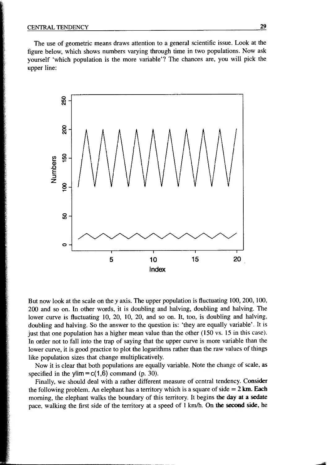
Other Wiley Editorial Offices
John Wiley & Sons Inc., 111 River Street, Hoboken, NJ 07030, USA
Jossey-Bass, 989 Market Street, San Francisco, CA 94103-1741, USA
Wiley-VCH Verlag GmbH, Boschstr. 12, D-69469 Weinheim, Germany
John Wiley & Sons Australia Ltd, 33 Park Road, Milton, Queensland 4064, Australia
John Wiley & Sons (Asia) Pte Ltd, 2 Clementi Loop #02-01, Jin Xing Distripark, Singapore 129809
John Wiley & Sons Canada Ltd, 22 Worcester Road, Etobicoke, Ontario, Canada M9W 1L1
Wiley also publishes its books in a variety of electronic formats. Some content that appears in
print may not be available in electronic books.
Library of Congress Cataloging-in-Publication Data
Crawley, Michael J.
Statistics : an introduction using R / M. J. Crawley.
p. cm.
ISBN 0-470-02297-3 (acid-free : hardback) - ISBN 0-470-02298-1
(acid-free : pbk.)
1. Mathematical statistics-Textbooks. 2. R (Computer program language)
I. Title.
QA276.12.C73 2005
519.5-dc22 2004026793
British Library Cataloguing in Publication Data
A. catalogue record for this book is available from the British Library
ISBN 0-470-02297-3 (Cloth)
ISBN 0-470-02298-1 (Paper)
Contents
Preface xi
Chapter 1 Fundamentals 1
Everything Varies 2
Significance 3
Good and Bad Hypotheses 3
Null Hypotheses 3
p Values 3
Interpretation 4
Statistical Modelling 4
Maximum Likelihood 5
Experimental Design 7
The Principle of Parsimony (Occam’s Razor) 7
Observation, Theory and Experiment 8
Controls 8
Replication: It’s the n’s that Justify the Means 8
How Many Replicates? 9
Power 9
Randomization 10
Strong Inference 12
Weak Inference 12
How Long to Go On? 13
Pseudoreplication 13
Initial Conditions 14
Orthogonal Designs and Non-orthogonal Observational Data 14
Chapter 2 Dataframes 15
Selecting Parts of a Dataframe: Subscripts 19
Sorting 20
Saving Your Work 22
Tidying Up 22
Vi CONTENTS
Chapter 3 Central Tendency 23
Getting Help in R 31
Chapter 4 Variance 33
Degrees of Freedom 36
Variance 37
A Worked Example 39
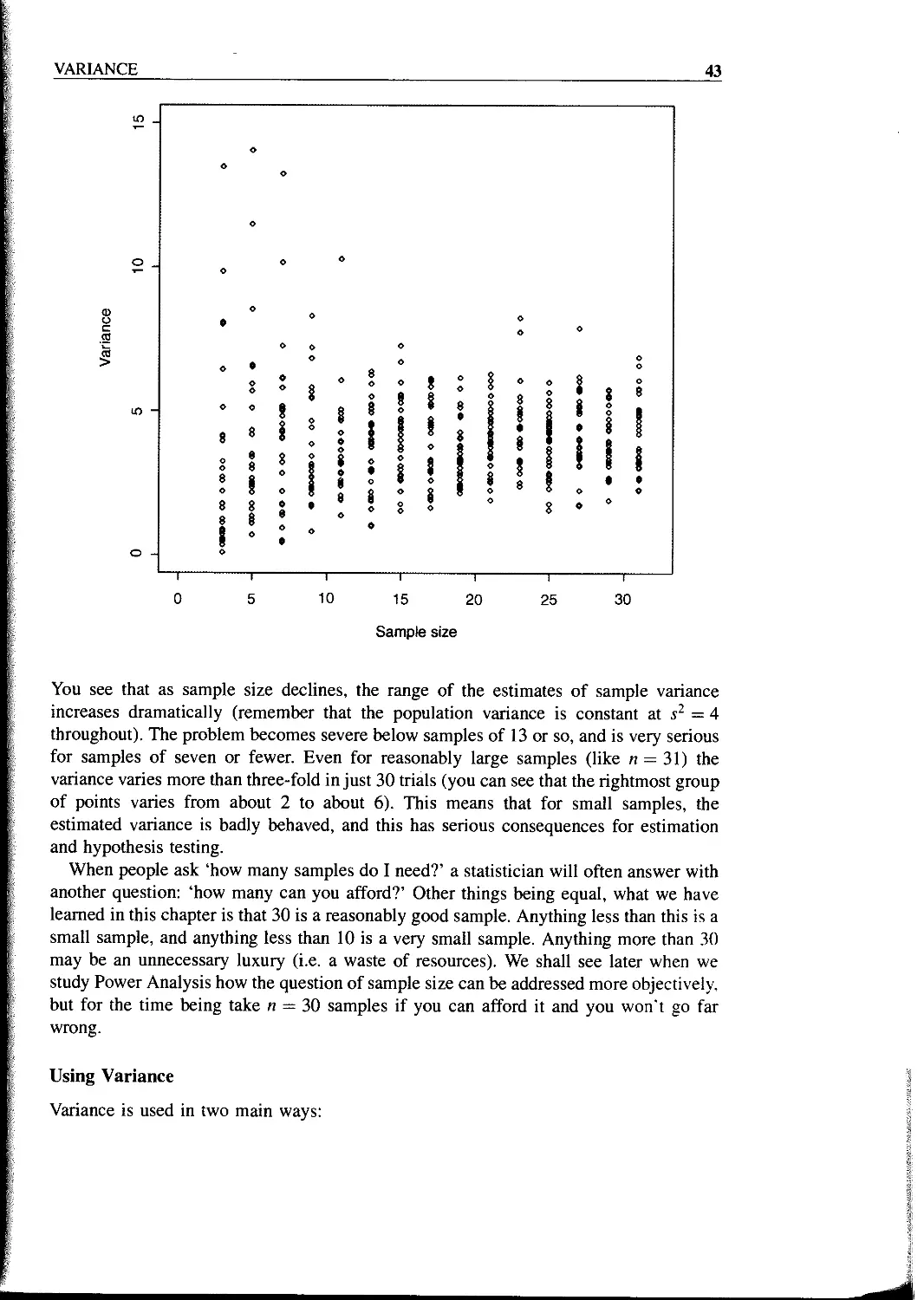
Variance and Sample Size 42
Using Variance 43
A Measure of Unreliability 44
Confidence Intervals 45
Bootstrap 46
Chapter 5 Single Samples 51
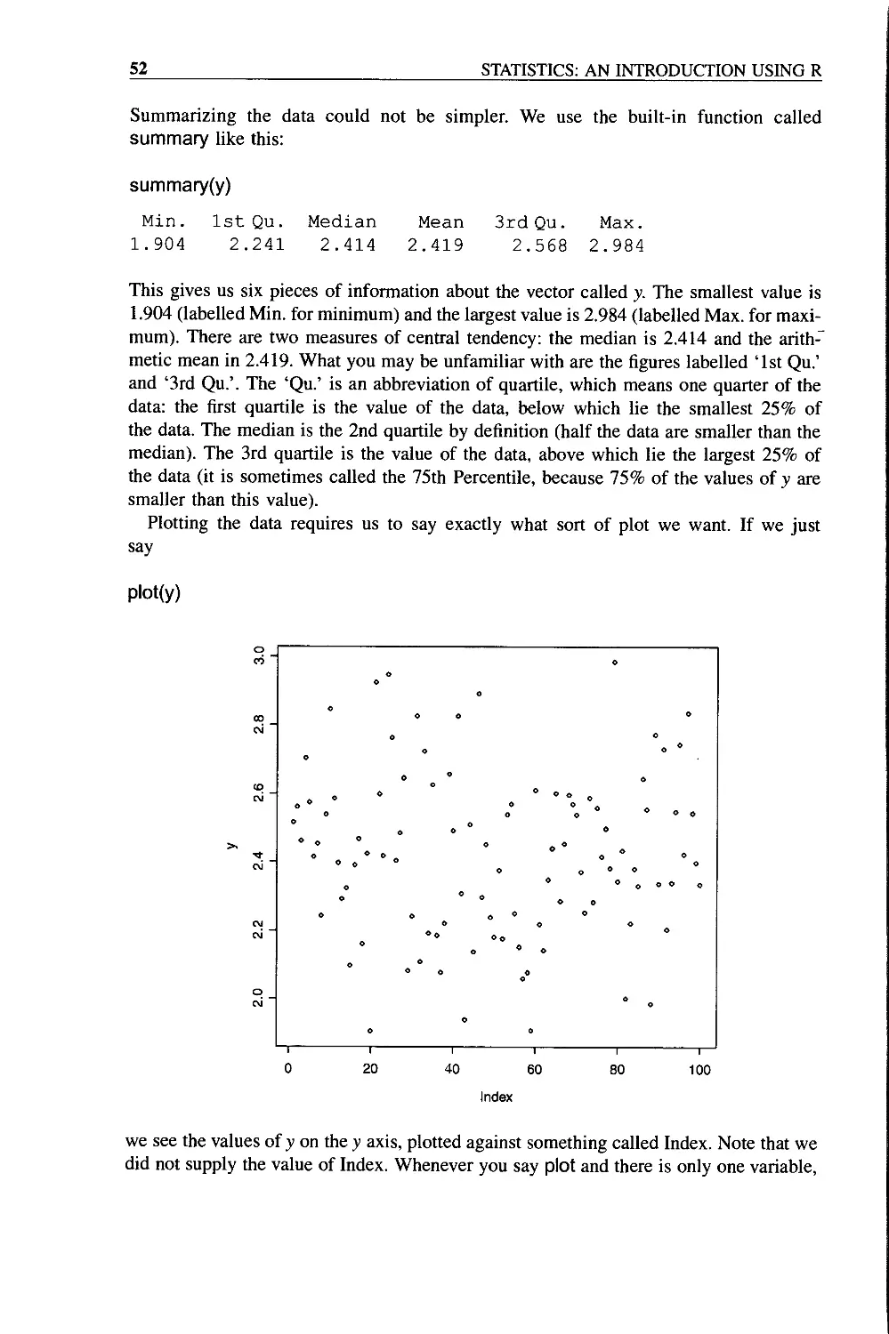
Data Summary in the One Sample Case 51
The Normal Distribution 55
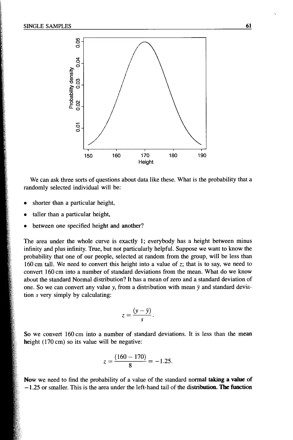
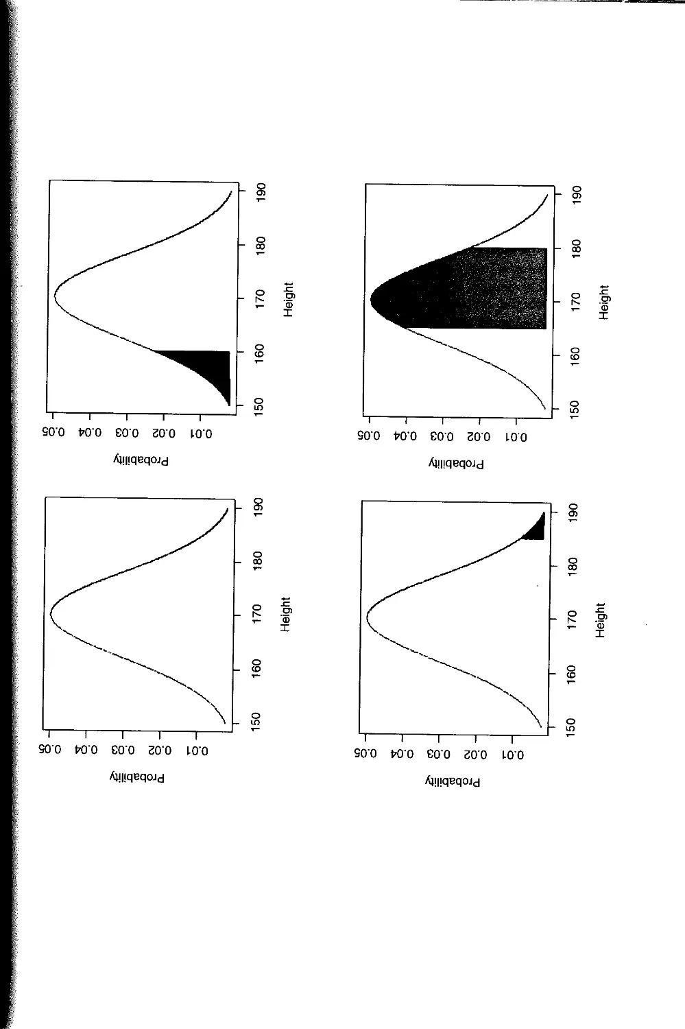
Calculations using z of the Normal Distribution 60
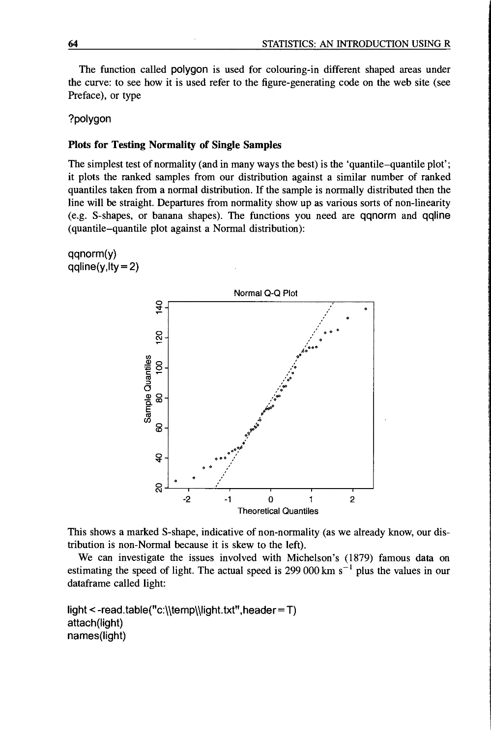
Plots for Testing Normality of Single Samples 64
Inference in the One-sample Case 65
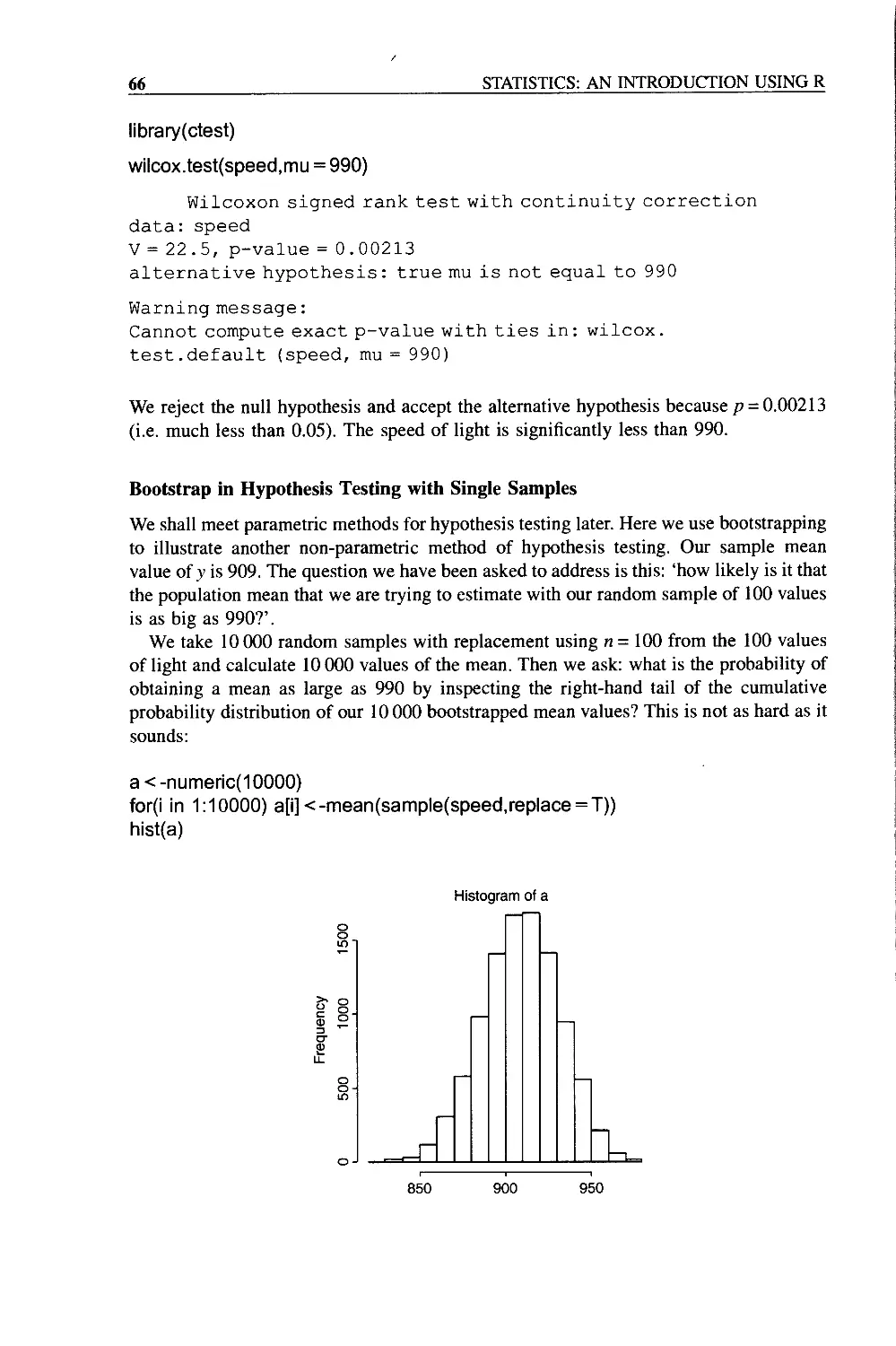
Bootstrap in Hypothesis Testing with Single Samples 66
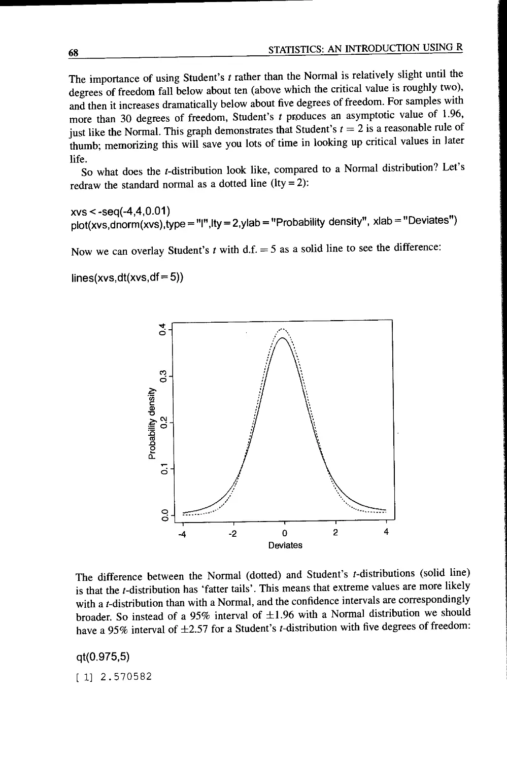
Student’s /-distribution 67
Higher-order Moments of a Distribution 69
Skew 69
Kurtosis 71
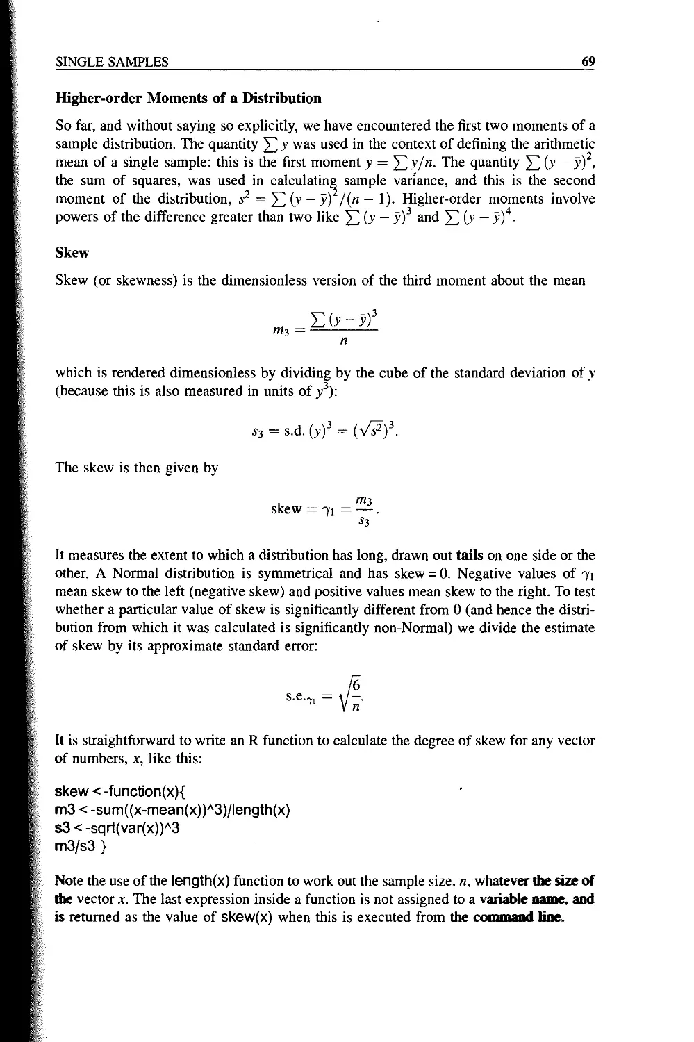
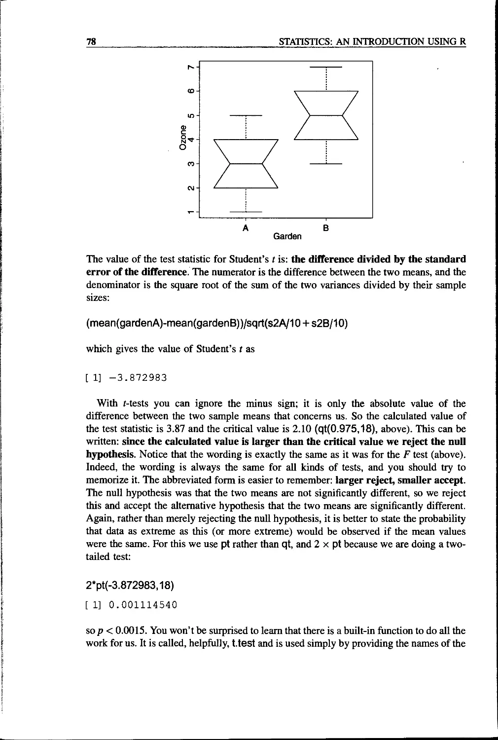
Chapter 6 Two Samples 73
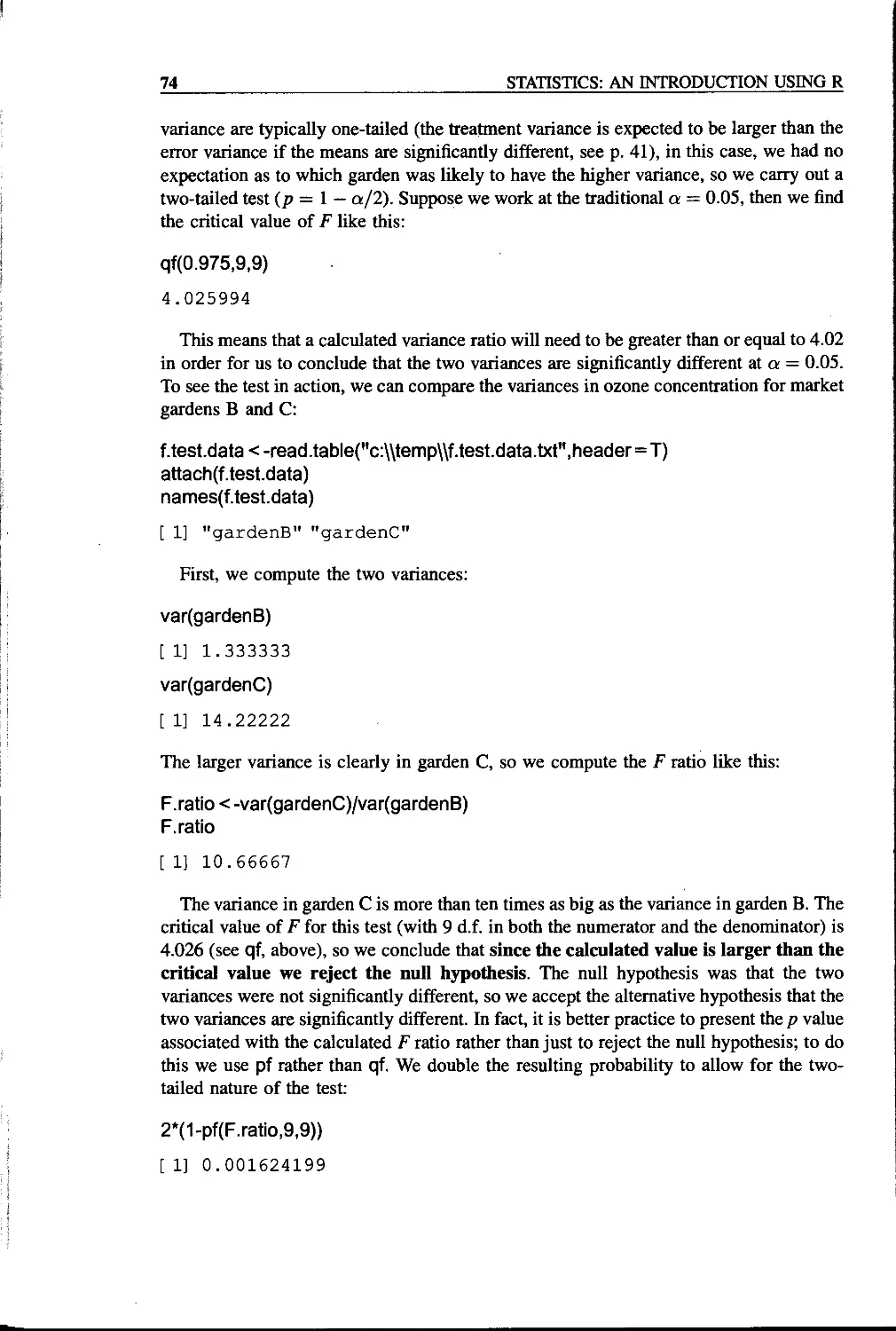
Comparing Two Variances 73
Comparing Two Means 75
Student’s /-test 76
Wilcoxon Rank Sum Test 79
Tests on Paired Samples 81
The Sign Test 83
Binomial Tests to Compare Two Proportions 84
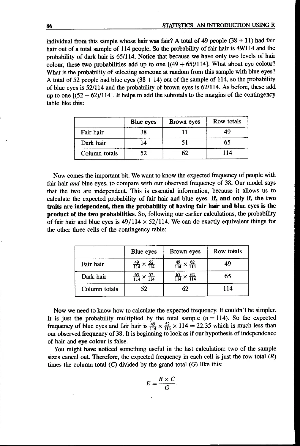
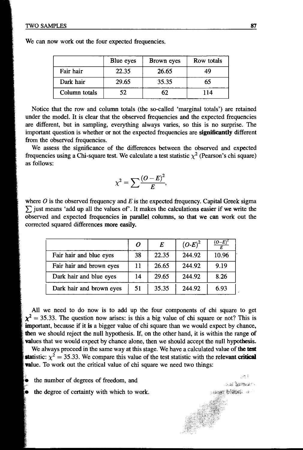
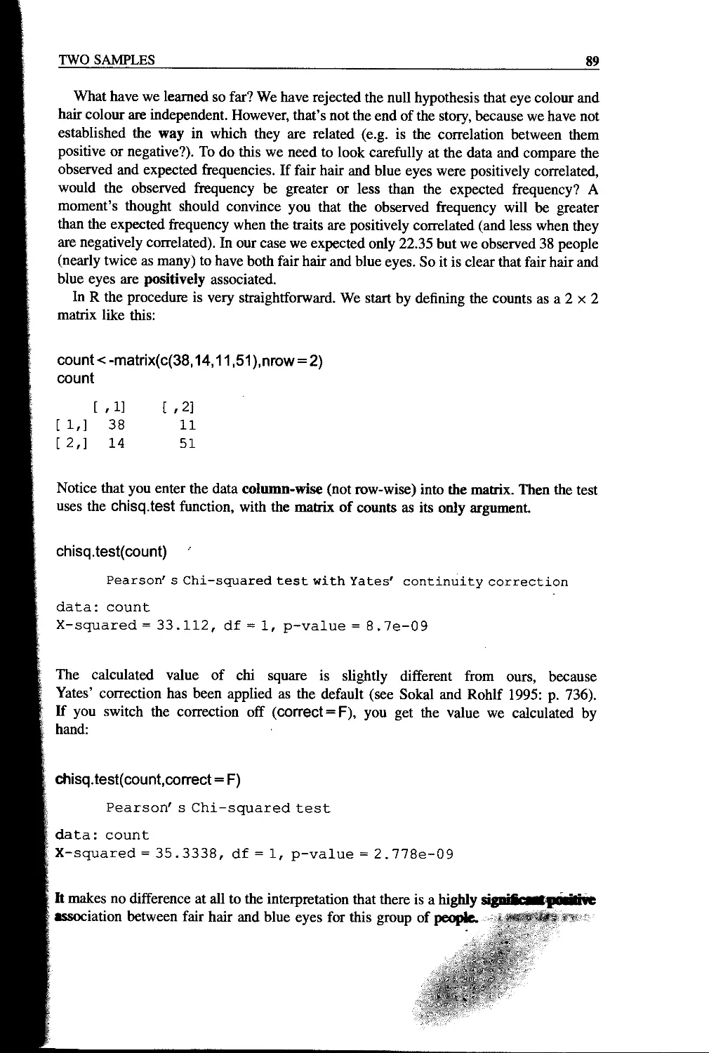
Chi-square Contingency Tables 85
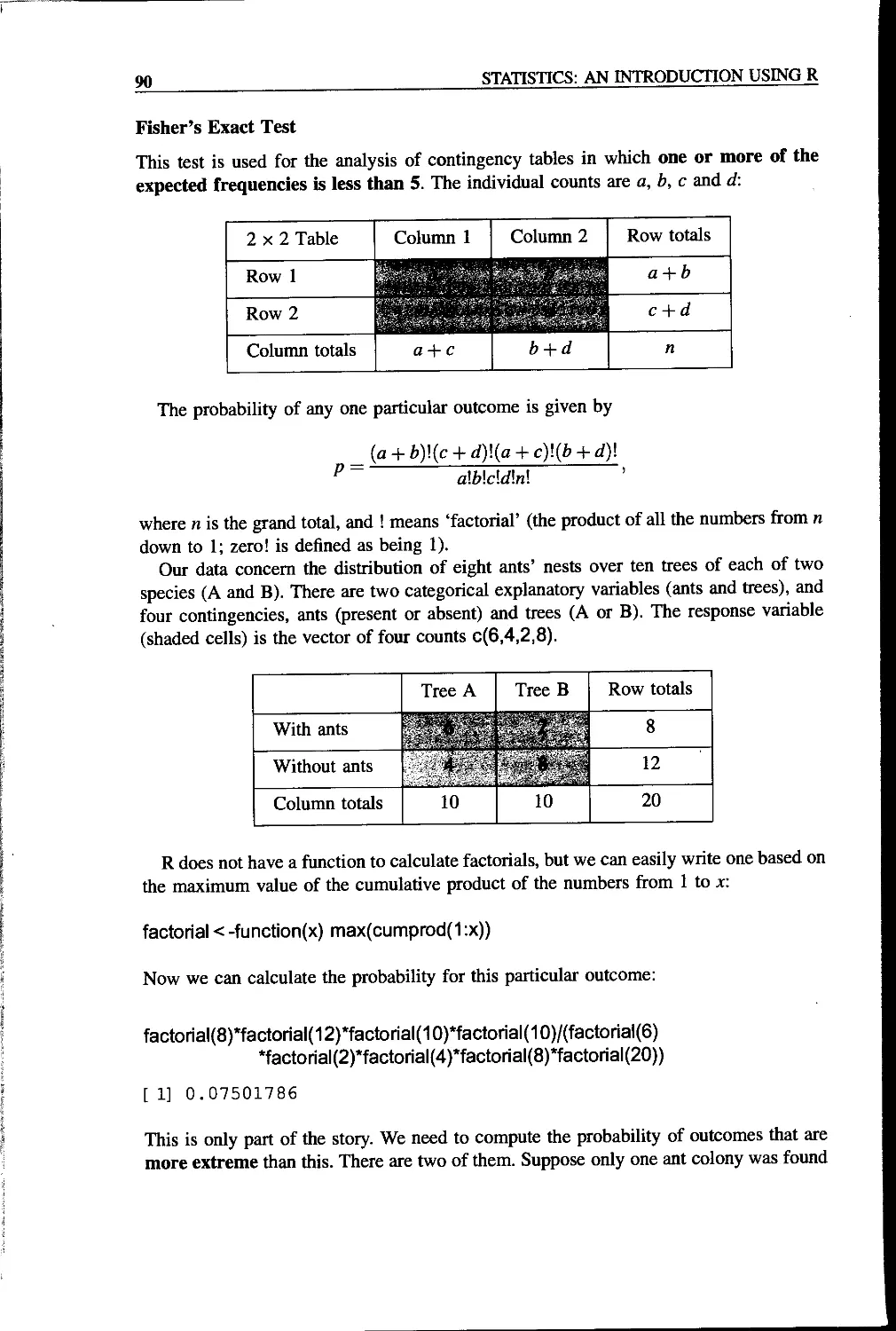
Fisher’s Exact Test 90
Correlation and Covariance 93
Data Dredging 95
Partial Correlation 96
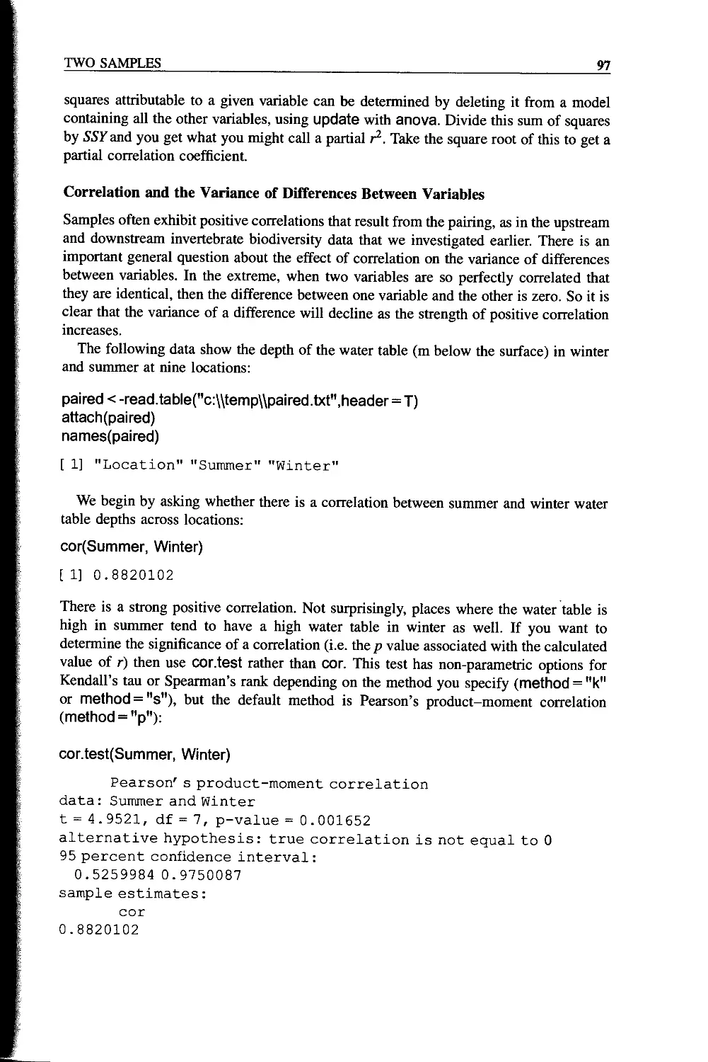
Correlation and the Variance of Differences Between Variables 97
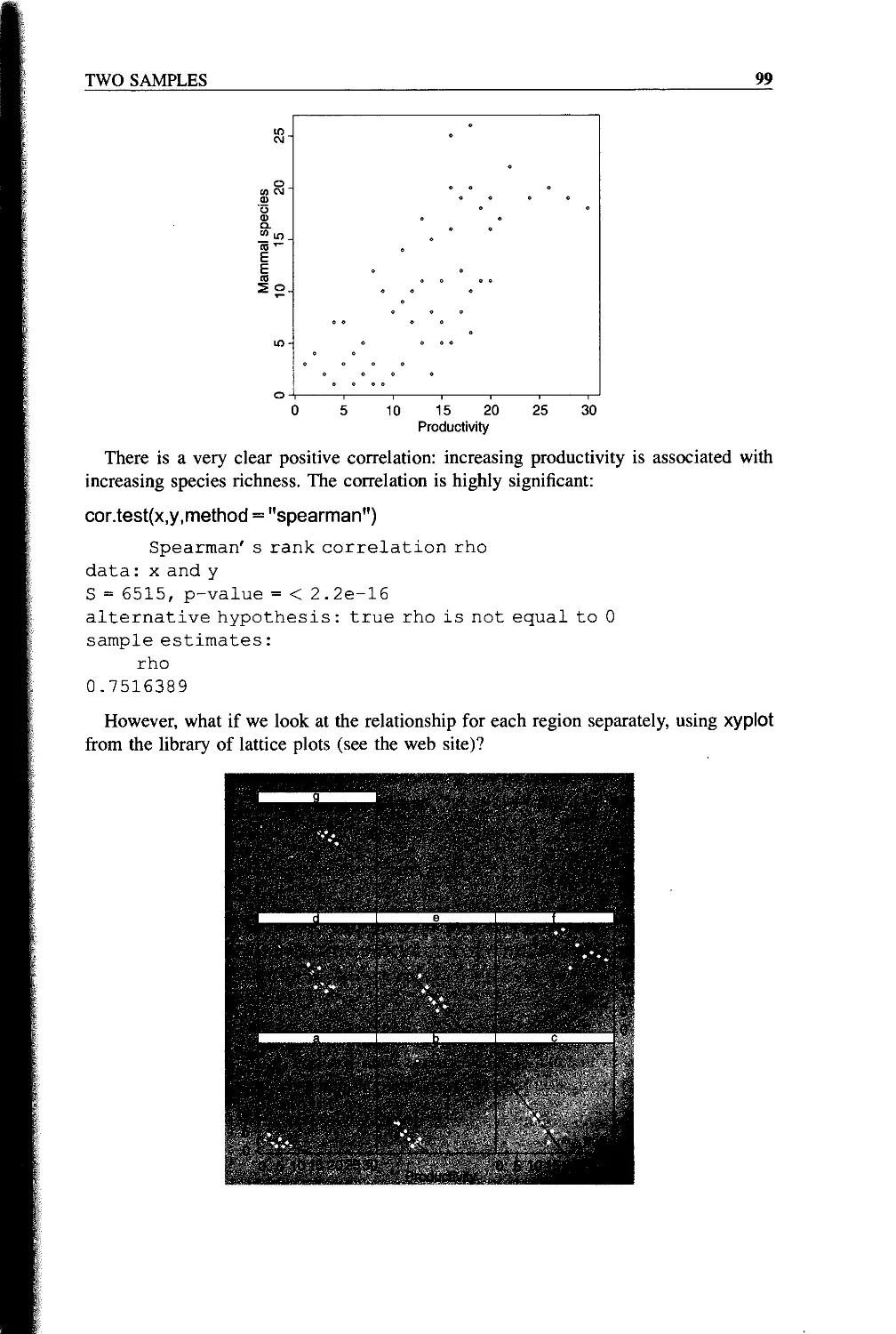
Scale-dependent Correlations 98
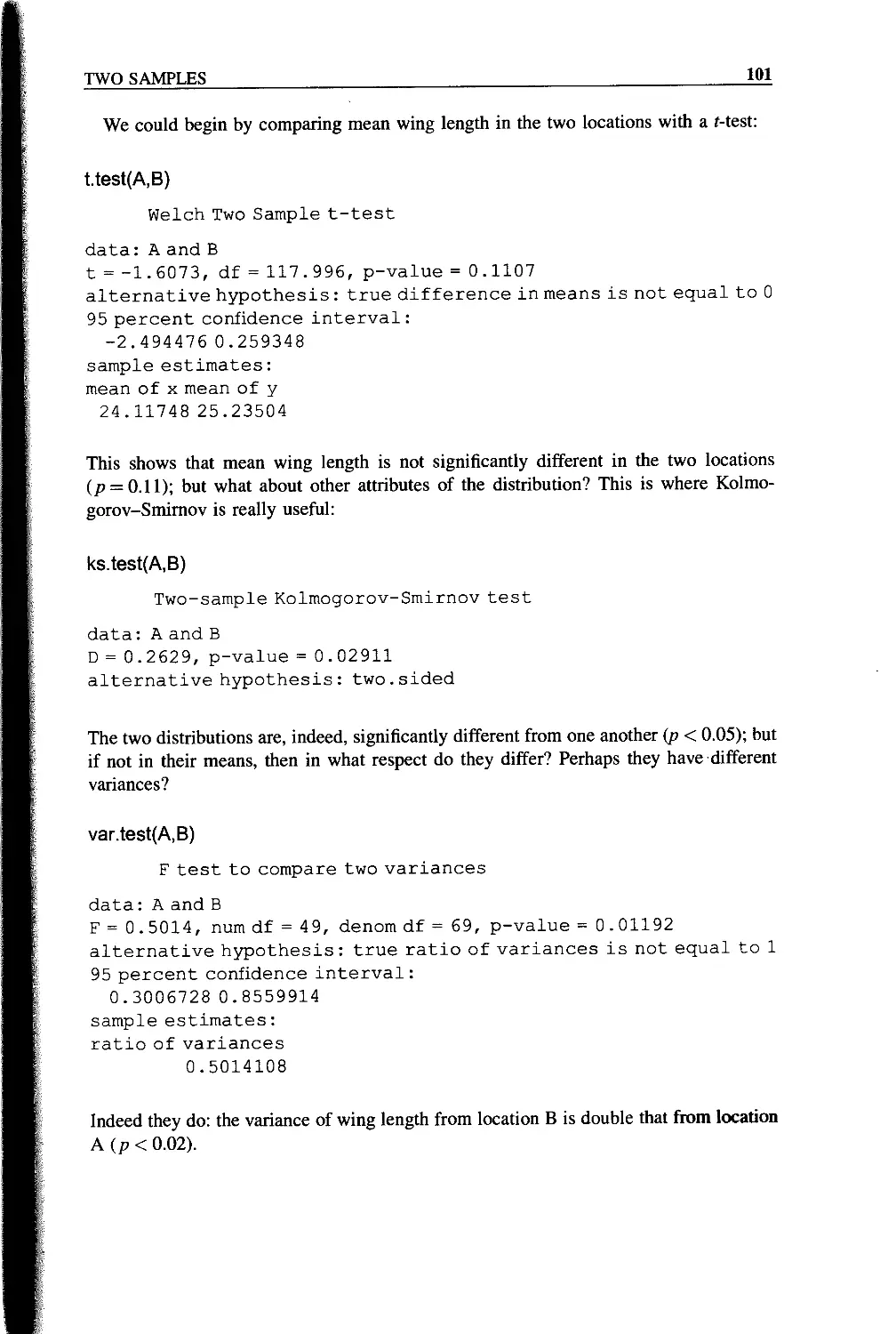
Kolmogorov-Smirnov Test 100
CONTENTS vii
Chapter 7 Statistical Modelling 103
The Steps Involved in Model Simplification 105
Caveats 106
Order of Deletion 106
Model Formulae in R 106
Interactions Between Explanatory Variables 108
Multiple Error Terms 109
The Intercept as Parameter 1 109
Update in Model Simplification 110
Examples of R Model Formulae 110
Model Formulae for Regression 111
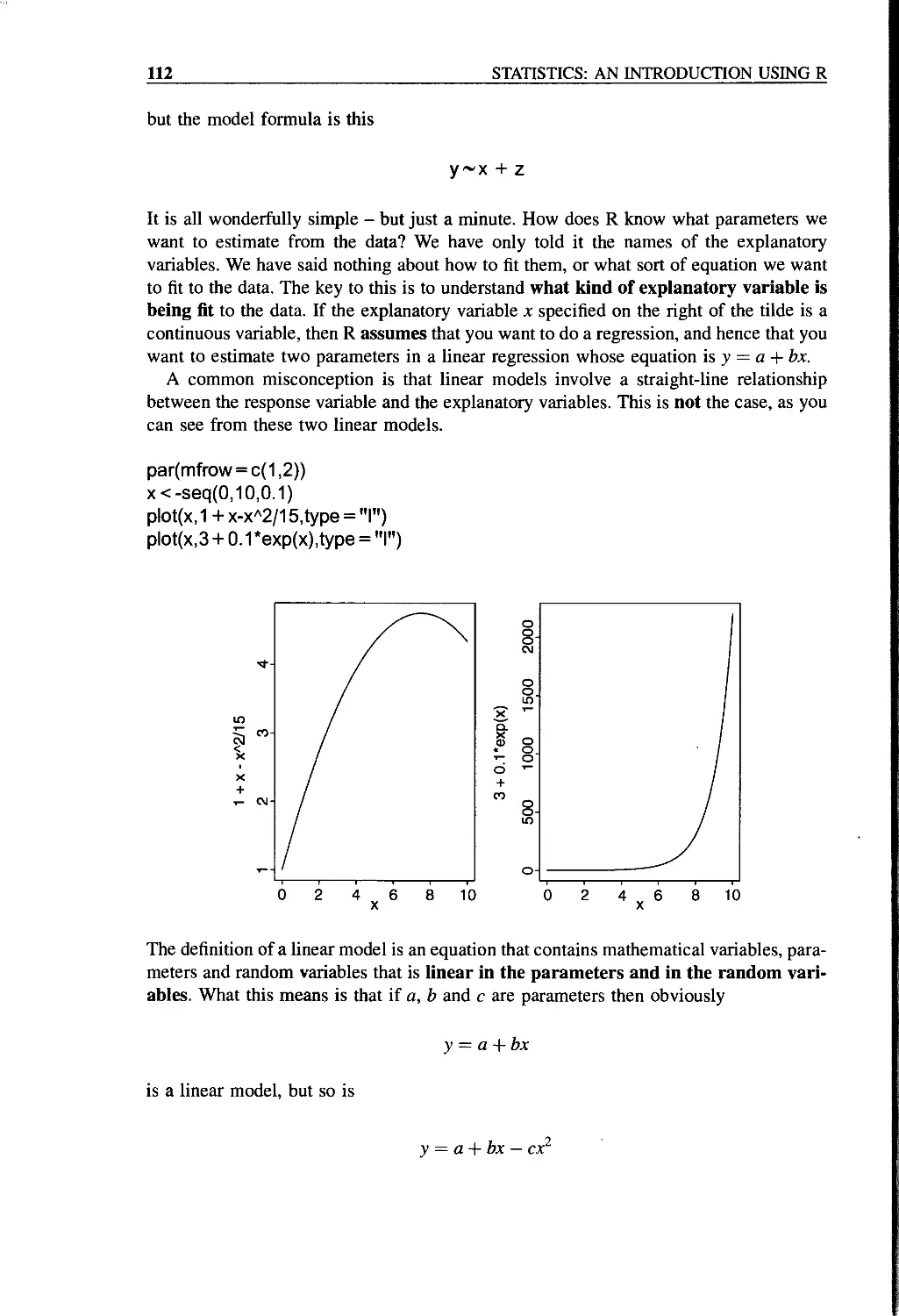
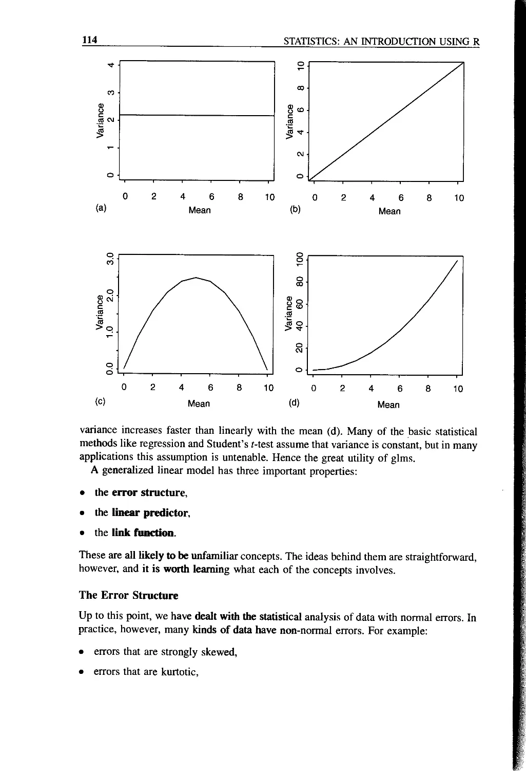
GLMs: Generalized Linear Models 113
The Error Structure 114
The Linear Predictor 115
Fitted Values 116
The Link Function 116
Canonical Link Functions 117
Proportion Data and Binomial Errors 117
Count Data and Poisson Errors 118
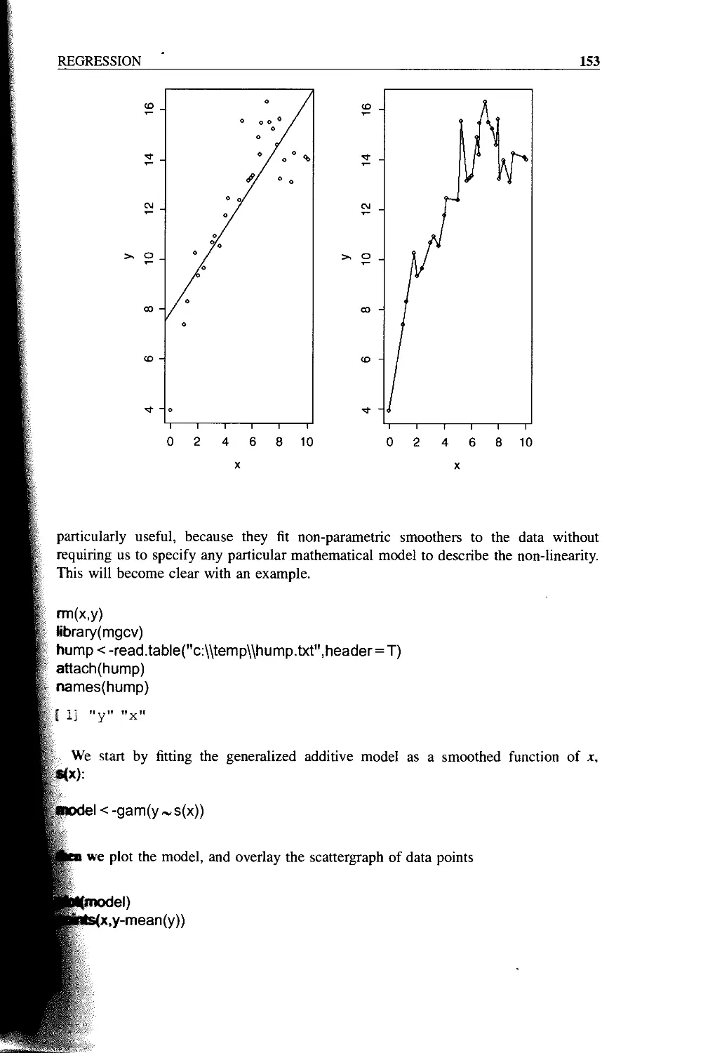
GAMs: Generalized Additive Models 119
Model Criticism 119
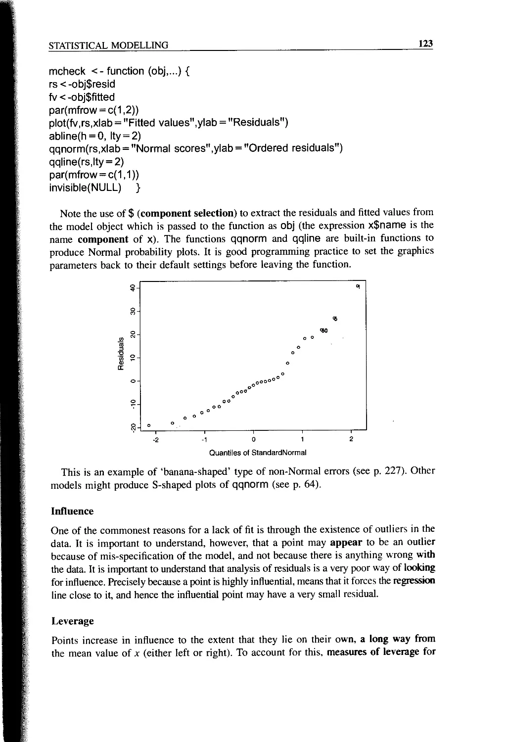
Summary of Statistical Models in R 120
Model Checking 121
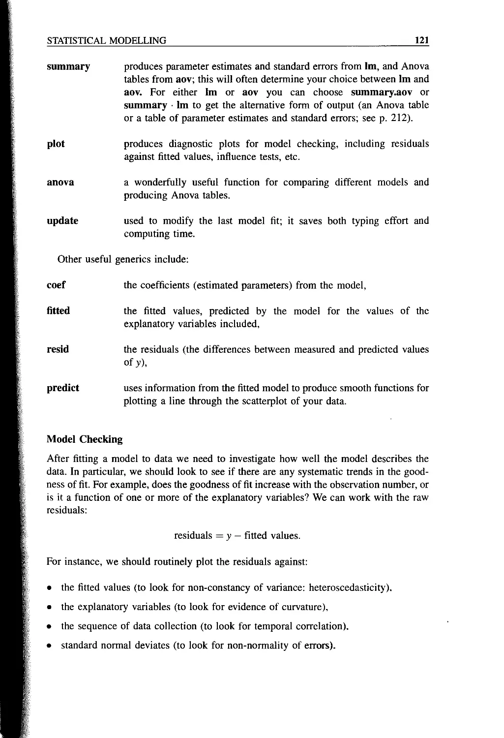
Non-constant Variance: Heteroscedasticity 122
Non-Normality of Errors 122
Influence 123
Leverage 123
Mis-specified Model 124
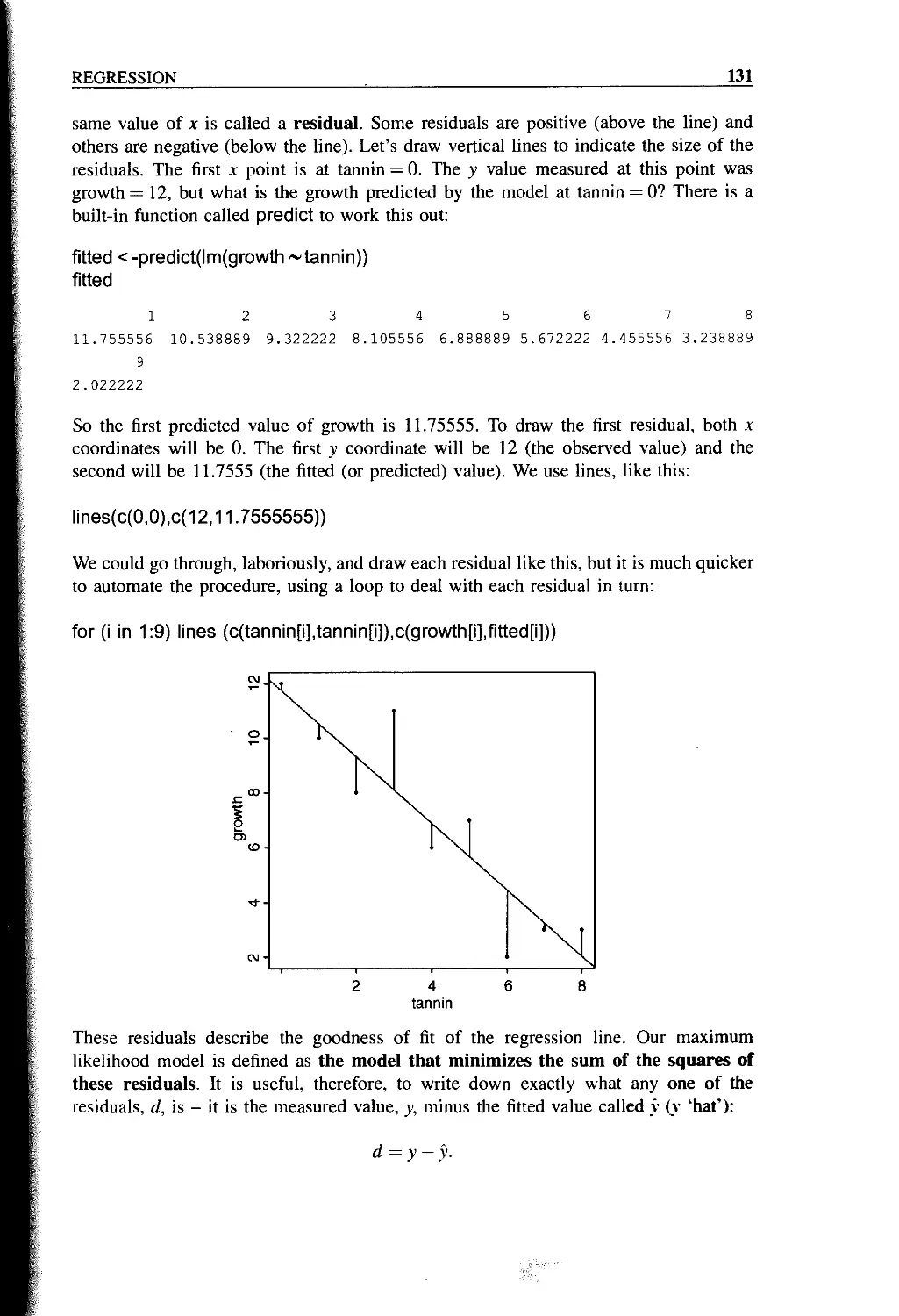
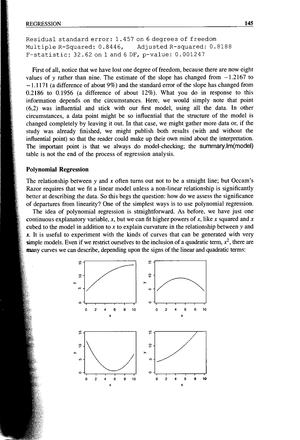
Chapter 8 Regression 125
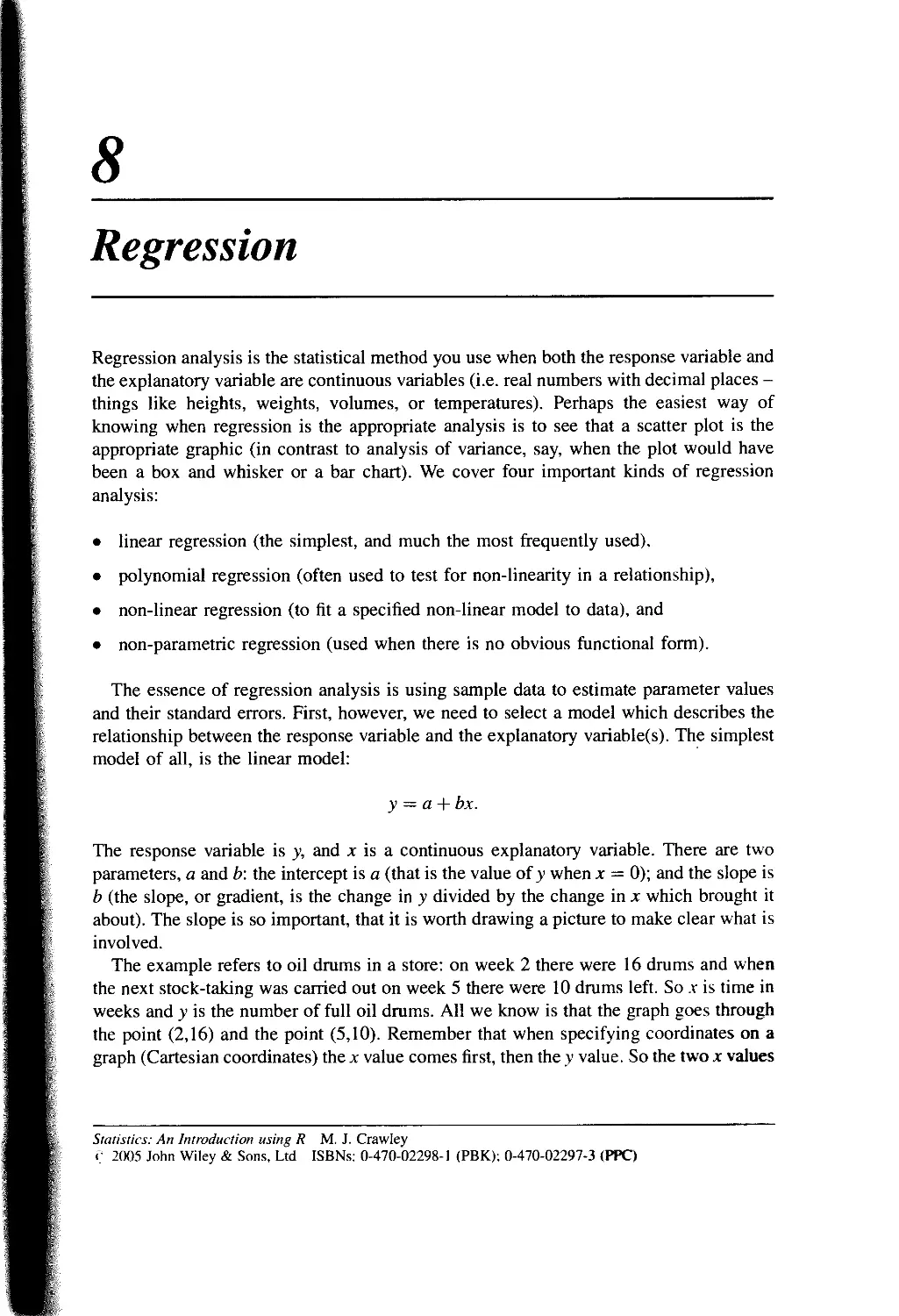
Linear Regression 128
Linear Regression in R 129
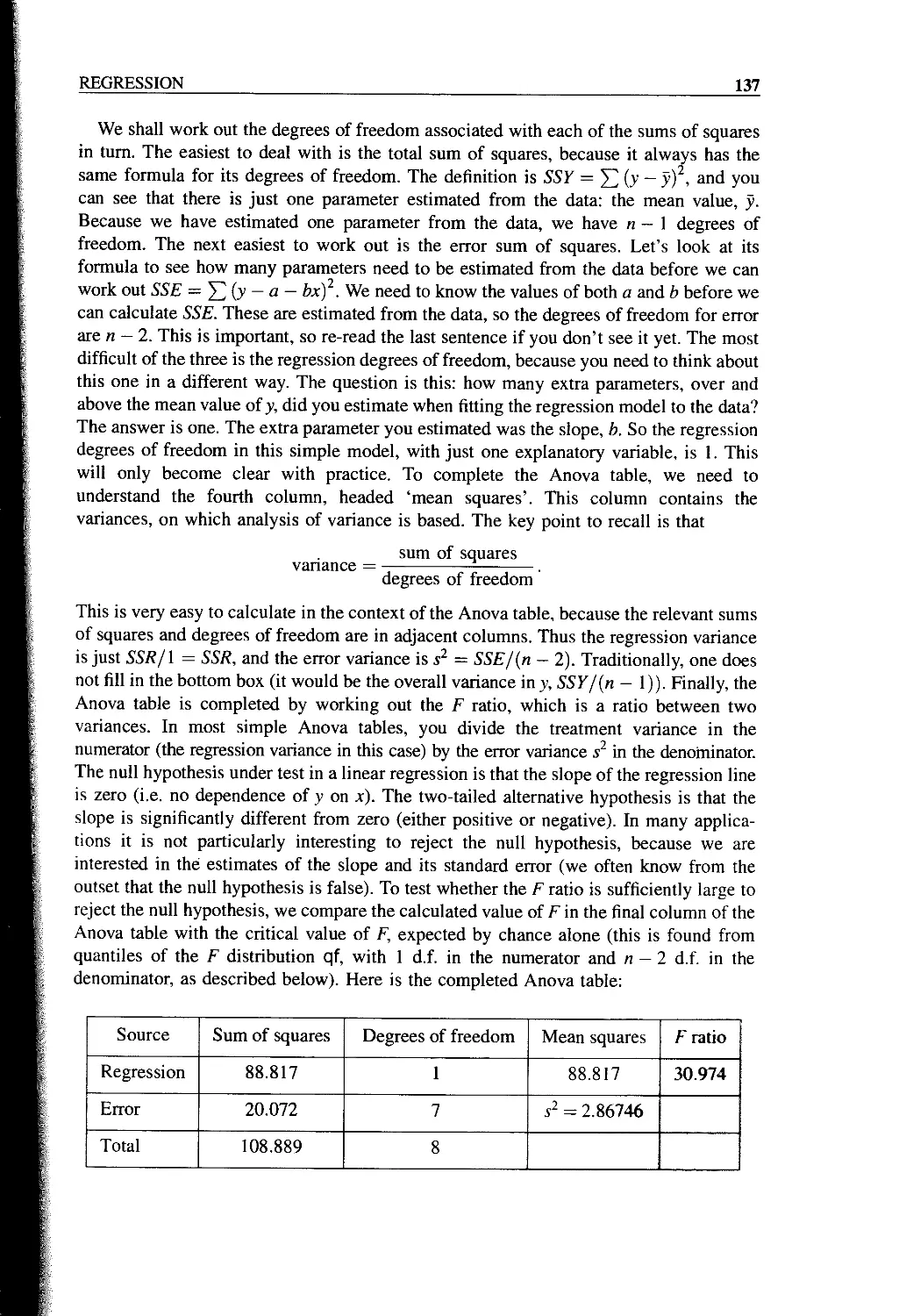
Error Variance in Regression: SSY = SSR + SSE 136
Measuring the Degree of Fit, r2 142
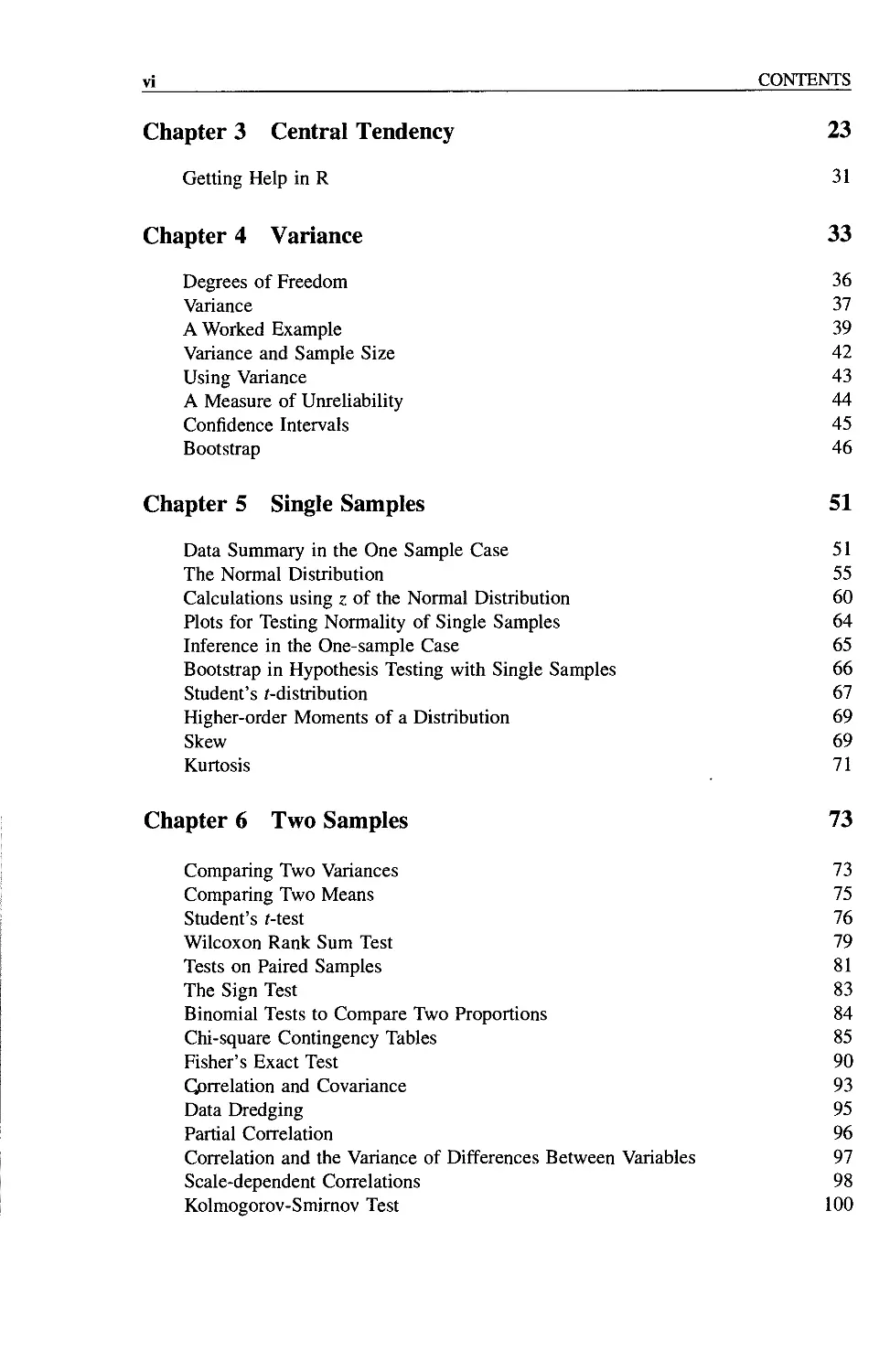
Model Checking 143
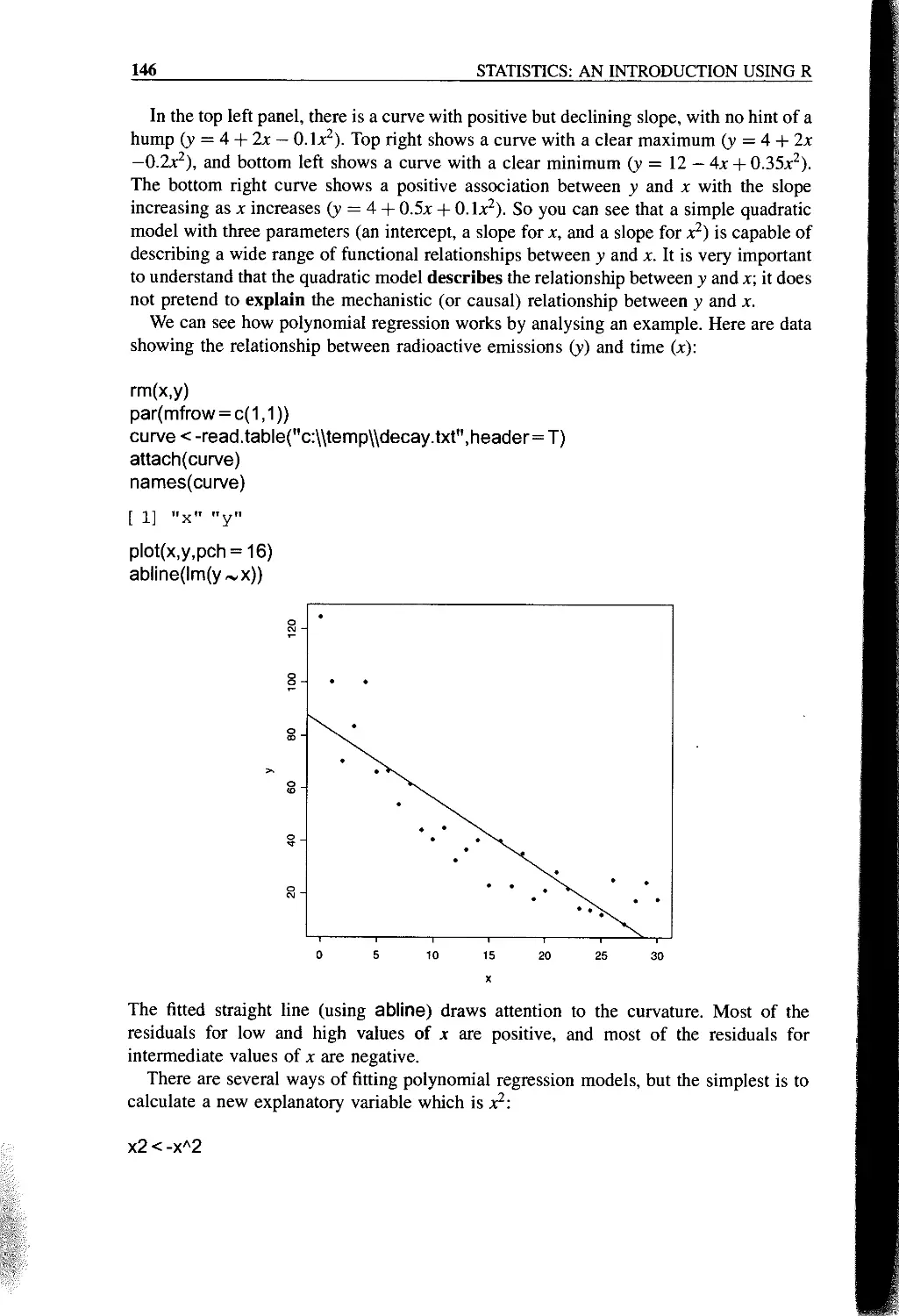
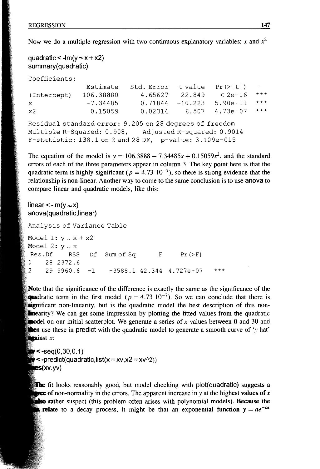
Polynomial Regression 145
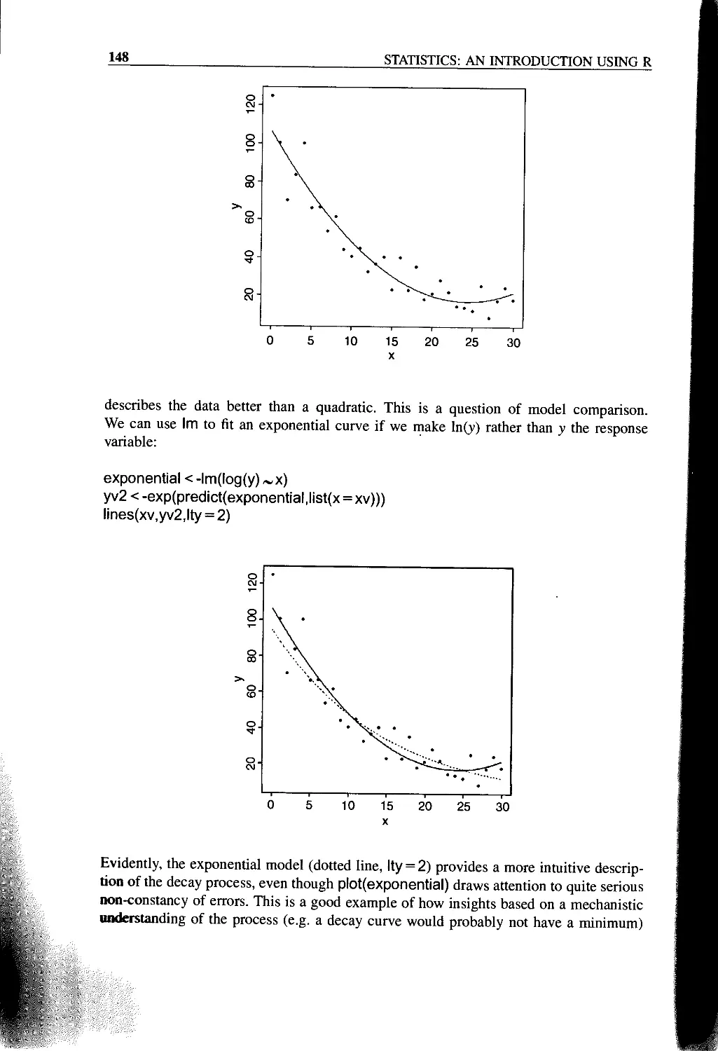
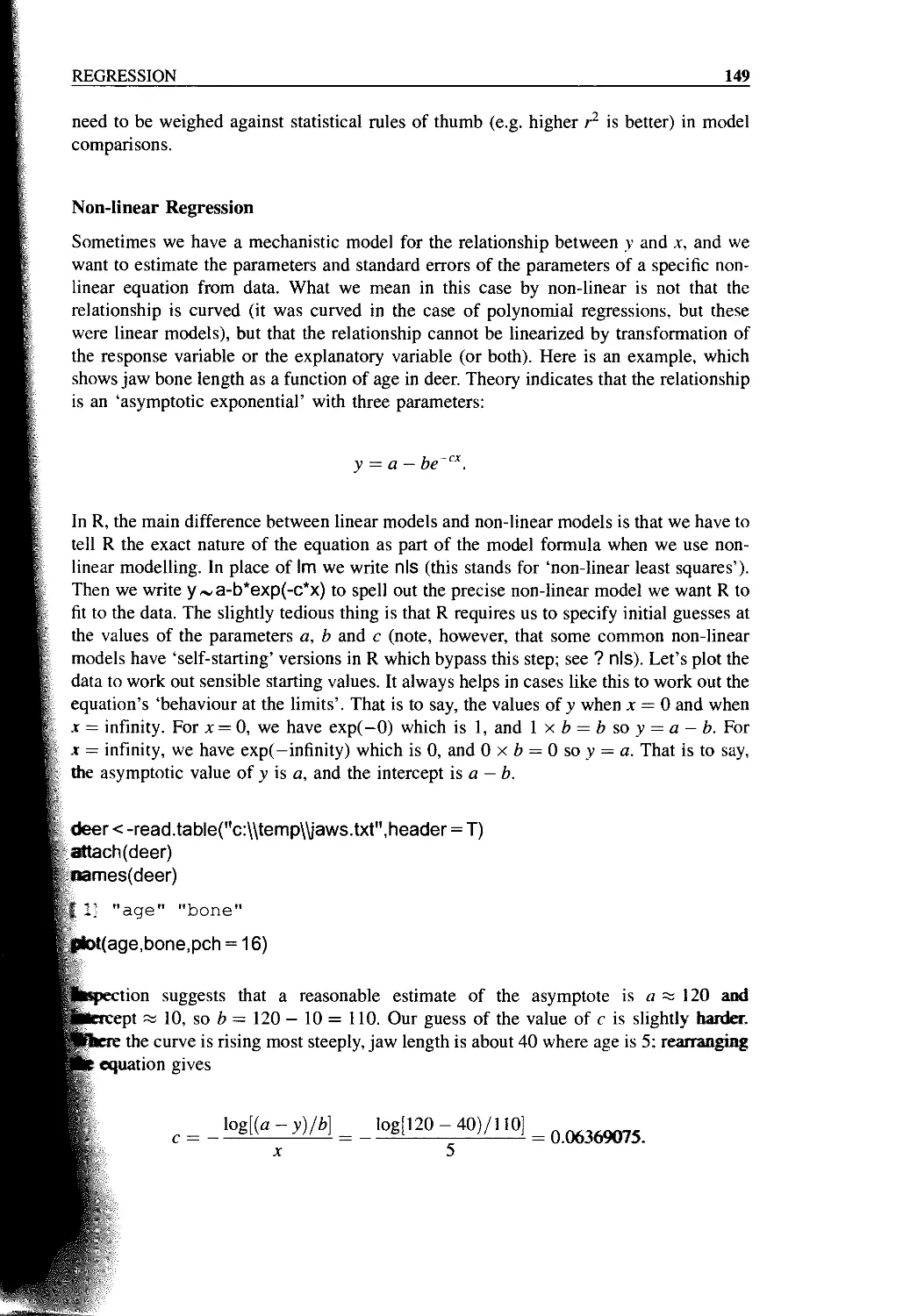
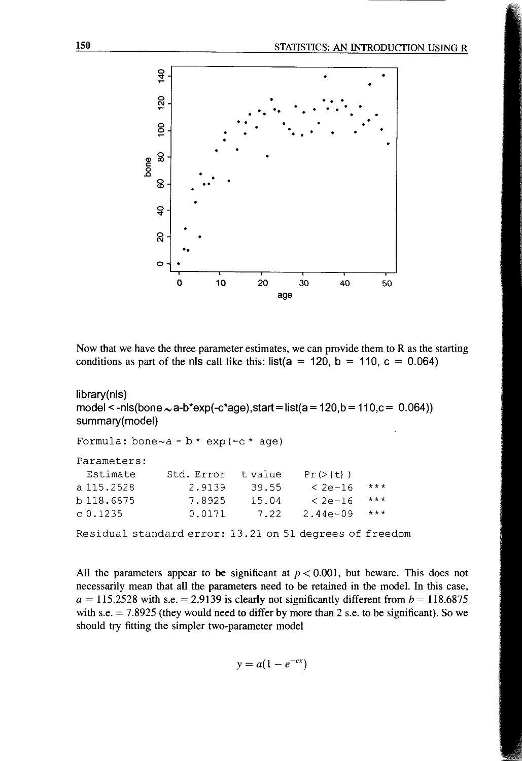
Non-linear Regression 149
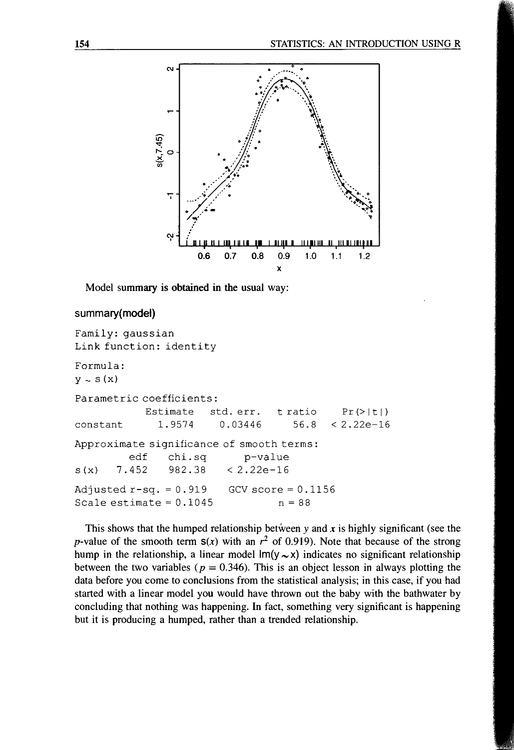
Testing for Humped Relationships 152
Generalized Additive Models (gams) 152
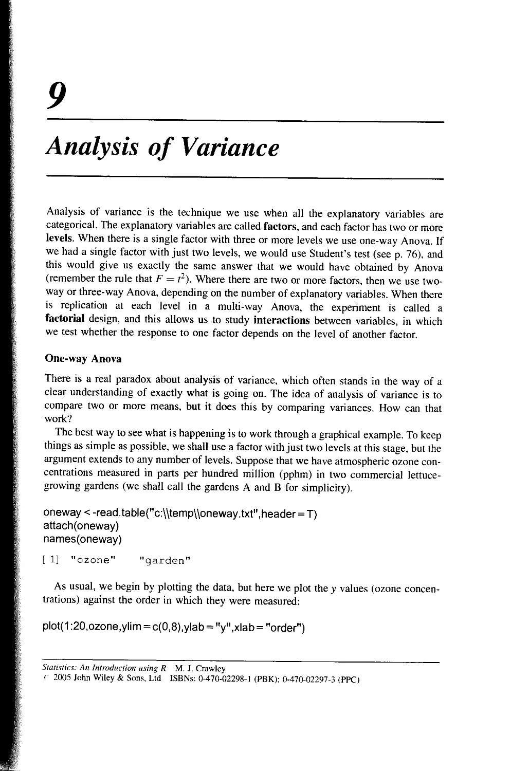
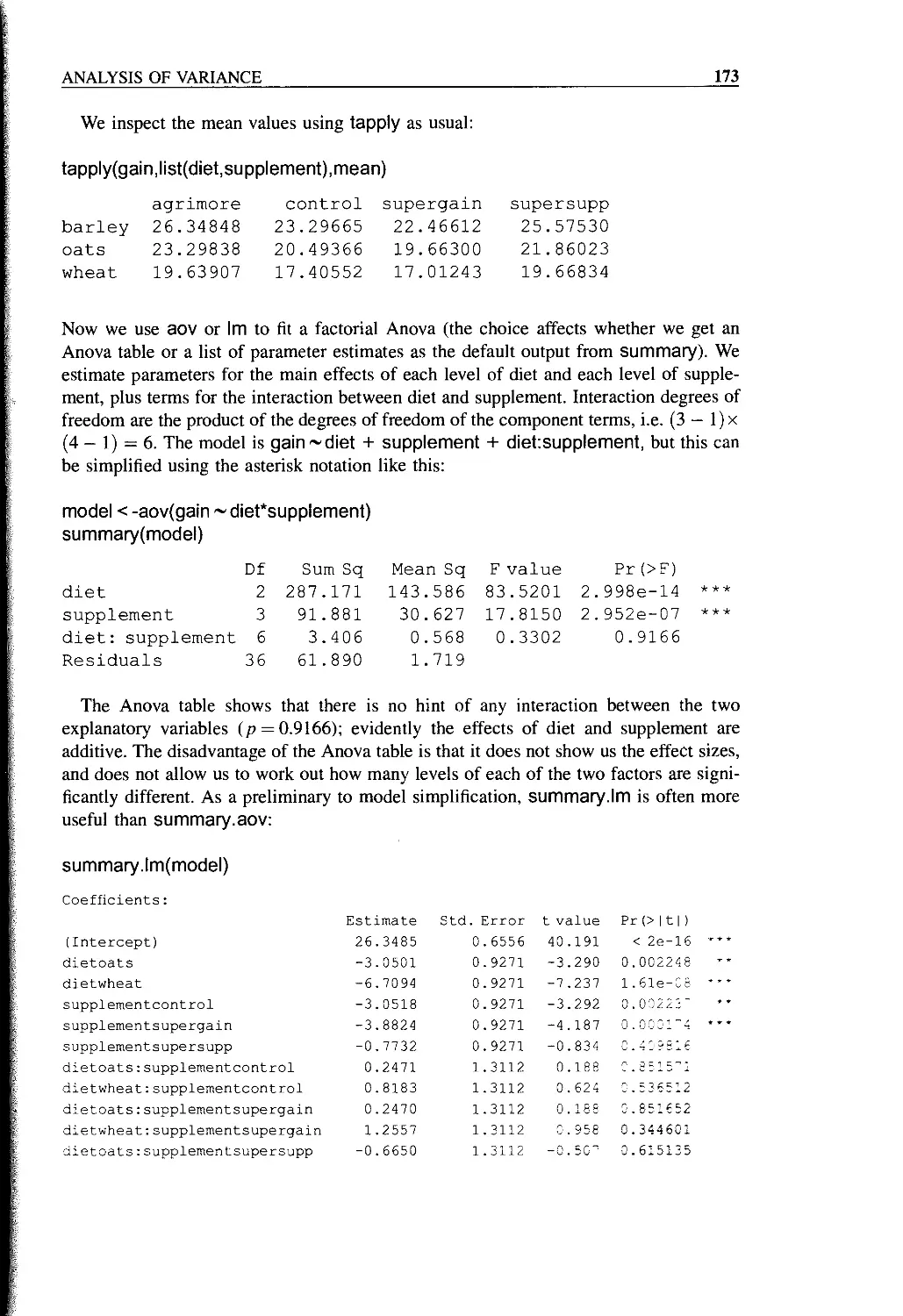
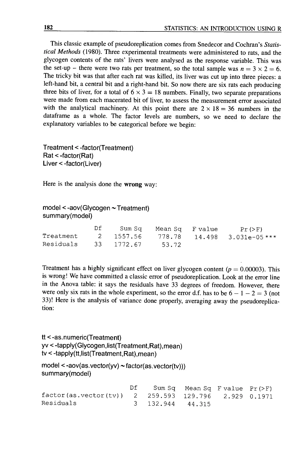
Chapter 9 Analysis of Variance 155
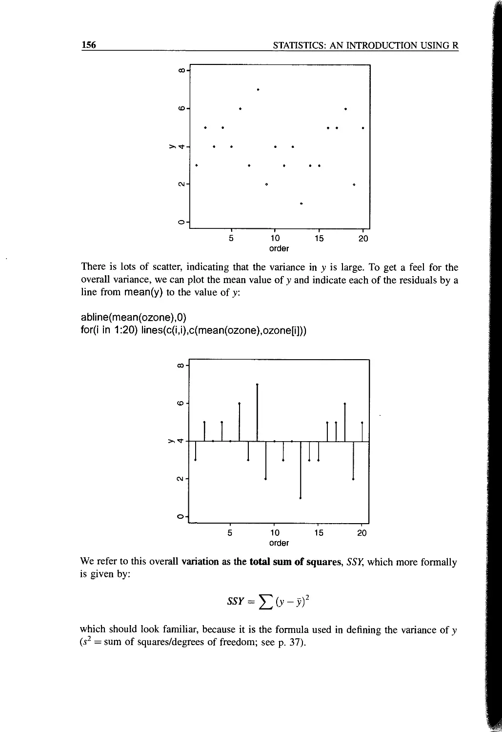
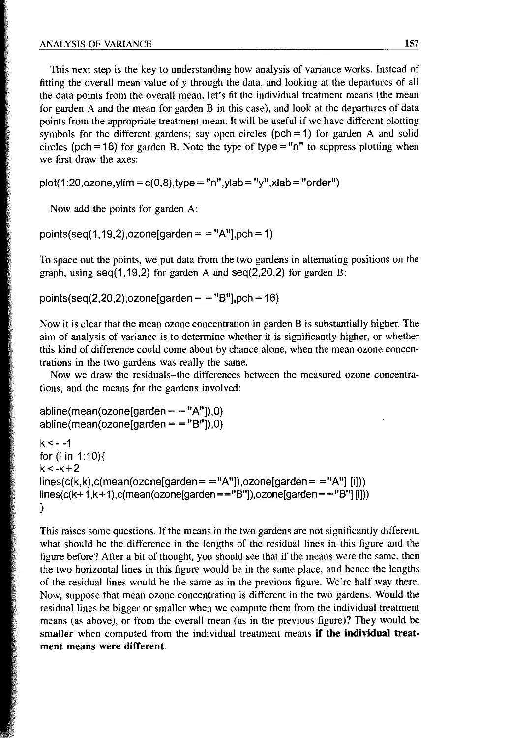
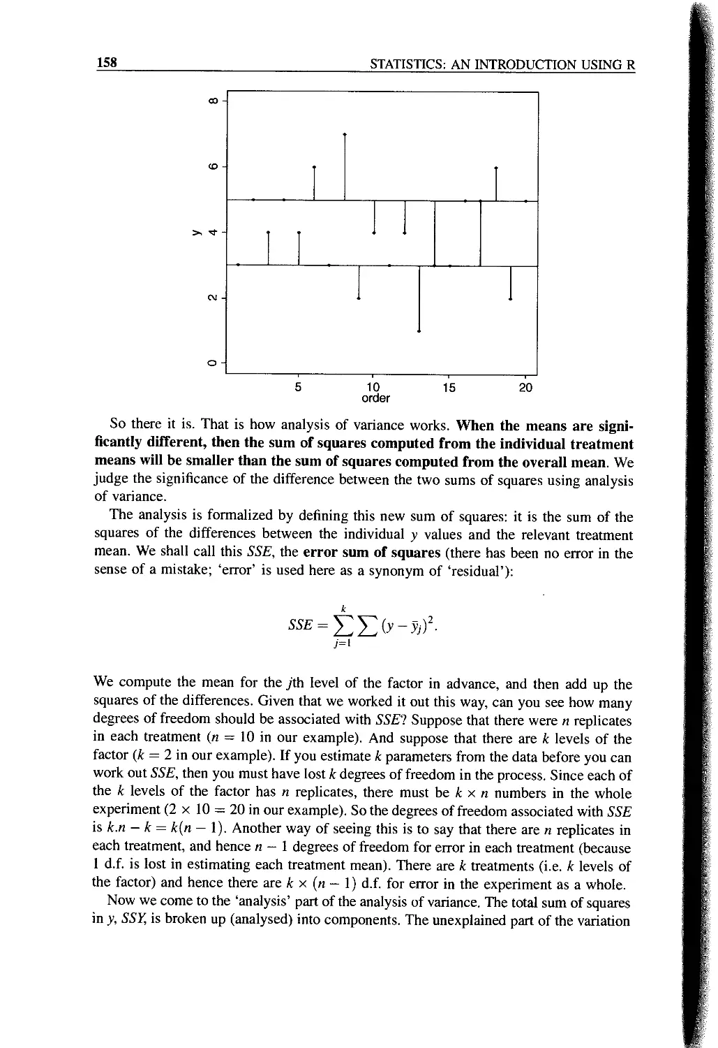
One-way Anova 155
Shortcut Formula 161
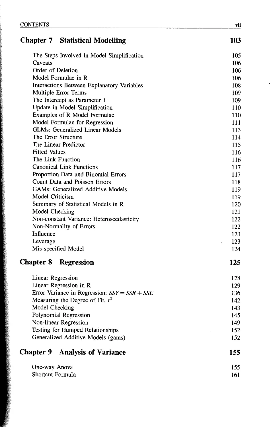
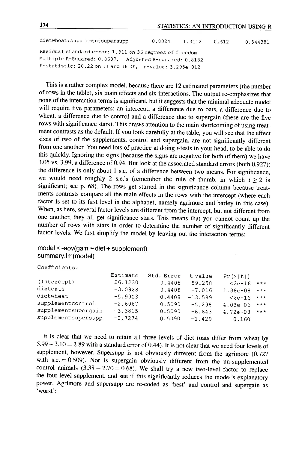
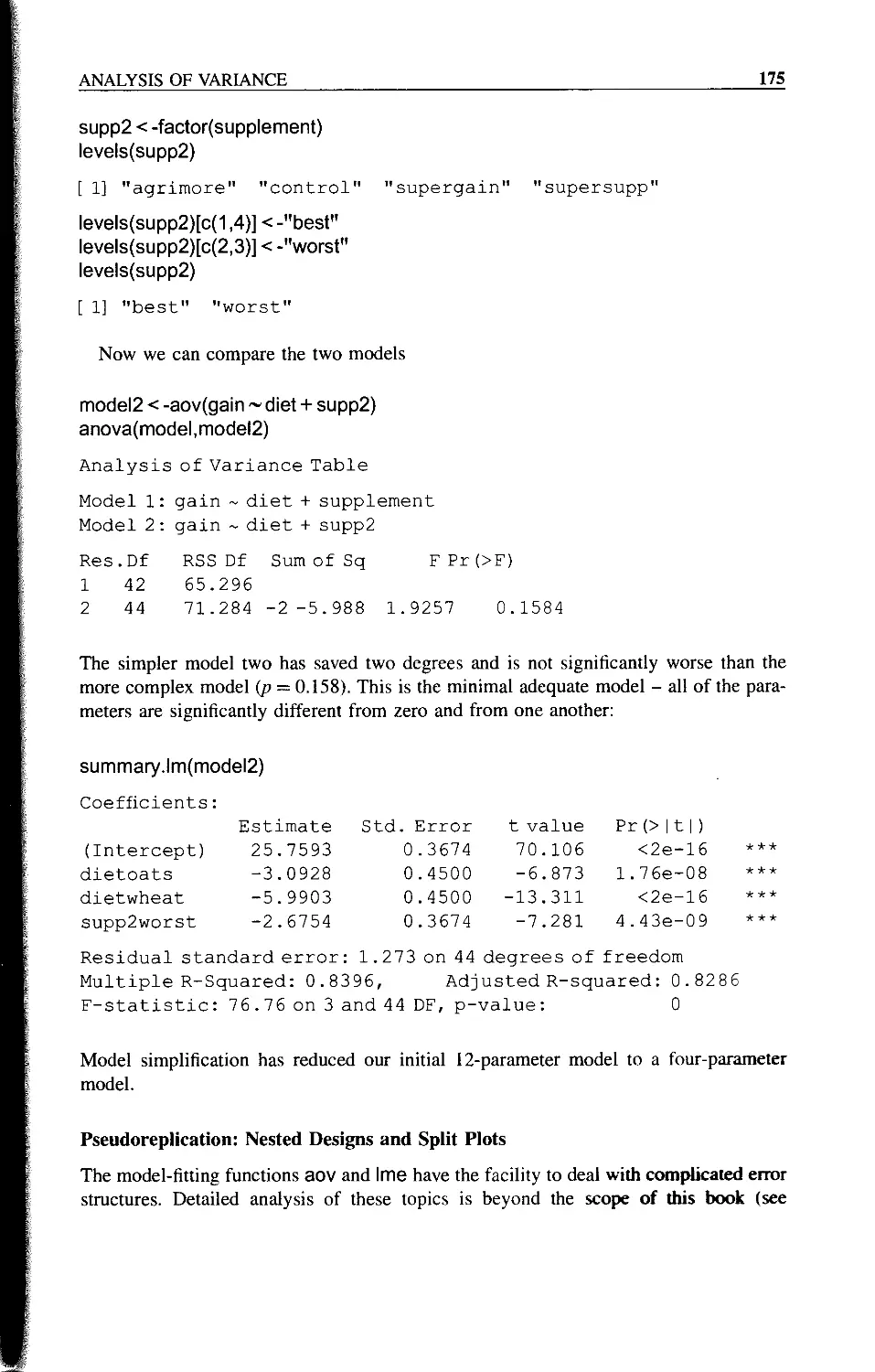
viii
CONTENTS
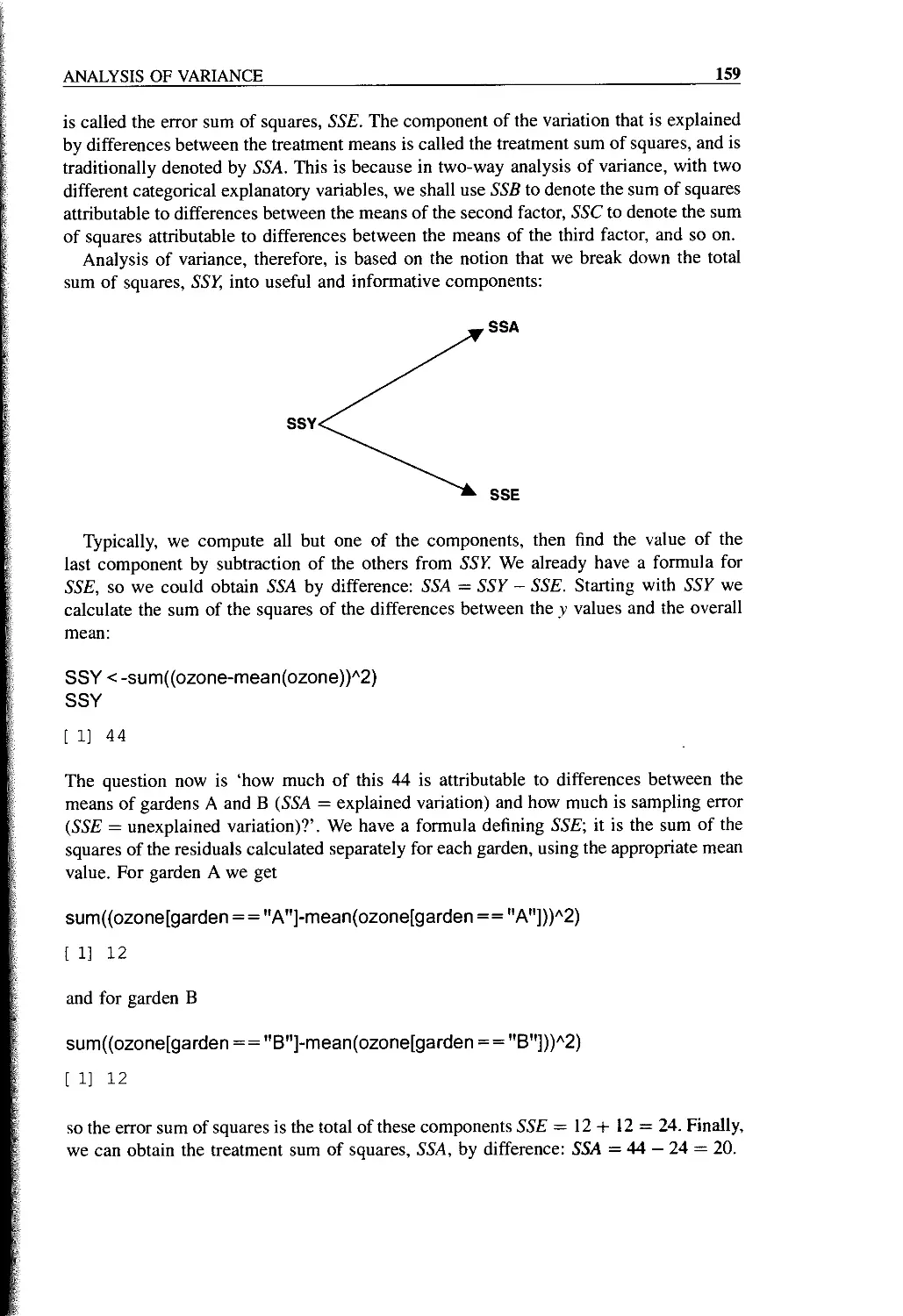
Effect Sizes 163
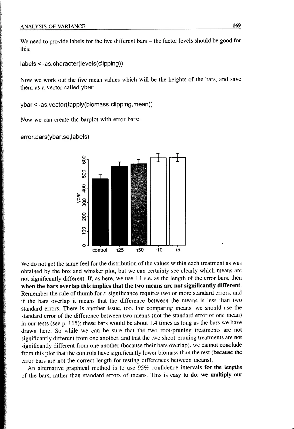
Plots for Interpreting One-way Anova 167
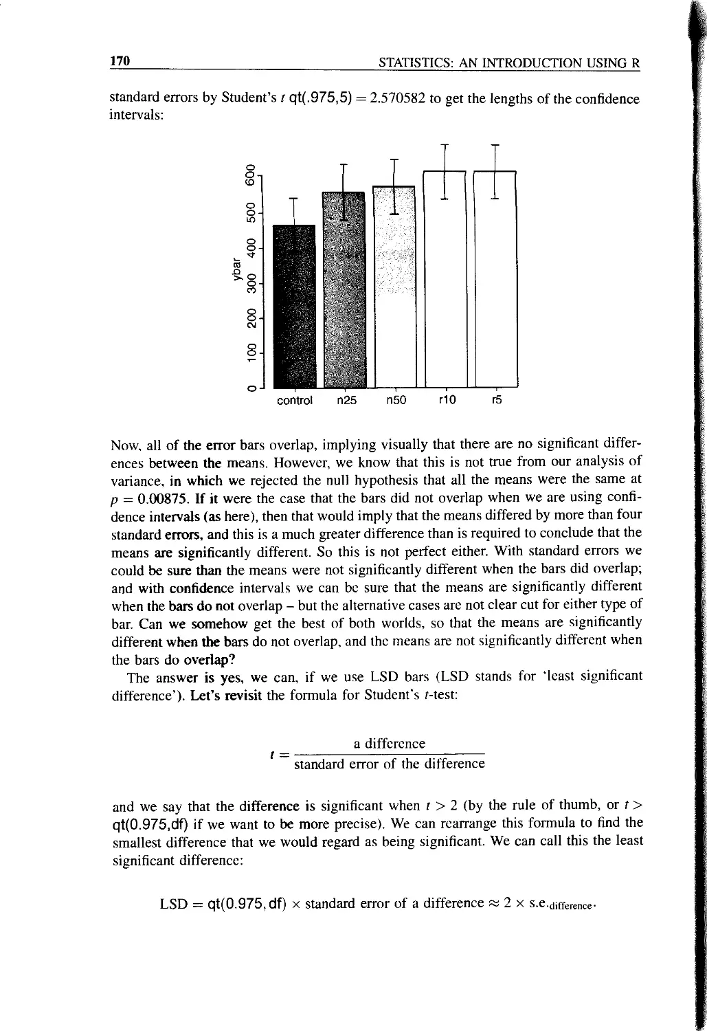
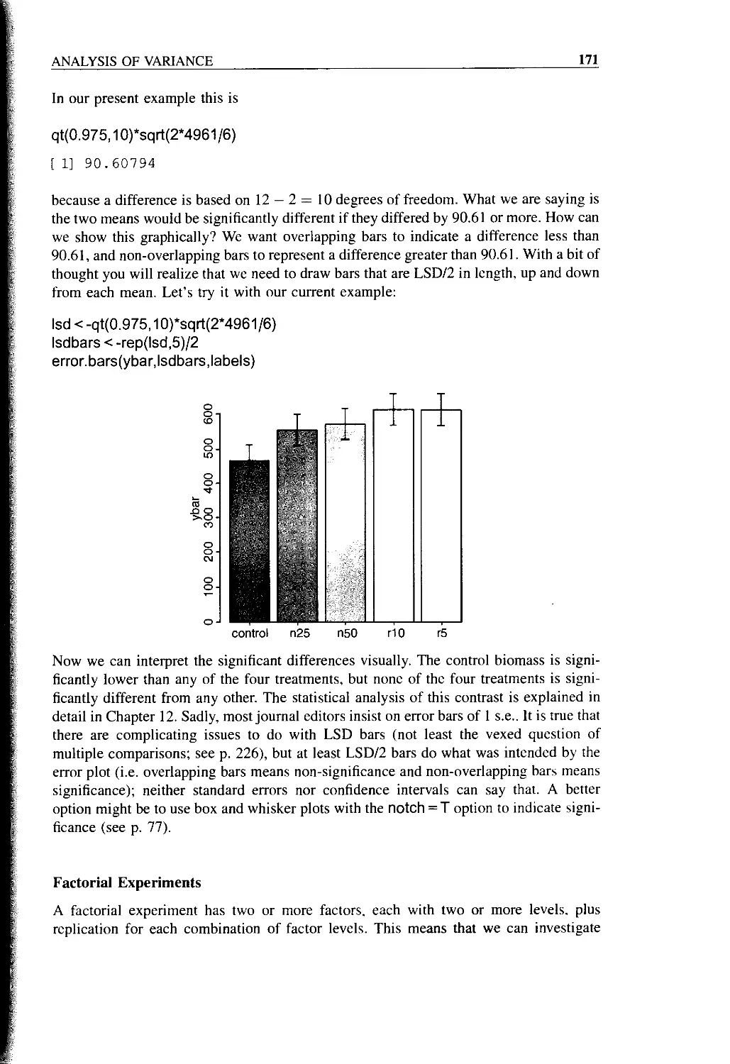
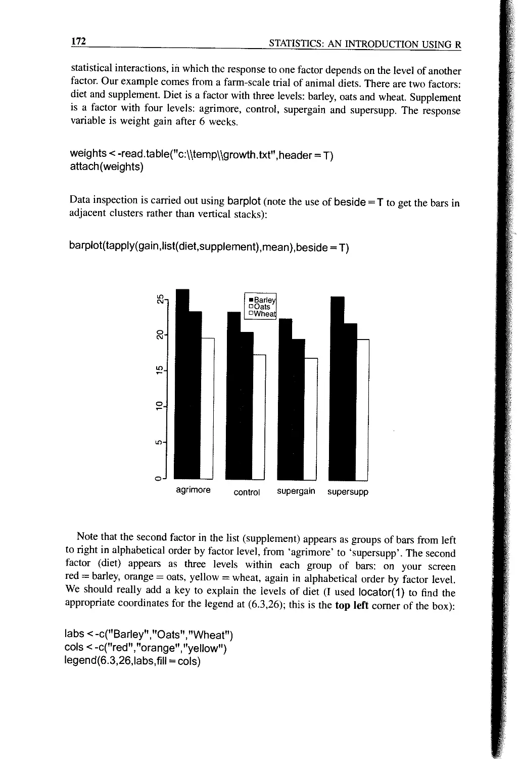
Factorial Experiments 171
Pseudoreplication: Nested Designs and Split Plots 175
Split-plot Experiments 176
Random Effects and Nested Designs 178
Fixed or Random Effects? 179
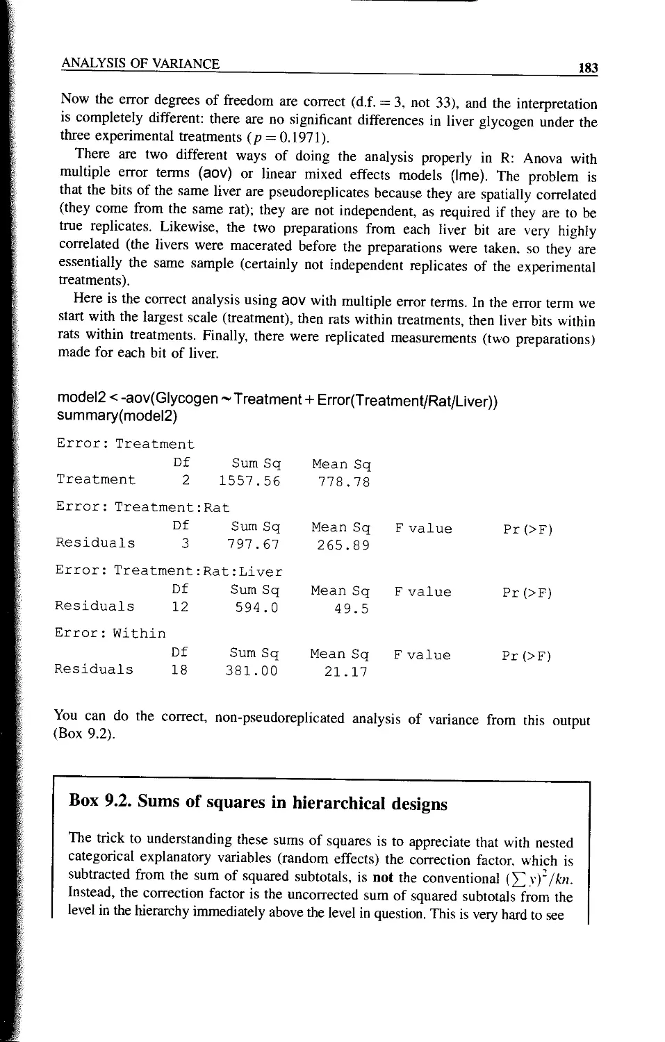
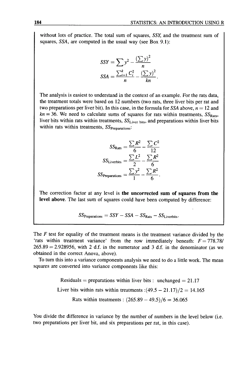
Removing the Pseudoreplication 180
Analysis of Longitudinal Data 180
Derived Variable Analysis 181
Variance Components Analysis (VCA) 181
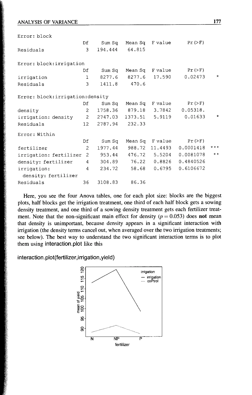
What is the Difference Between Split-plot and Hierarchical Samples? 185
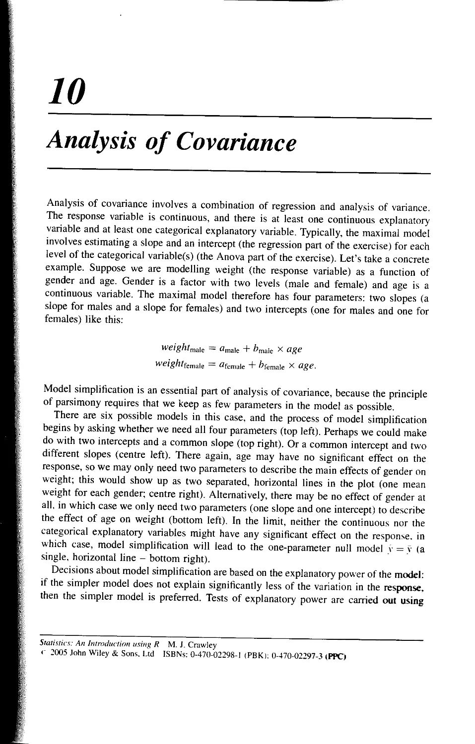
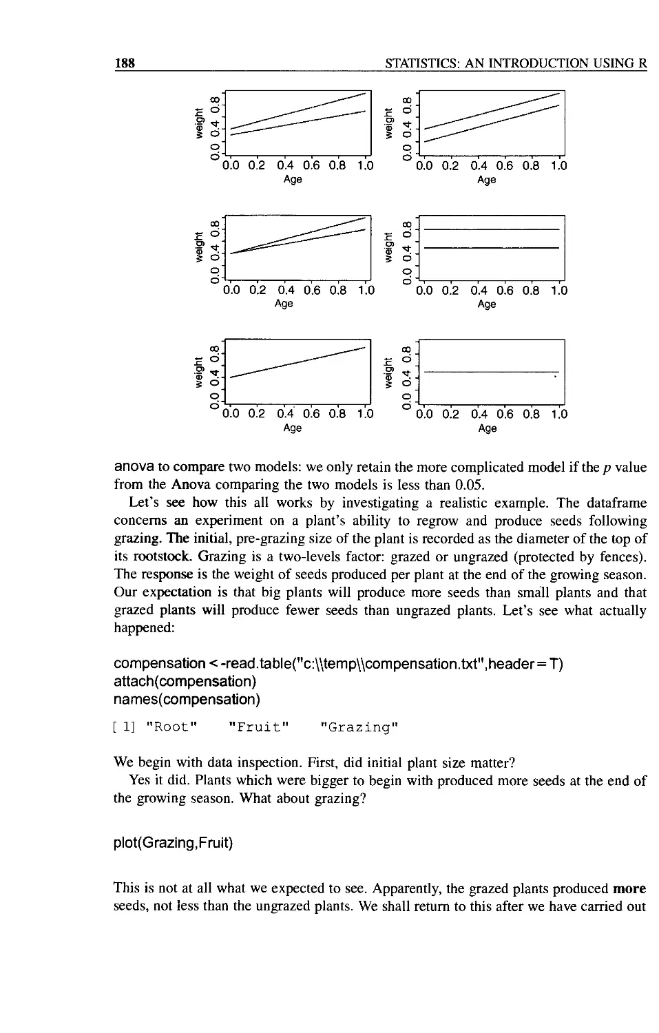
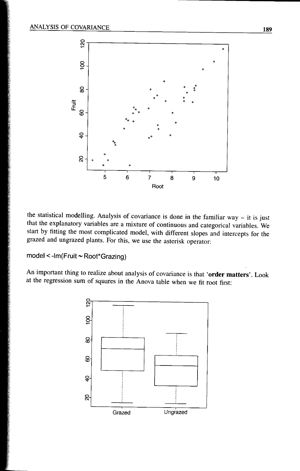
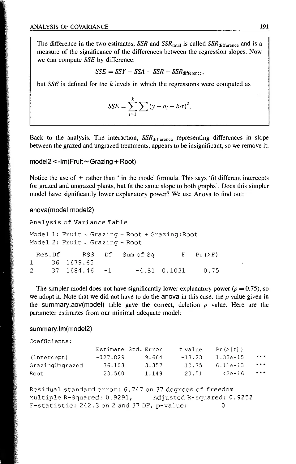
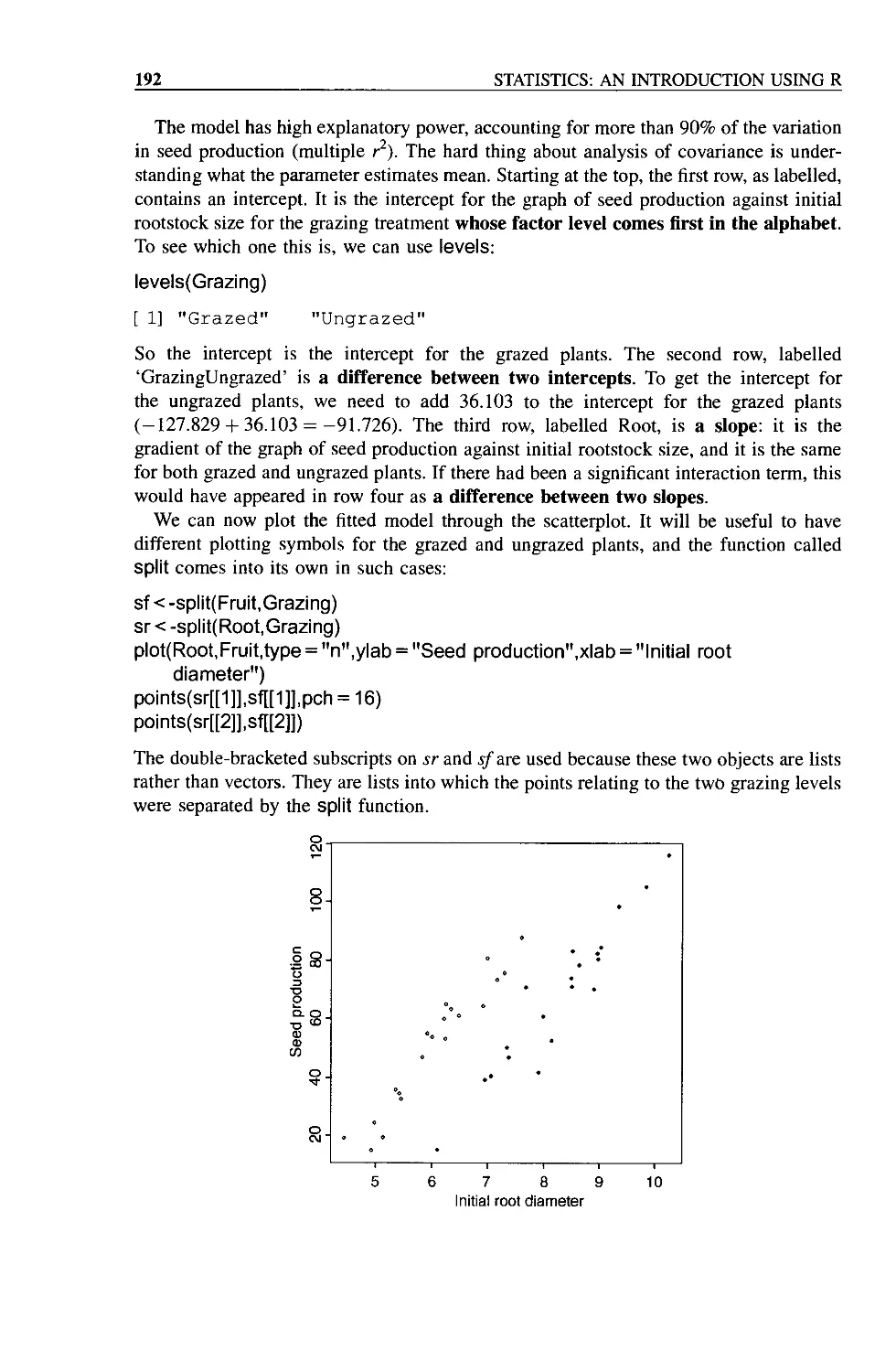
Chapter 10 Analysis of Covariance 187
Chapter 11 Multiple Regression 195
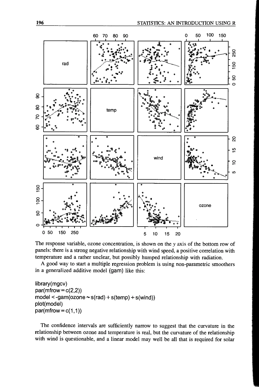
A Simple Example 195
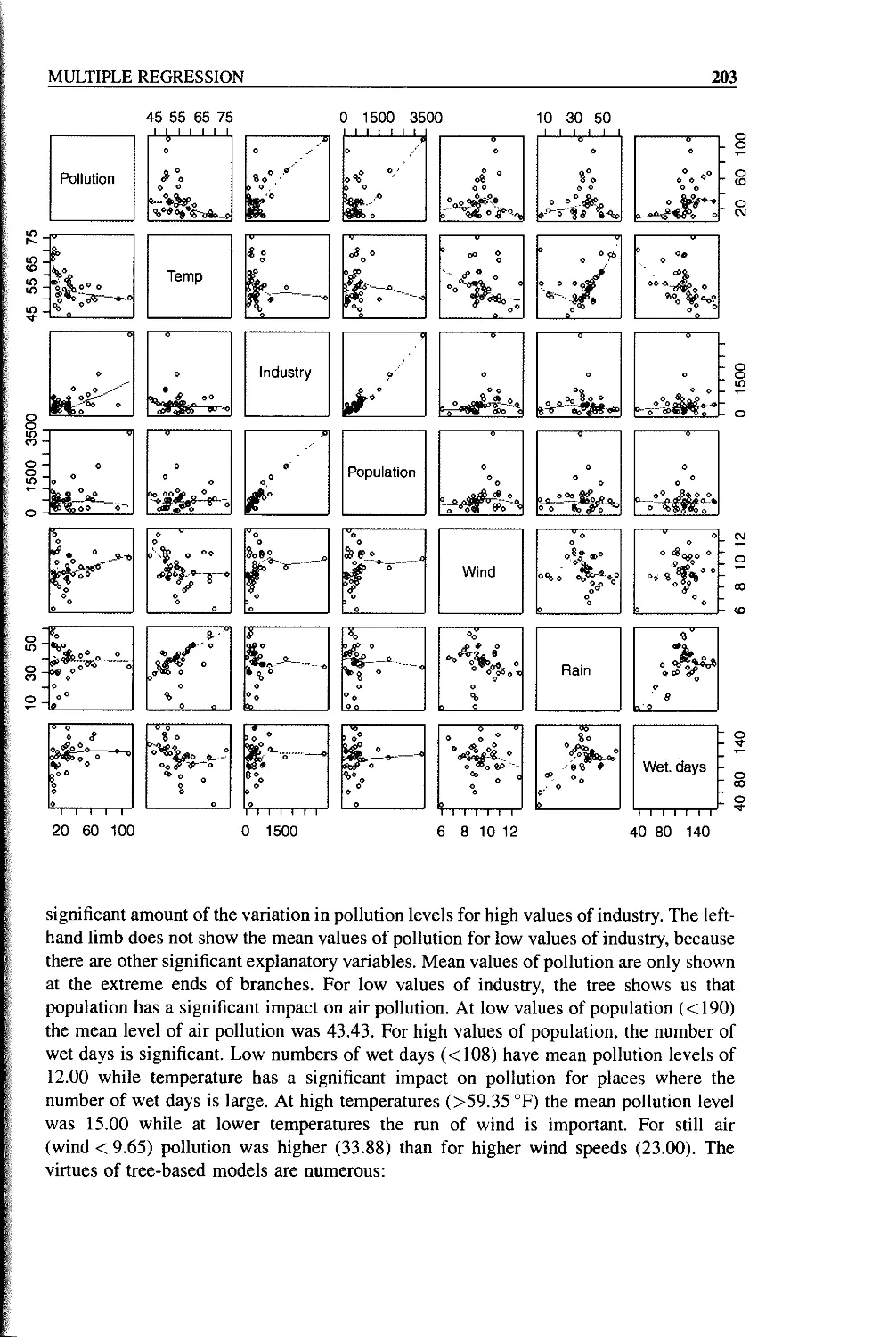
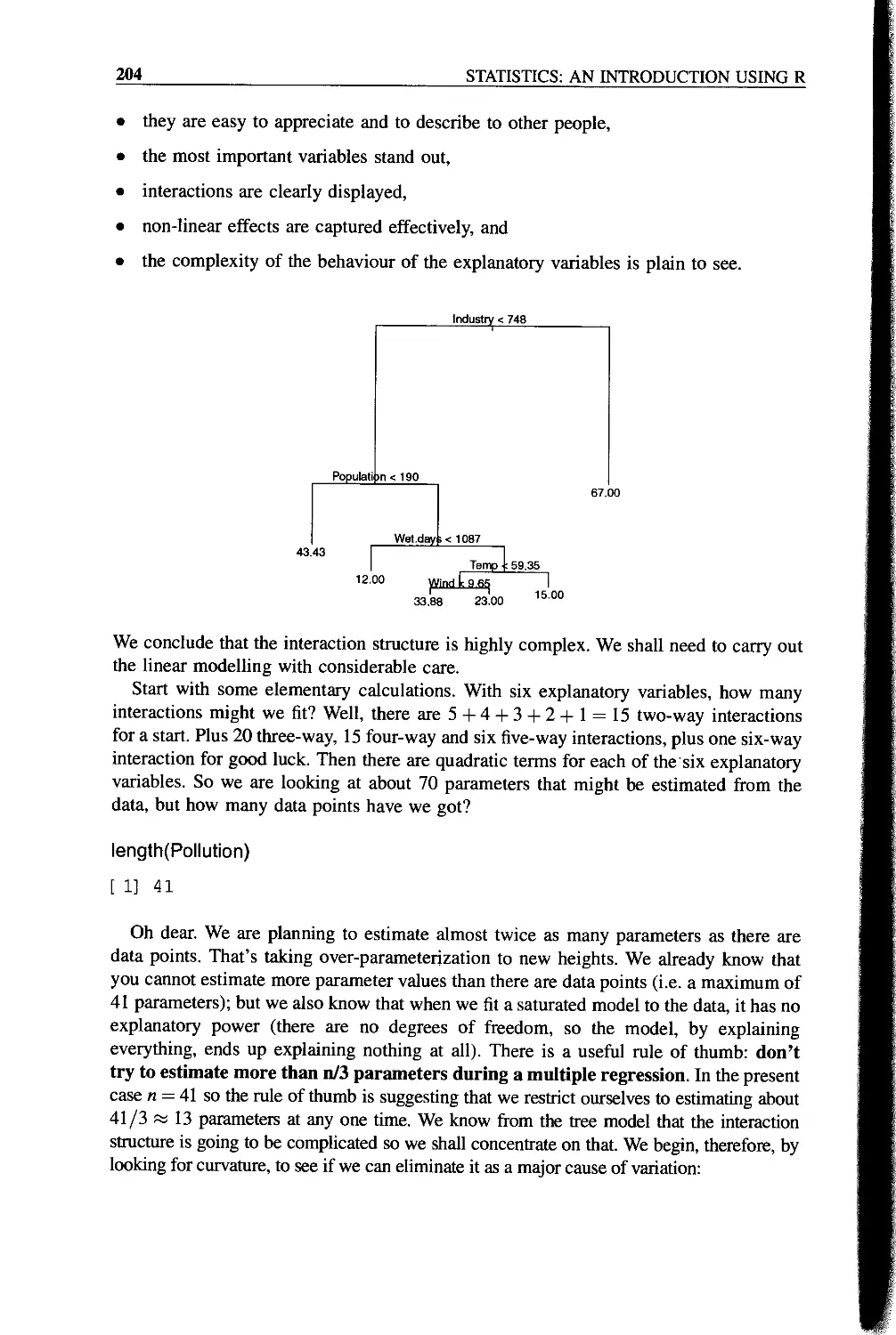
A More Complex Example 202
Automating the Process of Model Simplification Using step 208
AIC (Akaike’s Information Criterion) 208
Chapter 12 Contrasts 209
Contrast Coefficients 210
An Example of Contrasts in R 211
A Priori Contrasts 212
Model Simplification by Step-wise Deletion 214
Contrast Sums of Squares by Hand 217
Comparison of the Three Kinds of Contrasts 218
Aliasing 222
Contrasts and the Parameters of Ancova Models 223
Multiple Comparisons 226
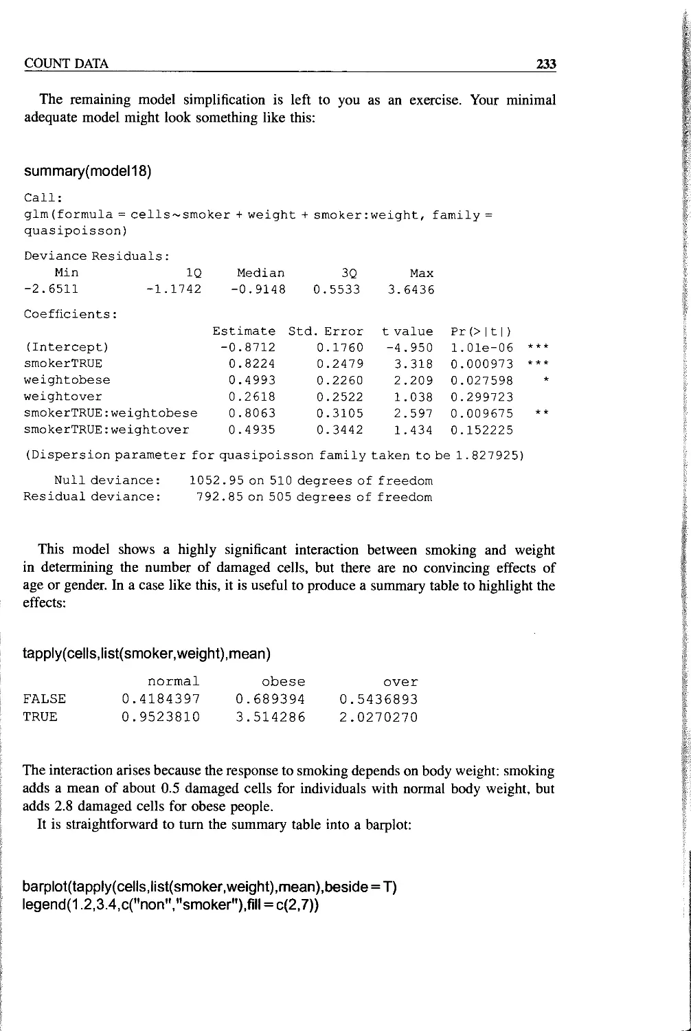
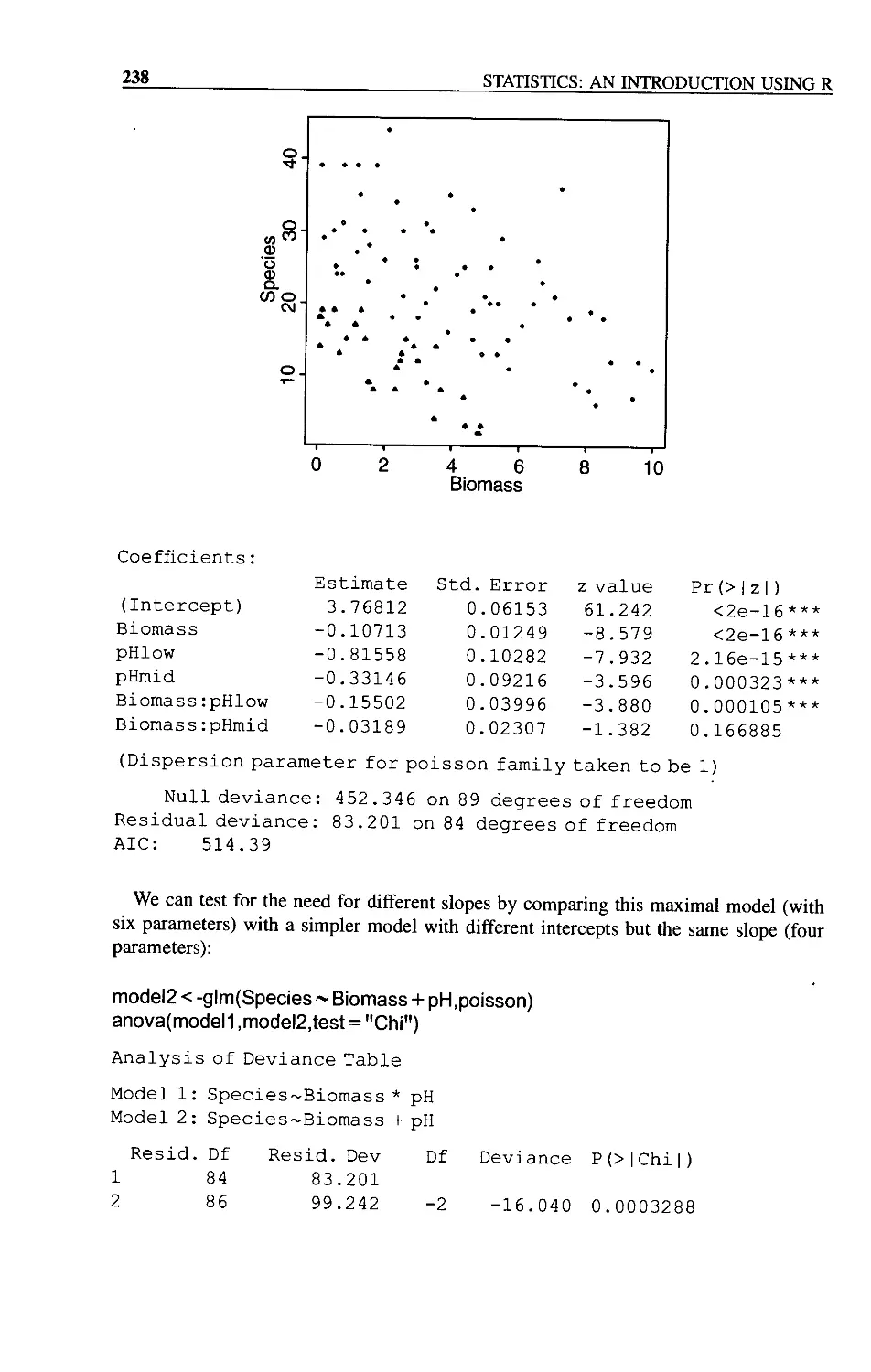
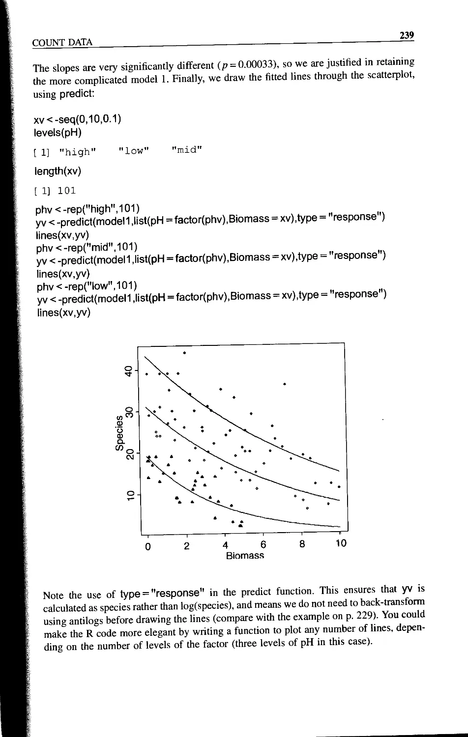
Chapter 13 Count Data 227
A Regression with Poisson Errors 227
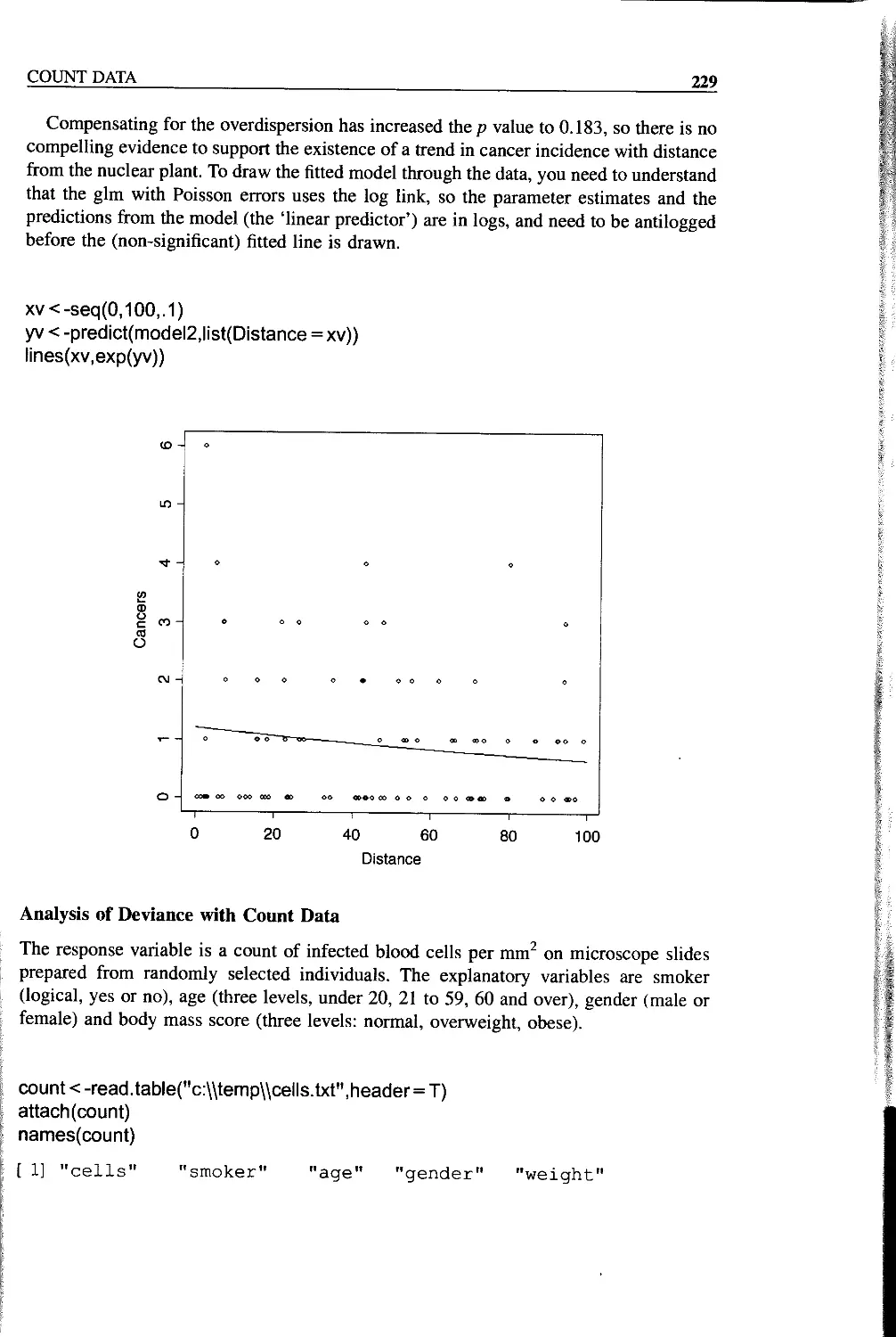
Analysis of Deviance with Count Data 229
The Danger of Contingency Tables 234
Analysis of Covariance with Count Data 237
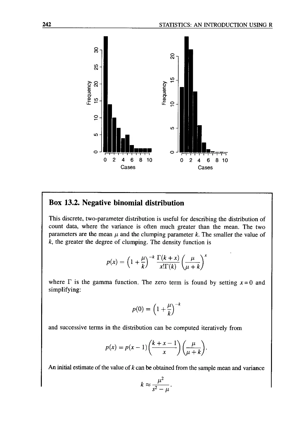
Frequency Distributions 240
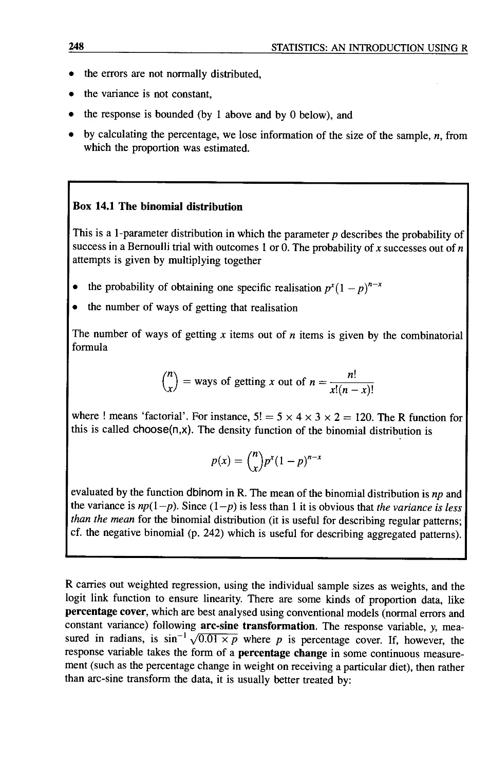
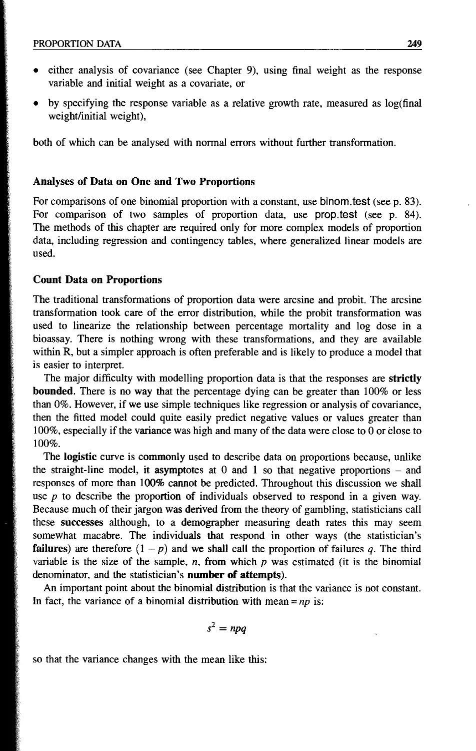
Chapter 14 Proportion Data 247
Analyses of Data on One and Two Proportions 249
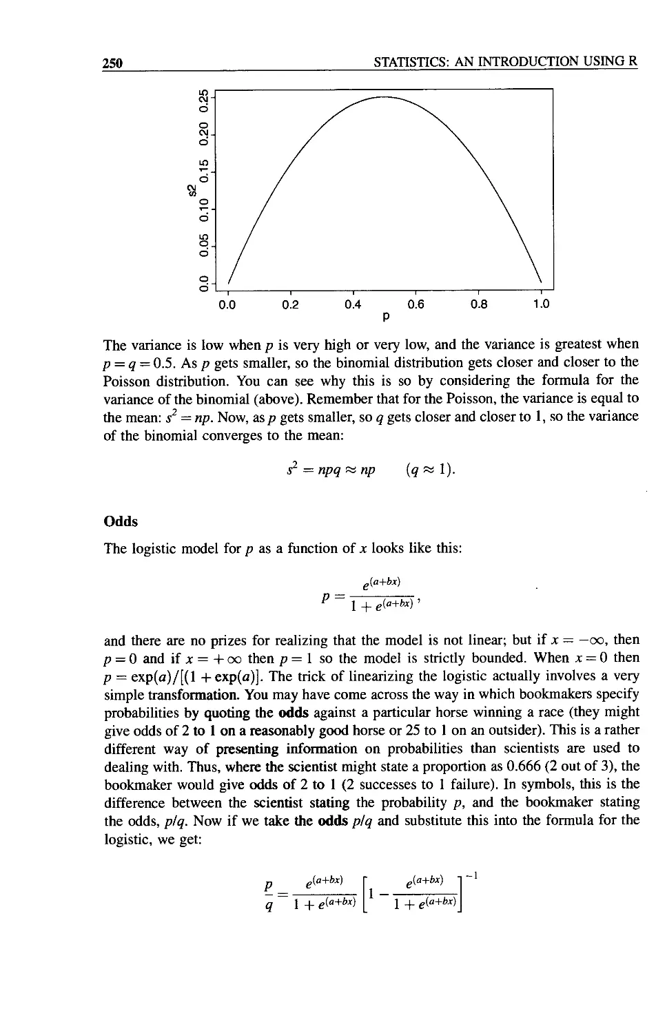
Count Data on Proportions 249
CONTENTS ix
Odds 250
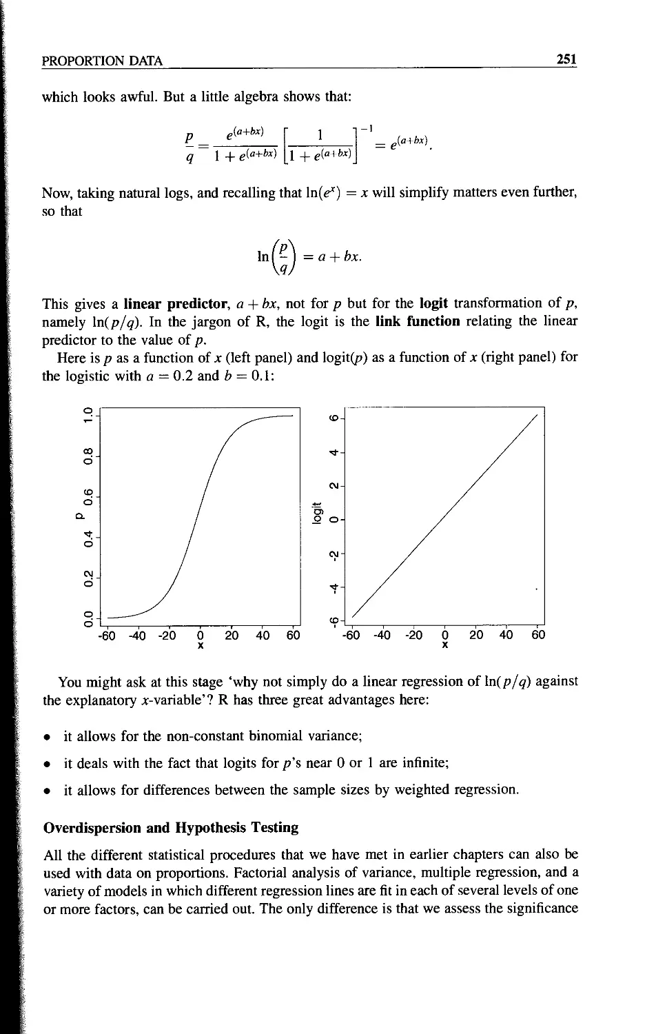
Overdispersion and Hypothesis Testing 251
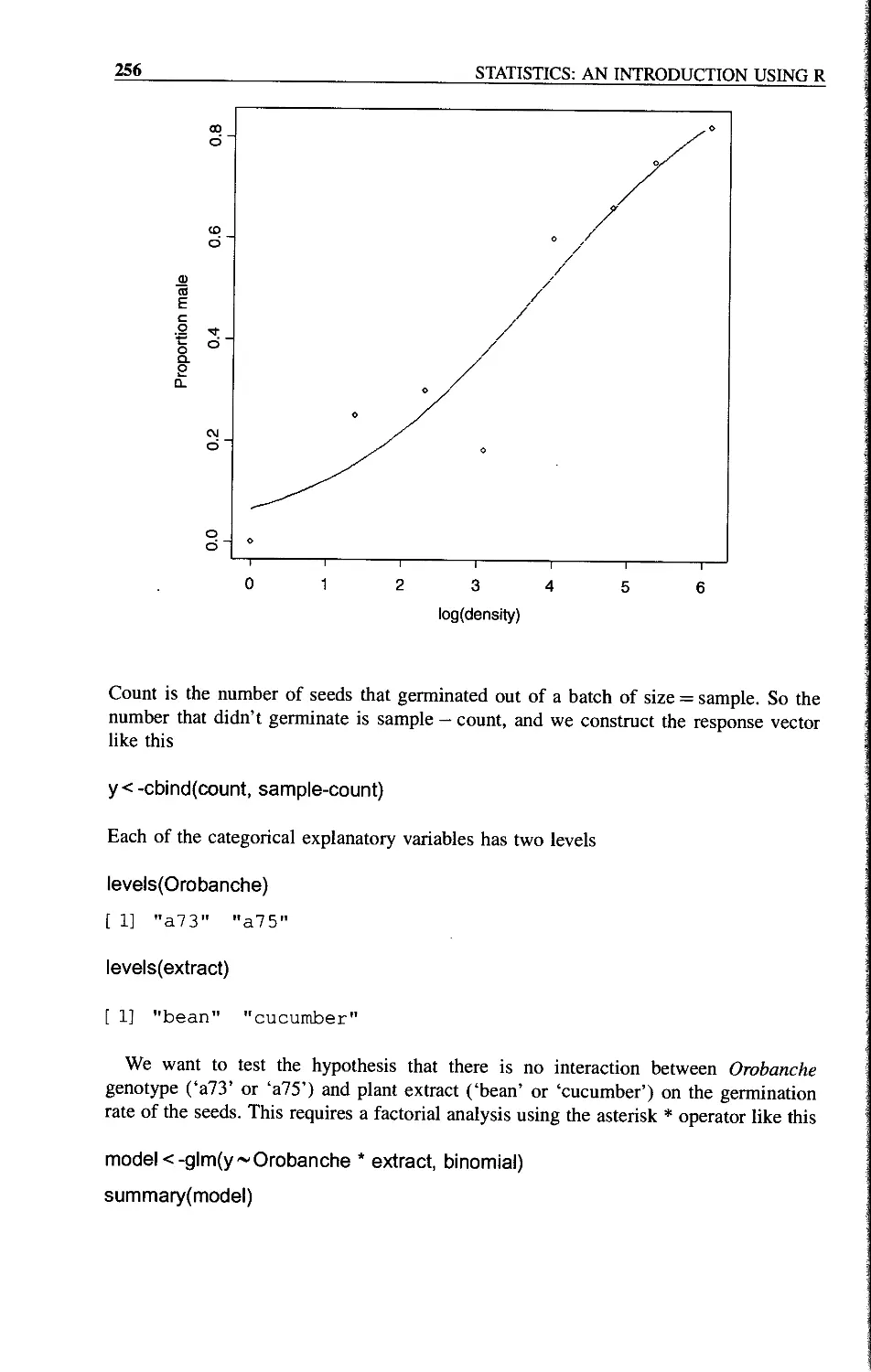
Applications 253
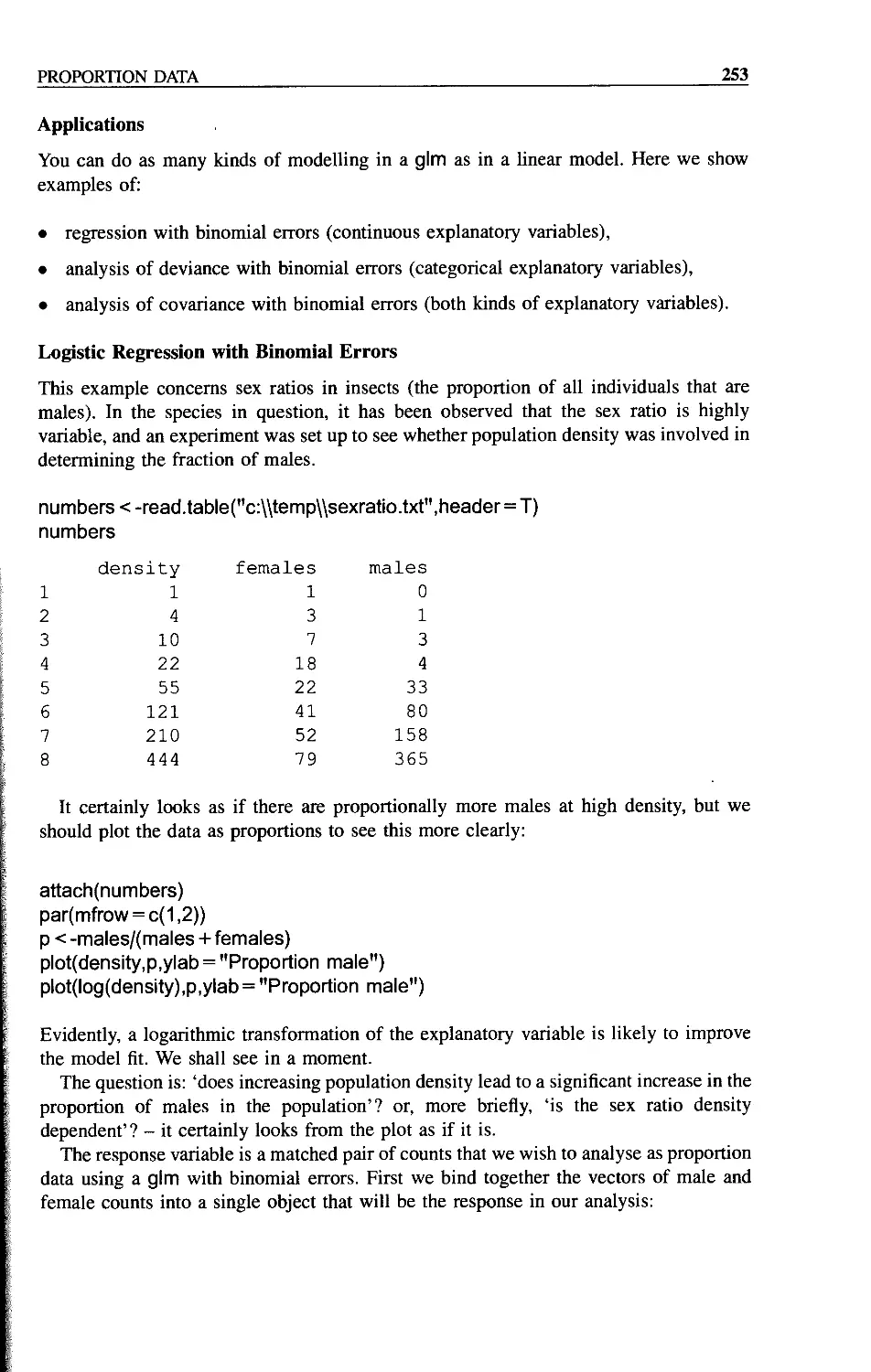
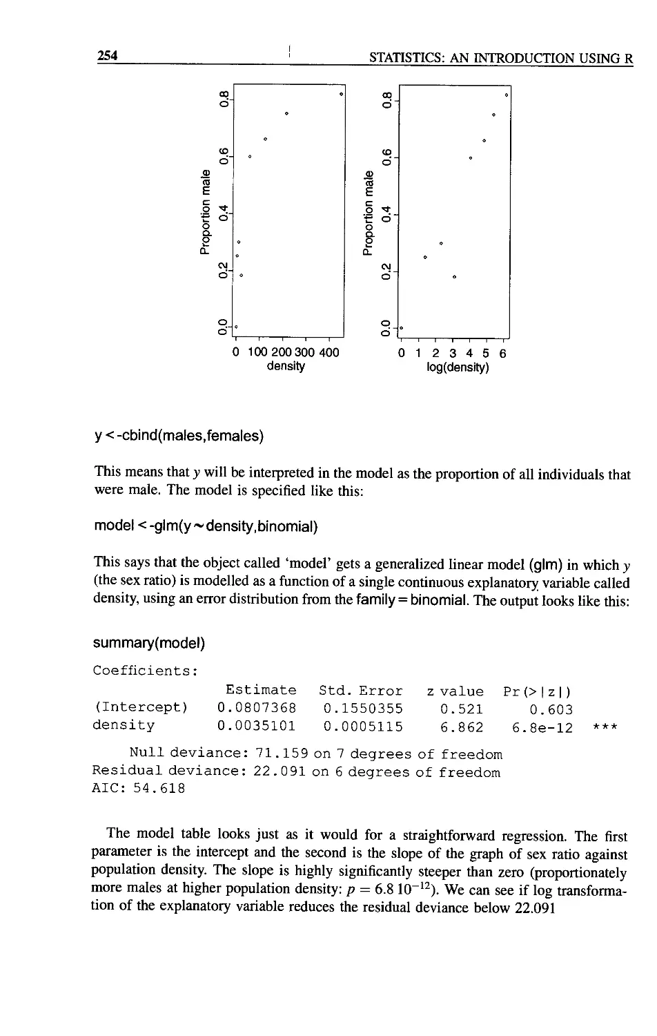
Logistic Regression with Binomial Errors 253
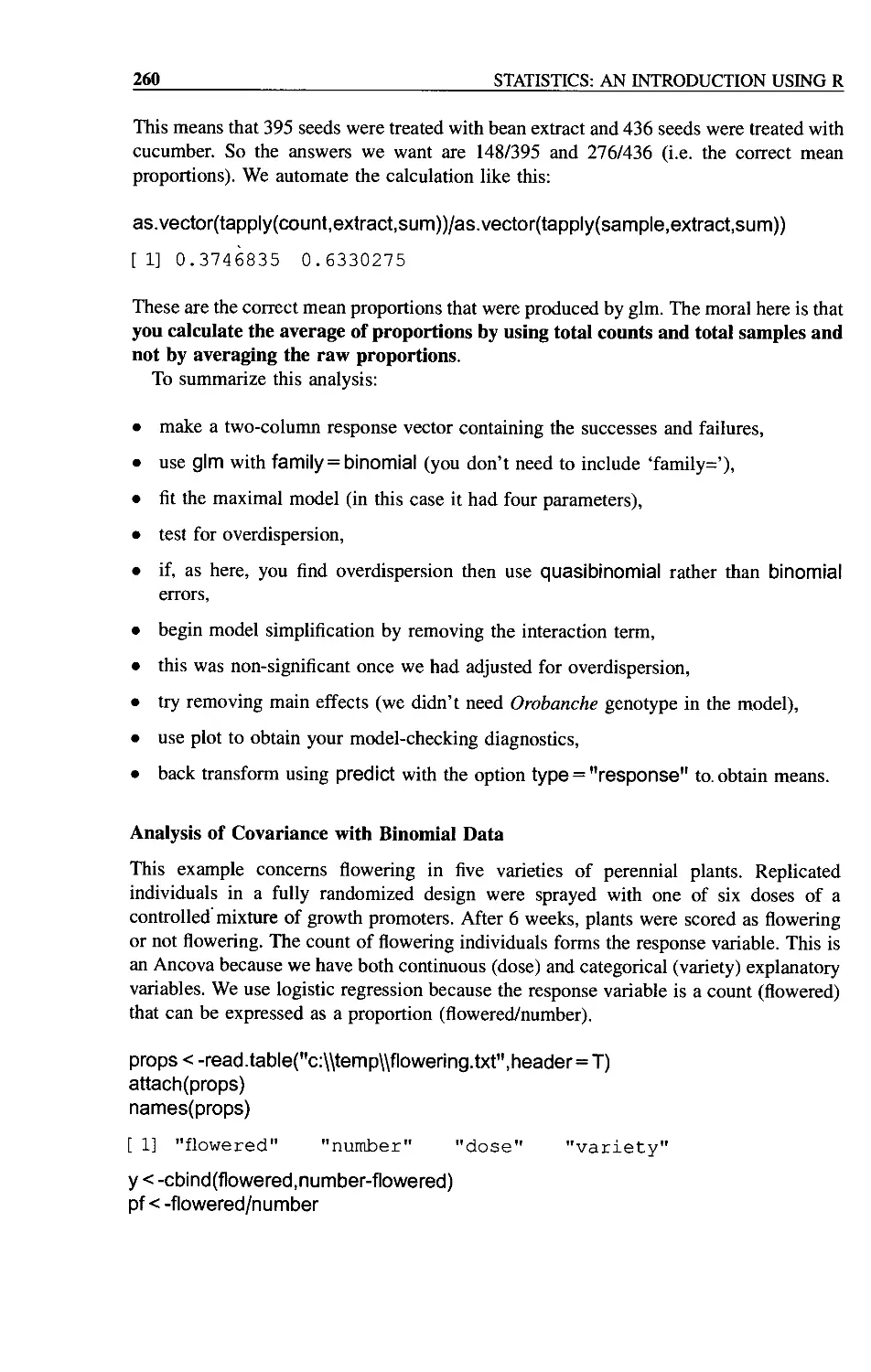
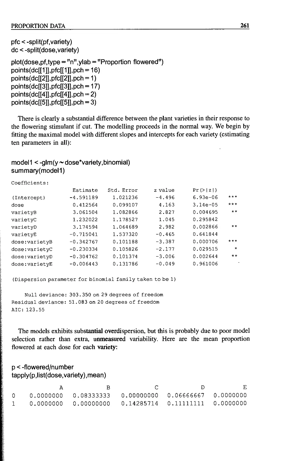
Proportion Data with Categorical Explanatory Variables 255
Analysis of Covariance with Binomial Data 260
Chapter 15 Death and Failure Data 263
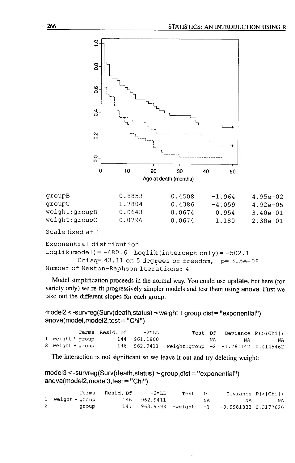
Survival Analysis with Censoring 265
Chapter 16 Binary Response Variable 269
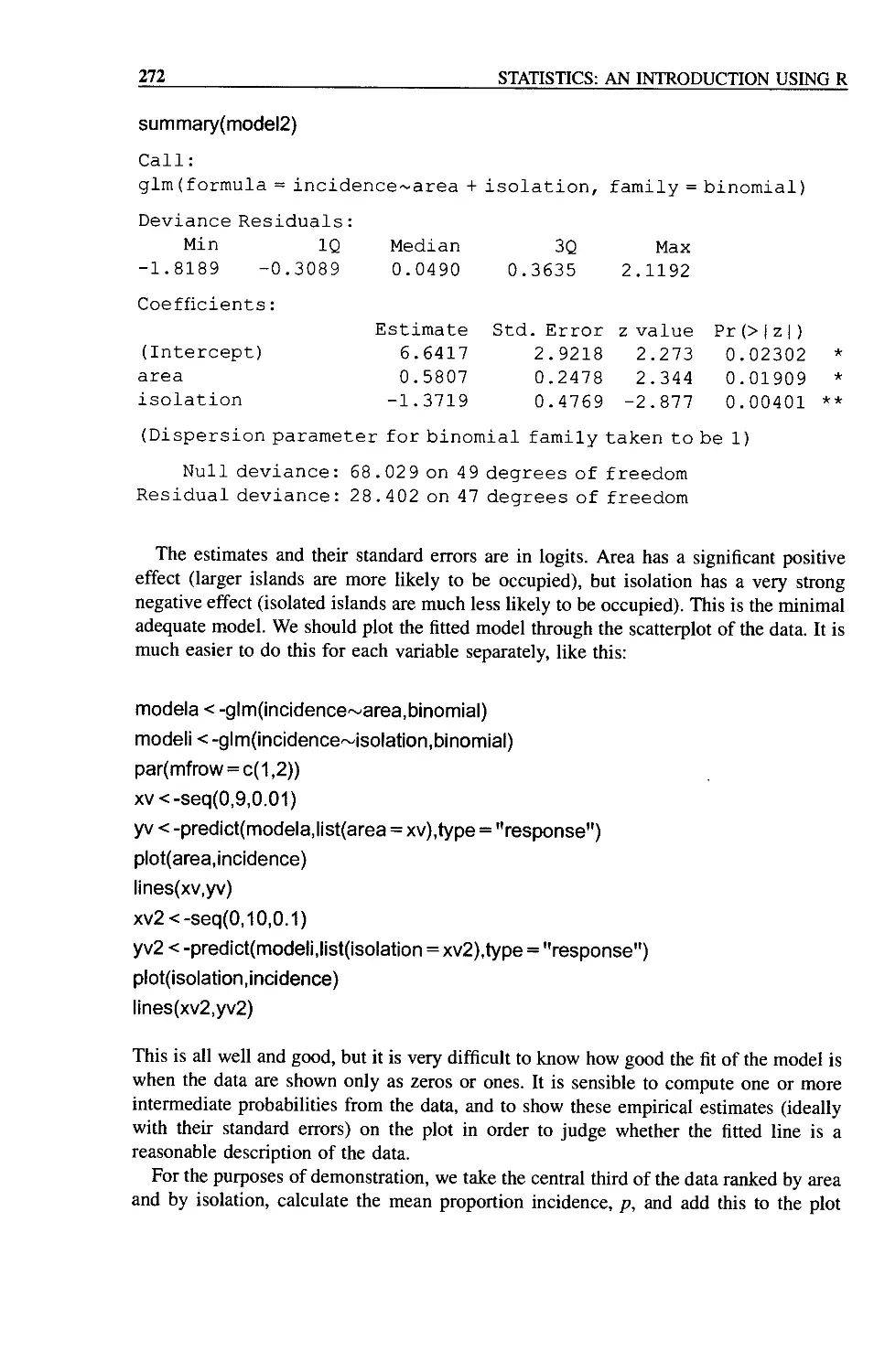
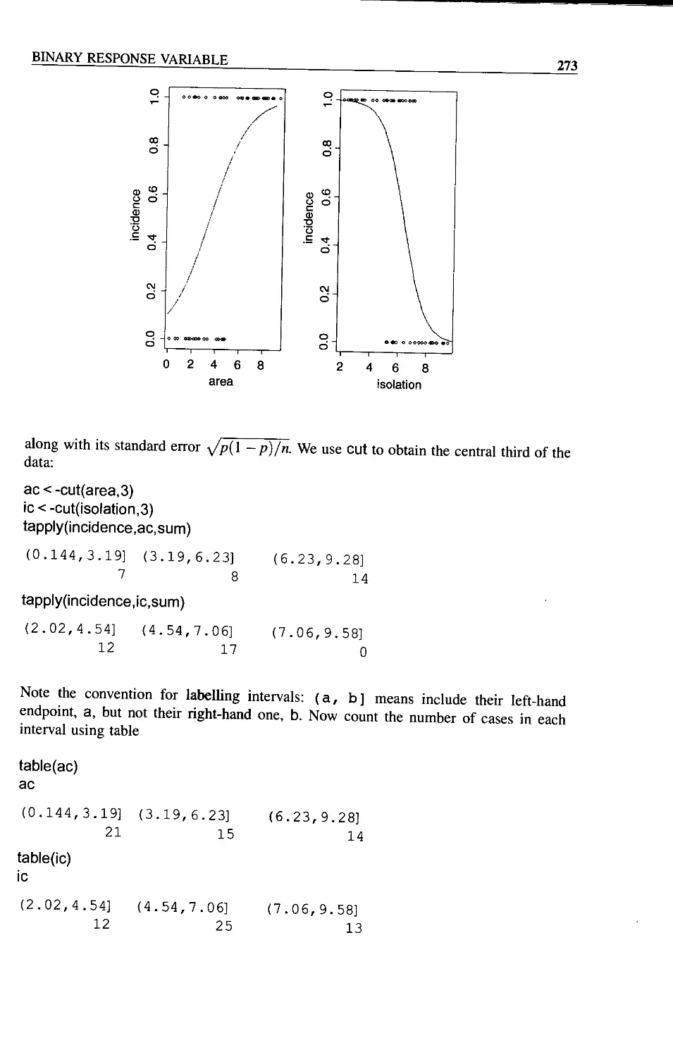
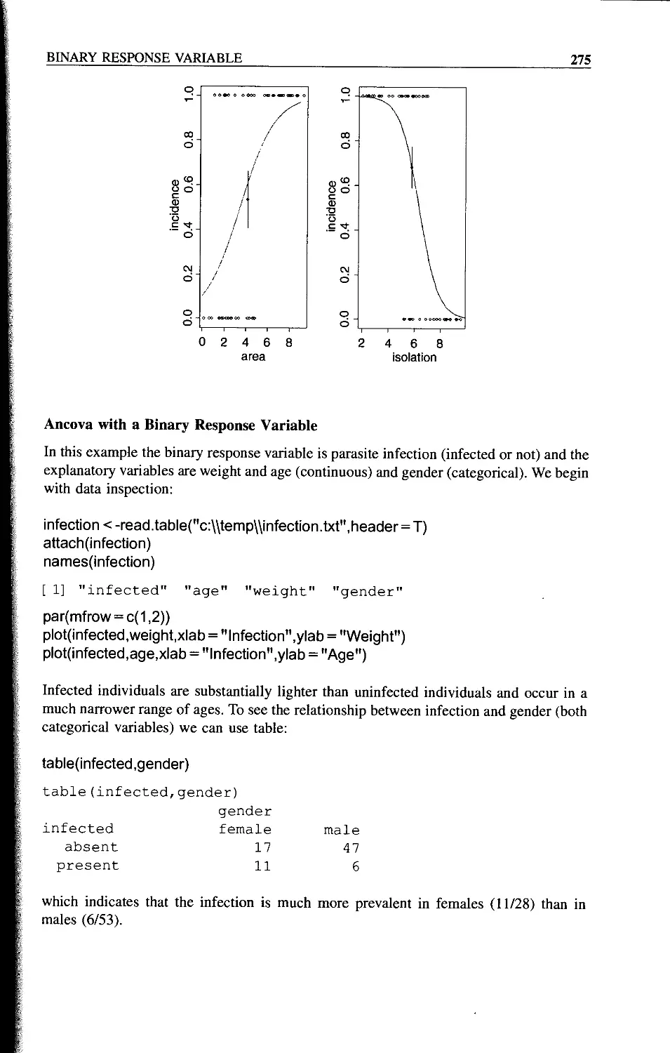
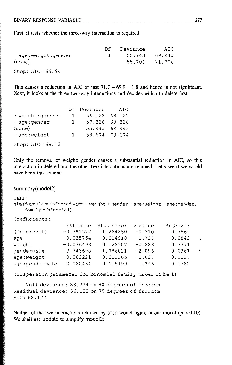
Incidence Functions 271
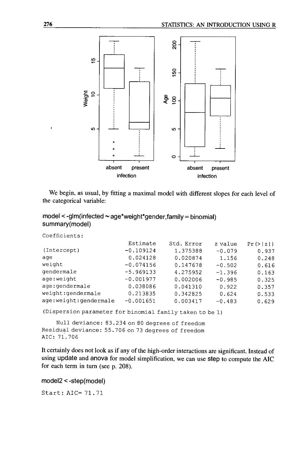
Ancova with a Binary Response Variable 275
Appendix 1: Fundamentals of the R Language 281
R as a Calculator 281
Assigning Values to Variables 282
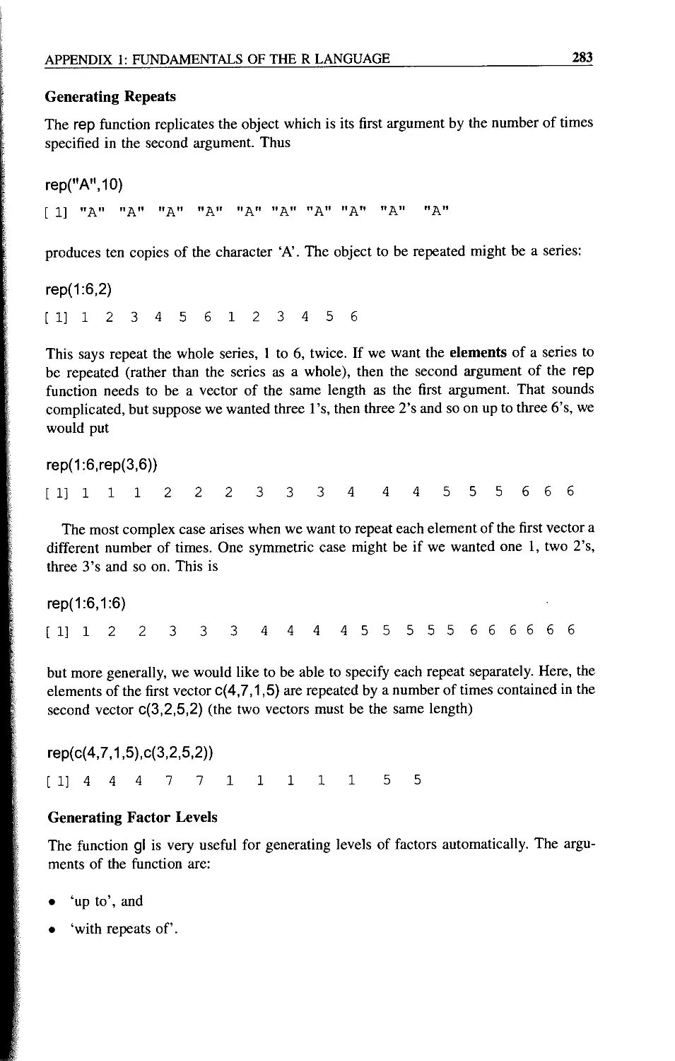
Generating Repeats 283
Generating Factor Levels 283
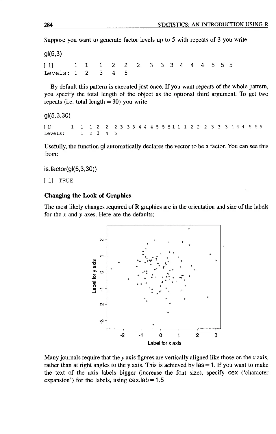
Changing the Look of Graphics 284
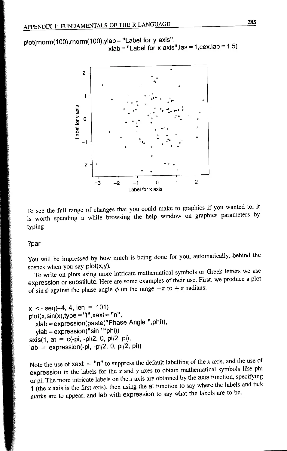
Reading Data from a File 286
Vector Functions in R 287
Subscripts: Obtaining Parts of Vectors 288
Subscripts as Logical Variables 289
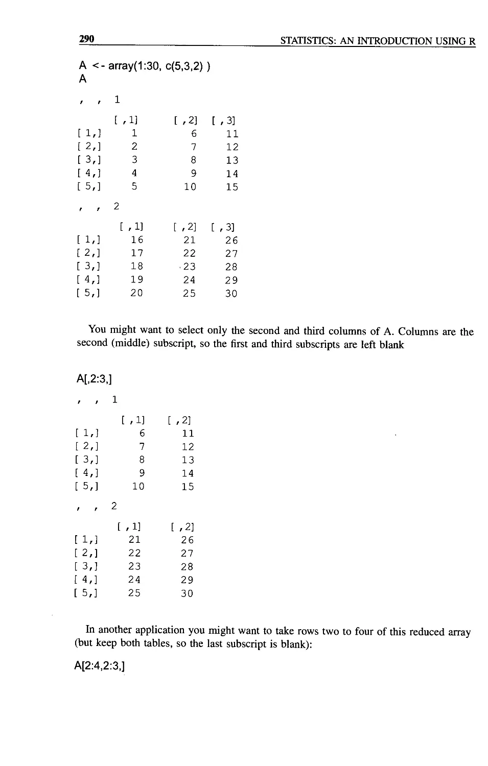
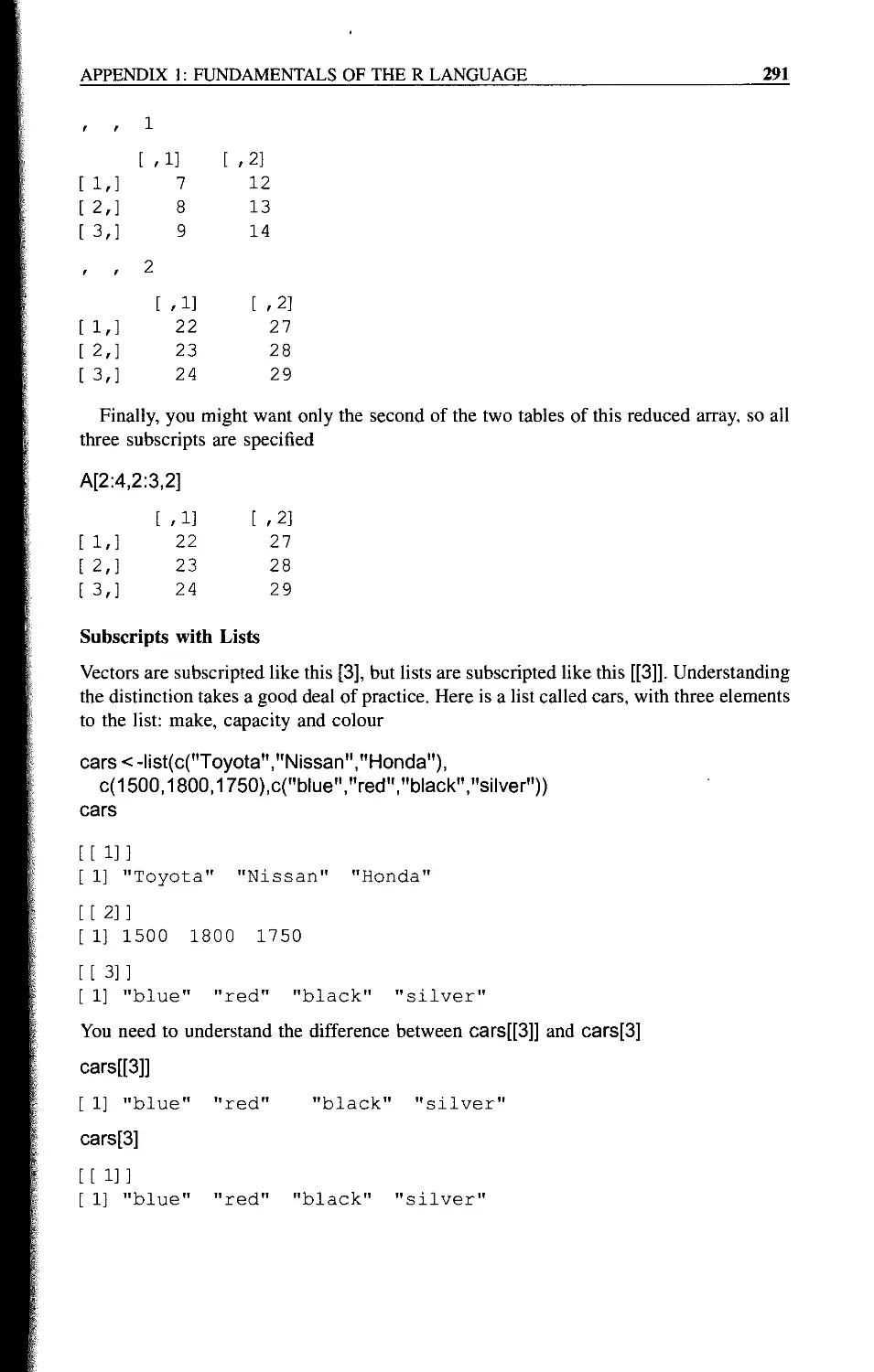
Subscripts with Arrays 289
Subscripts with Lists 291
Writing Functions in R 292
Sorting and Ordering 292
Counting Elements within Arrays 294
Tables of Summary Statistics 294
Converting Continuous Variables into Categorical Variables Using cut 295
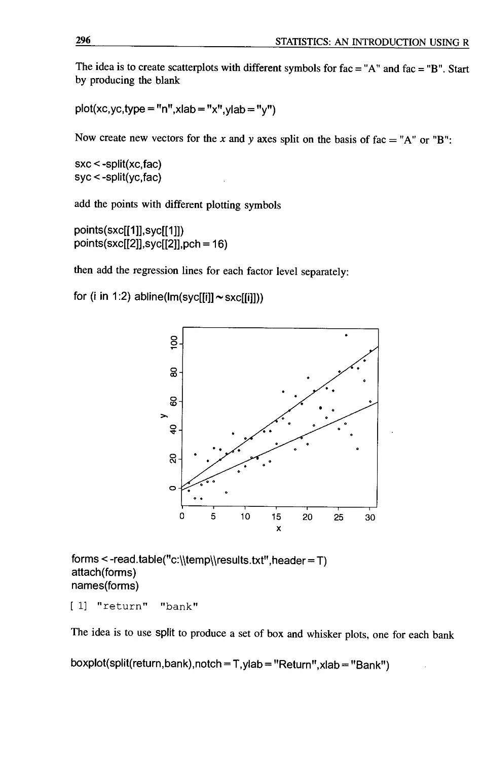
The split Function 295
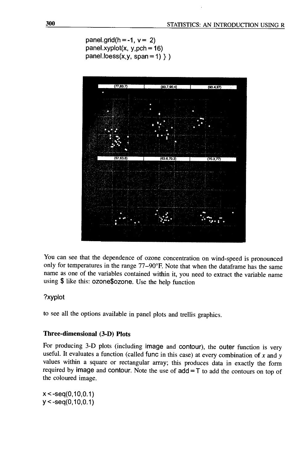
Trellis Plots 297
The xyplot Function 299
Three-dimensional (3-D) Plots 300
Matrix Arithmetic 301
Solving Systems of Linear Equations 304
References and Further Reading 305
Index
309
Preface
This book is an introduction to the essentials of statistical analysis for students who have
little or no background in mathematics or statistics. The audience includes first or second
year undergraduate students in science, engineering, medicine and economics, along with
post-experience and other mature students who want to re-leam their statistics, or to
switch to the powerful new language of R.
For many students, statistics is the least favourite course of their entire time at
university. Part of this is because some students have convinced themselves that they are
no good at sums, and consequently have tried to avoid contact with anything remotely
quantitative in their choice of subjects. They are dismayed, therefore, when they discover
that the statistics course is compulsory. Another part of the problem is that statistics is
often taught by people who have absolutely no idea how difficult some of the material is
for non-statisticians. As often as not, this leads to a recipe-following approach to
analysis, rather than to any attempt to understand the issues involved and how to deal
with them.
The approach adopted here involves virtually no statistical theory. Instead, the
assumptions of the various statistical models are discussed at length, and the practice
of exposing statistical models to rigorous criticism is encouraged. A philosophy of model
simplification is developed in which the emphasis is placed on estimating effect sizes
from data, and establishing confidence intervals for these estimates. The role of
hypothesis testing at an arbitrary threshold of significance like a = 0.05 is played
down. The text starts from absolute basics and assumes absolutely no background in
statistics or mathematics.
As to presentation, the idea is that background material would be covered in a series of
1 hour lectures, then this book could be used as a guide to the practical sessions and for
homework, with the students working on their own at the computer. My experience is that
the material can be covered in 10 to 30 lectures, depending on the background of the
students and the depth of coverage it is hoped to achieve. The practical work is designed
to be covered in 10 to 15 sessions of about 1.5 hours each, again depending on the
ambition and depth of the coverage, and on the amount of one-to-one help available to
the students as they work at their computers.
R and S-PLUS
The R language of statistical computing has an interesting history. It evolved from the S
language, which was first developed at AT&T’s Bell Laboratories by Rick Becker, John
Chambers and Allan Wilks. Their idea was to provide a software tool for professional
Mi PREFACE
statisticians who wanted to combine state-of-the-art graphics with powerful model-fitting
capability. S is made up of three components. First and foremost, it is a powerful tool for
statistical modelling. It enables you to specify and fit statistical models to your data,
assess the goodness of fit and display the estimates, standard errors and predicted values
derived from the model. It provides you with the means to define and manipulate your
data, but the way you go about the job of modelling is not predetermined, and the user is
left with maximum control over the model-fitting process. Second, S can be used for data
exploration, in tabulating and sorting data, in drawing scatter plots to look for trends in
your data, or to check visually for the presence of outliers. Third, it can be used as a
sophisticated calculator to evaluate complex arithmetic expressions, and a very flexible
and general object-oriented programming language to perform more extensive data
manipulation. One of its great strengths is in the way in which it deals with vectors (lists
of numbers). These may be combined in general expressions, involving arithmetic,
relational and transformational operators such as sums, greater-than tests, logarithms or
probability integrals. The ability to combine frequently-used sequences of commands
into functions makes S a powerful programming language, ideally suited for tailoring
one’s specific statistical requirements. S is especially useful in handling difficult or
unusual data sets, because its flexibility enables it to cope with such problems as unequal
replication, missing values, non-orthogonal designs, and so on. Furthermore, the
open-ended style of S is particularly appropriate for following through original ideas
and developing new concepts. One of the great advantages of learning S is that the simple
concepts that underlie it provide a unified framework for learning about statistical ideas
in general. By viewing particular models in a general context, S highlights the
fundamental similarities between statistical techniques and helps play down their
superficial differences. As a commercial product S evolved into S-PLUS, but the problem
was that S-PLUS was very expensive. In particular, it was much too expensive to be
licensed for use in universities for teaching large numbers of students. In response to this,
two New Zealand-based statisticians, Ross Ihaka and Robert Gentleman from the
University of Auckland, decided to write a stripped-down version of S for teaching
purposes. The letter R ‘comes before S’ so what would be more natural than for two
authors whose first initial was ‘R’ to christen their creation R. The code for R was
released in 1995 under a GPL (General Public License), and the core team was rapidly
expanded to 15 members (they are listed on the web site, below). Version 1.0.0 was
released on 29 February 2000. This book is written using version 1.8.1, but all the code
will run under R 2.0.0 (released in September 2004). R is an Open Source implementa-
tion of S-PLUS, and as such can be freely downloaded. If you type CRAN into your
Google window you will find the site nearest to you from which to download it. Or you
can go directly to
http://cran.r-project.org
There is a vast network of R users world-wide, exchanging functions with one another,
and a vast resource of libraries containing data and programs. There is a useful journal
called R News that you can read at CRAN.
This book has its own web site at
http://www.imperial.ac.uk/bio/research/crawley/statistics
PREFACE
xiii
Here you will find all the data files used in the text; you can download these to your
hard disc and then run all of the examples described in the text. The executable
statements are shown in the text in Arial font. There are files containing all the commands
for each chapter, so you can paste the code directly into R instead of typing it from the
book. Another file supplies the code necessary to generate all of the book’s figures. There
is a series of 14 fully-worked stand-alone practical sessions covering a wide range of
statistical analyses. Learning R is not easy, but you will not regret investing the effort to
master the basics.
M. J. Crawley
Ascot
Fundamentals
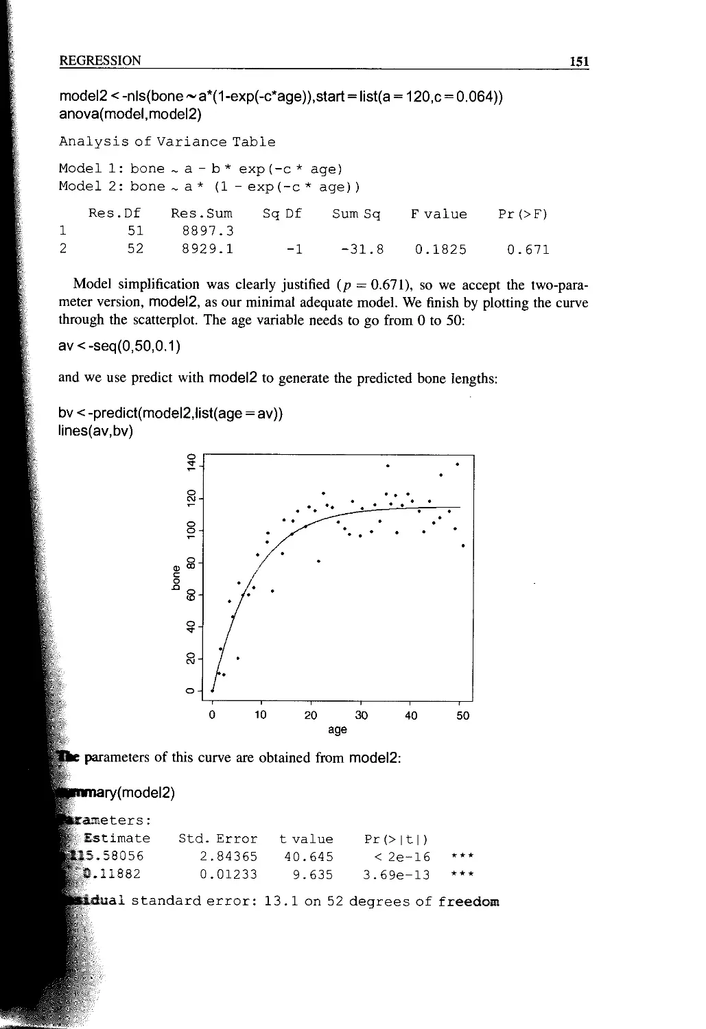
The hardest part of any statistical work is getting started - and one of the hardest things
about getting started is choosing the right kind of statistical analysis. The choice depends
on the nature of your data and on the particular question you are trying to answer. The
truth is that there is no substitute for experience; the way to know what to do, is to have
done it properly lots of times before.
The key is to understand what kind of response variable you have got, and to know the
nature of your explanatory variables. The response variable is the thing you are working
on; it is the variable whose variation you are attempting to understand. This is the variable
that goes on the у axis of the graph (the ordinate). The explanatory variable goes on the x
axis of the graph (the abscissa); you are interested in the extent to which variation in the
response variable is associated with variation in the explanatory variable. A continuous
measurement is a variable like height or weight that can take any real numbered value. A
categorical variable is a factor with two or more levels: gender is a factor with two levels
(male and female), and a rainbow might be a factor with seven levels (red, orange,
yellow, green, blue, indigo, violet).
It is essential, therefore, that you know:
• which of your variables is the response variable;
• which are the explanatory variables;
• are the explanatory variables continuous or categorical, or a mixture of both;
• what kind of response variable have you got - is it a continuous measurement, a
count, a proportion, a time-at-death or a category?
These simple keys will then lead you to the appropriate statistical method.
1. The explanatory variables
(a) All explanatory variables continuous Regression
(b) All explanatory variables categorical Analysis of variance (Awa)
(c) Explanatory variables both continuous Analysis of covariance (Aacnvn)
and categorical
Statistics: An Introduction using R M. J. Crawley
© 2005 John Wiley & Sons, Ltd ISBNs: 0-470-02298-1 (PBK): 0-470-02297-3 (PPC>
2
STATISTICS: AN INTRODUCTION USING R
2. The response variable
(a) Continuous Normal regression, Anova or Ancova
(b) Proportion Logistic regression
(c) Count Log linear models
(d) Binary Binary logistic analysis
(e) Time-at-death Survival analysis
There are some key ideas that need to be understood from the outset. We cover these here
before getting into any detail about different kinds of statistical model.
Everything Varies
If you measure the same thing twice you will get two different answers. If you measure
the same thing on different occasions you will get different answers because the thing
will have aged. If you measure different individuals, they will differ for both genetic and
environmental reasons (nature and nurture). Heterogeneity is universal: spatial hetero-
geneity means that places always differ and temporal heterogeneity means that times
always differ.
Because everything varies, finding that things vary is simply not interesting. We need a
way of discriminating between variation that is scientifically interesting, and variation
that just reflects background heterogeneity. That is why we need statistics. It is what this
whole book is about.
The key concept is the amount of variation that we would expect to occur by chance
alone, when nothing scientifically interesting was going on. If we measure bigger
differences than we would expect by chance, we say that the result is statistically
significant. If we measure no more variation than we might reasonably expect to occur by
chance alone, then we say that our result is not statistically significant. It is important to
understand that this is not to say that the result is not important. Non-significant
differences in human life span between two drug treatments may be massively important
(especially if you are the patient involved). Non-significance is not the same as ‘not
different’. The lack of significance may simply be due to the fact that our replication is
too low.
On the other hand, when nothing really is going on, then we want to know this. It
makes life much simpler if we can be reasonably sure that there is no relationship
between у and x. Some students think that ‘the only good result is a significant result’.
They feel that their study has somehow failed if it shows that ‘A has no significant effect
on B’. This is an understandable failing of human nature, but it is not good science. The
point is that we want to know the truth, one way or the other. We should try not to care
too much about the way things turn out. This is not an amoral stance, it just happens to be
the way that science works best. Of course, it is hopelessly idealistic to pretend that this is
the way that scientists really behave. Scientists often hope passionately that a particular
experimental result will turn out to be statistically significant, so that they can have a
paper published in Nature and get promoted, but that doesn’t make it right.
FUNDAMENTALS
3
Significance
What do we mean when we say that a result is significant? The normal dictionary
definitions of significant are ‘having or conveying a meaning’ or ‘expressive; suggesting
or implying deeper or unstated meaning’ but in statistics we mean something very
specific indeed. We mean that ‘a result was unlikely to have occurred by chance’. In
particular, we mean ‘unlikely to have occurred by chance if the null hypothesis was true’.
So there are two elements to it: we need to be clear about what we mean by ‘unlikely’,
and also what exactly we mean by the ‘null hypothesis’. Statisticians have an agreed
convention about what constitutes ‘unlikely’. They say that an event is unlikely if it
occurs less than 5% of the time. In general, the ‘null hypothesis’ says that ‘nothing’s
happening’ and the alternative says ‘something is happening’.
Good and Bad Hypotheses
Karl Popper was the first to point out that a good hypothesis is one that is capable of
rejection. He argued that a good hypothesis is a falsifiable hypothesis. Consider the
following two assertions.
1. There are vultures in the local park.
2. There are no vultures in the local park.
Both involve the same essential idea, but one is refutable and the other is not. Ask
yourself how you would refute option 1. You go out into the park and you look for
vultures, but you don’t see any. Of course, this doesn’t mean that there aren’t any. They
could have seen you coming, and hidden behind you. No matter how long or how hard
you look, you cannot refute the hypothesis. All you can say is ‘I went out and I didn’t see
any vultures’. One of the most important scientific notions is that absence of evidence is
not evidence of absence. Option 2 is fundamentally different. You reject hypothesis 2 the
first time that you see a vulture in the park. Until the time that you do see your first
vulture in the park, you work on the assumption that the hypothesis is true. But if you see
a vulture, the hypothesis is clearly false, so you reject it.
Null Hypotheses
The null hypothesis says ‘nothing’s happening’. For instance, when we are comparing
two sample means, the null hypothesis is that the means of the two samples are the same.
Again, when working with a graph of у against x in a regression study, the null hypothesis
is that the slope of the relationship is zero, i.e. у is not a function of x, or у is independent
of x. The essential point is that the null hypothesis is falsifiable. We reject the null
hypothesis when our data show that the null hypothesis is sufficiently unlikely.
p Values
A p value is an estimate of the probability that a particular result, or a result more
extreme than the result observed, could have occurred by chance, if the null hypothesis
were true. In short, the p value is a measure of the credibility of the null hypothesis. If
4
STATISTICS: AN INTRODUCTION USING R
something is very unlikely to have occurred by chance, we say that it is statistically
significant, e.g. p < 0.001. For example, in comparing two sample means, where the null
hypothesis is that the means are the same, a low p value means that the hypothesis is
unlikely to be true and the difference is statistically significant. A large p value (e.g.
p = 0.23) means that there is no compelling evidence on which to reject the null
hypothesis. Of course, saying ‘we do not reject the null hypothesis’ and ‘the null
hypothesis is true’ are two quite different things. For instance, we may have failed to
reject a false null hypothesis because our sample size was too low, or because our
measurement error was too large. Thus, p values are interesting, but they don’t tell the
whole story; effect sizes and sample sizes are equally important in drawing conclusions.
Interpretation
It should be clear by this point that we can make two kinds of mistakes in the
interpretation of our statistical models:
• we can reject the null hypothesis when it is true, or
• we can accept the null hypothesis when it is false.
These are referred to as Type I and Туре II errors respectively. Supposing we knew the
true state of affairs (which, of course, we seldom do), then in tabular form:
Actual situation
Null hypothesis True False
Accept Correct decision Reject Type I Type II Correct decision
Statistical Modelling
The object is to determine the values of the parameters in a specific model that lead to the
best fit of the model to the data. The data are sacrosanct, and they tell us what actually
happened under a given set of circumstances. It is a common mistake to say ‘the data
were fitted to the model’ as if the data were something flexible, and we had a clear picture
of the structure of the model. On the contrary, what we are looking for is the minimal
adequate model to describe the data. The model is fitted to the data, not the other way
around. The best model is the model that produces the least unexplained variation (the
minimal residual deviance), subject to the constraint that all the parameters in the model
should be statistically significant.
You have to specify the model. It embodies your mechanistic understanding of the
factors involved, and of the way that they are related to the response variable. We want
the model to be minimal because of the principle of parsimony, and adequate -because
there is no point in retaining an inadequate model that does not describe a significant
fraction of the variation in the data. It is very important to understand that there is not just
FUNDAMENTALS
5
one model; this is one of the common implicit errors involved in traditional regression
and Anova, where the same models are used, often uncritically, over and over again. In
most circumstances, there will be a large number of different, more or less plausible
models that might be fitted to any given set of data. Part of the job of data analysis is to
determine which, if any, of the possible models are adequate and then, out of the set of
adequate models, which is the minimal adequate model. In some cases there may be no
single best model and a set of different models may all describe the data equally well (or
equally poorly if the variability is great).
Maximum Likelihood
What exactly do we mean when we say that the parameter values should afford the ‘best
fit of the model to the data’? The convention we adopt is that our techniques should lead
to unbiased, variance minimizing estimators. We define ‘best’ in terms of maximum
likelihood. This notion is likely to be unfamiliar, so it is worth investing some time to get
a feel for it. This is how it works.
• Given the data,
• and given our choice of model,
• what values of the parameters of that model make the observed data most likely?
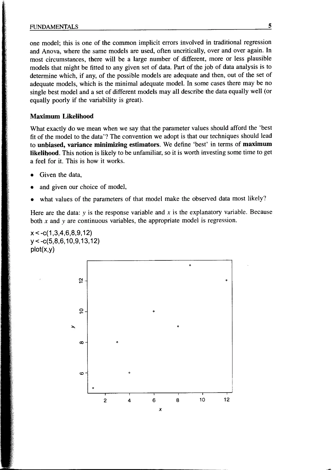
Here are the data: у is the response variable and x is the explanatory variable. Because
both x and у are continuous variables, the appropriate model is regression.
x<-0(1,3,4,6,8,9,12)
у <-0(5,8,6,10,9,13,12)
plot(x,y)
(XI
о
co
(0
6
STATISTICS: AN INTRODUCTION USING R
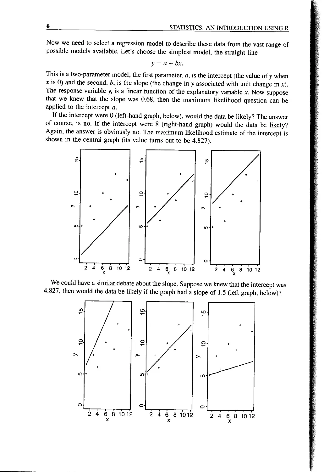
Now we need to select a regression model to describe these data from the vast range of
possible models available. Let’s choose the simplest model, the straight line
у = a + bx.
This is a two-parameter model; the first parameter, a, is the intercept (the value of у when
x is 0) and the second, b, is the slope (the change in у associated with unit change in x).
The response variable y, is a linear function of the explanatory variable x. Now suppose
that we knew that the slope was 0.68, then the maximum likelihood question can be
applied to the intercept a.
If the intercept were 0 (left-hand graph, below), would the data be likely? The answer
of course, is no. If the intercept were 8 (right-hand graph) would the data be likely?
Again, the answer is obviously no. The maximum likelihood estimate of the intercept is
shown in the central graph (its value turns out to be 4.827).
We could have a similar debate about the slope. Suppose we knew that the intercept was
4.827, then would the data be likely if the graph had a slope of 1.5 (left graph, below)?
FUNDAMENTALS
7
The answer, of course, is no. What about a slope of 0.2 (right graph)? Again, the data
are not at all likely if the graph has such a gentle slope. The maximum likelihood of the
data given the model is obtained with a slope of 0.679 (centre graph). This is not how
the procedure is actually carried out, but it makes the point that we judge the model on
the basis of how likely the data would be if the model were correct. In practice of course,
both parameters are estimated simultaneously.
Experimental Design
There are only two key concepts:
• replication, and
• randomization.
You replicate to increase reliability. You randomize to reduce bias. If you replicate
thoroughly and randomize properly, you will not go far wrong.
There are a number of other issues whose mastery will increase the likelihood that you
analyse your data the right way rather than the wrong way:
• the principle of parsimony,
• the power of a statistical test,
• controls,
• spotting pseudoreplication and knowing what to do about it,
• the difference between experimental and observational data (non-orthogonality).
It does not matter very much if you cannot do your own advanced statistical analysis. If
your experiment is properly designed, you will often be able to find somebody to help
you with the statistics. However, if your experiment is not properly designed, or not
thoroughly randomized, or lacking adequate controls, then no matter how good you are at
statistics, some (or possibly even all) of your experimental effort will have been wasted.
No amount of high-powered statistical analysis can turn a bad experiment into a good
one. R is good, but not that good.
The Principle of Parsimony (Occam’s Razor)
One of the most important themes running through this book concerns model simplifica-
tion. The principle of parsimony is attributed to the 14th century English Nominalist
philosopher William of Occam who insisted that, given a set of equally good explanations
for a given phenomenon, then the correct explanation is the simplest explanation. It is
called Occam’s razor because he ‘shaved’ his explanations down to the bare minimum. In
statistical modelling, the principle of parsimony means that:
• models should have as few parameters as possible,
• linear models should be preferred to non-linear models,
• experiments relying on few assumptions should be preferred to those relying on many,
8
STATISTICS: AN INTRODUCTION USING R
• models should be pared down until they are minimal adequate,
• simple explanations should be preferred to complex explanations.
The process of model simplification is an integral part of hypothesis testing in R. In
general, a variable is retained in the model only if it causes a significant increase
in deviance when it is removed from the cunent model. Seek simplicity, then distrust
it.
In our zeal for model simplification, we must be careful not to throw the baby out with
the bathwater. Einstein made a characteristically subtle modification to Occam’s razor.
He said: ‘A model should be as simple as possible. But no simpler’.
Observation, Theory and Experiment
There is no doubt that the best way to solve scientific problems is through a thoughtful
blend of observation, theory and experiment. In most real situations, however, there are
constraints on what can be done, and on the way things can be done, which mean that one
or more of the trilogy has to be sacrificed. There are lots of cases, for example, where it
is ethically or logistically impossible to carry out manipulative experiments. In these
cases it is doubly important to ensure that the statistical analysis leads to conclusions that
are as critical and as unambiguous as possible.
Controls
No controls, no conclusions.
Replication: It’s the n’s that Justify the Means
The requirement for replication arises because if we do the same thing to different
individuals we are likely to get different responses. The causes of this heterogeneity in
response are many and varied (genotype, age, gender, condition, history, substrate,
microclimate, and so on). The object of replication is to increase the reliability of
parameter estimates, and to allow us to quantify the variability that is found within the
same treatment. To qualify as replicates, the repeated measurements:
• must be independent,
• must not form part of a time series (data collected from the same place on successive
occasions are not independent),
• must not be grouped together in one place (aggregating the replicates means that they
are not spatially independent),
• must be of an appropriate spatial scale.
Ideally, one replicate from each treatment ought to be grouped together into a block, and
each treatment repeated in many different blocks. Repeated measures (e.g. from the same
individual or the same spatial location) are not replicates (this is probably the commonest
cause of pseudoreplication in statistical work).
FUNDAMENTALS
9
How Many Replicates?
The usual answer is ‘as many as you can afford’. An alternative answer is 30. A very
useful rule of thumb is this: a sample of 30 or more is a big sample, but a sample of less
than 30 is a small one. The rule doesn’t always work, of course: 30 would be derisively
small as a sample in an opinion poll, for instance. In other circumstances, it might be
impossibly expensive to repeat an experiment as many as 30 times. Nevertheless, it is a
rule of great practical utility, if only for giving you pause as you design your experiment
with 300 replicates that perhaps this might really be a bit over the top - or when you
think you could get away with just five replicates this time.
There are ways of working out the replication necessary for testing a given hypothesis
(these are explained below). Sometimes we know little or nothing about the variance
or the response variable when we are planning an experiment. Experience is important.
So are pilot studies. These should give an indication of the variance between initial
units before the experimental treatments are applied, and also of the approximate
magnitude of the responses to experimental treatment that are likely to occur. Sometimes
it may be necessary to reduce the scope and complexity of the experiment, and to
concentrate the inevitably limited resources of manpower and money on obtaining an
unambiguous answer to a simpler question. It is immensely irritating to spend three years
on a grand experiment, only to find at the end of it that the response is only significant at
p = 0.08. A reduction in the number of treatments might well have allowed an increase in
replication to the point where the same result would have been unambiguously
significant.
Power
The power of a test is the probability of rejecting the null hypothesis when it is false. It
has to do with Type II errors: /3 is the probability of accepting the null hypothesis when it
is false. In an ideal world, we would obviously make /3 as small as possible, but there is a
snag. The smaller we make the probability of committing a Type II error, the greater we
make the probability of committing a Type I error, and rejecting the null hypothesis
when, in fact, it is correct. A compromise is called for. Most statisticians work with
a = 0.05 and /3 = 0.2. Now the power of a test is defined as 1 — /3 = 0.8 under the
standard assumptions. This is used to calculate the sample sizes necessary to detect a
specified difference when the error variance is known (or can be guessed at). Suppose that
for a single sample the size of the difference you want to detect is d and the variance
in the response is s2 (e.g. known from a pilot study or extracted from the literature), then
you will need n replicates to reject the null hypothesis with power = 80%:
8 x s2
This is a reasonable rule of thumb, but you should err on the side of caution by having
larger, not smaller samples than these. Suppose that the mean is close to 20, and the
variance is 10, but we want to detect a 10% change (i.e. d = ±2) with probability 0.8,
then n = 8 x 10/22 = 20.
10
STATISTICS: AN INTRODUCTION USING R
Here is the built-in function power!.test in action for the case just considered. We
need to specify that the type is “one sample”, the power we want to obtain is 0.8, the
difference to be detected (called delta) is 2.0, and the standard deviation (sd) is \/Гб
power.t.test(type = "one.sample",power=0.8,sd = sqrt(10),delta = 2)
One-sample t test power calculation
n = 21.62146
delta = 2
sd = 3.162278
sig. level = 0.05
power = 0.8
alternative = two.sided
Other power functions available in R include power.anova.test and power.prop.test
Randomization
Randomization is something that everybody says they do, but hardly anybody does
properly. Take a simple example. How do I select one tree from a forest of trees, on
which to measure photosynthetic rates? I want to select the tree at random in order to
avoid bias. For instance, I might be tempted to work on a tree that had accessible foliage
near to the ground, or a tree that was close to the lab, or a tree that looked healthy, or a
tree that had nice insect-free leaves, and so on. I leave it to you to list the biases that
would be involved in estimating photosynthesis on any of those trees. One common way
of selecting a ‘random’ tree is to take a map of the forest and select a random pair of
coordinates (say 157m east of the reference point, and 68m north). Then pace out these
coordinates and, having arrived at that particular spot in the forest, select the nearest tree
to those coordinates. But is this really a randomly selected tree?
If it was randomly selected, then it would have exactly the same chance of being
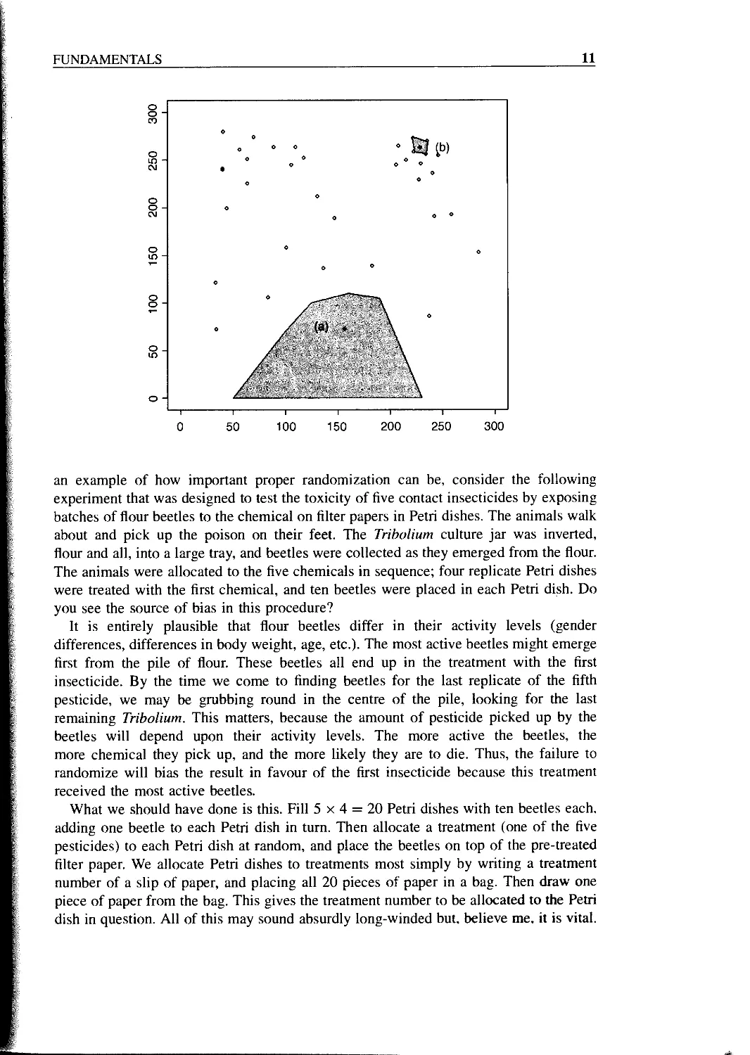
selected as every other tree in the forest. Let us think about this. Look at the figure below
which shows a plan of the distribution of trees on the ground. Even if they were originally
planted out in regular rows, accidents, tree-falls, and heterogeneity in the substrate would
soon lead to an aggregated spatial distribution of trees. Now ask yourself how many
different random points would lead to the selection of a given tree. Start with tree (a).
This will be selected by any points falling in the large shaded area.
Now consider tree (b). It will only be selected if the random point falls within the tiny
area surrounding that tree. Tree (a) has a much greater chance of being selected than tree
(b), and so the nearest tree to a random point is not a randomly selected tree. In a spatially
heterogeneous woodland, isolated trees and trees on the edges of clumps will always
have a higher probability of being picked than trees in the centre of clumps.
The answer is that to select a tree at random, every single tree in the forest must be
numbered (all 24 683 of them, or whatever), and then a random number between 1 and
24 683 must be drawn out of a hat. There is no alternative. Anything less than that is not
randomization.
Now ask yourself how often this is done in practice, and you will see what I mean
when I say that randomization is a classic example of ‘do as I say, and not do as I do’. As
FUNDAMENTALS
11
an example of how important proper randomization can be, consider the following
experiment that was designed to test the toxicity of five contact insecticides by exposing
batches of flour beetles to the chemical on filter papers in Petri dishes. The animals walk
about and pick up the poison on their feet. The Tribolium culture jar was inverted,
flour and all, into a large tray, and beetles were collected as they emerged from the flour.
The animals were allocated to the five chemicals in sequence; four replicate Petri dishes
were treated with the first chemical, and ten beetles were placed in each Petri dish. Do
you see the source of bias in this procedure?
It is entirely plausible that flour beetles differ in their activity levels (gender
differences, differences in body weight, age, etc.). The most active beetles might emerge
first from the pile of flour. These beetles all end up in the treatment with the first
insecticide. By the time we come to finding beetles for the last replicate of the fifth
pesticide, we may be grubbing round in the centre of the pile, looking for the last
remaining Tribolium. This matters, because the amount of pesticide picked up by the
beetles will depend upon their activity levels. The more active the beetles, the
more chemical they pick up, and the more likely they are to die. Thus, the failure to
randomize will bias the result in favour of the first insecticide because this treatment
received the most active beetles.
What we should have done is this. Fill 5 x 4 = 20 Petri dishes with ten beetles each,
adding one beetle to each Petri dish in turn. Then allocate a treatment (one of the five
pesticides) to each Petri dish at random, and place the beetles on top of the pre-treated
filter paper. We allocate Petri dishes to treatments most simply by writing a treatment
number of a slip of paper, and placing all 20 pieces of paper in a bag. Then draw one
piece of paper from the bag. This gives the treatment number to be allocated to the Petri
dish in question. All of this may sound absurdly long-winded but, believe me. it is vital.
12
STATISTICS: AN INTRODUCTION USING R
The recent trend towards ‘haphazard’ sampling is a cop-out. What it means is that T
admit that I didn’t randomize, but you have to take my word for it that this did not
introduce any important bias’. You can draw your own conclusions.
Strong Inference
One of the most powerful means available to demonstrate the accuracy of an idea is an
experimental confirmation of a prediction made by a carefully formulated hypothesis.
There are two essential steps to the protocol of strong inference (Platt 1964):
• formulate a clear hypothesis, and
• devise an acceptable test.
Neither one is much good without the other. For example, the hypothesis should not lead
to predictions that are likely to occur by other extrinsic means. Similarly, the test should
demonstrate unequivocally whether the hypothesis is true or false.
A great many scientific experiments appear to be carried out with no particular
hypothesis in mind at all, but simply to see what happens. While this approach may be
commendable in the early stages of a study, such experiments tend to be weak as an end
in themselves, because there will be such a large number of equally plausible explana-
tions for the results. Without contemplation there will be no testable predictions; without
testable predictions there will be no experimental ingenuity; without experimental
ingenuity there is likely to be inadequate control; in short, equivocal interpretation.
The results could be due to myriad plausible causes. Nature has no stake in being
understood by scientists. We need to work at it. Without replication, randomization and
good controls we shall make little progress.
Weak Inference
The phrase weak inference is used (often disparagingly) to describe the interpretation of
observational studies and the analysis of so-called ‘natural experiments’. It is silly to be
disparaging about these data, because they are often the only data that we have. The aim
of good statistical analysis is to obtain the maximum information from a given set of data,
bearing the limitations of the data firmly in mind.
Natural experiments arise when an event (often assumed to be an unusual event, but
frequently without much justification of what constitutes unusualness) occurs that is like
an experimental treatment (a hurricane blows down half of a forest block; a landslide
creates a bare substrate; a stock market crash produces lots of suddenly poor people, etc).
Hairston (1989) said: ‘The requirement of adequate knowledge of initial conditions has
important implications for the validity of many natural experiments. Inasmuch as the
“experiments” are recognized only when they are completed, or in progress at the
earliest, it is impossible to be certain of the conditions that existed before such an
“experiment” began. It then becomes necessary to make assumptions about these
conditions, and any conclusions reached on the basis of natural experiments are thereby
weakened to the point of being hypotheses, and they should be stated as such’ (Hairston
1989).
FUNDAMENTALS
13
How Long to Go On?
Ideally, the duration of an experiment should be determined in advance, lest one falls
prey to one of the twin temptations:
• to stop the experiment as soon as a pleasing result is obtained;
• to keep going with the experiment until the ‘right’ result is achieved (the ‘Gregor
Mendel effect’).
In practice, most experiments probably run for too short a period, because of the
idiosyncrasies of scientific funding. This short-term work is particularly dangerous in
medicine and the environmental sciences, because the kind of short-term dynamics
exhibited after pulse experiments may be entirely different from the long-term dynamics
of the same system. Only by long-term experiments of both the pulse and the press kind,
will the full range of dynamics be understood. The other great advantage of long-term
experiments is that a wide range of patterns (e.g. ‘kinds of years’) is experienced.
Pseudoreplication
Pseudoreplication occurs when you analyse the data as if you had more degrees of
freedom than you really have. There are two kinds of pseudoreplication:
• temporal pseudoreplication, involving repeated measurements from the same indi-
vidual, and
• spatial pseudoreplication, involving several measurements taken from the same vicinity.
Pseudoreplication is a problem because one of the most important assumptions of
standard statistical analysis is independence of errors. Repeated measures through time
on the same individual will have non-independent errors because peculiarities of the
individual will be reflected in all of the measurement made on it (the repeated measures
will be temporally correlated with one another). Samples taken from the same vicinity will
have non-independent errors because peculiarities of the location will be common to all the
samples (e.g. yields will all be high in a good patch and all be low in a bad patch).
Pseudoreplication is generally quite easy to spot. The question to ask is how many
degrees of freedom for error does the experiment really have? If a field experiment
appears to have lots of degrees of freedom, it is probably pseudoreplicated. Take an
example from pest control of insects on plants. There are 20 plots, ten sprayed and ten
unsprayed. Within each plot there are 50 plants. Each plant is measured five times during
the growing season. Now this experiment generates 20 x 50 x 5 — 5000 numbers. There
are two spraying treatments, so there must be 1 degree of freedom for spraying and 4998
degrees of freedom for error. Or must there? Count up the replicates in this experiment.
Repeated measurements on the same plants (the five sampling occasions) are certainly
not replicates. The 50 individual plants within each quadrat are not replicates either. The
reason for this is that conditions within each quadrat are quite likely to be unique, and so
all 50 plants will experience more or less the same unique set of conditions, irrespective
of the spraying treatment they receive. In fact, there are ten replicates in this experiment.
There are ten sprayed plots and ten unsprayed plots, and each plot will yield only one
independent datum to the response variable (the proportion of leaf area consumed by
14
STATISTICS: AN INTRODUCTION USING R
insects, for example). Thus, there are nine degrees of freedom within each treatment, and
2x9=18 degrees of freedom for error in the experiment as a whole. It is not difficult to
find examples of pseudoreplication on this scale in the literature (Hurlbert 1984). The
problem is that it leads to the reporting of masses of spuriously significant results (with
4998 degrees of freedom for error, it is almost impossible not to have significant
differences). The first skill to be acquired by the budding experimenter is the ability to
plan an experiment that is properly replicated.
There are various things that you can do when your data are pseudoreplicated:
• average away the pseudoreplication and carry out your statistical analysis on the
means,
• carry out separate analyses for each time period,
• use proper time series analysis or mixed effects models.
Initial Conditions
Many otherwise excellent scientific experiments are spoiled by a lack of information
about initial conditions. How can we know if something has changed if we don’t know
what it was like to begin with? It is often implicitly assumed that all the experimental
units were alike at the beginning of the experiment, but this needs to be demonstrated
rather than taken on faith. One of the most important uses of data on initial conditions is
as a check on the efficiency of randomization. For example, you should be able to run
your statistical analysis to demonstrate that the individual organisms were not signi-
ficantly different in mean size at the beginning of a growth experiment. Without
measurements of initial size, it is always possible to attribute the end result to differences
in initial conditions. Another reason for measuring initial conditions is that the informa-
tion can often be used to improve the resolution of the final analysis through analysis of
covariance (see Chapter 10).
Orthogonal Designs and Non-orthogonal Observational Data
The data in this book fall into two distinct categories. In the case of planned experiments,
all of the treatment combinations are equally represented and, barring accidents, there are
no missing values. Such experiments are said to be orthogonal. In the case of
observational studies, however, we have no control over the number of individuals for
which we have data, or over the combinations of circumstances that are observed. Many
of the explanatory variables are likely to be correlated with one another, as well as with
the response variable. Missing treatment combinations are commonplace, and the data
are said to be non-orthogonal. This makes an important difference to our statistical
modelling because, in orthogonal designs, the deviance that is attributed to a given factor
is constant, and does not depend upon the order in which that factor is removed from the
model. In contrast, with non-orthogonal data, we find that the deviance attributable to a
given factor does depend upon the order in which the factor is removed from the model.
We must be careful, therefore, to judge the significance of factors in non-orthogonal
studies, when they are removed from the maximal model (i.e. from the model including
all the other factors and interactions with which they might be confounded). Remember,
for non-orthogonal data, order matters.
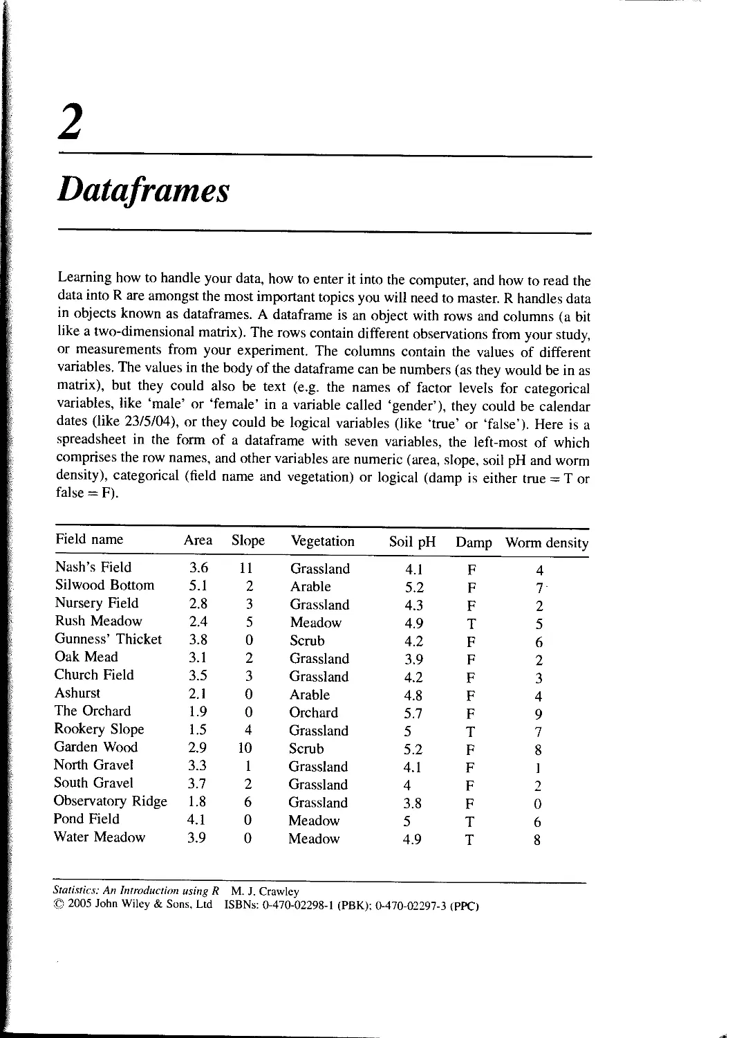
2
Dataframes
Learning how to handle your data, how to enter it into the computer, and how to read the
data into R are amongst the most important topics you will need to master. R handles data
in objects known as dataframes. A dataframe is an object with rows and columns (a bit
like a two-dimensional matrix). The rows contain different observations from your study,
or measurements from your experiment. The columns contain the values of different
variables. The values in the body of the dataframe can be numbers (as they would be in as
matrix), but they could also be text (e.g. the names of factor levels for categorical
variables, like ‘male’ or ‘female’ in a variable called ‘gender’), they could be calendar
dates (like 23/5/04), or they could be logical variables (like ‘true’ or ‘false’). Here is a
spreadsheet in the form of a dataframe with seven variables, the left-most of which
comprises the row names, and other variables are numeric (area, slope, soil pH and worm
density), categorical (field name and vegetation) or logical (damp is either true = T or
false = F).
Field name Area Slope Vegetation Soil pH Damp Worm density
Nash’s Field 3.6 11 Grassland 4.1 F 4
Silwood Bottom 5.1 2 Arable 5.2 F 7'
Nursery Field 2.8 3 Grassland 4.3 F 2
Rush Meadow 2.4 5 Meadow 4.9 T 5
Gunness’ Thicket 3.8 0 Scrub 4.2 F 6
Oak Mead 3.1 2 Grassland 3.9 F 2
Church Field 3.5 3 Grassland 4.2 F 3
Ashurst 2.1 0 Arable 4.8 F 4
The Orchard 1.9 0 Orchard 5.7 F 9
Rookery Slope 1.5 4 Grassland 5 T 7
Garden Wood 2.9 10 Scrub 5.2 F 8
North Gravel 3.3 1 Grassland 4.1 F 1
South Gravel 3.7 2 Grassland 4 F 2
Observatory Ridge 1.8 6 Grassland 3.8 F 0
Pond Field 4.1 0 Meadow 5 T 6
Water Meadow 3.9 0 Meadow 4.9 T 8
Statistics: An Introduction using R M. J. Crawley
© 2005 John Wiley & Sons, Ltd ISBNs: 0-470-02298-1 (PBK); 0-470-02297-3 (PPC)
16
STATISTICS: AN INTRODUCTION USING R
Field name Area Slope Vegetation Soil pH Damp Worm density
Cheapside 2.2 8 Scrub 4.7 T 4
Pound Hill 4.4 2 Arable 4.5 F 5
Gravel Pit 2.9 1 Grassland 3.5 F 1
Farm Wood 0.8 10 Scrub 5.1 T 3
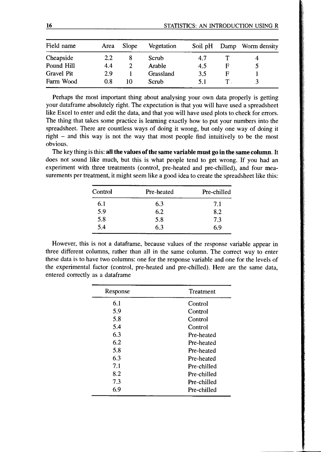
Perhaps the most important thing about analysing your own data properly is getting
your dataframe absolutely right. The expectation is that you will have used a spreadsheet
like Excel to enter and edit the data, and that you will have used plots to check for errors.
The thing that takes some practice is learning exactly how to put your numbers into the
spreadsheet. There are countless ways of doing it wrong, but only one way of doing it
right - and this way is not the way that most people find intuitively to be the most
obvious.
The key thing is this: all the values of the same variable must go in the same column. It
does not sound like much, but this is what people tend to get wrong. If you had an
experiment with three treatments (control, pre-heated and pre-chilled), and four mea-
surements per treatment, it might seem like a good idea to create the spreadsheet like this:
Control Pre-heated Pre-chilled
6.1 6.3 7.1
5.9 6.2 8.2
5.8 5.8 7.3
5.4 6.3 6.9
However, this is not a dataframe, because values of the response variable appear in
three different columns, rather than all in the same column. The correct way to enter
these data is to have two columns: one for the response variable and one for the levels of
the experimental factor (control, pre-heated and pre-chilled). Here are the same data,
entered correctly as a dataframe
Response Treatment
6.1 Control
5.9 Control
5.8 Control
5.4 Control
6.3 Pre-heated
6.2 Pre-heated
5.8 Pre-heated
6.3 Pre-heated
7.1 Pre-chilled
8.2 Pre-chilled
7.3 Pre-chilled
6.9 Pre-chilled
DATAFRAMES
17
A good way to practice this layout is to use the Excel function called Pivot Table
(found under the Data tab on the main menu bar) on your own data; it requires your
spreadsheet to be in the form of a dataframe, with each of the explanatory variables in its
own column.
Once you have made your dataframe in Excel and corrected all the inevitable data-
entry and spelling errors, then you need to save the dataframe in a file format that can be
read by R. Much the simplest way is to save all your dataframes from Excel as tab-
delimited text files: File/Save As/... then from the ‘Save as type’ options choose ‘Text
(Tab delimited)’. There is no need to add a suffix, because Excel will automatically add
‘.txt’ to your file name. This file can then be read into R directly as a dataframe, using the
read.table function.
It is important to note that read.table would fail if there were any spaces in any of the
variable names in row 1 of the dataframe (the header row) like Field name, Soil pH or
Worm density, or between any of the words within the same factor level (as in many of
the Field names). We should replace all these spaces by dots ‘.’ before saving the
dataframe in Excel (use Edit/Replace with “ ” replaced by “.”). Now the dataframe can
be read into R. There are three things to remember:
• the whole path and file name needs to be enclosed in double quotes: “c:\\abc.txt”,
• header = T says that the first row contains the variable names,
• always use double backslash \\ rather than \ in the file path definition.
Think of a name for the data frame (say ‘worms’ in this case). Now use the gets arrow
< — which is a composite symbol made up of the two characters < (less than) and —
(minus) like this
worms < -read.table(“c:\\temp\\worms.txt”, header = T.row.names = 1)
Once the file has been imported to R we want to do two things:
• use attach to make the variables accessible by name within the R session, and
• use names to get a list of the variable names.
Typically, the two commands are issued in sequence, whenever a new dataframe is
imported from file:
attach(worms)
names(worms)
[ 1] Field.Name" "Area" "Slope"
"Vegetation"
[ 5] "Soil.pH" "Damp" "Worm.density"
To see the contents of the dataframe, just type its name
18
STATISTICS: AN INTRODUCTION USING R
worms
Area Slope Vegetation Soil.pH Damp Worm.density
Nash' s. Field 3.6 11 Grassland 4.1 FALSE 4
Silwood.Bottom 5.1 2 Arable 5.2 FALSE 7
Nursery.Field 2.8 3 Grassland 4.3 FALSE 2
Rush.Meadow 2.4 5 Meadow 4.9 TRUE 5
Gunness' .Thicket 3.8 0 Scrub 4.2 FALSE 6
Oak.Mead 3.1 2 Grassland 3.9 FALSE 2
Church.Field 3.5 3 Grassland 4.2 FALSE 3
Ashurst 2.1 0 Arable 4.8 FALSE 4
The.Orchard 1.9 0 Orchard 5.7 FALSE 9
Rookery.Slope 1.5 4 Grassland 5.0 TRUE 7
Garden.Wood 2.9 10 Scrub 5.2 FALSE 8
North.Gravel 3.3 1 Grassland 4.1 FALSE 1
South.Gravel 3.7 2 Grassland 4.0 FALSE 2
Observatory.Ridge 1.8 6 Grassland 3.8 FALSE 0
Pond.Field 4.1 0 Meadow 5.0 TRUE 6
Water.Meadow 3.9 0 Meadow 4.9 TRUE 8
Cheapside 2.2 8 Scrub 4.7 TRUE 4
Pound.Hill 4.4 2 Arable 4.5 FALSE 5
Gravel.Pit 2.9 1 Grassland 3.5 FALSE 1
Farm.Wood 0.8 10 Scrub 5.1 TRUE 3
If, as here, the rows have unique names as part of the dataframe, we suppress R’s
natural inclination to produce its own row numbers, by telling R the number of the
column containing the row names (1 in this case) as part of the read.table function (see
above). Notice, also, that R has expanded our abbreviated Tand F into TRUE and FALSE.
The object called worms now has all the attributes of a dataframe. For example, you can
summarize it, using summary:
summary(worms)
Area Slope Vegetation Soil .pH Damp
Min. : 0.800 Min. : 0.00 Arable : 3 Min. : 3.500 Mode :logical
1st Qu. : 2.175 1st Qu. : 0.75 Grassland : 9 1st Qu. : 4.100 FALSE : 14
Median : 3.000 Median : 2.00 Meadow : 3 Median : 4.600 TRUE : 6
Mean : 2.990 Mean : 3.50 Orchard : 1 Mean : 4.555
3rd Qu. : 3.725 3rd Qu. : 5.25 Scrub : 4 3rd Qu. : 5.000
Max. : 5.100 Max. : 11.00 Max. : 5.700
Worm.density
Min. : 0.00
1st Qu . : 2.00
Median : 4.00
Mean : 4.35
3rd Qu . : 6.25
Max. : 9.00
DATAFRAMES
19
Values of continuous variables are summarized under six headings: one parametric (the
arithmetic mean) and five non-parametric (maximum, minimum, median, 25 percentile -
the first quartile - and 75 percentile - the third quartile). Levels of categorical variables
are counted. Note that the field names are not summarized, because they have been
declared to be the row names, and hence all the names have to be unique.
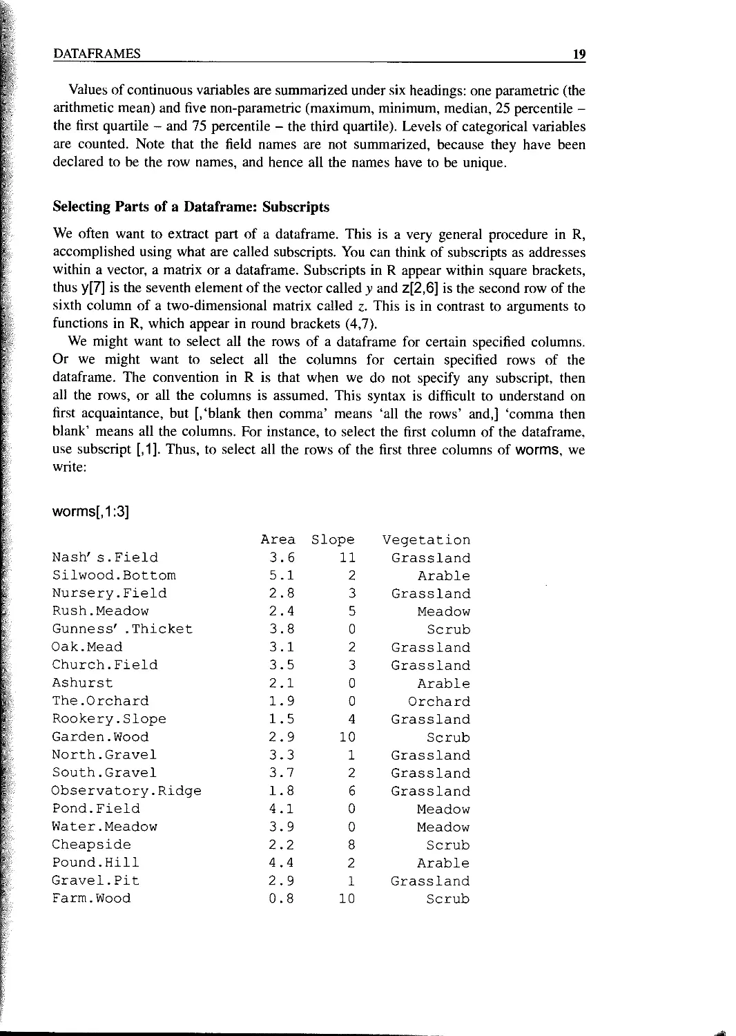
Selecting Parts of a Dataframe: Subscripts
We often want to extract part of a dataframe. This is a very general procedure in R,
accomplished using what are called subscripts. You can think of subscripts as addresses
within a vector, a matrix or a dataframe. Subscripts in R appear within square brackets,
thus y[7] is the seventh element of the vector called у and z[2,6] is the second row of the
sixth column of a two-dimensional matrix called z. This is in contrast to arguments to
functions in R, which appear in round brackets (4,7).
We might want to select all the rows of a dataframe for certain specified columns.
Or we might want to select all the columns for certain specified rows of the
dataframe. The convention in R is that when we do not specify any subscript, then
all the rows, or all the columns is assumed. This syntax is difficult to understand on
first acquaintance, but [,‘blank then comma’ means ‘all the rows’ and,] ‘comma then
blank’ means all the columns. For instance, to select the first column of the dataframe,
use subscript [,1]. Thus, to select all the rows of the first three columns of worms, we
write:
worms[,1:3]
Area Slope Vegetation
Nash's. Field 3.6 11 Grassland
Silwood.Bottom 5.1 2 Arable
Nursery.Field 2.8 3 Grassland
Rush.Meadow 2.4 5 Meadow
Gunness' .Thicket 3.8 0 Scrub
Oak.Mead 3.1 2 Grassland
Church.Field 3.5 3 Grassland
Ashurst 2.1 0 Arable
The.Orchard 1.9 0 Orchard
Rookery.Slope 1.5 4 Grassland
Garden.Wood 2.9 10 Scrub
North.Gravel 3.3 1 Grassland
South.Gravel 3.7 2 Grassland
Observatory.Ridge 1.8 6 Grassland
Pond.Field 4.1 0 Meadow
Water.Meadow 3.9 0 Meadow
Cheapside 2.2 8 Scrub
Pound.Hill 4.4 2 Arable
Gravel.Pit 2.9 1 Grassland
Farm.Wood 0.8 10 Scrub
20
STATISTICS: AN INTRODUCTION USING R
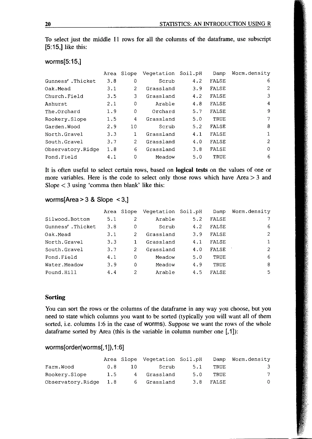
To select just the middle 11 rows for all the columns of the dataframe, use subscript
[5:15,] like this:
worms[5:15,]
Area Slope Vegetation Soil.pH Damp Worm.density
Gunness' .Thicket 3.8 0 Scrub 4.2 FALSE 6
Oak.Mead 3.1 2 Grassland 3.9 FALSE 2
Church.Field 3.5 3 Grassland 4.2 FALSE 3
Ashurst 2.1 0 Arable 4.8 FALSE 4
The.Orchard 1.9 0 Orchard 5.7 FALSE 9
Rookery.Slope 1.5 4 Grassland 5.0 TRUE 7
Garden.Wood 2.9 10 Scrub 5.2 FALSE 8
North.Gravel 3.3 1 Grassland 4.1 FALSE 1
South.Gravel 3.7 2 Grassland 4.0 FALSE 2
Observatory.Ridge 1.8 6 Grassland 3.8 FALSE 0
Pond.Field 4.1 0 Meadow 5.0 TRUE 6
It is often useful to select certain rows, based on logical tests on the values of one or
more variables. Here is the code to select only those rows which have Area > 3 and
Slope < 3 using ‘comma then blank’ like this:
worms[Area > 3 & Slope < 3,]
Area Slope Vegetation Soil.pH Damp Worm.density
Silwood.Bottom 5.1 2 Arable 5.2 FALSE 7
Gunness' .Thicket 3.8 0 Scrub 4.2 FALSE 6
Oak.Mead 3.1 2 Grassland 3.9 FALSE 2
North.Gravel 3.3 1 Grassland 4.1 FALSE 1
South.Gravel 3.7 2 Grassland 4.0 FALSE 2
Pond.Field 4.1 0 Meadow 5.0 TRUE 6
Water.Meadow 3.9 0 Meadow 4.9 TRUE 8
Pound.Hill 4.4 2 Arable 4.5 FALSE 5
Sorting
You can sort the rows or the columns of the dataframe in any way you choose, but you
need to state which columns you want to be sorted (typically you will want all of them
sorted, i.e. columns 1:6 in the case of worms). Suppose we want the rows of the whole
dataframe sorted by Area (this is the variable in column number one [,1]):
worms[order(worms[, 1 ]), 1:6]
Area Slope Vegetation Soil.pH Damp Worm.density
Farm.Wood 0.8 10 Scrub 5.1 TRUE 3
Rookery.Slope 1.5 4 Grassland 5.0 TRUE 7
Observatory.Ridge 1.8 6 Grassland 3.8 FALSE 0
DATAFRAMES
21
The.Orchard 1.9 0 Orchard 5.7 FALSE 9
Ashurst 2.1 0 Arable 4.8 FALSE 4
Cheapside 2.2 8 Scrub 4.7 TRUE 4
Rush.Meadow 2.4 5 Meadow 4.9 TRUE 5
Nursery.Field 2.8 3 Grassland 4.3 FALSE 2
Garden.Wood 2.9 10 Scrub 5.2 FALSE 8
Gravel.Pit 2.9 1 Grassland 3.5 FALSE 1
Oak.Mead 3.1 2 Grassland 3.9 FALSE 2
North.Gravel 3.3 1 Grassland 4.1 FALSE 1
Church.Field 3.5 3 Grassland 4.2 FALSE 3
Nash's. Field 3.6 11 Grassland 4.1 FALSE 4
South.Gravel 3.7 2 Grassland 4.0 FALSE 2
Gunness' .Thicket 3.8 0 Scrub 4.2 FALSE 6
Water-Meadow 3.9 0 Meadow 4.9 TRUE 8
Pond.Field 4.1 0 Meadow 5.0 TRUE 6
Pound.Hill 4.4 2 Arable 4.5 FALSE 5
Silwood.Bottom 5.1 2 Arable 5.2 FALSE 7
Alternatively, the dataframe can be sorted in descending order by Soil pH, with only Soil
pH and Worm density as output:
worms[rev(order(worms[,4])),c(4,6)]
Soil.pH Worm.density
The.Orchard 5.7 9
Garden.Wood 5.2 8
Silwood.Bottom 5.2 7
Farm.Wood 5.1 3
Pond.Field 5.0 6
Rookery.Slope 5.0 7
Water-Meadow 4.9 8
Rush.Meadow 4.9 5
Ashurst 4.8 4
Cheapside 4.7 4
Pound.Hill 4.5 5
Nursery.Field 4.3 2
Church.Field 4.2 ' 3
Gunness' -Thicket 4.2 6
North.Gravel 4.1 1
Nash' s. Field 4.1 4
South.Gravel 4.0 2
Oak.Mead 3.9 2
Observatory.Ridge 3.8 0
Gravel.Pit 3.5 1
22
STATISTICS: AN INTRODUCTION USING R
Saving Your Work
At any stage, you can highlight material on the screen, then use copy (Ctrl C) and paste
(Ctrl V) to save it to a Word document. Note that to keep tabular material properly
aligned in the Word document you will need to use a font like Courier New that has
absolute (rather than proportional) spacing. Graphs that you want to keep should be saved
as you go along (using File: Save As when the graphics window is highlighted, to chose
an appropriate format), or copied and pasted into a Word document.
You can review the command lines entered during a session with
history(lnf)
and you can copy from this and paste into the command line to save re-typing. You can
save the history of command lines to a text file like this
savehistory("c:\\temp\\today.txt")
and read it back into R with loadhistory("c:\\temp\\today.txt"). The session as a whole
can be saved as a binary file with
save(list = ls(), file = "c:\\temp\\all.Rdata")
and retrieved using load("c:\\temp\\all.Rdata")
Tidying Up
At the end of a session in R, it is good practice to remove (rm) any variables names you
have created (using, say, X <- 5.6) and to detach any dataframes you have attached
earlier in the session. That way, variables with the same names but different properties
will not get in each other’s way in subsequent work:
rm(x,y,z)
detach(worms)
This command does not make the dataframe called worms disappear; it just means that
the variables within worms, like Slope and Area, are no longer accessible directly by
name. To get rid of everything, including all the dataframes, type
rm(list = ls())
but be absolutely sure that you want to be as Draconian as this before you execute the
command.
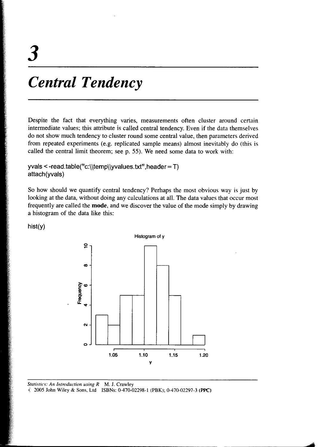
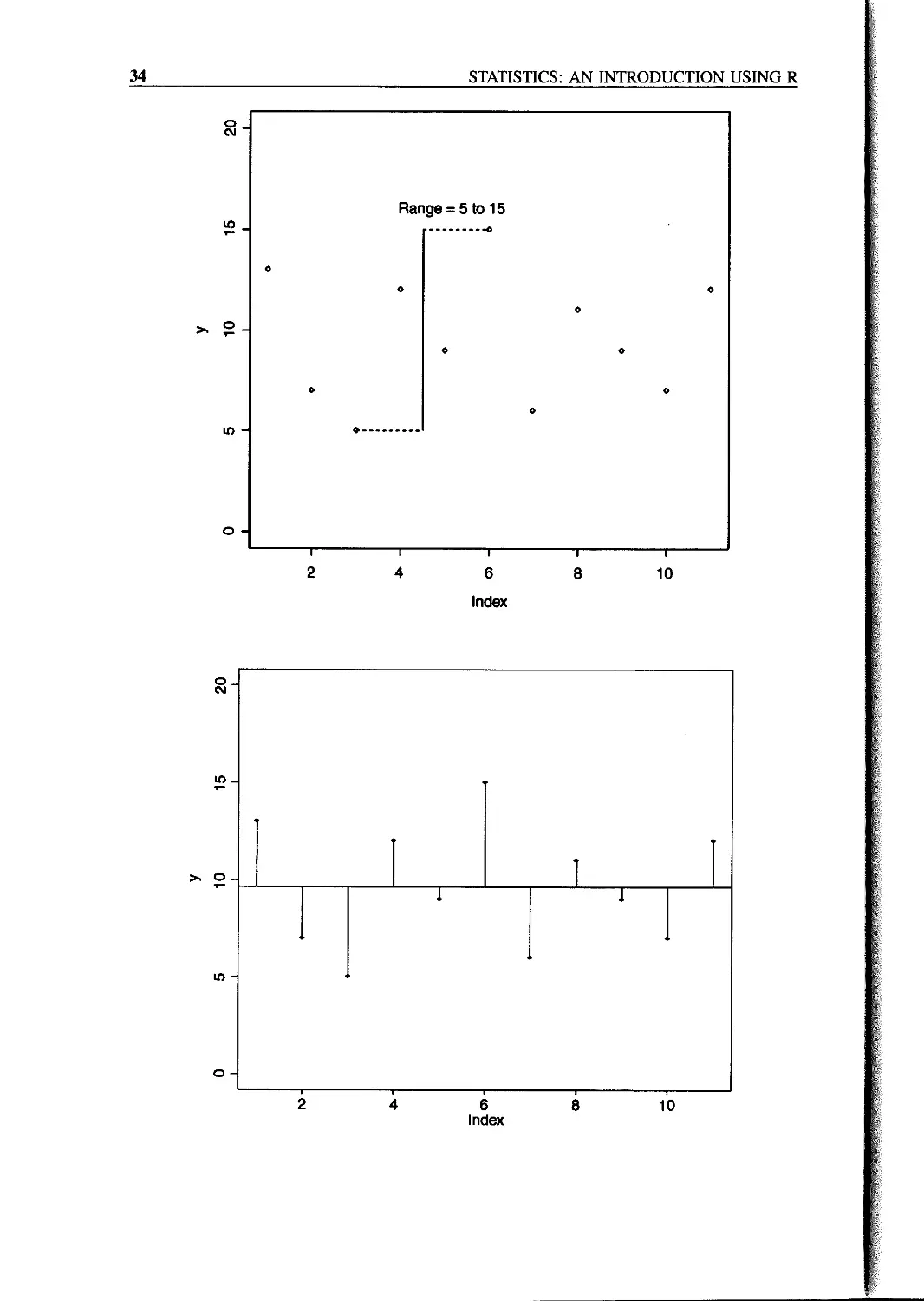
Central Tendency
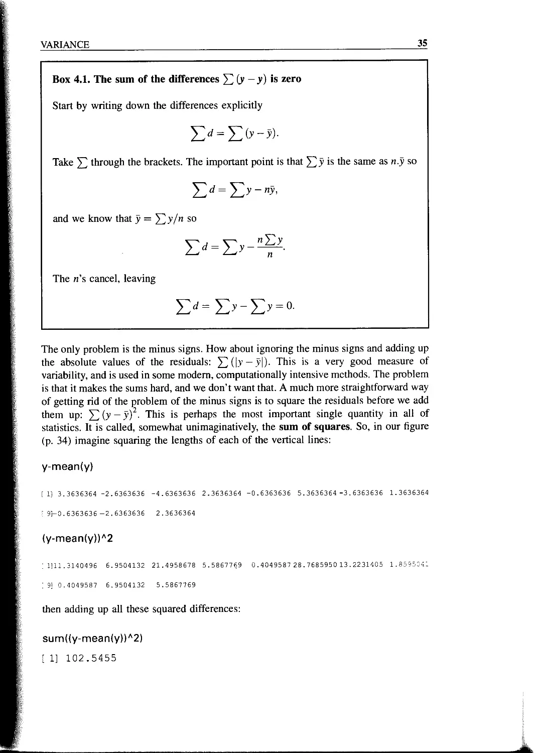
Despite the fact that everything varies, measurements often cluster around certain
intermediate values; this attribute is called central tendency. Even if the data themselves
do not show much tendency to cluster round some central value, then parameters derived
from repeated experiments (e.g. replicated sample means) almost inevitably do (this is
called the central limit theorem; see p. 55). We need some data to work with:
yvals < -read.table("c:\\temp\\yvalues.txt",header = T)
attach(yvals)
So how should we quantify central tendency? Perhaps the most obvious way is just by
looking at the data, without doing any calculations at all. The data values that occur most
frequently are called the mode, and we discover the value of the mode simply by drawing
a histogram of the data like this:
hist(y)
Statistics: An Introduction using R M. J. Crawley
C 2005 John Wiley & Sons, Ltd ISBNs: 0-470-02298-1 (PBK); 0-470-02297-3 (PPC)
24
STATISTICS: AN INTRODUCTION USING R
So we would say that the modal class of у was between 1.10 and 1.12 (we’ll see how to
control the location of the break points in a histogram later).
The most straightforward quantitative measure of central tendency is the arithmetic
mean of the data. This is the sum of all the data values 52 У divided by the number of data
values, n. The capital Greek sigma 52 just means ‘add up all the values’ of what follows;
in this case, a set of у values. So if we call the arithmetic mean ‘y bar’, y, we can write
The formula shows how we would write a general function to calculate arithmetic means
for any vector of у values. First, we need to add them up. We could do it like this:
y[1] + y[2] + y[3] + ....y[n]
but that is very long-winded and it supposes that we know the value of n in advance.
Fortunately, there is a built-in function called sum that works for any length of vector, so
total < - sum(y)
gives us the value for the numerator. Now what about the number of data values? This is
likely to vary from application to application. We could print out the у values and count
them, but that is very tedious and error-prone. There is a very important, general function
in R to work this out for us. The function is called length(y) and it returns the number of
numbers in the vector called y:
n < - length(y)
So our function for calculating the arithmetic mean would be ybar < - total/n. There is
no need to calculate the intermediate values, total and n, so it would be more efficient to
write ybar < - sum(y)/length(y). To put this logic into a general function we need to
pick a name for the function, let’s say ‘arithmetic.mean’ then define it as follows:
arithmetic.mean < - function(x) {
sum(x)/length(x) }
Notice three things: the calculations are enclosed within curly brackets {}; we don’t
assign the answer sum(x)/length(x) to a variable name like ybar; and the name of the
vector used inside the function (x) may be different from the names on which we might
want to use the function in future (like y, w or z for instance). If you type the name of a
function on its own, you get a listing of the contents:
arithmetic.mean
function (x) {
sum(x)/length(x) }
CENTRAL TENDENCY
25
Now we can test the function on some data. First we use a simple data set where we know
the answer already, so that we can check that the function works properly, such as
data<-c(3,4,6,7)
where we can see immediately that the arithmetic mean is 5.
arithmetic.mean(data)
[ 1] 5
So that’s all right. Now we can try it on a realistically big data set
arithmetic.mean(y)
[ 1] 1.103464
You won’t be surprised to learn that R has a built-in function for calculating arithmetic
means directly and, again not surprisingly, it is called ‘mean’. It works in the same way as
our home-made function:
mean(y)
[ 1] 1.103464
Arithmetic mean is not the only quantitative measure of central tendency, and in fact it
has some rather unfortunate properties. Perhaps the most serious failing of the arithmetic
mean is that it is highly sensitive to outliers. Just a single extremely large or extremely
small value in the data set will have a big effect on the value of the arithmetic mean. We
shall return to this issue later, but our next measure of central tendency does hot suffer
from being sensitive to outliers. It is called the median, and is the ‘middle value’ in the
data set. To write a function to work out the median, the first thing we need to do is sort
the data into ascending order:
sorted < - sort(y)
Now we just need to find the middle value. There is a slight difficulty here, because if the
vector contains an even number of numbers, then there is no middle value. Let’s start
with the easy case where the vector contains an odd number of numbers. The number of
numbers in the vector is given by length(y) and the middle value is half of this:
length(y)/2
[ 1] 19.5
So the median value is the twentieth value in the sorted data set. To extract the median
value of у we need to use 20 as a subscript, not 19.5, so we need to convert the value of
length(y)/2 into an integer. We use ceiling (‘the smallest integer greater than’) for this:
26
STATISTICS: AN INTRODUCTION USING R
ceiling(length(y)/2)
[ 1] 20
So now we can extract the median value of у
sorted[20]
[ 1] 1.108847
or, more generally
sorted[ceiling(length(y)/2)]
[ 1] 1.108847
or even more generally, omitting the intermediate variable called sorted:
sort(y)[ceiling(length(y)/2)]
[ 1] 1.108847
Now what about the case where the vector contains an even number of numbers? Let’s
manufacture such a vector, by dropping the first element from our vector called у using
negative subscripts like this:
y.even<-y[-1]
length(y.even)
t 1] 38
The logic is that we shall work out the arithmetic average of the two values of у on
either side of the middle; in this case, the average of the nineteenth and twentieth sorted
values:
sort(y.even)[19]
[ 1] 1.108847
sort(y.even)[20]
[ 1] 1.108853
So in this case, the median would be
(sort(y.even)[19] + sort(y.even)[20])/2
[ 1] 1.108850
but to make it general we need to replace the 19 and 20 by length(y.even)/2 and
1 + length(y.even)/2 respectively. The question now arises as to how we know, in
CENTRAL TENDENCY
27
general, whether the vector у contains an odd or an even number of numbers, so that we
can decide which of the two methods to use. The trick here is to use ‘modulo’. This is the
remainder (the amount ‘left over’) when one integer is divided by another. An even
number has modulo 0 when divided by 2, and an odd number has modulo 1. The modulo
function in R is % % (two successive per cent symbols) and it is used where you would
use slash (/) to carry out a regular division. You can see this in action with an even
number, 38, and odd number, 39:
38%%2
[ 1] 0
39%%2
[ И 1
Now we have all the tools we need to write a general function to calculate medians. Let’s
call the function med and define it like this:
med < -function(x) {
odd.even < -length(x)%%2
if(odd.even = = 0) (sort(x)[length(x)/2] + sort(x)[1 + length(x)/2])/2
else sort(x)[ceiling(length(x)/2)]
}
Notice that when the if statement is true (i.e. we have an even number of numbers) then
the expression immediately following the if statement is evaluated (this is the code for
calculating the median with an even number of numbers). When the if statement is false
(i.e. we have an odd number of numbers, and odd.even = = 1) then the expression
following the else statement is evaluated (this is the code for calculating the median
with an odd number of numbers). Let’s try it out, first with the odd-numbered vector y,
then with the even-numbered vector y.even, to check against the values we obtained
earlier.
med(y)
[ 1] 1.108847
med(y.even)
[ 1] 1.108850
Both of these check out. Again, you won’t be surprised that there is a built-in function for
calculating medians, and helpfully it is called median:
median(y)
[ 1] 1.108847
28
STATISTICS: AN INTRODUCTION USING R
median(y.even)
[ 1] 1.108850
For processes that change multiplicatively rather than additively, then neither the
arithmetic mean nor the median is an ideal measure of central tendency. Under these
conditions, the appropriate measure is the geometric mean. The formal definition of this
is somewhat abstract: the geometric mean is the nth root of the product of the data. If we
use capital Greek pi (П) to represent multiplication, and у ‘hat’ (y) to represent the
geometric mean, then
У = </Пу-
Let’s take a simple example we can work out by hand: the numbers of insects on five
plants were as follows: 10, 1, 1000, 1, 10. Multiplying the numbers together gives
100 000. There are five numbers, so we want the fifth root of this. Roots are hard to do in
your head, so we’ll use R as a calculator. Remember that roots are fractional powers, so
the fifth root is a number raised to the power | = 0.2. In R, powers are denoted by the л
symbol, which is found above the number 6 on the keyboard:
100000л0.2
[ 1] 10
So the geometric mean of these insect numbers is ten insects per stem. Note that two of
the data were exactly like this, so it seems a reasonable estimate of central tendency. The
arithmetic mean, on the other hand, is a hopeless measure of central tendency, because
the large value (1000) is so influential: 10 + 1 + 1000 + 1 4- 10= 1022 and
1022/5 = 204.4. Note that none of the data were close to 204.4, so the arithmetic
mean is a poor estimate of central tendency in this case.
insects < -c(1,10,1000,10,1)
mean(insects)
[ 1] 204.4
Another way to calculate the geometric mean involves the use of logarithms. Recall that
to multiply numbers together we add up their logarithms. And to take roots, we divide the
logarithm by the root. So we should be able to calculate a geometric mean by finding the
antilog (exp) of the average of the logarithms (log) of the data:
exp(mean(log(insects)))
[ 1] 10
Writing a general function to compute geometric means is one of the exercises.
CENTRAL TENDENCY
29
The use of geometric means draws attention to a general scientific issue. Look at the
figure below, which shows numbers varying through time in two populations. Now ask
yourself ‘which population is the more variable’? The chances are, you will pick the
upper line:
But now look at the scale on the у axis. The upper population is fluctuating 100, 200,100,
200 and so on. In other words, it is doubling and halving, doubling and halving. The
lower curve is fluctuating 10, 20, 10, 20, and so on. It, too, is doubling and halving,
doubling and halving. So the answer to the question is: ‘they are equally variable’. It is
just that one population has a higher mean value than the other (150 vs. 15 in this case).
In order not to fall into the trap of saying that the upper curve is more variable than the
lower curve, it is good practice to plot the logarithms rather than the raw values of things
like population sizes that change multiplicatively.
Now it is clear that both populations are equally variable. Note the change of scale, as
specified in the ylim = c(1,6) command (p. 30).
Finally, we should deal with a rather different measure of central tendency. Consider
the following problem. An elephant has a territory which is a square of side = 2 km. Each
morning, the elephant walks the boundary of this territory. It begins the day at a sedate
pace, walking the first side of the territory at a speed of 1 km/h. On the second side, he
30
STATISTICS: AN INTRODUCTIONUSINGR
£
E
8>
10
15
20
5
Index
has sped up to 2 km/h. By the third side he has accelerated to an impressive 4 km/h, but
this so wears him out, that he has to return on the final side at a sluggish 1 km/h. So what
is his average speed over the ground? You might say he travelled at 1, 2, 4 and 1 km/h so
the average speed is (1 + 2 + 4 + 1 )/4 = 8/4 = 2 km/h. But that is wrong. Can you see
how to work out the right answer? Recall that velocity is defined as distance travelled
divided by time taken. The distance travelled is easy: it’s just 4x2 = 8 km. The time
taken is a bit harder. The first edge was 2 km long, and travelling at 1 km/h this must have
taken 2 h. The second edge was 2 km long, and travelling at 2 km/h this must have taken
1 h. The third edge was 2 km long and travelling at 4 km/h this must have taken 0.5 h.
The final edge was 2 km long and travelling at 1 km/h this must have taken 2 h. So the
total time taken was 2 + 1 + 0.5 + 2 = 5.5 h. So the average speed is not 2 km/h but
8/5.5 = 1.4545 km/h.
The way to solve this problem is to use the harmonic mean. This is the reciprocal of
the average of the reciprocals. Remember that a reciprocal is ‘one over’. So the average
of the speed reciprocals is 2.75 + 4 = 0.6875. The reciprocal of this average is
the harmonic mean 1/0.6875 = 1.4545. In symbols, therefore, the harmonic mean, y, (y
‘curl’) is given by
1 n
n
CENTRAL TENDENCY
31
In R, we would write either
V<-C(1,2,4,1)
length(v)/sum(1/v)
[ 1] 1.454545
or
1/mean(1/v)
[ 1] 1.454545
detach(yvals)
rm(v,upper,lower,insects)
Getting Help in R
If you know the name of the function that you want to find out about, just type a question
mark, ?, followed immediately (without a space) by the name of the function. To find out
about graphics parameters (par), for instance, you would type
?par
If you do not know the exact name of the function, try browsing the index to this book, or
use the help.search facility with the name you are looking for in double quotes, like this
help.search("read")
and a list of the relevant functions involving reading data from files will appear in a
window. You can then use ? to look up the function names that look most relevent.
4
Variance
A measure of variability is perhaps the most important quantity in statistical analysis. The
greater the variability in the data, the greater will be our uncertainty in the values of
parameters estimated from the data, and the lower will be our ability to distinguish
between competing hypotheses about the data.
Consider the following data, y, which are plotted simply in the order in which they
were measured:
y<-c( 13,7,5,12,9,15,6,11,9,7,12)
plot(y,ylim=c(0,20))
How can we quantify the variation (the scatter) in у that we can see here? Perhaps the
simplest measure is the range of у values (p. 34):
range(y)
[ 1] 5 15
This is a reasonable measure of variability, but it is too dependent on outlying values
for most purposes. Also, we want all of our data to contribute to the measure of
variability, not just the maximum and minimum values. How about estimating the mean
value, and looking at the departures from the mean (known as ‘residuals’ or ‘deviations’)?
The longer these lines, the more variable the data. So this looks promising. How about
adding up the lengths of the lines: (у — у)? A moment’s thought will show that this is
no good, because the negative residuals (from the points below the mean) will cancel out
the positive residuals (from the points above the line). In fact, it is easy to prove that this
quantity (y — y) is zero, no matter what the variation in the data, so that’s no good (see
Box 4.1).
Statistics: An Introduction using R M. J. Crawley
£ 2005 John Wiley & Sons, Ltd ISBNs: 0-470-02298-1 (PBK); 0-470-02297-3 (PPC)
34
STATISTICS: AN INTRODUCTION USING R
Range = 5 to 15
4 6 8
Index
VARIANCE
35
Box 4.1. The sum of the differences 52 (У ~ У) *s zero
Start by writing down the differences explicitly
EJ=E^-^-
Take through the brackets. The important point is that 52 У is the same as n.y so
EJ=E>’“'^'
and we know that у = 52у/и so
The n’s cancel, leaving
Е^=Еу-Еу = 0-
The only problem is the minus signs. How about ignoring the minus signs and adding up
the absolute values of the residuals: 52(Ь’ — У|)- This is a very good measure of
variability, and is used in some modem, computationally intensive methods. The problem
is that it makes the sums hard, and we don’t want that. A much more straightforward way
of getting rid of the problem of the minus signs is to square the residuals before we add
them up: 52 (? _ y)2- This is perhaps the most important single quantity in all of
statistics. It is called, somewhat unimaginatively, the sum of squares. So, in our figure
(p. 34) imagine squaring the lengths of each of the vertical lines:
y-mean(y)
[ 1] 3.3636364 -2.6363636 -4.6363636 2.3636364 -0.6363636 5.3636364 -3.6363636 1.3636364
i 9]—0.6363636 -2.6363636 2.3636364
(y-mean(y))A2
: 1111.3140496 6.9504132 21.4958678 5.5867769 0.404 9587 28.768 5950 13.2231405 1.8595041
: 91 0.4049587 6.9504132 5.5867769
then adding up all these squared differences:
sum((y-mean(y))A2)
[ 1] 102.5455
36 STATISTICS: AN INTRODUCTION USING R
So the sum of squares for our data is 102.5455. But what are its units? Well that depends
on the units in which у is measured. Suppose the у values were lengths in mm. So the
units of the sum of squares are nun2 (like an area).
Now what would happen to the sum of squares if we added a twelfth data point? It
would get bigger, of course. And it would get bigger for every extra data point we added
(except in the unlikely event that our new data point was exactly equal to the mean value,
in which case we would add zero squared = 0). We don’t want our measure of variability
to depend on sample size in this way, so the obvious solution is to divide by the number
of samples, to get the mean squared deviation.
At this point we need to make a brief, but important, diversion. Before we can
progress, we need to understand the concept of degrees of freedom.
Degrees of Freedom
Suppose we had a sample of five numbers and their average was 4. What was the sum of
the five numbers? It must have been 20, otherwise the mean would not have been 4. So
now let’s think about each of the five numbers in turn.
We are going to put a number in each of the five boxes. If we allow that the numbers
could be positive or negative real numbers, we ask how many values could the first
number take. Once you see what I’m doing, you will realize it could take any value.
Suppose it was a 2.
2
How many values could the next number take? It could be anything. Say it was a 7.
2 7
And the third number could be anything. Suppose it was a 4.
2 7 4
The fourth number could be anything at all. Say it was 0.
2 7 4 0
Now, how many values could the last number take? Just one - it has to be another 7
because the numbers have to add up to 20 because the mean of the five numbers is 4.
2 7 4 0 7
VARIANCE
37
To recap, we have total freedom in selecting the first number-and the second, third and
fourth numbers. However, we have no choice at all in selecting the fifth number. We have
four degrees of freedom when we have five numbers. In general we have (n — I) degrees
of freedom if we estimated the mean from a sample of size n. More generally still, we can
propose a formal definition of degrees of freedom: degrees of freedom is the sample
size, n, minus the number of parameters, p, estimated from the data. This is so
important, you should memorize it. In the example we plotted earlier we had n = 11 and
we estimated just one parameter from the data, the sample mean, y. So we have
n - 1 = 10 d.f.
Variance
We return to developing our quantitative measure of variability. We have come to the
conclusion that the sum of squares (y — y)2 is a good basis for assessing variability,
but we have the problem that the sum of squares increases with every new data point we
add to the sample. The intuitive thing to do would be to divide by the number of numbers,
n, to get the mean squared deviation, but look at the formula for the sum of squares:
(y — y)2. We cannot begin to calculate it until we know the value of the sample mean,
y, and where do we get the value of у from? Do we know it in advance? Can we look it up
in tables? No, we need to calculate it from the data. The mean value у is a parameter
estimated from the data, so we loose one degree of freedom as a result. Thus, in
calculating the mean squared deviation we divide by the degrees of freedom, n — 1,
rather than by the sample size, n. In the jargon, this provides us with an unbiased estimate
of the variance, because we have taken account of the fact that one parameter was
estimated from the data prior to computation.
Now we can formalize our definition of the measure that we shall use throughout the
book for quantifying variability. It is called variance and it is represented conventionally
by s2:
sum of squares
variance = ---------—------—.
degrees or freedom
This is one of the most important definitions in the book, and you should commit it to
memory. We can put it into a more mathematical form, by spelling out what we mean by
each of the phrases in the numerator and the denominator:
2
variance — s
_E(y-y)2
n — 1
Let’s write an R function to do this. We have most of the necessary components already
(see above); the sum of squares is obtained as sum((y-mean(y))A2). For the degrees of
freedom, we need to know the number of numbers in the vector, y. This is obtained by the
function length(y). Let’s call the function variance and write it like this:
variance <- function (x) sum((x-mean(x))A2)/(length(x)-1)
38
STATISTICS: AN INTRODUCTION USING R
Now we can try out the function on our data, like this
variance(y)
[ 1] 10.25455
So there we have it. Our quantification of the variation we saw in the first plot is the
sample variance, s2 = 10.25455. You will not be surprised that R provides its own, built-
in function for calculating variance, and it has an even simpler name than the function we
just wrote: var
var(y)
[ 1] 10.25455
Variance is used in countless ways in statistical analysis, so this section is probably the
most important section in the whole book, and you should re-read it until you are sure
that you know exactly what variance is, and precisely what it measures (Box 4.2).
Box 4.2. Short-cut formula for the sum of squares (у _ У)2
The main problem with the formula defining variance is that it involves all those
subtractions, у — у. It would be good to find a simpler way of calculating the sum of
squares. Let’s expand the bracketed term (y — y)2 to see if we can make any
progress towards a subtraction-free solution:
(y - y)2 = (y - y)(y - y) = y2 - 2yy + y2.
So far, so good. Now we apply the summation
E?-2jE, + „y==E/-2&Ey + »[&]!.
Note that only the y’s take the summation sign. This is because we can replace J^y
by ny. Now replace у with J^y/n on the right-hand side, then cancel the n’s and
collect the terms:
E?_2E>f+„E>£ = E?_E£
n n2 n
This is the short-cut formula for computing the sum of squares. It requires only two
quantities to be estimated from the data: the sum of the squared у values У2 and
the square of the sum of the у values Ey]2.
VARIANCE
39
A Worked Example
The data in the following table come from three market gardens. The data show the ozone
concentrations in parts per hundred million (pphm) on ten summer days.
ozone<-read.table("c:\\temp\\garclens.txt",heacler=T)
attach(ozone)
ozone
gardenA gardenB gardenC
1 3 5 3
2 4 5 3
3 4 6 2
4 3 7 1
5 2 4 10
6 3 4 4
7 1 3 3
8 3 5 11
9 5 6 3
10 2 5 10
The first step in calculating variance is to work out the mean:
mean(gardenA)
[ 1] 3
Now we subtract the mean value (3) from each of the data points:
gardenA-mean(gardenA)
[ 1] 0 1 1 0 -1 0 -2 0 2 -1
This produces a vector of differences (of length = 10). We need to square these
differences:
(gardenA-mean(gardenA))A2
[1] 0110104041
then add up the squared differences:
sum((gardenA-mean(gardenA))A2)
[ 1] 12
This important quantity is called ‘the sum of squares’. Variance is the sum of
squares divided by degrees of freedom. We have ten numbers, and have estimated one
40
STATISTICS: AN INTRODUCTION USING R
parameter from the data (the mean) in calculating the sum of squares, so we have
10-1=9 d.f.
sum((gardenA-mean(gardenA))A2)/9
[ 1] 1.333333
So the mean ozone concentration in garden A is 3.0 and the variance in ozone
concentration is 1.33. We now do the same for garden B:
mean(gardenB)
[ 1] 5
It has a much higher mean ozone concentration than garden A, but what about its
variance?
gardenB-mean(gardenB)
[ 1] 0 0 1 2 -1 -1 -2 0 1 0
(gardenB-mean(gardenB))A2
[1] 0014114010
sum((gardenB-mean(gardenB))A2)
[ 1] 12
sum((gardenB-mean(gardenB))A2)/9
[ 1] 1.333333
This is interesting: although the mean values are quite different, the variances are exactly
the same (both have s2 = 1.33333). What about garden C?
mean(gardenC)
[ 1] 5
Its mean ozone concentration is the same as in garden B.
gardenC-mean(gardenC)
[ 1] -2 -2 -3 -4 5 -1 -2 6 -2 5
(gardenC-mean(gardenC))A2
[ 1] 4 4 9 16 25 1 4 36 4 25
sum((gardenC-mean(gardenC))A2)
VARIANCE
41
[ 1] 128
sum((gardenC-mean(gardenC))A2)/9
[ 1] 14.22222
So, although the means in gardens В and C are identical, the variances are quite different
(1.33 and 14.22 respectively). Are the variances significantly different? We do an F-test
for this, dividing the larger variance by the smaller variance:
var(gardenC)/var(gardenB)
[ 1] 10.66667
Then look up the probability of getting an F-ratio as big as this by chance alone if the two
variances were really the same. We need the cumulative probability of the F-distribution,
which is a function called pf that we need to supply with three arguments: the size of the
variance ratio (10.667), the number of degrees of freedom in the numerator (9) and the
number of degrees of freedom in the denominator (also 9). We did not know in advance
which garden was going to have the higher variance, so we do what’s called a two-tail test
(we simply multiply the probability by 2):
2*(1-pf(10.667,9,9))
[ 1] 0.001624002
This probability is much less than 5%, so we conclude that there is a highly significant
difference between these two variances. We could do this even more simply by using the
built-in F test:
var.test(gardenB,gardenC)
F test to compare two variances
data: gardenB and gardenC
F = 0.0938, num df = 9, denom df = 9, p-value = 0.001624
alternative hypothesis: true ratio of variances is not equal to 1
95 percent confidence interval:
0.02328617 0.37743695
sample estimates:
ratio of variances
0.09375
So the two variances are significantly different, but why does this matter?
What follows is one of the most important lessons so far, so keep re-reading it until you
are sure that you understand it. Comparing gardens A and В we can see that two samples
can have different means, but the same variance. This is assumed to be the case when we
42
STATISTICS: AN INTRODUCTION USING R
carry out standard tests (like Student’s t-test) to compare two means, or an analysis of
variance to compare three or more means.
Comparing gardens В and C we can see that two samples can have the same mean but
different variances. Is it right to say samples with the same mean are identical? No! Let’s
look into the science in a bit more detail. The damage threshold for lettuces is 8 pphm
ozone, so looking at the means shows that both gardens are free of ozone damage on
their lettuces (the mean of 5 for both В and C is well below the threshold of 8). Let’s look
at the raw data for garden B. How many of the days had ozone > 8? Look at the
dataframe and you will see that none of the days exceeded the threshold. What about
garden C?
gardenC
[ 1] 3 3 2 1 10 4 3 11 3 10
In garden C ozone reached damaging concentrations on three days out of ten, so 30% of
the time the lettuce plants would be suffering ozone damage. This is the key point: when
the variances are different, we should not make inferences by comparing the means.
When we compare the means, we conclude that garden C is like garden B, and that there
will be no ozone damage to the lettuces. When we look at the data, we see that this is
completely wrong: there is ozone damage 30% of the time in garden C and none of the
time in garden B.
So, when the variances are different, don’t compare the means. If you do, you run
the risk of coming to entirely the wrong conclusion.
Variance and Sample Size
It is important to understand the relationship between the size of a sample (the
replication, n) and the value of variance that is estimated. We can do a simple simulation
experiment to investigate this:
plot(c(0,32),c(0,15),type="n",xlab="Sample size",ylab="Variance")
The plan is to select random numbers from a normal distribution using the function
rnorm. The distribution is defined as having a mean of 10 and a standard deviation of 2
(this is the square root of the variance, so s1 = 4). We shall work out the variance for
sample sizes between n = 3 and n = 31, and plot 30 independent instances of variance at
each of the selected sample sizes:
for (df in seq(3,31,2)) {
fori i in 1:30){
x<-rnorm(df,mean=10,sd=2)
points(df,var(x))}}
VARIANCE
43
You see that as sample size declines, the range of the estimates of sample variance
increases dramatically (remember that the population variance is constant at s2 = 4
throughout). The problem becomes severe below samples of 13 or so, and is very serious
for samples of seven or fewer. Even for reasonably large samples (like n = 31) the
variance varies more than three-fold in just 30 trials (you can see that the rightmost group
of points varies from about 2 to about 6). This means that for small samples, the
estimated variance is badly behaved, and this has serious consequences for estimation
and hypothesis testing.
When people ask ‘how many samples do I need?’ a statistician will often answer with
another question: ‘how many can you afford?’ Other things being equal, what we have
learned in this chapter is that 30 is a reasonably good sample. Anything less than this is a
small sample, and anything less than 10 is a very small sample. Anything more than 30
may be an unnecessary luxury (i.e. a waste of resources). We shall see later when we
study Power Analysis how the question of sample size can be addressed more objectively,
but for the time being take n = 30 samples if you can afford it and you won't go far
wrong.
Using Variance
Variance is used in two main ways:
44
STATISTICS: AN INTRODUCTION USING R
• for establishing measures of unreliability (e.g. confidence intervals), and
• for testing hypotheses (e.g. Student’s t-test).
A Measure of Unreliability
Consider the properties that you would like a measure of unreliability to possess. As the
variance of the data increases, what would happen to unreliability of estimated
parameters? Would it go up or down? Unreliability would go up as variance increased,
so we would want to have the variance on the top (the numerator) of any divisions in our
formula for unreliability:
unreliability ex s2.
What about sample size? Would you want your estimate of unreliability to go up or down
as sample size, n, increased? You would want unreliability to go down as sample size
went up, so you would put sample size on the bottom of the formula for unreliability (i.e.
in the denominator):
s2
unreliability ex —.
n
Finally, consider the units in which unreliability is measured. What are the units in which
our current measure is expressed? Sample size is dimensionless, but variance is based on
the sum of squared differences, so it has dimensions of mean squared. So if the mean was
a length in cm, the variance would be an area in cm2. This is an unfortunate state of
affairs. It would make good sense to have the dimensions of the unreliability measure and
the parameter whose unreliability it is measuring to be the same. That is why all
unreliability measures are enclosed inside a big square root term. Unreliability measures
are called standard errors. What we have just worked out is the standard error of the
mean
=JI
This is a very important equation and should be memorized. Let’s calculate the standard
errors of each of our market garden means:
sqrt(s2A/10)
[ 1] 0.3651484
sqrt(s2B/10)
[ 1] 0.3651484
sqrt(s2C/10)
[ 1] 1.19257
VARIANCE
45
In written work you should show the unreliability of any estimated parameter in a
formal, structured way: ‘the mean ozone concentration in Garden A was 3.0 ±0.365
pphm (1 s.e., n = 10)’. You write plus or minus, then the unreliability measure, the
units (parts per hundred million in this case) then, in brackets, tell the reader what
the unreliability measure is (in this case one standard error) and the size of the sample
on which the parameter estimate was based (in this case, 10). This may seem rather
stilted, unnecessary even. But the problem is that unless you do this, the reader will not
know what kind of unreliability measure you have used. For example, you might have
used a 95% confidence interval or a 99% confidence interval instead of one standard
error.
Confidence Intervals
A confidence interval shows the likely range in which the mean would fall if the smpling
exercise were to be repeated. It is a very important concept that people always find
difficult to grasp at first. It is pretty clear that the confidence interval will get wider as the
unreliability goes up, so
confidence interval ex unreliability measure ex у —.
But what do we mean by ‘confidence’? This is the hard thing to grasp. Ask yourself
this question. Would the interval be wider or narrower if we wanted to be more confident
that out repeat sample mean will fall inside the interval? It may take some thought, but
you should be able to convince yourself that the more confident you want to be, the wider
the interval will need to be. You can see this clearly by considering the limiting case of
complete and absolute certainty. Nothing is certain in statistical science, so the interval
would have to be infinitely wide.
We can produce confidence intervals of different widths by specifying different levels
of confidence. The higher the confidence, the wider the interval. How exactly does this
work? How do we turn the proportionality (ex) in the equation above into equality? The
answer is by resorting to an appropriate theoretical distribution. Suppose our sample size
is too small to use the normal distribution (n < 30, as here), then we traditionally use
Student's /-distribution. The values of Student’s t associated with different levels of
confidence are available in the function qt, which gives the quantiles of the /-distribution.
Confidence intervals are always two-tailed because the parameter may be larger or
smaller than our estimate of it. Thus, if we want to establish a 95% confidence interval we
need to calculate the value of Student’s t associated with a = 0.025 (i.e. with
ОГ(100%-95%)/2). The value is found like this for the left (0.025) and right-hand
(0.975) tails:
qtt.025,9)
i1] -2.262157
qK.975,9)
t 11 2.262157
46
STATISTICS: AN INTRODUCTION USING R
The first argument in qt is the probability and the second is the degrees of freedom. This
says that values as small as —2.262 standard errors below the mean are to be expected in
2.5% of cases (p = 0.025), and values as large as +2.262 standard errors above the mean
with similar probability (p = 0.975). Values of Student’s t are numbers of standard
errors to be expected with specified probability and for a given number of degrees of
freedom. The values of t for 99% are bigger than these (0.005 in each tail):
qt(.995,9)
[ 1] 3.249836
and the value for 99.5% confidence are bigger still (0.0025 in each tail):
qt(.9975,9)
[ 1] 3.689662
Values of Student’s t like these appear in the formula for calculating the width of the
confidence interval, and their inclusion is the reason why the width of the confidence
interval goes up as our degree of confidence is increased. The other component of the
formula, the standard error, is not affected by our choice of confidence level. So, finally,
we can write down the formula for the confidence interval of a mean based on a small
sample (n < 30):
confidence interval = r-value x standard error,
Cl95% = ?(o=0.025.d.f.=9)y “
For Garden B, therefore, we calculate
qt(.975,9)*sqrt(1.33333/10)
[ 1] 0.826022
and we would present the result in written work: ‘the mean ozone concentration in
Garden В was 5.0 ± 0.826(95% C.I.,n = 10).’
Bootstrap
A completely different way of calculating confidence intervals is called bootstrapping.
You have probably heard the old phrase about ‘pulling yourself up by your own
bootlaces’. That is where the term comes from. It is used in the sense of getting
‘something for nothing’. The idea is very simple. You have a single sample of n
measurements, but you can sample from this in very many ways, so long as you allow
some values to appear more than once, and other samples to be left out (i.e. sampling
VARIANCE
47
with replacement). All you do is calculate the sample mean lots of times, once for each
sampling from your data, then obtain the confidence interval by looking at the extreme
highs and lows of the estimated means using a function called quantile to extract
the interval you want (e.g. a 95% interval is specified using c(0.0275, 0.975) to locate
the lower and upper bounds). Here are the data:
data<-read.table("c:\\temp\\skewdata.txt",header=T)
attach(data)
names(data)
[ 1] "values"
We shall simulate sample sizes (k) between 5 and 30, and for each sample size we shall
take 10000 independent samples from our data (the vector called values), using the
function called sample with replacement (replace=T):
plot(c(0,30),c(0,60),type="n",xlab="Sample size",ylab="Confidence interval")
for (k in seq(5,30,3)){
a<-numeric(10000)
for (i in 1:10000){
a[i]<-mean(sample(values,k,replace=T))
}
points(c(k,k),quantile(a,c(.025,.975)),type="b")
}
The confidence interval narrows rapidly over the range of sample sizes up to about 20,
but more slowly thereafter. At n = 30, the bootstrapped CI based on 10000 simulations
was
quantile(a,c(.025,.975))
2.5% 97.5%
24.86843 37.68985
(you will get slightly different values because of the randomization). It is interesting to
see how this compares with the Normal theory confidence interval:
6.5698,
V n V 30
implying that the sample mean lies in the range 24.39885 to 37.53846. As you see, the
estimates from the bootstrap and Normal theory are reassuringly close, but they are not
identical.
48
STATISTICS: AN INTRODUCTION USING R
0 5 10 15 20 25 30
Sample size
Here are the bootstrapped intervals compared with the intervals calculated from the
Normal (solid line) on p. 49:
xv<-seq(5,30,0.1)
yv<-mean(values)+1.96*sqrt(var(values)/xv)
lines(xv,yv)
yv<-mean(values)-1.96*sqrt(var(values)/xv)
lines(xv,yv)
and Student’s t-distribution (dotted line):
yv<-mean(values)-qt(.975,xv)*sqrt(var(values)/xv)
lines(xv,yv,lty=2)
yv<-mean(values)+qt(.975,xv)*sqrt(var(values)/xv)
lines(xv,yv,lty=2)
For the upper interval, you see that the bootstrapped intervals (vertical lines and open
symbols, type="b") fall between the Normal (the lower, solid line) and the Student’s t
distribution (the greater, dotted line). For the lower interval, however, the bootstrapped
intervals are quite different. This is because of the skewness exhibited by these data (see
p. 70). Very small values of the response are substantially less likely than predicted by the
symmetrical Normal (solid line) or Student’s t-distributions (dotted line). Recall that for
small-sample confidence intervals using Student’s t-distribution, the sample size, n,
VARIANCE
49
enters the equation twice: once as the denominator in the formula for the standard error of
the mean, then again as a determinant of the quantile of the t-distribution qt(0.975,n).
That is why the difference between the Normal and the Student’s t confidence intervals
gets bigger as sample size gets smaller.
So which kind of confidence interval should you choose? I prefer the bootstrapped
estimate because it makes fewer assumptions. If, as in our example, the data are skewed,
then this is reflected in the asymmetry of the confidence intervals above and below the
mean (6.7 above the mean, and 6.1 below it, at n = 30). Both Normal and Student’s t
assume that there is no skew, and so their confidence intervals are symmetrical, whatever
the data actually show.
Single Samples
Suppose we have a single sample. The questions we might want to answer are these.
• What is the mean value?
• Is the mean value significantly different from current expectation or theory?
• What is the level of uncertainty associated with our estimate of the mean value?
In order to be reasonably confident that our inferences are correct, we need to establish
some facts about the distribution of the data.
• Are the values normally distributed or not?
• Are there outliers in the data?
• If data were collected over a period of time, is there evidence for serial correlation?
Non-normality, outliers and serial correlation can all invalidate inferences made by
standard parametric tests like Student’s t-test. Much better in cases with non-normality
and/or outliers to use a non-parametric technique like Wilcoxon’s signed-rank test. If
there is serial correlation in the data, then you need to use time series analysis or mixed
effects models.
Data Summary in the One Sample Case
To see what is involved, read the data called у from the file called das.txt
data < -read.table("c:\\temp\\das.txt",header = T)
names(data)
[ И "y"
attach(data)
Statistics: An Introduction using R M. J. Crawley
c 2005 John Wiley & Sons, Ltd ISBNs: 0-470-02298-1 (PBK); 0-470-02297-3 (PPC)
52
STATISTICS: AN INTRODUCTION USING R
Summarizing the data could not be simpler. We use the built-in function called
summary like this:
summary(y)
Min. 1st Qu. Median Mean 3rd Qu. Max.
1.904 2.241 2.414 2.419 2.568 2.984
This gives us six pieces of information about the vector called y. The smallest value is
1.904 (labelled Min. for minimum) and the largest value is 2.984 (labelled Max. for maxi-
mum). There are two measures of central tendency: the median is 2.414 and the arith-”
metic mean in 2.419. What you may be unfamiliar with are the figures labelled ‘1st Qu.’
and ‘3rd Qu.’. The ‘Qu.’ is an abbreviation of quartile, which means one quarter of the
data: the first quartile is the value of the data, below which lie the smallest 25% of
the data. The median is the 2nd quartile by definition (half the data are smaller than the
median). The 3rd quartile is the value of the data, above which lie the largest 25% of
the data (it is sometimes called the 75th Percentile, because 75% of the values of у are
smaller than this value).
Plotting the data requires us to say exactly what sort of plot we want. If we just
say
plot(y)
we see the values of у on the у axis, plotted against something called Index. Note that we
did not supply the value of Index. Whenever you say plot and there is only one variable,
SINGLE SAMPLES
53
R assumes that you want to plot the values of у in the sequence in which they appear
in the dataframe, i.e. starting with the first value on the left, in sequence up to the value
in position number = length(y) on the right. This is very useful for data checking to
make sure that no really silly values appear in у (e.g. typing mistakes on data entry).
In the present case, suppose the middle value, y[50] had been typed in as 21.79386
instead of 2.179386. Then plot(y) would draw attention to the mistake at once if you
write:
y[50] <-21.79386
Plot(y)
Index
The mistake sticks out like a sore thumb, and the error can be rectified as follows. It is not
obvious which of the у values is wrong, but it is clear that it is the only value bigger than
10. So to find which value it is, we use the which function like this:
which(y> 10)
I И 50
So now we can retype the correct value for the 50th element of y:
y[50]<-2.179386
and the data are now edited. You could plot them again, to check.
A second kind of plot useful in data summary is the ‘box and whisker plot’. It is a
visual representation of the data shown in the summary function, above.
boxpiot(y,ylab = "data values")
54
STATISTICS: AN INTRODUCTION USING R
The horizontal bar in the middle shows the median value of y. The top of the box above
the median shows the 75th percentile, and the bottom of the box below the median
shows the 25th percentile. Both boxes together show where the middle 50% of the data
lie (this is called ‘the interquartile range’). The whiskers show the maximum and mini-
mum values of у (later on we shall see what happens when the data contain ‘outliers’).
The last sort of plot that we might want to use for a single sample is the histogram
hist(y)
SINGLE SAMPLES
55
This is a very informative plot because it shows that the left-hand side of the distribution
is a different shape from the right-hand side. The histogram is said to be ‘skew to the left’
or negatively skew, because there is a longer ‘tail’ to the left of the mode (where there are
six bars) than there is to the right (only four bars).
Simple as they seem, there are actually lots of issues about histograms. Perhaps the
most important issue is where, exactly, to draw the lines between the bars (the ‘bin widths’
in the jargon). For whole number (integer) data this is often an easy decision (draw a
bar of the histogram for each of the integer values of y). However, for continuous (real
number) data like we have here, that approach is completely inappropriate. How many
different values of у do we have in our vector of 100 numbers? The appropriate function
to answer questions like this is table: we don’t want to see all the values of y, we just want
to know how many different values of у there are. That is to say, we want to know the
length of the table of different у values:
length(table(y))
[ 1] 100
So there are no repeats of any of the у values, and our histogram would be completely
uninformative. Let’s look more closely to see what R has chosen on our behalf in design-
ing the histogram. The x axis is labelled every 0.2 units, in each of which there are two
bars. So the chosen bin width is 0.1. R uses simple rules to select what it thinks will make
a ‘pretty’ histogram. It wants to have a reasonable number of bars (too few bars looks
dumpy, while too many makes the shape too rough); there are 11 bars in this case. The
next criterion is to have ‘sensible’ widths for the bins. It makes more sense, for instance
to have the bins 0.1 units wide (as here) than to use one tenth of the range of у values, or
one eleventh of the range (note the use of the diff and range functions):
(max(y)-min(y))/10
[ 1] 0.1080075
diff(range(y))/11
[ 1] 0.09818864
So a width of 0.1 is a ‘pretty’ compromise. As we shall see later, you can specify the
width of the bins if you don’t like the choice that R has made for you, or if you want to
draw two histograms that are exactly comparable.
The Normal Distribution
This famous distribution has a central place in statistical analysis. If you take repeated
samples from a population and calculate their averages, then these averages will be
normally distributed. This is called the central limit theorem. Let’s demonstrate it for
ourselves. We can take five uniformly distributed random numbers between 0 and 10
and work out the average. The average will be low when we get, say. 2.3.1,2,1 and big
when we get 9,8,9,6,8. Typically, of course, the average will be close to 5. Let’s do this
10 000 times and look at the distribution of the 10 000 means. The data are rectangularly
56
STATISTICS: AN INTRODUCTION USING R
(uniformly) distributed on the interval 0 to 10, so the distribution of the raw data should
be flat-topped:
hist(runif(10000)*10,main = "")
What about the distribution of sample means, based on taking just five uniformly
distributed random numbers?
means < -numerical 0000)
for (i in 1:10000){
means[i]<- mean(runif(5)*10)
}
hist(means,ylim = c(0,1600))
means
SINGLE SAMPLES
57
Nice, but how close is this to a Normal distribution? One test is to draw a Normal distri-
bution with the same parameters on top of the histogram but what are these parameters?
The Normal is a ‘two-parameter distribution’ that is characterized by its mean and its
standard deviation. We can estimate these two parameters from our sample of 10 000
means (your values will be slightly different because of the randomization):
mean(means)
[ 1] 4.998581
sd(means)
[ 1] 1.289960
Now we use these two parameters in the p.d.f. (the ‘probability density function’) of
the normal distribution to create a Normal curve with our particular mean and standard
deviation. To draw the smooth line of the Normal curve, we need to generate a series of
values for the x axis; inspection of the histograms suggest that sensible limits would be
from 0 to 10 (the limits we chose for our uniformly distributed random numbers). A good
rule of thumb is that for a smooth curve you need at least 100 values, so let’s try this:
xv <-seq(0,10,0.1)
There is just one thing left to do. The p.d.f. has an integral of 1.0 (that’s the area
beneath the normal curve), but we had 10 000 samples. Because the normal distribution is
symmetrical we therefore expect half of our values to be to the left of the mode; i.e.
10000 x 0.5 = 5000. To scale the Normal p.d.f. to our particular case, therefore, we
multiply by 5000. Finally, we use lines to overlay the smooth curve on our histogram:
yv < -dnorm(xv,mean = 4.998581 ,sd = 1,28996)*5000
lines(xv,yv)
means
58
STATISTICS: AN INTRODUCTION USING R
The fit is excellent. The central limit theorem really works. Almost any distribution, even
a ‘badly behaved’ one like the negative binomial (p. 242), will produce a Normal distri-
bution of sample means taken from it.
The great thing about the Normal distribution is that we know so much about its shape.
Obviously, all values must lie between — infinity and + infinity, so the area under the
whole curve is 1.0. The distribution is symmetrical, so half of our samples will fall below
the mean, and half will be above it (i.e. the area beneath the curve to the left of the mean
is 0.5). The important thing is that we can predict the distribution of samples in various
parts of the curve. For example, about 16% of samples will be more than one standard
deviation above the mean, and about 2.5% of samples will be more than two standard
deviations below the mean; but how do I know this?
There is an infinite number of different possible Normal distributions: the mean can
be anything at all, and so can the standard deviation. For convenience, it is useful to have
a standard Normal distribution, whose properties we can tabulate. But what would be a
sensible choice for the mean of such a standard normal distribution - obviously not 12.7,
but what about 1? Not bad, but the distribution is symmetrical, so it would be good to
have the left and right halves with similar scales (not 1 to 4 on the right, but —2 to 1 on
the left). The only sensible choice is to have the mean — 0. What about the standard devia-
tion? Should that be 0 as well? Hardly, since that would be a distribution with no spread
at all. Not very useful. It could be any positive number, but in practice the most sensible
choice is 1. So there you have it. The Standard Normal Distribution is one specific case of
the Normal with mean = 0 and standard deviation = 1. So how does this help?
It helps a lot, because now we can work out the area below the curve up to any number
of standard deviations (these are the values on the x axis):
nd <-seq(-3,3,0.01)
у < -dnorm(nd)
plot(nd,y,type = "I")
nd
SINGLE SAMPLES
59
You can see that almost all values fall within three standard deviations of the mean,
one way or the other. It is easy to find the area beneath the curve for any value on the x
axis (i.e. for any specified value of the standard deviation). Let’s start with s.d. — —2.
What is the area beneath the curve to the left of —2? It is obviously a small number, but
the curvature makes it hard to estimate the area accurately from the plot. R provides the
answer with a function called pnorm (‘probability for a Normal distribution’; strictly
‘cumulative probability’ as we shall see). Because we are dealing with a standard Normal
(mean = 0, s.d. = 1) we need only specify the value of the Normal deviate, which is —2
in our case:
pnorm (-2)
[ 1] 0.02275013
This tells us that just a bit less than 2.5% of values will be lower than —2. What about one
standard deviation below the mean?
pnorm(-1)
[ 1] 0.1586553
In this case, about 16% of random samples will be smaller than one standard deviation
below the mean. What about big values of the Normal deviate? The histogram shows a
maximum of +3. What is the probability of getting a sample from a Normal distribution
that is more than three standard deviations above the mean? The only point to note here
is that pnorm gives the probability of getting a value less than the value specified (not
more, as we want here). The trick is simply to subtract the value given by pnorm from 1
to get the answer we want:
1-pnorm(3)
[ 1] 0.001349898
Such a large value is very unlikely indeed - less than a fifth of 1 %, in fact.
Probably the most frequent use of the standard Normal distribution is in working out
the values of the Normal deviate that can be expected by chance alone. This, if you like,
is the opposite kind of problem to the ones we’ve just been dealing with. There, we pro-
vided a value of the Normal deviate (like -1, or —2 or +3) and asked what probability
was associated with such a value. Now, we want to provide a probability and find out what
value of the Normal deviate is associated with that probability. Let’s take an important
example. Suppose we want to know the upper and lower values of the Normal deviate
between which 95% of samples are expected to lie. This means that 5% of samples will
lie outside this range, and because the normal is a symmetrical distribution, this means
that 2.5% of values will be expected to be smaller than the lower bound (i.e. lie to the left
of the lower bound) and 2.5% of values will be expected to be greater than the upper
bound (i.e. lie to the right of the lower bound). The function we need is called qnorm
60
STATISTICS: AN INTRODUCTION USING R
(‘quantiles of the Normal distribution’) and it is used like this by specifying our two
probabilities 0.025 and 0.975 in a vector c(0.025,0.975):
qnorm(c(0.025,0.975))
[ 1] -1.959964 1.959964
These are two very important numbers in statistics. They tell us that with a Normal
distribution, 95% of values will fall between —1.96 and +1.96 standard deviations of the
mean. Let’s draw these as vertical lines on the normal p.d.f. to see what’s involved:
nd
Between the two vertical lines, we can expect 95% of all samples to fall; we expect 2.5%
of samples to be less than —1.96 standard deviations below the mean, and we expect
2.5% of samples to be greater than 1.96 standard deviations above the mean. If we
discover that this is not the case, then our samples are not normally distributed. They
might, for instance, follow a Student’s t distribution (see p. 67).
To sum up, if we want to provide values of the Normal deviate and work out probabi-
lities, we use pnorm; if we want to provide probabilities and work out values of
the Normal deviate, we use qnorm. You should try and remember this important
distinction.
Calculations using z of the Normal Distribution
Suppose we have measured the heights of 100 people. The mean height was 170 cm and
the standard deviation was 8 cm. The Normal distribution looks like this:
ht<-seq(150,190,0.01)
plot(ht,dnorm(ht,170,8),type = "l",ylab = "Probability density",xlab = "Height")
SINGLE SAMPLES
61
We can ask three sorts of questions about data like these. What is the probability that a
randomly selected individual will be:
• shorter than a particular height,
• taller than a particular height,
• between one specified height and another?
The area under the whole curve is exactly 1; everybody has a height between minus
infinity and plus infinity. True, but not particularly helpful. Suppose we want to know the
probability that one of our people, selected at random from the group, will be less than
160 cm tall. We need to convert this height into a value of z; that is to say, we need to
convert 160 cm into a number of standard deviations from the mean. What do we know
about the standard Normal distribution? It has a mean of zero and a standard deviation of
one. So we can convert any value y, from a distribution with mean у and standard devia-
tion s very simply by calculating:
(y-y)
Z =-------•
S
So we convert 160 cm into a number of standard deviations. It is less than the mean
height (170 cm) so its value will be negative:
(160- 170)
z =-------------=—1.25.
Now we need to find the probability of a value of the standard normal taking a value of
— 1.25 or smaller. This is the area under the left-hand tail of the distribution. The function
62
STATISTICS: AN INTRODUCTION USING R
we need for this is pnorm: we provide it with a value of z (or, more generally, with a
quantile) and it provides us with the probability we want:
pnorm(-1.25)
[ 1] 0.1056498
So the answer to our first question is just over 10%. The second question is: what is the
probability of selecting one of our people and finding that they are taller than 185 cm?
The first two parts of the exercise are exactly the same as before; first we convert our
value of 185 cm into a number of standard deviations:
; = (185- 170) = 1 875.
О
then we ask what probability is associated with this, using pnorm:
pnorm(1.875)
[ 1] 0.9696036
But this is the answer to a different question. This is the probability that someone will be
less than 185 cm tall (that is what the function pnorm has been written to provide). All
we need to do is to work out the complement of this:
1-pnorm(1.875)
[ 1] 0.03039636
So the answer to the second question is about 3%. Finally, we might want to know the
probability of selecting a person between 165 cm and 180 cm? We have a bit more work
to do here, because we need to calculate two z values:
(165- 170) л (180- 170)
Zi =-----------= -0.625 and z2 =------------= 1-25.
О о
The important point to grasp is this: we want the probability of selecting a person between
these two z values, so we subtract the smaller probability from the larger probability. It
might help to sketch the Normal curve and shade in the area you are interested in:
pnorm(1.25)-pnorm(-0.625)
[ 1] 0.6283647
Thus we have a 63% chance of selecting a medium sized person (taller than 165 cm and
shorter than 180 cm) from this sample with a mean height of 170 cm and a standard devia-
tion of 8 cm.
Height Height
Probability
Probability
64
STATISTICS: AN INTRODUCTION USING R
The function called polygon is used for colouring-in different shaped areas under
the curve: to see how it is used refer to the figure-generating code on the web site (see
Preface), or type
?polygon
Plots for Testing Normality of Single Samples
The simplest test of normality (and in many ways the best) is the ‘quantile-quantile plot’;
it plots the ranked samples from our distribution against a similar number of ranked
quantiles taken from a normal distribution. If the sample is normally distributed then the
line will be straight. Departures from normality show up as various sorts of non-linearity
(e.g. S-shapes, or banana shapes). The functions you need are qqnorm and qqline
(quantile-quantile plot against a Normal distribution):
qqnorm(y)
qqline(y,lty = 2)
Normal Q-Q Plot
-2-1012
Theoretical Quantiles
This shows a marked S-shape, indicative of non-normality (as we already know, our dis-
tribution is non-Normal because it is skew to the left).
We can investigate the issues involved with Michelson’s (1879) famous data on
estimating the speed of light. The actual speed is 299 000 km s^1 plus the values in our
dataframe called light:
light < -read.table("c:\\temp\\light.txt",header=T)
attach(light)
names(light)
SINGLE SAMPLES
65
[ 1] "speed"
hist(speed)
We get a summary of the non-parametric descriptors of the sample like this:
summary(speed)
Min. 1st Qu. Median Mean 3rd Qu. Max.
650 850 940 909 980 1070
From this, you see at once that the median (940) is substantially bigger than the mean
(909), as a consequence of the strong negative skew in the data seen in the histogram. The
interquartile range is the difference between the 1st and 3rd quartiles: 980 - 850 = 130.
This is useful in the detection of outliers: a good rule of thumb is that an outlier is a value
more than 1.5 times the interquartile range above the 3rd quartile, or below the 1st
quartile (130 x 1.5 = 195). In this case, therefore, outliers would be measurements of
speed that were less than 850 - 195 = 655 or greater than 980 + 195 = 1175. You will
see that there are no large outliers in this data set, but one or more small outliers (the
minimum is 650).
Inference in the One-sample Case
We now know that the speed of light is 299 792.458 km/s. We want to test the hypothesis
that Michelson’s estimate of the speed of light is significantly different from the value of
299 990 km/s thought to prevail at the time. The data have all had 299 000 subtracted
from them, so the test value is 990. Because of the non-Normality, the use of Student's
Me st in this case is ill advised. The correct test is Wilcoxon’s signed rank test. The code
for this is in a library of ‘Classical Tests’ called ctest:
66
STATISTICS: AN INTRODUCTION USING R
library(ctest)
wilcox.test(speed,mu = 990)
Wilcoxon signed rank test with continuity correction
data: speed
V=22.5, p-value = 0.00213
alternative hypothesis: true mu is not equal to 990
Warning message:
Cannot compute exact p-value with ties in: wilcox.
test.default (speed, mu = 990)
We reject the null hypothesis and accept the alternative hypothesis because p = 0.00213
(i.e. much less than 0.05). The speed of light is significantly less than 990.
Bootstrap in Hypothesis Testing with Single Samples
We shall meet parametric methods for hypothesis testing later. Here we use bootstrapping
to illustrate another non-parametric method of hypothesis testing. Our sample mean
value of у is 909. The question we have been asked to address is this: ‘how likely is it that
the population mean that we are trying to estimate with our random sample of 100 values
is as big as 990?’.
We take 10 000 random samples with replacement using n = 100 from the 100 values
of light and calculate 10 000 values of the mean. Then we ask: what is the probability of
obtaining a mean as large as 990 by inspecting the right-hand tail of the cumulative
probability distribution of our 10000 bootstrapped mean values? This is not as hard as it
sounds:
a <-numeric( 10000)
for(i in 1:10000) a[i] <-mean(sample(speed,replace = T))
hist(a)
850
900
950
SINGLE SAMPLES
67
The test value of 990 is off the scale to the right. A mean of 990 is clearly most unlikely,
given the data:
max(a)
[ 1] 979
In our 10000 samples of the data, we never obtained a mean value greater than 979, so
the probability that the mean is 990 is clearly p < 0.0001.
Student’s /-distribution
Student’s /-distribution is used instead of the Normal distribution when sample sizes are
small (n < 30). Remember that the 95% intervals of the standard normal were —1.96 to
+ 1.96 standard deviations. Student’s /-distribution produces bigger intervals than this.
The smaller the sample, the bigger the interval. Let’s see this in action. The equivalents of
pnorm and qnorm are pt and qt. We are going to plot a graph to show how the upper
interval (equivalent to the Normal’s 1.96) varies with sample size in a /-distribution. This
is a deviate so the appropriate function is qt. We need to supply it with the probability (in
this case p = 0.975) and the degrees of freedom (we’ll vary these from 1 to 30 to produce
the graph)
plot(c(0,30),c(0,10),type = "n",xlab = "Degrees of freedom",ylab = "Students t value")
lines(1:30,qt(0.975,df = 1:30))
68
STATISTICS: AN INTRODUCTION USING R
The importance of using Student’s t rather than the Normal is relatively slight until the
degrees of freedom fall below about ten (above which the critical value is roughly two),
and then it increases dramatically below about five degrees of freedom. For samples with
more than 30 degrees of freedom, Student’s t produces an asymptotic value of 1.96,
just like the Normal. This graph demonstrates that Student’s t = 2 is a reasonable rule of
thumb; memorizing this will save you lots of time in looking up critical values in later
life.
So what does the t-distribution look like, compared to a Normal distribution? Let’s
redraw the standard normal as a dotted line (Ity = 2):
xvs<-seq(-4,4,0.01)
plot(xvs,dnorm(xvs),type = "I",Ity=2,ylab = "Probability density", xlab = "Deviates")
Now we can overlay Student’s t with d.f. — 5 as a solid line to see the difference:
lines(xvs,dt(xvs,df=5))
Deviates
The difference between the Normal (dotted) and Student’s t-distributions (solid line)
is that the t-distribution has ‘fatter tails’. This means that extreme values are more likely
with a t-distribution than with a Normal, and the confidence intervals are correspondingly
broader. So instead of a 95% interval of ±1.96 with a Normal distribution we should
have a 95% interval of ±2.57 for a Student’s t-distribution with five degrees of freedom:
qt(0.975,5)
[ 1] 2.570582
SINGLE SAMPLES
69
Higher-order Moments of a Distribution
So far, and without saying so explicitly, we have encountered the first two moments of a
sample distribution. The quantity У was use^ in the context of defining the arithmetic
mean of a single sample: this is the first moment у = 52у/и. The quantity 52 (y — y)2,
the sum of squares, was used in calculating sample variance, and this is the second
moment of the distribution, s2 = 52 (у — у) /(n — 1). Higher-order moments involve
powers of the difference greater than two like 52 O' — y)3 and 52 (y — y)4-
Skew
Skew (or skewness) is the dimensionless version of the third moment about the mean
тз —------------
n
which is rendered dimensionless by dividing by the cube of the standard deviation of y
(because this is also measured in units of y3):
S3 = s.d. (y)3 = (vG2)3.
The skew is then given by
m3
skew = 71 = —.
S3
It measures the extent to which a distribution has long, drawn out tails on one side or the
other. A Normal distribution is symmetrical and has skew - 0. Negative values of 71
mean skew to the left (negative skew) and positive values mean skew to the right. To test
whether a particular value of skew is significantly different from 0 (and hence the distri-
bution from which it was calculated is significantly non-Normal) we divide the estimate
of skew by its approximate standard error:
s.e.71 =
It is straightforward to write an R function to calculate the degree of skew for any vector
of numbers, x, like this:
skew <-function(x){
m3 < -sum((x-mean(x))A3)/length(x)
S3 < -sqrt(var(x))A3
m3/s3 }
Note the use of the length(x) function to work out the sample size, n, whatever die size of
the vector x. The last expression inside a function is not assigned to a variable name, and
is returned as the value of skew(x) when this is executed from the command line.
70
STATISTICS: AN INTRODUCTION USING R
data < -read.table("c:\\temp\\skewdata.txt",header=T)
attach(data)
names(data)
[ 1] "values"
hist(values)
The data appear to be positively skewed (i.e. to have a longer tail on the right than on
the left). We use the new function skew to quantify the degree of skewness:
skew(values)
[ 1] 1.318905
Now we need to know whether a skew of 1.319 is significantly different from zero. We
do a Mest, dividing the observed value of skew by its standard error ^/6/n
skew(values)/sqrt(6/length(values))
[ 1] 2.949161
Finally we ask, what is the probability of getting a t-value of 2.949 by chance alone,
when the skew value really is zero?
1-pt(2.949,28)
[1] 0.003185136
We conclude that these data show significant non-Normality (p < 0.0032).
SINGLE SAMPLES
71
The next step might be to look for a transformation that normalizes the data by reduc-
ing the skewness. One way of drawing in the larger values is to take square roots, so let’s
try this to begin with:
skew(sqrt(values))/sqrt(6/length(values))
[ 1] 1.474851
This is not significantly skew. Alternatively, we might take the logs of the values:
skew(log(values))/sqrt(6/length(values))
[ 1] -0.6600605
This is now slightly skew to the left (negative skew), but the value of Student’s t is
smaller than with a square root transformation, so we might prefer a log transformation
in this case.
Kurtosis
This is a measure of non-Normality that has to do with the peakyness, or flat-toppedness,
of a distribution. The Normal distribution is bell shaped, whereas a kurtotic distribu-
tion is other than bell shaped. In particular, a more flat-topped distribution is said to be
platykurtotic, and a more pointy distribution is said to be leptokurtotic. Kurtosis is the
dimensionless version of the fourth moment about the mean
тп^ —-----------,
n
which is rendered dimensionless by dividing by the square of the variance of у (because
this is also measured in units of y4):
s4 = var(y)2 = (?)2.
Kurtosis is then given by
kurtosis = 72 =----3.
$4
The minus 3 is included because a Normal distribution has = 3. This formulation
therefore has the desirable property of giving zero kurtosis for a Normal distribution,
while a flat-topped (platykurtic) distribution has a negative value of kurtosis, and a pointy
(leptokurtic) distribution has a positive value of kurtosis. The approximate standard error
of kurtosis is
72 STATISTICS: AN INTRODUCTION USING R
An R function to calculate kurtosis might look like this:
kurtosis < -function(x) {
m4 < -sum((x-mean(x))A4)/length(x)
s4 < -var(x)A2
m4/s4 - 3 }
For our present data, we find that kurtosis is not significantly different from Normal:
kurtosis(values)
[ 1] 1.297751
kurtosis(values)/sqrt(24/length(values))
[ 1] 1.450930
6
Two Samples
There is absolutely no point in carrying out an analysis that is more complicated than it
needs to be. Occam’s razor applies to the choice of statistical model just as strongly as to
anything else: simplest is best. The so-called classical tests deal with some of the most
frequently-used kinds of analysis, and they are the models of choice for:
• comparing two variances (Fisher’s F test, var.test),
• comparing two sample means with normal errors (Student’s t-test, t.test),
• comparing two sample means with non-normal errors (Wilcoxon’s rank test,
wilcox.test),
• comparing two proportions (the binomial test, prop.test),
• correlating two variables (Pearson’s or Spearman’s rank correlation, COr.test),
• testing for independence in contingency tables (chi-square test, chisq.test or Fisher’s
exact test, fisher.test).
Comparing Two Variances
Before we can carry out a test to compare two sample means, we need to test whether the
sample variances are significantly different (see p. 42). The test could not be simpler. It is
called Fisher’s F test after the famous statistician and geneticist R. A. Fisher, who worked
at Rothamsted, UK. To compare two variances, all you do is divide the larger variance
by the smaller variance.
Obviously, if the variances are the same, the ratio will be 1. In order to be significantly
different, the ratio will need to be significantly bigger than 1 (because the larger variance
goes on top, in the numerator). How will we know a significant value of the variance ratio
from a non-significant one? The answer, as always, is to look up the critical value of the
variance ratio. In this case, we want critical values of Fisher’s F. The R function for this is
qf which stands for ‘quantiles of the F distribution’. For our example of ozone levels in
market gardens (see p. 39) there were ten replicates in each garden, so there were
10 — 1 = 9 degrees of freedom for each garden. In comparing two gardens, therefore, we
have 9 d.f. in the numerator and 9 d.f. in the denominator. Although F tests in analysis of
Statistics: An Introduction using R M. J. Crawley
c 2005 John Wiley & Sons, Ltd ISBNs: 0-470-02298-1 (PBK); 0-470-02297-3 (PTC)
74
STATISTICS: AN INTRODUCTION USING R
variance are typically one-tailed (the treatment variance is expected to be larger than the
error variance if the means are significantly different, see p. 41), in this case, we had no
expectation as to which garden was likely to have the higher variance, so we carry out a
two-tailed test (p = 1 — a/2). Suppose we work at the traditional a = 0.05, then we find
the critical value of F like this:
qf(0.975,9,9)
4.025994
This means that a calculated variance ratio will need to be greater than or equal to 4.02
in order for us to conclude that the two variances are significantly different at a = 0.05.
To see the test in action, we can compare the variances in ozone concentration for market
gardens В and C:
f.test.data < -read.table("c:\\temp\\f.test.data.txt",header=T)
attach(f.test.data)
names(f.test.data)
[ 1] "gardenB" "gardenC"
First, we compute the two variances:
var(gardenB)
[ 1] 1.333333
var(gardenC)
[ 1] 14.22222
The larger variance is clearly in garden C, so we compute the F ratio like this:
F.ratio < -var(gardenC)/var(gardenB)
F. ratio
[ 1] 10.66667
The variance in garden C is more than ten times as big as the variance in garden B. The
critical value of F for this test (with 9 d.f. in both the numerator and the denominator) is
4.026 (see qf, above), so we conclude that since the calculated value is larger than the
critical value we reject the null hypothesis. The null hypothesis was that the two
variances were not significantly different, so we accept the alternative hypothesis that the
two variances are significantly different. In fact, it is better practice to present the p value
associated with the calculated F ratio rather than just to reject the null hypothesis; to do
this we use pf rather than qf. We double the resulting probability to allow for the two-
tailed nature of the test:
2*(1-pf(F.ratio,9,9))
[ 1] 0.001624199
TWO SAMPLES
75
so the probability that the variances are the same is p < 0.002. Because the variances are
significantly different, it would be wrong to compare the two sample means using
Student’s t-test.
There is a built-in function called var.test for speeding up the procedure. All we
provide are the names of the two variables containing the raw data whose variances are to
be compared (we don’t need to work out the variances first):
var.test(gardenB,gardenC)
F test to compare two variances
data: gardenB and gardenC
F = 0.0938, num df = 9, denom df = 9, p-value = 0.001624
alternative hypothesis: true ratio of variances is not egual to 1
95 percent confidence interval:
0.02328617 0.37743695
sample estimates:
ratio of variances
' 0.09375
Note that the variance ratio, F, is given as roughly rather than roughly 10 because
var.test put the variable name that came first in the alphabet (garden B) on top (i.e. in the
numerator) instead of the bigger of the two variances. However, the p value of 0.0016 is correct,
and we reject the null hypothesis. These two variances are highly significantly dififerent.
Comparing Two Means
The question is this: given what we know about the variation from replicate to replicate
within each sample (the within-sample variance), how likely is it that our two sample
means were drawn from populations with the same average? If the answer is highly
likely, then we shall say that our two sample means are not significantly different. If it is
rather unlikely, then we shall say that our sample means are significantly different.
Perhaps a better way to proceed is to work out the probability that the two samples were
indeed drawn from populations with the same mean. If this probability is very low (say,
less than 5% or less than 1 %), then we can be reasonably certain (95% or 99% in these
two examples) that the means really are different from one another. Note, however, that
we can never be 100% certain; the apparent difference might just be due to random
sampling - we just happened to get a lot of low values in one sample, and a lot of high
values in the other.
There are two simple tests for comparing two sample means:
• Student’s t-test when the samples are independent, the variances constant, and die
errors are Normally distributed, or
• Wilcoxon rank sum test when the samples are independent but the errors are Mt
Normally distributed (e.g. they are ranks or scores of some sort).
What you should do when these assumptions are violated (e.g. when die variances are
different) is discussed later on.
76
STATISTICS: AN INTRODUCTION USING R
Student’s I-Test
Student was the pseudonym of W.S. Gosset who published his influential paper in
Biometrika in 1908. He was prevented from publishing under his own name by dint of the
archaic employment laws in place at the time, which allowed his employer, the Guinness
Brewing Company, to prevent him publishing independent work. Student’s t-distribution,
later perfected by R. A. Fisher, revolutionized the study of small sample statistics where
inferences need to be made on the basis of the sample variance s2 with the population
variance ст2 unknown (indeed, usually unknowable). The test statistic is the number of
standard errors by which the two sample means are separated:
_ difference between the two means у A — yB
s.e. of the difference s.e.diff
Now we know the standard error of the mean (see p. 44) but we have not yet met the
standard error of the difference between two means. For two independent (i.e. non-
correlated) variables, the variance of a difference is the sum of the separate variances
(see Box 6.1).
Box 6.1. The variance of a difference between two independent samples
We want to work out the sum of squares of a difference between samples A and B.
First we express each у variable as a departure from its own mean, м
[(Уа - Да) - (ув - Mb)]2-
If we were to divide by the degrees of freedom, we would get the variance of the
difference, Оуд.^- Start by calculating the square of the difference:
(Уа - Ma)2 + (ув - Дв)2 - 2(yA - Ма)(ув - Mb),
then apply summation
52 (уа - Ma)2 + 52 (ув - mb)2 - 252 (уа ~ Ма)(ув - Mb)-
We already know that the average of (уа — Ma)2 is the variance of population A
and the average of (ув — Mb)2 is the variance of population В (see Box 4.2). So
the variance of the difference between the two sample means is the sum of the
variances of the two samples, minus a term = 2 (уа — Ма)(ув — Mb), i.e. minus
two times the covariance of samples A and В (see Box 6.2). However, because the
samples from A and В are independently drawn they are uncorrelated, the
covariance is zero, and so 2^2(yA — Ма)(ув — Mb) = 0- This important result
needs to be stated separately
=<%+Ob-
So if two samples are independent, the variance of the difference is the sum of the
two sample variances. This is not true, of course, if the samples are positively or
negatively correlated (see p. 97).
TWO SAMPLES
77
This important result allows us to write down the formula for the standard error of
the difference between two sample means
SA SB
S-в. difference = 1/ I •
V «А »B
At this stage we have everything we need to carry out Student’s t-test. Our null
hypothesis is that the two sample means are the same, and we shall accept this unless
the value of Student’s t is so large that it is unlikely that such a difference could have
arisen by chance alone. For the ozone example introduced on p. 39, each sample has nine
degrees of freedom, so we have 18 d.f. in total. Another way of thinking of this is to
reason that the complete sample size is 20, and we have estimated two parameters from
the data, у a and ув, s° we have 20 — 2 = 18 d.f. We typically use 5% as the chance of
rejecting the null hypothesis when it is true (this is the Type I error rate). Since we didn’t
know in advance which of the two gardens was going to have the higher mean ozone
concentration (and we usually don’t), this is a two-tailed test, so the critical value of
Student’s t is:
qt(0.975,18)
[ 1] 2.100922
This means that our test statistic needs to be bigger than 2.1 in order to reject the null
hypothesis, and hence to conclude that the two means are significantly different at
a = 0.05. The dataframe is attached like this:
ttestdata < -read.table("c:\\temp\\t.test.data.txt",header=T)
attach(t.test.data)
names(t.test.data)
[1] "gardenA" "gardenB"
A useful graphical test for two samples employs the ‘notches’ option of boxplot:
ozone < -c(gardenA,gardenB)
label < -factor(c(rep("A",10),rep("B",10)))
boxplot(ozone~label,notch = T.xlab = "Garden",ylab = "Ozone")
Because the notches of two plots do not overlap, we conclude that the medians are
significantly different at the 5% level. Note that the variability is similar in both gardens
(both in terms of the range - the whiskers - and the inter-quartile range - the boxes).
To carry out a t-test longhand, we begin by calculating the variances of the two
samples, s2A and s2B:
s2A <-var(gardenA)
s2B < -var(gardenB)
78
STATISTICS: AN INTRODUCTION USING R
The value of the test statistic for Student’s t is: the difference divided by the standard
error of the difference. The numerator is the difference between the two means, and the
denominator is the square root of the sum of the two variances divided by their sample
sizes:
(mean(gardenA)-mean(gardenB))/sqrt(s2A/10 + S2B/10)
which gives the value of Student’s t as
[ 1] -3.872983
With t-tests you can ignore the minus sign; it is only the absolute value of the
difference between the two sample means that concerns us. So the calculated value of
the test statistic is 3.87 and the critical value is 2.10 (qt(0.975,18), above). This can be
written: since the calculated value is larger than the critical value we reject the null
hypothesis. Notice that the wording is exactly the same as it was for the F test (above).
Indeed, the wording is always the same for all kinds of tests, and you should try to
memorize it. The abbreviated form is easier to remember: larger reject, smaller accept.
The null hypothesis was that the two means are not significantly different, so we reject
this and accept the alternative hypothesis that the two means are significantly different.
Again, rather than merely rejecting the null hypothesis, it is better to state the probability
that data as extreme as this (or more extreme) would be observed if the mean values
were the same. For this we use pt rather than qt, and 2 x pt because we are doing a two-
tailed test:
2*pt(-3.872983,18)
[ 1] 0.001114540
sop < 0.0015. You won’t be surprised to learn that there is a built-in function to do all the
work for us. It is called, helpfully, t.test and is used simply by providing the names of the
TWO SAMPLES
79
two vectors containing the samples on which the test is to be carried out (garden A and
garden В in our case):
t.test(gardenA,gardenB)
There is rather a lot of output. You often find this - the simpler the statistical test, the
more voluminous the output.
Welch Two Sample t-test
data: gardenA and gardenB
t = -3.873, df = 18, p-value = 0.001115
alternative hypothesis: true difference in means is not egual to 0
95 percent confidence interval:
-3.0849115 -0.9150885
sample estimates:
mean of x mean of у
3 5
The result is exactly the same as we obtained longhand. The value of t is —3.873 and
since the sign is irrelevant in a t test we reject the null hypothesis because the test statistic
is larger than the critical value of 2.1. The mean ozone concentration is significantly
higher in garden В than in garden A. The computer print-out also gives a p value and a
confidence interval. Note that, because the means are significantly different, the
confidence interval on the difference does not include zero (in fact, it goes from
-3.085 up to —0.915). You might present the result like this: ozone concentration was
significantly higher in garden В (mean = 5.0 p.p.h.m.) than in garden A (mean =
3.0 p.p.h.m.; t = 3.873, p = 0.0011 (two-tailed), d.f. = 18).
Wilcoxon Rank Sum Test
This is a non-parametric alternative to Student’s t-test, which we could use if the errors
were non-Normal. The Wilcoxon rank sum test statistic, W, is calculated as follows. Both
samples are put into a single array with their sample names clearly attached (A and В in
this case, as explained below). Then the aggregate list is sorted, taking care to keep the
sample labels with their respective values. A rank is assigned to each value, with ties
getting the appropriate average rank (two-way ties get (rank i + (rank i + l))/2, three-
way ties get (rank i + (rank i + 1) + (rank i + 3))/3, and so on). Finally the ranks are
added up for each of the two samples, and significance is assessed on size of the smaller
sum of ranks.
First we make a combined vector of the samples
ozone < -c(gardenA, gardenB)
ozone
[1] 34432313525567443565
i
80
STATISTICS: AN INTRODUCTION USING R
then make a list of the sample names, A and В
label < -c(rep("A", 1O),rep("B", 10))
label
[ 1] "А" "А” "А" "А" "А" "А" "А" "А" "А" "А" "В" "В" "В" "В" "В" "В" "В" "В" "В" "B"
Now use the built-in function rank to get a vector containing the ranks, smallest to
largest, within the combined vector:
combined.ranks < -rank(ozone)
combined.ranks
[ 1] 6.0 10.510.5 6.0 2.56.01.0 6.015.0 2.5 15.0 15.0 18.5 20.0 10.5
[ 16] 10.5 6.015.018.5 15.0
Notice that the ties have been dealt with by averaging the appropriate ranks. Now all we
need to do is calculate the sum of the ranks for each garden. We use tapply with sum as
the required operation
tapply(combined.ranks, label, sum)
A В
66 144
Finally, we compare the smaller of the two values (66) with values in Tables of
Wilcoxon rank sums (e.g. Snedecor and Cochran 1980: p. 555), and reject the null
hypothesis if our value of 66 is smaller than the value in tables. For samples of size ten
and ten like ours, the 5% value in tables is 78. Our value is smaller than this, so we reject
the null hypothesis. The two sample means are significantly different (in agreement with
our earlier t-test).
We can carry out the whole procedure automatically, and avoid the need to use tables
of critical values of Wilcoxon rank sums, by using the built-in function wilcox.test:
wilcox.test(gardenA, gardenB)
which produces the following output:
Wilcoxon rank sum test with continuity correction
data: gardenA and gardenB
W = 11, p-value = 0.002988
alternative hypothesis: true mu is not equal to 0
Warning message:
Cannot compute exact p-value with ties in:
wilcox.test.default(gardenA, gardenB)
TWO SAMPLES
81
The function uses a normal approximation algorithm to work out a z value, and from
this a p value to assess the hypothesis that the two means are the same. This p value of
0.002988 is much less than 0.05, so we reject the null hypothesis, and conclude that the
mean ozone concentrations in gardens A and В are significantly different. The warning
message at the end draws attention to the fact that there are ties in the data (repeats of the
same ozone measurement), and this means that the p value cannot be calculated exactly
(this is seldom a real worry).
It is interesting to compare the p values of the t-test and the Wilcoxon test with the
same data: p = 0.001115 and 0.002988 respectively. The non-parametric test is much
more appropriate than the t-test when the errors are not normal, and the non-parametric
test is about 95% as powerful with normal errors, and can be more powerful than the
t-test if the distribution is strongly skewed by the presence of outliers. Typically, as
here, the t-test will give the lower p value, so the Wilcoxon test is said to be conservative;
if a difference is significant under a Wilcoxon test it would have been even more
significant under a t-test.
Tests on Paired Samples
Sometimes, two-sample data come from paired observations. In this case, we might
expect a correlation between the two measurements, either because they were made on
the same individual, or were taken from the same location. You might recall that earlier
(Box 6.1) we found that the variance of a difference was the average of
(Уа - Да)2 + (ув - Дв)2 - 2(уд - Да)(ув - Дв),
which is the variance of sample A, plus the variance of sample B, minus two times the
covariance of A and B. When the covariance of A and В is positive, this is a great help
because it reduces the variance of the difference, which makes it easier to detect
significant differences between the means. Pairing is not always effective, because the
correlation between yA and yB may be weak.
The following data are a composite biodiversity score based on a kick sample of
aquatic invertebrates.
streams <-read.table("c:\\temp\\streams.txt",header=T)
attach(streams)
names(streams)
[ 1] "down" "up"
The elements are paired because the two samples were taken on the same river, one
upstream and one downstream from the same sewage outfall. If we ignore the fact dMt
(be samples are paired, it appears that the sewage outfall has no impact on the
biodiversity score (p = 0.6856):
ttest(down,up) * v.-'*
82
STATISTICS: AN INTRODUCTION USING R
Welch Two Sample t-test
data: down and up
t = -0.4088, df = 29.755, p-value = 0.6856
alternative hypothesis: true difference in means is not equal to 0
95 percent confidence interval:
-5.248256 3.498256
sample estimates:
mean of x mean of у
12.500 13.375
However, if we allow that the samples are paired (simply by specifying the option
paired = T), the picture is completely different.
t.test(down,up,paired = T)
Paired t-test
data: down and up
t = -3.0502, df = 15, p-value = 0.0081
alternative hypothesis : true difference in means is not equal to 0
95 percent confidence interval:
-1.4864388 -0.2635612
sample estimates:
mean of the differences
-0.875
Now, the difference between the means is highly significant (p = 0.0081). The moral
is clear. If you can do a paired t-test, then you should always do the paired test. It
can never do any harm, and sometimes (as here) it can do a huge amount of good. In
general, if you have information on blocking or spatial correlation (in this case, the fact
that the two samples came from the same river), then you should always use it in the
analysis.
Here is the same paired test carried out as a one-sample t-test on the differences
between the pairs:
d < - up-down
t.test(d)
One Sample t-test
data: d
t = 3.0502, df =15, p-value = 0.0081
alternative hypothesis: true mean is not equal to 0
95 percent confidence interval:
0.2635612 1.4864388
sample estimates:
mean of x
0.875
TWO SAMPLES
83
As you see, the result is identical to the two-sample t-test with paired = T
(p = 0.0081). The upstream values of the biodiversity score were greater by 0.875 on
average, and this difference is highly significant. Working with the differences has halved
the number of degrees of freedom (from 30 to 15), but it has more than compensated for
this by reducing the error variance, because there is such a strong positive correlation
between уд and ув-
The Sign Test
This is one of the simplest of all statistical tests. Suppose that you cannot measure a
difference, but you can see it (e.g. in judging a diving contest). For example, nine
springboard divers were scored as better or worse, having trained under a new regime and
under the conventional regime (the regimes were allocated in a randomized sequence to
each athlete: new then conventional, or conventional then new). Divers were judged
twice - one diver was worse on the new regime, and eight were better. What is the
evidence that the new regime produces significantly better scores in competition? The
answer comes form a two-tailed binomial test. How likely is a response of 1/9 (or 8/9 or
more extreme than this, i.e. 0/9 or 9/9) if the populations are actually the same (i.e.
p = 0.5) ? We use a binomial test for this, specifying the number of ‘failures’ (1) and the
total sample size (9):
binom.test(1,9)
This produces the output
Exact binomial test
data: 1 out of 9
number of successes =1, n = 9, p-value = 0.0391
alternative hypothesis: true p is not equal to 0.5
from which we would conclude that the new training regime is significantly better than
the traditional method, because p < 0.05.
It is easy to write a function to carry out a sign test to compare two samples, x
and у
sign.test < - function(x, y)
{
if(length(x) ! = length(y)) stopf'The two variables must be the same length")
d <-x - у
binom.test(sum(d > 0), length(d))
}
The function starts by checking that the two vectors are the same length, then wodts out
Ae vector of the differences, d. The binomial test is then applied to the number of
positive differences (sum(d > 0)) and the total number of numbers (length(d)). If there
has no difference between the samples then, on average, the sum would be about
84
STATISTICS: AN INTRODUCTION USING R
half of length(d). Here is the sign test used to compare the ozone levels in gardens A
and B:
sign.test(gardenA,gardenB)
Exact binomial test
data: sum(d> 0) andlength(d)
number of successes = 0, number of trials = 10, p-value = 0.001953
alternative hypothesis: true probability of success is not equal to 0.5
95 percent confidence interval:
0.0000000 0.3084971
sample estimates:
probability of success
0
Note that the p value (0.002) from the sign test is larger than in the equivalent t-test
(p = 0.0011) that we carried out earlier. This will generally be the case: other things
being equal, the parametric test will be more powerful than the non-parametric
equivalent.
Binomial Tests to Compare Two Proportions
Suppose that only four females were promoted compared with 196 men. Is this an
example of blatant sexism, as it might appear at first glance? Before we can judge, of
course, we need to know the number of male and female candidates. It turns out that 196
men were promoted out of 3270 candidates, compared with four promotions out of only
40 candidates for Ле women. Now, if anything, it looks like Ле females did better Лап
males in Ле promotion round (10% success for women versus 6% success for men).
The question Леп arises as to whether Ле apparent positive discrimination in favour of
women is statistically significant, or wheЛer this sort of difference could arise through
chance alone. This is easy in R using Ле built-in binomial proportions test prop.test in
which we specify two vectors, Ле first containing Ле number of successes for females
and males c(4,196) and second containing Ле total number of female and male
candidates c(40,3270)
prop.test(c(4,196),c(40,3270))
2-sample test for equality of proportions with continuity correction
data: c (4, 196) out ofc(40, 3270)
X-squared = 0.5229, df = 1, p-value = 0.4696
alternative hypothesis: two.sided
95 percent confidence interval:
-0.06591631 0.14603864
sample estimates:
prop 1 Pr°P 2
0.10000000 0.05993884
TWO SAMPLES
85
There is no evidence in favour of positive discrimination (p = 0.4696). A result like this
will occur more than 45% of the time by chance alone. Just think what would have
happened if one of the successful female candidates had not applied. Then the same
promotion system would have produced a female success rate of 3/39 instead of 4/40
(7.7% instead of 10%). In small samples, small changes have big effects.
Chi-square Contingency Tables
A great deal of statistical information comes in the form of counts (whole numbers or
integers): the number of animals that died, the number of branches on a tree, the number
of days of frost, the number of companies that failed, the number of patients that died.
With count data, the number 0 is often the value of a response variable (consider, for
example, what a 0 would mean in the context of the examples just listed).
The dictionary definition of contingency is ‘a thing dependent on an uncertain event’
(OED 2004). In statistics, however, the contingencies are all the events that could
possibly happen. A contingency table shows the counts of how many times each of
the contingencies actually happened in a particular sample. Consider the following
example that has to do with the relationship between hair colour and eye colour in white
people. For simplicity, we just chose two contingencies for hair colour: ‘fair’ and
‘dark’. Likewise we just chose two contingencies for eye colour: ‘blue’ and ‘brown’.
These two categorical variables, eye colour and hair colour, each has two levels (‘blue’
and ‘brown’, and ‘fair’ and ‘dark’ respectively). Between them, they define four possible
outcomes (the contingencies): fair hair and blue eyes, fair hair and brown eyes, dark hair
and blue eyes, and dark hair and brown eyes. We take a sample of people and count how
many of them fall into each of these four categories. Then we fill in the two-by-two
contingency table:
Blue eyes Brown eyes
Fair hair 38 11
Dark hair 14 51
These are our observed frequencies (or counts). The next step is very important. In
order to make any progress in the analysis of these data we need a model which predicts
! the expected frequencies. What would be a sensible model in a case like this? There are
r all sorts of complicated models that you might select, but the simplest model (Occam’s
razor, or the Principle of Parsimony) is that hair colour and eye colour are independent.
We may not believe that this is actually true, but the hypothesis has the great virtne off
being falsifiable. It is also a very sensible model to choose because it makes it easy to
1 predict the expected frequencies based on the assumption that the model is tine. Vfe need
I to do some simple probability work. What is the probability of getting a random
86
STATISTICS: AN INTRODUCTION USING R
individual from this sample whose hair was fair? A total of 49 people (38 + 11) had fair
hair out of a total sample of 114 people. So the probability of fair hair is 49/114 and the
probability of dark hair is 65/114. Notice that because we have only two levels of han-
colour, these two probabilities add up to one [(49 + 65)/l 14]. What about eye colour?
What is the probability of selecting someone at random from this sample with blue eyes?
A total of 52 people had blue eyes (38 + 14) out of the sample of 114, so the probability
of blue eyes is 52/114 and the probability of brown eyes is 62/114. As before, these add
up to one [(52 + 62)/l 14]. It helps to add the subtotals to the margins of the contingency
table like this:
Blue eyes Brown eyes Row totals
Fair hair 38 11 49
Dark hair 14 51 65
Column totals 52 62 114
Now comes the important bit. We want to know the expected frequency of people with
fair hair and blue eyes, to compare with our observed frequency of 38. Our model says
that the two are independent. This is essential information, because it allows us to
calculate the expected probability of fair hair and blue eyes. If, and only if, the two
traits are independent, then the probability of having fair hair and blue eyes is the
product of the two probabilities. So, following our earlier calculations, the probability
of fair hair and blue eyes is 49/114 x 52/114. We can do exactly equivalent things for
the other three cells of the contingency table:
Blue eyes Brown eyes Row totals
Fair hair 49 v 52 114 л 114 49 62 114 л 114 49
Dark hair 65 v 52 114 л 114 65 ,. 62 114 л 114 65
Column totals 52 62 114
Now we need to know how to calculate the expected frequency. It couldn’t be simpler.
It is just the probability multiplied by the total sample (n= 114). So the expected
frequency of blue eyes and fair hair is x x 114 = 22.35 which is much less than
our observed frequency of 38. It is beginning to look as if our hypothesis of independence
of hair and eye colour is false.
You might have noticed something useful in the last calculation: two of the sample
sizes cancel out. Therefore, the expected frequency in each cell is just the row total (R)
times the column total (C) divided by the grand total (G) like this:
R x C
E=^T-
TWO SAMPLES
87
We can now work out the four expected frequencies.
Blue eyes Brown eyes Row totals
Fair hair 22.35 26.65 49
Dark hair 29.65 35.35 65
Column totals 52 62 114
Notice that the row and column totals (the so-called ‘marginal totals’) are retained
under the model. It is clear that the observed frequencies and the expected frequencies
are different, but in sampling, everything always varies, so this is no surprise. The
important question is whether or not the expected frequencies are significantly different
from the observed frequencies.
We assess the significance of the differences between the observed and expected
frequencies using a Chi-square test. We calculate a test statistic y2 (Pearson’s chi square)
as follows:
2 = у* (° ~ E)2
* e
where О is the observed frequency and E is the expected frequency. Capital Greek sigma
52 just means ‘add up all the values of’. It makes the calculations easier if we write the
observed and expected frequencies in parallel columns, so that we can work out the
corrected squared differences more easily.
О E (O-E)2 (O-£)‘ E
Fair hair and blue eyes 38 22.35 244.92 10.96
Fair hair and brown eyes 11 26.65 244.92 9.19
Dark hair and blue eyes 14 29.65 244.92 8.26
Dark hair and brown eyes 51 35.35 244.92 6.93
All we need to do now is to add up the four components of chi square to get
X2 = 35.33. The question now arises: is this a big value of chi square or not? This is
important, because if it is a bigger value of chi square than we would expect by chance,
then we should reject the null hypothesis. If, on the other hand, it is within the range of
values that we would expect by chance alone, then we should accept the null hypothesis.
We always proceed in the same way at this stage. We have a calculated value of the test
Statistic: y2 = 35.33. We compare this value of the test statistic with the relevant critical
value. To work out the critical value of chi square we need two things:
• the number of degrees of freedom, and
• the degree of certainty with which to work.
88
STATISTICS: AN INTRODUCTION USING R
In general, a contingency table has a number of rows (r) and a number of columns (c),
and the degrees of freedom are given by
d.f. = (r — 1) x (c — 1).
So we have (2 — l)x(2-l) = l degree of freedom for a 2 x 2 contingency table. You
can see why there is only one degree of freedom by working through our example. Take
the ‘fair hair, brown eyes’ box (the top right in the table) and ask ‘how many values could
this possibly take’? The first thing to note is that the count could not be more than 49,
otherwise the row total would be wrong but, in principle, the number in this box is free to
be any value between 0 and 49. We have one degree of freedom for this box. But when
we have fixed this box to be 11
Blue eyes Brown eyes Row totals
Fair hair 11 49
Dark hair 65
Column totals 52 62 114
you will see that we have no freedom at all for any of the other three boxes. The top left
box has to be 49 - 11 = 38 because the row total is fixed at 49. Once the top left box is
defined as 38 then the bottom left box has to be 52 — 38 = 14 because the column total is
fixed (the total number of people with blue eyes was 52). This means that the bottom
right box has to be 65 — 14 = 51. Thus, because the marginal totals are constrained, a
2x2 contingency table has just one degree of freedom.
The next thing we need to do is say how certain we want to be about the falseness of
the null hypothesis. The more certain we want to be, the larger the value of chi square we
would need to reject the null hypothesis. It is conventional to work at the 95% level. That
is our certainty level, so our uncertainty level is 100 — 95 = 5%. Expressed as a fraction,
this is called alpha (a = 0.05). Technically, alpha is the probability of rejecting the null
hypothesis when it is true. This is called a Type I error. A Type П error is accepting the
null hypothesis when it is false.
Critical values in R are obtained by use of quantiles (q) of the appropriate statistical
distribution. For the chi-squared distribution, this function is called qchisq. The function
has two arguments: the certainty level (p = 0.95), and the degrees of freedom (d.f. = 1):
qchisq(0.95,1)
[ 1] 3.841459
The critical value of chi squared is 3.841.The logic goes like this: since the calculated
value of the test statistic is greater than the critical value we reject the null hypothesis.
You should memorize this sentence and put the emphasis on ‘greater’ and ‘reject’.
TWO SAMPLES
89
What have we learned so far? We have rejected the null hypothesis that eye colour and
hair colour are independent. However, that’s not the end of the story, because we have not
established the way in which they are related (e.g. is the correlation between them
positive or negative?). To do this we need to look carefully at the data and compare the
observed and expected frequencies. If fair hair and blue eyes were positively correlated,
would the observed frequency be greater or less than the expected frequency? A
moment’s thought should convince you that the observed frequency will be greater
than the expected frequency when the traits are positively correlated (and less when they
are negatively correlated). In our case we expected only 22.35 but we observed 38 people
(nearly twice as many) to have both fair hair and blue eyes. So it is clear that fair hair and
blue eyes are positively associated.
In R the procedure is very straightforward. We start by defining the counts as a 2 x 2
matrix like this:
count < -matrix(c(38,14,11,51 ),nrow = 2)
count
[ , 1] [ , 2]
[ 1,] 38 11
[ 2,] 14 51
Notice that you enter the data column-wise (not row-wise) into the matrix. Then the test
uses the chisq.test function, with the matrix of counts as its only argument.
chisq.test(count)
Pearson's Chi-squared test with Yates' continuity correction
data: count
X-squared =33.112, df = 1, p-value = 8.7e-09
The calculated value of chi square is slightly different from ours, because
Yates’ correction has been applied as the default (see Sokal and Rohlf 1995: p. 736).
If you switch the correction off (correct = F), you get the value we calculated by
hand:
chisq.test(count,correct = F)
Pearson' s Chi-squared test
data: count
X-squared = 35.3338, df = 1, p-value = 2.778e-09
It makes no difference at all to the interpretation that there is a highly dgnifir—f fiMilive
association between fair hair and blue eyes for this group of people. •
90
STATISTICS: AN INTRODUCTION USING R
Fisher’s Exact Test
This test is used for the analysis of contingency tables in which one or more of the
expected frequencies is less than 5. The individual counts are a, b, c and d:
2x2 Table Column 1 Column 2 Row totals
Row 1 a + b
Row 2 c + d
Column totals a + c b + d n
The probability of any one particular outcome is given by
(a + b)!(c + d)l(a + c)!(b + d)l
alblcldW
where n is the grand total, and ! means ‘factorial’ (the product of all the numbers from n
down to 1; zero! is defined as being 1).
Our data concern the distribution of eight ants’ nests over ten trees of each of two
species (A and B). There are two categorical explanatory variables (ants and trees), and
four contingencies, ants (present or absent) and trees (A or B). The response variable
(shaded cells) is the vector of four counts c(6,4,2,8).
Tree A Tree В Row totals
With ants 8
Without ants В -A 12
Column totals 10 10 20
R does not have a function to calculate factorials, but we can easily write one based on
the maximum value of the cumulative product of the numbers from 1 to x:
factorial < -function(x) max(cumprod(1 :x))
Now we can calculate the probability for this particular outcome:
factorial(8)*factorial(12)*factorial(10)*factorial(10)/(factorial(6)
*factorial(2)*factorial(4)*factorial(8)*factorial(20))
[ 1] 0.07501786
This is only part of the story. We need to compute the probability of outcomes that are
more extreme than this. There are two of them. Suppose only one ant colony was found
TWO SAMPLES
91
on Tree B. Then the table values would be 7, 1, 3, 9 but the row and column totals would
be exactly the same (the marginal totals are constrained). The numerator always stays the
same, so this case has probability
factorial(8)*factorial(12)*factorial(10)*factorial(10)/
(factorial(7)*factorial(3)*factorial(1)*factorial(9)*factorial(20))
[1] 0.009526078
There is an even more extreme case if no ant colonies at all were found on Tree B. Now
the table elements become 8, 0, 2, 10 with probability
factorial(8)*factorial(12)*factorial(10)*factorial(10)/
(factorial(8)*factorial(2)*factorial(0)*factorial(10)*factorial(20))
[ 1] 0.0003572279
and we need to add these three probabilities together
0.07501786 + 0.009526078 + 0.000352279
[ 1] 0.08489622
However, there was no a priori reason for expecting die result to be in this direction. It
might have been Tree A that had relatively few ant colonies. We need to allow for
extreme counts in the opposite direction by doubling this probability (all Fisher’s Exact
Tests are two-tailed).
2*(0.07501786 + 0.009526078 + 0.000352279)
[ 1] 0.1697924
This shows that there is no evidence of a correlation between tree and ant colonies. The
observed pattern, or a more extreme one, could have arisen by chance alone with
probability p = 0.17.
There is a built-in function called fisher.test, which saves us all this tedious
computation. It takes as its argument a 2 x 2 matrix containing the counts of the four
contingencies. We make the matrix like this (compare with the alternative method of
making a matrix, above):
x<-as.matrix(c(6,4,2,8))
dim(x)<-c(2,2)
x
[,1] [,2]
11,] 6 2
12,] 4 8
92
STATISTICS: AN INTRODUCTION USING R
and run the test like this
fisher.test(x)
Fisher' s Exact Test for Count Data
data: x
p-value = 0.1698
alternative hypothesis: true odds ratio is not equal to 1
95 percent confidence interval:
0.6026805 79.8309210
sample estimates:
odds ratio
5.430473
The fisher.test can be used with matrices much bigger than 2x2. Alternatively, the
function may be provided with two vectors containing factor levels, instead of a two-
dimensional matrix of counts, as here; this saves you the trouble of counting up how
many combinations of each factor level there are:
table < -read.table("c:\\temp\\fisher.txt",header=T)
table
tree nests
1 A ants
2 В ants
3 A none
4 A ants
5 В none
6 A none
7 A ants
8 В ants
9 В none
10 A none
11 A none
12 В none
13 В none
14 A ants
15 A ants
16 В none
17 A ants
18 В none
19 В none
20 В none
attach (table)
fisher.test(tree,nests)
TWO SAMPLES
93
Fisher's Exact Test for Count Data
data: tree and nests
p-value = 0.1698
alternative hypothesis: true odds ratio is not equal to 1
95 percent confidence interval:
0.6026805 79.8309210
sample estimates:
odds ratio
5.430473
Correlation and Covariance
With two continuous variables, x and y, the question naturally arises as to whether their
values are correlated with each other. Correlation is defined in terms of the variance of x,
the variance of y, and the covariance of x and у (the way the two vary together, or the way
they со-vary) on the assumption that both variables are normally distributed. We have
symbols already for the two variances; s* and Now we call the covariance of x and у
cov(x,y), after which the correlation coefficient r is defined as
cov(x,y)
We know how to calculate variances, so it remains only to work out the value of the
covariance of x and y. Covariance is defined as the expectation of the vector product
x*y which sounds difficult, but isn’t (Box 6.2). The covariance of x and у is ‘the
expectation of the product minus the product of the two expectations’. Note that when x
and у are independent (i.e. they are not correlated) then the covariance between x and у is
0, so E[xy] = E[x].E[y] (i.e. the product of their mean values).
Box 6.2 Correlation and covariance
The correlation coefficient is defined in terms of the covariance of x and y, and the
geometric mean of the variances of x and y:
у/var(x) x var(y)
We know how to compute var(x) and var(y), so we need only to find cov(x.y). The
covariance of x and у is defined as the expectation of the vector product
(x-x)(y-y)
cov(x,y) = E[(x-x)(y-y)].
We start by multiplying through the brackets:
(x - x)(y - y) = xy - xy - xy + xy.
94
STATISTICS: AN INTRODUCTION USING R
Now applying expectations, and remembering that the expectation of x is x and the
expectation of у is у we get
cov(x, y) = E(xy) - xE(y) - E(x)y + xy = E(xy) - xy — xy + xy.
Then — xy + xy cancels out, leaving — xy which is —E(x)E(y) so
cov(x,y) = E(xy) - E(x)E(y).
Notice that when x and у are uncorrelated, E(xy) = E(x)E(y) so the covariance is 0
in this case. The corrected sum of products SSXY (see p. 133) is given by
v-л V'
SSXY=,
so covariance is computed as:
cov(x, y) = SSXY. /--—x
V(n-D2
SSXY also provides a shortcut formula for the correlation coefficient
SSXY
Г ~ y/SSX.SSY
because the degrees of freedom (n — 1) cancel out. The sign of r takes the sign of
SSXY: positive for positive correlations and negative for negative correlations.
Let’s do a numerical example.
data < -read.table("c:\\temp\\twosample.txt",header = T)
attach (data)
plot(x,y)
§
v-
§
10 20 30 40 50
X
TWO SAMPLES
95
First we need the variance of x and the variance of y:
var(x)
[ 1] 199.9837
var(y)
[ 1] 977.0153
The covariance of x and y, cov(x,y), is given by the var function when we supply it with
two vectors like this:
var(x,y)
[ 1] 414.9603
Thus, the correlation coefficient should be 414.96/^/199.98 x 977.02
var(x,y)/sqrt(var(x)*var(y))
[ 1] 0.9387684
Let’s see if this checks out:
cor(x,y)
[ 1] 0.9387684
Yes it does! So now you know the definition of the correlation coefficient: it is the
covariance divided by the geometric mean of the two variances.
Data Dredging
The R function СОГ returns the correlation matrix of a data matrix, or a single value
showing the correlation between one vector and another.
pollute < -read.table("c:\\temp\\pollute.txt",header = T)
attach(pollute)
names(pollute)
[ 1] "Pollution" "Temp" "Industry" "Population" "Wind"
[ 6] "Rain" "Wet.days"
cor(pollute)
Pollution Temp Industry Population Wind
Pollution 1.00000000 -0.43360020 0.64516550 0.49377958 0.09509921
Temp -0.43360020 1.00000000 -0.18788200 -0.06267813 -0.35112340
Industry 0.64516550 -0.18788200 1.00000000 0.95545769 0.23650590
96
STATISTICS: AN INTRODUCTION USING R
Population 0.49377958 -0.06267813 0.95545769 1.00000000 0.21177156
Wind 0.09509921 -0.35112340 0.23650590 0.21177156 1.00000000
Rain 0.05428389 0.38628047 -0.03121727 -0.02606884 -0.01246601
Wet.days 0.36956363 -0.43024212 0.13073780 0.04208319 0.16694974
Rain Wet.days
Pollution 0.05428389 0.36956363
Temp 0.38628047 -0.43024212
Industry -0.03121727 0.13073780
Population -0.02606884 0.04208319
Wind -0.01246601 0.16694974
Rain 1.00000000 0.49605834
Wet.days 0.49605834 1.00000000
The phrase ‘data dredging’ is used disparagingly to describe the act of trawling
through a table like this, desperately looking for big values which might suggest
relationships that you can publish. This behaviour is not to be encouraged. The correct
approach is model simplification (see p. 195). Note that the correlations are identical in
opposite halves of the matrix (in contrast to regression, where regression of у on x would
be different from a regression of x on y). The correlation between two vectors produces a
single value:
cor(Pollution,Wet.days)
[ 1] 0.3695636
Correlations with single explanatory variables can be highly misleading if (as is typical)
there is substantial correlation amongst the explanatory variables (see Chapter 11).
Partial Correlation
With more than two variables, you often want to know the correlation between x and у
when a third variable, say z, is held constant. The partial correlation coefficient
measures this. It enables correlation due to a shared common cause to be distinguished
from direct correlation:
Гху ~ rxz.ryz
Suppose we had four variables and we wanted to look at the correlation between x and у
holding the other two, z and w, constant
________ Gy.z — fxw.Z-ryw.Z
rxy.zw — I
You will need partial correlation coefficients (p.c.c.) if you want to do path analysis. In
this book, we prefer to use tree models and various kinds of model simplification
following multiple regression. Nevertheless, if you need them, you can use the built-in
function Im to get the values of partial correlation coefficients as follows. The sum of
TWO SAMPLES
97
squares attributable to a given variable can be determined by deleting it from a model
containing all the other variables, using update with anova. Divide this sum of squares
by SSY and you get what you might call a partial r2. Take the square root of this to get a
partial correlation coefficient.
Correlation and the Variance of Differences Between Variables
Samples often exhibit positive correlations that result from the pairing, as in the upstream
and downstream invertebrate biodiversity data that we investigated earlier. There is an
important general question about the effect of correlation on the variance of differences
between variables. In the extreme, when two variables are so perfectly correlated that
they are identical, then the difference between one variable and the other is zero. So it is
clear that the variance of a difference will decline as the strength of positive correlation
increases.
The following data show the depth of the water table (m below the surface) in winter
and summer at nine locations:
paired < -read.table("c:\\temp\\paired.txt",header = T)
attach(paired)
names(paired)
[ 1] "Location" "Summer" "Winter"
We begin by asking whether there is a correlation between summer and winter water
table depths across locations:
cor(Summer, Winter)
[ 1] 0.8820102
There is a strong positive correlation. Not surprisingly, places where the water table is
high in summer tend to have a high water table in winter as well. If you want to
determine the significance of a correlation (i.e. the p value associated with the calculated
value of r) then use COr.test rather than СОГ. This test has non-parametric options for
Kendall’s tau or Spearman’s rank depending on the method you specify (method = "k"
or method = "s"), but the default method is Pearson’s product-moment correlation
(method = "p"):
cor.test(Summer, Winter)
Pearson's product-moment correlation
data: Summer and Winter
t = 4.9521, df = 7, p-value = 0.001652
alternative hypothesis: true correlation is not equal to 0
95 percent confidence interval:
0.5259984 0.9750087
sample estimates:
cor
0.8820102
98
STATISTICS: AN INTRODUCTION USING R
The correlation is highly significant (p = 0.00165). Now, let’s investigate the relation-
ship between the correlation coefficient and the three variances: the summer variance, the
winter variance, and the variance of the differences (summer-winter)
varS = var(Summer)
varW = var(Winter)
varD = var(Summer-Winter)
The correlation coefficient p is related to these three variances by:
p =—о------------•
So, using the values we have just calculated, we get the correlation coefficient to be
(varS + varW-varD)/(2*sqrt(varS)*sqrt(varW))
[ 1] 0.8820102
which checks out. We can also see whether the variance of the difference is equal to the
sum of the component variances (see p. 76):
varD
[ 1] 0.01015
varS + varW
[ 1] 0.07821389
No, it is not. They would be equal only if the two samples were independent. In fact,
we know that the two variables are positively correlated, so the variance of the difference
should be less than the sum of the variances by an amount equal to 2 x r x x
varS + varW -2 * 0.8820102 * sqrt(varS) * sqrt(varW)
[ 1] 0.01015
which is a better result.
Scale-dependent Correlations
Another major difficulty with correlations is that scatterplots can give a highly mislead-
ing impression of what is going on. The moral of this exercise is very important: things
are not always as they seem. The data show the number of species of mammals in
forests of differing productivity:
par(mfrow = c(1,1))
rm(x,y)
productivity < -read.table("c:\\temp\\productivity.txt",header=T)
attach(productivity)
names(productivity)
[ 1] "x" "y" "f"
plot(x,y,ylab = "Mammal species",xlab = "Productivity")
TWO SAMPLES
99
Productivity
There is a very clear positive correlation: increasing productivity is associated with
increasing species richness. The correlation is highly significant:
cor.test(x,y, method = "spearman")
Spearman's rank correlation rho
data: x and у
S = 6515, p-value = < 2.2e-16
alternative hypothesis: true rho is not equal to 0
sample estimates:
rho
0.7516389
However, what if we look at the relationship for each region separately, using xyplot
from the library of lattice plots (see the web site)?
100
STATISTICS: AN INTRODUCTION USING R
I’ve added the regression lines for emphasis, but the pattern is obvious. In every single
case, increasing productivity is associated with reduced mammal species richness within
each region (labelled a-g). The lesson is clear: you need to be extremely careful when
looking at correlations across different scales. Things that are positively correlated over
short time scales may turn out to be negatively correlated in the long term. Things that
appear to be positively correlated at large spatial scales may turn out (as in this example)
to be negatively correlated at small scales.
Kolmogorov-Smirnov Test
People know this test for its wonderful name, rather than for what it actually does. It is an
extremely simple test for asking one of two different questions.
• Are two sample distributions the same, or are they significantly different from one
another?
• Does a particular sample distribution arise from a particular hypothesized distribution?
The two-sample problem is the one most often used. The apparently simple question is
actually very broad. It is obvious that two distributions could be different because their
means were different; but two distributions with exactly the same mean could be
significantly different if they differed in variance, or in skew or kurtosis (see p. 69).
The Kolmogorov-Smirnov test works on cumulative distribution functions (c.d.f.).
These give the probability that a randomly selected value of X < x
F(x) = P[X < x]
This sounds somewhat abstract. Suppose we had insect wing sizes for two geographically
separated populations and we wanted to test whether the distribution of wing lengths was
the same in the two places.
wings < -read.table("c:\\temp\\wings.txt",header=T)
attach(wings)
names(wings)
[ 1] "size" "location"
We need to find out how many specimens there are from each location:
table(location)
location
A В
50 70
So the samples are of unequal size (50 insects from location A, 70 from B). It will be
useful, therefore, to create two separate variables containing the wing lengths from sites
A and B:
A < -size[location = = "A"]
В < -size[location = = "B"]
TWO SAMPLES
101
We could begin by comparing mean wing length in the two locations with a t-test:
t.test(A,B)
Welch Two Sample t-test
data: A and В
t = -1.6073, df = 117.996, p-value = 0.1107
alternative hypothesis : true difference in means is not equal to 0
95 percent confidence interval:
-2.494476 0.259348
sample estimates:
mean of x mean of у
24.11748 25.23504
This shows that mean wing length is not significantly different in the two locations
(p = 0.11); but what about other attributes of the distribution? This is where Kolmo-
gorov-Smirnov is really useful:
ks.test(A.B)
Two-sample Kolmogorov-Smirnov test
data: A and В
D = 0.2629, p-value = 0.02911
alternative hypothesis: two. sided
The two distributions are, indeed, significantly different from one another (p < 0.05); but
if not in their means, then in what respect do they differ? Perhaps they have different
variances?
var.test(A.B)
F test to compare two variances
data: A and В
F = 0.5014, num df = 49, denom df = 69, p-value = 0.01192
alternative hypothesis: true ratio of variances is not equal to 1
95 percent confidence interval:
0.3006728 0.8559914
sample estimates:
ratio of variances
0.5014108
Indeed they do: the variance of wing length from location В is double that from location
A (p < 0.02).
102
STATISTICS: AN INTRODUCTION USING R
We can finish by drawing the two histograms side by side to get a visual impression of
the difference in the shape of the two distributions; the open bars show the data from
location B, solid bars show location A (see the web site).
The spread of wing lengths is much greater at location В despite the fact that the mean
wing length is similar in the two places. Also, the distribution is skew to the left in
location B, with the result that modal wing length is greater in location В (26 mm
compared with 22 mm).
7
Statistical Modelling
Fitting models to data is the central function of R. The process is essentially one of
exploration; there are no fixed rules and no absolutes. The object is to determine a
minimal adequate model from the large set of potential models that might be used to
describe the given set of data. In this book we discuss five types of model:
• the null model,
• the minimal adequate model,
• the current model,
• the maximal model, and
• the saturated model.
The step-wise progression from the saturated model (or the maximal model, whichever is
appropriate) through a series of simplifications to the minimal adequate model is made on
the basis of deletion tests - F-tests or chi-squared tests that assess the significance of the
increase in deviance that results when a given term is removed from the current model.
Models are representations of reality that should be both accurate and convenient.
However, it is impossible to maximize a model’s realism, generality and holism
simultaneously, and the principle of parsimony (or Occam’s razor; see p. 7) is a vital
tool in helping to choose one model over another. Thus, we would only include an
explanatory variable in a model if it significantly improved the fit of a model. Just
because we went to the trouble of measuring something, does not mean we have to have it
in our model. Parsimony says that, other things being equal, we prefer:
• a model with n — 1 parameters to a model with n parameters,
• a model with к - 1 explanatory variables to a model with к explanatory variables,
• a linear model to a model which is curved,
• a model without a hump to a model with a hump, and
• a model without interactions to a model containing interactions between factors.
Statistics: An Introduction using R M. J. Crawley
C 2005 John Wiley & Sons, Ltd ISBNs: 0-470-02298-1 (PBK); 0-470-02297-3 (PPC)
104
STATISTICS: AN INTRODUCTION USING R
Other considerations include a preference for models containing explanatory variables
that are easy to measure over variables that are difficult or expensive to measure. Also,
we prefer models that are based on a sound mechanistic understanding of the process
over purely empirical functions.
Parsimony requires that the model should be as simple as possible. This means that the
model should not contain any redundant parameters or factor levels. We achieve this by
fitting a maximal model then simplifying it by following one or more of these steps:
• remove non-significant interaction terms,
• remove non-significant quadratic or other non-linear terms,
• remove non-significant explanatory variables,
• group together factor levels that do not differ from one another, and
• in Ancova, set non-significant slopes of continuous explanatory variables to zero.
All the above are subject, of course, to the caveats that the simplifications make good
scientific sense, and do not lead to significant reductions in explanatory power.
Just as there is no perfect model, so there may be no optimal scale of measurement for
a model. Suppose, for example, we had a process that had Poisson errors with multi-
plicative effects amongst the explanatory variables. Then, one must choose between three
different scales, each of which optimizes one of three different properties:
• the scale of would give constancy of variance;
• the scale of уз would give approximately normal errors;
• the scale of ln(y) would give additivity.
Thus, any measurement scale is always going to be a compromise, and you should choose
the scale that gives the best overall performance of the model.
Model
Interpretation
Saturated model One parameter for every data point Fit: perfect Degrees of freedom: none Explanatory power of the model: none
Maximal model Contains all (p) factors, interactions and covariates that might be of any interest. Many of the model’s terms are likely to be insignificant Degrees of freedom: n - p - 1 Explanatory power of the model: it depends
Minimal adequate model A simplified model with 0 < p' < p parameters Fit: less than the maximal model, but not significantly so Degrees of freedom: n — p' — 1
STATISTICAL MODELLING
105
Explanatory power of the model: r2 = SSR/SSY
Null model Just one parameter, the overall mean у Fit: none; SSE = SSY Degrees of freedom: n - 1 Explanatory power of the model: none
The Steps Involved in Model Simplification
There are no hard and fast rules, but the procedure laid out below works well in practice.
With large numbers of explanatory variables, and many interactions and non-linear terms,
the process of model simplification can take a very long time. However, this is time well
spent because it reduces the risk of overlooking an important aspect of the data. It is
important to realize that there is no guaranteed way of finding all the important structures
in a complex dataframe.
Step Procedure Explanation
1 Fit the maximal model Fit all the factors, interactions and covariates of interest. Note the residual deviance. If you are using Poisson or binomial er- rors, check for overdispersion and rescale if necessary.
2 Begin model simplification Inspect the parameter estimates using summary. Remove the least significant terms first, using update -, starting with the highest-order interactions.
3 If the deletion causes an insignificant increase in deviance Leave that term out of the model. Inspect the parameter values again. Remove the least signifi- cant term remaining.
4 If the deletion causes a significant increase in deviance Put the term back in the model using update +. These are the statis- tically significant terms as as- sessed by deletion from the maximal model.
5 Keep removing terms from the model Repeat steps 3 or 4 until the model contains nothing but significant terms. This is the minimal adequate model. If none of the parameters is significant then the minimal adequate model is the null model.
106
STATISTICS: AN INTRODUCTION USING R
Caveats
Model simplification is an important process but it should not be taken to extremes. For
example, the interpretation of deviances and standard errors produced with fixed
parameters that have been estimated from the data, should be undertaken with caution.
Again, the search for ‘nice numbers’ should not be pursued uncritically. Sometimes there
are good scientific reasons for using a particular number (e.g. a power of 0.66 in an
allometric relationship between respiration and body mass). It is much more straight-
forward, for example, to say that yield increases by 2 kg per hectare for every extra unit
of fertilizer, than to say that it increases by 1.947 kg. Similarly, it may be preferable to
say that the odds of infection increase ten-fold under a given treatment, than to say that
the logits increase by 2.321; without model simplification this is equivalent to saying that
there is a 10.186-fold increase in the odds. It would be absurd, however, to fix on an
estimate of 6 rather than 6.1 just because 6 is a whole number.
Order of Deletion
Remember that order matters. If your explanatory variables are correlated with each
other, then the significance you attach to a given explanatory variable will depend upon
whether you delete it from a maximal model or add it to the null model. If you always test
by model simplification then you won’t fall into this trap.
The fact that you have laboured long and hard to include a particular experimental
treatment does not justify the retention of that factor in the model if the analysis shows it
to have no explanatory power. Anova tables are often published containing a mixture of
significant and non-significant effects. This is not a problem in orthogonal designs,
because sums of squares can be unequivocally attributed to each factor and interaction
term. However, as soon as there are missing values or unequal weights, then it is impos-
sible to tell how the parameter estimates and standard errors of the significant terms would
have been altered if the non-significant terms had been deleted. The best practice is:
• say whether your data are orthogonal or not,
• present a minimal adequate model,
• give a list of the non-significant terms that were omitted, and the deviance changes
that resulted from their deletion.
The reader can then judge for themselves the relative magnitude of the non-significant
factors, and the importance of correlations between the explanatory variables.
The temptation to retain terms in the model that are ‘close to significance’ should be
resisted. The best way to proceed is this. If a result would have been important if it had
been statistically significant, then it is worth repeating the experiment with higher
replication and/or more efficient blocking, in order to demonstrate the importance of the
factor in a convincing and statistically acceptable way.
Model Formulae in R
The structure of the model is specified in the model formula like this:
response variable ~ explanatory variable(s),
STATISTICAL MODELLING
107
where the tilde symbol ~ reads ‘is modelled as a function of’. So a simple linear
regression of у on x would be written like this
y~x
and a one-way Anova where sex is a two-level factor would be written like this
y~sex.
The right-hand side of the model formula shows
• the number of explanatory variables and their identities-their attributes (e.g. conti-
nuous or categorical) are usually defined prior to the model fit,
• the interactions between the explanatory variables (if any),
• non-linear terms is the explanatory variables.
On the right of the tilde, one also has the option to specify offsets or error terms in some
special cases. As with the response variable, the explanatory variables can appear as
transformations, or as powers or polynomials.
It is very important to note that symbols are used differently in model formulae than in
arithmetic expressions. In particular:
+ indicates inclusion of an explanatory variable in the model (not addition);
— indicates deletion of an explanatory variable from the model (not subtraction);
* indicates inclusion of explanatory variables and interactions (not multiplication);
/ indicates nesting of explanatory variables in the model (not division);
| indicates conditioning (e.g. у ~ x | z is read as ‘y as a function of x given z’).
There are several other symbols that have special meanings in model formulae, in
particular
: colon means an interaction, so that A: В means the two-way interaction between A and
B, and N:P:K:Mg means the four-way interaction between N, P, К and Mg.
Some terms can be written in an expanded form. Thus:
A*B*C is the same as A + B + C + A:B + A:C + B:C + A:B:C
A/B/C is the same as A+B%in%A + C%in%B%in%A
(A + В + С)л3 is the same as A*B*C
(А + В + С)л2 is the same as A*B*C —A:B:C.
108
STATISTICS: AN INTRODUCTION USING R
Interactions Between Explanatory Variables
Interactions between two two-level categorical variables A*B mean that two main
effect means and one interaction mean are evaluated. On the other hand, if factor A
has three levels and factor В has four levels, then seven parameters are estimated for
the main effects (three means for A and four means for B). The number of interaction
terms is (a — l)(b — 1) where a and b are the numbers of levels of the factors A and В
respectively. So in this case, R would estimate (3 —1)(4—1) = 6 parameters for
the interaction.
Interactions between two continuous variables are fitted differently. If x and z are two
continuous explanatory variables, then x*z means fit x + z + x : z and the interaction term
x : z behaves as if a new variable had been computed that was the point-wise product of
the two vectors x and z. The same effect could be obtained by calculating the product
explicitly
product.xz < - x * z
then using the model formula у ~ x + z + product.xz. Note that the representation of the
interaction by the product of the two continuous variables is an assumption, not a fact.
The real interaction might be of an altogether different functional form (e.g. x * ZA2).
Interactions between a categorical variable and a continuous variable are interpreted
as an analysis of covariance; a separate slope and intercept are fitted for each level of the
categorical variable. So у ~ A*x would fit three regression equations if the factor A
had three levels; this would estimate six parameters from the data, three slopes and three
intercepts.
The slash operator is used to denote nesting. Thus, with categorical variables A and В
y~A/B
means fit ‘A plus В within A’. This could be written in two other equivalent ways:
y~A + A:B
y~A + В %in% A
both of which alternatives emphasize that there is no point in attempting to estimate a
main effect for В (it is probably just a factor label like ‘tree number Г that is of no
scientific interest; see p. 185).
Some functions for specifying non-linear terms and higher-order interactions are
useful. To fit a polynomial regression in x and z, we could write
y~poly(x,3) + poly(z,2)
to fit a cubic polynomial in x and a quadratic polynomial in z.
To fit interactions, but only up to a certain level, the л operator is useful. This formula
y~(A + В + С)л2
STATISTICAL MODELLING
109
fits all the main effects and two-way interactions (i.e. it excludes the three-way interac-
tion that A*B*C would have included).
The I function (capital letter i) stands for ‘as is’. It overrides the interpretation of a
model symbol as a formula operator when the intention is to use it as an arithmetic
operator. Suppose you wanted to fit \/x as an explanatory variable in a regression, you
might try this:
y~1/x
but this actually does something very peculiar. It fits x nested within the intercept! When it
appears in a model formula, the slash operator is assumed to imply nesting. To obtain the
effect we want, we use I to write
y~l(1/x).
We also need to use I when we want * to represent multiplication and л to mean ‘to the
power’ rather than an interaction model expansion: thus to fit x and x2 in a quadratic
regression we would write
y~x + l(xA2).
Multiple Error Terms
When there is nesting (e.g. split plots in a designed experiment; see p. 177) or temporal
pseudoreplication (see p. 13) you can include an error function as part of the model
formula. Suppose you had a three-factor factorial experiment with categorical variables
A, В and C. The twist is that each treatment is applied to plots of different sizes. A is
applied to replicated whole fields, В is applied at random to half fields and C is applied to
smaller split-split plots within each field. This is shown in a model formula like this:
y~A*B*C + Error(A/B/C).
Note that the terms within the model formula are separated by asterisks to show that it is
a full factorial with all interaction terms included, whereas the terms are separated by
slashes in the error statement. There are as many terms in the error statement as there are
different sizes of plots - three in this case, although the smallest plot size (C in this
example) can be omitted from the list - and the terms are listed left to right from the
largest to the smallest plots; see p. 176 for details and examples.
The Intercept as Parameter 1
The simple command
y~1
causes the null model to be fit. This works out the grand mean (the overall average)
of all the data and works out the total deviance (or the total sum of squares, SSY, in
models with normal errors and the identity link). In some cases, this may be the minimal
110
STATISTICS: AN INTRODUCTIONUSINGR
adequate model; it is possible that none of the explanatory variables we have measured
contribute anything significant to our understanding of the variation in the response
variable. This is normally what you don’t want to happen at the end of your three-year
research project.
To remove the intercept (parameter 1) from a regression model (i.e. to force the
regression line through the origin, you fit ‘ —Г like this:
у ~ x-1.
You should not do this unless you know exactly what you are doing, and exactly why
you are doing it (see p. 135 for details). Removing the intercept from an Anova model
where all the variables are categorical has a different effect:
у ~ gender-1.
This gives the mean for males and the mean for females in the summary table, rather than
the overall mean and the difference in mean for males (see Contrasts, p. 209).
Update in Model Simplification
In the update function used during model simplification, the dot ‘.’is used to specify
‘what is there already’ on either side of the tilde. So if your original model said
model <-lm(y~A*B)
then the update function to remove the interaction term A:B could be written like this:
model2 < -update(model, ~. - A:B)
Note that there is no need to repeat the name of the response variable, and the punctua-
tion ‘tilde dot’ means take model as it is, and remove from it (‘minus’) the interaction
term A.B.
Examples of R Model Formulae
Model
Model formula
Comments
Null
Regression
One-way Anova
Two-way Anova
Factorial Anova
Three-way Anova
y~1
y~x
у~gender
у ~ gender + genotype
y~N *P‘K
y~N*P*K-N:P:K
1 is the intercept in regression models,
but here it is the overall mean у
x is a continuous explanatory variable
Gender is a two-level categorical
variable
Genotype is a four-level categorical
variable
N, P and К are two-level factors to be
fit along with all their interactions
As above, but don’t fit the three-way
interaction
STATISTICAL MODELLING
111
Model Model formula Comments
Analysis of covariance у ~x +gender A common slope for у against x but with two intercepts, one for each gender
Analysis of covariance y~x * gender Two slopes and two intercepts
Nested Anova y~a/b/c Factor c nested within factor b within factor a
Split-plot Anova у ~ a*b*c + Error(a/b/c) A factorial experiment but with three plots sizes and three different error variances, one for each plot size
Multiple regression y~x + z Two continuous explanatory variables, flat surface fit
Multiple regression y~x * z Fit an interaction term as well (x+ z + x : z)
Multiple regression y~x + l(xA2) + z+ l(zA2) Fit a quadratic term for both x and z
Multiple regression у <-poly(x,2) + z Fit a quadratic polynomial for x and linear z
Multiple regression y~(x + z + w)A2 Fit three variables plus all their two-way interactions
Non-parametric model y~s(x) + lo(z) у is a function of smoothed x and loess z
Transformed response and explanatory variables log(y)~l(1/x) + sqrt(z) All three variables are transformed in the model
Model Formulae for Regression
The important point to grasp is that model formulae look very like equations but there are
important differences. Our simplest useful equation looks like this:
у = a + bx.
It is a two-parameter model with one parameter for the intercept, a, and another for the
slope, b. of the graph of the continuous response variable у against a continuous expla-
natory variable x. The model formula for the same relationship looks like this:
y~x
The equals sign is replaced by a tilde, and all of the parameters are left out. If we had a
multiple regression with two continuous explanatory variables x and z the equation would
look like this
у = a + bx + cz,
112
STATISTICS: AN INTRODUCTION USING R
but the model formula is this
y~x + z
It is all wonderfully simple - but just a minute. How does R know what parameters we
want to estimate from the data? We have only told it the names of the explanatory
variables. We have said nothing about how to fit them, or what sort of equation we want
to fit to the data. The key to this is to understand what kind of explanatory variable is
being fit to the data. If the explanatory variable x specified on the right of the tilde is a
continuous variable, then R assumes that you want to do a regression, and hence that you
want to estimate two parameters in a linear regression whose equation is у = a + bx.
A common misconception is that linear models involve a straight-line relationship
between the response variable and the explanatory variables. This is not the case, as you
can see from these two linear models.
par(mfrow = c(1,2))
x<-seq(0,10,0.1)
plot(x, 1 + х-хл2/15,type = "I")
plot(x, 3 + 0.1 *exp(x) .type = "I")
The definition of a linear model is an equation that contains mathematical variables, para-
meters and random variables that is linear in the parameters and in the random vari-
ables. What this means is that if a, b and c are parameters then obviously
у = a + bx
is a linear model, but so is
у = a + bx — ex2
STATISTICAL MODELLING
113
because x2 can be replaced by z which gives a linear relationship
у = a + bx + cz
and so is
у = a + be*
because we can create a new variable z = exp(x), so that
у = a + bz.
Some models are non-linear but can be readily linearized by transformation. For
example:
у = exp(a + bx)
is non-linear, but on taking logs of both sides, it becomes
ln(y) = a + bx.
If the equation you want to fit is more complicated than this, then you need to specify
the form of the equation, and use non-linear methods (nls or nlme) to fit the model to the
data (see p. 149).
GLMs: Generalized Linear Models
We can use glms (pronounced ‘glims’) when the variance is not constant, and/or when the
errors are not normally distributed. Certain kinds of response variables invariably suffer
from these two important contraventions of the standard assumptions, and glms are excel-
lent at dealing with them. Specifically, we might consider using glms when the response
variable is:
• count data expressed as proportions (e.g. logistic regressions),
• count data that are not proportions (e.g. log linear models of counts),
• binary response variables (e.g. dead or alive), or
• data on time-to-death where the variance increases faster than linearly with the mean
(e.g. time data with gamma errors).
The central assumption that we have made up to this point is that variance was constant
(a). In count data, however, where the response variable is an integer and there are often
lots of zero’s in the dataframe, the variance may increase linearly with the mean (b). With
proportion data, where we have a count of the number of failures of an event as well as
the number of successes, the variance will be a П-shaped function of the mean (c). Where
the response variable follows a gamma distribution (as in data on time-to-death) the
114
STATISTICS: AN INTRODUCTION USING R
variance increases faster than linearly with the mean (d). Many of the basic statistical
methods like regression and Student’s t-test assume that variance is constant, but in many
applications this assumption is untenable. Hence the great utility of glms.
A generalized linear model has three important properties:
• the error structure,
• the linear predictor,
• the link function.
These are all likely to be unfamiliar concepts. The ideas behind them are straightforward,
however, and it is worth learning what each of the concepts involves.
The Error Structure
Up to this point, we have dealt with the statistical analysis of data with normal errors. In
practice, however, many kinds of data have non-normal errors. For example:
• errors that are strongly skewed,
• errors that are kurtotic,
STATISTICAL MODELLING
115
• errors that are strictly bounded (as in proportions),
• errors that cannot lead to negative fitted values (as in counts).
In the past, the only tools available to deal with these problems were transformation of
the response variable or the adoption of non-parametric methods. A glm allows the
specification of a variety of different error distributions:
• Poisson errors, useful with count data,
• binomial errors, useful with data on proportions,
• gamma errors, useful with data showing a constant coefficient of variation, and
• exponential errors, useful with data on time-to-death (survival analysis).
The error structure is defined by means of the family directive, used as part of the
model formula like this:
glm(y~z, family = poisson)
which means that the response variable у has Poisson errors. Or
glm(y~z, family = binomial)
which means that the response is binary, and the model has binomial errors. As with
previous models, the explanatory variable z can be continuous (leading to a regression
analysis) or categorical (leading to an Anova-like procedure called analysis of deviance,
as described below).
The Linear Predictor
The structure of the model relates each observed у-value to a predicted value. The pre-
dicted value is obtained by transformation of the value emerging from the linear
predictor. The linear predictor, 77 (eta), is a linear sum of the effects of one or more expla-
natory variables, Xf.
p
rji =
7=1
where the x’s are the values of the p different explanatory variables, and the 3’s are the
(usually) unknown parameters to be estimated from the data. The right-hand side of the
equation is called the linear structure.
There are as many terms in the linear predictor as there are parameters, p, to be esti-
mated from the data. Thus with a simple regression, the linear predictor is the sum of two
terms whose parameters are the intercept and the slope. With a one-way Anova with four
treatments, the linear predictor is the sum of four terms leading to the estimation of the
116
STATISTICS: AN INTRODUCTION USING R
mean for each level of the factor. If there are covariates in the model, they add one
term each to the linear predictor (the slope of each relationship). Interaction terms in a
factorial Anova add one or more parameters to the linear predictor, depending upon the
degrees of freedom of each factor (e.g. there would be three extra parameters for
the interaction between a two-level factor and a four-level factor, because (2 — 1) x
(4 - 1) = 3).
Fitted Values
To determine the fit of a given model, a glm evaluates the linear predictor for each value
of the response variable, then compares the predicted value with a transformed value
of y. The transformation to be employed is specified in the link function, as explained
below. The fitted value is computed by applying the reciprocal of the link function, in
order to get back to the original scale of measurement of the response variable. Thus,
with a log link, the fitted value is the antilog of the linear predictor, and with the recip-
rocal link, the fitted value is the reciprocal of the linear predictor.
The Link Function
One of the difficult things to grasp about glm is the relationship between the values of the
response variable (as measured in the data and predicted by the model in fitted values)
and the linear predictor. The thing to remember is that the link function relates the
mean value of у to its linear predictor. In symbols, this means that:
T) = gM
which is simple, but needs thinking about. The linear predictor, r) (eta), emerges from the
linear model as a sum of the terms for each of the p parameters. This is not a value of у
(except in the special case of the identity link that we have been using (implicitly) up to
now). The value of r/ is obtained by transforming the value of у by the link function, and
the predicted value of у is obtained by applying the inverse link function to p.
The most frequently used link functions are shown below. An important criterion in the
choice of link function is to ensure that the fitted values stay within reasonable bounds.
We would want to ensure, for example, that counts were all greater than or equal to zero
(negative count data would be nonsense). Similarly, if the response variable was the
proportion of individuals that died, then the fitted values would have to lie between
zero and one (fitted values greater than one or less than zero would be meaningless). In
the first case, a log link is appropriate because the fitted values are antilogs of the linear
predictor, and all antilogs are greater than or equal to zero. In the second case, the logit
link is appropriate because the fitted values are calculated as the antilogs of the log-odds,
bg(p/?).
By using different link functions, the performance of a variety of models can be com-
pared directly. The total deviance is the same in each case and we can investigate the
consequences of altering our assumptions about precisely how a given change in the
linear predictor brings about a response in the fitted value of y. The most appropriate link
function is the one which produces the minimum residual deviance.
STATISTICAL MODELLING
117
Canonical Link Functions
The canonical link functions are the default options employed when a particular error
structure is specified in the family directive in the model formula. Omission of a link
directive means that the following settings are used:
Error Canonical link
Normal identity
poisson log
binomial logit
Gamma reciprocal
You should try to memorize these canonical links and to understand why each is appro-
priate to its associated error distribution. Note that only Gamma errors have a capital
initial letter.
Choosing between using a link function (e.g. log link) and transforming the response
variable (i.e. having log(y) as the response variable rather than y) takes a certain amount
of experience. The decision is usually based on whether the variance is constant on the
original scale of measurement. If the variance was constant, you would use a link func-
tion. If the variance increased with the mean, you would be more likely to log transform
the response.
Proportion Data and Binomial Errors
Proportion data have three important properties that affect the way the data should be
analysed:
• the data are strictly bounded,
• the variance is non-constant,
• errors are non-normal.
You cannot have a proportion greater than one or less than zero. This has obvious impli-
cations for the kinds of functions fitted and for the distributions of residuals around these
fitted functions. For example, it makes no sense to have a linear model with a negative
slope for proportion data because there would come a point, with high levels of the x
variable, that negative proportions would be predicted. Likewise, it makes no sense to
have a linear model with a positive slope for proportion data because there would come
a point, with high levels of the x variable, that proportions greater than one would be
predicted.
With proportion data, if the probability of success is zero, then there will be no suc-
cesses in repeated trials, all the data will be zeros and hence the variance will be zero.
118
STATISTICS: AN INTRODUCTION USING R
Likewise, if the probability of success is one, then there will be as many successes
as there are trials, and again the variance will be zero. For proportion data, therefore, the
variance increases with the mean up to a maximum (when the probability of success
is one half) then declines again towards zero as the mean approaches one. The
variance mean relationship is humped, rather than constant as assumed in the classical
tests.
The final assumption is that the errors (the differences between the data and the fitted
values estimated by the model) are normally distributed. This cannot be so in a linear
model because the data are bounded above and below: no matter how big a negative resi-
dual at high predicted values, y, a positive residual cannot be bigger than 1 — y. Similarly,
no matter how big a positive residual might be for low predicted values y, a negative
residual cannot be greater than у (because you cannot have negative proportions). This
means that confidence intervals must be asymmetric whenever у takes large values (close
to one) or small values (close to zero).
All these issues (boundedness, non-constant variance, non-Normal errors) are dealt
with by using a generalized linear model with a binomial error structure. It could not be
simpler to deal with this. Instead of using a linear model and writing
lm(y~x)
we use a generalized linear model (glm) and specify that the error family is binomial like
this:
glm(y ~x,family = binomial).
That’s all there is to it. In fact, it is even easier than that, because we don’t need to write
‘family = ’
glm(y~x,binomial).
Count Data and Poisson Errors
Count data have a number of properties that need to be considered during modelling:
• count data are bounded below (you can’t have counts less than zero),
• variance is not constant (variance increases with the mean),
• errors are not normally distributed, and
• the fact that the data are whole numbers (integers) affects the error distribution.
It is very simple to deal with all these issues by using a glm. All we need to write is
glm(y~x, poisson)
and the model is fitted with a log link (to ensure that the fitted values are bounded below)
and Poisson errors (to account for the non-normality).
STATISTICAL MODELLING
119
GAMs: Generalized Additive Models
These models are like glms in that they can have different error structures and different
link functions to deal with count data or proportion data. What makes them different is
that the shape of the relationship between у and a continuous variable x is not specified by
some explicit functional form. Instead, non-parametric smoothers are used to describe the
relationship. This is especially useful for relationships that exhibit complicated shapes,
like hump-shaped curves (see p. 195). The model looks just like a glm, except that the
relationships we want to be smoothed are prefixed by s: thus, if we had a three-variable
multiple regression (three continuous explanatory variables w, x and z) on count data and
we wanted to smooth all three explanatory variables, we would write:
model < -gam(y ~s(w) + s(x) + s(z),poisson)
Model Criticism
There is a temptation to become personally attached to a particular model. Statisticians
call this ‘falling in love with your model’. It is as well to remember the following truths
about models:
• all models are wrong,
• some models are better than others,
• the correct model can never be known with certainty, and
• the simpler the model, the better it is.
There are several ways that we can improve things if it turns out that our present model
is inadequate:
• transform the response variable,
• transform one or more of the explanatory variables,
• try fitting different explanatory variables if you have any,
• use a different error structure,
• use non-parametric smoothers instead of parametric functions,
• use different weights for different у values.
All of these are investigated in the coming chapters. In essence, you need a set of tools
to establish whether, and how, your model is inadequate. For example, the model
might
• predict some of the у values poorly,
• show non-constant variance,
• show non-Normal errors,
120
STATISTICS: AN INTRODUCTION USING R
• be strongly influenced by a small number of influential data points,
• show some sort of systematic pattern in the residuals, or
• exhibit overdispersion.
Summary of Statistical Models in R
Models are fitted using one of the model-fitting functions as follows.
• Im: fits a linear model with normal errors and constant variance; generally this is used
for regression analysis using continuous explanatory variables.
• aov: fits analysis of variance with normal errors, constant variance and the identity
link; generally used for categorical explanatory variables or Ancovas with a mix of
categorical and continuous explanatory variables.
• glm: fits generalized linear models to data using categorical or continuous explana-
tory variables, by specifying one of a family of error structures (e.g. Poisson for
count data or binomial for proportion data) and a particular link function.
• gam: fits generalized additive models to data with one of a family of error structures
(e.g. Poisson for count data or binomial for proportion data) in which the continuous
explanatory variables can (optionally) be fitted as arbitrary smoothed functions using
non-parametric smoothers rather than specific parametric functions.
• Ime: fits linear mixed effects models with specified mixtures of fixed effects and
random effects and allows for the specification of correlation structure amongst the
explanatory variables and autocorrelation of the response variable (e.g. time series
effects with repeated measures).
• nls: fits a non-linear regression model via least squares, estimating the parameters of a
specified non-linear function.
• nlme: fits a specified non-linear function in a mixed effects model where the para-
meters of the non-linear function are assumed to be random effects; allows for the
specification of correlation structure amongst the explanatory variables and auto-
correlation of the response variable (e.g. time series effects with repeated measures).
• loess: fits a local regression model with one or more continuous explanatory variables
using non-parametric techniques to produce a smoothed model surface.
• tree: fits a regression tree model using binary recursive partitioning whereby the data
are successively split along coordinate axes of the explanatory variables so that at any
node, the split is chosen that maximally distinguishes the response variable in the left
and the right branches. With a categorical response variable, the tree is called a classi-
fication tree, and the model used for classification assumes that the response variable
follows a multinomial distribution.
For most of these models, a range of generic functions can be used to obtain
information about the model. The most important and most frequently used are given
below.
STATISTICAL MODELLING
121
summary produces parameter estimates and standard errors from Im, and Anova
tables from aov; this will often determine your choice between Im and
aov. For either Im or aov you can choose summary.aov or
summary Im to get the alternative form of output (an Anova table
or a table of parameter estimates and standard errors; see p. 212).
plot produces diagnostic plots for model checking, including residuals
against fitted values, influence tests, etc.
anova a wonderfully useful function for comparing different models and
producing Anova tables.
update used to modify the last model fit; it saves both typing effort and
computing time.
Other useful generics include:
coef the coefficients (estimated parameters) from the model,
fitted the fitted values, predicted by the model for the values of the
explanatory variables included,
resid the residuals (the differences between measured and predicted values
of y),
predict uses information from the fitted model to produce smooth functions for
plotting a line through the scatterplot of your data.
Model Checking
After fitting a model to data we need to investigate how well the model describes the
data. In particular, we should look to see if there are any systematic trends in the good-
ness of fit. For example, does the goodness of fit increase with the observation number, or
is it a function of one or more of the explanatory variables? We can work with the raw
residuals:
residuals = у — fitted values.
For instance, we should routinely plot the residuals against:
• the fitted values (to look for non-constancy of variance: heteroscedasticity).
• the explanatory variables (to look for evidence of curvature),
• the sequence of data collection (to look for temporal correlation),
• standard normal deviates (to look for non-normality of errors).
122
STATISTICS: AN INTRODUCTION USING R
Non-constant Variance: Heteroscedasticity
A good model must also account for the variance-mean relationship adequately and
produce additive effects on the appropriate scale (as defined by the link function). A plot
of standardized residuals against fitted values should look like the sky at night (points
scattered at random over the whole plotting region), with no trend in the size or degree of
scatter of the residuals. A common problem is that the variance increases with the mean,
so that we obtain an expanding, fan-shaped pattern of residuals.
(a) fitted(model)
25 30 35 40 45
(b) fitted(model)
The plot on the left (a) is what we want to see with no trend in the residuals with the
fitted values. The plot on the right (b) is a problem. There is a clear pattern of increasing
residuals as the fitted values get larger. This is a picture of what heteroscedasticity looks
like.
Non-Normality of Errors
Errors may be non-Normal for several reasons. They may be skew, with long tails to the
left or right. Or they may be kurtotic, with a flatter or more pointy top to their distri-
bution. In any case, the theory is based on the assumption of Normal errors, and if the
errors are not Normally distributed, then we shall not know how this affects our interpre-
tation of the data or the inferences we make from it.
It takes considerable experience to interpret the Normal error plots. Here we generate a
series of data sets where we introduce different but known kinds of non-Normal errors.
Then we plot them using a simple home-made function called mcheck (first developed
by John Nelder in the original GLIM language; the name stands for model checking). The
idea is to see what patterns are generated in Normal plots by the different kinds of non-
Normality. In real applications we would use the generic plot(model) rather than
mcheck (see below). First, we write the function mcheck. The idea is to produce two
plots, side by side - a plot of the residuals against the fitted values on the left, and a plot
of the ordered residuals against the quantiles of the Normal distribution on the right.
STATISTICAL MODELLING
123
mcheck <- function (obj,...) {
rs < -obj$resid
fv < -obj$fitted
par(mfrow = c(1,2))
plot(fv,rs,xlab = "Fitted values",ylab = "Residuals")
abline(h = 0, lty = 2)
qqnorm(rs,xlab = "Normal scores",ylab = "Ordered residuals")
qqline(rs,lty = 2)
par(mfrow = c(1,1))
invisible(NULL) }
Note the use of $ (component selection) to extract the residuals and fitted values from
the model object which is passed to the function as obj (the expression x$name is the
name component of x). The functions qqnorm and qqline are built-in functions to
produce Normal probability plots. It is good programming practice to set the graphics
parameters back to their default settings before leaving the function.
Quantiles of StandardNormal
This is an example of ‘banana-shaped’ type of non-Normal errors (see p. 227). Other
models might produce S-shaped plots of qqnorm (see p. 64).
Influence
One of the commonest reasons for a lack of fit is through the existence of outliers in the
data. It is important to understand, however, that a point may appear to be an outlier
because of mis-specification of the model, and not because there is anything wrong with
the data. It is important to understand that analysis of residuals is a very poor way of looking
for influence. Precisely because a point is highly influential, means that it forces the regression
line close to it, and hence the influential point may have a very small residual.
Leverage
Points increase in influence to the extent that they lie on their own, a long way from
the mean value of x (either left or right). To account for this, measures of leverage for
124
STATISTICS: AN INTRODUCTION USING R
a given data point у are proportional to (x — x)2. The commonest measure of leverage
is
where the denominator is SSX (see p. 133). A good rule of thumb is that a point is highly
influential if its
n
where p is the number of parameters in the model. We could easily calculate the leverage
value of each point in x. It is more efficient, perhaps, to write a general function that
could carry out the calculation of h for any vector of x values
leverage < -function(x){ 1/length(x) + (x-mean(x))A2/sum((x-mean(x))A2) }.
Mis-specified Model
The model may have the wrong terms in it, or the terms may be included in the model in
the wrong way. Here we simply note that transformation of the explanatory variables
often produces improvements in model performance. The most frequently used trans-
formations are logs, powers and reciprocals.
When both the error distribution and functional form of the relationship are unknown,
there is no single specific rationale for choosing any given transformation in preference to
another. The aim is pragmatic, namely to find a transformation that gives:
• constant error variance,
• approximately normal errors,
• additivity,
• a linear relationship between the response variables and the explanatory variables, or
• straightforward scientific interpretation.
The choice is bound to be a compromise, and as such, is best resolved by quantitative
comparison of the deviance produced under different model forms. Again, in testing for
non-linearity in the relationship between у and x we might add a term in x2 to the model;
a significant parameter in the x2 term indicates curvilinearity in the relationship between
у and x.
8
Regression
Regression analysis is the statistical method you use when both the response variable and
the explanatory variable are continuous variables (i.e. real numbers with decimal places -
things like heights, weights, volumes, or temperatures). Perhaps the easiest way of
knowing when regression is the appropriate analysis is to see that a scatter plot is the
appropriate graphic (in contrast to analysis of variance, say, when the plot would have
been a box and whisker or a bar chart). We cover four important kinds of regression
analysis:
• linear regression (the simplest, and much the most frequently used),
• polynomial regression (often used to test for non-linearity in a relationship),
• non-linear regression (to fit a specified non-linear model to data), and
• non-parametric regression (used when there is no obvious functional form).
The essence of regression analysis is using sample data to estimate parameter values
and their standard errors. First, however, we need to select a model which describes the
relationship between the response variable and the explanatory variable(s). The simplest
model of all, is the linear model:
у = a + bx.
The response variable is y, and x is a continuous explanatory variable. There are two
parameters, a and b: the intercept is a (that is the value of у when x = 0); and the slope is
b (the slope, or gradient, is the change in у divided by the change in x which brought it
about). The slope is so important, that it is worth drawing a picture to make clear what is
involved.
The example refers to oil drums in a store: on week 2 there were 16 drums and when
the next stock-taking was carried out on week 5 there were 10 drums left. So .r is time in
weeks and у is the number of full oil drums. All we know is that the graph goes through
the point (2,16) and the point (5,10). Remember that when specifying coordinates on a
graph (Cartesian coordinates) the x value comes first, then the у value. So the two x values
Statistics: An Introduction using R M. J. Crawley
г 2005 John Wiley & Sons, Ltd ISBNs: 0-470-02298-1 (PBK); 0-470-02297-3 (PPC)
126
STATISTICS: AN INTRODUCTION USING R
are 2 and 5 and the two у values are 16 and 10. We see at once that у gets smaller as x
increases, so the value of the slope is going to be negative. First we plot the axes of the
graph, but put nothing (yet) between the axes (this is graph type = "n"):
plot(c(2,5),c(16,10),type = "n",ylab = "y",xlab = "x",ylim = c(0,20),xlim = c(0,6))
Note that in the plot function, the x values c(2,5) are grouped together in the first
argument and the у values c(16,10) are grouped together in the second (i.e. the
arguments of plot are not Cartesian coordinates even though, as here, they sometimes
look as if they might be).
Let’s add the two points to the graph as solid circles (this is plotting character pch =
16)
points(c(2,5),c(16,10),pch = 16)
Now to calculate the slope, we need to know the change in y. On the graph this is a
vertical line (i.e. parallel with the у axis); the line representing the change in у would be
drawn like this
lines(c(2,2),c(16,10))
Do you see how this worked? The x value did not change (so both x coordinates were 2).
The top of the line was у = 16 and the bottom of the line was 10). Let’s label this line
delta y:
text(1,13,"delta y")
The next thing we need to calculate the slope is the change in x. We draw a line to
represent the change in x like this:
lines(c(2,5),c(10,10))
We can label this line delta x:
text(3.5,8,"delta x")
You need to work out the x and у coordinates for locating text by trial and error after you
have looked at the graph. Alternatively, there is a function called locator(1) that enables
you to get the coordinate values of one point using the mouse to locate the cursor, then
left-clicking. Note that text is centred on the location you specify (not, for instance,
printed from a specified lower-left comer). Now, we can calculate slope, b, as.
change in у
b — — ,
change in x that brought it about
REGRESSION
127
So for our example, b = (10 — 16)/(5 — 2) = —6/3 = —2.0. We can draw the line
with slope = —2 between the two points like this:
lines(c(2,5),c(16,10))
but there is a very useful function in R called abline which draws a line from exactly one
edge of the plotting area to another. To use this, we need to know the value of a, the
intercept. Now that we know that b = —2.0, this is easy. Take any one of the two known
coordinates (say {2,16}) and rearrange the equation to find a. To some of you, this may
be second nature, but to others it may be really hard. We’ll work though this example to
show what’s involved. Start with what we know:
у = a + bx.
Now we know у (16), we know x (2) and we know Z?(—2). How do we get a out of this
equation? We know that a + bx is equal to y, so if we subtract bx from both sides of the
equation, we are left with:
у — bx = a 4- bx — bx.
The +bx and — bx cancel out, so
a = у — bx.
We can work this out for our example: a = 16 — (—2 x 2). Remember that ‘minus minus
equals plus’ so a = 16 + 4 — 20. Now we are in a position to use abline to draw a line
right across the plotting area: the arguments of abline are first a, then b, like this:
abline(20,-2)
x
128
STATISTICS: AN INTRODUCTION USING R
Linear Regression
Let’s start with an example. The thing to understand is that there is nothing difficult, or
mysterious about estimating the regression parameters. We can do a reasonable job, just
by eye.
reg.data < -read.table("c:\\temp\\tannin.txt",header = T)
attach(reg.data)
names(reg.data)
[ 1] "growth" "tannin"
plot(tannin,growth,pch = 16)
tannin
This is how we do regression ‘by eye’. We ask ‘what has happened to the у value ?’. It
decreased from about 12 to about 2, so delta у (the change in y) = -10 (the minus sign is
important). How did the x value change? It increased from 0 to 8, so the change in x is
+8. (tip: when working out regressions by eye, it is a good idea to take as big a range of x
values as possible, so here we took the complete range of x). What is the value of у when
x = 0? It is about 12, so the intercept a= 12. Finally, what is the value of Ы It is the
change in у (—10) divided by the change in x which brought it about (8), so b = —10/
8 = —1.25. So our rough guess at the regression equation is
у = 12.0- 1.25x
REGRESSION
129
That’s all there is to it. Obviously, we want to make the procedure more objective than
this. We also want to estimate the unreliability of the two estimated parameters (i.e. the
standard errors of the slope and intercept), but the basics are just as straightforward as
that.
Linear Regression in R
How close did we get to the maximum likelihood estimates of a and b with our
guesstimates of 12 and —1.25? It is easy to find out using the R function Im which stands
for ‘Linear Model’ (the first letter is a lower case L, not a number one). All we need do, is
to tell R which of the variables is the response variable (growth in this case) and which
is the explanatory variable (tannin concentration in the diet). The response variable goes
on the left of the tilde ~ and the explanatory variable goes on the right: growth ~ tannin.
This is read ‘growth is modelled as a function of tannin’. Now we write:
lm(growth~ tannin)
Coefficients:
(Intercept) tannin
11.756 -1.217
The two parameters are called ‘coefficients’ in R: the intercept is 11.756 (compared with
out guesstimate of 12) and the slope is —1.217 (compared with our guesstimate of
— 1.25). Not bad at all.
So where does R get its coefficients from? We need to do some calculations to find this
out. If you are more mathematically inclined, you might like to work through Box 8.1,
but this is not essential to understand what is going on. Remember that what we want are
the maximum likelihood estimates of the parameters. That is to say, that given the data,
and having selected a linear model, we want to find the values of the slope and
intercept that make the data most likely. Keep re-reading this sentence until you
understand what it is saying.
Box 8.1. The least-squares estimate of the regression slope, b
The best fit slope is found by rotating the line until the error sum of squares, SSE,
is minimized, so we want to find the minimum of ^2 (y — a — bx)1. We start by
finding the derivative of SSE with respect to b
dSSE
db
= — 2 — a — bx).
Now, multiplying through the bracketed term by x gives
dSSE
db
= — 2 У"\у — ax — bx2.
130
STATISTICS: AN INTRODUCTION USING R
Apply summation to each term separately, set the derivative to zero, and divide both
sides by —2 to remove the unnecessary constant:
^xy -^ax-^bx1 =0.
We cannot solve the equation as it stands because there are two unknowns, a and b.
However, we know the value of a is у — bx. Also, note that can be written as
a x- so, replacing a and taking both a and b outside their summations gives:
Now multiply out the central bracketed term by x to get
у v +ь I&L - b у =0.
t—1 n n
Finally, take the two terms containing b to the right-hand side, and note their change
of sign:
Vxy - TxlLx = b V? - b
4—J ft ft
then divide both sides by J^x2 — (52x)2/n to obtain the required estimate b:
b = —-------L.
&)2
Thus, the value of b that minimizes the sum of squares of the departures is given
simply by
, SSXY
b =------.
ssx
This is the maximum likelihood estimate of the slope of the linear regression.
The best way to see what is going on is to do it graphically. Let’s cheat a bit by fitting
the best-fit straight line through our scatterplot, using abline with a linear model, like
this:
abline(lm(growth ~ tannin))
The fit is reasonably good, but it is not perfect. The data points do not lie on the fitted
line. The difference between each data point and the value predicted by the model at the
REGRESSION
131
same value of x is called a residual. Some residuals are positive (above the line) and
others are negative (below the line). Let’s draw vertical lines to indicate the size of the
residuals. The first x point is at tannin = 0. The у value measured at this point was
growth = 12, but what is the growth predicted by the model at tannin = 0? There is a
built-in function called predict to work this out:
fitted < -predict(lm(growth ~ tannin))
fitted
1 2345678
11.755556 10.538889 9.322222 8.105556 6.888889 5.672222 4.455556 3.238889
9
2.022222
So the first predicted value of growth is 11.75555. To draw the first residual, both x
coordinates will be 0. The first у coordinate will be 12 (the observed value) and the
second will be 11.7555 (the fitted (or predicted) value). We use lines, like this:
lines(c(0,0),c(12,11.7555555))
We could go through, laboriously, and draw each residual like this, but it is much quicker
to automate the procedure, using a loop to deal with each residual in turn:
for (i in 1:9) lines (c(tannin[i],tannin[i]),c(growth[i],fitted[i]))
These residuals describe the goodness of fit of the regression line. Our maximum
likelihood model is defined as the model that minimizes the sum of the squares of
these residuals. It is useful, therefore, to write down exactly what any one of the
residuals, d, is - it is the measured value, y, minus the fitted value called у (у ‘hat’):
d = y-У-
132
STATISTICS: AN INTRODUCTION USING R
We can improve on this, because we know that у is on the straight line a + bx, so
d = у — (a + bx) = у — a — bx.
The equation includes a — bx because of the minus sign outside the bracket. Now our
best fit line, by definition, is given by the values of a and b that minimize the sums of the
squares of the d’s (see Box 8.1). Note, also, that just as J2 Су ~У) = О (Box 4-1), so
= £ (у - a - bx) = 0 (Box 8.2).
Box 8.2. Proof that £2 (у - a - йх) = 0
Take the summation through each of the terms, bearing in mind that ')Ta = na and
V' J V'
2^bx = b^x
We also know that the linear regression у = a + bx passes through the point (x, y)
defined by the mean values of x and y, so it must be the case that у = a + bx.
Replacing у by ^y/n and x by ^x/n allows us to work out the value of J2y
n n
so
because the n’s cancel. Now we substitute this value for ^2y:
x = 0
as required for the proof that J2 (y - a - hx) = 0.
We want to find the minimum of £2 <72 = £2 (y — a — bx)2. To work this out we need ‘the
famous five’ which are ^y2 and J2>’, J2x2 and £2x and a new quantity, J2xy, the sum
of products. The sum of products is worked out pointwise, so for our data, it is:
tannin
[1] 012345678
growth
[ 1] 12 10 8 11 6 7 2 3 3
tannin*growth
[ 1] 0 10 16 33 24 35 12 21 24
REGRESSION
133
zero times 12 = 0, plus one times 10 = 10, plus two times 8 = 16, and so on:
sum(tannin*growth)
[ 1] 175
The next thing is to use the famous five to work out three essential ‘corrected sums’: the
corrected sum of squares of x, the corrected sum of squares of у and the corrected sum of
products, x.y. The corrected sums of squares of x and у should be familiar to you:
SSY = ]Ty2
(Sy)2
n
SSX^x2 -
Q»2
n
because if we wanted the variance in y, we would just divide SSY by its degrees of
freedom (and likewise for the variance in x; see p. 137). It is only the corrected sum of
products that is novel, but its structure is directly analogous. Think about the formula for
SSY, above. It is ‘the sum of у times y’ Si'2’ ‘minus the sum of у times the sum of y’
(52 y)2 ‘divided by the sample size’, n. The formula for SSX is similar. It is ‘the sum of x
times x’ 52 %2’ ‘minus the sum of x times the sum of x’ (Sx)2 ‘divided by the sample
size’, n:
SSXY = ^xy-
(S*)(S?)
n
If you look carefully you will see that the corrected sum of products has exactly the same
kind of structure. It is ‘the sum of x times y’ 52 *У. ‘minus the sum of x times the sum of
у’ (52х)(22у) ‘divided by the sample size’, n.
These three corrected sums of squares are absolutely central to everything that follows
about regression analysis, so it is a good idea to re-read this section as often as necessary,
until you are confident that you understand what SSX, SSYand SSXY represent (Box 8.3).
Box 8.3. Corrected sums of squares and products in regression
The total sum of squares is SSY, the corrected sum of products is SSXYand the sum
of squares of x is SSX:
SSY = V y2 - IZM.
n
55X = Vx2-
n
5Г—\ ЧГ-Х
SSXY = ^xy -
134
STATISTICS: AN INTRODUCTION USING R
The explained variation is the regression sum of squares, SSR:
ssr-ssxy2
SSR-~ssT
The unexplained variation is the error sum of squares, SSE, can be obtained by
difference
SSE = SSY - SSR,
but SSE is defined as the sum of the squares of the residuals which is
SSE = (y — a — bx)2.
The correlation coefficient, r, is given by
SSXY
VSSX x SSY'
The next question is how we use SSX, SSY and SSXY to find the maximum likelihood
estimates of the parameters and their associated standard errors. It turns out that this step
is much simpler than what has gone before. The maximum likelihood estimate of the
slope, b, is just:
, SSXY
b = ~ssx
(the detailed derivation of this is in Box 8.1). Now that we know the value of the slope,
we can use any point on the fitted straight line to work out the maximum likelihood
estimate of the intercept, a. One part of the definition of the best-fit straight line is that it
passes through the point (x, y) determined by the mean values of x and y. Since we know
that у = a + bx, it must be the case that у = a + bx, and so
n n
Box 8.4. The shortcut formula for the sum of products, SSXY
SSXY is based on the expectation of the product (x — x)(y — y). Start by multiplying
out the brackets:
(x-x)(y-y)=xy-xy-yx + x.y.
REGRESSION
135
Now apply the summation remembering that J2 У = п-У and 12 ХУ = У 22 х
57ху-у57х-хУ^у + пхУ = - п.у.х ~ п-х-У + пл-У^^У ~ п-х-У
because 52 х = п.х and 521’ = п.у. Now replace the product of the two means by
Ex/n x J2y/n
which, on cancelling the n’s gives the corrected sum of products as
SSXY = - ^ХрУ-
We can work out the parameter values for our example. To keep things as simple as
possible, we can call the variables SSX, SSY and SSXY (note that R is ‘case sensitive’ so
the variable SSX is different from ssx):
SSX = sum(tanninA2)-sum(tannin)A2/length(tannin)
SSX
[ 1] 60
SSY = sum(growthA2)-sum(growth)A2/length(growth)
SSY
[ 1] 108.8889
SSXY = sum(tannin*growth)-sum(tannin)*sum(growth)/length(tannin)
SSXY
[ 1] -73
That’s all we need. So the slope is:
, SSXY -73
Z? = = —— = —1.2166667
SSX 60
and the intercept is given by:
a=^-bJ^ = —+l .2166667 — = 6.8889 + 4.86667 = 11.755556.
n n 9 9
Now we can write the maximum likelihood regression equation in full:
у = 11.75556- 1.216667л.
136
STATISTICS: AN INTRODUCTION USING R
This, however, is only half of the story. In addition to the parameter estimates,
a = 11.756 and b = —1.2167, we need to measure the unreliability associated with
each of the estimated parameters. In other words, we need to calculate the standard error
of the intercept and the standard error of the slope. We have already met the standard
error of a mean, and we used it in calculating confidence intervals (p. 45) and in doing
Student’s t-test (p. 77). Standard errors of regression parameters are similar in so far as
they are enclosed inside a big square root term (so that the units of the standard error are
the same as the units of the parameter), and they have the error variance, s2, in the
numerator. There are extra components, however, which are specific to the unreliability
of a slope or an intercept (see Boxes 8.6 and 8.7 for details), but we cannot work out the
standard errors until we know the value of the error variance s2 and to do this, we need to
carry out an analysis of variance.
Error Variance in Regression: SSY = SSR + SSE
The idea is simple - we take the total variation in y, SSY, and partition it into components
that tell us about the explanatory power of our model. The variation that is explained by
the model is called the regression sum of squares (denoted by SSR), and the unexplained
variation is called the error sum of squares (denoted by SSE that we drew on the
scatterplot, earlier). Then SSY = SSR + SSE (the proof is presented in Box 8.5). Now, in
principle, we could compute SSE because we know that it is the sum of the squares of the
deviations of the data points from the fitted model, (y ~~ a — bx)2. Since we
know the values of a and b, we are in a position to work this out. The formula is fiddly,
however, because of all those subtractions, squarings and addings-up. Fortunately, there
is a very simple shortcut that involves computing SSR, the explained variation, rather than
SSE. This is because
SSR = b.SSXY
so we can immediately work out SSR = —1.21667 x —73 = 88.81667; and since
SSY = SSR + SSE we can get SSE by subtraction:
SSE = SSY - SSR = 108.8889 - 88.81667 = 20.07222.
These components are now drawn together in what is known as the ‘Anova table’.
Strictly, we have analysed sums of squares, rather than variances up to this point, but you
will see why it is called analysis of variance shortly. The left-most column of the Anova
table lists the sources of variation: regression, error and total in our example. The next
column contains the sums of squares, SSR, SSE and SSY. The third column is in many
ways the most important to understand; it contains the degrees of freedom. There are n
points on the graph (n = 9 in this example). So far, our table looks like this.
Source Sum of squares Degrees of freedom Mean squares F ratio
Regression 88.817
Error 20.072
Total 108.889
REGRESSION
137
We shall work out the degrees of freedom associated with each of the sums of squares
in turn. The easiest to deal with is the total sum of squares, because it always has the
same formula for its degrees of freedom. The definition is SSY = 52 (y — y)2, and you
can see that there is just one parameter estimated from the data: the mean value, y.
Because we have estimated one parameter from the data, we have n — 1 degrees of
freedom. The next easiest to work out is the error sum of squares. Let’s look at its
formula to see how many parameters need to be estimated from the data before we can
work out SSE = (y — a — bx)2. We need to know the values of both a and b before we
can calculate SSE. These are estimated from the data, so the degrees of freedom for error
are n — 2. This is important, so re-read the last sentence if you don’t see it yet. The most
difficult of the three is the regression degrees of freedom, because you need to think about
this one in a different way. The question is this: how many extra parameters, over and
above the mean value of y, did you estimate when fitting the regression model to the data?
The answer is one. The extra parameter you estimated was the slope, b. So the regression
degrees of freedom in this simple model, with just one explanatory variable, is 1. This
will only become clear with practice. To complete the Anova table, we need to
understand the fourth column, headed ‘mean squares’. This column contains the
variances, on which analysis of variance is based. The key point to recall is that
sum of squares
variance =---------------------.
degrees of freedom
This is very easy to calculate in the context of the Anova table, because the relevant sums
of squares and degrees of freedom are in adjacent columns. Thus the regression variance
is just SSR/\ = SSR, and the error variance is s2 = SSE/{n — 2). Traditionally, one does
not fill in the bottom box (it would be the overall variance iny, SSY/(n — 1)). Finally, the
Anova table is completed by working out the F ratio, which is a ratio between two
variances. In most simple Anova tables, you divide the treatment variance in the
numerator (the regression variance in this case) by the error variance s2 in the denominator.
The null hypothesis under test in a linear regression is that the slope of the regression line
is zero (i.e. no dependence of у on x). The two-tailed alternative hypothesis is that the
slope is significantly different from zero (either positive or negative). In many applica-
tions it is not particularly interesting to reject the null hypothesis, because we are
interested in the estimates of the slope and its standard error (we often know from the
outset that the null hypothesis is false). To test whether the F ratio is sufficiently large to
reject the null hypothesis, we compare the calculated value of F in the final column of the
Anova table with the critical value of F, expected by chance alone (this is found from
quantiles of the F distribution qf, with 1 d.f. in the numerator and n-2 d.f. in the
denominator, as described below). Here is the completed Anova table:
Source Sum of squares Degrees of freedom Mean squares F ratio
Regression 88.817 1 88.817 30.974
Error 20.072 7 ? = 2.86746
Total 108.889 8
138
STATISTICS: AN INTRODUCTION USING R
Notice that the component degrees of freedom add up to the total degrees of freedom (this
is always true, in any Anova table, and is a good check on your understanding of the
design of the experiment). The last question concerns the magnitude of the F
ratio = 30.974: is it big enough to justify rejection of the null hypothesis? The critical
value of the F ratio is the value of F that would arise due to chance alone when the null
hypothesis was true, given that we have 1 d.f. in the numerator and 7 d.f. in the
denominator. We have to decide on the level of uncertainty that we are willing to put up
with; the traditional value for work like this is 5%, so our certainty = 0.95. Now we can
use quantiles of the F distribution, qf, to find the critical value:
qf(0.95,1,7)
[ 1] 5.591448
Because our calculated value of F (30.974) is much larger than the critical value (5.591),
we can be confident in rejecting the null hypothesis. Perhaps a better thing to do, rather
than working rigidly at the 5% uncertainty level, is to ask what is the probability of
getting a value for F as big as 30.974 or larger if the null hypothesis is true. For this we
use 1 — pf rather than qf:
1-pf(30.974,1,7)
[1] 0.0008460725
It is very unlikely indeed (p < 0.001). Up to this point we have assumed that
SSY = SSR + SSE; see Box 8.5 for the proof.
Box 8.5. Proof that SSY = SSR + SSE
Let’s start with what we know. The difference between у and у is the sum of the
differences (y — y) and (y — y) as you can see from the figure:
REGRESSION
139
However, it is not at all obvious that the sum of the squares of these quantities,
(.У — 5’)2 + — >’)2’ should be equal to (y — y)2. We begin by squaring (y — y) +
(y - y) to see where this gets us. Remember that (a + b)2 is a2 + b2 + lab so let’s
write out the square of the sum in full:
(У - y)2 + (y - y)2 + 2(y - y)(y - y).
Now we apply summation
52(у - я2 + 52 _ >c2+2 52 ~ y)(y - y)-
The first term is SSE = 52 (У ~~ 5’)2 , the second term is SSR = 52 (2 ~ y)2 and the
third term, 2 52 (у - у) (у - у), needs to be equal to zero if SSY is to be equal to
SSE + SSR as we aim to prove. The first step is to replace у and у by their relations
to x in the right-most term: у = a + bx and у = a + bx
2 52 (y — a ~ bx)(a + bx — (a + bx)).
The minus sign outside the inner bracket means that this becomes
2 52 (y — a — bx)(bx — bx)
because the a’s cancel out. This summation will be zero if both 52 (y — a ~ bx) and
52 (bx — bx) are zero. We have already proved that 52 (У — ~ bx) = 0 in Box 8.2
and that 52 (x ~ x) = 0 in Box 4.1 (admittedly in the guise of 52 (у — у) = 0), so all
we need to note is that 52 (bx — bx) can be written as b 52 (x — x) to complete the
proof (b x 0 = 0).
Next, we can use the calculated error variance s2 = 2.867 to work out the standard
errors of the slope (Box 8.6) and the intercept (Box 8.7). First the standard error of the
slope:
s.e.fe =
'2.867
60
= 0.2186.
Box 8.6. The standard error of the regression slope, b, is given by: s.e.b =
The error variance s2 comes from the Anova table and is the quantity used in calculating
standard errors and confidence intervals for the parameters, and in carrying out
hypothesis testing. SSX measures the spread of the x values along the x axis. Recall
that standard errors are unreliability estimates. Unreliability increases with die error
variance so it makes sense to have s2 in the numerator (on top of the division), h is less
140
STATISTICS: AN INTRODUCTIONUSINGR
obvious why unreliability should depend on the range of x values. Look at these two
graphs that have exactly the same slopes and intercepts. The difference is that the
left-hand graph has all of its x values close to the mean value of x, while the graph
on the right has a broad span of x values. Which of these do you think would give
the most reliable estimate of the slope? It is pretty clear that it is the graph on the
right, with the wider range of x values. Increasing the spread of the x values reduces
unreliability of the estimated slope and hence appears in the denominator (on the
bottom of the equation). What is the purpose of the big square root term? This is
there to make sure that the units of the unreliability estimate are the same as the
units of the parameter whose unreliability is being assessed. The error variance is in
units of у squared, but the slope is in units of у per unit change in x.
The formula for the standard error of the intercept is a little more involved (Box 8.7)
s.e.a
n x SSX
'2.867 x 204
9 x 60
1.0408.
Box 8.7. The standard error of the intercept, a, is given by: s.e.a = у nssx
This is like the formula for the standard error of the slope, but with two additional
terms. Uncertainty declines with increasing sample size n. It is less clear why
uncertainty should increase with 52 x2. The reason for this is that uncertainty in the
estimate of the intercept increases, the further away from the intercept that the mean
value of x lies. You can see this from the following graphs. On the left is a graph
with a low value of x and on the right an identical graph (same slope and intercept)
but estimated from a data set with a higher value of x. In both cases there is a 25%
variation in the slope. Compare the difference in the prediction of the intercept in
the two cases.
REGRESSION
141
Confidence in predictions made with linear regression declines with the square of
the distance between the mean value of x and the value of x at which the prediction
is to be made (i.e. with (x - x)2). Thus, when the origin of the graph is a long way from
the mean value of x, the standard error of the intercept will be large, and vice versa.
In general, the standard error for a predicted value у is given by:
Note that the formula for the standard error of the intercept is just the special case of
this for x = 0 (you should check the algebra of this result as an exercise).
Now that we know where all the numbers come from, we can repeat the analysis in R
and see just how straightforward it is. It is good practice to give the statistical model a
name: ‘model’ is as good as any.
model < -lm(growth ~ tannin)
Then, you can do a variety of things with the model. The most important, perhaps, is to
see the details of the estimated effects, which you get from the summary function:
summary(model)
Coefficients:
Estimate Std. Error t value Pr (> 111 )
(Intercept) 11.7556 1.0408 11.295 9.54e-06 ***
tannin -1.2167 0.2186 -5.565 0.000846
Residual standard error: 1.693 on 7 degrees of freedom
Multiple R-Squared: 0.8157, Adjusted R-squared: 0.7893
F-statistic: 30.97 on 1 and 7 DF, p-value: 0.0008461
142
STATISTICS: AN INTRODUCTION USING R
This shows everything you need to know about the parameters and their standard errors
(compare the values for s.e.a and s.e.* with those you calculated long-hand, above). If you
want to see the Anova table rather than the parameter estimates, then the appropriate
function is summary.aov
summary.aov(model)
tannin
Residuals
Df Sum Sq
1 88.817
7 20.072
Mean Sq
88.817
2.867
F value Pr (>F)
30.974 0.000846 ***
This shows the error variance (s2 =2.867) along with SSR (88.817) and SSE (20.072),
and the p value we just computed using 1 -pf. Of the two sorts of summary table, the
summary.lm is vastly the more informative, because it shows the effect sizes (in this
case the slope of the graph) and their unreliability estimates (the standard error of the
slope). Generally, you should resist the temptation to put Anova tables in your written
work. The important information like the p-value and the error variance can be put in the
text, or in figure legends, much more efficiently. Anova tables put far too much emphasis
on hypothesis testing, and show nothing directly about effect sizes.
Measuring the Degree of Fit, r2
There is a very important issue that remains to be considered. Two regression lines can
have exactly the same slopes and intercepts, and yet be derived from completely different
relationships as shown in the figures below. We need to be able to quantify the degree of
fit, which is low in the graph on the left and high in the right. In the limit, all the data
points might fall exactly on the line. The degree of scatter in that case would be zero and
the fit would be perfect (we might define a perfect fit as 1). At the other extreme, x might
REGRESSION
143
explain none of the variation in у at all; in this case, fit would be zero and the degree of
scatter would be 100%. Can we combine what we have learned about SSY, SSR and SSE
into a measure of fit that has these properties? Our proposed metric is the fraction of the
total variation in у that is explained by the regression. The total variation is SSY and
the explained variation is SSR, so our measure - let’s call it r2 - is given by
2 SSR
^ = ssr
This varies from 1, when the regression explains all of the variation in у (SSR = SSY), to 0
when the regression explains none of the variation in у (SSE = SSY).
The formal name of this quantity is the coefficient of determination, but these days
most people just refer to it as ‘r squared'. We have already met the square root of this
quantity (r or p), as the correlation coefficient (p. 93).
Model Checking
The final thing you will want to do is to expose the model to critical appraisal. The
assumptions we really want to be sure about are constancy of variance and normality of
errors. The simples way to do this is with four model-checking plots:
plot(model)
The first graph (top left) shows residuals on the у axis against fitted values on the x
axis. It takes experience to interpret these plots, but what you don’t want to see is lots of
structure or pattern in the plot. Ideally, as here, the points should look like the sky at
ight. It is a major problem if the scatter increases as the fitted values get bigger; this
would show up like a wedge of cheese on its side (see p. 200). However, in our present
case, everything is all right on the constancy of variance front. The next plot (top right)
shows the Normal qqnorm plot (p. 64) which should be a straight line if the errors are
•ormally distributed. Again, the present example looks fine. If the pattern were S-shaped
144
STATISTICS: AN INTRODUCTION USING R
Fitted values
я
«
Я
<д
я
□
8
Normal Q-Q plot
-1.5 -1.0 -0.5 0.0 0.5 1.0 1.5
Scale-Location plot
Fitted values
Theoretical Quantiles
or banana-shaped, we would need to fit a different model to the data. The third plot
(bottom left) is a repeat of the first, but on a different scale. It shows the square root of the
standardized residuals (where all the values are positive) against the fitted values. If there
was a problem, the points would be distributed inside a triangular shape, with the scatter
of the residuals increasing as the fitted values increase; but there is no such pattern here,
which is good. The fourth and final plot (lower right) shows Cook’s distance for each of
the observed values of the response variable (in the order in which they appear in the
dataframe). The point of this plot is to highlight those у values that have the biggest effect
on the parameter estimates (i.e. it shows influence; p. 123). You can see that point
number 7 is the most influential; but which point is that? You can use 7 as a subscript (i.e.
in square brackets) to find out:
tannin[7];growth[7]
[ И 6
[ 1] 2
The most influential point was the one with tannin = 6% and growth rate = 2. You
might like to investigate how much this influential point (6,2) affected the parameter
estimates and their standard errors. To do this, we repeat the statistical modelling but
leave out the point in question, using subset like this (! = means ‘not equal to’):
model2<-update(model,subset=(tannin != 6))
summary(model2)
Coefficients:
(Intercept) Estimate 11.6892 Std. Error 0.8963 t value 13.042 Pr (>|t|) 1.25e-05
tannin -1.1171 0.1956 -5.712 0.00125
REGRESSION
145
Residual standard error: 1.457 on 6 degrees of freedom
Multiple R-Squared: 0.8446, Adjusted R-squared: 0.8188
F-statistic: 32.62 on 1 and 6 DF, p-value: 0.001247
First of all, notice that we have lost one degree of freedom, because there are now eight
values of у rather than nine. The estimate of the slope has changed from -1.2167 to
— 1.1171 (a difference of about 9%) and the standard error of the slope has changed from
0.2186 to 0.1956 (a difference of about 12%). What you do in response to this
information depends on the circumstances. Here, we would simply note that point
(6,2) was influential and stick with our first model, using all the data. In other
circumstances, a data point might be so influential that the structure of the model is
changed completely by leaving it out. In that case, we might gather more data or, if the
study was already finished, we might publish both results (with and without the
influential point) so that the reader could make up their own mind about the interpretation.
The important point is that we always do model-checking; the summary.lm(model)
table is not the end of the process of regression analysis.
Polynomial Regression
The relationship between у and x often turns out not to be a straight line; but Occam’s
Razor requires that we fit a linear model unless a non-linear relationship is significantly
better at describing the data. So this begs the question: how do we assess the significance
of departures from linearity? One of the simplest ways is to use polynomial regression.
The idea of polynomial regression is straightforward. As before, we have just one
continuous explanatory variable, x, but we can fit higher powers of x, like x squared and x
cubed to the model in addition to x to explain curvature in the relationship between у and
x It is useful to experiment with the kinds of curves that can be generated with very
simple models. Even if we restrict ourselves to the inclusion of a quadratic term, x2, there are
many curves we can describe, depending upon the signs of the linear and quadratic terms:
146
STATISTICS: AN INTRODUCTION USING R
In the top left panel, there is a curve with positive but declining slope, with no hint of a
hump (y = 4 + 2x — O.lx2). Top right shows a curve with a clear maximum (y = 4 + 2x
—0.2X2), and bottom left shows a curve with a clear minimum (y = 12 — 4x + 0.35x2).
The bottom right curve shows a positive association between у and x with the slope
increasing as x increases (y = 4 + 0.5x + 0. lx2). So you can see that a simple quadratic
model with three parameters (an intercept, a slope for x, and a slope for x2) is capable of
describing a wide range of functional relationships between у and x. It is very important
to understand that the quadratic model describes the relationship between у and x; it does
not pretend to explain the mechanistic (or causal) relationship between у and x.
We can see how polynomial regression works by analysing an example. Here are data
showing the relationship between radioactive emissions (y) and time (x):
rm(x,y)
par(mfrow = c(1,1))
curve <-read.table("c:\\temp\\decay.txt",header=T)
attach(curve)
names(curve)
[ 1] "x" "y"
plot(x,y,pch = 16)
abline(lm(y ~x))
The fitted straight line (using abline) draws attention to the curvature. Most of the
residuals for low and high values of x are positive, and most of the residuals for
intermediate values of x are negative.
There are several ways of fitting polynomial regression models, but the simplest is to
calculate a new explanatory variable which is x2:
x2 < -хл2
REGRESSION
147
Now we do a multiple regression with two continuous explanatory variables: x and x2
quadratic < -lm(y ~x + x2)
summary(quadratic)
Coefficients:
Estimate
(Intercept) 106.38880
x -7.34485
x2 0.15059
Std. Error t value
4.65627 22.849
0.71844 -10.223
0.02314 6.507
Pr (> 111)
< 2e-16
5.90e-ll
4,73е-(П
Residual standard error: 9.205 on 28 degrees of freedom
Multiple R-Squared: 0.908, Adjusted R-squared: 0.9014
F-statistic: 138.1 on 2 and 28 DF, p-value: 3.109e-015
The equation of the model is у = 106.3888 — 7.34485x + 0.15059X2, and the standard
errors of each of the three parameters appear in column 3. The key point here is that the
quadratic term is highly significant (p = 4.73 10 7), so there is strong evidence that the
relationship is non-linear. Another way to come to the same conclusion is to use anova to
compare linear and quadratic models, like this:
linear <-lm(y~x)
anova(quadratic,linear)
Analysis of Variance Table
Model 1: у ~ x + x2
Model 2 : у ~ x
Pes.Df RSS Df Sum of Sq F Pr(>F)
1 28 2372.6
2 29 5960.6 -1 -3588.1 42.344 4.727e-07
Note that the significance of the difference is exactly the same as the significance of the
quadratic term in the first model (p = 4.13 10~7). So we can conclude that there is
lignificant non-linearity, but is the quadratic model the best description of this non-
linearity? We can get some impression by plotting the fitted values from the quadratic
Bodel on our initial scatterplot. We generate a series of x values between 0 and 30 and
*en use these in predict with the quadratic model to generate a smooth curve of ‘v hat’
against x:
»<-seq(0,30,0.1)
я»< -predict(quadratic,list(x = xv,x2 = xvA2))
hes(xv.yv)
Б The fit looks reasonably good, but model checking with plot(quadratic) suggests a
Mgree of non-normality in the errors. The apparent increase in у at the highest values of x
Malin rather suspect (this problem often arises with polynomial models). Because the
Bgn relate to a decay process, it might be that an exponential function у = ae~bx
148
STATISTICS: AN INTRODUCTION USING R
describes the data better than a quadratic. This is a question of model comparison.
We can use Im to fit an exponential curve if we make ln(y) rather than у the response
variable:
exponential < -lm(log(y) ~x)
yv2<-exp(predict(exponential,list(x = xv)))
Iines(xv,yv2,lty = 2)
Evidently, the exponential model (dotted line, Ity = 2) provides a more intuitive descrip-
tion of the decay process, even though plot(exponential) draws attention to quite serious
non-constancy of errors. This is a good example of how insights based on a mechanistic
understanding of the process (e.g. a decay curve would probably not have a minimum)
REGRESSION
149
need to be weighed against statistical rules of thumb (e.g. higher r2 is better) in model
comparisons.
Non-linear Regression
Sometimes we have a mechanistic model for the relationship between у and x, and we
want to estimate the parameters and standard errors of the parameters of a specific non-
linear equation from data. What we mean in this case by non-linear is not that the
relationship is curved (it was curved in the case of polynomial regressions, but these
were linear models), but that the relationship cannot be linearized by transformation of
the response variable or the explanatory variable (or both). Here is an example, which
shows jaw bone length as a function of age in deer. Theory indicates that the relationship
is an ‘asymptotic exponential’ with three parameters:
у = a - be~cx.
In R, the main difference between linear models and non-linear models is that we have to
tell R the exact nature of the equation as part of the model formula when we use non-
linear modelling. In place of Im we write nls (this stands for ‘non-linear least squares’).
Then we write у ~ a-b*exp(-c*x) to spell out the precise non-linear model we want R to
fit to the data. The slightly tedious thing is that R requires us to specify initial guesses at
the values of the parameters a, b and c (note, however, that some common non-linear
models have ‘self-starting’ versions in R which bypass this step; see ? nls). Let’s plot the
data to work out sensible starting values. It always helps in cases like this to work out the
equation’s ‘behaviour at the limits’. That is to say, the values of у when x = 0 and when
x = infinity. For x = 0, we have exp(—0) which is 1, and 1 xb = bsoy = a- b. For
x = infinity, we have exp(—infinity) which is 0, and 0xfe = 0soy = a. That is to say,
the asymptotic value of у is a, and the intercept is a — b.
deer < -read.table("c:\\temp\\jaws.txt",header = T)
attach (deer)
names(deer)
; 1 "age" "bone"
piot(age,bone,pch = 16)
inpection suggests that a reasonable estimate of the asymptote is a ~ 120 and
lercept =s 10, so b = 120 — 10 = 110. Our guess of the value of c is slightly harder.
Where the curve is rising most steeply, jaw length is about 40 where age is 5; rearranging
e equation gives
log[(a — y)/Z?] Iog[120 - 40)/110] nn6WMm
-------------=----------------------= 0.0o3o9U/5.
x 5
150
STATISTICS: AN INTRODUCTION USING R
0 10 20 30 40 50
age
Now that we have the three parameter estimates, we can provide them to R as the starting
conditions as part of the nls call like this: list(a = 120, b = 110, c = 0.064)
libra ry(nls)
model < -nls(bone ~ a-b*exp(-c*age), start = list(a = 120,b = 110,c = 0.064))
summary(model)
Formula: bone~a - b* exp(-c* age)
Parameters:
Estimate Std. Error t value Pr (> 11} )
a 115.2528 2.9139 39.55 < 2e-16 ***
b 118.6875 7.8925 15.04 < 2e-16 ***
c 0.1235 0.0171 7.22 2.44e-09 ***
Residual standard error:
13.21 on 51 degrees of freedom
All the parameters appear to be significant at p< 0.001, but beware. This does not
necessarily mean that all the parameters need to be retained in the model. In this case,
a = 115.2528 with s.e. = 2.9139 is clearly not significantly different from b = 118.6875
with s.e. = 7.8925 (they would need to differ by more than 2 s.e. to be significant). So we
should try fitting the simpler two-parameter model
у = a(l -«?-“)
REGRESSION
151
model2 < -nls(bone ~ a*(1 -exp(-c*age)),start = list(a = 120,c = 0.064))
anova(model,model2)
Analysis of Variance Table
Model 1: bone ~ a - b * exp (-c * age)
Model 2: bone ~ a * (1 - exp (-c * age) )
Res.Df Res. Sum Sq Df Sum Sq F value
1 51 8897.3
2 52 8929.1 -1 -31.8 0.1825
Pr (>F)
0.671
Model simplification was clearly justified (p = 0.671), so we accept the two-para-
meter version, model2, as our minimal adequate model. We finish by plotting the curve
through the scatterplot. The age variable needs to go from 0 to 50:
av<-seq(0,50,0.1)
and we use predict with mode!2 to generate the predicted bone lengths:
bv < -predict(model2,list(age = av))
lines(av.bv)
Ibe parameters of this curve are obtained from model2:
ry(model2)
rareters:
Estimate
11:.58056
Z.11882
Std. Error t value
2.84365 40.645
0.01233 9.635
Pr (> 111 )
< 2e-16
3.69e-13
idual standard error: 13.1 on 52 degrees of freedom
152
STATISTICS: AN INTRODUCTION USING R
which we could write like this у = 115.58(1 — e~°|188л) or like this у = 115.58 [1 — exp
(-0.1188x)] according to taste or journal style. If you want to present the standard errors
as well as the parameter estimates, you could write ‘the model у = a[l — exp(-bx)] had
a = 115.58 ± 2.84 (1 s.e.) and b = 0.1188 ± 0.0123 (1 s.e., и = 54) and explained
84.6% of the total variation in bone length’. Note that because there are only two
parameters in the minimal adequate model, we have called them a and b (rather than a
and c as in the original formulation).
Testing for Humped Relationships
Proving the existence of humps in a relationship between у and x is controversial and can
be difficult, but it is easy to appreciate the issues that are involved. For instance, is there
good evidence for a hump in the following relationship?
smooth < -read.table("c:\\temp\\smoothing.txt",header = T)
attach (smooth)
names(smooth)
[ 1] "x" "y"
par(mfrow = c(1,2))
plot(x,y)
abline(lm(y ~x))
This is the most parsimonious relationship between у and x with just two parameters;
the intercept and the slope of the linear regression. At the other extreme, we could
produce a model which explained all of the variation in y. This is what it would look
like:
sequence < -order(x)
plot(x,y)
lines(x[sequence],y[sequence])
The model has as many parameters as there are data points, hence it has no degrees of
freedom, and exhibits no explanatory power. What we need is a model of intermediate
complexity that optimizes the trade-off between the number of parameters and explana-
tory power. Incidentally, look what a mess you get if you try lines(x,y); this illustrates the
advantage of using ordered subscripts. You can carry out a quadratic polynomial
regression on these data as an exercise, but does the existence of a significant quadratic
term in the model prove the existence of a significant hump in the relationship?
Generalized Additive Models (gams)
Sometimes we can see that the relationship between у and x is non-linear but we don’t
have any theory or any mechanistic model to suggest a particular functional form
(mathematical equation) to describe the relationship. In such circumstances, gams are
REGRESSION
153
particularly useful, because they fit non-parametric smoothers to the data without
requiring us to specify any particular mathematical model to describe the non-linearity.
This will become clear with an example.
rm(x,y)
Sbrary(mgcv)
hump < -read.table("c:\\temp\\hump.txt",header=T)
attach(hump)
names(hump)
I 1] "y" "x"
We start by fitting the generalized additive model as a smoothed function of x,
S(x):
model < -gam(y ~ s(x))
we plot the model, and overlay the scattergraph of data points
odel)
'x,y-mean(y))
154
STATISTICS: AN INTRODUCTION USING R
Model summary is obtained in the usual way:
summary(model)
Family: gaussian
Link function: identity
Formula:
У ~ s (x)
Parametric coefficients:
Estimate std. err. t ratio Pr (> 111 )
constant 1.9574 0.03446 56.8 <2.22e-16
Approximate significance of smooth terms:
edf chi.sq p-value
s(x) 7.452 982.38 <2.22e-16
Adjusted r-sq. = 0.919 GCV score = 0.1156
Scale estimate = 0.1045
n = 88
This shows that the humped relationship between у and x is highly significant (see the
p-value of the smooth term s(x) with an r2 of 0.919). Note that because of the strong
hump in the relationship, a linear model lm(y~x) indicates no significant relationship
between the two variables (p = 0.346). This is an object lesson in always plotting the
data before you come to conclusions from the statistical analysis; in this case, if you had
started with a linear model you would have thrown out the baby with the bathwater by
concluding that nothing was happening. In fact, something very significant is happening
but it is producing a humped, rather than a trended relationship.
9
Analysis of Variance
Analysis of variance is the technique we use when all the explanatory variables are
categorical. The explanatory variables are called factors, and each factor has two or more
levels. When there is a single factor with three or more levels we use one-way Anova. If
we had a single factor with just two levels, we would use Student’s test (see p. 76), and
this would give us exactly the same answer that we would have obtained by Anova
(remember the rule that F = t2). Where there are two or more factors, then we use two-
way or three-way Anova, depending on the number of explanatory variables. When there
is replication at each level in a multi-way Anova, the experiment is called a
factorial design, and this allows us to study interactions between variables, in which
we test whether the response to one factor depends on the level of another factor.
One-way Anova
There is a real paradox about analysis of variance, which often stands in the way of a
clear understanding of exactly what is going on. The idea of analysis of variance is to
compare two or more means, but it does this by comparing variances. How can that
work?
The best way to see what is happening is to work through a graphical example. To keep
things as simple as possible, we shall use a factor with just two levels at this stage, but the
argument extends to any number of levels. Suppose that we have atmospheric ozone con-
centrations measured in parts per hundred million (pphm) in two commercial lettuce-
growing gardens (we shall call the gardens A and В for simplicity).
oneway < -read. table("c:\\temp\\oneway.txt", header = T)
attach(oneway)
names(oneway)
[ 1] "ozone" "garden"
As usual, we begin by plotting the data, but here we plot the у values (ozone concen-
trations) against the order in which they were measured:
plot( 1:20, ozone, ylim = c(0,8),ylab = "y",xlab = "order")
Statistics: An Introduction using R M. J. Crawley
c 2005 John Wiley & Sons, Ltd ISBNs: 0-470-02298-1 (PBK); 0-470-02297-3 (PPC)
156
STATISTICS: AN INTRODUCTION USING R
co
<D-
<N -
5
20
order
There is lots of scatter, indicating that the variance in у is large. To get a feel for the
overall variance, we can plot the mean value of у and indicate each of the residuals by a
line from mean(y) to the value of y:
abline(mean(ozone),0)
for(i in 1:20) lines(c(i,i),c(mean(ozone),ozone[i]))
We refer to this overall variation as the total sum of squares, SSY, which more formally
is given by:
SSY = ^(y-y)2
which should look familiar, because it is the formula used in defining the variance of у
(s2 = sum of squares/degrees of freedom; see p. 37).
ANALYSIS OF VARIANCE
157
This next step is the key to understanding how analysis of variance works. Instead of
fitting the overall mean value of у through the data, and looking at the departures of all
the data points from the overall mean, let’s fit the individual treatment means (the mean
for garden A and the mean for garden В in this case), and look at the departures of data
points from the appropriate treatment mean. It will be useful if we have different plotting
symbols for the different gardens; say open circles (pch = 1) for garden A and solid
circles (pch = 16) for garden B. Note the type of type = "n" to suppress plotting when
we first draw the axes:
plot( 1:20,ozone,ylim = c(0,8),type = "n",ylab = "y ”, xla b = "order")
Now add the points for garden A:
points(seq(1,19,2),ozone[garden= ="A"],pch = 1)
To space out the points, we put data from the two gardens in alternating positions on the
graph, using seq(1,19,2) for garden A and seq(2,20,2) for garden B:
points(seq(2,20,2),ozone[garden= ="B"],pch = 16)
Now it is clear that the mean ozone concentration in garden В is substantially higher. The
aim of analysis of variance is to determine whether it is significantly higher, or whether
this kind of difference could come about by chance alone, when the mean ozone concen-
trations in the two gardens was really the same.
Now we draw the residuals-the differences between the measured ozone concentra-
tions, and the means for the gardens involved:
abline(mean(ozone[garden = = "A"]),0)
abline(mean(ozone[garden = ="B"]),0)
k<- -1
for (i in 1:10){
k<-k+2
lines(c(k,k),c(mean(ozone[garden= ="A"]),ozone[garden= ="A"] [i]))
lines(c(k+1,k+1),c(mean(ozone[garden=="B"]),ozone[garden=="B"] [i]))
}
This raises some questions. If the means in the two gardens are not significantly different,
what should be the difference in the lengths of the residual lines in this figure and the
figure before? After a bit of thought, you should see that if the means were the same, then
the two horizontal lines in this figure would be in the same place, and hence the lengths
of the residual lines would be the same as in the previous figure. We’re half way there.
Now, suppose that mean ozone concentration is different in the two gardens. Would the
residual lines be bigger or smaller when we compute them from the individual treatment
means (as above), or from the overall mean (as in the previous figure)? They would be
smaller when computed from the individual treatment means if the individual treat-
ment means were different.
158
STATISTICS: AN INTRODUCTION USING R
So there it is. That is how analysis of variance works. When the means are signi-
ficantly different, then the sum of squares computed from the individual treatment
means will be smaller than the sum of squares computed from the overall mean. We
judge the significance of the difference between the two sums of squares using analysis
of variance.
The analysis is formalized by defining this new sum of squares: it is the sum of the
squares of the differences between the individual у values and the relevant treatment
mean. We shall call this SSE, the error sum of squares (there has been no error in the
sense of a mistake; ‘error’ is used here as a synonym of ‘residual’):
55E = ££(y-y7)2.
/=1
We compute the mean for the jth level of the factor in advance, and then add up the
squares of the differences. Given that we worked it out this way, can you see how many
degrees of freedom should be associated with SSE? Suppose that there were n replicates
in each treatment (n = 10 in our example). And suppose that there are к levels of the
factor (k = 2 in our example). If you estimate к parameters from the data before you can
work out SSE, then you must have lost к degrees of freedom in the process. Since each of
the к levels of the factor has n replicates, there must be к x n numbers in the whole
experiment (2 x 10 = 20 in our example). So the degrees of freedom associated with SSE
is k.n — k = k(n — 1). Another way of seeing this is to say that there are n replicates in
each treatment, and hence n — 1 degrees of freedom for error in each treatment (because
1 d.f. is lost in estimating each treatment mean). There are к treatments (i.e. к levels of
the factor) and hence there are к x (n - 1) d.f. for error in the experiment as a whole.
Now we come to the ‘analysis’ part of the analysis of variance. The total sum of squares
in y, SSY, is broken up (analysed) into components. The unexplained part of the variation
ANALYSIS OF VARIANCE
159
is called the error sum of squares, SSE. The component of the variation that is explained
by differences between the treatment means is called the treatment sum of squares, and is
traditionally denoted by SSA. This is because in two-way analysis of variance, with two
different categorical explanatory variables, we shall use SSB to denote the sum of squares
attributable to differences between the means of the second factor, SSC to denote the sum
of squares attributable to differences between the means of the third factor, and so on.
Analysis of variance, therefore, is based on the notion that we break down the total
sum of squares, SSY, into useful and informative components:
Typically, we compute all but one of the components, then find the value of the
last component by subtraction of the others from SSY. We already have a formula for
SSE, so we could obtain SSA by difference: SSA = SSY — SSE. Starting with SSY we
calculate the sum of the squares of the differences between the у values and the overall
mean:
SSY<-sum((ozone-mean(ozone))A2)
SSY
[ И 44
The question now is ‘how much of this 44 is attributable to differences between the
means of gardens A and В (SSA = explained variation) and how much is sampling error
(SSE = unexplained variation)?’. We have a formula defining SSE', it is the sum of the
squares of the residuals calculated separately for each garden, using the appropriate mean
value. For garden A we get
sum((ozone[garden = = "A"]-mean(ozone[garden == "А"]))л2)
I 1] 12
and for garden В
sum((ozone[garden = = "B"]-mean(ozone[garden = = "В"]))л2)
[ 1] 12
so the error sum of squares is the total of these components SSE = 12+ 12 = 24. Finally,
we can obtain the treatment sum of squares, SSA, by difference: 5SA = 44 — 24 = 20.
160
STATISTICS: AN INTRODUCTION USING R
At this point, we can fill in the Anova table (see p. 136):
Source Sum of squares Degrees of freedom Mean square F-ratio
Garden 20.0 1 20.0 15.0
Error 24.0 18 ? = 1.3333
Total 44.0 19
We need to test whether an F-ratio of 15.0 is large or small. To do this we compare it with
the critical value of F from quantiles of the F-distribution, qf. We have one degree of
freedom in the numerator, and 18 degrees of freedom in the denominator, and we want to
work at 95% certainty (a = 0.05):
qf(0.95,1,18)
[ 1] 4.413873
The calculated value of 15.0 is much greater than the critical value of F = 4.41, so we
can reject the null hypothesis (equality of the means) and accept the alternative hypo-
thesis (the two means are significantly different). We used a one-tailed F-test (0.95 rather
than 0.975 in the qf function) because we are only interested in the case where the treat-
ment variance is large relative to the error variance. This approach is rather old-fashioned;
the modern view is to calculate the effect size (the difference between the means is
2.0 pphm ozone) and to state the probability that such a difference would arise by chance
alone when the difference between the means was actually 0. For this we use cumulative
probabilities of the F distribution, rather than quantiles, like this:
1-pf(15.0,1,18)
[ 1] 0.001114539
So the probability of obtaining data as extreme as ours (or more extreme) if the two
means really were the same is roughly one tenth of 1%.
That was quite a lot of work. Here is the whole analysis in R in a single line:
summary(aov(ozone ~ garden))
Df Sum Sq Mean Sq Fvalue Pr (>F)
garden 1 20.0000 20.0000 15 0.001115
Residuals 18 24.0000 1.3333
The first column shows the sources of variation (SSA and SSE respectively); note that R
leaves off the row that we had included for total variation, SSY. The next column shows
degrees of freedom: there are two levels of garden (A and B) so there is 2 - 1 = 1 d.f. for
garden, and there are 10 replicates per garden, so 10 - 1 = 9 d.f. per garden and two
ANALYSIS OF VARIANCE
161
gardens, so error d.f. = 2x9=18. The next column shows the sums of squares: SSA =
20 and SSE = 24. The fourth column gives the mean squares (sums of squares divided by
degrees of freedom); the treatment mean square is 20.0 and the error variance, s2 (syno-
nym of the residual mean square) is 1.3333. The F ratio is 15, and the probability that this
(or a more extreme result) would arise by chance alone if the two means really were the
same, is 0.001115 (as we calculated long-hand, above).
We finish by carrying out graphical checks of the assumptions of the model, namely
constancy of variance and normality of errors.
plot(aov(ozone ~ garden))
The first plot on your screen shows that the variances are identical in the two treatments
(this is exactly what we want to see). The second plot shows a reasonably straight-line
relationship on the Normal quantile-quantile plot (especially since, in this example, the у
values are whole numbers), so we can be confident that non-normality of errors is not a
major problem. The third plot shows the residuals against the fitted values on a different
scale, and the fourth plot shows Cook’s statistics, drawing attention to the fact that points
8, 13 and 14 are potentially influential. We can test for their influence by repeating the
analysis but leaving out these points:
wanted = (1:20 ! = 8 & 1:20 ! = 13 & 1:20 ! = 14)
wanted
[ 1] TRUE TRUE TRUE TRUE TRUE TRUE TRUE FALSE TRUE TRUE TRUE TRUE
[ 13] FALSE FALSE TRUE TRUE TRUE TRUE TRUE TRUE
We can use subset to leave out the three potentially influential points:
summary(aov(ozone ~garden,subset = wanted))
Df Sum Sq Mean Sq F value Pr (>F)
garden 1 13.3856 13.3856 17.376 0.0008239 **
Residuals 15 11.5556 0.7704
The interpretation is unaffected; only the degrees of freedom (15 instead of 18 d.f. for
error) and the p value have changed.
Shortcut Formula
In the unlikely event that you ever need to do analysis of variance using a calculator, then
it is useful to know the shortcut formula for calculating SSA. We calculated it by differ-
ence, above, having worked out SSE longhand. To do this, the thing you need to under-
stand is what we mean by a ‘treatment total’. The treatment total is simply the sum of the
у values in a particular factor level. For our two gardens we have:
162
STATISTICS: AN INTRODUCTIONUSINGR
cbind(ozone[garden = = "A"],ozone[garden = = "B"])
[ I ,2]
[ 1,] 3 5
[ 2,] 4 5
[ 3,] 4 6
[ 4,] 3 7
[ 5,] 2 4
[ 6,] 3 4
[ 7,] 1 3
[ 8,] 3 5
[ 9,] 5 6
[ 10,] 2 5
tapply(ozone, garden, sum)
A В
30 50
The totals for gardens A and В are 30 and 50 respectively, and we shall call these Ti and
T2. The shortcut formula for SSA (Box 9.1) is then:
n kn
We should check that this really does give the correct value for SSA:
SSA
302 + 502
10
802
2 x 10
3400 6400 „„„
Л(Г-^(Г = 340-320 = 20
which checks out. In all sorts of analysis of variance, the key point to realize is that the
sum of the subtotals squared is always divided by the number of numbers that were
added together to get each subtotal. That sounds complicated, but the idea is simple. In
our case we squared the subtotals T\ and T2 and added the results together. We divided by
10 because both T\ and T2 were the sum of ten numbers.
Box 9.1. Corrected sums of squares in one-way Anova
The definition of the total sum of squares, SSY, is the sum of the squares of the
differences between the data points, y, and the overall mean, у
OT = EE(v~>)2
i=l
ANALYSIS OF VARIANCE
163
where means the sum over the n replicates within each of the к factor levels, the
error sum of squares, SSE, is the sum of the squares of the differences between the
data points, y, and their individual treatment means, y,
55£ = EE(-y-v,)2.
i=l
The treatment sum of squares, SSA, is the sum of the squares of the differences
between the individual treatment means, y,, and the overall mean, у
55A = ~ y>2 = n E*e ~ ^2-
i=i j=\ i=i
Squaring the bracketed term, and applying summation gives
E?2 -^E^+^2-
Now replace \\byTjn (where T is our conventional name for the к individual
treatment totals) and replace у by ^y/k.n to get
ЕЦт? 2ЕуЕ'=,7} иЕуЕу
n2 n.k.n k.n.k.n.
Note that 7) = EEi EJ=i Уи so the right-hand positive and negative terms
both have the form (Еу)2Д-«2- Finally, multiplying through by n gives
n k.n.
As an exercise, you should prove that SSY = SSA + SSE (and see Box 8.5).
Effect Sizes
So far we have concentrated on hypothesis testing, using summary.aov. It is us-
ually more informative to investigate the effects of the different factor levels, using
summary.Im like this:
summary.lm(aov(ozone ~ garden))
It was easy to interpret this kind of output in the context of a regression, where the
rows represent parameters that are intuitive-namely, the intercept and the slope. In the
164
STATISTICS: AN INTRODUCTION USING R
context of analysis of variance, it takes a fair bit of practice before the meaning of this
kind of output is transparent.
Coefficients:
Estimate Std. Error t value Pr(>|tl)
(Intercept) 3.0000 0.3651 8.216 1.67e-07 ***
gardenB 2.0000 0.5164 3.873 0.00111**
Residual standard error: 1.155 on 18 degrees of freedom
Multiple R-Squared: 0.4545, Adjusted R-squared: 0.4242
F-statistic: 15 on 1 and 18 DF, p-value: 0.001115
The rows are labelled (Intercept) and gardenB, but what do the parameter estimates 3.0
and 2.0 actually mean? Why are the standard errors different in the two rows? After all,
the variances in the two gardens were identical.
To understand the answers to these questions, we need to know how the equation for
the explanatory variables is structured when the explanatory variable, as here, is catego-
rical. To recap, the linear regression model is written as
lm(y~x)
which R interprets as the two-parameter linear equation
у = a + bx
in which the values of the parameters a and b are to be estimated from the data. But what
about our analysis of variance? We have one explanatory variable, x = ‘garden’, with two
levels, ‘A’ and ‘B’. The aov model is exactly analogous to the regression model
aov(y~x)
but what is the associated equation? Let’s look at the equation first, then try to under-
stand it:
у = a + bx\ + cx2-
This looks just like a multiple regression, with two explanatory variables, Xi and x2. The
key point to understand is that x, and x2 are the levels of the factor called x. If ‘garden’
was a four-level factor, then the equation would have four explanatory variables in it, xj
to x4. With a categorical explanatory variable, the levels are all coded as 0 except for the
level associated with they value in question, which is coded as 1. You will find this hard
to understand without a good deal of practice. Let’s look at the first row of data in our
dataframe:
garden[1]
[ И A
ANALYSIS OF VARIANCE
165
So the first ozone value in the dataframe comes from garden A. This means that X| = 1
and x2 = 0. The equation for the first row therefore looks like this:
у = a + b x l+c x0 = a + bx 1 = a + b.
What about the second row of the dataframe?
garden[2]
[ 1] в
Because this row refers to garden B, x, is coded as 0 and x2 is coded as 1 so the equation
becomes
y = a + bxQ + cx 1 = a + c x 1 = a + c.
So what does this tell us about the parameters a, b and c? And why do we have three
parameters, when the experiment generates only two means? These are the crucial ques-
tions for understanding the summary.Im output from an analysis of variance. The
simplest interpretation of the three-parameter case that we have dealt with so far is that
the (Intercept) a is the overall mean from the experiment:
mean(ozone)
[ 1] 4
Then, if a is the overall mean, so a + b must be the mean for garden A and a+c must
be the mean for garden В (see the equations, above). If that is true, then b must be the
difference between the mean of garden A and the overall mean. And c must be the
difference between the mean of garden В and the overall mean. Thus, the (Intercept)
is a mean, and the other parameters are differences between means. This explains why
the standard errors are different in the different rows of the table: the standard error of the
intercept is the standard error of a mean
s.e.j. = i M,
V «А
whereas the standard errors on the other rows are standard errors of the difference
between two means:
s-e.diff —
which is a bigger number (bigger by a factor of 1.4142 = 41 if, as here, the sample sizes
and variances are equal).
166
STATISTICS: AN INTRODUCTION USING R
With three parameters, then, we should have b = mean ozone concentration in garden
A — 4 and c = mean ozone concentration in garden В — 4.
mean(ozone[garden -= "A"])-mean(ozone)
[ 1] -1
mean(ozone[garden == "B"])-mean(ozone)
[ И 1
That would be a perfectly reasonable way to parameterize the model for this analysis
of variance, but it suffers from the fact that there is a redundant parameter. The experi-
ment produces only two means (one for each garden), and so there is no point in having
three parameters to represent the output of the experiment. One of the three parameters is
said to be ‘aliased’. There are lots of ways round this dilemma, as explained in detail in
Chapter 12 on Contrasts. Here we adopt the convention that is used as the default in R: so
called treatment contrasts. Under this convention, we dispense with the overall mean, a.
So now we are left with the right number of parameters (b and c). In treatment contrasts,
the factor level that comes first in the alphabet is set equal to the Intercept. The other
parameters are expressed as differences between this mean and the other relevant means.
So, in our case, the mean of garden A becomes the intercept
mean(ozone[garden = = "A"])
[ 1] 3
and the difference between the means of garden В and garden A is the second parameter:
mean(ozone[garden == "B"])-mean(ozone[garden == "A"])
[ 1] 2
Let’s revisit our summary.lm table and see if it now makes sense:
Coefficients:
(Intercept)
gardenB
Estimate
3.0000
2.0000
Std. Error
0.3651
0.5164
t value Pr(>111)
8.216 1.67e-07 **
3.873 0.00111 **
The (Intercept) is 3.0 which is the mean for garden A (because the factor level ‘A’ comes
before level ‘B’ in the alphabet). The estimate for garden В is 2.0. This tells us that the
mean ozone concentration in garden В is 2 p.p.h.m. greater than in garden A (greater
because there is no minus sign-absence of a sign implies ‘plus’). We would compute the
mean for garden В as 3.0 + 2.0 = 5.0. In practice, we would not obtain the means like
this, but by using tapply, instead:
tapply(ozone, garden, mean)
A В
3 5
There is more about these issues in Chapter 12.
ANALYSIS OF VARIANCE
167
Plots for Interpreting One-way Anova
There are two traditional ways of plotting the results of Anova:
• box and whisker plots, and
• bar plots with error bars.
Here is an example to compare the two approaches. We have an experiment on plant
competition with one factor and five levels. The factor is called clipping and the levels are
control (i.e. unclipped) with two intensities of shoot pruning and two intensities of root
pruning:
comp < -read.table("c:\\temp\\competition.txt",header = T)
attach(comp)
names(comp)
[ 1] "biomass" "clipping"
plot(clipping,biomass,xlab = "Competition treatment",ylab = "Biomass")
The box and whisker plot is good at showing the nature of the variation within each
treatment, and also whether there is skew within each treatment (e.g. for the control plots,
there is a wider range of values in the 50%-75% quartile than in the 25%-50% quartile).
No outliers are shown above the whiskers, so the tops and bottoms of the bars are the
maxima and minima within each treatment. The medians for the competition treatments
are all higher than the 75% percentile of the controls, suggesting that they may be signi-
ficantly different from the controls, but there is little to suggest that any of the competi-
tion treatments are significantly different from one another (see below for the analysis).
We could use the notch = T option to get a visual impression of the significance of
168
STATISTICS: AN INTRODUCTION USING R
differences between the means; all the treatment medians fall outside the notch of the
controls, but no other comparisons appear to be significant.
Barplots with error bars are preferred by many journal editors, and some people think
that they make hypothesis testing easier. We shall see. Unlike S-Plus, R does not have a
built-in function called error.bar so we shall have to write our own. Here is a very simple
version without any bells or whistles. We shall call it error.bars to distinguish it from the
much more general S-Plus function.
error.bars < -function(yv,z,nn){
xv <-
barplot(yv,ylim = c(0,(max(yv) + max(z))),names = nn,
ylab = deparse(substitute(yv)))
g<- (max(xv)-min(xv))/50
for (i in 1:length(xv)) {
lines (c(xv[i], xv[i]) ,c(yv[i] + z[i],yv[i]-z[i]))
lines(c(xv[i]-g,xv[i] + g),c(yv[i] + z[i], уv[i] + z[i]))
lines(c(xv[i]-g,xv[i] + g),c(yv[i]-z[i], yv[i]-z[i]))
}}
To use this function we need to decide what kind of values (z) to use for the lengths of the
bars. Let’s use the standard error of a mean based on the pooled error variance from the
Anova, then return to a discussion of the pros and cons of different kinds of error bars
later. Here is the one-way analysis of variance:
model < -aov(biomass ~ clipping)
summary(model)
Df Sum Sq Mean Sq F value Pr(>F)
clipping 4 85356 21339 4.3015 0.008752 '**
Residuals 25 124020 4961
From the Anova table we learn that the pooled error variance s2 = 4961.0. Now we need
to know how many numbers were used in the calculation of each of the five means:
table(clipping)
clipping
control n25 n50 rlO r5
6 6 6 6 6
There was equal replication (which makes life easier), and each mean was based on six
replicates, so the standard error of a mean is \/x2/n ~ ^/4961 /6 = 28.75. We shall draw
an error bar up 28.75 from each mean and down by the same distance, so we need five
values for z, one for each bar, each of 28.75:
se<-rep(28.75,5)
ANALYSIS OF VARIANCE
169
We need to provide labels for the five different bars - the factor levels should be good for
this:
labels < -as.character(levels(clipping))
Now we work out the five mean values which will be the heights of the bars, and save
them as a vector called ybar:
ybar < -as.vector(tapply(biomass, clipping, mean))
Now we can create the barplot with error bars:
error.bars(ybar,se,labels)
We do not get the same feel for the distribution of the values within each treatment as was
obtained by the box and whisker plot, but we can certainly see clearly which means are
not significantly different. If, as here, we use ±1 s.e. as the length of the error bars, then
when the bars overlap this implies that the two means are not significantly different.
Remember the rule of thumb for t: significance requires two or more standard errors, and
if the bars overlap it means that the difference between the means is less than two
standard errors. There is another issue, too. For comparing means, we should use the
standard error of the difference between two means (not the standard error of one mean)
in our tests (see p. 165); these bars would be about 1.4 times as long as the bars we have
drawn here. So while we can be sure that the two root-pruning treatments are not
significantly different from one another, and that the two shoot-pruning treatments are not
significantly different from one another (because their bars overlap), we cannot conclude
from this plot that the controls have significantly lower biomass than the rest (because the
error bars are not the correct length for testing differences between means).
An alternative graphical method is to use 95% confidence intervals for the lengths
of the bars, rather than standard errors of means. This is easy to do: we multiply our
170
STATISTICS: AN INTRODUCTION USING R
standard errors by Student’s t qt(.975,5) = 2.570582 to get the lengths of the confidence
intervals:
Now, all of the error bars overlap, implying visually that there are no significant differ-
ences between the means. However, we know that this is not true from our analysis of
variance, in which we rejected the null hypothesis that all the means were the same at
p = 0.00875. If it were the case that the bars did not overlap when we are using confi-
dence intervals (as here), then that would imply that the means differed by more than four
standard errors, and this is a much greater difference than is required to conclude that the
means are significantly different. So this is not perfect either. With standard errors we
could be sure than the means were not significantly different when the bars did overlap;
and with confidence intervals we can be sure that the means are significantly different
when the bars do not overlap - but the alternative cases are not clear cut for either type of
bar. Can we somehow get the best of both worlds, so that the means are significantly
different when the bars do not overlap, and the means are not significantly different when
the bars do overlap?
The answer is yes, we can, if we use LSD bars (LSD stands for ‘least significant
difference’). Let’s revisit the formula for Student’s /-test:
a difference
standard error of the difference
and we say that the difference is significant when t > 2 (by the rule of thumb, or t >
qt(0.975,df) if we want to be more precise). We can rearrange this formula to find the
smallest difference that we would regard as being significant. We can call this the least
significant difference:
LSD = qt(0.975,df) x standard error of a difference « 2 x s.e.difference-
ANALYSIS OF VARIANCE
171
In our present example this is
qt(0.975,10)*sqrt(2*4961/6)
[ 1] 90.60794
because a difference is based on 12 — 2 = 10 degrees of freedom. What we are saying is
the two means would be significantly different if they differed by 90.61 or more. How can
we show this graphically? We want overlapping bars to indicate a difference less than
90.61, and non-overlapping bars to represent a difference greater than 90.61. With a bit of
thought you will realize that we need to draw bars that are LSD/2 in length, up and down
from each mean. Let’s try it with our current example:
Isd < -qt(0.975,10)*sqrt(2*4961 /6)
lsdbars<-rep(lsd,5)/2
error.bars(ybar,lsdbars,labels)
Now we can interpret the significant differences visually. The control biomass is signi-
ficantly lower than any of the four treatments, but none of the four treatments is signi-
ficantly different from any other. The statistical analysis of this contrast is explained in
detail in Chapter 12. Sadly, most journal editors insist on error bars of 1 s.e.. It is true that
there are complicating issues to do with LSD bars (not least the vexed question of
multiple comparisons; see p. 226), but at least LSD/2 bars do what was intended by the
error plot (i.e. overlapping bars means non-significance and non-overlapping bars means
significance); neither standard errors nor confidence intervals can say that. A better
option might be to use box and whisker plots with the notch =T option to indicate signi-
ficance (see p. 77).
Factorial Experiments
A factorial experiment has two or more factors, each with two or more levels, plus
replication for each combination of factor levels. This means that we can investigate
172
STATISTICS: AN INTRODUCTION USING R
statistical interactions, in which the response to one factor depends on the level of another
factor. Our example comes from a farm-scale trial of animal diets. There are two factors:
diet and supplement. Diet is a factor with three levels: barley, oats and wheat. Supplement
is a factor with four levels: agrimore, control, supergain and supersupp. The response
variable is weight gain after 6 weeks.
weights < -read.table("c:\\temp\\growth. txt", header = T)
attach(weights)
Data inspection is carried out using barplot (note the use of beside = T to get the bars in
adjacent clusters rather than vertical stacks):
barplot(tapply(gain,list(diet,supplement),mean),beside = T)
Note that the second factor in the list (supplement) appears as groups of bars from left
to right in alphabetical order by factor level, from ‘agrimore’ to ‘supersupp’. The second
factor (diet) appears as three levels within each group of bars: on your screen
red = barley, orange = oats, yellow = wheat, again in alphabetical order by factor level.
We should really add a key to explain the levels of diet (I used locator(1) to find the
appropriate coordinates for the legend at (6.3,26); this is the top left comer of the box):
labs < -c("Barley","Oats","Wheat")
cols < -c("red","orange","yellow")
legend(6.3,26,labs,fill = cols)
ANALYSIS OF VARIANCE
173
We inspect the mean values using tapply as usual:
tapply(gain,list(diet,supplement),mean)
agrimore control supergain supersupp
barley 26.34848 23.29665 22.46612 25.57530
oats 23.29838 20.49366 19.66300 21.86023
wheat 19.63907 17.40552 17.01243 19.66834
Now we use aov or Im to fit a factorial Anova (the choice affects whether we get an
Anova table or a list of parameter estimates as the default output from summary). We
estimate parameters for the main effects of each level of diet and each level of supple-
ment, plus terms for the interaction between diet and supplement. Interaction degrees of
freedom are the product of the degrees of freedom of the component terms, i.e. (3 - 1) x
(4 - 1) = 6. The model is gain ~diet + supplement + dietsupplement, but this can
be simplified using the asterisk notation like this:
model < -aov(gain ~diet*supplement)
summary(model)
Df Sum Sq Mean Sq F value Pr(>F)
diet 2 287.171 143.586 83.5201 2.998e-14 ***
supplement 3 91.881 30.627 17.8150 2.952e-07 ***
diet: supplement 6 3.406 0.568 0.3302 0.9166
Residuals 36 61.890 1.719
The Anova table shows that there is no hint of any interaction between the two
explanatory variables (p = 0.9166); evidently the effects of diet and supplement are
additive. The disadvantage of the Anova table is that it does not show us the effect sizes,
and does not allow us to work out how many levels of each of the two factors are signi-
ficantly different. As a preliminary to model simplification, summary.Im is often more
useful than summary.aov:
summary. Im(model)
Coefficients:
Estimate Std. Error t value Pr (> 111 )
(Intercept) 26.3485 0.6556 40.191 < 2e-16
dietoats -3.0501 0.9271 -3.290 0.002248
dietwheat -6.7094 0.9271 -7.237 1.61 e - 0 8
supplementcontrol -3.0518 0.9271 -3.292 0.00223"
supplementsupergain -3.8824 0.9271 -4.187 0.0001’4
supplementsupersupp -0.7732 0.9271 -0.834 C . 4 J и u. c
dietoats:supplementcontrol 0.2471 1.3112 0.188 0.8515^1
dietwheat:supplementcontrol 0.8183 1.3112 0.624 0.536512
dietoats:supplementsupergain 0.2470 1.3112 0.188 0.851652
dietwheat:supplementsupergain 1.2557 1.3112 0.958 0.344601
dietoats:supplementsupersupp -0.6650 1.3112 -0.50" 0.615135
174
STATISTICS: AN INTRODUCTION USING R
dietwheat:supplementsupersupp 0.8024 1.3112 0.612 0.544381
Residual standard error: 1.311 on 36 degrees of freedom
Multiple R-Squared: 0.8607, Adjusted R-squared: 0.8182
F-statistic: 20.22 on 11 and 36 DF, p-value: 3.295e-012
This is a rather complex model, because there are 12 estimated parameters (the number
of rows in the table), six main effects and six interactions. The output re-emphasizes that
none of the interaction terms is significant, but it suggests that the minimal adequate model
will require five parameters: an intercept, a difference due to oats, a difference due to
wheat, a difference due to control and a difference due to supergain (these are the five
rows with significance stars). This draws attention to the main shortcoming of using treat-
ment contrasts as the default. If you look carefully at the table, you will see that the effect
sizes of two of the supplements, control and supergain, are not significantly different
from one another. You need lots of practice at doing /-tests in your head, to be able to do
this quickly. Ignoring the signs (because the signs are negative for both of them) we have
3.05 vs. 3.99, a difference of 0.94. But look at the associated standard errors (both 0.927);
the difference is only about 1 s.e. of a difference between two means. For significance,
we would need roughly 2 s.e.’s (remember the rule of thumb, in which t > 2 is
significant; see p. 68). The rows get starred in the significance column because treat-
ments contrasts compare all the main effects in the rows with the intercept (where each
factor is set to its first level in the alphabet, namely agrimore and barley in this case).
When, as here, several factor levels are different from the intercept, but not different from
one another, they all get significance stars. This means that you cannot count up the
number of rows with stars in order to determine the number of significantly different
factor levels. We first simplify the model by leaving out the interaction terms:
model < -aov(gain ~ diet + supplement)
summary.lm(model)
Coefficients:
Estimate Std. Error t value
(Intercept) 26.1230 0.4408 59.258
dietoats -3.0928 0.4408 -7.016
dietwheat -5.9903 0.4408 -13.589
supplementcontrol -2.6967 0.5090 -5.298
supplementsupergain -3.3815 0.5090 -6.643
supplementsupersupp -0.7274 0.5090 -1.429
Pr(>|t|)
<2e-16
1.38e-08
<2e-16
4.03e-0 6
4.72e-08
0.160
It is clear that we need to retain all three levels of diet (oats differ from wheat by
5.99 - 3.10 = 2.89 with a standard error of 0.44). It is not clear that we need four levels of
supplement, however. Supersupp is not obviously different from the agrimore (0.727
with s.e. = 0.509). Nor is supergain obviously different from the un-supplemented
control animals (3.38 — 2.70 = 0.68). We shall try a new two-level factor to replace
the four-level supplement, and see if this significantly reduces the model’s explanatory
power. Agrimore and supersupp are re-coded as ‘best’ and control and supergain as
‘worst’:
ANALYSIS OF VARIANCE
175
supp2 < -factor(supplement)
Ievels(supp2)
[ 1] "agrimore" "control" "supergain" "supersupp"
Ievels(supp2)[c(1,4)] < -"best"
Ievels(supp2)[c(2,3)] < -"worst"
Ievels(supp2)
[ 1] "best" "worst"
Now we can compare the two models
mode!2 < -aov(gain ~ diet + supp2)
anova(model,model2)
Analysis of Variance Table
Model 1: gain ~ diet + supplement
Model 2: gain ~ diet + supp2
Res. Df RSS Df Sum of Sq FPr(>F)
1 42 65.296
2 44 71.284 -2-5.988 1.9257 0.1584
The simpler model two has saved two degrees and is not significantly worse than the
more complex model (p = 0.158). This is the minimal adequate model - all of the para-
meters are significantly different from zero and from one another:
summary.lm(model2)
Coefficients:
(Intercept)
dietoats
dietwheat
supp2worst
Estimate Std. Error
25.7593 0.3674
-3.0928 0.4500
-5.9903 0.4500
-2.6754 0.3674
t value
70.106
-6.873
-13.311
-7.281
Pr (> 111 )
<2e-16
1.76e-08
<2e-16
4,43e-09
Residual standard error: 1.273 on 44 degrees of freedom
Multiple R-Squared: 0.8396, Adjusted R-squared: 0.8286
F-statistic: 76.76 on 3 and 44 DF, p-value: 0
Model simplification has reduced our initial 12-parameter model to a four-parameter
model.
Pseudoreplication: Nested Designs and Split Plots
The model-fitting functions aov and Ime have the facility to deal with complicated error
structures. Detailed analysis of these topics is beyond the scope of this book (see
176
STATISTICS: AN INTRODUCTION USING R
Statistical Computing, Crawley 2002, for worked examples), but it is important that you
can recognize them, and hence avoid the pitfalls of pseudoreplication. There are two
general cases:
• nested sampling, as when repeated measurements are taken from the same individual,
or observational studies are conduced at several different spatial scales (mostly ran-
dom effects), and
• split-plot analysis, as when designed experiments have different treatments applied to
plots of different sizes (mostly fixed effects)
Split-plot Experiments
In a split-plot experiment, different treatments are applied to plots of different sizes.
Each different plot size is associated with its own error variance, so instead of having one
error variance (as in all the Anova tables up to this point), we have as many error terms as
there are different plot sizes. The analysis is presented as a series of component Anova
tables, one for each plot size, in a hierarchy from the largest plot size with the lowest
replication at the top, down to the smallest plot size with the greatest replication at the
bottom.
The example refers to a designed field experiment on crop yield with three treatments:
irrigation (with two levels, irrigated or not), sowing density (with three levels, low, medium
and high), and fertilizer application (with three levels, low, medium and high).
yields <-read.table("c:\\temp\\splityield.txt",header = T)
attach(yields)
names(yields)
[ 1] "yield" "block" "irrigation" "density" "fertilizer"
The largest plots were the four whole fields (block), each of which was split in half, and
irrigation was allocated at random to one half of the field. Each irrigation plot was split
into three, and one of three different seed-sowing densities (low, medium or high) was
allocated at random (independently for each level of irrigation and each block). Finally,
each density plot was divided into three and one of three fertilizer nutrient treatments (N,
P, or N and P together) was allocated at random. The model formula is specified as a
factorial, using the asterisk notation. The error structure is defined in the Error() term,
with the plot sizes listed from left to right, from largest to smallest, with each variable
separated by the slash operator /. Note that the smallest plot size, fertilizer, does not need
to appear in the error term:
model < -aov(yield~irrigation*density*fertilizer+ Error(block/irrigation/density))
summary(model)
ANALYSIS OF VARIANCE
177
Error: block
Df Residuals 3 Sum Sq 194.444 Mean Sq 64.815 F value Pr (>F)
Error: block:irrigation
Df Sum Sq Mean Sq F value Pr (>F)
irrigation 1 8277.6 8277.6 17.590 0.02473
Residuals 3 1411.8 470.6
Error: block:irrigation:density
Df Sum Sq Mean Sq F value Pr (>F)
density 2 1758.36 879.18 3.7842 0.05318.
irrigation: density 2 2747.03 1373.51 5.9119 0.01633 *
Residuals 12 2787.94 232.33
Error: Within
Df Sum Sq Mean Sq F value Pr (>F)
fertilizer 2 1977.44 988.72 11.4493 0.0001418 ***
irrigation: fertilizer 2 953.44 476.72 5.5204 0.0081078 **
density: fertilizer 4 304.89 76.22 0.8826 0.4840526
irrigation: 4 234.72 58.68 0.6795 0.6106672
density: fertilizer
Residuals 36 3108.83 86.36
Here, you see the four Anova tables, one for each plot size: blocks are the biggest
plots, half blocks get the irrigation treatment, one third of each half block gets a sowing
density treatment, and one third of a sowing density treatment gets each fertilizer treat-
ment. Note that the non-significant main effect for density (p = 0.053) does not mean
that density is unimportant, because density appears in a significant interaction with
irrigation (the density terms cancel out, when averaged over the two irrigation treatments;
see below). The best way to understand the two significant interaction terms is to plot
them using interaction.plot like this
interaction.plot(fertilizer,irrigation,yield)
178
STATISTICS: AN INTRODUCTION USING R
Irrigation increases yield proportionately more on the N-fertilized plots than on the
P-fertilized plots. The irrigation/density interaction is more complicated:
interaction. plot(density, irrigation, yield)
On the irrigated plots, yield is minimal on the low-density plots, but on control plots yield
is minimal on the high-density plots.
Random Effects and Nested Designs
Mixed effects models are so called because the explanatory variables are a mixture of
fixed effects and random effects:
• fixed effects influence only the mean of y,
• random effects influence only the variance of y.
A random effect should be thought of as coming from a population of effects: the exis-
tence of this population is an extra assumption. We speak of prediction of random
effects, rather than estimation; we estimate fixed effects from data, but we intend to
make predictions about the population from which our random effects were sampled.
Fixed effects are unknown constants to be estimated from the data. Random effects
govern the variance-covariance structure of the response variable. The fixed effects are
often experimental treatments that were applied under our direction, and the random
effects are either categorical or continuous variables that are distinguished by the fact that
we are typically not interested in the parameter values, but only in the variance they
explain.
One or more of the explanatory variables represents grouping in time or in space.
Random effects that come from the same group will be correlated, and this contravenes
one of the fundamental assumptions of standard statistical models: independence of
errors. Mixed effects models take care of this non-independence of errors by modelling
the covariance structure introduced by the grouping of the data. A major benefit of
random effects models is that they economize on the number of degrees of freedom used
ANALYSIS OF VARIANCE
179
up by the factor levels. Instead of estimating a mean for every single factor level, the
random effects model estimates the distribution of the means (usually as the standard
deviation of the differences of the factor-level means around an overall mean). Mixed
effects models are particularly useful in cases where there is temporal pseudoreplication
(repeated measurements) and/or spatial pseudoreplication (e.g. nested designs or split-
plot experiments). These models can allow for:
• spatial autocorrelation between neighbours,
• temporal autocorrelation across repeated measures on the same individuals,
• differences in the mean response between blocks in a field experiment, and
• differences between subjects in a medical trial involving repeated measures.
The point is that we really do not want to waste precious degrees of freedom in esti-
mating parameters for each of the separate levels of the categorical random variables. On
the other hand, we do want to make use of the all measurements we have taken, but
because of the pseudoreplication we want to take account of both the
• correlation structure, used to model within-group correlation associated with temporal
and spatial dependencies, using correlation, and
• variance function, used to model non-constant variance in the within-group errors
using weights.
Fixed or Random Effects?
It is difficult without lots of experience to know when to use categorical explanatory
variables as fixed effects and when as random effects. Some guidelines are given
below.
• Am I interested in the effect sizes ? Yes, means fixed effects.
• Is it reasonable to suppose that the factor levels come from a population of levels?
Yes, means random effects.
• Are there enough levels of the factor in the data from on which to base an estimate of
the variance of the population of effects? No, means fixed effects.
• Are the factor levels informative? Yes, means fixed effects.
• Are the factor levels just numeric labels ? Yes, means random effects.
• Am I mostly interested in making inferences about the distribution of effects, based
on the random sample of effects represented in the dataframe? Yes, means random
effects.
• Is there hierarchical structure? Yes, means you need to ask whether the data are
experimental or observations.
180
STATISTICS: AN INTRODUCTION USING R
• Is it an hierarchical experiment, where the factor levels are experimental manipula-
tions? Yes, means fixed effects in a split-plot design (see p. 176).
• Is it an hierarchical observational study? Yes, means random effects, perhaps in a
variance components analysis (see p. 181).
• When your model contains both fixed and random effects, use mixed effects models.
• If your model structure is linear, use linear mixed effects, line.
• Otherwise, specify the model equation and use non-linear mixed effects, nlme.
Removing the Pseudoreplication
The extreme response to pseudoreplication in a data set is simply to eliminate it. Spatial
pseudoreplication can be averaged away and temporal pseudoreplication can be dealt
with by carrying out separate Anovas, one at each time. This approach has two major
weaknesses:
• it cannot address questions about treatment effects that relate to the longitudinal
development of the mean response profiles (e.g. differences in growth rates between
successive times);
• inferences made with each of the separate analyses are not independent, and it is not
always clear how they should be combined.
Analysis of Longitudinal Data
The key feature of longitudinal data is that the same individuals are measured repeatedly
through time. This would represent temporal pseudoreplication if the data were used
uncritically in regression or Anova. The set of observations on one individual subject will
tend to be positively correlated and this correlation needs to be taken into account in car-
rying out the analysis. The alternative is a cross-sectional study, with all the data gathered at
a single point in time, in which each individual contributes a single data point. The advant-
age of longitudinal studies is that they are capable of separating age effects from cohort
effects; these are inextricably confounded in cross-sectional studies. This is particularly
important when differences between years mean that cohorts originating at different times
experience different conditions, so that individuals of the same age in different cohorts
would be expected to differ. There are two extreme cases in longitudinal studies:
• a few measurements on a large number of individuals,
• a large number of measurements on a few individuals,
In the first case it is difficult to fit an accurate model for change within individuals, but
treatment effects are likely to be tested effectively. In the second case, it is possible to get
an accurate model of the way that individuals change though time, but there is less power
for testing the significance of treatment effects, especially if variation from individual to
ANALYSIS OF VARIANCE
181
individual is large. In the first case, less attention will be paid to estimating the cor-
relation structure, while in the second case the covariance model will be the principal
focus of attention. The aims are:
• to estimate the average time course of a process,
• to characterize the degree of heterogeneity from individual to individual in the rate of
the process,
• to identify the factors associated with both of these, including possible cohort
effects.
The response is not the individual measurement, but the sequence of measurements on
an individual subject. This enables us to distinguish between age effects and year effects
(see Diggle et al. (1994) for details).
Derived Variable Analysis
The idea here is to get rid of the pseudoreplication by reducing the repeated measures
into a set of summary statistics (slopes, intercepts or means), then analyse these summary
statistics using standard parametric techniques like Anova or regression. The technique
is weak when the values of the explanatory variables change through time. Derived vari-
able analysis makes most sense when it is based on the parameters of scientifically
interpretable non-linear models from each time sequence. However, the best model from
a theoretical perspective may not be the best model from the statistical point of view.
There are three qualitatively different sources of random variation:
• random effects: experimental units differ (e.g. genotype, history, size, physiological
condition) so that there are intrinsically high responders and other low responders,
• serial correlation: there may be time-varying stochastic variation within a unit (e.g.
market forces, physiology, ecological succession, immunity) so that correlation
depends on the time separation of pairs of measurements on the same individual,
with correlation weakening with the passage of time,
• measurement error: the assay technique may introduce an element of correlation
(e.g. shared bioassay of closely spaced samples; different assay of later specimens).
Variance Components Analysis (VCA)
For random effects we are often more interested in the question of how much of the vari-
ation in the response variable can be attributed to a given factor, than we are in estimating
means or assessing the significance of differences between means. This procedure is
called variance components analysis.
rats < -read.table("c:\\temp\\rats.txt",header=T)
attach (rats)
names(rats)
i 1] "Glycogen" "Treatment" "Rat" "Liver"
182
STATISTICS: AN INTRODUCTION USING R
This classic example of pseudoreplication comes from Snedecor and Cochran’s Statis-
tical Methods (1980). Three experimental treatments were administered to rats, and the
glycogen contents of the rats’ livers were analysed as the response variable. This was
the set-up - there were two rats per treatment, so the total sample was « = 3x2 = 6.
The tricky bit was that after each rat was killed, its liver was cut up into three pieces: a
left-hand bit, a central bit and a right-hand bit. So now there are six rats each producing
three bits of liver, for a total of 6 x 3 = 18 numbers. Finally, two separate preparations
were made from each macerated bit of liver, to assess the measurement error associated
with the analytical machinery. At this point there are 2 x 18 = 36 numbers in the
dataframe as a whole. The factor levels are numbers, so we need to declare the
explanatory variables to be categorical before we begin:
T reatment < -factor(T reatment)
Rat < -factor(Rat)
Liver < -factor(Liver)
Here is the analysis done the wrong way:
model < -aov(Glycogen ~ Treatment)
summary(model)
Df Sum Sq
Treatment 2 1557.56
Residuals 33 1772.67
Mean Sq F value Pr(>F)
778.78 14.498 3.031e-05***
53.72
Treatment has a highly significant effect on liver glycogen content (p = 0.00003). This
is wrong! We have committed a classic error of pseudoreplication. Look at the error line
in the Anova table: it says the residuals have 33 degrees of freedom. However, there
were only six rats in the whole experiment, so the error d.f. has to be 6 — 1 — 2 = 3 (not
33)! Here is the analysis of variance done properly, averaging away the pseudoreplica-
tion:
tt < -as.numeric(T reatment)
yv < -tapply(Glycogen,list(Treatment, Rat), mean)
tv < -tapply(tt,list(Treatment,Rat),mean)
model < -aov(as.vector(yv) ~factor(as.vector(tv)))
summary(model)
Df
factor(as.vector(tv)) 2
Residuals 3
Sum Sq
259.593
132.944
Mean Sq
129.796
44.315
F value
2.929
Pr (>F)
0.1971
ANALYSIS OF VARIANCE
183
Now the error degrees of freedom are correct (d.f. = 3, not 33), and the interpretation
is completely different: there are no significant differences in liver glycogen under the
three experimental treatments (p = 0.1971).
There are two different ways of doing the analysis properly in R: Anova with
multiple error terms (aov) or linear mixed effects models (Ime). The problem is
that the bits of the same liver are pseudoreplicates because they are spatially correlated
(they come from the same rat); they are not independent, as required if they are to be
true replicates. Likewise, the two preparations from each liver bit are very highly
correlated (the livers were macerated before the preparations were taken, so they are
essentially the same sample (certainly not independent replicates of the experimental
treatments).
Here is the correct analysis using aov with multiple error terms. In the error term we
start with the largest scale (treatment), then rats within treatments, then liver bits within
rats within treatments. Finally, there were replicated measurements (two preparations)
made for each bit of liver.
model2 < -aov(Glycogen ~ T reatment + Error(T reatment/Rat/Liver))
summary(mode!2)
Error: Treatment
Df Sum Sq Mean Sq
Treatment 2 1557.56 778.78
Error: Treatment: : Rat
Df Sum Sq Mean Sq F value Pr (>F)
Residuals 3 797.67 265.89
Error: Treatment: :Rat:Liver
Df Sum Sq Mean Sq F value Pr (>F)
Residuals 12 594.0 49.5
Error: Within
Df Sum Sq Mean Sq F value Pr (>F)
Residuals 18 381.00 21.17
You can do the correct, non-pseudoreplicated analysis of variance from this output
(Box 9.2).
Box 9.2. Sums of squares in hierarchical designs
The trick to understanding these sums of squares is to appreciate that with nested
categorical explanatory variables (random effects) the correction factor, which is
subtracted from the sum of squared subtotals, is not the conventional (^y)~/kn.
Instead, the correction factor is the uncorrected sum of squared subtotals from the
level in the hierarchy immediately above the level in question. This is very hard to see
184
STATISTICS: AN INTRODUCTION USING R
without lots of practice. The total sum of squares, SSY, and the treatment sum of
squares, SSA, are computed in the usual way (see Box 9.1):
SSY = '£/y2 -
„д-ELc,2 (Еу)2
n kn
The analysis is easiest to understand in the context of an example. For the rats data,
the treatment totals were based on 12 numbers (two rats, three liver bits per rat and
two preparations per liver bit). In this case, in the formula for SSA above, n = 12 and
kn = 36. We need to calculate sums of squares for rats within treatments, 55Rats,
liver bits within rats within treatments, 55Liver bits, and preparations within liver bits
within rats within treatments, 55preparations:
„ E*2 EC2
Rats 6 12
„ _E^2 E*2
^Liverbits — >-
2 О
„ _Ет2 E*2
^Preparations — , z-
1 О
The correction factor at any level is the uncorrected sum of squares from the
level above. The last sum of squares could have been computed by difference:
‘^‘^Preparations — SSY SSA S^Rats verbits •
The F test for equality of the treatment means is the treatment variance divided by the
‘rats within treatment variance’ from the row immediately beneath: F = 778.78/
265.89 = 2.928956, with 2 d.f. in the numerator and 3 d.f. in the denominator (as we
obtained in the correct Anova, above).
To turn this into a variance components analysis we need to do a little work. The mean
squares are converted into variance components like this:
Residuals = preparations within liver bits : unchanged = 21.17
Liver bits within rats within treatments :(49.5 - 21.17)/2 = 14.165
Rats within treatments : (265.89 - 49.5)/6 = 36.065
You divide the difference in variance by the number of numbers in the level below (i.e.
two preparations per liver bit, and six preparations per rat, in this case).
ANALYSIS OF VARIANCE
185
What is the Difference Between Split-plot and Hierarchical Samples?
Split-plot experiments have informative factor levels. Hierarchical samples have unin-
formative factor levels. That’s the distinction. In the irrigation experiment, the factor
levels were as follows:
ievels(density)
[ 1] "high" "low" "medium"
levels(fertilizer)
[ 1] "N" "NP" "P"
They show the density of seed sown, and the kind of fertilizer applied - they are inform-
ative. Here are the factor levels from the rats experiment:
levels(Rat)
[ 1] "1" "2"
levels(Liver)
These factor levels are uninformative, because rat number 2 in treatment 1 has nothing
in common with rat number 2 in treatment 2, or with rat number 2 in treatment 3. Liver
bit number 3 from rat 1 has nothing in common with liver bit number 3 from rat 2. Note,
however, that numbered factor levels are not always uninformative: treatment levels 1,
2 and 3 are informative: 1 is the control, 2 is a diet supplement and 3 is a combination
of two supplements.
When the factor levels are informative, the variable is known as a fixed effect. When
the factor levels are uninformative, the variable is known as a random effect. Generally,
we are interested in fixed effects as they influence the mean, and in random effects as they
influence the variance. We tend not to speak of effect-sizes attributable to random effects,
but effect-sizes and their standard errors are often the principal focus when we have fixed
effects. Thus, irrigation, density and fertilizer are fixed effects, and rat and liver-bit are
random effects.
10
Analysis of Covariance
Analysis of covariance involves a combination of regression and analysis of variance.
The response variable is continuous, and there is at least one continuous explanatory
variable and at least one categorical explanatory variable. Typically, the maximal model
involves estimating a slope and an intercept (the regression part of the exercise) for each
level of the categorical variable(s) (the Anova part of the exercise). Let’s take a concrete
example. Suppose we are modelling weight (the response variable) as a function of
gender and age. Gender is a factor with two levels (male and female) and age is a
continuous variable. The maximal model therefore has four parameters: two slopes (a
slope for males and a slope for females) and two intercepts (one for males and one for
females) like this:
We/g/ltma[e = 6tmale T ^male X Oge
Wezg/zrferna|e — ZZfemale + ^female X age.
Model simplification is an essential part of analysis of covariance, because the principle
of parsimony requires that we keep as few parameters in the model as possible.
There are six possible models in this case, and the process of model simplification
begins by asking whether we need all four parameters (top left). Perhaps we could make
do with two intercepts and a common slope (top right). Or a common intercept and two
different slopes (centre left). There again, age may have no significant effect on the
response, so we may only need two parameters to describe the main effects of gender on
weight; this would show up as two separated, horizontal lines in the plot (one mean
weight for each gender; centre right). Alternatively, there may be no effect of gender at
all, in which case we only need two parameters (one slope and one intercept) to describe
the effect of age on weight (bottom left). In the limit, neither the continuous nor the
categorical explanatory variables might have any significant effect on the response, in
which case, model simplification will lead to the one-parameter null model у = у (a
single, horizontal line - bottom right).
Decisions about model simplification are based on the explanatory power of the model:
if the simpler model does not explain significantly less of the variation in the response,
then the simpler model is preferred. Tests of explanatory power are carried out using
Statistics: An Introduction using R M. J. Crawley
< 2005 John Wiley & Sons. Ltd ISBNs: 0-470-02298-1 (PBK); 0-470-02297-3 (PPC)
188
STATISTICS: AN INTRODUCTION USING R
0.0 0.2 0.4 0.6 0.8 1.0
Age
anova to compare two models: we only retain the more complicated model if the p value
from the Anova comparing the two models is less than 0.05.
Let’s see how this all works by investigating a realistic example. The dataframe
concerns an experiment on a plant’s ability to regrow and produce seeds following
grazing. The initial, pre-grazing size of the plant is recorded as the diameter of the top of
its rootstock. Grazing is a two-levels factor: grazed or ungrazed (protected by fences).
The response is the weight of seeds produced per plant at the end of the growing season.
Our expectation is that big plants will produce more seeds than small plants and that
grazed plants will produce fewer seeds than ungrazed plants. Let’s see what actually
happened:
compensation < -read.table("c:\\temp\\compensation.txt",header=T)
attach(compensation)
names(compensation)
[ 1] "Root" "Fruit" "Grazing"
We begin with data inspection. First, did initial plant size matter?
Yes it did. Plants which were bigger to begin with produced more seeds at the end of
the growing season. What about grazing?
plot(Grazing,Fruit)
This is not at all what we expected to see. Apparently, the grazed plants produced more
seeds, not less than the ungrazed plants. We shall return to this after we have carried out
ANALYSIS OF COVARIANCE
189
the statistical modelling. Analysis of covariance is done in the familiar way - it is just
that the explanatory variables are a mixture of continuous and categorical variables. We
start by fitting the most complicated model, with different slopes and intercepts for the
grazed and ungrazed plants. For this, we use the asterisk operator:
model < -lm(Fruit ~ Root*Grazing)
An important thing to realize about analysis of covariance is that ‘order matters’. Look
at the regression sum of squares in the Anova table when we fit root first:
Grazed
Ungrazed
190
STATISTICS: AN INTRODUCTION USING R
summary.aov(model)
Df Sum Sq Mean Sq F value Pr (>F)
Root 1 16795.0 16795.0 359.9681 <2.2e-16
Grazing 1 5264.4 5264.4 112.8316 1.209e-12
Root:Grazing 1 4.8 4.8 0.1031 0.75
Residuals 36 1679.6 46.7
and when we fit root second:
model < -lm(Fruit ~ Grazing*Root)
summary.aov(model)
Df Sum Sq Mean Sq F value Pr (>F)
Grazing 1 2910.4 2910.4 62.3795 2.262e-09
Root 1 19148.9 19148.9 410.4201 <2.2e-16
Grazing:Root 1 4.8 4.8 0.1031 0.75
Residuals 36 1679.6 46.7
In both cases, the error sum of squares (1679.6) and the interaction sum of squares (4.8)
are the same, but the regression sum of squares (labelled ‘root’) is much greater when
root is fitted to the model after grazing (19 148.9), than when it is fitted first (16 795.0).
This is because the data for Ancova are typically non-orthogonal. Remember, with non-
orthogonal data, order matters (Box 10.1).
Box 10.1. Corrected sums of squares in analysis of covariance
The total sum of squares, SSY, and the treatment sums of squares, SSA, are
calculated in the same way as in a straightforward analysis of variance (Box 9.1).
The sums of squares for the separate regressions within the individual factor levels,
i, are calculated as shown in Box x.x: SSXY;, SSX„ SSR,, and SSE,.
SSXY,otal = ^SSXY,
SSXtotal = £ssx,
SS/?total = SSR,.
Then the overall regression sum of squares, SSR, is calculated from the total
corrected sums of products and the total corrected sums of squares of x:
(SSXYtotal)2
dd/\ =--------------
SSXtotal
ANALYSIS OF COVARIANCE
191
The difference in the two estimates, 557? and 55/?total is called 557?differenCe and is a
measure of the significance of the differences between the regression slopes. Now
we can compute SSE by difference:
SSE = SSY — SSA — SSR — 55/?djffcrence.
but SSE is defined for the к levels in which the regressions were computed as
к
SSE = 52 52 (y - «i - bix)2.
i=i
Back to the analysis. The interaction, 557?difference representing differences in slope
between the grazed and ungrazed treatments, appears to be insignificant, so we remove it:
model2 < -lm(Fruit ~ Grazing + Root)
Notice the use of + rather than * in the model formula. This says ‘fit different intercepts
for grazed and ungrazed plants, but fit the same slope to both graphs’. Does this simpler
model have significantly lower explanatory power? We use Anova to find out:
anova(model,model2)
Analysis of Variance Table
Model 1: Fruit ~ Grazing + Root + Grazing:Root
Model 2: Fruit ~ Grazing + Root
Res.Df RSS Df Sum of Sq F Pr(>F)
1 36 1679.65
2 37 1684.46 -1 -4.81 0.1031 0.75
The simpler model does not have significantly lower explanatory power (p = 0.75), so
we adopt it. Note that we did not have to do the anova in this case: the p value given in
the summary.aov(model) table gave the correct, deletion p value. Here are the
parameter estimates from our minimal adequate model:
summary.lm(model2)
Coefficients:
Estimate Std. Error t value Pr(>|t) )
(Intercept) -127.829 9.664 -13.23 1.33e-l5 * * *
GrazingUngrazed 36.103 3.357 10.75 6.11e-13
Root 23.560 1.149 20.51 <2e-16
Residual standard error: 6.747 on 37 degrees of freedom
Multiple R-Squared: 0.9291, Adjusted R-squared: 0.9252
F-statistic: 242.3 on 2 and 37 DF, p-value: 0
192
STATISTICS: AN INTRODUCTION USING R
The model has high explanatory power, accounting for more than 90% of the variation
in seed production (multiple r2). The hard thing about analysis of covariance is under-
standing what the parameter estimates mean. Starting at the top, the first row, as labelled,
contains an intercept. It is the intercept for the graph of seed production against initial
rootstock size for the grazing treatment whose factor level comes first in the alphabet.
To see which one this is, we can use levels:
levels(Grazing)
[ 1] "Grazed" "Ungrazed"
So the intercept is the intercept for the grazed plants. The second row, labelled
‘GrazingUngrazed’ is a difference between two intercepts. To get the intercept for
the ungrazed plants, we need to add 36.103 to the intercept for the grazed plants
(—127.829 + 36.103 =—91.726). The third row, labelled Root, is a slope: it is the
gradient of the graph of seed production against initial rootstock size, and it is the same
for both grazed and ungrazed plants. If there had been a significant interaction term, this
would have appeared in row four as a difference between two slopes.
We can now plot the fitted model through the scatterplot. It will be useful to have
different plotting symbols for the grazed and ungrazed plants, and the function called
split comes into its own in such cases:
sf <-split(Fruit, Grazing)
sr < -split(Root,Grazing)
plot(Root,Fruit,type = "n",ylab = "Seed production",xlab = "Initial root
diameter")
points(sr[[1]],sf[[1]],pch = 16)
points(sr[[2]],sf[[2]])
The double-bracketed subscripts on sr and sf are used because these two objects are lists
rather than vectors. They are lists into which the points relating to the two grazing levels
were separated by the split function.
Initial root diameter
ANALYSIS OF COVARIANCE
193
With this plot, it becomes clear why we got the curious result at the beginning (in which
grazing appeared to increase seed production). The truth is that the majority of big plants
ended up in the grazed treatment (the solid symbols). If you compare like with like (e.g.
plants at 7mm initial root diameter) it is clear that the ungrazed plants (open symbols)
produced more seed than the grazed plants (36.103 more, to be precise). This will
become clearer when we fit the lines predicted by model2:
abline(—127.829,23.56)
abline(-127.829 + 36.103,23.56,Ity = 2)
This example shows the great strength of analysis of covariance. By controlling for
initial plant size, we have completely reversed the interpretation. The naive first
impression was that grazing increased seed production:
tapply(Fruit, Grazing, mean)
Grazed Ungrazed
67.9405 50.8805
and this was significant if we were rash enough to fit grazing on its own (p = 0.027):
summary(aov(Fruit ~ Grazing))
Df Sum Sq Mean Sq F value Pr(>F)
Grazing 1 2910.4 2910.4 5.3086 0.02678 *
Residuals 38 20833.4 548.2
194
STATISTICS: AN INTRODUCTION USING R
However, when we do the correct analysis of covariance, we find the opposite result:
grazing significantly reduces seed production for plants of comparable initial size, e.g.
from 77.46 to 41.36 at mean rootstock size:
-127.829 + 36.103 + 23.56*mean(Root)
[ 1] 77.4619
-127.829 + 23.56*mean(Root)
[ 1] 41.35889
The moral is clear. When you have covariates (like initial size in this example), then use
them. This can do no harm, because if the covariates are not significant, they will drop
out during model simplification. Also remember that in Ancova, order matters. So
always start model simplification by removing the highest-order interaction terms first. In
Ancova, these interaction terms are differences between slopes for different factor levels
(recall that in multi-way Anova, the interaction terms were differences between means).
Other Ancovas are described in Chapters 13, 14 and 16 in the context of count data,
proportion data and binary response variables.
11
Multiple Regression
In multiple regression we have a continuous response variable and two or more
continuous explanatory variables (i.e. no categorical explanatory variables). There are
several important issues involved in carrying out a multiple regression:
• which explanatory variables to include,
• curvature in the response to the explanatory variables,
• interactions between explanatory variables,
• correlation between explanatory variables,
• the risk of over-parameterization.
The approach recommended here is that before you begin modelling in earnest you do
two things:
• use tree models to investigate whether there are complicated interactions, and
• use generalized additive models (gam’s) to investigate curvature.
A Simple Example
Let’s begin with an example from air pollution studies. How is ozone concentration
related to wind speed, air temperature and the intensity of solar radiation?
ozone.pollution <-read.table("c:\\temp\\ozone.data.txt", header = T)
attach(ozone.pollution)
names(ozone.pollution)
[ 1] "rad" "temp" "wind" "ozone"
In multiple regression, it is always a good idea to use pairs to look at all the correlations:
pairs(ozone.pollution,panel = panel.smooth)
Statistics: An Introduction using R M. J. Crawley
<’ 2005 John Wiley & Sons. Ltd ISBNs: 0-470-02298-1 (PBK); 0-470-02297-3 (PPO
196
STATISTICS: AN INTRODUCTION USING R
0 50 150 250
5 10 15 20
The response variable, ozone concentration, is shown on the у axis of the bottom row of
panels: there is a strong negative relationship with wind speed, a positive correlation with
temperature and a rather unclear, but possibly humped relationship with radiation.
A good way to start a multiple regression problem is using non-parametric smoothers
in a generalized additive model (gam) like this:
libra ry(mgcv)
par(mfrow = c(2,2))
model < -gam(ozone ~ s(rad) + s(temp) + s(wind))
plot(model)
par(mfrow = c(1,1))
The confidence intervals are sufficiently narrow to suggest that the curvature in the
relationship between ozone and temperature is real, but the curvature of the relationship
with wind is questionable, and a linear model may well be all that is required for solar
MULTIPLE REGRESSION
197
wind
radiation. The next step might be to fit a tree model to see whether complex interactions
between the explanatory variables are indicated:
libra ry(tree)
model < -tree(ozone ~ ..data = ozone, pollution)
plot(model)
text(model)
This shows that temperature is far and away the most important factor affecting
ozone concentration (the longer the branches in the tree, the greater the deviance
explained). Wind speed is important at both high and low temperatures, with still air
being associated with higher mean ozone levels (the figures at the ends of the branches
are mean ozone concentrations). Radiation shows an interesting, but subtle effect. At low
temperatures, radiation matters at relatively high wind speeds (>7.15), whereas at high
temperatures, radiation matters at relatively low wind speeds (<10.6); in both cases,
however, higher radiation is associated with higher mean ozone concentration. The tree
model therefore indicates that the interaction structure of the data is not particularly
complex (a reassuring finding).
STATISTICS: AN INTRODUCTION USING R
198
temp< 82.5
10.6
rad <179.5
61.00 I t^mok77.S
1222 20.97 34.56
temp •: 88.5
I rad ^20^
7454 83.43 102.40
48.71
Armed with this background information (likely curvature of the temperature response
and an uncomplicated interaction structure) we can begin the linear modelling. We start
with the most complicated model: this includes interactions between all three explanatory
variables plus quadratic terms to test for curvature in response to each of the three
explanatory variables:
modell <-lm(ozone~temp*wind*rad + l(radA2) + l(tempA2) + l(windA2))
summary(modell)
Coefficients:
Estimate Std. Error t value Pr (> 111)
(Intercept) 5.683e+02 2.073e+02 2.741 0.00725 ★ *
temp -1.076e+01 4.303e+00 -2.501 0.01401 ★
wind -3.237e+01 1.173e+01 -2.760 ' 0.00687
rad -3.117e-01 5.585e-01 -0.558 0.57799
I(rad-2) -3.619e-04 2.573e-04 -1.407 0.16265
I(temp-2) 5.833e-02 2.396e-02 2.435 0.01668 *
I(wind-2) 6.106e-01 1.469e-01 4.157 6.81e-05 ★ ★ ★
temp:wind 2.377e-01 1.367e-01 1.739 0.08519.
temp:rad 8.402e-03 7.512e-03 1.119 0.26602
wind:rad 2.054e-02 4,892e-02 0.420 0.67552
temp:wind:rad -4.324e-04 6.595e-04 -0.656 0.51358
Residual standard error: 17.82 on 100 degrees of freedom
Multiple R-Squared: 0.7394, Adjusted R-squared: 0.7133
F-statistic: 28.37 on 10 and 100 DF, p-value: 0
The three-way interaction is clearly not significant, so we remove it to begin the
process of model simplification:
model2<-update(model1,~. - temp:wind:rad)
summary(model2)
MULTIPLE REGRESSION
199
Next, we remove the least significant two-way interaction term - in this case wind:rad
model3 <-update(model2,~. - wind:rad)
summary(model3)
then try removing the temperature by wind interaction:
model4 <-update(model3, - temp:wind)
summary(model4)
We shall retain the marginally significant interaction between temp and rad
(p = 0.04578) but leave out all other interactions. In model 4, the least significant
quadratic term is for rad, so we delete this:
models <-update(model4, - l(radA2))
summary(model5)
This deletion has rendered the temp:rad interaction insignificant, and caused the main
effect of radiation to become insignificant. We should try removing the temp.rad
interaction
model6 < -update(model5, ~. - temp:rad)
summary(model6)
Coefficients:
Estimate Std. Error t value Pr(>|t|)
(Intercept) 291.16758 100.87723 2.886 0.00473
temp -6.33955 2.71627 -2.334 0.02150
wind -13.39674 2.29623 -5.834 6.05e-08
rad 0.06586 0.02005 3.285 0.00139
I(tempA2) 0.05102 0.01774 2.876 0.00488
I(windA2) 0.46464 0.10060 4.619 1.10e-05
Residual standard error: 18.25 on 105 degrees of freedom
Multiple R-Squared: 0.713, Adjusted R-squared: 0.6994
F-statistic: 52.18 on 5 and 105 DF, p-value: 0
Now we are making progress. All the terms in model 6 are significant. At this stage, we
should check the assumptions, using plot(model6):
There is a clear pattern of variance increasing with the mean of the fitted values. This is
bad news (heteroscedasticity). Also, the normality plot is distinctly curved; again, this is
bad news. Let’s try transformation of the response variable. There are no zeros in the
response, so a log transformation is worth trying:
200
STATISTICS: AN INTRODUCTION USING R
Fitted values
Theoretical Quantiles
0 20 40 60 80 100 120
0 20 40 60 80 100
Fitted values
Obs.number
model? <-lm(log(ozone)~ temp + wind + rad + l(tempA2) + l(windA2))
summary(model7)
Coefficients: Estimate Std. Error t value Pr(>|t|)
(Intercept) 2.5538486 2.7359735 0.933 0.35274
temp -0.0041416 0.0736703 -0.056 0.95528
wind -0.2087025 0.0622778 -3.351 0.00112 **
rad 0.0025617 0.0005437 4.711 7.58e-06 ***
I(tempA2) 0.0003313 0.0004811 0.689 0.49255
I(windA2) 0.0067378 0.0027284 2.469 0.01514 *
Residual standard error: 0.4949 on 105 degrees of freedom
Multiple R-Squared: 0.6882, Adjusted R-squared: 0.6734
F-statistic: 46.36 on 5 and 105 DF, p-value: 0
On the log(ozone) scale, there is no evidence for a quadratic term in temperature, so
let’s remove that:
model8<-update(model7, - l(tempA2))
summary(model8)
MULTIPLE REGRESSION
201
Coefficients:
Estimate Std. Error t value Pr(>|t|)
(Intercept) 0.7231644 0.6457316 1.120 0.26528
temp 0.0464240 0.0059918 7.748 5.94e-12 ***
wind -0.2203843 0.0597744 -3.687 0.00036 ***
rad 0.0025295 0.0005404 4.681 8.49e-06 ***
I(windA2) 0.0072233 0.0026292 2.747 0.00706 **
Residual standard error: 0.4936 on 106 degrees of freedom
Multiple R-Squared: 0.6868, Adjusted R-squared: 0.675
F-statistic: 58.11 on 4 and 106 DF, p-value: 0
plot(model8)
Residuals vs Fitted
102
Theoretical Quantiles
Fitted values
The heteroscedasticity and the non-normality have been cured, but there is now a
highly influential data point (number 17 on the Cook’s plot). We should refit the model
with this point left out, to see if the parameter estimates or their standard errors are
greatly affected:
model9<-lm(log(ozone)~temp + wind + rad + l(windA2),subset = (1 length
(ozone)! = 17))
summary(model9)
202
STATISTICS: AN INTRODUCTION USING R
Coefficients :
Estimate Std. Error t value Pr (> 111 )
(Intercept) 1.1932358 0.5990022 1.992 0.048963 *
temp 0.0419157 0.0055635 7.534 1.81e-ll ★ ★ ★
wind -0.2208189 0.0546589 -4.040 0.000102 ★ ★ ★
rad 0.0022097 0.0004989 4.429 2,33e-05 ★ ★ чк
I (windA2) 0.0068982 0.0024052 2.868 0.004993 ★ ★
Residual standard error: 0.4514 on 105 degrees of freedom
Multiple R-Squared: 0.6974, Adjusted R-squared: 0.6859
F-statistic: 60.5 on 4 and 105 DF, p-value: 0
Finally, plot(model9) shows that the variance and normality are well behaved, so we
can stop at this point. We have found the minimal adequate model. It is on a scale of
log(ozone concentration), all the main effects are significant, but there are no interac-
tions, and there is a single quadratic term for wind speed (five parameters in all, with 105
d.f. for error).
A More Complex Example
In the next example we introduce two new difficulties: more explanatory variables and
fewer data points. It is another air pollution dataframe, but the response variable in this
case is sulphur dioxide concentration. There are six continuous explanatory variables:
pollute <-read.table("c:\\temp\\sulphur.dioxide.txt",header = T)
attach(pollute)
names(pollute)
[ 1] "Pollution" "Temp" "Industry" "Population" "Wind"
[ 6] "Rain" "Wet. days"
Here are the 36 scatter plots:
pairs(pollute,panel = panel.smooth)
This time, let’s begin with the tree model rather than the generalized additive model. A
look at the pairs plots suggests that interactions may be more important than non-
linearity in this case.
libra ry(tree)
model < -tree(Pollution ~ ..data = pollute)
plot(model)
text(model)
This is interpreted as follows. The most important explanatory variable is Industry, and
the threshold value separating low and high values of industry is 748. The right-hand
branch of the tree indicates the mean value of air pollution for high levels of industry
(67.00). The fact that this limb is unbranched means that no other variables explain a
MULTIPLE REGRESSION
203
40 80 140 6 8 10 12 0 1500 20 60 100
significant amount of the variation in pollution levels for high values of industry. The left-
hand limb does not show the mean values of pollution for low values of industry, because
there are other significant explanatory variables. Mean values of pollution are only shown
at the extreme ends of branches. For low values of industry, the tree shows us that
population has a significant impact on air pollution. At low values of population (< 190)
the mean level of air pollution was 43.43. For high values of population, the number of
wet days is significant. Low numbers of wet days (< 108) have mean pollution levels of
12.00 while temperature has a significant impact on pollution for places where the
number of wet days is large. At high temperatures (>59.35 °F) the mean pollution level
was 15.00 while at lower temperatures the run of wind is important. For still air
(wind < 9.65) pollution was higher (33.88) than for higher wind speeds (23.00). The
virtues of tree-based models are numerous:
204
STATISTICS: AN INTRODUCTION USING R
• they are easy to appreciate and to describe to other people,
• the most important variables stand out,
• interactions are clearly displayed,
• non-linear effects are captured effectively, and
• the complexity of the behaviour of the explanatory variables is plain to see.
Industry < 748
>n < 190
67.00
Wet .day »< 1087
43.43 I
| Temp 59.35
1200 Wind Lass I
I I 15 00
33.88 23.00 wuu
We conclude that the interaction structure is highly complex. We shall need to carry out
the linear modelling with considerable care.
Start with some elementary calculations. With six explanatory variables, how many
interactions might we fit? Well, there are 5+4 + 3 + 2+1 = 15 two-way interactions
for a start. Plus 20 three-way, 15 four-way and six five-way interactions, plus one six-way
interaction for good luck. Then there are quadratic terms for each of the six explanatory
variables. So we are looking at about 70 parameters that might be estimated from the
data, but how many data points have we got?
length(Pollution)
[ 1] 41
Oh dear. We are planning to estimate almost twice as many parameters as there are
data points. That’s taking over-parameterization to new heights. We already know that
you cannot estimate more parameter values than there are data points (i.e. a maximum of
41 parameters); but we also know that when we fit a saturated model to the data, it has no
explanatory power (there are no degrees of freedom, so the model, by explaining
everything, ends up explaining nothing at all). There is a useful rule of thumb: don’t
try to estimate more than n/3 parameters during a multiple regression. In the present
case n = 41 so the rule of thumb is suggesting that we restrict ourselves to estimating about
41/3 « 13 parameters at any one time. We know from the tree model that the interaction
structure is going to be complicated so we shall concentrate on that. We begin, therefore, by
looking for curvature, to see if we can eliminate it as a major cause of variation:
MULTIPLE REGRESSION
205
model 1 <-
lm(Pollution ~Temp + l(TempA2) + Industry + l(lndustryA2) + Population +
l(PopulationA2) + Wind + l(WindA2) + Rain + l(RainA2)+Wetdays + l(Wet.daysA2))
summary(modell)
Coefficients:
Estimate Std. Error t value Pr(> 111 )
(Intercept) -6.641e+01 2.234e+02 -0.297 0.76844
Temp 5.814e-01 6.295e+00 0.092 0.92708
I(TempA2) -1.297e-02 5.188e-02 -0.250 0.80445
Industry 8.123e-02 2.868e-02 2.832 0.00847
I(IndustryA 2) -1.969e-05 1.899e-05 -1.037 0.30862
Population -7.844e-02 3.573e-02 -2.195 0.03662
I (Population^) 2.551e-05 2.158e-05 1.182 0.24714
Wind 3.172e+01 2.067e+01 1.535 0.13606
I(WindA2) -1.784e+00 1.078e+00 -1.655 0.10912
Rain 1.155e+00 1.636e+00 0.706 0.48575
I(RainA2) -9.714e-03 2.538e-02 -0.383 0.70476
Wet.days -1.048e+00 1.049e+00 -0.999 0.32615
I (Wet.days'4 2) 4.555e-03 3.996e-03 1.140 0.26398
Residual standard error: 14,98 on 28 degrees of freedom
Multiple R-Squared: 0.7148, Adjusted R-squared: 0.5925
F-statistic: 5.848 on 12 and 28 DF, p-value: 5.868e-005
So that’s our first bit of good news. There is no evidence of curvature for any of the six
explanatory variables. Only the main effects of industry and population are significant in
this (over-parameterized) model. Now we need to consider the interaction terms. We do
not fit interaction terms without both the component main effects, so we cannot fit all the
two-way interaction terms at the same time (that would be 15 + 6 = 21 parameters; well
above the rule of thumb value of 13). One approach is to fit the interaction terms in
randomly selected sets. With all six main effects, we can afford to assess 13 — 6 = 7
interaction terms at a time, so we’ll try this. Make a vector containing the names of the 15
two-way interactions:
interactions <-c("ti","tp","tw","tr","td","ip","iw","ir","id","pw","pr","pd","wr","wd", "rd")
Now shuffle the interactions into random order using sample without replacement:
sample(interactions)
E 1] "wr" "wd" "id" "ir" "rd" "pr" "tp" "pw" "ti" "iw" "tw" "pd" "tr" "td" "ip”
It would be pragmatic to test the two-way interactions in three models each containing
five two-way interaction terms:
206
STATISTICS: AN INTRODUCTION USING R
model2 < -
lm(Pollution ~ T emp + Industry + Population + Wind + Rain + Wet.days+Wind: Rain +
Wind: Wet.days + Industry:Wet.days + lndustry:Rain + Rain:Wet.days)
model3 < -
lm(Pollution ~ Temp + Industry + Population + Wind + Rain + Wet.days + Population:
Rain + Temp:Population + Population:Wind + Temp:lndustry + lndustry:Wind)
model4 < -
lm(Pollution ~Temp + Industry + Population + Wind + Rain + Wet.days + Temp:Wind +
Population: Wet.days + Temp:Rain + Temp:Wet.days + Industrypopulation)
Extracting only the interaction terms from the three models, we see:
Industry:Rain
Industry:Wet.days
Wind:Rain
Wind:Wet.days
Rain:Wet.days
Temp:Industry
Temp:Population
Industry:Wind
Population:Wind
Population:Rain
Temp:Wind
Temp:Rain
Temp:Wet.days
Industry:Population
Population:Wet.days
-1.616e-04
2.311e-04
9.049e-01
-1.662e-01
1.814e-02
-1.643e-04
1.125e-03
2.668e-02
-2.753e-02
6.898e-04
1.261e-01
-7.819e-02
1.934e-02
1.441e-06
1.979e-05
9.207e-04
3.680e-04
2.383e-01
5.991e-02
1.293e-02
-0.176
0.628
3.798
-2.774
1.403
0.861891
0.534949
0.000690
0.009593
0.171318
3.208e-03 -0.051
2.382e-03 0.472
1.697e-02 1.572
1.333e-02 -2.066
1.063e-03 0.649
0.9595
0.6402
0.1267
0.0479
0.5214
2,848e-01 0.443 0.66117
4.126e-02 -1.895 0.06811.
2.522e-02 0.767 0.44949
4.178e-06 0.345 0.73277
4.674e-04 0.042 0.96652
The next step might be to put all of the significant or close-to-significant interactions
into the same model, and see which survive:
model5 < -
lm(Pollution ~ Temp + Industry + Population + Wind + Rain + Wet.days + Wind: Rain +
Wind: Wet.days + Population:Wind + Temp:Rain)
summary(model5)
Coefficients :
Estimate Std. Error t value Pr(>|t|)
(Intercept) 323.054546 151.458618 2.133 0.041226
Temp -2.792238 1.481312 -1.885 0.069153
Industry 0.073744 0.013646 5.404 7.44e-06
Population 0.008314 0.056406 0.147 0.883810
Wind -19.447031 8.670820 -2.243 0.032450
Rain -9.162020 3.381100 -2.710 0.011022
Wet.days 1.290201 0.561599 2.297 0.028750
Temp:Rain 0.017644 0.027311 0.646 0.523171
Population:Wind -0.005684 0.005845 -0.972 0.338660
Wind:Rain 0.997374 0.258447 3.859 0.000562
Wind:Wet.days -0.140606 0.053582 -2.624 0.013530
MULTIPLE REGRESSION
207
We certainly do not need Temp:Rain
model6 < -update(model5, ~. -Temp-.Rain)
or Population:Wind
model? < -update(model6, ~. -Population:Wind)
All the terms in model 7 are significant. Time for a check on the behaviour of the
model:
plot(model7)
That’s not bad at all, but what about the higher-order interactions? One way to proceed is
to specify the interaction level using л3 in the model formula, but if you do this, you will
find that we run out of degrees of freedom straight away. A sensible option is to fit three-
way terms for the variables that already appear in two-way interactions - in our case, that
is just one term: Wind:Rain:Wet.days
model8 <-update(model7,~. + Wind:Rain:Wet.days)
summary(model8)
Coefficients:
Estimate Std. Error t value Pr(>|t|)
(Intercept) 278.464474 68.041497 4.093 0.000282 ***
Temp -2.710981 0.618472 -4.383 0.000125 ***
Industry 0.064988 0.012264 5.299 9.1e-06 ***
Population -0.039430 0.011976 -3.293 0.002485 **
Wind -7.519344 8.151943 -0.922 0.363444
Rain -6.760530 1.792173 -3.772 0.000685 ***
Wet.days 1.266742 0.517850 2.446 0.020311 *
Wind:Rain 0.631457 0.243866 2.589 0.014516 *
Wind:Wet.days -0.230452 0.069843 -3.300 0.002440 **
Wind:Rain:Wet.days 0.002497 0.001214 2.056 0.048247 *
Residual standard error: 11.2 on 31 degrees of freedom
Multiple R-Squared: 0.8236, Adjusted R-squared: 0.7724
F-statistic: 16.09 on 9 and 31 DF, p-value: 2.231e-009
That’s enough for now. You are probably getting the idea. Multiple regression is difficult,
time consuming and always vulnerable to subjective decisions about what to include and
what to leave out. The linear modelling confirms the early impression from the tree
model: for low levels of industry, the SO2 level depends in a simple way on population
(people tend to want to live where the air is clean) and in a complicated way on daily
weather (the three-way interaction between wind, total rainfall and the number of wet
days (i.e. on rainfall intensity).
208
STATISTICS: AN INTRODUCTION USING R
Automating the Process of Model Simplification Using step
In a model with many interaction terms or a large number of explanatory variables, the
procedure of model simplification can be very time-consuming. Help is at hand, however,
in the form of the step function. The complex model 1 is automatically simplified to
model2 like this:
model2 <-step(model 1)
You can control whether the procedure steps “backwards”, “forwards” or “both”, and
you can fix the most complex (“upper”) and most simple (“lower”) models between
which simplification is carried out. The criterion used for dropping terms from the model
is AIC; the smaller the AIC, the better the fit (see below).
Typically, step is generous in the sense that it leaves close-to-significant terms in the
model. Therefore, the simplified model2 needs to be subjected to manual model
simplification using update in order to arrive at a minimal adequate model which
contains nothing but significant terms. You should not use step to simplify complex
contingency table models without specifying “lower”, because step could eliminate
nuisance variables that need to be retained in the model to constrain the marginal totals.
AIC (Akaike’s Information Criterion)
As you add parameters to a model you inevitably improve the fit. In the limit, you would
have a parameter for every data point, and the fit of the model to the data would be
perfect (see p. 153). There is always a trade-off between model simplicity and fit, and the
ideal model is typically a compromise between these two. One way of determining
whether extra parameters are justified is to use AIC. In the jargon, this is a penalized log-
likelihood. It is like a deviance (—2*log-likelihood), but with a ‘penalty’ of 2 added to
the score for every extra parameter in the model:
AIC = —2*log-likelihood + 2p
where p represents the number of parameters in the fitted model. It is useful in model
simplification because a model with lower AIC is preferred to one with a higher AIC, and
there are built-in tests for assessing the significance of the difference between two AICs.
Unless an additional parameter causes a reduction in deviance of at least 2.0 then AIC
will not decrease, and the additional parameter will not we warranted.
12
Contrasts
Contrasts are the essence of hypothesis testing and model simplification in Anova. They
are used to compare means or groups of means with other means or groups of means, in
what are known as single degree of freedom comparisons. There are two sorts of
contrasts we might want to carry out:
• contrasts we had planned to carry out at the experimental design stage (these are
referred to as a priori contrasts), or
• contrasts that look interesting after we have seen the results (these are referred to as
a posteriori contrasts).
Some people are very snooty about a posteriori contrasts, on the grounds that they were
unplanned. You are not supposed to decide what comparisons to make after you have
seen the analysis, but scientists do this all the time - you cannot change human nature.
The key point is that you should only do contrasts after the Anova has established that
there really are significant differences to be investigated. It is not good practice to carry
out tests to compare the largest mean with the smallest mean, if the Anova fails to reject
the null hypothesis (tempting though this may be).
There are two important points to understand about contrasts:
• there is a huge number of possible contrasts,
• there are only к - 1 orthogonal contrasts.
where к is the number of factor levels. Two contrasts are said to be orthogonal to one
another if the comparisons are statistically independent. Technically, two contrasts are
orthogonal if the products of their contrast coefficients sum to zero (we shall see what
this means in a moment).
Let’s take a simple example. Suppose we have one factor with five levels and the factor
levels are called a, b, c, d and e. Let’s start writing down the possible contrasts. Obviously
we could compare each mean singly with every other:
a vs. b, a vs. c, a vs. d, avs.e, b vs. c, b vs. d, bvs.e, cvs.d. cvs.e. d vs. e
Statistics: An Introduction using R M. J. Crawley
© 2005 John Wiley & Sons, Ltd ISBNs: 0-470-02298-1 (PBK); 0-470-02297-3 (PPC)
210
STATISTICS: AN INTRODUCTION USING R
but we could also compare pairs of means:
{rz, 6} vs. {c, d}, {a, b} vs. {c,e}, {a, b} vs. {d, e}, {a, c} vs. {b. d}, {a, c} vs. {b, e}, etc.
or triplets of means:
{a,b,c} vs.d, {a,b,c}vs.e, {a,b,d} vs.c, {a,b,d}vs.e, {a,c,d}vs.b, etc.
or groups of four means:
{a, b, c, d} vs. e, {a, b, c, e} vs. d, {6, c, d, e} vs. a, {a, b, d, e} vs. c, {a, b, c, e} vs. d
You are probably getting the idea. There are absolutely masses of possible contrasts. In
practice, however, we should only compare things once, either directly or implicitly. So
the two contrasts:
a vs. b and a vs. c
implicitly contrasts b vs. c. This means that if we have carried out the two
contrasts a vs. b and a vs. c then the third contrast b vs. c is not an orthogonal
contrast because you have already carried it out, implicitly. Which particular
contrasts are orthogonal depends very much on your choice of the first contrast to
make. Suppose there were good reasons for comparing {a,b,c,e} vs. d. For
example, d might be the placebo and the other four might be different kinds of
drug treatment, so we make this our first contrast. Because к - 1 = 4 we only have
three possible contrasts that are orthogonal to this. There may be a priori reasons
to group {a,b} and {c,e} so we make this our second orthogonal contrast. This
means that we have no degrees of freedom in choosing the last two orthogonal
contrasts: they have to be a vs. b and c vs. e. Just remember that with orthogonal
contrasts you only compare things once.
Contrast Coefficients
Contrast coefficients are a numerical way of embodying the hypothesis we want to test.
The rules for constructing contrast coefficients are straightforward:
• treatments to be lumped together get the same sign (plus or minus),
• groups of means contrasted get the opposite sign,
• factor levels to be excluded get a contrast coefficient of 0,
• the contrast coefficients, c, must add up to 0.
Suppose that with our five-level factor {a,b,c,d,e] we want to begin by comparing
the four levels {a,b,c,e} with the single level d. All levels enter the contrast, so none of
the coefficients is 0. The four terms {a,b,c,e} are grouped together so they all get the
same sign (minus, for example, although it makes no difference which sign is chosen).
CONTRASTS
211
They are to be compared with d, so it gets the opposite sign (plus, in this case). The
choice of what numeric values to give the contrast coefficients is entirely up to you. Most
people use whole numbers rather than fractions, but it really doesn’t matter. All that
matters is that the c’s add up to 0. The positive and negative coefficients have to add up to
the same value. In our example, comparing four means with one mean, a natural choice
of coefficients would be -1 for each of {a,b,c,e} and +4 for d. Alternatively we could
have selected +0.25 for each of {a,b,c,e} and —1 for d.
factor level: a b c d e
contrast one coefficients, c: — 1
- 1 - 1 4 - 1
Suppose the second contrast is to compare {a,b} with {c,e}. Because this contrast
excludes d, we set its contrast coefficient to 0. {a,b} get the same sign (say, plus) and
{c,e} get the opposite sign. Because the number of levels on each side of the contrast is
equal (two in both cases) we can use the name numeric value for all the coefficients. The
value 1 is the most obvious choice (but you could use 13.7 if you wanted to be perverse).
factor level: a
contrast two coefficients, c: 1
b cd e
1 - 1 0 - 1
There are only two possibilities for the remaining orthogonal contrasts: a vs. b and c vs. e:
factor level: a b
contrast three coefficients, с: 1 — 1
contrast four coefficients, c: 0 0
cd e
0 0 0
1 0 - 1
An Example of Contrasts in R
The example comes from the competition experiment we analysed in Chapter 9 in which
the biomass of control plants is compared with the biomass of plants grown in conditions
where competition was reduced in one of four different ways. There are two treatments in
which the roots of neighbouring plants were cut (to 5 cm depth or 10 cm) and two
treatments in which the shoots of neighbouring plants were clipped (25% or 50% of the
neighbours cut back to ground level; see p. 167).
comp<-read.table("c:\\temp\\competition.txt",header=T)
attach(comp)
names(comp)
[ 1] "biomass" "clipping"
We start with the one-way analysis of variance:
model 1 <-aov(biomass~ clipping)
summary(modell)
212
STATISTICS: AN INTRODUCTION USING R
Df Sum Sq Mean Sq F value Pr (>F)
clipping 4 85356 21339 4.3015 0.008752 **
Residuals 25 124020 4961
Clipping treatment has a highly significant effect on biomass - but have we fully
understood the result of this experiment? Probably not. For example, which factor
levels had the biggest effect on biomass, and were all of the competition treatments
significantly different from the controls? To answer these questions, we need to use
summary.lm:
summary.lm(modell)
Coefficients:
(Intercept) Estimate Std. Error t value Pr(>|t|) 9.33e-15 ***
465.17 28.75 16.177
clippingn25 88.17 40.66 2.168 0.03987 *
clippingn50 104.17 40.66 2.562 0.01683
clippingrlO 145.50 40.66 3.578 0.00145 **
clippingr5 145.33 40.66 3.574 0.00147 **
Residual standard error: 70.43 on 25 degrees of freedom
Multiple R-Squared: 0.4077, Adjusted R-squared: 0.3129
F-statistic: 4.302 on 4 and 25 DF, p-value: 0.008752
This looks as if we need to keep all five parameters, because all five rows of the summary
table have one or more significance stars. If fact, this is not the case. This example
highlights the major shortcoming of treatment contrasts: they do not show how many
significant factor levels we need to retain in the minimal adequate model.
A Priori Contrasts
In this experiment, there are several planned comparisons we should like to make. The
obvious place to start is by comparing the control plants that were exposed to the full
rigours of competition, with all of the other treatments.
levels(clipping)
[ 1] "control" "n25" "n50" "rlO" "r5"
That is to say, we want to contrast the first level of clipping with the other four levels. The
contrast coefficients, therefore, would be 4, —1, —1, —1, —1. The next planned
comparison might contrast the shoot-pruned treatments (n25 and n50) with the root-
pruned treatments (rlO and r5). Suitable contrast coefficients for this would be 0, 1, 1,
-1,-1 (because we are ignoring the control in this contrast). A third contrast might
compare the two depths of root-pruning; 0, 0, 0, 1, —1. The last orthogonal contrast
would therefore have to compare the two intensities of shoot-pruning: 0, 1, —1, 0, 0.
Because the factor called ‘clipping’ has five levels there are only 5 — 1=4 orthogonal
contrasts.
CONTRASTS
213
R is outstandingly good at dealing with contrasts, and we can associate these
five user-specified a priori contrasts with the categorical variable called clipping like
this:
contrasts(clipping) < -
cbind(c(4,-1 -1 ,-1 ,-1 ),c(0,1,1 -1 -1 ),c(0,0,0,1, -1 ),c(0,1, -1,0,0))
We can check that this has done what we wanted by typing
contrasts(clipping)
[ , И [ , 2] [ , 3] [ , 4]
control 40 00
n25 -1101
n50 -11 0-1
rlO -1-1 10
r5 -1 -1 -1 0
which produces the matrix of contrast coefficients that we specified. Note that all the
columns add to zero (i.e. each set of contrast coefficients is correctly specified). Note also
that the products of any two of the columns sum to zero (this shows that all the contrasts
are orthogonal, as intended), e.g. comparing contrasts 1 and 2 gives products 0+
(—1) + (— 1) + 1 + 1=0.
Now we can re-fit the model and inspect the results of our specified contrasts, rather
than the default treatment contrasts:
model2 < -aov(biomass ~ clipping)
summary.lm(model2)
Coefficients:
Estimate Std. Error t value Pr(>|t|)
(Intercept) 561.80000 12.85926 43.688 <2e-16
clippingl -24.15833 6.42963 -3.757 0.000921
clipping2 -24.62500 14.37708 -1.713 0.099128
clippings 0.08333 20.33227 0.004 0.996762
clipping4 -8.00000 20.33227 -0.393 0.697313
Residual standard error: 70.43 on 25 degrees of
freedom
Multiple R-Squared: 0.4077, Adjusted R-squared: 0.3129
F-statistic: 4.302 on 4 and 2 5 DF, p-value: 0.0087 52
Instead of requiring five parameters (as suggested by out initial treatment contrasts), this
analysis shows that we need only two parameters: the overall mean (561.8) and the
contrast between the controls and the four competition treatments (p = 0.000921). All
the other contrasts are non-significant.
214
STATISTICS: AN INTRODUCTION USING R
Model Simplification by Step-wise Deletion
An alternative to specifying the contrasts ourselves (as above) is to aggregate non-
significant factor levels in a step-wise a posteriori procedure. To demonstrate this, we
revert to treatment contrasts:
contrasts(clipping) < -NULL
options(contrasts = c("contr.treatment","contr.poly"))
Now we fit the model with all five factor levels as a starting point:
model3 < -aov(biomass ~ clipping)
summary.lm(model3)
Coefficients:
Estimate Std. Error t value Pr (> 111 )
(Intercept) 465.17 28.75 16.177 9.33e-15
clippingn25 88.17 40.66 2.168 0.03987
clippingn50 104.17 40.66 2.562 0.01683
clippingrlO 145.50 40.66 3.578 0.00145
clippingr5 145.33 40.66 3.574 0.00147
Looking down the list of parameter estimates, we see that the most similar are the
effects of root pruning to 10 and 5 cm (145.5 vs. 145.33). We shall begin by simplifying
these to a single root-pruning treatment called root. The trick is to use ‘levels gets’ to change
the names of the appropriate factor levels. Start by copying the original factor name:
clip2 < -clipping
Now inspect the level numbers of the various factor level names:
Ievels(clip2)
[ 1] "control" "n25" "n50" "rlO" "r5"
The plan is to lump together rlO and r5 under the same name, ‘root’. These are the fourth
and fifth levels of clip2, so we write:
Ievels(clip2)[4:5] < -"root"
and to see what has happened type
Ievels(clip2)
[ 1] "control" "n25" "n50" "root"
and we see that ‘rlO’ and ‘r5’ have indeed been replaced by ‘root’. The next step is to fit a
new model with clip2 in place of clipping, and to test whether the new simpler model is
significantly worse as a description of the data using anova:
CONTRASTS
215
model4 < -aov(biomass ~ cl ip2)
anova(model3,model4)
Analysis of Variance Table
Model 1: biomass-clipping
Model 2: biomass~clip2
Res.Df RSS Df Sum of Sq F Pr(>F)
1 25 124020
2 26 124020 -1 -0.0833333 0.0000168 0.9968
As we expected, this model simplification was completely justified. The next step is to
investigate the effects using summary.Im:
summary. Im(model4)
Coefficients:
Estimate Std. Error t value Pr (> 111 )
(Intercept) 465.17 28.20 16.498 2.66e-15
clip2n25 88.17 39.87 2.211 0.036029
clip2n50 104.17 39.87 2.612 0.014744
clip2root 145.42 34.53 4.211 0.000269
It looks as if the two shoot clipping treatments (n25 and n50) are not significantly
different from one another (they differ by just 16.0 with a standard error of 39.87). We
can lump these together into a single shoot-pruning treatment as follows:
clip3 < -clip2
Ievels(clip3)[2:3] < -"shoot"
Ievels(clip3)
[ 1] "control" "shoot" "root"
Then fit a new model with clip3 in place of clip2:
models < -aov(biomass ~ cl Ip3)
anova(model4,models)
Analysis of Variance Table
Model 1: biomass~clip2
Model 2: biomass~clip3
Res. Df RSS Df
1 26 124020
2 27 124788 -1
Sum of Sq
-768
F Pr(>F)
0.161 0.6915
Again, this simplification was fully justified. Do the root and shoot competition
treatments differ?
216
STATISTICS: AN INTRODUCTION USING R
Clip4 < -Clip3
Ievels(clip4)[2:3] < -"pruned"
Ievels(clip4)
[ 1] "control" "pruned"
Now fit a new model with clip4 in place of clip3:
model6 < -aov(biomass ~ clip4)
anova(model5,model6)
Analysis of Variance Table
Model 1: biomass~clip3
Model 2: biomass~clip4
Res.Df RSS Df Sum of Sq F Pr(>F)
1 27 124788
2 28 139342 -1 -14553 3.1489 0.08726.
This simplification was close to significant, but we are ruthless (p > 0.05, so we accept
the simplification). Now we have the minimal adequate model:
summary.lm(model6)
Coefficients:
(Intercept)
clip4pruned
Estimate Std. Error t value
465.2 28.8 16.152
120.8 32.2 3.751
Pr (> 111 )
l.lle-15
0.000815
it has just two parameters: the mean for the controls (465.2) and the difference between
the control mean and the four treatment means (465.2 + 120.8 = 586.0):
tapply(biomass,clip4,mean)
control pruned
465.1667 585.9583
We know that these two means are significantly different from the p value = 0.000815,
but just to show how it is done, we can make a final model 7 that has no explanatory variable
at all (it fits only the overall mean). This is achieved by writing у ~ 1 in the model formula:
model? < -aov(biomass ~ 1)
anova(model6, model?)
Analysis of Variance Table
Model 1: biomass~clip4
Model 2: biomass~l
CONTRASTS
217
Res.Df 1 28 2 29 RSS Df Sum of Sq F Pr(>F) 139342 209377 -1 -70035 14.073 0.000815 ***
Note that the p value is exactly the same as in model 6. The p values in R are calculated
such that they avoid the need for this final step in model simplification: they are ‘p on
deletion’ values.
Contrast Sums of Squares by Hand
The key point to understand is that the treatment sum of squares SSA is the sum of all
(к - 1) orthogonal sums of squares. It is useful to know which of the contrasts
contributes most to SSA, and to work this out, we compute the contrast sum of squares
SSC as follows:
The significance of a contrast is judged in the usual way by carrying out an F test to
compare the contrast variance with the error variance, s2. Since all contrasts have a single
degree of freedom, the contrast variance is equal to SSC, so the F test is just
SSC
F = —,
where the error variance, s2, comes from the error mean square column of the Anova
table. The contrast is significant (i.e. the two contrasted groups have significantly
different means) if the calculated value is larger than the critical value of F with one
and k(n — 1) degrees of freedom. We demonstrate these ideas by continuing our example.
The five mean biomass values were:
tapply(biomass,clipping,mean)
control n25 n50 rlO r5
465.1667 553.3333 569.3333 610.6667 610.5
We have already established that the contrast between the controls and the other four
treatments was highly significant (above). Here we develop the theme by assessing the
significance of the type of competition treatment. The root pruned plants (rlO and r5)
were larger than the shoot pruned plants (n25 and n50), suggesting that below ground
competition might be more influential than above ground. It remains to be seen whether
these differences are significant by using contrasts. To compare defoliation and root
pruning (i.e. a comparison of competition for light with below-ground competition), the
contrast coefficients are
control n25 n50 rlO r5
Ci 0 -1 -1 1 1
218
STATISTICS: AN INTRODUCTION USING R
To calculate a new contrast sum of squares, we need the treatment totals, T,
tapply(biomass,clipping,sum)
control n25 n50 rlO r5
2791 3320 3416 3664 3663
to which we apply the formula. The controls have zero weight so we ignore them.
i(-l x 3320) + (-1 x 3416) + (1 x 3664) + (1 x 3663)
6
l((-i)2 + (-i)2 + i2 + i2)
/591V
V = 14553.38.
4
6
The error variance is 4960.81 (from the Anova table, above), so the F test for this
contrast is
F =
14553.38
4960.81
= 2.93367.
Notice that this F value is the square of the t value obtained by contrast number 2,
above (1.71282 =2.933684). We need to test the significance of this by comparing our
calculated F value with the critical value with 1 and 25 d.f.. We use qf for this
qf(0.95,1,25)
[ 1] 4.241699
Our calculated value is less than the value in tables, so this contrast was not significant.
Comparison of the Three Kinds of Contrasts
In order to show the differences between treatment, Helmert and sum contrasts, we shall
reanalyse this competition experiment.
1. Treatment contrasts
This is the default in R. These are the contrasts you get, unless you explicitly choose
otherwise.
options(contrasts = cf'contr. treatment", "contr. poly"))
Here are the contrast coefficients as set under treatment contrasts
contrasts(clipping)
n25
control 0
n25 1
n50
0
0
rlO
0
0
r5
0
0
CONTRASTS
219
n50
rlO
r5
0 10 0
0 0 10
0 0 0 1
Notice that the contrasts are not orthogonal (the products of the coefficients do not sum to
zero).
output.treatment < -lm(biomass ~ clipping)
summary(output.treatment)
Coefficients:
Estimate Std. Error t value Pr(>|t|)
(Intercept) 465.17 28.75 16.177 9.33e-15 **
clippingn25 88.17 40.66 2.168 0.03987
clippingn50 104.17 40.66 2.562 0.01683
clippingrlO 145.50 40.66 3.578 0.00145 *
clippingr5 145.33 40.66 3.574 0.00147 *
With treatment contrasts, the factor levels are arranged in alphabetical sequence, and
the level that comes first in the alphabet is made into the intercept. In our example this is
‘control’, so we can read off the control mean as 465.17, and the standard error of a mean
as 28.75. The remaining four rows are differences between means, and the standard errors
are standard errors of differences. Thus, clipping neighbours back to 25 cm increases
biomass by 88.17 over the controls and this difference is significant at p = 0.03987. And
so on. The downside of treatment contrasts is that all the rows appear to be significant
despite the fact that rows 2-5 are actually not significantly different from one another, as
we saw earlier.
2. Helmert contrasts
This is the default in S-Plus, so beware if you are switching back and forth between the
two languages.
options(contrasts = c("contr.helmert","contr.poly"))
contrasts(clipping)
[ ,1] [ ,2] [ ,3] [ ,4]
control -1 -1 -1 -1
n25 1 -1 -1 -1
n50 0 2 -1 -1
rlO 0 0 3 -1
r5 0 0 0 4
Notice that the contrasts are orthogonal (the products sum to zero) and their coeffi-
cients sum to zero, unlike treatment contrasts, above.
220
STATISTICS: AN INTRODUCTION USING R
output.helmert < -lm(biomass ~ clipping)
summary(output.helmert)
Coefficients:
Estimate Std. Error t value Pr(>|t|)
(Intercept) 561.800 12.859 43.688 <2e-16 ***
clippingl 44.083 20.332 2.168 0.0399 *
clipping2 20.028 11.739 1.706 0.1004
clippings 20.347 8.301 2.451 0.0216 *
clipping4 12.175 6.430 1.894 0.0699
With Helmert contrasts, the intercept is the overall mean (561.8). The first contrast (on
row 2, labelled contrast ‘Г) compares the first mean with the average of the first and
second factor levels in alphabetical sequence (control plus n25, see above); its parameter
value is the mean of the first two factor levels, minus the mean of the first factor level:
(465.16667 + 553.33333)/2-465.166667
[ 1] 44.08332
The third row contains the contrast between the third factor level (n50) and the two levels
already compared (control and n25); its value is the difference between the average of the
first three factor levels and the average of the first two factor levels
(465.16667 + 553.33333 + 569.333333)/3-(465.166667 + 553.3333)/2
[ 1] 20.02779
The fourth row contains the contrast between the fourth factor level (rlO) and the three
levels already compared (control, n25 and n50); its value is the difference between the
average of the first four factor levels and the average of the first three factor levels
(465.16667 + 553.33333 + 569.333333 + 610.66667)/4-
(553.3333+ 465.166667+ 569.3333)/3
[ 1] 20.34725
The fifth and final row contains the contrast between the fifth factor level (r5) and the
four levels already compared (control, n25, n50 and rlO); its value is the difference
between the average of the first five factor levels, and the average of the first four factor
levels
mean(biomass)-(465.16667 + 553.33333 + 569.333333 + 610.66667)/4
[ 1] 12.175
So much for the parameter estimates. Now look at the standard errors. We have seen
none of these values in any of the analyses we have done to date. The standard error in
CONTRASTS 221
row 1 is the standard error of the overall mean, with s2 taken from the overall Anova
table: V®
sqrt(4961/30) |
I [1] 12.85950 I
I I
r The standard error in row 2 is a comparison of a group of two means with a single
mean (2x1=2). This is multiplied by the sample size n in the denominator:
sqrt(4961/(2*6))
I [1] 20.33265 ;
The standard error in row 3 is a comparison of a group of three means with a group of
two means (3x2 = 6):
sq rt(4961/(3*2*6))
[ 1] 11.73906
The standard error in row 4 is a comparison of a group of four means with a group
of three means (4 x 3 = 12):
sqrt(4961/(4*3*6))
[ 1] 8.30077
The standard error in row 5 is a comparison of a group of five means with a group of
four means (5 x 4 = 20):
sqrt(4961/(5*4*6))
[ 1] 6.429749
It is true that the parameter estimates and their standard errors are much more difficult to
understand in Helmert than in treatment contrasts. However, the advantage of Helmert
contrasts is that they give you proper orthogonal contrasts, and hence give a much clearer
picture of which factor levels need to be retained in the minimal adequate model. They do
not eliminate the need for careful model simplification, however As we saw earlier this )
example requires only two parameters in the minimal adequate model, but Helmert
contrasts (above) suggest the need for three (albeit only marginally significant) parameters. \
I. 3. Sum contrasts
options(contrasts = c("contr.sum",''contr.poly"))
I do not know anyone who uses sum contrasts, so I won’t use up space explaining them. If
you are interested, see Statistical Computing, Crawley 2002, p. 341. j
222
STATISTICS: AN INTRODUCTION USING R
Aliasing
Aliasing occurs when there is no information available on which to base an estimate of a
parameter value. Parameters can be aliased for one of two reasons:
• there are no data in the dataframe from which to estimate the parameter (e.g. missing
values, partial designs or correlation amongst the explanatory variables), or
• the model is structured in such a way that the parameter value cannot be estimated
(e.g. over specified models with more parameters than necessary).
Intrinsic aliasing occurs when it is due to the structure of the model. Extrinsic
aliasing occurs when it is due to the nature of the data.
If we had a factor with four levels (say none, light, medium and heavy use) then we
could estimate four means from the data, one for each factor level. But the model looks
like this:
У = M + 01*1 + P2X2 + /Зз*з + /З4Х4
where the x’s are dummy variables having the value 0 or 1 (see p. 164). Clearly there is
no point in having five parameters in the model if we can estimate only four independent
terms. One of the parameters must be intrinsically aliased.
There are innumerable ways of dealing with this, but three equally logical options are:
• set the grand mean /1 to 0, so that the four /J’s are the four individual treatment
means,
• set the first term l3\ to 0 so that /1 is the mean of the first group and the /J’s are the
differences between the first group mean and the other group means,
• set the sum of the /J’s to 0 so that /1 is the grand mean and each /J is a departure from
the grand mean.
Suppose that in a factorial experiment, all of the animals receiving level 2 of
diet (factor A) and level 3 of temperature (factor B) have died accidentally as a
result of attack by a fungal pathogen. This particular combination of diet and tempe-
rature contributes no data to the response variable, so the interaction term A(2):B(3)
cannot be estimated. It is extrinsically aliased, and its parameter estimate is set to
zero. If one continuous variable is perfectly correlated with another variable that has
already been fitted to the data (perhaps because it is a constant multiple of the first
variable), then the second term is aliased and adds nothing to the model. Suppose that
%2 = 0.5xi then fitting a model with xi + X2 will lead to xz being intrinsically aliased
and given a zero parameter estimate (see the example of galls on leaves, above). If all
the values of a particular explanatory variable are set to zero for a given level of a
particular factor, then that level is intentionally aliased. This sort of aliasing is a
useful programming trick in Ancova when we wish a covariate to be fitted to some
levels of a factor but not to others.
CONTRASTS
223
Contrasts and the Parameters of Ancova Models
In analysis of covariance, we estimate a slope and an intercept for each level of one or
more factors. Suppose we are modelling growth (the response variable) as a function of
gender and age. Gender is a factor with two levels (male and female) and age is a
continuous measure. The maximal model therefore has four parameters: two slopes (a
slope for males and a slope for females) and two intercepts (one for males and one for
females) like this:
wcz'g/zrmaie — nmaje + £>maie x age
W^ightfema\e = ZZfemale T ^female X
The difficulty arises because there are several different ways of expressing the values
of the four parameters in the summary.Im table:
• two slopes, and two intercepts (as in the equations, above),
• one slope and one difference between slopes, and one intercept and one difference
between intercepts, or
• the overall mean slope and the overall mean intercept, and one difference between
slopes and one difference between intercepts.
In the second case (two estimates and two differences) a decision needs to be made
about which factor level to associate with the estimate, and which level with the dif-
ference (e.g. should males be expressed as the intercept and females as the difference
between intercepts, or vice versa)? When the factor levels are unordered (the typical
case), then R takes the factor level that comes first in the alphabet as the estimate and the
others are expressed as differences. In our example, the parameter estimates would be
female, and male parameters would be expressed as differences from the female values,
224
STATISTICS: AN INTRODUCTION USING R
because ‘f’ comes before ‘m’ in the alphabet. This should become clear from an
example:
Ancovacontrasts<-read.table("c:\\temp\\Ancovacontrasts.txt",header = T)
attach(Ancovacontrasts)
names(Ancovacontrasts)
[ 1] "weight" "gender" "age"
First we work out the two regressions separately so that we know the values of the two
slopes and the two intercepts:
lm(weight[gender = = "male"] ~ age[gender= = "male"])
Coefficients:
Intercept) age[ gender == "male"]
3.115178 1.560808
lm(weight[gender= = "female"] ~ age[gender = = "female"])
Coefficients:
(Intercept) age[ gender == "female"]
1.966277 0.9962039
So the intercept for males is 3.115 and the intercept for females is 1.966. The difference
between the first (female) and second intercepts (male) is therefore
3.115 - 1.9266 = +1.1884.
Now we can do an overall regression, ignoring gender:
lm(weight~age)
Coefficients :
(Intercept) age
2.540728 1.278506
This tells us that the average intercept is 2.541 and the average slope is 1.279.
Next we can carry out an analysis of covariance and compare the output produced by
each of the three different contrast options allowed by S-Plus: Helmert (the default),
treatment (the default in R and in Glim) and sum.
options(contrasts = c("contr.helmert", "contr.poly"))
The Ancova estimates separate slopes and intercepts for each gender because we use
the asterisk operator:
lm(weight ~ age*gender)
Coefficients:
(Intercept) age gender age:gender
2.540728 1.278506 0.5744508 0.2823018
CONTRASTS
225
Let’s see if we can work out what the four parameter values represent. The first
parameter 2.5407 (labelled ‘Intercept’) is the intercept of the overall regression, ignoring
gender (see above). The parameter labelled age (1.2785) is a slope because age is our
continuous explanatory variable. Again, you will see that it is the slope for the regression
of weight against age, ignoring gender. The third parameter labelled gender (0.5744)
must have something to do with intercepts because gender is our categorical variable. If
we want to reconstruct the second intercept (for males) we need to add 0.5744 to the
overall intercept: 2.5407 + 0.5744 = 3.1151. To get the intercept for females we need to
subtract it 2.5407 — 0.5744 = 1.9663. The fourth parameter (0.2823) labelled age:gender
is the difference between the overall mean slope (1.279) and the male slope: 1.2785 +
0.2823 = 1.5608. To get the slope of weight against age for females we need to subtract
the interaction term from the age term: 1.2785 - 0.2823 = 0.9962.
The advantage of Helmert contrasts is in hypothesis testing, because it is easy to
see which terms we need to retain in a simplified model by inspecting their significance
levels in the summary.Im table. The disadvantage is that it is hard to reconstruct the
slopes and the intercepts from the estimated parameters values (see also p. 220). Let’s
repeat the analysis using treatment contrasts as used by R and by Glim:
options(contrasts = c("contr.treatment", "contr.poly"))
lm(weight ~ age*gender)
Coefficients:
(Intercept) age gender age:gender
1.966277 0.9962039 1.148902 0.5646037
The Intercept (1.9662) is now the intercept for females (because ‘f ’ comes before ‘m’ in
the alphabet). The age parameter (0.9962) is the slope of the graph of weight against age
for females. The gender parameter (1.1489) is the difference between the. (female)
intercept and the male intercept (1.966277+ 1.148902 = 3.1151). The age:gender
interaction term is the difference between slopes of the female and male graphs
(0.9962 + 0.5646= 1.5608). So with treatment contrasts, the parameters (in order 1 to
4) are an intercept, a slope, a difference between two intercepts, and a difference between
two slopes. Many people are more comfortable with this method of presentation than
they are with Helmert contrasts.
Finally, we look at the third option which is sum contrasts:
options(contrasts = cfcontr.sum", "contr.poly"))
lm(weight ~ age*gender)
Coefficients:
(Intercept) age gender age:gender
2.540728 1.278506 -0.5744508 -0.2823018
The first two terms are the same as those produced by Helmert contrasts: the overall
intercept and slope of the graph relating weight to age ignoring gender. The gender
parameter (—0.5744) is sign reversed compared with the Helmert option: it shows how
226
STATISTICS: AN INTRODUCTION USING R
to calculate the female (the first) intercept from the overall intercept 2.5407 - 0.5746 =
1.9661. The interaction term also has reversed sign - to get the slope for females, add the
interaction term to the slope for age: 1.2785 — 0.2823 = 0.9962.
Multiple Comparisons
The thorny issue of multiple comparisons arises because when we do more than one test
we are likely to find ‘false positives’ at an inflated rate (i.e. by rejecting a true null
hypothesis more often than a). The old-fashioned approach was to use Bonferroni’s
correction; in looking up a value for Student’s t, you divide your a value by twice the
number of comparisons you have done. If the result is still significant then all is well, but
it often will not be. Bonferroni’s correction is very harsh and will often throw out the
baby with the bathwater. An old-fashioned alternative was to use Duncan’s Multiple
Range Tests (you may have seen these in old statistics books, where lower case letters
were written at the head of each bar in a barplot: bars with different letters were
significantly different, while bars with the same letter were not significantly different).
The modem approach is to use contrasts wherever possible, and where it is essential to do
multiple comparisons, then to use the wonderfully named Tukey’s Honest Significant
Differences (see Statistical Computing, Crawley 2002), and see
?TukeyHSD
13
Count Data
Up to this point, the response variables have all been continuous measurements like
weights, heights, lengths, temperatures, growth rates and so on. A great deal of the data
collected by scientists, medical statisticians and economists, however, are in the form of
counts (whole numbers or integers). The number of individuals that died, the number of
firms going bankrupt, the number of days of frost, the number of red blood cells on a
microscope slide, or the number of craters in a sector of lunar landscape are all poten-
tially interesting variables for study. With count data, the number 0 often appears as a
value of the response variable (consider, for example, what a 0 would mean in the context
of the examples just listed). In this chapter we deal with data on frequencies, where we
count how many times something happened, but we have no way of knowing how often
it did not happen (e.g. lightening strikes, bankruptcies, deaths, births). This is in contrast
with count data on proportions, where we know the number doing a particular thing,
but also the number not doing that thing (e.g. the proportion dying, gender ratios at birth,
proportions of different groups responding to a questionnaire).
Straightforward linear regression methods (assuming constant variance, normal errors)
are not appropriate for count data for four main reasons:
• the linear model might lead to the prediction of negative counts,
• the variance of the response variable is likely to increase with the mean,
• the errors will not be normally distributed, and
• zeros are difficult to handle in transformations.
In R, count data are handled very elegantly in a glm by specifying family = poisson
which sets errors = Poisson and link = log (see Chapter 7). The log link ensures that all
the fitted values are positive, while the Poisson errors take account of the fact that the
data are integers and have variances that are equal to their means.
A Regression with Poisson Errors
This example has a count (the number of reported cancer cases per year per clinic) as the
response variable, and a single continuous explanatory variable (the distance from a
Statistics: An Introduction using R M. J. Crawley
0 2005 John Wiley & Sons, Ltd ISBNs: 0-470-02298-1 (PBK); 0-470-02297-3 (PPC)
228
STATISTICS: AN INTRODUCTION USING R
nuclear plant to the clinic in km). The question is whether or not proximity to the reactor
affects the number of cancer cases.
clusters < -read.table("c:\\temp\\clusters.txt",header=T)
attach(clusters)
names(clusters)
[ 1] "Cancers" "Distance"
plot(Distance,Cancers)
There seems to be a downward trend in cancer cases with distance (see the plot below),
but is the trend significant? We do a regression of cases against distance, using a glm with
Poisson errors:
modell < -glm(Cancers ~ Distance,poisson)
summary(modell)
Coefficients:
Estimate
(Intercept) 0.186865
Distance -0.006138
Std. Error zvalue Pr(>|z|)
0.188728 0.990 0.3221
0.003667 -1.674 0.0941
(Dispersion parameter for poisson family taken to be 1)
Null deviance: 149.48 on 93 degrees of freedom
Residual deviance: 146.64 on 92 degrees of freedom
AIC: 262.41
The trend does not look to be significant, but first look at the residual deviance. It is
assumed that this is the same as the residual degrees of freedom. The fact that residual
deviance is larger than residual degrees of freedom indicates that we have overdispersion
(extra, unexplained variation in the response). We compensate for the overdispersion by
re-fitting the model using quasipoisson rather than Poisson errors:
model2 < -glm(Cancers ~ Distance,quasipoisson)
summary(model2)
Coefficients:
Estimate Std. Error t value Pr(>|t|)
(Intercept) 0.186865 Distance -0.006138 0.235341 0.794 0.429 0.004573 -1.342 0.183
(Dispersion parameter for quasipoisson family taken to be
1.554966) Null deviance: 149.48 on 93 degrees of freedom
Residual deviance: 146.64 on 92 degrees of freedom
AIC: NA
COUNT DATA
229
Compensating for the overdispersion has increased the p value to 0.183, so there is no
compelling evidence to support the existence of a trend in cancer incidence with distance
from the nuclear plant. To draw the fitted model through the data, you need to understand
that the glm with Poisson errors uses the log link, so the parameter estimates and the
predictions from the model (the ‘linear predictor’) are in logs, and need to be antilogged
before the (non-significant) fitted line is drawn.
xv<-seq(0,100,.1)
yv < -predict(model2,list(Distance = xv))
lines(xv,exp(yv))
Analysis of Deviance with Count Data
The response variable is a count of infected blood cells per mm2 on microscope slides
prepared from randomly selected individuals. The explanatory variables are smoker
(logical, yes or no), age (three levels, under 20, 21 to 59, 60 and over), gender (male or
female) and body mass score (three levels: normal, overweight, obese).
count <-read.table("c:\\temp\\cells.txt",header=T)
attach (count)
names(count)
[ 1] "cells" "smoker" "age" "gender"
"weight"
230
STATISTICS: AN INTRODUCTION USING R
It is always a good idea with count data to get a feel for the overall frequency distribution
of counts using table:
table(cells)
0 1 234567
314 75 50 32 18 13 7 2
Most subjects (314 of them) showed no damaged cells, and the maximum of seven was
observed in just two patients. We begin data inspection by tabulating the main effect
means:
tapply(cells,smoker,mean)
FALSE TRUE
0.5478723 1.9111111
tapply(cells,weight,mean)
normal obese over
0.5833333 1.2814371 0.9357143
tapply(cells,gender,mean)
female male
0.6584507 1.2202643
tapply(cells,age,mean)
mid old young
0.8676471 0.7835821 1.2710280
It looks as if smokers have a substantially higher mean count than non-smokers, that
overweight and obese subjects had higher counts than normal weight, males had a higher
count that females, and young subjects had a higher mean count than middle-aged or
older people. We need to test whether any of these differences are significant and to assess
whether there are interactions between the explanatory variables.
model 1 <-glm(cells~smoker*gender*age*weight,poisson)
summary(modell)
Null deviance: 1052.95 on 510 degrees of freedom
Residual deviance: 736.33 on 477 degrees of freedom
AIC: 1318
Number of Fisher Scoring iterations: 6
The residual deviance (736.33) is much greater than the residual degrees of freedom
(477) indicating overdispersion, so before interpreting any of the effects, we should re-fit
the model using quasipoisson errors:
COUNT DATA
231
model2 < -glm(cells ~ smoker*gender*age*weight, quasipoisson)
summary(model2)
Call:
glm(formula = cells- -smoker* gender* age* weight, family = quasipoisson)
Deviance Residuals:
Min IQ Median 3Q Max
-2.236 -1.022 -0.851 0.520 3.760
Coefficients: (2 not defined because of singularities)
Estimate Error t value Pr (> 111 )
Std.
(Intercept) -0.8329 0.4307 -1.934 0.0537 .
smokerTRUE -0.1787 0.8057 -0.222 0.8246
gendermale 0.1823 0.5831 0.313 0.7547
ageold -0.1830 0.5233 -0.350 0.7267
ageyoung 0.1398 0.6712 0.208 0.8351
weightobese 1.2384 0.8965 1.381 0.1678
weightover -0.5534 1.4284 -0.387 0.6986
smokerTRUE:gendermale 0.8293 0.9630 0.861 0.3896
smokerTRUE:ageold -1.7227 2.4243 -0.711 0.4777
smokerTRUE:ageyoung 1.1232 1.0584 1.061 0.2892
gendermale:ageold -0.2650 0.9445 -0.281 0.7791
gendermale:ageyoung -0.2776 0.9879 -0.281 0.7788
smokerTRUE:weightobese 3.5689 1.9053 1.873 0.0617 .
smokerTRUE:weightover 2.2581 1.8524 1.219 0.2234
gendermale:weightobese -1.1583 1.0493 -1.104 0.2702
gendermale:weightover 0.7985 1.5256 0.523 0.6009
ageold:weightobese -0.9280 0.9687 -0.958 0.3386
ageyoung:weightobese -1.2384 1.7098 -0.724 0.4693
ageold:weightover 1.0013 1.4776 0.678 0.4983
ageyoung:weightover 0.5534 1.7980 0.308 0.7584
smokerTRUE:gendermale:ageold 1.8342 2.1827 0.840 0.4011
smokerTRUE:gendermale:ageyoung -0.8249 1.3558 -0.608 0.5432
smokerTRUE:gendermale:weightobese -2.2379 1.7788 -1.258 0.2090
smokerTRUE:gendermale:weightover -2.5033 2.1120 -1.185 0.2365
smokerTRUE:ageold:weightobese 0.8298 3.3269" 0.249 0.8031
smokerTRUE:ageyoung:weightobese -2.2108 1.0865 -2.035 0.0424 *
smokerTRUE:ageold:weightover 1.1275 1.6897 0.667 0.5049
smokerTRUE:ageyoung:weightover -1.6156 2.2168 -0.729 0.4665
gendermale:ageold:weightobese 2.2210 1.3318 1.668 0.0960 .
gendermale:ageyoung:weightobese 2.5346 1.9488 1.301 0.1940
gendermale:ageold:weightover -1.0641 1.9650 -0.542 0.5884
gendermale:ageyoung:weightover -1.1087 2.1234 -0.522 0.6018
smokerTRUE:gendermale:ageold:weightobese -1.6169 3.0561 -0.529 0.5970
smokerTRUE:gendermale:ageyoung:weightobese NA NA NA NA
smokerTRUE:gendermale:ageold:weightover NA NA NA NA
smokerTRUE:gendermale:ageyoung:weightover 2.4160 2.6846 0.900 0.3686
Signif. codes: 0 '***' 0.001 '**' 0.01 '*' 0.05 0.1 ” 1
(Dispersion parameter for quasipoisson family taken to be 1.854809)
Null deviance: 1052.95 on 510 degrees of freedom
Residual deviance: 736.33 on 477 degrees of freedom
232
STATISTICS: AN INTRODUCTION USING R
There is an apparently significant three-way interaction between smoking, age and
obesity (p = 0.0424). There were too few subjects to assess the four-way interaction (see
the NAs in the table) so we begin model simplification by removing the highest-order
interaction:
model3<-update(model2,~. - smoker.gender.age.weight)
summary(model3)
Call:
glm (formula = cells~smoker + gender + age + weight + smoker :gender +
smoker:age + gender:age + smoker:weight + gender:weight + age:weight +
smoker: gender: age + smoker -.gender-.weight + smoker-.age: weight +
gender: age .-weight, family = quasipoisson)
Deviance Residuals:
Min IQ Median -2.2442 -1.0477 -0.8921 3Q 0.5195 Max 3.7613
Coefficients: Estimate Std. Error t value Pr (> 111)
(Intercept) -0.897195 0.436987 -2.053 0.04060 *
smokerTRUE 0.030263 0.735384 0.041 0.96719
gendermale 0.297192 0.570008 0.521 0.60234
ageold -0.118726 0.528164 -0.225 0.82224
ageyoung 0.289259 0.639617 0.452 0.65130
weightobese 1.302660 0.898306 1.450 0.14768
weightover -0.005052 1.027197 -0.005 0.99608
smokerTRUE:gendermale 0.527345 0.867292 0.608 0.54345
smokerTRUE:ageold -0.566584 1.700587 -0.333 0.73915
smokerTRUE:ageyoung 0.757297 0.939745 0.806 0.42073
gendermale:ageold -0.379884 0.935363 -0.406 0.68482
gendermale:ageyoung -0.610703 0.920967 -0.663 0.50758
smokerTRUE:weightobese 3.924591 1.475474 2.660 0.00808 **
smokerTRUE:weightover 1.192159 1.259886 0.946 0.34450
gendermale:weightobese -1.273202 1.040700 -1.223 0.22178
gendermale -.weightover 0.154097 1.098779 0.140 0.88853
ageold:weightobese -0.993355 0.970483 -1.024 0.30656
ageyoung:weightobese -1.346913 1.459452 -0.923 0.35653
ageold:weightover 0.454217 1.090258 0.417 0.67715
ageyoung:weightover -0.483955 1.300863 -0.372 0.71004
smokerTRUE:gendermale:ageold 0.771116 1.451509 0.531 0.59549
smokerTRUE:gendermale:ageyoung -0.210317 1.140383 -0.184 0.85376
smokerTRUE:gendermale:weightobese -2.500668 1.369939 -1.825 0.06857 .
smokerTRUE:gendermale:weightover -1.110222 1.217529 -0.912 0.36230
smokerTRUE:ageold:weightobese -0.882951 1.187869 -0.743 0.45766
smokerTRUE:ageyoung:weightobese -2.453315 1.047065 -2.343 0.01954 *
smokerTRUE:ageold:weightover 0.823018 1.528230 0.539 0.59045
smokerTRUE -. ageyoung: weightover 0.040795 1.223662 0.033 0.97342
gendermale:ageold:weightobese 2.338617 1.324803 1.765 0.07816 .
gendermale:ageyoung:weightobese 2.822032 1.623846 1.738 0.08288 .
gendermale:ageold:weightover -0.442066 1.545449 -0.286 0.77497
gendermale:ageyoung:weightover 0.357807 1.291192 0.277 0.78181
COUNT DATA
233
The remaining model simplification is left to you as an exercise. Your minimal
adequate model might look something like this:
summary(model18)
Call:
glm(formula = cells~smoker + weight + smoker:weight, family =
quasipoisson)
Deviance Residuals:
Min IQ -2.6511 -1.1742 Median -0.9148 3Q 0.5533 Max 3.6436
Coefficients:
Estimate Std. Error t value Pr(>|t| )
(Intercept) -0.8712 0.1760 -4.950 1.01e-06 ★ ★ ★
smokerTRUE 0.8224 0.2479 3.318 0.000973 ★ ★ ★
weightobese 0.4993 0.2260 2.209 0.027598 ★
weightover 0.2618 0.2522 1.038 0.299723
smokerTRUE:weightobese 0.8063 0.3105 2.597 0.009675 ★ ★
smokerTRUE:weightover 0.4935 0.3442 1.434 0.152225
(Dispersion parameter for quasipoisson family taken to be 1.827925)
Null deviance:
Residual deviance:
1052.95 on 510 degrees of freedom
792.85 on 505 degrees of freedom
This model shows a highly significant interaction between smoking and weight
in determining the number of damaged cells, but there are no convincing effects of
age or gender. In a case like this, it is useful to produce a summary table to highlight the
effects:
tapply(cells,list(smoker,weight),mean)
FALSE
TRUE
normal
0.4184397
0.9523810
obese
0.689394
3.514286
over
0.5436893
2.0270270
The interaction arises because the response to smoking depends on body weight: smoking
adds a mean of about 0.5 damaged cells for individuals with normal body weight, but
adds 2.8 damaged cells for obese people.
It is straightforward to turn the summary table into a barplot:
barplot(tapply(cells,list(smoker,weight),mean),beside = T)
legend(1.2,3.4,c("non","smoker"),fill = c(2,7))
234
STATISTICS: AN INTRODUCTION USING R
The Danger of Contingency Tables
We have already dealt with simple contingency tables and their analysis using Fisher’s
Exact Test or Pearson’s chi-squared (see p. 90), but there is an important further issue to
be dealt with. In observational studies we quantify only a limited number of explanatory
variables. It is inevitable that we shall fail to measure a number of factors that have an
important influence on the behaviour of the system in question. That’s life, and given that
we make every effort to note the important factors, there is little we can do about it. The
problem comes when we ignore factors that have an important influence on the response
variable. This difficulty can be particularly acute if we aggregate data over important
explanatory variables. An example should make this clear.
Suppose we are carrying out a study of induced defences in trees. A preliminary trial
has suggested that early feeding on a leaf by aphids may cause chemical changes in the
leaf which reduce the probability of that leaf being attacked later in the season by hole-
making insects. To this end we mark a large cohort of leaves, then score whether they
were infested by aphids early in the season and whether they were holed by insects later in the
year. The work was carried out on two different trees and the results were as follows:
Tree Aphids Holed Intact Total leaves Proportion holed
Tree 1 Without 35 1750 1785 0.0196
With 23 1146 1169 0.0197
Tree 2 Without 146 1642 1788 0.0817
With 30 333 363 0.0826
There are four variables: the response variable, count, with eight values (in grey above),
a two-level factor for late season feeding by caterpillars (holed or intact), a two-level
COUNT DATA
235
factor for early season aphid feeding (with or without aphids) and a two-level factor for tree
(the observations come from two separate trees, imaginatively named Tree 1 and Tree 2).
induced < -read.table("C:\\temp\\induced.txt",header = T)
attach(induced)
names(induced)
[ 1] "Tree" "Aphid" "Caterpillar" "Count"
We begin by fitting what is known as a saturated model. This is a curious thing, which
has as many parameters as there are values of the response variable. The fit of the model
is perfect, so there are no residual degrees of freedom and no residual deviance. The
reason that we fit a saturated model is that it is always the best place to start modelling
complex contingency tables. If we fit the saturated model, then there is no risk that we
inadvertently leave out important interactions between the so-called ‘nuisance variables’.
These are the parameters that need to be in the model to ensure that the marginal totals
are properly constrained.
model <-glm(Count~ Tree*Aphid*Caterpillar,family = poisson)
The asterisk notation ensures that the saturated model is fitted, because all of the main
effects and two-way interactions are fitted, along with the three-way interaction Tree by
Aphid by Caterpillar. The model fit involves the estimation of2x2x2 = 8 parameters,
and exactly matches the eight values of the response variable, Count. There is no point
looking at the saturated model in any detail, because the reams of information it contains
are all superfluous. The first real step in the modelling is to use update to remove the
three-way interaction from the saturated model, and then to use anova to test whether
the three-way interaction is significant or not.
model2 <-update(model, ~. - Tree:Aphid:Caterpillar)
The punctuation here is very important (it is comma, tilde, dot, minus) and note the use
of colons rather than asterisks to denote interaction terms rather than main effects plus
interaction terms. Now we can see whether the three-way interaction was significant by
specifying test = "Chi" like this:
anova(model,model2,test = "Chi")
Analysis of Deviance Table
Model 1: Count~Tree* Aphid* Caterpillar
Model 2: Count~Tree + Aphid + Caterpillar + Tree:Aphid +
Tree:Caterpillar + Aphid:Caterpillar
Resid. Df Resid. Dev Df Deviance P(>I Chi I)
1 0 -9.97e-14
2 1 0.00079
-1 -0.00079
0.97756
236
STATISTICS: AN INTRODUCTION USING R
This shows clearly that the interaction between caterpillar attack and leaf holing does
not differ from tree to tree (p = 0.97756). Note that if this interaction had been significant,
then we would have stopped the modelling at this stage, but it wasn’t so we leave it out
and continue. What about the main question - is there an interaction between caterpillar
attack and leaf holing? To test this we delete the CaterpillarAphid interaction from the
model, and assess the results using anova:
mode!3 <-update(model2, - Aphid:Caterpillar)
anova(model3,model2,test = "Chi")
Analysis of Deviance Table
Model 1: Count~Tree + Aphid + Caterpillar + Tree:Aphid +
Tree:Caterpillar
Model 2: Count~Tree + Aphid + Caterpillar + Tree:Aphid +
Tree:Caterpillar + Aphid:Caterpillar
Resid. Df Resid. Dev Df Deviance P(>|Chi|)
1 2 0.00409
2 1 0.00079 1 0.00329 0.95423
There is absolutely no hint of an interaction (p = 0.954). The interpretation is clear: this
work provides no evidence for induced defences caused by early season caterpillar
feeding.
However, look what happens when we do the modelling the wrong way. Suppose we
went straight for the interaction of interest, Aphid:Caterpillar. We might proceed like this:
wrong < -glm(Count ~Aphid*Caterpillar,family = poisson)
wrongl <-update(wrong, ~. - Aphid:Caterpillar)
anova(wrong,wrong1 ,test = "Chi")
Analysis of Deviance Table
Model 1: Count~Aphid* Caterpillar
Model 2: Count~Aphid + Caterpillar
Resid. Df Resid. Dev Df Deviance P(>|Chi|)
1 4 550.19
2 5 556.85 -1 -6.66 0.01
The Aphid:Caterpillar interaction is highly significant (p = 0.01) providing strong evi-
dence for induced defences. This is wrong ! By failing to include Tree in the model we
have omitted an important explanatory variable. As it turns out, and we should really have
determined by more thorough preliminary analysis, the trees differ enormously in their
average levels of leaf holing:
as.vector(tapply(Count,list(Caterpillar,Tree),sum))[1]/tapply(Count,Tree,sum) [1]
Treel
0.01963439
COUNT DATA
237
as.vector(tapply(Count,list(Caterpillar,Tree),sum))[3]/ tapply(Count,Tree,sum) [2]
Tree2
0.08182241
Tree 2 has more than four times the proportion of its leaves holed by caterpillars. If we
had been paying more attention when we did the modelling the wrong way, we should
have noticed that the model containing only Aphid and Caterpillar had massive overdis-
persion, and this should have alerted us that all was not well. The moral is simple and
clear. Always fit a saturated model first, containing all the variables of interest and all
the interactions involving the nuisance variables (Tree in this case). Only delete from the
model those interactions that involve the variables of interest (Aphid and Caterpillar in
this case). Main effects are meaningless in contingency tables, as are the model
summaries. Always test for overdispersion. It will never be a problem if you follow
the advice of simplifying down from a saturated model, because you only ever leave
out non-significant terms, and you never delete terms involving any of the nuisance
variables.
Analysis of Covariance with Count Data
In this example the response is a count of the number of plant species on plots that have
different biomass (a continuous explanatory variable) and different soil pH (a categorical
variable with three levels: high, mid and low).
species < -read.table("c:\\temp\\species.txt",header = T)
attach(species)
names(species)
[ 1] "pH" "Biomass" "Species"
plot(Biomass,Species,type = "n")
spp < -split(Species.pH)
bio < -split(Biomass,pH)
points(bio[[1]],spp[[1]],pch = 16)
points(bio[[2]],spp[[2]],pch = 17)
points(bio[[3]],spp[[3]])
Note the use of split to create separate lists of plotting coordinates for the three levels
of pH. It is clear that species declines with biomass, and that soil pH has a big effect on
species, but does the slope of the relationship between species and biomass depend on
pH? The lines look reasonably parallel from the scatter plot. This is a question about
interaction effects, and in analysis of covariance, interaction effects are about differences
between slopes:
modell < -glm(Species ~Biomass*pH,poisson)
summary(modell)
238
STATISTICS: AN INTRODUCTION USING R
0 2
4 6 8 10
Biomass
Coefficients:
Estimate Std. Error
(Intercept) 3.76812 0.06153
Biomass -0.10713 0.01249
pHlow -0.81558 0.10282
pHmid -0.33146 0.09216
Biomass:pHlow -0.15502 0.03996
Biomass:pHmid -0.03189 0.02307
z value
61.242
-8.579
-7.932
-3.596
-3.880
-1.382
Pr(>|z|)
<2e-16***
<2e-16***
2.16e-15***
0.000323***
0.000105***
0.166885
(Dispersion parameter for poisson family taken to be 1)
Null deviance: 452.346 on 89 degrees of freedom
Residual deviance: 83.201 on 84 degrees of freedom
AIC: 514.39
We can test for the need for different slopes by comparing this maximal model (with
six parameters) with a simpler model with different intercepts but the same slope (four
parameters):
model2 < -glm(Species ~ Biomass + pH,poisson)
anova(model1 ,model2,test = "Chi")
Analysis of Deviance Table
Model 1: Species~Biomass
Model 2: Species~Biomass
Resid. Df Resid. Dev
1 84 83.201
2 86 99.242
* pH
+ pH
Df Deviance P(>|Chi|)
-2
-16.040 0.0003288
COUNT DATA
239
The slopes are very significantly different (p = О.ОООЗЗ), so we are justified in retaining
the more complicated model 1. Finally, we draw the fitted lines through the scatterplot,
using predict:
xv <-seq(0,10,0.1)
levels(pH)
[ 1] "high" "low" "mid"
length(xv)
[ 1] 101
phv<-rep("high",101)
yv < -predict(model 1 ,list(pH = factor(phv), Biomass = xv),type = "response")
lines(xv.yv)
phv<-rep("mid",101)
yv < -predict(model1 ,list(pH = factor(phv),Biomass = xv),type = "response")
lines(xv,yv)
phv<-rep("low",101)
yv < -predict(model1 ,list(pH = factor(phv), Biomass = xv), type = "response")
lines(xv.yv)
Biomass
Note the use of type = "response" in the predict function. This ensures that yv is
calculated as species rather than log(species), and means we do not need to back-transform
using antilogs before drawing the lines (compare with the example on p. 229). You could
make the R code more elegant by writing a function to plot any number of lines, depen-
ding on the number of levels of the factor (three levels of pH in this case).
240
STATISTICS: AN INTRODUCTION USING R
Frequency Distributions
Here are data on the numbers of bankruptcies in 80 districts. The question is whether
there is any evidence that some districts show greater than expected numbers of cases.
What would we expect? Of course we should expect some variation, but how much,
exactly? Well that depends on our model of the process. Perhaps the simplest model is
that absolutely nothing is going on, and that every single bankruptcy case is absolutely
independent of every other. That leads to the prediction that the numbers of cases per
district will follow a Poisson process - a distribution in which the variance is equal to the
mean (Box 13.1).
Box 13.1. The Poisson distribution
The Poisson distribution is widely used for the description of count data. We know
how many times something happened (e.g. kicks from cavalry horses, lightening
strikes, bomb hits), but we have no way of knowing how many times it did not
happen. The Poisson is a one-parameter distribution, specified entirely by the mean.
The variance is identical to the mean (Л), so the variance/mean ratio is equal to one.
The probability of observing a count of x is given by
This can be calculated very simply on a hand calculator because:
P(x) =P(x- 1)^.
This means that if you start with the zero term
P(0) = e“A
then each successive probability is obtained simply by multiplying by the mean and
dividing by x.
Let’s see what the data show.
case.book < -read.table("c:\\temp\\cases.txt",header=T)
attach(case.book)
names(case.book)
[ 1] "cases"
First we need to count the numbers of districts with no cases, one case, two cases, and
so on. The R function that does this is called table:
COUNT DATA
241
frequencies < -table(cases)
frequencies
cases
0 1 234 56789 10
34 14 10 7 4 5 2 1 1 1 1
There were no cases at all in 34 districts, but one district had ten cases. A good way to
proceed is to compare our distribution (called frequencies) with the distribution that
would be observed if the data really did come from a Poisson distribution as postulated
by our model. We can use the R function dpois to compute the probability density of
each of the 11 frequencies from 0 to 10 (we multiply the probability produced by dpois
by the total sample of 80 to obtain the predicted frequencies). We need to calculate the
mean number of cases per district: this is the Poisson distribution’s only parameter:
mean(cases)
[ 1] 1.775
The plan is to draw two distributions side by side, so we set up the plotting region:
par(mfrow = c(1,2))
Now we plot the observed frequencies in the left-hand panel:
barplot(frequencies,ylab = "Frequency",xlab = "Cases",col = "red")
and the predicted, Poisson frequencies in the right-hand panel
barplot(dpois(0:10,1.775)*80,names = as.character(0:10),ylab = "Frequency",
xlab = "Cases",col = "red")
The distributions are very different (p. 242) the mode of the observed data is zero, but
the mode of the Poisson with the same mean is one; the observed data contained
examples of eight, nine and ten cases, but these would be highly unlikely under a Poisson
process. We would say that the observed data are highly aggregated; they have a
variance/mean ratio much greater than one (the Poisson, of course, has variance/mean
ratio =1):
var(cases)/mean(cases)
[ 1] 2.99483
So, if the data are not Poisson distributed, how are they distributed? A good candidate
distribution where the variance/mean ratio is this big (about 3.0) is the negative binomial
distribution (Box 13.2).
242
STATISTICS: AN INTRODUCTION USING R
Box 13.2. Negative binomial distribution
This discrete, two-parameter distribution is useful for describing the distribution of
count data, where the variance is often much greater than the mean. The two
parameters are the mean p. and the clumping parameter k. The smaller the value of
k, the greater the degree of clumping. The density function is
. /А ~k Г(£ + х) / м \
к/ х!Г(£) \fi + k/
where Г is the gamma function. The zero term is found by setting x = 0 and
simplifying:
and successive terms in the distribution can be computed iteratively from
p(x) = p(x - 1 ----------- ——
\ x ) + к
An initial estimate of the value of к can be obtained from the sample mean and variance
— /r
COUNT DATA
243
Since к cannot be negative, it is clear that the negative binomial distribution should
not be fitted to data where the variance is less than the mean (use a binomial
distribution instead). The precise maximum likelihood estimate of к is found
numerically, by iterating progressively more fine-tuned values of к until the left-
and right-hand sides of the following equation are equal:
. (, MX x—'max I ^(x) \
nln(l+y) = > n
\ kJ ^x=o yfc q- x)
where the vector A(x) contains the total frequency of values greater than x.
You could create a function to work out the probability densities like this:
factorial < -function(x) max(cumprod(1 :x))
negbin < -function(x,u,k) (1 + u/k)A(-k)*(u/(u + k))Ax*gamma(k + x)/(factorial(x)
*gamma(k))
then use the function to produce a barplot of probability densities for a range of
x values (say 0 to 10, for a distribution with specified mean and aggregation
parameter (say p, = 0.8, = 0.2) like this
xf<-numeric(11)
for (i in 0:10) xf[i + 1]<-negbin(i,0.8,0.2)
barplot(xf)
This is a two-parameter distribution; the first parameter is the mean number of cases
(1.775), and the second is called the clumping parameter, к (measuring the degree of
aggregation in the data: small values of к (к < 1) show high aggregation, while large
values of к (к > 5) show randomness). We can get an approximate estimate of the
magnitude of к from
We can work this out:
mean(cases)A2/(var(cases)-mean(cases))
[ 1] 0.8898003
so we shall work with к = 0.89. How do we compute the expected frequencies? The den-
sity function for the negative binomial distribution is dnbinom and it has three
arguments: the frequency for which we want the probability (in our case 0 to 10), the
number of successes (in our case 1), and the mean number of cases (1.775); we multiply
by the total number of cases (80) to obtain the expected frequencies
exp < -dnbinom(0:10,1 ,mu = 1.775)*80
244
STATISTICS: AN INTRODUCTION USING R
The plan is to draw a single figure in which the observed and expected frequencies are
drawn side by side. The trick is to produce a new vector (called both) which is twice as
long as the observed and expected frequency vectors (2 x 11 = 22). Then, we put the
observed frequencies in the odd numbered elements (using modulo 2 to calculate the
values of the subscripts), and the expected frequencies in the even numbered elements:
both < -numeric(22)
both[1:22 % % 2 ! = 0] < -frequencies
both[1:22 %% 2 = = 0]<-exp
On the x axis, we intend to label only every other bar:
labels < -character(22)
labels[1:22 % % 2 = = 0] <-as.character(0:10)
Now we can produce the barplot, using white for the observed frequencies and grey
for the negative binomial frequencies:
barplot(both,col = rep(c("white","grey"), 11),names = labels,
ylab = "Frequency", xlab = "Cases")
Now we need to add a legend to show what the two colours of the bars mean. You can
locate the legend by trial and error, or by left-clicking mouse when the cursor is in the
correct position, using the locator(1) function (see p. 126):
legend(16,30,cf'Observed","Expected"), fill = c("white","grey"))
COUNT DATA
245
The fit to the negative binomial distribution is much better than it was with the Poisson
distribution, especially in the right-hand tail; but the observed data have too many zeros
and too few ones to be represented perfectly by a negative binomial distribution. If you
want to quantify the lack of fit between the observed and expected frequency distribu-
tions, you can calculate Pearson’s chi square 52 (О - E)1 /Е based on the number of
comparisons that have expected frequency > 4
exp
[ 1] 28.8288288 18.4400617 11.7949944
[7] 1.9744185 1.2629164 0.8078114
7.5445460 4.8257907 3.0867670
0.5167082 0.3305070
If we accumulate the rightmost six frequencies, then all the values of exp will be
bigger than four. The degrees of freedom are then given by the number of comparisons
(six) - the number of parameters estimated from the data (two in our case) - 1 (for
contingency, because the total frequency must add up to 80) = three degrees of freedom.
We use ‘levels gets’ to reduce the lengths of the observed and expected vectors, creating
an upper interval called ‘5+’ for ‘5 or more’:
cs<-factor(0:10)
levels(cs)[6:11]<-"5 + "
levels(cs)
[ 1] "0" ” 1 ” "2" "3" "4"
Now make the two shorter vectors ‘of’ and ‘ef’ (for observed and expected frequencies):
ef < -as.vector(tapply(exp,cs,sum))
of < -as.vector(tapply(frequencies,cs,sum))
Finally we can compute the chi square value measuring the difference between the
observed and expected frequency distributions, and use 1 -pchisq to work out the p value:
sum((of-ef)A2/ef)
[ 1] 3.594145
1-pchisq(3.594145,3)
[ 1] 0.3087555
We conclude that a negative binomial description of these data is reasonable (the
observed and expected distributions are not significantly different; p - 0.31).
14
Proportion Data
An important class of problems involves data on proportions such as:
• studies on percentage mortality,
• infection rates of diseases,
• proportion responding to clinical treatment,
• proportion admitting to particular voting intentions,
• sex ratios, or
• data on proportional response to an experimental treatment.
What all these have in common is that we know how many of the experimental objects
are in one category (say dead, insolvent, male or infected) and we also know how many
are in another (say alive, solvent, female or uninfected). This contrasts with Poisson
count data, where we knew how many times an event occurred, but not how many times
it did not occur (Chapter 13).
We model processes involving proportional response variables in R by specifying a
glm with family = binomial (Box 14.1). The only complication is that whereas with
Poisson errors we could simply say family = poisson, with binomial errors we must
specify the number of failures as well as the numbers of successes in a two-vector
response variable. To do this we bind together two vectors using cbind into a single
object, y, comprising the numbers of successes and the number of failures. The binomial
denominator, n, is the total sample, and the
number.of.failures = binomial.denominator - number.of.successes
у < - cbind(number.of.successes, number.of.failures)
The old-fashioned way of modelling these sort of data was to use the percentage
mortality as the response variable. There are four problems with this:
Statistics: An Introduction using R M. J. Crawley
Г 2005 John Wiley & Sons, Ltd ISBNs: 0-470-02298-1 (PBK); 0-470-02297-3 (PPC)
248
STATISTICS: AN INTRODUCTION USING R
• the errors are not normally distributed,
• the variance is not constant,
• the response is bounded (by 1 above and by 0 below), and
• by calculating the percentage, we lose information of the size of the sample, n, from
which the proportion was estimated.
Box 14.1 The binomial distribution
This is a 1-parameter distribution in which the parameter p describes the probability of
success in a Bernoulli trial with outcomes 1 or 0. The probability of x successes out of n
attempts is given by multiplying together
• the probability of obtaining one specific realisation p*(l — p)n~x
• the number of ways of getting that realisation
The number of ways of getting x items out of n items is given by the combinatorial
formula
. - nl
= ways of getting x out of n = —п
x!(n — X)!
where ! means ‘factorial’. For instance, 51=5x4x3x2 = 120. The R function for
this is called choose(n,x). The density function of the binomial distribution is
p(x) = Q^(i -рг*
evaluated by the function dbinom in R. The mean of the binomial distribution is np and
the variance is np(l— p). Since (1— p) is less than 1 it is obvious that the variance is less
than the mean for the binomial distribution (it is useful for describing regular patterns;
cf. the negative binomial (p. 242) which is useful for describing aggregated patterns).
R carries out weighted regression, using the individual sample sizes as weights, and the
logit link function to ensure linearity. There are some kinds of proportion data, like
percentage cover, which are best analysed using conventional models (normal errors and
constant variance) following arc-sine transformation. The response variable, y, mea-
sured in radians, is sin-1 t/0.01 x p where p is percentage cover. If, however, the
response variable takes the form of a percentage change in some continuous measure-
ment (such as the percentage change in weight on receiving a particular diet), then rather
than arc-sine transform the data, it is usually better treated by:
PROPORTION DATA
249
• either analysis of covariance (see Chapter 9), using final weight as the response
variable and initial weight as a covariate, or
• by specifying the response variable as a relative growth rate, measured as log(final
weight/initial weight),
both of which can be analysed with normal errors without further transformation.
Analyses of Data on One and Two Proportions
For comparisons of one binomial proportion with a constant, use binom.test (see p. 83).
For comparison of two samples of proportion data, use prop.test (see p. 84).
The methods of this chapter are required only for more complex models of proportion
data, including regression and contingency tables, where generalized linear models are
used.
Count Data on Proportions
The traditional transformations of proportion data were arcsine and probit. The arcsine
transformation took care of the error distribution, while the probit transformation was
used to linearize the relationship between percentage mortality and log dose in a
bioassay. There is nothing wrong with these transformations, and they are available
within R, but a simpler approach is often preferable and is likely to produce a model that
is easier to interpret.
The major difficulty with modelling proportion data is that the responses are strictly
bounded. There is no way that the percentage dying can be greater than 100% or less
than 0%. However, if we use simple techniques like regression or analysis of covariance,
then the fitted model could quite easily predict negative values or values greater than
100%, especially if the variance was high and many of the data were close to 0 or close to
100%.
The logistic curve is commonly used to describe data on proportions because, unlike
the straight-line model, it asymptotes at 0 and 1 so that negative proportions - and
responses of more than 100% cannot be predicted. Throughout this discussion we shall
use p to describe the proportion of individuals observed to respond in a given way.
Because much of their jargon was derived from the theory of gambling, statisticians call
these successes although, to a demographer measuring death rates this may seem
somewhat macabre. The individuals that respond in other ways (the statistician’s
failures) are therefore (1 — p) and we shall call the proportion of failures q. The third
variable is the size of the sample, n, from which p was estimated (it is the binomial
denominator, and the statistician’s number of attempts).
An important point about the binomial distribution is that the variance is not constant.
In fact, the variance of a binomial distribution with mean = np is:
s2 = npq
so that the variance changes with the mean like this:
250
STATISTICS: AN INTRODUCTION USING R
The variance is low when p is very high or very low, and the variance is greatest when
p = q = 0.5. As p gets smaller, so the binomial distribution gets closer and closer to the
Poisson distribution. You can see why this is so by considering the formula for the
variance of the binomial (above). Remember that for the Poisson, the variance is equal to
the mean: s2 = np. Now, as p gets smaller, so q gets closer and closer to 1, so the variance
of the binomial converges to the mean:
? = npq ^np (q^ 1).
Odds
The logistic model for p as a function of x looks like this:
g(a+M
P ~ 1 + ’
and there are no prizes for realizing that the model is not linear; but if x — — oo, then
p = 0 and if x = + oo then p = 1 so the model is strictly bounded. When x = 0 then
p = exp(a)/[(l + exp(a)]. The trick of linearizing the logistic actually involves a very
simple transformation. You may have come across the way in which bookmakers specify
probabilities by quoting the odds against a particular horse winning a race (they might
give odds of 2 to 1 on a reasonably good horse or 25 to 1 on an outsider). This is a rather
different way of presenting information on probabilities than scientists are used to
dealing with. Thus, where the scientist might state a proportion as 0.666 (2 out of 3), the
bookmaker would give odds of 2 to 1 (2 successes to 1 failure). In symbols, this is the
difference between the scientist stating the probability p, and the bookmaker stating
the odds, plq. Now if we take the odds plq and substitute this into the formula for the
logistic, we get:
p e(a+bx) Г e(a+bx) "I
q ~~ 1 4- e(a+bx) 1 _|_ e(a+bx)
PROPORTION DATA
251
which looks awful. But a little algebra shows that:
e(a+M
1
P =_______________________________
q 1 + g(“+fa) [1 + e(a+bx'>
_ £(a+bx)
Now, taking natural logs, and recalling that ln(<?*) = x will simplify matters even further,
so that
Inf^
= a + bx.
This gives a linear predictor, a + bx, not for p but for the logit transformation of p,
namely \n(p/q). In the jargon of R, the logit is the link function relating the linear
predictor to the value of p.
Here is p as a function of x (left panel) and logit(p) as a function of x (right panel) for
the logistic with a = 0.2 and b = 0.1:
You might ask at this stage ‘why not simply do a linear regression of \n(p/q) against
the explanatory x-variable’? R has three great advantages here:
• it allows for the non-constant binomial variance;
• it deals with the fact that logits for p’s near 0 or 1 are infinite;
• it allows for differences between the sample sizes by weighted regression.
Overdispersion and Hypothesis Testing
All the different statistical procedures that we have met in earlier chapters can also be
used with data on proportions. Factorial analysis of variance, multiple regression, and a
variety of models in which different regression lines are fit in each of several levels of one
or more factors, can be carried out. The only difference is that we assess the significance
252
STATISTICS: AN INTRODUCTION USING R
of terms on the basis of chi-squared; the increase in scaled deviance that results from
removal of the term from the current model.
The important point to bear in mind is that hypothesis testing with binomial errors is
less clear-cut than with normal errors. While the chi-squared approximation for changes
in scaled deviance is reasonable for large samples (i.e. bigger than about 30), it is poorer
with small samples. Most worrisome is the fact that the degree to which the approxima-
tion is satisfactory is itself unknown. This means that considerable care must be exercised
in the interpretation of tests of hypotheses on parameters, especially when the parameters
are marginally significant or when they explain a very small fraction of the total
deviance. With binomial or Poisson errors we cannot hope to provide exact p-values
for our tests of hypotheses.
As with Poisson errors, we need to address the question of overdispersion (see Chapter
13). When we have obtained the minimal adequate model, the residual scaled deviance
should be roughly equal to the residual degrees of freedom. When the residual
deviance is larger than the residual degrees of freedom there are two possibilities: either
the model is mis-specified, or the probability of success, p, is not constant within a given
treatment level. The effect of randomly varying p is to increase the binomial variance
from npq to
s2 = npq + n(n — Ijtr2
leading to a large residual deviance. This occurs even for models that would fit well if the
random variation were correctly specified.
One simple solution is to assume that the variance is not npq but npqs, where s is an
unknown scale parameter (s > 1). We obtain an estimate of the scale parameter by
dividing the Pearson chi-square by the degrees of freedom, and use this estimate of s to
compare the resulting scaled deviances. To accomplish this, we use family = quasibi-
nomial rather than family = binomial when there is overdispersion.
The most important points to emphasize in modelling with binomial errors are as
follows.
• Create a two-column object for the response, using cbind to join together the two
vectors containing the counts of success and failure.
• Check for overdispersion (residual deviance > residual degrees of freedom),
and correct for it by using family = quasibinomial rather than binomial if
necessary.
• Remember that you do not obtain exact p-values with binomial errors; the chi-squared
approximations are sound for large samples, but small samples may present a
problem.
• The fitted values are counts, like the response variable.
• The linear predictor is in logits (the log of the odds = ln(p/q)).
• You can back transform from logits (z) to proportions (p) by p = 1 / (1 + 1 / exp(z)).
PROPORTION DATA
253
Applications
You can do as many kinds of modelling in a glm as in a linear model. Here we show
examples of:
• regression with binomial errors (continuous explanatory variables),
• analysis of deviance with binomial errors (categorical explanatory variables),
• analysis of covariance with binomial errors (both kinds of explanatory variables).
Logistic Regression with Binomial Errors
This example concerns sex ratios in insects (the proportion of all individuals that are
males). In the species in question, it has been observed that the sex ratio is highly
variable, and an experiment was set up to see whether population density was involved in
determining the fraction of males.
numbers < -read.table("c:\\temp\\sexratio.txt",header = T)
numbers
density females males
1 1 1 0
2 4 3 1
3 10 7 3
4 22 18 4
5 55 22 33
6 121 41 80
7 210 52 158
8 444 79 365
It certainly looks as if there are proportionally more males at high density, but we
should plot the data as proportions to see this more clearly:
attach(numbers)
par(mfrow = c(1,2))
p < -males/(males + females)
plot(density,p,ylab = "Proportion male")
plot(log(density),p,ylab = "Proportion male")
Evidently, a logarithmic transformation of the explanatory variable is likely to improve
the model fit. We shall see in a moment.
The question is: ‘does increasing population density lead to a significant increase in the
proportion of males in the population’? or, more briefly, ‘is the sex ratio density
dependent’ ? - it certainly looks from the plot as if it is.
The response variable is a matched pair of counts that we wish to analyse as proportion
data using a glm with binomial errors. First we bind together the vectors of male and
female counts into a single object that will be the response in our analysis:
254
STATISTICS: AN INTRODUCTION USING R
0 100 200 300 400
density
co
d
log(density)
0 1 2 3 4 5 6
у < -cbind(males, females)
This means that у will be interpreted in the model as the proportion of all individuals that
were male. The model is specified like this:
model <-glm(y~ density, binomial)
This says that the object called ‘model’ gets a generalized linear model (glm) in which у
(the sex ratio) is modelled as a function of a single continuous explanatory variable called
density, using an error distribution from the family = binomial. The output looks like this:
summary(model)
Coefficients:
Estimate Std. Error z value Pr (> | z | )
(Intercept) 0.0807368 0.1550355 0.521 0.603
density 0.0035101 0.0005115 6.862 6.8e-12
Null deviance: 71.159 on 7 degrees of freedom
Residual deviance: 22.0 91 on 6 degrees of freedom
AIC: 54.618
The model table looks just as it would for a straightforward regression. The first
parameter is the intercept and the second is the slope of the graph of sex ratio against
population density. The slope is highly significantly steeper than zero (proportionately
more males at higher population density: p = 6.8 10-12). We can see if log transforma-
tion of the explanatory variable reduces the residual deviance below 22.091
PROPORTION DATA
255
model < -glm(y ~ log(density),binomial)
summary(model)
Coefficients:
Estimate Std. Error z value Pr (> | z | )
(Intercept) -2.65927 0.48754 -5.454 4.91e-08 ★ ★ ★
log(density) 0.69410 0.09055 7.665 1.79e-14 ★ ★ ★
(Dispersion parameter for binomial family taken to be 1)
Null deviance: 71.1593 on 7 degrees of freedom
Residual deviance: 5.6739 on 6 degrees of freedom
AIC: 38.201
This is a big improvement, so we shall adopt it. There is a technical point here, too. In
a glm like this, it is assumed that the residual deviance is the same as the residual degrees
of freedom. If the residual deviance is larger than the residual degrees of freedom, this is
called overdispersion. It means that there is extra unexplained variation, over and above
the binomial variance assumed by the model specification. In the model with log(density)
there is no evidence of overdispersion (residual deviance = 5.67 on 6 d.f.), whereas the
lack of fit introduced by the curvature in our first model caused substantial overdispersion
(residual deviance = 22.09 on 6 d.f).
Model checking involves the use of plot(model). As you will see, there is no pattern in
the residuals against the fitted values, and the normal plot is reasonably linear. Point
number 4 is highly influential (it has a big value of Cook’s distance), but the model is still
significant with this point omitted.
We conclude that the proportion of animals that are males increases significantly with
increasing density, and that the logistic model is linearized by logarithmic transformation
of the explanatory variable (population density). We finish by drawing the fitted line
though the scatter plot:
xv<-seq(0,6,0.05)
plot(log(density),p,ylab = "Proportion male")
lines(xv,predict(model,list(density = exp(xv)),type = "response"))
Note the use of type = "response" to back-transform from the logit scale to the S-
shaped proportion scale.
Proportion Data with Categorical Explanatory Variables
This example concerns the germination of seeds of two genotypes of the parasitic plant
Orobanche and two extracts from host plants (bean and cucumber) that were used to
stimulate germination. It is a two-way factorial analysis of deviance.
germination < -read.table("c:\\temp\\germination.txt",header=T)
attach(germination)
names(germination)
[ 1] "count" "sample" "Orobanche" "extract"
256
STATISTICS: AN INTRODUCTION USING R
Count is the number of seeds that germinated out of a batch of size = sample. So the
number that didn’t germinate is sample — count, and we construct the response vector
like this
y<-cbind(count, sample-count)
Each of the categorical explanatory variables has two levels
levels(Orobanche)
[ 1] "a73" "a75"
levels(extract)
[ 1] "bean" "cucumber"
We want to test the hypothesis that there is no interaction between Orobanche
genotype (‘a73’ or ‘a75’) and plant extract (‘bean’ or ‘cucumber’) on the germination
rate of the seeds. This requires a factorial analysis using the asterisk * operator like this
model <-glm(y~ Orobanche * extract, binomial)
summary(model)
PROPORTION DATA
257
Coefficients:
Estimate Std. Error z value Pr (> | z I )
(Intercept) -0.4122 0.1842 -2.238 0.0252
Orobanchea75 -0.1459 0.2232 -0.654 0.5132
extractcucumber 0.5401 0.2498 2.162 0.0306
0robanchea75:extractcucumber 0.7781 0.3064 2.539 0.0111
(Dispersion parameter for binomial family taken to be 1)
Null deviance: 98.719 on 20 degrees of freedom
Residual deviance: 33.278 on 17 degrees of freedom
AIC: 117.87
At first glance, it looks as if there is a highly significant interaction (p = 0.0111), but
we need to check that the model is sound. The first thing to check for is overdispersion.
The residual deviance is 33.278 on 17 d.f. so the model is quite badly overdispersed:
33.279/17
[ 1] 1.957588
The overdispersion factor is almost 2. The simplest way to take this into account is to use
what is called an ‘empirical scale parameter’ to reflect the fact that the errors are not
binomial as we assumed, but were larger than this (overdispersed) by a factor of 1.9576.
We re-fit the model using quasibinomial to account for the overdispersion.
model <-glm(y ~Orobanche * extract, quasibinomial)
Then we use update to remove the interaction term in the normal way.
model2 < -update(model, ~. - Orobancherextract)
The only difference is that we use an F-test instead of a Chi-square test to compare the
original and simplified models:
anova(model,model2,test="F")
Analysis of Deviance Table
Model 1: y~Orobanche* extract
Model 2: y~Orobanche + extract
Resid. Df
1 17
2 18
Resid. Dev
33.278
39.686
Df Deviance F Pr(>F)
-1 -6.408 3.4419 0.08099.
Now you see that the interaction is not significant (p = 0.081). There is no compelling
evidence that different genotypes of Orobanche respond differently to the two plant
extracts. The next step is to see if any further model simplification is possible.
258
STATISTICS: AN INTRODUCTION USING R
anova(model2,test = "F")
Analysis of Deviance Table
Model: quasibinomial, link: logit
Response: у
Df Deviance Resid. Df Resid. Dev F Pr (>F)
NULL 20 98.719
Orobanche 1 2.544 19 96.175 1.1954 0.2887
extract 1 56.489 18 39.686 26.5412 6.692e-05
There is a highly significant difference between the two plant extracts on germination
rate, but it is not obvious that we need to keep Orobanche genotype in the model so we
try removing it.
model3 < -update(model2, ~. -Orobanche)
anova(model2,model3,test = "F")
Analysis of Deviance Table
Model 1: y~Orobanche + extract
Model 2: y~extract
Resid. Df Resid. Dev Df Deviance F Pr (>F)
1 18 39.686
2 19 42.751 -1 -3.065 1.4401 0.2457
There is no justification for retaining Orobanche in the model. So the minimal
adequate model contains just two parameters:
coef(model3)
(Intercept)
-0.5121761
extract
1.0574031
What, exactly, do these two numbers mean? Remember that the coefficients are from
the linear predictor. They are on the transformed scale, so because we are using binomial
errors, they are in logits [ln(p/(l -p)]. To turn them into the germination rates for the
two plant extracts requires a little calculation. To go from a logit x to a proportion p, you
need to do the following sum
P =
1
1 +£’
So our first x value is —0.5122 and we calculate
1/(1 + 1/(exp(-0.5122)))
[ 1] 0.3746779
PROPORTION DATA
259
This says that the mean germination rate of the seeds with the first plant extract was 37%.
What about the parameter for extract (1.057). Remember that with categorical explana-
tory variables the parameter values are differences between means. So to get the
second germination rate we add 1.057 to the intercept before back-transforming:
1/(1 + 1/(exp(-0.5122+ 1.0574)))
[ 1] 0.6330212
This says that the germination rate was nearly twice as great (63%) with the second plant
extract (cucumber). Obviously we want to generalize this process, and also to speed up
the calculations of the estimated mean proportions. We can use predict to help here,
because type = "response" makes predictions on the back-transformed scale automa-
tically:
tapply(predict(mode!3,type = "response"),extract,mean)
bean cucumber
0.3746835 0.6330275
It is interesting to compare these figures with the averages of the raw proportions. First
we need to calculate the proportion germinating, p, in each sample
p < -count/sample
then we can find the average the germination rates for each extract
tapply(p,extract,mean)
bean cucumber
0.3487189 0.6031824
You see that this gives different answers. Not too different in this case, it’s true, but
different none the less. The correct way to average proportion data is to add up the total
counts for the different levels of abstract, and only then to turn them into proportions:
tapply(count,extract,sum)
bean cucumber
148 276
This means that 148 seeds germinated with bean extract and 276 with cucumber, but how
many seeds were involved in each case?
tapply(sample,extract,sum)
bean cucumber
395 436
260
STATISTICS: AN INTRODUCTION USING R
This means that 395 seeds were treated with bean extract and 436 seeds were treated with
cucumber. So the answers we want are 148/395 and 276/436 (i.e. the correct mean
proportions). We automate the calculation like this:
as. vector(tapply(count,extract,sum))/as.vector(tapply(sample,extract,sum))
[ 1] 0.3746835 0.6330275
These are the correct mean proportions that were produced by glm. The moral here is that
you calculate the average of proportions by using total counts and total samples and
not by averaging the raw proportions.
To summarize this analysis:
• make a two-column response vector containing the successes and failures,
• use glm with family = binomial (you don’t need to include ‘family=’),
• fit the maximal model (in this case it had four parameters),
• test for overdispersion,
• if, as here, you find overdispersion then use quasibinomial rather than binomial
errors,
• begin model simplification by removing the interaction term,
• this was non-significant once we had adjusted for overdispersion,
• try removing main effects (we didn’t need Orobanche genotype in the model),
• use plot to obtain your model-checking diagnostics,
• back transform using predict with the option type = "response" to. obtain means.
Analysis of Covariance with Binomial Data
This example concerns flowering in five varieties of perennial plants. Replicated
individuals in a fully randomized design were sprayed with one of six doses of a
controlled mixture of growth promoters. After 6 weeks, plants were scored as flowering
or not flowering. The count of flowering individuals forms the response variable. This is
an Ancova because we have both continuous (dose) and categorical (variety) explanatory
variables. We use logistic regression because the response variable is a count (flowered)
that can be expressed as a proportion (flowered/number).
props < -read.table("c:\\temp\\flowering.txt",header=T)
attach(props)
names(props)
[ 1] "flowered" "number” "dose" "variety"
у < -cbind(flowered,number-flowered)
pf< -flowered/number
PROPORTION DATA
261
pfc < -split(pf,variety)
de < -split(dose, variety)
plot(dose,pf,type = "n",ylab = "Proportion flowered")
points(dc[[1]],pfc[[1]],pch = 16)
points(dc[[2]],pfc[[2]],pch = 1)
points(dc[[3]],pfc[[3]],pch = 17)
points(dc[[4]],pfc[[4]],pch = 2)
points(dc[[5]],pfc[[5]],pch = 3)
There is clearly a substantial difference between the plant varieties in their response to
the flowering stimulant if cut. The modelling proceeds in the normal way. We begin by
fitting the maximal model with different slopes and intercepts for each variety (estimating
ten parameters in all):
modell < -glm(y ~ dose*variety,binomial)
summary(modell)
Coefficients:
Estimate Std. Error z value Pr (> I z I )
(Intercept) -4.591189 1.021236 -4.496 6.93e-06 ***
dose 0.412564 0.099107 4.163 3.14e-05 ***
varietyB 3.061504 1.082866 2.827 0.004695 “
varietyC 1.232022 1.178527 1.045 0.295842
varietyD 3.174594 1.064689 2.982 0.002866 **
varietyE -0.715041 1.537320 -0.465 0.641844
dose:varietyB -0.342767 0.101188 -3.387 0.000706 ***
dose:varietyC -0.230334 0.105826 -2.177 0.029515 *
dose:varietyD -0.304762 0.101374 -3.006 0.002644 **
dose:varietyE -0.006443 0.131786 -0.049 0.961006
(Dispersion parameter for binomial family taken to be 1)
Null deviance: 303.350 on 29 degrees of freedom
Residual deviance: 51.083 on 20 degrees of freedom
AIC: 123.55
The models exhibits substantial overdispersion, but this is probably due to poor model
selection rather than extra, unmeasured variability. Here are the mean proportion
flowered at each dose for each variety:
p < -flowered/number
tapply(p,list(dose,variety),mean)
о
i
AB C D E
0.0000000 0.08333333 0.00000000 0.06666667 0.0000000
0.0000000 0.00000000 0.14285714 0.11111111 0.0000000
262
STATISTICS: AN INTRODUCTION USING R
4 0.0000000 0.20000000 0.06666667 0.15789474 0.0000000
8 0.4000000 0.50000000 0.17647059 0.53571429 0.1578947
16 0.8181818 0.90000000 0.25000000 0.73076923 0.7500000
32 1.0000000 0.50000000 1.00000000 0.77777778 1.0000000
There are several ways to plot the five different curves on the scatterplot, but perhaps
the simplest is to fit the regression model separately for each variety (see http://
www. imperial .ac. uk/bio/research/cra wley/statistic s):
As you can see, the model is reasonable for two of the genotypes (A and E, represented
by open and solid diamonds respectively), moderate for one genotype (C, solid triangles)
but poor for two of them: В (open circles) and D (the open triangles). For both of the
latter, the model overestimates the proportion flowering at zero dose, and for genotype В
there seems to be some inhibition of flowering at the highest dose because the graph falls
from 90% flowering at dose 16 to just 50% at dose 32. Variety D appears to be
asymptoting at less than 100% flowering. These failures of the model focus attention for
future work.
The moral is that just because we have proportion data, does not mean that the data
will necessarily be well described by the logistic. For instance, in order to describe the
response of genotype B, the model would need to have a hump, rather than to asymptote
at p = 1 for large doses.
15
Death and Failure Data
Time-to-death data, and data on failure times, are often encountered in statistical model-
ling. The main problem is that the variance in such data is almost always non-constant,
and so standard methods are inappropriate. If the errors are gamma distributed, then the
variance is proportional to the square of the mean (remember that with Poisson errors,
the variance is equal to the mean). It is straightforward to deal with such data using a glm
with Gamma errors.
This case study has 50 replicates in each of three treatments: an untreated control, low
dosage and high dosage of a novel cancer treatment. The response is the age at death for
the rats (expressed as an integer number of months):
mortality < -read.table("c:\\temp\\deaths.txt'',header=T)
attach(mortality)
names(mortality)
[ 1] "death" "treatment"
tapply(death .treatment, mean)
control high low
3.46 6.88 4.70
The animals receiving the high dose lived roughly twice as long as the untreated controls.
The low dose increased life expectancy by more than 35%. The variance in age at death,
however, is not constant
tapply(death,treatment,var)
control high low
0.4167347 2.4751020 0.8265306
The variance is much greater for the longer-lived individuals, so we should not use
standard statistical models which assume constant variance and Normal errors. However,
we can use a generalized linear model with Gamma errors:
Statistics: An Introduction using R M. J. Crawley
© 2005 John Wiley & Sons, Ltd ISBNs: 0-470-02298-1 (PBK); 0-470-02297-3 (PPC)
264
STATISTICS: AN INTRODUCTION USING R
model < -glm(death ~ treatment, Gamma)
summary(model)
Coefficients:
Estimate Std. Error t value Pr (> 111)
(Intercept) 0.289017 0.008304 34.804 <2e-16 ***
treatmenthigh -0.143669 0.009293 -15.461 <2e-16 ***
treatmentlow -0.076251 0.010311 -7.395 9.93e-12 ***
(Dispersion parameter for Gamma family taken to be 0.04136633)
Null deviance: 17.7190 on 149 degrees of freedom
Residual deviance: 5.8337 on 147 degrees of freedom
AIC: 413.52
The link function with Gamma errors is the reciprocal so that is why the parameter for
the high dose appears as a negative term in the summary table; the mean value for high
dose is calculated as 0.289 — 0.1437 = 0.1453, and 1/0.1453 = 6.882. Checking the
model using plot(model) shows that it is reasonably well-behaved (you might like to
compare the behaviour of lm(death~ treatment)). We conclude that all three treatment
levels are significantly different from one another.
Theoretical Quantiles
Predicted values
Obs. number
DEATH AND FAILURE DATA
265
A common difficulty with data on time at death is that some (or even many) of the
individuals do not die during the trial, so their age at death remains unknown (they might
recover, they might leave the trial, or the experiment might end before they die). These
individuals are said to be censored. Censoring makes the analysis much more compli-
cated, because the censored individuals provide some information (we know the age at
which they were last seen alive) but the data are of a different type from the information
on age at death which is the response variable in the main analysis. There is a whole field
of statistical modelling for such data and it is called survival analysis.
Survival Analysis with Censoring
The next example comes from a study of mortality in 150 wild male sheep. There were
three experimental groups, and the animals were followed for 50 months. The groups
were treated with three different medicines against their gut parasites: group A received a
bolus with a high dose of worm-killer, group В received a low dose, and group C received
the placebo (a bolus with no worm-killing contents). The initial body mass of each
individual (weight) was recorded as a covariate. The month in which each animal died
(death) was recorded, and animals which survived up to the 50th month (the end of the
study) were recorded as being censored (for them, the censoring indicator status = 0,
whereas the animals that died all have status = 1).
library(survival)
sheep <-read.table("c:\\temp\\sheep.txt",header = T)
attach(sheep)
names(sheep)
[ 1] "death" "status" "weight" "group"
The overall survivorship curves for the three groups of animals are obtained like this:
plot(survfit(Surv(death,status)~group),lty = c(1,3,5),xlab = "Age at death (months)")
The crosses + at the end of the survivorship curves for groups A and В indicate that there
was censoring in these groups (not all of the individuals were dead at the end of the
experiment). Parametric regression in survival models uses the survreg function, for
which you can specify a wide range of different error distributions. Here we use the expo-
nential distribution for the purposes of demonstration (you can chose from dist =
"extreme", "logistic", "gaussian" or "exponential" and from link = "log" or "iden-
tity"). We fit the full analysis of covariance model to begin with:
model <-survreg(Surv(death,status) ~weight*group,dist = "exponential")
summary(model)
Call:
survreg(formula=Surv(death,status)-weight * group, dist =
"exponential")
Value Std. Error z P
(Intercept) 3.8702 0.3854 10.041 1.00e-23
weight -0.0803 0.0659 -1.219 2,23e-01
266
STATISTICS: AN INTRODUCTION USING R
groupB -0.8853 0.4508 -1.964 4.95e-02
groupC -1.7804 0.4386 -4.059 4.92e-05
weight:groupB 0.0643 0.0674 0.954 3.40e-01
weight:groupC 0.0796 0.0674 1.180 2.38e-01
Scale fixed at 1
Exponential distribution
Loglik (model) = -480.6 Loglik (intercept only)= -502.1
Chisq= 43.11 on 5 degrees of freedom, p= 3.5e-08
Number of Newton-Raphson Iterations: 4
Model simplification proceeds in the normal way. You could use update, but here (for
variety only) we re-fit progressively simpler models and test them using anova. First we
take out the different slopes for each group:
mode!2 < -survreg(Surv(death,status) ~ weight + group,dist = "exponential")
anova(model,model2,test = "Chi")
Terms
1 weight * group
2 weight + group
Resid. Df
144
146
-2*LL Test Df
961.1800 NA
962.9411 -weight:group -2
Deviance P(>|Chi|)
NA NA
-1.761142 0.4145462
The interaction is not significant so we leave it out and try deleting weight:
model3 < -survreg(Surv(death,status) ~ group,dist = "exponential")
anova(model2,models,test = "Chi")
Terms
1 weight + group
2 group
Resid. Df
146
147
-2*LL
962.9411
963.9393
Test Df
NA
-weight' -1
Deviance P(>|Chi I)
NA NA
-0.9981333 0.3177626
DEATH AND FAILURE DATA
267
This is not significant, so we leave it out and try deleting group:
model4 < -survreg(Surv(death,status) ~ 1 ,dist = "exponential")
anova(model3,model4,test = "Chi")
Terms Resid. Df -2*LL Test Df Deviance P(> 1 Chi | )
1 group 147 963.9393 NA NA NA
2 1 149 1004.2865 -2 -40.34721 1.732661e-09
This is highly significant, so we add it back. The minimal adequate model is model 3
with the three-level factor group, but there is no evidence that initial body weight had
any influence on survival.
summary(model3)
Call:
survreg(formula = Surv(death, status)-group, dist = "exponential")
Value Std. Error z P
(Intercept) 3.467 0.167 20.80 3.91e-96
groupB -0.671 0.225 -2.99 2.83e-03
groupC -1.386 0.219 -6.34 2.32e-10
Scale fixed at 1
Exponential distribution
Loglik(model)= -482 Loglik(intercept only)= -502.1
Chisq= 40.35 on 2 degrees of freedom, p= 1.7e-09
Number of Newton-Raphson Iterations: 4
n= 150
We need to retain all three groups (group В is significantly different from both group A
and group C).
It is straightforward to compare error distributions for the same model structure:
model3 < -survreg(Surv(death, status) ~ group, dist = "exponential")
model4 < -survreg(Surv(death, status) ~ group, dist = "extreme")
models < -survreg(Surv(death,status) ~ group,dist = "gaussian")
model6 < -survreg(Surv(death,status) ~ group,dist = "logistic")
anova(model3,model4,models,model6)
Terms Resid. Df - 2*LL Test Df Deviance P(> IChi | )
1 group 147 963.9393 NA NA NA
2 group 146 1225.3512 =1 -261.411949 8.44789e-59
3 group 146 1178.6582 =0 46.692975 NaN
4 group 146 1173.9478 =0 4.710457 NaN
Our initial choice of exponential was clearly the best, giving much the lowest residual
deviance (963.94).
268
STATISTICS: AN INTRODUCTION USING R
You can immediately see the advantage of doing proper survival analysis when you
compare the predicted mean ages at death from model 3 with the crude arithmetic
averages of the raw data on age at death:
tapply(predict(model3,type = "response"), group.mean)
A В 32.05555 16.38635 tapply(death,group,mean) C 8.02
A В 23.08 14.42 C 8.02
If there is no censoring (as in Group C, where all the individuals died) then the esti-
mated mean ages at death are identical. However, when there is censoring, the arithmetic
mean underestimates the age at death, and when the censoring is substantial (as in Group
A) this underestimate is very large (23.08 vs. 32.06 months).
16
Binary Response Variable
Many statistical problems involve binary response variables. For example, we often
classify individuals as
• dead or alive,
• occupied or empty,
• healthy or diseased,
• wilted or turgid,
• male or female,
• literate or illiterate,
• mature or immature,
• solvent or insolvent, or
• employed or unemployed.
It is interesting to understand the factors that are associated with an individual being in
one class or the other. In a study of company insolvency, for instance, the data would con-
sist of a list of measurements made on the insolvent companies (their age, size, turnover,
location, management experience, workforce training and so on) and a similar list for the
solvent companies. The question then becomes which, if any, of the explanatory variables
increase the probability of an individual company being insolvent?
The response variable contains only Os or Is; for example, 0 to represent dead indi-
viduals and 1 to represent live ones. Thus, there is only a single column of numbers for the
response, in contrast to proportion data where two vectors (successes and failures) were
bound together to form the response (see Chapter 14). The way that R treats binary data is
to assume that the Os and Is come from a binomial trial with sample size 1. If the pro-
bability that an individual is dead is p, then the probability of obtaining у (where у is
Statistics: An Introduction using R M. J. Crawley
© 2005 John Wiley & Sons, Ltd ISBNs: 0-470-02298-1 (PBK); 0-470-02297-3 (PPC)
270
STATISTICS: AN INTRODUCTION USING R
either dead or alive, 0 or 1) is given by an abbreviated form of the binomial distribution
with n = 1, known as the Bernoulli distribution:
The random variable у has a mean of p and a variance of p(l — p), and the objective is to
determine how the explanatory variables influence the value of p. The trick for using
binary response variables effectively is to know when it is worth using them, and when it
is better to lump the successes and failures together and analyse the total counts of dead
individuals, occupied patches, insolvent firms or whatever. The question you need to ask
yourself is: do I have unique values of one or more explanatory variables for each
and every individual case?
If the answer is ‘yes’, then analysis with a binary response variable is likely to be fruit-
ful. If the answer is ‘no’, then there is nothing to be gained, and you should reduce your
data by aggregating the counts to the resolution at which each count does have a unique
set of explanatory variables. For example, suppose that all your explanatory variables
were categorical such as gender (male or female), employment (employed or unemploy-
ed) and region (urban or rural). In this case there is nothing to be gained from analysis
using a binary response variable because none of the individuals in the study have unique
values of any of the explanatory variables. It might be worthwhile if you had each indi-
vidual’s body weight, for example, then you could ask the question ‘when I control for
gender and region, are heavy people more likely to be unemployed than light people?’ In
the absence of unique values for any explanatory variables, there are two useful options.
• Analyse the data as a contingency table using Poisson errors, with the count of the
total number of individuals in each of the eight contingencies (2 x 2 x 2) as the res-
ponse variable (see Chapter 13) in a dataframe with just eight rows.
• Decide which of your explanatory variables is the key (perhaps you are interested in
gender differences), then express the data as proportions (the number of males and the
number of females) and re-code the binary response as a count of a two-level factor.
The analysis is now of proportion data (the proportion of all individuals that are
female, for instance) using binomial errors (see Chapter 14).
If you do have unique measurements of one or more explanatory variables for each indi-
vidual, these are likely to be continuous variables such as body weight, income, medical
history, distance to the nuclear reprocessing plant, geographic isolation and so on. This
being the case, successful analyses of binary response data tend to be multiple regression
analyses or complex analyses of covariance, and you should consult Chapters 10 and 11
for details on model simplification and model criticism.
In order to carry out modelling on a binary response variable we take the following
steps:
• create a single vector containing Os and Is as the response variable,
• use glm with family = binomial,
• you can change the link function from default logit to complementary log-log,
BINARY RESPONSE VARIABLE
271
• fit the model in the usual way,
• test significance by deletion of terms from the maximal model, and compare the
change in deviance with chi-square,
• note that there is no such thing as overdispersion with a binary response variable, and
hence no need to change to using quasibinomial when the residual deviance is large.
Choice of link function is generally made by trying both links and selecting the link that
gives the lowest deviance. The logit link that we used earlier is symmetric in p and q, but
the complementary log-log link is asymmetric.
Incidence Functions
In this example, the response variable is called ‘incidence’; a value of 1 means that an
island was occupied by a particular species of bird, and 0 means that the bird did not
breed there. The explanatory variables are the area of the island (km2) and the isolation of
the island (distance from the mainland, km).
island < -read.table("c:\\temp\\isolation.txt",header = T)
attach(island)
names(island)
[ 1] "incidence" "area" "isolation"
There are two continuous explanatory variables, so the appropriate analysis is multiple
regression. The response is binary, so we shall do logistic regression with binomial errors.
We begin by fitting a complex model involving an interaction between isolation and area:
modell <-glm(incidence~area*isolation,binomial)
then fit a simpler model with only main effects for isolation and area:
model2 < -glm(incidence ~area + isolation,binomial)
then compare the two models using Anova:
anova(model1 ,model2,test = "Chi")
Analysis of Deviance Table
Model 1: incidence~area* isolation
Model 2: incidence~area + isolation
Resid. Df Resid. Dev Df Deviance P (>|Chi|)
1 46 28.2517
2 47 28.4022 -1 -0.1504 0.6981
The simpler model is not significantly worse, so we accept this for the time being, and
inspect the parameter estimates and standard errors:
272
STATISTICS: AN INTRODUCTION USING R
summary(model2)
Call:
glm(formula = incidence~area + isolation, family = binomial)
Deviance Residuals:
Min IQ -1.8189 -0.3089 Median 0.0490 3Q 0.3635 Max 2.1192
Coefficients: Estimate Std. Error z value ₽r (> | z | )
(Intercept) 6.6417 2.9218 2.273 0.02302 *
area 0.5807 0.2478 2.344 0.01909 *
isolation -1.3719 0.4769 -2.877 0.00401 * *
(Dispersion parameter for binomial family taken to be 1)
Null deviance: 68.02 9 on 4 9 degrees of freedom
Residual deviance: 28.402 on 47 degrees of freedom
The estimates and their standard errors are in logits. Area has a significant positive
effect (larger islands are more likely to be occupied), but isolation has a very strong
negative effect (isolated islands are much less likely to be occupied). This is the minimal
adequate model. We should plot the fitted model through the scatterplot of the data. It is
much easier to do this for each variable separately, like this:
modela < -glm(incidence~area,binomial)
modeli < -glm(incidence~isolation, binomial)
par(mfrow = c(1,2))
xv<-seq(0,9,0.01)
yv < -predict(modela,list(area = xv),type = "response")
plot(area,incidence)
lines(xv.yv)
xv2<-seq(0,10,0.1)
yv2 < -predict(modeli,list(isolation = xv2),type = "response")
plot(isolation,incidence)
Iines(xv2,yv2)
This is all well and good, but it is very difficult to know how good the fit of the model is
when the data are shown only as zeros or ones. It is sensible to compute one or more
intermediate probabilities from the data, and to show these empirical estimates (ideally
with their standard errors) on the plot in order to judge whether the fitted line is a
reasonable description of the data.
For the purposes of demonstration, we take the central third of the data ranked by area
and by isolation, calculate the mean proportion incidence, p, and add this to the plot
BINARY RESPONSE VARIABLE
273
area
along with its standard error ^p(l ~p}/n. We use cut to obtain the central third of the
data:
ac<-cut(area,3)
ic<-cut(isolation,3)
tapply(incidence,ac,sum)
(0.144,3.19] (3.19,6.23]
7 8
tapply(incidence,ic,sum)
(2.02,4.54] (4.54,7.06]
12 17
(6.23, 9.28]
14
(7.06, 9.58]
0
Note the convention for labelling intervals: (a, b] means include their left-hand
endpoint, a, but not their right-hand one, b. Now count the number of cases in each
interval using table
table(ac)
ac
(0.144,3.19] (3.19,6.23] (6.23,9.28]
21 15 14
table(ic)
ic
(2.02,4.54] (4.54,7.06] (7.06, 9.58]
12 25 13
274
STATISTICS: AN INTRODUCTION USING R
A sensible place to plot the mean probability associated with the central third of the
explanatory variable is in the position defined by the median:
median(area)
[ 1] 4.1705
median(isolation)
[ 1] 5.8015
Next, calculate the two mean proportions:
8/15
[ 1] 0.5333333
17/25
[ 1] 0.68
and their two standard errors:
sqrt((8/15*7/15)/15)
[ 1] 0.1288122
sqrt((17/25*8/25)/25)
[ 1] 0.09329523
Finally, re-plot the two graphs, adding the empirical estimates and their error bars:
plot(area,incidence)
lines(xv,yv)
points(4.1705,0.5333,pch = 16)
lines(c(4.1705,4.1705),c(0.533333-0.1288,0.533333 + 0.1288))
plot(isolation,incidence)
Iines(xv2,yv2)
points(5.8015,0.68,pch = 16)
lines(c(5.8015,5.8015),c(0.68-0.093,0.68 + 0.093))
This shows that the fit to the central third of the data is excellent for the relationship
between incidence and isolation, but less good (although not significantly far out) for the
relationship with area. With a large data set, you can compute more of these empirical
estimates (say three, five, or seven of them) and this would enable you to test quite
sensitively for model failure. This approach would not work, of course, if there was an
interaction between area and isolation; then you would need to produce conditioning
plots of incidence against area for different degrees of isolation.
BINARY RESPONSE VARIABLE
275
Ancova with a Binary Response Variable
In this example the binary response variable is parasite infection (infected or not) and the
explanatory variables are weight and age (continuous) and gender (categorical). We begin
with data inspection:
infection < -read.table("c:\\temp\\infection.txt",header = T)
attach(infection)
names(infection)
[ 1] "infected" "age" "weight" "gender"
par(mfrow = c(1,2))
plot(infected,weight,xlab = "Infection",ylab = "Weight")
plot(infected,age,xlab = "Infection",ylab = "Age")
Infected individuals are substantially lighter than uninfected individuals and occur in a
much narrower range of ages. To see the relationship between infection and gender (both
categorical variables) we can use table:
table(infected,gender)
table(infected,gender)
gender
infected female male
absent 17 47
present 11 6
which indicates that the infection is much more prevalent in females (11/28) than in
males (6/53).
276
STATISTICS: AN INTRODUCTION USING R
absent present
infection
absent present
infection
We begin, as usual, by fitting a maximal model with different slopes for each level of
the categorical variable:
model <-glm(infected ~age*weight*gender, family = binomial)
summary(model)
Coefficients:
Estimate Std. Error z value Pr (> | z I )
(Intercept) -0.109124 1.375388 -0.079 0.937
age 0.024128 0.020874 1.156 0.248
weight -0.074156 0.147678 -0.502 0.616
gendermale -5.969133 4.275952 -1.396 0.163
age:weight -0.001977 0.002006 -0.985 0.325
age:gendermale 0.038086 0.041310 0.922 0.357
weight:gendermale 0.213835 0.342825 0.624 0.533
age:weight:gendermale -0.001651 0.003417 -0.483 0.629
(Dispersion parameter for binomial family taken to be 1)
Null deviance: 83.234 on 80 degrees of freedom
Residual deviance: 55.706 on 73 degrees of freedom
AIC: 71.706
It certainly does not look as if any of the high-order interactions are significant. Instead of
using update and anova for model simplification, we can use step to compute the AIC
for each term in turn (see p. 208).
model2 < -step(model)
Start: AIC= 71.71
BINARY RESPONSE VARIABLE
277
First, it tests whether the three-way interaction is required
- age:weight:gender
(none)
Step: AIC= 69.94
Df Deviance AIC
1 55.943 69.943
55.706 71.706
This causes a reduction in AIC of just 71.7 — 69.9 =1.8 and hence is not significant.
Next, it looks at the three two-way interactions and decides which to delete first:
Df Deviance AIC
- weight:gender 1 56.122 68.122
- age:gender 1 57.828 69.828
(none) 55.943 69.943
- age:weight 1 58.674 70.674
Step: AIC= 68.12
Only the removal of weight: gender causes a substantial reduction in AIC, so this
interaction in deleted and the other two interactions are retained. Let’s see if we would
have been this lenient:
summary(mode!2)
Call:
glm(formula = infected~age + weight + gender + age:weight + age:gender,
family = binomial)
Coefficients:
Estimate Std. Error z value Pr (> | z | )
(Intercept) -0.391572 1.264850 -0.310 0.7569
age 0.025764 0.014918 1.727 0.0842
weight -0.036493 0.128907 -0.283 0.7771
gendermale -3.743698 1.786011 -2.096 0.0361
age:weight -0.002221 0.001365 -1.627 0.1037
age:gendermale 0.020464 0.015199 1.346 0.1782
(Dispersion parameter for binomial family taken to be 1)
Null deviance: 83.234 on 80 degrees of freedom
Residual deviance: 56.122 on 75 degrees of freedom
AIC: 68.122
Neither of the two interactions retained by step would figure in our model (p > 0.10).
We shall use update to simplify mode!2:
278
STATISTICS: AN INTRODUCTION USING R
model3 < -update(model2, ~ ,-age:weight)
anova(model2,model3,test = "Chi")
Analysis of Deviance Table
Model 1: infected~age + weight + gender + age:weight +age: gender
Model 2: infected~age + weight + gender + age:gender
Resid. Df Resid. Dev Df Deviance P(>|Chi|)
1 75 56.122
2 76 58.899 -1 -2.777 0.096
so there is no really persuasive evidence of an age:weight term (p = 0.096)
model4 < -update(model2, ~ ,-age:gender)
anova(model2,model4,test = "Chi")
Note that we are testing all the two-way interactions by deletion from the model that
contains all two-way interactions (model 2): p = 0.155, so nothing there, then. What
about the three main effects?
models < -glm(infected ~ age + weight + gender,family = binomial)
summary(model5)
Coefficients:
Estimate Std. Error z value Pr (> | z |)
(Intercept) 0.609392 0.801303 0.761 0.446955
age 0.012649 0.006717 1.883 0.059654
weight -0.227880 0.068138 -3.344 0.000825
gendermale -1.543151 .0.681434 -2.265 0.023539
(Dispersion parameter for binomial family taken to be 1)
Null deviance: 83.234 on 80 degrees of freedom
Residual deviance: 59.859 on 77 degrees of freedom
AIC: 67.859
Weight is highly significant, as we expected from the initial boxplot, gender is quite
significant, and age is marginally significant. It is worth establishing whether there is any
evidence of non-linearity in the response of infection to weight or age. We might begin by
fitting quadratic terms for the two continuous explanatory variables:
model6 < -
glm(infected ~ age + weight + gender + l(weightA2) + l(ageA2), family = binomial)
summary(model6)
Coefficients:
Estimate Std. Error z value Pr (> | z | )
(Intercept) -3.4469474 1.7825435 -1.934 0.0531
age 0.0829206 0.0355997 2.329 0.0198
weight 0.4465758 0.3355612 1.331 0.1832
BINARY RESPONSE VARIABLE
279
gender -1.2202485 0.7646071 -1.596 0.1105
I(weightA2) -0.0415082 0.0208383 -1.992 0.0464
I(ageA2) -0.0004008 0.0001981 -2.023 0.0431
(Dispersion parameter for binomial family taken to be 1)
Null deviance: 83.234 on 80 degrees of freedom
Residual deviance: 48.620 on 75 degrees of freedom
AIC: 60.62
Evidently, both relationships are significantly non-linear. It is worth looking at these
non-linearities in more detail, to see if we can do better with other kinds of models (e.g.
non-parametric smoothers, piece-wise linear models or step functions). A good start is
often a gam (a generalized additive model) when we have continuous covariates:
library(mgcv)
model? < -gam(infected ~gender + s(age) + s(weight),family = binomial)
plot.gam(model7)
These non-parametric smoothers are excellent at showing the humped relationship
between infection and age, and at highlighting the possibility of a threshold at weight «8
in the relationship between weight and infection. We can now return to a glm to
incorporate these ideas. We shall fit age and ageA2 as before, but try a piecewise linear fit
for weight, estimating the threshold weight at a range of values (say 8-14) and selecting
the threshold that gives the lowest residual deviance; this turns out to be a threshold =12.
The piecewise regression is specified by the term:
280
STATISTICS: AN INTRODUCTION USING R
l((weight - 12) * (weight > 12))
The I (‘as is’) is necessary to stop the * as being evaluated as an interaction term in
the model formula. What this expression says is ‘regress infection on the value of
weight — 12, but only do this when (weight > 12) is true’. Otherwise, assume that infec-
tion is independent of weight.
models < -glm(infected ~ sex + age + l(ageA2) + l((weight-12)* (weight >12)),
family = binomial)
summary(model8)
Coefficients:
Estimate Std. Error z value Pr (> I z | )
(Intercept) -2.7511452 1.3672006 -2.012 0.0442
gender male -1.2864620 0.7343309 -1.752 0.0798
age 0.0798630 0.0347926 2.295 0.0217
I(age A 2) -0.0003892 0.0001953 -1.993 0.0463
I((weight - 12) * (weight > • 12)) -1.3547080 0.5318043 -2.547 0.0109
(Dispersion parameter for binomial family taken to be 1)
Null deviance: 83.234 on 80 degrees of freedom
Residual deviance: 48.687 on 76 degrees of freedom
AIC: 58.687
model9 <-update(model8, ~.-gender)
anova(model8,model9,test = "Chi")
model 10 < -update(model8, ~ .-l(ageA2))
anova(model8, model 10,test = "Chi")
The effect of gender on infection is not quite significant (p = 0.071 for a Chi-square test
on deletion), so we leave it out. The quadratic term for age does not look highly signi-
ficant here, but a deletion test gives p = 0.011, so we retain it. The minimal adequate
model is therefore model9:
summary(model9)
Coefficients:
Estimate Std. Error z value Pr (> | z | )
(Intercept) -3.1207575 1.2663090 -2.464 0.01372
age 0.0765785 0.0323274 2.369 0.01784
I(ageA2) -0.0003843 0.0001845 -2.082 0.03732
I((weight - 12) * (weight > 12)) -1.3511514 0.5112930 -2.643 0.00823
(Dispersion parameter for binomial family taken to be 1)
Null deviance: 83.234 on 80 degrees of freedom
Residual deviance: 51.953 on 77 degrees of freedom
AIC: 59.953
We conclude there is a humped relationship between infection and age, and a threshold
effect of weight on infection. The effect of gender is marginal, but might repay further
investigation (p= 0.071).
Appendix 1: Fundamentals of the R
language
R as a Calculator
Immediately to the right of the prompt symbol ‘ > ’ on the command line is space in
which you can perform a wide range of calculations. The arithmetic operators for
addition, subtraction and division are +, — and / respectively, while * means multiply (x)
and л means ‘to the power’. The first operations to be carried out are powers, then
multiplication and division, and finally addition and subtraction. You can overide this
hierarchy of calculation by the use of brackets, so to calculate the cube root of 17 x 0.35
you would type
(17 * 0.35) л (1/3)
[ 1] 1.812059
There is a huge range of mathematical functions; the ones you will use most often are log
(logarithm to base e), exp (natural antilog) and sqrt (square root).
Iog(10)
[ 1] 2.302585
exp(1)
[ 1] 2.718282
Negative powers are reciprocals, so x~l is the same as 1/x:
Зл-1
[ 1] 0.3333333
1/3
[ 1] 0.3333333
Statistics: An Introduction using R M. J. Crawley
C; 2005 John Wiley & Sons, Ltd ISBNs: 0-470-02298-1 (PBK); 0-470-02297-3 (PPC)
282
STATISTICS: AN INTRODUCTION USING R
Assigning Values to Variables
Variables are assigned values in R using ‘gets’ <— rather than the more familiar
‘equals’ = sign. Gets is a composite operator made up of a Tess than’ symbol < and
a minus sign —. To assign one value to a variable (creating a scalar) called x just write
xc-12.6
Now, whenever we use the variable x the value 12.6 is used in its place (until we change
the value of x with another assignment). More usually in R we work with variables that
contain many values (vectors). These can be assigned values in several different of ways.
The simplest is to write down all the values separated by commas, and turn this into a
vector using the concatenate function, c, like this:
y<-c(3,7,9,11)
If the vector of numbers was long, this would be tedious to type and difficult to proof
read. Alternatively, you can type the numbers in at the keyboard during an R session,
using the scan function like this:
z<-scan()
1: 8
2: 4
3: 7
4: 5
5:
Read 4 items
After typing each number (starting with 8 in this case), press the Return key, then number
4, Return key, and so on. To finish, type two successive Return keys. R responds by
telling you how many values you have entered.
If the numbers you want to put into a vector form a regular sequence of some sort, then
you can automate the procedure. Suppose you want the integer (whole) numbers 1 to 6 in
a vector called a. You just type
a<-1:6
and R understands the colon operator : to mean ‘a series of integers between’. Alter-
natively, your series might be in non-integer steps (say, in steps of 0.1) in which case you
use the seq function. For decreasing series you specify negative values of the step size.
The vector b contains six numbers stepped down from one half to zero:
b<-seq(0.5,0,-0.1)
APPENDIX 1: FUNDAMENTALS OF THE R LANGUAGE
283
Generating Repeats
The rep function replicates the object which is its first argument by the number of times
specified in the second argument. Thus
rep("A",10)
[ 1] ,fA” "A" "A" "A" nA” rtA" "A” MAM ”A" MA,r
produces ten copies of the character ‘A’. The object to be repeated might be a series:
rep(1:6,2)
[1] 123456123456
This says repeat the whole series, 1 to 6, twice. If we want the elements of a series to
be repeated (rather than the series as a whole), then the second argument of the rep
function needs to be a vector of the same length as the first argument. That sounds
complicated, but suppose we wanted three 1 ’s, then three 2’s and so on up to three 6’s, we
would put
rep(1:6,rep(3,6))
[1] 1112223334 4 4 555666
The most complex case arises when we want to repeat each element of the first vector a
different number of times. One symmetric case might be if we wanted one 1, two 2’s,
three 3’s and so on. This is
rep(1:6,1:6)
[ 1] 1 2 2 3 3 3 444 455555666666
but more generally, we would like to be able to specify each repeat separately. Here, the
elements of the first vector c(4,7,1,5) are repeated by a number of times contained in the
second vector c(3,2,5,2) (the two vectors must be the same length)
rep(c(4,7,1,5),c(3,2,5,2))
[1] 4447711111 55
Generating Factor Levels
The function gl is very useful for generating levels of factors automatically. The argu-
ments of the function are:
• ‘up to’, and
• ‘with repeats of’.
284
STATISTICS: AN INTRODUCTION USING R
Suppose you want to generate factor levels up to 5 with repeats of 3 you write
gi(5,3)
[1] 11 1222 333444555
Levels: 12 345
By default this pattern is executed just once. If you want repeats of the whole pattern,
you specify the total length of the object as the optional third argument. To get two
repeats (i.e. total length = 30) you write
gl(5,3,30)
[1] 1 1 12 2 2333444555111222333444555
Levels: 12345
Usefully, the function gl automatically declares the vector to be a factor. You can see this
from:
is.factor(gl(5,3,30))
[ 1] TRUE
Changing the Look of Graphics
The most likely changes required of R graphics are in the orientation and size of the labels
for the x and у axes. Here are the defaults:
Label for x axis
Many journals require that the у axis figures are vertically aligned like those on the x axis,
rather than at right angles to the у axis. This is achieved by las = 1. If you want to make
the text of the axis labels bigger (increase the font size), specify cex (‘character
expansion’) for the labels, using cex.lab = 1.5
APPENDIX 1: FUNDAMENTALS OF THE R LANGUAGE
285
plot(rnorm(100),rnorm(100),ylab = "Label for у axis",
xlab = "Label for x axis",las = 1 .cex.lab = 1.5)
To see the full range of changes that you could make to graphics if you wanted to, it
is worth spending a while browsing the help window on graphics parameters by
typing
?par
You will be impressed by how much is being done for you, automatically, behind the
scenes when you say plot(x,y).
To write on plots using more intricate mathematical symbols or Greek letters we use
expression or substitute. Here are some examples of their use. First, we produce a plot
of sin ф against the phase angle ф on the range —я to + тг radians:
x < - seq(-4, 4, len = 101)
plot(x,sin(x),type = 'T'.xaxt = "n",
xlab = expression(paste("Phase Angle ",phi)),
ylab = expression("sin "*phi))
axis(1, at = c(-pi, -pi/2, 0, pi/2, pi),
lab = expression(-pi, -pi/2, 0, pi/2, pi))
Note the use of xaxt = "n" to suppress the default labelling of the x axis, and the use of
expression in the labels for the x and у axes to obtain mathematical symbols like phi
or pi. The more intricate labels on the x axis are obtained by the axis function, specifying
1 (the x axis is the first axis), then using the at function to say where the labels and tick
marks are to appear, and lab with expression to say what the labels are to be.
286
STATISTICS: AN INTRODUCTION USING R
Suppose you wanted to add ‘y2 = 24.5’ to this graph at location (—тг/2,0.5). You use
text with substitute, like this:
text(-pi/2,0.5,substitute(chiA2 = = "24.5"))
Note the use of ‘double equals’ to print a single equals sign.
You can write quite complicated formulae on plots using paste to join together the
elements of an equation: here is the density function of the Normal written on the plot at
location (тг/2, —0.5):
text(pi/2, -0.5, expression(paste(frac(1, sigma*sqrt(2*pi)), " ",
eA{frac(-(x-mu)A2, 2*sigmaA2)})))
Note the use of frac to obtain individual fractions; the first argument is the text for the
numerator, the second the text for the denominator. Most of the arithmetic operators have
obvious formats A, etc.); the only non-intuitive symbol that is commonly used
is ‘plus or minus’, ±; this is written as % + -% like this:
text(pi/2,0,expression(hat(y) %+-% se))
Reading Data From a File
For real applications, the typical way to get numbers into a variable in R is to read them
from a file that you created and error-checked earlier, perhaps in Excel. The vector may
contain many thousands of numbers, and it would make no sense at all to type the
APPENDIX 1: FUNDAMENTALS OF THE R LANGUAGE
287
numbers directly into R via the keyboard using scan. The R function that reads data from
a file is called read .table and you use it like this:
dataframe <-read.table("c:\\directory\\filename.txt",header = T)
Note that the drive, the directory and the file name are enclosed in double quotes. The
phrase header = T says that row 1 of your file contains the variable name(s). You must
use ‘double backslash’ \\ to separate the drive, directory and file names.
Common things that can go wrong at this stage include:
• the file does not exist (e.g. you have mis-spelled the file name, or given it the wrong
extension, . prn instead of . txt for instance);
• the file is not in the directory you specified, but somewhere else;
• the variable names in row 1 of your file have blank spaces between words in some of them
(e.g. ‘dry weight’ or ‘body mass’) - in such a case, R would look for four columns of
numbers (‘dry’, ‘weight’, ‘body’ and ‘mass’), not two as intended and the solution is to use a
dot instead of a blank in variable names (e.g. ‘dry.weight’ or ‘body.mass’);
• you have used blanks in the file to represent missing values (you should use NA).
To use variables contained within the dataframe, you need to use attach like this:
attach(dataframe)
and to see the names of the variables, and the order in which they appear use
names(dataframe)
When you have finished using a set of variables, tidy up by detaching the dataframe
and removing (rm) any variables names that you have assigned using ‘gets’:
detach(dataframe)
rm(a,b,x,y,z)
Vector Functions in R
у < -c(5,7,7,8,2,5,6,6,7,5,8,3,4)
z<-13:1
Typical operations on vectors include summary statistics, using functions like mean, var,
range, max, min, summary, IQR and fivenum.
mean(y)
[ 1] 5.615385
var(y)
[ 1] 3.423077
288
STATISTICS: AN INTRODUCTION USING R
range(y)
[ 1] 2 8
Some functions (like range) produce more than one number as output (min and max
in this case). A very powerful feature is that you can do arithmetic with entire vectors.
The * operator performs vector multiplication. Since у and z are the same length, y*z
gives a vector of the same length as у containing the point-wise products (5 x 13, 7 x 12,
7x11, etc.):
y*Z
[ 1] 65 84 77 80 18 40 42 36 35 20 24 6 4
In R, if two vectors are not the same length, then the shorter vector is repeated as neces-
sary, up to the length of the longer vector. You can see this with the expression
y*6
[ 1] 30 42 42 48 12 30 36 36 42 30 48 18 24
in which the scalar, 6, is repeated 13 times to match the length of y. Two vectors are
joined together, the top of the second vector to the bottom of the first, using the con-
catenate function, c:
c(y,z)
[1] 57 7 8 2 5 6675834 13 12 11 10 9 8765432
[ 26] 1
Subscripts: Obtaining Parts of Vectors
Elements of vectors are addressed by subscripts which appear in square brackets []. The
third element of у is extracted like this:
У[3]
[ 1] 7
the third to the seventh elements of у in sequence like this
y[3:7]
[ 1] 7 8 2 5 6
and the third, fifth, sixth and ninth elements of у like this
y[c(3,5,6,9)]
[ 1] 7 2 5 7
APPENDIX 1: FUNDAMENTALS OF THE R LANGUAGE
289
To drop an element from an array, you use negative subscripts. Here is the vector у
without its first element
y[-U
[ 1] 7 7 8 2 5 6 6 75 834
and here is a general way of dropping the last element of the array, without knowing in
advance how long the array might be
y[-length(y)]
[ 1] 5 7 7 8 2 5 6 67 583
Subscripts as Logical Variables
Often you want to use some kind of logical condition to find a subset of the values in a
vector. Suppose, for instance, that we wanted to know all the values of у that were bigger
than 6? This could not be simpler in R: just state the logical condition as the subscript:
y[y>6]
[ 1] 7 7 8 7 8
We might want to know the values of z for which у > 6. Again, this could not be simpler:
z[y>6]
[ 1] 12 11 10 5 3
Suppose we wanted to extract all of the elements of у that were not multiples of three. If a
number is a multiple of three then y%%3 (‘y modulo 3’) will be zero. The symbol for ‘not
equal’ in R is ! = (exclamation, equals), so the way to extract the non-multiples of three is
y[y%%3! = 0]
[ 1] 5 7 7 8 2 5 7 584
and you see that all the threes and sixes have been removed from y.
Subscripts with Arrays
Begin by making a three-dimensional array containing the numbers 1 to 30, structured
so that there are five rows and three columns in each of two tables. The first dimension
refers to the number of rows, the second to the number of columns, and the third to
the number of two-dimensional tables. Note that the numbers enter each table column-
wise (rather than row-wise), and that the elements of the array are filled up through the
dimensions of the array from left to right (rows then columns then tables):
290
STATISTICS: AN INTRODUCTION USING R
A < - array(1:30, c(5,3,2)) A
r f 1
[ ,H [ ,2] [ ,3]
[ 1,1 1 6 11
1 2,] 2 7 12
[ 3,] 3 8 13
[ 4,] 4 9 14
1 5,] 5 10 15
f r 2
[ ,U [ ,2] [ ,3]
[ 1,] 16 21 26
[ 2,] 17 22 27
[ 3,] 18 23 28
[ 4,] 19 24 29
[ 5,] 20 25 30
You might want to select only the second and third columns of A. Columns are the
second (middle) subscript, so the first and third subscripts are left blank
A[,2:3,]
, , 1
[ ,1] [ ,2]
[ 1,] 6 11
[ 2,] 7 12
[ 3,] 8 13
[ 4,] 9 14
[ 5,] 10 15
f f 2
[ ,1] [ ,2]
[ 1,] 21 26
[ 2,] 22 27
[ 3,] 23 28
[ 4,] 24 29
[ 5,] 25 30
In another application you might want to take rows two to four of this reduced array
(but keep both tables, so the last subscript is blank):
A[2:4,2:3,]
APPENDIX 1: FUNDAMENTALS OF THE R LANGUAGE
291
f r 1
[ ,U [ ,2]
[ 1,] 7 12
[ 2,] 8 13
[ 3,] 9 14
f r 2
[ [ ,2]
[ 1,] 22 27
[ 2,] 23 28
[ 3,] 24 29
Finally, you might want only the second of the two tables of this reduced array, so all
three subscripts are specified
A[2:4,2:3,2]
[ [ ,2]
1,] 22 27
2,] 23 28
3,] 24 29
Subscripts with Lists
Vectors are subscripted like this [3], but lists are subscripted like this [[3]]. Understanding
the distinction takes a good deal of practice. Here is a list called cars, with three elements
to the list: make, capacity and colour
cars <-list(c("Toyota", "Nissan", "Honda"),
c(1500,1800,1750),c("blue","red","black","silver"))
cars
E E 1] ]
[1] "Toyota" "Nissan" "Honda"
[ [ 2] ]
[ 1] 1500 1800 1750
[ [ 3] ]
[ 1] "blue" "red" "black" "silver"
You need to understand the difference between cars[[3]] and cars[3]
cars[[3]]
[ 1] "blue" "red" "black" "silver"
cars[3]
[ [ 1] ]
[ 1] "blue" "red" "black" "silver"
292
STATISTICS: AN INTRODUCTION USING R
The distinction is apparently rather subtle, but it is very important when you try to extract
one element of the sub-list using subscripts (e.g. suppose we want to extract the third
colour, red): double brackets works
cars[[3]][2]
[ 1] "red"
but single brackets does not
cars[3][2]
[[ Ц]
NULL
Writing Functions in R
One of the outstanding features of R is the ease with which you can write your own functions.
Here is a function to produce a summary of various measures of central tendency: we want to
print the median, the arithmetic mean, the geometric mean and the harmonic mean of the
numbers in a vector called x. Let’s call the function central and define it like this:
central < - function (x) {
gm < -exp(mean(log(x)))
hm<-1/mean(1/x)
cat("Median", median(x),"\n")
cat(" Arithmetic mean",mean(x),"\n")
catf'Geometric mean",gm,"\n")
cat("Harmonic mean",hm,"\n") }
Functions are created using function and the code is contained within ‘curly brackets’, {}.
Lines of code are separated with a ‘hard return’. There are no built-in functions for geo-
metric mean or harmonic mean, so we have to write our own code on lines two and three.
The rest of the code produces nicely formatted output. The function to do this is cat (it is
like print but with control over format). The key point here is that to get a new line for the
next bit of output, you must include "\n" at the end of your cat function. Now we can run
the function to compare the different measures of central tendency for the data in y:
central (y)
Median
Arithmetic mean
Geometric mean
Harmonic mean
5.615385
5.261941
4.823322
Sorting and Ordering
It is important to understand the distinction between sorting and ordering. Typically
you have several variables in a dataframe, including the response variable and the
APPENDIX 1: FUNDAMENTALS OF THE R LANGUAGE
293
various explanatory variables. In such a case, it is very dangerous to sort any one of
the variables on its own, because it becomes uncoupled from its associated explanatory
variables. This can cause terrible problems if statistical modelling is subsequently carried
out, because values of the response variable will be associated with the wrong values of
the explanatory variables. The answer is never to use sort on variables that are part of a
dataframe.
sort(y)
[ 1] 2 3 4 5 5 56677788
produces the intuitively obvious output, as does
rev(sort(y))
[ 1] 8 8 7 7 7 66555432
The problems can arise if you say у < -sort(y) because there is no ‘unsort’ function. It
is much better practice to leave the variables in your dataframe in their original unsorted
sequence and to use order to produce new sequences, because this function leaves the
original order undisturbed. Let’s see it in action
order(y)
[ 1] 5 12 13 1 6 10 7 8 2 3 9 4 11
Now you will need to concentrate. What does the number 5 in the first element of order(y)
mean? The thing you need to realize is that order (y) does not produce values of y. It
produces subscripts for y. In particular, it produces the subscripts necessary to order the
values of у into an increasing sequence. So the 5 in position 1 is a subscript - it says that
the smallest value in у is the value in the fifth element of y. Let’s see if that is correct:
У
[ 1] 5 7 7 8 2 56675834
Yes, it is. The smallest value in у is 2, and this is the fifth number in y. By the same logic,
the eleventh value in у should be the largest, because 11 is the last number in order (y).
This, too, is correct: there is a tie for highest number because there are two 8’s, one in
position 4 and one in position 11. Here are the values of z ordered by the matching
elements of у
z[order(y)]
[ 1] 9 2 1 13 8 4 7 6 12 11 5 10 3
The fifth element of z is 9, then the twelfth element is 2, the thirteenth element is 1, the
first is 13 and so on. The great advantage of order over sort is that it can be applied to
whole dataframes, as illustrated on p. 20.
294
STATISTICS: AN INTRODUCTION USING R
Counting Elements Within Arrays
You often want to know how many times particular values appear in a vector. The func-
tion for this is table. Here we generate 10 000 random numbers from a negative binomial
distribution with mean =1.2 and aggregation parameter к = 0.63 (prob = k/(mu + k).
The question is: how many zeros are there amongst the 10 000 numbers?
vals < -rnbinom(10000,size = 0.63,prob = 0.63/1.83)
table(vals)
vals
0 1 2 3 4 5 6 7 8 9 10 11 12 13 14 15 +
5048 2169 1116 651 379 230 156 97 59 31 29 13 9 5 3 5
The answer is 5048 zeros (about half of the numbers). You will get a different figure each
time you execute the rnbinom function because the randomizations will be different.
Tables of Summary Statistics
One of the most commonly used functions in R is tapply. This is the function by which
tables of means, variances, sample sizes and suchlike are produced. We need a big
dataframe to see this in full swing:
Daphnia.data <-read.table("c:\\Daphnia.txt",header = T)
attach(Daphnia.data)
names(Daphnia.data)
[ 1] "Growth.rate" "Water" "Detergent" "Daphnia"
There is a response variable (Growth.rate) and three categorical explanatory variables
(Water, Detergent and Daphnia clone). The first argument of tapply is the variable to be
summarized, the second argument is the variable by which the summary is to be classified, and
the third argument is the function to be applied (mean, variance or whatever). Here is the use of
tapply for means classified by the levels of a single categorical variable:
tapply(Growth. rate, Detergent, mean)
BrandA BrandB BrandC
3.884832 4.010044 3.954512
BrandD
3.558231
tapply(Growth. rate, Water, mean)
Tyne Wear
3.685862 4.017948
When you want a two-way (or higher) classification, then the two (or more) classifying
variables appear in a list as the second argument: the levels of the first variable create the
rows (Water) and the levels of the second variable create the columns (Detergent) of the
summary table:
APPENDIX 1: FUNDAMENTALS OF THE R LANGUAGE
295
tapply(Growth. rate, list(Water, Detergent), mean)
BrandA BrandB BrandC BrandD
Tyne 3.661807 3.911116 3.814321 3.356203
Wear 4.107857 4.108972 4.094704 3.760259
To check that the replication is equal for each combination of factors, you can use the
length function as the third argument:
tapply(Growth. rate, list(Water, Detergent), length)
BrandA BrandB BrandC BrandD
Tyne 9 9 9 9
Wear 9 9 9 9
Yes, all combinations are based on nine numbers.
Converting Continuous Variables into Categorical Variables Using cut
It might be that you want to reduce a continuous variable into a categorical variable with
a small number of levels (like small, medium and large). The cut function makes this
very straightforward
sml<-cut(vals,3)
table(sml)
sml
(-0.017,5.66] (5.66,11.3] (11.3,17]
9593 385 22
Here we take the vector of 10 000 negative binomial random numbers (p. 294) and use
cut with table to see how many of them were small, medium or large (the elements of
sml are produced by cutting vals into three equal parts based on the range of values
in vals). There were only 22 individuals in the large category which ran from “[11.3”
(meaning 11.3 and greater-‘from and including’), to “17”] (meaning less than 17.0-‘up
to but not including’). Alternatively, instead of specifying the number of bits for cutting
(three in this case), you can specify where you want the break points to be.
The split Function
The function called split produces a list of vectors on the basis of the levels of a factor,
and is particularly useful in generating plots:
sdata<-read.table("c:\\temp\\splits. txt", header = T)
attach(sdata)
names(sdata)
[ 1] "xc" "yc" "fac"
296
STATISTICS: AN INTRODUCTION USING R
The idea is to create scatterplots with different symbols for fac = "A" and fac = "B". Start
by producing the blank
plot(xc,yc,type = "n",xlab = "x",ylab = "y")
Now create new vectors for the x and у axes split on the basis of fac = "A" or "B":
sxc < -split(xc,fac)
syc < -split(yc,fac)
add the points with different plotting symbols
points(sxc[[1]],syc[[1]])
points(sxc[[2]],syc[[2]],pch = 16)
then add the regression lines for each factor level separately:
for (i in 1:2) abline(lm(syc[[i]]~sxc[[i]]))
forms < -read.table("c:\\temp\\results.txt", header = T)
attach(forms)
names(forms)
[ 1] "return" "bank"
The idea is to use split to produce a set of box and whisker plots, one for each bank
boxplot(split(return,bank),notch = T,ylab = "Return",xlab = "Bank")
APPENDIX 1: FUNDAMENTALS OF THE R LANGUAGE
297
The notch = T option allows significance testing of the difference in median return between
banks: those where the notches do not overlap are significantly different at 5% (like 4
and 5) while those where the notches do overlap (like 7 and 8) are not significantly
different.
Trellis Plots
These multi-panel plots are particularly useful in the context of grouped data of the kind
met in mixed effects modelling. Here are data on repeated measures on the growth of
48 pigs:
pigs < -read.table("c:\\temp\\pig.txt",header=T)
attach(pigs)
names(pigs)
[ 1] "Pig" "tl" "t2" "t3" "t4" "t5" "t6" "t7" "t8" "t9
pig.wt < -c(t1 ,t2,t3,t4,t5,t6,t7,t8,t9)
Next we create a vector for pig identity pig.id which is the vector Pig (a vector of
numbers 1 to 48) repeated nine times
pig.id <-c(rep(Pig,9))
Now we generate a vector for the week number: 48 Is then 48 2s etc:
pig.time < -c(rep(c(1:9),each = 48))
pig < -data.frame(cbind(pig.time,pig.id,pig.wt))
298
STATISTICS: AN INTRODUCTION USING R
Finally convert the dataframe into a grouped data object using groupedData
libra ry(nlme)
pig.growth<-groupedData(pig.wt~pig.time|pig.id,data = pig)
To see a trellis of time series plots of weight for each pig separately, just type:
plot(pig.growth,pch = 16)
whereas to see all the time series in a single axis, set the outer option to ~1 like this:
plot(pig.growth,outer= ~1,key = F)
APPENDIX 1: FUNDAMENTALS OF THE R LANGUAGE
299
The lack of crossing of the growth trajectories shows that ‘tracking’ is high (the indi-
viduals that were the biggest at the beginning were the biggest at the end of the trial).
Statistical modelling of these data is explained on the web site: http://www.imperial.
ac.uk/bio/research/crawley/statistics.
The xyplot Function
Trellis plots are very useful for showing conditioning (the dependence of the response to
one variable on the level of another continuous explanatory variable); they are accessible
from the library called ‘lattice’:
library(lattice)
ozone < -read.table("c:\\temp\\ozone.data.txt",header = T)
attach(ozone)
names(ozone)
[ 1] "rad" "temp" "wind" "ozone"
We want to look at the graph of ozone against wind-speed at different temperatures, using
cut to produce six panels, based on the range of values of temp. The vertical bar, |, is read
as ‘given’: we want to plot ozone against wind-speed, given the temperature.
xyplot(ozone$ozone ~ wind | cut(temp,6),
panel = function(x, y) {
300
STATISTICS: AN INTRODUCTION USING R
panel.grid(h=-1, v= 2)
panel.xyplot(x, y,pch = 16)
panel.loess(x,y, span = 1) } )
You can see that the dependence of ozone concentration on wind-speed is pronounced
only for temperatures in the range 77-90°F. Note that when the dataframe has the same
name as one of the variables contained within it, you need to extract the variable name
using $ like this: ozone$ozone. Use the help function
?xyplot
to see all the options available in panel plots and trellis graphics.
Three-dimensional (3-D) Plots
For producing 3-D plots (including image and contour), the outer function is very
useful. It evaluates a function (called func in this case) at every combination of x and у
values within a square or rectangular array; this produces data in exactly the form
required by image and contour. Note the use of add = T to add the contours on top of
the coloured image.
x<-seq(0,10,0.1)
у <-seq(0,10,0.1)
APPENDIX 1: FUNDAMENTALS OF THE R LANGUAGE
301
func<-function(x,y) 3*x*exp(0.1*x)*sin(y*exp(-.5*x))
image(x,y,outer(x,y,func))
contour(x,y,outer(x,y,func),add = T)
X
Other palettes for image plots include terrain.colors (greens, shading through yellows
and browns into white for high ground) and topo.colors (blue, shading through greens to
yellows for high ground) and rainbow (red, orange, yellow, green, blue, indigo, violet).
For black and white printers you can specify a grey scale
image(x,y,outer(x,y,func),col = palette(gray(seq(0,.9,len = 25))))
Matrix Arithmetic
It is important to understand that matrix multiplication requires the %*% operator (not *).
Consider this example where a Leslie matrix, L, is to be multiplied by a column matrix of
age-structured population sizes, n
L<-c(0,0.7,0,0,6,0,0.5,0,3,0,0,0.3,1,0,0,0)
L < -matrix(L,nrow = 4)
302
STATISTICS: AN INTRODUCTION USING R
Note that the elements of the matrix are entered in column-wise, not row-wise sequence.
We make sure that the Leslie matrix is properly conformed:
L
[ ,H [ ,2] [ ,3] [ ,4]
[ 1,] 0.0 6.0 3.0 1
[ 2,] 0.7 0.0 0.0 0
[ 3,] 0.0 0.5 0.0 0
[ 4,] 0.0 0.0 0.3 0
The top row contains the age-specific fecundities (e.g. 2-year-olds produce six female
offspring per year), and the sub-diagonal contains the survivorships (70% of 1-year-olds
become 2-year-olds). Now the population sizes at each age go in a column vector, n
n <-c(45,20,17,3)
n<-matrix(n,ncol = 1)
n
I ,U
[ 1,] 45
[ 2,] 20
[ 3,] 17
[ 4,] 3
Population sizes next year in each of the four age classes are obtained by matrix multi-
plication, %*%
L %*% n
[ 1,]
[ 2,]
[ 3,]
[ 4,]
[
174.0
31.5
10.0
5.1
We can check this longhand. The number of juveniles next year (the first element of n) is
the sum of all the babies bom last year:
45*0 + 20*6+17*3 + 3*1
[1] 174
We write a function to carry out the matrix multiplication, giving next year’s popu-
lation vector as a function of this year’s:
fun < -function(x) L%*%x
APPENDIX 1: FUNDAMENTALS OF THE R LANGUAGE
303
Now we can simulate the population dynamics over a period long enough (say, 40 gene-
rations) for the age structure to approach stability. So long as the population growth rate
A > 1 the population will increase exponentially, once the age structure has stabilized
pop < -numeric(40)
for (i in 1:40) {
n <-fun(n)
pop[i]<-sum(n)}
plot(log(pop),type = "I")
The population growth rate (the per-year multiplication rate, A) is approximated by the
ratio of population sizes in the 40th and 39th years:
pop[40]/pop[39]
[ 1] 2.164035
and the approximate stable age structure is obtained from the 40th value of n
n/sum(n)
[ ,U
[1,] 0.709769309
[ 2,] 0.230139847
[ 3,] 0.052750539
[ 4,] 0.007340305
The exact values of the population growth rate and the stable age distribution are
obtained by matrix algebra: they are the dominant eigenvalue and eigenvector respec-
tively. Use the function eigen applied to the Leslie matrix, L, like this
eigen(L)
$values
[ 1] 2.1694041 + 0.00000000i -1.9186627 + 0.000000001 -0.1253707+0.097510461 -0.1253707-
0.097510461
$vectors
[ /1] ( ,2]
[ 1,] -0.949264118+Oi -0.93561508+Oi
[ 2,] -0.306298338+Oi 0.34134741+0i
[ 3,] -0.070595039+Oi -0.08895451+Oi
[ 4,] -0.009762363+Oi 0.01390883+Oi
( ,3]
-0.01336028-0.030544331
-0.03616819+0.142411691
0.36511901-0.283981181
-0.87369452+0.000000001
[ ,4]
-0.01336028+0.030544331
-0.03616819-0.142411691
0.36511901+0.283981181
-0.87369452+0.000000001
The dominant eigenvalue is 2.1694 (compared with our empirical approximation of
2.1640 after 40 years). The stable age distribution is given by the first eigenvector, which
we need to turn into proportions
eigen(L)$vectors[,1]/sum(eigen(L)$vectors[,1])
[ 1] 0.710569659+0i 0.229278977 + 0i 0.052843768 + 0i 0.007307597 + 0i
304
STATISTICS: AN INTRODUCTION USING R
This compares with our approximation (above) in which the proportion in the first age
class was 0.70977 after 40 years (rather than 0.71057).
Solving Systems of Linear Equations
Suppose we have two equations containing two unknown variables:
3x + 4y = 12
x + 2y = 8.
We can use the function solve to find the values of the variables if we provide it with two
matrices:
• a square matrix A containing the coefficients, and
• a column vector kv containing the known values.
We set the two matrices up like this (column-wise)
A < -matrix(c(3,1,4,2),nrow = 2)
A
[ , 1] [ , 2]
[ 1,] 3 4
[ 2,] 1 2
kv < -matrix(c( 12,8), n row = 2)
kv
[
[ 1,] 12
[ 2,] 8
Now we can solve the simultaneous equations
solve(A.kv)
[ ,1]
[ 1,] -4
[ 2,] 6
so x = —4 and у = 6 (as you can easily verify by hand). The function comes into its own
when there are many simultaneous equations to be solved.
References and Further Reading
Agresti, A. (1990) Categorical Data Analysis. New York, John Wiley.
Aitkin, M., Anderson, D., Francis, B. and Hinde, J. (1989) Statistical Modelling in GLIM. Oxford,
Clarendon Press.
Atkinson, A. C. (1985) Plots, transformations, and Regression. Oxford, Clarendon Press.
Bishop, Y. M. M., Fienberg, S. J. and Holland, P. W. (1980) Discrete Multivariate Analysis: Theory
and Practice. New York, John Wiley.
Box, G. E. P. and Cox, D. R. (1964) An analysis of transformations. Journal of the Royal Statistical
Society, Series В 26: 211-246.
Box, G. E. P., Hunter, W. G. and Hunter, J. S. (1978) Statistics for Experimenters: An Introduction to
Design, Data Analysis and Model Building. New York, John Wiley.
Box, G. E. P. and Jenkins, G. M. (1976) Time Series Analysis: Forecasting and Control. Oakland,
California, Holden-Day.
Breiman, L., Friedman, L. H., Olshen, R. A. and Stone, C. J. (1984) Classification and Regression
Trees. Belmont, California, Wadsworth International Group.
Caroil, R. J. and Ruppert, D. (1988) Transformation and Weighting in Regression. New York,
Chapman and Hall.
Casella, G. and Berger, R. L. (1990) Statistical Inference. Pacific Grove, California, Wadsworth and
Brooks/Cole.
Chambers, J. M., Cleveland, W. S., Kleiner, B. and Tukey, P. A. (1983) Graphical Methods for Data
Analysis. Belmont, California, Wadsworth.
Chambers, J. M. and Hastie, T. J. (1992) Statistical Models in S. Pacific Grove, California,
Wadsworth and Brooks Cole.
Chatfield, C. (1989) The Analysis of Time Series: An Introduction. London, Chapman and Hall.
Cochran, W. G. and Cox, G. M. (1957) Experimental Designs. New York, John Wiley.
Collett, D. (1991) Modelling Binary Data. London, Chapman and Hall.
Conover, W. J. (1980) Practical Nonparametric Statistics. New York, John Wiley.
Cook, R. D. and Weisberg, S. (1982) Residuals and Influence in Regression. New York, Chapman and
Hall.
Cox, D. R. and Hinkley, D. V. (1974) Theoretical Statistics. London, Chapman & Hall.
Cox, D. R. and Oakes, D. (1984) Analysis of Survival Data. London, Chapman and Hall.
Cox, D. R. and Snell, E. J. (1989) Analysis of Binary Data. London, Chapman and Hall.
Crawley, M. J. (2002) Statistical Computing: An Introduction to Data Analysis using S-PLUS.
Chichester, John Wiley.
Cressie, N. A. C. (1991) Statistics for Spatial Data. New York, John Wiley.
Crowder, M. J. and Hand, D. J. (1990) Analysis of Repeated Measures. London, Chapman and Hall.
Statistics: An Introduction using R M. J. Crawley
© 2005 John Wiley & Sons, Ltd ISBNs: 0-470-02298-1 (PBK); 0-470-02297-3 (PPC)
306
STATISTICS: AN INTRODUCTION USING R
Dalgaard, P. (2002) Introductory Statistics with R. New York, Springer-Verlag.
Davidian, M. and Giltinan, D. M. (1995) Nonlinear Models for Repeated Measurement Data.
London, Chapman and Hall.
Diggle, P. J. (1983) Statistical Analysis of Spatial Point Patterns. London, Academic Press.
Diggle, P. J., Liang, K.-Y. and Zeger, S. L. (1994) Analysis of Longitudinal Data. Oxford, Clarendon
Press.
Dobson, A. J. (1990) An Introduction to Generalized Linear Models. London, Chapman and Hall.
Draper, N. R. and Smith, H. (1981) Applied Regression Analysis. New York, John Wiley.
Edwards, A. W. F. (1972) Likelihood. Cambridge, Cambridge University Press.
Efron, B. and Tibshirani, R. J. (1993) An Introduction to the Bootstrap. San Francisco, Chapman and
Hall.
Everitt, B. S. (1994) Handbook of Statistical Analyses Using S-PLUS. New York, Chapman & Hall I
CRC Statistics and Mathematics.
Ferguson, T. S. (1996) A Course in Large Sample Theory. London, Chapman and Hall.
Fisher, L. D. and Van Belle, G. (1993) Biostatistics. New York, John Wiley.
Fisher, R. A. (1954) Design of Experiments. Edinburgh, Oliver and Boyd.
Fleming, T. and Harrington, D. (1991) Counting Processes and Survival Analysis. New York, John
Wiley.
Gordon, A. E. (1981) Classification: Methods for the Exploratory Analysis of Multivariate Data.
New York, Chapman and Hall.
Gosset, W.S. (1908) writing under the pseudonym “Student”. The probable error of a mean.
Biometrika 6(1): 1-25.
Grimmett, G. R. and Stirzaker, D. R. (1992) Probability and Random Processes. Oxford, Clarendon
Press.
Hairston, N. G. (1989) Ecological Experiments: Purpose, Design and Execution. Cambridge,
Cambridge University Press.
Hampel, F. R., Ronchetti, E. M., Rousseeuw, P. J. and Stahel, W. A. (1986) Robust Statistics: The
Approach Based on Influence Functions. New York, John Wiley.
Harman, H. H. (1976) Modem Factor Analysis. Chicago, University of Chicago Press.
Hastie, T. and Tibshirani, R. (1990) Generalized Additive Models. London, Chapman and Hall.
Hicks, C. R. (1973) Fundamental Concepts in the Design of Experiments. New York, Holt, Rinehart
and Winston.
Hoaglin, D. C., Mosteller, F. and Tukey, J. W. (1983) Understanding Robust and Exploratory Data
Analysis. New York, John Wiley.
Hochberg, Y. and Tamhane, A. C. (1987) Multiple Comparison Procedures. New York, John Wiley.
Hosmer, D.W. and Lemeshow, S. (2000) Applied Logistic Regression. 2nd Edition. New York, John
Wiley.
Hsu, J. C. (1996) Multiple Comparisons: Theory and Methods. London, Chapman and Hall.
Huber, P. J. (1981) Robust Statistics. New York, John Wiley.
Huitema, В. E. (1980) The Analysis of Covariance and Alternatives. New York, John Wiley.
Hurlbert, S. H. (1984) Pseudoreplication and the design of ecological field experiments. Ecological
Monographs 54: 187-211.
Johnson, N. L. and Kotz, S. (1970) Continuous Univariate Distributions. Volume 2. New York, John
Wiley.
Kalbfleisch, J. and Prentice, R. L. (1980) The Statistical Analysis of Failure Time Data. New York,
John Wiley.
Kaluzny, S. P, Vega, S. C., Cardoso, T. P. and Shelly, A. A. (1998) S+ Spatial Stats. New York,
Springer-Verlag.
Kendall, M. G. and Stewart, A. (1979) The Advanced Theory of Statistics. Oxford, Oxford University
Press.
REFERENCES AND FURTHER READING
307
Keppel, G. (1991) Design and Analysis: A Researcher’s Handbook. Upper Saddle River, New Jersey,
Prentice Hall.
Khuri, A. I., Mathew, T. and Sinha, В. K. (1998) Statistical Tests for Mixed Linear Models. John
Wiley, New York.
Krause, A. and Olson, M. (2000) The Basics of S and S-PLUS. New York, Springer-Verlag.
Lee, P. M. (1997) Bayesian Statistics: An Introduction. London, Arnold.
Lehmann, E. L. (1986) Testing Statistical Hypotheses. New York, John Wiley.
Mandelbrot, В. B. (1977) Fractals, Form, Chance and Dimension. San Francisco, Freeman.
Mardia, К. V, Kent, J. T. and Bibby, J. M. (1979) Multivariate Statistics. London, Academic
Press.
McCullagh, P. and Nelder, J. A. (1989) Generalized Linear Models. 2nd Edition. London, Chapman
and Hall.
McCulloch, С. E. and Searle, S. R. (2001) Generalized, Linear and Mixed Models. New York, John
Wiley.
Michelson, A. A. (1880) Experimental determination of the velocity of light made at the U.S. Naval
Academy, Annapolis. Astronomical Papers 1: 109-145
Millard, S. P. and Krause, A. (2001) Using S-PLUS in the Pharmaceutical Industry. New York,
Springer-Verlag.
Miller, R. G. (1981) Survival Analysis. New York, John Wiley.
Miller, R. G. (1997) Beyond ANOVA: Basics of Applied Statistics. London, Chapman and Hall.
Mosteller, F. and Tukey, J. W. (1977) Data Analysis and Regression. Reading, Mass., Addison-
Wesley.
Nelder, J. A. and Wedderbum, R. W. M. (1972) Generalized Linear Models. Journal of the Royal
Statistical Society, Series A 135: 37-384.
Neter, J., Kutner, M., Nachstheim, C. and Wasserman, W. (1996) Applied Linear Statistical Models.
New York, McGraw-Hill.
Neter, J., Wasserman, W. and Kutner, M. H. (1985) Applied Linear Regression Models. Homewood,
Illinois, Irwin.
OED (2004) Oxford English Dictionary. Oxford, Oxford University Press.
O’Hagen, A. (1988) Probability: Methods and Measurement. London, Chapman and Hall.
Pinheiro, J. C. and Bates, D. M. (2000) Mixed-effects Models in S and S-PLUS. New York, Springer-
Verlag.
Platt, J. R. (1964) Strong inference. Science 146: 347-353.
Priestley, M. B. (1981) Spectral Analysis and Time Series. London, Academic Press.
Rao, P. S. R. S. (1997) Variance Components Estimation: Mixed Models, Methodologies and
Applications. London, Chapman and Hall.
Riordan, J. (1978) An Introduction to Combinatorial Analysis. Princeton, New Jersey, Princeton
University Press.
Ripley, B. D. (1996) Pattern Recognition and Neural Networks. Cambridge, Cambridge University
Press.
Robert, С. P. and Casella, G. (1999) Monte Carlo Statistical Methods. New York, Springer-Verlag.
Rosner, B. (1990) Fundamentals of Biostatistics. Boston, PWS-Kent.
Ross, G. J. S. (1990) Nonlinear Estimation. New York, Springer-Verlag.
Santer, T. J. and Duffy, D. E. (1990) The Statistical Analysis of Discrete Data. New York, Springer-
Verlag.
Searle, S. R., Casella, G. and McCulloch, С. E. (1992) Variance Components. New York, John Wiley.
Shao, J. and Tu, D. (1995) The Jacknife and Bootstrap. New York, Springer-Verlag.
Shumway, R. H. (1988) Applied Statistical Time Series Analysis. Englewood Cliffs, New Jersey,
Prentice Hall.
Silvey, S. D. (1970) Statistical Inference. London, Chapman and Hall.
308
STATISTICS: AN INTRODUCTION USING R
Snedecor, G. W. and Cochran, W. G. (1980) Statistical Methods. Ames, Iowa, Iowa State University
Press.
Sokal, R. R. and Rohlf, F. J. (1995) Biometry: The Principles and Practice of Statistics in Biological
Research. San Francisco, W.H. Freeman and Company.
Sprent, P. (1989) Applied Nonparametric Statistical Methods. London, Chapman and Hall.
Taylor, L. R. (1961) Aggregation, variance and the mean. Nature 189: 732-735.
Upton, G. and Fingleton, B. (1985) Spatial Data Analysis by Example. Chichester, John Wiley.
Venables, W. N. and Ripley, B. D. (2002) Modem Applied Statistics with S-PLUS. 4th Edition. New
York, Springer-Verlag.
Venables, W. N., Smith, D. M. and the R Development Core Team (1999) An Introduction to R.
Bristol, Network Theory Limited.
Weisberg, S. (1985) Applied Linear Regression. New York, John Wiley.
Wetherill, G. B., Duncombe, P., Kenward, M., Kollerstrom, J., Paul, S. R. and Vowden, B. J. (1986)
Regression Analysis with Applications. London, Chapman and Hall.
Winer, B. J., Brown, D. R. and Michels, К. M. (1991) Statistical Principles in Experimental Design.
New York, McGraw-Hill.
Zar, J. H. (1999) Biostatistical Analysis. Englewood Cliffs, New Jersey, Prentice Hall.
Index
Entries in bold are R functions
1 parameter “1” as the intercept, 109
1:6 generate a sequence 1 to 6, 282
= = (“double equals”) logical EQUALS, 100,
157, 166, 244
!= logical NOT EQUAL, 83
for barplot, 244
influence testing, 161, 201
with subsets, 144
- remove a term from a model, 107
/ division, 288
/ nesting of explanatory variables, 107, 176
“\n” new line in output, with cat, 292
+ add a term to a model, 107
$ component selection, 123, 300, 303
%% modulo, 27
%*% matrix multiplication, 302
%in% nesting of explanatory variables, 108
& logical AND, 20
I logical OR, 20
I conditioning (“given”), 107, 298
( ) arguments to functions, 19
(a,b] from and including a, up to but not
including b, 273, 295
* main effects and interaction terms in a model,
107
* multiplication , 288
: generate a sequence; e.g. 1:6, 20, 282
: interaction between two explanatory variables,
107
[[ ]] subscripts for lists, 291
[ ] subscripts, 19, 289
[a,b) include b but not a,
\\ double backslash in file paths, 17
л for powers and roots, 28, 281
{ } in defining functions, 24
in for loops, 42
< - gets operator, 5
< less than, 20
> greater than, 20
1st Quartile with summary, 19, 52
3D plots introduction, 300
3rd Quartile with summary, 19, 52
a intercept in linear regression, 125
a priori contrasts, 209
abline function for adding straight lines to a
plots, 127
after Ancova, 193
in Anova, 156
with a linear model as its argument, 130
abline(0,2) draw a line with a = 0 and b = 2,
abline(h=3) draw a horizontal line at у = 3,
abline(lm(y~x)) draw a line with a and b
estimated from the linear model y~x, 146,
152
abline(v=10) draw a vertical line at x = 10,
absence of evidence, 3
acceptance null hypothesis, 4
additivity mis-specification, 124
age effects longitudinal data, 180
age-at-death data using glm, 113
aggregation and randomization, 10
aggregation count data, 241
AIC Akaike’s Information Criterion, 208
air pollution correlations, 95
Statistics: An Introduction using R M. J. Crawley
© 2005 John Wiley & Sons, Ltd ISBNs: 0-470-02298-1 (PBK); 0-470-02297-3 (PPC)
310
INDEX
aliasing introduction, 164, 222
analysis of covariance see Ancova
analysis of deviance count data, 229
proportion data, 259
analysis of variance see Anova
Ancova, 187
contrasts, 22
model formulae, 111
order matters, 189
subscripts, 224
with binary response, 275
with count data, 237
anova and Anova: anova is an R function for
comparing two models, while Anova
stands for analysis of variance
anova analysis of deviance, 257
Ancova, 191
comparing models, 121
function for comparing models, 147
model simplification, 175
non-linear regression, 150
test=“Chi”, 235, 271, 278
test=“F”, 257
with contrasts, 214
Anova essence of, 157
choice, 1
introduction, 155
longhand calculations for
one-way, 159
model formula, 110, 164, 222
one-way, 155
Anova table in regression, 136
one-way Anova, 160
and non-orthogonal data, 106
antilogs exp, 28, 281
ants in trees, 90
aov function for fitting linear models with
categorical explanatory variables
analysis of variance models, 120
competition example, 211
Error for rats example, 183
factorial experiments, 173
model for analysis of variance, 160
multiple error terms using Error, 176
with contrasts, 213
appearance of graphs, improvements, 284
arcsine transformation of percentage
data, 248
arithmetic mean definition, 24
with summary, 19
array function creating an array specifying its
dimensions, 290
arrays 289
as.character for labels, 169
in barplot labels, 244
as.matrix 91
as.numeric 182
as. vector 182
to estimate proportions, 237
with tapply, 245, 259
assignment, <- not =, 282
association, contingency tables, 89
asymptotic exponential in non-linear
regression, 149
attach a dataframe, 17, 23, 47
autocorrelation random effects, 179
average of proportions, 259
averaging speeds, 30
axis change tic mark locations, 285
axis labels changing font size, cex.lab, 284
b slope in linear regression, 125
b = SSXY/SSX, 134
barplot factorial experiments, 172
frequencies, 241
negative binomial distribution, 243
table using tapply, 234
two data sets compared, 102
with error bars, 168
with two sets of bars, 244
Bernoulli distribution n = 1, 270
binary response variable, 2
Ancova, 275
introduction, 269
using glm, 113
binom.test exact binomial test, 83
binomial variance/mean ratio, 114
binomial data introduction, 247
binomial denominator, 247
binomial distribution dbinom density
function, 248
pbinom probabilities
qbinom quantiles
rbinom random numbers
binomial errors glm, 115
logit link, 117
binomial test comparing two proportions with
prop.test, 84
binomial trials Bernoulli distribution, 269
blank plots use type=“n”, 42
INDEX
311
blocks, 8
split plot design, 176
and paired t-test, 82
bootstrap confidence interval for mean, 46
hypothesis testing with single samples, 66
bounded count data, 118, 227
bounded proportion data, 117, 247
bounded errors in glrn, 115
box and whisker plots see boxplot
boxplot function, 53
garden ozone, 77
notch=T for hypothesis testing, 296
with split, 296
c concatenation function, 5, 282
making a vector, 25, 28, 33, 287
calculator, 281
cancer with distance example, 228
canonical link functions glm, 117
cars list, 291
Cartesian coordinates, 125
cat function for formatted output, 292
categorical variables in data frames, 1, 15
use cut to create from continuous, 273,
295
cbind function to bind columns together
in Ancova, 260
making contrasts, 212
proportion data, 253, 256
creating the response variable for propor-
tion data, 247
ceiling function for “the smallest integer
greater than”, 25
censoring introduction, 265
central, a function for central tendency, 292
central limit theorem, introduction, 55
central tendency central function, 292
introduction, 23
cex a function for character expansion
changing font size, 284
chance and variation, 2
changing font size cex, 284
character mode for variable, 244
character expansion cex, 284
checking the model, introduction, 121
chi squared comparing two distributions, 245
test=“Chi”, 235
distribution pchisq probabilites
qchisq quantiles
chisq.test Pearson’s Chi-squared test, 89
chi-square contingency tables, 85
choice of model, usually a compromise, 124
choose combinatorial function in R,
classical tests, 65
clear the workspace rm(list=ls()), 22
clumps, selecting a random individual, 10
coef extract coefficients from a model object,
121, 258
coefficients Ancova, 191
Anova, 212
binary infection, 276
coef function, 258
extract, as in model$coef, 258
factorial experiments, 173
gam, 154
glm with Gamma errors, 264
of a system of linear equations, 304
quadratic regression, 147
regression, 129, 144
regression with proportion data, 253
treatment contrasts, 166
with contrasts, 213
cohort effects in longitudinal data, 180
col=“red” colour in barplot, 241
column totals in contingency tables, 86
columns selecting from an array, 290
selecting using subscripts, 19
columnwise data entry for matrices, 89, 301
comparing two distributions with
Kolmogorov-Smirnov, 100
comparing two means, 75
comparing two proportions, 84
comparing two variances, 73
competition experiment, 167, 211
complex text on plots using expression, 285
component selection $, 123
concatenation function, c, 282, 287
conditioning in model formulae using I, 107
confidence intervals as error bars, 169
introduction, 45
constant variance glm, 117
model checking, 144
contingency tables dangers of aggregation, 234
introduction, 85
rather than binary analysis, 270
continuous variables, 2
convert to categorical using cut, 295
in data frames, 15
using cut to create categorical variables,
273
312
INDEX
contour overlay on image plots, 301
contr.treatment treatment contrasts, 214
contrast coefficients, 210
contrast conventions compared, 218
contrast sum of squares example by hand, 217
contrasts Ancova, 223
as factor attribute, 212
Helmert, 219
introduction, 166, 209
sum, 221
treatment, 218
contrasts=c(“ contr.tr eatment”,
“contr.poly”)) options, 214
controls, 8
Cook’s distance plot in model checking, 144
cor correlation in R, 95
paired data, 97
contest scale dependent correlation, 98
significance of correlation, 97
correct=F in chisq.test, 89
corrected sums of squares Ancova, 190
one-way Anova, 162
correction factor hierarchical designs, 183
correlation and paired-sample t-test, 81
contingency tables, 89
introduction, 93
partial, 96
problems of scale-dependence, 98
variance of differences, 97
correlation coefficient r, 93
correlation of explanatory variables model
checking, 121
multiple regression, 195
correlation structure, random effects, 179
count data analysis of deviance, 229
analysis using contingency tables, 85
Fisher’s Exact Test, 92
introduction, 227
negative binomial distribution, 242
on proportions, 249
Poisson errors, 118
using glm, 113
counting, use table, 294
using sum(d>0), 83
elements of vectors using table function,
55
counts, 1
covariance and the variance of a difference, 76
introduction, 93
paired samples, 81
covariates in the linear predictor, 116
CRAN address, xii
critical value and rejection of the null
hypothesis, 78
F-test, 73
rule of thumb for t = 2, 67
Student’s t, 77
criticism of a model, introduction, 119
mis-specification, 124
cross-sectional studies longitudinal data, 180
cumprod cumulative product function, 90
cumulative distribution function, Kolmogorov-
Smirnov, 100
current model, 103
curvature and model simplification, 103
in regression, 145
model checking, 121
multiple regression, 195
curves on plots, Ancova with Poisson errors,
239
cut, produce category data from continuous,
273, 295
d.f. see degrees of freedom
dangers of contingency tables, 234
data, fitting models to, 103
data Ancovacontrasts, 224
cases, 240
cells, 229
clusters, 228
compensation, 188
competition, 167, 211
Daphnia, 294
das, 51
deaths, 263
decay, 146
f.test.data, 74
fisher, 92
flowering, 260
gardens, 39
germination, 255
growth, 172
hump, 153
induced, 235
infection, 275
isolation, 271
jaws, 149
light, 64
oneway, 155
ozone, 195, 2999
INDEX
313
paired, 97
pig, 297
pollute, 95
productivity, 98
rats, 181
results, 296
sexratio, 253
sheep, 265
skewdata, 47, 70
smoothing, 152
species, 237
splits, 295
splityield, 176
streams, 81
sulphur.dioxide, 202
t.test.data, 77
tannin, 128
twosample, 94
wings, 100
worms, 17
yvalues, 23
data dredging using cor, 95
data editing, 53
data exploration, 195
data frame, introduction, 15
data summary one sample case, 51
dataframe create using cbind, 297
create using read.table, 287
name the same as variable name, 299
dbinom binomial density function
death data introduction, 263
deer jaws example, 149
degree of fit r2, 142
degrees of freedom checking for
pseudoreplication, 182
contingency tables, 88
definition, 36
factorial experiments, 172
in a paired t-test, 83
in an F test of two variances, 41, 73
in Anova, 158
in different models, 104
in nested designs, 182
in the linear predictor, 116
model simplification, 145
number of parameters, 37
one-way Anova, 160
spotting pseudoreplication, 13
deletion tests, steps involved, 103, 105
density function binomial,
negative binomial, 242
Normal, 286
Poisson, 240
deparse, in plot labels, 168
derived variable analysis longitudinal data, 181
detach a dataframe, 22, 31, 287
deviations, introduction, 33
diet supplement example, 172
diff function generating differences, 55
differences vs. paired t-test, 82
differences between means aliasing, 222
in Anova model formula, 165
differences between slopes Ancova, 192
differences between intercepts Ancova, 192
dim dimensions of an object,
dimensions of a matrix, 91
dimensions of an array, 290
dimensions of an object x <- 1:12;
dim(x) <- c(3,4)
division /, 288
dnbinom function for probability density of the
negative binomial, 243
dnorm, 60
plot of, 68
probability density of the Normal
distribution, 57
dominant eigenvalue, 303
dredging through data using cor, 95
drop elements of an array using negative
subscripts, 289
drop the last element of an array using length,
289
dt density function of Student’s t, plot of, 68
dummy variables in the Anova model formula,
164
duration of experiments, 12
E = R x C/G expected frequencies in
contingency tables, 86
each in repeats, 297
edges, selecting a random individual, 10
effect size and power, 9
factorial experiments, 173
fixed effects, 179
one-way Anova, 163
eigen function for eigenvalues and
eigenvectors, 303
eigenvalues, eigen function, 303
eigenvectors, extract using $, 303
else with the if function, 27
314
INDEX
empty plots use type=“n”, 42
equations and model formulae, 111
equals in lists =
equals, logical == (“double equals”)
Error with aov, introduction, 109
model formulae, 107
multiple error terms in aov, 176
error bars, function for drawing, 168
least significant difference, 171
on proportions, 274
overlap and significance, 169
error correction, 53
error structure introduction, 114
model criticism, 119
error sum of squares SSE in regression, 129
error variance contrast sum of squares, 217
in regression, 136
error.bars function for plotting, 168
errors Poisson for count data, 227
eta the linear predictor, 115
even numbers, %%2 is zero, 27
everything varies, 2
exact binomial test binom.test, 83
exit a function using stop, 83
exp antilogs (base e) in R, 28
predicted value, 148
with glm and quasipoisson errors, 229
expectation of the vector product, 93
expected frequencies E = R x C / G, 86
Fisher’s Exact Test, 90
negative binomial distribution, 243
experiment, 8
experimental design, 7
explained variation in Anova, 158
in regression, 136
explanatory power of different
models, 104
explanatory variables, 1
choice of, 104
continuous regression, 125
dangers of aggregation, 234
model formulae, 107
removal in model simplification, 104
specifying; see predict
transformation, 107
unique values for each binary response,
270
exponential errors, in survival analysis, 266
expression, complex text on plots, 285
extract $, 299
extreme value distribution in survival
analysis, 267
extrinsic aliasing, 222
eye colour, contingency tables, 85
F as logical False, 18
F distribution pf probabilties,
qf qualities,
F ratio, 74
in regression, 137
F-test, comparing two variances, 41
factor, numerical factor levels, 182
factor levels Fisher’s Exact Test, 92
generate with gl, 283
informative, 179, 185
in model formula, 164
reduction in model simplification, 104
use split to separate vectors, 295
factorial, Fisher’s Exact Test, 90
function using cumprod, 90
factorial designs, introduction, 155
factorial experiments introduction, 171
model formulae, 110
factor-level reduction in model simplification,
174
factors categorical variables in Anova, 1, 155
in data frames, 15
plot, 167
failure data, introduction, 1, 263
using glm, 113
failures proportion data, 247
FALSE or F, influence testing, 161
logical variable, 18
falsifiable hypotheses, 3
family, error structures in glm, 115
family=binomial binary response variable, 270
proportion data, 260
family=poisson for count data, 227
famous five; sums, sums of squares and sums of
products, 132
file names, 17
fill colour for legends, 172
in barplot legend, 234, 244
fisher.test Fisher’s Exact Test, 91
with 2 arguments as factor
levels, 92
Fisher’s Exact Test, contingency
tables, 90
Fisher’s F-Test see F-test,
fit of different models, 104
INDEX
315
fitted values definition, 131
from a model object, 121
glm, 116
proportion data, 253
fitting models to data, 103
fixed effects, introduction, 178
for loops, 42, 47, 56, 66
drawing error bars, 168
for plotting residuals, 131
model of population growth, 303
negative binomial distribution, 243
residuals in Anova, 156
with abline and split, 296
format, output using cat, 292
formula, model for Anova, 164
frac fractions in text, 285
F-ratio, contrast sum of squares, 217
one-way Anova, 160
frequencies count data, 227
using table, 230, 294
frequency distributions, introduction, 240
F-test, introduction, 73
functions written in R, 24, 292
error bars, 168
exit using stop, 83
for a sign test, 83
for variance, 37
Leslie matrix evaluation, 302
leverage, 124
mcheck, 123
median, 27
negative binomial distribution, 243
gam generalized additive models, 119, 120, 152
data exploration, 195
introduction, 152
library(mgcv), 153
with a binary response, 279
y-s(x), 153
Gamma distribution, variance/mean ratio, 114
Gamma errors glm, 115
introduction, 263
reciprocal link, 117
gardenA, 39
Gaussian distribution in survival analysis, 267
generalized additive models see gam,
generalized linear model see glm,
generate factor levels gl, 283
generic functions for model objects, 120
geometric mean, definition, 28, 292
gets function <-, 5, 17
gl generate levels for factors, 283
glm analysis of deviance, 230, 253
Ancova with binomial errors, 253
Ancova with poisson errors, 237
binary infection, 276
binary response variable, 270
cancers example, 228
Gamma errors, 264
introduction, 113, 120
proportion data, 253
regression with proportion data, 253
saturated model with Poisson errors, 235
gradient see slope,
grand mean, aliasing, 222
graphs, improving appearance, 284
graphs, two adjacent, par(mfrow=c(l,2)), 152
graphs, two by two array, par(mfrow=c(2.2)),
196
Gregor Mendel effect, 13
grouped.Data introduction, 298
grouping random effects, 178
h, leverage measure, 124
hair colour, contingency tables, 85
harmonic mean, 30, 292
header = T, 17, 23
Helmert contrasts Ancova, 224
example, 219
help in R, 31
?function name, 31
help.search, 31
heteroscedasticity introduction, 122
model checking, 121, 144
multiple regression, 199
hierarchical designs, correction factor, 183
hierarchy random effects, 179
rats example, 181
hist function for producing histograms, 23
speed, 65
values, 70
with bootstrap, 66
with skew, 54
histograms, see hist
history(Inf) for list of input commands, 22
honest significant differences TukeyHSD, 226
horizontal lines on plot abline(h=3)
how many samples? plot of variance and
sample size, 43
humped relationships significance testing, 154
316
INDEX
model simplification, 103
testing for, 152
testing a binary response model, 279
hypotheses good and bad, 3,11
hypotheses testing, 44
using chi-square, 88
with F, 74
I “as is” in multiple regression, 198, 204
introduction, 109
model formulas, 280
identity link gltn, 116
Normal errors, 117
if function, 27
with stop, 83
if with logical subscripts, 20
image 3D plot with colour intensity, 301
incidence functions using logistic regression,
269, 271
independence, 8
independence assumption in contingency
tables, 85
independence of errors, 13
random effects, 178
index in one-variable plots, 52
induced defences example, 234
infection example, 275
inference with single samples, 65
influence introduction, 123
model checking, 144
model criticism, 120
one-way Anova, 161
testing in multiple regression, 201
informative factor levels, fixed effects, 179
initial conditions, 12, 14
input from keyboard using scan(), 282
insecticide, 11
interaction, multiple regression, 195
terms with continuous explanatory
variables, 108
terms in the linear predictor, 116
terms model formulae, 107
terms in multiple regression, 198
terms, removal in model simplification,
104
interaction.plot split plot example, 177
interactions factorial experiments, 155
selecting variables, 205
value of tree models, 204
intercept a, 125
calculations longhand, 135
differences between intercepts, 192
estimate, 134
maximum likelihood estimate, 6, 129
removing from models, 110
treatment contrasts, 166
intercepts Ancova, 223
interquartile range, 65
plots, 167
intrinsic aliasing, 222
inverse, and harmonic means, 30
invisible(NULL) in mcheck, 123
is.factor, 284
к of the negative binomial distribution, 242
key see legend,
with plot(groupedData), 298
kinds of years, 13
known values in a system of linear equations,
304
Kolmogorov-Smirnov, ks.test, comparison of
two distributions, 100
ks.test wing length data, 101
kurtosis definition, 71
error structure, 114
function for, 72
values, 72
labels changing font size, cexJab, 284
for barplot, 244
orientation, las, 284
lattice library for trellis plots, 299
least significant difference (LSD) error bars,
171
introduction, 170
least-squares estimates of slope and intercept in
linear regression, 129
legend barplot with two sets of bars, 234, 244
plot function for keys, 172
length function for determining the length of a
vector, 24, 25, 31, 53, 69
drop the last element of an array, 289
in a sign test function, 83
length with tapply, 295
Leslie matrix, introduction, 301
levels of factors, 1
levels, generate with gl, 282
levels, use split to separate vectors, 295
levels introduction, 175
model simplification, 174
INDEX
317
proportion data, 253
regression in Ancova, 187
with contrasts, 212
“levels gets’’ comparing two distributions, 245
factor-level reduction, 175
with contrasts, 214
leverage and SSX, 124
leverage function, 123, 124
influence testing, 123
library ctest for classical tests, 66
lattice for trellis plots, 297
rngcv for gam, 153, 196, 279
nlme for mixed effects models, 298
survival for survival analysis, 265
tree for tree models, 197, 202
line format using “\n”, 292
linear equations solving systems of linear
equations, 304
linear function, 6
linear mixed effects model line, 180
linear predictor introduction, 115
logit link, 248
linear regression example using growth and
tannin, 128
linearizing the logistic, 250
lines adds lines to a plots (cf. points), 48, 126
binary response variable, 272
drawing error bars, 168
dt and dnorm, 68
exponential decay, 148
for errors with proportion data, 274
non-linear regression, 151
ordered x values, 152
over histograms, 57
polynomial regression, 147
showing residuals, 131
type=“response” for proportion data, 255
with glm and quasipoisson errors, 229
with qt, 67
with subscripts, 157
link, log for count data, 227
link function complementary log-log, 270
introduction, 116
logit, 250, 270
list, in non-linear regression, 150
lists, subscripts, 192, 291
liver, rats example, 181
Im
Im fit a linear model lm(y~x), 129
Ancova, 189
in regression, 141
linear models, 120
the predict function, 131
Ime linear mixed effects model, 120, 180
handling pseudoreplication, 176
lo smoothing in gam, 119
locator function for determining coordinates on
as plot, 126
with barplot, 172
loess local regression non-parametric
models
fit a polynomial surface, 120
panel.loess, 299
log exponential decay, 147
log logarithms (base e) in R, 28, 281
log link for count data, 118
Poisson errors, 117
log odds, logit, 252
log transformation in multiple
regression, 199
log y, scale of response variable, 104
logarithms and variability, 29
logical equals (“double equals” ==) in
subscripts, 224
logical subscripts, 166, 289
logical tests using subscripts, 20
logical variables, T or F, 18
in data frames, 15
logistic model, caveats, 262
logistic S-shaped model for proportion.data,
248
distribution in survival analysis, 267
logistic regression, binary response variable,
269
example, 253
logit link binomial errors, 117
definition, 250
log-linear models for count data, 228
longitudinal data analysis, 180
loops in R, see for loops
LSD least significant difference, 170
plots, 171
Ity line type (e.g. dotted is lty=2), 48
m3 third moment, 69
m4 fourth moment, 71
marginal totals in contingency tables, 85
margins in contingency tables, 85
matrices, columnwise data entry, 89
introduction, 301
318
INDEX
matrix function in R, 89
with ncol, 301
with nrow, 304
matrix multiplication %*%, 302
maximal model, 103
maximum, with summary, 19
max, 52
maximum likelihood definition, 5
estimates in linear regression, 129
estimate of к of the negative binomial, 243
mcheck function for model checking, 122
mean function determining arithmetic mean, 25
mean, arithmetic, 48, 165, 287
geometric, 28
harmonic, 30
mean age at death with censoring, 268
mean squared deviation, introduction, 36
means, tapply for tables, 166, 233
two-way tables using tapply, 173
measurement error, 181
med function for determining medians, 27, 52
median built-in function, 27
with summary, 19
writing a function, 25
mgcv, binomial, 279
Michelson’s light data, 64
minimal adequate model, 4, 8, 103
analysis of deviance, 233
multiple regression, 199
minimum, min, with summary, 19, 52
mis-specified model, introduction, 124
mixed effects models, 14
library(nlme), 297
mode, the most frequent value, 23
model for Anova, 164
contingency tables, 85
linear regression, 164
model checking, introduction, 121
in regression, 143
using mcheck, 123
model criticism, introduction, 119
model formula for Anova, 164
equations, 111
examples, 110
introduction, 106
symbols used, 107
model objects, generic functions, 120
model selection, 5
model simplification analysis of deviance, 257
Ancova, 188
caveats, 106
factorial experiments, 174
factor-level reduction, 174
multiple regression, 195, 207
non-linear regression, 150
order matters, 106
steps involved, 105
with contrasts, 213
models, fitting to data, 103
mis-specification, 124
modulo % %
for barplot, 244
remainder, 27
with logical subscripts, 289
moments of a distribution, 69, 71
multiple comparisons, 226
multiple error terms, introduction, 109
multiple graphs per page, par(mfrow=c(l,2)),
152
multiple regression, introduction, 195
difficulties in, 207
minimal adequate model, 199
model formulae, 111
number of parameters, 208
quadratic terms, 147
multiplication, *, 288
n, sample size, 8
and degrees of freedom, 37
and influence, 124
and power, 9
and standard error, 44
name component in mcheck, 123
names in barplot, 168, 241
names of variables in a dataframe, 17, 47
natural experiments, 12
ncol, number of columns on a matrix, 301
negative binomial distribution definition, 242
dnbinom density function, 243
pnbinom probabilities
qnbinom quantiles
rnbinom random number generator
negative correlation in contingency tables, 89
negative skew, 71
negative subscripts to drop elements of an array,
289
nested Anova, model formulae, 111
nesting model formulae, 107
of explanatory variables, %in%, 108
new line of output using “\n”, 292
INDEX
319
nice numbers in model simplification, 106
nlme library for mixed effects models, 297
non-linear mixed effects model, 120, 180
nls non-linear least squares models, 120, 149
deer jaws example, 150
non-constant variance count data, 118, 227
model criticism, 119
proportion data, 117, 247
non-linear least squares, see nls
non-linear mixed effects model, see nlme
non-linear regression introduction, 149
non-linear terms in model formulae, 107
use of nls, 113
non-linearity in regression, 145
non-Normal errors introduction, 122
count data, 118, 227
model checking, 121
model criticism, 119
proportion data, 117, 247
non-orthogonal data observational
studies, 14
order matters, 190
non-orthogonal designs Anova tables, 106
non-parametric smoothers gam, 119
pairs, 196
with a binary response, 279
Normal variance/mean ratio, 114
Normal and Student’s t distributions
compared, 68
Normal calculations using z, 61
Normal curve, drawing the, 60
Normal distribution, introduction, 55
dnorm density function, 57, 286
pnorm probabilities, 59
qnorm quantiles, 60
rnorm random numbers, 42, 285
Normal errors identity link, 117
model checking, 144
Normal q-q plot in model checking, 144
normality, tests of, 64
not equal, !=, 83
notch=T in boxplot for significance testing, 77,
167
plots for Anova, 171
with boxplot, 296
nrow, number of rows in a matrix, 301
n-shaped humped relationships, 152
nuisance variables, marginal totals in
contingency tables, 85
null hypotheses, 3
rejection and critical values, 78
with F-tests, 74
null model y~l, 103, 109
numbers as factor levels, 182
numeric, definition of the mode of a variable,
47, 66
observational data, 8
observed frequencies in contingency tables, 87
Occam’s Razor, 7
and choice of test, 73
contingency tables, 85
odd numbers, %%2 is one, 27
odds, p/q, definition, 249
offset in model formulae, 107
one-sample t-test, 82
one-way Anova introduction, 155
options contrasts=c(“contr.helmert”,
“contr.poly”)), 224
contrasts=c( “ contr.sum ”,
“contr.poly”)), 225
contrasts=c(“contr.treatment”,
“contr.poly”)), 214, 218, 225
order function, 292
in sorting dataframes, 20
with scatter plots, 152
with subscripts, 293
order matters Ancova, 189, 194
in model simplification, 106
non-orthogonal data, 14
ordering, introduction, 292
orthogonal contrasts, 209
orthogonal designs, 14
Anova tables, 106
outer function to generate predictions for 3D
plots, 301
with plot groupedData, 298
outliers definition, 51, 65
in box and whisker plots, 54
output formatted using cat, 292
new line using “\n”, 292
overdispersion and transformation of
explanatory variables, 254
model criticism, 120
no such thing with binary data, 271
proportion data, 248, 249
use quasibinomial for proportion data,
use quasipoisson for count data, 228
over-parameterization in multiple regression,
195
320
INDEX
ozone and lettuce growth in gardens, 39, 162
П Greek Pi, meaning the product of, 28
p number of parameters, 37
and influence, 124
in the linear predictor, 115
estimated parameters in the model, 104
p values, 3
compared for t-test and Wilcoxon Rank
Sum Test, 81
paired samples t-test, 81
pairs mutli-panel scatterplots, 195
SO2 example, 202
palette, grey-scale, 301
hsv, the “heat colours”, 301
rainbow, 301
terrain.colors, 301
topo.colours, 301
panel function in xyplot, 299
panel plots, scale dependent correlation, 99
panel.smooth in pairs, 195
SO2 example, 202
par graphics parameters, 146, 285
par(mfrow=c(l,l)) single graph per page, 146
par(mfrow=c(l,2)) two graphs side by side,
123, 152, 241, 253, 272, 275
par(mfrow=c(2,2)) four plots in a 2 x 2 array,
196
parallel lines in Ancova, 191
parameter estimation in non-linear regression,
149
parameters 2-parameter model, 6
and modelling, 103
in different models, 104
in multiple regression, 204
of graphics system, par, 285
parsimony, 7
and modelling, 103
model criticism, 119
partial correlation, introduction, 96
paste to concatenate text, 285
path analysis, 96
path name for files, 17
pattern in the residuals, heteroscedasticity, 122
pch with split, 237
pch=16 146
solid circle plotting symbols, 128
with split, 296
pchisq cumulative probability of chi squared
distribution, 245
Pearson’s chi-squared definition, 87
for comparing two distributions, 245
Pearson’s Product-Moment Correlation,
contest, 97
percentage data and the arcsine transformation,
248
from counts, 247
percentiles, 52
plots, 167
in box and whisker plots, 54
with summary, 19
pf cumulative probability from the F
distribution, 41
in F-tests, 74
in regression, 137
one-way Anova, 160
piece-wise regression, with a binary response,
279
pigs, example, 297
Pivot Table in Excel, 17
plot 5, 33, 42, 47, 68, 146
3-dimensional, 300
abline for adding straight lines, 127
adding points to a plot, 42
binary response variable, 275
box and whisker, 167
compensation example, 189
correlation, 94
count data, 228
groupedData object, 298
growth and tannin, 128
improving appearance, 284
in Anova, 155
in error checking, 53
las=l for vertical axis labels, 284
multiple using pairs, 195, 202
multiple using par(mfrow=c(l,2)),
152
non-linear scatterplot, 149
proportion data, 253, 260
regression with proportion data, 255
scale dependent correlation, 98
the locator function for determining
coordinates, 126
type=“n” for blank plotting area, 67, 126,
192, 296
with index, 52
with split, 237
plot(model) introduction, 121
for gam, 153, 196
INDEX
321
and transformation of explanatory
variables, 253
for tree models, 197
glm with Gamma errors, 264
heteroscedasticity, 122
model checking, 143
multiple regression, 201, 207
one-way Anova, 160
SO2 example, 202
plot.gam with a binary response, 279
plots, box and whisker, 167
pairs for many scatterplots, 195
for binary response example, 271
plotting symblols pch in plot, 128
pnorm probabilities from the Normal
distribution, 59
probabilities of z values, 62
points adding points to a plot (cf. lines), 42, 126
with gam plot, 153
with split, 192, 237, 261, 296
with subscripts, 157
Poisson distribution definition, 240
dpois density function
ppois probabilities
qpois quantiles
rpois random number generator
variance/mean ratio, 114
poisson errors count data, 227
glm for count data, 115, 118
log link, 117
scale of response variable, 104
pollution, example of multiple regression, 202
poly polynomial regression, 108
polygon function for shading complex shapes,
64
polynomial regression, introduction, 145
polynomial terms, model formulae, 111
population growth, simulation model, 303
positive correlation, and paired-sample t-test,
81
contingency tables, 89
power, probability of rejecting a false null
hypothesis, 9
functions for estimating sample size, 10
power.anova.test
power.prop.test
power, t. test, 10
power, 2/3 scale of response variable, 104
powers л, 28, 281
p/q, see odds
predict, function to predict values from a
model for specified values of the
explanatory variables, 121, 131
binary response variable, 272
non-linear regression, 151
polynomial regression, 147
type=“response” for proportion data,
239, 255
with glm and quasipoisson errors, 229
predicted value, standard error of y, 141
prediction errors, model criticism, 119
predictions, 12
probabilities, contingency tables, 85
probability density, binomial distribution
Normal, 57
negative binomial distribution, 242
Poisson distribution, 240
products, cumprod function for cumulative
products, 90
products as interaction terms, 108
prop.test binomial test for comparing two
proportions, 84
proportion, transformation from logit, 252, 258
proportion data introduction, 1, 247
analysis of deviance, 255
Ancova, 260
binomial errors, 117
rather than binary analysis, 270
using glm, 113
proportions from tapply with as.vector, 237,
258
pseudoreplication, 13
analysis with, 176
checking degrees of freedom, 182
Error terms in aov, 109
removing it, 180
split plots, 177
pt cumulative probabilities of Student’s
t distribution
garden ozone, 78
test for skew, 70
qchisq quantiles of the chi-square
distribution, 88
qf quantiles of the F distribution, 73
contrast sum of squares, 218
in regression, 137
one-way Anova, 160
qnorm quantiles of the Normal
distribution, 60
322
INDEX
qqline introduction, 64
mcheck, 123
qqnorm introduction, 64
in regression, 143
mcheck, 123
qt quantiles of the t distribution,
45, 48, 67
confidence interval for mean, 170
critical value of Student’s t, 77
quadratic regression, introduction, 145
multiple regression, 198
quadratic terms for assessing non-linearity of
response, 124
in a binary response model, 278
model formulae, 111
removal in model simplification, 104
quantile function in R, 47
quantiles, in box and whisker plots, 54
quantiles of the binomial distribution using
qbinom
of the chi-square distribution using qchisq,
88
of the F distribution usibng qf, 73, 137,
160
of the Normal distribution using qnorm,
60
of the Poisson distribution using qpois
of the t distribution usibng qt, 45
quartile plots, 167
with summary, 19
quasibinomial analysis of deviance, 257
family for overdispersed proportion data,
252
quasipoisson analysis of deviance, 231
family for overdispersed count data, 228
r correlation coefficient, 93
in terms of covariance, 95
in terms of SSXY, 94
R download, xii
R language, xi
i2 as a measure of explanatory power of a
model, 105
definition, 142
r2 = SSR/SSY, 143
random effects introduction, 178
longitudinal data, 181
uninformative factor levels, 185
random numbers from the normal distribution,
rnorm, 42, 285
from the negative binomial distribution,
rnbinom
from the Poisson distribution, rpois
from the uniform distribution, runif, 56
randomization in sampling and experimental
design, 7, 10
randomizing variable selection, 205
range function returning maximum and
minimum, 33, 288
rank function in R, 80
read.table introduction, 17, 23, 39, 47
reading data from a file, 17, 286
reciprocal link with Gamma errors, 117
reciprocals, 30, 281
regression introduction, 125
anova table, 136
at different factor levels Ancova, 187
binary response variable, 269
by eye, 128
calculations longhand, 132
choice, 1
exponential decay, 147
linear, 125
logistic, 252
model formulae, 110, 111
non-linear, 149
parameter estimation in non-linear, 149
piece-wise, 279
polynomial, 108, 145
predict in non-linear, 151
quadratic, 145
removing the intercept, 110
summary in non-linear, 151
testing for humped relationships, 152
testing for non-linearity, 145
regular patterns, the binomial distribution,
rejection critical values, 78
null hypothesis, 3, 4
using F-tests, 74
relative growth rate with percentage data, 249
removing variables with rm, 22, 287
rep function for generating repeats, 80, 283
error bars, 168
for subject identities, 297
LSD bars, 171
repeat function, 80
text, 80
repeated measures, 8
random effects, 179
repeats, generating repeats, see rep
INDEX
323
replace=T sampling with replacement, 47
replication 7, 8, 9
checking with table, 168
residual deviance in proportion data, 252
residual errors. 4
residual plots in model checking, 143
residuals definition, 3, 131
and influence, 123
extract residuals from a model object, 121
in Anova, 156
model checking, 121
pattern and heteroscedasticity, 120, 122
response, predict with type=“response”, 239,
258, 272
response variable and the choice of model, 1,113
regression, 125
types of, 2
rev with order in sorting dataframes, 21
rev(sort(y)) sort into reverse order, 293
rm removing variables from the work space,
22, 31
rm(list=ls()) clear everything, 22
rnorm random normally distributed numbers,
42, 285
root y, scale of response variable, 104
roots, A(fraction), 28, 281
in calculating geometric mean, 28
row names in data frames, 15
row totals contingency tables, 86
row.names in read.table, 17
rows selecting from an array, 290
selecting using subscripts, 19
rules of thumb
leverage > 2p/n, 124
parameters in multiple regression p < n/3,
204
power 80% requires n = 8 s2/d2, 9
t >2 is significant, 68
runif uniform random numbers, 56
E Greek Sigma, meaning summation, 24
s smoothing in gam, 119
S language, background, xi
s(x) smoother in gam, 153
S (y - y) = 0 proof, 35
(y — a — bx) = 0 proof, 132
sample, function for sampling at random from a
vector, 47
with replacement, replace=T, 66
selecting variables, 205
for shuffling, replace=F, 47, 205
sample size and degrees of freedom, 37
sampling with replacement; sample with
replace=T, 47
saturated model, 103
contingency tables, 235
saving your work from an R session, 22
scale location plot, used in model checking, 144
scale of response variable choice of. 104
scale parameter, overdispersion, 251
scale-dependent correlation, 98
scan() input from keyboard, 282
scatter, measuring degree of fit with r2, 142
scatterplot, graphic for regression, 125
sd standard deviation function in R, 57
seed production compensation example. 192
selecting a random individual, 10
selecting certain columns of an array, 290
selecting certain rows of an array, 290
selection of components from objects using $,
123
selection of models, introduction, 119
self-starting functions in non-linear regression,
149
seq generate a series, 48, 57, 60, 68, 282
for 3D plot axes, 300
values for x axis in predict, 229
sequence generation, see seq
serial correlation, 51
random effects, 181
sex discrimination, test of proportions, 84
shuffling using sample, 205
sign test definition, 83
garden ozone, 84
significance 3
in boxplots using notch=T, 77
of correlation using contest, 97
overlap of error bars, 169
significant differences in contingency tables, 87
simplicity see Occam’s Razor
simplification, see model simplification
simulation model of population growth, 303
simulation experiment on the central limit
theorem, 56
single sample tests, 51
skew definition, 69
asymmetric confidence intervals, 49
error structure, 114
function for, 69
in histograms, 55
324
INDEX
negative, 71
values, 70
slope b, 125
calculations longhand, 135
definition, 126
differences between slopes, 192
maximum likelihood estimate, 6, 129
standard error, 139
slopes Ancova, 223
removal in model simplification, 104
smoothing gam, 119
model formulae, 111
panel.smooth in pairs, 195
solve solving systems of linear equations, 304
sort function for sorting a vector, 25, 292
rev(sort(y)) for reverse order, 293
sorting a dataframe, 20
sorting, introduction, 292
spaces in variable names or factor levels, 17
spatial autocorrelation random effects, 179
spatial correlation and paired t-test, 82
spatial pseudoreplication, 14
Spearman’s Rank Correlation, 99
split for species data, 237
proportion data, 262
separate on the basis of factor levels, 192,
295
split-plots Error terms, 109
introduction, 177
Anova model formulae, 111
different plotting symbols, 296
spreadsheets and data frames, 16
sqrt square root function in R, 46, 48, 69
square root function, see sqrt
SSA explained variation in Anova, 159
one-way Anova, 163
shortcut formula, 162
SSC contrast sum of squares, 217
SSE error sum of squares, 129
in Ancova, 191
in Anova, 158
in regression, 143
one-way Anova, 163
the sum of the squares of the residuals, 131
S-shaped curve logistic, 248
SSR Ancova, 190
in regression, 143
regression sum of squares, 136
SSX corrected sum of squares of x, 133
and leverage, 124
calculations longhand, 135
SSXY corrected sum of products, 94, 133
Ancova, 190
calculations longhand, 135
shortcut formula, 134
SSY total sum of squares defined, 133
calculations longhand, 135
in Anova, 156
null model, 109
one-way Anova, 162
SSY = SSR+SSE, 138
stable age distribution, dominant eigenvector,
303
standard deviation, sd function in R, 57
and skew, 69
in calculating z, 62
standard error
as error bars, 169
difference between two means, 77, 165
Helmert contrasts, 221
mean, 44, 165
of a proportion, 274
of kurtosis, 71
of skew, 69
of slope and intercept in linear regression,
139
standard normal deviate, see z
start, initial parameter values in nls, 150
statistical modelling, introduction, 103
status with censoring, 265
step automated model simplification, 276
and AIC
stop exit from a function, 83
straight line, 6
strong inference, 12
Student’s t-distribution introduction, 67
pt probabilities, 70, 78
qt quantiles, 45, 67, 77
Student’s t-test statistic, 78
normal errors and constant variance, 76
subjects, random effects, 179
subscripts [ ] introduction, 53, 289
barplot with two sets of bars, 244
data selection, 166
factor-level reduction, 175
for computing subsets of data, 100
in data frames, 19
in lists [[ ]], 192, 291
in calculations for Anova, 159
influence testing, 201
INDEX
325
Im for Ancova, 224
residuals in Anova, 156
with for loops, 47, 56, 66
with order, 293
using the which function, 53
subset in model checking, 144
influence testing, 161
multiple regression, 201
subsets of data using logical subscripts, 100
substitute, complex text on plots, 286
in plot labels, 168
successes, proportion data, 247
sulphur dioxide, multiple regression, 202
sum function for calculating totals,
24, 31, 69
sum contrasts, 221
sum of squares introduction, 35
computation, 39
contrast sum of squares, 217
shortcut formula, 38
summary introduction, 121
analysis of deviance, 256
Ancova, 193
Ancova with poisson errors, 237
factorial experiments, 173
glm with Gamma errors, 264
glm with poisson errors, 228
in model simplification, 105
in regression, 141
non-linear regression, 150, 151
of a vector, 52
regression with proportion data, 253
speed, 65
split plot aov, 176
with data frames, 17
with quasipoisson errors, 228
summary(model)
gam, 154
piece-wise regression, 280
with survreg, 265
summary.aov
Ancova, 190
in regression, 142
one-way Anova, 160
summary.lm
Ancova, 223
effect sizes in Anova, 163
factorial experiments, 173
Helmert contrasts, 220
in Anova, 212
two-way Anova, 175
with contrasts, 215
sums of squares in hierarchical designs, 183
suppress axis labelling xaxt=“n”, 285
Surv Kaplan-Meier survivorship function, 265
survflt plot survivorship curves. 265
survival analysis introduction, 2, 263
library(survival), 265
survivorship curves, plot(surfit), 265
survreg analysis of deviance, 265
symbols in model formulae, 107
symbols on plots complex text on plots, 285
different symbols, 296
systems of linear equations, using solve, 304
T logical True, 18
t distribution see Student’s t distribution,
t.test garden ozone, 79
one sample, 82
paired=T, 82
wing length data, 101
table, function for counting elements in vectors,
55
binary response variable, 275
checking replication, 168
counting frequencies, 294
counting values in a vector, 100
determining frequency distribution, 230,
241
with cut, 273
tables of means introduction, 294
tapply on proportions, 261
tails of the Normal distribution, 59, 60
tails of the Normal and Student’s t compared,
68
tapply for tables of means, 166, 193, 233, 294
for proportions, 259
function in R, 80
mean age at death, 263
mean age at death with censoring, 268
reducing vector lengths, 182
table of totals, with sum, 80, 162
table of variances, with var, 263
two-way tables of means, 173
with contrasts, 216
with count data, 230
with cut, 273
with length, 295
temporal autocorrelation random effects, 179
temporal correlation model checking, 121
326
INDEX
temporal pseudoreplication, 13
test statistic for Student’s t, 78
test=“Chi” contingency table, 235
test=“F” anova, 257
tests of hypotheses, 11, 44
tests of normality, 64
text function to add text to a plot, 126
complex text on plots, 285
text(model) for tree models, 197, 202
theory, 8
three-dimensional plots, introduction, 300
three-way Anova, model formulae, 110
thresholds in piece-wise regression, 279
tic marks, axis to change locations, 285
tidying up, remove and detach, 287
ties, problems in Wilcoxon Rank Sum Test, 80
tilde - means “is modelled as a function of” in
Im or aov, 129
model formulae, 106
time at death, 1
time series, random effects, 179
time series, 14
time-at-death data, introduction, 263
transformation
arcsine for percentage data, 248
count data, 227
explanatory variables, 107, 253
from logit to p, 252, 258
linear models, 113
logistic, 250
model criticism, 119
model formulae, 111
the linear predictor, 115
transpose, using concatenate, c, 297
transpose function for a matrix, t
treatment contrasts introduction, 166, 218
treatment totals, contrast sum of squares, 217
in Anova, 161
tree models, 120
advantages of, 204
data exploration, 195
ozone example, 197
SO2 example, 202
trees, selecting a random individual, 10
trellis plots in library(lattice), 297
Tribolium, 11
TRUE or T, influence testing, 161
logical variable, 18
true and false hypotheses, 4
t-test definition, 76
paired samples, 81
rule of thumb for t = 2, 174
TukeyHSD, Tukey’s Honest significant
differences, 226
two sample problems, 73
t-test with paired data, 82
two-parameter model, linear regression, 125
two-tailed tests, 74
Fisher’s Exact Test, 91
two-way Anova, model formulae, 110
Type I Errors, 4, 88
Type II Errors, 4
type=“b” both points and lines, 47
type=“l” line rather than points in plot, 57, 60
type=“n” for blank plots, 42, 47, 157, 192
proportion data, 262
with split, 296
type=“response”, model output on
back-transformed scale
Ancova with poisson errors, 239
with binary data, 272
with proportion data, 255, 259, 262
unexplained variation, 4
in Anova, 158
in regression, 136
uniform random numbers with runif function,
56
uninformative factor levels, 108
rats example, 185
unplanned comparisons, a posteriori contrasts,
209
unreliability, estimation of, 44
intercept, 140
predicted value, 141
slope, 139
update in model simplification, 105, 110, 144,
121
after step, 278
analysis of deviance, 231, 253
contingency table, 234
multiple regression, 198, 204
using variance to estimate unreliability, 44
testing hypotheses, 44
var variance function in R, 38, 48, 69, 74, 287
var(x,y) function for covariance, 95
var.test F-test in R, 41
for garden ozone, 75
wing length data, 101
INDEX
327
variable names in dataframes, 16, 287
variable has same name as dataframe, use
$, 299
variance, definition and derivation, 33
and corrected sums of squares, 133
and power, 9
and sample size, 42
and standard error, 44
constancy in a glm, 117
count data, 227
data on time-at-death, 263
F-test to compare two variances, 41
formula, 37
gamma distribution, 263
in Anova, 155
minimizing estimators, 5
of a difference, 76, 98
of the binomial distribution, 248
plot against sample size, 43
random effects, 178
sum of squares / degrees of freedom, 37,
137
var function in R, 38, 287
VCA, variance components analysis, 181
variance components analysis, 181
rats example, 184
variance constancy model checking, 144
variance function, random effects, 179
variance/mean ratio
aggregation in count data, 241
examples, 114
regular patterns,
variation, 2
using logs in graphics, 29
variety and split, 260
VCA, see variance components analysis,
vector functions in R, 287
vertical lines on plots, abline(v=10),
weak inference, 12
web address of this book, xii
weights model criticism, 119
proportion data, 247
Welch Two Sample t-test, 79
which, R function to find subscripts, 53
whiskers in box and whisker plots, 54
wilcox.test Wilcoxon Rank Sum Test, 66, 80
Wilcoxon Rank Sum Test, 66
non-normal errors, 79
wing length data, paired barplot, 102
worms dataframe, 15
writing functions in R, see functions
x, continuous explanatory variable in
regression, 125
xaxt=“n” suppress axis labelling, 285
xlab labels for the x axis, 42, 47
font size, use cex.lab, 285
in Anova, 155
xlim scale of x axis, 126
xyplot introduction, 299
library (lattice), 297
scale dependent correlation, 99
with cut, 299
у response variable in regression, 125
y~l null model, 109
y-x-l removing the intercept, 110
Yates’ correction Pearson’s Chi-squared test, 89
yield experiment, split plot example, 176
ylab labels for the у axis, 42, 47
font size, use cex.lab, 285
in Anova, 155
with deparse, 168
ylim controlling the scale of the у axis in plots,
29, 33, 56, 126
in Anova, 155
z of the Normal distribution, 60
approximation in Wilcoxon Rank Sum
Test, 81
zero term negative binomial distribution,
242
Poisson distribution, 240