/


Текст
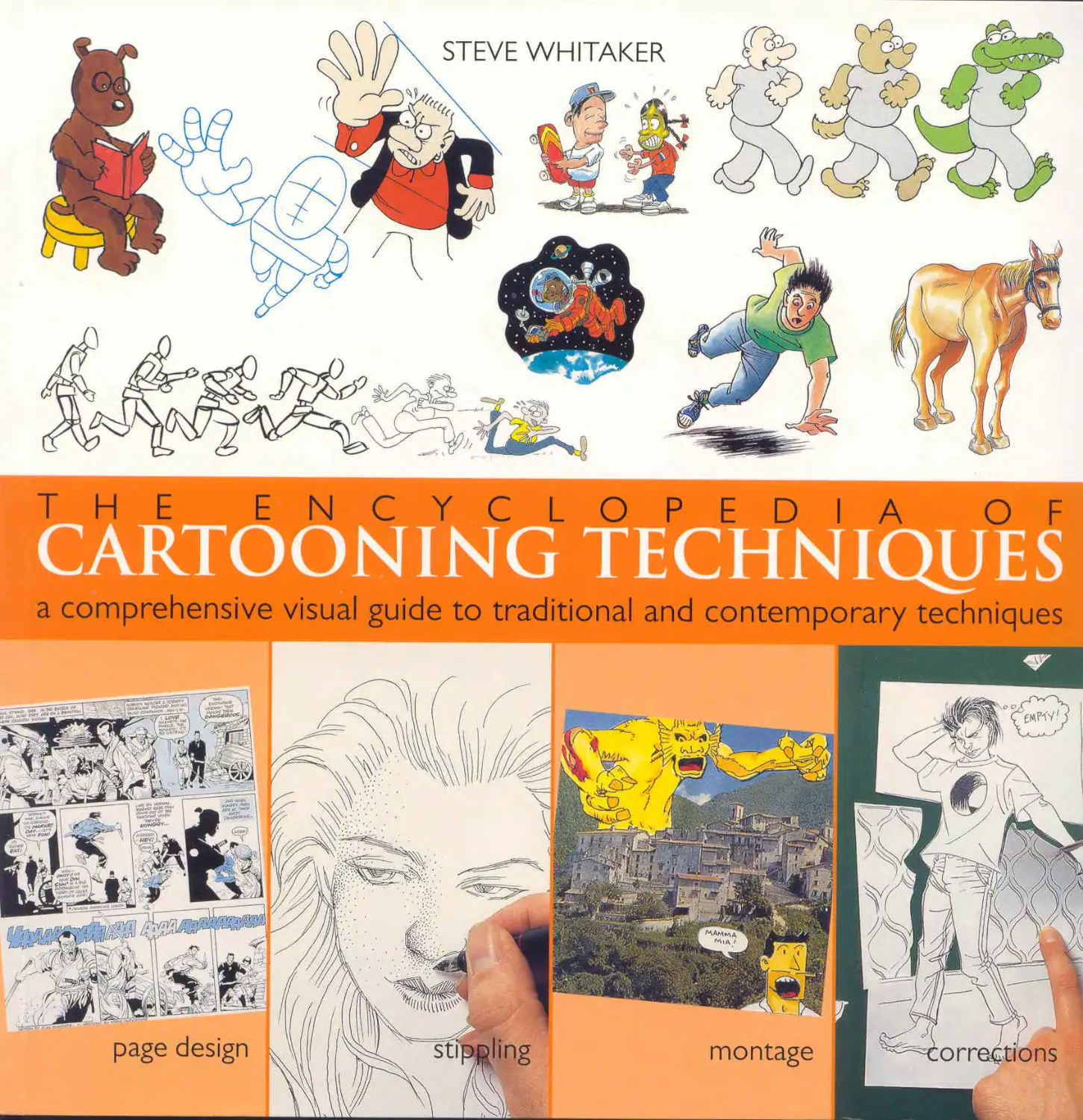
                    STEVE WHITAKER.
TOOLS AND EQUIPMENT
TeokS /_
I
x £<?0lPMPtjr _-
Cartoons can be produced in
all kinds of media, techniques,
and styles, but they are largely
associated with black-and-
white drawings, so consider
using these media first.
Pencils
You have a choice between
traditional wood-cased pencils
or mechanical pencils. Pencil
leads are basically hard (H) or
soft (B for black). The "lead" is
graphite, or a mixture of
graphite and clay.
Some artists prefer the H
pencil because it makes a very
slight, gray line, but being
hard, the lead tends to score
the paper if used too heavily or
energetically. This can be a
problem when ink is to be
applied to a drawing, since a
damaged paper surface can
lead to blots and ink bleeding
from the lines (especially on
board). If you are confident
and have a clean, immediate
style, an H pencil should suit
you. Pencils are graded
numerically; the higher the
number (2H, ЗН, 4H) the
harder and grayer the lead.
Other artists prefer В pencils
(graded from 2B to 8B) because
they create very black lines
useful for emphasis. If you
want to produce a finished
cartoon in pencil, the В lead is
recommended for its
Hard pencils
(H grades) create
grayed marks,
Graphite pencil
is a sensitive
medium
allowing
variable line
and shading
Pencils
Pencils are a quick and
responsive medium for
sketches, roughs, and bast
drawings that will be inked
In finished cartoons they gi
more delicate effect than in
line.
blackness. The line is harder to
erase than an H grade, because
it is so dark and smudges very
easily. If you are doing a
detailed job, make sure you
cover what you have already
drawn, so that a busy hand or
sleeve doesn't smear your
The HB (hard/black) pencil is
a good average quality for
drawing and often easier to
obtain, as it is standard and
readily available from
stationery and general stores
as well as art suppliers. The F
pencil is relatively hard and
fine. There are also water-
soluble graphite pencils,
enabling you to make soft gray
washes and drybrushed marks
by working over lines and
shading with a dampened
Soft pencils
(B grades) are
blacker and
grainier, often
more suitable
for finished
cartoons in
pencil
brush. If your cartoon is going
into print, a pencil drawing is
best reproduced as a halftone
image, to pick up the subtleties
in the surface textures.
Mechanical pencils are
refillable and designed to take
a variety of leads, in
thicknesses from 0.3-0.9mm
increasing in 0.2mm
increments. The advantage of a
mechanical pencil is that it is
"sharp" all the time, so the
lead widths give you the choice
of how delicate or sensitive
you want the pencil point to
be. Soft leads break easily, but
the hard grades are very
brittle. Most artists use 0.5 or
0.7, but a soft 0.9 is useful for
roughs, layouts, or sketching.
The clutch pencil takes
relatively thick leads that are
also well-suited to broader
drawing.
Dip pens
The traditional implement of
the cartoonist is still the dip
pen. Unfortunately, there is no
simple method for starting to
draw perfectly with a dip pen
right away. The critical factor is
comfort - you need to be
comfortable with a pen in
order to use it confidently.
There are various pen nibs to
be recommended for various
line qualities. The nib should
be flexible, durable, adaptable,
and reliably consistent.
To begin with, obtain a
writing pen rather than a
drawing or mapping pen, with
a pointed nib such as those
used for copperplate writing
(not a squared italic nib). When
you have found out what you
like about using a dip pen,
then you can begin to
specialize and try some of the
standard pen nibs used by
cartoonists.
There are essentially two
A pointed dip
pen nib. ideal
for beginners
Dip pens are versatile;
varying the pressure and
direction of the nib alters
line weight and texture
A pointed
drawing pen
nib needs to be
firm but flexible
A fountain
handles easily
and the non-
waterproof ink
gives some
tonal variation
in the line
sorts of penholder - short or
long. Much the same as with
brush handles, some artists
like a long handle with a little
weight at the top to balance the
working end (some even
weight the handle by attaching
a ball of masking tape); others
prefer a short handle, which
has the advantage of being
easier to fit into a pencil case or
pocket. There are attachments
for larger or smaller nibs, so if
you intend to use a variety of
pen points, make sure you
have a holder that is adaptable
to your choice of nib.
Fountain pens
These are comfortable to use
and commercial ranges include
a number of good pens for
drawing. The main drawback
of fountain pens is that the ink
used in them is not
waterproof. Waterproof inks
rapidly dog the pen and
should not be used. There are
one or two permanent, free-
flow inks designed for use in
fountain pens, less dense than
India ink but more versatile in
this context.
The range of nibs is limited.
There is no fountain pen nib
that can match the fineness of a
mapping pen or the flexibility
of most dip pens. You will
need to work broadly and on a
suitable scale - nothing too
tiny or delicately detailed.
Technical pens
These pens have been
developed to give a perfect line
for ruling borders and straight
edges in graphic work. The
"nib" is a tiny metal pipe that
channels the ink; sizes range
from as small as 0.1mm up to a
bold 2mm. Because of the
mechanical consistency of the
point, technical pens do not
lend themselves to expressive
drawing. However, the same
characteristic makes them the
perfect tools for even stippling.
TOOLS AND EQUIPMENT
Brushes
You need to keep two types of
brush, a brush fordrawing and
one or more for applying
color. Many people find it
very uncomfortable to draw
with a brush, because you
have less control over the
splaying hairs than over a
compact pen nib. As with any
drawing implement, comfort is
the most important element,
and this will determine
whether you prefer a big,
bulbous brush with a fine point
that can take up lots of ink or a
tiny "dagger-point" sable 00
brush. You should also
consider whether you like a
short handle or a long one that
weighs against your drawing
movement.
Roundhair sable brushes,
available in sizes 000 to 12, are
relatively expensive, but for
drawing are the most
responsive. Synthetic brushes
and acrylic/sable mixes are
springier and can flick the ink
where you don't want it. When
using waterproof black ink,
remember to clean the brush
very thoroughly down to the
metal ferrule, otherwise the
ink rots the hairs. Use ordinary
soap if you cannot clean it
thoroughly with water-
dish washing detergent is
unsuitable because it is gritty.
For filling large areas of
black, a larger synthetic-hair
brush is handy and time-
saving. Some professionals use
cotton swabs for this kind of
work, which give a splendid
finish.
Keep your old, worn-down
drawing brushes. They come
in useful for drybrush
techniques that involve
spreading and dragging the
brush hairs, which may spoil a
sable brush for finer drawing.
Brushes for applying opaque
For washes of tone and color,
choose a large roundhair brush
from watercolor ranges
Use a waterproof, densely black
ink for work in line and wash,
Non-waterproof ink Writing i
color and washes need not be
sable, but should have a
similar feel (bristle brushes are
only suitable for work in acrylic
or oil). Keep a fine brush for
detailing and a broader one for
filling in large areas.
Roundhair brushes are usually
preferred, but you may find a
squared brush useful for filling
hard-edged shapes. Add to
these a "mop" - a big soft
watercolorists' brush used for
nk Drawing pen ink
wetting the paper to receive
color washes. This is good for
laying down a sweep of flat or
blended color, such as a
background or sky.
As with drawing brushes,
select the type and size that
suits your own needs. Keep in
mind that the longer the brush
hairs, the more color they
retain, which can be crucial in
applying color washes
accurately.
Drawing inks
The most important aspect of a
black drawing ink is whether
or not it is waterproof. The
dried ink line work must not be
soluble if you are going to lay
color washes into your
drawing. India ink, also called
"encre de Chine", is the best,
but make sure it is fully
waterproof as some specially
ground non-waterproof types
are sold under the same name.
TOOLS AND EQUIPMENT
There are other specialist inks
of extreme blackness available,
under a variety of brand
names. Buy a large bottle - it is
more economical and means
you will not run out of medium
in the middle of a drawing.
Before you use the ink, take
the lid off and let the bottle
stand for a day or two. The ink
thickens slightly so you do not
encounter the usual watery
consistency at the top.
Markers
This term can include all kinds
of felt- and fiber-tip pens with
drawing tips from very fine to
very broad. Many black marker
inks are water-based and are
not truly black, but a mixture
of blue and orange. This is
important if you are doing
work for reproduction; a
process camera does not see
blue as well as other colors,
and this tends to weaken any
line work done in water-based
ink. Spirit-based inks are
blacker and semi-permanent;
they reproduce well and you
can lay color washes over
Markers usually have a
limited range of expression
where line quality is
concerned, but their
convenience value is high and
they are much quicker and
easier than dip pens for
drawing roughs and layouts.
Mechanical tints
Many cartoonists like to add
gray tone to their drawings
when they are limited to black-
and-white reproduction. While
pen and wash is an acceptable
cartooning style, shooting the
artwork in halftone can be
expensive and/or beyond the
capabilities of the print method
or format.
Prepared mechanical tints
are a practical alternative -
basically, black dot patterns
that reproduce as even grays.
The "grain" and size of the dot
patterns vary, so you can have
deep, dense grays or a more
open, luminous tone. The
concentration ranges from 10
percent to 90 percent black,
and different measures of dots
per square inch. The cruder
your proposed printing
method, the bolder the dot
screen you need. Printing can
darken the fine tones, so use 10
or 20 percent for an average
gray.
Mechanical tints are self-
adhesive sheets (you peel off a
backing paper as you lay them
down) or dry-transfer dots;
you need a burnisher to rub
them down evenly. Dry-
transfer tones should be cut
larger than the area you need
and trimmed to the precise
outline after application (use a
very sharp frisket knife blade
and a light touch). Don't use
the self-adhesive types on
photocopied drawings, as the
sticky back of the tint film can
lift the photocopied line.
You can also obtain a variety
of patterns, and also color tint
sheets, which are both
valuable and time-saving for
decorative or formal styles of
work where completely even
tones are an asset.
TOOLS AND EQUIPMENT
Colors
You can choose from a variety
of media and methods for
coloring your cartoon. If your
work is for print, there may be
special requirements on
medium, presentation, and
finish, so make sure you get a
detailed brief. The following
are the main color media, with
comments on their advantages
and disadvantages.
Watercolor
Available as semi-moist cakes
(pans) or in tube form, and in a
vast color range, high-quality
artists' watercolors are
expensive but usually worth
the extra cost. A box of water-
color pans is good back-up for
studio or location work, and
easily portable. Tube colors
are easier to use for broad
washes. Unless you are well
practiced in watercolor wash
technique, avoid very large
color areas or ambitious
gradations, as they can come
out looking very patchy and
dabbed when reproduced.
Dyes and inks
Dyes are very fine liquid color
with nothing added, so you are
literally dyeing the paper you
are coloring. This is very
friendly to the process camera.
Colored inks contain a water-
proofing medium so, while
they stay where they are on the
paper as they dry, the medium
usually limits how much
mixing around you can do.
Several manufacturers now
make liquid acrylic colors that
are designed to intermix, with
an admirable color range. If
you have dyes and acrylic
colors, you can do a lot of the
work with the dyes before
adding glazes of waterproof
color.
Liquid colors have been
specially formulated for
artwork intended for
reproduction. Their
permanency is not always
guaranteed, as is the lightfast-
ness of artists' watercolors.
Check the manufacturer's
rating for permanency if you
want your original cartoon to
last.
Gouache and poster paint
Poster paint is a very crude
water-based paint that tends to
crack if applied thickly. It
contains a lot of filler, and the
colors can look fairly dead. It is
not recommended for work to
be reproduced, but is fine for
roughs.
Gouache is opaque water-
Poster paints have a limited,
unsubtle color range
compared to watercolors or
gouache for heavily modeled
images, but you may find it
easier to work that way with
acrylic paints.
Acrylic and oil paints
Oil paint is rarely used for
cartoons but if you try it, work
on a canvas paper or board
specially made for oils. It can
be difficult to control, as the
medium remains wet and
movable for such a long time.
Acrylic paint is more
convenient and being water-
based, eliminates the oily and
unpleasant-smelling thinners
that you have to use with oils.
Acrylics dry to a tough plastic
"skin" and are ideal if your
cartoon needs some heavily
painted modeling and texture,
or if the image has to be
permanent and durable.
If you do not wish to invest
in a full set of acrylics, for
occasional use you can obtain
similar effects using acrylic
medium mixed into gouache.
Pastels, crayons, and colored
pencils
These media are sometimes
referred to as "dry color," and
14
TOOLS AND EQUIPMENT
that is both their strength and
weakness. If you apply dry
olor to a picture with any kind
of texture to it (including
erased pencil lines that
sometimes score the paper
Soft pastels remain powdery
on the paper and a pastel
drawing needs to be fixed
Oil pastels area juicy,
quick-to-work medium
for freely textured color
Marker color can have
a speedy look, as the
movement of the
marker tip often
remains visible
Gouache is an opaque paint
that can be applied thickly
without dilution or as a thin,
slightly “chalky" wash
Slow-drying oil paint is an
unusual medium
tooning
Acrylics make a tough,
glossy surface
El effect but
К can be
p thinned in
* transparent
washes
deeper than you'd expect), it
exaggerates that texture and
usually leaves little uncovered
specks of the paper color. The
effect is a little like stippling;
the flecks slow the eye down
and give a static look to the
image. If you use pastels or
colored pencils, try applying
them to tinted paper.
On the positive side, dry
color is in itself a great textural
device - if you want something
to look dry, crumbly or sandy,
for example - and pastels can
emulate close-up skin texture
very well.
Pastels come in three
varieties: chalk or soft pastels,
which are powdery and have
to be fixed; oil pastels, which
are like greasy, opaque wax
crayons; and water-soluble
pastels, opaque or waxy,
which combine the durability
of oil pastel with the sensitivity
of chalk.
Colored pencils range from
hard, fine leads to soft velvety
or chalky textures, to water-
soluble types that can be used
dry or wet.
•, Colored pencil ranges
f'.._ include hard and soft,
waxy, dry, and chalky
textures as well as
water-soluble colors
Wax crayons do not
reproduce well, since the
color is merely suspended in
transparent wax which is
smeared onto the paper. But
they are useful as wax-resist
with water-soluble media for
irregular effects of color and
texture.
Markers
There are huge ranges of
color markers in hundreds of
shades and tones, as well as
different-sized tips. These are
made for designers and people
in a hurry and, as convenience
items, are very expensive. All
you really need is a watercolor
box or some inks, and markers
are not ideal for cartoonists
starting out, though they are a
quick and easy option for
roughs and layouts.
However, there is a look to
marker coloring that has
become acceptable - check out
color cartoons in the more
upscale, glossy magazines.
And if you start to get
commissioned work, you may
find certain marker ranges
useful in that they can match
specified color requirements
for print.
TOOLS AND EQUIPMENT
Cold-pressed
Papers
It is not essential to use high-
grade papers for quick
cartooning, but a firm, resilient
surface helps to create a clean
image and makes the original
artwork more durable. Suitable
weight and texture can depend
on a variety of factors including
your style and medium, and
whether you need to erase
easily, paste up separate
elements, or dampen the paper
when doing color work.
Hot-pressed
Tracing paper
Smooth line board
Drawing paper
Textured illustration board
Surfaces	color, test the quality of the surface before you start
Just as with pens and brushes, whatever suits you and your drawing style is what you should use. First, take a few basic factors into consideration:	finished artwork. Make sure that the pen can move freely and does not pick up loose paper fibers. • Many smooth boards have
•	If you are going to do a lot of drawn work in pencil before you finish the piece in ink, you need a paper or board that can take the punishment an eraser gives the surface without making finishing impossible. Try thick, high-grade drawing paper for brush drawings; for pen drawing or color work, use watercolor paper with high rag content. Drawing paper is made of wood pulp and is not the best surface to paint on. •	If you are using watercolor papers for ink line work and |	been hot-pressed with chalk to give a sort of eggshell finish. This is great for paste-up and brush drawing but may bleed the ink away from a sharp pen line, because the pen point has cut the surface and broken through to the absorbent layer beneath. •	Check out the whiteness of your paper or board by putting a dab of process white or correction' fluid on it. •	If you are doing a color cartoon for reproduction, the printer may need to wrap your artwork on a revolving drum for scanning. Do the cartoon on thin, flexible cardboard or "stripping board," a thick art board that can have the top layer stripped off for scanning. • Most artwork is only done on board to prevent it from being folded or damaged in some way. If you wrap and reinforce packages well when you send them, then the artwork can be on as flimsy a surface as you like. If you work with a ballpoint pen on wax paper and the result looks fine, it is fine. Paper and board A smooth, non-porous surface; the ink dries on top rather than
Layout i paper I	sinking in. You can create some interesting effects by scratching back the dried ink. Paper There are two surface qualities: hot-pressed, which is smooth,
	and cold-pressed, which is coarser and more grainy. Both are good for pen drawing,
color washes, and gouache
painting.
Art boards
Boards for illustration and
graphic work come in a variety
of thicknesses and finishes,
with compressed surfaces or
top layers that can be stripped.
Line boards are smooth and
perfectly receptive to ink;
illustration boards have surface
finishes comparable to the
range of watercolor papers.
Tracing paper
This is useful for roughs, so
you can build up your image
with overlays, but is not so
good for finished artwork.
Layout paper
A semitransparent, fine-
grained white paper for
layouts, which is very handy
around the studio. You can use
it for roughs, marker
drawings, and color tests (but
not for painting) and, since it is
translucent, you can work
from one rough or layout to the
next stage by tracing over.
Drawing paper
This is not recommended for
painted or heavily rendered
work, but is fine forbrush-
drawings and sketching. There
are slight differences in
thicknesses, according to
brand; double-weight drawing
paper is heavy, resilient, and
very smooth.
Acetate
Clear, hard plastic sheet used
when an overlay is necessary;
for example, when the
lettering in comic strips may be
translated for foreign editions
‘'nd so should not be part of
actual artwork. Acetate is
expensive - use it only if you
really need it.
Drawing aids
Apart from the media you use
for drawing and finishing
artwork, several other items
are useful or essential.
Erasers
The commonest, most
available eraser is made of
rubber. This type is not very
efficient on a shiny or very
smooth surface and best used
where only a little cleaning is
needed, as a lot of graphite will
just smear. Never use the hard
kind called "ink erasers,"
which spoil the drawing
surface.
Plastic erasers are also easily
available and are much more
effective than rubber on line
board and smooth (hot-
pressed) papers. However,
they can lift some ink from
brush or pen lines if used too
enthusiastically. Artgum
erasers are, as the name
suggests, suitable for art
papers with a rough surface
and for loose materials such as
charcoal or soft pencil.
A kneaded eraser is difficult
to get used to, because the
material changes shape as you
rub. But it is invaluable in that
it doesn't attack the paper
A T-square is used
with ruler and triangle
to ensure right angles
and parallel lines
is a useful supplement
straight-
Ellipse and circle
helpful if your work
 involves repetitive,
regular shapes

TOOLS AND EQUIPMENT
surface at all, but simply
absorbs the excess graphite.
It is not as efficient at cleaning
as, say, a plastic eraser and not
recommended for clearing
large areas, but is excellent for
anything delicate; its
kneadability means you can
mold it into a thinner shape for
extra care and precision.
There are electric erasers,
best regarded as specialized
and acquired only if you feel
the ordinary types are not
answering your needs. These
are said to remove ink as easily
as pencil, and can be used as a
drawing implement to create
smoky, faded effects.
If a large area has to be
erased, start from a clean part
of your drawing and work
systematically through the
graphite. If you smear the
black across the surface, it can
be very hard to get rid of.
Rulers
Avoid wooden rulers (they
tend to be inaccurate); a
transparent plastic ruler is a big
advantage. Have one marked
with American and metric
measurements, down to Viein
and individual millimeters. An
18in or 20in ruler is better than
something shorter, since with
triangles you also have short
straight edges for fine ruling.
You need a beveled edge
and a metal edge. The bevel is
for ruling in ink, when it is best
not to have the ruler flat on the
paper as ink can puddle under-
neath. The metal edge - either
a separate steel rule or a metal
strip inset in a plastic one - is
for cutting. Ruling with a blade
against plastic inevitably
results in slicing slivers out of
the side, rendering the straight
edge unreliable. Note that a
steel rule may have been
stored in a thin protective
coating of oil, so make sure
you clean it thoroughly before
starting work.
Triangles
The most important part of the
triangle for the cartoonist is its
right angle. An accurately
squared-up drawing is
essential if your artwork has a
border, as in a comic strip. You
do not have to keep both 45
and 60 degree triangles - a
single one will do - but you can
alternatively invest in an
adjustable triangle, which
gives you all the angles you
will need.
T-square
If you have a simple drawing
board with straight sides, a
T-square is very useful for
drawing parallel horizontal
lines (drawing boards with
"parallel motion" have a built-
in T-square). You can use your
triangles to get parallel lines
crossing at right angles or more
acutely in relation to a fixed
horizontal. A traditional hard-
wood T-square is more durable
and practical than a plastic
Templates
The most famous and valuable
template for drafting is the
French curve, which has
several convex and concave
curves on its outer edges, and
some ellipse templates (ovals)
within the shape. You can buy
one all-purpose template or a
"nest" of curves in various
sizes. The curve is very handy
for drawing a curved line in ink
when the need for accuracy
overrides the desire for
freshness and spontaneity in
freehand drawing.
A slightly less versatile but
useful item for drawing curves
is the flexible rule. This is a
strip of rubber that can be bent
into curves and stays in the
configuration until you change
the shape again.
Other templates you may
need are circles and ellipses.
When a perfect circle is small
enough to be too fiddly for
compass drawing, a circle
template is just what you need.
Ellipse templates are similar,
and excellent for drawing
symmetrical curves on, for
example, the top of a bowl or a
dinner plate. These shapes are
also preferred by some
cartoonists for their word
balloons (drawn after the
lettering is complete, not
before). Ellipse and circle
templates made for
professional drafting studios
can be very expensive, but
they are an investment for life.
There are also less costly
versions with fewer grades and
sizes of ellipse.
Customized studio
equipment
If you can set up a dedicated
work space, this gives you a
professional sense of what you
hope to achieve, but specially
made studio equipment is costly
and can be acquired gradually
as you see what you need.
An adjustable chair with
supportive back is
preferable if you are
spending long hours
developing ideas and
concentrating on
finished work
Parallel motion attached
to the drawing board is
useful for ruling borders,
strips, and frames
TOOLS AND EQUIPMENT
General studio
equipment
There are various
miscellaneous studio items,
many of which you may
A lamp angled directly
onto the work area is
not only clear light to
work by but will reveal
any inconsistencies in
inking or color quality
practicing drawing for a while,
whether or not specifically for
cartoons. First, make sure that
your work area is comfortable
and well lit, and you have a
well-supported, easy-to-access
drawing surface.
Keep all your drawing tools and
materials within easy reach and
in some kind of order
Drawing boards
These can vary from a simple
piece of plywood or hardboard
to a specially made free-
standing drawing board with
plasticized finish and parallel
motion device attached. You
can also get drawing tables
which allow you to angle the
work surface (it is worth
keeping an eye out for second-
hand studio boards and
tables). But you do not have to
go to sophisticated heights - if
you are comfortable at the
living-room table or even in an
easy chair with a board to lean
on in front of you, that is
equally acceptable. However,
if you are working long hours,
hunching over a board can
cause back trouble. If you do
invest in a studio drawing
board, ask about a suitable
chair to go with it, with swivel
motion and supportive back-
Lamps
You need a good light source,
especially if you cannot work
in daylight hours. A tabletop
adjustable-arm lamp is what
professional artists use, which
gives you strong, directed light
arriving from a wide choice of
angles. Instead of pointing the
A light box is not essential —
equipment to start with, but in
^X^ professional practice can prove
invaluable for a number of tasks
TOOLS AND EQUIPMENT
lamp directly at the work, you
may find it easier on the eye to
bounce the light off a white
wall nearby. The slight
diffusion makes the light less
harsh and the work less tiring.
An ordinary bedside light is
usable, and you can get
"daylight" lamps to fit. Regular
light bulbs give off a slightly
yellow glow, so color work that
looks satisfactory by that light
may appear very different in
daylight. If your work is to be
reproduced, bear in mind that
a process camera sees the
colors in conditions much
more like daylight.
If you have fluorescent
lighting in your workroom, an
individual lamp may only be
necessary if cast shadows are a
problem in the immediate
angled straight edge for cutting
and a curved edge for
scraping. Always keep plenty
Process white, used by
Light box
A light box is simply a lit
screen that enables you to see
through opaque paper and
originals to trace elements
from a drawing or reference
image, or rework details to be
collaged into the artwork.
Light boxes are relatively
expensive, but a good
investment; sizes range from
8V2 x Ilin tabletop boxes to
large studio light tables. For
occasional work of this kind,
however, you can use a
window with the daylight as
your light source; it is just not
very convenient to draw
against a vertical surface.
If you need to trace from a
sensitive drawing, you will
find that a dark photocopy
provides a better line or tone to
read through normally non-
translucent paper or thin
board; this is because
photocopy toner is more
opaque than graphite. You can
also use a light box to work
from a messy, sketchy rough
and trace off a finished version
directly in ink.
Knife
You will need a sharp knife for
a number of jobs - always use a
knife in preference to scissors.
Unless you are doing heavy-
duty cutting on thick board, an
excise or frisket knife is the
ideal tool. Handles and packs
of blades are generally
available from art suppliers.
The most useful blades are the
of fresh blades in stock - dull
ones just waste your time.
If you do need to cut
through heavy board, buy a
sturdy craft knife with
disposable or interchangeable
blades. If your work regularly
involves cutting complex,
irregular edges and curves, a
knife with a swivel-head might
be an advantage. This is not
cheap, so consider it only if
you feel it might save you time
and aggravation.
Cutting mat
This is useful though not
essential - the back of a
drawing pad will do. But a mat
is a good investment and you
can obtain a translucent one for
studio materials
items shown here are
general studio materials
commonly used by
designers and illustrators.
Specially made cutting
mats are marked with
grid lines for accurate
measuring and
trimming
TOOLS AND EQUIPMENT
cutting on a light box, a time-
saving and efficient
combination, especially if you
are doing the layout as well as
drawing the cartoons.
Process white
This thick, opaque, pure white
medium is what professional
artists use to cover up
mistakes. You might think that
a dense white paint such as
gouache or poster white would
do as well, or even typist's
correction fluid, but process
white is specially made to be
camera-friendly. You can use
the other materials, but this is
better.
It does have a tendency to
dry in the bottle. Don't throw it
away if this happens, just add
a small amount of clean water
and fasten the lid, leaving the
paint to soften.
Blue pencil
The fact that the process
camera is not very sensitive to
blue can be used to advantage.
When you need to mark
something on your cartoon
that is not part of the final
drawing - the boundary of a
tone, for example, or an
optional border - a light blue
pencil (or marker) can be
thought of as invisible. Blue
pencil is also called non-copy
pencil, and blue leads are
available for mechanical
pencils. But check with your
publisher that this is suitable
before you use it.
Adhesives
For pasting down patches,
mounting drawings on board,
and for collage or paste-up,
you need some kind of reliable
adhesive. Rubber solution
adhesive is the traditional glue
used in paste-up studios,
although the convenience of
spray adhesive has widely
taken hold. The rubber type is
more economical, though
rather messy. For small-scale
gluing, the little adhesive
sticks readily available at
stationery stores are perfectly
adequate and easier to use
than wet adhesives.
When you use a glue-stick,
push it up only enough to
show a tiny rim of adhesive
above the plastic case. This
prevents waste and you don't
knock off large pieces that you
don't need.
Tapes
Drafting tape is low-tack and
does no damage to a drawing
surface. Masking tape is usable
in an emergency, but more
likely to affect surface finish.
Ordinary clear adhesive tapes
are usually very sticky, so you
only get one chance to lay
them down, and can
reproduce as a yellow tone; the
matte-finished, low-tack types
reproduce better and can be
written or drawn on, but the
edges attract dirt that may
show up in photographic
copying.
Gummed paper tape is used
only to stretch watercolor
paper before laying color
washes. Soak the paper in
clean water and tape it to a
board with strips of gummed
tape along all sides. Paper
expands slightly or
dramatically when wet,
depending on its weight and
composition, but shrinks again
as it dries, and the tapes
ensure it stays flat. Once
stretched, it will dry back to a
flat, smooth surface every time
it is wetted.
Rubber-solution adhesive
7//0 P/WW/VG p/?//vg/P£.gg,
7G0M/V/0/U. 0Р1//00, 0/V0 ЗУ&^&У-
G7GP P£/YI&/V$7/?07/0/V0 //V 7V//0
GG07/0/V УМ?0 PGG/&/V0P 70
£0/И7Ч.£/И£7У7 7Н0 77?£У/00£ 0007/0/V
Я//Р 0/V00/.0 У00 70 00&//V 0/?007///&
У00/2 0W/V 0^/?700/V0.
ANIMALS
Animals feature in cartoons in
two ways. Often they are a
kind of prop or gag-feed for a
human subject - someone
riding a horse or an elephant,
or talking to a dog or cat. But
they can also be the subject of
the cartoon, the character that
the viewer identifies with, like
Snoopy the dog, Garfield the
cat, or the megastar Mickey
Mouse.
These two functions also
tend to indicate ways of
presenting animals. When
they are secondary players
they usually appear animal-
like, though their shapes and
movements are simplified and
characteristic features are
exaggerated. Used as main
subjects, they are more likely
to be anthropomorphized:
four-legged creatures are made
to stand up on their hind legs
and use their forelegs and
paws like human arms and
hands; their faces have
humanized expressions of
pleasure, terror, rage, or
craftiness; they may even have
clothes, shoes, and other such
accessories.
To draw a cartoon animal
convincingly, however much
you simplify or distort it, you
need to have a clear sense of
how it looks and moves
realistically so that you can
interpret the shapes. You
should also be thinking about
how the kind of animal you
choose assists your "storyline";
with an elephant, for example,
the fact that it is huge and
lumbering is often part of the
joke, but a cat can be weird and
fuzzy or superior and sleek, so
what is it expected to
contribute to your cartoon?
A key aspect of simplifying
an animal, especially in a strip
where it has to move and be
seen from various angles, is to
use simple modular shapes
which you can easily
reorganize into different
relationships. These are
typically circles, ovals, and
cylinders; the more complex
musculature and joints are
reduced to fluid lines and
curves. To create a tense or
aggressive character, convert
to angular shapes. Scaly or
folded skin, raggedy ears, and
spiky fur or whiskers can be
superimposed on basic forms.
Body Language, pages 38-39
Devices, pages 58-59
Figures, pages 68-71
Movement, pages 92-95
ANIMALS
ANIMALS
Anthropomorphism
The modular shapes of the dog
shown on the previous page
are no longer restricted to a
purely canine form. Through
engaging in human activities
the animal figure becomes
anthropomorphic, with the body
erect and sitting on a seat
instead of crouching. The dog's
hind legs become human feet
and its forepaws, like hands,
can grasp things. The shapes
of its head take on the features
of the human face. The animal
figure expresses human
gesture and may wear human
clothes.
▲ Anthropomorphism becomes
more comic in direct ratio to the
“humanness” of the activity,
such as when the cartoon
animal wears glasses to read.
◄ Playing a
saxophone
involves a human
distortion of the
anthropomorphic
head.
▲ ▼ Bowling puts the cartoon
animal in postures impossible
fora real dog.
◄ Skating makes the canine
cartoon figure balance as the
human, with forelegs extended
as arms.
ANIMALS
Man into animal
▲ Just as an animal can assume human
form, a few extra touches can make a
human into any animal you choose. Here
the rounded ears and circle at the tip of the
nose have created an instant teddy bear.
▲ Consider how you might
portray the running man
as an animal, perhaps by
changing the feet to paws.
▲ The addition of ears,
nose, and tail complete
the illusion. The hands
are sufficiently
generalized to be read
as paws.
▲ Use the dominant
characteristics of the
animal you want to
portray, in this case the
long snout and thick,
fleshy tail of the alligator.
Woman into animal
Here the transformation from female
human to teddy bear has involved
changing the clothes as well as adding
cars and turning feet into paws.
▲ For the more “feminine”
form of the cat, the feet
have been reinstated
and a slinky striped
skirt chosen.
▲ To turn girl into cow, the wings of the bow
have become horns and the feet have
spread into hooves. A nice touch of
humor is provided by the hands holding
out the skirt, as though in amazement
at the unusual attire.
27
ANIMALS
ANIMALS
Variations on facial
expressions
Classically, an upturned mouth
denotes happiness and a
downturned one ill-temper or
gloom. See if you can create
some variations of your own.
Shocked
Puzzled
Happily exhausted
Tired but contented
.aughing
Gesture and movement
Body language is as important
as facial expression in telling
the story. Gestures such as
hunching the shoulders or
placing a hand on the chin can
convey both emotions and
thought processes.
Serious second thoughts
Hatching a clever idea

ANIMALS
BACKGROUNDS
There are several important
questions you need to ask
yourself about the background
to your cartoon. Does it
represent the real world, a
stereotype, ora fantasy?
Should it be there at all; if so,
how much of it do you want to
show? Is it just placing your
characters in context, or
providing a stage on which
some kind of action occurs?
The actual size of your
cartoon may restrict how
generous you can be about
background detail. Bearing in
mind that you want to set the
scene rapidly, simple
indications may be sufficient -
a horizon line, a couple of
perspective lines, or a loose
patch of tone or texture. Basic
perspective elements show
where people are in relation to
their surroundings, and can
help to place them in a large or
small space, firmly on the
ground or precariously high up
in the air. Simple perspective
makes sense of a scene,
whereas if you try to fake it,
the idea can collapse.
Stereotypical settings bring
in all sorts of associations; the
same characters are given
different stories by the
descriptive nature of the
background, such as two men
in a desert with an oasis in the
distance, or the
in a narrow prison cell.
Occasionally, the background
is all that is visible, with a word
balloon coming in to comment
on the situation.
Narrative
It is possible to convey mood
partially by applying light or
color to your characters in a
telling way, but a well-drawn
background does much more.
An interior or exterior
furnished with suitable props
can add a narrative
background to the cartoon
story, as well as a physical one,
suggesting a whole way of life
or a temporary crisis situation.
The background is usually a
stage setting for the characters,
but can sometimes have a role
in its own right, such as a
storm, flood, or tidal wave.
If your background is a
famous place, you don't have
to use all of it; certain features
are instantly recognized by
readers familiar with the
location - the dome of the
White House, or the railings
and gates of Buckingham
Palace. Buildings are difficult,
unless you have a flair for
architectural drawing.
Technically, it is easiest to use
photographs, and copy or trace
in line the features you need.
But for all kinds of
backgrounds you need to be
able to draw the overall
situation and its props; the key
to this is good observation.
Once you get into the habit of
using your sketchbook, you
will find that drawing
backgrounds and background
details becomes second nature,
and you can soon spot the
essential details that will make
your drawing work. For
unfamiliar or exotic settings,
keep a file of magazine
clippings.
FURTHER INFORMATION
Perspective, pages 98-101
Stereotypes, pages 108-109
Building a background
The purpose of a background is
to show your reader when or
where your characters are.
Graphically, this means drawing
the surfaces that surround a
figure in order to convey all the
information necessary for a
gag. Treat the background as if
it were built from the figure
outward, gradually shaped
around your character. This is
illustrated as a stage-by-stage
process in the series of
drawings right, below, and
immediately opposite.
▲ Ground the floating figure on
a horizontal surface. A simple
horizon line is enough.
▲ Show that your horizontal environment: break the
ground is not empty. Make it an horizontal with a vertical line.
▲ Distinguish the environment
-turn it into a location. Use
pictorial details and props to
define time and place as
precisely, or as vaguely, as
necessary.
A Dramatize the drawing. graduated tone to add weight,
Render areas of black or solidity, depth or mood.
BACKGROUNDS
▲ Reference is used as picture:
the shape of the castle and the
viewpoint of the photograph are
transferred directly. There are
minor changes, but the
important difference is in how
the cartoon image is rendered.
▼ Reference is used as
information: a preconceived
cartoon image takes minor
incidental detail of the Empire
State Building from the
photograph of Manhattan’s
skyline.
BACKGROUNDS
Telling the story
Once you have built up the
background graphically, you
need to consider what you want
it to tell the reader about the
characters you might place in it.
Details of place and location
also provide information on who
the characters might be and
what they might be doing. The
pictures on these two pages
show the same two figures, first
in blank space and then against
a series of five different
backgrounds. In the first picture,
all the reader can know about
the characters is that they are
female and male, young, and
dressed casually.
The scene is an urban street. The silhouetted skyline suggests
evening, and from the absence of cars or other people we could
assume it to be Sunday. The two characters are looking around as
they cross the street, which they would be unlikely to do in a city
unless they were visitors. Thus the background makes these
figures look like a young couple away from home in a kids-in-the-
big-city cartoon.
The figures are put against a tropical background. Their presence
together on an idyllic, vacation-brochure, deserted beach hints at a
possible vacation romance.
This indoor setting could be any time of year, as the TV studio
lights would be hot enough to permit the wearing of light clothing.
The difference between the dress of the foreground figures and
that of the program presenters in the background distinguishes
the former as members of the audience - perhaps game-show
contestants.
BACKGROUNDS
The positioning of the two figures at the top of the airplane
gangway is a clear signal that they have arrived at a destination,
again in a warm climate. Their outward glances could be the
fascinated reaction of tourists to an unfamiliar place, while the
plainness of their clothing suggests that they might be
backpackers.
Here again, the background and clothing of the figures combine to
explain who and where they may be. They could be students in a
^eHege library, but since they are in the Travel section it is more
IKely that they are planning a vacation.
The background story In these three cartoons, the background gradually alters the point of the gag. In the first, the window cleaner is in a bad enough position, having lost control of his ladder. The background detail looks like residential houses, suggesting he is two or three floors up.

		II
		¥

In the second cartoon, the change of background to the simply drawn but unmistakable high-rise buildings makes his predicament all the worse.

	-	if
	[J(_lr_11	 1	Б E
	рйВг Ж.В0 3 BBS Лдйп 1.


becomes a second character in the cartoon, giving the scene a completely different context. The way the huge ape brandishes the tiny ladder revises the viewer’s sense of scale. Without background buildings, we can’t assess how far the man is from the ground, but that is no longer such an important feature of the storyline.
		к
	Г5 v J Ж $]


▲ Backgrounds can also be
stereotypes. This one is the
setting for urban existential
angst and decay.
▲ A generic shoreline shows
the essential components of the
meeting of land and sea.
Figures and props can be
added to suggest a specific type
of location.
▲ When drawing a landscape
you must decide your
illustration requirements. Do
you need to show a specific
place or a generic scene?
▲ An uptown city street. Add
props, such as street lamps,
mail boxes, fire hydrants, or
foreground people, to make a
specific scene.
BACKGROUNDS
A The classic desert landscape
complete with cactus, vultures,
and burning sun.
Autumnal gold, brown,
and purple are applied
in thick, pencil strokes
▲ Some backgrounds are
subject to seasonal change.
Use them to indicate time as
well as place.
▲ The size of the car interior, its
exaggerated perspectives, and non-
naturalistic colors all spell menace for
the solitary little girl.
▲ This generic suburban street
scene contains both
stereotypical and typical
elements.
37
BODY LANGUAGE
Cartoonists can pack a lot of
information into a single image
destined to be hastily scanned.
As in the real world, body
language can help to make a
point directly, or supply
additional, less obvious but
enriching layers of meaning.
Posture illustrates
personality and a character's
relationships with the wider
world. Timid or depressed
people shrink inward;
confident and aggressive
people expand outward.
Sympathy and attraction are
expressed by people leaning or
gesturing toward each other;
antipathy and shyness can be
shown by pulling away. The
balance of the body is
indicative of such states, with
or without overt gestures.
Many gestures have become
classic cartoon conventions,
and they are broadly based on
observations of how people
actually behave. An overbearing
character may be shown
grasping or pointing, to pin
people down and emphasize
that orders are being given.
People portrayed as
embarrassed or slow-witted
may scratch their head or
fiddle with their ear - aimless
gestures that show they are out
of their depth. Surprise and joy
are expressed as much by
outgoing hand and arm
impenetrable barrier.
▲ Anger could turn
this armchair into a
launching pad at
any moment.
gestures as by the expression
on the face. Gestures are
typically complementary to
facial expressions, although
you can create an interesting
tension by opposing the
language of body and face.
Reactions are often highly
exaggerated in cartoons -
someone jumps up in the air
when surprised, or falls flat
with shock. There is an over-
blown drama in cartoon
messages, and body language
often takes a kind of
pantomime form.
FURTHER INFORMATION
Figures, pages 68-71
▼ Leaning so far back into the
chair, this person could be quite
relaxed, but the face and
tapping foot say otherwise.
BODY LANGUAGE
BRUSII DRAWING
A lot of people find drawing
with a brush much more
difficult than using a pen or
pencil. That is because in
ordinary writing and drawing,
we make small-scale hand and
wrist movements, while with
brushwork you need to get
used to drawing with your
whole arm, letting the brush
travel freely on the paper.
Start by experimenting with
the kinds of marks you can
make. You will find that the
smoothness of thick lines you
can draw with a brush is very
useful for emphasis. You can
get subtle thick-and-thin
variation, especially around
angles and curves, increasing
your range of line qualities.
If your image includes
elements with a lot of body,
such as tree trunks or
furniture, a brush helps give
some weight to the drawing.
And for putting heavy shading
on a scene a brush is the idea)
tool. The physical properties of
a brush are also very useful for
particular tasks; for example,
drawing a person with shiny
hair. You can achieve very fine
lines flowing into a highlight
area, and the texture of the
brush is naturally sympathetic
to the subject.
It is important to be aware of
which areas of your drawing
are wet, and which are dry. If
inking over a pencil rough,
work downward through the
image to avoid moving across
ink that is still wet. It isn't
convenient to have to turn the
board around when you are
trying to draw recognizable
forms with some consistency.
Light & Shade, pages 86-87
Line Qualities, pages 90-91
Fine drybrushing
An old brush is best for this
technique. Load it with ink and
blot off the excess, then stub
the brush on paper to splay the
hairs, and stroke it gently over
the paper to make fine, multi-
stroke lines.
▲ The shiny texture of the hair
depends on a lot of highlighting.
As you apply the brushstrokes,
vary the density of tones to
make the texture flow. Fade
down into the highlight areas,
then brush up from below,
leaving the whites clean.
Feathering
This technique is used to shade
organic shapes, making a
broken texture along the lines
where forms interlock.
► 1 Do not overload the brush,
the strokes should be fluid,
quick and light. Build up a kind
Coarse drybrushing
The artist is looking for a
contrast of line qualities, using
fluid strokes to draw the lion
face which will contrast with the
rougher texture of the
drybrushed mane.
1	The brush is blotted to
remove excess ink before the
zigzag lines of the mane are
drawn. The ink starts to run out
quickly, making a fuzzy,
dragged texture.
2	The finished drawing treats
the animal head as relatively
simple shapes, but the varying
qualities of the brush drawing
express different features of the
subject.
40
BRUSH DRAWING
▲ Dry brush is used to render
the effect of light from the fire as
it casts shadows that reveal the
ridged and graveled surface of
the earth.
▲ The cartoon face reduces
human physiognomy to a set of
abstract features, rendered
without shadow by simple dots
and strokes of the brush.
◄ The cartoon rendering aims
at expression. The figure and
fire are mainly outlines and the
area of light around both is a
uniform ellipse.
Light, shade, and texture
Г Consider three different
brush renderings of the same
scene. From each, a detail is
enlarged and inset for close
study of the particular qualities
of each brush technique.
▲ This treatment includes
much fine detail, such as the
tiny brushstrokes rendering
silhouetted pine foliage in the
background. The fire and the
figure's features are more
naturalistic, even to the point of
resembling Elvis Presley.
▲ The shadows in this scene
are feathered strokes, brushed
out of dark areas in the direction
of the light. The detail reveals
reflected light on rocks around
the fire's base, rendered by
strokes radiating away from the
firelight out of shadow lines on
each rock.
CARICATURE
CARICATURE
This branch of cartooning is
basically about drawing real
people, though you can
caricature a type. The viewer
has to be given enough
recognition factors to identify
the person and understand the
joke. The subject doesn't have
to be world-famous, but must
be sufficiently well-known in
the context in which the
cartoon representation
appears, so it could be a
schoolteacher or family
member. Some people have a
natural feel for this, but some
expert cartoonists find
caricature impossible because
it involves portraiture, the
need to obtain a likeness,
however distorted.
A caricature can be a face or
a whole figure. The image is
developed by homing in on a
particular feature, or more
than one, that is absolutely
characteristic of the person
physically, and may also seem
to say something about his or
her personality. Large noses or
ears are very useful, full lips or
small eyes, an exaggerated
hairstyle, or a distinctive shape
to the face, such as a pear
shape either way up. If you are
drawing the whole figure, the
person's posture can be a key
factor-a very upright, stiffly
held body, or one that is
stooped orbent. Mannered
gestures are also valuable
ammunition in a caricature.
Familiar characteristics
When a person is exceptionally
famous, or stays around long
enough to become completely
familiar to a wide range of
people, the caricature can be
honed and reduced to the bare
essentials. British Prime
Minister Margaret Thatcher,
for example, became little more
than a particular configuration
of hair, nose, and chin in some
representations over the years.
Some well-known people
present a special challenge
because they are relatively
unremarkable physically.
Among US Presidents, Bill
Clinton is less easily
caricatured than Ronald
Reagan, because his features
are more even.
The easiest way to develop a
caricature is to work with a
medium you feel comfortable
with - pen or pencil - and just
sketch and doodle, gradually
pulling out important features
until you get a stereotype of
your subject. An alternative
method is to use photocopies
of snapshots or newspaper
pictures and trace over parts of
them or collage them together.
If you have access to an
enlarging photocopier, you can
rearrange the proportions of
the face quite quickly this way,
and it is helpful if you are not
confident of your drawing.
FURTHER INFORMATION
Faces, pages 62-65
Figures, pages 68-71
Hands, pages 76-79
Development of a caricature
Illustrates the development of a
caricature from photographic
reference through finished
drawing. Most caricaturists use
some if not all of these stages.
1	Although you can draw
caricatures from life, a
photograph will supply details
which may not be remembered
or which would be otherwise
unavailable.
2	Pencil an outline of your
caricature, blocking in its
general shapes. This is an
important stage; if a likeness is
not achieved early on, the
finished drawing may prove
unsatisfactory.
3	Draw in the finer details,
developing the characteristic
features of dress, body shape,
and facial structure.
CARICATURE
4 The pencil drawing is traced
Or|to a smooth line board for an
'nk rendering of the rough. Here
a strong, variable line is needed
both to define the shapes of the
oaricature and to fill in shadows
and other solid black areas. If
Уоиг caricature is intended for
reproduction at a small size, this
may be as much detail as you
need.
5 To finish the drawing, tone is
applied by cross-hatching,
using a fine, rigid pen. At this
stage, photo reference can help
again to make detail of light and
shade convincing. Also, a highlit
edge to the figure increases the
appearance of roundness.
CARICATURE
Exaggeration
▼ A very effective caricature.
By exaggerating the subject’s
long face, much narrowed, and
heavy, hooded eyes, the artist
creates a sense of weightiness
that also emphasizes the
drooping posture.
Changing proportions
▼ This is an attractive portrait,
swelling the proportions of the
and laughing eyes.
▲ This artwork is pieced
together from photocopies
enlarged to different sizes, with
ink and process white used to


CARICATURE
CLOTHING
easily work out how the
clothes would stretch or drape
differently as your character
changes position.
◄ ▼ When you are using
simple line work, concentrate
on the shapes of the clothing
and any accessories or pattern
detail that emphasize the
character, like the little girl's
cute bow, short skirt and ankle
socks (left) or the chef's
traditional stripy garments
(below).
In a lot of cartooning, economy
is essential. When drawing
clothes, you cannot capture all
the detail, so you need to ask
yourself what it is you want to
convey. Is the clothing loose,
does it hang from the body? Is
it stretched, showing the form
underneath, like leggings or a
snug T-shirt? Is it important to
show that the clothing is stiff
and starchy, or an item that
keeps its own shape?
Another aspect of clothing in
cartoons is for signaling the
type of person you are
portraying. Figure out simple
codes; for example, the basic
shape and features of a
business suit. You need not
include a lot of accurate detail -
you are basically looking for an
unambiguous, "shorthand"
description. On the other
hand, some telling detail adds
to effective characterization-
for a bag-person, the clothes
may appear dirty and
uncomfortable; someone very
rich may have a lot of jewelry
and accessories. Clothes can
very directly indicate social
status.
The shapes of clothing and
the ways they relate to the
body can provide a lot of
information about implied
movement, especially in a
comic strip where the image
changes from frame to frame.
Figures, pages 68-71
Stereotypes, pages 108-109
◄ Scribbled fiber-tip line wraps
the clothing around the body.
The colored pencil work
emphasizes the way the
clothes just form an outer skin
to the body shape.
CLOTHING
47
◄ This style-victim has it all
wrong - the clothes don’t fit and
his shirt is wrinkled and stained.
Clumsy shoes complete a
picture of fashion disorientation.
▼ Whatever shape this woman
has is lost in her sturdy coat,
given one continuous all-around
curve by the plaid pattern.
Denim fabric
conveyed
economically
The matching hat doubles
as a pet dog
► Comfortable clothes, as all
the smoothly drawn lines and
shapes suggest. The pattern is
inessential but livens up the
drawing.
CLOTHGS
swipe file
This swipefile contains a range
of images by different
cartoonists for you to copy or
adapt. Use it to help you to
explore ideas about style,
technique, and characterization.
An old-time cowboy typically
wears a checked shirt and
baggy, rumpled chaps.
The cartoonist has
conveyed a bulky, heavy
Baseball cap
and mobile phone
specifically
accessorize a
basic teenage
dress code.
► A Supergirl lookalike has the
basics right - color co-ordinated
with underpants outside her
tights - but is she steady
enough on those heels to save
the world?
CLOTHING
COLOR
COLOR
Color can be one of the best
ways to emphasize the
message of your cartoon. It is
obviously a more expensive
option at every stage - a/w,
film, plate making, and
printing so it is not always
within budget. There are two
basic considerations for the
cartoonist: the aesthetic
understanding of how to use
color and the practicalities of
telling the printer what you
want.
Aesthetics
If you have the luxury of using
color in a cartoon, the question
you need to ask is whether it
basically acts as decoration for
a drawing or is a functional
element of the image. If the
color works fully as a
descriptive element, you do
not have to put a lot of line
work down before you start
working with your color
medium. Decorative color, on
the other hand, needs a strong
linear structure; the black-and-
white drawing should work
perfectly in its own right, and
the color is extra.
Colors have two basic
properties - chroma, which is
the brightness and intensity of
the hue, and tone or tonal
value, which is the degree of
lightness or darkness. You can
make use of these properties,
and the visual relationships
between different colors, to
give sparkle and definition to
your cartoon. There are
elements of color theory that
you can learn and use
deliberately, but you also
acquire an understanding of
color through practice.
Practicalities
Spot color is, simply put, one
color in addition to black and
white. It is usually flat color or
The color wheel
The color wheel arranges the
three primary colors - red.
yellow, and blue - in sequence
with the secondary colors -
orange, green, violet - mixed
from primary pairs, and
intermediary shades. Colors
opposite each other on the
wheel, such as red and green,
often very bright or intense
their cartoons or strips.
gradations above and below it.
As with hue, you can make
Red - the
hottest, most
striking color
Orange-
the impact
of red and
the brilliance
of yellow
combined
Yellow -
naturally light-
toned, so good
for highlighting
are called complementary; they
contrast intensely. Colors in
adjacent segments, on the
other hand, make harmonious
relationships
As wel
contrast,
the co
colors
COLOR
dot screen, intended to
enliven the drawing or draw
attention to focal points.
Where you are able to use
more than one color in a
decorative role, it is often
advisable to limit your palette;
especially if the drawing is
complicated, a small color
range holds it together.
Generally the spot or second
color will be predetermined by
the publisher or client as it
needs to be the same
throughout the publication.
To decide where and how to
apply decorative color, take
some photocopies of your
drawing and try out color
applications freely. You may
lose a little spontaneity when
you come to coloring the final
image, but by planning in
advance you avoid making
errors that have to be covered
up, which the camera may pick
out again when the cartoon is
reproduced. Watercolor is the
ideal medium for applying
decorative color directly, as it is
transparent and does not
obliterate the ink line.
The four-color reproduction
process works by overprinting
only four colors - magenta
(red), cyan (blue), yellow, and
black - as a series of tiny, even
dots. The original image is
photographically screened and
dot-films are produced which
break down every color and
tonal variation into a
percentage mix of process
colors. If four-color printing is
available to you, there is no
limit to the color range and
techniques that you can use,
but this is the most expensive
form of reproduction. Spot
color is cheaper, as there is
only one color film to be made.
The actual color does not have
to be taken from the original;
the artist can indicate the color
areas as gray or non-repro blue
tones and the printer puts
them on to a color plate.
FURTHER INFORMATION
Line & Wash, pages 88-89
Limited color
When you have a limited color
range, you can choose to make
a cool harmony or a striking
clash for impact.
► Yellow and violet are high-
contrast complementaries, lit up
with pure white. Orange tints
relate to yellow. Two or three
related colors with one
complete opposite is a classic
way of picking a dynamic color
scheme.

contrast
Putting color to work in
your cartoons means
dividing your drawing
into harmonizing and
contrasting fields of
temperature and tone.

► Green, blue and violet run in
sequence on the color wheel
and are cool colors, so the
combination is restrained and
attractive. Violet only on the
'Sure makes him stand out.
▲ In this flat-colored,
schematic arrangement, there
is no shading to give depth, so
the contrast of warm and cool
does the job.
► A combination of warm/cool
and low/high intensity color in
which the hues are also
gradated to shade form and
depth.
COLOR
Color in print
There are many ways to get
from a piece of finished artwork
to a printed color copy of your
cartoon. None of them should
affect how you invent your gags
but each can influence the kind
of artwork you produce and the
way that you draw it.
In most cases, the method by
which your artwork is
reproduced will be the result of
cost considerations, given
where your cartoon is intended
to appear.
Below and opposite, the
principal methods of print
reproduction are explained with
examples using a simple black-
and-white image of astronaut
and goldfish bowl and applying
different ways of preparing it for
printing in color.
Single color
Solid black (100%)
AV Printing a single color-
usually black - is termed
monochrome printing. Most
newspapers and magazines
contain monochrome sections
which include cartoons. For
these, you can draw line
artwork, line and wash, or use
percentage tints, as below.
10% 20% 50% 70% 90%
Two or three colors
Black Special color
A Printing two or three colors
usually involves printing black
plus one or two extra colors.
A You can choose spot colors
from the extensive ranges of
inks available as solid colors.
Four colors
Cyan Magenta Yellow Black
A ▼ In the four-color process,
you produce full-color artwork
which is separated
electronically into an image
made of magenta, cyan, yellow,
and black dots.
Specifying color reproduction
A A simple line drawing is
marked with non-reproducing
blue, invisible when scanned, to
indicate a tint area.
A The printed image shows the
line drawing with a tint area
inserted photographically,
following the areas of blue on
the original artwork.
A In order that you don't
have to touch your original
artwork, you can attach an
overlay and mark color on г
as a quick guide for the
origination house.
A In print, the image follows the
areas of color indicated on the
photocopy. However, where
hand-separated color is used,
most color appears flat, like a
patchwork quilt.
52
COLOR
COLOR.
SWIPEFIl-E
The red tongue
makes a horrid,
greedy focal
point in the
gray face
The natural fade of a
sky is reversed to —-
heighten contrast with
the foreground tree
Local color is used in this image,
but selectively. By leaving a background
white, you can focus attention on what
is essential for a gag.
This swipefile contains a range
of images by different
cartoonists for you to copy or
adapt. Use it to help you to
explore ideas about style,
technique, and characterization.
▼ Here the envious green is
inserted in a picture otherwise
colored quite naturalistically,
emphasizing the
“storyline.”
▼ Use color for clarity. Here
objects are differentiated by
filling the white areas of a black-
and-white image.
Red/green
complementary
contrast
increases focus
on face
Clothing
colors and
shading stick to
a limited range
of red, blue,
Bright-colored, dripping
relishes are based in reality
but over-lush
► A comment on
unhealthy lifestyle —
the man's grayed
coloring makes it
obvious that a diet
of burgers (attended
by flies) is doing him
no good at all.
COLOR
CORRECTIONS
CoRRCCltoHS
You have a few options for
correcting your work when
something goes wrong - erase
or scrape it off, cover it, patch
it. The appropriate technique
depends on what medium you
are using and the area of the
artwork that needs correction.
Erasing pencil is relatively
easy; ink, especially waterproof
ink, is relatively difficult. Be
careful not to do anything that
damages the paper surface so
much that you cannot redraw
cleanly. If you are working in
ink on a very smooth surface,
you may be able to scratch back
the line with a frisket knife.
This is a useful technique for
refining line qualities and
eliminating small errors, but
unsuitable for erasing large
Correction fluid isn't usually
pure white, so be careful if you
use a cover-up method on
color artwork. Process white is
an opaque medium that is
invisible to the process camera
- use it in preference to typist's
correction fluid or white
gouache.
Patching can be done in one
of two ways. Either you can
stick a clean patch of paper
over the particular section of
your drawing and ink onto it
(let the adhesive dry before
you start; damp paper may tear
or spread the ink line). Or you
can cut out a patch around the
error and stick the fresh paper
to the back of your artwork.
The second method is better if
you are doing a large
correction; sometimes you
need to rework up to half of
the drawing. On inked
artwork, it is ideal if you can
arrange the patch to fit into an
existing outline, which
conceals the cut edges.
To disguise a patch - the
camera may pick up a cast
shadow from the edge of a
stuck-on section - smooth
down the edge with your
fingernail, then "puddle" some
process white along the join to
soften it.
Using process white
A Small errors where ink has
smeared out from the line are
easy to cover. Make sure the
ink is completely dry before
brushing undiluted process
white evenly over the smudge,
working carefully up to the line.
Patching from above	|

4a _
▲ 1 This method can be used to
correct part of a drawing. Cut a
piece of paper slightly larger
than the area to be corrected,
stick it over the artwork, and
redraw the detail in pencil
before inking the lines in style
with the rest.
► 2 Flatten the hard edges of
the paper patch by running your
thumbnail along them firmly.
▲ 3 Load a brush with process
white and brush it thickly across
the smoothed edge to “fill” the
join. Do not brush along the
edge, work at right angles to it.
► 4 In this image, the artist has
successfully added shoes to a
figure that was originally
barefoot. The correction will
not show up at all in a line
reproduction.
CORREC HONS
57
DEVICES
Cartoons have a large number
of conventions that act as a sort
of shorthand for conveying
actions, noises, or states of
mind. They are part of the
comedy of exaggeration,
giving larger-than-life qualities
to ordinary subjects or making
things visible that are not
physically present in static,
soundless scenes.
One of the best-known and
most obvious devices is speed
lines, trailing out from people's
feet when they are running, or
from car or bicycle wheels.
There are variations on this
visually - sometimes the speed
is shown just by straight lines,
which give a whizzing effect;
you can also use little puffs of
smoke, suggesting that the
character is burning up the
road by running so fast; to
show that a long distance has
been covered, the lines might
meander broadly to add the
extra length within the shallow
pictorial space.
Other devices include short,
sharp lines coming out of a
dog's mouth to indicate an ear-
splitting bark, and huge beads
of sweat breaking from a face
on which the features are also
drawn exaggeratedly to convey
enormous anxiety or effort. The
sweating is disproportionate-
you don't normally see great
droplets flying off anxious
Movement lines do not
always show speed -
this is a slow, weaving
path
The double line on the
shoe soles gives him an
unstable base
people - and that is part of the
gag. Exploding sound effects
of the Wham! Zap! type work
the same way. By contrast, the
light bulb going on over
somebody's head to show a
great idea suddenly dawning is
associative rather than
exaggerated.
These examples are all too
familiar, and we have learned
to read them the right way.
There is room for some new
ideas of your own, but the
visual impact has to be
immediate and obvious, so
that the device enhances the
overall mood or message of the
cartoon rather than distracting
from it.
FURTHER INFORMATION
Lettering, pages 84—85
Movement, pages 92-95
Sounds
Cartoons use lots of visual
equivalents for sounds. Think
about the quality of the sound
and what kind of line or shape
can interpret it.
Curving lines are
"sweet," and music has
its own symbols
Lines that fan out
suggest increasing
volume; straight lines
are hard, direct sounds
This chick is still
learning and its song is
shrill and jagged
A one-note whistle
swells out in a cloud of
air-give it some
momentum with speed
Burst bubbles are a
standard device to
indicate a drunken or
dazed state of mind
▲ Drunks and drunkenness
Drunkenness has a whole
range of devices relating to the
person’s physical state and
actions. Start with the overall
body language, like this drunk's
free but unsteady movement.
DEVICES
EXPRESSIVE DRAWING
DRAWlMG
Distortion and simplification
are the cartoonist's bread and
butter. Often the cartoon is a
tiny melodrama in which
exaggerated or dramatic
features help to put across the
point quickly and with the
greatest impact. One means of
achieving this is to emphasize
specific attributes of your
characters, so that they
become, in effect, cartoonist's
caricatures, though not
necessarily of known persons.
In action pictures you can
distort bodies and use abrupt
foreshortening to convey
mood and movement. Or you
might borrow the visual effects
of other artistic styles, such as
that of the European
Expressionists, who used the
bold drama of black and white
in dynamically stylized
woodcuts and drawings.
The composition of your
drawing can also be contrived
to make the overall scene more
expressive. Harsh angles and
directional lines suggest power
and aggression; curves and
concentric shapes have a
calming effect, although this
can also be sinister, say, if an
anxious or agitated cartoon
character is isolated within a
serene background. In fact, a
sugar-coated world in which
everything and everyone
seems perfect and happy is as
much of a distortion as a
purposely disturbing
rendering, because the artist
has abandoned the truth.
Expressive drawing is about
adjusting the facts to suit your
story, or the type of world and
its inhabitants that you want to
convey. You can begin with
real detail from your
sketchbook and decide which
way you want to take it.
FURTHER INFORMATION
Devices, pages 58-59
Movement, pages 92-95
Emotional transformation
A transformation from slight
discomfiture, implied by the
raised eyebrow, to shock-
haired, open-mouthed, fanged
raving. Thinking about the face
as a spectrum of expression in
this way enables you to
consider what is most
appropriate in your cartoon.
EXPRESSIVE DRAWING
▲ These cartoons include two
different reactions to the same
situation. Top, unexpressive
drawing. Above, on the way to
manic raving.
Exaggerating reactions
Bodily transformation
Simple technique expresses
straightforward character - the
tine work conveys nothing
remarkable about this guy.
The outline here is more
variable, with broken line and
downward shading in the torso
emphasizing the limp,
somewhat anxious posture.
The line quality here flows and
curls, echoing the melting
shapes, and this is
complemented by soft charcoal
tones replacing the more
dynamic style of hatched
shading. Color sets a mood -
blue is the color of sadness
and depression.
▲ A little girl complains when
her father buys the wrong ice
cream. In the top drawing,there
is restrained reaction, needing a
verbal gag to make it funny. The
humor in the drawing above is
entirely visual.
FACES
Just as in life, where you watch
a person's face for their
response and mood, faces and
heads are extremely important
in cartoons and appear more
than anything else when you
are conveying a story. There
are two specific tasks for the
artist in this: the ability to draw
a face convincingly (although
not realistically), with
proportions and features that
make sense; and the ability to
alter that face to convey
particular expressions and
actions - sadness, pleasure,
pain, shouting, nodding.
Even though in cartooning
you can simplify or exaggerate
to a great degree, it helps to get
the basic shape and
proportions right. The
schematic drawings shown
here will help you to identify
the position of features, and
their relationships to each
other. You then need to
practice turning the head and
face to different angles, with
the arrangement of features
following logically from the
viewpoint selected.
Faces can be round, oval,
squarish, pear-shaped. The
shape can help to give your
character an identity. Then
there are details relating
to sex and age. In comic strips,
where the characters are often
relatively realistic, women and
children typically have less
detail on their faces than men.
Extra marks on the face tend to
suggest the heavier
musculature of males, so for
women you have to find
economical ways of showing,
for example, crow's feet
patterns and laughter lines.
With expressions, there are
various useful conventions
based on observation. Pleasure
pulls the features upward,
sadness pulls them down.
Anxiety or fear is often
conveyed by rounded shapes -
starting eyes, open mouth. But
there are subtle degrees of
variation for expressions, even
in the simplified language of
cartoons. A teaching exercise
we use consists of asking
students to draw someone
crying. When they have done
that, we ask them to draw
someone who is sad. Usually,
they have used up all their
ammunition on the first
drawing, and have to think
very hard about how else
sadness can be conveyed.
Body Language, pages 38-39
Caricature, pages 42^15
Devices, pages 58-59
Guidelines
▲ ► The eyes are about
halfway down the head seen
straight on, and the nose
divides it in half widthwise.
Drawing this kind of grid helps
you to visualize where features
sit when you see a head from
different angles. Using the
vertical axis and the horizontal
divisions, you can plot the
position of features as the head
turns.
FACES
Age and gender
▲ These drawings show some
basic differences. A child’s
forehead is high, the nose very
small and unformed. Young
people have firm features and
often rounded, “puppy-fat”
flesh, but with age, bones and
muscles are more visible. In
men, the jaw and brow are
typically heavier than in women.
With increasing age, the skin
begins to pouch and fold
downward.
A simplified grid
► The facial grid shown
opposite can be similarly
applied to a very basic cartoon
face. Even though the features
here are quite unrealistic, you
can see that the same shifts in
position occur as the head
changes angle.

FACES
◄ This face is a support for
props that describe the
character - shape of glasses
frames, hairstyle, even the style
of shirt collar.
▲ Similarity of heads and faces
mark this pair as a couple.
► This drawing makes use of
contrast and shock tactics. The
u9ly, inelegant face contradicts
the expectations raised by the
dainty “feminine" styles of hair
and costume.
Prominence of
nose and lip fill out
the features of a
busybody.
► The turn of the
head gives this
impassive face
a story to tell.
► The bland
face normalizes
a deviant dress
style.
All the features
are realistically
positioned, but this
face is deliberately
elongated and
unnaturalistically
colored.
FEET
Feet are notoriously difficult to
draw; even rigorous figure
artists may fudge on the issue.
It is not always the actual
structure of the foot itself that
causes problems, but the need
to show feet standing firmly on
the ground, forming the
contact point between the
figure and its surroundings.
Ideally, try to pick up a
simple idea about how the foot
is put together, as in the
drawings here, then consider
how you can articulate this in
your own drawing, according
to what the feet are doing. Feet
can be fairly expressive and
may become a sort of
"sideways" gag in a cartoon;
like hands, for example, the
feet can be expressing
something different from what
the face seems to be saying.
Feet are commonly covered
up by shoes. Here again, the
shape and gravity relates to the
shape and movement of the
foot, though you can
approximate.
FURTHER INFORMATION
Clothing, pages 46-49
Hands, pages 76-79
Drawing feet
▲ 1 Consider the foot as a set
of modular parts, constructed to
allow the body to balance
upright on an even surface.
▲ 4 You can adapt this way of
thinking about the construction
of the foot to building the kind of
exaggerated shape more suited
to cartooning.
▲ ► 2 Rendered
naturalistically, the stepping
foot supports the balance of the
body. The examples of footwear
are designed to emulate both
step and even surface.
▼ 3 Use the modular
construction of the feet to think
about how the articulation of
their parts, seen from a variety
of angles, can function
expressively in your drawing.
FEET
67
FIGURES
FIGURES
The human figure attracts the
eye over and above any other
subject in an image, because
we naturally associate with the
human element. So a quietly
drawn figure doing nothing in
the corner of your cartoon has
the potential to become a focal
point. Keep this in mind when
you decide who should appear
in your cartoon frame and
what they are contributing.
If you find figures difficult to
draw, here the conventions of
cartooning are on your side,
because you can, and perhaps
should, simplify or distort. The
basic proportions of the human
figure are considered to be
about 1:6-7 head to body
length. A ratio of 1:4 gives you
a more compact, dumpy
person (but this is the correct
proportion for children, whose
heads are relatively large); a
thin, tall, gawky person might
be 1:8 or more. Be careful when
you are including two or more
people that their relative
proportions have some sort of
consistency, otherwise the
drawing may seem incorrect
and out of scale. Unless there
is a comic reason to distort
immensely, you need to
preserve the relationship of
body and limbs as well:
whether a person is tall and
stretched or wide and
compact, their elbows and
hands will approximately align
with waist and mid-thigh
respectively.
You can gather material by
sketching people at home or on
the street. Television,
magazines, and other people's
cartoons also give you useful
information. Look for typical,
obvious elements - short, tall;
fat, thin; upright, stooped;
young, old. The posture and
apparent energy of a figure can
say something about who the
person is. Pay attention to
clothes, hairstyles, and
accessories; not only the detail
of what people choose to wear,
but how it relates to showing
off or disguising their physical
attributes.
The drama of a cartoon,
especially comic strips, often
depends upon foreshortened
limbs or whole figures,
exaggerated gestures, and
implied movement. These
complex subjects are treated
under separate headings.
FURTHER INFORMATION
Body Language, pages 38-39
Clothing, pages 46-49
Faces, pages 62-65
Feet, pages 66-67
Focus, pages 72-73
Foreshortening, pages 74—75
Hands, pages 76-79
Movement, pages 92-95
Human proportions
Few human beings conform
strictly to the standard
proportions, but it is helpful to
know how the “basic model”
works, as this helps you to
recognize and play up individual
differences, as shown in the
three drawings here (center
right). You might, for example,
want to exaggerate a key
feature, such as a small head,
big feet or particularly
long legs. Bear in mind
too the obvious
differences between the
male and female figure. The
schematic drawing of a man
shown here could be adapted
to a woman by making
the shoulders and waist
narrower and the hips wider.
The proportions of head to body
are more or less the same,
though women’s heads tend to
be smaller.
Body types
Even when much of a person's
body is obscured by clothes you
can convey the basic figure
type. You may find it helpful to
make schematic drawings.
▼ The thin, unmuscular body
and narrow shoulders are
stressed by the obvious weight
of the shopping bags.
Large feet contrast
with bony ankles
Over-large head and
angle of neck
emphasize narrowness
of shoulders
68
FIGURES
▼ A well-muscled body in loose
clothing can sometimes appear
simply fat, so choose revealing
clothes such as T-shirts.
Short tight sleeve
reveals bulging
biceps
FIGURES
Aging
The human figure changes
dramatically with the passage
from babyhood to adulthood,
the most noticeable difference
being in the relative proportions
of head and body. In late-middle
and old age people alter in
shape rather than proportion,
either accumulating fat and
spreading in certain areas or
becoming stringy and skinny.
Posture typically becomes more
hunched, and flesh begins to
sag, producing pouches and
wrinkles.
The diaper proclaims this a
baby, but equally so does the
large head and rounded limbs.
The head is still large in
proportion to the body, but more
revealing are the posture and
clothes-thumb in mouth and
slipping shorts.
The plump child has become a
thin, uncertain young man. with
typical sloppy dress, awkward
posture, and adolescent spots.
A reasonably fit, muscular, and
broad-shouldered adult male,
confident and ready to face the
world.
Ten years later, the smile is still
hopeful and the expression
alert, but the beer-belly has
become pronounced.
Life is less attractive now, and
face and figure are beginning
their drooping descent into old
age.
The body has shrunk, making
the feet and hands appear
unnaturally large, and the head
is no longer carried upright.
FIGURES
▼ An exaggerated walk
conveys a showy character.
▼ Successive layers of
transparent ink model the
weight, mass, and local color
of this figure.
◄ The similar graphic treatment
of these two figures stresses
the physical similarity,
suggesting mother and
daughter.
A split brush renders
the texture of coarse,
swept-back hair
FICrURK
5 WIPE FILE
This swipefile contains a range
of images by different
cartoonists for you to copy or
adapt. Use it to help you to
explore ideas about style,
technique, and characterization.
Flat marker
colors
complement
fine outline
details
A high overhead viewpoint
produces complex
foreshortening and tilting of the
figure’s angle, emphasizing the
irritable movements of this
waiting man.
▼ The more realistic a figure is,
the more care must be taken
with the balance of gesture and
posture.
Skin and flesh
highlights are
reserved as
white paper
This bigfoot figure is
identified as a mechanic
through the use of costume and
props - dungarees and a
spanner behind the ear.
FOCUS
There are all sorts of ways in
which you can direct your
viewers to the point of the
cartoon or lead them through a
story, whether a single image
or strip. Through the
organization of the image you
can ensure that a figure or
object makes immediate
impact, or you can spread the
action more subtly and let the
viewer realize gradually where
the punchline comes in.
However, attention span for
cartoons is short; as a general
rule, you don't want to
complicate the means of
communication. Even if you
are going for a slow-fuse
approach, you can allow only
a couple of seconds for the
point to come across.
Perspective gives you
directions and angles relating
to the actualities of the scene
that can lead the eye toward
the focal point of the cartoon.
There are also simple
diagrammatic divisions of a
rectangle that naturally
indicate where the focus will
easily be picked up. This helps
you to arrange the composition
effectively and maintain a
continuity through the image.
Alternative methods of
creating emphasis are technical
and visual - a thicker line
quality, a splash of bright
color, a dramatic value
contrast. These are all based on
creating one element that
stands out from the rest, even
having a more obviously three-
dimensional quality. But don't
overdo it - the emphatic part
must remain integrated with
the rest of the image, or some
of your work will go unseen. If
you knock down background
elements too far, they may
become obsolete (perhaps they
are unnecessary), so think
about the overall composition
in these terms also.
FURTHER INFORMATION
Perspective, pages 98-101
Viewpoint, pages 122-123
▲ Here, the central figure is on the figure, relating its outline
isolated by linear, pictorial graphically to the edge of the
devices. Perspective lines from field.
the edges of the room converge
FOCUS
Focusing devices
A Use a bold line. Not only
does the dog fill more of the
visual field than the man, the
thick contrasting lines of its face
and forepaws, and the
foreshortening of its figure,
bring the dog into focus.
▼ The visual field is divided into
simple areas of black and white
related by the direction of
hatching. This converges on the
crystal ball, emphasized by the
direction of the background
figure’s gaze.
▲ The videotape is a solid
black area within a white area
which is, in turn, within another
solid black. In the white area,
the gaze of the figures combine
with these divisions to signal the
tape’s importance.
▼ You can focus your reader's
eye using color contrasts with
great richness and complexity.
Here, contrast moves focus
between the bright, warm
colors of the figure in the
doorway and the second figure.
Focus and depth of picture
The depth of an object in a picture
determines how much space it occupies
in the visual field. Below and right,
examples show the same object at
different depths.
Top right, the typewriter is the picture's
focus. Above, the typewriter is an integral
part of the background, although in
focus, linked to the left figure. Right, the
typewriter is relegated completely to the
background; focus is entirely on
foreground characters.
Image and space
You can draw attention to an image not
merely by how much of it fills a given
image area but by how it fills the area.
Below, a highly contrasted drawing of a
shark breaks into the page via an area
normally reserved for the white space of
the margin. This device is usually
reserved for use in strips.
FORESHORTENING
This is an exaggerated
perspective effect applied to
figures and individual objects.
Its value in cartooning mainly
relates to making subjects
seem to come at you from the
page, which aids the
melodramatic impact typical of
cartoons and comic strips. The
classic example is a figure with
one arm flung out toward you
- perhaps pointing, punching,
or beckoning; in the drawing,
the person's hand appears
much larger than the head,
and the receding perspective
travels along the arm and
shoulder. A similar effect is
applied to, for example, a foot
kicking out or a large running
step, and the principle also
applies to objects coming at
you directly; say, in a strip,
the nose-cone of a spaceship
looming up.
This works on an illusion of
things seeming near or far,
although the actual distance
between them may be
relatively small. There is a
subjective element to it, in
which you can decide the
relationships of scale and
proportion for yourself
depending on how
exaggerated you want the
illusion to be. But you can use
basic perspective methods to
plot the image. Decide how
much of your field of vision is
occupied by the nearest part of
your subject, then fix a
notional vanishing point and
extend lines back toward it.
Within this framework, the
other elements of your subject
are roughly fitted.
For a human arm stretching
toward you, for example, you
can interpret the shape as a
simple cylinder. At the front is
a large circle, at the back a tiny
one, and the two are joined by
straight lines gradually
converging as they recede. The
lines are a directional guide,
not a fixed outline; you may
want to flesh out the shape as a
bulging, muscly arm or a
wrinkled sleeve.
Movement, pages 92-95
Perspective, pages 98-101
▲ As the viewpoint shifts, the
tops of both cylinder and
spaceship appear larger, their
bases are relatively small, and
their lengths are increasingly
truncated.
Degrees of foreshortening
The drawings below show how
the principles of perspective
produce foreshortening in the
shapes of a cylinder and a
cartoon spaceship, seen from
three angles of view.
► The forms of the cylinder and
the spaceship are dramatically
foreshortened to measure
about half of their length in side
view.
▼ The side view displays the
cylinder as a rectangle, with no
curvature of volume. The
spaceship is in cross section.
FORESHORTENING
Foreshortening the figure
This follows the basic principle
of near/large and far/small. This
is easier if you break down the
shapes into basic building
blocks of spheres, ovoids,
cylinders, and cubes.
▲ The hand held up in anger is
a set of curved cylinders and
ovoids. To draw the cartoon
version, start with a close-up of
the hand and draw back,
showing smaller proportions, to
give a 3-D effect.
Drama
▲ You can use foreshortening
to accentuate the drama of
cartoons, by stressing the depth
of a picture. The foreground
character’s foreshortened arm
runs through several depths of
picture, combining the division
between foreground and
background with focusing
devices.
◄ When you are foreshortening
the child's figure, start with a
very large sphere for the head.
Even without foreshortening,
children's heads and faces
are drawn proportionately
larger than adults’.
► Foreshortening makes
the dramatic object the
biggest in the drawing.
The studded boot is
the beginning of the
drawing. The rest of
the figure is drawn
back from this in
perspective.
HANDS
After the face, hands are
probably the most expressive
part of the human anatomy.
The face and one or both hands
can often say a lot more than a
whole figure. Hands form a
limited, small-scale part of
overall body language, but
their gestures can give a much
more specific context to the
expression on the face.
As with all the most vital
elements of cartooning,
straightforward observation of
your subject is the essential
starting point. Study hands to
see the proportions of fingers
to the back and palm of the
hand, look at the articulation of
the joints - where the knuckles
lie, where the thumb joins in.
The hand is a very complicated
and flexible piece of
machinery, and the more you
know about it, the more you
can use it expressively. But
with any kind of drawing that
involves stylization, once you
know the rules, you can break
them. Some cartoonists show
hands as minimal scribbles.
There are various cartoon
cliches relating to hands - the
beckoning hand, the fist, the
open palm, the thumbs-up
sign. Practice drawing these
gestures until you get them
down pat.
Cartooning also has a
tradition of simplifying hands,
borrowed from cartoon
animation. They are shown
with only three fingers, which
makes them easier to draw and
makes the shape less
complicated or crowded in
drawings that are typically
quite small and intricate
enough. This convention is
often applied to cartoon
animals, when their paws are
converted to hands to
anthropomorphize the
creature. But whatever the
reason, a hand with three
fingers can point or make a fist
as well as a four-fingered one.
If you get the expressive
element right, the reader
probably won't notice that a
finger is missing.
FURTHER INFORMATION
Body Language, pages 38-39
Faces, pages 62-65
Feet, pages 66-67
Basic shapes
If you think of a hand as being
strictly segmented, like a robotic
construction, it makes it easier
to work out shapes and angles.
▲ In these simplified drawings
the important factor is the
movement of the thumb,
indicated by speed lines. Only
◄ Hands can be deliberately
distorted as long as you provide
visual clues, in this case the
fingernails and creases over the
knuckles.
► A three-fingered hand can be
as expressive as a five-fingered
one, but if you use this kind of
simplification it must be carried
through the rest of the drawing.
A hand held out flat, palm or
back toward you, is relatively
simple to define as a set of
basic shapes.
the absence of the thumb
crease in the last drawing
shows that this is the back of
the hand.
HANDS
Hand gestures
Hands are very expressive both
in life and in illustrations,
particularly when in contact with
the face. As these examples
show, simple but effective
drawing solutions can be found
in any style.
This is a tense and threatening
gesture, expressed by the claw-
like outer shape.
"I'm telling you, just do it."
1 ll hang it up there.
This gesture is more powerful
than a single finger pointing but
more ambiguous. The ink
drawing technique gives it a
tough texture.
The sausage-shaped fingers
are unrealistic, but the
beckoning-finger gesture,
reinforced by speed lines is
easily understood.
In this firm “stop” gesture,
the hand is given an
exaggerated backward slope.
One hand waving - and the
wobble lines cheerfully provide
the to-and-fro motion.
Hands holding objects
When you draw a hand
holding something, look for
the way the fingers curl
around the object, and try to
indicate how tightly or
loosely it is held, however
simple the shapes you are
using to describe both.

▼ This flexed hand gains
movement from sketchy line
and shading in fine fiber-tip pen,
with color wash giving form.
▲ If an object being held is
important, make sure hands are
arranged to show it off clearly.
A rather unnatural grip,
again designed to show
the whole object.
▼ A pointing hand is easy
to read and dynamic,
however simplified.
▲ A surprisingly delicate
gesture from a simple, strong
drawing.
HATCHING
This is a method of depicting
shading that creates three-
dimensionality and mood in a
black-and-white drawing.
Simply described, it means
working in a series of parallel
lines, traveling fairly evenly in
one direction. Crosshatching is
a "doubling" of the technique.
Having put down a set of lines,
you hatch over them more or
less at right angles to intensify
the value.
If this sounds somewhat
rigid and graphic, it certainly
doesn't have to be. Hatching
and crosshatching can be
orderly and regimented if
desired, but the technique can
also be used freely, with lines
loosely scribbled and scratched.
What you are aiming for is the
impression of "gray" tone
within a particular area, which
maybe raggedly finished or
cleanly hard-edged. The black
and white combination forms
the effect of gray mid-tones;
the depth of tone depends on
how widely spaced are the
lines and how heavy or fine.
Apart from being an
expressive way of shading, this
has the advantage of
reproducing as line rather than
halftone; it is essential to
certain kinds of print
production that you don't use
solid grays. It works equally
well in pencil or ink, though
when a pencil drawing is
reproduced as line only, some
of the subtleties may be lost.
Light & Shade, pages 86-87
Stippling, pages 110-111
Types of hatching
The pictures on this page
illustrate the different ways in
which you can combine layers
of hatching to create varied
densities of tone. Below are
details exemplifying each
method, taken from the main
picture, right.
▲ Hatching drawn in the
direction of the light source
renders the unlit side of a moon,
with a secondary layer
suggesting reflection.
▲ Crosshatching combines
uniform strokes, overlaid at
angles to produce a net-like
balanced texture of lines.
▲ In multiple hatching, three or
more layers of hatching create a
dense texture where tone finally
takes over from linearity.
▲ Curving, hatched lines
signify direction of surfaces on
terrain and boxes, notably on
the moons.
▲ Crosshatching defines the
direction and surfaces of boxes,
along with foreground and
background terrain. Multiple
hatching is used to distinguish
the bottom box of the pile from
the crosshatched ground.
HATCHING
Hatching shapes and forms
You can kill a cartoon drawing
with the wrong sort of hatching.
The illustration plus details
below and right show hatching
as integral to the image.
▲ The mad nun's form is
picked out by lines at right
angles to lines radiating from
the candle flame.
▲ Hatching follows facial
contours and shadows.
▲ Lines fan out from the flame
as tonal ground for the image.
▲ Crosshatched drapery
superimposes angled lines, to
show the hang of the garment.
The direction of the lines in
hatching is crucial. The image
lives or dies according to
whether a crosshatched
cartoon shapes the object or
merely makes a pattern.
chest, and facial features,
impose a pattern of lines which
also defines mass and volume.
▲ Uniform hatching adds
simple tonal value to the hues
which distinguish the parts of
this image.
▲ Multiple hatched areas
overlay hatching. Note limited
contour hatching on cheeks,
chest, and shoulders.
Hatching in context
► The mail car of a train is
being robbed by stereotyped
masked Western bandits.
Hatching is used sparingly to
differentiate parts of the picture
by areas of tonal density and to
hold the action at its center.
However, the basic hatching
types outlined on these pages
are put to use here.
Short contour lines follow the
curvature of the roof and the
metal side of the car. The mail
guards' uniforms are hatched
by carefully drawn horizontal
lines, contrasting with the short,
angled strokes hatching the
bags behind them. In the
foreground below left, a horse's
head is hatched in narrow
horizontal lines, contrasting with
the wider lines of the guard's
uniform.
81
INSPIRATION
Cartoon ideas can come from
anywhere: something catches
your attention or makes you
laugh, and seems worth a
visual comment. But it is hard
getting started, especially if
you feel under pressure to be
funny. So keep in mind that
jokiness is not an essential
feature of a cartoon; it must
have a grain of truth or satire,
but doesn't have to produce a
belly-laugh.
Learning from others
Stealing someone else's ideas
is obviously bad practice
professionally, but it is not a
bad way to learn your craft. If
you see some cartoons where
you like the joke or comment,
but you think they aren't well
drawn, try reworking them
yourself. You can also do this
with a cartoon that you
particularly admire. The
process of thinking it over and
deciding how you could
present it differently develops
a useful habit of analysis.
Copying from the media in
any form - animated cartoons
as well as static ones - puts you
in the area of copyright, which
it is easy to breach, so use
copying only as a form of
private practice and don't even
risk adapting an existing idea
for publication.
Looking and listening
For original work, however,
your sources are your every-
day experience, including
what you see and hear in the
broadcasting media. You might
have been in a funny or
interesting situation that seems
worth a comment, or been told
about one by somebody else. If
someone tells you a good joke,
you might think of turning it
into a strip of two or three
images. You need to write it
down and pare it down,
because you don't want a lot of
writing on the cartoon itself.
Some very famous cartoonists
can draw brilliantly but have
no sense of a storyline, so you
can also try working with a
"words-person" who helps
you to develop the sequence.
A joke delivers a punchline,
and for a single cartoon it is
usually the moment of delivery
that is visualized. Focus strictly
on the main event, and
eliminate any distracting lead-
in or surrounding detail.
Rambling jokes can be very
funny in conversation, but take
too long on the page.
Surrealism is a type of
humor that depends on non
sequiturs or unexpected juxta-
positions. Usually a person
either has an inclination to this
kind of humor or does not; it is
hard to develop it objectively.
Observation, pages 96-97
From idea to finished art
On these pages, two artists
have developed cartoons from
the same given theme of the
Empire State Building.
Mooncat, top, and Rachael Ball,
bottom, take the theme from
initial rough notes and pencil
sketches to final full-color
image.
The building's
appearance
in King Kong
id • is an early
s? source of ideas
The twin towers I
of the World
Trade Center
muscle in on
the Empire
State's act

After rejecting King Kong,
the club, the runaway, and the
World Trade mafiosi, one idea,
left, is chosen: the deflating
building.
INSPIRATION
Y ► The wobbly image is
made by photocopying a
moving photograph. This is cut
out and pasted up, right, with a
copy of a stable city foreground
and a drawn cartoon nipple
valve, far right.
. .Mat 2 4*'ds a way stood frag Burkz,
future President, of- the Uat ted
States of A*eriea-
3a не was a fierce dal/-Boydlisp
And f/mu bebei/Ss ok capital yun/idtvnent.
was aZ the top of the Cup re Stale Bui Id 1м
that G yea redd Andrew pledged Ihal one May
АШлеа would Paow his true identity...
.'That k. Andrew Mew fey was the /ом tost-
- pinq of America...{
LETTERING
Pocket cartoons and political or
topical features in newspapers
and magazines often consist of
a drawing with a typeset
caption, but hand-lettering is
still an important feature of
single cartoons and strips. This
must be clear and legible -
fancy lettering styles are all
very well, but readers will only
try so hard for so long.
Consistency is also a vital
feature; any variation in size
and proportion of lettering
should have a logical reason,
such as emphasis or display.
If you are no good at
lettering, don't be tempted to
make do. For commissioned
work, tell your client that the
lettering should be done by
somebody else, or figure out
another way of applying it,
such as pasting in high-quality
word processing (don't use
typewriter script, which looks
tacky). Poor lettering is a
distraction and cannot be
compensated by the most
brilliant drawing, because it
competes too strongly with the
drawn message. Lettering
naturally attracts the reader's
attention.
Practice hand-lettering very
assiduously. Fill pages and
pages with letters, words, and
sentences, paying careful
attention to proportions and
spacing (of individual letters,
words, and lines). Keep
working at it until you come to
a point where you have
achieved speed and accuracy,
and the lettering remains
consistent whatever you do.
There are various
conventions for presenting
written material within the
cartoon. Speech balloons are
usually ovals, rectangles with
rounded corners, or irregular
shapes billowing horizontally
around the words. Thought
balloons are like clouds, with
undulating outlines. Loud or
unexpected exclamations are
sometimes put into balloons
with zigzagging outlines.
Captions that comment on the
action - that is, are not directly
spoken by the character in the
frame - can be put into
rectangular boxes at top or
bottom of the cartoon.
Always write out the
lettering before you draw the
balloon; don't start by defining
the boundary and then writing
into the shape. Make sure that
pointers from speech and
thought balloons go straight to
the right cartoon character. If
more than one person is
speaking within a single frame,
make it clear in what order the
words should be read.
Balloons have a sort of artificial
gravity; the first word balloon
should be highest in the
drawing and farthest to the
left, the last is the lowest and
farthest to the right. In
languages that read left to
right, that is a given rule that
you shouldn't try to break.
For emphasis and sound
effects, you can use fancy
letters in black and white, or
color if you are allowed it.
There are all kinds of possible
variations, including outlined
letters, exploding letters, or
heavily shadowed letterforms.
Lettering that needs to stand
out can work very effectively in
white on black. When you use
color, make the colors of sound
effects as clean, bright, and
different from their
surroundings as possible.
FURTHER INFORMATION
Devices, pages 58-59
Strips, pages 112-121
Line spacing
◄ Typesetting has instruments,
such as the depth scales which
measure lines of type and the
spaces between them.
IF УРО WANTJODO
DWWZPEWL LINES-
▼ In standard comic lettering,
the nearest equivalent to the
depth scale is the Ames guide,
which helps you draw evenly
spaced parallel guidelines for
as much lettering as you are
likely to need in one balloon.
LETTERING
Letterspacing
UNEVEN
V/ I P£
Т&ртвз^г
A Like the drawing of
characters themselves, the
spaces between letters make
your words. Getting this right
needs practice. If the spaces
between letters are irregular,
open or too tight, the result may
be that your letters strain
legibility or do not form words.
Balloons
▲ Lettering containing dialogue
and thought is usually
separated from a cartoon’s
picture area by enclosure in a
white graphic space with a
linear border: the word balloon.
The speech balloon's tail
points from the center of the
balloon to the mouth of the
speaker.
Emphasis
There are two types of verbal
emphasis in comic strips. One
is contained inside balloons or
captions and emulates the

ANP
Win, ypu
Sound-effect lettering
Sound-effect lettering does
not have to obey the strict
graphic rules that govern
words inside balloons and
captions,
suits
delivery of speech. The other is
the sound effect, floating in the
picture area and visually
rendering auditory effects or
human utterances.
▲ In word balloon emphasis,
bold italic letters are a way of
both fine-tuning the meaning
LIGHT AND SHADE
You can use a variety of
techniques for applying
shading to your drawing, and
the method you choose may
depend on whether the
cartoon is for reproduction and
what are the limits of the
reproduction process. That
should be made clear to you in
the brief you are given for the
work. With regard to the visual
qualities of shading, and what
it adds to your image, you
need to think very carefully
about what function it serves,
or whether you need it at all.
Shading relates to the three-
dimensionality of objects and
spaces and also to the mood
and atmosphere of an image.
You might use it for modeling
- giving form and solidity to a
figure, say - or for developing
the drama of your setting.
Visually, shading can be any
degree of tone from very fine,
light grays to dense,
continuous black.
Experiment with lighting
Investigate the effectiveness of
shading by making some
drawings of real objects or
scenes with a definite light
source (experiment with
different media too). Look for
the ways the light and shadow
explain the shapes of things,
and pay attention to cast
shadows, which provide the
relationships of objects to the
spaces they occupy, and can
contribute a dramatic, almost
abstract element. Then make
the drawings again from
memory, so that you have to
consider the logic of the
shading in relation to the light
source. This way you develop
a notional sense of how it
works that you can apply to
imaginary situations.
You can break the rules more
easily once you know what
they are. For example, you
may draw a cartoon in which
someone is strongly lit from
above, but you don't choose to
show the cast shadow on the
ground. This might be just in
order to simplify the drawing,
or it might have a narrative
function, to make the subject
surreal or sinister.
FURTHER INFORMATION
Hatching, pages 80-81
Stippling, pages 110-111

consider when choosing how
you light your cartoon.
Generally, lighting in cartoons
and comic strips can be likened
to set lighting on a movie and in
the theater, or the lighting of an
installation in an art gallery. It
plays the double role of
illuminating the forms of figures
and objects, and of making their
purpose visible.

From below: this is the least
natural angle of light, often
used in old cartoons to light
a stage performer. The
whole top area of the face is
in shadow
From both sides: the light
sources partly cancel each
other’s shade. This also
occurs where reflected light
illuminates the opposite
side of a figure from its light
source
From right: the figure's left
arm is blocked from the
light source by the mass of
the body and rendered in
colors sharing one even
tone
LINE AND WASH
This method of shading
cartoon drawings combines
elegant, clear line with simple
gray tone. It is a highly
sensitive and accurate form of
shading in black and white,
suitable for subtle or delicate
subjects and for creating
atmosphere or texture.
Technically, you apply the line
work and allow it to dry, then
brush in the gray on selected
areas of the drawing, using
heavily diluted ink; so the line
work needs to be waterproof.
A wash spreads more evenly if
the area is already wetted with
clean water-ideally, use
separate brushes for water and
tonal wash, to keep it
absolutely clean.
As with spot color, you can
alternatively apply the tone in
non-repro blue, and the printer
can prepare the plate
mechanically so that the blue
marks print gray. This method
is used mainly in editorial and
political cartoons and provides
a different effect, but its roots
are in the tradition of line and
wash drawing.
Be cautious and economical
when applying grays direct.
Use one ready-mixed pale or
mid-value gray; dark grays
may become darker or fill in as
solid black when reproduced.
This is especially likely when
the original is being reduced in
size for print, which is usually
the case. As you become more
practiced in the technique and
its effects, you may be able to
develop a more variable
painting method.
You can use washed tone
simply to avoid leaving a line
drawing too fragile and open;
to shade or model space and
form; or to create loose, fluid
textures such as clouds,
reflections, and half-shadows,
where a heavy, holding black
outline is inappropriate.
FURTHER INFORMATION
Color, pages 50-55
Light & Shade, pages 86-87
Simple wash
The more simple your line
drawing, the more simple your
washes are likely to be as a
result.
▲ One simple, mid-toned wash
is all that's needed to set this
dinosaur cartoon against its
blank white background. The
slightly loose application keeps
the image lively.
Variable wash
This sequence shows how
different gradations of a wash
are built up from light to dark,
letting tones bleed softly into
each other rather than creating
hard-edged shapes. The artist
has vignetted the wash around
the light source, grading
outward from the street light’s
central pool of brightness. This
throws the background into
deeper shadow and the figure
into sharper relief.
1 The line drawing must be in
waterproof ink and completely
dry before you start work. Wet
the paper with clean water and
introduce a pale gray wash.
4 The gradual, wet-into-wet
build-up of wash technique
2 Use smaller areas of wash to
strengthen the shapes. When
adding cast shadows, make
them much deeper in tone.
3 Be sparing with tonal detail in
the figure directly under the
light. It only needs a suggestion
of shadow to show how the form
curves away from the light
source.
permits an extremely fine
control of tone and texture.
LINE AND WASH
Laying mechanical tints
An alternative to applying tone
in a wash is to “lay” one or more
mechanical tints. This has
distinct advantages, chief
among which is that the
mechanical method retains the
sharpness and clarity of your
line drawing. In wash, the tonal
variety of your drawing is
reproduced by photographing
the whole drawing - including
the lines - as halftone dots.
By contrast, a tint is a flat
area of dot tone. It's
“mechanical” because it's
included separately from your
hand-drawn artwork. Tints
come in varying densities,
usually measured in increments
often percent. Right, the same
drawing is shown with a variety
of tints.
▲ Two light tints are used on
clothing, making sweatshirts the
focus of this image. The tints
also distinguish depths of
picture with the darker, 20%
tints on the foreground shirts
and the lighter, 10%, tint on the
mid-ground shirt.
▲ More tints are added to
enhance the image, giving
emphasis to the pants (50%
black) and the scattered
jumpers in the background
(30% black).
▲ This final image makes
the boldest statement of all:
the hair is solid black and the
number 13 on the shirt is
picked out in 80% black.
Washes in context
► Light, mid-toned, and dark
washes model form, light, and
shadow in this cartoon. Pools of
tone are shaped to leave
highlights in almost every part
of the picture.
In the right foreground is an
exception to the wet-on-wet rule
in wash. Here, pattern is
superimposed on tone.
The floral decoration on the
armchair is produced by letting
the first, base wash dry and
then working on top of it in mid-
toned and dark washes to
produce an impression of a
rose-design chair covering.
"He got up one morning 8 years ago and said he was going to take a mulligan
in the Game of Life, and I haven’t seen him since."
LINE QUALITIES
Painting or drawing in any
kind of medium is dependent
on line - everything has a
direction to it, and you are
constantly dealing with the
boundaries of shapes, even if
they are not shown as strictly
linear. In cartoons, of course,
line is often the sole means of
carrying the entire image, and
the physical line qualities are
crucial to the description and
stylistic impact.
Line qualities depend on a
number of factors: the actual
implement or medium that you
use to draw, the pressure on
the paper, the potential for
varying the weight and
thickness of the line, and the
continuity of the line.
Consistency is important, but
this doesn't mean that your
lines are all of equal weight
and value. A style of very
nervous, scratchy, and broken
lines is as effective as bold,
even lines, provided you
understand the range or
limitations of your drawing
method and apply it
appropriately to your subject.
Brush Drawing, pages 40-41
Hatching, pages 80-81
Line quality also relates to
emphasis and focus within a
cartoon. In a cartoon with lots
of variable detail, evenly
weighted lines throughout can
cause different elements to
compete too strongly. A
background with perfect
outlines can look less real than
one with unfinished shapes.
When you buy a new
drawing tool, fill several pages
with random marks, just
getting to know the feel of the
instrument and the flow of the
medium. Try everything, do
everything - it is all drawing
and it all works, there are no
strictly right or wrong ways.
You can even make good use of
materials in less than perfect
condition - a dried-up marker,
for example, gives a pleasing
soft, smudgy line. A dry mark
is a slow mark, because the eye
doesn't see it as a slick texture.
Alternatively, if you make a
drawing in clean, fine, flowing
lines, then blacken them
heavily, the whole image can
change. There is a lot of room
for experiment with this single
element of cartoon drawing.
FURTHER INFORMATION
The bullet-point marker
LINE QUALITIES
▲ Brush drawing makes a fluid, create shadowing, as on the
swelling line that can help man’s forward leg.
Varieties of line	with fiber-tip or dip pen. Solid
▲ Line is fine and even, done blacks add weight and depth.
A The nervous, scratchy line of sense of action, though the
a fine dip pen enhances a speedy static background is less solid.
▲ An edged italic nib creates for quick line work, seen here in
thick/thin variation when used the clothing and shadows.
MOVEMENT
MOVEMENT
In cartoon drawing, you can
both depict movement directly
and use devices that imply
motion. The direct forms
consist of shaping the subject
obviously in action - through a
particular configuration of
limbs and body, a running
man or a bounding dog is read
as moving, even in isolation.
More subtly, the angle and
direction of the figure within
the composition helps to
emphasize the movement,
perhaps from side to side of
the picture or diagonally
through the surroundings. If
the person is coming straight
toward you or going away, you
can use exaggerated fore-
shortening to give direction.
Forms of implied movement
commonly used to animate
figures include multiple
images, like time-lapse
photographic frames. Related
to this is the idea of blurring
the image of the moving part,
whether it is single or multiple,
suggesting an out-of-focus
photo. There are also
simplified devices - whizzy
speed lines trailing from
behind a moving person or
vehicle; the arc of parallel lines
that traces, for example, the
motion of a hand and arm
coming down in a mighty
blow. These distinctly non-real
devices are common currency
in cartoons. Juxtaposition is a
simple but relatively
sophisticated solution. You
cannot define speed and
direction if everything is
moving, but if you provide a
recognizably slow or fixed
reference point, some
movement is obvious by
comparison. This can be real,
symbolic, and associative, as in
the image of the hare and
tortoise race, or located firmly
in the everyday world, as with
a person running to catch a bus
that has halted.
FURTHER INFORMATION
Clothing, pages 46-49
Figures, pages 68-71
<2
Arms spread
to anticipate
and balance
forward
momentum
Schematic drawings
These drawings have been
made from a wooden lay figure
with movable parts, a useful
though not essential aid in
studying the way the body
works in movement.
The momentum of
the outstretched
arm is pulling
the whole body
in the sam
direction
Widespread
legs balance
dramatic upper
movement
A knockout blow
splays limbs and
pushes back
head
Lunging
creates
dramatic-
foreshortening
of the legs
A rhythmic
movement
like this
could be
dance
92
MOVEMENT
▼ A cycle of movement can
be seen as individual poses that
become more and more
exaggerated. The cartoon
figure can go even further,
producing an action that is not
possible in the real world. To
show suggested movement
with only one image, consider
which part of the cycle will
provide the most descriptive,
dramatic, or funny pose in the
given context.

MOVEMENT
OBSERVATION
Precision and detail are
the keynotes of this pencil
drawing of a store front
A cartoonist's job is to observe
and comment. Style and
technique can be developed
just through practicing your
drawing, but the raw material
exercise is information-
gathering, don't try to take
your sketchbook notes in
cartoon form, or you will find
that you have eliminated
yourself of how people
behaved or how the situation
developed, and atmospheric
background such as colors and
lighting.
tidy studies of figures and faces
Sketching from life
Drawing from observation is a
way of helping you remain fresh
and less prone to graphic
cliches. The sketchbook
drawings assembled here show
how regular practice is not
oriented to the production of
finished images but to the
drawing process itself. They
also indicate the importance of
seeking out likely places to find
your subjects.
of your cartoons comes from
the real world. Keeping a
sketchbook enables you to
gather vast amounts of
information and inspiration
which you can draw upon for
whole images or incidental
details in your work. Start to
develop a habit of scribbling
things down as you see them -
a sketchbook is like a visual
diary of your day-to-day
experience.
Since the point of this
This pencil sketch of a row
of houses includes
interesting attention to
brickwork
useful material too early. Note
down what you see as
accurately and expressively as
you can in the time; an eye for
the important feature, and the
technical ability to capture it,
improves with practice. Look
out for the characterful people,
descriptive poses and gestures,
typical or unusual settings,
and useful props. If you are
pushed for time, you don't
have to draw everything; take
written notes as well to remind
On a practical level, keep it
simple. Your sketchbook
should travel with you every-
where, ready for use at a
moment's notice. Buy a small,
sturdy sketchbook, hardback
or ring-bound, containing
good-quality drawing paper.
Make sure you are equipped
with a pencil, fiber-tip pen, or
ballpoint at all times.
OBSERVATION
► An actual example roughly
sketched on location supplies
the basic shape of the
drawing.
► This is a simple visualization
sketch, before any research is
done to find the location.
mechanical tints to deal with the
shadowy night effect. The
clouds are treated with crayon.
The cartoon had to be black-
and-white only, so the artist
chose to use ink line with solid
blacks and two types of
Exploring ideas
Knowing the overall impression
he wants to create - of a pub
wjth lighted frontage standing
against a darkening sky - the
artist sketches outdoors to
explore different versions of the
basic idea, eventually coming
on one that conveys exactly the
right image.
The picturesque
character of this
building made it a
strong candidate
for the final
choice.
A building with a
taller but more
compact, stronger
shape seems a
better choice, and
offers a lot of
interesting
incidental detail.
97
PERSPECTIVE
The classic system for creating
an illusion of three-
dimensional space and form on
a two-dimensional surface,
perspective can be used in a
simple or complex way in
cartooning, but invariably
increases the impact of the
drawing. To a certain extent,
the effects of perspective can
be judged by eye, but giving
yourself a basic grid to work to
makes the rendering easier and
more consistent.
If your cartoon characters are
not shown in any context - as
isolated figures or a head-to-
head arrangement - then you
don't have to worry about
perspective. But as soon as you
have an implied background
space or situation, the viewer
will subconsciously expect it to
conform to basic rules of
perspective, because we have
been taught to read spatial
information in this way. Total
distortion or "non-real" space
needs to have justification in
the cartoon idea.
Vanishing points
Perspective is based on a
horizon line, which may be
observed or notional, and one
or more vanishing points fixed
on the horizon. In one-point
perspective, all horizontal lines
receding from the viewer go to
one vanishing point. Verticals
are fixed, and horizontals
parallel to the horizon remain
horizontal. This is the
equivalent of looking straight
down the street; the roadsides
appear to converge on the
horizon, and houses lining the
street appear smaller with
increasing distance. In two-
point perspective, you have
two vanishing points at some
distance from each other on
the horizon; receding
horizontals go to one or other
point. This is illustrated by the
idea of standing at a street
corner able to see down two
streets at once.
Three-point perspective
enables you to emphasize
distance upward or
downward. It works similarly
to two-point perspective, but
verticals also converge on a
vanishing point. If they
converge upward, you have
what is known as the worm's-
eye view; imagine being at
ground level in front of a
corner building, able to see
down two streets and up the
front of the building
simultaneously (this is not a
normal kind of vision, as in
such a situation you tend to
focus on things sequentially
rather than all at once). In the
aerial or bird's-eye view, the
third vanishing point is below
the building, so the walls
appear to converge downward.
There are practical problems
of using perspective when
your drawing is relatively
small-scale. The vanishing
points in two- and three-point
perspective are typically off the
paper for an exterior view, for
example; if you bring them in
more closely the distortion is
immense. A building never
recedes to a single point - it
always has to have a base, or it
looks unreal. However, you
can use the principle broadly
as a guideline, without setting
up complicated arrangements
to locate vanishing points
halfway across your studio.
Once you have set up a
perspective for an interior or
exterior view, all objects and
figures are governed by the
arrangement. People on the
street, for example, appear
smaller as they get farther
away; their heads and feet
touch converging lines of
recession at any given level.
Inside a room, the walls and
ceiling recede in perspective,
so does a table in the middle oi
the room, so does a box on the
table.
One-point perspective is far
the easiest method to use, and
in terms of cartoon shorthand,
it does an effective job. But if
you are looking for more
sophisticated and/or realistic
effects, you may need to
grapple with two- or three-
point perspective. The
examples given here show you
the basics of each order and its
applications; if you are
specially interested in systems
of this kind, you can easily find
further information in
specialized perspective
manuals.
FURTHER INFORMATION
Backgrounds, pages 32-37
Focus, pages 72-73
Foreshortening, pages 74-75
Viewpoint, pages 122-123
The horizon line
▼ Perspective alters as soon
as you move your viewpoint,
because the horizon line, which
dictates the vanishing point or
points, is your own eye level. If
you are drawing from memory
or imagination, invent your
viewpoint and make it
consistent.
98
PERSPECTIVE
One-point perspective
Draw a horizon line -
representing your eye level -
and fix a vanishing point on it.
The farther the point is to one
side, the more objects on that
side are compressed. Vertical
planes that face you are drawn
flat-on and undistorted. Lines
can then be drawn back from
corners and edges to the
vanishing point to create the
sides of a cubic shape that
recedes directly away from you.
In a solid shape you see the
underside if the object is above
the horizon line, the top plane if
the object is below. But you can
also treat them as hollow forms.
Make construction lines in
pencil, then ink the appropriate
shapes.
► In this street scene, the
notional viewpoint is directly in
the center, hence the central
vanishing point. If the artist
were to move to the right, it
would be left of center.
► Simple one-point
perspective does its job well
here, explaining the spatial
context of the characters
without presenting complex
drawing problems. Note the
cartoonist has not slavishly
followed the rules of one-point
perspective but the drawing
works nonetheless.
PERSPECTIVE
Two-point perspective
► In two-point perspective, site
vanishing points at either side of
the horizon line. You then begin
a cubic shape with the closest
vertical edge, from which both
sides recede. Relation to the
horizon line still fixes viewpoint
from above, below, or level.
▲ In an interior, you would get
a distorted view if both
vanishing points were on the
paper. But you can make a grid
suggesting line covergence
outside the frame, on which
you can plot flat surfaces in
perspective, such as tabletops
and pictures on a wall.
◄ A classic example of two-
point perspective. The left-hand
edge of the steps lead off to the
left-hand vanishing point, and
the side of the podium gives off
to the right.
too
Three-point perspective
This enables you to give a
more dramatic impression of
height and depth. Planes follow
receding lines not only
governing convergence left or
right, but also downward, if your
viewpoint is high.
Left VP /r
▲ The aerial view gives a
charming and mischievous twist
to the cats’ play - who can see
whom?
► This quirky cartoon adapts
three-point perspective to a
simple but effective, fantasy
building.
A High-viewpoint three-point
perspective can be a useful
device in drawings of interiors.
The verticals slope inward,
converging at a vanishing point
some way beneath the drawing.
▲ Exterior scenes can have! a
sharper incline because the
overall spaces and forms are
greater. The guidelines here
show the distinct slant inward at
the top. Added drama is
introduced here because the
buildings are on a hill. The
aerial or bird's-eye view,
resulting in downward
convergence, would make the
tops of the buildings visible, as
in the furniture, left.
PRESENTATION AND PUBLICATION
presentation
There are some obvious
publishing categories that
seem ideal targets for
presentation of your work, but
any area of illustration work is
highly competitive and you
need to think about the
opportunities as broadly as
possible.
Newspapers and magazines
For these publications, as well
as specified cartoon pages or
columns, material may be
needed for fillers, say, if a story
falls short. Take a look at what
kind of cartoons different
publications include, the
drawing styles (line, tone, or
color), and the average number
of cartoons reproduced in an
issue.
Reference libraries provide
you with two sources of
research: one, a range of
newspapers and magazines
kept in general stock for local
readers, including current and
back numbers; two, reference
manuals for artists and writers
listing the addresses of
publishers and publications
nationwide. Beware of just
picking out a magazine title
and sending material on
chance. It is easy for an editor
or art director to spot that you
haven't the first idea of what
their publication is like; try to
find out what they want.
When you think of
magazines, you may get an
image of commercial glossies,
joke and puzzle mags, or
journals with serious political
and social comment. But keep
an eye out for smaller
operations such as fanzines
and in-house newsletters that
might be good starting points.
Ask around your friends and
local contacts for further ideas.
• Local newspapers
• National newspapers
• Weekly national magazines
• Monthly national magazines
• Special-interest magazines
• Trade papers and magazines
• Local listings magazines
• Fanzines
• In-house newsletters of local
businesses and institutions
Cartoon illustration
Books of cartoon collections are
mainly restricted to famous
names, and it is unusual for
illustrated in cartoon style,
unless by a big name to help
publicity. But it is not unheard
of, and you can research the
possibilities in this area. There
are also some opportunities in
advertising, design, and
merchandising. You can start
by aiming for direct
involvement with local
businesses which might need,
say, a logotype or a drawing
for a promotional flier, or look
up art agencies and design
groups listed in contact
directories.
• Adult non-fiction publishers
• Children's book publishers
• Comic book publishers
• Artists' agents
•	Advertising agencies
•	Design groups
•	Illustration studios
Syndication agencies
These are agencies whose
business it is to distribute
or worldwide. A number are
dedicated to hard news stories
and pictures, others handle tht
lighter side of publishing,
including items such as feature
articles, horoscopes, and
cartoons. Generally, you will
need to be professionally well
established before your work
has syndication potential and if
is inadvisable to send
unsolicited original material.
Record-keeping
All graphic artists and
illustrators will advise you tha
at first you can expect to paper
a wall with rejection slips. The
only solution is to persevere.
There is nothing to prevent
you from reapplying to a
publisher after a lapse of time
people's requirements and
tastes change, and your work
will also have progressed.
PRESENTATION AND PUBLICATION
However, sending the same
work back to someone who has
recently rejected it, addressing
it to an outdated contact, or
mixing up the covering letters
when you are sending several
batches are all signs of a lack of
professionalism. It is worth
keeping careful records of
what you have sent out and
what was the response, along
the following lines:
• The name of your contact
and the company he or she
works for.
•	List of work supplied.
Photocopy the cartoons for
your own reference and give
I them titles or numbers that
you can easily record. It is
important you know what you
have shown to whom, and
whether or not work has been
published and should not be
sent out again.
•	Date work was sent out;
response received; publication
date if accepted; date when
rejected work was returned.
• Payment agreed for
publication. Keep invoices and
accounts of income and
expenses as separate records.
Presenting yourself
Presenting yourself effectively
involves some initial expense,
but when you are contacting
busy professionals, it helps
you to claim attention. A
printed letterhead can be used
as a compliments slip and for
invoicing, as well as for letters.
If you are prepared for some
extra outlay, a business card is
handier for the recipient to
keep in a phone or card file
than a letter sheet.
The least expensive way to
produce a letterhead is to run it
off yourself on a good-quality
word processor. This will limit
your choices for layout and
typeface. If you want to
include a logo or cartoon with
typeset name, address, phone,
fax, etc, you can do a camera-
ready layout for commercial
printing. Get several printers'
quotes, as costs vary widely.
A well-designed signature,
logo, or small-scale cartoon
gives a clear identity that sticks
in people's minds. Once you
have artwork, you can use and
reuse it for any kind of
personal stationery, or even for
a display ad in a local or trade
paper.
As you have cartoons
published, you might like to
produce a mail-out sheet
showing several samples with
your letterhead or logo. Good-
quality photocopies may be
adequate for this, but if you
want a large quantity it may be
cheaper to print. The
cartoonist has an advantage
over other illustrators in that
Recipient Art faLitbs.
Cartoons	Date	Accepte<	d Rejected &	Payment | Publishing
лилл1ч«	15, 14 15,I4,W, Z-Z, l/l		е_ЬО /ИлгА iSS 1ЛС
Recipient
Cartoons	Date	Accepted Rejected & sent	returned
5,6,7,	7,2й |4<2O, 2-2-	/1, 2.011
Cataloging cartoons
▲ Keep a careful record of
what you have sent out and
whether or not you were
successful in getting the
Going about it
To avoid wasting time,
effort and expense, follow a
few simple guidelines when
making your contacts:
• Make sure you have an
up-to-date address for the
publication or agency you
are applying to. Even the
largest companies can move
premises and reference
listings sometimes
republish outdated
cartoon into print. Include
information such as whether the
artwork has been returned,
payment and publication date.
information. Telephone to
check an address if the
company is unfamiliar to
you.
•	Study the areas of special
interest in the publication
and the way their cartoons
are presented, to make sure
that both the style and
content of your work will be
appropriate.
•	Sending to a named
editor or art director is
much more effective than
enclosing a generalized
cover note. When deciding
who to target, keep in mind
that the editorial content of
your cartoons may be as
important as the drawing
style in catching someone's
eye. For large-scale
journals, check whether
there is a specialist cartoon
editor.
103
PRESENTATION AND PUBLICATION
at the same time catch the art
director's eye.
you can usually show off your
work very well without any
color, which greatly adds to
print costs.
Pitching in person
In most circumstances, you do
not need a personal
appointment to make initial
contacts. Where cartoons are
basically throwaway items, as
in newspapers, you may not
meet the editor face to face
even after you have started to
supply work. If you are trying
to enter the field of book or
advertising illustration,
however, presenting directly
to an editor or art director
provides a better opportunity
for both of you to see what the
other might have to offer.
The golden rules are to make
an appointment in advance, by
telephone or letter, arrive on
time, and make sure your
portfolio is organized. Do not
unload a sea of paper scraps on
someone's desk and hope
they'll be struck by your talent
and originality. Professional
presentation is part of an
illustrator's skill.
If you have printed samples
104
from previous commissions,
include these in your portfolio.
Pitching by mail
Whenever you send
uncommissioned material to
someone, you are adding
another small task to their
workload. You need to make a
good impression quickly, so
this means presenting your
work directly and cleanly.
Take time to construct a
brief, businesslike covering
letter which you can use as a
standard form for making new
contacts. If you want rejected
work returned, enclose a self-
addressed, stamped envelope.
Be careful not to
misrepresent your work by
sending poor photocopies.
Make sure that the illustrations
are sharp and black, that the
qualities of the drawing show
up well, and that captions or
speech bubbles have clean
contrast and even tone.
You should expect that
whoever receives your work
will deal with it in a
professional manner.
However, it occasionally
happens that by accident or
design, submitted work gets
into print without the artist
being notified. A good-quality
photocopy can be used as an
original. If you are worried
about this when sending off
precious samples to an outfit
whose reputation you do not
know, you can photocopy on
red paper, which registers
similarly to black on a process
camera, so preventing
reproduction from the copy.
Organizing a portfolio
▼ Ideally use a small portoflio
containing plastic sleeves which
protect and display work. You
can then arrange your cartoons
in a suitable sequence, relate
images to each other, and flip
over pages easily to make
points as you discuss work.
PRESENTATION AND PUBLICATION
PRESENTATION AND PUBLICATION
work up further ideas quickly
and visualize future strips.
Present several finished
samples to show that your
drawing style is competent and
consistent, that you can keep
up the presentation of a
character in different poses
and contexts, and that your
gag lines or narrative are also
continuously high standard.
If your idea is a storytelling
strip cut into installments, you
need not draw the whole thing
to reproduction quality. You
can provide finished examples
together with a brief narrative
treatment of how the story
continues. You might also
include roughs for a couple of
strips to come later in the
sequence if these would have
special visual impact or an
interesting twist.
Sizing up artwork
Draw a diagonal from the
bottom left corner through the
top right and extend it beyond
the rectangle.
You've got a job!
If you have submitted cartoon
copies and something is
selected, all you have to do is
send the original artwork. If
your submissions inspire
somone to commission work
on a specific topic, make sure
you find out all you need to
know about the job before you
• Sizing artwork - check what
the dimensions or proportions
From brief to printed piece
◄ You may be given a written
or verbal brief. Make sure you
understand exactly what is
required before you begin work.
of the printed piece will be,
and whether the editor wants
the original to be same-size or
larger.
• Medium-is this a black-
and-white piece or color? If
black and white, is it for
reproduction in line only (hard
blacks and whites), or can half-
tones (grays) be included? If it
is color, is it full-color artwork
or are separate overlays
needed to indicate color tints?
• Base material - it is
sometimes essential to present
artwork on flexible support, so
that it can be wrapped onto a
drum when scanned for
reproduction. If you prefer to
use rigid artboard, check that
this is acceptable.
• Words-are captions and
speech bubbles to be
handwritten or typeset, laid
out directly on the artwork or
presented on overlay sheets?
• Fee - find out if there is a
standard fee or, if asked to
quote, try to figure out how
long it will take you to
complete the cartoon and what
it is worth at an hourly rate.
• Roughs - you may be
asked to present rough
sketches showing more than
one approach, or a pencil
rough for approval before you
start a finished version. Minor
amendments, if requested, are
part of the job, but if a client
changes the original idea and
wants you to rework the imag<
substantially, try to renegotiate
your terms.
• Deadlines - fix the dates for
supplying roughs and/or
finished artwork and meet
your deadlines at all costs. If
you feel a proposed deadline is
certainly unrealistic, either
negotiate an extension up-

▼ Revised pencil roughs,
showing amendments and
refinements. The next stage is
to go to finished artwork.
▲ You will usually be asked to
supply pencil roughs for
approval by the art director.
Minor amendments may be
requested at this stage.
PRESENTATION AND PUBLICATION
front or refuse the work; do not
use tight timing as an excuse
for failing to deliver.
Supplying finished artwork
When you are sending original
work to the client, make sure it
is well protected, both by
secure packaging and by
the mail service that you
choose. Special postage rates
that insure contents and
guarantee rapid delivery are
expensive, but so is loss of
your precious package.
Finished artwork is usually
presented with a mask, or
mat frame, bordering the
image, and a protective cover
paper or acetate sheet over the
mask. If the artwork itself has a
broad border, you can attach
the mat frame with two-sided
tape. Otherwise, position the
cartoon on a backing board and
attach the mat and cover sheet
to the board.
To avoid flexible artwork
being crushed in the mail, send
A Your cartoon in its printed
form. Check to see if it’s part of
your contract that you get a
copy of the finished book.
it in a cardboard-backed
envelope or slip a piece of
cardboard into an ordinary
envelope to make it rigid.
Your signature
You will have noticed that
famous cartoonists usually
make sure their signatures are
prominently displayed. These
are often designed as a kind of
logo, as well as simply
identifying the artist. Start by
deciding who you want to be.
You can use your full name,
first name, or surname only, or
an invented "pen-name" (in
which case make sure your
invoices also show the name
that will enable you to bank the
payment). Avoid anything too
similar to someone already
well known.
Contract terms
Many publishing agreements
are surprisingly informal, but
you should ask for a letter of
agreement confirming the
conditions of work, deadlines,
and fee. If your client fails to
Straight dealings
•	Once you have agreed a
fee and deadline, it is up to
you to keep to both. You
have no right to more time
or money just because the
work takes longer than you
estimated. If a real disaster
may prevent you from
delivering on time, let the
client know as soon as you
do, so he or she can cancel
or reschedule.
•	Stick to the brief. Even if
you have a "better" idea
halfway through a job, you
provide written confirmation,
you can make your own job
sheet outlining the brief and
terms discussed, and send it
in. This is a safeguard if, for
any reason, the terms seem to
change as the work progresses.
However, it is worth
remembering that most people
have no intention of
disadvantaging you - they
want the work and will pay if
you perform competently.
Informality is fine if you feel
confident of the situation.
Make sure you know the
position with regard to
ownership of the original
artwork and its copyright. You
have the right to return of the
artwork unless you have
signed something that says
otherwise. Copyright will
usually be with the publisher;
for advertising and book
illustration work, you may be
asked to assign copyright
are commissioned to supply
what the client has asked
for.
•	Always be polite and
courteous, even if you are
treated unfairly - it is never
a good idea to burn your
bridges.
•	Do not criticize someone
else's work or publication to
an actual or potential client.
It makes a bad impression if
you talk yourself up at
another person's expense,
and your client or
colleagues may assume you
would do the same to them.
totally, so the image can be
published in any market your
client enters without further
reference to you. Alternatively,
you may be surrendering
rights to specific uses only.
Check contract terms carefully
with regard to this issue, so
that you know exactly what
you have agreed to when you
sign-
FURTHER INFORMATION
Strips, pages 112-121
107
STEREOTYPES
Cartoons are full of stock
characters, but the kind of
stereotypes that might cause
offense are rapidly
disappearing. There are
borderline areas where it can
be difficult to tell whether
something that makes you
laugh could seem offensive to
somebody else, but you need
to avoid tired old assumptions
about what particular groups
or types of people are like.
Stereotyping is
generalization, and there are
certain conventions which we
easily "read" and understand,
though they bear no relation to
reality. The prisoner in a suit
covered with arrows, and the
burglar's striped jersey and
mask are shorthand of this
kind - their origins are
obscure, but the visual
symbolism is picked up by new
generations. However,
librarians are now rarely
dowdy people wearing pince-
nez eyeglasses, and it is no
longer particularly appropriate
to show them as such; but big
business is often represented
Costume and settings
Each of these stereotyped
figures is pictured with props
and in the kind of background
setting which reinforces their
stereotyping. They are
inseparable from their settings
and vice versa.
▲ The schoolteacher in
cartoons is identified principally
through costume and
expression - archaic dress and
an unbending manner.
stereotype of the happy working
man, grimily toiling for the good
of society. Hard physical labor
has made his body big. His
habitat is an idealized suburbia
comprising row upon row of
identical houses.
108
by rather faceless men in suits,
and that image works slightly
differently and more acceptably.
Uniforms are useful stereo-
typing because they identify
without personalizing. You
need to think about the
function of your drawing, why
you want to generalize and
what your rendering is saying.
Remember that all
generalization is potentially
offensive to someone, and you
have to decide where you draw
the line.
Settings can also be stereo-
typical - the desert island with
the single palm tree, identical
skyscrapers in a modem city,
or the rocks and bristling cacti
that symbolize the Old West.
Shorthand symbols are
valuable because you have to
set your scene very fast. But
rather than depend on ancient
cliches, you can develop a set
of types in people, settings, or
props that is based on your
own observation of the world
around you. Unfamiliar
subjects can be gleaned from
television, magazines, and
other media sources.
FURTHER INFORMATION
Clothing, pages 46-49
Figures, pages 68-71
▲ The stereotype of the nurse
is identified by her uniform and
sex. Although not all nurses are
female, this has become a
stereotype that is readily
understood. The uniform ties
the figure visually into the
institution of which she is a part,
and the bed-ridden patient
stresses her occupation.
▲ Burglary may not be an
“official" profession, but a
burglar is a professional in his
way. Typically, he is a creature
of the night, straying into the
prosperous homes from which
he would certainly be excluded
in the daytime.
STEREOTYPES
109
STIPPLING
Stippling is a form of non-
directional shading, consisting
of masses of small dots or
similar marks. The marks don't
have to be even or regularly
sized and shaped - if you want
that effect you are better off
using mechanical tints.
Stippling can contain any kind
of small-scale mark, such as
tiny splotches, ticks, hooks,
blobs, or even miniscule
images. The effect you get
depends partly on the
materials you use.
Non-directional shading is
both an advantage and a
disadvantage in drawing. It is
relatively quiet and
unobtrusive; it doesn't drag
your eye across the page, but it
tends to be fairly static, even
serene. Linear shading is more
dynamic, but if you want a
calming effect of variable tone,
stippling is ideal. It is not
suitable for speedy subjects,
such as a train whistling down
a track or a person flying down
a slope on skis, but it is a good
atmospheric device and a
subtle modeling method. It is
a very accurate way of
representing photographic
tones and excellent for
incidental detail like the bloom
on a person's cheek or a mark
on their clothes.
The process of filling areas of
your drawing with stippled
marks is time-consuming and
can be very tedious if you have
to cover large areas. But avoid
working too methodically. If
you start at the outline and
stipple consistently around a
shape, the dots tend to make
linear patterns. Put down an
open field of random marks all
over the shape; where you see
gaps, start to fill them; then
you see smaller gaps, which
you can fill, and so on. That
way the tones blend naturally
and you can create tonal
gradations by leaving some
areas relatively open and filling
others more densely.
FURTHER INFORMATION
Hatching, pages 80-81
Light & Shade, pages 86-87
Texture
Stippling is an excellent method
for imitating certain textures, but
remember that you need to
build up the forms as well, so
take care not to stipple evenly
all over the drawing.
▲ A quick method of stippling is
to use a stencil brush, or a
bristle brush with the hairs
splayed out. Use the minimum
of paint or ink on the brush.
Rough stippling
1 This technique is good for
rugged characters. Draw it in
pencil or non-repro blue first,
then start dashing in short pen
strokes in dark shadow areas,
roughly following the same
direction.
2 Work down the drawing, then
go back and overwork the
darkest tones. Leave the ink
outline until last.
Mottled stipple
drawn out into short lines, the
result is similar to shading.
Fine stippling
This technique has a very
gradual build-up, so it is
advisable to know what you
are aiming for. Make a pencil
sketch as a guideline (below)
to decide how to treat different
areas of the image. Here the
artist has used gray paper for
the sketch to act as a mid-tone,
with hatched shading in pencil
and highlighting in white crayon.
1 Lay in rough line work to form
the basic structure. Keep the
drawing minimal at this stage,
so you do not pre-judge the
tonal balance.
the texture does not fill in to
solid black, but work closely to
develop dark tones.
areas. The halo of dark hair,
added with drybrushing, helps
to emphasize the smoothly
stippled tone.
eyes, nose, and chin, but keep
the texture very open to begin
With.
STRIPS
The strip cartoon, or comic
strip, is a long-established
tradition of cartooning, but its
status and presentation have
been changing. Strips now
vary from three-frame
newspaper funnies, which are
essentially throwaway items,
to up to 96 pages of narrative in
picture-strip form, in what has
become known as "the graphic
A major difference between
the strip and the one-shot
cartoon is that the strip
includes the element of time.
You can develop the idea of a
strip sequence simply by
writing down some basic
aspect of your life - your
background, such as where
you were born and who your
parents were; or a mundane
action that you perform day-to-
day, like peeling a potato - and
then focusing on the important
details which you could
visualize in a few pictures. If
you find it intimidating to
work on it as a sequence of
images, do them singly and
paste them together to see how
they work. The usual
organization is multiples of
three images, arranged in tiers.
Strips are not illustrations to
a story; the visual and verbal
elements are tightly knit in a
kind of to-and-fro dance
between them; one doesn't
work without the other. As
with single gags, you need to
find the active moments in the
story: what is exciting and
what is not; what needs
emphasis or not; who does
what to whom. The narrative
has subjects and objects, and
in a developing sequence it is
very important to make these
relationships simple and
striking.
One aspect of this is keeping
your characters absolutely
recognizable, whether they are
equivalent
seen in close-up or in
background action. As you
develop strip characters, draw
them every way you can think
of, until you know that person
inside out and upside down.
Because strips are unfolding in
time like a movie, but have no
real movement or sound, you
may need to employ any
number of cartoon conventions
to "animate" your story.
Words feature largely in
strips, and deciding how they
function is part of the overall
styling and character of your
idea. Do you need captions
underneath, as well as
dialogue in the frame? Or do
caption and commentary fit
within the image? Make sure
you keep to the basic principle
of immediate impact and
explanation - don't complicate
matters for your reader.
If you are looking for a long-
term commission for a strip,
remember that it may run for
many years, using three or
more frames a day. A one-joke
112
STRIPS
idea simply won't sustain the
exposure; you have to create
characters and situations that
can change and develop, or be
used in a variety of ways. A
strip cartoonist works like a
novelist or playwright rather
than a type of visual stand-up
comic. Some people prefer to
specialize in either story or
pictures; but you are in the
strongest position if you can be
both author and artist. In
practical terms, if you get a
strip taken for publication, you
@53 (5IANT (£«)	(Ж® VIMJ		/supa-su* \ • J	( kUS-TRMn» j g
may be asked to supply
batches that keep your
publisher a month ahead - it's
a lot of work, but deadlines are
all-important. On comicbooks,
there may be vast numbers of
people working on different
aspects of the same
visualization, just because the
timing is so tight.
Characterization
Characters in strips function like
characters in a movie or play.
They are a cast: a group of
figures held together by the
traits which simultaneously
distinguish them visibly from
one another. Drawing them, you
play a role similar to that of a
casting director.
▲ The “cast” of characters is
clearly defined. This is a group
of uniformed police officers:
visually, a group of uniforms
with different heads on top. The
distinctions between each
figure are reduced to shape and
tone of hairstyle, facial features,
and decoration of uniforms.
▲ Comic strips in daily
newspapers are usually allotted
only part of a page. Such strips
can be just a single row, or
“tier” of three or four panels.
This is eminently suited to the
gag strip. In this sort of format,
you use the first panels to set up
the gag and put the punchline in
the last panel.
◄ Those Piglets exemplifies
the use the six-panel
i “grid” commonly found in
I American comics.
I Structurally it follows a similar
I dramatic formula to the
1 single-tier strip, above,
I except that you have four
I panels in which to set up
—1 the gag. This allows you
more interplay between
characters.
Aina comic strip you must
draw your characters many
times from many angles. From
the outset, you must have a
mental picture of your "cast” in
three dimensions. A good tip is
to draw a model sheet for each
character.
STRIPS
The breakdown
Whether you have just two
panels or many pages to fill with
your strip, the first stage in its
construction is the rough
breakdown. Some cartoonists
prefer to pencil out "thumbnail”
sketches at a fraction of the
finished artwork’s size. Others
compose their sequences at the
size their finished art will be
reproduced. Either way the aim
STfUP C7N?-.
tune their “payoff” lines. Such
strips are usually scripted in
batches of a week or more,
depending on how far ahead
your strip allows you to be.
A The less space you have, the
tighter your scripting must be.
Some gag cartoonists script
their strips by writing dialogue in
balloons, so that they can fine-
Cliches and conventions
A cover may introduce
characters and set the tone of
the narrative. Similarly, the
splash page is a convention
which starts a strip with title,
logo, credits, and a large or fuli-
page picture which can be
either any dramatic highlight
from the plot or the first page of
is the same: taking a scripted or
merely visualized continuous
sequence, you literally break it
down into the picture, word
balloon viewpoints, or sound-
effect shapes which best carry
the narrative. Below and right,
gag and continuity breakdowns
are explained.
▼ The development of a page
from roughs to finished pencil is
set out in three stages. The
page is broken down from a
script which will have been sent
to the artist by an editor or the
scriptwriter, with panels
numbered and picture, action,
and dialogue described.
The finished pencil
drawing is inked over in
line and solid areas of
black to produce
camera-ready artwork
Panels are repositioned
and the shapes of the
main figure and props
are worked out in
pencil.
The rough visual
translates your script's
verbal description into
graphic form, showing
you how many panels
and what room for word
balloons you will need
the narrative.
114
STRIPS
◄ ► In children's comics,
above left, you may incorporate
the distinctive attribute of a
character graphically into the
title, and make it part of the
character’s name. In a more
realistic strip, left, you might use
the title to familiarize the reader
with the main character and
important narrative elements.
Right, the title is the name of the
leading characters.
◄ ► The sort of picture you
might use in an “establishing”
panel. It suggests an outdoors
scene, a sunny atmosphere,
and a past period. All figures
are shown at medium distance.
Right, panel six establishes the
position of characters sitting
around a dinner table, so that
panel 7 can feature a close view
of the sinister Mr Moodus with
surplus details omitted.
▲ All through this strip, the
artist has packed in as much
information as possible to build
a sense of place and person. In
panel three, the conversation
between the children is
indicated by speech balloons
pointing to the front of a house,
siting it in relation to a cemetery.
This is followed by a close view
of the two girls that registers
little more than their expressions.
▼ ► The close-ups in this
moody page exemplify one of
comics' most characteristic
devices: metonymy is ‘where an
attribute stands for the thing
meant'; part for whole (and v/
versa) is synecdoche. Top left,
the black mass is a shadowy
figure across a desk from a fat
man. Top right, the fat man's
vulgar necktie is indicative of its
wearer's vulgarity. Bottom right,
the reader knows that this is the
fat man's hand because it
extends out of the picture
opposite to the shadowy, hatted
face in panel four. Below, you
can also use the close-up to

◄ ▲ The background to an
overhead view grounds your
figures and shows the layout of
a scene. It is a classic
“establishing” image, supplying
general details of location or
time.
◄ The pictures in most comic
strip panels contain three-
quarter views, usually in
combination with other types of
view, as here in panel three.
Such images include general
detail of features which you
may have to leave out of an
establishing picture or a close-up.
Г15
STRIPS
Pictorial depth
Three panels of a humor strip
are enlarged and studied in
detail for what they reveal about
the way in which the
conventions of pictorial depth
function in strip sequences.
▲ Characters are in the
midground, in the act of
walking. The background
establishes a light, fantasy
setting. The sweep of the path
recedes behind them and
describes the direction from
which they have walked. No
message confirms whether or
not they are approaching. For
this, we will have to refer to the
next panel.
▲ There are differences at all
depths of the picture. The path's
direction has altered. The
figures are larger in the
▲ The characters are larger
still, and almost in the
foreground. Here they
encounter the foreground
figure. The background has
midground: they are
approaching. Retrospectively
this indicates forward
movement in panel one.
also changed to show less
detail; to continue with the same
amount in this panel will make
the picture too cluttered.
116
Transitions
The kinds of transitions you can
make in a comic strip are as
varied as any format will allow
your drawings to be. The
illustrations on this page
include some of the most typical
types of transitions to be found
in the formats of gag and
continuity strips.
► Alter very little between
panels and you can focus on
minutiae. The positions of the
foreground figure in bed, and
the layout of the background,
remain constant. This strip is
about the changing of the
foreground character's
expression from alarm to horror
as another character arrives at
the door.

1		IS
		a
Н6У 'iofj!7OU'RE )/TX*rs it! WOKTHL ESS!/ (l 'VE HAD		%		Э5

L I	j				v /< J		s'—»
mvwAi
▲ Position the caption at the
top of each panel and the
reader uses it first to interpret
the scene. It gains the status of
a TV voiceover. By slowly
altering the viewpoint, you can
play the framing of the panel
border against the notional
cinematic frame of a camera
shutter. Here, the panel
transitions imply the horizontal
movement of a camera pan.
▲ Choosing the moment of
action to illustrate is crucial.
Look at what the reader isn't
shown by the pictures in these
panels. There's no image of the
second figure bracing his arms
and legs to strike the first.
There's no image of the first
figure falling or of the second
turning to go. You make a whole
sequence through the images
you choose as its parts.
◄ Between panels two and
three, and five and six, the
backgrounds change
completely, signifying
differences in place or time.
However, the figure of Rodney
Crumpet is present in both two
and three. In other words, his
character has moved directly
from one location to the other
and the surreal faqade of
Vulpine Villas replaces the
relatively undistinctive interior of
panels one and two. In the
scene-change between panels
five and six, there is no
continuity of figures. With this
type of scene-change, your
reader won't expect a
consequence: as if, in this
example, Rodney were about to
burst in and take his cattle-prod.
STRIPS
Layouts
If there is a rule in comic strip
layout, it's that the more space
you have, the more you do with
it. In the case of a one-tier strip,
your main job is to decide how
you are going to put the panels
next to each other. For a strip
sequence that runs over a page
or more, the structure of the
whole page becomes integral to
the storytelling process. On this
page are five sequences
showing different relations of
panels in tiers and in the overall
page layout of a story strip.
▼ This layout follows the
pattern of a uniform grid. The
viewpoint and very sparse
background change negligibly,
concentrating the reader's
attention on the
anthropomorphic insect.
eleven with the box in
panel twelve
silhouettes picking out the
relative positions. This is a title
sequence but it has integrated
into itself elements of the story.
► This single-tier strip solves
the space problem of the gag
cartoonist by reducing the
content to a simple exchange.
Essentially the same but for the
different animated gestures that
make up the anthropomorphic
dog’s reply, the three center
panels are crucial to the gag's
set-up.
► In contrast to the above, this
gag strip follows a more
conventional layout. The first,
and biggest, panel contains an
establishing picture with details
of setting necessary for the gag:
desert, sun, sweltering heat,
gas station. This is followed by
the gag itself: question in panel
two and answer in panel three.
▼ Images introducing each
main participant, plus a logo,
are followed by a long, three-
quarter view of the train with
MR. and MRS. R.V. RHODES
▼ These panels are decidedly
non-standard in shape, size,
and design. The L-shape of the
large panel dominates the lay-
out by surrounding the outline of
the diving figure. The curved
panel shapes create gutters
which suggest waves.
118
STRIPS
Words
There are three principal types
of verbal ingredient in comic
strips. Word balloons contain
thought and dialogue. Captions
include first or third person
narration. Sound effects render
sonic forms phonetically. The
examples here all acknowledge
the “gravity” of strip reading in
which everything is scanned
like the sequence of panels on a
page: from left to right and from
top to bottom.
A Running narration beneath a
panel border is an archaic
comic technique. You can use it
ironically, as here, to evoke an
old-fashioned “voice." Unlike
above right, sound effects and
balloons are crisply contained
► This strip sequence shows
the figure of a little girl in a
matador costume riding a
rocking horse. In panel one,
JEEOOPI, separated from the
picture space by a jagged
balloon, is read before the
repeated CRICKETY CRACK of
the horse being rocked. Note
how the sound effect lettering
works in the pictorial space of a
panel. Effect lettering can be
cropped by the panel border
just like elements of the picture.
inside the picture area. In panel
four, a speech balloon is
placed, as if it were an effect, on
the floor to indicate dialogue
from the shadow of The
Penguin's unseen figure.
▼ Where you position
extensive dialogue in a strip,
you must bear in mind the order
in which balloons will be read.
Quite complex arrangements
can emerge, such as the split
balloon in panel three which, in
order to pose a question,
shapes a part of the balloon
border over the balloon
containing the answer. Panels
three and five show overlapping
balloons, used here to ensure
that dialogue does not mix.
STRIPS
Stages of production
On these two pages, the
essential stages in the
development of a comic strip
are outlined using the example
of a story written by Alan
McKenzie and drawn by Steve
Parkhouse. It uses the model
favored in the production of
some comics, where writers
approach publishers with an
idea independently of an artist.
If the idea is acceptable to an
editor, the script will be
accepted on its own merits.
► The script is laid out in a
standard format listing panel
number, picture description,
captions, dialogue, thought or
sound effects. This method puts
some onus on the writer to
break down a sequence
visually. Another popular
method is to describe the action
that takes place on a page, to
pass this to an artist, and to
write the definitive script later.
▲ Before laying out pages you
can draw a model sheet of
characters, so that you know
what they look like from various
angles, in postures and in
appropriate costumes.
Sometimes this process is
referred to as “character
design.” If the characters are to
be in a series, they may be
drawn from descriptions in the
writer's story proposal, before a
word of the first episode is
scripted.
120

STRIPS
▲ Final artwork includes the
captions and balloons. For line
artwork, as here, lettering is
drawn on patch-paper and
stuck directly on the inked page.
For artwork that is in full color,
lettering is positioned on an
acetate overlay with registration
marks to ensure that nothing
slips out of place.
VIEWPOINT
viewpoint
A cartoon can be treated as a
picture of something
happening one step away from
the viewer, or you can draw
your audience into the frame,
almost as participants in the
action. Similarly, the viewers'
sympathy and association with
the characters and events
within the cartoon can be to
some extent directed by the
cartoonist, by organizing the
composition in a way that
suggests how they should see
it, not just what they see.
Take the example of an
encounter with the potential
for conflict - an argument
between a married couple, or
employer and employee; two
gunfighters facing each other,
or a pair of animals squaring
up for a spat. If you just show
these characters centered
within the frame, the viewer is
an uninvolved onlooker and
the situation seems equally
weighted. To draw the viewer
in, you could bring one of the
protagonists right to the edge
of the frame, seeing the other
beyond and as if from the first
person's point of view. To
suggest that the combatants
are unequal, you could just
make one of them taller, fatter,
more muscle-bound; or you
could give your viewer a
worm's-eye view, so that the
nearer contestant looks huge
and towering, while the other
is distanced a little more and
therefore appears in a
relatively normal scale.
Some people have no trouble
visualizing things from
different angles, while others
have to toil away with
perspective guidelines and
grids. But taking an
unexpected viewpoint can give
much greater impact to your
cartoon, underlining the point
or inserting a subversive
commentary.
122
VIEWPOINT
СШё ИРГУ 70 СёУМ?Р //(?& 7&
CPM?7&0/V /ё 7ё> £00# /ГPC? ёёё РС?1Р
С77РёР РёС/РСё С?С? /У. 7W/5 б/Ш&?У
5£<С7УС№ £?&//&/7'5 р УР/?/£УУ /7У
к /У^С?/Р, $//&J£C:7' /И/УТТёТ?, /Г/VC?
К ёТУСёё //V р/уё р/ёёё/гё/VT А
ёёр/гёё.
HUMOR
The modern cartoon joke has
evolved very freely since
nineteenth-century magazines
started to include humorous
verse, prose, and drawings
that became fashionable and
popular. Old-style cartoons
typically had a particular
political or social point to
make; often the drawing
merely made a tableau and the
joke was carried in a caption
"conversation." Gradually,
words and pictures became
snappier and more immediate,
and the drawing itself made
the humor more explicit.
Topical references were not
essential, though often still
used, as long as the cartoon
was funny and likely to have
broad appeal.
As film, television, and radio
emphasized the element of
comic timing in humorous
dialogue, cartoon captions
became clipped, often relying
on the cartoonist's command
of colloquialisms and
exclamations. Words are now
more directly integrated with
pictures, and both are
simplified to have an instant
impact. But publishing and
broadcasting media have also
supplied a pool of shared
reference that cartoonists can
draw upon for ideas, images,
language, and presentation.
There are certain subjects
that have always lent
themselves to cartooning-
politics, class differences, and
social hierarchies of all kinds,
sexual manners, new
inventions, public events.
Animals have often featured,
usually anthropomorphized to
a high degree or representing
the human condition. Cartoon
humor often works by
prodding at a natural
conservatism in the audience,
but cartoons need to make fun
of people in a way that enables
them to share the joke, so that
the shaft of wit is pointed but
not too personally cruel.
A sense of humor is not
necessarily universal or even
shared between friends and
family, so it is no wonder that
modern cartooning includes a
vast range of ideas and
interpretations. Throwaway
newspaper cartoons endlessly
recycle the humor of ordinary
relationships between
husbands and wives, parents
and children, lovers,
employers and employees -
humor which is easily grasped
by a wide audience. At the
other end of the spectrum are
cartoons that focus on a
seemingly irrelevant element,
taking the use of the
unexpected as close to
meaninglessness as the
cartoonist dares.
It isn't easy to predict what
will make a successful visual
joke, or what will find favor
with an editor's judgment.
Sometimes off-the-wall humor
starts as a minority preference,
gets picked up as a cult, and
eventually goes into the
mainstream. As a cartoonist,
you need to use, and trust,
your own sense of humor to
form a common thread
through what you do.
▲ ALBERT
The black humor of this cartoon
is associated with the
commonly held notion that
clowns are deeply sad people
who hide their sorrow by
clowning. The composition and
tonality of the ink line-and-wash
drawing emphasize the funereal
nature of the joke, with the
sooty black background
hanging in a heavy pall over the
stooped figures. The clowns
and ringmaster are portrayed as
stereotypes, with traditional
clothes and circus make-up, but
the artist has introduced subtle
variations of shape and form
that give each a sense of
individuality.
126
HUMOR
Look on the bright side, at least you've discovered a cure for baldness."
"It's a portable one-man desk top publishing unit."
▲ BANX
The artist uses an uncluttered
style, contrasting simple line
drawing with areas of solid
black, so that the detail of the
main figure and his invention is
clearly stated. But there is a
dancing rhythm in the black
shapes that leads the eye easily
through the image.
◄ MIKE WILLIAMS
Pen lines, colored ink washes,
and chalk drawing give an
attractive painterly quality to this
limited edition cartoon. The bold
color composition is anchored
by a strong zigzag framework
traveling through the picture,
from the door to the woman,
along her sightline to the wolf-
man, and from his face into the
foreground. The scenario is
familiar horror-movie imagery
that focuses the punchline by its
contrast of bizarre and
everyday elements.
"Well it's not MY idea of
wall-to-wall carpets."
▲ MEEHAN
The idea for this cartoon has
suggested the point of view - it
is essential to see the whole
floor, so a high viewpoint is
naturally established. The
shrinking carpet makes a
dynamic black shape, well
combined with minimal linear
detail which frames the central
focus.
127
HUMOR
"If I may say so, my Lord, you are not only a superb shot, but a man
of taste and discrimination."
◄	ROLAND FIDDY
The open, economical drawing
style of the cartoon provides the
basic setting of a spacious
stately home. In this relatively
featureless environment, the
butler is the focus of almost all
the detail, so that you
immediately look to him for the
point of the gag.
▲	KARL DIXON
This episodic image keeps
control over its series of random
but related events by placing
the figures and objects within a
simple box-like construction.
The limited color scheme of
transparent ink washes has a
broadly descriptive as well as
decorative function.
◄	HALDANE
The picture is divided diagonally
with all the important
information falling within the
left-hand section. The diagonal
leads directly from the central
figure to the two figures
watching him in the
background. Surrounding
incidental detail has a uniform
style based on wavy lines and
washes of mid-toned grays. The
artist gives a humorous twist to
a classic myth from the King
Arthur legend which is assumed
to be familiar to the audience for
the cartoon.
HUMOR
PAT DRENNAN
Like the King Arthur cartoon
(below left), this drawing takes a
well-known story and alters the
outcome to create a joke. The
broad horizontal format is
exploited with an even spread
of activity moving across the
width of the drawing as the story
unfolds from left to right, but
there are distinct vertical and
diagonal stresses that give a
lively rhythm to the image.
Varying line qualities and
grades of tone emphasize form
and depth.
▼ MIKE WILLIAMS
The viewer's attention travels
against the implied momentum
of this drawing, going left to
right toward the occupants of
the car who furnish the
punchline. The line work and
washes are vigorously applied
and left free. The cartoon would
be ruined by a conventional
rectangular frame.	/—
"Parkinson! For Heaven's sake, man,
stop or well all be killed!"
HUMOR
"I hate these sudden-death playoffs."
◄ MEYRICK JONES
In this very simple line drawing
the relationship of the figures
indicates a sense of space; the
setting is absolutely minimal. In
printing, the drawing was given
body with dropped-in tone not
originally indicated by the artist.
► MACLACHAN
The shading on the background
and all the staring heads of the
students line up with the swish
of the decapitation. The
background of simple verticals
and two circular motifs anchors
the drawing without reference to
a floor or ceiling or any form of
perspective. The master's black
belt, the only solid black in the
image, serves to emphasize his
importance. The artist has
made the most of individual
facial expressions to underline
the grotesque humor of the gag.
130
HUMOR
". . .It's my husband! Damn! He
► MARTY MURPHY
All the detail in this drawing
makes the naked figures stand
out, and also gives a wry
commentary, as the trophies
and pictures help to establish
the self-importance and golfing
obsession of the cuckolded
husband. The basic
perspective applied to the
shapes of the furniture leads the
eye toward the background
figure.
The central joke is focused in a
classic triangular composition,
formed by the attitudes of the
discus thrower and the shouting
official. The athlete's posture is
based on a classical pose seen
in ancient statuary, its potential
elegance contrasted with his
apparent crudity. Following the
triangular outline of the main
figures, you find some
secondary jokes about javelin-
throwing supplementing the
action. The color work is drawn
with broad markers, and their
linear strokes add to the energy
of the image.
"Ancient Greeks
or not. Put your
shorts on!"
131
HUMOR

132
◄ ALEX TIANI
The layout of this drawing is
essential to the gag. The people
clustered around the dinosaur
skeleton are visually grouped
and connected with it, while the
dog, who has a different
agenda, walks away with his
huge bone. But he is associated
with the people by the artist’s
use of marker color for animate
forms.
▲ CLIVE COLLINS
This color cartoon makes clever
use of the “negative” white line
contrasting with the black
keyline drawing and bright
gouache color. It attracts the
eye and leads into the joke.
Despite the open outline and
relative simplicity of the setting,
careful drawing of the fence
establishes both depth and
point of view. The grassy
texture is marker strokes
overlaid with wash, leaving
residual lines.
HUMOR
► CLIVE COLLINS
The artist has used both pen
texture and tonal wash to pull
the wolves into the foreground,
leaving the background
treatment as simple washed
silhouettes. The shape of the
drawing is important; with the
open outline, it takes a moment
to realize that the comfortable
“living room” is a cave.
◄ CRAMER
The props in this image are
essential to the joke - the sign
marking the sushi bar and the
fact that the dog is eating with
chopsticks. The cartoon is
focused just off-center, where
the drawing is most detailed
and vigorous. On either side,
the line work is more open, and
dropped-in mechanical tone
highlights the focal points.
133
SATIRE AND COMMENT
SATikE
бсКЩЕМТ
The word "cartoon" as we use
it today was first applied to
satirical drawings rather than
simply humorous ones. The
satire relied on the reader
being familiar with a social or
political situation that the artist
could make ridiculous by
exaggerating it or presenting it
in an unflattering way.
The direct modern
descendant of this tradition is
the editorial cartoon that forms
a major feature in a daily
newspaper. The cartoonist's
comment on an important
national or international event
accompanies or complements
the editorial commentary.
These often include direct
caricatures of politicians or
other people involved whose
faces have become well known
through the story. They may
use symbols, stereotypes, or
allegory to parody the event,
while ensuring that the topical
reference is clear.
Satire is, however, one of the
most common forms of humor
in the modern world, easily
applied to all kinds of subject
matter that is widely
recognized and understood.
The media are self-satirizing to
a great extent - many cartoons
relate to the content and
presentation of television and
movies, for example. Details of
politics, law, religion, and
social customs broadly known
to readers of newspapers and
magazines can become targets
when not immediately in the
Cartoons can use an
economical and oblique
"language" to carry large
ideas. The satirical comment
can act for or against the main
idea, either promoting or
criticizing attitudes to, say,
green issues, feminist thought,
or political correctness.
Cartoons are often regarded as
throwaway comment and few
outlast the direct context, but
occasionally the immediacy of
a cartoon can make
considerable impact. If the
cartoonist gets the message
and the visual encapsulation of
it just right, a cartoon can form
a memorable icon of events.
► STEVE WAY
Television provides a common
pool of reference that
cartoonists can draw on for
humor and comment. Here the
late hour is directly stated by the
caption on screen, the dark
window, and the character’s
lazy gesture, and quietly
underscored by the use of loose
hatching to create tone, which
gives the shapes a slightly
unformed, shadowy quality.
Focal points are brought out by
the absence of tone on the face
and television.
134
"Wait a minute - he's got the drunken preacher, the
grizzled old-timer, and the callow youth; it's the complete
Western cliche; we don't stand a chance."
▲ PAUL LOWE
This cartoon satirizes the use of
movie stereotypes in an
affectionate way. Sketchy, bold
ink drawing gives a gritty feel
well suited to the subject.
Although detail is minimal and
the figures lack a formal setting,
location and mood are strongly
implied. The balance of black
and white is excellently
handled, with the long shadow
closing the gap between the
individuals and the crowd.
SATIRE AND COMMENT
A HUNT EMERSON
This drawing was made for
exhibition at a festival of
cartooning with an Olympic
theme. Each section of the
picture has its own joke and
point of view, but the incidents
have been visually linked so
they occupy the page as if
following an athletics course.
However, the makeshift
“course” doubles the athletes'
effort, as everyone is being
carried by somebody else. Not
only facial features but every
aspect of the body language
and gestures has been devised
to add emphasis and
expression, distorting or
simplifying as appropriate -
note that all the characters have
the economical, three-fingered
cartoon hand. The faces
highlight the humor - the usual
grim concentration of athletes is
here and there replaced by
aggression, anxiety,
resignation, and beatific ease.
▲ BRIAN BOLLAND
Homage to other artists’ work
enables a cartoonist to
introduce a range of references
that comment on the story. This
comic book cover condenses
the composition of The
Nightmare by eighteenth-
century painter Henry Fuseli
and reinterprets the symbolic
figures in a modern context.
Rich tonal contrasts and
controlled hatching create a
beautiful interplay of open and
detailed forms.
135
SATIRE AND COMMENT
"I've been granted visiting rights, but only to 150 of them."
136
SATIRE AND COMMENT
JL
"Bad news, dear, the drought relief scheme's become a victim of the spending cuts."
eXPANWf'/G- BILLY
ftWTioN PR0CRq<vi
◄ LONG
The subject of a topical cartoon
is usually a matter for serious
debate in the real world. Here
the concentrated effort which
the police put into testing their
billies satirically mirrors concern
over the use of weapons in law
enforcement. The pen drawing
is simple and lively, framing the
notice which also acts as the
cartoon caption.
◄ CLIVE COLLINS
This cartoon is a comment on
the disintegration of family life,
interpreted through the frogs
looking cold-bloodedly at the
hundreds of anonymous spawn.
It is also a mood piece in which
the well-styled marker drawing
and smooth washes of color
help to emphasize the sense of
isolation and absurdity.
► DON ROBERTS
This is a nice use of dry shading
to give body to the pen drawing.
As the ink line work is fairly
loose, the dry shading becomes
the complexion of the drawing,
holding it together as you
“read” the situation and detail.
There is a kind of solid realism
to the main image gently
subverted by the tiny
caricatures of stranded animals
taking to the boats.
137
SATIRE AND COMMENT
editorial. By presenting the
dilemma plainly, without over-
dramatizing the violent element,
the artist shows sympathy with
the victims. The simplicity of the
drawing is nicely Offset by
smooth washes of watercolor
broadly laid, but minimal use of
cast shadow around the figures,
house and trap-spring adds a
little depth to the flat shapes.
► MICHAEL HEATH
These party types may be
drawn from direct observation
or general awareness of
contemporary style, but either
way they are meant to be
stereotypes with easily
recognized status. By poking
fun at their posing, the artist
makes the caption comment
believable in the context.
▲ DE LANOUGEREDE
The situation is wholly
conveyed in the figure poses,
moving from the concentration
of the left-hand figure to the
distracted marksman, to the
elderly lady apparently oblivious
to the unseen drama. There is a
nice use of black, loosely
brushed into the pen drawing.
▼ BILL CALDWELL
The Pope is brightly lit among
his shadowy entourage and the
aisles of the stadium radiate
from his central figure. With the
solid blacks in the foreground
and open line work in the
background, this creates a clear
sense of perspective and depth.
The drawing and caption are
perfectly complementary.
139
▲ HALDANE
Sting-in-the-tail humor works on
successive levels. This cartoon
makes a sharp observation on
how ecological awareness has
become required thinking, but
has a bitter subtext on the
hypocrisy of taking inadequate
measures to improve the
situation. The line-and-wash
drawing in restricted tonal
range shows the artist's
distinctive style.
► WILSON
The crayon drawing creates
softened line and tone,
contrasting with the harsh
message of the cartoon. The
grainy shading draws attention
to the passengers, their sight-
lines and surroundings, and on
to the bulletin board caption.
140
▼ LARRY
Cartoons often play a role in
advertising, as in this example
from a book of cartoons
commissioned by JCB. All the
attention is focused on the
“Swiss army knife" vehicle,
which carries the company's
logo, and the directions of lines,
shading, and figurative content
lead back to it. The vehicle itself
is an intriguing, witty creation,
and the surrounding craziness
makes the cartoon even
funnier.
SATIRE AND COMMENT
► HUGO PRATT
The astronaut discovering new
moons to conquer provides a
narrative suggestion open to
various interpretations. This
personal statement by the artist
makes a lovely, balanced color
image despite the economy of
means. Delicate line-and-wash
work stands out against the
rich, velvety black. The shape of
the spaceman’s helmet cleverly
echoes the crescent forms in
the background almost like
another moon, so that he is part
of his surroundings as well as
an alien presence.
SATIRE AND COMMENT
/ I caJisut
сдД di jas(wwL....
7
Serb’s t
▲ JACKY FLEMING
All of the cartoons on this page
dealing with feminist issues
represent the way this field of
communication can carry
serious and large ideas to the
widest possible audience. A
common feature of such
cartoons is a relative lack of
detail; captions are important,
and the reader is required to
think on and see the broader
picture. Despite the simplicity of
the drawing, a distinct personal
style emerges. In Jacky
Fleming's work, the open, fluid
pen drawing constructs a clear
sense of the characters and
their social relationship. Their
postures are wonderfully
descriptive of each person’s
role and attitude. To a degree,
they are stereotypes, but also
come across as real people that
the reader will have
encountered in similar
situations.
ANNIE LAWSON
This artist's pen-and-ink line
drawing reduces characters to
the most minimal, essential
forms that allow recognition.
The use of stick figures is a
clever way of stating social
commentary regardless of
individual input, because we are
not able to make assumptions
about who these people are or
why they relate to each other in
this way. She has used basic
codes of facial expression on
which the reader can project
the response.
JACKY FLEMING
The subject of this cartoon is
anger, and it is expressed
through every aspect of the
drawing: the visual immediacy
of the slanted brows and bared
teeth; the implied tension of
body and arms, and the manic
scribble representing the hair.
► ► JACKY FLEMING
Because we are used to such
glamorous stereotypes, the
message of the caption is at fir:-1
merely amusing; then the
grotesqueness of the idea kick .
in as quite a shock. Most
cartoon imagery'is designed to
be easily assimilable, but in thi;
case it sticks in the mind and
unravels layers of implication.
142
SATIRE AND COMMENT
143
SATIRE AND COMMENT
► MEEHAN
A funny, childish situation
reveals a shocking truth about
violence and power. The
children’s game of snap - a
random matching of picture
cards - represents an arbitrary
element in the seizure of Native
Americans' territories, and the
image also satirizes past movie
conventions that cast cowboys
as winners and Indians as
losers. The artist uses uniform
line work to state the picture
simply, adding a little texture to
enliven the characterizations.
Notice the device of using tiny,
fragile lines to denote hand
movements.
/
◄ ARNOLD ROTH
Santa Claus bearing gifts and
being made welcome is a
familiar image, but this vision of
former President Ronald
Reagan bearing a sack full of
nuclear weapons and sprinkling
fake snow in the desert is a
disturbing and sinister one.
Roth's beautiful dip-pen work is
complemented by superbly
atmospheric watercolor blurring
the desert horizon into the
domes and minarets in the
distant haze. Tonally,
everything that needs to be
noticed comes forward and
draws the eye.
144
SATIRE AND COMMENT
A CLIVE WAKFER
This image uses drawing
devices more typically
associated with comic books
than with one-shot cartoons, as
if it were a single frame isolated
from the action, which is one
point of the commentary. The
semi-realistic figures are
described by harshly hatched
lines, while the menacing death
figure has a rough, explosive
white-on-black drybrushed
texture surrounded by coarse
black spattering. It forms a
central inverted triangle that
implies giant proportions by
breaking through the upper
frame.
► ARTHUR REED
Focusing on ordinary people,
this cartoon links hard facts of
economic life in the former
Soviet Union with the element
of political uncertainty, but the
seriousness of the message is
subverted by the insouciant
caption comment. The lively line
work more than adequately sets
the scene and characters.
145
CARICATURE
It could be said that caricature
is the most obvious form of
cartooning. Other people have
been readily available and
continuously fascinating
subjects for artists throughout
the ages. No doubt there have
always been humorously
exaggerated portraits and
figure drawings that gently or
crudely move beyond an
ordinary representation.
However, caricature is
possibly also the hardest
cartoon type to master. It is not
just a question of any old
funny drawing of a famous
face, but a matter of
appropriateness, capturing a
commonly held impression of
the person you are
caricaturing. You need a
certain courage, or even
ruthlessness, if you decide to
become a caricaturist; you have
to be prepared to assume an
attitude of merciless
dissatisfaction and learn to
hold up an acutely partial
magnifying glass to your
subject's features.
A caricature is often, in
simple terms, an unkind view,
because the features most easy
to exaggerate may also be
those the subject might be
personally sensitive about.
This could be inhibiting if you
start practicing on drawings of
friends and family, and you
may also find it difficult to take
a coldly objective view of
someone you know. But
objectivity is essential and the
caricaturist has to be able to
apply it in a versatile way. A
caricaturist representing
politicians, actors, rock stars,
and media personalities, or
those people who just seem to
be famous for being famous,
must be ready to work on
anyone who suddenly makes
news or is sought after - and
also be prepared to drop a
well-honed caricature when its
subject no longer commands
the atttention he or she once
did.
As a topical branch of
cartooning, caricature is
subject to visual fashions. It is
not always enough to get at the
subject accurately; sometimes
the success of a caricaturist
depends on having presented
the drawing itself in a style that
also catches the mood of the
time and background context.
Although you can pick up tips
on style and technique from
established artists, remember
that the better they are known,
the more their influence on
you may be obvious,
inexpensive imitators of
famous cartoonists are
sometimes in demand and
most fashions produce a short-
lived bandwagon effect, but
this can also count against your
work. So make a real effort to
use the ideas that you pick up
to produce something clearly
your own.
CARICATURE
4 CAMLEY
This caricature of British Prime
Minister John Major, “The
Nation Awaits,” refers to his
delay on setting a date for the
1992 general election. The
circus background refers to his
trapezist father. The figure is
spotlit within a cone of light
masked off from a coarsely
spattered background. The
eyeglasses' blank gaze shows
indecision and Major's most
notable physical feature, his
long upper lip, is vastly
exaggerated.
► “GAL”
This complex double portrait of
Stalin and Hitler is executed in
mixed media, including pastel,
colored pencil, and charcoal
with a laid-in color film
background. By spotting certain
physical similarities between
two of the twentieth century's
most ruthless dictators, the
artist has achieved a believable
composite which signifies the
political similarities between
these apparent enemies in their
exercise of power.
« EMMS
This image is a kind of dual
caricature: Russia itself is
represented in the symbolic
form of the bear, which both
threatens Boris Yeltsin and
depends on him to nurture
democracy. Yeltsin's heavy
features are shown with
[pinimum exaggeration. In
Keeping with the style, the tonal
drawing is descriptive, though
the grays are hatched rather
‘han washed in to avoid the
heed for halftone reproduction.
147
CARICATURE
▲ KARL MEERSHAN
Here is a simple visual pun -
the face of an infamous boxer
which merges with that of a
boxer dog. The face is carefully
rendered in hot flesh tones; the
foreground is cool with two
huge, blue-black boxing gloves.
Tyson’s head has been
distorted to fit in with the dog
snout he’s been given - all it
lacks is a pair of floppy ears.
148
▲ CARL FLINT
Not just a caricature but a
comment on Arnold
Schwarzenegger's status as a
movie star, involving many
visual puns and references to
his appearance as the
monstrous mechanical
assassin in the Terminator
movies. Flint has used collages
of Schwarzenegger's face -
suitably altered to accentuate
the "squarehead” haircut.
A BRIAN BOLLAND
This is closer to a conventional
portrait than what we normally
think of as a caricature. It was
commissioned for the cover of
an adventure comic featuring
the pop star Prince (as the
story's hero he could hardly be
lampooned by its jacket).
The portrait is in the artist’s
usual comic-strip style. The
initial finely hatched black-and-
white drawing was hand-
colored to give a photographic
quality to the figure. The cold
colors on the jacket, hair, and
gloves separate the hero from
his fiery background, and an
intensely bright yellow pushes
the guitar forward. The hot and
cold colors complement the
black and white of the drawing.
A RICHARD DOLAN
The cartoonist is free to exploit
any and all techniques: this oil
painting, commissioned by the
subject, reveals the artist’s
interest in and knowledge of
post-Renaissance European
portraiture. The artist worked
from a photograph, but the
highly realistic style, coupled
with the disturbing fantasy,
gives the painting a dreamlike,
if not nightmarish, quality. It is
reminiscent of the work of the
Surrealists, notably Salvador
Dali and the collagist, Max
Ernst. A thorough examination
of the technique of this painting
would be an art education in
itself.
149
CARICATURE
▲ TONY HEALEY
Popular television characters
are more often caricatured than
the actors who play them, but it
is not enough to rely on features
that are already exaggerated,
such as Mr Spock's pointy ears.
In this watercolor portrait, using
ink line to hold the detail of the
characterization, the artist has
had to apply a logical,
consistent distortion to all
aspects of his subject.
▼ BRUNO
This portrait of a zombified
rock’n'roller is identifiable but
the caricature serves to make a
general point about how an
excessive lifestyle may sap
energy and charm. Technically,
the drawing is clever and
stylishly done, using the
delicate gradations of ink wash
to suggest form and
atmosphere.
150
PETER MADDOCKS
◄ A caricature must combine
the actor’s characteristic facial
features with an image equally
characteristic of the parts
played. Here Bogart’s high
forehead, sloping brow,
wrinkled bags, and 5 o'clock
shadow, all join together in a
face that sits atop a khaki
trenchcoat which Bogart’s roles
made into the classic private
dick’s uniform.
CARICATURE
◄ PETER CLARKE
These caricatures of Mick
Jagger and the Duchess of York
are typical of this artist’s use of
computer functions to distort
and exaggerate photographic
data. Computerized image
manipulation opens up a new
order of technique for the
cartoonist, because highly
realistic detail can be directly
applied to picture-making, but
interpreted in imaginative and
totally unrealistic ways.
PETER MADDOCKS
▼ It would be possible to leave
out all the facial features but the
beard from this drawing of
opera singer Luciano Pavarotti,
and let body shape, gesture,
and the characteristic
handkerchief prop identify the
caricature.
STRIPS
Picture-strip stories have been
around for about a century,
beginning in much the same
form that we know today.
Newspapers and magazines
ran single-tier or whole-page
comic strips on a variety of
subjects, based around
families, individualsand, of
course, animals acting like
humans. Adventure and
romance strips developed
somewhat later, becoming the
soap operas of their age and
syndicated to newspapers
around the world. Then came
the three- or four-panel gag
strip, providing a self-
contained joke but with a
running theme, context, and
characters. Collections of
previously published picture-
stories were gathered into
books and spawned the
current concept of the graphic
novel, with the concept wholly
originated for publication in
that form.
Strips have covered just
about every literary and
cinematic genre imaginable,
provided straightforward
laughs or wry running
commentaries, and have even
been used to dispense serious
information, advice, and
instructions in palatable form.
You have only to look at the
range that may be included in
one weekend newspaper or
supplement to see the variety
of subject matterand style that
is being applied to this form of
cartooning. However,
newspaper readerships are
generally dwindling and the
publication of syndicated strips
in book form, or of original
graphic novels, brings
conventional treatments and
developing ideas to a very
wide audience.
Strips can revive history,
comment on the world we live
in, or invent whole new worlds
for people to enter. They deal
with abstract and surreal ideas
as well as ongoing daily
concerns —who does the
dishes, who walks the dog,
who averts the threat to
humanity from outer space,
who knows what we're all
doing here anyway. From the
sublime to the ridiculous,
strips cover all the ground, and
do so with increasingly
inventive graphics. Techniques
exploit all the standard forms
of black-and-white
communication, but many
now command the extra
impact of color printing
throughout and can also
explore new means of
expression only loosely
attached to standard comic
book conventions.
▲ BRIAN BOLLAND
High-contrast lighting
emphasizes the dynamics of
this sequence. The hard-edged
black-and-white areas linked by
minimal, evenly hatched
shading, create sharp focus.
The tones are well balanced in
each frame, and through the
image as a whole. Lines and
whole shapes reinforce the
action, thrusting across
horizontal frames for the most
dynamic movement, while the
verticals are like stills in the
action sequence, particularly
the upper left-hand frame,
which relates to all three right-
hand horizontals. This large
portrait is lit from below, making
the character more frightening
and dominant, and the
foreshortened hand breaking
out of its frame aids the illusion
of depth.
STRIPS
◄ BRIAN BOLLAND
Reduced to the silhouetted
shape of his cape and hood.
Batman remains instantly
recognizable but has a
threatening presence. In the
second frame, he is
represented only by the
tentacle-like folds of the cape,
from which the figures in the
background flee in terror. Clean
definition and exactly judged
contrasts of black-and-white
emphasis create mood and
narrative.
◄ DAVID LLOYD
The somber palette and
textured watercolor washes
have a gritty social realist style.
Attention to clothes and props
underscores the sense of
naturalism, and the light
sources are distinctive in each
frame. Boxes are left for hand-
lettered text to be dropped in.
▲ DANSPIEGLE
The lit frames are shaded with
varied weights of hatching, but
a mechanical tint provides the
evenly dark, nighttime effect at
top left. Simultaneous events
are indicated by the way the
hand holding the grenade
discreetly overlaps the image
above.
▲ DAN SPIEGLE
A lot of the styling in this strip
contributes directly to the period
flavor. Although the drawing is
relatively simplified to suit strip
format, the detail creates a
sense of realism. The extended
background of the title frame
sets the scene admirably, and
the older character's clothing is
immediately seen clearly
enough to fix him in his own
time. Consistent chiaroscuro
lighting adds to the flavor of
the piece, although the black-
and-white contrasts are cleverly
varied between positive and
negative forms. The sequence
is full of active texture denoting
specific details, but the artist
keeps visual control of the
narrative throughout and the
word balloons are kept clean.
The device of occasionally
bleeding off white shapes into
the surrounding borders breaks
the rigidity of framing,
enhancing the flow of narrative.
The inset cameo in the lower
frame enables the artist to
handle layers of information.
STRIPS
A BRIAN BOLLAND
The artist has used black as a
focusing device in the first
panel. Your eye goes straight to
the rat's solid black shape.
Conversely, in following panels
the murderer is predominantly
white, spotlit against dark
windows that reflected mid-
tones in the first frame. The
murderer's actions are
dramatically underlined with
heavy cast shadows and
movement lines for violent
gestures. Part of the fascination
lies in a switch of emphasis. In
detailed scene-setting, the store
fronts and windows reflecting
opposite buildings are
organized in faultless one-point
perspective. Then the close
focus, flat-on views of the
characters involve the viewer
directly.
▲ DISRAELI
A rework of the Snow White
fairytale, parodying popular
stage and Disney versions,
bizarrely inserts a male
principal character and gives
the narrative a sense of
underlying threat. The drawing,
by contrast, is simplified and
sometimes deliberately
charming, as in the frames
showing the cottage and
woodland animals, so the
violent elements seem the more
disturbing. The line work is
consistent overall, with white
lines reversed out of solid black
shapes which give a sharp
graphic feel, and occasional
loose hatching to make mid-
toned grays or convey specific
textures such as grass or wood.
The artist used pen and brush
drawing over a page layout first
drawn in blue pencil. Where
corrections were needed after
inking, they were scratched
back with a razor blade.
◄ HUNT EMERSON
The backgrounds change
surreally from frame to frame,
but the artist knows your
attention is on the main
characters and the way they
develop the gag. The spotted
cat is always the focus, and has
a strong outline to add
emphasis, as do the other
players in the story, the kittens
and the disembodied arm.
Notice small movement lines
around the animals at first,
leading to the explosion of
cartoon fight devices in frame
four.
◄ RACHAEL BALL
Absence of dialogue makes this
sequence enigmatic and
ambiguous, as in a dream
where logic and realism cannot
be counted on. The color gives
the images a lush personality,
using a family of colors to
mesh the shapes and textures.
The smooth, translucent color
of felt-tip pens is combined with
rough-textured colored pencil
work and fine ink outlines and
hatching.
► NICKABADZIS
Modern cartoons have
increasingly used simplified
drawing and storytelling formats
to make serious comment. But
cartoonists can make a doubly
subversive message by also
mocking their own commentary,
so the viewer picks up layers of
irony. Here, ridiculous cartoon
devices are used to
characterize aspects of the
sheep's appearance and
behavior.
STRIPS
▲ SHAUN HAYES-HOLGATE
Illustration of a narrative poem
creates a page crammed with
activity, in both text and images.
To clarify the storyline, most of
the poem has been typeset,
except for some dialogue,
which is integrated with the
pictures as direct speech
balloons. But the artist also
includes jokes and comments
that satirize the poem, among
drawings densely filled with
varied stylistic devices,
including a secondary layer of
illustration in the caption boxes.
▲ BRADTEARE
In an interesting variation on
black-and-white technique, the
artist has used scratchboard for
the image, which means
bringing the whites out of a
black ink layer rather than
drawing positive blacks. The
slanted, stacked arrangement
of the page resembles the
pyramid of rocks in the story. A
simplified color palette adds
depth and richness, allowing
the speech balloons to float.
The distinctive lettering style is
part of the characterization of
the narrator figure.
158

STRIPS

160
STRIPS
4 4 ANNIE LAWSON
Not only is the main character in
this strip pared down to the bare
essentials, the precise context
of the situation is withheld until
the last possible moment. But it
states a universally
recognizable dilemma for which
the reader can propose a
I personal background narrative.
4 ANNIE LAWSON
The interesting “disconnected"
style of drawing gives only the
briefest explanation of scale
and space, so the setting is
read as a flat visual pattern
which gradually breaks into
I separate components. The
words carry greater weight than
in some cartoon forms as the
drawing does not make the joke
explicit.
► SUZY VARTY
The apparent subject of this
cartoon provides an oblique
way of commenting on the
actual subject, both having a
personal and more broadly
cultural context. The stylishly
drawn cartoon has an excellent
balance of black and white, but
it is the simple, vivid color
blocks which give it great
impact.
▼ MAGGIE LING
This strip is driven by the script,
and in a way would work just as
well if it were a radio
monologue, but the character is
drawn in an accomplished,
characterful manner. The artist
uses the simplified features and
cropped figure very
expressively.
STRIPS
Professor Questertester solves the mysteries of the universe
STRIP
4 RIAN HUGHES
For a strip that runs in the young
reader's section of a national
newspaper, the plain, direct
styling of large shapes and a
simple tonal range creates an
allover design effect that is
easily accessible. The narrative
is a spoof on the idea of
educational cartoons, using
joke information.
к HUNT EMERSON
The running theme of swarms
makes the frames fill up very
1 quickly, so that the drawing
soon creates a massed pattern
effect. The individual characters
get progressively harder to see,
though their simple shapes
work in line or silhouette.
| Emphasis is achieved through
I varying line weights and
reducing specific detail within
the swarm where it would
become too confusing.
STRIPS

BRIAN BOLLAND
▲ A strip commenting
satirically on various aspects of
English weather, countryside,
and vacation pursuits uses a
finely drawn, consistent style of
line work to describe character,
mood, and atmospherics.
RIAN HUGHES
◄ ▲ ► Hughes uses markers
to build up flat layers of color
onto photocopies of black-and-
white linework; highlights are
added using gouache or acrylic.
I The result is images that have
depth and atmosphere rather
than being flat renderings. The
lettering is done on a computer
using a font he designed
himself.

JARTOON ILLUSTRATION
CARTooN 4
ILLUSTRATION
A cartoon that illustrates
something is not a difficult
concept to grasp. It is less clear
where a cartoon stops being
definable as such and simply
becomes a commissioned
illustration in an artist's
particular style. Sometimes a
jokey, simplified image is
needed, which is the natural
area of cartooning. At other
times, the illustration may
appear clearer or better suited
to the style and content of the
text it accompanies if it uses
some of the techniques and
devices that are associated
with cartoons.
To some extent, in this area,
it is up to the artist to decide
whether or not the picture
"qualifies" as a cartoon. But if a
cartoon-like style is wanted, it
makes better sense to use a
professional who is
accustomed to interpreting
images this way, than to ask a
general illustrator to try to
imitate it. Cartoon illustrations
are commissioned for
magazines and books, as cover
pictures and to be integrated
with text, and also for
advertising purposes, such as
in brochures, mailshots, and
handouts.
▲ LARRY
The weightlifter dominates the
image by his size, and the eye
level of all other characters
aligns with the autograph book
he is holding. There are two
essential props, the barbell
tucked under his chin and the
autograph book, which is
labeled, so the cartoon needs
no caption. Notice how the
heaviness of the weights is
emphasized by downward,
hatched shading, while
everything else has a horizontal
or slanted emphasis.
► DUSAN POLAKOVIC
The linear work in this picture
describing the straining book
spines and pressurizing screw
threads is all to the benefit of its
“squeeze” effect. The lines
form subtly varied tonal shading
and pull the eye to the center of
the image, where the dense
liquid forms a solid black shape.
This is all focused very directly
by centering the composition
and isolating it within its frame.
166
CARTOON ILLUSTRATION
◄ TED DEWAN
Lithographic crayon shaded
over textured paper creates
deep, soft tones giving depth to
the pen drawing. Sharp white
highlighting, some applied in
process white, adds to mood
and dimension. The subject of
the cartoon is loss of arts
funding, hence the destructive
sawing of the cello which bears
monetary symbols.
▼ TORMA LACO
Excellent use of hatching
creates space and depth. The
diminishing scale of the brick
walls is controlled by careful line
work, but the drawing has
energy and textural interest.
The fruit on the distant tree, the
reward for getting through the
maze, is unnaturally large in
scale, so it is identifiable.

.'AR TOON ILLUSTRATION
▲ STEFANO TOGNETTI
Taking the popular cartoon
figure Tintin and drawing him in
a style unlike his own is an
example of direct homage often
seen in illustrational cartoons.
The color scheme is in fact
quite close to that of the original
books; color consistency is
among the elements that aid
recognition.
▲ BRYAN TALBOT
A central theme of this image is
light, portrayed in different ways
both figuratively and narratively.
The intensity of light within the
room comes from the artist’s
boldness in using dramatic
tonal contrasts, and areas
which lack detail within a
heavily detailed rendering.
These shapes are freely formed
by tonal gradation or anchored
by subtle line work. Behind the
journalist lighting a cigarette
hangs Holman Hunt's famous
picture The Light of the World, a
religious icon which
counterpoints the man's squalid
surroundings and cynical
expression.
170
CARTOON ILLUSTRATION
171
CREDITS
We would like lo thank the many
contributors who have kindly
allowed us to reproduce their
work in this book; thanks are also
due lo Nick Abadzis, Rachel Ball,
Tony Banks, Bojan M! Djukic,
Simon Ellinas of Squigglers, Carl
Flint, David Lewis, Peter
Maddocks, Woodrow Phoenix,
Paul 'Mooncat’ Schroeder, Ross
Thomson, Ron Tiner, and Steve
Whitaker for illustration work in
the Techniques section. We are
also indebted to Carol Bennett of
Knockabout, London, and Paul
Gravett at the Cartoon Art Trust,
London, for their help during our
research; and to Langford & Hill,
who loaned tools and equipment
for photography.
The following artists' work
appears by kind permission of
Anthony Brandt Artists' Agent,
Chesham House, 150 Regent
Street, London W1R 5FA: Albert,
Banx, Bill Caldwell, Camley, Karl
Dixon, Pat Drennan, Emms,
Roland Fiddy, Haldane, Julie
Hollings, Larry, McLachlan, Don
Roberts, Sax, Clive Wafker, Mike
Williams.
Pages I, 2,3, 8, 9 Peter Maddocks;
page 22/3 Peter Maddocks; page
33br Moira Clinch; page 44bl
Rebecca Horsewood; page 52cr
Stefano Tognetti; pages 73br, 81b
Peter Maddocks; page 89b Marty
Murphy; page 96 Ron Tiner; page
99b Bill Caldwell; page 100b Clive
Collins; pages 103b, 104bc Peter
Maddocks; page 104br portfolio
work by Hunt Emerson and Brian
Boliand; page 104ar letterheads
courtesy of Steve Whitaker, and
Squigglers; pages 106/107
illustration by Ross Thomson,
taken from Dog Facts by Joan
Palmer, published 1991 by Stanley
Paul (UK) and Barnes & Noble
(US); page 112b Dan Spiegle; page
1131 Nick Abadzis; page 113r Peter
Maddocks; page 114ar Brian
Boliand © DC Comics Inc; bl from
Video Max © Origa/Ambrosini/
Fumetti d'llalia; br Nick Abadzis;
page 115tr Dan Spiegle; be David
Lloyd, from The Pencil by
Raymond Chandler, art © 1994
Byron Preiss Visual Publications;
page 1.17 Nick Abadzis; page 118ar
Daniel; cr Marty Murphy; page
119br Dan Spiegle; page 120/1 from
How to Draw and Sell Comic Strips
by Alan McKenzie, published in
1987 by Macdonald Orbis (UK) and
Northiight (US); pages 124/5 Peter
Maddocks; 135r from Animal Man
© DC Comics Inc; page 1491 © DC
Comics Inc; page 151a Peter Clarke
appears by courtesy of The
Guardian; pages 152,153a from
Batman © DC Comics Inc; page
153Ы from Crisis © Fleetway
Editions Ltd; page 155r characters
© 1993 Oakley & D'Israeli,
reproduced by kind permission of
Deadline Publications Ltd; page
162 © Wagner Grant (words); page
165©Fleetway Editions Ltd and
used with permission; pages 172-6
Peter Maddocks.
lo acknowledge all copyright
holders, Quarto would like to
176
Make your point—visually and in a funny way—by creating cartoons. If you can put an idea or observation
across in a drawing then you can be a cartoonist. Here’s how not only to sharpen your illustrative skills, but
also to convey humor, satire, and the emotions of your characters.
Animate figures on the page with expressive drawing (distortion and simplification are the cartoonist’s bread
and butter), as well as be able to tell a story through faces, hands, and feet. What are the devices that act as
a shorthand for suggesting actions, noises, and states of mind? How can you master the important
techniques, from working with brushes and stippling to hatching and lettering? It's all here.
•
Bonus: a gallery of contemporary cartoons demonstrates how the professionals work.
ISBN О-йОЬЪЧЕЧА-О
Printed in Singapore
Sterling Publishing Co., Inc.
New York