/


Автор: Dona M. Wong
Теги: journal the wall street information graphics
ISBN: 978-0-393-07295-2
Год: 2010


Текст
• LS REETJO 'N' .
-1 nf ation G ap
T E »OS AND DON'TS OF PRESENTING DATA, FACTS, AND f IGURES
ona M Won •
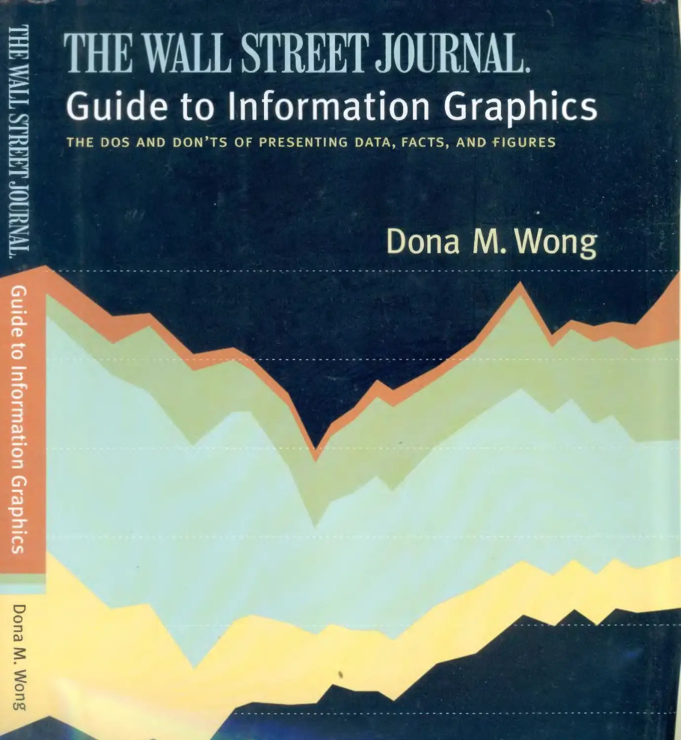
THE WALL STREET JOURNAL.
Guide to Information Graphics
THE DOS AND DON'TS OF PRESENTING DATA, FACTS, AND FIGURES
Dona M.Wong
W. W. Norton & Company
New York | London
Copyright © 2010 by Dow Jones & Company, Inc., and Dona M. Wong
The Wall Street Journal is a registered trademark of Dow Jones.
All rights reserved
Printed in the United States of America
First Edition
For information about permission to reproduce selections from this book, write to
Permissions, W. W. Norton & Company, Inc., 500 Fifth Avenue, New York, NY 10110
For information about special discounts for bulk purchases, please contact W. W. Norton
Special Sales at specialsales@wwnorton.com or 800-233-4830
Manufacturing by Courier Westford
Production manager: Anna Oler
Library of Congress Cataloging-in-Publication Data
Wong, Dona M.
The Wall Street Journal guide to information graphics : the dos and don'ts of presenting
data, facts, and figures / Dona M. Wong. — 1st ed.
p. cm.
Includes indexes.
ISBN 978-0-393-07295-2 (hbk.)
1. Business presentations—Graphic methods. 2. Charts, diagrams, etc. 3. Visual
communication. I. Wall Street Journal. II. Title. III. Title: Guide to information graphics.
IV. Title: Dos and don'ts of presenting data, facts, and figures.
HF5718.22.W65 2010
658.4'52—dc22
2009035687
W. W. Norton & Company, Inc.
500 Fifth Avenue, New York, N.Y 10110
www.wwnorton.com
W. W. Norton & Company Ltd.
Castle House, 75/76 Wells Street, London WIT 3QT
1234567890
THE WALL STREET JOURNAL.
Guide to Information Graphics
for my
parents for my
better half
for Joyce & Joe
Michael
Contents
Introduction
CHAPTER 1 I The Basics
Charting
Numbers
Data integrity
Data richness
Fonts
Legibility
Typography in charts
The Visual - Data Continuum
Color
Basics
Color palettes
Color in charts
Color chart templates
Coloring for the color blind
Color scale application
13
19
20
22
26
28
30
32
34
36
38
40
42
44
46
h /* PTER 2 |
H A PI E R 3 |
Chart Smart
Lines
Height and weight
Y-axis increments
Clean lines, clear signal
Legends and labels
Left-right y-axis scales
Comparable scales
Vertical bars
Form and shading
Zero baseline
Multiple bars and legends
Broken bars and outliers
Horizontal bars
Ordering and regrouping
Negative bars
Pies
Slicing and dicing
Dressing up the slices
Slicing a slice
Proportional pies
Tables
Grid lines
Numbers alignment and ordering
Pictograms
Choice of icons
Comparing quantities
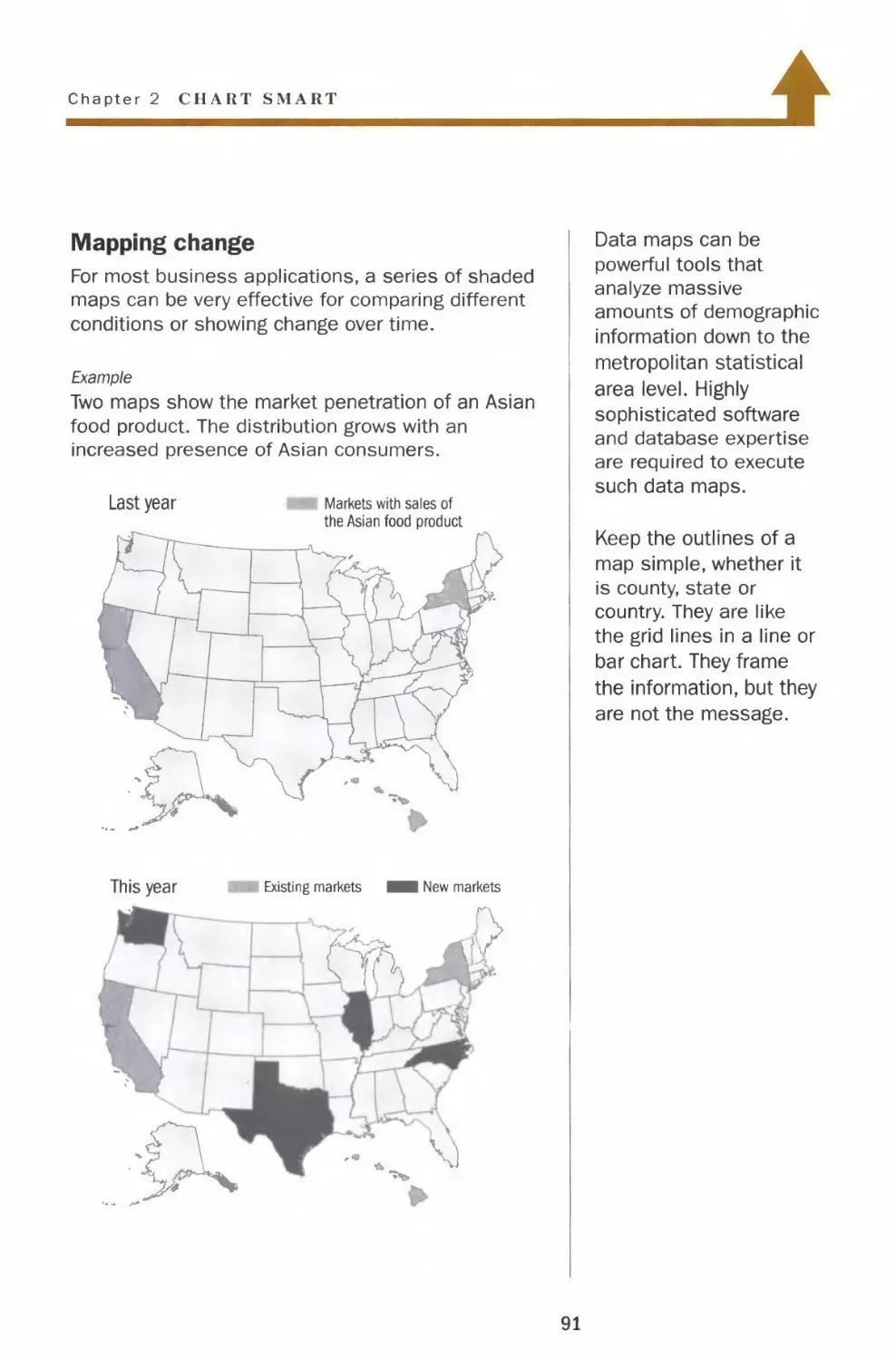
Maps
Mapping and shading
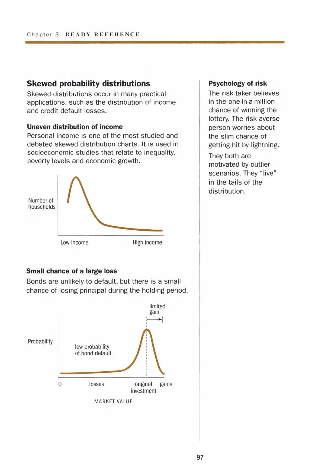
Ready Reference
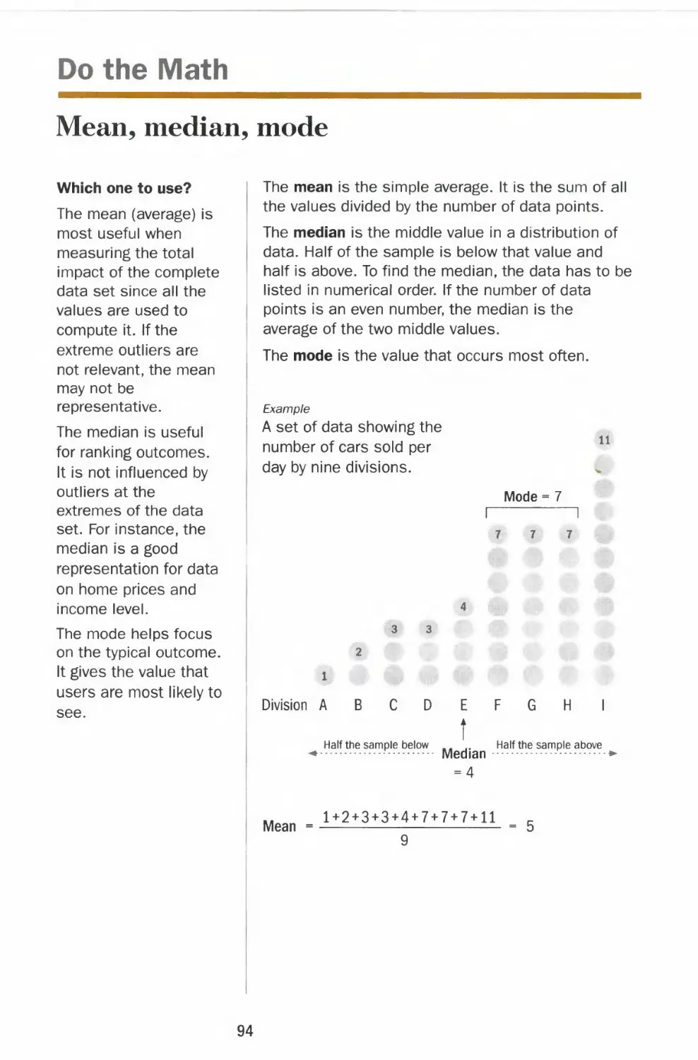
Do the Math
Mean, median, mode
Standard deviation
Probability
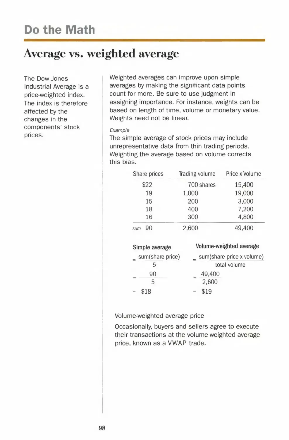
Average vs. weighted average
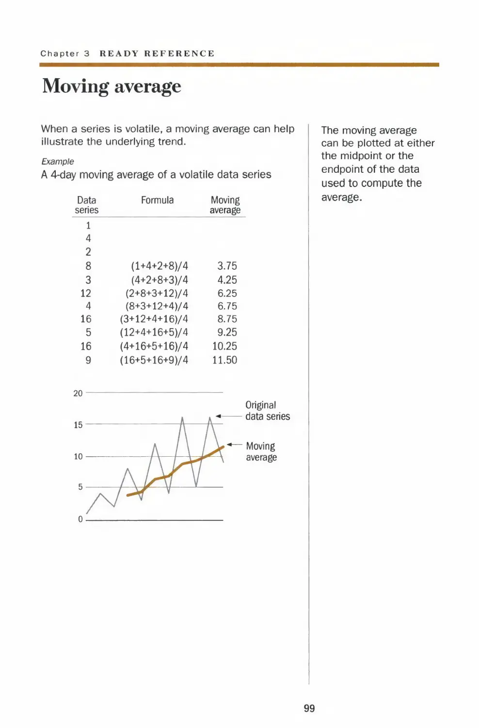
Moving average
49
50
52
54
56
58
60
62
64
66
68
70
72
74
76
78
80
82
84
86
88
90
93
94
95
96
98
99
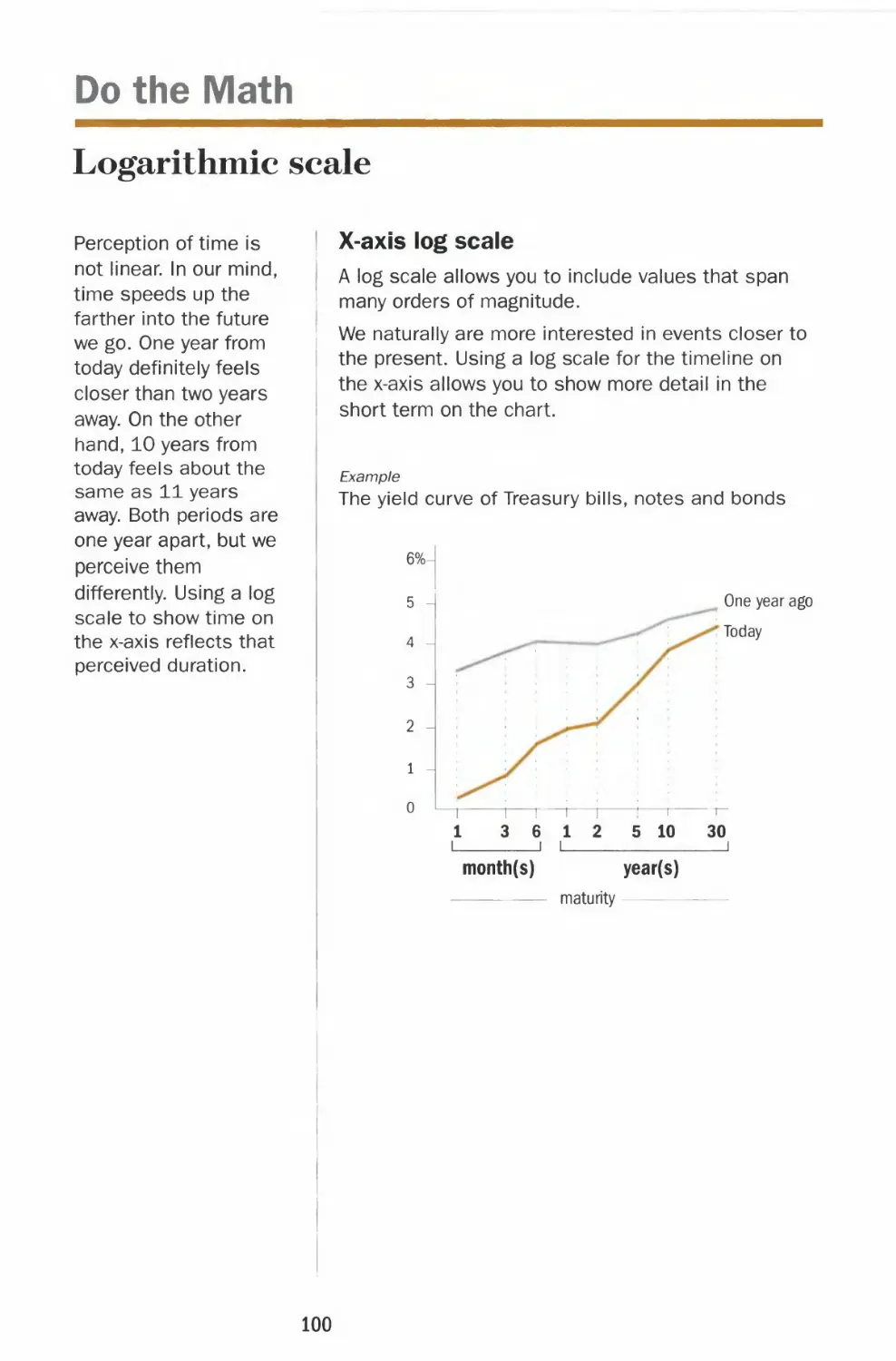
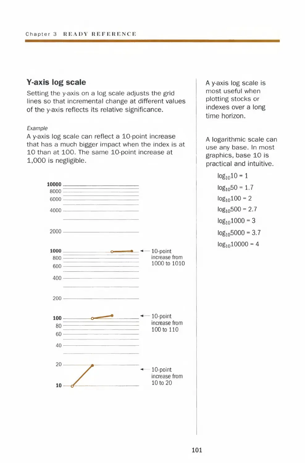
Logarithmic scale 100
Comparable scales 102
Percentage change 104
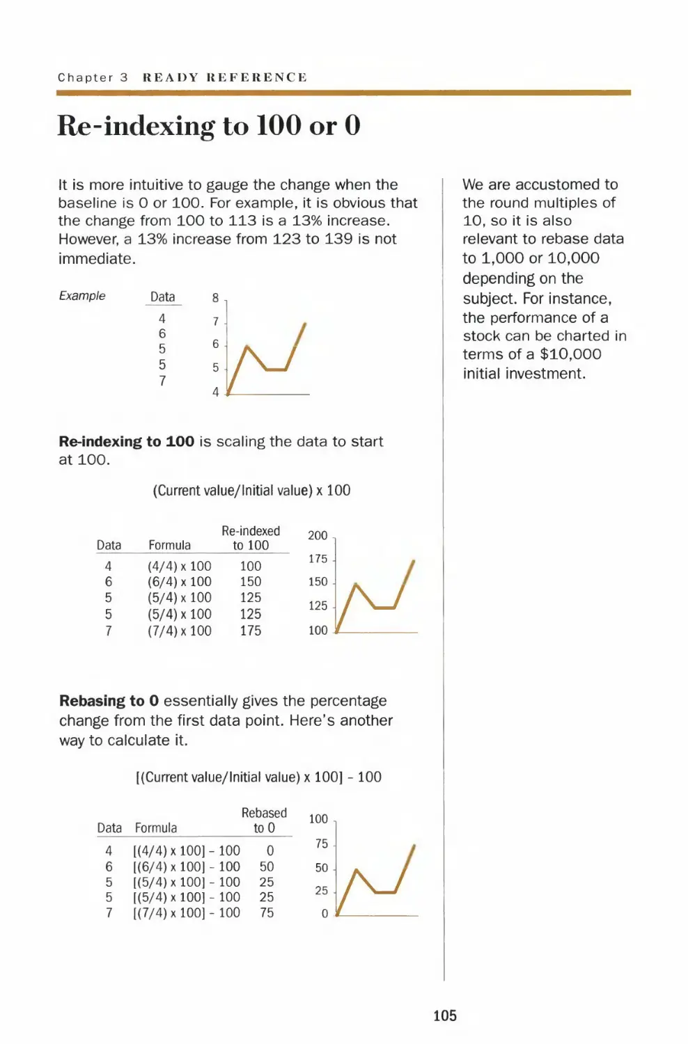
Re-indexing to 100 or 0 105
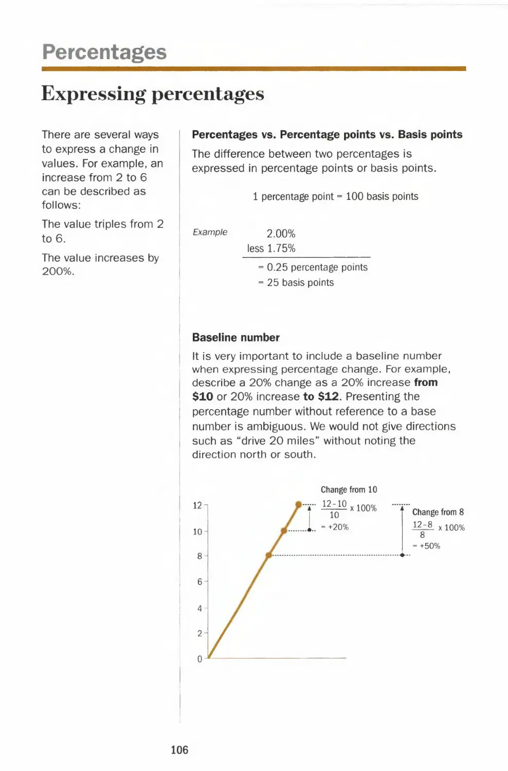
Percentages
Expressing percentages 106
Absolute values vs. percentage changes 107
Percent of a percentage 108
Don't average percentages 109
Copy Style in Charts
Words 110
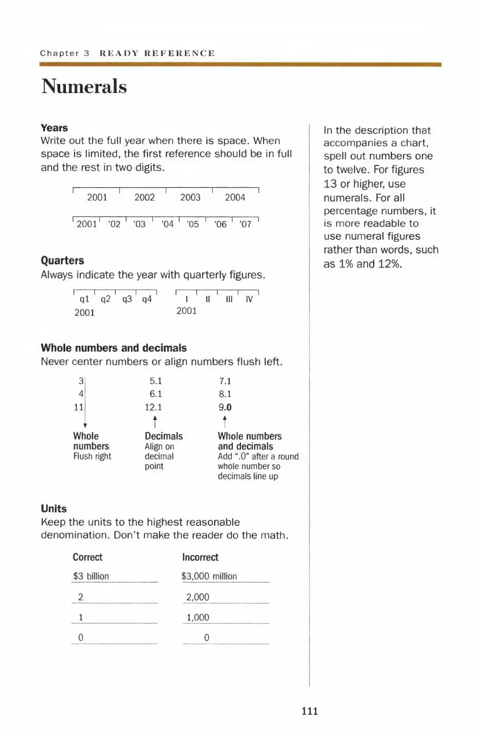
Numerals 111
Money
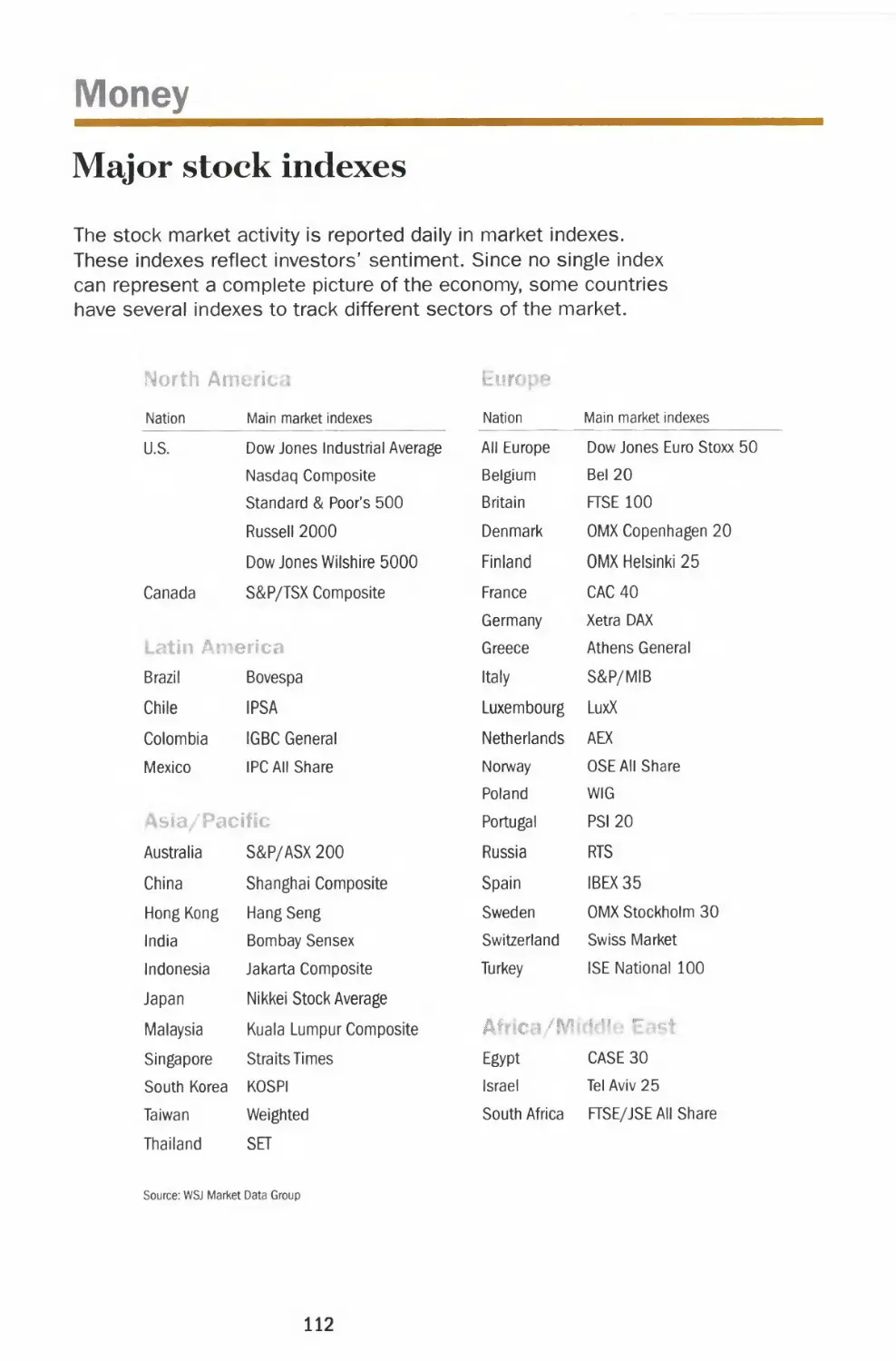
Major stock indexes 112
Measuring performance 114
Arithmetic vs. geometric rate of return 116
Currencies 118
CHAPTER 4 |
CHAPTER 5|
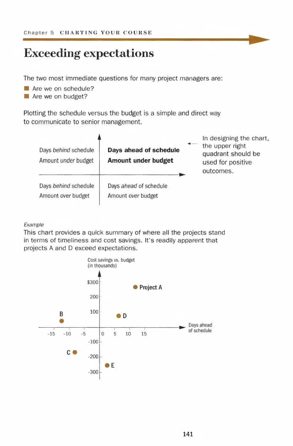
Tricky Situations
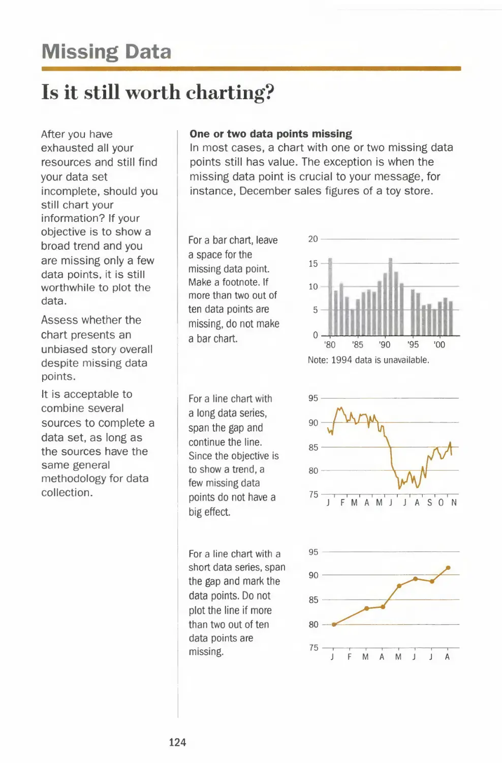
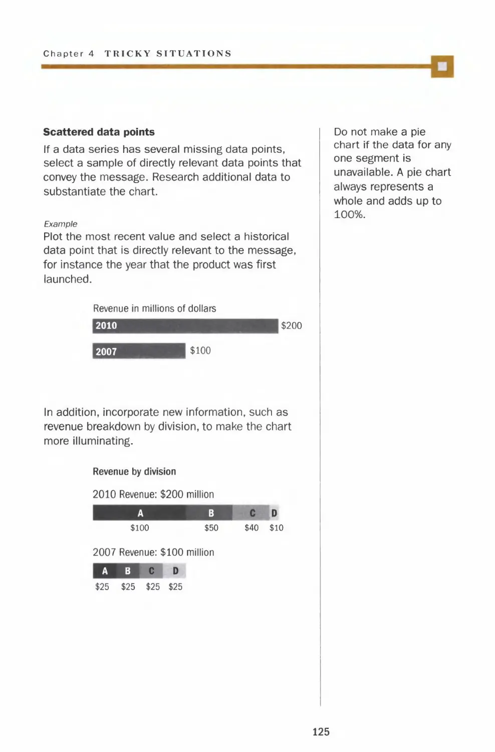
Missing data
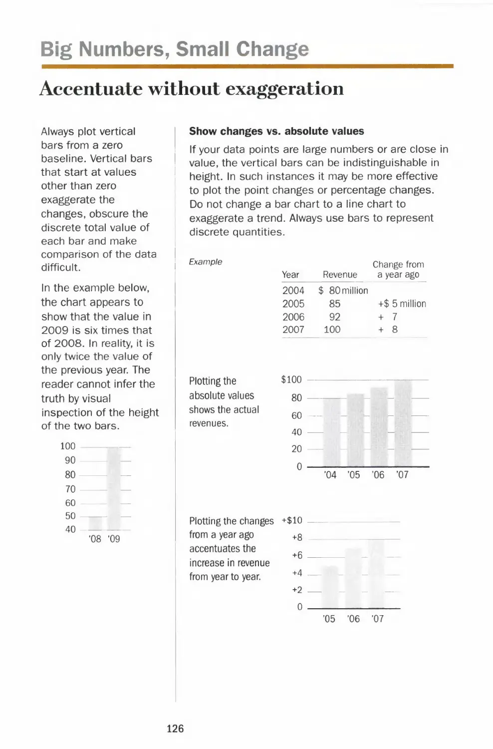
Big numbers, small change
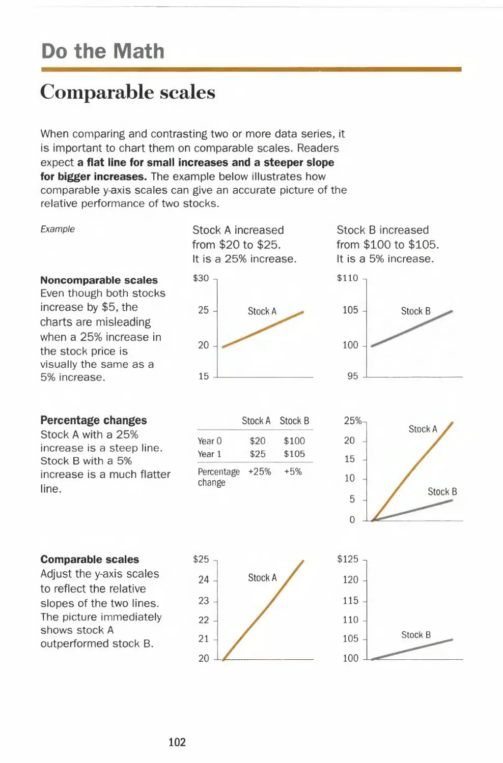
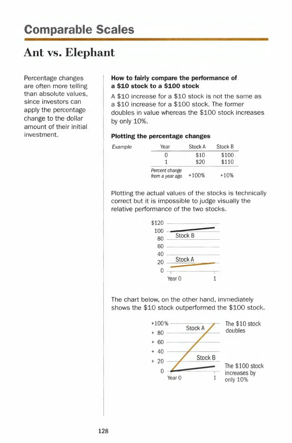
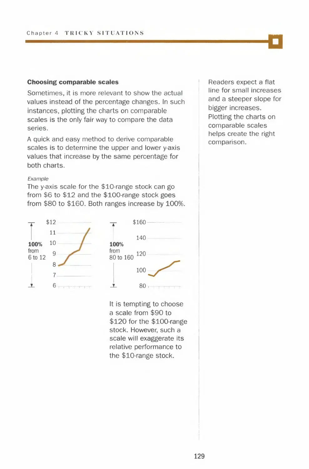
Comparable scales
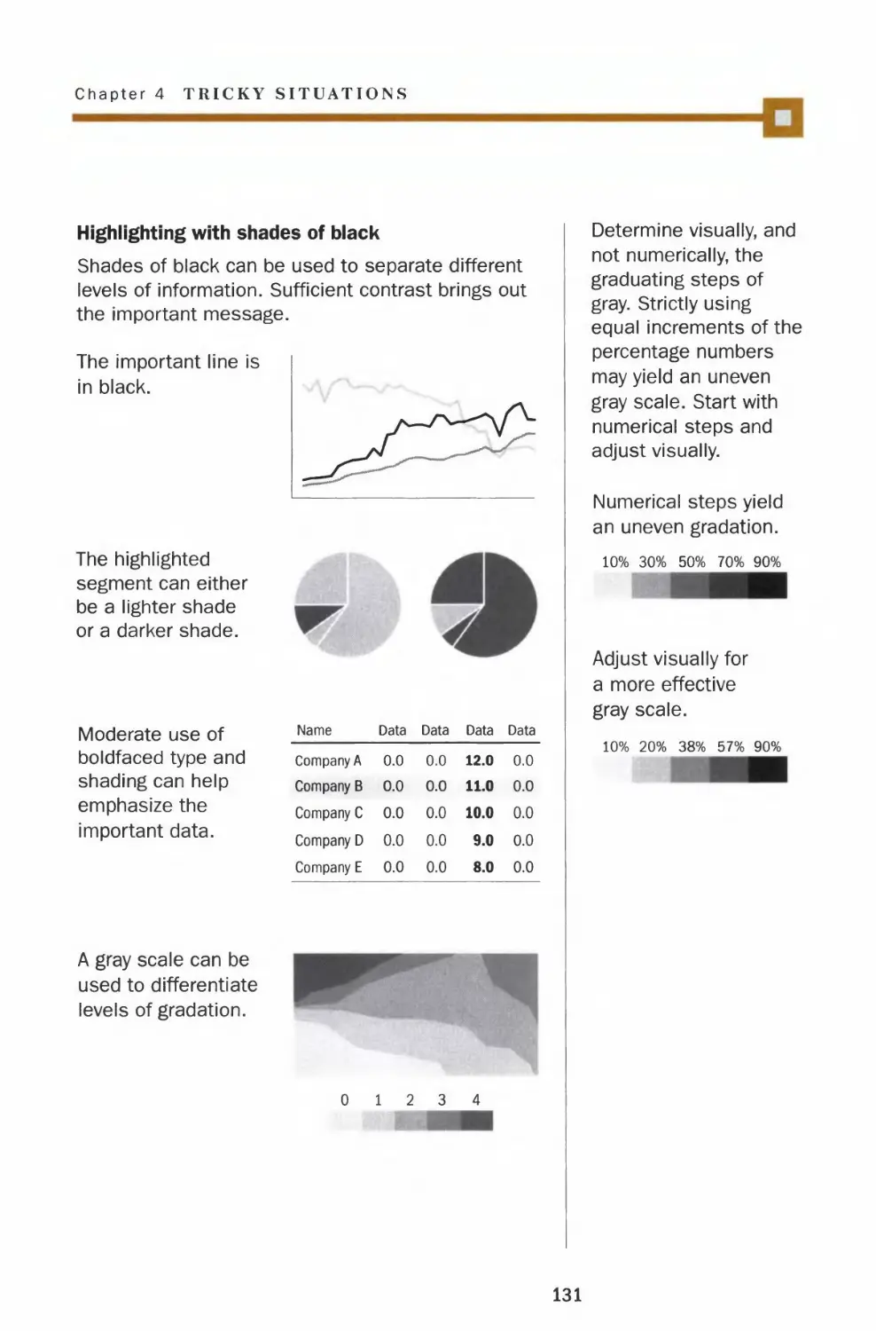
Coloring with black ink
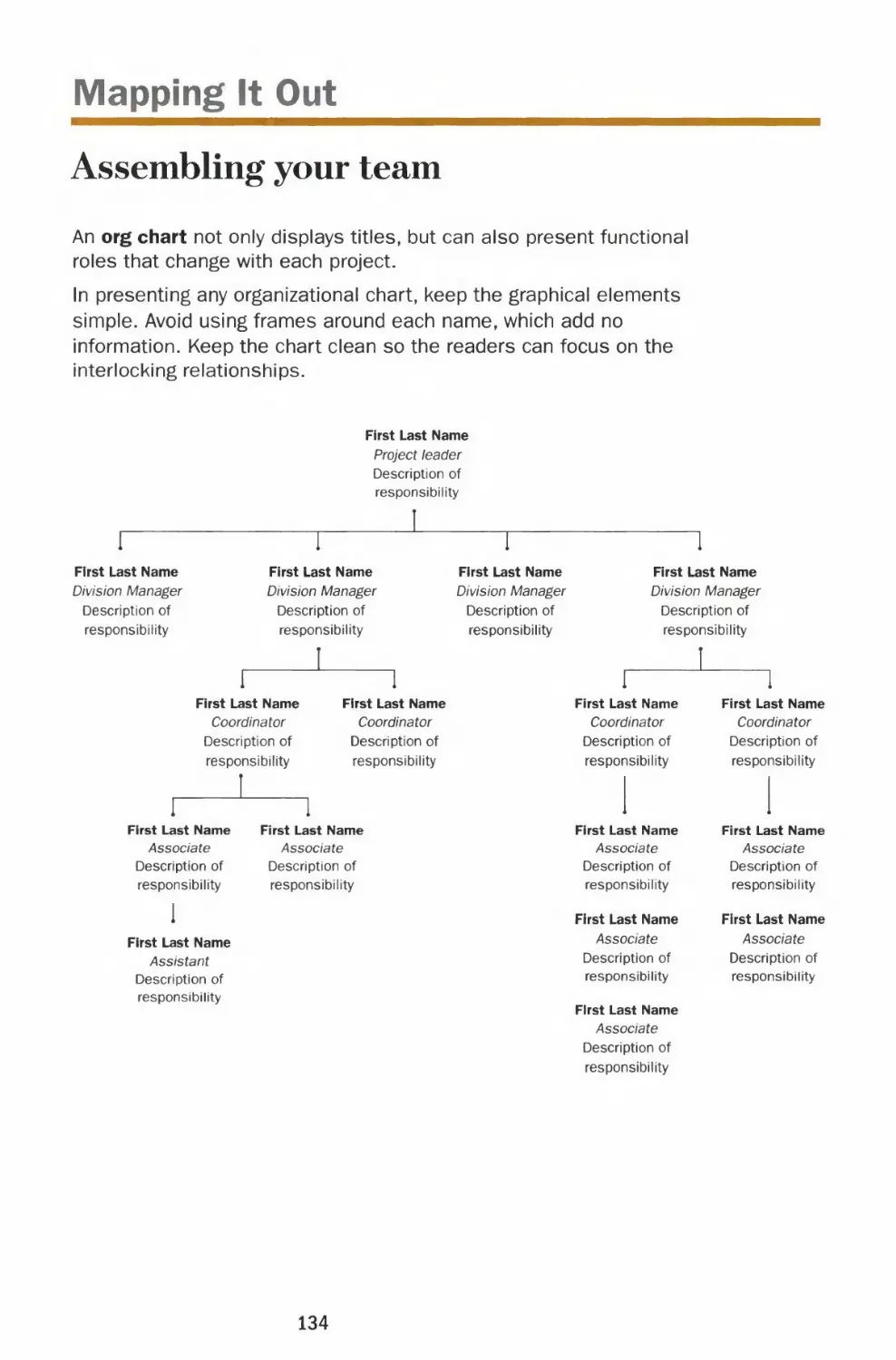
Charting Your Course
Org chart
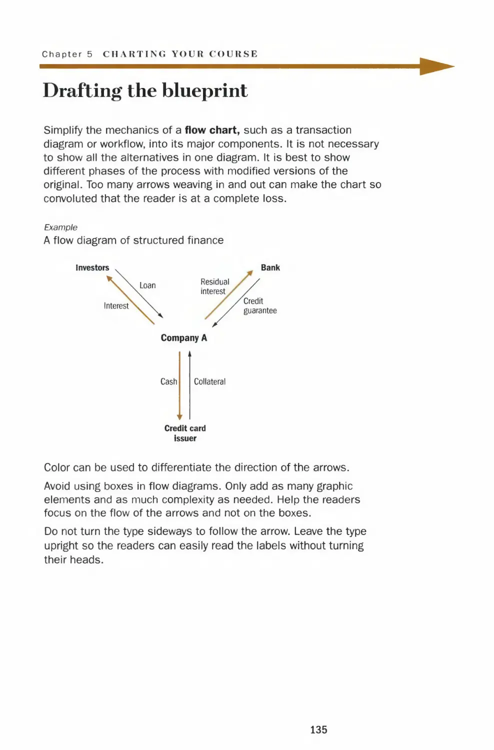
Flow chart
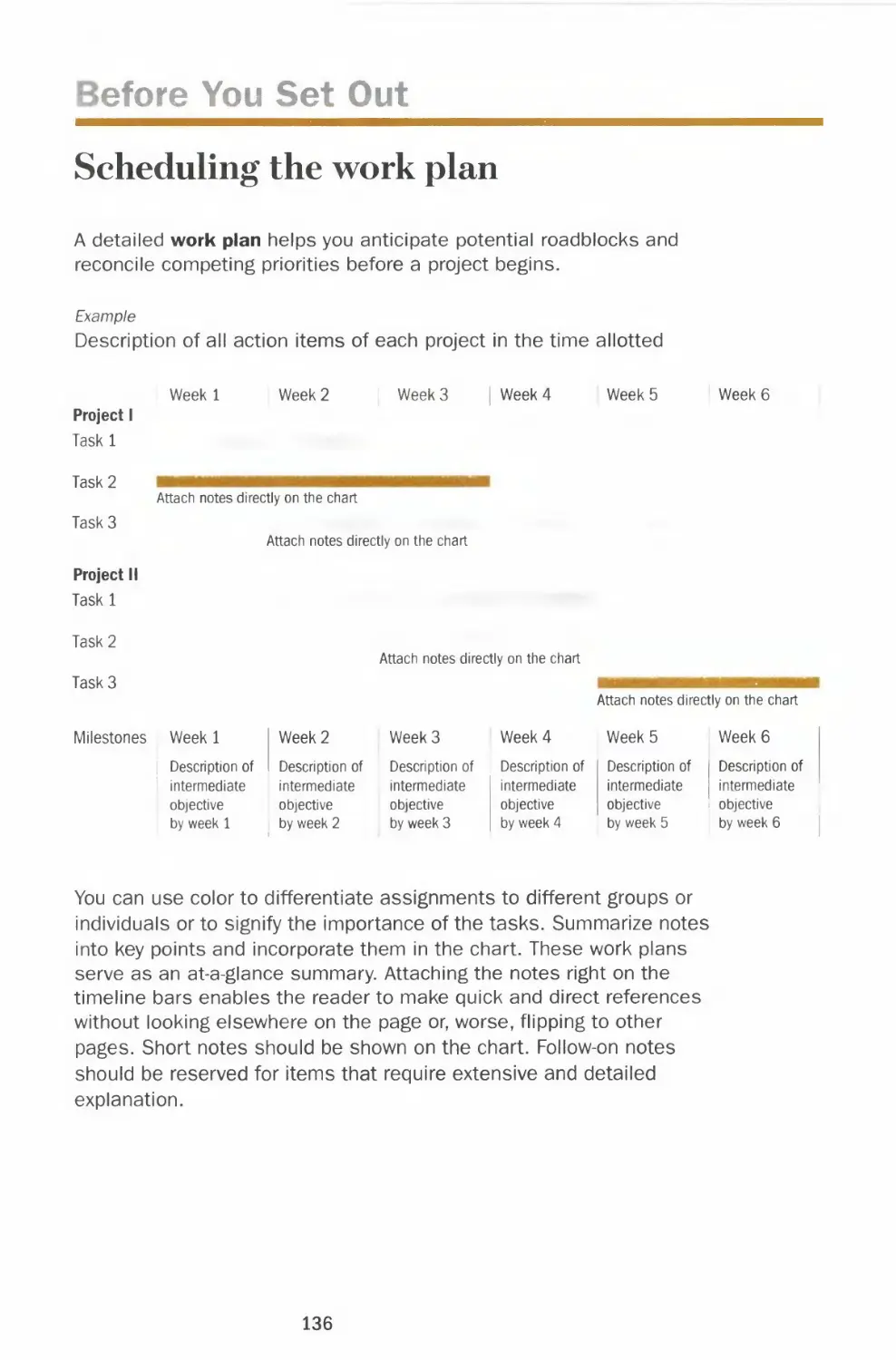
Work plan
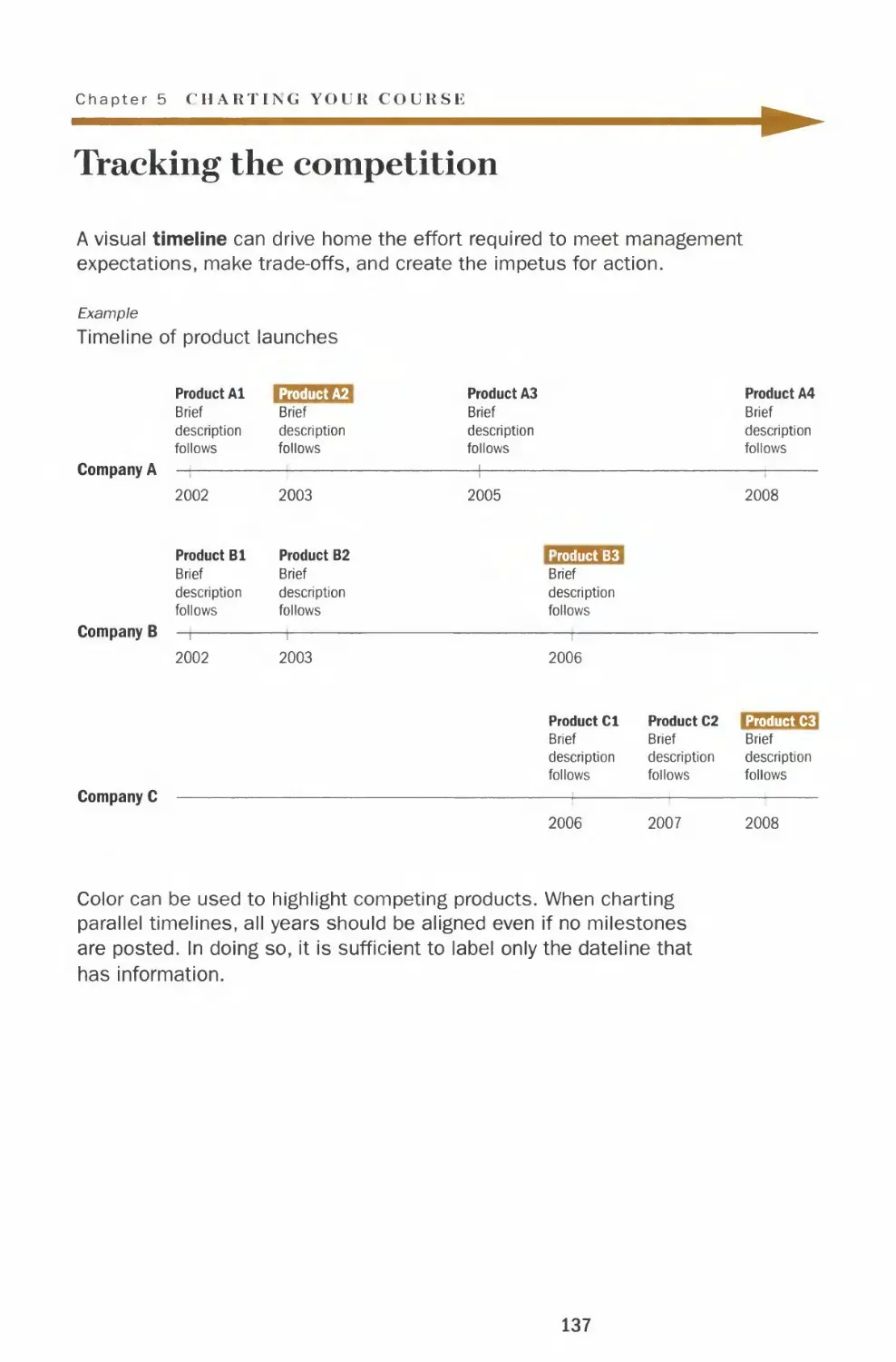
Timeline
Progress report
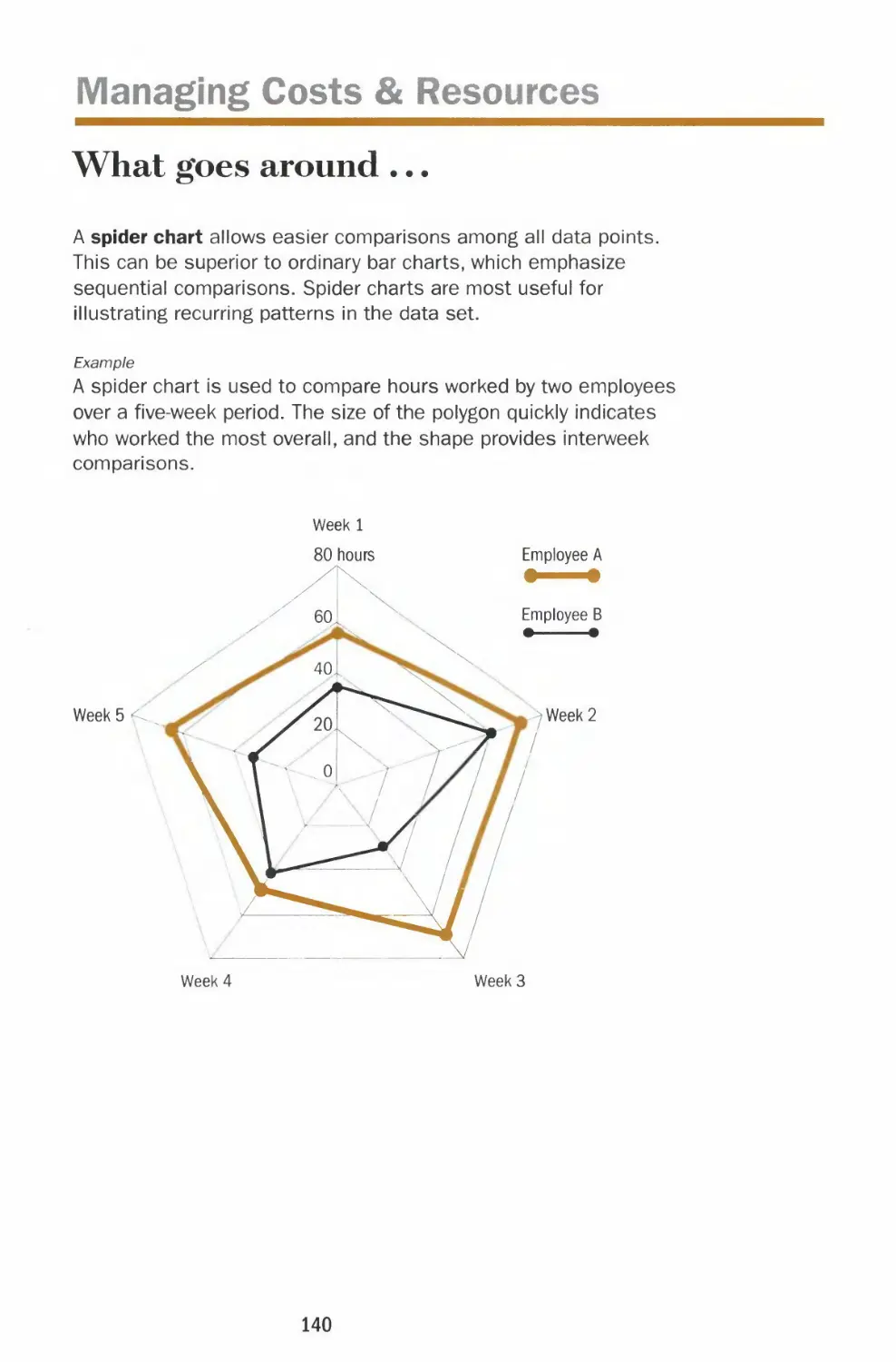
Spider chart
Schedule and budget chart
In Brief
Acknowledgments
Creative process revealed
Index
123
124
126
128
130
133
134
135
136
137
138
140
141
143
147
149
151
Note: The charts
in this book were
generated with
Excel, Deltagraph
and Adobe
Illustrator.
However, there are
many software
packages
available in the
market and some
are even freeware.
Introduction
We live in a data-driven world where the ability to
create effective charts and graphs has become
almost as indispensable as good writing.
With computer technology, anyone can create
graphics, but few of us know how to do it well. Too
often we present a chart with visual tricks such as
clashing colors or 3-D blocks thinking it will look
pretty, while not paying enough attention to
conveying information.
Ultimately, it is content that makes graphics
interesting. When a chart is presented properly,
information just flows to the viewer in the clearest
and most efficient way. There are no extra layers of
colors, no enhancements to distract us from the
clarity of the information.
13
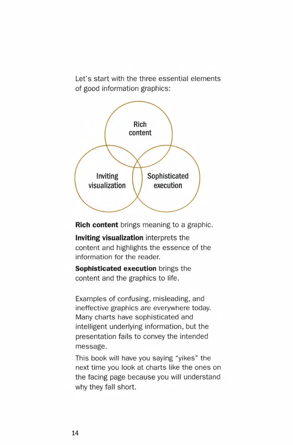
Let's start with the three essential elements
of good information graphics:
Rich
content
Inviting Sophisticated
visualization \ / execution
Rich content brings meaning to a graphic.
Inviting visualization interprets the
content and highlights the essence of the
information for the reader.
Sophisticated execution brings the
content and the graphics to life.
Examples of confusing, misleading, and
ineffective graphics are everywhere today.
Many charts have sophisticated and
intelligent underlying information, but the
presentation fails to convey the intended
message.
This book will have you saying "yikes" ^e
next time you look at charts like the ones on
the facing page because you will understand
why they fall short.
14
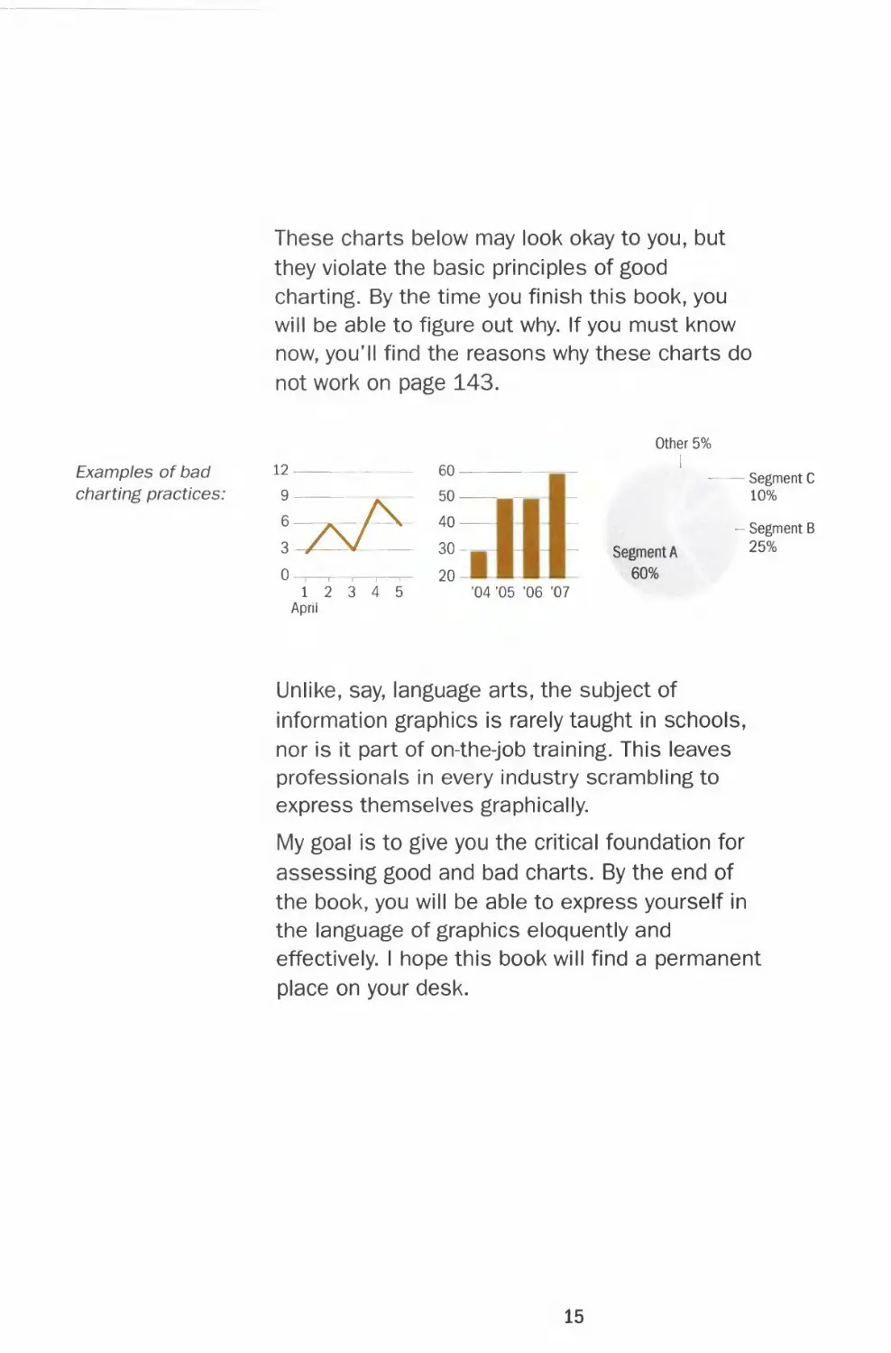
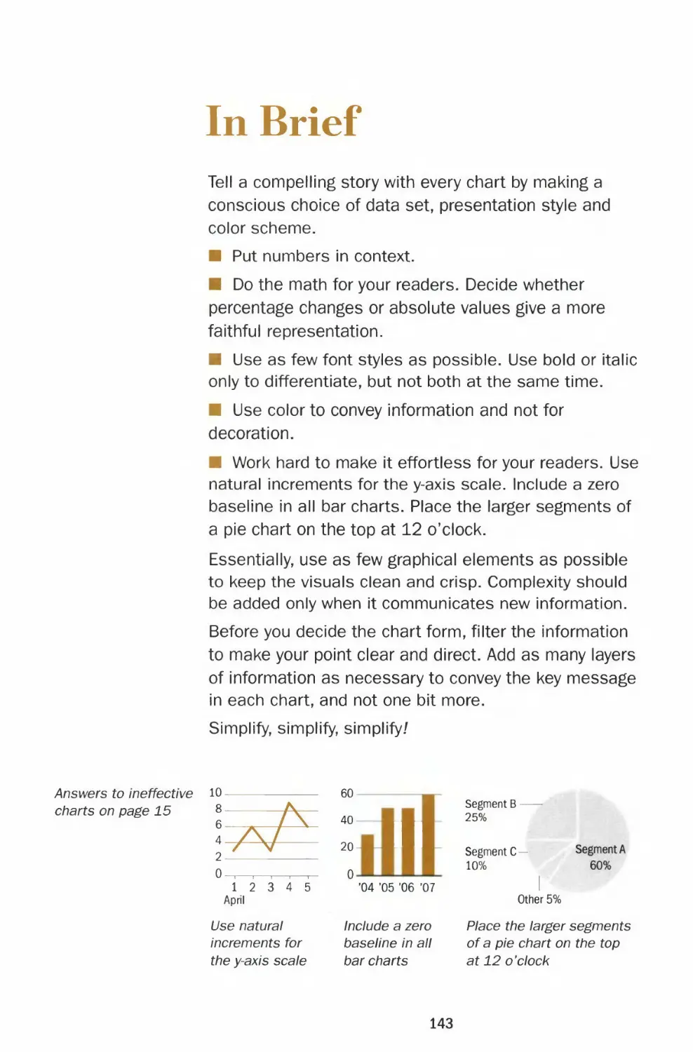
These charts below may look okay to you, but
they violate the basic principles of good
charting. By the time you finish this book, you
will be able to figure out why. If you must know
now, you'll find the reasons why these charts do
not work on page 143.
Other 5%
Examples of bad 12 — — 60 -
charting practices: 9 50 — - 10%
6—*--/\ 40
- Segment C
- Segment B
3-/-—V 30- - Segment A 25%
0 ,- , , ,— 20- 60%
12 3 4 5 '04 "05 '06 '07
April
Unlike, say, language arts, the subject of
information graphics is rarely taught in schools,
nor is it part of on-the-job training. This leaves
professionals in every industry scrambling to
express themselves graphically.
My goal is to give you the critical foundation for
assessing good and bad charts. By the end of
the book, you will be able to express yourself in
the language of graphics eloquently and
effectively. I hope this book will find a permanent
place on your desk.
15
THE WALL STREET JOURNAL.
Guide to Information Graphics
CHAPTER 1
The Basics
What really makes a chart effective are font,
color and design and the depth of critical
analysis displayed. In other words, do you have
information worth making a chart for and have
you portrayed it accurately? Remember that a
single wrong data point can discredit the rest of
the information and make the entire chart
worthless.
In this chapter I provide practical guidelines and
templates for fonts and the choice of colors —
bright or muted. I answer questions like: Do two
numbers constitute a chart? What is good data?
These basics provide the backbone and
foundation for executing intelligent and
persuasive charts.
19
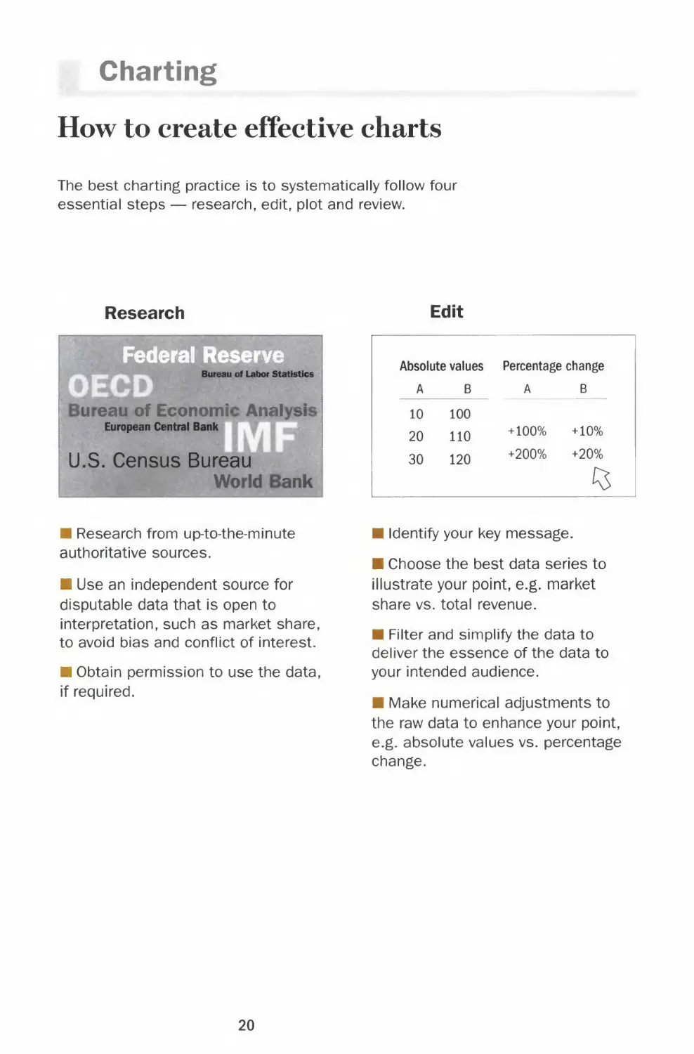
Charting
How to create effective charts
The best charting practice is to systematically follow four
essential steps — research, edit, plot and review.
Research
Federal Reserve
Bureau of Labor Statistics
u eau of Economi Anal si
European Central Bank
U.S. Census Bureau
Wo Id ank
Edit
Absolute values
A B
10 100
20 110
30 120
Percentage change
A B
+100% +10%
+200% +20%
(5
■ Research from up-to-the-minute
authoritative sources.
■ Use an independent source for
disputable data that is open to
interpretation, such as market share,
to avoid bias and conflict of interest.
■ Obtain permission to use the data,
if required.
■ Identify your key message.
■ Choose the best data series to
illustrate your point, e.g. market
share vs. total revenue.
■ Filter and simplify the data to
deliver the essence of the data to
your intended audience.
■ Make numerical adjustments to
the raw data to enhance your point,
e.g. absolute values vs. percentage
change.
20
Chapter 1 BASICS
Plot
Headline of the chart
Brief description of the chart
20
5 y^
1 2 3 4 5 8 9 10
April
■ Choose the right chart type to
present the data, e.g. a line to show
trend or a bar to show discrete
quantities.
■ Choose the appropriate chart
settings, e.g. scale, y-axis
increments and baseline.
■ Label the chart, e.g. title,
description, legends and source line.
■ Use color and typography to
accentuate the key message.
Review
»*% error?
I ;,:
■ Check the plotted data against
your sources.
■ Use judgment to evaluate whether
your chart makes sense.
■ Try to look at the chart from the
reader's perspective.
■ Verify your data with additional
sources and consult with experts in
the field for questionable content
and outliers.
■ Refer to this book to check best
charting practices.
Too often, this step is skipped for the
sake of expedience. However, taking
the time to go over every step of your
work can make the difference
between a professional and an
amateur attempt. Unlike a mispelled
word in a story, one wrong number
discredits the whole chart.
21
Numbers
Tangible evidence
When calculating the
figures and plotting the
graphs, use decimal
places for accuracy.
However, in labeling
your chart, round off
the numbers to the
significant digit (or
digits) for easy
comparison. For
example, labeling
12.345 may be more
precise than 12.3, but
it distracts from the
visual impact of the
chart.
Words vs. Charts
Charting is a powerful tool that puts a series of
numbers in close proximity to each other. The
numbers in a chart convey information to the reader
both visually and narratively. The same set of
numbers looks more concrete and precise when
charted than when presented in a story or a caption.
Test
Numbers in a story:
Company A earns $100
million and outperforms
company B which earns
$75 million.
Numbers plotted:
Earnings in millions
A $100
B $75
The chart shown above on the right allows you to
make a judgment at a glance. It is more memorable
than a string of numbers held together by words.
Let the data speak for itself
The best chart should be free of any distraction and
allow the reader to compare or contrast the data
and draw a conclusion.
A chart with obtrusions
such as heavy gridlines
and 3-D rendering
obscures the data and
diverts the reader's
attention from the
content.
In contrast, a clean and
crisp chart allows the
reader to focus on the
data, which is the
message of the story.
10-
8-
6-
4-
2-
0
ql Q2
o
q3 q4
8
6
4 —
2 —: ,, _
n
- !—
ql q2 q3 q4
22
Chapter 1 BASICS
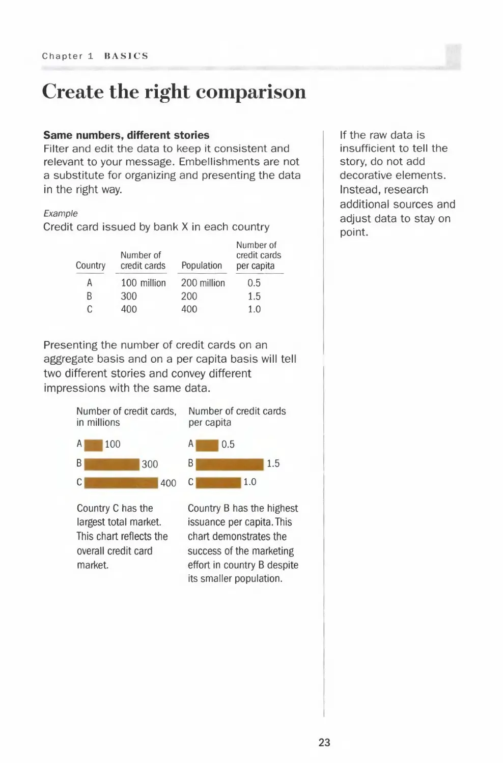
Create the right comparison
Same numbers, different stories
Filter and edit the data to keep it consistent and
relevant to your message. Embellishments are not
a substitute for organizing and presenting the data
in the right way.
Example
Credit card issued by bank X in each country
Country
A
B
C
Number of
credit cards
100 million
300
400
Population
200 million
200
400
Number of
credit cards
per capita
0.5
1.5
1.0
Presenting the number of credit cards on an
aggregate basis and on a per capita basis will tell
two different stories and convey different
impressions with the same data.
Number of credit cards, Number of credit cards
in millions per capita
A 100
B 300
C 400
Country C has the
largest total market.
This chart reflects the
overall credit card
market.
A 0.5
B 1.5
C 1.0
Country B has the highest
issuance per capita. This
chart demonstrates the
success of the marketing
effort in country B despite
its smaller population.
If the raw data is
insufficient to tell the
story, do not add
decorative elements.
Instead, research
additional sources and
adjust data to stay on
point.
23
Numbers
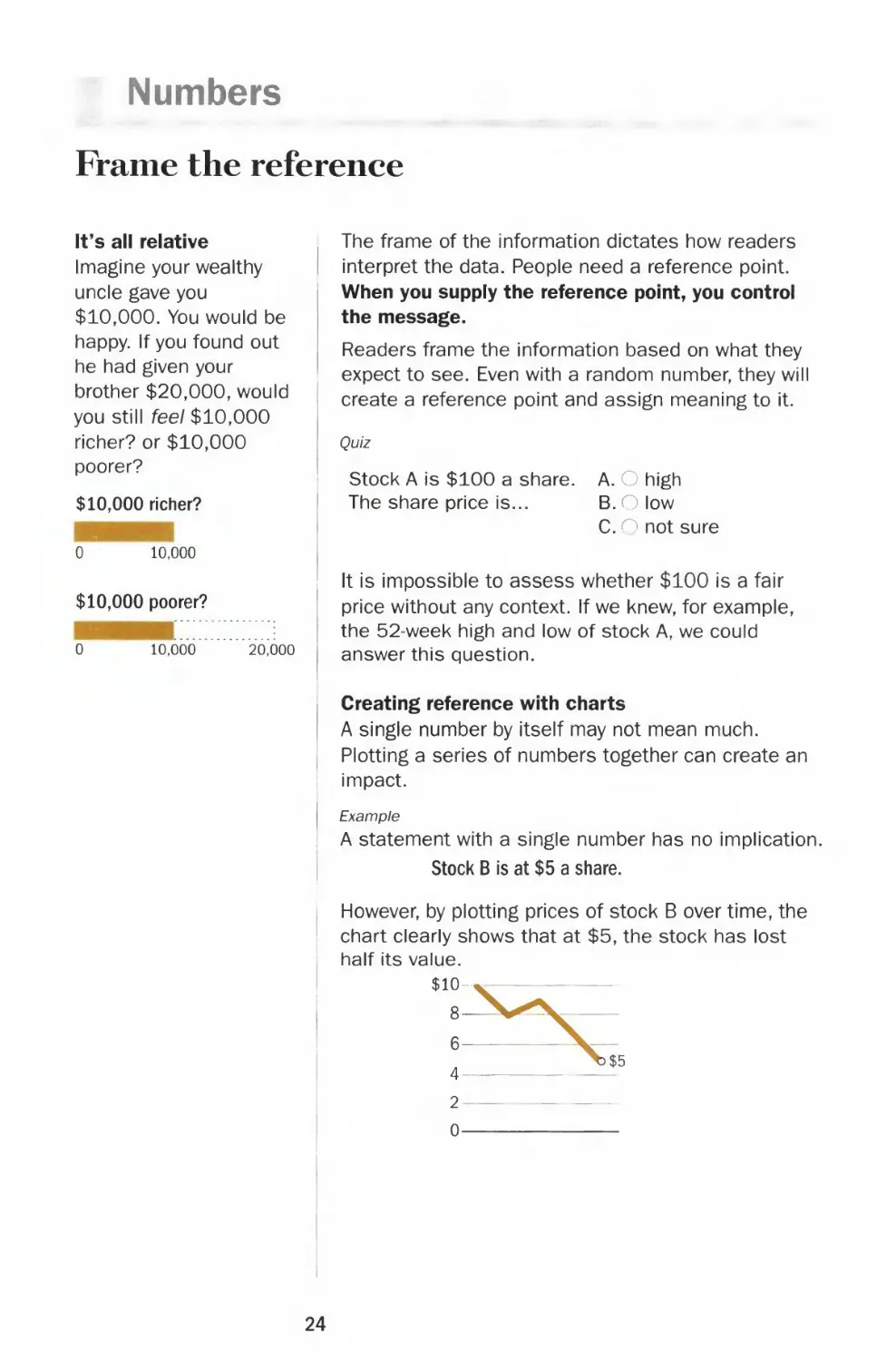
Frame the reference
It's all relative
Imagine your wealthy
uncle gave you
$10,000. You would be
happy. If you found out
he had given your
brother $20,000, would
you still feel $10,000
richer? or $10,000
poorer?
$10,000 richer?
0
10,000
$10,000 poorer?
0 10,000 20,000
The frame of the information dictates how readers
interpret the data. People need a reference point.
When you supply the reference point, you control
the message.
Readers frame the information based on what they
expect to see. Even with a random number, they will
create a reference point and assign meaning to it.
Quiz
Stock A is $100 a share.
The share price is...
A. O high
B.O low
C. ^ not sure
It is impossible to assess whether $100 is a fair
price without any context. If we knew, for example,
the 52-week high and low of stock A, we could
answer this question.
Creating reference with charts
A single number by itself may not mean much.
Plotting a series of numbers together can create an
impact.
Example
A statement with a single number has no implication.
Stock B is at $5 a share.
However, by plotting prices of stock B over time, the
chart clearly shows that at $5, the stock has lost
half its value.
$10-,
8-
4-
2-
0-
24
Chapter 1 BASICS
Send the right signal
One set of numbers can be charted in many ways.
People feel the pain of a $1,000 loss more than
the joy of a $1,000 gain. Use the right context to
communicate the message you intend.
Example
Performance of stock A
Share price
$ 8
10
8
4
2
Percent change
from first data point
0%
+25
0
-50
-75
Plotting the actual share prices:
$12
Plotting the percentage change in prices will bring
the line into negative territory. This accentuates
the drop in share prices. Just by setting the
baseline, the chart visually implies the
performance is unacceptable.
+50%
+25
^SZ
*i
-25-
-50-
-75-
-100
Both charts give a fair picture. Clearly, the choices
you make in charting create the framework that
sends a specific message to the readers.
The message of the
chart should be
consistent with ALL the
facts and evidence
available. For instance,
when plotting profit and
loss, a chart that omits
previous quarters with
poor performance
would misrepresent the
facts.
Example
Full disclosure
$8 million -
6
4
2
0
-2-
-4-
ql q2 q3 q4
Half truth
$8 million -
6
4
2
0-
q3 q4
25
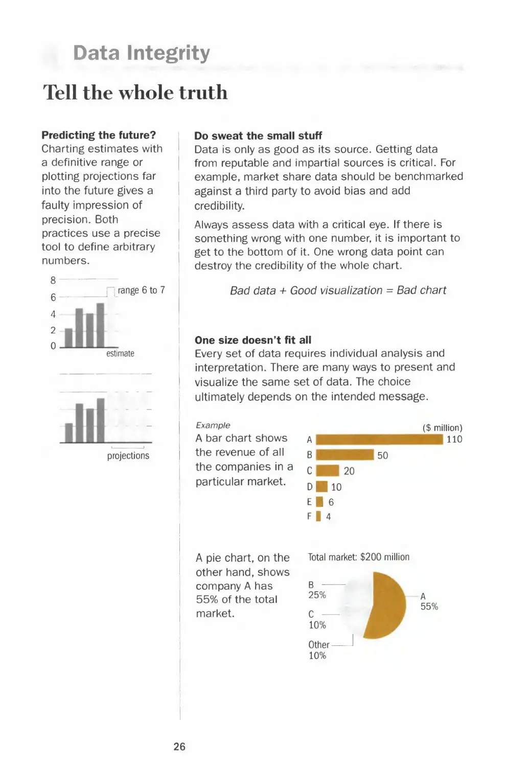
Data Integrity
Tell the whole truth
Predicting the future?
Charting estimates with
a definitive range or
plotting projections far
into the future gives a
faulty impression of
precision. Both
practices use a precise
tool to define arbitrary
numbers.
range 6 to 7
4-
2
0
estimate
projections
Do sweat the small stuff
Data is only as good as its source. Getting data
from reputable and impartial sources is critical. For
example, market share data should be benchmarked
against a third party to avoid bias and add
credibility.
Always assess data with a critical eye. If there is
something wrong with one number, it is important to
get to the bottom of it. One wrong data point can
destroy the credibility of the whole chart.
Bad data + Good visualization = Bad chart
One size doesn't fit all
Every set of data requires individual analysis and
interpretation. There are many ways to present and
visualize the same set of data. The choice
ultimately depends on the intended message.
Example
A bar chart shows
the revenue of all
the companies in a
particular market.
A pie chart, on the
other hand, shows
company A has
55% of the total
market.
A
B 50
C 20
dHio
I
F|4
Total market: $200 million
($ million)
110
25%
C —
10%
Other-
10%
A
55%
26
Chapter 1 BASICS
Put numbers in context
Build credibility by presenting facts fairly. An initiative
to hire 200 people can be 1% of the workforce in
one company or 10% in another company.
Showing a percentage without a base number is also
meaningless. A 10% increase from what number to
what number?
Example
Market share for product x
U.S.
Canada
A
60%
B
60%
The only conclusion we can draw from the two pie
charts is that A and B both have a 60% market
share. However, not knowing the size of each market
makes it impossible to judge which has more sales.
Leave rounding to the end
Don't round off your numbers until the last step in
the presentation process. Rounding the figures up
and down during the analysis stage can lead to
final results that are far from the truth and
subsequent erroneous interpretations.
Example
Example
Data After rounding
12.4 12
16.5 17
Percent change +33.1% +41.7%
Data After rounding
Company A
Company B
Company C
$2.9 billion $3 billion
3.1 3
4.2 4
The comparison between company A and B is lost.
Besides, $0.2 billion or $200 million is a lot of money.
Beware of showing a
big percentage change
based on small
numbers. It is generally
unfair to compare the
percentage change in
revenue of a big
company to that of a
small company. Even if
a small company
increases its revenue
threefold, it may still be
a small sliver in the
total market.
27
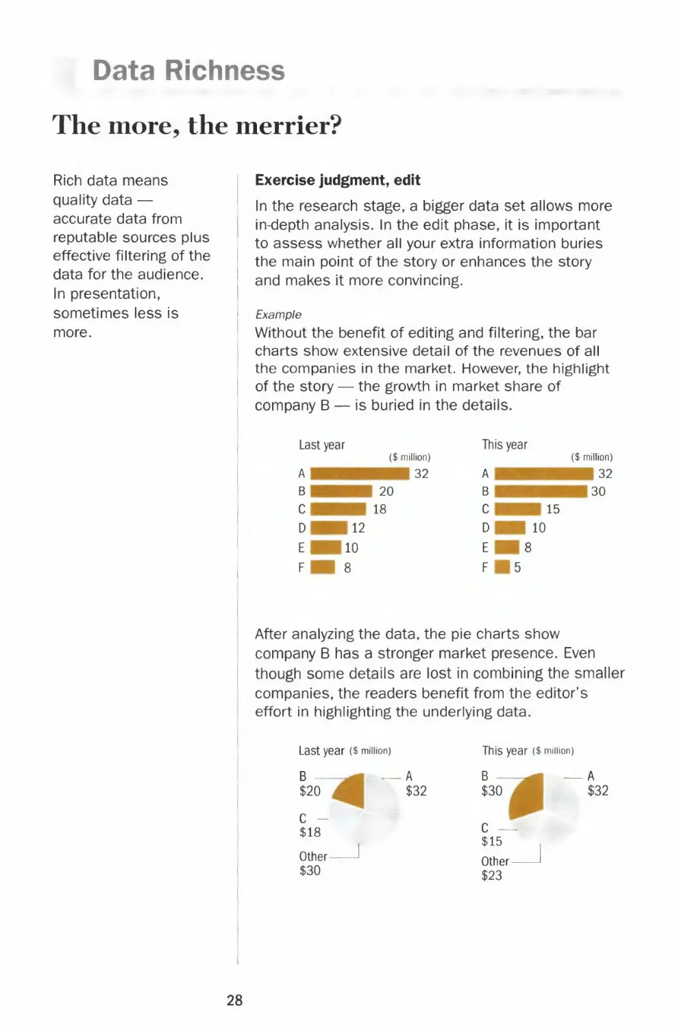
Data Richness
The more, the merrier?
Rich data means
quality data —
accurate data from
reputable sources plus
effective filtering of the
data for the audience.
In presentation,
sometimes less is
more.
Exercise judgment, edit
In the research stage, a bigger data set allows more
I in-depth analysis. In the edit phase, it is important
to assess whether all your extra information buries
' the main point of the story or enhances the story
and makes it more convincing.
| Example
' Without the benefit of editing and filtering, the bar
charts show extensive detail of the revenues of all
the companies in the market. However, the highlight
| of the story — the growth in market share of
i company B — is buried in the details.
Last year
This year
A
B
c
D
E
F
($ million)
20
18
12
10
8
32
A
B
C
D
E
F
15
10
8
5
($ million)
32
30
After analyzing the data, the pie charts show
company B has a stronger market presence. Even
though some details are lost in combining the smaller
companies, the readers benefit from the editor's
effort in highlighting the underlying data.
Last year ($ million)
B —
$20
A
$32
This year ($ minion)
B —
$30
A
$32
C -
$18
Other-
$30
C —
$15
Other -
$23
28
Chapter 1 BASICS
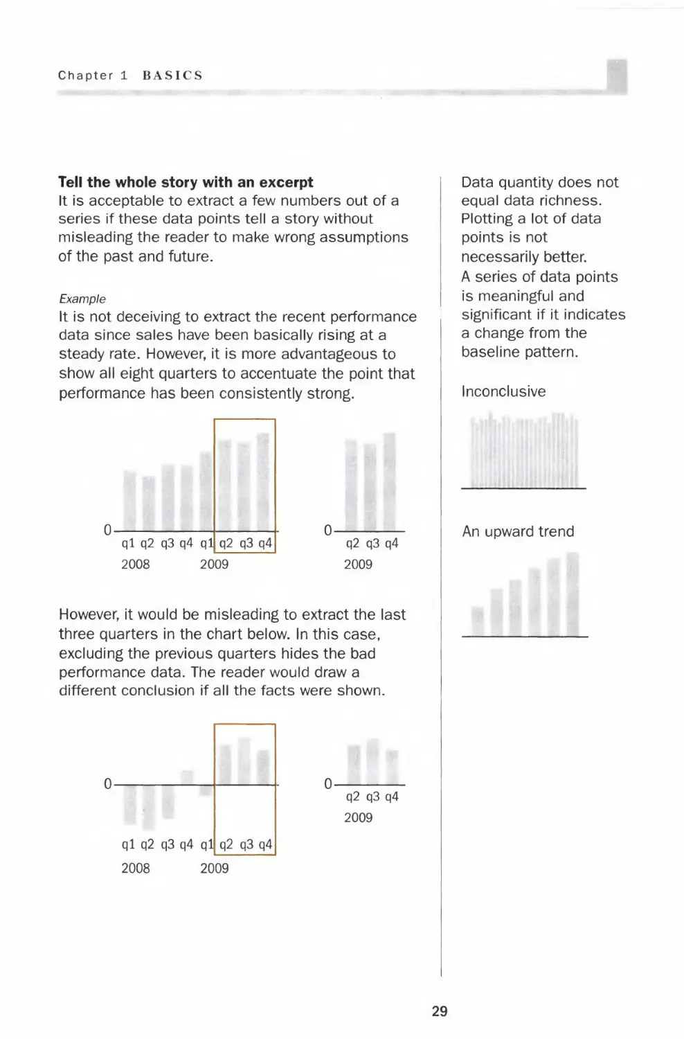
Tell the whole story with an excerpt
It is acceptable to extract a few numbers out of a
series if these data points tell a story without
misleading the reader to make wrong assumptions
of the past and future.
Example
It is not deceiving to extract the recent performance
data since sales have been basically rising at a
steady rate. However, it is more advantageous to
show all eight quarters to accentuate the point that
performance has been consistently strong.
ql q2 q3 q4 ql[_
2008 2009
q2 q3 q4
2009
However, it would be misleading to extract the last
three quarters in the chart below. In this case,
excluding the previous quarters hides the bad
performance data. The reader would draw a
different conclusion if all the facts were shown.
q2 q3 q4
2009
Data quantity does not
equal data richness.
Plotting a lot of data
points is not
necessarily better.
A series of data points
is meaningful and
significant if it indicates
a change from the
baseline pattern.
Inconclusive
An upward trend
29
Fonts
Legibility
With thousands of typefaces available today, in different
styles and weights — serif, sanserif, italic, all caps, light,
medium, bold and black — choosing type can be a daunting
task. In the end, though, type in charts is meant to describe
the information and not to adorn. And it is with that
perspective that typography should be chosen purely on the
merit of legibility.
T L
Terminology
Serif type has a stroke added to the beginning
or end of the main strokes of the letter.
T L
Sanserif type means "letter without serifs.
Mb
text
text
T 1 point
1 inch J 1 pica
leading
Type size is the height of the type, which
originated from the height of the metal block on
which the letter was cast. In digital type, the
type size is the height of the assumed
equivalent of the block, and not the dimension
of the letter itself.
A point is the unit of measure for type size.
Twelve points make a pica. A pica is close to
one-sixth of an inch.
Leading (pronounced led-ing) is the vertical
distance from the baseline of one line to the
baseline of the next.
30
Chapter 1 BASICS
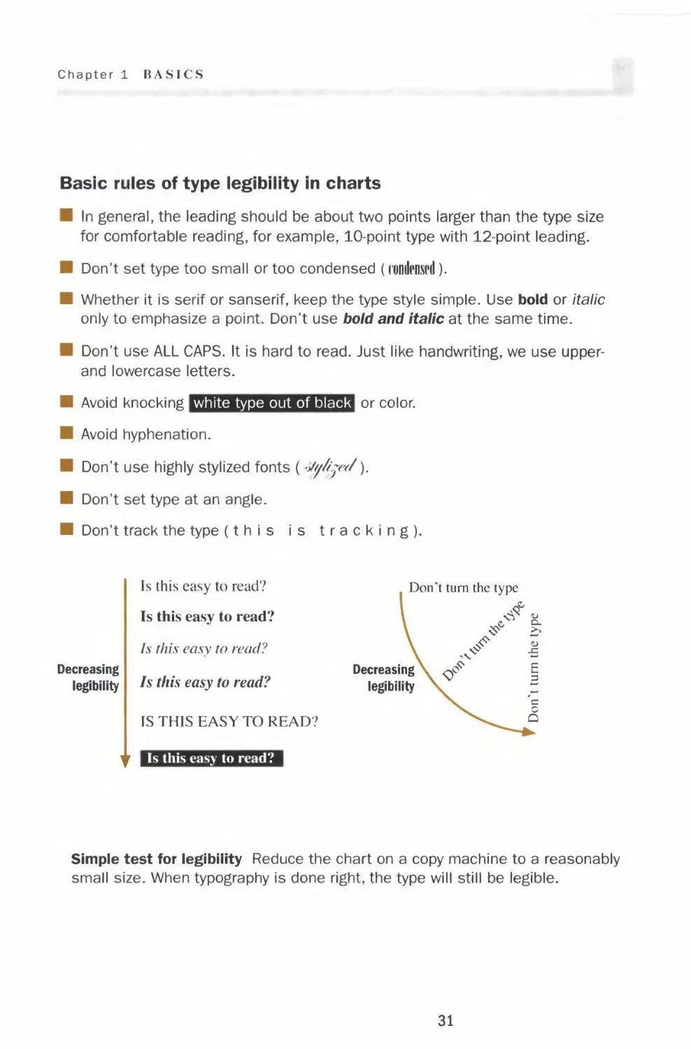
Basic rules of type legibility in charts
■ In general, the leading should be about two points larger than the type size
for comfortable reading, for example, 10-point type with 12-point leading.
■ Don't set type too small or too condensed (rondiwd).
■ Whether it is serif or sanserif, keep the type style simple. Use bold or italic
only to emphasize a point. Don't use bold and italic at the same time.
■ Don't use ALL CAPS. It is hard to read. Just like handwriting, we use upper-
and lowercase letters.
■ Avoid knocking white type out of black or color.
■ Avoid hyphenation.
■ Don't use highly stylized fonts (-Jy/i.jw/y
■ Don't set type at an angle.
■ Don't track the type (this is tracking).
Decreasing
legibility
Is this easy to read?
Is this easy to read?
Is this easy to read?
Is this easy to read?
IS THIS EASY TO READ?
i Is this easy to read?
Don't turn the type
Decreasing
legibility
Simple test for legibility Reduce the chart on a copy machine to a reasonably
small size. When typography is done right, the type will still be legible.
31
Fonts
Typography in charts
In charts, typography should not be center stage. The data is
the focus. Type in charts is there to describe the chart
clearly and not to evoke an emotion, as in a fashion
magazine or political poster. Poor typography draws undue
attention away from the underlying data, which carries the
main message. The impulse to use type styles to spice up
the chart should be avoided at all costs. Typography done
right helps present the information in the most efficient and
direct way.
Don't permit typography
DON'T
to oppress the underlying
data.
Don't use all
caps or knock
white type - «
out of black.
Don't use — ■
bold italic.
Don't use
bold for the ■
numbers
on the scale.
Don't set
type at an
angle.
HEADLINE OF THE CHART
A brief description that outlines
what the data shows
4
2-
0
^ ^ ^ ^
Keep the typography
D0 simple. The headline can
be either bold or a couple
of sizes larger.
Headline of the chart
A brief description that outlines
what the data shows
Town A Town B Town C Town D
Alternatively, chart the
data as horizontal bars to
accommodate long names.
Town A 8
Town B 6
Town C 4
Town D 2
32
Chapter 1 BASICS
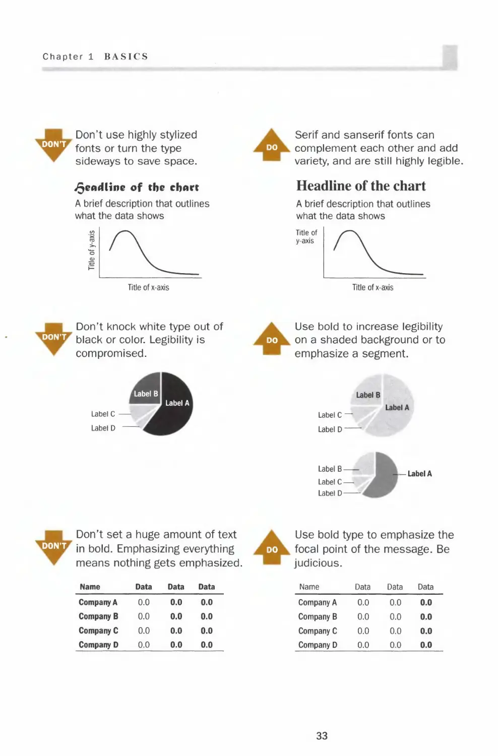
DON'T
Don't use highly stylized
fonts or turn the type
sideways to save space.
deadline of the chart
A brief description that outlines
what the data shows
Serif and sanserif fonts can
do complement each other and add
variety, and are still highly legible.
Headline of the chart
A brief description that outlines
what the data shows
Title of
y-axis
Title of x-axis
Title of x-axis
Don't knock white type out of
dont black or color. Legibility is
compromised.
Use bold to increase legibility
do on a shaded background or to
emphasize a segment.
Label B
Label A
Label C •
Label D
Label B
Label C —
Label D —
Label A
Label B
Label C —
Label D
-Label A
Don't set a huge amount of text
dont jn froia Emphasizing everything
means nothing gets emphasized.
Use bold type to emphasize the
do focal point of the message. Be
judicious.
Name
Company A
Company B
Company C
Company D
Data
0.0
0.0
0.0
0.0
Data
0.0
0.0
0.0
0.0
Data
0.0
0.0
0.0
0.0
Name
Company A
Company B
Company C
Company D
Data
0.0
0.0
0.0
0.0
Data
0.0
0.0
0.0
0.0
Data
0.0
0.0
0.0
0.0
33
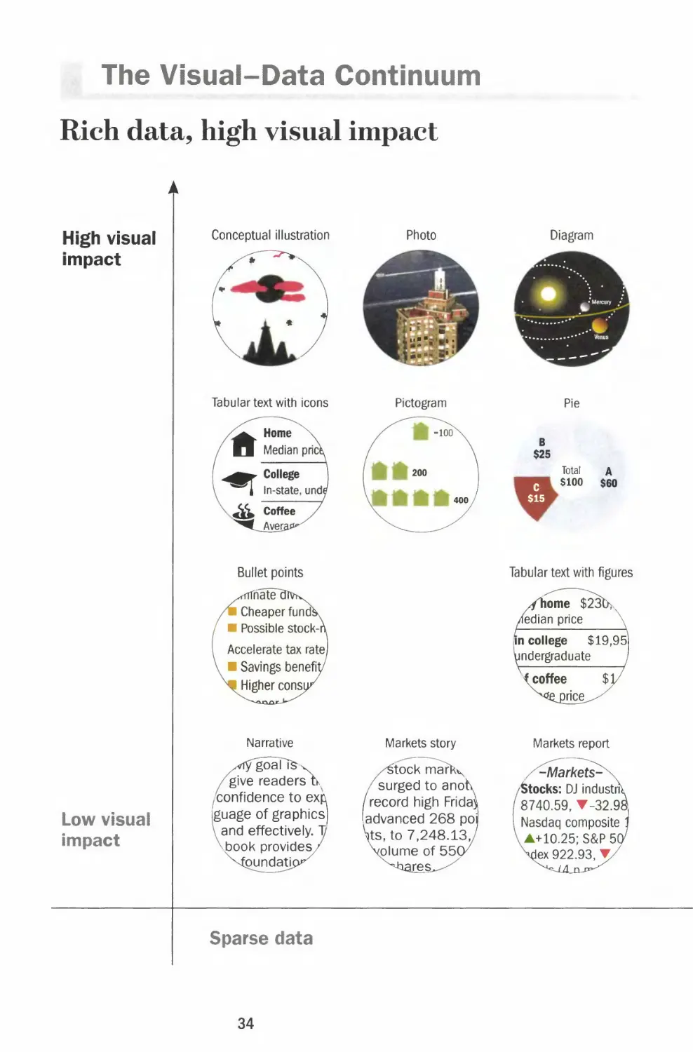
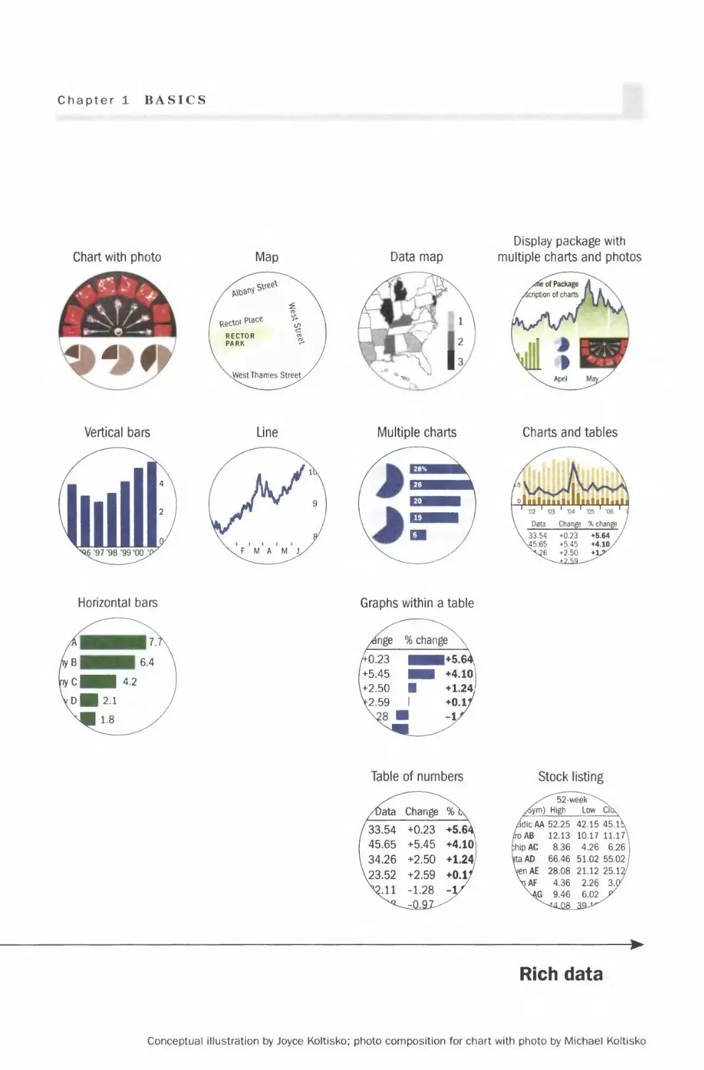
The Visual-Data Continuum
Rich data, high visual impact
High visual
impact
Low visual
impact
Conceptual illustration
Tabular text with icons
Bullet points
rrnatel
I Cheaper funcfe
I Possible stock-i
Accelerate tax rate)
I Savings benefty
I Higher consu
Narrative
goaTfev
give readers Ik
(confidence to exft
guage of graphics)
^and effectively. 1/
{Dook provides^
pundatic
Photo
Pictogram
Markets story
/£tock tnark^
/surged to anotv
/record high Fridav
[advanced 268 po
\ts, to 7,248.13,/
volume of 55(y
ares^
Diagram
Pie
B
$25
Total
c $100
$15
A
$60
Tabular text with figures
Markets report
Sparse data
34
Chapter 1 BASICS
Chart with photo
©
Vertical bars
Horizontal bars
Data map
-3h
Multiple charts
Graphs within a table
Table of numbers
/Data Change %\
33.54 +0.23 +5.6^
45.65 +5.45 +4.101
34.26 +2.50 +1.241
23.52 +2.59 +0.l/
Vll -1.28 -1/
Display package with
multiple charts and photos
Charts and tables
Stock listing
^""52 - ween\
/fom) High Low Cft\
/dicAA 52.25 42.15 45.l\
/roAB 12.13 10.17 11.17N
ihipAC 8.36 4.26 6.26
ta AD 66.46 51.02 55.02
VenAE 28.08 21.12 25.12/
\AF 4.36 2.26 3.07
\AG 9.46 6.02 /
►
Rich data
Conceptual illustration by Joyce Koltisko; photo composition for chart with photo by Michael Koltisko
Color
Basics
Decreasing saturation
Describing colors
There are three main attributes of
a color: hue, saturation and value.
Hue is how we normally describe
color such as red, green and blue.
Saturation is the intensity of the
color. A color with higher
saturation is more intense in the
same hue. For instance, a red
becomes a more intense red (less
pinkish) as the saturation
increases.
Value is how light or dark a color
is. A darker shade of a color can
be achieved by adding black ink.
Warm and cool colors
Warm colors are those in
the red area of the color
spectrum such as red,
orange, yellow and brown.
Cool colors are the blue
side of the spectrum and
include blue, green and
neutral gray.
Warm colors appear
larger than cool colors so
red can visually
overpower blue even if
used in equal amounts.
Warm colors appear
closer while cool colors
visually recede.
Warm
colors I
Color
wheel
Cool
colors
36
Chapter 1 BASICS
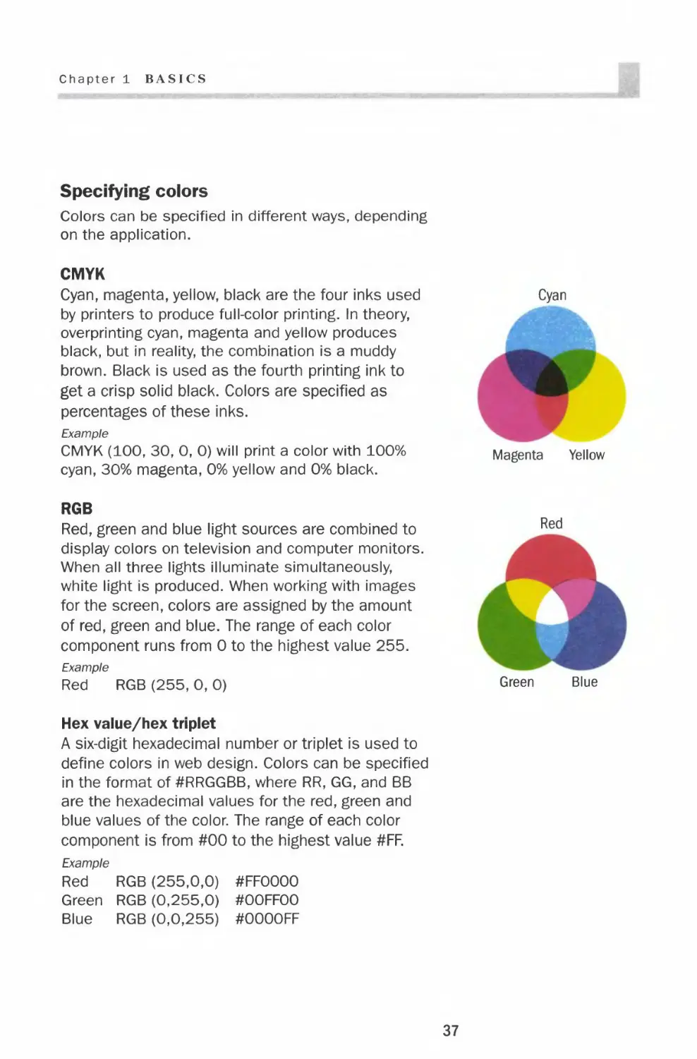
Specifying colors
Colors can be specified in different ways, depending
on the application.
CMYK
Cyan, magenta, yellow, black are the four inks used
by printers to produce full-color printing. In theory,
overprinting cyan, magenta and yellow produces
black, but in reality, the combination is a muddy
brown. Black is used as the fourth printing ink to
get a crisp solid black. Colors are specified as
percentages of these inks.
Example
CMYK (100, 30, 0, 0) will print a color with 100%
cyan, 30% magenta, 0% yellow and 0% black.
RGB
Red, green and blue light sources are combined to
display colors on television and computer monitors.
When all three lights illuminate simultaneously,
white light is produced. When working with images
for the screen, colors are assigned by the amount
of red, green and blue. The range of each color
component runs from 0 to the highest value 255.
Example
Red RGB (255, 0, 0)
Hex value/hex triplet
A six-digit hexadecimal number or triplet is used to
define colors in web design. Colors can be specified
in the format of #RRGGBB, where RR, GG, and BB
are the hexadecimal values for the red, green and
blue values of the color. The range of each color
component is from #00 to the highest value #FF.
Example
Red RGB (255,0,0) #FFOOOO
Green RGB (0,255,0) #OOFFOO
Blue RGB (0,0,255) #OOOOFF
Color
Color palettes
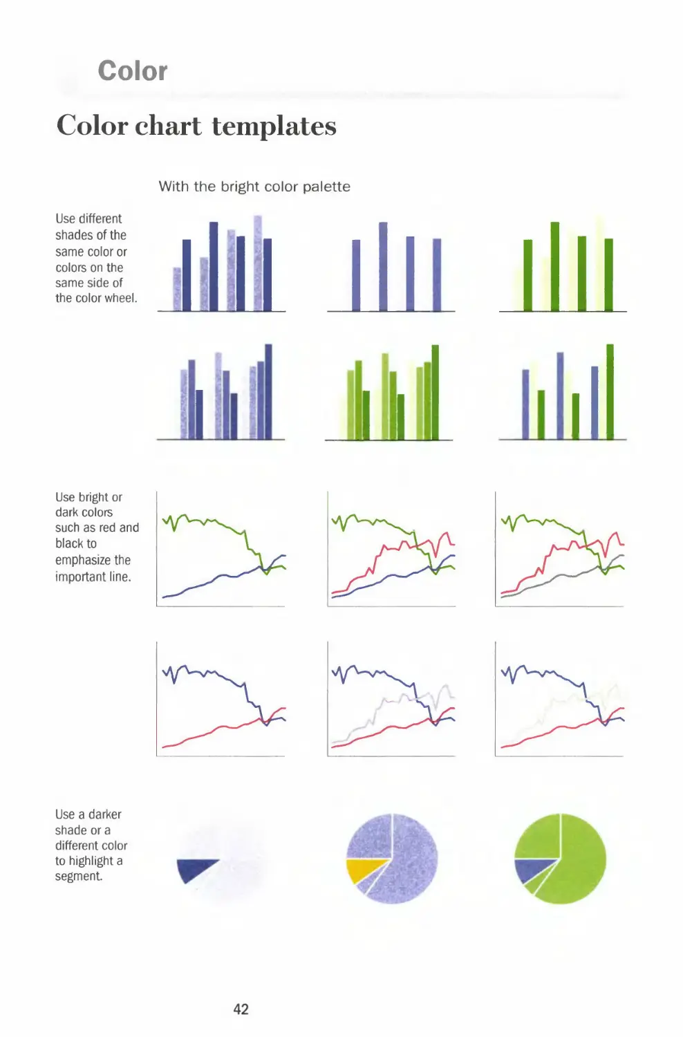
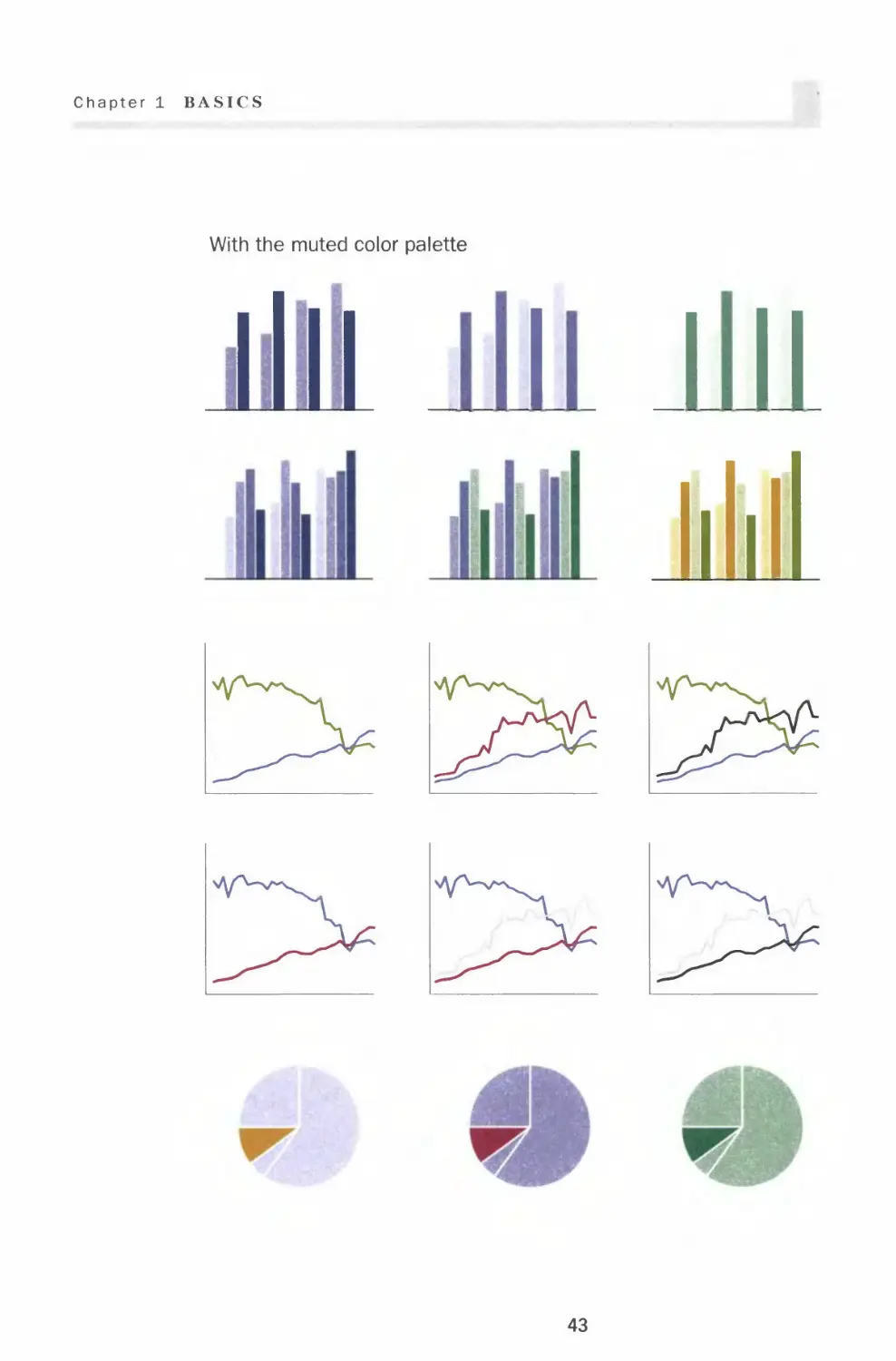
A color palette for charts should include the basic colors and three to
five shades of each hue. This gives you the option of using fewer colors
within a chart to avoid distraction. Once you choose a palette, stay with
it for the entire presentation so all the visuals look coordinated.
Bright color palette
38
Chapter 1 BASICS
Muted color palette
39
Color
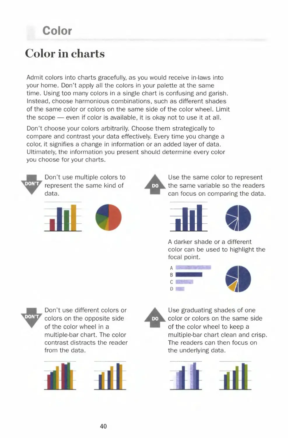
Color in charts
Admit colors into charts gracefully, as you would receive in-laws into
your home. Don't apply all the colors in your palette at the same
time. Using too many colors in a single chart is confusing and garish.
Instead, choose harmonious combinations, such as different shades
of the same color or colors on the same side of the color wheel. Limit
the scope — even if color is available, it is okay not to use it at all.
Don't choose your colors arbitrarily. Choose them strategically to
compare and contrast your data effectively. Every time you change a
color, it signifies a change in information or an added layer of data.
Ultimately, the information you present should determine every color
you choose for your charts.
DON'T
Don't use multiple colors to
represent the same kind of
data.
Use the same color to represent
do the same variable so the readers
can focus on comparing the data.
.!'
at
A darker shade or a different
color can be used to highlight the
focal point.
A
B
i
DON'T
Don't use different colors or
colors on the opposite side
of the color wheel in a
multiple-bar chart. The color
contrast distracts the reader
from the data.
Use graduating shades of one
do color or colors on the same side
of the color wheel to keep a
multiple-bar chart clean and crisp
The readers can then focus on
the underlying data.
40
Chapter 1 BASH'S
^^WjT
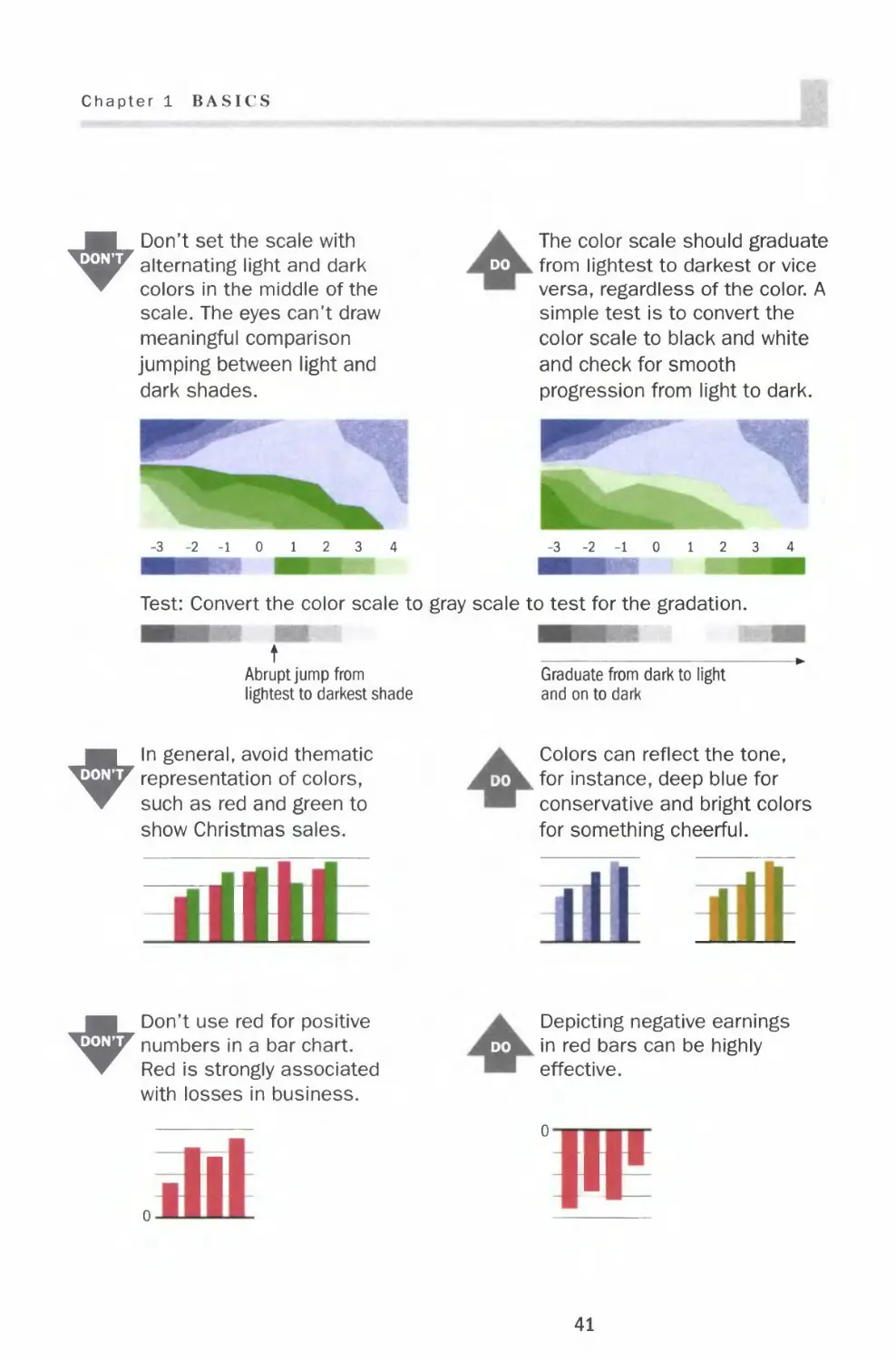
Don't set the scale with
alternating light and dark
colors in the middle of the
scale. The eyes can't draw
meaningful comparison
jumping between light and
dark shades.
The color scale should graduate
do from lightest to darkest or vice
versa, regardless of the color. A
simple test is to convert the
color scale to black and white
and check for smooth
progression from light to dark.
-3-2-101234
-3-2-10 12 3 4
Test: Convert the color scale to gray scale to test for the gradation.
t
Abrupt jump from
lightest to darkest shade
Graduate from dark to light
and on to dark
"^^^WjF
In general, avoid thematic
representation of colors,
such as red and green to
show Christmas sales.
I I I
I I
Colors can reflect the tone,
do . for instance, deep blue for
conservative and bright colors
for something cheerful.
^^W^
Don't use red for positive
numbers in a bar chart.
Red is strongly associated
with losses in business.
Depicting negative earnings
do in red bars can be highly
effective.
n
11
41
Color
Color chart templates
Use different
shades of the
same color or
colors on the
same side of
the color wheel.
With the bright color palette
ill
Use a darker
shade or a
different color
to highlight a
segment.
jj
Use bright or
dark colors
such as red and
black to
emphasize the
important line.
f^\
f^
42
Chapter 1 BASICS
With the muted color palette
vyw-x^
Y^
43
Color
Coloring for the color blind
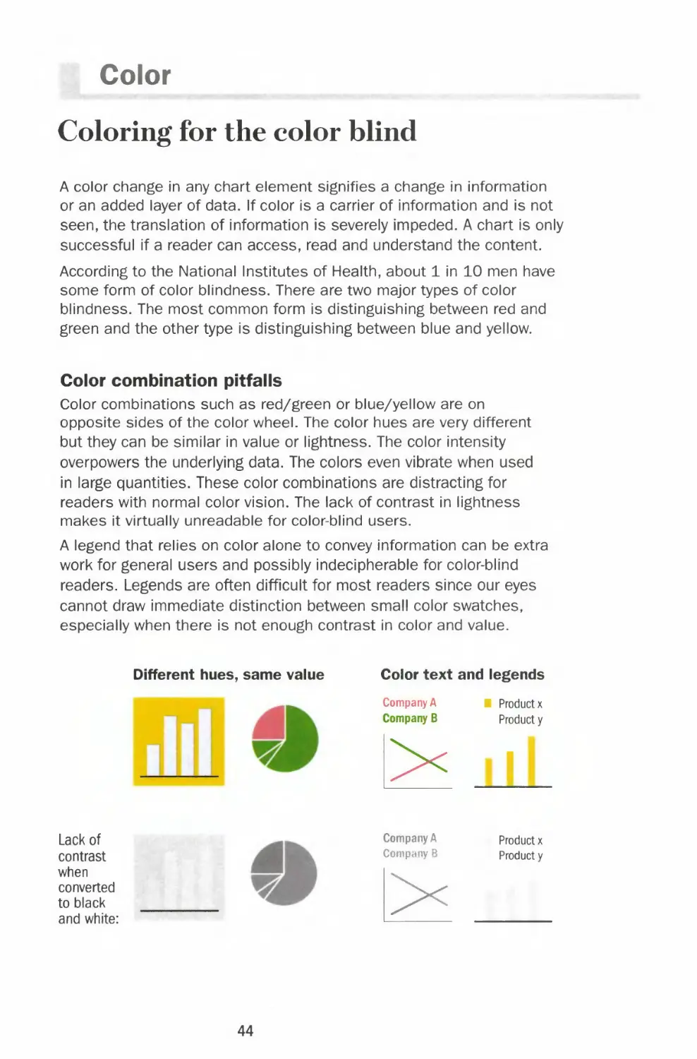
A color change in any chart element signifies a change in information
or an added layer of data. If color is a carrier of information and is not
seen, the translation of information is severely impeded. A chart is only
successful if a reader can access, read and understand the content.
According to the National Institutes of Health, about 1 in 10 men have
some form of color blindness. There are two major types of color
blindness. The most common form is distinguishing between red and
green and the other type is distinguishing between blue and yellow.
Color combination pitfalls
Color combinations such as red/green or blue/yellow are on
opposite sides of the color wheel. The color hues are very different
but they can be similar in value or lightness. The color intensity
overpowers the underlying data. The colors even vibrate when used
in large quantities. These color combinations are distracting for
readers with normal color vision. The lack of contrast in lightness
makes it virtually unreadable for color-blind users.
A legend that relies on color alone to convey information can be extra
work for general users and possibly indecipherable for color-blind
readers. Legends are often difficult for most readers since our eyes
cannot draw immediate distinction between small color swatches,
especially when there is not enough contrast in color and value.
Different hues, same value Color text and legends
Lack of
contrast
when
converted
to black
and white:
Company A
Company B
Company A
Company 8
l>
■ Product x
Product y
i
Product x
Product y
44
Chapter 1 BASICS
Strategies for selecting effective colors
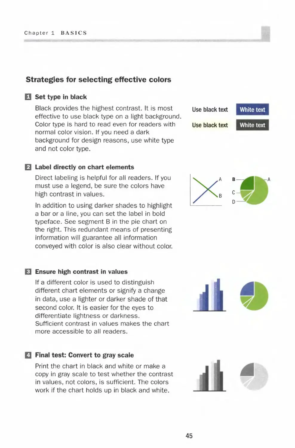
□ Set type in black
Black provides the highest contrast. It is most use black text White text
effective to use black type on a light background.
Color type is hard to read even for readers with Use black text White text
normal color vision. If you need a dark
background for design reasons, use white type
and not color type.
B Label directly on chart elements
Direct labeling is helpful for all readers. If you
must use a legend, be sure the colors have
high contrast in values.
In addition to using darker shades to highlight
a bar or a line, you can set the label in bold
typeface. See segment B in the pie chart on
the right. This redundant means of presenting
information will guarantee all information
conveyed with color is also clear without color.
0 Ensure high contrast in values
If a different color is used to distinguish
different chart elements or signify a change
in data, use a lighter or darker shade of that
second color. It is easier for the eyes to
differentiate lightness or darkness.
Sufficient contrast in values makes the chart
more accessible to all readers.
Q Final test: Convert to gray scale
Print the chart in black and white or make a
copy in gray scale to test whether the contrast
in values, not colors, is sufficient. The colors
work if the chart holds up in black and white.
45
Color
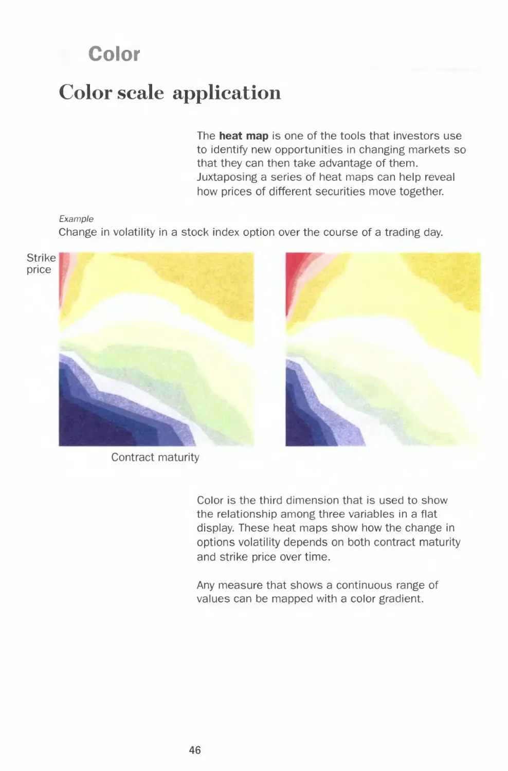
Color scale application
The heat map is one of the tools that investors use
to identify new opportunities in changing markets so
that they can then take advantage of them.
Juxtaposing a series of heat maps can help reveal
how prices of different securities move together.
Example
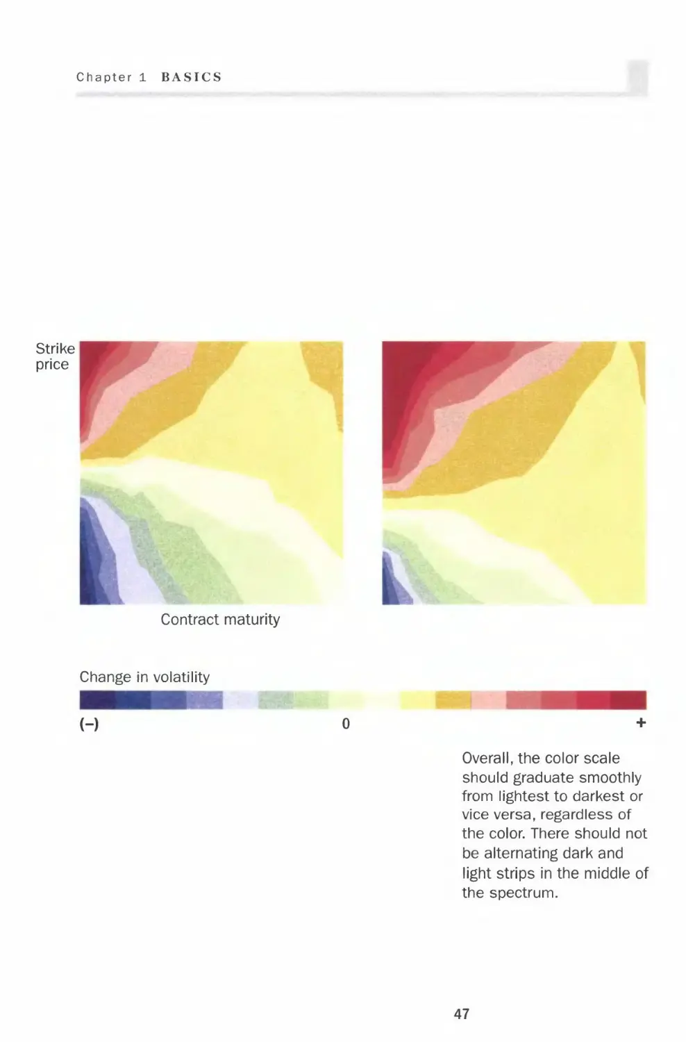
Change in volatility in a stock index option over the course of a trading day.
Strike
price
Contract maturity
Color is the third dimension that is used to show
the relationship among three variables in a flat
display. These heat maps show how the change in
options volatility depends on both contract maturity
and strike price over time.
Any measure that shows a continuous range of
values can be mapped with a color gradient.
46
Chapter 1 BASICS
Strike
price
Contract maturity
Change in volatility
(-)
Overall, the color scale
should graduate smoothly
from lightest to darkest or
vice versa, regardless of
the color. There should not
be alternating dark and
light strips in the middle of
the spectrum.
47
CHAPTER 2
Chart Smart
Correct
Effective
Incorrect
Inadequate When creating a chart, it is you who interprets
the data and selects the format that most
effectively presents complex information. The
underlying principles that I lay out in this
chapter, when applied judiciously, can take your
chart from ordinary to powerful.
In this chapter, I specifically address good
chart choices and bad chart choices. I have set
up each topic in a two-page spread, with the
bad charting practices on the left and the
correct approach on the right. You will see that
some choices are strictly right or wrong; others
are either more effective or simply lack
essential information. For example, imagine
reading a pie chart as you would a clock. It
makes the most sense to place the largest
segment of the pie on the right at 12 o'clock.
This emphasizes its importance.
49
Lines
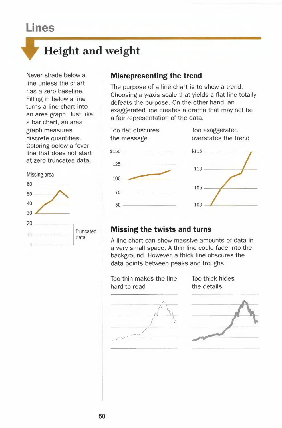
Height and weight
Never shade below a
line unless the chart
has a zero baseline.
Filling in below a line
turns a line chart into
an area graph. Just like
a bar chart, an area
graph measures
discrete quantities.
Coloring below a fever
line that does not start
at zero truncates data.
Truncated
data
Misrepresenting the trend
The purpose of a line chart is to show a trend.
Choosing a y-axis scale that yields a flat line totally
defeats the purpose. On the other hand, an
exaggerated line creates a drama that may not be
a fair representation of the data.
Too flat obscures
the message
$150
125
100
75
50
Too exaggerated
overstates the trend
$115
Missing the twists and turns
A line chart can show massive amounts of data in
a very small space. A thin line could fade into the
background. However, a thick line obscures the
data points between peaks and troughs.
Too thin makes the line
hard to read
Too thick hides
the details
50
Chapter 2 CHART SMART
l
The right height — two-thirds of the
chart area
Choose the y-axis scale so that the height of the
fever line occupies roughly two-thirds of the chart
area. The scale should also encompass relevant
reference points, which help determine the range
and make it less arbitrary. For example, the range
of a stock chart should include its 52-week high
and low.
Roughly two-thirds
of the range
The right weight — visible with details
The weight of the fever line should be thick
enough to stand out against the grid line but
still thin enough to show the twists and turns
of the line. Keep the grid lines thin and the
zero baseline slightly thicker than the rest of
the grid lines.
Lines are best used to
display continuous
data series over a
period of time, such as
stock prices and index
values. Lines are
suited for showing
trend, acceleration or
deceleration, and
volatility, including
sudden peaks or
troughs.
Unlike a bar chart, a
fever line doesn't
necessarily require a
zero baseline. For
example, plotting a
stock index with a
range in the thousands
from a zero baseline
would make it hard to
discern daily changes.
Terminology
y-axis
gridlines
h—i—r -baseline
J F M
-x-axis—
51
Lines
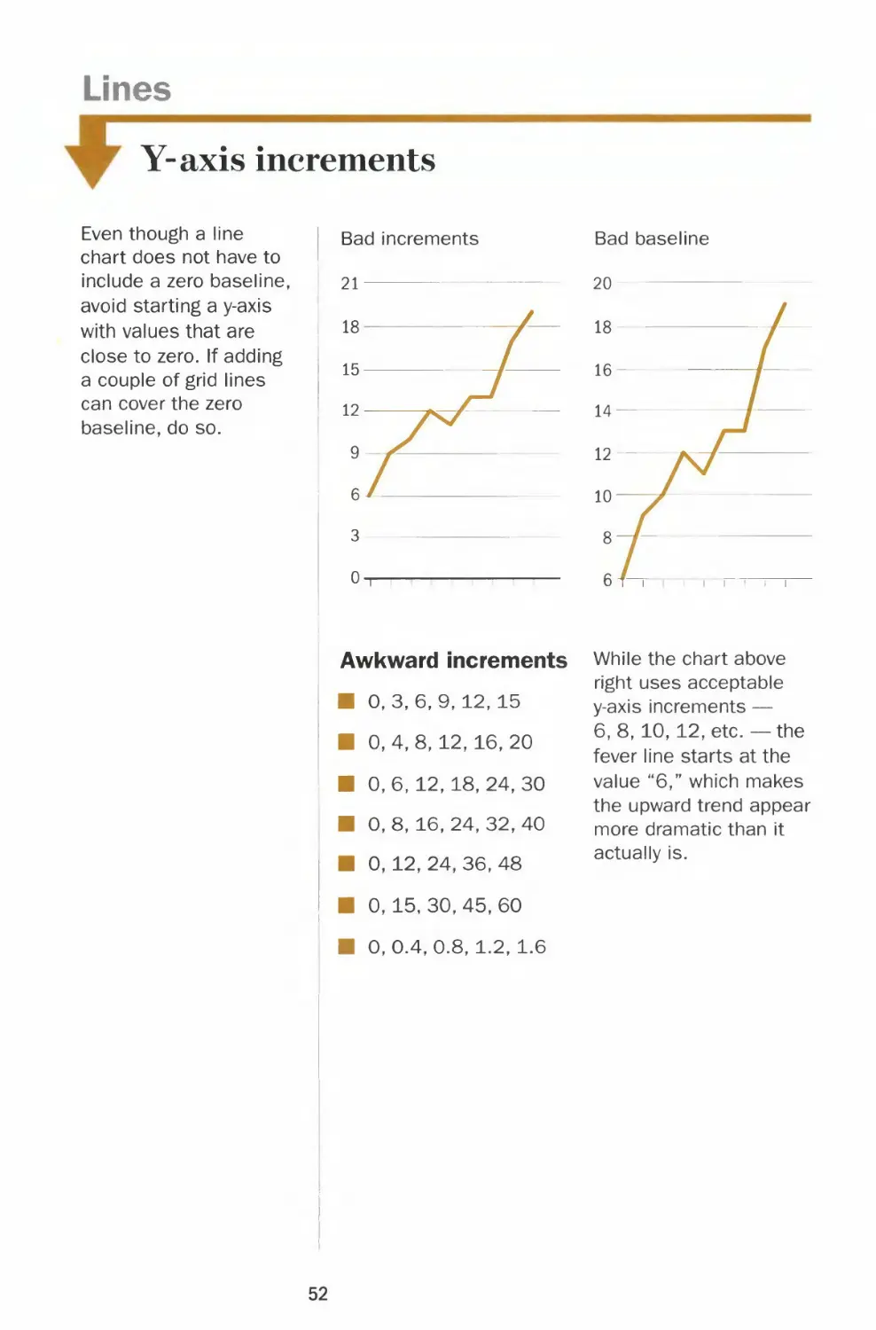
Y-axis increments
Even though a line
chart does not have to
include a zero baseline,
avoid starting a y-axis
with values that are
close to zero. If adding
a couple of grid lines
can cover the zero
baseline, do so.
Bad increments
ii-ii
Awkward increments While the chart above
right uses acceptable
0,3,6,9,12, 15
0, 4, 8, 12, 16, 20
0, 6, 12, 18, 24, 30
0, 8, 16, 24, 32, 40
0, 12, 24, 36, 48
0, 15, 30, 45, 60
0,0.4,0.8, 1.2, 1.6
y-axis increments —
6,8,10,12, etc. — the
fever line starts at the
value "6," which makes
the upward trend appear
more dramatic than it
actually is.
52
Chapter 2 CHART SMART
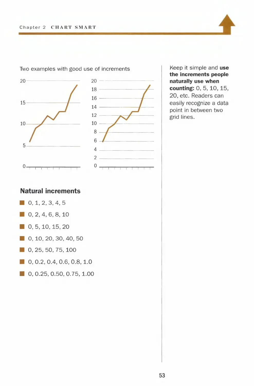
Two examples with good use of increments
Natural increments
■ 0,1,2,3,4,5
■ 0,2,4,6,8,10
■ 0,5,10,15,20
■ 0, 10, 20, 30, 40, 50
■ 0, 25, 50, 75, 100
■ 0,0.2,0.4,0.6,0.8,1.0
■ 0,0.25,0.50,0.75,1.00
Keep it simple and use
the increments people
naturally use when
counting: 0, 5,10,15,
20, etc. Readers can
easily recognize a data
point in between two
grid lines.
53
Lines
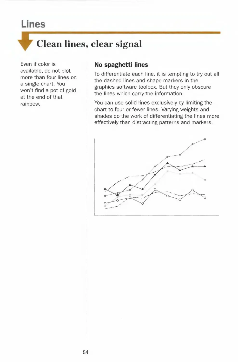
Clean lines, clear signal
Even if color is
available, do not plot
more than four lines on
a single chart. You
won't find a pot of gold
at the end of that
rainbow.
No spaghetti lines
To differentiate each line, it is tempting to try out all
the dashed lines and shape markers in the
graphics software toolbox. But they only obscure
the lines which carry the information.
You can use solid lines exclusively by limiting the
chart to four or fewer lines. Varying weights and
shades do the work of differentiating the lines more
effectively than distracting patterns and markers.
54
Chapter 2 CHAKT SM \RT
1
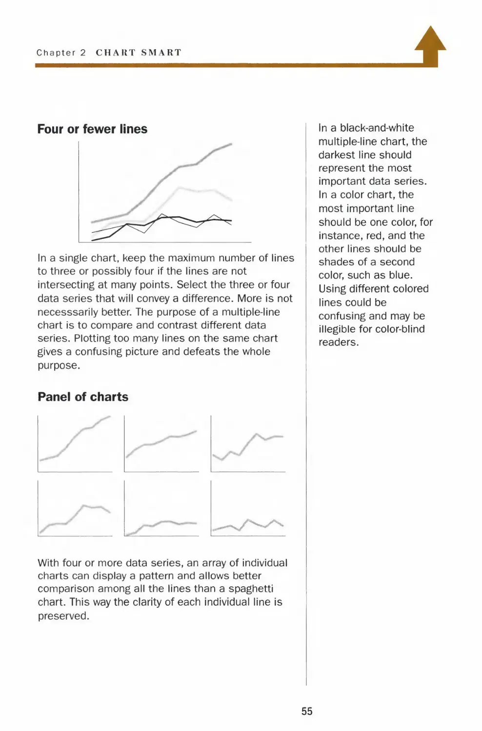
Four or fewer lines
In a single chart, keep the maximum number of lines
to three or possibly four if the lines are not
intersecting at many points. Select the three or four
data series that will convey a difference. More is not
necesssarily better. The purpose of a multiple-line
chart is to compare and contrast different data
series. Plotting too many lines on the same chart
gives a confusing picture and defeats the whole
purpose.
Panel of charts
With four or more data series, an array of individual
charts can display a pattern and allows better
comparison among all the lines than a spaghetti
chart. This way the clarity of each individual line is
preserved.
In a black-and-white
multiple-line chart, the
darkest line should
represent the most
important data series.
In a color chart, the
most important line
should be one color, for
instance, red, and the
other lines should be
shades of a second
color, such as blue.
Using different colored
lines could be
confusing and may be
illegible for color-blind
readers.
55
Lines
Legends and labels
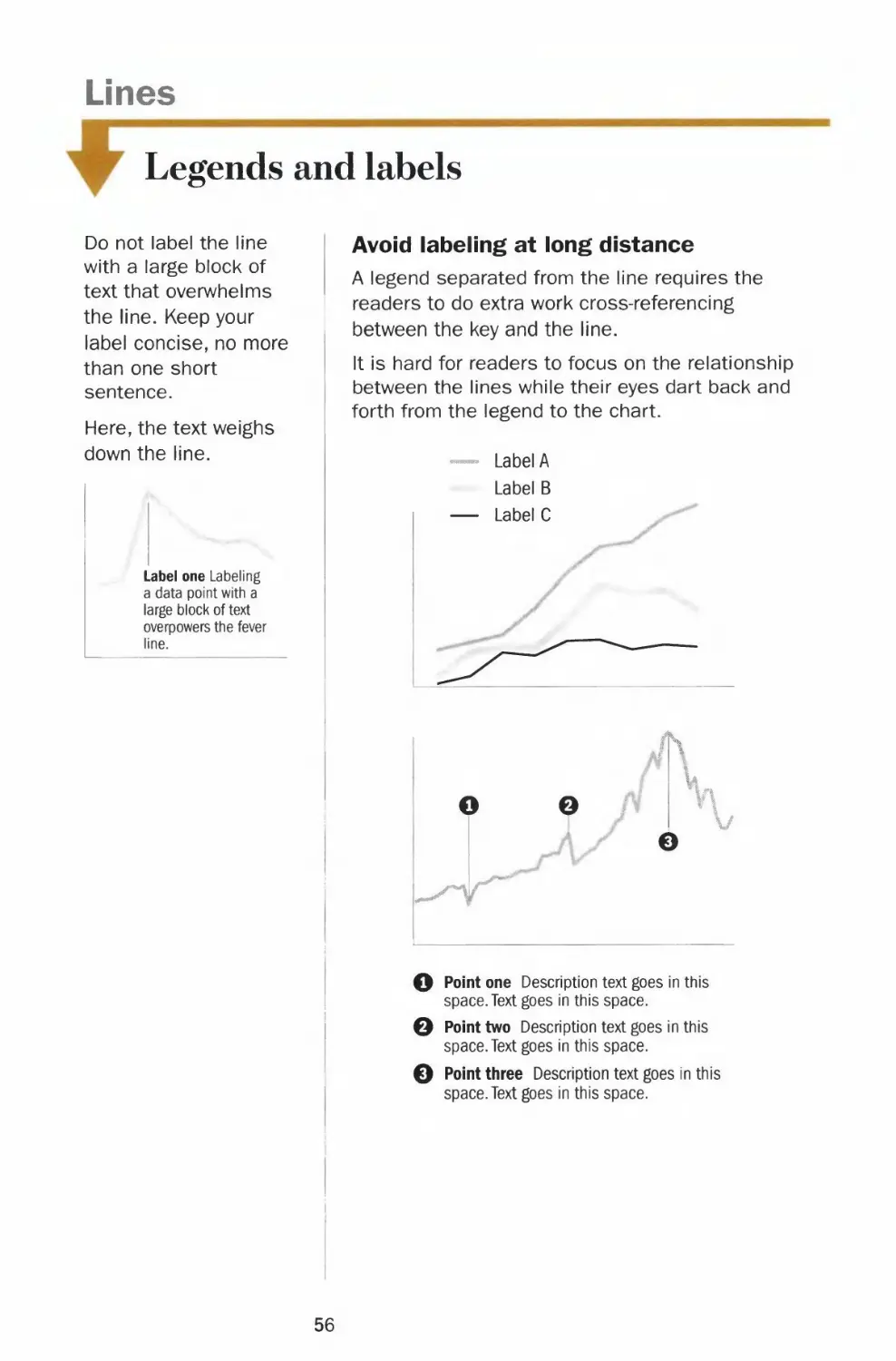
Do not label the line
with a large block of
text that overwhelms
the line. Keep your
label concise, no more
than one short
sentence.
Here, the text weighs
down the line.
Label one Labeling
a data point with a
large block of text
overpowers the fever
line.
Avoid labeling at long distance
A legend separated from the line requires the
readers to do extra work cross-referencing
between the key and the line.
It is hard for readers to focus on the relationship
between the lines while their eyes dart back and
forth from the legend to the chart.
— Label A
Label B
— Label C
ff\
V
O po'nt o°e Description text goes in this
space. Text goes in this space.
0 Point two Description text goes in this
space. Text goes in this space.
0 Point three Description text goes in this
space. Text goes in this space.
56
Chapter 2 CHART SMART
1
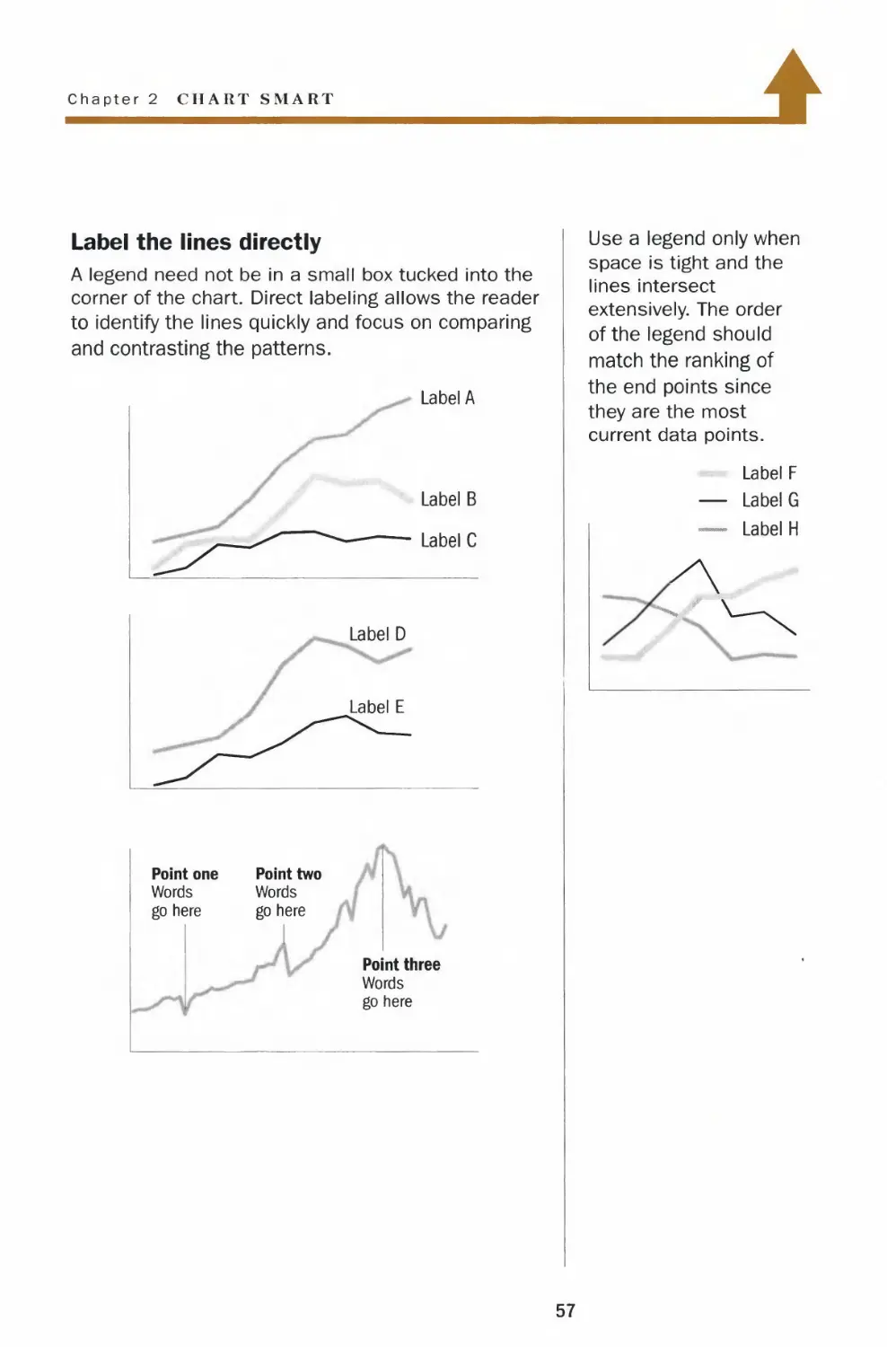
Label the lines directly
A legend need not be in a small box tucked into the
corner of the chart. Direct labeling allows the reader
to identify the lines quickly and focus on comparing
and contrasting the patterns.
Label A
Label B
Label C
Label D
Label E
Point one
Words
go here
'
Point two
Words
go here
1
i
Point three
Words
go here
Use a legend only when
space is tight and the
lines intersect
extensively. The order
of the legend should
match the ranking of
the end points since
they are the most
current data points.
Label F
— Label G
— Label H
A
57
Lines
Left-right y-axis scales
Do not use left-right
scales when the two
data series measure
the same kind of
quantities, such as
stock prices. Instead,
use a comparable
scale or chart the
percentage changes to
compare the two
series.
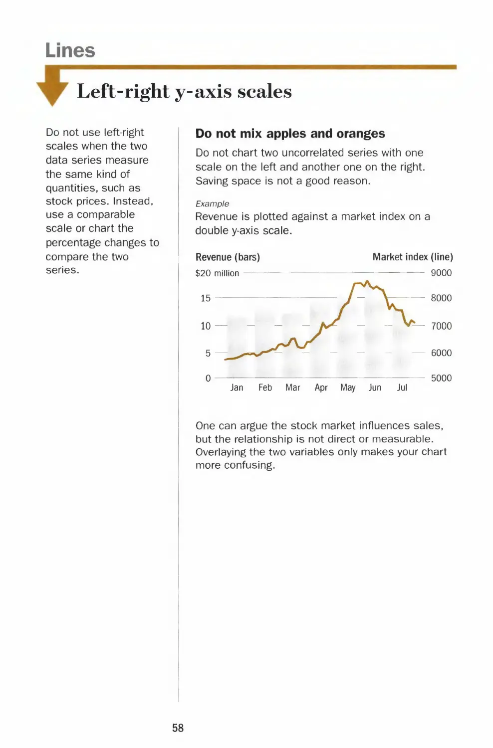
Do not mix apples and oranges
Do not chart two uncorrected series with one
scale on the left and another one on the right.
Saving space is not a good reason.
Example
Revenue is plotted against a market index on a
double y-axis scale.
Revenue (bars)
$20 million
Market index (line)
9000
Jan Feb Mar Apr May Jun Jul
One can argue the stock market influences sales,
but the relationship is not direct or measurable.
Overlaying the two variables only makes your chart
more confusing.
58
Chapter 2 CHART SMART
Moving in tandem
Using left-right y-axis scales can help show how two
directly related series move together.
Example
The chart below shows how an increase in market
share has not helped generate more revenue.
Revenue (bars)
$4 million
Market share (line)
38%
Jan Feb Mar Apr May Jun Jul
Always label the scales clearly to avoid any
confusion.
Adhere to the correct chart type for each series -
lines for continuous data and bars for discrete
quantities. Do not deviate for stylistic reasons.
The only exception is when both data series call
for a chart with vertical bars. In such instances,
convert one to a line.
Use left-right scales
sparingly. Your choice
of scale can change
the apparent
relationship between
the two lines.
350
300
B
Moo
350
L300
59
Lines
Comparable scales
Don't use awkward
y-axis increments when
calculating the ranges
of the comparable
scales.
Biased comparison
Anytime two or more charts are juxtaposed in the
same space, the reader will compare and contrast
the lines. Plotting the data series on noncomparable
scales gives an unfair representation of the data.
100%
increase
from
20 to 40
Stock B
$120
115
110
105
100
20%
increase
from
100 to 120
Both stock A and stock B increased by $20.
Stock A doubled in value while stock B increased by
20% in the same period. Yet the pictures show that
both lines have the same slope.
Unless the readers calculate the percentage
changes of both lines, they will draw the wrong
conclusion.
The charts above wrongly suggest that investors in
stock A and stock B are getting the same return on
their investments.
60
Chapter 2 CHART SMART
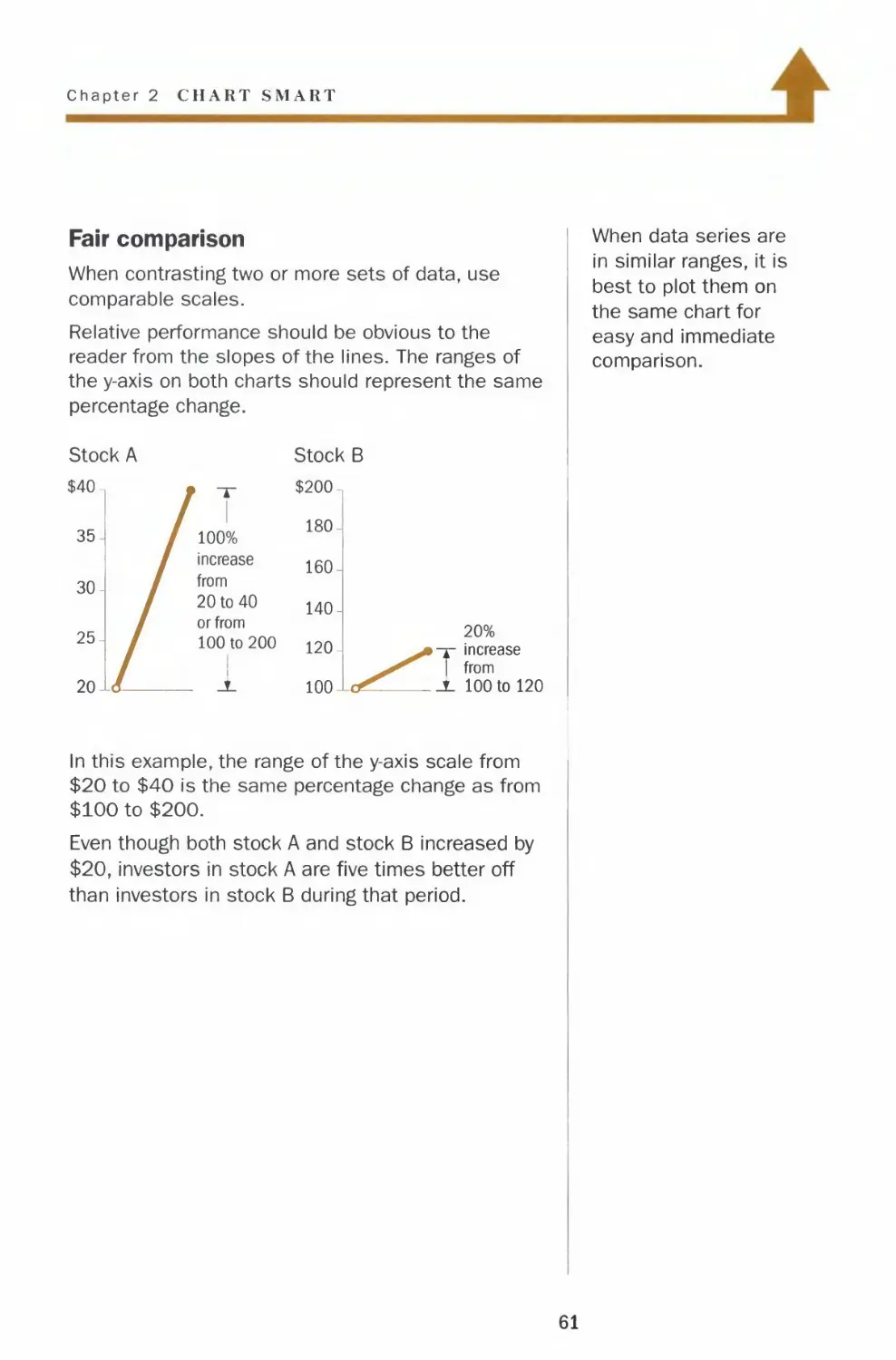
Fair comparison
When contrasting two or more sets of data, use
comparable scales.
Relative performance should be obvious to the
reader from the slopes of the lines. The ranges of
the y-axis on both charts should represent the same
percentage change.
Stock A
$40.
35-
30-
25-
20-
/
/
Let
/ y
/ 100%
* increase
from
20 to 40
or from
100 to 200
1
_A_
Stock B
$200-
180-
160-
140-
120-
100-
^
L<^_
20%
^^•T increase
^ 1 from
S- 100 to 120
When data series are
in similar ranges, it is
best to plot them on
the same chart for
easy and immediate
comparison.
In this example, the range of the y-axis scale from
$20 to $40 is the same percentage change as from
$100 to $200.
Even though both stock A and stock B increased by
$20, investors in stock A are five times better off
than investors in stock B during that period.
61
Vertical Bars
Form and shading
Don't create shadows
behind bars. A bar
chart is not a piece of
fine art. The shadow
contains no information
or data.
l
Bars too narrow
Vertical bars measure discrete quantities. When
the bars are too narrow, your eyes focus on the
negative space, the space between the bars, which
carries no data.
Distracting shades
Since all the bars measure the same variable,
different shades have no relevance to the data.
They only distract the readers from comparing the
bars.
/y
t
Where is the top of the bar?
Three-dimensional vertical bars are flat out wrong.
The reader is left to guess where the top of the
bar meets the grid. Rendering the bars in 3-D
adds no information.
i
l_ Is this the top?
*- or this?
62
Chapter 2 CHART SMART
1
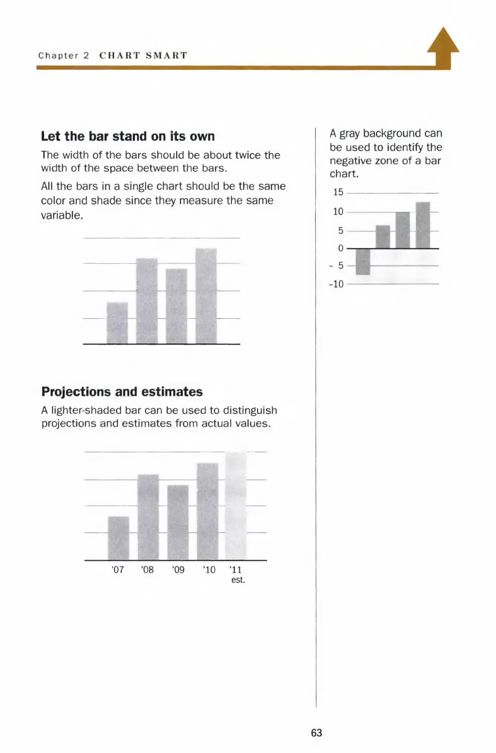
Let the bar stand on its own
The width of the bars should be about twice the
width of the space between the bars.
All the bars in a single chart should be the same
color and shade since they measure the same
variable.
Projections and estimates
A lighter-shaded bar can be used to distinguish
projections and estimates from actual values.
'07
'08
'09
'10
'11
est.
A gray background can
be used to identify the
negative zone of a bar
chart.
15
10
5
o-
- 5
-10
I
63
Vertical Bars
Zero baseline
Even if you make the
bottoms of the bars
jagged to signify that
the chart doesn't start
at a zero baseline, it is
difficult to compare the
total value of each bar.
$100-
95-
90-
85-
80-
75-
'04 '05 '06 '07
$100-
95-
90-
85-
80-
75-
'04 '05 '06 '07
Truncation equals misrepresentation
A bar chart that doesn't begin at a zero
baseline is misleading. Truncation obscures
the discrete total value of each bar and
makes comparison of the data difficult.
In the above example, the chart appears to
show that revenue in 2007 was five times
that of 2004 — while in reality, revenue in
2007 rose only 25% from 2004. But the only
way a reader would know that is to calculate
the figures — which defeats the purpose of
the chart.
For better representation of the same data,
see the charts on the facing page.
64
Chapter 2 CHART SMART
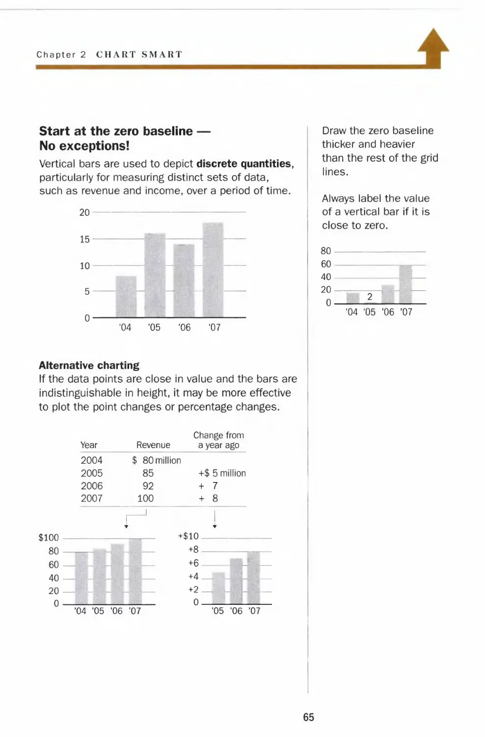
Start at the zero baseline —
No exceptions!
Vertical bars are used to depict discrete quantities,
particularly for measuring distinct sets of data,
such as revenue and income, over a period of time.
20
15-
10-
5-
0-
-I
'04 '05 '06 '07
Alternative charting
If the data points are close in value and the bars are
indistinguishable in height, it may be more effective
to plot the point changes or percentage changes.
Year
Revenue
Change from
a year ago
2004
2005
2006
2007
I 80 million
85
92
100
+$ 5 million
+ 7
+ 8
J
$100
80
60
40
+$10.
20 —
0
'04 '05 '06 '07
+6
+4_
0.
'05 '06 '07
Draw the zero baseline
thicker and heavier
than the rest of the grid
lines.
Always label the value
of a vertical bar if it is
close to zero.
80-
60
40
20-
0-
'04 '05 '06 '07
65
Vertical Bars
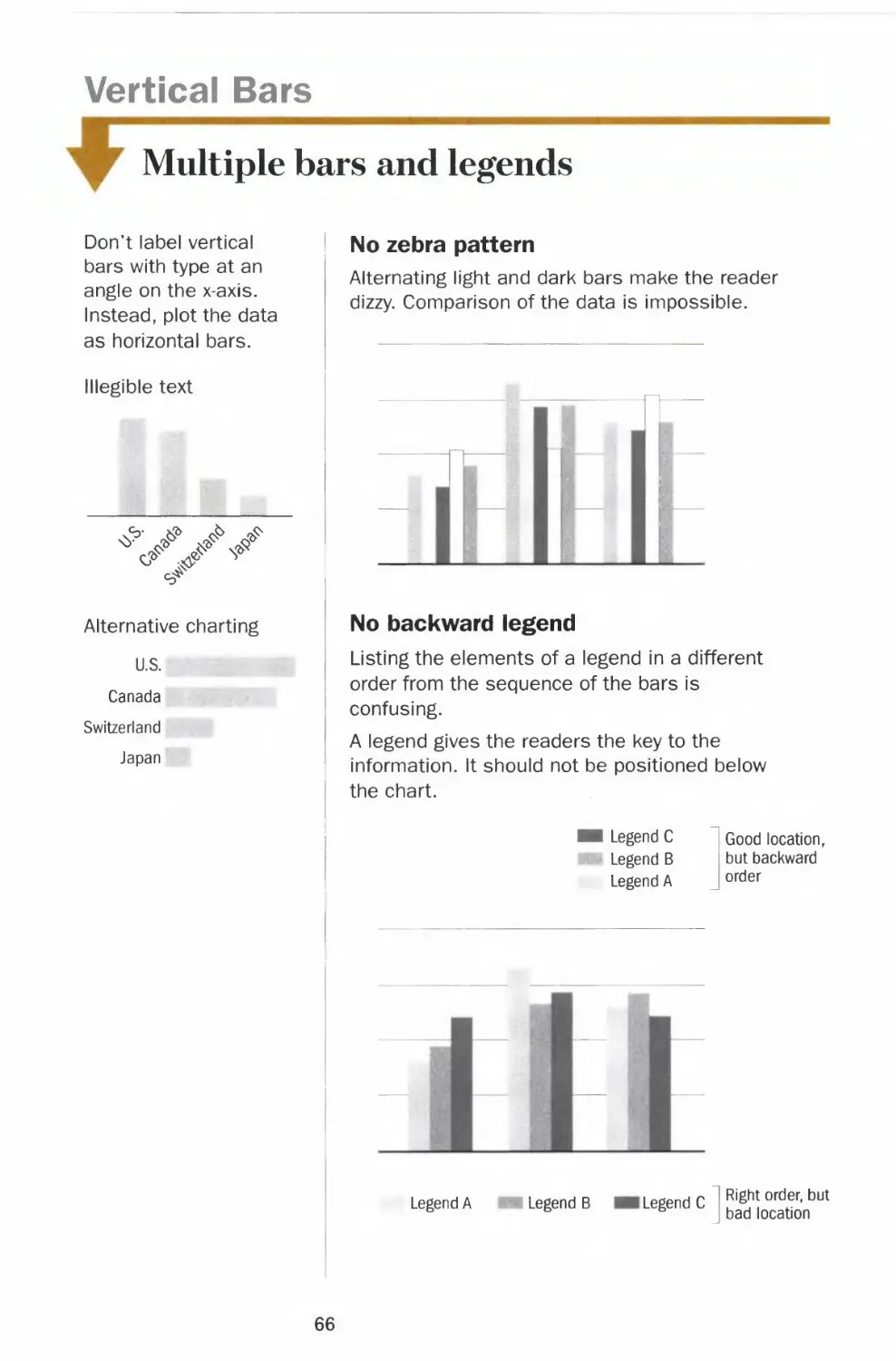
Multiple bars and legends
Don't label vertical
bars with type at an
angle on the x-axis.
Instead, plot the data
as horizontal bars.
Illegible text
Alternative charting
U.S.
Canada
Switzerland
Japan
1 No zebra pattern
Alternating light and dark bars make the reader
dizzy. Comparison of the data is impossible.
TT
T
No backward legend
Listing the elements of a legend in a different
order from the sequence of the bars is
confusing.
A legend gives the readers the key to the
information. It should not be positioned below
the chart.
Legend C
Legend B
Legend A
Good location
but backward
order
Legend A
Legend B
Legend C
Right order, but
bad location
66
Chapter 2 CHART SMART
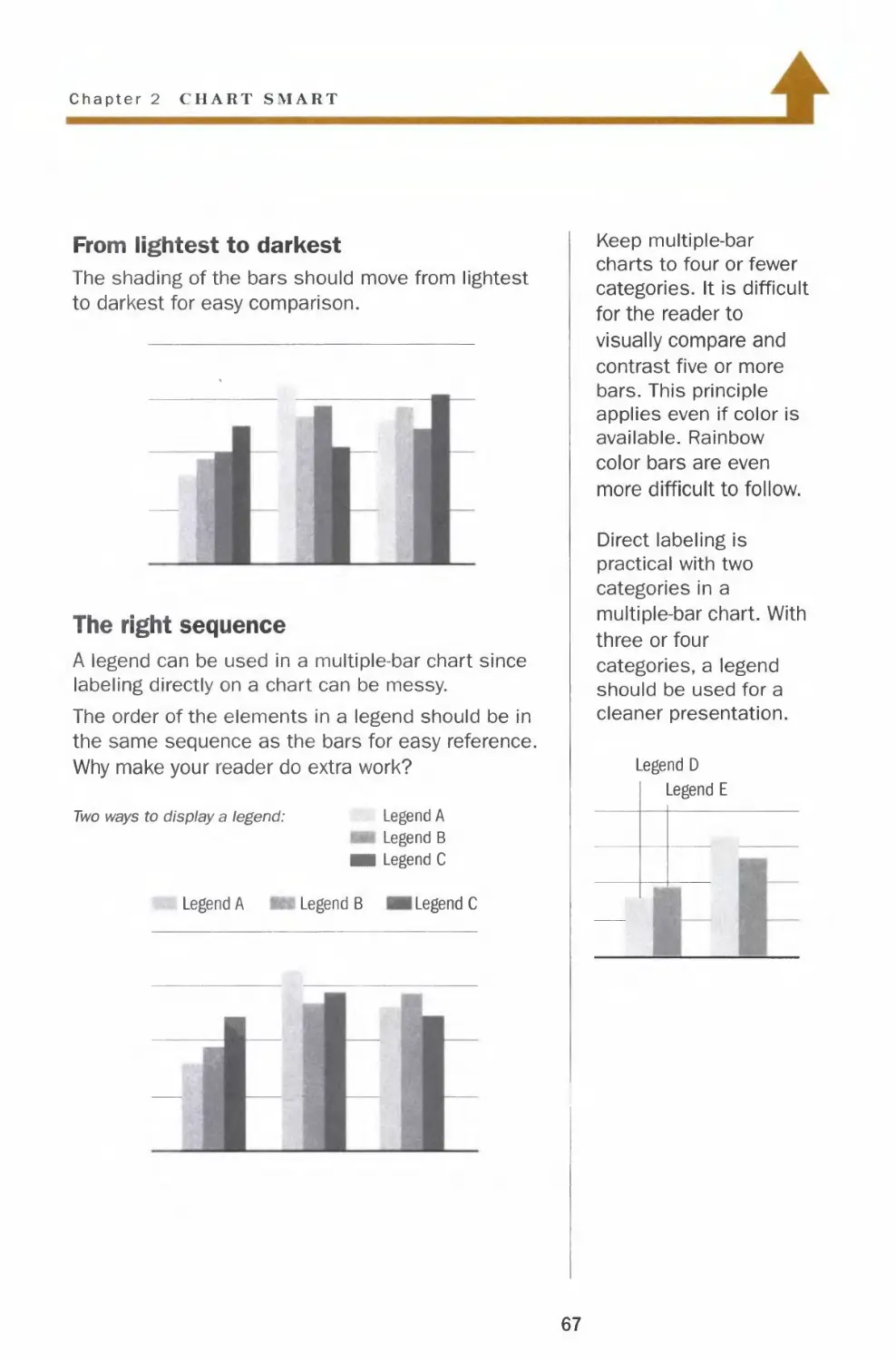
From lightest to darkest
The shading of the bars should move from lightest
to darkest for easy comparison.
The right sequence
A legend can be used in a multiple-bar chart since
labeling directly on a chart can be messy.
The order of the elements in a legend should be in
the same sequence as the bars for easy reference.
Why make your reader do extra work?
Two ways to display a legend:
Legend A
Legend A
Legend B
■i Legend C
Legend B Legend C
Keep multiple-bar
charts to four or fewer
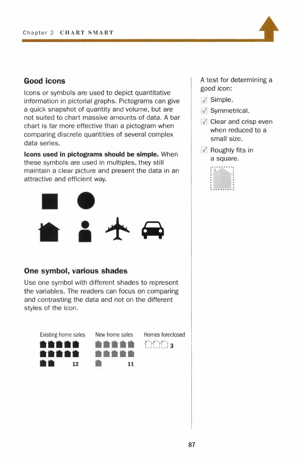
categories. It is difficult
for the reader to
visually compare and
contrast five or more
bars. This principle
applies even if color is
available. Rainbow
color bars are even
more difficult to follow.
Direct labeling is
practical with two
categories in a
multiple-bar chart. With
three or four
categories, a legend
should be used for a
cleaner presentation.
Legend D
Legend E
67
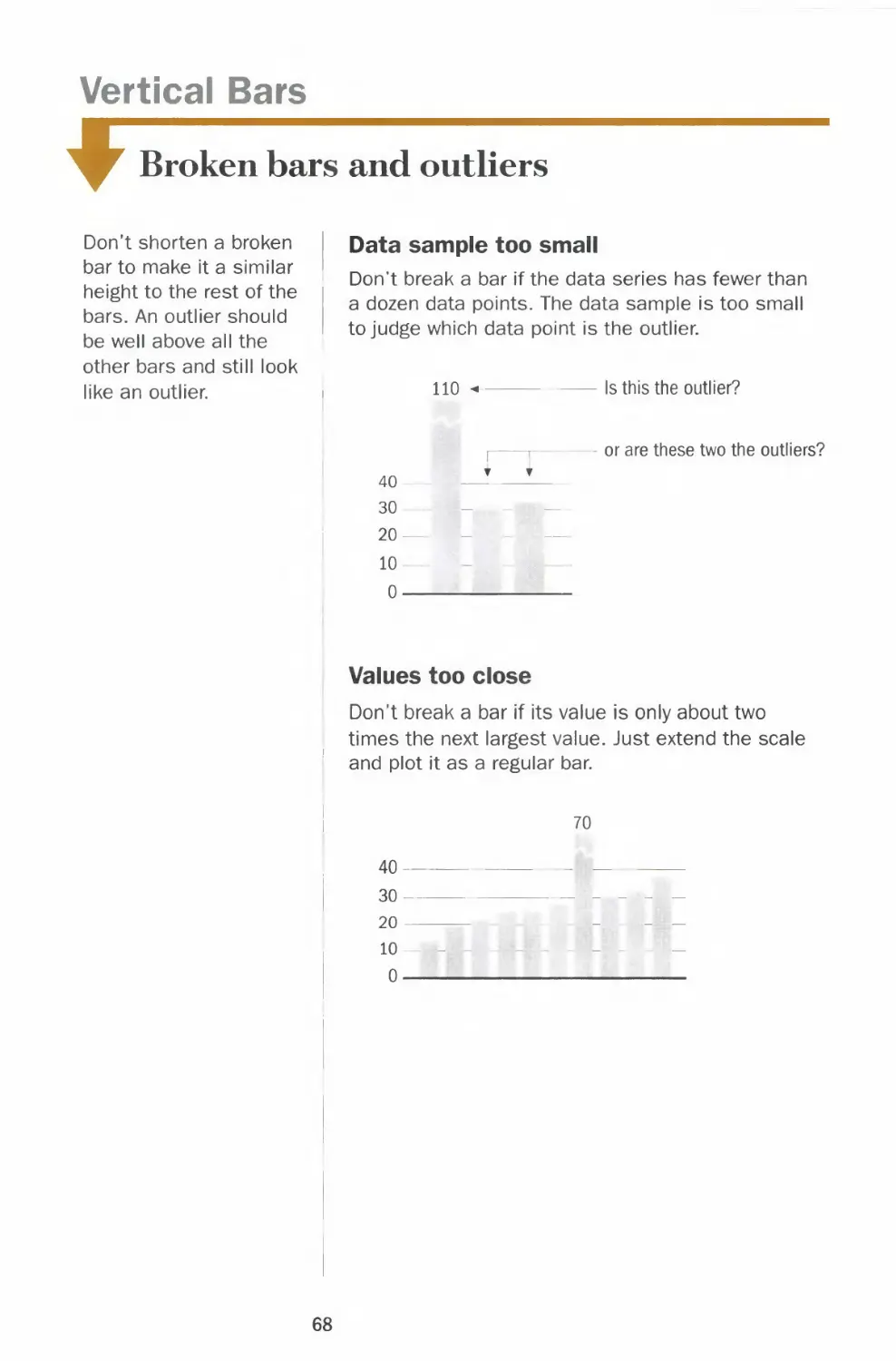
Vertical Bars
*
Broken bars and outliers
Don't shorten a broken
bar to make it a similar
height to the rest of the
bars. An outlier should
be well above all the
other bars and still look
like an outlier.
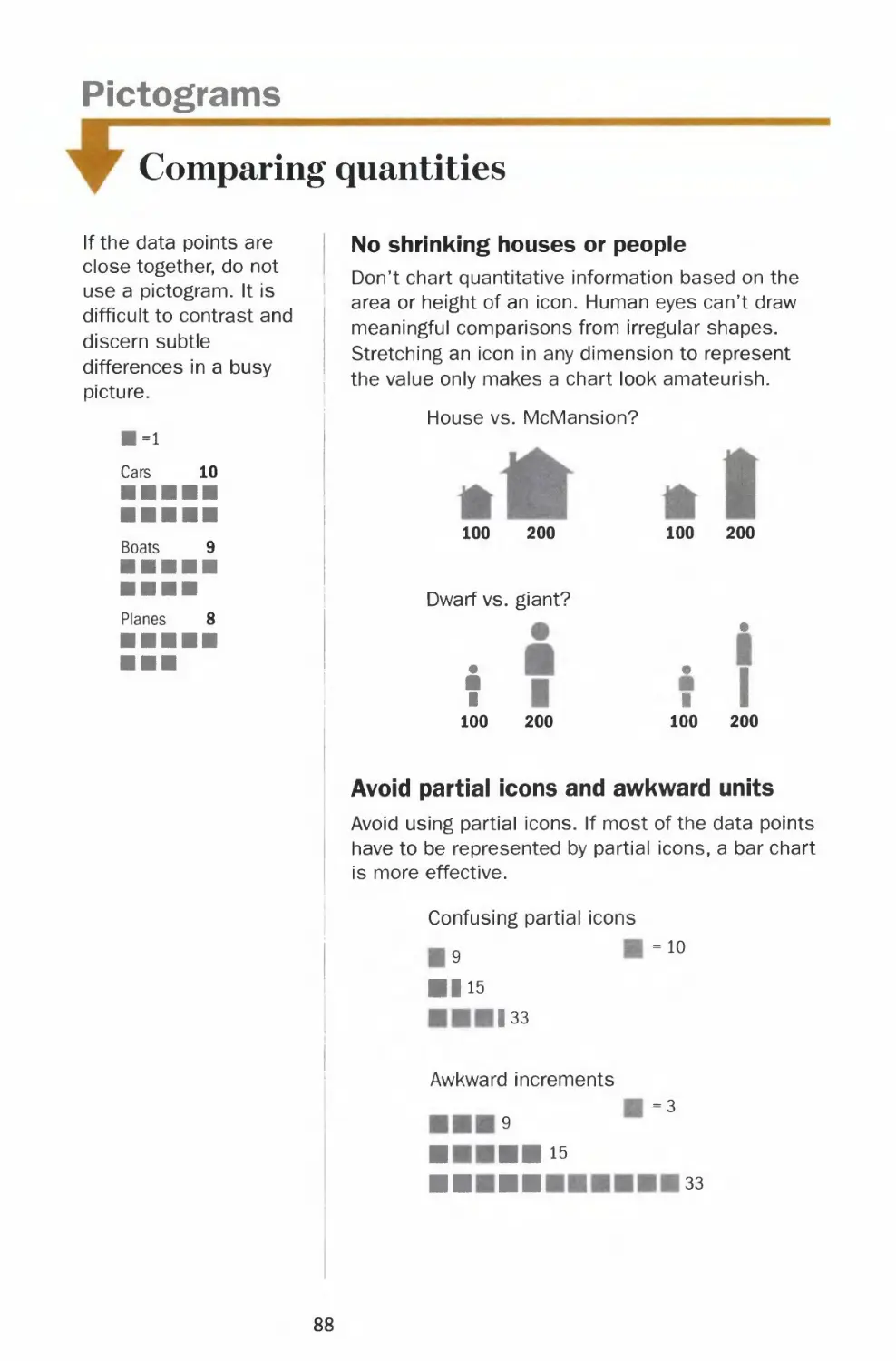
Data sample too small
Don't break a bar if the data series has fewer than
a dozen data points. The data sample is too small
to judge which data point is the outlier.
110
Is this the outlier?
40
30
20
10-
0-
or are these two the outliers?
Values too close
Don't break a bar if its value is only about two
times the next largest value. Just extend the scale
and plot it as a regular bar.
70
40-
30-
20
10
0-
68
Chapter 2 CH VRT SMART
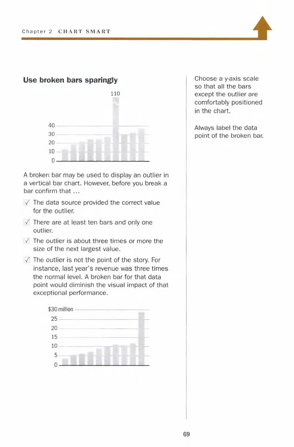
>
Use broken bars sparingly
no
40-
30-
20
10 —
0 —
A broken bar may be used to display an outlier in
a vertical bar chart. However, before you break a
bar confirm that...
/ The data source provided the correct value
for the outlier.
/ There are at least ten bars and only one
outlier.
/ The outlier is about three times or more the
size of the next largest value.
/ The outlier is not the point of the story. For
instance, last year's revenue was three times
the normal level. A broken bar for that data
point would diminish the visual impact of that
exceptional performance.
$30 million-
25
20—
15 —
10
5 —
0
Choose a y-axis scale
so that all the bars
except the outlier are
comfortably positioned
in the chart.
Always label the data
point of the broken bar.
69
Horizontal Bars
Ordering and regrouping
Just as in a vertical bar
chart, do not use
different shades or 3-D
rendering in a
horizontal bar chart.
Similar to a vertical
multiple-bar chart, a
horizontal multiple-bar
chart should be kept to
four or fewer
categories. The
shading of the bars
should be assigned
from lightest to darkest
so the reader can
easily compare and
contrast the data.
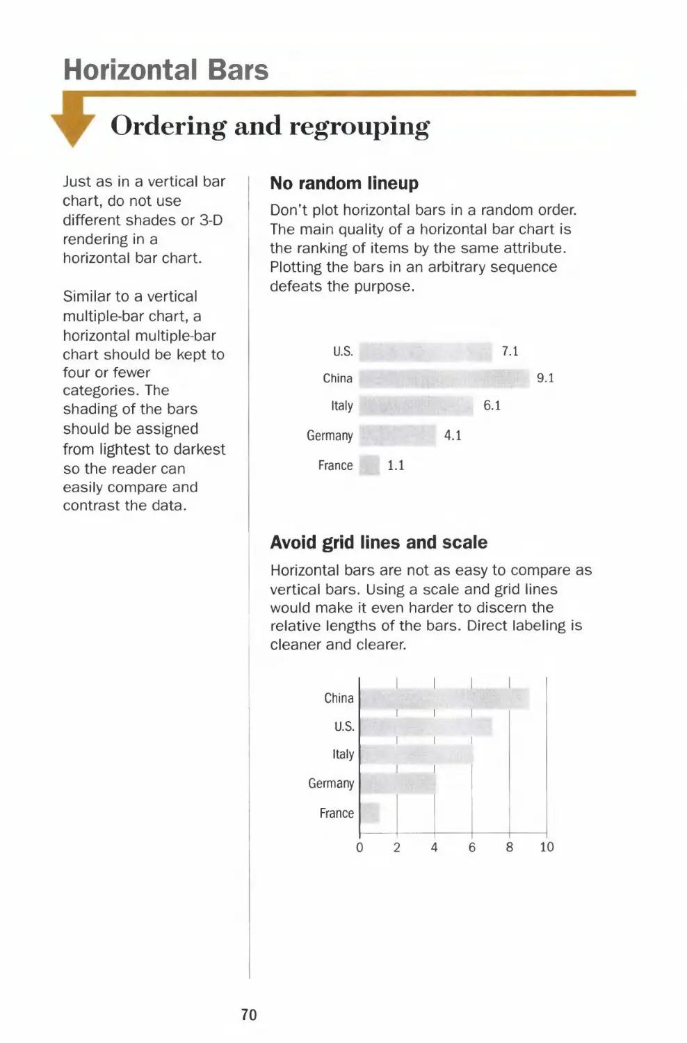
No random lineup
Don't plot horizontal bars in a random order.
The main quality of a horizontal bar chart is
the ranking of items by the same attribute.
Plotting the bars in an arbitrary sequence
defeats the purpose.
U.S.
China
Italy
Germany
France
7.1
9.1
6.1
4.1
1.1
Avoid grid lines and scale
Horizontal bars are not as easy to compare as
vertical bars. Using a scale and grid lines
would make it even harder to discern the
relative lengths of the bars. Direct labeling is
cleaner and clearer.
China
U.S.
Italy
Germany
France
i i
i i i
i i i
i i
i . i
10
70
Chapter 2 CHART SMART
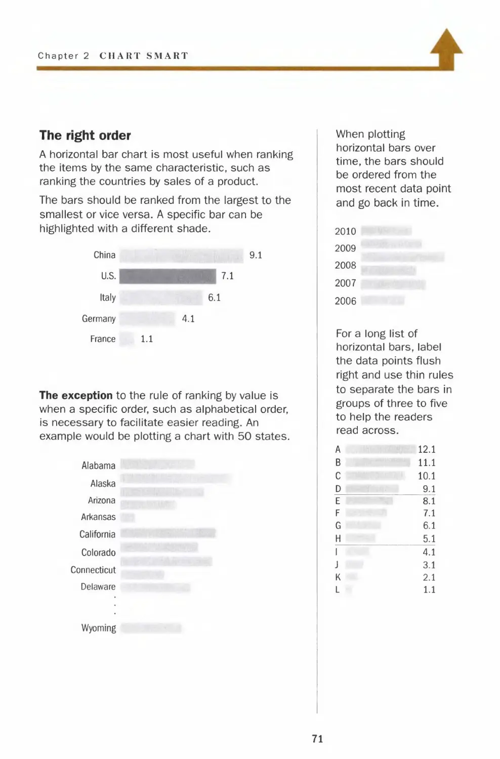
The right order
A horizontal bar chart is most useful when ranking
the items by the same characteristic, such as
ranking the countries by sales of a product.
The bars should be ranked from the largest to the
smallest or vice versa. A specific bar can be
highlighted with a different shade.
China
U.S.
Italy
Germany
France
9.1
7.1
6.1
4.1
1.1
The exception to the rule of ranking by value is
when a specific order, such as alphabetical order,
is necessary to facilitate easier reading. An
example would be plotting a chart with 50 states.
Alabama
Alaska
Arizona
Arkansas
California
Colorado
Connecticut
Delaware
Wyoming
When plotting
horizontal bars over
time, the bars should
be ordered from the
most recent data point
and go back in time.
2010
2009
2008
2007
2006
For a long list of
horizontal bars, label
the data points flush
right and use thin rules
to separate the bars in
groups of three to five
to help the readers
read across.
A
B
C
D
E
F
G
H
1
J
K
L
12.1
11.1
10.1
9.1
8.1
7.1
6.1
5.1
4.1
3.1
2.1
1.1
71
Horizontal Bars
Negative bars
Avoid using horizontal
bars if most of the
values are negative. It
is best to use vertical
bars unless the labels
do not fit underneath
the bars. A picture with
the bars below a
horizontal baseline
leaves a stronger
impression than one
with bars to the left of
a zero line.
Negative values in a
horizontal bar chart
0
A more striking picture
as a vertical bar chart
Wrong direction
Never plot horizontal bars with negative values
on the right side of the zero line, even if there
are no positive numbers in the data set.
Company A
Company B
Company C
Company D
Company E
-9.1
-7.1
-6.1
-4.1
-1.1
No two-way horizontal bars
Demographics charts sometimes plot the
number of males on one side and females on
the other. However, in most applications, the
left side of the baseline is reserved for negative
numbers. It is hard to compare two sets of bars
on opposite sides. It is better to plot the two
data series as a multiple-bar chart.
Company A Company B
10 8
8 10
72
Chapter 2 CHART SMART
4
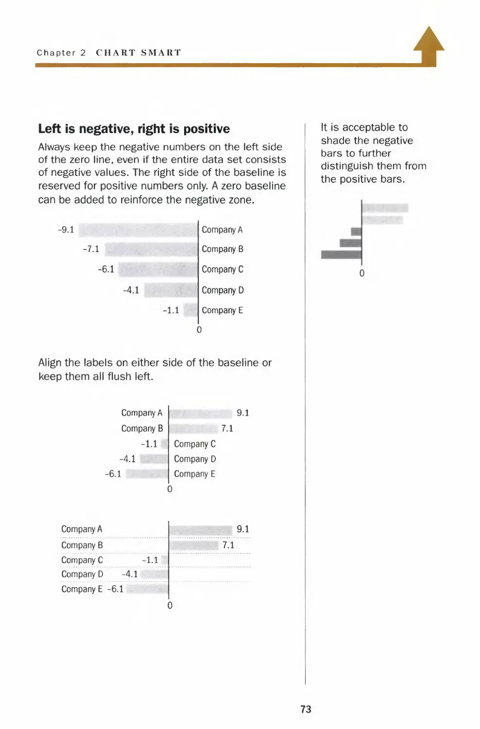
Left is negative, right is positive
Always keep the negative numbers on the left side
of the zero line, even if the entire data set consists
of negative values. The right side of the baseline is
reserved for positive numbers only. A zero baseline
can be added to reinforce the negative zone.
-9.1
-7.1
-6.1
-4.1
-l.i
Company A
Company B
Company C
Company D
Company E
0
Align the labels on either side of the baseline or
keep them all flush left.
Company A
Company B
-1.1
-4.1
-6.1
9.1
7.1
Company C
Company D
Company E
0
Company A
Company B
Company C -1.1
Company D -4.1
Company E -6.1
9.1
7.1
It is acceptable to
shade the negative
bars to further
distinguish them from
the positive bars.
73
Pies
Slicing and dicing
Pie charts should not
be used to illustrate
complicated
relationships among
many segments. It is
easier to compare two
vertical bars than two
slices in a pie.
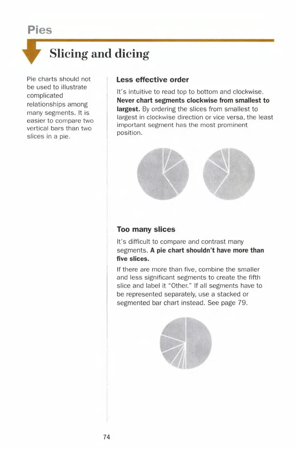
Less effective order
It's intuitive to read top to bottom and clockwise.
Never chart segments clockwise from smallest to
largest. By ordering the slices from smallest to
largest in clockwise direction or vice versa, the least
important segment has the most prominent
position.
Too many slices
It's difficult to compare and contrast many
segments. A pie chart shouldn't have more than
five slices.
If there are more than five, combine the smaller
and less significant segments to create the fifth
slice and label it "Other." If all segments have to
be represented separately, use a stacked or
segmented bar chart instead. See page 79.
74
Chapter 2 CHART SMART
Larger segments on top
start here
T
2nd
largest
largest
segment
3rd
4th
'+
M*
Reading a pie chart is like reading a clock. It's
intuitive to start at 12 o'clock and go clockwise.
Therefore, it is most effective to place the
largest segment at 12 o'clock on the right to
emphasize its importance.
The best way to order the rest of the segments
is to place the second biggest slice at 12
o'clock on the left; the rest would follow
counterclockwise. The smallest slice will fall
near the bottom of the chart, in the least
significant position.
The only exception to
the ordering is when all
the slices are close in
value. In this case,
start at 12 o'clock on
the right and go
clockwise from largest
to smallest.
15°i
35%
20%
30%
Just like in bar and line
charts, direct labeling
helps the reader to
quickly identify
individual segments
and focus on the
comparison between
them.
75
Pies
Dressing up the slices
Pie charts are not as
effective in presenting
complex data as line or
bar charts, but they are
good visual tools for
showing portions of a
whole. Avoid the
temptation to dress up
a pie by using different
colors or 3-D effects,
which will distort how
the reader perceives
the data. Any
embellishments that
are not relevant to the
data have no place In
a chart.
Distracting shades and colors
A pie with multiple
shades or colors
distracts the reader from
immediate comparison of i
the segments.
Special effect overkill
Don't use more than
one trick to highlight a
segment, for instance,
don't both shade and
pull out the slice you
want to emphasize.
Incorrect data represention
Since the area is used to
represent each segment's
relative value, a pie with
three-dimensional
rendering misrepresents
each segment's
proportion to the whole.
76
Chapter 2 CHART SMART
4
Keep the shading simple
It is generally easier to
compare different
lengths than different
sizes of segments of a
pie. Therefore, keep it
simple when shading
the slices. The goal is
for the reader to
compare the size of
any segment to the
whole pie efficiently.
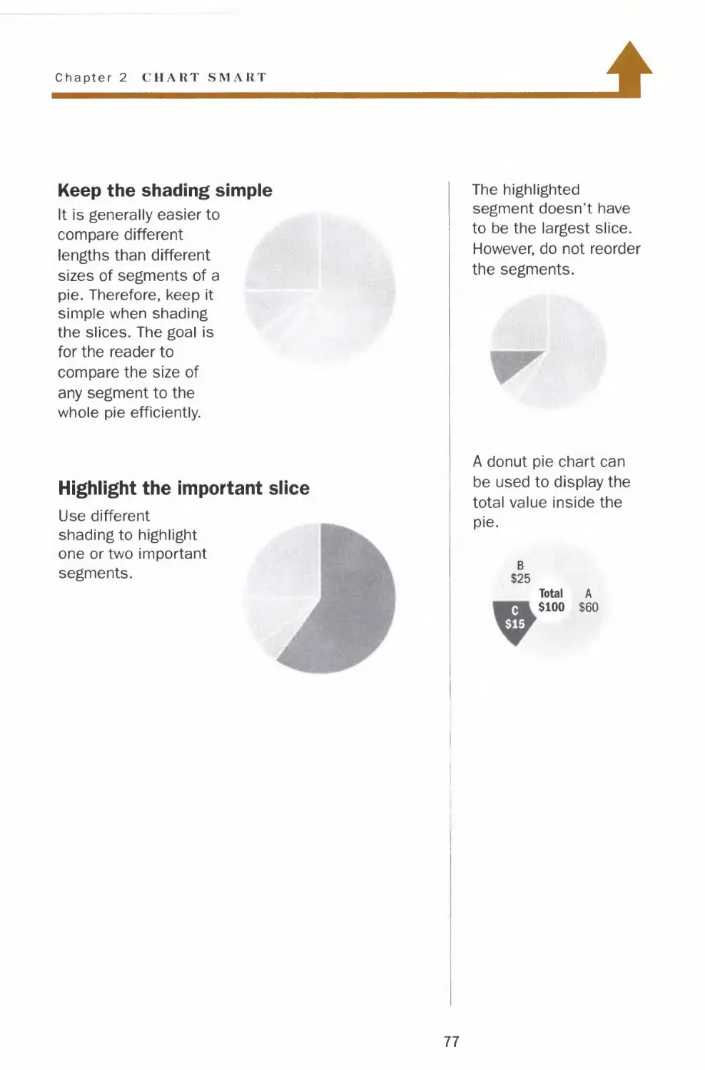
Highlight the important slice
Use different
shading to highlight
one or two important
segments.
The highlighted
segment doesn't have
to be the largest slice.
However, do not reorder
the segments.
A donut pie chart can
be used to display the
total value inside the
pie.
B
$25
Total A
c $100 $60
$15
77
Pies
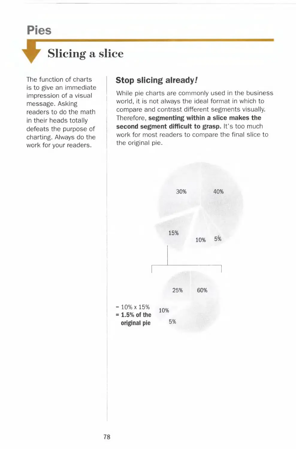
Slicing a slice
The function of charts
is to give an immediate
impression of a visual
message. Asking
readers to do the math
in their heads totally
defeats the purpose of
charting. Always do the
work for your readers.
Stop slicing already/
While pie charts are commonly used in the business
world, it is not always the ideal format in which to
compare and contrast different segments visually.
Therefore, segmenting within a slice makes the
second segment difficult to grasp. It's too much
work for most readers to compare the final slice to
the original pie.
30%
40%
15%
10% 5%
25%
60%
10%xl5%
1.5% of the
original pie
10%
5%
78
Chapter 2 CHART SMART
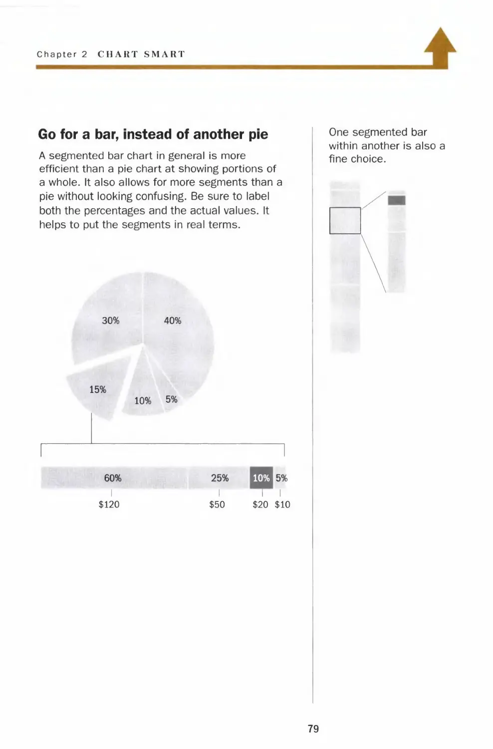
Go for a bar, instead of another pie
A segmented bar chart in general is more
efficient than a pie chart at showing portions of
a whole. It also allows for more segments than a
pie without looking confusing. Be sure to label
both the percentages and the actual values. It
helps to put the segments in real terms.
30% 40%
15%
10% 5%
60% 25% 10% 5%
I III
$120 $50 $20 $10
Pies
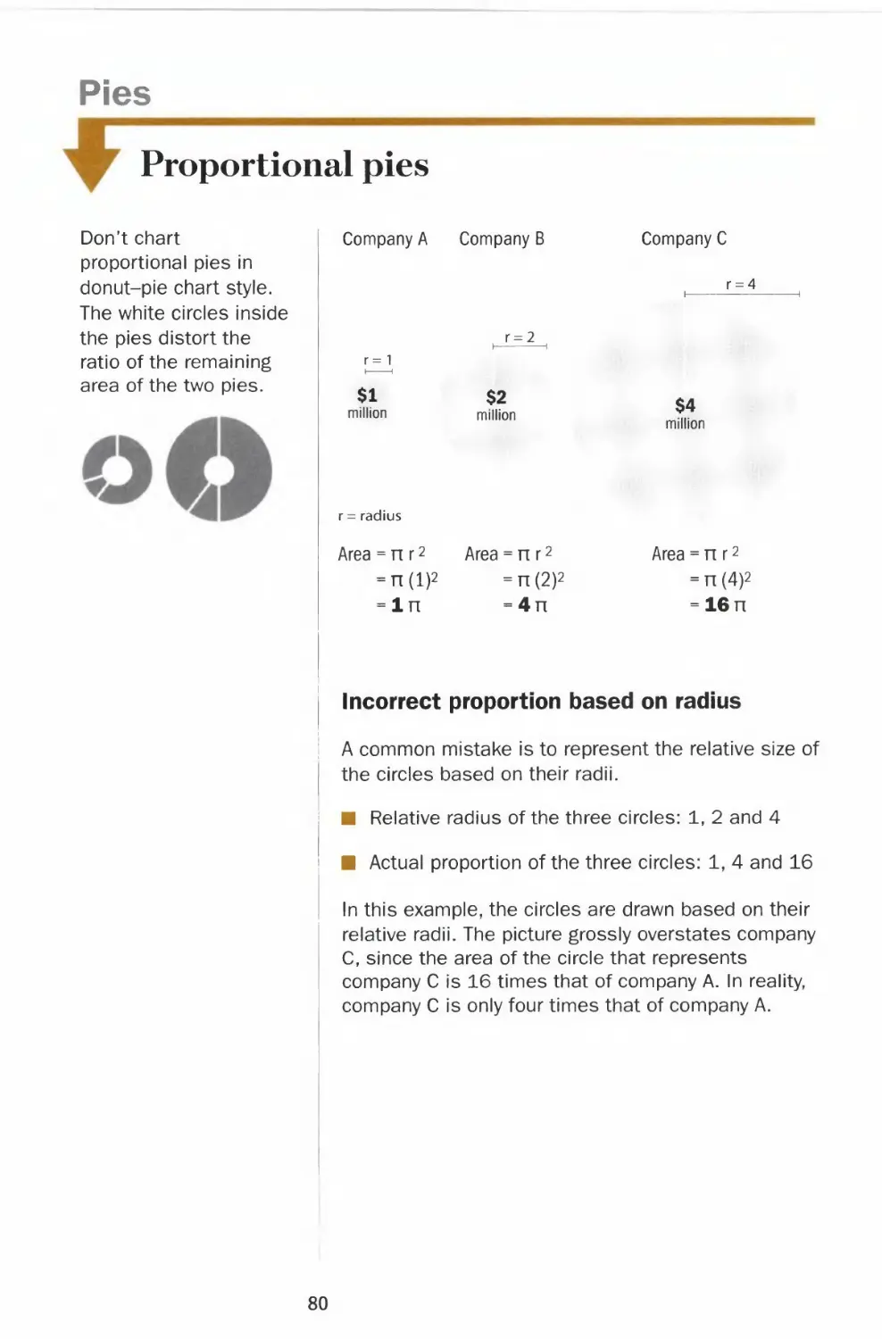
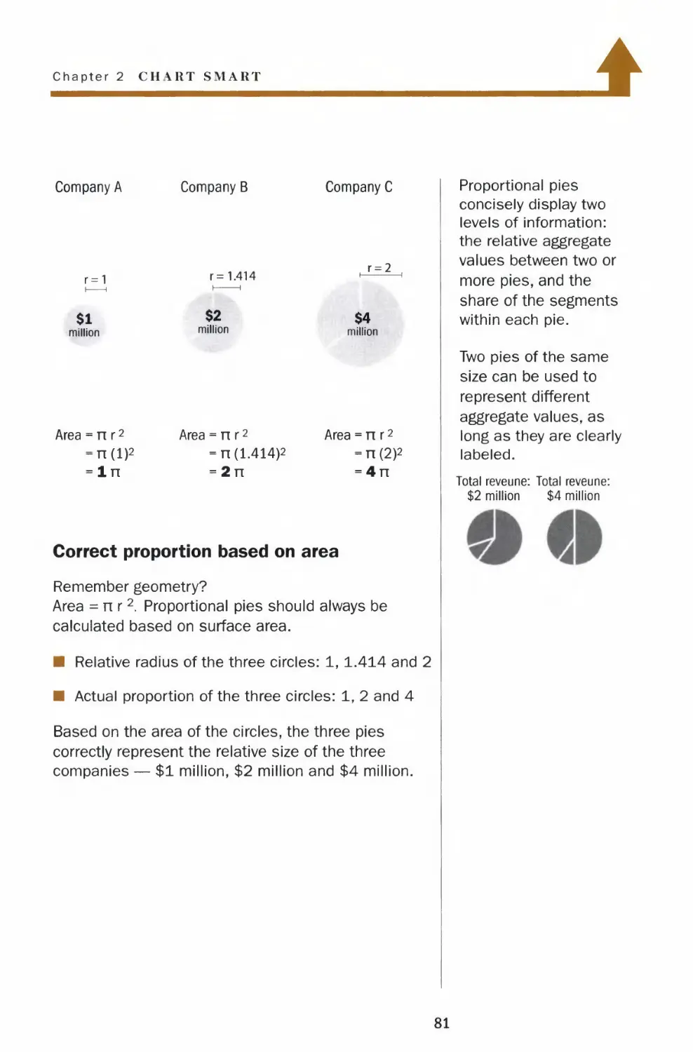
Proportional pies
Don't chart
proportional pies in
donut-pie chart style.
The white circles inside
the pies distort the
ratio of the remaining
area of the two pies.
Company A Company B
Company C
r = 4
r = 2
r= 1
$1
million
r = radius
$2
million
$4
million
Area = n r2 Area = nr2
= n(l)2 =n(2)2
=ln =4n
Area:
nr2
n(4)2
16 n
Incorrect proportion based on radius
A common mistake is to represent the relative size of
the circles based on their radii.
■ Relative radius of the three circles: 1, 2 and 4
■ Actual proportion of the three circles: 1, 4 and 16
In this example, the circles are drawn based on their
relative radii. The picture grossly overstates company
C, since the area of the circle that represents
company C is 16 times that of company A. In reality,
company C is only four times that of company A.
80
Chapter 2 CII \RT SMART
4
Company A
r=1
$1
million
Area = nr2
-n(l)2
-In
Company B
r= 1.414
$2
million
Area = n r2
= n (1.414)2
= 2n
Company C
r = 2
$4
million
Area = n r2
-n(2)2
= 4n
Proportional pies
concisely display two
levels of information:
the relative aggregate
values between two or
more pies, and the
share of the segments
within each pie.
Two pies of the same
size can be used to
represent different
aggregate values, as
long as they are clearly
labeled.
Correct proportion based on area
Remember geometry?
Area =nr2 Proportional pies should always be
calculated based on surface area.
■ Relative radius of the three circles: 1, 1.414 and 2
■ Actual proportion of the three circles: 1, 2 and 4
Based on the area of the circles, the three pies
correctly represent the relative size of the three
companies — $1 million, $2 million and $4 million.
Total reveune: Total reveune:
$2 million $4 million
81
Tables
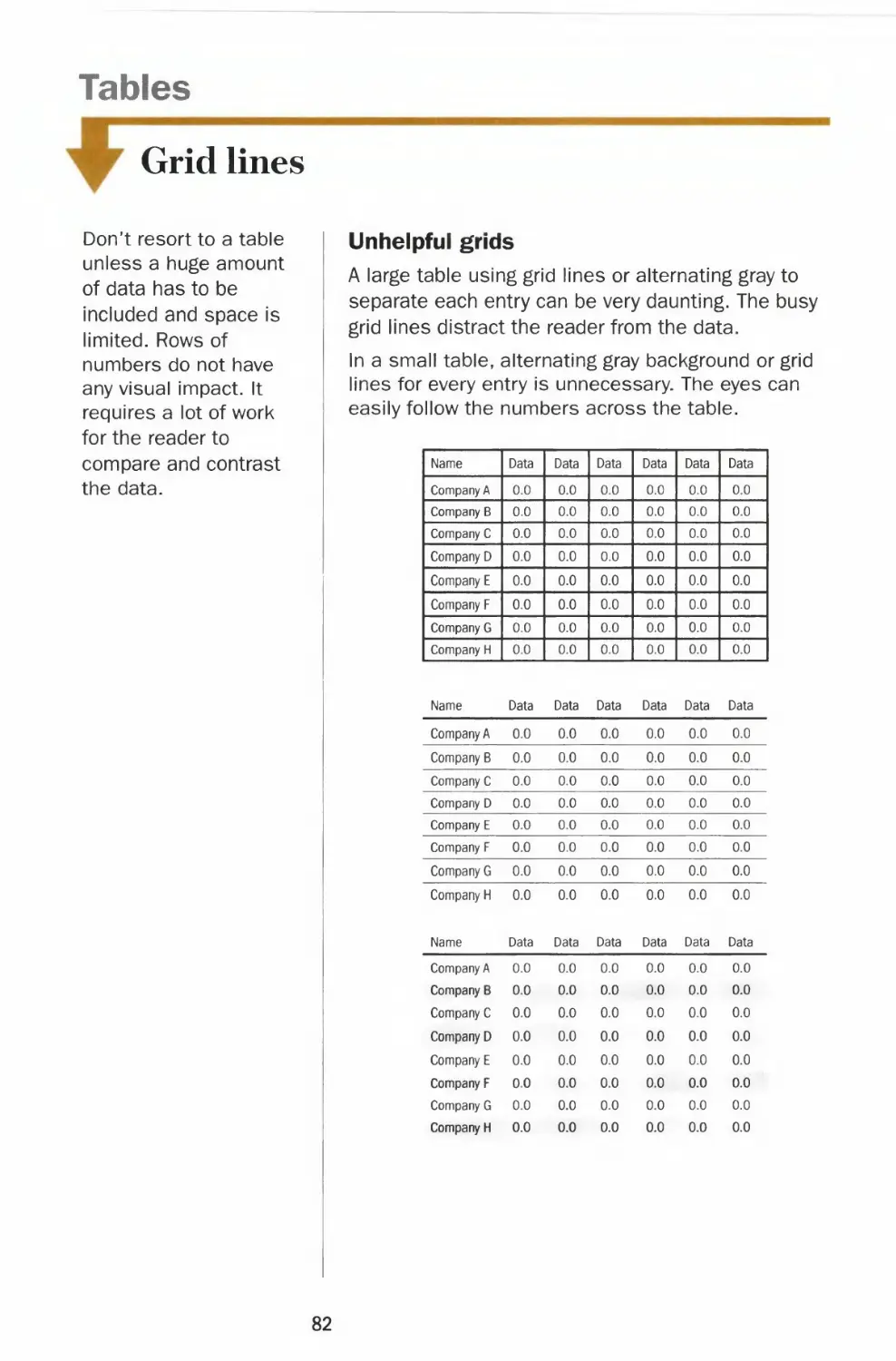
Grid lines
Don't resort to a table
unless a huge amount
of data has to be
included and space is
limited. Rows of
numbers do not have
any visual impact. It
requires a lot of work
for the reader to
compare and contrast
the data.
Unhelpful grids
A large table using grid lines or alternating gray to
separate each entry can be very daunting. The busy
grid lines distract the reader from the data.
In a small table, alternating gray background or grid
lines for every entry is unnecessary. The eyes can
easily follow the numbers across the table.
Company A 0.0
Company B 0.0
Company C 0.0
Company D 0.0
Company E 0.0
Company F 0.0
Company G 0.0
Company H 0.0
0.0
0.0
0.0
0.0
0.0
0.0
0.0
0.0
0.0
0.0
0.0
0.0
0.0
0.0
0.0
0.0
0.0
0.0
0.0
0.0
0.0
0.0
0.0
0.0
0.0
0.0
0.0
0.0
0.0
0.0
0.0
0.0
Name
| Company A
Company B
Company C
Company D
Company E
Company F
Company G
Company H
Name
Company A
Company B
Company C
Company D
Company E
Company F
Company G
Company H
Name
Data
0.0
0.0
0.0
0.0
0.0
0.0
0.0
0.0
Data
0.0
0.0
0.0
0.0
0.0
0.0
0.0
0.0
Data
Data
0.0
0.0
0.0
0.0
0.0
0.0
0.0
0.0
Data
0.0
0.0
0.0
0.0
0.0
0.0
0.0
0.0
Data
Data
0.0
0.0
0.0
0.0
0.0
0.0
0.0
0.0
Data
0.0
0.0
0.0
0.0
0.0
0.0
0.0
0.0
Data
Data
0.0
0.0
0.0
0.0
0.0
0.0
0.0
0.0
Data
0.0
0.0
0.0
0.0
0.0
0.0
0.0
0.0
Data
Data
0.0
0.0
0.0
0.0
0.0
0.0
0.0
0.0
Data
0.0
0.0
0.0
0.0
0.0
0.0
0.0
0.0
Data
Data
0.0
0.0
0.0
0.0
0.0
0.0
0.0
0.0
Data
0.0
0.0
0.0
0.0
0.0
0.0
0.0
0.0
Data
0.0
0.0
0.0
0.0
0.0
0.0
0.0
0.0
82
Chapter 2 CHART SMART
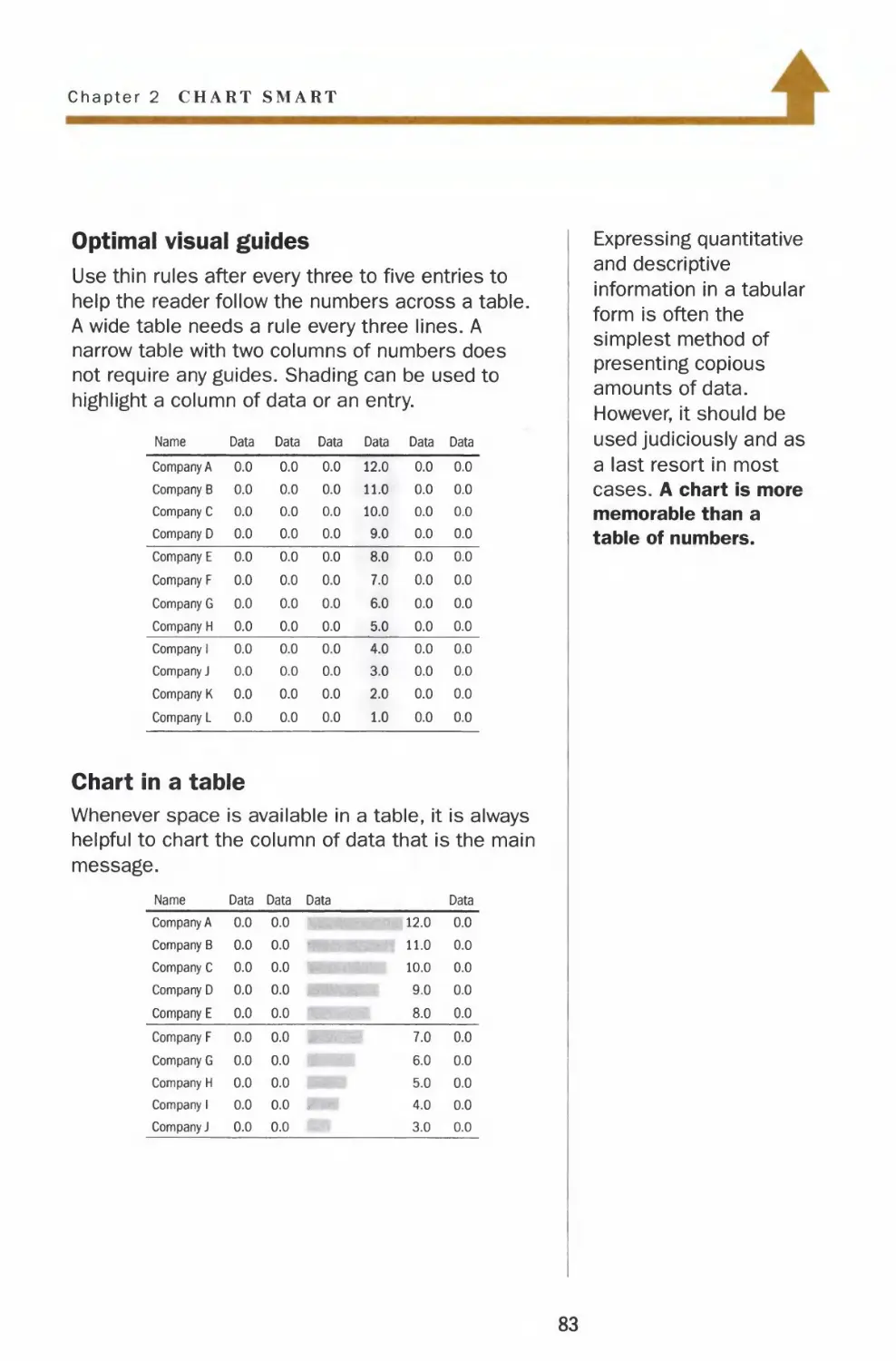
Optimal visual guides
Use thin rules after every three to five entries to
help the reader follow the numbers across a table.
A wide table needs a rule every three lines. A
narrow table with two columns of numbers does
not require any guides. Shading can be used to
highlight a column of data or an entry.
Name
Company A
Company B
Company C
Company D
Company E
Company F
Company G
Company H
Company 1
Company J
Company K
Company L
Data
0.0
0.0
0.0
0.0
0.0
0.0
0.0
0.0
0.0
0.0
0.0
0.0
Data
0.0
0.0
0.0
0.0
0.0
0.0
0.0
0.0
0.0
0.0
0.0
0.0
Data
0.0
0.0
0.0
0.0
0.0
0.0
0.0
0.0
0.0
0.0
0.0
0.0
Data
12.0
11.0
10.0
9.0
8.0
7.0
6.0
5.0
4.0
3.0
2.0
1.0
Data
0.0
0.0
0.0
0.0
0.0
0.0
0.0
0.0
0.0
0.0
0.0
0.0
Data
0.0
0.0
0.0
0.0
0.0
0.0
0.0
0.0
0.0
0.0
0.0
0.0
Chart in a table
Whenever space is available in a table, it is always
helpful to chart the column of data that is the main
message.
Name
Company A
Company B
Company C
Company D
Company E
Company F
Company G
Company H
Company 1
Company J
Data
0.0
0.0
0.0
0.0
0.0
0.0
0.0
0.0
0.0
0.0
Data Data
0.0
0.0
0.0
0.0
0.0
0.0
0.0
0.0
0.0 ,
0.0
12.0
11.0
10.0
9.0
8.0
7.0
6.0
5.0
4.0
3.0
Data
0.0
0.0
0.0
0.0
0.0
0.0
0.0
0.0
0.0
0.0
Expressing quantitative
and descriptive
information in a tabular
form is often the
simplest method of
presenting copious
amounts of data.
However, it should be
used judiciously and as
a last resort in most
cases. A chart is more
memorable than a
table of numbers.
83
Tables
Numbers alignment and ordering
For a table with
multiple data series, do
not present the
comparative data
horizontally. It is easier
for the reader to
analyze data vertically.
Never align whole numbers flush left
Data
Company A
Company B
Company C
Company D
1000
900
80
7
Comparative data
presented horizontally
Company Company Company
ABC
Sales 1
Profit/loss 11
Employees 210
2
12
220
Comparative data
3
13
230
presented vertically
Name Sales
Company A 1
Company B 2
Company C 3
Profit/
loss
11
12
13
Employees
210
220
230
Never align decimals flush left or flush right
Name
Company A
Company B
Company C
Company D
Name
Data
10.82
9.49
8
7.4
Data
Company A
Company B
Company C
Company D
10.82
9.49
8
7.4
Never order entries randomly
Name
Data
Company A
Company C
Company D
Company B
4.1
5.1
2.1
3.1
84
Chapter 2 CHART SMART
Align whole numbers flush right
Name
Data
Company A
Company B
Company C
Company D
1000
900
80
7
Always align decimal numbers on the
decimal point
Round off all figures to the same number of places
after the decimal point, even whole numbers.
Example
Round off to one decimal point and align
along the decimal point. Add ".0" after a
round whole number so the decimals line up.
Name
Data
Company A 10.8
Company B 9.5
Company C 8.0
Company D 7.4
Order entries logically
In alphabetical order Ranked by values
Name Data Name Data
Company A 4.1
Company B 3.1
Company C 5.1
Company D 2.1
Company C 5.1
Company A 4.1
Company B 3.1
Company D 2.1
For small numbers, it
is acceptable to center
whole numbers.
Name
Data
Company A
Company B
Company C
Company D
In a table, It
10
9
8
7
is only
necessary to display
the unit, such as a
dollar sign or a
percentage sign, once
with the first
Just be sure
entry.
to keep
the numerals aligned.
Name
Company A
Company B
Company C
Company D
Name
Company A
Company B
Company C
Company D
Data
$10
9
8
7
Data
10%
9
8
7
85
Pictograms
Choice of icons
Avoid using partial
icons in a pictogram.
The purpose of a
pictogram is to create
a snapshot of the data.
Partial icons add
confusion.
The only exception is
when using a square
as an icon. A square
works even if a small
sliver of the unit is
used.
| 115
A truncated person or
airplane is not only
illegible but also
disturbing.
i
150
HH
150
Bad icons
Even though a pictogram is more visually engaging
than a bar chart, it is less effective for comparing a
large amount of data. A pictogram should be used
only when comparing a few simple data series.
Icons in pictograms are not meant to be works of
art. Icons that are visually interesting do not
necessarily make good symbols for pictograms. A
symbol with too many details hinders the readers
from comparing the underlying data. When these
symbols are used in multiples, they create a
cluttered and busy picture.
|B
Distracting variations
Don't use different versions of a symbol to
represent the variables. The combinations can be
very distracting and it is hard for the readers to
compare the underlying data. The focus should be
the information and not the drawing.
Existing home sales New home sales Homes foreclosed
***** 1113
*****
i ii
*****
**
12
86
Chapter 2 CHART SMART
l
Good icons
Icons or symbols are used to depict quantitative
information in pictorial graphs. Pictograms can give
a quick snapshot of quantity and volume, but are
not suited to chart massive amounts of data. A bar
chart is far more effective than a pictogram when
comparing discrete quantities of several complex
data series.
Icons used in pictograms should be simple. When
these symbols are used in multiples, they still
maintain a clear picture and present the data in an
attractive and efficient way.
* «
One symbol, various shades
Use one symbol with different shades to represent
the variables. The readers can focus on comparing
and contrasting the data and not on the different
styles of the icon.
Existing home sales
*****
*****
** 12
New home sales
** *
*****
* ii
Homes foreclosed
DQQ3
A test for determining a
good icon:
7 Simple.
V Symmetrical.
/ Clear and crisp even
when reduced to a
small size.
/ Roughly fits in
a square.
87
Pictograms
Comparing quantities
If the data points are
close together, do not
use a pictogram. It is
difficult to contrast and
discern subtle
differences in a busy
picture.
■ -1
Cars
■ ■
■ ■
Boats
■ ■
■ ■
Planes
10
No shrinking houses or people
Don't chart quantitative information based on the
area or height of an icon. Human eyes can't draw
meaningful comparisons from irregular shapes.
Stretching an icon in any dimension to represent
the value only makes a chart look amateurish.
House vs. McMansion?
100 200
Dwarf vs. giant?
100 200
100 200
; i
100 200
Avoid partial icons and awkward units
Avoid using partial icons. If most of the data points
have to be represented by partial icons, a bar chart
is more effective.
Confusing partial icons
= 10
15
| 33
Awkward increments
15
= 3
33
88
Chapter 2 CHART SMART
±
Comparing with multiple units
A pictogram takes the form of a bar chart and uses
icons or symbols to visualize the data. Multiple
units of a symbol are used to represent the
discrete quantities.
An effective pictogram is visually engaging and
gives a quick comparison of the variables.
=100
300
800
Natural units
In an effective pictogram, most data points should
be multiples of a complete icon. Each icon should
represent a natural counting increment, such as
1, 2, 5,10, 50 and 100.
30
10
50
110
= 2
10
22
Always label the data
values of a pictogram.
Don't make the readers
count.
Icons should be
organized in groups of
5 or 10 to facilitate
easy visual counting.
Unnatural grouping
12
****
Effective grouping
*****
*****
** 12
89
Maps
Mapping and shading
Don't use patterns or
cross-hatching to
highlight an area. Use
solid shades of black
or another color.
No mapping unless geography is relevant
Do not use a map to compare quantities or volume,
unless geography is relevant to the message.
Suppose sales in New Jersey are three times that in
Texas. Even if New Jersey is shaded black and Texas
in light gray, the picture gives a different impression
of the relative size of the business. A bar chart
showing the sales figures is more effective.
$ million
1 2 3
90
Chapter 2 CHART SMART
4
Mapping change
For most business applications, a series of shaded
maps can be very effective for comparing different
conditions or showing change over time.
Example
Two maps show the market penetration of an Asian
food product. The distribution grows with an
increased presence of Asian consumers.
Last year
Markets with sales of
the Asian food product
This year Existing markets ■■ New markets
••. V)
Data maps can be
powerful tools that
analyze massive
amounts of demographic
information down to the
metropolitan statistical
area level. Highly
sophisticated software
and database expertise
are required to execute
such data maps.
Keep the outlines of a
map simple, whether it
is county, state or
country. They are like
the grid lines in a line or
bar chart. They frame
the information, but they
are not the message.
91
CHAPTER 3
Ready Reference
Most of the math we use in charting is
fundamental algebra and statistics. Yet most
of us continue to make simple mistakes.
Should we ever take an average of two
percentages? How do we calculate percentage
change: the new number minus the old
number divided by the new number? Or
divided by the old number? What is a log
scale?
In addition to basic math skills, we also need
knowledge of the market — the more, the
better. What are the major stock indexes?
How do we chart currency fluctuations that
affect our global business?
These are all formulas and facts that save you
time when you need to deliver quality work on
a tight deadline. You will find them all here at
your fingertips in this chapter.
93
Do the Math
Mean, median, mode
Which one to use?
The mean (average) is
most useful when
measuring the total
impact of the complete
data set since all the
values are used to
compute it. If the
extreme outliers are
not relevant, the mean
may not be
representative.
The median is useful
for ranking outcomes.
It is not influenced by
outliers at the
extremes of the data
set. For instance, the
median is a good
representation for data
on home prices and
income level.
The mode helps focus
on the typical outcome.
It gives the value that
users are most likely to
see.
The mean is the simple average. It is the sum of all
the values divided by the number of data points.
The median is the middle value in a distribution of
data. Half of the sample is below that value and
half is above. To find the median, the data has to be
listed in numerical order. If the number of data
points is an even number, the median is the
average of the two middle values.
The mode is the value that occurs most often.
Example
A set of data showing the
number of cars sold per
day by nine divisions.
11
Mode = 7
3 3
Division ABCDEFGH I
Half the sample below . a ' Half the sample above
Median
t
sdi
= 4
1+2+3+3+4+7+7+7+11
Mean = = 5
94
Chapter 3 READY REFERENCE
Standard deviation
Standard deviation shows how tightly the data is
dispersed around the mean. A highly volatile stock
has a high standard deviation.
Low standard deviation
Data tightly centered
around the mean
High standard deviation
Data widely dispersed
around the mean
Mean
Standard deviation =
sum (x - x)
x = each data point
"x = mean
n = number of data points
Example
One common business application for standard
deviation is to represent the volatility of a series,
based on percentage changes in prices.
Percent change
in price x - x
3% -5
1 -7
9 1
19 11
mean 8
Standard deviation = J-
The volatility is 7%.
(x-x)2
25
49
1
121
sum 196
4
For the quants:
Volatility is usually
quoted on an
annualized basis.
To calculate
annualized volatility:
Daily
standard X
deviation ^
Number of
trading days
in a year
95
Do the Math
Probability
Probability can be
interpreted as the
relative number of
occurrences. While
one cannot predict with
certainty the result of
any one trial, the
collective outcomes of
a large number of trials
can display some
recurring patterns.
Probability theory is
widely used in many
areas from actuarial
estimates of mortality
risk to clinical trials of
new drugs.
Symmetric probability distributions
Symmetric distributions arise in many
circumstances. For instance, test scores often fall
along a bell-shaped curve.
Example. Toss 2 dice and
plot the outcome. Enough
trials will yield a bell curve:
Possible 2
outcomes
36 possible
combinations
3 4 5
(1.4)
(1,3) (2,3)
(1,2) (2,2) (3,2)
6
(1,5)
(2,4)
(3,3)
(4,2)
(1,1) (2,1) (3,1) (4,1) (5,1)
7 8 9 10 11
(1,6)
(2,5) (2,6)
(3,4) (3,5) (3,6)
(4,3) (4,4) (4,5) (4,6)
(5,2) (5,3) (5,4) (5,5) (5,6)
12
(6,1) (6,2) (6,3) (6,4) (6,5)(6,6)
Fat-tails (kurtosis) indicate that extreme gains or
losses are more frequent than the normal bell curve
distribution might predict. The normal distribution is
often used but it can significantly understate the risk
of extreme events, for instance, the 1987 stock
market crash.
Probability
Normal distribution
more
JIIIUIC
plausible
Extreme
losses
Expected
value
*"]_ close to
Extreme impossible
gains
96
Chapter 3 READY REFERENCE
Skewed probability distributions
Skewed distributions occur in many practical
applications, such as the distribution of income
and credit default losses.
Uneven distribution of income
Personal income is one of the most studied and
debated skewed distribution charts. It is used in
socioeconomic studies that relate to inequality,
poverty levels and economic growth.
Number of
households
Low income
High income
Small chance of a large loss
Bonds are unlikely to default, but there is a small
chance of losing principal during the holding period.
Probability
low probability
of bond default
losses
original gains
investment
Psychology of risk
The risk taker believes
in the one-in-a-million
chance of winning the
lottery. The risk averse
person worries about
the slim chance of
getting hit by lightning.
They both are
motivated by outlier
scenarios. They "live"
in the tails of the
distribution.
MARKET VALUE
97
Do the Math
Average vs. weighted average
The Dow Jones
Industrial Average is a
price-weighted index.
The index is therefore
affected by the
changes in the
components' stock
prices.
Weighted averages can improve upon simple
averages by making the significant data points
count for more. Be sure to use judgment in
assigning importance. For instance, weights can be
based on length of time, volume or monetary value.
Weights need not be linear.
Example
The simple average of stock prices may include
unrepresentative data from thin trading periods.
Weighting the average based on volume corrects
this bias.
Share prices
$22
19
15
18
16
sum 90
Simple average
Trading volume Price x Volume
700 shares 15,400
1,000 19,000
200 3,000
400 7,200
300 4,800
2,600 49,400
Volume-weighted average
_ sum(share price) _ sum(share price x volume)
5
90
5
- $18
total volume
49,400
2,600
= $19
Volume-weighted average price
Occasionally, buyers and sellers agree to execute
their transactions at the volume-weighted average
price, known as a VWAP trade.
98
Chapter 3 READY REFERENCE
Moving average
When a series is volatile, a moving average can help
illustrate the underlying trend.
Example
A 4-day moving average of a volatile data series
Data
series
1
4
2
8
3
12
4
16
5
16
9
20
15
10
Formula
(l+4+2+8)/4
(4+2+8+3)/4
(2+8+3+12)/4
(8+3+12+4)/4
(3+12+4+16)/4
(12+4+16+5)/4
(4+16+5+16)/4
(16+5+16+9)/4
Moving
average
3.75
4.25
6.25
6.75
8.75
9.25
10.25
11.50
Original
A -« data series
/ \+*— Moving
lr\ average
The moving average
can be plotted at either
the midpoint or the
endpoint of the data
used to compute the
average.
99
Do the Math
Logarithmic scale
Perception of time is
not linear. In our mind,
time speeds up the
farther into the future
we go. One year from
today definitely feels
closer than two years
away. On the other
hand, 10 years from
today feels about the
same as 11 years
away. Both periods are
one year apart, but we
perceive them
differently. Using a log
scale to show time on
the x-axis reflects that
perceived duration.
X-axis log scale
A log scale allows you to include values that span
many orders of magnitude.
We naturally are more interested in events closer to
the present. Using a log scale for the timeline on
the x-axis allows you to show more detail in the
short term on the chart.
Example
The yield curve of Treasury bills, notes and bonds
6%
5 -I
4
3
2
1
0
One year ago
Today
3 6 12
l I
5 10 30
month(s) year(s)
maturity
100
Chapter 3 READ^ REFERENCE
Y-axis log scale
Setting the y-axis on a log scale adjusts the grid
lines so that incremental change at different values
of the y-axis reflects its relative significance.
Example
A y-axis log scale can reflect a 10-point increase
that has a much bigger impact when the index is at
10 than at 100. The same 10-point increase at
1,000 is negligible.
10000.
8000-
6000-
4000-
2000-
1000
800 :
600-
400-
200-
100
80^
60-
40-
- 10-point
increase from
1000 to 1010
- 10-point
increase from
100 to 110
-•— 10-point
increase from
10 to 20
A y-axis log scale is
most useful when
plotting stocks or
indexes over a long
time horizon.
A logarithmic scale can
use any base. In most
graphics, base 10 is
practical and intuitive.
lo&olO - 1
log1050= 1.7
log10100 = 2
log10500 = 2.7
log101000 = 3
log105000 = 3.7
log1010000 = 4
101
Do the Math
Comparable scales
When comparing and contrasting two or more data series, it
is important to chart them on comparable scales. Readers
expect a flat line for small increases and a steeper slope
for bigger increases. The example below illustrates how
comparable y-axis scales can give an accurate picture of the
relative performance of two stocks.
Example
Noncomparable scales
Even though both stocks
increase by $5, the
charts are misleading
when a 25% increase in
the stock price is
visually the same as a
5% increase.
Percentage changes
Stock A with a 25%
increase is a steep line.
Stock B with a 5%
increase is a much flatter
line.
Comparable scales
Adjust the y-axis scales
to reflect the relative
slopes of the two lines.
The picture immediately
shows stock A
outperformed stock B.
Stock A increased
from $20 to $25.
It is a 25% increase.
$30
25
20
Stock A
Stock B increased
from $100 to $105.
It is a 5% increase.
$110
105
100
YearO
Year 1
Percentage
change
$25 -,
24-
23 -
22 -
21 -
20 -
Stock A Stock B
$20 $100
$25 $105
+25% +5%
Stock A /
25%
20
15
10
5
0
$125
120
115
110
105
100
Stock B
Stock A
Stock B
Stock B
102
Chapter 3 RKAD\ REFERENCE
Deriving comparable scales step by step
The trading range of stock P is from $21 to $24, while stock Q ranges from
$105 to $110.
Q Calculate which trading range is
larger in percentage terms and
determine the scale for that
chart first. The range of stock P
is about 14% while stock Q's
range is less than 5%.
25
24 A
23
22-|
21
20
Stock P
z
Trading ,24-21
range % 21
x 100%
B Set the bottom value of the scale
of the other chart using natural
counting increments, such as 1, 2,
5,10, 50 and 100.
100
Stock Q
El Calculate the ratio between
the bottom values of the
two scales.
20.
Stock P
ratio
x5
100-
Stock Q
0 Multiply the top value of the
first scale by the same ratio
to get the top value of the
other scale.
25
20 J
Stock P
x5
125
100 J
Stock Q
0 Double check the
comparable scales
by verifying that the
percentage change
between the top
and bottom values
of each scale is the
same.
T
25% from
20 to 25
J
L
$25 n
24-
23-
22-
21-
20-
Stock P
/
$125^
1 1201
25% from 115 J
100 to 125 110J
J
105 J
L 100 J
Stock Q
Both graphs are now on comparable scales that show
the relative performance of the two stocks clearly.
103
Do the Math
Percentage change
When the new value is
smaller than the
original value, the
result is a percentage
decrease.
Example
If the value changes
from 100 to 90,
Percentage change
90 - 100
100
= -10%
x 100%
The change in values can be expressed as a
percentage change from the original value.
^ New number-Old number ......
Percentage change = — : x 100%
Old number
Example
t 3-2
x 100% = +50%
-^-x 100% = +150%
2
When calculating percentage changes from a data
series, a different starting point will yield different
numerical values for the percentage changes.
Example
Jan.
Feb.
Data
10
15
March 12
April
May
60 1
40 -
20 -
0
-20 -
-40 ■
-60 -
6
9
A
/N
/
Percent change since
January
0%
+50
+20
-40
-10
\
\
\/
V
February
0%
-20
-60
-40
60 -|
40 -
20 -
0 -
-20 -
-40 -
-60 J
\
\/
V
104
Chapter 3 READY REFERENCE
Re-indexing to 100 or 0
It is more intuitive to gauge the change when the
baseline is 0 or 100. For example, it is obvious that
the change from 100 to 113 is a 13% increase.
However, a 13% increase from 123 to 139 is not
immediate.
Example
Data
4
6
5
5
7
££
Re-indexing to 100 is scaling the data to start
at 100.
(Current value/Initial value) x 100
Data Formula
Re-indexed
to 100
(4/4) x 100
(6/4) x 100
(5/4) x 100
(5/4) x 100
(7/4) x 100
100
150
125
125
175
200
175
150
125
100
fc±
Rebasing to 0 essentially gives the percentage
change from the first data point. Here's another
way to calculate it.
[(Current value/Initial value) x 100] - 100
Data Formula
Rebased
toO
[(4/4) x 100] ■
[(6/4) x 100]
[(5/4) x 100]
[(5/4) x 100]
[(7/4) x 100]
100
100
100
100
100
0
50
25
25
75
100
75
50
25
V±L
We are accustomed to
the round multiples of
10, so it is also
relevant to rebase data
to 1,000 or 10,000
depending on the
subject. For instance,
the performance of a
stock can be charted in
terms of a $10,000
initial investment.
105
Percentages
Expressing percentages
There are several ways
to express a change in
values. For example, an
increase from 2 to 6
can be described as
follows:
The value triples from 2
to 6.
The value increases by
200%.
Percentages vs. Percentage points vs. Basis points
The difference between two percentages is
expressed in percentage points or basis points.
1 percentage point = 100 basis points
Example
2.00%
less 1.75%
: 0.25 percentage points
: 25 basis points
Baseline number
It is very important to include a baseline number
when expressing percentage change. For example,
describe a 20% change as a 20% increase from
$10 or 20% increase to $12. Presenting the
percentage number without reference to a base
number is ambiguous. We would not give directions
such as "drive 20 miles" without noting the
direction north or south.
12
10 H
Change from 10
12-10 ,
10
+20%
■x100%
Change from 8
12-8 x100%
8
= +50%
106
Chapter 3 READY REFERENCE
Absolute values vs. percentage changes
Same curve, different message
Charting the absolute values or the percentage
changes from the initial data point yields the same
shape for the graphs. The chart plotting the
percentage changes accentuates the changes from
the baseline.
Example
Plotting the percentage changes brings the line into
the negative territory, which accentuates the drop in
prices.
Comparing two or more data series
When comparing different data series, plotting
percentage changes from the initial data point can
be more telling than absolute values.
Example
Both stock A and stock B increase by $10 in the
same period. By plotting the percentage changes
from the same start date, the chart immediately
conveys stock A outperformed stock B.
$120
100
80
60
40
20
0
Stock B
Stock A
YearO
YearO
Don't compare
percentage changes for
two entities that are
not comparable in size.
For example, comparing
the percentage change
in revenue of a large
company with $100
million in revenue to a
small company with
only $10,000 is
misleading. Even a
100% increase in sales
for that small company
can still be a small
sliver of the total
market.
107
Percentages
Percent of a percentage
Don't make your
readers work. Do the
math for them.
A% of B% = —A_ x B%
100
Example 1
50% of 8% = 50/100 x 8% = 4%
Example 2
Total number of units = 100
A owns 70% B owns 30%
= 70 units = 30 units
12 3 4 5 6 7
2 * \
3
4
5
6 1
7 ..*.".
8
9
10
Each pays 10% fee:
10% fee of 70% 10% fee of 30(
= 10/100x70% =10/100x30
= 7% = 3%
A pays 7 units B pays 3 units
or 7% of 100 units or 3% of 100 u
Yo
%
nits
108
Chapter 3 READY REFERENCE
Don't average percentages
When it comes to averaging, percentages should
not be treated like ordinary numbers. You must
always go back to the original data source to
recalculate a new percentage.
EBU Average of A% and B% = ^±J3 %
A% =
B% =
New percentage =
d
f
c + d
e + f
x 100%
Example 1
The average of 10% and 14% is NOT 12%.
Going back to the original data source:
10% = 30/300; 14% = 28/200
30 + 28
New percentage
300 + 200
xl00% = 11.6%
Example 2
The percent of population in each state that holds
bank Z credit card:
Alabama 12.3%
Alaska 3.3%
Wyoming 4.1%
National average 7^
(12.3 +3.3+ ••• +4.1)%
50
Sum of credit card Z
National market = holders in 50 states x 10Q%
Total population
Exception: It is okay to
average percentages if
they are calculated
from the same base.
For example, the
average grade of a
class is the simple
average of the
students' grades, since
they are all based on
100%.
109
Copy Style in Charts
Words
In tables, spell out the
full name of the
companies and
organizations. Don't
assume readers know
the acronyms. The
Bureau of Labor
Statistics is still more
informative than BLS.
An acronym can be
used only when it is so
widely recognized that
it has replaced the full
name in the public eye,
such as IBM for
International Business
Machines.
Months
On the x-axis, either use the first three letters or
present the names of the months as follows.
Jan. Feb. March April May June
July Aug. Sept. Oct. Nov. Dec.
Jan.
2008
Feb.
n March '
April
27 28 29 30 31 1 2 3
July Aug.
When charting a time period six months or longer,
use only the first initial.
0 ' N ' D
2008
1 J ' F ' M '
2009
In tables, spell out the months when using them
alone or with a year, for example, January 2009.
Don't separate the year with a comma. For a specific
date, abbreviate or spell out the months as shown
above and set off the year with a comma, for
example, Jan. 1, 2009.
State and city names
In tables, spell out the names of the 50 U.S. states
when they stand alone without a city name.
U.S. city names should be used in conjunction with
the state name. Add a comma after the city name, for
example, Louisville, Ky. Spell out Alaska, Hawaii,
Idaho, Iowa, Maine, Ohio, Texas and Utah. Abbreviate
others as listed.
Ala.
Fla.
Mass.
N.C.
Nev.
Ariz.
Ga.
Md.
N.D.
Okla.
Ark.
III.
Mich.
N.H.
Ore.
Calif.
Ind.
Minn.
N.J.
Pa.
Colo.
Kan.
Miss.
N.M.
R.I.
Conn.
Ky.
Mo.
N.Y.
S.C.
Del.
La.
Mont.
Neb.
S.D.
Tenn. Va. Vt. W.Va. Wash. Wis. Wyo.
110
Chapter 3 READY REFERENCE
Numerals
Years
Write out the full year when there is space. When
space is limited, the first reference should be in full
and the rest in two digits.
2001
2002
2003
2004
1 20011 '02 ' '03 ' '04 ' '05
'06 ' '07 '
Quarters
Always indicate the year with quarterly figures.
i i i i i
ql q2 q3 q4
2001
~l 1 1
III IV
2001
Whole numbers and decimals
Never center numbers or align numbers flush left.
3
4
11
\
'
Whole
numbers
Flush right
5.1
6.1
12.1
t
Decimals
Align on
decimal
point
7.1
8.1
9.0
1
Whole numbers
and decimals
Add ".0" after a round
whole number so
decimals line up
Units
Keep the units to the highest reasonable
denomination. Don't make the reader do the math.
Correct
$3 billion
2
_1
0
Incorrect
$3,000 million
2,000
1,000
0
In the description that
accompanies a chart,
spell out numbers one
to twelve. For figures
13 or higher, use
numerals. For all
percentage numbers, it
is more readable to
use numeral figures
rather than words, such
as 1% and 12%.
Ill
Money
Major stock indexes
The stock market activity is reported daily in market indexes.
These indexes reflect investors' sentiment. Since no single index
can represent a complete picture of the economy, some countries
have several indexes to track different sectors of the market.
forth Americ:
Nation
U.S.
Canada
Main market indexes
Dow Jones Industrial Average
Nasdaq Composite
Standard & Poor's 500
Russell 2000
Dow Jones Wilshire 5000
S&P/TSX Composite
atin America
Brazil
Chile
Colombia
Mexico
Bovespa
IPSA
IGBC General
IPC All Share
' sia Pacific
Australia
China
Hong Kong
India
Indonesia
Japan
Malaysia
Singapore
South Korea
Taiwan
Thailand
S&P/ASX 200
Shanghai Composite
Hang Seng
Bombay Sensex
Jakarta Composite
Nikkei Stock Average
Kuala Lumpur Composite
Straits Times
KOSPI
Weighted
SET
£vr< | *
Nation
All Europe
Belgium
Britain
Denmark
Finland
France
Germany
Greece
Italy
Luxembourg
Netherlands
Norway
Poland
Portugal
Russia
Spain
Sweden
Switzerland
Turkey
Af c«i f$*
Egypt
Israel
South Africa
Main market indexes
Dow Jones Euro Stoxx 50
Bel 20
FSE 100
OMX Copenhagen 20
0MX Helsinki 25
CAC40
Xetra DAX
Athens General
S&P/MIB
LuxX
AEX
OSE All Share
WIG
PSI20
RTS
IBEX 35
OMX Stockholm 30
Swiss Market
ISE National 100
|^ g J fJW« ^^
CASE 30
Tel Aviv 25
FSE/JSE All Share
Source: WSJ Market Data Group
112
Chapter 3 READY REFERENCE
Dow Jones Industrial Average
A chart showing the daily closes of the Dow in the
52-week period leading up to March 29,1999.
10000
9500
9000
8500
8000
7500
7000
A M
1998
A S 0 N D I J F M
1999
The Dow at one-minute interval
A minute-by-minute chart of the Dow shows the
movements of the stock market throughout a
one-day trading period.
9000
7800-
©©©©©©©©
A.M.
Source: WSJ Market Data Group
Noon RM.
"The Dow" is the
world's most
frequently quoted
and longest-serving
market indicator of
its kind, measuring
the U.S. market
since its creation by
Charles Dow in
1896. The index first
closed above the
10,000 point
milestone on
March 29,1999.
113
Money
Measuring performance
The price return shows
the growth in the value
of a stock or an index
excluding dividends.
An investor can see a
more accurate picture
of an index's actual
investment return using
a total return index.
A total return index
captures both the price
change and the
reinvested dividends.
Price return vs. Total return
To illustrate the total return of investment in the
index, the dividends of the component stocks
have to be included. Typically, the dividend is
reinvested in the same index or held in cash.
100
Total return
with reinvested
^ — dividends
-•-Price return
114
Chapter 3 READY REFERENCE
Showing relative performance
To show the performance of a stock against an
index and its peer group, it is common to plot the
return with reinvested dividends of a hypothetical
$100 investment in each of them. The original
data series was rebased to 100.
Stock A
$100
Index
Stock B
Stock indexes are
averages weighted by
price or by market
capitalization or other
characteristics of the
component stocks.
See page 98 for
weighted average.
115
Money
Arithmetic vs. geometric rate of return
Each year's investment
return is dependent on
prior years' return. For
instance, if you have a
big gain one year, you
have much more
capital to generate
returns during the
following years, and
vice versa. Geometric
return is therefore a
more accurate
measurement of how
an investment does
over a period of time.
Arithmetic rate of return
Simple average of the rate of return in each year
Geometric rate of return
Compounded rate of return of initial investment
Example
How well did stock A
perform?
Year Price
Annual
rate of return
0
1
2
3
4
$100
150
75
90
72
+50%
-50
+20
-20
Arithmetic return = Average of annual rates of return
= (+50% - 50% + 20% - 20%) /4
= 0%
Geometic return = Annualized appreciation
over four years
= 4
72
100
1
7.9 %
This means stock A loses
7.9% per year.
How the math works:
Year Annualized rate Stock value
0
1
2
3
4
- 7.9%
- 7.9%
- 7.9%
- 7.9%
$100
92
85
78
72
116
Chapter 3 READY REFERENCE
Example
Imagine an investment of $10,000 growing at
a 20% average rate of return.
Year
Return
1
2
3
4
-20%
+50
+100
-50
Average rate
of return:
+20% or 0.2
■flEHil It would be a mistake to believe the
investment is compounding at 20% a year:
$10,000 x(l+0.2)4 = $20,736
Reality The investment compounds at 4.7%. Based
on the geometric return, the account will be worth
only $12,000. Compounding the arithmetic return
grossly overstates the growth by more than $8,000.
$30,000
$24,000
20,000
10,000
Compounded
at average rate:
$20,736
Reality
Accumulated
value: $12,000
0
1—
YearO
For the quants:
The difference
between arithmetic
return and geometric
return is due to the
dispersion of annual
returns.
Geometric return
_ Arithmetic _ Adjustment
return factor
where adjustment factor
(Standard deviation \2
of annual returns /
The adjustment factor
is a numerical
approximation to the
exact difference
between the two.
117
Money
Expressing currencies
There is a large and active market in foreign exchange. Anyone involved
in a global enterprise will need to use the standard conventions for
translating results into different currencies. Here's a sample table of
spot exchange rates.
USD
EUR
JPY
GBP
CAD
HKD
U.S. Japanese British Canadian Hong Kong
Dollar Euro Yen Pound Sterling Dollar Dollar
1 USD 1 EUR 1 JPY 1 GBP 1 CAD 1 HKD
1
0.7060
104.85
0.5617
1.0738
7.7761
1.4165
1
148.53
0.7957
1.5211
11.0150
0.009537
0.006733
1
0.005357
0.010241
0.074161
1.7802
1.2568
186.66
1
1.9117
13.8430
0.9313
0.6574
97.65
0.5231
1
7.2414
Conventional
market quote
USD
per euro
Yen
per USD
0.1286
0.0908
13.48
0.0722
0.1381
1
USD Canadian Hong Kong
per British dollars dollar
pound per USD per USD
Note: Traders' screens often do not align numbers on decimal points. The number of decimal
points are based on conventional quotes.
Converting currencies
When converting a foreign currency into U.S. dollars, either multiply or divide the
foreign currency by the exchange rate, depending on the standard conventions for
each rate. Since currencies fluctuate, use the exchange rate that is relevant to the
time period.
Example. Converting 100 Canadian dollars into U.S. dollars
Convention Exchange rate Algebra
Currency unit
per U.S. dollar
C$1.0738 = US$1
1.0738 = 1
100 =?
= (100xl)/1.0738
Conversion
Divide by the exchange rate
C$100/1.0738
C$100 = US $93.13
Example. Converting 100 British pounds into U.S. dollars
Convention Exchange rate Algebra
U.S. dollar per
currency unit
US$1.7802 = £1
1
100
= 1.7802
= ?
= (100xl.7802)/l
Conversion
Multiply by the exchange rate
£100x1.7802
£100 = US $178.02
Online: Currencies rates are available at http://wsjmarkets.com
118
Chapter 3 READY REFERENCE
A windfall gain
Exchange rates need to be taken into consideration
when presenting financial data for overseas
operations.
When presenting assets and liabilities such as
inventory and loans, use the exchange rate at the
end of each period (e.g. Dec. 31) to show the value
accumulated to date.
When presenting profits and losses, use the
average exchange rate during each period to show
the impact of currency on the performance during
that period.
Example. Profit of a German subsidiary
Quarterly Average Profit in
profit exchange U.S. dollar
Period (million) rate (million)
ql
q2
q3
q4
5 euro
6
7
8
1 euro = US$1.00
1 euro = US$1.10
1 euro = US$1.20
1 euro = US$1.30
t 5.0
6.6
8.4
10.4
Profit in euro
12 million euro-
10
Profit in U.S. dollar
$12 million
10
8
I I
III
ql q2 q3 q4
I
I I
III
ql q2 q3 q4
When the euro gets stronger, the profit in
U.S. dollars reflects a windfall gain.
For the inquisitive:
In accounting, a
fudge factor known
as the cumulative
translation
adjustment (CTA) is
used to reconcile
the differences that
arise from using
average and end-of-
period exchange
rates together.
119
Money
Currency charts
It is important to chart
currencies in a way that
is intuitive for the
readers. Readers
expect to see an
upward trend line as
the currency
strengthens and a
downward trend line as
the currency weakens.
Conventional
market quote
■ U.S. dollar per euro
■ Yen per U.S. dollar
■ U.S. dollar per
British pound
■ Canadian dollar per
U.S. dollar
■ Hong Kong dollar per
U.S. dollar
With globalization, many business presentations
include currency charts to reflect how currency
fluctuations are affecting performance.
Strength/weakness of the U.S. dollar
against the other currency
If the focus of the message is linked to the U.S.
dollar, the chart should show the number of foreign
currency units $1 can buy.
Example
The U.S. dollar strengthens against the yen,
i.e. $1 buys more yen. The line trends up to show
a stronger dollar.
yen per dollar
106
100 +
The U.S. dollar weakens against the yen,
i.e. $1 buys fewer yen. The line slopes down to
show a weaker dollar.
yen per dollar
106 -f
100
120
Chapter 3 READY REFERENCE
Strength/weakness of a foreign currency
against the U.S. dollar
If the focus of the message is linked to the foreign
currency, the chart should show how many U.S.
dollars one unit of foreign currency can buy.
Example
The euro strengthens against the U.S. dollar, i.e.
1 euro buys more dollars. The line trends up to
show a stronger euro.
US$ per euro
1.20
0.80
The euro weakens against the U.S. dollar, i.e.
1 euro buys fewer dollars. The line slopes down to
show a weaker euro.
US$ per euro
1.20-h
0.80
Inverse scale
There are times
when adhering to the
conventional market
quote can lead to a
chart with an upward
trend for a
weakening currency
and vice versa. An
inverse scale can
turn the line to give
an intuitive
presentation.
Example
The focus of the
message is the U.S.
dollar and the
currency convention
is dollars per euro.
An inverse scale will
show a stronger
dollar with an
upward trend. It
costs fewer dollars
to buy 1 euro.
US$ per euro
0.80-
1.204-
An inverse scale
should only be used
for a sophisticated
audience and should
be clearly footnoted.
121
CHAPTER 4
Tricky Situations
Raw data is like a diamond in the rough — it needs to
be polished and mounted before it can be shown to
the world. There are times when you can present just
your data. But, in most instances, you should be
prepared to reorganize your information so as to
convey your intended message effectively.
In the real world, unexpected issues are bound to
arise. Should you throw out a data set if you are
missing some data points? How do you present a
small increase from a large base fairly? What is the
most effective way to visually compare a stock that
trades in the $10 range versus one in the $100
range? When color is not available to you, how do you
use black ink to your advantage?
Finding the right solution within a particular set of
parameters comes down to judgment and experience.
In this chapter, I shed light on these topics to provide
you with a foundation for working through even more
complicated situations.
123
Missing Data
Is it still worth charting?
After you have
exhausted all your
resources and still find
your data set
incomplete, should you
still chart your
information? If your
objective is to show a
broad trend and you
are missing only a few
data points, it is still
worthwhile to plot the
data.
Assess whether the
chart presents an
unbiased story overall
despite missing data
points.
It is acceptable to
combine several
sources to complete a
data set, as long as
the sources have the
same general
methodology for data
collection.
One or two data points missing
In most cases, a chart with one or two missing data
points still has value. The exception is when the
missing data point is crucial to your message, for
instance, December sales figures of a toy store.
For a bar chart, leave
a space for the
missing data point.
Make a footnote. If
more than two out of
ten data points are
missing, do not make
a bar chart.
For a line chart with
a long data series,
span the gap and
continue the line.
Since the objective is
to show a trend, a
few missing data
points do not have a
big effect.
For a line chart with a
short data series, span
the gap and mark the
data points. Do not
plot the line if more
than two out of ten
data points are
missing.
20-
15-
10
5
0-
n
'80 '85 '90 '95 '00
Note: 1994 data is unavailable.
75 —i—i—i—i—i—i—i—i—i—i—
J FMAMJ JASON
95
75
J FMAMJ J A
124
Chapter 4 TRICKY SITUATIONS
Scattered data points
If a data series has several missing data points,
select a sample of directly relevant data points that
convey the message. Research additional data to
substantiate the chart.
Example
Plot the most recent value and select a historical
data point that is directly relevant to the message,
for instance the year that the product was first
launched.
Revenue in millions of dollars
2010
$200
2007
$100
In addition, incorporate new information, such as
revenue breakdown by division, to make the chart
more illuminating.
Revenue by division
2010 Revenue: $200 million
A B
$100
$50
D
$40 $10
2007 Revenue: $100 million
A B C D
$25 $25 $25 $25
Do not make a pie
chart if the data for any
one segment is
unavailable. A pie chart
always represents a
whole and adds up to
100%.
125
Big Numbers, Small Change
Accentuate without exaggeration
Always plot vertical
bars from a zero
baseline. Vertical bars
that start at values
other than zero
exaggerate the
changes, obscure the
discrete total value of
each bar and make
comparison of the data
difficult.
In the example below,
the chart appears to
show that the value in
2009 is six times that
of 2008. In reality, it is
only twice the value of
the previous year. The
reader cannot infer the
truth by visual
inspection of the height
of the two bars.
100 —
90 —
80 —
70 —
60 —
50 —-— —
40
'08 '09
Show changes vs. absolute values
If your data points are large numbers or are close in
value, the vertical bars can be indistinguishable in
height. In such instances it may be more effective
to plot the point changes or percentage changes.
Do not change a bar chart to a line chart to
exaggerate a trend. Always use bars to represent
discrete quantities.
Example
Year
Revenue
2004
2005
2006
2007
$ 80million
85
92
100
Change from
a year ago
+$ 5 million
+ 7
+ 8
Plotting the
absolute values
shows the actual
revenues.
$100
80
60 —
40 -
20 -
0
'04 '05 '06 '07
Plotting the changes
from a year ago
accentuates the
increase in revenue
from year to year.
+$10
+8
+6
+4
+2
0
'05 '06 '07
126
Chapter 4 TRICKY SITUATIONS
Show recent changes with historical perspective
Sometimes a chart needs to serve dual purposes —
to show a historical trend and to show recent peaks
or troughs. In a chart with a long time horizon, it
could be difficult to see small changes in the latest
data points. In such instances, plot the historical
data series with an additional chart or an inset to
magnify the points of interest.
In the example below, the chart plotting the most
recent data points highlights that the value drops in
half in the last five days.
Two panels 40
side by side
30
Magnifying
visual effect
Aug. Sept.
The time frame for both
the longer horizon chart
and the close-up
should directly relate to
the message, whether
it is a ten-year trend or
a one-week period. The
purpose for magnifying
the recent data points
is to show any
significant changes
that would otherwise
be missed in the main
chart. Do not zoom in
for decorative
purposes.
127
Comparable Scales
Ant vs. Elephant
Percentage changes
are often more telling
than absolute values,
since investors can
apply the percentage
change to the dollar
amount of their initial
investment.
How to fairly compare the performance of
a $10 stock to a $100 stock
A $10 increase for a $10 stock is not the same as
a $10 increase for a $100 stock. The former
doubles in value whereas the $100 stock increases
by only 10%.
Plotting the percentage changes
Example
Year
Stock A Stock B
$10
$20
$100
$110
Percent change
from a year ago +100%
+10%
Plotting the actual values of the stocks is technically
correct but it is impossible to judge visually the
relative performance of the two stocks.
$120
100
80
60
40
20
0
Stock B
Stock A
YearO
The chart below, on the other hand, immediately
shows the $10 stock outperformed the $100 stock.
+100%
+ 80
+ 60
+ 40
+ 20
0 -
Stock A
Stock B
YearO
The $10 stock
doubles
The $100 stock
increases by
only 10%
128
Chapter 4 TRICKY SITUATIONS
Choosing comparable scales
Sometimes, it is more relevant to show the actual
values instead of the percentage changes. In such
instances, plotting the charts on comparable
scales is the only fair way to compare the data
series.
A quick and easy method to derive comparable
scales is to determine the upper and lower y-axis
values that increase by the same percentage for
both charts.
Example
The y-axis scale for the $10-range stock can go
from $6 to $12 and the $100-range stock goes
from $80 to $160. Both ranges increase by 100%.
-r $12
11
100% 10 -
from q
6 to 12
1 Readers expect a flat
line for small increases
and a steeper slope for
bigger increases.
Plotting the charts on
comparable scales
helps create the right
comparison.
It is tempting to choose
a scale from $90 to
$120 for the $100-range
stock. However, such a
scale will exaggerate its
relative performance to
the $10-range stock.
129
Coloring with Black Ink
Creating contrast and highlights
A graphic can be "colorful" even in black and white.
The use of different shades of black can create layers of
texture. The contrast with light and dark shades can be
used to emphasize the focal point.
10%
20%
30%
40%
50%
60%
70% 80%
90% 100%
The same shade of black can look different against a different
shaded background. In the example below, the small squares
in the center of the four panels are all 30% black, but they look
different depending on the surrounding gray background.
0% black
20% black
55% black
100% black
Contrast and readability
There is a trade-off
between contrast and
readability. Too little
contrast makes it hard to
differentiate between
elements. Too much
contrast creates vibration
that diminishes readability,
such as images on a black
background. Black text or
graphics on a white or
light-colored background is
most legible.
Too much contrast
Title
Description
$20 —A
B
:: n
2004 2005 2006
More legible
Title
Description
$20 A mB
15-
10-
5-
0
2004 2005 2006
130
Chapter 4 TRICKY SITUATIONS
Highlighting with shades of black
Shades of black can be used to separate different
levels of information. Sufficient contrast brings out
the important message.
The important line is
in black.
The highlighted
segment can either
be a lighter shade
or a darker shade.
Moderate use of
boldfaced type and
shading can help
emphasize the
important data.
A gray scale can be
used to differentiate
levels of gradation.
Name
Data Data Data Data
Company A
Company B
Company C
Company D
Company E
0.0
0.0
0.0
0.0
0.0
0.0
0.0
0.0
0.0
0.0
12.0
11.0
10.0
9.0
8.0
0.0
0.0
0.0
0.0
0.0
0 1
Determine visually, and
not numerically, the
graduating steps of
gray. Strictly using
equal increments of the
percentage numbers
may yield an uneven
gray scale. Start with
numerical steps and
adjust visually.
Numerical steps yield
an uneven gradation.
10% 30% 50% 70% 90%
Adjust visually for
a more effective
gray scale.
10% 20% 38% 57% 90%
131
Vtnf-
i
V >ek i
\
Week h
CHAPTER 5
Charting
Your Course
Out in the corporate jungle, our project
plan, budget illustration and progress
report are vital navigation tools. They are
our compass and North Star.
What's the most effective way to
communicate with decision makers
when we have five minutes of their time?
A concise graphic illustration creates
focus and urgency for the audience and
helps the team stay on track. Laying out
the plan graphically often helps identify
challenges ahead of time.
Drawing up a successful plan is planning
for success.
133
Mapping It Out
Assembling your team
An org chart not only displays titles, but can also present functional
roles that change with each project.
In presenting any organizational chart, keep the graphical elements
simple. Avoid using frames around each name, which add no
information. Keep the chart clean so the readers can focus on the
interlocking relationships.
First Last Name
Project leader
Description of
responsibility
First Last Name
Division Manager
Description of
responsibility
First Last Name
Division Manager
Description of
responsibility
First Last Name
Division Manager
Description of
responsibility
First Last Name
Division Manager
Description of
responsibility
First Last Name
Coordinator
Description of
responsibility
First Last Name
Coordinator
Description of
responsibility
First Last Name
Associate
Description of
responsibility
First Last Name
Assistant
Description of
responsibility
First Last Name
Associate
Description of
responsibility
First Last Name
Coordinator
Description of
responsibility
First Last Name
Associate
Description of
responsibility
First Last Name
Associate
Description of
responsibility
First Last Name
Associate
Description of
responsibility
First Last Name
Coordinator
Description of
responsibility
First Last Name
Associate
Description of
responsibility
First Last Name
Associate
Description of
responsibility
134
Chapter 5 CHARTING YOUR COURSE
Drafting the blueprint
Simplify the mechanics of a flow chart, such as a transaction
diagram or workflow, into its major components. It is not necessary
to show all the alternatives in one diagram. It is best to show
different phases of the process with modified versions of the
original. Too many arrows weaving in and out can make the chart so
convoluted that the reader is at a complete loss.
Example
A flow diagram of structured finance
Residual
interest
Bank
'Credit
guarantee
Company A
Cash
Collateral
Credit card
issuer
Color can be used to differentiate the direction of the arrows.
Avoid using boxes in flow diagrams. Only add as many graphic
elements and as much complexity as needed. Help the readers
focus on the flow of the arrows and not on the boxes.
Do not turn the type sideways to follow the arrow. Leave the type
upright so the readers can easily read the labels without turning
their heads.
135
efore You Set Out
Scheduling the work plan
A detailed work plan helps you anticipate potential roadblocks and
reconcile competing priorities before a project begins.
Example
Description of all action items of each project in the time allotted
Project I
Taskl
Task 2
Task 3
Week 1
Week 2
Week 3 I Week 4
Week 5
Week 6
Attach notes directly on the chart
Attach notes directly on the chart
Project II
Taskl
Task 2
Task 3
Milestones
Weekl
Description of
intermediate
objective
by week 1
Week 2
Description of
intermediate
objective
by week 2
Attach notes directly on the chart
Week 3 Week 4
Description of Description of
intermediate
objective
by week 3
intermediate
objective
by week 4
Attach notes directly on the chart
Week 5 Week 6
Description of
intermediate
Description of
intermediate
objective > objective
by week 5
by week 6
You can use color to differentiate assignments to different groups or
individuals or to signify the importance of the tasks. Summarize notes
into key points and incorporate them in the chart. These work plans
serve as an at-a-glance summary. Attaching the notes right on the
timeline bars enables the reader to make quick and direct references
without looking elsewhere on the page or, worse, flipping to other
pages. Short notes should be shown on the chart. Follow-on notes
should be reserved for items that require extensive and detailed
explanation.
136
Chapter 5 CHARTING YOUR COURSE
Tracking the competition
A visual timeline can drive home the effort required to meet management
expectations, make trade-offs, and create the impetus for action.
Example
Timeline of product launches
Product Al Product A2
Brief Brief
description description
follows follows
Company A
2002
2003
Product A3
Brief
description
follows
Product A4
Brief
description
follows
2005
2008
Product Bl Product B2
Brief Brief
description description
follows follows
Company B
2002
Product B3
Brief
description
follows
—I
2003
2006
Company C
Product CI Product C2 Product C3
Brief Brief Brief
description description description
follows follows follows
2006
2007
2008
Color can be used to highlight competing products. When charting
parallel timelines, all years should be aligned even if no milestones
are posted. In doing so, it is sufficient to label only the dateline that
has information.
137
Staying On Track
Communicating progress
No plan is perfect. A progress report helps reassess the
situation and adapt strategies in order to stay on track.
Example
A progress report, when outlined with the impact on
overall workflow and the action items required to keep
the project on track, can create urgency and help redirect
ineffective strategy.
Status # Delayed
On track # Completed
Impact on other
Deadline Team A Team B work streams
Taskl
Task 2
Task 3
Task 4
Task 5
Task 6
Jan. 1
Feb. 2
March 3*
April 4
May 5
June 6
Description of impact
on other work streams
Description of impact
on other work streams
Description of impact
on other work streams
Management
action required
List action items
required to adjust plan
List action items
required to adjust plan
List action items
required to adjust plan
♦Revised deadline
Color can be used to highlight tasks that are behind schedule.
The pattern created can help decision makers assess whether
this is due to a lack of resources or due to setting unrealistic
targets. When color is not available, different shades of black
can be just as effective.
Minimize the grid lines. Heavy grid lines will overpower the dots,
which carry the main message.
138
Chapter 5 CHARTING YOUR COURSE
Finding the big fish in your pond
Prioritizing is vital. Identify and focus on key items that have the
biggest impact. A concise chart to identify high-priority projects that
are underperforming can help managers focus on any important
aspects of the project that need improvement.
Example
A status report showing larger icons for more important tasks can
help direct resources to high-priority projects that need more work.
Status by color of circles
• •
Not Highly
effective effective
Importance by size of circles
o O O
Low High
priority priority
Team A Team B Team C Team D
Taskl
Task 2
Task 3
Task 4
Task 5
Task 6
•
•
•
•
•
•
•
•
•
•
•
Management communication may be dominated by good news about
projects that are already on track ( • • ) or their attention
may be diverted by secondary initiatives ( • • ). Both take time
away from high-impact initiatives.
This status report allows managers to see that they should focus on
projects that are important and are not as effective yet ( • ).
139
Managing Costs & Resources
What goes around ...
A spider chart allows easier comparisons among all data points.
This can be superior to ordinary bar charts, which emphasize
sequential comparisons. Spider charts are most useful for
illustrating recurring patterns in the data set.
Example
A spider chart is used to compare hours worked by two employees
over a five-week period. The size of the polygon quickly indicates
who worked the most overall, and the shape provides interweek
comparisons.
Week 1
80 hours Employee A
Employee B
^ Week 2
/
Week 4 Week 3
Week 5 <^
140
Chapter 5 CHARTING YOUR COURSE
Exceeding expectations
The two most immediate questions for many project managers are:
■ Are we on schedule?
■ Are we on budget?
Plotting the schedule versus the budget is a simple and direct way
to communicate to senior management.
Days behind schedule
Amount under budget
Days behind schedule
Amount over budget
Days ahead of schedule
Amount under budget
Days ahead of schedule
Amount over budget
In designing the chart,
the upper right
quadrant should be
used for positive
outcomes.
Example
This chart provides a quick summary of where all the projects stand
in terms of timeliness and cost savings. It's readily apparent that
projects A and D exceed expectations.
Cost savings vs. budget
(in thousands)
B
•
-15 -10
C#
J
$300
200
100
-5
-100
-200
-300
{
• Project A
• D
i i i
0 5 10 15
-
• E
-
Days ahead
of schedule
141
In Brief
Tell a compelling story with every chart by making a
conscious choice of data set, presentation style and
color scheme.
■ Put numbers in context.
■ Do the math for your readers. Decide whether
percentage changes or absolute values give a more
faithful representation.
■ Use as few font styles as possible. Use bold or italic
only to differentiate, but not both at the same time.
■ Use color to convey information and not for
decoration.
■ Work hard to make it effortless for your readers. Use
natural increments for the y-axis scale. Include a zero
baseline in all bar charts. Place the larger segments of
a pie chart on the top at 12 o'clock.
Essentially, use as few graphical elements as possible
to keep the visuals clean and crisp. Complexity should
be added only when it communicates new information.
Before you decide the chart form, filter the information
to make your point clear and direct. Add as many layers
of information as necessary to convey the key message
in each chart, and not one bit more.
Simplify, simplify, simplify/
Answers to ineffective
charts on page 15
A
/\ 40
/\l
/ V 20
n
ii
Segment B ■
25%
Segment C —
10%
Segment A
60%
1
April
2 3 4 5
Use natural
increments for
the y-axis scale
'04 '05 '06 '07
Include a zero
baseline in all
bar charts
Other 5%
Place the larger segments
of a pie chart on the top
at 12 o'clock
143
information
design
I am grateful to my professors at the University of Louisville and
Yale University who taught me to imagine, to learn, to question and
to get to the bottom of things - Alvin Eisenman, Armin Hofmann,
Bradbury Thompson, Dorothea Hofmann, Edward Tufte, Inge
Druckrey, James Grubola, John Gambell, Mike Kelley, Min Wang,
Paul Rand, Phil Wakeman, Steve Skaggs and Ying Kit Chan.
I would like to take this opportunity to thank my colleagues and
the professionals I've come to know over the years. You shared with
me your ideas and experience and challenged me along the way -
Alan Anspaugh, Archie Tse, Bonnie Scranton, Brad Paley, Brian Wuf
Charles Blow, Charles Fairweather, Chris McCullough, Christina
Rivero, Daniel Beunza, Dave Kansas, David Pybas, PontMte Arbftrto,
Dylan MeCtain, Ellen Lesser Comisar, Floyd Norris, Glenn Kramon,
Gordon Akwera, Greg Leeds, Howard Hoffman, Jim Pensfero, Jim
Schachter, Joanne Lipman, Joe Dizney, Joe Paschke, John Geddes,
Jonathan Pillet, Joseph Tracy, Jovi Juan, Joyce Edwards, Judy
Dobrzynski, Karl Gude, Ken Resen, Kevin McKay, Kris Goodfellow,
Larry Ingrassia, Laura Chang, Marcus Brauchli, Martin Wallenberg,
Matt Murray, Megan Jaegerman, Melinda Beck, Michael Connolly,
Nell Cote, Paul Steiger, Rich Meislin, Richard Teitelbaum, Robert
Thomson, Roger Black, Sarah Slobin, Seth Feaster, Steve Duenes,
Steve Heller, Tom Bodkin, Tomaso Capuano and Tomoeh Tse,
I work with a great group of people at Siegel+Gale who share my
passion for simplification - Alan Siegel, Car! Roberts, Charlene
Raytek, Christine Mauro, David Srere, Howard Belk, Irene Etzkorn,
Lee Rafkin, Madge Dion, Marina Posniak, Mary Quandt, Rachael
Keeler, Richard Pasqua, Thomas Mueller and Valentina Miosuro.
Thanks to Alan Siegel and Lee Rafkin for their enthusiastic support
of this book and to Kate Trogan for a terrific cover design*
For my comrades at WSJinfographics - Andrew Garcia-PhMIips,
Brett Taylor, Carlos Tovar, Dan Ion, Erik Brpilsen; Francesco
Fiondella, Gail Zuniga, Jeff Magness, Jessica Yu, John Won Josh
Ulick, Luis Santiago, Maryanne Murray, Michael Ovaska, Neven
Telak, Pat Minczeski, Randy Yeip, Reg Chua, Renee Rigdon, Rich
Franconeri, Rubina Madan, Seth Hamblin and Thad Chambers*
You were on the front lines with me day in and day out
My book, your book.
Acknowledgments
My deepest gratitude to my family for their love and
encouragement — my husband and best friend Joe Koltisko,
my beautiful children Joyce and Michael, HH, ^^,
mW, §§, mm, ^B^, /\«^, Maggie and Marie.
I am grateful to Edward Tufte, my thesis advisor at Yale,
who introduced me to the field of information design.
My sincere thanks to Alvin Eisenman who believed in me
and was there for me at every turn in the road.
My heartfelt appreciation to many individuals who have
helped make this book a success:
Dow Jones Books
W. W. Norton
Alan Murray
Roe D'Angelo
Literary agent
Lynn Johnston
Maria
Guarnaschelll
Jeannle Luciano
Drake McFeely
Norton editor
1
Editorial assistant
Melanie Tortoroli
WSJ editor
Karen Pensiero
-►
Maria
Guarnaschelll
y
Copy edit
Nancy
Palmqulst
^ Carol Rose
Norton marketing
MARKETING
IE!
Publicist
Online marketing
Winfrida Mbewe
Steve Colca
Bill Rusin
Louise Brockett
Many other smart professionals at Dow Jones and Norton
made this book possible, including but not limited to
Paul Kaplan, Anna Oler, Andy Marasia, Ingsu Liu, Eleen Cheung
and Nomi Victor.
For my friends — John and Mary Brown, Lisu Chow,
Sarah Ling, Angie Yeung, Jim Folino, Grace Sun and
Lee Williams — thank you for standing by me and taking
my crazy ideas seriously.
147
Creative Process Revealed
My action wall
Writing a book distills the writer's creative energy,
somewhat like coaxing a genie into a bottle.
When I first decided to pursue this project, I cleared a big
wall in my living space. After I had a good number of pages
written and designed, I arranged the drafts on the wall in
the sequence they appear in the book. Taking the pages
outside the book format with a high-impact display brings
the creative process to the next level.
Design is an act of expressing and creating. This process
helps me to experience the writing and visualization in
totality. I can then follow the progression of ideas and
visuals and connect all the themes.
This is what brings it all to life.
149
Index
A
absolute values vs. percentage
changes, 107, 126, 128, 129
acronyms, use of, 110
alignment and ordering of numbers,
84-85
alphabetical order, 71, 85
angled or sideways type, 31, 32, 33,
66,135
area, correct use of, 81
area graphs, 50
arithmetic rate of return, 116-117
assignment chart (work plan), 136
average (mean), 94, 95
average vs. weighted average, 98
B
backward legends, 66
bar charts, 26, 28, 40, 50, 89, 90,140
discrete quantities and, 59, 62, 64,
65
missing data and, 124, 125
pictograms in, 87, 88
segmented, 74, 79
stacked, 74
see also horizontal bar charts;
vertical bar charts
baseline numbers, 27,106
bell-shaped curves, 96
black ink, "coloring" with, 130-131
black type, for contrast, 45
bold type, 31, 33, 45, 131
broken bars, 68-69
bullet points, 34
C
changes shown with historical
perspective, 127
changes vs. absolute values, 107,126,
128,129
chart headlines, 32-33
charting, 49-91
changes vs. absolute values in, 107,
126,128,129
clarity and simplification in, 143
color use in, see color
comparable scales in, 60-61, 102-
103,128-129
context and, 25, 27
copy style in, 110-111
direct labeling and, see labeling
distractions in, 22, 40, 44, 62, 76,
86, 135
editing and, 20, 28
essential steps in, 20-21
estimates and projections in, 26,
63
historical trends and, 127
math formulas and facts for,
93-105
missing or incomplete data and,
124-125
money matters and, 112-121
problem-solving and, 123-131
project planning with graphics, 133-
141
quality vs. quantity in, 28-29
ranking by attribute or value in, 70,
71
151
charting (continued)
reference points and, 24, 51
shading use in, see shading
typography and, 32-33
of uncorrelated series, 58
visual impact of, 34-35
words vs., 22
chart with photo, 35
CMYK (specifying colors), 37
color, 36-47
bright or muted palettes, 38-39,
42-43
for the colorblind, 44-45, 55
combination pitfalls, 44
contrast and highlights using black
ink, 130-131
describing, 36
selecting effective, 45
specifying, 37
strategic use of, 40-41, 55, 135,
136, 137, 138
thematic representation of, 41
warm and cool, 36
colorblind readers, 44-45, 55
color chart templates, 42-43
color gradient, 46
color palettes, 38-39, 42-43
color scale application, 41, 46-47
comparable scales, 60-61, 102-103,
128-129
competition tracking, 137
conceptual illustration, 34
condensed type, 31
context, 25, 27
continuous data, 59
contrast and highlights, 44, 45,130-
131
copy style in charts, 110-111
cost and resource management, 140-
141
counting by increments, 52-53, 60, 61,
89,103
currencies, 118-121
charting of, 120-121
conversion of, 118-119
curves, bell-shaped, 96
D
data:
continuum of, 34-35
editing of, 23, 28
integrity of, 26-27
richness of, 28-29
sources of, 20, 23, 26, 69, 124
verification of, 21
data points:
in horizontal bar charts, 71
missing or incomplete, 124-125
in pictograms, 88, 89
telling a story with, 29
in vertical bar charts, 65, 68, 69
decimal numbers, 22, 84, 85, 111
diagrams, 35
direct labeling, see labeling
discrete quantity measurement, 62, 64,
65
display packages, 35
distractions, 22, 40, 44, 62, 76, 86,135
152
donut pie charts, 77
Dow, Charles, 113
Dow Jones & Company, 113
Dow Jones Industrial Average, 98,113
E
estimates and projections, 26, 63
exchange rates, currency, 118,119
F
fat-tails (kurtosis), 96
fever lines, 50, 51
fill patterns:
bar charts, 66
maps, 90
flow chart mechanics, 135
fonts, 30-33
foreign currency fluctuations, 120-121
G
geographical mapping, 90-91
geometric rate of return, 116-117
graphs within a table, 35
gray scale, 41, 45,131
see also shading
grid lines, 70, 82-83, 138
horizontal bar charts, 35, 70-73
labeling on, 73
missing data and, 125
negative values in, 72-73
ordering and regrouping of, 70-71
hue, 36
hyphenation, 31
I
icons, 86-87, 88-89, 139
income distribution, personal, 97
increments, counting by, 52-53, 60,
61, 89, 103
inverse scale, 121
italic type, 31
K
kurtosis (fat-tails), 96
L
labeling, 45
on horizontal bar charts, 73
on line charts, 56-57, 59
on pie charts, 75, 79, 81
on vertical bar charts, 65, 67, 69
leading, 30, 31
left-right y-axis scales, 58-59
legends, on charts, 44, 45, 56-57,
66-67
legibility, 30-31, 33, 45, 130
line charts, 35, 49-61
comparable scales in, 60-61
height and weight (thickness) in,
50-51
headlines, 32-33
heat maps, 46-47
hex value/hex triplet (specifying colors),
37
highlights and contrast, 44, 45,130-
131
153
line charts (continued)
labeling on, 56-57, 59
left-right y-axis scales and, 58-59
limiting number of lines on, 54-55
missing data and, 124
y-axis increments in, 52-53, 60, 61
logarithmic scales, 100-101
M
magnification in charting, 127
maps, 35, 90-91
changes overtime shown on, 91
and shading, 90
market indexes, 58
market share, 26,27,59
mean (average), 94, 95
median, 94
missing data, 124-125
mode, 94
money, 112-121
arithmetic vs. geometric rate of
return in, 116-117
currencies, 118-121
performance measurement, 114-115
stock indexes, 112-113, see stock
indexes
moving average, 99
multiple-bar charts, 66-67, 70, 72
multiple charts, 35
multiple line charts, 54-55
:\l
negative values, 72, 73
negative zones, 41, 63
numbers, 22-25
alignment and ordering of, 84-85
baseline, 27, 106
context and, 25, 27
copy style for, 111
creating comparisons with, 23
decimal places and, 22, 84, 85,
111
plotting of negative and positive,
72-73
plotting of whole and decimal, 84-
85, 111
reference points and, 24, 51
rounding off, 22, 27,85
0
ordering and alignment of numbers,
84-85
organizational charts, 134
outliers, 21, 68, 69, 94
P
panel of charts, 55
partial icons, 86, 88
percentage changes, 25, 58,104
absolute values vs., 107,126,128,
129
based on small numbers, 27
comparable scales and, 102,103,
128
line charts and, 60
re-indexing and, 105
standard deviation and, 95
vertical bar charts and, 65
154
percentages, 27,106
averaging of, 109
calculating, 108
copy style for, 111
personal income distribution, 97
photos, 34, 35
pica, 30
pictograms, 34, 86-89
comparing quantities in, 88-89
icon choices for, 86-87, 88-89
pie charts, 26, 27, 28, 34, 49, 74-81
donut, 77, 80
embellishment overuse in, 76
labeling on, 75, 79,81
missing data and, 125
proportional, 80-81
segmenting within slices of, 78
segment order in, 74-75
positive numbers, 73
prioritizing projects, chart, 139
probability, 96-97
problem solving, 123-131
actual values vs. percentage
changes, 128-129
contrast and highlights, 130-131
exaggeration of changes, 126-127
missing or incomplete data, 124-
125
product launch timeline, 137
profit and loss, 25, 29
progress reports, 138
projections and estimates, 26, 63
project planning with graphics, 133-
141
assembling of team, 134
communicating progress, 138
competition tracking, 137
cost and resource management,
140-141
drafting the blueprint, 135
prioritizing projects, chart, 139
schedule vs. budget plotting,
141
work plan scheduling, 136
proportional pie chart, 80-81
R
radius, and proportional pies, 80-81
rainbow color bars, 67
random order:
bar charts, 70
tables, 84
rebasingto 0,105
reference points, 24, 51
re-indexing to 100,105
resource and cost management, 140-
141
RGB (specifying colors), 37
risk, psychology of, 97
S
sanserif fonts, 30, 31, 33
saturation (color), 36
segmented bar charts, 74, 79
serif fonts, 30, 31, 33
shading, 40-41
as "color," 130-131
in horizontal bar charts, 70, 71, 73
155
shading (continued)
maps and, 90, 91
of pictograms, 87
in pie charts, 77
in tables, 83
in vertical bar charts, 62-63, 67
sideways or angled type, 31, 32, 33,
66, 135
skewed probability distributions, 97
"spaghetti" lines, 54-55
special effect overkill, 76
spider charts, 140
squares used as icons, 86
stacked bar charts, 74
standard deviation, 95
status reports, 139
stock indexes, 46, 112-113
line charts and, 51
performance measurement and, 103,
114-115
y-axis log scales and, 101
stock prices, 24, 25, 35, 51, 58, 98,
102
stylized fonts, 31, 33
symmetric probability distributions,
96
tables, 35, 82-85
charts within, 83
copy style in, 110
graphs within, 35
grid lines used in, 82-83
number alignment and ordering in,
84-85
optimal visual guides in, 83
tabular text with figures, 34
tabular text with icons, 34
three-dimensional renderings, 22, 62,
70,76
timelines, 137
total return index, 114
transaction diagram, 135
truncation:
line chart/area graph, 50
bar chart, 64
icons, 86
two-way horizontal bar charts, 72
type size, 30, 31
type tracking, 31
typography, 30-33
in charts, 32-33
legibility and, 30-31, 33, 45, 130
u
unit ($, %) display in tables, 85
V
value (color), 36
vertical bar charts, 35, 59
broken bars and outliers in, 68-69
discrete quantities and, 62, 64, 65
form and shading of, 62-63
labeling on, 65, 67, 69
missing data and, 124
multiple-bar charts and, 66-67
156
negative values in, 72
three-dimensional, 22, 62
zero baselines and, 64-65, 126
volatility, mapping of, 46, 95, 99
W
Wall Street Journal, The, 113
weighted averages, 98
whole numbers, 84, 85, 111
work plans, 136
Y
y-axis:
increments for, 52-53, 60, 61, 103
log scales for, 101
scales for, 50, 51, 58-59, 61, 69,
102,129
zero baselines, 50, 51, 52
horizontal bar charts and, 73
vertical bar charts and, 64-65,126
x
x-axis, 51, 66, 110
log scales for, 100
157
About the Author
With over twenty years of experience in information
graphics, Dona Wong has devoted her career to bridging
the analytical and the visual worlds.
Dona became the graphics director for The Wall Street
Journal in 2001. There she led a team of graphics editors
and designers to produce all breaking-news and feature
graphics that appeared daily in the newspaper. During her
nine-year tenure, she was responsible for setting the
graphics standard for the newspaper and affiliates,
including wsj.com, The Wall Street Journal Europe, and
The Wall Street Journal Asia. She was instrumental in the
redesign of the Money and Investing section in 2002, as
part of the paper's overall redesign, which brought full-color
graphics to The Journal for the first time and received a
silver award in the Society of News Design competition.
Dona began her career in visual journalism at The New
York Times in the 1990s, where she was a graphics editor
of the daily Business, Sunday Business, and Monday
Media Business sections. Before joining The New York
Times, Dona developed complex financial graphics for
international tax clients at Deloitte & Touche.
Today, Dona is the Strategy Director for Information Design
at Siegel+Gale, a global strategic branding firm that is a
pioneer in simplifying complex customer communications.
Always the consummate designer, Dona's portfolio
includes museum publications and posters, brand identity,
signage, annual reports, and corporate publications for
Fortune 500 companies.
Dona graduated from the University of Louisville, and has
an MFA degree from Yale University. She completed her
dissertation on information design with thesis advisor
Edward Tufte, a recognized authority on data visualization.
She lives in New York City with her husband, Joseph
Koltisko, and their two children.
THE WALL STREET JOURNAL.
Every day The Wall Street Journal uses information graphics
like those detailed in this book to help readers make sense
of important news.
► Subscribe today to stay
informed and to hone your
own presentation skills.
► Students: Enjoy special
discounts and tools at
WSJstudent.com.
► All others can visit
subscribe.wsj.com for a
great subscription offer.
Pa*a Change % chan°c
33.54 +0.23 +5.64
45 65 +5.45 +4.10
* 26 +2 50 +1.?
+2.59
B
$25
Total A
$100 $60
Home
Median prist
College
In-state, untie
CC Coffee
N^r Average
= 100
200
18
400
Data Change %c.
33.54
45.65
34.26
23.52
n2.11
^O
+0.23
+5.45
+2.50
+2.59
-1.28
-0.97
+5.64
+4.10
+1.24
+0.1*
-
%'97'9b '99'DC *0
ISBN 978-0-393-07295-2 USA $29.95
Can. $37.50
THE DEFINITIVE GUIDE TO THE GRAPHIC
PRESENTATION OF INFORMATION.
n today's data-driven world, professionals need
to know how to express themselves in the
language of graphics effectively and eloquently.
Yet information graphics is rarely taught in schools
or is the focus of on-the-job training. Now, for
the first time, Dona M. Wong, a student of the
information graphics pioneer Edward Tufte, makes
this material available for all of us. In this book,
you will learn:
to choose the best chart that fits your data;
the most effective way to communicate with
decision makers when you have five minutes of
their time;
how to chart currency fluctuations that affect
global business;
how to use color effectively;
how to make a graphic "colorful" even if only
black and white are available.
The book is organized in a series of mini-workshops
backed up with illustrated examples, so not only
will you learn what works and what doesn't but
also you can see the dos and don'ts for yourself.
This is an invaluable reference work for students
and professionals in all fields.
J Through two decades of
experience in financial
graphics, DONA M.WONG
has devoted her career
to bridging the
analytical and the visual world.
Wong began her career
in visual journalism at
The New York Times in the 1990s, where she was
the graphics editor of the daily Business, Sunday
Business, and Monday Media Business sections.
She became the graphics director for The Wall
Street Journal in 2001. During her nine-year tenure
at The Journal, Wong was responsible for setting
the graphics standard for the newspaper, making
visual sense of complex data for readers. Wong
has an MFA degree from Yale University, where she
completed her dissertation on information design
with thesis advisor Edward Tufte, a recognized
authority on data visualization. Today she is the
strategy director for information design at the
global consulting firm Siegel+Gale, a pioneer in
simplifying customer communications. She lives
in New York City.
If you have questions for Dona, please contact her at
askdona@gmail.com.
JACKET DESIGN BY KATE TROGAN. SIEGEL + GALE
AUTHOR PHOTOGRAPH BY JOSEPH KOLTISKO
NORTON 81 COMPANY
IMA TO I 1 M n p M
BUSINESS
Advance Praise for
THE WALL STREET JOURNAL GUIDE TO INFORMATION GRAPHICS
An essential reference for anyone who needs to effectively convey quantitative information using
graphs. Everyone will learn something from reading this book."
—JOSEPH TRACY, executive vice president and director of research,
Federal Reserve Bank of New York
- ive in an increasingly data-driven world, and Dona Wong does a masterful job of explaining ho
o make data come alive and tell the truth in an engaging way."
—MARK ZANDI, chief economist, Moody's Economy.com
"Dona Wong's professional advice advances the art of information graphics."
—GENE ZELAZNY, director of visual communications, Mckinsey& Company
"Software ha made it wonderfully easy to produce graphs and charts to illustrate everything from
your company's capital expenditures to your daughter's science project. Trouble is, the software
won't stop you from makihg bad graphics. This book will."
-PAUL STEIGER, editor in chief of ProPublica,
former managing editor of The Wall Street Journal
'Dona Wong's outstanding new book artfully blends lessons on data analysis and graphic design.
She shows us how to make our complex, confusing graphs and presentations both simple and
powerful."
—PETER TUFANO, Sylvan C. Coleman Professor of Financial Management,
Harvard Business School
An invaluable tool .or peopl* from all walks of life—not just designers. Dona Wong lias created a
practical, clearly illustrated guide that demonstrates information desig principles and techniques
through numerous dos and don'ts "
—ALAN SI EGEL, chairman and CEO, Siegel+Gale, and best-selling author of
The Wall Street Journal Guide to Understanding Money and Markets
ISBN W8-CM9V07P95-2
w .w orton.com