/


Автор: Fleming B.
Теги: computer graphics digital art 3d modeling rendering
ISBN: 0-471-25346-4
Год: 1998

Текст
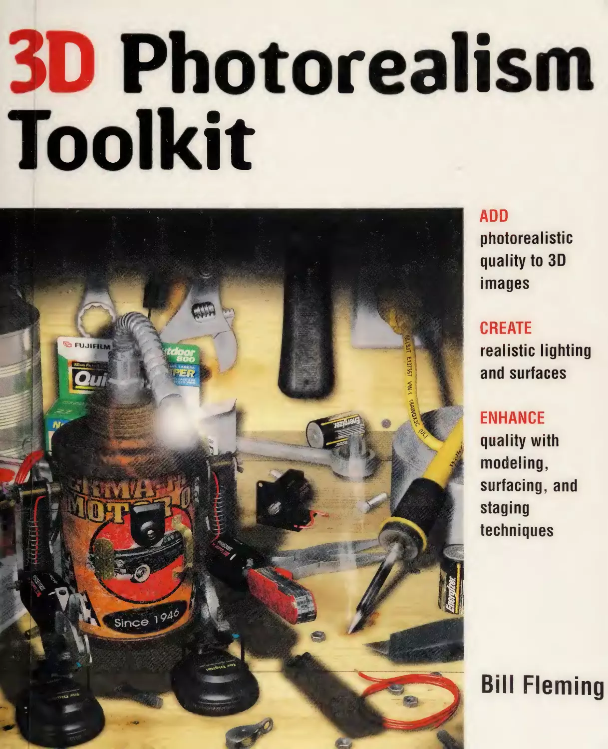
                    3D Photorealism
Toolkit
ADD
photorealistic
quality to 3D
images
CREATE
realistic lighting
and surfaces
ENHANCE
quality with
modeling,
surfacing, and
staging
techniques

isiSilSIili

Bill Fleming

Form 178 rev. 1-94

T
385
.F59
1998

Chicago Public Library

RDlETDt.Dt.Tb
HWLCTC

3D photorealism toolkit,

3D Photorealism Toolkit

Digitized by the Internet Archive
in 2018 with funding from
Kahle/Austin Foundation

https://archive.org/details/3dphotorealismto0000flem

3D Photorealism
Toolkit
Bill Fleming

WILEY COMPUTER PUBLISHING

JOHN WILEY & SONS, INC.
New York • Chichester • Weinheim • Brisbane • Singapore • Toronto

Publisher: Robert Ipsen
Editor: Cary Sullivan
Assistant Editor: Kathryn A. Malm
Managing Editor: Brian Snapp
Electronic Products, Associate Editor: Michael Sosa
Text Design & Composition: North Market Street Graphics, Lancaster, PA
Designations used by companies to distinguish their products are often claimed as trade¬
marks. In all instances where John Wiley & Sons, Inc., is aware of a claim, the product
names appear in initial capital or ALL capital letters. Readers, however, should con¬
tact the appropriate companies for more complete information regarding trademarks
and registration.
This book is printed on acid-free paper. @
Copyright © 1998 by Bill Fleming. All rights reserved.
Published by John Wiley & Sons, Inc.
Published simultaneously in Canada.
No part of this publication may be reproduced, stored in a retrieval system or transmit¬
ted in any form or by any means, electronic, mechanical, photocopying, recording, scan¬
ning or otherwise, except as permitted under Sections 107 or 108 of the 1976 United
States Copyright Act, without either the prior written permission of the Publisher, or
authorization through payment of the appropriate per-copy fee to the Copyright Clear¬
ance Center, 222 Rosewood Drive, Danvers, MA 01923, (508) 750-8400, fax (508) 7504744. Requests to the Publisher for permission should be addressed to the Permissions
Department, John Wiley & Sons, Inc., 605 Third Avenue, New York, NY 10158-0012,
(212) 850-6011, fax (212) 850-6008, E-Mail: PERMREQ @ WILEY.COM.
This publication is designed to provide accurate and authoritative information in regard
to the subject matter covered. It is sold with the understanding that the publisher is not
engaged in professional services. If professional advice or other expert assistance is
required, the services of a competent professional person should be sought.
Library of Congress Cataloging-in-Publication Data:
Fleming, Bill, 1969—
3D photorealism toolkit / BiU Fleming.
p.

cm.

Includes index.
ISBN 0-471-25346-4 (pbk. : alk. paper)
1. Computer graphics.
display systems.
T385F59

2. Photo-realism.

3. Three-dimensional

1. Title.

1998

006.6’93—dc21

97-52083
CIP

Printed in the United States of America.
10 98765432

HW-.K '

'

•

■

T
PV

-•

V■

J <

A! F -T|.F:£T
i

5

‘

IL ^\rm flDi^

'!

,’V

Si

C.

Contents

Introduction

xi

Overview of the Book and Technology

xii

How This Book Is Organized

xiii

Who Should Read This Book

xix

Tools You Will Need
What’s on the Web Site

xx
xxi

Color Plates

xxii

Getting Started

xxii

PART I

REALITY IS CHAOS

1

Chapter 1_

Chaos—A Reality Primer

3

The 10 Principles of 3D Photorealism

3

Getting Your Hands Dirty

PART II

PHOTOREALISTIC MODELING TECHNIQUES

27

29

Chapter 2

_

Detail—The Main Component of Reality

31

Working with the Viewer’s Expectations

31

V

VI

Contents

Using Familiar Detail to Make Fantasy Objects Photorealistic

34

Creating Detail with Booleans

38

Getting Our Hands Dirty with Boolean Operations

41

More Modeling to Come

48

Chapter 3_

Material—What’s It Made Of?

51

Creating the Manufactured Look

51

There’s More to Come ...

70

Chapter 4_

Construction—How’s It Assembled?

73

The Credibility of Screws

73

Holes, Latches, and Other Common Assembly Items

76

What’s Holding It Up?

83

Time for a Little Mechanics

86

Chapter 5_

Movement—What Are the Mechanics of Objects?

87

Gizmo—A Study of Motion Mechanics

93

Wrapping It Up

97

Chapter 6_

Beveling—The Key to Specular Reality
Creating Specular Reality with Bevels

99
99

Creating and Planning Your Beveled Edges

104

When to Use Bevels

113

Get Ready for a Little Demolition

115

Chapter 7_

Dents and Dings—Aging Your Models

117

Applying Damage to Your Models

119

That Does It for Modeling!

127

vii

Contents

PART in

PHOTOREALISTIC SURFACING TECHNIQUES

129

Chapter 8_

Photorealistic Surfacing Fundamentals

131

Every Surface Must Have a Bump Texture

131

AH Surfaces Must Have Specularity

134

Never Use 100 Percent Diffusion

135

No Image Map Stretching!

140

Apply Aging to AH Surfaces

149

No Repeating Patterns!

155

Putting the Rules of Photorealistic Surfacing to Work

158

Creating Photorealistic Water and Glass

168

Looking Ahead

172

Chapter 9

Image Map Surfaces

173

Finding Source Material

174

Creating Painting Templates

181

Creating Seamless Image Maps

188

Getting Mileage Out of Your Image Maps

195

Exploring the Types of Image Map Surfaces

197

Putting the Image Map Types to Work

210

Taking a Breath

219

Chapter 10_

Procedural Textures

221

Creating Photorealistic Detail with Fractal Noise

223

It’s AH About Where You Put It

230

PART IV

PHOTOREALISTIC STAGING TECHNIQUES

231

Chapter 11_

Planning Your Scene
Becoming a 3D Profiler

233
233

Vlll

Contents

It Takes Two Personalities to Tango

238

Honing Your 3D Profiling Skills

240

Time to Wreak Havoc!

240

Chapter

12

__

Adding Chaos—Creating Clutter

241

The Relationship between Order and Chaos

242

Why Is Chaos Critical for Photorealism?

244

Applying Chaos and Clutter

248

Defining an Object’s Galaxy

251

Determining the Level of Chaos

254

The Three Rules of Chaos Development

257

Balancing Chaos in Your Scenes

260

Justifying Your Chaos

262

Adding Pointless Objects to Create Depth

264

Putting the Chaos Concepts to Use

267

It’s Up to You Now

273

PART V

PHOTOREALISTIC CAMERA AND LIGHTING
TECHNIQUES

Chapter

275

13_

Camera Positioning

277

Creating Emotion with Camera Angles

279

Creating Emotion with Camera Rotation

281

Creating Visual Depth

284

And Then There Was Light. . .

287

Chapter

14__

Lighting for Every Occasion

289

Creating Realities with Radiosity

294

Diffusion and Radiosity

302

Using Lighting Gels

304

Contents

IX

Using Lens Flares

3Q7

Working with Photographs as Source Material

309

It’s All Up to You Now!

310

Appendix A

Modeling and Surfacing Source Material

311

Appendix B

Procedural Metal Attributes

313

Appendix C

Procedural Plastic and Rubber Attributes

315

Appendix D

Index of Refraction Values for Transparent Materials 317
Appendix E

Light Colors Rated in Kelvins

319

Appendix F

The Companion Web Site

321

Index

323

jri. ,.

m

f^rj^

XtK..

"*
V V'

arc

1.

- *\

•■■;:>'. i

7'‘v*‘

"'

S'-

k.,

■ t Na

' •

i

' V <n

- .

; a,

-vr

lf«>J ^rfit’ii i'

J\ /in/

-I t # A

-

Ba#

LV '
■

Wt-V ;‘A-

. .

^ ^

t^r-

.•

til'mdn3:A I ;i'

'■ |••^l•0 '■•"-■*' c

.

■

v

1.

.

,.

;

rip-tlsaa®' *IB|J '.

(i /IM

:Sa'

F.

3 '.ii'i^ rtn/
oip
»

wr

■fll'"{ ’^'

fliOriiH' •t*>^ ‘‘ 4

t^“ f«M i!i<4>'»!> •*;.U I

l|4aC^W7„>

-

»

■? '

.,

,

‘

/J.i/.Fi iA

^iiB »i',W a'K»»iif|fT»o-'

^ iT-

1'-:8''

(IT

I

V nM^it '' • ‘«U .M, ,n i ^ u
S.

,i:4:

i, 41!i* ■ i

■

•t

"i> 'k-i.‘\* •'
'Ol

i

-.

3

I

btii

si f ^

p

r

i ^- ’■
■ I:*-..,

>5 *■■

rs* » '

>■ I#*''- ']y||^' «

.•••.!-I

Introduction

Have you ever sat and stared at the wall of 3D books on store shelves, wondering
which one to purchase? I can’t even count the number of hours I’ve wasted try¬
ing to find specific information on 3D rendering. All the books seem to repeat
the same things but never explore any one topic with enough detail to satisfy the
readers.
Everyday, it seems, there is yet another 3D book added to bookstore shelves.
The majority of them are merely rewrites of the program manual. Sure, they
point out a few things that aren’t covered in the manual but you are still faced
with a small amount of information for a large number of topics. How many
times have you read a 3D book only to be left wanting more? If you’re like me,
this happens all too often. That’s why I decided to write the 3D Photorealism

Toolkit.
So, who am I? Some would say I’m the most neurotic artist they’ve ever met.
Others call me a perfectionist. They are both correct, but I like to refer to myself
as a 3D Chaotician. A 3D Chaotician is someone who focuses his or her efforts on
developing photorealistic 3D images by applying the chaos of reality. Call it an
obsession—my wife does. I probably spend 14 hours a day glued to my computer
screen. There is something about the challenge of creating digital realities that
intrigues me. I’ve always been impressed by the 3D artists who have taken the
time and energy to ensure their images were truly photorealistic. It takes a seri¬
ous commitment to be a photorealistic 3D artist. You don’t have to commit 14
hours of your day but you do need to take the time to add the subtle detail and
nuances that make images realistic. I refer to photorealistic 3D rendering as a
“visual smorgasbord.” A properly constructed photorealistic image has tremen¬
dous depth. It provides viewers with a seemingly never ending source of enjoy¬
ment—they just sit there and marvel at the attention to detail. It gives me great
satisfaction to see the reaction of the people who view a truly photorealistic 3D
image. They are literally lost in the image.
Being a photorealistic 3D artist actually entails more attention to detail than
artistic talent. To be honest, I haven’t done traditional art in more than 20 years.

XI

Xll

Introduction

I probably couldn’t even sketch a simple chair without wearing holes in the paper
where I’ve erased the mistakes. The skill I bring to my 3D work is neurotic atten¬
tion to detail. I’m a firm believer that the term “neurotic” is not always a bad
thing. It’s important that you are committed to the details or your 3D efforts will
fall short of being photorealistic. You have to spend an equal amount of time
researching the work as you do creating it. The goal of a photorealistic 3D artist
is to capture reality—to harness its chaos and reflect it in your work. That’s what
the 3D Photorealism Toolkit is all about. This book focuses on discovering the sub¬
tle, and sometimes not so subtle, nuances of reality and incorporating them into
every 3D image you create.
I use photorealistic techniques every day in my professional career as a 3D
artist. I remember the difficulty I encountered when trying to create photoreal¬
istic images for the first time. I also remember the questions I asked in an attempt
to ease the pain of making the transition to a photorealistic 3D artist. I’ve tried
to answer all of those questions, and more, in this book. I’ve made every effort to
provide you with all the information you’ll need to create photorealistic 3D
images.
The 3D Photorealism Toolkit was written for 3D artists, by a 3D artist. It will pro¬
vide you with a wealth of insight into the creation of photoreahstic 3D images.

Overview of the Book and
Technology
New technology is steadily being developed that expands the capabiHties of 3D
products. Even the most basic 3D programs possess many of the essential tools for
creating photorealistic 3D images. While the capabilities of 3D programs will con¬
tinue to grow, the principles of 3D photorealism will always remain constant. This
book covers countless universal techniques for creating photorealistic 3D images.
These techniques are not fixed to any one specific program; they can be used with
any 3D program on the market. The surfacing and lighting capabiHties will vary
from the low-cost amateur programs to the high-cost professional programs, but
the techniques for photorealistic 3D modeling and staging remain the same.
This book covers the when and where of 3D photorealism. Rather than focus¬
ing on how the technique is done in your specific program, it focuses on the
objective—when and where to use the technique. For example, a Boolean oper¬
ation is the same regardless of the program you own. Therefore, this book covers
where and when to use Booleans instead of illustrating how to perform the oper¬
ation. It would consume far too much space to demonstrate the Boolean opera¬
tions for every 3D program.

Introduction

Xlll

If you use any of the following programs you should read this book: Softimage, Alias,
LightWave, 3D Studio MAX, 3D Studio, Strata, Electricimage, Ray Dream,
trueSpace, Extreme 3D, Animation Master, Houdini, Imagine, and even POV-

P^Y.

How This Book Is Organized
This book is divided into five parts that will take you logically through the
process of developing photorealistic images. Each part is a complete concept,
allowing you to reach closure at the end. You don’t have to read one part to
understand another. If you are interested only in the principles of photorealistic
modeling, you can read Part II and skip the other parts of the book. I do recom¬
mend that you read the entire book if you are interested in the complete process
of developing photorealistic 3D images.

Part I: Reality Is Chaos
Part I contains a single chapter, yet it is probably the most important chapter in
this book. Before you can begin to develop photorealistic scenes you need to
have a complete understanding of the elements that make an image realistic. This
part focuses on showing you how to identify the critical elements of a photore¬
alistic scene.

Chapter 1: Chaos—A Reality Primer
Here is where you lay the foundation for a photorealistic 3D image. Chapter 1
identifies the ten principles of photorealistic 3D images. You wiU examine sev¬
eral photorealistic 3D images and learn to identify the elements that make them
appear realistic. It’s all about taking the time to experience the chaos of reality.
By the end of this chapter you will be looking at real-world objects in an entirely
different way than you ever have before.

Part II: Photorealistic Modeling Techniques
Modeling is where the photorealistic 3D process begins—it’s the foundation of a
photorealistic 3D scene. A solid model is paramount in creating a photorealistic
object. Part II includes six chapters that cover the modeling techniques that are a

XIV

Introduction

fundamental part of developing photorealistic models. Whether you are using
polygons, splines, or nurbs, the information in this chapter will help you add
photorealistic detail to your 3D models.

Chapter 2: Detail—The Main Component of Reality
One of the major flaws in most 3D models is the lack of detail. Real objects are
typically covered with detail. Just examine any multimedia component in your
house and you’ll quickly see that detail is a necessary part of photorealistic 3D
modeling. Chapter 2 covers the basic details of photorealistic 3D models and
shows you how to apply them to your models.

Chapter 3: Material—What’s It Made Of?
Where are the seams? That’s the first question that comes to mind when I see 3D
objects. How often do you actually see a seam in an object? Rarely does a 3D
object have seams, yet all objects in reality are assembled from parts and therefore
contain seams. Chapter 3 covers the importance of adding seams to your models
so they appear manufactured. You’ll learn simple techniques for adding seams to
your existing models.

Chapter 4: Construction—How’s It Assembled?
What happens when you pull all the screws out of your TV? It falls apart! Keep¬
ing this in mind, most 3D scenes should appear as piles of parts since the models
rarely have anything holding them together. Real-world objects are assembled,
which means they need something to hold them together. This is just another of
those details that makes a model realistic. Chapter 4 covers the technique of
adding nuts, bolts, screws, and even glue to your models to make them realistic.

Chapter 5: Movement—What Are the Mechanics of Objects?
Have you ever seen a car move without an axle? You will in most 3D animations.
One of the major elements modelers forget to add to 3D models is the mechan¬
ics of movement. For an object to be photorealistic it must possess the mechanics
for the motion it’s making. All too often you’ll see a robot that is just a collection
of tubes and spheres with no presence of any mechanical hardware for movement.
Chapter 5 focuses on developing motion mechanics for your 3D models. You’ll
learn how to add mechanical detail to your models so they appear reaHstic.

Introduction

XV

Chapter 6: Beveling—The Key to Specular Reality
Beveling is one element that is rarely seen in most 3D models. In the real world,
bevels are simply a treatment to the edge of an object to remove the harsh right
angle that is quite often a hazard. Nearly every object that is manufactured has
beveled edges. This makes it mandatory that you incorporate beveled edges in
your 3D models to make them realistic. Chapter 6 covers where and when to use
beveled edges on your models.

Chapter 7: Dents and Dings—Aging Your Models
How many new things do you own? I mean objects that have no scratches, dents,
or dings. How polished and clean is the world around you? Well, if your world is
anything like mine it could use a visit from “Mr. Clean.” The most common
problem with 3D images is that everything is too perfect. All the objects are clean
and free of any blemishes. Chapter 7 focuses on the techniques for aging your 3D
models. You’ll learn how to beat some reality into them, but more important,
you’ll learn where and when to create dents and dings.

Part III: Photorealistic Surfacing Techniques
Photorealistic surfacing is by far the most complicated aspect of the photorealis¬
tic process. There are many factors to take into consideration when creating pho¬
torealistic surfacing. The six chapters in Part III focus on planning your surfaces
and determining the appropriate surfacing technique to use with your model.

Chapter 8: Photorealistic Surfacing Fundamentals
The first step in surfacing your models is to completely understand the elements
that make a surface photorealistic. Once you have a handle on these elements,
you can determine how to select the surfaces on your object and which surface
mapping method to use. Chapter 8 will help you understand the photorealistic
surfacing fundamentals so you can determine which surfaces to create and how
they will be mapped.

Chapter 9: Image Map Surfaces
Image map surfaces are the most commonly used photorealistic surfacing tech¬
nique. They offer you an unlimited level of detail while providing you with the

XVI

Introduction

means to create photorealistic surfaces. There are eight types of image map sur¬
face that are discussed in Chapter 9: color, luminosity, diffusion, secularity,
glossiness, reflection, transparency, and bump. You will also learn how to cre¬
ate multiple surface types on a single surface, such as plastic and metal, using
image maps.

Chapter 10: Procedural Textures
Procedural textures are an essential tool for creating photorealistic surfaces.
They can save you hours of time that would be spent trying to create the same
effects with image maps. Because procedural textures are truly 3D they offer
unlimited potential for adding photorealistic detail to surfaces. They can be used
to create brushed metal or add dirt to a polished surface to make it appear tar¬
nished. They are by far the most flexible surfacing method. Chapter 10 explores
the most common procedural textures and how they can be used to create real¬
istic surface detail.

Part IV: Photorealistic Staging Techniques
How many images have you seen where everything was in complete order?
Nearly every 3D image is too organized. Reality is chaotic. Don’t let the term
fool you. Reality isn’t complete havoc; it’s just a bit disorganized. There is order
in chaos. For example: The whole chessboard is neatly arranged except for one
piece that is ofl* center. Now that’s realistic staging. Part IV has two chapters that
focus on developing realistic scenes by creating chaos and disorder. You’ll learn
how to create imperfections in your staging that look natural and help create a
photorealistic scene.

Chapter 11: Planning Your Scene
Planning your scene is a very important step in the 3D photorealism process. A
poorly planned scene can look artificial in spite of the model and surface quality.
The foundation of proper scene planning is an in-depth exploration of the char¬
acters responsible for creating the scene. Not you, but the fictional characters—
whether they are present in the image or not. Once you understand their
personality, you can properly stage the scene so it makes sense. Chapter 11
explores the five major personality types and how they can be used to plan your
scenes so they appear photorealistic and believable.

Introduction

xvii

Chapter 12: Adding Chaos—Creating Clutter
Chaos is a fundamental ingredient of photorealistic 3D images. Nothing makes a
scene look more artificial than uniformity. In order for a scene to look photoreal
it needs to have an element of chaos. Knock over one of the chess pieces, hang
the picture on the wall crooked, move a chair away from the table, you get the
idea. There is order in chaos but not uniformity. Chapter 12 shows you how to
stage a scene so it doesn’t look planned or artificial.

Part V: Photorealistic Camera and Lighting Techniques
Camera and lighting techniques are the cornerstones of a quality photorealistic
3D image. They influence the mood of the image. If you shot a clown from a low
angle with dim lighting he’ll end up looking dark and sinister. The same clown
from a higher camera angle in bright light looks happy. The two chapters in Part
V focus on illustrating techniques for properly lighting a scene and demonstrat¬
ing the proper camera angles for nearly every occasion.

Chapter 13: Camera Positioning
One of the major flaws in most 3D images is a poor camera angle. The camera
angle helps depict the mood of the scene. All too often 3D scenes are shot from
sterile camera angles that flatten the depth of the scene. Chapter 13 wiU explain
where and when to use specific camera angles. You will also learn how to use
camera zoom and focal lengths to change the mood of the image.

Chapter 14: Lighting for Every Occasion
Lighting can make or break a photorealistic scene. There are many different light¬
ing possibilities depending on where the scene is located; that is, indoors or out¬
doors. Your scene may require direct sunlight or it may need a soft and subtle
diffused light. Using the wrong lighting can make your scene appear artificial
even though you may have incredibly photorealistic models and textures. Chap¬
ter 14 focuses on determining the proper lighting technique for every scene.
You’ll learn where and when to use different types of lighting.

XVlll

Introduction

Appendixes
The six appendixes cover resources for modeling source material, surface attrib¬
utes for metal, plastic, and a variety of other surfaces, index of refraction values
for transparent surfaces, and a complete visual reference of the bonus items on
the companion Web site.

Appendix A: Modeling and Surfacing Source Material
Photorealistic modeling requires good source material. It can be very difficult to
find high-quality color images of objects you wish to model and surface. Appen¬
dix A contains a comprehensive listing of resources for visual modeling reference.
These books contain outstanding visual references for thousands of common
items ranging from insects to military weapons.

Appendix B: Procedural Metal Attributes
Creating the right surface attributes for metals can be very time consuming. I
spent months perfecting the values for more than 30 common metals. In Appen¬
dix B, you’ll find a complete listing of the surface attributes for those metals. The
information includes surface color, diffusion, secularity, glossiness, reflectivity,
and bump values.

Appendix C: Procedural Plastic and Rubber Attributes
Creating the right surface attributes for plastics and rubber is no less time con¬
suming than metals. In Appendix C, you’ll find a complete listing of the surface
attributes for 15 forms of plastic and rubber. The information includes surface
color, diffusion, secularity, glossiness, reflectivity, and bump values.

Appendix D: Index of Refraction Values for Transparent Materials
One of the most common problems with 3D photorealism is simulating the nat¬
ural index of refraction that occurs with transparent materials. Appendix D gives
you a complete listing of Index of Refraction values for 25 transparent materials
ranging from glass to lead crystal.

Appendix E: Light Colors Rated in Kelvins
Determining the proper light colors can be very difficult, particularly when there
are so many variations. Fortunately there is an answer. You’ll find a very com¬
prehensive listing of the light sources and their Kelvin rating in this chart.

Introduction

XIX

Appendix F: The Companion Web Site
Refer to Appendix F for a listing of everything you’ll find on the companion
Web site, including bonus models and map textures.

Who Should Read This Book
This book is for all 3D artists who desire to take their images to the next level. If
you are truly dedicated to making photorealistic 3D images you should read this
book. Most of the 3D books I’ve read seem to throw the word photorealistic
around like the multimedia industry once did with the word interactive. It’s easy
to call an image photorealistic; it’s another thing to take the time to really make
the image realistic. I have a simple definition for photorealism: if it looks like a
photograph, it’s photorealistic—no more, no less. A 3D television isn’t photo¬
realistic unless it has seams and screws holding it together. A couch isn’t photo¬
realistic unless the seat cushions have a depression in the middle. And, of course,
nothing is photorealistic if it’s perfect. If you want to create 3D images with
unprecedented levels of photorealistic detail then this book is for you.
If you fall into any of the categories below you should read this book:
Seeking a Career in 3D:

If you are seeking a career in 3D graphics this book

is a must. Although there are literally thousands of 3D artists seeking work,
only a handful are capable of generating photorealistic 3D images. A profi¬
ciency in creating photorealistic images puts you at the top of the stack of
resumes in the major studios. You should read the book cover to cover
because it will give you a distinct advantage in the job market.
Multimedia/Games:

If you are in the multimedia or game industry you are

well acquainted with 3D graphics. 3D effects have permeated every aspect
of your industry. Where it was once acceptable to use 2D or low-quality 3D
graphics it is now required that you create photorealistic effects. Competi¬
tion is fierce, forcing you to keep improving the quality of your 3D graph¬
ics. In this book, you’U discover hundreds of techniques for wowing your
customers and clients with photorealistic 3D effects.
Film/Broadcast:

No industry is more particular about the quality of 3D

work than yours. Every form of visual media is being saturated with 3D
graphics, whether it’s needed or not. From virtual sets to animated stunt
characters, 3D effects have become a part of nearly every film and broadcast
production. Traditional special effects are being replaced with digital effects.
This book will provide you with the knowledge to create photorealistic sets
and props for your next project or production.

XX

Introduction

Print Media:

Computer graphics have taken your industry by storm. More

3D graphics are popping up in print media every day Your industry is prob¬
ably the most challenging when it comes to photorealistic 3D. Unlike the
film industry where most things move by you too fast to really get a good
look, your work lies there motionless so even the smallest flaw can stand out
like a beacon. This book will show you countless techniques for creating
eye-popping photorealistic images that will keep your viewers glued to the
page.
3D Modelers:

You are the foundation of every 3D image. It all starts with

modeling. If you want to know the secrets of making photorealistic models,
you should dive right into Part II. You’ll discover dozens of proven tech¬
niques for adding photorealistic detail to your models.
3D Texture Artists:

There is no more important element of photorealistic 3D

than the textures. You are saddled with the responsibihty of creating the eye
candy. It’s up to you to create realistic textures that make the model photore¬
alistic. You’ve mastered the painting technique but now you want to learn the
elements that make a texture realistic. You should skip ahead to Part III where
you’ll learn how to add subtle nuances to your texture to make them undeni¬
ably reahstic.
3D Staging and Lighting Technicians:

You’re sitting there with a pile of 3D

models that have beautiful textures and now it’s up to you to package them
in a photorealistic environment. Part IV will show you how to mimic the
chaos of reality in your scenes. You’ll learn techniques for making your
scene look natural, not staged. You’ll also learn techniques for lighting every
situation you’ll encounter.
Hobbyists:

You’ve been experimenting with 3D and you really want to do

something spectacular. Let’s face it, you want to show the world what
you’re capable of doing. You want to leave them dumbfounded when they
look at your 3D images. Well, you’re only 300+ pages away from doing just
that! Remember this, photorealistic 3D entails more attention to detail than
artistic talent. Let everyone else be artistic; you’ll be photorealistic.
Whether you are an amateur or a professional you will benefit from reading
this book. In short, if you are a 3D artist who’s interested in creating photoreal¬
istic images, read this book!

Tools You Will Need
You will, of course, need a 3D program to take advantage of the information this
book has to offer. Any 3D program is fine—the principles and techniques are not

Introduction

XXI

limited to any one program. I do recommend that you purchase Softimage, Alias,
Light Wave, or 3D Studio MAX if you are interested in exploring all the resources
described in this book. The lower-priced programs typically lack a few of the
surfacing and lighting features that make photorealistic 3D images possible. You
can still create great looking photorealistic images with the lower-priced pro¬
grams; the quality just won’t be as high as the professional programs.
You will require a working knowledge of the modeling, surfacing, staging, and
lighting aspects of your 3D program to grasp the concepts in this book. The main
focus of this book is to illustrate the principles and techniques of 3D photoreal¬
ism. It doesn’t cover product-specific examples. If you are just beginning to
explore 3D you should become more acquainted with your program before
beginning to read this book.
You will also need a painting program such as Photoshop. This is an important
tool when creating the different types of image maps. Some Photoshop tech¬
niques are described in Part III, but the same techniques can be applied with
Fractal Painter and Corel’s Photopaint.
The last item you need is dedication. You have to be dedicated to creating
photorealistic 3D images. It doesn’t happen overnight. It takes practice and
experimentation. In time, it will become second nature. You won’t even have to
think about doing it.

What’s on the Web Site
The companion Web site contains a variety of support materials for creating
photorealistic 3D images. The support materials of the examples discussed in this
book are provided in a common format that can be used by any program on any
platform. The bonus models on the Web site are available in several common for¬
mats. The bonus Image Maps are in a TGA format.
Here’s what you’ll find on the Web site:
• Support materials for exercises discussed in the book
• A 3D photorealism gallery
• Free photorealistic models
• Free photorealistic image map textures
• Update to the book
• And links to dozens of photorealism resources
The 3D Photorealism Toolkit companion Web site is located at www.wiley.com/
compbooks/fleming.

XXll

Introduction

Color Plates
Inside you’ll find several photorealistic images on the Color Plates. These images
are provided to give you an idea of what is possible if you closely follow the prin¬
ciples of 3D photorealism. Sure, they’re a bit complicated and highly detailed,
but these elements will become second nature to you in very little time. You’U
soon find yourself applying painstaking detail to your images so they become
ultra-realistic.

Getting Started
Photorealistic 3D can be the hardest thing you’ll ever accomplish if you don’t
understand the techniques and principles. Fortunately, you currently have these
techniques and principles at your fingertips. After reading this book you’ll find
3D photorealism to be one of the easiest endeavors you’ve undertaken. You are
only 300+ pages away from knowing everything you’ll need to create stunning
photorealistic 3D images. What are you waiting for—dive in!

I remember a conversation I had with one of my modelers several
months ago. We were critiquing an image I had just completed for an
animated short film. While he was very impressed with the photore¬
alistic quality of the image, he was also concerned that it was too clut¬
tered . . . too cluttered? Let’s examine that statement. Saying that a
photorealistic image is too cluttered is sort of an oxymoron. That’s
like saying a ball is too round. 3D artists have become accustomed to
seeing purity in computer-generated images. We’ve seen so much of
it that it has altered our perception of reality. We’ve come to accept
neat and spotless images as photorealistic. The term photorealistic
implies that the image resembles a photograph. In other words, it
mimics reality. Somewhere along the line the term photorealistic has
been downgraded to meaning something that’s close to realistic but
not quite there. The same thing happened with the term interactive in
the multimedia industry. Suddenly every program was interactive!
The reality was that only a handful of the programs were actually
interactive. As 3D artists we need to strive for more. We can’t stop at
close to photorealistic and make the jump to realistic by simply call¬
ing it photorealistic. The difference between a near photorealistic
image and one that’s truly realistic is marginal. It’s all a matter of tak¬
ing the time to add the subtle detail that transforms the image into
something photorealistic. If you are willing to dedicate yourself to
taking that extra step toward realism then turn the page and get ready
for a little chaos!

2

Part 1: Reality Is Chaos

VISIT THE COMPANION WEB SITE FOR COLOR
IMAGES.
Before you begin Part I, go to Appendix F and learn about the companion Web site, located
at www.wiley.com/compbooks/Jleming. All of the figures shown in this book are included,
in color, on the companion Web site. I recommend you visit the site and view the images
while you read the book, or download the images for faster reference. There will be details
in the figures that you can't see in the printed image.

Chaos—A Reality
Primer

What makes an image photorealistic? Actually there are literally thousands of
things that make an image photorealistic but they all fall into 10 categories that I
call “The Principles of 3D Photorealism.” These principles are the guidelines to
ensure that an image is photorealistic.

The 10 Principles of 3D Photorealism
1. Clutter and Chaos
2. Personality and Expectations
3. Believability
4. Surface Texture
5. Specularity
6. Dirt, Dust, and Rust
7. Flaws, Scratches, and Dings
8. Beveled Edges
9. Object Material Depth
10. Radiosity
All you need to do is take a look at your image and compare it with the 10
principles of 3D photorealism. Your image must conform to at least eight of the
principles for your image to be considered truly photorealistic. For example, an
out-of-the-box-, factory-new object, would not require principles 6 and 7 because
it is new, but it would still need the other eight principles to be photorealistic.
There you have it. Ten simple principles to use as guidelines in your 3D pho¬
torealism endeavors. What are they aU about? I was hoping you would ask. This
chapter briefly outlines each of the principles so you have a basic understanding

3

4

Chapter 1

of their application. We will be doing an in-depth exploration of each principle
in the coming chapters.
Let’s take a moment to examine each of these principles by seeing how they
were applied to this book’s cover image. Before we get started with the princi¬
ples, it’s important to understand the background behind the image. This helps
you to understand how and why the principles of 3D photorealism were applied
to the image.
Dwellers is a 3D animated short film currently in production at Komodo Stu¬
dio, a 3D studio in Southern California. It’s about a race of cognitive thinking
robotic creatures that were created by an old toy maker named Papagaio. Papagaio created the first Dweller, Gizmo, in his basement workshop. To make a short
story even shorter, Papagaio built Gizmo out of discarded junk and parts he scav¬
enged from both new and old items. The Dwellers are built from actual realworld parts. This helps to establish their photorealistic credibility. This also helps
determine the modeling and surfacing attributes . . . not to mention the
mechanics of motion.
Figure 1.1 shows Gizmo on Papagaio’s workbench where he was created. The
scene takes place at around 1 AM in the basement of Papagaio’s house. He doesn’t
want anyone to find out about the Dwellers, so he uses only a shop light to iUu-

Figure 1,1 Gizmo in Papagaio’s workshop.

Chaos—A Reality Primer

5

minate the workbench. He’s just finished adding the circuit board that is Gizmo’s
brain. The scene has captured the moment at which Gizmo comes to life.
Now that you have a basic understanding of the story behind the scene, let’s
take a look at those Principles of 3D photorealism and see how they were applied
to the Dwellers image.

Principle 1: Clutter and Chaos
There is much more to photorealism than applying real image textures to your
objects. The way that you stage a scene can impact the realism. For example, a
table with aU the chairs rotated at 90-degree angles and moved to the exact same
distance from the table looks too planned. Even if the textures are amazingly real
the scene will end up looking like a shot of Barbie’s dream house. It just won’t
look natural. It is important to add chaos and clutter to your 3D scenes to paint
a little reality in the picture.
Clutter is one of the most obvious traits of reality. The common problem in
most 3D rendered scenes is the lack of clutter—they are too sterile. Everything
is neatly arranged. I don’t know about your world but the world I live in is in
complete chaos. Look around your home or office. What do you see? Well, if it’s
anything like my studio you see stacks of reference books, piles of papers, flop¬
pies, zips, and an assortment of knick-knacks. Basically, pure CHAOS.
Reality is pure chaos. Chaos doesn’t mean that everything is completely dis¬
organized. There is actually order in chaos. Chaos means that everything in the
scene cannot be aligned perfectly. You can create order by putting all the chess
pieces on the board but chaos dictates that they will be rotated at slightly differ¬
ent angles and none of them will be in the middle of their space. There is no uni¬
formity in reality yet, for some reason, 3D rendered scenes defy reality by neatly
arranging everything. Actually, the reason is simple. 3D programs present us with
countless tools for engineering our creations. Because we are submersed in this
engineering environment we feel compelled to be linear in our thinking. It’s far
too easy to get caught up in the rigidity of 3D engineering. You need to break
loose of the engineering binds of 3D and experience the creative side.
Try to make it a habit to place things out of alignment in your scenes. Not dra¬
matically out of alignment, because that would be too much chaos, but a little
out of alignment. You’ll see it makes a big difference in the photorealism of the
scene.

TELL ME MORE
In Chapter 12, you'll learn a number of techniques for applying clutter and chaos to
your scenes.

6

Chapter 1

COMBINE BOTH CHAOS AND ORDER TO
CREATE WINNING PHOTOREALISTIC SCENES.
While it^s important to add clutter it is also equally important to add balance. If a scene is
too out of balance it will be uncomfortable to view. A solid photorealistic 3D scene combines
the chaos of reality with the balance we desire. For example: Placing chairs around a table
is order, rotating them all to slightly different angles is chaos. Reality formula: Order +
Chaos = Reality.
Now let’s see how the clutter and chaos principle was applied to the work¬
bench scene. Take another look at Figure 1.1. You’ll notice an abundance of clut¬
ter. This is a workbench, and I haven’t seen a workbench that is neatly
arranged . . . particularly when it’s in use. There are nuts, bolts, and screws scat¬
tered everywhere. And yet, there is still an element of order in the tools that are
neatly stored on the wall rack. You can’t go wrong by combining chaos and
order. Notice the subtle chaos in the scene. One of the two batteries has fallen
over. The camera box is turned away from the wall slightly. The needle-nose pli¬
ers are open and the red wire isn’t coiled perfectly. Probably the best use of chaos
is the hot soldering iron that is burning the workbench. I don’t recommend
doing this in your workshop, but I don’t recall the last time I saw anyone use a
heat synch with a soldering iron . . . that would be too much of a hassle for the
busy craftsman.
Speaking of the craftsman, it’s very important to understand the personality of
the characters involved in your scene. This takes us to the next principle of 3D
photorealism: personality and expectations.

Principle 2: Personality and Expectations
What does personality have to do with 3D photorealism? Everything! It’s impor¬
tant to realize that people create their environments. In this world, few sanctuar¬
ies exist that people have not altered. Because of this, nearly every 3D scene has
some element of human intervention. Of course, it’s not just people we’re talk¬
ing about here. It could be animals, aliens, or even insects. Every creature has a
distinct personality that it reflects in its environment. They have a particular way
of doing things. It may be sloppy, neat, or completely chaotic, but they definitely
have a way they like to structure their environment. You need to dedicate some
time to exploring the theoretical creators of your scene. Even though a character
may not be featured in the scene, it was most definitely created by someone or
something. You need to understand their personality to properly construct a
photorealistic scene.

Chaos—A Reality Primer

7

Expectation Is a Large Part of Photorealism
When exploring the personality of your scene’s creators, it’s important to con¬
sider the viewer’s expectation. We have come to stereotype nearly everyone and
everything. While stereotypes may not always be flattering, they do provide you
with perfect guidelines for developing your photorealistic scenes. Stereotypes
don’t limit your creativity; instead they provide you with simple guidelines for
ensuring your work will be recognized as photorealistic.
For example, we assume that intelligent people are neat. And, of course, that less
intelligent people are sloppy. While this may be true in some cases it certainly
doesn’t apply to everyone. Still, when developing a scene created by an inteUigent
character you should aim for neatness to make the scene believable to the viewers.
Another example would be how the intelligent character looks. What would hap¬
pen if you made a scientist a buff, handsome hunk? The answer is simple—nobody
would beheve he was smart. Hollywood has conditioned us to believe scientists are
skinny, nerdy-looking guys with glasses and pocket protectors. We’ve also been
programmed to beheve that muscle-bound macho men are dumb as dirt. You can’t
escape the stereotypes and expect the scene to be credibly photorealistic. Even
though it may be completely reaHstic looking there will still be some doubt in the
viewers’ mind due to their expectations. It would be like fighting millions of years
of evolution. Everyone has been stereotyped . . . even 3D artists.
Let’s see if we can extract Papagaio’s personality from the workbench scene.
Take a look at Figure 1.1. Immediately you can see that he has a neat side to his
personality since there are tools carefully hung on the wall rack. This tells you
that he respects his tools and workspace. You’ll see some aging on the tools but
they are still in great condition. The workbench surface is dirty but it doesn’t
have a lot of damage like paint stains and gouges. Even the wire is coiled up
neatly as opposed to being knotted. These are all subtle expressions of his per¬
sonality. We have to assume that Papagaio is rather intelligent since he has created
an artificial life form capable of cognitive thought. Therefore, by stereotype def¬
inition, he is neat. But because he is an inventor, a messy stereotype, his work¬
space is cluttered while he is working. He probably cleans it up after he’s done.
We can also assume, since he is an inventor, that he will have reference books
piled on his workbench. This justifies the book in the scene.
You can see how the scene is starting to make a great deal of sense based on
the personality of Papagaio. It’s very important to get inside the head of the char¬
acters responsible for the development and maintenance of the scene you are cre¬
ating. It’s also a lot of fun.

Working with the Viewer’s Expectations
It is also important to get inside the heads of your viewers to understand their
expectation of the scene. We have come to expect certain attributes of particu-

Chapter 1

lar scenes and environments. For instance: We expect an industrial factory to be
dark and dirty; a movie theater to be littered with popcorn and empty cups;
spaceships to be covered in grease stains; monsters to be very ugly with huge
fangs; and dinosaurs to be earthtone colors—you get the idea. We have been
conditioned by our experiences to make assumptions about the nature of things.
The media have played a major role in defining our expectations. When was the
last time you saw a spotless factory in the media? Probably never, but there are
actually many factories that are extremely clean. Yet, if I were to show you a
spotless factory scene you would say it didn’t look realistic because there wasn’t
any dirt. How can a factory operate without making a mess? We can’t accept a
spotless factory, because the media has taught us that it isn’t possible for a fac¬
tory to be clean.

UNDERSTAND THE VIEWER’S EXPECTATIONS
BEFORE YOU BEGIN YOUR PROJECT.
People have predefined expectations of things. Over time they are conditioned by their envi¬
ronment to expect certain attributes in real objects. For instance: Grass is green and the sky
is blue. It’s what they are used to seeing. If you include objects in your scene that have
unexpected attributes you will lose photorealistic credibility . . . even if it looks great. An
aurora borealis would be unrealistic to people who haven’t seen one.

Here’s a great example of the expectations we create ourselves: If I showed
you a render of a dinosaur with bright colors you would say it was artificial, in
spite of the fact that dinosaurs were most likely very colorful. Because of their
size and skin texture, we tend to compare dinosaurs to current day behemoths
like elephants. But these are also pachyderms—pachyderms don’t have colorful
skin. These skin colors wouldn’t make sense for a dinosaur since they were rep¬
tilian and reptiles are very colorful, particularly the males. They were depicted
with subtle tones by the media because we wouldn’t expect them to be color¬
ful. This brings up an important point. You need to conform to people’s expec¬
tations in spite of the fact that they may be occasionally misguided. It’s all part
of making the scene believable, which just happens to be the next principle of
3D photorealism.

TELL ME MORE
You’ll learn more about designing scenes based on personality and expectation in Chapter
11, ''Planning Your Scene. ”

Chaos—A Reality Primer

9

Principle 3: Believability
What makes a 3D scene believable? Probably the most important aspect of
believability is recognition. The objects and/or surfaces in the scene must be rec¬
ognizable to be believable. They must be familiar to the viewer. Otherwise they
have no basis for determining the photorealism of the scene.
There are two types of believability: models and surfaces. You don’t need to
have both to make an object believable. For example, a futuristic spaceship isn’t
a real object, but if the surfaces are something we expect, the object becomes
believable. The opposite also applies. If you had a photoreal model of a computer
screen that was painted with psychedelic colors it would still seem believable, in
spite of the strange colors, because a computer monitor is a familiar object. It
would be a bizarre choice of coloration but the computer just might belong to a
Grateful Dead fanatic.
Another good example of believable surfaces would be the dinosaur we dis¬
cussed earlier. A colorful dinosaur wouldn’t be believable even if the model was
physiologically perfect. We just don’t accept the colors. On the other hand, an
earthtone dinosaur with flaws in the physical design would be believable. There
are only a few cases where we have preconceived notions for the physical struc¬
ture of a dinosaur. The T rex is a perfect example of a dinosaur’s physical struc¬
ture that we have come to expect. The media has told us that the T rex has tiny
arms. Any deviation from that structure and the creature becomes less believable.
We wouldn’t buy into a T rex with large upper arms, even if the surfacing is
something we expect.
Let’s take another look at Figure 1.1. What makes this scene believable? Actu¬
ally there are many things. First and foremost, the scene is comprised of all realworld objects. Most of the objects in the scene are recognizable to everyone,
particularly the tools. They lay a solid foundation for believability. The book is
another element of believability. It adds credibility because it is easily recognized
as a real-world object. All of these items add a great deal of believability to the
scene but the batteries really bring it home. Take a look at the batteries in Figure
1.2. They are the most recognizable objects in the scene. This helps build photo¬
realistic credibility for the entire scene. Key photorealistic objects, like the bat¬
teries, are referred to as object anchors.

Using Photorealistic Object Anchors to Make Your Scenes Believable
One of the best ways to ensure viewers perceive your scene as photorealistic is to
use object anchors. An object anchor is a recognizable object that has undeniable
photorealistic attributes. More often than not, it’s a simple object, usually one
that is surfaced with real-world texture maps. These are the easiest objects to

10

Chapter 1

Figure 1.2 Believable objects are a necessary element of photorealistic scenes.

make photorealistic. It can be as simple as a product box with scanned textures or
may be a book with a commonly seen cover.
It’s important to make the distinction between objects that are recognizably
photorealistic and those that appear realistic. For example, a chair is not an object
anchor because it isn’t immediately recognizable. We know that it’s a chair, but
we probably haven’t seen the specific chair that’s in the scene. While it may be
realistic, it isn’t recognizably photorealistic. Objects like furniture are not good
object anchors because their styles are too varied. An effective object anchor
needs to have detailed familiarity. It needs to be a very specific object that we fre¬
quently see in our daily lives. A box of cereal is an excellent object anchor, par¬
ticularly if the textures were scanned from an actual box. Who hasn’t seen a
Wheaties box? The cereal box is a great object anchor because all cereal boxes are
constructed the same way. It’s the object’s construction that makes it a solid
object anchor.
It’s important to note that the texture you apply to the object anchor must fall
into the guidelines of what the viewer expects. This means you can’t change the
basic layout of a cereal box without losing its photorealistic credibility. We are
accustomed to seeing a specific layout for cereal boxes; for example, the manu-

Chaos—A Reality Primer

11

facturer’s name at the top of the box; a product name underneath the manufac¬
turer’s name; a picture of the cereal under the product name; a nutritional label
on one side panel; and something gimmicky on the other side panel; and, of
course, some kind of bonus offer on the back. If you dramatically alter this design
with your textures you’ll negate the object’s credibility.
Another excellent object anchor is a battery. All batteries are basically shaped the
same. They are commonly seen items and the viewer is actually fairly flexible on
the texture design. Figure 1.1 makes good use of a battery to establish beHevabiHty.

ALWAYS ANCHOR YOUR SCENE WITH
RECOGNIZABLE OBJECTS.
Recognizable objects lend credibility to a photorealistic scene. They add that undeniably real¬
istic anchoring element. If viewers are convinced that one object is real they are likely to
assume all the other objects are real, thereby becoming less critical of the scene^s photorealism.
To see a closer view of the batteries, take another look Figure 1.2. While the
model is nice, it’s the textures that makes it believable. The object’s surfacing
matches the real-world object so well that you can’t teU the difference. Adding a
believable object like this gives the whole image great leverage in convincing the
viewer that it’s real. If viewers believe that one object in the scene is real, they are
Hkely to assume the whole thing is real. This can be a great benefit when creating
photoreahstic scenes. Object anchors are a critical part of every photorealistic scene.
While the object anchor is crucial to the scene’s believabiHty, it doesn’t need to
be the main focus of the scene. The batteries in Figure 1.1 are a very small element
in the scene. Gizmo, the robot, is the main focus of the scene. The batteries were
added to anchor the photoreahsm of the scene, and build more credibility for the
fantasy robot object. Actually there are several anchors in this scene. The book and
camera box are also powerful object anchors that solidify the scene’s photoreahsm.
Books and product packages are very famihar objects that make them perfect object
anchors. This brings us to another aspect of believabiHty; object famiharity

Using Familiar Objects to Make Fantasy Objects Photorealistic
Familiar objects play a major role in a scene’s photorealistic credibility. Familiar
objects are a little different from object anchors. Object anchors are used as a
foundation of the scene’s photorealism. Familiar objects are used to make fantasy
objects appear realistic. For instance, to make a futuristic car that flies appear real¬
istic, we add familiar components to the body such as: headlights, running lights,
turn signals, bumpers, windshield wipers, rear view mirrors, and so forth. These
are all familiar objects that make the fantasy object appear realistic. Gizmo, the
robot, is a great example of a fantasy object that incorporates familiar objects.

12

Chapter I

lake a look at l'ie;ure 1.3. I'.ven though Coznio isn’t a real-world obu'et, he is
eoinprised of very faiuiliar real-world parts. You ean iininediateK' identify his
right arm as a Swiss .\rmy knife, and the speaker on his baek is quite tainihar as
well. If you take a eloser look you’ll reeognize his feet as headphone speakers.
.\nd, of eourse, his body is an oilean—it eyen says it on the label. .Ml ot these
real-world objeets help to make Cizmo beliewible in spite ot the taet that he is
eompletely imaginary.
You should make an etbort to inelnde familiar objeets in the eonstruetion ot all
your fantasy objects, bhere will be eases where the t'antasy object is too sophisti
eated or too old to incorporate tamiliar objects. In these situations, you need to
focus your etborts on creating beliey.ible surfaces. 3P photorealism principles 4 to
7 explore the snrtacing guidelines.

Principle 4: Surface lerture
.\ll real-world objects haye snrtace texture. Now don’t contuse the term :c‘.yr:.'c‘
\\dth the reference commonly used in the 30 industry. I'exture does not mean
the coloration of the object. In fact, the proper term tor texture is the anighness
or smoothness of the object surface. It’s the snrtace attribute that you can teel. ,\d
obiects h.iye some form of surface texture. Yes. including the smooth ones.
common problem with the 30 objects snrtacing is that thcN' are almost
alw.iys too smooth, brequently you will see polished wood that’s as smooth, as
glass. This just isn’t realistic. The yarnish will contorm to the natural texture v^t
the wood’s grain, le.iying yery subtle yariations in the varnish texture. The only
\yay to get smooth varnish is to coat the wood with seyeral l.iyers and then .sand
the final l.iyer smooth. I'his just isn’t done unless you want to mortgage your
house to buy a wooden desk. You could hypothesize that the wood is an artif.
cial yeneer but then nobody would want to admit to using artificial wood m t’n.en
scene. You could try sanding the wood until it is completely snK''Oth. but tins
wouldn’t work well either. Wood has a natural grain. To completeK' remoye an\
surface texture, you would h.iye to sand all the wood aw.iy . . . this just isn’t a
yery practical solution. Keep in mind that just because you can’t feel a texture
doesn’t mean it’s not there. The texture m.iy be too subtle to teel. but it \yi'.i detinitely show up in the object’s specularity—particularly if the vdyect is ammated

ADD SI KFACl

I KM l KK TO KVl HY

PHO rOKKALlS ri(. OBJ I P I .
i:VcT}'

cf/tvr in your pfiotorculisiic scenes should Ilwo some leirl or su’'\:.e ‘r:>

h cdti he procedural or inuiye hosed hut it must he included to
Without surUce humps, the ohiects' specuLinty u'lll oppeof unfeodsric.

.'f'c'

'C.;

Figure 1.3 Object recognition is an important part of 3D photorealism.

13

14

Chapter 1

Another factor of varnished wood is the very subtle bump that the varnish
itself creates. When the varnish dries there are very tiny air bubbles trapped under
the surface; you can’t see these from any distance but if you plan to shoot a closeup of an object on a varnished table, you’ll need to add the varnish bump. Once
again, you won’t really see the bump but you will see the visual impact on the
specularity and reflectivity of the wood.
Take a look at Figure 1.4. This is a close-up shot of the tools on Papagaio’s
workbench. You can see a subtle bump texture on the wrenches against the wall.
Shop tools are primarily made of chrome alloy. Chrome alloy usually has a slightly
rough surface that is quite often brushed. There are also many chrome alloys that
have an irregular bumpiness to their surface. This texture is essential for the tools
to appear photorealistic. There is also a very subtle brushed bump map on the
neck of the light. This texture is not really obvious in a still shot, but it’s very
apparent when the neck is animated. It affects both the specularity and the reflec¬
tion. Of course, there is a subtle texture on the wood. You have to look close, but
you will see small lines between the larger grain lines. This is that tiny texture that
can’t be felt but can be seen upon close inspection. While this texture isn’t neces¬
sary for distance shots it becomes an important part of close-up shots.

Figure 1,4 Real-world objects have surface texture.

Chaos—A Reality Primer

15

I know I’ve been picking on wood, but it’s not the only surface that requires
a bump map. You’ll need to add surface texture to all the photorealistic objects in
your scene—particularly surfaces such as plastic, rubber, metals, fabric, and even
paper. Take a look at any multimedia component in your house. You’U notice the
plastic has a minor roughness to its surface. If you don’t incorporate that texture
into the 3D-rendered version of that object, it won’t be photorealistic. Even
smooth plastic objects have minor surface distortion that impacts their specular¬
ity. Specularity is a critical element of surface realism. It’s also the fifth principle
of 3D photorealism.

>

TELL ME MORE
You’ll see many examples on applying surface textures in Chapter 9; ‘‘Image Map Sur¬
faces, ” and Chapter 10, “Procedural Textures. ”

Principle 5: Specularity
Simply put, specularity is the reflection of the light source on the object’s surface.
It’s a bright spot that the human eye uses to determine the surface’s shininess and
hardness. Specularity is a very important aspect of 3D photorealism. It’s neces¬
sary to add specularity to mimic the real-world attributes of the surface. Without
specularity, the object would appear dull, soft, and flat. While this may be good
for cloth it doesn’t do much for metal or plastic. Specularity and surface texture
work together to simulate real-world surfaces. For example: Plastic has a rough
surface texture. When specularity is applied, it adds specular highlights to the
tops of the surface bumps. This does two things: It gives the surface bump a 3D
feel and provides you with a visual reference for hardness.
Let’s take a look at how specularity impacts the model photorealism in the
workbench scene. Take another look at Figure 1.4. Notice how there is a soft
white spot on the leading edge of each segment in the light’s neck. This subtle
specular highlight is essential for the photorealism of the object. The light’s neck
is made of chromed aluminum, which, like all metals, has a low specular level
because it reflects light. The subtle specular highlight helps the human eye iden¬
tify the surface as metal.
Just behind the light neck you’ll see the head of a crescent wrench. You’ll
notice a very subtle specular highlight on peaks of the rounded parts. The
wrench has a lower specular level than the light neck because it’s a different metal
surface. The wrench is made of chromed alloy, which has a lower specular level
and a rough surface texture. The low specular level spreads the highlight over the
surface of the object, which is then softened by the rough surface texture.

16

Chapter 1

Take a look at the open-end wrench to the left of the light neck. It too is made
of chrome alloy, so the specularity is spread out over the surface. The entire head
of the wrench is covered in a soft specular highlight because it’s a flat surface that
is parallel to the light source. This is a case where the surface texture is necessary
to maintain the photorealism of the metal surface. Without a texture, the surface
would be completely washed out by the specular highlight, covering all the sur¬
face attributes. The specular highlight is broken up by the surface texture, which
helps maintain the integrity of the surface.

SPECULARITY ISN’T AN OPTION, IT’S A
REQUIREMENT.
The human eye uses specularity to determine the hardness of an object. This is a crucial ele¬
ment in creating photorealistic surfaces like metal, plastic, wood, paper, and cloth. You need
to add specularity to every object in your scene or they will not appear photorealistic.
While specularity is important to simulate many real-world textures, there are
cases where you don’t want parts of an object to be specular. For instance: You
would want metal to be specular but what if it was covered in corrosion? Corro¬
sion isn’t normally specular. Therefore you would need to make the metal spec¬
ular but not the corroded areas. This is accomplished with specular image maps,
which we discuss in Part III, “Photorealistic Surfacing Techniques.” There are
occasions where the corrosion would be specular due to humidity or water; in
these cases you would need to add specularity to the corrosion. As you can see,
it’s important to identify the environmental conditions of the scene to properly
apply specularity.
While we’re on the subject of corrosion, let’s take a look at the sixth principle
of 3D photorealism: dirt, dust, and rust.

Principle 6: Dirt, Dust, and Rust
Dirt, dust, and rust are very important aspects of an object’s surface, which are
commonly referred to as aging. There are very few clean surfaces in reality. Just
look around your home or office and you’ll find almost everything is covered
in dust. If you have small children, it’s likely that you have stains on the carpet
and handprints on the walls. I’m willing to bet that your glass tabletops have
smudges and there might even be cobwebs in the ceiling corners. If you have
brass, copper, or silver items they are likely to be tarnished. I haven’t seen a TV
yet that doesn’t have a layer of dust on the screen. Picture tubes are dust mag¬
nets! You can’t see it while the TV is on but when you turn it off, well, it’s not
a pretty sight.

Chaos—A Reality Primer

17

APPLY AGING TO ALL YOUR OBJECTS WHEN
RENDERING CLOSE-UPS.
All objects, regardless of how new they are, will show signs of aging. These signs may not
be visible from a distance shot but they are obvious when viewed up close. You should make
an effort to add subtle layers of dust to your objects when shooting close-ups.

It’s not that we are lazy and don’t clean our houses. It’s just a fact of life: Dirt
is everywhere and we can’t escape it—unless we live in a plastic bubble. Yet it
seems nearly every 3D scene created has somehow captured the precise moment
after which it was visited by Mr. Clean. That’s a whole lot of great timing. Spot¬
less scenes just aren’t natural. It may look great but it doesn’t look realistic. It’s
important to add aging to your scenes. The level of aging depends on the scene’s
background. If you are creating a factory scene you should bury everything in a
layer of dirt and grime. If you are rendering a hospital operating room you can
probably get away with making the scene spotless—^well, one would hope it
would be spotless. You need to consider the environment of the scene when
planning your surfaces.
Let’s take another look at the workbench scene in Figure 1.1 and see where
the aging was added. Remember when we discussed Papagaio’s personality? He’s
an intelligent inventor, and that makes him neat with a tendency to get a little
disorganized. His personality needs to be reflected in the scene’s surfaces. Notice
how the workbench is covered in burn marks and dirt stains. Even though Papagaio is neat, it would be nearly impossible to avoid making stains on the work¬
bench. You’U notice they aren’t huge stains, just a little dirty. This is a reflection
of Papagaio’s personality. We need to zoom in to the picture more to see some
of the aging detail.
Take a look at the image in Figure 1.5. This is a close-up of Gizmo’s oilcan
body. You’ll notice the top of the can is covered in rust and corrosion. This is a
very important element of the scene. It justifies a great deal of the dirt in the rest
of the scene. We have to assume that Papagaio has been handling Gizmo. If so,
the rust and corrosion have likely rubbed off on his hands. This dirt will be trans¬
ferred to the objects Papagaio handles. You can see evidence of this by looking
back at Figure 1.2. Here you can see that the rust and corrosion from Papagaio’s
hands have rubbed off on the soldering iron grip. You can see that he handled the
duct tape because there is grime on the left side and dirt on the center roll.
Let’s explore the workbench scene a little more to see if we can find additional
evidence of Papagaio’s grimy grasp. Take a look at Figure 1.6. Here we have a
close-up of the reference book. Notice how there are dirt stains on the cover.
This is another subtle sign of aging, but it’s important to ensure the scene makes
sense. A spotless book on a cluttered and dirty workbench would stand out like

18

Chapter 1

Figure 1.5 You begin by determining the source of the aging.

a sore thumb. You need to sit back and examine a scene after you have staged it,
to determine where and how to apply the aging.
Keeping with the idea that Papagaio is spreading the dirt with his hands, there
is another object in the scene that needs some specific aging. Take a look at Fig¬
ure 1.7. Here we have a close-up of the camera box. Since the camera box is
open, we have to assume Papagaio handled it. Therefore it needs to have dirty
fingerprints. If you look close you’ll see a couple fingerprints around the open¬
ing on the right side of the box, and a couple on the opposite side where he held
the box while opening it. These may be subtle details but they add an extraordi¬
nary amount of photorealism to the scene. It’s this attention to detail that makes
the scene photorealistic. If you take a closer look at Figure 1.1, you’U notice that
there are grime and dirt marks on all of the tools that Papagaio has handled.
As you can see, aging is a critical aspect of a photorealistic 3D scene. Before
you add the aging, take some time to explore your scene to find out what kind
of aging to add, where it is coming from, and how it’s being spread. It may seem
like a lot of work but it’s actually a lot of fun. How often do you get the oppor¬
tunity to make a mess without having to clean it up? If you’re like me, it’s not
often enough.

Chaos—A Reality Primer

19

Figure 1.6 Only certain objects will be affected by the aging source.

There is still another element of aging that we haven’t covered: flaws, scratches,
and dings. As you have probably guessed, that’s the topic of the next principle of
3D photorealism.

TELL ME MORE
Part III, “Photorealistic Suffcing Techniques, ” will show you many techniques for applying aging to your models.

Principle 7: Flaws, Scratches, and Dings
Nothing makes an object look more artificial that a flawless surface. Even brandnew objects have occasional subtle flaws. Computer graphics have made it far too
easy to create perfect objects. The problem is that reality isn’t perfect. It’s impor¬
tant that you add a little wear and tear to your objects to make them realistic. I
can’t count the number of 3D wooden tables I’ve seen, yet, not a single one has
a dent or ding on its surface. All wooden objects, unless they are new, have some

20

Chapter 1

Figure 1.7 You need to follow the aging source through the scene.
form of flaw. In fact, even the new ones can be flawed since the delivery people
are more than willing to help you apply them.
Applying flaws to your objects requires that you first explore the nature of the
scene. You must consider the following questions in the order presented here, to
determine if and when to apply flaws:
1. What is the object material?

This is the most important question. The

material makes a major impact on the type of flaws you’ll need to apply. Wood
is the most likely surface to be flawed. Plastic and papers, such as cardboard,
frequently have dents and dings. Metal, on the other hand, usually has mini¬
mal flaws. Hard metals, like steel, are typically scratched; softer metals like lead,
aluminum, copper, and brass are usually dented and dinged. Objects that are
dented and dinged are commonly referred to as peened. You will see a lot of
peened metals in industrial images. The last of the major material types is fab¬
ric. Fabric frequently has rips and tears, though you will see knotted threads
on occasion. Take a moment to consider the object’s material when you are
applying its surfacing.
2. How often is the object handled?

Most objects are handled at some point.

It’s necessary to determine how often the object is handled to accurately

21

Chaos—A Reality Primer

apply the flaws. Objects such as household appliances, tools, sports equip¬
ment, recreational items, and clothing are frequently handled. These items
are likely to have flaws. I’ve seen many 3D characters wearing jeans, but I’ve
yet to see a worn spot on the knees. If the item is frequently handled, it
really needs to have flaws, even if they are minor. I’ve also seen an abun¬
dance of flawless tools, which is very unlikely. Be sure to invest a little time
in determining how often the object is handled before you surface it.
3. Who is handling the object?

This is a question 3D artists rarely consider

when applying surfacing to their objects. It’s important to take into consid¬
eration the personality of the individual who handles the objects. If the per¬
son is an auto body shop worker, it’s likely the tools are very flawed.
They’ve been dropped, banged, and pounded against everything in the
garage. If the objects are surgeon’s instruments, there are likely to be very
few flaws. If the object is a child’s toy, you can count on some serious dents
and dings . . . not to mention the damage to the rest of the scene. Think
about the personality of the characters handling the object before you apply
aging.
4. Where is the object located?

The placement of objects will determine the

magnitude of flaws. The location of the object can have a large impact on
the surface aging. For example: If you place objects high on a shelf they are
likely to remain flawless. If they are located within reach they will probably
have some minor flaws. If they are within reach of children, well, plan for
the worst. This, of course, is an obvious example, so let’s look at one that’s
not so obvious. Let’s say you have a car parked under a carport. The carport
has posts that hold it in place. What are the odds you’ll ding one of these
posts when backing out the car? Okay, so you’re an excellent driver. Now,
what about the guy in the parking lot that dings your car door for you? Tell
me this hasn’t happened to you at least once. Get the idea? You need to be
creative with your aging. The more creative you are the more likely it will
appear realistic.
Now it’s time for a little fun. Let’s ask these questions of an object in the
workbench scene. Take a look at Figure 1.8. Here we have a close-up of Gizmo’s
body. Let’s explore the aging of the Swiss Army knife.
Gizmo is made from many discarded parts. We will assume the knife was an
object Papagaio found in a city street gutter. It probably fell out of someone’s
pocket. This gives us the location. This also tells us the object was handled fre¬
quently, though in this case, most of the damage would come from falling in the
gutter. We also know the case is plastic so it tends to dent easily. This covers the
object material. The last remaining question is who was handHng the knife. Well,
in this case it’s a question of what, not who. It was the gutter that handled the knife.
Yes, it’s unusual but we must assume that it spent a while in the gutter before it

22

Chapter 1

Figure 1.8 Flaws, dents, and dings are necessary tools of aging.

caught Papagaio’s eye. The water running through the gutter pushed the knife for
some time before it was discovered. This would add quite a few flaws to the plastic
case. Take another look at the knife in Figure 1.8. You’U notice it is Uttered with
dents and dings. This adds a great deal of natural photorealism to the model
There is another great example of surface flaws in Figure 1.8. Take a look at
the hip joint on the left side of the image. This object is showing quite a few flaws
in the form of dings. I wonder how they got there? Actually, this object is a new
item. So why does it have dings? Well, it was stored with several other metal
items, such as screws and bolts, in the tin can on the left side of the workbench
scene. Since it’s a softer metal, it was dinged by the other harder metal items
when they were dropped on it. It also received damage when Papagaio would
shake the can to find the object he was seeking.
As you can see, it requires some planning to determine the proper use of aging.
It’s a bit of work, but the time is well spent when you consider the final result is
a truly striking photorealistic image. Just remember not to get carried away with
aging items. If you apply too much aging, the items will tend to look unrealistic.
Just apply enough to break up the surface. Nobody will buy into an object that
is completely mutilated . . . unless it’s a post-nuclear war environment.

Chaos—A Reality Primer

23

We’ve covered all the staging and surfacing principles, now it’s time to take a
look at the modeling principles.

TELL ME MORE
You'll learn how to age your models with dents and dings in Chapter 7, ‘'Dents and
Dings—Aging Your Models."

Principle 8: Beveled Edges
What is the one feature that is missing in nearly every 3D object? Beveled edges.
Very rarely will you see beveled edges on a 3D model. This, of course, is a prob¬
lem since nearly every real-world object that’s manufactured has beveled edges.
In the real world, beveling is done to shave off the harsh right angle that can
cause injury. In the 3D world beveling becomes necessary for two reasons: The
first is that the objects need to mirror the features of their real-world counter¬
parts; the second becomes an issue of specularity. As we discussed earlier, specu¬
larity is the reflection of the light source on the object’s surface. What this means
is there will be very subtle specular highlights on the beveled edges. These high¬
lights become particularly noticeable when the object is animated. We are accus¬
tomed to seeing these highlights on real-world objects. Without them, the 3D
object will seem artificial.
Let’s take a look at how beveled edges were used in the workbench scene.
Look at Figure 1.9. You’ll see a close-up of several hex nuts. This is a simple yet
effective use of beveled edges. You can see a small bevel on the outer edge of the
nut. Notice how the beveled edges closest to the light source have a specular
highlight. These are fairly obvious bevels. Now let’s look at a less obvious, but no
less important bevel. Take a close look at the edge surrounding the blade lever on
the X-acto knife. You can see a very fine line of specularity on this small beveled
edge. You can even see the specular reflection in the brass lever grip. This gives
the X-acto knife a refined and manufactured look.
Okay, those are the more obvious bevels. Not it’s time for a really subliminal
bevel. Take a look at the edge of the sheath around the copper wire that’s facing
you. You’ll notice a smooth look to the edge. This is an extremely small bevel,
but it helps make the object realistic. When you cut a sheath with trimmers,
you’ll compress the edge where it was cut. The beveling on the 3D object cre¬
ates that compressed look. If it didn’t have the bevel, it would be flat. This would
cause the end of the sheath to be washed out by a specular highlight, making it
look unnatural. Even though it’s a minor element in the scene, your eye would
be drawn to it because of the irregular specular highlight. You can see how even
the smallest of details can have a large impact on the photorealism of the scene.

24

Chapter 1

Figure 1.9 Using beveled edges to create specular reality.

ADD BEVELED EDGES TO ALL YOUR
MANUEACTURED OBJECTS.
Real-world, manufactured, items have beveled edges. You need to add beveled edges to all
your models that resemble manufactured items.
While beveled edges are important, they are not necessary for all models. Only
objects that appear manufactured require beveled edges. Beveling is done to only
three material types: metal, wood, and plastic. If your model is made of another
material, it’s likely you won’t need to add beveled edges. Now it s time to
explore the other modeling principle: object material depth.

TELL ME MORE
You'll learn how to add beveled edges to your models in Chapter 6, ‘'Beveling—The Key
to Specular Reality."

Chaos—A Reality Primer

25

Principle 9: Object Material Depth
One of my major complaints about 3D objects is their lack of material depth. I’m
not talking about their depth on the 2: axis. I’m speaking of the physical depth of
the material. I’ve seen far too many objects where their material was thin as
paper. This problem is mainly seen in character clothing, where the clothing
resembles paper hanging off the model’s body. While this is great for keeping the
model cool during the summer, it’s not a very photorealistic look. All real-world
object materials have depth. There are only a few objects that have a depth that
would resemble the thickness of a single polygon. This, of course, would be
paper.
Take a look at Figure 1.10. Here you’ll see a close-up of the camera box from
the workbench scene. This is a great example of object material depth. Notice
how the cardboard tabs have thickness. If you take a closer look you’ll notice that
the surface texture of the box label doesn’t go aU the way through the material,
making it possible for you to see the cardboard surface. This is a critical aspect of
object depth in regard to box labels. For a 3D box to appear photorealistic, you
need to show both the label and cardboard surface. Real-world labels are printed
on the surface of the cardboard, not as a part of the cardboard. If you ran the label
surface aU the way through the depth of the material, it would look artificial.
Now take a look at the other end of the box. You’ll see that there are actually
folded tabs that give the box the look of being assembled. We have all seen way
too many 3D product boxes that were merely scanned images mapped to a sim¬
ple cube. This obviously doesn’t look realistic because there is no depth to the
material. In fact, there is no visible way to open the box. This makes the box lose
aU photorealistic credibility, in spite of the scanned texture maps. For 3D product
boxes to be realistic, they need to have material depth and signs of being manu¬
factured. They also need to have slightly rounded edges that display specularity.
The hard edge of a simple cube is completely unrealistic.

YOU NEED TO PLAN EOR OBJECT MATERIAL
DEPTH.
For 3D objects to appear realistic they need to have material depth. This attribute of your
model must be planned before you begin the modeling process. It's unlikely you'll be able
to add it after the model is completed.
As you can see, material depth has a profound impact on the realism of a
model. Adding material depth is relatively simple but you must plan ahead. It’s
far easier to add the material depth when you are just beginning the model than

26

Chapter 1

Figure 1.10 Object material needs to have depth.
waiting until you’ve completed it. Take a moment to consider the material of the
object before you begin modeling it.
Well, that does it for the modeling principles. Now let’s take a look at the final
principle of 3D photorealism: radiosity.

TELL ME MORE
You’ll learn many ways for adding depth to your models in Chapter 2, ^^Detail—The
Main Component of Reality,” including how to fold a 3D product package.

Principle 10: Radiosity
Radiosity is the most critical of the 10 principles of 3D photorealism. It was
saved until last because few 3D programs have the capability to render radiosity
lighting. Radiosity is defined as the radiation leaving a surface per unit time per
unit area. Did that clear it up for you? Well, it didn’t work for me either. Simply
put, radiosity is the indirect light that is distributed between objects. Most realworld objects reflect light.

Chaos—A Reality Primer

27

You’ll be surprised to know that the majority of illumination in any room
comes from the light reflected off objects, not directly from the source. For
example: Let’s say we built a room with four walls, painted with semigloss paint,
and a floor tiled with linoleum. We’ll call it a dining room. We then place a table
in the middle of the room and light it with a single light source directly above.
Can we see the legs? In fact, we can. You see—the light was reflected off the
table, then the walls, and finally the floor, thereby illuminating the table legs. This
is radiosity. Now try the same test with a standard point light in a 3D scene. Can
you see the legs? Unfortunately, you can’t. The objects in the scene did not
reflect the light. This is why radiosity is necessary for creating truly photorealis¬
tic scenes.
Now that you understand the concept of radiosity, you can see why it’s so crit¬
ical for photoreahsm. Unfortunately, nearly ever 3D scene suffers from a lack of
reflected light. This has nothing to do with the artist. It’s a limitation of nearly
every 3D program. Why, you ask. It’s simple really. Radiosity is the most com¬
plex lighting formula to create, not to mention that it also adds considerably to
your render times. The good news is that many of the more popular 3D pro¬
grams are working on radiosity solutions. So what do you do until radiosity is a
feature in your 3D program? You fake it.

TELL ME MORE
In Chapter 14, ''Lighting for Every Occasion, ” you will learn how to fake radiosity light¬
ing in your scenes to give them that ultrarealistic look. Youll also learn how to light nearly
every conceivable situation.

Getting Your Hands Dirty
Well, there you have it, the 10 principles of 3D photorealism. See, it wasn’t that
bad. Well, not too bad, anyway. Now the fun begins. You’ve seen how these
principles were applied to the workbench scene to make it photorealistic; now it’s
time to take a look at how you can apply these same principle to your own
images. The following chapters will take you even deeper into each of the prin¬
ciples, and show you, by example, several ways you can incorporate them into
every 3D image you create. So sit back, relax, and take a deep breath. You’re
about to go where no 3D artist has gone before. Okay, so it’s a bit melodramatic,
but you should be excited because you are about to learn very simple and prac¬
tical techniques for turning your 3D creations into ultraphotorealistic images.

r

mO(a yiu :i- M
T‘»l

-rt/TlJpi: 4'’ -

'jWj:.* ii «DfiI

s

3
''^-

■

‘nr

'fb. Hfj. ;;

-'Y^Ui

• >

Jj/«»

jf

'

'

1 k'»

’V** ji»'^'‘V».^‘■'"i'

. .:t"^^

IhV-.--.

<>

Y./.'u*><>f>f4/ 'b‘-'t
•;

■'^r<.

.<^.;»,9

"O
lor r'ah :

,'
"tT*

'-‘Y '■*
>i- •'

'

I

* -

^■' ^

'’

^ j'

'

''

■■■

'

t • >.-M A i r li •■■? Trtv’rr'*

<ri'-

'

.■>'’■■■

-’(wV

n-;.'

'/■',•'

'i! V *" U. ^

. , » «t>^T

1

■ ■"-' "i

'
«

M

■

■

J

-id‘i , ■.

.

*: - jr>4^ v>''Y/r
i-’''
-f.

*"■

"

"
’
'*
.2’-^T
' . ,. \i*
= -,.1 -iV p ^

'f> ■

. '

..V

lii^M/

i'fi

iriiin* ^Vmj

„

^.>r ’ ..M'W< -:?.•> ^' ' ■ ^

'■idt* ■:i>::i' ^

ail^

.

Y
..»

■ V>^"• ■ '■ ’IT' ■*'

'

■H'
« I

«i\ i

r #

- • WTJ

■Ai .J*

'.iij..

'*

•

^.tV *

.1- -■

-1»V»;'.

4

f*,..^;^

n'.

'i*;4<":i.

•b

V

Ai*

■ '’^if’.i
':'<.'JC'> ^rui ll'/ii< ,

U'

.'

,;i;

*

■
'■'
'. • !'uf ;Tn''ih'''=>V^-:^ j'‘

^<-,r.
1

->

..r‘
*

)i* . .'»)!Yi!

> !‘

:«W ^r-'

'44 ■!. .'U'■_ .^,Y .',

j'tlfda' •■'

rj.^.u
.
O'

' . ':

“'■

;»•♦ Ti:. l-'/r.’i:'®.
I p

|r .

!?/

N •/I'd

■ <. %
V

■

%

_

'

31

'

-^\ ,4J V "

vbr. iti V?.
.i
j

- r’tPkfe’U'^ '

4

► • T^

i': »

.t

-

f •>

iCS

/t'lKJ -%I»nRH‘lijf*
m

\

^

i*U<3 3%IU

1

#

’^'il .'<‘0

V.

4

^

\

< It 1<

^

»Ji ‘iVt*/' . Hi.'i''*. W»iNitr

ut

'oo f .irti
>i

C« ’(*--rl<4ql^TA^iS ." -ni#

/i

ii;*j i#oy vv?

^''''

W*'*’

aim rn^rb o’i,TC:>4» >:=<"! «r4. i/< ♦- :* v/j

vYiaY .riu-it^-,|V'^.f
- .rjq i*n^ •?u|j4‘iji2
•j.;:finK Ji-»

/,;

TiOV Wii? .li:3'X; ^

.t ».d diS?':*'

•>'»n-’ c,'"4tt T<

nwvo tiso'f (i\ flk|on:ua ^am

'. iriJncnt.Mbifjj.y J

-..i^ ,li

j;

i. va-:j 01 ^ifUj

lErtwolk’i ;i »^' r'- 'iJH'
JC5 VC ,^*o,

wo^h Lo

.<<i.

-^s^. ,

-

u

»;j

vk^’i <^*4' .u?bin;-y:-.

.t;,.’c ;i‘s

>- ''oJ'--

o'rij, .''firiuii • b'Y,

•;;;♦ -u-y >. ,.414):
Co-*

.

ni\

.

Modeling is the foundation of every photorealistic 3D image. Unfortunately, it’s where most 3D artists skimp on detail. Sure, it can be
complicated to model real-world objects, but without a high level of
model detail you can’t have photorealistic images. Objects in reality
have a great deal of subtle detail. Even the simplest object is complex
in design. Take a book for instance. It’s a relatively simple object but
there are details you must add to the model or it won’t be photoreal¬
istic.
Take a look at any hardbound book in your studio and you’ll see
that it actually has a great deal of detail. Sure, it’s basically a bunch of
pages glued together, but take a closer look and you’ll see that the top
and bottom of the spine have been dented from use. My books look
like they’ve been through a battle, probably because they’re fighting
for space on my desk. Now take a closer look at that book and you’ll
notice that cover material is actually thicker than the spine. It’s a sub¬
tle detail but it’s there nonetheless. Don’t forget the cloth liner that’s
inside the spine—nobody ever considers this item. While we’re here,
take a look at how the pages actually curve a bit where they are glued
to the spine. In fact, take a look at the other side of the book and
you’ll notice a slight curvature to the end of the pages.
As you can see, even the most simplistic object has an abundance of
detail, which is required to make the object photorealistic. Yes, you
can skimp on the detail, but realize that every thing you skip lessens
the photorealistic credibility of the model. If your goal is to inspire the

30

Part II: Photorealistic Modeling Techniques

viewer with a wealth of photorealistic detail, you have a bit of work
to do. It’s not that difficult to add photorealistic details to your mod¬
els. It’s just a matter of discipline. It’s far too easy to quit before you
reach the level of photorealistic detail. In fact, it’s usually just a few
steps away.
The following chapters cover a wealth of issues regarding photore¬
alistic modeling. We’ll even do a couple exercises that are designed to
illustrate techniques for adding detail to your models. While the mod¬
eling techniques may change from one program to another, the con¬
cepts remain the same—regardless if you are using polygons, splines, or
nurbs. The exercises in these chapters wiU be done with polygons since
they are the most common modeling method. Tutorial models will be
provided in DXF or 3DS file format since these are accepted by nearly
every program. You might have to use an import filter to use them.
Enough talk and more action! Let’s get started.

VISIT THE COMPANION WEB SITE FOR
TUTORIAL FILES.
Before you begin Part II, go to Appendix F and learn about the companion Web site. All of
the TUTORIAL FILES referenced are located on the companion Web site. You should also
download the color figures from the companion Web site since they will be easier to review
than the grayscale images printed in this book. The site is located at www.wiley.com/
compbooks /fleming.

Detail—The Main
Component of Reality

What is the one key element of reality that is missing from nearly every 3D
model? If you said detail, you are correct. (Did you cheat by looking at the title
of this chapter?)
Have you noticed that very few 3D models contain enough detail to be pho¬
torealistic? This problem runs amuck in the 3D industry. While it’s true that a lot
of detail can be added when surfacing the model, you still need to lay a solid
foundation of model detail, or the object won’t be photorealistic. The one con¬
sistent thing about every object in reality is that they are very detailed, whether
they are manmade or natural.
So why is detail so important? Well, because the viewer expects it.

Working with the Viewer’s
Expectations
Since we’ve all been around reality for some time now, though a few of us have
drifted into Bizarro World, we have become accustomed to seeing a certain level
of detail in the objects around us. Naturally we don’t spend a lot of time study¬
ing the objects in our environment, but we have seen them enough times to
expect certain details. For instance: I’m sure you haven’t taken the time to ana¬
lyze your TV’s remote control, but I’ll guarantee you that you would expect a 3D
model of one to have several buttons, a battery door, and an infrared port on the
end. These are the basic details of a remote control. Without these, a 3D model
won’t be photorealistic. Look at the difference between a typical 3D TV remote
and one that is photorealistic. (See Figure 2.1).
As you can see, the difference in detail is subtle but difference in photorealis¬
tic credibility is significant. Take a look at the remote on the left. Notice how it
lacks detail. In fact, the infrared port has been created by simply creating a sten¬
cil on the surface of the remote’s body, rather than actually creating a hole and
31

32

Chapter 2

placing an object within. Now look at the buttons. While they are placed in
actual holes, they seem out of place on the barren surface of the remote. In gen¬
eral, this is a very simple model, but a typical representation of what you 11 find
m most 3D images. Now let’s take a look at the remote on the right.
Notice how this one appears photorealistic because it has more detail

partic¬

ularly the detail we expect in a TV remote. I’m sure you saw the distinctive bat¬
tery door with a nice thumb grip for removing it. This is a very cool detail that
adds credibility to the object. Now look at the distinctive button panel that
makes the buttons appear more natural. It’s a simple recess but it does a great job
of braking up the surface. Electronics manufacturers spend millions on designers
who are charged with creating designs that are comfortable for the end user. Did
you notice the seam around the body? This adds awesome credibility to the
object since you’ll rarely see a 3D model that shows signs of being assembled.
We’ll take a look at techniques for making objects appear like they are manufac¬
tured in Chapter 3, “Material—What’s It Made Of?”
Now take a look at the edge around the infrared port. This is a subtle detail, but
necessary to make the object photorealistic. In reaHty, the infrared port is manufac¬
tured separately and installed in the remote upon assembly. Therefore we need to
cut a hole in the remote and install the infrared port much the same way it’s done
in reality. Now for the last of the details, take a look at the “Made in” text window
at the base of the remote. Every electronic item has this feature—typically they say
“Made in Japan” or “Made in Taiwan.” This remote happened to be made in
Malaysia. Yes, this could have been created with a bump map but it wouldn’t have
been very behevable, at least not nearly as much as actual geometry.

ALWAYS CONFORM TO THE VIEWER’S
EXPECTATIONS.
The viewers of your models will have expectations of detail, particularly if the model is a
recognizable real-world object. You need to meet the viewer’s expectations for the model to
be photorealistic. Don’t worry, you aren’t limited in creativity by these expectations; you
just need to include the familiar details to anchor the object’s photorealistic credibility.
All of these are common elements you’ll find on every remote. Sure, the styles
may change but they are present nonetheless. If you fail to include these elements,
the remote will appear artificial. You have to comply with the viewer s expecta¬
tions if you intend for the object to be photorealistic. Once again, we have expec¬
tations about nearly every object in existence. You do have a certain level of
freedom when creating objects but you’ll need to incorporate the expected items
if you want the object to be photorealistic. Let’s take a look at a common object,
about which viewers have expectations. Take a look at Figure 2.2.

Detail—The Main Component of Reality

33

Here we have a very detailed model of an office phone; of course, we have
misplaced the receiver but we won’t be making any calls in this chapter anyway
Let’s take a look at some of the items the viewer will expect in an office phone.
Realize that viewers don’t consciously expect things from the models; it’s done
on a subconscious level, which means they’ll find fault with the object, but won’t
likely know why In their mind they have a visual representation of an office
phone, which the subconscious compares to the image. Of course, the subcon¬
scious usually doesn’t bother to inform them of the exact problem. The viewer
simply feels uncomfortable with the image.

Figure 2.1 A typical 3D TV remote com¬

Figure 2.2 Working with a viewer^ expecta

pared to a photorealistic version.

tions.

Figure 2.3 A phone with expected detail.

Figure 2.4 The surfaced, photorealistic phone
model.

34

Chapter 2

The most obvious element of an office phone is the colorful “Hold” button,
which is the orange button on this model. Another thing viewers expect is a col¬
lection of speed-dial buttons, which you’ll find in the upper right of the phone.
Of course, they’ll expect a couple “Line” buttons, since it s an office phone.
You’ll find three of these just under the speed-dial buttons. These are the obvi¬
ous things^ there are a couple not so obvious elements that they expect but might
not consciously realize. These items include the little microphone in the lower
right corner and the receiver lock at the bottom of the upper receiver cup. Of
course, there actually is a flaw in this model, which undermines its photorealistic
credibility. What is it?
Well, what are three features that are common to nearly every phone? They are
a pulse/tone select, ringer volume option, and someplace to plug in the receiver
cord. You’ll be hard-pressed to find a phone that doesn’t have a receiver jack.
Where are these features usually located? Typically they are located on the side of
the phone where the receiver sits. This brings us to the flaws in the phone in Fig¬
ure 2.2. It doesn’t have these options. In fact, it’s a three-lme phone so it should
have three ringer volume switches. An updated version of the phone, which fea¬
tures these items, is shown in Figure 2.3.
In Figure 2.3 we see several switches on the side panel. That’s more like it.
You’ll find a pulse/tone switch and a ringer volume switch for each line. And, of
course, we now have someplace to plug in the receiver. The phone is now truly
photorealistic. ^»Vell, the model is at any rate. It still needs to be surfaced but that s
a topic for Part III, “Photorealistic Surfacing Techniques.

Let s take a look at a

final render to see how the model detail helped make the object photorealistic.
Take a look at Figure 2.4.
As you can see, the model detail has made a large impact on the photorealistic
credibility of the object. While the surfaces are important, they are also relatively
simple, which means they rely heavily on the model to create photorealistic cred¬
ibility.
We’ve seen that the viewer’s expectations dictate a large degree of the object’s
detail. What about objects that aren’t found in reality? Something like spaceships?
Well, then we need to incorporate a little familiar detail work.

Using Familiar Detail to Make
Fantasy Objects Photorealistic
What are familiar details? They are simply familiar parts on objects. They can be
complex objects like radar antennas or simple objects like doors and access pan¬
els. Familiar details become a necessary element when creating fantasy objects
like spaceships because we have expectations about these objects, too. I don’t

Detail—The Main Component of Reality

35

think there is a viewer out there who hasn’t seen a major science fiction film. Of
course, these films are filled with highly detailed spaceships. While the spaceships
may not exist in reality, we have been conditioned by the media to expect a cer¬
tain amount of detail. Besides, it’s difficult for us to picture a high-tech object
that doesn’t have tons of detail.
Of course, you can’t just start randomly throwing miscellaneous parts on a
spaceship model to make it photorealistic. While you do have a certain amount
of freedom since it’s a fantasy object, you still need to have parts that are recog¬
nizable. For instance: You would need to have some point of access to the ship,
which is something the viewer expects. You’ll need to have some external repre¬
sentation of a communications device like an antenna or satellite dish. Of course,
you’ll need an abundance of access panels and ventilation ducts, which are com¬
monplace items on current space vehicles and traditional aircraft like planes and
jets. These are all very familiar details to the viewer. No, they don’t have to meet
any predefined expectation as far as appearance goes, they just need to be easily
identifiable as doors, antennas, and access panels.

ALWAYS INCLUDE FAMILIAR DETAILS IN YOUR
FANTASY MODELS.
In spite of the fantasy nature of the object, the viewer will have expectations for detail.
Nearly all fantasy objects have some sort of real-world element that is used to make them
believable. It doesn't have to be the main focus of the object, just something to enhance its
credibility.
Once you have laid a foundation of familiar details, you can start to have a lit¬
tle fun with the random, chaotic objects, which are referred to as nurnies. Yep,
that’s right—nurnies. It’s a term that was pioneered by the special effects indus¬
try for the pointless details they added to spaceships to make them appear hightech. Don’t ask me why they call them nurnies, though I feel it has something to
do with pulling all-nighters. You’ll find things get a little weird after 36 hours
with no sleep.
So what do nurnies look like? Well, they are usually no more than a bunch of
cylinders, boxes, tubes, and spheres that are piled together in a somewhat orga¬
nized and logical fashion. They are basically a collection of simple objects, that
when combined, create a single complex object. In fact, the Star Trek Borg ship
is one giant mass of nurnies. To get a better idea of what nurnies are, let’s take a
look at them in action.
Figure 2.5 shows a collection of nurnies on a spaceship. All of the darker
objects in the image are nurnies. They are just a collection of simple objects, yet
when surfaced properly they become photorealistic components. You should

36

Chapter 2

Figure 2.5 A collection of nurnies put to good use.

make an effort to include nurnies on all your high-tech objects. This doesn’t
apply only to spaceships; it can also mean machines, factories, and robots. Let’s
take a look at an object that utilizes both nurnies and familiar details to make it
appear high-tech and photorealistic (see Figure 2.6).
Wow, now that’s what I call detail. This, of course, is a very complicated space¬
ship, but this is actually necessary for the object to be believable. I doubt anyone
would expect a spaceship to be simple, particularly one that is suited for combat.
Maybe this one is a bit complex; but you have to admit, it does look high-tech.
What we have here is a Roid Runner patrol gunship, which is used to protect the
mining colonies on Saturn’s satellites. Let’s take a moment to explore the famil¬
iar details and expected objects on this model. We’ll start with the wings.
Take a look at the wing on the large model in the lower right corner. You can
see that there are several guns on the front of the wing. From their appearance,
we can assume they shoot a standard projectile round. If this is the case, there
needs to be a place where the ammunition can be loaded. If you look directly
behind the guns you’ll notice three access panels. The one in the center, with the
hinges, is the most readily accessible so it must be the door to the armory. Now
take a look under the guns and you’ll see a large vent, which is used to cool the

Detail—The Main Component of Reality

37

Figure 2.6 Creating photorealistic fantasy objects with familiar detail.

guns that get hot during use. You can see that these are very logical items on the
spaceship. They are also expected items for those with any knowledge of machin¬
ery or weapons.
Follow the wing back to the engine of the spaceship. Notice the hinge where
the wing connects to the engine. This allows the wing to move up and down for
maneuvering. This helps to add high-tech detail to the spaceship, which is
expected by viewers. They probably don’t expect the wings to be movable but they
sure do expect a lot of detail. The people viewing your images will expect hightech objects to have a lot of detail and I can’t think of anything more high-tech
than a spaceship. Now follow the engine back and you’ll see a recess where there is
a lot of detail. This is a nurnie zone. Here we have completely pointless detail that
makes the spaceship appear high-tech. In fact, there are nurnies all over this object.
Take a look at the main body of the ship, behind the cockpit, and you’ll see an
abundance of nurnies in a recess. Speaking of the cockpit. Did you take a look
inside it? Talk about detail. The interior of the cockpit is littered with details,
which include a pilot, flight controls, display panel, and, of course, a bunch of
nurnies. We could spend all day talking about the details on this model but we
have much to cover.

38

Chapter 2

USE NURNIES TO MAKE OBJECTS APPEAR
HIGH-TECH.
Nurnies are nothing more than a bunch of cylinders, boxes, tubes, and spheres that are piled
together in a somewhat organized and logical fashion to create a single complex object. Use
nurnies to make your industrial and high-tech objects photorealistic. Nothing quite says
industrial like pointless pipes and power boxes.
Boy, that was some object. As you can see, both familiar details and nurnies are
necessary to make high-tech objects appear photorealistic. How exactly do we
create detail in our objects? Most of the detail you’ll create will be done with
Boolean operations. Let’s take a look at how they work.

Creating Detail with Booleans
Boolean operations are the primary tool for creating object details. Boolean
operations will merge, split, carve, and join objects. To create Booleans you must
have two overlapping objects. One is the effector and the other is the recipient of
the effect, or the target object. For the Boolean operation to work, both objects
must be solids. You can’t have an open face on the object or it will cause serious
errors in most programs. The way Booleans are created varies from one program
to another, but the effect stays the same. In some programs the two objects are on
different layers, while in others they are on the same layer. You’ll have to consult
your user’s manual to determine the method your program uses. To better under¬
stand Boolean operations, let’s take a look at the most common types available in
3D programs: subtract, add, union, and intersect.

Working with Boolean Subtract
Boolean Subtract is the most commonly used Boolean operation, used to subtract
the mass of one object from another, like cutting the core out of an apple. It
carves out a hole in the shape of the effector object, leaving new polygons where
the models overlapped. Let’s take a look at how this Boolean operation works.
As you can see in Figure 2.7, we used an object representing the pumpkin’s
face to carve the holes in the pumpkin object. The wireframe views show the
effector object in black and the target object in white. Notice how the newly
created polygons inside the pumpkin have different surface attributes. When you
Boolean Subtract or Intersect, the newly created polygons will have the surface

Detail—The Main Component of Reality

39

name and attributes of the effector object. This can be very handy, particularly
when creating complex objects. To carve out the interior of the pumpkin you
would use an effector object with a name like pumpkin interior so you wouldn’t
have to manually select the polygons to rename them. Just imagine how much
fun it would be to manually select all the polygons on the inside of the pumpkin.
You’d be crazy to try!

Working with Boolean Add
Boolean Add is used to combine the mass of two objects. It doesn’t remove the
polygons where the objects overlap, but instead leaves them intact. It merely joins
the two objects together. Let’s take a look at how the Boolean Add operation
works.
Figure 2.8 shows that the two objects were combined into a single object. This
is obviously an undesirable thing for a jack-o-lantern, but you get the idea. This
Boolean operation isn’t used that often since it has little value when adding
details to your objects.
Now let’s look at a very useful Boolean operation. Boolean Intersect.

Working with Boolean Intersect
Boolean Intersect is used to create the difference between two objects. It cuts away
everything except where the two objects overlapped. This operation creates new
polygons, which retain the surface name and attributes of the effector object.
Let’s take a look at how this Boolean operation works.
In Figure 2.9 we used the effector object in black to cut away everything except
the top of the pumpkin, which is the object in white. This is a very important
Boolean operation to use when creating object details like the carved top of the
pumpkin. When creating the carved look, you’ll want to cut a hole and then fit
the lid into the hole. This can be easily accomplished by using a Boolean Subtract
operation to cut the hole. Then with another copy of the pumpkin, you use the
Boolean Intersect operation to create the lid. Be sure that you scale down the
effector object slightly so the lid fits in the hole, rather than seamlessly merging
with it. Some tissue had to have been lost when the hole was cut.
Let’s look at the last Boolean operation, Boolean Union.

Working with Boolean Union
The Boolean Union operation is similar to the Boolean Add except the polygons
where the objects overlapped are removed. This is another very useful tool for

40

Chapter 2

Figure 2.1 The Boolean Subtract operation.

Figure 2.8 The Boolean Add operation.

Figure 2.9 The Boolean Intersect operation.

Figure 2.10 The Boolean Union operation.

adding details to objects. It also keeps the polygon count to a minimum. Let’s
take a look at how the Boolean Union operation works (see Figure 2.10).
It’s not the best use for Boolean Union, but it does get the point across. Here
you can see we added the effector object in black to the pumpkin, which is the
object m white. All of the polygons where the two objects overlapped have been
removed. This is a great Boolean operation for adding details to your objects like
the rubber feet on a TV. You would want to literally weld these objects to the
bottom of the TV, but you wouldn’t want any extra polygons hanging around
inside the TV since they wouldn’t be seen. Simply use a Boolean Union opera¬
tion where the feet are the effector object and the TV is the target object.

Detail—Tlte Main Component of Reality

41

That does it for our study of Boolean operations. As you can see, they can be
very powerful tools for creating photorealistic detail on your objects. Of course,
nothing drives the concepts home like getting our hands dirty so why don’t we
actually add photorealistic detail to an object using the Boolean operations we
just discussed?

Getting Our Hands Dirty with
Boolean Operations
It’s time to put those awesome Boolean operations to work. In the following
exercise, we’ll be using three of the Boolean operations to add photorealistic
detail to a TV remote control. The final version will look like the model in Fig¬
ure 2.11.
There are several model files that are included in the tutorial file for this
chapter, which we need to create the detail on our exercise object. Check and
make sure you have downloaded all of the following files listed here. You can

Figure 2.11 The remote control

42

Chapter 2

download them from the companion Web site at www.wiley.com/compbooks/
fleming.
• Remote.3ds
• B_Arrow.3ds
• B_Beam.3ds
• B_Seam.3ds
• B_Buttn.3ds
• B_Dent.3ds
• B_Keypad.3ds
• Butons.3ds
In an effort to streamline this exercise the actual effector objects have already
been created for you. As you’ll see during the exercise, they are all simple objects
that you can easily create using very basic modeling techniques. Before you begin
the exercise, become familiar with how the Boolean operations in your program
are performed, since this exercise is not software-specific. Let’s get started.

Exercise: Where’s the Remote?
1. Load the Remote.3ds file into your modeling program. Let’s start
adding the details. The first thing we’ll do is create the battery door by
adding a seam, which also shows that the object was assembled. Go
ahead and load the B_Seam.3ds object. It should load in the proper
position but if it doesn’t, just move it so it lines up with the remote
object as shown in Figure 2.12.
2. Perform a Boolean Subtract operation with B_Seam.3ds as the effector
object and Remote.3DS as the target object. Your result should look
like Figure 2.13.
Notice how there is now a small seam running the length of the
remote with a small seam running horizontally. The small floating piece
created by the horizontal seam is the battery door. We could have cre¬
ated a more complicated effector object that actually cut a groove
around the edge of the remote but that really isn’t necessary unless you
plan to put the camera right on the object. Normally you can just cut
away portions of the model to create the seam since light won’t make it
far enough into the seam to show the interior.
3. It’s time to add the hole for the infrared port. First, delete the
B_Seam.3ds object if your program hasn’t already done so, and then
load the B_Beam.3ds object. This object will be used to cut a hole in

Detail—The Main Component of Reality

Figure 2.12 The battery door seam effector.

43

Figure 2.13 The seam added to the TV
remote model.

Figure 2.14 The infrared port effector.

Figure 2.15 The infrared port hole added to
the TV remote model.

the end of the remote. It should load in the proper position, but if it
doesn’t just move it so it lines up with the remote object as shown in
Figure 2.14.
4. Now perform a Boolean Subtract operation with B_Beam.3ds as the
effector object and Remote.3DS as the target object. Your result should
look like Figure 2.15.
You should have a hole in the end of the remote object. This is
where we will be placing the infrared port. We needed to create a hole
since we want it to look manufactured and assembled. The next thing
we need to do is create the actual infrared port.

44

Chapter 2

5. First, save the Remote.3ds object with a new file name like TVremote.3ds. If you have multiple layers, load another copy of the
Remote.3ds object on a new layer. If you have only one layer, delete
the TVremote.3ds object and load a new one. If your program deleted
the B_Beam.3ds object then load it again now.
6. Next, we slightly reduce the size of the B_Beam.3ds object so it fits in
the hole and leaves a small seam. Scale the B_Beam.3ds object down so
it’s just slightly smaller as shown in Figure 2.16.
7. Great—now we need to perform a Boolean Intersect operation to give
the infrared port the same shape as the remote. Perform a Boolean
Intersect operation with B_Beam.3ds as the effector object and
Remote.3DS as the target object. Your result should look like Figure
2.17.
8. You should have just the infrared port with the top rounded to the
shape of the remote. Now load the TVremote.3ds you saved previously,
or combine the remote and infrared port layers so you have an object
like the one in Figure 2.18. Be sure to delete all other objects.

Figure 2.16 Scaling down the infrared port effector.

Figure 2.17 The infrared port.

Figure 2.18 The infrared port added to the
remote.

Figure 2.19 The keypad effector.

Figure 2.20 The button panel added to the
remote.

Figure 2.21 The buttonhole effector.

Figure 2.22 Buttonholes added to the remote.
45

46

Chapter 2

9. Now we’re starting to get somewhere. The next thing we need to do is
add a panel on the front of the remote where the buttons will be
located. Go ahead and load the B_Keypad.3ds and make sure it’s posi¬
tioned as shown in Figure 2.19.
10. Perform a Boolean Subtract operation with B_Keypad.3ds as the effec¬
tor object and TVremote.3ds as the target object. Your result should
look like Figure 2.20.
11. You can see where we’ll be placing the buttons now. The next step is to
create the holes for the buttons. Since we want the object to be photo¬
realistic, we need to create buttonholes and ensure that they are slightly
larger than the actual buttons so a minor is gap visible. If your program
has left the B_Keypad.3ds object, go ahead and delete it now. The next
step is to load the B_Buttn.3ds object and make sure it is lined up as
shown in Figure 2.21.
12. Now perform a Boolean Subtract operation with B_Buttn.3ds as the
effector object and TVremote.3ds as the target object. This operation
might take a bit of time since there is a lot of geometry in the
B_Buttn.3ds object. Some programs will allow you to select only the
polygons that will be changed in the target object. This will greatly
improve the Boolean speed. Go ahead and do this before you Boolean
the objects if your program is capable. Your result should look like Fig¬
ure 2.22.
We’re more than halfway done with the model. Hang in there; it’s
almost over. Our next step is to add the thumb-grip detail to the back
of the remote. This is actually a very complicated Boolean operation,
which might fail with some software. If it does fail, just move the
effector object slightly and try again. If it continues to fail, just skip
this element. Unfortunately not all programs have stable Boolean
operations.
13. If your program has left the B_Buttn.3ds object, go ahead and delete it
now. The next step is to load the B_Dent.3ds object and make sure it is
lined up as shown in Figure 2.23.
14. Alright, now perform a Boolean Subtract operation with B_Dent.3ds
as the effector object and TVremote.3ds as the target object. This oper¬
ation might take a bit of time since there is a lot of geometry in the
B_Dent.3ds object. Your result should look like Figure 2.24.
15. We have just one more detail to add and we’re done. It’s time to put the
direction indicator on the thumb grip. Before we do this, make sure the
B_Dent.3ds object has been deleted. Now load the B_Arrow.3ds object
and position it as shown in Figure 2.25.

Detail—The Main Component of Reality

Figure 2.23 The thump grip effector.

47

Figure 2.24 The thump grip added to the
remote.

Figure 2.25 The direction indicator effector.

Figure 2.26 The direction indicator added to
the remote.

16. Perform a Boolean Union operation with B_Arrow.3ds as the effector
object and TVremote.3ds as the target object. This will add the arrow
to the remote and remove the excess polygons. Your result should look
like Figure 2.26.
17. We’re done cutting up the remote control. Now remove all effector
objects and load the Buttons.3ds object—make sure you position it over
the buttonholes. Excellent, we just created a photorealistic TV remote
control using three of the Boolean operations. Your completed model
should look like Figure 2.27.

48

Chapter 2

Well, that was fun. The Boolean operations are essential for adding photoreal¬
istic detail to your models. It would be difficult, if not impossible to create real¬
istic details without them. Spend a little time adding more detail to the TV
remote model to get the feel for Boolean operations. Try adding some gripping
grooves down the side of the remote, or maybe the “Made In” box on the lower
back. Add anything you want. Just get familiar with your Boolean operations
because you’ll be using them daily from this day forward.

More Modeling to Come
Well, we covered some interesting issues in this chapter. We now know that the
viewers have certain expectations of objects, which we need to honor if we
intend to make the object photorealistic. We also discovered that familiar details
can make fantasy objects appear photorealistic. Ah yes, and we can’t forget those
wonderful nurnies, which are used to add high-tech details. And finally, we had
fun with those marvelous Boolean operations.

Figure 2,21 The completed photorealistic TV remote.

Detail—The Main Component of Reality

49

So with all that we have covered what can possibly be left? More fun, natu¬
rally. In the next chapter, we’ll be taking a look at object construction and how
we make 3D objects appear as if they are assembled like their real-world coun¬
terparts. But before we jump into this I suggest we take a break—I know I could
use one.
I’ll see you in Chapter 3.

• •

i\'‘

■V

' :* . '

f.^ • t ^

. X

i!
V'

«

»AfO:‘ f
iu»

*.ll

■

.’)

I
'

v'KjiHHp i

'^■’
hf

' . i '•'.*•

'.-‘H 1

«

■

Pfi*. .-■

^

, . 4

-

•

*

.

!

'

BJHi
iT

I'l fi' ■^.
1
^ i.. . f-

1

' :: iH ■

.

-JiT tid

....

I'

l< «
I*

tf»

.

JU.

Moilr* ’

*f
>V. **'

n(yi*"

f‘
« # r .,

«

n^sr^kMP.

••«k

<'

\

j

Material What’s It
Made Of?
—

Here’s a question I repeatedly ask when viewing 3D images, “What is it made
of?” Why do I ask? Simply because there is rarely a model that shows any sign of
being manufactured. What I mean to say is that they never have seams, folds, or
any other indicator that they were assembled. All manmade objects in reality are
manufactured in one way or another. That’s probably why we call them man¬
made, isn’t it?
If we want our 3D models to be photorealistic they must show indications of
being manufactured. For example: A plastic object can be molded as a single
object or assembled from several molded parts. Either way it will have a seam
somewhere on the object to show that it was manufactured.
Another great example is a simple cardboard box. How many times have you
seen a 3D cardboard box that was merely a six-sided cube with image maps
slapped on it? Yikes, I hate it when that happens. How exactly is someone sup¬
posed to get inside the box when there is no opening? You see the problem. Yes,
it’s the perfect childproof container but it also happens to be adult proof. There’s
just no way this object can be photorealistic unless it has the dimension of a realworld box. Without showing the folds, the object just won’t appear realistic.
Before you begin modeling your next object, you need to determine the
proper manufacturing method. Then you need to incorporate the visual signs of
that manufacturing method somewhere on the model. This is actually quite a bit
of fun. It’s amazing just how critical these elements are in making the object
photorealistic. Let’s take a look at how we can add the manufactured look to our
models.

Creating the Manufactured Look
There are several manufacturing methods you can use to make your objects pho¬
torealistic, which include seams, welds, glue, staples, and folds. There are other
possibilities but these are used most frequently. You need to determine the man-

51

52

Chapter 3

ufacturing method you are going to use before you begin the modeling process.
If you don’t, you may not be able to add it later without a lot of unnecessary
effort.
Let’s examine the most common manufacturing methods and see how we can
incorporate them into our models. We’ll start with seams since they are seen
most frequently.

Creating Recessed Seams
There are two types of seams: raised and recessed. Both are fairly easy to create as
long as you plan the model properly. Let’s consider recessed seams first.
Recessed seams are used to simulate objects that are created by joining two sep¬
arate molded parts with screws or bolts. This technique is most often used when
creating multimedia components and high-tech consumer products like the Per¬
sonal Digital Assistant (PDA) shown m Figure 3.1.
On the back of the PDA we can see the battery door, which is an example of
a recessed seam. Notice how it adds photorealistic credibility to the object. Nat¬
urally, the battery door can’t be seamlessly connected to the body since it needs

Figure 3.1

An example of recessed seams.

Material — What’s It Made Of?

53

to be removed. Therefore, we need to create a seam in the model. To make hightech electronic objects photorealistic, you must use an abundance of recessed
seams so they look manufactured.
How do we create recessed seams? It’s actually fairly simple. There are two
methods you can use and both of them involve the Boolean operations we dis¬
cussed in Chapter 2. We’ll start with the simple approach.

Exercise: Creating Simple Recessed Seams
1. The first thing you need to do is load your modeling program and cre¬
ate two simple six-sided cubes. Leave the first one intact, but scale the
second slightly larger and then compress it along its z axis until it’s about
l/20th the depth of the first cube.
2. Perform a Booloean Subtract with the thin box as the effector and the
cube as the target object. You should have something similar to Figure 3.2.
You can see that we cut a small segment out of the cube, making a seam. This
is the quick and dirty approach to creating recessed seams. Actually, it’s not tech¬
nically recessed since we actually cut a segment out of the cube, but unless you
plan to shoot extreme close-ups there’s no need to get more detailed. Yes, it’s
true, I actually condone skipping details when they are unnecessary—of course,
only on rare occasions. You’ll find that simple recessed seams work very well for
distant shots since very little light actually gets into the seam.
So what if you are planning a close-up shot of the object and you want it to
be extremely photorealistic? We need to create a more precise effector object.
Let’s do that now.

Exercise: Creating Complex Recessed Seams
1. The first thing you need to do is load your modeling program and cre¬
ate two simple six-sided cubes. Leave the first one intact, but scale the
second slightly smaller as shown in Figure 3.3, and name it Effector.
2. You have just created the first of two objects we will use to create the
complex effector object. Now create another cube, but this time scale it
slightly larger than the first one and compress it along the z axis as shown
in Figure 3.4. Then name it Target.
3. Now we have the two objects, which we need to create the effector object.
Perform a Boolean Subtract operation where the Effector object is the
effector and the Target object is the target . . . pretty obvious wasn’t it?
You should have an object that resembles the one in Figure 3.5.
4. You can see that we have to cut a hole in the effector object, making it
look like a frame. This shape will leave a portion in the center of the tar-

54

Chapter 3

Figure 3.2 Creating simple recessed seams.

Figure 3.3 Creating the first Boolean cube.

Figure 3.4 Creating the second Boolean cube.

Figure 3.5 The completed effector object.

get object when we perform the Boolean operation. In fact, let’s do it
now. Perform a Boolean Subtract operation where the frame object is
the effector and the cube object is the target. You should have something
resembling the object in Figure 3.6.
Great; you can now see physical material in the recess, which makes the object
perfect for close-up shots. This, of course, is a little more complicated when deal¬
ing with organic shapes but it still isn’t terribly difficult to do. As you can see,
recessed seams can make a significant difference in the photorealistic credibility of
an object.

Material—What’s It Made Of?

55

Figure 3.6 A complex recessed seam.

What about those raised seams that were mentioned earher? Well, those are actu¬
ally easier to create but they require more planning before you begin modeling.

Creating Raised Seams
Raised seams are usually found on plastic objects that were created with a single
skin mold, like plastic bottles and toys. They are typically used because a recessed
seam is either impractical or unsafe. You want to avoid using recessed seams on
toys for small children since they will need screws, which are a choking hazard.
And we all know that if there is a hazard, children will find it. In fact, I know a
couple adults who are likely to choke on small objects, but that’s another story.
Before we get into the creation of raised seams, let’s take a look at a couple
examples of objects that incorporate them. Figure 3.7 shows a typical laundry
detergent bottle. The bottle on the right is the unsurfaced model and naturally
the bottle on the left is the final surface version. Take a look at either model and
you’ll notice a seam that runs around the outside of the body. This is a great
example of a raised seam, which adds tremendous credibility to the object. With-

56

Chapter 3

Figure 3.1 An example of raised seams.

out this seam, the detergent bottle would look unnatural in spite of the great
surfacing.
Now let’s take a look at another example. Figure 3.8 shows a child’s toy
wrestling ring. Actually, I borrowed it from my nephew so I could model it.
Well, I guess I sort of toynapped it. I’m planning to hold it ransom for some
Halloween candy. I figure I’m doing his dentist a favor. Take a look at the large
turnbuckle in the upper part of the image. You’ll notice a raised seam that runs
down the side as well as across the top. Nearly every toy is molded from plastic
since they want to avoid using small parts like screws and such. Therefore, you
need to create raised seams so they look properly manufactured.
All right, so we know raised seams are a large part of photorealism, but how
do we create them? You’ll need three edges on your object. This is much easier
to show you so let’s jump right into an exercise where we’ll create a raised seam.

Exercise: Creating Raised Seams
1. The first thing we need to do is create a box with four segments on the
z axis, as shown in Figure 3.9.

Material—What’s It Made Of?

57

Figure 3.8 Another example of raised seams.

2. As you can see, there are three edges that run down the middle of the
box. These are the edges we’ll need to create the raised seam. Let’s go
ahead and start creating the seam by selecting the middle points and
resizing them slightly as shown in Figure 3.10.
3. You can see that the difference is very slight. You don’t want to make
it too large or the seam will look way too big, and consequently unre¬
alistic. Now select the points to either side of the center ones and
stretch them so they are very close to the center points as shown in Fig¬
ure 3.11.
There you have it. A simple raised seam and it took only a few steps to create.
Now, obviously it’s more difficult on complex objects but you can simplify the
process if you plan the model properly by creating the three edges ahead of time.
If you wait too long, it will be a nightmare to add them later and you’ll find your¬
self taking a sabbatical at Bellevue Flospital ... if you know what I mean. Trust
me, I know from experience. I mean the agony, not the Bellevue vacation.
Well, that about does it for seams; now let’s move on to a very rarely seen ele¬
ment on 3D objects: welds.

58

Chapter 3

Creating Welds
How often have you seen welds on 3D objects? Well, I can tell you that I have
yet to see a 3D model with welds. It seems that nearly every 3D metal object is
miraculously held together by invisible welds. Sure, it sounds cool but it certainly
doesn’t look convincing since most people’s imaginations aren’t that creative.
You need to add welds to your metal objects to make them photorealistic. It
requires a smoothing feature in your modeling program. They are often referred
to as SmoothMesh or quite possibly MetaForm. Either way, they apply a smooth¬
ing to the mesh based on the tension between points. If the points are close the

Figure 3.9 The foundation of a raised seam.

Figure 3.10 Resizing the center points.

Figure 3.11 The completed raised seam.

Material—What's It Made Of?

59

smoothing is minimal, if they are distant the smoothing is severe. We can use this
wonderful tool to our advantage when creating welds for our 3D models since
we can build a basic shape and then smooth it to create the organic look of welds.
Let’s take a look at a good example of using welds on 3D objects. Figure 3.12
shows the base of a fire hydrant. As you can see, we have a rather irregular shaped
weld around the base. This really helps to make the object photorealistic since
something needs to seal the seam where the base and top meet. You’ll notice the
weld bulges in places. This is important since the weld is laid in segments, which
is what created the bumpy look. It you want the weld to be photorealistic, you
need to miirdc the real-world properties of the weld.
Normally viewers don’t go out of their way to look for welds but they cer¬
tainly will notice that something is wrong with the model if it doesn’t have
them. Of course, usually only heavy industrial items have welds, but you’ll find
they are used in a number of other places, such as joining the parts on art deco
furniture.
I bet you’re wondering how we go about creating the welds. Well, that’s
exactly what we’re about to do. Let’s get started.

Figure 3.12 Using welds on 3D objects.

60

Chapter 3

Exercise: Creating Welds
1. First, open your modeling program and create a cylinder. This will be
the object we are creating the weld around. Now lay down a ring of
joined polygons around the sphere, and then pull every other point on
the outside of the mesh outward. This will help create the irregular shape
of the weld. Now extrude the mesh as shown in Figure 3.13.
2. You should have a ring with an irregular shape on the outside. The mesh
doesn’t need to be neat since it’s organic. In fact, you should probably
add a little chaos to it like the one shown in Figure 3.13. Now we need
to add vertical chaos to the weld so it looks natural. To do this, simply
select every other point in the ring, both inside and out, and stretch
them vertically as shown in Figure 3.14. In fact, you can add a little more
chaos by skipping a couple points.
3. Now we need to soften the outer edge of the weld so it isn’t too square.
To do this select some of the outermost points and scale them down
slightly as shown in Figure 3.15. We don’t want to select aU of the points
since we want the shape to be chaotic.
4. We’re almost there. Now we just need to perform a smoothing function
and compress the mesh slightly so it looks more natural. Go ahead and
perform a smoothing operation with the maximum value possible. Then
stretch the mesh to about half its original size vertically. Now place it at
the bottom of the tube we originally created and, for effect, you can add
a box underneath so we get the feeling of objects being welded together.
You should have something that resembles Figure 3.16.
There you have it, a rather convincing weld. Of course, if you want more
detail you’ll need to add more segments to the original ring. You can also ran¬
domly select polygons and extrude them to add the occasional severe bumps
where the welder wasn’t paying attention.
We’re really making progress now. We have just a few more manufacturing
methods left to explore. Let’s slow things down by taking a brief look at some
simple ones like staples and glue. We want to pace ourselves because we’ve got
plenty more to look at and the folding exercise will definitely make your muscles
sore. Particularly those finger muscles.

Creating Staples and Glue
Staples and glue are a couple of the more simplistic manufacturing methods.
They are also rarely seen on 3D objects. Are you noticing a trend here? It seems
that none of the manufacturing methods are incorporated into 3D models on a

Material

—

61

What's It Made Of?

Figure 3.13 Creating the basic weld shape.

Figure 3.14 Creating vertical chaos on the
weld.

Figure 3.15 Softening the edge of the weld.

Figure 3.16 The completed weld.

regular basis. Hopefully this trend will change soon. In fact, if it’s going to hap¬
pen it’s up to you to do it . . . no pressure.
Let’s look at some uses for staples and glue. First we’ll take a look at an object
that uses staples. Figure 3.17 shows a simple magazine object, which has three
staples that hold the pages together. I can’t count the number of magazine objects
I’ve seen in 3D images that lack the staples. If someone were to pick up the mag¬
azine in the scene, the pages would be everywhere. Nearly every paper publica¬
tion under 100 pages is saddle stitched with staples. Staples are basically the easiest
manufacturing method to simulate. You just need to create a tube with 90degree corners on either end and suddenly, a staple is born.

62

Chapter 3

Figure 3,17 Using staples to create the manufactured look.

Let’s take a look at glue. There really aren’t too many objects where glue is
used to join the parts. Well, not ones where you can see the glue anyway. Of
course, there are some abstract uses for glue, such as the silicon caulking used to
seal the crack where the tub meets the tiled floor. In fact, let’s take a look at an
image that shows 3D caulking being used.
In Figure 3.18 we can see that 3D silicon caulking was added to the base of the
tub where it meets the tiles. Notice how this gives the scene a more realistic look.
It’s a subtle detail but it adds tremendous credibility to the scene. Also notice that
the caulking has a very irregular shape, which adds photorealistic credibility. You
should never overlook the small details since they are the ones that make the
scene photorealistic.
So how do we create glue? Well, I’m sure you noticed the similarity between
glue and welds. In fact, creating glue is done the same way one would create a
weld. Just make a simple polygon mesh in the shape of the glue and start pulling
points to add chaos. Then apply smoothing to give it the organic look. It’s really
very simple.
Just one more manufacturing method to go and it’s my personal favorite
folds.

Material

—

What^s It Made Of?

63

Figure 3.18 Using glue/caulking to create the manufactured look.

Creating Folds
Here I am back on my mission to create detailed 3D boxes. It seems that very few
3D artists actually go to the effort of adding photorealistic detail to boxes. They
think that merely placing image maps on the surface will give it all the photore¬
alistic credibility it needs. It would be great if this were true, but unfortunately
it’s not. The viewer can easily pick up on the fact that the box has no opening,
particularly if you have intrigued them about the contents inside.
There have been occasions where I have seen 3D boxes that actually had the
flaps, which show that it can be opened, but they were lacking another critical
feature of photorealistic objects: object material depth. There’s something unnat¬
ural about cardboard that’s paper thin. You can’t just simply add single-depth
polygon flaps to a box and expect it to be realistic. The cardboard needs depth.
In fact, cardboard is usually corrugated, which means it actually has layers visible
to the human eye. Let’s take a look at a photorealistic model of a cardboard box
shown in Figure 3.19.
Now this is a realistic box. Notice the folded flaps. In fact, there is even a small
tab inside the box where it was glued—just like real boxes. This is a level of detail

64

Chapter 3

that you’ll likely never see in another 3D box. At least not until you start putting
your photorealistic creations out for the world to see. Now let’s take a look at the
other end to see how the flaps come together to make the object appear natural.
Take a look at Figure 3.20. Notice how the flaps don’t meet perfectly in the
middle. This is paramount to the success of the model. The odds of the box being
folded perfectly are slim to none. In fact, take a look at the top edge and you 11
see that the flaps are not lined up with each other. This, too, is an important ele¬
ment of chaos that makes the object realistic. Take a look at Figure 3.21.

Figure 3.19 A photorealistic cardboard box.

Figure 3.20 Photorealistic folding of box
flaps.

Figure 3.21 The layers of corrugated card¬
board.

Material

—

What's It Made Of?

65

Here we have an extreme close-up of the cardboard’s material depth. Figure
3.21 shows there are actually two layers of material that make up the cardboard.
This may seem like nit-picking but you’ll need to create both layers if you plan
to shoot the object in close-ups. Besides, it really blows the viewer’s mind to see
this kind of detail.
We know that boxes need folds and material depth, now we just need to fig¬
ure out how to do It. That’s where we can thank the designers of actual product
boxes. They’ve gone through the effort of creating the template for us. Have you
ever unfolded a box before? If you had, you would have noticed that it’s a single
piece of cardboard that has been die-cut to create the sides and flaps. There’s no
better way to create a 3D cardboard box that using the real-world technique.
That s right. We’ll need to create a die-cut template to make our cardboard box.
Box templates are very easy to create since they are all around us. Just unfold a
box and start taking measurements.
Personally, I like to scan the unfolded box and bring the image in as a back¬
ground template. Then I just start building the polygon mesh over the box tem¬
plate. For our exercise we’ll use a box template image to make it easier to create
the initial foundation. In fact, we’ll be creating the same box we just saw in the
last three images. You’ll need to make sure you have downloaded the tutorial files
from the companion Web site at www.wiley.com/compbooks/fleming before we
begin the exercise. You’ll need to have the Template.jpg for the exercise. Check
to see if you have it.
Now that we have our template file, we are ready to jump right in and start
making our box.

Exercise: Creating a Cardboard Box
1. The first thing we need to do is load the template image into our mod¬
eling program as the background image. If your program cannot do
this, you should take measurements from the Template.jpg image to use
as guidelines. Once you have the image loaded, begin to create joined
polygons that cover the template. Create a single polygon for all the
sides and flaps, then join them with three polygons along the seam. This
can be a bit confusing, so let’s take a look at what this means. Take a
look at Figure 3.22.
You can see that the template is fairly simple. All of the sides and flaps
are created with a single polygon. Then they are joined with three
polygons along the seam, which give us the geometry to make the
folds. You see, we will be creating the folds with the polygons we used
to join the segments. Let’s take a close look at the seams in Figure 3.23.
2. As you can see, the seams were created by joining the sides and flaps
with three polygons. We’re almost ready to start folding, but first we

66

Chapter 3

need to create some material depth. To do this, simply extrude the box
template. Of course, we have to make the extrusion very small if it s to
look like cardboard. You should extrude it to Vie of an inch. This will
create the first layer of the cardboard. Since we are making corrugated
cardboard we’ll need to add another layer. This is relatively simple; make
a copy of the template and paste it so you have a Ms of an inch gap
between the two templates. Yes, I know it’s small but we re basically
working with paper here. Now scale the top layer so it is M2 of an inch
thick. Whew, that was some seriously small detail work, but we now
have a very detailed cardboard box template. Now comes the fun part
the folding.
3. This

IS

a bit tricky so try to follow along closely. You may have to read

this segment a couple times to catch all the details—I know I did, and I
wrote the thing. The first folds we want to make are the flaps that will
be on the interior of the box. These would be the top and bottom flaps
on the narrow sides of the box. The best way is to fold all the flaps on
each side at the same time. This will save you a great deal of repetitive
work. To fold the flaps, select all the points that don’t connect to the
side panel of the box. For a visual reference take a look at Figure 3.24.
4. You can see the highlighted points in blue and the actual polygons that
we’ll be moving in black. You don’t want to select the points that are
connected to the side panel because we want it to be stationary. Now
the trick is to rotate these polygons toward the center of the box, stop¬
ping when they are at a 90-degree angle. Of course, we can t just rotate
all of them at the same angle since this will give us a hard edge. Instead,
we need to rotate each of the seam polygons at 30 degrees to create a
rounded edge. This will be easier to see in an image so let’s look at how
it’s done. Take a look at Figure 3.25.
5. This is the first 30-degree rotation we need to make. The narrow white
arrow shows the direction you want to rotate the polygons, and the
wide red arrow shows the direction you want to move the points. You
see, we need to move the points closer together as we rotate the flap so
we create a tight fold. Otherwise the box will look very unusual. Now
we are ready to make the second 30-degree rotation. Before we do this
you need to deselect the polygon that’s closest to the fold so we don’t
rotate it again. Now rotate the remaining polygons another 30 degrees
as shown in Figure 3.26.
6. Here you can see the polygons were rotated another 30 degrees and
moved closer to the seam. The only polygons that you should have
edited are indicated in black. Be sure that you move the polygons closer
to the seam so the fold is nice and tight. Now deselect the polygon

Figure 3.22 The cardboard template made

Figure 3.23 The box template seams,

with polygons.

Figure 3.24 Selecting the points to fold the

Figure 3.25 The first 30-degree rotation,

flap.

Figure 3.26 The second 30-degree rotation.

Figure 3.27 The final 30-degree rotation.

67

68

Chapter 3

that’s closest to the seam and rotate the remaining polygons another 30
degrees as shown in Figure 3.27.
7. You should have the flap folded at a 90-degree angle. Don’t forget to
move the selected polygons closer to the seam, as shown in Figure 3.27,
to make the fold tight. (Admittedly, that was complicated to explain, in
spite of the fact that it’s really a fairly simple procedure.) This is the
method you should use to fold all of the flaps.
8. Repeat the same folding procedure until all the folds are made. Of
course, there is a proper order to fold them, so we’ll continue with the
exercise. Let’s repeat the same procedure we just did for the flaps on the
other side so we have a model that looks like Figure 3.28.
9. Now we need to fold another set of flaps. This time we’ll fold the larger
flaps that will cover the small ones when we close the box. You will
need to repeat the same folding procedure, but with one exception.
Make sure there is enough room in the fold for the big flaps to overlap
the smaller ones, as shown in Figure 3.29.
10. As you can see, when you create the first rotation, you need to move
the polygons farther out so they will rest on the smaller flaps when the

Figure 3.28 The first flaps folded.

Material — Wliat's It Made Of?

Figure 3.29 Allowing room for the flaps to

69

Figure 3.30 The largerflaps folded,

overlap.

Figure 3.31 Folding the first side and tab.

Figure 3.32 Folding the large side.

fold is complete. Complete the fold for the larger flaps. When you are
finished, your model should look like the one in Figure 3.30.
11. Now that we understand how to rotate the flaps, and we are aware that
the flaps must overlap properly, we can complete the rest of the folds
very easily. The next thing we need to do is fold the tab and the small
side on the opposite end inward at a 90-degree angle. Go ahead and do
this now. Your model should look like Figure 3.31 when you are fin¬
ished.
12. Great—now the box is really starting to take shape. Now we have just
two more folds to make and we’re done. 1 bet you thought it would

70

Chapter 3

Figure 3.33 The completed cardboard box.

never end. Okay, now fold the large side on the left upward 90 degrees
as shown in Figure 3.32.
13. Well, it’s the moment we’ve all been waiting for. The last fold to com¬
plete our photorealistic cardboard box. Simply fold the large side on the
left upward 90 degrees as shown in Figure 3.33.
Well, that was certainly a bit more effort than the other manufacturing methods.
But, as you can see, the effort was well worth it. In fact, you now have a box that
can be easily resized to fit any box need you have. You’ll likely never have to fold
another cardboard box again. That should make you happy. Well, that is until the
next time you move to a new home. Ugh, nothing is more painful than moving.

There’s More to Come . . .
There you have it, the most commonly used manufacturing methods and some
very simple techniques for recreating their details on your models. That wasn’t so
bad. Well, not too bad, anyway.

Material—Whafs It Made Of?

71

We’re about halfway through the photorealistic modeling segment of the
book. We’re really starting to make some progress now. We have a firm handle on
creating the manufacturing look, but we still need to actually add the elements
that hold the objects together. We could neglect them, like so many others seem
to do, but where’s the fun in that? Of course, many of the manufacturing meth¬
ods we discussed actually do hold the objects together, like welds, staples, glue,
and raised seams. That really leaves only one to discuss, and of course, it’s the
most popular one—recessed seams.
All right, let’s get out those screwdrivers, wrenches, and power tools because
we’re about to get cracking on Chapter 4, “Construction—How’s It Assembled?”

V

Ch^.
fl»' «»...

^ -iWVA i\

'

•%

(Vf'l
£}iiait'-

^

i’jni ■: ai;urJB|pa»’>i:

m(;i i •>fi^>'>iM,.|l.‘:’t.^^ ,V'J|^::;|
■ >'■

.■sul^

■ fl) E*'"!

■ ■-.-

' ■>

' ,'I

JT'U J

^

•

'kj.■’•!■. .

o-li •-»!_

f ^

I

.-.I'i-,'

- . .- t-bvi-i.r
^ .♦ .--.
HiH*
'■'•'■
'i
•.:, .•»•, • ,! .1 Irr-'. ,
-r »%,

*

--

♦.

\

./• .J^*» ''i

^,'

~' '■.^h^^ r

, ' ''vr

^ -.t

.'•■ '-un.'

"

-.

t,

<!.?<■*

.-I'*

,

f

I

.?m’

» '

1
'
^ i^?

^

'•I.-1

,,5^. * *rL

.

■*

’

,

.A-

r 7 *

-

^ '
>

> «
’J
i

ya

■

•

.

•'M

■:•- -' ’.

.,’.k.

f

■■<•.,.'%'• -c/?

•s-

^
•

«l ?%i i^ i ^,
*5?^ :?l

ifO's.’’
%'k

»«rs

."**1

^ i;i J iC.iT

i

9jBi' — »,Si/t ^

«nil V'
o»<r, I*-

*i:

»

t

■

iV

-

j'alBr

I

i 5- ' ‘‘f » fc=

'V -^' •
4

4

*1

i -i;

i'jSf**tii*

'i\o ,' 1 I I

>■ K‘ ,n.ir^'Jrri

.. » ♦“' < I *

I*, ^ I'wH't) »j 1^'

I.

T’"

•< .. ..«t .'. 1*44?'

. =

r- ‘1.'

.-,
u"..

:i
'•

'

Construction—How’s It
Assembled?

How many multimedia components do you have in your home? Well, if you’re
anything like me you have plenty of them. How many of them are lying around
in pieces? None, you say? Well, I would certainly hope they weren’t lying around
in pieces; it kind of defeats their purpose. So if they are still assembled, what is
actually holding them together? Probably screws for most of them. Of course.
I’ve seen them held together with duct tape before, but that had something to do
with children running amuck.
So if real-world objects are held together with screws and such, why aren’t the
3D objects? Are we getting lazy? Well, that might have something to do with it.
Yes, it can be tiresome to create 3D models but adding the elements that hold the
pieces together is really very simple. And it certainly does a lot for making the
object appear photorealistic. Attention to detail is very important when you are
creating photorealistic models. You have to capture every subtle detail you find
in real objects. What is the impact of adding screws to 3D models?

The Credibility of Screws
Although screws may be a small factor in the development of the model, they
pack a big punch when it comes to photorealistic credibility. That’s right. Some¬
thing as simple as a screw can make a tremendous difference in the realism of an
object. How is this possible? Well, it’s easier to explain while looking at an
object, so let’s take a look at Figure 4.1.
Here we can see the bottom of a personal CD player. Notice the five screws
that hold the unit’s parts together. Obviously this isn’t a surfaced model but it
actually looks real because of the high level of detail. The screws serve to anchor
the photorealistic credibility of the model because they are a smaller detail,
which tends to have more leverage in making the object photorealistic. What?
Small objects are better leverage for making objects appear photorealistic? How
is this possible?

73

74

Chapter 4

Figure 4.1 Joining parts with screws.
It’s simple really. We expect the large details but rarely do we expect the small
ones. When we encounter a 3D object with small details we are more easily con¬
vinced it’s real. This actually happens for two reasons. The first is that the details
make the object more chaotic, which is what we expect from real objects. The sec¬
ond is that most viewers have been conditioned to expect a much lower level of
detail from 3D objects. This is mainly because they are not used to seeing detail in
3D models, but on the other hand, they are used to seeing plenty of detail in real
objects. So when they see a highly detailed 3D object they are easily convinced it s
real. This, of course, explains why screws make excellent photorealistic detail.

ALWAYS CREATE RECESSES EOR SCREWS.
You should always create a recess for a screw since you don't want it to be surface mounted.
This would be a flaw in the design because the screw would be a serious scratching hazard.
Your object would end up destroying the surface of whatever it sat upon. Those engineers
who design products have really done their research to find the best ergonomic designs. We
can learn a lot from them.
You probably noticed that all the screws are sitting in recesses. This is another
critical element when using screws. You must create a recess so the screw head

Construction—How’s It Assembled?

75

doesn’t protrude from the surface of the object. This would obviously be a nasty
hazard in reality for any surface that scratches easily You should always try to cre¬
ate very ergonomic designs, which are both user and environment safe. Speaking
of safe: Just who came up with the idea of creating glass coffee tables, where the
glass extends a foot beyond the legs? That guy must have had two wooden legs
because I must hit that thing with my shins at least once a week. I guess you can’t
predict all the hazards when creating your objects.
As you can see, screws are great for making objects appear photorealistic, par¬
ticularly objects with recessed seams, but they have many other uses that are
equally as effective. They can also be used to attach elements to other objects. I
know this is painfully obvious but you don’t see too many 3D models that incor¬
porate screws. For example, when was the last time you saw a 3D door where the
doorknob was actually attached with screws? I don’t think I’ve ever seen one,
which is strange since every doorknob you’ll see in reality is attached with visi¬
ble screws. Let’s take a look at an example of screws being used with a doorknob
to see the impact they make on its realism. Take a look at Figure 4.2.
As you can see, this is a rather nice photorealistic scene but we want to focus
our attention on the doorknob. Notice how it has a screw located in the center
of its base, which holds it to the door, unlike those other 3D doorknobs that are
apparently attached with super glue. While super glue might actually work for

Figure 4.2 More uses for screws.

76

Chapter 4

attaching a doorknob, I find it much better for gluing hard hats to I beams—and
certainly a lot more fun.
Now take a look at the door latch. Notice how it has a couple screws holding
it in place. This is another thing you’ll rarely see on 3D doors. They will often
put the latch on the door but they usually forget to include the screws. In reality,
these 3D scenes should be rendered with the latch lying on the floor since there
were no screws holding it in place. Say, that might actually be fun to do.
I’m sure you noticed that both the doorknob and latch were very nicely sur¬
faced with a reflective brass finish. While this is a great surface, the real photore¬
alistic credibility comes from the details, which in this case are the screws. Man,
those screws really get around. Without the screws, the objects would have
looked nice but they definitely wouldn’t have been photorealistic. Even the best
surfacing can’t make up for poor model quality.

ALWAYS ADD ELEMENTS THAT MAKE YOUR
OBJECTS APPEAR ASSEMBLED.
All objects that are manmade have something holding them together. Sometimes it will be
hidden but more often than not they are clearly visible. You should always try to add ele¬
ments like screws and bolts to your manufactured objects to make them photorealistic, fust
donHget carried away.

Even though screws are tiny objects, they have a tremendous amount of
impact on the photorealistic credibility of the model. Of course, it isn’t just
screws that can leverage the credibility of the object, it can also be nuts, bolts, and
even nails. In fact, it can simply be a hole in the object. Yes, it doesn’t sound like
a convincing detail but it is. Why don’t we take a look at holes and a few other
details that dramatically improve the photorealistic quality of a model?

Holes, Latches, and Other
Common Assembly Items
Screws are great for creating photorealistic details but you don’t necessarily
always have to use them. There are many cases where you can imply that a screw
is used by simply creating holes. That’s right, holes. Let’s take a look at an exam¬
ple so can see what I’m talking about. Take a look at Figure 4.3.
Here we have the back of a portable radio. I’m sure you noticed the screws on
the back but what I want you to take a look at is the large holes on either side of
the screws. They are recesses that go rather deep into the radio. They are designed

Construction

How’s It Assembled?

—

77

Figure 4.3 Creating photorealistic credibility with screw holes.

for screws, and while they do actually have screws in them, you wouldn’t neces¬
sarily have to include one since it’s very unlikely anyone will ever see them. Light
doesn’t get that far into the holes unless you’re shining it directly in the hole.
Besides, the shadows are guaranteed to cover them even if they are there.
You’ll find these screw holes on a large number of electronic items around
your home or office. They are a simple and convenient way to make your 3D
objects more photorealistic without having to create a bunch of screws. They are
also particularly useful if you are concerned about the polygon count of the
object.

USE SCREW HOEES TO QUICKEY ADD
PHOTOREAEISTIC CREDIBIEITY TO YOUR
RECESS-SEAMED OBJECTS.
When recessed seams are present we assume that the object is held together with screws. This
isn’t always true but it is in most cases. You can quickly add photorealistic detail to these
objects by adding screw holes, which make the object appear assembled. Usually you won’t
need to actually add the screw since the hole will be too deep for the light to penetrate.

78

Chapter 4

Of course, screw holes are very easy to create. All you need to do is Boolean
a few holes in your object. Just make sure you’re putting them in an appropriate
place. Putting deep holes in the narrow part of an object wouldn’t make a great
deal of sense. You should always put them in the deepest part of the object where
they will make the most sense.
Okay, so creating screw holes is an easy way to add photorealistic credibility
but what are some others? Well, I’m glad you asked. There are actually a number
of very unique assembly features that you can add to make your object photore¬
alistic. Let’s take a look at a unique one that lends tremendous photorealistic
credibility to objects—latches.

Using Latches to Create Photorealistic Details
I’ve seen 3D objects assembled in a variety of ways but I have yet to see very
many latches used. Latches are wonderful detailed features that make objects pop
off the screen. Any level of detail you can add to a model will greatly improve its
photorealistic credibility, but latches do it extremely well because they are rather
detailed themselves.
There are, of course, proper places to use latches. You can’t just stick them to
any old object. The most popular types of latches would be found on lunchboxes
and toolboxes. These latches are also some of the most detailed in appearance.
Let’s take a look at the effect a latch has on the photorealistic credibility of an
object. In Figure 4.4 we have a simple lunchbox. You can see that the object
doesn’t have a lot of detail but the latch really does a nice job of making it real¬
istic. Admittedly, the handle plays a major role in photorealistic credibility, too,
since it is very detailed. A lunchbox is an obvious use for a latch. In fact, it’s even
the most common type of latch. Nov/ what are the other kinds of latches and
where are they used? Well, there is a very common latch used to keep the battery
doors of electronic equipment closed. Let’s take another look at that portable
radio we saw earlier. The new version is shown in Figure 4.5.
You can see that the battery door on the lower part of the radio is secured with
two plastic latches. These aren’t extremely detailed features but they sure help to
add photorealistic credibility to the object. It’s critical that your object design
makes sense based upon its function and use. It wouldn’t be very logical to attach
a battery door with screws on an object where the batteries will be frequently
changed. This is a relatively simple and common latch, so how about something
more extraordinary? Take a look at Figure 4.6.
Now this is a nice latch. Actually, it serves two purposes. It’s a latch and a lock¬
ing mechanism. Both actually perform the same function—they keep the battery
door closed. This is a very unique detail that, once again, makes the object appear
realistic. Keep in mind, the more unique and complicated the latch, the more

Construction

79

How's It Assembled?

—

realistic the object will appear. Viewers are suckers for high-tech details. I know
I am. Tell me you don’t get mesmerized by the plethora of flashing lights on the
front of stereo amplifiers and receivers? We all do. That’s why they make them
that way. Well, the viewers of your 3D images are just the same. They are liter¬
ally hypnotized by details.
Of course, high-tech features are always great photorealistic details, but just
about any small item on the model can be a powerful tool for creating photore¬
alistic credibility. In fact, let’s digress slightly for a moment and examine this the¬
ory. Take a look at Figure 4.7.

Figure 4.4 Using latches to add photorealistic

Figure 4.5 A simple battery door latch,

credibility.

Figure 4.6 A complex latch/locking mecha¬

Figure 4.1 Tiny details that anchor the pho¬

nism.

torealistic credibility of a model.

80

Chapter 4

Take a close look at the bottom of the model and you’ll see some very tiny bumps
in the corners. These are the actual feet of the minirecorder. They keep the plastic
body from getting scratched on tabletop surfaces. Now take a look at the back of the
minirecorder and you’ll find those same Httle bumps. These are tiny Httle features but
what a difference they make. It’s elements Hke these that make an object undeniably
realistic in the eyes of the viewer.

ALWAYS ENDEAVOR TO ADD SMALL DETAILS
TO YOUR MODELS.
Small details are the photorealistic anchors of a model, particularly if it is a manufactured
object. We have been conditioned to expect a lot of small detail in these items. If you fail to
add the details, the object will likely appear unnatural.
How many times have you seen this level of detail in a model? I’ll bet not very
often. It’s very important that you understand the object you are creating. I know
it sounds weird but you have to realize that manufacturers spend millions design¬
ing their products. They have tried to think of everything. If we fall short of this
ideal, we’ll end up creating an object that isn’t photorealistic.
Oh yes, before we return to adding the assembly details to our objects, did you
notice the screws? They’re everywhere.
Let’s have some fun by taking a look at working with abstract assembly methods.

Working with Uncommon Assembly Methods
So what are uncommon assembly methods? They are the less frequently seen, but
readily recognized methods of attaching objects. These methods include cables,
magnets, and even force. It’s always nice to get creative when assembling your
objects; of course, you can’t get too creative or the object won’t be believable.
For instance, you can’t assemble a VCR with wooden dowels. Sure, it would
look interesting but not very practical, and therefore unrealistic. When working
with creative assembly methods, you need to ensure that they make sense based
on the use of the item.
Let’s take a look at a very common, yet unusual assembly method—force. Yep,
that’s right, pure unadulterated force can be a great assembly method. Take a
pickax for example. The wooden handle is just stuck in the head by force. While
the head has been tightly molded to the wooden handle, they are still just stuck
together. Sure, there may be some glue added in cases but not usually.
There are some things to consider when using this type of assembly method.
You can’t just stick a wooden handle on an object. You must physically create the
hole in your 3D object so the handle can be naturally inserted. Let’s take a look
at an example (see Figure 4.8).

Construction

How's It Assembled?

—

81

Here we have a typical ballpeen hammer. You’ll notice that the handle is
inserted in the head of the hammer. Now take a close look and you’ll see that
there is a very distinct hole where the handle enters the head. This is a critical
feature to include if you want to make the object photorealistic. If you just per¬
formed a simple Boolean Union operation on the two objects they wouldn’t
look assembled. In fact, they would look like they were created from the same
material since there would be no seam. Now take a look at the top of the ham¬
mer shown in Figure 4.9.
Notice how the handle goes all the way through the hammer. This is how
nearly all forced assembly objects appear. The handle usually comes out the top
of the object to which it is attached. Now take a closer look and you’ll notice
the seam around the wooden handle, which is very important since you want the
two objects to look as if they are made from separate materials. Obviously the
surfacing will help, but it can’t make up for the lack of details in the model.
That’s why we need to create the detailed hole. What we have here is a very pho¬
torealistic model of a hammer, which was assembled with the force method.
Let’s take a look at another uncommon assembly method. How about some¬
thing with cables? Go ahead and take a look at Figure 4.10.
Here we have a nice photorealistic living room scene. Let’s examine the assem¬
bly of the coffee table. Take a look at the middle of the table and you’ll notice

Figure 4.8 An example of force assembly.

Figure 4.9 Making objects appear assembled.

Figure 4.10 An example of cable assembly.

82

Construction

Horn’s It Assembled?

—

83

two cables. These are used to reinforce the frame of the table so it doesn’t flex.
These cables are very common in modern and art deco furniture. It’s definitely
nice to break away from the same old wooden furniture and do something inter¬
esting so the image stands out in the crowd.
Okay, just one more uncommon assembly method to look at and we’ll move
on to more exciting stuff. Take another look at the table and you’ll notice a little
black knob at the end of the metal bar that runs down the middle of the table.
This is another very nice subtle detail that makes the object photorealistic. The
knob is actually the head of a hex screw, which was used to attach the legs to the
stabilizing bars. It’s just another form of assembly that you should consider when
creating your objects.
Well, that does it for assembly methods. There are literally thousands of them
to consider but we just don’t have the space to cover them all. There are a num¬
ber of techniques you can use to simulate your object’s assembly. It really doesn’t
matter which one you use as long as it makes sense based on the use of the object.
Remember, no VCRs with wooden dowels.
Let’s take a look at a topic that’s related to assembly—mounting features.

What’s Holding It Up?
This isn’t a long, drawn-out topic. It’s just an overview of how to create photo¬
realistic credibility by providing the necessary mounting features on your models.
For instance: If you plan to hang a phone on the wall, you’ll need some sort of
mounting feature on the back. In fact, take a look at Figure 4.11.
Here we just happen to have an example of a kitchen wall phone with the
appropriate mounting features on the back. Typically you’ll never see the backs
of most objects but I like to model them anyway since you never know when
you’ll want to shoot the back. You may just want to render a scene where the
phone has fallen off the wall, or maybe it was knocked off in a struggle to give
the winning Phrase that Pays to a radio station disc jockey. At any rate, it’s always
easier to add the details when you first create the model than going back after
some time to retrofit it with additional features.
How about a mounting feature that is much more common, like hinges? How
often do you see hinges on 3D models? It’s pretty rare that a 3D object has
hinges, in spite of the fact that they have doors. Now, I’ve seen hinges on regu¬
lar doors but I rarely see them on cabinet doors. So what exactly is holding the
doors to the cabinets? It must be that super glue again. Boy, that’s got to make it
tough to get inside. You should always create hinges for your cabinet doors as
shown in Figure 4.12.
Here we have a hinge on the door to a credenza. I know, it’s pretty obvious
that doors need hinges, but so many 3D artists will try to shortcut their work by

84

Chapter 4

Figure 4.11 Creating detailed mounting features.

skipping them. Sure, they’ll get the image done faster but will they captivate their
viewers? Probably not since they don’t have enough detail to keep the viewer’s
interest. Your scenes need to be visual smorgasbords of detail. There should be
something there for everyone. Of course, I’m getting ahead of myself. We’ll be
talking about staging scenes in Part IV, “Photorealistic Staging Techniques.”
We have time to squeeze in one last plug for mounting features. Always be sure
to include mounting features when creating photoreaHstic scenes. All too often
you’ll find that 3D artists have included items in their scene that have no mounting
features, yet they are mounted. This just doesn’t look right. No, you don’t need to
worry about the mounting features on the back of the objects, but there are cases
where the mounting features will be on the front as shown in Figure 4.13.
Take a look at the drainpipe and you’ll see a mounting bracket, which is hold¬
ing it to the wall. You’ll see several drainpipes in 3D scenes but rarely wiU you see
a mounting bracket. In fact, you’ll see plenty of 3D industrial images, but where
are the mounting brackets? They’re probably in the imaginations of the viewers.
You should always justify the presence of mounted objects by providing visible
mounting features whenever possible.
As you can see, mounting features are pretty obvious but in our rush to com¬
plete the image we often overlook them. Try to live by this creed: “We’ll render

Figure 4.12 Using hinges to add photorealistic credibility.

Figure 4.13 An example of a front-mounting feature.

85

86

Chapter 4

no image before its time,” and you won’t go wrong. Slow down and take a few
extra moments to make your image photorealistic. The result is definitely worth
the investment.

Time for a Little Mechanics
Well, that was a completely bizarre chapter. We’ve covered quite a bit of infor¬
mation on assembly. You can probably assemble just about anything now. Just
think, you’ll have a tremendous edge at Christmas, where assembly skills are crit¬
ical for putting together those easy-to-assemble toys.
I’d say it’s a good time to take a break before we dive into a little mechanical
fun with Chapter 5, “Movement—What Are the Mechanics of Objects?” Why
don’t you stretch your legs a bit while I figure out what I’m going to cover in the
next chapter?

5

Movement—What Are
the Mechanics of
Objects?

Movement is a frequently overlooked subject in regard to photorealistic 3D
images. Not too many people actually consider the mechanical feasibility of their
creations. Even when they clone a real-world object they typically neglect to add
the subtle details of motion mechanics. We may be working in a virtual world
but our creations are founded in reality, so they need to be logically assembled
and most definitely need to apply to the laws of physics.
I can’t count the number of 3D creatures I’ve seen that couldn’t possibly exist
in reahty Alien or not, they still need to conform to the laws of physics. . . nobody
is above the law! I know it’s fun to create new life forms but if you want the viewer
to believe in it you are going to have to play by the rules. You’d be surprised at how
mechanical creatures are. Think about it: They all have some sort of skeletal struc¬
ture or at least something very similar, which means they have motion mechanics.
Why don’t we take a look at a great example of creature motion mechanics, shown
in Figure 5.1.
Here we have a marvelous example of creature motion mechanics. This is a
model of a Madagascar hissing cockroach, which happens to be the largest and
most intimidating of the roach species. They can reach three inches in length!
You’ll need something a bit larger than a Roach Hotel to snag these guys—
maybe something along the lines of a Roach Resort would work. Did you know
there are actually more than 3000 species of cockroach? I wonder who counted
all of them?
Let’s take a look at the actual creature mechanics of the roach model in Figure
5.1. The first thing we notice is that the body is segmented, which is an absolute
must since insect bodies are basically armor plating and are not flexible. If we
made the body a single piece, it would be impossible for the roach to bend. In
other words, it would cripple the mechanics of motion. Now take a look at the
legs. You can see they are all jointed which gives them a broad range of move¬
ment. Insects have an exoskeleton so they look very jointed. If we hadn’t made
the legs jointed, well, the roach wouldn’t be able to move, which is probably not
a bad thing when I think about it.

87

88

Chapter 5

Figure 5.1 Creature mechanics.
All right, now take a look at where the legs meet the body. Here we can see
some very detailed sockets for the hind legs but the front legs have a joint. This
means the motion for the hind legs is rather limited while the front legs are very
flexible. Why is the range of motion limited for the rear legs? What we have here
is something to the effect of rear wheel drive. The hind legs propel the roach
while the front legs are used for steering. Therefore the front legs need to have a
broader range of motion to guide the body while the hind legs are limited in
range to provide stability. Pretty impressive design for an insect isn’t it?
As you can see, there are a lot of motion mechanics to consider when creating
photorealistic creature models. Of course, it’s not just creatures that need to con¬
form to the laws of physics, it’s machines too. If you are planning to include
mechanical objects in your photorealistic scenes, you need to ensure that they are
mechanically sound, whether the object is real or not.
It’s not that difficult to create logical mechanical objects. More often than not
you are merely cloning real-world objects that provide you with plenty of
mechanical source material. When creating 3D objects that are based on realworld objects you need to pay close attention to the mechanical details. This
applies to more than just machines; it’s anything that has moving parts. In fact,
let’s take a look at a great example of nonmechanical motion mechanics. It
sounds contradictory but mechanics actually means the science of motion. So

Movement—What Are the Mechanics of Objects?

89

anything that moves has motion mechanics, regardless if it’s a machine or not.
Let’s get back to our example. Take a look at Figure 5.2.
Here we can see three books. I’ll bet you never thought of a book as being
mechanical. Well, they definitely are, so we need to design them properly if we
want them to be photorealistic. Take a look at the book on the far left. This
model represents just about 90 percent of the books you’ll see in 3D images. In
fact, it’s probably more detailed than most. The problem is that the book doesn’t
have any motion mechanics. Currently, there is no way to open the book. Well,
no reasonable method anyway. You see, hardbound book covers are made of
thick material, which doesn’t bend easily. In order for a hardbound book to be
opened, you need to create a literal paper hinge. Basically, you need to crease the
cover so it has an inherent weak spot where it will bend.
Now take a look at the book in the middle. This book has the proper motion
mechanics for a hardbound book cover. Notice the crease that runs the length of
the spine. The material in this area has been curved to make it flexible, and it’s
also thinner than the rest of the cover so it will flex easier. What we have here is
a paper hinge, which provides the motion mechanics for opening the book. The
book model in the middle is photorealistic, whereas the one on the left is not.
Now take a look at the paperback book on the right. You’ll notice this book
doesn’t have any motion mechanics. Since the cover is very thin and pliable there

Figure 5.2 Nonmechanical object mechanics.

90

Chapter 5

is no need to create the hinge. Well, at least no need to put one on the model.
You will find that a paperback book usually has a very small crease, which runs
the length of the book. It’s a subtle detail that is best created with a bump map.
This is a case where there is no need for the model to have motion mechanics
since it will be easier to do with image maps.

NOT ALL MOTION MECHANICS ARE BASED
ON MACHINERY.
Although it's true that the overwhelming majority of motion mechanics is based on machin¬
ery, there are cases where it isn't. Take books for example. They have a cover that has motion
mechanics so you can open it. Sure, it's only a simple crease next to the spine, but it's motion
mechanics just the same. If we didn't include the crease, the book would look unnatural since
we would have no way to open it. Well, without destroying the cover anyway.

As you can see, motion mechanics isn’t limited to just machinery. There are
literally thousands of nonmechanical items that have a need for motion mechan¬
ics. Just try opening a cardboard box without it. In fact, you’d be hard pressed to
get that Cuban cigar out of the cigar box without motion mechanics. Let’s not
forget your favorite 3D magazine, which can’t be opened without motion
mechanics either.
We’ve covered every form of motion mechanics except the machine-based
type, so I guess we should look at it for a moment. Working with truly mechan¬
ical objects can get tricky. It usually involves a plethora of moving parts, which
can get rather complicated to assemble in a 3D environment. You need to con¬
sider the motion mechanics of the model carefully before you begin creating it
since it wiU have a major impact on the way you develop the model. Sometimes
the motion mechanics of an object are very subliminal so you have to look
closely to find them. You might think that if you have to look to find them they
aren’t necessary but this isn’t the case. While you may not pick up on them
immediately, viewers definitely will since they are looking at the image from a
different perspective. You need to capture the subtle details of motion mechan¬
ics in order to make your object convincingly photorealistic. Let’s take a look at
an example of subtle motion mechanics, shown in Figure 5.3.
Can you see the subtle motion mechanics on the jeep? They are actually well
camouflaged. Take a look at the leading edge of the passenger door and you’ll see
a couple of hinges. Now these aren’t normally visible on a car but this is a unique
case, so therefore we need to ensure that we include them. Now take a look at
the base of the windshield and you’ll find a couple more hinges, which allow the
windshield to fold forward. These are elements that you will find on every jeep
but rarely on their 3D counterparts. Although they may be small elements on the

Movement—WIiat Are the Mechanics of Objects?

91

Figure 5.3 Finding the subliminal motion mechanics.

car, they definitely need to be there or the jeep won’t have the proper motion
mechanics to be photorealistic.
Now let’s take a look at a very subliminal example of motion mechanics. Did
you see the detail under the jeep, behind the rear wheels? I’ll bet you didn’t even
think twice about it. Why? Because we fully expect this kind of detail on a real
jeep, or any other automobile for that matter. You see, it’s subtle details like this
that anchor the photorealistic credibility of an object. If we had left out the
motion mechanics details under the jeep, it would have looked unnatural for
obvious reasons. It’s a little difficult to get around without a drive train. In fact,
quite often you’ll see 3D vehicles that have no motion mechanics at all, which
makes them great paperweights but lousy transportation.

APPLY MOTION MECHANICS ONLY WHERE
THEY WILL BE CEEARLY VISIBLE.
Don’t make the mistake of getting too carried away with adding detail to your models.
Motion mechanics are important hut only where they are clearly visible from normal cam¬
era angles. You need to determine the use of your model before you add the motion median-

92

Chapter 5

ics so you don’t do a lot of work for nothing. It doesn’t make any sense to invest a lot of
time adding details that nobody will ever see.
While it may sound like a lot of work to create motion mechanics it really isn’t
all that bad. Usually it’s just a matter of adding some mechanical looking parts to
the object. In fact, take a look at Figure 5.4.
Here we have the unsurfaced jeep model. You’ll notice that the jeep on the left
has no motion mechanics whereas the jeep on the right has plenty. You can see
that the detail under the jeep on the right isn’t completely accurate. In fact, the
axle is merely jammed into the wheels. This is a good example of knowing when
to limit the motion mechanics details. You see, there will never be a time where
you will be able to see the point where the axle meets the wheel, so it’s unnec¬
essary to add any more detail at this point. Of course we can see this area now
but our camera is literally lying on the ground. If you plan to shoot camera angles
like this, well, then you would need more detail, but typically you’ll never use
this camera angle. You definitely don’t want to get carried away with the motion
mechanics of an object. Before you start modeling your object, consider just how
much of Its detail will be visible. While details are important, there is a point
where they become unnecessary.
Let’s have a little fun by examining a motion mechanics case study.

Figure 5A The impact of motion mechanics.

Movement—What Are the Mechanics of Objects?

93

Gizmo—A Study of Motion
Mechanics
Creating motion mechanics for real-world objects, which you are cloning, is rel¬
atively simple since you have a logical model to work from. What about those
times when you want to create a fantasy object that needs motion mechanics?
You really need to be careful to ensure that the motion mechanics you are creat¬
ing make sense. Sure, very few of your viewers will actually be certified mechan¬
ical engineers but even the most uneducated individual can still identify flaws in
motion mechanics. For example, we all know that a square wheel doesn’t roll.
That example was a little too obvious. How about cabinet doors? I’m sure we all
know that they need hinges, just like we all know that automobiles need axles for
their wheels to turn. I’ll bet you’ve never seen a human knee bend forward. Well,
it’s possible but it would definitely hurt.
Before you start modeling your fantasy creation, you should spend a little time
studying its motion mechanics to ensure that it makes sense and is actually feasi¬
ble. Speaking of original creations, let’s get to our case study of Gizmo, the robot
from the Dwellers short film. Take a look at Figures 5.5 and 5.6.
Here we have a couple images of Gizmo, which show the detailed motion
mechanics that were used to make him realistic. This character presented a par¬
ticular challenge because he needed to have logical motion mechanics, but all of
the parts had to be common, and recognizable by nearly everyone. Talk about
tricky!
It’s very important that you create motion mechanics that make sense. You
need to justify all of the elements of your motion mechanics so the viewer is con¬
vinced the object is real. For example, you can’t have a robot that doesn’t have
some form of energy source for its mechanical parts. It just wouldn’t be con¬
vincing to the viewer. Ah yes, so now you’re wondering where Gizmo gets his
energy. Well, maybe we should take a look at what’s behind door number one.
Take a look at Figure 5.7.
There you have it. Gizmo runs on a single C cell battery. Now that we have a
logical energy source we need to justify his motion mechanics. We need to deter¬
mine just exactly how he gets around. Since we’ve got him opened up we might as
well start here. If you look at the bottom of the can you’ll notice a couple of ser¬
vomotors, which appear to have come from a radio-controlled car. These are hightorque motors, which are capable of reversing direction quickly, and with great
force, making them perfect for moving Gizmo’s legs back and forth. In fact, let’s
take a close look at how Gizmo’s legs actually work. Take a look at Figure 5.8.
Here we have a close-up of Gizmo’s legs. Sure, they’re not the sexiest robot
legs around but they get him from place to place well enough. Look at his hip
joint. You’ll see that he has a clamp attached to the rotor that comes out of the

94

Chapter 5

Figure 5.5 Gizmo, a fantasy object with

Figure 5.6 Another look at Gizmo,

proper motion mechanics.

Figure 5.7 Gizmo’s energy source.

Figure 5.8 Gizmo’s leg motion mechanics.

servomotor. This makes perfect sense. Now take a look at the bottom of the
clamp and you’ll see that we have a furniture hinge, which is attached to the ear¬
piece of my favorite headphones. Man, I’ve been looking for them everywhere.
The furniture hinge plays an important role in the motion mechanics of the
leg. You see, it has a limited range of motion, much like that of a human knee.
It can rotate backward but not forward, which gives Gizmo great stability when
he’s standing still. It also keeps him from falling forward when he reaches out to
grab something.
Now take a look at those big feet, which provide him with great weight dis¬
tribution and balance. In fact, they also make him a silent runner since they are
padded. You’ll notice that the headphone earpiece has a bracket attached to it,
which allows it to rotate through a wide range of motion, just like a human ankle

Movement—What Are the Mechanics of Objects?

95

joint. When the leg rotates forward, the earpiece will rotate upward from the
momentum as shown by his right foot. Then, when the leg is rotated backward,
the earpiece will rotate downward from the momentum, thus placing the hypo¬
thetical ball of his foot on the ground as shown by his left foot. You can see that
he has very similar motion mechanics to that of a human. We’ll let’s make it even
easier to make the comparison by taking a look at Figure 5.9.
Here we have a direct comparison of the similarities between Gizmo’s leg and
a human leg. The arrows indicate the similar joints between the models. As you
can see, the human leg served as the perfect model to create the motion mechan¬
ics for Gizmo’s legs. The great thing about reality if that it is full of great source
material for creating logical motion mechanics. For example, when creating
biped motion mechanics for robots, you simply study the motion mechanics of
humans. In fact, you can also determine the animation sequences by studying the
human walk cycle. Take a look at Figure 5.10 and you’ll see a frame from
Gizmo’s walk cycle.
As you can see. Gizmo has a very natural looking walk cycle. This is because
his motion mechanics were modeled after a human. Okay, so the motion
mechanics of his legs make perfect sense but what’s telling them to move? That’s
a good question. You see, when creating automated motion mechanics you have
to also create the brain that drives them. This could be as simple as an on/off
switch or it could even be a complex computer system like you find in car
engines. Why don’t we take a look at the computer that drives Gizmo’s motion
mechanics? Take a look at Figure 5.11.
Here we have Gizmo with all of his surfacing stripped away so we easily iden¬
tify his parts. Take a look at the model on the right and you’ll see that he has a
circuit board attached to his back, which is the brain that drives his motion
mechanics. In fact, why don’t we take a moment to explore the many uses for
Gizmo’s brain?
The circuit board does far more than just control his motion mechanics; it’s
also the source of his personality. You see. Gizmo is a cognitive thinking creature,
which means he’s basically alive. To bring Gizmo to life, a learning chip was
installed on the circuit board that allows him to expand his knowledge and make
intelligent decisions. In addition to adding creative thought, it also controls his
communications network. If you take a look at the top of his body you’ll see a
cellular antenna, which he uses to communicate with the other Dwellers and
occasionally browse the Internet. You’ll be pleased to know that he’s a big fan of
3D graphics.
Ah yes, the circuit board also controls his audio output, which he used to com¬
municate with carbon-based life forms. Of course, it’s also used to intimidate
potential predators. How, you ask? Well, it’s actually quite ingenious. Since
Gizmo is only a foot tall, he isn’t very intimidating. In fact, he looks like a very
appealing toy to children. In order to scare off predators, like children, he plays

96

Chapter 5

really loud RoboCop-style servo sounds through his speaker. This way he sounds
like he’s ten feet tall as he approaches. Pretty cool, isn’t it?
Let’s look at one more example of Gizmo’s motion mechanics before we
move on to the next chapter. Take a look at Figure 5.12.
This is a great example of complex motion mechanics. What we have here is
a close-up of Gizmo’s right hand, which happens to be a Swiss Army knife. You
can see that there is plenty of detail on the knife. This is of particular importance
since the motion mechanics of knife blades are rather complex. You see, each
blade has a spring-loaded locking mechanism that keeps it from folding back
once you’ve opened it. In order for Gizmo’s hand to look realistic, we needed to
add those locking mechanisms. If you take a look at the base of the saw blade.

Figure 5.9 The similarities of motion

Figure 5.10 Qizmo^s walk cycle,

mechanics.

Figure 5.11 Gizmo’s brain.

Figure 5.12 Complex motion mechanics.

Movement—What Are the Mechanics of Objects?

97

where it meets the body of the knife, you’ll see the locking mechanism, which is
being pushed up by the saw blade. Yes, this is a seriously neurotic detail, which
probably could have been skipped, but you must admit it makes the image really
impressive. If you want to truly captivate your viewers you’ll need to be very
detailed with the motion mechanics.
We could go on for hours discussing the motion mechanics of Gizmo, but I
think you get the idea. Making the motion dynamics for Gizmo took a lot of
planning and study of mechanical motion, but you can see that the results were
well worth the time invested. Proper use of motion mechanics has made this fan¬
tasy character more believable, and subsequently photorealistic.
Don’t be in such a rush to finish your model that you sacrifice its photorealis¬
tic credibility. Take your time to ensure it makes proper use of motion mechan¬
ics. I know you’ll be pleased with the results.

Wrapping It Up
Well, as you can see, it’s of paramount importance that you take the time to
properly develop motion mechanics for your objects. It’s an essential element of
photorealistic credibility. It’s also a lot of fun to explore. Before you start your
next model, take a moment to consider its movement. Remember, it doesn’t
matter if it’s a machine or not. If it has moving parts, it’s got motion mechanics.
Now we’re ready for a little more fun. It’s time to take a look at secular real¬
ity, which is just another of the many elements that make an object photorealis¬
tic. What are you waiting for? Flip the page and let’s get started.

'h
^ '<-!*'Ai^O ’V. . aw ‘

*

>
I .>n

.r*,'

■i I

-,

.»'

'*■

..yt'^ ■

‘.d ‘i*

’
'‘

'

&,J!M

«% *

'V

'

yttie. -ji. fju-5^14

mH

^iri' r .* .

,

.*i'^

IWS*iSW •

'■ > ’*^'S' >• * ic^* diJ

-/“a? i'+’i .f;*‘''^t'^i*. f *j’-» ’ ^ h,fi

'i'.;'

•

.*-<'•; if*»i.* <1 .:;;;^'r^3f.wi .f

‘‘ [is^j

■ j

! joci

.

1

‘Ux'tx^< \-^

I..-i

.:

j5nl(|)f?'*'-■'*t*l4 *

-• .•* /ill-' *: ,
*Jtiyj

AOi^lIf
.»ii

<f■:.<4i..!. ■

'S,

■ft ’

!

'■

,

•

■»

»'U'.*■ QKi<lty
^

.

>•'

# Iif,|i .

■

» "*'' ' *

‘)

-I il^lt

■

4 »

i..-t,

t. t' -

\itor

Mt* ’■>* ''*

♦

•n* .

f

Vc

. .-‘V

..■ j

.'>V'* •'^' i;‘.’.:pwu'-ru
■w^'
!• ■• U'J ,»

fl

•■<

t,'

t V '■'.

*>
'H'ljJOi;

r. 'f.(i lililM

■* N:-_1'; Mil. ?•'■

* .• '

j

a,. i .r->

- -:

• hf

A'iau

/'rl T-^,

.t

{* : ■*. ' *" n ^ I •r

»

, i.

'5

ilP»^

iI

/»

*^ ~
ft.

•'

^

?4 'i V

k*

«■-•■*' ■
■-*t ■

!3

►iHf *tt

' ■*

j. ' * •

*4 * -

*

'

«.

-v, yt ■

• ;■.

4

^ I* ' '-V

. ^ U*: " ■■

fc’l
r4
:•

^

y

11I

'-}
s

.•(‘i-jiS i

!»*?» * ;'.*i^'iy?

?'

~' ■ - ‘'

■’ ^ *'^-’ *

■

>'

*i‘. -

|v-

.Ji

.rr t'

■!.

■: Jtti : .

’

iifm

fys * J
*•-

,

<ii

11
^■' wm

“»fh "fill ’Tci

Muy
'*•

- .■'

;?•-

Beveling—The Key to
Specular Reality

How many hard right angles edges are there in reality? Actually, there are very
few because most edges are beveled. Well, the manufactured objects are anyway.
Oddly though, beveling is one element that is rarely seen in most 3D models,
even though it is critical for creating photorealistic objects.
What is a bevel? It can take many forms but to put it simply, a bevel is a damp¬
ening of right angle edges. In the real world, bevels are done to remove the harsh
right-angle edge on manufactured objects, which makes them safer to handle.
Quite often, right-angle edges can be hazardous since they are rather sharp. They
are also a great deal more painful on impact.
If you have toured any new homes lately you’ll notice that, in some homes, the
corners of the walls have rounded edges. This may look like it was done to pre¬
vent damage to the wall but it’s actually to keep small children from injuring
themselves when they hit the wall. Basically, the corners were beveled to prevent
the injuries that come from hitting a right-angle edge—^well, they prevent severe
injury anyway.
Bevels can be many shapes, such as flat, round, or even very ornamentally
detailed. Their shape depends on where they are used. It’s important that you
always make an effort to add bevels to your objects so they will appear photore¬
alistic. A lack of bevels can be the enemy of detail. If you don’t use them on your
details, the model will look artificial because the edges will be too harsh.
Of course, there is another, and more important, reason for using bevels—
specular reality.

Creating Specular Reality
with Bevels
Specularity is best described as the reflection of the light source on the object. It’s
basically the white highlights we see on surfaces. Specularity is an essential aspect

99

100

Chapter 6

of 3D photorealism because the human eye uses it to determine the hardness of
the surface. A soft object would have a wide specular highlight, whereas a hard
object would have a small specular highlight. Without specularity, surfaces would
appear soft and dull.
Specular reality is the effect that is created by seeing small specular highlights on
the surfaces of objects. To be direct, it’s the specular highlights we see on beveled
edges. Beveled edges will typically show a small specular highlight, even when
the rest of the object doesn’t, because they are at a different angle to the light
source, usually about 45 degrees off from the rest of the surfaces. AH real-world
objects that are manufactured have beveled edges, so they are literally covered
with tiny specular highlights on their bevels. We have become accustomed to
seeing these specular highlights in real-world objects, so a 3D model must also
have them to be photorealistic. Therefore, we must put bevels on all the rightangle edges of our 3D models.

_

I

>

_ _

_

ALWAYS ADD BEVELED EDGES
TO YOUR MODELS.
You should always try to add beveled edges to your models because they create specular
reality. In other words, they create specular highlights, which emphasize the details on the
model.
The effect of specular reality is incredible. It makes a tremendous difference in
the depth of the object. It makes the object appear more three-dimensional. For
example, take an object that has the same surface color for all of its details. If the
object was created without beveled edges there would be no specular highlights
to separate the details from the main surface. They would just blend together,
making the object less dimensional. Bevels are of paramount importance when
working with dark-colored objects, where details can be lost if there are no spec¬
ular highlights. Let’s take a look at how specular highlights bring out the details
on dark objects. Take a look at Figure 6.1.
Here we have a mini cassette recorder that is literally all black. The button and
the body are the same color. Take a look at the tape buttons on the front of the
recorder. Notice the subtle highlights on the tops of the buttons. These are great
indicators of the plastic’s hardness. You can tell this is a relatively soft plastic because
the highlights are rather small. Now take a close look at the buttons and you’ll see
some diagonal specular highlights. These are the direction indicator arrows on
the buttons. They are very common details on tape players, which the viewer
expects, but more important is the fact that you can actually see them due to the
specular highlight. If we didn’t bevel the arrows, they wouldn’t be visible at all.

Beveling—The Key to Specular Reality

101

They would just blend in with the button color. The same thing applies for the
microphone on the corner of the recorder. You can see specular highlights,
which indicate that there are a couple grooves in the microphone. Without the
beveling, these would disappear. In fact, let’s remove the beveling from the
arrows and the microphone to see what happens. Take a look at Figure 6.2.
The arrows and microphone grooves have literally disappeared. They are actu¬
ally still there but they just don’t have any bevels to create specular highlights.
Specular highlights are critical when you are dealing with details on dark objects.
They are critical all the time but definitely under these conditions.

Figure 6.1 Adding depth to dark-colored

Figure 6.2 What happens when you don’t

objects with bevels.

bevel details on dark objects.

Figure 6.3 Identifying specular reality.

Figure 6.4 The downside of having no
beveled edges.

102

Chapter 6

it’s important to include bevels on
DARK-COLORED OBJECTS.
Dark-colored objects tend to hide their features. Therefore we need to add bevels so there will
be specular highlights to emphasize the details on the model. If you don’t add bevels the
model will end up looking very fat when rendered because the details will bleed in with the
body of the object.

You probably noticed that specular highlights call our attention to the details
of the object. This is a very important function of bevels. In fact, let’s take a
moment to explore several examples of specular reality, which was achieved by
using bevels. Take a look at Figure 6.3.
Here we have a typical answering machine, which also happens to be a pho¬
torealistic 3D model. Take a close look at the corner closest to you and you’ll
see a number of small specular highlights. The largest one on the top edge of the
answering machine body is a very obvious specular highlight, but it isn’t the
most important one on the object. Actually, it’s the small specular highlights
that call our attention to the details in the objects. Now take a look at the small
specular highlight just below the big one. This is a very critical highlight since
it adds depth to the object by bringing out the detail in the seam. If the specu¬
lar highlight weren’t there, we wouldn’t really notice the seam, which happens
to be an important detail for photorealistic credibility. In fact, let’s take a look at
what happens when we remove a few bevels from the answering machine (see
Figure 6.4).
Ouch! What happened to the model? Suddenly we have a very dull and unap¬
pealing object. It lacks the luster of the answering machine with bevels. In fact,
this one looks like it’s made out of chalk, in spite of the fact that the model’s sur¬
face attributes haven’t changed. Due to the angle of the light source, the surfaces
don’t show specularity, which is why the bevels were so critical. Bevels will
always show specular highlights, which are required to make the surface appear
to be plastic. As we discussed earlier, we use the specular highlight to determine
the hardness of the surface, so with no highlights the surface appears dull like
chalk. We are accustomed to seeing specular reality, which means the model
doesn’t look natural without it.
Let’s treat our eyes to something truly spectacular. Take a look at Figure 6.5.
Here we have the Personal Digital Assistant (PDA) we discussed in Chapter 3,
“Material—What’s It Made Of?” This object is a literal smorgasbord of specular
reality. Let’s start by looking at the buttons. Notice how every button has a small
specular highlight on its front right corner. You can see how the tiny highlight
makes the keys appear as if they are made out of hard material. In fact, the keys
are rather hard since they need to withstand the pummeling of barbaric fingers.

Beveling—The Key to Specular Reality

103

Figure 6.5 The photorealistic influence of bevels.

day in and day out. Now let’s take a look at the base of the PDA. Did you notice
the nice specular highlight on the front edge? This highlight isn’t nearly as crisp
as the keys so it implies that the case is actually made out of a softer material,
which is correct.
Just below that specular highlight you’ll find another, which is much smaller.
This

IS

a great detail that helps to make the object photorealistic. In Chapter 3,

we discussed the importance of adding manufacturing details to your 3D objects.
This tiny specular highlight shows the seam in the case, which indicates that it
was manufactured. Bevels create specular highlights that bring out the manufac¬
turing details, which are paramount to the photorealistic credibility of the object.
You can see that no one element stands on its own. You need to make sure you
apply all the rules of photorealistic 3D we discussed m Chapter 1 or the object
just won’t appear realistic. Yes, there are occasional exceptions to the rule but
these are rare. When creating details on your objects you also need to create
bevels so they will be distinguishable on the object’s surface. Without the bevels,
they can be very difficult fo see.
Beveled edges make a huge impact on the believability of the objects. They
also add depth to the object and make it possible to distinguish the details. In

104

Chapter 6

general, they are necessary or the object won’t be photorealistic. How do we cre¬
ate them? We’re just about to explore this question.

Creating and Planning Your
Beveled Edges
Creating bevels can be a snap or it can be a bit of work. It all depends on how
your program handles them. Some programs can’t create bevels so you’ll have to
do them manually, which isn’t a lot of fun, but it can be done relatively quickly.
We’re going to explore both the automated and manual methods for creating
bevels, but first we need to discuss the requirements for creating them.
You can usually bevel only a single polygon. Sure, you can select a group and
then bevel them but each polygon will end up having its own bevel, which looks
cool but is rather unrealistic in most cases. It all depends on the capabilities of
your program. For the sake of this discussion, we cover the most common bevel¬
ing features available.

ALWAYS PLAN YOUR BEVELS BEFORE YOU
START MODELING THE

OBJECT.

Beveling edges can he tricky. If you dond plan them out before you start modeling the object
you can get into a situation where adding the bevels can be very difficult if not impossible.
Try to think of every possible detail in the model before you start building it. It can take a
bit of time to get used to doing this but believe me, it will save you countless hours you’d
spend trying to retrofit the model with bevels.
It’s important to note that we can’t start adding the bevels randomly or we’ll
get ourselves in trouble. We need to plan them out carefully so we don’t end up
spending a lot of time creating them. It’s paramount that you plan the beveled
edges before you begin to model your object. If you wait until after you have
added the details, you may not be able to create the bevels, or at least not with¬
out a lot of added work. In fact, why don’t we take a look at why planning is
important.
In Figure 6.6 we have the model of the PDA we examined earlier. You can see
that the buttons have very nice recesses around them, which are beveled on the
edges. This creates a very clean look and provides a lot of specular reality for the
model. We’re going to re-create these recesses, which will require some planning
since we will want to bevel the edges around the recesses.
In order to make the recesses we’ll need to use a Boolean Subtract operation.
Here’s where we start to run into planning issues. If we just jumped right in and
started adding the bevels as we develop the model, we might run into a problem

Beveling—The Key to Specular Reality

105

Figure 6.6 Planning your bevels.
adding the bevels where we need them. In fact, let’s have a little fun and test this
theory by jumping in and adding the bevels with no regard to planning. (This is
the last time we’re going to do this. I don’t want you to make a habit out of bad
planning.) Take a look at Figure 6.7.
You can see that a nice bevel was added to the top of the PDA base. This, of
course, is what we wanted but what happens when we add the key recesses by
performing a Boolean Subtract operation? Let’s take a look at Figure 6.8 and see
for ourselves.
Here we have the result of our Boolean operation. Take a look at the shaded
view in the upper right corner and you’ll see that we have a bevel on the outer
edge of the target object, but we don’t have one on the edge of the recesses. This
happened because we did the beveling first, which, of course, was bad planning.
You always want to perform the Boolean operations before you bevel the surface.
This way, when you create the bevel it will react with the holes in the polygon,
which will create bevels on the recess edges. Use some proper planning and per¬
form the Boolean operation first. Take a look at Figure 6.9.
Here you can see the effector object in black and the target object in white.
Performing a Boolean Subtract with these two objects will create the recesses in
the PDA base. Once this has been done, we can select the top polygon of the
PDA base and create a small bevel as shown in Figure 6.10.

106

Chapter 6

Figure 6.7 Beveling the PDA base.

Figure 6.8 The result of not planning the
bevels.

Figure 6.9 Creating the recesses.

Figure 6.10 The result of proper bevel plan¬
ning.

That’s more like it. Now we have a bevel on the outside of the PDA top and
around the recesses. You can see how proper planning is critical to the success of
your bevels. How do we actually create the bevels?

Creating Bevels
There are two ways to create bevels: automatically and manually. Obviously the
automatic method is best since the computer does all of the work for you. All
you have to do is select the polygon and enter a bevel value. It doesn’t get any
easier than this. In fact, let’s take a look at how it is actually done.

Beveling—The Key to Specular Reality

107

In Figure 6.11 we have two simple objects. The one on the left shows the
object before the bevel and the one on the right shows the result of the bevel
operation. To automatically create the bevel, select the polygon you want to
bevel, as shown in the object to the left, and then perform the bevel operation.
When you chose the bevel operation you will be asked to enter a value which
represents the size of the bevel. Usually you will be prompted for two values: the
amount of shift and inset. The Shift represents the distance the new polygon will
move away from the object and the Inset controls the depth of the bevel. Let’s
take a look at a visual representation of these values before we get too confused.
You can clearly see in Figure 6.12 how the shift and inset values work. Now,
your program may refer to these values by different names but their functions will
remain the same. Many programs refer to the inset value as bevel and the shift
value as height. Once again, the functions are the same, only the names have
changed.
As you can see, the automatic method is a very fast and simple method for
creating bevels. Let’s look at how effectively it creates complex bevels. In Figure
6.13 we have the same two objects as before, but now they have a hole in the
center. Notice how the bevel operation is the same but this time we have a bevel
on the outer edge of the object and around the edge of the hole. It’s a great effect
and provides a lot of visual detail on the model. Creating bevels with the auto¬
matic method is easy when you are working with single polygons, but what hap¬
pens when there is more than one polygon on the surface? We need to do a little
beveling trickery.

Creating Automatic Bevels with Multiple Polygons
There wiU be many occasions where you’ll need to create a bevel on a surface
that has several polygons. Since automatic beveling operations usually work only
with single polygons, we need to be creative to find a solution. We can’t just
select all the polygons or we’ll end up with something that resembles the image
in Figure 6.14.
While the effect certainly looks cool, it’s not what we were trying to accom¬
plish. The problem is that the automatic bevel operation created a bevel for every
polygon selected. There are a few programs that will allow you to bevel groups
of polygons as a single bevel, but this is rare. How do we get around this prob¬
lem? There are a couple of ways.
The first method is to merge the polygons into a single polygon; you can bevel
it as shown in Figure 6.15.
As you can see, it was simple to bevel the polygons once they were merged. If
you needed the top polygon to be divided into segments, all you need to do is
manually split it up after you’ve beveled it, which is relatively simple using basic
polygon editing tools.

108

Chapter 6

Creating Bevels Manually
The second beveling technique is manual beveling. The manual method isn’t as
simple as the automatic method since it requires a bit more effort to perform and
a completely different way of looking at bevels. Sometimes you’ll find that even
if you can do automatic bevels, you’ll still need to do them manually because the
surface is too complex for an automatic bevel, as is the case when you need to
bevel details into a group of polygons.
Manual bevels are created in two different ways. They can be created using the
Boolean or Extrude operations. We’ll take a look at the Boolean method first.

Figure 6.11 Using the automatic method to

Figure 6.12 The beveling values,

create bevels.

Figure 6.13 Creating complex bevels with the
automatic beveling method.

Figure 6.14 Using the automatic bevel operation with multiple polygons.

Figure 6.15 Merging multiple polygons for automatic beveling.

109

110

Chapter 6

Creating Bevels with Boolean Operations
Let’s assume for a moment that you have a complex model and you need to add
a hole with a beveled edge. Let’s also assume that you have already done a beveled
edge on the surface some time ago, and to make things worse, the surface has sev¬
eral polygons. Well, this certainly rules out using automatic beveling, doesn’t it?
This is when it’s time to employ a little beveling trickery using the Boolean Sub¬
tract operation. The key to the Boolean beveling method is the shape of the effec¬
tor object. It’s actually kind of simple when you think about it. Just create a
negative version of the beveled edge on the effector object as shown in Figure 6.16.
You can see that the effector object has been created with the negative version
of the bevel so it will create a positive bevel in the target object. Now all we need
to do is perform a Boolean Subtract operation and we’ll have a perfect beveled
hole as shown in Figure 6.17.
Looks great doesn’t it? You can see how this method is very effective for cre¬
ating beveled edges on complex shapes. You’U find there will be many occasions
where you need to use this method to create details with bevels. For instance, you
might need to put a few controls on a portable CD player, which happens to be
a very organic shape. You can’t just Boolean a hole and use the automatic bevel

Figure 6.16 Creating the beveling effector object.

Beveling—The Key to Specular Reality

111

Figure 6.17 Creating bevels with Boolean operations.
operation since the shape is organic. To be specific, the body of the CD player
doesn’t have bevels, or need them, since it’s an organic shape. Instead you want
just the hole where you are placing the controls to be beveled. You’ll have to use
Boolean beveling.
As you can see, the Boolean method of creating bevels can be extremely effec¬
tive where an automatic bevel just wouldn’t work. I use this technique more
often than any other since it’s very effective for creating bevels on organic shapes.

Creating Bevels with Extrude Operations
Using Extrude operations is by far the least desirable method for creating bevels,
but there are times when it’s the only method that works, especially if you don’t
have automatic beveling tools. Actually it’s not all that bad, it just requires a bit
more patience. It’s important to note that your program may have another name
for the Extrude operation, such as Sweep or Smooth Shift. Either of these will
create a new layer of polygons from the ones selected. In fact, it might have both
the Extrude function and a Smooth Shift or Sweep feature. In these cases you’ll
want to use the later options since they are more reliable and cause less potential
errors when extruding multiple polygons at the same time.

112

Chapter 6

Let’s jump right in and take a look at how we create bevels with Extrude oper¬
ations. The first thing you’ll need to do is select the polygons and extrude them
a very short distance as shown in Figure 6.18.
You can see that a new layer of polygons has been added to the object. Now
the trick is to shrink these polygons to create the beveled edges. I’m sure you
noticed that we have a slight problem when doing this since there is a hole in the
center. If we just scale the new polygons as a group, the hole will have an inverted
bevel because the points around it will shrink. What we need to do is enlarge the
points around the hole to create the bevel. This means we’ll have to create the
bevels in two steps.
First, select all of the points on the outer edge of the surface and scale them
down to create the outer bevel as shown in Figure 6.19.

Figure 6.18 Extruding the polygons to create

Figure 6.19 Creating the outer bevel,

a bevel.

Figure 6.20 Creating the inner bevel.

Beveling—The Key to Specular Reality

113

We now have a very nice outer bevel on the object. Next, select all the points
on the interior of the surface and scale them up so they create the inner bevel as
shown in Figure 6.20.
There you have it, a very nice beveling job done the hard way. It wasn’t that
difficult. It’s important that you become familiar with all of the beveling meth¬
ods since you will encounter situations where you will need to use all of them to
make your object photorealistic.
We know that beveled edges are necessary but where and when do we use
them? That’s a great question. Why don’t we take a look at how we determine
where bevels should be used?

When to Use Bevels
It’s actually very easy to determine where bevels are necessary since they are
designed to soften harsh edges that would be safety hazards. This means that you
need to bevel any edge that will be encountered when handling the object. I told
you it was easy. The good news is that it’s completely unnecessary to bevel edges
that can’t be reached since they aren’t a safety hazard. In fact, real-world objects

Figure 6.21 Edges that don^t require bevels.

114

Chapter 6

don’t have bevels on edges that you can’t touch. Let’s take a look at an example
of edges that don’t need to be beveled (see Figure 6.21).

YOU NEED TO ADD BEVELS

ONLY TO EDGES

THAT CAN BE TOUCHED.
Don^tget carried away adding bevels. They were originally designed to protect against haz¬
ardous sharp edges so you only need to add them to edges that can be touched while han¬
dling the object. You don't need to bevel the untouchables, like button/key holes and even
recessed seams.
Here we have the key recesses on the PDA. You’ll notice that there isn’t a
beveled edge on the inside recess. That is because your finger will never touch it
since the key doesn’t go down that far. In fact, let’s look at the same image with
the keys in place.
Figure 6.22 shows that the keys prevent you from being able to touch the edge
of the inside recess, so there is no point in beveling their edges. I’U bet you’re glad
there are actually edges that you don’t have to bevel. In fact, there are other cases

Figure 6.22 The recess edge being hidden by the keys.

Beveling—The Key to Specular Reality

115

where beveling isn’t necessary. You’ll find that recessed seams are very rarely
beveled either since they are too small to be a hazard. It would be unlikely that
you could get your finger far enough into the seam to hurt yourself, and if you
did you probably deserved it for horsing around with the seam.
You should definitely try to avoid overdoing it with bevels. They are critical
for photorealistic credibility but they need to be used only in areas where you can
physically touch the edges. I should say where the average finger can physically
touch the edge, since if you had “gorilla” fingers there would be a whole lot of
edges you couldn’t touch.

Get Ready for a Little
Demolition
Well, that was fun. You now know a number of ways to create bevels. In fact, you
won’t find a situation where at least one of these methods won’t do the job. Just
make sure that you always include bevels on your objects to create specular real¬
ity. They go a long way toward creating photorealistic credibility since the viewer
is used to seeing bevels on real-world objects and, conversely, not used to seeing
them on 3D objects.
I’m sure you have some tension to release after all the modeling tutorials
you’ve done, so now it’s time to take out some of your aggression by demolish¬
ing your models. Maybe that would be a bit much. How about if we just age
them a bit? Great; then let’s continue on to Chapter 7, “Dents and Dings—Aging
Your Models.”

»svur/is''^. '**

^ifip rr- •"

i(>*ru

. ^

H'J.' t/<i3 ^r,*./,,

cfcctj V' .iiM>jy -tJ bii^^iA ?i
»oy Ji

1' ! l! <

•. -Tf' ’lilt.
ji iriA’i)

,”.'..iV v|..

J.,^ ' itfy'i iT'" H

■

/tf'-- I .

,■.,.

•-tciH"

!|»V ^ ' 'l.f't ?J'■*»•'
» i'* i' ‘ ■«.' '

('5;

.'ih

X ^

n, '.A.

vj

<• 4 ;
rr^Hi'u

i

;*'*‘{‘/ ^ ^1* . Vh

j It • *

^7/

i).' |^'r^440,' /v' A :h

»i»if7 ''■» iX\T."ii I'' -

rif.

H^n*'

‘

-v?cJ

“r-iov
' 1

:h .v
•'

Li-.-(' '** • *^ >i''l!4 'jf^t^
’ ■

»'

<--

h

^
m

■! y‘. ^

,•iJ^iUcj'jR'lkj TO

'

-I: uc*i ylu.:)i^(ri

fA 4
‘~

* •'‘rblu» O titr^

r

'

i •

ii.*

W

iul ' •‘Hrtfl i i%)

ri?^'

>

.-tfSjpfc, !
K

■ M.' :t: .'I',-' rr-'l

r:*» '’i

^ ^

f.-al ifofijWl
!\'‘n

miv7 W.i^xxii;r^ 1; wo>i w >:i. '-’C-ti

j'i
J^ n .1

.

-- *

-iL

rv i ViVL A i’

•vf*'-'.' :

'• A5

, *,<i

iyv. ai>

v- flhly-i

■^inv^ .'/ h jp" '-ir.
.

'ii< v* i

’''

■^\}r'i:K^

*1

» .c : . ’

’

•.

U

—

*‘ f

i

I

Dents and Dings—Aging
Your Models

It’s time for a little damage! It’s about time someone wreaked havoc on their 3D
models. I’m sure you’ve seen literally hundreds of 3D images by now. So tell me,
just how many of them had aging on the models? One? Two? Maybe three? I’ve
seen a couple but it’s generally been rather disappointing. I want to see more
damage! Perfect objects just aren’t natural—especially in my home.
So, how many new things do you own? I mean objects that have no dents or
dings. How polished and clean is the world around you? Well, if your world is
anything like mine, it’s a complete mess. Sure, it’s likely that the objects in our
homes are relatively unscathed but step outside your home and it’s a literal disas¬
ter area. One of the best things about reality is that nothing is perfect. It gives our
environment character. A perfect world would be boring, much like the current
offering of 3D images.

ALWAYS TRY TO AGE YOUR OBJECTS IE THEY
ARE EREQUENTLY HANDLED.
Frequently handled objects are likely to have some form of damage. You should always add
a little aging to your models that are frequently handled, such as cell phones, watches, and
even sidewalks.
I don’t mean to make it sound like aU 3D images lack depth, but when you
view an image your eyes scan it for details. If you can’t find enough detail in the
image you’ll quickly lose interest. Of course, we’ve already discussed detail on
many levels but now it’s time to make our 3D objects look like they’ve experi¬
enced reality. The fact is that reality can be quite destructive. How many times
have you seen a car accident on your way to work? If you live in Los Angeles I’m
sure you see them daily. Car accidents are an extreme form of damage, but how
about the sidewalk you walk upon daily? Have you ever looked down? Maybe to
snatch that lucky penny? If you have. I’m sure you noticed that the sidewalk isn’t
perfect. It probably has plenty of dents, dings, and gouges, which were created by

117

118

Chapter 7

years of wear and tear from foot traffic. In fact, it probably looks a little something
like Figure 7.1.
Now that’s what I call a sidewalk! Notice the chunks that have been chipped
away from the edges of the concrete. This is exactly what happens to sidewalks
over the years. Think about it. Thousands of people have walked on the sidewalk,
which means you’ve got to see some damage. I’m sure you noticed that this scene
is very photorealistic but it’s actually the chipped sidewalk that provides the most
photorealistic leverage. It’s a detail that is rarely found m 3D scenes but nearly
always found in reality. You’d be surprised at how influential damage can be in
convincing your audience that the image is photorealistic.
I’m sure you recall our frequent discussion on how detail is what makes an
object realistic. Aging is just another detail that lends credibility to your objects.
It’s the details that make your models photorealistic. Of course there are other
types of details that impact the photorealistic credibility of a model, but nothing
makes it appear more natural than a little aging. Aging makes the model appear
lived-in. (Obviously nobody lives in the models, unless it’s a house, but you get
the idea.) Aging tells us that the model has been around a while and has proba¬
bly been frequently handled. Damage doesn’t happen on its own, you know.

Figure 7.1 An example of an aged sidewalk.

Dents and Dings—Aging Your Models

119

Aging our models is important, but how exactly is it accomplished? Well I’m
glad you asked because we’re getting ready to create some damage.

Applying Damage to Your Models
Applying damage to your models separates them from the currently sterile crowd
of 3D models. Nearly all objects you’ll see in 3D scenes are flawless. Sure, they
might be a little dirty but where’s the damage? Consider this for a moment: One
out of every three households in the United States has a child living under its
roof. Of course, we all know that children are basically walking disaster areas.
Nearly everything they touch is decimated. They quite literally leave a wake of
havoc as they pass through the house.
You know, if Samsonite Luggage really wanted to impress us they would get
rid of that silly gorilla and let a child play with the luggage. If it lasted more than
a minute I would buy it. Have I mentioned that damage is important? Okay, I’ll
stop nagging now.
How do we do it? There are a number of methods you can use. The most pop¬
ular methods include Boolean operations, magnet tools, and point manipulation.
We covered Boolean operations in Chapter 3, so I guess we need to cover the
magnet tool and point manipulation next.
A magnet tool does exactly what it says. It pulls polygons and points just like a
real magnet. Magnet tools are extremely flexible since you can control the
strength and range of the magnetic effect to create precise deformations. In fact,
several programs actually let you change the shape of the magnet effect for even
greater control, though this is actually undesirable when aging your models
since you want the effect to be chaotic. In fact, the less precise the better. I’m
sure you can see how the magnet tool is an indispensable asset when creating
aged models.
Point manipulation is no more than moving and dragging point the oldfashioned way. That’s all there is to it.
Now that we’re familiar with the aging methods, let’s jump right in and
explore the different ways you can apply them to your models.

Aging Your Models with Booleans
The Boolean Subtract operation is an essential tool when creating damaged objects.
It offers you a high degree of control because you can use literally any shape for the
effector object, which makes the aging process a lot easier. In fact, why don’t we
see if we can re-create the chipped cement that we saw in Figure 7.1?

120

Chapter 7

First, let’s take a look at the actual unsurfaced model that was used in the
scene, so we can determine the best approach for aging our sidewalk. You can see
that the model in Figure 7.2 is actually very simple. Now that we’ve seen the
model, it becomes obvious that a Boolean Subtract operation will do the job
nicely. The first thing we need to do is create our effector object, which is actu¬
ally quite simple since all you need to do is create a box with a jagged edge, as
shown in Figure 7.3.
As you can see, the object really isn’t all that complicated. In fact, to create this
object you merely need to lay down a few points, create a polygon, and extrude
it. It doesn’t get much easier than this. Once you have created the effector you
need to load your sidewalk object and perform a Boolean Subtract operation. Of
course, making the gouges look right is the trick, so before we perform the
Boolean operation we need to give our effector object a unique surface name.
This is necessary since we want the actual gouges in the cement to be a different
surface than the sidewalk. Why? It’s simple really; chipped cement is very rough
and jagged, whereas finished cement is rather smooth and porous. Therefore, to
make the object photorealistic, we need to create separate surfaces for the side¬
walk and gouges.

Figure 1.2 The chipped sideimlk model.

Dents and Dings—Aging Your Models

121

Figure 7.3 The effector object used to chip the sidewalk.

Now that we have given the effector a unique surface name, we need to posi¬
tion it properly so we have a realistic gouge in the sidewalk. This requires rotat¬
ing the effector object so it’s at roughly a 45-degree angle as shown in Figure 7.4.
Once you have rotated the effector you can move it into position and perform
the Boolean Subtract operation as shown in Figure 7.4. You can see that it was
very simple to create gouges and chips in the cement with the Boolean Subtract
operation. If you wanted to make the object truly photorealistic, you would need
to create several effector objects so the gouges would all be unique. In addition,
you would want to rotate them all at different angles to add a little more chaos so
the effect appears more natural.
That was a very simple technique for creating a chipped sidewalk but the effect
was awesome m the final render. The aging doesn’t have to be very complicated
to create photorealistic credibility. It just needs to be applied correctly. It’s impor¬
tant that you add the aging in logical places or it will make the object appear
unnatural. For instance, you wouldn’t normally put gouges in the middle of the
sidewalk since it’s a flat surface, which resists gouges. If you did gouge the cement
in the middle you would need to justify it with an object in the scene that was

122

Chapter 7

Figure 7.4 The Boolean Subtract operation done to add gouges to the sidewalk.

responsible for the damage. We’ll talk more about object justification in Chapter
12, “Adding Chaos—Creating Clutter.”
Let’s create some very simple aging by using the most basic aging method—
pulling points.

Aging Your Models with Point Manipulation
Sometimes all it takes to age your object is pulling a few points. This is particu¬
larly effective when the object is made of a paper product or some other pliable
material. Obviously, using Boolean operations on paper products wouldn’t make
much sense since they can’t be chipped or gouged. Of course, they can be
dented, but now that I think about it, it’s actually more like a crease or fold,
which we would create by dragging points.
Let’s take a look at how easily aging can be applied by pulling points. Figure
7.5 shows a very photorealistic roll of duct tape, with a variety of aging techniques
applied. No doubt you noticed the wonderful surface aging that was applied with

Dents and Dings—Aging Your Models

123

image maps. Surface aging is also very important but it’s usually used to support
the model aging. We’ll be covering surface aging in Chapter 8, “Photorealistic
Surfacing Fundamentals.” Right now let’s focus on the aging that was applied to
the model. You can see that the model isn’t perfectly round like most 3D models
of tape. This model actually has a very realistic, irregular shape, which is common
for objects like tape because they are phable. It’s very easy to change their shape
by grabbing them or even dropping them on the floor.
Let’s take a look at how the aging was applied to the duct tape. First take a look
at the basic model in Figure 7.6 to determine where we need to apply the aging.
We can see that the model is fairly basic but has some nice detail on the cen¬
ter cardboard core. The only problem is that the tape is too round, which makes
it look artificial. There isn’t a single roll of tape in our universe that’s perfectly
round. (There may be one floating around in a UFO somewhere, but you’ll have
to consult the X Files on that one.) It’s obvious that we need to apply some minor
distortion to the general shape of the tape. But we have to be careful to avoid dis¬
torting the area around the core since this region is unaffected by being handled
or dropped. To age the tape we’ll need to pull a few of the outer points to create
some valleys and bulges as shown in Figure 7.7.
You can see that the tape now has an irregular shape. The actual points that
were manipulated are highlighted in blue. Notice how nearly all of the points
were slightly altered to give the tape a nice organic shape. This chaos is impor¬
tant for establishing photorealistic credibility.
We could call it quits now but we haven’t quite added enough aging yet.
What’s missing? We can assume that the tape was dropped, which is why it is
slightly deformed. If this is the case, it’s highly unlikely that it landed flat on its
side. It’s more likely that it landed at an odd angle, which would create some
depressions on the edge of the tape at the point of impact. Once again, this is a
matter of pulling a few points as illustrated in Figure 7.8.
Here you can see that a couple of things were done to create the flattened
edges of the tape. The first thing we did was to move the center points closer to
the top. This was done because we needed to drag some of the points on the top
edge inward to create the flattened spots. If we had left the points in the middle
of the tape, the flattened spots would have been too large. We want them to be
small so it looks like the tape landed on its edge.
The second thing we did was to pull a few points inward, which created the
flattened spots. The actual points that were moved are highlighted in blue. As
you can see, it was very simple to add photorealistic aging details to the tape by
merely pulling a few points. You can use similar methods to add photorealistic
aging to all your models that are made with paper products or other pliable
materials.
Speaking of pliable materials, let’s take a look at that wonderful magnet tool.

124

Chapter 7

Figure 7,5 Object aging that was created by

Figure 7.6 The basic duct tape model.

point manipulation.

Figure 7.7 Applying aging to the duct tape

Figure 7,8 Creating points of impact by

model.

pulling points.

Aging Your Models with the Magnet Tool
The magnet tool is a very useful tool in creating organic aging. So what is
organic aging? In many cases the aging that occurs on real-world objects is very
free flowing, which makes using Boolean operations impossible and point
manipulation undesirable. Instead, you want to be able to influence portions of
the mesh simultaneously—somewhat like dragging multiple points at the same
time, but slightly different because merely dragging the points would move all of

Dents and Dings—Aging Your Models

125

them to the same distance, which is undesirable. What you want to do is create a
curved deformation in the points. Basically, you want the effect to be like a mag¬
net, where the strength of the effect tapers off as you get further away from the
center of the magnet. This is exactly what the magnet tool does: Just like a real
magnet, it has a limited range of influence.
How do we create aging with the magnet tool? Let’s take a look at an excel¬
lent use for the magnet tool. Let’s add the aging that occurs at the top of hard¬
bound book covers—^you know, the sort of folded and smashed look that comes
from being set down on its edge. Before we can use the magnet tool we need to
prep the model. The first step is to ensure that we have enough polygons to cre¬
ate the effect. Take a look at Figure 7.9.
If you look at the top of the book, you’ll see three rows of polygons, which
we will be using to add the aging details. It’s important that you have these poly¬
gons or you won’t be able to apply the aging. You should always plan for aging
when you create your models because adding polygons to the finished object can
be difficult and downright annoying. Fortunately, many programs have a knife
tool, which makes it simple to add polygons by dividing a current polygon along
a particular axis.

ALWAYS CONSIDER AGING BEFORE YOU START
MODELING YOUR OBJECT.
You should always plan for aging when you create your models because adding polygons to
the finished object can be difficult if not downright annoying. Most of the aging details
require a solid polygon mesh so the effect isn’t jagged. You should try to plan your models
so they have the proper mesh density in the areas where aging would occur.
Now that we have enough polygons we are ready to start adding the aging.
The first thing we need to do is select the points at the outer edge of the spine as
shown in Figure 7.9, and then rotate them slightly as shown in Figure 7.10.
You can see that we are starting to deform the shape of the spine. Next, use
the magnet tool to drag these points out and down to create the fold as shown in
Figure 7.11.
You can see that we now have a slight curvature to the spine’s top edge, which
was created by selecting the outermost points, which are highlighted in blue, and
then dragging them with the magnet tool. The magnet effect is limited to the
points that we have selected. Doing this allows us to control the impact of the
magnet tool.
We need to add the final detail, which makes the fold more prominent. Select
the points at the base of the fold and pull them inward as shown in Figure 7.12.

126

Chapter 7

Figure 7.9 Building the foundation for aging

Figure 7.10 Rotating the points at the top of

the book.

the spine.

Figure 7.11 Bending the spine’s edge with

Figure 7.12 Making the fold more prominent

the magnet tool.

by dragging points.

Now we have very realistic aging applied to our book. The next step would be
to create some nice bump image maps that will add fine wrinkles to the fold. We
explore image maps in Chapter 9, “Image Map Surfaces.”
As you can see, the magnet tool is very useful for creating organic aging details.
In fact, all three tools are great for creating aging details. There are literally thou¬
sands of aging effects that can be created with these tools. The possibilities are
truly unlimited. Just remember to plan for aging when you create your models so
you don’t kill yourself trying to modify them later.

Dents and Dings—Aging Your Models

127

That Does It for Modeling!
Well, that about does it for the photorealistic modeling techniques. We’ve cov¬
ered a lot of information in a mere few pages. I don’t know about you, but I
think my head is going to explode. Well, it’s swelling at any rate.
Now it’s time to take a look at the photorealistic surfacing principles. But first,
I think we’ve earned a break. Why don’t you take some time off and let the con¬
cepts you’ve just learned sink in before you pummel your brain with more infor¬
mation? Believe me, the surfacing chapters are filled with awesome techniques
and principles for making your objects appear realistic so you’ll want a clear head
before you dive in.

"IE?!•

1

*

M

^ Wm n\^ ^\

ny

it (111^4:

tp*>

*%
r*i
._r^

• Ar /^il fp

-» 4.1*1 1^0

(..3^ IHJ>-<U>U*4

. <;*;- .■•^4i5r ""’

icr vjriirif9|i ^nfeCOiC
•c^i^ormfe'

i2<tiiH»

^iliv Tlti^ 4»f ifc»««tfh*

i»..?T«ll ^l» litCM*

|^^i|rtiiWl!l

4ft

14^

How many of you have seen a 3D image where you could see stretch¬
ing in the image maps? You know, the wood surface that stretches
over the end of the board, or maybe the pinching of the texture at the
top of a basketball? I’m sure you all have seen this problem. Surfacing
photorealistic objects can be very challenging. It’s by far the most
complicated aspect of the photorealistic process. Not because of the
work, but more the level of detail required for creating photorealistic
surfaces.
Surfaces in reality are very unique. They have subtle, and often not
so subtle, details that make them complicated to mimic. The goal of
photorealistic surfacing is to mimic the chaos of real-world object sur¬
faces. This chaos takes on two forms: visual and physical. Simply put,
they are visually chaotic with detail and also physically chaotic with
texture you can feel. It’s important to capture these details in the sur¬
faces you create for your 3D objects.
3D programs have given us a number of tools for re-creating the
surfaces of reality. The most common tools are procedural textures
and image maps. The goal of Part III is to give you a complete under¬
standing of these tools and where they are best used. There are many
factors to consider when creating your object’s surfaces. The surfaces
we see m reality have a number of attributes, which make up their
appearance. There are many ways to re-create these attributes using

130

Part III: Photorealistic Surfacing Techniques

procedural textures and image maps, which we will cover in detail. So
sit back, relax, and get ready for a wild ride into the world of photo¬
realistic surfacing.

VISIT THE COMPANION WEB SITE FOR
TUTORIAL FILES.
Before you begin Part III, go to Appendix F and learn about the companion Web site. All
of the TUTORIAL FILES referenced in this part are located on the companion Web site,
which is located at www.wiley.com/compbooks/fleming. You should also download the color
figures from the companion W^eb site since they will be easier to review than the grayscale
images printed in this book.

Photorealistic Surfacing
Fundamentals

Creating photorealistic surfaces can be challenging, but it can also be a lot of
fun. Surfacing is the most important aspect of the model’s photorealistic devel¬
opment. While the modeling of an object is important, it won’t make the
object appear photorealistic. It’s a good foundation, but you need to add sur¬
face attributes to make the object appear realistic. For example: A product that
is a simple four-sided box with scanned image maps will look photorealistic at
first but it won’t hold up under close scrutiny. On the other hand, a perfectly
modeled box with poor surfaces will immediately appear unrealistic. You need
to place an equal amount of energy on both the model and surfaces to make
the object realistic.
There are many elements that make a surface photorealistic. These elements
can best be described as the Rules of Photorealistic Sufacing, which serve as guide¬
lines for surfacing your objects. I know what you’re thinking: “Not more rules!”
(If you think this is bad, wait until you get to Chapter 12.) All kidding aside,
these rules make it easy to analyze the surfacing on your objects to ensure they
are photorealistic, so let’s jump right in and take a look at them.

Every Surface Must Have a
Bump Texture
All real-world objects have a surface texture. While they may not be as obvious
as tree bark or rusted metal, they are definitely present. One of the most com¬
mon problems in 3D images is the lack of surface texture. Completely smooth
objects look unrealistic. They just don’t have the surface chaos that we expect
from real objects. Even smooth objects like glass and mirrors have very subtle sur¬
face textures. You may not be able to feel them, or even see them, but they play
a major role in the photorealistic credibility of the object. Surface texture is par-

131

132

Chapter 8

ticularly important when the object is reflective. Even a minor surface texture
will have a clearly visible effect on the surface’s reflectivity. Without a surface
texture, the reflection will be too perfect. Let s take a look at an example of how
a bump map impacts the reality of reflections.
Take a look at Figure 8.1. Here we have two of my favorite insects, Madagas¬
car hissing cockroaches, which are snacking on some crackers that fell to my
kitchen floor. Okay, so I put them there to feed the roaches. No, I don’t have
giant roaches running around my house; they are pets that get to occasionally
come out of their terrarium for exercise. Now that you’re convinced I should be
institutionalized, let’s get back to the image. Take a look at the bottom image.

Figure 8.1 The impact of bump textures on reflections.

Photorealistic Surfacing Fundamentals

133

Notice how the reflection on the floor is irregular, following the contours of the
bump map on the floor. This is very important for making the surface realistic. A
perfect reflection would suggest that the floor was smooth, which wouldn’t make
sense based on the visual chaos we’ve seen on the floor tiles.
Speaking of not making sense, take a look at the top of Figure 8.1. Flere we
have the same scene, but no bump map texture has been added to the floor.
Notice how the reflection is very clear and smooth. The floor looks like a mir¬
ror. This doesn’t look natural because the floor tiles look like they have a surface
texture, which would make the reflection irregular. The lack of irregularity in
the reflection has undermined the photorealistic credibility of the scene. You
want to make sure that all your surfaces have a bump texture.

ALWAYS ADD BUMP MAPS TO YOUR
REFLECTIVE SURFACES.
A bump map will create subtle distortions in the reflection on a surface. If you neglect to add
the bump, the reflection will be too clean, which makes the surface seem artificial A metal
surface with perfect reflections just can^t exist since the process of making metals isn^t pure.
The only place we are used to seeing clean reflections is in a mirror, which happens to have
an extremely minor bump that has little impact on the reflection.
Another reason to add surface texture is to create specular reality. The surface
texture on an object breaks up the specular highlight. If there is no texture, the
highlight is too consistent and looks artificial. Let’s take a look at an example of
how surface texture makes an object more realistic.
Take a look at Figure 8.2. Here we have two pagers. The farthest one has no
surface bump, whereas the one in the foreground does. Notice how the one in
the foreground looks convincingly realistic. That’s because it has a minor surface
bump texture. Pagers are made of plastic, which we expect to have a rough sur¬
face texture. Without this texture, the pager looks artificial.
Now let’s take a look at the impact the surface bump has on the specularity of
the object. You can see that the specularity on the pager in the foreground is
more intense than the one in the background. Both pagers have the same value
of specularity but the bump texture makes the pager in the foreground appear
harder, which is what we expect from a plastic pager. The specular highlight on
the pager without a bump texture is softer, making the object appear soft, which
is unrealistic for a pager.
You can see how a surface bump plays a major role in making an object pho¬
torealistic. Since we’re on the subject of specularity, let’s take a look at the next
rule of photorealistic surfacing: All surfaces must have specularity.

134

Chapter 8

Figure 8.2 The relationship between hump textures and specularity.

All Surfaces Must Have
Specularity
I regularly see objects that lack specularity, particularly ones like natural wood or
fabrics. In reality, all surfaces have specularity. Remember that specularity is the
reflection of the light source on the object. Specularity is an essential aspect of
3D photorealism because the human eye uses it to determine the hardness of the
surface. A soft object would have a wide specular highlight, whereas a hard object
would have a small specular highlight. Without specularity, surfaces would appear
soft and dull. In fact, even the most dull and porous objects have a minor level of
specularity. Let’s take a look at how specularity helps to make an object photore¬
alistic.

APPLY SPECULARITY TO EVERY OBJECT TO
CREATE A VISUAE CUE EOR HARDNESS.
The human eye uses specularity to determine the hardness of a surface. If you fail to add
specularity, it will be impossible to determine the hardness of the suface.

Photorealistic Surfacing Fundamentals

135

Take a look at Figure 8.3. Here we have the same two pagers, but this time the
farthest one has a bump texture and no specularity. Notice how dull it appears. In
fact, it looks like it’s made of chalk. I’m sure there is some use for a chalk pager
but I can’t imagine what it would be. Even though it now has a realistic bump tex¬
ture, it lacks the specularity that makes the pager in the foreground photorealistic.
It’s the same model, but it lacks depth because there are no specular highlights.
Specularity adds depth to an object, particularly when there is a bump texture.
As you can see, your models need to conform to all of the rules of photoreal¬
istic surfacing. If you are missing just one, the object will appear unnatural.
Speaking of unnatural, let’s take a look at a common problem in most 3D images:
100 percent diffusion levels.

Never Use 100 Percent Diffusion
This is the rule that is most often abused. I can’t count the number of 3D images
I’ve seen that have 100 percent diffusion for all of their objects. Diffusion is best
described as the amount of the object’s color that it shows on its own surface. For

Figure 8.3 The value off specularity.

136

Chapter 8

example: A metal object is reflective so it shows a small portion of its own color
because it is also showing its environment. The more reflective, the lower the
level of diffusion. Metals typically have a diffusion level of 25 to 45 percent. On
the other hand, a mirror would have a diffusion of 0 percent since it’s 100 per¬
cent reflective.
There are only a few surfaces in reality that show 100 percent of their own
color. These would be matte surfaces such as flat paint. Usually, using 100 per¬
cent diffusion will make your objects too crisp, almost as if they are too new.
While it’s a subtle element in the scene, it definitely undermines the realism.
You’d be surprised how easily the human eye picks up these subtle details. I’m
sure you’ve seen many scenes that looked great but there was something that
didn’t feel right about it. It was probably the level of diffusion on the surfaces.
Typically, you’ll want to set your diffusion levels to around 90 percent on objects
that aren’t reflective. Of course, metals and plastics have even lower diffusion lev¬
els since they are reflective. Just make sure that you don’t exceed 90 percent dif¬
fusion on your surfaces.

AVOID USING A DIFFUSION LEVEL THAT IS
GREATER THAN 90 PERCENT.
There are very few objects in reality that display 100 percent of their surface color. If you
use values of 100 percent, your models will appear too crisp and bright, making them
appear unnatural. A good rule of thumb is to avoid using diffusion values that are greater
than 90 percent.
Let’s take a look at the difference between 100 percent diffusion and a proper
setting of 90 percent. Take a look at the two books in Figure 8.4. Actually, they
happen to be one of my favorite source books. Now take a close look and you’ll
notice that the book in the background has a sharp, crisp color. In fact, the sur¬
face is a bit washed out by the light. This is because the surface has 100 percent
diffusion. Take a look at any book in your studio and you’U notice that they aren’t
bright, shiny, and new. In fact, if they’re anything like mine, they are rather dull
from being handled frequently. There are very few surfaces in reality that show
100 percent of their color. This book is an excellent example of an object that
would make a photorealistic scene appear unnatural. We discuss more on surface
source material in Chapter 9, “Image Map Surfaces.”
Now take a look at the book in the foreground. Notice how it has a more sub¬
dued coloration. This is a very natural level of diffusion. It doesn’t get washed out
by a specular highlight because it shows only 90 percent of its own surface color.
Light-colored objects can easily become washed out by specularity, so it’s neces¬
sary to lower their diffusion level to soften the specular highlight.

Photorealistic Surfacing Fundamentals

137

Figure 8.4 Using less than 100 percent diffusion to make suffices realistic.

Even though the difference in diffusion levels is irnnor, it plays a major role in
the credibility of a photorealistic scene. Since we’re on the subject of diffusion, let’s
take a look at how we can modify a surface’s diffusion level to make it appear wet.

Creating Wet Surfaces with Diffusion
Creating wet surfaces is one of the most challenging 3D effects. In fact, it’s a reg¬
ular pain in the neck, but the results, if done correctly, are definitely well worth
the effort. Adding water to a scene requires a number of changes to the surface
attributes of existing objects. When you cover an object with moisture, it becomes
reflective and more specular, which are the attributes of water. You’ll find that
most 3D scenes with wet surfaces have these attributes, but they almost always lack
the most important attribute of wet surfaces: lowered diffusion. Water is basically
transparent, with no color of its own. This means it has a very low diffusion level.
When you place water over another surface, the diffusion level of the water effec¬
tively lowers the diffusion of the surface below it.
The diffusion level will vary depending on what type of surface the water is
covering. Basically there are two types of surfaces: absorbent and nonabsorbent.

Chapter 8

Absorbent surfaces become darker when they are wet because the water soaks in
and lowers the diffusion level, making the surface darker. I’m sure you’ve noticed
that tree bark is significantly darker when it’s wet. That’s because bark is
absorbent. The wood of the tree also gets darker, but this depends on the type of
wood. Oak is very hard wood so it doesn’t get much darker, while balsa is a softer
wood so it gets significantly darker. When making absorbent surfaces wet, you
need to lower the diffusion level, usually by at least 35 percent.

LOWER THE DIEFUSION LEVEL BY 35
PERCENT WHEN MAKING ABSORBENT
SURFACES WET.
Water has a low diffusion level because it’s transparent and shows very little of its own color.
When water is placed on an absorbent surface it soaks in and actually changes the surface,
lowering the diffusion level. When making absorbent surfaces wet, you need to lower t’ne
diffusion level—usually by at least 35 percent.
What if the surface is nonabsorbent? The diffusion levels of these surfaces
don’t change because the water won’t be absorbed by the surface. On the other
hand, they will appear lighter in color when rendered because the water has a
high level of specularity, which makes the surface lighter. For example: Try plac¬
ing some water in a stainless steel spoon. Then hold it under a light. You 11 notice
that the surface with the water covering it is now lighter in color because of the
water’s specularity. Actually, it’s not the surface, but in fact the water that’s
lighter. Fortunately, you don’t need to make any changes to the object’s diffusion
level to create this effect.
Now that we know when and where to apply changes in diffusion to create
the wet look, let’s take a look at the theory in practice. First, we need to start
with a dry scene like the one in Figure 8.5. Here we have a scene from the
Dwellers film. This scene represents a dimly lit sidewalk in a rundown part of
town. We see that Gizmo is on his way to collect some discarded parts that were
discovered by another Dweller. Let’s make it look like it has recently rained.
We’ll do this by adding some water puddles on the sidewalk and a little water
pouring from the drain spout. We’ll also need to make the surfaces in the scene
reflective and specular to make them appear wet. Let’s see what the scene looks
like after these modifications have been made. Take a look at Figure 8.6.
Here we have the same scene with a few modifications to its surface attributes.
Notice how there are a bunch of little puddles near the ledge. If you look closely,
you’ll notice that the sidewalk surface under the water is darker. In fact, the dark
parts are feathered on the edges, which shows the water is evaporating. It looks
really nice but there is something wrong with this scene, something that under-

139

Photorealistic Suifacing Fundamentals

Figure 8.5 A dry scene with normal diffu¬

Figure 8.6 A wet scene with typical diffusion

sion.

levels.

Figure 8.7 A wet scene with proper rust dif¬

Figure 8.8 A wet scene with correct water dif¬

fusion levels.

fusion levels.

mines its photorealistic credibility. I wonder what it is? Ah yes, you probably
noticed that the rusty metal wall, drain pipe, and can are now brighter. This
makes sense because the moisture is reflecting the environment but what is the
common element of all these surfaces? They are all absorbent surfaces. Rust is
very grainy, and therefore absorbent. This means that the water would soak into
the surfaces and lower their diffusion levels. Let’s reduce the diffusion levels of
these surfaces by 35 percent and see what happens. Take a look at Figure 8.7.
Now that’s more like it. You can see that the rusted surfaces are now darker,
which makes them appear more natural. The scene is now photorealistic ... or
is it? Now that I look at it, there seems to be something wrong with the water

140

Chapter 8

puddles. While the surface under the water seems to be properly darkened, the
water itself appears too light on top. This is because the image map for the
cement was manually darkened in Photoshop. While this is the correct way to
create isolated water spots, you also need to apply an actual diffusion map to the
surface so it reacts with the water in the scene. The diffusion map will prevent the
water from reflecting a large amount of the pavement’s surface color. The water
is now light because it’s reflecting the surface of the pavement, which doesn’t
have a lowered diffusion level. You can’t fake diffusion by simply adding dark¬
ened spots to the image map. You need to create diffusion maps, which will
properly diffuse the surface when rendered. We explore diffusion maps in more
detail in Chapter 9, “Image Map Surfaces.” Let’s apply a diffusion map to the
sidewalk and see what happens. Take a look at Figure 8.8.

YOU MUST USE AN ACTUAL DIFFUSION MAP
TO CREATE REALISTIC WATER EFFECTS.
When creating water puddles, you can’t fake diffusion by simply adding darkened spots to
an image map. While it’s important to create the altered color image map, you still need to
create an actual diffusion map, which will properly diffuse the surface when rendered. Dif¬
fusion is computed mathematically in memory; if you simply color the image map, there will
be no diffusion values computed during the render.
At last, we finally have a truly photorealistic scene. You can see how the sur¬
face of the water is now darker. This is the natural effect of water on an absorbent
surface. You’ve probably noticed that water effects are complicated to create.
While this may be true, the results are definitely worth the effort. Being able to
create convincing water effects gives you great leverage when seeking contract
work or employment. It will make you stand out from the crowd.
Let’s get back on track and continue with the rules of photorealistic surfac¬
ing. It’s time to take a look at the most obvious problem with 3D images: image
map stretching.

No Image Map Stretchingl
Don’t you just hate it when you see a great 3D image but right there in the mid¬
dle is a glaring example of image map stretching? I hate it when that happens. It
takes all the glory away from the image. The unfortunate thing is that this is a
common problem in nearly every 3D image.
It can be difficult to properly surface objects with image maps—particularly if
they are organically shaped. Photorealistic surfacing requires a complete under-

Photorealistic Surfacing Fundamentals

141

standing of the pros and cons of the image mapping methods. Once you under¬
stand the mapping methods and their limitations, you can properly define the
surfaces on the model so the image maps won’t stretch. I know you’ve probably
seen a hundred descriptions of the image mapping methods and now you’re
going to see number 101. I promise to keep it brief.
Let’s take a look at the four most common image map methods: planar, spher¬
ical, cylindrical, and cubic.

Understanding Planar Image Maps
Planar image maps are the most frequently used image mapping method since the
majority of objects have relatively flat surfaces. A planar image map projects the
image onto the surface of the object the same way a movie projector displays an
image on the screen. For this reason, it’s best to use planar image maps on flat sur¬
faces such as TV screens, boxes, walls, floors, or any other relatively flat surface.
Let’s see how a planar image map works. Take a look at Figure 8.9.
This image illustrates how a planar image map is applied in each of the three
axes—V, y and 2^. You can see that planar image maps are great for flat surfaces

Figure 8.9 The planar image map.

142

Chapter 8

but what if you need to surface a round object? You would use spherical image
maps.

Understanding Spherical Image Maps
spherical image maps are probably the least frequently used image mapping
method. This is mainly because they tend to pinch the image map at the top and
bottom of the surface. This is a by-product of the way they are mapped. A spher¬
ical image map wraps a flat image around the object in similar fashion to gift wrap¬
ping a basketball. Have you ever tried to giftwrap something that was round?
Somehow I seem to get the task of doing this every Christmas. It’s just doesn’t
work that well because you always have too much paper at the top and bottom.
The package ends up looking like a giant candy wrapper. Well, this problem
doesn’t happen with a spherical image map because it pinches the image at the
top and bottom, so you don’t have any excess material. Take a look at Figure
8.10. Here you’ll see an image that illustrates the spherical image mapping
method along the x, y, and ^ axes.
The pinching of the image at the top and bottom of the surface can also be a
problem. It works fine if your image map has a solid color in these areas like a

Figure 8.10 The spherical image map.

Photorealistic Surfacing Fundamentals

143

pool ball or marble. But what if you have a detailed texture, like the surface of a
basketball? The result is less than photorealistic. If you have an image map with a
detailed texture, like that of a basketball, the texture will pinch at the top and
bottom of the ball as shown in Figure 8.11.
Here you can see the basketball texture is pinched at the top of the ball, mak¬
ing it very unrealistic. There are methods you can use to correct this problem,
which we discuss later in this chapter in the segment on Defining Surfaces. For
the most part, you want to avoid using a spherical image map to wrap images that
are highly detailed.

Understanding Cylindrical Image Maps
Cylindrical image maps are frequently used to surface tube-shaped objects. A
cylindrical image map wraps the image around an axis the same way toilet paper is
wrapped around the cardboard tube. I know it’s not the most glamorous com¬
parison but it works. Well, maybe not the exact same way but you get the idea.
Cylindrical image maps are great for surfacing objects such as soda cans, batter¬
ies, tree trunks, baseball bats, or any other cylindrical object. Let’s take a look at

Figure 8.11 Spherical image map pinching.

144

Chapter 8

Figure 8.12, which illustrates the cylindrical image-mapping method along the x,
y and z axes.
You can see how cylindrical mapping is very effective for mapping tubular
objects like batteries. Of course, as with all image-mapping methods, there is a
drawback to using cylindrical image maps. Cylindrical image maps are great for
tube-shaped surfaces that don’t have ends, but what happens when they do have
ends? Well, the result is undesirable stretching of the image around the axis, as
shown in Figure 8.13.
As you can see, the watermelon image has pinched around the axis that we
used to map the image. As with the spherical image map, there are ways to pre¬
vent this problem, which we discuss later in the segment on Defining Surfaces.
Now we have just one more image mapping method to cover—cubic image
maps. Hang in there, we’re almost done with the boring stuff.

Understanding Cubic Image Maps
Cubic image maps are probably the most versatile image-mapping method. It’s
great for mapping images to organically shaped objects. A cubic image map is

Figure 8.12 The cylindrical image map.

Photorealistic Siirfacitig Fundamentals

145

Figure 8.13 Cylindrical image map pinching.
essentially a planar image map times three. It projects the image from all three
axes at the same time, as shown in Figure 8.14.
As you can see, cubic image maps can be useful for quickly surfacing objects
that have the same image map on all sides, which makes it a great alternative to
planar mapping each of the sides individually.
Well, that was fun. Now that we are all on the same wavelength in regard to
the pros and cons of the image-mapping methods, we can explore the problem
of image map stretching.
Take a look at Figure 8.15. Here we have a typical wooden board. The board
on the top illustrates the usual mapping method we see in 3D images. Notice
how the image map is stretched over the end and sides. This is because the board
was planar mapped from the top, or y axis. As we learned earlier, a planar image
map is best used for flat surfaces, which worked well for the top of the board, but
the end and sides are a mess. To correct this problem you need to planar map
these with separate image maps, along the appropriate axis.
Now take a look at the board on the bottom. This board has been correctly
image mapped. Three image maps were used to surface the board. A small image
was planar mapped along the 2' axis to make the end of the board realistic. Notice
how the grain matches the top of the board, and is slightly pinched toward the
center. The pinching is the proper effect since the gram of a tree is circular. If the

146

Chapter 8

Figure 8.14 The cubic image map.

surface had straight lines, it would have appeared unnatural since it’s impossible
for the grain in the tree to be straight. You’ll notice that a different image map
was used to create the grain that runs down the side of the board. This image was
planar mapped along the x axis to prevent image map stretching. The result of
proper image mapping is a very realistic wooden board.
All right, we’ve seen the results of proper image mapping but how did we
determine the right mapping method to use? It’s a matter of properly defining
the surfaces, which we’re about to explore.

Defining Surfaces
The first step in surfacing your models is to define the surfaces and their surface¬
mapping method. The way you select your surfaces can have a profound impact
on the quality of your finished model. We’ve already seen that improper surface
definition results in undesirable image map stretching. Before you begin to sur¬
face your object, you need to define the actual surfaces. This is a critical step in
creating photorealistic surfacing.
Determine the image-mapping method you plan to use. Once this has been
determined, you can proceed to define the surfaces on the model. Let’s take a
look at a model and see if we can determine the proper image-mapping method
to use. Take a look at Figure 8.16.

Photorealistic Sarjacing Fundamentals

147

Figure 8.15 Preventing image map stretching.

Here we have a hamburger bun model. You’ll notice that while it’s a simple
object, it has a complex organic shape. It’s definitely not a sphere and clearly not
a tube. This makes photorealistic surfacing of the bun rather tricky. Here’s where
we need to get creative. You can see that the base of the bun is relatively cylindri¬
cal. This means we can use a cylindrical image map to surface it. Now take a look
at the top of the bun. It’s definitely not flat, so we can’t use a planar image map
without stretching the image over the edges. A spherical map definitely won’t
work since it will pinch at the top. Our only option left is to use a cubic image
map. Let’s take a look at what the surface selection will look like for a cylindrical
map on the sides and a cubic map on the top. Take a look at Figure 8.17.
You can see that the top of the bun has been selected to create a new surface,
which is represented by the lighter color in the shaded view window. We now
have two separate surfaces for the hamburger bun. I’m sure you’re wondering
about the interior of the bun. Since it’s flat we’ll use a planar image map to apply
its surfacing. Now we have three surfaces for the hamburger bun that use three
different mapping methods. How do we keep track of which mapping method
to apply to these surfaces? The answer is simple: Include the mapping method in
the surface name. For example: The hamburger bun top surface would be named
Bun Top (cubic). If you are on an operating system with limited character capa-

148

Chapter 8

Figure 8.16 Properly defining a modeVs sur¬

Figure 8.17 Proper surface selection for the

faces.

organically shaped hamburger bun.

Figure 8.18 Correct application of image

Figure 8.19 The completed photorealistic

maps.

hamburger bun, with no image map stretching.

bilities you could have named the surface buntop_c. Either way, you now have a
great means for keeping track of the image-mapping method.

INCLUDE THE MAPPING METHOD IN THE
SUREACE NAME.
You should always include the mapping method in the surface name so you don’t lose track
of which mapping method to use. For example: A surface with a cubic image map would
be named surface name (cubic).

Photorealistic Surfacing Fundamentals

149

Now it’s time to apply the image maps. Take a look at Figure 8.18. Here we
have a visual representation of the image-mapping method for the hamburger
bun surfaces. We have applied a cubic image map to the top of the bun and a
cylindrical image map to the sides. Notice how the cylindrical image map fades
to a lighter color at the base. This is the natural look for a hamburger bun. You
see, the top and bottom of the bun get browned because it’s glazed with butter
before it goes through the toaster. The heat sources in the toaster are at the top
and bottom so they lightly toast these parts of the bun, while the sides stay rela¬
tively unchanged since there isn’t a heat source on the sides of the toaster. (Say,
you’re now qualified to work the bun machine in a fast food restaurant.)
As you can see, adding this detail to the image map goes a long way toward
making the surface photorealistic. (All this talk about hamburgers is making me
hungry. I’ll have to render myself some lunch.) I’ll bet you’re wondering what
the hamburger bun looks like when it’s fully surfaced. Well, you’re in luck. I just
happen to have a picture of the completed bun. Take a look at Figure 8.19.
Here we have the completed hamburger bun sitting on top of my lunch. I’m
sure you’re wondering why that funny little guy is sitting on the hamburger.
Well, everyone knows that only a rendered character can eat a rendered ham¬
burger, so I had to render myself to eat it. . . . Well, anyway.
Taking the time to properly define surfaces can have a tremendous impact on
the photorealistic credibility of an image. It can take some experimentation to
find the right combination of mapping methods but the results are well worth
the time.
Now let’s take a look at a very frequently overlooked aspect of photorealistic
surfacing: aging.

Apply Aging to All Surfaces
Now we’re going to have some fun. Aging objects is my favorite part of the pho¬
torealistic 3D process. How often do you get to trash objects without having to
clean them up? Not often enough.
Have you noticed that nearly every object, in a typical 3D scene, is perfectly
clean and free of blemishes? That Mr. Clean guy must be as ominous as Santa
Claus to find the time to tidy up everyone’s 3D images. Nothing makes a 3D
scene appear more unnatural than perfect surfaces. Reality is messy. My cleaning
person can testify to this fact.
You’d be surprised how a little bit of aging can make your scene appear
incredibly realistic. Very few surfaces in reality are 100 percent clean. About the
only place we expect to find clean surfaces are in hospitals and laboratories, and
even they have their dirty places. When creating your surface you’ll want to apply

150

Chapter 8

a little natural aging. The amount of aging really depends on the story behind the
scene. If your scene takes place in a grungy city street alley, you’ll want to apply
a severe amount of aging. It’s likely that the metal elements in the scene will be
heavily coated in rust, and there are probably oil stains and grease marks on the
pavement. In fact. I’ll guarantee there’s some graffiti on the walls. Your level of
aging needs to support the scene.
On the other hand, if your scene takes place in the living room of a typical
family dwelling, you’ll want to limit the aging to dust and scratches. Dust is
something I have yet to see in a 3D scene. It covers nearly everything in exis¬
tence, yet nobody bothers to include this element in their surfacing. Of course,
adding dust can be a bit tricky but it really adds an awesome amount of depth to
a scene. Let’s take a look at how we can add dust to 3D surfaces.

Creating Dusty Surfaces
Adding dust to your 3D objects really separates them from the pack. It’s an
unparalleled and subtle detail of realism that is absent from nearly every 3D image
produced. The ironic thing is that it takes only a few minutes to add dust.
Dust is created with image maps. There are a few possibilities using procedural
textures but the effect isn’t as realistic as when image maps are used. To create
dust with image maps, your program needs to have the ability to use alpha image
maps. This is a relatively new feature in the 3D industry. An alpha image map is
basically a transparency map for the image you are mapping to the surface. It’s
used to filter out portions of the image so they won’t be seen. In the case of dust,
you’ll use an alpha image map to filter out the majority of the color image map
so only a fraction of the dust is visible on the surface.
Adding dust to objects requires the use of three image maps. To make this dis¬
cussion easier, let’s take a look at the image maps we’ll be using. Take a look at
Figure 8.20.
The image in the upper left corner is the color image map. Dust is gray, but
the color of the particles varies, so you should create a color map that periodi¬
cally shifts from a dark to light gray. The cloud filter in Photoshop is perfect for
creating this subtle color shifting. Now take a look at the image in the upper
right. This is the alpha image map. The white areas in the image will be trans¬
parent, while the gray areas will be semitransparent. You can see that there are
varying levels of transparency, which help to make the dust a little chaotic. Since
dust is a 3D element, you’ll need a bump map to give it some depth. The image
in the lower left corner is the bump map, which was created by simply reversing
the colors in the alpha image map. The white, or transparent areas, are now black
and represent zero altitude. The gray areas will vary the altitude of the dust par¬
ticles to make them appear more realistic. You’ll find all three of these image

Photorealistic Surfacing Fundamentals

151

Figure 8.20 The image maps for creating dust.

maps in the tutorial file you downloaded for this chapter from the companion
Web site at www.wiley.com/compbooks/fleming. The images are: dust.jpg,
dustbump.jpg and dustfilter.jpg
The next step is to map these images to the surfaces of our object. The best
way to map dust to an object is with a cubic image map. Since the dust is very
small, it’s nearly impossible for any image map stretching to occur. The cubic
image map will easily wrap the dust around the entire objects as shown in the
lower right corner of Figure 8.20. Now let’s take a look at the finished product.
In Figure 8.21, we have two televisions. The one on the left is your typical
clean surface, while the one on the right has the dust image maps applied. Notice
how natural the TV on the right appears. TVs are literal dust magnets because

152

Chapter 8

Figure 8.21 The visual difference between clean and dusty suffices.

they produce a great deal of static electricity. For a TV to appear completely pho¬
torealistic, it needs to be dusty.
You probably noticed that the tabletop on the right half of the image is dusty.
We couldn’t make the TV dusty without making the table it’s sitting on dusty as
well. Nothing looks more out of place than a dusty object on a clean surface. Be
sure that when you apply dust to your objects, you also apply dust to whatever
they are sitting upon.

ADD DUST TO YOUR OBJECTS TO MAKE THEM
EYE-POPPINGLY PHOTOREALISTIC.
Nothing says reality like a dusty surface. Very few 3D images have dusty objects, which is
a direct contradiction of reality. Dust permeates everything in reality. To create eyepoppingly photorealistic surfaces you need to add dust.
It looks like we’ve covered dust fairly well but it’s not the only type of surface
aging we can apply to objects. We can also apply scratches, dents, and dings, so
get ready to have a little more destructive fun.

Photorealistic Surfacing Fundamentals

153

Applying Scratches, Dents, and Dings to Yonr Surfaces
As hard as we may try to keep our possessions blemish free, they ultimately fall
prey to chaos. Nearly every object has its own distinguishing blemishes. The
more the object is handled, the more blemishes you’ll find. While I have seen
blemished objects in 3D scenes, it’s usually done only in industrial images. Obvi¬
ously, we expect industrial objects to be dented and dinged, but we can’t forget
about the everyday objects. Take a look around your house and I’m sure you’ll
find that nearly every object has some level of aging. More often than not it’s in
the form of scratches.
Applying dents and dings to surfaces is a great deal easier than adding dust. It
requires only one image map to do the job. All you need is a simple chaotic
bump map to add surface details. Let’s take a look at my favorite aging bump
map, which is shown in Figure 8.22.
You can see how this bump map would wreak havoc on the surface of an
object. It has a variety of dark and light spots, which represent scratches and dings.
The great thing about this image is that it can be used to apply unlimited levels of
aging. You can resize the image on your surface to create large dents or tiny

Figure 8.22 A general aging bump map.

154

Chapter 8

scratches. You’ll find this bump map image in the tutorial files you downloaded
for this chapter. The file is called ‘Peened.jpg’. Now, let’s take a look at several
examples of aging created with this bump map. Take a look at Figure 8.23.
You can see we have a variety of different objects in this image. Each of them
has a different level of aging based on their use and how frequently they are han¬
dled. Let’s take a look at the aging of each object, starting with the laser pointer.
Take a close look at the laser pointer and you’ll see several minor dents around
the base. This is a very subtle form of aging. The pointer is made of thin, pliable
aluminum, which is easily deformed if you handle it aggressively. It looks like
maybe the presentation didn’t go so well. Even though this is minor aging, it
breaks up the uniformity of the surface so it doesn’t look too new. Let’s take a
look at the CASSIOPEIA PDA. Since this is a palmtop computer we can assume
it’s handled regularly. As you can see, there are subtle dents and dings covering
the surface of the object. These were likely created when the PDA was bounced
around in the briefcase, where it collided with other objects such as pens, cellu¬
lar phones, videotapes, and so forth. It’s a more obvious level of aging than the
laser pointer but still not terribly obvious, particularly from a distance.

Figure 8.23 A variety of aging examples created with a dent and ding hump map.

Photorealistic Surfacing Fundamentals

155

Now take a look at the cellular phone. This too is a frequently handled object
but it’s likely to have more severe aging since it’s probably been dropped several
times on the sidewalk when someone bumped into the owner. If you take a look
at the bottom of the phone you’ll see several deep dents that were created when
the phone hit a tiny rock on the pavement. There are also several less apparent
dings on the side and top. These were created when the phone bounced around
when it was dropped. If you could zoom in even closer you would notice that
the display screen is also aged with the addition of little scratches. As you can see,
it helps to get into character with the object to understand the hazards it encoun¬
ters throughout the day.
All right, on to the last and most obviously aged object—the crescent wrench.
Here we have a typical auto mechanic’s shop tool. This poor wrench has been
bounced off and rammed into every possible hazard in a car engine. For this rea¬
son, it’s heavily aged with serious dents, dings, and gouges. It probably earned
several of those blemishes while being bounced around in the toolbox when the
mechanic came to fix my chronically ill car for the fifth time this month. But I
digress.

EXPLORE THE HISTORY BEHIND OBJECTS
BEEORE YOU AGE THEM.
All too often 3D artists will jump right in and carelessly surface their objects with no regard
to its history. You can’t effectively age your object until you know where it has been and the
hazards it may have encountered along the way. Before you surface your next object, con¬
sider where it has been.
Aging plays a major role in the believability of an object. Nobody would
expect a mechanic’s tools to be perfectly spotless. You might get away with a per¬
fectly clean cell phone but it wouldn’t be the most photorealistic portrayal of this
item either. You should spend some time exploring the history of your objects
before you begin surfacing them. It takes only a few moments and it’s actually a
lot of fun.
That about does it for rule number 5. Just one more rule to go, and it’s an easy
one too. Let’s take a look at one of the most frequently abused rules of photore¬
alistic surfacing, no repeating patterns!

No Repeating Patterns!
This is one of the most abused of photorealistic surfacing rules. It’s just too easy
to create repeating patterns in our images. How many times have you seen a great

156

Chapter 8

image that was undermined by a painfully obvious repeating pattern? Probably
too often. I often find myself battling repeating patterns in my images. Seamless
image maps are wonderful for creating photorealistic images but they have the
shortcoming of being far too repeating.
Repeating patterns usually aren’t a problem with images that are shot fairly
close to the objects, but when the camera is pulled back, yeow—major repeat¬
ing! This usually happens because the seamless tiles that are readily available are
typically too small. They often max out at 512 X 512 pixels, which really doesn’t
help much when you are rendering a large environment, particularly if the image
is rendered to print resolutions. So what’s the solution?
It’s easy enough to fix the repeating pattern by importing the image into Pho¬
toshop, or any other paint program, and editing out the patterns. If the image is
512x512, simply create a new image that is 1024 X 1024 and tile the image map
four times. Then use the clone tool to remove the repeating areas by sampling the
source from another area in the image map. Now you have a seamless image map
that’s twice as large as the original and no longer has the repeating pattern.
What’s the downside? You will need more RAM to load the larger image maps
into memory. Of course, with the prices of PYVM plummeting on a daily basis,
this isn’t much of a downside.
Of course, the patterns may not always be so obvious. Sometimes it can be dif¬
ficult to spot the repeating patterns so you’ll really need to take a close look.
You’re probably wondering why you should bother with removing the patterns
that are not obvious. They aren’t obvious to you because you have been staring
at the scene for hours, but they are obvious to people who are viewing your
image. Let me put it this way: I’m sure you have all written something that
included spelling errors, which someone else found when reading it. Somehow
you missed the error, even though you knew the proper spelling, but they found
it immediately. That’s because you had a preconceived perception of how the
word was supposed to be spelled, so your eyes did the error correction in real
time when you proofread it. The amazing thing about our perception is that we
will autocorrect things that we know to be an error, particularly if we created it.
We will quickly spot errors in words we don’t know how to spell, but rarely catch
the errors in words we can spell because we already have a preconceived percep¬
tion of the correct spelling.
This translates directly to working with patterns in your images. You won’t
recognize subtle patterns because your eye does the error correction for you. On
the other hand, people who are viewing your image don’t have a preconceived
perception of the surface, so they pick up patterns very easily. Let’s take a look at
an example of a subtle repeating pattern in an image in Figure 8.24.
Here we have a very photorealistic scene that just happens to have a couple of
subtle repeating patterns, which tell us that the image is rendered. Take a look at
the top edge of the stucco wall. You’ll see a dark spot that repeats three times.
Now follow those spots downward and you’ll see them again toward the bottom

Photorealistic Surfacing Fundamentals

157

Figure 8.24 An example of subtle repeating patterns.

of the wall. While it’s not a very obvious pattern, it definitely undermines the
photorealistic credibility of the scene. There are no repeating patterns in nature.
While the wall is manmade, it would be impossible for repeating patterns to have
been created, particularly since stucco is applied from scratch. It’s not as if tiles
were applied to the wall.
Now take a look at the cement on the leading edge of the doormat. You’ll
notice a dark spot that repeats twice, once on the bottom edge of the scene and
again at the end of the doormat. This, again, undermines the photorealistic cred¬
ibility of the scene. Of course, these are relatively simple errors to correct. Let’s
take a look at the corrected scene to see the impact of making the changes. Take
a look at Figure 8.25.
Now that’s better. Notice how the stucco and cement appear more natural.
We made a minor change but the impact was significant. The scene now looks
very photorealistic and will hold up under close scrutiny.
Removing the repeating patterns is a necessary step in making your images
photorealistic. Although there will be some cases where repeating patterns are
desirable, such as floor tiles, it’s usually something you want to avoid. When you
have finished your image, take a step back and try to view it objectively so you
can spot the repeating patterns. I usually have someone else take a look at my

158

Chapter 8

Figure 8.25 The same scene with repeating patterns removed.
image so I get an untainted perspective from someone with no preconceived per¬
ception of the image.
There you have it, the six rules of photorealistic surfacing. If you carefully
abide by these rules your images will become strikingly photorealistic. I know
what you’re thinking: “Rules stink!” Sure they do, but in this case I think you’ll
agree they can be a lot of fun. The rules may take a bit of getting used to, but in
time they will become second nature.
Now let’s put all these rules to work by surfacing the photorealistic pumpkin
we just saw in the last image. We’ll use the precarved pumpkin to make things a
bit easier. I’ll let you carve it yourself.

Putting the Rules of Photorealistic
Surfacing to Work
Now we’re going to have some fun. I’ll bet you were wondering when you
would finally get to use the tutorial files you downloaded from the Web site?
Well, there’s no time like the present.

Photorealistic Surfacing Fundamentals

159

You’ll find a file named pumpkin.3DS in the files you downloaded from the
companion Web site at www.wiley.com/compbooks/fleming. This is the pump¬
kin model we’ll be surfacing. First we’re going to start with a simple pumpkin
model, then we’ll determine the proper surface definitions, and finally, we’ll
apply image maps to make the pumpkin photorealistic. This tutorial is designed
for programs that can use multiple image maps on a single surface. If your pro¬
gram can’t do this, you’ll need to make some modifications to the image maps to
perform the tutorial. Combine the multiple bump map images into a single
image.
Let’s get started. Take a look at Figure 8.26.
Here we have a simple shaded image of the pumpkin model. Since it’s an
organic model, we’ll need to be creative with our surfacing efforts. As with the
hamburger bun we surfaced earlier, the pumpkin isn’t round or flat, but parts of it
are, so we’ll have to break the model into several surfaces. Take a look at the sides
of the pumpkin. They are basically cylindrical so we can use a cylindrical image
map for this surface. Now take a look at the top of the pumpkin. It’s relatively flat
so we can use a planar image map for its surfacing. Let’s take a look at how we
should define the surface for the top of the pumpkin. Take a look at Figure 8.27.

Figure 8.26 The pumpkin model.

160

Chapter 8

Figure 8.27 Defining the pumpkin surfaces.

Notice how the selection was made up to the point where the shape of the
pumpkin starts to fall off. This was done to prevent image map stretching. The
image for the top of the pumpkin will be planar mapped on the y axis so you don’t
want to select any polygons that are parallel to the x or z axis. If you do, the image
map will be stretched over these polygons. You don’t need to worry about defin¬
ing these surfaces on your model since they’ve already been done for you.
Now take a look at the shaded view in the upper right corner. You’ll notice
that each surface is represented with a different color. This makes it easier to dis¬
tinguish them when working on the model. Take a look at the stem and you’ll
notice the sides and top are two different colors. A cylindrical image map makes
perfect sense for the sides of the stem, but it would be pinched at the top so a pla¬
nar image map will be used to surface this portion of the model. Now we’re
ready to start surfacing our pumpkin. There are several JPG files that were
included in the files you downloaded, which we will use to surface the pumpkin.
It’s a good time to check and make sure you have all of the following files:
• Branch.jpg
• Bumps.jpg

Photorealistic Surfacing Fundamentals

161

• Pores.jpg
• PumpkinBump.jpg
• PumpkinColor.jpg
• PumpkinDiff.jpg
• PumpkinTop.jpg
As you can see, the photorealistic surfacing of a pumpkin requires an abundance
of image maps. Now that we’ve confirmed we have the image map files, let’s begin
surfacing the pumpkin. We’ll start with the fourth rule of photorealistic surfac¬
ing—no image map stretching—since it will make it easier to visuaHze that we are
creating a pumpkin. Before we surface the pumpkin the correct way, let’s take a
look at what we are avoiding by using multiple surfaces. Take a look at Figure 8.28.
You can see that the pumpkin skin and stem were both cylindrically image
mapped, which caused severe pinching at the top of these surfaces. Although this
may not be visible from a distance, it certainly undermines the photorealistic
credibility when viewed at close range. Now let’s apply the image maps to the
pumpkin skin on our model, which has the surfaces properly defined.
The following exercises are generalized so you’ll have to fill in the blanks when
necessary. I won’t be making specific references on how to map images in your
program. You’ll need to explore this yourself. Let’s get started.

Exercise: Applying the Pumpkin Skin Image Maps
1. Load the model into your rendering program. Make sure that you load
all of the images in the previous list. We’ll be using all of these images to
surface the pumpkin. The next thing you need to do is light the pump¬
kin so you can clearly see the surfaces. Take a look at Figure 8.29. This
image shows how we will be mapping the images to the pumpkin skin
surfaces. Let’s get started on the surfacing.
2. Select the SKNSIDE_C surface. You’ll notice we’ve added a C at the
end of the name, which tells us that we need to use a cylindrical image
map for this surface. Go ahead and cylindrically map the Pumpkin¬
Color.jpg image along the y axis. Be sure to wrap the image only once.
3. Now select the SKNTOP_P surface. You’ll notice we’ve added a P at the
end of the name, which tells us that we need to use a planar image map
for this surface. Go ahead and planar map the PumpkinTop.jpg image on
the y axis. Make sure that you size the image to cover the whole surface.
4. Now render the pumpkin. You should have something that resembles
the image in Figure 8.30. You can see that the pumpkin skin is very nat¬
urally surfaced, with no signs of image map stretching. Now let’s surface
the pumpkin stem.

162

Chapter 8

Figure 8.28 Image map stretching caused by

Figure 8.29 Applying the pumpkin skin

using a single surface for the pumpkin skin.

image maps.

Figure 8.30 Image maps applied to the

Figure 8.31 Image maps applied to the

pumpkin skin surface.

pumpkin stem surface.

5. Select the BRANCH_C surface. As with the previous surfaces, the let¬
ter at the end of the name tells us which image mapping method to use.
In this case, we’ll be using a cylindrical image map. Go ahead and cylindrically map the Branch.jpg image along the y axis. Be sure to wrap the
image only once.
6. Now select the BRNCHT_P surface. In this case, we’ll be using a pla¬
nar image map. Go ahead and planar map the Branch.jpg image on the y
axis. Make sure that you size the image to cover the whole surface.

Photorealistic Surfacing Fundamentals

163

7. Now render the pumpkin. You should have something that resembles
the image in Figure 8.31. You can see that the pumpkin stem is very nat¬
urally surfaced, with no signs of image map stretching.
It’s starting to look like a real pumpkin. Now that we have image maps on the
surfaces, we need to apply the first rule of photorealistic surfacing: Every surface
must have a bump map texture. This is where we start to breathe life into the
object. The bump maps will give the surface realistic texture and depth. This
process will take a bit of time to complete since we will be using several bump
map images on each surface. Let’s get started.

Exercise: Applying Bump Maps to Our Pumpkin
1. Select the SKNSIDE_C surface, open the bump layer, and cylindricaUy
map the PumpkinBump.jpg image along the y axis. Be sure to wrap the
image only once. Now set the bump value to 100 percent. This bump
map wiU add subtle creases around the surface of the skin.
2. Now select the SKNTOP_P surface, open the bump layer, and cylindrically map the PumpkinBump.jpg image along the y axis. Be sure to wrap
the image only once. Set the bump value to 100 percent. This will cre¬
ate the subtle creases at the top of the pumpkin, which will line up with
the creases you created on the side of the pumpkin. The cylindrical
image map works great for this surface since we actually want the creases
to pinch at the top, which is what happens on a real pumpkin.
3. Now we have the subtle creases mapped to our pumpkin skin. The next
thing we need to do is create a little surface texture. Pumpkins, like aU
fruits and vegetables, have small pores in their skin. These details are crit¬
ical for making the object photorealistic, particularly when shooting
close-ups. To create the surface texture, we’ll use the color image maps.
This saves on having to load another image in memory. We don’t need a
separate bump map since the skin pores aren’t very deep.
4. Select the SKNSIDE_C surface, create a new bump layer, and cylindrically map the PumpkinColor.jpg image along the y axis. Be sure to wrap
the image only once. Now set the bump value to 100 percent. (If your
program is capable of exaggerated setting, I recommend that you set this
value to 150 percent for the best effect.) This will create small pores in
the pumpkin skin.
5. Now select the SKNTOP_P surface, create a new bump layer, and pla¬
nar map the PumpkinColor.jpg image on the y axis. Make sure that you
size the image to cover the whole surface. Then set the bump value to
100 percent. (If your program is capable of exaggerated setting, I recom-

164

Chapter 8

mend that you set this value to 150 percent for the best effect.) We have
some detailed texture on the skin. The next thing we need to do is add
a surface texture to the stem. Let’s get to it.
6. Select the BPJVNCH_C surface, open the bump layer, and cylindricaUy
map the Branch.jpg image along the y axis. Be sure to wrap the image
only once. Now set the bump value to 100 percent. We’re using the
color image to create the bump texture because it saves on memory and
does the job very well. This image wiU create vertical cracks in the sur¬
face of the stem.
7. Now select the BRNCHT_P surface, open the bump layer, and planar
map the Branch.jpg image on the y axis. Make sure that you size the
image to cover the whole surface and then set the bump value to 100
percent. Now we need to add an important detail to the stem. The
pumpkin stem has tubular pores that run its length. These pores carry
moisture to the pumpkin. We need to simulate these pores by adding an
additional bump map to the top of the stem. Let’s do this now.
8. Now select the BRNCHT_P surface, add a new bump layer, and planar
map the Pores.jpg image on the y axis. Make sure that you size the image
to cover the whole surface and then set the bump value to 100 percent.
9. Great; now we have several layers of detail bump textures added to the
pumpkin. Let’s see what they look like. Go ahead and render the pump¬
kin. You should have something that resembles the image in Figure 8.32.
You can see that the bump maps have literally brought the pumpkin to
life. It now has a very natural surface texture.
We’re about halfway there now. The next thing we need to do is apply the sec¬
ond and third rules of photorealistic surfacing: All surfaces must have specularity
and never use 100 percent diffusion. These are relatively simple changes so let’s
do them now.

Exercise: Setting the Specularity and Diffusion Levels for Our Pumpkin
1. The first thing we need to do is set aU of the diffusion levels to 90 percent.
Go ahead and do this for all four surfaces. Now we need to modify the
diffusion in the creases of the pumpkin, which we created in the previous
exercise. Since they are created with a bump map, we’U need to add depth
to them by lowering the diffusion levels at the lowest point of the crease.
A bump map really only simulates altitude changes. To make the simula¬
tion more convincing, we need to darken the lowest point of the crease.
We’ll do this by applying a diffusion image map. Let’s add the diffusion
image maps now.

Photorealistic Surfacing Fundamentals

165

Figure 8.32 Bump maps applied to the pumpkin stem surface.

2. Select the SKNSIDE_C surface, open the diffusion layer, and cylindrically map the PumpkinDiff.jpg image along the y axis. Be sure to wrap
the image only once. This diffusion map will slightly darken the lowest
point of the creases to make them appear natural. If you take a look at a
pumpkin, you’ll notice that the skin color is slightly darker in the lowest
point of the creases.
3. Now select the SKNTOP_P surface, open the diffusion layer, and cylindrically map the PumpkinDiff.jpg image along the y axis. Be sure to
wrap the image only once.
4. We’re ready to modify the specularity of the pumpkin skin. Start by set¬
ting the specularity of the two pumpkin skin surfaces to 35 percent, and
then set the two pumpkin stem surfaces to 5 percent. Now we need to
add the second part of the specularity formula, glossiness. Glossiness is
used to determine the size of the specular highlight. Since we know the
specular highlight is used to determine the hardness of the object, we’ll
want to set the pumpkin’s glossiness very low. Go ahead and set the
glossiness/hardness to a value of 16 percent. This will make the specular
highlight spread out over the surface, making it appear soft and porous.

166

Chapter 8

5. Now render the pumpkin. You should have something that resembles
the image in Figure 8.33. You can see that the pumpkin skin looks soft
and porous, and the creases are more apparent.
Wow, the pumpkin is really starting to look photorealistic. Now we’re just
about done with the surfacing. We have only two more rules to go. Since the
image maps were created with no visible repeating textures, we don’t need to
worry about the sixth rule of photorealistic surfacing—no repeating patterns.
This leaves us with only one remaining rule: Apply aging to all surfaces.
How do we age a pumpkin? Part of our work has already been done for us.
Take another look at Figure 8.32 and you’ll notice a few scars on the top and
right side of the pumpkin. These are very typical features on a pumpkin, which
make our 3D pumpkin appear very believable. They are extremely effective aging
elements. Since this is only part of the aging we need to do, what else is needed?
We’re in need of a little surface texture chaos.
Currently the surface is too perfect. It lacks the subtle, chaotic irregularities
that make an organic object believable. These are very subtle changes, but they
have an effect on the specularity of the surface, which can be easily detected. If
the specularity is too consistent, the object will appear too perfect. To create
these irregularities all we need to do is apply a bump map that has periodic and

Figure 8.33 Diffusion and specularity levels modified.

Photorealistic Surfacing Fundamentals

167

chaotic changes in altitude. This adds a large bumpiness to the surface, which
makes it appear more organic. Let’s add a little surface chaos now.

Exercise: Creating Surface Texture Chaos
1. Select the SKNSIDE_C surface, open a new bump layer, and cubic map
the Bumps.jpg image. Now set the size of all three axes to 14 cm. This is
important because we will need to apply the bump map to the top as
well, and we want to make sure the textures are seamless. Making the size
the same on both surfaces will ensure the texture is seamless. Now set the
bump value to 100 percent.
2. Now select the SKNTOP_P surface, open a new bump layer, and
cubic map the Bumps.jpg image. Then set the size of all three axes to
14 cm, and the bump value to 100 percent. This will ensure the tex¬
ture seamlessly merges with the one we applied on the sides of the
pumpkin.
3. Render the pumpkin. You should have something that resembles the
image in Figure 8.34. You should see that the pumpkin skin texture is
more chaotic, which makes it appear very photorealistic.

Figure 8.34 The completed, photorealistic pumpkin—ready for carving.

168

Chapter 8

Boy, that was a bit of work. I’ll bet you thought surfacing a pumpkin would be
easy. You can see that photorealistic surfacing requires a lot of attention to detail.
I# fact, we could have added a couple more bump maps to bring out some detail
m the scars but we have to draw the line somewhere. It’s important that you
adhere to all six rules of photorealistic surfacing if you want your objects to be
truly realistic. If you skip just one, it’s likely your object will lose its photorealis¬
tic credibility.
The good news is that you are now prepared for Halloween! All you need to
do is carve the pumpkin and you’re done. Well, there is the matter of lighting the
pumpkin, but that’s a whole other topic. I couldn’t resist taking the pumpkin to
the next level so I carved it and placed it on my digital doorstep, which you saw
in Figure 8.25.
That pretty much does it for the rules of photorealistic surfacing. Before we
move on to Chapter 9, I thought we’d cover just one more surfacing topic, pho¬
torealistic water and glass.

Creating Photorealistic Water
and Glass
Photorealistic water and glass are elements that will make your images pop. I’ve
seen a great number of glass and water objects in 3D scenes but I’ve rarely seen
any that were photorealistic. Water and glass are relatively simple effects to create
but it seems most 3D artists only dc|j half the work required to make these sur¬
faces photorealistic.
To create realistic glass and water you need to mimic the properties of these
surfaces in reality. These surfaces are both refractive, causing the light to bend as
it passes through them. The thing most 3D artists fail to realize is that light is bent
as it exits the object and enters the surrounding air. This is better illustrated by
looking at Figure 8.35.
The light passes through glass as it enters the object, but then passes through
air as it exits the object. If you only give an object a glass surface you will be
bending the light for glass, but you won’t be bending it for air. This won’t be a
problem if you have a flat piece of glass, but what if you have an object like the
ashtray in Figure 8.35, or maybe a drinking glass? In these objects, light will pass
through the glass on one side, travel through the air in the middle, and then pass
through the glass on the other side. If you don’t bend the light as it passes through
the air, you’ll end up refracting the light at twice its value when it passes through
the glass on the other side. Since the index of refraction for glass is 1.6, you’ll end
up with an effective refraction of 3.2 in the glass on the other side. Needless to
say, the result is less than desirable.

169

Photorealistic Surfacing Fundamentals

To create photorealistic glass, you need to have two surfaces. One for glass and
the other for air. The trick is that the air surface must face the opposite direction
of the glass surface. Otherwise you’ll be passing light through glass and air at the
same time. What you need to do is make a copy of the glass polygons, paste them
in a new layer and flip the surface normals so they face the other direction. At
this point your object should look inside out, like the ashtray in Figure 8.36.
Here you can see that the polygons are facing the opposite direction, making
the object appear inside out. Once you have flipped the polygons, you need to
rename them to something like AIR. Then you need to paste them on the orig¬
inal glass polygons so you have a complete object. Now you have both a glass and
air surface on your model.
The next step is to apply the proper surface attributes. The proper surface
attributes for glass and air are presented as follows:

Surface Attributes for Glass and Air
Glass

Air

Surface color

128, 128, 128

128, 128, 128

Luminosity

0

0

Diffusion

0

0

Specularity

80%

75%

Glossiness

64

64

Reflectivity

10%

0

Transparency

90%

95%

Refractive index

1.6

1.0

You’ll notice that neither the glass nor air is completely transparent. All too
often 3D artists will surface these items with 100 percent transparency, which just
isn’t possible in reality. There is always some minor level of noise in the surface
that prevents it from being 100 percent transparent. Even air isn’t 100 percent
transparent, particularly if you live in an industrial town where there is an abun¬
dance of smog. If you wanted to be regionally accurate, you might want to lower
the transparency of the air surface to compensate for the smog. In case you’re
wondering, smoggy air has a transparency of 83 percent and a surface color of
141, 131, 114.
Now take a look at the refractive index levels. As you can see, the light will be
refracted at a value of 1.6 as it enters the glass and then at 1.0 as it enters air. Let’s
take a look at Figure 8.37, which illustrates the index of refraction values for light
as it passes through the glass ashtray.
You can see how skipping the air surfaces would result in a dramatically differ¬
ent index of refraction. You must include the air surface for the light to be
refracted properly. Of course, this sounds nice but what is the real difference?

170

Chapter 8

GLASS
AIR

Figure 8.35 The surfaces that light passes

Figure 8.36 The air surface for an ashtray,

through.

Figure 8.37 The index orf refraction values for

Figure 8.38 Glass with an air surface and

light as it passes through a glass ashtray.

glass without.

Well, to better illustrate the impact of applying the air surface, let’s take a look at
a comparison of a glass ashtray with an air surface and one without. Take a look
at Figure 8.38.
Here we have two ashtrays. The one on the left has an air surface whereas the
one on the right doesn’t. Notice how natural the ashtray on the left appears. One
of the most striking differences is the apparent thickness of the glass. Notice how
the ashtray on the right appears thick while the ashtray on the left seems as thin
as paper. I’m sure you also noticed the way the ashes seem to be wrapped around
the ashtray on the right. This happened because the light was refracted at twice
its normal value, which distorted the appearance. It now becomes painfully obvi¬
ous that we need to add an air surface when creating glass.

Color Plate 1 Gizmo’s birth place.

Color Plate 2 Gizmo acquires his transport vehicle.

Color Plate 3 Gizmo’s discovery.

Color Plate 4 Gizmo searching for spare parts.

Color Plate 5 The reality clinic

Color Plate 6 The virtual theater.

Color Plate 1 Robby the rabbit's den

Color Plate 8 My desk.

Color Plate 9 Virtual

Color Plate 10 Sunrise in the office.

Color Plate 11 Jack!

Color Plate 12 Jurassic 3D.

Color Plate 13 Dweller's tunnel

Color Plate 14 Now that/s a burner!

Color Plate 15 Virtual smokes.

Photorealistic Surfacing Fundamentals

171

Another great benefit of using air surfaces is the ability to make glass objects
appear solid. Take a look at Figure 8.39.
Here we have the same ashtray in a scene with several other objects. Notice
how the cigarette boxes are distorted when viewed through the ashtray. This is a
marvelous effect that happens when objects are viewed through thick glass. It’s a
very natural effect that couldn’t have been created without the addition of the air
surface. The air surface allows us to accurately simulate solid glass objects. Cool,
isn’t it?
We’ve covered glass, now what about water? That’s simple, water is created the
same way as glass. In fact, you need to create an air surface for aU transparent sur¬
faces that refract light. In Appendix E you’ll find the index of refraction values
for all transparent materials, even some rather obscure ones.

ALWAYS USE AIR SURFACES WITH
TRANSPARENT OBJECTS.
You need to create opposite facing air surfaces for all transparent surfaces that refract light. If
you don’t, they won’t refract the light properly and they’ll fail to appear as if they are solid
material.

Figure 8.39 Creating solid glass objects with air surfaces.

172

Chapter 8

Well, that about does it for water and glass surfaces. As you can see, you need
to carefully study real-world objects before you surface their 3D counterparts.
Don’t forget, if you plan to create a glass of water with ice cubes, you’ll need to
create air surfaces for the glass, water, and ice. Otherwise you’ll end up with a
rather scary looking object.

Looking Ahead
Well, we’ve covered quite a bit on surfacing fundamentals, haven’t we? I don’t
know about you, but I need a break. Take a moment to clear your head. Get
something to eat, see a movie, take a nap; just do something to clear your head
so you can attack the next chapter with all your energy. We’re going to explore
some very cool surfacing techniques in Chapter 9, “Image Map Surfaces,” and I
wouldn’t want you to miss anything.
I’ll see you in the next chapter.

Nothing makes an object more photorealistic than high-quality image maps.
They are absolutely essential if you plan to add realistic details to your surfaces.
Real surfaces are full of tiny details that couldn’t possibly be replicated without
using image maps.
I’m sure you’re familiar with image maps. In fact, we’ve used them many
times in the previous chapters. The two most frequently used image maps are
color and bump, but there are actually eight types of image maps, which are
essential for creating photorealistic surfaces. I guess you’re probably wondering
what they are? The image map types are color, diffusion, specularity, luminos¬
ity, reflectivity, transparency, bump, and clip, which we’ll cover in detail later in
the chapter.
You’ll find that color and bump maps are used in nearly every image, but you
don’t see too many images that take advantage of other types. The interesting
thing is that the majority of surfaces really should use a great deal more than just
color and bump. You can’t effectively mimic reality without using specularity
and diffusion image maps. But I’m getting ahead of myself. Before we cover the
specific image map types, we need to explore the foundation of image maps—
you know, start with the basics. In fact, there’s nothing more basic than finding
source material, so let’s start with it. What are we waiting for? Let’s take a look
at source material.

VISIT THE COMPANION WEB SITE EOR
TUTORIAE EIEES.
Before you begin this chapter, go to Appendix F to learn about the companion Web site.
All of the TUTORIAL FILES referenced in this chapter are located on the companion
Web site at www.wiley.com/compbooks/fleming. You should also download the color figures

173

174

Chapter 9

from the companion Web site since they will be easier to review than the grayscale images
printed in this chapter.

Finding Source Material
Creating realistic surfaces requires an abundance of quality source material since
it’s difficult to create photorealistic image maps from memory. There are so many
subtle nuances in real surfaces that it would be impossible for us to remember all
of them. Take rust for example: I’m sure you remember that it’s a reddish brown
color, but do you recall the other details like the orange splotches, purple dabs,
and occasional white spots? Probably not, unless you happen to have a photo¬
graphic memory. Even then you’d have so much information stored in your head
that you’d have barely enough memory left to remember what you were trying
to surface. It’s important to have the source material in front of you when you
create the surfaces to ensure they are realistic.
I have a very comprehensive library of source material, which I draw upon
daily to help me create photorealistic images. In fact, my desk is completely cov¬
ered in source material. You can never have too much source material. It’s almost
as important as your computer.
There are many ways to acquire source material, but we’re only going to take
a look at the most useful ones. We’ll start with the most obvious one—books.

Finding Source Material at the Bookstore, Library,
and on the Internet
There are a number of places you can get source material, such as the library and
even on the Internet, but if you are seeking really high quality source material
you are better off visiting your local bookstore, or maybe even the on-line mam¬
moth bookstore: www.amazon.com. Bookstores always carry a wide variety of
books that feature an abundance of color images, and they have those wonderful
children’s educational sections. I know it sounds bizarre but you’ll likely find the
best source material in this section. Children’s educational books are always filled
with an abundance of color photos, unlike the adult books, which are more
words than pictures. I’ve always preferred books with more pictures—well, that’s
another story.
Another benefit of getting source material from a bookstore is that you own
the book so you can vandalize the books without having a psychotic librarian
stalking you. Sometimes it’s necessary to remove the pages from the book to scan
them and most libraries don’t appreciate this. ... I know mine didn’t.

Image Map Surfaces

175

MAKE THE CHILDREN’S EDUCATIONAL
SECTION YOUR EIRST STOP WHEN SEEKING
SOURCE MATERIAL.
When looking for source material in a bookstore, you should head directly to the children^
educational section. You won^tfind a better source of high-quality color images than a chil¬
dren's educational book.
Of course, libraries aren’t all bad. They can be another good place to find
source material. I’ve spent hours in the library digging up great source mater¬
ial. I find that the magazines are probably the best source material in the library
since the books have been handled by thousands of people, which can leave
them a little worse for the wear. If you’re planning to scan images to use in
your surfacing you’ll find that libraries aren’t the best place to go, since you’ll
want a high-quality, untainted image for the scan. Another drawback of
libraries is the lack of color images in the books. It’s important that your source
material is full color so you don’t have to guess at the colors. (Boy, it sounds
like I have some deep hostility toward libraries, doesn’t it?) Actually, if you’re
lucky enough to have a city library nearby. I’m sure you’ll find some very nice
source material.
Of course, the fastest way to obtain source material is through the Internet.
While the images may not be very large, they are easily obtainable, usually fullcolor, and don’t cost you anything. I occasionally browse the Internet for images
I want to use as a reference for painting the image maps, since high-resolution
images aren’t necessary. On the other hand, if I need to scan the image I prefer
bookstores, since they have large, high-quality originals.
So we know the bookstore is a great place to find source material but what
books should we be looking for? I have found a few books that have outstanding
color photographs, which make perfect source material. For example: I heartily
recommend that you purchase any of the books in the Eyewitness Book Series.
These books were created for children, but they feature literally thousands of
high-quality color photographs of nearly everything under the sun. Heck, you
might even learn something too. Yesterday I found out that there is a giant water
bug that actually eats tiny fish. Cool isn’t it? I’m sure that’s something you’ve
been dying to know.

TELL ME MORE
You'll find a list of outstanding resources for source material in Appendix A: Modeling and
Surfacing Source Material.

176

Chapter 9

Where else can we look? Well, the great thing is that good source material is
all around you. You just need to be able to bring it back to your studio. For this,
you’ll need a camera.

Gathering Source Material with an Instant Camera
Quite often you’ll discover that the objects you need can’t be found in books or
on the Web. In these situations you’ll need to go into the world and find the
objects yourself. For this task, I seriously recommend that you invest in an instant
camera. The world around us is filled with an endless supply of awesome source
material, which you can capture in an instant (no pun intended) with a Polaroid
camera. In fact, for Chapter 11 of this book, I needed to find several items that
weren’t likely to be in a bookstore or on the Web. Two of the objects I needed
pictures of were an aged fire hydrant and an old, rusted water main cover. Fortu¬
nately, these items were only 20 feet from the front door of my studio. In an
effort to avoid hostility from the Public Works Department, I decided to photo¬
graph them rather than dragging them into my studio, which would have been a
messy proposition anyway. Let’s take a look at the actual photographs I took and
the rendered images that were created from these source images.
You can see two Polaroid photographs on the left side of Figure 9.1, which
were the source material for creating the fire hydrant and water main image
maps. Take a look at the image behind the photographs. This is the final rendered
image. It s obvious that the photographs played a major role in determining the
surfaces of the objects in this image. Without these photographs, it would have
been difficult to re-create the chaotic details of the real surfaces, particularly the
discoloration of the fire hydrant and the way rust gathers around the seam at the
base. While the quality of an instant picture isn’t the best, it does provide you
with enough detail to create dynamic surfaces, and it’s immediately available,
unlike conventional photographs.

CARRY AN INSTANT CAMERA WITH YOU AT
ALL TIMES.
You never know when you’ll come across a perfect su face while you’re out and about. It
would be a shame to lose out on such great source material. Always carry an instant cam¬
era with you. You don’t have to physically carry it everywhere, just leave one in your car so
you can easily access it.
I carry a Polaroid camera with me everywhere I go because I never know
when I’ll come across an awesome surface. In fact, two years ago I had a contract
that required a lot of post-nuclear war industrial surfaces. You know, those old

Image Map Surfaces

177

Figure 9.1 Gathering source material with a Polaroid camera.
rusty factories with oxidized grunge running down the walls. Well, I just hap¬
pened to have made a trip to the Magic Mountain theme park the following
weekend and discovered that the Batman Park was filled with tons of industrial
architecture. Needless to say, 1 took a great number of photographs—did 1 ever
look like a tourist.
I’m always on the search for great surfaces. I’ve spent hours walking up and
down the alleys behind strip mall shopping centers, gathering killer source mate¬
rial and getting strange looks from mall security. You’ll find excellent source
material everywhere you look. In fact, let’s take a look at another example of
great source material that I discovered the other day.
Figure 9.2 shows two Polaroid photographs of a storefront. I just happened to
need this very look for the image you see behind the photographs. It would have
taken me twice as long to create the image if I didn’t have the source material,
and it definitely wouldn’t have looked anywhere near as good.
Of course, there are times when you won’t be able to photograph the source
material you need. I’ll bet you’re wondering when this might happen? Well, I
recall a time when I had several Toys R Us employees chasing me around the
store because I was taking pictures of the toys. Apparently they thought I was a
spy from another toy store who was trying to discover their proprietary toy store

178

Chapter 9

Figure 9.2 More great source material gathered with a Polaroid camera.
secrets. Can you believe that’s why you can’t bring a camera into the store? They
even confiscated my photographs . . . well, not all of them. The moral of the
story is: “Use smaller cameras when taking pictures in toy stores.” Actually, the
point is that on occasion you’ll have to drag an object into your studio to study
it. Of course, this isn’t so bad when the object is a G.I. Joe with the kung fu grip.
As you can see, an instant camera is a great tool but it does have one minor
drawback. You can’t use the photographs as the actual surface for your objects
because the quality isn’t very good. In many cases you’ll want to save time by
using portions of a photograph to surface your objects. It sure beats taking the
time to manually recreate the surfaces.
If you want to use the photographs as image maps I suggest you use a highquality 35-mm camera and take the film to a professional developer. Definitely
avoid those one-hour photo shops since the quality of prints they produce just
isn’t worth the time you’re saving. You want the photographs to be the highest
quality possible so your image maps look their best. It’s also a good idea to get
enlargements of the really good photos so you have a larger source file for your
scans.
Since we’re on the topic of using photographs for image maps, I guess we
should take a moment to discuss scanners.

Image Map Surfaces

179

Scanning Source Material
A scanner is a necessary tool if you plan to do a lot of photorealistic image maps.
There hasn’t been a day gone by that I haven’t scanned something to use in mak¬
ing my image maps. A scanner allows you to capture images from photographs
and books to use as image maps surfaces, or even a source of sampling textures
for cloning. I often scan images so I can sample their colors, which I use to re¬
create the surfaces. It beats trying to mix the colors yourself.
If you plan to purchase a scanner, I recommend that you purchase a highresolution 24-bit scanner. You want to avoid the lower resolution models since
the scans will be too small to be of any use. Try to get a scanner that has a mini¬
mum resolution of 300DPI—avoid the 150DPI models. When scanning images,
you’ll want to capture them at the largest possible size. Once again, you can
resample images smaller but you can’t enlarge them without sacrificing image
quality.
If you already have a scanner. I’m sure you are familiar with the problem of
patterns in your scanned images. You see, most color images are printed at a res¬
olution of 300DPI. While the human eye can’t see the individual dots, the scan¬
ner certainly has no problem seeing them and is more than willing to include
them in your scanned image. The best way to remove the patterns created by
these dots is to apply a Gaussian blur to the image. Blurring the image will blend
the dots so they won’t be distinguishable to the human eye. Just make sure you
don’t use a high level of blurring or you’ll end up making the image appear fuzzy,
requiring everyone to have corrective lenses to view your images, which doesn’t
quite have the same appeal as 3D glasses.

ALWAYS REMOVE THE DOT PATTERNS
IN SCANNED IMAGES.
Its important to remove the dot patterns from your scanned images, even if they are subtle.
If you use images with these patterns to surface your objects you’ll find that the patterns
will show up in the render as scintillation, which is the undesirable flickering of the image
when animated.
It’s also a good idea to avoid scanning images from magazines since they are
printed on poor quality paper, which makes the dots more prominent. Of
course, a magazine cover would work just fine since it’s printed on higherquality coated paper. The best scans come from high-quality coated paper, which
you typically find in books. In fact, calendars are always printed on high-quality
coated paper and they typically feature crisp color images, which are perfect
for scanning.

180

Chapter 9

Scanners are great for capturing images and photographs but what else can you
do with them? The great thing about a scanner is that you aren’t limited to just
scanning images; you can also scan objects.

Capturing Object Surfaces with a Scanner
Scanning objects? That’s right, you can put just about anything on a scan¬
ner ... as long as it holds still for you. I wouldn’t recommend scanning some¬
thing like a lizard. They just don’t hold still long enough. ... I know because I
tried it once.
There are literally thousands of small objects that can be scanned. I often scan
the surfaces on product boxes and books covers. Of course these are the obvious
objects since they are printed images, but how about those unusual object sur¬
faces that would be a pain to paint? You know, the ones like carpet, fabric, ham¬
burger meat, lettuce, tomatoes, onions . . . now I’m starting to get hungry again.
There are countless objects around your house and studio that can be scanned to
create awesome image maps. Take a look at Figure 9.3.
Here we have a nice photorealistic image, with an abundance of really nice
organic surfaces. All of the image maps used in this image were scanned from the
actual objects. Can you believe I had to sacrifice a perfectly good hamburger for
this image?
The image maps play a major role in making the image photorealistic. It would
have taken me days to paint these surfaces, but it took me only two hours to scan
and edit them.

USE YOUR SCANNER TO CAPTURE OBJECTS AS
WEEE AS IMAGES.
Don’t limit yourself to scanning images and photographs. You can scan literally thousands
of objects with your scanner. Just make sure they aren’t heavy enough to break the glass.
Sometimes finding the right source image can take a bit of creativity. For exam¬
ple: I needed a carpet surface for many of the images in this book. I could have
photographed a portion of my carpet but that would have taken too long, and my
landlord advised me that ripping out a segment of the carpet was not a good idea.
Instead, I scanned a small portion of the throw rug in my kitchen. It made the per¬
fect source image to create photorealistic carpet. Take a look at Figure 9.4.
Here we have the segment of the rug that I scanned. In the upper left corner
you’ll find the seamless carpet image map I created from the original scan. I just
took a bit of the black rug and changed the color in Photoshop to the desired
carpet color. Now I have a very realistic carpet image map. The throw rug made
a perfect carpet image map because it has very small fibers, which allows me to

Image Map Surfaces

181

Figure 9.3 A scene that is completely surfaced with images scanned from actual
objects.

scan a small area and make it appear like it’s a much larger segment of a carpet.
Five inches of throw rug is the equivalent of three feet of carpet.
Of course, sometimes you need to get a little bizarre when scanning object
surfaces. 1 recall a time where I spread strawberry jam on my scanner so I could
get a realistic surface for my 3D jam. It looked great in the final render. I’ve done
the same thing with fruit, toast, tobacco, dirt, and even potato salad. Just make
sure you don’t close the scanner lid when scanning sloppy stuff, or you’ll have
quite a mess to contend with.
That about does it for scanning and acquiring source material. So now that we
have source material, what’s next? We need to paint the image maps, but before we
can do this we need to create a painting template for the surface we are creating.

Creating Painting Templates
The creation of an image map begins with a painting template, which is simply a
visual representation of the surface. It’s basically a picture of the model’s surface.

182

Chapter 9

Figure 9.4 A carpet image map created from a scanned throw rug.

Painting templates are necessary so you can line up the details of the image map
with their appropriate location on the model’s surface. They are also critical for
ensuring that you are creating seamless surfaces. Without a painting template,
you’ll spend countless, unnecessary hours trying to tweak the image map so it
works.
There are a number of ways to create a painting template, but the fastest way
is to do a screen capture of the wireframe surface in the modeling program. You
simply select the surface you want to paint in the modeling program, hide all the
other surfaces, and do a screen capture. Take a look at Figure 9.5.
Here we have a screen capture that shows the lower part of the pumpkin we
surfaced in Chapter 8. All the other surfaces were hidden so they wouldn’t clut¬
ter the screen capture. You want only the surface you are capturing to be visible,
or the template will be difficult to use. You can see that a screen capture from the
modeling program gives you an orthographic view of the surface. An ortho¬
graphic view is a flat view, with no perspective. An orthographic view is neces¬
sary because you don’t want any perspective to be present or the template won’t
match the surface, causing the image map details to be out of alignment with the
model’s details. Your image map will also end up being several pixels shy of cov¬
ering the whole surface, which is a little too sexy for 3D photorealism.

Image Map Surfaces

183

Figure 9,5 Creating painting templates with screen captures.

There are a number of ways to capture the screen. If you are running Win¬
dows, the fastest way is to press the Print Screen button on the keyboard. This
will capture the screen to the clipboard, which you can then paste into your
painting program to edit. On the Macintosh, you press Command+Shift+3,
which will save the screen dump on your startup hard drive. The images will be
named Picture X, where X is the number of the screen capture you just created.
These, of course, are fast methods but they can become unreliable if you do too
many screen captures. The most reliable method, for all platforms, is to use a
screen capture utility. There are many shareware and freeware screen capture util¬
ities available on the Internet. Table 9.1 provides a listing of several screen cap¬
ture utilities and their URLs.
Screen captures are great but they aren’t the only way you can create a paint¬
ing template. You can also render a template. There are a couple of things to con¬
sider when rendering your painting template. The first is whether you want to
use a wireframe or shaded view. Quite often you’ll find that a wireframe is the
most useful method since it will clearly illustrate the unique aspects of the model.
Shaded views tend to hide some of the details. Let’s take a look at how these two
methods compare. Take a look at Figure 9.6.

184

Chapter 9

Table 9.1 Screen Capture Utilities
Product

Platform

PrintScreen95

Win 3.1, 95, NT

Developer
Super Simple

URL
www.primente.com/~glencj

Software
Snagit

Win 3.1, 95, NT

TechSmith

WWW. techsmith. com

Corporation
Snapshot 3

Win 3.1, 95, NT

Beacon Hill

world.std.com/~bhs

Software, Inc.
Win 3.1, 95, NT

Photoimpact

Ulead Systems

www.ulead.com

Inc.
HyperSnap DX

Win 3.1, 95, NT

Hyperionics

www.hyperionics.com

ScreenShot 2.5.5

Macintosh

The Beale Street

www.beale.com

Group
Flash-It

Macintosh

Nobu Toge

wAvw. share warej unkies .com
/flashit.htm

Captivate

Macintosh

Mainstay

wrww.mstay.com

Here we have two renders of a pager model. You can see that the wireframe
view gives you a very clear illustration of the details on the model. Now take a
look at the shaded view. Notice how it tends to confuse the lines with shadows.
We could have avoided the shadows by lighting the pager from the front but then
we wouldn’t see any of the details. Both images would be good painting tem¬
plates, but if you wanted precise placement of detail you should use the wire¬
frame template. Now we need to take a look at the second thing you need to
consider when rendering painting templates—perspective.
When rendering the template you’ll encounter the problem of perspective
being added to the model. This is because cameras are usually set to relatively low

Figure 9.6 A comparison of wireframe and shaded templates.

Image Map Surfaces

185

zoom settings, which adds perspective to the model. In order to prevent this,
you’ll need to set an extremely high zoom value for the camera. I usually set it to
around 100, which moves the camera far enough away that the view becomes
orthographic. Let’s take a look at how increasing the camera zoom changes the
perspective of the model. Take a look at Figure 9.7.
Here we have the same pagers but this time we’ve rendered the ones on the
left with a standard camera zoom of 3.2, and the ones on the right with an exag¬
gerated camera zoom of 100. Take a look at the right side of the shaded pagers
and you’ll see that the perspective pager on the left has a wider margin between
the screen and its edge. It’s not a major difference, but if you were to use the per¬
spective view to paint details on the pager’s screen, the image map would be
slightly out of alignment with the actual screen on the model.

USE A CAMERA ZOOM OE 100 OR GREATER
WHEN RENDERING PAINTING TEMPEATES.
A low value for the camera zoom will add perspective to your model, which will make your
image maps out of alignment with the actual detail on the model. Using a camera zoom in

Perspective

Figure 9.7 A comparison of perspective versus orthographic view.

186

Chapter 9

excess of 100 creates an orthographic view, which gives you the best representation of the
surface.
It can be difficult to see the difference between perspective and orthographic
views when using shaded renders. It’s usually better to use a wireframe render so
you can be certain you have created a truly orthographic view. Take a look at the
wireframe models in Figure 9.7 and you can immediately pick up on the differ¬
ence between the perspective and shaded views. There is a very dramatic differ¬
ence in the perspective render, which makes this an undesirable painting
template. Be sure that you always use a very high zoom level on your camera
when you render painting templates.
You have just created a template for your surface. Now what do you do? It’s
time to paint the image map, but before we begin painting we need to size the
painting template.

Sizing the Painting Template
The first step in sizing the painting template is to crop out the excess information
in the image. You want to see just the wireframe portion that represents the sur¬
face you are painting. The rest of the image is useless, so just crop it out as shown
in Figure 9.8.
The screen capture we saw in Figure 9.5 has been cropped to show only the
mesh we want to surface. It’s important that you crop the right view of the mesh.
For instance: We are going to surface the sides of the pumpkin with a cylindrical
image map so we want to use a side view for the painting template. If we used
the top view, the image map would not fit the surface properly.
Now we’re ready to size the template. This is a very important step in creating
image maps because you need to size the painting template before you begin
painting.
The size of the template really depends on the use of the model. If you plan to
do close-ups, you’ll need to create large image maps. If you only plan to use it as
a background prop, you could create small image maps but I recommend that
you always create large image maps. Why? You may later find that you want to
use the model in a close-up and if you have only small image maps, you’ll be
painting them all over again, and that’s no fun. Remember, you can resample an
image smaller but you can’t increase it without losing image quality. You can
always resample the image maps smaller for the distant shots, and then use the
larger image maps for the close-ups.
What’s a good size? I like to size my image maps to about 1000 pixels wide for
standard image maps and around 2500 pixels for close-up image maps. Of course,
this all depends on the surface you’re editing. These settings would apply to the
largest surface on the model. You should always start by editing the largest sur-

187

Image Map Surfaces

face on the object because you need to make sure that all your image maps are in
the right proportions. Why is this important? That’s a great question. If you’re
using multiple image maps to surface an object, they need to be proportionately
sized or they won’t be seamless. This will be easier to understand if we look at an
example. Take a look at Figure 9.9.
Here we have our pumpkin again. Take a look at the pumpkin on the left and
you’U see a seam around the top where the two surfaces meet. This seam is the
result of using image maps that weren’t proportionally sized. These image maps
were painted with no regard to sizing. Now take a look at the pumpkin on the
right. Notice how the image maps are seamless, making the pumpkin appear nat-

Figure 9.8 A properly cropped painting tem¬

Figure 9.9 Using proper sizing to make

plate.

image maps seamless.

Figure 9.10 Proportional sizing of image

Figure 9.11 Sizing cylindrical image map

maps.

templates.

188

Chapter 9

ural. This is because they were created at proportional sizes. Okay, so what’s all
this talk about proportions? Well, when you create image maps you need to make
sure they are equally sized. Once again, this is easier to explain with an image.
Take a look at Figure 9.10.
Take a look at the top image. Notice how the painting templates for the top
and side have been combined into the same painting template, which is called a
Master Painting Template. A master painting template is used to ensure that the
image maps are sized proportionately. This is particularly important when there
is a pattern in the color image map, as we have with the pumpkin. Take a look at
the bottom image. You’ll notice that there is a subtle repeating pattern in the sur¬
face of the pumpkin near the top. It’s important that you keep this pattern the
same size on the top of the pumpkin or you’ll end up with a seam where the two
image maps meet, because the pattern sizes won’t match. Putting the templates
together makes it very simple to size them proportionately. Once you are done
painting the surface, you just select the specific surface areas, then copy and paste
them into a new file.
This brings up a good point. You always want to keep the template layer
untainted since you will need it for reference, and to create the selections for the
image maps. If you paint on the template you won’t be able to accurately select
the individual image maps.
Here’s a question I hear a lot. When creating a painting template for a cylin¬
drical object, just how wide do you make the template? This question comes up
because the image you screen capture or render is a mere fragment of the actual
size of the surface. The answer is quite simple. Your cylindrical image map should
be 325 percent of the object’s width. Let’s see exactly what this means. Take a
look at Figure 9.11.
You need to size your cylindrical image maps to 325 percent of the object’s
width to prevent image map pinching and stretching that occurs when you use
the improper size. Now let’s wrap up this segment and get on with the fun stuff.
When creating image maps, it’s imperative that you start with the largest sur¬
face so you can properly size the other surfaces. I’m sure you also noticed that
placing the two painting templates together makes it very easy to ensure they are
seamless. In fact, there is no better way to ensure image maps are seamless than
painting them simultaneously in a master painting template. Now that we’re on
the subject of seamless image maps, let’s take a look at how we can create them.

Creating Seamless Image Maps
Nothing undermines the photorealistic credibility of an object like surface seams.
Real-world objects don’t have surface seams, especially the organic objects. So

Image Map Surfaces

189

how do we create seamless image maps? First we need to look at the two types of
image maps: tileable and specific. Tileable image maps are the most common type
of seamless image map. They are usually square images of common surfaces like
woods, marble, bricks, and such. There are many companies that sell these image
maps in libraries. I’m sure you have all purchased one of these libraries at some
point.

Creating Nonrepeating, Seamless Image Maps
What if you can’t find the seamless image map that you need? You need to make
one. It’s not as difficult as it sounds. Let’s make a seamless tileable image map
from the throw rug that I scanned. First you need to make sure that you have
downloaded the tutorial files for this chapter from the companion Web site at
www.wiley.com/compbooks/fleming. For this tutorial we’ll be using Photo¬
shop, but the steps we’ll be doing are very basic, which means they can be done
in most painting programs. Okay, now we’re ready to get started.

Exercise: Creating Seamless Tileable Image Maps
1. Load the carpet.jpg file into Photoshop. Now create a new image that’s
800 X 800 pixels. When creating a seamless image map tile, you want to
make a template that’s twice the width and height of the source image.
2. Now select the entire carpet.jpg file, then copy and paste it into the new
file you just created. The carpet image should have a selection around it.
It is very important that you don’t remove the selection. You should have
a square segment of carpet in the middle of your image as shown in Fig¬
ure 9.12.
3. We need to save the selection that’s active. This will be the area of the
image that we will be saving as the final seamless tile. Go ahead and save
the selection.
4. Now comes the tricky part. First, move the carpet selection to the upper
left corner of the screen. Then copy and paste it. Now flip the new selec¬
tion horizontally and place it to the right of the first piece. You should
now have carpet covering the top half of the image.
5. Paste another copy of the carpet segment and flip it vertically. Then place
it in the lower left corner.
6. Finally, copy and paste the current selection (it should be the segment in
the lower left corner) and flip it horizontally. Then place it in the lower
right corner. Well, that was fun. You should now have an image that
resembles Figure 9.13.

190

Chapter 9

Why did we flip the image? Well, we wanted to make sure we put the
same sides together so there would be a seamless border in the center selec¬
tion, Now we have to do some cloning to remove patterns in the carpet.
7. Load the selection you saved earlier. We’ll be painting in the selection
since we don’t care about the rest of the image. Take another look at
Figure 9.13 and you’ll see a circular pattern m the middle of the image.
We need to remove this pattern or it will show up as a repeating pattern
when we use the image map. You’ll also see a light-colored stripe down
the middle of the selection with darker bands on either side. These too
will create repeating patterns. What we need to do is use the Cloning
Tool to sample areas of the carpet outside the selection and paint them
over these repeating spots. Make sure you avoid the edges of the selec¬
tion when you are painting or you’ll interfere with the seamless border
we created by flipping the images.
8. We’ve just finished removing the patterns in the selected area. Now
there’s just one more step to make the image seamless. All you need to
do is crop the image to the selected area. Now you should have an image
like the one shown in Figure 9.14.
There you have it. A perfect, seamless image map that you can use to surface
the carpet in your scene. In some cases you may have to repeat the process to
clean up repeating segments, or to correct a border which you might have acci¬
dentally altered with the cloning brush.
As you can see, it can be fairly simple to create awesome seamless tiles. Now let’s
look at the more complicated task of creating nonrepeating, seamless image maps.

Creating Complex Seamless Image Maps
Complex seamless image maps can be a lot more difficult to create. The founda¬
tion of any complex seamless image map is the painting template, so let’s jump
right in and take a look at one. Take a look at Figure 9.15.
Remember how we discussed the importance of proportionately sized image
maps? Well, there’s another reason for combining the templates into a master
painting template—it makes it easier to paint seamless image maps. If you look at
the figure you’ll see that the images for the side and top of the pumpkin were
seamlessly merged using the Clone Tool. Putting the two templates together
made it possible to ensure that the image maps would be seamless. Of course, this
is a relatively simple example since there are only two surfaces and the texture
isn’t very specific. What happens when you have a very specific surfacing need?
Well, that’s where the fun begins, and I use the term loosely. Once again it all
starts with the painting template. Before we make the template we need an object.

191

Image Map Surfaces

Mn{3]

jlQAdobe^wlosh^
fte E<a Mods Imsse F*er getet*

1

-

■noinn

Umilledl (RGB. 1:2|
r

PitkgF '^Swait^esX

Seri

h.....l'.«.

XI

8

%3
in
X

Zoom to

. |:

O ^<ev5r ftesjze \fyiims

. iSj
!

Path? N "Chanwb.

•s

K

90

>; Cfck »a«Qe to aeom m. fick and *to nw#*e%z.oo^ Use Alt -wd Ctrl tor d>4Stiw|opttcifts.

Figure 9.12 Pasting the source sample into

Figure 9.13 Laying down the carpet selec¬

the seamless image map template.

tions.

jj^Adobe Pholoshop
■m

Mode Jmegs

^mdovs

a«ip
'

'1: Untitled 1 (RGB. 1;1)
s4

Swtchet
a

lit 1,1

rBrurhes

.

...

► Ctek wage to toom n, cbsk aniJ (k:®? to marquo® j»om..

Al * J C»/l («

Figure 9.14 The completed, seamless tileable

Figure 9.15 Creating a painting template for

image map.

complex seamless image maps.

so let’s take a look at a complex object with very specific surfacing needs. Take a
look at Figure 9.16.
Here we have the engine segment of a spaceship. Each of the different surfaces
has been indicated by a unique color. You can see that we have several image maps
to create, which doesn’t seem too bad until you consider the amount of detail
we’U need to add to the surfaces. Let’s take a look at the story behind this object.
This engine is part of an old Roid Hopper spaceship. Roid Hoppers get their
name because they are private security patrol ships that tour the asteroid belts of

192

Chapter 9

Figure 9.16 A complex object with specific

Figure 9.17 The surfaced engine,

surfacing needs.

Saturn, protecting the mining colonies on its moons. Since they fly through
asteroid debris all day long, they tend to be heavily aged. Usually they are cov¬
ered in dents and dings from asteroid fragments. Of course, this would mean the
paint is chipped and probably covered in oxidation. Since they patrol a rather
grungy environment they don’t waste their time cleaning the ship, which means
you can expect to see dirt, oil, and grease stains near all the vents and mechani¬
cal parts. Needless to say, the surfacing of this object is rather complicated. Let’s
take a look at the final surfaced object, shown in Figure 9.17, to get a real nice
visual of the challenge before us.
As you can see, creating seamless image maps for this object appears rather
impossible, but yet, it was done for this image—so there must be a way. Let’s take
a look at how we approach the surfacing of complicated objects like the engine.
The first step is to create the painting templates, which help us to size the image
maps proportionately and ensure they are seamless. This object is more compli¬
cated than the pumpkin we discussed earlier so we need to create a more detailed
master painting template. We’ll use the main engine body as the basis for our dis¬
cussion, so it doesn’t get too confusing.
Once you have created a painting template for each of the five surfaces—front,
back, side, top, and bottom—you’ll need to combine them into a single master
painting template. This is a little tricky at first, but you’ll get the hang of it quickly.
You start by creating a large image that is big enough to hold all the other tem¬
plates. Then you start piecing together the puzzle. It’s best to start with the Parent
Template, which is the one surface with seams that connect to all the other sur¬
faces. You should place this template in the middle of the image, then start plac¬
ing the other templates in relation to it as shown in Figure 9.18. Make sure that
you size all the templates so they are proportional to the center one. Your com¬
pleted master painting template should look like a box that has been unfolded.

Image Map Surfaces

193

The master painting template shows you all the object’s surfaces simultane¬
ously, which makes painting seamless image maps a great deal easier. Now that
we have a master painting template for the engine, we need to paint the seamless
surfaces. I won’t go into the actual painting techniques but I will cover the steps
that were used to make the image maps seamless.
The first step was to create the base color, which is the foundation of the
seamless surfaces. Figure 9.19 shows the base colors that were created.
Obviously this is a very simple coloration, but you always need to start with a
foundation color before you can add the details. Any good painter uses a primer
coat. Now the challenge is to create extremely high detail, which is also seamless.
Since we have a master painting template, this process becomes a matter of paint¬
ing within the lines, so to speak. You start by painting all of the seams that are
visibly connected in the image. Once you have built the foundation with the
connected seams, you need to work on the seams that aren’t connected, like the
front and back templates, which aren’t connected to the top or bottom of
the engine. There are actually two ways to do this. You can use the Clone Tool
to copy parts from one edge to another, or you can do what I do—copy the
whole edge of one surface to another, creating a perfect blend between them. I
know you want to see an example because that last sentence kind of confused me,
too. Let’s take a look at where the top and front surfaces meet in Figure 9.20.
Here we have an image that shows the process of creating seamless blends
between surfaces. The master painting template and color layers have been super¬
imposed so we can see where the changes need to be done. You can do the same
thing in Photoshop by reducing the opacity of the color layer. Take a look at Cell
A; this is the upper left corner of our master painting template. The two edges we
need to blend are indicated with the highlighted selections. We’re going to copy
the top edge of the engine’s front to the leading edge of the engine’s top by fol¬
lowing a few simple steps.
1. The first thing we need to do is copy a portion of the engine front as
shown in Cell B, and then feather it so it blends with the engine top sur¬
face. I usually use a value of 5 pixels when feathering selections.
2. Now we need to rotate it 90 degrees counterclockwise so it lines up with
the engine top surface as shown in Cell C.
3. Next, we move it into place as shown in Cell D, and then we crop the
selection a bit so it doesn’t cover any of the engine front, as shown in
Cell E.
Now take a look at Cell F. Here we have the completed effort. The surfaces
have been selected so you can see how their edges will blend. You can see that it
actually isn’t terribly difficult to create seamless surfaces as long as you are work¬
ing with a master painting template. Let’s take a look at the final color image that
was created for the engine surfaces. Take a look at Figure 9.21.

194

Chapter 9

Figure 9.18 The Master Painting template

Figure 9.19 Creating the base colors for

for the engine.

seamless image maps.

Figure 9.20 Creating a seamless edge

Figure 9.21 The completed master color

between image maps.

image.

Here we have the completed master color image for the spaceship engine.
Once again, the master painting template and color layers have been superim¬
posed so you can see just how accurately the details can be created with this tech¬
nique. You can see a small overlay m the upper right corner that shows the color
image map in its final form. The only thing left to do now is separate the indi¬
vidual image maps and place them on the model. In fact, let’s take a look at the
actual Roid Hopper in Figure 9.22 to see how it all came together.
Here we have an image of a Roid Hopper patrolling the outer edge of the
asteroid belt. You can see how the complex seamless image maps have gone a
long way toward making the model photorealistic. In fact, this entire model was
surfaced with a total of 109 image maps. If you enjoy sanity, I suggest you avoid
developing models with this much image map detail. Honestly, this is a very
unusual case. Typically it’s a matter of creating only a couple image maps to sur¬
face complex objects.

Image Map Surfaces

195

Figure 9.22 The Roid Hopper—covered in complex, seamless image map surfaces.
Seamless image maps play a major role in the photorealistic credibility of a 3D
image. While they may seem daunting at first, they are actually relatively simple
to create once you understand the principle of using Master Painting Templates.
Now let’s lighten things up by exploring the diversity of image maps.

Getting Mileage Out of Your
Image Maps
One of the greatest things about image maps is their unlimited application. You
can use one image map as the foundation for creating an incredible variety of
unique surfaces. All you need to do is use your imagination. Speaking of imagi¬
nation, let’s take a look at how a simple driftwood image map was modified to
surface a photorealistic palm tree. Take a look at Figure 9.23.
While it may be a bit cluttered, this image does show how versatile image maps
can be when creating photorealistic images. In the background you’ll see three
variations of the original driftwood image map, which is in the upper left corner.
This image was modified to produce the image maps for the palm leaves. First, it

196

Chapter 9

Figure 9.23 Using one image map to create multiple surfaces.
was turned green to create the surface for the fan leaves on top of the tree, and
the new palm leaves around the base of the fan leaf stems. Then two levels of
green fade were added to simulate the gradual dying of the lower palm leaves. Of
course, the original driftwood image was used to surface the completely dead
palm leaves. As you can see, this single image map, which has nothing to do with
palm trees, was perfect for simulating the palm leaves. You need to be creative
when exploring your image maps.
Since we’re on the topic of using an image map from one object to surface a
completely different one, let’s take a look at one of my favorite examples.
Figure 9.24 illustrates how a crab shell texture was used to make a photoreal¬
istic fruit skin. Doesn’t that crab fruit look tasty? As you can see, the possibilities
are limitless. The most important tip for image maps is to use your imagination.
Don’t limit yourself to assuming that a driftwood texture is good only for drift¬
wood when it actually makes a great surface for dead palm leaves.
Now that our imaginations are running wild, let’s put them to good use by
exploring the seven types of image map surfaces. Yes, we’re finally going to do
it! Here we go.

Image Map Surfaces

197

Figure 9.24 A creative application of source material.

Exploring the Types
of Image Map Surfaces
You’re probably familiar with color and bump image maps since they’ve been
used in nearly every 3D image created. And you’ve probably used transparency
image maps at some point, but have you taken advantage of specularity and dif¬
fusion image maps? How about those power image maps like luminosity and
clip? Well, you’re going to start using them now.
You can’t effectively mimic reality without using a variety of image map types
to surface your objects. The surfaces in reality are very complex, and nothing
about them is consistent. You won’t find a single object that has the same level of
specularity across its entire surface. The same also applies for diffusion levels. Real
surfaces are very chaotic. Therefore, we need to create this same chaos m our 3D
surfaces if we hope to effectively mimic them. How do we do this? We start by
taking advantage of the other types of image maps at our disposal.
In a moment, we discuss each of the image map types, but first we need to take
a look at how image maps work. The good news is that all image maps, except

198

Chapter 9

color, use the same principle of determining their values based on the shades of
gray in the image. Simply put, the black areas in the image would represent zero
effect, while white areas represent 100 percent effect. For example: The white
area on a luminosity image map represents maximum brightness, whereas the
black area would be completely nonluminous. Now that we understand the prin¬
ciple behind how they work, let’s take a look at each of the image map types and
get an idea of what they do.

Understanding the Types of Image Maps
There are eight types of image maps that can be used to create photorealistic sur¬
faces. They are color, diffusion, specularity, luminosity, reflectivity, transparency,
bump, and clip. It’s possible that your program might not use aU of them, and in
some cases might even refer to them by a different name. Don’t worry, it’s not
the end of the world if you are missing a couple of them. Just experiment with
the ones you do have until you acquire a program that uses them all.
Before we take a look at what each of the image map types does, let’s exam¬
ine a model that uses several types of image maps to create a photorealistic sur¬
face. Take a look at Figure 9.25.
Here we have a close-up of the Roid Hopper’s right wing. You can see that it
has very detailed surfacing with a number of chaotic traits. Let’s take a look at the
subtle details that were created using a variety of the image map types. Notice the
grease and grunge behind the weapons. This really helps to make the object
appear natural since we can expect debris from the weapon blasts to attach itself
to the wing. Now take a look at the leading edge of each metal plate and you’ll
see little streaks of dirt. This is a subtle detail but very important since the ship
has been flying through asteroid belts, which means the dust particles that hit the
wing will stick to the leading edge of the plates.
Now look at the front of the wing. You’ll notice that the red paint has been
chipped away in a few places, exposing the metal beneath. Those must have been
some big dust particles. Did you notice the occasionally whitish spots on the
wing? This is where oxidation has formed. And, of course, there are little specs
of white all over the wing where oxidation has formed in places where the paint
has been dented and chipped away. This wing is a mess, but it’s very photorealis¬
tic, something that would have been impossible to achieve using only color and
bump image maps.
Now let’s take a look at the types of image maps that were used to create these
effects.

Color Image Maps
Obviously, I don’t need to tell you what these are. A color image map is the most
visible of the image maps. It’s also the most frequently used, and for good reason

Image Map Surfaces

199

Figure 9.25 Exploring the types of image maps.
since our models would look fairly drab without them. A color image map gives
your surface its color. It’s probably the most important image map type since it is
responsible for creating the overwhelming majority of visual chaos we see on the
surface. It’s also the foundation of all the other image maps. You create the color
image map first, then you create the other image maps based on the details in the
color image map. In most cases you can simply convert the color image map to
gray and modify it to be used for the other image maps.
Color image maps are also the only type of image map that doesn’t use shades
of gray to determine its value. It’s just a color, and nothing more. Now let’s take
a look at the color image map that was used for the Roid Hopper wing. Take a
look at Figure 9.26.
You can see that a great deal of detail was added to the color image map, which
was essential for making the surface realistic. Take a look at the grease marks
where the guns were located. In fact, look at any of the grease marks covering
the wing. What are the attributes of dried grease and grime? Well, it’s usually dull
and porous, which means it will be dark and show very little specularity. You’re
probably thinking we could add more detail to the grease on the color image map
to achieve this effect. Sure, you could, but it still wouldn’t look right when ren¬
dered since the color cannot image map control the diffusion and specularity of

200

Chapter 9

Figure 9.26 The Raid Hopper wing color image map.

the surface. In order to make the grease dull we need to apply a diffusion image
map. Let’s take a look at diffusion image maps now.

Diffusion Image Maps
Very rarely does a 3D surface include diffusion image maps, which is unfortunate
since they play a major role in creating photorealistic 3D images. Diffusion image
maps regulate the amount of light that is scattered by the surface. Simply put, dif¬
fusion is the amount of an object’s color that the surface will show. For example:
Metal objects are very reflective so they have low diffusion levels because they
show the surrounding objects on their surface. On the other hand, plastics have
a higher diffusion level because they are only slightly reflective. The diffusion
image map uses shades of gray to set diffusion levels. Following are the low and
high values for diffusion image maps and the effect they produce.
• Black = Dark (none of its own color is visible)
• White = Light (all of its own color is visible)
Now, let’s take a look at the diffusion image map that was used on the Roid
Hopper wing. You can see in Figure 9.27 that the diffusion image map is very
similar to the color image map. This is necessary because we want to modify the
diffusion level of the details on the color image map. Notice how the grease
marks are very dark; this will lower the diffusion level of the grease so it doesn’t
react with the light in the scene. We don’t want the grease to be illuminated
much by the light since it’s very porous, which means it absorbs light. You can

Image Map Surfaces

201

Figure 9.21 The Roid Hopper wing diffusion image map.

also see that there is an abundance of white dots on the image map. These repre¬
sent the oxidized areas of the wing. This is where the oxidation is collecting in
dents and dings. Oxidation is whitish so we want to raise the diffusion level fairly
high so it maintains its color. Now take a look at the gray lines between the metal
plates. These were added to darken these areas on the surface. We can assume
grime and crud will make its way to the lowest point on the surface, so we need
to diffuse these areas on the wing.
You can see that if we didn’t use a diffusion image map the greasy and dirty
areas would show too much color, making them appear unnatural. Diffusion
image maps are necessary so you can control the diffusion of specific details on
the surface.

Specularity Image Maps
Nearly all 3D images feature surfaces that use blanket specularity values, which
makes them appear unnatural. There is no object in reality that has a consistent
specularity level across its surfaces. There are always subtle elements that change
the specularity of the surface. Quite often these surfaces are covered in dust, dirt,
and rust, which all have low specularity levels.
As we mentioned earlier, specularity is the highlights that occur on smooth
and/or shiny surfaces—it’s basically a reflection of the light source. The human
eye uses specularity to determine the hardness of the surface. Hard objects like
plastic, glass, and ceramic typically have a higher level of specularity, whereas
softer objects like rubber, wood, and fabric have low levels of specularity.
Another factor in determining specularity is the reflectivity of the surface.

202

Chapter 9

Reflective surfaces, like metals, have very low specularity values. I’ve seen far too
many 3D metal objects that had high levels of specularity.
In some cases, like cars, you’ll find painted metals with protective coatings,
which show a large degree of specularity. It’s important to realize that it’s the
paint and coating that are specular and not the metal beneath. Another example
would be an airplane wing. Now these look like bare metal but they too have a
protective coat, which is specular. Try this experiment in your studio: Take a
chrome object and point a flashlight directly at it. Now, do you see any specular¬
ity? Don’t be fooled by the bright spot on the objects; it’s the reflection of the
light emitting object, not the light itself. You’re seeing the bright light bulb in
the flashlight. In fact, repeat this experiment with a number of bare metal objects
to see how low their specularity actually is.
It’s important to know that the specularity image map controls only the inten¬
sity of the highlight and not the size. The size is controlled by a separate hard¬
ness/ glossiness control. You must remember to set this control properly to ensure
the effect is natural. For instance: Rubber would have a very low hardness/glossi¬
ness (16) setting while coated plastic would have a much higher setting (64).
Some programs wiU allow you to set values for the hardness/glossiness while oth¬
ers simply have a low, medium, high toggle. Both are effective, though the
numeric control is much more precise.
Following are the low and high values for specularity image maps and the
effect they produce.
• Black = Soft and porous
• White = Hard and shiny
Let’s take a look at the specularity image map that was used on the Roid Hop¬
per wing.
Figure 9.28 is a rather ugly image isn’t it? Although it’s not the prettiest sight,
it does serve its purpose well. Notice how the grease stains areas are nearly black.
Dried grease has literally no specularity because it’s a duU and porous surface so
we want to make these areas darker on the specularity image map. If we didn’t
use a specularity image map on the wing, the grease stains would end up being
shiny, which would be very unrealistic. Of course, if the grease were fresh, we
would have to give it a high specularity level since it would be wet.
Now take a look at the white dots. These are those oxidized areas. Since there
are tiny dried crystals in the oxidized areas, we need to make them fairly specu¬
lar. These surfaces will look great when the Roid Hopper is animated. The spec¬
ular highlights will flicker as the spaceship passes a light source.
Now let’s examine the areas where the paint was chipped away on the color
image map. Notice the gray spots on the leading edge of the wing—these repre-

Image Map Surfaces

203

Figure 9.28 The Roid Hopper wing specularity image map.
sent the bare metal surface. Since metal has a low specularity value, dark gray was
added to these areas on the specularity image map.
Speaking of metals, let’s take a look at how we make specific areas of the wing
reflective by using a reflection image map.

Reflection Image Maps
Reflectivity is a popular element in 3D images, though it would seem that the
objects always have the same value of reflectivity across the entire surface. This
just isn’t likely in reality. There is always going to be some dust, dirt, or general
grime on the surface of the object that changes its reflectivity. Obviously, none
of these elements are reflective. It’s important to note that these elements won’t
always be visible to the human eye. More often than not they are very subtle and
undetectable, but the impact they have on the reflectivity is noticeable. You
should always apply a little value shifting in your reflectivity levels. Following are
the low and high values for reflection image maps and the effect they produce.
• Black = No reflection
• White = Mirrors
Let’s take a look at the reflection image map, shown in Figure 9.29, that was
used on the Roid Flopper wing.
You can see that the surface of the wing will have a variety of different
reflection values because of the varying shades of gray. This helps to make the
surface appear photorealistic since the surface is rather worn and dirty. Now

204

Chapter 9

Figure 9.29 The Roid Hopper wing reflection image map.

take a look at the areas where the paint was chipped away in the color image
map. You can see that a light gray color was used in these areas to make the
exposed metal reflective. In fact, there are a couple more areas where the sur¬
face has a rather high level of reflectivity. Take a look at those little gray spots.
Since these are tiny crystals, they will be somewhat reflective. I know it’s a lit¬
tle detail to worry about, but it didn’t take any additional effort to create since
the details were already in the color image map that was used to create the
reflection image map.
The last thing we need to look at is the grease stains. Notice how they are
black, which will prevent the grease from reflecting the environment. The grease
is dried so it’s nonreflective. On the other hand, if it were fresh, we would need
to make these areas a lighter shade of gray so the grease would be reflective.

Bump Image Maps
I’m sure these aren’t new to you. Just about every 3D image uses bump image
maps in one way or another. Bump image maps are one of the most important
image maps since they add depth and texture to the surface. You can almost get
away without using specularity and diffusion image maps but the bump has to be
used. You’ll never encounter a surface in reality that doesn’t have some sort of
texture. There are a couple surfaces that don’t have a detectable texture, like mir¬
rors and glass, but they definitely do have one. It’s just too small to feel.
So what are bump image maps? Yes, I know you know what they are but right
now there is some guy on a desert island who has never heard of them. I certainly
wouldn t want him to be confused. A bump image map is used to create simulated

Image Map Surfaces

205

texture depth on 3D surfaces. I say simulated because it doesn’t actually alter the
mesh but instead creates simulated depth by adding highlights to the surface,
much the same way the embossing filter does in Photoshop. The difference is that
a bump map will interact with the light source. Following are the low and high

• Black = Low
• White = High
Let’s look at the bump image maps that were created for the Roid Hopper
wing shown in Figure 9.30.

Figure 9.30 The Roid Hopper wing bump image map.

206

Chapter 9

Here we have the two bump image maps that were used to add texture to the
wing’s surface. The top image shows the bump image map that created the metal
plates. The bottom image shows the bump image map that was used to create the
chipped paint. The metal plate image is fairly obvious so we’ll jump right to the
paint bump image map.
You can see that there are several black spots. These represent the area where
the paint was chipped away, exposing the metal beneath. We had to make these
spots black so they would be the lowest point on the surface. Now take a look at
the splattering of gray spots. These are the dents where the oxidation has col¬
lected. The gray values were varied so the dents wouldn’t all be the same depth.
It’s important that you apply chaos to your image maps so the effect they create
is natural.
As you can see, the bump image maps have added a tremendous amount of
depth to the wing’s surface. Without them, the wing would have appeared flat
and artificial.
Well, that about does it for the image maps used to create the Roid Hopper
wing. Now we only have three more types of image maps to consider: trans¬
parency, luminosity, and clip. Let’s take a look at an object that uses all three of
these image map types, shown in Figure 9.31.

Figure 9.31 Using transparency, luminosity, and clip image maps.

Image Map Surfaces

207

rU bet you were wondering when we would get around to seeing a photore¬
alistic creature? Well, here you go—and it’s a beauty too! Here we have a hatchet
fish that lives about a mile beneath the ocean’s surface. It has light organs in its
lower belly and tail, which it uses to blend itself in with the brighter surface
water, making them extremely difficult to see from below Great camouflage isn’t
it? They can even control the level of brightness to ensure they match the surface
light. It wouldn’t be a good idea for them to glow like a lightbulb, since it would
be like turning the light on in the fridge. They also have a darker body on top so
they blend in with the darkness of the water below. You’ve got to love Mother
Nature’s ingenuity.
I’m sure you noticed the little transparent fm on his side and the irregular
edges on all the other fins. These are common features on every fish, which we
need to include if we want the object to be photorealistic. Let’s take a look at the
types of image maps that were used to create these effects.

Transparency Image Maps
You’ll see a lot of transparent objects in 3D scenes but rarely do you see objects
with varying levels of transparency. I’m sure you’ve seen countless rendered
drinking glasses. So how many of them had water spots? Seen any windows with
streaks or dirt? What about water marks on a glass table? Get the idea? These are
all very common attributes of transparent objects but you won’t find them in
many 3D scenes, in spite of the fact that they are relatively easy to create using
transparency image maps.
A transparency image map determines the amount of light that passes through
a surface. Simply put, it controls how much you can see through an object. Fol¬
lowing are the low and high values for transparency image maps and the effect
they produce.
• Black = Opaque
• White = Transparent
Let’s take a look at the transparency image map, shown in Figure 9.32, that was
used to make the fishes’ fins semitransparent.
Here we have the transparency image map for the hatchet fishes’ fm. You can
see that it uses several shades of gray, which make some parts more transparent
than others. This is important for making the surface realistic. You couldn’t just
apply a blanket transparency value since the fin is organic and has plenty of chaotic
detail, including a spot at the end that isn’t transparent at all. This area represents
a scar that it probably acquired while escaping a predator. You can also see that the
membranes of the fin are less transparent since they are made of denser material.
You can see that transparency image maps are very valuable when creating
organic transparency. You could have created water spots on a glass using the same

208

Chapter 9

technique that was done with the fin. You would just create several spots that were
less transparent by making them a shade of gray. Of course, you would need a
color image map to show the minerals in the water spot and a specularity image
map to remove the specularity from the spots since the minerals aren’t specular.
Now let’s take a look at how that cool glow on the fishes’ belly was created.

Luminosity Image Maps
This is probably the least used type of image map since there aren’t too many things
that are luminous in our environments other than lights and digital displays. Of
course, both of these effects need luminosity. You’ll find that most 3D artists will
just apply a blanket luminosity to surfaces which, once again, never happens in real¬
ity. Let’s consider a lightbulb for a moment. It’s obviously luminous but certainly
not at a uniform level of luminosity. A Hghtbulb is lit by a filament, which means
that it will be more luminous toward this point and less luminous at the edges of
the bulb. You could use a luminosity image map to vary the levels of luminosity on
the bulb. How about something less common such as a stove burner? These are
luminous but certainly not even. They have stains and hot spots from being used,
so the luminosity would vary over the surface of the burner.
A luminosity image map will determine how much a surface appears to emit
light. It basically makes the surface bright, but it doesn’t make it glow. That’s an
entirely different effect. Following are the low and high values for luminosity
image maps and the effect they produce.
• Black = Dull
• White = Bright
Let’s take a look at the luminosity image map, shown in Figure 9.33, that was
used to make the fishes’ belly light up.
Yes, I know, it’s a boring image. I guess I could have made the fish light up like
the Vegas strip but that would be like putting a neon sign on a diner. You can see
that a light gray spot was added where the belly is located. This will make the
belly of the fish fairly luminous. It won’t appear terribly bright since the belly is
a dark color, but it will be much brighter than the rest of the fish. It’s a simple
image map but it does the job well.
Now we have come to the last type of image map—clip. Let’s take a look at
the clip image map and see how it was used to create the irregular edges on the
fishes’ fins.

Clip Image Maps
Clip image maps are very similar to transparency image maps except they work
on the actual model instead of the surface. A clip image map is used to cut away

Image Map Surfaces

209

Figure 9.32 The hatchet fish transparency

Figure 9.33 The hatchet fish luminosity

image map.

image map.

Figure 9.34 The hatchet fish clip image map.

Figure 9.35 The impact of a clip image map
on the quality of a model.

parts of the model. Actually, they don’t cut the model but rather hide the selected
portions. Clip image maps work a little differently than the other image maps.
You have only two color possibilities to work with, black and white. Anything
that IS white will be cut out of the render. Note the two levels of clip maps.
• Black = Unaffected
• White = Cut

210

Chapter 9

Clip image maps do have one major advantage over transparency image maps.
They completely remove the portion of the model from the rendered image. A
transparency image map makes only the portion invisible. This works well if the
surface has little or no specularity, but if you have a highly specular surface you’ll
actually see specular highlight on the invisible portion. This, of course, is very
undesirable. On the other hand, since a clip map removes portions of the model
from the render, you won’t get a specular highlight.
Where do you use a clip image map? There are a number of places, which
include trimming the edges on leaves, cutting away the edges of a treasure map or
even adding irregular edges to fish fins. In fact, let’s take a look at the clip image
map that was used to trim the edges of the hatches fishes’ fins.
In Figure 9.34 we have a black silhouette of the hatchet fish. The black area
represents the solid portion and the white area is everything that will be cut away.
Take a look at the tail fin and you’ll see that it has a very irregular edge, which
really adds credibility to the model since fish have very irregular edges on their
fins. If we left the edge smooth, the fish would look like a 3D model. In fact, let’s
take a look at how the clip map changes the appearance of the model.
Take a look at the fish model on the right of Figure 9.35. You can see the
incredible difference the clip image map has made. This model looks a great deal
better, and more realistic than the model on the left. It was a great model to begin
with, but the irregular edges add the fine chaotic details that make the object
photorealistic. Take a look at the top and bottom fins and you’ll see very fine
details on the edges. This is the kind of detail that convinces the viewer that
they’re looking at a real object. Of course, the surfaces help a lot, too.
You can see how valuable all the image map types are when it comes to creat¬
ing photorealistic surfaces. It can take a bit of time to create the different types of
image maps but I think you’ll agree that the result is well worth the effort. Real¬
ity is a complex environment, so you’ll need to take full advantage of the image
map types to re-create real-world surfaces.
Well, we’re actually done with our exploration of the eight types of image
maps. We could jump right to Chapter 10, but I think it’s time we had a little
fun. Let’s do a couple exercises that show us the real power of using the different
image maps.

Putting the Image Map Types
to Work
We’ve seen several examples of the types of image maps and the effect they have
on surfaces, but we haven’t actually done it ourselves. Now it’s time to put the
image maps to work for us so we can better understand the impact they have on
making an object photorealistic. Let’s get a little exercise.

Image Map Surfaces

211

In this exercise we will use five of the image map types to transform a simple
battery model, as shown in Figure 9.36, into a photorealistic battery with both
chrome and plastic surfaces, using only image maps.
There are several JPG files that were included in the tutorial file you down¬
loaded for this chapter from the Web site at wvvw.wiley.com/compbooks/
fleming, which we will need to surface our exercise object. It’s a good time to
check and make sure you have all of the files listed as follows:
• E_Color.jpg
• E_DifF.jpg
• E_Spec.jpg
• E_Bunip.jpg
• E_Refl.jpg
Great; now that we have the images, let’s get started.

Exercise: Energize Me!
1. Load the battery.dxf file into your rendering program and light the scene
so you can clearly see the battery surfaces. You should also position the

Figure 9.36 The basic battery model

212

Chapter 9

camera so you have a view similar to the one in Figure 9.36. Next, add
a ground plane with an image map surface. We will be making the model
reflective and you can’t create photorealistic surfaces without having sur¬
faces in the environment to reflect. A simple ground plane with a wood
or marble surface will do nicely.
2. Now we can surface the model. We’ll start by setting the two surfaces on
the battery, chrome, and label, to maximum smoothing and disabling the
double-sided feature since it’s unnecessary. We won’t be surfacing the
chrome portion since it would be done with procedural textures and we
aren’t quite ready to look at those yet. For this exercise you can just load
one of the default chrome surfaces that came with your program or pos¬
sibly one you have created yourself. Let’s put some image map on this
battery.
3. Select the LABEL surface, open the color layer, and cylindrically map
the E_color.jpg image along the y axis. Be sure to wrap the image only
once. This, of course, puts the basic color image on the battery. Go
ahead and render the battery. You should have an image similar to Fig¬
ure 9.37.
You can see that it doesn’t look much like an actual Energizer battery.
Let’s ignore the fact that it has no specularity and focus on the fact that
there should be chrome where there is currently a light gray color. Now,
we could have created unique surfaces to give these areas a chrome look
but that would have been next to impossible considering the level of
detail in, and around, the chrome areas. You could spend a year on the
model and never reach the photorealistic level. Nope, for this task there
is only one method that makes sense—image maps. What we’re going to
do is use several image maps to create a chrome surface on the battery.
Let’s start by adding a reflection image map. Take a look at the reflection
image map we’ll be using shown in Figure 9.38.
You can see several areas with different shades of gray, which represent
the different reflective areas of the battery label. We want to make the
chrome areas about 50 percent reflective and the plastic areas about 12
percent reflective. This means the chrome areas on the reflection image
map will be light gray and the plastic will be dark gray. Let’s put the
reflection image map on the battery.
4. Select the LABEL surface, open the reflection layer, and cylindrically
map the E_refl.jpg image along the y axis. Be sure to v/rap the image
only once. This makes the surfaces reflective but the chrome parts still
won’t look right because we haven’t added the second half of the metal
formula—diffusion. In fact, they look downright scary because we’re
adding reflection to a surface that currently has 100 percent diffusion. Go

213

Image Map Surfaces

Figure 9.37 The battery with color image

Figure 9.38 The battery reflection image

map.

map.

Figure 9.39 The battery with reflection image

Figure 9.40 The battery diffusion image

map added.

map.
ahead and render the battery to see what I’m talking about. You should
have an image that resembles the one in Figure 9.39.
Notice how the chrome area on the label is completely washed out.
This is the result of using 100 percent diffusion and high reflectivity. Let’s
fix this problem by adding a diffusion image map. Take a look at the dif¬
fusion image map for the battery in Figure 9.40.
Here we have a similar image to the reflection map except the colors
are somewhat reversed. We can see that the chrome areas are very dark,
which means they will show very little of their own color. This is impor¬
tant because metals are highly reflective and don’t show much of their
own color. Lowering the diffusion in the chrome area will clear up the

214

Chapter 9

problem we encountered when we added the reflection map. You can
see that the plastic areas of the surface have a higher level of diffusion. We
definitely want to show plenty of their color since this is the labeled part
of the image. Let’s put the diffusion image map on the battery label.
5. Select the LABEL surface, open the diffusion layer, and cylindrically map
the E_diff.jpg image along the y axis. Be sure to wrap the image only
once. Now go ahead and render the battery to see what it looks like. You
should have an image that resembles the one in Figure 9.41. Now the
battery is starting to look like the real deal. We have only two image map
types to go.
If you look at the top of the battery you’ll notice the conspicuous
absence of a specular highlight. This is because we haven’t added any
specularity to the surface. We could use a global specularity value but
that won’t work since metals have very low specularity and shiny plastic
has a rather high specularity. We’ll need to use another image map so we
can provide a different specularity level for the metal and plastic surfaces.
Well, I suppose we should take a look at the specularity image map. Take
a look at Figure 9.42.
You can see that the chrome area of the battery has a specularity value
of zero since it’s completely black. This is a typical value for chrome
since a specular highlight would only wash out the surface. Now take a
look at the plastic region of the image map. Notice that a medium value
of gray was used to make the plastic parts slightly specular. This was done
because the paper label that covers the battery is somewhat pliable, and if
we use a higher level of specularity it will appear too hard. That about
does it for the specularity map discussion. Well, what are we waiting for?
Let’s add the specularity image map to the battery label.
6. Select the LABEL surface, open the specularity layer, and cylindrically
map the E_spec.jpg image along the y axis. Be sure to wrap the image
only once. Now render the battery to see how the specularity has been
added. You should have an image that resembles the one in Figure 9.43.
Now we finally have a photorealistic Energizer battery, or do we?
Well, it may be nit-picking but we have one little detail left to add. Take
a look at the middle of the battery and you’ll notice a notch is taken out
of the bands. This is where you’ll normally find a couple small letters that
have been embossed on the surface of the battery label. To make our bat¬
tery completely photorealistic we’ll need to add the embossing with a
bump image map. Of course, this is a very simple image map. It’s basi¬
cally all black with a couple of white letters where we want the bump to
be located. I would show it but it’s likely you wouldn’t even see the let¬
ters. Let’s get right to adding the bump image map to our battery label.

215

Image Map Surfaces

Figure 9.41 The battery with diffusion image

Figure 9.42 The battery specularity image

map applied.

map.

Figure 9.43 The battery with specularity

Figure 9.44 The final battery with bump

image map applied.

image map applied.

7. Select the LABEL surface, open the bump layer, and cylindrically map
the E_bump.jpg image along the y axis. Be sure to wrap the image only
once and set the bump value to 100 percent. This will emboss two little
letters on the side of the battery as shown in Figure 9.44. If you have
image antialiasing it would be a good idea to use it. The antialiasing will
smooth the bump so it doesn’t seem too rigid.
Now that’s more like it. I’d say we’ve done a pretty impressive job of turning
a simple model into a very advanced photorealistic object. You can see how
image maps play a major role in making an object photorealistic. In fact, you can

216

Chapter 9

use them to create a variety of unique material types on the same surface as we
did with the battery.
Now that we have a handle on the basic image maps, let’s have a little fun with
transparency and luminosity.

Working with Transparency and Luminosity Image Maps
I thought we’d take a stab at surfacing something with transparency and luminos¬
ity image maps. We’re going to create a photorealistic, burning cigarette by using
transparency and luminosity image maps. This cigarette would make the surgeon
general proud; it’s the only cigarette you can smoke that doesn’t cause cancer.
There’s no safer way to smoke. Enough of the public service announcement. Let’s
take a look at the cigarette model we’ll be using. Take a look at Figure 9.45.
Here you can see a simple cigarette model with ashes protruding from the end.
Don’t worry about the ashes that penetrate the wrapper. We’ll be using a trans¬
parency image map to remove the end of the wrapper that covers the ashes.
We’re going to need a few images in the tutorial file you downloaded from the
companion Web site so make sure you have the following images.

Figure 9.45 The cigarette model.

Image Map Suifaces

217

• CigColor.jpg
• CigBump.jpg
• CigButt.jpg
• CigLume.jpg
• CigFilter.jpg
Now that we have all the images, let’s begin the exercise.

Exercise: Smokin’
The first thing you need to do is load the cigarette.3ds file into your rendering
program and light the scene so you can clearly see the cigarette surfaces. You
should also position the camera so you have a view similar to the one in Figure
9.45. Before we apply the special effect image maps, we’ll need to lay a founda¬
tion with the basic image maps. We’ll leave the ashes a neutral color since they
would normally be surfaced with procedural textures, which we don’t cover until
Chapter 10, “Procedural Textures.” Let’s add the basic image maps now.
1. Select the FILTER surface, open the color layer, and planar map the
CigButt.jpg image on the y axis. Be sure to size the image so it covers the
whole surface. This will create a nasty, tar-filled filter so the cigarette
looks like it’s been used.
2. Now select the WILAPPER surface, open the color layer, and cylindrically map the CigColor.jpg image along the y axis. Be sure to wrap the
image only once. This, of course, gives the cigarette its paper wrapper
color.
3. Now for the final touch we need to add a little crinkling to the paper.
For this we’ll use a bump image map. With the WFLAPPER surface
selected, open the bump layer, and cylindrically map the CigBump.jpg
image along the y axis. Be sure to wrap the image only once and set the
bump value to 50 percent. Use antialiasing if you have it. Let’s render the
cigarette to see where we are so far. You should have an image that is
similar to Figure 9.46.
I’m sure you notice that I added procedural textures to the ashes. . . .
I just couldn’t resist it. Now take a look at the end of the cigarette wrap¬
per. Notice how the end of the cigarette has a scorched look, which rep¬
resents the area of the wrapper that has been burned. We’ll be using a
filter image map to create an irregular edge on the end of the wrapper so
it actually looks like paper has been burned away. Now take a look at the
ring of orange color near the end of the wrapper, which represents the
burning portion of the wrapper. We’ll be using a luminosity image map

218

Chapter 9

Figure 9.46 The cigarette with basic image map surfacing.
to make this area of the wrapper illuminate as though it’s actually burn¬
ing. Let’s add these two image maps now.
4. Select the WRAPPER surface, open the transparency layer, and cylindrically map the CigFilter.jpg image along the y axis. Be sure to wrap the
image only once. This, of course, cuts off the end of the cigarette wrap¬
per in an irregular manner so it appears to have been burned away.
5. Now open the luminosity layer, and cylindrically map the CigLume.jpg
image along the y axis. Be sure to wrap the image only once. This will
make the orange ring at the end of the filter illuminate as though it’s
burning. Let’s render the cigarette to see how it looks. Your cigarette
should resemble the one in Figure 9.47.
Now that’s a good-looking smoke. Notice how the end of the wrapper has an
irregular shape, like the paper has been burned away. Now take a look at the
glowing orange coloration around the edge. This makes it look like the cigarette
is actually burning. You can almost feel the heat.
Now let’s take a look at the images to the right. These images represent the
transparency and luminosity image maps that were used to surface the cigarette.
The first image is the transparency image map. Notice how it’s basically all black

Image Map Surfaces

219

Figure 9.47 The completed cigarette.
with a small portion of white at the end. This is the transparent portion of the
image map. Now take a look at the image to the right, which is the luminosity
image map. Here we have a similar image but this time there is an irregular while
line across the bottom, which represents the luminous portion of the image. You
can see how these two image maps have transformed the cigarette into a truly
photorealistic object.
That about does it for this exercise. You can see that transparency and lumi¬
nosity image maps can be used to create some rather stunning visual effects. Try
to use your imagination when surfacing your objects. You’ll be surprised at the
number of uses you’ll find for transparency and luminosity image maps.

Taking a Breath
That was a whole lot of information on image maps. The good news is that the
coming chapter. Chapter 10, “Procedural Textures,” isn’t nearly as long or
intense. Don’t get me wrong: The exploration of procedural textures is awesome;
it just doesn’t make your head explode like image maps do.
Why don’t you sit back and relax a moment before you dive into Chapter 10?

Procedural Textures

Procedural textures are one of the most important elements of 3D photorealism
surfacing, since they give you an unparalleled flexibility in creating surface chaos.
Unfortunately, they seem to be rarely used when surfacing 3D objects. How often
do you see 3D images where the surfaces are completely smooth? How about sur¬
faces that have a consistent coloration, or even a consistent specularity? Well, it
seems these are problems with nearly every 3D image. Fortunately, they can be
easily corrected with the use of procedural textures.
So what are procedural textures? Well, they are mathematical algorithms that
create surface effects in 3D space. Boy, that didn’t explain it very clearly did it?
Let me try that again. Simply put, procedural textures are computer-generated sur¬
faces. They are basically 3D versions of the fractal noise that you have been using
in painting programs like Photoshop. Since they are computer generated, they
offer you several advantages over image map surfaces:
• They conform to irregular objects without pinching or stretching the sur¬
face.
• They are nonrepeating over infinite space.
• They have infinite resolution so surfaces won’t be pixilated on close-ups.
Probably the best way to explain the differences between procedural textures
and image maps is with an actual image, so let’s take a look at Figure 10.1.
Take a look at the object on the left, which was surfaced with a cubic image
map. You can see that the image map did a fine job of surfacing the object but
unfortunately the surfaces aren’t seamless and they are also repeating the same
image on every side. This, of course, is undesirable for photorealistic surfacing.
Yes, we can seamlessly surface the object with image maps but that would take
quite a bit of effort and would require several image maps.
On the other hand, we could quickly surface the object with a procedural tex¬
ture as shown on the object to the right. Notice how the texture seamlessly wraps

221

222

Chapter 10

Figure 10.1 The advantage of procedural textures over image maps.

around the object. This is one of the main advantages of procedural textures. Now
take a close look and you’ll notice that the surfaces are unique on every side,
which is another advantage of procedural textures. As you can see, there are dis¬
tinct advantages to using procedural textures to surface your objects.
Of course, this example isn’t exactly photorealistic but don’t let that fool you
into thinking that procedural textures are limited to nonphotorealistic applica¬
tions. They are actually the foundation of most photorealistic surfaces. There are
literally thousands of procedural textures that have been created for 3D applica¬
tion. Some programs have an enormous number of procedural textures, while
others merely have a few standard ones. The quantity; type, and application of
procedural textures vary widely among 3D programs, which makes it difficult to
go into any real detail on specific procedural textures.
Fortunately, there is really only one procedural texture that is indispensable
when it comes to creating photorealistic surfaces, and it happens to be common
to nearly every 3D program. The procedural texture is called fractal noise. Let’s
take a look at fractal noise and see how it can be used to add photorealistic sur¬
face chaos to all your models.

Procedural Textures

223

Creating Photorealistic Detail
with Fractal Noise
Fractal noise is the foundation of all procedural textures. In fact, all procedural
textures are built upon the fractal noise concept. Fractal noise is merely random
noise that is generated based on a few parameters, which include the x, y and ^
size, frequencies, and amplitude. With these parameters you can control the size
and volume of the noise. In fact, the surfaces-in-comparison image we viewed in
the beginning of the chapter were created with fractal noise.
Fractal noise is the most valuable procedural texture because it is used to apply
color, diffusion, specularity, and bump chaos to surfaces, making it the most ver¬
satile procedural texture in your surface arsenal. Let’s take a look at each of the
applications for fractal noise to see how they can add photorealistic credibility to
your surfaces. We’ll start by taking a look at using fractal noise to create bump
textures.

Creating Surface Textures with Fractal Noise
Every surface in reahty has a bump texture. While it may be too small to actually
feel, there is still a visible texture that has an impact on the specularity, reflectivity,
and diffusion of the surface. Therefore, we need to ensure that we apply a bump
texture to all of our surfaces. Of course, this could take a great deal of time using
image maps, particularly since the bump texture on most surfaces is very small,
which would make creating an image map rather time consuming. So what is the
solution? Simply use a fractal noise bump texture.
Adding surface texture with a fractal noise bump is very simple. In fact, most
surfaces have a very similar subtle surface bump. The majority of surfaces have a
very minor bump texture, which actually looks a lot like the gritty surface of sand¬
paper. Of course, it’s nowhere near as gritty but it looks similar just the same.
You’ll be surprised to know that the surface bump for metal, plastic, paper, wood,
marble, and even clay is actually the same. It’s simply a pattern of very small bumps
that break up the specularity on the surface. Of course. I’m referring to the fine
surface bump and not the physical grain. The grain is an entirely different texture,
which needs to be applied with image maps since its pattern is very specific, like
that of paper or wood.
What is the real impact of a fractal noise bump on the surface? Does it reaUy
make that much of a difference? You better believe it does. In fact, let’s take a
look at an example of how a fractal noise bump texture transforms a rather plain
surface into one that is convincingly photorealistic.

224

Chapter 10

Figure 10.2 The impact of a fractal bump texture.
Figure 10.2 shows two open-end wrenches that are both surfaced with a
chromed alloy surface, but the one on the right also has a fractal bump texture.
Notice how the wrench with the fractal bump surface looks more realistic
because it actually breaks up the reflection on the surface. You will see only one
metal surface in reality that is relatively smooth and that’s chrome. In fact,
chrome even needs a subtle surface bump texture to appear photorealistic. You
can see that the addition of a simple fractal bump texture has transformed the
wrench on the right into a photorealistic object.
The actual process for applying the fractal bump texture varies from program to
program but the principle is basically the same. If you look closely at the surface of
the wrench on the right you’ll notice that the texture looks Hke it’s been brushed.
Most metals have a brushed surface texture, which is very easy to create with frac¬
tal noise. To create the brushed metal look we simply opened the bump layer on
the surface and applied a very small fractal noise texture with the following values:
Texture size .0002 (x), .00002 (y), .0002 (z)
Texture amplitude
Frequencies 3

35%

Procedural Textures

225

Before we get into what these values represent it’s necessary to point out that
your program may refer to them by a different name or it may not be able to cre¬
ate the same settings. If this is the case, you will need to do a little experimenta¬
tion to find the proper setting, but the values just listed will give you a good
starting point.
What do these values mean? The first thing we need to look at is the size of the
texture, which is expressed in inches. You can see that the numbers are extremely
small, making them a mere fraction of an inch. In fact, some programs may not
allow you to use values this small, which is really just fine since all you need to
do is ensure that the texture is tiny. You can see that the y-axis value is much
smaller than the other two, which is how we created the brushed look. We have
basically stretched the texture out along the y axis so it appears long and thin, like
brush strokes.
Now take a look at the texture amplitude, which controls the actual altitude, or
strength, of the bump. We want to make the bump relatively strong since we are
making a rugged metal surface. You’ll find that metal objects are actually signifi¬
cantly more reflective that they appear since the bump texture tends to diffuse
the reflection so it isn’t as prominent. In fact, you can see this by looking at the
wrenches in Figure 10.2. Both of them have the same reflection value, but the
wrench on the left appears more reflective because it doesn’t have a surface bump.
It is necessary to difliise the reflection of metal surfaces so they look realistic.
Now we need to take a look at the frequencies attribute, which creates variations
of the texture so it doesn’t appear perfect. This attribute is often referred to as a
random seed or possibly turbulence depending on the program you are using.
You’ll find the way your program handles this value may be different, so make
sure that you apply some variance to the texture so it doesn’t appear perfect.
As you can see, it’s rather simple to create a convincing fractal bump texture.
The great thing is that this same fractal bump texture can be used on all metals.
In fact, let’s take a look at another image that shows multiple uses for the fractal
bump texture, shown in Figure 10.3.
Flere we have four different metals that were surfaced with the same fractal
bump texture we just discussed. You can see how it has made these surfaces appear
very realistic, and we didn’t have to change any of the fractal bump texture set¬
tings. Of course, if we did change the settings, we could create an entirely differ¬
ent surface bump texture. If we simply change the y-axis value so it’s the same as
the V and

we’U have the perfect fractal noise bump texture to surface rubber and

plastic. Let’s take a look at an image that shows the fractal bump texture being used
to create photorealistic plastic, shown in Figure 10.4.
Here we have a photorealistic cordless phone compliments of the fractal bump
texture. Take a look at the receiver cup in the handset and you’ll see how the
fractal bump texture breaks up the specularity, which adds tremendous photore-

Figure 10.3 Using the same fractal hump texture to create multiple surfaces.

Figure 10.4 Using fractal bump textures to create photorealistic plastic.

226

Procedural Textures

227

alistic credibility to the plastic surface. The great thing is that this texture is nearly
the same as the brushed metal texture; we had to make only one simple change
to the y-axis value.
The fractal bump texture is a powerful tool for creating photorealistic surfaces,
particularly when there is a need for small details. You should make an effort to
use it on every surface you create. It’s also very useful for aging your surfaces.

Aging Your Surfaces with Fractal Noise
There’s no faster way to age your surfaces than using fractal noise because it allows
you to add random chaos without spending hours editing image maps. There are
two elements of surface aging that can be accomplished with fractal noise. You can
use it to add discoloration to your surfaces, as well as diffuse random spots to sim¬
ulate grease and grime. Let’s take a look at an image that incorporates a great deal
of fractal noise to age limestone blocks. Take a look at Figure 10.5.
Here we have a scene that is entirely surfaced with procedural textures, except
for the bump image map, which was used to create individual blocks. Take a close
look at the limestone blocks and you’ll see a variety of colors, which were cre-

Figure 10. S Aging surfaces with fractal noise.

228

Chapter 10

ated with a simple fractal noise in the color layer. The great thing about fractal
noise is that you can use the same technique no matter where you apply it. Cre¬
ating the color fractal noise for this image was pretty much the same technique
we used to create the fractal bump texture in the examples we saw earlier. The
only difference is that you’ll want to make the noise texture larger since you’ll
want to see it clearly on the surface, as in the limestone surface which used a size
of 6 inches on all three axes.
Of course, limestone has several colors on its surface so multiple layers of
fractal noise were used, each layer being a different color. Some programs actu¬
ally limit you to a single layer of fractal noise, which can make detailed surfac¬
ing difficult. Under these circumstances, you may need to use image maps to
apply enough detail to the surface. If you do have the capability for multiple
texture layers, you can create an amazing variety of surfaces with fractal noise. In
fact, let’s look at another image that was fully surfaced with multiple layers of
fractal noise.
Figure 10.6 shows the Dweller’s tunnel where Gizmo lives. Yes, Gizmo has
moved. You see, Papagaio passed away shortly after bringing Gizmo to life, so
Gizmo set out to find a new home where he could secretly build a race of cog¬
nitive thinking robots without being discovered. If you take a look in the lower
left corner you’ll see an illuminated tunnel which happens to be the entrance to
Gizmo’s secret hideaway.
Nearly every surface in this image was created using fractal noise on the color,
specularity, and diffusion layers. In fact, the only surfaces that weren’t created with
fractal noise are the caution signs and the tunnel’s metal plate bump. Let’s start by
looking at the fractal noise on the wall. You’ll notice that the wall is gray with a
variety of brownish streaks running down it. These streaks were created with frac¬
tal noise, much the same way the brushed metal texture was created, except obvi¬
ously larger values were used so the grime would be visible. In addition to a color
fractal noise we also added a diffusion fractal noise to prevent the grimy spots from
being too specular. All we did was make the diffusion fractal noise the same size as
the color one so they would line up correctly.
You can see that the pipes running through the tunnel are rusted. This rust was
created using fractal noise on the color, specularity, diffusion, and bump layers.
Basically several layers of color fractal noise were added to create the reddish color
and then the fractal noise bump was added to make it look corroded. To really
make it look like rust, a specularity fractal noise, the same size as the bump tex¬
ture, was added to make the tops of the bumps more specular. Finally, a diffusion
fractal noise was added to make the lower parts of the bumps darker, which adds
depth to the rust surface. As you can see, it took several types of fractal noise to
create the rust but it actually took less than two minutes to create. It would take
you that long just to set up the color image map for painting. You can see the def¬
inite advantage of procedural textures when it comes to quickly aging surfaces.

Procedural Textures

229

Figure 10.6 Using multiple layers of fractal noise to age surfaces.

I could go on all day discussing the fractal noise effects in this image but I think
you get the idea. There is one more effect in this image that deserves attention
before we move on. We might as well take a look as to how atmosphere effects
are created with fractal noise, since they are rather impressive.

Creating Atmosphere Effects with Fractal Noise
Would you believe that the two fog layers and fire flames were created with a sim¬
ple fractal noise texture? It’s true, and it took only a matter of minutes to accom¬
plish. Let’s take a look at how the fog was done first. Actually it’s rather simple;
all that we did was add a fractal noise texture to the transparency layer, which
made parts of the fog object surface transparent. It was really that easy. The fog
object was just a simple model with a few bumps and dents to make the fog look
like it was sort of rolling through the tunnel.
How did we create the fire flames? The same way we created the fog but this
time we added a fractal noise texture to the luminosity layer so the flames would
glow brightly. As you can see, it’s very easy to create astounding effects with frac¬
tal noise. By now I’m sure you’re getting the idea that there is literally no end to
the number of uses for fractal noise. Well, if there is a limit I haven’t found it yet.
Fractal noise is a very versatile procedural texture, which you can use to make
countless objects appear photorealistic. Don’t limit yourself to simply creating
fractal bump textures or even color details; use your imagination and explore the

230

Chapter 10

literally thousands of possibilities for fractal noise. In fact, see what you can do
with the luminosity layer. I’ll bet you can create some awesome glowing fog or
even green smelly ooze if you just spend a little time exploring the versatility of
the texture. You name it because the sky is the limit. Speaking of sky, how about
some nice flowing fractal clouds? Getting any ideas yet?
Of course this is just fractal noise we’re talking about. It’s likely you have access
to even more procedural texture, which you can use to create dazzling photore¬
alistic effects. I would really love to cover more types of procedural textures but
I’m afraid we don’t have enough pages. A chapter on all the procedural textures
would read like War and Peace. I’ll tell you what I’ll do. I’ll post more information
about procedural textures on the companion Web site. Check www.wiley.com/
compbooks/fleming for the details.

It’s All About Where You Put It
Well, now that we have a handle on object surfacing we’re ready to tackle the
challenge of photorealistic staging, which happens to be one of the most enjoy¬
able aspects of 3D photorealism rendering. It’s where we get to explore the roots
of chaos and get inside the minds of both our characters and objects. Yes, I said
objects. They have personality, too, you know.
What are we waiting for? Let’s dive in and create a little chaos!

A I
' *> !

/I

i M

.^f

m

0^.

-

'%. #

You’ve spent hours modeling and surfacing the most perfect photore¬
alistic objects ever, so now what? Well, it’s time to put those models
to good use. Now that you have a plethora of photorealistic objects
you can begin to build realistic environments. Of course, this requires
a thorough study of reality.
All too often it seems that 3D artists focus all their energy on the
models and surfacing, and completely neglect the staging. It doesn’t
matter how realistic the models appear, if you stage them improperly
you’ll end up with a scene that is denied photorealistic credibility. The
funny thing is that staging objects is the most entertaining aspect of
the 3D photorealism process. It’s where you get to become the film
director. Actually, it’s more like becoming Sherlock Holmes.
You need to discover the clues that make your scene credible. Then
you need to include those clues in your scene so the viewer doesn’t
have to be Sherlock Holmes to understand it. You don’t want to make
it difficult for the viewer to grasp the concept behind your scene,
since the attention span of the average viewer is very short. To main¬
tain their attention you have to leave them enough visual clues so they
can decipher the scene. You want to spark their imagination and pull
them into the image so they become a part of the story.
In this part, we will be going on a journey of exploration to discover
the visual clues that make a scene photorealistic. We’U submerse our¬
selves in chaos theory, psychology, and even a little herpetology. It’s
going to be a wild ride, so fasten your seatbelts because we’re on our way.

Part IV: Photorealistic Staging Techniques

One last thing: There are no rest stops for at least one chapter so
you’d better go before we leave. I don’t want to hear you complain¬
ing about a rest stop after three paragraphs.

VISIT THE COMPANION WEB SITE FOR COLOR
IMAGES.
Before you begin Part IXgo to Appendix F and learn about the companion Web site. All
of the figures shown in this book are mirrored, in color, on the companion Web site at
www.wiley.com/compbooks/fleming. I recommend you visit the site and view the images
while you read the book, or download the images for faster reference. There will be details
in the figures that you can’t see in the printed image.

Planning Your Scene

Planning your scene is probably the most enjoyable aspect of creating photoreal¬
istic 3D images. It’s where you get to do a little role playing. Have you ever
wanted to be an actor? Well, now is your chance. In fact, you get to be actor,
director, writer, and producer. That’s a lot of hats to wear. Actually, it all boils
down to getting into character with your scene. I know, it sounds a bit weird but
it’s necessary if you want the scene to be believable.
How do we get into character? That’s where the fun begins. It’s where you get
to be the detective. Actually, it’s where you become a 3D Profiler.

Becoming a 3D Profiler
We’ve all seen those psychological thrillers where the brilliant detective tracked
down the genius serial killer. How did he do it? He became the killer. Well, he
didn’t actually become the killer, but he started to think like the killer. He got inside
the killer’s mind to see how he worked. The goal is to determine how the killer
thinks so you can anticipate his next move. The FBI calls this procedure profiling.
There is a parallel between the profiling concept and developing photorealis¬
tic staging. To effectively stage a photorealistic scene you have to get inside the
minds of characters who inhabit it, so you can understand the way they think. If
you don’t understand the personality of these characters, you can’t possibly stage
the scene properly.
How do you become a 3D Profiler? The first step is to gain a working knowl¬
edge of the five major personality types. That’s right, it all starts with a little psy¬
chology. Once you have a handle on the major personality types you can quickly
determine the environment for any potential character that would be involved
with your scene.
Let’s examine the traits of each personality type and explore the impact they
have on their environment. There are actually five personality types and they are
conveniently named A, B, C, D, and E.

233

234

Chapter 11

The Type A Personality
Type A is the Midas character—everything they touch turns to gold. They buy
swampland and the next day there’s a freeway running through it with an off
ramp in their backyard. They’re those annoying people who always have the right
answer and are always in the right place at the right time. Murphy’s law doesn’t
touch these people, but we’d certainly like to get our hands on them.
These people are extreme about everything so you can bet the word modera¬
tion doesn’t exist in their vocabulary. They are usually entrepreneurs and worka¬
holics so you’ll most likely find them sitting in the president’s chair, that is, if they
actually take the time to sit down. These are fast-paced people who rarely take
the opportunity to experience the simple pleasures in life. You definitely won’t
find any of these people on your local bowling team.
Type As are stubborn, persistent, decisive, very independent, and analytical.
They are skilled in many areas, emotionally stable, and easily turn problems into
opportunities. They enjoy the challenge and play to win. These are the leaders
who inspire people with their dedication and talent.
Simply put, they are the leaders.

The Type A Environment
The type A environment is painfully neat and organized. These are very well
organized people who have a filing system for everything. They surround them¬
selves with new things, which they believe helps spawn their creativity and
energy. They live in an upscale community, drive expensive cars, and wear
expensive clothes. For them the label is more important than the look. They hate
antiques and crave high-tech toys. Everything in their environment is a show¬
piece, a statement of their success.
They can’t stand disorganization or clutter, so their space is very neat and well
kept. The furniture is art deco, modern, and typically leather. The entire house
is lit with indirect lighting that comes from European-style lamps. You can
expect a phone in every room and probably one in the bathroom since they are
constantly working a deal. They always have an office in the home where you’ll
find a plethora of high-tech toys. You’ll definitely find a computer in their home
and you can expect it to be an out of the box brand since they don’t have the
time or concern to shop around for the best prices.
Good examples of type A characters would be:
Sigourney Weaver in the Alien series
Sean Connery as Agent 007
Patrick Stewart as Jean Luc Picard

Planning Your Scene

235

The Type B Personality
Type B personalities are the happy-go-lucky individuals who you’ll find dancing
on the table with the lampshade on their head. They are the party people who
are filled with energy and crave the good times. They live for today because
tomorrow is a long way off.
These people are very impatient, demanding, and sometimes quite childlike.
They love parties, traveling, music, and anything to do with a lot of noise and
hype. They will talk for hours about anything because they like the sound of their
own voice. They are typically salespeople, musicians, artists, or hair stylists. Yes,
they love to gossip and they always seem to have way too much energy.
They are creative, artistic, outgoing, talkative, and persuasive people. They are
usually cheerful, spontaneous, and enjoy a fast-paced atmosphere. They get
bored very easily and usually get along with most people. You usually refer to
these personalities as the people that make you laugh.
Simply put, they are the artistic entertainers.

The Type B Environment
Try to picture the eye of a tornado, with everything whirling around in complete
chaos and you’ve nailed the type B environment. Here is an environment that is
filled with a plethora of knickknacks, collectibles, and just about anything else
you can imagine. You are guaranteed to find a layer of dust on almost everything
since they don’t have a cleaning person and are too busy flirting with the world
to do it themselves.
Their furniture is all cloth and most likely very old. You can bet that nothing
in the house matches. It’s the type of place you’ll find in an interior decorator’s
nightmares. They are just too busy to worry about how things look. You can
expect to find clutter in every room. Their idea of organization is “I know it’s in
this pile somewhere.” The TV is always on and there’s probably a radio playing
somewhere in the house. You can bet they are always losing the TV remote.
You’ll find a pile of extraordinary items somewhere close to the door where they
empty their pockets as they enter the house.
They are likely to have a computer but it’s sure to be a late model, that is,
unless they are computer artists. Then the computer is likely to be an off brand
since they shopped for the best price. You can bet that they are on-line, fre¬
quently chatting it up on the Internet.
Good examples of type B characters would be:
Bob Hope
Goldie Hawn
Dom DeLuise

236

Chapter 11

Martin Short
Robin Williams

The Type C Personality
Type C people take everything seriously They need structure and direction in
their day-to-day routine. They strive for perfection and consistency. They are
very low keyed, methodical, not very excitable. They tend to be humanitarians
and environmentally conscious. They are usually accountants, lawyers, and
politicians.
They are steady, serious, consistent, and patient. They tend to be very detail
neurotic, if not completely neurotic and they are motivated by maps, charts, and
graphs. Their average decision-making time is around a month, which means
their mortal enemy is the used car salesman.
They are very analytical. They spend enormous amounts of time on a simple
problem or decision because they can’t make a decision until they have thor¬
oughly researched all of the facts and figures. They like nonfiction books, manu¬
als, and educational television programs. In fact, they read the entire software
manual before installing the program. They are deep, thoughtful, and sensitive.
Simply put, they are perfectionists.

The Type C Environment
Picture a library with a bed in the middle of it and you’ve got the perfect type C
environment. You can expect to find a literal pile of books in every room. Their
furniture is older and they probably have a lot of antiques. You can expect to find
dust everywhere since they are too busy analyzing everything to clean the house.
They aren’t messy people but their house is in chaos. There will be piles of paper
everywhere you look and the rooms are primarily lit with reading lamps. You
won’t find many decorative items in the house. You are likely to find collectibles
like stamp collections or similar items.
What you will find in their house is absolutely everything they have encoun¬
tered in their lifetime. These people hang on to everything because they hate
waste and actually get emotionally attached to items. You’ll find they don’t park
their car in the garage because it’s full of stuff they are saving, which is far more
important to them than the car. Everything has a use so they can’t possibly part
with it.
You won’t find many high-tech items in a type C environment. They proba¬
bly have a black-and-white TV since color is meaningless to them. Everything in
their world is black and white. Not the colors, but their approach. The rooms are
dimly lit and the drapes are always closed. If they have a computer, it’s likely to
be several years out of date.

Planning Your Scene

237

Good examples of type C characters would be:
Commander Data, Star Trek—The Next Generation
Sir Isaac Newton
Socrates
Albert Einstein

The Type D Personality
Type D personalities are known as happy-go-lucky individuals who aren’t in any
hurry Nothing matters much to these people and we often envy them because
nothing seems to get to them. They are content being where they are and with
what they have. They float through life enjoying each day as it comes. They are
most likely nurses, teachers, administrators, and secretaries. They are more than
satisfied with mundane jobs that need to be done. They enjoy doing the jobs that
would drive most of us completely nuts with boredom.
They are neither fast-paced nor slow-paced. They tend to be emotionally sta¬
ble and have a good sense of humor. They are low-keyed, charming, competent,
calm, patient, and compassionate. They are good listeners and they like to be
involved in everything but rarely accept responsibility for any of it.
They usually need a structured environment and their energy level is consis¬
tent and well paced. They are very balanced, persuasive, and charming. They set
realistic goals and cope well with problem situations but rarely try to solve them.
Basically, they are content.

The Type D Environment
The type D environment is very understated and well balanced, basically a neu¬
tral environment that doesn’t have too much order or chaos. The items in their
environment are neither new nor old. They have some antiques, a few older
items, and the occasional new item. They don’t have a lot of high-tech toys, but
they do have the basics like a color TV, VCR, and stereo, none of which are
extraordinary.
You’ll find their rooms are relatively neat with scattered spots of chaos that
are balanced by areas of organization. We’re looking at a fairly neutral environ¬
ment here.
Good examples of type D characters would be:
Cliff, from the sitcom Cheers
George Washington
David Copperfield

238

Chapter 11

Charles Dickens
Sherlock Holmes’ faithful sidekick, Dr. Watson

The Type E Personality
The type E personality is very rare. Only one in 1000 people have a true type E
personality. These characters can go a number of directions since they are an
equal combination of all four types of personalities. They are known as the
chameleons since they mirror the personality of the people they are with. This
means that their personality changes quite frequently throughout the day. They
can be any of the four group personalities at any time.

The Type E Environment
When creating the type E personality, it’s basically an “anything goes” situation.
You have the freedom to mirror any of the other personality type environments
and even mix them. You can have a lot of fun staging a scene for a type E per¬
sonality. You can combine computers with antiques, clutter, areas of organiza¬
tion, high-tech toys, and complete chaos.
Now that we have a relatively detailed description of each personality type,
what’s next? You’ll find that it’s very difficult to neatly squeeze someone into any
one personality type. In fact, you’ll find that most of us have split personalities.
Let’s take a look at how this works.

It Takes Two Personalities
to Tango
While we may lean toward a specific personality type, we are actually a combi¬
nation of two. We have a dominant personality with a little bit of another. This,
of course, will have an impact on the environment around us, which will end up
being a hybrid of the two personality types, with the dominant one prevailing. In
fact, let’s take a look at a scene and see if we can profile the character who is
responsible for creating it.
Figure 11.1 shows Gizmo in Papagaio’s workshop. Let’s see if we can profile
Papagaio. It should be easy to do by simply examining the objects in the image.
The first thing we notice is that we are looking at Gizmo, which is an artistic and
creative creation. This is a strong trait of type B personalities who are quite often
artists. Of course, we immediately notice that Gizmo is made of discarded junk,
which means there is no way Papagaio is a type A personality since they would
go insane looking at something old and dirty.

Planning Your Scene

239

Figure 11.1 3D profiling a rendered scene.

On the other hand, type C personalities love to collect old stuff and are quite
at home with dirt. In fact, they are also concerned about the environment, which
means they would be prone to recycling old stuff in an effort to clean up the
world. I think it’s safe to say that Gizmo is comprised of recycled parts. Speaking
of Gizmo, we know that he is a cognitive thinking robot, so we must assume that
it required a lot of patience and research to design him, which are additional traits
of a type C personality. Hmmm, it looks like we have a winner here.
What does our brief analysis tell us? It would seem that Papagaio is a type C
personality with type B traits. He possesses many of the type C characteristics but
only a few of the type B. He is best described as a quiet man who is patient, very
detail neurotic, analytical, and artistic. We now have a blueprint for creating
Papagaio’s environment. We can now easily create any room in his house with
frightening accuracy.
You can see how 3D profiling is a powerful tool for creating believable envi¬
ronments. There is much more to staging a scene than just dropping a few objects
in a room. You need to tell a story with the scene so the viewer becomes
intrigued, and the only way you can effectively accomplish this is to get into
character with your scene—you’ve got to become a 3D Profiler.

240

Chapter 11

Honing Your 3D Profiling Skills
A person’s personality determines his or her environment, which means that
once you determine the personality type you’ll be able to stage the scene with
great accuracy It’s really a lot of fun.
You now have the personality background information to be an effective 3D
Profiler. All you need to do is determine the personality type of the characters
involved with the scene and you’re well on your way to creating photorealistic
staging.
You know, if you’re really daring you could turn the focus on yourself and cre¬
ate your 3D profile. Who knows what you’ll discover? I’m sure after reading this
book, you’ll have no trouble determining my personality type. In fact, I recom¬
mend that you wander over to your friends’ houses and discretely 3D profile
them to warm up your 3D profiling skills. I’m sure you’ll be fascinated with your
findings and you’ll probably never look at them the same way again.
That does it for our exploration of planning your scene. It really comes down
to understanding the personalities of the character involved with your scene, so
be sure to spend some time working on your 3D profiling skills because you’ll
definitely be needing them.

Time to Wreak Havoc!
Well, it’s the moment we’ve been waiting for. It’s time to explore chaos! Now
we get to journey deep into the heart of chaos and unearth the secrets to creat¬
ing photorealistic staging.
Before we dive into chaos, we should take a break. You should definitely
approach chaos with a clear head and plenty of energy because Chapter 12,
“Adding Chaos—Creating Clutter,” is truly a wild ride that will alter the way you
look at the world around you. I know it sounds a bit dramatic but you’U soon see.

Adding Chaos—Creating
Clutter

Here we are, back on my favorite topic—chaos. As we explained in Chapter 1,
reality is chaos. Of course, you probably didn’t need me to tell you that. I’m sure
you’ve experienced it many times yourself. No matter how much you may plan
or schedule your life, chaos always steps in and alters your plans. If you are ever
in doubt, just consult Murphy’s Law. I can’t count the number of times that
Murphy has ruined my day. I really don’t like that guy.
So what exactly is chaos? Chaos is that maniacal little criminal who corrupts
law and order. It’s always lurking in the shadows, waiting to act. Okay, so maybe
I got a bit carried away. Simply put, chaos is the unexpected. For example: New¬
ton came up with a marvelous theory, which later became a law of physics. What
goes up, must come down. Several hundred years later, chaos stepped in and
unexpectedly broke that law with satellites and space probes. They go up, but
they rarely, if ever, come down. Well, I certainly hope they don’t.
Chaos is always searching for that little loophole in the law so it can present us
with something unexpected. A hundred years ago they said we couldn’t fly, and
then we did. Later they said we couldn’t achieve manned space flight, and we
did. Then they said we couldn’t conquer time travel . . . well, chaos just hasn’t
gotten around to giving us this little gem yet. You get the idea.

ALWAYS ADD AN UNEXPECTED ELEMENT
TO YOUR SCENE.
Chaos is the unexpected. To create a truly photorealistic scene you need to add something
the viewer does not expect. It doesn’t have to be anything major. It can he as simple as
knocking over a chess piece. It just needs to be unexpected.
Did you know there are several species of amphibians that actually change
their sex if there is a shortage of the opposite sex? Males become females and vice
versa. Now if that isn’t unexpected I don’t know what is. Speaking of amphib¬
ians. There is a salamander, commonly referred to as a mud-puppy, which spends

241

242

Chapter 12

its entire life under water . . . unless the pond dries up. When the water level
starts to drop, it actually develops lungs and takes to land, never to return to the
water again. In fact, if it does return to the water, it will drown. That’s chaos.
Reality has been trying to teach us to expect the unexpected. We just haven’t
learned yet. Just when we think we know the rules, they change. There is only
one rule that will always remain constant—reality is chaos.
Are you hungry for a little chemistry? Well, I’ve got the perfect formula for
chaos. Just add two parts Order and blend in one part Chaos. It’s that easy. Every
scene is a mixture of order and chaos. All scenes start with order. Then chaos
enters the picture and applies its magic. Remember the chaos formula we dis¬
cussed in Chapter 1? Here it is again . . .just in case you forgot.
Reality formula: Order + Chaos = Reality
I’ll bet you’re wondering how to apply the formula to your scene? That’s
exactly what you’ll be learning in this chapter. While the formula seems relatively
simple, it actually has many smaller components, which we will explore in detail
throughout the chapter. We will go into some very detailed exploration of chaos
and how it is used to make your 3D scenes photorealistic. So put on your think¬
ing cap and get ready for a wild ride through the theory of 3D chaos.

The Relationship between Order
and Chaos
Order and chaos coexist in the same space. How is this possible? Take a look
around your office or studio and what do you see? Piles of things all over your
desk. Have you ever had anyone try to find anything in those piles? I’ll bet they
couldn’t, but you went right to it. For you, the pile represented order. You knew
where everything was, regardless of how chaotic it looked. For the other person,
it was complete chaos because he or she didn’t understand the order you’ve cre¬
ated. Here’s another example. Take a look at Figure 12.1. It’s a rendering of a
desk in my office. On this desk I have a stack of JAZ disks. As you can see m the
image, five of them are facing one direction while only one is facing the oppo¬
site direction. I have one facing the opposite direction so I know it’s blank. For
me, this is order. For someone who doesn’t know why the JAZ disk is facing
another direction, it’s chaos. If I were to ask them to retrieve the blank disk, they
would have no idea which one to choose . . . especially since I rarely label my
disks. As you can see, we tend to create our own order out of chaos.
Not convinced? Here’s another good example of order and chaos. Take a look
at your filing cabinet some time. You’ll see dozens of files that are probably in no
particular sequence. They represent order because they contain a specific group

Adding Chaos—Creating Clutter

243

Figure 12.1 An example of ordered chaos.
of documents. They also represent chaos because they are probably in no partic¬
ular sequence. In fact, I’m sure that the documents within the folder are not
arranged m any particular sequence. Wherever there is order, there is chaos. We
just can’t escape it.
Let’s look at a visual comparison of how chaos is applied to an ordered scene
to make it photorealistic. Take a look at Figure 12.2. Here you see an image with
several books on a shelf. You’ll notice the scene has a few chaotic items, but the
books really stand out because they are arranged by size. Although this looks
nice, it isn’t very realistic. We have to assume that these books are frequently read.
They’re all 3D reference books so they probably come off the shelf daily. 1 know
mine do. This seems like a small point to nag, but think about it. When was the
last time your books were arranged according to size? Probably the first time to
put them on the shelf... it was probably the last time too. Books are taken from
the shelf frequently but rarely get put back immediately. They gather on your
desk until you finally get the energy to organize them, because you can’t see your
desk anymore. You’re probably in too big of a rush to neatly arrange them, so
you just put them wherever there’s a hole. Sense a little chaos coming?
Now take a look at Figure 12.3. Here we have the same scene with just
enough chaos applied to make it appear natural. Notice how the books are no

244

Chapter 12

Figure 12.2 A scene with too much order.
longer arranged by size. In fact, a couple of books are sitting on the magazine that
used to be neatly arranged with the books. You’ll notice the bookend is no
longer doing its job. It now appears that the 3D Photorealism book has become
the bookend. Hey, there’s the remote I’ve been trying to find for the last week.
Now why didn’t I think to look here? Ah, yes—it’s that Murphy guy again. At
last, perfect chaos. Now we’re getting somewhere.
Chaos has made the bookshelf scene appear more natural. We like to surround
ourselves with chaos. In fact, we get a little weird when things are too ordered.
This brings up a good question: Why is chaos so critical for photorealism?

Why Is Chaos Critical for
Photorealism?
Humans are wired to be chaotic. Excessive order drives us nuts. Have you
noticed that everything we really enjoy doing is chaotic? Think about it. We pre¬
dominantly enjoy movies, TV, and sports. All of these are pure chaos. We like
them because they offer us a healthy dose of the unexpected. We have no idea

Adding Chaos—Creating Clutter

245

Figure 12.3 A balance of order and chaos.
what will happen next and we love it. If we thought order was exciting, syn¬
chronized swimming would be the most popular sport in the Olympics. We like
to be surprised. Don’t you just hate it when you’re in the middle of a book and
someone tells you the ending? How about that blabbermouth who gives away
the movie’s plot? How exciting is the Super Bowl game the second time you see
it? Get the idea? We just love to be surprised. Ironically, we also love consistency.
I bet you drive the same route to work every day, even if you’ve been told
there’s a quicker route. How about that one coffee cup you’ve used since the
dawn of time? How long have you been watching the same TV shows? You have
many places to sit in your living room but you always seem to sit in the same
place. In fact, there could be 10 empty seats in the room but if someone is sitting
in your seat you’ll ask them to move, or you just might become silently homi¬
cidal wishing they would move. Have I struck a nerve yet?
We are actually very well balanced in our lives. We rely on order to keep us
going, but seek chaos to break the monotony. You’ll find we tend to seek order
in the physical sense and chaos in the visual sense. For example; The pile of
papers is physically located on the desk, but the individual papers are visually dis¬
organized. Just take a look at the things you consistently do the same and you’ll
notice they all have one thing in common—they are physically related events: sit-

Chapter 12

ting in the same place, driving the same way to work, eating the same foods, and
so forth. Now examine the chaos in your life. It’s probably purely visual, like
movies, TV, and watching sports.
It’s important to distinguish the difference between physical order and visual
chaos. Physical order means the objects are organized physically For instance, take
another look at Figure 12.3 and you’ll see that the books are physically ordered on
the shelf. They are aU located in an easy to find location. This is physical order.
Now take another look and you’ll see that the books are chaotically piled on the
shelf—this is visual chaos. If you look at Figure 12.1, you’U see theJAZ Disks are
physically ordered on the desk, but they are also chaotically arranged. You rarely
want to apply physical chaos to your scenes. It will throw them out of balance. You
wouldn’t want to scatter the books or JAZ disks around the room. It just wouldn’t
look natural. Of course, if the character responsible for developing your scene is a
complete slob Hke Oscar Madison, then physical chaos would be appropriate.

ORDER MUST ONLY BE IN THE PHYSICAL
SENSE.
Order should always be represented in the physical sense. For example: Groceries are phys¬
ically ordered on the shelves. The chaos is visually represented because they are not perfectly
aligned, and there are a variety orf different box sizes and labels. You want to avoid mak¬
ing visual order. If the boxes were perfectly aligned and all the same size, shape, and color,
they would look unnatural because we are not used to seeing visual order.
Take a look at Figure 12.4. Flere we have an excellent example of physical
order with visual chaos. Notice how the sofa and loveseat are physically ordered
around the coffee table. They are neatly arranged to be parallel with the table’s
edge. This is a must because these objects are experienced physically. We would
feel uncomfortable in a room where these items were out of alignment. Oddly
though, we are very comfortable with the throw pillows being chaotically tossed
on the sofa. That is because it’s a visual effect. The sofa is physically ordered but
visually chaotic. It’s the perfect combination of order and chaos.
Now take a look at the coffee table. While it’s physically aligned with the sofa
and loveseat, it’s also cluttered with a variety of items. This clutter is important
for making the scene appear realistic. A room must appear lived-in to be photo¬
realistic. I doubt there is a house where everything on the coffee table is neatly
arranged. It certainly isn’t my house. Sure, it’s probably done when the house is
cleaned, but that won’t last long. When was the last time you neatly arranged
your mail on the table? If you’re anything like me, you walk in the door and toss
it on the table. That’s realistic.

Adding Chaos—Creating Clutter

247

Figure 12.4 Physical order with visual chaos.
Here’s an experiment for you. Neatly arrange several items on your coffee
table as shown in Figure 12.5. Now sit in front of the table and try to watch TV.
You’ll notice your eyes are continually drawn to the order on the coffee table.
Your first impulse will be to add some chaos to the objects. You’ll start to become
distracted by the order in front of you. Soon, you won’t even know what’s on the
TV; you’ll be obsessed with the order on the coffee table. Try to see just how long
it takes before you crack under the pressure of visual order, and are forced to
throw the coffee table into chaos. I’m sure it won’t take more than a couple min¬
utes at best.
So how does this apply to 3D photorealism? That’s a great question. The
answer is simple: 3D is a visual experience. We’re viewing the images to break up
the monotony of our lives. We’re looking for some chaos—a form of escape. You
can see how an organized scene will be very disappointing when we are seeking
the unexpected. Chaos is paramount to 3D photorealism because viewers expect
it. The last thing we want to do is pull them even deeper into their daily routine.
I know it would disappoint me.
How do we implement chaos? This is where the fun begins. Actually, this is
where the chaos begins.

248

Chapter 12

Figure 12.5 The unnatural look of visual order.

Applying Chaos and Clutter
Simply put, chaos is natural. In fact, the purpose of chaos in a 3D scene is to
make it appear natural. Take a look around and you’ll see that few things are
completely organized. This is because humans have invaded the environment.
We spread chaos wherever we go. Have you ever toured a model home? If you
have, you probably noticed that the house didn’t feel like a home. That’s because
it was too organized. Everything was neatly arranged and the house lacked clut¬
ter. Basically, it didn’t have the lived-in look.
Clutter and chaos make a scene appear lived-in. It’s important for 3D photo¬
realism scenes to reflect the lived-in look so they feel natural. A model home isn’t
natural since it’s typically too ordered. In reality, we come in contact with many
things in the house throughout the day. Rarely do we bother to neatly arrange
these items after we have handled them. How often do you place the TV remote
control m the same place when you’re done using it? Probably not that often,
since you keep losing it. I lose mine constantly. We pick up things as we move
through the house and deposit them randomly. This is the natural clutter that is
paramount for making your 3D scenes realistic.

Adding Chaos—Creating Clutter

249

YOUR SCENES MUST APPEAR LIVED-IN.
3D scenes must reflect the aftermath of human intervention for them to appear photoreal¬
istic. Objects need to be pointlessly scattered throughout the scene so it appears lived-in.
Let’s take a moment to examine the impact chaos and clutter have on the pho¬
torealism of a scene. Take a look at Figure 12.6. It’s a simple scene with a dining
room table and place settings in front of each chair. Notice how all the chairs are
all rotated 90 or 45 degrees on their axis. What are the odds of this happening in
reality? Pretty slim unless you live with a team of engineers. Somehow all the ele¬
ments in the scene are parallel to an axis. If there is one constant in reality, it’s that
nothing is perfect. It would take a team of engineers to align your dining room
table so everything was perfect, and I don’t recommend engineers for dinner
guests. It also appears that someone took great care to center the burgers on their
plates. I don’t know too many people with that kind of patience. It must be those
engineers again. What we have here is a whole lot of order and no chaos. This
scene is seriously unnatural.
In reality, rooms aren’t neatly arranged; they are in disarray—unless you’re
lucky enough to live with Felix Unger. When I use the term disarray, I don’t

Figure 12.6 A typically staged 3D scene.

250

Chapter 12

mean things are thrown around the room as though it’s been ransacked, I mean
things are out of alignment. When was the last time you walked into a room
where everything was in alignment? Probably the last time you toured that model
home.
Take a look at Figure 12.7. This is the same scene with the first principle of 3D
photorealism applied—Chaos and Clutter. Notice how the chairs are all slightly
rotated and positioned at different distances from the table’s edge. In fact, one
chair is placed against the wall. This helps offset the alignment of the chairs. It
also makes the scene appear natural. We have to assume that the dining table is
frequently used, so the likelihood of the chairs’ being neatly arranged is very slim.
Now take a look at the place settings. See how they are off center? There are
even a couple missing. Many 3D artists feel the need to fill every empty space,
like there must be a place setting for every chair at the table. This just doesn’t
happen that often in reality. More often than not, there is an empty seat at the
dinner table. Lately it’s been mine.
As you can see, clutter and chaos are critical to making a scene appear photo¬
realistic. We now know that clutter is an important aspect of 3D photorealism,
but how do we determine where and when to apply it? This becomes a question
of galactic proportions.

Figure 12.1 Applying natural chaos to a scene.

Adding Chaos—Creating Clutter

251

Defining an Object’s Galaxy
It’s time to get spaced out. All you 3D astronomers should grasp this concept
immediately. I know this sounds like a tangent but bear with me for a moment.
Consider this: A Universe is a large body that has many smaller bodies within its
influence. These smaller bodies are referred to as a Galaxies. These Galaxies have
objects within their own limited range of influence. These objects are called
Satellites. These Satellites revolve around the center of the Galaxy. There are also
objects that freely travel the Universe, but are not a part of a Galaxy. These are
referred to as Free Bodies. As you can see, there are four major objects in a Uni¬
verse. There are actually a lot more but there’s no point in covering them. Now
that we have covered Astronomy 101, let’s see how this applies to a 3D scene.
A 3D scene is very much the same as a Universe. In fact, a scene is referred to
as an Object Universe. It’s a large body that has several small bodies (objects) within
its influence. Let’s take another look at the dining table scene in Figure 12.7 to
see how this works. Since the scene is a Universe, it needs a center object that
everything revolves around. This is typically the point of focus in the scene. In
this scene, the dining table is the heart of the Object Universe. Everything in the
scene is positioned in relation to the dining table.
There are also several small Galaxies that are clearly defined within the dining
table Object Universe. Take a look at the place mats. Notice how they have a
variety of objects within their influence, like the plate, utensils, napkin and
glass ... in other words, there are several objects that sit upon the place mat.
These objects fall into the place mat’s range of influence because if it were
moved, the objects would move with it. This group of objects is referred to as an
Object Galaxy. I’U bet you’re wondering what we call the objects that fall within
an Object Galaxy. Well, those are called Satellite Objects. Confused yet? Okay,
here it is in a nutshell:
Object Universe:

The entire scene

Object Galaxy:

A group of objects that are under the influence of a single
common object

Satellite Object:

Objects within an Object Galaxy

Free Object:

Objects within the Object Universe, but not in an Object
Galaxy

These are the four staging elements you’ll find in every photorealistic 3D
scene. You need to have a balance of all four elements for the scene to appear
realistic. Of these elements, the Object Galaxy is the most critical. It lays the
foundation for creating clutter and chaos. Let’s take a look at all the Object
Galaxies in the dining table scene in Figure 12.8.

252

Chapter 12

Figure 12.8 Defining the Object Galaxies.
You’ll notice that certain objects in the scene are colored. These colored
objects highlight the Object Galaxies in the scene. Let’s take a moment to exam¬
ine each of the Object Galaxies.
Place Mats:

The place mats are Object Galaxies because there are several

items that fall within their range of influence. Simply put, the items are sit¬
ting on the place mat. These items are called Satellite Objects because they
are under the influence of the place mat. It the place mat is moved, the
items will move with it.
Dinner Plates:

The plates with burgers on them are Object Galaxies

because the burgers fall within the plate’s influence. These burgers are Satel¬
lite Objects. It’s probably a good time to mention that an Object Galaxy can
contain other, smaller Object Galaxies. The plate and burger are an Object
Galaxy that is a part of the place mat Object Galaxy.
Burger Plate:

The plate of burgers, in the middle of the table, is also an

Object Galaxy because it has two burgers within its influence. These burg¬
ers are referred to as Satellite Objects.
Chair:

This one is not so obvious. The chair with the napkin lying on it is

an Object Galaxy. If the chair is moved, the napkin will move with it. The

Adding Chaos—Creating Clutter

253

napkin is the sole Satellite Object in the chair’s Object Galaxy. Some Object
Galaxies have only one Satellite Object.
Table:

The final Object Galaxy in the scene is the table. It wasn’t high¬

lighted because it would have confused the image. It’s the largest Object
Galaxy since it has many objects within its influence. It also has several
smaller Object Galaxies within its influence.
Now that we have identified all the Object Galaxies in the scene, let’s find the
Free Objects. Free Objects are items that fall within the Object Universe but not
in an Object Galaxy. There are a couple Free Objects in Figure 12.8. The chairs
and wall clock are Free Objects, since they don’t belong to an Object Galaxy.
They can be moved and nothing will move with them.
Every scene has at least one Object Galaxy. Sometimes they can be difficult to
detect but they are always present. It is important to identify the Object Galaxies
in a scene so you can determine where to apply the chaos. It’s time to put your
knowledge of Object Galaxies to the test. Take a moment to examine Figure
12.9 and see if you can identify the Object Galaxies.

Figure 12.9 Finding the Object Galaxies in a scene.
(Courtesy of Ian Armstrong, ©1996 Ian Armstrong.)

254

Chapter 12

If you identified three Object Galaxies in the scene you are correct. The table
is the most obvious Object Galaxy. It has several items that fall within its range of
influence, one of which is the clock, which also happens to be an Object Galaxy.
The wooden base is the center object that has influence over the two Satellite
Objects, which are the clock and circuit board. The corkboard is the final, and
less obvious. Object Galaxy. It has several Satellite Objects that include two
papers and many pins. As you can see, it can be a bit tricky to identify the Object
Galaxies in a scene.
Now you know how to identify the Object Galaxies, but what relevance does
this have in regard to 3D photorealism? That’s an excellent question. Object
Galaxies are used to determine the amount of chaos that is applied to a scene.
Let’s take a look at how we determine the amount of chaos to apply.

Determining the Level of Chaos
This is a very important step in the development of photorealistic scenes. If you
apply the wrong level of chaos, the scene will appear unnatural. Before you begin
to add chaos, you need to determine the proper volume to apply. When you
apply chaos to objects in your scene, you have two levels of chaos from which to
chose: minor or major. Selecting the right level of chaos depends on the type of
object and the nature of the scene. Figure 12.10 illustrates the difference between
minor and major chaos. You can see that the stack of JAZ disks on the left
displays minor chaos, while the JAZ disks on the right reflect major chaos. I’ll
bet you prefer the stack on the left. That is because major chaos does not work
with Physically Ordered Groups. Unless, of course, you live in Bizarro World.
This brings us to the burning question: How do you know which level of chaos
to use?
This question is easily answered by consulting the Chaos Volume Guidelines.
These simple guidelines help you determine the level of chaos to apply to every
object in the scene. Of course, there are exceptions to these guidelines, but these
exceptions need to be justified. We’ll explore Object Justification later in this
chapter. Right now, let’s take a look at the Chaos Volume Guidelines.
Physically Ordered Groups require minor chaos:

Physically Ordered Groups

would be a stack of papers on table, video tapes in a rack, disks on a desk,
books on a shelf, or any other group of objects that are arranged for refer¬
ence. The purpose of Physically Ordered Groups is to organize the objects,
so you can’t apply major chaos without defeating their purpose. You should
make an effort to apply minor chaos to your Physically Ordered Groups.
Take another look at Figure 12.10. We now know that the stack JAZ disks
is a Physically Ordered Group, which means the stack on the left, with

255

Adding Chaos—Creating Clutter

minor chaos, is correct. The stack on the right doesn’t work since it is too
chaotic and defeats the purpose of the Physically Ordered Group.
Ordered Object Galaxies require minor chaos:

These groups of objects are sim¬

ilar to Physically Ordered Groups, except they are not designed to organize
objects for reference. Instead, they are organized groups of objects that share
a common influence. An Organized Object Galaxy would be any group of
objects that are a predetermined form of organization, such as bookshelves,
display cases, and cabinets. These objects are designed to organize items.
Therefore you cannot use major chaos without defeating their purpose.
Let’s take a look at the difference between major and minor chaos in the
Ordered Object Galaxy in Figure 12.11. Here we have a collection of my
favorite Bobblehead characters. I’m sure you found the group on the top to
be most acceptable. This is because it has minor chaos applied. The group
on the bottom has major chaos applied, which defeats the purpose of the
display shelf. Since these figurines are on a display shelf, we must assume
that they would be facing the viewer, and placed so they can all be seen.
Gathering them together in a huddle is far too chaotic and doesn’t permit
viewing of the figurines’ faces, which is the main detail we would want to
see . . . even if some of them are ugly.
Undefined Object Galaxies can use minor and major chaos:

An Undefined

Object Galaxy would be any common influence group of objects that has
no particular organizational purpose, like a sofa, coffee table, or chair—it
could even be a sidewalk. These items may have Satellite Objects but they
aren’t predetermined forms of organization. They are expected to display
higher levels of chaos so using major chaos is acceptable. For example: You
can pile coats chaotically on a chair, which is major chaos, and it’s viewed
as natural because the chair doesn’t have a predetermined organizational
purpose. Take a look at Figure 12.12. Here you’ll see a great example of
minor and major chaos applied to Undefined Object Galaxies. The coffee
table, which is an Undefined Object Galaxy, displays a major level of chaos
because it’s cluttered with a number of objects that are in no particular
order. Now look at the end table in the corner. Here we have an example
of minor chaos being applied to an Undefined Object Galaxy. There are
only a couple items on the table and they are relatively organized. The
minor chaos is evident in the fact that none of the objects are aligned. You
can see how either level of chaos is acceptable when used with an Unde¬
fined Object Galaxy.
Free Objects can use minor and major chaos:

This is the last of the Chaos Vol¬

ume Guidelines. These objects are not attached to an Object Galaxy, nor do
they belong to a Physically Ordered Group. They are free to travel the scene
without corrupting the purpose of the object. These objects can have either

256

Chapter 12

Figure 12,10 An example of minor and

Figure 12.11 Ordered Object Galaxy chaos

major chaos.

comparison.

Figure 12.12 Undefined Object Galaxy

Figure 12.13 Free Object chaos,

chaos.
minor or major chaos. Take a look at Figure 12.13. This image displays both
minor and major chaos being applied to Free Object. As we discussed ear¬
lier, the chairs are Free Objects. Notice how one chair is against the wall.
This represents major chaos. It has broken the order of chairs that surround
the table, yet it is completely natural. Now look at the other chairs. Notice
how they are slightly rotated away from the table. This represents minor
chaos. They haven’t broken the order of the chairs, but they have broken
the monotony.

Adding Chaos—Creating Clutter

257

There you have it. The four guidelines for determining the volume of chaos
to use with particular objects. Now that we have a firm handle on the amount of
chaos to use, we need to know how to go about adding chaos to a scene. This is
made easy by following the Three Rules of Chaos Development, which we dis¬
cuss next. Just when you thought there couldn’t be any more rules! Don’t worry,
we’re just about done with guidelines and rules.

The Three Rules of Chaos
Development
Chaos is applied to 3D scenes in layers. You start by laying a solid foundation of
order, then you add layers of chaos until the desired effect is achieved. The best
method for applying chaos to a scene is to follow the Three Rules of Chaos Devel¬
opment, which serve as sequential guidelines for determining when and where to
add chaos. Let’s take a look at each of these rules and see how they were applied
to the scene in Figure 12.12.

Use Physically Ordered Objects to Lay the Foundation of Chaos
Physical Order lays the foundation of chaos for the scene. When staging a pho¬
torealistic scene, you start by building a layer of order, then you add layers of
chaos to make the scene appear natural. You create a layer of order by placing
Physically Ordered Objects in the scene. Look again at Figure 12.12. This scene
was started by adding Physically Ordered Objects, such as the sofa, loveseat,
chair, ottoman, end table, coffee table, and TV. Once they were placed in the
scene, minor chaos was applied to make them appear natural.
If you start with major chaos in the first layer, by the time you get to the final
layer, your scene will be completely chaotic and rather uncomfortable to view. It
will end up looking like a tornado hit the room. This, of course, might actually
make sense if you’re rendering a child’s room, but it isn’t usually desired. On the
other hand, if you were to make these objects perfectly aligned, the scene would
appear staged and artificial. The best choice is to apply minor chaos to Physically
Ordered Objects. Take another look at Figure 12.12. Here you can see how minor
chaos was applied to make the Physically Ordered Objects appear natural. Notice
how subtle chaos was applied to the sofa so it wouldn’t be exactly parallel to the
wall. You can see the same subtle chaos was applied to the coffee table and foot¬
stool so they wouldn’t be perfectly aligned. You get the idea. These are very sub¬
tle forms of chaos, but they are paramount to the success of the image. They are
the foundation of chaos. All other chaos is built upon these subtle nuances.

258

Chapter 12

Now let’s look at major chaos. In most cases, you should avoid adding major
chaos to Physically Ordered Objects, but there are exceptions to the rule. Maybe
you have a murder scene where a struggle took place, like the one shown in Figure
12.14. In this case, you’ll want to apply major chaos to simulate the struggle. This,
of course, makes the scene uncomfortable to view, but under these circumstances,
you want viewers to be uncomfortable so they feel the mood of the scene. Another
good example of where major chaos should be applied to Physically Ordered
Objects would be a battle scene. In this case, the viewer expects the Physically
Ordered Objects to be chaotic, and you don’t want to disappoint the viewer. You
should always ensure that your level of chaos supports the theme of your scene.
Once you have laid a solid foundation of Physical Order, you need to start
adding the second layer, which is Visual Chaos.

Apply Visual Chaos to Physically Ordered Objects
to Balance the Scene
Visual chaos is the icing on the proverbial Physical Order cake. Once you have
laid the foundation of Physically Ordered Objects, you need to start adding the

Figure 12.14 Major chaos applied to Physically Ordered Objects.

Adding Chaos—Creating Clutter

259

details with Visually Chaotic Objects. These objects are used to offset the struc¬
ture of the Physically Ordered Objects, so the scene won’t appear sterile.
Remember our discussion on the balance of chaos and order? Here’s where we
get to apply the formula for chaos. We added two parts order in the previous
layer, now it’s time to add one part chaos to complete the formula. This will bal¬
ance the order and chaos in the scene.
Visually Chaotic Objects are all the objects in a scene that aren’t Physically
Ordered Objects. Simply put, they are the books on a shelf, the papers on a desk,
the videos in a rack, or the toys on a floor. They are the Satellite Objects and Free
Objects in the scene.
Take another look at Figure 12.12. All of the items on the coffee table, end
table, sofa, loveseat, and ottoman are Visually Chaotic Objects. They were used
to subdue the order of the scene and make it appear lived-in. Notice how the
Visually Chaotic Objects are evenly distributed on the coffee table. This is
important for making the scene balanced. If aU the items were on one end of the
table, it would appear unbalanced and unnatural. We can see that several people
have been sitting around the table by evidence of the CD player on the ottoman,
the paper on the sofa and the rabbit doll on the loveseat. This means that the
chaos will be evenly distributed on the coffee table.
As you start adding Visually Chaotic Objects, you’ll begin to develop Object
Galaxies. These groups of objects require their own subtle form of chaos so they
don’t appear too ordered.

Apply Visual Chaos within the Object Galaxies
to Make the Scene Natural
The last layer of chaos is applied to the Satellite Objects in the Object Galaxies.
Although the Object Galaxies may not be the main focus of the scene, they are
fundamental for creating photorealism. You could have done a flawless job on the
first two layers of chaos, but if you skip this layer, the scene will still appear arti¬
ficial. You need to ensure that all your Object Galaxies have visual chaos.
Before you add chaos to the Object Galaxies, you need to make sure that you
have properly identified the type of Object Galaxy you are editing. Remember,
Ordered Object Galaxies require minor chaos, whereas Undefined Object
Galaxies can have minor or major chaos. Let’s take a look at Figure 12.12 again
to see how the final layer of chaos was added. First, we need to identify the types
of Object Galaxies. Immediately we can see that there are no Ordered Object
Galaxies, so we’U jump right to the Undefined Object Galaxies. The sofa,
loveseat, coffee table, end table, and ottoman are the major Undefined Object
Galaxies. The smaller, and less obvious Undefined Object Galaxies include the
book with the beeper, the envelopes on the coffee table, and the dollar bill with

260

Chapter 12

remote control. Since these are all Undefined Object Galaxies, they can have
either minor or major chaos. A good rule of thumb is to apply major chaos to
the larger Object Galaxies and minor chaos to the smaller Object Galaxies. This
will balance the chaos in the scene. A small Object Galaxy would have a difficult
time supporting major chaos.
You’ll notice the coffee table reflects major chaos due to the variety of objects
cluttering the surface. This works well because it’s a large Object Galaxy, which
can support major chaos. On the other hand, the end table is a small Object
Galaxy so it has minor chaos. Major chaos would make it appear unnatural. Now
take a look at the sofa, loveseat, and ottoman. You can see that these items have
minor chaos. These are all seating objects so we expect them to have minor
chaos. If they had major chaos there would be no place to sit, which would
defeat the purpose of the object.
Now let’s look at the small Object Galaxies. Since they are small, they can only
support minor chaos. They don’t actually have enough Satellites Objects to cre¬
ate major chaos. The minor chaos was created by slightly rotating the objects to
break up the alignment. This made them appear more natural.
There you have it, the Three Rules of Chaos Development. That wasn’t so
bad after all. It may take a bit of time to get the hang of them, but if you follow
these rules closely, you’ll find your scenes begin to take on a more photorealistic
appearance.
Now that we know when and where to apply the chaos, let’s look at how we
balance it to make the scene appear natural.

Balancing Chaos in Your Scenes
Although it’s important to add clutter to your scenes, it’s also equally important
to add balance. If a scene is too out of balance it will be uncomfortable to view.
We have the tendency to seek balance in our lives. Therefore, a solid photoreal¬
istic 3D scene combines the chaos of reality with the balance we seek. Whatever
you do, don’t confuse balance with alignment. Balance means the chaos is evenly
distributed throughout the scene, where alignment means the objects are
arranged as if they were on a grid.
Rarely do you want the chaos to be focused in a single area in the scene. There
are some cases when you will want more chaos in a particular area to draw the
viewer’s attention to that spot. Maybe you have a murder scene, similar to the
one in Figure 12.14, except yours has bullet holes in the wall and a body slumped
over on the floor. This is another example of major chaos. You just need to
ensure that there is enough minor chaos in the rest of the scene to balance the
focal point of chaos. This would be accomplished by knocking over a few items

Adding Chaos—Creating Clutter

261

in the scene to simulate a struggle, or items that fell while the felon was fleeing.
You probably wouldn’t trash your room as much as Figure 12.14 since you want
the dead body to be the focal point of the scene. Additionally, the bullet holes teU
us that there probably wasn’t much of a struggle so there would be limited major
chaos.

YOU NEED TO BAEANCE THE CHAOS IN YOUR
SCENES.
Photorealistic scenes have balanced chaos. Because we seek balance in our lives, we tend to
create balanced chaos in our environments. You want to avoid having the chaos focused in
one area of the scene. This will throw the scene out of balance and make it uncomfortable
to view. Be sure to go over your image when you are finished and ensure that the chaos is
evenly distributed.
Let’s take a look at Figure 12.15, which is a scene with balanced chaos. Notice
how the computer has a floppy disk on it. This is a subtle form of chaos that helps
to break the monotony of the computer’s beige color. This is a very natural bal¬
ance of chaos. My computer is literally buried in disks and Post-it Notes. Now
take a look at the paperback book on top of the ordered books. This was added
to dilute the uniformity of the ordered books. Even though there is minor chaos
in the ordering of the books, there needs to be a little more chaos to break up the
line that is formed between the books and computer monitor. This is an excel¬
lent example of adding balance to the scene. If you look close, you’ll notice that
a bookmark was placed in one of the books to further dilute the uniformity.
Now take a look at the JAZ disks, which we discussed early in this chapter.
These are Physically Ordered Objects so they require minimal chaos to make
them appear natural. I’m sure you noticed the pumpkin immediately. It’s another
element that was added to balance the chaos, but it also serves to offset the neu¬
tral colors in the scene. If you have too many similar colors in a scene, it will
appear sterile . . . sort of like being in a hospital where everything is white. You
need to add occasional color chaos as well as physical chaos to balance your
scenes.
Finally, we have the envelope, with cracker, on the corner of the desk. If we
had left the corner empty, the scene would have appeared out of balance. Very
rarely do we see a lot of empty space on a computer desk. I don’t think I’ve actu¬
ally seen the surface of my desk in years. The cracker is a great element of unex¬
pected chaos. You wouldn’t normally expect to see a cracker on a computer
desk. Of course, you would on my computer because I eat them while I work in
the wee hours of the morning. If the camera were panned downward, you would
likely see piles of cracker crumbs on the floor.

262

Chapter 12

Figure 12.15 An example of well-balanced chaos.
Subtle additions of chaos can be very useful in balancing the scene. Adding
balance is the finishing touch to your scene. Once you have added all three lay¬
ers of chaos, you need to go back through the scene and ensure that the chaos is
evenly distributed. In the scene we just discussed, the pumpkin, paperback book,
envelope, and cracker were added to balance the chaos. If these items weren’t
added, the scene would have appeared out of balance because all of the objects in
the scene were focused on the left side. This made the scene very uncomfortable
to view. Therefore, subtle chaos was added to balance the scene.
It’s time to look at one of the fun aspects of photorealistic 3D staging—justi¬
fying chaos.

Justifying Your Chaos
This is one of my favorite aspects of 3D photorealism. It’s also one of the most
important. You need to justify the objects and chaos in your scene or you just
may lose the viewer. We seek justification in the things around us. If we can’t find
justification, the environment doesn’t feel natural and we lose interest. Therefore,
we need to justify the chaos to keep the viewers’ interest.

Adding Chaos—Creating Clutter

263

Let me put it another way. When telling a story, you need to justify the ele¬
ments in the story You don’t need to discuss them, but they need to make sense
based on the story For example: You wouldn’t normally have a boat in the mid¬
dle of the desert. If you did, you’d certainly have to justify it. If you put a tor¬
nado in the scene, it would justify the presence of the boat. As we discussed in
Chapter 11, “Planning Your Scene,” a 3D scene is a story. Therefore, the same
rules of justification apply to a 3D scene. For the scene/story to be believable,
you need to justify your objects and chaos.
Let’s consider an example of justifying chaos. If you created a scene that
showed a videotape rack with videos that were seriously chaotic, you’d have to
justify their chaos. Normally, these items would be organized. Sure, they’d be
slightly chaotic but certainly not seriously chaotic. Now, if you placed a fallen
lamp against the videotape rack, it would justify the serious chaos. The viewer
can see that the lamp fell over and shook up the videos in the rack. Let’s look at
a visual example of chaos justification in a 3D scene.

YOU NEED TO JUSTIFY THE OBJECTS IN YOUR
SCENE.
A scene tells a story. Since viewers didn’t write the story, they need you to justify the objects
in your scene. They don’t know the background behind the scene. Tltey have to extract the
story from the scene. The more justification you provide for your objects, the more likely they
will be able to understand the story.
Take another look at Figure 12.14. Fiere we have the murder scene we dis¬
cussed earlier in this chapter. You’ll notice that the chalk mark and blood on the
floor serve to justify the major chaos in the scene. We can see that there was a
struggle and someone was killed. If this scene didn’t include these elements, we
would have a hard time justifying the extreme chaos of the Physically Ordered
Objects. A scene with chaotically arranged furniture just doesn’t make sense on
its own. You need to add elements that justify the chaos in the scene.
If you are animating the scene, you can have objects move through the scene
that justify the chaos. You could stage a struggle between two people in the scene
and then have them fight their way out of the scene. This would justify the chaos
because the viewers saw the fight. Unfortunately, if you are doing still images,
you need to include the chaos justification within the scene. This can actually be
a lot of fun. It’s where you get to be creative in planning your scene.
In addition to justifying chaos, there are cases where you’U need to justify
objects in your scene. While the objects may make perfect sense to you, they may
not be adequately justified for the viewer. The viewers didn’t make the scene, so
they need visual clarification to understand the concept behind the scene. For

264

Chapter 12

example: If you created a scene that showed a fresh puddle of paint on a sidewalk,
you’d have to justify the paint’s presence. Although spilled paint is a plausible
scene, the paint needs more justification for why it’s on the sidewalk. It can be
easily justified by placing a paint can next to the spilled paint. As with chaos, if
you are doing still images, you need to make sure the objects in the scene are vis¬
ibly justified.
Now take a look at Figure 12.16. Here we have a scene with a bowl of candy
on a coffee table. Even though the bowl of candy is somewhat large, it really
doesn’t need to be justified since bowls of candy are rather common.
But what if we took a different approach to the scene and scattered the candy
over the table. What if we took it a step farther and organized the candy accord¬
ing to their type. Well, we’d end up having a scene like the one shown in Figure
12.17. Take a look at the image. You’ll notice that the scene doesn’t make any
sense because you don’t see organized piles of candy on a coffee table ... or, do
you? While it may not be justified in this scene, there is definitely a very logical
and common reason for the candy being separated in piles. It’s called Halloween.
What you’re seeing is the aftermath of a child separating trick-or-treat candy in
piles, so they can easily access their favorite types. I used to do the same thing so
I didn’t have to dig through all the candy to find the good stuff.
Now take a look at Figure 12.18. Here we have the same scene with a simple
trick-or-treat basket added. Notice how it easily justifies the candy on the coffee
table. The trick-or-treat basket tells us that the scene was shot during Halloween.
All it takes is one object to justify the unusual objects in a scene.
As you can see. Justifying your chaos and objects is a necessary step in the 3D
photorealism process. Be sure to study the story behind the scene to ensure that
you properly justify the chaos and objects.
Now that we have a handle on chaos and object justification, let’s take a look
at the pointless aspect of photorealistic 3D images.

Adding Pointless Objects
to Create Depth
Pointless Objects are an essential aspect of photorealistic 3D scenes. They are
used to add depth to a scene and make it appear natural. You need to have com¬
pletely Pointless Objects in the scene to make it lived-in. Pointless Objects are
not critical to the point of the scene. For example: Try putting a piece of crum¬
pled paper on the desk. Scatter tools on the workbench. Chaotically arrange
throw pillows and magazines on the sofa. Stack some videos next to the TV. Put
piles of paper, books, and magazines on the coffee table. Scatter leaves under the

Adding Chaos—Creating Clutter

265

bush or tree. Clutter the bookshelves with knickknacks. Pile toys in the corner
of the room, and for crying out loud, knock over a chess piece on the board. You
see where I’m going with this. Don’t make the mistake of sterilizing your scene
by looking for that perfect image—there’s nothing perfect about reality. Unifor¬
mity makes a scene look 3D and artificial.
Pointless Objects are used to make the scene appear lived-in. Every day we
pick up objects and move them around the house. Although they may have a
point in their origin, they don’t once they are moved. The crumpled paper on
the desk has no point, but it would if it were placed in a wastebasket. A TV
remote control on the dining table would have no point, but it would if placed
on the coffee table, which is in front of the TV. You get the idea.

Figure 12.16 Objects that don’t needjustification.

Figure 12.18 Justified objects.

Figure 12.17 Unjustified objects,

266

Chapter 12

ADD POINTLESS OBJECTS TO MAKE YOUR
SCENE APPEAR LIVED-IN.
Pointless Objects are used to make a scene appear lived-in. In reality, we deposit items in
our environment on a daily basis. We are losing TV remotes in all parts of the house, throw¬
ing cigarette butts on the streets, depositing books and magazines throughout the house, and
scattering disks on our desks. To make your scenes appear lived-in, you need to add Point¬
less Objects.
While adding Poindess Objects is necessary, don’t make the mistake of mak¬
ing them too pointless. The Pointless Objects still need to be justified in the
scene. For example: Placing a throw pillow on the dining table wouldn’t be jus¬
tified. This isn’t an item that you typically carry around the house. On the other
hand, a TV Guide or magazine on the dining table would make perfect sense.
Basically, pointless items need to be portable. Let’s take a look at how Pointless
Objects were used to make the scene in Figure 12.19 appear natural.
Here we have a familiar scene from the Dwellers movie. This scene has a num¬
ber of Pointless Objects that have been used to make the scene appear lived-in.
You’ll notice that there are a number of cigarette butts lying on the pavement.

Figure 12.19 Using Pointless Objects to make a scene appear natural.

Adding Chaos—Creating Clutter

267

These are very common on city sidewalks. They are also very portable items.
There are also a couple bottle caps in the scene. These too are common sights on
city sidewalks, and most definitely portable. We fully expect people to walk by
and discard the bottle caps from their sodas. Now take a look at the rusty oilcan
on the ledge. This is another pointless object that feels very natural in the scene.
Although it’s not a common sight, it certainly is portable. Someone probably
changed the oil in his car while parked by the sidewalk, and then left the can
behind when he departed. Don’t you just hate a litterbug? Now, what about that
shopping cart? Well, it certainly is pointless but is it portable? Of course, it has
wheels. Someone probably loaded her car by the sidewalk and didn’t bother to
return the cart when she was done. Or, maybe it was deposited here by a home¬
less person. Either way, it’s a portable Pointless Object that is easily justified.
As you can see. Pointless Objects add depth and realism to a scene. Without
them, a scene would appear sterile. Before you call it quits on your next scene,
add a little Pointless Chaos—what the heck, add a lot!

Putting the Chaos Concepts to Use
Let’s use the techniques we discussed in this chapter to make an existing scene
appear photorealistic. Come on, wake up, this is where the fun begins. We’ll start
with a simple foundation and gradually add the chaos until the scene is truly pho¬
torealistic. Let’s dive right in!
Take a look at Figure 12.20. Here we have the dining table scene we discussed
earlier in the chapter. Let’s start by examining the current level of chaos in the
scene. You’ll notice we have a solid foundation of Physically Ordered Objects.
These objects include the dining table, wall clock, walls, and floor. The dining
table is the center of the Object Universe. It’s also an Object Galaxy. Since it’s a
Physically Ordered object, it can have only minor chaos. The wall clock is also a
Physically Ordered Object so it has minor chaos. If you look closely, you’ll notice
it hangs a little crooked on the wall.
Now take a look at the chairs. These are all Free Objects, so they can have
minor or major chaos. You’ll notice the chair against the wall displays major
chaos, while the other chairs reflect minor chaos. This adds balance to the chaos
in the scene. The minor chaos of the chairs around the table balances the major
chaos of the chair against the wall. This covers the major objects in the scene.
Now let’s look at the minor objects.
The minor objects are all combined into small Object Galaxies. You’ll notice
that each of these Object Galaxies has a different level of chaos applied. As we
discussed earlier, the Object Galaxies include the place mats, chair with napkin,
and the dining table. You’ll notice that the place mats on opposite sides of the

268

Chapter 12

Figure 12.20 The beginning of a photorealistic scene.
table are fairly well organized, reflecting minor chaos. The place mats on the end
of the table display major chaos because their burgers are opened. This is a key
element in making the scene appear lived-in. It appears two of the people have
begun to prepare their burgers. Rotating the chairs at these place settings helped
to reinforce the fact that someone has recently been sitting in them. You’ll notice
that the other chairs are undisturbed, which explains why those place settings are
untouched. This is a critical point of chaos justification. The chairs justify the
chaos on the plates.
Now let’s look at some subtle chaos within the Object Galaxies. You can see
that there are three people drinking soda, while only one is drinking water. This
helps to break the uniformity of the glasses. It’s unlikely that everyone would be
drinking the same thing. If you look closely, you’ll notice that there is ice in both
the water glass and the soda glass on the far side of the table. This helps to break
the monotony of the fluid in the glasses. Sure, it’s a bit neurotic, but you have to
agree that the effect works. You can also see that the water glass is on the oppo¬
site side of the place mat. It’s a small chaotic detail that helps make the scene
appear more natural.
How about the really subtle chaos? Did you notice that the place setting on the
near side of the table has the critical blunder of the salad fork being on the wrong

Adding Chaos—Creating Clutter

269

side of the plate? How about the fact that all of the utensils are placed in slightly
different positions and rotations? You probably didn’t notice since it appears nat¬
ural. If they were all aligned the same way, you would notice immediately, since
it would be unnatural. Applying chaos to the utensils helps balance the chaos and
removes that sterile, packaged look from the scene.
Now let’s take a look at the objects in the scene that aren’t justified. Even
though utensils wouldn’t normally need justifying, we are currently faced with a
situation where it’s necessary. You see, utensils don’t make a lot of sense with
hamburgers, which we normally consider a finger food. We have to justify the
presence of the utensils. We could just remove them, but they are an important
part of the chaos in the scene. Removing them would make the scene appear too
empty, so let’s take a different approach by adding objects that justify the utensils.
Take a look at Figure 12.21. You can see we’ve added several bowls of potato
salad and a bottle of ketchup. The potato salad justifies the fork and spoon since
these utensils are commonly used to eat this type of food. The ketchup was added
to justify the knife. We can assume they will be using the knife to spread the
ketchup on the burgers. Since the ketchup is new, we can also assume that they
wiU be using the knife to free the ketchup, so it flows from the bottle. Of course,
they could pound on the end of the bottle, but then we’d have to add ketchup
splatters all over the scene to reflect the aftermath of this poor choice of ketchup
extraction.
Now, what do we do next? We’re well into the second Rule of Chaos Devel¬
opment: Apply Visual Chaos to Physically Ordered Objects to Balance the Scene,
so let’s balance the table’s Object Galaxy by adding Visual Chaos. You’ll notice
that aU of the objects are at one end of the table. Although this makes sense due
to the number of people eating, it’s unlikely that the dining table started off per¬
fectly clear. It probably had items that were pushed to one end to make room for
the place settings. You’ll need a shovel to clear a spot on my dining table.
You’ll find that people frequently traffic between the living areas of a home
and the kitchen. In many cases the dining table is right in the path. This means
that countless items will be deposited on the dining table. In fact, they wiU likely
be placed on the closest point of the dining table, which means that in all likelyhood you’ll have very unbalanced chaos on the dining table. This is one of those
rare exceptions to the rule of balanced chaos. In the case of our dining table
scene, the place settings are located at the closest point to the path of traffic so
we’ll assume the items have been pushed to the opposite side to make room for
the place settings. Now let’s see what happens when we add some Visual Chaos
to the dining table.
Take a look at Figure 12.22. Now the dining table chaos is a little more realis¬
tic. We’ve added several items at the opposite end of the table. This balances the
chaos on the table. You’ll notice pointless objects were used to make the scene
appear lived-in. These objects are all justified since they are easily portable, and

270

Chapter 12

commonly make their way through the house. Unfortunately, we created an
alignment problem when we added the new objects. All of the items on the table
seem to follow the contour of the table’s edge. This looks far too staged. We need
to add a little chaos to the new items to ensure they create a natural effect. Let’s
do that now.
Take a look at Figure 12.23. You’ll notice the camera was moved forward
slightly to break up the alignment on the outer edge of the table. It’s amazing
how a minor change can make such a dramatic difference in the photorealism of
a scene. The image is really starting to come together. There are just a few prob¬
lems we stiU need to correct. The first one we address is the lack of chaos in the
rest of the scene. All the chaos seems to be focused on the table. This makes the

Figure 12.21 Justifying objects in a scene.

Figure 12.22 Balancing the scene with Visual
Chaos.

Figure 12.23 Removing object alignment

Figure 12.24 Adding depth with random

with chaos.

chaos.

Adding Chaos—Creating Clutter

271

table balanced but tends to throw the scene out of balance. We need to add some
minor chaos to the area surrounding the table to make it more believable. My
dining table is actually surrounded with stuffed animals, but we’ll go with some¬
thing a little more traditional . . . and expected. It’s important that you create
chaos that the viewer expects. If you hit them with something too strange, the
scene will appear artificial. Stuffed animals are justified in my house but they
wouldn’t be in most homes. What this scene needs is a little chaos on the walls,
which currently seem too sterile. Let’s add some chaos.
Take a look at Figure 12.24. Now that’s more like it. The image is really
becoming more realistic. Two wall outlets have been added to the walls. This
breaks up the monotony of the wall texture. They are also familiar objects that
add credibility to the scene. You’ll notice a power plug was added to the wall out¬
let under the clock. This really helps to add depth to the scene. Most 3D scenes
fail to include power plugs for their electronic appliances, which means they
must be drawing current from the static in the air. You can see how the simple
addition of a power cord goes a long way toward adding photorealistic credibil¬
ity. We still have one more wall object to discuss. Take a look at the curtains in
the upper left corner of the image. This is a common element seen in dining
rooms. Most dining rooms have a window, so the curtains are an expected ele¬
ment. They add a subtle level of chaos to the upper portion of the image, which
lends balance to the rest of the scene.
We have one last object to consider. I’m sure you noticed the broom on the
floor. This is a great object for adding depth to the scene. Since we have a
linoleum floor, we can assume that they use a broom to clean it. The broom on
the floor suggests that someone has recently been sweeping the floor. Of course,
as with my household, whoever was using the broom neglected to return it to the
closet. Thanks to that Murphy guy, you can count on me tripping over the
broom every time.
Although this scene has come a long way from the original image, it still lacks
photorealistic credibility, because the broom doesn’t feel very natural in its cur¬
rent position. One very important aspect of 3D photorealism is to maintain an
adherence to the laws of physics. We can assume that the broom was leaning
against the wall and fell at some point. The only problem with its current posi¬
tion is that it would have to fall through the clock to reach it. The broom needs
to be moved to a more logical position.
In addition to the broom’s placement, there is a problem with balance in the
scene. Now that we’ve added the wall outlets and broom, there is a glaring empty
spot on the right side of the image. We need to place something in this area to
balance the scene. We don’t want to clutter this space since that would make the
scene too chaotic. Instead, we need to add a subtle object that feels natural in the
scene. A piece of carpet should do just fine. Ah, yes, and let’s not forget the cur¬
tains. Did you notice that they were open? This would mean that sunlight would

Ill

Chapter 12

be shining through the window, yet we don’t see the warmth of sunlight in the
scene. Let’s see what we can do about these problems.
Take a look at Figure 12.25. Wow, what a difference a few changes can make.
Now we have a photorealistic scene. Take a look at where the broom landed this
time. This position makes sense. The broom was leaning against the wall between
the curtains and clock. When it fell, it was pushed away from the wall by the cur¬
tains, making it land on the chair. Now take a look at the specularity on the
broom handle and table. You can see the warmth of the sunlight coming through
the window. This helps to add photorealistic credibility to the scene. Notice how
the surface of the table and broom handle are completely washed out with light?
This is a natural effect of direct sunlight. Many 3D artists actually strive to avoid
this effect. While it may not be attractive, it is what happens in reality. If the effect
were softened, it would no longer resemble sunlight. Remember, reality is chaos.
Things aren’t always going to be aesthetically pleasing.
On to the last change. Notice how the edge of a carpet was added to the right
side of the image. This is a very passive object that does a great job of balancing
the scene, without adding to the chaos. It’s an expected element that helps add
depth and realism. Most dining rooms are barely larger than the dining table.

Figure 12.25 The completed Photorealistic scene.

Adding Chaos—Creating Clutter

273

Therefore, if we left this portion of the screen unchanged, the dining room
would have seemed too large.
Whew, that was a bit of work. Actually, it wasn’t that bad. You can see how
important chaos is in creating photorealistic scenes. Just take another look at Fig¬
ure 12.20, then take a look at Figure 12.25 and you’ll see that chaos has made a
major impact on the photorealistic credibility of this scene. It’s worth investing a
bit of your time to determine the proper use of chaos in a scene, particularly
when the results are dramatically better.

Up to You Now
WeU, there you have it. Countless mind-numbing rules and principles for pho¬
torealistic 3D staging. Okay, so it’s not aU that bad. Really, once you get used to
the idea of analyzing the chaos in your scenes, you’ll find it doesn’t add much to
your development time, though it does add a significant boost in the quality of
the image. It takes only a few minutes to add the details that wiU transform your
images from ordinary into unbelievable. Before you wrap up your next image,
take a few moments to analyze the staging and make sure that it makes proper use
of chaos.
That’s enough about chaos. It’s time to take a look at something less chaotic—
photorealistic camera and lighting techniques.

%'i

r<lt*'ft .^Ttziift'

v/od
*^.ri It

dfi.7 lt*r ooiTr*.’**']

ns:: i;oY

bs.t^^?Pr!M

Adoi i^'f iiuni

^.fji iutd:.
^
£ gifft^WiC ft j?<r/r #t*«|

vhilijjiiif^
^

{ v?*.

tf'fK‘V fee *

»:*jir>

;• V

404p

‘f

rt

triXiTO^iJrty^i 1 li xir-l tl i.

'"iiij ti .Hi ,.4!I„i:i

^ f f}’^'

^»> YJ/bdifc-

. ?q * •'

-'tTfH'i tc 5*it i r<< <•; •

‘.--H

'«WH3

!

.rj

it**

,)]'■ ,!

llfl^SiLir* i F"^

-v..

tja'{ ykiio.

.-

=■

,, V

,....

'

J>j-li 4ib

■• ■ r.

^

'

■ . -K. j» m

"■

^

» .

"wrf.> flf^ri'A* ^miuj t> v. • -ir!*.

^

j** j»*
.

ird

.ttet*«K
'•

»iif-ftirtiv oifiiMCii^ ' 1

‘ ^

mjvtr‘^^jb • ? ^mi*

<A AP««

o| b'j*]

;£4i \v^d V

tti

,^aY^ u
-.

n^Si w/j

ijc v^ttiiJiA

>vv.

'♦

,vii>l<rt'i<iT ^•‘’ !lgfe;^|ll.fhc

t‘

fr

Ir.

. - ♦■-ii.irii '

'

■

•
'■
.■
■•■•

'IffS* ^-;C; •»•’•'

'■••’VV"',
'■••’Vh"'.

'

J,i:h-.t.

.'/pfO

^

l>h& I'r.iijob }(
V
t;;oy im
2' u’v'.'Uiurir. L jfxi.txil
1*3
■ <1 '
•“lo
•5di pinacK? .ni;./rt'n;^.<. i, bb£:^alb .M ibuf 'ih /KTri j/i''^q<;>bv^h jl*6^
' *T '
'
' . ‘
•
’-> X ^ ' i’V.
^ */
lyoy i*TiirUfTt%r Uri>, rwdi
orf' bhr"*) ^:'>Jtfa|ni
^
>J
.aji ‘W

.

r

M &>um

.v^iffirT^Tin
T^s TT^qouq

qu £|s?«*i/ rjrrr/
’ .di-uyi
t. -.f;^

H

IL- ■
•»

;

• Mjdwv^bJmi oxni ^rruuir pi >ii .s^«nu
.

.. .a.

■* t: t»4i44I f^\oatc*ui
' "-7 ' -c ^
'
wi ■

.,.

rs^

'
,, -J

j

|ApH||

X.--' ‘V:'

r "s

♦/.’to
. x»*'

.BW-’:;!*:
*■

I

4

»

'^ir

«. «';;j'' ,. r- :^-,;ai:- i

u

-CRl
» 'j.-' '1 '•■

El

iff

,44 ,aa';
^ kijra

Sfr'
• • * J^%,- •■"
,i
V■i
.H
-

-

^

-

;, «$

•e
•

-3
%

?l

" -

&■■

^

.*-i, ..
t,

•
••

I

IH.-,. - ■

i,.’v^

■fS. '•t.
(

j.j /

i*S
*J>

ri

,

r,

I
fcy*

•» J>•

#"

■« ■;***

fK

<v

■ »;

E ^

i A’ *;'I »‘■■

>^S

'••d

■9

' ..

jW

m’T

...

.r

j^r—.

^
«. -.SH;

/

•M»

iit’ *-'

v^.- t* ■
j»\
»lf■
i*.

w- '■'
«■

t''i*< >■’ te «-iSl .. ' .
■'I
.
%
f■»•
:, . ..*«

•»

^v
.■J

Well, you’ve toiled away until the midnight hours modeling and sur¬
facing your creations, now it’s time to put them to work. This is
where things get a bit tricky. Here is where we have to apply photo¬
realistic lighting and camera techniques.
There is much more to rendering a realistic scene than simply stag¬
ing the scene well. You have to use proper camera angles to elicit
emotion in the viewer. In fact, the lighting has a great deal of impact
on the viewer’s emotional state. You want your creation to be more
than a simple image. You want it to be an experience. For an image
to be considered “art,” it needs to be an experience for the viewer. It
needs to spur an emotional response.
Of course, there is also the issue of creating photorealism in your
images. To achieve photorealism you’ll need to study the effects of
light on an environment. You see, you can’t simply place a white spot¬
light in the environment and expect it to appear realistic. You have to
study the type of light, its natural color, the amount of light objects in
the environment, and the time of day. There is a bit of homework to
be done when creating photorealistic images.
In the following chapters we’ll be discussing how camera angles and
light can be used to create photorealistic images. Hang on to your seats
because this is going to be another wild ride.

276

Part V: Photorealistic Camera and Lighting Techniques

VISIT THE COMPANION WEB SITE FOR
TUTORIAL FILES.
Before you begin Part

go to Appendix F and learn about the companion Web site. All

of the TUTORIAL FILES referenced in this part are located on the companion Web site,
which is located at www.wiley.com/compbooks/fleming. You should also download the color
figures from the companion Web site since they will be easier to review than the printed
grayscale images.

13

Camera Positioning

Camera positioning can make a big difference in the photorealistic quality of the
image. Far too many 3D scenes are shot so every object is clearly visible. How
often does this happen in reality? Never. Think about the last time you took a
photograph: Did you take the time to arrange all of the items so they would fit
into the view frame? 1 certainly hope you didn’t. Imagine completely rearrang¬
ing your studio so everything would neatly fit within the boundaries of a photo¬
graph. Most 3D images look like the designer moved all of the objects so they are
clearly visible in the scene, making the image look completely unnatural.
To create photorealistic images you need to leave something to the imagina¬
tion. There should be objects that are only partially visible in the scene so the
viewer is intrigued about what they are. It’s what makes the images interesting.
If you pile everything within the camera’s view you leave nothing to the imagi¬
nation of the viewer, which means they quickly lose interest. Let’s take a look at
an example of good camera positioning, as shown in Figure 13.1.
Here we have a typical office scene, which happens to be a very nice photore¬
alistic image. Notice how there are several objects around the perimeter of the
scene that are only partially visible. This helps to make the image appear more
natural. In reality, it would be impossible to fit all of the objects in the shot with¬
out piling them in on top of each other. This camera position also helps to make
the room look smaller. If all the objects were in plain view, the room would seem
very large. In fact, it would look too large.
Now take a look at the left side of the image. You can see that the camera
angle has cut off the end of the credenza. This is actually very important because
it is necessary to balance the image. You see, if the camera was moved over to
show the entire credenza there would be too much weight on the right side of
the image where we see the wall unit. It would end up looking as if the room
was empty on the left side since all we would see is carpet. It’s necessary to
choose a camera position that balances the scene and makes the environment
look full. There really isn’t much empty space in reality. In fact, why don’t you
test this theory?

277

278

Chapter

13

Figure 13.1 Proper camera positioning.

Try this little experiment. First, go find your camera. It doesn’t matter what
type of camera you have since you won’t be taking any pictures. Now pick any
room in your home or office and view it through the camera. Try to find a shot
where you can actually see some empty space. Difficult isn’t it? The average room
is rather cluttered and cramped, unless you are fortunate enough to live in a cas¬
tle. Most of us are faced with the problem of too much stuff and too little space.
Therefore it’s rather unlikely that we’ll ever see a picture with any empty space.
You can see that a 3D image, which implies empty space, would be rather unnat¬
ural. Let’s get back to analyzing the image m Figure 13.1.

NEVER POSITION THE CAMERA SO
EVERYTHING IN THE SCENE IS VISIBEE.
One of the fastest ways to sterilize your scene is to position the camera so you can clearly
see everything. In reality it would be nearly impossible to take a picture where all the ele¬
ments were clearly in the image. The only way to accomplish this would be to manually
arrange the elements, which wouldn’t be very natural. Always try to leave objects where
only a portion is visible so your image appears natural.

Camera Positioning

219

I’m sure you noticed that the image leaves you intrigued about a few items
such as the magazine on top of the television. You can see only part of the cover,
which makes you wonder what the full cover image looks like. (Actually, you’re
reaUy not missing anything. It wasn’t that exciting anyway.) Now take a look at
the wall unit and you’U see there is something on the top shelf that we can’t iden¬
tify. It may be a subtle element in the scene but it adds a lot of credibility to the
camera position since we can’t see enough of the object to identify it. The last
thing you want to do is make it possible to identify every object in the scene. It
would neutralize the viewer’s curiosity, which is the exact opposite of what we’re
trying to accomplish.
The camera position plays a major role in the photorealistic credibility of the
scene. Although it’s true that the camera position doesn’t actually make the scene
look photorealistic, it does prevent the image from looking staged, which is what
we’re trying to avoid. A staged scene looks artificial, not realistic. In fact, most
3D scenes look staged because they have poor camera positions. We’ve actually
come to expect sterile camera positions from 3D images so even if your objects
and surfaces are realistic the camera position can make the image look 3D if it’s
not positioned properly. On the other hand, if you are creative with your camera
positions you’ll end up strengthening the photorealistic credibility of the scene.
Let’s have a little fun by taking a look at how we can create different moods
with camera angles. They don’t have any real impact on the photorealistic cred¬
ibility of the scene but they will help you get the most out of your images.

Creating Emotion with Camera
Angles
A common problem with many 3D images is that they are shot from sterile
angles, which kills the mood of the scene. It would certainly be a tragedy to go
through all the effort to create a photorealistic scene only to kill it with a steril¬
ized camera angle. A sterile camera angle is typically an orthographic view, looking
straight at the scene, with no camera rotation in either direction. Let’s take a look
at a sterile camera angle to see how it undermines the credibility of a photoreal¬
istic scene in Figure 13.2.
Ouch, what a waste of really nice photorealistic work. You can see that the
models and surfacing are wonderful but the camera position is far too rigid. It’s
looking straight at the scene. It’s as if our heads were locked in position as though
we were in an electric chair—a view we really don’t want to experience. If you
stare at the image for more than a few moments you’ll actually start to get
uncomfortable because it inhibits your freedom, and the last thing we want to do
is give the viewer anxiety. I’m sure they already have enough of that.

Chapter

13

NEVER USE ORTHOGRAPHIC VIEWS TO
RENDER YOUR IMAGES.
The goal of an image is to elicit an emotional response. Orthographic views neutralize the
viewer’s emotions, which leads to boredom. While boredom is an emotion, it’s not a desired
response. You should try to position your camera so it elicits the proper emotional response.
This means anywhere but orthographically.
Proper camera positioning is very important to keep the viewer interested in
the scene. The camera angle controls the mood of the scene, and the mood is
what pulls viewers into the image and holds their interest. For example: High
camera angles add drama whereas lower camera angles create tension. It’s amaz¬
ing how a mere change in the camera angle can completely alter the mood of the
scene. In fact, let’s take a look at the same scene shot from two completely dif¬
ferent camera angles to see how the mood actually changes. First we’ll take a look
at the scene shot from a typical camera angle in Figure 13.3.
While it’s a nice scene, you can see that this camera angle doesn’t evoke a
major emotional response. In fact, it’s a rather comfortable camera angle, which
tends to expedite the onset of boredom. We don’t want the viewers to be too
comfortable or they’U fall asleep. There’s actually nothing wrong with this shot;
it just doesn’t change the viewer’s emotions. Now, let’s take a look at the same
scene shot from a very low camera position in Figure 13.4.
That’s certainly a big difference. Immediately we have an emotional reaction to
the image. In fact, it makes us feel small and insignificant, as though Gizmo could
actually step on us, which in reality would be rather difficult since he’s only a foot
tall. You’ll notice nothing in the scene has changed except the camera angle and
yet the entire mood of the scene has been altered. There are literally dozens of
emotions we can elicit with this same scene by merely changing the camera angle.
Low camera angles create tension and even fear. What happens with a high
camera angle? Well, let’s take a look at an example—Figure 13.5, for instance.
Notice how small Gizmo looks in this scene. It now looks like we can step on
him. That wiU teach him not to intimidate us! Suddenly the mood is shifted to a
feeling of power, which you’ll find most people are very comfortable with. We
can safely say that higher camera positions create a feeling of power. In fact, the
higher the camera position, the more powerful the viewer feels. You could make
a T-rex look insignificant if you positioned the camera high enough. On the
other hand, if you put the camera directly beneath him, well, your viewer’s hearts
will be skipping a few beats.
You can see that the camera position has tremendous influence over the mood
of the scene. When positioning your camera you really need to consider the
mood you are trying to project, because you can totally reverse the mood of the
scene by positioning the camera improperly.

281

Camera Positioning

Figure 13.2 A sterile camera angle.

Figure 13.3 A neutral camera angle.

Figure 13.4 Creating tension with low cam¬

Figure 13.5 The feeling of power created by a

era angles.

high camera angle.

Creating Emotion with Camera
Rotation
There are times when you’ll want your scene to elicit tension from the viewer,
and there’s no better way to do this than rotating the camera. We spend our
entire lives looking at the world head on, which happens to be the most com¬
fortable view for use. Now if we were to rotate our head to the side it would be
only a matter of seconds before we started to get tense. Of course, as soon as we
felt the tension we would straighten our view out. In fact, why take my word for

282

Chapter 13

it? Go ahead, rotate your head to the side and try reading. It really bugs you
doesn’t it? How fast did you turn your head back? I’m sure it was pretty close to
immediately
A 3D image with a serious camera rotation will definitely elicit tension, par¬
ticularly since we can’t just straighten out our heads to correct the view. You’ll
have viewers literally crawling out of their chairs to escape the tension. Actually,
you’ll have them turning their head to the side so the view is comfortable. That
is, until they strain their neck.
When should camera rotation be used? It all depends on the scene, but most
definitely when you want to create tension. An example of a good use for cam¬
era rotation would be in a scene where a murder just took place and you are
looking through the eyes of the murder victim. In this case the camera would be
low to the ground and rotated at almost 90 degrees. Now that would be a tense
image. In fact, let’s take a look at just how intense it would be. Take a look at Fig¬
ure 13.6.
How does it feel to be dead? Pretty tense isn’t it? Probably eerie too. You need
to resurrect yourself now so we can discuss Figure 13.6. You can see how this
camera rotation really adds tension to the scene. I’U bet you even wanted to turn

Figure 13,6 Creating tension with camera rotation.

Camera Positioning

283

your head when you looked at it. I know I did. Camera rotation can be a power¬
ful tool for eliciting emotional responses from your viewers but it doesn’t always
have to be tension. In fact, it can also be humor, and in some cases pity. It all
depends on how you stage the scene. Most of the time it will be tension because
we don’t enjoy the rotated view, but the staging can alter the effect, or it can even
enhance it. If you take another, and quite painful look at Figure 13.6, you’ll
notice that the room is in total disarray. This serves to heighten the tension
because it’s an awful lot of chaos to take in at one time. And as we know, the
more chaos the more intense the reaction.
Now let’s release a little tension by taking a look at another example of cam¬
era rotation, but this time with less chaos in the scene. Take a look at Figure 13.7.
Remember the low camera angle image where it looked like Gizmo was going
to step on us? WeU he just did. Actually you are now looking through the eyes
of Flash, who is waiting for Gizmo to come over and pick him up. Flash is a
Polaroid camera who’s been charged with the task of finding spare parts and pho¬
tographing their location so the Dwellers can find them. Unfortunately, Flash is
rather awkward and clumsy so he tends to fall over a lot.

Figure 13.7 Creating mixed emotions camera rotation image.

284

Chapter 13

This scene has nowhere near the tension of the murder scene. That’s because
there is rather minimal chaos. The possibilities for emotional reaction to this
scene are actually very mixed. It all depends on viewers and their personalities.
They could feel tense, happy, or possibly confused, which of course isn’t bad. It’s
actually quite good since it makes viewers think a bit to figure out why they are
viewing the world from this angle. You could always put visual keys in the scene,
which help them determine the reason for the rotated view. In fact, you could
dump a few items directly in front of the camera to make it look like someone
fell over. For that matter you could put a banana peel in the scene, which would
make it more humorous—the possibilities are limitless.
As you can see, camera rotation is another powerful tool for eliciting emo¬
tional responses from your viewers. Although it doesn’t work for every scene, it
does have its application when you want to snap viewers out of the trance that
typical 3D images put them in.
There is just one more technique we can use to create moods with our cam¬
era—camera zoom. Let’s take a look at how it works.

Creating Visual Depth
One of the least seen elements in 3D images is depth. I know it sounds weird
considering that we’re talking about 3D images, but it’s true. Most 3D images are
shot with a relatively moderate camera zoom, which tends to flatten them out,
particularly if it’s the standard orthographic view that we so frequently see in 3D
images. It seems an awful shame to spend so much time creating 3D models only
to flatten them out in the rendered image.
There are a couple of ways to create depth in scenes. You can use either cam¬
era zoom or object placement to achieve the feeling of depth. Either one is very
effective. Let’s take a look at both of them to see how they affect the perception
of the scene. We’ll start by looking at camera zoom.
Camera zoom can have a significant impact on the depth of the scene. In fact,
a small zoom setting will literally stretch the scene out, giving it tremendous
depth. The actual zoom levels will vary depending on the program you use but
typically a good zoom setting for depth is 2.5 to 3.2. Let’s take a look at an image
that gained plenty of depth by using a small camera zoom setting. Take a look at
Figure 13.8.
Here we have a scene of the Seeker in the Dweller’s tunnel. Seeker is the
Dweller that Gizmo created to search the water drainage tunnels for parts that he
can use to create other Dwellers. He looks like a fish because Gizmo has a sense
of humor.
Let’s take a look at the depth in the scene. As you can see, a small camera zoom
was used in this scene to make the tunnel appear longer by widening the part that

Camera Positioning

285

Figure 13.8 Adding depth with camera zoom.

is closest to the camera. A low camera zoom level widens the perspective, which
creates the feeling of depth because it allows you to see more of the object’s mass.
Instead of merely seeing the front of the object, you can now see part of its side,
which creates depth.
Object placement is another very simple way to add depth without distorting
the perspective. All you need to do is place an object close to the camera. An
object close to the camera will appear very large in the scene compared to the
other objects. This creates the illusion of depth. Let’s see how this works. Take a
look at Figure 13.9.
Notice how the furniture in the scene looks far away. This is because the tele¬
vision looks as big as the sofa, which we know isn’t possible, so therefore we
assume the furniture is farther away. It’s really as simple as that. As you can see,
object placement can be a very quick and effective means for adding depth to
your scenes.
What if we want to have the wide angle look of a small camera zoom without
the exaggerated perspective? You need to move the camera farther away from the
image and use a higher camera zoom. This will flatten the perspective and allow
you to view a wider portion of the scene as shown in Figure 13.10.
Here we have a view of Robby the Rabbit’s den. Who’s Robby? Robby is a
tiny rabbit that lives under my vegetable garden. He’s quite the character. I can’t
count the number of times I’ve lost items in the house only to find them buried
in the garden! Robby is a scavenger so his house is filled with wonderful items.

286

Chapter 13

Figure 13.9 Adding depth with object placement.

This scene is a shot of Robby in his living room, reading the morning paper,
which happens to be printed on gift cards from a stuffed animal in my niece’s
playroom. His house is tastefully furnished with items borrowed from Barbie’s
Dream House and on the back wall is the watch I lost more than a month ago!
No wonder I keep hearing a ticking sound when I’m working in the garden. Of
course, by the door is the missing piece from my Flintstones chess set—Robby
wanted a watchdog to protect his home. And finally, in the foreground is the
Hotwheels car my nephew lost in the garden last week. Well, now you know
everything there is to know about Robby.
The perspective of this image is relatively shallow, which makes us feel like
we’re in the room with Robby. The view is also rather wide, which allows us to
take in all of the detail in Robby’s den. Naturally, to make this shot work I had
to knock out the wall of Robby’s den so I could move the camera far enough
back to capture the full width of the room. Don’t worry, I put the wall back after
I was done.
It’s definitely important to add depth to our scenes, which can be done with
camera zoom or object placement. While it’s not necessary for all images, it can
help to add more impact to many of your images.

Camera Positioning

287

Figure 13.10 Achieving a wide angle view with camera zoom.

That about does it for camera placement techniques. Camera positioning,
rotation, and zoom have a significant impact on the quality of your scene. Just
remember that you’ve invested a number of hours developing those wonderful
photorealistic models, now don’t kill them by shooting and orthographic view.

And Then There Was Light. . .
Wow, I just realized we only have one more chapter to go. And what a chapter it
is! Nothing has a greater impact on the photorealistic credibility of a scene than
lighting. We’re too close to quit now, so let’s dive right in and get our feet wet
with lighting photorealistic scenes m Chapter 14, “Lighting for Every Occasion.”

i?ni • wv < /

‘ •jX* f!r^

-. . .■I,;,IKi-'i, yoUXM^k ,,

4tl~y -

>,. v-::.',-;;.■friw.' i, Wvf!"

I
'// ‘

I
I

r

* .. .is H
.

. »*

4

- i•'

.» r • I
' t.*

* p i
>>r“

■ i /H

^ <f

^■•4

' '.ill/.

.<; . ItishJN
T
. *H*
. I

fUfM 'Sn'sx i. vu ;-'«4iybvC'

liw

ib’ii

' •

1

-<‘.iA ►nu.'srrJJ'^ *>i;'Vs;. -I,

*-. • »

700 ?*>{i J-U m
i:

*

1

,^ill»fc.'*rA«Vv •
■^ ':.r

I

*

-

•

. tlj
•hw-A*.

■

lift,

rr ^

^ * If

*

Hi.
11 f

i . ii

‘-h**

>

n,-

^ 4.

.
.V

'iSl^r ki -1

»*»

■ ’*. 1 . jii

liif «b.rfitfi,

^ V* Mf h ' *■ V*»^
Or !**“'.nsr^t-

» ^

■

Jill

irtjf; Of/ w.oi. iioill

ir r

<’ f

A>t

'' I*
M

til

[

/ k

' :ujff V ... lJ

Lighting for Every
Occasion

Before you begin reading this chapter, you should go to the companion Web site
and download the example images.
Lighting is one of the most critical aspects of photorealistic 3D images, and it’s
also one of the more complicated. It can literally make or break an image, so we
need to place a great deal of emphasis on getting it right. It won’t do us any good
to spend hours modeling, surfacing, and staging our scenes only to underinine the
photorealistic credibility with poor lighting. Unfortunately, very few 3D images
actually have realistic lighting. It seems they always place a pure white light in the
scene and expect it to look natural, but in reality you will never encounter a white
light source. In fact, light is anything but white. I know I must sound like a com¬
plete madman, but before you sign my commitment papers let’s take a look at
light and how it affects our environment.
We obviously know what light does, so I won’t waste your time with pages of
scientific mumbo jumbo that explains the theory of light waves. Instead, I’d
rather we focused on how light affects the environment around us. The most
critical element of light is its temperature. Yes, light has a temperature. In fact, it’s
the foundation of photorealistic lighting. For example, the color of natural day¬
light changes throughout the day. At sunrise and sunset the light looks reddish
(warmer), while at midday it look bluish (cooler). These changes are referred to
as color temperature, which is measured in degrees Kelvin (K). Warm light, as at
sunrise and sunset, has a low Kelvin rating, whereas cool light, such as midday
sunlight, has a high Kelvin rating.
What does all this have to do with photorealistic lighting? Most people don’t
realize that every light source has a distinct color based on its temperature or
Kelvin rating. We don’t actually see this color because our eyes automatically
adapt to changes in color temperature, much the same way auto-white balance
on a camcorder does, making any type of light look nearly white. This process is
known as chromatic adaptation. Our eyes automatically correct the color of the
light so it appears white when in reality it’s anything but white. In fact, let’s take
a look at the actual colors of different light sources. Take a look at Figure 14.1.

289

290

Chapter 14

2000

3000

4000

6000

10000

20000

-Kelvins
Figure 14.1 The color temperatures of light.
Here we can see a chart that shows the actual color temperature of several light
sources. You can see that the lower the temperature of the light, the more red¬
dish it becomes. On the other hand, the higher the temperature, the more bluish
it becomes. The interesting thing is that although the temperature may be getting
higher, the light color is actually getting cooler. Most of us consider blue a cool
color and red a hot color, which are very natural conclusions since fire is red and
water is blue. Since we have these predisposed notions about colors and temper¬
ature, you’ll find that light colors will actually change the temperature of the
scene, making it appear warm or cool depending on the color.
Certainly if we use the actual light colors for our 3D lights we’d have an image
that looked more like a Disco Dance Club, creating an undesirable urge within
us to wear bell-bottom jeans, which is a really scary thought. Well, our eyes do
correct the color of the light, but it’s not a perfect conversion, which means we
can still see very subtle evidence of the actual light color. This, of course, means
that we need to incorporate these subtle color nuances into our 3D lighting
endeavors if we intend to create photorealistic images.
The first thing we need to do to accomplish this is to identify the Kelvin rat¬
ing of the light source we are emulating so we can determine the proper color.
Fortunately, we just happen to have the perfect tool for determining light col¬
oration. Take a look at Figure 14.2.
Here we have a rather detailed chart that shows the light color for a number
of specific light sources. On the left you’ll find the actual light color referenced

Lighting for Every Occasion

ACTUAL
1500
1600
1700
1800
1900
2000
2100

2200
2300
2400
2500
2700
2900
3000
3100
3200
3300
3400
3500
3700
3900
4000
4100
4300
4500
4700
4900
5100
5300
5500
5700
5900
6000
6300
6700
7300
7700
8100
8500
8900
9300
9700
10000
11000

12000
13000
14000
15000
16000
17000
18000
19000
20000

291

LIGHT SOURCE
CANDLE FLAME
INCANDESCENT HOUSE LAMPS
INCANDESCENT HOUSE LAMPS
INCANDESCENT HOUSE LAMPS
INCANDESCENT HOUSE LAMPS
INCANDESCENT HOUSE LAMPS
INCANDESCENT HOUSE LAMPS
INCANDESCENT HOUSE LAMPS
INCANDESCENT HOUSE LAMPS
INCANDESCENT HOUSE LAMPS 1500-3000
60-WATT GAS FILLED, TUNGSTEN-FILAMENT LAMP
100-WATT, TUNGSTEN-FILAMENT LAMP
500-WATT, TUNGSTEN-FILAMENT LAMP
1000-WATT, TUNGSTEN-FILAMENT LAMP
500-WATT PROJECTION LAMP
FLOODLAMP
WHITE, N0.1,N0.2, OR N0.4 FLOODLAMP
REFLECTOR FLOODS
WARM, WHITE FLUORESCENT LAMP
SHREDED-FOIL, CLEAR FLASHLAMP
HIGH-INTENSITY SUN ARC
DIRECT SUNLIGHT BETWEEN 10AM-3PM (AVERAGE)
COOL, WHITE FLUORESCENT LAMP
DAYLIGHT (BLUE) FLOODLAMP
WHITE-FLAME CARBON ARC
M2B FLASHLAMP
HIGH NOON SUNLIGHT
DIRECT SUNLIGHT IN SUMMER
BLUE FLASHLAMP
DAYLIGHT FLUORESCENT LAMP
SUNLIGHT WITH CLEAR SKY AT NOON
LIGHT FROM OVERCAST SKY
6800-7000
HIGH-SPEED ELECTRONIC FLASHTUBES
LIGHT FROM HAZY SKY 7500-8400

LIGHT FROM CLEAR BLUE SKY
LIGHT FROM CLEAR BLUE SKY
LIGHT FROM CLEAR BLUE SKY
LIGHT FROM CLEAR BLUE SKY
LIGHT FROM CLEAR BLUE SKY
LIGHT FROM CLEAR BLUE SKY
LIGHT FROM CLEAR BLUE SKY
LIGHT FROM CLEAR BLUE SKY
LIGHT FROM CLEAR BLUE SKY
LIGHT FROM CLEAR BLUE SKY
CLEAR BLUE SKY OVER WATER
20000-27000

3D LIGHT
1500
1600
1700
1800
1900
2000
2100

2200
2300
2400
2500
2700
2900
3000
3100
3200 —-O
3300
3400
3500
3700
3900
4000
4100
4300 -—a
4500
4700
4900
5100
5300
5500
5700
5900 —□
6000
6300
6700
7300
7700
8100
8500
8900
9300
9700
10000 —o
11000
12000
13000
14000
15000
16000
17000
18000
19000 —□
20000

Figure 14.2 The light color chart.
by its Kelvin rating and on the right you’ll find the 3D lighting equivalent. To
determine your 3D light color just look up the actual light source on the chart
and then drop your color sampler in the little box next to the Kelvin rating. This
will give you the RGB (red-green-blue) settings for your 3D light source. You’ll
find that this chart is an invaluable tool for creating photorealistic lighting in
your 3D scenes.

292

Chapter

14

Speaking of lighting 3D scenes, let me ask you this: How many 3D images have
you seen where a candle was emitting yellowish light? I know there aren’t that
many candle scenes, but I’m sure you’ll find that almost all 3D artists use a yel¬
lowish colored light for the candle flame, a very common mistake. They assume
that if the flame is yellow, then the light must also be yellow. It would be great if
it were that easy, but it’s not since the actual color of candlelight is red. In fact, try
this experiment. Close yourself in a dark room and light a candle as the only light
source. Now place a piece of white paper to one side of the light, making sure not
to get it too close to the flame. I don’t want the fire marshal coming after me.
Now take a look at the paper and you’ll notice that it has a slightly red hue to it.
It’s not an overpowering coloration but you can definitely see that it’s red.

ALWAYS USE THE PROPER LIGHT COLORATION
WHEN CREATING PHOTOREALISTIC LIGHTING.
Every light source emits a different color so if you want to create realistic lighting you’ll need
to use the appropriate light color. In fact, you should avoid using white lights since they
don’t exist in reality You’d be surprised at how realistic your scene becomes when you use
the correct light color.
As you can see, to create photorealistic candlelight you’ll need to use a reddish
light coloration. Of course, you don’t want too much red, but this won’t be a
problem since you now have the light coloration conversion chart. It’s easy to see
how the light color plays a major role in the credibility of the scene since differ¬
ent light sources produce different colors. In fact, let’s take a look at a scene that
was rendered with four different light sources so we can see the actual difference,
as shown in Figure 14.3.
You can see that Robby the Rabbit was kind enough to pose for our lighting
study. Actually, he loves the camera. Let’s look at some lighting. Here we have
four different images of Robby, which we lit with different light sources. Let’s
take a look at the image in the upper left corner, which illustrates the reddish cast
that is created by candlelight. Notice how the image feels warm; this is because
candlelight emits red light, which we perceive as warm. Now take a look at the
image to the right, which was lit with a standard light bulb. Notice how it has a
very subtle reddish coloration, which is nearly undetectable. This is the most nat¬
ural looking image in the group since we are exposed to this type of light more
often than any other. You’ll notice that it doesn’t feel nearly as warm as the can¬
dlelight scene because standard light bulbs have a higher color temperature.
Now take a look at the image in the lower left corner. This image was lit with
a fluorescent light, which gives off a green color. Notice how the subtle green tint
makes it feel cooler than the previous images. You know, it’s likely that you are
one of the many people who have fluorescent lighting in your kitchen. This makes

Figure 14.3

The impact of different light sources.

293

294

Chapter 14

for a great comparison of light sources. Take a look at the walls in your kitchen
and you’ll notice that they actually have a slightly green tint. Now take a look at
the walls in your dining room and you’ll notice the coloration is different. I bet
you never noticed the difference before; most people don’t, since your chromatic
adaptation is constantly working to correct the light coloration. The last image
was lit to simulate sunlight over water, which happens to have the highest color
temperature and appears blue in color. You’ll notice that the blue tint makes the
image feel very cool, as though we were sitting somewhere in the Arctic.
There is a significant difference in light coloration for each light source, which
happens to change the temperature in the room. Well, it doesn’t actually change
the temperature but it does make the room feel warm or cool.
I’m sure you noticed that the coloration added by the different light sources
was a bit strong. The light coloration is actually correct but there is something
missing in the scene. It lacks the light color bleeding that is caused by radiosity.
Color bleeding and radiosity are the most important elements of photorealistic
lighting. In fact, they are the most important elements of photorealistic 3D
images, period. Let’s take a look at how these lighting attributes work.

Creating Realities with Radiosity
Simply put, radiosity is the indirect light that is distributed between objects. You
see, most real-world objects reflect light, which means the light is bounced back
and forth between the objects in the environment. This reflected light is respon¬
sible for most of the illumination in the environment. You’ll find that the actual
light source illuminates only a specific point in the environment, whereas radio¬
sity lights up the majority of the space. Reflected light is commonly referred to
as indirect lighting, and is the most common form of lighting you’ll see in real¬
ity. Natural light is primarily indirect lighting.
To better understand radiosity let’s consider an example. I’m sure you have
opened the window in the early morning and noticed that light literally flooded
the room, even though there were no lights on at the time. How was this possi¬
ble? The sunlight entered through the window and bounced off all the objects it
hit in the room, illuminating the rest of the room with indirect (bounced) light.
Which objects actually reflect light? Only the reflective and specular objects
reflect any real volume of light. You’ll find that dull objects don’t add to the indi¬
rect lighting. Of course, the object also needs to be a light color to reflect light
because darker objects will absorb light. They don’t actually absorb the light; they
just don’t reflect a dark color, which is basically the same thing as not reflecting
the light. In fact, let’s take a look at an example of radiosity lighting where we
can see the dramatic effect of reflected light, as shown in Figure 14.4.

Lighting for Every Occasion

295

Figure 14.4 The dramatic effect of radiosity lighting.
(Rendered using LightScape ©1995 View by View, Inc., San Francisco, CA.)

Here we have a very nice image that was rendered with the LightScape Visu¬
alization System from LightScape Technologies, Inc. LightScape is one ot several
radiosity rendering engines on the market. As you can see, the image accurately
depicts the reflection of light. In fact, the only real light source is a window that
allows sunlight to flow into the stairwell. This sunlight is reflected off the white

296

Chapter 14

walls into the room below, which is filled with indirect light. You can see that the
highly reflective floor is bouncing the light upward so it illuminates the under¬
side of the stairs. This is how natural light works, which is why radiosity is so
important when creating photorealistic images.
What happens to the light color? The light that bounces off objects actually
changes color. In fact, it assumes the color of the object that is reflecting it. This
effect is referred to as color bleeding, which means the color reflected between sur¬
faces. This becomes an important factor to consider when lighting our scenes. If
we don’t accurately compensate for color bleeding, our scene will end up look¬
ing very artificial as we discovered with the lighting examples we examined ear¬
lier. In fact, let’s take a look at what happens when we apply color bleeding to
the Robby images (see Figure 14.5).
Here we have the same four images of Robby the Rabbit, but this time we
applied color bleeding to the scene. The light that reflects off the walls has
assumed its cream color, which tends to neutralize a great deal of the color tint
that was created by the light source. You can still see a slight coloration but it’s
not nearly as prominent as before. We now have a very natural lighting scenario
for all four light sources. Let’s take a look at another image that shows the color
bleeding effect.
Figure 14.6 was rendered with the LightScape Visualization System. Notice
how there is a green tint to the scene, which was created by the light that is
reflecting off the green water. We are seeing a larger amount of color bleeding in
this image than in the Robby images because water is very reflective, whereas the
painted walls of Robby’s room are not. The more reflective the object, the more
color will bleed into the light. As you can see, to create natural lighting we need
to compensate for color bleeding as well as indirect light. As long as we are look¬
ing at this image we might as well take a look at the real influence radiosity light¬
ing has on making a scene photorealistic.
I’m sure your first impression of the image was probably that it looked like a
photograph. Of course, upon closer inspection you likely noticed that the mod¬
els and surface are really rather plain. In fact, they aren’t realistic at all, yet the
image appeared like a photograph at first. That’s the power of radiosity lighting.
The light is so natural that we are tricked into believing that the image is a real
photograph. Just think, what if we combined photorealistic modes and radiosity?
The outcome would be inspirational for sure.
So how do we add radiosity lighting to our images? Well, that’s the tricky part.
Very few 3D programs have radiosity lighting features. The mathematics for cre¬
ating radiosity is very complex, meaning few programmers are willing to embark
on a journey of madness to create radiosity lighting engines. Of course, as 3D
programs continue to evolve we will see more of them incorporating radiosity
into their lighting features. If you don’t have radiosity capabilities in your pro-

Figure 14,5 The effects of color bleeding.

297

298

Chapter

14

Figure 14.6 More color bleeding.
(Rendered using LightScape ©1995 Agata and Andrzej Wojaczek.)

gram you can always purchase one of the third-party products or plug-ins that do
radiosity rendering.
On the other hand, there are ways to simulate radiosity without having to pur¬
chase additional tools or even suffering the extended render times that come from
using actual radiosity. Let’s take a look at how that’s done.

Simulating Radiosity
Although radiosity is a complex lighting formula it can be simulated fairly easily
with success. Of course, the lighting won’t be nearly as accurate as radiosity but
it will certainly be significantly better than simply using direct lighting. In order
to simulate radiosity you’ll need to do two things: Add additional lights around
the scene and give them color bleeding. It’s actually not very difficult to do but
it does require a bit of experimentation. Let’s see how the radiosity hghting was
added to the Robby images. Take a look at Figure 14.7.
Here we have a before-and-after comparison that illustrates the impact of simu¬
lated radiosity. Let’s take a look at the before image so we can see where the light¬
ing needs improvement. The image on the left is a typical representation of

Lighting for Every Occasion

299

Figure 14.7 The difference between direct lighting and simulated radiosity.

single-light source rendering. Notice the dark shadows in the scene, which really
aren’t possible since Robby is sitting in a corner with rather Hght-colored walls
around him. The walls would normally reflect light, which would illuminate the
back of Robby’s head and diffuse the many shadows in the scene. Take a look at the
lower right corner of the scene. Notice that a shadow from the chair has completely
shadowed the carpet. While there would be some shadowing, it certainly wouldn’t
be this dark since Hght would bounce off the wall and illuminate the carpet.

ALWAYS REMEMBER TO CREATE COEOR
BREEDING WITH YOUR RADIOSITY LIGHTS.
Wlten light is bounced off an object it assumes the color of the object. If you don’t refect
this color in your radiosity lights, you’ll end up with a very artificial looking image.
Let’s see how the image looks when we correct these areas by applying simu¬
lated radiosity. Take a look at the image to the right and you’ll see that Robby is
now illuminated from the back and all of the shadows have been diffused to the
point where they are only slightly visible. In fact, we can now see the true color
of the walls that were previously rather gray and we can also see Robby’s natural
colors. The simulated radiosity image has made the image much more natural.

300

Chapter 14

Figure 14.8 Proper placement of simulated radiosity point lights.

It’s obvious that simulated radiosity is much better than direct lighting but how
exactly do we create it? Actually, it’s fairly simple. Place several point lights
around the scene to simulate the places where the light would bounce. It’s very
important that you use a point light and not a distant light or spotlight since we
want the light to travel in all directions, which is what happens in reality. The
placement of the light is determined by the light reflectivity of the objects in the
room. In the case of Robby’s image, the walls are the main source of indirect
lighting so we needed to place lights in relation to the walls. Why don’t we take
a look at where the lights were placed in the scene? Look at Figure 14.8.
What we have in Figure 14.8 is a top-down view of the scene. You can see that
four point lights were added to the scene to create the radiosity effect. Two lights
were placed against the walls to create the light that bounces off the wall. Another
light was placed above Robby in the corner to create the light that is reflected by
the corner of the wall. Finally, a fourth point light was added just below the direct
light to simulate the light that is bounced off the opposing walls. Why don’t we
view the scene from another angle so we can see how high the lights were placed.
Take a look at Figure 14.9.
You can see that most of the lights were placed slightly above Robby. This was
done because the carpet would actually absorb the light. Placing light any lower

Lighting for Every Occasion

301

Figure 14.9 The vertical placement of the radiosity lights.

would make it look like the carpet was reflecting light. You’ll notice that one light
is lower than all the others. This light is located directly under the direct light so
it was placed lower to avoid hitting Robby with too much light from the front. As
you can see, the placement of light is critical when trying to simulate radiosity.
The actual brightness of the lights is something you’ll have to experiment with
since it will vary form scene to scene.
We can’t forget the value of color bleeding, which was necessary to make the
scene appear natural. All of the point lights in the scene were given a color that
was slightly lighter than the wall. This helped to neutralize the tint that was cre¬
ated with the source light, which you can clearly see in the image to the left. You
need to avoid adding too much color to the lights since the walls aren’t extremely
reflective.

ALWAYS TURN OFF SPECULARITY WHEN
SIMULATING RADIOSITY.
Specular highlights can be created only by the light source, not by indirect lighting. There¬
fore, if you don’t turn off the specularity for your indirect lights you’ll end up with far too
many specular highlights on your su faces, making them appear very unnatural.

302

Chapter 14

There’s just one remaining element that you need to be aware of when simu¬
lating radiosity—specularity. It’s important that you disable the specularity fea¬
ture of the point lights since you don’t want multiple specular highlights on the
object’s surfaces. Specular highlights are created only by the light source; indirect
lighting cannot create specular highlights. If you don’t disable the specularity of
the point lights you’ll end up with a very unnatural number of specular highlights
on your surfaces.
Creating simulated radiosity will take a bit of time and experimentation before
you get used to lighting scenes in this manner but the result is well worth the
time invested.
A surfacing issue arises when we add radiosity lighting to a scene, called color
saturation. It can wreak havoc on your surfaces if you don’t know how to cor¬
rect it.

Diffusion and Radiosity
When you start adding lights to a scene to simulate radiosity you run into the
problem of surface color saturation, which is where the surface actually shows too
much of its own color. Far too many 3D artists surface their models with 100
percent diffusion, which is something that will never happen in reality. In fact,
most surfaces in reality show only a small fraction of their own color since they
rely on the light around them to bring out their color. When you have a surface
with 100 percent diffusion, and you add radiosity lights, you end up showing
more than 100 percent of the surface’s color, which results in surface color sat¬
uration as shown in Figure 14.10.
Here we have a simple scene with an office phone where radiosity was used to
illuminate the controls on the side of the phone. The phone itself is surfaced with
70 percent diffusion so it doesn’t have a problem with color saturation. On the
other hand, the table uses 100 percent diffusion so it has several very hot satura¬
tion spots where the surface color has been literally amplified by the light. In fact,
you can think of lights as color amplifiers. You wouldn’t normally see this prob¬
lem if you used only a single direct light, but when creating photorealistic radio¬
sity lighting you’ll need to use several lights, which tend to amplify the surface
color of the object.

NEVER USE 100 PERCENT DIFEUSION LEVELS
WHEN SIMULATING RADIOSITY.
You should never use 100 percent diffusion levels under any circumstances, but definitely
not when simulating radiosity. Light acts as a color amplifier, so if you use 100 percent dif-

Lighting for Every Occasion

303

Figure 14.10 Surface color saturation caused by 100 percent diffusion.
fusion levels your surface will end up with color saturation, which is completely unnatural.
Never use 100 percent diffusion levels under any circumstances.
What’s the solution to surface color saturation? Lower the diffusion of the sur¬
face to a point where the saturation no longer occurs. This may require some
experimentation at first but in time you’ll be able to predict the diffusion levels
you’ll need to use. In the case of our phone image, the table should have a diffu¬
sion of around 70 percent, which is typical for most wood surfaces. Let’s take a
look at what the image looks like when we use the proper diffusion setting as
shown in Figure 14.11.
This is much better. Notice that there is no sign of surface color saturation. In
fact, with the proper diffusion level it will be nearly impossible to add enough
light to create surface color saturation. There is a simple test you can do that illus¬
trates the importance of surface diffusion. Take a bright flashlight and shine it on
your arm. You’ll notice that there is no surface color saturation at all. That is
because human skin has a low diffusion level, which means it can’t be oversatu¬
rated with color.
Another thing to consider when creating your surfaces is image maps. You must
lighten the image maps you use since the lower diffusion level will darken them

304

Chapter 14

Figure 14.11 Correcting surface color saturation with a proper diffusion level.
significantly. If you use an image map that represents the desired color, you’ll end
up with something much darker after a proper diffusion level is applied. If you
already have a plethora of image maps lying around that need to be corrected you
can simply use the Variation tool in Photoshop to lighten them. It’s a fast and sim¬
ple means for creating the proper image map color depth for use with diffusion.
As you can see, diffusion is a major factor to consider when lighting your
scenes, particularly if you plan to simulate radiosity. Make sure that you consider
the impact of radiosity lighting before you create your next image map. It will
save you a lot of time you would spend correcting it later.
Let’s take a moment to examine one of the most useful lighting tools for
adding depth to your images—lighting gels.

Using Lighting Gels
Lighting gels can be a very helpful for creating complicated lighting effects in your
images. A lighting gel gets its name from the film industry where they are used to
changing the light color and creating shadow maps. Lighting gels, also commonly
referred to as shadow maps, are used to enhance your lights with color filters and

Lighting for Every Occasion

305

custom shadows. They can be very useful for creating complex shadow effects,
such as simulating light passing through a window as shown in Figure 14.12.
In this image you can see a shadow on the wall that resembles the frame of a
window. In this case, the shadow map was used to simulate the morning sun
pouring through an office window. This effect was created by making a twocolor image of the window frame and mapping it to the light. In fact, take a look
at Figure 14.13, which shows the actual image map that was used.
The white boxes represent the glass portion of the window and the black lines
indicate the frame. Lighting gels work under the same principles as aU other image
maps, where grayscale values are used to determine the level of the effect. In the
case of lighting gels, the white areas represent complete transparency, whereas the
black areas represent fuU opacity.
Another important thing to remember when creating shadow maps with light¬
ing gels is the level of edge blurring you should use. If you plan to simulate early
morning light, as done in the sample image, you need to feather the edges of the
shadow map. Early morning and late evening light are very diffused, which means
shadows will have fuzzy edges. On the other hand, if you wanted to simulate mid¬
day light you would keep the edges hard since the sun is very intense during the
middle of the day.

Figure 14.12 Using lighting gels to create shadow effects.

306

Chapter 14

Figure 14.13 The window frame shadow map.

In addition to creating shadows you can also do very interesting color light
effects with hghting gels. One of the most popular uses for lighting gels is to create
the effect of stained glass windows, which is done by using a multicolored image
map for the lighting gel. The image is actually projected on the scene by the hght
as shown in Figure 14.14.
Here we can see an image of our faithful model Robby sitting in a room with
a stained glass window. The image on the right is the actual image map that was
used for the lighting gel. Sure, it’s a bit corny but it shows how effective lighting
gels can be for creating complex lighting effects.
As you can see, lighting gels are powerful tools for creating very impressive
lighting effects, which couldn’t be created by any other means. Speaking of pow¬
erful lighting tools, let’s take a look at lens flares.

Lighting for Every Occasion

307

Figure 14.14 Using lighting gels to project stained glass images.

Using Lens Flares
Lens flares are probably one of the most frequently abused lighting effect. It
seems they pop up in so many places where they just aren’t possible in reality. In
order to use them correctly we need to understand how they are created. While
they are definitely very cool to look at, they are actually a mistake. Lens flares are
created m the camera lens when it’s aimed directly at a bright light source. They
are actually a defect in the capturing system, but since it is often seen on film, we
need to re-create it to mimic reality. Besides, they look cool.
The key to creating lens flares is to know when and where to use them. For
example, lights that fall into the reddish range in color do not create lens flares.
They aren’t bright enough to cause the error in the camera lens. I have seen far
too many 3D candles and fires that had lens flares. The only proper place to use
them is when you have a very bright light source like a star, flashlight, or head¬
light. Let’s take a look at an image that shows the proper use of lens flares, as
shown in Figure 14.15.
Here’s a familiar character. The very nice lens flare at the end of Gizmo’s
light, which IS a very bright light source, demonstrates the proper use of a lens

308

Chapter

14

Figure 14.15 Proper use of a lens flare.

flare. Of course, there are more to lens flares than the rings and stars we are
accustomed to seeing. They are also useful for creating the glow of lightbulbs.
In these cases you would disable the star and central ring so only the glow is vis¬
ible. Why don’t we take a look at where this type of lens flare is useful? Look at
Figure 14.16.
Here we have several lights that use a lens flare glow to make them appear
natural. Actually, there are over 300 lights in this scene, all of them with lens
flares. The lens flare glow has made these lights very photorealistic. While they
are somewhat bright, they don’t emit enough light to create a star or ring in
the lens flare so we need to remove these elements from the lighting equation.
As you can see, lens flares are very powerful tools for adding photorealistic
credibility to your images—but you must use them m the appropriate manner or
you’ll actually undermine the realism of your image. Don’t limit yourself to using
the standard start-type lens flares either. Take some time to experiment with
them and you’ll find there are actually many uses, which can strengthen the pho¬
torealistic credibility of your images.
Let’s wrap up this chapter by taking a look at lighting source material.

Lighting for Every Occasion

309

Figure 14.16 Using lens flares without rings and stars.

Working with Photographs as
Source Material
Photographs can be a great source for gathering lighting information but it’s very
important that you understand how accurate they are in capturing the true light
color of the environment. Film doesn’t have the chromatic adaptation that our
eyes do, so it has the tendency to capture the actual color of light. Of course,
most film has been specially designed to compensate for certain lighting situa¬
tions. For example, daylight film is balanced for around 5500 Kelvin, which is the
typical color temperature of midday, but by sunset the color temperature has
dropped to around 3000K which will cause your pictures to take on a reddish
coloration. This variance can make the colors in the photograph very misleading.
In fact, most professional photographers will use color filters to correct the
light color on the photograph, or even alter it so they have the desired mood for
the shot. This means that when you work with source photographs you want to
focus on the level of light in the scene and fall back on the light coloration chart

Chapter

14

for the actual light color. This will ensure that your images reflect the true color
of the light source.
On the other hand, if you want to actually find out what the light color is in
a given situation, I suggest that you use the wrong film so it captures the true
light color. Use daylight film to shoot evening shots and vice versa. Another
quick method for capturing the true light color on film is to use an instant cam¬
era, which doesn’t have the sophisticated color correction of regular film—so
you are more likely to get an accurate light color in the photograph.
Photographs can be great source material for lighting but you need to make
sure you understand the circumstance under which the photograph was taken to
ensure you are getting accurate light color information.

s All Up to You Now!
Well, what do you know, we’re actually at the end of the book. Can you believe
that’s all there is to know about photorealistic 3D images? Actually it’s not but it
is all that we could fit into 300+ pages. Don’t worry, by the time you master all
of these concepts we’ll have plenty more waiting for you.
Don’t forget to visit the companion Web site at www.wiley.com/compbooks/
fleming and register for our on-line Photorealistic Art Gallery, where we’ll be
showcasing the impressive 3D images that are being created by you, the readers
of this book. I look forward to seeing how the information in this book has
affected the way you create your photorealistic 3D images.
It’s been great sharing the Principles of 3D Photorealism with you. I hope we
have the opportunity to do it again some time soon. Until next time, good luck,
good fortune, and remember: No detail is too small.

Appendix A
Modeling and Surfacing
Source Material
Ultimate Visual Dictionary
Publisher: Dorling Kindersley
ISBN: 156458640
Over 5000 color photographs of everything from the inside of a golf ball to the
surface of the sun, from the skeleton of a platypus to the anatomy of an elephant.
This book is an awesome visual reference.

The Eyewitness Book Series
Publisher: Dorling Kindersley
There are 84 books in this series that are saturated with high-quality photos of
objects. Each book in the series covers a different subject such as fish, pirates, rep¬
tiles, oceans, plants, and so forth. You’ll find that they have a color photograph
of anything you’re seeking.

The Macmillan Visual Dictionary
Publisher: Macmillan Publishing Company
ISBN: 0-02-528160-7
This book features over 3500 full-color illustrations covering a wide variety of
objects. Although they are only illustrations, they are stiU very useful for model¬
ing sources material.

Dorling Kindersley History of the World
Publisher: Dorling Kindersley
ISBN: 0-56458-244-2
This book features over 1500 full-color illustrations and photographs of his¬
torical items from the beginning of life to present day.

The Ultimate Book of Cross-Sections
Publisher: Dorling Kindersley
ISBN: 0-7894-1195-4

311

312

Appendix A

Thousands of fully illustrated cross sections of cars, trains, tanks, trucks, ships,
planes, jets, spacecraft, and other high-tech machinery.
Stephen Biesty’s Incredible Everything
Publisher: Dorling Kindersley
ISBN: 0-7894-2049-X
This book features fully detailed cutaway images of historical and architectural
items.
Illustrated Encyclopedia of Animals
Publisher: Kingfisher Books
ISBN: 1-85697-801-X
Over a thousand full-color photographs of animals.
Disaster
Publisher: Dorling Kindersley
ISBN: 0-7894-2034-1
If you’re looking for chaos, this is the book. It features very detailed illustra¬
tions of historical floods, fires, earthquakes, avalanches, and shipwrecks.
Reader’s Digest How Nature Works
Publisher: Reader’s Digest
ISBN: 0-895-72391-0
Here’s a unique source book. It actually features dozens of great science exper¬
iments for children but also has more than 500 very nice color photographs.
The Ultimate Dinosaur Book
Publisher: Dorling Kindersley
ISBN: 1-56458-304-X
This is a wonderful book that features detailed profiles on 55 different dino¬
saurs. It’s full of great facts and wonderful source images for those dinosaurs
you’ve been dying to model.
Stephen Biesty’s Cut-Away books
Publisher: Dorling Kindersley
There are several books in this series that show fully detailed illustrated cut¬
away images of ancient to modern-day objects. You’ll find eighteenth-century
warships, sixteenth-century castles, all the way up to modern-day factories. The
cutaway views feature an amazing amount of detail, which aids in the creation of
accurately photorealistic models.

Appendix B
Procedural Metal
Attributes

8
.0002, .00002, .0002

Ref

65

m O o o O m O m O o m O m m m m m m m m m m m m m
so
m M- m 04 m so m r-- 00
so so
04 T-1
04 M" cO 04 CO
CO

Gloss

(N
o
o
o

(N
o
o
o

(N
o
o
o
o

cm"
o
o
o
o

(N
o
o
o
o

rsi
o
o
o
o

rv

CM
o
o
o

(N
o
o
o

(N CM (N (N
o O o o
o o o o
o o o o

rv

CM
o
o
o

(N
O
o
o
o

rsf
o
o
o
o

CM
o
o
o
o

<N
o
o
o

(N
o
o
o

(N
o
o
o

r\

rs

CM
o
o
o

(N
o
o
o

CM
O
o
o
o

cm"
o
o
o
o

CM
O
o
o
o

(N
o
o
o

rsi
04 04
04 04
o O O o o O O
o o o o o o o
o o o o o o o

CM
o
o
o

04
04 04
o o o o
o o o o
o o o o

of
o
o
o
o

cm"
04 04
O O
o
o o o o
o o o o
o o o o

rs

rs

rs

#N

rs

rs

rs

rs

rs

•N

rs

04
o
o
o
rs

04
o
o
o
rs

04
o
o
o

CM
o
o
o

04
o o
o o
o o
04
O
o o
o o
o o

rs

rs

CM
O
o
o
o

04
O
o
o
o

04
O
o
o
o

oT
o
o
o
o

04
o
o
o

04
o
o
o

CM
o
o
o

04
O
o
o

rs

rs

rs

rs

rs

04
O o
o o
o o
T-H

OLOLOooOLnLOLnLOLOLnLnLnLnLncMLnOLno

ooooooooooooooooooooo o o o o

Q Q Q
w w w
hj 2 2 2 u

O
00
t-H
rs

O
00

04
04

Aluminum foil

88

O'
CM
04

CO
04
04

1

■ir—

•r^
rs

co" co" CO
04 o- O'
CM

o"
04
CN

O
04
CM

o o o o o o
m M" M" M- M"
T-1

rs

O

m
T—1

OS

OS

CM

04

04

CM

rs

O
CO
(N

s
0
c
a
0

• rH

04

m m
M"
sO

04

T-H

C/!)
^

o" o" o"
CO
04

CO
04

CO
04

04

CM

04

G
0
G u
04
>s a
"oo
O
m3
"Hh
o T30) (U
a a a a
o O o O
5-1
m -G -G m
U u U U
• rH

• rH
4->
OO

O

O
cO
04

"o
Dh
OO
OT)

c/^

03

03

O
04
04

t-H

T-H
rs

o"
T—1

T3(U
a
o
u

CQ pq u

Oj

5-1

t-H

t-H

t-H

rs

rs

so"
00 CO
srH
04

5-1

so
00

rs

O
00

O'
O'

m

t-H

04

O'" 00
00 tH

CN

04

ttH

04

N"

88

o
m
04
rs

o"
m
04

rs

CN

t-H

so
tH
04

rs

rs
OS
cm"
OS CO t-H
t-H
CO T^
rs

O

04

oo" m
m

co" O
CO m
04 04
rs

o"
m
CM

CO
CO
CN

rs

O

m

04

Q
w
0
2 hj

8

O O LO o

cO ^ cO ED

so
O
CM

sD
04
t-H

rs

CO
04
04

o
04
(N

r04
04

rs

oo"
04
t-H

O
04
04

co"
04
04

rs

OS
04
04

oo" o" o"
04

04
CN

04
CM

o
-G
2

fH

G(U
u

c/1

5-^

o
so
SO

os" 00
OS O'

o3

n
c/l

CO

rs

o" o" o" o" o"
m CM 04 04 04

T3<u
Cl.
a
0
so
a
0

8

Q Q Q Q Q Q
Q
w w w w w w D 6 w
2 s 2 2 s 2 h-j hj 2

rs

'o

• rH

8

Q
w
2

rs

•

O
0
a
0

t-H

r-H

rs

rs

O
00

1

T-

Q
w
2

(U
00 Ma O — 04
o
5-1 CG 2 2
-G O 2 2
U U O O
5-1

1

(U
G
OGo
G
G
2
2
O
5-1

Gh

2(U 2

(>

OO

i>
4->
c/l

C/1

00

oo

c/l

4->

2 0)
O'

• 1-H

1-^

2 d G
2
O
O o 5-1

Pewter

Y

m m m o m o o o o o o o o o o o o o o o o o o o o
m m OS
CO so so so so M" M" M" M" M" OS m M" <0s os
M" 04 \o M" so

180,180,180

MED

rv

04
o
o
o

68

CH'
Metal

o
o
o
o

CM
O
o
o
o

rs

(N
o
o
o
o

CM
o
o
o

<N
o
o
o

90

(N
O
O
o

0

314

(N
o
o
o

32

(N
O
o
o

CM
o
o
o

rs

r\

(N
O
o
o
o

(N
o
o
o

r*
#—(
d

a CJ o o
5-1 G
o T3 Gh 2 2
^ c<j G
00 00 00 00 00 H
• rH

• rH

/H

• rH

4-H

4->

• rH

Values are expressed in inches.

<N
o
o
o

0

Spec
Diff

\

Clr/(RGB)

Lum

\

CM
o
o
o

Color highlights.

Bump %

(N
O
O
o

BMP (Fractal Noise)^

LD LD (N O O m o O O rn moo o m o o o o m o o o m o
T-H
T—1
T—H
m CM m (N
CM T~H t-H (N
(N T—H
(N

Appendix C
Procedural Plastic and
Rubber Attributes

315

Pu
s
D

m in O O O
o o o o O O o O in o
t-h
m cn cn
(N ON CM CM
m

PQ

oo

o
z

'tH ^-H
t-H
CN
O
o O o o
o CM o o o o
o o o o o o
r*

r.

rv

r-

X-H
CM
O O O o
O
o CM O
o o
o o
o o o

T-^
r—1
O O o o
O O o o
O o o o

CM
T—1 t-H
o
o o O o
o o O o
o o O o

rv
r«
t-h ♦s
T-H
o O o o
o o o o
o o o o

CM
o
o
o
o

T-H
o
o
o

o
o
o
o

»s

r»
r-4 T—H CM
o o O
o o o
o o o

e>

CU

S
CQ
2
<

CM
o
o
o

#v
#v
CM
irH
T-H
T-H T-^
T—4 T-H O
#k o O O o o O o o o o o o
CM o O o o o o o o o o o o
O o o o o o o o o o o o o
r»

r'

o
o
o
o

o o o o o o o o o o o o o o o
NO

H
LL.

Ci^
c/5
C/5

o
o
u
w
0-,
(/)
u.

Uw

X Q
0 0 0 0 0 0 0 0 o w 0 0 0 0 0
Xi
h-)
u
X X X
2 s
o o o o o o o o o o o o o o o
rn
VO
cn ON ON 00 m cn CM CM 'rtO LO O o o CM o o o o o o o o o
00 00 ON un X X
ON ON 00 NO NO ON 00 ON

n:
u

2 2 2 2 2

ai
u
u

w

2 2

cO o un 00 in o NO o o o 00
o in
t-h o
lO CM CM m CM CM 00 CM CM
cn in
M"
r-H

r-H
r>
#s
#s
r.
r»
#»
#»
«»
ri
in
00 rn O un 00 in o 00 O o O
o
o
o
cn un
o m CM CM m CM CM o CM CM r-H
r-H
#v
e»
#s
#»
#V
r*
O un 00 un o cn O o O
O o m
CM Ln CM CM cn CM CM NO CM CM O NO cn in
t-H M"
CM

JJ
*T3
0
Xi
S
U
tX)
<L>
<w
1)
Q

(rough

o

2 2 2 2

N

o o o o o o o o o o o o o o o

N

D

CQ

316

un m m un o in in un un o un in o o m
r-H
T—*
rn T-^

<u
JD rS •
JO T3 'TO
D <U
0
u s S
•
<w
S
o 0 3
Uh
2

X
4mi
0
0 S'
3
a
t/5
♦ ^ rt
'TO "O
<U 1)
a •^
a
• 4->
3 3
2 s

33
(U S
• ^ Xl
4^
O
X! 1/3 Ctf
”00
*0
1-1
o
•T}
JO
n tX)
o
3
jj ♦ *H rtf ftf X
C/5
C/5

c/5

(/3
3
0
4-4
4-»
3

"O<u
•

JO

<u lU
u •^
u X
o •u
O u ♦^
X
^ •3
"Zj
4->
n
_Q
C/5
rj rj
3 3 3
03

S

C/5

C/5

X

C/5

X X

oo

"&, Cu
•-

• *H

C/5

V5<u
J3o
C

>

-d

^

in

O V3
"o
U 5

—

O'!

Appendix D
Index of Refraction
Values for Transparent
Materials
Material

Index of Rtfpj\.ction

Vacuum

1.0000

Air

1.0003

Carbon dioxide liquid

1.2000

Ice

1.3090

Water

1.3333

Acetone

1.3600

Ethyl alcohol

1.3600

Sugar solution (30%)

1.3800

Alcohol

1.3900

Fluorite

1.4340

Quartz, fused

1.4600

Calspar2

1.4860

Sugar solution (80%)

1.4900

Glass

1.5000

Glass, zinc crown

1.5170

Glass, crown

1.5200

Sodium chloride

1.5300

Sodium chloride (salt) 1

1.5440

Polystyrene

1.5500

Quartz 2

1.5530

Emerald

1.5700

Glass, light flint

1.5750

Lapis lazuli

1.6100

Topaz

1.6100

Carbon bisulfide

1.6300

Quartz 1

1.6440

Sodium chloride (salt) 2

1.6440

Glass, heavy flint

1.6500

317

318

Appendix D

Material

Calsparl
Glass, dense flint
Methylene iodide
Ruby
Sapphire
Glass, heaviest flint
Crystal
Diamond
Chromium oxide
Amorphous selenium
Iodine crystal

Index of Refraction

1.6600
1.6600
1.7400
1.7700
1.7700
1.8900
2.0000

2.4170
2.7050
2.2920
3.3400

Appendix E
Light Colors Rated in
Kelvins
Light Source

Kelvins

Candle flame

1500

Incandescent house lamps

2500-3000

60-watt, gas-filled, tungsten-filament lamp

2800

100-watt, tungsten-filament lamp

2865

500-watt, tungsten-filament lamp

2950

1000-watt, tungsten-filament lamp

3000

500-watt projection lamp

3175

3200 degree Kelvin floodlamp

3200

Amber flashlamp

3200

R32 reflector flood

3200

Zirconium concentrated arc

3200

White, no. 1, no. 2, or no. 4 floodlamp.

3400

reflector flood
Reflector floods

3400

Warm, white fluorescent lamp

3500

Shredded-foil, clear flashlamp

3800

Cool, white fluorescent lamp

4500

Daylight (blue) floodlamp

4800

White-flame carbon arc

5000

M2B flashlamp

5100

High-noon sunlight

5400

High-intensity sun arc

5550

Direct sunlight in summer

5800

Direct sunlight between 10 AM—3 PM (average)

6000

Blue flashlamp

6000

Daylight fluorescent lamp

6500

Sunlight with clear sky at noon

6500

Light from overcast sky

6800-7000

319

320

Appendix E

Light Source

Kelvins

High-speed electronic flashcubes

7000

Light from hazy sky

7500-8400

Light from clear blue sky

10,000-20,000

Clear blue sky over water

20,000-27,000

Appendix F
The Companion
Web Site

The companion Web site contains a variety of support materials for creating
photorealistic 3D images. The support materials of the examples discussed in this
book are provided in a common format that can be used by any program on any
platform. The bonus models on the Web site are available in a 3DS format. The
bonus Image Maps are in a JPG format. The 3D Photorealism Toolkit companion
Web site is located at www.wiley.com/compbooks/fleming.
Here’s what you’ll find on the Web site:
Color Figures and Tutorial files for each chapter are located at:
www.wiley.com/compbooks/fleming/index.htm.
The 3D photorealism gallery is located at:
www.wiley.com/compbooks/fleming/ gallery.htm
Free photorealistic models are located at:
www.wiley.com/compbooks/fleming/models.htm
Free photorealistic image map textures are located at:
www.wiley.com/compbooks/fleming/imagemaps, htm
Updates to the book are located at:
www.wiley.com/compbooks/fleming/updates.htm
And links to dozens of photorealism resources are located at:
www.wiley.com/compbooks/flemmg/links.htm

Hardware/S oft ware
Requirements
To use the tutorial files and free bonus objects on the companion Web site
you’ll need a Macintosh, IBM PC compatible, or Unix computer with at least
16 MB of RAM.

321

322

Appendix F

To view the figures or free bonus image maps files you’ll need a picture viewer
or painting program such as Photoshop, Photopaint, Fractal Painter or Paintshop
Pro. To use the tutorial models or free bonus models you’ll need a 3D program
such as Lightwave, 3D Studio Max, Softimage, Electric Image, trueSpace or any
other 3D program that can load 3DS and DXF files.
To access the companion Web site you’ll need a Web browser such as Netscape
2.0 or Microsoft Internet Explorer 2.0, or above, to view the companion Web
site. You’ll also need a utility that can decompress ZIP or Stuff-it files to extract
the chapter figures and tutorial files.

User Assistance and Information
The software accompanying this book is being provided as is without warranty
or support of any kind. Should you require basic installation assistance, or if your
media is defective, please contact our product support number at (212) 850—6194
weekdays between 9 A.M. and 4 P.M. Eastern Standard Time. Or, we can be
reached via e-mail at: wprtusw@wiley.com.
To place additional orders or to request information about other Wiley prod¬
ucts, please call (800) 879—4539.

Index

A
Absorbent surfaces, wet, 138
Aging, 16-19, 117-127
applying to surfaces, 149—155
dust, 150-152
scratches, dents, and dings, 153155
with Boolean operations, 119—122
frequently handled objects, 117
history behind objects, 155
with magnet tool, 124—126
with point manipulation, 122-124
surfaces, 123
with fractal noise, 227—229
Air surface
attributes, 169
transparent objects, 170—171
Alpha image map, 150—151
Assembly methods, uncommon, 80—83
Atmosphere effects, with fractal noise,
229-230

B
Ballpeen hammer, 81-82
Battery model, image map exercise, 211—
216
Believability, 9—12
Beveled edges, 23—24, 99—115
creating, 106—108

automatic, with multiple polygons,
107-109
with Boolean operations, 110-111
with extrude operations, 111-113
manually, 108
planning, 104-106
specularity, 99—104
when to use, 113—115
Book, movement, 89—90
Bookstore, finding source material, 174—
176
Boolean Add, 39
Boolean Intersect, 39
Boolean operations:
aging with, 119—122
beveled edges, 110-111
creating detail with, 38—41
exercise, 41—48
Boolean Subtract, 38—39
aging with, 119—122
Boolean Union, 39—41
Bump, 14-15
Bump map, 204—207
adding to reflective surfaces, 133
pumpkin model, 163-164
Bump texture, 131—133
fractal, 224

C
Camera angles, creating emotion with,
279-281

323

324

Index

Camera positioning, 277—287
camera angles, 279—281
camera rotation, 281—284
leaving objects only partly visible,
278-279
visual depth, 284—287
Camera rotation, creating emotion with,
281-284
Camera zoom;
adding depth, 284—285
rendering painting templates, 184—186
Cardboard box, exercise, 65—70
Chaos, 241-276
adding Pointless Objects to create
depth, 264—267
applying, 248—250
balancing, 260—262
definition, 241
determining level of, 254—257
justifying, 262—264
need for in photorealism, 244—248
putting concepts to use, 267—273
relationship with order, 5—6, 242—244
visual, see Visual chaos
Chaos Volume Guidelines, 254—256
Children’s educational books, as source
material, 174—175
Chromatic adaptation, 289
Clip image maps, 208—210
Clutter, 5—6
applying, 248—250
Color bleeding, 296—298
radiosity, 299
Color image map, 198—200
Color saturation, 302—304
Color temperature, 289—290, 319—320
Cubic image map, 144—146
Cylindrical image map, 143-144
sizing, 188

magnet tool, 124—126
point manipulation, 122—124
Dark-colored objects, bevels, 100—102
Dents, on surfaces, 153—155
Detail;
creating with Booleans, 38—41
familiar, 34—38
small, 80
Diffusion, 135
creating wet surfaces, 137—140
radiosity and, 302—304
Diffusion image maps, 200—201
creating realistic water effects, 140
Diffusion levels, 136—140
pumpkin model, 164-167
Dings, 19-22, 153-155
Dirt, 16-19
Disarray, 249—250
Dot patterns, in scanned images, 179
Dust, 16-19, 150-152
Dwellers, 4

Element, unexpected, adding to scene,
241
Emotion, creating with;
camera angles, 279—281
camera rotation, 281—284
Expectations, 6—8
viewer’s
conforming to, 32—34
working with, 7—8, 31—34
Extrude operations, creating beveled
edges, 111-113

F
D
Damage, applying to models, 119-126
Booleans, 119—122

Familiar details, using to make fantasy
objects photorealistic, 34-38
Familiar objects, 11—12
Fantasy objects, using familiar detail to
make photorealistic, 34-38

325

Index

Flaws, 19—22

types, 197—200

Folds, creating, 63—70

battery exercise, 211—216

Fractal bump, 224

bump, 204—207

Fractal noise:

burning cigarette model, 216—219

aging surfaces, 227-229

clip, 208-210

atmosphere effects, 229—230

color, 198—200

creating surface textures, 223—227

diffusion, 200—201

Free Objects, 251, 253

luminosity, 208

Frequencies attribute, 225

reflection, 203—204
specularity, 201—103
transparency, 207—208
unlimited application, 195-196

G

see also Painting templates
Index of refraction, values for transparent

Gizmo, 4-5, 12-13, 21-22
motion mechanics, 93—97

materials, 317—318
Instant camera, 310

Glass:

gathering source material, 176—178

photorealistic, creating, 168—172

Internet:

surface attributes, 169

companion Web site, 2, 321-322

Glue, creating, 60—63

finding source material, 174-176

H

L

Hardness, visual cue for, specularity,

Latches, 78—80

134
Hatchet fish, 206—209

Lens flares, 307—309
Library, finding source material, 174—
176
Light:
coloration, 290—292

I

color bleeding, 296—298
color chart, 291

Image map, 173—219
alpha, 150-151
cubic, 144—146
cylindrical, 143—144

color temperature, 289—290, 319—
320
refraction, 168—169
Lighting, 289-310

determining method, 146—147

lens flares, 307—309

dust, 150—152

photographs as source material,

with lower diffusion level, 303—304
planar, 141—142

309-310
see also Radiosity

pumpkin skin, 161—163

Lighting gels, 304—307

seamless, 188—195

LightScape Visualization System, 295—

complex, 190—195
nonrepeating, 189—190
spherical, 142—143
stretching, 140—141

296
Lived-m look, 248-250, 264-267
Luminosity image maps, 208
burning cigarette exercise, 216—219

326

Index

M

P

Magnet tool, aging with, 124—126

Painting templates, 181—188

Manufactured look, creating, 51—70

complex seamless image map, 190—194

folds, 63—70

rendering, 183—186

raised seams, 55—58

screen capture of wireframe surface,

recessed seams, 52-55
staples and glue, 60—63
welds, 58—61
Mapping method, include in surface
name, 148

182-184
sizing, 186—188
Patterns, repeating, 155—158
Peened metals, 20
Personal Digital Assistant, 52, 102—103

Master painting template, 188, 192—194

Personality, 6—8

Metals:

Photographs, as source material, 309—310

peened, 20
procedural, attributes, 314
Modeling, 29—30
source material, 311—312
Mounting features, 83—86
Movement, 87—97

Photorealism:
definition, 1
principles, 3
Physical order, 246
visual chaos applied to, 258-259
Planar image map, 141-142

Gizmo, 93—97

Plastic, procedural, attributes, 316

machine-based, 90—92

Pointless Objects, adding to create depth,

nonmechanical objects, 88—89

264-267
Point manipulation, aging with, 122—124
Polygons, multiple, creating automatic
beveled edges, 107—109

N

Procedural metal, attributes, 314
Procedural plastic and rubber, attributes,

Nurnies, 35-38

316
Procedural textures, 221—230
Profiling, 233—238
combination of personality types,

0

238-239
honing your skills, 240

Object anchors, believability and, 9—11

type A personality, 234

Object familiarity, 11—12

type B personality, 235—236

Object Galaxy, 251—254

type C personality, 236—237

applied visual chaos, 259-260
Object material depth, 25—26
Objects:

type D personality, 237—238
type E personality, 238
Pumpkin model:

location, 21

bump maps, 163—164

placement, adding visual depth,

painting templates, 187-188

285-286
Object Universe, 251
Order, relationship with chaos, 5—6,
242-244

skin image maps, 161—163
specularity and diffusion levels,
164-167
surface texture chaos, 167-168

327

Index

R

Source material:
finding, 174—181

Radiosity, 26—27, 294—302
color bleeding, 299
definition, 26
diffusion and, 302-304
simulating, 298—302
turn off specularity, 301-302
Raised seams, creating, 55—58
Recessed seams;

bookstore, library, and Internet,
174-176
instant camera, 176—178
scanning, 179—181
modeling and surfacing, 311—312
photographs as, 309—310
Specularity, 15—16
beveling and, 99—104

creating, 52—55

need for on surfaces, 134—135

screw holes to add credibility, 77—

pumpkin model, 164—167

78

turning off with radiosity, 301—302

Recesses, for screws, 74—75

Specularity image maps, 201—203

Reflection image maps, 203—204

Specular reality, 100

Reflective surfaces, adding bump maps,

Spherical image map, 142—143

133

Staging, 231

Repeating patterns, 155—158

Staples, creating, 60—63

Roach model, 87—88, 132

Surface name, include mapping method

Roid Hopper spaceship:
bump image map, 205
color image maps, 199—200
complex, seamless image maps,
191-195
diffusion image map, 200—201
reflection image map, 203—204
specularity image map, 202—203
Rubber, procedural, attributes, 316
Rust, 16—19

m, 148
Surfaces:
aging, 123
with fractal noise, 227—229
defining, 146—149
wet, creating with diffusion, 137—140
Surface texture, 12, 14-15, 131—133
chaos, pumpkin model, 167—168
creating with fractal noise, 223—227
Surfacing, 129, 131—172
applying aging, 149—155
dust, 150—152
scratches, dents, and dings, 153—155

S

bump texture, 131—133
creating photorealistic water and glass,

Satellite Object, 251—254
Scanning:

168-172
diffusion levels, 135—140

objects, 180—181

need for specularity, 134-135

source material, 179—181

pumpkin model, 159—168

Scratches, 19—22, 153—155

bump maps, 163—164

Screen capture, utilities, 184

skin image maps, 161-163

Screw holes, 76—78

specularity and diffusion levels,

Screws, credibility, 73—76
Shadow maps, 304

164-167
surface texture chaos, 167—168

Sidewalk, aged, 118-119

repeating patterns, 155—158

Sizing, painting templates, 186—188

source material, 311—312

328

Index

applied with Object Galaxies, 259—260

T

Visual depth, 284—287

Texture:
amplitude, 225
procedural, 221—230
surface, see Surface texture
Transparency image maps, 207—208
burning cigarette exercise, 216—219
Transparent materials, index of refraction
values, 317
Transparent objects, air surfaces, 170—171
Type A personality, 234
Type B personality, 235—236
Type C personality, 236—237
Type D personality, 237—238
Type E personality, 238

V
Visual chaos, 246
applied to physically ordered objects,
258-29

W
Water:
photorealistic, creating, 168—172
using diffusion map, 140
Welds, creating, 58—61
Wet surfaces, creating with diffusion,
137-140
Wireframe, screen capture, 182—184
World Wide Web, companion site, 2,
321-322

' ;• i ■' '

dn'i

'<■■■''■ ;* ■'»i’''

‘H'' .hj

,

:

’’■'i,.' . l»'>;.’ i'l' </f^

^

'■

kv, I

'.

^•v ; * ‘

• .
•

;.-

)

n*sjU’'. . • ■ 'i

'■ A'f',
.1

.l-'-r

' '

■

.

I'.iJiV

• ■

■

'

V''-,

j-.i

I

^ *'■,

<}

y

c’-<

V*-?

^

•

'*1- ■**

>

■X

■> -

J'X'

.-

■-

»--

' -5/ »

.-f--

. .(*.

i':

".1 . '

J' ..^,
**
‘..

■•. ^ ifv.

-»

-^

i- f- *-s r

^

'■

>■
• «v

><. •
■/

'
■

V * .,r.
r' • • 11 • I

•

■■

••■la

.'

.

■'€"'* •
•- T,., ■

«?

»r .■', •

■

■ ?. V

■i.k

.

•

;.?•'■ 1'
fi.

'

'•i.

‘-'

••:

). tT- *
. , '.. .,: 1 .
•

r-*

I

>

I

' >
•**»■'■.

.• -•
'rk'-iT

.•■:^r.»'''lA;/,. • '

lU 'ion '■•■'\fL-,^

i

-.

■

’ ' i -I

•

■

■. >
-

,„ /'v

•

,f

'.f*-

I.

%

H ■>■
-Vt . •

‘f.,

r

'. J.

; ,>r'

w

f yt.
,

-1

.

■ •>!>

What’s on the Companion Web Site?
Check out the companion Web site at www.wiley.com/compbooks/fleming for:
• Color Figures and Tutorial files
• The 3D photorealism gallery
^ Free photorealistic models
,A

*, Free photorealistic image map textures
•' Updates to the book
, • And links to dozens of photorealism resources

Serious Tutorials for
Serious 3D Artists!
Are you tired of the basic tutorials found in 3D
magazines? Well, so are we! That’s why we created
Serious 3D.
Founded by Bill Fleming, the industry’s leading 3D
educator. Serious 3D is a magazine for graphics
professionals who are interested in a monthly source
for advanced 3D tutorials covering photorealism,
creature development, character animation and
much more.
Every month we feature tutorials for Lightwave, 3D
Studio Max, Animation Master and trueSpace.
To take your 3D graphics to the next level, visit our
website for subscription information.

.Serious3d.com

i-'.'

l>

-

%
I

\

TV.

Quickly master the skills,
techniques, and tools you need
[97804 7 7
to create cutting-edge photoreal 05/04/2017 39-3
3D images

A

5 ^ 3^ y
r'n

piSS

^

^'^■

Cash in on the booming market for 3D photorealism with the 3D Phowrean^...
written by the head of a successful West Coast 3D photorealistic modeling studio.
% HJJll

You’ll quickly master all the modeling, surfacing, staging, and lighting techniques
needed to create images and scenes that look realistic enough to fool the most dis¬
criminating eye. With the help of dozens of examples executed in LightVi/ave, 3D Studio
Max, Form Z, Electricimage, Alias, Softimage, Strata and more. Bill Fleming shows you
how to:
Add realistic imperfections, bevels, seams, nuts, bolts, and
wear and tear to models
• Create a wide variety of material textures, including woods, metals,
glass, plastics, paper, fabrics, skin, and more
• Enliven surfaces with color, luminosity, diffusion, secularity,
glossiness, reflection, transparency, and bump

BILL FLEMING is founder and

Use camera position and focus to create the right mood

President of Komodo Studio,

Create lighting effects for every occasion

developers of 3D photorealistic

The 3D Photorealism Toolkit also contains a gold mine of valuable artist’s resources,

models for films, broadcast, and

including a comprehensive listing of resources for visual modeling reference; an index

multimedia. Komodo’s list of

of surface attributes for 30 common metals and 15 types of plastic and rubber; an

clients includes Corel Corp.,

index of refraction values for transparent materials; and a comprehensive chart listing
light sources and their Kelvin ratings.

Baker & McKenzie, and New
Be sure to visit the 3D Photorealism Toolkit companion Web site at
www.wiley.com/compbooks/fleming to find:
Demo versions of several 3D imaging programs
• Tutorials on modeling, staging, and surfacing
Photorealistic models and image map textures you can download and use
A 3D photorealism gallery
All the images from the book detailed and in color
Links to dozens of photorealistic resources

www.wiley.com/compbooks/

Cover Illustration: Bill Fleming

WILEY COMPUTER PUBLISHING

312 253

John Wiley & Sons, Inc.
Professional, Reference and Trade Group
605 Third Avenue, New York, N.Y. 10158-0012
New York • Chichester • Weinheim • Brisbane • Singapore • Toronto

780471 253464