/


Текст
M. Weintraub, F. Tip
USER EXPERIENCE (UX) /
USER INTERFACE (UI)
Thanks go to Joel Angiolillo, Demetrios Karis, and Bob Virzi for
their insights and help developing this section.
Thanks go to to Rahul Premraj and Andreas Zeller for allowing
incorporation of their materials.
OBJECTIVE
Understand what user experience (UX) means and how it
matters
Understand how to approach UX and usability
Understand how to approach UI design
2
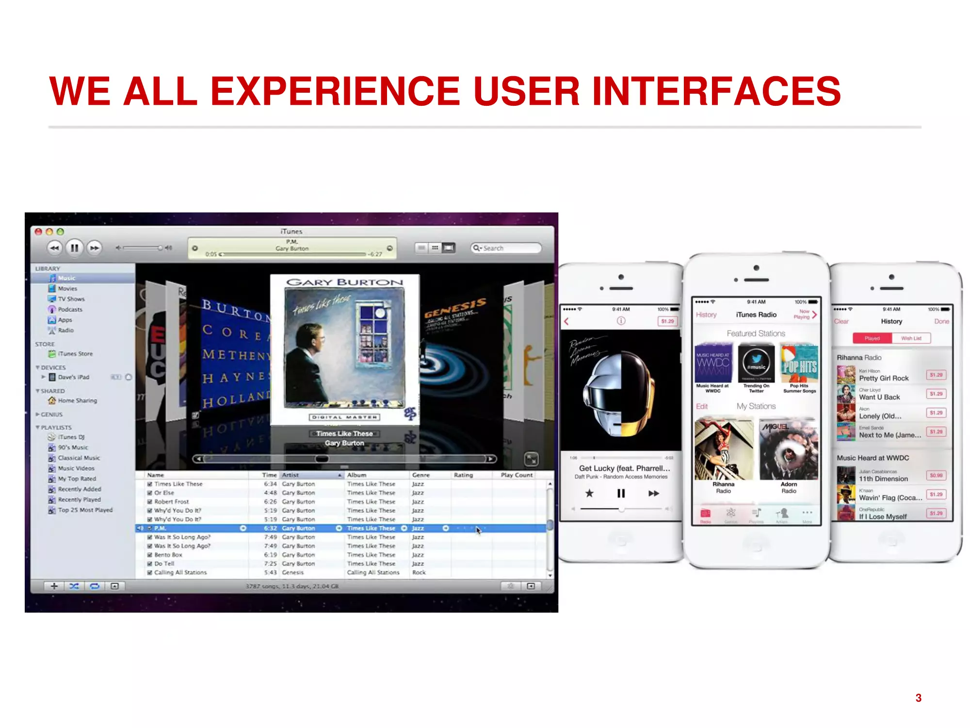
WE ALL EXPERIENCE USER INTERFACES
3
USER INTERFACES OF A DIFFERENT SORT
4
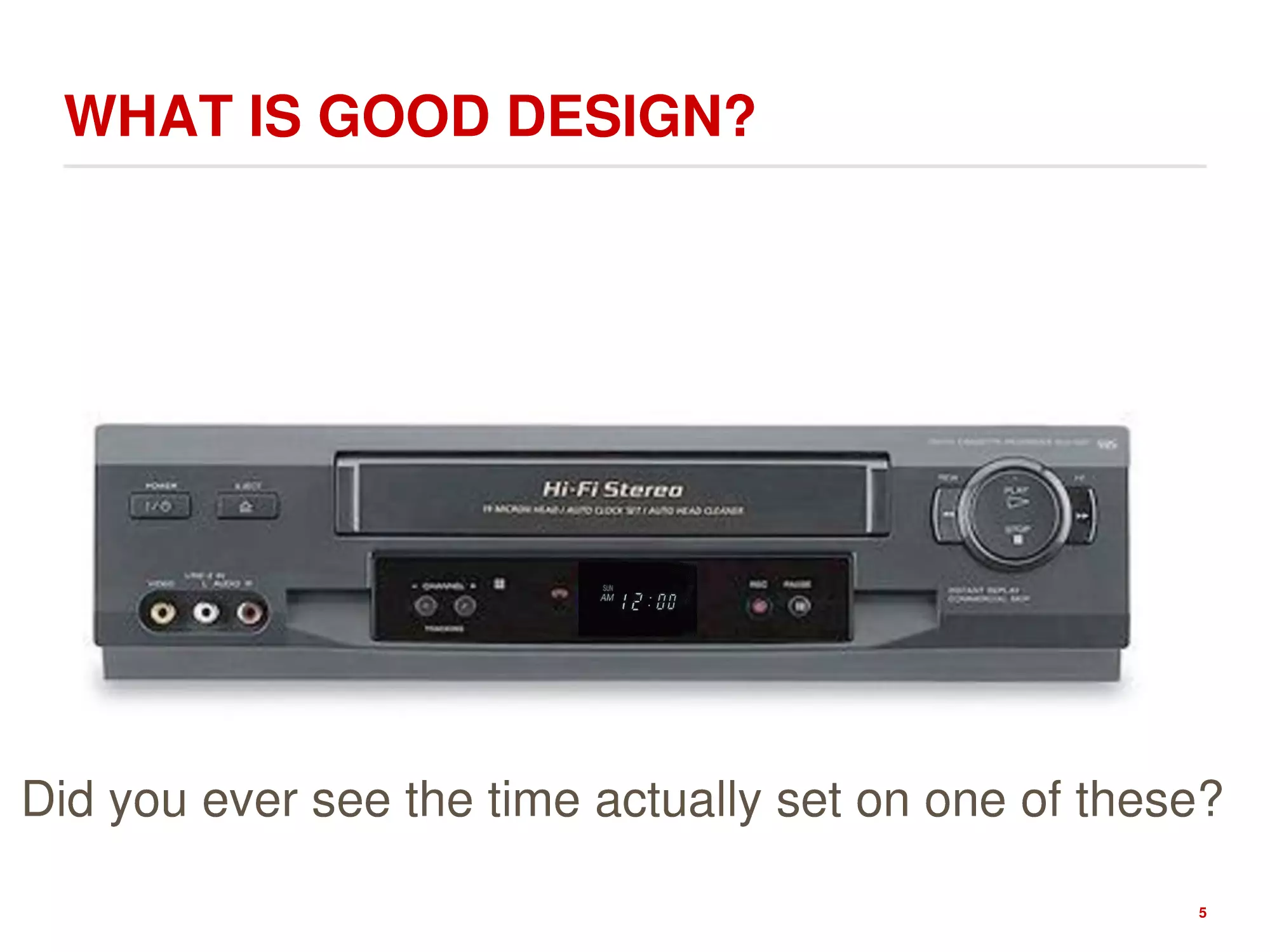
WHAT IS GOOD DESIGN?
Did you ever see the time actually set on one of these?
5
SOME ARE CONFUSING
6
REALLY CONFUSING
7
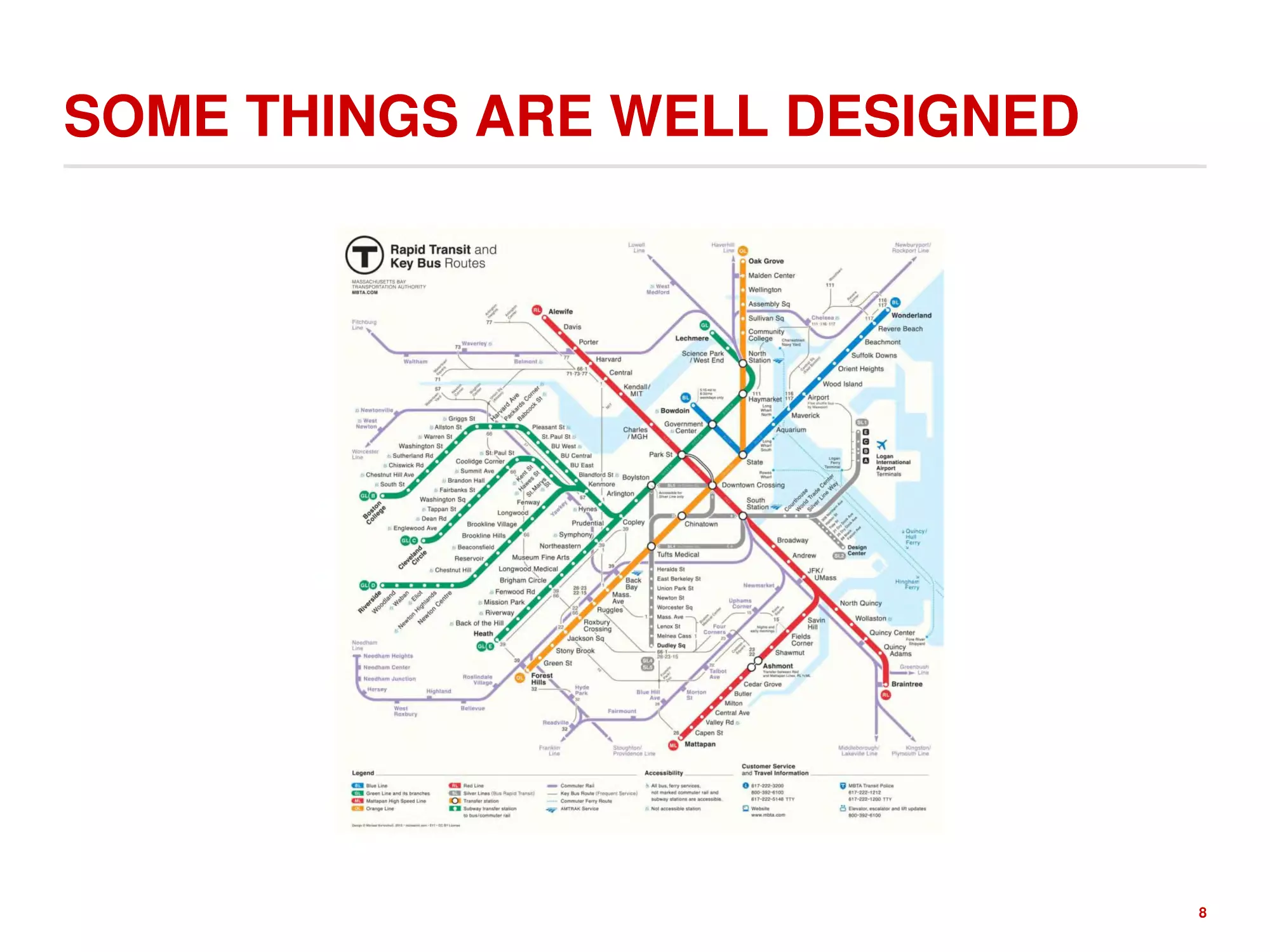
SOME THINGS ARE WELL DESIGNED
8
WHAT IS USER EXPERIENCE? (UX)
Puts the end user at the center of the universe and defines the
system from that perspective
Usability is finding the best match between a user’s needs and a
product’s use
While this is a specialty by itself, a computer scientist/developer
can grow an appreciation for UX, which affects
1. Functionality
2. System Organization and Structure
3. Interactions and Look and Feel
4. Access
9
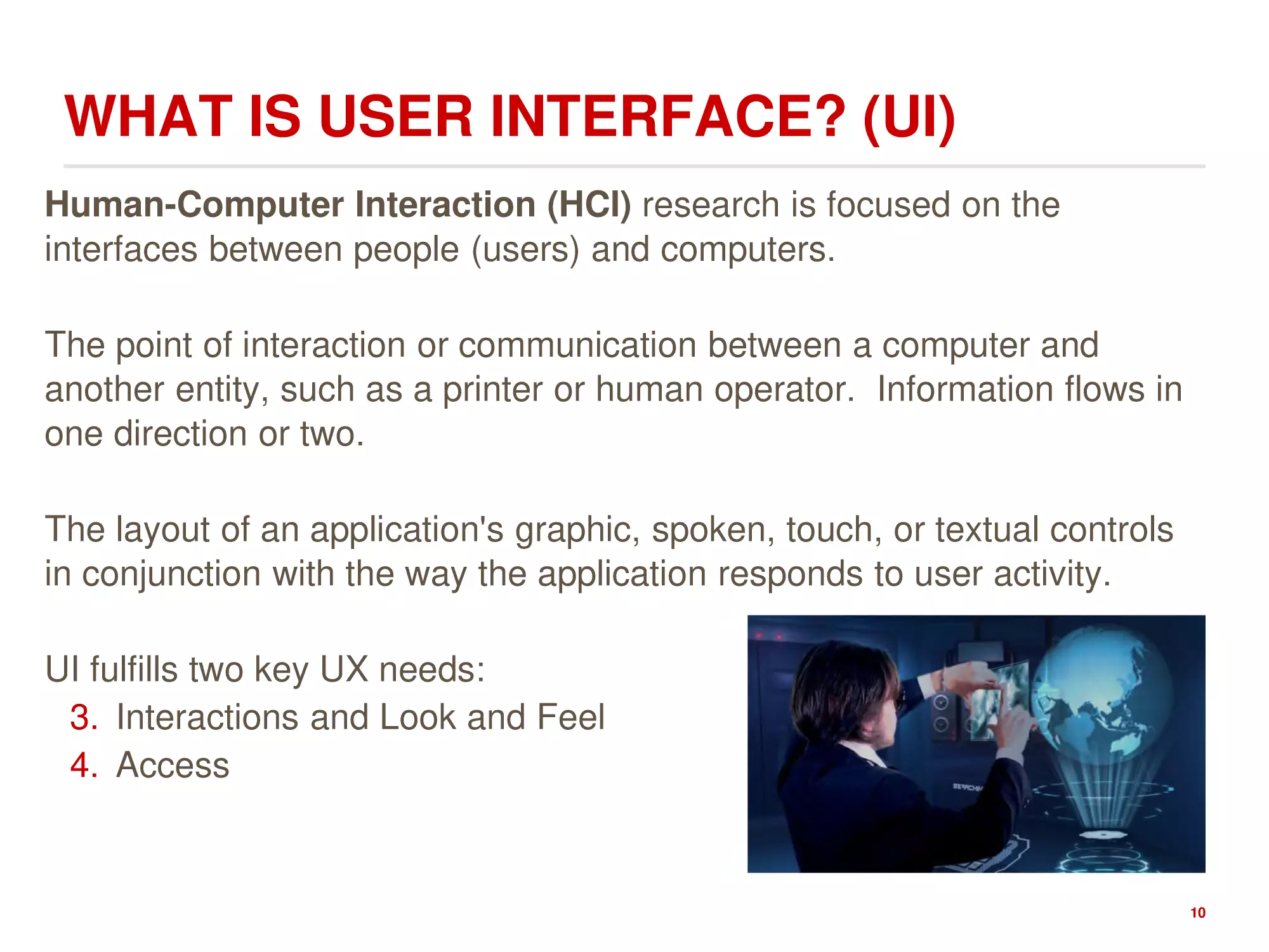
WHAT IS USER INTERFACE? (UI)
Human-Computer Interaction (HCI) research is focused on the
interfaces between people (users) and computers.
The point of interaction or communication between a computer and
another entity, such as a printer or human operator. Information flows in
one direction or two.
The layout of an application's graphic, spoken, touch, or textual controls
in conjunction with the way the application responds to user activity.
UI fulfills two key UX needs:
3. Interactions and Look and Feel
4. Access
10
WHY DO WE CARE ABOUT UX/UI?
Because it matters
11
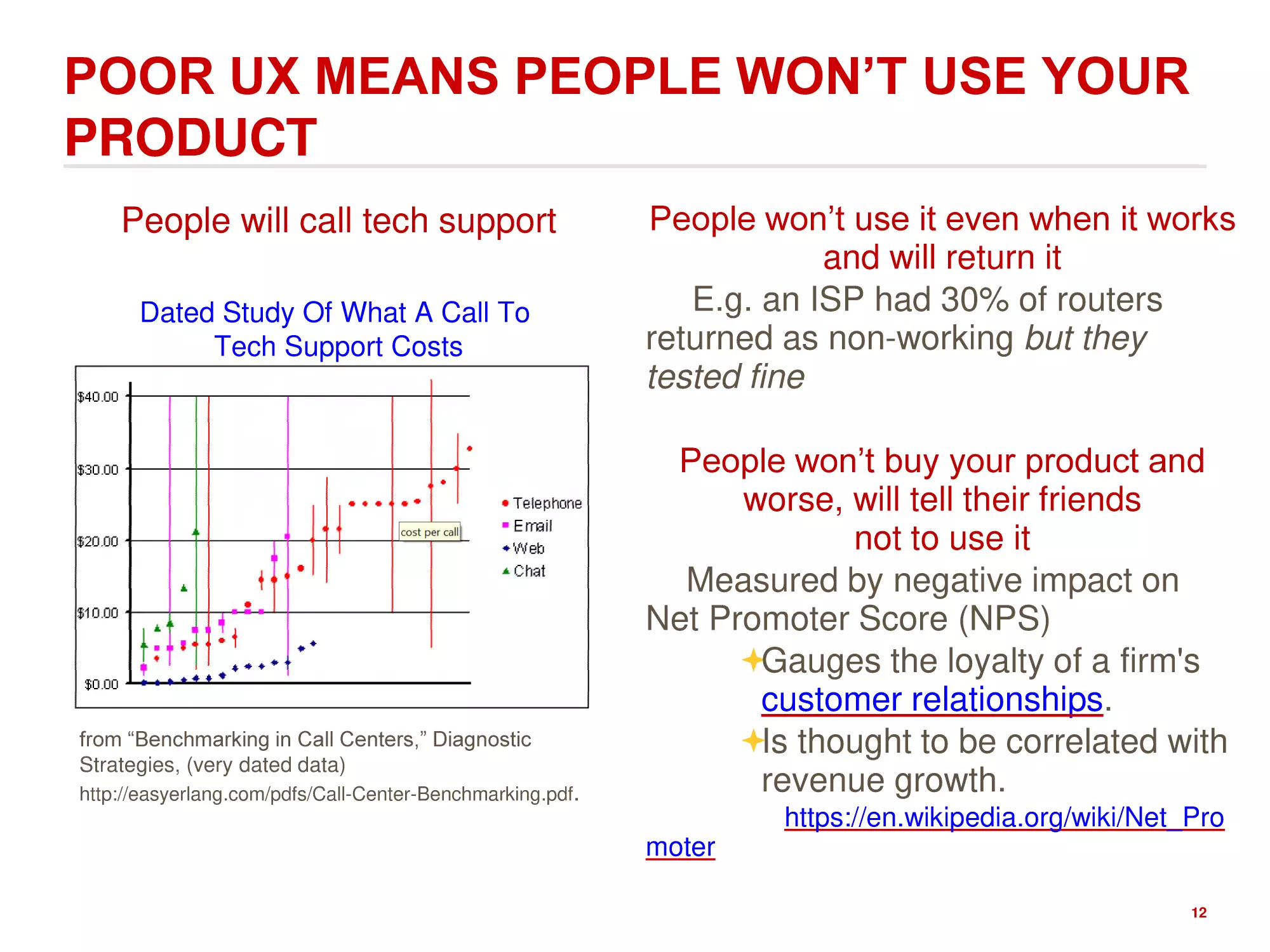
POOR UX MEANS PEOPLE WON’T USE YOUR
PRODUCT
People will call tech support
Dated Study Of What A Call To
Tech Support Costs
from “Benchmarking in Call Centers,” Diagnostic
Strategies, (very dated data)
http://easyerlang.com/pdfs/Call-Center-Benchmarking.pdf.
People won’t use it even when it works
and will return it
E.g. an ISP had 30% of routers
returned as non-working but they
tested fine
People won’t buy your product and
worse, will tell their friends
not to use it
Measured by negative impact on
Net Promoter Score (NPS)
Gauges the loyalty of a firm's
customer relationships.
Is thought to be correlated with
revenue growth.
https://en.wikipedia.org/wiki/Net_Pro
moter
12
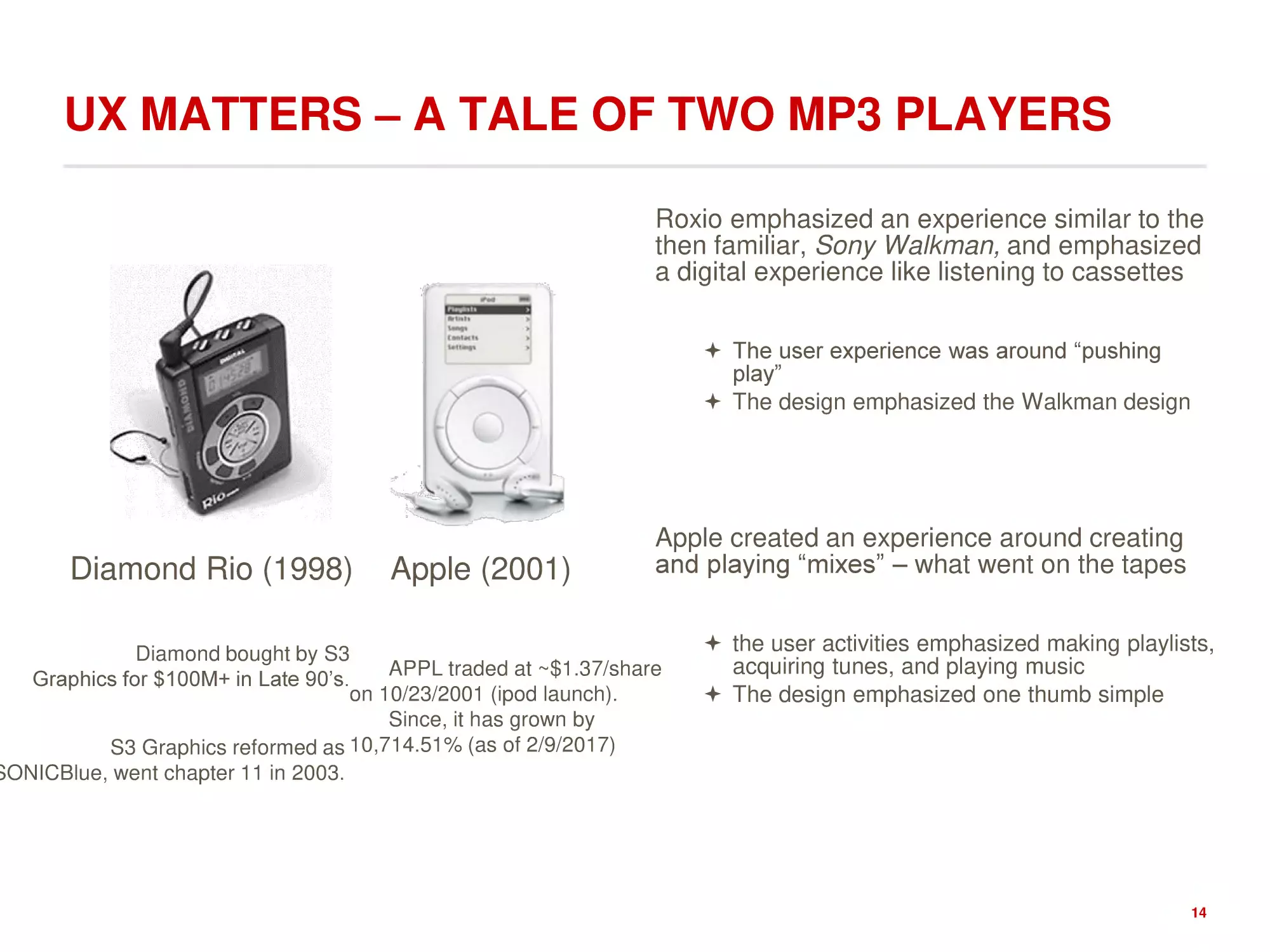
UX MATTERS – A TALE OF TWO MP3 PLAYERS
Roxio emphasized an experience similar to the
then familiar, Sony Walkman, and emphasized
a digital experience like listening to cassettes
The user experience was around “pushing
play”
The design emphasized the Walkman design
Diamond Rio (1998)
Diamond bought by S3
Graphics for $100M+ in Late 90’s.
S3 Graphics reformed as
SONICBlue, went chapter 11 in
2003.
Apple (2001)
APPL traded at ~$1.37/share
on 10/23/2001 (ipod launch).
Since, it has grown by
10,714.51% (as of 2/9/2017)
Apple created an experience around creating
and playing “mixes” – what went on the tapes
the user activities emphasized making playlists,
acquiring tunes, and playing music
The design emphasized one thumb simple
13
UX MATTERS – A TALE OF TWO MP3 PLAYERS
Roxio emphasized an experience similar to the
then familiar, Sony Walkman, and emphasized
a digital experience like listening to cassettes
The user experience was around “pushing
play”
The design emphasized the Walkman design
Diamond Rio (1998)
Apple (2001)
Apple created an experience around creating
and playing “mixes” – what went on the tapes
Diamond bought by S3
APPL traded at ~$1.37/share
Graphics for $100M+ in Late 90’s.
on 10/23/2001 (ipod launch).
Since, it has grown by
S3 Graphics reformed as 10,714.51% (as of 2/9/2017)
SONICBlue, went chapter 11 in 2003.
the user activities emphasized making playlists,
acquiring tunes, and playing music
The design emphasized one thumb simple
14
WHAT IS DESIGN?
“Most people make the mistake of thinking
design is what it looks like. People think it’s this
veneer – that the designers are handed this box
and told, ‘Make it look good!’ That’s not what we
think design is. It’s not just what it looks like and
feels like. Design is how it works.”
Steve Jobs
R. Walker, The Guts of a New Machine, New York Times Magazine,
Nov. 30, 2003
15
DESIGN IS HARD
16
DESIGN IS EASY TO OVERDO
17
WHAT IS A GOOD DESIGN?
A solution that serves the users
and satisfies the client
1. Does what the users need and want
2. Natural to use
3. Helps them avoid trouble
Easy to say, very hard to do well
18
USER CENTERED DESIGN
Puts the end user at the center of the
universe and defines the system from that
perspective
So, who or what is a user?
19
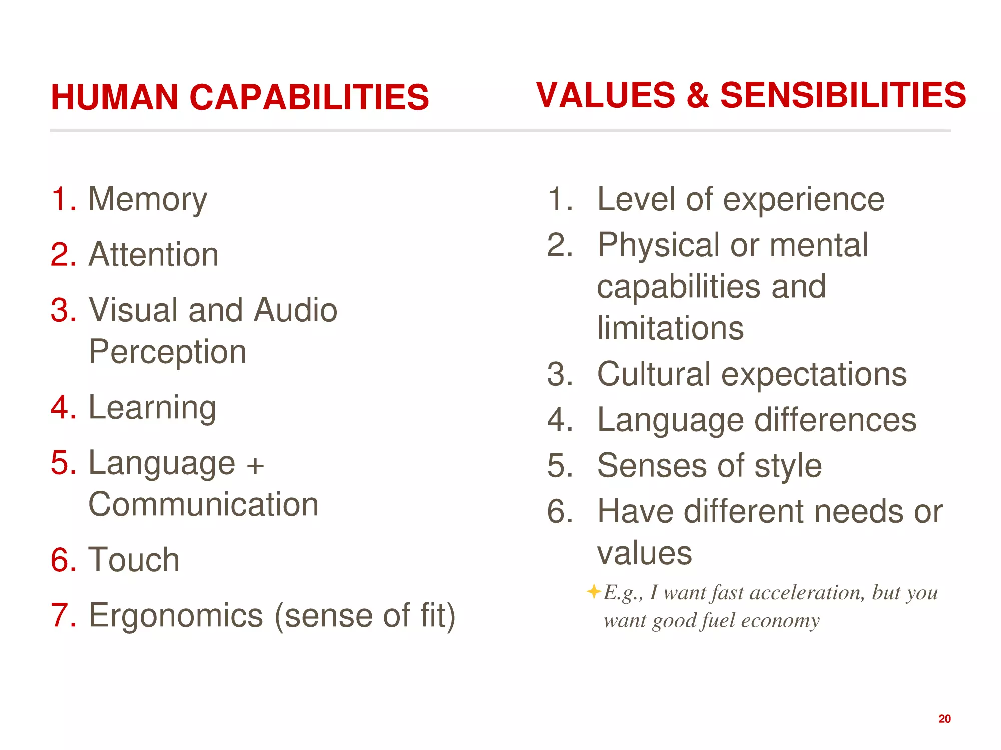
HUMAN CAPABILITIES
1. Memory
2. Attention
3. Visual and Audio
Perception
4. Learning
5. Language +
Communication
6. Touch
7. Ergonomics (sense of fit)
VALUES & SENSIBILITIES
1. Level of experience
2. Physical or mental
capabilities and
limitations
3. Cultural expectations
4. Language differences
5. Senses of style
6. Have different needs or
values
E.g., I want fast acceleration, but you
want good fuel economy
20
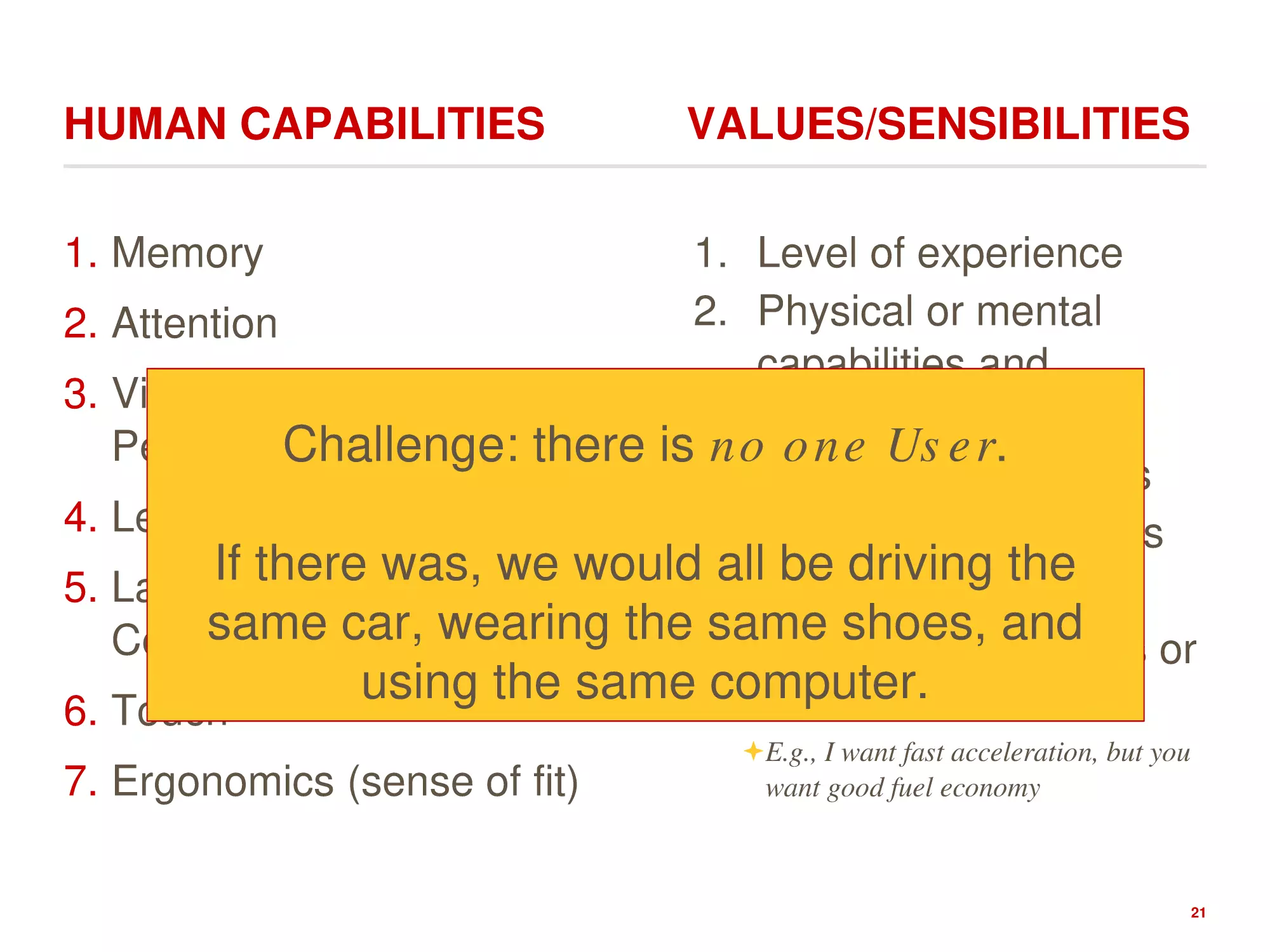
HUMAN CAPABILITIES
VALUES/SENSIBILITIES
1. Memory
1. Level of experience
2. Physical or mental
2. Attention
capabilities and
3. Visual and Audio
limitations
Perception
Challenge: there is no one User.
3. Cultural expectations
4. Learning
4. Language differences
If there was, we would all be driving the
5. Language +
5. Senses of style
same car, wearing the6.same
shoes,
and
Communication
Have different needs or
using the same computer.
values
6. Touch
7. Ergonomics (sense of fit)
E.g., I want fast acceleration, but you
want good fuel economy
21
YOU MUST UNDERSTAND HUMAN CAPABILITIES
AND PREFERENCES TO DESIGN GREAT SYSTEMS
22
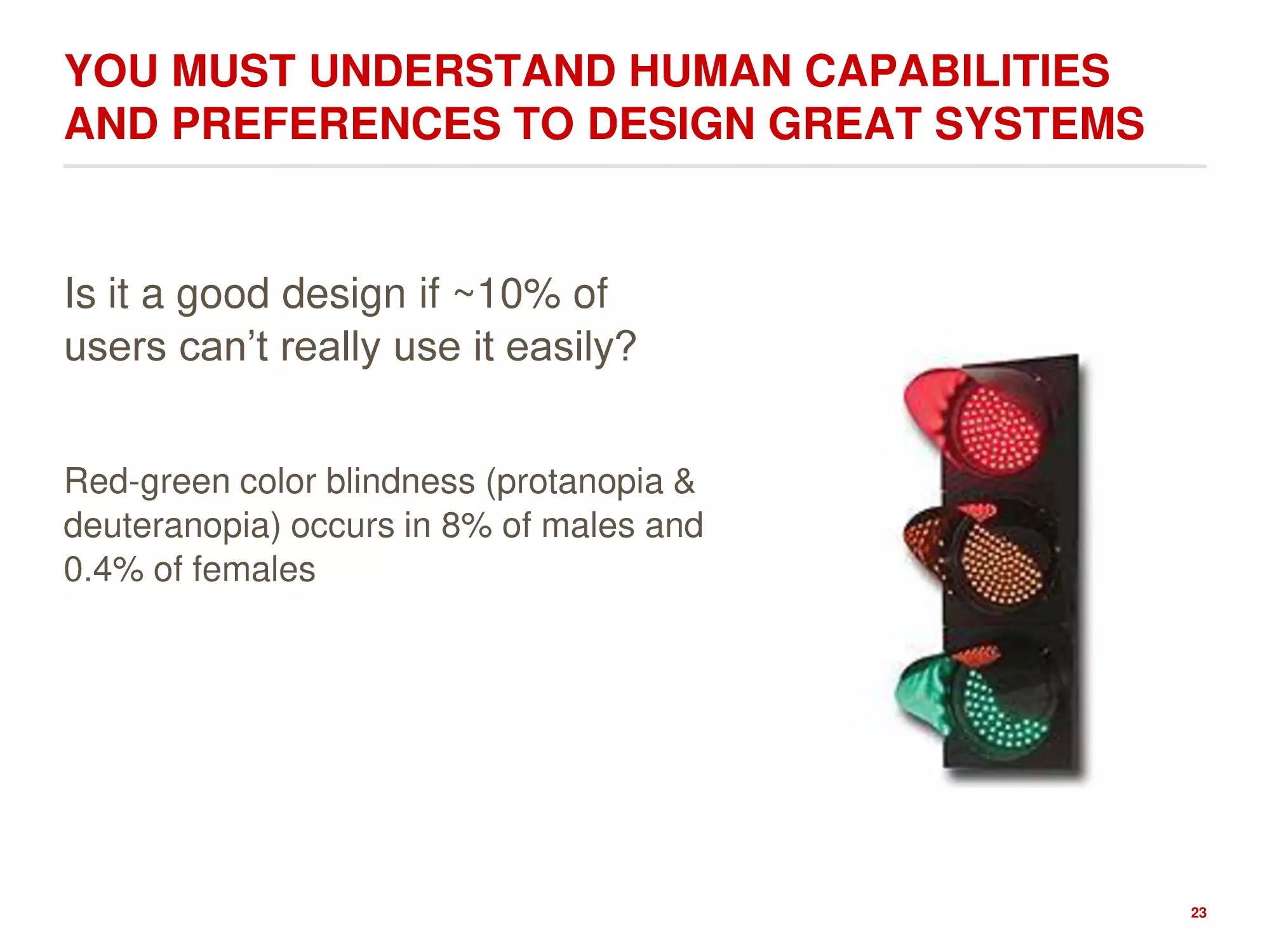
YOU MUST UNDERSTAND HUMAN CAPABILITIES
AND PREFERENCES TO DESIGN GREAT SYSTEMS
Is it a good design if ~10% of
users can’t really use it easily?
Red-green color blindness (protanopia &
deuteranopia) occurs in 8% of males and
0.4% of females
23
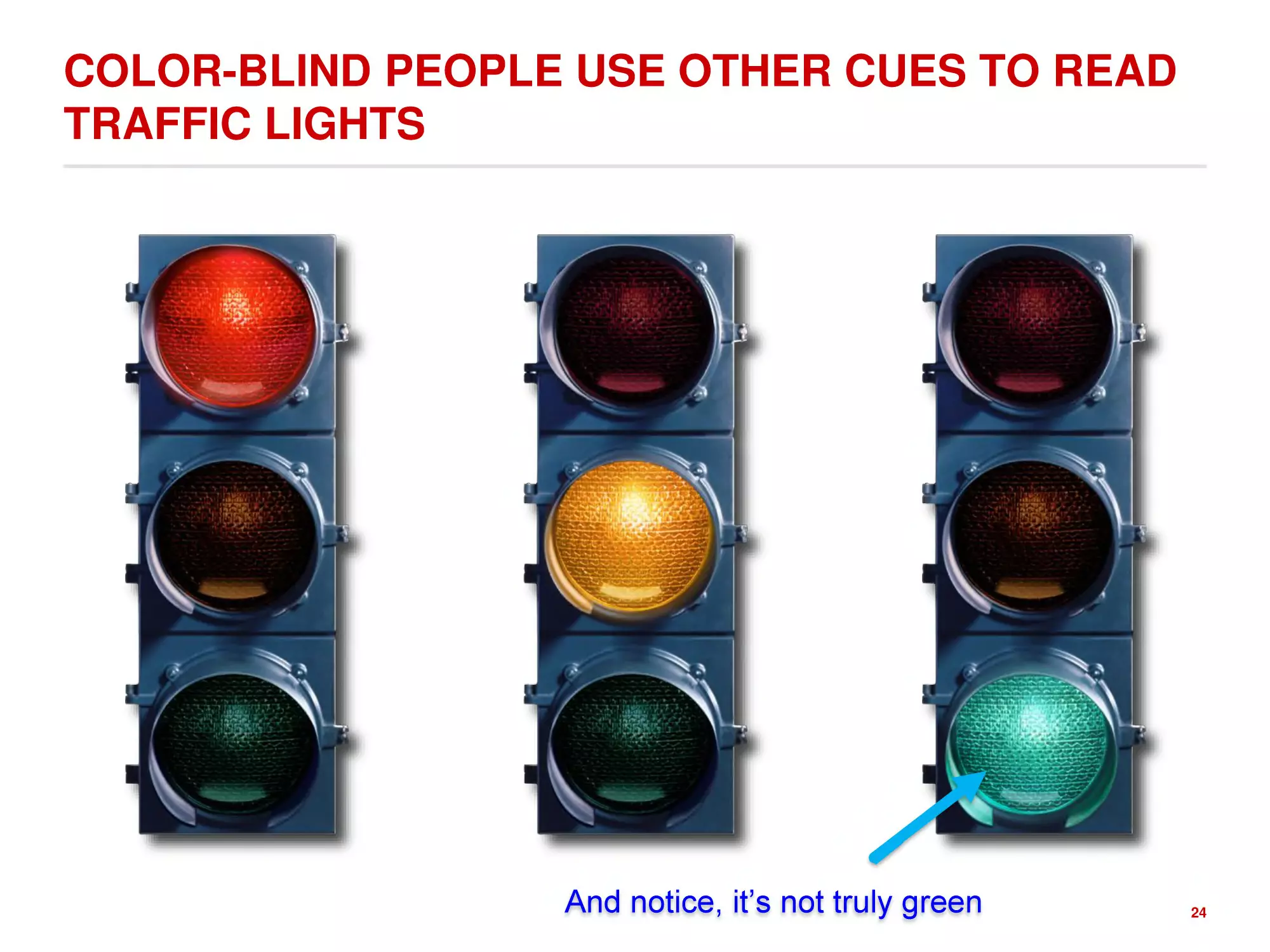
COLOR-BLIND PEOPLE USE OTHER CUES TO READ
TRAFFIC LIGHTS
And notice, it’s not truly green
24
CAN YOU PLEASE EVERYONE?
No
Multiple Sizes
You can have different products for
different types of users.
One size fits most/enough
You can have a product for an
average user and aim for average
within a subset of the market
Either way, you can not optimize the experience for
EVERY SINGLE user. You can't succeed.
25
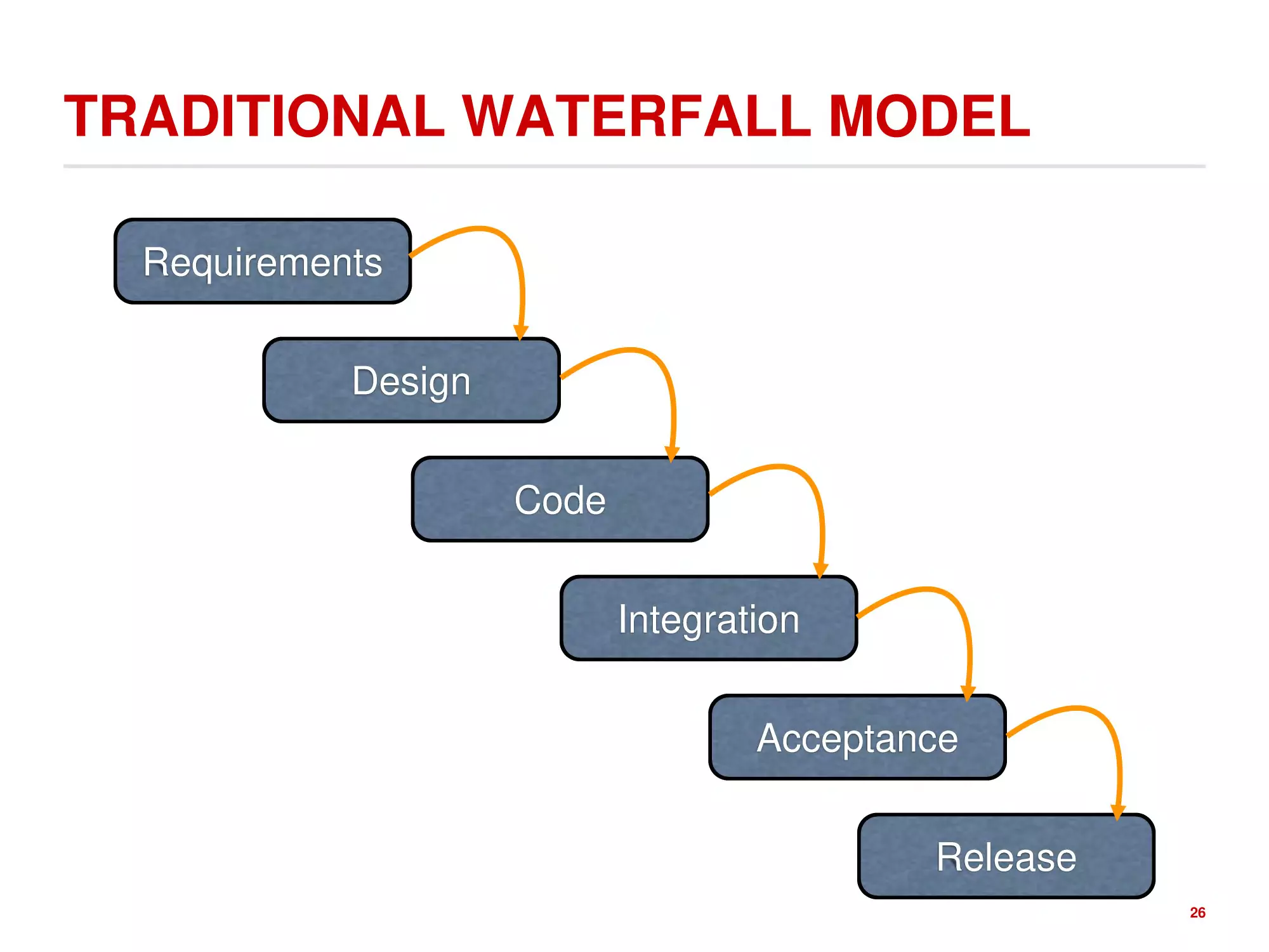
TRADITIONAL WATERFALL MODEL
Requirements
Design
Code
Integration
Acceptance
Release
26
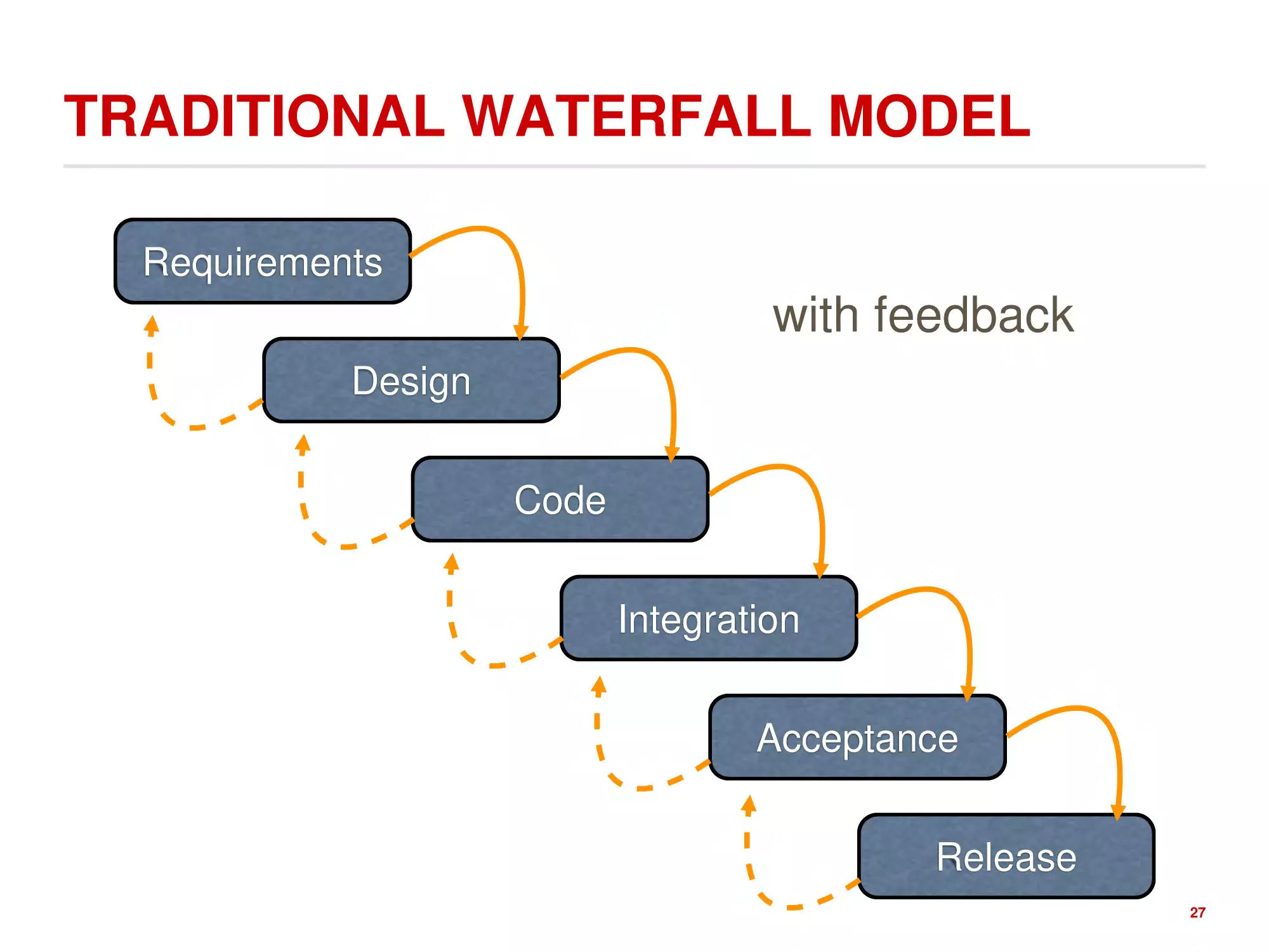
TRADITIONAL WATERFALL MODEL
Requirements
with feedback
Design
Code
Integration
Acceptance
Release
27
TRADITIONAL WATERFALL MODEL
UI design itself is risky.
So we are likely to get it wrong.
Waterfall makes it hard to recover.
Users are not involved in validation
until acceptance testing.
So we won’t find out until the end.
Requirements
Design
Code
UI flaws often cause changes in
requirements and design.
So we have to throw away carefully
written and tested code.
Integration
Acceptance
Release
28
OPTION 2: ITERATIVE DESIGN
Design
Evaluate
Implement
Deploy
29
WHY NOT ITERATIVE DESIGN?
Every iteration corresponds
to a release, so evaluation
(complaints/issues) feeds
back into next version’s
design, which is too late
Using your paying customers
to evaluate your usability is a
big risk
Design
Evaluate
Implement
Deploy
(they won’t like it and won’t buy the
next version)
30
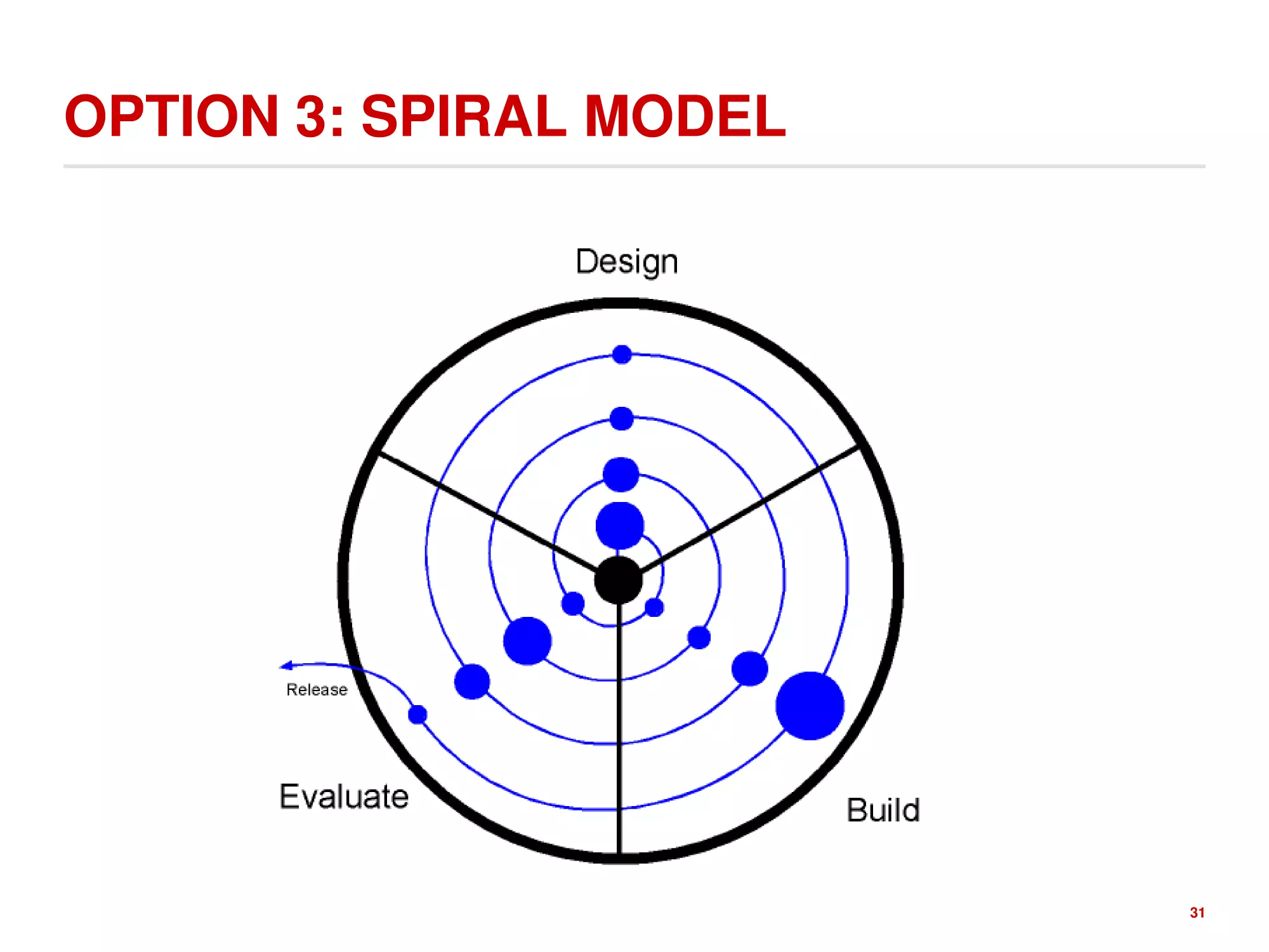
OPTION 3: SPIRAL MODEL
31
SPIRAL MODEL ITERATIONS
Early iterations use cheap,
quick to create, and easy to
pitch prototypes (paper
prototyping)
Later iterations have richer
implementations
More iterations generally
means better UI
Only mature iterations get
released
32
USER CENTERED DESIGN
Three Steps
1. Identify who the users are
2. Identify what they want to accomplish
3. Constantly assess (1) and (2)
33
KNOW YOUR USER
ROLES, RESPONSIBILITIES, CAPABILITIES
1. Ethnographics
Age, gender, ethnicity
2. Skill level
Novice
Knowledgeable, intermittent user
Knowledgeable, frequent user
3. Mental or Physical abilities
4. Knowledge
Domain experience
Application experience
5. Environment
Noisy, quiet
Inside, outside…
6. Communication patterns
1.
Who are the users: novices or
experts?
2.
What are users trying to accomplish?
3.
How often will the user be using the
system?
Should the design emphasize ease of
use and learning or efficiency?
4.
What information do they need to
accomplish their task?
5.
How easily can they identify the
information they need and the steps
needed to accomplish their tasks?
6.
Is the information and task structures
(aka the system) accessible to
everyone?
34
THE BEST TECHNIQUE: INTERVIEWING &
OBSERVING PEOPLE
Talking to users and potential
users
Semi-structured interviews
https://en.wikipedia.org/wiki/Semistructured_interview
lots of tips for creating an interview guide and
how to conduct the interview.
Structured interviews
It may be hard to recruit subjects
and some users are expensive to
talk to.
http://www.usability.gov/how-to-and-tools/methods/individualinterviews.html
35
HOW TO CONDUCT A STUDY?
1. Plan topics in advance
Best practice: create an interview guide, an
informal grouping of topics and questions that
the interviewer can ask in different ways for
different participants.
2. Identify the target user base in advance
3. Give users a task to do against your interface and
observe their behavior
a) Have them think aloud about what they seeing,
what they are trying to do, and actions they are
taking.
b) Take copious notes/record the session
c) Do not lead the user. Let them run the task
until they are successful or give up.
Source: http://www.userlytics.com/blog/unmoderated-vsmoderated-usability-user-experience-testing
Struggles are important indicators that
information is not organized well or that
something is missing.
4. Reflect on observations and write up a report
with findings
36
HOW DO WE EXPRESS DESIGNS?
37
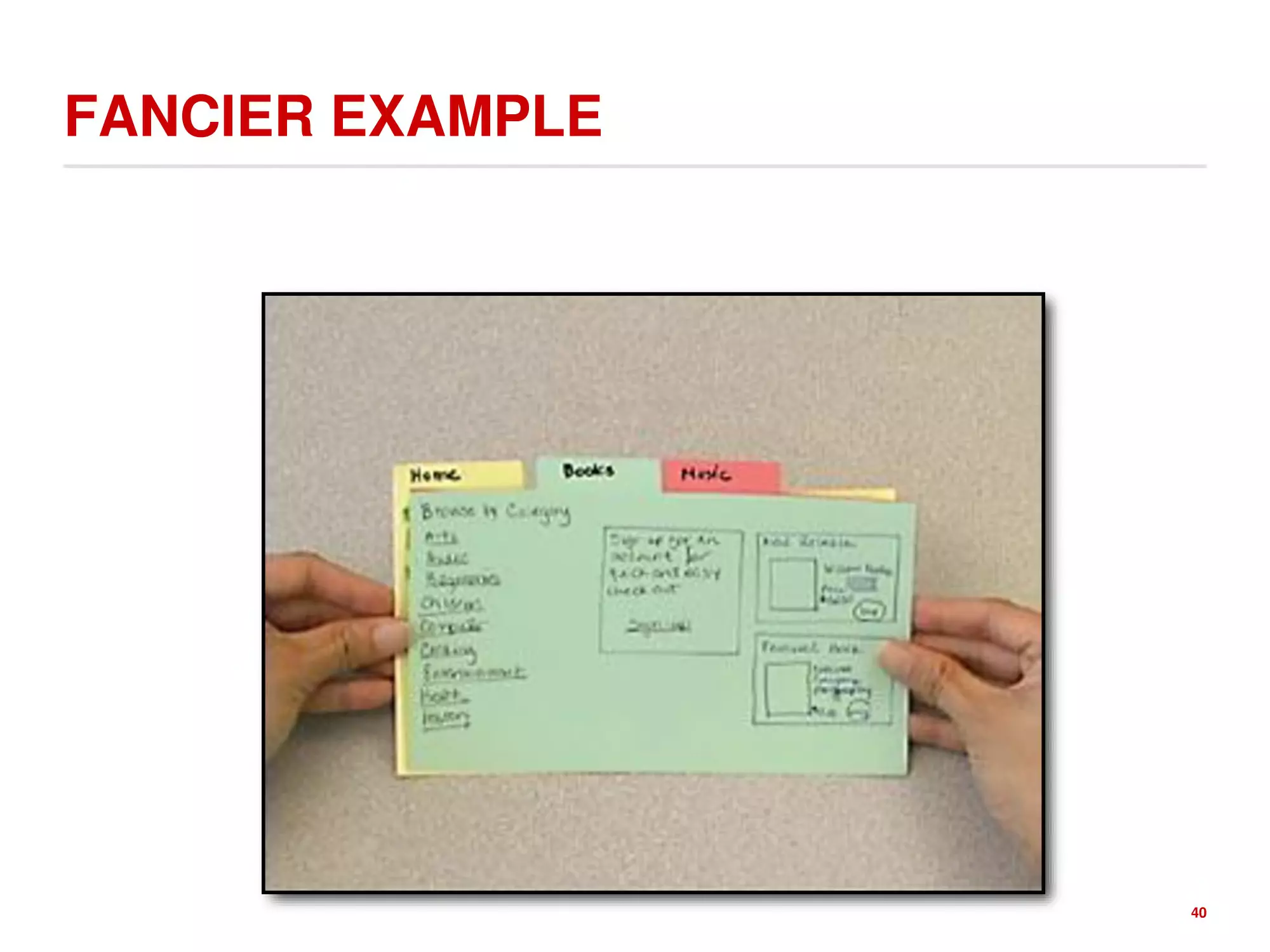
START WITH PAPER PROTOTYPES
Karis and Virzi have shown you can
often get the same design
information from easier and
cheaper to make low fidelity
prototypes as from higher fidelity
prototypes.
Credit to: Ariel Waldman, on Interaction Design/ Rachel Ilan
F. Cifaldi, Gamsutra, Sometimes, paper is your best prototyping tool - even if
you're Nintendo, 2012 On the development of the Wii U tablet
38
SIMPLE PAPER PROTOTYPES ARE EASY TO
CREATE AND CHANGE
39
FANCIER EXAMPLE
40
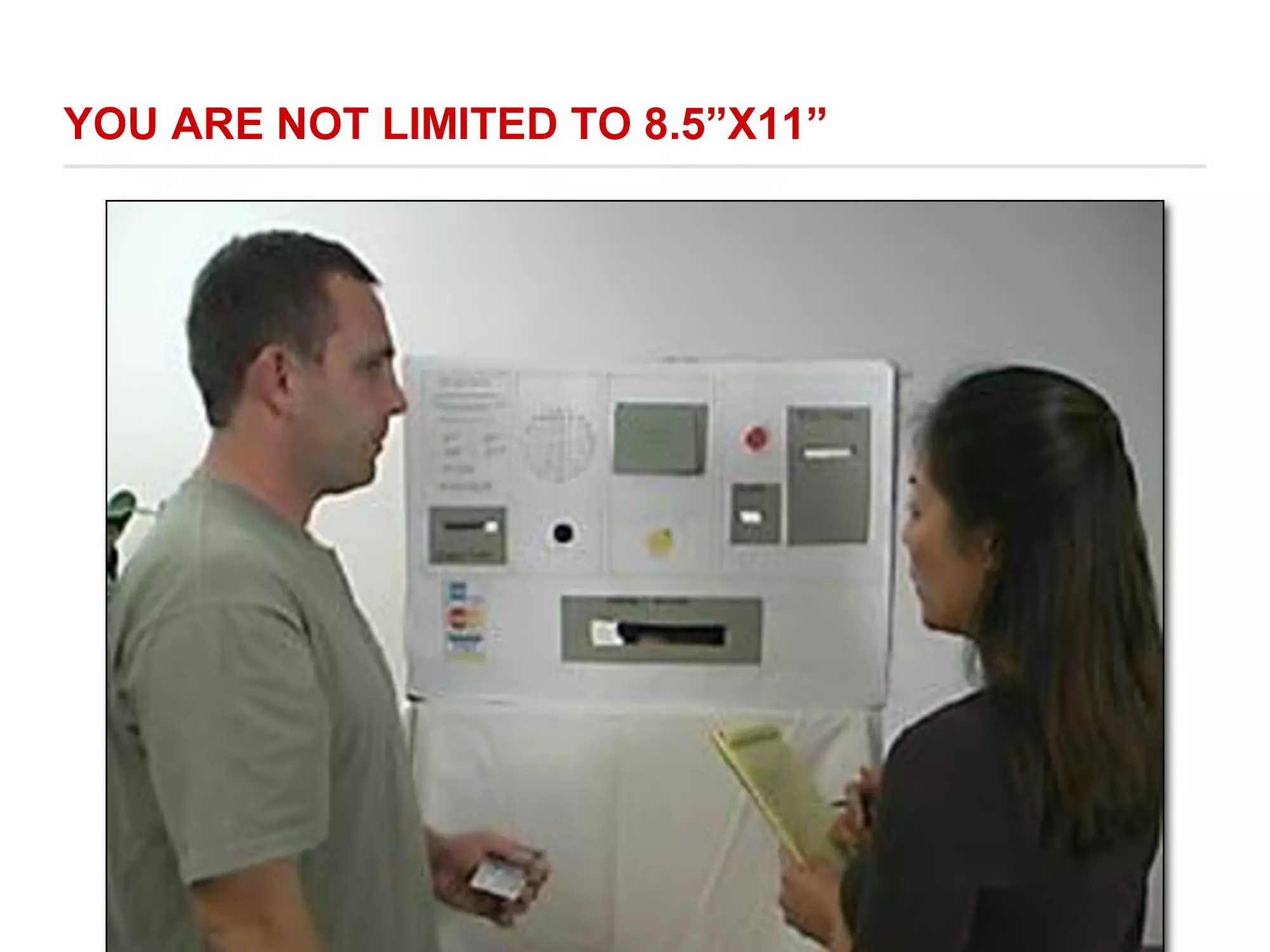
YOU ARE NOT LIMITED TO 8.5”X11”
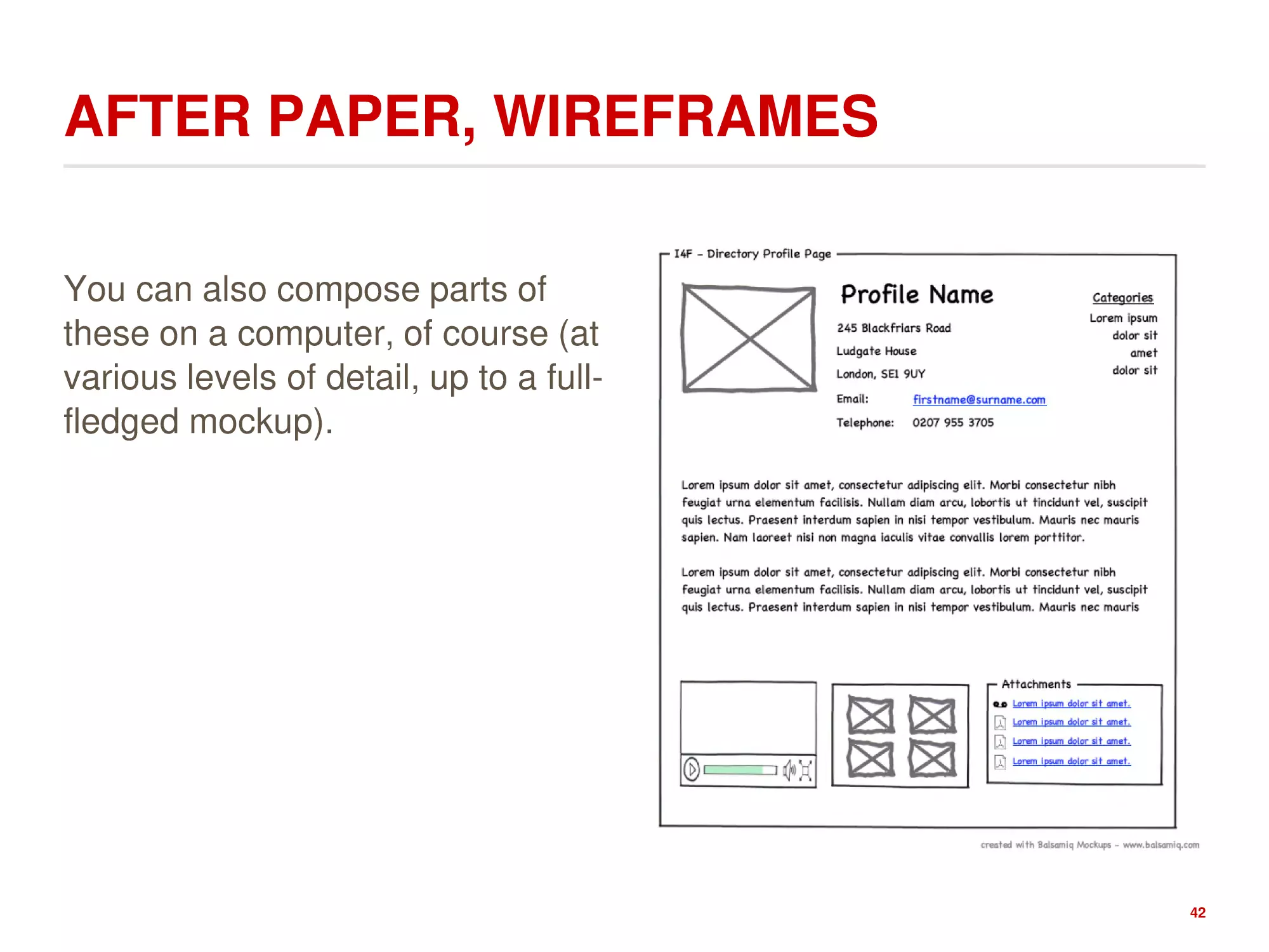
AFTER PAPER, WIREFRAMES
You can also compose parts of
these on a computer, of course (at
various levels of detail, up to a fullfledged mockup).
42
PUTS AND TAKES ON WIREFRAMING
Advantages
Disadvantages
1. Fast way to mock up an
interface - no coding required.
1. Doesn’t produce any code.
2. Finds a variety of problems with
the interface.
2. Does not find all classes of
problems with an interface.
3. Can affect the way users
3. Allows an interface to be refined
interact with the interface.
based on user feedback before 4. Has stronger benefits in some
implementation begins.
situations than in others.
4. A multidisciplinary team can
participate.
43
Credits: Paper Prototyping
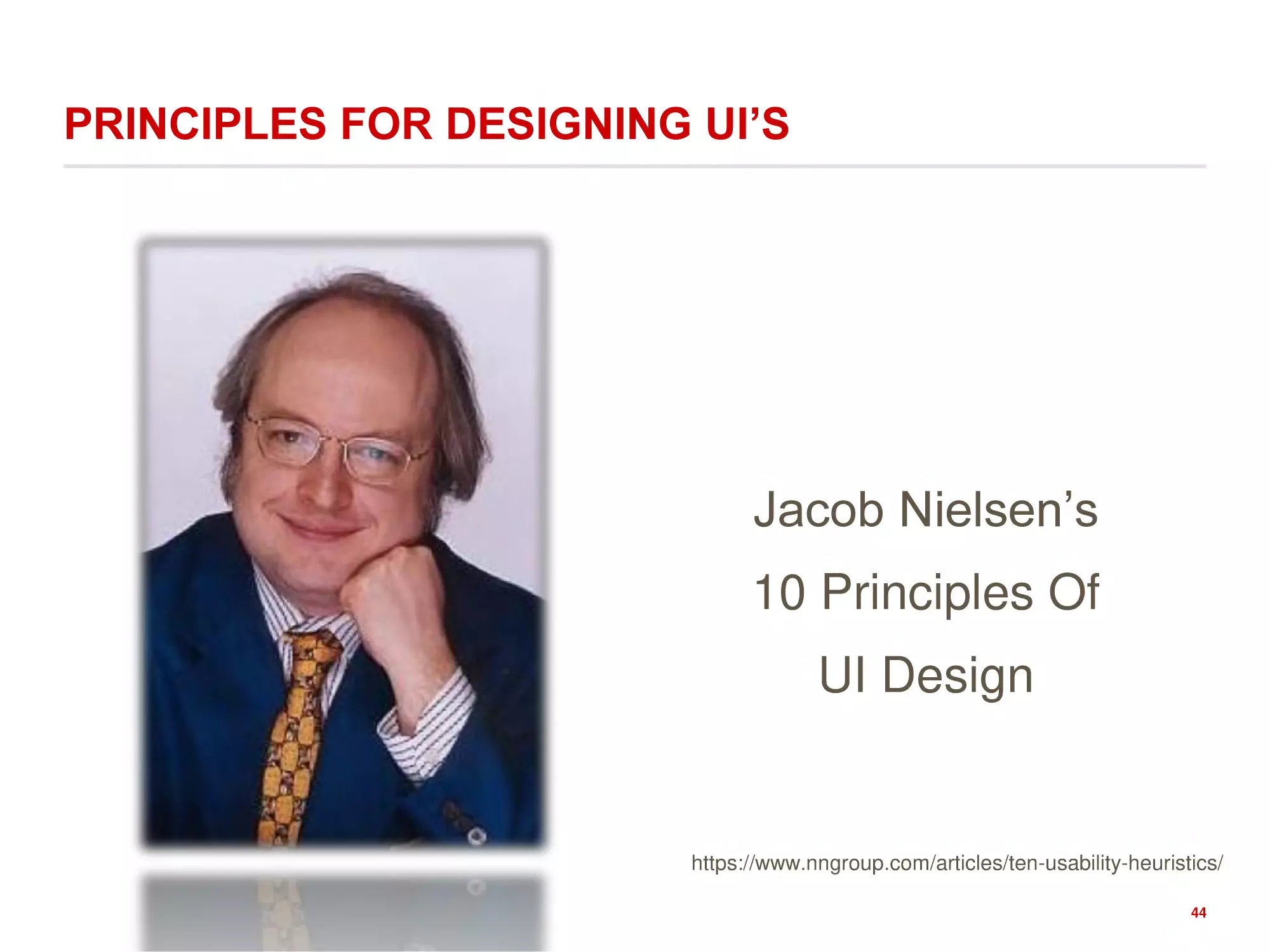
PRINCIPLES FOR DESIGNING UI’S
Jacob Nielsen’s
10 Principles Of
UI Design
https://www.nngroup.com/articles/ten-usability-heuristics/
44
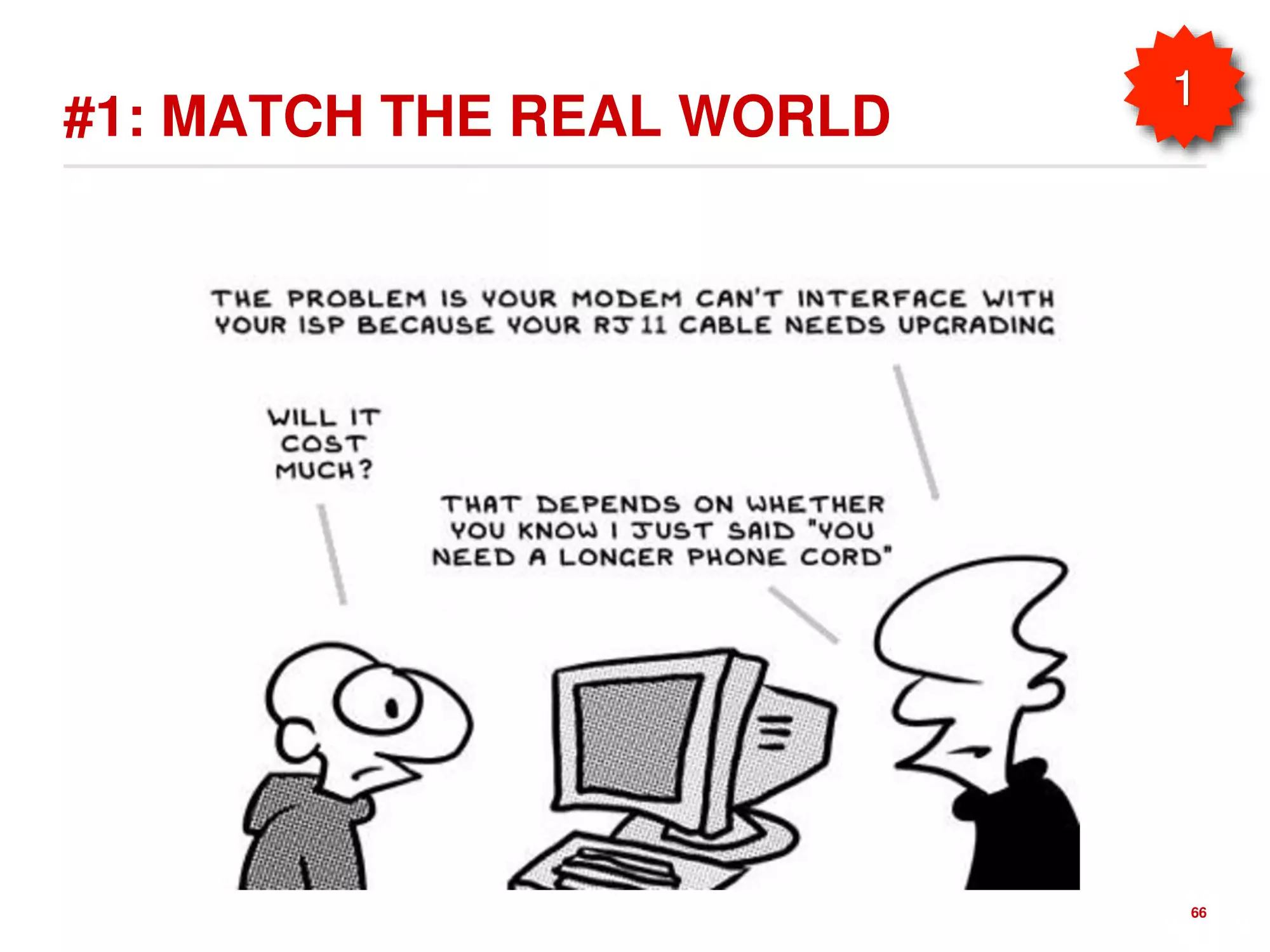
#1: MATCH THE REAL WORLD
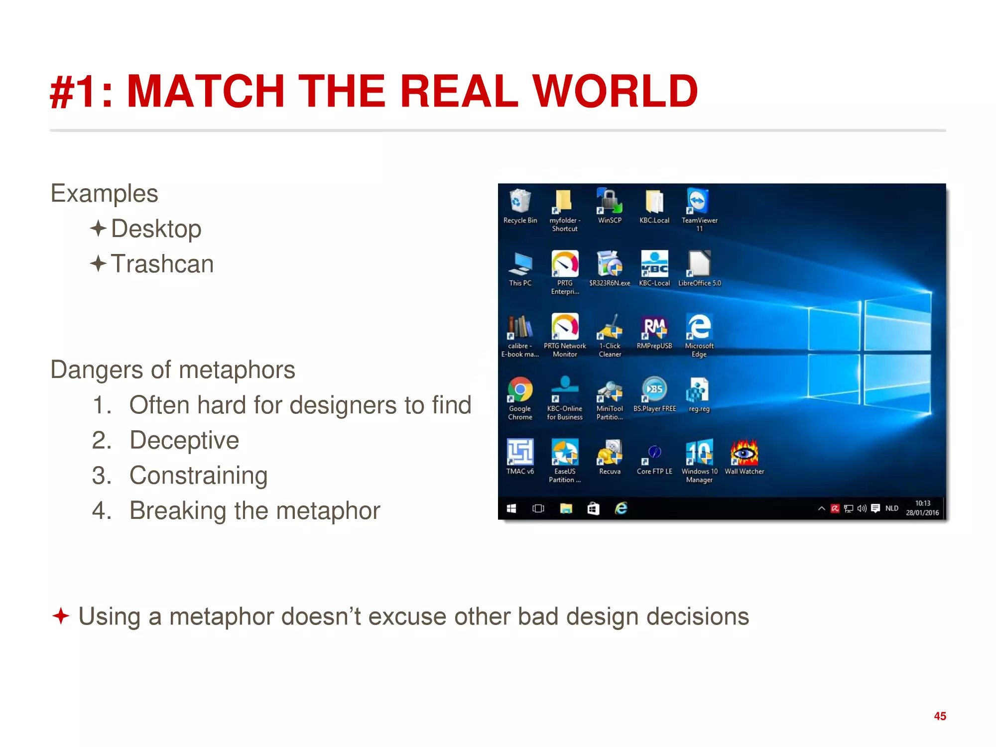
Examples
Desktop
Trashcan
Dangers of metaphors
1. Often hard for designers to find
2. Deceptive
3. Constraining
4. Breaking the metaphor
Using a metaphor doesn’t excuse other bad design decisions
45
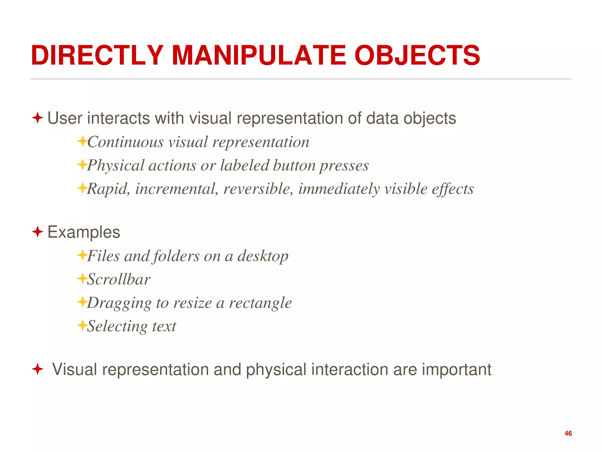
DIRECTLY MANIPULATE OBJECTS
User interacts with visual representation of data objects
Continuous visual representation
Physical actions or labeled button presses
Rapid, incremental, reversible, immediately visible effects
Examples
Files and folders on a desktop
Scrollbar
Dragging to resize a rectangle
Selecting text
Visual representation and physical interaction are important
46
OBJECTS SUGGEST SPECIFIC ACTIONS
(MANIPULATIONS) FOR USE
Perceived and actual properties of a thing that determine
how the thing could be used
1. Chair is for sitting
2. Knob is for turning
3. Button is for pushing
4. Listbox is for selection
5. Scrollbar is for continuous scrolling or panning
47
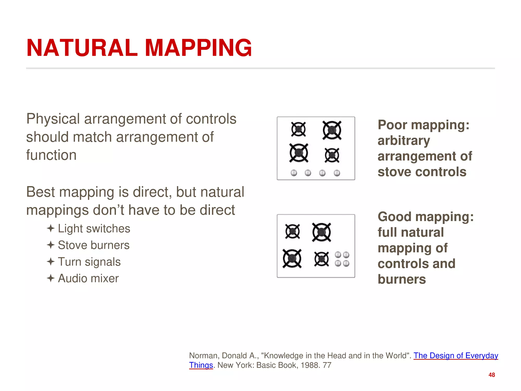
NATURAL MAPPING
Physical arrangement of controls
should match arrangement of
function
Best mapping is direct, but natural
mappings don’t have to be direct
Light switches
Stove burners
Turn signals
Audio mixer
Poor mapping:
arbitrary
arrangement of
stove controls
Good mapping:
full natural
mapping of
controls and
burners
Norman, Donald A., "Knowledge in the Head and in the World". The Design of Everyday
Things. New York: Basic Book, 1988. 77
48
ACTIONS SHOULD HAVE IMMEDIATE, VISIBLE
EFFECTS
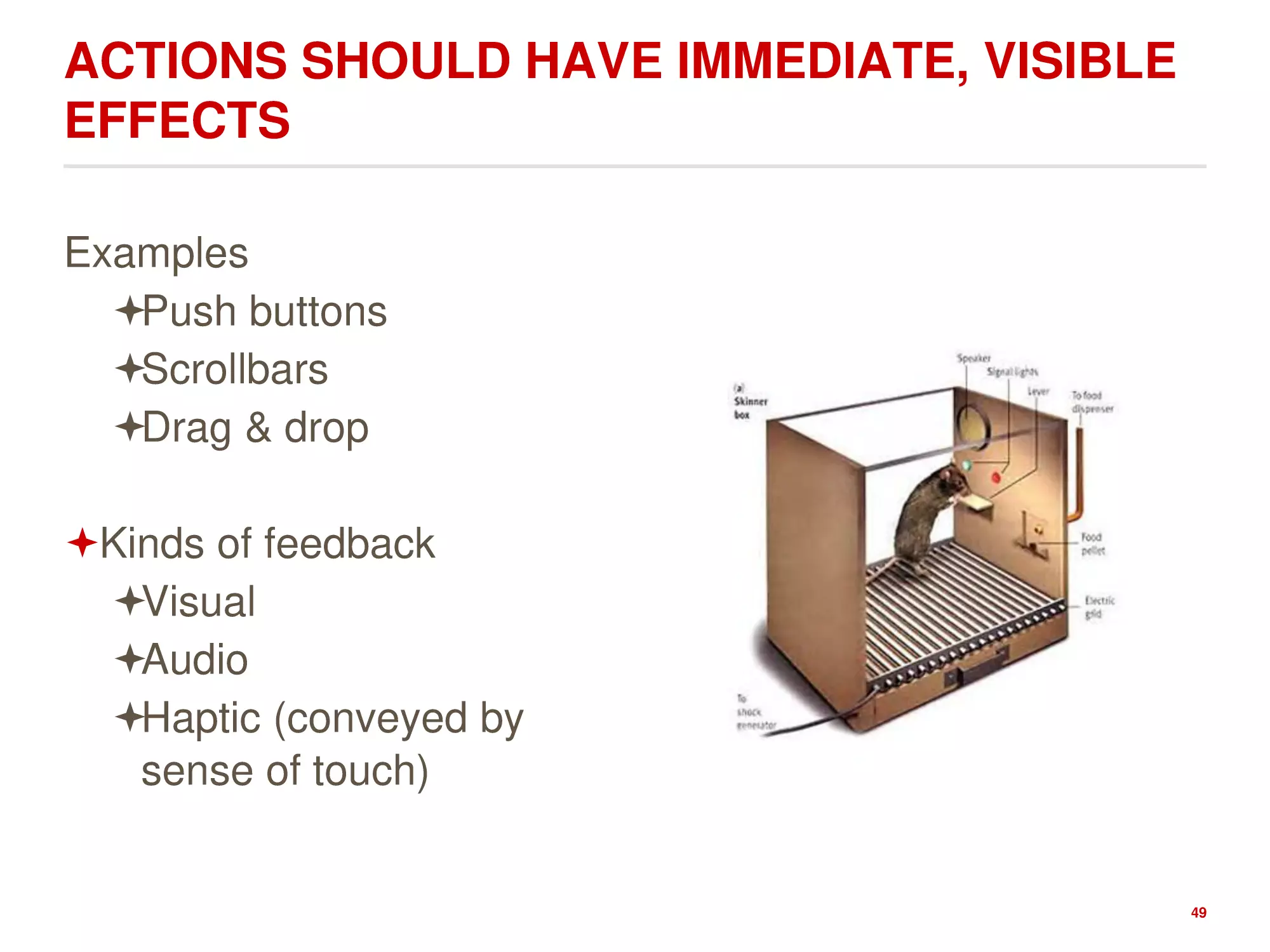
Examples
Push buttons
Scrollbars
Drag & drop
Kinds of feedback
Visual
Audio
Haptic (conveyed by
sense of touch)
49
#2: CONSISTENCY AND STANDARDS
Users should not
have to wonder
whether different
words, situations,
or actions mean
the same thing.
Follow platform
conventions.…
50
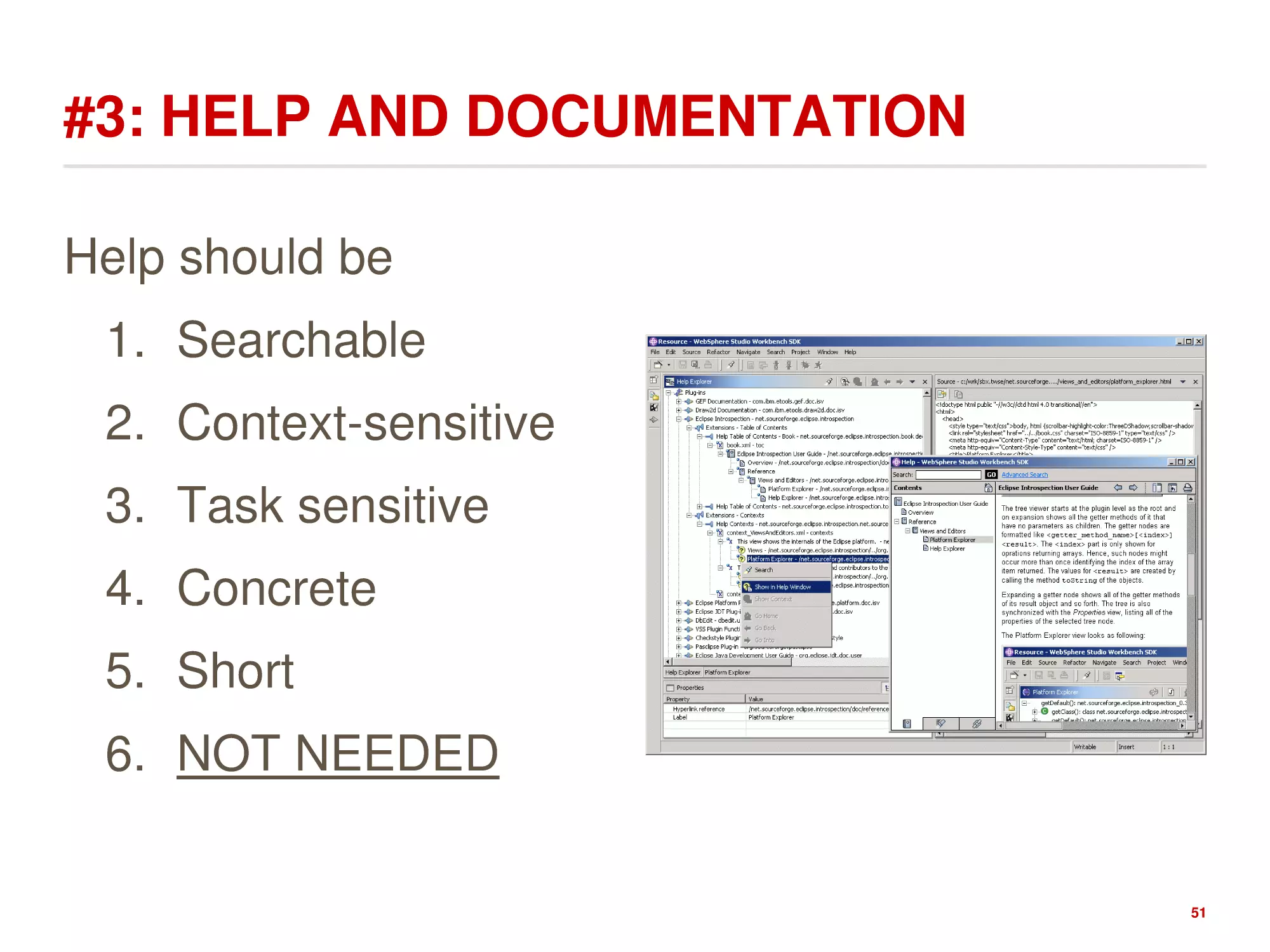
#3: HELP AND DOCUMENTATION
Help should be
1. Searchable
2. Context-sensitive
3. Task sensitive
4. Concrete
5. Short
6. NOT NEEDED
51
#4: USER CONTROL AND FREEDOM
Users may run in trouble by
using a system function by
mistake and need a clearly
marked "emergency exit" to
leave the unwanted state
without having to go through
an extended dialogue
1.
Provide Undo
2.
Long operations should be allowed
to be paused/suspended
3.
All dialogs should have a cancel
button
52
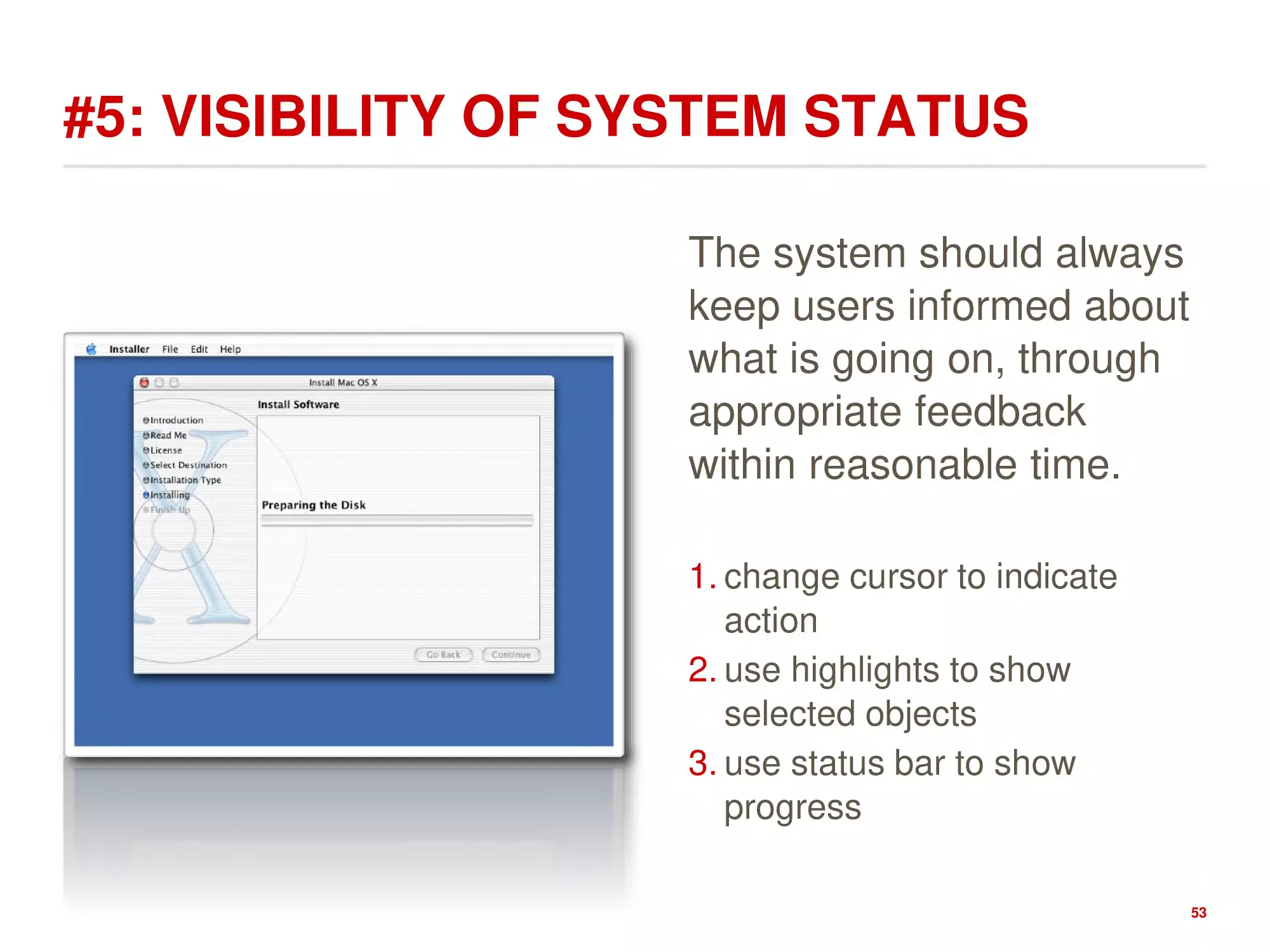
#5: VISIBILITY OF SYSTEM STATUS
The system should always
keep users informed about
what is going on, through
appropriate feedback
within reasonable time.
1. change cursor to indicate
action
2. use highlights to show
selected objects
3. use status bar to show
progress
53
#6: FLEXIBILITY AND EFFICIENCY
Accelerators -- unseen by the novice user -- may often speed up the
interaction for the expert user such that the system can cater to both
inexperienced and experienced users. Allow users to tailor frequent
actions. [follows from the power law of practice]
54
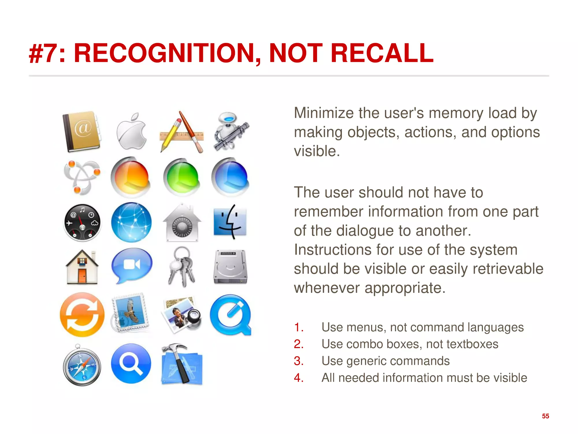
#7: RECOGNITION, NOT RECALL
Minimize the user's memory load by
making objects, actions, and options
visible.
The user should not have to
remember information from one part
of the dialogue to another.
Instructions for use of the system
should be visible or easily retrievable
whenever appropriate.
1.
2.
3.
4.
Use menus, not command languages
Use combo boxes, not textboxes
Use generic commands
All needed information must be visible
55
#8: ERROR PREVENTION
Even better than good error
messages is a careful design
which prevents a problem from
occurring in the first place.
Either eliminate error-prone
conditions or check for them and
present users with a confirmation
option before they commit to the
action.
56
#9: HELP USERS RECOGNIZE, DIAGNOSE, AND
RECOVER FROM ERRORS
Error messages should
be expressed in plain
language (no codes),
precisely indicate the
problem, and
constructively suggest a
solution.
And they should be
polite…
57
#10: AESTHETIC AND MINIMALIST DESIGN
Dialogues should not contain information which is
irrelevant or rarely needed. Every extra unit of information
in a dialogue competes with the relevant units of
information and diminishes their relative visibility.
58
TESTING THE UI
Testing the UI is like testing done early on, except now you
use the actual system.
1. Give the users a task and watch them work.
2. Take copious notes
3. Do not steer the user
Frustrations and failures are part of the game
59
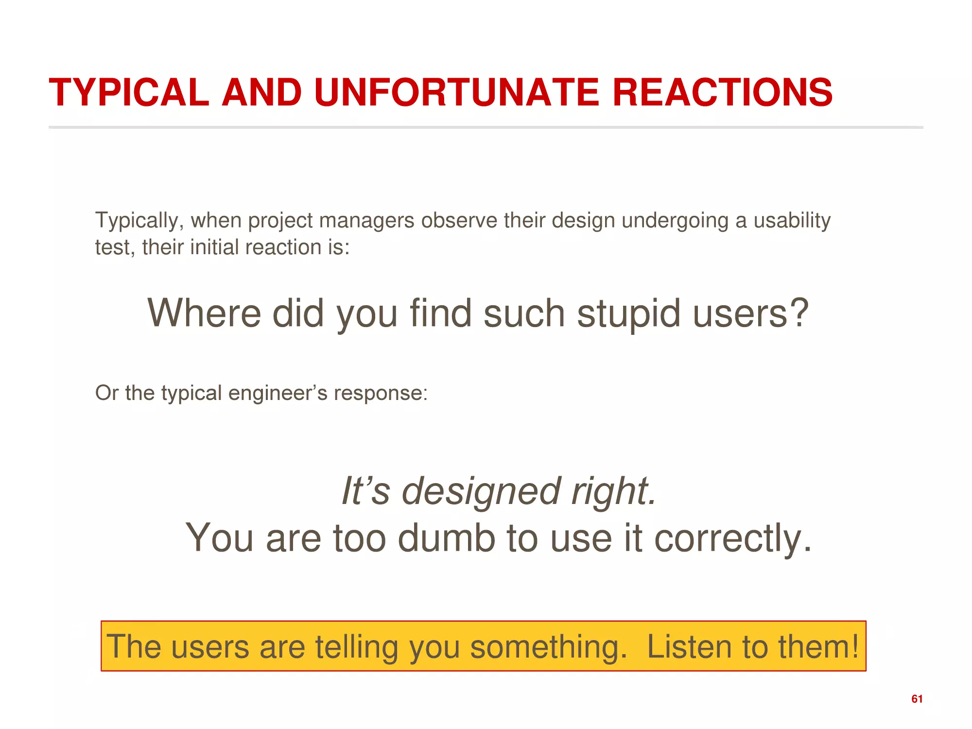
TYPICAL AND UNFORTUNATE REACTIONS
Typically, when project managers observe their design undergoing a usability
test, their initial reaction is:
Where did you find such stupid users?
Or the typical engineer’s response:
It’s designed right.
You are too dumb to use it correctly.
60
TYPICAL AND UNFORTUNATE REACTIONS
Typically, when project managers observe their design undergoing a usability
test, their initial reaction is:
Where did you find such stupid users?
Or the typical engineer’s response:
It’s designed right.
You are too dumb to use it correctly.
The users are telling you something. Listen to them!
61
EXTRA
62
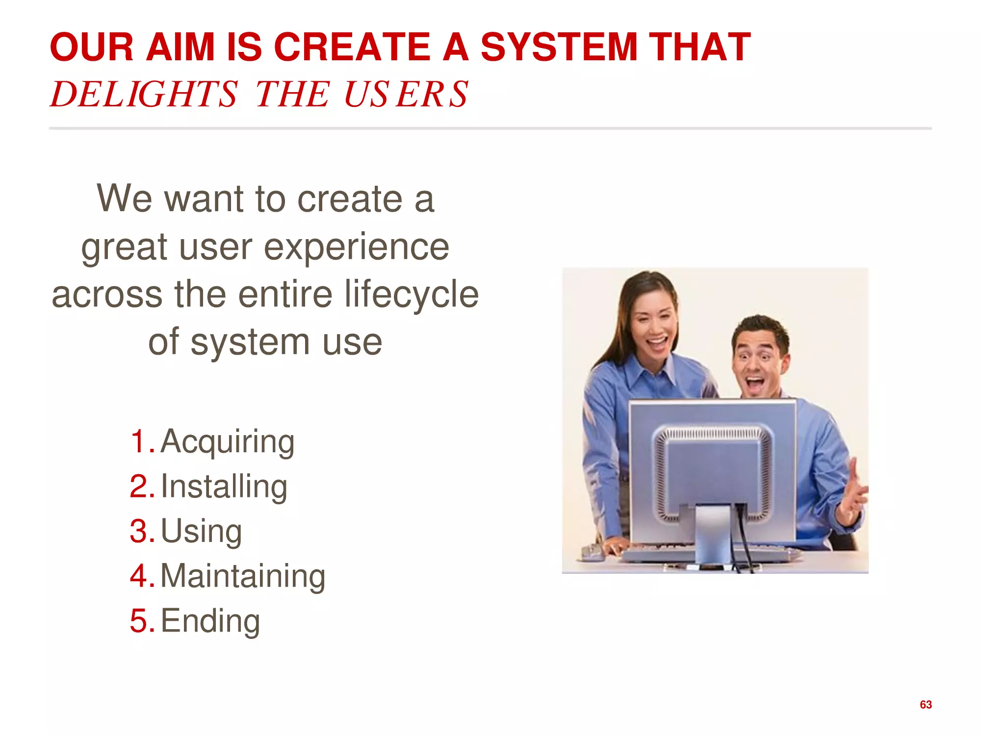
OUR AIM IS CREATE A SYSTEM THAT
DELIGHTS THE USERS
We want to create a
great user experience
across the entire lifecycle
of system use
1.Acquiring
2.Installing
3.Using
4.Maintaining
5.Ending
63
YOUR INTERFACE SHOULD BE SO SIMPLE A
DRUNK PERSON COULD USE IT
Someone took this seriously
http://www.betaboston.com/news/2015/08/28/user-testing-that-mixes-cocktails-and-coding/
64
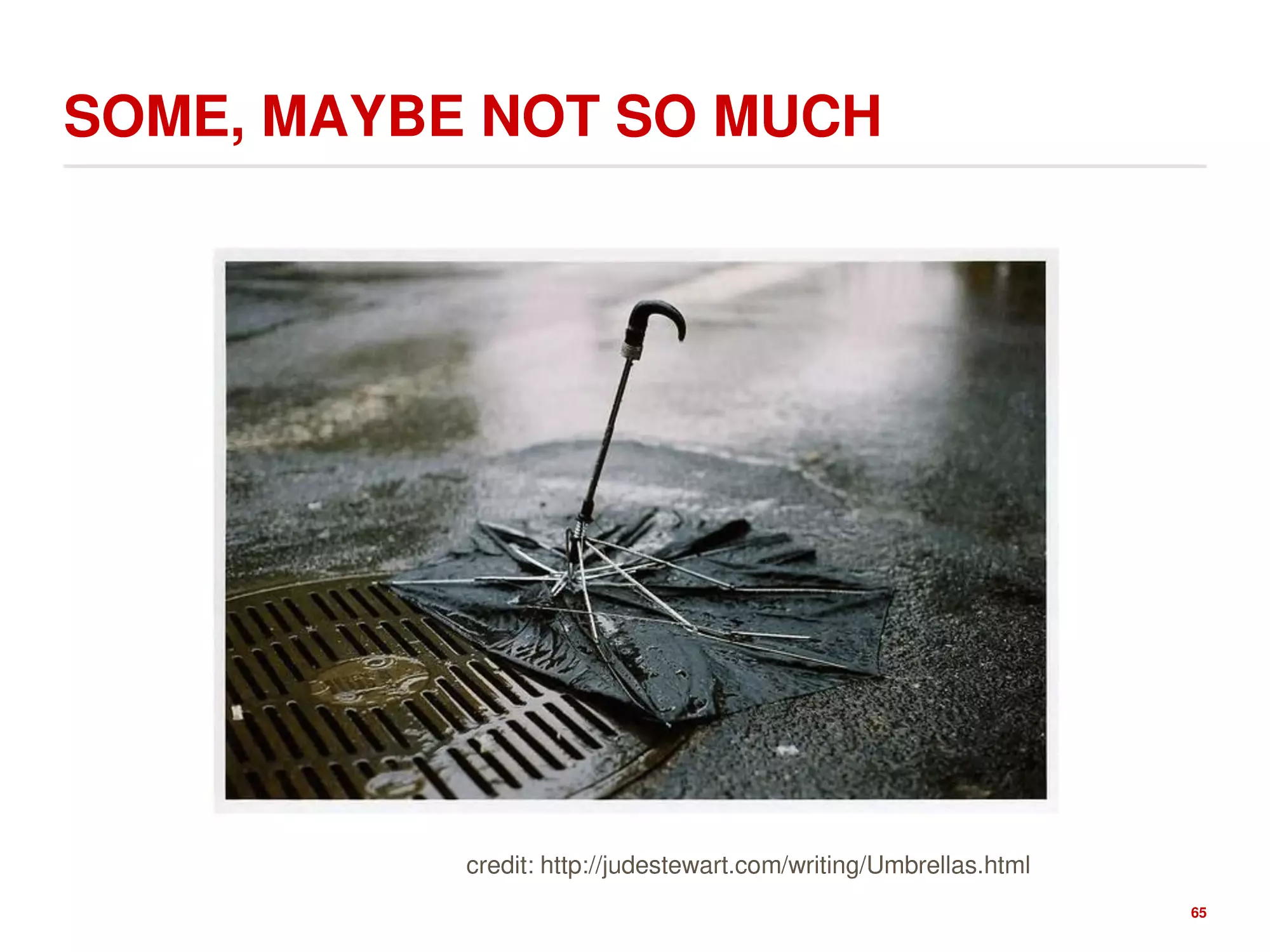
SOME, MAYBE NOT SO MUCH
credit: http://judestewart.com/writing/Umbrellas.html
65
#1: MATCH THE REAL WORLD
1
66
CAUTIONS
Usability And Interviewing Are
Robust
Even if you make a lot of
mistakes in the process
you'll still learn a lot
Online Surveys Are NOT Robust
!
There are many,
many ways
to make mistakes, that will
often destroy the validity of the
results
!
While it's trivial to write and
distribute an online survey, but if
you don't know what you're doing,
there's a significant probability that
you'll end up with garbage
67
USER INTERFACE IS ABOUT A DIALOGUE
The challenge is putting the
dialogue in the right terms and in
the right order.
How to organize all the things a
user could want to do
! Users may not be good at forming
their questions, expressing the
needs.
what do you
want me to do?
Here you go
Do this for me.
To construct a good dialogue,
one has to spend a lot of time watching
Everything in the product design
a lot of different people "talking" with it
contributes to this dialog - from
the button labels/placements to
noises to screen prompts
68
ORGANIZING THE DIALOGUE: TASK
ANALYSIS
1. Identify the individual
tasks to be solved.
1. What must be done?
2. Each task is a goal.
2. What must be done before to
make it possible?
3. Start with the big goal
and then, decompose
hierarchically.
Goal
Preconditions
Tasks on which this task
depends
Information that must be known
to the user
3. What steps are involved in
doing the task?
Subtasks
(may be decomposed recursively)
69
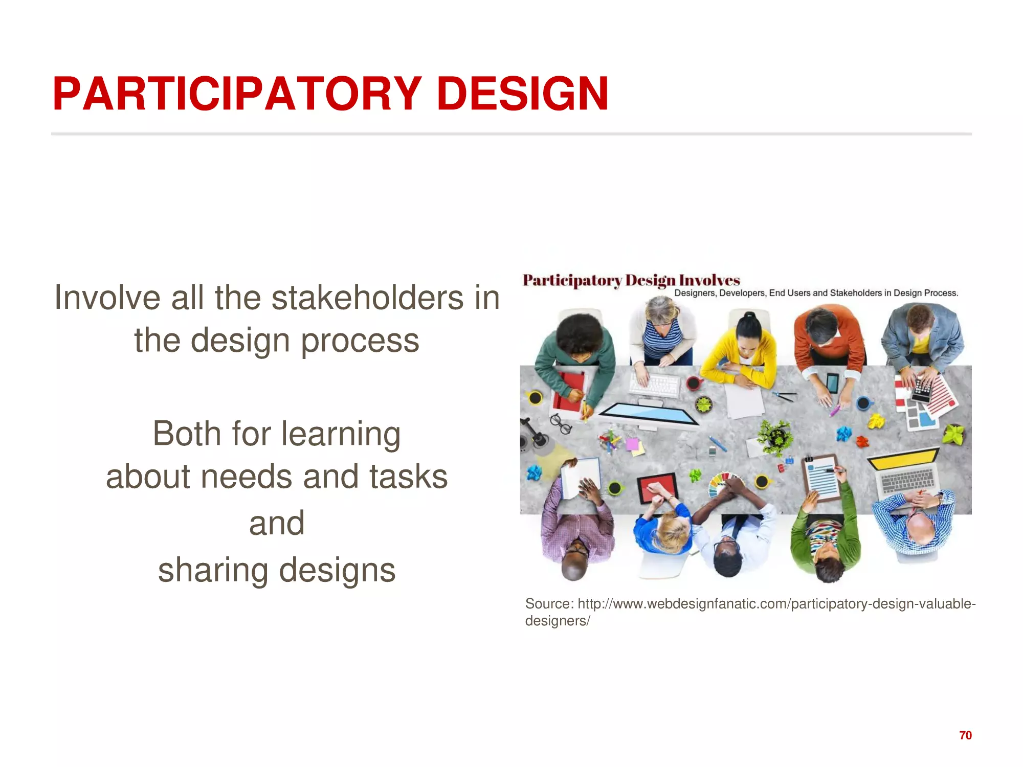
PARTICIPATORY DESIGN
Involve all the stakeholders in
the design process
Both for learning
about needs and tasks
and
sharing designs
Source: http://www.webdesignfanatic.com/participatory-design-valuabledesigners/
70