/


Теги: art animation animation artist
Год: 2022
Текст
NEW FREE RESOURCES! DOWNLOAD PROJECT FILES, VIDEO GUIDES, BRUSHES & MORE!
FEATURES + WORKSHOPS + INTERVIEWS
DISNEY’S
12 RULES OF
ANIMATION
PLUS!
SEVENTH
EDITION
Digital
Edition
KUBO AND
THE TWO
STRINGS
How Laika created an
animated masterpiece
HOW TO...
CREATE 3D FUR & FUZZ
MASTER STORYBOARDS
CONCEPT CHARACTERS
DESIGN SCENERY
Welcome to the latest edition of Animation Artist.
Celebrating the art of animation, discover insights and
techniques from professional artists, and see what it takes to
work and create in the animation industry today. Discover
how Disney’s blockbuster Moana was created, read
interviews and tips from the experts, and learn the
techniques needed to create animation art – including
workshops on designing characters, creating fur in 3D
software, and how to apply Disney’s 12 principles of
animation to your own work. In addition to this, there are
also free resources available on FileSilo, including project
files, video tutorials, brushes and much more. Turn to page
144 for more on how to access your free resources.
Future PLC Quay House, The Ambury, Bath, BA1 1UA
Editorial
Compiled by Dan Peel & Thomas Parrett
Senior Art Editor Andy Downes
Head of Art & Design Greg Whitaker
Editorial Director Jon White
ImagineFX Editorial
Editor in Chief Rob Redman
Art Editor Daniel Vincent
3D World Editorial
Editor Rob Redman
Designer Ryan Wells
Photography
All copyrights and trademarks are recognised and respected
Advertising
Media packs are available on request
Commercial Director Clare Dove
International
Head of Print Licensing Rachel Shaw
licensing@futurenet.com
www.futurecontenthub.com
Circulation
Head of Newstrade Tim Mathers
Production
Head of Production Mark Constance
Production Project Manager Matthew Eglinton
Advertising Production Manager Joanne Crosby
Digital Editions Controller Jason Hudson
Production Managers Keely Miller, Nola Cokely,
Vivienne Calvert, Fran Twentyman
Printed by William Gibbons, 26 Planetary Road,
Willenhall, West Midlands, WV13 3XT
Distributed by Marketforce, 5 Churchill Place, Canary Wharf, London, E14 5HU
www.marketforce.co.uk Tel: 0203 787 9001
Animation Artist Seventh Edition (CTB4228)
© 2022 Future Publishing Limited
We are committed to only using magazine paper which is derived from responsibly managed,
certified forestry and chlorine-free manufacture. The paper in this bookazine was sourced
and produced from sustainable managed forests, conforming to strict environmental and
socioeconomic standards. The paper holds full FSC or PEFC certification and accreditation.
All contents © 2022 Future Publishing Limited or published under licence. All rights reserved.
No part of this magazine may be used, stored, transmitted or reproduced in any way without
the prior written permission of the publisher. Future Publishing Limited (company number
2008885) is registered in England and Wales. Registered office: Quay House, The Ambury,
Bath BA1 1UA. All information contained in this publication is for information only and is, as far
as we are aware, correct at the time of going to press. Future cannot accept any responsibility
for errors or inaccuracies in such information. You are advised to contact manufacturers and
retailers directly with regard to the price of products/services referred to in this publication. Apps
and websites mentioned in this publication are not under our control. We are not responsible for
their contents or any other changes or updates to them. This magazine is fully independent
and not affiliated in any way with the companies mentioned herein.
Future plc is a public
company quoted on the
London Stock Exchange
(symbol: FUTR)
www.futureplc.com
Chief executive Zillah Byng-Thorne
Non-executive chairman Richard Huntingford
Chief financial officer Penny Ladkin-Brand
Tel +44 (0)1225 442 244
Part of the
bookazine series
CONTENTS
FEATURES
10 Interview: Pascal Campion
20 Star Wars Rebels
22 Kubo and the Two Strings
30 The Good Dinosaur
40 Stylised CG: The Journey
46 12 principles of animation
60 Disney’s Moana
22
The successes and setbacks in the
French illustrator’s globe-trotting career
The art team on Star Wars Rebels
explain some of their design decisions
Laika’s artists reveal how CG VFX have
changed stop motion animation
Pixar and Disney artists reveal how the
latest animated blockbuster was made
30
Creating a stylised CG illustration
with an animated feel
Learn the 12 rules of animation that
Disney’s master animators formulated
46
How Disney created stunning water
effects for this animated movie
60
72
6
ANiMATiON ARTiST
WORKSHOPS
RESOURCES
Watch our artist’s video examples of how to
use Disney’s 12 principles of animation
Create character guide sheets to
maintain consistency in your work
RESOURCES & ART
The files, brushes and more to follow
our artists’ tutorials, including…
•Learning to control visual contrast
•Creating fur in 3D software
•Sculpting toon heads in ZBrush
•Creating an animated character
68 Create a figure for animation
72 Establish character sheets
76 Improve your keyframe skills
80 Learn to control visual contrast
84 Applying animation’s 12 rules
90 Create cartoon fur in Yeti
98 Recreate cinematic lighting
102 Design a set for animation
106 How to survive your dream job
112 How to render characters
116 The art of storyboarding
122 How to sculpt hair in ZBrush
123 Sculpt and pose a cartoon head
124 Paint colourful animation art
130 Use a character to tell a story
136 Sharpen your vis dev skills
Guidelines to develop a character from
sketch to animation-ready design
VIDEO EXAMPLES
SEE
PAGE
144 FOR
MORE
How to depict a scene in a story that
conveys emotions through gestures
Three rules to help balance complex
concept art for animation
How to animate a larger-than-life
character following the 12 principles
Use 3D software to create fluffy
cartoon fur for an animation
112
98
How to add a new dimension to your
animation concept art
Design and stage a distinctive
animation environment
106
These 15 tips will help you get ahead
in the animation industry
Discover how you can make your 2D
character designs look like 3D models
Grasp the essentials of storyboarding
and boost your narrative skills
Learn an easy process for sculpting
stylised, cartoon hair in ZBrush
Master a quick technique to sculpt
a cartoon character in ZBrush
Make use of clean lines, layer modes,
lighting and more in Photoshop
Create a character with an emphasis
on animation and narrative
Learn how to sketch, colour comp
and add details to an environment
130
123
ANiMATiON ARTiST
7
FEATURES
55 pages of interviews, industry insight, pro tips and in-depth features
to give you inspiration and help you to get ahead in animation!
10 Interview: Pascal Campion
20 Star Wars Rebels
22 Kubo and the Two Strings
30 The Good Dinosaur
40 Stylised CG: The Journey
46 12 principles of animation
60 Disney’s Moana
The successes and setbacks in the
French illustrator’s globe-trotting career
60
The art team on Star Wars Rebels
explain some of their design decisions
Laika’s artists reveal how CG VFX have
changed stop motion animation
Pixar and Disney artists reveal how the
latest animated blockbuster was made
Creating a stylised CG illustration
with an animated feel
Learn the 12 rules of animation that
Disney’s master animators formulated
How Disney created stunning water
effects for this animated movie
A hand-drawn
ocean wouldn’t have
looked as good as
what we did in CG
22
46
8
ANiMATiON ARTiST
10
20
40
30
ANiMATiON ARTiST
9
INTERVIEW
Artist Portfolio
PASCAL
CAMPION
CHILLS
“I was playing around with buildings in this one – how to suggest buildings
without showing buildings. Buildings feature a lot in my work.”
Gary evans maps out the successes –
and setbacks – in the French illustrator’s
globe-trotting career
fter failing to get into his firstchoice art school, Pascal
Campion took a job as a
dishwasher in Strasbourg. It
was Christmas, dishes piled up all
around him, and he’d recently lost half
a tooth after being jumped by muggers
outside the restaurant. The Frenchman
remembers thinking: “Man, I’m so
going to enjoy being an artist.”
Pascal knows how to roll with the
punches. He got into the art school
A
Artist
ProFiLe
Pascal Campion
LoCation: US
Favourite artists: Andrew Wyeth,
Bill Watterson, Leo Espinosa, Tatsuro
Kiuchi, Carl Larsson, Frederic Remington,
Al Parker, Jon Romita Jr
soFtware used: Photoshop, Flash
web: www.pascalcampion.com
10 ANiMATiON ARTiST
the following year. In fact, many of
the animator’s greatest achievements
have followed major setbacks. The
first of these came when he was very
young. He still thinks about the incident
to this day.
Pascal was born in River Edge, New
Jersey. When he was three years old, his
parents separated and he moved from
America to France. His mother is
French. He describes his childhood in
Provence as “pretty idyllic” and
remembers being surrounded by the
“sunny, beautiful, vibrant colours” that
now characterise his work.
His family owned all the Tintin and
Asterix stories. Older brother Sean was
into Marvel comics and would let Pascal
read them, but only after getting him to
copy the covers. Pascal says Sean is the
main reason he’s an artist.
WHEN THE SNOW FALLS
“I love doing facades; I love people watching. I do a lot of these types of images
and I’m always trying to figure out what other people’s lives are like.”
PASCAL CAMPION
IT WAS 1980 SOMETHING,
THE SUMMER WHEN
“I was feeling low because of work, so
I did this piece that reminded me of
the summers I spent in Alaska.”
All I had to do was press Enter and
the computer would play back all
the frames I had just drawn
ANiMATiON ARTiST
11
INTERVIEW
WATER GAMES
“At the beginning of my Sketch of
the Day series, there was a period
when I was drawing animals doing
funny things. I still like doing some
for my kids now and again.”
THE VIEW
“This is a weird one for me.
When I did it, I didn’t like it
at all and showed it to barely
anyone. But now it’s one of
my most popular images.
Funny how that works.”
A LITTLE CLEANING, A LITTLE
DANCING, A LOT OF LOVE
“I’ve done 4,000 Sketch of the Days now!”
Yet not everyone was so
supportive. When he was 10, Pascal told
an art teacher he wanted to be an artist
when he grew up. He showed him work.
“In a very serious tone,” the Frenchman
says, “the teacher said I should probably
not consider this, because I just didn’t
have it. Up until that point, I really liked
that teacher. That crushed me.”
UNUSUAL METHODS
Pascal studied at the Arts Décoratifs de
Strasbourg. To get in, he sent a
portfolio, then travelled to the school
for a week of tests. He picked narrative
illustration as his major. But before that,
the teachers – unusual in their methods
– worked out what students liked to do
12
ANiMATiON ARTiST
The teacher said I should
probably consider not
being an artist, because I
just didn’t have it. That
crushed me
best and made sure they did the
exact opposite: everything from
engraving to metalwork. In his final
year, Pascal created three projects. Two
of them had to be paid jobs, otherwise
he couldn’t graduate.
“They didn’t tell us how to do things
at all,” Pascal says. “We had to come up
with that on our own, which was very
frustrating at first. That said, the big
thing we did focus on was on how to tell
stories, how to control what you’re
saying with your images, and how to
make sure the audience understands
what you want them to understand.”
Before graduating, in 2000 Pascal
spent a year as an exchange student at
the School of the Museum of Fine Arts
PASCAL CAMPION
MEET ME AT FIVE?
“This image was originally created for a
workshop for ImagineFX! But afterwards
I did this version, which is slightly different.”
in Boston. He also worked at Tom
Snyder Productions. It was his first job
as an animator.
Pascal flew to Kansas City to live with
his brother. He wanted to work in the
comics industry. But his career plans
changed after Sean built him his first
computer. Pascal began playing around
with software called Macromedia Flash.
“All I had to do was press Enter and
the computer would play back all the
frames I had just drawn,” Pascal says. “I
fell in love with it because I could make
animations instantly.”
THE GOOD KIND OF HEAVY
“Every day in the afternoon we’d go
with the kids to the park next to our
house. They were still small enough
that I could balance them all on the
see-saw. I loved those days.”
LIFE ON THE UP – AND DOWN
He posted these animations online and
job offers soon followed. He worked
ANiMATiON ARTiST
13
INTERVIEW
FLUID
“This is a summer image. I was
just happy that day. I remember
doing it and just singing to
myself the whole time.”
I start with a colour and
work with it. Sometimes I draw
a character or an environment
and see what happens
14 ANiMATiON ARTiST
Pascal camPion
SLOWING DOWN
“This one is new. I was feeling a
little burnt out from a bunch of
stuff, so I did it to remind myself
to slow down. It worked.”
You don’t
need to be
tHe best
Pascal explains how having
children changed his outlook on a
career in art
After having kids I found that, because I was
more focused, I could do more work in fewer
hours. Being busy doesn’t necessarily mean I’m
being productive. This was a good thing for me
to learn and accept.
I had to accept it because life changes all the
time. My work will change with it, and that’s
okay. I say this because sometimes the
conditions are ideal and I do a great piece,
and sometimes I’m sick or my kids or sick, and
my focus is split and my computer is slow and
my dog needs to go out … So my work will be
what it will be. I had to learn how to live with this
and accept it, which was not the case before I
had kids.
I also chose to accept not being the best,
instead of being the best I could be, which is
very different. Before having kids, I wanted to be
the best, no matter what discipline, and that
made me work more and not take care about
anything outside of work. When we had our first
daughter, I realised I wanted to spend some time
with her. She had a schedule. I had to get on that
schedule if I wanted to be a part of her life. I did.
And, oddly enough, my work completely
changed and I loved that change. I felt a little
stupid for not slowing down earlier. I enjoyed
what I was doing more, because I wasn’t doing it
all the time.
TAHOE
“When I drew this image, my family and
I had just come back from skiing in Tahoe,
the largest alpine lake in North America.”
at studios in San Francisco (where
he worked on a web show), in
Portland (where he became a storyboard
artist), in Honolulu (where he met his
future wife), and in Portland again
(where he became a director). He put
so much into his work, his personal
life suffered.
“I was realising how empty my life
was. I had nothing going on outside of
work and had a hard time making and
maintaining contact with anybody.
I had broken up with my girlfriend a
while back. I was very sad about that.”
Pascal moved back to San Francisco
to be with his girlfriend. He accepted a
position at a company called Leapfrog as
a lead animator, but he spent most of his
time managing others. So he decided to
come into work a little earlier each
morning and draw. The Frenchman now
has over 4,000 of these daily drawings.
“I start with a colour,” he says, “and
work with it. Sometimes I draw a
character or an environment and see
what happens. In almost all cases,
though, I have an idea of the emotion.”
His Sketch of the Day series led to
some big freelance jobs. DreamWorks
asked Pascal to do development work
on a feature film. “I actually got fired,
because when we got to production
work – that’s the part where you stop
doing conceptual work and you have to
start rendering the elements as they will
appear in the movie – they realised I
didn’t know how to do that.”
A SECOND CHANCE
DreamWorks put Pascal on another
movie, Mr. Peabody & Sherman. He’s
also worked on projects for Disney,
Paramount, the Cartoon Network, and
many more. He creates covers for
books and comics, does editorial
illustrations, and works on video games
and commercials.
Pascal describes working in these
various fields as similar to speaking
different languages. They each
ANiMATiON ARTiST
15
INTERVIEW
‘tHe bLanK PaGe sCares Me’
Pascal explains how he created a striking image of a couple in love…
BLUEGRASS AND FIREFLIES
“This image was inspired by my time
living in Kansas City, Missouri.
I stayed there with my brother Sean,
who built me my first computer.”
require a different part of his brain.
“In animation I don’t care too much
about the quality of the drawing,
because all I’m doing is matching it to
the approved design, which is usually a
simplified design.
“I can’t listen to music or talk to
anybody, because my whole brain is
focused on getting everything to work
together. I’m also moving pretty fast
because I try to keep a spontaneity of
motion – a flow and rhythm.”
1
a textured start
I add a little bit of
texture, just so I don’t have
to draw on a blank page.
Whether it’s on canvas or on a
digital screen, the blank page
scares me. I do a loose pencil
sketch of where the windows
will go. Next, I establish my
zones of contrast: dark inside
and bright outside. This is
more for me to know which
type of values I’ll be using in
different areas of the image.
2
the happy couple
4
introduce some greenery
5
a dramatic swathe of light (right)
I start adding details to the façade, and I block in
my couple very loosely. My pencil sketches aren’t very
good – at least, they aren’t clean. I know what I want, but
because I don’t use lines in the final I don’t bother
cleaning them up. In addition, if they’re loose it enables
me to be more creative when I paint them. I make the
figures dark to suggest intimacy.
SETTING THE MOOD
Pascal describes his style as “loose and
pretty utilitarian.” He wants the
audience to understand in a split second
exactly what’s happening in the image.
So he makes each visual element as clear
as possible. The same goes for the overall
message – the audience shouldn’t have
to work anything out. He uses light to
set the mood, something that’s
becoming an increasingly important
part of his work. And he edits ruthlessly.
No matter how good it looks, if it gets in
the way of readability, of clearness,
I try to keep a
spontaneity of
motion – a flow
and rhythm
16 ANiMATiON ARTiST
3
supporting cast
I add all the other figures.
They are there to support the
main characters, so I freehand
them. Most of my images are
like that: there’s one set of
characters I’ve really thought
about and everybody else is
just freehanded. It makes it
fun for me to draw.
I add the tree to create a little bit of depth and
make sure the leaves don’t cover any characters and that
they’re not too close to the characters, to ensure the
painting is readable.
This a late-afternoon image, so I made a big
swash of light across the building. I prefer early daytime,
late evening, or night-time, because the colours are
more dramatic.
PASCAL CAMPION
ANiMATiON ARTiST
17
INTERVIEW
I’m trying to get
the emotion to be
the story, without
making an abstract or
gratuitous painting
MY RAINY DAY FRIENDS
“Growing up in Provence, I remember
mostly sunny, beautiful vibrant
colours everywhere. But I just like
ducks, rain and moody weather.”
18 ANiMATiON ARTiST
PasCaL CaMPion
DUSK
SOMETIMES YOU JUST
HAVE TO SAY JUMP IT
“When I’m based in a studio,
I work from home and like to paint
in the morning. I created this image
during one of those days when I
was feeling tired and relaxed.”
“This a metaphor – not necessarily
jump off a rock, but sometimes I feel
I need to take more chances. This
painting’s a way of reminding myself.”
then it has to go. He likes it when
someone who knows nothing about art
can relate to his work.
“I’m trying to get the emotion to be
the story,” he says, “without making an
abstract painting or a gratuitous one.
Not that I have anything against
simply beautiful images. I just have a
hard time making them myself, so I
stick to what I understand. I try to push
my understanding and question it as
much as I can. That’s the French in me,
I think.”
DAILY ROUTINE
SEE, SEE, SEE
“We used to do this
with the kids a lot –
look up and see what
shapes we saw in the
clouds: ‘There, that
one’s a dinosaur!’”
Pascal wakes up at five in the morning
and draws for a couple of hours before
taking his kids to school. He bikes to the
Los Angeles studio where he works as
art director on Green Eggs and Ham, an
animated Neflix series by Warner Bros.
If he’s not there, he’s at home, always
working in the morning, since he’s a
little slower come afternoon. He doesn’t
like to work late and keeps a good
routine because this approach gets
“ideas flowing at a specific time.”
Aside from the Warner Bros. projects,
Pascal is working on several covers for
books and for Marvel comics, a video
game, more commercials, and more
development work. His dream project in
a cover for The New Yorker magazine.
Spurring him on to greater
achievements is his first major setback:
his childhood art teacher. “I think about
him every other month or so,” Pascal
says. “Funny how that works. I’m
spending the rest of my life trying to
prove him wrong.”
ANiMATiON ARTiST
19
Industry insight
Rebels
HOMAGE
The opening scene
of Star Wars Rebels
sets the TV show’s
tone: a return to the
look and feel of the
original 1977 film
with a
cause
The Lucasfilm Animation team discuss how they created
a single image to represent the story of Star Wars Rebels
E
© Lucasfilm Ltd
zra Bridger stands beneath a low-flying
Imperial Destroyer. As it rumbles by
overhead, the warship casts a long shadow
over the young rebel. This, the opening scene of Star Wars
Rebels, sets the tone for the whole series: a return to the
look and feel of the franchise’s original 1977 film.
The team behind the animated TV show – which
premiered on US channel Disney XD in October 2014 –
says Ralph McQuarrie’s original trilogy concept art was
a big stylistic influence. In a key frame created especially
for 3D World, Lucasfilm came up with an image that
captures the essence of the show, Ezra’s journey from
teenage thief to hero.
“The posing,” animation supervisor Keith Kellogg says,
“is accomplished using the tried and true method of
contrapposto – which makes characters look heroic,
rather than bland cutouts. Ezra staring out into the vast
MODEL
Animation
supervisor Keith
Kellogg posed
the main
characters, such
as Kanan Jarrus
beyond highlights the hero’s journey he is about to
embark upon. Kanan, the mentor – slightly behind
but still beside Ezra – represents the help that Ezra
will receive. The Star Destroyer was put in to show the
approaching darkness and struggle that the characters
would need to overcome. We added in the Ghost
swooping in overhead to help sell the existence of the
other characters on the show.”
Developing the render
The image began with a quick sketch, which executive
producer Dave Filoni created. Senior designer Chris
Voy worked on the lighting concept in Photoshop:
“McQuarrie’s work has been a huge influence on the
art of the show, so we referenced his palette here by
picking vivid complementary colours for the light
and shadow sides of the characters. We tried to
delineate rim light but kept shadows nice and
soft. I painted a few variations so we could get
some ideas worked out before settling on the
final version to light.”
In Maya, Keith used Dave’s sketch to
position the camera and the characters.
VFX/CG supervisor Joel Aron then took the
scene and set up lighting to match the look
of Chris’s work.
“Once I was close to complete with
the set, vehicles and characters,” Joel says,
“I assembled each layer in Photoshop,
where I dialled in final colour-looks
and paint-retouching. Chris then went
in on top of my final renders and did
further cleanup to the sky and the
characters. I took the complete image
and sweetened it, as we do with the
production shots – a final colour
grade that pushes the contrast
and tone. Lastly, I added the edge
treatment and film grain, processes
that are identical to our final shot
look for the show.”
We referenced
McQuarrie’s palette
by picking vivid
complementary
colours for the light
and shadow sides
of the characters
20 ANiMATiON ARTiST
The STAR WARS
ReBeLS TeAM
Keith Kellogg
is the animation
supervisor of Star
Wars: The Clone
Wars and Star Wars Rebels.
starwarsrebels.wikia.com
Chris Voy is a
senior designer
on Star Wars:
The Clone Wars
and Star Wars Rebels.
starwarsrebels.wikia.com
Joel Aron is
a VFX and CG
supervisor who
specialises in the
field of lighting and FX.
starwarsrebels.wikia.com
ANiMATiON ARTiST 21
FEATURE
22 ANiMATiON ARTiST
KUBO AND
THE TWO
STRINGS
Mixing CG, VFX and 3D printing, Laika’s fourth stop-motion movie pushes
the medium to new heights, Barbara Robertson meets the team…
he animation studio behind
Coraline and BoxTrolls, has upped
its game once more, delivering
outstanding action on a large scale
with Kubo and the Two Strings. In a
dramatic scene early on in the
feature, the child Kubo and his
mother ride precariously in a small boat that flounders in a
violent ocean. To save them, Kubo’s mother uses the pick
from her Japanese lute to magically part the sea. The scene is a
great achievement for a stop-frame animated film, and it’s
only the beginning of the technical and artistic virtuosity in
this breakthrough feature.
Directed by Laika CEO Travis Knight and based on a story
and character designs by Shannon Tindle, Kubo and the Two
Strings is a fantasy action adventure set in ancient Japan. The
human and mythical characters wear elegant kimonos and
have elaborate forms. Some characters are even origami.
“It’s pretty unorthodox for a stop-motion movie,” says
producer Arianne Sutner. “It’s a quest movie with large
exteriors and big characters. It’s mythological. But at its
centre, it’s an intimate family story.”
“Action in stop-motion is nigh impossible,” explains Travis
Knight. “The spirit of spontaneity is not something the
medium does well, but I wanted to try. What really got me
excited, though, is the emotional core, the story of a boy and
his family and what becomes his surrogate family.”
3D computer graphics helped tell this story in two ways:
Laika’s Academy Award-winning 3D printing team broke new
ground by printing an entire puppet and two characters’
heads in colour in plastic. The visual effects crew crafted water
T
for the incredible ocean scene, extended sets, and created CG
crowds beyond what they had achieved in previous movies.
Although Laika continued to print face parts for Kubo and
all the other human characters’ expressions with 3D Systems’
powder-based printers using techniques developed for
ParaNorman and honed for Boxtrolls, the characters in Kubo
demanded new techniques.
“Powder-based parts are fragile and prone to inconsistency
and breakage,” says Brian McLean, director of prototyping.
“When we looked at the mythical creatures in Kubo, we saw a
sharp nose on the Beetle’s face. The Monkey had hair all over
her face. And, Moon Beast had translucent elements. With the
powder-based printer, the Beetle’s face would end up
rounded, and Monkey’s hair would break. We had to change
the character designs or find a new way to do them.”
Plastic in colour
Laika had first used Stratasys’ plastic-based system for
Coraline, hand-painting the parts to colour them, and still
used that system for internal components. So, Brian called
Stratasys to see if the company might be working on a colour
printer. They were, and they were looking for beta testers.
Brian explains: “The machines had wonderful capabilities. All
the things we loved: dimensional accuracy, fine detail,
workable nested parts, live hinges, things that moved. The
problem was that the software was antiquated. Operators had
to assign colours based on closed surfaces, on shells. Eyebrows
needed a separate shell, for example. It was painting by
number and impossible to get gradients.”
For the powder-based faces, the Laika crew created a UV
texture map in Photoshop, wrapped it around the 3D
ANiMATiON ARTiST
23
FEATURE
COLOUR iS KEY
New colour 3D printing
techniques were experimented
with to ensure the puppets
for Kubo and the Two Strings
looked as close as possible to
their CG concept designs.
24 ANiMATiON ARTiST
KUBO & THE TWO STRINGS
CrOWDs OF CG
sTOP-MOTiON
PuPPeTs
Look development lead Eric Wachtman
explains the complexity of the CG
crowds for Kubo and the Two Strings
GeTTiNG reAl
Developing a new way of
creating stop motion animation
meant treating the puppet
cast like real actors.
object, and sent it to the printer. But, the Stratsys printer
couldn’t use texture maps.
John Hiller, an independent software developer suggested
by Stratasys, helped Laika bypass the printer’s software and
create the colours they needed for Kubo.
“Using John Hiller’s software, we could feed in a texture
map,” Brian says. “The software would identify a colour or
a gradient and get the needed combination of colours from
a lookup table.”
However, Stratasys’ Connex 3 printer had the ability to mix
only three colours of the five available at one time: cyan,
magenta, or yellow, plus black, and white.
“We could now print texture maps with gradients, but the
question was whether we could match a compelling character
design using three colours,” Brian says. “It took creative
problem solving.”
They settled on magenta, white, and cyan for Monkey’s
face; and black, yellow, and magenta for Beetle’s face. Then
We have to use subdivision
surfaces. On a real puppet, they
plug hair into little slots and have
an intricate layering system.
We had to match that
Before the visual effects team began work on the CG
crowd characters, look development lead Eric
Wachtman gathered samples of all the fabric they
would create digitally from the puppet costume team.
“We looked at the fabric under a microscope to find
weave patterns if any, and then came up with
procedural systems inside shaders for weave creation,”
explains Eric. “Everything is digital. We didn’t use
texture maps.”
Although the 45 characters the team would create
shared the same topology, each wore a unique
costume. Modellers created the costume shapes with
Marvelous Designer software.
For the crowd characters’ hair, the team modelled
guide curves and used custom RenderMan procedures
to generate the hair.
“Often, we can’t get away with flat ribbons,” Eric
says. “We have to use subdivision surfaces. On a real
puppet, they plug hair into little slots and have an
intricate layering system. We had to match that.”
To provide lighting and depth of field reference for
the virtual camera, a survey team had stand-in
puppets in costume walk around.
The effects team didn’t use crowd software to
create the characters; they positioned each carefully
crafted CG character in the live-action plates.
came Moon Beast, a huge (by stop-motion puppet standards)
spiny, translucent, and luminescent character.
“We knew he could benefit from being printed with plastic,
but there was no way we could achieve him with only three
colours,” Brian says.
Thinking out of the box
To make Moon Beast a reality, the team did some creative
thinking: “He had translucent elements,” Brian says. “We
were shooting stop motion, so we wondered if we could
photograph him under different lighting exposures and use
each as a mask.” After running a battery of tests, the team
soon discovered that if they created a gradient using the
ANiMATiON ARTiST 25
FEATURE
PersONAl PriNTs
uNsuNG HerOes
Visual effects supervisor Steve
Emerson explains the unique process
used to create facial expressions
Each lead character had its
own 3D printer set to its
colour requirements.
Laika animators create facial expressions using sets
of 3D printed parts. It’s up to the roto-paint artists to
erase all those thousands of lines; they paint them
out as they have done since Coraline. For Kubo,
though, they upped the game.
“The puppets have a face mask, an eyeball, and
an animate-able eyelid,” says Steve. “This time, for
the first time, we painted out the gap between the
eyelid, the eyeball, and the face mask. We tried it
and it was so interesting that Travis [Knight,
director] rolled with it. We’d never seen anything
like it before. It gave the puppets more of a
human quality.”
white and black resins, the white would pop and the black
would fade to invisible.
“We worked with the visual effects team on this,” Brian
says. “We printed Moon Beast in black, white, grey and clear,
then photographed him under different lights. VFX used each
photograph as a different mask. We got shimmer, gold, glows.
It was amazing, and a huge leap of faith.”
Moon Beast became the first puppet printed entirely with a
3D printer. It was also the first time animators used a puppet
that would look different in the final shots.
“It was nerve wracking,” Brian says. “The puppet didn’t
look like the artwork until post-processing.”
A proof of concept test during production, though,
convinced everyone that the technique would work, and
justified installing another printer.
“Because the printer could use only the three colours and
replacing resin is a long laborious process, we had separate
printers for Monkey, Beetle, and the Moon Beast,” Brian says.
CG water in kubo’s world
The 3D printing team gives Laika’s filmmakers the freedom to
have puppets with nearly unlimited facial expressions and to
work with puppets difficult if not impossible to create in any
other way. The visual effects team expands the world in which
these puppets perform.
Despite its name, stop-motion animation is live-action
filmmaking even though the ‘action’ takes place one frame at
a time as animators position and reposition puppets on stage
26 ANiMATiON ARTiST
sets. Thus, visual effects artists at Laika employ similar
techniques and have similar roles as their counterparts in the
live-action world. They build environments, extend sets, and
create CG characters. Their toolset includes Maya, Katana,
Nuke, Mari, Houdini, RenderMan Reyes and RIS.
“Kubo pushed us harder than any of our past projects,” says
visual effects supervisor Steve Emerson. “Kubo goes on a
worldwide odyssey through mythical Japan and we knew out
of the gate that we would be heavily involved in those
environments. And, Kubo is a storyteller. When he tells a
story, crowds in the village gather. We knew we would need to
create CG extras.”
The biggest CG environment and arguably biggest
challenge was the ocean, which needed to be too big and too
active to create practically. “We had never done water with
this scope at the studio before,” explains Steve. “My priority
became finding a water specialist.”
That specialist was David Horsley, who had received a VES
nomination for the water simulations in Life of Pi. “We knew
he could deliver photorealistic water from day one,” Steve
says. “So from then on, we worked with David to make the
water feel like it belonged in Kubo’s world.”
Oliver Jones, who rigs practical models, provided
animation tests of water created with practical materials for
reference. “We looked at those and at the artwork to come up
with our design aesthetic,” Steve says. “Then, we got to work.”
For calm waters, the team used fractal patterns in Houdini.
“We wanted a lot of negative spaces and surfaces balanced
KUBO & THE TWO STRINGS
liVe ACTiON eFFeCTs
The VFX team at Laika employ
similar workflows to live-action film,
software includes Maya, Katana,
Nuke, Mari, Houdini, RenderMan
Reyes and RIS.
ANiMATiON ARTiST
27
FEATURE
HiDDeN CG
Every scene in Laika’s films is
touched by CG, whether you
realise it or not.
28 ANiMATiON ARTiST
KUBO & THE TWO STRINGS
lAik A TurNs TeN!
From its first film to its fourth, the
little studio that’s housed in Portland,
Oregon has proven that stop-motion
films are viable and evolutionary
CHAr ACTer FirsT
Laika’s success is built on delivering
believable characters and performances.
nicely with areas of dense information,” Steve says. “We
could do that quickly in fractals.”
For choppy water, Oliver had built a physical rig made of
iron on which he had layered various materials, and then he
was able to animate the rig.
“We keyed in on patterns we could blend with an ocean
simulation to get a Kubo look,” Steve says.
“We wrote a herringbone whirly pattern in Houdini and
RenderMan and had a mix between a displacement shader
and an ocean simulation,” says look development lead Eric
Wachtman, explaining: “The shader is attached to the
simulation and they work together. David orchestrated the
blending back and forth.”
For the big waves, the crew referenced the artwork, and
then created a single plane with a wave simulation on it.
“We used hand-painted textures and procedural
animation; procedural displacement,” Eric says. “We handpainted the texture and detail in Mari and used flow vector
maps to give the illusion of movement. Then we added the
procedural displacement to have this water jibe with other
water we had established.”
For the shots in which Kubo’s mother parts the sea, the
team created the surfaces with mesh geometry and then
added foam, spray, and splashes with particles on top. Look
development for the water took about six months and it was a
year before the team felt like they were in a groove.
“We never want the VFX to be intrusive,” emphasises Steve.
“Hopefully, the first time you see it you just respond to water.
Then if you look again, you might notice the cool design
aesthetic that’s in there. We wanted something beautiful that
belonged in the world.”
Creating CG water was only one way in which the visual
effects team helped transport the puppets and the audience
into the gorgeous, magical world of Kubo and the Two
Strings. The striking film is a powerful example of how a
seamless blend of 3D technology, CG visual effects and stopmotion can create something unique and beautiful.
“I’m proud of the innovation here,” says founder, CEO, and director of the
current film Kubo and the Two Strings, Travis Knight. “We’ve taken a
stodgy art form to a place it’s never been before. What I’m doing now is
the most satisfying and creative thing I’ve ever done.”
In terms of crew size, the studio hasn’t grown much in 10 years. The
total staff for the studio’s first film, Coraline, was 450. The total staff
on Kubo, was 472. It gives the studio a fun, family feel.
“I think the biggest change in a department in terms of numbers is the
rapid prototyping department,” says producer Arianne Sutner. “We have
more people in that department supporting replacement faces.”
The rapid prototyping department is responsible for Laika’s main
innovations in puppetry. Laika’s Brian McLean and Martin Meunier
received a Scientific and Engineering Award from the Academy in 2016
for their pioneering use of rapid prototyping for character animation in
stop-motion film production.
“We were probably the first to do replacement animation,” Arianne
says. “And, we’ve continued to improve our character animation, learning
how to make [the puppets] emote in subtle and human ways.”
The second innovation has been in the use of visual effects to push
the puppet world off the “table-top” and into expansive environments
with crowds of characters.
“The goal Travis [Knight] had in the beginning was to tell stories in
any genre,” Arianne says. “But, there were limitations with stop-motion
and as a producer, I would veer away from scripts with too many
characters or too much action. The technology to do what we felt
comfortable doing wasn’t there 10 years ago. But now I’m working on
an incredible action adventure. It’s dynamic and we’re able to do it.
There’s nothing we’re afraid of trying. We want to take on bigger
challenges – a movie every year. It’s wonderful that Travis is committed
to making these movies.”
Arianne and Travis attribute Laika’s success in part to the stability of
the team. “We’ve had 10 years of keeping the band together,” Travis
says. “We can do things now with camera, lighting, set fabrication,
visual effects, faces, and so forth, that we couldn’t have done four
years ago. It’s unusual for a stop-motion team to be together as long
as we have, but because of that, we can do these things.”
The studio’s success is also tied to the willingness to experiment
with new technology. “We don’t stick to certain rules,” Arianne says.
“We have breakthroughs on every film. The goal is not to be limited by
or defined necessarily by stop-motion but by the movies we’re making.
The way we work is unique. All our characters move a frame at a time;
they’re real things in space with real light, and there’s a magic to that.
But, no part is not touched by CG. We don’t do that because it’s easier.
We have a reason. It becomes something new on the screen. I wish
we could come up with a name for what we’re doing. Maybe we
should call it LaikAmation.”
ANiMATiON ARTiST
29
COVER STORY
MAKING
THE GOOD
DINOSAUR
James Clarke uncovers Pixar’s creative journey to
bring a dinosaur and his boy to the big screen
30 ANiMATiON ARTiST
THE GOOD DINOSAUR
ixar doesn’t do things the
easy way. Many of its major
releases have been shelved,
redeveloped and reworked
before an eventual, delayed
released, including Toy Story
3. The Good Dinosaur is on
that list. The film is about a dinosaur and his human
companion overcoming dangers to find a way home,
and itself had to clear many hurdles, including
characterisation, setting, tone and the creative
challenge of telling a story that offers a fresh take
on a classic scenario. Director Pete Sohn, story
artist Kelsey Mann and animator Mike Venturini
reveal how and why The Good Dinosaur is one of
Pixar’s most ambitious films…
P
© 2015 Disney / Pixar
Big country, big picture
The 2009 Pixar short Partly Cloudy has a mood about
it that’s best described as lyrical. Instead of the highly
kinetic style of, say, For the Birds, Tin Toy or Boundin’,
Partly Cloudy has a softer feel – appropriate, really,
given the subject of the story. That short film was
directed by Pete Sohn, and The Good Dinosaur is his
feature-film directing debut.
ANiMATiON ARTiST 31
FEATURE
Scenes develop
(left, top to bottom)
from storyboards to
concept paintings
(this one is by
Sharon Calahan
pictured below)
before they are
modelled, initially
as wireframes.
Then the shading
team get to work
painting and
texturing. It’s only
after all this that
character animation
and lighting effects
are added (main
image, above).
Bob Peterson, screenwriter of Pixar’s acclaimed Up,
“originally pitched a fun flip of a boy and a dog,” Pete explains.
“So, digging into that, we started to build this story of survival
and coming-of-age.” Despite the dinosaurs, Pete (pictured
below) uses the words “real and true” to define a key sensibility
in The Good Dinosaur. The fantasy elements are never allowed
to overwhelm the heart of the story.
“When you think it’s a simple
story,” adds story artist Kelsey Mann,
“it’s harder. Because it’s so simple,
there’s nowhere to hide when you’re
reducing the story down to a couple
of elements.”
© 2013 Disney / Pixar
Getting a grand view
32 ANiMATiON ARTiST
That said, one of the standout elements of The Good Dinosaur
is its high-adventure settings. These take their frontier realism
from crew research visits to Wyoming and Idaho, but Pete
emphasises that the point is not to make the settings look real
but to heighten the action of the film.
Kelsey stresses that Arlo, the dinosaur protagonist, “feels he
needs to get home, so the environment he is in needs to feel
MORE THAN REAL
© 2013 Disney / Pixar
The scenery renders are based
on actual US Geological Survey
topographical data and
satellite images.
hard. We needed it to feel unsafe and not ‘designy’.” Pete adds
that initially “we tried a world where the trees were a little
more graphic,” but this “sort of watered the danger down.”
Referring to the film’s production design (by Harley
Jessup), Kelsey explains that “the art department at Pixar
are making decisions to support the story. You want the
environment to reflect what’s going on in the story, and in
Arlo’s story everything should be supporting the theme. We
You want the environment to
reflect what’s going on in the story,
so if Arlo is having trouble in his
world then the river’s difficult
wanted the river to match what was going on in Arlo’s life: if
he was having trouble in his world then the river’s difficult.”
There’s a long cinematic tradition of using settings in this
way as much more than just backdrops. Pete admits: “I come
from the East Coast. The only way I know these places was
through the movies.” He goes on to cite the inspiration of
the Westerns of John Ford and George Stevens’ Shane, and
makes special mention of Akira Kurosawa and how his films
“showcase the terrain.” He also references the influence of
another Japanese filmmaker: animator Hayao Miyazaki. In
many ways, as in these influences, the environment of The
Good Dinosaur is one of the largest “characters” in the film.
To support bringing the river to life in this way, the
production team created more than 200 shots of the river,
which could be combined with almost infinite variation.
ANiMATiON ARTiST 33
© 2013 Disney / Pixar
THE GOOD DINOSAUR
FEATURE
ANiMATiNG THE WORLD
© 2015 Disney / Pixar
How an environment can become a character
Of The Good Dinosaur’s expansive feel, Mike Venturini (pictured
below) explains that it captures “the beauty and danger of nature:
it’s breathtaking and in the next moment dangerous. We’ve never
had a film with an environment this big.
Usually, you’d use matte paintings. We
have no sky-matte paintings in our film.”
Instead, the production worked with
digitally rendered clouds comprising
millions of particles. This approach
allowed for increased nuance in the
presentation of the environment. For the movie’s landscapes,
terrain-mapping technology was applied in order to exactly
translate the geometry of particular real-world locations to the
virtual environment of the film. Pete notes that in building the
prehistoric world, “this is one of the first films where we’ve
wanted to push the scope of the movie.”
34 ANiMATiON ARTiST
THE GOOD DINOSAUR
ANiMATiON ARTiST 35
COVER STORY
The design reflects the
personality of the character.
Arlo’s young and a bit delicate;
Spot is tenacious and blunt
and wild like a dog
36 ANiMATiON ARTiST
THE GOOD DINOSAUR
NO FOOliN’
The movie plays with
your head, casting the
ferocious-looking
T-Rexes as cowboys.
For animator Mike Venturini a particularly satisfying
part of working on The Good Dinosaur was that “Pete let the
design reflect the personality of the character. Spot is really
tenacious and bullheaded and Pete wanted his face to be
square and blunt. He’s kind of a blocky little character. Arlo’s
young and a bit more delicate and then there’s this egg shape
to his body and round edges. It’s a gentle design.”
Characteristically thoughtful
Pete elaborates: “Originally, we had a blocky Arlo. We wanted
to play on the idea that Arlo is a boy. Arlo is a kind of stranger
in a strange land. He was originally a man-child but I brought
him down to this 11-year-old. How do you make a dinosaur
feel like an 11-year-old boy?” Pete explains that two details
were key to expressing this boyishness: knock-knees and a
wondrous look in Arlo’s eyes. By contrast, Spot, Arlo’s human
companion, is described by Kelsey as being “wild like a dog.”
During the story of The Good Dinosaur, Arlo and Spot
take up with a number of T-Rexes. “Our T-Rexes are so
rugged – there’s an angularity to
them,” notes Mike of their character
designs. “We went with a stoiccowboy-on-a-horse feel for them,
and their design allows for this.”
For Kelsey (pictured left), The
Good Dinosaur is “really different.
It’s not what you would usually expect from Pixar or family
films. I feel like only a place like Pixar can make this movie.”
The Good Dinosaur places a sense of wonder at the heart of
the film. The crux of the journey lies in finding moments of
wonder when the two characters can be in awe of something.
Pete explains that part of this process allowed the crew “to
have fun with scale in different ways,” such as in the very
obvious difference between a dinosaur and a firefly, allowing
them to “push that type of lyricism,” as Pete describes it.
© 2013 Disney / Pixar
liKe A PUPPY
Spot (left) evolved via
colour studies like this
by Bryn Imagire from
sketches by Pete Sohn.
ANiMATiON ARTiST 37
FEATURE
MiKe VeNTUriNi’S PrO TiPS
A guide to smart-thinking your animation
I used to teach
animation. One of the most
critical tests is a pantomimeacting test. In this film we
didn’t have a lot of dialogue,
and it means thought-through
action without words
1
Capture a detail
and make it tangible!
2
Always approach
When you
4
your animation
3
don’t have the
words and you have from a place of what
to consider what’s in
their head, you come
up with really
specific choices
© 2013 Disney / Pixar
5
PlAYiNG wiTh liGhT
Evocative lighting studies by
Director of Photography Sharon
Calahan, and concept art (top
right) of Clawtooth Mountain.
38 ANiMATiON ARTiST
your character is
internalising: what they
are thinking, feeling
and reacting to
Be in tune with showing reactions
to all of the environment
QUirKY
ChArACTerS
Mike notes several
instances that he feels
exemplify the film’s
creative strengths, with key
scenes being those without
dialogue, “Where we see
Spot offering Arlo food. I
thought the acting was
phenomenal,” says Mike as
he describes how the subtle
hesitations between Arlo and Spot echo a
FeATherY FOeS
key sequence in The Black Stallion, directed by Carroll
The cattle-thieving
Ballard. “We used The Black Stallion in the animation
raptors have a distinctive
department. Mostly we focused on the [scene of] the boy
look of their own, very
waking up on the beach and trying to befriend the horse.
different from Arlo’s.
That relationship plays out in complete silence. We
thought it’d be so great to do a film in that style. Ballard
was a great inspiration for us on this film.”
Mike also points to a scene in which Arlo and Spot are
camping and telling each other about their respective pasts.
For Mike this scene embodies “the maturity of the animation
to pull a performance out of silence.”
lyrical beauty in the beasts
Returning to the essential challenge of the storytelling
required for The Good Dinosaur, Pete notes that an
interesting challenge of the work was exploring a narrative
that is “very archetypal and simple: we’ve embraced that, so
that we can exploit it in the lyrical.”
© 2013 Di
sney / Pixa
r
The Pet Collector proves
that Arlo isn’t the only
one with a pet...
Regarding the film’s tone, Kelsey explains
that “it’s more pensive. It’s not filled with activity and
jokes.” Kelsey says of the relationship between story
development and conceptual art development that
“when the story zigs, the art zags. To make a character
come to life is one thing, but to make a character that
you are emotionally attached to is what I’m most proud
of. It’s really hard to create characters that you
care about.”
Pete’s concluding comments stay with what’s emotional
in describing his experience of bringing Arlo and Spot’s big
adventure to the screen: “Building the relationship between
these two has been an inspiring parallel journey with my
own making of the movie. Arlo’s naïve to the dangers of the
world. It’s been very moving for me.”
ANiMATiON ARTiST 39
FEATURE
40 ANiMATiON ARTiST
STYLISED CG
:
G
C
d
e
s
i
l
y
st
THE
JOURNEY
Emilie Stabell shares how she turned
a 2D illustration into a 3D masterpiece
ometimes a piece of
artwork just
demands to be
rendered in 3D, and
that was the spark
that ignited Media
Molecule’s Emilie
Stabell to spend a year adding an extra
dimension to a beloved 2D image.
Emilie is fan of illustrator Sam Bosma, and
in particular his concept Stability. “When I
showed his illustration to a friend, I joked:
“Imagine if I made this in 3D. It would be
absolutely insane.” Not long after that, I began
modelling the first asset. The sheer scale of the
project was quite overwhelming, though, so
on the first day I started by creating a cube in
Maya, and that was it: a small beginning.”
S
Emilie says her workflow was very simple:
Maya was used for modelling, Photoshop for
texturing and ZBrush was used to project from
the concept. Once her 3D model was complete
she rendered using Maya Hardware 2.0, and
also used After Effects and Photoshop to add
the finishing touches to the animated scene.
Start simple
Emilie began by blocking out the assets in
Maya, using an image plane of the concept
and setting her camera to front view. Using
simple primitives, she was particularly careful
to make sure the silhouettes matched the
illustration. “Since the geometry is flat-shaded
and wouldn’t be deforming, it gave me a lot of
freedom in how many pieces each asset can
consist of,” says Emilie. “As long as I
ANiMATiON ARTiST 41
FEATURE
THiNKiNG AHEAD
TEXTURE CONTROL
“I make sure that my model doesn’t
cover up the outline on the concept,”
explains Emilie. “I’m going to need
that little bit of extra space for when
I add my own ‘toon’ outlines later.”
“When texturing in Photoshop, you want all the layers
you paint on to be ‘clipped’ to the mask at the bottom
of your group. This will keep your structure simple and
easy to navigate. Use your ZBrush texture as a guide to
where the details are positioned on the model.
Each asset was treated as a separate,
minature project, so that painting
remained fresh and fun
was satisfied with the look of my silhouette
from all angles, I knew I was on the right track.
In a sense, this project was devoid of many of
the usual technical, and tedious, aspects that
go into creating successful 3D, which is most
likely the reason why it kept being fun to work
on the entire way through.”
How the lighting hit the geometry also
became irrelevant. “As long as the silhouette
looks good, you’re on the right track,” says
Emilie, explaining how focusing on the front
view to match her geometry with the
illustration is very forgiving for objects on the
Z-axis: “As long as they’re overlapping in the
right order… It’s really a rather flexible,
different and fun way to do 3D.”
42 ANiMATiON ARTiST
Emilie loved seeing all of the disparate parts
come together to bring the image to life. “I
have never created anything of this scale, and
proving to myself that I had the persistence
and motivation to do so was a wonderful
experience,” says Emilie. “From a technical
point of view, painting the textures gave me a
lot of joy. Each asset was treated as a separate
miniature project, so I never really managed to
get tired of a specific part of the pipeline, and
painting remained fresh and fun.”
Come together
That painting process began in earnest once
the silhouettes were finished, Emilie then
created the UVs and exported the mesh as an
.obj file and took it into ZBrush. “I projected
the texture from the concept to use as a guide
for the hand-painted textures I made in
Photoshop. I imported the .obj file, divided the
geometry a few times to get a good amount of
resolution for the Polypaint and then
positioned and scaled the model so it was
ready for projection.”
The next step involved using Spotlight to
import and project the concept onto the mesh.
Emilie checked her projection work was okay
and then exported the files by going to
Zplugin>Multi Map Exporter, and choosing
Texture From Polypaint.
With her texture exported from ZBrush and
opened in Photoshop, Emilie moved into
Maya and took a UV snapshot of the assets’
UVs to set as a layer on top of the ZBrush
texture. She then created a mask for all of her
UV shells and grouped them into appropriate
subgroups for ease of use, in this case: bird,
wing, thighs, legs and so forth.
STYLISED CG
expOrTed TexTureS
Making textures is hard work, but the
results are worth it
BiTS ANd pieCeS
An overview of all the
main assets Emilie
created throughout her
lengthly process – over
200 in total.
“This approach allowed me to create
clipping masks for each group so I needn’t
worry about ‘colouring within the lines’,”
explains Emilie. “Another important thing to
note is to always make sure your masks are a
couple of pixels wider than the actual UV shell,
otherwise you might run into issues with Maya
displaying black edges around the seams.”
When it came to the painting, Emilie began
by applying a flat base colour to everything
using the Paint Bucket Tool and her own
brushes: “Then I quickly painted some rough
gradients and colour vibration using my
Awesome Paint 1 brush. At this stage, I didn’t
worry about precision at all, as it was simply
a case of applying some nice gradients and
bold colours,” she says.
Once she had something decent to work
with, it was time to switch to the Smudge Tool
using her Smudge Blender brush: “This brush
is optimised for the tool, so I didn’t get any of
the lag you’d normally experience when using
Here you can see an example of what a texture looks like when exported
out from ZBrush. “Below it is my finished texture painted in Photoshop,”
says Emilie. “You will get a good sense of the before and after, and just
how much work goes into the making of the texture. The projection
simply provides a rough guide to where important aspects such as eyes
and key details go on the model – the rest is up to you.”
Smudge. Furthermore, it left behind a bit of
texture, creating that nice, painterly effect
From here on, it was a process of going back
and forth between painting and smudging
until I was satisfied. Lastly, I drew the inner
line art, as I planned to apply an outline as
my final step,” she explains.
keep going
As you can see from her workflow, Emilie’s
task to texture and paint every asset by hand
was a mammoth effort that involved creating
over 200 assets. “The hardest part was keeping
at it and not giving up on it halfway through,”
she says, adding: “When I had done roughly a
third of the work, I had a short period of time
where I really had to push myself to keep
going. The sheer amount I knew I had left to
do, made it seem like I would never finish.”
This is when the plan to treat each asset as a
separate project came into its own: “Without
this type of workflow, I am almost certain that
I would have canned the project long ago.
Hence, I want to stress the importance of
planning, folder structure and consistency.
They are your best friends when doing
something of a larger scale.”
But the end was in sight, the assets had been
modelled, textured and positioned, and Emilie
just had to build her surrounding scene as
depicted in the concept. “I started by setting up
a camera with a simple 180 rotation around
the model and built the environment from
there. This is also the point in time where I
started to think about how the environment is
supporting the narrative and is helping
enhance the original concept,” she says.
As the story concerns a group of explorers
hunting for pirate treasure in a vast dried-up
ocean, some of the scene’s elements – such as a
pirate flag, a sunken ship and a chunky, rusty
metal piece emerging from the sand – were
designed and modelled to support the
narrative. “I wanted to hint at the story.
ANiMATiON ARTiST 43
FEATURE
ApplYiNg liNe ArT
Adding the final outline to 3D images
like the ones in this project is easy
“In order to add a final outline for your images, simply go to
Rendering in the dropdown menu in Maya, select the model
and go to Toon Assign Outline Add New Toon Outline.
In the attribute editor, you’ll find a few helpful sliders to
tweak the look. The first thing I do is to change the Profile
Lines from Paint Effects to Offset Mesh as this will allow you
to smooth the outline. You can now go in your Outliner and
select the ProfileMeshes group, and either subdivide it or
simply hit 3 for a smooth preview. Now you want to tweak
the Line Width under the Common Toon Attributes. Here you
can play around until you get a thickness that you like.
Next, you’ll have to decide if you want Crease and
Intersection Lines, which are also found under the Common
Toon Attributes. I tend to stay away from Crease Lines as
they usually don’t look good; Intersection Lines are
sometimes helpful, but this depends on your project.
The final thing to do is to choose the colour of your
outline. You do this by expanding the Profile Lines menu
below the Common Toon Attributes menu and setting your
Profile Color. If you’ve chosen Intersection Lines or Crease
Lines, the colour of these can be changed in their
respective menus as well.
Once you’re happy with the look, all that’s left to do is
to clean up the scene and you’re ready to go. To do this,
delete any unused notes as well as the reference plane,
save the file and that’s it! You’ve now created a finished
beautiful little asset that’s ready to be imported straight
into the master scene.”
dOiNg iT righT
The amount of work I put into each of
the assets means that I now have a library
of cool characters and props
This may not be noticed by the audience,
but it helps me as a creator to inject a sense of
meaning and history into the scene in the
hopes that it will resonate.”
Rendering, says Emilie, was “a simple task”
because all the information was stored in the
textures and so much of the hard work was
already done and ready to use.
Emilie explains: “All of my materials were
surface shaders and there were no lights in the
scene whatsoever. I split the scene into the
appropriate render layers and rendered
everything using Maya Hardware 2.0.
Furthermore, I had a limited amount of render
layers and only a few elements to tweak in
compositing, so I quickly assembled
everything in After Effects.”
44 ANiMATiON ARTiST
Once in After Effects, Emilie applied the
scene’s more subtle effects, including the flags
blowing in the wind and the dust in front of
the turtle. She then rendered out to Premiere
and for the still images, she used Photoshop to
put the finishing touches to the final images.
In the end, the cumulation of all of Emilie’s
hours of hard work meant that she had much
more than a single product to showcase: “The
amount of work I put into each and every one
of the assets, means that I am left with a
substantial library of cool 3D characters and
props. Furthermore, I decided to create the
back of the piece as well, which means that the
whole thing can now be used both for still
images, turntables, videos and even in real
time,” Emilie explains.
This is how the scene
looks through the main
camera in Maya.
MOVie MAgIC
The view from above of
the final scene in Maya.
LEARN THE SKILLS REQUIRED TO CREATE
YOUR OWN MANGA MASTERPIECES
Be inspired by a selection of Manga inspired features, interviews,
sketchbooks, galleries and so much more. Follow along with the in-depth
workshops and re-create the amazing artwork inside.
ON SALE
NOW
Ordering is easy. Go online at:
Or get it from selected supermarkets & newsagents
disney’s
12 PRiNCiPLES
OF ANiMATiON
Whether you’re animating by hand or in 3D, the fundamentals of
animation were in place long before 3D rendering itself became
possible, as Steve Lambert explains
46 ANiMATiON ARTiST
priNciples
1 Squash and stretch
2 Anticipation
3 Staging
4 Straight-ahead and
pose-to-pose
5 Follow-through and
overlapping action
6 Slow in, slow out
7 Arcs
8 Secondary action
9 Timing
10 Exaggeration
11 Solid design
12 Appeal
steve lambert
cOUNTrY: New Zealand
Get your resources
Video files are on
FileSilo (page 144)
Steve Lambert
has worked in
the CG industry
since 2001.
Currently
director of animation at
Weta Workshop in New
Zealand, his feature film
work includes Prince
Caspian and Avatar.
scoobasteve.co.nz
ANiMATiON ARTiST 47
Pro tips
Tutorial credits
These tutorials use the
“Andy” rig created by
John Doublestein for the
Savannah College
of Art and Design
tinyurl.com/andyrig
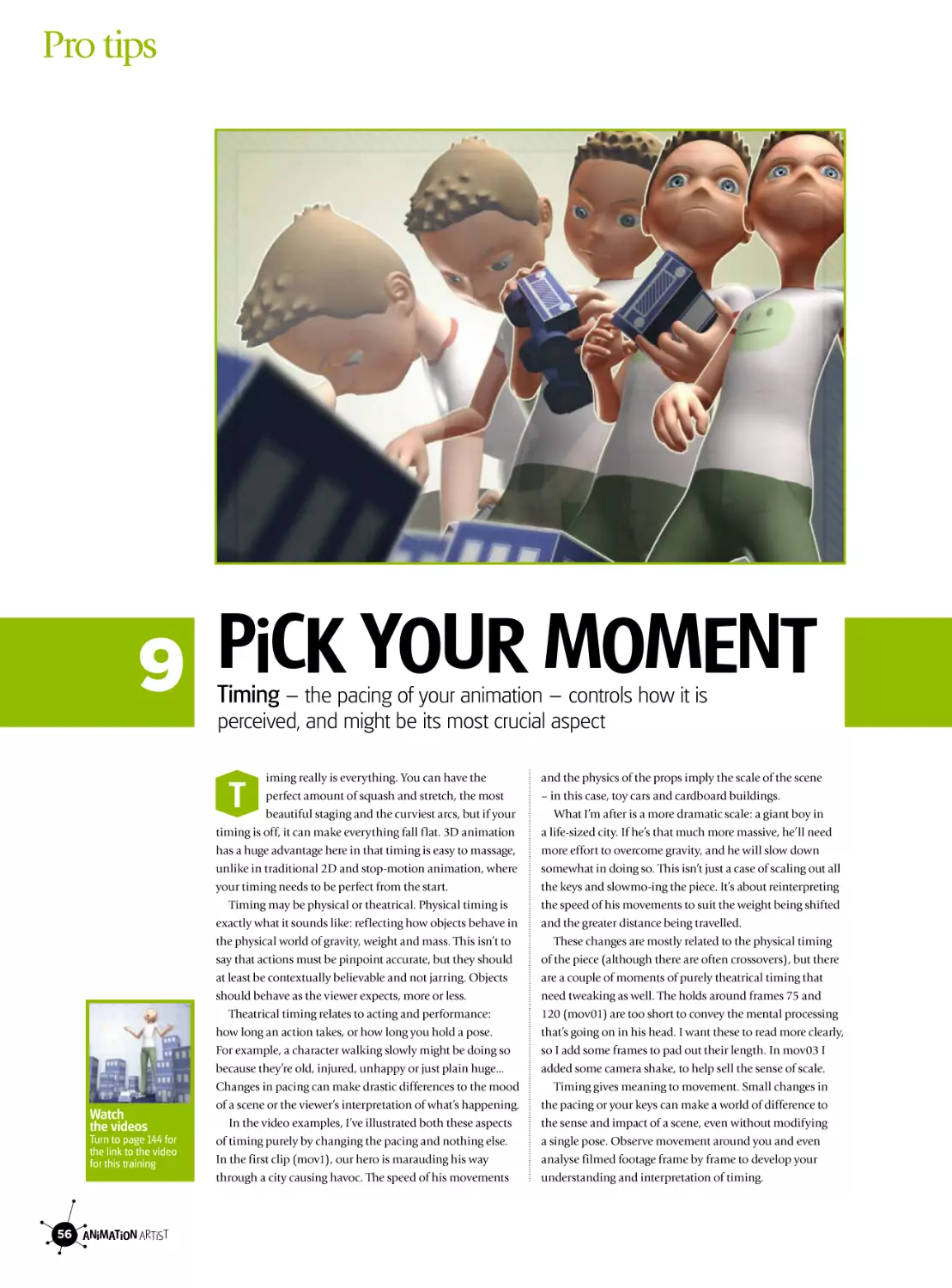
1 THe BiG sTreTcH
It’s not just bouncing rubber balls that should exhibit the first
of Disney’s 12 principles of animation, squash-and-stretch
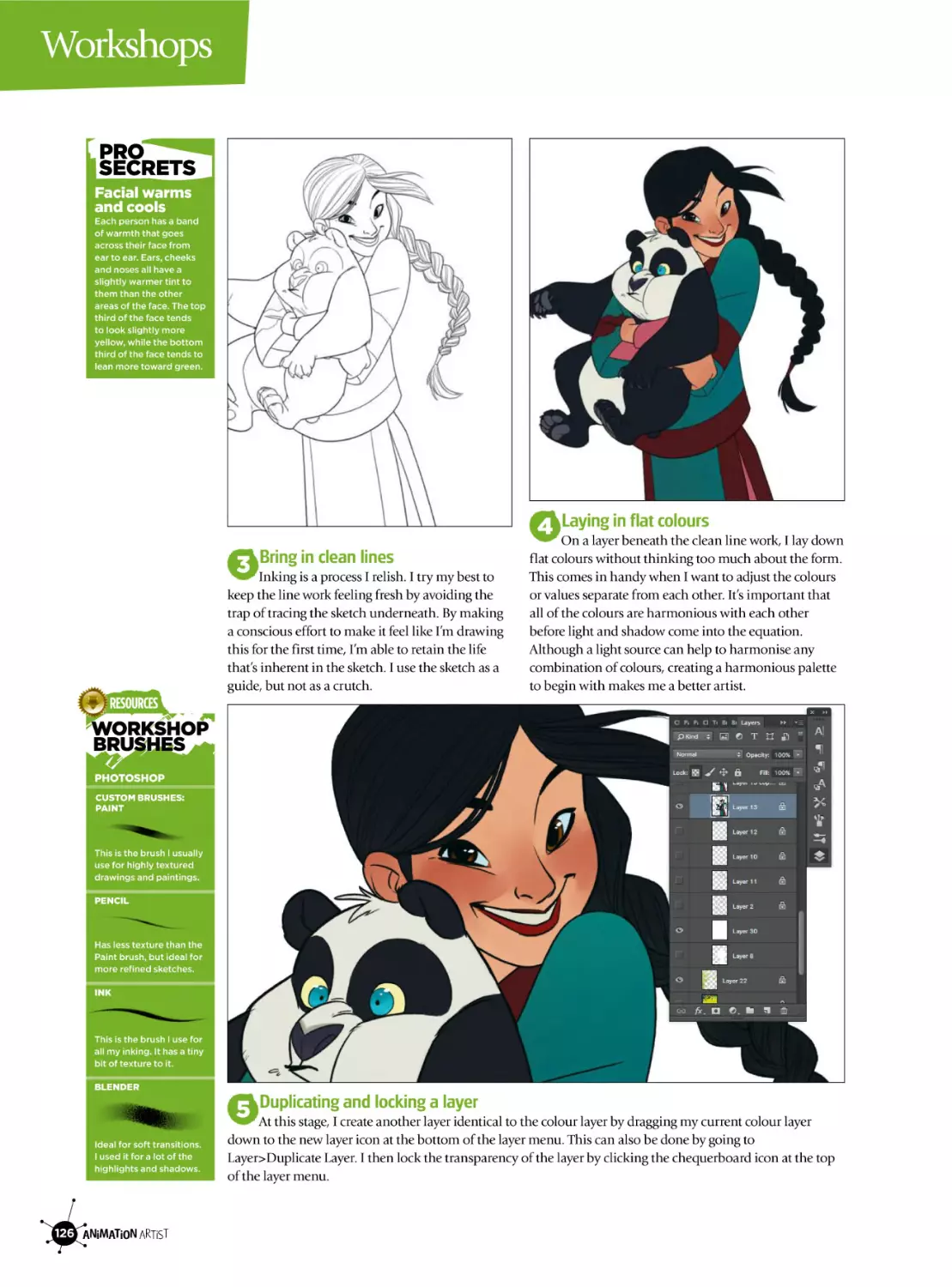
ack in 1981, Frank Thomas and Ollie Johnston
– two of Disney’s “Nine Old Men” – published
The Illusion of Life, a landmark book that set out
in print the 12 principles of animation that have guided the
company’s animators since the 1930s. Over the next several
pages, I’m going to show you how to apply these classic
animation principles to your 3D animation work.
It’s important to note that these principles do not stand in
isolation from each other. All combine to create a successful
animation – but just as in a toolbox, not every job requires
every tool. Note, also, that I will hesitate to refer to anything
as “wrong” or “incorrect”. They’re principles, not rules!
The first principle is squash and stretch. The caramelcovered marshmallow of the animation chocolate box, this
is the animator’s attempt to mimic the way objects deform
in motion. It is about so much more than the bouncing
balls often used to demonstrate it: it can be used to convey
weight, accentuate movement and enhance a character’s
flexibility. It isn’t just for cartoony animation, either.
One thing to bear in mind when squash-and-stretching is
the need to maintain a constant volume. If you animate an
arm stretching, the thickness of the limb should decrease.
Think of a rubber band: if you pull the ends, the rubber is
B
Watch
the videos
Turn to page 144 for
the link to the video
for this training
48 ANiMATiON ARTiST
distributed along a greater distance, so the band thins out.
The same is true if you’re squashing an object: the mass has
to go somewhere, and it generally bulges outward – keeping
the volume, if not the shape, constant.
To illustrate this, I’ve put together a few example
animations, which are in your resources. The Andy01 clip
shows Andy, our character for this series, running from a
billiard ball with no squash and stretch. In Andy02, I’ve
applied squash and stretch to both Andy and the ball. You
can see how the stretching of Andy’s body as he falls and the
compression as he hits the ground add a bit of punch to the
animation, emphasising his weight and movement.
In this example, however, the ball no longer seems right.
The squishiness kills the impression that it is a hard, rigid
object. Replace the texture to make the ball a basketball,
though (Andy03), and the result is much more believable.
The second example is a basic facial animation. Take01
has no squash and stretch. In Take02, I’ve distorted the
features to elongate the expression. This drags the face along
the path of movement and enhances the motion. Take03
goes one step further, changing the shape of the entire head
as it moves. I’ve intentionally made the result over-the-top,
but this sort of thing can be done more subtly to great effect.
12 principles of animation
2 THe NeXT MOVe
Wait for it, wait for it… the use of the second principle,
anticipation, can build drama into the simplest of actions
he second classic principle, anticipation, is all
about broadcasting thought, communicating
intent and directing focus. Anticipation can be
used to prepare the viewer for an action about to be
performed. There are many obvious examples, such as a
pitcher winding up to throw a ball, or a bow being pulled
back to fire an arrow. It is the reverse action of the one
about to follow.
Anticipation is not limited to the character performing
the action, though. One can direct attention to another
action or object – for example, a look or gesture (possibly
pointing off-screen) will direct us to something happening
out of our focus area, or even indicate to us to an object that
the character might be about to pick up.
Anticipation can also imply thought, because it shows
that the character intends to do something and is not just
moving from one position to another. Most actions have
some sense of anticipation (with the possible exception of
mechanised movement, although if you’re animating it you
should add some!), and the bigger or more dramatic the
action, the bigger the anticipation. But it can also be very
subtle, like the weight shift from one leg to another before
starting a walk or the intake of breath before a sigh.
T
Watch
the videos
Turn to page 144 for
the link to the video
for this training
I’ve made a few examples to illustrate the above. In the
first clip (Anticipation_01.mov), I’ve used little to no
anticipation on either character – so that when the first one
runs off, it comes as a surprise and the viewer’s attention
may or may not be in the right place, meaning that they
possibly miss the first part of the action. This can make for
jarring viewing and confuse the narrative.
In the second clip (Anticipation_02.mov), I’ve applied
a degree of anticipation to both the characters. You focus
on the boy as he pulls back before leaning in; then your
attention is pulled to the girl before she runs off. It’s not
much, but it’s enough to prepare you for their manoeuvres.
In the third and final clip (Anticipation_03.mov), I’ve
exaggerated the anticipation to really wind up the run. This
is also an example of a “surprise” anticipation, where the
anticipation might imply that one thing is about to happen
but another actually takes place. In this case, the viewer
might think she’s leaning in to respond to the boy, but this
movement is then used to reverse her direction.
As with any of these guidelines, anticipation can easily be
overdone, and you should experiment until you achieve the
timing that works best. And remember the unwritten 13th
principle: these principles are all just tools, not rules!
ANiMATiON ARTiST 49
Pro tips
3 reVeAliNG DeTAil
The principle of staging is something of a catch-all word for
a large number of ideas, all of which are important
taging includes composition, lighting, cameras,
scene content, action, personality and mood.
Ultimately, it all boils down to one thing: the
readability and clear communication of an idea, regardless
of what the medium is. As director Brad Bird once put it,
“Staging is staging, whether it be for animation or live
action or computer films or a wedding photo.”
So staging is really everything – the entire image, what it
communicates to you, and also the areas within the image
that you want to direct attention to.
No one aspect of staging is more important than the
others: they all work together. However, there are some that
relate more directly to the mechanics that make animation
work, and the one I’ll focus on here is the silhouette.
The concept originates from some of the very earliest
animations, such as Lotte Reiniger’s The Adventures of
Prince Achmed. In silhouette animation, the action had to
be clear and easy to follow, or it would become unreadable
and confusing. While these days there are no limits to the
colour and form you can create in animation, keeping the
silhouette readable still makes for much clearer action.
This includes the relationships of objects to everything else
in the scene, so you’ll need to consider the forms in the
s
Watch
the videos
Turn to page 144 for
the link to the video
for this training
50 ANiMATiON ARTiST
background of the shot, and ask yourself if they interfere
with the action and make it less easy to understand.
When you check the silhouette of your work it will
quickly become obvious if the action is coming across well.
If there are important actions that are indiscernible, it’s a
sure sign that you need to think about recomposing the shot
or modifying the action to suit the current angle better.
The first example I’ve made illustrates this point. Take a
look at the Staging_01 movie and see if you can tell what
our character is doing. Now take a look at the rendered
form, Staging_02. While you might be able to work out
what’s happening, there are certain aspects that are unclear
– such as the actions of the right hand. Composing these
movements inside the silhouette conceals the actions.
Now compare them with Staging_03 and Staging_04.
Being able to see the pencil extend from the nose helps the
joke make sense, and the small movements of the right arm
aren’t lost within the form of the body. As the amount of
action and complexity in a shot intensifies, this concept of
readability becomes increasingly important. Animation
takes a lot of work, so you don’t want to be wasting energy
on things that are completely lost on the viewer. Make every
detail, frame and scene count towards telling your story.
12 principles of animation
4 ANiMATiON OpTiONs
“Straight-ahead” and “pose-to-pose” are competing
approaches to animation, but both have pros and cons
here are two methodologies you can use to create
animation. The first, “straight-ahead”, is where
you start at your first frame and animate forwards
through time one frame at a time until you get to the end of
your shot. Straight-ahead offers spontaneity that can create
fluid, fresh animations, which can be full of surprises. In
some media, such as paint on glass, mixed media or stopmotion, straight-ahead is more or less the only way to go.
There are several weaknesses to this approach: things can
begin to wander; it can be hard to clean up or tweak; and
you can miss timed marks. It can be a bit like when you
were a kid and wrote a big title across the page, ran out of
room for the last letters, and squashed them in at the end.
The alternative is called “pose-to-pose”. Here you create
important key frames (sometimes called “extremes”) that
describe the whole action, then go back and create the
frames between those key poses to fill out the action. Poseto-pose is great for achieving well-timed animation: you can
get a sense for how your shot is coming together and make
sure characters are where they should be at the right times.
However, pose-to-pose also has its disadvantages. It can
often come across as staged, and you’re less likely to come
up with happy accidents along the way.
T
Watch
the videos
Turn to page 144 for
the link to the video
for this training
The most obvious way around the respective cons of
these two methods is a “combo” approach, combining the
spontaneity and freshness of straight-ahead with the
planning and timing strengths of pose-to-pose. You could
block out your key poses first, then use them as goalposts
or marks to hit as you animate straight ahead “through”
them. Or you might do a rough straight-ahead run and see
where it takes you, then go back, select poses from that run,
and rework and re-time them. Straight-ahead also works
beautifully on secondary motion such as cloth or floppy
ears. Once your character is moving the way you want,
you might do another straight-ahead pass to put in extra
dynamic motion. My videos show how this can work.
In P2PSA_01.mov, I went straight-ahead on 5s (putting a
key frame on every 5th frame) and blocked out my scene. I
wasn’t sure how it was going to play out until I’d done this.
Next, in P2PSA_02.mov, I went back over the sequence and
re-spaced my key frames for better timing. Then I started
back at the beginning and animated straight through over
the top. Finally, in P2PSA_03.mov, I went back, made any
timing adjustments where necessary, and did a pass of
straight-ahead on the ponytail and boxes. Remember, there
isn’t any formula or one “right” way to create animation!
ANiMATiON ARTiST 51
Pro tips
5 pOeTrY iN MOTiON
Follow-through and overlapping action can help make
motion in your animation look fluid, convincing and natural
otion in the real world is affected by momentum
and inertia, and this is what follow-through is all
about. When kicking a ball, for example, the foot’s
swing doesn’t stop the instant it strikes the ball: it continues
in an arc. When a car stops abruptly, the passengers inside it
are thrown forward. If it changes direction sharply, they will
continue on their original course for a while; this course
and the change of direction become overlapping actions.
Broadly speaking, the objects affected may be active or
passive. The passive group is anything driven by adhesion,
constraint or influence from an initiator, such as hair
attached to the scalp or clothes wrapped around the body.
These must follow the movements of their initiating force,
but react to momentum, gravity and atmosphere. Those in
the active group have some control over their motion. They
include arms, legs and tails – objects that can be passive but
also have the ability to behave in more controlled ways.
How much you exaggerate the effects of momentum will
vary with an object’s weight and environment. Underwater,
for example, passive objects waft about in a different
manner from on land. A common mistake is making things
look like they’re underwater when they’re not! This results
in a wafty, rubbery animation that lacks solidity.
M
Watch
the videos
Turn to page 144 for
the link to the video
for this training
52 ANiMATiON ARTiST
I’ve used three clips featuring Andy and a couple of props
to demonstrate the principle. In Overlap_01.mov, he starts
walking with all of his body moving at once. His arms and
legs are exactly in time. His bucket and fishing rod are stiff
and wooden, with no sense of weight or flexibility. He stops
abruptly, bringing everything to a halt at once.
In Overlap_02.mov, I’ve focused on his body movements.
When he starts to walk, his body leads with his hips, and
his looser limbs fall behind slightly. His elbows lag behind
his shoulders, wrists behind his elbows. By overlapping
the rotations of his arms and offsetting them from the
movement of his legs, I’ve made him much more flexible.
The same goes for the rest of his body: his head has a sense
of weight as it rolls about slightly behind the shoulders.
When he stops, his body stops in stages. The amount of
exaggeration determines the emphasis of his halt.
In Overlap_03.mov, I’ve added the secondary movements
of his bucket and fishing rod. Because the “joints” in the rod
bend with overlapping rotations, you get the sense that the
shaft is highly flexible. The bucket now feels like it’s loose
and light, and the fish is at the mercy of gravity and inertia
– especially when Andy stops suddenly. These actions are
vital to keeping your animation fluid.
12 principles of animation
6 perfecT TiMiNG
Slow in/slow out, easing, cushioning – call it what you
like, it’s a useful way to make movement more realistic
hings almost never move at a constant rate:
inertia, gravity, atmosphere, constraint and a
range of other factors make sure of that. When
something starts to move, it will usually build up energy
and speed – it won’t instantaneously achieve a terminal
velocity. The same is true when it comes to a stop: the builtup energy needs time to disperse before coming to a halt.
Slow in and slow out – also known as “ease in / ease out”
or “cushioning” – are how you represent this phenomenon
in animation. They deal with the way you enter and exit key
poses (as opposed to key frames). Spacing your in-betweens
or modifying your curves can produce this acceleration and
deceleration. More in-betweens or a flatter curve means a
slower motion, fewer frames or a steeper curve a faster one.
In 3D animation, you have the invaluable tool of a curve
editor. But people often rely too much on the computer to
control these curves – as if the software knows what you’re
trying to animate! You need to get stuck into the curve
editor and take control. Even then, it might be necessary to
animate frame-by-frame to get the exact result you’re after.
In SlowInOut00.mov, I’ve shown four versions of the
same movement. Each has the same overall timing; all I’ve
changed is the spacing leading into a key pose, either by
T
Watch
the videos
Turn to page 144 for
the link to the video
for this training
modifying the curves in the Graph Editor or by shifting
the in-betweens. Scrub through the clip to observe the
differences. You get a different attitude from the character
each time, even though they’re identical in substance.
The next three clips are all based on a single five-second
sequence. All three have the same timing; all I’ve changed is
the entry or exit from each key pose. In SlowInOut01.mov,
the action is completely linear. The movement is lifeless,
and the characters have no real weight – they just launch
off the ground.
SlowInOut02.mov looks much better. Easing out of the
crouch injects effort into their jumps as they overcome
gravity. We slow into the peak of a jump and slow out of the
peak as inertia fades and gravity takes over. However, the
characters are slowing into their landing positions. This
makes the landings a bit soft, so it’s better to change the
landings to a “fast in”, as shown in SlowInOut03.mov. This
has two effects: more “hang time” for the characters, and
real punch to the landings. The absorption of the landing
energy is reflected in the bending of the see-saw. So, slow in
and slow out add much more than just realism. Choosing
where to use them – and where not to use them – can make
actions much more nuanced, individual and subtle.
ANiMATiON ARTiST 53
Pro tips
7 feel THe flOW
Want to know the secret to capturing the sweeping
movements of natural forms? It’s all about the arcs
n nature, everything moves in arcs. Limbs pivot
and rotate around joints; projectiles fall to the
floor in a graceful arc as gravity takes effect. Even
more importantly, arcs are gestures or lines of action; if
straight lines give your animation power and emphasis, arcs
are what give your animation consistency and flow.
Staging (see page 50) is important here: because the final
rendered frame lies on a 2D plane, lines of action should be
clear from the camera viewpoint, not formed in 3D space.
There are several ways to visualise arcs as you work. You
could sketch thumbnails of your sequence out first (a good
idea anyway) and draw your arcs in. You could sketch your
curves with a curve tool – in Maya I mostly use Animation
menu set > Animate > Create Motion Trail (with Draw style
set to Line in the options). It gives you a constantly updating
line, so you can see your arcs as they take shape.
It’s been said that computers make this principle hard to
apply, but I disagree. The nature of joints in 3D means that
arcs are as inevitable and natural as they are in the real
world – as opposed to the lack of a physical skeleton in 2D
animation, for example. You still have to control gestural
arcs, but the danger of limbs growing and shrinking midshot is pretty slim.
i
Watch
the videos
Turn to page 144 for
the link to the video
for this training
54 ANiMATiON ARTiST
A big exception is if you use IK to control movements:
you have to be careful of how your arcs are forming, and
they generally require more keyframes to achieve the
desired results. In my example videos, I’ve specifically used
IK for the main “action” arm to help illustrate the idea. The
main point I’m tracing is the tip of the ping pong paddle.
Arcs_01.mov shows most of the action in place. If you
look at the arcs in Arcs_02.mov, though, the lines are messy
and the flow from one swing to another is broken. Because
the IK handle is basically moving in world space, it doesn’t
inherit any motions or arcs of the body. You need to add all
of that in, as well as forming the action to suit the camera.
Arcs_03.mov and Arcs_04.mov show the result. The arcs
are much smoother; not only do they stop the arm slicing
through the torso, but the readability of the action is much
better. This is especially important with action that comes
towards the camera.
Arcs aren’t limited to large limb movements. Subtle
movements are just as important – the rolling motion of the
hips, the rise and fall of the head in a walk, the sweep of a
head turning... even the movement of eyes. Arcs add clarity
to your action, and make a drastic difference to the quality
and appeal of your animation.
12 principles of animation
8 sUppOrTiNG AcTs
Secondary action consists of those little details that really
bring out the personalities of your characters
econdary action or secondary animation is all
about adding depth and substance. This is where
your attention to detail can separate interesting
from dull, and delightful from mediocre. Secondary action
doesn’t need to be obvious; it can be very subtle, building
layer upon layer to enrich the main action. However, it
shouldn’t become focal unless it’s meant to become part
of the primary action. Otherwise it’s just distracting.
Secondary action falls into two rough groups. The first
is motion derived from primary actions. This means your
usual suspects – loose hair, clothing, skin and so on – but
also any object that is driven by another force. When a
basketball hits the backboard, for example, the rim vibrates,
the net shakes and the backboard rocks. These motions are
secondary to the primary action of the basketball’s bounce
and add emphasis and realism to the shot.
The second group consists of performances or actions
that are secondary to the main idea of the shot. Say you
have a baby squealing and reaching up for a hug. Adding in
toes or fingers wiggling is additive (secondary) to the main
idea that the baby wants a hug. Even the face can become
secondary if the body language conveys the point in an
unsupported way (if our view starts from behind, say).
s
Watch
the videos
Turn to page 144 for
the link to the video
for this training
In the example included, I’ve shown three differing
approaches to secondary motion across three clips. In the
first clip, the character is reading a particularly noteworthy
publication. This is the primary action: the character is
absorbed in reading and turns the page.
The second pass is where I add some more depth to what
is happening. How do you make watching someone reading
more interesting? It’s about adding the subtleties, the little
quirks that make an individual. First, I add obvious details
such as flexibility to the magazine and its pages, making it
respond to her movements. Then I add some movement to
her ponytail, so that it’s not a solid lump sticking out the
back of her skull. Then I add some subtle facial animation,
just enough of it to show her captivation in her magazine.
The third pass adds one more important layer: having her
lock of hair hang down and then be brushed back. It helps
reinforce her absorption in reading and adds a level of
cuteness to her character. You can see how a detail like this
might carry over to any other scene she would be in.
You could argue that this is really part of the primary
action, but adding it doesn’t change the focus of the shot –
it’s just a peripheral action. Remember, the best secondary
actions work best when they seem completely natural.
ANiMATiON ARTiST 55
Pro tips
9 picK YOUr MOMeNT
Timing – the pacing of your animation – controls how it is
perceived, and might be its most crucial aspect
iming really is everything. You can have the
perfect amount of squash and stretch, the most
beautiful staging and the curviest arcs, but if your
timing is off, it can make everything fall flat. 3D animation
has a huge advantage here in that timing is easy to massage,
unlike in traditional 2D and stop-motion animation, where
your timing needs to be perfect from the start.
Timing may be physical or theatrical. Physical timing is
exactly what it sounds like: reflecting how objects behave in
the physical world of gravity, weight and mass. This isn’t to
say that actions must be pinpoint accurate, but they should
at least be contextually believable and not jarring. Objects
should behave as the viewer expects, more or less.
Theatrical timing relates to acting and performance:
how long an action takes, or how long you hold a pose.
For example, a character walking slowly might be doing so
because they’re old, injured, unhappy or just plain huge...
Changes in pacing can make drastic differences to the mood
of a scene or the viewer’s interpretation of what’s happening.
In the video examples, I’ve illustrated both these aspects
of timing purely by changing the pacing and nothing else.
In the first clip (mov1), our hero is marauding his way
through a city causing havoc. The speed of his movements
T
Watch
the videos
Turn to page 144 for
the link to the video
for this training
56 ANiMATiON ARTiST
and the physics of the props imply the scale of the scene
– in this case, toy cars and cardboard buildings.
What I’m after is a more dramatic scale: a giant boy in
a life-sized city. If he’s that much more massive, he’ll need
more effort to overcome gravity, and he will slow down
somewhat in doing so. This isn’t just a case of scaling out all
the keys and slowmo-ing the piece. It’s about reinterpreting
the speed of his movements to suit the weight being shifted
and the greater distance being travelled.
These changes are mostly related to the physical timing
of the piece (although there are often crossovers), but there
are a couple of moments of purely theatrical timing that
need tweaking as well. The holds around frames 75 and
120 (mov01) are too short to convey the mental processing
that’s going on in his head. I want these to read more clearly,
so I add some frames to pad out their length. In mov03 I
added some camera shake, to help sell the sense of scale.
Timing gives meaning to movement. Small changes in
the pacing or your keys can make a world of difference to
the sense and impact of a scene, even without modifying
a single pose. Observe movement around you and even
analyse filmed footage frame by frame to develop your
understanding and interpretation of timing.
12 principles of animation
10 lArGer THAN life
Exaggeration doesn’t mean going over the top with your
actions – it’s about pushing everything to complete clarity
xaggeration is the most essential principle you
will ever, ever learn. It’s less a tool in itself than
the degree to which you apply all the other
principles of animation: the amount of squash-and-stretch
you use, the length of your holds, the curviness of your arcs,
the distance of your follow-through... Exaggeration is not
simply “pushing everything to extremes,” it is more a matter
of purity or single-mindedness. It’s all about enhancing the
essence of your idea or action. If your idea or action is wild
and extreme, then knock yourself out – push everything to
its limits. But in all cases, think of animation as like acting
on stage: every gesture and subtlety must be clear even to
viewers seated in the most distant seat in the topmost
gallery. Subject to your judgement and the principle of
appeal (see page 59), the guiding rule is that viewers must
be able to comprehend absolutely clearly what’s going on.
You could also think of exaggeration as a caricature of an
action. If you look at any good caricature illustration (say
the work of Roberto Parada or Daniel Adel), the recognition
of the personality is usually instantaneous. Even when the
artist makes extreme distortions to the face, the elements
that make the person unique are intact enough or enhanced
enough to make an identification. In animation, this is
e
Watch
the videos
Turn to page 144 for
the link to the video
for this training
much the same concept – enhancing the important aspects
that help communicate the idea or action.
One reason for all this (other than the fun of it) is that
animation tends to need this emphasis to convey subtleties
that don’t carry through very well otherwise. Even if you
religiously follow reference footage, you can be left with
a performance that is lacking. The Disney animators found
out early on that even tracing action directly from film –
creating a perfect capture of real motion – resulted in a stiff
and unappealing animation. Pure 3D motion capture can
produce the same effect.
In the examples in your resources, I’ve started out with a
plain vanilla walk cycle and taken it through several
iterations of exaggeration. Even as you arrive at the last clip
(where I’ve taken things as far as I’d want to go without
losing the controls in Z-depth!), the wild motions are still
recognisable as a walk.
Exaggeration is the most creative aspect of animation. If
we use the illustration analogy again, think of all the other
principles as your toolbox of pens, pencils, knowledge and
observation. Exaggeration is the amount of stylisation and
flair that you use to place your pen strokes – or, in the case
of animation, your key frames.
ANiMATiON ARTiST 57
Pro tips
11 sHApe AND fOrM
Even if shapes and actions are exaggerated, and even if you work
in 3D, you need to pay attention to achieving solid design
he principle of solid design (or solid drawing)
originally referred to making characters and
objects feel three-dimensional despite existing on
a two-dimensional surface. This doesn’t require naturalistic
or photorealistic rendering, but it means that even cartoony
characters and objects must have consistent volume and
mass through an entire sequence. If shapes lose their mass,
change perspective or jitter, it can completely distract the
viewer. Many people have the ability to draw an image with
beautiful form and line, but it’s much harder to do this
frame after frame in a consistent and appealing manner. On
the most fundamental level, a character must look like the
same character even as it moves or turns. It’s surprising how
one flawed frame can spoil a sequence, and conversely how
fixing a single frame can help the flow of motion.
You might think that 3D animation will take care of the
basics of solid design for you, but although 3D eases the
struggle to render beautiful drawings for every frame of
animation, you still need to understand how shadows act as
cues to the solidity of objects, how a feeling of mass can be
conveyed, and how living things actually move and balance.
Look at the series of poses in the first video for this part.
The poses on the left are quite clearly lacking. If this were a
T
Watch
the videos
Turn to page 144 for
the link to the video
for this training
58 ANiMATiON ARTiST
solid body, it would be falling over. Compare this to the
poses on the right, which clearly show her centre of gravity
has been shifted. The next two poses are similar, but
balance isn’t the only factor: the left-hand poses are quite
visually unappealing. You want your poses to have interest
and appeal, and this is again where the body lines come in
– flowing all the way to the fingertips.
A classic symptom of poor solid design is something
called “twinning”, where a character’s poses or actions are
symmetrical in some way. This is quite unnatural and can
leave your animation feeling stiff. In the second clip, I’ve
shown some examples of twinning in motion. The most
obvious example is the arms: both are not only doing the
same thing at the same time, but are symmetrical in their
pose and form. In the third clip, I’ve modified the timing
and pose for the arm keyframes to fix this. The difference
is dramatic, and adds greatly to the appeal. The other, less
obvious (and often overlooked) area is the face, in which
symmetry is an immediate flag to a viewer that something
is a bit off. Real faces are never perfectly symmetrical.
Regardless of how you create your animation, your ability
to render credible mass, form and balance has an enormous
impact on the credibility of your illusion of life.
12 principles of animation
12 ADDeD AppeAl
The final challenge is creating appeal – the x-factor
that gets your audience caring about your characters
ppeal is about creating a character that’s engaging
to your audience – one that they will sit through
the film until the end for. It doesn’t require fluffy
bunnies or cutesy lambs, and it’s not about the audience
“liking” the character. Even villains and demons need
appeal – indeed, people often seem to be drawn to villains
more than heroes. If a character lacks appeal, why would
you care what happens to them? Why would you endure
90 bum-numbing minutes of unappealing story?
Good conceptual design and style have a part in appeal,
but they aren’t everything. Those things are often out of
your hands anyway. Unless it’s your own project, some
director, producer or client decides what the character looks
like before you get anywhere near it. The most important
aspect is how you build appeal through performance.
The most interesting people to watch are those with
exaggerated features or wrinkles, not flawless models. It’s
much the same with mannerisms: quirks and imperfections
are what create interest. Like a good stand-up comedian,
individual touches get you to relate to the story, making a
link between your feelings and the character’s.
Build a backstory, and feed it into details. Take Peter Pan’s
Captain Hook. One of the things that makes him appealing
A
Watch
the videos
Turn to page 144 for
the link to the video
for this training
is his fear of ticking clocks, because the crocodile that took
his hand also swallowed a clock. Subtle, or even oblique,
details can build up appeal on multiple levels – look at how
Pixar’s work is appreciated by both adults and kids.
My videos for this section have our hero cooking his
breakfast. Clip01.mov shows that it’s easy to show his basic
actions and get the idea across, but it’s not particularly
engrossing. How can we make cooking hold someone’s
interest? Clip02.mov adds a few details: the extra tap on the
egg, the flourish that he uses to add the egg to the frying
pan – but more importantly, wiping his hand on his T-shirt.
These details are character imperfections we can relate to.
Appeal is also the sum of your animation’s parts. Look
back through the principles we’ve covered, and make every
aspect of the animation express your character’s quirks and
subtleties. Is your squash-and-stretch enhancing their
performance or confusing it? Are there relevant secondary
actions you could add to reveal personality? Do you have
solid poses and nice arcs? Do you have enough frames to do
what you’re trying to do, or is it too much too quick? And is
the scene staged well so that all this hard work isn’t lost on
anyone? If you have all your ducks in a row, it’s a good start
to having an appealing and successful animation.
ANiMATiON ARTiST 59
DISNEY’S MOANA
Making of
MOANA
Barbara Robertson discovers how Disney Animation
created this beautiful CG film
he heroine of this
Disney animated
feature is a teenage
princess named
Moana, who tries to
save the
mysteriously landlocked people of her stunning South Pacific
island by sailing into uncharted waters.
The story might have turned out quite
differently had directors Ron Clements and
John Musker not taken their own journey to
the islands of Polynesia.
One of the legends they discovered was that
after sailing for 3,000 years, the Polynesian
voyagers had stopped sailing for 1,000 years.
T
This long gap in exploration sparked the story
that then became Moana.
“The big turning point was learning about
the emphasis on navigation,” explains Ron,
“and that right now in the South Pacific,
there is a feeling that their [the islanders’]
identity may be lost.”
Together, directors Ron Clements and John
Musker have created classic features The Little
Mermaid, Aladdin, Hercules, and The Princess
and the Frog. Moana is their first all-CG film.
“John Lasseter [chief creative officer of
Pixar Animation Studios, Walt Disney
Animation Studios, and DisneyToon Studios]
felt strongly [Moana] would be CG, but I
wasn’t clear that was the best way,” says John
ANiMATiON ARTiST 61
FEATURE
DiSNEY ST YLE
Maui is an adventure seeking
‘god’, a characteristic the
animation team needed to
focus on in his design.
CUTE PiGGY
Moana’s precious pet
pig Pua is a typically
cute Disney sidekick
for the heroine.
I think one of the things that wows
people on this film is seeing naturalistic
hair and clothing movement
Musker. “I felt it might be hand drawn. But
when we were in the islands, I asked people to
point us to painters and drafters for
inspiration. An artist on Samoa told us there is
no indigenous painting culture in the islands.
They did sculpture,” he explains.
“And, we wanted to make a living ocean,”
adds Ron. “The character of a hand-drawn
ocean wouldn’t have looked as good as what
we wound up doing in CG.” Even so, art
director of characters Bill Schwab and his team
began discovering Moana’s look through
drawings before handing her to the character
team. Visual development artist Neysa Bové
worked on costume, jewellery design and
hairstyles. The character team: Bill; animation
supervisor Malcon Pierce; rigging supervisor
62 ANiMATiON ARTiST
Mike Navarro; and modelling supervisor Chad
Stubblefield brought Moana into CG.
“Drawing is how we communicate between
departments,” explains Malcon. “We did
markup passes to define shapes for her hair
and cloth. When we first got Moana’s facial
structure, we had drawings for every
expression. We tried to hit those expressions,
and then did markups from different angles to
improve on the shapes and make sure she
could breathe in the world. Before this, I didn’t
realise posing lashes made such a difference
in expressions,” he adds.
Bill stayed with the team through the entire
production to help the 90 animators on teams
led by co-heads of animation Amy Smeed and
Hyrum Osmond.
“Even during shot production, people would
send me shots saying, ‘Moana doesn’t feel
right, can you help me push this pose?’” Bill
explains. “This is the first time I’ve done that,
even though I had the same role for Frozen.
But I’ve worked with a lot of the animation
supervisors, modellers, and riggers for 10 years
now. We’ve built trust,” he adds.
Making Maui
The challenge for Moana was in keeping the
teenager heroine, full of determination, as well
as true to her heritage.
“When we’re thinking about a character, a
walk is usually the best place to start,” Malcon
says. “We find out if her arms are too long or
too short. If she points her toes. Then, we have
her run and test the simulation on her hair and
clothes. We start rough and then refine and
refine. Sometimes a pose can take three hours,
and we have 24 poses per second.”
For Maui, the character team looked at
professional wrestlers and body builders, men
DISNEY’S MOANA
FiRE AND WATER
New tools and techniques lessened the load
for effects artists, and at the same time gave
layout artists and animators more control
During Moana’s journey, the young adventurer encounters a
living volcano, the Lava Witch.
“I can’t ever remember a character being that challenging,”
says co-head of animation Amy Smeed, talking about the fiery
lava monster. “We did the character performance with her.
Then effects added the lava. If we had too much lava, it
distracted from the performance.”
Thus, artists from the effects department always
participated in lava monster animation dailies. “There was a
lot of collaboration,” Amy says. “They might say that if she
stays this speed, the lava will go crazy. And we might say, ‘But
we need her at this speed to sell the acting’.”
A technique called ‘foundation effects’ helped. Effects
artists would build a library of fully realised, ready to render
smoke plumes and lava splashes flowing from the Lava Witch
into the water that layout artists and character animators
could place in a scene.
Layout artists and animators also used foundation effects
for water splashes and spouts. “Foundation effects gave
animators and layout artists timing control over the splashes,
the water spouts, the bursts of lava,” says visual effects
supervisor Kyle Odermatt.
The visual effects artists created the data sets that become
foundation effects primarily in Houdini, but custom tools
made it possible for the data sets to travel throughout the
animation pipeline. In addition, a new Splash tool created for
with muscle mass. “He doesn’t wear a lot of
clothing, so we had to deal with anatomy more
than in other films,” says animation supervisor
for Maui, Mack Kablan. “We pushed his
proportions to convey power and charm. He’s
a few thousand years old and an adored
demigod. So, he’s pretty laid back. When he
sits, he lets gravity do the work. But when he’s
called to action, he flips a switch and goes
from sitting to sprinting in a few frames.”
The biggest challenge for the Maui character
team was in keeping the demigod’s essence
during and after his shape-shifting
transformations into, at various times, a hawk,
lizard, beetle and a whale.
When he’s a hawk, he flaps his wings slowly
and powerfully, and when he lands, he again
lets gravity do the work. “Early in production,
we had a meeting to decide how we would
make the transformation look right,” Hyrum
says. “We decided that any time Maui moves
from one form to the next, there will be big
anticipation and then action will push him
this film enabled the team to put Moana and Maui on and in
the Pacific Ocean and even, at times, interact with the water in
unique ways. As the water is in itself a character, it needed to be
able to interact with the other characters.
from one form into the other. We almost
didn’t need lighting and effects to go from
animal to animal.”
As for Maui’s tattoos, the inked drawings
represent his accomplishments, and within
them is an animated caricature of Maui. This
meant animating 2D drawings on a 3D
character’s body. For this, the Moana team
turned to multiple Annie Awards-winning
animator Eric Goldberg.
“The small tattooed version of Maui became
known as ‘Mini Maui’,” says Eric. “He has
personality and function in the story. Maui is
a trickster but when he goes too far, Mini Maui
pulls him back.”
Creating realistic hair
Maui was originally bald, but after the team
consulted with the Oceanic Trust, they decided
to give the character a full head of coiled hair.
“We knew we had to do something different,”
head of characters and technical animation,
Carlos Cabral, explains. “He’d have wet hair,
dry hair, and wind was so important in this
world we created,” he adds.
Moana always had long hair and took cues
from actress Auli’i Cravalho, who plays with
her long hair. The interaction between CG hair
and CG hands is always a challenge.
A new grooming system called Tonic was
used. This was created for Frozen, evolved for
Big Hero 6 and changed again for Moana; the
hierarchical grooms from Tonic became rigs
for posing and simulation.
The new system, Quicksilver, lets artists
pose and animate the hair directly. “It’s very
significant,” says visual effects supervisor,
Kyle Odermatt. “With this system, we can
take simulation down to the strands. I think
one of the things that wows people on this
film is seeing naturalistic hair and the
movement of clothing.”
Although much of the film takes place on
the water, the film begins with Moana on her
island, Motunui. The island is not real; it’s an
art-directed amalgam of various South
ANiMATiON ARTiST 63
FEATURE
MAKiNg A sCeNe
Taking a broad look at how a scene is created at
a major animation studio can help you understand
the roles involved and where you fit in
It’s often worth taking note of the entire process that goes into creating a
CG animated scene to understand the different roles.
Every shot starts at the same point, with storyboards (top image).
These are drawn by story artists and are the first visual representation of
the film’s story anyone will see. They are placed side by side in sequence,
so that they convey scenes and deliver a rough sense of how the story
unfolds. It’s here that the beats of the film are set.
The pre-visualisation phase in the CG animation pipeline, known as
Layout, allows artists to place cameras and characters in an environment
to block out shots in a three-dimensional space. The layout pass is
based on the storyboards and precedes character animation.
Using the blocking established in the layout phase, character
animators begin to bring characters to life by physically posing them,
frame by frame, in the CG environment (middle image). It’s here that
CG animators can get a feel for the characters and really start to bring
a performance to the screen.
The next step is to send the scene to the technical animation artists
to focus on bringing art direction into simulated physics generated by
the simulation team – TechAnim affects how complex elements like
hair and clothing behave when subjected to collision, gravity and
wind, which are generated by simulation.
The lighting department is responsible for integrating all of the
elements into a final scene (main image). The lighting is achieved by
placing virtual light sources into the scene to illuminate the characters
and the set for final viewing and editing.
Pacific islands. Production designer Ian
Gooding, who came onto the movie early and
began doing what he calls ‘fun, blue-sky
concept art’, was particularly keen to travel to
the South Pacific to be sure his designs didn’t
look like Jamaica, his home country.
“The geology is very different from the
Caribbean,” he says. “There, volcanoes
explode. Here [in the South Pacific], we have
pure magma building islands in layers over
time. We have coral reefs. We wanted to make
sure our trees were specific to that part of the
world. We watched how the shadows move on
the sand, which is one of the things that
influences your feeling of being there.”
The team photographed several islands,
mapped a mountain in Morea, and spent time
on Teti’aroa. “Teti’aroa isn’t as heavily
travelled,” says Ian. “It only had what was
native or brought to the island 2000 years ago.
We took close up pictures of trees, bark, and so
forth.” Even after all that, Ian felt that his ideas
for Moana’s island still weren’t working. “I had
developed a shape language with triangles, but
64 ANiMATiON ARTiST
We knew this would be the most
beautiful movie ever animated.
It’s visually like nothing before
it didn’t feel truthful to the world,” he says.
“So I brought Andy Harkness on. Andy let the
environment dictate.”
Andy, art director for environments and
colour, combed through all the photos Ian had
taken and began drawing over them. “I wanted
to see what shapes formed from the lava, the
way it cooled,” he says. “Everything has
strength but a soft edge. Plants look almost
manicured by the wind but the side the wind
doesn’t hit is wilder. Then I worked on scale
and proportions. The islands seem massive
when you’re there, but when you take a picture,
everything flattens.”
The houses on the island look hand hewn,
while the colours of the world are saturated,
especially the water, which is a stunning mix
of blue shades. “On Morea, the water was
almost fluorescent,” says Andy. “It’s a colour
we never see in California.”
Oceanic environment
“One thing that worried me was how would
we create ‘wow moments’,” Ian admits. “For
much of the film all we have is horizon with
sky and boat and water.”
The answer was in the details. The modellers
and texture artists created a boat so detailed
that you want to reach out and touch it.
The lighters turned the water into shades of
blue. “Water is not monotone,” says Adolph
Lusinsky, director of cinematography for
lighting. “There is a range of hues. We
caricatured the colours because photographs
can’t capture them. What you remember as one
colour is many shades,” he adds.
DISNEY’S MOANA
The lighting team also added caustics to
create patterns in the volumes of water, but
doing so meant an upgrade to Hyperion,
Disney Animation’s rendering software.
Adolph notes that 80 per cent of the detail in
the water is from the caustics.
Blue sky thinking
As for clouds, the set extension artists often
created the background skies. “We knew that
The Good Dinosaur would use real volumetric
clouds and I thought in my jealousy that I
wanted that too,” says Ian. “But when you have
fluid simulation clouds, what you get is reality.
It was hard to get the caricatured shapes we
wanted using volumetric clouds. So, we have
some, but most are painted.”
With the sky occupying a large percentage of
the images, and therefore the screen, the
clouds, and how to treat them, became
especially important to the Disney team. The
colour of the sky and the clouds were carefully
thought through and created to ensure that the
way they looked reflected the emotional
content of the story and happening events
up on the cinema screen.
“We tried to keep the clouds true to the
story,” says Andy, explaining: “When there are
clouds there’s wind, so when Moana’s boat
capsizes there are more clouds, and in calm
morning sequences, the clouds disappear.
When we needed a beautiful sky and pure blue
wouldn’t do, we took some license.”
Live action films often take audiences to
other places and times in history, but few
animated films accomplish this feat. The
attention to historical, cultural and physical
research in Moana transports the audience
into another world. And it also helped create a
unique, visual animated world.
“We knew this would be the most beautiful
movie ever animated,” says screenwriter Jared
Bush, who has also worked on Big Hero 6 and
Zootopia. “We knew our story would have to
measure up to the amazing visuals. There are
things in the third act that Dave [Pimentael,
co-head of story] boarded that will surprise
people. It’s visually like nothing before.”
splAsHiNg
ArOuNd
Disney Animation R&D
developed new tools
for Moana
Among the new tools created for Moana
are Splash, made for simulating and art
directing water, and Quicksilver for
bringing hair simulation down to the
strands. Tonic, developed for previous
films, provided hair grooming.
“We use Maya as a primary interface,”
says technical supervisor Hank Driskill.
“And Houdini for effects data sets, but
we build so much on top, they’re almost
application interfaces. The tools the
artists use are home grown.”
ANiMATiON ARTiST 65
WORKSHOPS
74 pages of step-by-step guides to help you master the art techniques
and theory to get ahead in animation!
68
112
DOWNLOA
D
WORKSHO
P
FILES AND
RESOURCE
SEE PAGE S
144
138
66 ANiMATiON ARTiST
68 Create a figure for animation
Guidelines to develop a character
from initial sketch to animationready design
124
72 Establish character sheets
76 Improve your keyframe skills
80 Learn to control visual contrast
84 Applying animation’s 12 rules
90 Create cartoon fur in Yeti
98 Recreate cinematic lighting
102 Design a set for animation
106 How to survive your dream job
112 How to render characters
116 The art of storyboarding
122 How to sculpt hair in ZBrush
123 Sculpt and pose a cartoon head
124 Paint colourful animation art
130 Use a character to tell a story
136 Sharpen your vis dev skills
Create character guide sheets to
maintain consistency in your work
How to depict a scene in a story that
conveys emotions through gestures
Three rules to help balance complex
concept art for animation
How to animate a larger-than-life
character following the 12 principles
Use 3D software to create fluffy
cartoon fur for an animation
How to add a new dimension to your
animation concept art
Design and stage a distinctive
animation environment
76
These 15 tips will help you get ahead
in the animation industry
Discover how you can make your 2D
character designs look like 3D models
Grasp the essentials of storyboarding
and boost your narrative skills
Learn an easy process for sculpting
stylised, cartoon hair in ZBrush
Master a quick technique to sculpt a
cartoon character in ZBrush
Make use of clean lines, layer modes,
lighting and more in Photoshop
130
Create a character with an emphasis
on animation and narrative
Learn how to sketch, colour comp
and add details to an environment
80
ANiMATiON ARTiST 67
Workshops
photoshop
Create a fiGUre
fOr aNiMatiON
David adhinarya Lojaya gives you some simple guidelines to help you develop
a character from initial sketch to a design ready to be animated
utstanding, compelling characters
are one of the most important
aspects of an animated film. An
eye-catching character – ideally several – is a
must-have in every production.
Imagine watching a modern-day animation
film with a boring main character. Would
your time spent in the cinema be enjoyable?
No, and more than likely the film wouldn’t do
well at the box office – and making animated
films is an expensive business! That’s why
O
character design is a key part in the preproduction process of any animated film.
But the great thing about animation, as
opposed to a live-action film, is that you have
more freedom when designing characters.
There are a lot of techniques you can use to
make your animated character appear more
interesting. You can make the character
stand out by their silhouette, or by their
unique style, or just simply because of their
cute appearance.
In this workshop, I’ll share my process for
character design and development. The
workshop is divided into several simple steps,
and my task is to create an original character:
a male jazz musician from the 1940s.
I’ve decided he will have a charming,
flirtatious and gentlemanly personality.
Basically, he’s the regular main character
from a vintage musical. But how can I
make this character stand out from the
crowd? Read on to find out…
Customise your
interface
Your interface is like an
office workspace: you
can rearrange it based
on your specific needs.
In Photoshop, go to
Window > Workspace >
New Workspace and set
up your own interface
and arrange its tools
to suit the way you like
to work.
the client’s needs
1 Understand
You don’t usually work alone, and you need to
understand what the client art director wants. Talk to them
and make sure you have the same idea in mind. Once you
connect with the concept, then you can start researching.
Don’t limit your research to your own subject – brainstorm
and come up with totally different ideas and directions.
68 ANiMATiON ARTiST
from basic shapes
2 Sketching
I come up with something related to jazz and
decide to analyse the basic shapes of some musical
instruments. I pick a violin, a lute, drums and a trumpet,
then convert them into their basic shapes. This will help me
develop the core idea of what my character will be.
David adhinarya
Lojaya
COUNtrY: Indonesia
David is a
freelance
visual
development
artist who
focuses on game and
animation. He also
creates illustrations
for children’s books.
http://david.lojaya.com
GET YOUR
RESOURCES
See page 144 now!
ANiMATiON ARTiST 69
Workshops
ange Opacity
Ch
& Mac)
Number keys (PC
l ac tive, quickly
With a Brush too
’s Opacity
change the brush
rcent, 5 for
– tap 1 for 10 pe
or 5+4 for
50 percent, etc,
54 percent, say.
to exaggerate!
3 time
Now here’s the fun part. With those basic shapes,
your character
4 Simplify
I keep the character simple. It’s not about textures
I try to imagine them as if they’re a character. I add some
eyes, and even whole faces to them. Then I try imagining
the lower part of the instrument as the character’s body,
too. Of course, I can always change their perspective.
or accessories here, more about lines and silhouettes.
I decrease my character’s silhouette until it looks simple,
but it’s important to add your own drawing style, too.
Next, I come up with five characters and then I pick the
one who looks the most charming. Now I can play with
the face and colours.
RESOURCES
PHOTOSHOP
CUSTOM BRUSHES:
TEXTURE BRUSH
POre BrUSH
OIL BrUSH
These custom brushes
help me with detailing
and adding textures.
I usually set them to
30-50 percent Opacity,
depending on my needs.
effective design approach
5 an
Sometimes a design doesn’t need a reason to look
life to your character
6 Give
Now I’m about to add a little life to my musical
good. But good design with a meaning is beautiful! It’s time
to evaluate the character, his design and functions. Ask
yourself everything. Why is the bow tie untied? Why is his
jacket blue? Always come up with logical answers – your
client may ask you the same questions.
friend. I draw some expressions on him, according to
what I think he might look like in the film. He’s a romantic
fool, so I draw some funny faces. Exaggeration is one
of the fundamental elements in animated film, so don’t
forget to use it.
dynamic poses
7 Produce
Drawing gestures of your character helps to understand their personality.
This chap’s a jazz musician, so I’m drawing him with a guitar and other instruments.
He’s also a romantic, and a bit of a flirt. So to get this message across to my
audience I need to exaggerate his body gestures and facial expressions.
70 ANiMATiON ARTiST
flat colours
8 apply
After playing with gestures, I put some flat colours
on the character. Flat colours help me to get a clearer idea
of how he might look in the film. I experiment with a lot of
different blues for his clothes, but because he’s from the
1940s, I pick the one that has more of a vintage feel to it.
In depth Figure for animation
Duplicate a laye
r
Ctrl+J (PC)
Cmd+J (Mac)
Use this shortcu
t to quickly
copy the current
layer (or just
the current selec
tion, if
there is one).
poses to render
9 Choose
Now it’s time to fully render my man. I usually pick a
standing pose, because it tends to result in a more dynamic
drawing. I also pick this full-length pose because it shows
off a lot of my character’s body and clothing, while I feel that
his gesture shows off his personality.
solid foundation
10 aI paint
in black-and-white at first, laying a foundation
for tonal values. My approach is something like a 3D render
but with a 2D feeling. I’m working in one layer here, but you
can use more. I prefer to combine them into one layer
because it’s easier for my next step.
Liquify time
colour to my character
11 apply
After I’m done with black-and-white, I add colours
on top. I create a new layer and clip it to the black-and-white
layer (press Alt and move the cursor between the two layers
until it changes to a lock icon, then click). I change the layer
mode to Multiply and add bright colours, because using
Multiply mode will dull down the colours.
details and texture
12 finishing
After this step I usually merge all the Multiply
layers and the black-and-white layer into a single layer
to work on. Don’t forget to always back up your layers,
though. On the single layer, I begin to paint again, adding
some textures and details with a custom oil brush.
Flip the image frequently,
to check for flaws in your
composition. Sometimes
you might feel too lazy to
redraw some errors. So
instead use Liquify to
deform it. Go to Filter >
Liquify and use the
Forward Warp tool to
deform, and Reconstruct
as needed to undo.
more poses
13 Paint
Producing more paintings of a character will help
the designs
14 Compiling
When finishing up, I like to compile everything into a presentable
my client understand my design choices. So I paint some
more poses, trying to do different painting styles each
time. Since he’s from the 1940s, I depict him as if he’s
starring in a film noir.
portfolio. I bring everything together and pick the best from the sketches
and paintings. The simplest ones are usually better, but it depends on the
subject matter, too. I clean up the sketches and redraw some of the messy
ones. Now my charming musician is ready to hit the silver screen!
ANiMATiON ARTiST 71
Workshops
artist insight
esTablish
characTer
sheeTs and
guidelines
In animation character guide sheets are useful
for maintaining consistency and instructing
other artists, explains emma Vieceli
here are several reasons why a
character guide might come in
handy. You could be assisting an
animation team, leading a project that other
artists will be drawing, or working on a threebook title that means drawing the same
characters thousands of times. Whatever the
reasons, consistency and handy checkpoints
are crucial for visual, character-driven projects.
Consistency will help your readers engage with
T
colour, in theory
1 This
graphic novel is black-andwhite, so no colour information has been
included. It’s also a book that’s being
drawn by the artist who’s making the
sheet, so there’s little in the way of detailed
instruction. Its purpose will be mainly as a
memory and consistency guide, as this is a
long series. This book has a separate artist
providing tones, so you can see where a
Manga Studio tone code has been added.
72 ANiMATiON ARTiST
a character, and helpful notes can be referred
to in moments of doubt.
Sheets will vary depending on the project,
the medium and who you’re making the
guidelines for, but let’s take a look at some
features that you might want to cover.
The main image here shows three characters
from Oni Press’s Avalon Chronicles book one,
written by Nunzio DeFilippis and Christina
Weir, and drawn by, well, me!
character lineups
2 Multiple
It can be incredibly useful to create a
line-up sheet – a character sheet that features
multiple characters. This will give a clear guide
to relative heights, and how characters relate to
each other. It’s a great way to make sure you
don’t have two characters who look too similar,
to check family resemblances, or verify that all
characters look like they fit into the same world
(unless they’re from different worlds, like in
Avalon, of course!). Have fun with poses and
bringing out character diversity.
In depth Create character sheets
emma Vieceli
cOunTrY: England
Emma is an
illustrator, writer
and comic artist
based in
Cambridge.
Her clients include
Penguin Books, Oni Press,
SelfMadeHero, Marvel,
Image, Random House
and Tokyopop and she’s
known for work on
Marvel Girl Comics and
Dragon Heir: Reborn.
www.emmavieceli.com
GET YOUR
RESOURCES
See page 144 now!
colour
3 adding
Even black-and-white comics
will have colour covers or illustrations
occasionally, and if you want to plan any
colour-centric screentone you’ll need to
have an idea of what your colour scheme
would be, even if the readers aren’t
seeing it. Having multiple characters on
one sheet and laying down basic colour
schemes for them all together will ensure
that materials like gold or leather are one
uniform colour in your world.
ANiMATiON ARTiST 73
Workshops
it all together
4 Keeping
Casts can grow. Being sure that
they’re cohesive and yet distinctive will be
important to the project’s success. For The
Thrill Electric project a large cast had to be
created who were all wearing reasonably
accurate Victorian fashion of the day. The
project was also in colour, so it was
important to ensure the colour schemes of
each character worked together on screen.
In such cases, there’s nothing for it but a
massive line-up. This also helped establish
some character behaviour.
layer benefits
If, like me, you work digitally, really abuse those
layers when creating a character line-up. I create
my background measurement lines and then
draw each character on its own layer. This means
I can move any characters about and switch their
positions if I need to see different characters next
to each other. But it also means I have individual
character images if I need to pull them out for
something like a chapter heading.
into detail
5 going
Still on The Thrill Electric, Windflower
Studios was due to be drawing the comic, so
sheets had to be a little more detailed. It can
be helpful to offer a few different facial
expressions in these cases, as well as a little
description or illustrating of key points to
watch out for. If a particular character will
appear in several outfits then you may even
want to offer a variety of wardrobe options,
or depict how a certain outfit looks, say with
and without a jacket.
74 ANiMATiON ARTiST
can’t be
6 What
seen still matters
Whether for your own benefit or another
illustrator’s, if there are hidden elements to your
character’s design, make a note of them. Adding
items such as belt pouches or how an undertunic sword belt may look will help avoid that
embarrassing faux pas of the mysteriously
disappearing/appearing accessory (unless your
character is a magic user and has a handy
portal, of course). In addition, if your character
sheds a layer of clothing then it’s good to know
what they’re wearing underneath.
It was important to ensure the
colour schemes of each character
worked together on screen
to his own
7 each
Small details such as the shape of an
eye, the narrowness of lips or the curve of a
brow can help define
a character’s face. It’s
well worth reminding
yourself of these
little touches in
your character
sheet, even if it’s
only for your own
benefit. If you have a
gap between books or
chapters and you come back
to the project after working on something else,
you’ll be grateful for such reminders.
In depth Create character sheets
those
8 about
niggling details…
Some elements of design are all too easy to
miss or forget when you’re drawing a character
hundreds of times. With luck you’ll have a
wonderful editor or collaborator who’ll pick up
on your slips, but it’s well worth setting yourself
some reminders. Features that appear on only
one side, like Aeslin’s plait, a single ear piercing
or a tattoo, can be especially tricky to remember.
So add them to the sheet.
Put it on display
It’s no good making your character sheets and then
storing them away out of view. Get a pinboard
or a bit of bare wall near to where you work,
and put the sheets up there. That way, when you’re
working on a project, you have your references
right there in front of you.
the full sheet
9 before
Although character sheets can be used
as part of the design process, ideally you’ll want
to bash out ideas in the usual way before you
start committing to a reference sheet. A character
sheet should be the place to test out heights,
colours and uniformity, rather than the actual
design and style of a character.
all about Teamwork
10 It’s
Of course, if you’re working as part of a team, your sheets will serve as reference for
your collaborators. If you have experienced colourists or inkers working with you, you’ll hope
they can take your references and use their skills to embellish and improve on what you set
down. They may well add their own touches, and that’s where an overall art editor will work to
ensure everything fits, but that’s part of the magic of the process.
ANiMATiON ARTiST 75
Workshops
photoshop
iMPROVE YOUR
KEYFRAME SKiLLS
Film and video game artist Kan Muftic depicts a scene
in a story and conveys emotions through gestures
Kan Muftic
COUNTRY: England
Kan is a film
and video
game concept
artist who’s
worked on
Godzilla, Guardians of
the Galaxy, Edge of
Tomorrow, Residue,
Batman: Arkham Knight,
and Batman: Arkham City.
http://ifxm.ag/k-muftic
GET YOUR
RESOURCES
See page 144 now!
76 ANiMATiON ARTiST
ilms, TV programmes, video games and even
30-second adverts need great stories. In most
cases, these stories are written and handed over
to an artist, whose task is to transform the words into a
single example of engaging imagery: the keyframe. The
main goal here is for the image to be able to tell a moment
of the story without any additional description.
This is what I love doing the most, because it requires
all of my skills: composition, light, colours, character
design, anatomy and suchlike. It’s also important to
F
mention that keyframe illustration doesn’t always require
a huge amount of detail, as long as it describes the scene.
These days it’s quite common to achieve this by
combining a collection of photographs, resulting in a
quick and dirty painting. Indeed, I do that myself a lot
for my clients. However, in this workshop I won’t use any
photographs because I believe a lot of originality becomes
lost through photo-bashing. It’s our responsibility as
artists not to let this speed technique take over the more
traditional approaches, and to paint whenever possible.
TiOARNTiS
ANiAMNAiTMiOAN
ARTTiST 77
Workshops
Curves
and digest the script
1 Read
The first step I normally take is to read the script. It’s an incredibly important
Ctrl+M (PC)
Cmd+M (Mac)
ways to
One of the best
d correct
adjust values an
op.
colour in Photosh
stage because it sets up everything I do from now on. For the purposes of this
workshop I conjure up a moment in a story called The Pyjama Knight. Jack is sitting on
his bed at night, staring at Clownface and his friend Chubuscus. A strip of light from the
hallway indicates a slightly open door and Jack’s fear of the dark. Clownface is saying,
“They have taken everything. We have no one else to go to, Jack…”
the scene
2 Imagining
I don’t just jump in and start doodling. Drawing is a form of communication,
therefore I think first before I start saying anything with images. I relax with a cup of
tea, close my eyes and imagine the scene unveiling in front of me. And soon, the
important questions start popping up. Where would I observe this from? How do
those characters behave – are they hectic or calm? What do their voices sound like?
base
5 Colour
Moonlight will illuminate most of the room, so I
create the base colour with a simple bluish tint. I do that by
going to Image > Adjustments > Hue/Saturation and ticking
the Colorize box. Then I play around with the sliders, finding
the right tone. I always establish my base colour from the
predominant light source. If this were an exterior scene set
in daylight, I’d start with a warm colour.
6 Begin
blending
Now that I have my base,
I move the Color Picker
slightly towards grey and
start blending in the
warmer tones. I say
warmer tones because grey next to a cool colour appears warm.
I don’t jump straight to reds and yellows – instead, I approach
them gradually to keep the overall harmony. This is usually the
messiest part of my process.
up
7 Warming
I decide to bring in more warmth to the room, because
out ideas
3 sketching
Having answered some of those questions, I decide to go for a Spielberg
meets Miyazaki type of scene. A fragile kid is visited by some bizarre but friendly
characters from a different realm. They’re seeking Jack’s help, which is the main point
of this keyframe illustration. So I centre the two characters around Jack’s bed, which
will make him stand out as a protagonist – and the eventual hero of the story.
I don’t want the scene to look frightening. I create a new layer
and set it to Overlay. Then I pick an earthy colour and start
blocking it in from the lower left corner, away from the window
with the cool moonlight. I place my strokes where I believe the
cool light doesn’t reach. However, there has to be some mixing,
so I carefully blend in the strokes with the background.
4 Designing
the light
I always try to use light
as a design tool, just like
I do with shapes and
colours. In this scene,
I want to illuminate
the room with the
moonlight, but I
also want to have a
secondary light coming
from the hallway. Cool
moonlight will
complement the warm
interior light. For this
stage, I use very flat
but clear values – all
in black-and-white.
78 ANiMATiON ARTiST
start crisp and clear
It’s one thing to create your
personal art and experiment
with abstract shapes, but
even if you’re very skilled at
it, your clients can’t tell what
a messy sketch is going to
become. Crisp edges are
easier to blend into smooth
and lost edges (and it’s
harder to do it the other way
around). A simple black-andwhite sketch with a clear
value hierarchy usually
does the job.
Color Balance
Apply rim lights for
8 clarity’s
sake
Ctrl+B (PC)
Cmd+B (Mac)
Use this shortcut
to
quickly unify colou
rs
in your image.
I want to further downplay the bluish tint, so after
warming the room up I add bluish rim lights that hint at
outdoor light. They also help to define edges and the location of objects. When
doing this stage, the colour progresses towards the colour of the light, not just
towards plain white. I still keep everything fairly low in saturation.
In depth Keyframe skills
faces
12 Interesting
As I mentioned earlier, I want to
make those two characters slightly
strange-looking but friendly. I’m making
Clownface look very gentle, adding
large eyelashes and a harmless mouth
expression. Chubuscus gets more
puppet-like features, such as nose and
chin. Getting his facial expression to
look tense but not menacing is tricky.
poster
13 Wall
Jack is a bit of a geek and I imagine
him being a fan of video games. Perhaps
that’s where he meets strange people who
reveal incredible mysteries, maybe even
an unseen world that Clownface and
Chubuscus are from. And what if there’s a
yearly gathering of similar-minded kids like
Jack? Surely he would have some sort of
poster as a keepsake or a statement?
light
9 Hallway
I roughly place in a stripe of warm light
coming from behind Chubuscus and over the
bed and Jack’s face. The idea is to lead the
viewer to Jack and present him as a character
who’s hiding in the shadows. All of this works
on a subconscious level and it’s exactly the
kind of thing that helps tell the story better. Some of the light, however,
has to be reflected on Chubuscus and Clownface for realism.
language
10 Body
Jack stays slightly obscured by the
stripe of light, but I want the other two
characters to be expressive and connected
to Jack. Clownface is a gentle giant while
Chubuscus is a bundle of energy. When telling
stories with characters, posture is everything. Jack is displaying insecurity,
Chubuscus is curious and Clownface is exposing weakness.
14 refining
Clownface
I work on some details,
mainly his face. I add a hint
of his upper teeth, which
instantly gives him more
personality. I get caught up in
rendering his hands, but realise what I’m doing and simplify them
so as to not break the overall distribution of the detail. As I darken the
whole environment, some of the highlighted features pop out. I’m
achieving quite a cartoony palette and I’m happy with it.
up
15 Finishing
I tweak the colour scheme
the power of sketching
Never underestimate the
flexibility of sketching. It’s
very tempting to grab photos,
but they will never enable
you to quickly change
everything in the picture.
Very often, and particularly
in the film industry, you’ll be
expected to use photos for
your concepts. I’d advise
telling clients that you’ll add
them later on, once the
layout has been established.
towards yellow and place superhero
toys in the lower left corner, for
more visual interest. Next I fix the
wallpaper and make the clouds on
it smaller and cleaner. I add details
here and there, but don’t overdo it
because I want to keep the focus
on the scene as a whole. And there
it is – our finished Pyjama Knight
keyframe illustration.
projection
11 Window
I decide to get rid of the bright patch behind Clownface. It’s an unwanted
focal point and also it isn’t quite accurate. So I simply paint it out by extending the
colours and the tone of the wall on the left. I want to make this fantasy encounter
as realistic-looking as possible – even if that sounds like a contradiction in terms!
ANiMATiON ARTiST 79
Workshops
photoshop
LeaRn to contRoL
viSuaL contRaSt
Sam nielson demonstrates how he’s able to balance the competing
demands of a complicated concept illustration using just three simple rules…
ainting and animating digitally
are almost without limits. You
have access to pretty much any
colours you want, a massive selection of
brushes, as many layers as your computer
can handle, and the power to introduce tons
of detail and texture very easily.
However, bringing all these factors together
in the same piece is likely to result in a poor
illustration. For this reason, only half of good
painting is about knowing anatomy, texture,
light and so forth. The other half is about
P
controlling those choices and aligning
conflicting elements to what the image is
intended to say.
Most of the tricks I use to discipline my
art process come from one design principle:
contrast control in composition. The rules
for contrast control have three parts. First,
people’s eyes are drawn to higher contrast
areas. Second, too many high-contrast areas
are fatiguing to the eye. Third, areas of interest
should be surrounded by areas of simplicity
or rest, and this fluctuation of rest and detail
should create paths along which you want
your audience’s eyes to travel. These rules are
simple to remember, but difficult to apply
while painting.
This control over contrasts must be
expressed simultaneously in the colours of
the piece, the values, the edges, the textures
and more. All these things must also be
done in context: the detail areas should
communicate the story, while at the same time
the rest areas can’t be too boring or messy! Let’s
have a look at how this works in practice…
Stylus buttons
If you have a stylus with
two buttons, there’s no
reason for one of them
to be assigned to
double-click (the default).
Instead, assign one of
them to be a function
you use frequently.
I have one button
assigned to right-click
and the other to the
drag-resize brush
shortcuts (Ctrl+Alt+rightdrag on PC, Cmd+Alt+
left-click+drag on Mac).
This speeds up my
painting time a lot!
80 ANiMATiON ARTiST
through failures
1 Pushing
This is the hardest part! I have an idea, but when
I draw it it’s a mess. After a few goes I feel like a terrible artist.
My problem is often story. If the drawing isn’t working, I need
to think about narrative: what’s happening, what motivates
the characters, what idea am I trying to communicate? Once
I have the answers, everything usually falls into place.
block-ins
2 Rough
One of the best ways to avoid chaos early on is to
paint rough block-ins. These are the equivalent of thumbnails,
but don’t actually need to be small in size – you can do
them quickly if you stay rough. Having said this, if your
composition works when it’s small, then it will probably
work when large. I like to test the values this way, too.
Sam nielson
countRY: US
Sam has been
part of the
animation
industry for
over 20 years,
providing concept art
and illustration for
Disney/Avalanche, Sony
Pictures Animation,
Blizzard Entertainment,
HarperCollins, Scholastic
and many others.
http://ifxm.ag/s-nielson
GET YOUR
RESOURCES
See page 144 now!
ANiMATiON ARTiST 81
Workshops
The value of
clipping masks
I use clipping masks all
the time because they
confine the painting
area to the layer’s edges
underneath. The easiest
way to activate this is to
hold down Alt (on PC or
Mac) and click the line
between the two
layers you want to link
up. Alt-click again
between the layers to
release the mask.
the image
3 Prepping
I like using flat coloured layers as another test for
the colours and values. The great thing about this graphic
version of the image is that I can use it later to grab quick
selections of those different parts of the image. I just keep
a stack of layers or a single flat-coloured version under the
image and then select areas as necessary later.
the underpainting
4 Start
Once I’m happy with the rough, I start with my
background. I’ll sometimes begin with a colour that I
wouldn’t mind showing through the cracks in the painting
– in this case a bright orange that pushes the intensity
of the scene where it peeks through the background.
I paint enough of the background in to set the context
for the characters.
RESOURCES
photoshop
custoM BrushEs:
DrY BlEnDEr
This is a mixer brush
I use as a textured
blender. The texture
can keep the details
underneath or blend it
all together depending
on the pressure you use.
occlusion Brush
lighting
5 ambient
If I’m painting daylight, then the shadows need
light sculpting
6 Key
The ambient light underneath enables me to paint
to look great. One way to do this is to start lighting the
characters with the ambient light in the scene: the warm
light bouncing off the ground, the cool light from the sky
and the soft rim light from the explosion. This can be as
detailed as I want.
the sunlit areas on a separate layer and then erase it where
I need shadow. This part of the painting is like sculpting:
I’m pushing and pulling the light until the forms have the
roundness they need. My goal is to put the highest contrasts
where I want people to look, such as faces.
I use this brush to quickly
rough in ambient
occlusion, where two
objects meet each other
in the shadows. You
must have a tilt-sensitive
stylus for this brush to
work correctly.
DrY Brush 2
One of my favourite
rough painting brushes.
This will only work
properly with a
tilt-sensitive stylus.
pEncil BlAcK 2
My favourite sketching
brush. Again, you must
have a tilt-sensitive
stylus for this brush to
work as intended.
82 ANiMATiON ARTiST
transitions
7 cleaner
Complicated colour shifts, such as the patterned
gradient of the yellow feathers, are difficult to paint and can
become confusing for the viewer if you’re not careful. So I
create a separate version of the red feathers on a separate
layer, then use Curves to change it to yellow. A Layer Mask
on an Eraser brush can be used to manage the transition.
detail
8 Background
As I go, I carefully add detail into the background.
I want the hillside in the background to be rocky, but not
interesting in itself. I want the explosion to be energetic,
but not distracting. I don’t add all the detail at once because
alternating between the character and the background
helps me see problem spots.
In depth Control contrast
Fade
ctrl+shif t+F (pc
)
cmd +shif t+F (M
ac)
Enables you to foc
us
on a stroke’s shap
e an
pressure, then ad d
just
the Opacity.
and accents
9 Highlights
Reflections and highlights are fun to paint, but they
of big shapes
10 use
I see good composition as a series of large shapes
can be distracting to the viewer if you’re not careful. Keeping
specular highlights on a separate layer as I paint enables me
to adjust their intensity and position without messing around
with the matte surfaces underneath.
that direct attention to a series of smaller shapes. Once I
think of the background explosion as a larger shape, it’s
obvious that I need to group its values together so it redirects
attention to the smaller shapes in the girl. So I paint orange
over the area using an Overlay layer.
Blending options
details
11 Finer
Sometimes I’ll put down textures or fine details
midway through my painting so I’m aware of how they’re
affecting the composition. I can then compensate as I go.
Other times, like with the beak of the bird, I’ll immediately
subdue the contrast so it can exist without pulling attention
away from anything else.
control
13 edge
Even with all my work to control things, I feel like
the characters aren’t popping off the background. So I
apply a Zoom Blur (found under Radial Blur in the Filters
menu) to parts of the background. This makes all the
background edges softer, but preserves a lot of the
energy of the explosion.
brushes
12 textured
I have a variety of textural brushes that can be
a lifesaver when I’m putting in detail quickly. The leather
jacket and trousers have been bothering me the whole
time, so I finally add some subtle texture to the surface,
concentrated in places where I know there would be a lot
of wear, such as on the seams.
and cools
14 Warms
I wish my last step had some sparkle or flourish, but
it’s still about managing high-detail areas. The debris is
competing with the warm colours of the bird, so I add purple
to the smoke and blue-green to the grass, to help that area
recede. I use a flat-coloured Luminosity layer to see colour
temperatures more clearly. It’s the polish the piece needs.
I use the Blend If
section under Blending
Options to control when
and where a layer is
transparent. This makes
possible effects such as
having a Multiply layer
that affects only brighter
parts of the image. In
the list of your image’s
layers, double-click the
thumbnail for the layer
you want to affect.
Select Blending Options
and you’ll see sliders in
the Blend If section on
the bottom: these make
the layer transparent if
it’s brighter or darker
than colours on that
layer or the layer
underneath.
selection from
layer content
ctrl+left-click (pc
) / cmd+lef tclick (Mac) layer
thumbnail
Paint within one
layer’s
shape when on
another layer.
ANiMATiON ARTiST 83
Workshops
tv paint
APPLYING
ANiMATiON’S
12 PRiNCIPLES
Aaron Blaise explains his
approach to animating
a larger-than-life
character, and shows
how he applies
animation’s 12
principles…
Aaron Blaise
COUNTRY: US
A graduate of
Ringling College
of Art and
Design, Aaron
worked as an
animator for Walt Disney
for 21 years. He was
co-director of Brother
Bear and nominated
for an Oscar.
http://ifxm.ag/ablaise
GET YOUR
RESOURCES
See page 144 now!
84 ANiMATiON ARTiST
In depth Applying the 12 principles
y time spent working in animation
totals nearly 30 years now. For
most of that time I was at Disney,
drawing for films such as The Lion King,
Mulan, Aladdin, Beauty and the Beast, and
more. I also co-directed a film called Brother
Bear, for which I was eventually nominated
for an Oscar.
M
Originally, though, I wanted to become
an illustrator and had no intention of going
into animation. While in college I was lucky
enough to land an internship at Disney and
I got paired up with and trained by legendary
animator Glen Keane. He taught me about
the 12 Fundamentals of Animation, which
were pioneered by the original Nine Old Men
– animators who worked directly with Walt
Disney himself.
These principles are: (1) squash-and-stretch;
(2) anticipation; (3) staging; (4) straight-ahead
action and pose to pose; (5) follow-through
and overlapping action; (6) slow ins and
slow outs; (7) arcs; (8) secondary action; (9)
timing; (10) exaggeration; (11) solid drawing;
and (12) appeal (see more on page 51).
Once I learned and applied these principles
to a series of drawings and watched them
come alive, I was hooked. There‘s something
about animation that’s truly magical, and
now I want to share this magic, and my
approach to it, with you.
In this workshop I’ll take you through
my process and show you how I approach
animating a scene and apply these
principles. These fundamentals are
relevant whether you work with pencil
and paper, in software such as TVPaint
or even on a computer or tablet, using
stop-motion animation.
Now, let’s get started and create
a little animation magic of
our own…
ANiMATiON ARTiST 85
Workshops
Mouth shapes
Don’t over-animate your
character’s mouth
shapes. Watch The
Muppets… Seriously, if
you look at them they
only have two shapes,
open and closed. Yet
they achieve believable
dialog by hitting them at
the right timing.
the audio
1 import
It’s the combination of sound with drawings that makes for compelling animation, so it’s crucial to obtain
good, clear dialogue. Make sure that your audio clip evokes emotion and is something that you’ll enjoy animating.
You’re going to be hearing it a lot!
your scene
2 plan
At Disney we would spend weeks planning a scene
thumbnail sketches
3 create
It’s absolutely crucial that you make thumbnail
before we put pencil to paper. On Beauty and the Beast I
created hundreds of thumbnails and did weeks of planning
before I started to animate. What feeling do you get from
the audio? What are the scene requirements? There are
no unimportant, throwaway shots. Maximise the impact
of every frame.
sketches of your scene. Typically, these will be of your key
poses. You’ll be constantly referring to these thumbnails
as you animate. This is your opportunity to work out the
scene, so try to get the best poses you can.
your key poses
4 Draw
Now that you have thumbnails of your key poses
the scene
5 Breakdown
The term breakdown means the important pose
Keep it simple
A character that has a
simple appearance and
can be“constructed”
with various shapes will
enable you to animate it
more easily from various
angles. This will give you
more ability to focus on
the most important part:
the acting.
86 ANiMATiON ARTiST
you can start drawing them. If you are working in software
such as TVPaint, lay these initial poses out on the timeline
in sync with your audio. With your key poses in place you
can proceed to creating the rest of the animation. Key poses
are also referred to as keyframes.
images between keyframes. You’re breaking down the
motion into a series of smaller and smaller poses. As you
space these breakdowns along your timeline, you’ll start to
see a sense of movement. It’ll be choppy at first, but this
process eventually creates the feeling of life.
In depth Applying the 12 principles
out the scene
6 Acting
Animation and acting are closely related. You don’t need to be an actor to animate, but it’s important to
rehearse your scene. You need to convey emotion and your scene needs to be believable. Get up and act it out,
so that you gain a sense of the timing and physics involved. Many animators keep a mirror at their desk and take
note of their facial expressions while saying dialogue.
Full screen
0 (PC & Mac)
In TVPaint, press
the zero key
to display a full
screen to
animate on.
Act on your
new ideas
your drawings loose
7 Keep
Work fast and efficiently: keep your drawings loose
and fluid so you don’t get bogged down in detail. This will
enable you to move through your scene quickly without
losing momentum. However, ensure volumes and anatomy
stay consistent! I love the feeling of the hand-drawn line.
Some may prefer a crisp edge, but this isn’t the time for it.
You can clean up your drawing afterwards.
your images
8 Flip
When working in traditional animation you would flip
back and forth between sheets of paper to see if the
movement was correct. Working digitally, you can achieve
this same effect (and more) with the Onion Skin tool. The
tool enables you to see each drawing or frame overlapping
the previous and next ones. Make sure you continually use
it to maintain consistency.
Don’t be afraid to change
up your animation on the
fly. Quite often, as I get
into a scene after
spending a day or two
thumbnailing, I find a
more entertaining way
of acting it out.
Sometimes we can only
make these discoveries
once we get into the
scene and start actually
drawing it out through
the character. Remember,
your thumbnails are
your starting point.
Always look for ways
to improve the
entertainment.
ANiMATiON ARTiST 87
Workshops
remember the fundamentals
While animating your scene refer to the 12 Fundamentals of Animation I mentioned
9 in the introduction. Using exaggeration and squash-and-stretch in your poses will
enhance the feeling of emotion. Likewise, incorporating anticipation and overlapping action
into your drawings will give your scene a sense of life. Using these in combination will give
your scene a sense that it’s grounded in reality.
10 Animating dialogue
When animating a dialogue scene, don’t overdo it.
Creating a mouth shape for every syllable is a common
mistake that makes animation feel unnatural. Focus on the
key sounds, major vowels and hard consonants. And create
mouth poses a few frames before the sound. If you study
speech in slow motion you’ll see our mouth starts forming
itch tools
Sw
ac)
F2 & F4 (PC & Mswitch
ly
ick
qu
,
int
Pa
In TV
een Color
your brush betw odes.
m
se
Era
d
an
consider your
workload
The more intricate a
character’s design, the
longer it will take to
animate. For example,
when I designed the
character of Rajah in
Aladdin I tried to give
him a simple and almost
geometric design to his
stripes. This conveyed
his nature as a tiger to
the viewer, but didn’t
make each drawing too
labour-intensive.
88 ANiMATiON ARTiST
use of arcs
11 Make
One approach that will take your animation to another level is the use of arcs. In the natural world things tend to
move in arcs. Balls travel in an arc to the ground. Butterflies tend to float in a series of overlapping arcs. Playing with the
concept of arcs through space (X, Y and Z axes) will give your scene a much more dynamic feel.
In depth Applying the 12 principles
12
Animate on 2s
The eye perceives individual frames as continuous motion at the standard movie frame-rate of 24 frames per second. Life-like animation is
animated “on 2s”: we hold each image for two frames. Usually 12 unique drawings for each second of a scene is enough. However, for faster action for
example, you may need more for smoothness.
“in-betweens”
13 Add
Similar to breakdowns, “in-betweens” is an
animation term that refers to the images or frames that go in
between the breakdown poses/frames. These are all the rest
of the drawings that flesh out your scene and give it a lifelike feel. Continue to create these in-betweens (typically on
2s) until your scene looks polished and believable.
14 explore new techniques
Even after nearly 30 years of animating I’m still enthralled with the magic of it. Seeing
your images come to life is a special feeling. I’m still experimenting and discovering new
techniques, and I would encourage you to do the same: experiment with tempos, pacing,
stories and character attitudes. The more you do it, the better you’ll get. Have fun!
ANiMATiON ARTiST 89
Workshops
Maya, Yeti, Renderman (RIS), Nuke
MASTER YETi TO CREATE
CARTOON FUR
Romain Lavoine
Romain Lavoine reveals how to
create wooly cartoon characters
and set up your animation scene
wiff is the story of a dirt-hating extraterrestrial
who is travelling in space. He breaks down and
crashes on Earth in the countryside. In this
‘terra incognita’ animated adventure Swiff goes looking
for a compatible fuel source for his spaceship. During his
quest, he finds himself face to face with a hyperactive
little boy who is definitely going to give him a hard time.
S
90 ANiMATiON ARTiST
While working on the short film, I had the opportunity to
use Peregrine Labs’ Yeti and Pixar’s RenderMan (RIS). In
this tutorial, I will explain some of the key techniques
used in Yeti to make the sheep’s wool (fur), and an
instancing solution for Maya. The software can be
complicated, but it can be easier than you think.
I needed to learn Yeti for Swiff, and along the way
picked up some useful tricks that I hope you will find
equally handy for your animated film projects. Over
the coming pages, I will share my process for setting
up and combing fur in Yeti, as well as how we created
the scene for our short.
COUNTRY: UK
Romain is
passionate
about detailed
environments,
and specialises
in lighting & compositing.
https://www.artstation.
com/lavoineromain
GET YOUR
RESOURCES
See page 144 now!
In depth Cartoon fur
the terrain
1 Prepare
The first step is to establish a good cartoon environment
for the character we’ll create and add later on. I tend to work in a
different, smaller scene to the final scene, and when I’m happy
with the look of the object or terrain that I’m working on, I reimport
the asset into the final scene. For the grass, I create a basic terrain
in Maya and I import my own light rig, which contains multiple
lighting conditions for different times of day.
the terrain and unwrap uVs
2 Create
For this terrain, as I want to work in a smaller area than my actual terrain, I
create a rounded surface with just a few polygons, where I can populate some
grass. Yeti uses a cache system and it can take a long time to generate if you’re
using big terrain. By using a smaller version of the surface, I make sure that the
caching time doesn’t exceed a few seconds. The goal is to define the look of the
grass so there’s no need to waste time on a big surface. Once I model the basic
terrain, I unwrap the UVs using Maya’s default tools.
ANiMATiON ARTiST 91
Workshops
time saver
For the short film, we
had more than a
hundred shots to set up
with grass. I created a
simple script to automate
the ramp creation
process. Using Python
allows you to automate
simple tasks and can
save you a lot of time.
the stripes
3 adding
We wanted everything in our short film to be striped. To do this I use Ramp, Maya’s procedural texture solution.
I create a ramp in Maya and plug in a PxrDisney shader. It’s just for preview so you can use any shader. Use the
place2dTexture to repeat your ramp as much as needed. In my example, I do it directly in the ramp to add a bit of variation
in the stripe width. I also connect a PxrConstant in every colour of the ramp for more control.
the geometry for instancing
4 Prepare
We decided to instance polygons in order to get
yeti
5 Open
Yeti is very powerful and offers great optimisation
more control over the look of the grass, but you can also
create a fur system in Yeti and use it as grass. If you decide
to use polygons, create a few bundles of grass in Maya
using basic modelling techniques. There is no need to add a
lot of polygons as the tiny details will get lost. You also have
to make sure that your grass is at the centre of the world in
Maya to make it work with Yeti.
possibilities. It allows you to instance millions of polygons
very easily. Start by selecting your terrain and go to Yeti›
Create Yeti Node On Mesh. Open the Yeti Graph Editor. In
order to control the stripes separately, create multiple Yeti
systems corresponding to the different areas of grass. I
convert my coloured Ramp to a black and white ramp in
order to use it as a density map in Yeti.
up nodes
7 Setting
In the Graph Editor, create an Import node, a Texture
in yeti
6 nodes
Next, select your Yeti node in the Outliner, and go to the Attribute Editor. You should
see your terrain in the Input Objects tab. If you don’t, add it. Add the objects you want to
instance and make sure that they are at the centre of the grid in Maya.
92 ANiMATiON ARTiST
node and a Scatter node. The texture node will be used to
control the density of our instanced geo. In order to do so, I
bake my ramp into a texture. It allows me to retouch the
map afterwards if necessary. I use Nightshade Blockout to
bake the Ramp. It’s free and available on
www.creativecrash.com.
In depth Cartoon fur
your geometry
8 Instance
Once you’ve connected your densityMap in the
Texture node, add ‘density’ in the attribute of the node.
Create an Instance node and another Import node. Use the
Import node to choose the geometry to instance and
connect it to the second input of the Instance node. Set the
Instance node to Element and add scale and twist variation;
use the Scatter node to change the density. For more
variation, add a custom attribute, create a few graphs with
different types of grass and merge them.
shaders
9 adding
We used RenderMan RIS for rendering. The materials in RenderMan are physically
plausible and offer great possibilities. I use a Pxr LMDiffuse as a base and connect different
variations of the texture for the front and the back. Then I use a LMLayer to add a specular
layer over it. I’ve also played with the translucence of the LMDiffuse to get a softer look.
Simply assign the shader to your Yeti node to make it work with the instances.
the sheep
10 Creating
Select your mesh and go to Yeti› Create Yeti Node
fur
11 apply
In the new pop up, select the object you want your
On Mesh. Do the same with Yeti› Create Groom Node On
Mesh. This will create a pgYetiNode and pgYetiGroom in
your Outliner. Select the pgYeti and go to the Yeti Graph
Editor. Click on the Import Button and double-click on the
node Yeti has created. This will pop up in a window. Make
sure the type is set to Geometry, then click the button on
the right of the Selection field.
fur to be applied to and click Select. If you need to manually
add objects in the list, select the pgYeti, go into the Attribute
Editor, under Graph› Input Objects and click on Add Object.
Weirdly, sometimes the list doesn’t seem to update after
adding a new object. Select anything else in the Outliner
and then select your pgYeti again to see the new object
correctly added to the list.
your groom
12 Import
Select your pgYeti node and go to the Attribute
Editor (Ctrl+A). Under Graph› Input Grooms click on Input
Grooms. Select the groom that you’ve created. Go back to
the Yeti Graph Editor and click on Import. Select and doubleclick the new Import node. Set the type to Groom and select
the groom like we did previously with the geometry. You
now have two import nodes in your graph. Keep your graph
organised and name your Yeti node correctly.
Sheep shape
The sheep in our film
have very small feet and
their wool has to be
striped. We wanted them
to be very stylised even
in their behaviour. The
character design and the
modelling were done by
Alexis Agliata. I was in
charge of the texturing,
the grooming and
the shading.
grooming
13 Start
In the Yeti Graph, create a Scatter node, connect the
import_geo to the first input of the Scatter. Select the scatter
and create a Grow node. If you double-click on the Scatter,
you will be able to increase the density. Connect the
import_groom to the second Input of the Grow. Select the
Groom node in your Outliner and go into the Attribute Editor.
You will find a wide range of tools that you can use to
create various hair effects.
ANiMATiON ARTiST 93
Workshops
Length change
Note that you have a
Length Multiplier in the
Grow node if you want
to increase or decrease
the length of anything.
Populating strands
by pressing the (+) button. This will allow you
14 Start
to populate your mesh with strands that will be
used to create the hair in the pgYetiNode. Under the Brush
tab, you will find Radius and Strength parameters. Under the
Strand tab, there is a slider called Initial Strand Length.
Increase this a little bit if the default parameter doesn’t fit
what you need. Click on your mesh to populate strands.
the comb node
16 using
It’s time to create a bit of mess. Create a Comb node. Connect the Grow to the first
Input of the Comb and connect the Groom to the second Input. At this stage, I play with the
different tools in Yeti to create variations. Take your time, especially if your character will be
seen from different angles. When I am done tweaking the strands, I add a Curl node. It
creates some nice curling effects in every strand. This adds a lot of variations and makes
your fur look more realistic.
the length
15 Control
You can easily control the length of your strands by
going to the Attribute Paint tab. Simply double-click on the
Length parameter, set the Value to the number you want
and set the Mode depending on what you want. The
Multiply and Randomize modes can help you create a lot of
cool variations. For my sheep, I increased the length of the
head area to match the original design.
clumping
17 understanding
The Clumping node is one of the most important
nodes in Yeti. To apply the Clump, select your current
network and duplicate it; create a Clump node. Play with the
Density and the Length parameters on one of the networks
to enhance the effect. You can play with this technique
many times in your grooming network to make multiple
clumping effects. Note that you can also use the Clump tool
to enhance the clump effect in some areas.
strands
19 Populating
Start by pressing the (+) button. This will allow you
18
Bend the clumps
To finish my base network, I add a Bend node (which in this case is crucial to bend
the clump we previously made and get the look we want). Playing with the combination of
different nodes allows you to get subtle and very cool effects with litte fuss. This leads us
to the Merge Node and how best to use it.
94 ANiMATiON ARTiST
to populate your mesh with strands that will be used to
create the hair in the pgYetiNode. Under the Brush tab, you
will find Radius and Strength parameters. Under the Strand
tab, there is a slider called Initial Strand Length. Increase this
a little bit if the default parameter doesn’t fit what you need.
Click on your mesh to populate strands.
In depth Cartoon fur
Width node
20 the
To complete my graph, I need to control the width
of my fur. I create a Width node and put it at the end of my
graph, then I am able to control the width of the base and
the tip. I get pretty good results with a value of 0.07 for the
base and 0.03 for the tip. There is also the Multiplier
parameter if needs be.
your display
21 optimise
Optimisation is very important when dealing with
fur. The more fur you have in your scene, the harder it will
be to navigate. You can hide the Yeti Node by going into
the Show Panel (Viewport) and unticking Plugin Shapes,
or by using the attribute provided in the pgYeti Node. In
the pgYeti, you will find a Display tab. Three parameters
are available to control the display (and only the display)
in the viewport: the density, the length and the width.
your render
22 optimise
In the pgYeti under the Display tab, there is a tab
called Render. You will find the exact same parameters as in
Display, but for rendering. I like to set my density value in the
Scatter node and set the render density after that. On some
shots, the sheep are quite far from the camera so these
don’t need much density. I decrease the render density
accordingly and refine.
six variations of the scene
23 Make
The nice part about staying loose while painting and not worrying so much about clean lines is that the painting
process can go very fast, you'll be done before you know it. I decide to paint six more versions of this same scene with
different moods, and some of these take as little as 10 minutes.
ANiMATiON ARTiST 95
Workshops
Render Density
You can play with the
Render Density
parameter to increase
or decrease the overall
density of your graph.
the stripes
24 Create
The final thing to finish the sheep is to add the
the stripes
25 finish
To last thing to do in order to make the stripes work
stripes. I could use the same techniques that I used for the
grass but with fur, but there is another method. After
creating a ramp with a series of stripes, I create a Pxr
Manifold and I connect it to the Maya ramp. Without the Pxr
Manifold, it won’t work properly. In the Connection Editor,
connect the Result S (Pxr Manifold) to uCoord (Ramp) and
ResultT (Pxr Manifold) to vCoord (Ramp).
is to add the correct information in the Pxr Manifold. Add
surf_s in PrimVar S/ST and surf_t in PrimVar T. Note, if you are
not using a Maya node – you want to use a texture that
you painted, for instance – simply create a PxrTexture and
drag and drop the Pxr Manifold in the Manifold field of the
PxrTexture. Once the stripes are set up, I work more on the
shader in order to get a nice look.
Importing assets
In order to be more
efficient when dealing
with a lot of assets,
I create a Python script
with a simple UI that we
use to import our assets.
Navigating through all
the folders just to get
a Maya file and import
would be very timeconsuming.
the scene
26 Importing
Now all the assets are created, textured and
shaded, it’s time for me to gather them all into the scene. I
start by creating a new scene in Maya and I import my main
assets. I add the grass at the end of the process because it’s
quite heavy for Maya and not essential at this point. The
important thing is to get the main elements to start the
lighting. Keep your Outliner as clean as possible.
the lighting
27 Start
The lighting of my scene is daylight, the sun is high
and some clouds are casting shadows on the ground. I
create an HDR of one of our scenes that we use as a base
in the main environment shot. Then I add a simple
Directional Light to enhance the lighting direction. To
enhance certain areas, I put some colours in the light and
shadows or plug in some textures. This creates contrast.
the grass
28 adding
Using the technique that I explained before, I apply the grass to my main terrain. With my camera angle, I don’t need
the same density of grass everywhere. I simply split the terrain into different meshes and create a different Yeti node. I
reduce the Render Density of the grass. The scene looks the same but the caching time is reduced. Optimise your scene as
much as possible, especially when you are working with instances, otherwise it can become too large.
96 ANiMATiON ARTiST
In depth Cartoon fur
plants
29 Placing
It’s time to go into detail. I start by adding
rocks
30 adding
I want to make the ground more interesting so I add
mushrooms all around the scene, then some plants. I also
add trees in the background to add variation. The more
variation you add, the better it will be. Our universe is very
colourful and it was not always easy to deal with it. Most of
the time, I import a simple version in Photoshop and do a
couple of tests with various colours.
more variation of colour and textures in the grass. I decide
to add some tiny rocks. I’ve found a very cool, free script
called RockGen from Creative Crash (www.creativecrash.
com/maya/script/rockgen). I launch the script, choose the
number of rocks, and their height and click Generate. I can
now place these rocks in my scene.
spPaint3d
31 using
spPaint3d is a must-use script on Creative Crash
(www.creativecrash.com/maya/script/sppaint3d). It enables
you to duplicate or instance a series of meshes on a
surface. This is very useful for an environment scene like
this one. It allows me to place all the clovers, the rocks and
the plants randomly in a very short amount of time. There
are a lot of parameters I can tweak just to add variation in
the placement of my meshes.
your scene
32 Splitting
In order to have more flexibility in compositing, I
split my scene into different parts. Splitting your scene really
helps when you need to tweak particular elements
separately. I use different render layers to split my assets
and recombine them in Nuke. For the background, I create a
Yeti node on the hill using the same technique as the grass.
I work in a different Maya scene to keep it light. Once the hill
is created, it can be reused in other shots.
using nuke
33 Finishing
We use Nuke for compositing. In an environment scene like this one, I really recommend adding a bit of atmosphere
(using the ZDepth as a mask) to help the legibility of your image. After this tiny modification, I use a few Grade nodes to
enhance some parts of the image using the ID channel. To complete, I add a bit of vignetting, a spot of depth of field and
a touch of chromatic aberration.
ANiMATiON ARTiST 97
Workshops
photoshop
leArn to reCreAte
CineMAtiC liGHtinG
Without light there would be no image to see. Here, Woonyoung Jung shows
you how easy it is to add a new dimension to your animation concept art
hen someone asks me why lighting
is so important in my painting
process, I’d say it’s because nothing
can be seen without it. Light creates value and
changes hue in objects. Light isn’t an absolute
element to make an image, but it’s the most
powerful element in image development. I
have more fun when I create the illusion of
depth in my painting with lighting, because
W
only through light can my thoughts become
a tangible object. It’s a powerful experience
when you see the realistic interpretation of
your own imagination.
In this workshop, I’ll explain how I use and
approach light to create a believable scene,
which I want to call my own way of creating a
cinematic lighting effect. I’ve been fortunate
enough to work with some talented
cinematographers in lighting. I’ve learned a lot
from them and have borrowed many concepts
of lighting from their film-making process.
I’ve broken down my process into a few
simple steps – I promise that it’ll be a fun and
logical approach. I say logical because it’s not
an artistic colour-picking process, but more
akin to setting physical lights in a real location
or on a film set.
on the composition
1 Deciding
Although I start each piece of art in a different way, recently I’ve
noticed that sketching helps a lot towards the end of the process.
Drawing is like a map for my painting journey. I always put my drawing
layer on top to check my progress while I’m painting. It’s easy to lose your
way during the painting process and go in the wrong direction. For this
workshop, I’ll go with the second composition.
shapes
2 Creating
Before I start painting, I fill in the background with any value but
Woonyoung Jung
Country: South Korea
Woon was born
in Seoul and
studied concept
design in the
US. He worked
on Puss in Boots and Rise
of the Guardians.
http://bit.ly/ifx-wjung
GET YOUR
RESOURCES
See page 144 now!
98 ANiMATiON ARTiST
shapes
3 Dividing
I now split the shapes
into different layers, which will
give me more control further
down the painting process.
For instance, if I want to add
some more details to Frodo’s
left hand, I could just load
the selection from the hand
layer and paint those details
without worrying about
ruining the trousers and
sleeves. When I disassemble
my shapes, I give each one
a random value or colour to
make them more readable.
Then I label each layer so
that I can find them easily,
especially later on.
Estate Limited. All Rights Reserv
ed.
/ (PC & Mac)
ls,
Once you lock transparent pixe
you can paint only within
the image pixels. Great
for detailing.
white, and create shapes with the Lasso tool that will become useful
later on. I don’t worry about producing perfect shapes – it’s more about
getting big shapes from the drawing, which will enable me to see the
composition in a different perspective. The drawing layer is on top, but
I lower the opacity to concentrate on shapes rather than the lines.
Gollum and Frodo © The J.R.R. Tolkien
Lock
transparent pixels
ANiMATiON ARTiST 99
Workshops
shadows
6 Applying
I want a strong moonlight to come in from the right-hand side of the
screen, which should create a fantasy mood. The main light source is Frodo’s torch,
but before I light the torch, I think about the shadows that are created by the moon.
I create a Multiply layer on top of the shapes and fill it with dark blue, to indicate
that it’s night-time. On top of that I set up another Multiply layer with a darker blue
for the moon’s shadow. I need to start thinking about values now. To check them,
I create a Color layer, fill it with black and put it on top. I regularly turn this layer on
and off to assess my values.
on the
4 Starting
background
RESOURCES
For this piece, I only know that these
characters are in a forest, but I still don’t
know what kind of forest I want to
paint. So I find forest ground photo
textures and start to place them
randomly on to the background. On
top of those, I paint with some texture
brushes to integrate different photo
textures. It’s all about the big idea, and
the feeling that I develop.
warm light
7 Creating
I have lots of cool areas in my image. Now I need to add warm light from
the torch. To do this, I create an Overlay layer under the night-sky fill layer, click
Select > Load Selection with both characters and fill the selection with a warm,
orange colour that I’ve picked from a fire photo reference. My warms aren’t obvious
yet, because I’ve got lots of dark blue Multiply layers above the orange Overlay
layer. So I create a layer mask on each blue Multiply layer and remove the blues.
Once a colour has been multiplied, the original becomes lost. Layer masks enable
me to retain the original colour.
PHOTOSHOP
CUSTOM BRUSHES:
COLOUR TEXTURE
ROUND BRUSH
I use this brush a lot
when I do big strokes. It’s
a simple textured Round
brush that has Color
Dynamics turned on to
produce some different
colours. It’s useful for
early block-ins because
it gives me textures and
random colours at the
same time.
RECTANGLE TEXTURE
BRUSH
This brush is ideal for
rendering and detailing.
It creates unique, blocky
brush strokes that fit well
with my own style. I
often use this one for
final touch-ups.
100 AniMAtion ARTiST
my colours
8 Balancing
My warm colours still aren’t strong
textures
5 Introducing
Now I go back to my shapes
and loosely fill in the local colours. My
aim is to create interesting textures,
because I’m expecting happy accidents
later on when I paint on top of these
shapes. I know that when I have any
sort of texture on my painting, my
piece will be warmer and I’ll avoid
that cold, CG feeling.
enough, so I increase their saturation. I also paint
the torch fire and moonlight on the characters, to
balance out the warm and cool colours. Now I
have solid value and colour information. This idea
makes more sense to me than a traditional block
in, which is blocking in with your own choice of
colours. Because the colours are logically created
by combining different layer modes, I don’t waste
time choosing colours. When I start my images in
black-and-white, I end up painting them over again in colour
because I have a poor sense of value. Starting an image with
colour quickly gives me a working colour and lighting setup.
In depth Cinematic lighting
characters
9 Sculpting
Now that I’ve got a solid foundation, I start to think about the basic anatomy
of the characters and fabric details. I focus on getting the right forms and planes.
To do this properly, I look up some fabric and human face references and even
strike a pose myself to achieve the look I’m after. I regularly turn my drawing layer
on and off to check that I’m on the right track. From this point on, artistic decisions
are being made.
Constant
value check
To me, value is the most
important aspect of your
art that you need to
understand. You can see
an image without colour,
but not without values.
When I produce a solid
value structure, colour
comes naturally. When
I can’t see my problems
but know that
something’s wrong, I
always check my values
because they simplify
my image, and simplicity
helps me identify my
problem. I make a Color
layer and fill it with black
for my value checker. I
put it on the very top
and check my values
whenever I need to.
realism
12 Photo
The forest ground has many layers of detail and I’m failing
to capture those rich details, so it’s time to use a photo texture. This
time the purpose of my photo collage is to preserve the photo’s
details to produce a realistic texture. So the integration method
should be different. I usually put on a slight Blur filter and gently
paint in some darks, extra leaves and dirt to achieve this.
visual noise
10 Applying
Rendering is all about getting the right shape, hue, value and texture, so I
came up with the idea of throwing in textures earlier in the process. I grab a
concrete texture and apply it to my painting. The texture helps to move things
along, especially with Gollum’s forehead, which already feels good to me.
effect
13 Visual
Now that I’m in the final stages of the
piece, I make a colour correction and add a
camera effect. From the beginning, I’ve been
using the lighting concept from the filmmaking
process so I think of my piece as a movie still.
After the colour correction is done, I blur some
edges and sharpen others to emphasise the focal point. A light haze
around the fire and a few subtle sparks are also added.
a range of surfaces
11 Signalling
One of the most important things in the detailing process is indicating
different materials. I know Frodo’s sleeve should feel like a thin, soft fabric, so I
soften the shapes and folds. I also want to take advantage of the torchlight to
indicate the thickness of the fabric, or in this case, the translucency on Frodo’s left
cuff. Eyeballs are fun to paint, because they’re not only focal points but also
complicated surfaces – they’re glossy, clear spheres. I make sure the
opposite half of the pupils, away from the light, are lighter than
the other half, because light penetrates the pupils and
brightens the inner surface. Frodo’s ring and leaf accessory
Load selection
will bring another level of detail. I set my Brush mode to
)
Ctrl+click layer (PC
ac)
(M
er
lay
k
Color Dodge and paint highlights, because it gives me a
Cmd+clic
to load
Use this shortcut
promising highlight quality.
ions from layers.
select
ing a
Useful when paint
specific area.
14
Final touches
I have a rule to finishing a painting. I try really hard to ignore
my piece for a while, to evaluate my painting with fresh eyes. Only
by doing this can I identify any mistakes. I notice Gollum’s pose could
be a little bit more gestural and Frodo’s facial expression has some
issues. So I change their poses slightly and add some fine details,
such as dirt on their bodies, buttons and the sword. Finally it’s done.
AniMAtion ARTiST 101
Workshops
photoshop
Design a set
for animation
mingjue Helen Chen applies her knowledge of art direction
to design and stage a distinctive animation environment
W
way possible. Afterwards, you can reverseengineer the actual design of the set and props.
As a visual development artist, a large part
of the job is being able to visualise what the
film could look like aesthetically, using
techniques such as lighting, texture and
stylisation to get that vision across. Another big
consideration that relates specifically to film
versus traditional illustration is the time the
audience has to digest information. In an
illustration, the purpose is to capture the
viewer’s attention for as long as possible, to
elicit their appreciation of small details and
paint strokes. However, in film the viewer has
only a limited amount of time to digest the
visual information put forth by the camera in
a shot. Essentially, every second counts!
©iStockphoto/marcduf
elcome! This workshop won’t only
outline the basic way to start a set
design, but also introduce the
thinking behind set design for animation.
One of the most important aspects of any
set in animation is the fact that it should work
as a stage for the characters and story, as well
as any action that takes place within it. When
you look back at some of the classic feature
film animations, you’ll notice that each
frame is designed so that it contains the best
composition to tell the story. Your set design
should be no different: it should first and
foremost be designed for the camera and story.
I find the easiest way to begin is to imagine
a scene or actual shot from the final film with
a strong story point, and stage it in the clearest
Painting your
lighting effects
When lighting an object,
I prefer to paint the light
into it and then add layer
effects such as Color
Dodge afterwards to
enhance the effect. My
basic approach is to start
on the object with basic
lighting built in, use an
Overlay/Dodge layer
with the colour of the
light I want to use, and
then create a new layer
for any required effects
such as bloom.
102 ANiMATiON ARTiST
some thumbnails
1 Produce
To start, I decide on a simple story – one that’s easy
to read and a fun jumping-off point. A lonely girl spends her
time in the attic of an orphanage or a foster home, and it’s
here she meets another inhabitant of the attic. This simple
story provides just enough context to get going on a set. I
usually produce four or five thumbnails to get things going.
2 research
Next, I spend some time seeking out references for
different aspects of the painting; these can be photographs
of the actual space, props or even lighting. By the time I start
looking for reference I’ve already made some key decisions
about the piece, such as the fact that I want the main light
source to be warm candle light.
In depth Set design
Mingjue Helen Chen
CoUntrY: US
Helen works
as a visual
development
artist and art
director in
the animated feature
film industry. Films that
she’s been involved with
include Frankenweenie
and Big Hero 6.
http://ifxm.ag/mh-chen
GET YOUR
RESOURCES
See page 144 now!
on a thumbnail
3 Deciding
I chose a thumbnail in which the characters stand
in the space
4 Laying
This is the most important step for me, because this is where I lay in the key
out from the supporting background. I also decide on the
setting of an attic because it has a lot more visual interest
than an ordinary bedroom, because of the shapes created
by the dormer windows.
planes of the set, as well as the initial lighting. It determines not only the size of the
space, but how dark or light the final piece will be. Every stroke I make afterwards will
be judged against the values and colours of this first layer of paint.
ANiMATiON ARTiST 103
Workshops
Last Filter
Ctrl+f (PC)
Cmd+f (mac)
h of field
Control the dept st Filter
La
e
th
g
ttin
by se
-level
shor tcut to a low r.
blu
n
sia
us
Ga
up your perspective grids
5 set
I don’t often rely on perspective grids: if I follow them too closely, I find the end result looks too stiff for animation.
I do lay them in early, though, so I can look back and remind myself of what perspective I think the piece should be. The
decision of what perspective to use has already been determined in my loose thumbnail.
6
RESOURCES
PHotosHoP
Creating your own textures
I tend not to use photographs in my paintings,
because they rarely look correct next to the more cartoony
characters. So for repeating patterns and textures, I’ve
started to find ways of creating my own. The danger in
this, though, is too much repetition, so I make sure things
aren’t too even – for example, the widths of the wood.
CUstom BrUsHes:
006oILPasteL
in your textures
7 Laying
Next, I apply texture along those large planes of the
set I established early on. I regularly pull up my perspective
grid to make sure that it follows it, more or less. I often use
these textures in a layer mode such as Multiply and adjust
the Opacity. It’s important to paint over the laid-in texture,
because otherwise it’ll look like a flat texture that’s been
overlaid, funnily enough!
I use this flexible brush
as a quick sketching
brush, and for depicting
nice, crisp edges.
tHICK_aCrYLIC_ULtra_
teXtUreD
This is my main painting
brush. I use it to produce
a textured painterly base
on every painting I do.
LIgHt_tHICK_PaInt
I use this brush for its
neat vertical and
horizontal texture. It’s
ideal for creating a subtle
wood grain texture.
104 ANiMATiON ARTiST
the chimney
8 Painting
I repeat the process of creating my own texture for
architectural details
9 adding
At this point I have my “stage” designated, so I start
the chimney. I move it on to a new layer so I can focus just
on the chimney. Once I’m happy with the result, I move it
back into my original file and adjust the lighting to match
the rest of the image. Using a combination of Multiply and
Darken layers gives me a pretty good result.
painting elements like the crossbeams with my lighting
scheme in mind. The human brain tends to want to equalise
things, but to give this attic the feel of a little wear and tear
I change up the spacing between the beams. It also
creates interest within the design, because not everything
is perfectly spaced.
In depth Set design
Painting rim
lights properly
to redraw!
10 time
Now I take my image and recompose smaller details back on top of it, such as the characters and a few prop
One of the biggest
mistakes I see when
painting rim light is when
it presents as a flat line
along a shape. Think of
rim lights as a light
source that falls on top
of the object and wraps
around the form. Rim
lighting will also be more
believable if it looks like
it’s affected by texture
and how the object
reflects light. For
example, use softer rim
lights for objects such as
wool or hair, and harder
ones for metal.
details. It’s always hard to know how much detail you need to put into a painting, and for the first step of a set design like
this painting, I think something that conveys the feeling of the space rather then every little detail is more important.
Transform tool
Ctrl+t (PC)
Cmd+t (mac)
Quickly lay in a fla
t tex
or use to move ele ture
ments
around quickly.
11
Illustrating some props
Keeping with the main value structure of the piece,
I paint details such as the foreground elements and the
small trinkets that the character might have put up in her
space – newspaper clippings, feathers, glass, for example.
I want to show that she’s taken this empty space and made
it her own. If this set were to go to final, these props would
warrant their own design pass.
character
13 second
This second character is tricky, because of the
idea that she isn’t just a human. I chose blue to contrast
with the warm lighting on the human character, to pull
them completely into different worlds and to keep the
painting from feeling too monochromatic. I use a variety
of blurs, Gaussian and motion to help give her a glow.
12
first character
Now I lay in the first character. She should be
clearly visible among the darkness and all the little trinkets
that she’s put up, so I make sure she’s one of the brightest
points in the painting. I also create a cast shadow of the
character to accentuate her lighter silhouette against the
darkness that the shadow creates. This also helps to push
the smaller details back.
effects and finish
14 Lighting
After the bulk of the painting has been completed, I can now focus
on adjusting the lighting and values for the best read. The idea is to tweak the
balance of the piece just in terms of value, to achieve the clearest read. I also add
a rim light to the sitting character’s face because I feel she’s become slightly lost
in the painting, even though I’ve put a dark shadow behind her. Finally, I add a
noise filter to tie the painting together.
ANiMATiON ARTiST 105
Workshops
Chris Oatley
COuntry: US
Chris left Disney
in 2012 to start
The Oatley
Academy of
Concept Art and
Illustration. His ArtCast
features education and
career advice from some
of the industry’s top
professional artists.
www.chrisoatley.com
wayS tO
Survive yOur
dream jOb in
animatiOn
GET YOUR
RESOURCES
See page 144 now!
Chris Oatley’s visual development experience will help
you to ascend the animation industry’s ranks
pring 2007 was when I landed my
first in-house visual development
gig at Disney. After a few months
of eye-opening experiences at the studio, I
felt compelled to create the podcast that I
wish had existed when I was trying to break
into the industry.
Over the past eight years, eight animated
films and a hundred podcast episodes, I’ve
been helping artists make the transition from
total noob to experienced pro. In that time,
S
I’ve observed a few common mistakes and
misconceptions that could sabotage your
animation career before it starts.
Even if you feel like a total noob (I often
still do), no one has to know. You can –
and should – begin preparing yourself to
work in a studio environment long before
you break in. Here are 15 ways to ensure
that you look, sound and feel like a
confident professional on your first day
at an animation studio.
probably stopping too soon
1 you’re
At Disney, I would spend three to five days on a
single character design and then another week on the
visual development painting. Sometimes during that
process, we would decide to scrap everything and start
over. It’s rare for me to meet an aspiring artist who
works this hard on a single character
design or digital painting. I know that
almost every artist on the internet is in a
huge rush to churn out as many paintings
as possible, but this isn’t a race. Well, it is a
race, but have you ever heard the story of
the tortoise and the hare?
106 ANiMATiON ARTiST
Artist insight Studio survival guide
Try to understand how the synthesis
of visual elements defined the art
direction of successful animated fil
ms
a chameleon
2 become
As an animation visual development artist, you’ll have to adapt your work to the style of
a particular film or TV show. You’ll also face many design challenges that aren’t covered in the
style guide. Study the history of design and watch every director’s commentary and “making of”
documentary you can find. Try to understand how the synthesis of visual elements defined the art
direction of successful animated films such as Sleeping Beauty, Mulan and The Incredibles. Doing
so will increase your artistic agility, and develop your versatility and your unique visual voice.
ANiMATiON ARTiST 107
Workshops
looks wrong, then
4 Ifit’sit probably
wrong
and paint the real world
3 draw
You can’t hide a weak drawing using shiny digital techniques. True professionals will
see the stiffness in your figures and the mushy perspective in your environments. Regardless
of your skill level, it’s crucial to paint from real-world observation. You can always find figures
and environments to study for free. Paint en plein air. Draw the animals at the zoo. Sign up
to life-drawing sessions. Get your art buddies to pool funds and hire a model, or save your
money and pose for each other.
Legendary painting guru Richard Schmid said:
“Never knowingly leave anything wrong on your
canvas.” If something in your drawing or painting
looks “wrong” then don’t move on until you
figure out what the problem is and fix it. Don’t
ignore the problems in your paintings. They
won’t go away with more rendering. They’ll
only get worse.
Make the most of every
opportunity to prove that
you’re an indispensable
asset and a worthy addition
to the A-Team
hard out there for a temp
6 It’s
Breaking into animation is often like dating someone with
your own “tradigital” techniques
5 Create
Most of the artists at Disney work tradigitally, meaning they move back and
forth between traditional and digital media. All of my character designs begin in my
sketchbook and then I scan them into Photoshop or SketchUp or both to explore
further. I then print the digital version and draw over it with pencil or marker or
colour it with marker and coloured pencil. Then I scan the hybrid image and finish
it digitally. Keep changing things up to keep it interesting.
108 ANiMATiON ARTiST
a fear of commitment. Your first few gigs might feel uncomfortably
impermanent, and that’s likely because the studio is still unsure
about the financial viability of investing in a long-term relationship
with you. This happens to almost everyone. Don’t let it mess with
your head. Make the most of every opportunity to prove that
you’re an indispensable asset and a worthy addition to the
A-Team. I found Linchpin by Seth Godin (www.sethgodin.com)
a great read for learning how to become indispensable.
Artist insight Studio survival guide
inventive… up to a point
7 be
Your work must be inventive and stylistically
versatile. But you also don’t want to stretch so far into
versatility that you begin to showcase your weaknesses.
Cory Loftis (pictured above) is a great example of an artist
who maintains a balance between consistent quality
and mind-blowing versatility, as his blog demonstrates:
http://coryloftis.tumblr.com.
then over-deliver
8 under-promise,
When passionate artists get excited about a new creative opportunity, they often
promise too much, become overwhelmed and end up having to apologise for unmet
expectations. As my friend Mike puts it, this is “writing cheques with your mouth that your
body can’t cash.” I’m especially guilty of this. It’s a hard habit to break. When freelancing for
a studio (an opportunity that often precedes full-time work) or following-up with a recruiter
or art director, always promise less than you know you can deliver by the deadline. When
you deliver more than they expected, you’ll seem like a superhero.
10 Feed
your head
the professional geek
9 meet
The animation industry is full of geeks. Our
cubicles are adorned with toys and most water cooler
conversations sound like film school, but every successful
animation pro has found their zen. They carry themselves
with friendly confidence and engage in compelling, adult
conversations. They aren’t presumptuous and are good at
reading social cues. Their colleagues feel both challenged
and respected. Many aspiring artists haven’t found the
balance between geek and professional. Spend time
with older, wiser professionals from any industry and
practise the art of conversation.
Creative ideas come
from knowledge.
Knowledge comes
from history, past
and present. A deep
knowledge of art,
film and literary
history will fuel
your imagination
and help you to
communicate
efficiently (and
impressively) with
your directors. If it’ll
make you smarter,
read it.
ANiMATiON ARTiST 109
Workshops
to be unprepared
12 Prepare
Everyone on the crew has too much to do.
the ground running
11 Hit
Some young artists break into Disney and start dilly-dallying. One of my
younger colleagues dropped by my cube for up to an hour, multiple times a day.
This artist didn’t get the “not-removing-my-headphones” message, so we eventually
had to have an awkward chat. Yes, you need to make connections with your
colleagues, but every minute of the job is an audition for the next movie or TV
show. Play hard if you like, but during working hours the idea is to work hard.
When something goes wrong, the producers look
for the most convenient, viable answer… and that
might be you. After you break in, it probably won’t
be long before you’re asked to solve a high-stakes
problem, or at least contribute to the solution.
Stay cool. Trust your talent and training. And don’t
let them down.
After you break in,
it won’t be long before
you’re asked to solve a highstakes problem, or at least
contribute to the solution
a fair rate
13 negotiate
The Animation Guild (aka “Local 839”) in Burbank
publishes a yearly wage survey for the animation industry:
http://animationguild.org/contracts-wages. Refer to it when
you’re submitting your salary requirements to an animation
studio in southern California. Your starting rate is crucial because
your future pay raises will probably build upon it. Note the entrylevel rates as well as the ceiling to negotiate a fair rate without
insulting your potential colleagues. While studios in other cities
will probably pay a little less than studios in LA, you can still
use the survey as a basis.
110 animatiOn ARTiST
great power...
14 with
Artists and storytellers have an extraordinary ability to
cultivate empathy in the world. Much of the pain we experience
is caused (or severely intensified) by a lack of empathy across
cultures, creeds, clubs and between individuals. Yes, I want you
to pursue mastery of the craft and success in your creative career
with wholehearted passion. I want you to get your dream job. I
really do. But I want you to consider a higher calling, too. How can
your art help to heal a relationship, humanise the oppressed or
awaken selfless love in your audience? Why not try?
Artist insight Studio survival guide
long haul
15 The
A successful career in
animation goes way beyond your
portfolio. Inside the studio, your
primary job isn’t to be the best
artist on the crew. Your primary
job is to make the lives of your
art director, producers, director
and crew as easy as possible
and contribute to the group
result. Of course, that means
being a solid artist and taking
art direction. But it also means
being a humble listener, a
trustworthy collaborator, a
clever problem solver and a
generous encourager. I hope
you’re up to the job!
ANiMATiON ARTiST 111
Workshops
photoshop
how to render
CharaCters
Discover how you can make your 2D character designs look
like 3D models. Pramin Phatiphong is your guide
ixing colours, size, character poses,
format and rendering styles will be
some or all of the things that you’ll
be asked to do during the visual development
process. This can be time consuming and
creatively draining, even for the best of us.
So in this workshop, I’ll introduce an
approach to rendering that I’ve used over the
years to help me through many demanding
production requirements. Essentially, my
process covers the rendering of a 3D look in
F
2D. This is a time-saving method that helps
the development team to clarify and define
concepts before the character or asset is
submitted to modelling, which is a lengthier
and more costly process, and more difficult
to correct at a later date.
My approach adopts a relatively nondestructive method of rendering, which makes
use of many layers along with the Pen tool. It
requires some time to set up properly and this
might seem counter-intuitive, but spending the
extra time in establishing your graphics upfront will give you the flexibility to deal with
most production demands that raise their
heads during the latter part of the process.
Staying organised, naming layers logically
and creating context folders will give you
back more time for higher levels of creative
thinking and execution. Finally, knowing the
basics of 3D lighting or just plain cinematic
lighting will always come in handy, whatever
the assignment.
Pramin Phatiphong
Country: US
the composition
1 Conceptualising
The brief calls for a young, hip urban girl with
artistic dreams, so I draft up some black-and-white
thumbnails to work out composition ideas as well as
story and mood. I create between six and ten thumbnails,
using no more than three to five basic value planes with
a simple Hard brush, plus a Soft brush to create various
lighting schemes.
112 ANiMATiON ARTiST
test
2 Colour
I take a single thumbnail and make eight copies
of it on a single layer. To colour it, I create a separate layer
using the Overlay layer mode. I use as many layer modes
(Color, Multiply and Screen) as necessary to achieve the
right effect. It’s always better to paint in the effects, but
having a command of layer effects will help you stay
flexible for production demands.
Pramin is an
Los Angeles
based art
director and
concept artist
working in animation,
advertising, print and
mobile. He’s an all-round
ethical chap with good
table manners.
http://ifxm.ag/praminp
GET YOUR
RESOURCES
See page 144 now!
Resizing Brush
Ctrl+Opt (PC)
Cmd+Opt (Mac)
Hold these keys
do
while dragging yo wn
ur stylus
lef t or right to qu
ickly
alter brush size.
ANiMATiON ARTiST 113
Workshops
Thumbnail image
Coloured
thumbnail
out shapes
3 Blocking
Once I’m satisfied with the colour scheme, I take
Get to grips
with the Pen
This Photoshop tool
might be one that most
concept artists avoid,
because the drawing
feedback doesn’t feel as
spontaneous, and it’s
also fairly cumbersome
to use. But with a day’s
dedicated practice, a
working knowledge of
the Pen tool can add
greater precision and the
speed you need to your
creative arsenal.
RESOURCES
PHOTOSHOP
CUSTOM BRUSHES:
SOFT ROUND
the small black-and-white thumbnail and enlarge it with
the Transform tool to the desired size. Just as if I were using
tracing paper, I use the Pen tool to create shapes for each
character part – face, eyeball, hair, legs, mouth and so on
– over the enlarged thumbnail. As I do this, I make sure the
values match those of the original.
occlusion
5 ambient
This is generally a 3D term. Put simply, it’s the
innermost area of the painted object where it’s darkened
by shadow. I use a Clipping layer with a Multiply setting to
start painting in shadows (not cast shadows) in areas
where there’s a recess – for example, the fold of the eye,
the mouth or the clothing. I use black and set the layer’s
Opacity to between 60 and 70 percent.
fill
4 Colour
Next, I colour each part by sampling the colour test
thumbnail. Double-clicking the shape layer brings up a Color
Picker window, and I use the Eyedropper tool to find the
target colour in the thumbnail. I pick a half-tone from each
plane. Whether creating shapes or colour, I prefer to use a
non-destructive method when possible. This gives me
options during my painting phase.
to the face
6 on
After applying ambient occlusion, I create a Soft
Light mode layer and apply several colour accents to
bring out the iris, cheeks and lips. Soft Light is one way
to make the image pop with subtlety, but enough to
create a strong focal interest. Of course, applying a nice
specular shine to eyes at either the 10 o’clock or 2 o’clock
position of the iris is a safe bet.
This brush is great for
painting planes that
require gradients, and
for blending edges or
colour transitions.
MED ROUND
Painted
mask
Ideal for laying down
colours and broad
strokes. It’s usually the
first brush I use for the
bulk of illustrations.
HARD ROUND
This brush gets the least
amount of use, but it’s
extremely helpful when
I need to create a vectorlike stroke quickly.
114 ANiMATiON ARTiST
big picture
7 the
At this point, I back up and assess the overall picture.
I applied Soft Light or Overlay layer effects to the entire body
to balance the composition, making sure the colour accents
serve the focal point. I made the rear leg darker and brought
up the occlusion behind the head to add more depth. I also
add some graphic and textural elements to the umbrella.
a cast shadow
8 adding
Now that all the pieces are prepped, I introduce a
dramatic cast shadow on a Clipping layer. Using a purple
colour fill, I set the layer to Multiply. I then create a mask to
erase off the part that represents light dawning on the face.
A Soft Round brush gives me flexibility in handling the cast
shadow edges, because they vary in softness.
In depth Render characters
Layer selecting
from the canvas
Ctrl+click objec
Cmd+click objec t (PC)
Helpful when na t (Mac)
vig
to paint on dif fer ating
ent
layers.
accents
9 Lighting
After some degree of adjustment, I merge all the
blur
10 adding
Next, I add a tilt-shift effect to create shallow focal
layers and save as a new file to declutter my workspace.
I create another Clipping layer and set it to Vivid, sampling
the base colour to paint lights in. Vivid mode works rather
well for a high-key composition such as this one.
length to add intimacy to the character. In essence, the
blurred edges force the viewer to look at the in-focus area.
The degree, position and size of blurring is a matter of
preference. Whether hard painted or added by effects,
blurring helps to add a little mystery to the piece.
some noise
11 apply
Next I use the Add Noise effect to mimic film
grain, as well as distress the image further. This is done by
applying a colour fill on another layer, usually black. I apply
Add Noise to this black-filled layer and then set it the layer
to Overlay. I adjust the Opacity to create a subtle effect, and
use a Soft brush to mask off areas where I don’t want the
noise until the desired effect is achieved.
elements
12 Background
The brief requires the background to be simple,
sketchy and sparse, so that text can be added when the
image goes on the cover. On a separate layer, set to Multiply,
I apply a light-blue fill, then scrawl a few architectural details
that suggest a Parisian setting. I also paint some lighting
overlays to the background to further frame the character.
Purge the clichés
values
13 adjust
All the heavy lifting has been achieved by playing
with shadow and colour. I use Adjustment layers to tweak
the levels and saturation for optimal readability, and create
more details to fill in the compositional gaps, such as
occlusions, paint splashes and colour droplets. I warm the
image by adding a watercolour texture to the background.
14 Conclusion
A lot of the initial work was done to anticipate
iterations of the image. Creating all the assets using a
non-destructive process means that readjusting lighting,
saturation and even pose or expression is straightforward.
This technique adds speed and control to my workflow.
You can, of course, use Illustrator as a substitute.
Be bold and crank out as
many thumbnails as the
schedule allows. Don’t
pause to criticise. No one
has to see your lessfavourable creations.
This is an exercise to
purge any clichés that
are inside you. Your
creative muscle has
a warm-up point and
needs to be stretched
to improve, if you’re to
see decent results.
ANiMATiON ARTiST 115
Workshops
1
2
3
4
9
10
11
12
17
18
19
20
25
26
27
28
33
34
35
36
Artist insight
THE ART OF
STORYBOARDiNG
Matt Jones passes on his industry experience for honing your
storyboard craft – a key skill for any animation project
uring the early months on Pixar’s Inside Out,
I gave myself a personal assignment to draw a
sequence from the point of view of an
adolescent girl running away from home after an
argument with her parents.
I had recently moved to San Francisco from the UK and
based the sequence on my exploration of the Bay Area.
She followed a path across the Golden Gate Bridge
through Sausalito, Marin and up to Point Reyes
lighthouse – the edge of her known world. I could see a
D
116 ANiMATiON ARTiST
parallel with the interior story of the Emotions lost in
the Mind (at the heart of the film).
I was trying to find symbols that could have
corresponding interior imagery: the lighthouse as a
beacon of joy, the Golden Gate Bridge spanning two
worlds, the fog that hangs above Twin Peaks.
I drew the sequence rapidly in a flurry of inspiration,
on paper, but then lost the originals. I’ve recreated the
sequence digitally, taking more care over the drawing.
They’re ‘beat boards’ – single panels to represent a scene.
Matt Jones
Location: US
Matt has
worked in the
animation
industry for
over 20 years
and storyboarded for
major studios including
Aardman and Pixar. He’s
currently in Los Angeles
developing projects.
http://ifxm.ag/m_jones
GET YOUR
RESOURCES
See page 144 now!
Artist insight The art of storyboarding
5
6
7
8
13
14
15
16
21
22
23
24
29
30
31
32
37
38
39
40
41
42
43
44
45
46
49
47
48
ANiMATiON ARTiST 117
Workshops
1 GEttinG StaRtED
Faced with that first blank panel, where do you begin?
Well, think! Read the script pages multiple times and
visualise the sequence in your mind. Start sketching key
images or shots you think are integral. It may be an
establishing shot of the location or the height of the
emotional beat of the scene. For a complex setup with
multiple characters moving around, a good idea is to draw
a map with camera placements to stay on track.
The orientation of the face towards
the camera can determine the level of
empathy the audience feels
2 GET THUMBNAILING
Thumbnail sketches are ‘thinking’ drawings and
help me quickly work out the staging and acting
of a sequence. I won’t start a sequence until I’ve
fully thought it through and know where I’m
going with it. I’ll improvise acting and poses once
I get into boarding, but I need this framework to
support the sequence and ensure it flows with
the right camera angles, moves and cuts. I usually
thumbnail on the script page, roughing out
compositions and circling lines of dialogue with
speech balloons attached to the relevant shot.
4 GEnERatE EMPatHY
3 STORYBOARD BASICS
Contemporary feature animation
boarding usually requires several
panels per shot. For instance, if a
character is moving out of frame
from a standing position you would
have an A pose (standing), a B
pose (walking out), and a C pose
(gone). For the purpose of a
smooth animatic the editor might
demand some in-between poses,
for example, an anticipation pose,
before the walk and a half-out
118 ANiMATiON ARTiST
pose as the character exits the
frame. This is where modern
storyboarding converges with
old-school 2D layout and even
approaches animation. It depends
on the wants and needs of
particular directors and editors,
but often story animatics or story
reels feel animated. They may
be roughly drawn but are so
fleshed out they feel animated,
which helps the audience read
or follow the story.
The orientation of the face towards
the camera can determine the level of
empathy the audience feels with that
character. A figure in profile reveals
less of their face, shows only one eye
and therefore we see less of their
emotional state (although it works for
a detached or cold state). The Pixar
style has evolved to have characters
virtually full face with their eyeline just
left or right of the camera. (The
characters in Cars needed this
because of their wide facial designs.)
Artist insight The art of storyboarding
5 oVERLaPS HELP
cREatE DEPtH
Use depth to bring a more cinematic
quality to your panels. You can define
space in two dimensions by having
characters at different scales within
the frame, or overlapping them to
delineate size differences. Use
overlapping objects and architecture
too. Characters advancing to or
receding from the camera also give
the illusion of 3D space.
6 MAINTAIN EYELINES
Screen direction must be adhered to. If character A is talking to character
B then A must face B and those eyelines should be maintained. Character
A shouldn’t be looking in the same direction as character B when they’re
talking. If both characters appear to look screen left then one of them
has broken the 180-degree line, and the viewer will feel they’re no
longer addressing each other.
7 BUILDING TECHNIQUES
Story artists should not only be good at tackling
character expressions, but must also be adept at
environments, the backgrounds of storyboard
panels. Sketch from life and familiarise yourself
with different architectural styles to build a
mental library of designs. Study principles of
perspective and use it to dynamic effect in your
boards. Low or high angles on buildings tend
to look more cinematic.
8 BODY LANGUAGE
I love to tell stories visually, with as little dialogue as possible. It’s the unique
power of cinematic storytelling and I relish the challenge of communicating
narrative through drawing alone. The drawing above became an exercise
in expressing emotion through composition, framing, body gesture and
facial attitude. Try testing yourself with a similar challenge.
9 MaKE GooD USE
oF LiGHtinG
I like to indicate lighting to add a
sense of mood and tone. To do this
quickly (story artists must work fast
these days to hit short deadlines),
I start all story panels on a grey
background, from a template. I use
lighter greys for skin tones, white to
highlight eyes, clouds, teeth and
dark greys to balance and black
for contrast. (This means a white
background can be used, for
startling effect, when required.)
ANiMATiON ARTiST 119
Workshops
11 BIG OR SMALL?
Size relationships can influence the emotions of
the audience or reveal a character’s psychology.
A very small figure on screen can seem lonely or
overwhelmed by their environment. If the
horizon line is at a low angle, a character can feel
dominant over their environment or heroic, even.
12 LEAD THE EYE
10 AIM FOR INTERESTING STAGING
Dialogue scenes don’t have to be characters standing around. Decide if
it might serve the scene better to have them move around. The staging
can help you express who has the power in a scene – who is dominant.
Power can shift within a scene or a shot as characters become small or
large elements within the composition.
In storyboarding, you’re leading the eye with
contrast. The viewer’s eye will instantly go to the
point of highest contrast. Use white against
black, in shape terms, straight against curve, or
negative against positive. Our brains are hardwired to detect contrast and it’s aesthetically
pleasing. Contrast is dynamic, communicative
and cinematic. Don’t be afraid to use heavy
blacks – think like a camera operator and create
drawings that feel like frames from a film.
13 MaKE YoUR SHotS coUnt
Close-ups can be reserved for impact
– don’t make every dialogue shot a
close-up. Remember, the characters
are large on a cinema screen. An
intimate close-up of a character’s face
is only really necessary for very subtle
shots of emotional resonance, to
show someone thinking, changing
their mind, realising something, shock,
surprise and so on.
You must suppress
artistic ego. The
drawings are functional
and disposable
120 ANiMATiON ARTiST
Artist insight The art of storyboarding
15 booSt your
SKill Set
14 thinK orGanically
Story artists must also think about how separate
shots work together across a film's cut. When
viewed in animatic form, shots must flow
organically and also lead the eye between
different compositions. If the point of interest
is screen right in one shot, then the next shot
should pick up that same eye position and lead
it onto the next shot.
Storyboard artists are the director,
writer, editor, cinematographer and
actor of their sequences and must
be skilled in all. Reading books on
these subjects is essential, but to
master it you must practise it. You
have to get comfortable with
producing hundreds of drawings
every week for the duration of a
production, many months and
often years. You must suppress
ego – drawings are functional and
disposable. They will never be seen
by an audience and sequences are
routinely re-drawn or ‘fixed’ by
others. It’s the ideas that count and
that make it to the screen. You
must understand that filmmaking is
a collaborative art form and the
reward is the final film. Though
there’s still a thrill to be had if your
gag makes it to the screen!
17 PractiSe drawinG GeStureS
Along with cinema studies, gesture drawings are crucial. A regular session
in the life class with a model striking quick poses (between 30 seconds and
one minute) will loosen you up and prepare you for working as fast as
storyboard artists need to. It’s like the gym for your brain and arm!
18 further readinG
Study film, but also read. There are many excellent books on film theory
and film-making. These are some of the quintessential reads:
16 draw from filmS
Analyse a scene that strikes you from a good
film and sketch the composition. Then take note
of the camera moves and look at how it cuts
to the next scene. Learn how and why the
sequence is effective. Analysing bad movies
can also be productive – notice how the filmmaking could have been better and try to think
of alternative solutions.
On Filmmaking:
An Introduction to
the Craft of the
Director, Alexander
Mackendrick.
Into the Woods,
John Yorke.
Screenwriting 101,
Film Crit Hulk!
On Directing Film,
David Mamet.
And anything on Sidney Lumet, Walter Murch, Billy Wilder,
Orson Welles, Hitchcock and Kurosawa. Watch and study their films.
ANiMATiON ARTiST 121
Workshops
BruSh uSe
Gandalf’s beard and
moustache were created
using the CurveTube
brush, with the
SnakeHook brush used
to add a pointy effect.
Snakehook control
To get a pointed tip when using the SnakeHook
brush, go to Brush, Curve, and make sure
Accucurve is turned on. Also if you want your
mesh to follow the model when using the
brush, hold down Alt and it will do just that as
opposed to shooting out in an arbitrary direction.
Zbrush
how To SCuLPT
hAir in ZBruSh
Francis-Xavier Martins shares his
easy process for hair sculpting
o illustrate how to sculpt hair in ZBrush, I’ll be
sculpting a cartoon version of Gandalf from the
Lord of the Rings books. This particular model
is based on a sketch by Alberto Camara. Check him out
online, his work is awesome.
Fifty percent of this model is hair, and when it comes to
sculpting hair, there are many ways to go about it. First, I
split each section into subtools. The hair is extracted from
the head, I use the Move tool to get it into position and
then Dynamesh. Once I am happy with the shape, I use
ZRemesher for nice even topology.
The tash is created using the CurveTube brush. Going
into the Stroke menu, I am able to adjust the size, using
the Curve Modifier to get it tapered.
The beard was another appended ZSphere. Because I
want cuts at the bottom, I don’t want too much depth.
T
122 ANiMATiON ARTiST
Once I have the shape I want, I retopologise just the front
part of it with the ZSphere tool and then use the
ZModeler brush to Qmesh some depth into it.
The brows are the CurveTube brush again, layered on
top of one another. I use the SnakeHook brush to pull out
the pointy ends on the brows and the tash.
For the actual sculpting, I divide the mesh into sections
with the Dam_standard brush then use the ClayBuildup
brush with LazyMouse turned on to give me some
smooth, even strokes. It’s important to have Backface
Masking turned on when sculpting on a thin mesh so as
not to pull the faces on the other side. Because this is a
cartoon style, I don’t want excessive details in the sculpt,
so I run a Clay Polish on it, unmask and then go over it
again with the Standard brush in a few areas to bring out
some subtle details and catch the light.
For more realistic hair, I would use the Standard brush
with an alpha and go over the model to really bring out
the details. This requires a lot of patience and coffee! But
in my case, I apply simple colours and my model is done.
Francis-Xavier
Martins
CounTry:
England
Francis-Xavier is
a CG generalist
He has over a decade of
experience in video
games, media and
animated TV.
www.polyjunky.com
GET YOUR
RESOURCES
See page 144 now!
In depth Sculpting
NeW vieWs
Viewing your character
from a range of angles
will help you create a
successful sculpt.
Zbrush
HOW TO sCulpT
ANd pOse A CArTOON
HeAd iN ZBrusH
Francis-Xavier Martins reveals
how to quickly sculpt in ZBrush
hen I wanted to create something fun with
a goofy expression, I came across a concept by
Randy Bishop I really liked of a cartoon purple
Orc with a horn looking confused.
To start sculpting, I use a low resolution DynaMesh
sphere and block out the head and shoulders using the
Move brush. When I run out of resolution, I Ctrl-drag on
my canvas to remesh and get even topology.
Once I’m happy with the overall form, I use the Clay
Buildup brush to sculpt in the primary forms such as the
brow, cheeks and jaw. I use the Dam_Standard brush to
cut in areas for the eyelids and nasololabial fold.
It’s always good practice to have a sphere for the eyes, or
in this case, eye, and sculpt around it so the lids wrap
around properly from all sides. Once I’m satisfied, I move
to the nose, pulling out the form with the Move brush
and refining with the Standard. Have fun with this
process and exaggerate shapes and forms.
W
For the mouth, I mask out where I want it and use the
Transpose tool (hit W), line up the tip of the tool in the
side view, and then click on the middle circle to drag it in.
I then refine the mouth with the Move Topological, Clay
Buildup, Smooth and Standard brushes. The ears are
done by masking, dragging and refining like I did with
the mouth, but in reverse.
At this point, my model is symmetrical. In order to get
it asymmetrical, I use the Transpose Master. Once I’ve got
a workable mesh using Zremesher, I click on TPoseMesh
but have Layer selected. I then use the Move tool to move
the mouth, brow and nose into position.
When I’m done, I click Tpose> SubT. All the SubTools
will now be in their respective poses, but, more
importantly, will have separate layers so you can tweak
something in symmetry if you need to. At the same time
you can also go back to the posed layer and add the other
elements like the teeth, tongue and horns in the
expression you are looking for.
I use the Insert Sphere brush for the teeth and the
Curve tube for the long horn. After a quick Polypaint, my
cartoon Orc is now done, goofy expression and all.
Francis-Xavier
Martins
COuNTry: England
Francis-Xavier is
a CG generalist
He has over a
decade of
experience in
video games, media
and animated TV.
www.polyjunky.com
GET YOUR
RESOURCES
See page 144 now!
ANiMATiON ARTiST 123
Workshops
124 ANiMATiON ARTiST
In depth Paint colourful art
Photoshop
PAiNT COLOURFUL
ANiMATION ART
Randy Bishop makes use of clean lines, layer modes, lighting and cloth patterns to create
an illustration of a panda being given a great big hug
Artist
PRoFiLE
Randy Bishop
Location: US
Randy works as a
character designer in the
animation industry. He
loves being able to affect
how an audience
experiences a story.
http://ifxm.ag/randy-b
GET YOUR
RESOURCES
See page 144 now!
Here I’ll be going
over several key
concepts that I use as
an illustrator. I’ll be
talking about rough
concepts, clean line work, colour,
light and shadow, and some of the
pitfalls people tend to fall into while
working through an illustration. I’ll
be using Photoshop and talking
about some of the tools that the
program has and how those different
features can be of help.
Early sketches of the
panda’s expressions
help shape the tone
of the illustration.
Producing a refined sketch
2 After
I’ve determined which direction I want to
up with a rough concept
1 InComing
my experience, every good drawing begins with a solid foundation.
Generating thumbnails and working through different concepts quickly
helps me to clear my mind and find the best possible solution to any
assignment I’m given.
go, I dive into the details. I’m working on a separate
layer from what I’ve done previously, and I try to work
– as best I can – from large to small. Big shapes to small
shapes, general ideas to details. That way I don’t find
myself devoting too much time to a weak drawing.
ANiMATiON ARTiST
125
Workshops
Facial warms
and cools
Each person has a band
of warmth that goes
across their face from
ear to ear. Ears, cheeks
and noses all have a
slightly warmer tint to
them than the other
areas of the face. The top
third of the face tends
to look slightly more
yellow, while the bottom
third of the face tends to
lean more toward green.
laying in flat colours
4 On
a layer beneath the clean line work, I lay down
Bring in clean lines
3 Inking
is a process I relish. I try my best to
keep the line work feeling fresh by avoiding the
trap of tracing the sketch underneath. By making
a conscious effort to make it feel like I’m drawing
this for the first time, I’m able to retain the life
that’s inherent in the sketch. I use the sketch as a
guide, but not as a crutch.
flat colours without thinking too much about the form.
This comes in handy when I want to adjust the colours
or values separate from each other. It’s important that
all of the colours are harmonious with each other
before light and shadow come into the equation.
Although a light source can help to harmonise any
combination of colours, creating a harmonious palette
to begin with makes me a better artist.
RESOURCES
PHotoSHoP
cUStoM BRUSHES:
Paint
This is the brush I usually
use for highly textured
drawings and paintings.
PEnciL
Has less texture than the
Paint brush, but ideal for
more refined sketches.
inK
This is the brush I use for
all my inking. It has a tiny
bit of texture to it.
BLEnDER
Duplicating and locking a layer
5 At
this stage, I create another layer identical to the colour layer by dragging my current colour layer
Ideal for soft transitions.
I used it for a lot of the
highlights and shadows.
126 ANiMATiON ARTiST
down to the new layer icon at the bottom of the layer menu. This can also be done by going to
Layer>Duplicate Layer. I then lock the transparency of the layer by clicking the chequerboard icon at the top
of the layer menu.
In depth Paint colourful art
filling with grey
6 Once
I have two identical colour layers, I fill
the one on top with a mid-value grey. Because the
transparency has been locked on the layer, the grey
only fills the pixels that are opaque, giving me a
grey version of what I’ve already painted. This
comes in handy in the next step.
ANiMATiON ARTiST
127
Workshops
Normal mode
Multiply mode
shadow across the figures
7 Icreating
duplicate my colour layer again and fill it this time with white, then I change the layer mode to Multiply. The Multiply layer
mode darkens all of the layers beneath it. White doesn’t show up on a Multiply layer, but any value darker than white does. This is how
I create my shadows separate from my colours. The grey layer over the colour layer enables me to think purely about form without the
distraction of the colours.
Normal mode
Screen mode
highlights with the help of Screen layers
8 Icreating
create highlights the same way as the shadows, but rather than use a Multiply layer, I create a duplicate layer and set it to Screen
mode. The Screen mode does precisely the opposite of the Multiply layer. Anything lighter than black will lighten any values on layers
that are beneath it.
128 ANiMATiON ARTiST
In depth Paint colourful art
Working in
low-res
I’m a big fan of texture in
my tools when I sketch.
For this reason, I tend to
do my thumbnails and
initial sketches in
Photoshop zoomed in,
to the point where the
texture in my brushes
really shows. It’s only
when I’m cleaning things
up that I enlarge my
sketches and work in
higher resolution.
Thinking about surfaces
9 As
I consider the highlights and shadows in this
patterns
10 Atcreating
this point, the illustration is suffering
piece, I’m also thinking about the way the light reacts to
the different surfaces. The silk dress has the strongest
highlights and crispest shadows, whereas the fur of the
panda diffuses the light so that the highlights and
shadows are much softer.
from a lack of visual texture. The girl’s hair
provides a little bit of a break from the solid
blocks of colour, but not enough. So I design
pattern to add to the girl’s clothing, based on
what I’ve seen of traditional Chinese textiles.
Hunting down
reference
Shaping the pattern to the form
11 To
me, the hardest part of designing costuming is
creating patterns or graphics that need to wrap around
folds and creases in fabric. Fortunately, Photoshop has
the very handy Warp tool. To use the tool, I make a
selection, then hit Cmd+T, then right-click and select
Warp from the drop-down menu. Alternatively, you
can go to Edit>Transform>Warp. By dragging your
selection around, you can conform it to all sorts of
shapes. Usually, I make selections based on where there
are breaks or folds in the fabric.
creating a background
12 Environments
are my least favourite thing
to do. That’s mostly because I’m not as practised
with them and I’m not as comfortable creating
them as I am with other things. In this case, the
background is blessedly simple and the green in
it is easy to bring out in the characters to help
harmonise the whole image.
Finding good reference
can be hard, especially
when I’m looking for
something specific.
Pinterest is usually my
go-to resource for
reference because it’s
comprised completely of
sources people have
gathered for specific
reasons. Most of the
time, I can find entire
collections devoted to
what I’m looking for.
ANiMATiON ARTiST
129
Workshops
Incremental
backups
Try saving incremental
files and numbering
them sequentially. I like
to have old files I can go
back to in case the file
I’m working on becomes
corrupt or I accidentally
overwrite it (rare, but it
can happen!) Or, if I want
to go back to an earlier
stage in the painting
process and bring some
non-merged elements
back into my painting for
editing, it’s easily done.
130 ANiMATiON ARTiST
In depth Tell a story
Photoshop
USE A CHARACTER
TO TELL A STORY
Kenneth Anderson creates a fun, character-based illustration with
an animation vibe and an emphasis on a clear narrative
rawing characters is a passion of mine and I try
to tell a story with them in every illustration I
do. It can be subtle or forthright; as long as
there’s some narrative in there, the audience can relate
and it brings an artwork to life. This is important in the
world of animation – every character design I do for a
client has to have a sense of story behind it.
When ImagineFX asked me to do the cover for an
animation issue I knew I had to get an element of this
storytelling in there. I threw a few ideas on the table, but
this is the one that stuck. I’m glad too, because it has some
subtlety – a story that relies on really looking at the piece.
Why is this girl not scared of the thing casting that
D
A
B
C
D
1
Thinking, research and sketching
At the start of any new illustration, I mull over the
brief and consider how I’m going to approach the work. I
research anything I’m unfamiliar with and have a look at
other artwork for inspiration. With the notes from the
ImagineFX team in mind, I rough out some simple sketches,
trying to find a distinctive idea and character in each one.
ominous looming shadow over her? Her sketch reveals it’s
just a goofy, friendly monster.
My background in traditional animation definitely
influences my illustration style. It’s stylised and
exaggerated, but I like to keep the colours and forms
grounded in reality. I knew painting this would be tricky
with the grassy background and heavy use of green – I
find colour a challenge every time I paint. So I took it one
step at a time, getting the elements I knew I could handle
out of the way and figuring out the difficult bits as I went.
My workflow is simple but not completely linear, so this
workshop is a rough guide to how I work.
With all that said, let’s get started!
2
Kenneth
Anderson
LOCATION: Scotland
Since 2005,
Kenneth has
worked in
games, 2D
animation and
illustration. He now
freelances for a variety
of clients as a character
designer and illustrator.
www.charactercube.com
GET YOUR
RESOURCES
See page 144 now!
Refine the idea
There’s a bit of back and forth between myself and the
team while we decide on a direction and lock down the image.
It’s important to get the characters and composition right at the
earliest stages. If the character doesn’t feel alive in a rough
sketch, then no amount of painting will fix that!
ANiMATiON ARTiST 131
Workshops
3
Colour and
value rough
Once the team is happy with the sketch
I do a rough colour pass on a Multiply
layer, switching to greyscale to check my
values. I know the most prominent
colour is going to be the green of the
grass, so I base my colours around this.
Red hair and dark clothes should make
our character stand out.
Rotate view
R (Pc & Mac)
This enables
you to rotate
the canvas on
the
fly. Great for
getting
good drawing
angles.
tablet input
settings
Photoshop offers a lot of
control over how your
tablet pen interacts with
the software. However, I
find the tablet device
settings really useful and
they complement the
controls in Photoshop
nicely. Try lowering the
sensitivity input of your
stylus for line art and
sketching. Increase the
sensitivity slightly and
you have more
responsive strokes –
perfect for painting!
4
Prepare the canvas
After some tweaks to the composition the colour
rough is approved. I like to paint at a higher resolution
than needed so I double the required image size. I create
reference layers with the bleed areas and the logo
indicated, so I can switch them on and off to get a feel
of how everything is working in context.
132 ANiMATiON ARTiST
In depth Tell a story
5
Create grass brushes
Before painting, I create some quick grass brushes.
I want to use my own so they’re consistent with the
overall style of my artwork and have a more hand-drawn
effect. They don’t need to be perfect – just good enough so
I can quickly lay down some texture and then paint over
the top. I have supplied these brushes with your resources
– see page 144 for how to download them.
7
6
Red underpainting
8
Bring in the characters
I start painting from scratch with a default Pastel medium tip brush and using
my colour rough as a guide. Because green will be a large percentage of the image, I plan
to paint on top of a reddish underpainting. I want the red to shine through so the green
is less harsh – a tip I learnt from James Gurney’s book, Color and Light.
Background block in
Using my custom brushes and a default Pencil
brush I layer in the grass. I’m careful about where the
grass is in relation to the magazine cover text and where it
leads the eye: I want the viewer’s attention to be on the
characters and not on the blades of grass, after all! I use
Hue Jitter (in the Color Dynamics section of the Brush
dialog) so that the colours vary. I’m keen for some yellows
and blue-greens to be in there.
I copy the characters from my colour sketch and put them on separate layers.
I have to be careful I don’t lose their energy as I paint them up. Using the rough
characters as underpaintings, I start to block in their forms on a clipping mask.
This enables me to paint without destroying the original layer information. When
I'm happy with my work I merge the layers.
ANiMATiON ARTiST 133
Workshops
create/relea
se
clipping mas
k
cmd+option+
G (Mac)
ctrl+Alt+G (P
c)
Quickly mask
the chosen
layer with th
e one
that’s below
it.
Treating the
10 shadows differently
9
Continue the block-in
I do a rough pass of everything, focusing on good values and getting colours that
work together while avoiding too much detail. I throw stuff out there and see what
works, painting until things start to feel right. I separate elements onto different layers:
the flowers, shoes and jacket have their own layers. It makes it easy to move elements.
I keep the main character and monster shadows on
separate layers and start painting in cool hues to suggest
the reflected “off screen” blue sky. I minimise details in
the shadows and ensure that they’re strong enough to
suggest a sunny day. I set the main monster shadow layer
to Multiply, but the girl’s shadow is painted on a Normal
layer because it doesn’t need to interact with a complex
background.
Use greyscale
to check value
With a Hue/Saturation
layer set to zero
saturation at the top of
your Layers panel you
can quickly turn your
image greyscale. I use
this all the time to check
that my values are
working without the
colour information
distracting me. Try
painting while switching
this layer on and off – it
really helps me focus on
retaining good value
structures and forms
while I colour.
134 ANiMATiON ARTiST
11
Rendering details and colours
With everything roughed out I start to render the forms, using the Color Picker tool to choose colours from the
canvas. I try to bring the colours to life by adding subtle reds into the face and hands, reflected light from the grass and
more cool sky reflections in the shadows. This is an ongoing process throughout the rest of the painting process.
In depth Tell a story
Overlay some yellow-greens
12 Once I have most of the elements in place, I add an
Overlay layer on top of all the layers and paint in some
yellow-greens. I find this helps to bring to life the glows
and transitions between shade and light. I switch this
layer on and off while painting, so it doesn’t interfere
when painting on other layers.
More rendering and tweaks
13 By this point the major elements of the scene are mostly complete. I just need to
tighten up forms and details and change any bits that I’m not happy with. I introduce
more grass details, work into the flowers and adjust some colours in the faces of the girl
and her dog before sending it to the ImagineFX team for final feedback.
RESOURCES
PHotoSHoP
cUStoM BRUSHES:
GRASS A
Final polish
14 I get stuck into tightening up the details and
making the changes requested by ImagineFX. I’m careful
not to get too carried away with details because I want the
image to maintain a looseness. I refine my Overlay layer
and create a colour correction layer: my image is very
green and I want to balance things out with some subtle
reds. I also adjust the sight line of the girl’s eyes so that it’s
clear she’s looking at the tip of her pencil to help her
complete the sketch of the friendly monster.
A simple brush I created
and used to quickly
suggest grass while
maintaining my usual
drawing style.
cHUnKY cHARcoAL
My go-to brush for
sketching and laying in
forms and colours. It’s
not included with this
issue’s resources, but is
readily available from
www.kylebrush.com.
ANiMATiON ARTiST 135
Workshops
Photoshop
SHARPEN YOUR
ViS DEV SKiLLS
Dive deep into Craig Elliott’s creative process from sketch
and colour comp to the details of painting a flooded forest
Artist
PROFILE
Craig Elliott
LOCATION: US
Craig Elliott is a film, TV
and game production
designer, art director
and illustrator as well as
a fine artist.
http://ifxm.ag/c-elliott
GET YOUR
RESOURCES
See page 144 now!
136 ANiMATiON ARTiST
Here, I’ll be showing the key points
of my process in creating this
environment piece. I’ll also share
some key philosophies about
picture making. There are many
things to keep in mind when creating a painting that
are more important than just techniques or tools.
Habits you employ when painting are crucial to
developing great work.
I’ll begin with a sketch and colour comp, then
move on to fleshing out the whole painting. My
approach is to work up each part of the image using
the same level of detail, as appropriate. So if one part
of the painting is 25 per cent finished then I stop
and bring everything else up to the same level of
finish, before going back to working on that initial
element. I’ll keep moving on to different parts of the
painting, bringing each element along in at least 25
per cent increments. Of course, not everything in
the final composition will be rendered to the same
level of finish, but that’s usually the way in most of
my paintings.
I find that it’s also helpful to hold off from
working on the main focal point for as long as
possible. This enables me to keep a truer perspective
on the secondary parts of the painting until I’ve
finished the focal point.
In depth Vis dev skills
ANiMATiON ARTiST
137
Workshops
1 place key elements during the sketch stage
Producing a rough layout acts as a great guide when I’m doing the
colour key. Having done so many detailed layouts in pencil doing my time
at Disney, I’ve developed a bit of a shorthand process for this stage. I mostly
want to place the important elements of the painting and leave details for
later when I’m painting.
2 Tonal considerations
After my sketch I play with the tonal setup, mostly
trying to take into account where my focal point will be
and the necessities of realistic lighting, aerial
perspective, and the shadow and light that play across
the largest elements in the picture. For this stage I put
the line layer on top of the tonal study.
RESOURCES
PHotoSHoP
CUStoM BRUSHES:
WatERCoLoR
tRianGLE
My main brush, and the
one I turn Texture and
Dual Brush on and off to
achieve texture variety.
tEXt01
Great for wild painterly
effects, streak effects for
hair and blocking in. It
responds to pressure
and movement.
CHUnKY YEXtURE
Good for foliage, rough
hair and especially tree
bark. I built this one
when working on The
Princess and the Frog.
SaMPLED BRUSH 3 6
A special use brush.
Used mostly for variety
and randomness when
something seems too
painted or overworked.
138 aniMaTion ARTiST
the colour key for the painting
3 Indeveloping
the colour key I basically paint the whole painting in miniature. I’ll be making alterations here and
there later on, but things don’t change significantly from this stage. Then I increase the resolution of the
painting to its final size. This introduces some jagged lines and pixellated edges, but that will all get
cleaned up in the final painting.
In depth Vis dev skills
refining my colours
4 At
this stage I adjust some of the colours that I
laid down initially to ensure they’re both working
better and account for additional elements in the shot.
I take into account factors such as the cool light from
above and the strong light beam hitting the green
murky water.
to render the large forms
5 IBeginning
like to start my rendering with the biggest volumes in the painting.
This may be a mountain or large buildings. Whatever fills the most volume
in the shot, go for that first. Don’t finish it of course, but make sure the
shadows are correct, and introduce any rough form variations and
secondary light sources you might require.
Versioning up
It’s important to keep
your file size small so
Photoshop works as
smoothly as possible.
Large files can slow your
computer down, making
it hard to paint decent
strokes. The solution is
to flatten your layers and
save a new version. You
still can go back and
work on those layers, but
your current file size
remains manageable.
Be organised
up and adding texture
6 ICleaning
take this opportunity to clean up any stray
marks and begin to plan any necessary layer
separations. I only intend to put the character who’s
over on the right-hand side and the lily pads on their
own layers at this stage, so this is a relatively easy stage
for this painting. I’ve already put the butterflies on their
own layer.
cleanup
7 IWater
clean all the water underneath the lily
pads and removed all traces of the pads from this
layer. Now I can paint the pads on a layer of their
own that floats on top of the water. This is
important because it enables me to paint clean,
realistic water underneath the lily pads.
As a production designer
and art director, I love
organisation. Art created
for animation morphs as
the production goes on.
Directors, executives and
story fixers often require
changes after a painting
is completed. Grouping
your layers, naming them
and even colouring them
are a huge help when
making minor (or major)
changes to your artwork.
Your art director will
appreciate it!
aniMaTion ARTiST
139
Workshops
Finalising the colour of the water and lily pads
8 All
the water is now cleaned up, and I’ve adjusted and cleaned up a
new layer with all the lily pads on them. The pads still don’t have their final
detail, but their colour and placement is more or less final. There are still a
few lily pad stems and such to do, but I need to move on and not complete
this layer if I can avoid it.
Brush texture
toggle controls
It’s often useful to toggle
the Dual Brush and/or
Texture settings on a
brush. When doing the
initial rendering a rough
brush is desirable to
keep the rendering from
becoming too tight. You
can then turn off Texture
to bring in the details just
where you need them.
This can be done all in
one brush!
140 aniMaTion ARTiST
light rays and small insects
10 Adding
light rays to the foreground lefthand tree helps to guide the eye towards my
main subject, and link the atmospheric
background areas to the foreground. In addition
to the butterflies in pink, I want to add some
tiny insects and dust that the light rays could
pick up. So in this stage I add these elements and
give them a hint of glow so they look like they’re
in a slightly misty space.
The effects of mist
9 Now
I add a level of mist. I realise that the colour
isn’t quite right, but I can shift that later. I mostly want to
achieve the right emotional feeling and be sure that I have
a variety of shapes. Objects become more blue as they go
further back, and drop in contrast.
some butterflies
11 Iadding
loosely paint four separate butterflies, making
sure that they have a strong and recognisable shape. It’s
this shape, rather than any recognisable details, that
will inform the viewer of what these airborne objects
are. After I finish painting the first four butterflies, I
copy and paste them into the actual painting, and vary
their sizes and shapes. I only put them where I placed
the markers earlier in my colour comp.
In depth Vis dev skills
Time to bring in the lone figure
12 I’ve
now painted everything to a decent level of detail and can’t hold off painting the main subject any longer. First I draw the
figure’s outline and shadows in a reddish brown line, then fill in the shape and paint out the background. I focus on pose, gesture,
attitude and emotion, without getting bogged down in rendering. Neither the character or the giant floating seed she’s in are fully
finished during this stage.
Cleaning up the character
13 This
is the second stage of the figure painting,
where I give the body form and colour variation. There’s
some outline cleanup here too, as I get the final shapes
close to where I want them to be. The character in this
painting is pretty small in proportion to the overall
painting, so I won’t add much more detail than this. I
just need to add her bra and clean up the skirt a bit at
this point.
Finishing touch-ups and added realisms
14 My
final refinements to this image include introducing a slight
blurring of distant edges to account for the softening effect of the fog, and
adding more true blues to the distant sky and tree areas. I need to shift the
far colours away from green to make them more realistic. Objects become
either more cobalt or warm blue as they go back into the scene, and the
colours I had in place weren’t working.
aniMaTion ARTiST
141
Pro tips and
step-by-step
tutorials from
digital artists
and illustrators
Learn and
get creative
with drawing
and colouring
activities
Master new
skills and create
beautiful items
for your home
and family
DISCOVER OUR
GREAT BOOKAZINES
From crochet and quilting to painting and Photoshop,
pick up a book that will take your hobby to the next level
Take your
hobby to the
next level with
expert advice
and top tips
Follow us on Instagram
@futurebookazines
www.magazinesdirect.com
HOW TO USE
EVERYTHING YOU NEED TO KNOW ABOUT
ACCESSING YOUR NEW DIGITAL REPOSITORY
To access FileSilo, please visit www.filesilo.co.uk/bks-1683
01
Follow the
on-screen
instructions to create an
account with our secure
FileSilo system, log in and
unlock the bookazine by
answering a simple
question about it. You can
then access the
content for free
at any time, and
download it to
your desktop.
144 ANiMATiON ARTiST
02
Once you have
logged in, you are
free to explore the wealth
of content available on
FileSilo, from great video
tutorials and exclusive
online guides to superb
downloadable resources.
And the more bookazines
you purchase, the more
your instantly accessible
collection of digital content
will grow.
03
You can access
FileSilo on any
desktop, tablet or
smartphone device using
any popular browser
(such as Safari, Firefox or
Google Chrome).
However, we recommend
that you use a desktop to
download content, as you
may not be able to
download files to your
phone or tablet.
04
If you have any
problems with
accessing content on
FileSilo, or with the
registration process, take a
look at the FAQs online or
email filesilohelp@
futurenet.com.
NEED HELP
WITH THE
TUTORIALS?
Having trouble with any of the techniques in this
edition’s tutorials? Don’t know how to make the best
use of your free resources? Then why not visit the
ImagineFX Facebook page for all your questions,
concerns and qualms. There is a friendly community
of animation experts to help you out, as well as
regular posts and updates from the bookazine team.
Like us today and start chatting!
facebook.com/
imaginefx
ANiMATiON ARTiST 145
SUBSCRIBE &
SAVE UP TO 61%
Delivered direct to your door
or straight to your device
Choose from over 80 magazines and make great savings off the store price!
Binders, books and back issues also available
Simply visit www.magazinesdirect.com
No hidden costs
Shipping included in all prices
We deliver to over 100 countries
Secure online payment
F
O
S
E
G
A
148 P VICE
D
A
&
T
AR
DESIGN A SET
FOR ANIMATION
Learn how to stage an
animation environment
CHARACTER
MASTERCLASS
Design an
animated
character
with a fun
personality
HUNDREDS OF
TIPS & TRICKS INSIDE!
9021
Advice and insight
from pro designers
and animation
artists
DISNEY’S MOANA
9000
Discover how the
Disney blockbuster
was created
INTERVIEWS
PRACTICAL WORKSHOPS
IN-DEPTH FEATURES
Industry experts share their
secrets to animation success
Follow step-by-step tutorials on
contrast, lighting, colour and more
Behind the scenes with the creators
of some of the best animated films