/


Текст
TECHNICAL
ANALYSIS
?£e FINANCIAL
MARKETS
A COMPREHENSIVE GUIDE TO TRADING
METHODS AND APPLICATIONS
TECHNICAL
ANALYSIS
?L FINANCIAL
MARKETS
A COMPREHENSIVE GUIDE TO TRADING
METHODS AND APPLICATIONS
JOHN J. MURPHY
II
NEW YORK INSTITUTE OF FINANCE
Library of Congress Cataloging in Publication Data
Murphy, John J., [date]
Technical analysis of the financial markets / John J. Murphy.
p. cm.
Rev. ed. of: Technical analysis of the futures markets. cl986.
Includes bibliographical references and index.
ISBN 0-7352-0066-1
1. Futures market. 2. Commodity exchanges. I- Murphy, John J.
Technical analysis of the futures markets. II. Title.
HG6046.M87 1999
332.64'4—dc21 98-38531
CIP
© 1999 by John J. Murphy
ASS rights reserved.
No parts of this book may be reproduced
in any form or by any means,
without permission in writing from the publisher.
Portions of this book were previously published as
Technical Analysis of the Futures Markets {New York Institute of Finance, 1985).
Printed in the United States of America
10 9 8 7 6
This publication is designed to provide accurate and authoritative information in regard
to the subject matter covered. It is sold with the understanding that the publisher is not
engaged in rendering legal, accounting, or other professional service. If legal advice or
other expert assistance is required, the services of a competent professional person
should be sought.
—From the Declaration ofFrincipSes jointly adopted by a Committee of the American Bar
Association and a Committee of Publishers and Associations.
ATTENTION: CORPORATIONS AND SCHOOLS
NYIF books are available at quantity discounts with bulk purchase for educational,
business, or sales promotional use. For information, please write to Prentice Hail Special
Sales, 240 Frisch Court, Paramus, NJ 07652. Please supply: title of book, ISBN number,
quantity, how the book will be used, date needed.
ISBN Q-7352-DDbb-l
NEW YORK INSTITUTE OF FINANCE
Paramus, NJ 07652
On th» World Wide Web at http://www.ptidlr»ci.com
NYIF and NEW YORK INSTITUTE OF FINANCE
are trademarks of Executive Tax Rcpons, Inc.
used under license by Prentice Hall Direct, Inc.
To my parents,
Timothy and Margaret
and
To Patty, Clare, and Brian
Contents
About the Author xxiii
About the Contributors xxv
Introduction xxvii
Acknowledgments xxxi
Philosophy of Technical Analysis
Introduction 1
Philosophy or Rationale 2
Technical versus Fundamental Forecasting
Analysis versus Timing 6
Flexibility and Adaptability of Technical
Analysis 7
Technical Analysis Applied to Different Trading
Mediums 8
Technical Analysis Applied to Different Time
Dimensions 9
Economic Forecasting 10
Technician or Chartist? 10
A Brief Comparison of Technical Analysis in Stocks and
Futures 12
Less Reliance on Market Averages and Indicators 14
Some Criticisms of the Technical Approach 15
Random Walk Theory 19
Universal Principles 21
Dow Theory
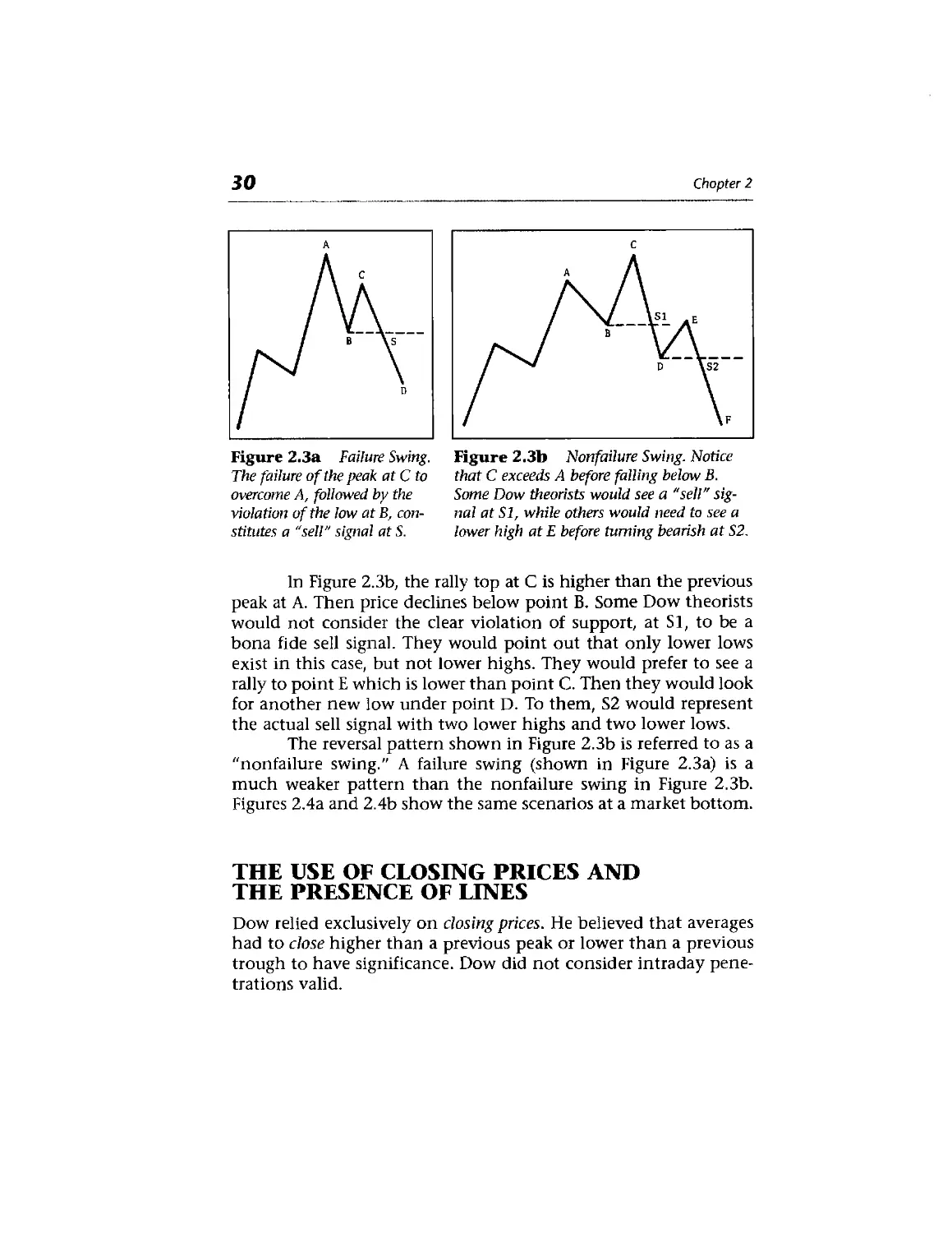
Introduction 23
Basic Tenets 24
The Use of Closing Prices and the Presence of
Lines 30
Some Criticisms of Dow Theory 31
Stocks as Economic Indicators 32
Dow Theory Applied to Futures Trading 32
Conclusion 33
Chart Construction
Introduction 35
Types of Charts Available 36
Candlesticks 37
Arithmetic versus Logarithmic Scale 39
Construction of the Daily Bar Chart 40
Volume 41
Futures Open Interest 42
Weekly and Monthly Bar Charts 45
Conclusion 46
Basic Concepts of Trend
Definition of Trend 49
Trend Has Three Directions 51
Trend Has Three Classifications 52
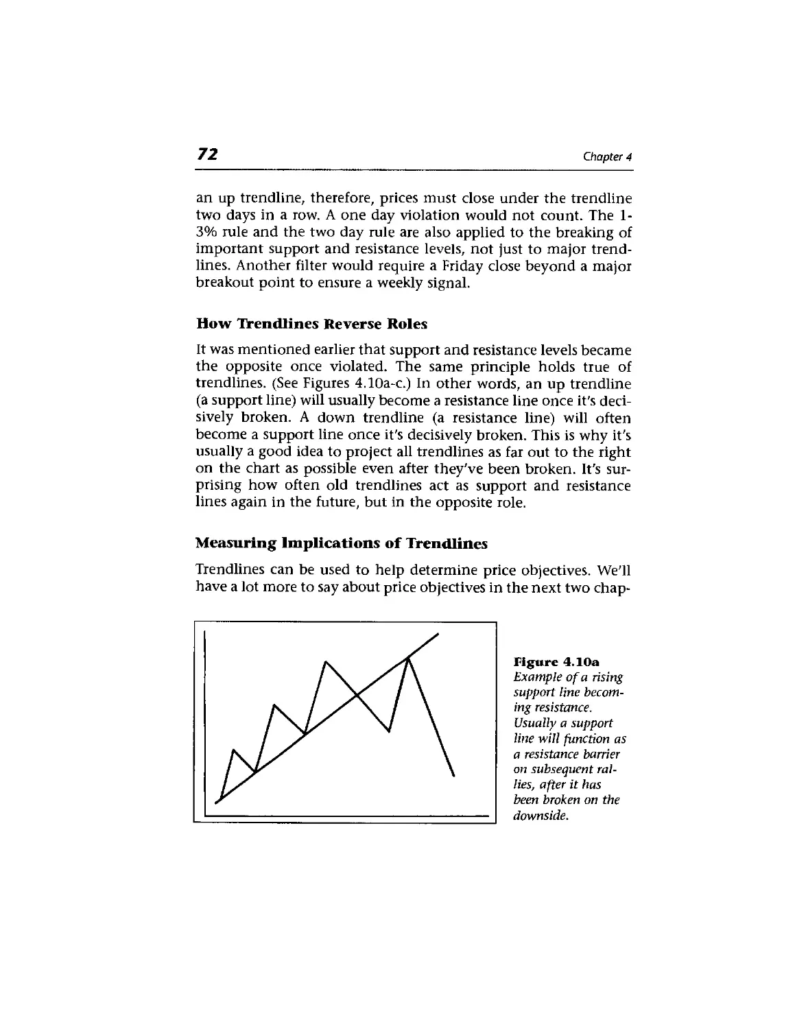
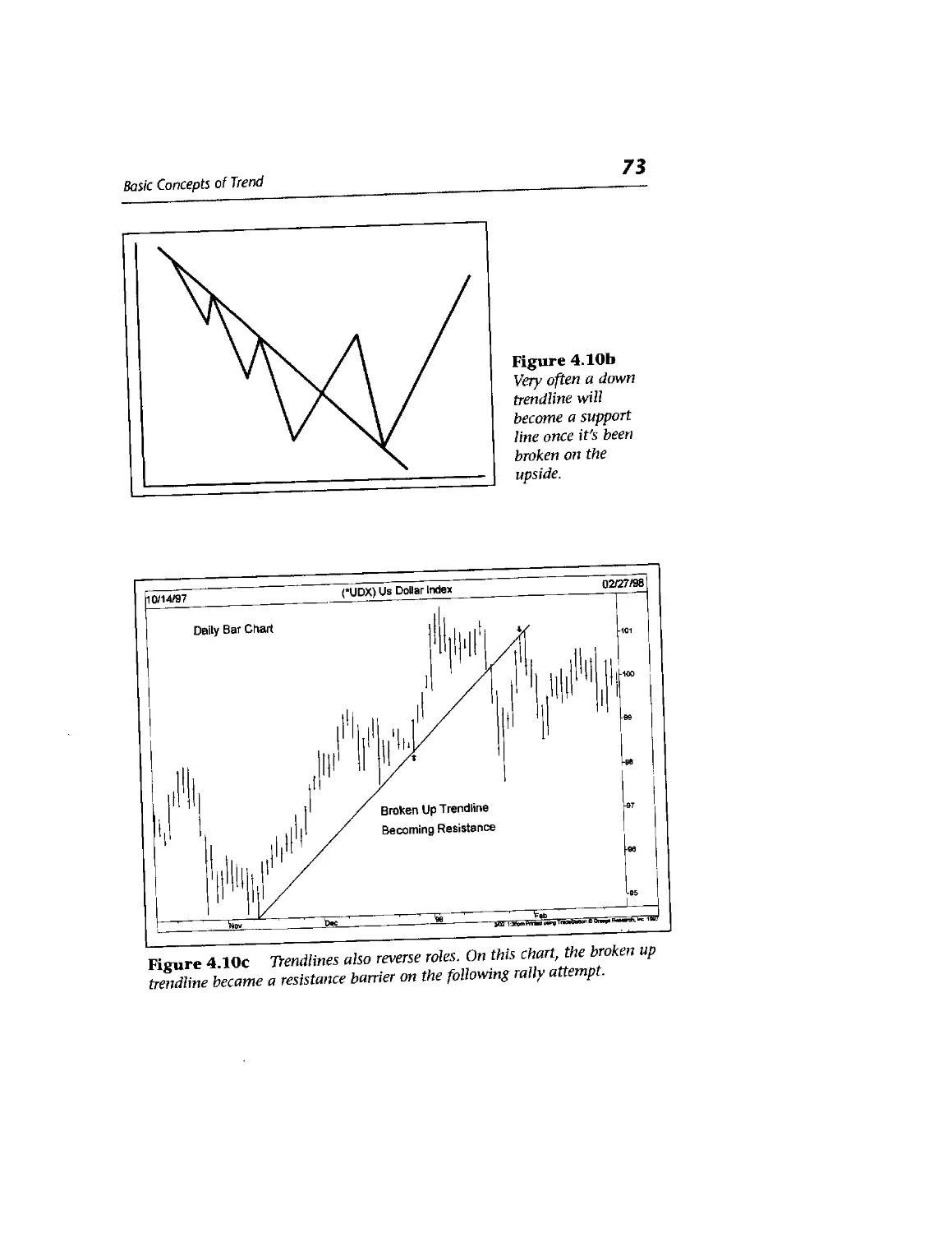
Support and Resistance 55
Trendlines 65
The Fan Principle 74
The Importance of the Number Three 76
The Relative Steepness of the Trendline 76
The Channel Line 80
Percentage Retracements 85
Speed Resistance Lines 87
Gann and Fibonacci Fan Lines 90
Internal Trendlines 90
Reversal Days 90
Price Gaps 94
Conclusion 98
Major Reversal Patterns
Introduction 99
Price Patterns 100
Two Types of Patterns: Reversal and
Continuation 100
The Head and Shoulders Reversal Pattern 103
The Importance of Volume 107
Finding a Price Objective 108
The Inverse Head and Shoulders 110
Complex Head and Shoulders 113
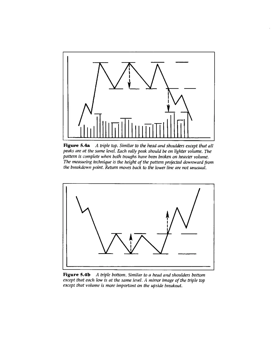
Triple Tops and Bottoms 115
Double Tops and Bottoms 117
Variations from the Ideal Pattern 121
Saucers and Spikes 125
Conclusion 128
Contents
xi
Continuation Patterns 129
Introduction 129
Triangles 130
The Symmetrical Triangle 132
The Ascending Triangle 136
The Descending Triangle 138
The Broadening Formation 140
Flags and Pennants 141
The Wedge Formation 146
The Rectangle Formation 147
The Measured Move 151
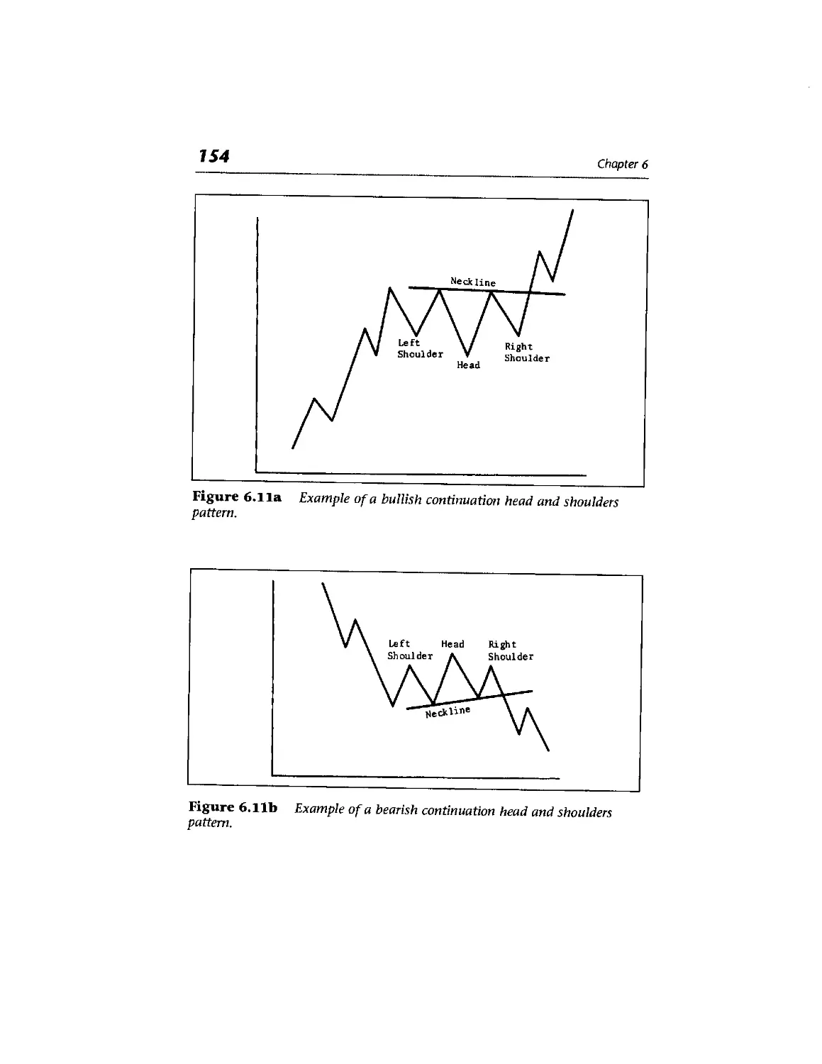
The Continuation Head and Shoulders Pattern 153
Confirmation and Divergence 155
Conclusion 156
Volume and Open Interest 157
Introduction 157
Volume and Open Interest as Secondary
Indicators 158
Interpretation of Volume for All Markets 162
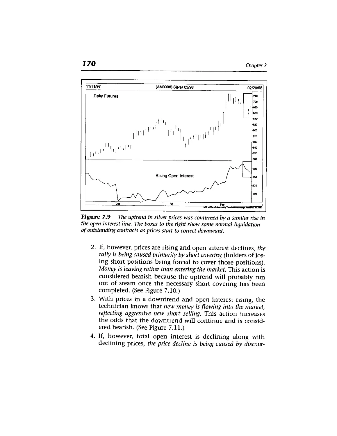
Interpretation of Open Interest in Futures 169
xii
Contents
Summary of Volume and Open Interest Rules 174
Blowoffs and Selling Climaxes 175
Commitments of Traders Report 175
Watch the Commercials 176
Net Trader Positions 177
Open Interest In Options 177
Put/Call Ratios 178
Combine Option Sentiment With Technicals 179
Conclusion 179
Long Term Charts 181
Introduction 181
The Importance of Longer Range Perspective 182
Construction of Continuation Charts for Futures 182
The Perpetual Contract™ 184
Long Term Trends Dispute Randomness 184
Patterns on Charts: Weekly and Monthly
Reversals 185
Long Term to Short Term Charts 185
Why Should Long Range Charts Be Adjusted for
Inflation? 186
Long Term Charts Not Intended for Trading
Purposes 188
Examples of Long Term Charts 188
Contents xiii
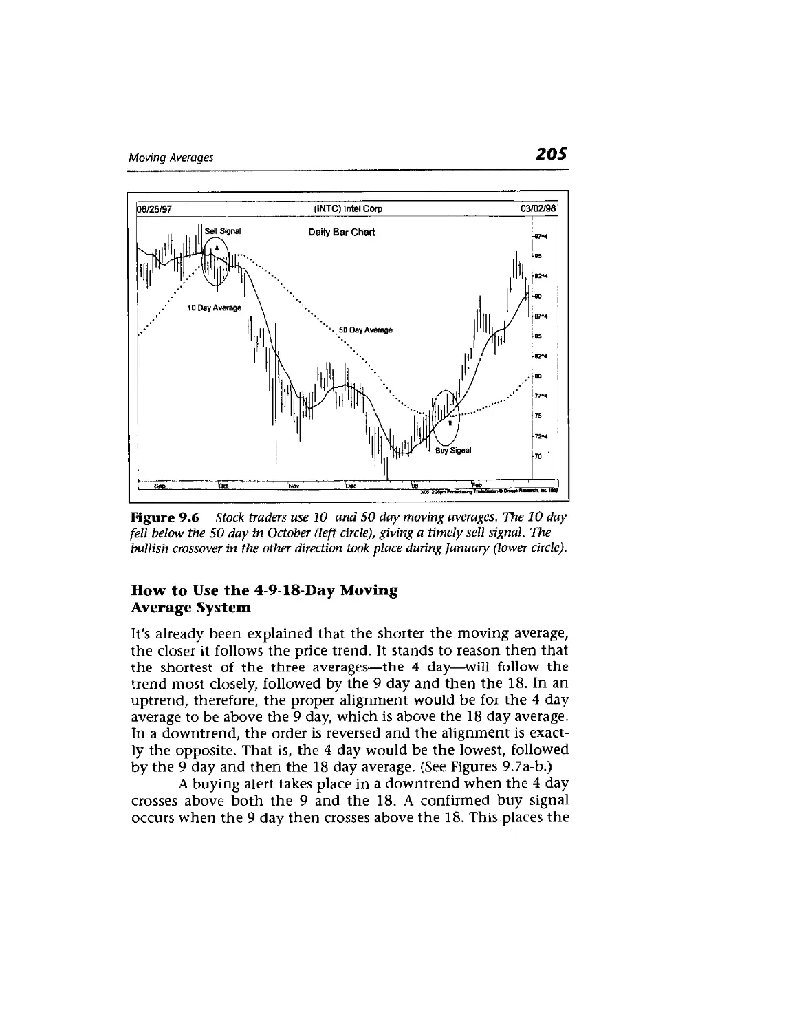
Moving Averages 195
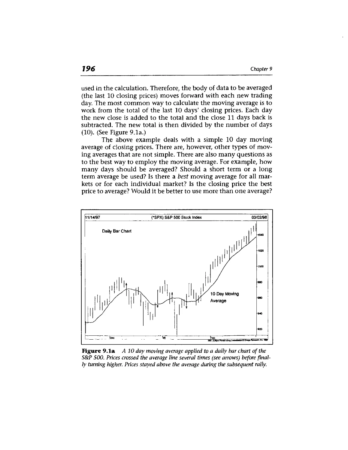
Introduction 195
The Moving Average: A Smoothing Device with a
Time Lag 197
Moving Average Envelopes 207
Bollinger Bands 209
Using Bollinger Bands as Targets 210
Band Width Measures Volatility 211
Moving Averages Tied to Cycles 212
Fibonacci Numbers Used as Moving Averages 212
Moving Averages Applied to Long Term
Charts 213
The Weekly Rule 215
To Optimize or Not 220
Summary 221
The Adaptive Moving Average 222
Alternatives to the Moving Average 223
Oscillators and Contrary Opinion 225
Introduction 225
Oscillator Usage in Conjunction with Trend 226
Measuring Momentum 228
xiv
Contents
Measuring Rate of Change (ROC) 234
\
Constructing an Oscillator Using Two Moving
Averages 234
Commodity Channel Index 237
The Relative Strength Index (RSI) 239
Using the 70 and 30 Lines to Generate Signals 245
Stochastics (K%D) 246
Larry Williams %R 249
The Importance of Trend 251
When Oscillators are Most Useful 251
Moving Average Convergence/Divergence
(MACD) 252
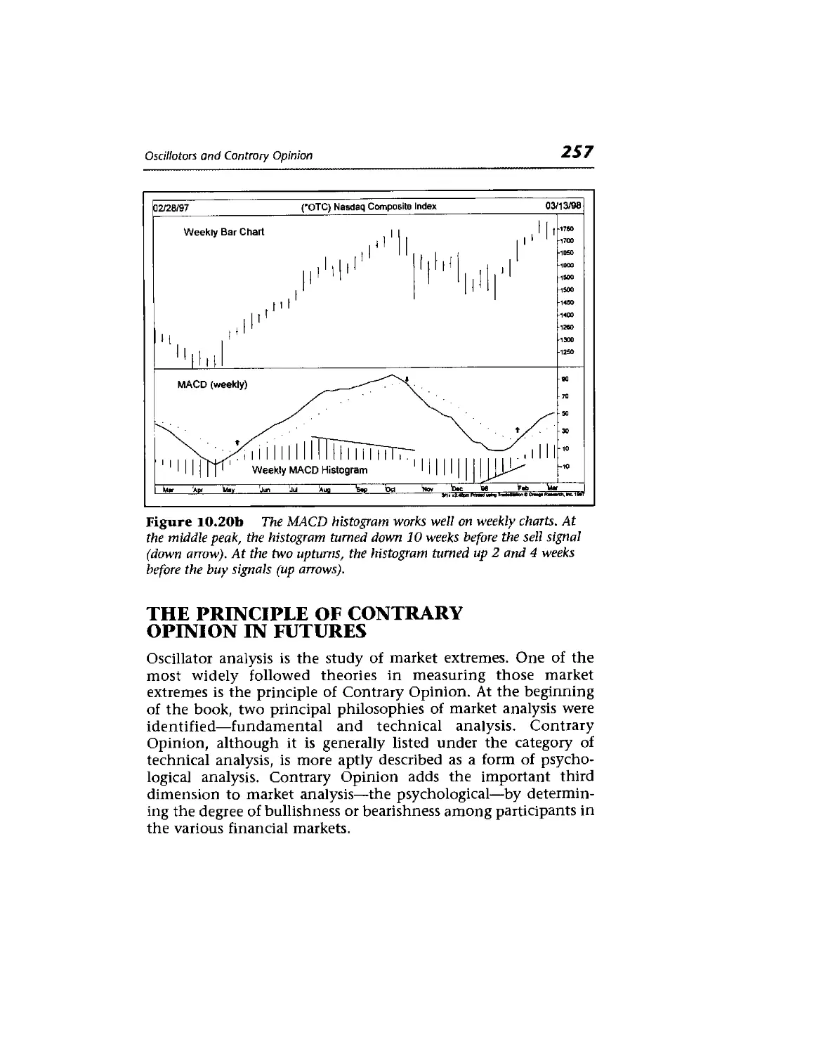
MACD Histogram 255
Combine Weeklies and Dailies 256
The Principle of Contrary Opinion in Futures 257
Investor Sentiment Readings 261
Investors Intelligence Numbers 262
Point and Figure Charting 265
Introduction 266
The Point and Figure Versus the Bar Chart 270
Construction of the Intraday Point and Figure
Chart 270
The Horizontal Count 274
Price Patterns 275
xiv
Contents
Measuring Rate of Change (ROC) 234
Constructing an Oscillator Using Two Moving
Averages 234
Commodity Channel Index 237
The Relative Strength Index (RSI) 239
Using the 70 and 30 Lines to Generate Signals 245
Stochastics (K%D) 246
Larry Williams %R 249
The Importance of Trend 251
When Oscillators are Most Useful 251
Moving Average Convergence/Divergence
(MACD) 252
MACD Histogram 255
Combine Weeklies and Dailies 256
The Principle of Contrary Opinion in Futures 257
Investor Sentiment Readings 261
Investors Intelligence Numbers 262
Point and Figure Charting 265
Introduction 266
The Point and Figure Versus the Bar Chart 270
Construction of the Intraday Point and Figure
Chart 270
The Horizontal Count 274
Price Patterns 275
xiv
Contents
Measuring Rate of Change (ROC) 234
Constructing an Oscillator Using Two Moving
Averages 234
Commodity Channel Index 237
The Relative Strength Index (RSI) 239
Using the 70 and 30 Lines to Generate Signals 245
Stochastics (K%D) 246
Larry Williams %R 249
The Importance of Trend 251
When Oscillators are Most Useful 251
Moving Average Convergence /Divergence
(MACD) 252
MACD Histogram 255
Combine Weeklies and Dailies 256
The Principle of Contrary Opinion in Futures 257
Investor Sentiment Readings 261
Investors Intelligence Numbers 262
Point and Figure Charting 265
Introduction 266
The Point and Figure Versus the Bar Chart 270
Construction of the Intraday Point and Figure
Chart 270
The Horizontal Count 274
Price Patterns 275
Contents
XV
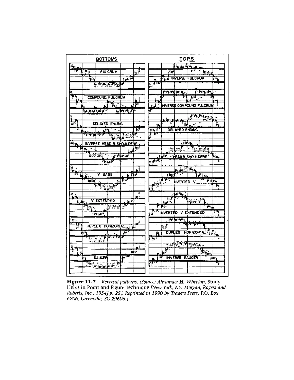
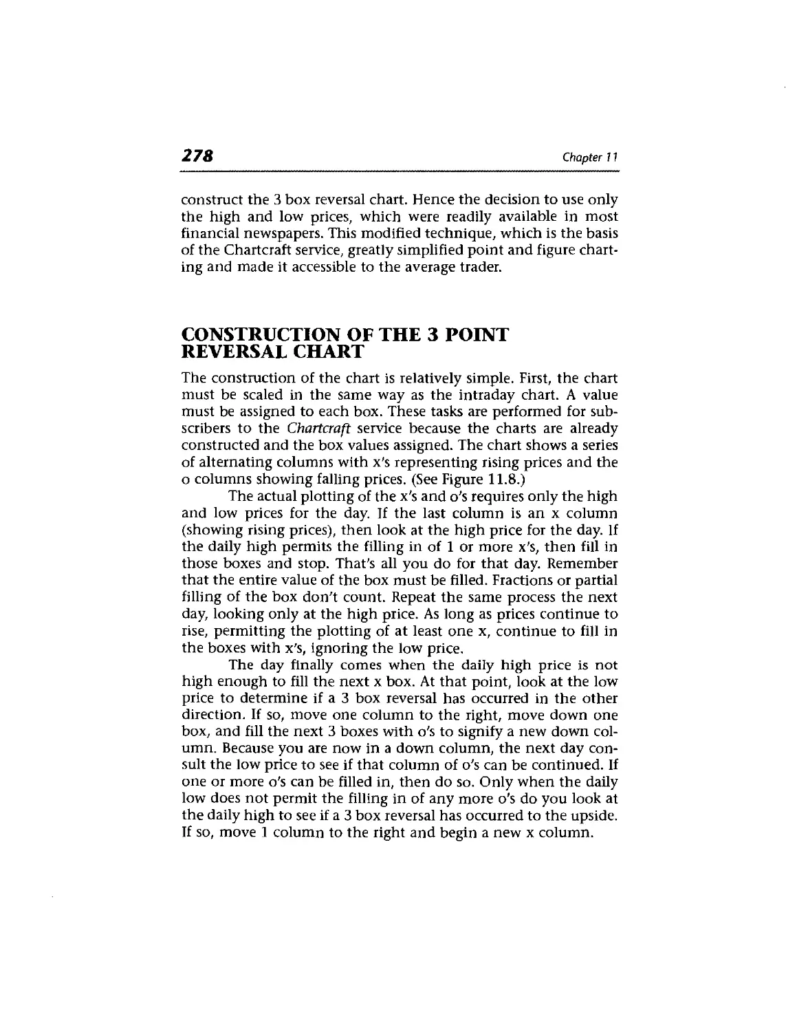
3 Box Reversal Point and Figure Charting 277
Construction of the 3 Point Reversal Chart 278
The Drawing of Trendlines 282
Measuring Techniques 286
Trading Tactics 286
Advantages of Point and Figure Charts 288
P&F Technical Indicators 292
Computerized P&F Charting 292
P&F Moving Averages 294
Conclusion 296
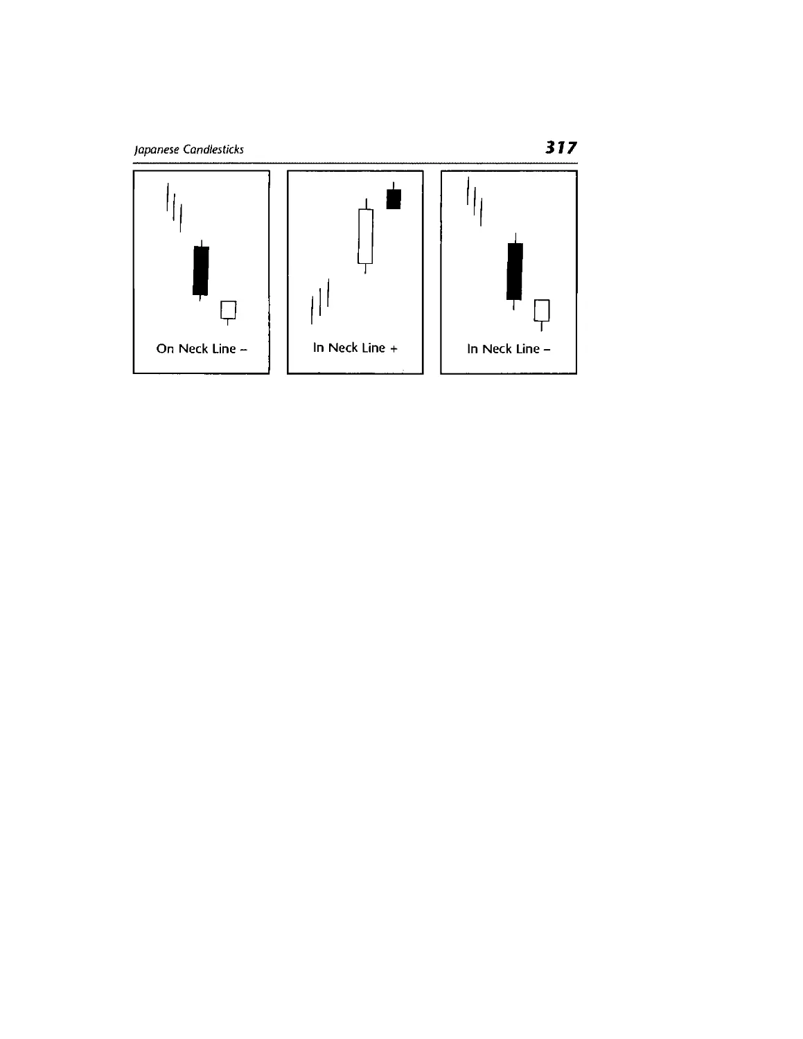
Japanese Candlesticks 297
Introduction 297
Candlestick Charting 297
Basic Candlesticks 299
Candle Pattern Analysis 301
Filtered Candle Patterns 306
Conclusion 308
Candle Patterns 309
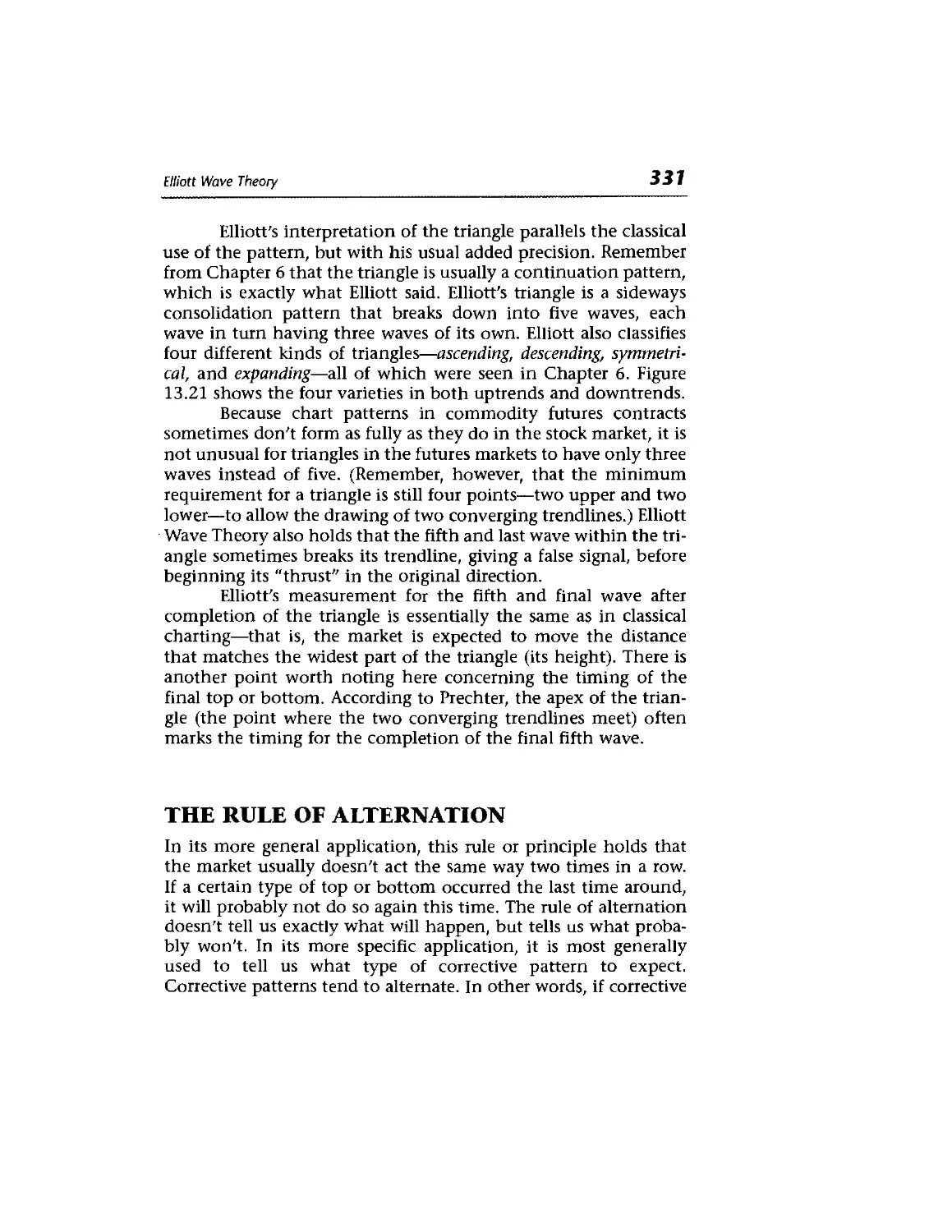
Elliott Wave Theory
Historical Background 319
The Basic Tenets of the Elliott Wave Principle
319
320
XVI
Contents
Connection Between Elliott Wave and Dow
Theory 324
Corrective Waves 324
The Rule of Alternation 331
Channeling 332
Wave 4 as a Support Area 334
Fibonacci Numbers as the Basis of the Wave
Principle 334
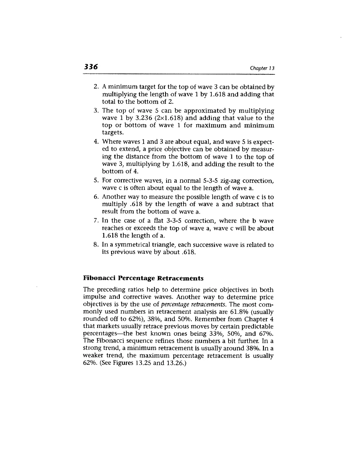
Fibonacci Ratios and Retracements 335
Fibonacci Time Targets 338
Combining All Three Aspects of Wave Theory 338
Elliott Wave Applied to Stocks Versus
Commodities 340
Summary and Conclusions 341
Reference Material 342
Time Cycles 343
Introduction 343
Cycles 344
How Cyclic Concepts Help Explain Charting
Techniques 355
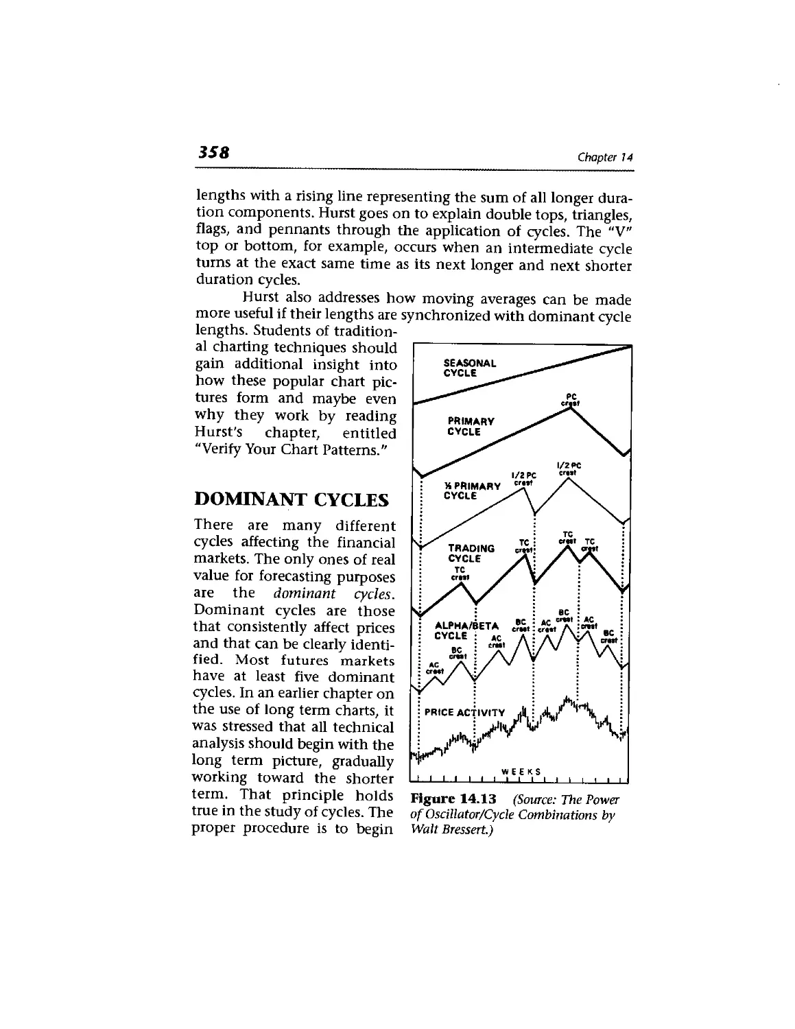
Dominant Cycles 358
Combining Cycle Lengths 361
The Importance of Trend 361
Left and Right Translation 362
How to Isolate Cycles 363
Contents
xvii
Seasonal Cycles 369
Stock Market Cycles 373
The January Barometer 373
The Presidential Cycle 373
Combining Cycles with Other Technical Tools 374
Maximum Entropy Spectral Analysis 374
Cycle Reading and Software 375
Computers and Trading Systems 377
Introduction 377
Some Computer Needs 379
Grouping Tools and Indicators 380
Using the Tools and Indicators 380
Welles Wilder's Parabolic and Directional Movement
Systems 381
Pros and Cons of System Trading 387
Need Expert Help? 389
Test Systems or Create Your Own 390
Conclusion 390
v Money Management and Trading
Tactics 393
Introduction 393
The Three Elements of Successful Trading 393
xviii
Contents
Money Management 394
Reward to Risk Ratios 397
Trading Multiple Positions: Trending versus Trading
Units 398
What to Do After Periods of Success and
Adversity 399
Trading Tactics 400
Combining Technical Factors and Money
Management 403
Types of Trading Orders 403
From Daily Charts to Intraday Price Charts 405
The Use of Intraday Pivot Points 407
Summary of Money Management and Trading
Guidelines 408
Application to Stocks 409
Asset Allocation 409
Managed Accounts and Mutual Funds 410
Market Profile 411
The Link Between Stocks and Futures:
Intermarket Analysis 413
Intermarket Analysis 414
Program Trading: The Ultimate Link 415
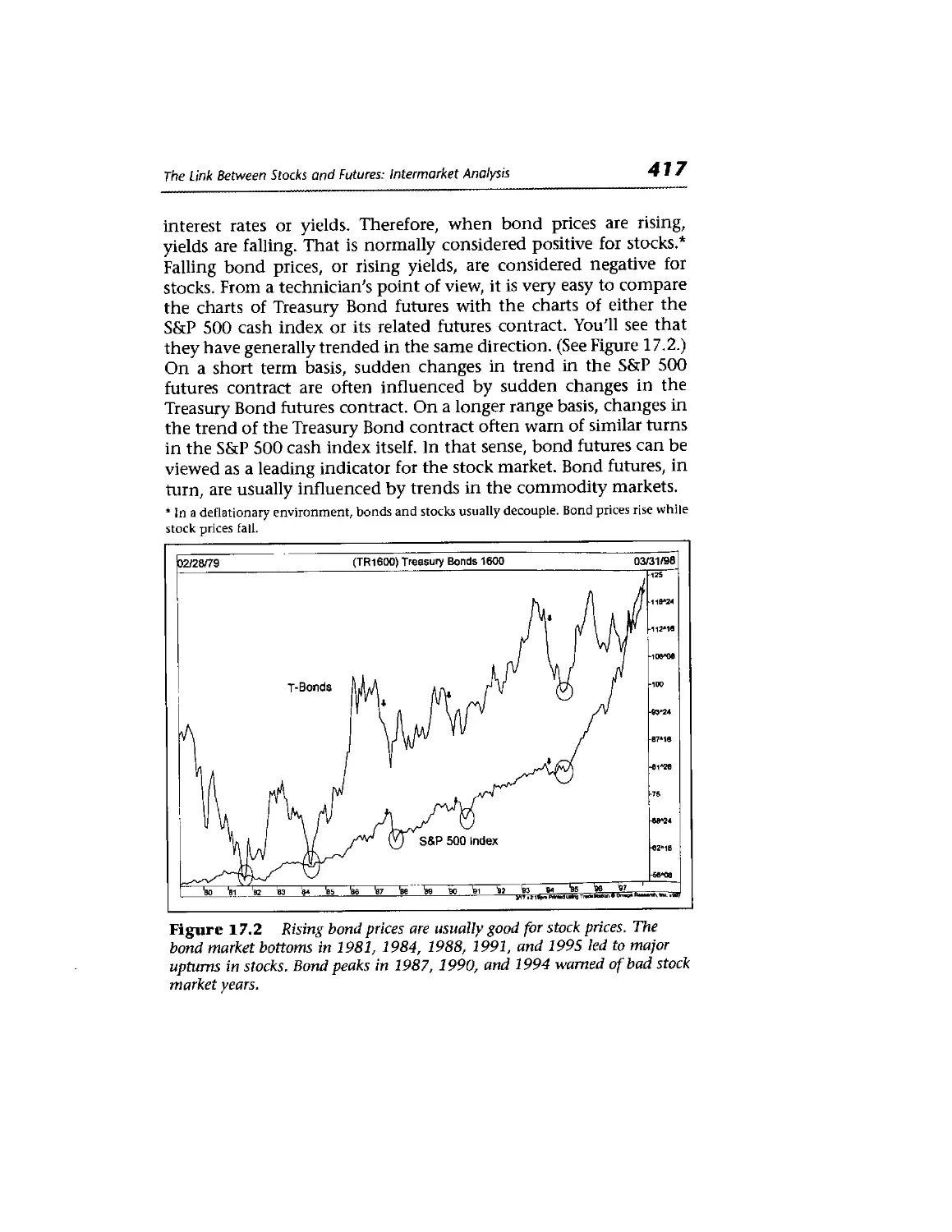
The Link Between Bonds and Stocks 416
The Link Between Bonds and Commodities 418
The Link Between Commodities and the Dollar 419
Contents
XIX
Stock Sectors and Industry Groups 420
The Dollar and Large Caps 422
Intermarket Analysis and Mutual Funds 422
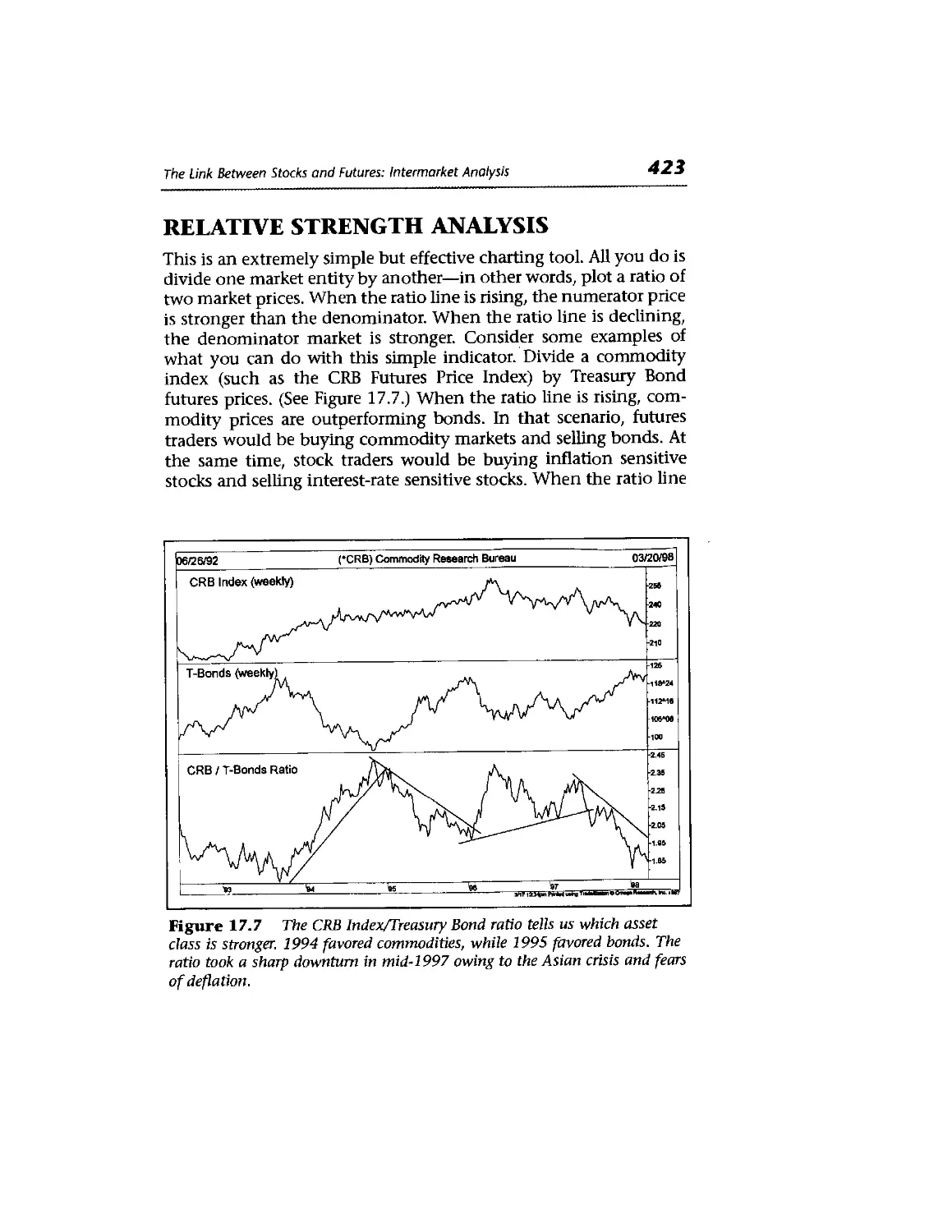
Relative Strength Analysis 423
Relative Strength and Sectors 424
Relative Strength and Individual Stocks 426
Top-Down Market Approach 427
Deflation Scenario 427
Intermarket Correlation 428
Intermarket Neural Network Software 429
Conclusion 430
- Stock Market Indicators 433
Measuring Market Breadth 433
Sample Data 434
Comparing Market Averages 435
The Advance-Decline Line 436
AD Divergence 437
Daily Versus Weekly AD Lines 437
Variations in AD Line 437
McClellan Oscillator 438
McClellan Summation Index 439
New Highs Versus New Lows 440
New High-New Low Index 441
Con ten f 5
Upside Versus Downside Volume 443
The Arms Index 444
TRIN Versus TICK 444
Smoothing the Arms Index 445
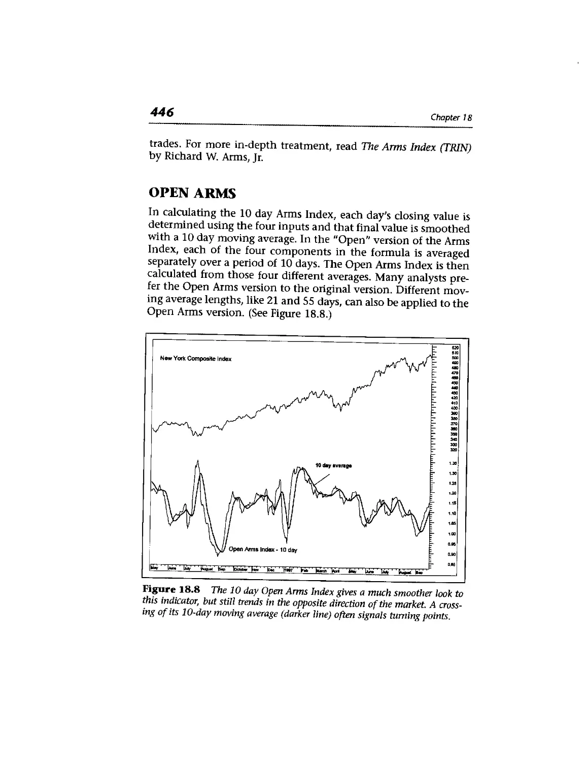
Open Arms 446
Equivolume Charting 447
Candlepower 448
Comparing Market Averages 449
Conclusion 452
Pulling It All Together—A Checklist 453
Technical Checklist 454
How to Coordinate Technical and Fundamental
Analysis 455
Chartered Market Technician (CMT) 456
Market Technicians Association (MTA) 457
The Global Reach of Technical Analysis 458
Technical Analysis by Any Name 458
Federal Reserve Finally Approves 459
Conclusion 460
Advanced Technical Indicators 463
Demand Index (DI) 463
Herrick Payoff Index (HPI) 466
Stare Bands and Keltner Channels 469
Formula for Demand Index 473
; Market Profile 475
Introduction 475
Market Profile Graphic 478
Market Structure 479
Market Profile Organizing Principles 480
Range Development and Profile Patterns 484
Tracking Longer Term Market Activity 486
Conclusion 490
The Essentials of Building a Trading
System 493
5-Step Plan 494
Step 1: Start with a Concept (an Idea) 495
Step 2: Turn Your Idea into a Set of Objective
Rules 497
Step 3: Visually Check It Out on the Charts 497
Step 4: Formally Test It with a Computer 497
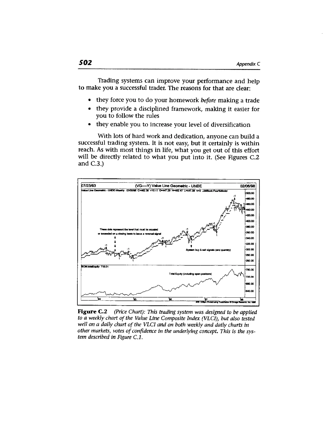
Step 5: Evaluate Results 500
Money Management 501
Conclusion 501
xxii
Contents
*. Continuous Futures Contracts 505
Nearest Contract 506
Next Contract 506
Gann Contract 507
Continuous Contracts 507
Constant Forward Continuous Contracts 508
\ Glossary 511
Selected Bibliography 523
Selected Resources 527
Index 531
About the Author
John J. Murphy has been applying technical analysis for three
decades. He was formerly Director of Futures Technical Research
and the senior managed account trading advisor with Merrill
Lynch. Mr. Murphy was the technical analyst for CNBC-TV for
seven years. He is the author of three books, including Technical
Analysis of the Futures Markets, the predecessor to this book. His
second book, Inteimarket Technical Analysis, opened up a new
branch of analysis. His third book, The Visual Investor, applies
technical work to mutual funds.
In 1996, Mr. Murphy founded MURPHYMORR1S, Inc.,
along with software developer Greg Morris, to produce interactive
educational products and online analysis for investors. Their Web
site address is:
www.murphymorris.com.
He is also head of his own consulting firm, JJM Technical
Advisors, located in Oradell, New Jersey.
XXIII
About the Contributors
Thomas E. Aspray (Appendix A) is a Capital Market Analyst with
Princeton Economic Institute Ltd., located in Princeton, New
Jersey. Mr. Aspray has been trading markets since the 1970s. Many
of the techniques he pioneered in the early 1980s are now used by
other professional traders.
Dennis C. Hynes (Appendix B) is Managing Director and
cofounder of R.W. Pressprich & Co., Inc., a fixed income
broker/dealer located in New York City. He also serves as the firm's
Chief Market Strategist. Mr. Hynes is a futures and options trader
and a CTA (Commodity Trading Advisor). He has an MBA in
Finance from the University of Houston.
Greg Morris (Chapter 12 and Appendix D) has been
developing trading systems and indicators for 20 years for investors
and traders to be used with major technical analysis software
programs. He is the author of two books on candlestick charting (see
Chapter 12). In August 1996, Mr. Morris teamed with John
Murphy to found MURPHYMORRIS Inc., a Dallas-based firm
dedicated to educating investors.
XXV
xxvi
About the Contributors
Fred G. Schutzman, CMT (Appendix C) is the President
and Chief Executive Officer of Briarwood Capital Management,
Inc., a New York-based Commodity Trading Advisor. He is also
responsible for technical research and trading system
development at Emcor Eurocurrency Management Corporation, a risk
management consulting firm. Mr, Schutzman is a member of the
Market Technicians Association and is currently serving on their
Board of Directors.
Introduction
1 had no idea when Technical Analysis of the Futures Markets was
published in 1986 that it would create such an impact on the
industry. It has been referred to by many in the field as the "Bible"
of technical analysis. The Market Technicians Association uses it
as a primary source in their testing process for the Chartered
Market Technician program. The Federal Reserve has cited it in
research studies that examine the value of the technical approach.
In addition, it has been translated into eight foreign languages. I
was also unprepared for the long shelf life of the book. It
continues to sell as many copies ten years after it was published as it did
in the first couple of years.
It became clear, however, that a lot of new material had
been added to the field of technical analysis in the past decade. I
added some of it myself. My second book, Intermarket Technical
Analysis (Wiley, 1991), helped create that new branch of technical
analysis, which is widely used today. Old techniques like Japanese
candlestick charting and newer ones like Market Profile have
become part of the technical landscape. Clearly, this new work
xxvii
xx via
Introduction
needed to be included in any book that attempted to present a
comprehensive picture of technical analysis. The focus of my
work changed as well.
While my main interest ten years ago was in the futures
markets, my recent work has dealt more with the stock market.
That also brought me full circle, since I began my career as a stock
analyst thirty years ago. That was also one of the side effects of my
being the technical analyst for CNBC-TV for seven years. That
focus on what the general public was doing also led to my third
book, The Visual Investor (Wiley, 1996). That book focused on the
use of technical tools for market sectors, primarily through
mutual funds, which have become extremely popular in the 1990s.
Many of the technical indicators that I wrote about ten
years ago, which had been used primarily in the futures markets,
have been incorporated into stock market work. It was time to
show how that was being done. Finally, like any field or
discipline, writers also evolve. Some things that seemed very
important to me ten years ago aren't as important today. As my work
has evolved into a broader application of technical principles to
all financial markets, it seemed only right that any revision of that
earlier work should reflect that evolution.
I've tried to retain the structure of the original book.
Therefore, many of the original chapters remain. However, they
have been revised with new material and updated with new
graphics. Since the principles of technical analysis are universal, it
wasn't that difficult to broaden the focus to include all financial
markets. Since the original focus was on futures, however, a lot of
stock market material has been added.
Three new chapters have been added. The two previous
chapters on point and figure charting (Chapters 11 and 12) have
been merged into one. A new Chapter 12 on candlestick charting
has been inserted. Two additional chapters have also been added
at the end of the book. Chapter 17 is an introduction to my work
on intermarket analysis. Chapter 18 deals with stock market
indicators. We've replaced the previous appendices with new ones.
Market Profile is introduced in Appendix B. The other appendices
show some of the more advanced technical indicators and explain
how to build a technical trading system. There's also a glossary.
Introduction
XXIX
I approached this revision with some trepidation. I wasn't
sure redoing a book considered a "classic" was such a good idea. I
hope I've succeeded in making it even better. I approached this
work from the perspective of a more seasoned and mature writer
and analyst. And, throughout the book, I tried to show the respect
I have always had for the discipline of technical analysis and for
the many talented analysts who practice it. The success of their
work, as well as their dedication to this field, has always been a
source of comfort and inspiration to me. 1 only hope I did justice
to it and to them.
John Murphy
Acknowledgments
The person who deserves the most credit for the second edition of
this book is Ellen Schneid Coleman, Executive Editor at Simon &
Schuster. She convinced me that it was time to revise Technical
Analysis of the Futures Markets and broaden its scope. I'm glad she
was so persistent. Special thanks go to the folks at Omega Research
who provided me with the charting software I needed and, in
particular, Gaston Sanchez who spent a lot of time on the phone with
me. The contributing authors—Tom Aspray, Dennis Hynes, and
Fred Schutzman—added their particular expertise where it was
needed. In addition, several analysts contributed charts including
Michael Burke, Stan Ehrlich, Jerry Toepke, Ken Tower, and Nick
Van Nice. The revision of Chapter 2 on Dow Theory was a
collaborative effort with Elyce Picciotti, an independent technical writer
and market consultant in New Orleans, Louisiana. Greg Morris
deserves special mention. He wrote the chapter on candlestick
charting, contributed the article in Appendix D, and did most of
the graphic work. Fred Dahl of Inkwell Publishing Services
(Fishkill, NY), who handled production of the first edition of this
book, did this one as well. It was great working with him again.
xxxi
TECHNICAL
ANALYSIS
?£E FINANCIAL
MARKETS
A COMPREHENSIVE GUIDE TO TRADING
METHODS AND APPLICATIONS
Philosophy of
Technical Analysis
INTRODUCTION
Before beginning a study of the actual techniques and tools used
in technical analysis, it is necessary first to define what technical
analysis is, to discuss the philosophical premises on which it is
based, to draw some clear distinctions between technical and
fundamental analysis and, finally, to address a couple of criticisms
frequently raised against the technical approach.
The author's strong belief is that a full appreciation of the
technical approach must begin with a clear understanding of
what technical analysis claims to be able to do and, maybe even
more importantly the philosophy or rationale on which it bases
those claims.
First, let's define the subject. Technical analysis is the study
of market action, primarily through the use of charts, for the purpose of
forecasting future price trends. The term "market action" includes
the three principal sources of information available to the techni-
1
2
Chapter 1
cian—price, volume, and open interest. (Open interest is used
only in futures and options.) The term "price action," which is
often used, seems too narrow because most technicians include
volume and open interest as an integral part of their market
analysis. With this distinction made, the terms "price action" and
"market action" are used interchangeably throughout the
remainder of this discussion.
PHILOSOPHY OR RATIONALE
There are three premises on which the technical approach is
based:
1. Market action discounts everything.
2. Prices move in trends.
3. History repeats itself.
Market Action Discounts Everything
The statement "market action discounts everything" forms what
is probably the cornerstone of technical analysis. Unless the full
significance of this first premise is fully understood and accepted,
nothing else that follows makes much sense. The technician
believes that anything that can possibly affect the
price—fundamentally, politically, psychologically, or otherwise—is actually
reflected in the price of that market. It follows, therefore, that a
study of price action is all that is required. While this claim may
seem presumptuous, it is hard to disagree with if one takes the
time to consider its true meaning.
All the technician is really claiming is that price action
should reflect shifts in supply and demand. If demand exceeds
supply, prices should rise. If supply exceeds demand, prices
should fall. This action is the basis of all economic and
fundamental forecasting. The technician then turns this statement
around to arrive at the conclusion that if prices are rising, for
whatever the specific reasons, demand must exceed supply and
the fundamentals must be bullish. If prices fall, the fundamen-
Philosophy of Technical Analysis
3
tals must be bearish. If this last comment about fundamentals
seems surprising in the context of a discussion of technical
analysis, it shouldn't. After all, the technician is indirectly
studying fundamentals. Most technicians would probably agree
that it is the underlying forces of supply and demand, the
economic fundamentals of a market, that cause bull and bear
markets. The charts do not in themselves cause markets to move up
or down. They simply reflect the bullish or bearish psychology
of the marketplace.
As a rule, chartists do not concern themselves with the
reasons why prices rise or fall. Very often, in the early stages of a
price trend or at critical turning points, no one seems to know
exactly why a market is performing a certain way. While the
technical approach may sometimes seem overly simplistic in its
claims, the logic behind this first premise—that markets discount
everything—becomes more compelling the more market
experience one gains. It follows then that if everything that affects
market price is ultimately reflected in market price, then the study of
that market price is all that is necessary. By studying price charts
and a host of supporting technical indicators, the chartist in effect
lets the market tell him or her which way it is most likely to go.
The chartist does not necessarily try to outsmart or outguess the
market. All of the technical tools discussed later on are simply
techniques used to aid the chartist in the process of studying
market action. The chartist knows there are reasons why markets go
up or down. He or she just doesn't believe that knowing what
those reasons are is necessary in the forecasting process.
Prices Move in Trends
The concept of trend is absolutely essential to the technical
approach. Here again, unless one accepts the premise that markets
do in fact trend, there's no point in reading any further. The
whole purpose of charting the price action of a market is to
identify trends in early stages of their development for the purpose of
trading in the direction of those trends. In fact, most of the
techniques used in this approach are trend-following in nature,
meaning that their intent is to identify and follow existing trends. (See
Figure 1.1.)
Chapter 1
31/31/79
Monthly Line Chart
Te to 'ei 'e: to "m 'ss
(*SPX) S&P 500 Stock Index 02/27/98
1000
mo
wo
700
400
500
WG
300
200
'e<s fc7 fce 6e bo 'ai '91 te 'w to be te7
— ~ snnssrwfiaissTifteassBiSisiissarKTW
Figure 1.1 Example of an uptrend. Technical analysis is based on the
premise that markets trend and that those trends tend to persist.
There is a corollary to the premise that prices move in
trends—a trend in motion is more likely to continue than to reverse.
This corollary is, of course, an adaptation of Newton's first law of
motion. Another way to state this corollary is that a trend in
motion will continue in the same direction until it reverses. This
is another one of those technical claims that seems almost
circular. But the entire trend-following approach is predicated on
riding an existing trend until it shows signs of reversing.
History Repeats Itself
Much of the body of technical analysis and the study of market
action has to do with the study of human psychology. Chart
patterns, for example, which have been identified and categorized
over the past one hundred years, reflect certain pictures that
appear on price charts. These pictures reveal the bullish or bearish
Philosophy of Technical Analysis
5
psychology of the market. Since these patterns have worked well
in the past, it is assumed that they will continue to work well in
the future. They are based on the study of human psychology,
which tends not to change. Another way of saying this last
premise—that history repeats itself—is that the key to
understanding the future lies in a study of the past, or that the future is
just a repetition of the past.
TECHNICAL VERSUS
FUNDAMENTAL FORECASTING
While technical analysis concentrates on the study of market
action, fundamental analysis focuses on the economic forces of
supply and demand that cause prices to move higher, lower, or
stay the same. The fundamental approach examines all of the
relevant factors affecting the price of a market in order to determine
the intrinsic value of that market. The intrinsic value is what the
fundamentals indicate something is actually worth based on the
law of supply and demand. If this intrinsic value is under the
current market price, then the market is overpriced and should be
sold. If market price is below the intrinsic value, then the market
is undervalued and should be bought.
Both of these approaches to market forecasting attempt to
solve the same problem, that is, to determine the direction prices
are likely to move. They just approach the problem from different
directions. The fundamentalist studies the cause of market movement,
while the technician studies the effect. The technician, of course,
believes that the effect is all that he or she wants or needs to know
and that the reasons, or the causes, are unnecessary. The
fundamentalist always has to know why.
Most traders classify themselves as either technicians or
fundamentalists. In reality, there is a lot of overlap. Many
fundamentalists have a working knowledge of the basic tenets of chart
analysis. At the same time, many technicians have at least a
passing awareness of the fundamentals. The problem is that the charts
and fundamentals are often in conflict with each other. Usually at
the beginning of important market moves, the fundamentals do
6
Chapter 1
not explain or support what the market seems to be doing. It is at
these critical times in the trend that these two approaches seem
to differ the most. Usually they come back into sync at some
point, but often too late for the trader to act.
One explanation for these seeming discrepancies is that
market price tends to lead the known fundamentals. Stated another
way market price acts as a leading indicator of the fundamentals or the
conventional wisdom of the moment. While the known
fundamentals have already been discounted and are already "in the
market/' prices are now reacting to the unknown fundamentals. Some
of the most dramatic bull and bear markets in history have begun
with little or no perceived change in the fundamentals. By the time
those changes became known, the new trend was well underway
After a while, the technician develops increased confidence
in his or her ability to read the charts. The technician learns to be
comfortable in a situation where market movement disagrees with
the so-called conventional wisdom. A technician begins to enjoy
being in the minority. He or she knows that eventually the reasons
for market action will become common knowledge. It is just that
the technician isn't willing to wait for that added confirmation.
In accepting the premises of technical analysis, one can see
why technicians believe their approach is superior to the
fundamentalists. If a trader had to choose only one of the two
approaches to use, the choice would logically have to be the
technical. Because, by definition, the technical approach includes the
fundamental. If the fundamentals are reflected in market price,
then the study of those fundamentals becomes unnecessary.
Chart reading becomes a shortcut form of fundamental analysis.
The reverse, however, is not true. Fundamental analysis does not
include a study of price action. It is possible to trade financial
markets using just the technical approach. It is doubtful that
anyone could trade off the fundamentals alone with no consideration
of the technical side of the market.
ANALYSIS VERSUS TIMING
This last point is made clearer if the decision making process is
broken down into two separate stages—analysis and timing.
Philosophy of Technical Analysis
7
Because of the high leverage factor in the futures markets, timing
is especially crucial in that arena. It is quite possible to be correct
on the general trend of the market and still lose money. Because
margin requirements are so low in futures trading (usually less
than 10%), a relatively small price move in the wrong direction
can force the trader out of the market with the resulting loss of all
or most of that margin. In stock market trading, by contrast, a
trader who finds him or herself on the wrong side of the market
can simply decide to hold onto the stock, hoping that it will stage
a comeback at some point.
Futures traders don't have that luxury. A "buy and hold"
strategy doesn't apply to the futures arena. Both the technical and
the fundamental approach can be used in the first phase—the
forecasting process. However, the question of timing, of
determining specific entry and exit points, is almost purely technical.
Therefore, considering the steps the trader must go through before
making a market commitment, it can be seen that the correct
application of technical principles becomes indispensable at some
point in the process, even if fundamental analysis was applied in
the earlier stages of the decision. Timing is also important in
individual stock selection and in the buying and selling of stock
market sector and industry groups.
FLEXIBILITY AND ADAPTABILITY
OF TECHNICAL ANALYSIS
One of the great strengths of technical analysis is its adaptability
to virtually any trading medium and time dimension. There is no
area of trading in either stocks or futures where these principles
do not apply.
The chartist can easily follow as many markets as desired,
which is generally not true of his or her fundamental counterpart.
Because of the tremendous amount of data the latter must deal
with, most fundamentalists tend to specialize. The advantages
here should not be overlooked.
For one thing, markets go through active and dormant
periods, trending and nontrending stages. The technician can
8
Chapter 1
concentrate his or her attention and resources in those markets
that display strong trending tendencies and choose to ignore the
rest. As a result, the chartist can rotate his or her attention and
capital to take advantage of the rotational nature of the markets.
At different times, certain markets become "hot" and experience
important trends. Usually, those trending periods are followed by
quiet and relatively trendless market conditions, while another
market or group takes over. The technical trader is free to pick and
choose. The fundamentalist, however, who tends to specialize in
only one group, doesn't have that kind of flexibility. Even if he or
she were free to switch groups, the fundamentalist would have a
much more difficult time doing so than would the chartist.
Another advantage the technician has is the "big picture."
By following all of the markets, he or she gets an excellent feel for
what markets are doing in general, and avoids the "tunnel vision"
that can result from following only one group of markets. Also,
because so many of the markets have built-in economic
relationships and react to similar economic factors, price action in one
market or group may give valuable clues to the future direction of
another market or group of markets.
TECHNICAL ANALYSIS
APPLIED TO DIFFERENT
TRADING MEDIUMS
The principles of chart analysis apply to both stocks and futures.
Actually, technical analysis was first applied to the stock market
and later adapted to futures. With the introduction of stock index
futures, the dividing line between these two areas is rapidly
disappearing. International stock markets are also charted and analyzed
according to technical principles. (See Figure 1.2.)
Financial futures, including interest rate markets and foreign
currencies, have become enormously popular over the past decade
and have proven to be excellent subjects for chart analysis.
Technical principles play a role in options trading. Technical
forecasting can also be used to great advantage in the hedging
process.
Philosophy of Technical Analysis
9
Figure 1.2 The Japanese stock market charts very well as do most stock
markets around the world.
TECHNICAL ANALYSIS APPLIED
TO DIFFERENT TIME DIMENSIONS
Another strength of the charting approach is its ability to handle
different time dimensions. Whether the user is trading the intra-
day tic-by-tic changes for day trading purposes or trend trading the
intermediate trend, the same principles apply. A time dimension
often overlooked is longer range technical forecasting. The opinion
expressed in some quarters that charting is useful only in the
short term is simply not true. It has been suggested by some that
fundamental analysis should be used for long term forecasting
with technical factors limited to short term timing. The fact is
that longer range forecasting, using weekly and monthly charts
going back several years, has proven to be an extremely useful
application of these techniques.
10
Chapter 7
Once the technical principles discussed in this book are
thoroughly understood, they will provide the user with tremendous
flexibility as to how they can be applied, both from the standpoint of
the medium to be analyzed and the time dimension to be studied.
ECONOMIC FORECASTING
Technical analysis can play a role in economic forecasting. For
example, the direction of commodity prices tells us something
about the direction of inflation. They also give us clues about the
strength or weakness of the economy. Rising commodity prices
generally hint at a stronger economy and rising inflationary
pressure. Falling commodity prices usually warn that the economy is
slowing along with inflation. The direction of interest rates is
affected by the trend of commodities. As a result, charts of commodity
markets like gold and oil, along with Treasury Bonds, can tell us a
lot about the strength or weakness of the economy and
inflationary expectations. The direction of the U.S. dollar and foreign
currency futures also provide early guidance about the strength or
weakness of the respective global economies. Even more impressive
is the fact that trends in these futures markets usually show up long
before they are reflected in traditional economic indicators that are
released on a monthly or quarterly basis, and usually tell us what
has already happened. As their name implies, futures markets
usually give us insights into the future. The S&P 500 stock market
index has long been counted as an official leading economic
indicator. A book by one of the country's top experts on the business
cycle, Leading Indicators for the 1990s (Moore), makes a compelling
case for the importance of commodity, bond, and stock trends as
economic indicators. All three markets can be studied employing
technical analysis. We'll have more to say on this subject in
Chapter 17, "The Link Between Stocks and Futures."
TECHNICIAN OR CHARTIST?
There are several different titles applied to practitioners of the
technical approach: technical analyst, chartist, market analyst,
Philosophy of Technical Analysis
11
and visual analyst. Up until recently, they all meant pretty much
the same thing. However, with increased specialization in the
field, it has become necessary to make some further distinctions
and define the terms a bit more carefully. Because virtually all
technical analysis was based on the use of charts up until the last
decade, the terms "technician" and "chartist" meant the same
thing. This is no longer necessarily true.
The broader area of technical analysis is being
increasingly divided into two types of practitioners, the traditional
chartist and, for want of a better term, statistical technicians.
Admittedly, there is a lot of overlap here and most technicians
combine both areas to some extent. As in the case of the
technician versus the fundamentalist, most seem to fall into one
category or the other.
Whether or not the traditional chartist uses quantitative
work to supplement his or her analysis, charts remain the
primary working tool. Everything else is secondary. Charting, of
necessity, remains somewhat subjective. The success of the approach
depends, for the most part, on the skill of the individual chartist.
The term "art charting" has been applied to this approach because
chart reading is largely an art.
By contrast, the statistical, or quantitative, analyst takes
these subjective principles, quantifies, tests, and optimizes them
for the purpose of developing mechanical trading systems. These
systems, or trading models, are then programmed into a
computer that generates mechanical "buy" and "sell" signals. These
systems range from the simple to the very complex. However, the
intent is to reduce or completely eliminate the subjective human
element in trading, to make it more scientific. These statisticians
may or may not use price charts in their work, but they are
considered technicians as long as their work is limited to the study
of market action.
Even computer technicians can be subdivided further into
those who favor mechanical systems, or the "black box"
approach, and those who use computer technology to develop
better technical indicators. The latter group maintains control
over the interpretation of those indicators and also the decision
making process.
12
Chapter 1
One way of distinguishing between the chartist and the
statistician is to say that all chartists are technicians, but not all
technicians are chartists. Although these terms are used
interchangeably throughout this book, it should be remembered that
charting represents only one area in the broader subject of
technical analysis.
A BRIEF COMPARISON OF
TECHNICAL ANALYSIS IN
STOCKS AND FUTURES
A question often asked is whether technical analysis as applied to
futures is the same as the stock market. The answer is both yes and
no. The basic principles are the same, but there are some significant
differences. The principles of technical analysis were first applied to
stock market forecasting and only later adapted to futures. Most of
the basic tools—bar charts, point and figure charts, price patterns,
volume, trendlines, moving averages, and oscillators, for example—
are used in both areas. Anyone who has learned these concepts in
either stocks or futures wouldn't have too much trouble making the
adjustment to the other side. However, there are some general areas
of difference having more to do with the different nature of stocks
and futures than with the actual tools themselves.
Pricing Structure
The pricing structure in futures is much more complicated than in
stocks. Each commodity is quoted in different units and
increments. Grain markets, for example, are quoted in cents per bushel,
livestock markets in cents per pound, gold and silver in dollars per
ounce, and interest rates in basis points. The trader must learn the
contract details of each market: which exchange it is traded on,
how each contract is quoted, what the minimum and maximum
price increments are, and what these price increments are worth.
Limited Life Span
Unlike stocks, futures contracts have expiration dates. A March
1999 Treasury Bond contract, for example, expires in March of
Philosophy of Technical Analysis
13
1999. The typical futures contract trades for about a year and a
half before expiration. Therefore, at any one time, at least a half
dozen different contract months are trading in the same
commodity at the same time. The trader must know which contracts
to trade and which ones to avoid. (This is explained later in this
book.) This limited life feature causes some problems for longer
range price forecasting. It necessitates the continuing need for
obtaining new charts once old contracts stop trading. The chart of
an expired contract isn't of much use. New charts must be
obtained for the newer contracts along with their own technical
indicators. This constant rotation makes the maintenance of an
ongoing chart library a good deal more difficult. For computer
users, it also entails greater time and expense by making it
necessary to be constantly obtaining new historical data as old
contracts expire.
Lower Margin Requirements
This is probably the most important difference between stocks
and futures. All futures are traded on margin, which is usually less
than 10% of the value of the contract. The result of these low
margin requirements is tremendous leverage. Relatively small price
moves in either direction tend to become magnified in their
impact on overall trading results. For this reason, it is possible to
make or lose large sums of money very quickly in futures. Because
a trader puts up only 10% of the value of the contract as margin,
then a 10% move in either direction will either double the
trader's money or wipe it out. By magnifying the impact of even
minor market moves, the high leverage factor sometimes makes
the futures markets seem more volatile than they actually are.
When someone says, for example, that he or she was "wiped out"
in the futures market, remember that he or she only committed
10% in the first place.
From the standpoint of technical analysis, the high leverage
factor makes timing in the futures markets much more critical than
it is in stocks. The correct timing of entry and exit points is crucial
in futures trading and much more difficult and frustrating than
market analysis. Largely for this reason, technical trading skills
become indispensable to a successful futures trading program.
14
Chapter 1
Time Frame Is Much Shorter
Because of the high leverage factor and the need for close
monitoring of market positions, the time horizon of the commodity
trader is much shorter of necessity. Stock market technicians tend
to look more at the longer range picture and talk in time frames
that are beyond the concern of the average commodity trader.
Stock technicians may talk about where the market will be in
three or six months. Futures traders want to know where prices
will be next week, tomorrow, or maybe even later this afternoon.
This has necessitated the refinement of very short term timing
tools. One example is the moving average. The most commonly
watched averages in stocks are 50 and 200 days. In commodities,
most moving averages are under 40 days. A popular moving
average combination in futures, for example, is 4, 9, and 18 days.
Greater Reliance on Timing
Timing is everything in futures trading. Determining the correct
direction of the market only solves a portion of the trading
problem. If the timing of the entry point is off by a day, or sometimes
even minutes, it can mean the difference between a winner or a
loser. It's bad enough to be on the wrong side of the market and
lose money. Being on the right side of the market and still losing
money is one of the most frustrating and unnerving aspects of
futures trading. It goes without saying that timing is almost
purely technical in nature, because the fundamentals rarely change on
a day-to-day basis.
LESS RELIANCE ON MARKET
AVERAGES AND INDICATORS
Stock market analysis is based heavily on the movement of broad
market averages—such as the Dow Jones Industrial Average or the
S&P 500. In addition, technical indicators that measure the
strength or weakness of the broader market—like the NYSE
advance-decline line or the new highs-new lows list—are heavily
employed. While commodity markets can be tracked using mea-
Philosophy of Technical Analysis
15
sures like the Commodity Research Bureau Futures Price Index,
less emphasis is placed on the broader market approach.
Commodity market analysis concentrates more on individual
market action. That being the case, technical indicators that
measure broader commodity trends aren't used much. With only
about 20 or so active commodity markets, there isn't much need.
Specific Technical Tools
While most of the technical tools originally developed in the
stock market have some application in commodity markets, they
are not used in the exact same way. For example, chart patterns in
futures often tend not to form as fully as they do in stocks.
Futures traders rely more heavily on shorter term
indicators that emphasize more precise trading signals. These points of
difference and many others are discussed later in this book.
Finally, there is another area of major difference between
stocks and futures. Technical analysis in stocks relies much more
heavily on the use of sentiment indicators and flow of funds
analysis. Sentiment indicators monitor the performance of different
groups such as odd lotters, mutual funds, and floor specialists.
Enormous importance is placed on sentiment indicators that
measure the overall market bullishness and bearishness on the
theory that the majority opinion is usually wrong. Flow of funds
analysis refers to the cash position of different groups, such as
mutual funds or large institutional accounts. The thinking here is
that the larger the cash position, the more funds that are available
for stock purchases.
Technical analysis in the futures markets is a much purer form
of price analysis. While contrary opinion theory is also used to
some extent, much more emphasis is placed on basic trend
analysis and the application of traditional technical indicators.
SOME CRITICISMS OF THE
TECHNICAL APPROACH
A few questions generally crop up in any discussion of the
technical approach. One of these concerns is the self-fulfilling prophe-
16
Chopter 7
cy. Another is the question of whether or not past price data can
really be used to forecast future price direction. The critic usually
says something like: "Charts tell us where the market has been,
but can't tell us where it is going." For the moment, we'll put
aside the obvious answer that a chart won't tell you anything if
you don't know how to read it. The Random Walk Theory
questions whether prices trend at all and doubts that any forecasting
technique can beat a simple buy and hold strategy. These questions
deserve a response.
The Self-Fulfilling Prophecy
The question of whether there is a self-fulfilling prophecy at work
seems to bother most people because it is raised so often. It is
certainly a valid concern, but of much less importance than most
people realize. Perhaps the best way to address this question is to
quote from a text that discusses some of the disadvantages of
using chart patterns:
a. The use of most chart patterns has been widely publicized in
the last several years. Many traders are quite familiar with
these patterns and often act on them in concert. This creates
a "self-fulfilling prophecy," as waves of buying or selling are
created in response to "bullish" or "bearish" patterns. ..
b. Chart patterns are almost completely subjective. No study
has yet succeeded in mathematically quantifying any of
them. They are literally in the mind of the beholder....
(Teweles et al.)
These two criticisms contradict one another and the
second point actually cancels out the first. If chart patterns are
"completely subjective" and "in the mind of the beholder/' then it is
hard to imagine how everyone could see the same thing at the
same time, which is the basis of the self-fulfilling prophecy.
Critics of charting can't have it both ways. They can't, on the one
hand, criticize charting for being so objective and obvious that
everyone will act in the same way at the same time (thereby
causing the price pattern to be fulfilled), and then also criticize
charting for being too subjective.
Philosophy of Technical Analysis
17
The truth of the matter is that charting is very subjective.
Chart reading is an art. (Possibly the word "skill" would be more
to the point.) Chart patterns are seldom so clear that even
experienced chartists always agree on their interpretation. There is
always an element of doubt and disagreement. As this book
demonstrates, there are many different approaches to technical
analysis that often disagree with one another.
Even if most technicians did agree on a market forecast,
they would not all necessarily enter the market at the same time
and in the same way. Some would try to anticipate the chart
signal and enter the market early. Others would buy the "breakout"
from a given pattern or indicator. Still others would wait for the
pullback after the breakout before taking action. Some traders are
aggressive; others are conservative. Some use stops to enter the
market, while others like to use market orders or resting limit
orders. Some are trading for the long pull, while others are day
trading. Therefore, the possibility of all technicians acting at the
same time and in the same way is actually quite remote.
Even if the self-fulfilling prophecy were of major concern,
it would probably be "self-correcting" in nature. In other words,
traders would rely heavily on charts until their concerted actions
started to affect or distort the markets. Once traders realized this
was happening, they would either stop using the charts or adjust
their trading tactics. For example, they would either try to act
before the crowd or wait longer for greater confirmation. So, even
if the self-fulfilling prophecy did become a problem over the near
term, it would tend to correct itself.
It must be kept in mind that bull and bear markets only
occur and are maintained when they are Justified by the law of
supply and demand. Technicians could not possibly cause a major
market move just by the sheer power of their buying and selling.
If this were the case, technicians would all become wealthy very
quickly.
Of much more concern than the chartists is the
tremendous growth in the use of computerized technical trading systems
in the futures market. These systems are mainly trend-following
in nature, which means that they are all programmed to identify
and trade major trends. With the growth in professionally man-
18
Chapter 1
aged money in the futures industry, and the proliferation of
multimillion-dollar public and private funds, most of which
are using these technical systems, tremendous concentrations of
money are chasing only a handful of existing trends. Because the
universe of futures markets is still quite small, the potential for
these systems distorting short term price action is growing.
However, even in cases where distortions do occur, they are
generally short term in nature and do not cause major moves.
Here again, even the problem of concentrated sums of
money using technical systems is probably self-correcting. If all of
the systems started doing the same thing at the same time, traders
would make adjustments by making their systems either more or
less sensitive.
The self-fulfilling prophecy is generally listed as a criticism
of charting. It might be more appropriate to label it as a
compliment. After all, for any forecasting technique to become so
popular that it begins to influence events, it would have to be pretty
good. We can only speculate as to why this concern is seldom
raised regarding the use of fundamental analysis.
Can the Past Be Used to Predict the Future?
Another question often raised concerns the validity of using past
price data to predict the future. It is surprising how often critics of
the technical approach bring up this point because every known
method of forecasting, from weather predicting to fundamental
analysis, is based completely on the study of past data. What
other kind of data is there to work with?
The field of statistics makes a distinction between
descriptive statistics and inductive statistics. Descriptive statistics refers to
the graphical presentation of data, such as the price data on a
standard bar chart. Inductive statistics refers to generalizations,
predictions, or extrapolations that are inferred from that data.
Therefore, the price chart itself comes under the heading of the
descriptive, while the analysis technicians perform on that price
data falls into the realm of the inductive.
As one statistical text puts it, "The first step in forecasting
the business or economic future consists, thus, of gathering obser-
Philosophy of Technical Analysis
19
vations from the past." (Freund and Williams) Chart analysis is
just another form of time series analysis, based on a study of the
past, which is exactly what is done in all forms of time series
analysis. The only type of data anyone has to go on is past data.
We can only estimate the future by projecting past experiences
into that future.
So it seems that the use of past price data to predict the
future in technical analysis is grounded in sound statistical
concepts. If anyone were to seriously question this aspect of
technical forecasting, he or she would have to also question the
validity of every other form of forecasting based on historical data,
which includes all economic and fundamental analysis.
RANDOM WALK THEORY
The Random Walk Theory, developed and nurtured in the
academic community, claims that price changes are "serially
independent" and that price history is not a reliable indicator of future
price direction. In a nutshell, price movement is random and
unpredictable. The theory is based on the efficient market
hypothesis, which holds that prices fluctuate randomly about their
intrinsic value. It also holds that the best market strategy to follow
would be a simple "buy and hold" strategy as opposed to any
attempt to "beat the market."
While there seems little doubt that a certain amount of
randomness or "noise" does exist in all markets, it's just
unrealistic to believe that all price movement is random. This may be one
of those areas where empirical observation and practical
experience prove more useful than sophisticated statistical techniques,
which seem capable of proving anything the user has in mind or
incapable of disproving anything. It might be useful to keep in
mind that randomness can only be defined in the negative sense
of an inability to uncover systematic patterns in price action. The
fact that many academics have not been able to discover the
presence of these patterns does not prove that they do not exist.
The academic debate as to whether markets trend is of
little interest to the average market analyst or trader who is forced
20
Chapter 1
to deal in the real world where market trends are clearly visible. If
the reader has any doubts on this point, a casual glance through
any chart book (randomly selected) will demonstrate the presence
of trends in a very graphic way. How do the "random walkers"
explain the persistence of these trends if prices are serially
independent, meaning that what happened yesterday, or last week,
has no bearing on what may happen today or tomorrow? How do
they explain the profitable "real life" track records of many trend-
following systems?
How, for example, would a buy and hold strategy fare in
the commodity futures markets where timing is so crucial? Would
those long positions be held during bear markets? How would
traders even know the difference between bull and bear markets if
prices are unpredictable and don't trend? In fact, how could a bear
market even exist in the first place because that would imply a
trend? (See Figure 1.3.)
Figure 1.3 A "random walker" would have a tough time convincing a
holder of gold bullion that there's no real trend on this chart
Philosophy of Technical Analysis 21
It seems doubtful that statistical evidence will ever totally
prove or disprove the Random Walk Theory. However, the idea
that markets are random is totally rejected by the technical
community. If the markets were truly random, no forecasting
technique would work. Far from disproving the validity of the
technical approach, the efficient market hypothesis is very close to the
technical premise that markets discount everything. The academics,
however, feel that because markets quickly discount all
information, there's no way to take advantage of that information. The
basis of technical forecasting, already touched upon, is that
important market information is discounted in the market price
long before it becomes known. Without meaning to, the
academics have very eloquently stated the need for closely monitoring
price action and the futility of trying to profit from fundamental
information, at least over the short term.
Finally, it seems only fair to observe that any process
appears random and unpredictable to those who do not
understand the rules under which that process operates. An
electrocardiogram printout, for example, might appear like a lot of random
noise to a layperson. But to a trained medical person, all those
little blips make a lot of sense and are certainly not random. The
working of the markets may appear random to those who have
not taken the time to study the rules of market behavior. The
illusion of randomness gradually disappears as the skill in chart reading
improves. Hopefully, that is exactly what will happen as the
reader progresses through the various sections of this book.
There may even be hope for the academic world. A
number of leading American universities have begun to explore
Behavioral Finance which maintains that human psychology and
securities pricing are intertwined. That, of course, is the primary
basis of technical analysis.
UNIVERSAL PRINCIPLES
When an earlier version of this book was published twelve years
ago, many of the technical timing tools that were explained were
used mainly in the futures markets. Over the past decade, howev-
22
Chapter 1
er, these tools have been widely employed in analyzing stock
market trends. The technical principles that are discussed in this book
can be applied universally to all markets—even mutual funds.
One additional feature of stock market trading that has gained
wide popularity in the past decade has been sector investing,
primarily through index options and mutual funds. Later in the
book we'll show how to determine which sectors are hot and
which are not by applying technical timing tools.
Dow Theory
INTRODUCTION
Charles Dow and his partner Edward Jones founded Dow Jones &
Company in 1882. Most technicians and students of the markets
concur that much of what we call technical analysis today has its
origins in theories first proposed by Dow around the turn of the
century. Dow published his ideas in a series of editorials he wrote
for the Wall Street Journal. Most technicians today recognize and
assimilate Dow's basic ideas, whether or not they recognize the
source. Dow Theory still forms the cornerstone of the study of
technical analysis, even in the face of today's sophisticated
computer technology, and the proliferation of newer and supposedly
better technical indicators.
On July 3, 1884, Dow published the first stock market
average composed of the closing prices of eleven stocks: nine railroad
companies and two manufacturing firms. Dow felt that these
eleven stocks provided a good indication of the economic health
of the country. In 1897, Dow determined that two separate
indices would better represent that health, and created a 12 stock
industrial index and a 20 stock rail index. By 1928 the industrial
23
24
Chapter 2
index had grown to include 30 stocks, the number at which it
stands today. The editors of The Wall Street Journal have updated
the list numerous times in the ensuing years, adding a utility
index in 1929. In 1984, the year that marked the one hundredth
anniversary of Dow's first publication, the Market Technicians
Association presented a Gorham-silver bowl to Dow Jones & Co.
According to the MTA, the award recognized "the lasting
contribution that Charles Dow made to the field of investment
analysis. His index, the forerunner of what today is regarded as the
leading barometer of stock market activity, remains a vital tool for
market technicians 80 years after his death.'7
Unfortunately for us, Dow never wrote a book on his
theory. Instead, he set down his ideas of stock market behavior in a
series of editorials that The Wall Street journal published around
the turn of the century. In 1903, the year after Dow's death, S.A.
Nelson compiled these essays into a book entitled The ABC of
Stock Speculation. In that work, Nelson first coined the term
"Dow's Theory." Richard Russell, who wrote the introduction to a
1978 reprint, compared Dow's contribution to stock market
theory with Freud's contribution to psychiatry. In 1922, William Peter
Hamilton (Dow's associate and successor at the Journal)
categorized and published Dow's tenets in a book entitled The Stock
Market Barometer. Robert Rhea developed the theory even further
in the Dow Theory (New York: Barron's), published in 1932.
Dow applied his theoretical work to the stock market
averages that he created; namely the Industrials and the Rails.
However, most of his analytical ideas apply equally well to all
market averages. This chapter will describe the six basic tenets of
Dow Theory and will discuss how these ideas fit into a modern
study of technical analysis. We will discuss the ramifications of
these ideas in the chapters that follow.
BASIC TENETS
1. The Averages Discount Everything.
The sum and tendency of the transactions of the Stock
Exchange represent the sum of all Wall Street's knowl-
Dow Theory
25
edge of the past, immediate and remote, applied to the
discounting of the future. There is no need to add to the
averages, as some statisticians do, elaborate compilations
of commodity price index numbers, bank clearings,
fluctuations in exchange, volume of domestic and foreign
trades or anything else. Wall Street considers all these
things (Hamilton, pp. 40-41).
Sound familiar? The idea that the markets reflect every
possible knowable factor that affects overall supply and demand
is one of the basic premises of technical theory, as was mentioned
in Chapter 1. The theory applies to market averages, as well as it
does to individual markets, and even makes allowances for "acts
of God." While the markets cannot anticipate events such as
earthquakes and various other natural calamities, they quickly
discount such occurrences, and almost instantaneously assimilate
their affects into the price action.
2. The Market Has Three Trends.
Before discussing how trends behave, we must clarify what Dow
considered a trend. Dow defined an uptrend as a situation in which
each successive rally closes higher than the previous rally high, and
each successive rally low also closes higher than the previous rally
low. In other words, an uptrend has a pattern of rising peaks and
troughs. The opposite situation, with successively lower peaks and
troughs, defines a downtrend. Dow's definition has withstood the
test of time and still forms the cornerstone of trend analysis.
Dow believed that the laws of action and reaction apply to
the markets just as they do to the physical universe. He wrote,
"Records of trading show that in many cases when a stock
reaches top it will have a moderate decline and then go back again to
near the highest figures. If after such a move, the price again
recedes, it is liable to decline some distance" (Nelson, page 43).
Dow considered a trend to have three parts, primary,
secondary, and minor, which he compared to the tide, waves, and
ripples of the sea. The primary trend represents the tide, the
secondary or intermediate trend represents the waves that make up
the tide, and the minor trends behave like ripples on the waves.
26
Chapter 2
An observer can determine the direction of the tide by
noting the highest point on the beach reached by successive waves.
If each successive wave reaches further inland than the preceding
one, the tide is flowing in. When the high point of each
successive wave recedes, the tide has turned out and is ebbing. Unlike
actual ocean tides, which last a matter of hours, Dow conceived
of market tides as lasting for more than a year, and possibly for
several years.
The secondary, or intermediate, trend represents
corrections in the primary trend and usually lasts three weeks to three
months. These intermediate corrections generally retrace between
one-third and two-thirds of the previous trend movement and
most frequently about half, or 50%, of the previous move.
According to Dow, the minor (or near term) trend usually
lasts less than three weeks. This near term trend represents
fluctuations in the intermediate trend. We will discuss trend concepts
in greater detail in Chapter 4, "Basic Concepts of Trends," where
you will see that we continue to use the same basic concepts and
terminology today.
3. Major Trends Have Three Phases.
Dow focused his attention on primary or major trends, which he
felt usually take place in three distinct phases: an accumulation
phase, a public participation phase, and a distribution phase. The
accumulation phase represents informed buying by the most
astute investors. If the previous trend was down, then at this
point these astute investors recognize that the market has
assimilated all the so-called "bad" news. The public participation phase,
where most technical trend-followers begin to participate, occurs
when prices begin to advance rapidly and business news
improves. The distribution phase takes place when newspapers
begin to print increasingly bullish stories; when economic news is
better than ever; and when speculative volume and public
participation increase. During this last phase the same informed
investors who began to "accumulate" near the bear market
bottom (when no one else wanted to buy) begin to "distribute"
before anyone else starts selling.
Dow Theory
27
Students of Elliott Wave Theory will recognize this
division of a major bull market into three distinct phases. R. N.
Elliott elaborated upon Rhea's work in Dow Theory, to recognize
that a bull market has three major, upward movements. In
Chapter 13, "Elliott Wave Theory" we'll show the close
similarity between Dow's three phases of a bull market and the five wave
Elliott sequence.
4. The Averages Must Confirm Each Other.
Dow, in referring to the Industrial and Rail Averages, meant that
no important bull or bear market signal could take place unless
both averages gave the same signal, thus confirming each other.
He felt that both averages must exceed a previous secondary peak
to confirm the inception or continuation of a bull market. He did
not believe that the signals had to occur simultaneously, but
recognized that a shorter length of time between the two signals
provided stronger confirmation. When the two averages diverged
from one another, Dow assumed that the prior trend was still
maintained. (Elliott Wave Theory only requires that signals be
generated in a single average.) Chapter 6, "Continuation
Patterns/' will cover the key concepts of confirmation and
divergence. (See Figures 2.1 and 2.2.)
5. Volume Must Confirm the Trend.
Dow recognized volume as a secondary but important factor in
confirming price signals. Simply stated, volume should expand or
increase in the direction of the major trend. In a major uptrend,
volume would then increase as prices move higher, and diminish as
prices fall. In a downtrend, volume should increase as prices drop
and diminish as they rally. Dow considered volume a secondary
indicator. He based his actual buy and sell signals entirely on
closing prices. In Chapter 7, "Volume and Open Interest," we'll cover
the subject of volume and build on Dow's ideas. Today's
sophisticated volume indicators help determine whether volume is
increasing or falling off. Savvy traders then compare this
information to price action to see if the two are confirming each other.
28 Chapter 2
Figure 2.1 A long term view of the Dow Theory at work. For a major
bull trend to continue, both the Dow Industrials and the Dow Transports
must advance together.
6. A Trend Is Assumed to Be in Effect Until
It Gives Definite Signals That It Has
Reversed.
This tenet, which we touched upon in Chapter 1, forms much of
the foundation of modern trend-following approaches. It relates a
physical law to market movement, which states that an object in
motion (in this case a trend) tends to continue in motion until
some external force causes it to change direction. A number of
technical tools are available to traders to assist in the difficult task
of spotting reversal signals, including the study of support and
resistance levels, price patterns, trendlines, and moving averages.
Some indicators can provide even earlier warning signals of loss of
momentum. All of that not withstanding, the odds usually favor
that the existing trend will continue.
Dow Theory
29
Figure 2.2 Examples of two Dow Theory confirmations. At the start of
J 997 (point 1), the Dow Transports confirmed the earlier breakout in the
Industrials. The following May (point 2), the Dow Industrials confirmed the
earlier new high in the Transports.
The most difficult task for a Dow theorist, or any
trend-follower for that matter, is being able to distinguish between a normal
secondary correction in an existing trend and the first leg of a new
trend in the opposite direction. Dow theorists often disagree as to
when the market gives an actual reversal signal. Figures 2.3a and
2.3b show how this disagreement manifests itself.
Figures 2.3a and 2.3b illustrate two different market
scenarios. In Figure 2.3a, notice that the rally at point C is lower
than the previous peak at A. Price then declines below point B.
The presence of these two lower peaks and two lower troughs
gives a clear-cut sell signal at the point where the low at B is
broken (point S). This reversal pattern is sometimes referred to as a
"failure swing."
30
Chapter 2
Figure 2.3a Failure Swing. Figure 2.3b Nonfailure Swing. Notice
The failure of the peak at C to that C exceeds A before falling below B.
overcome A, followed by the Some Dow theorists would see a "sell" sig-
violation of the low at B, con- nal at Slr while others would need to see a
stitutes a "sell" signal at S. lower high at E before turning bearish at S2.
In Figure 2.3b, the rally top at C is higher than the previous
peak at A. Then price declines below point B, Some Dow theorists
would not consider the clear violation of support, at Si, to be a
bona fide sell signal. They would point out that only lower lows
exist in this case, but not lower highs. They would prefer to see a
rally to point E which is lower than point C. Then they would look
for another new low under point D. To them, S2 would represent
the actual sell signal with two lower highs and two lower lows.
The reversal pattern shown in Figure 2.3b is referred to as a
"nonfailure swing." A failure swing (shown in Figure 2.3a) is a
much weaker pattern than the nonfailure swing in Figure 2.3b.
Figures 2.4a and 2.4b show the same scenarios at a market bottom.
THE USE OF CLOSING PRICES AND
THE PRESENCE OF LINES
Dow relied exclusively on closing prices. He believed that averages
had to close higher than a previous peak or lower than a previous
trough to have significance. Dow did not consider intraday
penetrations valid.
Dow Theory
31
Figure 2.4a Failure Swing Figure 2.4b Nonfailure Swing
Bottom. The "buy" signal takes place Bottom. "Buy" signals occur at points
when point B is exceeded (at Bl). Bl or B2.
When traders speak of lines in the averages, they are
referring to horizontal patterns that sometimes occur on the charts.
These sideways trading ranges usually play the role of corrective
phases and are usually referred to as consolidations. In more
modern terms, we might refer to such lateral patterns as "rectangles."
SOME CRITICISMS OF
DOW THEORY
Dow Theory has done well over the years in identifying major
bull and bear markets, but has not escaped criticism. On average,
Dow Theory misses 20 to 25% of a move before generating a
signal. Many traders consider this to be too late. A Dow Theory buy
signal usually occurs in the second phase of an uptrend as price
penetrates a previous intermediate peak. This is also, incidentally,
about where most trend-following technical systems begin to
identify and participate in existing trends.
In response to this criticism, traders must remember that
Dow never intended to anticipate trends; rather he sought to
recognize the emergence of major bull and bear markets and to
capture the large middle portion of important market moves.
32
Chapter 2
Available records suggest that Dow's Theory has performed that
function reasonably well. From 1920 to 1975, Dow Theory signals
captured 68% of the moves in the Industrial and Transportation
Averages and 67% of those in the S&P 500 Composite Index
(Source: Barron's). Those who criticize Dow Theory for failing to
catch actual market tops and bottoms lack a basic understanding
of the trend-following philosophy.
STOCKS AS ECONOMIC
INDICATORS
Dow apparently never intended to use his theory to forecast the
direction of the stock market. He felt its real value was to use stock
market direction as a barometric reading of general business
conditions. We can only marvel at Dow's vision and genius. In
addition to formulating a great deal of today's price forecasting
methodology, he was among the first to recognize the usefulness
of stock market averages as a leading economic indicator.
DOW THEORY APPLIED TO
FUTURES TRADING
Dow's work considered the behavior of stock averages. While
most of that original work has significant application to
commodity futures, there are some important distinctions between
stock and futures trading. For one thing, Dow assumed that most
investors follow only the major trends and would use
intermediate corrections for timing purposes only. Dow considered the
minor or near term trends to be unimportant. Obviously, this is
not the case in futures trading in which most traders who follow
trends trade the intermediate instead of the major trend. These
traders must pay a great deal of attention to minor swings for
timing purposes. If a futures trader expected an intermediate
uptrend to last for a couple of months, he or she would look for
short term dips to signal purchases. In an intermediate
downtrend, the trader would use minor bounces to signal short sales.
The minor trend, therefore, becomes extremely important in
futures trading.
Dow Theory
33
NEW WAYS TO TRADE THE
DOW AVERAGES
For the first 100 years of its existence, the Dow Jones Industrial f
t Average could only be used as a market indicator. That all changed
on October 6, 1997 when futures and options began trading on
Dow's venerable average for the first time. The Chicago Board of
Trade launched a futures contract on the Dow Jones Industrial
Average, while options on the Dow (symbol: D]X) started trading at
I the Chicago Board Options Exchange. In addition, options were also
launched on the Dow Jones Transportation Average (symbol: D]TA)
and the Dow Jones Utility Index (symbol: DJUA). In January 1998, the
American Stock Exchange started trading the Diamonds Trust, a unit
investment trust that mimics the 30 Dow industrials. In addition, two
| mutual funds were offered based on the 30 Dow benchmark. Mr.
I Dow would probably be happy to know that, a century after their
I creation, it would now be possible to trade his Dow averages, and
I actually put his Dow Theory into practice.
CONCLUSION
This chapter presented a relatively quick review of the more
important aspects of the Dow Theory. It will become clear, as you
continue through this book, that an understanding and
appreciation of Dow Theory provides a solid foundation for any study of
technical analysis. Much of what is discussed in the following
chapters represents some adaptation of Dow's original theory. The
standard definition of a trend, the classification of a trend into
three categories and phases, the principles of confirmation and
divergence, the interpretation of volume, and the use of
percentage retracements (to name a few), all derive, in one way or
another, from Dow Theory.
In addition to the sources already cited in this chapter, an
excellent review of the principles of Dow Theory can be found in
Technical Analysis of Stock Trends (Edwards & Magee).
Chart Construction
INTRODUCTION
This chapter is primarily intended for those readers who are
unfamiliar with bar chart construction. We'll begin by discussing the
different types of charts available and then turn our focus to the
most commonly used chart—the daily bar chart. We'll look at how
the price data is read and plotted on the chart. Volume and open
interest are also included in addition to price. We'll then look at
other variations of the bar chart, including longer range weekly and
monthly charts. Once that has been completed, we'll be ready to
start looking at some of the analytical tools applied to that chart
in the following chapter. Those readers already familiar with the
charts themselves might find this chapter too basic. Feel free to
move on to the next chapter.
35
36
Chapter 3
TYPES OF CHARTS AVAILABLE
The daily bar chart has already been acknowledged as the most
widely used type of chart in technical analysis. There are,
however, other types of charts also used by technicians, such as line
charts, point and figure charts, and more recently, candlesticks.
Figure 3.1 shows a standard daily bar chart. It's called a bar chart
because each day's range is represented by a vertical bar. The bar
chart shows the open, high, low, and closing prices. The tic to the
right of the vertical bar is the closing price. The opening price is
the tic to the left of the bar.
Figure 3.2 shows what the same market looks like on a line
chart. In the line chart, only the closing price is plotted for each
successive day. Many chartists believe that because the closing
price is the most critical price of the trading day, a line (or close-
only) chart is a more valid measure of price activity.
07/15/97
(INTC) Intel Corp
02/27/98
Daily Bar Chart
High
Open —
Close
Low
100
-97"*
■95
BZ'*
SO
87»4
86
02**
80
!77*4
75
-72"*
70
*"fl
"ffi
SB 'fwT
103 i item smalming Iwa-SHacneOnpi ■«•"». "™ '«>
Figure 3.1 A daily bar chart of Intel. Each vertical bar represents one
day's action.
Chart Construction
37
Q7/15/97
(INTC) Intel Corp
02/27/98
W
"KE
r Pn*ri LiU^TmlBSinn40(nfpHFHVi4\ inn. iO&T
Figure 3.2 4 /ine cfrarf of Intel This type of chart produces a solid line
by connecting the successive closing prices.
A third type of chart, the point and figure chart, is shown
in Figure 3.3. Notice here that the point and figure chart shows
the same price action but in a more compressed format. Notice
the alternating column of x's and o's. The x columns show rising
prices and the o columns, declining prices. Buy and sell signals are
more precise and easier to spot on the point and figure chart than
on the bar chart. This type of chart also has a lot more flexibility.
Chapter 11 covers point and figure charts.
CANDLESTICKS
Candlestick charts are the Japanese version of bar charting and
have become very popular in recent years among western
chartists. The Japanese candlestick records the same four prices as
the traditional bar chart—the open, the close, the high, and the
38
Chapter 3
Figure 3.3 A point and figure chart of Intel. Notice the alternating columns
ofx's and o's. The x column shows rising prices. The o column shows falling
prices. Buy and sell signals are more precise on this type of chart.
low. The visual presentation differs however. On the candlestick
chart, a thin line (called the shadow) shows the day's price range
from the high to the low. A wider portion of the bar (called the
real body) measures the distance between the open and the close.
If the close is higher than the open, the real body is white
(positive). If the close is lower than the open, the real body is black
(negative). (See Figure 3.4.)
The key to candlestick charts is the relationship between
the open and the close. Possibly because of the growing
popularity of candlesticks, western chartists now pay a lot more attention
to the opening tic on their bar charts. You can do everything with
a candlestick chart that you can do with a bar chart. In other
words, all the technical tools and indicators we'll be showing you
for the bar chart can also be used on candlesticks. We'll show you
a bit latet in the chapter how to construct bar charts for weekly
Chart Construction
39
57/24/97 (INTC) Intel Corp 01/29/98]
i 'I
n
J
Daily Candlestick Chart
1100
i
-97*4
k
1.,
It1
i n
-!<
i-BO
,:,-i ,7T„4
n'' I 75
r72"4
70
Sep
Figure 3.4 ,4 candlestick chart of Intel. The color of the candlestick is
determined by the relationship between the open and the close. White
candlesticks are positive, while black candlesticks are negative.
and monthly periods. You can do the same with candlesticks.
Chapter 12, "Japanese Candlesticks/' provides a more thorough
explanation of candlestick charting.
ARITHMETIC VERSUS
LOGARITHMIC SCALE
Charts can be plotted using arithmetic or logarithmic price scales.
For some types of analysis, particularly for very long range trend
analysis, there may be some advantage to using logarithmic
charts. (See Figures 3.5 and 3.6.) Figure 3.5 shows what the
different scales would look like. On the arithmetic scale, the vertical
price scale shows an equal distance for each price unit of change.
Notice in this example that each point on the arithmetic scale is
equidistant. On the log scale, however, note that the percentage
40
Chapter 3
Arithmetic
Scale
10
9
8
7
6
5
4
3
2
1
0
Logarithmic
Scale
10 —
9
8
7
G
S
4
3
2
1
Figure 3.5 A comparison of
an arithmetic and logarithmic
scale. Notice the equal spacing
on the scale to the left. The log
scale shows percentage changes
(right scale).
increases get smaller as the price
scale increases. The distance from
points 1 to 2 is the same as the
distance from points 5 to 10 because
they both represent the same
doubling in price. For example, a move
from 5 to 10 on an arithmetic scale
would be the same distance as a
move from 50 to 55, even though
the former represents a doubling in
price, while the latter is a price
increase of only 10%. Prices plotted
on ratio or log scales show equal
distances for similar percentage moves.
For example, a move from 10 to 20
(a 100% increase) would be the
same distance on a log chart as a
move from 20 to 40 or 40 to 80.
Many stock market chart services
use log charts, whereas futures chart
services use arithmetic. Charting
software packages allow both types
of scaling, as shown in Figure 3.6.
CONSTRUCTION OF THE DAILY
BAR CHART
The construction of the daily bar chart is extremely simple. The
bar chart is both a price and a time chart. The vertical axis (the y
axis) shows a scale representing the price of the contract. The
horizontal axis (the x axis) records the passage of time. Dates are
marked along the bottom of the the chart. All the user has to do is
plot a vertical bar in the appropriate day from the day's high to the
day's low (called the range). Place a horizontal tic to the right of
the vertical bar identifying the daily closing price. (See Figure 3.7.)
The reason for placing the tic to the right of the bar is to
distinguish it from the opening price, which chartists record to
Chart Construction
41
Arithmetic Scaling
jf'li'i
■"li'^hmiti
■37-4
■25
-12M
93 94 95 "96 97
Semi-Log Scaling
§3 iw ii §6 '97
Figure 3.6 Longer view of Intel using two different price scales. The chart
to the left shows the traditional arithmetic scale. The chart on the right
shows a logarithmic scale. Notice that the three year up trendline worked
better on the log chart.
the left of the bar. Once that day's activity has been plotted, the
user moves one day to the right to plot the next day's action. Most
chart services use five day weeks. Weekends are not shown on the
chart. Whenever an exchange is closed during the trading week,
that day's space is left blank. The bars along the bottom of the
chart measure volume. (See Figure 3.7.)
VOLUME
Another piece of important information should be included on
the bar chart—volume. Volume represents the total amount of
trading activity in that market for that day. It is the total number
of futures contracts traded during the day or the number of
common stock shares that change hands on a given day in the stock
market. The volume is recorded by a vertical bar at the bottom of
the chart under that day's price bar. A higher volume bar means
42
Chapter 3
10/27/97
(INTC) Intel Corp
Daily Bar Chart
High
— Close
Daily Volume Bars
02/03/9B
85
l|B2"4
BO
77*4
75
[72"4
-70
5OOOOO0
-*oooood
-aoooooa
3000000
ill -1000000
Figure 3.7 A closer look at the Intel daily bar chart. Each bar measures
the day's price range. The opening price is marked by the small tic to the left
of each bar. The closing tic is to the right. The bars along the bottom
measure each day's volume.
the volume was heavier for that day. A smaller bar represents
lighter volume. A vertical scale along the bottom of the chart is
provided to help plot the data, as shown in Figure 3.7.
FUTURES OPEN INTEREST
Open interest is the total number of outstanding futures contracts
that are held by market participants at the end of the day. Open
interest is the number of outstanding contracts held by the longs or
the shorts, not the total of both. Remember, because we're dealing
with futures contracts, for every long there must also be a short.
Therefore, we only have to know the totals on one side. Open
interest is marked on the chart with a solid line along the bottom,
usually just above the volume but below the price. (See Figure 3.8.)
Chart Construction
43
55/23/97 (TR0698) Treasury Bonds 06/98 02/24/98j
Figure 3.8 A daily line chart of a Treasury Bond futures contract. The
vertical bars along the bottom measure the total daily volume. The solid line
along the middle represents the total outstanding open interest for the
Treasury Bond futures market
Total Versus Individual Volume and Open
Interest Numbers in Futures
Futures chart services, along with most futures technicians, use
only the total volume and open interest figures. Although figures
are available for each individual delivery month, the total figures
for each commodity market are the ones that are used for
forecasting purposes. There is a good reason for this.
In the early stages of a futures contract's life, volume and
open interest are usually quite small. The figures build up as the
contract reaches maturity. In the last couple of months before
expiration, however, the numbers begin to drop again.
Obviously, traders have to liquidate open positions as the con-
44
Chapter 3
tract approaches expiration. Therefore, the increase in the
numbers in the first few months of life and the decline near the end
of trading have nothing to do with market direction and are just
a function of the limited life feature of a commodity futures
contract. To provide the necessary continuity in volume and open
interest numbers, and to give them forecasting value, the total
numbers are generally used. (Stock charts plot total volume
figures, but do not include open interest.)
Volume and Open Interest Reported a Day
Late in Futures
Futures volume and open interest numbers are reported a day
late. Therefore, the chartist must be content with a day's lag in
obtaining and interpreting the figures. The numbers are
usually reported during the following day's trading hours, but too
late for publication in the day's financial newspapers. Estimated
volume figures are available, however, after the markets close
and are included in the following morning's paper. Estimated
volume numbers are just that, but they do at least give the.
futures technician some idea of whether trading activity was
heavier or lighter the previous day. In the morning paper,
therefore, what the reader gets is the last day's futures prices
along with an estimated volume figure. Official volume and
open interest numbers, however, are given for the day before.
Stock chartists don't have that problem. Volume totals for
stocks are immediately available.
The Value of Individual Volume and Open
Interest Numbers in Futures
The individual open interest numbers in futures do provide valu-
able information. They tell us which contracts are the most liquid
for trading purposes. As a general rule, trading activity should be
limited to those delivery months with the highest open interest. Months
with low open interest numbers should be avoided. As the term
implies, higher open interest means that there is more interest in
certain delivery months.
Chart Construction 45
WEEKLY AND MONTHLY
BAR CHARTS
We've focused so far on the daily bar chart. However, be aware
that a bar chart can be constructed for any time period. The intra-
day bar chart measures the high, low, and last prices for periods as
short as five minutes. The average daily bar chart covers from six
to nine months of price action. For longer range trend analysis,
however, weekly and monthly bar charts must be used. The value
of using these longer range charts is covered in Chapter 8. But the
method of constructing and updating the charts is essentially the
same. (See Figures 3.9 and 3.10.)
On the weekly chart, one bar represents the price activity
for the entire week. On the monthly chart, each bar shows the
Figure 3-9 A weekly bar chart of the VS. Dollar Index. Each bar
represents one week's price data. By compressing the price data, the weekly chart
allows for chart analysis of longer range price trends, usually in the vicinity
of five years.
46
Chapter 3
b8/31/B2
("UDX) Us Dollar Index
02/27/98
Monthly Bar Chart
,!'
i"iiiV
■ t"»
'B3 £W fo fe B7
^0 _|91 '92 'B3 M __9S ™ =,_
3*fiTTCfv»P'Mweimh[IMviOC-i40ft Kwwch ku 1B0T
£-. I
Figure 3.10 .4 monthly bar chart of the U.S. Dollar Index. Each bar
represents one month's price data. By compressing the data evert further, the
monthly chart allows chart analysis for periods as long as twenty years.
entire month's price action. Obviously weekly and monthly charts
compress the price action to allow for much longer range trend
analysis. A weekly chart can go back as much as five years and a
monthly chart up to 20 years. It's a simple technique that helps the
chartist study the markets from a longer range perspective—a
valuable perspective that is often lost by relying solely on daily charts.
CONCLUSION
Now that we know how to plot a bar chart, and having
introduced the three basic sources of information—price, volume, and
open interest—we're ready to look at how that data is interpreted.
Remember that the chart only records the data. In itself, it has lit-
Chart Construction
47
tie value. It's much like a paint brush and canvas. By themselves,
they have no value. In the hands of a talented artist, however,
they can help create beautiful images. Perhaps an even better
comparison is a scalpel. In the hands of a gifted surgeon, it can
help save lives. In the hands of most of us, however, a scalpel is
not only useless, but might even be dangerous. A chart can
become an extremely useful tool in the art or skill of market
forecasting once the rules are understood. Let's begin the process. In
the next chapter, we'll look at some of the basic concepts of trend
and what I consider to be the building blocks of chart analysis.
Basic Concepts of Trend
DEFINITION OF TREND
The concept of trend is absolutely essential to the technical
approach to market analysis. All of the tools used by the chartist—
support and resistance levels, price patterns, moving averages,
trendlines, etc.—have the sole purpose of helping to measure the
trend of the market for the purpose of participating in that trend.
We often hear such familiar expressions as "always trade in the
direction of the trend," "never buck the trend/' or "the trend is
your friend." So let's spend a little time to define what a trend is
and classify it into a few categories.
In a general sense, the trend is simply the direction of the
market, which way it's moving. But we need a more precise
definition with which to work. First of all, markets don't generally
move in a straight line in any direction. Market moves are
characterized by a series of zigzags. These zigzags resemble a series of
successive waves with fairly obvious peaks and troughs. It is the
direction of those peaks and troughs that constitutes market trend.
Whether those peaks and troughs are moving up, down, or side-
49
so
Chapter 4
ways tells us the trend of the market. An uptrend would be defined
as a series of successively higher peaks and troughs; a downtrend is
just the opposite, a series of declining peaks and troughs;
horizontal peaks and troughs would identify a sideways price trend.
(See Figures 4.1a-d.)
Figure 4.1a
Example of an
uptrend with
ascending peaks
and troughs.
Figure 4.1b
Example of a
downtrend with
descending peaks
and troughs.
Figure 4.1c
Example of a
sideways trend
with horizontal
peaks and
troughs. This
type of market is
often referred to
as "trendless."
Basic Concepts of Trend
SI
Figure 4.1d Example of a downtrend turning into an uptrend. The first
portion to the left shows a downtrend. From April 1996 to April 1997, the
market traded sideways. During the summer 1997, the trend turned up.
TREND HAS THREE DIRECTIONS
We've mentioned an uptrend, downtrend, and sideways trend for
a very good reason. Most people tend to think of markets as being
always in either an uptrend or a downtrend. The fact of the
matter is that markets actually move in three directions—up, down,
and sideways. It is important to be aware of this distinction
because for at least a third of the time, by a conservative estimate,
prices move in a flat, horizontal pattern that is referred to as a
trading range. This type of sideways action reflects a period of
equilibrium in the price level where the forces of supply and demand
are in a state of relative balance. (If you'll recall, Dow Theory
refers to this type of pattern as a line.) Although we've denned a
flat market as having a sideways trend, it is more commonly
referred to as being trendless.
52
Chapter 4
Most technical tools and systems are trend-following in
nature, which means that they are primarily designed for markets
that are moving up or down. They usually work very poorly, or
not at all, when markets enter these lateral or "trendless" phases.
It is during these periods of sideways market movement that
technical traders experience their greatest frustration, and systems
traders their greatest equity losses. A trend-following system, by
its very definition, needs a trend in order to do its stuff. The
failure here lies not with the system. Rather, the failure lies with the
trader who is attempting to apply a system designed for trending
markets into a nontrending market environment.
There are three decisions confronting the trader—whether
to buy a market (go long), sell a market (go short), or do nothing
(stand aside). When a market is rising, the buying strategy is
preferable. When it is falling, the second approach would be
correct. However, when the market is moving sideways, the third choice—
to stay out of the market—is usually the wisest
TREND HAS THREE
CLASSIFICATIONS
In addition to having three directions, trend is usually broken
down into the three categories mentioned in the previous
chapter. Those three categories are the major, intermediate, and near
term trends. In reality, there are almost an infinite number of
trends interacting with one another, from the very short term
trends covering minutes and hours to superlong trends lasting 50
or 100 years. Most technicians, however, limit trend
classifications to three. There is a certain amount of ambiguity, however,
as to how different analysts define each trend.
Dow Theory, for example, classifies the major trend as being
in effect for longer than a year. Because futures traders operate in
a shorter time dimension than do stock investors, I would be
inclined to shorten the major trend to anything over six months
in the commodity markets. Dow defined the intermediate, or
secondary, trend as three weeks to as many months, which also
appears about right for the futures markets. The near term trend
is usually defined as anything less than two or three weeks.
Basic Concepts of Trend
S3
Each trend becomes a portion of its next larger trend. For
example, the intermediate trend would be a correction in the major
trend. In a long term uptrend, the market pauses to correct itself
for a couple of months before resuming its upward path. That
secondary correction would itself consist of shorter waves that would
be identified as near term dips and rallies. This theme recurs many
times—that each trend is part of the next larger trend and is itself
comprised of smaller trends. (See Figures 4.2a and b.)
In Figure 4.2a, the major trend is up as reflected by the
rising peaks and troughs (points 1, 2, 3, 4). The corrective phase (2-
3) represents an intermediate correction within the major
uptrend. But notice that the wave 2-3 also breaks down into three
smaller waves (A, B, C). At point C, the analyst would say that the
major trend was still up, but the intermediate and near term
trends were down. At point 4, all three trends would be up. It is
important to understand the distinction between the various
degrees of trend. When someone asks what the trend is in a given
market, it is difficult, if not impossible, to respond until you know
Figure 4.2a Example of the three degrees of trend: major, secondary, and
near term. Points 1,2,3, and 4 show the major uptrend. Wave 2-3 represents
a secondary correction within the major uptrend. Each secondary wave in turn
divides into near term trends. For example, secondary wave 2-3 divides into
minor waves A-B-C.
54
Chapter 4
Figure 4.2b The major trend (over a year) is up during 1997. A short
term correction occurred during March. An intermediate correction lasted
from August to November (three months). The intermediate correction broke
down into three short term trends.
which trend the person is inquiring about. You may have to
respond in the manner previously discussed by defining the three
different trend classifications.
Quite a bit of misunderstanding arises because of different
traders' perceptions as to what is meant by a trend. To long term
position traders, a few days' to a few weeks' price action might be
insignificant. To a day trader, a two or three day advance might
constitute a major uptrend. It's especially important, then, to
understand the different degrees of trend and to make sure that
all involved in a transaction are talking about the same ones.
As a general statement, most trend-following approaches
focus on the intermediate trend, which may last for several
months. The near term trend is used primarily for timing
purposes. In an intermediate uptrend, short term setbacks would be used
to initiate long positions.
Basic Concepts of Trend
55
SUPPORT AND RESISTANCE
In the previous discussion of trend, it was stated that prices move
in a series of peaks and troughs, and that the direction of those
peaks and troughs determined the trend of the market. Let's now
give those peaks and troughs their appropriate names and, at the
same time, introduce the concepts of support and resistance.
The troughs, or reaction lows, are called support The term
is self-explanatory and indicates that support is a level or area on
the chart under the market where buying interest is sufficiently
strong to overcome selling pressure. As a result, a decline is
halted and prices turn back up again. Usually a support level is
identified beforehand by a previous reaction low. In Figure 4.3a,
points 2 and 4 represent support levels in an uptrend. (See Figures
4.3a and b.)
Resistance is the opposite of support and represents a price
level or area over the market where selling pressure overcomes
buying pressure and a price advance is turned back. Usually a resis-
Figure 4.3a Shows rising support and resistance levels in uptrend. Points
2 and 4 are support levels which are usually previous reaction lows. Points 1
and 3 are resistance levels, usually marked by previous peaks.
56 Chapter 4
Figure 4.3b Shows support and resistance in a downtrend.
tance level is identified by a previous peak. In Figure 4.3a, points
1 and 3 are resistance levels. Figure 4.3a shows an uptrend. In an
uptrend, the support and resistance levels show an ascending
pattern. Figure 4.3b shows a downtrend with descending peaks and
troughs. In the downtrend, points 1 and 3 are support levels
under the market and points 2 and 4 are resistance levels over the
market.
In an uptrend, the resistance levels represent pauses in that
uptrend and are usually exceeded at some point. In a downtrend,
support levels are not sufficient to stop the decline permanently,
but are able to check it at least temporarily.
A solid grasp of the concepts of support and resistance is
necessary for a full understanding of the concept of trend. For an
uptrend to continue, each successive low (support level) must be
higher than the one preceding it. Each rally high (resistance level)
must be higher than the one before it. If the corrective dip in an
uptrend comes all the way down to the previous low, it may be an
early warning that the uptrend is ending or at least moving from
an uptrend to a sideways trend. If the support level is violated,
then a trend reversal from up to down is likely.
Basic Concepts of Trend
57
Each time a previous resistance peak is being tested, the
uptrend is in an especially critical phase. Failure to exceed a
previous peak in an uptrend, or the ability of prices to bounce off the
previous support low in a downtrend, is usually the first warning
that the existing trend is changing. Chapters 5 and 6 on price pat-
terns show how the testing of these support and resistance levels
form pictures on the charts that suggest either a trend reversal in
progress or merely a pause in the existing trend. But the basic
building blocks on which those price patterns are based are
support and resistance levels.
Figures 4.4a-c are examples of a classic trend reversal.
Notice, in Figure 4.4a, that at point 5 prices failed to exceed the
previous peak (point 3) before turning down to violate the
previous low at point 4. This trend reversal could have been identified
simply by watching the support and resistance levels. In our
coverage of price patterns, this type of reversal pattern will be
identified as a double top.
How Support and Resistance Levels Reverse
Their Roles
So far we've defined "support" as a previous low and "resistance"
as a previous high. However, this is not always the case. This leads
us to one of the more interesting and lesser known aspects of
support and resistance—their reversal of roles. Whenever a support or
Figure 4.4a Example
of a trend reversal The
failure of prices at point
S to exceed the previous
peak at point 3 followed
by a downside violation
of the previous low at
point 4 constitutes a
downside trend reversal.
This type of pattern is
called a double top.
Resistance
1
2
k Resistance
\ 4
3 5
Support
Figure 4.4b Example of a bottom reversal pattern. Usually the first sign
of a bottom is the ability of prices at point S to hold above the previous low
at point 3. The bottom is confirmed when the peak at 4 is overcome.
38/22/97
("PSE) Pacific High Tech Index
02/27/98
Daily Bar Chart
Support
s:
&r
Resistance
iU iiit»n>"Min>B'i'n—MtaitO»g.n u.t^ tro
Figure 4.4c Example of a bottom reversal. During January 1998 prices
retested the December support low and bounced off it, forming a second
support level. The upside penetration of the middle resistance peak signaled a
new uptrend.
Basic Concepts of Trend
S9
resistance level is penetrated by a significant amount, they reverse their
roles and become the opposite. In other words, a resistance level
becomes a support level and support becomes resistance. To
understand why this occurs, perhaps it would be helpful to
discuss some of the psychology behind the creation of support and
resistance levels.
The Psychology of Support and Resistance
To illustrate, let's divide the market participants into three
categories—the longs, the shorts, and the uncommitted. The longs
are those traders who have already purchased contracts; the
shorts are those who have already committed themselves to the
sell side; the uncommitted are those who have either gotten out
of the market or remain undecided as to which side to enter.
Let's assume that a market starts to move higher from a
support area where prices have been fluctuating for some time.
The longs (those who bought near the support area) are
delighted, but regret not having bought more. If the market would dip
back near that support area again, they could add to their long
positions. The shorts now realize (or strongly suspect) that they
are on the wrong side of the market. (How far the market has
moved away from that support area will greatly influence these
decisions, but we'll come back to that point a bit later.) The shorts
are hoping (and praying) for a dip back to that area where they
went short so they can get out of the market where they got in
(their break even point).
Those sitting on the sidelines can be divided into two
groups—those who never had a position and those who, for
one reason or another, liquidated previously held long
positions in the support area. The latter group are, of course, mad
at themselves for liquidating their longs prematurely and are
hoping for another chance to reinstate those longs near where
they sold them.
The final group, the undecided, now realize that prices are
going higher and resolve to enter the market on the long side on
the next good buying opportunity. All four groups are resolved to
"buy the next dip." They all have a "vested interest" in that sup-
60
Chopter 4
port area under the market. Naturally, if prices do decline near
that support, renewed buying by all four groups will materialize
to push prices up.
The more trading that takes place in that support area, the
more significant it becomes because more participants have a
vested interest in that area. The amount of trading in a given
support or resistance area can be determined in three ways: the
amount of time spent there, volume, and how recently the
trading took place.
The longer the period of time that prices trade in a support or
resistance area, the more significant that area becomes. For example,
if prices trade sideways for three weeks in a congestion area before
moving higher, that support area would be more important than
if only three days of trading had occurred.
Volume is another way to measure the significance of support
and resistance. If a support level is formed on heavy volume, this
would indicate that a large number of units changed hands, and
would mark that support level as more important than if very
little trading had taken place. Point and figure charts that measure
the intraday trading activity are especially useful in identifying
these price levels where most of the trading took place and,
consequently, where support and resistance will be most likely to
function.
A third way to determine the significance of a support or
resistance area is how recently the trading took place. Because we are
dealing with the reaction of traders to market movement and to
positions that they have already taken or failed to take, it stands to
reason that the more recent the activity, the more potent it
becomes.
Now let's turn the tables and imagine that, instead of
moving higher, prices move lower. In the previous example, because
prices advanced, the combined reaction of the market
participants caused each downside reaction to be met with additional
buying (thereby creating new support). However, if prices start to
drop and move below the previous support area, the reaction
becomes just the opposite. All those who bought in the support
area now realize that they made a mistake. For futures traders,
their brokers are now calling frantically for more margin money.
Basic Concepts of Trend
61
Because of the highly leveraged nature of futures trading, traders
cannot sit with losses very long. They must put up additional
margin money or liquidate their losing positions.
What created the previous support in the first place was
the predominance of buy orders under the market. Now,
however, all of the previous buy orders under the market have become
sell orders over the market. Support has become resistance. And the
more significant that previous support area was—that is, the more
recent and the more trading that took place there—the more
potent it now becomes as a resistance area. All of the factors that
created support by the three categories of participants—the longs,
the shorts, and the uncommitted—will now function to put a
ceiling over prices on subsequent rallies or bounces.
It is useful once in a while to pause and reflect on why the
price patterns used by chartists, and concepts like support and
resistance, actually do work. It's not because of some magic
produced by the charts or some lines drawn on those charts. These
patterns work because they provide pictures of what the market
participants are actually doing and enable us to determine their
reactions to market events. Chart analysis is actually a study of
human psychology and the reactions of traders to changing
market conditions. Unfortunately, because we live in the fast-paced
world of financial markets, we tend to rely heavily on chart
terminology and shortcut expressions that overlook the underlying
forces that created the pictures on the charts in the first place.
There are sound psychological reasons why support and resistance
levels can be identified on price charts and why they can be used
to help predict market movements.
Support Becoming Resistance and Vice
Versa: Degree of Penetration
A support level, penetrated by a significant margin, becomes a
resistance level and vice versa. Figures 4.5a-c are similar to Figures
4.3a and b but with one added refinement Notice that as prices
are rising in Figure 4.5a the reaction at point 4 stops at or above
the top of the peak at point 1. That previous peak at point 1 had
been a resistance level. But once it was decisively penetrated by
62
Chapter 4
Figure 4.5a In an uptrend, resistance levels that have been broken by a
significant margin become support levels. Notice that once resistance at point
1 is exceeded, it provides support at point 4. Previous peaks function as
support on subsequent corrections.
2
^/ \ Resistance
Support ^T 7\
\3/ \
5
Figure 4.5b In a downtrend, violated support levels become resistance
levels on subsequent bounces. Notice how previous support at point 1 became
resistance at point 4.
Basic Concepts of Trend
63
12/19/96
CNDX) Nasdaq 100 index
02/27/98
Daily Bar Chart
Mu vl^nPihMavaTniHgMsnOOM^ItaiMMi.w.llW
Figure 4.5c Role reversal at play. Once the early 1997 resistance peak
was broken, it reversed roies to become a support level A year later, the
intermediate price decline found support right at that prior resistance peak which
had become new support.
wave 3, that previous resistance peak became a support level. All
of the previous selling near the top of wave 1 (creating the
resistance level) has now become buying under the market. In Figure
4.5b, showing declining prices, point 1 (which had been a
previous support level under the market) has now become a resistance
level over the market acting as a ceiling at point 4.
It was mentioned earlier that the distance prices traveled
away from support or resistance increased the significance of that
support or resistance. This is particularly true when support and
resistance levels are penetrated and reverse roles. For example, it
was stated that support and resistance levels reverse roles only
after a significant penetration. But what constitutes significant?
There is quite a bit of subjectivity involved here in determining
whether a penetration is significant or not. As a benchmark, some
64
Chapter 4
chartists use a 3% penetration as a criteria, particularly for major
support and resistance levels. Shorter term support and resistance
areas would probably require a much smaller number, like 1%. In
reality, each analyst must decide for himself or herself what
constitutes a significant penetration. It's important to remember,
however, that support and resistance areas only reverse roles
when the market moves far enough away to convince the market
participants that they have made a mistake. The farther away the
market moves, the more convinced they become.
The Importance of Round Numbers as
Support and Resistance
There is a tendency for round numbers to stop advances or
declines. Traders tend to think in terms of important round
numbers, such as 10, 20, 25, 50, 75, 100 (and multiples of 1000), as
price objectives and act accordingly. These round numbers,
therefore, will often act as "psychological" support or resistance levels.
A trader can use this information to begin taking profits as an
important round number is approached.
The gold market is an excellent example of this
phenomenon. The 1982 bear market low was right at $300. The market
then rallied to just above $500 in the first quarter of 1983 before
falling to $400. A gold rally in 1987 stopped at $500 again. From
1990 to 1997, gold failed each attempt to break through $400.
The Dow Jones Industrial Average has shown a tendency to stall
at multiples of 1000.
One trading application of this principle is to avoid placing
trading orders right at these obvious round numbers. For example, if
the trader is trying to buy into a short term market dip in an
uptrend, it would make sense to place limit orders just above an
important round number. Because others are trying to buy the
market at the round number, the market may never get there.
Traders looking to sell on a bounce should place resting sell orders
just below round numbers. The opposite would be true when
placing protective stops on existing positions. As a general rule,
avoid placing protective stops at obvious round numbers.
Basic Concepts of Trend
65
In other words, protective stops on long positions should
be placed below round numbers and on short positions, above
such numbers. The tendency for markets to respect round
numbers, and especially the more important round numbers
previously referred to, is one of those peculiar market characteristics that
can prove most helpful in trading and should be kept in mind by
the technically oriented trader.
TRENDLINES
Now that we understand support and resistance, let's add
another building block to our arsenal of technical tools—the
trendline. (See Figures 4.6a-c.) The basic trendline is one of the
simplest of the technical tools employed by the chartist, but is
also one of the most valuable. An up trendline is a straight line
drawn upward to the right along successive reaction lows as
shown by the solid line in Figure 4.6a. A down trendline is drawn
downward to the right along successive rally peaks as shown in
Figure 4.6b.
Figure 4.6a
Example of an up trend-
line. The up trendline is
drawn under the rising
reaction lows. A
tentative trendiine is first
drawn under two
successively higher lows (points
1 and 3), but needs a
third test to confirm the
validity of the trendline
(point S).
66
Chapter 4
Figure 4.6b
A down trend-
line is drawn
over the
successively lower rally
highs. The
tentative down
trendline needs
two points (1
and 3) to be
drawn and a
third test (S) to
confirm its
validity.
12/22/95
(-BKX) Phlx Kbw Bank Index
02/27/98
Weekly Bar Chart
Example of Up Trendline
*K ,Mt
y
MS ■MnPmHu^ngT^^H*»e&nSi)lMKhbictOT
Figure 4.6c Long term up trendline at work. The up trendline was drawn
upward and to the right along the first two reaction lows (see arrows). The
third low at the start of 1998 bounced right off the rising trendline, thereby
keeping the uptrend intact.
Bosic Concepts of Trend
67
Drawing a Trendline
The correct drawing of trendlines is a lot like every other aspect of
charting and some experimenting with different lines is usually
necessary to find the correct one. Sometimes a trendline that
looks correct may have to be redrawn. But there are some useful
guidelines in the search for that correct line.
First of all, there must be evidence of a trend. This means
that, for an up trendline to be drawn, there must be at least two
reaction lows with the second low higher than the first. Of course,
it always takes two points to draw any straight line. In Figure 4.6a,
for example, only after prices have begun to move higher from
point 3 is the chartist reasonably confident that a reaction low has
been formed, and only then can a tentative up trendline be drawn
under points 1 and 3.
Some chartists require that the peak at point 2 be
penetrated to confirm the uptrend before drawing the trendline. Others
only require a 50% retracement of wave 2-3, or that prices approach
the top of wave 2. While the criteria may differ, the main point to
remember is that the chartist wants to be reasonably sure that a
reaction low has been formed before identifying a valid reaction
low. Once two ascending lows have been identified, a straight line
is drawn connecting the lows and projected up and to the right.
Tentative Versus the Valid Trendline
So far, all we have is a tentative trendline. In order to confirm the
validity of a trendline, however, that line should be touched a
third time with prices bouncing off of it. Therefore, in Figure 4.6a,
the successful test of the up trendline at point 5 confirmed the
validity of that line. Figure 4.6b shows a downtrend, but the rules
are the same. The successful test of the trendline occurs at point
5. To summarize, two points are needed to draw the trendline,
and a third point to make it a valid trendline.
How to Use the Trendline
Once the third point has been confirmed and the trend proceeds
in its original direction, that trendline becomes very useful in a
68
Chapter 4
variety of ways. One of the basic concepts of trend is that a trend
in motion will tend to remain in motion. As a corollary to that,
once a trend assumes a certain slope or rate of speed, as identified
by the trendline, it will usually maintain the same slope. The
trendline then helps not only to determine the extremities of the
corrective phases, hut maybe even more importantly, tells us
when that trend is changing.
In an uptrend, for example, the inevitable corrective dip
will often touch or come very close to the up trendline. Because
the intent of the trader is to buy dips in an uptrend, that trend-
line provides a support boundary under the market that can be
used as a buying area. A down trendline can be used as a
resistance area for selling purposes. (See Figures 4.7a and b.)
As long as the trendline is not violated, it can be used to
determine buying and selling areas. However, at point 9 in Figures
4.7a-b, the violation of the trendline signals a trend change,
calling for liquidation of all positions in the direction of the previous
trend. Very often, the breaking of the trendline is one of the best early
warnings of a change in trend.
Figure 4.7a Once the up trendline has been established, subsequent dips
near the line can be used as buying areas. Points 5 and 7 in this example could
have been used for new or additional longs. The breaking of the trendline at
point 9 called for liquidation of all longs by signaling a downside trend reversal.
Basic Concepts af Trend
69
Figure 4.7b
Points 5 and 7 could
have been used as
selling areas. The
breaking of the
trendline at point 9
signaled an upside
trend reversal.
How to Determine the Significance
of a Trendline
Let's discuss some of the refinements of the trendline. First, what
determines the significance of a trendline? The answer to that
question is twofold—the longer it has been intact and the number of
times it has been tested. A trendline that has been successfully
tested eight times, for example, that has continually demonstrated its
validity, is obviously a more significant trendline than one that
has only been touched three times. Also, a trendline that has been
in effect for nine months is of more importance than one that has
been in effect for nine weeks or nine days. The more significant
the trendline, the more confidence it inspires and the more
important is its penetration.
Trendlines Should Include All Price Action
Trendlines on bar charts should be drawn over or under the entire
day's price range. Some chartists prefer to draw the trendline by
connecting only the closing prices, but that is not the more
standard procedure. The closing price may very well be the most
important price of the day, but it still represents only a small
sample of that day's activity. The technique of including the day's
price range takes into account all of the activity and is the more
common usage. (See Figure 4.8.)
70
Chapter 4
Figure 4.8 The correct
drawing of a trendline
should include the entire
day's trading range.
How to Handle Small Trendline Penetrations
Sometimes prices will violate a trendline on an intraday basis, but
then close in the direction of the original trend, leaving the analyst
in some doubt as to whether or not the trendline has actually been
broken. (See Figure 4.9.) Figure 4.9 shows how such a situation might
look. Prices did dip under the trendline during the day, but closed
back above the up trendline. Should the trendline be redrawn?
Figure 4.9 Sometimes an intraday violation of a trendline will leave the
chartist in doubt as to whether the original trendline is still valid or if a new
line should be drawn. A compromise is to keep the original trendline, but draw
a new dotted line until it can be better determined which is the truer line.
Basic Concepts of Trend
71
Unfortunately, there's no hard and fast rule to follow in
such a situation. Sometimes it is best to ignore the minor breach,
especially if subsequent market action proves that the original
line is still valid.
What Constitutes a Valid Breaking
of a Trendline?
As a general rule, a close beyond the trendline is more significant than
just an intraday penetration. To go a step further, sometimes even a
closing penetration is not enough. Most technicians employ a
variety of time and price filters in an attempt to isolate valid
trendline penetrations and eliminate bad signals or "whipsaws."
One example of a price filter is the 3% penetration criteria. This
price filter is used mainly for the breaking of longer term trend-
lines, but requires that the trendline be broken, on a closing basis,
by at least 3%. (The 3% rule doesn't apply to some financial
futures, such as the interest rate markets.)
If, for example, gold prices broke a major up trendline at
$400, prices would have to close below that line by 3% of the
price level where the line was broken (in this case, prices would
have to close $12 below the trendline, or at $388). Obviously, a
$12 penetration criteria would not be appropriate for shorter term
trading. Perhaps a 1% criterion would serve better in such cases.
The % rule represents just one type of price filter. Stock chartists,
for example, might require a full point penetration and ignore
fractional moves. There is tradeoff involved in the use of any type
of filter. If the filter is too small, it won't be very useful in
reducing the impact of whipsaws. If it's too big, then much of the
initial move will be missed before a valid signal is given. Here again,
the trader must determine what type of filter is best suited to the
degree of trend being followed, always making allowances for the
differences in the individuals markets.
An alternative to a price filter (requiring that a trendline be
broken by some predetermined price increment or percentage
amount) is a time filter. A common time filter is the two day rule.
In other words, to have a valid breaking of a trendline, prices
must close beyond the trendline for two successive days. To break
72
Chapter 4
an up trendline, therefore, prices must close under the trendline
two days in a row. A one day violation would not count. The 1-
3% rule and the two day rule are also applied to the breaking of
important support and resistance levels, not just to major trend-
lines. Another filter would require a Friday close beyond a major
breakout point to ensure a weekly signal.
How Trendlines Reverse Roles
It was mentioned earlier that support and resistance levels became
the opposite once violated. The same principle holds true of
trendlines. (See Figures 4.10a-c.) In other words, an up trendline
(a support line) will usually become a resistance line once it's
decisively broken. A down trendline (a resistance line) will often
become a support line once it's decisively broken. This is why it's
usually a good idea to project all trendlines as far out to the right
on the chart as possible even after they've been broken. It's
surprising how often old trendlines act as support and resistance
lines again in the future, but in the opposite role.
Measuring Implications of Trendlines
Trendlines can be used to help determine price objectives. We'll
have a lot more to say about price objectives in the next two chap-
Figure 4.10a
Example of a rising
support line
becoming resistance.
Usually a support
line will function as
a resistance barrier
on subsequent
rallies, after it has
been broken on the
downside.
Basic Concepts of Trend
73
Figure 4.10b
Very often a down
trendline will
become a support
line once it's been
broken on the
upside.
10/14/97
CUDX) Us Dollar Index
02/27/98
Daily Bar Chart
Broken Up Trendline
Becoming Resistance
^S^
'~SETamT5™WSS«TSSKKrF5^B5i3rETS7
Figure 4.10c TYendlines also reverse roles. On this chart, the broken up
trendline became a resistance barrier on the following rally attempt.
74
Chapter 4
ters on price patterns. In fact, some of the price objectives
addressed that are derived from various price patterns are similar
to the one we'll cover here with trendlines. Stated briefly, once a
trendline is broken, prices will usually move a distance beyond
the trendline equal to the vertical distance that prices achieved on
the other side of the line, prior to the trend reversal.
In other words, if in the prior uptrend, prices moved $50
above the up trendline (measured vertically), then prices would be
expected to drop that same $50 below the trendline after it's broken.
In the next chapter, for example, we'll see that this measuring rule
using the trendline is similar to that used for the well-known head
and shoulders reversal pattern, where the distance from the "head" to
the "neckline" is projected beyond that line once it's broken.
THE FAN PRINCIPLE
This brings us to another interesting use of the trendline—the fan
principle. (See Figures 4.1 la-c.) Sometimes after the violation of an
up trendline, prices will decline a bit before rallying back to the
bottom of the old up trendline (now a resistance line). In Figure
4.11a, notice how prices rallied to but failed to penetrate line 1. A
J0r
Figure 4.11a Example of the fan principle. The breaking of the third
trendline signals the reversal of a trend. Notice also that the broken trend-
lines 1 and 2 often become resistance lines.
Bosk Concepts of Trend
75
Figure 4.11b The fan principle at a bottom. The breaking of the third
trendline signals the upside trend reversal The previously broken trendlines
(I and 2) often become support levels.
8/22/97
fRUT) Russell 2000 Index
02/27/98
Daily Bar Chart i
"W ' r~~^"T
Figure 4.11c Fan lines are drawn along successive peaks as shown in this
chart. The breaking of the third fan line usually signals the start of the uptrend.
76
Chapter A
second trendline (line 2) can now be drawn, which is also broken.
After another failed rally attempt, a third line is drawn (line 3).
The breaking of that third trendline is usually an indication that prices
are headed lower. In Figure 4.11b, the breaking of the third down
trendline (line 3) constitutes a new uptrend signal. Notice in these
examples how previously broken support lines became resistance
and resistance lines became support. The term "fan principle"
derives from the appearance of the lines that gradually flatten out,
resembling a fan. The important point to remember here is that the
breaking of the third line is the valid trend reversal signal
THE IMPORTANCE OF THE
NUMBER THREE
In examining the three lines in the fan principle, it's interesting
to note how often the number three shows up in the study of
technical analysis and the important role it plays in so many
technical approaches. For example, the fan principle uses three lines;
major bull and bear markets usually have three major phases
(Dow Theory and Elliott Wave Theory); there are three kinds of
gaps (to be covered shortly); some of the more commonly known
reversal patterns, such as the triple top and the head and shoulders,
have three prominent peaks; there are three different
classifications of trend (major, secondary, and minor) and three trend
directions (up, down, and sideways); among the generally
accepted continuation patterns, there are three types of triangles—the
symmetrical, ascending, and descending; there are three principle
sources of information—price, volume, and open interest. For
whatever the reason, the number three plays a very prominent
role throughout the entire field of technical analysis.
THE RELATIVE STEEPNESS OF
THE TRENDLINE
The relative steepness of the trendline is also important. In
general, most important up trendlines tend to approximate an
average slope of 45 degrees. Some chartists simply draw a 45 degree
Basic Concepts of Trend
77
Figure 4.12 Most
valid trendlines rise at an
angle approximating 45
degrees (see line 2). If the
trendline is too steep (line
I), it usually indicates
that the rate of ascent is
not sustainable. A trend-
line that is too flat (line
3) suggests that the
uptrend is too weak and
probably suspect Many
technicians use 45 degree
lines from previous tops
or bottoms as major
trendlines.
line on the chart from a prominent high or low and use this as a
major trendline. The 45 degree line was one of the techniques
favored by W. D. Gann. Such a line reflects a situation where
prices are advancing or declining at such a rate that price and
time are in perfect balance.
If a trendline is too steep (see line 1 in Figure 4.12), it
usually indicates that prices are advancing too rapidly and that the
current steep ascent will not be sustained. The breaking of that
steep trendline may be just a reaction back to a more sustainable
slope closer to the 45 degree line (line 2). If a trendline is too flat
(see line 3), it may indicate that the uptrend is too weak and not
to be trusted.
How to Adjust Trendlines
Sometimes trendlines have to be adjusted to fit a slowing or an
accelerating trend. (See Figure 4.13 and Figures 4.14a and b.) For
example, as shown in the previous case, if a steep trendline is
broken, a slower trendline might have to be drawn. If the original
trendline is too flat, it may have to be redrawn at a steeper angle.
Figure 4.13 shows a situation where the breaking of the steeper
trendline (line 1) necessitated the drawing of a slower line (line 2).
78
Chapter 4
Figure 4.13 Example
of a trendline that is too
steep (line 1). The original
up trendline proved too
steep. Often the breaking of
a steep trendline is only an
adjustment to a slower and
more sustainable up trend-
line (line 2).
In Figure 4.14a, the original trendline (line 1) is too flat
and has to be redrawn at a steeper angle (line 2). The uptrend
accelerated, requiring a steeper line. A trendline that is too far
away from the price action is obviously of little use in tracking the
trend.
In the case of an accelerating trend, sometimes several
trendlines may have to be drawn at increasingly steeper angles. In
my experience, however, where steeper trendlines become
necessary, it is best to resort to another tool—the moving average—
which is the same as a curvilinear trendline. One of the advantages
Figure 4.14a
Example of an up
trendline that is too
flat (line 1). Line 1
proved too slow as
the uptrend
accelerated. In this case, a
second and steeper
trendline (line 2)
should be drawn to
more closely track the
rising trend.
Basic Concepts of Trend
79
38/05/94 fSPX) S&P 500 Stock Index 02/27/98
,|
Weekly Bar Chart f
hiw-
/ *
/%
j ///
jji'l"1" ^-~^ Accelerating Trandlines
,J''V'1"|tli^-^^''^
10SO
1000
B»
900
850
600
750
700
-050
«00
-550
S00
r«o
'o te -a 'j b ' W 'a 'j b W V 'j b to
Figure 4.14b An accelerating uptrend requires the drawing of steeper
trendlines as shown in this chart. The steepest trendline becomes the most
important one.
of having access to several different types of technical indicators is
being able to choose the one most appropriate for a given situation.
All of the techniques covered in this book work well in certain
situations, but not so well in others. By having an arsenal of tools to
fall back on, the technician can quickly switch from one tool to
another that might work better in a given situation. An accelerated
trend is one of those cases where a moving average would be more
useful than a series of steeper and steeper trendlines.
Just as there are several different degrees of trend in effect
at any one time, so is there a need for different trendlines to
measure those various trends. A major up trendline, for example,
would connect the low points of the major uptrend, while a
shorter and more sensitive line might be used for secondary swings. An
even shorter line can measure the short term movements. (See
Figure 4.15.)
80 Chapter 4
Figure 4.15 Different trendlines are used to define the different degrees of
trend. Line 1 in the above example is the major up trendline, defining the
major uptrend. Lines 2, 3, and 4 define the intermediate uptrends. Finally,
line 5 defines a shorter term advance within the last intermediate uptrend.
Technicians use many different trendlines on the same chart.
THE CHANNEL LINE
The channel line, or the return line as it is sometimes called, is
another useful variation of the trendline technique. Sometimes
prices trend between two parallel lines—the basic trendline and
the channel line. Obviously, when this is the case and when the
analyst recognizes that a channel exists, this knowledge can be
used to profitable advantage.
The drawing of the channel line is relatively simple. In an
uptrend (see Figure 4.16a), first draw the basic up trendline along
Basic Concepts of Trend
81
Figure 4.16a
Example of a
trend channel.
Once the basic up
trendline is drawn
(below points 1
and 3) a channel,
or return, line
(dotted line) can
be projected over
the first peak at
2, which is
parallel to the basic up
trendline.
the lows. Then draw a dotted line from the first prominent peak
(point 2), which is parallel to the basic up trendline. Both lines
move up to the right, forming a channel. If the next rally reaches
and backs off from the channel line (at point 4), then a channel
may exist. If prices then drop back to the original trendline (at
point 5), then a channel probably does exist. The same holds true
for a downtrend (Figure 4.16b), but of course in the opposite
direction.
Figure 4.16b
A trend channel
in a downtrend.
The channel is
projected
downward from the
first low at point
2, parallel to the
down trendline
along the 1 and 3
peaks. Prices will
often remain
within such a
trend channel.
82
Chapter 4
Figure 4.16c Notice how prices fluctuated between the upper and lower
parallel channels over a period of 25 years. The 1987, 1989, and 1993 tops
occurred right at the upper channel line. The 1994 bottom bounced off the
lower trendline.
The reader should immediately see the value of such a
situation. The basic up trendline can be used for the initiation of
new long positions. The channel line can be used for short term
profit taking. More aggressive traders might even use the channel
line to initiate a countertrend short position, although trading in
the opposite direction of the prevailing trend can be a dangerous
and usually costly tactic. As in the case of the basic trendline, the
longer the channel remains intact and the more often it is
successfully tested, the more important and reliable it becomes.
The breaking of the major trendline indicates an
important change in trend. But the breaking of a rising channel line has
exactly the opposite meaning, and signals an acceleration of the
existing trend. Some traders view the clearing of the upper line in
an uptrend as a reason to add to long positions.
Basic Concepts of Trend 83
Figure 4.17
The failure to reach
the upper end of the
channel is often an
early warning that
the lower line will
be broken. Notice
the failure to reach
the upper line at
point 5 is followed
by the breaking of
the basic up trend-
line at point 6.
Another way to use the channel technique is to spot
failures to reach the channel line, usually a sign of a weakening trend.
In Figure 4.17, the failure of prices to reach the top of the channel
(at point 5) may be an early warning that the trend is turning, and
increases the odds that the other line (the basic up trendline) will
be broken. As a general rule of thumb, the failure of any move
within an established price channel to reach one side of the
channel usually indicates that the trend is shifting, and increases the
likelihood that the othei side of the channel will be broken.
The channel can also be used to adjust the basic trendline.
(See Figures 4.18 and 4.19.) If prices move above a projected
rising channel line by a significant amount, it usually indicates a
strengthening trend. Some chartists then draw a steeper basic up
trendline from the last reaction low parallel to the new channel
line (as demonstrated in Figure 4.18). Often, the new steeper
support line functions better than the old flatter line. Similarly, the
failure of an uptrend to reach the upper end of a channel
justifies the drawing of a new support line under the last reaction low
parallel to the new resistance line over the past two peaks (as
shown in Figure 4.19).
Chapter A
Figure 4.18
When the upper
channel line is
broken (as in
wave 5), many
chartists will
redraw the basic
up trendline
parallel to the new
upper channel
line. In other
words, line 4-6 is
drawn parallel to
line 3-5. Because
the uptrend is
accelerating, it
stands to reason
that the basic up
trendline will do
likewise.
Figure 4.19
When prices fail
to reach the upper
channel line, and
a down trendline
is drawn over the
two declining
peaks (line 3-S), a
tentative channel
line can be drawn
from the low at
point 4 parallel to
line 3-5. The
lower channel
line sometimes
indicates where
initial support
will be evident.
Basic Concepts of Trend
85
Channel lines have measuring implications. Once a
breakout occurs from an existing price channel, prices usually travel a
distance equal to the width of the channel. Therefore, the user has to
simply measure the width of the channel and then project that
amount from the point at which either trendline is broken.
It should always be kept in mind, however, that of the two
lines, the basic trendline is by far the more important and the
more reliable. The channel line is a secondary use of the trendline
technique. But the use of the channel line works often enough to
justify its inclusion in the chartist's toolkit.
PERCENTAGE RETRACEMENTS
In all of the previous examples of uptrends and downtrends, the
reader has no doubt noticed that after a particular market move,
prices retrace a portion of the previous trend before resuming the
move in the original direction. These countertrend moves tend to
fall into certain predictable percentage parameters. The best
known application of the phenomenon is the 50% retracement.
Let's say, for example, that a market is trending higher and
travels from the 100 level to the 200 level. Very often, the subsequent
reaction retraces about half of the prior move, to about the 150
level, before upward momentum is regained. This is a very well-
known market tendency and happens quite frequently. Also,
these percentage retracements apply to any degree of trend—
major, secondary, and near term.
Besides the 50% retracement, there are minimum and
maximum percentage parameters that are also widely recognized—the
one-third and the two-thirds retracements. In other words, the price
trend can be divided into thirds. Usually, a minimum retracement
is about 33% and a maximum about 66%. What this means is that,
in a correction of a strong trend, the market usually retraces at least
a third of the previous move. This is very useful information for a
number of reasons. If a trader is looking for a buying area under
the market, he or she can just compute a 33-50% zone on the chart
and use that price zone as a general frame of reference for buying
opportunities. (See Figures 4.20a and b.)
86
Chapter 4
200 /
i9o 7\ 7
180 / \ /
170 / \ / 33* Retracenent
160 / \ /
150 / \J $o\ Retracement
140 f
' " / 66% Retracement
120 /
110 /
~ioo /
Figure 4.20a Prices often retrace about half of the prior trend before
resuming in the original direction. This example shows a 50% retracement.
The minimum retracement is one-third and the maximum, two-thirds of the
prior trend.
The maximum retracement parameter is 66%, which
becomes an especially critical area. If the prior trend is to be
maintained, the correction must stop at the two-thirds point. This then
becomes a relatively low risk buying area in an uptrend or selling
area in a downtrend. If prices move beyond the two-thirds point,
the odds then favor a trend reversal rather than just a
retracement. The move usually then retraces the entire 100% of the prior
trend.
You may have noticed that the three percentage
retracement parameters we've mentioned so far—50%, 33%, and 66%—
are taken right from the original Dow Theory, When we get to the
Elliott Wave Theory and Fibonacci ratios, we will see that
followers of that approach use percentage retracements of 38% and
62%. I prefer to combine both approaches for a minimum
retracement zone of 33-38% and a maximum zone of 62-66%. Some
technicians round off these numbers even further to arrive at a
40-60% retracement zone.
Bosic Concepts of Trend
87
Figure 4.20b The three horizontal lines mark the 38%, 50%, and 62%
retracement levels measured from the April 1997 low to the August high. The
first decline fell to the 38% line, the second decline to the 62% line, and the
third near the 50% line. Most corrections will find support in the 38% to
50% retracement zones. The 38% and 62% lines are Fibonacci retracements
and are popular with chartists.
Students of W. D. Gann are aware that he broke down the
trend structure into eighths—VBf 2k< 3/s. 4/8, 5/8, 6/8, 7/8, 8/8-
However, even Gann attached special importance to the 3/8 (38%),
4/8 (50%), and 5/8 (62%) retracement numbers and also felt it was
important to divide the trend into thirds—V3 (33%) and 2/3 (66%).
SPEED RESISTANCE LINES
Speaking of thirds, let's touch on another technique that
combines the trendline with percentage retracements—speedlines. This
technique, developed by Edson Gould, is actually an adaptation
88
Chapter 4
of the idea of dividing the trend into thirds. The main difference
from the percentage retracement concept is that the speed
resistance lines (or speedlines) measure the rate of ascent or descent of
a trend (in other words, its speed).
To construct a bullish speedline, find the highest point in the
current uptrend. (See Figure 4.21a.) From that high point on the
chart, a vertical line is drawn toward the bottom of the chart to
where the trend began. That vertical line is then divided into thirds.
A trendline is then drawn from the beginning of the trend through
the two points marked off on the vertical line, representing the
one-third and two-thirds points. In a downtrend, just reverse the
process. Measure the vertical distance from the low point in the
downtrend to the beginning of the trend, and draw two lines from
the beginning of the trend through the one-third and two-thirds
points on the vertical line. (See Figures 4.21a and b.)
Figure 4.21a Examples of speed resistance lines in an uptrend. The
vertical distance from the peak to the beginning of the trend is divided into thirds.
Two trendlines are then drawn from point 1 through points 2 and 3. The upper
line is the z/3 speedline and the lower, the 1/3. The lines should act as support
during market corrections. When they're broken, they revert to resistance lines
on bounces. Sometimes these speedlines intersect price action.
Basic Concepts of Trend
89
Figure 4.21b Speedlines in a downtrend.
Each time a new high is set in an uptrend or a new low
in a downtrend, a new set of lines must be drawn (because there
is now a new high or low point). Because the speedlines are
drawn from the beginning of the trend to the one-third and
two-thirds points, those trendlines may sometimes move
through some of the price action. This is one case where trend-
lines are not drawn under lows or over highs, but actually
through the price action.
If an uptrend is in the process of correcting itself, the
downside correction will usually stop at the higher speedline (the
2/3 speedline). If not, prices will drop to the lower speedline (the
1/3 speedline). If the lower line is also broken, prices will probably
continue all the way to the beginning of the prior trend. In a
downtrend, the breaking of the lower line indicates a probable
rally to the higher line. If that is broken, a rally to the top of the
prior trend would be indicated.
As with all trendlines, speedlines reverse roles once they
are broken. Therefore, during the correction of an uptrend, if the
upper line (2/3 line) is broken and prices fall to the V3 line and
rally from there, that upper line becomes a resistance barrier. Only
when that upper line is broken would a signal be given that the
old highs will probably be challenged. The same principle holds
true in downtrends.
90
Chapter 4
GANN AND FIBONACCI FAN LINES
Charting software also allows the drawing of Gann and Fibonacci
fan lines. Fibonacci fan lines are drawn in the same fashion as the
speedline. Except that Fibonacci lines are drawn at 38% and 62%
angles. (We'll explain where those 38% and 62% numbers come
from in Chapter 13, "Elliott Wave Theory/') Gann lines (named
after the legendary commodity trader, W.D. Gann) are trendlines
drawn from prominent tops or bottoms at specific geometric
angles. The most important Gann line is drawn at a 45 degree angle
from a peak or trough. Steeper Gann lines can be drawn during an
uptrend at 633/4 degree and 75 degree angles. Flatter Gann lines
can be drawn at 26V4 and 15 degree lines. It's possible to draw as
many as nine different Gann lines.
Gann and Fibonacci lines are used in the same way as
speedlines. They are supposed to provide support during
downward corrections. When one line is broken, prices will usually fall
to the next lower line. Gann lines are somewhat controversial.
Even if one of them works, you can't be sure in advance which
one it will be. Some chartists question the validity of drawing
geometric trendlines at all.
INTERNAL TRENDLINES
These are variations of the trendline that don't rely on extreme
highs or lows. Instead, internal trendlines are drawn through the
price action and connect as many internal peaks or troughs as
possible. Some chartists develop a good eye for this type of trend-
line and find them useful. The problem with internal trendlines is
that their drawing is very subjective; whereas the rules for
drawing of more traditional trendlines along the extreme highs and
lows are more exact. (See Figure 4.21c.)
REVERSAL DAYS
Another important building block is the reversal day. This
particular chart formation goes by many names—the top reversal day,
Basic Concepts of Trend
91
38/10/95
J**?
■■■■■.^.-i
(*DWI X) Dow Industrials
Daily Bar Chart
Example of Internal Trendline /If
to ' Xw ' " 'j'ii '' ' bet r ''
07/31/97
MOO
7600
7000
«900
WOO
WOO
WOO
"V W \w"
HffT355TFSiwiwTiHBSS$5551CS3n5nW
Figure 4.21c Internal trendlines are drawn through the price action
connecting as many highs and lows as possible. This internal trendline
drawn along the early 1996 highs provided support a year later during the
spring of 1997.
the bottom reversal day, the buying or selling climax, and the key
reversal day. By itself, this formation is not of major importance.
But, taken in the context of other technical information, it can
sometimes be significant. Let's first define what a reversal day is.
A reversal day takes place either at a top or a bottom. The
generally accepted definition of a top reversal day is the setting of
a new high in an uptrend, followed by a lower close on the same
day. In other words, prices set a new high for a given upmove at
some point during the day (usually at or near the opening) then
weaken and actually close lower than the previous day's closing.
A bottom reversal day would be a new low during the day followed
by a higher close.
The wider the range for the day and the heavier the
volume, the more significant is the signal for a possible near term
92
Chapter 4
trend reversal. Figures 4.22a-b show what both would look like on
a bar chart. Note the heavier volume on the reversal day. Also
notice that both the high and low on the reversal day exceed the
range of the previous day, forming an outside day. While an
outside day is not a requirement for a reversal day, it does carry more
significance. (See Figure 4.22c.)
The bottom reversal day is sometimes referred to as a
selling climax. This is usually a dramatic turnaround at the bottom of
a down move where all the discouraged longs have finally been
forced out of the market on heavy volume. The subsequent
absence of selling pressure creates a vacuum over the market,
which prices quickly rally to fill. The selling climax is one of the
more dramatic examples of the reversal day and, while it may not
mark the final bottom of a falling market, it usually signals that a
significant low has been seen.
Figure 4.22a Example of a
top reversal day. The heavier
the volume on the reversal day
and the wider the range, the
more important it becomes.
Figure 4.22b Example of a
bottom reversal day. If volume is
especially heavy, bottom reversals
are often referred to as "selling
climaxes."
Basic Concepts of Trend
93
D5/29/87
(*DWl X) Dow Industrials
02/25/98
Dally Bar Chart
lNo. to ' fa ""*" 'Ft ,
^P '
IE
Figure 4.22c TTie diarf flcr/o« of October 28, 1997 was a classic
example of an upside reversal day or a "selling climax." Prices opened sharply
lower and closed sharply higher. The unusually heavy volume bar for that
day added to its importance. Two less dramatic upside reversal days (see
arrows) also marked price bottoms.
Weekly and Monthly Reversals
This type of reversal pattern shows up on weekly and monthly
bar charts, and with much greater significance. On a weekly
chart, each bar represents the entire week's range with the close
registered on Friday. An upside weekly reversal, therefore, would
occur when the market trades lower during the week, makes a
new low for the move, but on Friday closes above the previous
Friday's close.
Weekly reversals are much more significant than daily
reversals for obvious reasons and are watched closely by chartists
as signaling important turning points. By the same token,
monthly reversals are even more important.
94
Chapter A
PRICE GAPS
Price gaps are simply areas on the bar chart where no trading has
taken place. In an uptrend, for example, prices open above the
highest price of the previous day, leaving a gap or open space on
the chart that is not filled during the day. In a downtrend, the
day's highest price is below the previous day's low. Upside gaps are
signs of market strength, while downside gaps are usually signs of
weakness. Gaps can appear on long term weekly and monthly
charts and, when they do, are usually very significant. But they
are more commonly seen on daily bar charts.
Several myths exist concerning the interpretation of gaps.
One of the maxims often heard is that "gaps are always filled."
This is simply not true. Some should be filled and others
shouldn't. We'll also see that gaps have different forecasting implications
depending on which types they are and where they occur.
Three Types of Gaps
There are three general types of gaps—the breakaway, runaway (or
measuring), and exhaustion gaps.
The Breakaway Gap. The breakaway gap usually occurs at the
completion of an important price pattern, and usually signals the
beginning of a significant market move. After a market has
completed a major basing pattern, the breaking of resistance often
occurs on a breakaway gap. Major breakouts from topping or
basing areas are breeding grounds for this type of gap. The breaking
of a major trendline, signaling a reversal of trend, might also see
a breakaway gap.
Breakaway gaps usually occur on heavy volume. More often
than not, breakaway gaps are not filled. Prices may return to the
upper end of the gap (in the case of a bullish breakout), and may
even close a portion of the gap, but some portion of the gap is often
left unfilled. As a rule, the heavier the volume after such a gap
appears, the less likely it is to be filled. Upside gaps usually act as
support areas on subsequent market corrections. It's important that
prices not fall below gaps during an uptrend. In all cases a close
below an upward gap is a sign of weakness. (See Figures 4.23a and b.)
Beak Concepts of Trend
95
I Island Reversal Top
Exhaustion Gap
r;
Downside Breakaway Gap
RiBiaway (or Measuring) Gap
Ulil
Figure 4.23a The three types of gaps. The breakaway gap signaled the
completion of the basing pattern. The runaway gap occurred at about the
midway point (which is why it is also called the measuring gap). An
exhaustion gap to the upside, followed within a week by a breakaway gap to the
downside, left an island reversal top. Notice that the breakaway and
runaway gaps were not filled on the way up, which is often the case.
The Runaway or Measuring Gap. After the move has been
underway for awhile, somewhere around the middle of the move, prices
will leap forward to form a second type of gap (or a series of gaps)
called the runaway gap. This type of gap reveals a situation where
the market is moving effortlessly on moderate volume. In an
uptrend, it's a sign of market strength; in a downtrend, a sign of
weakness. Here again, runaway gaps act as support under the
market on subsequent corrections and are often not filled. As in the
case of the breakaway, a close below the runaway gap is a negative
sign in an uptrend.
96
Chapter A
05/29/97
(AMAT) Applied Matls Inc
02/24/98
Daily Bar Chart
Exhaustion Gap
Y
Measuring Gap
Exhaustion Gap
bet ' ' Vtov
■32"4
■30
KQ !4^>iPrn«ulft^T«ld>S*lv>OOiiHg*Ra»Qh>ici iW
-fla_
Figure 4.23b 77/e /irst box sfrows an "exhaustion" gap near the end of
the rally. Prices failing below that gap signaled a top. The second box is a
"measuring" gap about halfway through the downtrend. The third box is
another "exhaustion" gap at the bottom. The move back above that gap
signaled higher prices.
This variety of gap is also called a measuring gap because it
usually occurs at about the halfway point in a trend. By
measuring the distance the trend has already traveled, from the original
trend signal or breakout, an estimate of the probable extent of the
remaining move can be determined by doubling the amount
already achieved.
The Exhaustion Gap. The final type of gap appears near the end
of a market move. After all objectives have been achieved and the
other two types of gaps (breakaway and runaway) have been
identified, the analyst should begin to expect the exhaustion gap. Near
the end of an uptrend, prices leap forward in a last gasp, so to
speak. However, that upward leap quickly fades and prices turn
lower within a couple of days or within a week. When prices close
Basic Concepts of Trend
97
under that last gap, it is usually a dead giveaway that the
exhaustion gap has made its appearance. This is a classic example where
falling below a gap in an uptrend has very bearish implications.
The Island Reversal
This takes us to the island reversal pattern. Sometimes after the
upward exhaustion gap has formed, prices will trade in a narrow
range for a couple of days or a couple of weeks before gapping to
the downside. Such a situation leaves the few days of price action
looking like an "island" surrounded by space or water. The
exhaustion gap to the upside followed by a breakaway gap to the
downside completes the island reversal pattern and usually indicates a
trend reversal of some magnitude. Of course, the major
significance of the reversal depends on where prices are in the general
trend structure. (See Figure 4.23c.)
38/25/97 (PDG) Placer Dome Inc
Daily Bar Chart
Up Gap [7
1
1K 1 1 1
•IV ||lH
ll"
''l|
1 1
|'
'I'I]1
Island Reversal Top
Down Gap
|
1
I1'.
1 'i
il
1
'HI',,
if
12/12/97
l"
20
1A"«
■17*4
■lfl-2
M
ia»«
■ii«4
-11*2
Figure 4.23c The two gaps on this daily chart form an "island reversal" top.
The first box shows an up gap after a rally. The second box shows a down gap
three weeks later. That combination of gaps usually signals an important top.
98
Chapter 4
CONCLUSION
This chapter introduced introductory technical tools that I
consider to be the building blocks of chart analysis—support and
resistance, trendlines and channels, percentage retracements,
speed resistance lines, reversal days, and gaps. Every technical
approach covered in later chapters uses these concepts and tools
in one form or another. Armed with a better understanding of
these concepts, we're now ready to begin a study of price patterns.
Major Reversal Patterns
INTRODUCTION
So far we've touched on Dow Theory, which is the basis of most
trend following work being used today. We've examined the basic
concepts of trend, such as support, resistance, and trendlines. And
we've introduced volume and open interest. We're now ready to
take the next step, which is a study of chart patterns. You'll
quickly see that these patterns build on the previous concepts.
In Chapter 4, the definition of a trend was given as a series
of ascending or descending peaks and troughs. As long as they
were ascending, the trend was up; if they were descending, the
trend was down. It was stressed, however, that markets also move
sideways for a certain portion of the time. It is these periods of
sideways market movement that will concern us most in these
next two chapters.
It would be a mistake to assume that most changes in
trend are very abrupt affairs. The fact is that important changes in
trend usually require a period of transition. The problem is that
99
700
Chapter 5
these periods of transition do not always signal a trend reversal.
Sometimes these sideways periods just indicate a pause or
consolidation in the existing trend after which the original trend is
resumed.
PRICE PATTERNS
The study of these transition periods and their forecasting
implications leads us to the question of price patterns. First of all, what
are price patterns? Price patterns are pictures or formations, which
appear on price charts of stocks or commodities, that can be
classified into different categories, and that have predictive value.
TWO TYPES OF PATTERNS:
REVERSAL AND CONTINUATION
There are two major categories of price patterns—reversal and
continuation. As these names imply, reversal patterns indicate
that an important reversal in trend is taking place. The
continuation patterns, on the other hand, suggest that the market is only
pausing for awhile, possibly to correct a near term overbought or
oversold condition, after which the existing trend will be
resumed. The trick is to distinguish between the two types of
patterns as early as possible during the formation of the pattern.
In this chapter, we'll be examining the five most
commonly used major reversal patterns: the head and shoulders, triple
tops and bottoms, double tops and bottoms, spike (or V) tops and
bottoms, and the rounding (or saucer) pattern. We will examine
the price formation itself, how it is formed on the chart, and how
it can be identified. We will then look at the other important
considerations—the accompanying volume pattern and measuring
implications.
Volume plays an important confirming role in all of these
price patterns. In times of doubt (and there are lots of those), a
study of the volume pattern accompanying the price data can
be the deciding factor as to whether or not the pattern can be
trusted.
Major Reversal Patterns
101
Most price patterns also have certain measuring techniques
that help the analyst to determine minimum price objectives.
While these objectives are only an approximation of the size of
the subsequent move, they are helpful in assisting the trader to
determine his or her reward to risk ratio.
In Chapter 5, we'll look at a second category of patterns—
the continuation variety. There we will examine triangles, flags,
pennants, wedges, and rectangles. These patterns usually reflect
pauses in the existing trend rather than trend reversals, and are
usually classified as intermediate and minor as opposed to major.
Preliminary Points Common to
All Reversal Patterns
Before beginning our discussion of the individual major reversal
patterns, there are a few preliminary points to be considered that
are common to all of these reversal patterns,
1. A prerequisite for any reversal pattern is the existence of a
prior trend.
2. The first signal of an impending trend reversal is often the
breaking of an important trendline.
3. The larger the pattern, the greater the subsequent move.
4. Topping patterns are usually shorter in duration and more
volatile than bottoms.
5. Bottoms usually have smaller price ranges and take longer
to build.
6. Volume is usually more important on the upside.
The Need for a Prior Trend. The existence of a prior major trend is
an important prerequisite for any reversal pattern. A market must
obviously have something to reverse. A formation occasionally
appears on the charts, resembling one of the reversal patterns. If
that pattern, however, has not been preceded by a trend, there is
nothing to reverse and the pattern is suspect. Knowing where
certain patterns are most apt to occur in the trend structure is one of
the key elements in pattern recognition.
102
Chapter S
A corollary to this point of having a prior trend to reverse
is the matter of measuring implications. It was stated earlier that
most of the measuring techniques give only minimum price
objectives. The maximum objective would be the total extent of the
prior move. If a major bull market has occurred and a major
topping pattern is being formed, the maximum implication for the
potential move to the downside would be a 100% retracement of
the bull market, or the point at which it all began.
The Breaking of Important Trendlines. The first sign of an
impending trend reversal is often the breaking of an important trendline.
Remember, however, that the violation of a major trendline does
not necessarily signal a trend reversal. What is being signaled is a
change in trend. The breaking of a major up trendline might
signal the beginning of a sideways price pattern, which later would
be identified as either the reversal or consolidation type.
Sometimes the breaking of the major trendline coincides with the
completion of the price pattern.
The Larger the Pattern, the Greater the Potential When we use the
term "larger," we are referring to the height and the width of the
price pattern. The height measures the volatility of the pattern.
The width is the amount of time required to build and complete
the pattern. The greater the size of the pattern—that is, the wider
the price swings within the pattern (the volatility) and the longer
it takes to build—the more important the pattern becomes and
the greater the potential for the ensuing price move.
Virtually all of the measuring techniques in these two
chapters are based on the height of the pattern. This is the method
applied primarily to bar charts, which use a vertical measuring
criteria. The practice of measuring the horizontal width of a price
pattern usually is reserved for point and figure charting. That method
of charting uses a device known as the count, which assumes a
close relationship between the width of a top or bottom and the
subsequent price target.
Differences Between Tops and Bottoms. Topping patterns are
usually shorter in duration and are more volatile than bottoms. Price
swings within the tops are wider and more violent. Tops usually
take less time to form. Bottoms usually have smaller price ranges,
Major Reversal Patterns
103
but take longer to build. For this reason it is usually easier and less
costly to identify and trade bottoms than to catch market tops.
One consoling factor, which makes the more treacherous topping
patterns worthwhile, is that prices tend to decline faster than they go
up. Therefore, the trader can usually make more money a lot faster
by catching the short side of a bear market than by trading the
long side of a bull market. Everything in life is a tradeoff between
reward and risk. The greater risks are compensated for by greater
rewards and vice versa. Topping patterns are harder to catch, but
are worth the effort.
Volume is More Important on the Upside. Volume should generally
increase in the direction of the market trend and is an important
confirming factor in the completion of all price patterns. The
completion of each pattern should be accompanied by a
noticeable increase in volume. However, in the early stages of a trend
reversal, volume is not as important at market tops. Markets have a
way of "falling of their own weight" once a bear move gets
underway. Chartists like to see an increase in trading activity as prices
drop, but it is not critical. At bottoms, however, the volume
pickup is absolutely essential. If the volume pattern does not show a
significant increase during the upside price breakout, the entire
price pattern should be questioned. We will be taking a more in-
depth look at volume in Chapter 7.
THE HEAD AND SHOULDERS
REVERSAL PATTERN
Let's take a close look now at what is probably the best known and
most reliable of all major reversal patterns—the head and shoulders
reversal. We'll spend more time on this pattern because it is
important and also to explain all the nuances involved. Most of the
other reversal patterns are just variations of the head and
shoulders and will not require as extensive a treatment.
This major reversal pattern, like all of the others, is just a
further refinement of the concepts of trend covered in Chapter 4.
Picture a situation in a major uptrend, where a series of ascending
peaks and troughs gradually begin to lose momentum. The
704
Chapter S
uptrend then levels off for awhile. During this time the forces of
supply and demand are in relative balance. Once this distribution
phase has been completed, support levels along the bottom of the
horizontal trading range are broken and a new downtrend has
been established. That new downtrend now has descending peaks
and troughs.
Let's see how this scenario would look on a head and
shoulders top. (See Figures 5.1a and b.) At point A, the uptrend is
proceeding as expected with no signs of a top. Volume expands on
the price move into new highs, which is normal. The corrective
Figure 5.1a Example of a head and shoulders top. The left and right
shoulders (A and E) are at about the same height. The head (C) is higher
than either shoulder. Notice the lighter volume on each peak. The pattern is
completed on a close under the neckline (line 2). The minimum objective is
the vertical distance from the head to the neckline projected downward from
the breaking of the neckline. A return move will often occur back to the
neckline, which should not recross the neckline once it has been broken.
Major Reversal Patterns
105
07/14/95
(NKE) Nike inc
01/02/98
Weekly Bar Chart
Left Shoulder
Head
Right Shoulder
Hi.
Neckline
Head and Shoulders Top
^
itl^ti
^6 5T
-^OXrttr*iiSftSgBB*.e5im*TuiS*i.A <«7
Figure 5.1b 4 fread and shoulders top. The three peaks show the head
higher than either shoulder. The return wove (see arrow) back to the neckline
occurred on schedule.
dip to point B is on lighter volume, which is also to be expected.
At point C, however, the alert chartist might notice that the
volume on the upside breakout through point A is a bit lighter than
on the previous rally. This change is not in itself of major
importance, but a little yellow caution light goes on in the back of the
analyst's head.
Prices then begin to decline to point D and something
even more disturbing happens. The decline carries below the top
of the previous peak at point A. Remember that, in an uptrend, a
penetrated peak should function as support on subsequent
corrections. The decline well under point A, almost to the previous
reaction low at point B, is another warning that something may
be going wrong with the uptrend.
The market rallies again to point E, this time on even
lighter volume, and isn't able to reach the top of the previous
106
Chapter S
peak at point C, (That last rally at point E will often retrace one-
half to two-thirds of the decline from points C to D.) To continue
an uptrend, each high point must exceed the high point of the
rally preceding it. The failure of the rally at point E to reach the
previous peak at point C fulfills half of the requirement for a new
downtrend—namely, descending peaks.
By this time, the major up trendline (line 1) has already
been broken, usually at point D, constituting another danger
signal. But, despite all of these warnings, all that we know at this
point is that the trend has shifted from up to sideways. This might
be sufficient cause to liquidate long positions, but not necessarily
enough to justify new short sales.
The Breaking of the Neckline
Completes the Pattern
By this time, a flatter trendline can be drawn under the last two
reaction lows (points B and D), which is called a neckline (see line
2). This line generally has a slight upward slope at tops (although
it's sometimes horizontal and, less often, tilts downward). The
deciding factor in the resolution of the head and shoulders top is a
decisive closing violation of that neckline. The market has now violated
the trendline along the bottom of points B and D, has broken
under support at point D, and has completed the requirement for
a new downtrend—descending peaks and troughs. The new
downtrend is now identified by the declining highs and lows at
points C, D, E, and R Volume should increase on the breaking of
the neckline. A sharp increase in downside volume, however, is
not critically important in the initial stages of a market top.
The Return Move
Usually a return move develops which is a bounce back to the
bottom of the neckline or to the previous reaction low at point D (see
point G), both of which have now become overhead resistance.
The return move does not always occur or is sometimes only a
very minor bounce. Volume may help determine the size of the
bounce. If the initial breaking of the neckline is on very heavy
trading, the odds for a return move are diminished because the
Major Reversal Patterns
107
increased activity reflects greater downside pressure. Lighter
volume on the initial break of the neckline increases the likelihood
of a return move. That bounce, however, should be on light
volume and the subsequent resumption of the new downtrend
should be accompanied by noticeably heavier trading activity.
Summary
Let's review the basic ingredients for a head and shoulders top.
1. A prior uptrend.
2. A left shoulder on heavier volume (point A) followed by a
corrective dip to point B.
3. A rally into new highs but on lighter volume (point C).
4. A decline that moves below the previous peak (at A) and
approaches the previous reaction low (point D).
5. A third rally (point E) on noticeably light volume that fails
to reach the top of the head (at point C).
6. A close below the neckline,
7. A return move back to the neckline (point G) followed by
new lows.
What has become evident is three well defined peaks. The
middle peak (the head) is slightly higher than either of the two
shoulders (points A and E). The pattern, however, is not complete
until the neckline is decisively broken on a closing basis. Here
again, the 1-3% penetration criterion (or some variation thereof)
or the requirement of two successive closes below the neckline
(the two day rule) can be used for added confirmation. Until that
downside violation takes place, however, there is always the
possibility that the pattern is not really a head and shoulders top and
that the uptrend may resume at some point.
THE IMPORTANCE OF VOLUME
The accompanying volume pattern plays an important role in the
development of the head and shoulders top as it does in all price
708
Chapter S
patterns. As a general rule, the second peak (the head) should take
place on lighter volume than the left shoulder. This is not a
requirement, but a strong tendency and an early warning of
diminishing buying pressure. The most important volume signal
takes place during the third peak (the right shoulder). Volume
should be noticeably lighter than on the previous two peaks.
Volume should then expand on the breaking of the neckline,
decline during the return move, and then expand again once the
return move is over.
As mentioned earlier, volume is less critical during the
completion of market tops. But, at some point, volume should begin to
increase if the new downtrend is to be continued. Volume plays a
much more decisive role at market bottoms, a subject to be
discussed shortly. Before doing so, however, let's discuss the
measuring implications of the head and shoulders pattern.
FINDING A PRICE OBJECTIVE
The method of arriving at a price objective is based on the height of
the pattern. Take the vertical distance from the head (point C) to
the neckline. Then project that distance from the point where the
neckline is broken. Assume, for example, that the top of the head
is at 100 and the neckline is at 80, The vertical distance, therefore,
would be the difference, which is 20. That 20 points would be
measured downward from the level at which the neckline is broken. If
the neckline in Figure 5. la is at 82 when broken, a downside
objective would be projected to the 62 level (82 - 20 = 62).
Another technique that accomplishes about the same task,
but is a bit easier, is to simply measure the length of the first wave
of the decline (points C to D) and then double it. In either case,
the greater the height or volatility of the pattern, the greater the
objective. Chapter 4 stated that the measurement taken from a
trendline penetration was similar to that used in the head and
shoulders pattern. You should be able to see that now. Prices
travel roughly the same distance below the broken neckline as they
do above it. You'll see throughout our entire study of price
patterns that most price targets on bar charts are based on the height or
Major Reversal Patterns
109
volatility of the various patterns. The theme of measuring the height
of the pattern and then projecting that distance from a breakout
point will be constantly repeated.
It's important to remember that the objective arrived at is only
a minimum target. Prices will often move well beyond the
objective. Having a minimum target to work with, however, is very
helpful in determining beforehand whether there is enough
potential in a market move to warrant taking a position. If the
market exceeds the price objective, that's just icing on the cake.
The maximum objective is the size of the prior move. If the
previous bull market went from 30 to 100, then the maximum
downside objective from a topping pattern would be a complete
retracement of the entire upmove all the way down to 30.
Reversal patterns can only be expected to reverse or retrace what
has gone before them.
Adjusting Price Objectives
A number of other factors should be considered while trying to
arrive at a price objective. The measuring techniques from price
patterns, such as the one just mentioned for the head and
shoulders top, are only the first step. There are other technical factors
to take into consideration. For example, where are the prominent
support levels left by the reaction lows during the previous bull
move? Bear markets often pause at these levels. What about
percentage retracements? The maximum objective would be a 100%
retracement of the previous bull market. But where are the 50%
and 66% retracement levels? Those levels often provide
significant support under the market. What about any prominent gaps
underneath? They often function as support areas. Are there any
long term trendlines visible below the market?
The technician must consider other technical data in
trying to pinpoint price targets taken from price patterns. If a
downside price measurement, for example, projects a target to 30, and
there is a prominent support level at 32, then the chartist would
be wise to adjust the downside measurement to 32 instead of 30,
As a general rule, when a slight discrepancy exists between a
projected price target and a clearcut support or resistance level, it's
770
Chapter S
usually safe to adjust the price target to that support or resistance
level. It is often necessary to adjust the measured targets from
price patterns to take into account additional technical
information. The analyst has many different tools at his or her disposal.
The most skillful technical analysts are those who learn to blend
all of those tools together properly.
THE INVERSE HEAD
AND SHOULDERS
The head and shoulders bottom, or the inverse head and shoulders
as it is sometimes called, is pretty much a mirror image of the
topping pattern. As Figure 5.2a shows, there are three distinct bot-
Figure 5.2a Example of an inverse head and shoulders. The bottom
version of this pattern is a mirror image of the top. The only significant
difference is the volume pattern in the second half of the pattern. The rally from
the head should see heavier volume, and the breaking of the neckline should
see a burst of trading activity. The return move back to the neckline is more
common at bottoms.
Major Reversal Patterns
111
toms with the head (middle trough) a bit lower than either of the
two shoulders. A decisive close through the neckline is also
necessary to complete the pattern, and the measuring technique is
the same. One slight difference at the bottom is the greater
tendency for the return move back to the neckline to occur after the
bullish breakout. (See Figure 5.2b.)
The most important difference between the top and
bottom patterns is the volume sequence. Volume plays a much more
critical role in the identification and completion of a head and
shoulders bottom. This point is generally true of all bottom
patterns. It was stated earlier that markets have a tendency to "fall of
their own weight," At bottoms, however, markets require a
significant increase in buying pressure, reflected in greater volume, to
launch a new bull market.
07/14/95
(FRX) Forest Labs Inc
01/02/96
Weekly
Bar Chart
Head and Shoulders Bottom
«
■52N
-50
-47*4
35
32«4
■30
MKi13<iiftm«i^T«aiMc«cflii»a*
Figure 5.2b A head and shoulders bottom. The neckline has a slight
downward slant, which is normally the case. The pullback after the breakout
(see arrow) nicked the neckline a bit, but then resumed the uptrend.
112
Chapter 5
A more technical way of looking at this difference is that
a market can fall just from inertia. Lack of demand or buying
interest on the part of traders is often enough to push a market
lower; but a market does not go up on inertia. Prices only rise
when demand exceeds supply and buyers are more aggressive
than sellers.
The volume pattern at the bottom is very similar to that
at the top for the first half of the pattern. That is, the volume at
the head is a bit lighter than that at the left shoulder. The rally
from the head, however, should begin to show not only an
increase in trading activity, but the level of volume often exceeds
that registered on the rally from the left shoulder. The dip to the
right shoulder should be on very light volume. The critical point
occurs at the rally through the neckline. This signal must be
accompanied by a sharp burst of trading volume if the breakout
is for real.
This point is where the bottom differs the most from the
top. At the bottom, heavy volume is an absolutely essential
ingredient in the completion of the basing pattern. The return
move is more common at bottoms than at tops and should occur
on light volume. Following that, the new uptrend should resume
on heavier volume. The measuring technique is the same as at
the top.
The Slope of the Neckline
The neckline at the top usually slopes slightly upward.
Sometimes, however, it is horizontal. In either case, it doesn't
make too much of a difference. Once in a while, however, a top
neckline slopes downward. This slope is a sign of market weakness
and is usually accompanied by a weak right shoulder. However,
this is a mixed blessing. The analyst waiting for the breaking of
the neckline to initiate a short position has to wait a bit longer,
because the signal from the down sloping neckline occurs much
later and only after much of the move has already taken place. For
basing patterns, most necklines have a slight downward tilt. A
rising neckline is a sign of greater market strength, but with the
same drawback of giving a later signal.
Major Reversal Potterns
113
COMPLEX HEAD AND
SHOULDERS PATTERNS
A variation of the head and shoulders pattern sometimes occurs
which is called the complex head and shoulders pattern. These are
patterns where two heads may appear or a double left and right
shoulder. These patterns are not that common, but have the same
forecasting implications. A helpful hint in this regard is the strong
tendency toward symmetry in the head and shoulders pattern.
This means that a single left shoulder usually indicates a single
right shoulder. A double left shoulder increases the odds of a
double right shoulder.
Tactics
Market tactics play an important role in all trading. Not all tech-
nical traders like to wait for the breaking of the neckline before
initiating a new position. As Figure 5.3 shows, more aggressive
traders, believing that they have correctly identified a head and
shoulders bottom, will begin to probe the long side during the
formation of the right shoulder. Or they will buy the first
technical signal that the decline into the right shoulder has ended.
Some will measure the distance of the rally from the bottom
of the head (points C to D) and then buy a 50% or 66% retracement
of that rally. Still others would draw a tight down trendline along
the decline from points D to E and buy the first upside break of that
trendline. Because these patterns are reasonably symmetrical, some
will buy into the right shoulder as it approaches the same level as
the bottom of the left shoulder. A lot of anticipatory buying takes
place during the formation of the right shoulder. If the initial long
probe proves to be profitable, additional positions can be added on
the actual penetration of the neckline or on the return move back
to the neckline after the breakout.
The Failed Head And Shoulders Pattern
Once prices have moved through the neckline and completed a
head and shoulders pattern, prices should not recross the neckline
774
Chapter 5
Figure 5.3 Tactics for a head and shoulders bottom. Many technical
traders will begin to initiate long positions while the right shoulder (E) is
still being formed. One-half to two-thirds pullback of the rally from points
CtoD, a decline to the same level as the left shoulder at point A, or the
breaking of a short term down trendline (line 1) all provide early
opportunities for market entry. More positions can be added on the breaking of the
neckline or the return move back to the neckline.
again. At a top, once the neckline has been broken on the
downside, any decisive close back above the neckline is a serious
warning that the initial breakdown was probably a bad signal, and
creates what is often called, for obvious reasons, a failed head and
shoulders. This type of pattern starts out looking like a classic head
and shoulders reversal, but at some point in its development
(either prior to the breaking of the neckline or just after it), prices
resume their original trend.
There are two important lessons here. The first is that none
of these chart patterns are infallible. They work most of the time,
but not always. The second lesson is that technical traders must
always be on the alert for chart signs that their analysis is
incorrect. One of the keys to survival in the financial markets is to keep
trading losses small and to exit a losing trade as quickly as
possible. One of the greatest advantages of chart analysis is its ability
Major Reversal Potterns
IIS
to quickly alert the trader to the fact that he or she is on the
wrong side of the market. The ability and willingness to quickly
recognize trading errors and to take defensive action immediately
are qualities not to be taken lightly in the financial markets.
The Head And Shoulders as a
Consolidation Pattern
Before moving on to the next price pattern, there's one final point
to be made on the head and shoulders. We started this discussion
by listing it as the best known and most reliable of the major
reversal patterns. You should be warned, however, that this
formation can, on occasion, act as a consolidation rather than a
reversal pattern. When this does happen, it's the exception rather
than the rule. We'll talk more about this in Chapter 6,
"Continuation Patterns."
TRIPLE TOPS AND BOTTOMS
Most of the points covered in the treatment of the head and
shoulders pattern are also applicable to other types of reversal
patterns. (See Figures 5.4a-c.) The triple top or bottom, which is much
rarer in occurrence, is just a slight variation of that pattern. The
main difference is that the three peaks or troughs in the triple top
or bottom are at about the same level. (See Figure 5,4a.) Chartists
often disagree as to whether a reversal pattern is a head and
shoulders or a triple top. The argument is academic, because both
patterns imply the exact same thing.
The volume tends to decline with each successive peak at
the top and should increase at the breakdown point. The triple
top is not complete until support levels along both of the
intervening lows have been broken. Conversely, prices must close
through the two intervening peaks at the bottom to complete a
triple bottom. (As an alternate strategy, the breaking of the
nearest peak or trough can also be used as a reversal signal.)
Heavy upside volume on the completion of the bottom is also
essential.
Figure 5.4a A triple top. Similar to the head and shoulders except that all
peaks are at the same level Each rally peak should be on lighter volume. The
pattern is complete when both troughs have been broken on heavier volume.
The measuring technique is the height of the pattern projected downward from
the breakdown point Return moves back to the lower line are not unusual.
Figure 5.4b A triple bottom. Similar to a head and shoulders bottom
except that each low is at the same level. A mirror image of the triple top
except that volume is more important on the upside breakout
Major Reversal Patterns
117
M/13/93
(KBH) Kaufman & Broad Home
01/02/98
MHiiaa—iPfiiii^TiTfcBI—ieo^t.niiMirh. be if
Figure 5.4c A triple bottom reversal pattern. Prices found support just
below 12 three times on this chart before launching a major advance. The
bottom formation on this weekly chart lasted two full years, thereby giving it
major significance.
The measuring implication is also similar to the head and
shoulders, and is based on the height of the pattern. Prices will
usually move a minimum distance from the breakout point at
least equal to the height of the pattern. Once the breakout occurs,
a return move to the breakout point is not unusual. Because the
triple top or bottom represents only a minor variation of the head
and shoulders pattern, we won't say much more about it here.
DOUBLE TOPS AND BOTTOMS
A much more common reversal pattern is the double top or bottom.
Next to the head and shoulders, it is the most frequently seen and
the most easily recognized. (See Figures 5.5a-e.) Figures 5.5a and
118 Chapters
Figure 5.5a Example of a double top. This pattern has two peaks (A and
C) at about the same level. The pattern is complete when the middle trough
at point B is broken on a closing basis. Volume is usually lighter on the
second peak (C) and picks up on the breakdown (D). A return move back to the
lower line is not unusual. The minimum measuring target is the height of the
top projected downward from the breakdown point.
Figure 5.5b Example of a double bottom. A mirror image of the double
top. Volume is more important on the upside breakout. Return moves back to
the breakout point are more common at bottoms.
Major Reversal Patterns
119
M/14/S7
(UTX) United Technologies C
02/20/98
Dally Bar Chart
Resistance
Double Bottom
bet
Vtov '
^*T
^T
T«(.3»Sn^«-fl,Ti»irf«^ei>-B.S—nftkt**
Figure 5.5c Example of a double bottom. This stock bounced sharply off
the 68 level twice over a span of three months. Note that the second bottom
was also an upside reversal day. The breaking of resistance at 80 completed
the bottom.
5.5b show both the top and bottom variety. For obvious reasons,
the top is often referred to as an "M" and the bottom as a "W."
The general characteristics of a double top are similar to that of the
head and shoulders and triple top except that only two peaks
appear instead of three. The volume pattern is similar as is the
measuring rule.
In an uptrend (as shown in Figure 5.5a), the market sets a
new high at point A, usually on increased volume, and then
declines to point B on declining volume. So far, everything is
proceeding as expected in a normal uptrend. The next rally to point
C, however, is unable to penetrate the previous peak at A on a
closing basis and begins to fall back again. A potential double top
has been set up. I use the word "potential" because, as is the case
with all reversal patterns, the reversal is not complete until the
720
Chapter 5
05/19/97
(AMAT) Applied Matte Inc
01/02/99
Daily Bar Chart
«*4
■60
•47"*
46
■42*4
-40
•37*4
35
S2-4
3D
-27*4
~5T
6d
_ w _ ;w _ _ _.
Figure 5.5d Example of a double top. Sometimes the second peak doesn't
quite reach the first peak as in this example. This two month double top
signaled a major decline. The actual signal was the breaking of support near 46
(see box).
previous support point at B is violated on a closing basis. Until
that happens, prices could be in just a sideways consolidation
phase, preparing for a resumption of the original uptrend.
The ideal top has two prominent peaks at about the same
price level. Volume tends to be heavier during the first peak and
lighter on the second. A decisive close under the middle trough at
point B on heavier volume completes the pattern and signals a
reversal of trend to the downside. A return move to the breakout
point is not unusual prior to resumption of the downtrend.
Measuring Technique for the Double Top
The measuring technique for the double top is the height of the
pattern projected from the breakdown point (the point where the
Major Reversal Patterns
121
37/15/97
(*OTC) Naedaq Composite Index
02/27/96
Daily Bar Chart
Figure 5.5e Price patterns show up regularly on the charts of major stock
averages. On this chart, the Nasdaq Composite Index formed a double
bottom near the 1470 level before turning higher. The break of the down trend-
line (see box) confirmed the upturn.
middle trough at point B is broken). As an alternative, measure the
height of the first downleg (points A to B) and project that length
downward from the middle trough at point B. Measurements at
the bottom are the same, but in the other direction.
VARIATIONS FROM THE
IDEAL PATTERN
As in most other areas of market analysis, real-life examples are
usually some variation of the ideal. For one thing, sometimes the
two peaks are not at exactly the same price level. On occasion, the
second peak will not quite reach the level of the first peak, which
is not too problematical. What does cause some problems is when
122
Chapter S
the second peak actually exceeds the first peak by a slight margin.
What at first may appear to be a valid upside breakout and
resumption of the uptrend may turn out to be part of the topping
process. To help resolve this dilemma, some of the filtering
criteria already mentioned may come in handy.
Filters
Most chartists require a close beyond a previous resistance peak
instead of just an intraday penetration. Second, a price filter of
some type might be used. One such example is a percentage
penetration criterion (such as 1% or 3%). Third, the two day penetration
rule could be used as an example of a time filter. In other words,
prices would have to close beyond the top of the first peak for two
consecutive days to signal a valid penetration. Another time filter
could be a Friday close beyond the previous peak. The volume on
the upside breakout might also provide a clue to its reliability.
These filters are certainly not infallible, but do serve to
reduce the number of false signals (or whipsaws) that often occur.
Sometimes these filters are helpful, and sometimes they're not.
The analyst must face the realization that he or she is dealing with
percentages and probabilities, and that there will be times when
bad signals occur. That's simply a fact of trading life.
It's not that unusual for the final leg or wave of a bull
market to set a new high before reversing direction. In such a case, the
final upside breakout would become a "bull trap." (See Figures
5.6a and b.) We'll show you some indicators later on that may
help you spot these false breakouts.
The Term "Double Top" Greatly Overused
The terms "double top and bottom" are greatly overused in the
financial markets. Most potential double tops or bottoms wind up
being something else. The reason for this is that prices have a
strong tendency to back off from a previous peak or bounce off a
previous low. These price changes are a natural reaction and do
not in themselves constitute a reversal pattern. Remember that, at
a top, prices must actually violate the previous reaction low before
the double top exists.
Figure 5.6a
Example of a false
breakout, usually
called a bull trap.
Sometimes near the
end of a major
uptrend, prices will
exceed a previous
peak before failing.
Chartists use
various time and price
filters to reduce such
whipsaws. This
topping pattern would
probably qualify as
a double top.
38/14/97
(JPM) Morgan J P & Co inc
01/29/98
Daily Bar Chart
False Breakout
ll'"!!
i,1' 1
ti\
Volume
-126
-122"*
-120
117*4
115
■112**
110
•107*4
IDE
-102*4
-1«
Mfl i utwAr«m mi? IWfelfnn 6O-1H0. Ew—Oi. Vk rtW
Figure 5.6b Example of a false breakout. Notice that the upside breakout
was on light volume and the subsequent decline on heavy volume—a
negative chart combination. Watching the volume helps avoid some false
breakouts, but not all.
124
Chapter $
Notice in Figure 57a that the price at point C backs off from
the previous peak at point A. This is perfectly normal action in an
uptrend. Many traders, however, will immediately label this pattern
as a double top as soon as prices fail to clear the first peak on the
first attempt. Figure 5.7b shows the same situation in a downtrend.
It is very difficult for the chartist to determine whether the pullback
from the previous peak or the bounce from the previous low is just
a temporary setback in the existing trend or the start of a double
top or bottom reversal pattern. Because the technical odds usually
favor continuation of the present trend, it is usually wise to await
completion of the pattern before taking action.
Figure 5.7a Example of a normal
pullback from a previous peak before
resumption of the uptrend. This is
normal market action and not to be
confused with a double top. The
double top only occurs -when support at
point B is broken.
Figure 5.7b Example of a
normal bounce off a previous low. This is
normal market action and not to be
confused with a double bottom. Prices
will normally bounce off a previous
low at least once, causing premature
calls for a double bottom.
Major Reversal Patterns
125
Time Between Peaks or Troughs
Is Important
Finally, the size of the pattern is always important. The longer the
time period between the two peaks and the greater the height of
the pattern, the greater the potential impending reversal. This is
true of all chart patterns. In general, most valid double tops or
bottoms should have at least a month between the two peaks or
troughs. Some will even be two or three months apart. (On longer
range monthly and weekly charts, these patterns can span
several years.) Most of the examples used in this discussion have
described market tops. The reader should be aware by now that
bottoming patterns are mirror images of tops except for some of
the general differences already touched upon at the beginning of
the chapter.
SAUCERS AND SPIKES
Although not seen as frequently reversal patterns sometimes take
the shape of saucers or rounding bottoms. The saucer bottom
shows a very slow and very gradual turn from down to sideways
to up. It is difficult to tell exactly when the saucer has been
completed or to measure how far prices will travel in the opposite
direction. Saucer bottoms are usually spotted on weekly or
monthly charts that span several years. The longer they last, the
more significant they become. (See Figure 5.8.)
Spikes are the hardest market turns to deal with because the
spike (or V pattern) happens very quickly with little or no
transition period. They usually take place in a market that has gotten so
overextended in one direction, that a sudden piece of adverse
news causes the market to reverse direction very abruptly. A daily
or weekly reversal, on very heavy volume, is sometimes the only
warning they give us. That being the case, there's not much more
we can say about them except that we hope you don't run into
too many of them. Some technical indicators we discuss in later
chapters will help you determine when markets have gotten
dangerously over-extended. (See Figure 5.9.)
126
Chapter 5
93/30/90
(BMY) Bristol Myers Squibb
12/31/97
Monthly Bar Chart
Rounding or Saucer Bottom
M.n'n. .. itiHf
■l"'"1!,".
-_> - . _ J7 __ . ._r
imn^ftMMiHi^nMaiintaai^niii.ji.tirmff
Figure 5.8 This chart shows what a saucer (or rounding) bottom looks
like. They're very slow and gradual, but usually mark major turns. This
bottom lasted four years.
Major Reversal Potterns
127
02/04/97 (MU) Micron Technology Inc 12/31/97
Daily Bar Chart
k
/WyJ^*
f\
1
V-Reversal
t\
"\
w\
lfVv-
Volume
IlllJli
II
jiiy
IiIi1iII1IiI|||i1iI|Jii,J||iIii||Ili|i!
, I
ill.iiiii. „i,. !ih..,i, ll!
Heavy Volume
III .'.ill!
■
iiiuiiiiiniijy
1 ll.liuiillllilL llinlillillli. J
M»2
50
■nil
-37**
31-3
26
300CKW
2000OM
100000C
VT ■ 'a ■■■«■■ 'j ■■ y ■■■>'■' 's b ' ' •»' t ■ ■ -
Figure 5.9 Example of a v reversal pattern. These sudden reversals take
place with little or no warning. A sudden price drop on heavy volume is
usually the only telltale sign. Unfortunately, these sudden turns are hard to spot
in advance.
128
Chapter S
CONCLUSION
We've discussed the five most commonly used major reversal
patterns—the head and shoulders, double and triple tops and
bottoms, the saucer, and the V, or spike. Of those, the most common
are the head and shoulders, and double tops and bottoms. These
patterns usually signal important trend reversals in progress and
are classified as major reversal patterns. There is another class of
patterns, however, which are shorter term in nature and usually
suggest trend consolidations rather than reversals. They are aptly
called continuation patterns. Let's look at this other type of pattern
in Chapter 6.
Continuation Patterns
INTRODUCTION
The chart patterns covered in this chapter are called continuation
patterns. These patterns usually indicate that the sideways price
action on the chart is nothing more than a pause in the
prevailing trend, and that the next move will be in the same direction as
the trend that preceded the formation. This distinguishes this
group of patterns from those in the previous chapter, which
usually indicate that a major trend reversal is in progress.
Another difference between reversal and continuation
patterns is their time duration. Reversal patterns usually take
much longer to build and represent major trend changes.
Continuation patterns, on the other hand, are usually shorter
term in duration and are more accurately classified as near term
or intermediate patterns.
Notice the constant use of the term "usually." The
treatment of all chart patterns deals of necessity with general
tendencies as opposed to rigid rules. There are always exceptions. Even
the grouping of price patterns into different categories sometimes
129
730
Chapter 6
becomes tenuous. Triangles are usually continuation patterns, but
sometimes act as reversal patterns. Although triangles are usually
considered intermediate patterns, they may occasionally appear
on long term charts and take on major trend significance. A
variation of the triangle—the inverted variety—usually signals a
major market top. Even the head and shoulders pattern, the best
known of the major reversal patterns, will on occasion be seen as
a consolidation pattern.
Even with allowances for a certain amount of ambiguity
and the occasional exception, chart patterns do generally fall
into the above two categories and, if properly interpreted, can
help the chartist determine what the market will probably do
most of the time
TRIANGLES
Let's begin our treatment of continuation patterns with the
triangle. There are three types of triangles—symmetrical,
ascending, and descending. (Some chartists include a fourth type of
triangle known as an expanding triangle, or broadening formation.
This is treated as a separate pattern later.) Each type of triangle
has a slightly different shape and has different forecasting
implications.
Figures 6.1a-c show examples of what each triangle
looks like. The symmetrical triangle (see Figure 6.1a) shows
two converging trendlines, the upper line descending and the
lower line ascending. The vertical line at the left, measuring
the height of the pattern, is called the base. The point of
intersection at the right, where the two lines meet, is called the
apex. For obvious reasons, the symmetrical triangle is also
called a coil.
The ascending triangle has a rising lower line with a flat
or horizontal upper line (see Figure 6.1b). The descending
triangle (Figure 6.1c), by contrast, has the upper line declining
with a flat or horizontal bottom line. Let's see how each one is
interpreted.
Continuation Patterns
111
Figure 6.1a Example of a bullish symmetrical triangle. Notice the two
converging trendlines. A close outside either trendline completes the pattern.
The vertical line at the left is the base. The point at the right where the two
lines meet is the apex.
Figure 6.1b Example of an ascending triangle. Notice the flat upper line
and the rising lower line. This is generally a bullish pattern.
132
Chapter 6
\£Zs^
Figure 6.1c Example of a descending triangle. Notice the flat bottom line
and the declining upper line. This is usually a bearish pattern.
THE SYMMETRICAL TRIANGLE
The symmetrical triangle (or the coil) is usually a continuation
pattern. It represents a pause in the existing trend after which
the original trend is resumed. In the example in Figure 6.1a, the
prior trend was up, so that the percentages favor resolution of
the triangular consolidation on the upside. If the trend had
been down, then the symmetrical triangle would have bearish
implications.
The minimum requirement for a triangle is four reversal
points. Remember that it always takes two points to draw a
trendline. Therefore, in order to draw two converging trendlines,
each line must be touched at least twice. In Figure 6.1a, the
triangle actually begins at point 1, which is where the
consolidation in the uptrend begins. Prices pull back to point 2 and then
rally to point 3. Point 3, however, is lower than point 1. The
upper trendline can only be drawn once prices have declined
from point 3.
Notice that point 4 is higher than point 2. Only when
prices have rallied from point 4 can the lower upslanting line be
drawn. It is at this point that the analyst begins to suspect the he
or she is dealing with the symmetrical triangle. Now there are four
reversal points (1, 2, 3, and 4) and two converging trendlines.
While the minimum requirement is four reversal points,
many triangles have six reversal points as shown in Figure 6.1a.
Continuation Patterns
133
This means that there are actually three peaks and three troughs
that combine to form five waves within the triangle before the
uptrend resumes. (When we get to the Elliott Wave Theory, we'll
have more to say about the five wave tendency within triangles.)
Time Limit for Triangle Resolution
There is a time limit for the resolution of the pattern, and that is
the point where the two lines meet—at the apex. As a general rule,
prices should break out in the direction of the prior trend
somewhere between two-thirds to three-quarters of the horizontal
width of the triangle. That is, the distance from the vertical base
on the left of the pattern to the apex at the far right. Because the
two lines must meet at some point, that time distance can be
measured once the two converging lines are drawn. An upside
breakout is signaled by a penetration of the upper trendline. If prices
remain within the triangle beyond the three-quarters point, the
triangle begins to lose its potency, and usually means that prices
will continue to drift out to the apex and beyond
The triangle, therefore, provides an interesting
combination of price and time. The converging trendlines give the price
boundaries of the pattern, and indicate at what point the pattern
has been completed and the trend resumed by the penetration of
the upper trendline (in the case of an uptrend). But these trend-
lines also provide a time target by measuring the width of the
pattern. If the width, for example, were 20 weeks long, then the
breakout should take place sometime between the 13th and the 15th
week. (See Figure 6.Id.)
The actual trend signal is given by a closing penetration of
one of the trendlines. Sometimes a return move will occur back to
the penetrated trendline after the breakout. In an uptrend, that
line has become a support line. In a downtrend, the lower line
becomes a resistance line once it's broken. The apex also acts as an
important support or resistance level after the breakout occurs.
Various penetration criteria can be applied to the breakout,
similar to those covered in the previous two chapters. A minimum
penetration criterion would be a closing price outside the trend-
line and not just an intraday penetration.
134
Chapter 6
D5/29/97 (DELL) Dell Computer Corp
Daily Bar Chart
ir^|->^
,vvv
1 ,u I'!' ll JW
^
,IH A Bullish Symmetrical Triangle
) ''
'Jm 'JU 'Auo W ' " t« tar ' bac <M
02/24/98
J
rl.ll1
/
J
>J!l 1
■1M
■112*4
100
*7M
75
«M
to
Figure 6.1d Dell formed a bullish symmetrical triangle during the fourth
quarter of 1997. Measured from left to right, the triangle width is 18 weeks.
Prices broke out on the 13th week (see circle), just beyond the two-thirds point.
Importance of Volume
Volume should diminish as the price swings narrow within the
triangle. This tendency for volume to contract is true of all
consolidation patterns. But the volume should pick up noticeably at
the penetration of the trendline that completes the pattern. The
return move should be on light volume with heavier activity
again as the trend resumes.
Two other points should be mentioned about volume. As
is the case with reversal patterns, volume is more important on
the upside than on the downside. An increase in volume is
essential to the resumption of an uptrend in all consolidation patterns.
The second point about volume is that, even though
trading activity diminishes during formation of the pattern, a
close inspection of the volume usually gives a clue as to whether
Continuation Patterns
135
the heavier volume is occurring during the upmoves or down-
moves. In an uptrend, for example, there should be a slight
tendency for volume to be heavier during the bounces and lighter
on the price dips.
Measuring Technique
Triangles have measuring techniques. In the case of the
symmetrical triangle, there are a couple of techniques generally
used. The simplest technique is to measure the height of the
vertical line at the widest part of the triangle (the base) and
measure that distance from the breakout point. Figure 6.2 shows the
distance projected from the breakout point, which is the
technique I prefer.
The second method is to draw a trendline from the top
of the base (at point A) parallel to the lower trendline. This
upper channel line then becomes the upside target in an
uptrend. It is possible to arrive at a rough time target for prices
to meet the upper channel line. Prices will sometimes hit the
channel line at the same time the two converging lines meet at
the apex.
Figure 6.2 There
are two ways to take
a measurement from
a symmetrical
triangle. One is to
measure the height of the
base (AB); project
that vertical distance
from the breakout
point at C. Another
method is to draw a
parallel line upward
from the top of the
baseline (A) parallel
to the lower line in
the triangle.
136
Chapter 6
THE ASCENDING TRIANGLE
The ascending and descending triangles are variations of the
symmetrical, but have different forecasting implications. Figures 6.3a
and b show examples of an ascending triangle. Notice that the
upper trendline is flat, while the lower line is rising. This pattern
indicates that buyers are more aggressive than sellers. It is
considered a bullish pattern and is usually resolved with a breakout to
the upside.
Both the ascending and descending triangles differ from
the symmetrical in a very important sense. No matter where in
the trend structure the ascending or descending triangles appear,
they have very definite forecasting implications. The ascending
triangle is bullish and the descending triangle is bearish. The
symmetrical triangle, by contrast, is inherently a neutral pattern. This
does not mean, however, that the symmetrical triangle does not
have forecasting value. On the contrary, because the symmetrical
Figure 6.3a An ascending triangle. The pattern is completed on a
decisive close above the upper line. This breakout should see a sharp increase in
volume. That upper resistance line should act as support on subsequent dips
after the breakout. The minimum price objective is obtained by measuring
the height of the triangle (AB) and projecting that distance upward from the
breakout point at C.
Continuation Patterns
137
07/02/97
(*DWT X) Dow Transportation
02/16/98
Dally Bar Chart
Ascending Triangle
_±ML
"55"
"W
"&T
^W
T*
«Bii<T-i»«WiiiL<>'»»fc"°«*flni^Wiririi.t*.WT
Figure 6.3b Tfce Dow Transports formed a bullish ascending triangle near
the end of 1997. Notice the flat upper line at 3400 and the rising lower line.
This is normally a bullish pattern no matter where it appears on the chart.
triangle is a continuation pattern, the analyst must simply look to
see the direction of the previous trend and then make the
assumption that the previous trend will continue.
Let's get back to the ascending triangle. As already stated,
more often than not, the ascending triangle is bullish. The bullish
breakout is signaled by a decisive closing above the flat upper
trendline. As in the case of all valid upside breakouts, volume
should see a noticeable increase on the breakout. A return move
back to the support line (the flat upper line) is not unusual and
should take place on light volume.
Measuring Technique
The measuring technique for the ascending triangle is relatively
simple. Simply measure the height of the pattern at its widest
138
Chapter 6
point and project that vertical distance from the breakout point.
This is just another example of using the volatility of a price
pattern to determine a minimum price objective.
The Ascending Triangle as a Bottom
While the ascending triangle most often appears in an uptrend
and is considered a continuation pattern, it sometimes appears as
a bottoming pattern. It is not unusual toward the end of a
downtrend to see an ascending triangle develop. However, even in this
situation, the interpretation of the pattern is bullish. The
breaking of the upper line signals completion of the base and is
considered a bullish signal. Both the ascending and descending
triangles are sometimes also referred to as right angle triangles.
THE DESCENDING TRIANGLE
The descending triangle is just a mirror image of the ascending, and
is generally considered a bearish pattern. Notice in Figures 6.4a
and b the descending upper line and the flat lower line. This
pattern indicates that sellers are more aggressive than buyers, and is
usually resolved on the downside. The downside signal is
registered by a decisive close under the lower trendline, usually on
increased volume. A return move sometimes occurs which should
encounter resistance at the lower trendline.
The measuring technique is exactly the same as the
ascending triangle in the sense that the analyst must measure the
height of the pattern at the base to the left and then project that
distance down from the breakdown point.
The Descending Triangle as a Top
While the descending triangle is a continuation pattern and
usually is found within downtrends, it is not unusual on occasion for
the descending triangle to be found at market tops. This type of
pattern is not that difficult to recognize when it does appear in the
top setting. In that case, a close below the flat lower line would
signal a major trend reversal to the downside.
Continuation Potterns
139
Figure 6.4a A
descending
triangle. The bearish
pattern is
completed with a decisive
close under the
lower flat line. The
measuring
technique is the height
of the triangle (AB)
projected down
from the breakout
at point C.
K/17/97
(DD) Du Pont E I De Nemour
10/29/97
Daily Bar Chart
Descending Triangle
_*SL
"W^
Figure 6.4b A bearish descending triangle formed in Du Pont during
the autumn of 1997. The upper line is descending while the lower line is
flat. The break of the lower line in early October resolved the pattern to the
downside.
740
Chapter 6
The Volume Pattern
The volume pattern in both the ascending and descending
triangles is very similar in that the volume diminishes as the pattern
works itself out and then increases on the breakout. As in the case
of the symmetrical triangle, during the formation the chartist can
detect subtle shifts in the volume pattern coinciding with the
swings in the price action. This means that in the ascending
pattern, the volume tends to be slightly heavier on bounces and
lighter on dips. In the descending formation, volume should be
heavier on the downside and lighter during the bounces.
The Time Factor in Triangles
One final factor to be considered on the subject of triangles is that
of the time dimension. The triangle is considered an intermediate
pattern, meaning that it usually takes longer than a month to
form, but generally less than three months. A triangle that lasts
less than a month is probably a different pattern, such as a
pennant, which will be covered shortly. As mentioned earlier,
triangles sometimes appear on long term price charts, but their basic
meaning is always the same.
THE BROADENING FORMATION
This next price pattern is an unusual variation of the triangle and
is relatively rare. It is actually an inverted triangle or a triangle
turned backwards. All of the triangular patterns examined so far
show converging trendlines. The broadening formation, as the
name implies, is just the opposite. As the pattern in Figure 6.5
shows, the trendlines actually diverge in the broadening
formation, creating a picture that looks like an expanding triangle. It is
also called a megaphone top.
The volume pattern also differs in this formation. In the
other triangular patterns, volume tends to diminish as the price
swings grow narrower. Just the opposite happens in the
broadening formation. The volume tends to expand along with the wider price
swings. This situation represents a market that is out of control
Continuation Patterns
141
Figure 6.5 A broadening top. This type of expanding triangle usually
occurs at major tops. It shows three successively higher peaks and two
declining troughs. The violation of the second trough completes the pattern. This is
an unusually difficult pattern to trade and fortunately is relatively rare.
and unusually emotional. Because this pattern also represents an
unusual amount of public participation, it most often occurs at
major market tops. The expanding pattern, therefore, is usually a
bearish formation. It generally appears near the end of a major bull
market.
FLAGS AND PENNANTS
The flag and pennant formations are quite common. They are
usually treated together because they are very similar in appearance,
tend to show up at about the same place in an existing trend, and
have the same volume and measuring criteria.
The flag and pennant represent brief pauses in a dynamic
market move. In fact, one of the requirements for both the flag
142
Chapter 6
and the pennant is that they be preceded by a sharp and almost
straight line move. They represent situations where a steep
advance or decline has gotten ahead of itself, and where the
market pauses briefly to "catch its breath" before running off again in
the same direction.
Flags and pennants are among the most reliable of
continuation patterns and only rarely produce a trend reversal. Figures
6.6a-b show what these two patterns look like. To begin with,
notice the steep price advance preceding the formations on heavy
volume. Notice also the dramatic drop off in activity as the
consolidation patterns form and then the sudden burst of activity on
the upside breakout.
Construction of Flags and Pennants
The construction of the two patterns differs slightly. The flag
resembles a parallelogram or rectangle marked by two parallel
trendlines that tend to slope against the prevailing trend. In a
downtrend, the flag would have a slight upward slope.
Figure 6.6a Example
of a bullish flag. The flag
usually occurs after a
sharp move and represents
a brief pause in the trend.
The flag should slope
against the trend. Volume
should dry up during the
formation and build again
on the breakout. The flag
usually occurs near the
midpoint of the move.
Continuation Patterns
143
Figure 6.6b A bullish
pennant. Resembles a
small symmetrical
triangle, but usually lasts no
longer than three weeks.
Volume should be light
during its formation. The
move after the pennant is
completed should
duplicate the size of the move
preceding it.
The pennant is identified by two converging trendlines
and is more horizontal. It very closely resembles a small
symmetrical triangle. An important requirement is that volume should
dry up noticeably while each of the patterns is forming.
Both patterns are relatively short term and should be
completed within one to three weeks. Pennants and flags in
downtrends tend to take even less time to develop, and often last no
longer than one or two weeks. Both patterns are completed on the
penetration of the upper trendline in an uptrend. The breaking of
the lower trendline would signal resumption of downtrends. The
breaking of those trendlines should take place on heavier volume.
As usual, upside volume is more critically important than
downside volume. (See Figures 6.7a-b.)
Measuring Implications
The measuring implications are similar for both patterns. Flags
and pennants are said to "fly at half-mast" from a flagpole. The
flagpole is the prior sharp advance or decline. The term "half-
mast" suggests that these minor continuation patterns tend to
744
Chapter 6
b3/31/97
Daily Bar Chart
nl, J""''
hA\
'Aor
"1
III1
w
(IP) International Paper C
1
.,, ..i'1 '"1
iiTr
ihnii1
U1
07/16/97
"T^-^
a^
|
jiL
Jf
^"""■^-^
Bullish Flag
57M
5S
5Z"4
50
-47"4
45
43-4
l\.
MfTVSCamAHnluH^
Jul
IrM^«noo™c»fl-»«n,K i»
Figure 6.7a v4 bullish flag in International Paper. The flag looks like a
down-sloping parallelogram. Notice that the flag occurred right at the
halfway point of the uptrend.
appear at about the halfway point of the move. In general, the
move after the trend has resumed will duplicate the flagpole or
the move just prior to the formation of the pattern.
To be more precise, measure the distance of the preceding
move from the original breakout point. That is to say, the point at
which the original trend signal was given, either by the
penetration of a support or resistance level or an important trendline.
That vertical distance of the preceding move is then measured
from the breakout point of the flag or pennant—that is, the point
at which the upper line is broken in an uptrend or the lower line
in a downtrend.
Summary
Let's summarize the more important points of both patterns.
Continuation Patterns
145
M/08/97
(CAT) Caterpillar Inc
12/31/97
Dally Bar Chart
Pennant
Titay
Pennant
~ST""
'pa ' ' ' iton ' ' tfrc r~r „
THVil -|i«iifiiiiiniiiii. Ti«ii«r>—L»i If 1~i i.. hm» —
Auo
Figure 6.7b A couple of pennants are flying on this Caterpillar chart.
Pennants are short term continuation patterns that look like small
symmetrical triangles. The pennant to the left continued the uptrend, while the one to
the right continued the downtrend.
1. They are both preceded by an almost straight line move
(called a flagpole) on heavy volume.
2. Prices then pause for about one to three weeks on very light
volume.
3. The trend resumes on a burst of trading activity.
4. Both patterns occur at about the midpoint of the market
move.
5. The pennant resembles a small horizontal symmetrical
triangle.
6. The flag resembles a small parallelogram that slopes against
the prevailing trend.
7. Both patterns take less time to develop in downtrends.
8. Both patterns are very common in the financial markets.
146
Chapter 6
THE WEDGE FORMATION
The wedge formation is similar to a symmetrical triangle both in
terms of its shape and the amount of time it takes to form. Like
the symmetrical triangle, it is identified by two converging trend-
lines that come together at an apex. In terms of the amount of
time it takes to form, the wedge usually lasts more than one
month but not more than three months, putting it into the
intermediate category.
What distinguishes the wedge is its noticeable slant. The
wedge pattern has a noticeable slant either to the upside or the
downside. As a rule, like the flag pattern, the wedge slants against
the prevailing trend. Therefore, a failing wedge is considered bullish
and a rising wedge is bearish. Notice in Figure 6.8a that the bullish
wedge slants downward between two converging trendlines. In
the downtrend in Figure 6.8b, the converging trendlines have an
unmistakable upward slant.
Figure 6.8a
Example of a bullish
falling wedge. The
wedge pattern has
two converging
trendlines, but
slopes against the
prevailing trend. A
falling wedge is
usually bullish.
Continuation Patterns
147
Figure 6.8b
Example of a bearish
wedge. A bearish
wedge should slope
upward against the
prevailing
downtrend.
Wedges as Tops and Bottom
Reversal Patterns
Wedges show up most often within the existing trend and usually
constitute continuation patterns. The wedge can appear at tops or
bottoms and signal a trend reversal. But that type of situation is
much less common. Near the end of an uptrend, the chartist may
observe a clearcut rising wedge. Because a continuation wedge in
an uptrend should slope downward against the prevailing trend,
the rising wedge is a clue to the chartist that this is a bearish and
not a bullish pattern. At bottoms, a falling wedge would be a tip-
off of a possible end of a bear trend.
Whether the wedge appears in the middle or the end of a
market move, the market analyst should always be guided by the
general maxim that a rising wedge is bearish and a falling wedge is
bullish. (See Figure 6.8c.)
THE RECTANGLE FORMATION
The rectangle formation often goes by other names, but is usually
easy to spot on a price chart. It represents a pause in the trend
during which prices move sideways between two parallel horizontal
lines. (See Figures 6.9a-c.)
The rectangle is sometimes referred to as a trading range or
a congestion area. In Dow Theory parlance, it is referred to as a line.
Whatever it is called, it usually represents just a consolidation
period in the existing trend, and is usually resolved in the direc-
V^
148
Chapter 6
02/18/97
*CRB) Commodity Research Bureau
01/15/98
Daily Bar Chart
Commodity Research Bureau Index
^^r
'b' ' ' h ~TT~
B&mb. *>■■■■ iking, iff
Figure 6.8c Example of a bearish rising wedge. The two converging trend-
lines have a definite upward slant. The wedge slants against the prevailing
trend. Therefore, a rising wedge is bearish, and a piling wedge is bullish.
Figure 6.9a
Example of a
bullish rectangle in an
uptrend. This
pattern is also called
a trading range,
and shows prices
trading between
two horizontal
trendlines. It is
also called a
congestion area.
Continuation Patterns
149
Figure 6.9b Example
of a bearish rectangle.
While rectangles are
usually considered
continuation patterns, the trader
must always be alert for
signs that it may turn
into a reversal pattern,
such as a triple bottom.
10/09/96
(CPQ) Compaq Computer Corp
05/27/97
Daily Bar Chart
x il
il
Bullish Rectangle
■*t*2
40
3V*
37**
■WI
38
3W
£2-4
■91»2
-30
26-6
27«*
^T
Tf
T*
Tto
M-
im;aiSiiflrfM5ft<ti*tiiBjtWi»n ~w tat
ss&t
Figure 6.9c A bullish rectangle. Compaq's uptrend was interrupted for
four months while it traded sideways. The break above the upper line in early
May completed the pattern and resumed the uptrend. Rectangles are usually
continuation patterns.
150
Chapter 6
tion of the market trend that preceded its occurrence. In terms of
forecasting value, it can be viewed as being similar to the
symmetrical triangle but with flat instead of converging trendlines.
A decisive close outside either the upper or lower
boundary signals completion of the rectangle and points the direction of
the trend. The market analyst must always be on the alert,
however, that the rectangular consolidation does not turn into a
reversal pattern. In the uptrend shown in Figure 6.9a, for example,
notice that the three peaks might initially be viewed as a possible
triple top reversal pattern.
The Importance of the Volume Pattern
One important clue to watch for is the volume pattern. Because
the price swings in both directions are fairly broad, the analyst
should keep a close eye on which moves have the heavier volume.
If the rallies are on heavier and the setbacks on lighter volume,
then the formation is probably a continuation in the uptrend. If
the heavier volume is on the downside, then it can be considered
a warning of a possible trend reversal in the works.
Swings Within the Range Can Be Traded
Some chartists trade the swings within such a pattern by buying
dips near the bottom and selling rallies near the top of the range.
This technique enables the short term trader to take advantage of
the well defined price boundaries, and profit from an otherwise
trendless market. Because the positions are being taken at the
extremes of the range, the risks are relatively small and well
defined. If the trading range remains intact, this countertrend
trading approach works quite well When a breakout does occur,
the trader not only exits the last losing trade immediately, but can
reverse the previous position by initiating a new trade in the
direction of the new trend. Oscillators are especially useful in
sideways trading markets, but less useful once the breakout has
occurred for reasons discussed in Chapter 10.
Other traders assume the rectangle is a continuation
pattern and take long positions near the lower end of the price band
Continuation Patterns
1S1
in an uptrend, or initiate short positions near the top of the range
in downtrends. Others avoid such trendless markets altogether
and await a clearcut breakout before committing their funds.
Most trend-following systems perform very poorly during these
periods of sideways and trendless market action.
Other Similarities and Differences
In terms of duration, the rectangle usually falls into the one to
three month category, similar to triangles and wedges. The
volume pattern differs from other continuation patterns in the sense
that the broad price swings prevent the usual dropoff in activity
seen in other such patterns.
The most common measuring technique applied to the
rectangle is based on the height of the price range. Measure the
height of the trading range, from top to bottom, and then project
that vertical distance from the breakout point. This method is
similar to the other vertical measuring techniques already
mentioned, and is based on the volatility of the market. When we
cover the count in point and figure charting, we'll say more on
the question of horizontal price measurements.
Everything mentioned so far concerning volume on
breakouts and the probability of return moves applies here as well.
Because the upper and lower boundaries are horizontal and so
well defined in the rectangle, support and resistance levels are
more clearly evident. This means that, on upside breakouts, the
top of the former price band should now provide solid support on
any selloffs. After a downside breakout in downtrends, the
bottom of the trading range (the previous support area) should now
provide a solid ceiling over the market on any rally attempts.
THE MEASURED MOVE
The measured move, or the swing measurement as it is sometimes
called, describes the phenomenon where a major market advance
or decline is divided into two equal and parallel moves, as shown
in Figure 6.10a. For this approach to work, the market moves
Figure 6.10a
Example of a measured
move (or the swing
measurement) in an uptrend.
This theory holds that the
second leg in the advance
(CD) duplicates the size
and slope of the first
upleg (AB). The corrective
wave (BC) often retraces
a third to a half of AB
before the uptrend is
resumed.
13/17/97 (PG) Procter & Gamble Co 02/12/96
Figure 6.10b A measured move takes the prior upleg (AB) and adds that
value to the bottom of the correction at C. On this chart, the prior uptrend
(AB) was 20 points. Adding that to the lowpoint at C (62) yielded a price
target to 82 (D).
Continuation Patterns
153
should be fairly orderly and well defined. The measured move is
really just a variation of some of the techniques we've already
touched on. We've seen that some of the consolidation patterns,
such as flags and pennants, usually occur at about the halfway
point of a market move. We've also mentioned the tendency of
markets to retrace about a third to a half of a prior trend before
resuming that trend.
In the measured move, when the chartist sees a well-
defined situation, such as in Figure 6.10a, with a rally from point
A to point B followed by a countertrend swing from point B to
point C (which retraces a third to a half of wave AB), it is
assumed that the next leg in the uptrend (CD) will come close to
duplicating the first leg (AB). The height of wave (AB), therefore,
is simply measured upward from the bottom of the correction at
point C.
THE CONTINUATION HEAD AND
SHOULDERS PATTERN
In the previous chapter, we treated the head and shoulders
pattern at some length and described it as the best known and most
trustworthy of all reversal patterns. The head and shoulders
pattern can sometimes appear as a continuation instead of a reversal
pattern.
In the continuation head and shoulders variety, prices
trace out a pattern that looks very similar to a sideways
rectangular pattern except that the middle trough in an uptrend (see
Figure 6.11a) tends to be lower than either of the two shoulders.
In a downtrend (see Figure 6.11b), the middle peak in the
consolidation exceeds the other two peaks. The result in both cases is a
head and shoulders pattern turned upside down. Because it is
turned upside down, there is no chance of confusing it with the
reversal pattern.
154
Chapter 6
Left w Right
Shoulder V shoulder
Head
Figure 6.11a Example of a bullish continuation head and shoulders
pattern.
V \ Left Head
\ Shoulder A
—iJdain*
Right
Shoulder
Figure 6.11b Example of a bearish continuation head and shoulders
pattern.
Continuation Patterns
155
10/17/96
(GM) General Mtrs Corp
09/16/97
Daily Bar Chart
Continuation Head and Shoulders
IT"
Shoulder
«1*2
«
■87-*
50*1
59
■S3*6
«*4
"SSlT^SnWSaSili
Ti V
nftOmvlhmrt.lrc.tttf
Figure 6.11c General Motors formed a continuation head and shoulders
pattern during the first half of 1997. The pattern is very clear but shows up
in an unusual place. The pattern was completed and the uptrend resumed
with the close above the neckline at 60.
CONFIRMATION AND
DIVERGENCE
The principle of confirmation is one of the common themes
running throughout the entire subject of market analysis, and is used
in conjunction with its counterpart—divergence. We'll introduce
both concepts here and explain their meaning, but we'll return to
them again and again throughout the book because their impact is
so important. We're discussing confirmation here in the context of
chart patterns, but it applies to virtually every aspect of technical
analysis. Confirmation refers to the comparison of all technical
signals and indicators to ensure that most of those indicators are
pointing in the same direction and are confirming one another.
156
Chapter 6
Divergence is the opposite of confirmation and refers to a
situation where different technical indicators fail to confirm one
another. While it is being used here in a negative sense,
divergence is a valuable concept in market analysis, and one of the best
early warning signals of impending trend reversals. We'll discuss
the principle of divergence at greater length in Chapter 10,
"Oscillators and Contrary Opinion."
CONCLUSION
This concludes our treatment of price patterns. We stated earlier
that the three pieces of raw data used by the technical analyst
were price, volume, and open interest Most of what we've said so far
has focused on price. Let's take a closer look now at volume and
open interest and how they are incorporated into the analytical
process.
Volume and Open
Interest
INTRODUCTION
Most technicians in the financial markets use a
multidimensional approach to market analysis by tracking the movement of three
sets of figures—price, volume, and open interest Volume analysis
applies to all markets. Open interest applies primarily to futures
markets. Chapter 3 discussed the construction of the daily bar
chart and showed how the three figures were plotted on that type
of chart. It was stated then that even though volume and open
interest figures are available for each delivery month in futures
markets, the total figures are the ones generally used for
forecasting purposes. Stock chartists simply plot total volume along with
the accompanying price.
Most of the discussion of charting theory to this point has
concentrated mainly on price action with some mention of
volume. In this chapter, we'll round out the three dimensional
approach by taking a closer look at the role played by volume and
open interest in the forecasting process.
157
158
Chapter 7
VOLUME AND OPEN INTEREST AS
SECONDARY INDICATORS
Let's begin by placing volume and open interest in their proper
perspective. Price is by far the most important. Volume and open
interest are secondary in importance and are used primarily as
confirming indicators. Of those two, volume is the more important.
Volume
Volume is the number of entities traded during the time period
under study. Because we'll be dealing primarily with daily bar
charts, our main concern is with daily volume. That daily volume
is plotted by a vertical bar at the bottom of the chart under the
day's price action. (See Figure 7.1.)
M/15/97
(SDK) Black & Decker Corp
02/27/98
Daily Bar Chart
■ »l
%
M|»'i|(-
l,"t"J■|,■.lf',
In-Ill 'I
*1*3
■50
-4B"fl
-4T»4
■W2
45
4S*6
41*2
-40
we
-37-4
»*2
Daily Volume Bars
lilliiilliil.l
I Li) IIH,
1SO000C
■1M00W
«XXD0
-400000
iiiill
„*&..» fti.nnkt.. HIT
Figure 7.1 Notice that the volume bars are noticeably larger as prices are
rallying (see circles). That means that volume is confirming the price rise and
is bullish.
Volume and Open Interest
159
Volume can be plotted for weekly bar charts as well. In that
case, total volume for the week would simply be plotted under the
bar representing that week's price action. Volume is usually not
used, however, on monthly bar charts.
Open Interest in Futures
The total number of outstanding or unliquidated contracts at the
end of the day is open interest In Figure 7.2, open interest is the
solid line plotted on the chart under its corresponding price data
for the day, but above the volume bars. Remember that official
volume and open interest figures are reported a day late in the
futures markets and are, therefore, plotted with a one day lag.
(Only estimated volume figures are available for the last trading
day.) That means that each day the chartist plots the high, low,
and closing price bar for the last day of trading, but plots the
official volume and open interest figures for the previous day.
Open interest represents the total number of outstanding
longs or shorts in the market, not the sum of both. Open interest is
the number of contracts. A contract must have both a buyer and a
seller. Therefore, two market participants—a buyer and a seller—
combine to create only one contract. The open interest figure
reported each day is followed by either a positive or negative
number showing the increase or decrease in the number of
contracts for that day. It is those changes in the open interest levels,
either up or down, that give the chartist clues as to the changing
character of market participation and give open interest its
forecasting value.
How Changes in Open Interest Occur. In order to grasp the
significance of how changes in the open interest numbers are
interpreted, the reader must first understand how each trade produces a
change in those numbers.
Every time a trade is completed on the floor of the
exchange, the open interest is affected in one of three ways—it
increases, decreases, or stays unchanged. Let's see how those
changes occur.
160
Chapter 7
Change in
Buyer Seller Open Interest
1. Buys new long Sells new short Increases
2. Buys new long Sells old long No change
3. Buys old short Sells new short No change
4. Buys old short Sells old long Decreases
In the first case, both the buyer and seller are initiating a
new position and a new contract is established. In case 2, the
buyer is initiating a new long position, but the seller is merely
liquidating an old long. One is entering and the other exiting a
trade. The result is a standoff and no change takes place in the
number of contracts. In case 3, the same thing happens except
this time it is the seller who is initiating a new short and the buyer
who is only covering an old short. Because one of the traders is
entering and the other exiting a trade, again no change is
produced. In case 4, both traders are liquidating an old position and
the open interest decreases accordingly.
To sum up, if both participants in a trade are initiating a
new position, the open interest will increase. If both are
liquidating an old position, the open interest will decline. If, however,
one is initiating a new trade while the other is liquidating an old
trade, open interest will remain unchanged. By looking at the net
change in the total open interest at the end of the day, the chartist
is able to determine whether money is flowing into or out of the
market. This information enables the analyst to draw some
conclusions about the strength or weakness of the current price trend.
General Rules for Interpreting Volume and
Open Interest
The futures technician incorporates volume and open interest
information into market analysis. The rules for the interpretation
of volume and open interest are generally combined because they
are so similar. There are, however, some distinctions between the
two that should be addressed. We'll begin here with a statement
of the general rules for both. Having done that, we'll then treat
each one separately before combining them again at the end.
Volume and Open Interest
161
Price
Volume
Open Interest
Market
Rising
Rising
Declining
Declining
Up
Down
Up
Down
Up
Down
Up
Down
Strong
Weak
Weak
Strong
If volume and open interest are both increasing, then the
current price trend will probably continue in its present direction
(either up or down). If, however, volume and open interest are
declining, the action can be viewed as a warning that the current
price trend may be nearing an end. Having said that, let's now
take a look at volume and open interest separately. (See Figure
7.2.)
12/26/97 (LI0598) Crude Oil. Light 05/98 02/27/98
I j | Daily Futures
"''I, ,
lhhl,
I
"
l|,|l'.,
I
l|
III
Open Interest ,*—-—\
.
V<
2B 98
)lu
5
m
e
i
12
_
,
as
-10,5
-1B
■17.5
■17
Ifl.S
■18
-470000
-iSOOOO
■430000
-410000
-390000
-1B0000
120000
80000
-40000
V B 23
Figure 7.2 A daily chart of crude oil futures shows volume and open
interest (solid line). The open interest line is rising as prices are falling,
which is bearish.
162
Chapter 7
INTERPRETATION OF VOLUME
FOR ALL MARKETS
The level of volume measures the intensity or urgency behind the
price move. Heavier volume reflects a higher degree of intensity
or pressure. By monitoring the level of volume along with price
action, the technician is better able to gauge the buying or selling
pressure behind market moves. This information can then be used
to confirm price movement or warn that a price move is not to be
trusted. (See Figures 7.3 and 7.4.)
To state the rule more concisely volume should increase or
expand in the direction of the existing price trend. In an uptrend,
volume should be heavier as the price moves higher, and should
decrease or contract on price dips. As long as this pattern
continues, volume is said to be confirming the price trend.
10/27/97
(MCD) Mcdonalds Corp
02/18/98
Daily Bar Chart
Price Breakout
we
-92*4
-S1*2
SO
-M"6
■47*4
■49*3
-45
-*¥*
41*4
Volume
Increasing Volume
-450MW
-35OO0OI
2600001
-1SO0OW
Ttov
T»c
iMHT«iPi™._fl,lF«tStf(^«a^TSimJvk..1fclr
Figure 7.3 The upside price breakout by McDonalds through the
November 1997 peak was accompanied by a noticeable burst of trading
activity. That's bullish.
Volume and Open Interest
163
Figure 7.4 The volume bars are following Intel's price uptrend. Volume is
heavier as prices are rising, and drops off as prices weaken. Notice the burst
of trading activity during the last three days' price jump.
The chartist is also watching for signs of divergence (there's
that word again). Divergence occurs if the penetration of a
previous high by the price trend takes place on declining volume. This
action alerts the chartist to diminishing buying pressure. If the
volume also shows a tendency to pick up on price dips, the
analyst begins to worry that the uptrend is in trouble.
Volume as Confirmation in Price Patterns
During our treatment of price patterns in Chapters 5 and 6, volume
was mentioned several times as an important confirming indicator.
One of the first signs of a head and shoulders top occurred when
prices moved into new highs during the formation of the head on
light volume with heavier activity on the subsequent decline to the
neckline. The double and triple tops saw lighter volume on each
successive peak followed by heavier downside activity. Continuation
164
Chapter 7
patterns, like the triangle, should be accompanied by a gradual drop
off in volume. As a rule, the resolution of all price patterns (the
breakout point) should be accompanied by heavier trading activity
if the signal given by that breakout is real. (See Figure 7.5.)
In a downtrend, the volume should be heavier during
down moves and lighter on bounces. As long as that pattern
continues, the selling pressure is greater than buying pressure and the
downtrend should continue. It's only when that pattern begins to
change that the chartist starts looking for signs of a bottom.
Volume Precedes Price
By monitoring the price and volume together, we're actually
using two different tools to measure the same thing—pressure. By
06/27/97
(CPQ) Compaq Computer Corp
12/31/97
Daily Bar Chart
ri"*
ii'
j',; 'n'
Volume
220DDA
1600001
HOOMK
10000CX
VB*ta4w»^MiJ«1.wJwfcn*a.H|.»..-Ah.Hff
Figure 7.5 The first half of this chart shows a positive trend with heavier
volume on up days. The box at the top shows a sudden downturn on heavy
volume—a negative sign. Notice the increase in trading as the continuation
triangle is broken on the downside.
Volume and Open Interest
165
the mere fact that prices are trending higher, we can see that there
is more buying than selling pressure. It stands to reason then that
the greater volume should take place in the same direction as the
prevailing trend. Technicians believe that volume precedes price,
meaning that the loss of upside pressure in an uptrend or
downside pressure in a downtrend actually shows up in the volume
figures before it is manifested in a reversal of the price trend.
On Balance Volume
Technicians have experimented with many volume indicators to
help quantify buying or selling pressure. Trying to "eyeball" the
vertical volume bars along the bottom of the chart is not always
precise enough to detect significant shifts in the volume flow.
The simplest and best known of these volume indicators is on
balance volume or OBV. Developed and popularized by Joseph
Granville in his 1963 book, Granville's New Key to Stock Market
Profits, OBV actually produces a curving line on the price chart.
This line can be used either to confirm the quality of the current
price trend or warn of an impending reversal by diverging from
the price action.
Figure 7.6 shows the price chart with the OBV line along
the bottom of the chart instead of the volume bars. Notice how
much easier it is to follow the volume trend with the OBV line.
The construction of the OBV line is simplicity itself. The
total volume for each day is assigned a plus or minus value
depending on whether prices close higher or lower for that day, A
higher close causes the volume for that day to be given a plus
value, while a lower close counts for negative volume. A running
cumulative total is then maintained by adding or subtracting each
day's volume based on the direction of the market close.
It is the direction of the OBV line (its trend) that is
important and not the actual numbers themselves. The actual OBV
values will differ depending on how far back you are charting. Let
the computer handle the calculations. Concentrate on the
direction of the OBV line.
The on balance volume line should follow in the same
direction as the price trend. If prices show a series of higher peaks and
166
Chopter 7
' W ' ' bat*" .
VniiMJ—>frmu^gT»nbfit6n«SiHiiii Lli.lnc.tW?
Figure 7.6 The line along the bottom shows on balance volume (OBV)
for the same Compaq chart. Notice how much easier it was to spot the
downturn in October 1997.
troughs (an uptrend), the OBV line should do the same. If prices
are trending lower, so should the OBV line. It's when the volume
line fails to move in the same direction as prices that a divergence
exists and warns of a possible trend reversal.
Alternatives to OBV
The on balance volume line does its job reasonably well, but it has
some shortcomings. For one thing, it assigns an entire day's
volume a plus or minus value. Suppose a market closes up on the day
by some minimal amount such as one or two tics. Is it reasonable
to assign all of that day's activity a positive value? Or consider a
situation where the market spends most of the day on the upside,
but then closes slightly lower. Should all of that day's volume be
Volume and Open Interest
167
given a negative value? To resolve these questions, technicians
have experimented with many variations of OBV in an attempt to
discover the true upside and downside volume.
One variation is to give greater weight to those days
where the trend is the strongest. On an up day, for example, the
volume is multiplied by the amount of the price gain. This
technique still assigns positive and negative values, but gives
greater weight to those days with greater price movement and
reduces the impact of those days where the actual price change
is minimal.
There are more sophisticated formulas that blend volume
(and open interest) with price action. James Sibbet's Demand
Index, for example, combines price and volume into a leading
market indicator. The Herrick Payoff Index uses open interest to
measure money flow. (See Appendix A for an explanation of both
indicators.)
It should be noted that volume reporting in the stock
market is much more useful than in the futures markets. Stock
trading volume is reported immediately, while it is reported a day late
for futures. Levels of upside and downside volume are also
available for stocks, but not in futures. The availability of volume data
for stocks on each price change during the day has facilitated an
even more advanced indicator called Money Flow, developed by
Laszlo Birinyi, Jr. This real-time version of OBV tracks the level of
volume on each price change in order to determine if money is
flowing into or out of a stock. This sophisticated calculation,
however, requires a lot of computer power and isn't readily available
to most traders.
These more sophisticated variations of OBV have
basically the same intent—to determine whether the heavier volume is
taking place on the upside (bullish) or the downside (bearish).
Even with its simplicity, the OBV line still does a pretty good job
of tracking the volume flow in a market—either in futures or
stocks. And OBV is readily available on most charting software.
Most charting packages even allow you to plot the OBV line right
over the price data for even easier comparison. (See Figures 7.7
and 7.8.)
168
Chapter 7
31/24/97
(INTC) Intel Corp
12/22/97
Daily Bar Chart
V ^ / *V
Bearish Divergence
.' ' ' "W ' ■
1 'b' ' ' V ' ' V _
iioiai»T»>iM»duin,n«dii«iti'i*6.»c.n mLir» m
Figure 7.7 Art excellent example of how a bearish divergence between the
on balance volume line (bottom) and the price of Intel correctly warned of a
major downturn.
Other Volume Limitations in Futures
We've already mentioned the problem of the one day lag in
reporting futures volume. There is also the relatively awkward
practice of using total volume numbers to analyze individual
contracts instead of each contract's actual volume. There are good
reasons for using total volume. But how does one deal with
situations when some contracts close higher and others lower in the
same futures market on the same day? Limit days produce other
problems. Days when markets are locked limit up usually produce
very light volume. This is a sign of strength as the numbers of
buyers so overwhelm the sellers that prices reach the maximum
trading limit and cease trading. According to the traditional rules
of interpretation, light volume on a rally is bearish. The light
volume on limit days is a violation of that principle and can distort
OBV numbers.
Volume and Open Interest
169
Figure 7.8 Overlaying the OBV (solid line) right over the price bars
makes for easier comparison between price and volume. This chart of
McDonalds shows the OBV line leading the price higher and warning in
advance of the bullish breakout
Even with these limitations, however, volume analysis can
still be used in the futures markets, and the technical trader would
be well advised to keep a watchful eye on volume indications.
INTERPRETATION OF OPEN
INTEREST IN FUTURES
The rules for interpreting open interest changes are similar to
those for volume, but require additional explanation.
1. With prices advancing in an uptrend and total open
interest increasing, new money is flowing into the market reflecting
aggressive new buying, and is considered bullish. (See Figure
7.9.)
770
Chapter 7
Figure 7.9 The uptrend in silver prices was confirmed by a similar rise in
the open interest line. The boxes to the right show some normal liquidation
of outstanding contracts as prices start to correct downward.
2. If, however, prices are rising and open interest declines, the
rally is being caused primarily by short covering (holders of
losing short positions being forced to cover those positions).
Money is leaving rather than entering the market. This action is
considered bearish because the uptrend will probably run
out of steam once the necessary short covering has been
completed. (See Figure 7.10.)
3. With prices in a downtrend and open interest rising, the
technician knows that new money is flowing into the market,
reflecting aggressive new short selling. This action increases
the odds that the downtrend will continue and is
considered bearish. (See Figure 7.11.)
4. If, however, total open interest is declining along with
declining prices, the price decline is being caused by discour-
Volume and Open interest
171
MB «i4-~ Mw ialr« T™J^«»Bfl™B,li^iw. Inc. 1ST
Figure 7.10 /In example of a weak price rebound in gold futures. The
price rise is accompanied by falling open interest, while the price decline
shows rising open interest. A strong trend would see open interest trending
with price, not against it.
aged or losing longs being forced to liquidate their positions.
This action is believed to indicate a strengthening technical
situation because the downtrend will probably end once
open interest has declined sufficiently to show that most
losing longs have completed their selling.
Let's summarize these four points:
1. Rising open interest in an uptrend is bullish.
2. Declining open interest in an uptrend is bearish.
3. Rising open interest in a downtrend is bearish.
4. Declining open interest in a downtrend is bullish.
172 Chapter 7
Figure 7.11 The downturn in copper during the summer of 1997 and the
subsequent price decline was accompanied by rising open interest. Rising
open interest during a price decline is bearish because it reflects aggressive
Short selling.
Other Situations Where Open Interest
Is Important
In addition to the preceding tendencies, there are other market
situations where a study of open interest can prove useful.
1. Toward the end of major market moves, where open
interest has been increasing throughout the price trend, a leveling
off or decline in open interest is often an early warning of a change in
trend.
2. A high open interest figure at market tops can be considered
bearish if the price drop is very sudden. This means that all of the
new longs established near the end of the uptrend now have
losing positions. Their forced liquidation will keep prices under
pressure until the open interest has declined sufficiently. As an exam-
Volume ond Open Interest
173
pie, let's assume that an uptrend has been in effect for some time.
Over the past month, open interest has increased noticeably.
Remember that every new open interest contract has one new
long and one new short. Suddenly, prices begin to drop sharply
and fall below the lowest price set over the past month. Every
single new long established during that month now has a loss.
The forced liquidation of those longs keeps prices under
pressure until they have all been liquidated. Worse still, their forced
selling often begins to feed on itself and, as prices are pushed even
lower, causes additional margin selling by other longs and
intensifies the new price decline. As a corollary to the preceding point, an
unusually high open interest in a bull market is a danger signal.
3. If open interest builds up noticeably during a sideways
consolidation or a horizontal trading range, the ensuing price move
intensifies once the breakout occurs. This only stands to reason. The
market is in a period of indecision. No one is sure which direction the
trend breakout will take. The increase in open interest, however,
tells us that a lot of traders are taking positions in anticipation of
the breakout. Once that breakout does occur, a lot of traders are
going to be caught on the wrong side of the market.
Let's assume we've had a three month trading range and
that the open interest has jumped by 10,000 contracts. This
means that 10,000 new long positions and 10,000 new short
positions have been taken. Prices then break out on the upside and
new three month highs are established. Because prices are trading
at the highest point in three months, every single short position
(all 10,000 of them) initiated during the previous three months
now shows a loss. The scramble to cover those losing shorts
naturally causes additional upside pressure on prices, producing even
more panic. Prices remain strong until all or most of those 10,000
short positions have been offset by buying into the market
strength. If the breakout had been to the downside, then it would
have been the longs doing the scrambling.
The early stage of any new trend immediately following a
breakout is usually fueled by forced liquidation by those caught
on the wrong side of the market. The more traders caught on the
wrong side (manifested in the high open interest), the more
severe the response to a sudden adverse market move. On a more
174
Chapter 7
positive note, the new trend is further aided by those on the right
side of the market whose judgment has been vindicated, and who
are now using accumulated paper profits to finance additional
positions. It can be seen why the greater the increase in open interest
during a trading range (or any price formation for that matter), the
greater the potential for the subsequent price move.
4. Increasing open interest at the completion of a price pattern
is viewed as added confirmation of a reliable trend signal. The
breaking of the neckline, for example, of a head and shoulders bottom is
more convincing if the breakout occurs on increasing open
interest along with the heavier volume. The analyst has to be careful
here. Because the impetus following the initial trend signal is
often caused by those on the wrong side of the market, sometimes
the open interest dips slightly at the beginning of a new trend. This
initial dip in the open interest can mislead the unwary chart reader,
and argues against focusing too much attention on the open
interest changes over the very short term.
SUMMARY OF VOLUME AND OPEN
INTEREST RULES
Let's summarize some of the more important elements of price,
volume, and open interest.
1. Volume is used in all markets; open interest mainly in
futures.
2. Only the total volume and open interest are used for futures.
3. Increasing volume (and open interest) indicate that the
current price trend will probably continue.
4. Declining volume (and open interest) suggest that the
price trend may be changing.
5. Volume precedes price. Changes in buying or selling
pressure are often detected in volume before price.
6. On balance volume (OBV), or some variation thereof, can
be used to more accurately measure the direction of
volume pressure.
Volume and Open Interest:
175
1. Within an uptrend, a sudden leveling off or decline in
open interest often warns of a change in trend. (This
applies only to futures.)
8. Very high open interest at market tops is dangerous and
can intensify downside pressure. (This applies only to
futures.)
9. A buildup in open interest during consolidation periods
intensifies the ensuing breakout. (This applies only to
futures.)
10. Increases in volume (and open interest) help confirm the
resolution of price patterns or any other significant chart
developments that signal the beginning of a new trend.
BLOWOFFS AND
SELLING CLIMAXES
One final situation not covered so far that deserves mention is the
type of dramatic market action that often takes place at tops and
bottoms—blowoffs and selling climaxes. Blowoffs occur at major
market tops and selling climaxes at bottoms. In futures, blowoffs
are often accompanied by a drop in open interest during the final
rally. In the case of a blowoff at market tops, prices suddenly
begin to rally sharply after a long advance, accompanied by a
large jump in trading activity and then peak abruptly. (See Figure
7.12.) In a selling climax bottom, prices suddenly drop sharply on
heavy trading activity and rebound as quickly. (Refer back to
Figure 4.22c.)
COMMITMENTS OF
TRADERS REPORT
Our treatment of open interest would not be complete without
mentioning the Commitments of Traders (COT) Report, and how it
is used by futures technicians as a forecasting tool. The report is
released by the Commodity Futures Trading Commission (CFTC)
twice a month—a mid-month report and one at month's end. The
176
Chapter 7
10/08/93
Coffee Blowoffs
i
y
W
J
ffi>iwvH»^
A(\k*
T Irlllkj
ill III III ill lilhlil
Hi 111
w
(CC1600) Coffee 1600
|
WW
y V\ HViA
V M
lllll
*s to
02/27/98
|
j|
F
J
j,
r
bill
'H
Ilk
/V
$
111 1
ill |
1 J.
i
kii
III
-320
-300
-280
200
240
-220
300
■ieo
wo
140
i» 1
■100 j
«
ssooo
45000
05000
29000
*r ta
SB} ifrUWn *»*■< in>gTii minor OOnnqi I'm it* He 1«
Figure 7.12 A couple ofblowofftops in coffee futures. In both cases,
prices rallied sharply on heavy volume. The negative warnings came from the
decline in open interest (solid line) during both rallies (see arrows).
report breaks down the open interest numbers into three
categories—large hedgers, large speculators, and small traders. The
large hedgers, also called commercials, use the futures markets
primarily for hedging purposes. Large speculators include the
large commodity funds, who rely primarily on mechanical trend-
following systems. The final category of small traders includes the
general public, who trade in much smaller amounts.
WATCH THE COMMERCIALS
The guiding principle in analyzing the Commitments Report is
the belief that the large commercial hedgers are usually right,
while the traders are usually wrong. That being the case, the idea
is to place yourself in the same positions as the hedgers and in the
opposite positions of the two categories of traders. For example, a
Volume and Open Interest
177
bullish signal at a market bottom would occur when the
commercials are heavily net long while the large and small traders are
heavily net short. In a rising market, a warning signal of a
possible top would take place when the large and small traders become
heavily net long at the same time that the commercials are
becoming heavily net short.
NET TRADER POSITIONS
It is possible to chart the trends of the three market groups, and to
use those trends to spot extremes in their positions. One way to do
that is to study the net trader positions published in Futures Charts
(Published by Commodity Trend Service, PO Box 32309, Palm
Beach Gardens, FL 33420). That charting service plots three lines
that show the net trader positions for all three groups on a weekly
price chart for each market going back four years. By providing
four years of data, historical comparisons are easily done. Nick Van
Nice, the publisher of that chart service, looks for situations where
the commercials are at one extreme, and the two categories of
traders at the other, to find buying and selling opportunities (as
shown in Figures 7.13 and 7.14). Even if you don't use the COT
Report as a primary input in your trading decisions, it's not a bad
idea to keep an eye on what those three groups are doing.
OPEN INTEREST IN OPTIONS
Our coverage of open interest has concentrated on the futures
markets. Open interest plays an important role in options trading
as well. Open interest figures are published each day for put and
call options on futures markets, stock averages, industry indexes,
and individual stocks. While open interest in options may not be
interpreted in exactly the same way as in futures, it tells us
essentially the same thing—where the interest is and the liquidity.
Some option traders compare call open interest (bulls) to put open
interest (bears) in order to measure market sentiment. Others use
option volume.
178
Chapter 7
Figure 7.13 This weekly chart ofS&P 500 futures shows three buy
signals (see arrows). The lines along the bottom show the commercials (solid
line) heavily net long and the large speadators (dashed line) heavily net
short at each buy signal.
PUT/CALL RATIOS
Volume figures for the options markets are used essentially the
same way as in futures and stocks—that is, they tell us the degree
of buying or selling pressure in a given market. Volume figures in
options are broken down into call volume (bullish) and put volume
(bearish). By monitoring the volume in calls versus puts, we are
able to determine the degree of bullishness or bearishness in a
market. One of the primary uses of volume data in options trading is
the construction of put/call volume ratios. When options traders
are bullish, call volume exceeds put volume and the put/call ratio
falls. A bearish attitude is reflected in heavier put volume and a
higher put/call ratio. The put/call ratio is usually viewed as a
contrary indicator. A very high ratio signals an oversold market. A very
low ratio is a negative warning of an overbought market.
Volume ond Open Interest 179
Figure 7.14 This weekly chart of copper futures shows three sell signals
marked by the arrows. Each sell signal shows net long positions by the two
categories of speculators and a net short position by the commercials. The
commercials were right.
COMBINE OPTION SENTIMENT
WITH TECHNICALS
Options traders use open interest and volume put/call figures to
determine extremes in bullish or bearish sentiment. These
sentiment readings work best when combined with technical measures
such as support, resistance, and the trend of the underlying
market. Since timing is so crucial in options, most option traders are
technically oriented.
CONCLUSION
That concludes our coverage of volume and open interest, at least
for now. Volume analysis is used in all financial markets—futures,
780
Chapter 7
options, and stocks. Open interest applies only to futures and
options. But, since futures and options are traded on so many
stock market vehicles, some understanding of how open interest
works can be useful in all three financial arenas. In most of our
discussions so far, we've concentrated on daily bar charts. The
next step is to broaden our time horizon and to learn how to
apply the tools we've learned to weekly and monthly charts in
order to perform long range trend analysis. We'll accomplish that
in the next chapter.
Long Term Charts
INTRODUCTION
Of all the charts utilized by the market technician for forecasting
and trading the financial markets, the daily bar chart is by far the
most popular. The daily bar chart usually covers a period of only six
to nine months. However, because most traders confine their
interest to relatively short term market action, daily bar charts have
gained wide acceptance as the primary working tool of the chartist.
The average trader's dependence on these daily charts,
however, and the preoccupation with short term market behavior,
cause many to overlook a very useful and rewarding area of price
charting—the use of weekly and monthly charts for longer range trend
analysis and forecasting.
The daily bar chart covers a relatively short period of time
in the life of any market. A thorough trend analysis of a market,
however, should include some consideration of how the daily
market price is moving in relation to its long range trend
structure. To accomplish that task, longer range charts must be employed.
Whereas on the daily bar chart each bar represents one day's price
181
182
Chapter 8
action, on the weekly and monthly charts each price bar
represents one week's and one month's price action, respectively. The
purpose of weekly and monthly charts is to compress price action in
such a way that the time horizon can be greatly expanded and much
longer time periods can be studied.
THE IMPORTANCE OF LONGER
RANGE PERSPECTIVE
hong range price charts provide a perspective on the market trend that
is impossible to achieve with the use of daily charts alone. During our
introduction to the technical philosophy in Chapter 1, it was
pointed out that one of the greatest advantages of chart analysis
is the application of its principles to virtually any time dimension,
including long range forecasting. We also addressed the fallacy,
espoused by some, that technical analysis should be limited to
short term "timing" with longer range forecasting left to the
fundamental analyst.
The accompanying charts will demonstrate that the
principles of technical analysis—including trend analysis, support and
resistance levels, trendlines, percentage retracements, and price
patterns—lend themselves quite well to the analysis of long range
price movements. Anyone who is not consulting these longer range
charts is missing an enormous amount of valuable price information.
CONSTRUCTION OF
CONTINUATION CHARTS
FOR FUTURES
The average futures contract has a trading life of about a year and
a half before expiration. This limited life feature poses some
obvious problems for the technician interested in constructing a long
range chart going back several years. Stock market technicians
don't have this problem. Charts are readily available for
individual common stocks and the market averages from the inception
of trading. How then does the futures technician construct longer
range charts for contracts that are constantly expiring?
Long Term Charts
183
The answer is the continuation chart. Notice the emphasis
on the word "continuation." The technique most commonly
employed is simply to link a number of contracts together to
provide continuity. When one contract expires, another one is
used. In order to accomplish this, the simplest method, and the
one used by most chart services, is to always use the price of the
nearest expiring contract. When that nearest expiring contract
stops trading, the next in line becomes the nearest contract and
is the one plotted.
Other Ways to Construct
Continuation Charts
The technique of linking prices of the nearest expiring contracts
is relatively simple and does solve the problem of providing price
continuity. However, there are some problems with that method.
Sometimes the expiring contract may be trading at a significant
premium or discount to the next contract, and the changeover to
the new contract may cause a sudden price drop or jump on the
chart. Another potential distortion is the extreme volatility
experienced by some spot contracts just before expiration.
Futures technicians have devised many ways to deal with
these occasional distortions. Some will stop plotting the nearest
contract a month or two before it expires to avoid the volatility in
the spot month. Others will avoid using the nearest contract
altogether and will instead chart the second or third contract.
Another method is to chart the contract with the highest open
interest on the theory that that delivery month is the truest
representation of market value.
Continuation charts can also be constructed by linking
specific calendar months. For example, a November soybean
continuation chart would combine only the historic data
provided by each successive year's November soybean contract. (This
technique of linking specific delivery months was favored by
W.D. Gann.) Some chartists go even further by averaging the
prices of several contracts, or constructing indices that attempt
to smooth the changeover by making adjustments in the price
premium or discount.
184
Chapter 8
THE PERPETUAL CONTRACT™
An innovative solution to the problem of price continuity was
developed by Robert Pelletier, president of Commodity Systems,
Inc., a commodity and stock data service (CSI. 200 W. Palmetto
Park Road, Boca Raton, FL 33422), called the Perpetual Contract™
("Perpetual Contract™ " is a registered trademark of that firm.)
The purpose of the Perpetual Contract™ is to provide years
of futures price history in one continuous time series. That is
accomplished by constructing a time series based on a constant
forward time period. For example, the series would determine a
value three months or six months into the future. The time
period varies and can be chosen by the user. The Perpetual Contract™
is constructed by taking a weighted average of two futures
contracts that surround the time period desired.
The value for the Perpetual Contract™ is not an actual
price, but a weighted average of two other prices. The main
advantage of the Perpetual Contract™ is that it eliminates the need for
using only the nearest expiring contract and smoothes out the
price series by eliminating the distortions that can take place
during the transition between delivery months. For chart analysis
purposes, the nearest-month continuation charts published by chart
services are more than adequate. A continuous price series,
however, is more useful for back-testing trading systems and indicators.
A more complete explanation of ways to construct continuous
futures contracts is provided by Greg Morris in Appendix D.
LONG TERM TRENDS DISPUTE
RANDOMNESS
The most striking features of long range charts is that not only are
trends very clearly defined, but that long range trends often last for
years. Imagine making a forecast based on one of these long range
trends, and not having to change that forecast for several years!
The persistence of long range trends raises another
interesting question that should be mentioned—the question of
randomness. While technical analysts do not subscribe to the theory
that market action is random and unpredictable, it seems safe to
Long Term Charts
185
observe that whatever randomness does exist in price action is
probably a phenomenon of the very short term. The persistence of
existing trends over long periods of time, in many cases for years, is a
compelling argument against the claims of Random Walk Theorists
that prices are serially independent and that past price action has no
effect on future price action.
PATTERNS ON CHARTS: WEEKLY
AND MONTHLY REVERSALS
Price patterns appear on the long range charts, which are
interpreted in the same way as on the daily charts. Double tops and
bottoms are very prominent on these charts, as are head and
shoulder reversals. Triangles, which are usually continuation patterns,
are frequently seen.
Another pattern that occurs quite frequently on these
charts is the weekly and monthly reversal For example, on the
monthly chart, a new monthly high followed by a close below the
previous month's close often represents a significant turning
point, especially if it occurs near a major support or resistance
area. Weekly reversals are quite frequent on the weekly charts.
These patterns are the equivalent of the key reversal day on the
daily charts, except that on the long range charts these reversals
carry a great deal more significance.
LONG TERM TO SHORT
TERM CHARTS
It's especially important to appreciate the order in which price charts
should be studied in performing a thorough trend analysis. The
proper order to follow in chart analysis is to begin with the long
range and gradually work to the near term. The reason for this
should become apparent as one works with the different time
dimensions. If the analyst begins with only the near term picture, he
or she is forced to constantly revise conclusions as more price data
is considered. A thorough analysis of a daily chart may have to be
completely redone after looking at the long range charts. By starting
186
Chapter 8
with the big picture, going back as far as 20 years, all data to be
considered are already included in the chart and a proper perspective is
achieved. Once the analyst knows where the market is from a longer
range perspective, he or she gradually "zeros in" on the shorter term.
The first chart to be considered is the 20 year monthly chart.
The analyst looks for the more obvious chart patterns, major trend-
lines, or the proximity of major support or resistance levels. He or she
then consults the most recent five years on the weekly chart,
repeating the same process. Having done that, the analyst narrows his or
her focus to the last six to nine months of market action on the daily
bar chart, thus going from the "macro" to the "micro" approach. If
the trader wants to proceed further, intraday charts can then be
consulted for an even more microscopic study of recent action.
WHY SHOULD LONG RANGE
CHARTS BE ADJUSTED
FOR INFLATION?
A question often raised concerning long term charts is whether or
not historic price levels seen on the charts should be adjusted for
inflation. After all, the argument goes, do these long range peaks
and troughs have any validity if not adjusted to reflect the
changes in the value of the U.S. dollar? This is a point of some
controversy among analysts.
I do not believe that any adjustment is necessary on these
long range charts for a number of reasons. The main reason is my
belief that the markets themselves have already made the necessary
adjustments. A currency declining in value causes commodities
quoted in that currency to increase in value. The declining value of
the dollar, therefore, would contribute to rising commodity prices.
A rising dollar would cause the price of most commodities to fall.
The tremendous price gains in commodity markets during
the 1970s and declining prices in the 1980s and 1990s are classic
examples of inflation at work. To have suggested during the 1970s
that commodity price levels that had doubled and tripled in price
should then be adjusted to reflect rising inflation would make no
sense at all. The rising commodity markets already were a
manifestation of that inflation. Declining commodity markets since
Long Term Charts
187
the 1980s reflect a long period of disinflation. Should we take the
price of gold, which is now worth less than half of its value in
1980, and adjust it to reflect the lower inflation rate? The market
has already taken care of that.
The final point in this debate goes to the heart of the
technical theory, which states that price action discounts everything,
even inflation. All financial markets adjust to periods of inflation
and deflation and to changes in currency values. The real answer
to whether long range charts should be adjusted for inflation lies
in the charts themselves. Many markets fail at historic resistance
levels set several years earlier and then bounce off support levels
not seen in several years. It's also clear that falling inflation since
the early 1980s has helped support bull markets in bonds and
stocks. It would seem that those markets have already made their
own inflation adjustment. (See Figure 8.1.)
01/31/79
("DWI X) Dow industrials
02/27/98
to bi W to w' to to to ,
to to trg
Figure 8.1 The gold price peak in 1980 ushered in two decades of low
inflation. Low inflation normally causes falling gold prices and rising stock
prices as this chart shows. Why adjust the charts again for inflation? It's
already been done.
188
Chapter 8
LONG TERM CHARTS NOT
INTENDED FOR TRADING
PURPOSES
Long term charts are not meant for trading purposes. A
distinction has to be made between market analysis for forecasting
purposes and the timing of market commitments. Long term charts
are useful in the analytical process to help determine the major
trend and price objectives. They are not suitable, however, for the
timing of entry and exit points and should not be used for that
purpose. For that more sensitive task, daily and intraday charts
should be utilized.
EXAMPLES OF LONG
TERM CHARTS
The following pages contain examples of long term weekly and
monthly charts (Figures 8.2-8.12). The drawings on the charts are
limited to long term support and resistance levels, trendlines,
percentage retracements, weekly reversals, and an occasional price
pattern. Be aware, however, that anything that can be done on a
daily chart can also be done on a weekly or monthly. We'll show
you later in the book how the application of various technical
indicators to these long term charts is accomplished, and how
signals on weekly charts become valuable filters for shorter term
timing decisions. Remember also that semilog chart scaling becomes
more valuable when studying long range price trends.
)5/17/98
(*SOX) Phlx Semiconductor Index 02/27/98
Weekly Bar Chart
I
r
i H
\ i.i'iP
l'l In..,/
| p"Mj/
'j 'j '* fe b' \t t
l|
111
||
I1'
'llHl
1
l'l *
■ —s
Pt5
l.ill
mill
'1/
,x
i4-
■tr
p
,/ BZ% Retracement
ii
i
r
i
1 ' ^/Chart Support
400
380
360
340
320
300
2M
2M
240
UO
300
ISO
ion
•a? 'f ki 'a i* 'j j 'a *i b fc to to t
Figure 8.2 This chart of semiconductor stocks shows the valuable
perspective of a weekly chart The late 1997 price fall stopped right at the 62%
retracement level and bounced off chart support formed the previous spring
(see circle).
10/08/93
(GM) General Nitre Corp
02/27/98
Weekly Bar Chart
3n5i'i:U*.TOiiii*kiBT™SSw*'I™^ft»i«ttit»VlW
Figure 8.3 The early 1998 bottom in Generai Motors began right at the
trendline drawn along the 1995-1996 lows. That's why it's a good idea to
track weekly charts.
37/29/88
(BR) Burlington Res Inc
12/31/97
RMiatance
t » Sjpport
Monthly Bar Chart
■53M
80
4TM
45
47-4
40
37*4
se
MM
J7"4
■»
Ti^BT
ra^TG=3n>nw
Figure 8.4 Tftw monthly chart shows the 1997 rally in Burlington
Resources stopping right at the same level that stopped the 1989 and 1993
rallies. The 1995 bottom was at the same level as the 1991 bottom. Who
says charts don't have a memory?
03/31/87
(N) Inco Ltd
12/31/97
®—e>
iiiii
Monthly Bar Chart
■so
37*4
■25
32*4
■M
•17*4
1S
12*4
10
~S~ to ~¥n to te b4
W
"TM»M»nPw«lu^TlWMidiin»llw^^nMiii^,lfii IWf
Figure 8.5 An investor in Inco Ltd. during the 1997 rally could have
benefited from the knowledge that the 1989, 1991, and 1995 tops ocairred
right at 38.
Figure 8.6 Do long term charts matter? The 1993 bottom in IBM was at
the same level as the bottom formed 20 years earlier in 1974. The break of
an 8 year down trendline (see box) in 199S confirmed the new major
uptrend.
D7/31/79
Monthly Bar Chart
X
I
/
' VM
re to
ei to to "u
A
^s
(HP) Helmerich & Payne Inc 12/31/97
Resistance x
Resistance f
\
j
I
4^f
111 k VN
y%M^
4V«
rST**
ai"z
-2S
-1B»6
ir*
'n ki i 'it as tii )i te t< ts ke hi
Figure 8.7 Helmerich & Payne finally broke out above 19 in 1996 after
failing in 1987, 1990, and 1993. The late 1996 pullback at 28 occurred
near the 1980 peak.
11/30/84
(DJ) Dow Jones & Co Inc
12/31/97
46*2
Monthly Bar Chart
Left Shoulder
to k
MS I .:1b. »»h?uili5T5~
^7 ,
RSSHjnaHsarE~iBT
Figure 8.8 This monthly chart of Dow Jones shows a head and shoulders
bottom forming for 10 years from 1988 to 1997. The right shoulder also has
the shape of a buiiish ascending triangle. The breakout over the neckline at
42 completed the bottom.
34/30/91
(LUV) Southwest Airte Co
02/27/98
Monthly Bar Chart
3 1/2 Year Symmetrical Triangle
n.i
TffiTTHS™.—! —JTSi»S3i«oSirK^53ns~ra
Figure 8.9 A bullish symmetrical triangle was easy to spot on the
monthly chart of Southwest Airlines. But you probably wouldn't have spotted
it on a daily chart.
33/30/73
(*DWU) Dow Utilities
02/27/98
Monthly Bar Chart
20 Year Up Trendline
*74 *75 *76 J7 it "79 'BO 'Bx \l to 'W "5T~ W'»7tlte^^1^teto'M'Mt7
Figure 8.10 The 1994 bottom in the Dow Utilities bounced off a trend-
line lasting 20 years. There are those who claim that past price action has no
bearing on the future. If you still believe that, go back and look at these long
term charts again.
□101/79
(■TNA) Tokyo Nkkei Dow
02/27/98
Monthly Bar Chart
7S '«~~ fcl B3
^o" fr te ta" 5i to "ir~w~
~~— isanrs&nwsna^TBaEiSi'SQSS
Figure 8.11 On this linear-scaled chart of the Japanese stock market, the
long term up trendline (line 1) drawn under the 1982 and 1984 lows was broken
in early 1992 (see circle) near 22,000. That was two yean after the actual peak.
194
Chapter 8
Figure 8.12 The same Japanese chart from Figure 8.11 using log scaling.
Line 1 is the trendline from the previous figure. The steeper line 2 was broken
in mid-1990 (see box) at 30,000. Up trendhnes on log charts are broken
sooner than linear up trendlines.
Moving Averages
INTRODUCTION
The moving average is one of the most versatile and widely used of
all technical indicators. Because of the way it is constructed and
the fact that it can be so easily quantified and tested, it is the basis
for many mechanical trend-following systems in use today.
Chart analysis is largely subjective and difficult to test. As
a result, chart analysis does not lend itself that well to
computerization. Moving average rules, by contrast, can easily be
programmed into a computer, which then generates specific buy and
sell signals. While two technicians may disagree as to whether a
given price pattern is a triangle or a wedge, or whether the volume
pattern favors the bull or bear side, moving average trend signals
are precise and not open to debate.
Let's begin by defining what a moving average is. As the
second word implies, it is an average of a certain body of data. For
example, if a 10 day average of closing prices is desired, the prices
for the last 10 days are added up and the total is divided by 10.
The term moving is used because only the latest 10 days' prices are
195
196
Chapter 9
used in the calculation. Therefore, the body of data to be averaged
(the last 10 closing prices) moves forward with each new trading
day. The most common way to calculate the moving average is to
work from the total of the last 10 days' closing prices. Each day
the new close is added to the total and the close 11 days back is
subtracted. The new total is then divided by the number of days
(10). (See Figure 9.1a.)
The above example deals with a simple 10 day moving
average of closing prices. There are, however, other types of
moving averages that are not simple. There are also many questions as
to the best way to employ the moving average. For example, how
many days should be averaged? Should a short term or a long
term average be used? Is there a best moving average for all
markets or for each individual market? Is the closing price the best
price to average? Would it be better to use more than one average?
Figure 9.1a A 10 day moving average applied to a daily bar chart of the
S&P 500. Prices crossed the average line several times (see arrows) before
finally turning higher. Prices stayed above the average during the subsequent rally.
Moving Averages
197
Which type of average works better—a simple, linearly weighted
or exponentially smoothed? Are there times when moving
averages work better than others?
There are many questions to be considered when using
moving averages. We 11 address many of these questions in this
chapter and show examples of some of the more common usages
of the moving average.
THE MOVING AVERAGE:
A SMOOTHING DEVICE WITH
A TIME LAG
The moving average is essentially a trend following device. Its
purpose is to identify or signal that a new trend has begun or that an
old trend has ended or reversed. Its purpose is to track the
progress of the trend. It might be viewed as a curving trendline. It
does not, however, predict market action in the same sense that
standard chart analysis attempts to do. The moving average is a
follower, not a leader. It never anticipates; it only reacts. The
moving average follows a market and tells us that a trend has begun,
but only after the fact.
The moving average is a smoothing device. By averaging
the price data, a smoother line is produced, making it much
easier to view the underlying trend. By its very nature, however, the
moving average line also lags the market action. A shorter
moving average, such as a 20 day average, would hug the price action
more closely than a 200 day average. The time lag is reduced with
the shorter averages, but can never be completely eliminated.
Shorter term averages are more sensitive to the price action,
whereas longer range averages are less sensitive. In certain types
of markets, it is more advantageous to use a shorter average and,
at other times, a longer and less sensitive average proves more
useful. (See Figure 9.1b.)
Which Prices to Average
We have been using the closing price in all of our examples so far.
However, while the closing price is considered to be the most
198
Chapter 9
Figure 9.1b A comparison of a 20 day and a 200 day moving average.
During the sideways period from August to January, prices crossed the shorter
average several times. However, they remained above the 200 day average
throughout the entire period.
important price of the trading day and the price most commonly
used in moving average construction, the reader should be aware
that some technicians prefer to use other prices. Some prefer to
use a midpoint value, which is arrived at by dividing the day's
range by two.
Others include the closing price in their calculation by
adding the high, low, and closing prices together and dividing
the sum by three. Still others prefer to construct price bands by
averaging the high and low prices separately. The result is two
separate moving average lines that act as a sort of volatility buffer
or neutral zone. Despite these variations, the closing price is still
the price most commonly used for moving average analysis and
is the price that we'll be focusing most of our attention on in this
chapter.
Moving Averages
199
The Simple Moving Average
The simple moving average, or the arithmetic mean, is the type used
by most technical analysts. But there are some who question its
usefulness on two points. The first criticism is that only the
period covered by the average (the last 10 days, for example) is taken
into account. The second criticism is that the simple moving
average gives equal weight to each day's price. In a 10 day average, the
last day receives the same weight as the first day in the
calculation. Each day's price is assigned a 10% weighting. In a 5 day
average, each day would have an equal 20% weighting. Some analysts
believe that a heavier weighting should be given to the more
recent price action.
The Linearly Weighted Moving Average
In an attempt to correct the weighting problem, some analysts
employ a linearly weighted moving average. In this calculation, the
closing price of the 10th day (in the case of a 10 day average)
would be multiplied by 10, the ninth day by nine, the eighth day
by eight, and so on. The greater weight is therefore given to the
more recent closings. The total is then divided by the sum of the
multipliers (55 in the case of the 10 day average: 10 + 9 + 8 + . . .
+ 1). However, the linearly weighted average still does not address
the problem of including only the price action covered by the
length of the average itself.
The Exponentially Smoothed
Moving Average
This type of average addresses both of the problems associated
with the simple moving average. First, the exponentially
smoothed average assigns a greater weight to the more recent
data. Therefore, it is a weighted moving average. But while it
assigns lesser importance to past price data, it does include in its
calculation all of the data in the life of the instrument. In
addition, the user is able to adjust the weighting to give greater or
lesser weight to the most recent day's price. This is done by
assigning a percentage value to the last day's price, which is
200
Chapter 9
added to a percentage of the previous day's value. The sum of
both percentage values adds up to 100. For example, the last
day's price could be assigned a value of 10% (.10), which is added
to the previous day's value of 90% (-90). That gives the last day
10% of the total weighting. That would be the equivalent of a 20
day average. By giving the last day's price a smaller value of 5%
(.05), lesser weight is given to the last day's data and the average
is less sensitive. That would be the equivalent of a 40 day
moving average. (See Figure 9.2.)
11/14/97
(•SPX) S&P 600 Stock Index
03/02/98
Daily Bar Chart
Simple vs. Exponential Averages
"^T
Simple 40 Day
Average
~fc
Htf mpnhtminhgT-pliitJiiwc&f ■nnim. Bci
Figure 9.2 The 40 day exponential moving average (dotted line) is more
sensitive than the simple arithmetic 40 day moving average (solid line).
The computer makes this all very easy for you. You just
have to choose the number of days you want in the moving
average—10, 20, 40, etc. Then select the type of average you want—
simple, weighted, or exponentially smoothed. You can also select
as many averages as you want—one, two, or three.
Moving Averages
201
The Use of One Moving Average
The simple moving average is the one most commonly used by
technicians, and is the one that we'll be concentrating on. Some
traders use just one moving average to generate trend signals. The
moving average is plotted on the bar chart in its appropriate
trading day along with that day's price action. When the closing price
moves above the moving average, a buy signal is generated. A sell
signal is given when prices move below the moving average. For
added confirmation, some technicians also like to see the moving
average line itself turn in the direction of the price crossing. (See
Figure 9.3.)
If a very short term average is employed (a 5 or 10 day), the
average tracks prices very closely and several crossings occur. This
08/25/97
(INTC) Intel Corp
03/02/98
Daily Bar Chart
Figure 93 Prices fell below the 50 day average during October (see left
circle). The sell signal is stronger when the moving average also turns down
(see left arrow). The buy signal during January was confirmed when the
average itself turned higher.
202
Chapter 9
action can be either good or bad. The use of a very sensitive
average produces more trades (with higher commission costs) and
results in many false signals (whipsaws). If the average is too
sensitive, some of the short term random price movement (or
"noise") activates bad trend signals.
While the shorter average generates more false signals, it
has the advantage of giving trend signals earlier in the move. It
stands to reason that the more sensitive the average, the earlier
the signals will be. So there is a tradeoff at work here. The trick is
to find the average that is sensitive enough to generate early
signals, but insensitive enough to avoid most of the random "noise."
(See Figure 9.4.)
38/25/97
(INTC) Intel Corp
03/02/98
Daily Bar Chart
'-.50 Day Average
\
yt
P
I'l
s_
"55"
»iiiWr«aia<T»»»6fli»gihiiiii,ii.>g.fJ
Figure 9.4 A shorter average gives earlier signals. The longer average is
slower, but more reliable. The 10 day turned up first at the bottom. But it
also gave a premature buy signal during November and an untimely sell
signal during February (see boxes).
Moving Averages
203
Let's carry the above comparison a step further. While the
longer average performs better while the trend remains in
motion, it "gives back" a lot more when the trend reverses. The
very insensitivity of the longer average (the fact that it trailed the
trend from a greater distance), which kept it from getting tangled
up in short term corrections during the trend, works against the
trader when the trend actually reverses. Therefore, we'll add
another corollary here: The longer averages work better as long as
the trend remains in force, but a shorter average is better when
the trend is in the process of reversing.
It becomes clearer, therefore, that the use of one moving
average alone has several disadvantages. It is usually more
advantageous to employ two moving averages.
How to Use Two Averages to
Generate Signals
This technique is called the double crossover method. This means
that a buy signal is produced when the shorter average crosses
above the longer. For example, two popular combinations are the
5 and 20 day averages and the 10 and 50 day averages. In the
former, a buy signal occurs when the 5 day average crosses above the
20, and a sell signal when the 5 day moves below the 20. In the
latter example, the 10 day crossing above the 50 signals an
uptrend, and a downtrend takes place with the 10 slipping under
the 50. This technique of using two averages together lags the
market a bit more than the use of a single average but produces
fewer whipsaws. (See Figures 9.5 and 9.6.)
204
Chapter 9
38/22/97
(LI0598) Crude Oil, Light 05/96
03/02/9B
Jiu.i2im,fin,**<1r,***M^etfm**<iiv*;*rmt
Figure 9.5 The double crossover method uses two moving averages. The
5 and 20 day combination is popular with futures traders. The S day fell
below the 20 day during October (see circle) and caught the entire downtrend
in crude oil prices.
The Use of Three Averages, or the Triple
Crossover Method
That brings us to the triple crossover method. The most widely
used triple crossover system is the popular 4-9-18-day moving
average combination. The 4-9-18 method is used mainly in
futures trading. This concept was first mentioned by R.C. Allen
in his 1972 book, How to Build a Fortune in Commodities and
again later in a 1974 work by the same author, How to Use the 4-
Day 9-Day and 18-Day Moving Averages to Earn Larger Profits from
Commodities. The 4-9-18-day system is a variation on the 5, 10,
and 20 day moving average numbers, which are widely used in
commodity circles. Many commercial chart services publish the
4-9-18-day moving averages. (Many charting software packages
use the 4-9-18-day combination as their default values when
plotting three averages.)
Moving Averages
205
Figure 9.6 Stock traders use 10 and 50 day moving averages. The 10 day
fell below the 50 day in October (left circle), giving a timely sell signal. The
bullish crossover in the other direction took place during January (lower circle).
How to Use the 4-9-18-Day Moving
Average System
It's already been explained that the shorter the moving average,
the closer it follows the price trend. It stands to reason then that
the shortest of the three averages—the 4 day—will follow the
trend most closely, followed by the 9 day and then the 18. In an
uptrend, therefore, the proper alignment would be for the 4 day
average to be above the 9 day, which is above the 18 day average.
In a downtrend, the order is reversed and the alignment is
exactly the opposite. That is, the 4 day would be the lowest, followed
by the 9 day and then the 18 day average. (See Figures 9.7a-b.)
A buying alert takes place in a downtrend when the 4 day
crosses above both the 9 and the 18. A confirmed buy signal
occurs when the 9 day then crosses above the 18. This places the
206
Chapter 9
Figure 9.7a Futures traders like the 9 and 18 day moving average
combination. A sell signal was given in late October (first circle) when the 9 day
fell below the 18. A buy signal was given in early 1998 when the 9 day
crossed back above the 18 day.
4 day over the 9 day which is over the 18 day. Some
intermingling may occur during corrections or consolidations, but the
general uptrend remains intact. Some traders may take profits
during the intermingling process and some may use it as a
buying opportunity. There is obviously a lot of room for flexibility
here in applying the rules, depending on how aggressively one
wants to trade.
When the uptrend reverses to the downside, the first thing
that should take place is that the shortest (and most sensitive)
average—the 4 day—dips below the 9 day and the 18 day. This is
only a selling alert. Some traders, however, might use that initial
crossing as reason enough to begin liquidating long positions.
Then, if the next longer average—the 9 day—drops below the 18
day, a confirmed sell short signal is given.
Moving Averages
207
10/15/97 (JY039B) Japanese Yen 03/98
^vrx. (*j\\
\ - '. 18 Ouy Average
%" - 9 Day Average
4 Day Average \ ' ■. /vV
Price Bars Have Been \ "., XT
Removed for Clarity V^/A*/-
hav twc M
03/02/98
/ ■*" \*•
/' .-' \/
t /
.88
.84
.83
.78
.76
iU }»mf*ilidink»T»Ji4«<lin*4*i^fc«"^ikii. i*
Figure 9.7b The 4-9-18 day moving average combo is also popular with
futures traders. At a bottom, the 4 day (solid line) turns up first and crosses
the other two lines. Then the 9 day crosses over the 18 day (see circle),
signaling a bottom.
MOVING AVERAGE ENVELOPES
The usefulness of a single moving average can be enhanced by
surrounding it with envelopes. Percentage envelopes can be used to
help determine when a market has gotten overextended in either
direction. In other words, they tell us when prices have strayed
too far from their moving average line. In order to do this, the
envelopes are placed at fixed percentages above and below the
average. Shorter term traders, for example, often use 3%
envelopes around a simple 21 day moving average. When prices
reach one of the envelopes (3% from the average), the short term
trend is considered to be overextended. For long range analysis,
some possible combinations include 5% envelopes around a 10
week average or a 10% envelope around a 40 week average. (See
Figures 9.8a-b.)
36/04/97 (*DWI X) Dow Industrials 03/02/98
Figure 9.8a 3% envelopes placed around a 21 day moving average of the
Dow. Moves outside the envelopes suggest an overextended stock market
Figure 9.8b For longer range analysis, 5% envelopes can be placed
around a 10 week average. Moves outside the envelopes helped identify
market extremes.
36/04/97 (*DWI X) Dow Industrials 03/02/98
Figure 9.8a 3% envelopes placed around a 21 day moving average of the
Dow. Moves outside the envelopes suggest an overextended stock market.
Figure 9.8b For longer range analysis, 5% envelopes can be placed
around a 10 week average. Moves outside the envelopes helped identify
market extremes.
^6/04/97 (*DWl X) Dow Industrials 03/02/93
Figure 9.8a 3% envelopes placed around a 21 day moving average of the
Dow. Moves outside the envelopes suggest an overextended stock market.
Figure 9.8b For longer range analysis, 5% envelopes can be placed
around a 10 week average. Moves outside the envelopes helped identify
market extremes.
Moving Averages
209
BOLLINGER BANDS
This technique was developed by John Bollinger. Two trading
bands are placed around a moving average similar to the
envelope technique. Except that Bollinger Bands are placed two
standard deviations above and below the moving average, which is
usually 20 days. Standard deviation is a statistical concept that
describes how prices are dispersed around an average value.
Using two standard deviations ensures that 95% of the price data
will fall between the two trading bands. As a rule, prices are
considered to be overextended on the upside (overbought) when
they touch the upper band. They are considered overextended on
the downside (oversold) when they touch the lower band. (See
Figures 9.9a-b.)
Figure 9.9a Bollinger bands plotted around a 20 day moving average.
During the sideways period from August to January, prices kept touching the
outer bands. Once the uptrend resumed, prices traded between the upper band
and 20 day average.
210 Chopter9
Figure 9.9b Bollinger bands work on weekly charts as well, by using a
20 week average as the middle line. Each touch of the lower band (see
circles) signaled an important market bottom and a buying opportunity.
USING BOLLINGER BANDS
AS TARGETS
The simplest way to use Bollinger Bands is to use the upper and
lower bands as price targets. In other words, if prices bounce off
the lower band and cross above the 20 day average, the upper
band becomes the upper price target. A crossing below the 20 day
average would identify the lower band as the downside target. In
a strong uptrend, prices will usually fluctuate between the upper
band and the 20 day average. In that case, a crossing below the 20
day average warns of a trend reversal to the downside.
Moving Averages
211
BAND WIDTH
MEASURES VOLATILITY
Bollinger Bands differ from envelopes in one major way. Whereas
the envelopes stay a constant percentage width apart, Bollinger
Bands expand and contract based on the last 20 days' volatility.
During a period of rising price volatility, the distance between the
two bands will widen. Conversely, during a period of low market
volatility, the distance between the two bands will contract. There
is a tendency for the bands to alternate between expansion and
contraction. When the bands are unusually far apart, that is often
a sign that the current trend may be ending. When the distance
between the two bands has narrowed too far, that is often a sign
that a market may be about to initiate a new trend. Bollinger
Bands can also be applied to weekly and monthly price charts by
using 20 weeks and 20 months instead of 20 days, Bollinger Bands
work best when combined with overbought/oversold oscillators
that are explained in the next chapter. (See Appendix A for
additional band techniques.)
Centering the Average
The more statistically correct way to plot a moving average is to
center it. That means to place it in the middle of the time
period it covers. A 10 day average, for example, would be placed
five days back. A 20 day average would be plotted 10 days back
in time. Centering the average, however, has the major flaw of
producing much later trend change signals. Therefore, moving
averages are usually placed at the end of the time period
covered instead of the middle. The centering technique is used
almost exclusively by cyclic analysts to isolate underlying
market cycles.
212
Chapter 9
MOVING AVERAGES TIED
TO CYCLES
Many market analysts believe that time cycles play an important
role in market movement. Because these time cycles are repetitive
and can be measured, it is possible to determine the approximate
times when market tops or bottoms will occur. Many different
time cycles exist simultaneously, from a short term 5 day cycle to
Kondratieff's long 54 year cycle. We'll delve more into this
fascinating branch of technical analysis in Chapter 14.
The subject of cycles is introduced here only to make the
point that there seems to be a relationship between the
underlying cycles that affect a certain market and the correct moving
averages to use. In other words, the moving averages can be
adjusted to fit the dominant cycles in each market.
There appears to be a definite relationship between
moving averages and cycles. For example, the monthly cycle is one of
the best known cycles operating throughout the commodity
markets. A month has 20-21 trading days. Cycles tend to be related to
their next longer and shorter cycles harmonically, or by a factor of
two. That means that the next longer cycle is double the length
of a cycle and the next shorter cycle is half its length.
The monthly cycle, therefore, may explain the popularity of
the 5,10, 20, and 40 day moving averages. The 20 day cycle measures
the monthly cycle. The 40 day average is double the 20 day. The 10
day average is half of 20 and the 5 day average is half again of 10.
Many of the more commonly used moving averages
(including the 4, 9, and 18 day averages, which are derivatives of
5, 10, and 20) can be explained by cyclic influences and the
harmonic relationships of neighboring cycles. Incidentally, the 4 week
cycle may also help explain the success of the 4 week rule, covered
later in the chapter, and its shorter counterpart—the 2 week rule.
FIBONACCI NUMBERS USED AS
MOVING AVERAGES
We'll cover the Fibonacci number series in the chapter on Elliott
Wave Theory. However, I'd like to mention here that this
mysterious series of numbers—such as 13, 21, 34, 55, and so on—seem
to lend themselves quite well to moving average analysis. This is
Moving Averages
213
true not only of daily charts, but for weekly charts as well. The 21
day moving average is a Fibonacci number. On the weekly charts,
the 13 week average has proven valuable in both stocks and
commodities. We'll postpone a more in depth discussion of these
numbers until Chapter 13.
MOVING AVERAGES APPLIED TO
LONG TERM CHARTS
The reader should not overlook using this technique in longer
range trend analysis. Longer range moving averages, such as 10 or
13 weeks, in conjunction with the 30 or 40 week average, have
long been used in stock market analysis, but haven't been given
as much attention in the futures markets. The 10 and 40 week
moving averages can be used to help track the primary trend on
weekly charts for futures and stocks. (See Figure 9.10.)
Figure 9.10 Moving averages are valuable on weekly charts. The 40
week moving average should provide support during bull market corrections
as it did here.
274
Chapter 9
Some Pros and Cons of the Moving Average
One of the great advantages of using moving averages, and one of
the reasons they are so popular as trend-following systems, is that
they embody some of the oldest maxims of successful trading.
They trade in the direction of the trend. They let profits run and
cut losses short. The moving average system forces the user to
obey those rules by providing specific buy and sell signals based
on those principles.
Because they are trend-following in nature, however,
moving averages work best when markets are in a trending period.
They perform very poorly when markets get choppy and trade
sideways for a period of time. And that might be a third to a half
of the time.
The fact that they do not work that well for significant
periods of time, however, is one very compelling reason why it
is dangerous to rely too heavily on the moving average
technique. In certain trending markets, the moving average can't be
beat. Just switch the program to automatic. At other times, a
nontrending method like the overbought-oversold oscillator is
more appropriate. (In Chapter 15, we'll show you an indicator
called ADX that tells you when a market is trending and when
it is not, and whether the market climate favors a trending
moving average technique or a nontrending oscillator
approach.)
Moving Averages As Oscillators
One way to construct an oscillator is to compare the difference
between two moving averages. The use of two moving averages
in the double crossover method, therefore, takes on greater
significance and becomes an even more useful technique. We'll see
how this is done in Chapter 10. One method compares two
exponentially smoothed averages. That method is called Moving
Average Convergence/Divergence (MACD). It is used partially as
an oscillator. Therefore, we'll postpone our explanation of that
technique until we deal with the entire subject of oscillators in
Chapter 10.
Moving Averages
215
The Moving Average Applied to Other
Technical Data
The moving average can be applied to virtually any technical data
or indicator. It can be used on open interest and volume figures,
including on balance volume. The moving average can be used on
various indicators and ratios. It can be applied to oscillators as well.
THE WEEKLY RULE
There are other alternatives to the moving average as a
trend-following device. One of the best known and most successful of
these techniques is called the weekly price channel or, simply, the
weekly rule. This technique has many of the benefits of the
moving average, but is less time consuming and simpler to use.
With the improvements in computer technology over the
past decade, a considerable amount of research has been done on
the development of technical trading systems. These systems are
mechanical in nature, meaning that human emotion and
judgment are eliminated. These systems have become increasingly
sophisticated. At first, simple moving averages were utilized.
Then, double and triple crossovers of the averages were added.
The averages were then linearly weighted and exponentially
smoothed. These systems are primarily trend-following, which
means their purpose is to identify and then trade in the direction
of an existing trend.
With the increased fascination with fancier and more
complex systems and indicators, however, there has been a tendency
to overlook some of the simpler techniques that continue to work
quite well and have stood the test of time. We're going to discuss
one of the simplest of these techniques—the weekly rule.
In 1970, a booklet entitled the Trader's Notebook was
published by Dunn & Hargitt's Financial Services in Lafayette,
Indiana. The best known commodity trading systems of the day
were computer-tested and compared. The final conclusion of all
that research was that the most successful of all the systems
tested was the 4 week rule, developed by Richard Donchian. Mr.
216
Chapter 9
Donchian has been recognized as a pioneer in the field of
commodity trend trading using mechanical systems. (In 1983,
Managed Account Reports chose Donchian as the first recipient of
the Most Valuable Performer Award for outstanding contributions
to the field of futures money management, and presents The
Donchian Award to other worthy recipients.)
More recent work done by Louis Lukac, former research
director at Dunn & Hargitt and currently president of Wizard
Trading (a Massachusetts CTA) supports the earlier conclusions
that breakout (or channel) systems similar to the weekly rule
continue to show superior results. (Lukac et al.)*
Of the 12 systems tested from 1975-84, only 4 generated
significant profits. Of those 4, 2 were channel breakout systems
and one was a dual moving average crossover system. A later
article by Lukac and Brorsen in The Financial Review (November 1990)
published the results of a more extensive study done on data from
1976-86 that compared 23 technical trading systems. Once again,
channel breakouts and moving average systems came out on top.
Lukac finally concluded that a channel breakout system was his
personal choice as the best starting point for all technical trading
system testing and development.
The 4 Week Rule
The 4 week rule is used primarily for futures trading.
The system based on the 4 week rule is simplicity itself:
1. Cover short positions and buy long whenever the price
exceeds the highs of the four preceding full calendar weeks.
2. Liquidate long positions and sell short whenever the price
falls below the lows of the four preceding full calendar weeks.
The system, as it is presented here, is continuous in nature,
which means that the trader always has a position, either long or
short. As a general rule, continuous systems have a basic weakness.
They stay in the market and get "whipsawed" during trendless market
periods. It's already been stressed that trend-following systems do not
work well when markets are in these sideways, or trendless phases,
* See Bibliography
Moving Averoges
217
The 4 week rule can be modified to make it noncontinu-
ous. This can be accomplished by using a shorter time span—such
as a one or two week rule—for liquidation purposes. In other
words, a four week "breakout" would be necessary to initiate a
new position, but a one or two week signal in the opposite
direction would warrant liquidation of the position. The trader would
then remain out of the market until a new four week breakout is
registered.
The logic behind the system is based on sound technical
principles. Its signals are mechanical and clearcut. Because it is
trend following, it virtually guarantees participation on the
right side of every important trend. It is also structured to
follow the often quoted maxim of successful trading—"let profits
run, while cutting losses short." Another feature, which should
not be overlooked, is that this method tends to trade less
frequently, so that commissions are lower. Another plus is that
the system can be implemented with or without the aid of a
computer.
The main criticism of the weekly rule is the same one
leveled against all trend-following approaches, namely, that it does
not catch tops or bottoms. But what trend-following system
does? The important point to keep in mind is that the four week
rule performs at least as well as most other trend-following
systems and better than many, but has the added benefit of
incredible simplicity
Adjustments to the 4 Week Rule
Although we're treating the four week rule in its original form,
there are many adjustments and refinements that can be
employed. For one thing, the rule does not have to be used as a
trading system. Weekly signals can be employed simply as
another technical indicator to identify breakouts and trend reversals.
Weekly breakouts can be used as a confirming filter for other
techniques, such as moving average crossovers. One or 2 week rules
function as excellent filters. A moving average crossover signal
could be confirmed by a two week breakout in the same direction
in order for a market position to be taken.
218
Chapter 9
Shorten or Lengthen Time Periods
for Sensitivity
The time period employed can be expanded or compressed in the
interests of risk management and sensitivity. For example, the
time period could be shortened if it is desirable to make the
system more sensitive. In a relatively high priced market, where
prices are trending sharply higher, a shorter time span could be
chosen to make the system more sensitive. Suppose, for example,
that a long position is taken on a 4 week upside breakout with a
protective stop placed just below the low of the past 2 weeks. If
the market has rallied sharply and the trader wishes to trail the
position with a closer protective stop, a one week stopout point
could be used.
In a trading range situation, where a trend trader would
just as soon stay on the sidelines until an important trend signal
is given, the time period could be expanded to eight weeks. This
would prevent taking positions on shorter term and premature
trend signals.
The 4 Week Rule Tied to Cycles
Earlier in the chapter reference was made to the importance of the
monthly cycle in commodity markets. The 4 week, or 20 day,
trading cycle is a dominant cycle that influences all markets. This
may help explain why the 4 week time period has proven so
successful. Notice that mention was made of 1, 2, and 8 week rules.
The principle of harmonics in cyclic analysis holds that each cycle
is related to its neighboring cycles (next longer and next shorter
cycles) by 2.
In the previous discussion of moving averages, it was
pointed out how the monthly cycle and harmonics explained the
popularity of the 5, 10, 20, and 40 day moving averages. The same
time periods hold true in the realm of weekly rules. Those daily
numbers translated into weekly time periods are 1, 2, 4, and 8
weeks. Therefore, adjustments to the 4 week rule seem to work
best when the beginning number (4) is divided or multiplied by
2. To shorten the time span, go from 4 to 2 weeks. If an even
shorter time span is desired, go from 2 to 1. To lengthen, go from
Moving Averages
219
4 to 8. Because this method combines price and time, there's no
reason why the cyclic principle of harmonics should not play an
important role. The tactic of dividing a weekly parameter by 2 to
shorten it, or doubling it to lengthen it, does have cycle logic
behind it.
The 4 week rule is a simple breakout system. The original
system can be modified by using a shorter time period—a 1 or 2
week rule—for liquidation purposes. If the user desires a more
sensitive system, a 2 week period can be employed for entry signals.
Because this rule is meant to be simple, it is best addressed on that
level. The 4 week rule is simple, but it works.(Charting packages
allow you to plot price channels above and below current prices to
spot channel breakouts. Price channels can be used on daily,
weekly, or monthly charts. See Figures 9.11 and 9.12.)
Figure 9.11 A 20 day (4 week) price channel applied to Treasury Bond
futures prices. A buy signal was given when prices closed above the upper
channel (see circle). Prices have to close beneath the lower channel to reverse
the signal.
220 Chapter 9
12/31/93 (*SPX)S&P 500 Stock Index 03/31/98
i 1000
' -1000
■^ -eso
MO
T»
no
WO
«00
■550
SOU
460
!w> iltoiW»''^^'"a*^*--'f6™i''>"l,Jl-b>rlw
Figure 9.12 A 4 month price channel applied to the S&P 500 Index.
Prices aossed the upper channel in early 1995 (see circle) to give a buy signal
which remains in effect 3 years later, A close beneath the lower line is needed
to give a sell signal.
TO OPTIMIZE OR NOT
The first edition of this book included the results of extensive
research produced by Merrill Lynch, which published a series of
studies on computerized trading techniques applied to the futures
markets from 1978-82. Extensive testing of various moving
average and channel breakout parameters was performed to find the
best possible combinations in each futures market. The Merrill
Lynch researchers produced a different set of optimized indicator
values for each market.
Most charting packages allow you to optimize systems and
indicators. Instead of using the same moving average in all
markets, for example, you could ask the computer to find the moving
average, or moving average combinations, that have worked the
best in the past for that market. That could also be done for daily
Moving Averages
221
and weekly breakout systems and virtually all technical indicators
included in this book. Optimization allows technical parameters
to adapt to changing market conditions.
Some argue that optimization helps their trading results
and others that it doesn't. The heart of the debate centers on how
the data is optimized. Researchers stress that the correct procedure
is to use only part of the price data to choose the best parameters,
and another portion to actually test the results. Testing the
optimized parameters on "out of sample" price data helps ensure that
the final results will be closer to what one might experience from
actual trading.
The decision to optimize or not is a personal one. Most
evidence, however, suggests that optimization is not the Holy Grail
some think it to be. I generally advise traders following only a
handful of markets to experiment with optimization. Why should
Treasury Bonds or the German mark have the exact same moving
averages as corn or cotton? Stock market traders are a different
story. Having to follow thousands of stocks argues against
optimizing. If you specialize in a handful of markets, try optimizing.
If you're a generalist who follows a large number of markets, use
the same technical parameters for all of them.
SUMMARY
We've presented a lot of variations on the moving average
approach. Let's try to simplify things a bit. Most technicians use
a combination of two moving averages. Those two averages are
usually simple averages. Although exponential averages have
become popular, there's no real evidence to prove that they work
any better than the simple average. The most commonly used
daily moving average combinations in futures markets are 4 and
9, 9 and 18, 5 and 20, and 10 and 40. Stock traders rely heavily
on a 50 day (or 10 week) moving average. For longer range stock
market analysis, popular weekly moving averages are 30 and 40
weeks (or 200 days). Bollinger Bands make use of 20 day and 20
week moving averages. The 20 week average can be converted to
daily charts by utilizing a 100 day average, which is another use-
222
Chapter 9
ful moving average. Channel breakout systems work extremely
well in trending markets and can be used on daily, weekly, and
monthly charts.
THE ADAPTIVE
MOVING AVERAGE
One of the problems encountered with the moving average is
choosing between a fast or a slow average. While one may work
better in a trading range market, the other may be preferable in a
trending market. The answer to the problem of choosing between
the two may lie with an innovative approach called the "adaptive
moving average."
Perry Kaufman presents this technique in his book Smarter
Trading. The speed of Kaufman's "adaptive moving average"
automatically adjusts to the level of noise (or volatility) in a market.
The AMA moves more slowly when markets are trending
sideways, but then moves more swiftly when the market is trending.
That avoids the problem of using a faster moving average (and
getting whipsawed more frequently) during a trading range, and
using a slower average that trails too far behind a market when it
is trending.
Kaufman does that by constructing an Efficiency Ratio that
compares price direction with the level of volatility. When the
Efficiency Ratio is high, there is more direction than volatility
(favoring a faster average). When the ratio is low, there's more
volatility than direction (favoring a slower average). By
incorporating the Efficiency Ratio, the AMA automatically adjusts to the
speed most suitable for the current market.
Moving Averages
223
ALTERNATIVES TO THE
MOVING AVERAGE
Moving averages don't work all of the time. They do their best
work when the market is in a trending phase. They're not very
helpful during trendless periods when prices trade sideways.
Fortunately, there's another class of indicator that performs much
better than the moving average during those frustrating trading
ranges. They're called oscillators and we'll explain them in the
next chapter.
INTRODUCTION
In this chapter, we're going to talk about an alternative to trend-
following approaches—the oscillator. The oscillator is extremely
useful in nontrending markets where prices fluctuate in a
horizontal price band, or trading range, creating a market situation
where most trend-following systems simply don't work that well.
The oscillator provides the technical trader with a tool that can
enable him or her to profit from these periodic sideways and
trendless market environments.
The value of the oscillator is not limited to horizontal
trading ranges, however. Used in conjunction with price charts during
trending phases, the oscillator becomes an extremely valuable ally
by alerting the trader to short term market extremes, commonly
referred to as overbought or oversold conditions. The oscillator can
also warn that a trend is losing momentum before that situation
225
226
Chapter W
becomes evident in the price action itself. Oscillators can signal
that a trend may be nearing completion by displaying certain
divergences.
We'll begin by explaining first what an oscillator is and the
basis for its construction and interpretation. We'll then discuss
the meaning of momentum and its implications for market
forecasting. Some of the more common oscillator techniques will be
presented from the very simple to the more complicated. The
important question of divergence will be covered. We'll touch on
the value of coordinating oscillator analysis with underlying
market cycles. Finally, we'll discuss how oscillators should be used as
part of the overall technical analysis of a market.
OSCILLATOR USAGE IN
CONJUNCTION WITH TREND
The oscillator is only a secondary indicator in the sense that it
must be subordinated to basic trend analysis. As we go through
the various types of oscillators used by technicians, the
importance of trading in the direction of the overriding market trend
will be constantly stressed. The reader should also be aware that
there are times when oscillators are more useful than at others.
For example, near the beginning of important moves, oscillator
analysis isn't that helpful and can even be misleading. Toward the
end of market moves, however, oscillators become extremely
valuable. We'll address these points as we go along. Finally, no
study of market extremes would be complete without a discussion
of Contrary Opinion. We'll talk about the role of the contrarian
philosophy and how it can be incorporated into market analysis
and trading.
Interpretation of Oscillators
While there are many different ways to construct momentum
oscillators, the actual interpretation differs very little from one
technique to another. Most oscillators look very much alike. They
are plotted along the bottom of the price chart and resemble a flat
horizontal band. The oscillator band is basically flat while prices
Oscillators and Contrary Opinion
227
may be trading up, down, or sideways. However, the peaks and
troughs in the oscillator coincide with the peaks and troughs on
the price chart. Some oscillators have a midpoint value that
divides the horizontal range into two halves, an upper and a
lower. Depending on the formula used, this midpoint line is
usually a zero line. Some oscillators also have upper and lower
boundaries ranging from 0 to 100.
General Rules for Interpretation
As a general rule, when the oscillator reaches an extreme value in
either the upper or lower end of the band, this suggests that the
current price move may have gone too far too fast and is due for
a correction or consolidation of some type. As another general
rule, the trader should be buying when the oscillator line is in the
lower end of the band and selling in the upper end. The crossing
of the midpoint line is often used to generate buy and sell signals.
We'll see how these general rules are applied as we deal with the
various types of oscillators.
The Three Most Important Uses
for the Oscillator
There are three situations when the oscillator is most useful.
You'll see that these three situations are common to most types of
oscillators that are used.
1. The oscillator is most useful when its value reaches an
extreme reading near the upper or lower end of its
boundaries. The market is said to be overbought when it is near the
upper extreme and oversold when it is near the lower
extreme. This warns that the price trend is overextended
and vulnerable.
2. A divergence between the oscillator and the price action
when the oscillator is in an extreme position is usually an
important warning.
3. The crossing of the zero (or midpoint) line can give
important trading signals in the direction of the price trend.
228
Chapter 10
33/11/96
uAi t
\Ai hAh*W
1%^Y
iiri
t
I
h
a ^
u
V
h
w
(TR1600) Treasury Bonds 1600
J^^ J
^v>\ y\
VvVV^
\p^
i 10 Day Momentum
V W!/Vn\
"'to ""jui Ida"
03/06/98
AfcA
rf/ty
AT^
Jy^
p^
overboughl
A 1
A
W
oversold i r
1M"14
■120*1
■117*00
■114*02
■110*3
■107*28
-4
-4
M '«. ' \w W ■ ta ■ ■
Figure 10.1a The 10 day momentum line fluctuates around a zero line.
Readings too far above the zero line are overbought, while values too far
below the line are oversold. Momentum should be used in conjunction with
the trend of the market.
MEASURING MOMENTUM
The concept of momentum is the most basic application of
oscillator analysis. Momentum measures the velocity of price changes as
opposed to the actual price levels themselves. Market momentum
is measured by continually taking price differences for a fixed
time interval. To construct a 10 day momentum line, simply
subtract the closing price 10 days ago from the last closing price. This
positive or negative value is then plotted around a zero line. The
formula for momentum is:
M = V - Vx
where V is the latest closing price and V* is the closing price x
days ago.
Oscillators and Contrary Opinion
229
Figure 10.1b A comparison of 10 and 40 day momentum lines. The
longer version is more helpful in catching major market turns (see circles).
If the latest closing price is greater than that of 10 days ago
(in other words, prices have moved higher), then a positive value
would be plotted above the zero line. If the latest close is below
the close 10 days earlier (prices have declined), then a negative
value is plotted below the zero line.
While the 10 day momentum is a commonly used time
period for reasons discussed later, any time period can be
employed. (See Figure 10.1a.) A shorter time period (such as 5
days) produces a more sensitive line with more pronounced
oscillations. A longer number of days (such as 40 days) results in a
much smoother line in which the oscillator swings are less
volatile. (See Figure 10.1b.)
230
Chapter 10
Momentum Measures Rates of
Ascent or Descent
Let's talk a bit more about just what this momentum indicator is
measuring. By plotting price differences for a set period of time,
the chartist is studying rates of ascent or descent. If prices are
rising and the momentum line is above the zero line and rising, this
means the uptrend is accelerating. If the up-slanting momentum
line begins to flatten out, this means that the new gains being
achieved by the latest closes are the same as the gains 10 days
earlier. While prices may still be advancing, the rate of ascent (or the
velocity) has leveled off. When the momentum line begins to
drop toward the zero line, the uptrend in prices is still in force,
but at a decelerating rate. The uptrend is losing momentum.
When the momentum line moves below the zero line, the
latest 10 day close is now under the close of 10 days ago and a
near term downtrend is in effect. (And, incidentally, the 10 day
moving average also has begun to decline.) As momentum
continues to drop farther below the zero line, the downtrend gains
momentum. Only when the line begins to advance again does the
analyst know that the downtrend is decelerating.
It's important to remember that momentum measures the
differences between prices at two time intervals. In order for the
line to advance, the price gains for the last day's close must be
greater than the gains of 10 days ago. If prices advance by only
the same amount as 10 days ago, the momentum line will be flat.
If the last price gain is less than that of 10 days ago, the
momentum line begins to decline even though prices are still rising. This
is how the momentum line measures the acceleration or
deceleration in the current advance or decline in the price trend.
The Momentum Line Leads the Price Action
Because of the way it is constructed, the momentum line is always
a step ahead of the price movement. It leads the advance or
decline in prices, then levels off while the current price trend is
still in effect. It then begins to move in the opposite direction as
prices begin to level off.
Oscillators and Contrary Opinion
231
The Crossing of the Zero Line as a
Trading Signal
The momentum chart has a zero line. Many technicians use the
crossing of the zero line to generate buy and sell signals. A
crossing above the zero line would be a buy signal, and a
crossing below the zero line, a sell signal. It should be stressed here
again, however, that basic trend analysis is still the overriding
consideration. Oscillator analysis should not be used as an
excuse to trade against the prevailing market trend. Buy
positions should only be taken on crossings above the zero line if
the market trend is up. Short positions should be taken on
crossings below the zero line only if the price trend is down.
(See Figures 10.2a and b.)
Figure 10.2a The trendlines on the momentum chart are broken sooner
than those on the price chart. The value of the momentum indicator is that
it turns sooner than the market itself, making it a leading indicator.
232
Chapter 10
Figure 10.2b Some traders regard a crossing above the zero line as a
buy signal and a crossing below the line as a sell signal (see circles). A
moving average is helpful to confirm trend changes. The momentum line
peaked before the price (see arrows).
The Need for an Upper and
Lower Boundary
One problem with the momentum line, as it is described here, is
the absence of a fixed upper and lower boundary. It was stated
earlier that one of the major values of oscillator analysis is being able
to determine when markets are in extreme areas. But, how high is
too high and how low is too low on the momentum line? The
simplest way to solve this problem is by visual inspection. Check
the back history of the momentum line on the chart and draw
horizontal lines along its upper and lower boundaries. These lines
will have to be adjusted periodically, especially after important
trend changes have occurred. But it is the simplest and probably
the most effective way of identifying the outer extremities. (See
Figures 10.3 and 10.4.)
03/11/96
Ma J l r
^ * n Jw
wV
* \fV J
h . i fl I A
kA
A
ft u MP
iMf M
(TR1600) Treasury Bonds 1600
WL
Wi t A
V\ JV *f
WA J./*
H \ w
V
TV*
10 Day Momentum
i i\, A/VH
WU/vv
p *■ v n v i i
■ 'Mr ■' ' Jul ■'■■■>■■ W '
"W Vi 'ji'"'
03/06/96
ft .
JyfWL
* Jn r\
^
fiJ
ryy
overbouflht
A 1 ,j|
A
r \
¥ U
11 A
oversold V |
■in*M
12118
130*1
116*24
117*00
■115*Z
11«*02
■113*16
110*3
-WO* 12
10T*30
100*00
3
-3
.,....ftB..l. . ..ta , ,
Figure 10.3 By visual inspection, the analyst can find the upper and lower
momentum boundaries that are suitable for each market (see horizontal lines).
Figure 10.4 A 13 week momentum line on a weekly chart of Treasury
Bonds. The arrows mark the turning points from momentum extremes. The
momentum line changed direction before the price at each major turn (points
1, 2, and 3).
234
Chapter W
MEASURING RATE OF
CHANGE (ROC)
To measure the rate of change, a ratio is constructed of the most
recent closing price to a price a certain number of days in the past.
To construct a 10 day rate of change oscillator, the latest closing
price is divided by the close 10 days ago. The formula is as follows:
Rate of change = 100 (V/Vx)
where V is the latest close and Vx is the closing price x days ago.
In this case, the 100 line becomes the midpoint line. If
the latest price is higher than the price 10 days ago (prices are
rising), the resulting rate of change value will be above 100. If
the last close is below 10 days ago, the ratio would be below
100. (Charting software sometimes uses variations of the
preceding formulas for momentum and rate of change. While the
construction techniques may vary, the interpretation remains
the same.)
CONSTRUCTING AN OSCILLATOR
USING TWO MOVING AVERAGES
Chapter 9 discussed two moving averages being used to generate
buy and sell signals. The crossing of the shorter average above or
below the longer average registered buy and sell signals,
respectively. It was mentioned at that time that these dual moving
average combinations could also be used to construct oscillator charts.
This can be done by plotting the difference between the two
averages as a histogram. These histogram bars appear as a plus or
minus value around a centered zero line. This type of oscillator
has three uses:
1. To help spot divergences.
2. To help identify short term variations from the long term
trend, when the shorter average moves too far above or
below the longer average.
Oscillators and Contrary Opinion
23S
3. To pinpoint the crossings of the two moving averages,
which occur when the oscillator crosses the zero line.
The shorter average is divided by the longer. In both cases,
however, the shorter average oscillates around the longer average,
which is in effect the zero line. If the shorter average is above the
longer, the oscillator would be positive. A negative reading would
be present if the shorter average were under the longer. (See
Figures 10.5-10.7.)
When the two moving average lines move too far apart,
a market extreme is created calling for a pause in the trend.
(See Figure 10.6.) Very often, the trend remains stalled until
the shorter average line moves back to the longer. When the
Figure 10.5 The histogram lines measure the difference between the two
moving averages. Crossing above and below the zero line give buy and sell
signals (see arrows). Notice that the histogram turns well before the actual
signals (see circles).
236
Chapter 10
Figure 10.6 A histogram measuring the difference between the 10 and
50 day averages. The histogram always turns well before the zero line
crossover. In an uptrend, the histogram will find support at the zero line and
turn up again (third arrow).
shorter line approaches the longer, a critical point is reached. In
an uptrend, for example, the shorter line dips back to the longer
average, but should bounce off it. This usually represents an ideal
buying area. It's much like the testing of an up trendline. If the
shorter average crosses below the longer average, however, a trend
reversal is signaled.
In a downtrend, a rise in the shorter average to the longer
usually represents an ideal selling area unless the longer line is
crossed, in which case a trend reversal signal would be registered.
The relationships between the two averages can be used,
therefore, not only as an excellent trend-following system, but also to
help identify short term overbought and oversold conditions.
Oscillators and Contrary Opinion
237
Figure 10.7 A histogram plotting the difference between 2 weekly
averages. The histogram turned in the direction of the new price trend weeks
before the actual zero line crossings on the histogram. Notice how easily the
overbought and oversold levels are seen.
COMMODITY CHANNEL INDEX
It is possible to normalize an oscillator by dividing the values by
a constant divisor. In the construction of his Commodity
Channel Index (CO), Donald R. Lambert compares the current
price with a moving average over a selected time span—usually 20
days. He then normalizes the oscillator values by using a divisor
based on mean deviation. As a result, the CCI fluctuates in a
constant range from +100 on the upside to -100 on the downside.
Lambert recommended long positions in those markets with
values over +100. Markets with CCI values below -100 were
candidates for short sales.
238
Chapter 10
It seems, however, that most chartists use CCI simply as an
overbought/oversold oscillator. Used in that fashion readings over
+100 are considered overbought and under -100 are oversold.
While the Commodity Channel Index was originally developed
for commodities, it is also used for trading stock index futures and
options like the S&P 100 (OEX). Although 20 days is the common
default value for CCI, the user can vary the number to adjust its
sensitivity (See Figures 10.8 and 10.9.)
11/17/97
(TR1600) Treasury Bonds 1600
03/10/9B
. * J t ■
124*12
■123*24
■123*04
■122*18
■121*28
■121*00
120*2
■120
11»*12
-119*24
■118*04
Commodity Channel Index
ifcha.hhB'-I^Twij-nfcftWft'^rf',*. t«
Figure 10.8 A 20 day Commodity Channel Index. The original intent of
this indicator was to buy moves above +100 and sell moves below -100 as
shown here.
Oscillators ond Contrary Opinion
239
Figure 10.9 The Commodity Channel Index can be used for stock
indexes like this one and can also be used like any other oscillator to measure
market extremes. Notice that the CCI turns before prices at each top and
bottom. The default length is 20 days.
THE RELATIVE STRENGTH
INDEX (RSI)
The RSI was developed by J. Welles Wilder, Jr. and presented in his
1978 book, New Concepts in Technical Trading Systems. We're only
going to cover the main points here. A reading of the original
work by Wilder himself is recommended for a more in-depth
treatment. Because this particular oscillator is so popular among
traders, we'll use it to demonstrate most of the principles of
oscillator analysis.
As Wilder points out, one of the two major problems in
constructing a momentum line (using price differences) is the
erratic movement often caused by sharp changes in the values
being dropped off. A sharp advance or a decline 10 days ago (in
the case of a 10 day momentum line) can cause sudden shifts in
240
Chapter 10
the momentum line even if the current prices show little change.
Some smoothing is therefore necessary to minimize these
distortions. The second problem is that there is the need for a constant
range for comparison purposes. The RSI formula not only
provides the necessary smoothing, but also solves the latter problem
by creating a constant vertical range of 0 to 100.
The term "relative strength," incidentally, is a misnomer
and often causes confusion among those more familiar with
that term as it is used in stock market analysis. Relative strength
generally means a ratio line comparing two different entities. A
ratio of a stock or industry group to the S&P 500 Index is one
way of gauging the relative strength of different stocks or
industry groups against one objective benchmark. We'll show you
later in the book how useful relative strength or ratio analysis can
be. Wilder's Relative Strength Index doesn't really measure the
relative strength between different entities and, in that sense,
the name is somewhat misleading. The RSI, however, does solve
the problem of erratic movement and the need for a constant
upper and lower boundary. The actual formula is calculated as
follows:
RSI = 100 - -^
1 + RS
R~ _ Average of x days' up closes
~ Average of x days' down closes
Fourteen days are used in the calculation; 14 weeks are
used for weekly charts. To find the average up value, add the total
points gained on up days during the 14 days and divide that total
by 14. To find the average down value, add the total number of
points lost during the down days and divide that total by 14.
Relative strength (RS) is then determined by dividing the up
average by the down average. That RS value is then inserted into the
formula for RSI. The number of days can be varied by simply
changing the value of x.
Wilder originally employed a 14 day period. The shorter the
time period, the more sensitive the oscillator becomes and the wider its
amplitude. RSI works best when its fluctuations reach the upper
Oscillators and Contrary Opinion
241
and lower extremes. Therefore, if the user is trading on a very short
term basis and wants the oscillator swings to be more pronounced,
the time period can be shortened. The time period is lengthened
to make the oscillator smoother and narrower in amplitude. The
amplitude in the 9 day oscillator is therefore greater than the
original 14 day. While 9 and 14 day spans are the most common
values used, technicians experiment with other periods. Some use
shorter lengths, such as 5 or 7 days, to increase the volatility of the
RSI line. Others use 21 or 28 days to smooth out the RSI signals.
(See Figures 10.10 and 10.11.)
)8/27/&7
(•OEX) S&P 100 Stock Index
03/05/96
lll»l[
|H<
M.,i«<
l'N1Hlii II
It', I11
iV
..i*
„iXf
ih,,ii >'
-500
480
-4M
■470
-400
-450
-440
-430
-420
■410
Relative Strength Index (RSI) - 14 Day
~W
T5"
~£T
100
overtwught f > *>
oversold
•JHhm— Emm .M^TWirtMinafrmi Munich. Ir» W
Figure 10.10 The 14 day Relative Strength Index becomes overbought
over 70 and oversold below 30. This chart shows the S&P 100 being oversold
in October and overbought during February.
242
Chapter W
Figure 10.11 The amplitude of the RSI line can be widened by
shortening the time period. Notice that the 7 day RSI reaches the outer extremes
more frequently than the 14 day RSI. That makes the 7 day RSI more useful
to short term traders.
Interpreting RSI
RSI is plotted on a vertical scale of 0 to 100, Movements above
70 are considered overbought, while an oversold condition
would be a move under 30. Because of shifting that takes place
in bull and bear markets, the 80 level usually becomes the
overbought level in bull markets and the 20 level the oversold level
in bear markets.
"Failure swings/' as Wilder calls them, occur when the RSI
is above 70 or under 30. A top failure swing occurs when a peak in
the RSI (over 70) fails to exceed a previous peak in an uptrend,
followed by a downside break of a previous trough. A bottom failure
swing occurs when the RSI is in a downtrend (under 30), fails to
set a new low, and then proceeds to exceed a previous peak. (See
Figures 10,12a-b.)
33/26/97
CDWU) Dow Utilities
Relative Strength Index (RSI) - 9 Day
30 Line
05/23/97
"lni«w»nhmdu»^TMtMinBOn«SnnMuiLHi inr
Figure 10.12a A bottom failure swing in the RSI line. The second RSI trough
(point 2) is higher than the first (point 1) while it is below 30 and prices are still
falling. The upside penetration of the RSI peak (point 3) signals a bottom.
36/19/97
("DWT X) Dow Transportation
Relative Strength index (RSl) - 9 Day
1
70 Line
11/05/97
I£X
~9li inWbndi-ttngTnJMB'inBC&MiiRiMiiih.hc.tM'
Figure 10.12b A top failure swing* The second peak (2) is lower than
the first (1) while the RSI line is over 70 and prices are still rallying. The
break by the RSI line below the middle trough (point 3) signals the top.
244 Chapter 10
Divergence between the RSI and the price line, when the
RSI is above 70 or below 30, is a serious warning that should be
heeded. Wilder himself considers divergence "the single most
indicative characteristic of the Relative Strength Index" [Wilder,
p. 70].
Trendline analysis can be employed to detect changes in
the trend of the RSI. Moving averages can also be used for the
same purpose. (See Figure 10,13,)
Figure 10.13 Trendlines work very effectively on the RSI line. The breaking
of the two RSI trendlines gave timely buy and sell signals on this chart (see
arrows).
In my own personal experience with the RSI oscillator, its
greatest value lies in failure swings or divergences that occur
when the RSI is over 70 or under 30. Let's clarify another
important point on the use of oscillators. Any strong trend, either up
or down, usually produces an extreme oscillator reading before
Oscillators ond Contrary Opinion
245
too long. In such cases, claims that a market is overbought or
oversold are usually premature and can lead to an early exit
from a profitable trend. In strong uptrends, overbought markets
can stay overbought for some time. Just because the oscillator
has moved into the upper region is not reason enough to
liquidate a long position (or, even worse, short into the strong
uptrend).
The first move into the overbought or oversold region is
usually just a warning. The signal to pay close attention to is the
second move by the oscillator into the danger zone. If the second
move fails to confirm the price move into new highs or new lows
(forming a double top or bottom on the oscillator), a possible
divergence exists. At that point, some defensive action can be
taken to protect existing positions. If the oscillator moves in the
opposite direction, breaking a previous high or low, then a
divergence or failure swing is confirmed.
The 50 level is the RSI midpoint value, and will often act
as support during pullbacks and resistance during bounces.
Some traders treat RSI crossings above and below the 50 level as
buying and selling signals respectively.
USING THE 70 AND 30 LINES TO
GENERATE SIGNALS
Horizontal lines appear on the oscillator chart at the 70 and 30
values. Traders often use those lines to generate buy and sell
signals. We already know that a move under 30 warns of an
oversold condition. Suppose the trader thinks a market is about to
bottom and is looking for a buying opportunity. He or she
watches the oscillator dip under 30. Some type of divergence or
double bottom may develop in the oscillator in that oversold
region. A crossing back above the 30 line at that point is taken
by many traders as a confirmation that the trend in the
oscillator has turned up. Accordingly, in an overbought market, a
crossing back under the 70 line can often be used as a sell signal.
(See Figure 10,14.)
246
Chapter 10
54/30/73
(*DWU) Dow Utilities
03/31/98
Monthly Bar Chert
~*7< *75 *7fl Y! it it to fel '82 to 'a* to to B7
to ti ta to ^ to to~^r ,
Figure 10.14 The RSI oscillator can be used on monthly charts. Notice the
two major oversold buy signals in 1974 and 1994. The overbought peaks in
the RSI line did a pretty good job of pinpointing important tops in the utilities.
STOCHASTICS (K%D)
The Stochastic oscillator was popularized by George Lane
(president of Investment Educators, Inc., Watseka, IL). It is based on the
observation that as prices increase, closing prices tend to be
closer to the upper end of the price range. Conversely, in downtrends,
the closing price tends to be near the lower end of the range. Two
lines are used in the Stochastic Process—the %K line and the %D
line. The %D line is the more important and is the one that
provides the major signals.
The intent is to determine where the most recent closing price
is in relation to the price range for a chosen time period. Fourteen is
the most common period used for this oscillator. To determine the K
line, which is the more sensitive of the two, the formula is:
%K = 100 [(C - L14) / (H14 - L14)]
Oscillators and Contrary Opinion
247
where C is the latest close, L14 is the lowest low for the last 14
periods, and H14 is the highest high for the same 14 periods (14
periods can refer to days, weeks, or months).
The formula simply measures, on a percentage basis of 0 to
100, where the closing price is in relation to the total price range
for a selected time period. A very high reading (over 80) would put
the closing price near the top of the range, while a low reading
(under 20) near the bottom of the range.
The second line (%D) is a 3 period moving average of the
%K line. This formula produces a version called fast stochastics.
By taking another 3 period average of %D, a smoother version
called slow stochastics is computed. Most traders use the slow
stochastics because of its more reliable signals.*
These formulas produce two lines that oscillate between a
vertical scale from 0 to 100. The K line is a faster line, while the D
line is a slower line. The major signal to watch for is a divergence
between the D line and the price of the underlying market when
the D line is in an overbought or oversold area. The upper and
lower extremes are the 80 and 20 values. (See Figure 10.15.)
A bearish divergence occurs when the D line is over 80 and
forms two declining peaks while prices continue to move higher.
A bullish divergence is present when the D line is under 20 and
forms two rising bottoms while prices continue to move lower.
Assuming all of these factors are in place, the actual buy or sell
signal is triggered when the faster K line crosses the slower D line.
There are other refinements in the use of Stochastics, but
this explanation covers the more essential points. Despite the
higher level of sophistication, the basic oscillator interpretation remains
the same. An alert or set-up is present when the %D line is in an
extreme area and diverging from the price action. The actual signal
takes place when the D line is crossed by the faster K line.
The Stochastic oscillator can be used on weekly and
monthly charts for longer range perspective. It can also be used
effectively on intraday charts for shorter term trading. (See Figure 10.16.)
One way to combine daily and weekly stochastics is to use
weekly signals to determine market direction and daily signals for
timing. It's also a good idea to combine stochastics with RSI. (See
Figure 10.17.)
* The second smoothing produces 3 lines. Fast stochastics uses the first 2 lines.
Slow stochastics uses the last 2 lines.
)2/07/97
(TR1600) Treasury Bonds 1600
Weekly Bar Chart
03/1M8
■123»M
■W1-M
ttCI
■iid**
11T*«
IIS*}
11«*Q2
1«*1«
•110*3
-1W12
1D7-3S
Figure 10.15 Tfce down arrows show two sell signals which occur when
the faster %K line crosses below the slower %D line from above the 80 level.
The %K line aossing above the %D line below 20 is a buy signal (up arrow).
Figure 10.16 Turns in the 14 week stochastics from above 80 and below
20 did a nice job of anticipating major turns in the Treasury Bond market.
Stochastics charts can be constructed for 14 days, 14 weeks, or 14 months.
Oscillators and Contrary Opinion
249
Figure 10.17 A comparison of the 14 week RSI and stochastics. The RSI
line is less volatile and reaches extremes less frequently than stochastics. The
best signals occur when both oscillators are in overbought or oversold territory.
LARRY WILLIAMS %R
Larry Williams %R is based on a similar concept of measuring the
latest close in relation to its price range over a given number of
days. Today's close is subtracted from the price high of the range
for a given number of days and that difference is divided by the
total range for the same period. The concepts already discussed for
oscillator interpretation are applied to %R as well, with the main
factors being the presence of divergences in overbought or
oversold areas. (See Figure 10.18.) Since %R is subtracted from the
high, it looks like an upside down stochastics. To correct that,
charting packages plot an inverted version of %R.
250 Chapter 10
Figure 10.18 Larry Williams %R oscillator is used in the same fashion
as other oscillators. Readings over 80 or under 20 identify market extremes.
Choice of Time Period Tied to Cycles
Oscillator lengths can be tied to underlying market cycles. A time
period of l/2 the cycle length is used. Popular time inputs are 5, 10,
and 20 days based on calendar day periods of 14, 28, and 56 days.
Wilder's RSI uses 14 days, which is half of 28. In the previous
chapter, we discussed some reasons why the numbers 5, 10, and
20 keep cropping up in moving average and oscillator
formulations, so we won't repeat them here. Suffice it to mention here
that 28 calendar days (20 trading days) represent an important
dominant monthly trading cycle and that the other numbers are
related harmonically to that monthly cycle. The popularity of the
10 day momentum and the 14 day RSI lengths are based largely
on the 28 day trading cycle and measure l/2 of the value of that
dominant trading cycle. We'll come back to the importance of
cycles in Chapter 14.
Oscillators and Contrary Opinion
2S1
THE IMPORTANCE OF TREND
In this chapter, we've discussed the use of the oscillator in market
analysis to help determine near term overbought and oversold
conditions, and to alert traders to possible divergences. We
started with the momentum line. We discussed another way to
measure rates of change (ROC) by using price ratios instead of
differences. We then showed how two moving averages could be
compared to spot short term extremes and crossovers. Finally, we
looked at RSI and Stochastics and considered how oscillators
should be synchronized with cycles.
Divergence analysis provides us with the oscillator's greatest
value. However, the reader is cautioned against placing too much
importance on divergence analysis to the point where basic trend
analysis is either ignored or overlooked. Most oscillator buy signals
work best in uptrends and oscillator sell signals are most profitable
in downtrends. The place to start your market analysis is always by
determining the general trend of the market. If the trend is up,
then a buying strategy is called for. Oscillators can then be used to
help time market entry. Buy when the market is oversold in an
uptrend. Sell short when the market is overbought in a downtrend.
Or, buy when the momentum oscillator crosses back above the
zero line when the major trend is bullish and sell a crossing under
the zero line in a bear market.
The importance of trading in the direction of the major
trend cannot be overstated. The danger in placing too much
importance on oscillators by themselves is the temptation to use
divergence as an excuse to initiate trades contrary to the general trend.
This action generally proves a costly and painful exercise. The
oscillator, as useful as it is, is just one tool among many others and must
always be used as an aid, not a substitute, for basic trend analysis.
WHEN OSCILLATORS ARE
MOST USEFUL
There are times when oscillators are more useful than at others.
During choppy market periods, as prices move sideways for several
weeks or months, oscillators track the price movement very close-
2S2
Chapter 10
ly. The peaks and troughs on the price chart coincide almost
exactly with the peaks and troughs on the oscillator. Because both price
and oscillator are moving sideways, they look very much alike. At
some point, however, a price breakout occurs and a new uptrend or
downtrend begins. By its very nature, the oscillator is already in an
extreme position just as the breakout is taking place. If the
breakout is to the upside, the oscillator is already overbought. An
oversold reading usually accompanies a downside breakout. The trader
is faced with a dilemma. Should he or she buy the bullish breakout
in the face of an overbought oscillator reading? Should the
downside breakout be sold into an oversold market?
In such cases, the oscillator is best ignored for the time
being and the position taken. The reason for this is that in the
early stages of a new trend, following an important breakout,
oscillators often reach extremes very quickly and stay there for
awhile. Basic trend analysis should be the main consideration at
such times, with oscillators given a lesser role. Later on, as the
trend begins to mature, the oscillator should be given greater
weight. (We'll see in Chapter 13, that the fifth and final wave in
Elliott Wave analysis is often confirmed by bearish oscillator
divergences.) Many dynamic bull moves have been missed by
traders who saw the major trend signal, but decided to wait for
their oscillators to move into an oversold condition before
buying. To summarize, give less attention to the oscillator in the early
stages of an important move, but pay close attention to its signals
as the move reaches maturity.
MOVING AVERAGE CONVERGENCE/
DIVERGENCE (MACD)
We mentioned in the previous chapter an oscillator technique
that uses 2 exponential moving averages and here it is. The
Moving Average Convergence/Divergence indicator, or simply
MACD, was developed by Gerald Appel. What makes this
indicator so useful is that it combines some of the oscillator principles
we've already explained with a dual moving average crossover
approach. You'll see only two lines on your computer screen
although three lines are actually used in its calculation. The faster
Oscillators and Contrary Opinion
253
line (called the MACD line) is the difference between two
exponentially smoothed moving averages of closing prices (usually the
last 12 and 26 days or weeks). The slower line (called the signal
line) is usually a 9 period exponentially smoothed average of the
MACD line. Appel originally recommended one set of numbers
for buy signals and another for sell signals. Most traders,
however, utilize the default values of 12, 26, and 9 in all instances. That
would include daily and weekly values, (See Figure 10.19a.)
The actual buy and sell signals are given when the two
lines cross. A crossing by the faster MACD line above the slower
signal line is a buy signal. A crossing by the faster line below the
slower is a sell signal. In that sense, MACD resembles a dual
moving average crossover method. However, the MACD values also
fluctuate above and below a zero line. That's where it begins to
resemble an oscillator. An overbought condition is present when
DB/21/97
(*OTC) Nasdaq Composite Index
02/27/98
, I'1"! i*
1 i ■
i'MiI'
^lil'l'
H'll1
V .,»■
m
1700
1WO
WOO
1500
■1500
Moving Average Convergence Divergence (MACD)
waagTSKTwI™igiT~»frii«pRwiii^7ifc W
Figure 10.19a The Moving Average Convergence Divergence system
shows two lines. A signal is given when the faster MACD line crosses the
slower signal line. The arrows show five trading signals on this chart of the
Nasdaq Composite Index.
254
Chapter 10
the lines are too far above the zero line. An oversold condition is
present when the lines are too far below the zero line. The best
buy signals are given when prices are well below the zero line
(oversold). Crossings above and below the zero line are another
way to generate buy and sell signals respectively, similar to the
momentum technique we discussed previously.
Divergences appear between the trend of the MACD lines
and the price line. A negative, or bearish, divergence exists when
the MACD lines are well above the zero line (overbought) and start
to weaken while prices continue to trend higher. That is often a
warning of a market top. A positive, or bullish, divergence exists
when the MACD lines are well below the zero line (oversold) and
start to move up ahead of the price line. That is often an early sign
of a market bottom. Simple trendlines can be drawn on the MACD
lines to help identify important trend changes. (See Figure 10.19b.)
Figure 10.19b The MACD lines fluctuate around a zero line, giving it
the quality of an oscillator. The best buy signals occur below the zero line.
The best sell signals come from above. Notice the negative divergence given
in October (see down arrow).
Oscillators and Contrary Opinion
255
MACD HISTOGRAM
We showed you earlier in the chapter how a histogram could be
constructed that plots the difference between two moving average
lines. Using that same technique, the two MACD lines can be
turned into an MACD histogram. The histogram consists of
vertical bars that show the difference between the two MACD lines.
The histogram has a zero line of its own. When the MACD lines
are in positive alignment (faster line over the slower), the
histogram is above its zero line. Crossings by the histogram above
and below its zero line coincide with actual MACD crossover buy
and sell signals.
The real value of the histogram is spotting when the
spread between the two lines is widening or narrowing. When
the histogram is over its zero line (positive) but starts to fall
toward the zero line, the uptrend is weakening. Conversely,
when the histogram is below its zero line (negative) and starts
to move upward toward the zero line, the downtrend is losing
its momentum. Although no actual buy or sell signal is given
until the histogram crosses its zero line, the histogram turns
provide earlier warnings that the current trend is losing
momentum. Turns in the histogram back toward the zero line
always precede the actual crossover signals. Histogram turns are
best used for spotting early exit signals from existing positions.
It's much more dangerous to use the histogram turns as an
excuse to initiate new positions against the prevailing trend.
(See Figure 10.20a.)
256
Chapter 10
Figure 10.20a The MACD histogram plots the difference between the
two MACD lines. Signals are given on the zero line crossings. Notice that the
histogram turns earlier than the crossover signals, giving the trader some
advanced warning.
COMBINE WEEKLIES
AND DAILIES
As with all technical indicators, signals on weekly charts are
always more important than those on daily charts. The best way
to combine them is to use weekly signals to determine market
direction and the daily signals to fine-tune entry and exit
points. A daily signal is followed only when it agrees with the
weekly signal. Used in that fashion, the weekly signals become
trend filters for daily signals. That prevents using daily signals to
trade against the prevailing trend. Two crossover systems in
which this principle is especially true are MACD and Stochastics.
(See Figure 10.20b.)
Oscillators and Contrary Opinion
257
12126197
(*OTC) Nasdaq Composite Index
03/13/98
Weekly Bar Chart
,1
M
■1780
1700
10SO
1000
1500
1500
14»
1400
izeo
1300
1250
MACD (weekly)
l I
M
70
50
W
'10
'10
T*T
u»
Figure 10.20b 77ie MACD histogram works well on weekly charts. At
the middle peak, the histogram turned down 10 weeks before the sell signal
(down arrow). At the two upturns, the histogram turned up 2 and 4 weeks
before the buy signals (up arrows).
THE PRINCIPLE OF CONTRARY
OPINION IN FUTURES
Oscillator analysis is the study of market extremes. One of the
most widely followed theories in measuring those market
extremes is the principle of Contrary Opinion. At the beginning
of the book, two principal philosophies of market analysis were
identified—fundamental and technical analysis. Contrary
Opinion, although it is generally listed under the category of
technical analysis, is more aptly described as a form of
psychological analysis. Contrary Opinion adds the important third
dimension to market analysis—the psychological—by
determining the degree of bullishness or bearishness among participants in
the various financial markets.
2S8
Chapter 10
The principle of Contrary Opinion holds that when the
vast majority of people agree on anything, they are generally
wrong. A true contrarian, therefore, will first try to determine
what the majority are doing and then will act in the opposite
direction.
Humphrey B. Neill, considered the dean of contrary
thinking, described his theories in a 1954 book entitled, The Art
of Contrary Thinking. Ten years later, in 1964, James H. Sibbet
began to apply Neill's principles to commodity futures trading
by creating the Market Vane advisory service, which includes
the Bullish Consensus numbers (Market Vane, P.O. Box 90490,
Pasadena, CA 91109). Each week a poll of market letters is taken
to determine the degree of bullishness or bearishness among
commodity professionals. The purpose of the poll is to quantify
market sentiment into a set of numbers that can be analyzed
and used in the market forecasting process. The rationale behind
this approach is that most futures traders are influenced to a
great extent by market advisory services. By monitoring the
views of the professional market letters, therefore, a reasonably
accurate gauge of the attitudes of the trading public can be
obtained.
Another service that provides an indication of market
sentiment is the "Consensus Index of Bullish Market Opinion,"
published by Consensus National Commodity Futures Weekly
(Consensus, Inc., 1735 McGee Street, Kansas City, MO 64108).
These numbers are published each Friday and use 75% as an
overbought and 25% as an oversold measurement.
Interpreting Bullish Consensus Numbers
Most traders seem to employ a fairly simple method of analyzing
these weekly numbers. If the numbers are above 75%, the market
is considered to be overbought and means that a top may be near.
A reading below 25% is interpreted to warn of an oversold
condition and the increased likelihood that a market bottom is near.
Oscillators and Contrary Opinion
259
Contrary Opinion Measures Remaining
Buying or Selling Power
Consider the case of an individual speculator. Assume that
speculator reads his or her favorite newsletter and becomes
convinced that a market is about to move substantially higher. The
more bullish the forecast, the more aggressively that trader will
approach the market. Once that individual speculator's funds
are fully committed to that particular market, however, he or
she is overbought—meaning there are no more funds to commit
to the market.
Expanding this situation to include all market
participants, if 80-90% of market traders are bullish on a market, it is
assumed that they have already taken their market positions.
Who is left to buy and push the market higher? This then is one
of the keys to understanding Contrary Opinion. If the
overwhelming sentiment of market traders is on one side of the
market, there simply isn't enough buying or selling pressure left to
continue the present trend.
Contrary Opinion Measures Strong Versus
Weak Hands
A second feature of this philosophy is its ability to compare strong
versus weak hands. Futures trading is a zero sum game. For every
long there is also a short. If 80% of the traders are on the long side
of a market, then the remaining 20% (who are holding short
positions) must be well financed enough to absorb the longs held by
the other 80%. The shorts, therefore, must be holding much
larger positions than the longs (in this case, 4 to 1).
This means further that the shorts must be well capitalized
and are considered to be strong hands. The 80%, who are holding
much smaller positions per trader, are considered to be weaker
hands who will be forced to liquidate those longs on any sudden
turn in prices.
260
Chapter 10
Some Additional Features of the Bullish
Consensus Numbers
Let's consider a few additional points that should be kept in mind
when using these numbers. The norm or equilibrium point is at
55%. This allows for a built-in bullish bias on the part of the
general public. The upper extreme is considered to be 90% and the
lower extreme, 20%. Here again, the numbers are shifted upward
slightly to allow for the bullish bias.
A contrarian position can usually be considered when the
bullish consensus numbers are above 90% or under 20%.
Readings over 75% or under 25% are also considered warning
zones and suggest that a turn may be near. However, it is
generally advisable to await a change in the trend of the numbers before
taking action against the trend. A change in the direction of the
Bullish Consensus numbers, especially if it occurs from one of the
danger zones, should be watched closely.
The Importance of Open Interest (Futures)
Open interest also plays a role in the use of Bullish Consensus
numbers. In general, the higher the open interest figures are, the better the
chance that the contrarian positions will prove profitable. A
contrarian position should not be taken, however, while open interest is still
increasing. A continued rise in open interest numbers increases the
odds that the present trend will continue. Wait for the open interest
numbers to begin to flatten out or to decline before taking action.
Study the Commitments of Traders Report to ensure that
hedgers hold less than 50% of the open interest. Contrary Opinion
works better when most of the open interest is held by speculators,
who are considered to be weaker hands. It is not advisable to trade
against large hedging interests.
Watch the Market's Reaction to
Fundamental News
Watch the market's reaction to fundamental news very closely.
The failure of prices to react to bullish news in an overbought
Oscillators and Contrary Opinion
261
area is a clear warning that a turn may be near. The first
adverse news is usually enough to quickly push prices in the
other direction. Correspondingly, the failure of prices in an
oversold area (under 25%) to react to bearish news can be
taken as a warning that all the bad news has been fully
discounted in the current low price. Any bullish news will push
prices higher.
Combine Contrarian Opinion with Other
Technical Tools
As a general rule, trade in the same direction as the trend of the
consensus numbers until an extreme is reached, at which time the
numbers should be monitored for a sign of a change in trend. It
goes without saying that standard technical analytical tools can
and should also be employed to help identify market turns at
these critical times. The breaking of support or resistance levels,
trendlines, or moving averages can be utilized to help confirm
that the trend is in fact turning. Divergences on oscillator charts
are especially useful when the Bullish Consensus numbers are
overbought or oversold.
INVESTOR SENTIMENT READINGS
Each weekend Barron's includes in its Market Laboratory section a
set of numbers under the heading "Investor Sentiment Readings."
In that space, four different investor polls are included to gauge
the degree of bullishness and bearishness in the stock market. The
figures are given for the latest week and the period two and three
weeks back for comparison purposes. Here's a random sample of
what the latest week's figures might look like. Remember that
these numbers are contrary indicators. Too much bullishness is
bad. Too much bearishness is good.
262
Chapter 10
Investor's Intelligence
Bulls
Bears
Correction
Consensus Index
Bullish Opinion
48%
27
24
77%
A All Index
(American Association of
Individual Investors
62S N. Michigan Ave.
Chicago, IL 60611)
Bullish
Bearish
Neutral
53%
13
34
Market Vane
Bullish Consensus
66%
INVESTORS INTELLIGENCE
NUMBERS
Investors Intelligence (30 Church Street, New Rochelle, NY
10801) takes a weekly poll of investment advisors and produces
three numbers—the percent of investment advisors that are
bullish, those that are bearish, and those that are expecting a market
correction. Bullish readings over 55% warn of too much optimism
and are potentially negative for the market. Bullish readings
below 35% reflect too much pessimism and are considered
positive for the market. The correction figure represents advisers who
are bullish but expecting short term weakness.
Investors Intelligence also publishes figures each week that
measure the number of stocks that are above their 10 and 30 week
Oscillators and Contrary Opinion
263
moving averages. Those numbers can also be used in a contrary
fashion. Readings above 70% suggest an overbought stock market.
Readings below 30% suggest an oversold market. The 10 week
readings are useful for measuring short to intermediate market
turns. The 30 week numbers are more useful for measuring major
market turns. The actual signal of a potential change in trend
takes place when the numbers rise back above 30 or fall back
below 70.
Point and Fislfre
INTRODUCTION
The first charting technique used by stock market traders before
the turn of the century was point and figure charting. The actual
name "point and figure" has been attributed to Victor deVilliers
in his 1933 classic, The Point and Figure Method of Anticipating Stock
Price Movements. The technique has had various names over the
years. In the 1880s and 1890s, it was known as the "book
method." This was the name Charles Dow gave it in a July 20,
1901 editorial of The Wall Street Journal.
Dow indicated that the book method had been used for
about 15 years, giving it a starting date of 1886. The name "figure
charts" was used from the 1920s until 1933 when "point and
figure" became the accepted name for this technique of tracking
market movement. R.D. Wyckoff also published several works
dealing with the point and figure method in the early 1930s.
265
266
Chapter 11
The Wall Street Journal started publishing daily high, low,
and closing stock prices in 1896, which is the first reference to the
more commonly known bar chart. Therefore, it appears that the
point and figure method predates bar charting by at least 10 years.
We're going to approach point and figure charting in two
steps. We'll look at the original method that relies on intraday
price moves. Then we'll show you a simpler version of point and
figure charting that can be constructed by using only the high
and low prices for any market.
THE POINT AND FIGURE VERSUS
THE BAR CHART
Let's begin with some of the basic differences between point and
figure charting and bar charting and look at a couple of chart
examples.
The point and figure chart is a study of pure price movement.
That is to say, it does not take time into consideration while
plotting the price action. A bar chart, by contrast, combines both
price and time. Because of the way the bar chart is constructed,
the vertical axis is the price scale and the horizontal axis, a time
scale. On a daily chart, for example, each successive day's price
action moves one space or bar to the right. This happens even if
prices saw little or no change for that day. Something must always
be placed in the next space. On the point and figure chart, only
the price changes are recorded. If no price change occurs, the
chart is left untouched. During active market periods, a
considerable amount of plotting may be required. During quiet market
conditions, little or no plotting will be needed.
An important difference is the treatment of volume. Bar charts
record volume bars under the day's price action. Point and figure
charts ignore volume numbers, as a separate entity. This last
phrase, "as a separate entity," is an important one. Although the
volume numbers are not recorded on the point and figure chart,
it does not necessarily follow that volume, or trading activity, is
totally lost. On the contrary, since intraday point and figure
charts record all price change activity, the heavier or lighter
volume is reflected in the amount of price changes recorded on the
Point and Figure Charting
267
chart. Because volume is one of the more important ingredients
in determining the potency of support and resistance levels, point
and figure charts become especially useful in determining at
which price levels most of the trading activity took place and,
hence, where the important support and resistance numbers are.
Figure 11.1 compares a bar chart and a point and figure
chart covering the same time span. In one sense, the charts look
similar, but, in another sense, quite different. The general price
and trend picture is captured on both charts, but the method of
recording prices is different. Notice in Figure 11.2 the alternating
columns of x's and o's. The x columns represent rising prices, while
the o columns show declining prices. Each time a column of x's
moves one box above a previous column of x's, an upside
breakout occurs. (See arrows in Figure 11.2.)
Figure 11.1 A comparison of a daily bar chart for the S&P S00 Index
(left) and a point and figure chart (right) for the same time period. The point
and figure chart uses x columns for rising prices and o columns for declining
prices.
268 Chapter 11
Figure 11.2 A buy signal is given when one x column rises above the top
of a previous x column (see up arrows). A sell signal is given when a column
ofo's falls below a previous o column (see down arrows). Signals are more
precise on point and figure charts.
Correspondingly when a column of o's declines one box
under a previous column of o's, a downside breakout occurs.
Notice how much more precise these breakouts are than those on
the bar chart. These breakouts can, of course, be used as buy and
sell signals. We'll have more to say on buy and sell signals a bit
later. But the charts demonstrate one of the advantages of the
point and figure chart, mainly the greater precision and ease in
recognizing trend signals.
Figures 11.3 and 11.4 reveal another major advantage of the
point and figure chart: flexibility. While all three of the p&f charts
cover the same price action, we can make them look very different
to serve different purposes. One way to change the p&f chart is to
vary the reversal criteria {let's say from a 3 box reversal to a 5 box
reversal). The larger the number of boxes required for a reversal, the
08/1 mi
(*SPX) SAP 500 Stock Index
Polnt& Figure Chart (10x3)
03/17/98
WW
1M0
■1(MO
iWO
_tne W7 BB_.t.io w «a «aa ««a «ra nw iw i^,,^,^-,^.^.^^
Figure 11.3 Increasing the box size from S points to 10 makes the point
and figure chart less sensitive and fewer signals are given. This is more
suitable for a long term investor.
11/05/97
(*SPX) S&P 500 Stock Index
03/12/9B
Point & Figure Chart (3x3)
11107 ii/13 iw iias iai2 i2Jifl ana iwe dot iiii mi imo mb an* mm __
Figure 11.4 Reducing the box size to 3 points produces more signals.
This is better for shorter term trading. The last rally from 920 to 1060
produced 6 different buy signals. Protective sell stops can be placed under the
highest column ofo's (see Sl-SS).
270
Chapter 11
less sensitive the chart becomes. The second way to vary the chart is
to change the box size . Figure 2 uses a box size of 5 points. Figure
11.3 changes the box size from 5 points to 10 points. The number
of columns has been reduced from 44 in the 5x3 chart in Figure 11.2
to only 16 columns in Figure 11.3. By using the larger box size in
Figure 11.3, fewer signals are given. That allows the investor to
concentrate on the major trend of a market by avoiding all the short
term sell signals that are eliminated from the less sensitive chart.
Figure 11.4 reduces the box size from 5 to 3. That increases
the sensitivity of the chart. Why would anyone want to do that?
Because it's better for shorter term trading. Compare the last rally
from 920 to 1060 in all three charts. The 10x3 chart (Figure 11.3)
shows the last column as a series of x's with no o columns. The 5x3
chart (Figure 11.2) shows the last upleg in 5 columns—3 x columns
and 2 o columns. The 3x3 chart (Figure 11.4) breaks the last upleg
into 11 columns—6 x columns and 5 o columns. By increasing the
number of corrections during the uptrend (by increasing the
number of o columns), more repeat buy signals are given either for later
entry or for adding to winning positions. It also allows the trader
to raise protective sell stops below the latest columns of o's. The
bottom line is that you can alter the look of the point and figure
chart to adjust its sensitivity to suit your own needs,
CONSTRUCTION OF THE INTRA-
DAY POINT AND FIGURE CHART
We've already stated that the intraday chart was the original type
used by point and figure chartists. The technique was originally
used to track stock market movement. The intent was to capture
and record on paper each one point move of the stocks under
consideration. It was felt that accumulation (buying) and
distribution (selling) could be better detected in this manner. Only
whole numbers were employed. Each box was given a value of
one point and each one point move in either direction was
recorded. Fractions were largely ignored. When the technique was
later adopted to commodity markets, the value of the box had to
be adjusted to fit each different commodity market. Let's
construct an intraday chart using some actual price data.
Point ond Figure Charting
271
The following numbers describe 9 actual days of trading in
a Swiss franc futures contract. The box size is 5 points. Therefore,
every 5 point swing in either direction is plotted. We'll start with
a 1 box reversal chart.
4/29 4B75 4880 4860 4865 4850 4860 4855
5/2 4870 4660 4865 4855 4B60 4855 4860 4B55 4860 4855 4B65 4855
5/3 4870 4865 4870 4860 4865 4860 4870 4865
5/4 4885 4880 4890 48B5 4890 4675
5/5 4905 4900 4905 4900 4905
5/6 4885 4900 4890 4930 4920 4930 4925 4930 4925
5/9 4950 4925 4930 4925 4930 4925 4935 4925 4930 4925 4935 4930 4940 4935
5/10 4940 4915 4920 4905 4925 4920 4930 4925 4935 4930 4940 4935 4940
5/11 4935 4950 4945 4950 4935 4940 4935 4945 4940 4965 4960 4965 4955 4960 4955 4965 4960 4970
Figure 11.5a is what the previously listed numbers would
look like on the chart. Let's begin on the left side of the chart. First
the chart is scaled to reflect a 5 point increment for every box.
Column 1: Put a dot at 4875. Because the next number—
4880—is higher, fill in the next box up to 4880.
Column 2: The next number is 4860. Move 1 column to the
right, go down 1 box, and fill in all the o's down to
4860.
Column 3: The next number is 4865. Move 1 column to the
right, move up 1 box and put an x at 4865. Stop
here. So far you have only 1 x marked in column 3
because prices have only moved up 1 box. On a 1
box reversal chart, there must always be at least 2
boxes filled in each column. Notice that the next
number is 4850, calling for o's down to that
number. Do you go to the next column to record the
column of declining o's? The answer is no because that
would leave only 1 mark, the x, in column 3.
Therefore, in the column with the lone x (column 3)
fill in o's down to 4850.
272
Chapter 11
rt
4950 - - i
4925
l v £
„_- _ _ __:£_ )i & lS
I , _ „_)! [J
n ?»it a»M?
-MSStQjf ?*P tl -T
gy« 8MB ■
:: : x _± .
i i
' ii
i! t.
< i
I ■ <
i I '
■ " -*}S 4[»- + jttr}.
n 8 *'' ( «w;
_;__^j£Jgxi[h^5^ |iR4
ilKailftO_Ql---fl JJjBL^L-
! ^^(.u_j_^
I P ' )
% l! __L_L
lit ■
. H ft 9 B 7
C*&
n i
I
1
! I '
._ 1 ' !
_,_ .' .ii'
l -t m : i i
■ ■
, i : i
'
■ ! 1
■ 1
1 L ' 1
\ft Mf"
! j oa\x2\
_4_3 SB
_> __L__.
58 "tJ-
-SI
:X::::::::
-4--i
: ±
:± :::::::
:±~~::::::
.ii::::
*
■
' ! 1
Figure 11.5a A Sxl point and figure chart of a Deutsche mark contract
is shown in the upper chart. The blackened boxes show the end of each day's
trading. Figure 11.Sb shows the same price data with a 3 box reversal.
Notice the compression. Figure 11.5c shows a 5 box reversal.
Column 4: The next number is 4860. Move to the next column,
move 1 box up, and plot in the x's up to 4860.
Column 5: The next number is 4855. Because this is a move
down, go to the next column, move down a box, and
fill the o at 4860. Notice on the table that this is the
last price of the day. Let's do one more.
Column 6: The first number on 5/2 is 4870. So far, you only have
one o in column 5. You must have at least 2 marks in
each column. Therefore, fill in x's (because prices are
advancing) up to 4870. But notice that the last price
on the previous day is blacked out. This is to help
keep track of time. By blacking in the last price each
day, it's much easier to keep track of the separate days'
trading.
Feel free to continue through the remainder of the chart to
sharpen your understanding of the plotting process. Notice that
Point and Figure Chorting
273
this chart has several columns where both x's and o's are present.
This situation will only develop on the 1 point reversal chart and
is caused by the necessity of having at least 2 boxes filled in each
column. Some purists might argue with combining the x's and o's.
Experience will show, however, that this method of plotting prices
makes it much easier to follow the order of the transactions.
Figure 11.5b takes the same data from Figure 11.5a and
transforms it into a 3 box reversal chart. Notice that the chart is
condensed and a lot of data is lost. Figure 11.5c shows a 5 box reversal.
These are the 3 reversal criteria that have traditionally been used—
the 1, 3, and 5 box reversal. The 1 box reversal is generally used for
very short term activity and the 3 box for the study of the
intermediate trend. The 5 box reversal, because of its severe condensation, is
generally used for the study of long term trends. The correct order to
use is the one shown here, that is, begin with the 1 point reversal
chart. The 3 and 5 box reversals can then be constructed right off the
first chart. For obvious reasons, a 1 point reversal chart could not
possibly be constructed from a 3 or 5 box reversal.
■" :::~ ::":_—:~::—::::::~~_i__::
i
4'j/r> I
" . : i
'
i
x r, »ft J i i i i T"
»h jo J ft -ill
9 SB? Ill
iann » J«" ' 1
Wt ' 1 "
"f- n V J 1
Jill I
™'-» 9h TK US '
Mi KJ '
JH ftl 1
s 5 s * flx
4850 K' - ■" IP j |
i ! 1
i '
1 ; i
.. !.__. _. __-. _... _. -W
Figure 11.5b
Figure 11.5c
274
Chapter 11
THE HORIZONTAL COUNT
One principal advantage of the intraday 1 box reversal chart is the
ability to obtain price objectives through use of the horizontal
count If you think back to our coverage of bar charts and price
patterns, the question of price objectives was discussed. However,
virtually all methods of obtaining price objectives off bar charts
were based on what we call vertical measurements. This meant
measuring the height of a pattern (the volatility) and projecting that
distance upward or downward. For example, the head and
shoulders pattern measured the distance from the head to the neckline
and swung that objective from the break of that neckline.
Point and Figure Charts Allow
Horizontal Measurement
The principle of the horizontal count is based on the premise that
there is a direct relationship between the width of a congestion
area and the subsequent move once a breakout occurs. If the
congestion area represents a basing pattern, some estimate can be
made of the upside potential once the base is completed. Once
the uptrend has begun, subsequent congestion areas can be used
to obtain additional counts which can be utilized to confirm the
original counts from the base. (See Figure 11.6.)
The intent is to measure the width of the pattern.
Remember we're talking here of intraday 1 box reversal charts.
The technique requires some modifications for other types of
charts that we'll come back to later. Once a topping or basing area
has been identified, simply count the number of columns in that
top or base. If there are 20 columns, for example, the upside or
downside target would be 20 boxes from the measuring point.
The key is to determine which line to measure from. Sometimes
this is easy and, at other times, more difficult.
Usually, the horizontal line to count across is near the
middle of the congestion area. A more precise rule is to use the line
that has the least number of empty boxes in it. Or put the other
way, the line with the most number of filled in x's and o's. Once
you find the correct line to count across, it's important that you
include every column in your count, even the ones that are
Point and Figure Charting
27S
Figure 11.6 By counting the number of columns across the horizontal
Congestion area, price objectives Can be determined. The wider the congestion
area, the greater the objective.
empty. Count the number of columns in the congestion area and
then project that number up or down from the line that was used
for the count.
PRICE PATTERNS
Pattern identification is also possible on point and figure charts.
Figure 11.7 shows the most common types.
As you can see, they're not much different from ones
already discussed on bar charting. Most of the patterns are
variations on the double and triple tops and bottoms, head and
shoulders, V's and inverted V's, and saucers. The term "fulcrum" shows
up quite a bit in the point and figure literature. Essentially, the
fulcrum is a well defined congestion area, occurring after a significant
advance or decline, that forms an accumulation base or a
distribution top. In a base, for example, the bottom of the area is
subjected to repeated tests, interrupted by intermittent rally
attempts. Very often, the fulcrum takes on the appearance of a
double or triple bottom. The basing pattern is completed when a
breakout (catapult) occurs over the top of the congestion area.
BOTTOMS
Zm
te
m
**
*=t*
4*
J^ifteH^bS^
¥fa JMYEBSE. HEAD a SHOULDERS.
,SS
*HS=
=tK
'-•
fctW
*J*F
fc±
FULCRUM
i.1' *W '"
COMPOUND. FULCRUM
far.
B=3«S
_Sli
ts.r
=fi
*S2
^
DELAYED ENDING
1
fc=
3wq.
*^=fe
-»—1-1 r-^r-
Sfc
#i
V BASE
—
**C
_^JU
-IS'
#^
:.. ^ V EXTENDED
43
;::.s
:*=*!
■ ■■ ■.■■'"
'"" -*
**
teP
DUPLEX HORIZONTAL.. ■■":.;
=Pf
*te
SAUCEP
*t'iii'H":
ffts*«a
^t3
#£
^=*s*
»
^4=
f
a
: ;s*
TOPS
■riii'
(:«■
rn ■ :.J INVERSE FULCRUM
Ft*
=»
*=fc(t
^K»
#*
t^_
=IH
-wnt*-
f"««""T " *5t?J—
•m:
=RP=5
■ ■ I*' 1
MVEBS
SHH
i^i
fctta
"!i«.ifc
M"
**=*
E COMPOUND FULCRUM;
±[
=jKfc=;f
DELAYED ENDING
*£
"£i>
jffi -TCAD& SHOULDERS'
. . ::f.-..
= B
ai..
Tic
NVERTED V
=G#
*«
«:■
: j'V
'.!i*T "
3f
1*77777
•il "IJl INVERTED V EXTENDED
rfk1
=**}
Li.
JttS
I,.....,
*
ifitj
Jt
■S.IHJ.
■"'- * ! >*
=*H
*£S*c
i!3
?s
"t
£&;;
DUPLEX HORIZONTAL-"..: ':
*.:■
ZMm™
■*■---*■:&»■*
ft:
INVERSE SAUCER
|ffi,
fefi
**f
Figure 11.7 Reversal patterns. (Source: Alexander H. Wheelan, Study
Helps in Point and Figure Technique [New York, NY: Morgan, Rogers and
Roberts, Inc., 1954]p. 25.) Reprinted in 1990 by Traders Press, P.O. Box
6206, Greenville, SC 29606.]
Point and Figure Chorting
277
Those reversal patterns with the most pronounced
horizontal ranges obviously lend themselves quite well to the taking of
count measurements. The V base, in contrast, because of the
absence of a significant horizontal price area, would not be
amenable to the taking of a horizontal count. The blackened boxes
in the chart examples in Figure 11.7 represent suggested buying
and selling points. Notice that those entry points generally
coincide with the retesting of support areas in a base or resistance areas
in a top, breakout points, and the breaking of trendlines.
Trend Analysis and Trendlines
The price patterns in Figure 11.7 show trendlines drawn as part of
those patterns. Trendline analysis on intraday charts is the same
as that applied to bar charts. Up trendlines are drawn under
successive lows and down trendlines are drawn over successive peaks.
This is not true of the simplified point and figure chart, which
we're going to study next. It utilizes 45 degree lines and plots
them differently.
3 BOX REVERSAL POINT AND
FIGURE CHARTING
In 1947, a book on point and figure was written by A.W, Cohen
entitled, Stock Market Timing. The following year, when the
Chartcraft Weekly Service was started, the book's name was
changed to The Chartcraft Method of Point & Figure Trading. Several
revised editions have been published since then to include
commodities and options. In 1990, Michael Burke wrote The All New
Guide to the Three-Point Reversal Method of Point & Figure
Construction and Formations (Chartcraft, New Rochelle, NY).
The original 1 box reversal method of plotting markets
required intraday prices. The 3 box reversal was a condensation of
the 1 box and was meant for intermediate trend analysis. Cohen
reasoned that because so few 3 box reversals occurred in stocks
during the day that it was not necessary to use intraday prices to
278
Chapter 11
construct the 3 box reversal chart. Hence the decision to use only
the high and low prices, which were readily available in most
financial newspapers. This modified technique, which is the basis
of the Chartcraft service, greatly simplified point and figure
charting and made it accessible to the average trader.
CONSTRUCTION OF THE 3 POINT
REVERSAL CHART
The construction of the chart is relatively simple. First, the chart
must be scaled in the same way as the intraday chart. A value
must be assigned to each box. These tasks are performed for
subscribers to the Chartcraft service because the charts are already
constructed and the box values assigned. The chart shows a series
of alternating columns with x's representing rising prices and the
o columns showing falling prices. (See Figure 11.8.)
The actual plotting of the x's and o's requires only the high
and low prices for the day. If the last column is an x column
(showing rising prices), then look at the high price for the day. If
the daily high permits the filling in of 1 or more x's, then fill in
those boxes and stop. That's all you do for that day. Remember
that the entire value of the box must be filled. Fractions or partial
filling of the box don't count. Repeat the same process the next
day, looking only at the high price. As long as prices continue to
rise, permitting the plotting of at least one x, continue to fill in
the boxes with x's, ignoring the low price.
The day finally comes when the daily high price is not
high enough to fill the next x box. At that point, look at the low
price to determine if a 3 box reversal has occurred in the other
direction. If so, move one column to the right, move down one
box, and fill the next 3 boxes with o's to signify a new down
column. Because you are now in a down column, the next day
consult the low price to see if that column of o's can be continued. If
one or more o's can be filled in, then do so. Only when the daily
low does not permit the filling in of any more o's do you look at
the daily high to see if a 3 box reversal has occurred to the upside.
If so, move 1 column to the right and begin a new x column.
Point and Figure Charting
279
EXPLANATION vl CHARTS
•ut/covii smo«i
eUY/COVE*. SHORT
lUV/COVfl SHORT
IUY/CQVfa SHORT
MONTH
INITIAL IUV
POINT * FICUIE TECHNIQUES
tuv signal - oecun »w< a coi*nr> «i Xi n*. on* ban H&m
than rh* highair X ol iha piicr X column. Sine* rhii paim
con ba oniicieeiee'# a nop order to enter the poiirlon con to*
pieced at the buy palm,
SELL SIGNAL -Ohub whin e column si Cn decline! on* ben ba.
low ih* lovan OmiKt prior 0 uIumv.
COVER POINT FDD A SHORT • Enelly th* un poim a the buy
llgnel. Site* iMi paim con oa oatenninad In advance. 4
Iiso-toti eraai hi Cover ihellM be In rhe r*oft*l.
CLOStOUT OF A LONG * Enocih/ th. tan>a point a th* >«l| ■ignol.
OK MRS - Sine* el) entry and Una-leu polnti cm ba determlond
pilar hi Hit occurrence, entry and ckgieoui Mop ordert Con
bt placed botorahend In (ha r*Brt*l. hn r* luminal, IheM
llgnel painl ■ chonea md all gntm iheuld ba periuu'lcoily
reoiaveo' md adjutro*.
ll>DIT|ONAL ENTIV SIGNALS - Th* llm buy ifenol roJIo-ing
ana oi "•> wll-ihorl lignob and rh» Urn lall-ihnrt lipnal
Following an* *r "*(-■ buy t'gnoh.
IULUSH - If th* ami meant ilgnol ~m a buy tfeiujl. the paiirian
■ i bullilh and remain! bullilh vniil 0 Mll-thon ■ ignol ocean.
tcAllSH - 11 (ba nan tectni ilpnol wtm a raliihorr ilgnol. I ha
poilrlon !■ lafflik and rentaini baorilh vol I a buy tlonaj
PULUACK5 - Mother inon taking on immediwo entry en „ ,;Biv>l.
II a ravenal it anticipated aFtvi a iignol. e Hraiee* Involv
kin riaV it hi tek* rhe peiihron ortei the iignol bvt et a pii<
c later hi the trap.
Daily chait updating
IF TH( CUHRF.NI COLUMN IS AN X COLUMN - Look lint or the
Solly high, II Iha daily high ptnniit tha slowing of one 01
Hera X'i. drov rheei and Jgnora (h* dairy law. ||. and only
II, no new Xi can b* d'0-n, leak at th* daily lew and del*t-
ia|n* wriathar a mvenol ha occurred. II a ravenal hoi net
occurred, aiain ni> entriei oi all.
IF THE CURRENT COLUMN |5 AN 0 COLUMN - look lint M the
dolly Km. If the dolly km pamirt lha drawing el ana d> men
O., 4^ rheia and la™™ ih* soT'r high. II. and a»l» ;l. no
new Oj con be drawn, look at iha doily hiflk to datemin*
whathar a f*v*rto| he* oceoried. |l a ra**nol hea occurred
dnav rha oppreprJoT* nunbar a' Xl. II a i*v*nal ha rail
occurrvd, aHOia no emriai at all.
Ihen can hav*f be Xt and Oi diawn an iha lonw day. On e
doily ball thai* it tiihe' a cenilnuation oi the cvrieni caliam
a rewetal, or no no* enfriel ere ffloda.
Figure 11.8
Source: Courtesy of Chartcraft, Inc., New Rochelle, NY.
280
Chapter 11
Chart Patterns
Figure 11.9 shows 16 price patterns most common to this type of
point and figure chart—8 buy signals and 8 sell signals.
Let's take a look at the patterns. Since column 2, showing
signals S-l through S-8, is just a mirror image of column 1, we'll
concentrate on the buy side. The first 2 signals, B-l and B-2, are
simple formations. All that is required for the simple bullish buy
signal is 3 columns, with the second column of x's moving 1 box
above the previous column of x's. B-2 is similar to B-l with one
minor difference—there are now 4 columns, with the bottom of
the second column of o's higher than the first. B-l shows a
simple breakout through resistance. B-2 shows the same bullish
breakout but with the added bullish feature of rising bottoms. B-
2 is a slightly stronger pattern than B-l for that reason.
The third pattern (B-3), breakout of a triple top, begins the
complex formations. Notice that the simple bullish buy signal is
a part of each complex formation. Also, as we move down the
page, these formations become increasingly stronger. The triple
top breakout is stronger because there are 5 columns involved
and 2 columns of x's have been penetrated. Remember that the
wider the base, the greater the upside potential. The next
pattern (B-4), ascending triple top, is stronger than B-3 because the
tops and bottoms are both ascending. The spread triple top (B-5)
is even stronger because there are 7 columns involved, and 3
columns of x's are exceeded.
The upside breakout above a bullish triangle (B-6) combines
two signals. First, a simple buy signal must be present. Then the
upper trendline must be cleared. (We'll cover the drawing of
trendlines on these charts in the next section). Signal B-7, upside
breakout above a bullish resistance line, is self-explanatory. Again,
two things must be present. A buy signal must have already been
given; and the upper channel line must be completely cleared.
The final pattern, the upside breakout above a bearish resistance line
(B-8), also requires two elements. A simple buy signal must be
combined with a clearing of the down trendline. Of course,
everything we've said regarding patterns B-l through B-8 applies
equally to patterns S-l through S-8 except that, in the latter case, prices
are headed down instead of up.
Point and Figure Charting
281
'
■B-
J
-M-
■
B-
H
-B-
.
e-
i
:*■
1
B-
- ,
- j
"1
BUY SIGNALS
SimbI* Foramtioi
sjmplE bulUSH buy signal-
j_::x-t-q
1 1 ' h
MM
MM
. i
■'
WITH A RISING BOTTOM
Complex Formation! -
: ililllliMil -rH-
3 BREAKOUT OF A TRIPLE
i ' ' . . i 1
. i , , ■ : !
111 ■
i
1 1 '
4 ASCENDING TRIPLE TOP
i ' ,
11 ' | 1 i
i . .
,
5 SPREAD TUPLE 1
i .
ill . ' •
.
^ ! L
I ' M
.
,
5 UPSIDE BREAKOUT ABO*
A BULUSH TRIANGLE
■ i .
1
1 i ' ' 1
. 1 L . i •
, 1 ■ , ■ . i
' 1 i
. -
.„_
7 UPSIDE BREAKOUT ABO>
BULLISH RESISTANCE U
' I , 1 1 1 l
i
1 ^
■
l
,
■
^ . .
.
,
i
. ,
=^~
_....:_
H
"TT"
' 11
^^
»
Sfi
W
J^_
1
p 1
.._,_ .
-!—
, ,
XT~r
• i i
«•*».
C°
j£. .„_
___
-j
/E A~
NE -
■
■ ■
.
BEARISH RESISTANCE LINE -j-
-i-n-4-+u
Si:*
--H-1-
1 1 !
-L+-U-
i
.la+J-
1
i i
4
—iv -
~~$8i
i
±rrr.
> ■
hc-^—
:3s.-.
M
~ „>.
1 ]
JU,r
""
_!_^-
3uy:
t;
..
—
IUY"
■
.;,
—3£88bl ^
f'
<^
— -
. __"
"^ -
~~
- i -S -
~"r fUx
—-
EU
._,_„
-i
V=^
^
I 1 '
~\.
— ■-
BUV,
r4
:±:
=i±
SELL (SHORT SALE) SIGNALS
E
;S-4 DESCENDING TRI
StMpI* Formation!
S-1 SIMPLE SELL SIGNAL
S-2 SIMPLE SELL SIGNAL WITH A "
DECLINING TOP -
Complax Formalism h
S-3 BREAKOUT OF A TRIPLE
BOTTOM
PLE BOTTOM
S-6 SPREAD TUPLE BOTTOM-
sell:
< L I
rsea:
^=sell
-i-H- -■-'
;+zr
-=SEU..
S* DOWNSIDE BREAKOUT Of A -
BEARISH TRIANGLE I
S-7 DOWNSIDE BREAKOUT BELOW
A BULLISH SUPPORT LINE
:SELL
S-6 DOWNSIDE BREAKOUT BELOW
A BEARISH SUPPORT UNE
sSELL:
:SElU
Figure 11.9 Source: K.C. Zieg, Jr., and RJ. Kaufman, Point and Figure
Commodity Trading Techniques (New Rochelle, NY: Investors Intelligence)
p. 73.
282
Chapter J1
There is a difference between how these patterns are applied to
commodity markets as opposed to common stocks. In general, all 16
signals can be used in stock market trading. However, because of
the rapid movement so characteristic of the futures markets, the
complex patterns are not as common in the commodity markets.
Much greater emphasis is therefore placed on the simple signals.
Many futures traders utilize the simple signals alone. If the trader
chooses to wait for the more complex and stronger patterns,
many profitable trading opportunities will be missed.
THE DRAWING OF TRENDLINES
In our discussion of intraday charts, it was pointed out that trend-
lines were drawn in the conventional way. This is not the case on
these 3 point reversal charts. Trendlines on these charts are drawn
at 45 degree angles. Also, trendlines do not necessarily have to
connect previous tops or bottoms.
The Basic Bullish Support Line and Bearish
Resistance Line
These are your basic up and down trendlines. Because of the
severe condensation on these charts, it would be impractical to
try to connect rally tops or reaction lows. The 45 degree line is,
therefore, used. In an uptrend, the bullish support line is drawn at
a 45 degree angle upward to the right from under the lowest
column of o's. As long as prices remain above that line, the major
trend is considered to be bullish. In a downtrend, the bearish
resistance line is drawn at a 45 degree angle downward to the
right from the top of the highest column of x's. As long as prices
remain below that down trendline, the trend is bearish. (See
Figures 11.10-11.12.)
At times, those lines may have to be adjusted. For example,
sometimes a correction in an uptrend breaks below the rising
support line after which the uptrend resumes. In such cases, a new
support line must be drawn at a 45 degree angle from the bottom
of that reaction low. Sometimes a trend is so strong that the orig-
Point and Figure Charting
283
Figure 11.10 Examples of the Chartcraft three point reversal stock
charts. Notice that the trendlines are drawn at 45 degree angles. (Source:
Courtesy of Chartcraft, New Rochelle, NY.)
}v ttMvip dm s}wi{j dSdifi uo sauiipitejj; ■$ui}wi{j 3m$i} put) jwodjo pouidui
\vs*3Adi xuiod £ iJ.moiwH3 dHljo saiduwxa 3ioui oa\i h'h ajnSij
/ / widow
P8Z
Point ond Figure Charting
28S
Figure 11.12 The box to the bottom left shows a horizontal target to 92
in British Telecomm PLC arrived at by tripling the base and adding to SO. To
the right, a vertical target to 102 is arrived at by tripling the x column and
adding to 63. (Source: Courtesy of Chartcraft, New Rochelle, NY.)
286
Chapter 1J
inal up trendline is simply too far away from the price action. In
that case, a tighter trendline should be drawn in an attempt to
arrive at a "best fitting" support line.
MEASURING TECHNIQUES
Three point reversal charts allow the use of two different
measuring techniques—the horizontal and the vertical. For the horizontal,
count the number of columns in a bottom or topping pattern.
That number of columns must then be multiplied by the value of
the reversal or the number of boxes needed for a reversal. For
example, let's assign a $1.00 box value to a chart with a 3 box
reversal. We count the number of boxes across a base and come
up with 10. Because we're using a 3 box reversal, the value of that
reversal is $3.00 (3x$1.00). Multiply the 10 columns across the
base by $3 for a total of $30. That number is then added to the
bottom of the basing pattern or subtracted from the top of a
topping pattern to arrive at the price objective.
The vertical count is a bit simpler. Measure the number of
boxes in the first column of the new trend. In an uptrend,
measure the first up column of x's. In a downtrend, measure the first
down column of o's. Multiply that value by 3 and add that total
to the bottom or subtract it from the top of the column. What
you're doing in effect with a 3 box reversal chart is tripling the
size of the first leg. If a double top or bottom occurs on the chart,
use the second column of o's or x's for the vertical count. (See
Figure 11.12.)
TRADING TACTICS
Let's look at the various ways that these point and figure charts
can be used to determine specific entry and exit points.
1. A simple buy signal can be used for the covering of old
shorts and/or the initiation of new longs.
2. A simple sell signal can be used for the liquidation of old
longs and/or the initiation of new shorts.
Point and Figure Charting
287
3. The simple signal can be used only for liquidation
purposes with a complex formation needed for a new
commitment.
4. The trendline can be used as a filter. Long positions are
taken above the trendline and short positions below the
trendline.
5. For stop protection, always risk below the last column of
o's in an uptrend and over the last column of x's in a
downtrend.
6. The actual entry point can be varied as follows:
a. Buy the actual breakout in an uptrend.
b. Buy a 3 box reversal after the breakout occurs to obtain
a lower entry point.
c. Buy a 3 box reversal in the direction of the original
breakout after a correction occurs. Not only does this
require the added confirmation of a positive reversal in
the right direction, but a closer stop point can now be
used under the latest column of o's.
d. Buy a second breakout in the same direction as the
original breakout signal.
As you can readily see from the list, there are many
different ways that the point and figure chart can be used. Once
the basic technique is understood, there is almost unlimited
flexibility as to how to best enter and exit a market using this
approach.
Adjusting Stops
The actual buy or sell signal occurs on the first signal. However, as
the move continues, several other signals appear on the chart.
These repeat buy or sell signals can be used for additional
positions. Whether or not this is done, the protective stop point can
be raised to just below the latest o column in an uptrend and
lowered to just over the latest x column in a downtrend. This use of
a trailing stop allows the trader to stay with the position and
protect accumulated profits at the same time.
286
Chapter 11
inal up trendline is simply too far away from the price action. In
that case, a tighter trendline should be drawn in an attempt to
arrive at a "best fitting" support line.
MEASURING TECHNIQUES
Three point reversal charts allow the use of two different
measuring techniques—the horizontal and the vertical. For the horizontal,
count the number of columns in a bottom or topping pattern.
That number of columns must then be multiplied by the value of
the reversal or the number of boxes needed for a reversal. For
example, let's assign a $1.00 box value to a chart with a 3 box
reversal. We count the number of boxes across a base and come
up with 10. Because we're using a 3 box reversal, the value of that
reversal is $3.00 (3x$1.00). Multiply the 10 columns across the
base by $3 for a total of $30. That number is then added to the
bottom of the basing pattern or subtracted from the top of a
topping pattern to arrive at the price objective.
The vertical count is a bit simpler. Measure the number of
boxes in the first column of the new trend. In an uptrend,
measure the first up column of x's. In a downtrend, measure the first
down column of o's. Multiply that value by 3 and add that total
to the bottom or subtract it from the top of the column. What
you're doing in effect with a 3 box reversal chart is tripling the
size of the first leg. If a double top or bottom occurs on the chart,
use the second column of o's or x's for the vertical count. (See
Figure 11.12.)
TRADING TACTICS
Let's look at the various ways that these point and figure charts
can be used to determine specific entry and exit points.
1. A simple buy signal can be used for the covering of old
shorts and/or the initiation of new longs.
2. A simple sell signal can be used for the liquidation of old
longs and/or the initiation of new shorts.
Point and Figure Charting
287
3. The simple signal can be used only for liquidation
purposes with a complex formation needed for a new
commitment.
4. The trendline can be used as a filter. Long positions are
taken above the trendline and short positions below the
trendline.
5. For stop protection, always risk below the last column of
o's in an uptrend and over the last column of x's in a
downtrend.
6. The actual entry point can be varied as follows:
a. Buy the actual breakout in an uptrend.
b. Buy a 3 box reversal after the breakout occurs to obtain
a lower entry point.
c. Buy a 3 box reversal in the direction of the original
breakout after a correction occurs. Not only does this
require the added confirmation of a positive reversal in
the right direction, but a closer stop point can now be
used under the latest column of o's.
d. Buy a second breakout in the same direction as the
original breakout signal.
As you can readily see from the list, there are many
different ways that the point and figure chart can be used. Once
the basic technique is understood, there is almost unlimited
flexibility as to how to best enter and exit a market using this
approach.
Adjusting Stops
The actual buy or sell signal occurs on the first signal. However, as
the move continues, several other signals appear on the chart.
These repeat buy or sell signals can be used for additional
positions. Whether or not this is done, the protective stop point can
be raised to just below the latest o column in an uptrend and
lowered to just over the latest x column in a downtrend. This use of
a trailing stop allows the trader to stay with the position and
protect accumulated profits at the same time.
288
Chapter 11
What to Do After a Prolonged Move
Intermittent corrections against the trend allow the trader to
adjust stops once the trend has resumed. How is this
accomplished, however, if no 3 box reversals occur during the trend?
The trader is then faced with a long column of x's in an uptrend
or o's in a downtrend. This type of market situation creates what
is called a pole, that is, a long column of x's and o's without a
correction. The trader wants to stay with the trend but also wants
some technique to protect profits. There is at least one way to
accomplish this. After an uninterrupted move of 10 or more
boxes, place a protective stop at the point where a 3 box reversal
would occur. If the position does get stopped out, reentry can be
done on another 3 box reversal in the direction of the original
trend. In that case, an added advantage is the placement of the
new stop under the most recent column of o's in an uptrend or
over the latest column of x's in a downtrend.
ADVANTAGES OF POINT AND
FIGURE CHARTS
Let's briefly recap some of the advantages of point and figure
charting.
1. By varying the box and reversal sizes, these charts can be
adapted to almost any need. There are also many different
ways these charts can be used for entry and exit points.
2. Trading signals are more precise on point and figure charts
than on bar charts.
3. By following these specific point and figure signals, better
trading discipline can be achieved. (See Figures 11.13-
11.18.)
W08/95 (TR1600) Treasury Bonds 1600 03/12/98
Figure 11.13 This chart of Treasury Bond futures prices covers more
than two years. The arrows mark the buy and sell signals. Most of the
signals captured the market trend very well. Even when a bad signal is given,
the chart quickly corrects itself
Figure 11.14 The early 1994 sell signal (first down arrow) lasted all the
way through 1994. The buy signal at the start of 1995 (first up arrow)
lasted for two years until 1997. A sell signal in mid-1997 turned into a buy at
the start of 1998.
M/03/93 (UD1599) U.S. Dollar Index Cash 03/12/98
Figure 11.15 This chart condenses the previous dollar chart by doubling
the box size. Only two signals are given on this less sensitive version. The
last signal was a buy (see up arrow) in mid-1995 near 85, which has lasted
for almost three years.
Figure 11.16 This point and figure chart of gold gave a sell signal (see
down arrow) near $380 during 1996. Gold prices feli another $100 over the
next two years.
39/03/93 (UD1599) U.S. Dollar Index Cash 03/12/96
Figure 11.15 This chart condenses the previous dollar chart by doubling
the box size. Only two signals are given on this less sensitive version. The
last signal was a buy (see up arrow) in mid-1995 near 85, which has lasted
for almost three years.
Figure 11.16 This point and figure chart of gold gave a sell signal (see
down arrow) near $380 during 1996. Gold prices fell another $100 over the
next two years.
39/03/93 (UD1599) U.S. Dollar Index Cash 03/12/B8
Figure 11.15 This chart condenses the previous dollar chart by doubling
the box size. Only two signals are given on this less sensitive version. The
last signal was a buy (see up arrow) in mid-1995 near 85, which has lasted
for almost three years.
Figure 11.16 This point and figure chart of gold gave a sell signal (see
down arrow) near $380 during 1996. Gold prices fell another $100 over the
next two years.
3501/97 (LI160D) Crude OH. Light 1600 03/17/M
Figure 11.17 The crude oil point and figure chart gave a sell signal (see
down arrow) near $20 during October 1997 and caught the subsequent $6
tumble. Crude oil prices would have to rise above the last x column at 16.50
to reverse the downtrend.
Figure 11.18 This point and figure chart of the Semiconductor Index gave
four signals over a period of two and a half years. The down arrows mark two
timely sell signals in 1995 and 1997. The buy signal during 1996 (first up
arrow) caught most of the ensuing rally.
292
Chapter 11
P&F TECHNICAL INDICATORS
In his 1995 book, Point & Figure Charting (John Wiley & Sons),
Thomas J. Dorsey espouses the Chartcraft method of 3 point
reversal charting of stocks. He also discusses point and figure
application to commodity and options trading. In addition to explaining
how to construct and read the charts, Dorsey also shows how the
P&F technique can be applied to relative strength analysis, sector
analysis, and in the construction of an NYSE Bullish Percent Index.
He shows how p&f charts can be constructed for the NYSE advance
decline line, the NYSE High-Low Index, and the percentage of
stocks over their 10 and 30 week averages. Dorsey credits Michael
Burke, the publisher of Chartcraft, (Chartcraft, Inc., Investors
Intelligence, 30 Church Street, New Rochelle, N.Y 10801) with the
actual development of these innovative p&f indicators which are
available in that chart service.
COMPUTERIZED P&F CHARTING
Computers have taken the drudgery out of point and figure
charting. The days of laboriously constructing columns of x's and o's
are gone. Most charting software packages do the charting for
you. In addition, you can vary the box and reversal sizes with a
keystroke to adjust the chart for shorter or longer term analysis.
You can construct p&f charts from real-time (intraday) and end of
day data, and you can apply them to any market you want. But
you can do a lot more with a computer.
Kenneth Tower (CMT), technical analyst for UST Securities
Corporation, (5 Vaughn Drive, CN5209, Princeton, NJ. 08543) uses
a logarithmic method of point and figure charting. A screening
process that measures the volatility of a stock over the last 3 years
determines the right percentage box size for each stock. Figures
11.19 and 11.20 show examples of Tower's logarithmic p&f charts
applied to America Online and Intel. The box size for AOL in Figure
11.19 is 3.6%. A 1 box reversal, therefore, would require a retrace-
ment of 3.6%. Since that happens to be a 2 box reversal chart, prices
would have to retrace 7.2% to start a new column. Each box size for
the Intel chart shown in Figure 11.20 is worth 3.2%.
Point and Figure Charting
293
42.5
4S.t
22.5
Figure 11.19 A logarithmic point and figure chart of America Online.
The reversal criteria is based on percentages. Each box is worth 3.6%. Since
this is a two box reversal chart, a reversal is worth 7.2%. Notice the
horizontal upside counts to 69.7 and 136.5 (see arcs). (Chart courtesy of VST
Securities Corp.)
-3t.t
'.«",
»
IBT-"
•—Base
Secondary Base ■
44
-11.4
45
Figure 11.20 A one box reversal point and figure chart of Intel using
percentages. A reversal of 3.2% is needed to move into the next column. Measuring
horizontally from right to left along the base, upside counts can be made to 33
and then to 87.6 (see arcs). (Chart courtesy of UST Securities Corp.)
294
Chapter 11
The arcs you see on both charts are examples of using
horizontal price counts across a price base to arrive at short and long
term price objectives. The Intel chart, for example, shows a short
term objective to 33, arrived at by measuring halfway across the
price base (lower arc). The larger arc, which measures to 87.6, is
arrived at by measuring across the entire price base and projecting
that distance upward. If you look closely at Figures 11.19 and
11.20, you'll also see price dots trailing the price action. Those
dots happen to be moving averages.
P&F MOVING AVERAGES
Moving averages are usually applied to bar charts. But here they
are on point & figure charts, courtesy of Ken Tower and UST
Securities. Tower uses two moving averages on his charts, a 10
column and a 20 column moving average. The dots you see in
Figures 11.19 and 11.20 are 10 column averages. These moving
averages are constructed by first finding an average price for each
column. That is done by simply adding up the prices in each
column and dividing the total by the number of x's or o's in that
column. The resulting numbers are then averaged over 10 and 20
columns. The moving averages are used in the same way as on bar
charts.
Figure 11.21 shows two point and figure charts of the same
stock with 10 column averages (dots) and 20 column averages
(dashes). The bottom chart is a 2.7% reversal logarithmic chart of
Royal Dutch Petroleum going back to 1992. Notice that the faster
moving average stayed above the slower moving average from
1993 to the 1997 during the four year uptrend. You can see the
two moving averages coming together during the second half of
1997 in what turned out to be a consolidation year for that stock.
To the far right, you can see that Royal Dutch may be on the verge
of resuming its major uptrend. A closer look at that potential
upside breakout is seen in the upper chart in Figure 11.21.
The upper chart is a traditional one point reversal linear
chart of the same stock. The time frame covered in the linear
chart is much shorter than the long chart. But you get a closer
look at the late 1997 and early 1998 price action and can see the
Point and Figure Charting
295
70
30
20
i—; Mala" . Mtnw
RD | Boyd Dutch Pm Co |l|u rv61 obi 63.9 ob2 Q3.s|u:rvC4 ab '67
1 Point Rtvarwl Urww
WE . 5.5
vi-H - 1 twt.
LattPrici - 57,438 »
P*tfol*um-lrnagialad 5"
Siiii
4^
^%^^^
SH.
W
o
92.7 -i
.13 £L
_a_
71
41.7
31.9
24.6
1B.7
14.4
2.7% H«vais»l Logarithmic
iAM0^-
J3 23 i* ft W
JL
10 C«h*nO Movkta Aw*o«--- 20 Coluwi MovWif Awiufi
?9 I 14.4
Figure 11.21 Two point and figure versions of Royal Dutch Petroleum.
The bottom chart is a log chart spanning several years. The upper chart is a
linear chart for one year. The dots and dashes represent 10 and 20 column
moving averages, respectively. (Prepared by VST Securities Corp. Updated
through March 26, 1998.)
296
Chapter 11
short term upside breakout at the start of 1998. The stock still
needs to close through 60 to confirm a major bullish breakout.
The moving averages haven't been much help during the trading
range (they never are), but should begin to trend higher once
again if the bullish breakout materializes. By adding moving
averages to point and figure charts, Ken Tower brings another valuable
technical indicator to p&f charting. The use of logarithmic charts
also adds a modern wrinkle to this old charting method.
CONCLUSION
Point and figure charting isn't the oldest technique in the world.
That credit goes to the Japanese candlestick chart, which has been
used in that country for centuries. In the next chapter Greg
Morris, author of two books on candlesticks, will introduce that
ancient technique that has gained new popularity in recent years
among Western technical analysts.
*--#?
INTRODUCTION
While the Japanese have used this charting and analysis
technique for centuries, only in recent years has it become popular in
the West. The term, candlesticks, actually refers to two different,
but related subjects. First, and possibly the more popular, is the
method of displaying stock and futures data for chart analysis.
Secondly, it is the art of identifying certain combinations of
candlesticks in defined and proven combinations. Fortunately, both
techniques can be used independently or in combination.
CANDLESTICK CHARTING
Charting market data in candlestick form uses the same data
available for standard bar charts; open, high, low, and close prices.
While using the exact same data, candlestick charts offer a much
"This chapter was contributed by Gregory L. Morris.
297
298
Chapter 12
more visually appealing chart. Information seems to jump off the
page (computer screen). The information displayed is more easily
interpreted and analyzed. The box below is a depiction of of a
single day of prices showing the difference between the bar (left) and
the candlestick(s). (See Figure 12.1.)
Figure 12.1
You can see how the name "candlesticks" came about. They
look somewhat like a candle with a wick. The rectangle represents
the difference between the open and close price for the day, and is
called the body. Notice that the body can be either black or white.
A white body means that the close price was greater (higher) than
the open price. Actually, the body is not white, but open (not
filled), which makes it work better with computers. This is so that
it will print correctly when printing charts on a computer. This is
one of the adaptations that have occurred in the West; the
Japanese use red for the open body. The black body means that the
close price was lower than the open price. The open and close
prices are given much significance in Japanese candlesticks. The
small lines above and below the body are referred to as wicks or
hairs or shadows. Many different names for these lines appear in
Japanese reference literature, which is odd since they represent the
high and low prices for the day and are normally not considered
vital in the analysis by the Japanese. (See Figure 12.2.)
Figure 12.2 shows the same data in both the popular bar
chart and in a Japanese candlestick format. You can quickly see
that information not readily available on the bar chart seems to
jump from the page (screen) on the candlestick chart. Initially, it
takes some getting use to, but after a while you may prefer it.
Japanese Condlesticks
299
Chart
V
AVv
fl?P\]^Y
Candlestick Chart
4
V
VV
/
jP\J^\
Figure 12.2
The different shapes for candlesticks have different
meanings. The Japanese have defined different primary candlesticks,
based upon the relationship of open, high, low, and close prices.
Understanding these basic candlesticks is the beginning of
candlestick analysis.
BASIC CANDLESTICKS
Different body/shadow combinations have different meanings.
Days in which the difference between the open and close prices is
great are called Long Days. Likewise, days in which the difference
between the open and close price is small, are called Short Days.
Remember, we are only talking about the size of the body and no
reference is made to the high and/or low prices. (See Figure 12.3.)
Spinning Tops are days in which the candlesticks have small
bodies with upper and lower shadows that are of greater length
BOO
Chapter 12
4
Figure 12.3 Figure 12.4 Spinning tops.
than that of the body. The body color is relatively unimportant in
spinning top candlesticks. These candlesticks are considered as
days of indecision. (See Figure 12.4.)
When the open price and the close price are equal, they are
called Doji lines. Doji candlesticks can have shadows of varying
length. When referring to Doji candlesticks, there is some
consideration as to whether the open and close price must be exactly
equal. This is a time when the prices must be almost equal,
especially when dealing with large price movements.
There are different Doji candlesticks that are important.
The Long-legged Doji has
long upper and lower
shadows and reflects
considerable indecision on the part
of market participants. The
Gravestone Doji has only a
long upper shadow and no
lower shadow. The longer
the upper shadow, the more
bearish the interpretation. Figure 12.5 Doji candlesticks.
Long Days
4
Short Days
Japanese Candlesticks
301
The Dragonfly Doji is the opposite of the Gravestone Doji, the
lower shadow is long and there is no upper shadow. It is usually
considered quite bullish. (See Figure 12.5.)
The single candlestick lines are essential to Japanese
candlestick analysis. You will find that all Japanese candle patterns
are made from combinations of these basic candlesticks.
CANDLE PATTERN ANALYSIS
A Japanese candle pattern is a psychological depiction of traders'
mentality at the time. It vividly shows the actions of the traders as
time unfolds in the market. The mere fact that humans react
consistently during similar situations makes candle pattern analysis work.
A Japanese candle pattern can consist of a single candlestick
line or be a combination of multiple lines, normally never more
than five. While most candle patterns are used to determine
reversal points in the market, there are a few that are used to determine
trend continuation. They are referred to as reversal and
continuation patterns. Whenever a reversal pattern has bullish
implications, an inversely related pattern has bearish meaning. Similarly,
whenever a continuation pattern has bullish implications, an
opposite pattern gives bearish meaning. When there is a pair of
patterns that work in both bullish and bearish situations, they
usually have the same name. In a few cases, however, the bullish
pattern and its bearish counterpart have completely different names.
Reversal Patterns
A reversal candle pattern is a combination of Japanese candlesticks
that normally indicate a reversal of the trend. One serious
consideration that must be used to help identify patterns as being
either bullish or bearish is the trend of the market preceding the
pattern. You cannot have a bullish reversal pattern in an uptrend.
You can have a series of candlesticks that resemble the bullish
pattern, but if the trend is up, it is not a bullish Japanese candle
pattern. Likewise, you cannot have a bearish reversal candle pattern
in a downtrend.
302
Chapter 12
This presents one of the age-old problems when analyzing
markets: What is the trend? You must determine the trend, before
you can utilize Japanese candle patterns effectively. While
volumes have been written on the subject of trend determination,
the use of a moving average will work quite well with Japanese
candle patterns. Once the short term (ten periods or so) trend has
been determined, Japanese candle patterns will significantly assist
in identifying the reversal of that trend.
Japanese literature consistently refers to approximately
forty reversal candle patterns. These vary from single candlestick
lines to more complex patterns of up to five candlestick lines.
There are many good references on candlesticks, so only a few of
the more popular patterns will be discussed here.
Dark Cloud Cover. This is a two day
^> reversal pattern that only has bearish
|H implications. (See Figure 12.6.) This
^U is also one of the times when the pat-
^M tern's counterpart exists but has a dif-
^M ferent name (see Piercing Line). The
I first day of this pattern is a long
white candlestick. This reflects the
current trend of the market and helps
confirm the uptrend to traders. The
next day opens above the high price
of the previous day, again adding to
the bullishness. However, trading for
Figure 12.6 Dark cloud the rest of the day is lower with a
cover-. close price at least below the
midpoint of the body of the first day.
This is a significant blow to the
bullish mentality and will force many to exit the market. Since the
close price is below the open price on the second day, the body is
black. This is the dark cloud referred to in the name.
Piercing Line. The opposite of the Dark Cloud Cover, the
Piercing Line, has bullish implications. (See Figure 12.7.) The
scenario is quite similar, but opposite. A downtrend is in place, the
Japanese Candlesticks
303
first candlestick is a long black day
which solidifies traders' confidence
in the downtrend. The next day,
prices open at a new low and then
trade higher all day and close above
the midpoint of the first
candlestick's body. This offers a significant
change to the downtrend mentality
and many will reverse or exit their
positions.
Evening Star and Morning Star. The
Evening Star and its cousin, the
Morning Star, are two powerful
reversal candle patterns. These are both
three day patterns that work
exceptionally well. The scenario for
understanding the change in trader psychology for the Evening Star will
be thoroughly discussed here since the opposite can be said for
the Morning Star. (See Figures 12.8 and 12.9.)
Figure 12.7 Piercing line +.
Figure 12.8 Evening star -. Figure 12.9 Mowing star +.
304
Chapter 12
The Evening Star is a bearish reversal candle pattern, as its
name suggests. The first day of this pattern is a long white
candlestick which fully enforces the current uptrend. On the open of the
second day, prices gap up above the body of the first day. Trading
on this second day is somewhat restricted and the close price is near
the open price while remaining above the body of the first day. The
body for the second day is small. This type of day following a long
day is referred to as a Star pattern. A Star is a small body day that
gaps away from a long body day. The third and last day of this
pattern opens with a gap below the body of the star and closes lower
with the close price below the midpoint of the first day.
The previous explanation was the perfect scenario. Many
references will accept as valid, an Evening Star which does not
meet each detail exactly. For instance, the third day might not gap
down or the close on the third day might not be quite below the
midpoint of the first day's body. These details are subjective when
viewing a candlestick chart, but not when using a computer
program to automatically identify the patterns. That is because
computer programs require explicit instructions to read the candle
chart, and don't allow for subjective interpretation.
Continuation Patterns
Each trading day, a decision needs to be made, whether it is to exit
a trade, enter a trade, or remain in a trade. A candle pattern that
helps identify the fact that the current trend is going to continue
is more valuable than may first appear. It helps answer the
question as to whether or not you should remain in a trade. Japanese
literature refers to 16 continuation candle patterns. One
continuation pattern and its related opposite cousin are particularly good
at trend continuation identification.
Rising and Falling Three Methods. The Rising Three Methods
continuation candle pattern is the bullish counterpart to this duo and
will be the subject of this scenario building. A bullish
continuation pattern can only occur in an uptrend and a bearish
continuation pattern can only occur in a downtrend. This restates the
required relationship to the trend that is so necessary in candle
pattern analysis. (See Figures 12.10 and 12.11.)
Japanese Candlesticks
305
,0\0
I'1
Figure 12.10 Rising Three
Methods +.
Figure 12.11 Falling Three
Methods -.
The first day of the Rising Three Methods pattern is a long
white day which fully supports the uptrending market. However,
over the course of the next three trading periods, small body days
occur which, as a group, trend downward. They all remain
within the range of the first day's long white body and at least two of
these three small-bodied days have black bodies. This period of
time when the market appears to have gone nowhere is
considered by the Japanese as a "period of rest/' On the fifth day of this
pattern, another long white day develops which closes at a new
high. Prices have finally broken out of the short trading range and
the uptrend will continue.
A five day pattern such as the Rising Three Methods
requires a lot of detail in its definition. The above scenario is the
perfect example of the Rising Three Methods pattern. Flexibility
can be applied with some success and this only comes with
experience. For example, the three small reaction days could
remain within the first day's high-low range instead of the
body's range. The small reaction days do not always have to be
predominantly black. And finally, the concept of the "period of
rest" could be expanded to include more than three reaction
days. Don't ignore the Rising and Falling Three Methods
pattern; it can give you a feeling of comfort when worrying about
protecting profits in a trade.
306
Chapter 12
Using Computers for Candle
Pattern Identification
A personal computer with software designed to recognize candle
patterns is a great way to remove emotion, especially during a
trade. However, there are a couple of things to keep in mind
when viewing candlesticks on a computer screen. A computer
screen is made up of small light elements called pixels. There are
only so many pixels on your computer screen, with the amount
based upon the resolution of your video card/monitor
combination. If you are viewing price data that has a large range of prices
in a short period of time, you may think that you are seeing
many Doji days (open and close price are equal) when in fact,
you are not. With a large range of prices on the screen, each
pixel element will have a price range of its own. A computer
software program that identifies patterns based on a
mathematical relationship will overcome this visual anomaly. Hopefully,
the above explanation will keep you from thinking that your
software isn't working.
FILTERED CANDLE PATTERNS
A revolutionary concept developed by Greg Morris in 1991, called
candle pattern filtering, provides a simple method to improve the
overall reliability of candle patterns. While the short term trend
of the market must be identified before a candle pattern can exist,
determination of overbought and oversold markets using
traditional technical analysis will enhance a candle pattern's predictive
ability. Concurrently, this technique helps eliminate bad or
premature candle patterns.
One must first grasp how a traditional technical indicator
responds to price data. In this example, Stochastics %D will be
used. The stochastic indicator oscillates between 0 and 100, with
20 being oversold and 80 being overbought. The primary
interpretation for this indicator is when %D rises above 80 and then
falls below 80, a sell signal has been generated. Similarly, when it
drops below 20 and then rises above 20, a buy signal is given. (See
Chapter 10 for more on Stochastics.)
Japanese Candlesticks
307
Here is what we know about stochastics %D: When it
enters the area above 80 or below 20, it will eventually generate a
signal. In other words, it is just a matter of time until a signal is
given. The area above 80 and below 20 is called the presignal area
and represents the area that %D must get to before it can give a
trading signal of its own. (See Figure 12.12.)
36/13/98
(COMS) 3 Com Corp
06/28/96
Figure 12.12
The filtered candle pattern concept uses this presignal area.
Candle patterns are considered only when %D is in its presignal
area. If a candle pattern occurs when stochastics %D is at, say 65,
the pattern is ignored. Also, only reversal candle patterns are
considered using this concept.
Candle pattern filtering is not limited to using stochastics
%D. Any technical oscillator that you might normally use for
analysis can be used to filter candle patterns. Wilder's RSI,
Lambert's CCI, and Williams' %R are a few that will work equally
as well. (These oscillators are explained in Chapter 10.)
308
Chapter 12
CONCLUSION
Japanese candlestick charting and candle pattern analysis are
essential tools for making market timing decisions. One should
use Japanese candle patterns in the same manner as any other
technical tool or technique; that is, to study the psychology of
market participants. Once you become used to seeing your price
charts using candlesticks, you may not want to use bar charts
again. Japanese candle patterns, used in conjunction with other
technical indicators in the filtering concept, will almost always
offer a trading signal prior to using other price-based indicators.
CANDLE PATTERNS
The candle patterns listed below comprise the library that is used to
identify candlestick signals. The number in parentheses at the end of
each name represents the number of candles that are used to define
that particular pattern. The bullish and bearish patterns are divided
into two groups signifying either reversal or continuation patterns.
Bullish Reversals
Long White Body (1)
Hammer (1)
Inverted Hammer (1)
Belt Hold (!)
Engulfing Pattern (2)
Ha rami (2)
Harami Cross (2)
Piercing Line (2)
Doji Star (2)
Meeting Lines (2)
Three White Soldiers (3)
Morning Star (3)
Morning Doji Star (3)
Abandoned Baby (3)
Tri-Star (3)
Breakaway (5)
Three Inside Up (3)
Three Outside Up (3)
Kicking (2)
Unique Three Rivers Bottom (3)
Three Stars in the South (3)
Concealing Swallow (4)
Stick Sandwich (3)
Homing Pigeon (2)
Ladder Bottom (5)
Matching Low (2)
Bullish Continuation
Separating Lines (2)
Rising Three Methods (5)
Upside Tasuki Cap (3)
Side by Side White Lines (3)
Three Line Strike (4)
Upside Gap Three Methods (3)
On Neck Line (2)
In Neck Line (2)
Bearish Reversals
Long Black Body (1)
Hanging Man (1)
Shooting Star(1)
Belt Hold CI)
Engulfing Pattern (2)
Harami (2)
Harami Cross (2)
Dark Cloud Cover (2)
Do/i Star (2)
Meeting Lines (2)
Three Black Crows (3)
Evening Star (3)
Evening Doji Star (3)
Abandoned Baby (3)
Tri-Star C3)
Breakaway (5)
Three Inside Down (3)
Three Outside Down (3)
Kicking (2)
Latter Top (5)
Matching High (2)
Upside Cap Two Crows (3)
Identical Three Crows (3)
Deliberation (3)
Advance Block (3)
Two Crows (3)
Bearish Continuation
Separating Lines (2)
Falling Three Methods (5)
Downside Tasuki Cap (3)
Side by Side White Lines (3)
Three Line Strike (4)
Downside Cap Three Methods (3)
On Neck Line (2)
In Neck Line C2)
310
Chapter 12
T
Hammer +
T
Hanging Man -
I
Inverted Hammer +
s
hooti
1
1
ng
1
Star
1
Belt Hold -
1
Engulfing ■+
Japanese Candlesticks
311
i
t
Doji Star +
312
Chapter 12
+ + +
Tri-Star +
312
Chapter 12
+ + +
Tri-Star +
312
Chapter 12
+ + +
Tri-Star +
Japanese Candlesticks
313
+
+
+
Tri-Star -
314
Chapter 12
■ To
Unique Three River
li
Matching Low +
Three Stars in the
South +
I
I
I
Identical Three
Crows -
I
I
.1
Concealing Baby
Swallow +
**
Upside Cap
Two Crows-
Japanese Candlesticks
315
i«
Homing Pigeon +
I
Rising Three
Methods +
|o*P|
Falling Three
Methods -
316
Chapter 12
I
X A,
Side by Side White
Lines -
i
Upside Gap Three
Methods +
I
I
Downside Cap Three
Methods +
Japanese Candlesticks
317
m
HISTORICAL BACKGROUND
In 1938, a monograph entitled The Wave Principle was the first
published reference to what has come to be known as the Elliott
Wave Principle. The monograph was published by Charles J.
Collins and was based on the original work presented to him by
the founder of the Wave Principle, Ralph Nelson (R.N.) Elliott.
Elliott was very much influenced by the Dow Theory,
which has much in common with the Wave Principle. In a 1934
letter to Collins, Elliott mentioned that he had been a subscriber
to Robert Rhea's stock market service and was familiar with Rhea's
book on Dow Theory Elliott goes on to say that the Wave
Principle was "a much needed complement to the Dow Theory."
In 1946, just two years before his death, Elliott wrote his
definitive work on the Wave Principle, Nature's Law—The Secret of
the Universe.
Elliott's ideas might have faded from memory if A.
Hamilton Bolton hadn't decided in 1953 to publish the Elliott
Wave Supplement to the Bank Credit Analyst, which he did annual-
319
320
Chapter 13
ly for 14 years, until his death in 1967. A.J. Frost took over the
Elliott Supplements and collaborated with Robert Prechter in
1978 on the Elliott Wave Principle. Most of the diagrams in this
chapter are taken from Frost and Prechter's book. Prechter went a
step further and in 1980 published The Major Works of R.N. Elliott,
making available the original Elliott writings that had long been
out of print.
BASIC TENETS OF THE ELLIOTT
WAVE PRINCIPLE
There are three important aspects of wave theory—pattern, ratio,
and time—in that order of importance. Pattern refers to the wave
patterns or formations that comprise the most important element
of the theory. Ratio analysis is useful in determining retracement
points and price objectives by measuring the relationships between
the different waves. Finally, time relationships also exist and can be
used to confirm the wave patterns and ratios, but are considered by
some Elliotticians to be less reliable in market forecasting.
Elliott Wave Theory was originally applied to the major
stock market averages, particularly the Dow Jones Industrial
Average. In its most basic form, the theory says that the stock
market follows a repetitive rhythm of a five wave advance
followed by a three wave decline. Figure 13.1 shows one complete
cycle. If you count the waves, you will find that one complete
cycle has eight waves—five up and three down. In the advancing
portion of the cycle, notice that each of the five waves are
numbered. Waves 1, 3, and 5—called impulse waves—are rising waves,
while waves 2 and 4 move against the uptrend. Waves 2 and 4 are
called corrective waves because they correct waves 1 and 3. After
the five wave numbered advance has been completed, a three
wave correction begins. The three corrective waves are identified
by the letters a, b, c.
Along with the constant form of the various waves, there
is the important consideration of degree. There are many
different degrees of trend. Elliott, in fact, categorized nine different
degrees of trend (or magnitude) ranging from a Grand Supercyde
Elliott Wave Theory
321
Figure 13.1 The Basic Pattern. (A.J. Frost and Robert Prechter, Elliott
Wave Principle [Gainesville, GA: New Classics Library, 1978], p. 20.
Copyright © 1978 by Frost and Prechter.)
spanning two hundred years to a subminuette degree covering
only a few hours. The point to remember is that the basic eight
wave cycle remains constant no matter what degree of trend is
being studied.
Each wave subdivides into waves of one lesser degree that,
in turn, can also be subdivided into waves of even lesser degree. It
also follows then that each wave is itself part of the wave of the
next higher degree. Figure 13.2 demonstrates these relationships.
The largest two waves—1 and 2—can be subdivided into eight
lesser waves that, in turn, can be subdivided into 34 even lesser
waves. The two largest waves—1 and 2—are only the first two
waves in an even larger five wave advance. Wave 3 of that next
higher degree is about to begin. The 34 waves in Figure 13.2 are
subdivided further to the next smaller degree in Figure 13.3,
resulting in 144 waves.
322
Chapter 13
111
3 / \
b
A / a \ /
1 / 4 c
I / (2)
/ 2
3
1 I 4
2
(3)
5
A b
a \f
c
(4)
(5)
5
A 2
3 / \A
A / v \ 4
/V ' \A °
k 1 * v
' Y s
2 la)
0ond®= 2
()H21{31(41(5J(o),(b)tc)= B
X 2.3.4, ****€.•*.-34
(b)
c
v/\ 2
b V\
1
Mbvti
VtbvM
> 4
3 \
5
(c)
®
Figure 13.2
Prechter.)
(Frost and Prechter, p. 21. Copyright © 1978 by Frost and
The numbers shown so far 1,2,3,5,8,13,21,34,55,89,144—
are not just random numbers. They are part of the Fibonacci
number sequence, which forms the mathematical basis for the Elliott
Wave Theory. We'll come back to them a little later. For now, look
at Figures 13.1-13.3 and notice a very significant characteristic of
the waves. Whether a given wave divides into five waves or three
waves is determined by the direction of the next larger wave. For
example, in Figure 13.2, waves (1), (3), and (5) subdivide into five
waves because the next larger wave of which they are part—wave
1—is an advancing wave. Because waves (2) and (4) are moving
against the trend, they subdivide into only three waves. Look
more closely at corrective waves (a), (b), and (c), which comprise
the larger corrective wave 2. Notice that the two declining
waves—(a) and (c)—each break down into five waves. This is
Elliott Wove Theory
323
Figure 13.3 (Frost and Prechter, p. 22. Copyright © 1978 by Frost and
Prechter.)
because they are moving in the same direction as the next larger
wave 2. Wave (b) by contrast only has three waves, because it is
moving against the next larger wave 2.
Being able to determine between threes and fives is
obviously of tremendous importance in the application of this approach.
That information tells the analyst what to expect next. A completed
five wave move, for example, usually means that only part of a
larger wave has been completed and that there's more to come (unless
it's a fifth of a fifth). One of the most important rules to remember is that
a correction can never take place in five waves. In a bull market, for
example, if a five wave decline is seen, this means that it is probably
only the first wave of a three wave (a-b-c) decline and that there's
more to come on the downside. In a bear market, a three wave
advance should be followed by resumption of the downtrend. A five
wave rally would warn of a more substantial move to the upside and
might possibly even be the first wave of a new bull trend.
324
Chapter 13
CONNECTION BETWEEN ELLIOTT
WAVE AND DOW THEORY
Let's take a moment here to point out the obvious connection
between Elliott's idea of five advancing waves and Dow's three
advancing phases of a bull market. It seems clear that Elliott's idea
of three up waves, with two intervening corrections, fits nicely
with the Dow Theory. While Elliott was no doubt influenced by
Dow's analysis, it also seems clear that Elliott believed he had
gone well beyond Dow's theory and had in fact improved on it.
It's also interesting to note the influence of the sea on both men
in the formulation of their theories. Dow compared the major,
intermediate, and minor trends in the market with the tides,
waves, and ripples on the ocean, Elliott referred to "ebbs and
flows" in his writing and named his theory the "wave" principle.
CORRECTIVE WAVES
So far, we've talked mainly about the impulse waves in the
direction of the major trend. Let's turn our attention now to the
corrective waves. In general, corrective waves are less clearly defined and,
as a result, tend to be more difficult to identify and predict. One
point that is clearly defined, however, is that corrective waves can
never take place in five waves. Corrective waves are threes, never
fives (with the exception of triangles). We're going to look at three
classifications of corrective waves—zig-zags, flats, and triangles.
Zig-Zags
A zig-zag is a three wave corrective pattern, against the major
trend, which breaks down into a 5-3-5 sequence. Figures 13.4 and
13.5 show a bull market zig-zag correction, while a bear market
rally is shown in Figures 13.6 and 13.7. Notice that the middle
wave B falls short of the beginning of wave A and that wave C
moves well beyond the end of wave A.
A less common variation of the zig-zag is the double
zigzag shown in Figure 13.8. This variation sometimes occurs in
larger corrective patterns. It is in effect two different 5-3-5 zig-zag
patterns connected by an intervening a-b-c pattern.
Elliott Wove Theory
Figure 13.4 Bull Market Zig-Zag
(5-3-5). (Frost and Prechter, p. 36.
Copyright © 1978 by Frost and
Prechter.)
Figure 13.6 Bear Market Zig-Zag
(5-3 5). (Frost and Prechter, p. 36.
Copyright © 1978 by Frost and
Prechter.)
325
Figure 13.5 Bull Market Zxg-Zag
(5-3-5). (Frost and Prechter, p. 36.
Copyright © 1978 by Frost and
Prechter.)
Figure 13.7 Bear Market Zig-
Zag (5-3-5). (Frost and Prechter, p.
36 Copyright © 1978 by Frost and
Prechter.)
326
Chapter 13
Figure 13.8 Double Zig-Zag. (Frost and Prechter, p. 37. Copyright ©
1978 by Frost and Prechter.)
Flats
What distinguishes the flat correction from the zig-zag correction
is that the flat follows a 3-3-5 pattern. Notice in Figures 13.10 and
13.12 that the A wave is a 3 instead of a 5. In general, the flat is
more of a consolidation than a correction and is considered a sign
of strength in a bull market. Figures 13.9-13.12 show examples of
normal flats. In a bull market, for example, wave B rallies all the
way to the top of wave A, showing greater market strength. The
final wave C terminates at or just below the bottom of wave A in
contrast to a zig-zag, which moves well under that point.
There are two "irregular" variations of the normal flat
correction. Figures 13.13-13.16 show the first type of variation.
Notice in the bull market example (Figures 13.13 and 13.14) that
the top of wave B exceeds the top of A and that wave C violates
the bottom of A.
Another variation occurs when wave B reaches the top of A,
but wave C fails to reach the bottom of A. Naturally, this last
pattern denotes greater market strength in a bull market. This
variation is shown in Figures 13.17-13.20 for bull and bear markets.
Elliott Wove Theory
327
Figure 13.9 Bull Market Flat (3-
3-5), Normal Correction. (Frost and
Prechter, p. 38. Copyright © 1978 by
Frost and Prechter.)
Figure 13.10 Bull Market Flat (3-
3-5), Normal Correction. (Frost and
Prechter, p. 38. Copyright © 1978 by
Frost and Prechter.)
Figure 13.11 Bear Market Flat
(3-3-5), Normal Correction. (Frost
and Prechter, p. 38. Copyright ©
1978 by Frost and Prechter.)
Figure 13.12 Bear Market Flat (3-
3-5), Normal Correction. (Frost and
Prechter, p. 38. Copyright © 1978 by
Frost and Prechter.)
328
Chapter 13
Figure 13.13 Bull Market Flat (3-
3-5), Irregular Correction. (Frost and
Prechter^. 39. Copyright ©1978 by
Frost and Prechter.)
Figure 13.15 Bear Market Flat
(3-3-5), Irregular Correction. (Frost
and Prechter, p. 39. Copyright ©
1978 by Frost and Prechter.)
Figure 13.14 Bull Market Flat (3-
3-5), Irregular Correction. (Frost and
Prechter, p. 39. Copyright ©1918 by
Frost and Prechter.)
Figure 13.16 Bear Market Flat (3-
3-5), Irregular Correction. (Frost and
Prechter, p. 39. Copyright © 1978 by
Frost and Prechter.)
Elliott Wave Theory
329
Figure 13.17 Bull Market Flat (3-
3-5), Inverted Irregular Correction,
(Frost and Prechter, p. 40. Copyright
© 1978 by Frost and Prechter.)
Figure 13.18 Bull Market Flat
(3-3-5), Inverted Irregular Correction.
(Frost and Prechter, p. 40. Copyright
© 1978 by Frost and Prechter.)
Figure 13.19 Bear Market Flat
(3-3-5), Inverted Irregular Correction.
(Frost and Prechter, p. 40. Copyright
© 1978 by Frost and Prechter.)
Figure 13.20 Bear Market Flat
(3-3-5), Inverted Irregular Correction.
(Frost and Prechter, p. 40. Copyright
© 1978 by Frost and Prechter.)
Triangles
Triangles usually occur in the fourth wave and precede the final
move in the direction of the major trend. (They can also appear
in the b wave of an a-b-c correction.) In an uptrend, therefore, it
can be said that triangles are both bullish and bearish. They're
bullish in the sense that they indicate resumption of the uptrend.
They're bearish because they also indicate that after one more
wave up, prices will probably peak. (See Figure 13.21.)
330
Chapter 13
BULL MARKET
BEAR MARKET
ASCENDING (Top
flat, bottom rising)
DESCENDING {Top declining, bottom flat)
CONTRACVNG or SYMMETRICAL {Top declining, bottom rijing)
EXPANDING or REVERSE SYMMETRICAL {Top rhing, bottom declining)
Figure 13.21 Corrective Wave (Horizontal) Triangles. (Frost and
Prechter, p. 43. Copyright © 1978 by Frost and Prechter.)
Elliott Wave Theory
331
Elliott's interpretation of the triangle parallels the classical
use of the pattern, but with his usual added precision. Remember
from Chapter 6 that the triangle is usually a continuation pattern,
which is exactly what Elliott said. Elliott's triangle is a sideways
consolidation pattern that breaks down into five waves, each
wave in turn having three waves of its own. Elliott also classifies
four different kinds of triangles—ascending, descending,
symmetrical, and expanding—all of which were seen in Chapter 6. Figure
13.21 shows the four varieties in both uptrends and downtrends.
Because chart patterns in commodity futures contracts
sometimes don't form as fully as they do in the stock market, it is
not unusual for triangles in the futures markets to have only three
waves instead of five. (Remember, however, that the minimum
requirement for a triangle is still four points—two upper and two
lower—to allow the drawing of two converging trendlines.) Elliott
Wave Theory also holds that the fifth and last wave within the
triangle sometimes breaks its trendline, giving a false signal, before
beginning its "thrust" in the original direction.
Elliott's measurement for the fifth and final wave after
completion of the triangle is essentially the same as in classical
charting—that is, the market is expected to move the distance
that matches the widest part of the triangle (its height). There is
another point worth noting here concerning the timing of the
final top or bottom. According to Prechter, the apex of the
triangle (the point where the two converging trendlines meet) often
marks the timing for the completion of the final fifth wave.
THE RULE OF ALTERNATION
In its more general application, this rule or principle holds that
the market usually doesn't act the same way two times in a row.
If a certain type of top or bottom occurred the last time around,
it will probably not do so again this time. The rule of alternation
doesn't tell us exactly what will happen, but tells us what
probably won't. In its more specific application, it is most generally
used to tell us what type of corrective pattern to expect.
Corrective patterns tend to alternate. In other words, if corrective
332
Chapter 13
wave 2 was a simple a-b-c pattern, wave 4 will probably be a
complex pattern, such as a triangle. Conversely, if wave 2 is complex,
wave 4 will probably be simple. Figure 13.22 gives some examples.
Figure 13.22 The Rule of Alternation. (Frost and Prechter, p. 50.
Copyright © 1978 by Frost and Prechter.)
CHANNELING
Another important aspect of wave theory is the use of price
channels. You'll recall that we covered trend channeling in Chapter 4.
Elliott used price channels as a method of arriving at price
objectives and also to help confirm the completion of wave counts.
Once an uptrend has been established, an initial trend channel is
constructed by drawing a basic up trendline along the bottoms of
waves 1 and 2. A parallel channel line is then drawn over the top
of wave 1 as shown in Figure 13.23. The entire uptrend will often
stay within those two boundaries.
If wave 3 begins to accelerate to the point that it exceeds
the upper channel line, the lines have to be redrawn along the
top of wave 1 and the bottom of wave 2 as shown in Figure
13.23. The final channel is drawn under the two corrective
waves—2 and 4—and usually above the top of wave 3 as shown
in Figure 13.24. If wave 3 is unusually strong, or an extended
Elliott Wave Theory
333
Figure 13.23
Old and New
Channels. (Frost
and Prechter, p.
62. Copyright ©
1978 by Frost
and Prechter.)
Figure 13.24
Final Channel. (Frost
and Prechter, p. 63.
Copyright© 1978 by
Frost and Prechter.)
334
Chapter 13
wave, the upper line may have to be drawn over the top of wave
1. The fifth wave should come close to the upper channel line
before terminating. For the drawing of channel lines on long
term trends, it's recommended that semilog charts be employed
along with arithmetic charts.
WAVE 4 AS A SUPPORT AREA
In concluding our discussion of wave formations and guidelines,
one important point remains to be mentioned, and that is the
significance of wave 4 as a support area in subsequent bear markets.
Once five up waves have been completed and a bear trend has
begun, that bear market will usually not move below the previous
fourth wave of one lesser degree; that is, the last fourth wave that
was formed during the previous bull advance. There are
exceptions to that rule, but usually the bottom of the fourth wave
contains the bear market. This piece of information can prove very
useful in arriving at a maximum downside price objective.
FIBONACCI NUMBERS AS THE
BASIS OF THE WAVE PRINCIPLE
Elliott stated in Nature's Law that the mathematical basis for his
Wave Principle was a number sequence discovered by Leonardo
Fibonacci in the thirteenth century. That number sequence has
become identified with its discoverer and is commonly referred to
as the Fibonacci numbers. The number sequence is 1, 1, 2, 3, 5, 8,
13, 21, 34, 55, 89, 144, and so on to infinity.
The sequence has a number of interesting properties, not
the least of which is an almost constant relationship between the
numbers.
1. The sum of any two consecutive numbers equals the next
higher number. For example, 3 and 5 equals 8, 5 and 8
equals 13, and so on.
2. The ratio of any number to its next higher number
approaches .618, after the first four numbers. For example,
Elliott Wove Theory
335
1/1 is 1.00, 1/2 is .50, 2/3 is .67, 3/5 is .60, 5/8 is .625, 8/13
is .615, 13/21 is .619, and so on. Notice how these early
ratio values fluctuate above and below .618 in narrowing
amplitude. Also, notice the values of 1.00, .50, .67. We'll
comment further on these values when we talk more about
ratio analysis and percentage retracements.
3. The ratio of any number to its next lower number is
approximately 1.618, or the inverse of .618. For example, 13/8 is
1.625, 21/13 is 1.615, 34/21 is 1.619. The higher the numbers
become, the closer they come to the values of .618 and 1.618.
4. The ratios of alternate numbers approach 2.618 or its
inverse, .382. For example, 13/34 is .382, 34/13 is 2.615.
FIBONACCI RATIOS AND
RETRACEMENTS
It was already stated that wave theory is comprised of three
aspects—wave form, ratio, and time. We've already discussed
wave form, which is the most important of the three. Let's talk
now about the application of the Fibonacci ratios and retracements.
These relationships can apply to both price and time, although
the former is considered to be the more reliable. We'll come back
later to the aspect of time.
First of all, a glance back at Figures 13.1 and 13.3 shows
that the basic wave form always breaks down into Fibonacci
numbers. One complete cycle comprises eight waves, five up and three
down—all Fibonacci numbers. Two further subdivisions will
produce 34 and 144 waves—also Fibonacci numbers. The
mathematical basis of the wave theory on the Fibonacci sequence, however,
goes beyond just wave counting. There's also the question of
proportional relationships between the different waves. The
following are among the most commonly used Fibonacci ratios:
1. One of the three impulse waves sometimes extends. The
other two are equal in time and magnitude. If wave 5
extends, waves 1 and 3 should be about equal. If wave 3
extends, waves 1 and 5 tend toward equality.
336
Chapter 13
2. A minimum target for the top of wave 3 can be obtained by
multiplying the length of wave 1 by 1.618 and adding that
total to the bottom of 2.
3. The top of wave 5 can be approximated by multiplying
wave 1 by 3.236 (2x1.618) and adding that value to the
top or bottom of wave 1 for maximum and minimum
targets.
4. Where waves 1 and 3 are about equal, and wave 5 is
expected to extend, a price objective can be obtained by
measuring the distance from the bottom of wave 1 to the top of
wave 3, multiplying by 1.618, and adding the result to the
bottom of 4.
5. For corrective waves, in a normal 5-3-5 zig-zag correction,
wave c is often about equal to the length of wave a.
6. Another way to measure the possible length of wave c is to
multiply .618 by the length of wave a and subtract that
result from the bottom of wave a.
7. In the case of a flat 3-3-5 correction, where the b wave
reaches or exceeds the top of wave a, wave c will be about
1.618 the length of a.
8. In a symmetrical triangle, each successive wave is related to
its previous wave by about ,618.
Fibonacci Percentage Retracements
The preceding ratios help to determine price objectives in both
impulse and corrective waves. Another way to determine price
objectives is by the use of percentage retracements. The most
commonly used numbers in retracement analysis are 61.8% (usually
rounded off to 62%), 38%, and 50%. Remember from Chapter 4
that markets usually retrace previous moves by certain predictable
percentages—the best known ones being 33%, 50%, and 67%.
The Fibonacci sequence refines those numbers a bit further. In a
strong trend, a minimum retracement is usually around 38%. In a
weaker trend, the maximum percentage retracement is usually
62%. (See Figures 13.25 and 13.26.)
02/28/79
M
unthly Bar Chart
ift
rfl
\
|
"■"
^
II
1W
W. ,p
\M>
A
(TR1600) Treaeury Bonds 1600 03/31/98
ill, ift Li.flr W 3e%
|p
fc
A
Linif ?
f 50%
Wl/ >
X 92%
Fibonacci Retracemente
11W
t12*M
woe
loo
WW
«7'W
7a
«f*M
«-*
woo
1» to to to iu *- W, to fa. S» fan to to k» W tei W tor
Figure 13.25 The three horizontal lines show Fibonnaci retracement
levels of 38%, 50%, and 62% measured from the 1981 bottom to the 1993
peak in Treasury Bonds. The 1994 correction in bond prices stopped right at
the 38% retracement line.
)
6/30/93 (TR16O0) Treasury Bonds 1600 03/31/98
Monthly Bar Chart
(
_
, I
T^
38%
50%
62% /
1
1
/ t T
|
/ Fibonacci Retracements
■121»»
11»*M
tlS"2
■1tt"l9
10B"1I
100-M
103-04
100
#11
fai 9* ta tor W
Figure 13.26 The three Fibonacci percentage lines are measured from the
1994 bottom in bond prices to the early 1996 top. Bond prices corrected to
the 62% line.
338
Chapter 13
It was pointed out earlier, that the Fibonacci ratios
approach .618 only after the first four numbers. The first three
ratios are 1/1 (100%), 1/2 (50%), and 2/3 (66%). Many students of
Elliott may be unaware that the famous 50% retracement is
actually a Fibonacci ratio, as is the two-thirds retracement. A complete
retracement (100%) of a previous bull or bear market also should
mark an important support or resistance area.
FIBONACCI TIME TARGETS
We haven't said too much about the aspect of time in wave
analysis. Fibonacci time relationships exist. It's just that they're
harder to predict and are considered by some Elliotticians to be
the least important of the three aspects of the theory. Fibonacci
time targets are found by counting forward from significant tops
and bottoms. On a daily chart, the analyst counts forward the
number of trading days from an important turning point with
the expectation that future tops or bottoms will occur on
Fibonacci days—that is, on the 13th, 21st, 34th, 55th, or 89th
trading day in the future. The same technique can be used on
weekly, monthly, or even yearly charts. On the weekly chart, the
analyst picks a significant top or bottom and looks for weekly
time targets that fall on Fibonacci numbers. (See Figures 13.27
and 13.28.)
COMBINING ALL THREE ASPECTS
OF WAVE THEORY
The ideal situation occurs when wave form, ratio analysis, and
time targets come together. Suppose that a study of waves reveals
that a fifth wave has been completed, that wave 5 has gone 1.618
times the distance from the bottom of wave 1 to the top of wave
3, and that the time from the beginning of the trend has been 13
weeks from a previous low and 34 weeks from a previous top.
Suppose further that the fifth wave has lasted 21 days. Odds
would be pretty good that an important top was near.
02/28/79
(TR1600) Treasury Bonds 1600
'a i ta to 'm
03/31/98
BC fr to
h to to W ta "to W J ,
Figure 13.27 Fibonacci time targets measured in months from the 1981
bottom in Treasury Bonds. It may be coincidence, but the last four Fibonacci
time targets (vertical bars) coincided with important turns in bond prices.
D2/29/79
*DWI X) Dow Industrials
I fr I ^ to"
03/31/08
Figure 13.28 Fibonacci time targets in months pom the 1982 bottom in
the Dow. The last three vertical bars coincide with bear market years in
stocks—1987, 1990, and 1994. The 1987 peak was 13 years from the 1982
bottom—a Fibonacci number.
340
Chapter 13
A study of price charts in both stocks and futures markets
reveals a number of Fibonacci time relationships. Part of the
problem, however, is the variety of possible relationships. Fibonacci
time targets can be taken from top to top, top to bottom, bottom
to bottom, and bottom to top. These relationships can always be
found after the fact. It's not always clear which of the possible
relationships are relevant to the current trend.
ELLIOTT WAVE APPLIED TO
STOCKS VERSUS COMMODITIES
There are some differences in applying wave theory to stocks and
commodities. For example, wave 3 tends to extend in stocks and
wave 5 in commodities. The unbreakable rule that wave 4 can
never overlap wave 1 in stocks is not as rigid in commodities.
(Intraday penetrations can occur on futures charts.) Sometimes
charts of the cash market in commodities give a clearer Elliott
pattern than the futures market. The use of continuation charts in
commodity futures markets also produces distortions that may
affect long term Elliott patterns.
Possibly the most significant difference between the two
areas is that major bull markets in commodities can be
"contained/' meaning that bull market highs do not always exceed
previous bull market highs. It is possible in commodity markets
for a completed five wave bull trend to fall short of a previous bull
market high. The major tops formed in many commodity markets
in the 1980 to 1981 period failed to exceed major tops formed
seven and eight years earlier. As a final comparison between the
two areas, it appears that the best Elliott patterns in commodity
markets arise from breakouts from long term extended bases.
It is important to keep in mind that wave theory was
originally meant to be applied to the stock market averages. It doesn't
work as well in individual common stocks. It's quite possible that it
doesn't work that well in some of the more thinly traded futures
markets as well because mass psychology is one of the important
foundations on which the theory rests. Gold, as an illustration, is
an excellent vehicle for wave analysis because of its wide following.
Elliott Wave Theory
341
SUMMARY AND CONCLUSIONS
Let's briefly summarize the more important elements of wave
theory and then try to put it into proper perspective.
1. A complete bull market cycle is made up of eight waves,
five up waves followed by three down waves.
2. A trend divides into five waves in the direction of the next
longer trend.
3. Corrections always take place in three waves.
4. The two types of simple corrections are zig-zags (5-3-5)
and flats (3-3-5).
5. Triangles are usually fourth waves, and always precede the
final wave. Triangles can also be B corrective waves.
6. Waves can be expanded into longer waves and subdivided
into shorter waves.
7. Sometimes one of the impulse waves extends. The other
two should then be equal in time and magnitude.
8. The Fibonacci sequence is the mathematical basis of the
Elliott Wave Theory.
9. The number of waves follows the Fibonacci sequence.
10. Fibonacci ratios and retracements are used to determine
price objectives. The most common retracements are 62%,
50%, and 38%.
11. The rule of alternation warns not to expect the same thing
twice in succession.
12. Bear markets should not fall below the bottom of the
previous fourth wave.
13. Wave 4 should not overlap wave 1 (not as rigid in futures).
14. The Elliott Wave Theory is comprised of wave forms,
ratios, and time, in that order of importance.
15. The theory was originally applied to stock market averages
and does not work as well on individual stocks.
16. The theory works best in those commodity markets with
the largest public following, such as gold.
342
Chapter 13
17. The principal difference in commodities is the existence
of contained bull markets.
The Elliott Wave Principle builds on the more classical
approaches, such as Dow Theory and traditional chart patterns.
Most of those price patterns can be explained as part of the Elliott
Wave structure. It builds on the concept of "swing objectives" by
using Fibonacci ratio projections and percentage retracements.
The Elliott Wave Principle takes all of these factors into
consideration, but goes beyond them by giving them more order and
increased predictability.
Wave Theory Should Be Used in
Conjunction with Other Technical Tools
There are times when Elliott pictures are clear and other times
when they are not. Trying to force unclear market action into an
Elliott format, and ignoring other technical tools in the process, is
a misuse of the theory. The key is to view Elliott Wave Theory as a
partial answer to the puzzle of market forecasting. Using it in
conjunction with all of the other technical theories in this book will
increase its value and improve your chances for success.
REFERENCE MATERIAL
Two of the best sources of information on Elliott Wave Theory
and the Fibonacci numbers are The Major Works of R.N. Elliott,
(Prechter, Jr.) and the Elliott Wave Principle (Frost and Prechter). All
of the diagrams used in Figures 13.1-13.24 are from the Elliott
Wave Principle and are reproduced in this chapter through the
courtesy of New Classics Library.
A primer booklet on the Fibonacci numbers, Understanding
Fibonacci Numbers by Edward D. Dobson, is available from Traders
Press (P.O. Box 6206, Greenville, S.C. 29606 (800-927-8222).
Time Cycles
INTRODUCTION
Our main focus up to this point has been on price movement, and
not too much has been said about the importance of time in
solving the forecasting puzzle. The question of time has been present
by implication throughout our entire coverage of technical
analysis, but has generally been relegated to secondary consideration.
In this chapter, we're going to view the problem of forecasting
through the eyes of cyclic analysts who believe that time cycles
hold the ultimate key to understanding why markets move up or
down. In the process, we're going to add the important
dimension of time to our growing list of analytical tools. Instead of just
asking ourselves which way and how far a market will go, we'll start
asking when it will arrive there or even when the move will begin.
Consider the standard daily bar chart. The vertical axis
gives the price scale. But that's only half of the relevant data. The
horizontal scale gives the time horizon. Therefore, the bar chart is
really a time and price chart. Yet, many traders concentrate solely
on price data to the exclusion of time considerations. When we
343
344
Chapter 14
study chart patterns, we're aware that there is a relationship
between the amount of time it takes for those patterns to form
and the potential for subsequent market moves. The longer a
trendline or a support or resistance level remains in effect, the
more valid it becomes. Moving averages require input as to the
proper time period to use. Even oscillators require some decision
as to how many days to measure. In the previous chapter, we
considered the usefulness of Fibonacci time targets.
It seems clear then that all phases of technical analysis
depend to some extent on time considerations. Yet those
considerations are not really applied in a consistent and dependable
manner That's where time cycles come into play. Instead of playing a
secondary or supporting role in market movement, cyclic analysts
hold that time cycles are the determining factor in bull and bear
markets. Not only is time the dominant factor, but all other
technical tools can be improved by incorporating cycles. Moving
averages and oscillators, for example, can be optimized by tying them
to dominant cycles. Trendline analysis can be made more precise
with cyclic analysis by determining which are valid trendlines and
which are not. Price pattern analysis can be enhanced if combined
with cyclic peaks and troughs. By the use of "time windows," price
movement can be filtered in such a way that extraneous action can
be ignored and primary emphasis placed only on such times when
important cycle tops and bottoms are due to occur.
CYCLES
The most intriguing book I've ever read on the subject of cycles
was written by Edward R. Dewey, one of the pioneers of cyclic
analysis, with Og Mandino entitled Cycles: The Mysterious Forces
That Trigger Events. Thousands of seemingly unrelated cycles were
isolated spanning hundreds and, in some cases, thousands of
years. Everything from the 9.6 year cycle in Atlantic salmon
abundance to the 22.20 year cycle in international battles from 1415
to 1930 was tracked. An average cycle of sunspot activity since
1527 was found to be 11.11 years. Several economic cycles,
including the 18.33 year cycle in real estate activity and a 9.2 year
stock market cycle, were presented. (See Figures 14.1 and 14.2.)
Figure 14.1 The 22.2 year cycle of incidence of sunspots. Drought often follows two years after the sunspot
minima which last occurred in the early 1970s, and is due again in the mid 1990s. In the chart, the dotted line
is the "ideal" cycle, and the solid line is the actual detrended data. (Courtesy of the Foundation for the Study of
Cycles, Wayne, PA.)
3'
rt>
9
*
Oi
The 22-1/5 Year Cycle in International Battles, 1115-1950
I I I I I I I I I I I I I
1700 1750 1900 1850 1900 1950
the 214/5 yrtcycle in international battles is next due to top in I9&2.
1*1
0\
I
Figure 14.2 The 22.2 year cycle in intemational battles was due to top in 1982. In the chart, the
dotted line is the "ideal" cycle, and the solid line is the actual detrended data. (Courtesy of the
Foundation for the Study of Cycles, Wayne, PA.
Time Cycles
347
Two startling conclusions are discussed by Dewey. First,
that many of the cycles of seemingly unrelated phenomena
clustered around similar periods. On p. 188 of his book, Dewey listed
37 different examples of the 9.6 year cycle, including caterpillar
abundance in New Jersey, coyote abundance in Canada, wheat
acreage in the U.S., and cotton prices in the U.S. Why should such
unrelated activities show the same cycles?
The second discovery was that these similar cycles acted in
synchrony, that is, they turned at the same time. Figure 14.3
THE 18.2-YEAR CYCLES ON PARADE
("""■r" i i i i -i i t""""t r"'""'i
\ /\ /\ /\ /\ _/V ^Marriages. USA
\ /\ y^N /\ /*\ /\ S Flood Stages, Nile
V' VX V V v '' V "' "i-»"
-vAvAs/\//NvAv/
Sales of an Industrial Co.
1872-1939
T° 1"-VAV V V V V'S-^"'
/\ /\ S\ .^v **%. /Construction, Hanfcurg
V V V V V7 1M5-U3B
To »^\/\/SvAs/\v/\v</5;L
X\ /\_ y\ _/S. y7A Public Utili
N_^_^__?, ._,w 1903-1939
- -WWW
Estate Activity
1954
ty Company
Real Estate Transfer
1795-1958
To 1856*--\—y^—\—X-\—j/--\—S-\- /-~\~—s-Construction
V \S
**\ ^Residential Building
Constructi
1856-1950
\S \S \S \ v v iaM_1M6
To 1514 *-^\ y\ y\ y\. ,^\ /*\ * Java Tree Rings
\7 \/ \/ \ J \ r \ S finvertedl
(Inverted)
1514-1929
■ I ■ .1 1 lumn.l h.iui 1^,1111 in) ,1 1
1S80 1900 1920 1940 1960 1980
Figure 14.3 The 18.2 year cycles on parade. (Source: Dewey, Edward R.f
Cycles: The Mysterious Forces That Trigger Events (New York: Manor
Books, 1973.)
348
Chapter U
shows 12 different examples of the 18,2 year cycle including
marriages, immigration, and stock prices in the U.S. Dewey's startling
conclusion was that something "out there" in the universe must
be causing these cycles; that there seemed to be a sort of pulse to
the universe that accounted for the pervasive presence of these
cycles throughout so many areas of human existence.
In 1941, Dewey organized the Foundation for the Study of
Cycles (900 W. Valley Rd., Suite 502, Wayne, PA 19087). It is the
oldest organization engaged in cycles research and the recognized
leader in the field. The Foundation publishes Cycles magazine,
which presents research in many different areas including
economics and business. It also publishes a monthly report, Cycle
Projections, which applies cyclical analysis to stocks, commodities,
real estate and the economy.
Basic Cyclic Concepts
In 1970, J.M. Hurst authored The Profit Magic of Stock Transaction
Timing. Although it deals mainly with stock market cycles, this
book represents one of the best explanations of cycle theory
available in print, and is highly recommended reading. The following
diagrams are derived from Hurst's original work.
First, let's see what a cycle looks like and discuss its three
main characteristics. Figure 14.4 shows two repetitions of a price
cycle. The cycle bottoms are called troughs and the tops referred to
as crests. Notice that the two waves shown here are measured from
trough to trough. Cyclic analysts prefer to measure cycle lengths from
low to low. Measurements can be taken between crests, but they are
not considered to be as stable or reliable as those taken between the
troughs. Therefore, common practice is to measure the beginning
and end of a cyclic wave at a low point, as shown in this example.
The three qualities of a cycle are amplitude, period, and phase.
Amplitude measures the height of the wave as shown in Figure
14.5, and is expressed in dollars, cents, or points. The period of a
wave, as shown in Figure 14.6, is the time between troughs. In this
example, the period is 20 days. The phase is a measure of the time
location of a wave trough. In Figure 14.7, the phase difference
between two waves is shown. Because there are several different
Time Cycles
349
10
g
8
7
6
5
4
3
2
1
0
-1
~2
-3
-4
-5
-6
-7
-8
-9
-10
B (Wave Crest)
-First Cycle.
-Second Cycle.
A (Wave Trough)
C (Wave Trough)
Figure 14.4 Two cycles of a price wave. A simple, single price wave of
the kind that combines to form stock and commodity price action. Only two
cycles of this wave are shown, but the wave itself extends infinitely far to the
left and to the right. Such waves repeat themselves cycle after cycle. As a
result, once the wave is identified, its value can be determined at any past or
future time. It is this characteristic of waves that provides a degree of
predictability for equity price action.
cycles occurring at the same time, phasing allows the cyclic analyst
to study the relationships between the different cycle lengths.
Phasing is also used to identify the date of the last cycle low. If, for
example, a 20 day cycle bottomed 10 days earlier, the date of the
next cycle low can be determined. Once the amplitude, period, and
phase of a cycle are known, the cycle can theoretically be
extrapolated into the future. Assuming the cycle remains fairly constant, it
can then be used to estimate future peaks and troughs. That is the
basis of the cyclic approach in its simplest form.
350
Chapter 14
Figure 14.5 The amplitude of a wave. In this figure, the wave has an
amplitude often dollars (from minus five dollars to plus five dollars).
Amplitude is always measured from wave trough to wave crest.
Figure 14.6 The period of a wave. In this figure, the wave has a period
of 20 days, which is shown measured between two consecutive wave troughs.
The period could just as well have been measured between wave crests. But
in the case of price waves, the wave troughs are usually more clearly defined
than the wave crests for reasons that will be discussed later. Consequently,
price wave periods are most often measured from trough to trough.
Time Cycles
3S1
Figure 14.7 The phase difference between two waves. The phase
difference between the two waves shown is 6 days. This phase difference is
measured between the troughs of the two waves because, again, wave troughs are
the most convenient points to identify in the case of price waves.
Cyclic Principles
Let's take a look now at some of the principles that underlie the
cyclic philosophy. The four most important ones are the
Principles of Summation, Harmonicity, Synchronicity, and
Proportionality.
The Principle of Summation holds that all price movement
is the simple addition of all active cycles. Figure 14.8 demonstrates
how the price pattern on the top is formed by simply adding
together the two different cycles at the bottom of the chart.
Notice, in particular, the appearance of the double top in
composite wave C. Cycle theory holds that all price patterns are formed by
the interaction of two or more different cycles. We'll come back to
this point again. The Principle of Summation gives us an
important insight into the rationale of cyclic forecasting. Let's assume
that all price action is just the sum of different cycle lengths.
Assume further that each of those individual cycles could be
isolated and measured. Assume also that each of those cycles will
continue to fluctuate into the future. Then by simply continuing each
cycle into the future and summing them back together again, the
future price trend should be the result. Or, so the theory goes.
352
Chapter 14
Figure 14.8 The summation of two waves. The dotted lines show how,
at each point in time, the value of wave A is added to the value of wave B to
produce the value of composite wave C.
The Principle of Harmonicity simply means that
neighboring waves are usually related by a small, whole number. That
number is usually two. For example, if a 20 day cycle exists, the
next shorter cycle will usually be half its length, or 10 days. The
next longer cycle would then be 40 days. If you'll remember back
to the discussion on the 4 week rule (Chapter 9), the principle of
harmonics was invoked to explain the validity of using a snorter
2 week rule and a longer 8 weeks.
Time Cycles
353
The Principle of Synchronicity refers to the strong
tendency for waves of differing lengths to bottom at about the same
time. Figure 14.9 is meant to show both harmonicity and
synchronicity. Wave B at the bottom of the chart is half the length of
wave A. Wave A includes two repetitions of the smaller wave B,
showing harmonicity between the two waves. Notice also that
when wave A bottoms, wave B tends to do the same,
demonstrating synchronicity between the two. Synchronicity also means
that similar cycle lengths of different markets will tend to turn
together.
The Principle of Proportionality describes the relationship
between cycle period and amplitude. Cycles with longer periods
(lengths) should have proportionally wider amplitudes. The
amplitude, or height, of a 40 day cycle, for example, should be
about double that of a 20 day cycle.
The Principles of Variation and Nomina I ity
There are two other cyclic principles that describe cycle behavior
in a more general sense—The Principles of Variation and Nominality.
The Principle of Variation, as the name implies, is a
recognition of the fact that all of the other cyclic principles already
mentioned—summation, harmonicity, synchronicity, and
proportionality—are just strong tendencies and not hard and fast rules.
Some "variation" can and usually does occur in the real world.
The Principle of Nominality is based on the premise that,
despite the differences that exist in the various markets and
allowing for some variation in the implementing of cyclic principles,
there seems to be a nominal set of harmonically related cycles that
affect all markets. And that nominal model of cycle lengths can be
used as a starting point in the analysis of any market. Figure 14.10
shows a simplified version of that nominal model. The model
begins with an 18 year cycle and proceeds to each successively
lower cycle half its length. The only exception is the relationship
between 54 and 18 months which is a third instead of a half.
When we discuss the various cycle lengths in the
individual markets, we'll see that this nominal model does account for
most cyclic activity. For now, look at the "Days" column. Notice
354
Chapter 14
c. Lacking Harmonicity
b. Lacking Synchronicity
a. Displaying Both Harmonicity and Synchronicity
Figure 14.9 Harmonicity and synchronicity.
Time Cycles
355
Years
18
9
Months
54
18
Weeks
40
20
Days
80
40
20
10
5
Figure 14.10 The simplified nominal model
40, 20, 10, and 5 days. You'll recognize immediately that these
numbers account for most of the popular moving average lengths.
Even the well known 4, 9, and 18 day moving average technique
is a variation of the 5, 10, and 20 day numbers. Many oscillators
use 5, 10, and 20 days. Weekly rule breakouts use the same
numbers translated into 2, 4, and 8 weeks.
HOW CYCLIC CONCEPTS HELP
EXPLAIN CHARTING TECHNIQUES
Chapter 3 in Hurst's book explains in great detail how the
standard charting techniques—trendlines and channels, chart
patterns, and moving averages—can be better understood and used
to greater advantage when coordinated with cyclic1, principles.
Figure 14.11 helps explain the existence of trendlines and
channels. The flat cycle wave along the bottom becomes a rising price
channel when it is summed with a rising line representing the
long term uptrend. Notice how much the horizontal cycle along
the bottom of the chart resembles an oscillator.
Figure 14.12 from the same chapter shows how a head and
shoulders topping pattern is formed by combining two cycle
3S6
Chapter 14
Figure 14.11 Channel formation. (Source: Hurst, J.M., The Profit Magic
of Stock Transaction Timing [Englewood Cliffs, N.J.: Prentice-Hall, Inc.,
1970].)
Figure 14.12a Adding another component. (Source: Hurst, JM., The
Profit Magic of Stock Transaction Timing [Englewood Cliffs, N.J.:
Prentice-Hall, Inc., 1970].)
Figure 14.12b The Summation principle applied. (Source: Hurst, }M.,
The Profit Magic of Stock Transaction Timing [Englewood Cliffs, N.J.:
Prentice Hall Inc., 19701].)
3S8
Chapter 14
SEASONAL
CYCLE
lengths with a rising line representing the sum of all longer
duration components. Hurst goes on to explain double tops, triangles,
flags, and pennants through the application of cycles. The "V"
top or bottom, for example, occurs when an intermediate cycle
turns at the exact same time as its next longer and next shorter
duration cycles.
Hurst also addresses how moving averages can be made
more useful if their lengths are synchronized with dominant cycle
lengths. Students of
traditional charting techniques should
gain additional insight into
how these popular chart
pictures form and maybe even
why they work by reading
Hurst's chapter, entitled
"Verify Your Chart Patterns."
DOMINANT CYCLES
There are many different
cycles affecting the financial
markets. The only ones of real
value for forecasting purposes
are the dominant cycles.
Dominant cycles are those
that consistently affect prices
and that can be clearly
identified. Most futures markets
have at least five dominant
cycles. In an earlier chapter on
the use of long term charts, it
was stressed that all technical
analysis should begin with the
long term picture, gradually
working toward the shorter
term. That principle holds
true in the study of cycles. The
proper procedure is to begin
PRtCE ACTIVITY J | AjF ^\ . j
WEEKS
I I I I
Figure 14.13 (Source: The Power
of Oscillator/Cycle Combinations by
Walt Bressert.)
Time Cycles
359
the analysis with a study of long term dominant cycles, which can
span several years; then work toward the intermediate, which can
be several weeks to several months; finally, the very short term
cycles, from several hours to several days, can be used for timing
of entry and exit points and to help confirm the turning points of
the longer cycles.
Classification of Cycles
The general categories are: long term cycles (2 or more years in
length), the seasonal cycle (1 year), the primary or intermediate cycle
(9 to 26 weeks), and the trading cycle (4 weeks). The trading cycle
breaks down into two shorter alpha and beta cycles, which
average 2 weeks each. (The labels Primary, Trading, Alpha, and Beta
are used by Walt Bressert to describe the various cycle lengths.)
(See Figure 14.13.)
The Kondratieff Wave
There are even longer range cycles at work. Perhaps the best
known is the approximate 54 year Kondratieff cycle. This
controversial long cycle of economic activity, first discovered by a
Russian economist in the 1920s by the name of Nikolai D.
Kondratieff, appears to exert a major influence on virtually all
stock and commodity prices. In particular, a 54 year cycle has
been identified in interest rates, copper, cotton, wheat, stocks,
and wholesale commodity prices. Kondratieff tracked his "long
wave" from 1789 using such factors as commodity prices, pig iron
production, and wages of agricultural workers in England. (See
Figure 14.14.) The Kondratieff cycle has become a popular subject
of discussion in recent years, primarily owing to the fact that its
last top occurred in the 1920s, and its next top is long overdue.
Kondratieff himself paid a heavy price for his cyclic view of
capitalistic economies. He is believed to have died in a Siberian labor
camp. For more information, see The Long Wave Cycle
(Kondratieff), translated by Guy Daniels. (Two other books on the
subject are The K Wave by David Knox Barker and The Great Cycle
by Dick Stoken.)
o
Figure 14.14 Kondratieffs long wave. For more information, see The Long Wave Cycle by Nikolai
Kondratieff, translated by Guy Daniels (New York: Richardson and Snyder, 1984). That translation is the first
ever from the original Russian text. (Copyright ©1984 by The New York Times Company. Reprinted by
permission [May 27, 1984, p. F1L])
O
Time Cycles
361
COMBINING CYCLE LENGTHS
As a general rule, long term and seasonal cycles determine the
major trend of a market. Obviously, if a two year cycle has
bottomed, it can be expected to advance for at least a year, measured
from its trough to its crest. Therefore, the long term cycle exerts
major influence on market direction. Markets also have annual
seasonal patterns, meaning that they tend to peak or trough at
certain times of the year. Grain markets, for example, usually hit
their low point around harvest time and rally from there. Seasonal
moves usually last for several months.
For trading purposes, the weekly primary cycle is the most
useful. The 3 to 6 month primary cycle is the equivalent of the
intermediate trend, and generally determines which side of a
market to trade. The next shorter cycle, the 4 week trading
cycle, is used to establish entry and exit points in the direction
of the primary trend. If the primary trend is up, troughs in the
trading cycle are used for purchases. If the primary trend is
down, crests in the trading cycles should be sold short. The 10
day alpha and beta cycles can be used for further fine tuning.
(See Figure 14.13.)
THE IMPORTANCE OF TREND
The concept of trading in the direction of the trend is stressed
throughout the body of technical analysis. In an earlier chapter,
it was suggested that short term dips should be used for
purchases if the intermediate trend was up, and that short term
bulges be sold in downtrends. In the chapter on Elliott Wave
Theory, it was pointed out that five wave moves only take place
in the direction of the next larger trend. Therefore, it is
necessary when using any short term trend for timing purposes to
first determine the direction of the next longer trend and then
trade in the direction of that longer trend. That concept holds
true in cycles. The trend of each cycle is determined by the direction
of its next longer cycle. Or stated the other way, once the trend of
a longer cycle is established, the trend of the next shorter cycle
is known.
362
Chapter 14
The 28 Day Trading Cycle in Commodities
There is one important short term cycle that tends to influence
most commodity markets—the 28 day trading cycle. In other words,
most markets have a tendency to form a trading cycle low every 4
weeks. One possible explanation for this strong cyclic tendency
throughout all commodity markets is the lunar cycle. Burton Pugh
studied the 28 day cycle in the wheat market in the 1930s {Science
and Secrets of Wheat Trading, Lambert-Gann, Pomeroy, WA, 1978,
orig., 1933) and concluded that the moon had some influence on
market turning points. His theory was that wheat should be
bought on a full moon and sold on a new moon. Pugh
acknowledged, however, that the lunar effects were mild and could be
overridden by the effects of longer cycles or important news events.
Whether or not the moon has anything to do with it, the
average 28 day cycle does exist and explains many of the numbers
used in the development of shorter term indicators and trading
systems. First of all, the 28 day cycle is based on calendar days.
Translated into actual trading days, the number becomes 20.
We've already commented on how many popular moving
averages, oscillators, and weekly rules are based on the number 20 and
its harmonically related shorter cycles, 10 and 5. The 5, 10, and
20 day moving averages are widely used along with their
derivatives, 4, 9, and 18. Many traders use 10 and 40 day moving
averages, with the number 40 being the next harmonically related
longer cycle at twice the length of 20.
In Chapter 9, we discussed the profitability of the 4 week
rule developed by Richard Donchian. Buy signals were generated
when a market set new 4 week highs and a sell signal when a 4
week low was established. Knowledge of the existence of a 4 week
trading cycle gives a better insight into the significance of that
number and helps us to understand why the 4 week rule has
worked so well over the years. When a market exceeds the high of
the previous 4 weeks, cycle logic tells us that, at the very least, the
next longer cycle (the 8 week cycle) has bottomed and turned up.
LEFT AND RIGHT TRANSLATION
The concept of translation may very well be the most useful
aspect of cycle analysis. Left and right translation refers to the
Time Cycles
363
shifting of the cycle peaks either to the left or the right of the
ideal cycle midpoint. For example, a 20 day trading cycle is
measured from low to low. The ideal peak should occur 10 days
into the cycle, or at the halfway point. That would allow for a
10 day advance followed by a 10 day decline. Ideal cycle peaks,
however, rarely occur. Most variations in cycles occur at the
peaks (or crests) and not at the troughs. That's why cycle
troughs are considered more reliable and are used to measure
cycle lengths.
The cycle crests act differently depending on the trend of
the next longer cycle. If the trend is up, the cycle crest shifts to
the right of the ideal midpoint, causing right translation. If the
longer trend is down, the cycle crest shifts to the left of the
midpoint, causing left translation. Therefore, right translation is
bullish and left translation is bearish. Stop to think about it. All we're
saying here is that in a bull trend, prices will spend more time
going up than down. In a bear trend, prices spend more time
going down than up. Isn't that the basic definition of a trend?
Only, in this case, we're talking about time instead of price. (See
Figure 14.15.)
HOW TO ISOLATE CYCLES
In order to study the various cycles affecting any given market, it
is necessary to first isolate each dominant cycle. There are various
ways of accomplishing this task. The simplest is by visual
inspection. By studying daily bar charts, for example, it is possible to
identify obvious tops and bottoms in a market. By taking the
average time periods between those cyclic tops and bottoms, certain
average lengths can be found.
There are tools available to make that task a bit easier. One
such tool is the Ehrlich Cycle Finder, named after its inventor, Stan
Ehrlich (ECF, 112 Vida Court, Novato, CA 94947 [415] 892-1183).
The Cycle Finder is an accordion-like device that can be placed on
the price chart for visual inspection. The distance between the
points is always equidistant and can be expanded or contracted to
fit any cycle length. By plotting a distance between any two
obvious cycle lows, it can be quickly determined if other cycle lows of
364
Chapter 14
AA/WWWV
A SIMPLE CYCLE
FIGURE A
,' THE TREND OF THE LARGER CYCLE
FIGURE D
SIMPLE CYCLE
RIGHT TRANSLATION
Ai the Trend of the Larger
Cycle Moves UP
(BULL MARKETl
LEFT TRANSLATION
At the Trend of the Larger
Cycle Moves DOWN
(BEAR MARKETl
FIGURE C
Figure 14.15 Example of left and right translation. Figure A shows a
simple cycle. Figure B shows the trend of the larger cycle. Figure C shows the
combined effect. When the longer trend is up, the midpeak shifts to the right
When the longer trend is down, the midpeak shifts to the left. Right
translation is bullish, left translation is bearish. (Source: The Power of
Oscillator/Cycle Combination by Walt Bressert.)
Time Cycles
365
the same length exist. An electronic version of that device, called
the Ehrlich Cycle Forecaster, is now available as an analysis
technique on Omega Research's Trade Station and Super Charts
(#Omega Research, 8700 West Flagler Street, Suite 250, Miami, FL
33174, [305] 551-9991, www.omegaresearch.com). (See Figures
14.16-14.18.)
Computers can help you find cycles by visual inspection.
The user first puts a price chart on the screen. The next step is to
pick a prominent bottom on the chart as a starting point. Once
that is done, vertical lines (or arcs) appear every 10 days (the
default value). The cycle periods can be lengthened, shortened, or
moved left or right to find the right cycle fit on the chart. (See
Figures 14.19 and 14.20.)
Figure 14.16 The 4 year presidential cycle is clearly identified with the
Ehrlich Cycle Forecaster (see vertical lines). If the cycle is still working, the
next major low would be expected to occur during 1998.
Figure 14.17 The Ehrlich Cycle Forecaster has identified a 49 day
trading cycle in S&P 500 futures prices (see vertical lines). The ECF estimates
that the next cycle low will be formed 49 days from the last cycle low, which
would be on March 30, 1998.
Figure 14.18 The ECF has uncovered a 133 day cycle in Boeing (see
vertical lines). Since the last cycle low occurred during November, 1997, the ECF
estimates that the next cycle low is due to occur 133 days later on June 3, 1998.
10/29/93
(*DWI X) Dow industrials
03/20/98
Weekly Bar Chart
™H2&z*ltBmr*&&"*Q"',n,"mifX£i*''
Figure 14.19a The bottoms in the cycle arcs coincide with important
reaction lows in the Dow when spaced 40 weeks apart. That suggests a 40
week cycle in the Dow. The last two cycle troughs were in the spring of 1997
and the start of 1998 (see arrows).
K/19/97
('DWl X) Dow Industrials
03/17/98
Daily Bar Chart
<n
'Ftb ' War"
Figure 14.19b The daily cycle arcs reveal the presence of SO day cycle
bottoms in the Dow during the second half of 1997 and the start of 1998.
The idea is to shift the arcs until their lows coincide with a number of
reaction lows on the price chart.
32/28/79
(TR1600) Treasury Bonds 1600
Monthly Bar Chart
to tai fc" to _ __* te
——■ in | ■!«*<■> P~4aianii ma
03/31/98
in* Omw *Mvn lr* i*
Figure 14.20a Beginning with the major bottom in 1981, the cycle
finder arcs reveal that bonds have shown a tendency to form important bottoms
every 75 months (6.25 years). These numbers may shift with time, but still
provide useful trading information.
31/03/97
Dairy Bar Chart
A
uAi r
w
\v^k /F
' V' ' kV ' ' V ' ' \a
(TR1600) Treasury Bonds 1600
A
| JT *
r\f *
l J" " 55 Day Cycle Lows
1 b' ' ■ V ' k1 ' ' b' ' ' 't
at Oat*. Mm mlna TmiIWiI
03/17/98
A/
I
t
13J"H
120*1
iie*2*
■11T1B
HS"2
IM*<H
112-IB
■110*3
107*39
»6i igMiii.i.hciH
Figure 14.20b Applied to this daily chart, the cycle arcs showed a
tendency for bond prices to bottom every 55 trading days during this time span
(see arrows).
Time Cycles
369
SEASONAL CYCLES
All markets are affected to some extent by an annual seasonal
cycle. The seasonal cycle refers to the tendency for markets to
move in a given direction at certain times of the year. The most
obvious seasonals involve the grain markets where seasonal
lows usually occur around harvest time when supply is most
plentiful. In soybeans, for example, most seasonal tops occur
between April and June with seasonal bottoms taking place
between August and October. (See Figure 14.21.) One well
known seasonal pattern is the "February Break" where grain
and soybean prices usually drop from late December or early
January into February,
Figure 14.21 Soybeans usually peak in May and bottom in October.
370
Chapter 14
Although the reasons for seasonal tops and bottoms are
more obvious in the agricultural markets, virtually all markets
experience seasonal patterns. Copper, for example, shows a strong
seasonal uptrend from the January/February period with a
tendency to top in March or April. (See Figure 14.22.) Silver has a low
in January with higher prices into March. Gold shows a tendency
to bottom in August. Petroleum products have a tendency to peak
during October and usually don't bottom until the end of the
winter. (See Figure 14.23.) Financial markets also have seasonal
patterns.
May Copper(CMX) 15 Year Seasonal(83-97)
Jun Jul Aug Sep Oct Nov Dec Jan Feb Mar Apr May
Figure 14.22 Copper usually bottoms during October and February, but
peaks during the April-May period.
Time Cycles
371
Jun Crude Oil(NYM) 14 Year Seasonal(B4-97)
100
Jul Aug Sep Oct Nov Dec Jan Feb Mar Apr May
Figure 14.23 Crude oil prices peak during October and turn up during
March.
The U.S. Dollar has a tendency to bottom during January.
(See Figure 14.24.) Treasury Bond prices usually hit important
highs during January. Over the entire year, Treasury Bond prices
are usually weaker during the first half of the year and stronger
during the second half, (See Figure 14.25.) The examples of
seasonal charts are provided by the Moore Research Center (Moore
Research Center, 321 West 13th Avenue, Eugene, OR 97401, (800)
927-7259), which specializes in seasonal analysis of futures
markets.
Jun Deutsche Merk(IMM) 15 Year Seasonal(B3-97)
Sep Oct Nov Dec Jan Feb Mar Apr May Jun
Figure 14.24 The peak in the German mark during January coincides with
a lowpoint in the U.S. dollar that usually occurs at the start of the new year.
Sbp 30-Year T-Bonds(CBOT) 15 Year Seasonat(83-97)
}ioo
Oct Nov Dec Jan Feb Mar Apr May Jun Jul Aug Sep
Figure 14.25 Treasury Bonds prices usually peak around the new year,
and then remain weak for most of the first half. The second half of the year
is better for bond bulls.
Time Cycles
373
STOCK MARKET CYCLES
Did you know that the strongest three month span for the stock
market is November through January? February is then weaker,
but is followed by a strong March and April. After a soft June, the
market turns strong during July (the start of the traditional
summer rally). The weakest month of the year is September. The
strongest month is December (ending with the well known Santa
Claus rally just after Christmas). That information, and a whole
lot more about stock market cycles, can be found in Yale Hirsch's
annual Stock Trader's Almanac (The Hirsch Organization, 184
Central Avenue, Old Tappen, NJ 07675).
THE JANUARY BAROMETER
According to Hirsch: "as January goes, so goes the year." The well
known January Barometer holds that what the S&P 500 does
during January will determine what kind of year the market as a whole
will have. Another variation on that theme is the belief that the
direction of the S&P 500 during the first 5 trading days of the year
gives some hint of what's ahead for the year. The January
Barometer shouldn't be confused with the January Effect, which is
the tendency for smaller stocks to outperform larger stocks during
January.
THE PRESIDENTIAL CYCLE
Another well known cycle that affects stock market behavior is
the 4 year cycle, also called the Presidential Cycle, because it
coincides with the elected term of U.S. presidents. Each of the 4 years
has a different historical return. The election year (1) is normally
strong. The postelection and midyears (2 and 3) are normally
weak. The preelection year (4) is normally strong. According to
Hirsch's Trader's Almanac, election years since 1904 have seen
averages gains of 224%; postelection years, gains of 72%; midterm
years, gains of 63%; and preelection years, gains of 217%. (See
Figure 14.16.)
374
Chapter 14
COMBINING CYCLES WITH
OTHER TECHNICAL TOOLS
Two of the most promising areas of overlap between cycles and
traditional technical indicators are in the use of moving averages
and oscillators. It is believed that the usefulness of both indicators
can be enhanced if the time periods used are tied to each market's
dominant cycles. Let's assume that a market has a dominant 20
day trading cycle. Normally, when constructing an oscillator, it's
best to use half the length of the cycle. In this case, the oscillator
period would be 10 days. To trade a 40 day cycle, use a 20 day
oscillator. Walt Bressert discusses in his book, The Power of
Oscillator/Cycle Combinations, how cycles can be used to adjust
time spans for the Commodity Channel Index, the Relative
Strength Index, Stochastics, and Moving Average Convergence
Divergence (MACD),
Moving averages can also be tied to cycles. You could use
different moving averages to track different cycle lengths. To
generate a moving average crossover system for a 40 day cycle, you
could use a 40 day moving average in conjunction with a 20 day
average (one-half of the 40 day cycle) or a 10 day average (one-
quarter of the 40 day cycle). The main problem with this
approach is determining what the dominant cycles are at a
particular point in time.
MAXIMUM ENTROPY
SPECTRAL ANALYSIS
The search for the right dominant cycles in any market is
complicated by the belief that cycle lengths aren't static; in other
words, they keep changing over time. What worked a month ago
may not work a month from now. In his book, MESA and Trading
Market Cycles, John Ehlers uses a statistical approach called
Maximum Entropy Spectral Analysis (MESA). Ehlers explains that
one of the main advantages of MESA is its high-resolution
measurement of cycles with relatively small time periods, which is
crucial for shorter term trading. Ehlers also explains how cycles
can be used to optimize moving average lengths and many of the
Time Cycles
375
oscillator-type indicators we've already mentioned. Uncovering
cycles allows for the dynamic adjusting of technical indicators to
fit current market conditions. Ehlers also addresses the problem of
distinguishing between a market in a cycle mode versus one that
is in a trend mode. When a market is in a trend mode, a
trend-following indicator like a moving average is needed to implement
trades. A cycle mode would favor the use of oscillator-type
indicators. Cycle measurement can help determine which mode the
market is currently in, and which type of technical indicator is
more appropriate to use for trading strategies.
CYCLE READING AND SOFTWARE
Most of the books referred to in this chapter on cycles can be
obtained through mail order firms like Traders Press (see reference
in previous chapter) or Traders' Library, P.O. Box 2466, Ellicott
City, MD 21041, [800] 272-2855). There's also a lot more software
to help you perform cycle analysis with your computer. The
Ehrlich Cycle Forecaster and Walt Bressert's CycleTrader are both
available as add-on options to run with charting software
provided by Omega Research. Bressert's CycleTrader integrates the
concepts he describes in his book, The Power of Oscillator/Cycle
Combinations. (Bressert Marketing Group, 100 East Walton, Suite
200, Chicago, IL 60611 (312) 867-8701). More information on the
MESA computer program can be gotten from John Ehlers (Box
1801, Goleta, CA 93116 (805) 969-6478). For ongoing cycle
research and analysis, don't forget the Foundation for the Study
of Cycles.
*
ife-
Computers angJF
Trading Systems
INTRODUCTION
The computer has played an increasingly important role in the
field of technical analysis. In this chapter, we'll see how the
computer can make the technical trader's task a good deal easier by
providing quick and easy access to an arsenal of technical tools
and studies that would have required an enormous amount of
work just a few years earlier. This assumes, of course, that the
trader knows how to use these tools, which brings us to one of the
disadvantages of the computer.
The trader not properly schooled in the concepts that
underlie the various indicators, and who is not comfortable with
how each indicator is interpreted, may find him- or herself
overwhelmed with the vast array of computer software currently
available. Even worse, the amount of impressive technical data at one's
fingertips sometimes fosters a false sense of security and
competence. Traders mistakenly assume that they are automatically
better simply because they have access to so much computer power.
377
378
Chapter IS
The theme emphasized in this discussion is that the
computer is an extremely valuable tool in the hands of a technically
oriented trader who has already done his or her basic homework. When we
review many of the routines available in the computer, you'll see that
a fair number of the tools and indicators are quite basic and have
already been covered in previous chapters. There are, of course, more
sophisticated tools that require more advanced charting software.
Much of the work involved in technical analysis can be
performed without the computer. Certain functions can be more
easily performed with a simple chart and ruler than with a
computer printout. Some types of longer range analysis don't require
a computer. As useful as it is, the computer is only a tool. It can
make a good technical analyst even better. It won't, however, turn
a poor technician into a good one.
Charting Software
Several of the technical routines available in charting software
have been covered in previous chapters. We'll review some of the
tools and indicators currently available. We'll then address some
additional features such as the ability to automate the various
functions chosen by the user. In addition to providing us with the
various technical studies, the computer also enables us to test
various studies for profitability, which may be the most valuable
feature of the program. Some software allows the user, with little or
no programming background, to construct indicators and systems.
Welles Wi I tier's Directional Movement and
Parabolic Systems
We'll take a close look at a couple of Welles Wilder's more popular
systems, the Directional Movement System and the Parabolic System.
We'll use those two systems in our discussion of the relative
merits of relying on mechanical trading systems. It will be
demonstrated that mechanical trend following systems only work well in
certain types of market environments. It will also be shown how a
mechanical system can be incorporated into one's market analysis
and used simply as a confirming technical indicator.
Computers and Trading Systems
379
Too Much of a Good Thing
It may strike you that there are too many indicators from which
to choose. Instead of simplifying our lives, has the computer
only served to complicate things by giving us so much more to
look at? Charting packages offer 80 different studies that are
available to the technician. How does one possibly reach any
conclusions (and find the time to trade) with so much data to
contend with? We'll say a few words about some work being
done in that direction.
SOME COMPUTER NEEDS
Charting software can be applied to virtually any financial
market. Most software is user-friendly, meaning that it can be easily
implemented by choosing from successive lists of available
routines. The place to start is with a charting software package that
works for the computer you already own or are thinking of
buying. Bear in mind that most charting software has been written for
IBM-compatible computers.
Charting packages do not provide daily market data. The
user must obtain that data elsewhere. Data can be collected
automatically from a data service over telephone lines (requiring a
phone modem). Charting packages provide the names of various
data vendors from which to choose. These data vendors provide
all the software and instructions needed to set up and collect the
data files.
When first starting out, the user must collect historical data
going back for at least several months to have something to work
with. After that, data should be collected daily. It is possible to
analyze "on line" data during the trading day by hooking up to a
quote service. However, in our use of daily data, we will be
referring to end-of-day data, which is available after the markets close.
The final piece of equipment you might want is a printer to obtain
a copy of whatever appears on the terminal screen. CD-Rom
capability is highly recommended since some software vendors
provide you with several years of historical data on a CD-Rom disk to
380
Chapter IS
get you started. There are some data vendors that also provide
charting capability, which simplifies your task even more. One
such service is Telescan (5959 Corporate Drive, Suite 2000,
Houston, TX 77036, (800) 324-8246, www.telescan.com).
GROUPING TOOLS
AND INDICATORS
The following list groups some of the chart and indicator options.
• Basic Charts: Bar, line, point and figure, and candlesticks
• Chart Scales: Arithmetic and semilogarithmic
• Bar Chart: Price, volume, and open interest (for futures)
• Volume: Bars, on balance, and Demand Index
• Basic Tools: Trendlines and channels, percentage retrace-
ments, moving averages, and oscillators
• Moving Averages: Reference envelopes, Bollinger Bands
• Oscillators: Commodity Channel Index, momentum, rate of
change, MACD, Stochastic, Williams %R, RSI
• Cycles: Cycle Finder
• Fibonacci Tools: Fan lines, arcs, time zones and retracements
• Wilder: RSI, Commodity Selection Index, Directional
Movement, Parabolic, Swing Index, ADX line
USING THE TOOLS
AND INDICATORS
How does one cope with so much from which to choose? A
suggestion is to first use the basic tools such as price, volume, trend-
lines, percentage retracements, moving averages, and oscillators.
Notice the large number of oscillators available. Pick one or two
that you are most comfortable with and go with them. Use such
things as cycles and Fibonacci tools as secondary inputs unless
you have a special interest in those areas. Cycles can help fine
Computers and Trading Systems
381
tune moving average and oscillator lengths, but require study and
practice. For mechanical trading systems, Wilder's Parabolic and
DMI are especially noteworthy.
WELLES WILDER'S PARABOLIC
AND DIRECTIONAL
MOVEMENT SYSTEMS
We're going to spend some time on two studies that are especially
useful. Both studies were developed by J. Welles Wilder Jr. and
discussed in his book, New Concepts in Technical Trading Systems. Three
of Wilder's other studies included on the computer menu—
Commodity Selection Index, Relative Strength Index, and the
Swing Index—are also included in the same book.
Parabolic System (SAR)
Wilder's Parabolic system (SAR) is a time/price reversal system
that is always in the market. The letters "SAR" stand for "stop and
reverse," meaning that the position is reversed when the
protective stop is hit. It is a trend-following system. It gets its name from
the shape assumed by the trailing stops that tend to curve like a
parabola. (See Figures 15.1-15.4. Notice that as prices trend
higher, the rising dots below the price action (the stop and reverse
points) tend to start out slower and then accelerate with the
trend. In a downtrend, the same thing happens but in the
opposite direction (the dots are above the price action). The SAR
numbers are calculated and available to the user for the following day.
Wilder built an acceleration factor into the system. Each
day the stop moves in the direction of the new trend. At first, the
movement of the stop is relatively slow to allow the trend time to
become established. As the acceleration factor increases, the SAR
begins to move faster, eventually catching up to the price action.
If the trend falters, or fails to materialize, the result is usually a stop
and reverse signal. As the accompanying charts show, the
Parabolic system works extremely well in trending markets. Notice
that while the trending portions were captured well, the system
whipsawed constantly during the sideways, nontrending periods.
12/29/97
Dally Bar Chart
t
I'll V U
' '
w ees
,|ll I
a
(-SPX) S&P 500 Slock Index 03/16/99
!iJ
l! I
iili.|'||,!-!-"" *
ii
■i1
III" .■
Parabolic Stop
and Reverse Points
(SAR)
»
HMO
HMD
■1MO
IP20
1000
tea
-BW
HO
BID
F ■ 13 "U » IB
Figure 15.1 The Parabolic SARs look like dots on the chart. A buy signal
was given when the upper SAR was hit (first arrow). Notice how the SARs
accelerated upward during the rally and caught most of the uptrend. A small
whipsaw occurred to the upper right, which was quickly corrected. This
system works when a trend is present.
Figure 15.2 A longer range version of the previous chart shows the good
and bad aspects ofParabolks and any trend-following system. They work
during trending periods (to the left and right of the chart). But are useless
during the type of trading range that occurred from August to January.
ftO/92
(■SPX> S&P 500 Stock Index
Monthly Bar Chart
Monthly Parabolic SAR
. J1JI ■
■ttt., ■»'*:!! iii ii" ■ 11 j-r.
03/31/98
_ > ~ _ _ b ,
Figure 15.3 Parabolics cart be used on a monthly chart to track the
primary trend. A sell signal in early 1994 was followed by a buy in late
summer. Except for one whipsaw during 1996, this system has stayed positive for
almost four years.
hi roe/96
Weekly Bar Chart
r n i
]i„ii,mh!!
Weekly Parabolic SAR
b^ t>7 ^« W 'A» W| 'jwi 'Jit 'Am Sw 'QM jlo. ~~fc«
omputer Corp
,l|i
hi1'-"
h'l1..
.
|
|
i
owoffla
i|
1
",i' V .
Ih'lll
l!l ll
1
«rs
«-.
SB-3
SO
■C*
'-ST*
*« w
Vl> +.&&!, Prt^H^Ti^J^ittbr^ttMlPtft km. *fft
Figure 15.4 Parabolics applied to weekly chart of Dell Computer. After
staying positive through most of 1997, a sell signal was given during
October. That sell signal was reversed and a buy signal given as 1997
ended t
384
Chapter IS
That demonstrates both the strength and weakness of
most trend-following systems. They work well during strong
trending periods, which Wilder himself estimates occur only
about 30% of the time. If that estimate is even close to reality,
then a trend-following system will not work for about 70% of the
time. How then does one deal with this problem?
DMI and ADX
One possible solution is to use some type of filter or a device to
determine if the market is in a trending mode. Wilder's ADX line
rates the directional movement of the various markets on a scale
of 0 to 100. A rising ADX line means the market is trending and
a better candidate for a trend-following system. A falling ADX line
indicates a nontrending environment, which would not be
suitable for a trend-following approach. (See Figure 15.5.)
Figure 15.5 The ADX line measures the degree of directional movement. A
downturn from above 40 (left arrow) signaled the onset of a trading range. The
upturn from below 20 (right arrow) signaled the resumption of a trending phase.
Computers and Trading Systems
385
Because the ADX line is on a scale from 0 to 100, the trend
trader could simply trade those markets with the highest trend
ratings. Nontrending systems (oscillators, for example) could be
utilized on markets with low directional movement.
Directional Movement can be used either as a system on its
own or as a filter on the Parabolic or any other trend-following
system. Two lines are generated in the DMI study, +DI and -DI.
The first line measures positive (upward) movement and the
second number, negative (downward) movement). Figure 15.6 shows
the two lines. The darker line is + DI and the lighter line -DI. A
buy signal is given when the +DI line crosses over the - DI line
and a sell signal when it crosses below the - DI line.
Figure 15.6 also shows both the Parabolic and Directional
Movement systems. The Parabolic is clearly a more sensitive sys-
Figure 15.6 The Directional Movement lines along the bottom of the
chart can be used as a filter on Parabolics (upper chart). When the +DI line
is above the -DI line (far left and far right of chart), all Parabolic sell signals
can be ignored. That would have eliminated several whipsaws during the
rally phases.
386
Chapter IS
tern, meaning that more frequent and earlier signals are given.
However, by using the Directional Movement as a filter, several of
the bad signals in the Parabolic could be avoided by following
only those signals in the same direction as the Directional
Movement lines. It appears then that the Parabolic and
Directional Movement systems should be used together, with
Directional Movement acting as a screen or filter on the more
sensitive Parabolic.
The best time to use a trending system is when the ADX line
is rising. (See Figures 15.7 and 15.8.) Be forewarned, however, that
when the ADX line starts to drop from above the 40 level, that is
an early sign that the trend is weakening. A rise back above the 20
level is often a sign of the start of a new trend. (The ADX line is
essentially a smoothed difference between the +DI and -DI lines.)
13/17/95
(*DWU) Dow Utilities
03/20/98
Weekly Bar Chart
iflt 1-l»nM5a,Mig1WUMi>n*e~v'lM—ulu \,m. ml
Figure 15.7 The 14 week ADX line peaked in early 1996 from well over
40, and initiated art 18 month trading range in utilities. The ADX upturn
during the summer of 1997 from below 20 signaled that utilities were
starting to trend.
Computers and Troding Systems
387
Figure 15.8 An ADX line overlaid over a monthly chart of the AMEX
Oil Index (XOI). The ADX peaked above 40 in 1990, ending the oil stock
rally. The upturn in the ADX line from below 20 at the start of 199S
signaled the end of a 4 year trading range in oil stocks, arid correctly spotted the
start of a new upleg.
PROS AND CONS OF
SYSTEM TRADING
Advantages of Mechanical Systems
1. Human emotion is eliminated.
2. Greater discipline is achieved.
3. More consistency is possible.
4. Trades are taken in the direction of the trend.
5. Participation is virtually guaranteed in the direction of
every important trend.
6. Profits are allowed to run.
7. Losses are minimized.
388
Chapter 15
Disadvantages of Mechanical Systems
1. Most mechanical systems are trend-following.
2. Trend-following systems rely on major trends in order to be
profitable.
3. Trend-following systems are generally nonprofitable when
markets are not trending.
4. There are long periods of time when markets are not
trending and, therefore, not suitable for a trending
approach.
The major problem is the failure of the system to recognize
when the market is not trending and its inability to turn itself off.
The measure of a good system is not only its ability to make
money in trending markets, but its ability to preserve capital
during nontrending periods. It is this inability of the system to
monitor itself that is its greatest weakness. This is where some
overriding filtering device, such as Welles Wilder's Directional Movement
system or the ADX line could prove especially useful by allowing
the trader to determine which markets are most suitable for a
trending system.
Another drawback is that no allowance is generally made
for anticipating market reversals. Trend-following systems ride
with the trend until it turns. They don't recognize when a
market has reached a long term support or resistance level, when
oscillator divergences are being given, or when an Elliott Wave
fifth pattern is clearly visible. Most traders would get more
defensive at that point, and begin taking some profits. The
system, however, will stay with the position until well after the
market has changed direction. Therefore, it's up to the trader to
determine how best to employ the system. That is to say,
whether it should be followed blindly or whether it should be
incorporated into a trading plan with other technical factors.
That brings us to our next section on how a mechanical system
can be used as just another technical input into the forecasting
and trading process.
Computers and Trading Systems
389
Using System Signals as a
Disciplining Device
The system signals can be used simply as a mechanical
confirmation along with other technical factors. Even if the system is not
being traded mechanically, and other technical factors are being
employed, the signals could be used as a disciplined way to keep
the trader on the right side of the major trend. No short positions
would be taken as long as the computer trend was up. No longs
would be taken in a computer downtrend. (This would be a
simple way for fundamentally oriented traders to use a technical
device as a filter or trigger on their own trading ideas.) Trend
direction can be a matter of judgment. The computer signals
relieve the trader of some degree of uncertainty. They can prevent
him or her from falling into the trap of "top and bottom picking."
Using Signals as Alerts
System signals can also be used as an excellent screening device to
alert the trader to recent trend changes. The trader can simply
glance at the trend signals and instantly has several trading
candidates. The same information could be found by studying all of
the charts. The computer just makes that task quicker, easier, and
more authoritative. The ability of the computer to automate
system signals and then alert the trader when signals are triggered is
an enormous asset, especially when the universe of financial
markets has grown so large.
NEED EXPERT HELP?
One of the products offered by Omega Research called
TradeStation offers a variety of Expert Features (Omega Research,
Miami, FL 33174, (305) 551-9991). You can call up its Expert
Commentary, which interprets indicators for you based on
current market conditions. Omega's Expert Analyst will determine
390
Chapter IS
which indicators should work best in the current market and
interpret them for you. In addition, it has two Expert Tools. The
Trendlines Automatic Indicator actually draws trendlines for you.
The Candlestick Patterns Indicator reads the more common
candlestick chart patterns.
TEST SYSTEMS OR CREATE
YOUR OWN
Omega Research also includes a library of the most popular
trading systems used by traders. You can test them, change them, or
create your own if you wish. All of Omega's charting tools,
indicators, and trading systems are written in a relatively simple
language called EasyLanguage. EasyLanguage takes trading ideas that
you have described in plain language and converts them into the
machine code needed to run the program. It's hard to
overestimate the value of being able to develop, test, optimize if you wish,
and then automate your own trading ideas—without being a
computer programmer. The computer will even generate the
appropriate trading orders for you and alert you via your
alphanumeric pager that signals have been triggered. (In Appendix C,
we'll use Omega Research's EasyLanguage and TradeStation to
show you how to go about creating a trading system of your own.)
CONCLUSION
This chapter introduced a couple more of Welles Wilder's systems
to you—Parabolics and Directional Movement (DMI). Parabolics
can generate useful trading signals, but probably shouldn't be
used alone. The two Dl lines can be used as a filter on Parabolics
or any other sensitive trend-following trading system. The ADX
line, which is part of the DMI system, provides one way to
determine which type of market you're dealing with—a trending or a
trading market. A rising ADX line suggests a trend and favors
moving averages. A falling ADX line suggests a trading range and
favors oscillators. We also used the Parabolic examples to show
Computers and Troding Systems
391
the good and bad sides of most trend-following systems. They
work well when a trend is present. They're useless during a
trading range. You have to be able to tell the difference. We also
touched on the merits of mechanical trading systems. These
systems remove human emotion and can be very helpful in the right
market climate. They can also be used as technical alerts and used
in conjunction with fundamental analysis. (See Appendix C for
more on system trading.)
There's no question that the computer has revolutionized
financial market analysis and trading. While our interest is
primarily in technical analysis, software programs also allow you to
blend fundamental analysis with the technical. When the first
edition of this book was published in 1986, it cost about $5,000
to outfit yourself with the necessary computer hardware to
perform serious technical analysis. The leading software package of
the day cost close to $2,000. How things have changed. You can
now obtain incredibly powerful computers for less than $2,000.
Most software packages can be had for less than $300. The better
ones provide you with up to 20 years of historical price data on a
CD-Rom disk at little or no additional cost.
Another big benefit is the amount of educational help that
you can obtain with those software packages. The user manuals
alone are the size of a book and include technical formulas and all
kinds of useful explanations. The screening and alert capabilities
of today's computer are especially helpful to those monitoring
global bond and stock markets and thousands of individual
common stocks, not to mention mutual funds. In Chapter 17, we'll
talk about an even more sophisticated use of computer
technology for developing neural networks. But the message to you is clear.
If you are serious about investing or trading financial markets, get
a computer and learn how to use it. You'll be glad you did.
Money Management and
Trading Tactics
INTRODUCTION
The previous chapters presented the major technical methods
used to forecast and trade financial markets. In this chapter, we'll
round out the trading process by adding to the task of market
forecasting the crucial elements of trading tactics (or timing) and the
often overlooked aspect of money management. No trading
program can be complete without all three elements.
THE THREE ELEMENTS OF
SUCCESSFUL TRADING
Any successful trading program must take into account three
important factors: price forecasting, timing, and money management.
393
394
Chapter 16
1. Price forecasting indicates which way a market is expected to
trend. It is the crucial first step in the trading decision. The
forecasting process determines whether the trader is bullish or
bearish. It provides the answer to the basic question of
whether to enter the market from the long or short side. If the
price forecast is wrong, nothing else that follows will work.
2. Trading tactics, or timing, determines specific entry and exit
points. Timing is especially crucial in futures trading.
Because of the low margin requirements and the resulting
high leverage, there isn't much room for error. It's quite
possible to be correct on the direction of the market, but still
lose money on a trade if the timing is off. Timing is almost
entirely technical in nature. Therefore, even if the trader is
fundamentally oriented, technical tools must be employed
at this point to determine specific entry and exit points.
3. Money management covers the allocation of funds. It
includes such areas as portfolio makeup, diversification,
how much money to invest or risk in any one market, the
use of stops, reward-to-risk ratios, what to do after periods
of success or adversity, and whether to trade conservatively
or aggressively.
The simplest way to summarize the three different
elements is that price forecasting tells the trader what to do (buy or
sell), timing helps decide when to do it, and money management
determines how much to commit to the trade. The subject of price
forecasting has been covered in the previous chapters. We'll deal
with the other two aspects here. We'll discuss money
management first because that subject should be taken into consideration
when deciding on the appropriate trading tactics.
MONEY MANAGEMENT
After having spent many years in the research department of a
major brokerage firm, I made the inevitable switch to managing
money, I quickly discovered the major difference between
recommending trading strategies to others and implementing them
Money Management and Trading Tactics
395
myself. What surprised me was that the most difficult part of the
transition had little to do with market strategies. The way I went
about analyzing the markets and determining entry and exit
points didn't change much. What did change was my perception
of the importance of money management. I was amazed at the
impact such things as the size of the account, the portfolio mix,
and the amount of money committed to each trade could have on
the final results.
Needless to say, I am a believer in the importance of money
management. The industry is full of advisors and advisory services
telling clients what to buy or sell and when to do it. Very little is
said about how much of one's capital to commit to each trade.
Some traders believe that money management is the most
important ingredient in a trading program, even more crucial
than the trading approach itself. I'm not sure I'd go that far, but I
don't think it's possible to survive for long without it. Money
management deals with the question of survival. It tells the
trader how to handle his or her money. Any good trader should win
in the long run. Money management increases the odds that the
trader will survive to reach the long run.
Some General Money
Management Guidelines
Admittedly, the question of portfolio management can get very
complicated, requiring the use of advanced statistical measures.
We'll approach it here on a relatively simple level. The following
are some general guidelines that can be helpful in allocating one's
funds and in determining the size of one's trading commitments.
These guidelines refer primarily to futures trading.
1. Total invested funds should be limited to 50% of total capital
The balance is placed in Treasury Bills. This means that at
any one time, no more than half of the trader's capital
should be committed to the markets. The other half acts as
a reserve during periods of adversity and drawdown. If, for
example, the size of the account is $100,000, only $50,000
would be available for trading purposes.
396
Chapter 16
2. Total commitment in any one market should be limited to 10-
15% of total equity. Therefore, in a $100,000 account, only
$10,000 to $15,000 would be available for margin deposit
in any one market. This should prevent the trader from
placing too much capital in any one trade.
3. The total amount risked in any one market should be limited to
5% of total equity. This 5% refers to how much the trader is
willing to lose if the trade doesn't work. This is an
important consideration in deciding how many contracts to trade
and how far away a protective stop should be placed. A
$100,000 account, therefore, should not risk more than
$5,000 on a single trade.
4. Total margin in any market group should be limited to 20-25%
of total equity. The purpose of this criteria is to protect
against getting too heavily involved in any one market
group. Markets within groups tend to move together. Gold
and silver are part of the precious metals group and
usually trend in the same direction. Putting on full positions in
each market in the same group would frustrate the
principle of diversification. Market commitments in the same
group should be controlled.
These guidelines are fairly standard in the futures industry,
but can be modified to the trader's needs. Some traders are more
aggressive than others and take bigger positions. Others are more
conservative. The important consideration is that some form of
diversification be employed that allows for preservation of capital
and some measure of protection during losing periods. (Although
these guidelines relate to futures trading, the general principles of
money management and asset allocation can be applied to all
forms of investing.)
Diversification Versus Concentration
While diversification is one way to limit risk exposure, it can be
overdone. If a trader has trading commitments in too many
markets at the same time, a few profitable trades may be diluted by a
larger number of losing trades. A tradeoff exists and the proper
Money Management ond Trading Todies
397
balance must be found. Some successful traders concentrate their
trading in a handful of markets. That's fine as long as those
markets are the ones that are trending at that time. The more
negative correlation between the markets, the more diversification is
achieved. Holding long positions in four foreign currency markets
at the same time would not be a good example of diversification,
since foreign currencies usually trend in the same direction
against the U.S. dollar.
Using Protective Stops
I strongly recommend the use of protective stops. Stop placement,
however, is an art. The trader must combine technical factors on
the price chart with money management considerations. We'll
show how this is done later in the chapter in the section on
tactics. The trader must consider the volatility of the market. The
more volatile the market is, the looser the stop that must be
employed. Here again, a tradeoff exists. The trader wants the
protective stop to be close enough so that losing trades are as small
as possible. Protective stops placed too close, however, may result
in unwanted liquidation on short term market swings (or
"noise"). Protective stops placed too far away may avoid the noise
factor, but will result in larger losses. The trick is to find the right
middle ground.
REWARD TO RISK RATIOS
The best futures traders make money on only 40% of their trades.
That's right. Most trades wind up being losers. How then do
traders make money if they're wrong most of the time? Because
futures contracts require so little margin, even a slight move in
the wrong direction results in forced liquidation. Therefore, it
may be necessary for a trader to probe a market several times
before catching the move he or she is looking for.
This brings us to the question of reward-to-risk ratios.
Because most trades are losers, the only way to come out ahead is
to ensure that the dollar amount of the winning trades is greater
398
Chapter 16
than that of the losing trades. To accomplish this, most traders use
a reward-to-risk ratio. For each potential trade, a profit objective is
determined. That profit objective (the reward) is then balanced
against the potential loss if the trade goes wrong (the risk). A
commonly used yardstick is a 3 to 1 reward-to-risk ratio. The profit
potential must be at least three times the possible loss if a trade is
to be considered.
"Letting profits run and cutting losses short" is one of the
oldest maxims of trading. Large profits in trading are achieved by
staying with persistent trends. Because only a relative handful of
trades during the course of a year will generate large profits, it's
necessary to maximize those few big winners. Letting profits run
is the way that is done. The other side of the coin is to keep
losing trades as small as possible. You'd be surprised how many
traders do just the opposite.
TRADING MULTIPLE POSITIONS:
TRENDING VERSUS
TRADING UNITS
Letting profits run isn't as easy as it sounds. Picture a situation
where a market starts to trend, producing large profits in a
relatively short period of time. Suddenly, the trend stalls, the
oscillators show an overbought situation and there's some resistance
visible on the chart. What to do? You believe the market has much
higher potential, but you're worried about losing your paper
profits if the market should fail. Do you take profits or ride out a
possible correction?
One way to resolve that problem is to always trade in
multiple units. Those units can be divided into trading and trending
positions. The trending portion of the position is held for the long
pull. Loose protective stops are employed and the market is given
plenty of room to consolidate or correct itself. These are the
positions that produce the largest profits in the long run.
The trading portion of the portfolio is earmarked for
shorter term in-and-out trading. If the market reaches a first objective,
Money Management and Trading Tactics
399
is near resistance and overbought, some profits could be taken or
a tight protective stop utilized. The purpose is to lock up or
protect profits. If the trend then resumes, any liquidated positions
can be reinstated. It's best to avoid trading only one unit at a time.
The increased flexibility that is achieved from trading multiple
units makes a big difference in overall trading results.
WHAT TO DO AFTER PERIODS OF
SUCCESS AND ADVERSITY
What does a trader do after a losing or a winning streak? Suppose
your trading equity is down by 50%. Do you change your style of
trading? If you've already lost half of your money, you now have
to double what you have remaining just to get back to where you
were in the first place. Do you get more selective choosing trades,
or keep doing the same things you were doing before? If you
become more conservative, it will be that much harder to win
back your losses.
A more pleasant dilemma occurs after a winning streak.
What do you do with your winnings? Suppose you've doubled
your money. One alternative is to put your money to maximum
use by doubling the size of your positions. If you do that,
however, what will happen during the inevitable losing period that's
sure to follow? Instead of giving back 50% of your winnings,
you'll wind up giving it all back. So the answers to these two
questions aren't as simple or obvious as they might first appear.
Every trader's track record is a series of peaks and troughs,
much like a price chart. The trend of the equity chart should be
pointing upward if the trader is making money on balance. The
worst time to increase the size of one's commitments is after a
winning streak. That's much like buying into an overbought
market in an uptrend. The wiser thing to do (which goes against
basic human nature) is to begin increasing one's commitments
after a dip in equity. This increases the odds that the heavier
commitments will be made near the equity troughs instead of
the peaks.
400
Chapter 16
TRADING TACTICS
Upon completion of the market analysis, the trader should know
whether he or she wants to buy or sell the market. By this time,
money management considerations should have dictated the
level of involvement. The final step is the actual purchase or sale.
This can be the most difficult part of the process. The final
decision as to how and where to enter the market is based on a
combination of technical factors, money management parameters,
and the type of trading order to employ. Let's consider them in
that order.
Using Technical Analysis in Timing
There's nothing really new in applying the technical principles
discussed in previous chapters to the timing process. The only
real difference is that timing covers the very short term. The time
frame that concerns us here is measured in days, hours, and
minutes as opposed to weeks and months. But the technical tools
employed remain the same. Rather than going through all of the
technical methods again, we'll limit our discussion to some
general concepts.
1. Tactics on breakouts
2. The breaking of trendlines
3. The use of support and resistance
4. The use of percentage retracements
5. The use of gaps
Tactics on Breakouts: Anticipation
or Reaction?
The trader is forever faced with the dilemma of taking a position
in anticipation of a breakout, taking a position on the breakout
itself, or waiting for the pullback or reaction after the breakout
occurs. There are arguments in favor of each approach or all
three combined. If the trader is trading several units, one unit
can be taken in each instance. If the position is taken in antici-
Money Management and Trading Tactics
401
pation of an upside breakout, the payoff is a better (lower) price
if the anticipated breakout takes place. The odds of making a
bad trade, however, are increased. Waiting for the actual
breakout increases the odds of success, but the penalty is a later
(higher) entry price. Waiting for the pullback after the breakout
is a sensible compromise, providing the pullback occurs.
Unfortunately, many dynamic markets (usually the most
profitable ones) don't always give the patient trader a second
chance. The risk involved in waiting for the pullback is the
increased chance of missing the market.
This situation is an example of how trading multiple
positions simplifies the dilemma. The trader could take a small
position in anticipation of the breakout, buy some more on the
breakout, and add a little more on the corrective dip following the
breakout.
The Breaking of Trendlines
This is one of the most useful early entry or exit signals. If the
trader is looking to enter a new position on a technical sign of a
trend change or a reason to exit an old position, the breaking of
a tight trendline is often an excellent action signal. Other
technical factors must, of course, always be considered. Trendlines can
also be used for entry points when they act as support or
resistance. Buying against a major up trendline or selling against a
down trendline can be an effective timing strategy.
Using Support and Resistance
Support and resistance are the most effective chart tools to use for
entry and exit points. The breaking of resistance can be a signal
for a new long position. Protective stops can then be placed under
the nearest support point. A closer protective stop could be placed
just below the actual breakout point, which should now function
as support. Rallies to resistance in a downtrend or declines to
support in an uptrend can be used to initiate new positions or add to
old profitable ones. For purposes of placing protective stops,
support and resistance levels are most valuable.
402
Chapter 16
Using Percentage Retracements
In an uptrend, pullbacks that retrace 40-60% of the prior advance
can be utilized for new or additional long positions. Because we're
talking primarily about timing, percentage retracements can be
applied to very short term action. A 40% pullback after a bullish
breakout, for example, might provide an excellent buying point.
Bounces of 40-60% usually provide excellent shorting
opportunities in downtrends. Percentage retracements can be used on intra-
day charts also.
Using Price Gaps
Price gaps on bar charts can be used effectively in the timing of
purchases or sales. After an upmove, for example, underlying
gaps usually function as support levels. Buy a dip to the upper
end of the gap or a dip into the gap itself. A protective stop can
be placed below the gap. In a bear move, sell a rally to the lower
end of the gap or into the gap itself. A protective stop can be kept
over the gap.
Combining Technical Concepts
The most effective way to use these technical concepts is to
combine them. Remember that when we're discussing timing, the
basic decision to buy or sell has already been made. All we're
doing here is fine tuning the entry or exit point. If a buy signal
has been given, the trader wants to get the best price possible.
Suppose prices dip into the 40-60% buying zone, show a
prominent support level in that zone, and/or have a potential support
gap. Suppose further that a significant up trendline is nearby.
All of these factors used together would improve the
timing of the trade. The idea is to buy near support, but to exit
quickly if that support is broken. Violation of a tight down
trendline drawn above the highs of a downside reaction could
also be used as a buying signal. During a bounce in a
downtrend, the breaking of a tight up trendline could be a shorting
opportunity.
Money Management ond Trading Tactics
403
COMBINING TECHNICAL FACTORS
AND MONEY MANAGEMENT
Besides using chart points, money management guidelines should
play a role in how protective stops are set. Assuming an account
size of $100,000, and using the 10% criteria for maximum
commitment, only $10,000 is available for the trade. The maximum
risk is 5%, or $5,000. Therefore, protective stops on the total
position must be placed in such a way that no more than $5,000
would be lost if the trade doesn't work.
A closer protective stop would permit the taking of larger
positions. A looser stop would reduce the size of the position.
Some traders use only money management factors in
determining where to place a protective stop. It's critically important,
however, that the protective stop be placed over a valid
resistance point for a short position or below a valid support point
for a long position. The use of intraday charts can be especially
effective in finding closer support or resistance levels that have
some validity.
TYPES OF TRADING ORDERS
Choosing the right type of trading order is a necessary ingredient
in the tactical process. We'll concern ourselves only with some of
the more common types of orders: market, limit, stop, stop limit,
and market-if-touched (M.I.T.).
1. The market order simply instructs your broker to buy or sell
at the current market price. This is usually preferable in fast
market conditions or when the trader wants to ensure that
a position is taken and to protect against missing a
potentially dynamic market move.
2. The limit order specifies a price that the trader is willing to
pay or accept. A buy limit order is placed below the current
market price and states the highest price the trader is
willing to pay for a purchase. A sell limit order is placed over the
current market price and is the lowest price the seller is
404
Chapter 16
willing to accept. This type of resting order is used, for
example, after a bullish breakout when the buyer wants to
buy a downside reaction closer to support.
3. A stop order can be used to establish a new position, limit a
loss on an existing position, or protect a profit. A stop order
specifies a price at which an order is to be executed, A buy
stop is placed over the market and a sell stop under the
market (which is the opposite of the limit order). Once the stop
price is hit, the order becomes a market order and is
executed at the best price possible. On a long position, a sell
stop is placed below the market to limit a loss. After the
market moves higher, the stop can be raised to protect the
profit (a trailing stop). A buy stop could be placed above
resistance to initiate a long position on a bullish breakout.
Since the stop order becomes a market order, the actual
"fill" price may be beyond the stop price, especially in a fast
market.
4. A stop limit order combines both a stop and a limit order.
This type of order specifies both a stop price where the
trade is activated and a limit price. Once the stop is elected,
the order becomes a limit order. This type of order is useful
when the trader wants to buy or sell a breakout, but wants
to control the price paid or received.
5. The market-if-touched (MJ.T.) order is similar to a limit
order, except that it becomes a market order when the
limit price is touched. An M.I.T. order to buy would be
placed under the market like a limit order. When the limit
price is hit, the trade is made at the market. This type of
trade has one major advantage over the limit order. The
buy limit order placed under the market does not
guarantee a fill even if the limit price is touched. Prices may
bounce sharply from the limit price, leaving the order
unfilled. An M.I.T. order is most useful when the trader
wants to buy the dip, but doesn't want to risk missing the
market after the limit price is hit.
Money Management ond Trading Tactics
405
Each of these orders is appropriate at certain times. Each
has its own strong and weak points. Market orders guarantee a
position, but may result in "chasing" the market. Limit orders
provide more control and better prices, but risk missing the
market. Stop limit orders also risk missing the market if prices
gap beyond the limit price. Stop prices are strongly
recommended to limit losses and protect profits. However, the use of
a buy or sell stop to initiate new positions may result in bad
fills. The market-if-touched order is particularly useful, but is
not allowed on some exchanges. Familiarize yourself with the
different types of orders and learn their strengths and
weaknesses. Each of them has a place in your trading plan. Be sure
to find out which types of orders are permitted on the various
financial exchanges.
FROM DAILY CHARTS TO
INTRADAY PRICE CHARTS
Because timing deals with very short term market action, intraday
price charts are especially useful. Intraday charts are indispensable
for day trading purposes, although that's not our focus here. We're
mainly interested in how intraday activity can be used to aid the
trader in the timing of purchases and sales once the basic decision
to enter or exit a market has been made.
It bears repeating that the trading process must begin
with a long range view and then gradually work toward the
shorter term. Analysis begins with monthly and weekly charts
for long term perspective. Then the daily chart is consulted,
which is the basis for the actual trading decision. The intraday
chart is the last one viewed for even greater precision. The long
term chart gives a telescopic view of a market. The intraday
chart allows more microscopic study. The technical principles
already discussed are clearly visible on these very sensitive
charts. (See Figures 16.1-16.3.)
D3/10/9B 3:10pm
(SP H8)
S&P 500 Futures
5 Minute Bar Chart
03/12/98 12;30pm
■W71
ton
-iota
l«a
I DOT
1096
IMS
10W
too
Figure 16.1 A 5 minute bar chart of an S&P SOO futures contract showing
a day and a half of trading. The last five stochastic signals (see arrows) worked
pretty well. Intraday charts are used for very short term trading purposes.
Figure 16.2 A 10 minute bar chart of a Treasury Bond futures contract
showing three days of trading. The last two stochastic signals show a sell
just after 10:10 on the morning of 2/26 and then a buy signal the following
morning around the same time.
Money Management and Trading Tactics
407
Figure 16.3 A one hour bar chart of a Deutschemark futures Contract
showing ten trading days. Three stochastic signals are shown (see arrows). A
buy signal on 2/17 turned to a sell on 2/24 and then another buy on 2/26.
THE USE OF INTRADAY
PIVOT POINTS
In order to achieve earlier entry with even tighter protective stops,
some traders try to anticipate where a market will close by the use
of pivot points. This technique combines seven key price levels
with four time periods. The seven pivot points are the previous
day's high, low, and close and the current day's open, high, low,
and close. The four time periods are applied to the current trading
day. They are the open, 30 minutes after the open, midday (about
12:30 New York time), and 35 minutes before the close.
These are average times and can be adjusted to the
individual markets. The idea is to use pivot points only as a timing
device when the trader believes a market is topping or bottoming.
Buy or sell signals are given as the pivot points are broken during
the day. The later in the day the signal is given, the stronger it is.
408
Chapter 16
As an illustration of a buy signal, if the market opens above the
previous day's close, but is below the previous day's high, a buy
stop is placed above the previous day's high. If the buy stop is
elected, a protective sell stop is placed below the current day's low.
At 35 minutes before the close, if no position has been taken, a
buy stop is placed above the current day's high, with a protective
stop under today's open. No action is generally taken during the
first 30 minutes of trading. As the day progresses, the pivot points
are narrowed as are the protective stops. As a final requirement on
a buy signal, prices must close above both the previous day's
closing price and today's opening price.
SUMMARY OF MONEY
MANAGEMENT AND
TRADING GUIDELINES
The following list pulls together most of the more important
elements of money management and trading.
1. Trade in the direction of the intermediate trend.
2. In uptrends, buy the dips; in downtrends, sell bounces.
3. Let profits run, cut losses short.
4. Use protective stops to limit losses.
5. Don't trade impulsively; have a plan.
6. Plan your work and work your plan.
7. Use money management principles.
8. Diversify, but don't overdo it.
9. Employ at least a 3 to 1 reward-to-risk ratio.
10. When pyramiding (adding positions), follow these
guidelines.
a. Each successive layer should be smaller than before.
b. Add only to winning positions.
c. Never add to a losing position.
d. Adjust protective stops to the breakeven point.
11. Never meet a margin call; don't throw good money after
bad.
Money Management and Trading Tactics
409
12. Close out losing positions before the winning ones.
13. Except for very short term trading, make decisions away
from the market, preferably when the markets are closed.
14. Work from the long term to the short term.
15. Use intraday charts to fine-tune entry and exit.
16. Master interday trading before trying intraday trading.
17. Try to ignore conventional wisdom; don't take anything
said in the financial media too seriously.
18. Learn to be comfortable being in the minority. If you're
right on the market, most people will disagree with you.
19. Technical analysis is a skill that improves with experience
and study. Always be a student and keep learning.
20. Keep it simple; more complicated isn't always better.
APPLICATION TO STOCKS
The trading tactics that we've covered in this chapter (and the
analytical tools in preceding chapters) also apply to the stock
market, with some minor adjustments. While futures traders
focus on short to intermediate trends, stock investors are more
concerned with intermediate to longer term trends. Stock
trading places less emphasis on the very short term and makes less
use of intraday charts. But the general principles remain the
same for analyzing and trading markets—whether they're in
the futures pits of Chicago or on the floor of the New York
Stock Exchange.
ASSET ALLOCATION
The money management guidelines presented in this chapter
refer mainly to futures trading. However, many of the
principles included in that discussion relate to the need for proper
diversification in one's investment portfolio and touches on
the subject of asset allocation. Asset allocation refers to how a
person's portfolio is divided among stocks, bonds, and cash
470
Chapter 16
(usually in the form of a money market fund or Treasury Bills).
It can also refer to how much of one's portfolio should be
allocated to foreign markets. Asset allocation also refers to how
one's stockholdings are spread among the various market
sectors and industry groups. And, more recently, it deals with how
much of one's portfolio should be allocated to traditional
commodity markets.
MANAGED ACCOUNTS AND
MUTUAL FUNDS
Managed accounts have been available in the futures markets for
several years and have provided a vehicle for those wishing to put
some money into futures but lacked the expertise to do so
themselves. Managed accounts have provided a sort of mutual fund
approach to futures. Even though managed futures accounts
invest in all futures markets—including currencies, commodities,
bonds, and stock index futures—they still provide some measure
of diversification from bonds and stocks. Part of the
diversification is due to their practice of trading from both the long and the
short side. Another part comes from the commodity portion
itself. However, the ability to devote some of one's assets to
commodities was made even easier during 1997.
Oppenheimer Real Assets, launched in March 1997, is the
first mutual fund devoted exclusively to commodity investing. By
investing in commodity-linked notes, the fund is able to fashion
a commodity portfolio that tracks the Goldman Sachs
Commodity Index, which includes 22 commodity markets. Since
commodities often trend in opposite directions to bonds and
stocks, they provide an excellent diversification vehicle. Proper
diversification requires spreading one's assets among market
groups or classes that have a low correlation to each other—in
other words, they don't always trend in the same direction.
Commodities certainly fit that criteria.
We point these things out for two reasons. One is to show
that the areas of money management and asset allocation are very
much intertwined. The second is to show that the markets them-
Money Management and Trading Tactics
411
selves are very much intertwined. In the next two chapters, you'll
see how closely linked the futures and stock markets really are,
and why it's important that stock investors keep informed of
what's going on in the futures markets. Chapter 17 will introduce
you to intermarket technical analysis.
MARKET PROFILE
We couldn't leave the subject of intraday charts without
introducing one of the most innovative approaches to intraday trading
called Market Profile. This trading technique was developed by J.
Peter Steidlmayer, a former floor trader on the Chicago Board of
Trade. Mr. Steidlmayer's approach has gained an enthusiastic
following over the past decade, especially in the futures markets.
Market Profile can, however, be applied to common stocks as well.
It's not an easy approach to grasp. But those traders that have done
so give it very high marks. Dennis Hynes, an expert in Market
Profile trading, explains the approach in Appendix B.
The Link Between
Stocks and Futures:
Intermarket Analysis
i -. . &■ -,\Mr'i > "...
When the first edition of this book was published in 1986 the
separation of the commodity futures world from the more
traditional world of stocks and bonds was already starting to break down.
Twenty years ago, commodities referred to such things as corn,
soybeans, porkbellies, gold, and oil. These were traditional
commodities that could be grown, mined, or refined. Dramatic
changes took place from 1972 to 1982 with the introduction of
futures contracts on currencies, Treasury Bonds, and stock index
futures. The term "commodities" gave way to "futures" since
bonds and stocks were hardly commodities. But they were futures
contracts. Since then, the world of futures trading has blended
with that of traditional stocks and bonds to the point that they
can hardly be separated. As a result, the technical analysis
methods used to analyze the different financial markets have become
more universally applied.
413
474
Chapter 17
On any given day, quotes are readily available for dollar
futures, bond futures, and stock index futures—and they often
move in sync with one another. The direction those three markets
move is often affected by what happens in the commodity pits.
Program trading, which occurs when the price of the S&P 500
futures contract is out of line with the S&P 500 cash index, is a
day-to-day reality. For those reasons, it seems clear that the more
understanding you have about the world of futures trading, the
more insight you will gain into the entire financial marketplace.
It has become clear that action in the futures markets can
have an important influence on the stock market itself. Early
warnings signs of inflation and interest rate trends are usually spotted
in the futures pits first, which often determine the direction stock
prices will take at any given time. Trends in the dollar tell us a lot
about the strength or weakness of the American economy, which
also has a major impact on corporate earnings and the valuation
of stock prices. But the linkage goes even deeper than that. The
stock market is divided into sectors and industry groups. Rotation
into and out of those groups is often dictated by action in futures.
With the tremendous growth in mutual funds, and sector funds in
particular, the ability to capitalize on sector rotation into winning
groups and out of losing ones has become much simpler.
In this chapter, we'll deal with the broader subject of inter-
market analysis as it deals with the interplay between currencies,
commodities, bonds, and stocks. Our primary message is how
closely the four markets are linked. We'll show how to use the
futures markets in the process of sector and industry group
rotation within the stock market itself.
INTERMARKET ANALYSIS
In 1991, I wrote a book entitled Intermarket Technical Analysis.
That book described the interrelationships between the various
financial markets, which are universally accepted today. The book
provided a guide, or blueprint, to help explain the sequence that
develops among the various markets and to show how
interdependent they really are. The basic premise of intermarket analysis
is that all financial markets are linked in some way. That includes
The Link Between Stocks and Futures: Intermarket Analysis
415
international markets as well as domestic ones. Those
relationships may shift on occasion, but they are always present in one
form or another. As a result, a complete understanding of what's
going on in one market—such as the stock market—isn't possible
without some understanding of what's going on in other markets.
Because the markets are now so intertwined, the technical analyst
has an enormous advantage. The technical tools described in this
book can be applied to all markets, which greatly facilitates the
application of intermarket analysis. You'll also see why the ability
to follow the charts of so many markets is a tremendous
advantage in today's complex marketplace.
PROGRAM TRADING:
THE ULTIMATE LINK
Nowhere is the close link between stocks and futures more obvious
than in the relationship between the S&P 500 cash index and the
S&P 500 futures contract. Normally, the futures contract trades at
a premium to the cash index. The size of that premium is
determined by such things as the level of short term interest rates, the
yield on the S&P 500 index itself, and the number of days until the
futures contract expires. The premium (or spread) between S&P
500 futures over the cash index diminishes as the futures contract
approaches expiration. (See Figure 17.1.) Each day institutions
calculate what the actual premium should be—called fair value. That
fair value remains constant throughout the trading day but
changes gradually with each new day. When the futures premium
moves above its fair value to the cash index by some
predetermined amount, an arbitrage trade is automatically activated—
called program buying. When the futures are too high relative to the
cash index, program traders sell the futures contract and buy a
basket of stocks in the S&P 500 to bring the two entities back into line.
The result of program buying is positive for the stock market since
it pushes the S&P 500 cash index higher. Program selling is just the
opposite and occurs when the premium of the futures over the
cash narrows too far below its fair value. In that case, program
selling is activated which results in the buying of S&P 500 futures and
416
Chapter 17
Figure 17.1 S&P 500 futures normally trade at a premium to the cash
index as shown in this chart. Notice that the premium narrows as the March
contract nears expiration.
selling of the basket of stocks. Program selling is negative for the
market. Most traders understand this relationship between the two
related markets. What they don't always understand is that the
sudden moves in the S&P 500 futures contract, which activate the
program trading, are often caused by sudden moves in other
futures markets—like bonds.
THE LINK BETWEEN BONDS
AND STOCKS
The stock market is influenced by the direction of interest rates. The
direction of interest rates (or yield) can be monitored on a minute-
to-minute basis by tracking the movements in the Treasury Bond
futures contract. Bond prices move in the opposite direction of
The Link Between Stocks and Futures: Intermarket Analysis
417
interest rates or yields. Therefore, when bond prices are rising,
yields are falling. That is normally considered positive for stocks.*
Falling bond prices, or rising yields, are considered negative for
stocks. From a technician's point of view, it is very easy to compare
the charts of Treasury Bond futures with the charts of either the
S&P 500 cash index or its related futures contract. You'll see that
they have generally trended in the same direction. (See Figure 17.2.)
On a short term basis, sudden changes in trend in the S&P 500
futures contract are often influenced by sudden changes in the
Treasury Bond futures contract. On a longer range basis, changes in
the trend of the Treasury Bond contract often warn of similar turns
in the S&P 500 cash index itself. In that sense, bond futures can be
viewed as a leading indicator for the stock market. Bond futures, in
turn, are usually influenced by trends in the commodity markets.
* In a deflationary environment, bonds and stocks usually decouple. Bond prices rise while
stock prices fall.
32/28/79
(TR16OO) Treasury Bonds 1600
03/31/98
OT7FrtSTp*5IwJ5T555H3TT5SSn
Figure 17.2 Rising bond prices are usually good for stock prices. The
bond market bottoms in 1981, 1984, 1988, 1991, and 1995 led to major
upturns in stocks. Bond peaks in 1987, 1990, and 1994 warned of bad stock
market years.
418
Chapter 17
THE LINK BETWEEN BONDS
AND COMMODITIES
Treasury Bond prices are influenced by expectations for inflation.
Commodity prices are considered to be leading indicators of
inflationary trends. As a result, commodity prices usually trend in the
opposite direction of bond prices. If you study the market's
history since the 1970s, you'll see that sudden upturns in commodity
markets (signaling higher price inflation) have usually been
associated with corresponding declines in Treasury Bond prices. The
flip side of that relationship is that strong Treasury Bond gains
have normally corresponded with falling commodity prices. (See
Figure 17.3). Commodity prices, in turn, are impacted by the
direction of the U.S. dollar.
Figure 17.3 Commodity prices and bond prices normally trend in
opposite directions as shown here. The bond bottoms in the spring of 1996 and
1997 coincided with major peaks in commodity prices (see boxes).
The Link Between Stocks and Futures: Intermorket Analysis
419
THE LINK BETWEEN COMMODITIES
AND THE DOLLAR
A rising U.S. dollar normally has a depressing effect on most
commodity prices. In other words, a rising dollar is normally
considered to be noninflationary. (See Figure 17.4.) One of the
commodities most effected by the dollar is the gold market. If you
study their relationship over time, you'll see that the prices of
gold and the U.S. dollar usually trend in opposite directions. (See
Figure 17.5.) The gold market, in turn, usually acts as a leading
indicator for other commodity markets. So, if you're analyzing
the gold market, it's necessary to know what the dollar is doing.
If you're studying the commodity price trend in general (using
32/09/79
fCRB) Commodity Research Bureau
03/20/98
¥i te to fr to ;« y .
'ai te Sa
Figure 17.4 A rising dollar normally has a depressing effect on
commodity markets. In 1980, the dollar bottom coincided with a major peak in
commodities. The dollar bottom in 1995 contributed to a sharp decline in
commodities a year later.
420 Chapter 17
04/04/94 ("UDX)Ub Dollar index 03/16/98
Figure 17.5 The U.S. Dollar and gold prices usually trend in opposite
directions as shown in this example. Gold prices, in turn, usualiy lead other
commodities.
one of the better known commodity price indexes), it's necessary
to know what the gold market is doing. The fact of the matter is
that all four markets are linked—the dollar influences
commodities, which influence bonds, which influence stocks. To fully
comprehend what's happening in any one asset class, it's necessary to
know what's happening in the other three. Fortunately, that's
easily done by simply looking at their respective price charts.
STOCK SECTORS AND
INDUSTRY GROUPS
An understanding of these intermarket relationships also sheds
light on the interaction between the various stock market sectors
and industry groups. The stock market is divided into market sec-
The Link Between Stocks and Futures: Intermorket Analysis
421
tors which are then subdivided into industry groups. These
market categories are influenced by what's happening on the inter-
market scene. For example, when bonds are strong and
commodities weak, interest rate-sensitive stock groups—such as the
utilities, financial stocks, and consumer staples—usually do well
relative to the rest of the stock market. At the same time,
inflation-sensitive stock groups—like gold, energy, and cyclical
stocks—usually underperform. When commodity markets are
strong relative to bonds, the opposite is the case. By monitoring
the relationship between Treasury Bond prices and commodity
prices, you can determine which sectors or industry groups will
do better at any given time.
Since there is such a close relationship between stock
market sectors and their related futures markets, they can be used in
conjunction with each other. Utility stocks, for example, are
closely linked to Treasury Bond prices. (See Figure 17.6.) Gold
Figure 17.6 There is usually very close linkage between bond prices and
utilities. In addition, utilities often make their turns a little before bonds.
422
Chapter 17
mining shares are closely linked to the price of gold. What's more,
the related stock groups often tend to lead their respective futures
markets. As a result, utility stocks can be used as leading
indicators for Treasury Bonds. Gold mining shares can be used as
leading indicators for gold prices. Another example of intermarket
influence is the impact of the trend of oil prices on energy and
airline stocks. Rising oil prices help energy shares but hurt airlines.
Falling oil prices have the opposite effect.
THE DOLLAR AND LARGE CAPS
Another intermarket relationship involves how the dollar affects
large and small cap stocks. Large multinational stocks can be
negatively impacted by a very strong dollar, which may make their
products too expensive in foreign markets. By contrast, the more
domestically oriented small cap stocks are less affected by dollar
movements and may actually do better than larger stocks in a
strong dollar environment. As a result, a stronger dollar may favor
smaller stocks (like those in the Russell 2000), while a weaker
dollar may benefit the large multinationals (like those in the Dow
Industrial Average.)
INTERMARKET ANALYSIS AND
MUTUAL FUNDS
It should be obvious that some understanding of these
intermarket relationships can go a long way in mutual fund investing. The
direction of the U.S. dollar, for example, might influence your
commitment to small cap funds versus large cap funds. It may
also help determine how much money you might want to
commit to gold or natural resource funds. The availability of so many
sector-oriented mutual funds actually complicates the decision of
which ones to emphasize at any given time. That task is made a
good deal easier by comparing the relative performance of the
futures markets and the various stock market sectors and industry
groups. That is easily accomplished by a simple charting approach
called relative strength analysis.
The Link Between Stocks and Futures: intermorket Analysis
423
RELATIVE STRENGTH ANALYSIS
This is an extremely simple but effective charting tool. All you do is
divide one market entity by another—in other words, plot a ratio of
two market prices. When the ratio line is rising, the numerator price
is stronger than the denominator. When the ratio line is declining,
the denominator market is stronger. Consider some examples of
what you can do with this simple indicator. Divide a commodity
index (such as the CRB Futures Price Index) by Treasury Bond
futures prices. (See Figure 17.7.) When the ratio line is rising,
commodity prices are outperforming bonds. In that scenario, futures
traders would be buying commodity markets and selling bonds. At
the same time, stock traders would be buying inflation sensitive
stocks and selling interest-rate sensitive stocks. When the ratio line
Figure 17.7 The CRB Index/Treasury Bond ratio tells us which asset
class is stronger, 1994 favored commodities, while 199S favored bonds. The
ratio took a sharp downturn in mid-1997 owing to the Asian crisis and fears
of deflation.
422
Chapter 17
mining shares are closely linked to the price of gold. What's more,
the related stock groups often tend to lead their respective futures
markets. As a result, utility stocks can be used as leading
indicators for Treasury Bonds. Gold mining shares can be used as
leading indicators for gold prices. Another example of intermarket
influence is the impact of the trend of oil prices on energy and
airline stocks. Rising oil prices help energy shares but hurt airlines.
Falling oil prices have the opposite effect.
THE DOLLAR AND LARGE CAPS
Another intermarket relationship involves how the dollar affects
large and small cap stocks. Large multinational stocks can be
negatively impacted by a very strong dollar, which may make their
products too expensive in foreign markets. By contrast, the more
domestically oriented small cap stocks are less affected by dollar
movements and may actually do better than larger stocks in a
strong dollar environment. As a result, a stronger dollar may favor
smaller stocks (like those in the Russell 2000), while a weaker
dollar may benefit the large multinationals (like those in the Dow
Industrial Average.)
INTERMARKET ANALYSIS AND
MUTUAL FUNDS
It should be obvious that some understanding of these
intermarket relationships can go a long way in mutual fund investing. The
direction of the U.S. dollar, for example, might influence your
commitment to small cap funds versus large cap funds. It may
also help determine how much money you might want to
commit to gold or natural resource funds. The availability of so many
sector-oriented mutual funds actually complicates the decision of
which ones to emphasize at any given time. That task is made a
good deal easier by comparing the relative performance of the
futures markets and the various stock market sectors and industry
groups. That is easily accomplished by a simple charting approach
called relative strength analysis.
The Link Between Stocks and Futures: Intermarket Analysis
423
RELATIVE STRENGTH ANALYSIS
This is an extremely simple but effective charting tool. All you do is
divide one market entity by another—in other words, plot a ratio of
two market prices. When the ratio line is rising, the numerator price
is stronger than the denominator. When the ratio line is declining,
the denominator market is stronger. Consider some examples of
what you can do with this simple indicator. Divide a commodity
index (such as the CRB Futures Price Index) by Treasury Bond
futures prices. (See Figure 17.7.) When the ratio line is rising,
commodity prices are outperforming bonds. In that scenario, futures
traders would be buying commodity markets and selling bonds. At
the same time, stock traders would be buying inflation sensitive
stocks and selling interest-rate sensitive stocks. When the ratio line
Figure 17.7 The CRB Index/Treasury Bond ratio tells us which asset
class is stronger. 1994 favored commodities, while 1995 favored bonds. The
ratio took a sharp downturn in mid-1997 owing to the Asian crisis and fears
of deflation.
424
Chapter 17
is falling, they would be doing the opposite. That is, they would sell
commodities and buy bonds. At the same time, stock investors
would be selling the golds, the oils, and the cyclicals, while buying
the utilities, the financials, and consumer staples. (See Figure 17.8.)
Figure 17.8 During October 1997, the Asian crisis caused funds to flow
out of cyclicals and into consumer staples, which coincided with a falling
CKB/Bond ratio in Figure 17.7.
RELATIVE STRENGTH
AND SECTORS
Many exchanges now trade index options on various stock
market sectors. The Chicago Board Options Exchange has the greatest
selection and includes such diverse groups as automotive,
computer software, environmental, gaming, real estate, healthcare,
retail, and transportation. The American and Philadelphia Stock
Exchanges offer popular index options on banks, gold, oil, phar-
The Link Between Stocks and Futures: Intermarket Analysis
425
maceuticals, semiconductors, technology, and utilities. All of
these index options can be charted and analyzed like any other
market. The best way to use relative strength analysis on them is"
to divide their price by some industry benchmark such as the S&P
500. You can then determine which are outperforming the
overall market (a rising RS line) or underperforming (a falling RS line).
Employing some simple charting tools like trendlines and moving
averages on the relative strength lines themselves will help you
spot important changes in their trend. (See Figure 17.9.) The
general idea is to rotate your funds into those sectors of the market
whose relative strength lines are just turning up, and to rotate out
of those market groups whose relative strength lines are just
turning down. Those moves can be implemented either with the
index options themselves or through mutual funds that match
the various market sectors and industry groups-
Figure 17.9 A relative strength (ratio) comparison of the PSE High Tech
Index to the S&P 500. Simple trendline analysis helped spot the downturn in
technology stocks during October 1997 and the upturn at year-end.
426
Chapter 17
RELATIVE STRENGTH AND
INDIVIDUAL STOCKS
Investors have two ways to go at that point. They can simply
rotate their funds out of one market group into another and stop
there. Or, if they wish, they can continue on to choose individual
stocks within those groups. Relative strength analysis plays a role
here as well. Once the desired index has been chosen, the next
step is to divide each of the individual stocks within the index by
the index itself. In that way, you can easily spot the individual
stocks that are showing the greatest relative strength. (See Figure
17.10.) You can purchase the stocks showing the strongest ratio
lines, or you can buy a cheaper stock whose ratio line may just be
turning up. The idea, however, is to avoid stocks whose relative
strength (ratio) lines are still falling.
39/09/97 (DELL) Dell Computer Corp
Mill 1
\\ /V ['"
Dell / PSE High Tech Ratio
Relative Strength Breakout /s~S\\ r^
-/"^Vy^'"
ba 'Nov 'dk *a
03/16/98
70
-45
-60
-as
-50
-49
-40
-0,11
-0.2
-0.10
-0.18
0.17
o.ia
a.15
o.i*
0.13
Ut> taw
Figure 17.10 A ratio analysis of Dell Computer versus the PSE High
Tech Index at the end of 1997 showed Dell to be one of the better stock picks
in the tech sector.
The Link Between Stocks and Futures: Intermarket Analysis
427
TOP-DOWN MARKET APPROACH
What we've described here is a top down market approach. You
begin by studying the major market averages to determine the
trend of the overall market. Then you select those market sectors
or industry groups that are showing the best relative strength.
Then you select individual stocks within those groups that are
also showing the best relative strength. By incorporating
intermarket principles into your decision making process, you can
also determine whether the current market climate favors
bonds, commodities, or stocks which can play a role in your
asset allocation decisions. The same principles can also be
applied to international investing by simply comparing the
relative strength of the various global stock markets. And, finally,
all of these technical tools described herein can be applied to
charts of mutual funds as a final check on your analysis. All of
this work is easily done with price charts and a computer.
Imagine trying to apply fundamental analysis to so many
markets at the same time.
DEFLATION SCENARIO
The intermarket principles described herein are based on market
trends since 1970. The 1970s saw runaway inflation which
favored commodity assets. The decades of the 1980s and 1990s
have been characterized by falling commodities (disinflation)
and strong bull markets in bonds and stocks. During the second
half of 1997, a severe downturn in Asian currency and stock
markets was especially damaging to markets like copper, gold, and
oil. For the first time in decades, some market observers
expressed concern that a beneficial disinflation (prices rising at a
slower level) might turn into a harmful deflation (falling prices).
To add to the concerns, producer prices fell on an annual basis
for the first time in more than a decade. As a result, the bond and
stock markets began to decouple. For the first time in four years,
investors were switching out of stocks and putting more money
into bonds and rate-sensitive stock groups like utilities. The rea-
428
Chapter 17
son for that asset allocation adjustment is that deflation changes
the intermarket scenario. The inverse relationship between bond
prices and commodities is maintained. Commodities fall while
bond prices rise. The difference is that the stock market can react
negatively in that environment. We point this out because it's
been a long time since the financial markets had to deal with the
problem of price deflation. If and when deflation does occur,
intermarket relationships will still be present but in a different
way. Disinflation is bad for commodities, but good for bonds and
stocks. Deflation is good for bonds and bad for commodities, but
may also be bad for stocks.
The deflationary trend that started in Asia in mid-1997
spread to Russia and Latin America by mid-1998 and began to
hurt all global equity markets. A plunge in commodity prices had
an especially damaging impact on commodity exporters like
Australia, Canada, Mexico, and Russia. The deflationary impact of
falling commodity and stock prices had a positive impact on
Treasury bond prices, which hit record highs. Market events of
1998 were a dramatic example of the existence of global
intermarket linkages and demonstrated how bonds and stocks can
decouple in a deflationary world.
INTERMARKET CORRELATION
Two markets that normally trend in the same direction, such as
bonds and stocks, are positively correlated. Markets that trend in
opposite directions, like bonds and commodities, are negatively
correlated. Charting software allows you to measure the degree of
correlation between different markets. A high positive reading
suggests a strong positive correlation. A high negative reading suggests
a strong negative correlation. A reading near zero suggests little or
no correlation between two markets. By measuring the degree of
correlation, the trader is able to establish how much emphasis to
place on a particular intermarket relationship. More weight should
be placed on those with higher correlations, and less weight on
those closer to zero. (See Figure 17.11.)
The Link Between Stocks and Futures: intermarket Analysis
429
Figure 17.11 The line along the bottom shows the positive correlation
between T-bond prices and the S&P500. During the second half of 1997,
the Asian crisis caused an unusual decoupling. Investors bought bonds and
sold stocks.
In his book, Cybernetic Trading Strategies, Murray Ruggiero,
Jr. presents creative work on the subject of intermarket
correlations. He also shows how to use intermarket filters on trading
systems. He demonstrates, for example, how a moving-average
crossover system in the bond market can be used as a filter for
stock index trading. Ruggiero explores the application of state-of-
the-art artificial intelligence methods like chaos theory, fuzzy
logic, and neural networks to the development of technical
trading systems. He also explores the application of neural networks
to the field of intermarket analysis.
INTERMARKET NEURAL
NETWORK SOFTWARE
One major problem with the study of intermarket relationships is
that there are so many of them—and they're all interacting at the
430
Chapter 17
same time. That's where neural networks come into play. Neural
networks provide a more quantitative framework for identifying
and tracking the complex relationships that exist among the
financial markets. Louis Mendelsohn, president of Market
Technologies Corporation (25941 Apple Blossom Lane, Wesley Chapel,
FL 33544; e-mail address: 4S141@ProfitTaker.com; website URL:
www.ProfitTaker.com/45141), was the first person to develop
intermarket analysis software in the financial industry during the
1980s. Mendelsohn is the leading pioneer in the application of
microcomputer software and neural networks to intermarket
analysis. His VantagePoint software, first introduced in 1991, uses
intermarket principles to trade interest rate markets, stock
indexes, currency markets, and energy futures. VantagePoint uses
neural network technology to detect the hidden patterns and
correlations that exist between related markets.
CONCLUSION
This chapter summarizes the main points included in my book,
Intermarket Technical Analysis. It discusses the ripple effect that
flows from the dollar to commodities to bonds to stocks.
Intermarket work also recognizes the existence of global linkages.
What happens in Asia, Europe, and Latin America has an impact
on U.S. markets and vice versa. Intermarket analysis sheds light on
sector rotation within the stock market. Relative strength analysis
is helpful for seeking out asset classes, market sectors, or
individual stocks that are likely to outperform the general market. In his
book, Leading Indicators for the 1990s, Dr. Geoffrey Moore shows
how the interaction between commodity prices, bond prices, and
stock prices follows a sequential pattern that tracks the business
cycle. Dr. Moore substantiates the intermarket rotation within the
three asset classes, and argues for their use in economic
forecasting. In doing so, Dr. Moore elevates intermarket work and
technical analysis in general into the realm of economic forecasting.
Finally, technical analysis can be applied to mutual funds like any
other market (with some minor modifications). That being the
case, all of the techniques discussed in this book can be applied
The Link Between Stocks and Futures; Intermorket Analysis
431
right on the mutual fund charts themselves. Even better, the lower
degree of volatility in mutual fund charts make them excellent
vehicles for chart analysis. My latest book, The Visual Investor,
deals more extensively with the subject of sector analysis and
trading, and shows how mutual funds can be charted and then used
to implement various trading strategies. (See Figure 17.12.)
03/31/94
(FSEAX) Fidelity Invt T Southeast A
03/13/96
Figure 17.12 Chart analysis can be done on mutual fund charts. You
didn't have to be a chart expert to see that Asia was headed for trouble by
tracking this mutual fund.
Stock Market liidicators
MEASURING MARKET BREADTH
In the previous chapter, we described the top-down approach that
is most commonly employed in stock market analysis. With that
approach, you begin your analysis with a study of the health of
the overall market. Then you work down to market sectors and
industry groups. The final step is the study of individual stocks.
Your goal is to pick the best stocks in the best groups in an
environment when the stock market is technically healthy. The study
of market sectors and individual stocks can be accomplished with
the technical tools employed throughout this book—including
chart patterns, volume analysis, trendlines, moving averages,
oscillators, etc. Those same indicators can also be applied to the
major market averages. But there's another class of market
indicators widely employed in stock market analysis whose purpose is to
determine the health of the overall stock market by measuring
market breadth. The data used in their construction are
advancing versus declining issues, new highs versus new lows, and up
volume versus down volume.
433
434
Chapter 18
SAMPLE DATA
If you check the Stock Market Data Bank section of The Wall Street
Journal (Section C, page 2) each day, you'll find the following data
for the previous trading day. The numbers shown are based on an
actual day's trading results.
NYSE
Issues Traded
Advances
Declines
Unchanged
New highs
New lows
Adv vol (000)
Decl vol (000)
Total vol (000)
Closing tick
Closing Arms (trin)
Monday
3,432
1,327
1,559
546
78
43
248,215
279,557
553,914
-135
.96
The above figures are derived from New York Stock
Exchange (NYSE) data. A similar breakdown is also shown for the
NASDAQ and the American Stock Exchange. We'll concentrate
on the NYSE in this discussion. It just so happens that on that
particular day the Dow Jones Industrial Average had gained 12.20
points. So the market was up as measured by the Dow. However,
there were more declining stocks (1,559) than advancing stocks
(1,327), suggesting that the broader market didn't fare as well as
the Dow. There was also more declining volume than advancing
volume. Those two sets of figures suggest that market breadth
was actually negative for that particular day—even though the
Dow itself closed higher. The other figures present a more mixed
picture. The number of stocks hitting new 52 week highs (78)
was greater than those hitting new lows (43) suggesting a
positive market environment. However, the closing tick (the number
of stocks that closed on an uptick versus a downtick) was a neg-
Stock Market Indicators
435
ative, -135. That meant that 135 more stocks closed on a
downtick than an uptick, a short term negative factor. The
negative closing tick, however, is offset by a closing Arms (Trin)
reading of .96 which is mildly positive. We'll explain why that is later
in the chapter. All of these internal market readings have one
intended purpose—to give us a more accurate reading on the
health of the overall market that isn't always reflected in the
movement of the Dow itself.
COMPARING MARKET AVERAGES
Another way to study the breadth of the market is to compare the
performance of the stock averages themselves. Using the same
day's trading as an example, the following data lists the relative
performance of the major stock averages:
Dow Industrials +12.20 (+.16%)
S&P 500 -.64 (-.07%)
Nasdaq Composite -14.47 (-.92%)
Russell 2000 -3.80 (-.89%)
The first thing that is clear is that the Dow Industrials was
the only market average to gain on the day. On all the TV news
programs that night, investors were told that the market
(represented by the Dow) was up for the day. Yet all the other measures
were actually down. Notice also that the broader the average (the
more stocks included) the worse it did. Compare the percentage
changes. The 30 stock Dow gained .16%. The S&P 500 lost .07%.
The Nasdaq Composite, which includes more than 5,000 stocks,
was the day's worst performer and lost .92%. Almost as bad as the
Nasdaq was the Russell 2000 (-.89%), which is a measure of 2000
small cap stocks. The message in this brief comparison is that
even though the Dow gained on the day, the overall market lost
ground as measured by the more broader based stock averages.
We'll revisit the idea of comparing market averages again. But
first, let's show the different ways market technicians can analyze
the market's breadth numbers.
436
Chapter IB
THE ADVANCE-DECLINE LINE
This is the best known of the breadth indicators. The construction
of the advance decline line is extremely simple. Each day's trading
on the New York Stock Exchange produces a certain number of
stocks that advanced, a number that declined, and a number that
remained unchanged. These figures are reported each day in The
Wall Street Journal and Investor's Business Daily, and are used to
construct a daily advance-decline (AD) line. The most common way to
calculate the AD line is to take the difference between the number
of advancing issues and the number of declining issues. If there are
more advances than declines, the AD number for that day is
positive. If there are more declines than advances, the AD line for that
day is negative. That positive or negative daily number is then
added to the cumulative AD line. The AD line displays a trend of
its own. The idea is to make sure the AD line and the market
averages are trending in the same direction. (See Figure 18.1.)
Figure 18.1 The NYSE advance-decline line versus the Dow Industrials.
In a healthy market, both lines should be trending upward together as they
are here.
436
Chapter 18
THE ADVANCE-DECLINE LINE
This is the best known of the breadth indicators. The construction
of the advance decline line is extremely simple. Each day's trading
on the New York Stock Exchange produces a certain number of
stocks that advanced, a number that declined, and a number that
remained unchanged. These figures are reported each day in The
Wall Street Journal and Investor's Business Daily, and are used to
construct a daily advance-decline (AD) line. The most common way to
calculate the AD line is to take the difference between the number
of advancing issues and the number of declining issues. If there are
more advances than declines, the AD number for that day is
positive. If there are more declines than advances, the AD line for that
day is negative. That positive or negative daily number is then
added to the cumulative AD line. The AD line displays a trend of
its own. The idea is to make sure the AD line and the market
averages are trending in the same direction. (See Figure 18.1.)
Figure 18.1 The NYSE advance-decline line versus the Dow Industrials.
In a healthy market, both lines should be trending upward together as they
are here.
Stock Market Indicators
417
AD DIVERGENCE
What does the advance-decline line measure? The advance-
decline line tells us whether or not the broader universe of 3500
NYSE stocks is advancing in line with the most widely followed
stock averages, which include only the 30 Dow Industrials or
the 500 stocks in the S&P 500. To paraphrase a Wall Street
maxim: the advance-decline line tells us if the "troops" are
keeping up with the "generals." As long as the AD line is
advancing with the Dow Industrials, for example, the breadth
or health of the market is good. The danger appears when the
AD line begins to diverge from the Dow. In other words, when
you have a situation where the Dow Industrials are hitting new
highs while the broader market (measured by the AD line) isn't
following, technicians begin to worry about "bad market
breadth" or an AD divergence. Historically, the AD line peaks
out well ahead of the market averages, which is why it's
watched so closely.
DAILY VERSUS WEEKLY AD LINES
The daily AD line, which we have described herein, is better used
for short to intermediate comparisons with the major stock
averages. It is less useful for comparisons going back several years. A
weekly advance-decline line measures the number of advancing
versus declining stocks for the entire week. Those figures are
published in Barron's each weekend. A weekly advance-decline line is
considered more useful for trend comparisons spanning several
years. While a negative divergence in the daily AD line may warn
of short to intermediate problems in the market, it's necessary to
also show a similar divergence in the weekly AD line to confirm
that a more serious problem is developing.
VARIATIONS IN AD LINE
Since the number of stocks traded on the NYSE has grown over
the years, some market analysts believe the method of subtract-
438
Chapter IB
ing the number of declining issues from the number of
advancing issues gives greater weight to the more recent data. To
combat that problem, many technicians prefer to use an
advance/decline ratio which divides the number of advancing
issues by the number of declining issues. Some also believe that
there's value in including the number of unchanged issues in the
calculation. Whichever way the AD line is calculated, its use is
always the same—that is, to measure the direction of the
broader market and to ensure it's moving in the same direction as the
more narrowly constructed, but popular market averages.
Advance decline lines can also be constructed for the American
Stock Exchange and the Nasdaq Market. Market technicians like
to construct overbought/oversold oscillators on the AD lines to
help measure short to intermediate term market extremes in the
breadth figures themselves. One of the better known examples is
the McClellan Oscillator.
McCLELLAN OSCILLATOR
Developed by Sherman McClellan, this oscillator is
constructed by taking the difference between two exponential moving
averages of the daily NYSE advance-decline figures. The
McClellan Oscillator is the difference between the 19 day (10%
trend) and the 39 day (5% trend) exponential moving averages
of the daily net advance decline figures. The oscillator
fluctuates around a zero line with its upper and lower extremes
ranging from +100 and -100. A McClellan Oscillator reading above
+100 is a signal of an overbought stock market. A reading
below -100 is considered an oversold stock market. Crossings
above and below the zero line are also interpreted as short to
intermediate term buying and selling signals respectively. (See
Figure 18.2.)
Stock Market Indicators
439
Figure 18.2 The McClellan oscillator shown as a histogram. Crossings
above the zero line are positive signals. Readings above +100 are overbought,
while readings below -100 are oversold. Notice the extreme oversold reading
during October of 1997.
McCLELLAN SUMMATION INDEX
The Summation Index is simply a longer range version of the
McClellan Oscillator. The McClellan Summation Index is a
cumulative sum of each day's positive or negative readings in the
McClellan Oscillator. Whereas the McClellan Oscillator is used for
short to intermediate trading purposes, the Summation Index
provides a longer range view of market breadth and is used to spot
major market turning points. (See Figure 18.3.)
440 Chapter 18
Figure 18.3 The McClellan Summation Index is simply a longer range
version of the McClellan Oscillator. The Summation Index is used for major
trend analysis. Crossings below zero are negative. The February 1998 signal
was positive.
NEW HIGHS VERSUS NEW LOWS
In addition to the number of advancing and declining stocks, the
financial press also publishes the number of stocks hitting new 52
week highs or new 52 week lows. Here again, these figures are
available on a daily and weekly basis. There are two ways to show
these figures. One way is to plot the two lines separately. Since the
daily values can sometimes be erratic, moving averages (usually 10
days) are plotted to present a smoother picture of the two lines.
(See Figure 18.4.) In a strong market, the number of new highs
should be much greater than the number of new lows. When the
number of new highs start to decline, or the number of new lows
start to expand, a caution signal is given. A negative market signal
is activated when the moving average of new lows crosses above
Stock Market Indicators
441
Figure 18.4 A 10 day average of new highs versus a 10 day average of
new lows, A healthy market should see more stocks hitting new highs than
new lows. During October 1997, the two lines almost crossed before
reasserting their bullish alignment.
the moving average of new highs. It can also be shown that
whenever the new highs reach an extreme, the market has a topping
tendency. Similarly, whenever new lows reach an extreme, the
market is near a bottom. Another way to use the new highs versus
new lows numbers is to plot the difference between the two lines.
NEW HIGH-NEW LOW INDEX
The advantage of a New High-New Low index is that it can be
directly compared to one of the major market averages. In that
way, the high-low line can be used just like an advance-decline
line. (See Figure 18.5.) The trend of the high-low line can be chart-
442
Chapter IB
kirt' ' ' Mw' ' ' k» ' ' \m*,' ' ' L^L ' kM^n*w b^W ' k^w*^ bw*A»w Kwe ' ' h*iW ki*
Figure 18.5 Tfre New High-New Low Index versus the NYSE Composite
Index. This line plots the difference between the number of stocks hitting new
highs and new lows. A rising line is positive. Notice the sharp drop during
October of 1997.
ed and it can be used to spot market divergences. A new high in
the Dow, for example, that is not matched by a corresponding new
high in the high-low line could be a sign of weakness in the
broader market. Trendline and moving-average analysis can be applied
to the line itself. But its major value is in either confirming or
diverging from the major stock trends and giving early warning of
potential trend changes in the overall market. Dr. Alexander Elder
describes the New High-New Low index as "probably the best
leading indicator of the stock market" Trading for a Living, (Wiley).
Elder suggests plotting the indicator as a histogram with a
horizontal reference point at its zero line, making divergences
easier to spot. He points out that crossings above and below the zero
line also reflect bullish and bearish shifts in market psychology.
Stock Market Indicators
443
UPSIDE VERSUS DOWNSIDE
VOLUME
This is the third and final piece of data that is utilized to
measure the breadth of the market. The New York Stock Exchange
also provides the level of volume in both the advancing and
declining issues. That data is also available the next day in the
financial press. It is then possible to compare the upside
volume versus the downside volume to measure which is
dominant at any given time. (See Figure 18.6.) The upside volume
and downside volume can be shown as two separate lines (just
as we did with the new highs and new lows figures) or the
difference can be shown as a single line. Either way, the
interpretation is always the same. When the upside volume is domi-
Up Volume (10 Day Average)
Llune ' llulv ' ' [August' JSeo' ' 'banter' ^jov' ' bacambw-hwa' ' iFWuWvklimJi
i"" 'kpni
Figure 18.6 A 10 day average of stock market upside volume (dark line)
versus downside volume. A strong market should have more upside than
downside volume.
444
Chapter 18
nant, the market is strong. When downside volume is greater,
the market is weak. It's possible to combine the number of
advancing and declining issues with advancing and declining
volume. That's what Richard Arms did in the creation of the
Arms Index.
THE ARMS INDEX
The Arms Index, named after its creator Richard Arms, is a ratio
of a ratio. The numerator is the ratio of the number of advancing
issues divided by the number of declining issues. The
denominator is the advancing volume divided by declining volume. The
purpose of the Arms Index is to gauge whether there's more
volume in rising or falling stocks. A reading below 1.0 indicates
more volume in rising stocks and is positive. A reading above 1.0
reflects more volume in declining issues and is negative. On an
intraday basis, a very high Arms Index reading is positive, while
a very low reading is negative. The Arms Index, therefore, is a
contrary indicator that trends in the opposite direction of the
market. It can be used for intraday trading by tracking its
direction and for spotting signs of short term market extremes. (See
Figure 18.7.)
TRIN VERSUS TICK
The Arms Index (TRIN) can be used in conjunction with the TICK
indicator for intraday trading. TICK measures the difference
between the number of stocks trading on an uptick versus the
number trading on a downtick. The TICK is a minute-by-minute
version of the daily advance-decline line and is used for the same
purpose. When combining the two during the day, a rising TICK
indicator and a falling Arms Index (TRIN) are positive, while a
falling TICK indicator and a rising Arms Index (TRIN) are
negative. The Arms Index, however, can also be used for longer range
analysis.
Stock Market Indicators
445
Figure 18.7 The Arms Index (also called TRIN) trends in the opposite
direction of the market. Exceptionally high spikes usually signal market
bottoms. A 10-day moving average of the Arms Index is a popular way to view
this contrary indicator.
SMOOTHING THE ARMS INDEX
While the Arms Index is quoted throughout the trading day and
has some short term forecasting value, most traders use a 10 day
moving average of its values. According to Arms himself, a 10 day
average of the Arms Index above 1.20 is considered oversold,
while a 10 day Anns value below .70 is overbought, although
those numbers may shift depending on the overall trend of the
market. Anns expresses a preference for Fibonacci numbers as
well. He suggests using a 21 day Arms Index in addition to the 10
day version. He also utilizes 21 day and 55 day moving-average
crossovers of the Arms Index to generate good intermediate term
446
Chapter 18
trades. For more in-depth treatment, read The Arms Index (TRIN)
by Richard W. Arms, Jr.
OPEN ARMS
In calculating the 10 day Arms Index, each day's closing value is
determined using the four inputs and that final value is smoothed
with a 10 day moving average. In the "Open" version of the Arms
Index, each of the four components in the formula is averaged
separately over a period of 10 days. The Open Arms Index is then
calculated from those four different averages. Many analysts
prefer the Open Arms version to the original version. Different
moving average lengths, like 21 and 55 days, can also be applied to the
Open Arms version. (See Figure 18.8.)
Figure 18.8 The 10 day Open Arms Index gives a much smoother look to
this indicator, but still trends in the opposite direction of the market. A
crossing of its 10-day moving average (darker line) often signals turning points.
Stock Market Indicators
447
EQUIVOLUME CHARTING
Although Arms is best known for creating the Arms Index, he has
also pioneered other ways of combining price and volume
analysis. In doing so, he created an entirely new form of charting called
Equivolume. In the traditional bar chart, the day's trading range is
shown on the price bar with the volume bar plotted at the bottom
of the chart. Since technical analysts combine price and volume
analysis, they have to look at both parts of the chart at the same
time. On the Equivolume chart, each price bar is shown as a
rectangle. The height of the rectangle measures the day's trading
range. The width of the rectangle is determined by that day's
volume. Heavier volume days produce a wider rectangle. Lighter
volume days are reflected in a narrower rectangle. (See Figure 18.9.)
Equivolume Chart (Intel)
a
TTTfrfr-rc'bT^F
lomber October
>-"i»-H7-tay '''Is" He'Is
csbruafv March
- 101
- 100
90
08
07
96
96
M
93
92
91
00
89
96
87
86
88
84
S3
B2
81
SO
79
76
77
79
75
- 74
73
- 72
- 71
- 70
- 89
- 89
- 67
- 98
68
Figure 18.9 Equivolume charts combine price and volume. The width of
each rectangle (daily bar) is determined by the volume. Wider rectangles
show heavier volume. The rectangles started to widen during Intel's last sell-
off—a negative sign.
448
Chapter 18
As a rule, a bullish price breakout should always be
accompanied by a burst of trading activity. On an Equivolume chart,
therefore, a bullish price breakout should be accompanied by a
noticeably wider rectangle. Equivolume charting combines price
and volume analysis into one chart and makes for much easier
comparisons between price and volume. In an uptrend, for
example, up days should see wider rectangles while down days should
see narrower rectangles. Equivolume charting can be applied to
market averages as well as individual stocks and can be plotted for
both daily and weekly charts. For more information, consult
Volume Cycles in the Stock Market by Richard Arms (Dow Jones-
Irwin, 1983).
CANDLEPOWER
In Chapter 12, Greg Morris explained candlestick charting. In a
1990 article published in Technical Analysis of Stocks and
Commodities magazine entitled "East Meets West: CandlePower
Charting," Morris proposed combining candlestick charts with
Arms' Equivolume charting method. Morris' version shows the
candlestick chart in an Equivolume format. In other words, the
width of the candlestick is determined by the volume. The greater
the volume, the wider the candlestick. Morris called the
combination CandlePower charting. Quoting from the article: ". . . the
CandlePower chart offers similar if not better information than
Equivolume or candlestick charting and is as visually appealing as
either of them." Morris' CandlePower technique is available on
Metastock charting software (published by Equis International,
3950 S. 700 East, Suite 100, Salt Lake City, UT 84107 [800] 882-
3040, www.equis.com). However its name has been changed to
Candlevolume. (See Figure 18.10.)
Stock Market Indicators
449
CandlePower Chart (Intel)
rh'3 •••fo'bV •"hj-1 ,HoT"I"H,"I»",Hb •rr|lB"h'2",l"1atf"¥'h7'lB'b" b>"Hfc"ta»
November iDecwnber
-Bbruwv
101
1W
09
08
07
96
05
04
03
92
01
00
80
80
87
OS
aa
04
S3
B2
81
SO
70
70
77
79
75
74
73
72
71
70
80
80
87
aa
eo
Figure 18.10 A CandlePower chart (also called Candlevolume) combines
equivolume and candlesticks. The width of each candle (daily bar) is
determined by volume.
COMPARING MARKET AVERAGES
At the start of the chapter, we mentioned that another way to
gauge market breadth was to compare the different market
averages themselves. We're talking here primarily about the Dow
Industrials, the S&P 500, the New York Stock Exchange Index, the
Nasdaq Composite, and the Russell 2000. Each measures a
slightly different portion of the market. The Dow and the S&P 500
capture the trends of a relatively small number of large capitalization
stocks. The NYSE Composite Index includes all stocks traded on
the New York Stock Exchange, and gives a slightly broader
perspective. Breakouts in the Dow Industrials should, as a rule, be
confirmed by similar breakouts in both the S&P 500 and the NYSE
Composite Index if the breakout is to have staying power.
450
Chapter 18
Most important divergences involve the Nasdaq and the
Russell 2000. The Nasdaq Composite has the largest number of
stocks (5000). However, since the Nasdaq is a capitalization-
weighted index, it is usually dominated by the one hundred
largest technology stocks like Intel and Microsoft. Because of that,
the Nasdaq is more often a measure of the direction of the
technology sector. The Russell 2000 is a truer measure of the smaller
stock universe. Both indexes, however, should be trending
upward along with the Dow and the S&P 500 if the trend of the
market is truly healthy.
Relative strength (RS) analysis plays a useful role here. A
ratio of the Nasdaq to the S&P 500 tells us whether the
technology stocks are leading or lagging. It's usually better for the market
if they're leading and the ratio line is rising. (See Figure 18.11.) A
Nasdaq / S&P 500 Ratio
Tiiert' 'May ' Lmne' ' '\i*f ' ' kwart' |s»p' ' 'bctobef' |wm' ' bacwntwrliws' ' |FafauaryUw*i
Figure 18.11 The Nasdaq/S&P 500 ratio tells us whether technology
stocks are leading or lagging the market It's usually better for the market
■when the ratio line is rising.
Stock Market Indicators
451
comparison of the Russell 2000 and the S&P 500 tells us whether
the "troops" are following the "generals." When the small stocks
are showing poor relative strength, or are lagging too far behind
the large stocks, that's often a warning that market breadth is
weakening. (See Figure 18.12.)
Dow Industrials
Russell 2000
iMw ' ' U^b' ' 'billy ' ' jftuburt' bap' ' 'bctobw' hov' ' bocemtwrliBm' ' biwuwvktardi
-8900
LB900
-8700
-6600
-6600
-8400
■ B300
- B200
BIX
-8000
- 7900
- 7900
- 7700
-7B00
- 7600
- 7400
- 7300
-7200
-7100
■ 7000
6900
6600
-6700
-6600
-650Q
-0400
"6300
- B200
Figure 18.12 An overlay comparison of the small cap Russell 2000 and
the large cap Dow. It's usually better when both lines are rising together.
452
Chapter 18
CONCLUSION
Another example of comparing two market averages for signs of
confirmation or divergence involves the Dow Theory. In Chapter
2, we discussed the importance of the relationship between the
Dow Industrials and the Dow Transports. A Dow Theory buy
signal is present when both averages hit new highs. When one
diverges from the other, a caution signal is given. It can be seen
then that the study of market breadth, and the related issues of
confirmation and divergence, can take many forms. The general
rule to follow is that the greater the number of stock market
averages that are trending in the same direction, the greater the
chances are for that trend continuing. In addition, be sure to
check the advance-decline line, the new highs-new lows line, and
the upside-downside volume lines to make sure that they're also
trending in the same direction.
As this book has demonstrated, technical analysis is a blend of
many approaches. Each approach adds something to the analyst's
knowledge of the market. Technical analysis is much like putting
together a giant jigsaw puzzle. Each technical tool holds a piece of
the puzzle. My approach to market analysis is to combine as many
techniques as possible. Each works better in certain market
situations. The key is knowing which tools to emphasize in the current
situation. That comes with knowledge and experience.
All of these approaches overlap to some extent and
complement one another. The day the user sees these
interrelationships, and is able to view technical analysis as the sum of its parts,
is the day that person deserves the title of technical analyst. The
following checklist is provided to help the user touch all the
bases, at least in the early going. Later on, the checklist becomes
second nature. The checklist is not all-inclusive, but does have
most of the more important factors to keep in mind. Sound mar-
453
454
Chapter 19
ket analysis seldom consists of doing the obvious. The technician
is constantly seeking clues to future market movement. The final
clue that leans the trader in one direction or the other is often
some minor factor that has gone largely unnoticed by others. The
more factors the analyst considers, the better the chances of
finding that right clue.
TECHNICAL CHECKLIST
1. What is the direction of the overall market?
2. What is the direction of the various market sectors?
3. What are the weekly and monthly charts showing?
4. Are the major, intermediate, and minor trends up, down,
or sideways?
5. Where are the important support and resistance levels?
6. Where are the important trendlines or channels?
7. Are volume and open interest confirming the price action?
8. Where are the 33%, 50%, and 66% retracements?
9. Are there any price gaps and what type are they?
10. Are there any major reversal patterns visible?
11. Are there any continuation patterns visible?
12. What are the price objectives from those patterns?
13. Which way are the moving averages pointing?
14. Are the oscillators overbought or oversold?
15. Are any divergences apparent on the oscillators?
16. Are contrary opinion numbers showing any extremes?
17. What is the Elliot Wave pattern showing?
18. Are there any obvious 3 or 5 wave patterns?
19. What about Fibonacci retracements or projections?
20. Are there any cycle tops or bottoms due?
21. Is the market showing right or left translation?
Pulling it AH Together—A Checklist:
455
22. Which way is the computer trend moving: up, down, or
sideways?
23. What are the point and figure charts or candlesticks showing?
After you've arrived at a bullish or bearish conclusion, ask
yourself the following questions.
1. Which way will this market trend over the next several
months?
2. Am I going to buy or sell this market?
3. How many units will I trade?
4. How much am I prepared to risk if I'm wrong?
5. What is my profit objective?
6. Where will I enter the market?
7. What type of order will I use?
8. Where will I place my protective stop?
Going through the checklist won't guarantee the right
conclusions. It's only meant to help you ask the right
questions. Asking the right questions is the surest way of finding the
right answers. The keys to successful trading are knowledge,
discipline, and patience. Assuming that you have the knowledge,
the best way to achieve discipline and patience is doing your
homework and having a plan of action. The final step is putting
that plan of action to work. Even that won't guarantee success,
but it will greatly increase the odds of winning in the financial
markets.
HOW TO COORDINATE
TECHNICAL AND
FUNDAMENTAL ANALYSIS
Despite the fact that technicians and fundamentalists are often at
odds with one another, there are ways they can work together for
456
Chapter 19
mutual benefit. Market analysis can be approached from either
direction. While I believe that technical factors do lead the known
fundamentals, I also believe that any important market move
must be caused by underlying fundamental factors. Therefore, it
simply makes sense for a technician to have some awareness of
the fundamental condition of a market. If nothing else, the
technician can inquire from his or her fundamental counterpart as to
what would have to happen fundamentally to justify a significant
market move identified on a price chart. In addition, seeing how
the market reacts to fundamental news can be used as an
excellent technical indication.
The fundamental analyst can use technical factors to
confirm an analysis or as an alert that something important may be
happening. The fundamentalist can consult a price chart or use a
computer trend-following system as a filter to prevent him or her
from assuming a position opposite an existing trend. Some
unusual action on a price chart can act as an alert for the
fundamental analyst and cause him or her to examine the fundamental
situation a bit closer. During my years in the technical analysis
department of a major brokerage firm, 1 often approached our
fundamental department to discuss some market move that
seemed imminent on the price charts. I often received responses
like "that can never happen" or "no way." Very often, that same
person was scrambling a couple of weeks later to find
fundamental reasons to explain a sudden and "unexpected" market move.
There's obviously room for much more coordination and
cooperation in this area.
CHARTERED MARKET
TECHNICIAN (CMT)
A lot of people use technical analysis and offer opinions on the
technical condition of the various markets. But are they really
qualified to do so? How would you know? After all, you wouldn't
go to a doctor who didn't have a medical degree on the wall. Nor
Pulling It All Together—A Checklist
457
would you consult a lawyer who hadn't passed the bar exam. Your
accountant is undoubtedly a CTA. If you asked a security analyst
for an assessment on a common stock, you would certainly make
sure that he or she was a Chartered Financial Analyst (CFA). Why
wouldn't you take the same precautions with a technical analyst?
The Market Technicians Association (MTA) resolved this
question by instituting a Chartered Market Technician (CMT)
program. The CMT program is a three step examination process that
qualifies the analyst to carry the CMT letters after his or her name.
Most professional technical analysts have gone through the
program. The next time someone offers you his or her technical
opinion, ask to see the CMT.
MARKET TECHNICIANS
ASSOCIATION (MTA)
The Market Technicians Association (MTA) is the oldest and best
known technical society in the world. It was founded in 1972 to
encourage the exchange of technical ideas, educate the public and
the investment community, and establish a code of ethics and
professional standards among technical analysts. (On March 11, 1998
the MTA celebrated the 25th birthday of its incorporation. The
event was highlighted by a special presentation at the New York
monthly meeting by three of the organization's founding
members—Ralph Acampora, John Brooks, and John Greeley.) MTA
membership includes full-time technical analysts and other
interested parties (called affiliates). Monthly meetings are held in New
York (Market Technicians Association, Inc., One World Trade
Center, Suite 4447, New York, NY 10048 (212) 912-0995, e-mail:
shelleymta@aol.com), and an annual seminar is held each May at
various locations around the country. Members have access to the
MTA library and a computer bulletin board. A monthly newsletter
and a periodic MTA Journal are published. Some regional chapters
have even been formed, MTA members also become colleagues of
the International Federation of Technical Analysts (IFTA).
458
Chapter 19
THE GLOBAL REACH OF
TECHNICAL ANALYSIS
During the fall of 1985, a meeting was held in Japan with
technical representatives of several different countries to draft a
constitution for the International Federation of Technical Analysts
(IFTA, Post Office Box 1347, New York, NY 10009 USA). Since
then, the organization has grown to include technical analysis
organizations from more than twenty countries. One of the nice
things about being a member is that annual meetings are held in
places like Australia, Japan, Paris, and Rome since a different
national organization hosts each seminar. I'm proud to say that in
1992 I received the first award ever given at an IFTA conference
for "outstanding contribution to global technical analysis."
TECHNICAL ANALYSIS BY
ANY NAME
After a century of use in this country (and 300 years in Japan),
technical analysis is more popular than ever. Of course, it's not
always called technical analysis. In my book, The Visual Investor, I
called it visual analysis. That was simply an attempt to get people
beyond the intimidating title of technical analysis and to get
them to examine this valuable approach more closely. Whatever
you want to call it, technical analysis is practiced under many
names. A lot of financial organizations employ analysts whose job
it is to number-crunch market prices to find stocks or stock groups
that are expensive (overbought) or cheap (oversold). They're
called quantitative analysts, but the numbers they crunch are
often the same ones the technicians are crunching. The financial
press has written about a "new" class of trader called
"momentum" players. These traders move funds out of stocks and stock
groups that are showing poor momentum and into those that are
showing good momentum. They use a technique called relative
strength. Of course, we recognize "momentum" and "relative
strength" as technical terms.
Then there are the brokerage firms' "fundamental"
upgrades and downgrades. Have you noticed how often these
Pulling It All Together—A Checklist
459
"fundamental" changes take place the day after a significant
"chart" breakout or breakdown? Economists, who certainly don't
consider themselves technical analysts, use charts all the time to
measure the direction of inflation, interest rates, and all sorts of
economic indicators. And they talk about the "trend" of those
charts. Even fundamental tools like the price/earnings ratio have
a technical side to them. Anytime you introduce price into the
equation, you're moving into the realm of technical analysis. Or
when security analysts say the dividend yield of the stock market
is too low, aren't they saying prices are too high? Isn't that the
same thing as saying a market is overbought?
Finally, there are the academics who have reinvented
technical analysis under the new name of Behavioral Finance. For
years, the academics espoused the Efficient Market Hypothesis to
prove that technical analysis simply didn't work. No less an
authority than the Federal Reserve Board has thrown some doubt
on those ideas.
FEDERAL RESERVE
FINALLY APPROVES
During August of 1995, the Federal Reserve Bank of New York
published a Staff Report under the title: "Head and Shoulders: Not
Just a Flaky Pattern." The report was intended to examine the
validity of the head and shoulders pattern in foreign exchange
trading. (The first edition of this book was cited as one of the
primary sources on technical analysis.) The opening sentence in the
introduction reads:
Technical analysis, the prediction of price movements
based on past price movements, has been shown to
generate statistically significant profits despite its
incompatibility with most economists' notions of "efficient
markets." (Federal Reserve Bank of New York, C.L. Osier and
P.H. Kevin Chang, Staff Report No. 4, August 1995.)
A more recent report, published in the fall of 1997 by the
Federal Reserve Bank of St. Louis, also addresses the use of tech-
460
Chapter 19
nical analysis and the relative merits of the Efficient Market
Hypothesis. (Technical Analysis of the Futures Markets was again
cited as a primary source of information on technical analysis.)
Under the paragraph titled, "Rethinking the Efficient Markets
Hypothesis/' the author writes:
The success of technical trading rules shown in the
previous section is typical of a number of later studies
showing that the simple efficient market hypothesis fails in
important ways to describe how the foreign exchange
market actually functions. While these results did not
surprise market practitioners, they have helped persuade
economists to examine features of the market ... that
might explain the profitability of technical analysis.
(Neely)
CONCLUSION
If imitation is the sincerest form of flattery, then market
technicians should feel very flattered. Technical analysis is practiced
under many different names, and often by those who may not
realize they're using it. But it is being practiced. Technical
analysis has also evolved. The introduction of intermarket analysis, for
example, has changed the focus away from "single market"
analysis to a more interdependent view of the financial markets.
The idea that all global markets are linked isn't questioned much
anymore either. That's why the universal language of technical
analysis makes it especially useful in a world where the financial
markets, here and abroad, have become so intertwined. In a
world where computer technology and lightning-fast
communications require quick responses, the ability to read the market's
signals is more crucial than ever. And reading market signals is
what technical analysis is all about. Charles Dow introduced
technical analysis at the start of the twentieth century. As the
twentieth century draws to a close, Mr, Dow would be proud of
what he started.
APPENDICES
461
I
I
i
i
Appendix A: Advanced
Technical Indicators*
This appendix introduces several more advanced technical
methods that can be used by themselves or with other technical
studies. As with any technical approach, it is always recommended
that investors do their own independent testing and research
before actually investing.
DEMAND INDEX (DI)
Most technicians will agree that volume analysis is an important
ingredient in determining a market's direction. The Demand Index
(DI) is one of the early volume indicators that was developed in
the 1970s by James Sibbett. The formula is quite complex (see end
of this appendix). The Demand Index is the ratio of buying pres-
*This Appendix was prepared by Thomas E. Aspray.
463
464
Appendix A
sure to selling pressure. When the buying pressure is greater than
the selling pressure, the DI is above the zero line, which is
positive. Greater selling pressure means the DI is below zero, which
implies prices will move lower. Most traders also look for
divergences between the DI and prices.
Figure A.l is a weekly chart of T-Bond futures from early
1994 until late 1997. From April to November 1994, the DI was
mostly below the zero line as bonds declined from 104 to the 96
area. While prices made lower lows (line A), the DI formed
higher lows (line B). This is a classic positive, or bullish divergence,
which suggested that bond prices were bottoming. The
divergence was confirmed when the DI moved above the zero line at
point 1. The DI reached its highest level for this rally in late May
1995 at point 2, and then dropped for the next six weeks before
Figure A.l The Demand Index (DI), which incorporates price and
volume, is shown here as a histogram. Values above zero are positive; below
zero they are negative. Notice the bullish divergence in late 1994 and the
bearish divergence in late 199S. (Courtesy MetaStock Equis International.)
Advanced Technical Indicators
465
crossing below the zero line at point 3. It stayed negative for five
weeks before it again turned positive. On the next rally the DI
formed a significantly lower high in late November at point 4,
While the DI was lower (line D), the bond contract was almost six
points higher (line C). This negative or bearish divergence warned
of a price peak.
This indicator can also be used with stocks. The weekly
chart of General Motors (Figure A. 2) shows the DI plotted as a
line rather than a histogram. This allows for trendlines to more
easily be drawn on the indicator. I have personally found trend-
line analysis of indicators to be quite valuable. Indicator trend-
lines are often broken ahead of price trendlines. This was the
case in late 1995 as the downtrend in the DI (line A) was broken
Figure A.2 The Demand Index (solid line) compared to a weekly chart
ofGM. Trendline breaks on the DI line often preceded trendline breaks on
the price chart. Notice the negative (bearish) divergence in April 1996.
(Courtesy MetaStock, Equis International.)
466
Appendix A
a week before the corresponding price downtrend (line B). As
this chart indicates, buying just one week earlier could have
significantly improved the entry price. The DI also warned of a
price high in mid-April 1996. While GM was making a new price
high (line C), the DI had formed lower highs (line D). This
warning signal came well ahead of the serious price decline in June
and July,
HERRICK PAYOFF INDEX (HPI)
This indicator was developed by the late John Herrick as a way of
analyzing commodity futures through changes in the open
interest. As discussed in Chapter 7, changes in the open interest can
give traders important clues as to whether a market trend is well
supported or not.
The Herrick Payoff"Index uses price, volume, and open
interest to determine money flow into or out of a given commodity.
This helps the trader spot divergences between the price action
and the open interest. This is often quite important as buying or
selling panics can often be identified through analysis of the open
interest by the Herrick Payoff Index.
The most basic interpretation of the HPI is whether it is
above or below the zero line. A positive value means that the HPI
is projecting higher prices and that open interest is rising along
with prices. Conversely, negative readings suggest that funds are
flowing out of the commodity being analyzed.
One of the more volatile commodity markets is coffee,
featured in Figure A3, During March and April of 1997, the HPI had
four crossings of the zero line with the last positive signal in early
April (B) lasting until early June. The HPI dropped below zero in
June, and even though prices were well below the highs, coffee
dropped another 70 cents. Once again the HPI turned positive in
late July very close to the lows. Over the next two months there
were two short term signals and then another longer term sell
signal. This is characteristic of the HPI when used on the daily data
as it will cross above and below the zero line several times before
a longer lasting buy or sell signal is given.
Advanced Technical indicators
467
Coffee DeHy wtth HPI Indicator
E/04«7
Cona^csCEMWMMiy oioam 'c-ier.no +2.W0 o*iaa.tMo h-istmo l-im.soo v«8«
(KC_1053P) Coffee-CSCE46fl)0
J1 l|
|l * ,
'I'kiii,/) f\i * ]
yiV
D1/23/98
*i»iV
200
260
240
2»
£20
210
200
190
180
170
1M
180
-140
■W 7.00
■ ■ w v^a
80
40
■20
0
■20
Figure A.3 Tfre Herrick Payoff Index (HPI) shown as a histogram with
coffee prices. HPI uses price, volume, and open interest in its calculation and
is used in futures markets. Crossings above zero are buys (B); crossings below
are sells (S).
The HPI, like the Demand Index, is most effective when
used on the weekly data, as fewer false signals are evident.
Divergence analysis can also be used to warn the trader of a
change from positive to negative money flow. There are several
good examples on the weekly T-Bond futures charts (Figure A.4)
that covers approximately six years of trading. The HPI stayed
positive from late 1992 until late 1993. The HPI peaked in early
1993 and, when bonds were almost 10 points higher (line A),
the HPI was forming a lower high (line B). This negative
divergence warned bond traders of the decline in prices that took
place in 1994, The HPI violated the zero line in late October of
1993, but then turned slightly positive in early 1994 before
plunging back below the zero line. The HPI reached its lowest
468
Appendix A
T Bonds Weekly with HPI indicator
0215/91
kjBT.BM*G«MXMNMUy 01IZVM OIIBJMO -SL7W 0-121.310 h*1ZSL11D L-11HJM0 VMB3333
(USJ053P) US T.BonctaG46/00
01/23/96
Figure A.4 A weekly version ofHerrick Payoff Index with Treasury
Bonds. Notice the bearish divergences in 1993 and 1995, and the bullish
divergence in 1994.
level in the first half of 1994 and bottomed well ahead of prices.
As prices were making lower lows (line C), the HPI was forming
higher lows and therefore a positive divergence (line D). The HPI
moved back into positive territory in December 1994 as bonds
were very close to their lows. A negative divergence was formed
in late 1995 (line F), after bonds had rallied over 25 points from
the late 1994 lows. The zero line was crossed several times in
1996 and early 1997 before the HPI moved firmly into positive
territory. These two examples should illustrate why the HPI and
its analysis of open interest can be helpful in analyzing a
commodity market's direction.
Advanced Technical Indicators
469
STARC BANDS AND
KELTNER CHANNELS
As discussed in Chapter 9, banding techniques have been used for
many years. Two types that I prefer are based on the Average True
Range. Despite this common factor, these two types of bands are
used in very different ways. Average True Range is the average of
true price ranges over x periods. True Range is the greatest distance
from today's high to low, yesterday's close to today's high, or
yesterday's close to today's low. See Welles Wilder's New Concepts in
Technical Trading Systems.
Manning Stoller, a well known expert in the commodity
business, developed the Stoller Average Range Channels or stare
bands. In his formula the 15 period Average True Range is doubled
and added to or subtracted from a 6 period moving average (MA).
The upper band is starc+; the lower is stare-. Movement outside of
these bands is uncommon and indicates an extreme situation. In
this manner they can be used as trading filters. When prices are
near or above the starc+ band, it is a high risk time to buy and a low
risk time to sell. Conversely, if prices are at or below the stare- band,
then it is a high risk selling zone and a more favorable point to buy.
The weekly continuation chart of gold futures (Figure A.5) is
plotted with both the starc+ and stare- bands. In Feb. 1997 at point
1, gold prices slightly overshot the stare- band. Though the price
action was weak, the stare bands indicated that this was not a good
time to sell. By waiting, a better selling opportunity was likely to
occur. Just three weeks later gold was $22 higher and at the starcf
band (point 2). Point 2 was a low risk selling opportunity. In July
(point 3), gold prices dropped well below the stare-band, but
instead of declining further, prices moved sideways for the next 12
weeks. Gold prices then started to move lower from November to
December 1997 and touched the stare- band three times (points 4).
In all instances prices did stabilize or move higher for 1-2 weeks.
These bands work well in all time frames even as short as 5 to 10
minute bar charts. Stare bands can help the trader avoid chasing the
market, which almost always results in a poor entry price.
470
Appendix A
Weekly gold
price with
stare bands
Upper line -
starc+
Middle line = 6
week average
Lower line =
stare-
Figure A.5 Stare bands plotted around a 6 week moving average of
weekly gold prices. Points 1 and 3 show prices bouncing after dipping below the
lower band. Point 2 shows prices falling after rising above the upper band.
The Keltner channels were originally developed by Chester
Keltner in his 1960 book How to Make Money in Commodities.
Linda Raschke, a very successful commodity trader, has
reintroduced them to technicians. In her modification, the bands are
also based on the average true range (ATR), but the ATR is
calculated over 10 periods. This ATR value is then doubled and added to
a 20 period exponential moving average for the plus band and
subtracted from it for the minus band.
The recommended use of the Keltner channels is much
different from the stare bands. When prices close above the plus
band, a positive signal is given as it indicates a breakout in
upward volatility. Conversely, when prices close below the lower
band, it is negative and indicates prices will move lower. In many
respects, this is just a graphical representation of a four week
channel breakout system discussed in Chapter 9.
Advanced Technical Indicators
471
Figure A-6 is a daily chart of March 1998 copper futures.
Prices closed below the minus band in late October 1997 at point
1. This indicated that prices should begin a new downtrend and
copper prices dropped 16 cents in the next two months.
raniKfl
Ike Man ihi£"
Daily copper prices with Keltner
Channels
Upper line = plus channel
Middle line = 20 day
exponential average
Lower line = minus channel
Figure A.6 Keltner Channels plotted around a 20 day exponentially
smoothed average of daily copper prices. With this indicator, moves below
the lower channel (such as point 1) are interpreted as a sign of weakness.
There were many other closes below the minus band
during this period. Until prices close above the plus band, the
negative signal will stay in effect. The second chart is March 1998
coffee prices (Figure A.7) and illustrates a positive signal at point 1.
After two consecutive closes above the plus band, prices then
declined to the 20 period EMA. In a rising market the 20 period
EMA should act as support. Several days after the EMA was
touched (point 2), coffee prices began a dramatic 30 cent rise in
just a few weeks.
472
Appendix A
NtJULS.b twill pliis Minus '
478rttW
4ttrWtt
■ 15BiB8W
±4JM»»
438t4NB
mnwcffi
[Nov
|fec
Dally coffee chart
with Keltner Bands
Figure A.7 Keltner Channels with a daily coffee chart. Point 1 shows
prices breaking the upper channel which is a sign of strength. Notice that
after that buy signal, prices found support at the 20 day exponential moving
average (middle line) at point 2.
Both of these techniques offer an alternative approach to
either percentage envelopes or standard deviation bands (like
Bollinger Bands). Neither is presented as a stand-alone trading
system but should be considered as additional tools of the
trade.
Advanced Technical Indicators
473
FORMULA FOR DEMAND INDEX
The Demand Index (DI) calculates two values, Buying Pressure
(BP) and Selling Pressure (SP), and then takes a ratio of the two.
DI is BP/SP. There are some slight variations in the formula. Here's
one version:
If prices rise:
BP = V or Volume
SP = V/P where P is the % change in price
If prices decline:
BP = V/P where P is the % change in price
SP = V or Volume
Because P is a decimal (less than 1), P is modified by
multiplying it by the constant K.
P = P(K)
K = (3 x Q/VA
Where C is the closing price and VA (Volatility Average) is the 10
day average of a two day price range (highest high - lowest low).
If BP > SP then DI = SP/BP
The Demand Index is included on the MetaStock charting
menu.
Appendix B:
Market Profile*
INTRODUCTION
The purpose of this writing is to illustrate what Market Profile is
and to define its underlying principles. Before the early 1980s,
the only technical tools available were the bar chart and the
point and figure chart. Since then Market Profile®1 was
introduced to expand the arsenal of technical tools. Market Profile is
essentially a statistical approach to the analysis of price data,2 For
those without a statistics background, a familiar example may be
helpful. Consider a group of students taking an exam. Typically,
some score very high (say 90 or higher), some score very low (say
*This appendix was prepared by Dennis C. Hynes.
1The Market Profile® is a registered trademark of the Chicago Board of Trade
(CBOT), hereafter referred to as Market Profile or the profile. The concept was developed by
J. Peter Steidlmayer, formerly of the CBOT. For further information On the subject, contact
the CBOT or read Mr. Steidlmayer's latest book: 141 WEST JACKSON—1996.
2Originaily introduced for commodity futures prices, the format can be used for
any price data series where continuous transaction activity is available.
475
476
Appendix B
60 or lower), but most scores tend to be clustered around the
average score (say 75). A histogram can be used to depict the
frequency distribution of these test scores in a "statistical picture"
(Figure B.l).
7
6
5
4
3
2
1
35
How Students Scorn were Distributed
■
■ 1 ■
1 1 1 1 ■
■ 1 1 1 1 1 ■
1 1 1 1 1 1 1
■llllllll
■ ■■■■■■■■
55 60 65 70 75 80 85 90 95 100
Test Score*
As can be seen, the most frequent score, or modal score,
is 75 (6 students) while the range of scores is defined by the
lowest and highest scores (55 and 95). Note how the scores
distribute evenly around the modal score. For a perfectly symmetric
distribution, the modal score will be equal to the mean, or
average score. Next observe that the distribution is "bell-shaped,"
the telltale sign of a normal distribution. For a perfect normal
distribution, specific standard deviation intervals correlate to
specific numbers of observations. For example, if the test scores
are, in fact, perfectly normally distributed, then 68.3% of these
scores will fall within one (1) standard deviation of the mean.
While actual data is unlikely to form a perfect normal
distribution; it is often close enough that these relationships can be
employed.
Prices, like other physical measurements (e.g., school test
grades, population heights, etc.), distribute around a mean price
level as well. What is the Market Profile graphic? Visualize it as
simply, a frequency distribution of prices displayed as a price
histogram turned on its side (see Figures B.2a and B.2b).
Market Profile
477
Figure B.2a TYaditional
Price Histogram
Horizontal
Figure B.2b Flipped on its side.
The centerpiece of the Market Profile graphic is the (bell-
shaped) normal curve used to display the evolving price
distribution. Once the normal curve assumption is acknowledged, a
modal or average price can be identified, a price dispersion
(standard derivation) can be computed and probability statements can
be made regarding the price distribution. For example, virtually
all values fall within three (3) standard deviations of the average
while about 70% (68.3% to be exact) fall within one (1) standard
deviation of the average (see Figure B.3).
Market Profile provides a picture
of what's happening here and now in the
marketplace. In its pursuit of promoting
trade, the market is either in equilibrium
or moving toward it. The profile's
natural tendency toward symmetry defines, in
a simple way, the degree of balance
(equilibrium) or imbalance
(disequilibrium) that exists between buyers and
sellers. As the market is dynamic, the profile
graphic portrays equilibrium as periods of
market balance—when price
distributions are symmetric, and represents
disequilibrium as periods of market
imbalance—when price distributions are not
symmetric or are skewed.
Figure B.3 The
profile graphic reveals that
market activity is
regularly normally distributed.
478
Appendix B
Market Profile is not a trading system nor does it provide
trade recommendations. The aim of the profile graphic is to allow
the user to witness a market's developing value on price
reoccurrence over time. As such, Market Profile is a decision support tool
requiring the user to exercise personal judgment in the trading
process.
MARKET PROFILE GRAPHIC
The Market Profile format organizes price and time into a visual
representation of what happens over the course of a single
session. It provides a logical framework for observing market
behavior in the present tense displaying price distributions over a period
of time. The price range evolves both vertically and horizontally
throughout the session. How is a profile graphic constructed?
Consider a 4 period bar chart (see Figure B.3a). This
traditional bar chart can be converted to a profile graphic as follows:
(1) assign a letter for each price within each period's price range,
letter A for the 1st period, B for the 2nd, and so on (see Figure B.3b)
and then (2) collapse each price range to the leftmost or first
column (see Figure B.3c). The completed profile graphic reflects
prices on the left and period frequency of price occurrence on the
right, represented by the letters A through D.
Price
168
167
166
165
164
163
162
161
160
159
1 2 3
I'l
4
1
Price
168
167
166
165
164
163
162
161
160
159
1
A
A
A
A
A
2
B
B
B
B
3
C
c
c
c
4
D
D
D
D
D
Figure B.3a
Figure B.3b
Market Profile
479
Each letter
represents a Time Price
Opportunity or TPO to identify a
specific price at which the
market traded during a
specific time period (e.g.,
in B period prices traded
between 163 and 166).
These TPOs are the basic
units of analysis for the
day's activity. In other
words, each TPO is an
opportunity created by the
market at a certain time
and certain price. Market
Profile distributions are
constructed of TPOs. The Chicago Board of Trade (CBOT) assigns
a letter to each half-hour trading period on a 24 hour basis;
uppercase letters A through X represent the half-hour periods from
midnight to noon while lowercase letters from a through x
represent the half-hour periods from noon to midnight.3
Price
168
167
166
165
164
163
162
161
160
159
D
B
A
A
A
A
A
C
B
B
B
C
D
C
C
C
D
D
D
Figure B.3c
MARKET STRUCTURE
When you visit a commodities trading pit on a busy day, you
observe what is best described as "controlled chaos." Beneath the
screaming and gesturing locals and other traders, there is a
describable process. Think of the market as a place where
participants with differing price needs and time constraints compete
with each other to get business done. Emotions can run high as
anxiety levels soar.
The Market Profile concept was introduced by Mr.
Steidlmayer in an attempt to help describe this process. As a
3Letter assignments can vary between vendors. For example, CQG assigns
uppercase letters A through Z from 8:00 am CST while lowercase letters from a through z from
10:00 p.m. CST.
480
Appendix B
CBOT floor trader (local) and student of market behavior, he
observed recurring patterns of market activity, which ultimately
lay the foundation for his understanding of the market. Since
the CBOT trading floor conducts trade in an auction-like
manner, he defined Market Profile principles in auction terms. For
example, an off-the-floor trader would describe an advancing
market as one that is rallying or trading up, whereas Mr.
Steidlmayer would instead say something like, "the market
continues to auction up, advertising for sellers to appear in order to
shut off buying."
To explain why a trading pit auction process works the
way it does, he invented some new terms unfamiliar to off-the-
floor traders. He began with a definition of a market's purpose,
which is to facilitate trade. Next, he defined some operational
procedures, namely that the market operates in a dual auction
mode as prices rotate around a fair or mean price area (i.e.,
similar to the way school grades were distributed). Lastly, he
defined the behavior characteristics of market participants,
namely that traders with a short term time frame seek a fair
price, while traders with a longer term time frame seek an
advantageous price.
MARKET PROFILE
ORGANIZING PRINCIPLES
Auction Setting: The purpose of the marketplace is to facilitate
or promote trade. All market activity occurs within this auction
setting. Initially, as price moves higher, more buying comes in, as
price moves lower, more selling comes in. The market moves up
to shut off buying (i.e., auctioning up until the last buyer buys)
and moves down to shut off selling (i.e., auctioning down until
the last seller sells). The market actually operates through a dual
auction process. When price moves up and more buying comes
in, the up-move advertises for an opposite response (i.e., selling)
to stop the directional move. The opposite is true when price
moves down.
Market Profile
481
Range Parameters
Unfair High Area
Continuous Negotiation: When a
market moves directionally it establishes
price parameters, an unfair high and an
unfair low, and then trades between them
to establish a fair value area. All trade
takes place through this negotiating
process and remains within these
parameters until one side or the other side is
eventually taken out (i.e., a new high or
new low is formed), (see Figure B.4.)
Market Balance and Imbalance:
The market is either in equilibrium or
working toward equilibrium between
buyers and sellers. To facilitate trade, the
market moves from a state of balance
(equilibrium) to one of imbalance
(disequilibrium ) and back to balance again.
This pattern of market behavior occurs
in all times frames, from intraday
session activity to single session activity to
aggregated or consolidated sessions
activity which form the longer term
auction.
Time Frames and Trader Behavior: The concept of
different time frames was introduced to help explain the behavioral
patterns of market participants. Market activity is divided into
two timeframe categories, short term and longer term. The short
term activity is defined as day time frame activity where traders are
forced to trade today (e.g., locals, day traders and options traders
on expiration day fall into this category). With limited time to
act, the short term trader is seeking a fair price. Short term buyers
and sellers do trade with each other at the same time and at the
same price. Longer term activity is defined by all other timeframe
activity (e.g., commercials, swing traders, and all other position
traders fall into this category). Not forced to trade today and with
time as an ally, these traders can seek a more advantageous price. In
pursuit of their interests, longer term buyers seek lower prices
Unfair Low Area
Figure B.4
482
Appendix B
while longer term sellers seek higher prices. As their price
objectives differ, longer term buyers and sellers generally do not trade
with each other at the same price and at the same time. It is the
behavioral interaction between these two distinct timeframe
types of activity that causes the profile to develop as it does.
The Short Term Trader and Longer Term Trader Play
Different Roles: Short term and longer term traders play key,
but different, roles in facilitating trade. A market's initial balance
(i.e., a place where two-sided trade can occur) is usually
established in the first hour of trade by short term buyers and sellers
(day timeframe activity) in their pursuit of a fair price. Most of
the day's activity occurs in the fair price or value area. Prices
above and below this developed fair value area offer
opportunity and are advantageous to longer term traders. With time on
their side, longer term traders can either accept or reject prices
away from fair value. By entering the market with large enough
volume, longer term buyers and sellers can upset the initial
balance, thereby extending the price range higher or lower. The
longer term trader is responsible for the way the day's range
develops and for the duration of the longer term auction. In
other words, the role of the longer term trader is to move the
market directionally.
Price and Value: The distinction between price and value
defines a market-generated opportunity. There are two kinds of
prices: 1) those that are accepted—defined as a price area where
the market trades over time and 2) those that are rejected—
defined as a price area where the market spends very little time.
A rejected price is considered excessive in the market—defined as
an unfair high or unfair low. Price and value are all but
synonymous for short term traders as they ordinarily trade in the fair
value area. For longer term traders, however, the concept that
price equals value is often inaccurate. Price is observable and
objective while value is perceived and subjective, depending upon
the particular needs of longer term traders. For example, a price
at the top of today's range, while excessive or unfair for today, is
cheap to the longer term trader who believes that prices next
week will be much higher (i.e., today's price is below next week's
anticipated value).
Market Profile
483
Figure B.5 By combining daily consecutive profile graphics (upper) into a
larger cumulative profile graphic (lower), an evolving picture of long term
balance or imbalance emerges. (See explanation on page 489.)
The longer term trader distinguishes between price and
value by accepting or rejecting current prices away from his
perception of fair value. Recall that rising prices advertise for sellers
while falling prices advertise for buyers. When the longer term
trader responds to an advertised price, this behavior is expected and is
referred to as responsive. On the other hand, if the longer term
trader did the opposite (i.e., buy after prices rose or sell after prices
declined), then this unexpected activity is referred to as initiating.
Classifying longer term activity as responsive or initiating relative
to yesterday's or today's evolving value area provides anecdotal
evidence of longer term trader confidence. The more confident the
trader becomes, the more likely he is to take initiating action.
484
Appendix B
RANGE DEVELOPMENT AND
PROFILE PATTERNS
Since market activity is not arbitrary it's not surprising that over
time recognizable price patterns reveal themselves, A skillful
trader able to anticipate such pattern development in its early stage
may be able to capitalize. Mr. Steidlmayer loosely identifies the
following daily range development patterns:
1. A normal day occurs when the longer term trader is
relatively inactive. The day's range is established in the pioneer
range (defined as the first column of prices) during the
session's first half-hour period of trade. The short term trader
establishes the initial balance, the unfair high and low, and
then prices rotate between these parameters for balance of
the day (see Figure B.6: Pane] 01—Orange Juice).
2. A normal variation day occurs when the longer term
trader is more active and extends the range beyond the initial
balance. In this instance, the short term traders initial
balance parameters do not hold and there is some directional
movement which extends the range and sets a new high or
new low parameter. As a rule, the range extension beyond
the initial balance can be anywhere from a couple of ticks
to double the initial balance. This profile type is probably
the most common (see Figure B.6: Panel #2—Dow Jones
Industrial Average),
3. A trend day occurs when the longer term trader extends
the range successively further. In this instance, the range is
considerably more than double the initial balance with the
longer term trader controlling direction as the market
continues its search for a fair price. Here the market moves in
one direction and closes at or near the directional extreme
(see Figure B.6: Panel #3—Japanese Yen).
4. A neutral day occurs when the longer term trader extends
the range after the initial balance in one direction, then
reverses and extends the range in the opposite direction.
Neutral days indicate trader uncertainty and occur when
the market probes or tests for price trend continuation or
change (see Figure B.6: Panel #4—Cattle).
Panel #1
Orange Juice
NORMAL DAY
(a) Initial
Balance
established
by short term
traders in the
first two
periods: C&D
(b) Longer term
traders are
inactive
(c) Symmetrical
orbalanced
price
distribution
Figure B.6
Panel #2
Dow Jones
Industrials
NORMAL
VARIATION
DAY
(a) Initial
Balance
established by
short term
traders in
periods: B&C
(b) Longer term
traders
extended the
range down to
almost double
the initial
balance
Panel #3
Japanese Yen
TREND DAY
(a) Initial
Balance
established
by short term
traders in
periods: y & z
(b) Longer term
traders extend
range
successively further.
(c) Market closes
near the
directional
low
Panel #4
Cattle
NEUTRAL DAY
(a) Initial
Ba\ance
established
by short term
traders in
periods: C
&D
(b) Longer term
traders first
extend up in
E period, then
(c) Longer term
traders extend
down in H
period
486
Appendix B
TRACKING LONGER TERM
MARKET ACTIVITY
With the exception of option sellers who profit when prices
remain static, the profit strategy of most traders requires
directional price movement. The trader wins when he gets the
direction right and loses when he is incorrect. Because the longer term
trader is responsible for determining the market's directional
movement, we monitor this activity to help detect evidence of a
price trend. After identifying and evaluating longer term trader
activity, an educated conclusion regarding price direction can be
reached. We begin the process by identifying the longer term
trader's influence in today's session and then considering how that
influence extends into the future.
• Influence in day's range development: The profile
graphic helps identify longer term trader behavior during daily
range development. By monitoring longer term activity
throughout the range, particularly at the extremes, at range
extension, and after value area completion, we can
determine whether longer term buyers or sellers are more active
and hence control market direction. Activity at the
extremes provides the clearest indication of longer term
trader influence, followed by range extension and then
value area buying and selling.
1. Extremes are formed when the longer term trader
competes with the short term trader for opportunities at a
particular price level (which later becomes either the session
high or low). A minimum of two single prints is required
to establish an extreme. The more eager the longer term
trader is in this price competition, the more the single
prints and the longer the single print extreme. Anything
less than two prints suggests that the longer term trader is
not very interested in competing at that price. A local top
or bottom is formed when only one single print defines
the top or bottom of the range. This condition implies
that the market offered a price opportunity which no one
really wanted (i.e., no evidence of competition [see Figure
B.7: Panel #1—Intel Corporation].
Panel #1
Intel Corporation
Extreme: formation
requires at least two
TPOs
(a) Selling Extreme
from 77 11/32 to
77 5/32
(b) Buying Extreme
from 73 31/32 to
75 reveals spirited
competition
between short term
and longer term
traders.
Panel #2
Coffee
Range Extension:
occurs when longer
term traders upset the
initial balance
(a) Initial Balance
established in
periods: A&B.
(b) Range extension
down in periods C,
H, and I
Panel #3
S&P 500 Index
Value Area/TPO
Buying or Selling:
assessment of whether
longer term buyers or
sellers control the
current session in the
value area
(a) Modal or Fairest
Price at 1039.20
(b) TPO selling count
equals 59
(c) TPO buying count
equals 100
(d) Imbalance to the
buy side implies
that prices need to
go higher for market
balance.
Figure B.7
488
Appendix B
2. Range Extension occurs when the longer term trader
enters the market with enough volume to tip the initial
balance and extend the range up or down. Range
extension up indicates longer term buying while range
extension down indicates longer term selling. However, there
are occasions when both the longer term buyer and
seller are active at a range extreme, but not at the same price
and time (recall that longer term buyers and sellers
generally do not trade with each other). For example, if an
extreme is formed after a range extension up, the market
moves up first to shut off buying and then moves down
to shut off selling. This is an example of both longer
term buyers and sellers trading in the same price area
but at different times. Both kinds of activity at the
extremes are identified to evaluate the impact of longer
term buying and selling (see Figure B.7: Panel #2—
Coffee).
3, The Value Area is determined each trading session by
price rotations around the modal price (i.e., the price
with the highest TPO count or the fairest price). The
value area is computed by counting 70% of all TPOs
surrounding the fairest price. In other words, the value area
is an estimate of fair value which is approximated by
one standard deviation of the session's trading volume
(recall the student example earlier). When a longer term
trader makes a trade in the value area, he is buying low
or selling high in relation to a longer term view, not in
relation to today's value. This behavior creates an
imbalance in today's value area. Longer term trader activity is
measured by counting TPOs. The following procedure
can be used to determine which side contains the longer
term imbalance, 1) a line is drawn through the fairest
price, and 2) TPOs are counted on either side of the
fairest price until a single print is encountered. The
imbalance is assigned to the side with the smaller
number of TPOs because the longer term trader activity
represents the smaller percentage of total trade in the value
area. For example, if the TPO count was 22 above and 12
Market Profile
489
below the fairest price, that would indicate net TPO
selling with a mild bias toward lower prices (see Figure B.7:
Panel #3—S&P 500 Index). Note that TPO buying and
selling in the value area is not applicable on trend days, as
the market is still in search of a fair value area.
After identifying and evaluating longer term trader
activity correctly in today's profile graphic, the user can readily
determine whether longer term buyers or sellers were in control of the
current trading session.
• Influence beyond today: The profile graphic also helps
identify longer term trader behavior beyond today's range
development. A key goal of the trader is to determine
whether the current market price tread will continue or is
likely to change. A change in market direction is a reversal of
the current price trend. The standard technical approach to
trend assessment, without Market Profile, is to draw an
appropriate trendline and monitor subsequent price action
against it. Unless the trendline is violated, the current price
trend is expected to continue. Trendline analysis is the most
important of basic technical tools, particularly given its
universal usage and applicability to different time intervals (i.e.,
hourly, daily, weekly, monthly, etc.).
Market Profile, on the other hand, offers an alternative
approach to traditional trend analysis by evaluating market
activity over different time periods. In its simplest form, an
evaluation of the profile graphic on consecutive days can
help define the start or continuation of the short term price
trend. For example, if today's value area is higher than
yesterday's value area, then the current market price trend is
up. Moreover, if tomorrow's value area is higher than
today's, then the current market uptrend has continued. By
monitoring market activity in this fashion, the trader is
able to readily identify trend continuation or change.
Similarly by combining daily consecutive profile graphics
into a larger cumulative profile graphic, an evolving picture
of longer term balance or imbalance emerges. The profile
graphic in Figure B.5 (Sugar) on page 483 illustrate this
490
Appendix B
point. A cursory review of the individual sessions (2/10—
2/13) in the upper panel suggest an uptrending market
without a hint of reversal. When these four (4) consecutive
sessions are combined (lower panel), however, a cumulative
balanced picture springs forth. Once balanced, a market
moves to a state of imbalance which, more often than not,
begins after a final test at the fairest price.
CONCLUSION
The Market Profile method can be used to analyze any price data
series for which continuous transaction activity is available. This
includes listed and unlisted equities, U.S. government notes and
bonds (prices or yields), commodity futures and options, where
applicable. The profile graphic presents the movement of prices,
per unit of time, in two dimensions—vertically (i.e., direction ally)
and horizontally (i.e., frequency of occurrence). When price
action is viewed in this way, a picture of price discovery unfolds
which is unavailable in the traditional one dimensional (vertical)
bar chart.
The profile graphic offers unique advantages over the
standard bar chart:
• The symmetry attribute of the profile graphic allows the
trader to assess the market's state of balance (or imbalance)
in any timeframe. When a market is symmetric, a
condition of balance or equilibrium exists between buyers and
sellers. A market imbalance implies price trend
continuation, as the market works toward a new equilibrium.
Market balance, however, is fleeting and implies market
change or a directional move (either up or down) is likely to
occur, a signal for traders to consider employing trend
following methodologies.
• Every trend change occurs at a single moment in time, not
conveniently at the end of the hour, day, week or month.
The profile graphic can be used to more accurately identify
that specific time where control changed hands between
Market Profile 491
buyers and sellers. By pinning down such control shifts, the
profile graphic allows the trader to identify key support and
resistance levels.
In short, the profile graphic provides a substantial amount
of price information per unit of time, allowing the trader to
identify patterns and dynamics which would not be readily apparent
using other methods.
Appendix C: The
Essentials of Building a
Trading System*
Trading system development is part art, part science, and part
common sense. Our goal is not to develop a system that achieves
the highest returns using historical data, but to formulate a
sound concept that has performed reasonably well in the past
and can be expected to continue to perform reasonably well in
the future.
Ideally, we would prefer an approach that is 100%
mechanical, increasing the odds that past performance can be replicated in
the future. Mechanical means objective: if 10 people follow the
same rules and achieve the same results, those rules are said to be
objective. It does not matter whether a mechanical system is
written on paper or entered into a computer.
*This appendix was prepared by Fred G. Schutzman.
493
494
Appendix C
Here, however, we'll assume that we are using a
computer and will use the terms "mechanical" and "computerized"
interchangeably. This does not imply that a computer is
mandatory for trading system development, although it
certainly helps.
The mechanical approach offers us three main benefits:
o We can back test ideas before trading them. A computer
allows us to test ideas on historical data rather than on hard
earned cash. By helping us see how a system would have
performed in the past, it allows us to make better decisions
when it really counts—in the present.
• We can be more objective and less emotional. Most
people have trouble applying their objective analysis to actual
trading situations. Analysis (where we have no money at
risk) is easy, trading (where we have money at risk) is
stressful. Therefore, why not let the computer pull the trigger for
us? It is free of human emotion and will do exactly what we
had instructed it to do at the time when we developed our
system.
• We can do more work, increasing our opportunities. A
mechanical approach takes less time to apply than a
subjective one, which allows us to cover more markets, trade
more systems, and analyze more time frames each day. This
is especially true for those of us who use a computer, since
it can work faster and longer than we can, without losing
its concentration.
5 STEP PLAN
1. Start with a concept
2. Turn it into a set of objective rules
3. Visually check it out on the charts
4. Formally test it with a computer
5. Evaluate the results
The Essentials of Building a Trading System
495
STEP 1: START WITH A CONCEPT
(AN IDEA)
Develop your own concepts of how markets work. You can begin
by looking at as many charts as you can, trying to identify
moving average crossovers, oscillator configurations, price patterns or
other pieces of objective evidence which precede major market
moves. Also attempt to recognize clues that provide advance
warning on moves that are likely to fail. I studied chart after chart
after chart in the hope of finding such answers. This "visual"
approach has worked for me, and I highly recommend it.
In addition to studying price charts and reading books
such as this one, I suggest you read about trading systems and
study what others have done. Although no one is going to reveal
the "Holy Grail" to you, there is a great deal of useful
information out there. Most importantly, think for yourself. I have found
that the most profitable ideas are rarely original, but frequently
our own.
Most of the successful trading systems are trend following.
Counter trend systems should not be overlooked, however,
because they bring a degree of negative correlation to the table.
This means that when one system is making money, the other is
losing money, resulting in a smoother equity curve for the two
systems combined, than for either one alone.
Principles of Good Concept Design
Good concepts usually make good sense. If a concept seems to
work, but makes little sense, you may be sliding into the realm of
coincidence, and the odds of this concept continuing to work in
the future diminishes considerably. Your concepts must fit your
personality in order to give you the discipline to follow them even
when they are losing money (i.e. during periods of drawdown).
Your concepts should be straightforward and objective, and if
trend following, should trade with the major trend, let profits run
and cut losses short. Most importantly, your concepts must make
money in the long run (i.e. they must have a positive expectation).
496
Appendix C
Designing entries is hard, but designing exits is harder and
more important. Entry logic is fairly straightforward, but exits
have to take various contingencies into account, such as how fast
to cut losses or what to do with accumulated profits. I prefer
systems that do not reverse automatically—I like to exit a trade first,
before putting on another trade in the opposite direction. Work
hard to improve your exits, and your returns will improve relative
to your risk.
Another suggestion—try to optimize as little as possible.
Optimization using historical data often leads one to expect
unrealistic returns that cannot be replicated in real trading. Try to use
few parameters and apply the same technique across a number of
different markets. This will improve your chances of long run
success, by reducing the pitfalls of over optimization.
The three main categories of trading systems are:
• Trend following. These systems trade in the direction of
the major trend, buying after the bottom and selling after
the top. Moving averages and Donchian's weekly rule are
popular methodologies among money managers.
o Counter trend
- Support/Resistance. Buy a decline into support; sell a
rally into resistance.
- Retracements. Here we buy pullbacks in a bull market
and sell rallies in a bear market. For example, buy a
50% pullback of the last advance, but only if the major
trend remains up. The danger of such systems is that
you never know how far a retracement will go and it
becomes difficult to implement an acceptable exit
technique.
- Oscillators. The idea is to buy when the oscillator is
oversold and to sell when it is overbought. If divergence
between the price series and the oscillator is also
present, a much stronger signal is given. However, it is
usually best to wait for some sign of a price reversal before
buying or selling.
The Essentials of Building a Trading System 497
• Pattern recognition (visual and statistical). Examples
include the highly reliable head and shoulders formation
(visual), and seasonal price patterns (statistical).
STEP 2: TURN YOUR IDEA INTO A
SET OF OBJECTIVE RULES
This is the most difficult step in our 5 step plan, much more
difficult than many of us would at first expect! To complete this step
successfully, we must express our idea in such objective terms that
100 people following our rules will all arrive at exactly the same
conclusions.
Determine what our system is supposed to do and how it
will do it. It is with this step that we produce the details needed
to accomplish the programming task. We need to take the overall
problem and break it down into more and more detail until we
finalize all the details.
STEP 3: VISUALLY CHECK IT OUT
ON THE CHARTS
Following the explicit rules we just determined in Step 2, let us
visually check the trading signals that are produced on a price
chart. This is an informal process, meant to achieve two results:
first, we want to see whether our idea has been stated properly;
and second, before writing complicated computer code, we want
some proof that the idea is a potentially profitable one.
STEP 4: FORMALLY TEST IT
WITH A COMPUTER
Now its time to convert our logic into computer code. For my
own work, I use a program called TradeStation®, Omega
Research, Inc. in Miami, FL. TradeStation is the most compre-
498
Appendix C
hensive technical analysis software package available for
formulating and testing trading systems. It brings together everything
from the visualization of your idea, to assistance in trading your
system in real time.
Writing code in any computer language is no easy task and
TradeStation's EasyLanguage™ is no exception. The job with
EasyLanguage, however, is greatly simplified because of the
program's user friendly editor and the inclusion of many built in
functions and plenty of sample code. See Figure C.l.
Once our program has been written, we then move into
the testing phase. To begin with, we must choose one or more
data series to test. For stock traders this is an easy task. Futures
traders, however, are faced with contracts that expire after a
relatively short period of time. I like to do my initial testing using a
continuous (spread adjusted) price series popularized by Jack
Schwager, (Schwager on Futures: Technical Analysis, Wiley, 1996.) If
those results look promising, I then move on to actual contracts.
Next, we must decide how much data to use when
building our system. I use the entire data series, without saving any for
out-of-sample testing (building your system on part of the data
and then testing it on the remaining "unseen" data). Many
experts would disagree with this approach, but I believe it to be
the best with my methodology that relies on good solid concepts,
virtually no optimization, and a testing procedure that covers a
wide range of parameter sets and markets, I start with a
methodology that I believe to be sound and then test it to either prove or
disprove my theory. I have found that most individuals do the
reverse, they test a data series to arrive at a trading system.
I do not account for transaction costs (slippage and
commissions) when testing systems, but instead factor them in at the
end. I believe that this keeps the evaluation process more pure
and allows my results to remain useful should certain
assumptions change in the future.
I require my systems to work across:
• Different sets of parameters. If I were considering using a
5/20 moving average crossover system, then I would expect
6/18, 6/23, 4/21, and 5/19 to also perform reasonably well.
If not, I immediately become skeptical of the 5/20 results.
{'
//fileName: ||MBook.Four%Model
//Written by Fred C. Schutzman, CMT
//Logic by Ned Davis
//see Zweig book: Martin Zweig's Winning with New IRAs, pages 117-128
//Model was designed to be applied to a weekly chart of the Value Line Composite Index
(VLCI)
//Program uses the weekly {usually Friday) close of the VLCI to initiate trades
//buy if the weekly close of the VLCI rises 4% or more from its lowest close (since the last
sell signal]
//sell if the weekly close of the VLCI falls 4% or more from Its highest close {since the last
buy signal)
//Date last changed: February 8, 1998
********System Properties********
Properties tab:
Pyramid Settings = Do not allow multiple entries in same direction
Entry Settings = default values
Max number of bars system will reference = 1
Inputs: perOffLo{4.00), {percent off lowest close J
perOffHi<4.00]; { percent off highest close }
Variables: LC(O), {lowest close}
HC(0), { highest close J
trend(O); {0 = no trades yet, +1 = up, -1 down |
{initialize variables }
tf currentBar = 1 then begin
LC = close;
HC = close;
trend = 0;
end;
{ update trend variable and place trading orders }
if trend = 0 then begin
if ((close-LC] / LC) > = (perOffLo /100) then trend = +1;
if <(HC-close) / HQ > = (perOffHi / 100) then trend = -1;
end
else if trend = +1 and ((HC-close) / HC) > = {perOffHi / 100) then begin
sell on close;
trend =-1;
LC = close;
end
else if trend = -1 and {{close-LC) / LC) > = (perOffLo / ToO) then begin
buy on close;
trend = +1;
HC = close;
end;
{ update LC & HC variables}
If close < LC then LC = close;
If close > HC then HC = close;
{ End of Code }
Figure C.l (EasyLanguage Code): This EasyLanguage code was written
using TradeStation's Power Editor™. It has the look—and power—of a full
blown programming language. See Figures C.2 and C.3 for the results on this
trend following system described by Martin Zweig.
500
Appendix C
• Different periods of time (e.g. 1990-95 and 1981-86). A
system that tests well in the Japanese Yen over a recent five
year period should also test reasonably well over any other
five year interval. This is another area where I appear to
hold the minority point of view.
• Many different markets. A system that has worked well in
crude oil should also work well in heating oil and
unleaded gasoline over the same period of time. If not, I will look
for an explanation and will usually discard the system. I go
even further than this, however, and test that same system
across my entire database of markets, expecting it to
perform well in the majority of them.
Once our testing is complete, let us visually inspect the
computer generated trading signals on a price chart to ensure that
the system does what we intended it to do. TradeStation facilitates
this process by placing buy and sell arrows directly on the chart
for us! If the system does not do what it is supposed to do, we
need to make the necessary corrections to the code and test it
again. Keep in mind that very few ideas will test out profitably,
usually less than 5%. And, for one reason or another, most of
these "successful" ideas will not even be tradable.
STEP 5: EVALUATE RESULTS
Let us try to understand the concept behind our trading system.
Does it make sense or is it just a coincidence? Analyze the equity
curve. Can we live through the drawdowns? Evaluate the system
on a trade-by-trade basis. What happens if a signal is a bad one?
How quickly does the system exit from losers? How long does it
stay with the winners? Make sure we are completely comfortable
with the test results, otherwise we will not be able to trade this
system in real time.
Three key TradeStation statistics to analyze are:
• Profit factor. Equals Gross profit on winning trades/Gross
loss on losing trades. This statistic tells us how many
dollars our system made for every $1 it lost, and is a measure
The Essentials of Building a Trading System
501
of risk. Long term traders should aim for profit factors of
2.00 or higher. Short term traders can accept slightly lower
numbers.
• Avg trade (win & loss). This is our system's mathematical
expectation. It should at least be high enough to cover
transaction costs (slippage and commissions); otherwise we
will be losing money.
• Max intraday drawdown. This is the biggest drop, in
dollar terms, from an equity peak to an equity trough. I prefer
to do this calculation on a percentage basis. I also
differentiate between drawdowns from a standing start (where I am
losing money from my own pocket) versus drawdowns from
an equity peak (where I am giving back profits taken from
the markets). I am usually more lenient with the latter.
MONEY MANAGEMENT
Money management, while outside the scope of this appendix, is
an extremely important topic. It is the key to profitable trading,
every bit as important as a good trading system.
Money management techniques should be well thought
out. Accept the fact that losses are part of the game. Control your
downside and profits will take care of themselves.
In this area, practice diversification as much as possible.
Diversification will enable you to increase your returns while
holding your risk constant, or decrease your risk while holding your
returns constant. Diversify among markets, systems, parameters,
and time frames.
CONCLUSION
We have discussed the basic philosophy of trading systems and
why objective is better than subjective. We covered the three main
benefits of a computerized approach and designed a 5 step plan for
building a trading system. And last, but not least, we touched upon
the importance of money management and diversification.
S02
Appendix C
TYading systems can improve your performance and help
to make you a successful trader. The reasons for that are dear:
• they force you to do your homework before making a trade
• they provide a disciplined framework, making it easier for
you to follow the rules
• they enable you to increase your level of diversification
With lots of hard work and dedication, anyone can build a
successful trading system. It is not easy, but it certainly is within
reach. As with most things in life, what you get out of this effort
will be directly related to what you put into it. (See Figures C.2
and C.3.)
□7/23/93
(VG—Y) Value Line Geometric - UNDE
02/06/98
MaLkttQaomaa-fc-UhDE-Waakly 03*06016 04S2.3B »1SH 0-447.28 H-4B2.47 L-447.28 V-0 TlTTirl "i 111IIV1 lul
Thaaa data nspuwnt tto tovd Put mud be squaM
or unadtd en ■ doaing baatt to i««ua * mvMl aignal
*
Sftum buy A hH ilgnata (and quantity)
400.00
4»00
460.00
440.00
430.00
400.00
-380.00
200.00
-340.00
■220.00
-300.00
200,00
-200.00
WT5SSfi53wE5TSSHBirra5»71l
Figure C.2 (Price Chart): This trading system was designed to be applied
to a weekly chart of the Value Line Composite Index (VLCI), but also tested
well on a daily chart of the VLCI and on both weekly and daily charts in
other markets, votes of confidence in the underlying concept. This is the
system described in Figure C.J.
The Essentials of Building a Trading System
503
Figure C.3 (Performance Summary): Here is a 36 year Performance
Summary of the system shown in Figures C.l and C.2. Performance over the
last 12 years has been consistent with the overall results. The Profit factor,
Avg trade (win and loss) and Max intraday drawdown are all excellent.
Appendix D: Continuous
Futures Contracts*
With a clean database of "raw" commodity data, there are
numerous types of contracts that can be gleaned from the raw
data, such as: Nearest Contracts, Next Contracts, Gann
Contracts, and Continuous Contracts. Following, are ideas for
constructing these futures contracts derivatives. The symbols
used are for illustration purposes only. These continuous
contracts can be created through the Dial Data Service (56 Pine
Street, New York, NY 10005, [212] 422-1600.)
*This appendix was prepared by Greg Morris.
505
506
Appendix D
NEAREST CONTRACT
A nearest contract is primarily used by traders who just want a
large file of continuous data made up of actual trading prices.
They are content with the data going to expiration and then
rolling over automatically.
It is quite probable that no one trades the nearest contract
within 15 to 30 days of expiration. This is because the liquidity
dries up very fast in the latter days of a contract. The number of
days before expiration that an individual rolls over to the next
contract is a function of the commodity that is being traded (the
number of months till the next contract), and the individual's
trading style. It is quite conceivable that the same individual will
rollover at different times for different commodities.
When to rollover to the next contract will more than
likely be based upon the current contract's volume. When it begins to
erode, that is the time to roll forward.
Therefore, one should have available a choice as to when to
rollover his Nearest Contract. Remember, Nearest Contracts are
made up of actual data. Here are some examples: Portfolio
Manager A is content to rollover at expiration; so all he wants is
the "standard" Nearest Contract with symbol TRNE00 (Treasury
Bonds). Manager A is probably managing money and needs
equity calculations which he can derive from the data. Trader B feels
that trading in the month of expiration is not liquid enough for
him; so he wants his Nearest Contract to roll over IS days prior to
expiration—the symbol could be TRNE15. Analyst C would like to
evaluate different roll-over dates, so he might like to download
multiple Nearest Contracts, such as: TRNE00, TRNE05, TRNE12,
and TRNE21 (which roll-over 5,12, and 21 days before expiration).
Keep in mind that all of these contracts are Nearest
Contracts and contain actual contract data. The only difference is
which actual contract the data comes from.
NEXT CONTRACT
A Next Contract is a unique offspring of the Nearest Contract. It
is exactly the same as the Nearest Contract except that it is always
Continuous Futures Contracts
507
the contract that follows the Nearest Contract. In other words, if
the Nearest Contract is using December data for T-Bonds (TR),
then the Next Contract is using data from the March T-Bond
contract. When the December contract expires, the Nearest rolls to
the March and the Next rolls to the June contract. This is defined
as the Next-1 contract.
From this concept, another Next Contract is available,
called a Next-2. Here, the data is always coming from the contract
that is two contracts away from the Nearest Contract. Keeping
with the above example, if the Nearest is using data from the
December contract, the Next-2 Contract is using data from the
June contract. When the December contract expires, the Nearest
begins to use data from the March contract and the Next-2
Contract uses data from the September contract and so on.
Ticker symbols for the Next contracts are: TRNXT1 and
TRNXT2. Of course, the actual futures ticker will be used instead
of the TR used in this example.
GANN CONTRACT
Gann Contracts refer to the use of a specific contract month and
rolling over only to the same contract in the next year. For
example, July Wheat would be used until the July contract expires,
then the Gann Contract would start using data from the July
Wheat contract of the next year.
Examples of ticker symbols for Gann Contracts are:
W07GN, GC04GN, JY12GN, etc. (representing July Wheat, April
gold, December Japanese yen).
CONTINUOUS CONTRACTS
Continuous Contracts were developed to help analysts overcome
the problem of liquidity dry up and premium (or discount) gaps
in futures data. This becomes a problem whenever an analyst is
testing a trading model or system over many years of data. It
allows for a continuous stream of data with compensation being
made for rollover jumps in price trends.
SOS
Appendix D
CONSTANT FORWARD
CONTINUOUS CONTRACTS
A Constant Forward Continuous Contract looks a constant length
of time into the future. It uses more than one contract to do this.
A common method is to use the nearest two contracts and do a
linear extrapolation of the data. (See Figure D.l.)
£l
' Is '" h?"' ho '
6.25
12 weeks
w.
DecwiUMr
i" fa" " he " la
'\v
1889
87.91
"\J!7i73
" la" " h's"' yr bil " h" " ha " I20" I77" '
-ebtuary March
i "' ho " hV' 1
\pm
-W.4Q
' 88.35
rSB.30
-W.25
-BB50
-68.19
LB8.1C
-Bao6
-BB.W
-87.95
-B7.60
-87.85
-87.60
■87.75
87.70
-87.85
"-87.60
-87.55
-87.50
-B7.45
87.40
-87.35
Figure D.l A visual representation of a continuous contract.
One possibility is to give the futures trader (as with the
Nearest Contracts) the ability to construct his own Constant
Forward Continuous Contract. Three things are needed to do this:
The commodity symbol, the number of contracts he wants used
in the calculation, and the number of weeks into the futures he
wants to look. For instance, if he wanted T-Bonds, using 3 of the
Continuous Futures Contracts
509
nearest contracts, and looking 14 weeks into the future, the
symbol could be: TRCF314. TR is the symbol, CF is for Continuous
(Forward Looking), 3 is the number of contracts used, and 14 is
the number of weeks the price is projected.
The mechanics of this are fairly simple. First, a fixed rollover
date would need to be set for each commodity. A good one to start
with could be 10 days prior to expiration. What is important is that
there is a rollover sometime prior to actual expiration. Second, the
number of contracts used will never be less than 2 and probably
never greater than 4. The number of weeks used should probably
always be greater that 3 and could go up to 40 in some cases.
Example: This is the method used by Commodity Systems,
Inc. (See Perpetual Contract in Chapter 8.)
T-Bonds will be used again, because they have a uniform
expiration cycle of every 3 months. Let's say a trader wants a
Continuous Contract of T-Bonds using the 2 nearest months and
looking 12 weeks into the future (symbol = TRCF212). Today's
date is December 1, A graphical portrayal makes this easier to
understand (see Figure D.l). The vertical axis is price and the
horizontal axis is time. Today's date is marked on the horizontal axis
and the expiration dates of the two nearest contracts (December
and March), are also marked. He wants to look 12 weeks into the
future so a mark is made 12 weeks from today which is about
February 25. The close price of the December contract was 88.25
and the close of the March contract was 87.75 These points are
then put above their expiration dates at the corresponding prices.
Then a linear extrapolation is made by merely drawing a line
between the two points. The slope of this line will vary up and
down depending upon the outlook for long term interest rates (in
this T-Bond example). In this particular example the outlook is for
higher rates because the March futures price is lower than the
December price.
To find the value of the TRCF212 close price for today, find
the point on the horizontal axis that is 12 weeks from today (Feb
25th) and go up to the line drawn on the chart. Then from the
line go to the right and that is the price of the close for this
Constant Forward Continuous Contract (about 87.91). You can
510
Appendix D
also visually see from the chart that the March contract is
carrying more weight than the December contract because the point of
interception is closer to March. This method can be done on the
Open, High, Low, and Close in the exact manner. Of course, a
computer does it mathematically; this is just a visual explanation
of how a Perpetual Contract is constructed.
Advance-decline line: One of the most widely used indicators
to measure the bTeadth of a stock market advance or
decline. Each day (or week) the number of advancing
issues is compared to the number of declining issues. If
advances outnumber declines, the net total is added to the
previous cumulative total. If declines outnumber advances,
the net difference is subtracted from the previous
cumulative total. The advance-decline line is usually compared to
a popular stock average, such as the Dow Jones Industrial
Average. They should trend in the same direction. When
the advance-decline line begins to diverge from the stock
average, an early indication is given of a possible trend
reversal.
Arms index: Developed by Richard Arms, this contrary indicator
is a ratio of the average volume of declining stocks divided by
the average volume of advancing stocks. A reading below 1.0
S11
512
Glossary
indicates more volume in rising stocks. A reading above 1.0
reflects more volume in declining issues. A 10 day average of
the Arms index over 1.20 is oversold, while a 10 day average
below ,70 is overbought.
Ascending triangle: A sideways price pattern between two
converging trendlines, in which the lower line is rising while the
upper line is flat. This is generally a bullish pattern. (See
Triangles.)
Bar chart: On a daily bar chart, each bar represents one day's
activity. The vertical bar is drawn from the day's highest price
to the day's lowest price (the range). A tic to the left of the
bar marks the opening price, while a tic to the right of the bar
marks the closing price. Bar charts can be constructed for any
time period, including monthly, weekly, hourly, and minute
periods.
Bollinger bands: Developed by John Bollinger, this indicator
plots trading bands two standard deviations above and below
a 20 period moving average. Prices will often meet resistance
at the upper band and support at the lower band.
Breakaway gap: A price gap that forms on the completion of an
important price pattern. A breakaway gap usually signals the
beginning of an important price move. (See Gaps.)
Channel line: Straight lines drawn parallel to the basic trendline.
In an uptrend, the channel line slants up to the right and is
drawn above rally peaks; in a downtrend, the channel line is
drawn below price troughs and slants down to the right.
Prices will often meet resistance at rising channel lines and
support at falling channel lines.
Confirmation: Having as many market factors as possible
agreeing with one another. For example, if prices and volume are
rising together, volume is confirming the price action. The
opposite of confirmation is divergence.
Glossary
513
Continuation patterns: Price formations that imply a pause or
consolidation in the prevailing trend. The most common
types are triangles, flags, and pennants.
Descending triangle: A sideways price pattern between two
converging trendlines, in which the upper line is declining while
the lower line is flat. This is generally a bearish pattern. (See
Triangles.)
Divergence: A situation where two indicators are not confirming
each other. For example, in oscillator analysis, prices trend
higher while an oscillator starts to drop. Divergence usually
warns of a trend reversal. (See Confirmation.)
Double top: This price pattern displays two prominent peaks. The
reversal is complete when the middle trough is broken. The
double bottom is a mirror image of the top.
Down trendline: A straight line drawn down and to the right
above successive rally peaks. A violation of the down trend-
line usually signals a reversal of the downtrend. (See
Trendlines.)
Dow Theory: One of the oldest and most highly regarded
technical theories. A Dow Theory buy signal is given when the
Dow Industrial and Dow Transportation Averages close above
a prior rally peak. A sell signal is given when both averages
close below a prior reaction low.
Elliott wave analysis: An approach to market analysis that is based
on repetitive wave patterns and the Fibonacci number
sequence. An ideal Elliott wave pattern shows a five wave
advance followed by a 3-wave decline. (See Fibonacci numbers).
Envelopes: Lines placed at fixed percentages above and below a
moving average line. Envelopes help determine when a
market has traveled too far from its moving average and is
overextended.
514
Glossary
Exhaustion gap: A price gap that occurs at the end of an
important trend, and signals that the trend is ending. (See Gaps.)
Exponential smoothing: A moving average that uses all data
points, but gives greater weight to more recent price data.
(See Moving average.)
Fibonacci numbers: The Fibonacci number sequence (1, 2, 3, 5,
8, 13, 21, 34, 55, 89, 144...) is constructed by adding the first
two numbers to arrive at the third. The ratio of any number
to the next larger number is 62 percent, which is a popular
Fibonacci retracement number. The inverse of 62 percent,
which is 38 percent, is also used as a Fibonacci retracement
number. The ratio of any number to the next smaller
number is 1,62 percent, which is used to arrive at Fibonacci price
targets. (See Elliott wave analysis).
Flag: A continuation price pattern, generally lasting less than
three weeks, which resembles a parallelogram that slopes
against the prevailing trend. The flag represents a minor
pause in a dynamic price trend. (See Pennant.)
Fundamental analysis: The opposite of technical analysis.
Fundamental analysis relies on economic supply and
demand information, as opposed to market activity.
Gaps: Gaps are spaces left on the bar chart where no trading has
taken place. An up gap is formed when the lowest price on a
trading day is higher than the highest high of the previous
day. A down gap is formed when the highest price on a day
is lower than the lowest price of the prior day. An up gap is
usually a sign of market strength, while a down gap is a sign
of market weakness. Three types of gaps are breakaway,
runaway (also called measuring), and exhaustion gaps.
Head and shoulders: The best known of the reversal patterns. At
a market top, three prominent peaks are formed with the
middle peak (or head) slightly higher than the two other
Glossary
SIS
peaks (shoulders). When the trendline (neckline) connecting
the two intervening troughs is broken, the pattern is
complete. A bottom pattern is a mirror image of a top and is
called an inverse head and shoulders.
Intermarket analysis: An additional aspect of market analysis
that takes into consideration the price action of related
market sectors. The four sectors are currencies, commodities,
bonds, and stocks. International markets are also included.
This approach is based on the premise that all markets are
interrelated and impact on one another.
Island reversal: A combination of an exhaustion gap in one
direction and a breakaway gap in the other direction within
a few days. Toward the end of an uptrend, for example, prices
gap upward and then downward within a few days. The
result is usually two or three trading days standing alone
with gaps on either side. The island reversal usually signals a
trend reversal. (See Gaps.)
Key reversal day: In an uptrend, this one day pattern occurs
when prices open in new highs, and then close below the
previous day's closing price. In a downtrend, prices open
lower and then close higher. The wider the price range on
the key reversal day and the heavier the volume, the
greater the odds that a reversal is taking place, (See Weekly
Reversal.)
Line charts: Price charts that connect the closing prices of a given
market over a span of time. The result is a curving line on the
chart. This type of chart is most useful with overlay or
comparison charts that are commonly employed in intermarket
analysis. It is also used for visual trend analysis of open end
mutual funds,
MACD: Developed by Gerald Appel, the moving average
convergence divergence system shows two lines. The first (MACD)
line is the difference between two exponential moving aver-
516
Glossary
ages (usually 12 and 26 periods) of closing prices. The second
(signal) line is usually a 9 period EMA of the first (MACD)
line. Signals are given when the two lines cross.
MACD histogram: A variation of the MACD system that plots the
difference between the signal and MACD lines. Changes in
the spread between the two lines can be spotted faster,
leading to earlier trading signals.
McClellan oscillator: Developed by Sherman McClellan, this
oscillator is the difference between the 19 day (10% trend)
and the 39 day (5% trend) exponentially smoothed averages
of the daily net advance decline figures. Crossings above the
zero line are positive and below zero are negative. Readings
above +100 are overbought while readings below -100 are
oversold.
McClellan summation index: A cumulative sum of all daily
McClellan oscillator readings that provides longer range
analysis of market breadth. Used in the same way as an
advance-decline line.
Momentum: A technique used to construct an overbought-over-
sold oscillator. Momentum measures price differences over a
selected span of time. To construct a 10 day momentum line,
the closing price 10 days earlier is subtracted from the latest
price. The resulting positive or negative value is plotted
above or below a zero line. (See Oscillators.)
Moving average: A trend following indicator that works best in
a trending environment. Moving averages smooth out price
action but operate with a time lag. A simple 10 day moving
average of a stock, for example, adds up the last 10 days'
closing prices and divides the total by 10. That procedure is
repeated each day. Any number of moving averages can be
employed, with different time spans, to generate buy and
sell signals. When only one average is employed, a buy
signal is given when the price closes above the average. When
Glossary
517
two averages are employed, a buy signal is given when the
shorter average crosses above the longer average. There are
three types: simple, weighted, and exponentially smoothed
averages.
On balance volume: Developed by Joseph Granville, OBV is a
running cumulative total of upside and downside volume.
Volume is added on up days and subtracted on down days.
The OBV line is plotted with the price line to see if the two
lines are confirming each other. (See Volume,)
Open interest: The number of options or futures contracts that
are still unliquidated at the end of a trading day. A rise or fall
in open interest shows that money is flowing into or out of
a futures contract or option, respectively. In futures markets,
rising open interest is considered good for the current trend.
Open interest also measures liquidity.
Oscillators: Indicators that determine when a market is in an
overbought or oversold condition. When the oscillator
reaches an upper extreme, the market is overbought. When
the oscillator line reaches a lower extreme, the market is
oversold. (See Momentum, Rate of change, Relative strength
index, and Stochastics.)
Overbought: A term usually used in reference to an oscillator.
When an oscillator reaches an upper extreme, it is believed
that a market has risen too far and is vulnerable to a selloff.
Oversold: A term usually used in reference to an oscillator. When
an oscillator reaches a lower extreme, it is believed that a
market has dropped too far and is due for a bounce.
Pennant: This continuation price pattern is similar to the flag,
except that it is more horizontal and resembles a small
symmetrical triangle. Like the flag, the pennant usually lasts
from one to three weeks and is typically followed by a
resumption of the prior trend.
S18
Glossary
Percent investment advisors bullish: This measure of stock
market bullish sentiment is published weekly by Investor's
Intelligence of New Rochelle, New York. When only 35% of
professionals are bullish, the market is considered oversold. A
reading of 55% is considered to be overbought.
Price patterns: Patterns that appear on price charts and that have
predictive value. Patterns are divided into reversal and
continuation patterns.
Rate of change: A technique used to construct an overbought-
oversold oscillator. Rate of change employs a price ratio over
a selected span of time. To construct a 10 day rate of change
oscillator, the last closing price is divided by the closing price
10 days earlier. The resulting value is plotted above or below
a value of 100.
Ratio analysis: The use of a ratio to compare the relative strength
between two entities. An individual stock or industry group
divided by the S&P 500 index can determine whether that
stock or industry group is outperforming or underperforming
the stock market as a whole. Ratio analysis can be used to
compare any two entities. A rising ratio indicates that the
numerator in the ratio is outperforming the denominator.
Trend analysis can be applied to the ratio line itself to
determine important turning points.
Relative strength index (RSI): A popular oscillator developed by
Welles Wilder, Jr. and described in his self published 1978
book, New Concepts in Technical Trading Systems. RSI is plotted
on a vertical scale from 0 to 100. Values above 70 are
considered to be overbought and values below 30, oversold. When
prices are over 70 or below 30 and diverge from price action,
a warning is given of a possible trend reversal. RSI usually
employs 9 or 14 time periods.
Resistance: The opposite of support. Resistance is marked by a
previous price peak and provides enough of a barrier above
the market to halt a price advance. (See Support.)
Glossary
519
Retracements: Prices normally retrace the prior trend by a
percentage amount before resuming the original trend. The best
known example is the 50% retracement. Minimum and
maximum retracements are normally one third and two thirds,
respectively. Elliott wave analysis uses Fibonacci
retracements of 38% and 62%.
Reversal patterns: Price patterns on a price chart that usually
indicate that a trend reversal is taking place. The best known
of the reversal patterns are the head and shoulders and
double and triple tops and bottoms.
Runaway gap: A price gap that usually occurs around the
midpoint of an important market trend. For that reason, it is also
called a measuring gap. (See Gaps.)
Sentiment indicators: Psychological indicators that attempt to
measure the degree of bullishness or bearishness in a market.
These are contrary indicators and are used in much the same
fashion as overbought or oversold oscillators. Their greatest
value is when they reach upper or lower extremes.
Simple average: A moving average that gives equal weight to
each day's price data. (See Exponential smoothing and
Weighted average.)
Stochastics: An overbought-oversold oscillator popularized by
George Lane, A time period of 14 is usually employed in its
construction. Stochastics uses two lines—%K and its 3 period
moving average, %D. These two lines fluctuate in a vertical
range between 0 and 100. Readings above 80 are overbought,
while readings below 20 are oversold. When the faster %K
line crosses above the slower %D line and the lines are below
20, a buy signal is given. When the %K crosses below the %D
line and the lines are over 80, a sell signal is given.
Support: A price, or price zone, beneath the current market price,
where buying power is sufficient to halt a price decline. A
previous reaction low usually forms a support level.
520
Glossary
Symmetrical triangle: A sideways price pattern between two
converging trendlines in which the upper trendline is declining
and lower trendline is rising. This pattern represents an even
balance between buyers and sellers, although the prior trend
is usually resumed. The breakout through either trendline
signals the direction of the price trend. (See Ascending and
Descending triangles.)
Technical analysis: The study of market action, usually with
price charts, which includes volume and open interest
patterns. Also called chart analysis, market analysis and, more
recently, visual analysis.
Trend: Refers to the direction of prices. Rising peaks and troughs
constitute an uptrend; falling peaks and troughs constitute a
downtrend. A trading range is characterized by horizontal
peaks and troughs. Trends are generally classified into major
(longer than a year), intermediate (one to six months), or
minor (less than a month).
Trendlines: Straight lines drawn on a chart below reaction lows in
an uptrend, or above rally peaks in a downtrend, that
determine the steepness of the current trend. The breaking of a
trendline usually signals a trend reversal.
Triangles: Sideways price patterns in which prices fluctuate
within converging trendlines. The three types of triangles are the
symmetrical, the ascending, and the descending.
Triple top: A price pattern with three prominent peaks, similar to
the head and shoulders top, except that all three peaks occur
at about the same level. The triple bottom is a mirror image
of the top.
Up trendline: A straight line drawn upward and to the right
below reaction lows. The longer the up trendline has been in
effect and the more times it has been tested, the more signif-
Glossary
521
icant it becomes. Violation of the trendline usually signals
that the uptrend may be changing direction. (See Down
trendline.)
Visual analysis: A form of analysis that utilizes charts and market
indicators to determine market direction.
Volume: The level of trading activity in a stock, option, or
futures contract. Expanding volume in the direction of the
current price trend confirms the price trend. (See On-balance
volume.)
Weekly reversal: An upside weekly reversal is present when prices
open lower on Monday and then on Friday close above the
previous week's close. A downside weekly reversal opens the
week higher but closes down by Friday. (See Key reversal day.)
Weighted average: A moving average that uses a selected time
span, but gives greater weight to more recent price data. (See
Moving average.)
Bibliography
Achelis, Steven B., Technical Analysis from A to Z, Probus, 1995.
Allen, R.C., How to Build a Fortune in Commodities (Windsor Books,
Brightwaters, NY) (Best Books, Chicago) 1972.
Allen, R.C, How to Use the 4 Day, 9 Day and 18 Day Moving
Averages to Earn Large Profits in Commodities, Best Books 1974.
Arms, Richard W., The Arms Index (TRIN), Dow Jones-Irwin, 1989.
Volume Cycles in the Stock Market: Market Timing Through
Equivolume—Charting, Dow Jones-Irwin, 1983.
Bressert, Walter J., The Power of Oscillator/Cycle Combinations,
Bressert & Associates, 1991,
Burke, Michael L., Three-Point Reversal Method of Point & Figure
Construction and Formations, Chartcraft, 1990.
Colby, Robert W. and Thomas A. Meyers, The Encyclopedia of
Technical Market Indicators, Dow Jones-Irwin, 1988.
S23
524
Bibliography
deVilliers, Victor, The Point and Figure Method of Anticipating Stock
Price Movements (1933: available from Traders' Library, P.O.
Box 2466, Ellicott City, MD 20141 [1-800-222-2855]).
Dewey, Edward R. with Og Mandino, Cycles, the Mysterious Forces
That Trigger Events, Manor Books, 1973.
Dorsey, Thomas J., Point & Figure Charting, Wiley, 1995.
Edwards, Robert D. and John Magee, Technical Analysis of Stock
Trends, 5th Edition, John Magee, 1966.
Ehlers, John E, MESA and Trading Market Cycles, Wiley, 1992.
Elder, Alexander Dr., Trading for a Living, Wiley, 1993.
Study Guide for Trading for a Living.
Freund, John E. and Frank J, Williams, Modem Business Statistics,
Prentice-Hall.
Frost, Alfred J. and Robert R. Prechter, Elliott Wave Principle, Key to
Stock Market Profits, New Classics Library, 1978.
Gann, W,D., How to Make Profits in Commodities, revised edition,
Lambert-Gann Publishing, orig. 1942, reprinted in 1976.
Granville, Joseph, Granville's New Key to Stock Market Profits,
Prentice Hall, Englewood Cliffs, NJ, 1963.
Hadady, R. Earl, Contrary Opinion: How to Use It for Profit in Trading
Commodity Futures, Hadady Publications, 1983.
Hamilton, William Peter, The Stock Market Barometer, Robert Rhea
developed the theory even further in the Dow Theory (New
York: Barron's), published in 1932.
Hurst, J.M., The Profit Magic of Stock Transaction Timing, Prentice-
Hall, 1970.
Kaufman, Perry, Smarter Trading, McGraw-Hill, 1995.
Kondratieff, Nikolai, translated by Guy Daniels, The Long Wave
Cycle, New York: Richardson and Snyder, 1984. (Two other
books on the subject are The K Wave by David Knox Barker
and The Great Cycle by Dick Stoken.)
Bibliography
525
LeBeau, Charles and David W. Lucas, Technical Traders Guide to
Computer Analysis of the Futures Market, Business One Irwin,
1992.
Lukac, Louis, B. Wade Brorsen, and Scott Irwin, A Comparison of
Twelve Technical Trading Systems, Traders Press, Greenville, SC,
1990.
McMillan, Lawrence G., McMillan on Options, Wiley, 1996.
Moore, Geoffrey H., Leading Indicators for the 1990s, Dow Jones-
Irwin, 1990.
Morris, Gregory L., Candlestick Charting Explained, Dow Jones-
Irwin, 1995 (Originally published as CandlePower in 1992).
Murphy, John J., Intermarket Technical Analysis, Wiley, 1991.
The Visual Investor: How to Spot Market Trends, Wiley, 1996.
Neely, Christopher, J., Technical Analysis in the Foreign Exchange
Market: A Layman's Guide, Federal Reserve Bank of St. Louis
Review, September/October 1997.
Neill, Humphrey B., The Art of Contrary Thinking, Caldwell, OH:
The Caxton Printers, 1954.
Nelson, S.A., ABC of Stock Market Speculation, First published in
1903, Reprinted in 1978 by Frasier Publishing Co.
Nison, Steve, Japanese Candlestick Charting Techniques, NY Institute
of Finance, 1991.
Beyond Candlesticks, Wiley, 1994.
Prechter, Jr., Robert R., The Major Works ofR. N. Elliott, Gainesville,
GA: New Classics Library, 1980.
Pring, Martin J., Technical Analysis Explained, Third Edition,
McGraw-Hill, 1991.
Pring on Market Momentum, Intl. Institute for Economic
Research, 1993.
Ruggiero, Murray A., Cybernetic Trading Strategies, Wiley, 1997.
526
Bibliography
Schwager, Jack D., Schwager on Futures Technical Analysis, Wiley,
1996.
Steidlmayer, Peter J., 141 West Jackson, Steidlmayer Software,
1996.
Steidlmayer on Markets, A New Approach to Trading,
Wiley, 1989.
Teweles, Richard J., Charles V. Harlow, Herbert L. Stone, The
Commodity Futures Game, McGraw-Hill.
Wheelan, Alexander, Study Helps in Point & Figure Technique,
Morgan Rogers & Roberts, 1954, reprinted in 1990 by Traders
Press.
Wilder J, Welles, New Concepts in Technical Trading Systems,
Greensboro, NC: Trend Research, 1978.
Wilkinson, Chris, Technically Speaking: Tips and Strategies from 16
Top Analysts, Traders Press, 1997.
Selected Resources
FINANCIAL BOOK DEALERS
Fraser Publishing Company, P.O. Box 494, Burlington, VT 05402,
(800) 253-0900
Traders Library, PO Box 2466, Ellicott City MD 21041 (800) 272-
2855
Traders Press, PO Box 6206, Greenville, SC 29606 (800) 927-8222
TECHNICAL MAGAZINES
Futures Magazine, 250 S, Wacker Drive, #1150, Chicago, IL 60606
(312) 977-0999
Technical Analysis of Stocks & Commodities, 4757 California
Avenue S.W., Seattle, WA 98116 (800) 832-4642
527
528
Selected Resources
TECHNICAL SOFTWARE
Metastock, Equis International, 3950 S. 700 East, Suite 100, Salt
Lake City, UT 84107 (800) 882-3040
North Systems, Inc., CandlePower, S. Salem, OR (503) 364-3829
SuperCharts and TradeStation, Omega Research, 8700 Flager
Street, Suite 250, Miami, FL (305) 551-9991
MARKET DATA
Dial Data, Track Data Corp., 56 Pine Street, New York, NY 10005
(800) 275-5544
Telescan, 5959 Corporate Drive, Suite 2000, Houston, TX 77036
(800) 324-8246
CHART SERVICES
Chartcraft, 30 Church Street, New Rochelle, NY 10801 (914)
632-0422
Futures Charts, Commodity Trend Service, PO Box 32309, Palm
Beach Gardens, FL 33420 (800) 331-1069
SRC Stock Charts, Securities Research Company, 101 Prescott
Street, Wellesley Hills, MA 02181 (781) 235-0900
The Business Picture, Gilman Research Corporation, PO Box,
20567, Oakland, CA 94620 (510) 655-3103
Selected Resources
529
TECHNICAL ORGANIZATIONS
International Federation of Technical Analysts (IFTA), PO Box
1347, New York, NY 10009
Market Technicians Association (MTA), One World Trade Center,
Suite 4447, New York, NY 10048 (212) 912-0995
529
INDEX
Abandoned Baby candle pattern, 312
ABC of Stock Speculation, The (Nelson), 24
Acampora, Ralph, 457
Adaptive moving average (AMA), 222
Advance Block candle pattern, 315
Advance-decline (AD) line. 436
AD divergence, 437
daily vs. weekly AD lines, 437
variations in, 437-438
Advanced technical indicators, 463-473
Demand Index (Dl), 463-466, 473
Herrick Payoff Index (HPI), 466-468
Keltner channels. 470-472
stare bands, 469-470
Allen, R.C.. 204
Alpha cycles, 359
Analysis vs. timing, 6-7
Appel, Gerald, 252
Arithmetic scale, 39-40
Arms Index (TRIN), 444, 445
Open Arms, 446
smoothing, 445-446
TICK vs.. 444
Arms, Richard, 444, 448
Art charting, 11
Art of Contrary Thinking, The (Nelll), 258
Ascending triangle, 130, 131,136-138. 331
as bottoming pattern, 138
bullish breakout, 136-137
measuring technique, 137-138
volume pattern, 140
Asset allocation, 409-410
Average, True Range, 469
Barker, David Knox. 359
Bar charts, 35, 40-46
compared to point and figure charts,
266-270
futures open interest, 35, 42-44
volume, 35. 41-42
Behavioral Finance, use of term, 21, 459
Belt Hold candle pattern. 310
Beta cycles, 359
Blowoffs, 175
Bollinger Bands. 209-211. 221
using as targets, 210
53?
532
Index
Bollinger Bands (cont.)
and volatility, 211
Bollinger. John, 209
Bolton, A. Hamilton, 319
Bottom failure swings, 242-243
Bottom reversal day, 91, 92
Breakaway candle pattern, 313
Breakaway gaps, 94-95
Breakouts, tactics on, 400-401
Bressert, Walt. 359, 374, 375
Broadening formation, 130, 140-141
Brooks, John, 457
Bullish speedline, constructing, 88-89
Bull trap, 122
Buy-and-hold strategy:
and futures, 7
and Random Walk Theory, 16
Buy limit order, 403-404
Buy stop order, 404
Call open interest, 177
Candle pattern analysis, 301-306
computerized, 306
continuation candle patterns, 304-305
reversal candle patterns, 301-304
CandlePower charting, 448-449
Candlestick charts, 37-39, 297-299, 309-
317
See also Japanese candlesticks
Channel line (return line), 80-85
measuring implications, 85
Chart construction, 35-47
arithmetic vs. logarithmic scale, 39-40
candlestick charts, 37-39
of daily bar charts, 36, 40-41
futures open interest, 35, 42-44
volume, 35, 41-42
intraday chart, 35
line charts, 36-37
point and figure charts, 37, 38, 278-282
types of charts available. 36-37
weekly and monthly charts, 35, 45-46
Chart patterns, 185
Chartcraft Method of Point and Figure
Trading, The (Cohen), 277
Chartered market technician (CMT), 456-
457
Charting. 9. 10-12
purpose of, 3
subjectivity of, 11, 16
Charting software, 378-379
Chartist, 10-12
Closing prices. 30-31
Cohen. A.W., 277
Coil, See Symmetrical triangle
Collins. Charles J., 319
Commitments of Traders (COT) Report,
175-176
and large commercial hedgers, 176
Commodities Futures Trading Commission
(CFTC), 175
Commodity Channel Index (CCI), 237-
239, 374
Commodity market analysis, 15
Commodity markets, chart of, 10
Commodity Research Bureau Futures, 15
Commodity Systems, Inc., 184
Commodity Trend Service, 177
Complex head and shoulders patterns,
113-115
tactics, 113
Computers:
charting software, 378-379
Directional Movement System (Welles
Wilder), 378, 380, 384-387, 390
and ADX, 384-387
Parabolic System (Welles Wilder), 378,
380, 381-384, 390
system trading pros/cons, 387-389
tools/indicators. 380
using, 380
TradeStation (Omega Research), 389-390
and trading systems, 377-391
Concealing Baby Swallow candle pattern,
314
Concentration, diversification vs., 396-397
Confirmation, 155-156
Congestion area, 147-150, 274
Consensus National Commodity Futures
Weekly, 258
Constant Forward Contracts vs.
Continuous Contracts, 508-510
Continuation candle patterns, 304-305
Continuation charts for futures,
construction of, 182-183
Continuation head and shoulders, 153-155
Continuation patterns. 100-101, 129-156
confirmation, 155-156
continuation head and shoulders, 153-
155
Index
533
divergence, 155-156
triangles, 130-147 See also Triangles
Continuous futures contracts, 50S-510
Continuous Contracts. 507-510
Constant Forward Contracts vs., 508-
510
Gann Contract, 507
Nearest Contract, 506
Next Contract, 506-507
Contract details, futures markets, 12
Contrary Opinion, 226, 257-261
combining with other technical tools,
261
interpreting bullish consensus numbers,
258, 260
market's reaction to fundamental news,
260-261
open interest (futures), importance of,
260
and remaining buying/selling power,
259
and strong vs. weak hands, 259
Corrective waves, 320-323, 324-331
flats, 326-329
triangles, 329-331
zig-zags, 324-326
CRB Futures Price Index, 423-424
Crests, 348-351
Cybernetic Trading Strategies (Ruggiero), 428
Cycles:
and 4 week rule, 218-219
and moving averages, 212
Cycles: The Mysterious Forces That Trigger
Events (Dewey and Mandino),344
Cycle Trader, 375
Daily bar charts, 36, 40-41, 181
horizontal axis, 41-42
open interest, 35, 42-44
vertical axis, 41-42
volume, 35. 41-42
Dark Cloud Cover candle pattern, 302, 311
Day trading, 9
Deliberation candle pattern, 314
Demand Index (Dl), 167, 463-466, 473
Descending triangle, 130, 138-140,331
as a top, 138
volume pattern, 140
Descriptive statistics, 18
deVilliers, Victor, 265
Dewey, Edward R., 344-348
Dial Data Service, 505
Directional Movement System (Welles
Wilder), 378, 380. 384-387, 390
and ADX, 384-387
Divergence, 27, 155-156, 227
Diversification vs. concentration, 396-397
Dobson, Edward D., 342
Doji candlesticks, 300-301
Doji Star candle pattern, 311, 312
Dominant cycles, 358-360
Donchlan, Richard, 215-216, 362
Dorsey, Thomas, 292
Double crossover method, 203-204
Double tops and bottoms, 57,100, 117-
121, 122-124
measuring technique, 120-121
Dow, Charles, 23-24, 265, 460
Dow Jones & Company, 23
Dow Jones Industrial Average, 14, 33, 320,
422, 449-151
Dow Jones Transportation Average, 33
Dow Jones Utility Index, 33
Downside Gap Three Methods candle
pattern, 316
Downside Tasuki Gap candle pattern, 316
Downtrend, 50-52
Dow Theory, 23-33. 319, 452
applied to futures trading, 32
basic tenets of, 24-30
averages discount everything, 24-25
averages must confirm each other, 27
major trends have three phases, 26-27
market has three trends, 25-26
trend is in effect until it signals
reversal, 28-30
volume must confirm trend, 27
closing prices, 30-31
criticisms of, 31-32
lines, 31
stocks as economic indicators, 32
Dragonfly Doji, 301
Dunn & Hargitt's Financial Services, 215
Easy Language (Omega), 390, 498-500
Economic forecasting, 10
Efficient market hypothesis, 19-21, 459
Ehlers. John. 374, 375
Ehrlich Cycle Finder. 363-365
Ehrlich Cycle Forecaster, 365, 366,375
534
Index
Ehrlich. Stan. 363
Elder, Alexander. 442
Elliott, R.N., 27, 319
Elliott Wave Supplement to the Bank Credit
Analyst, 319-320
Elliott Wave Theory, 27, 76, 86. 319-342
alternation, rule of, 331-332
applied to stocks vs. commodities, 340
basic tenets of, 320-323
channeling, 332-334
combining all aspects of, 338-340
connection between Dow Theory and,
324
corrective waves, 320-323, 324-331
flats, 326-329
triangles, 329-331
zig-zags, 324-326
degrees of trend, 320-321
Elliott Wave Principle, 320, 342
Fibonacci numbers, 212-213, 322-323,
334-335
Fibonacci ratios and retracements. 335-
338
Fibonacci time targets, 338
historical background, 319-320
impulse waves, 320
pattern, 320
ratio analysis, 320
time relationships, 320
using with other technical tools, 342
wave 4 as support area, 334
Engulfing candle pattern, 310
Equivolume charting, 447-448
Evening Star candle pattern, 303-304, 312
Exhaustion gaps. 96-97
Exponentially smoothed moving average,
197, 199-200
Extremes. 486-487
Failed head and shoulders pattern, 113-
115
Failure swing. 29-31, 242
Fair value, 415
Falling Three Methods candle pattern,
304-305, 315
Fan principle, 74-76
Fibonacci fan lines, 90
Fibonacci numbers, 212-213, 322-323,
334-335
Fibonacci number sequence, 322-323
Fibonacci percentage retracements, 335-
338
Fibonacci ratios, 86
and retracements, 335-338
Fibonacci time targets, 338
50% retracement, 85-87
Filtered candle patterns, 306-307
Filters, 71-72, 122
Financial futures, 8
Flagpole, 143-144
Flags, 141-145
construction of, 142-143
measuring implications, 143-144
Flat corrections, 326-329
Flow of funds analysis, 15
Foreign currencies, 8
Foundation for the Study of Cycles, 348,
375
4-9-18 day moving average combination,
204
how to use, 205-207
4 week rule. 212, 215-219, 362
Frost, A.J., 320, 342
Fulcrum, use of term, 275
Fundamental forecasting, technical
forecasting vs., 5-6
Futures, 8
blowoffs, 175
lifespan, 12-13
margin requirements, 13
pricing structure, 12
time frame, 14
and timing, 14
Futures Charts, 177
Gann Contract. 507
Gann fan lines, 90
Gann, W.D., 87, 90, 183
Gaps, 76
Goldman Sachs Commodity Index, 410
Gould, Edson, 87-88
Granville, Joseph, 165
Granville's New Key to Stock Market Profits,
165
Gravestone Doji. 300
Great Cycle, The, (Stoken), 359
Greeley, John, 457
Hamilton, William Peter, 24
Hammer candle pattern, 310
Index
535
Hanging Man candle pattern, 310
Harami candle pattern, 310-311
Harami Cross candle pattern, 311
Harmonicity, principle of, 351, 352, 354
Harmonic relationships, cycles, 212, 218
Head and shoulders, 74, 76
continuation pattern, 153-155
reversal pattern:
basic ingredients of, 106
neckline, breaking of, 106
price objective, 108-110
adjusting. 109-110
finding, 108-110
return move, 106-107
volume. 107-108
Hedging process, 8
Herrick. John, 466
Herrick Payoff Index (HP1), 167, 466-168
Hirsch,Yale, 373
Histogram, 234-237, 476
Homing Pigeon candle pattern, 315
Horizontal count, 274-275
How to Build a Fortune in Commodities
(Allen], 204
How to Use the 4-Day, 9-Day and 18-Day
Moving Averages to Earn Larger
Profits from Commodities (Allen),
204
Hurst, J.M., 348. 355-358
Identical Three Crows candle pattern, 314
Impulse waves, 320
Inductive statistics. 18
In Neck Line candle pattern, 317
Interest rate markets, 8
Intermarket analysis. 413-431
bonds:
link between commodities and, 418
link between stocks and. 416-417
commodities, link between dollar and,
419-420
deflation scenario. 427-428
dollar and large caps, 422
intermarket correlation,428-429
intermarket neural network software,
429-430
and mutual funds, 422
program trading, 414, 415-416
relative strength:
and individual stocks, 426
and sectors, 424-425
relative strength analysis, 422-426
stock sectors and industry groups, 420-
422
top-down market approach, 427
Intermarket correlation, 428-429
Intermarket neural network software, 429-
430
Intermarket Technical Analysis (Murphy),
414, 430
Intermediate cycle, 359
Intermediate trend, 25, 52-54
Internal trendlines, 90
International Federation of Technical
Analysts (IFTA), 457, 458
International stock markets, 8,9
Intraday pivot points, 407-408
Intraday point and figure charts,
construction of, 270-273
Intraday price charts, 45, 405-408
Market Profile, 411
Inverse head and shoulders, 110-112
neckline, slope of, 111-112
Inverted Hammer candle pattern, 310
Investor Sentiment Readings, 261-262
Investors Intelligence numbers, 262-263
Island reversal pattern, 97
January Barometer, 373
Japanese candlesticks, 37-39, 297-317
basic candlesticks, 299-301
candle pattern analysis, 301-306
computerized. 306
continuation candle patterns. 304-305
reversal candle patterns, 301-304
candle patterns, 309-317
filtered, 306-307
candlestick charting, 297-299
Doji candlesticks, 300-301
Long Days, 299
Short Days, 299
Spinning Tops, 299-300
Jones, Edward, 23
K Wave, The (Barker), 359
Kaufman, Perry. 222
Keltner channels, 470-472
Key reversal day, 91
Kicking candle pattern, 313
Kondratieff Wave, 359-360
536
Index
Ladder Bottom candle pattern, 315
Ladder Top candle pattern, 315
Lambert, Donald R.. 237, 307
Lane. George, 246
Larry Williams %R, 249
Leading Indicators for the 1990s (Moore), 10,
430
Life span, futures contracts 12-13
Limit days, 168
Limit order, 403-404
Linearly weighted moving average, 197,
199
Line charts, 36-37
Lines, 31, 57, 147-148
Logarithmic charts, 39-40
Longer range technical forecasting, 9
Long-legged Doji, 300
Long-term charts, 181-194
adjusting for inflation. 186-187
continuation charts for futures,
construction of. 182-183
examples of, 188-194
longer range perspective, importance of,
182
long term trends, persistence of, 184-185
and moving averages, 214
patterns on, 185
Perpetual Contract, 184
and trading, 188
Long term cycles, 359
Long term to short term charts, 185-186
Long Wave Cycle (Kondratieff), 359
Lukac, Louis, 216
Lunar cycle, 362
McClellan oscillator, 438-439
McClellan, Sherman, 438
McClellan Summation Index, 439-440
Major reversal patterns, 99-128
double tops and bottoms, 100, 117-121
filters, 122
head and shoulders, 100, 103-107
complex, 113-115
as consolidation pattern, 115
failed. 113-115
inverse, 110-112
ideal pattern, variations from, 121-125
price patterns. 100-103
continuation, 100, 129-156
measuring techniques, 101
reversal, 99-128
volume, 100, 107-108
saucers/spikes. 100, 125-127
triple tops and bottoms, 100, 115-117
Major trend, 52-54
Major Works of R.N. Elliott, The, 320, 342
Managed accounts, 410-411
Mandino, Og, 344
Margin requirements, stocks vs. futures, 13
Market averages, comparing, 435, 449-451
Market breadth, measuring, 433
Market-if-touched (M.I.T.) order, 404
Market order, 403,404
Market price, as leading indicator of
fundamentals, 6
Market Profile. 411, 475-491
graphic. 476-479
defined, 476
longer term market activity, tracking,
486-490
market structure, 479-480
organizational principles, 480-483
auction setting, 480
continuous negotiation, 481
market balance/imbalance, 481
price and value, 482-483
short term trader/long term trader
roles, 482
time frames and trader behavior, 481-
482
range development and profile patterns,
484-485
Market Technicians Association (MTA), 24,
457
Market Technologies Corporation, 429
Matching High candle pattern, 314
Matching Low candle partem, 314
Maximum Entropy Spectral Analysis
(MESA), 374-375
Maximum retracement parameter, 86
Measured move, 151-153
Measuring gaps, 95-96
Meeting Line candle pattern, 311
Mendelsohn. Louis, 429-430
MESA and Trading Market Cycles (Ehlers),
374
Metastock charting software (Equis
International), 448
M.I.T. order, 404
Momentum:
Index
S37
ascent/descent rates, 230
crossing of zero line, 231-232
measuring, 228-233
momentum line, and price action, 230
upper/lower boundary, need for, 232-233
Money management, 393-411, 501
asset allocation, 409-410
combining with technical factors, 403
diversification vs. concentration, 396-
397
guidelines for, 395-396
managed accounts, 410-411
mutual funds, 410-411
reward-to-risk ratios, 397-398
trading multiple positions, 398-399
Monthly charts. 35, 45-46,181-182
Monthly cycle, and moving averages, 212
Monthly reversals, 93,185
Moore, Geoffrey, 430
Morning Doji Star candle pattern, 312
Morning Star candle pattern, 303, 312
Morris, Greg, 184, 296, 297fn, 306, 448
Moving Average Convergence/Divergence
<MACD), 214. 252-255, 374
MACD histogram, 255
Moving average, 195-215
adaptive (AMA). 222
alternatives to. 223
applied to long term charts, 213-215
Bollinger bands. 209-211, 221
using as targets, 210
and volatility, 2l 1
defined. 195-196
double crossover method, 203-204
envelopes, 207-208
exponentially smoothed, 197. 199-200
Fibonacci numbers used as, 212-213
4-9-18 day moving average
combination, 204
how to use, 205-207
linearly weighted, 197, 199
optimization, 220-221
as oscillators. 214
and point and figure charts, 294-295
pros/eons of, 214
simple, 197, 199
as smoothing devices with time lag, 197-
207
and time cycles, 212
triple crossover method, 204
using one. 201-203
using three, 204
using two. 203-204
which prices to average. 197-198
Moving average envelopes, 207-208
Multiple positions, trading, 398-399
Mutual funds. 410-411
and intermarket analysis, 422
NASDAQ composite, 435, 449-451
Nature's Law—The Secret of the Universe,
319, 334
Nearest Contract, 506
Near term trend, 52-54
Neill, Humphrey B., 258
Nelson, S.A., 24
Neutral day, 484-486
New Concepts in Technical Trading Systems
(Wilder). 239, 469
New High-New Low index, 440-442
New York Stock Exchange Index, 449-451
Next Contract. 506-507
Nominality, principle of, 353-355
Nonfailure swing. 30-31
Normal day. 484-486
Normal variation day, 484-486
On-balance volume (OBV), 165-167
One-third retracement. 85-87
On Neck Line candle pattern. 316, 317
Open Arms Index, 446
Open interest, 35, 42-44, 159-162
defined, 159
in futures. 42-44, 159-161
how changes occur in, 160-161
interpreting;
in futures, 169-174
general rules for, 161-162
in options, 177
put/call ratios, 178-179
as secondary indicator, 159-162
Oppenheimer Real Assets, 410
Optimization, 220-221, 496
Options, open interest in, 177
Options hedging, 8
Oscillators, 223, 225-263
Commodity Channel Index (CC1), 237-
239
constructing, using two moving
averages, 234-237
538
Index
Oscillators (cont.)
Contrary Opinion, 257-261
interpretation of, 226-227
Investor Sentiment Readings. 261-262
Investors Intelligence numbers. 262-263
Larry Williams %R, 249
momentum, measuring, 228-233
Moving Average
Convergence/Divergence (MACD),
214, 252-255
MACD histogram, 255
moving averages as, 214
rate of change (ROC), measuring, 234
Relative Strength Index (RSI), 239-245
interpreting, 242-245
70 and 30 lines, using to generate
signals, 245-246
Stochastic oscillator. 246-249
and trend, 226-228
importance of, 251
usefulness of, 251-252
uses for, 227
See also Contrary Opinion
Outside day, 92
Parabolic System (Welles Wilder), 378, 380,
381-384, 390
Peaks, time between, 125
Pelletier. Robert, 184
Pennants, 141-145
construction of, 142-143
measuring implications, 143-144
Percentage envelopes, 207-208
Percentage retracements, 85-87, 402
Fibonacci, 86, 336-338
Perpetual Contract, 184
Piercing Line candle pattern, 303,
311
Pioneer range, 484
Point and Figure Charting (Dorsey), 292
Point and figure charts. 37, 38. 265-296
advantages of, 288
bar charts compared to. 266-270
computerized charting, 292-294
horizontal count, 274-275
intraday. construction of, 270-273
moving averages. 294-295
price patterns, 275-277
technical indicators, 292
3 box reversal, 277-282
trading tactics, 286-288
trend analysis and trendlines, 277
vertical count, 286
Point and Figure Method of Anticipating Stock
Price Movements (deVilliers), 265
Power of Oscillator/Cycle Combinations
(Bressert), 374, 375
Prechter, Robert, 320. 331, 342
Presidential Cycle, 373
Price action, and shifts in supply and
demand, 2
Price channels, 219-220, 332-334
Price filters, 71-72, 122
Price forecasting, 393-394
Price gaps, 94-97, 402
breakaway gaps, 94-95
exhaustion gaps, 96-97
island reversal pattern, 97
runaway (measuring) gaps, 95-96
types of, 94
Price patterns, 57, 100-103, 185
continuation, 100-101, 129-156
measuring techniques, 101
and point and figure charts, 275-277
reversal, 99-128
volume, 100
as confirmation in, 162-164
See also Continuation patterns:
Reversal patterns
Pricing structure, futures, 12
Primary cycle, 359
Primary trends, 25-26
Profit Magic of Stock Transaction Timing
(Hurst), 348
Program buying, 415
Program selling, 415-416
Program trading, 414, 415-416
Proportionality, principle of, 351, 353
Protective stops, 397
Pugh, Burton, 362
Put/call ratios, 178-179
Put open interest, 177
Quantitative analyst, 11
Random Walk Theory, 19-21
and buy-and-hold strategy, 16
Range development and profile patterns,
484-485
Range extension, 486-488
index
539
Rate of change (ROC), measuring, 234
Rectangle formation, 147-151
similarities/differences, 151
swings within range, trading, 150-151
volume pattern. 150
Rectangles, 31
Relative strength analysis, 422-426. 450-
451
Relative Strength Index (RSI), 239-245, 374
interpreting, 242-245
Return line, 80-85
measuring implications, 82-85
Reversal days, 90-93
Reversal candle patterns, 301-304
Dark Cloud Cover, 302, 311
Evening Star, 303-304, 312
Morning Star, 303, 312
Piercing Une, 302-303, 311
Reversal patterns, 99-128
double tops and bottoms, 100, 117-121
filters, 122
head and shoulders, 100, 103-107
complex, 113-115
as consolidation pattern, 115
failed, 113-115
inverse, 110-112
ideal pattern, variations from. 121-125
saucers/spikes, 100, 125-127
triple tops and bottoms, 100, 115-117
Reward-to-risk ratios, 397-398
Rhea, Robert, 24. 319
Right angle triangles, 138
Rising Three Methods candle pattern, 304-
305, 315
Ruggiero, Murray, Jr., 428
Runaway gaps, 95-96
Russell 2000, 422, 435, 449-451
Russell, Richard, 24
S&P 500, 14, 32, 415-416, 425, 449-451
Saucers, 125-127
Seasonal cycles. 359, 369-372
Secondary trends, 25. 52-54
Self-fulfilling prophecy, and technical
analysis, 15-18
Selling climax, 91r 92, 93, 175
Sell limit order, 403-404
Sell stop order. 404
Semilog chart scaling, 188
Sentiment indicators, 15
Separating Lines candle pattern, 315
70 line, using to generate signals, 245-246
Shooting Star candle pattern, 310
Side by Side white Lines candle pattern,
316
Sideways trend, 50-52
Simple moving average, 197, 199
Smarter Trading (Kaufman), 222
SpeedUnes, 87-89
Spikes, 125-127
Spinning Tops, 299-300
Standard deviation, 209, 476
Stare bands. 469-470
Statistical analyst, 11
SteidlmayerJ. Peter, 411, 475fn, 479-480
Stick Sandwich candle pattern, 314
Stochastic oscillator, 246-249, 374
Stock index futures, 8
Stock market analysis, 14-15
Stock Market Barometer (Rhea), 24
Stock market cycles, 373
Stock market indicators, 433-452
advance-decline (AD) line, 436
AD divergence, 437
daily vs. weekly AD lines, 437
variations in, 437-438
Arms Index (TR1N), 444, 445
Open Arms, 446
smoothing, 445-446
TICK vs., 444
CandlePower charting, 448-449
Equivolume charting, 447-448
McClellan oscillator, 438-439
McClellan Summation Index, 439-440
market averages, comparing, 435, 449-
451
market breadth, measuring, 433
New High-New Low index, 440-442
sample data, 434-435
upside vs. downside volume, 443-444
See also Advanced technical indicators
Stock Market Timing (Cohen), 277
Stocks, 8
as economic indicators, 32
life span, 12-13
margin requirements, 13
pricing structure, 12
time frame, 14
and timing, 14
Stock Trader's Almanac (Hirsch), 373
540
Index
Stoller, Manning, 469
Stop limit order, 404
Stop order, 404
Summation, principle of, 351-352
Support and resistance, 55-65, 401
psychology of, 59-61
resistance, defined, 55-56
reversal of roles, 56-59
support, defined. 55
and volume, 60
Swing measurement, 151-153
Symmetrical triangle, 130, 131-135, 331
defined, 132
measuring technique, 135
triangle resolution, time limit for, 133-
134
volume, 134-135
Symmetric distribution. 476
Synchronicity. principle of, 351, 353, 354
Technical analysis:
applied to time dimensions, 9-10
applied to trading mediums, 8
chartered market technician (CMT), 456-
457
coordinating with fundamental analysis,
455-456
criticisms of, 15-19
defined, 1
economic forecasting. 10
Federal Reserve approval, 459-460
flexibility/adaptability of, 7-8
flow of funds analysis, 15
global reach of, 458
International Federation of Technical
Analysts <IFTA), 457, 458
Market Technicians Association (MTA),
457
names for, 458-459, 460
number three, importance of, 76
philosophy of, 1-22
history repeats itself, 4-5
market action discounts everything, 2-
3
prices move in trends, 3-4
and self-fulfilling prophecy, 15-18
sentiment indicators, 15
in stocks and futures, comparison of, 12-
14
technical checklist, 454-455
using in timing. 400
Technical analysis of Stock trends {Edwards
et al.), 33. 448
Technical analyst, 10-12
Technical forecasting, fundamental
forecasting vs., 5-6
Technical tools. 15, 374
Technician, 10-12
Telescan, 380
30 line, using to generate signals, 245-246
3% penetration criterion, 71
Three Black Crows candle pattern, 312
3 box reversal point and figure chart, 277-
282
chart patterns, 280-282
construction of, 278-282
measuring techniques, 286
trendlines, 282-286
Three Inside Down candle pattern, 313
Three Inside Up candle pattern, 313
Three Line Strike candle pattern, 316
Three Outside Down candle pattern, 313
Three Outside Up candle pattern, 313
Three Stars in the South candle pattern,
314
Three White Soldiers candle pattern, 312
Time cycles, 212, 343-375
basic concepts, 348-351
and chafing techniques, 355-358
classification of, 359
combining cycle lengths, 361
combining cycles with other technical
Tools, 374
crests, 348-351
cyclic principles, 351-353
dominant cycles, 358-360
Ehflich Cycle Finder, 363-366
and 4 week rule, 212, 215-216, 362
isolating cycles, 363-368
January Barometer, 373
Kondratieff Wave, 359-360
left and right translation, 362-363
Maximum Entropy Spectral Analysis
(MESA), 374-375
and moving averages, 212
Presidential Cycle, 365, 373
qualities of, 348-351
seasonal cycles, 359, 369-372
stock market cycles, 373
and trend, 361-362
Index
541
troughs, 348-351
Time dimensions, technical analysis
applied To, 9-10
Time filter, 71
Time Price Opportunity (TPO), 479
Time series analysis, 19
Timing, 393-394
analysis vs., 6-7
using technical analysis in, 400
Top failure swing. 242-243
Top reversal day, 91, 92
Tower, Kenneth. 292-294, 296
Trader's Library, 375
Trader's Notebook, 215
TradeStation (Omega Research), 389-390,
497-500
Trading:
elements of, 393-394
after periods of success/adversity, 399
Trading cycle, 359, 362
Trading for a Living (Elder), 442
Trading mediums, technical analysis
applied to, 8
Trading multiple positions, 398-399
Trading orders, types of, 403-405
Trading range, 51, 147-150
Trading system:
building, 493-503
concept design, 495-497
evaluating results, 500-501
money management, 501
obfective rules, 497
testing code, 497-500
trading signals, checking on computer,
497
Trading tactics, 393-394, 400-402
applied to stocks, 409
ana point and figure charts, 286-288
timing, using technical analysis in, 400
Trend. 49-98
classifications of, 52-54
definition of, 49
downtrend, 50-52
fan principle, 74-76
Fibonacci fan lines, 90
Gann fan lines, 90
intermediate trend. 52-54
internal trendlines, 90
major trend, 52-54
monthly reversals, 93
near term trend, 52-54
percentage retracements, 85-87
price gaps, 94-97
reversal days, 90-92
sideways trend, 50-52
speed resistance lines, 87-89
support and resistance, 55-65
and time cycles, 361-362
trading range, 51
trendlines, 65-74
uptrend, 50-52
weekly reversals, 93
See also Price gaps; Support and
resistance; Trendlines
Trend day, 484-486
Trending vs. trading units, 398-399
Trendlines, 65-74
adjusting, 77-79
breaking of, 68, 71-72. 102
channel line (return line), 80-B5
determining significance of, 69
down trendline, 65-66
drawing, 67
how to use, 67-68
internal, 90
measuring Implications of, 72-74
and price action, 69
price filters, 71-72
relative steepness of, 76-80
and reversal of roles, 72-73
small penetrations, how to handle, 70-
71
tentative vs. valid, 67
3 box reversal point and figure chart,
282-286
up trendline, 65-66
Trend trading, 9
Triangles, 76. 130-147
ascending, 130,131, 136-138, 331
broadening formation, 130, 140-144
descending, 130, 138-140, 331
and Elliott Wave Theory, 329-331
flags. 141-145
measured move, 153
minimum requirement for, 132
pennants, 141-145
rectangle formation, 147-151
symmetrical, 130, 131-135, 331
time factor in, 140
wedge formation, 146-147, 148
542
index
Triangles (cont.)
See also Ascending triangle; Descending
Triangle; Symmetrical triangle
Triple crossover method, 204
triple tops and bottoms, 76, 115-117. 164
Tri-Star candle pattern. 312, 313
Troughs, 348-351
time between, 125
28 day trading cycle, 362
Two Crows candle pattern, 315
2 day rule, 71-72
Two-thirds retracement. 85-87
2 week rule, 212
Understanding Fibonacci Numbers (Dobson),
342
Unique Three River candle pattern, 314
Upside Gap Three Methods candle pattern,
314
Upside Gap Two Crows candle pattern, 314
Upside Tasuki Gap candle pattern. 316
Uptrend, 50-52
UST Securities, 292, 294
Value Area. 487, 488-489
Van Nice, Nick. 177
Vantage Point software, 430
Variation, principle of, 353-355
Visual Investor, The, 430, 458
Volatility, and Bollinger bands, 211
Volume:
on-balance volume (OBV). 165-166
alternatives to, 166-167
on bar charts, 41-42
as confirmation in price patterns, 163-
164
denned, 158
degree of penetration, 61-64
head and shoulders reversal pattern,
100, 107-108
interpreting:
for all markets, 162-169
general rules for, 161-162
and price, 163-165
and price patterns, 100
round numbers as, 64-65
as secondary indicator, 158-162
and support and resistance, 60
Volumes Cycles in the Stock Market (Arms),
448
V-pattern, 125-127
Wall Street Journal, The, 23-24, 265-266,
434, 436
Wave Principle, The. 319
Wedge formation, 146-147, 148
Weekly charts, 35, 45-46, 181-182
Weekly price channel (weekly rule), 215.
220
Weekly reversals, 93, 185
Weekly rule, 215-220
4 week rule, 212, 219
adjustments to, 217-218
and cycles, 218-219
Wilder, J. Welles, 239, 307, 378, 380, 381-
387, 469
Wizard Trading, 216
Wyckoff, R.D., 265
Zig-zags, 324-326