/


Текст
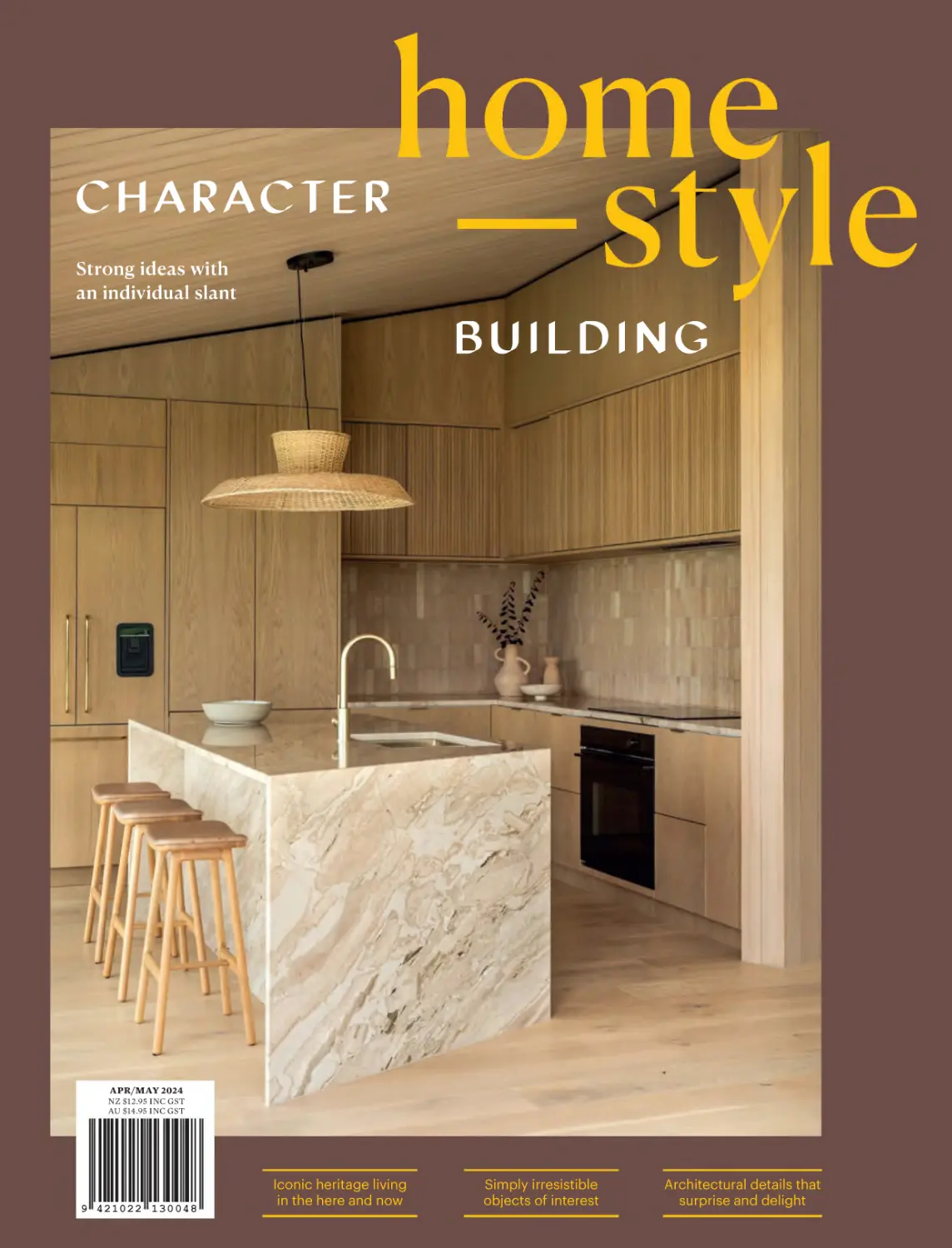
                    C HARACTER
Strong ideas with
an individual slant

BUILDING

APR/MAY 2024

NZ $12.95 INC GST
AU $14.95 INC GST

9 421022 13 0 048

Iconic heritage living
in the here and now

Simply irresistible
objects of interest

Architectural details that
surprise and delight

BAKER MODULAR SOFA, SENSU LOUNGE CHAIR, EDEN COFFEE TABLE - SKETCH

www.dawsonandco.nz

CONTENTS

94

52

Contents

April/May

HOMES
52

When stars align
This extremely thoughtful abode
is totally at one with the world.

68

Power moves
What are the key strengths of this
dwelling? Texture, cosiness, colour
and design details like no other.

82

That’s the spirit
A mid-century icon lives on.

94

82

4 homestyle

Fancy footwork
Great skill has manoeuvred a family’s
house into a home that provides
everything they could ask for.

AUTUMN | WINTER 2024
weavehome.co.nz | @weavehomenz

CONTENTS

STYLE
14

Shop
Covetable stuff and things.

18

Colour palette
Hero-hued spaces en France.

21

Bookmark
Renovation inspiration.

26

Specialist profile
The art of objects at auction.

30

Store profile
Kind of a big deal.

32

Paint trends
DIY headboard.

People
38

32

Maker profile
Elena Renker.

44

At home with...
Kelly and Josh Müller.

DESIGN
110

What’s on
Open Christchurch.

114

Product profile
Bathroom mood and moves.

116

Product profile
A concrete solution.

118

Build profile
Small footprints, big gains.

120

ETC

Garden
Plant like a painter.

128

8

Two great things

24

Take a seat and a table.

38
6 homestyle

Editor’s note
Subscribe

Bring your
space to life

FIRST DEC/JAN24

The Inspiration Kit is available
now to help you choose the
perfect windows and doors

Order your free Inspiration Kit
Firstwindows.co.nz/inspiration-kit

With brochures and guides
detailing product options
and case studies

Includes 3 aluminium
colour swatches to find
the perfect finish

EDITOR’S NOTE

While producing this issue, I’ve been...

1
… HUNTING FOR the perfect
sheer curtains to replace the
ones my cat Pickle shredded
when she was a kitten — and
I may just have found them in
the latest release from Mokum
Textiles. Quadrata is a new
checked design created with
a fil coupé weave technique
that makes it look translucent
and textural all at once.

Alice Lines, @alice.lines

8 homestyle

2
… LUSTING AFTER this
cordless Pomponette
lamp by Maison Balzac.
I find lamps much more
atmospheric than overhead
downlights and this portable
glass lantern lights up with
the insertion of a candle.
It’s lovely for gently
illuminating the dining
table and setting a relaxing
mood beside the bath.

3
… SNUGGLING UP IN
Untouched World’s Rubbish
socks. It’s encouraging to see
brands continuing to think
of new ways to approach
circularity in their processes.
For these socks, scraps left over
from the company’s locally
made knitwear are collected
and turned into new yarn. I’ve
been wearing mine to bed.

4
… DISCOVERING the best
trails from which to catch
the sunrise in the hills
behind my Ōtautahi/
Christchurch house.
A friend and I start our
weekdays walking up
Rāpaki Track to the top of
Mt Vernon to see the sun
coming up over Horomaka/
Banks Peninsula. The view
is helping to convert me
into being an early riser!

Portrait: Simon Wilson. Alice wears: Refined tank and Boyfriend pants, juliettehogan.com

When it comes to new builds and renovations, there are any
number of expressions you could choose to encapsulate the
ups and downs of the process. When the team and I were
bandying about ideas for this issue’s cover lines, ‘character
building’ was a phrase that stuck for us. A certain strength
is required for the decision making around sale-and-purchase
and consent procedures alone, so it’s no mean feat to realise
your dream home — especially in this economic climate.
Despite the hurdles, though, creativity keeps knocking at
my door — emails from architects, interior designers and
proud homeowners alike popping up in my inbox as they
seek to share their ideas and individuality with you.
We were chuffed when interior designer and director
of Ko & Ko Thandi Tipene got in touch to tell us about
the recently completely Taranaki home that graces our
cover. It’s not the first time we’ve featured her work (we
profiled her and her co-director husband Bachelor’s own
home in October/November 2018), and it’s inspiring to see
how her aesthetic has evolved since we last caught up. This
time around, she and Bachelor collaborated with architect
Ken Crosson on a home with an interesting twist — be
surprised and delighted by its special details on page 52.
It’s also a repeat appearance in homestyle for Gretchen
Lowe and her husband Blair Houston. There’s no stopping
this talented duo, who have a knack for taking on the
crummiest houses in Tāmaki Makaurau/Auckland’s inner
west and DIYing the heck out of them to create personalityfilled family spaces. I’m especially a fan of the second-hand
items Gretchen has scored for the interior of their home —
see what you think on page 68.
The character continues as we talk to Ross Morrison
— known to many mid-century collectors as Mr Mod —
about decking out his iconic 1968 Ian Athfield-designed
dwelling in Ōtautahi/Christchurch with pieces from his
enviable hoard of furniture and objects. If you find yourself
picturing yourself in these scenes, there are opportunities
for you to visit or stay — flip to page 82 to learn how.

EDITOR
Alice Lines
DEPUTY EDITOR
Philippa Prentice
ART DIRECTOR
Juliette Wanty
CONTRIBUTORS
Sarah Ell
Wendy Fenwick
Sam Hartnett
Claire McCall
Natalie McComas
Larnie Nicolson
David Straight
Greta van der Star
Simon Wilson
ADVERTISING & COMMERCIAL
PARTNERSHIPS
Nicholas Burrowes
General Manager
nick@homestyle.co.nz
+64 21 505 992
SUBSCRIPTIONS
Online homestyle.co.nz
Email subs@homestyle.co.nz
Phone 0800 246 637
International phone +64 9 360 5700

PRINTER
SCG
DISTRIBUTOR
Are Direct
ISSN 1177-0015

homestyle is a member of the MPA.
Our audience and channel information
can be found at magazine360.co.nz.
Contact us for the latest and most
detailed circulation and readership
information.

homestyle is subject to copyright in its entirety.
The contents may not be reproduced in any
form, either whole or in part, without written
permission from the publisher. All rights
reserved in material accepted for publication,
unless initially specified otherwise. All letters
and other material forwarded to the magazine
will be assumed intended for publication
unless clearly labelled ‘not for publication’.
No responsibility is accepted for unsolicited
material. Paint colours may alter in the
printing process.

PUBLISHER
The Pluto Group Ltd
Physical 326 New North Road,
Kingsland, Auckland 1021
Postal PO Box 911577, Victoria
Street West, Auckland 1142
Phone +64 9 300 7544
Email info@homestyle.co.nz

Subscribe
to homestyle and
save on page 24.

COVER PHOTOGRAPHY
David Straight

AU C K L A N D | W E LLI N GTO N | C H R I S TC H U RC H | B O C O N C E P T.C O M

THE AR T

OF NATURE
AUTUMN '24 INSTORE & ONLINE
UNTOUCHEDWORLD.COM

14

Shop

18

Colour palette

21

Bookmark

26

Specialist profile

30

Store profile

32

Paint trends

Special pieces that speak
to you cannot be underrated
— they can really make a space
and your day. Extra-cool and
one-of-a-kind objects of
interest are dotted throughout
this issue, kicking off over the
page with finds that could
become firm favourites at your
place, including this print by
Suzanne Lustig, who likes to
work with oil pastels and Indian
ink for their tactile qualities
that allow the layering of depth
and texture.

homestyle 13

Scout
We’ve been shopping for your home.

NATURAL INCLINATIONS
In developing her Symbiont collection for The Poster Club,
illustrator Suzanne Lustig let her emotions lead the way
— often in the evenings, as this night owl finds working
after the clock strikes bed offers a tranquillity that makes
her more expressive. Suzanne relocated to New Zealand
from the Netherlands almost a decade ago, a move that has
enabled her to spend more time with her biggest inspiration,
Mother Nature, as evidenced by this splendid collection’s
six prints referencing her perennial muse, mushrooms.

Words: Philippa Prentice

theposterclub.com; @suzanne_lustig

14 homestyle

ON THE REG
Hey, cool coasters. They’re made in
South Africa by women from a non-profit
initiative that empowers artisans with an
outlet for their talent and the opportunity
to earn a consistent income — and sold in
Aotearoa by another clever lady, Mallory
Allen. Founder of online store Regular
Interval, Mallory supports worthy enterprises
and the reduction of waste by sourcing
timeless, ethical, out-of-the-ordinary
homeware and gifts from around the world.
At an inclusive range of price points, they’re
intended to help you pepper your place
with pieces that provide frequent reasons
to pause and savour those in-betweenthe-busyness moments.
regularinterval.com

Design your style
with our unique
range of textiles
and our custom
making services.

DELICATE BALANCE
Via her blog-gone-global and work as an interior stylist with an affinity for neutral, natural,
pared-back refinement, Tāmaki Makaurau’s Michelle Halford is aka The Design Chaser.
Now with photographer/graphic designer Kirsty Dawn, she’s developed another venture,
Vertone. Pursuing versatile simplicity and enduring elegance in the form of furniture, the
duo has launched with two oak pieces called Aperture — a side and low table influenced
by architecture and Japanese woodworking. An interplay of planes, the tables’ clean
lines are the counterpoint to the opportunities they present for display.
vertone.space

Above: Boho Paisley,
Laurel, Lisbon Velvet
Rosewater. Free samples
via our website. Available
nationwide.

marthas.co.nz

STYLE —— Shop

RUGGEDLY HANDSOME
Meet Barnaby, an outdoorsy type that loves to go on adventures
and is up for whatever you suggest. By eco-minded Te Whanganui/
Port Underwood-based Underwood Goods, this all-purpose
blanket’s sturdy yet soft 100% waxed cotton canvas ensures it’s
an all-season accessory that’ll last for yonks. In earthy Tussock
Brown, Aoraki Blue and Waitakere Green, it’ll get you closer to
nature and be a cinch to clean. Yes, this is a set-up, but we think
you guys would be great together.
underwoodgoods.co.nz

IN WITH A BRIM
Get amongst something pretty and practical that’ll
bring joy to your everyday. Adding to the selection
of natty hats Te Matau-a-Māui/Hawke’s Bay maker
Emma Cheape handcrafts for The Brim Label
from sustainably selected textiles are these nifty
lightshades. In a few hues and sizes, her Bellis
pendants are made to order from straw materials
usually used in millinery. They’re lovely from this
angle and possibly even lovelier should you chance
to look up at Emma’s amazing handiwork from
below — like beautiful fabric flowers, or jellyfish.
thebrimlabel.com

STRIKE IT RICH
It’s giving Saltburn, but in fact it’s a scene from
Shjark’s heritage-inspired AW24 campaign, which
sews the temptations of the English countryside
and French court into elevated garments that make
you feel a bit upper crust. As per this thoughtful
local label’s MO, flawlessly constructed, classic
pieces in top-quality materials are the focus. You’ll
want to run your hands all over this ensemble that
includes the corduroy Leandra jacket, wool-silk
Florence blouse and velvet Joplin trousers.
shjark.com

16 homestyle

STYLE —— Colour palette

Brush with greatness
Use paint and props to colour-block, creating spaces
with their own shade-y character.

18 homestyle

World famous in Marseille, France,
bistro/bar/B&B La Relève is part of
the furniture, having been around
since the 1940s. It’d been handed
down through generations of a
single family until 2013, when new
owners took it over with a view to
restoring and reinvigorating its
lasting charm. Another upgrade last
year by Junod-Marc Architects and
design studio Honoré saw each of its
four upstairs guest suites colourcoded according to its own theme:
Mediterranean-inspired blue,
tropical-1950s green, Provençal
yellow and Rococo pink, with
woodwork by local artisan Romain
Davidico repeating across the
rooms. Described by Honoré as
“daydreams full of character and
life”, spaces decorated in this way
really do transport you to different
worlds. Flip the standard script and
use bold colours of similar depth as
your key players with a neutral
as the accent, then pump up the
personality with pieces like these:

1

Resene Liquid Gold

2

Resene Aroha

5
3

4

Resene Skylight

7

6

Resene Good To Go

8

Photography: Guillaume Chamahian

9

Resene Grape Escape

Colours from Resene The Range fashion
colours collection, available at Resene
ColorShops and selected resellers.
ABOVE, FROM TOP 1. Vintage Nest pendant, $890, vitrine.co.nz. 2. Ava cushion, $79, weavehome.co.nz.
3. Loft Linen Frill pillowcase, $95/pair, wallacecotton.com. 4. Fossil vase, $70, cittadesign.com. 5. Lampshade
by Fermoie, from $320, theivyhouse.co.nz. 6. Tomato candle, $49, madegood.co.nz. 7. Last Wishes artwork
by Loren Marks, POA, sanderson.co.nz. 8. Vintage French oak armchair, $800/set of two, vitrine.co.nz.
9. Mohair throw, $290, mohairpossumstore.com.

resene.co.nz/colorshops
0800 RESENE (737 363)

Order your free
samples
CHELSEA ROW
C ra f ted i n New Ze a l a n d, t his wool car pe t draws inspirat ion f rom rocky out crops an d
m o u n ta i n o u s te r ra i n, co m b i ning t wo- t one , t hick and t hin y ar n in a st y lish line ar de sign t o c reate
the i l l u s i o n o f s p a ce w i th i ts lev e l loop pile .

Bookmark —— STYLE

ON
THE
SHELF

Words: Philippa Prentice. Photography: Derek Swalwell

Got a heritage reno
on the horizon? This
new book is full of epic
ideas for guiding the
past into the present.

Before we begin, a warning: this
read might lead you to blow your
renovation budget by inspiring big
dreams for your heritage do-up. It’s
a highly entertaining and aspirational
compilation of projects by Australian
architects and designers charged with
updating homes built between the 1920s
and 1940s, amid the interwar period
— and they haven’t done so by halves.
Twenty projects are arranged in three
sections — Enduring British Traditions,
A Nod To Hollywood and Ornament’s
Last Hurrah — respectively reflecting
the influence of British architecture (such
as the Old English style), Mediterranean
vibes (eg Spanish Mission) and emerging
modern aesthetics (like Art Deco) on
Aussie design. Info about the eight
most popular styles of this period,
original drawings, reports and photos
provide rich historical context as the >

ABOVE Cold, dark, compartmentalised rooms and a lack of connection to the big backyard were
issues the new owners of Malvern Garden House wanted their renovation to overcome. Now, both
the existing dwelling and the new extension are intimately engaged with the redesigned outdoor
areas. BELOW Referencing the craftsmanship of the Old English architecture, American oak was
used in the interior to frame original elements like the fireplace.

homestyle 21

architects, designers and owners
weigh in on the properties’ legacies
and present-day lifestyles.
The increased global mobility of the
interwar era meant these dwellings were
architecturally eclectic from the get-go,
and they’re even more individual now,
following updates that have restored
their original character and significantly
added to it. One we love that’s filled with
enviable takeaways is Melbourne project
Malvern Garden House (pictured on
these pages). Originally designed in 1934
in the Old English style by architect,
developer and builder Arnaud E Wright
(an important player in this period,
who designed many grand homes and
developed new residential estates), it
was renovated by architecture and

22 homestyle

interior design studio Taylor Knights
in 2019. Key moves include the new
green-roofed living pavilion crafted
from concrete for a sense of permanence
and functioning as the home’s new hub,
and the insertion of sculptural apertures
that draw light into the existing spaces
while connecting them to the garden
reimagined for young kids — a highlight
of that being the metal slide that snakes
down a tree-studded slope.
Really, though, you could open to
almost any page in this cool coffee table
book and find something you hadn’t
thought of and now desperately want.
Sorry not sorry about that budget.
Modern Heritage by Cameron Bruhn
(Thames & Hudson).

ABOVE & OPPOSITE, TOP RIGHT
Containing kitchen and dining,
Malvern Garden House’s extension
delivers for the owners by turning
these new spaces into the heart of
their home. OPPOSITE, TOP LEFT
Protruding window seats inch the
interior closer to nature. OPPOSITE,
BOTTOM LEFT The 1930s facade
features classic stepped brickwork
around the joinery and eaves.
OPPOSITE, BOTTOM RIGHT Still
more personality has been brought
to the existing rooms in details like
this concealed bar.

Bookmark —— STYLE

“The architecture of Malvern Garden House is expertly
choreographed… The home is no longer insulated
by small openings or restricted thresholds.”

homestyle 23

SPECIAL
OFFER

Subscribe and get a year
of homestyle (six issues)
for only $65. You’ll
receive your copies hot
off the press and save
16% off the cover price.

SUBSCRIBE
NOW

Head to homestyle.co.nz or phone 0800 246 637.

TERMS & CONDITIONS This subscribe-and-save offer is valid for new and renewing subscription orders received before May 19, 2024. It’s available only for
subscriptions delivered within New Zealand. International pricing is available — see homestyle.co.nz. Please allow up to eight weeks for the delivery of your
first magazine. For any subscription queries, missing issues or changes of address, call 0800 246 637.

24 homestyle

Grayson Sofa

Enduring design,
obsessively crafted.
The Tim Webber range features furniture and
lighting designed in-house and made locally
in New Zealand, as well as a considered edit
of premium European and North American
brands.
View the full collection of products and
brands online.

Visit our new Furniture & Lighting Showroom
12 Nugent Street, Grafton, Auckland

timwebberdesign.com
Trace Table & Bensen Torii Chair

KNOW &
TELL
In which an auction
expert shares how
to score decorative
objects you won’t
find everywhere else.

INTERVIE W
Alice Lines

ST YLIN G
Juliet te Want y

Specialist profile —— WEBB’S

According to Florence S Fournier,
Decorative Arts Specialist at New
Zealand’s premier auction house,
Webb’s, objects are more than objects
— they can also be a form of personal
expression and speak to a wider social
history. In her role that involves tasks
such as appraisal, art direction,
styling photoshoots, curating gallery
installations and creating a narrative
around the items going up for sale in
Webb’s auctions, extensive research is
essential to understand the historical
context, provenance and significance
of each piece. She and the Webb’s team
aim to highlight the objects’ uniqueness
and value, alerting potential buyers
to both their aesthetic and their
historical importance.

LEFT The Decorative Arts
department at Webb’s has
brought some unique
collections to auction recently
— including that of Mr Mod,
Ross Morrison (see page 82).
“We’ve been lucky to work on
some significant single-owner
collections in the past few
years,” says Florence. “It’s
a collaborative effort that
requires a keen eye for quality
and authenticity, and a deep
understanding of what
collectors are looking for.”
Pictured here are (from left)
a pair of Ugandan Hima milk
vessels, a vase by Anders
Ousback and a 300 vase
by Crown Lynn. BELOW
A teapot by Jean Hastedt.

So Florence, how does all this inform
the way you present a Webb’s collection?
I think it’s important for each sale to
have a distinct personality. The styling
often reflects the era or style of the
collection, incorporating complementary
colours and layering to enhance the
overall aesthetic and evoke a sense
of immersion.

Photography: Webb’s

As well as its Decorative Arts online
auctions, Webb’s has recently reinstated
its Decorative Arts live auctions — what
does this mean for collectors? We’re
really excited about this development.
Design Live is our new quarterly live
auction showcasing the best of midcentury and modern design. A
celebration of craft, materials and the
designers who brought them to life,
with the opportunity to experience
the energy of bidding in person, these
sales offer the best examples of decorative
arts in a premium setting, from modern
masterpieces to timeless classics.
What would you say are the main
differences between Webb’s The Estate
auctions and Decorative Arts auctions?
The Estate is more affordable and varied,
and brings together an eclectic mix
of pieces every time, whereas the
Decorative Arts auctions are premium
and thematically curated. Themed
auctions allow us to explore specialised
areas of decorative arts and engage
with different types of collectors. >
homestyle 27

Specialist profile —— WEBB’S

What are your insider tips for people
who are wanting to add unique finds
to their homes from the Decorative
Arts auctions? Look for pieces that
speak to your personal style and
interests, and consider their historical
and artistic value too. I’m always
impressed by the modern design
consignments we get. You can find
amazing pieces by design heavyweights
at great prices and with no lead time.
If you’re after smaller accents for your
home, our Applied Arts sales always
bring in vibrant and exciting ceramics,
art glass and textile works, many by
local creatives.

“BEAUTIFULLY CURATED
SPACES THAT SEEM
LIVEABLE IS AN ETHOS
I SEEK TO EMBODY IN
MY WORK AND MY HOME.”

New Zealanders often take quite a
‘safe’ approach to their interiors —
how can people be braver? To me, the
best-looking spaces bring together
a mixture of colour, texture and form.
I love using colour for impact, but
neutral spaces can be enhanced by
bringing in accents that have surprising
textures or shapes; this stops things
from looking too matchy-matchy and
the tension between contrasting items
provides depth. I also believe in leaning
into our personalities and following
what catches our eye, in order to stop
narrowing down our design choices
to align with what’s popular.
You’re a collector of vintage cookware
— how did that come about? I just
didn’t see why my cookware couldn’t
be stylish. It’s nice to cook with items
I know have been treasured by someone
else before me, and I like knowing that
I can extend each piece’s life. My most
recent addition is a Liekki casserole
dish designed by Ulla Procopé for
Arabia that I bought through The
Estate at Webb’s. I check through
each and every sale; recently there
have been lots of amazing cast-iron
pieces coming through, including
great Le Creuset finds.
What other dream pieces are you on
the lookout for? I’m on the hunt for a
striking floor lamp. Top of the wishlist
would be a green Bellhop lamp by Flos,
because I love its refined but playful
form. I’m hoping someone consigns
one soon and I can bid at one of our
auctions! Something that caught
my eye in homestyle recently was
a fabulous Bold Bench by Big-Game
for Moustache. An electric blue one
would be perfect for my bedroom.
webbs.co.nz

ABOVE A cocktail chair by Marilyn Sainty and a Murano-glass mushroom lamp. OPPOSITE A
vase by Ernest Shufflebotham for Crown Lynn (left) and an orb by Una Sharpley on a side table by
Drexel. Where does Florence think interiors are heading? “I believe we’ll continue to see a fusion
of traditional craftsmanship with contemporary design, as well as a growing appreciation for
sustainability and ethical sourcing. There’s also a trend towards creating more meaningful
spaces that reflect our individual lifestyles and values.”

homestyle 29

Photography: Simon Wilson

Big news

One lucky neighbourhood just got
an upgrade, with an elevated space
dedicated to extra all things design.

Store profile —— CITTÀ

THESE PAGES Nordic and Japanese
aesthetics influence the shapes,
shades and natural materials used
by Wonder Group, and cabinetry
from Città’s Craft (left and above)
and Compound (below) ranges has
been adapted to work in this setting.
“In the kitchen area [left], we used
Craft buffets side by side and above
these installed a custom shelving
unit designed with Buster Caldwell of
Wonder Group,” says Dave. “Staining
the shelves to match the cupboards
created a cohesive display that works
really well — so much so we’re actually
looking at putting the floating shelves
into production, so watch this space!”

It’s Città, but now with more Città, thanks to a big new store filled
with the best — and most — of this notable furniture and homeware
brand. Just over the road from the New Zealand design company’s
former Grey Lynn, Tāmaki Makaurau/Auckland destination for
furniture, lighting, textiles and accessories, the new flagship
occupies a former postal depot with a footprint almost double
that of its predecessor.
Reimagined by concept and interior studio Wonder Group, the
space is awash with natural light and has a domestic feel that puts
you at ease. Generous configurations of current collections let you
visualise how they’d look at your house (though you might pick up on
how well suited Città’s chic pieces are to commercial fit-outs too).
“The intention was to create environments our customers could
imagine being in their own homes,” says Città’s product designer,
David Moreland. “Wonder Group curated a really beautiful, focused
material and colour palette, which was implemented in all the
dedicated displays. The inclusion of plastered and panelled walls,
tiled plinths, stone counters, built-in cabinetry and floating shelves
helps to enhance the customer experience.”
A wall of fabric swatches makes it simple to compare upholstery
options, and there are spots in which to consult with staff on interior
design ideas and ways to customise pieces for kitchen, living, bedroom,
bathroom, anywhere and everywhere. Head on down to peruse the
many, many possibilities. We’re sure you’ll agree it’s just grand.
cittadesign.com

FOLK

Paint trends —— RESENE

LAW
Follow the rules and make
your own by adding an
artsy headboard to a
classic scheme.
ST YLIN G

PH OTO G R APHY

Juliet te Want y

Wendy Fenwick

How to...
-

-

-

It’s a traditional belief that neutral
walls — ours are in Resene Solitaire
— are fail-safe in a bedroom for the
sense of calm they project. That’s
perfectly true, and they also form
an unobtrusive backdrop for more
eye-catching elements you can
play your way — in this instance
an earth-toned DIY headboard.
To make our folksy version, paint
a 105cm x 195cm piece of timber with
Resene Rewilding, leaving a 15cm
border around the top and sides and
masking with painter’s tape (we use
Sellotape Washi Advanced, from Resene
ColorShops) to achieve a crisp edge.
Allow to dry before removing the tape.
Confine your punchier headboard
hues to the border, so they’re visually
interesting, not overwhelming. Divide
the border into 15cm squares, mask
with tape, then paint alternate squares
with Resene Tequila Sunrise. Once
dry, remove the tape, then repeat the
process to add 2cm squares of Resene
Deep Teal in the middle of each. >

Resene Solitaire

Resene Rewilding

Resene Tequila Sunrise

Resene Deep Teal

Resene Trek

Resene Tenor

homest yle 33

RESENE —— Paint trends

Stylist’s tip
The timber bed base and the floor
are also opportunities to introduce
complementary colours to this
warm cream space. We opted for
Resene Trek for the bed, and painted
the floor with Resene Tenor-tinted
Resene Walk-on, which has a
surface finish specially designed
to be durable and reduce slipping.

PAINTED ITEMS: ABOVE Walls in Resene SpaceCote Low Sheen in Resene Solitaire; headboard in Resene SpaceCote Low Sheen in
Resene Rewilding, Resene Tequila Sunrise and Resene Deep Teal; bed base in Resene SpaceCote Low Sheen in Resene Trek; and floor
in Resene Walk-on tinted to Resene Tenor, resene.co.nz/colorshops. DÉCOR ITEMS: ABOVE, FROM LEFT Zita dining chair, $3800/set
of two; Thierry side table, $3100; Zachary wall light, $750, designcentralnz.co.nz. Chiara vase, $290, flowstudioceramics.co.nz.
Unplugged Checkers mat, $220, nodirugs.com. Textured linen bedcover, $699, thefoxesden.co.nz. Bolster cushion $255, klay.co.nz.
Studio Velvet Jade fabric (used as curtain), $120/m, marthas.co.nz. ADDITIONAL ITEM PREVIOUS PAGES Atmosphere artwork by
Paula Coulthard, $1250, thepoiroom.co.nz.

34 homest yle

SPECIAL
CAN BE
GRAND
AND
TALL.
BUT
IT’S
JUST
AS GREAT
WHEN
IT’S
LITTLE
AND
SMALL.
Nestled among 3rd
generation avocado trees
in Waihi Beach, Rach, Tim
and their two boys enjoy
their Homewerk cabin’s
sense of calmness.
Making small feel big.
Special isn’t reserved
for a privileged few –
it’s all the things that make
your home feel like you.
If you’re dreaming of a build
or renovation project but
concerned about cost, talk
to an NZCB builder about
how to make it happen
in the right way for you.
Find your builder at nzcb.nz
LET’S BUILD
SOMETHING SPECIAL.

5(9(*2
7UHQGVWRZDUGVPXOWLIXQFWLRQDOOLYLQJVSDFHVVXFKDV
NLWFKHQVGLQLQJDQGOLYLQJURRPVUHTXLUHPRGHUQ
VROXWLRQV5(9(*2%OXP·VSRFNHWGRRUV\VWHPRIIHUV
XQOLPLWHGGHVLJQRSWLRQVIRULQWHJUDWHGOLYLQJVSDFHV
(QMR\VWXQQLQJLQWHULRUVDQGH[FHSWLRQDOXVHUIXQFWLRQDOLW\
ZLWK5(9(*2DQGWUDQVIRUPDQ\URRPWKURXJKRXW
\RXUKRPH
ZZZEOXPFRPUHYHJR

38

Maker profile

44

At home with…

Ever wondered what it’s like
to be a professional potter?
North Shore ceramicist Elena
Renker sheds some light on
the matter, saying: “There’s
no such thing as a regular
day for me. I divide my time
between my studio, land and
garden, kids, grandkids and
dogs. I usually make pots every
day, but there are also a lot of
other jobs to do in a pottery,
like preparing clay and glazes;
splitting, stacking and sorting
wood; cleaning the kiln and the
shelves. It usually gets pretty
hectic just before a firing, and
then I have a bit of a break
afterwards.” Our chinwag
continues overleaf.

homestyle 37

INTERVIE W
Alice Lines

PH OTO G R APHY
Greta van der Star

PRACTICE MAKES IMPERFECT

POTTER ELENA
RENKER’S PROCESS
IS A VISIBLE PART
OF ALL OF
HER PIECES.

Maker profile —— PEOPLE

THESE PAGES Elena says she has
a pretty clear idea of what she
wants to create before she begins.
“I need to use the right amount of
clay for the shape I want to make,
and right from the start, the process
is very different when making a cup
as opposed to a bowl or a plate, so
you can’t really just sit down and
let things evolve, but the details
do often just happen as I work.”
She ordinarily takes on big pieces
one at a time, “simply because
there’s a limit to how many I can
fit into the kiln, but otherwise I tend
to work on a body of work. It helps
me to explore different shapes
and forms. One will often lead
to the next and the next…”

German-born Elena Renker was into
pottery from the moment she was
introduced to it by a wonderful craft
teacher as a child. She later made plans
to spend a year working in a pottery
in the village of Bergen in Germany’s
Bavaria, but before she did so, took
up an invitation from a friend to spend
three months at India’s Golden Bridge
Pottery. She had an amazing time, and
for someone who’d always enjoyed
making functional, everyday objects,
it planted a seed. The year in Bergen
followed, before she moved to Bavaria’s
capital, Munich, to study graphic
design, got married, got pregnant and
immigrated to New Zealand. In 1998,
20 years after her initial stints, she
started potting again when the youngest
of her five children started school.
Where are you based now, Elena? I
live and work in Okura/Long Bay [in
Tāmaki Makaurau/Auckland]. I bought
some land out here 38 years ago and
have lived here ever since. I built my
studio here in 2000 and my first
wood-fired kiln in 2009.
Your pieces are perfectly imperfect
— what methods do you use to create
them? A large part of my functional
work is thrown on the wheel. I often

deform my pieces slightly as it makes
them more organic-looking and nicer
to hold. I usually make my large vases
by coiling, and my faceted pots are cut
and formed from a solid piece of clay
in very quick, gestural movements,
then hollowed out. I like my pots to be
loose and irregular. I want the touch
of my hand to be visible on the work.
Your glazes and firing add a whole lot
of character too… Most of my work is
finished with a Japanese shino-style
glaze made from a local feldspar [a group
of rock-forming minerals]. It’s very
interesting because everything we
usually consider to be a glaze fault —
like crawling, pinholing and crazing
— is what this glaze is supposed to do.
It looks different every time, especially
in combination with the ash from the
wood firing, and the results can be quite
unpredictable. What I love most about
this glaze is that there are so many
surface variations, you can discover
something new every time you look at it.
There’s a risk something might not go
to plan at any stage in the process — are
there any life lessons clay has taught
you in this regard? There are so many
things that can go wrong when making
pottery — it keeps us potters humble. >

homestyle 41

PEOPLE —— Maker profile

THESE PAGES How does Elena
decide what themes she wants
to explore if she’s working on an
exhibition? “It depends on the
gallery and where it is,” she says.
“If I have a show here in Auckland,
I take the opportunity to make
bigger work, but if it’s overseas,
shipping costs are a huge issue
now, so the work tends to be
smaller. Last year, I had an
exhibition in Taiwan and all 40
pots had to fit into my suitcase.”

Many pots crack while drying and
can’t be saved, or something will go
wrong with the glaze or the firing — but
sometimes cracks can add to the pot.
I’m very inspired by Japanese pottery
and their attitude to pots. Whereas
traditionally Europeans were looking
for perfection, the Japanese like the
imperfections. They say a pot should
reflect life, so being able to see the
clay, the hand of the maker and the
result of the firing process is really
important to them. I once saw a pot
with a large crack in it in a gallery
in Kyoto, and when I asked about it,
I was told it was more expensive than
the pot that was intact because it
showed the force of the kiln and fire.
We’ve been impressed by some of
your large pieces on display at Public
Record, who you show with in Tāmaki
Makaurau — does it require a different
kind of energy to work at this scale?
Yes, it’s hard work, but it’s also very
satisfying. For some of the pieces,
I start with more than 50kg of clay,
so it’s physically hard, but I love
making big pieces and want to do
more of that.
You have a special interest in the tea
bowl as a form — what drew you to this
object? I was introduced to tea bowls
42 homestyle

by chance. In 2009, a friend was invited
to a tea bowl festival in Korea, but he
wasn’t able to go, so he asked if I’d be
interested. I jumped at the opportunity.
The 10-day festival took place in a
small town in central Korea. I knew
absolutely nothing about tea traditions,
but met potters from around the world
and learned about the intricacies of tea
bowls and tea ceremonies. I ended up
being invited back five years in a row,
so I got to know the people and the
place pretty well and became known
as a tea bowl maker.
What do you have coming up for 2024?
I have a solo exhibition at Public Record
in June, in August I’ll be travelling to
the US to teach some workshops there,
then in October I’ll be attending Clay
Week in Nelson.
What keeps you motivated? I just love
the process of making pots and wood
firing, and I love experimenting with
new techniques. I’m always asking
myself what would happen if I did
this or that. There are always so many
ideas buzzing around in my head and
so many things I’d like to try. A lot of
them don’t work out, but sometimes
they do and that makes it all worthwhile.
I’m happiest with my hands in clay.
elenarenker.com

AT HOME WITH…

… KELLY AND JOSH
MÜLLER, FOR WHOM
BLENDING BUSINESS AND
PLEASURE, AOTEAROA
AND AUSTRALIA IS ALL
IN A DAY’S WORK.

INTERVIE W
Alice Lines

PH OTO G R APHY
N at alie M c C omas

THESE PAGES The couple have fostered
a link to Aotearoa through some of their
interior choices. “As well as looking to a lot
of New Zealand suppliers, we were mindful
about what we were investing in — it was
important to us to select environmentally
friendly pieces that weren’t too trendy,” says
Kelly. “We chose Nodi rugs for our living and
media rooms, and have two paraikete by
Noa Blanket Co, artworks by Meg Gallagher,
and prints by our photographer friends
Rambo Estrada, Richard Hodder and Tāne
Coffin. I love that these are all pieces I enjoy
every day, and a beautiful taste of home.”

Kiwis Kelly and Josh Müller met in
Tauranga, relocated to Sydney, then
— craving a slower pace for their young
family — settled in Lennox Head in
northern NSW. Although they initially
landed in this small coastal town because
they couldn’t find an affordable rental
elsewhere, Kelly says it turned out to be
the biggest blessing. With the benefits
of being 20 minutes to Byron Bay and
less than an hour to the GC (and its
international airport), the one-mainstreet locale is quiet and down to earth,
with a genuine sense of community.
So Kelly, a taste of home but with better
weather?! Aotearoa is a big part of who
Josh and I are, and we miss our friends
and family immensely, but the incredible
community here makes living away a
little bit easier. We often reflect on our
46 homestyle

daughters growing up not knowing
the same connection to New Zealand
that we did, not to mention the lack
of connection to their tūpuna — Josh
and the girls all whakapapa to Ngāpuhi
— so we’re doing our best to ensure they
understand who they are and where
they’re from, while living in a place we
love and have come to consider home.
What made you decide to build here?
Luck! Josh and I were never overly
focused on buying property — mostly
because we wanted to live right on the
beach and couldn’t afford it — but we
serendipitously ended up renting on
the same street as a real estate agent. He
casually mentioned some land he was
selling, so I started making enquiries
as to whether it’d be possible for us.
I honestly believe it was just about

being in the right place at the right time,
and we’re so grateful for the guidance
we received along the way. At that stage,
pre-Covid, it was much cheaper to build
than buy, so it was the most affordable
way for us to get into the property market.
What was the experience of building
your first home like? We were working
to a relatively small budget, so my hopes
for an architecturally designed home
— ideally by my friend Adam Taylor of
Mt Maunganui studio Ata — were never
going to become a reality. Instead, we
opted for an off-the-plan home, which
we were able to customise quite a bit.
We considered things that would have
an impact in terms of future-proofing,
functionality and longevity, such as
higher ceilings, stone benchtops and
maximising the north-facing aspect.

At home with —— PEOPLE

We took out small windows and
upgraded to walls of sliding doors
along the north side, picked up rooms
and moved them around to suit the
configuration we were after… It was
like the most important game of Tetris
we’d ever played! We also redrew the
facade so it felt a little more unique to
us, paid close attention to our finishes
and invested in our landscaping. We
ended up with a simple, single-level,
four-bedroom, two-bathroom home
— and we’re so happy with it.
How did you want your house to feel?
With two young kids, the stage we’re
in is beautiful chaos, so we wanted
a home that felt calm and safe, with
a neutral base we could bring to life
through colour and texture. Josh and
I prefer minimal, uncluttered spaces,

but although we have gone for lots of
white, it’s super functional. The Dulux
Vivid White on the walls makes it easy
to spot little handprints and wipe them
clean, the couch covers are removable
and washable, the concrete floors are
the easiest thing in the world to sweep
and mop. Unpretentious and welcoming,
this is a home for living in.
It’s also the HQ of your and Josh’s
business, Kelly Müller Consulting
— how does that work out for you guys?
I’m a strategic thinker by nature and
love the process of building brands, but
I found the more senior I became in
in-house roles, the less I was able to get
stuck into that. With KMC, Josh and I
can offer a bespoke service where clients
get the full benefit of my experience,
since I’m actually doing the work.

Essentially, I’m a marketing director,
PR manager, content manager, digital
marketing manager, copywriter, and
recently I’ve started moving into
e-comm as well, while Josh joined the
business about five years ago to manage
our clients’ digital advertising. Offering
an alternative to traditional agency
models, we work with New Zealand and
Australian lifestyle, beauty and fashion
brands to help them grow. I particularly
love being able to work with New
Zealand brands and seeing Kiwis
succeed internationally.
Do you have any pro tips for achieving
work-life balance? There have been
many lessons! When I first started,
because I worked remotely, I felt like
I needed to be available at any time,
which really burnt me out. I set some >
homestyle 47

PEOPLE —— At home with

THIS PAGE Daughters Ari (5) and Sunny
(8). The bedrooms include organic latex
mattresses by Totem Road and bedding
by Kiwi-founded Milou Milou. OPPOSITE
“We used Trex decking, which is a composite
of 95% recycled plastic and reclaimed
sawdust that doesn’t require maintenance,
sanding, painting or staining,” says Kelly of
their outdoor decisions. “Instead of building
our barbecue area directly off the house, we
ended up going for a parallel position, so we
didn’t restrict any light into the living space
and made the most of the sun.”

boundaries around my availability
and ensured I delivered on what
I promised, but it was having our
first child that truly taught me how
to prioritise. I doubt you’ll meet a
more efficient worker than a working
mum. I’m super organised, but what
I get done in four-hour windows is
more than I ever got done in an
eight-hour day at the office.
I think creating a work-life routine
that supports what we need and not
hiding that is really important. For
me, health and wellbeing are a priority,
so whereas I used to cancel a gym class
for a meeting, it’s now the other way
around. We can only do our best when
we feel our best, and it’s when we’re
48 homestyle

given the time, space and permission
to do that that the magic happens. I’ve
ended up attracting clients who share
a similar approach and it’s really nice
to work with business owners who
encourage each other to have a mental
health day or switch off with our
families. There’s a mutual understanding
as well as a deep desire to do the absolute
best we can with the time we have.
Gotta love the flexibility of WFH, but
the juggle is definitely real… I’m still
learning to accept that I can’t be all the
things all the time. Working from home
is great while our kids are still young,
but it does makes it harder to separate
work and family. However, the longer

I do it for, the more I realise that this
is reality, so I try to normalise it as
much as I can. I think it’s important
that we start being our whole selves
at work and, for me, that means being
a mother first. Josh and I having the
flexibility of owning our business and
sharing our responsibilities at home
gives me the chance to do that.
For us, [couple] time together is rare,
but we know this is just a season of life.
Communication is key. When you work
together, parent together and do life
together, it’s hardly ever 50/50. We
understand that some days one of us will
struggle and the other will pick up that
80/20 because you need them to. I think
that’s what makes this work for us.

“A LANDSCAPE ARCHITECT
HELPED US CREATE
A LOW-MAINTENANCE,
COASTAL GARDEN THAT
REMINDED US OF SUMMER
IN NEW ZEALAND.”

Your home, your story – Ackworth House
understands that staircases are pivotal to your
home’s narrative. Whether you’re renovating
or building anew, our expert team is dedicated
to bringing your vision to life with high-quality
materials and exquisite designs.
Elevate your home with Ackworth House,
visit ackworthhouse.co.nz to begin.

From Inspiration to
Installation: Celebrating
40 Years of Ackworth
House Stairs

52

When stars align

68

Power moves

82

That’s the spirit

94

Fancy footwork

With windows up the yin
yang linking life here to the
landscape, this recently
revamped house is a breath
of fresh air that makes its
inhabitants feel like dancing.
Not discussed in the story
you can enjoy on page 94
is the standalone sleepout
in the garden, which wasn’t
included in the renovation
but contributed to making
this suburban section a real
find. Now, it’s the best it’s ever
been, thanks to an update that
transformed the main dwelling
(pictured here) from a rundown
rental into a real treat.

homestyle 51

This extremely thoughtful abode
is totally at one with the world.

When
stars
WO RDS
Philippa Prentice

align

PH OTO G R APHY
David Straight

HOMES

LEFT Oak flooring travels through
this part of the curved hallway
that connects to the more ‘public’
portion of the home, past the tall
windows that retain a connection
to the internal garden. In the dining
space, a Link pendant by Powersurge
hovers over the family’s existing
table and new Rattan Art chairs
by Corcovado. OPPOSITE Facing
the ocean and duplicating the
parallelogram angle of the wall, the
kitchen island installed by Precision
Benchtops is crafted from Daino
Reale marble from CDK Stone, and
complemented by oak cabinetry
and Wide Clay Bejmat tiles by Tiles
of Ezra from Tile Depot in the matte
finish favoured throughout. The
appliances are by Fisher & Paykel,
the Beam fridge handles are by
Powersurge, the Rappana drawer
pulls and Elysian mixer are by ABI
Interiors, and a Faina Strikha Big
pendant by Tigmi tempers the
vertical lines of the tiles and timber.

L

ike the flax threads of the
exquisite hieke/cloak framed
in its entryway, everything in
this extraordinary home ties in
beautifully. It’s connected to its owners’
past and present; to their loves and
lifestyle; to the land, sea, stream and sky.
If you were to view it from above, you’d
also be struck by its intriguing shape, but
more gazing up and out happens here.
Dubbed Waitī House after a star in Te
Kāhui o Matariki cluster that has links
to fresh water and the protection of life
within it, the home’s name reflects its
owners’ commitment to care for this
piece of land, alongside which the Wairau
Stream supplies a tinkling soundtrack.
54 homestyle

It also speaks to a passion for stargazing
— one of the key experiences enabled
within the experience of this out-ofthis-world yet down-to-earth dwelling.
As directors of interior, architecture
and project management studio Ko & Ko,
Thandi Tipene and her husband Bachelor
oversee their clients’ builds from start to
finish, finding the perfect piece of land,
introducing them to the right architect (in
this case, a team from Crosson Architects
headed by Ken Crosson), devising the
interior design, bringing together top
trade professionals and attending to every
single detail. Having met Elisa Roorda
and Flavio Vianna after their arrival
in Aotearoa from São Paolo, Brazil in >

THE
PROJECT
Ko & Ko, Crosson Architects and
Chris Bell Construction designed
and built this four-bedroom home
and one-bedroom studio in
Ōākura, Taranaki for entrepreneur
Elisa Roorda, advertising agency
owner Flavio Vianna, and their
children Nina (15), Sofia (12) and
Martin (6).

THESE PAGES Decks and a path
linking the house, studio, spa, sauna
and garage are surrounded by lawn,
whereas the rest of the property
has received minimal intervention.
Swathes of glass mean the main
living areas and bedroom soak up the
great outdoors, and smaller windows
allow for ventilation if it’s blowing
a gale. Through the door here, you
can spot the circular ‘hearth’ below
the suspended Elegente fire from
Zen Fireplaces, made from the
travertine used in the entryway.

HOMES

LEFT Joining with pine timber
in a stain Ko & Ko had customcoloured to be deliberately warm,
without yellow or grey, Terra Vein
travertine tiles from Artedomus
greet you on arrival. They were
broken to create a bespoke effect
and laid by Maow the Tiler, who
Thandi says “knocked it out of the
park”. OPPOSITE The internal and
external gardens were devised
by landscape designer Nathan
Richardson and installed by Down
to Earth Landscapes. The Dryden
WoodOil-stained exterior cedar
cladding complements the hues in
the Kaitake Range bush beyond and
forms the backdrop for a hanging
chair from Maytime. Crosson
Architects are big fans of such
seats. “They’re great little cocoons,”
says Ken. “You kind of sneak into
them, and here it’s another
experience — you fill it up with
cushions and you’re really comfy
in there and you can read a book
or twist it round and look out.”

2020, they embarked on a highly
collaborative and responsive project
that allowed adjustments to be made
as the journey progressed, to ensure
the ultimate outcome.
Both nature-loving creative types,
yogi Elisa and stargazer Flavio share an
adventurous spirit that saw them lean into
opportunities to design things differently.
Asking for an abode in which their story
is evident and that’s in harmony with the
environment has resulted in a melding
of New Zealand and Brazil that toys with
the boundary between inside and out.
In addition to the stream, this special
property in Ōākura, Taranaki, has a bush
backdrop and epic rural and sea views,
58 homestyle

all of which Crosson Architects set out to
facilitate engagement with. Of course, with
this kind of west coast outlook comes a
certain level of exposure, so several sheltered
external spaces were designed — along with
an internal courtyard. A circular structure
inserted into the home’s parallelogramshaped floorplan to complete the
replication of the Brazilian flag and its
blue disc dotted with stars, the courtyard
spirals up to an observation platform.
“We wanted to give the family that classic
Kiwi experience — a home where you can
retreat inside and live outside — and get Flavio
into the big sky,” says Ken. “He sets up his
telescope and has an uninterrupted view.”
Just past the entryway (the travertine >

HOMES

60 homestyle

HOMES

OPPOSITE These lucky residents
are able to experience Aotearoa
from an uncommonly intimate
perspective. In rural areas like
this, “the night sky is pretty
mind-boggling”, says Ken. “Here,
you can get that every evening.
Sitting up on the roof, you feel
vulnerable and exposed but
exhilarated as well.” BELOW The
graceful steel balustrade took
several iterations to perfect and
was craned into position.

“You open the door
and feel a sense
of peace and also
excitement — it’s
awe-inspiring, but
not in a fancy way.”
homestyle 61

HOMES

LEFT Able to be closed off with
a heavy timber slider to offer
separation for kids’ movie nights
or after-dinner conversations with
friends, the sunken lounge was
designed, says Ken, to be “a
batten-down-the-hatches kind
of space”. It features oak seating
built in by the project’s joiner,
Jake Styles of Style Joinery, and
curves into oak bookshelves to
provide weight and warmth along
with Samurai Bokuto carpet by
Bremworth. The Bandy side table
and Otis coffee table are from
Jardan. “It was important to select
furniture that connects with the
understated palette and doesn’t
overpower or distract from the
form, but rather brings everything
together,” says Thandi. In the main
living space outside the door, an
artwork by Meg Gallagher hangs
on a travertine-tiled wall above
a sideboard from Bohème Home.

tiles in which were deliberately smashed
then laid in an organic arrangement)
and into the curved, pine-lined hallway
(enhanced by Ko & Ko’s meticulously
custom-developed timber stain), the
leafy oasis is a key part of the overarching
family narrative that’s woven through
this home. Described by Thandi as “the
oxygen of the house”, its garden combines
Aotearoa and Brazil in its natives and
tropical and floral plants, which surround
you as you float in the hanging chair or
climb up to the 360-degree deck to
breathe at all in — or check the surf.
The home’s social kitchen/dining/living
area stays connected to the greenery via
slender windows in the hallway, while
62 homestyle

on the other side of the space, generous
joinery frames the vista. So as not to
compete with the view and to instil a sense
of calm, the interior design champions
tone and texture over colours or objects
that demand attention, with the material
palette placing a firm focus on raw, honest,
unobtrusive products and finishes.
“The natural environment is at the
forefront of everything we do,” says
Thandi. “When designing interiors, my
favourite mood to create is one that truly
settles your spirit. The purpose with this
one was to make it fit with the site, and
create a feeling first and foremost, rather
than a celebration of objects. I find real
comfort in an interior that’s not full of >

THIS PAGE Each space is intended
to be contemplated as a whole,
without any one element standing
out. In the main living area, the
Lemmy sofa from Jardan is ultrasoft to encourage you to sink into
it, and curtains in Montenegro fabric
from Warwick Fabrics ameliorate
the light along with pendants by
Arturest from Etsy and a Bonbori
table lamp by Brokis. The August
coffee table is by Jardan and the
Bamboo & Silk rug is by Nodi.

THIS PAGE Simplicity was
a paramount concern in the
sleep spaces, to ensure they’re
as relaxing as possible. Elisa and
Flavio appreciate art, so the team
chose a large painting by Marcia
Priestly as the focal point of their
bedroom. A pleated Mika lamp by
McMullin & Co and fluted Podium
Rillo table by Broste Copenhagen
from Maytime supply visual texture
beside their Adobe bed by Futonz,
with bedding and cushions by
A&C Homestore and Città.

HOMES

ABOVE LEFT & RIGHT The décor
in the children’s bedrooms was
directed by their tastes and
interests. In Nina and Sofia’s rooms,
ladders step up to individual loft
spaces that further improve the
efficiency of the floorplan. The
furniture in these photos includes
chairs from Soren Liv. ABOVE
MIDDLE Sharing a common design
language, the bathrooms are all
about accessible luxury. The same
tiles used in the ensuite (overleaf)
appear here — honed travertine
from Artedomus and Isernia
Sandblasted tiles by Tiles of Ezra
from Tile Depot — the latter in a
pinker hue to bring in a bit of extra
energy for the kids. A Coral Duo
light by Søktas and Hugi bath by
Stone Baths join a ledge that runs
around the room for displaying
objects and increasing the already
ample storage space supplied by
the custom Ko & Ko vanity.

ensuite
bed
kitchen

robe

robe

dining

bed

courtyard
bed

ro

living

entry

living

be

be

bed

laundry

ro

office
bath

GROUND FLOOR

robe
entry
bed

kitchen

garage

bath
living

STUDIO

homestyle 65

HOMES

highly processed materials or styled
according to a specific genre. Natural
materials hold a story that’s long lasting
and can develop over time.”
Crafted around the family’s lifestyle,
variation in the architecture offers spaces
for occasions, and cleverly uses vertical
volume to expand the relatively modest
228m2 footprint. “We’ve got high spaces
and low spaces,” says Ken. “In the more
powerful zones like the kitchen, dining
and living area, there are lofty ceilings
that give a bit more height, and then in the
sunken lounge, for evenings and wintery
days, it’s much more enclosed and snug.”
As in this cosy sanctuary, the children’s
bedrooms are fitted with smaller windows to
inspire rest — though the older kids’ spaces
also boast an exciting detail: each has a
ladder that leads to its own private playroom
in the roof cavity, hidey-holes that have
circular hammocks inserted into the floor
that bulge down into the ceilings below. “It’s
another interesting take on living,” says Ken.
“When you’re given a bit of rope, you can
come up with some extraordinary things.”
Set back on this site towards the bush,
there’s a self-contained studio that functions
as a yoga space and guest quarters. Like the
hammocks, the link to the flag continues
with a circular skylight over the bed.
66 homestyle

Here and in the main dwelling, the colour
palette is dedicated to warm neutrals, but,
says Thandi, “coming from Brazil, which
is traditionally much more lively than New
Zealand, Elisa and Flavio are drawn to
colour, so we’ve pulled it in in places — like
the blue tiles in the studio bathroom, for
example — and it has a really nice balance.”
She identifies a similar duality in the
home overall. “You open the door and feel
a sense of peace and also excitement — it’s
quite awe-inspiring, but not in a fancy way.
When you take your shoes off at the front
door, you can feel the different heights of
the tiles under your feet, then run your
hand along the wall and feel the crevices
of the timber. You look up and there’s the
door opening into the lush internal garden
with a chair that immediately invites you
to engage with the space, then the light
play when you go into the living spaces
feels enjoyable from every point.
“Sometimes when you walk into a very
beautiful house, you can feel like you’re an
outsider, like it’s at a different level to you,”
she continues. “That doesn’t happen here
— it’s welcoming and casual enough that
you develop a relationship with it straight
away. It feels like it’s the place for you.”
Now that’s quite a talent — genuine
star quality.

ABOVE LEFT “When you’re in the
country, you can challenge some
norms, so in the ensuite we created
a closer link to the outdoors with
two full-height windows,” says Ken.
One opposite the shower and one
opposite the loo, they include
louvres you can open and close,
but the rural location means there’s
no need for any type of screening
on either side of the glass. The Loop
mirror in this corner of the ensuite
is by Powersurge, that’s another
Coral Duo pendant light by Søktas
and the tapware is also by ABI
Interiors. ABOVE MIDDLE & RIGHT
The studio comprises a kitchen,
dining and living space, a bedroom
and bathroom, an outdoor shower
and a curved deck. In the living
area, Arch chairs by Snelling have
a heart to heart with a Solomon
coffee table by McMullin & Co.

THIS PAGE As with the main house,
slatted timber screens on the
exterior of the studio help to control
the sun and create patterns of light,
and pine detailing pops up around
the skylight. The absence of shutters
to close off this aperture means your
body can respond to the rhythm of
the day. “When the sun comes up,
the sun comes up,” says Ken. On the
wall by the bed is Ki Tua o Te Ārai by
Thandi’s sister Callè Swanepoel of
Rukua, who also created the hieke
(not pictured) in the entryway.

Po wer

What are the key strengths
of this dwelling? Texture,
cosiness, colour and design
details like no other.

WO RD S
Philippa Prentice

PH OTO G R APHY
L arnie Nicolson

Moves

HOMES

BOTTOM LEFT On the walls in the
nook by the front door, Resene Quarter
Biscotti has been coated with Resene
Sandtex for a Mediterranean effect.
Gretchen made the shoe rack from
a slab of macrocarpa from Cypress
Sawmill and basketballs she filled with
concrete. The walls in the hall are in
Resene Sea Fog and Resene Double
Sea Fog blended with Resene FX
Paint Effects Medium for a limewashed
look, and the panels are in Resene
Eighth Canterbury Clay. Gretchen
commissioned ceramicist Deborah
Sweeney to make the lightshade (plus
a mini version for the main bathroom)
based on her favourite vintage jewellery
dish. OPPOSITE Over the vintage table
and chairs is a pendant light that lit up
a Czech hotel in the 1950s. They’re all
from Vitrine.

i

t took the might of four men to carry the
giant timber island into Gretchen Lowe’s
one-of-a-kind kitchen, and four again to
instal the weighty fossil-stone sideboard
in her treasure-filled lounge. For all the muscle
power she and her husband Blair Houston
enlisted to renovate the home they share
with their children Gwynnie and Margot,
though, there’s no force stronger than her
own creativity.
Ever since baking her first batch of
lamingtons at the age of seven, formidable
talent Gretchen has been a maker through
and through, and has turned her unique
skill set into a career that combines interior
design, food styling, recipe creation and
photography, and sees her and her content
appear in books and magazines, on TV and
in a regular slot on Radio NZ. This is the
fourth house she’s overhauled with Blair.
The list of things they’ve learned to DIY has
lengthened by the day, and with a roster
of trusted tradies on speed dial, there’s
almost nothing they couldn’t make work.
For this project, Gretchen followed her
design instincts wherever they led — whether
to the birdbath she upcycled to live in the
lounge, or her choice to use the kitchen island’s
54 drawers, cupboards and shelves in lieu of a
pantry, after spotting the 4m cabinet on Trade
Me for a steal, crafted from pine to look aged
for a Netflix movie. Although the odd thing
gets ‘lost’ in it, Gretchen says, “We’ve got set
drawers for everything from the Marmite to my
herbs and spices. There’s a tall one for bottles of
olive oil, flat ones for lunchboxes and cake tins,
and there’s also ‘Mum’s chocolate drawer’
— although I have to change that around
when the girls work out which one it is.” >

70 homestyle

THE PROJECT
With Auckland Design Solutions
and builder Jemahl Cattermole of
JRC, interior designer/food stylist/
recipe creator/photographer
Gretchen Lowe and her accountant
husband Blair Houston renovated
this three-bedroom home in
Auckland’s Kingsland for
themselves and their daughters
Gwynnie (10) and Margot (4).

“I design and instruct,
and Blair does a lot
of the grunt work.
I swear, given the time,
he could build a
house from scratch.”

HOMES

THESE PAGES Clovelly Crazy Pave tiles
from Jacobsen were laid floor to ceiling
in the stairwell linking to the extension
by the couple’s master tiler friend Ken
Wood, and paired with a brass handrail
Gretchen designed and had made by
Sam Grimmer of SG Fabrication. On the
opposite wall, Blair and his cousin Elliot
Zonneveld of Plumbing Services Limited
(who lent his expertise throughout the
project) installed flat-pack Laminex
Melteca Mist cabinetry from UDuit and
Karu handles by Lo & Co. The benchtop
and shelves are made from Brittanicca
engineered stone by Sunhome and the
tapware is by ABI Interiors. Gretchen
— who sings the praises of her Haier
freestanding electric oven with a gas
cooktop — aced the walls using Resene
FX Paint Effects Medium tinted to
Resene Contented Pink.

Along with liberal servings of this kind of
individuality, essential interior ingredients
for Gretchen include delicious warmth and
texture. “‘Home’ for me is a sanctuary that
feels cosy yet sophisticated, and where I can
play with personal expression,” she says.
“I don’t follow a set aesthetic, but rather buy
things I love and slowly piece them together.
I love combining new with vintage for
character and depth, and candles and
incense are a massive thing for me. I’ve
got a friend who has a word for it — she
says I ‘Gretchen-ify’ a home.”
Lights, camera, Gretchen, who in playing
casting director here opted for more than
just the kitchen island with a cinematic
background. Fun facts: the family’s thrifted
bar stools beside the island have also done
time on a film set; the couple’s friend Tristan
Stretz builds amazing props for movies and
TV shows and brought Gretchen’s ideas for
a bespoke rangehood to life; plus the home’s
previous owners ran a film company and
shot some of Sione’s Wedding out the back.
A lot has changed since then. Sold on the
central Tāmaki Makaurau/Auckland location,
the north-facing site graced with mature
trees, the original fireplace that recalled the
rustic appeal of homes in Italy and France,
and the view of the lit-up Sky Tower at night,
the couple embarked on a renovation that
involved ripping off rundown parts of the
century-old “butchered bungalow”, which
had suffered a fire in the ’70s and having
some dodgy additions made to it. After
sketching out what she wanted to achieve,
Gretchen and Blair engaged Auckland
Design Solutions to draft the plans for an
upgrade and manage the consent process. >

homestyle 73

HOMES

THESE PAGES Although the main living
area is open-plan, Gretchen enjoys the
embracing feel of distinct areas within
that, and uses substantial pieces to
ground each zone before adding small
vignettes. Lots of vintage has worked
its way into this home, and in the
lounge, almost everything is secondhand, including the stone sideboard
from Babelogue (left), the birdbath
from auction house Cordy’s upcycled
with Resene Smooth Surface Sealer
and Resene Lustacryl tinted with
Resene Apple Blossom and Resene
Sakura (bottom, far left), and the
cabinet from a hospice shop jazzed
up with Resene Avant Garde (page 70).

Over the year and a half that’s passed
since they moved into the home with no gib
on the walls and exposed insulation, they’ve
redone piling, raised ceilings and rewired;
added arches in the hallway and 3D panelling
to the walls; fixed the flooring and fireplace;
expanded the main bedroom suite; and built
a kitchen-and-dining extension at the rear.
Surprisingly for this popular cook, ahead of
even the kitchen, Gretchen’s priority was a
ducted heating/cooling system, as she and Blair
know the inside temperature is one thing that
makes or breaks them. “I really feel the cold but
can make a beautiful meal in the most modest
of situations — in this case a plug-in induction
element, a trestle table, a bucket, a secondhand sink and a wardrobe from the Salvation
Army that I painted and used for about a year
until we could afford to put the kitchen in.”
This new extension is a standout and proof
that fortune favours the brave. It’s entered
via a crazy-paved stairwell with a Gretchendesigned railing that guides you down into
the space that’s surrounded by glass on three
sides and a custom-coloured wall on the other.
Saving themselves thousands, the couple took
on most of the finishing touches in this abode
themselves, including the painting and much
of the tiling. Teaming with Resene, Gretchen
steered away from white, while leaning into
her love of neutrals and pushing the boat
out with textural effects and colour-driven
makeovers of second-hand gems.
“I love the look and the quality you can
get from found pieces, and they’re a great
option in the time of Covid when there are
often long lead times on furniture,” she says.
“There’s so much to love about vintage from
a sustainability standpoint and it tends to be >

74 homestyle

THESE PAGES Positioned below
woven works by Ruth Castle, the sofa
was bought off Trade Me for $50. “Of
course, reupholstering isn’t always the
cheapest option,” Gretchen concedes
of subsequently having it covered, “but
it’s next on my list of things to learn.”
On a vintage rug from Yuva is a 1980s
marble coffee table sourced through
Gina Fabish. Meanwhile, Gretchen
wanted the hearth (opposite) to look as
good as old, so the handmade Moroccan
tiles she had stored away were ideal.

THIS PAGE Flauti tiles from Ceramic
Vogue beautify the new ensuite, which
the couple painted with Resene Ravine
on the ceiling, Resene Quarter Tea on
the walls and Resene Vantage Point
on the decorative panels from Archi
Profiles. The pink tones seen elsewhere
in the house continue in the
asymmetrical arch around the mirror
in Resene Cashmere. To create this
detail, Gretchen drew around the
shower screen to replicate its shape,
and waterproofed the back of a mirror
from Farmers with Resene Sureseal
to get it bathroom-ready beside Artis
Opal Globe lights from Lighting Direct.

HOMES

RIGHT The floorboards in here are
mostly original kauri Blair learned how
to restore alongside his brother-in-law
Ben Degiorgio using reclaimed kauri
from Century Timber Products, before
Richard Hood of Universal Flooring
finished them off with an invisible
Bona sealant. BOTTOM RIGHT In the
couple’s bedroom, Resene Sea Fog
combines with a wall in Resene Quarter
Truffle texturised with Resene Sandtex.
Gretchen grew up in Ōpōtiki and knows
the local artist, Tangimoe Clay, who
wove the basket above the bed. The
1970s wall lights are from Trade Me and
through the archway into the walk-in
wardrobe there’s a pendant light savvily
bought at auction from Webb’s.

durable, decreasing disposal rates. I also love
the thrill of seeking it out, knowing when
I’ve got a great piece and restoring it.”
Coming from a family of original thinkers
and craftspeople, what others might consider
risky moves are second nature to Gretchen.
“The thing about creating your own spaces
is you get to be as brave as you like, and the
confidence to back myself has come with
experience,” she says. “I have a deep desire
to create and love doing things differently
— it fuels me! Even as a child, I just wanted
to make in any sense; I used to sew clothes
and soft toys, I helped my grandmother in
her wedding cake business, I’d go round to my
friends’ houses and redesign their bedrooms.
Now, I’m constantly moving things around
and restyling. I love nothing more than
pottering about in the house and kitchen.
Blair and I are so drawn to these lovely old
places and get great joy from creating beauty
out of something almost derelict.”
Gretchen-ify: verb, to go boldly where your
imagination takes you to make the ordinary
singularly sublime. Today, there are sockit-to-’em moments in every single room.
“I feel so proud of what we’ve done,” says
Gretchen. “Being an accountant, Blair’s very
particular, and things really have to be done
properly, whereas I’ve got all these ideas
I don’t quite know how to execute and need
someone to help me. We’re a great team.
When people visit, they say they’ve never
seen anything like it, which makes me so
happy. At night, when all the candles are
lit and the kids are in bed, we’re like,
‘Yeah, this is pretty cool.’”

homestyle 7 7

HOMES

LEFT In Gwynnie’s bedroom, the
hero statement is this wallpaper
from Resene’s French Impressionist
collection, teamed with a fan from
BoConcept and wall panels in
Resene Atomic. OPPOSITE Seen
in the foreground of this shot of the
main bathroom and in several spots
throughout the house are brass vases
by Emma Harding, Gretchen’s partner
in the floral art business they run
together, Houston & Harding.

kitchen
bath

dining

living
bed

entry
robe
patio
bed

78 homestyle

ensuite

bed

THIS PAGE Tearing apart then rebuilding
the main bathroom using YouTube
videos as their guide saw the couple
use Resene Spacecote Low Sheen
Kitchen & Bathroom tinted with Resene
Eighth Bison Hide on the walls and
Resene Half Bison Hide on the panels,
protected with Resene Smooth Surface
Sealer. As well as a new nib wall, a
Coronet vanity by Lucino went in —
a subtle link to the kitchen benchtop.

THIS PAGE For Margot’s room, the
walls of which are in Resene Half Sea
Fog with panels in Resene Quarter
Joss, Gretchen turned a second-hand
record holder into a book trolley with
Resene Hot Toddy. The artwork was
also bought at auction from Webb’s.
“It’s all about keeping an eye out for
things,” says Gretchen.

That’s
The
spirit
A mid-century icon lives on.

WO RDS

PH OTO G R APHY

Claire McCall

Sam Har tnet t

THE
PROJECT
Mr Mod founder Ross Morrison
is the custodian of this threebedroom house in Christchurch’s
St Martins designed by late
architect Ian Athfield.

HOMES

ABOVE Light floods into the lounge, where a Pernilla 3 lounge chair by Bruno Mathsson invites relaxation in front of the fireplace. Ross bought the 1970s
ladder-system wall unit by WHB 10 years ago and it fits this space like a glove. OPPOSITE The home’s concrete-block cladding is painted with Resene
Black White and offset by joinery in Resene Karaka. In the west-facing courtyard, a 1960s patio chair looks the part.

M

ost people who manage to secure an iconic
mid-century house in New Zealand might
already own one or two items that would fit
seamlessly into the scheme — an Eames chair
or Arco floor lamp, for instance — but would struggle
to deck out the spaces in full modernist mode. Not so
Mr Mod, Ross Morrison, who started his collection in the
early 1990s and had just the right thing for every nook
and cranny of this Ian Athfield-designed beauty — and
then some.
When Ross was growing up in Ōtautahi/Christchurch in
the ’60s and ’70s, the DIY brigade was in full swing. Without
the shackles of governmental red tape, people got stuck in.
“Many’s the weekend my father and I would be off to friends’
[places] to help pour the foundations for a house,” says Ross.
So the young boy developed a practical eye, but also enjoyed
a childhood enriched by design. Not only did Ross live in
a 1950s mid-century house, he was also at school with
late architect Maurice Mahoney’s son and daughters. He

recalls that “they’d turn up with stories about the town
hall, one of my all-time favourite builds.”
With a father who was a furniture maker and antiques
dealer, the young protégé had a natural pathway into the
arena. He stepped into the family business and a career that
took him on many covetable journeys: buying trips on which
he fossicked through the cool gloom of Japanese farmhouses;
a stint in England, where he opened an antique store in Sussex
before hopping the channel to full immersion in the Parisian
fleamarkets. “There I became interested in the French
modernist movement, but when I first moved from selling
French antiques into mid-century, people laughed at me.
No one wanted to buy the stuff.”
All that, as they say, is history. And Ross, who established
Mr Mod in 2004, selling mid-century design sourced from
Europe and the US, was nothing if not prolific. It meant that
20 years ago, when he bought this home at auction, he had
more than enough finds stashed away to draw on.
Alerted to the impending sale of this 1968 Athfield dwelling >
homestyle 85

HOMES

ABOVE A couple of 1960s armchairs by Italian design duo Afra and Tobia Scarpa for B&B Italia sit with a Mexico sofa by Arne Norell in the lounge. The New
Zealand-made vase just visible on top of the 19th-century Japanese drawers was a junk-shop find. OPPOSITE Above the Cidonio dining table by Antonia
Astori for Driade and DSX chairs by Charles and Ray Eames for Herman Miller hangs an AJ pendant by Arne Jacobsen for Louis Poulsen that was originally
designed for the SAS Royal Hotel in Copenhagen in 1957. The large decorative clam shell by Arthur Court was a fleamarket score in San Francisco.

by a real estate agent friend, Ross was instantly intrigued.
“I remember driving past the house as a child when Dad
was taking us to school. I liked it even then.”
Originally built for the Jones family, the two-level home
is loosely set up as two pavilions, with a short, linking
hallway through the middle. It features an offbeat, asymmetric
roofline and is clad in white-painted concrete blocks. Typical
of Athfield thinking, the front door is around the back,
while inside, the pitched tongue-and-groove rimu ceilings,
terracotta-tile floors and mezzanine loft are emblematic
of what became known as ‘the Christchurch style’.
Having sold his Victorian villa to make the move, Ross
bid ferociously against another bidder and secured the sale.
When he moved in, it was something of an awakening: “Ath
always operated on the extremities of architecture,” he says.
That included exploring the concept of open-plan — fully.
“Ath believed in freedom of design; he didn’t see the point
of putting everyone behind doors,” explains Ross, who can
appreciate this concept but was still pleased that previous
86 homestyle

owners had added some sliders to the bedrooms for privacy.
He settled into the house, revelling in the way the light
dappled through skylights and threw circles onto the walls
through porthole windows. He raided his warehouse for
unsung gems that would slot into the jaunty angles of the
mezzanine, enjoyed the summer months when upstairs
it felt like living among the trees, and lit the wood-burning
fire in winter to stave off icy tentacles that challenged the
single glazing.
When the earthquake struck and many other concreteblock houses cracked, this one, where half blocks are tied
to a wooden frame, survived relatively unscathed. Ross took
the opportunity to upgrade the bathrooms and replace broken
floor tiles with some from the backyard patio. “I got to know
Ath reasonably well after the earthquake and learned he was
not a purist,” he says. “He was quite a believer in changing
things to suit your needs.”
The duo was like-minded about adapting to the dynamism
of life as it moves from one phase to the next, but for Ross, >

THIS PAGE The kitchen had already
been updated when Ross moved
in but the built-in cabinets and
mosaic-tile benchtop are original.
“It’s very much like [late New
Zealand architect] Myles Warren’s
galley kitchens,” says Ross. “I
guess Ath took the idea from when
he worked at Warren & Mahoney.”
Ross has furnished the space with
a pair of vintage American bar
stools and a balloon dog sculpture
by Jeff Koons on the open shelves.

HOMES

ABOVE LEFT Open-tread stairs lead up to the mezzanine loft bedroom. The chair beneath them is one of a pair of Swedish armchairs designed by Gustav
Axel Berg for Bröderna Anderssons. ABOVE RIGHT In this downstairs nook is a Stool 60 by Alvar Aalto for Artek and an aluminium folding desk used during
the Vietnam War by the US Nurse Corps. The painting by Californian artist Clifford Holmes dates back to the 1950s, while the spun pendants throughout the
home were designed by Austrian-born architect Ernst Plischke for St Martins Presbyterian Church, 100m up the road.

who closed his shop in 2023 to semi-retire but still operates
his warehouse and sells via Instagram at @mrmod_co_nz,
“the wheel turned a tad too far. In the past 10 years, interest
in mid-century design has gone nuts and it has become quite
prohibitive to buy overseas”. He now only uses the house when
he’s in town and has set it up as short-term accommodation.
That’s a move mid-century fiends will relish (as will
those who visit the home as part of the upcoming Open
Christchurch festival; see page 110), since the dwelling is
richly layered with exemplary pieces that boast fascinating
backstories. Downstairs, capacious leather armchairs by
Afra and Tobia Scarpa team with vintage Swedish Rya rugs
to warm up the lounge, there’s a Warren Platner coffee table
and chair on the mezzanine, the bedrooms are furnished
with Scandi classics, including a rare single daybed by Ejner
Larsen and Aksel Bender Madsen, and the art all around
cues in with the era.
In a study nook hangs an abstract still life Ross rescued
from a rat-infested warehouse in the San Francisco Bay

Area, and in the back bedroom there’s a signed Daniel Arsham
print. “I happened to be in New York and a friend of mine told
me that on this particular day, an artist was giving away prints
beneath a bridge near the Whitney [Museum of American
Art],” says Ross.
Sharing his design histories with others has opened a whole
new appreciation of the architecture for Ross, and it means his
legacy continues, albeit in a different vein. “I lived in the home
for 12 years and in all that time, I didn’t have a dining table.
That’s because, to me, it isn’t a sit-up-straight sort of house.
It’s for relaxing or getting together in.”
When the late-afternoon sun washes into the lounge and the
up-lights go on in the maple trees that form a living umbrella
in the courtyard, that’s when the architecture really starts
to sing. Ath may have passed on and Mr Mod is no longer in
permanent residence, but their spirits remain.
Experience life in this house for yourself at Open Christchurch
via openchch.nz or by searching for The Athfield House at
perfectstays.co.nz.
homestyle 89

THIS PAGE A rosewood bed
by Danish designers Ejner Larsen
and Aksel Bender Madsen occupies
this downstairs bedroom, where
a lithograph by Italian artist Luigi
Rossini tucks in beneath the
sloping ceiling. OPPOSITE The
upstairs mezzanine is used as
a TV room and furnished with
a Danish daybed with its original
fabric, based on a design by Hans
Wegner. The floor lamp is by Ruser
& Kunter for Knoll.

“I remember driving
past the house as
a child when Dad
was taking us to
school. I liked it
even then.”

HOMES

robe

bed

living/
bed

stairs

void
stairs

bath

bed

robe

ABOVE LEFT Red sliding doors bring privacy to the bedrooms. Decorative elements here include another Swedish Rya rug and an etching by German/American
artist Norbert Schlaus. ABOVE RIGHT Aggregato lamps by Enzo Mari and Giancarlo Fassina for Artemide work with the red doors. The 1970s chest of drawers was
made in New Zealand in the French Campagne style. OPPOSITE Ross built the back deck with a friend, inspired by the form of a 1960s swimming pool. “I
love the vista from the back courtyard through the single bedroom to the west courtyard,” he says. The trees include lancewood, maple and a large tulip.

office

FIRST FLOOR
entry

laundry

bath

void

kitchen

living

living

void

dining

92 homestyle

stairs

stairs

GROUND FLOOR

FIRST FLOOR

Fancy
WO RDS
Claire McCall

PH OTO G R APHY
Simon Wilson

Great skill has manoeuvred
a family’s house into a home
that provides everything
they could ask for.

Footwork

HOMES

LEFT The front garden is beefriendly, with a fragrant low
hedge of star jasmine by the
entryway and a Lagerstroemia
fauriei Townhouse tree providing
structure. The couple painted
the weatherboards with Dulux
Manorburn Half. OPPOSITE
To the rear, the property drops
away and the native garden
is easy-care. It includes trees
such as tītoki and groundcovers
muehlenbeckia, leptinella
and Fuchsia procumbens.
The addition is clad in
whitewashed DuraLarch.

A

long with the typical requests
for renovating and extending
this bungalow in Tāmaki
Makaurau/Auckland’s Western
Springs, Sam Atcheson of Dorrington
Atcheson Architects (DAA) received
some more unusual ones. Budding
young gymnast Bea wanted carpet
rather than timber floorboards in
her bedroom (all the better to do
handstands on) and her elder sister
Florence was adamant that the original
large entry lobby stay that way. Why?
For dancing in the hallway, of course.
Those two wishes were easily granted,
but their idea for a two-storey house (it’s
not unusual for children to equate height
96 homestyle

with value) didn’t fit with the wider
architectural programme. Their parents
Kate van Praagh and Mike Burgess vetoed
that submission when they briefed in
more connection to the land.
The family moved into the 1922
bungalow that had been tenanted for
some time six years ago, with their
eyes on the prize of its central location.
The exterior was painted green and
yellow, windows were cracked, and
one day, in a storm, the neighbours
came over to say there were bargeboards
flapping off the roof. “The first thing
we did was initiate Project Warm &
Dry,” says Kate.
While they effected repairs, they >

THE
PROJECT
Dorrington Atcheson Architects
and Maybeck Residential
renovated this three-bedroom
home in Auckland’s Western
Springs for Kate van Praagh (who
works as a general manager of
sustainability), Mike Burgess (a
head of corporate affairs and
sustainability) and their children
Florence (10) and Bea (7).

HOMES

THESE PAGES American oak
veneer battens in a walnut-hued
stain lend a modernist edge to
the kitchen that features Melteca
Possum cabinetry, a velvet-finish
benchtop made from Dekton Rem
by Cosentino and Icon tapware by
Astra Walker. The curved, built-in
shelves are perfectly in keeping
with the theme and Kate has
used them to display books and
objects including (from top) a
sake jug and cups, an Eames
House Bird by Charles and Ray
Eames for Vitra and a Japanese
teapot. The ceramics continue in
the other direction with a Flower
vase by Author Ceramics on the
end of the kitchen island.

98 homestyle

HOMES

homestyle 99

HOMES

also tackled the bamboo monster that
threatened to gobble up the garden.
This was a major mission. The hedge was
sending suckers under the house — never
a good thing — and when the elephants
at the nearby zoo rejected the cuttings
for being too fragrant, it was a formidable
task to cut and grind down the stakes.
Kate and Mike always knew they’d one
day outgrow the compact weatherboard
dwelling. On the plus side, the house
was placed at the front of the 700m2
section and enjoyed great privacy. On
the downside, the land sloped steeply
away to the north-east.
It was Sam’s role to knit the built forms
more effectively into the local landscape
— both the grounds and the view. “We liked
the elevation of the property,” explains Kate.
“You can see the Sky Tower, and the twinkly
lights of the neighbourhood at night.”
The existing hallway that once terminated
abruptly in a bathroom became the central
100 homestyle

axis for the plan. Its open nature now
continues down a set of stairs to a new
kitchen, living and dining space and
main bedroom suite. Include the northfacing deck and the footprint is effectively
doubled to 206m 2. “The layout of the new
part is basically a square and it was just
about arranging the functions for best
use,” says Sam.
A backdrop of greenery floods into
the open-plan zone through floor-toceiling windows, and a sawtooth roof
with clerestory glazing ushers in evening
light. “The roof matches the pitch of the
original house and grabs high-level views
from the west,” says Sam.
Whereas before, Bea was squeezed into
little more than an overgrown closet, the
reconfigured spaces within the bungalow
are now far more equitable. The girls’
bedrooms are almost the same size and
a skylight in their bathroom elevates the
experience, although Mum and Dad’s >

ABOVE Above the table
designed by Sam and teamed
with Volt chairs by Pedrali from
ECC and a Rosa bowl by Author
Ceramics, a Leaves pendant light
by Bolia from Slow ties in with
other mid-century elements in
the open-plan addition. With
cabbage trees in the foreground,
pittosporum along the back fence
and a large oak on the ridge, the
dining room is flooded with
green. “If I could, I’d love to sit
here all day every day, looking out
at the changing colours through
the seasons,” says Kate. S2 stools
by Città tucked into the island
give her another option.

THIS PAGE Crafted from
walnut-stained American oak,
the door to the main bedroom
stretches up 2.7m. Through it,
a work by Fleur Wickes beckons.
At this end of the shelves, Kate’s
display includes (from top) a
teapot featuring a 1930s London
transport ad; a jug from Ibiza;
blue, yellow and green vintage
jugs sourced on various travels;
and a penguin-shaped jug
from Argentina.

HOMES

THIS PAGE Using the original
mataī floorboards, the wide entry
hall is the central spine that links
the old house with the extension.
Engineered tongue-and-groove
oak from Goodwood Timber
Flooring has been laid in a
herringbone pattern to meet
it where the change of level
follows the natural lay of the land.
OPPOSITE Clerestory windows
bring light into the new living
room, where Label armchairs
and a Horizon coffee table from
Città (with another bowl, Lilly,
by Author Ceramics on top)
set the mood. (The cushions are
from Città too.) Next to Mike’s
turntable (great for dad dancing)
is an illustration by Peter Forsyth,
and the gold foil hoops on the
wall are by Annie Smits Sandano.

ensuite is often commandeered too.
Throughout the design-and-build
process, the couple championed the
cause of sustainability, repurposing
where they could. Crafted by
acquisitioning part of the original living
room, the coat cupboard in the entryway
reuses the door from the bathroom, and
the lifted mataī floorboards now form
the stairs down to the extension.
Although pandemic restrictions meant
some of the pair’s choices were unavailable,
they nevertheless prevailed in their
eco-consciousness. They built around
an existing tōtara, and added a water
tank that’s used for the laundry, flushing
the loos and irrigating the garden.

‘Soft’ and ‘natural’ are the keywords
for the interior design. The warmth of
wood is comforting alongside a palette
of washed greys and greens, plus moments
of pale pink. Parquet-style American oak
flooring anchors the scheme and, in the
kitchen, gentle green cabinetry pairs with
walnut-stained battens on high-level
cupboards and the island bench. “We
also added some curves to the island
as it’s an object you walk around a lot,”
says Sam.
The high pitch of the roof here adds
to the spacious sensation, while built-in
elements such as mid-century-styled
shelving and window seats with extra
storage keep the concept family-friendly. >
homestyle 103

HOMES

LEFT The tile selection and
towels by Baina connect the
colours of the two bathrooms.
In the ensuite, Touch of Linen
tiles from The Tile People on
the wall pair with the Marvel
Calacatta Matt 60 tiles from
Tile Space used on the floor in
both spaces. A hint of glamour
is achieved with a Milani heated
towel rail from ABI Interiors and
a Mini Glo Ball light by Flos from
ECC. The Glory basin and Zero
vanity are from Bath Co and
the mirror was a Bunnings find.
OPPOSITE Grace Emerald tiles
from Artedomus are calming in
the main bathroom, an internal
room lit by a skylight and fitted
with a Genesis towel ladder from
Heirloom, Elysian tapware from
Abi Interiors and a Tondo bath
from Plumbline.

Although the extension isn’t literally
grounded, it fully fulfils the brief for
connection, hovering above a pocket
of bush where several tall trees bring the
foliage to eye level. In this urban oasis,
the owners are planting with a focus on
the future. “We’re choosing resilient
natives and plants that can soak up water,
and I got rid of the lawn, which is better
for biodiversity,” says Kate.
In the living space, the couple are slowly
layering up the elements according to a
strategy that aligns with their values and
involves buying to budget and only what
they love. The rug is in shades of cream
and brown to match their springer spaniel
Rosie’s coat, and a collection of modernist
104 homestyle

jugs, including a sangria jug from Spain,
a penguin-shaped wine jug from Argentina
and a green one that was given to Kate at
an Irish bar (are you sensing a theme?), is
starting to populate the shelves.
There’s a niche in which to work, places
to boogie and sing (although the children
have banned ‘dad jams’), flexible rooms
that adapt when needed, and the covered
deck (“Without that shelter, it’d be either
too hot or too rainy to enjoy,” says Sam)
that’s a favourite place in which to sit
and survey the suburban scene.
An homage to yesterday, a celebration
of today and a toast to tomorrow — this
house will no doubt be the venue for
many more dances to come.

“It’s pretty special
when the rain is
pounding on the
skylight while
you’re in the
bath,” says kate.

scullery/laundry

kitchen

dining

HOMES

deck

ensuite
robe

living

bed

office
bath
bed

robe

living

entry

bed

porch

THESE PAGES On the eastern
elevation, the new form extends
over the native planting, making
the most of the elevated site,
while a series of full-height
windows with top-hung awnings
maximise the view of the
greenery that spills down the
hill. “We wanted resilient native
plants here that could survive
both very wet and very dry
conditions,” says Kate. The kids
love watching the tūī feed on
the harakeke flowers and seeing
kererū dip and dive past.

106 homestyle

robe

HOMES

homestyle 107

Auckland Showroom 299 Great North Road, Grey Lynn – sales@ligne.nz – 64 9 393 5636

110

What’s on

114

Product profile

116

Product profile

118

Build profile

120

Garden

128

Two great things

Hungry for something to do
on the weekend of May 3-5?
If you’re in, near or inclined to
travel to Ōtautahi, you could
find yourself in this beautiful
dining space in the home of
late architect George Lucking.
It’s accessible to the public as
part of Open Christchurch, the
annual festival of architectural
excellence that lets keen
beans feast on some of the
city’s best indoor and outdoor
spaces (many free of charge),
plus a programme of talks,
tours and activities too. Turn
the page for a taster.

homestyle 109

KEY TO
THE CITY

Here’s director of Te Pūtahi Centre for
Architecture & City Making, Jessica Halliday,
with a preview of some of Open Christchurch’s
upcoming festival highlights.

Oxford Terrace Baptist
Church complex
ANDREW BARRIE LAB, 2017 & 2023

This coherent collection of mixed-use
buildings illustrates the capacity of
architecture to create community. The
church as a village is the driving concept
behind a welcoming complex that
provides spaces for worship and music,
offices for social services, venues for
public hire, a café and, since May of
last year, a collection of apartments and
terraced houses. A controlled palette of
colours and materials ties it all together
and creates a calm, refined atmosphere.

110 homest yle

What’s on —— DESIGN

RHR House
THREE SIXT Y ARCHITECTURE, 2023

A bold, muscular home designed for
its location on the estuary with both
the future and the past in mind, this
dwelling’s ship-like form and reduced
finishing speak to the development
of this area in the 1960s and ’70s.
Constructed using exposed concrete
blocks, the ground floor is reserved for
storage and built to withstand potential
inundation, while the upper floors
have included more luxurious timber,
rich fabrics and a strong use of colour
to become a sanctum for an architect
and his family.

Photography: Peanut Productions (top) Sarah Rowlands (bottom) and Patrick Reynolds (opposite)

Lucking House
GEORGE LUCKING, 1951. ALTERATIONS
& ADDITIONS BY COMMON, 2023

Architect George Lucking’s own house
is an example of how developments in
architecture reflect not only shifts in
style and aesthetics, but also changing
political, social, economic and personal
conditions. In the early 1950s, while
war-time restrictions on materials
were loosened, the influence of the
State Advances Corporation’s loan
conditions still determined the pattern
of building small, modest, threebedroom houses based on the state
house model. George’s original home
was a simple timber structure with
a rectangular plan and a low pitched
roof. An example of modernist
residential architecture before the
Dorset Street Flats ushered in the
dominant phase of Ōtautahi/
Christchurch modernism, the house
is notable for its simplicity and
directness, and recent updates have
sustained this approach and retained
the legibility of the existing form. >

homest yle 111

DESIGN —— What’s on

Te Raekura Redcliffs School
TENNENT BROWN ARCHITECTS, 2020

At the intersection of Te Ana o
Hineraki/Moa Bone Point Cave and
Te Ihutai/Heathcote-Avon Estuary, an
important site since Waitaha settlement
in the 14th century, this new primary
school (below) embraces its coastal
location through the materials used
and reflects historical pathways in
the form of a tunnel that pierces the
heavy 60m-long cliff-facing facade,
connecting cave to coast. Playful
features of slides, netting, poles and
ramps link areas of spatial variety.

Korako Whānau Papakāinga
ROYAL ASSOCIATES, 2023

St Michael and All Angels
Anglican Church
WILLIAM FITZJOHN CRISP & FREDERICK
STROUTS, 1872

Located beside some of the city’s busiest
streets, St Michael and All Angels has a
remarkable atmosphere ideal for peaceful
contemplation. The cool, dark nave is formed
from columns made of mataī trunks and is a
rich foil for the church’s notable collection of
stained-glass windows. The Mountfort belfry
and Thomas Cane’s school hall on this site are
also worth a visit.

112 homest yle

Photography: (this page) Andy Spain (top) and Peanut Productions (bottom);
(opposite) Sarah Rowlands (top) and Dennis Radermacher (bottom)

The original approach to cohousing in
Aotearoa continues in this contemporary
papakāinga (housing on ancestral Māori
land) in Rāpaki, where pre-fabricated
abodes offer options for intergenerational
living. Along with an existing house,
they’re oriented around shared outdoor
spaces for growing kai, cooking, eating
and gathering, and a testament to the
way mana motuhake/self-determination
can find architectural expression.

Marian College
SHEPPARD & ROUT, 2023

All parties involved took a leap
of faith with this unique approach
to school design. The entirety of
Marian College is housed under the
gigantic roof of a former supermarket
distribution centre. The rooms are
timber boxes, conveniently fabricated
in situ under the warehouse roof.
Arranged over two levels, the
classrooms and administration area
take up roughly two-thirds of the
space, with wide first-floor decks for
circulation. Sporting facilities share
the other third with music and a
black-box theatre, and a simple,
gabled chapel takes centre stage, its
starry ceiling a faithful representation
of the night sky on the day the school
opened in 1982.

Big Cottage
BOB BURNET T ARCHITECTURE, 2021

Big Cottage blends Japanese and
Californian architectural traditions
with the sustainability goals of the
Superhome movement to produce
a calm, harmonious house. The result
of a perfect alignment between client
and architect, it draws together two
couples’ shared appreciation of art and
architectural history and desire for a
high-quality indoor environment.
Along with designed landscapes and
urban walks, 50 buildings will open
their doors for Open Christchurch on
May 3-5. Visit openchch.nz for more info.

homest yle 113

Product profile —— ABI INTERIORS

GET
YOUR
GROOVES
ON
Tactical and tactile
moves to make
when designing
your bathroom.

THESE PAGES Every aspect of
ABI Interiors’ Namika collection is
extremely well-resolved, the intricate
reeded detail teaming with shapely
rods and delicate etched lettering
to denote hot and cold. Minimal in
appearance, it maximises enjoyment
on a multisensory level.

Filled with practicalities you can’t live without but don’t
necessarily want to live with, the average bathroom can
feel like a challenge to your home’s overall appeal. Doing it
differently starts with making a mood board that allows you
to compile and arrange elements you actually like to form
a cohesive whole that works well and looks good. Those in the
know might add fixtures and fittings from a beautifully crafted
collection that’s at home amid a number of aesthetics, from
Art Deco to Japandi, allowing you to style it to suit you.
By specialists in premium bathroom, kitchen and laundry
products ABI Interiors, the Namika collection is characterised
by reeded detail that’s very now yet chic forever. Ornate ribbing
joins robust construction from solid brass in this range that
encompasses tapware, dual-purpose hooks/cabinetry knobs,
a towel rail, a toilet roll holder and a fluted basin. Far from
choosing function over form, the pieces in the Namika collection
look lovely, perform perfectly and are memorable to touch,
making a statement on arrival and leaving a lasting impression.
Plan like a pro from the get-go by integrating these elegant
options into your mood board with your paint and other samples
in your favourite of four finishes: Brushed Brass, Brushed
Copper, Brushed Gunmetal and Brushed Nickel. Include several
items from the Namika collection for visual continuity or select
just one as a tactile hero you could team with other textured
elements such as handmade tiles. You can also plan now and
pivot later with ABI Interiors’ innovative, interchangeable
Infiniti technology, which allows you to swap your tapware
styles, finishes and functions at any point post-installation.
This is sophistication you can see and feel, further enhanced
by the sense of surety the grooved grips offer wet hands. It’s
special subtleties like this that elevate a utilitarian space and
are a pleasure to integrate early in your interior design process.
Aim to ensure your space includes all the essentials and that
each touchpoint is highly refined, for an effect and experience
that’s the complete package.
abiinteriors.co.nz
homestyle 115

PETERFELL —— Product profile

Hard
to beat
Coloured concrete
flooring flexes on both
form and function.

116 homest yle

THIS PAGE Easy-clean PeterFell coloured concrete is a healthy option for everyone, including allergy
sufferers. As flooring and walls, driveways and paths, patios and pool surrounds, it won’t fade, chip
or wear, since the iron oxides used to colour it are completely UV stable and mixed all the way through,
providing permanence that develops a natural patina with time and makes it one of a kind.

Photography: Sam Hartnett

Oriented towards the lake, while also
capturing views of the mountains and
golf course, this urban bach in central
Wānaka was designed by architects who
know what to look for. James Hyndman
and Erin Taylor of Hyndman Taylor made
savvy decisions right down to the last
detail in this NZIA Award-winning
dwelling constructed by Rutch Building
(profiled in our October/November
2023 issue). One of those was to run
with coloured concrete flooring, for
a subtle visual connection to the alpine
environment in a hue that complements
the FlaxPod Colorsteel exterior cladding.
Going for PFL677 from PeterFell’s
Special Charcoal range was an astute
choice that’s the perfect partner for
the warm ashin timber that surrounds
the holiday home’s main social spaces.
Warm in its own right, but especially
in a dark colour, concrete is a thermally
efficient inclusion, passively absorbing
and regulating heat for a cooler feel
in summer, and releasing it to provide
radiant heat in winter and at night.
As Erin points out, its suitability for
this upscale bach is clear. “Concrete
forms robust flooring that feels great
underfoot, and we went with an informal
polished finish that suits a relaxed vibe.
The seamless, non-directional surface
works well with the angled floor plan
and is easy to keep clean, while the
salt-and-pepper look offers enough
speckle to hide obvious dirt.”
She mentions it delivers on an acoustic
level too. Most houses have a timberframed midfloor, but this has a concrete
one that lessens the transmission of
sound between the living spaces and
the bedroom below them. Boxes?
They’re all very much ticked.
peterfell.co.nz

Stay Hydrated.
Feel Almighty Good.

@drinkalmighty

VERSATILE —— Build profile

Great & small
Self-directed change can be a very good
thing. Build success into your future with a
little investment that can add a lot of value.
Change is the only constant, so how about taking the reins
and making one that enhances your life — perhaps providing
you with a small home you can afford, adding value to your
existing property with a secondary dwelling, downsizing
to make things more manageable, or expanding for growing
teens or to house extended family close to home. The rising
cost of living and land is no joke, but you could be laughing
all the way to the bank or simply over a glass of something
chilled as you toast to your best idea yet.
With one of Aotearoa’s largest offerings of small-home
designs (among a wide selection of plan sizes across several
ranges), locally owned, nationwide home-building company
Versatile can work with you on an abode that gives you
options. Their overarching aim is to make your project and
all that follows as easy and enjoyable as possible, so with
Versatile, compact doesn’t mean cramped. Their smallhome plans expertly maximise space and storage, and
you can customise them to your requirements inside and
out. You make the decisions, they make them happen.
No matter if yours is a limited budget or you’ve got some
space to spare out the back, small homes can bring big gains.
Crafted to last from quality, certified materials and backed
by a 10-year Master Builders guarantee, Versatile’s adaptable
designs deliver exceptional value for money in a supportive
process that harnesses their 40-plus years of local construction
and regulatory know-how.
Versatile are all about building better, so what do you say?
About time for a positive change?
versatile.co.nz
118 homestyle

TOP From Versatile’s Freedom range of contemporary, consent-ready
homes, the two-bedroom Kereru design has everything you need in
pavilion-style form. MIDDLE Another concise footprint that expands
the possibilities for smaller sections or subdividing, Advantage 100
from the Advantage range is similarly open plan and incorporates
a single-car garage as well. ABOVE Personalise your plan by choosing
your preferred colours, fixtures and fittings in consultation with
Versatile’s interior and kitchen design professionals.

Le Sfere Transparent LCeiling Light by Gino Sarfatti, LT8 Floor Lamp by Osvaldo Borsani for Astep

Exclusive Representation of Architectmade . Astep . CC-Tapis . Ercol . Karimoku
Case Study . L. Ercolani by Ercol . Nedre Foss . OMK 1965 . Oblure . Omann Jun
Rex Kralj . Saito Wood . Stoff Nagel . Tomado . Warm Nordic . Zaha Hadid Design
goodform.co.nz

DESIGN —— Garden

Nature’s
Irish artist/gardener TJ Maher has written
a book on how to grow in harmony with
the environment and plant colour like a
painter. Dig into it with this edited extract.

Canvas

120 homestyle

Garden —— DESIGN

ABOVE The intensity (or saturation) of a colour must be able to hold
its own when placed beside the intensity of another. For example,
a very intense yellow next to a dull pink can feel displeasing, but
place that same yellow alongside a pink of the same intensity and
the equally strong colours sit comfortably together.

We live our lives in a world of colour,
from the moment we wake in the
morning until we lie down to sleep at
night. And even then, we dream in colour.
I work as an artist and colour is my
expression. Alongside other elements,
colour — by its exact creation and
placement — helps me communicate the
feelings I want to convey in a painting.
I can spend a long time mixing different
pigments together until I make the exact
colour I require. A shade darker or a tint
lighter will change the feeling. My aim
through my use of colour is to spark an
emotional response in the viewer.
An understanding of colour theory
is essential to me as an artist, and it’s
invaluable to the gardener also. Here
in the garden, it’s one of the easiest
ways for me to create atmosphere.
Individual areas can all have a different
feel, depending on my choices. In our
gardens, as in our homes, it’s one of
the simplest ways of setting the tone
or mood.

THE TEMPERATURE
OF COLOUR
Red and yellow (and orange, which is
a mix of red and yellow) are ‘hot’ colours.
They’re stimulating and energising,
conjuring up feelings of warmth and
excitement. Hot colours reflect light and
appear bright; because of this they seem
to come forward and give the impression
of being closer. This is useful in a larger
garden when it feels too expansive or
spacious. Placing red far off can make
distant areas appear closer, producing
the illusion that the space is smaller
and more intimate. In a small garden,
however, using red in the farthest areas
will make the space appear even more
compact. In a small space, it makes sense
to keep the hot colours close and the
cool colours in the distance, thus adding
an impression of depth.
Because we see hot colours first, they
can be used to lead the eye. They can
bring attention to an area of interest, >

homestyle 121

DESIGN —— Garden

COLOUR IS A FASCINATING
SUBJECT. THE MORE WE
UNDERSTAND AND ENGAGE
WITH IT, THE MORE WE
BECOME AWARE OF THE
COMPLEXITIES OF ITS USE.

122 homestyle

Garden —— DESIGN

homestyle 123

such as seating, or they can distract from
somewhere unsightly, like the dustbin
area. Bright red flowers close to the
dustbins will draw attention to the bins;
but place the reds farther away and the
eye is led to somewhere more intended.
Conversely, cooler shades of green near
the bins will help to merge them into
the overall greenness of the garden.
Greens and blues are ‘cool’ colours.
Whereas hot colours appear to come
forward, cooler colours appear to retreat
and seem farther away than they are.
Blue seen in the distance of a large garden
will make the garden seem even more
spacious. In a small garden, blues planted
in the distance will give a sense of depth.
This is a useful visual trick in a small
space, where carefully chosen hues in
the cool range give the garden the
illusion of being bigger than it is.
Green appears neutral, as it’s a mix
of blue, which is cool, and yellow,
which is warm. In the garden it’s usually
the predominant colour, connecting
everything together in a web of foliage
of different sizes, shapes and textures.

124 homestyle

MONOCHROMATIC
PLANTINGS
In a monochromatic planting scheme
(concentrating on flowers of one colour),
there’s the risk it can appear more
monotonous than monochrome. Blue,
for example, is a calming colour, but it
can also feel unstimulating and lacking
warmth. True blue flowers are scarce,
though, as most have a little bit of red in
them. Instead of coldness, there’s a hint
of warmth as the cool blues transition
towards purples by virtue of the warmer
reds. The presence of white in any of the
blues will shift them towards pastel,
bringing lightness and airiness. Now
blue appears more complex, with the
inclusion of red and white adding
warmth and light respectively, though
neither red nor white is present as an
independent colour.
In a blue or any other kind of
monochromatic planting, a slight splash
of another colour will emphasise that
this is, in essence, dedicated to a single
colour. A splash of yellow, perhaps? I

could introduce yellow flowers among
the blue ones, and they’d look good
because even though I now have two
primary colours, the green of the
leaves is a mix of both.
Maybe plant a dash of orange to
really sing against the blue? As blue’s
complementary opposite on the colour
wheel, orange will scream out, adding
some daring and excitement.
Most monochromatic plantings will
already have the green of foliage providing
extra interest. If green is our chosen
predominant colour, it becomes more
engaging if we employ a variety of plant
forms, foliage shapes and textures. The
yellows and blues in some green foliage
bring variation as the leaves become
yellowy, limey and bluey greens. The
planting with its base
of green is now more
complex and
sophisticated.
Grounded in the
Garden by TJ Maher
(Pimpernel Press).

Photography: Jason Ingram (this page) and TJ Maher

DESIGN —— Garden

Garden —— DESIGN

ABOVE LEFT When used in proximity, primary colours are jarring and difficult on the eye. Remember, each primary is a unique colour
that cannot be created by mixing any others together. In primary red, for example, no blue or yellow is present. Here at Patthana [TJ’s
open-to-the-public garden], I aim never to use primary colours closely together. Instead, I combine all the in-between variations. For
instance, rather than placing red and yellow close together, I rely on oranges (a mix of red and yellow) to establish a connection between
the two. All the nuanced variations will be employed as I move closer to each primary colour. BELOW Pastels can be mixed in every
combination and still be aesthetically pleasing, because the presence of white in them brings them all together.

CATALOG

BLUM — Hardware

RESENE — Colour consultations

PLUMBLINE — Bathrooms

Blum develops high-quality storage solutions
for your entire home and cabinetry hardware
based on years of research. Discover their
range of products and services at your nearest
Blum showroom in Tāmaki Makaurau/Auckland
or Ōtautahi/Christchurch, to be inspired for
your next project and feel the original Blum
quality first-hand.

Are you planning to decorate but not sure what
to choose? Resene Colour Experts are here
to help. They can visit you to help you select
colours, paint, wallpaper and accessories for
the interior and exterior of your home, or you
can opt for a free virtual or in-store Resene
ColorShop consultation. Book online at:

Plumbline’s offering of contemporary and
traditional bathroom and kitchen products
is carefully selected for its enduring quality,
exceptional design and outstanding value.
With one of the most comprehensive bathroom
collections in New Zealand, it’s your one-stop
destination for your bathroom or kitchen
project. Visit a Plumbline showroom or the
website for the latest ideas.

blum.com

resene.co.nz/colourconsult

plumbline.co.nz

BOCONCEPT — Interior design

WALLACE COTTON — Homeware

HOMESTYLE — Content creation

BoConcept are experts at making design,
furniture and colour come together. If you
need someone to bounce ideas off, their
interior decorators are on hand to assist you
to complete any scheme — single rooms,
small apartments, large houses or corporate
spaces. Book a free consultation with one
of BoConcept’s interior decorators today.

When comfort is key, look no further than
weekend loungewear from Wallace Cotton.
Made from cotton-knit fabric in classic navy and
soft stone, the roomy sweatshirt and joggers
pictured are designed for slow days at home,
casual weekend plans and popping on after
work or the gym. Mix and match with cottoncashmere pieces and your favourite denim for
easy-to-wear style. Shop online or in store.

At homestyle, we’re specialists in working with
brands to create innovative, integrated, bespoke
home and lifestyle content. From initial concept
to polished finish, our clients benefit from our
in-depth understanding of these categories,
and our expert design, styling and editorial
advice. Gain exposure across multiple channels,
including print and online. Get in touch to learn
how to further the reach of your next campaign.

wallacecotton.co.nz

021 505 992
nick@homestyle.co.nz

info@boconcept.co.nz
boconcept.co.nz

If you’d like your business to be featured in the homestyle Catalog, please email us at advertising@homestyle.co.nz.
126 homestyle

DESIGN —— Two great things

THIS PAGE The SBR T01 table features striking negative
detailing, while the C01 chair (with optional squab) is defined
by its three-legged configuration and scalloped backrest.
Each is made to order from ash or oak timber in a variety
of colours and a matte finish.

We wanted to know more about the Woodwrights
x Seear-Budd Ross SBR T01 table and C01 chair.

Thomas Seear-Budd and James Ross of Te
Whanganui-a-Tara/Wellington architecture
and interiors studio Seear-Budd Ross share
a passion for designing furniture; Motueka
furniture makers Woodwrights are expert
artisans. They met, they talked, they decided
to design a contemporary table and chair that
embody enduring principles of proportion,
functionality, elegance and craftsmanship.
So how did the to and fro go between you
guys? James: Woodwrights’ enthusiasm for
pursuing quality design meant the process
was really enjoyable and collaborative.
They made several prototypes throughout,
which we visited the factory and had sent
128 homestyle

T01 and C01 aren’t a complete dining suite
per se, but they do work beautifully together…
Thomas: We fine-tuned the chair’s armrest
so it just tucks under the table. This means
that even though the pieces are substantial,
their overall footprint is quite efficient
when the chairs are sitting partially under
the table.
How do you imagine this furniture living
its best life? Thomas: The beauty of working
with solid timber is that it’ll last. Quality
furniture can be a significant investment
but we hope these pieces are a pleasure to
use on a daily basis for a very long time.
James: We like the idea of the heavy
table being almost like an anchor of a
dining space and the chair is purposefully
comfortable, so now all anyone needs to
do is add good food, drinks and company.
woodwrights.co.nz; seearbuddross.com

Photography: Anna McLeod

Behind the design

to our office to review and test. That was
cool, since we don’t have the luxury of
making 1:1 prototypes when we design
our buildings! We were trying to make
the chair legs as slender as possible, and
for prototype 01, they were about 19mm
thick, which meant they flexed nearly to
the point of breaking when I sat down!
That was all part of the process, though
— it allowed us to discover the properties
and limitations of the material and adjust
the design to suit.

When less is more. Available in 12 finishes.
Auckland Showroom
23 Davis Crescent, Newmarket | 09 526 0136
Wellington Showroom
1 Antilles Place, Grenada Village | 04 568 9898
Available from all leading bathroom retailers.
Visit plumbline.co.nz/wheretobuy

BUDDY ZERO Round 2 Hole High Mixer in Brushed Nickel

BUDDY ZERO

It’s not just how a room looks that matters,
it’s how it feels.

Paint with heart and soul.
Quality paints and specialty finishes for over 35 years.
Find your perfect colour at porterspaints.com
or call 0800 672 468 for stockists and samples.