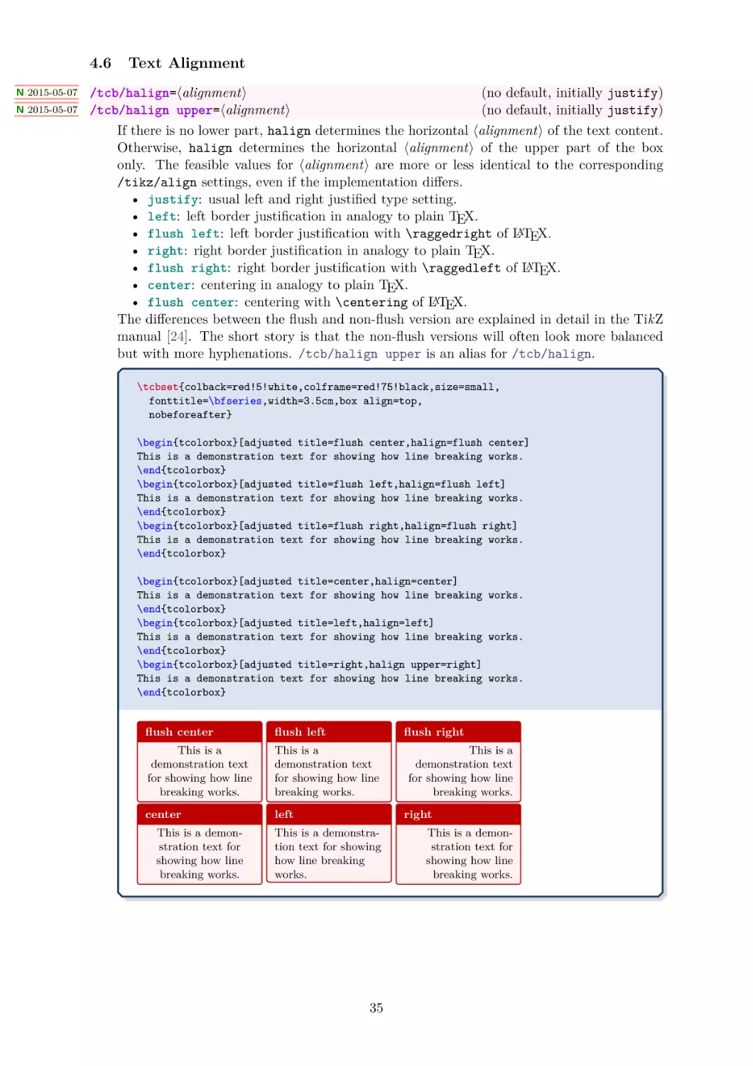
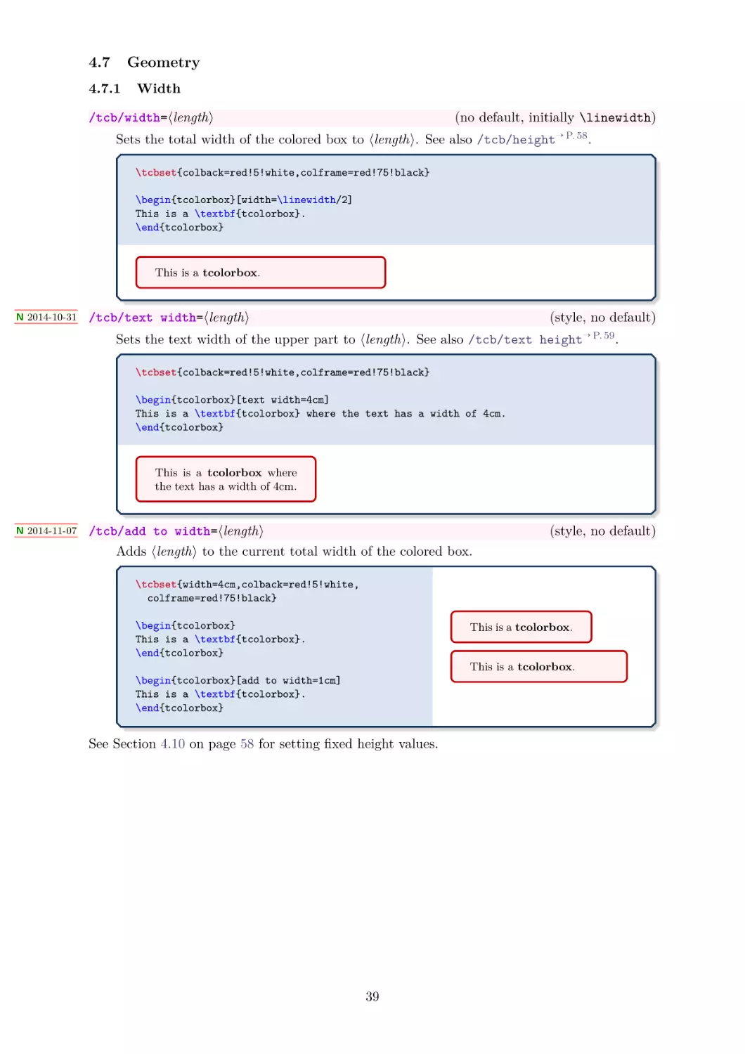
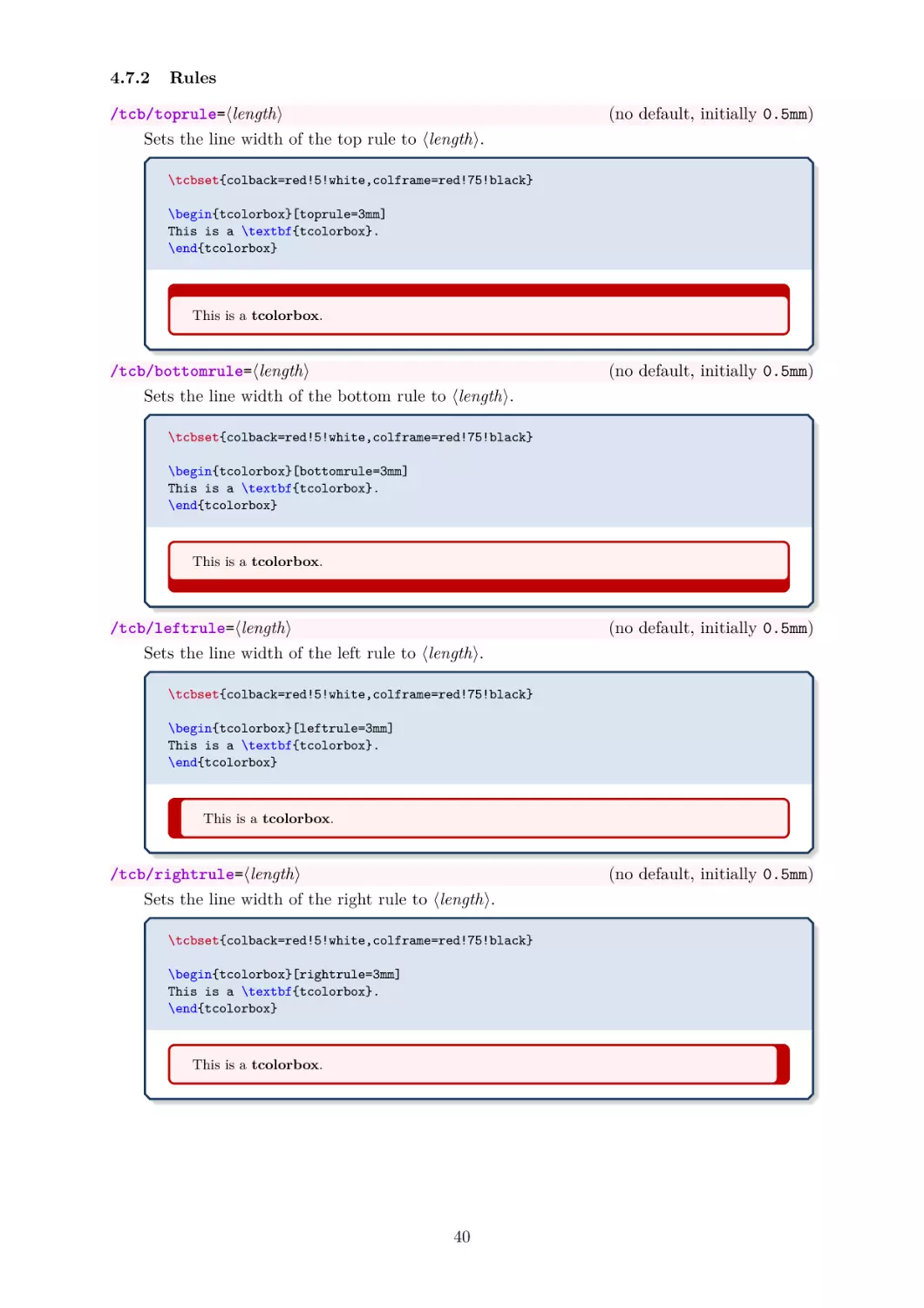
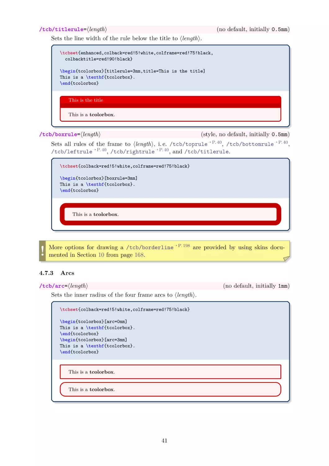
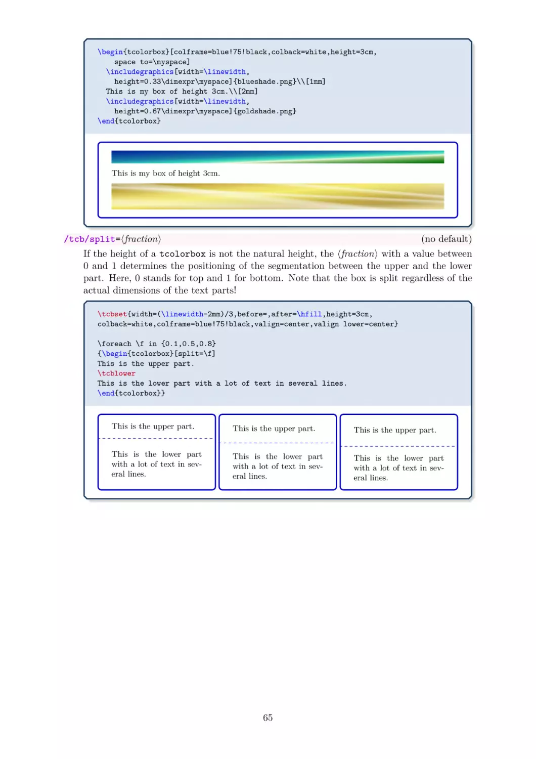
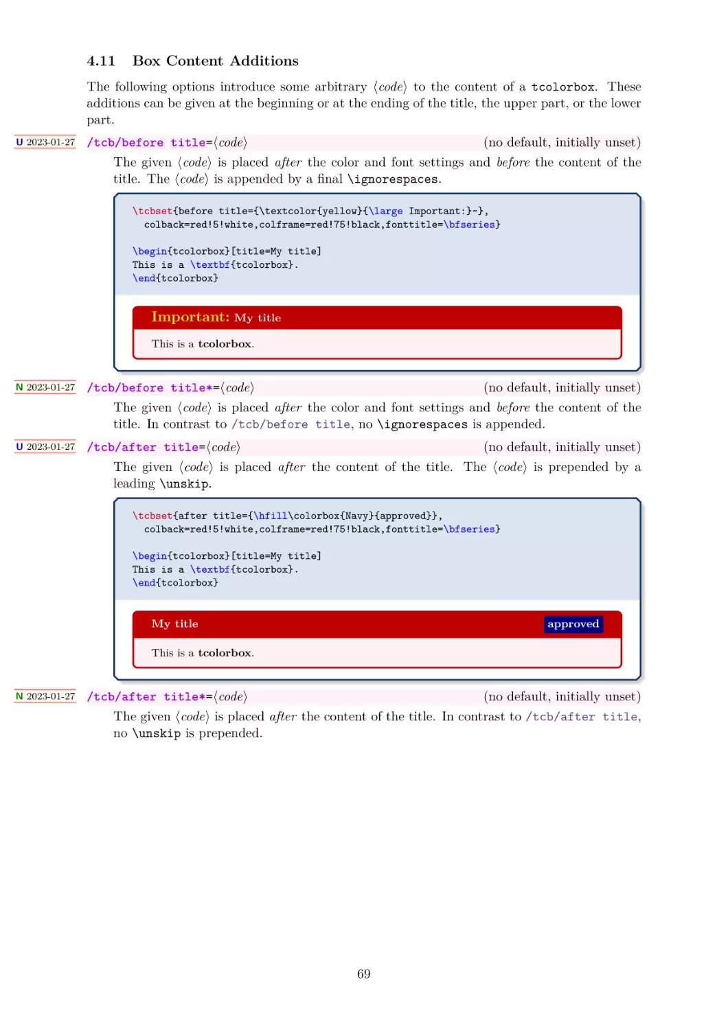
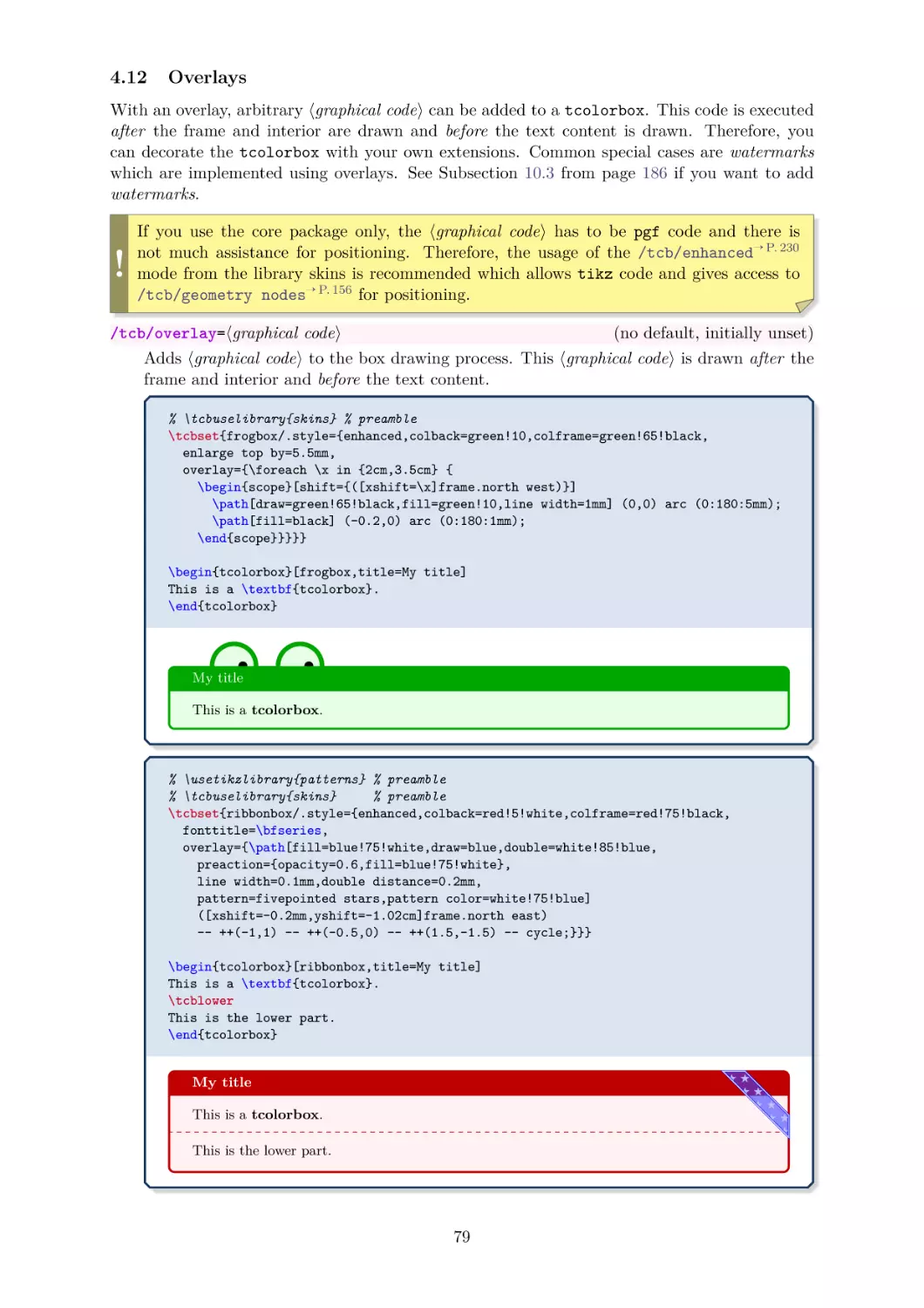
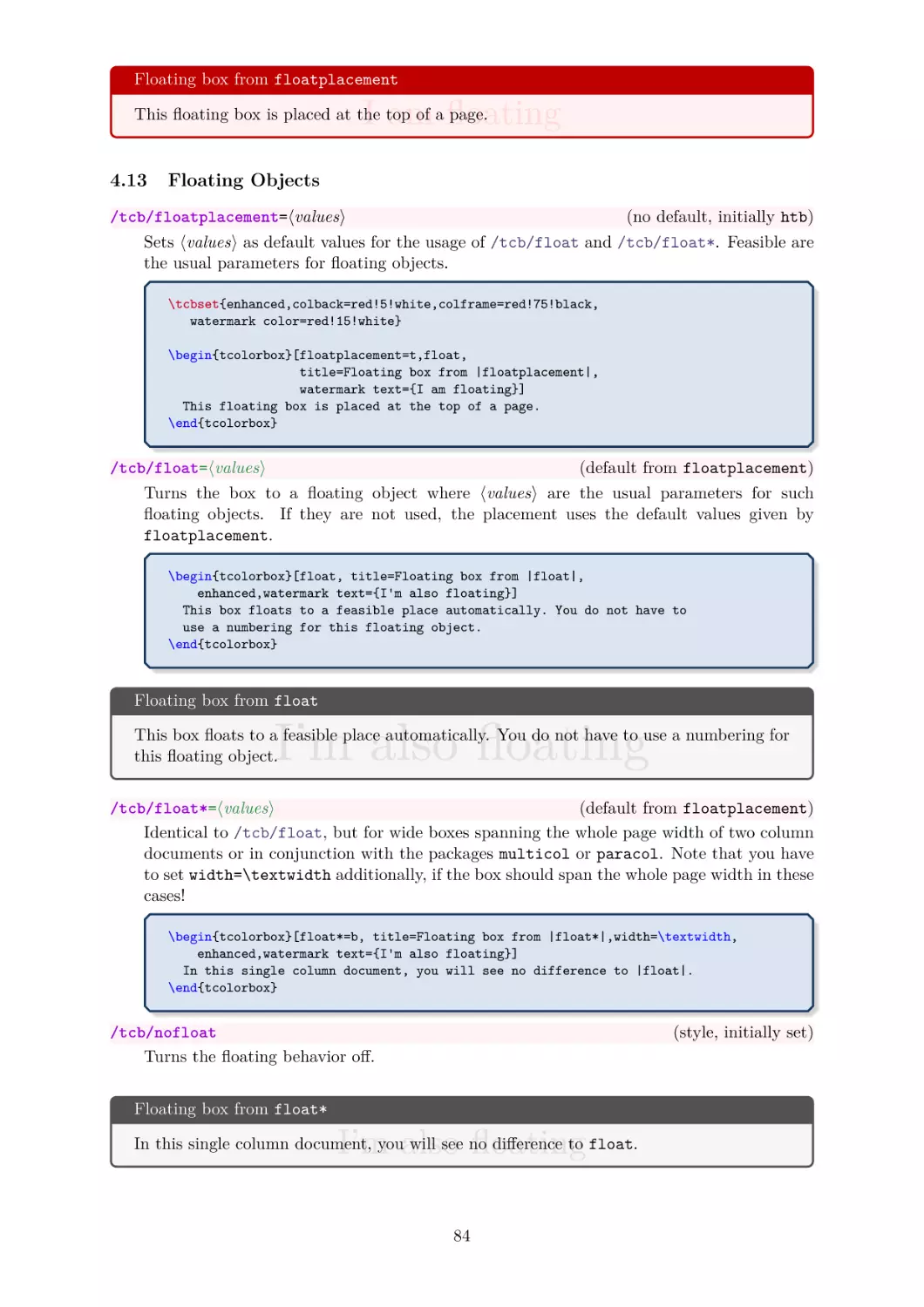
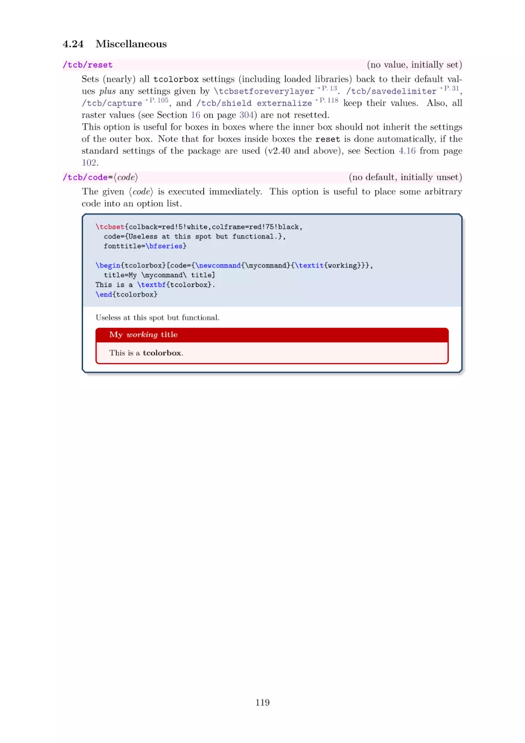
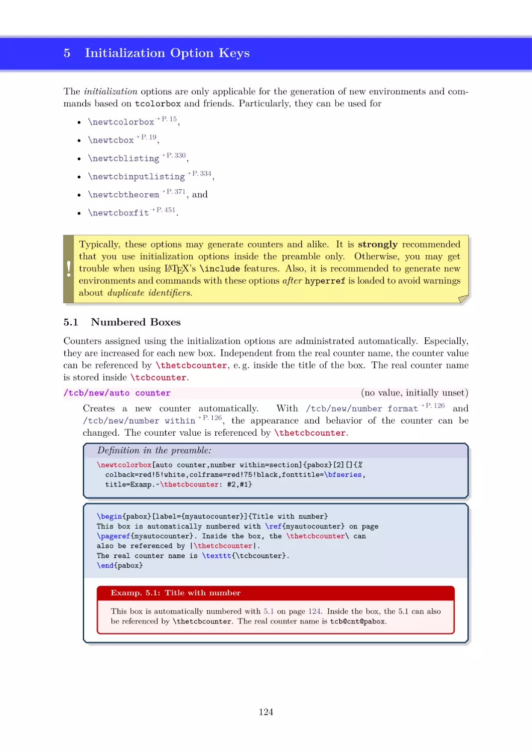
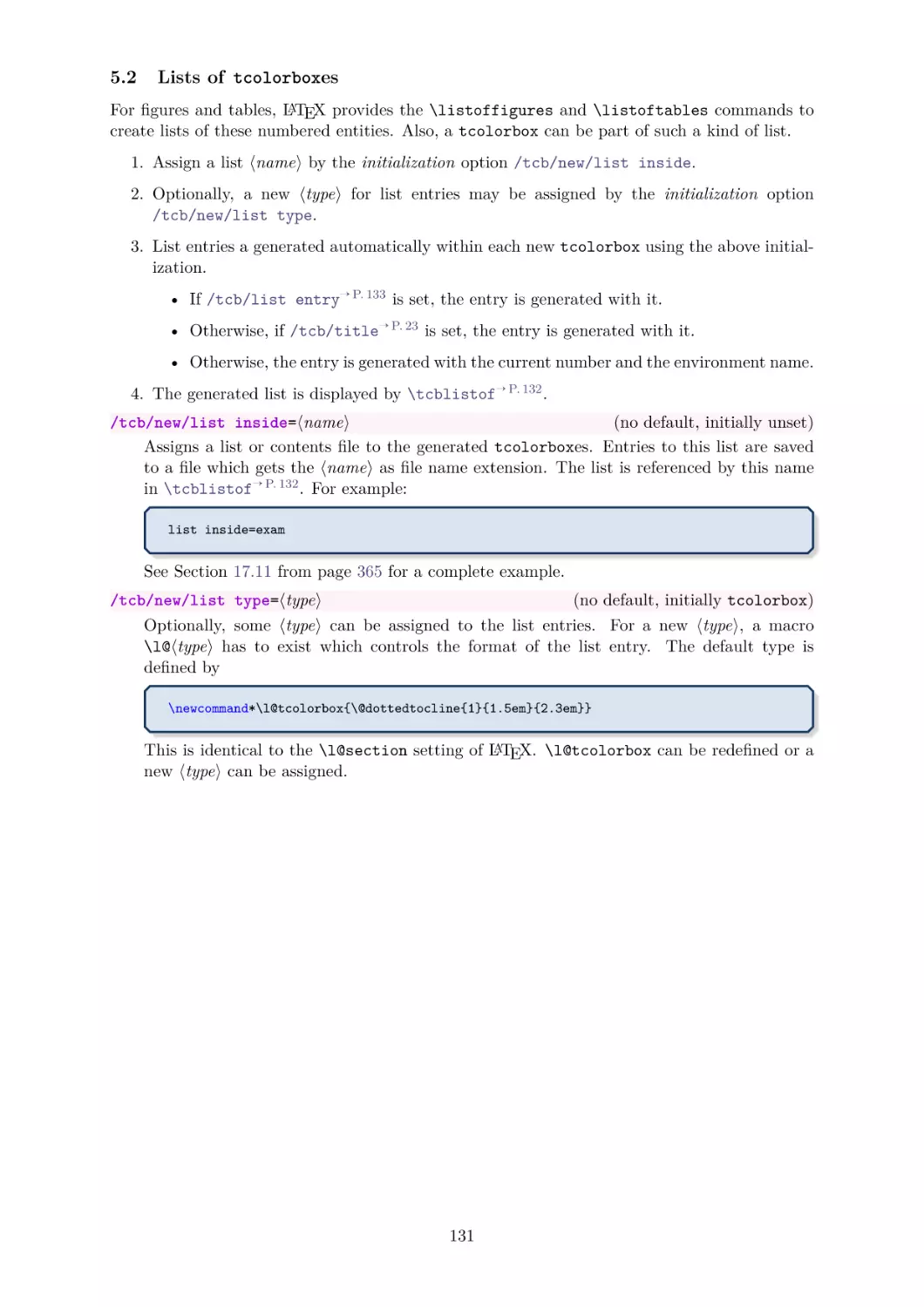
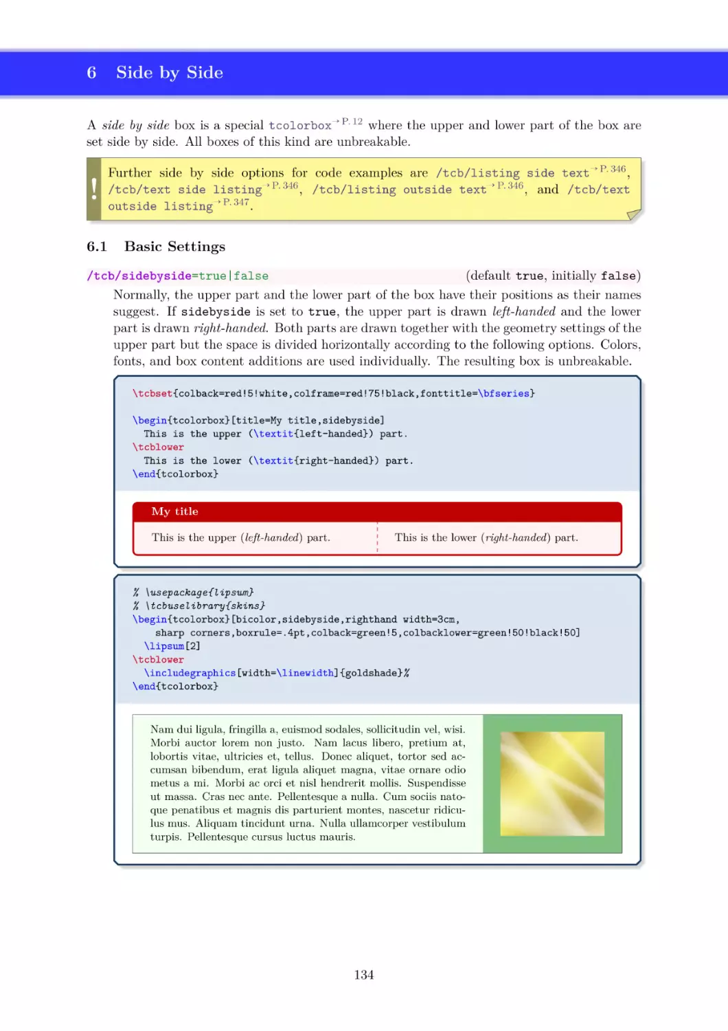
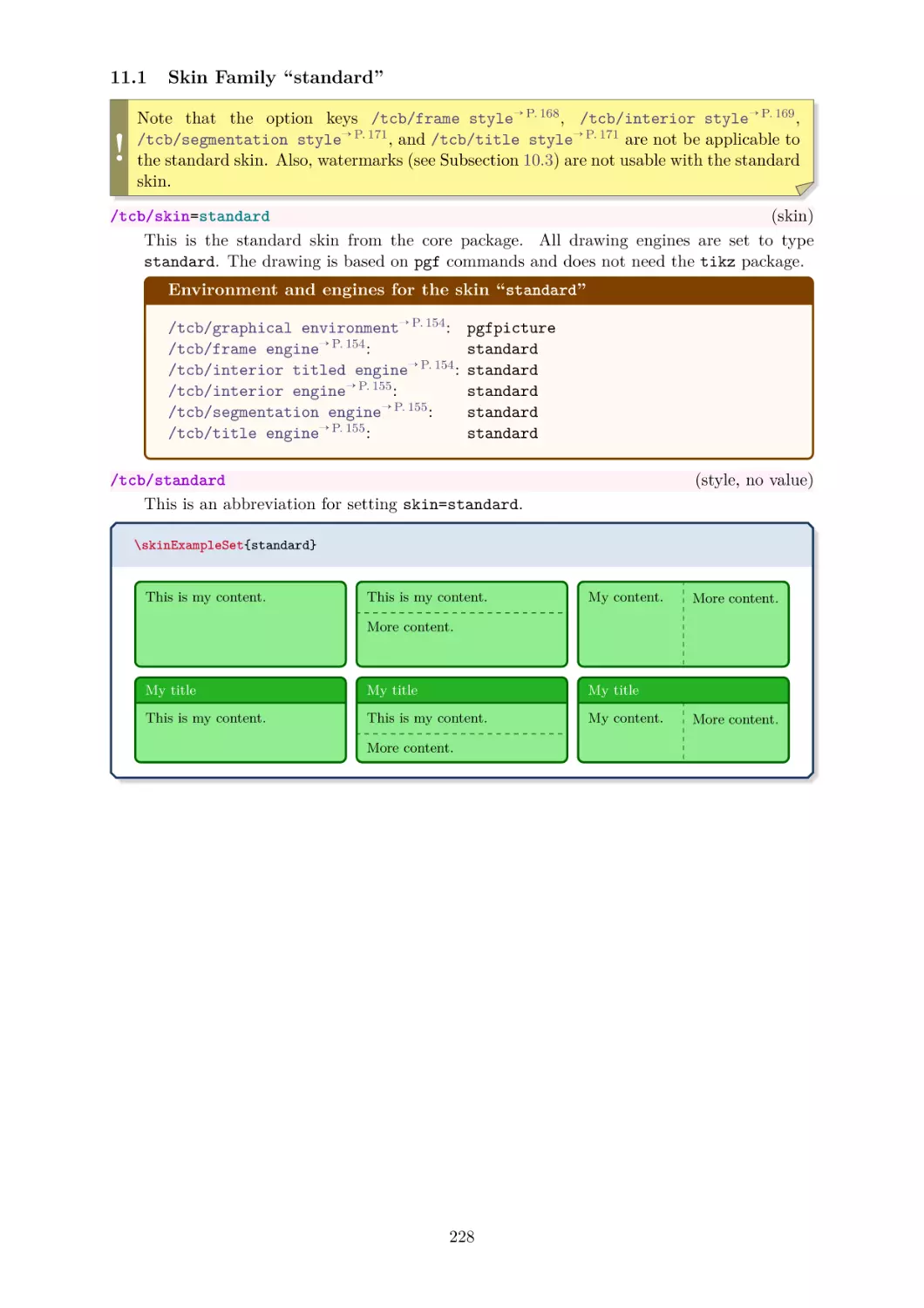
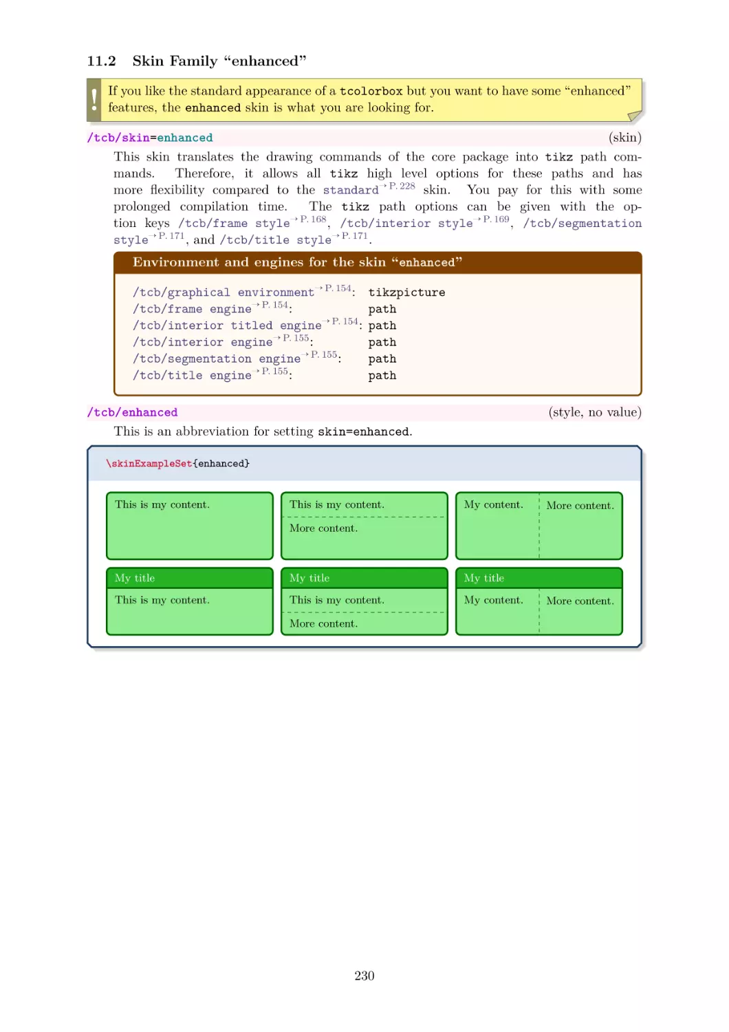
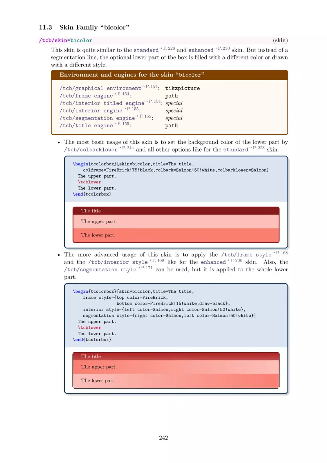
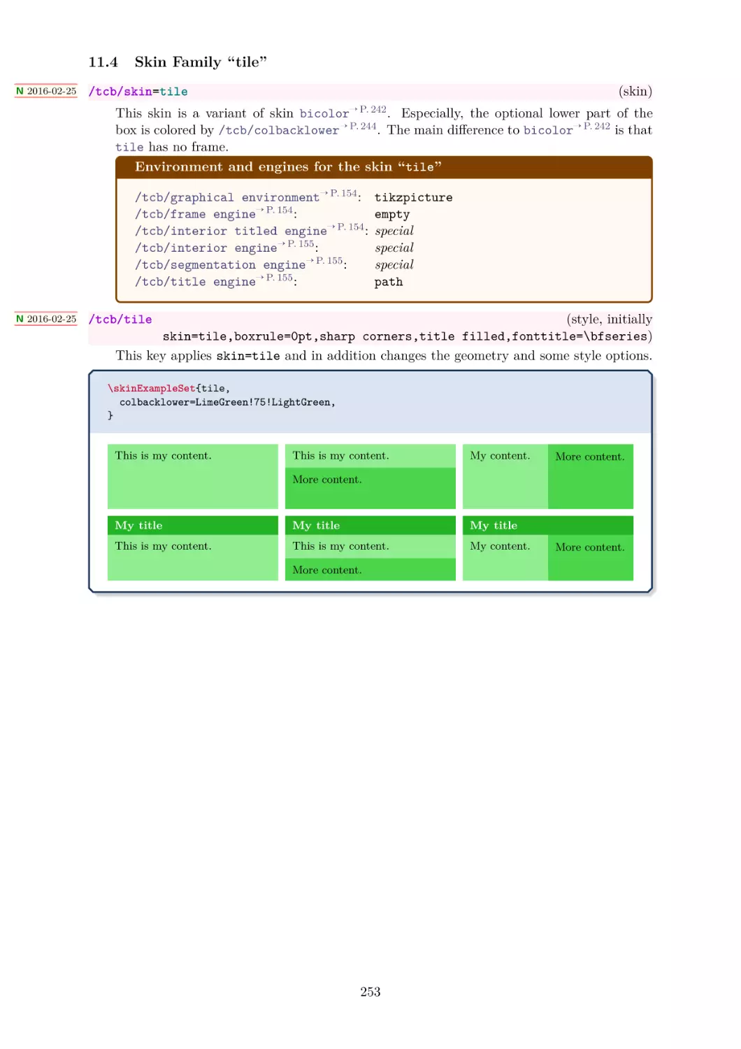
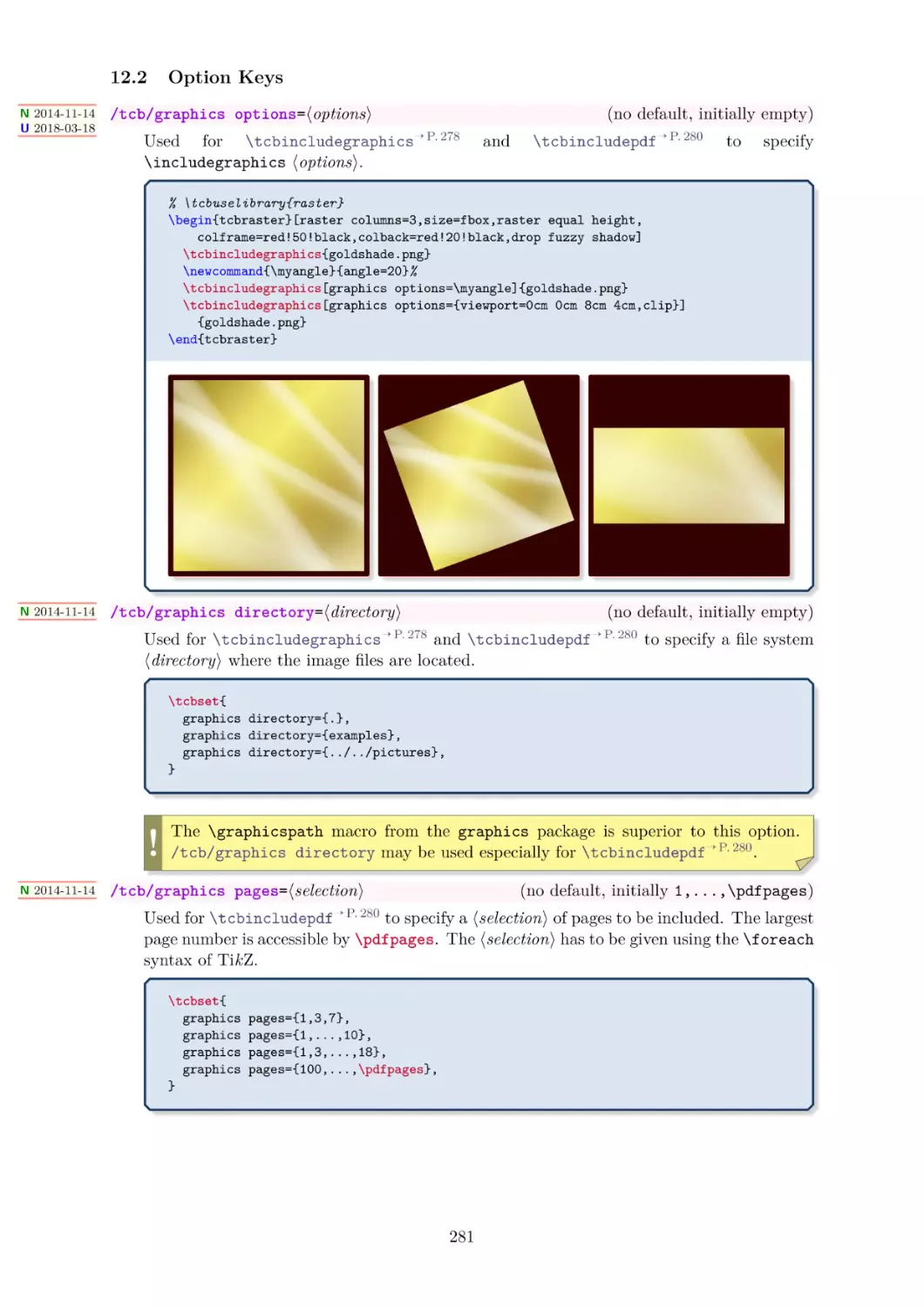
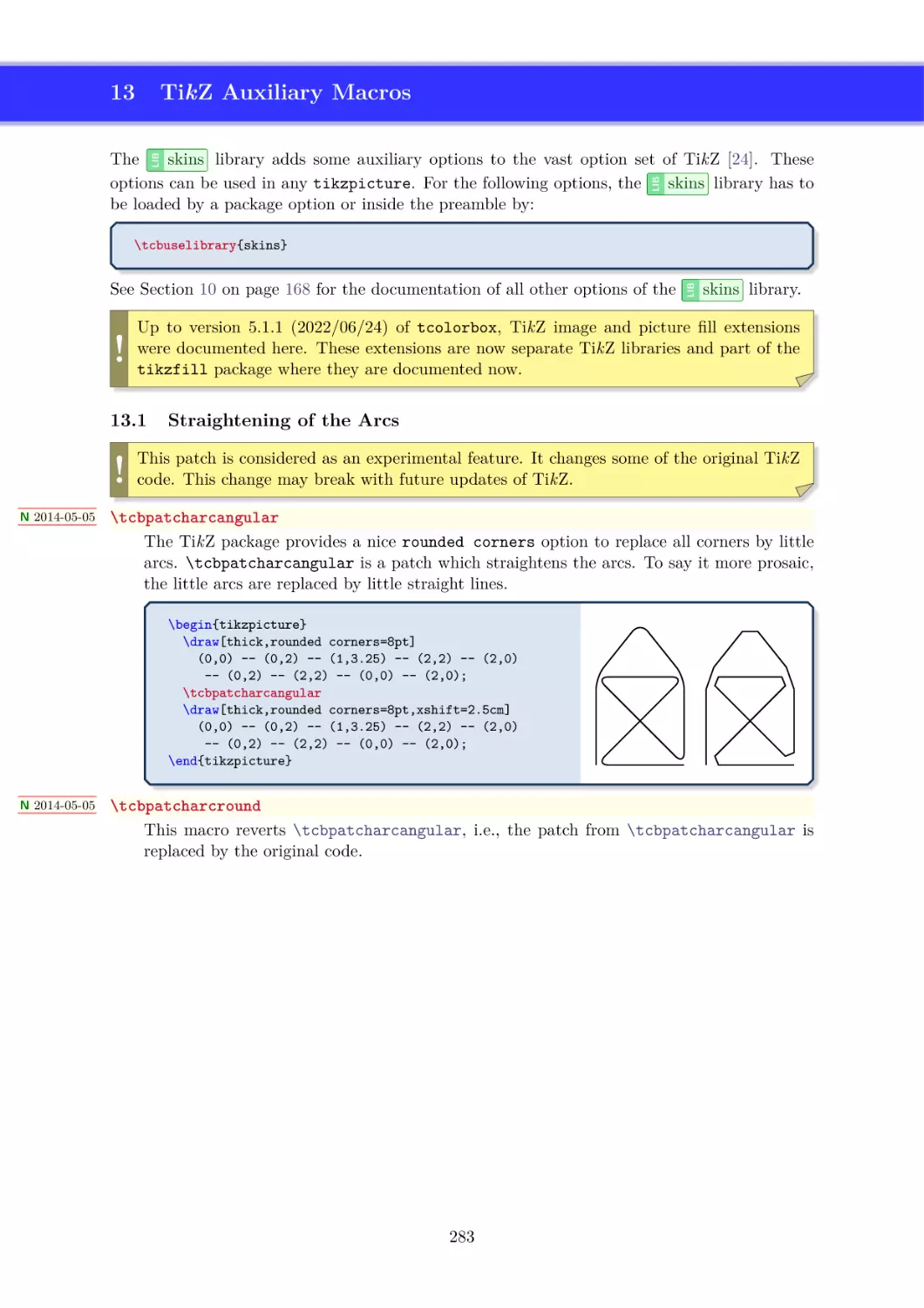
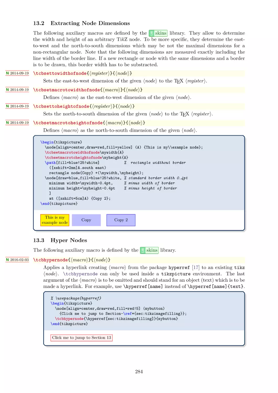
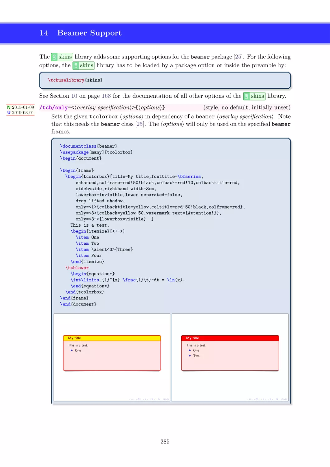
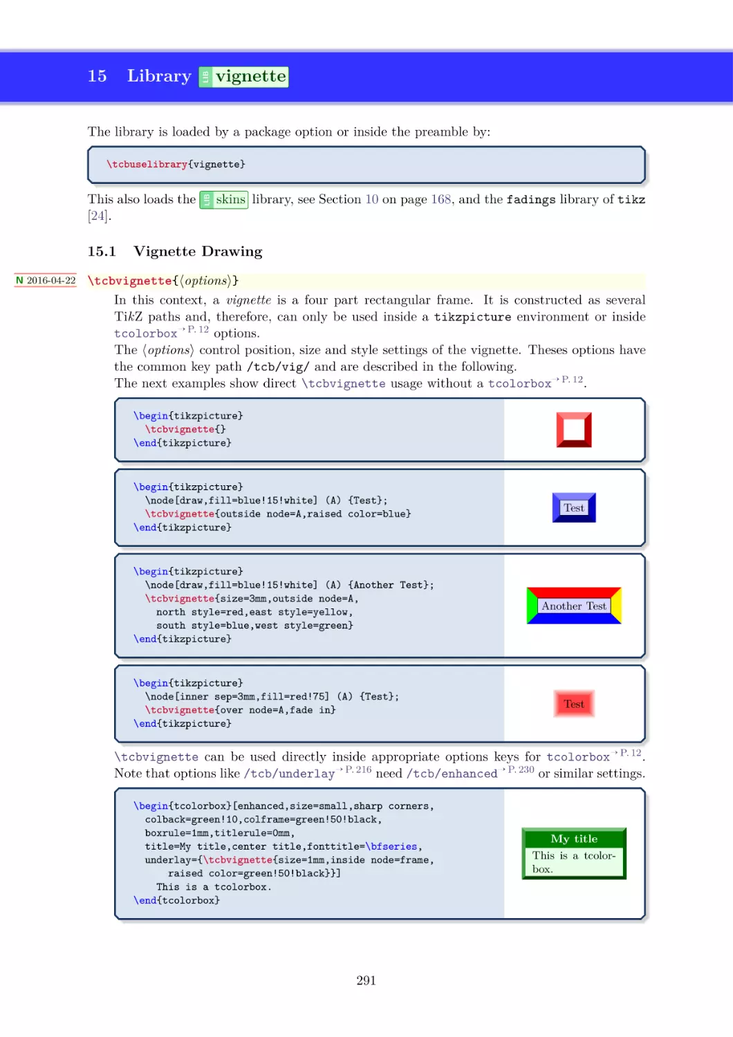
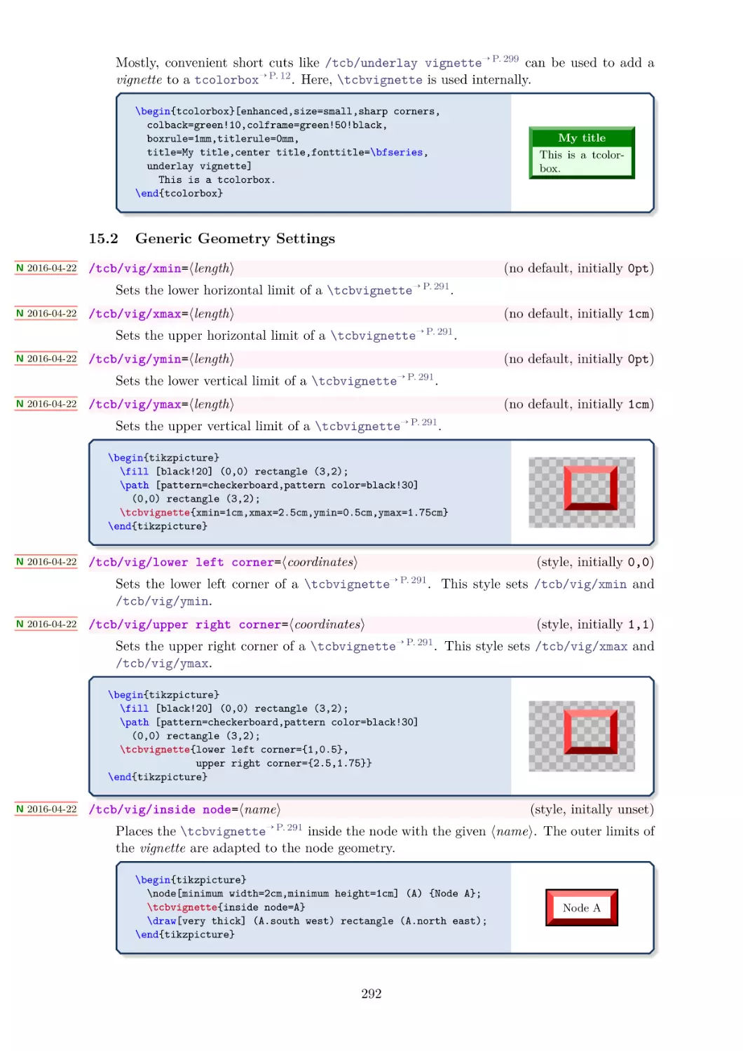
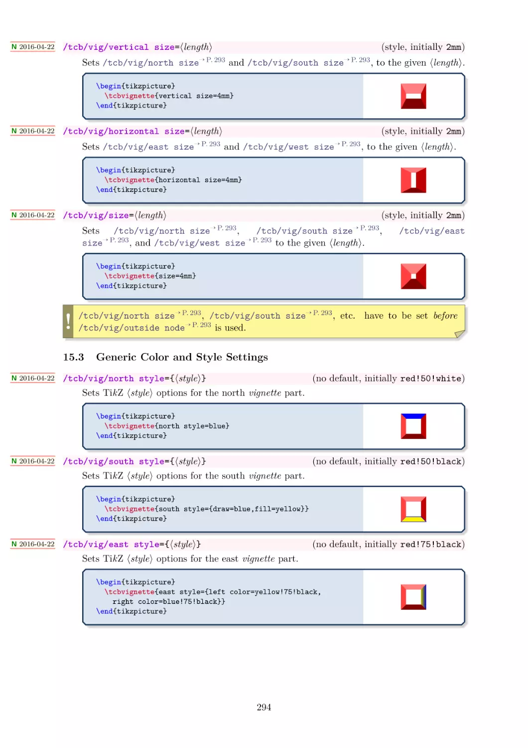
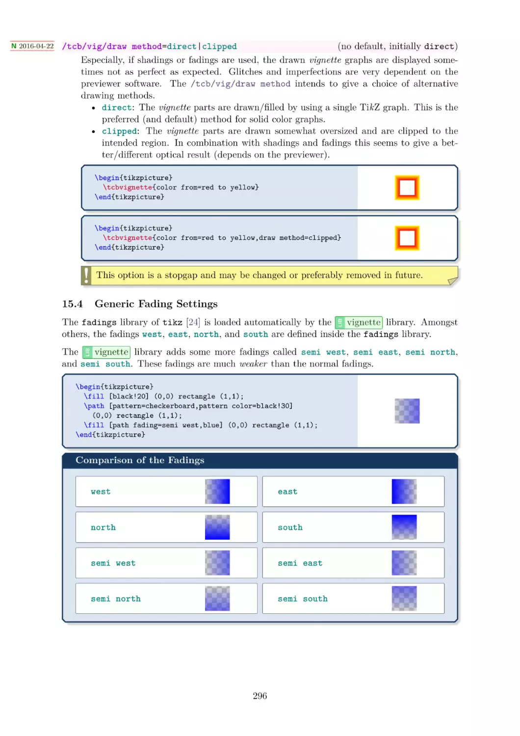
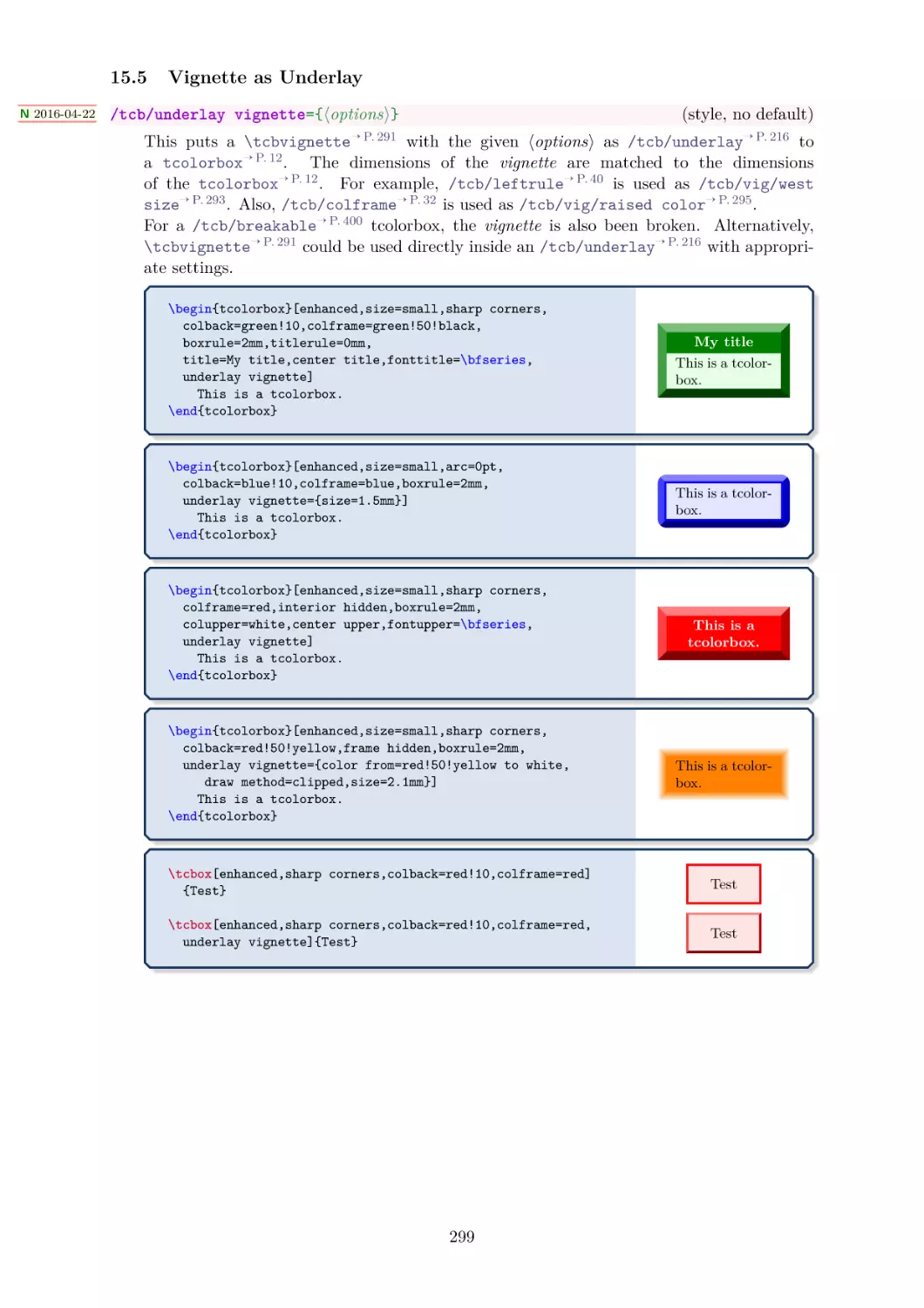
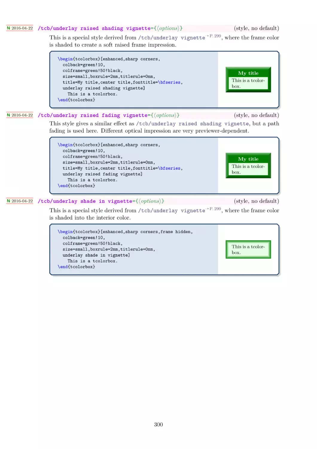
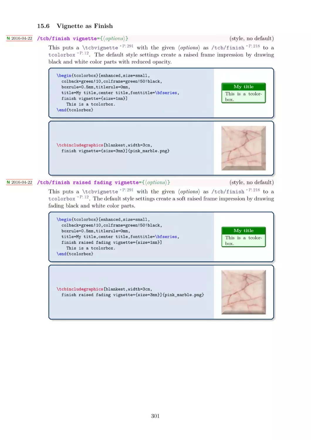
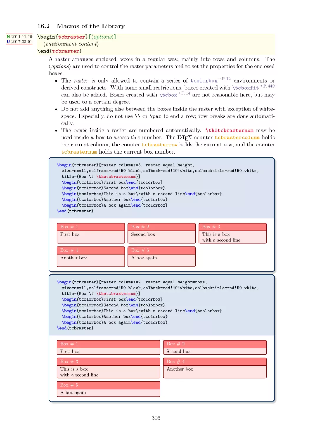
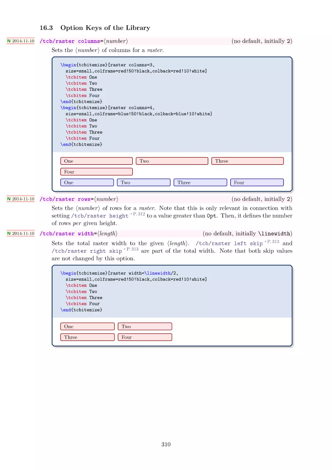
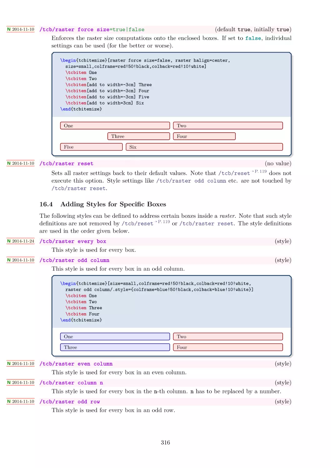
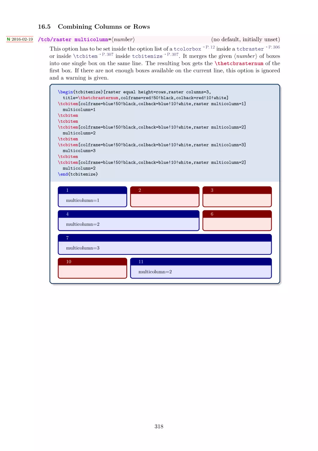
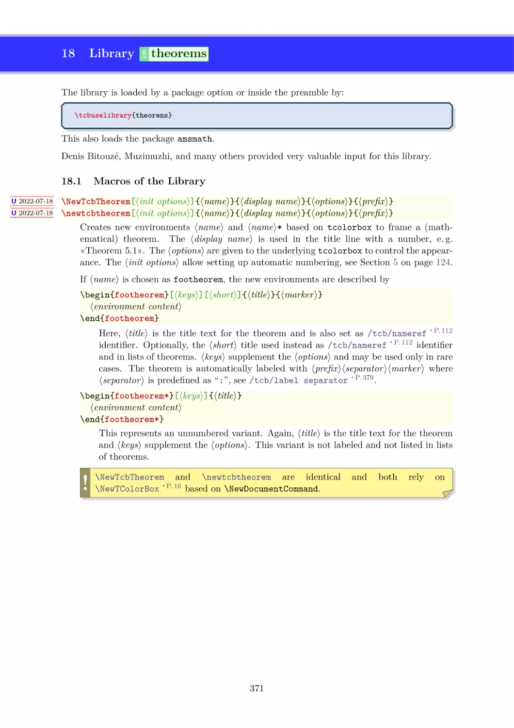
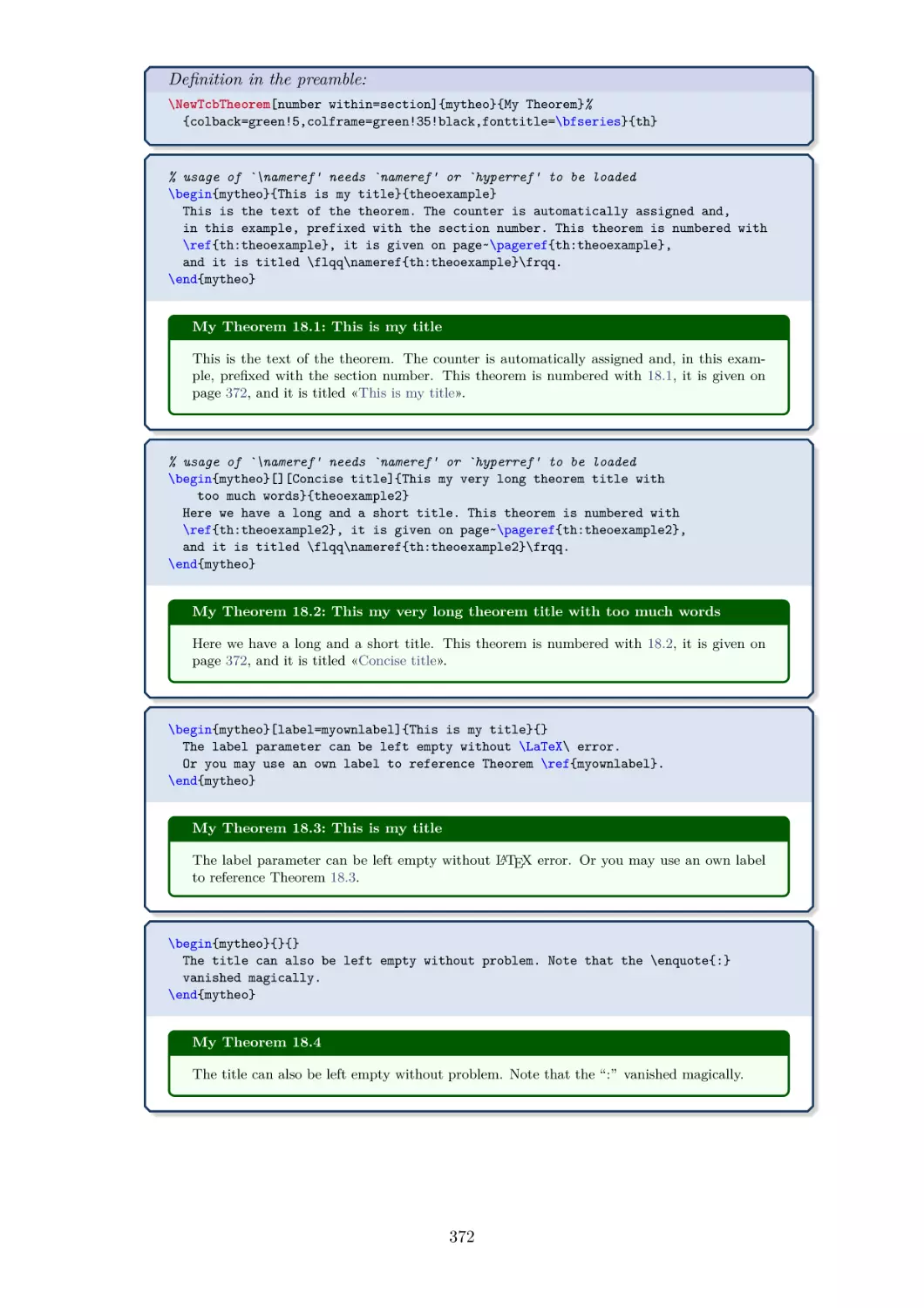
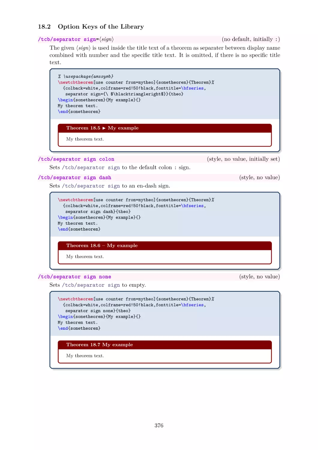
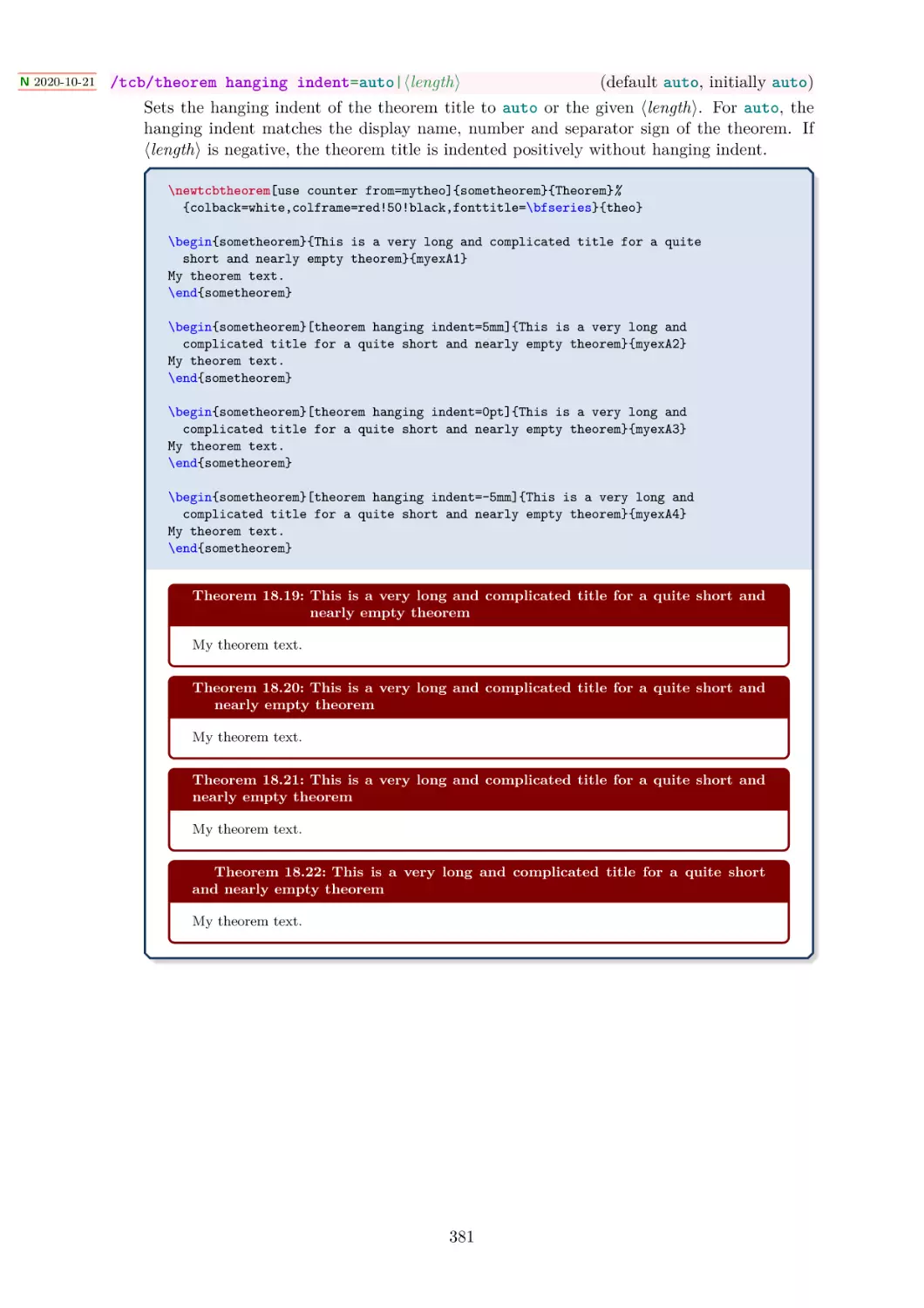
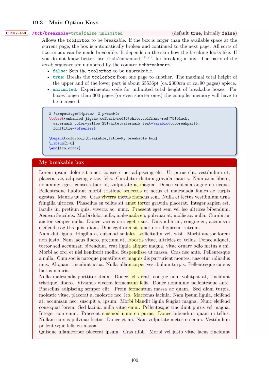
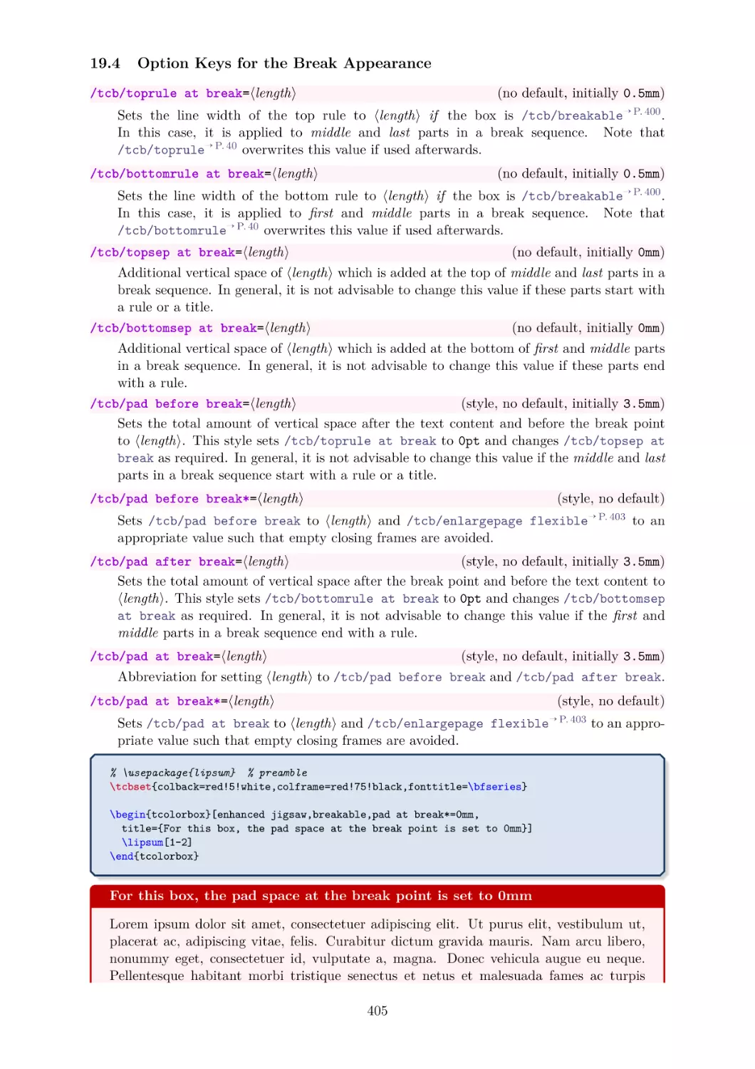
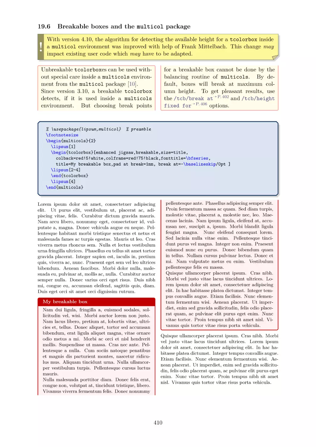
/


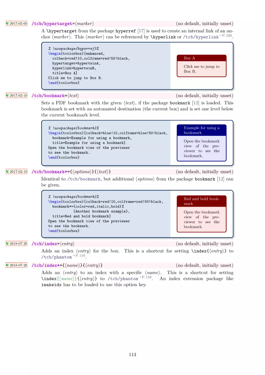
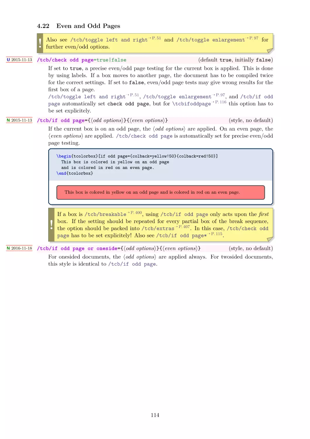
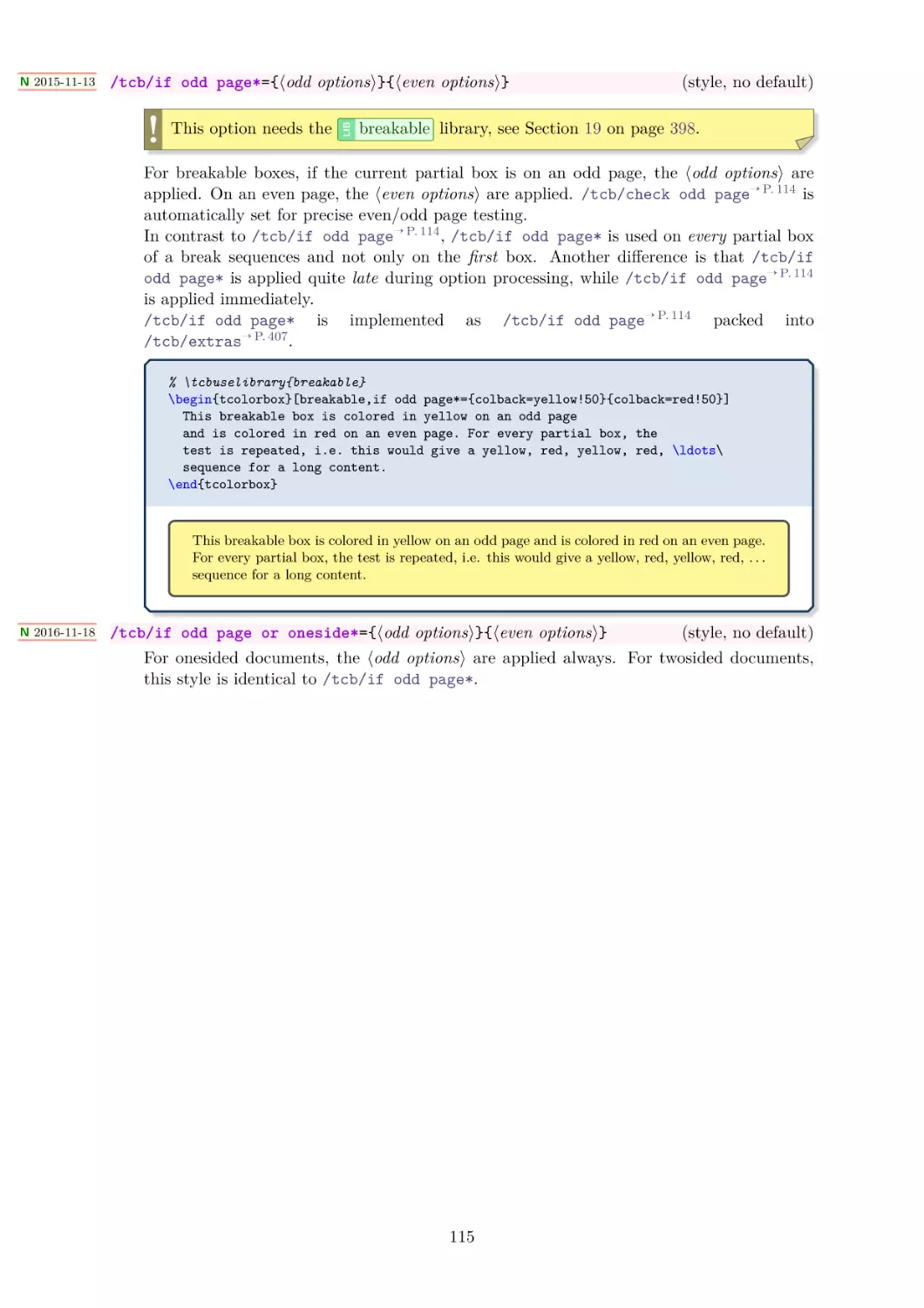


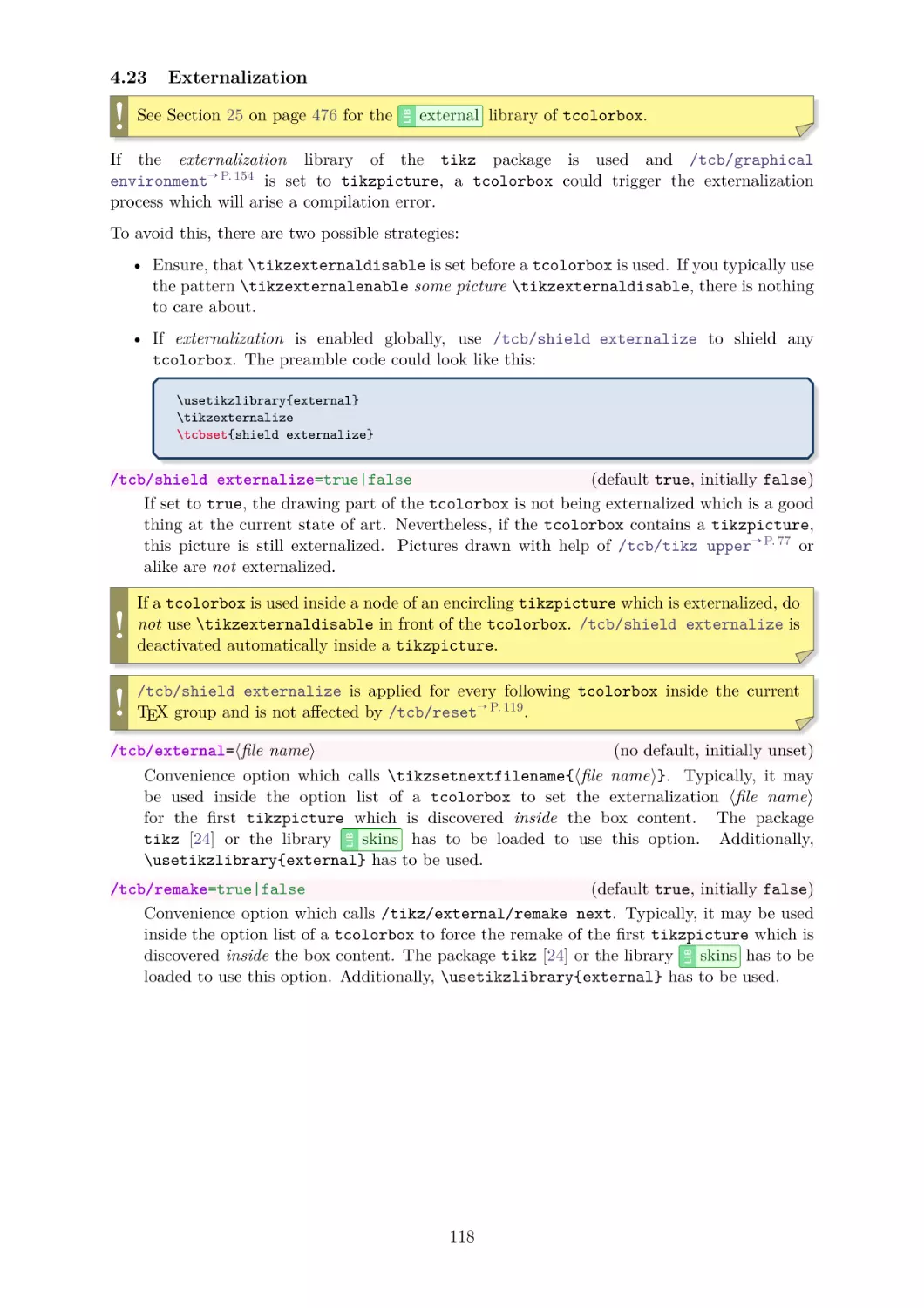


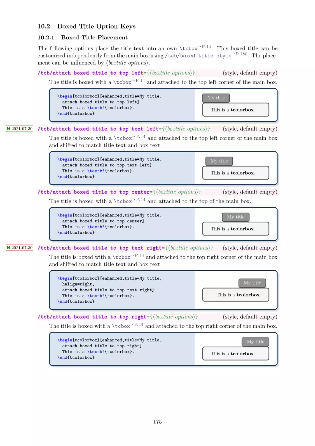


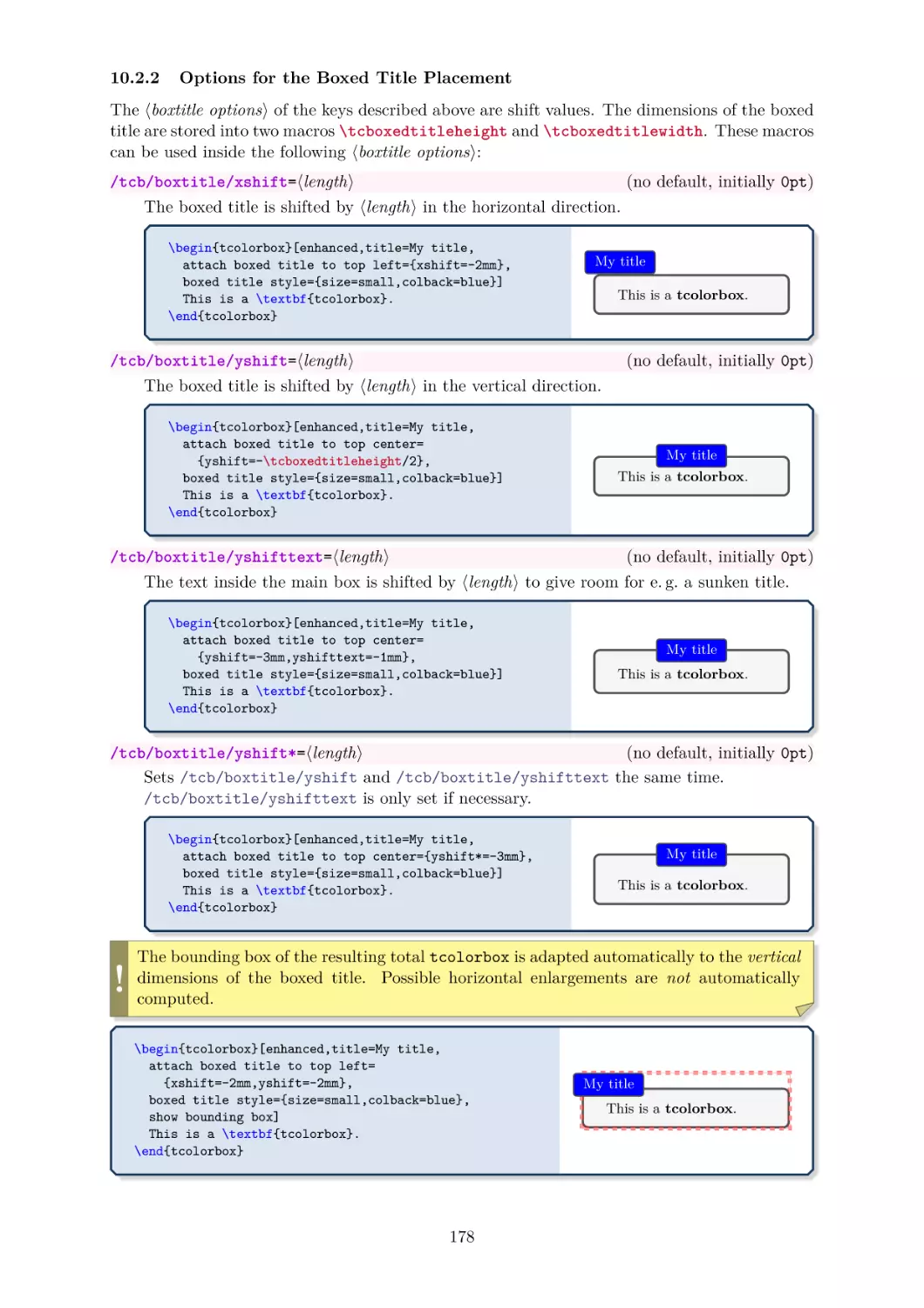
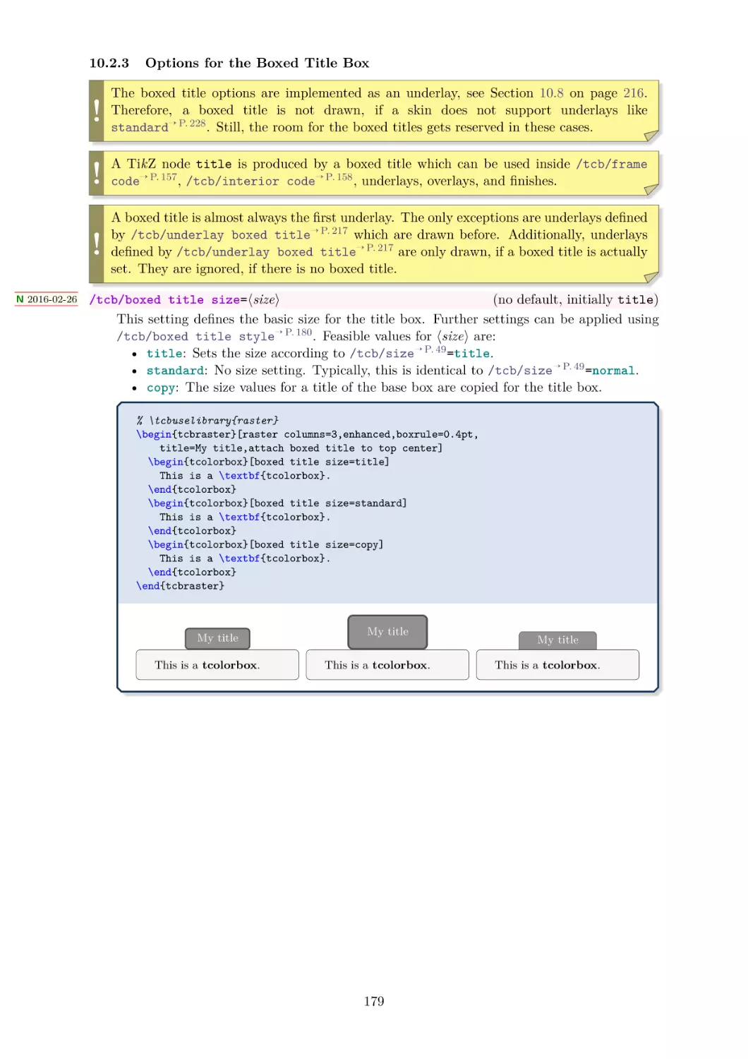


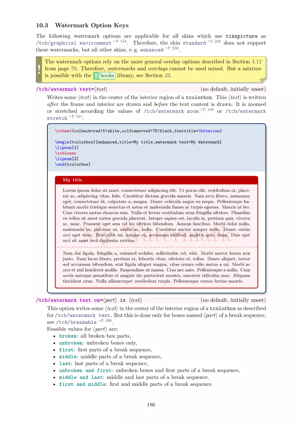


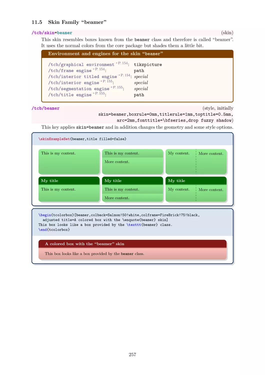


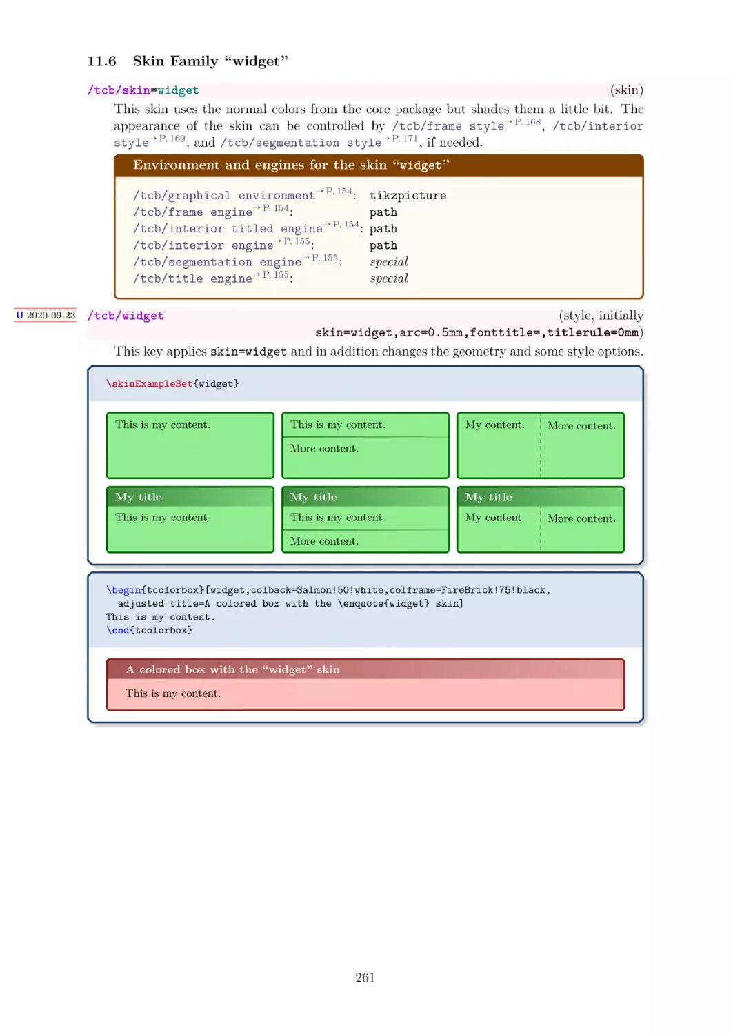


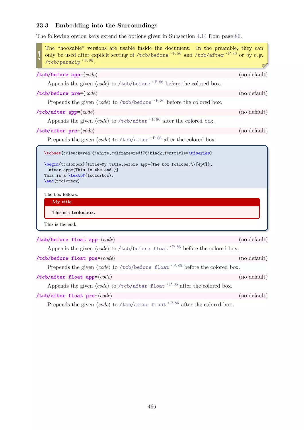
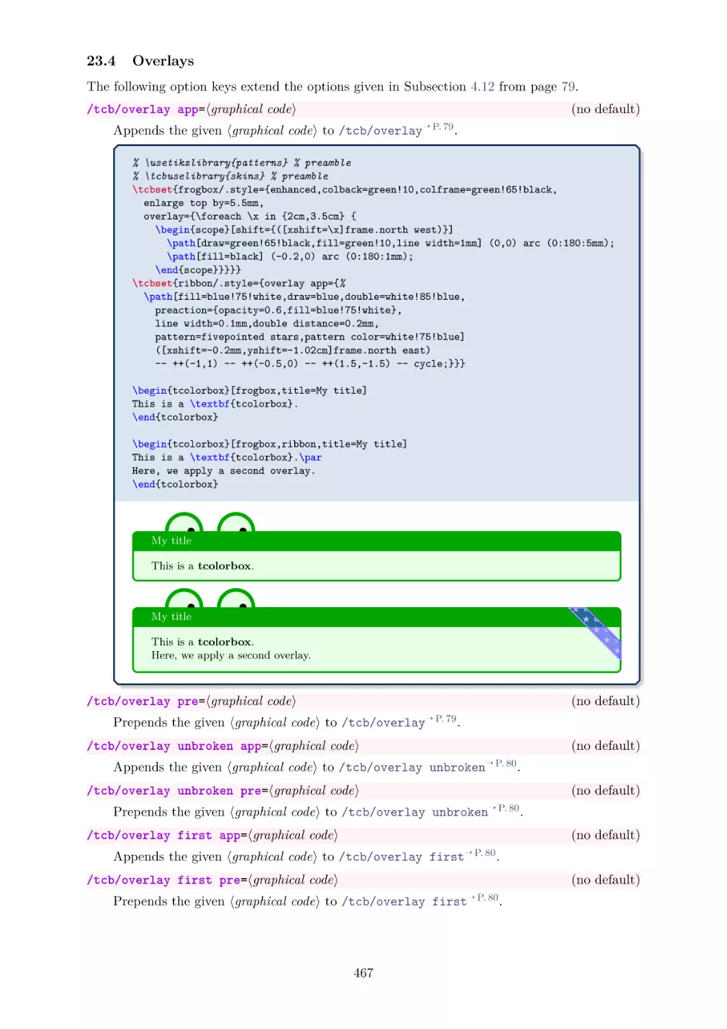

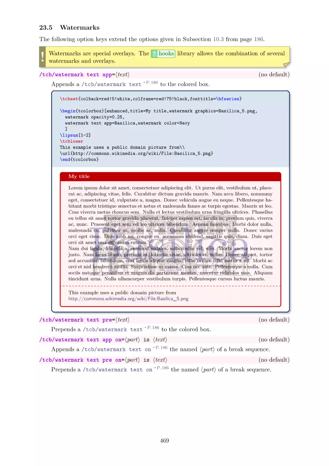

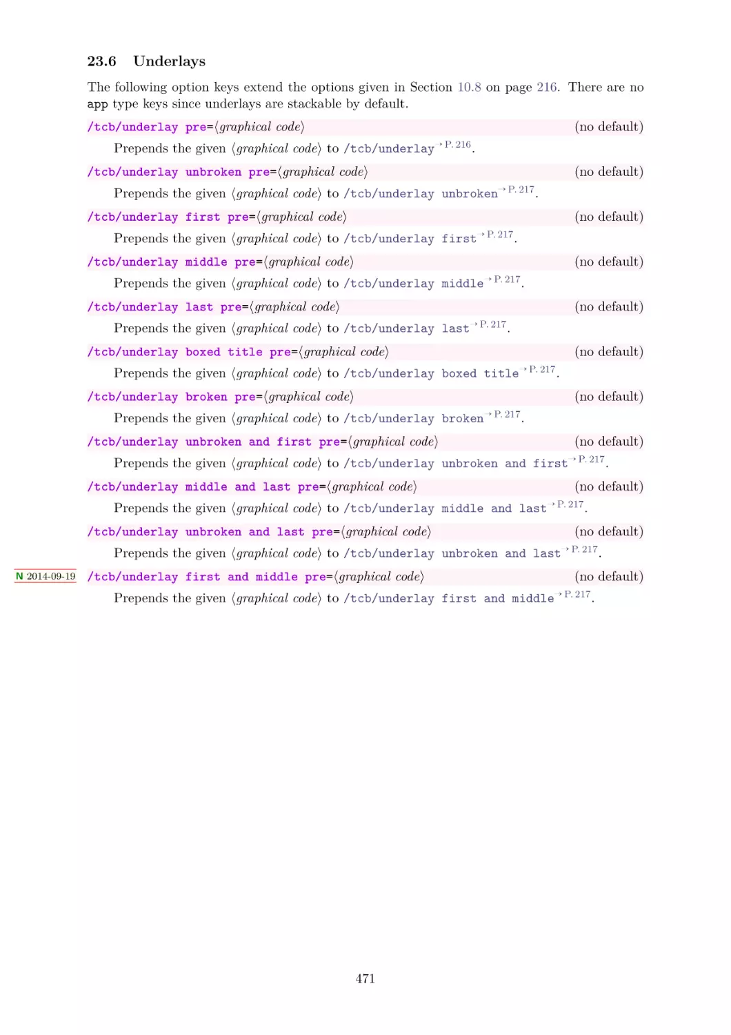


Автор: Sturm T.F.
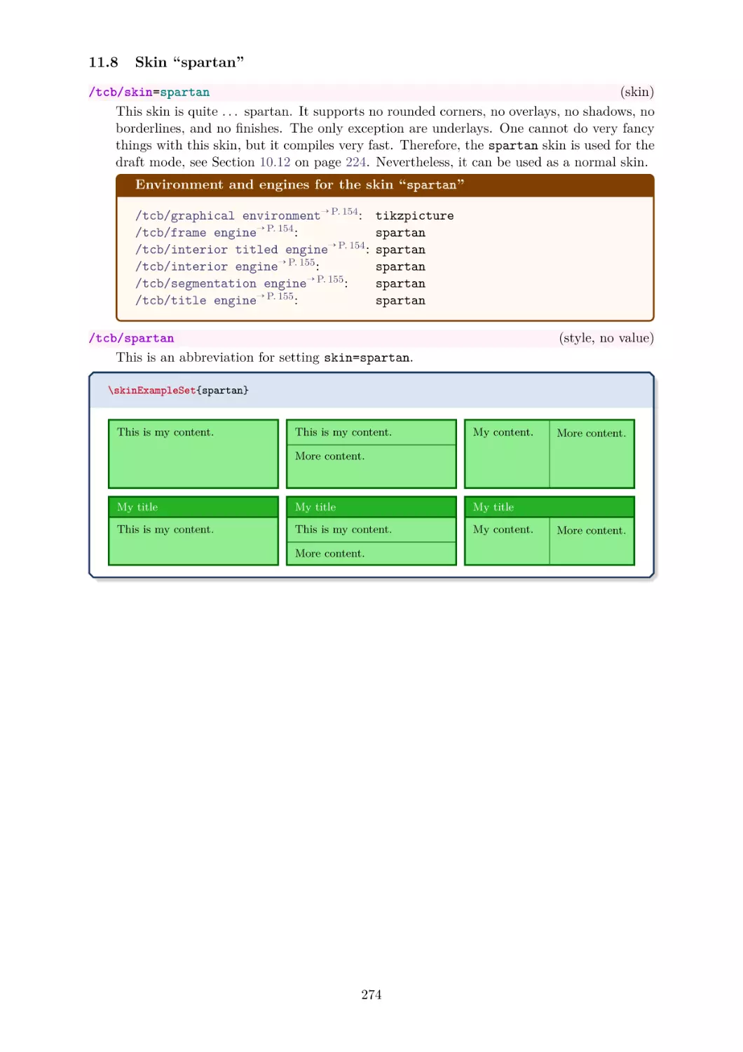
Теги: programming informatics


Текст
5
6
et,
din
orbox 6
s. Pe
lac
um, erat
.0.1
ligula ali tellus. Donec aliq us libero, pretiu vel, wisi.
m
qu
ue
Nam dui
ac orci e
li
t nisl hen et magna, vitae t, tortor sed accu at, loM
o
msan
rbi aucto gula, fringilla a,
ornare o
. Pellente
drerit mo
d
eu
r lorem n
bortis vit
arturient sque a nulla. Cum llis. Suspendisse io metus a
on justo. ismod sodales, s
a
e
,
u
l
t
u
ollicitudi
montes, n
ricies et,
t
s
bibendum
Nam lacu
n vel, wi
t
ascetur r ociis natoque pen massa.
lla ullam
e
,
s
l
l
u
e
l
r
i
s
b
at ligula
. Donec a
e
r
mi. Mor
o
idiculus m
,
corper ve
atibus
p
r
e
t
aliquet m
liquet, to
ium at, l si.
bi ac orc
stibulum
us. Aliqu
C
r
oagna, vit
tor sed a
i et nisl
ras nec a
turpis. P
c
a
h
n
c
e
e
t
u
n
e
m
o
.
ellentesqu am
d
r
r
san
Pellentes
nare odi
erit mol
et magn
e
b
tincidunt is dis parturient que a nulla. Cum lis. Suspendisse o metus a
u
m
u
t
s
b
o
o
r
i
m
be
na. N
ntes,
ciis n
ass
cursus lu
ctus mau ulla ullamcorper nascetur ridiculu atoque penatibu a.
m
i
smod sod
.
M
s
ris.
s
vestibulu
al
Cras nec
m turpis. mus. Aliquam
tcolorbo
am lacus es, sollicitudin ve
P
e
x
l
l
l
l
,
e
e
6
i
b
n
t
.
w
0.1
tesque
magnis d
c aliquet, ero, pretium a isi.
i
Nam dui
t
t, loi
n
tortor sed
c
i
d
unt urna
l
i
g
u
l
v i ta e o rn
a
a
,
c
M
f
.
c
ringilla
umsan
orbi a
cursus lu
a re
ctus mau
bortis vit uctor lorem non a, euismod soda
Suspendi odio metus a
a
j
l
u
e
e
sse ut m
s
,
s
,
t
u
o
s
ltricies et
.
bibendum
tcolorbo
a
i s n a to q u
, tellus. D Nam lacus libe ollicitudin vel, wi
,
x 6.0.1
e
r
e penatib ssa.
a
t
r
m
s
o
l
i.
onec aliq
igula aliq
, pretium
i. Morbi
us
lus mus.
u
N
u
e
ac orci e
am dui l
A
Cras nec
t nisl hen et magna, vitae t, tortor sed accu at, loig
a
s. Pellen liquam
M
n
t
o
e
m
r
o
.
drerit mo
bi auctor ula, fringilla a,
rnare od
s
Pellentes
et magni
a
n
tesque
l
i
lorem no
bortis vit
tincidunt s dis parturient que a nulla. Cum lis. Suspendisse o metus a
n
a
e
,
u
l
t
u
m
r
u
t
s
b
i
cies et, te justo
ibendum
massa.
cursus lu rna. Nulla ull ontes, nascetu ociis natoque
,
llu
erat ligu
penati6.0.1
atcolorbox
ctus mau
mcorper 6.0.1 r ridiculus tcolorbox
mi. Mor
la alique s. D
bus
ris.
b
vestibulu
i
m
a
u
c
s
t
. Aliquam
orci et n
Cras nec
m turpis.
tcolorbo
isl hendr magn
a
n
t
P
e
.
e
x
l
P
l
e
erit mo
e
6
ellentesqu
ntesque
t magnis
.0.1
isi.
e
d
i
a
s
Nam dui
n
p
ul
arturient
tincidunt
montes, n la. Cum
u
r
n
a
Morbi au ligula, fringilla
.
c
N
u
u
rsus luctu
a
l
s mauris. la ullamcorper ve scetur ri
bortis vit ctor lorem non a, euismod soda
Manual
for
s
tibulum
bibendum ae, ultricies et, t justo. Nam lac les, sollicitudin
t
tcolorbversion
u
e
o
v
,
s
l
x
e
l
u
e
l
l
,
6
r
i
s
b
a
.
.
w
0
e
t
D
i
r
.1
mi. Mor
bi ac orc ligula aliquet ma onec aliquet, tor o, pretium at, lo si.
Nam dui 6.0.1
t
i
g
o
e
n
r
s nec ant
ligula, fr
Morbi au (2023/02/12)
in
e. Pellen t nisl hendrerit m a, vitae ornare o sed accumsan
c
t
t
o
esque a n
dio metu
ollis. Sus
r lorem n gilla a, euismod
nis dis pa
b
o
r
t
i
s
u
sodales,
s
p
on justo.
ll
vitae, ult
r
e
sollicitud
r
urna. Nu turient montes, n a. Cum sociis na ndisse ut massa. a
b
i
N
c
i
b
i
a
e
e
m
s
ndum, er
e
l
t
in ve
a
,
c
toque pe
t
ascetur r
u
lla ullam
e
s
l
l
u
l
i
s
b
at ligula
. Donec a
e
r
mi. Mor
o
natibus
idiculus m
,
corper ve
s mauris.
p
r
e
t
a
l
stibulum
u
Cras nec bi ac orci et nis liquet magna, v iquet, tortor sed ium at,
turpis. P s. Aliquam
i
l
accumsan
a
t
a
h
nte. Pelle 6.0.1 endrerit
e ornare
eltcolorbox
lentesque 6.0.1 et magn tcolorbox
n
m
o
t
e
d
o
s
l
i
l
q
o
i
i
metus a
tincidunt s dis parturient ue a nulla. Cum s. Suspendisse
u
m
u
t
s
o
o
r
m
na. N
ntes,
ciis n
ass
cursus lu
lla a, eui
ctus mau ulla ullamcorper nascetur ridiculu atoque penatibu a.
smod sod
s
ris.
s
vestibulu
al
justo. N
m turpis. mus. Aliquam
tcolorbo
am lacus es, sollicitudin ve
Thomas F. Sturm
Pellentes
x 6.0.1
us. Done
l
et
que
c aliquet, libero, pretium a , wisi.
N
a
t
m dui lig
t, loincid
tortor sed
magna, v
ula, fring
i
a
t
c
M
a
c
e
u
o
c
m
r
o
u
b
r
r
s
i
i
n
s
an
lla
us lu
a
rit mollis
a
. Suspen re odio metus a
bortis vit uctor lorem non a, euismod soda
di
Cum soc
bibendum ae, ultricies et, t justo. Nam lac les, sollicitudin
tcolorbo
iis natoq sse ut massa.
u
e
v
,
s
l
x 6.0.
e
l
u
u
e
l
l
,
r
i
tur ridicu
s
e penatib
b
a
.
w
e
t
D
i
r
m
s
o
l
i.
onec aliq
igula aliq
, pretium
i. Morbi
us
lus mus.
u
N
u
e
ac orci e
am dui l
A
lum turp
Cras nec
t nisl hen et magna, vitae t, tortor sed accu at, loig
is. Pellen liquam
a
M
n
t
o
e
m
r
o
.
drerit mo
bi auctor ula, fr
rnare od
s
Pellentes
et magni
a
n
tesque
l
i
lorem
bortis vit
tincidunt s dis parturient que a nulla. Cum lis. Suspendisse o metus a
a
e
,
u
l
t
u
m
r
u
t
s
b
i
c
ibendum
mass
cursus lu rna. Nulla ull ontes, nascetu ociis natoque
, erat lig ies et,
penatibu a.
amcorper
ctus mau
r ridiculu
m
i
.
u
la
Morbi ac
s
ris.
s mus. A
vestibulu
orci et n aliq
C
l
r
m
i
a
q
s
u
t
a
n
u
t
m
c
e
r
i
pis. Pelle
olorbox
in vel, w
et magni c ante. Pellentesq sl hen
6.0.1
ntesque
isi.
s
u
m at, loNam dui
tincidunt dis parturient e a nu
l
i
g
u
l
a
,
Morbi au
fringilla
umsan
cursus lu urna. Nulla ull montes, na
a
c
t
,
o
amcorper
ctus mau
e
r
u
lorem no
ismod so
bortis vit
r
sa
i
ves
s
.
n
d
a
a
j
l
u
e
e
s
,
s
,
t
ultricies e
o. Nam
s
o
l
b
l
i
i
c
b
t
i
c
e
t
o
n
u
l
d
d
o
la
t,
u
in
rbox 6.0
.
.1
mi. Mor m, erat ligula al tellus. Donec ali cus libero, pretiu vel, wisi.
q
b
i
Nam dui
Cras nec i ac orci et nis quet magna, v uet, tortor sed m at, loMorbi au ligula, fringilla
et magni ante. Pellentesq l hendrerit molli itae ornare odio accumsan
bortis vit ctor lorem non a, euismod soda
metus a
tincidunt s dis parturient ue a nulla. Cum s. Suspendisse
ut massa
montes, n
urna. Nu
sociis nat
bibendum ae, ultricies et, t justo. Nam lac les, sollic
.
a
l
sus luctu
o
mi. Mor , erat ligula al ellus. Donec ali us libero, pr
s mauris. la ullamcorper ve scetur ridiculus m que penatibus
stibulum
us. Aliqu
Cras nec bi ac orci et nis iquet magna, v quet, tortor sed
turpis. P
a
m
ellentesqu
x 6.0.1
et magni ante. Pellentesq l hendrerit molli itae ornare odio
e
sd
ue
s.
m
10 11
14 15
8 19
2
0
23
tcolorbox
Cover code
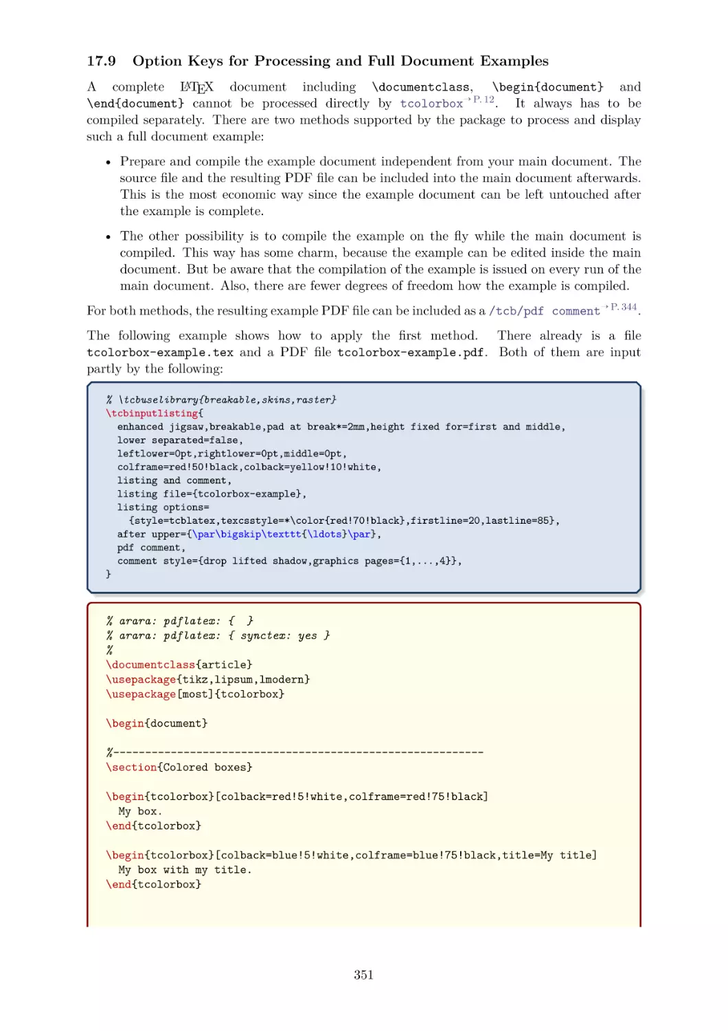
% \usepackage{incgraph}
\begin{inctext}
\begin{tikzpicture}
\definecolorseries{boxcol}{rgb}{last}{blue}{red}
\resetcolorseries[28]{boxcol}
\coordinate (A) at (0,0); \coordinate (B) at (21,29.7);
\path[use as bounding box] (A) rectangle coordinate (C) (B);
\node[transform shape,xslant=0.7,rotate=-10,xshift=0cm] at (C) {%
\begin{tcbraster}[raster columns=4,title=tcolorbox \version,
fonttitle=\small\bfseries,raster width=50cm]
\foreach \b in {1,...,28} {\begin{tcolorbox}[enhanced,
watermark text=\thetcbrasternum,
colframe=boxcol!30!white,
colback=boxcol!25!white!30!white,
colbacktitle=boxcol!!+!50!black!30!white,
colupper=black!30!white]\lipsum[2]\end{tcolorbox}}
\end{tcbraster}%
};
\node at (C) {%
\begin{tcbitemize}[title=tcolorbox \version,fonttitle=\small\bfseries,
enhanced jigsaw,opacityback=0.5,opacitybacktitle=0.75,
halign=center,valign=center,arc=5mm,
raster width=16cm,raster column skip=8mm,raster halign=center,
raster force size=false,
raster row 1/.style={height=6cm},
raster row 2/.style={width=6cm,height=4cm},
raster column 1/.style={flushright title,
frame style={left color=yellow!50!black,right color=green!50!black},
title style={left color=yellow!50!blue,right color=blue!50!green!50!black},
interior style={left color=yellow!70,right color=green!70},
underlay={\draw[line width=6mm,line cap=round,black!60]
([shift={(0.4,-0.15)}]frame.north east)
--([shift={(0.4,0.15)}]frame.south east); }},
raster column 2/.style={
frame style={left color=green!50!black,right color=yellow!50!black},
title style={left color=blue!50!green!50!black,right color=yellow!50!blue},
interior style={left color=green!70,right color=yellow!70}}]
\tcbitem[fontupper=\Huge\bfseries,sharp corners=east,
underlay={\draw[line width=6mm,line cap=round,black!60]
([shift={(0.4,0.30)}]frame.north east)-- coordinate(A) +(0,0.2);
\draw[line width=1mm,line cap=round,black!60](A) -- +(30:1.5cm);
\draw[line width=1mm,line cap=round,black!60](A) -- +(150:1.5cm);}]
tcolorbox
\tcbitem[fontupper=\large\bfseries,sharp corners=west]
Manual for\\ version\\ \version\\(\datum)
\tcbitem[sharp corners=northeast]
\tcbitem[sharp corners=northwest] Thomas F.~Sturm
\end{tcbitemize}%
};
\end{tikzpicture}
\end{inctext}
2
The tcolorbox package
Manual for version 6.0.1 (2023/02/12)
Thomas F. Sturm1
https://www.ctan.org/pkg/tcolorbox
https://github.com/T-F-S/tcolorbox
Abstract
tcolorbox provides an environment for colored and framed text boxes with a heading
line. Optionally, such a box can be split in an upper and a lower part. The package
tcolorbox can be used for the setting of LATEX examples where one part of the box
displays the source code and the other part shows the output. Another common use
case is the setting of theorems. The package supports saving and reuse of source code
and text parts.
Contents
1 Introduction
1.1 Installation . . . . . . . . . . . . . . . . . . . . . . . . . . . . . . . . . . .
1.2 Loading the Package . . . . . . . . . . . . . . . . . . . . . . . . . . . . .
1.3 Libraries . . . . . . . . . . . . . . . . . . . . . . . . . . . . . . . . . . . .
2 Quick Reference
11
3 Macros for Box Creation
3.1 Using tcolorbox and \tcbox . . . . . . . . . . . . . . . . .
3.2 Producing tcolorbox Environments and Commands . . . .
3.3 Producing \tcbox Commands . . . . . . . . . . . . . . . . .
3.4 Redefining other Environments (Wrapping with tcolorbox)
.
.
.
.
.
.
.
.
.
.
.
.
.
.
.
.
.
.
.
.
Contents
4 Option Keys
4.1 Title . . . . . . . . . . . . . .
4.2 Subtitle . . . . . . . . . . . . .
4.3 Upper Part . . . . . . . . . . .
4.4 Lower Part . . . . . . . . . . .
4.5 Colors and Fonts . . . . . . . .
4.6 Text Alignment . . . . . . . .
4.7 Geometry . . . . . . . . . . . .
4.7.1 Width . . . . . . . . .
4.7.2 Rules . . . . . . . . . .
4.7.3 Arcs . . . . . . . . . .
4.7.4 Spacing . . . . . . . . .
4.7.5 Size Shortcuts . . . . .
4.7.6 Toggle Left and Right .
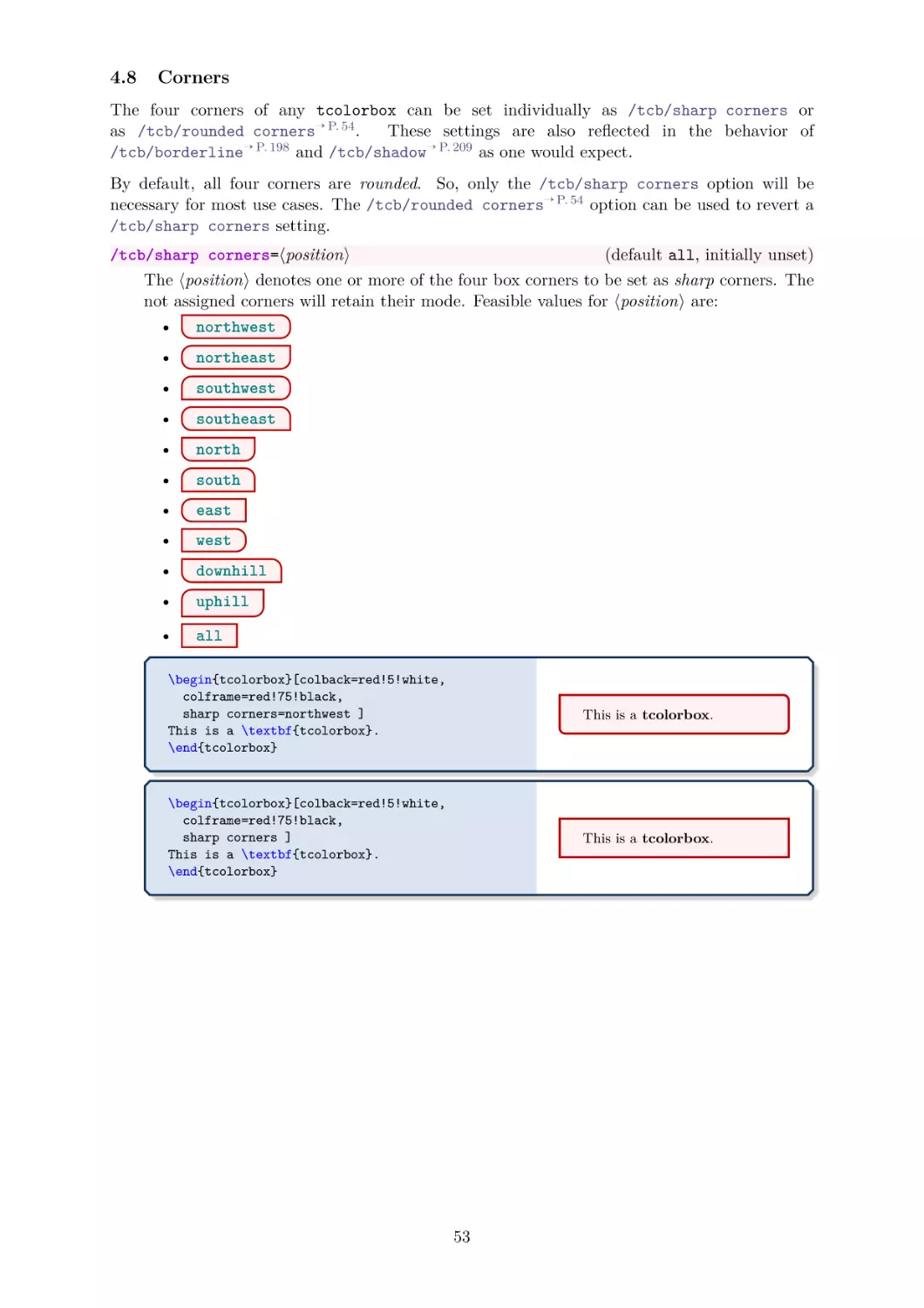
4.8 Corners . . . . . . . . . . . . .
8
8
8
9
.
.
.
.
.
.
.
.
.
.
.
.
.
.
.
.
.
.
.
.
.
.
.
.
.
.
.
.
1
.
.
.
.
.
.
.
.
.
.
.
.
.
.
.
.
.
.
.
.
.
.
.
.
.
.
.
.
.
.
.
.
.
.
.
.
.
.
.
.
.
.
.
.
.
.
.
.
.
.
.
.
.
.
.
.
.
.
.
.
.
.
.
.
.
.
.
.
.
.
.
.
.
.
.
.
.
.
.
.
.
.
.
.
.
.
.
.
.
.
.
.
.
.
.
.
.
.
.
.
.
.
.
.
.
.
.
.
.
.
.
.
.
.
.
.
.
.
.
.
.
.
.
.
.
.
.
.
.
.
.
.
.
.
.
.
.
.
.
.
.
.
.
.
.
.
.
.
.
.
.
.
.
.
.
.
.
.
.
.
.
.
.
.
.
.
.
.
.
.
.
.
.
.
.
.
.
.
.
.
.
.
.
.
.
.
.
.
.
.
.
.
.
.
.
.
.
.
.
.
.
.
.
.
.
.
.
.
.
.
.
.
.
.
.
.
.
.
.
.
.
.
.
.
.
.
.
.
.
.
.
.
.
.
.
.
.
.
.
.
.
.
.
.
.
.
.
.
.
.
.
.
.
.
.
.
.
.
.
.
.
.
.
.
.
.
.
.
.
.
.
.
.
.
.
.
.
.
.
.
.
.
.
.
.
.
.
.
.
.
.
.
.
.
.
.
.
.
.
.
.
.
12
12
15
19
22
.
.
.
.
.
.
.
.
.
.
.
.
.
.
23
23
26
27
29
32
35
39
39
40
41
44
49
51
53
Prof. Dr. Dr. Thomas F. Sturm, Institut für Mathematik und Informatik, Universität der Bundeswehr
München, D-85577 Neubiberg, Germany; email: thomas.sturm@unibw.de
3
4.9
4.10
4.11
4.12
4.13
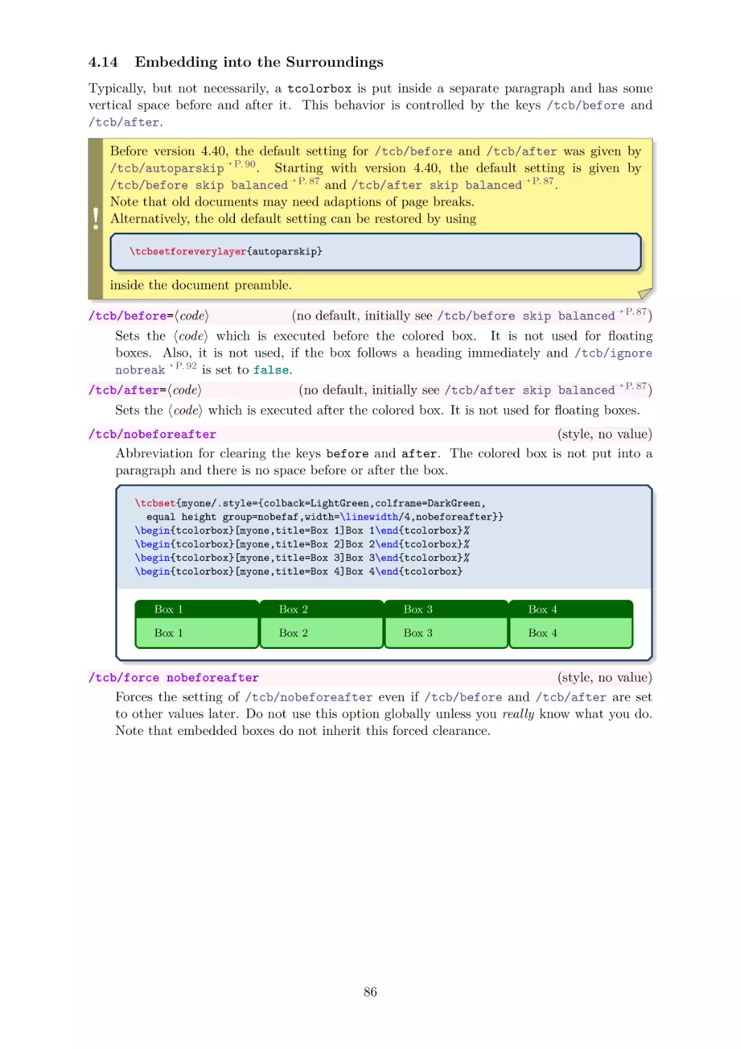
4.14
4.15
4.16
4.17
4.18
4.19
4.20
4.21
4.22
4.23
4.24
Transparency . . . . . . . . . . . . . . .
Height Control . . . . . . . . . . . . . .
Box Content Additions . . . . . . . . .
Overlays . . . . . . . . . . . . . . . . .
Floating Objects . . . . . . . . . . . . .
Embedding into the Surroundings . . .
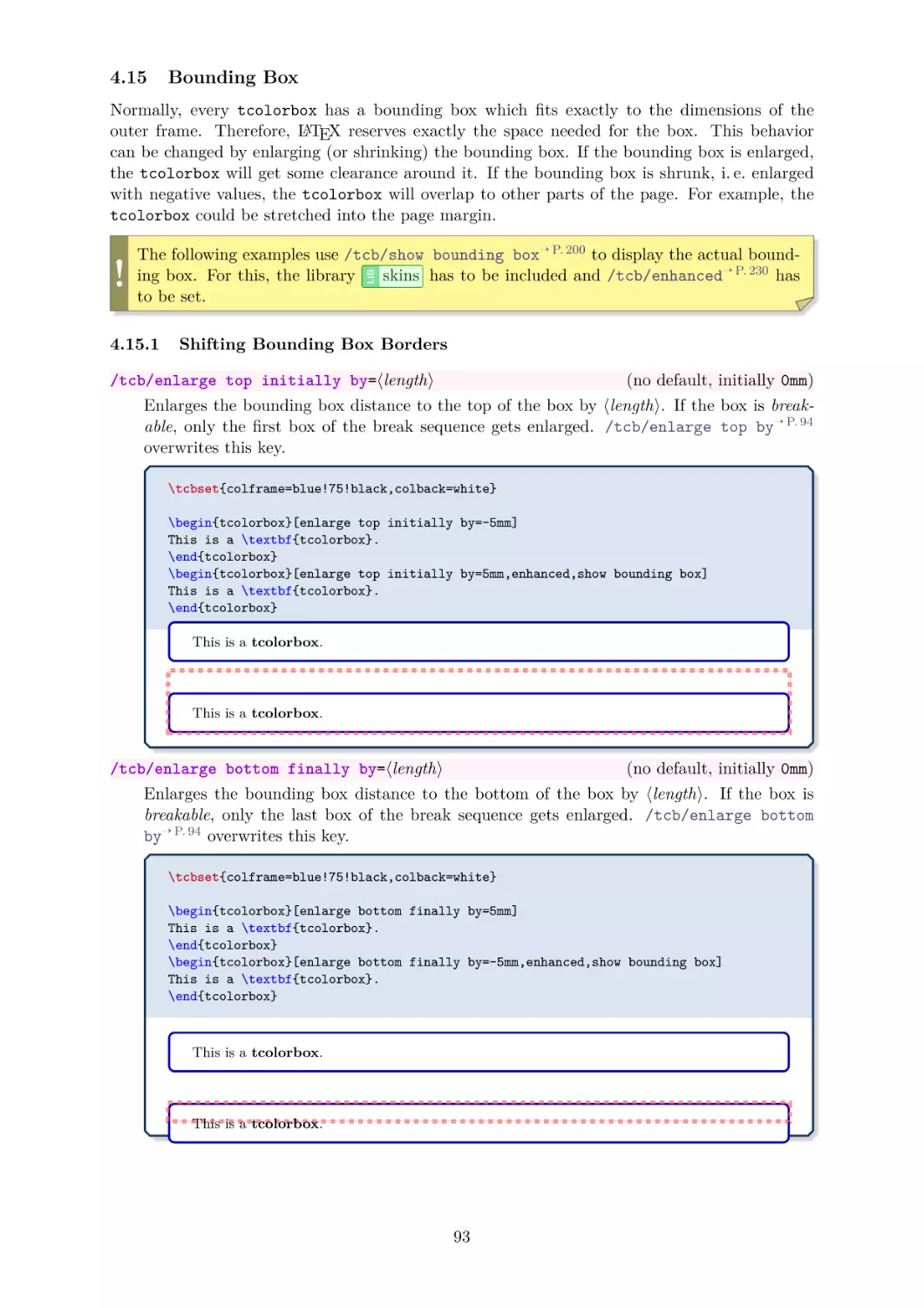
Bounding Box . . . . . . . . . . . . . .
4.15.1 Shifting Bounding Box Borders
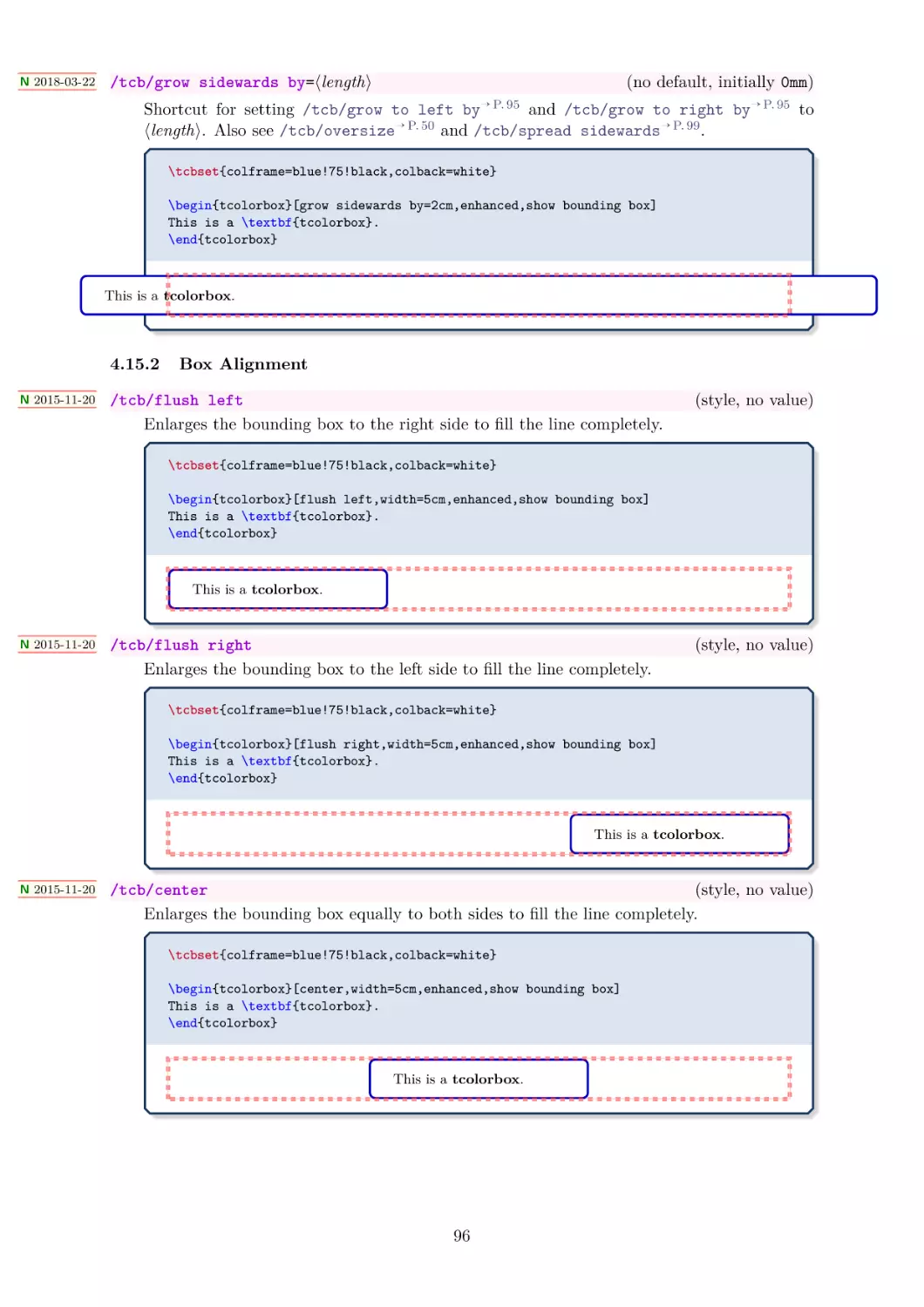
4.15.2 Box Alignment . . . . . . . . . .
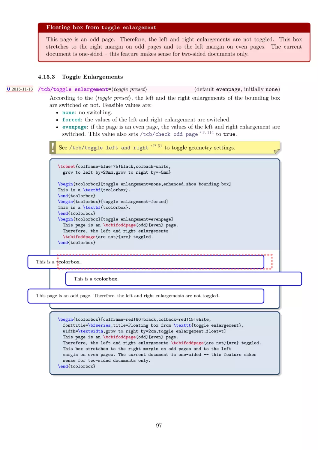
4.15.3 Toggle Enlargements . . . . . .
4.15.4 Spread Box to Page Borders . .
4.15.5 Box Extrusion . . . . . . . . . .
Layered Boxes and Every Box Settings
Capture Mode . . . . . . . . . . . . . .
Text Characteristics . . . . . . . . . . .
Files . . . . . . . . . . . . . . . . . . .
\tcbox Specials . . . . . . . . . . . . .
Counters, Labels, and References . . .
Even and Odd Pages . . . . . . . . . .
Externalization . . . . . . . . . . . . .
Miscellaneous . . . . . . . . . . . . . .
.
.
.
.
.
.
.
.
.
.
.
.
.
.
.
.
.
.
.
.
.
.
.
.
.
.
.
.
.
.
.
.
.
.
.
.
.
.
.
.
.
.
.
.
.
.
.
.
.
.
.
.
.
.
.
.
.
.
.
.
.
.
.
.
.
.
.
.
.
.
.
.
.
.
.
.
.
.
.
.
.
.
.
.
.
.
.
.
.
.
.
.
.
.
.
.
.
.
.
.
.
.
.
.
.
.
.
.
.
.
.
.
.
.
.
.
.
.
.
.
.
.
.
.
.
.
.
.
.
.
.
.
.
.
.
.
.
.
.
.
.
.
.
.
.
.
.
.
.
.
.
.
.
.
.
.
.
.
.
.
.
.
.
.
.
.
.
.
.
.
.
.
.
.
.
.
.
.
.
.
.
.
.
.
.
.
.
.
.
.
.
.
.
.
.
.
.
.
.
.
.
.
.
.
.
.
.
.
.
.
.
.
.
.
.
.
.
.
.
.
.
.
.
.
.
.
.
.
.
.
.
.
.
.
.
.
.
.
.
.
.
.
.
.
.
.
.
.
.
.
.
.
.
.
.
.
.
.
.
.
.
.
.
.
.
.
.
.
.
.
.
.
.
.
.
.
.
.
.
.
.
.
.
.
.
.
.
.
.
.
.
.
.
.
.
.
.
.
.
.
.
.
.
.
.
.
.
.
.
.
.
.
.
.
.
.
.
.
.
.
.
.
.
.
.
.
.
.
.
.
.
.
.
.
.
.
.
.
.
.
.
.
.
.
.
.
.
.
.
.
.
.
.
.
.
.
.
.
.
.
.
.
.
.
.
.
.
.
.
.
.
.
.
.
.
.
.
.
.
.
.
.
.
.
.
.
.
.
.
.
.
.
.
.
.
.
.
.
.
Contents
56
58
69
79
84
86
93
93
96
97
98
100
102
105
106
107
108
110
114
118
119
5 Initialization Option Keys
124
5.1 Numbered Boxes . . . . . . . . . . . . . . . . . . . . . . . . . . . . . . . . 124
5.2 Lists of tcolorboxes . . . . . . . . . . . . . . . . . . . . . . . . . . . . . 131
6 Side by Side
134
6.1 Basic Settings . . . . . . . . . . . . . . . . . . . . . . . . . . . . . . . . . 134
6.2 Advanced Settings . . . . . . . . . . . . . . . . . . . . . . . . . . . . . . . 140
7 Saving and Loading of Verbatim Texts
.
.
.
.
.
.
.
.
.
.
.
.
.
.
.
.
.
.
.
.
.
.
.
.
.
.
.
.
.
.
.
.
.
.
.
.
.
.
.
.
.
.
.
.
.
.
.
.
.
.
.
.
.
.
.
.
.
.
.
.
.
.
.
.
.
.
.
.
.
.
.
.
.
.
.
.
.
.
.
.
147
147
147
148
151
9 Technical Overview and Customization
9.1 Skins and Drawing Engines . . . . . . .
9.2 Code Option Keys . . . . . . . . . . . .
9.3 Subskins . . . . . . . . . . . . . . . . .
9.4 Drawing Scheme . . . . . . . . . . . . .
9.5 Color Names . . . . . . . . . . . . . . .
9.6 Useful Properties . . . . . . . . . . . .
.
.
.
.
.
.
.
.
.
.
.
.
.
.
.
.
.
.
.
.
.
.
.
.
.
.
.
.
.
.
.
.
.
.
.
.
.
.
.
.
.
.
.
.
.
.
.
.
.
.
.
.
.
.
.
.
.
.
.
.
.
.
.
.
.
.
.
.
.
.
.
.
.
.
.
.
.
.
.
.
.
.
.
.
.
.
.
.
.
.
.
.
.
.
.
.
.
.
.
.
.
.
.
.
.
.
.
.
.
.
.
.
.
.
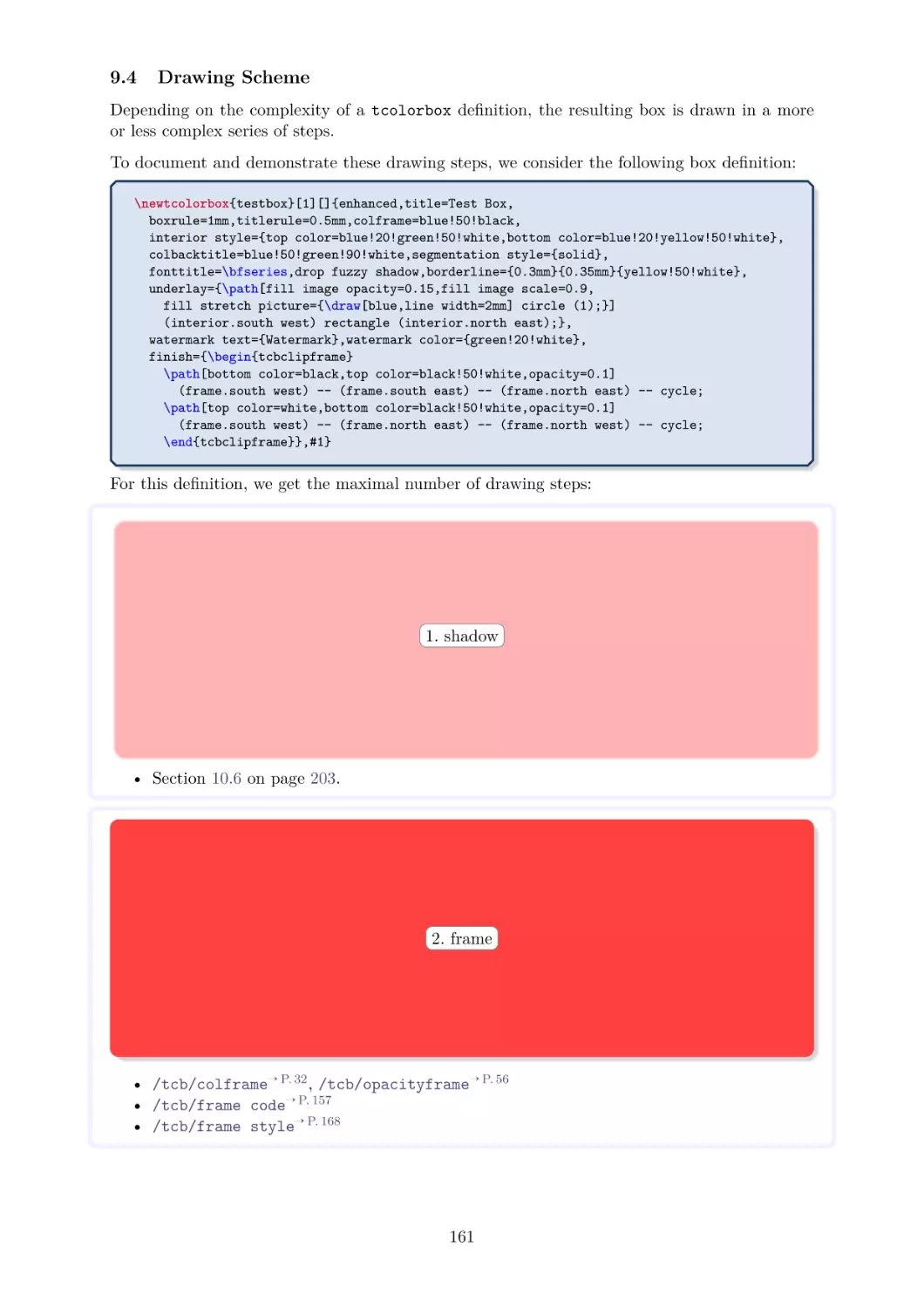
153
153
157
160
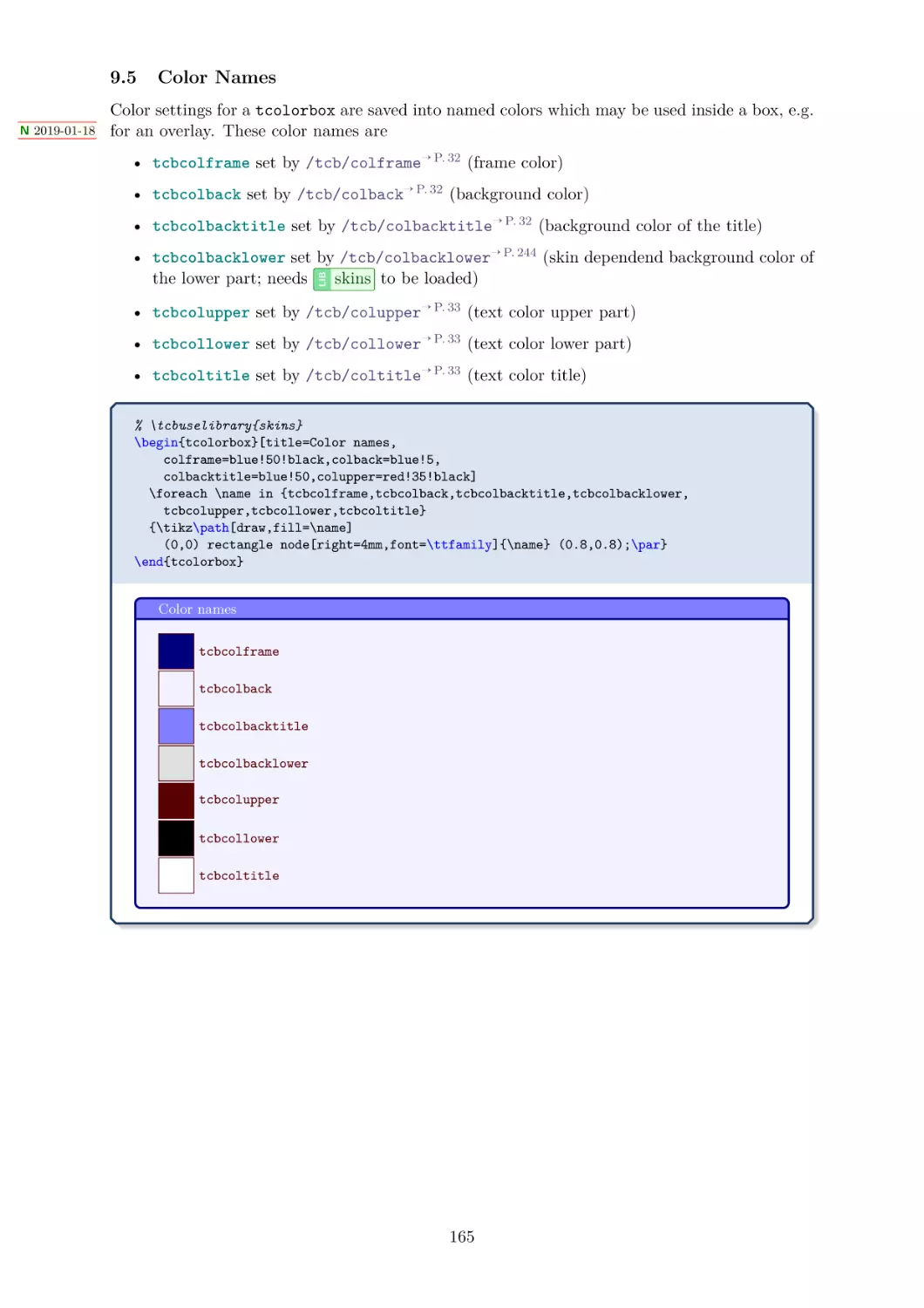
161
165
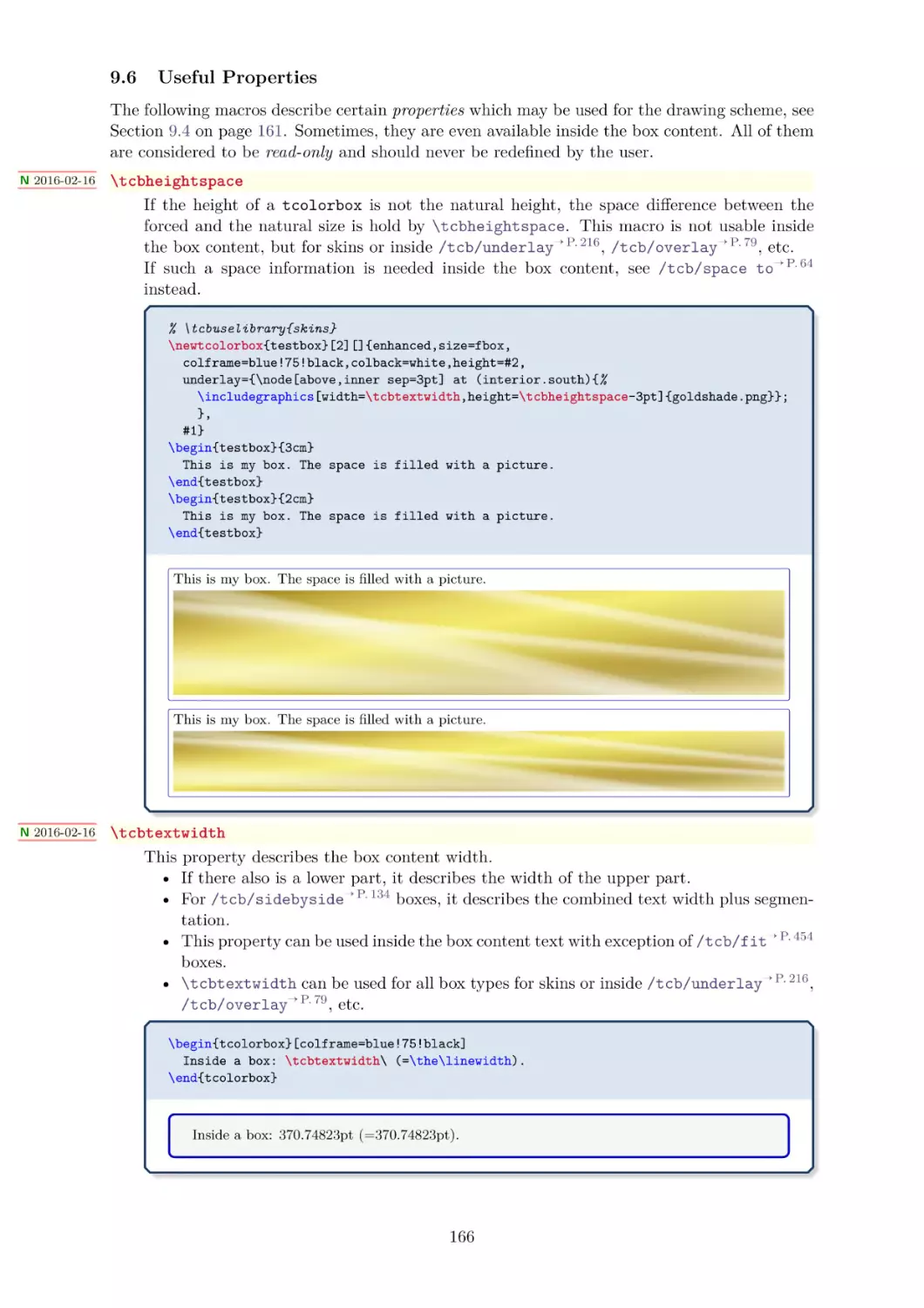
166
10 Library
skins
10.1 Style Option Keys . . . . . . . . . . . . . . . .
10.2 Boxed Title Option Keys . . . . . . . . . . . .
10.2.1 Boxed Title Placement . . . . . . . . .
10.2.2 Options for the Boxed Title Placement
10.2.3 Options for the Boxed Title Box . . . .
.
.
.
.
.
.
.
.
.
.
.
.
.
.
.
.
.
.
.
.
.
.
.
.
.
.
.
.
.
.
.
.
.
.
.
.
.
.
.
.
.
.
.
.
.
.
.
.
.
.
.
.
.
.
.
.
.
.
.
.
.
.
.
.
.
.
.
.
.
.
.
.
.
.
.
168
168
175
175
178
179
. . . . . .
. . . . . .
Exercises
Solutions
.
.
.
.
.
.
.
.
.
.
.
.
.
.
.
.
.
.
.
.
.
.
.
.
.
.
.
.
.
.
.
.
LIB
8 Recording
8.1 Macros .
8.2 Options .
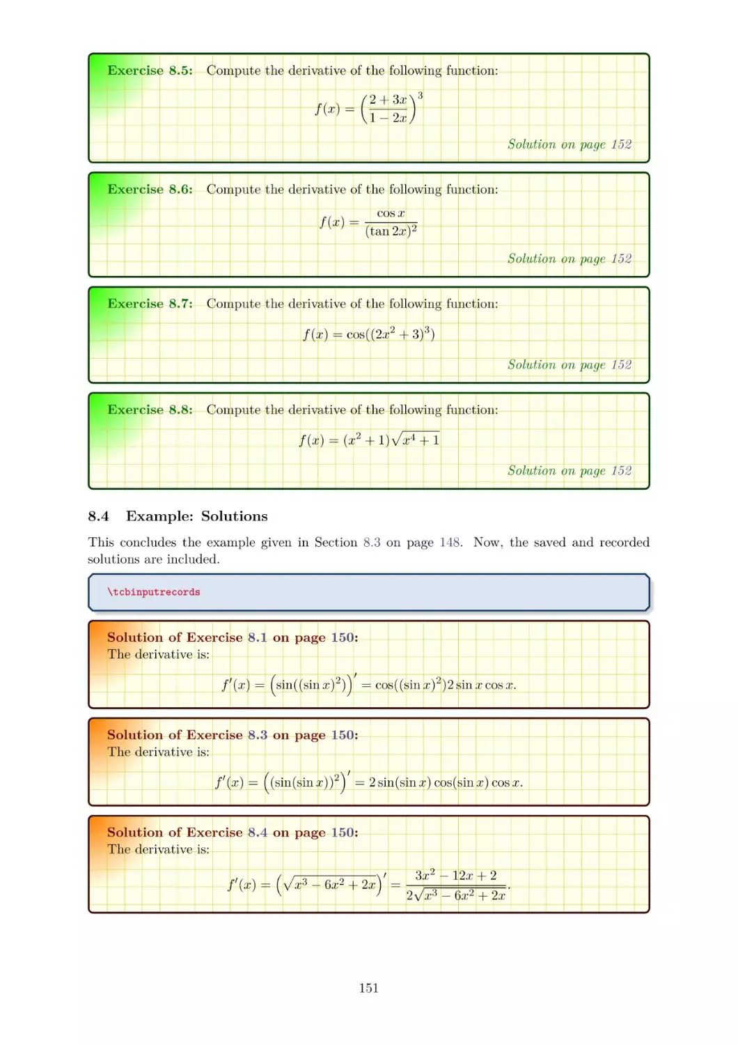
8.3 Example:
8.4 Example:
144
4
.
.
.
.
.
.
.
.
10.3
10.4
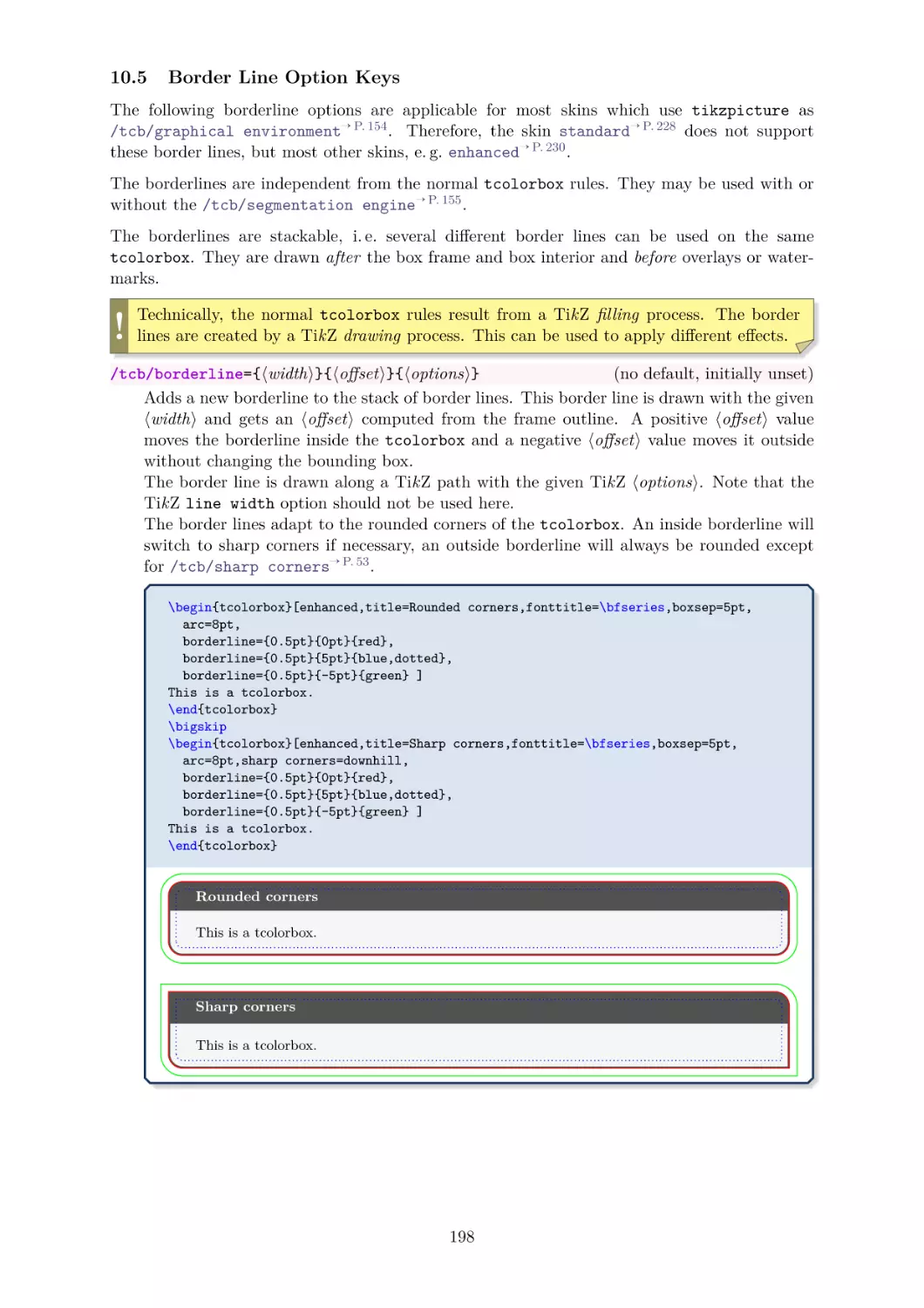
10.5
10.6
10.7
10.8
10.9
10.10
10.11
10.12
Watermark Option Keys . . . . . .
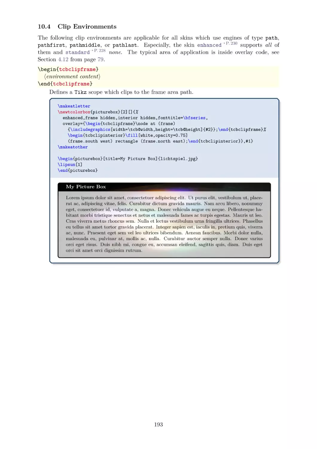
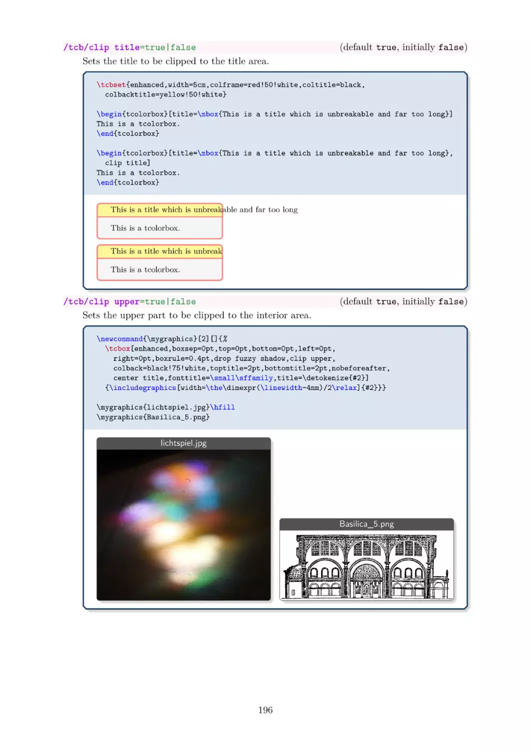
Clip Environments . . . . . . . . . .
Border Line Option Keys . . . . . .
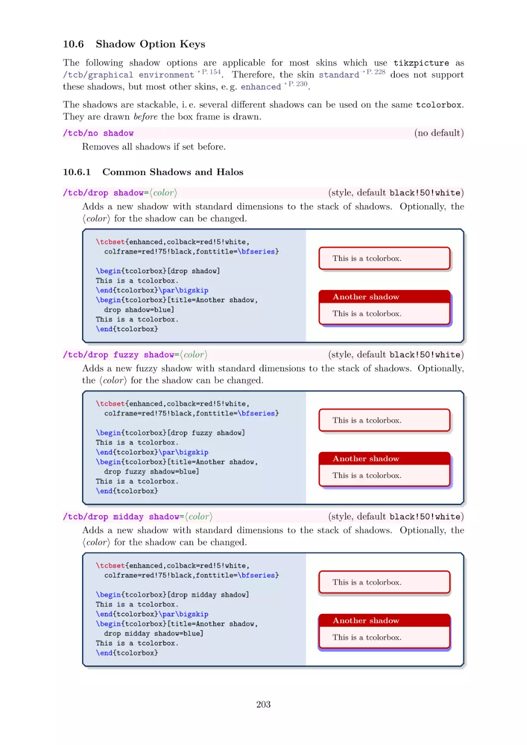
Shadow Option Keys . . . . . . . .
10.6.1 Common Shadows and Halos
10.6.2 Lifted Shadows . . . . . . .
10.6.3 Generic Shadows . . . . . .
10.6.4 TikZ Shadows . . . . . . . .
TikZ Picture Option Keys . . . . .
Underlay Option Keys . . . . . . .
Finish Option Keys . . . . . . . . .
Hyper Option Keys . . . . . . . . .
Jigsaw Skin Variants . . . . . . . .
Draft Mode . . . . . . . . . . . . . .
skins - Catalog of Skins
Family “standard” . . . . . .
Family “enhanced” . . . . . .
Family “bicolor” . . . . . . .
Family “tile” . . . . . . . . .
Family “beamer” . . . . . . .
Family “widget” . . . . . . .
Family “empty” . . . . . . .
“spartan” . . . . . . . . . . .
“draft” . . . . . . . . . . . .
Family “freelance” . . . . . .
LIB
11 Library
11.1 Skin
11.2 Skin
11.3 Skin
11.4 Skin
11.5 Skin
11.6 Skin
11.7 Skin
11.8 Skin
11.9 Skin
11.10 Skin
.
.
.
.
.
.
.
.
.
.
.
.
.
.
.
.
.
.
.
.
.
.
.
.
.
.
.
.
.
.
.
.
.
.
.
.
.
.
.
.
.
.
.
.
.
.
.
.
.
.
.
.
.
.
.
.
.
.
.
.
.
.
.
.
.
.
.
.
.
.
.
.
.
.
.
.
.
.
.
.
.
.
.
.
.
.
.
.
.
.
.
.
.
.
.
.
.
.
.
.
.
.
.
.
.
.
.
.
.
.
.
.
.
.
.
.
.
.
.
.
.
.
.
.
.
.
.
.
.
.
.
.
.
.
.
.
.
.
.
.
.
.
.
.
.
.
.
.
.
.
.
.
.
.
.
.
.
.
.
.
.
.
.
.
.
.
.
.
.
.
.
.
.
.
.
.
.
.
.
.
.
.
.
.
.
.
.
.
.
.
.
.
.
.
.
.
.
.
.
.
.
.
.
.
.
.
.
.
.
.
.
.
.
.
.
.
.
.
.
.
.
.
.
.
.
.
.
.
.
.
.
.
.
.
.
.
.
.
.
.
.
.
.
.
.
.
.
.
.
.
.
.
.
.
.
.
.
.
.
.
.
.
.
.
.
.
.
.
.
.
.
.
.
.
.
.
.
.
.
.
.
.
.
.
.
.
.
.
.
.
.
.
.
.
.
.
.
.
.
.
.
.
.
.
.
.
.
.
.
.
.
.
.
.
.
.
.
.
.
.
.
.
.
.
.
.
.
.
.
.
.
.
.
.
.
.
.
.
.
.
.
.
.
.
.
.
.
.
.
.
.
.
.
.
.
.
.
.
.
.
.
.
.
.
.
.
.
.
.
.
.
.
.
.
.
.
.
.
.
.
.
.
.
.
.
.
.
.
.
.
.
.
.
.
.
.
.
.
.
.
.
.
.
.
.
.
.
.
.
.
.
.
.
.
.
.
.
.
.
.
.
.
.
.
.
.
.
.
.
.
.
.
.
.
.
.
.
.
.
.
.
.
.
.
.
.
.
.
.
.
.
.
.
.
.
.
.
.
.
.
.
.
.
.
.
.
Contents
.
.
.
.
.
.
.
.
.
.
.
.
.
.
.
.
.
.
.
.
.
.
.
.
.
.
.
.
.
.
.
.
.
.
.
.
.
.
186
193
198
203
203
208
209
212
213
216
218
220
222
224
.
.
.
.
.
.
.
.
.
.
226
228
230
242
253
257
261
264
274
275
277
12 Inclusion of Boxed Image Files
278
12.1 Macros . . . . . . . . . . . . . . . . . . . . . . . . . . . . . . . . . . . . . 278
12.2 Option Keys . . . . . . . . . . . . . . . . . . . . . . . . . . . . . . . . . . 281
13 TikZ Auxiliary Macros
283
13.1 Straightening of the Arcs . . . . . . . . . . . . . . . . . . . . . . . . . . . 283
13.2 Extracting Node Dimensions . . . . . . . . . . . . . . . . . . . . . . . . . 284
13.3 Hyper Nodes . . . . . . . . . . . . . . . . . . . . . . . . . . . . . . . . . . 284
14 Beamer Support
285
.
.
.
.
.
.
.
.
.
.
.
.
.
.
.
.
.
.
.
.
.
.
.
.
.
.
.
.
.
.
.
.
.
.
.
.
.
.
.
.
.
.
.
.
.
.
.
.
.
.
.
.
.
.
.
.
.
.
.
.
.
.
.
.
.
.
.
.
.
.
.
.
.
.
.
.
.
.
.
.
.
.
.
.
.
.
.
.
.
.
.
.
.
.
.
.
.
.
.
.
.
.
.
.
.
.
.
.
.
.
.
.
.
.
.
.
.
.
.
.
.
.
.
.
.
.
.
.
.
.
.
.
.
.
.
.
.
.
291
291
292
294
296
299
301
16 Library
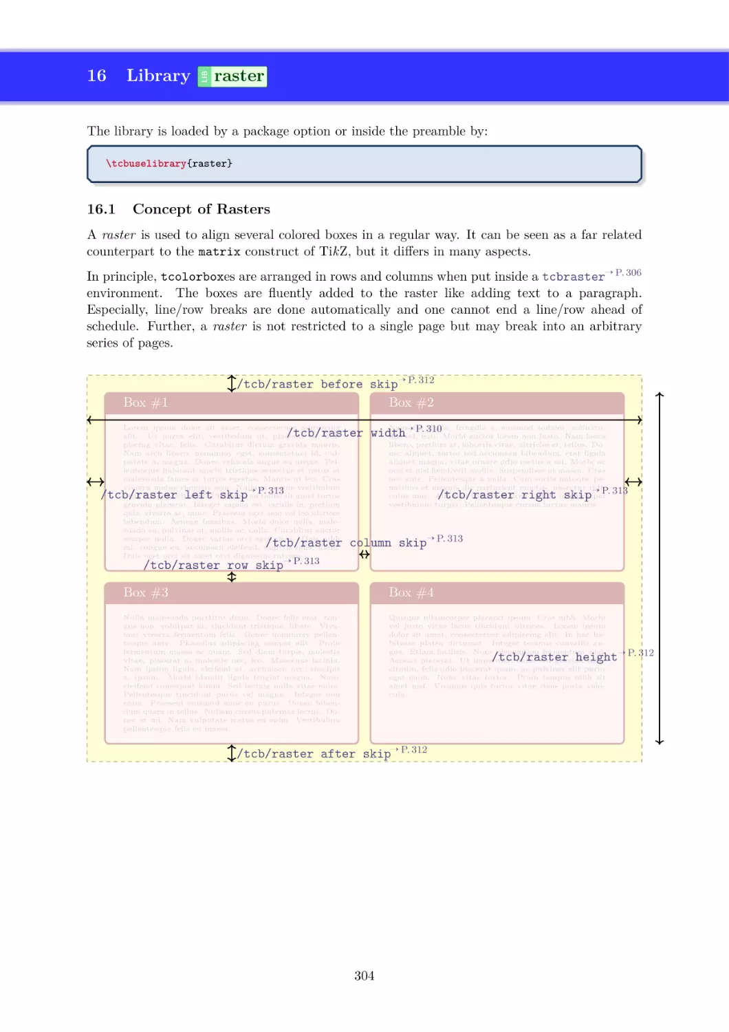
raster
16.1 Concept of Rasters . . . . . . .
16.2 Macros of the Library . . . . . .
16.3 Option Keys of the Library . . .
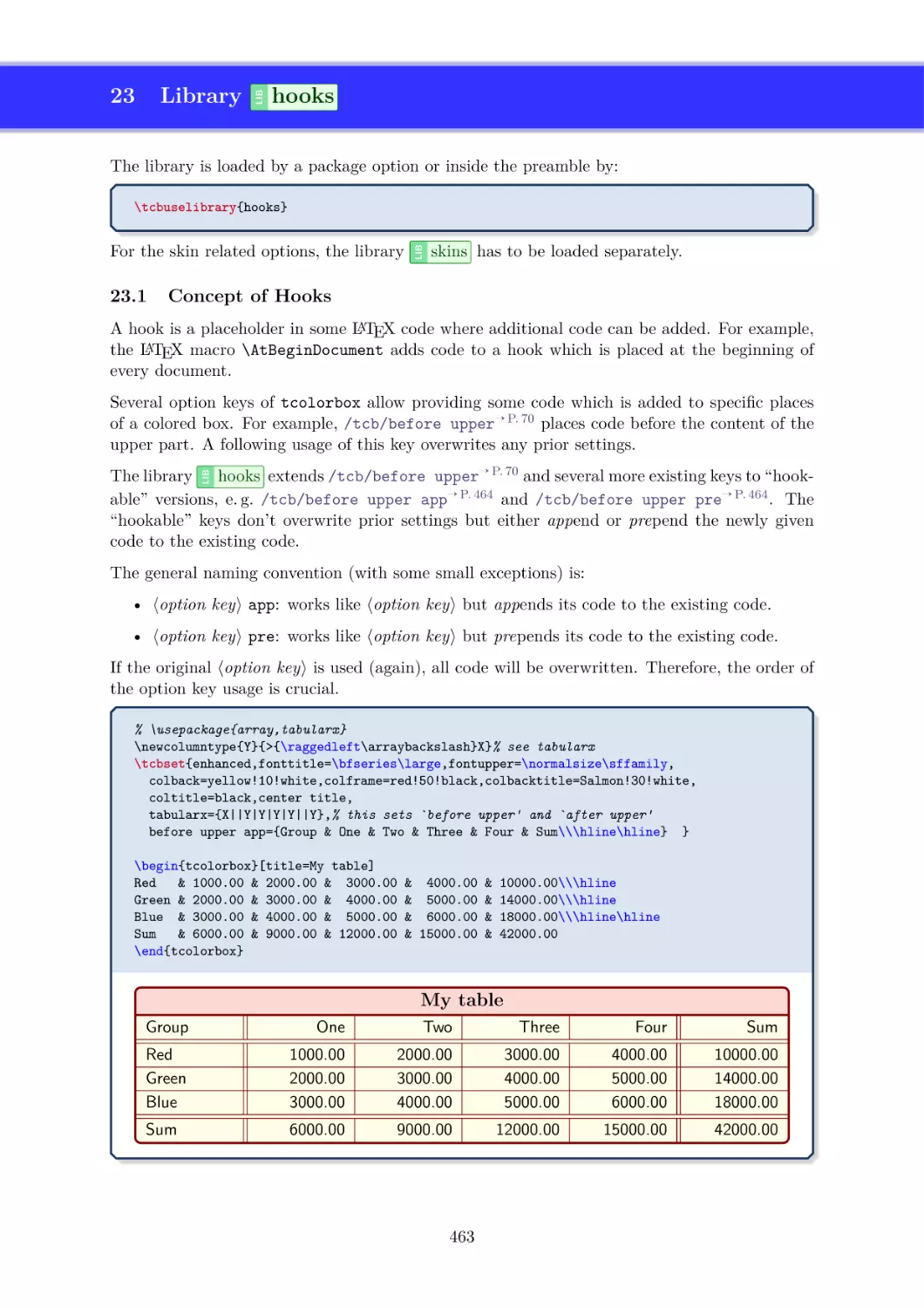
16.4 Adding Styles for Specific Boxes
16.5 Combining Columns or Rows . .
16.6 Rasters inside Rasters . . . . . .
.
.
.
.
.
.
.
.
.
.
.
.
.
.
.
.
.
.
.
.
.
.
.
.
.
.
.
.
.
.
.
.
.
.
.
.
.
.
.
.
.
.
.
.
.
.
.
.
.
.
.
.
.
.
.
.
.
.
.
.
.
.
.
.
.
.
.
.
.
.
.
.
.
.
.
.
.
.
.
.
.
.
.
.
.
.
.
.
.
.
.
.
.
.
.
.
.
.
.
.
.
.
.
.
.
.
.
.
.
.
.
.
.
.
.
.
.
.
.
.
.
.
.
.
.
.
.
.
.
.
.
.
.
.
.
.
.
.
304
304
306
310
316
318
321
LIB
LIB
15 Library
vignette
15.1 Vignette Drawing . . . . . . . .
15.2 Generic Geometry Settings . . .
15.3 Generic Color and Style Settings
15.4 Generic Fading Settings . . . . .
15.5 Vignette as Underlay . . . . . .
15.6 Vignette as Finish . . . . . . . .
5
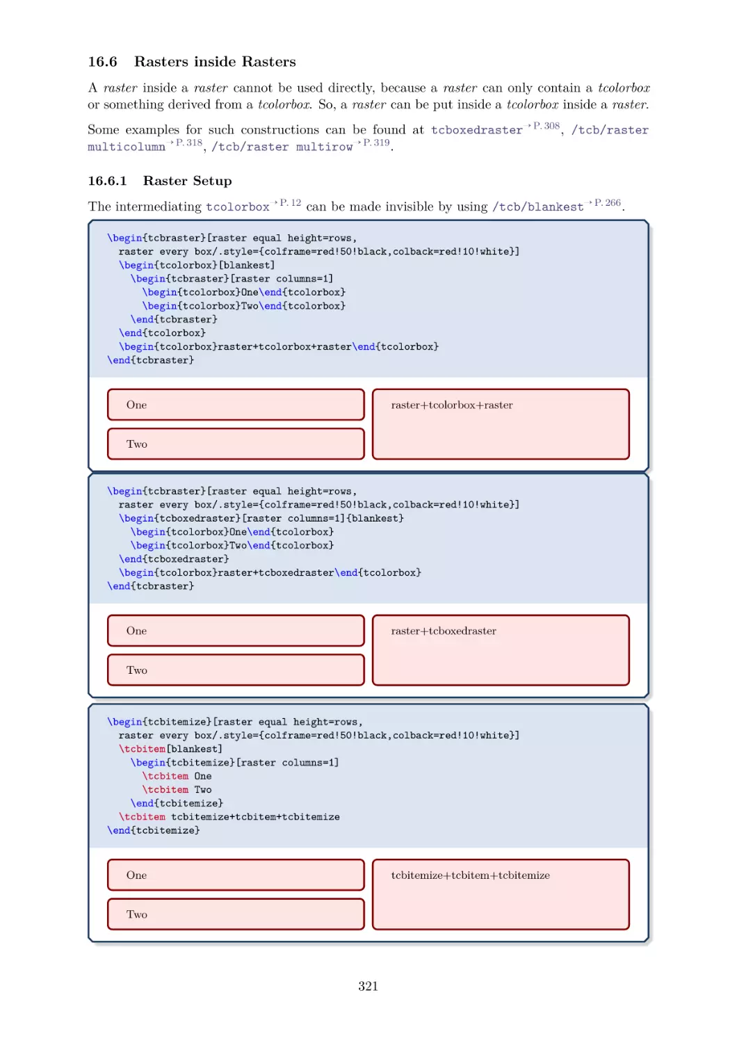
16.6.1 Raster Setup . . . . . . . . . . . . . . . . . . . . . . . . . . . . . . 321
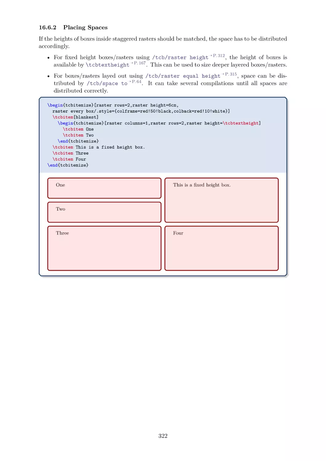
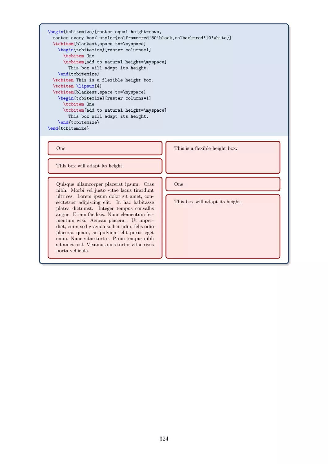
16.6.2 Placing Spaces . . . . . . . . . . . . . . . . . . . . . . . . . . . . . 322
.
.
.
.
LIB
LIB LIB LIB
LIB LIB LIB
LIB
18 Library
theorems
18.1 Macros of the Library . . . . . . . . . .
18.2 Option Keys of the Library . . . . . . .
18.3 Examples for Definitions and Theorems
18.4 Using other theorem environments with
LIB
.
.
.
.
.
.
.
.
.
.
.
.
.
.
.
.
LIB
17 Libraries
listings ,
listingsutf8 , and
minted
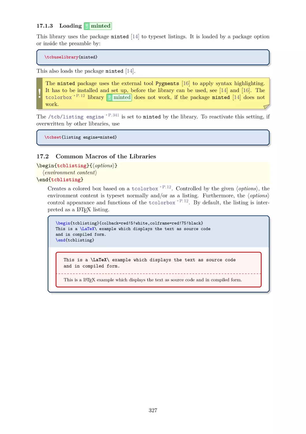
17.1 Loading the Libraries . . . . . . . . . . . . . . . . . . . . .
listings . . . . . . . . . . . . . . . . . .
17.1.1 Loading
17.1.2 Loading
listingsutf8 . . . . . . . . . . . . . . . .
minted . . . . . . . . . . . . . . . . . .
17.1.3 Loading
17.2 Common Macros of the Libraries . . . . . . . . . . . . . .
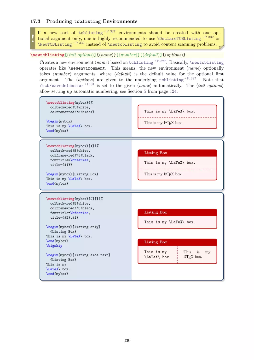
17.3 Producing tcblisting Environments . . . . . . . . . . . .
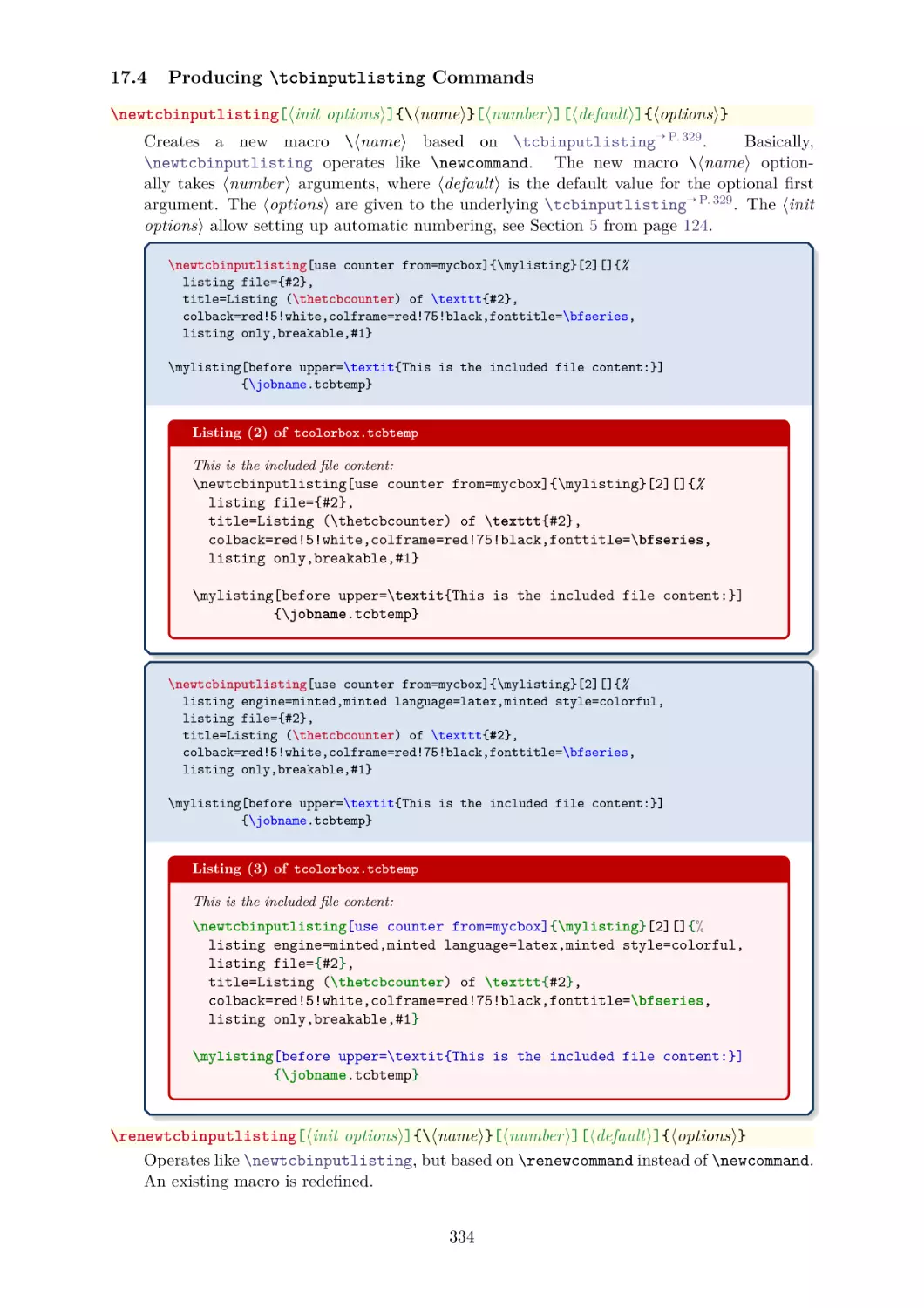
17.4 Producing \tcbinputlisting Commands . . . . . . . . .
17.5 Option Keys of the
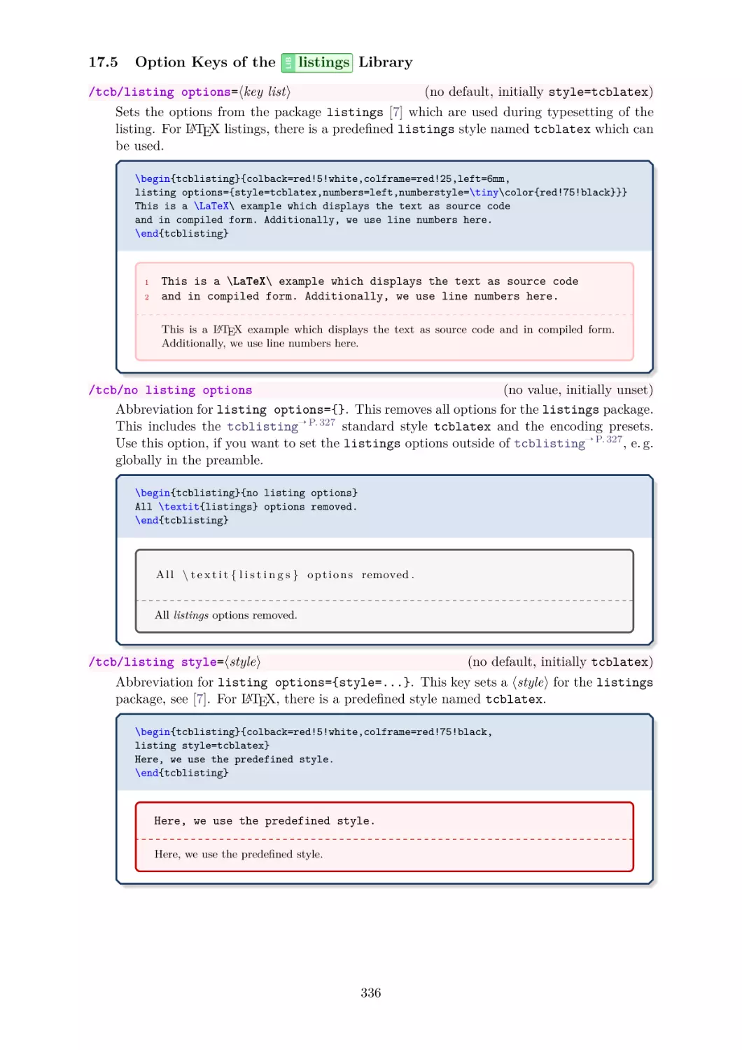
listings Library . . . . . . . . . . .
17.6 Option Keys of the
listingsutf8 Library . . . . . . . . .
17.7 Option Keys of the
minted Library . . . . . . . . . . .
17.8 Common Option Keys of all Libraries . . . . . . . . . . . .
17.9 Option Keys for Processing and Full Document Examples .
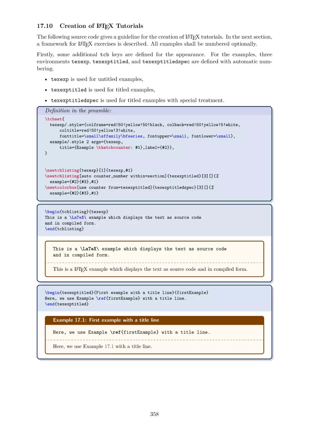
17.10 Creation of LATEX Tutorials . . . . . . . . . . . . . . . . . .
17.11 Creation of LATEX Exercises . . . . . . . . . . . . . . . . .
17.12 List of Exercises . . . . . . . . . . . . . . . . . . . . . . . .
17.13 Solutions for the given LATEX Exercises . . . . . . . . . . .
.
.
.
.
.
.
.
.
.
.
.
.
.
.
.
.
.
.
.
.
.
.
.
.
.
.
.
.
.
.
.
.
.
.
.
.
.
.
.
.
.
.
.
.
.
.
.
.
.
.
.
.
.
.
.
.
.
.
.
.
.
.
.
.
.
.
.
.
.
.
.
.
.
.
.
.
.
.
.
.
Contents
. . . . . . .
. . . . . . .
. . . . . . .
tcolorbox
.
.
.
.
.
.
.
.
.
.
.
.
.
.
.
.
.
.
.
.
.
.
.
.
.
.
.
.
.
.
.
.
.
.
.
.
.
.
.
.
.
.
.
.
.
.
.
.
.
.
.
.
.
.
.
.
.
.
.
.
.
.
.
.
.
.
.
.
326
326
326
326
327
327
330
334
336
338
339
341
351
358
365
368
369
.
.
.
.
.
.
.
.
371
371
376
392
397
.
.
.
.
.
.
.
.
.
.
.
.
.
.
.
.
.
.
.
.
.
.
.
.
.
.
.
.
.
.
.
.
.
.
.
.
.
.
.
.
.
.
.
.
.
.
.
.
.
.
.
.
.
.
.
.
.
.
.
.
.
.
.
.
.
.
.
.
.
.
.
.
.
.
.
.
.
.
.
.
.
.
.
.
.
.
.
.
.
.
.
.
.
.
.
.
.
.
.
.
.
.
.
.
.
.
.
.
.
.
.
.
.
.
.
.
.
.
.
.
.
.
.
.
.
.
.
.
.
.
.
.
.
.
.
.
.
.
.
.
.
.
.
.
398
398
399
400
405
407
410
413
414
424
20 Library
magazine
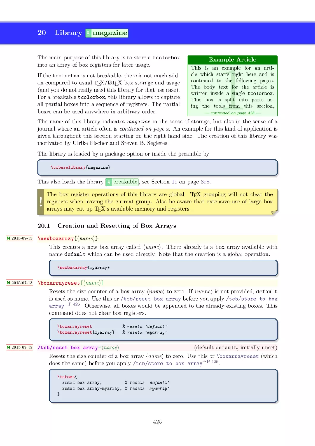
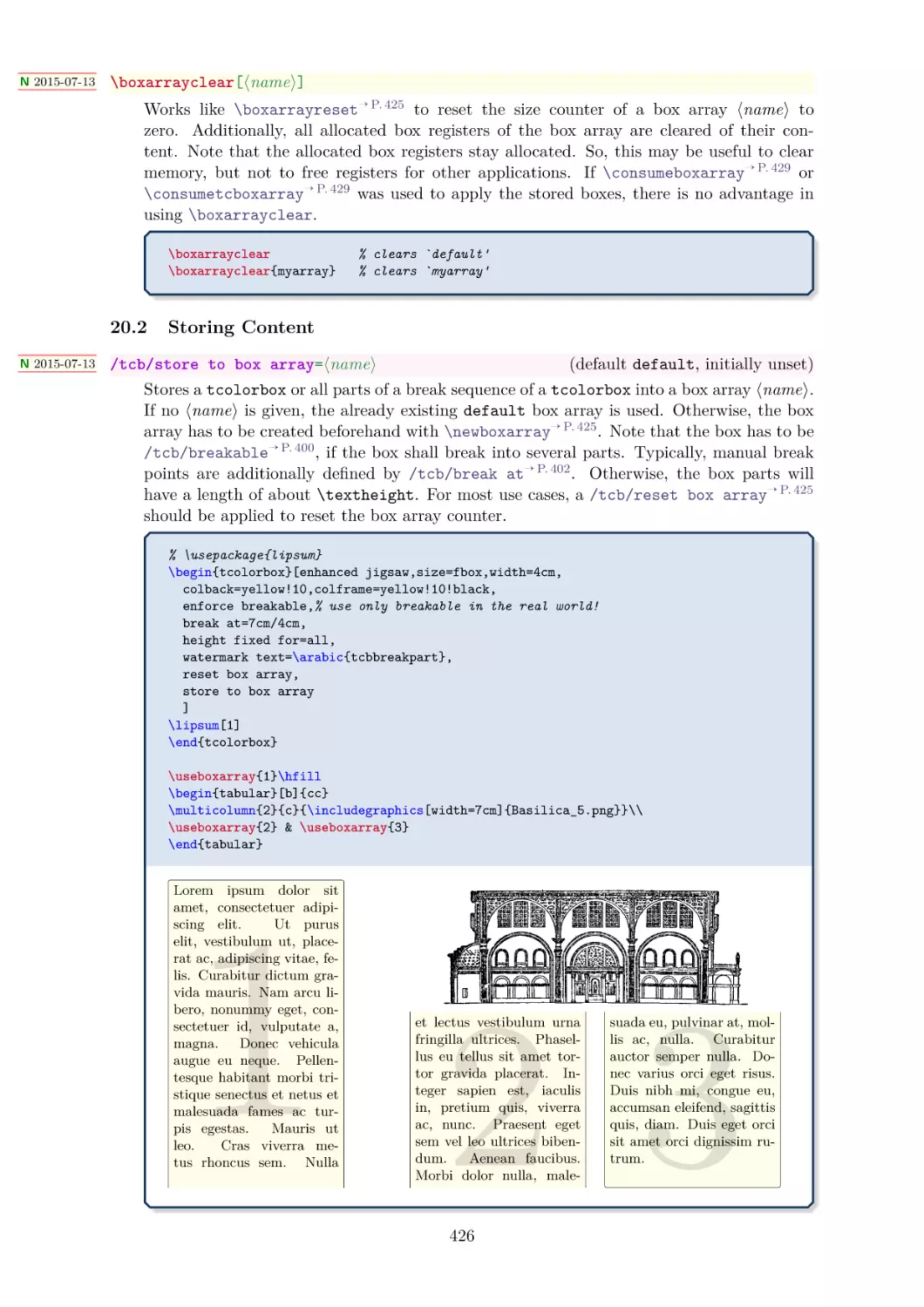
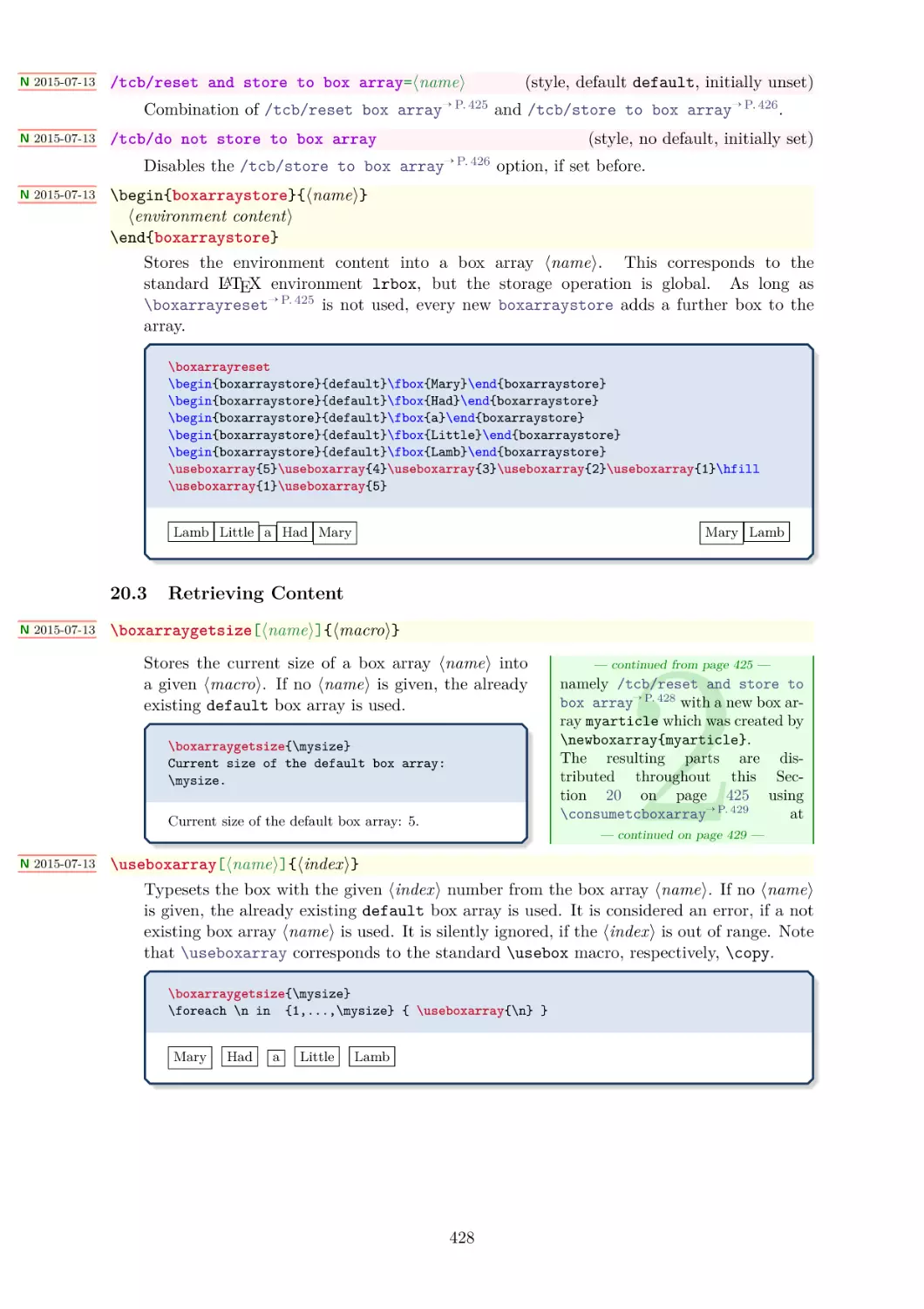
20.1 Creation and Resetting of Box Arrays
20.2 Storing Content . . . . . . . . . . . .
20.3 Retrieving Content . . . . . . . . . .
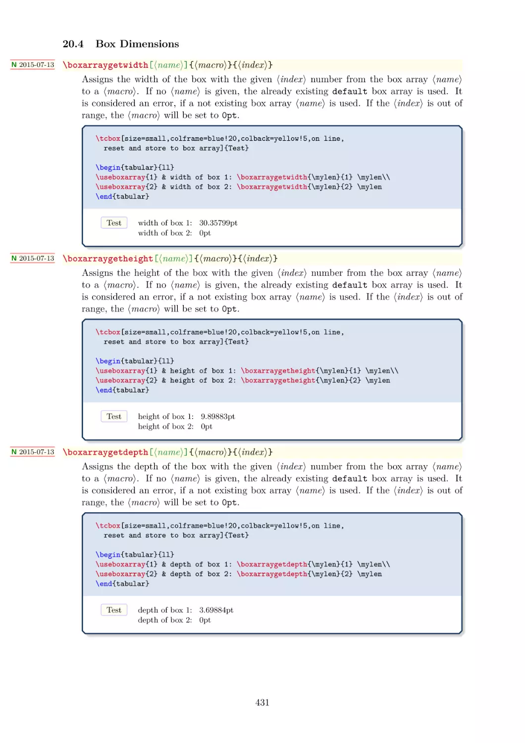
20.4 Box Dimensions . . . . . . . . . . . .
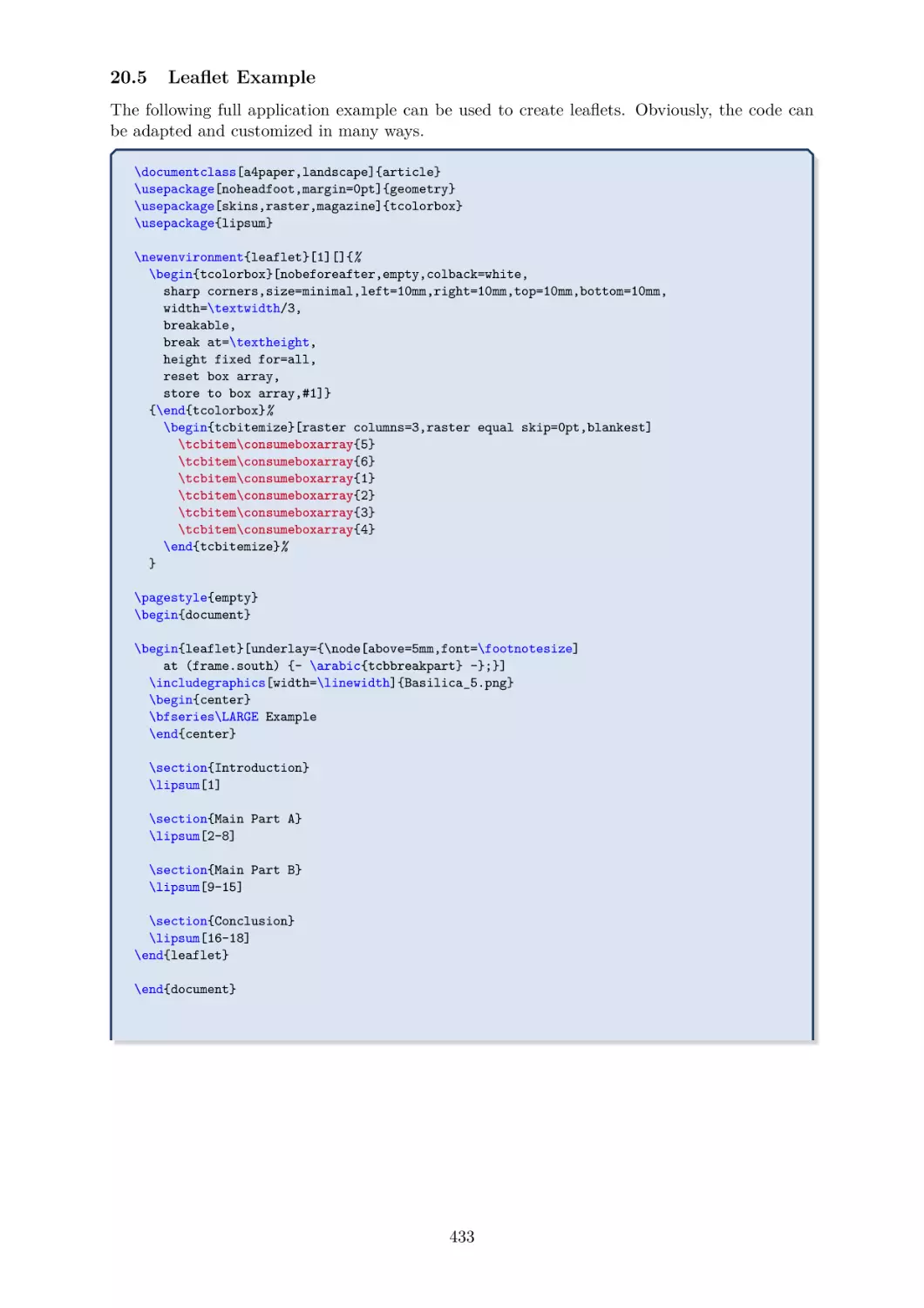
20.5 Leaflet Example . . . . . . . . . . . .
.
.
.
.
.
.
.
.
.
.
.
.
.
.
.
.
.
.
.
.
.
.
.
.
.
.
.
.
.
.
.
.
.
.
.
.
.
.
.
.
.
.
.
.
.
.
.
.
.
.
.
.
.
.
.
.
.
.
.
.
.
.
.
.
.
.
.
.
.
.
.
.
.
.
.
.
.
.
.
.
425
425
426
428
431
433
.
.
.
.
.
.
435
435
436
438
439
440
440
LIB
LIB
19 Library
breakable
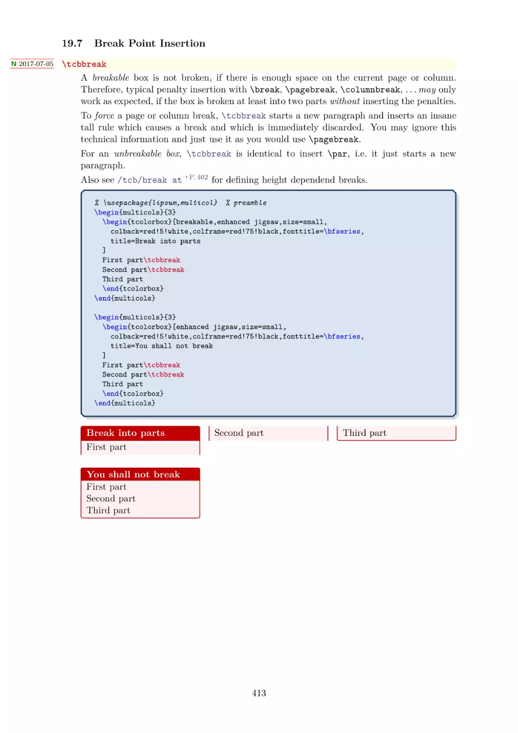
19.1 Technical Overview . . . . . . . . . . . . . .
19.2 Limitations and Known Bugs . . . . . . . . .
19.3 Main Option Keys . . . . . . . . . . . . . . .
19.4 Option Keys for the Break Appearance . . .
19.5 Extra Options for Partial Boxes . . . . . . .
19.6 Breakable boxes and the multicol package .
19.7 Break Point Insertion . . . . . . . . . . . . .
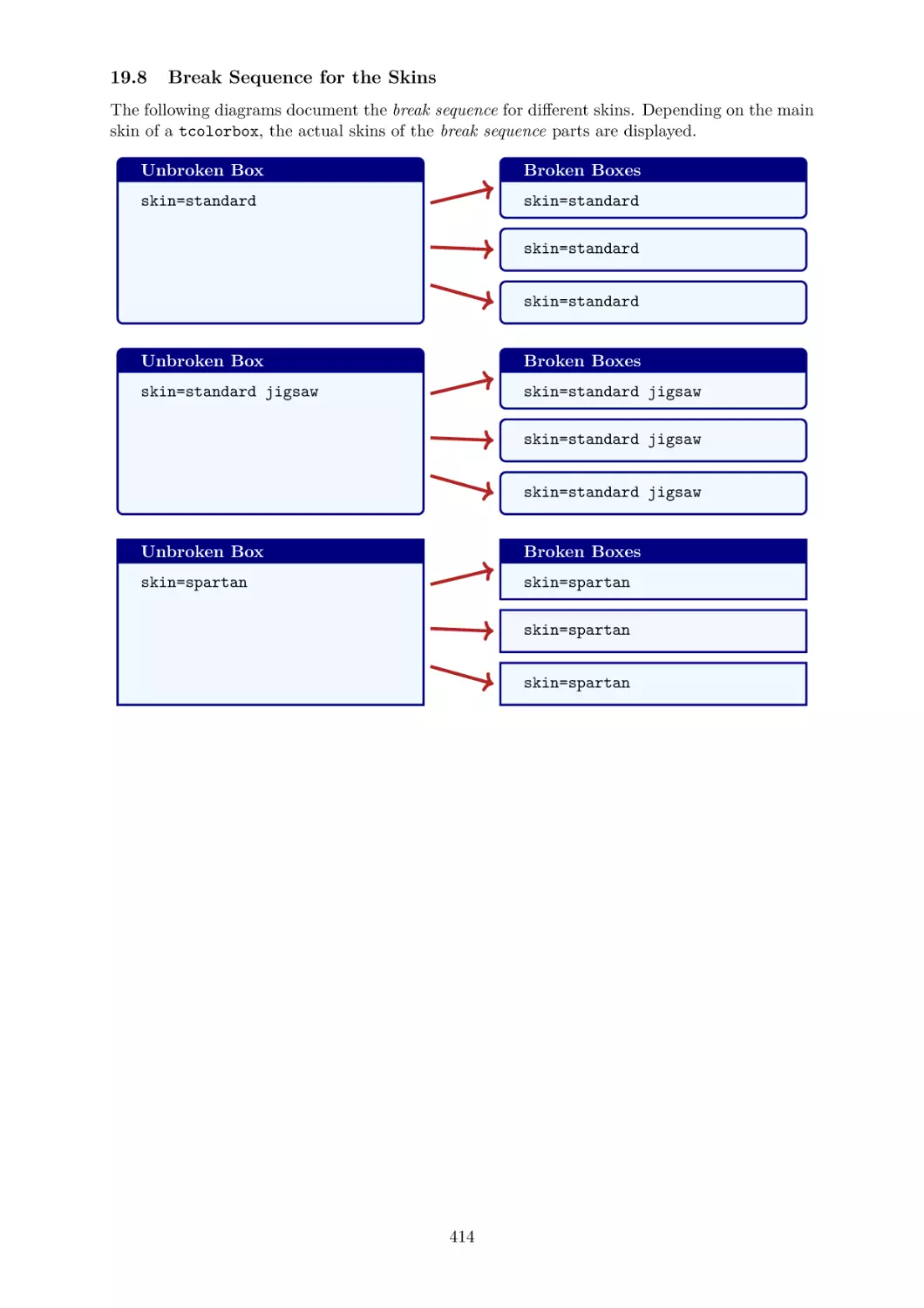
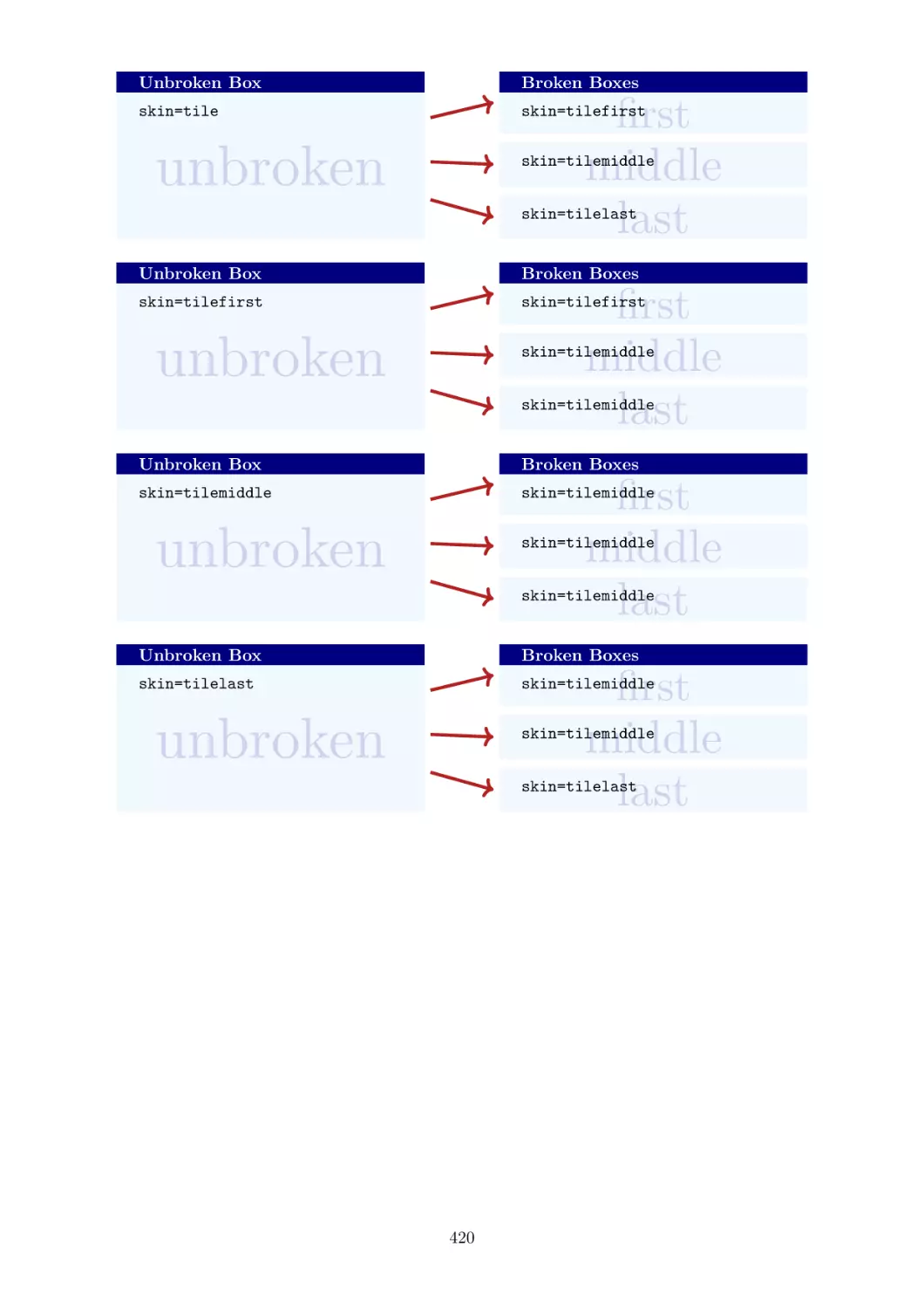
19.8 Break Sequence for the Skins . . . . . . . . .
19.9 Break by Hand (Faked Break) . . . . . . . .
LIB
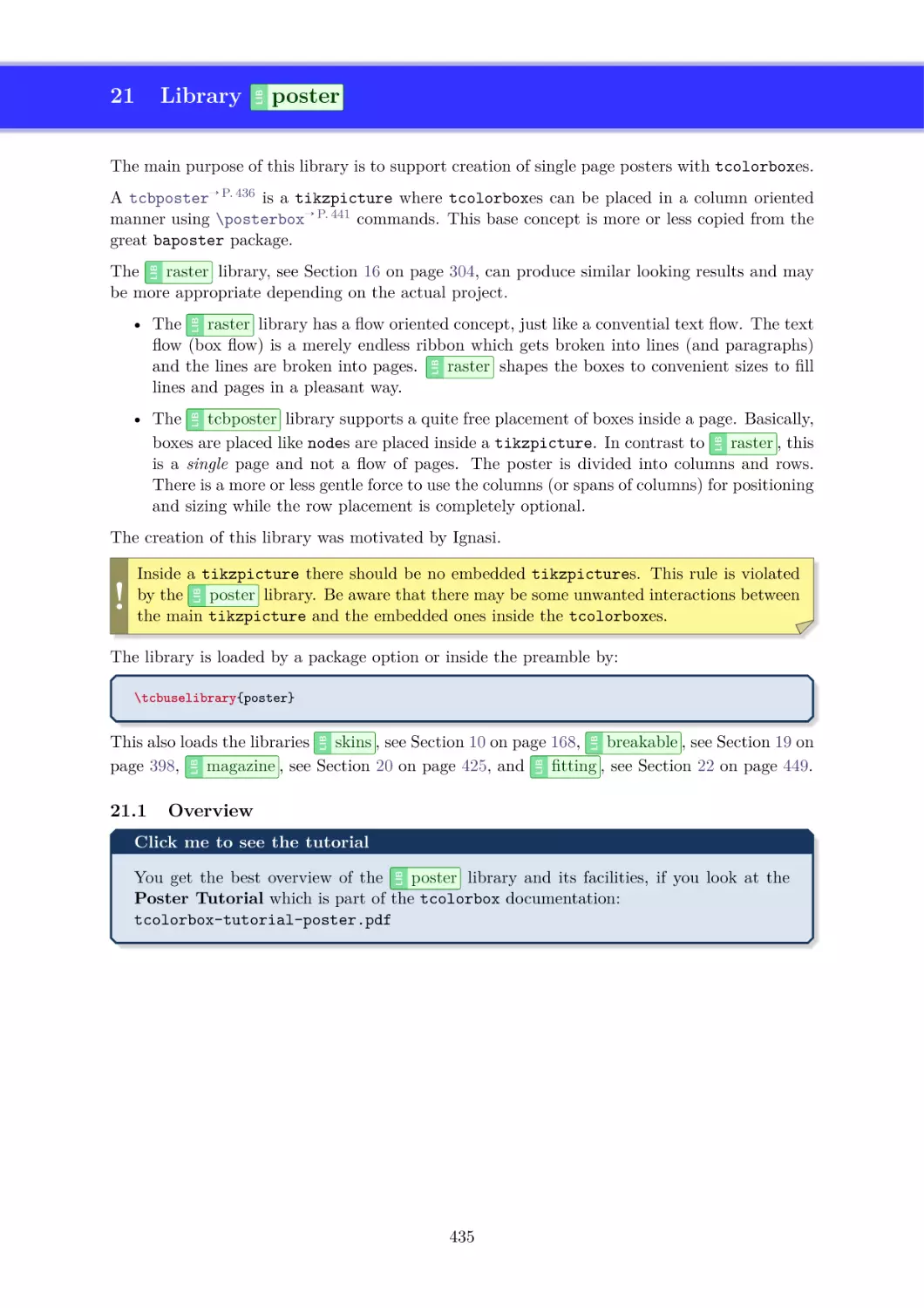
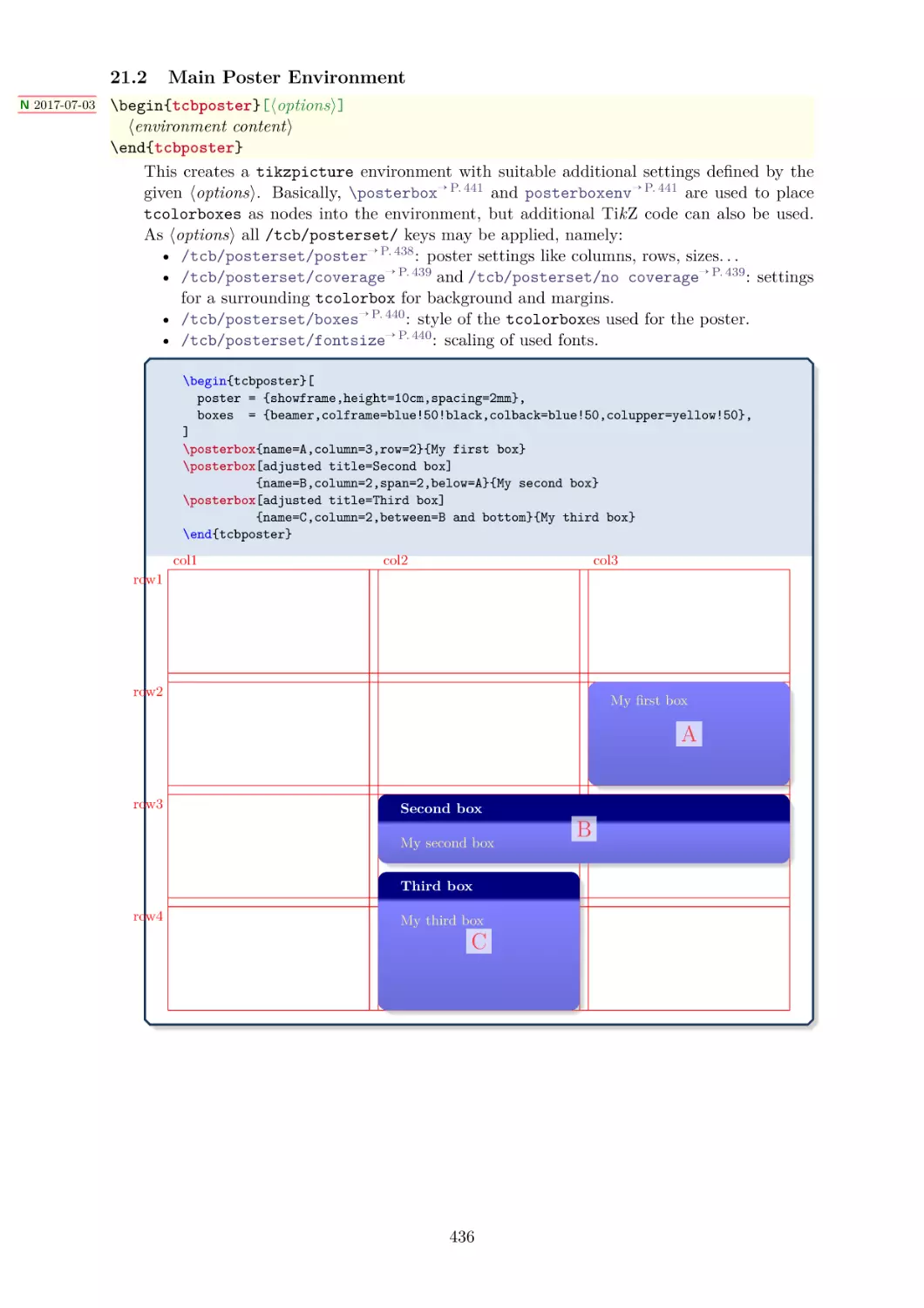
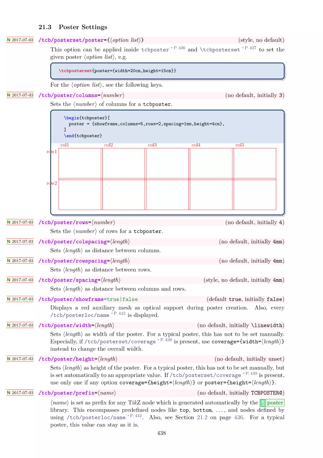
21 Library
poster
21.1 Overview . . . . . . . . . .
21.2 Main Poster Environment .
21.3 Poster Settings . . . . . . .
21.4 Coverage . . . . . . . . . .
21.5 Common Box Settings . .
21.6 Font Scaling . . . . . . . .
.
.
.
.
.
.
.
.
.
.
.
.
.
.
.
.
.
.
.
.
.
.
.
.
6
.
.
.
.
.
.
.
.
.
.
.
.
.
.
.
.
.
.
.
.
.
.
.
.
.
.
.
.
.
.
.
.
.
.
.
.
.
.
.
.
.
.
.
.
.
.
.
.
.
.
.
.
.
.
.
.
.
.
.
.
.
.
.
.
.
.
.
.
.
.
.
.
.
.
.
.
.
.
.
.
.
.
.
.
.
.
.
.
.
.
.
.
.
.
.
.
.
.
.
.
.
.
.
.
.
.
.
.
.
.
.
.
.
.
.
.
.
.
.
.
.
.
.
.
.
.
.
.
.
.
.
.
.
.
.
.
.
.
.
.
.
.
.
.
.
.
21.7 Box Placement . . . . . . . . . . . . . . . . . . . . . . . . . . . . . . . . . 441
LIB
fitting
449
22 Library
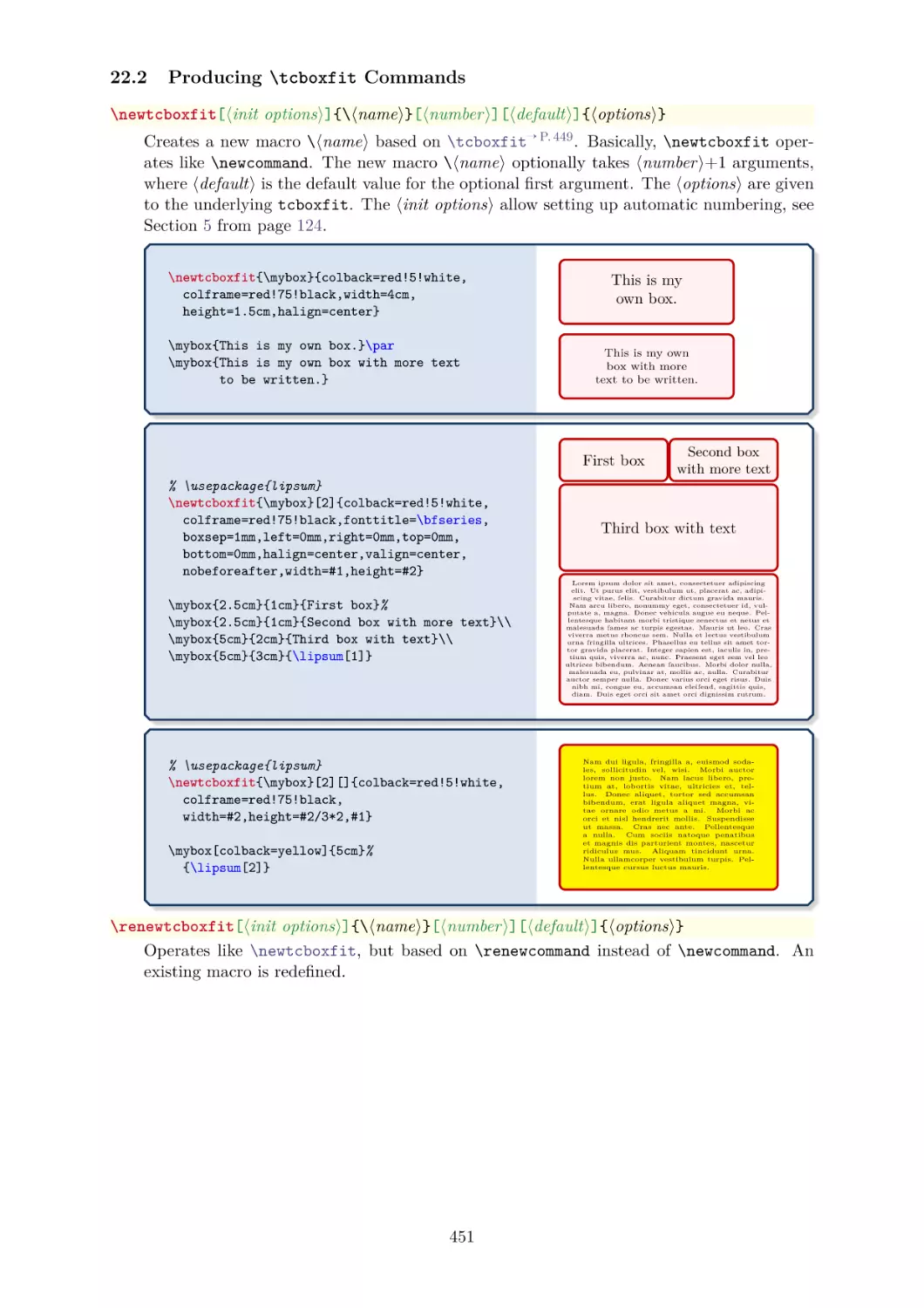
22.1 Macros of the Library . . . . . . . . . . . . . . . . . . . . . . . . . . . . . 449
22.2 Producing \tcboxfit Commands . . . . . . . . . . . . . . . . . . . . . . 451
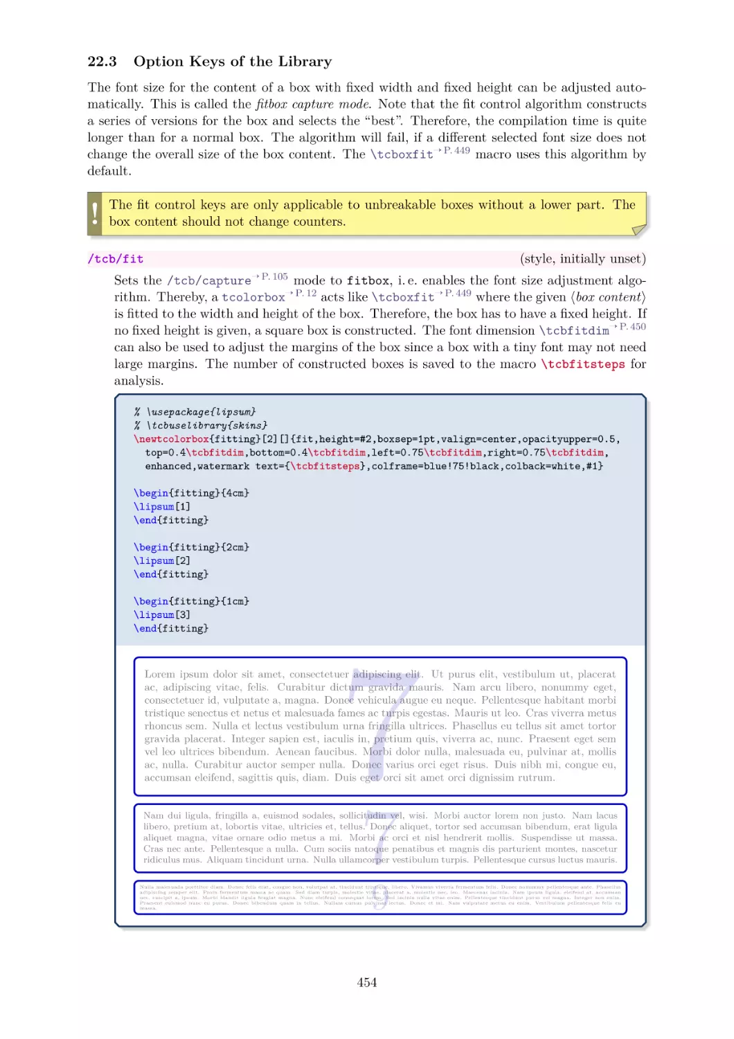
22.3 Option Keys of the Library . . . . . . . . . . . . . . . . . . . . . . . . . . 454
LIB
23 Library
hooks
23.1 Concept of Hooks . . . . . . . . .
23.2 Box Content Additions . . . . . .
23.3 Embedding into the Surroundings
23.4 Overlays . . . . . . . . . . . . . .
23.5 Watermarks . . . . . . . . . . . .
23.6 Underlays . . . . . . . . . . . . .
23.7 Finishes . . . . . . . . . . . . . . .
23.8 Skin Code . . . . . . . . . . . . .
23.9 Extras . . . . . . . . . . . . . . .
23.10 Listings . . . . . . . . . . . . . . .
.
.
.
.
.
.
.
.
.
.
.
.
.
.
.
.
.
.
.
.
.
.
.
.
.
.
.
.
.
.
.
.
.
.
.
.
.
.
.
.
.
.
.
.
.
.
.
.
.
.
.
.
.
.
.
.
.
.
.
.
.
.
.
.
.
.
.
.
.
.
.
.
.
.
.
.
.
.
.
.
.
.
.
.
.
.
.
.
.
.
.
.
.
.
.
.
.
.
.
.
.
.
.
.
.
.
.
.
.
.
.
.
.
.
.
.
.
.
.
.
.
.
.
.
.
.
.
.
.
.
.
.
.
.
.
.
.
.
.
.
.
.
.
.
.
.
.
.
.
.
.
.
.
.
.
.
.
.
.
.
.
.
.
.
.
.
.
.
.
.
.
.
.
.
.
.
.
.
.
.
.
.
.
.
.
.
.
.
.
.
.
.
.
.
.
.
.
.
.
.
LIB
Contents
24 Library
.
.
.
.
.
.
.
.
.
.
.
.
.
.
.
.
.
.
.
.
xparse
463
463
464
466
467
469
471
472
472
474
474
475
.
.
.
.
.
.
.
.
.
.
.
.
.
.
.
.
.
.
.
.
.
.
.
.
.
.
.
.
.
.
.
.
.
.
.
.
.
.
.
.
.
.
.
.
.
.
.
.
.
.
.
.
.
.
.
.
.
.
.
.
476
477
478
483
487
26 Library
documentation
26.1 Macros of the Library . . . . . . . .
26.2 Entry Content Option Keys . . . .
26.3 Entry Customization Option Keys .
26.4 General Customization Option Keys
26.5 Language Option Keys . . . . . . .
26.6 Predefined Colors of the Library . .
.
.
.
.
.
.
.
.
.
.
.
.
.
.
.
.
.
.
.
.
.
.
.
.
.
.
.
.
.
.
.
.
.
.
.
.
.
.
.
.
.
.
.
.
.
.
.
.
.
.
.
.
.
.
.
.
.
.
.
.
.
.
.
.
.
.
.
.
.
.
.
.
.
.
.
.
.
.
.
.
.
.
.
.
.
.
.
.
.
.
488
488
502
505
510
513
514
LIB
LIB
external
25 Library
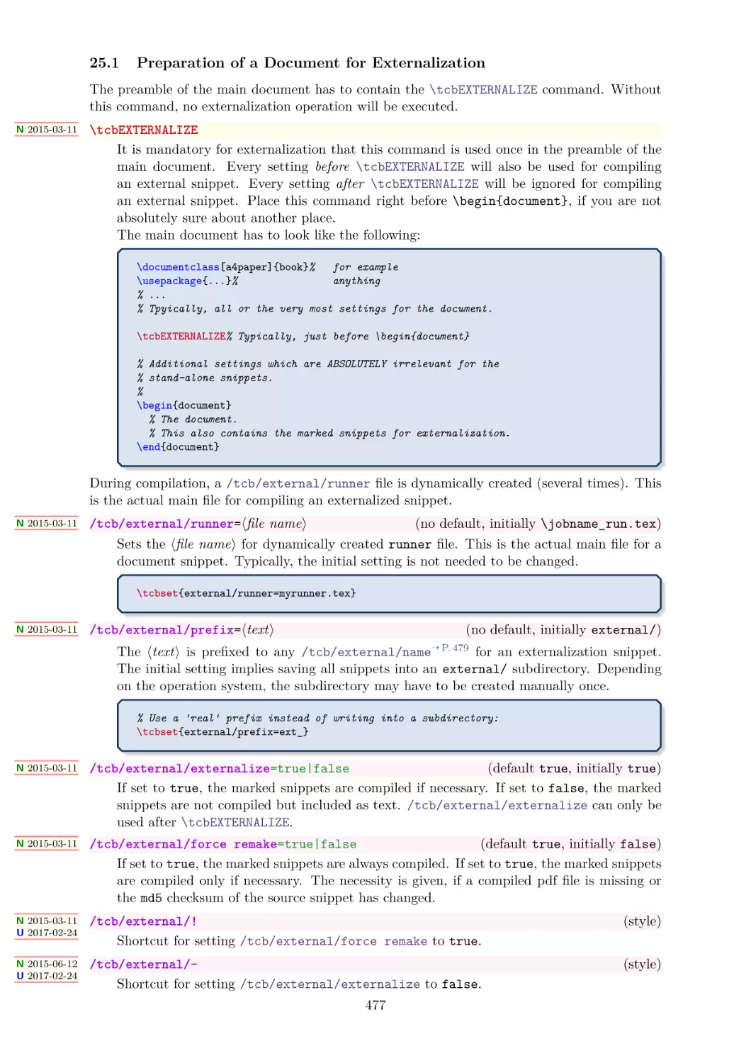
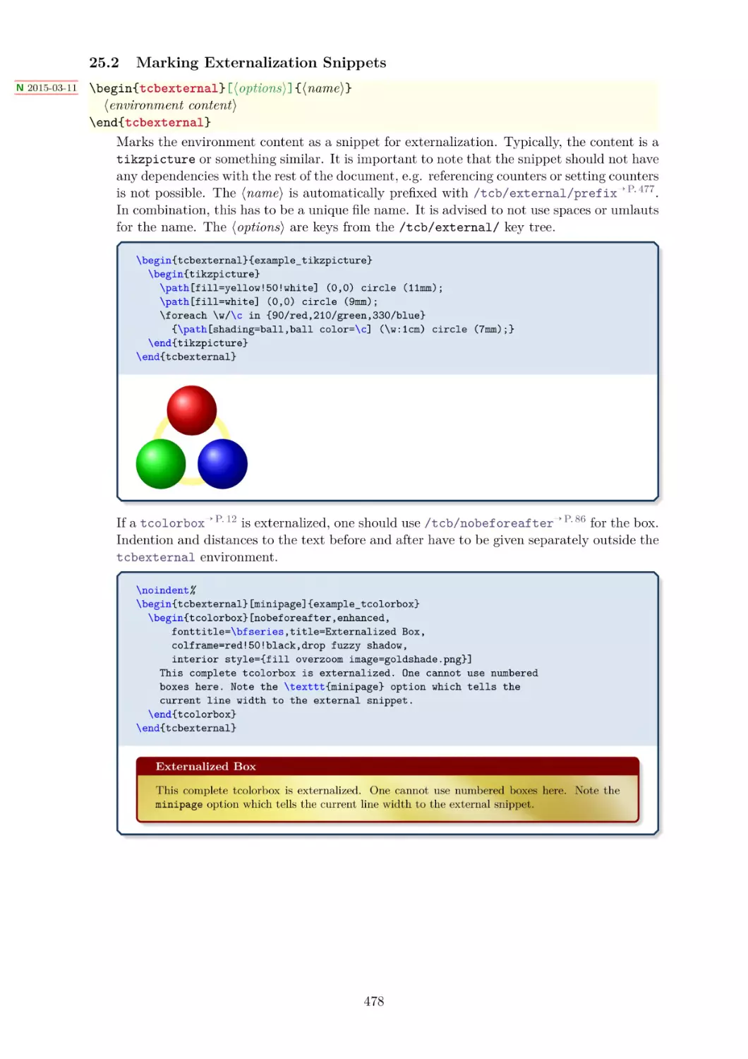
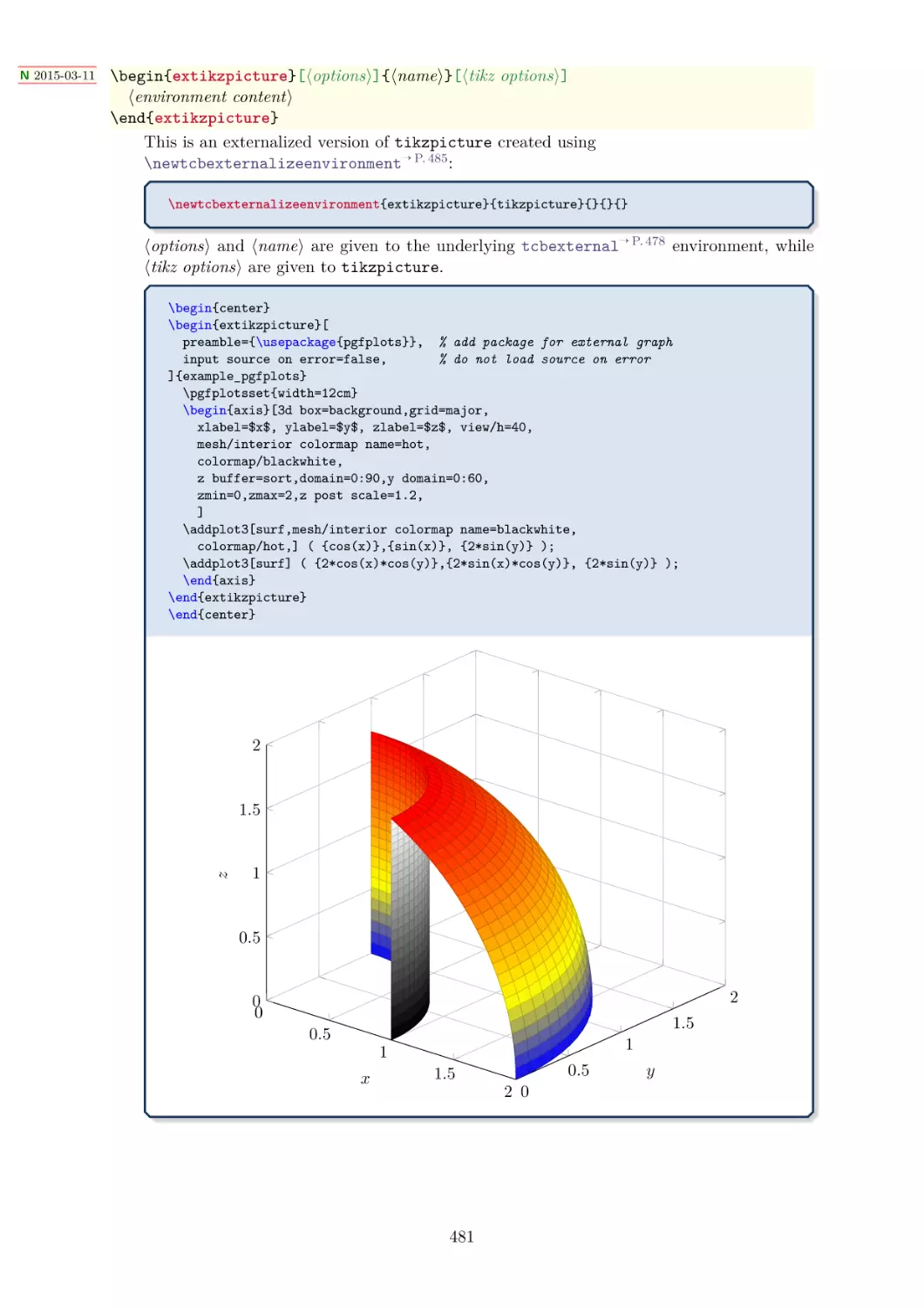
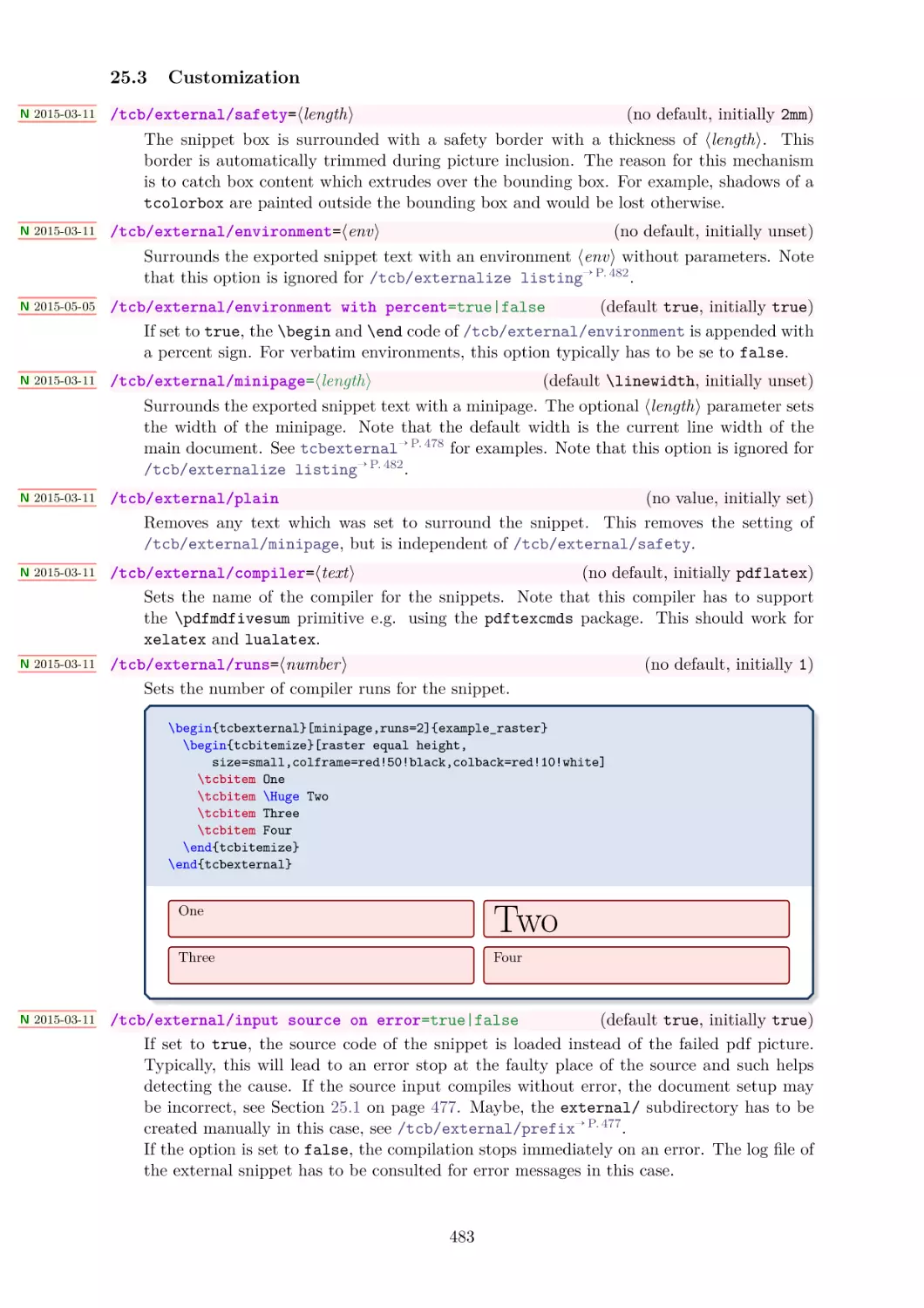
25.1 Preparation of a Document for Externalization
25.2 Marking Externalization Snippets . . . . . . .
25.3 Customization . . . . . . . . . . . . . . . . . .
25.4 Troubleshooting and FAQ . . . . . . . . . . .
.
.
.
.
.
.
.
.
.
.
.
.
.
.
.
.
.
.
.
.
.
.
.
.
.
.
.
.
.
.
.
.
.
.
.
.
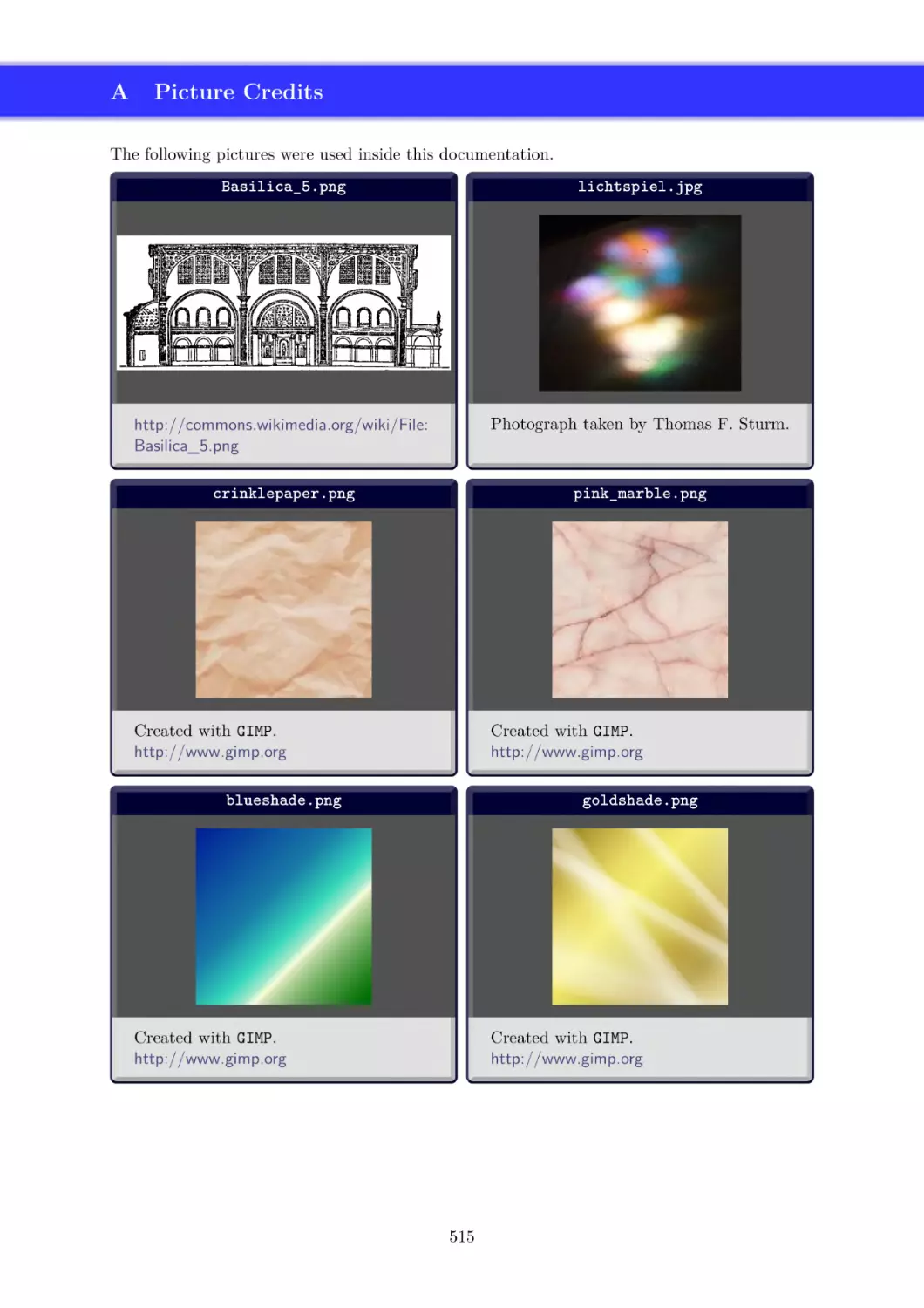
A Picture Credits
515
References
516
Index
518
7
1
Introduction
The package originates from the first edition of my book «LATEX– Einführung in das Textsatzsystem» [20] in about 2006. For the LATEX examples and tutorials given there, I wanted to have
accentuated and colored boxes to display source code and compiled text in combination. Since,
in my opinion, this type of boxes is also quite useful to highlight definitions and theorems, I
applied them for my lecture notes in mathematics [21–23] as well. With this package, you are
invited to apply these boxes for similar projects.
The breaking news for version 2.00 was the support for breakable boxes. This feature allows
new applications of the package without affecting the core package too much if you do not need
boxes to break automatically. With version 2.20, the often requested “side by side” mode for
listings has been added. With version 3.00, boxed titles are introduced together with improved
customization options for overlays, underlays, finishes, and own code extensions.
Since the first public release in 2011, I received a lot of feedback from all over the world. I want
to thank all who wrote me for supporting this package by sending bug reports and ideas for new
or better features.
1.1
Installation
Typically, tcolorbox will be installed as part of a major LATEX distribution and there is nothing
special to do for a user.
If you intend to make a local installation by hand, see the README file of the tcolorbox package
for some hints. The short story is: you have to install not only tcolorbox.sty, but also all
*.code.tex files in the local texmf tree.
1.2
Loading the Package
The base package tcolorbox loads the packages pgf [24], verbatim [19], etoolbox [8], and
environ [18]. tcolorbox itself is loaded in the usual manner in the preamble:
\usepackage{tcolorbox}
The package takes option keys in the key-value syntax. Alternatively, you may use these keys
later in the preamble with \tcbuselibrary→ P. 9 (see there). For example, the key to typeset
listings is:
\usepackage[listings]{tcolorbox}
8
1.3
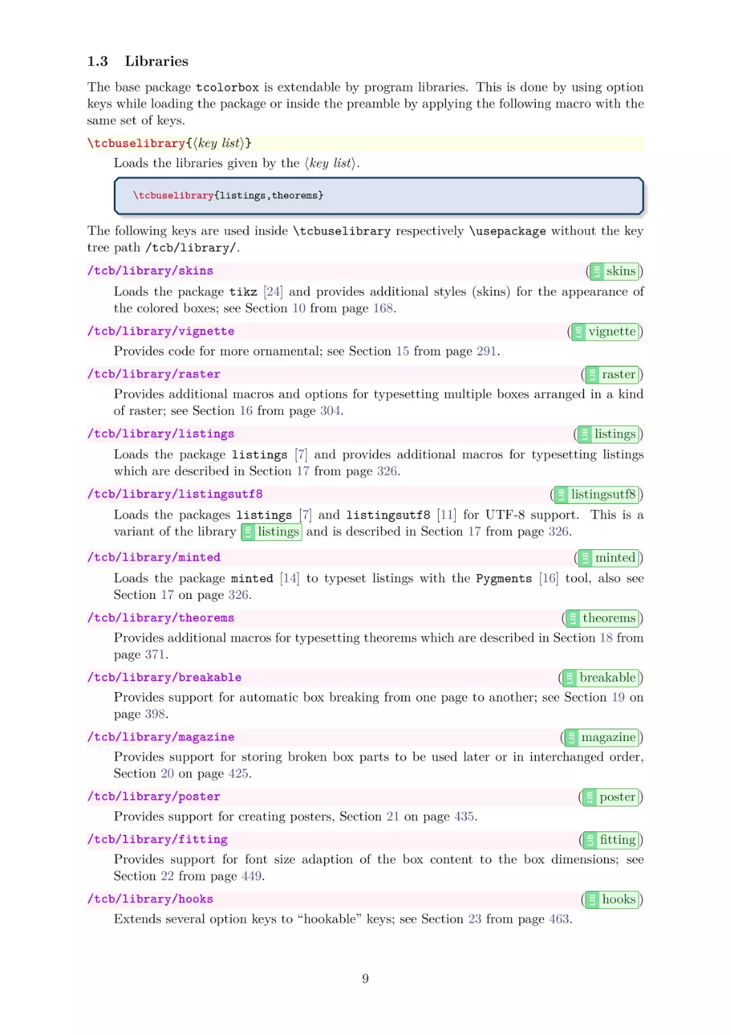
Libraries
The base package tcolorbox is extendable by program libraries. This is done by using option
keys while loading the package or inside the preamble by applying the following macro with the
same set of keys.
\tcbuselibrary{⟨key list⟩}
Loads the libraries given by the ⟨key list⟩.
\tcbuselibrary{listings,theorems}
(
/tcb/library/skins
LIB
The following keys are used inside \tcbuselibrary respectively \usepackage without the key
tree path /tcb/library/.
skins )
Loads the package tikz [24] and provides additional styles (skins) for the appearance of
the colored boxes; see Section 10 from page 168.
vignette )
LIB
(
/tcb/library/vignette
Provides code for more ornamental; see Section 15 from page 291.
( raster )
Provides additional macros and options for typesetting multiple boxes arranged in a kind
of raster; see Section 16 from page 304.
LIB
/tcb/library/raster
listings )
LIB
(
/tcb/library/listings
(
/tcb/library/listingsutf8
LIB
Loads the package listings [7] and provides additional macros for typesetting listings
which are described in Section 17 from page 326.
listingsutf8 )
LIB
Loads the packages listings [7] and listingsutf8 [11] for UTF-8 support. This is a
variant of the library
listings and is described in Section 17 from page 326.
minted )
LIB
(
/tcb/library/minted
Loads the package minted [14] to typeset listings with the Pygments [16] tool, also see
Section 17 on page 326.
( theorems )
Provides additional macros for typesetting theorems which are described in Section 18 from
page 371.
LIB
/tcb/library/theorems
( breakable )
Provides support for automatic box breaking from one page to another; see Section 19 on
page 398.
LIB
/tcb/library/breakable
( magazine )
Provides support for storing broken box parts to be used later or in interchanged order,
Section 20 on page 425.
(
/tcb/library/poster
LIB
LIB
/tcb/library/magazine
poster )
Provides support for creating posters, Section 21 on page 435.
( fitting )
Provides support for font size adaption of the box content to the box dimensions; see
Section 22 from page 449.
(
/tcb/library/hooks
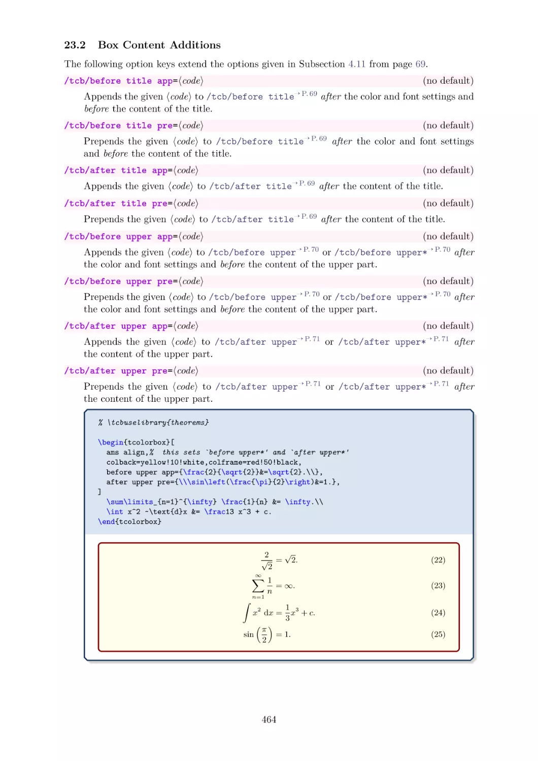
Extends several option keys to “hookable” keys; see Section 23 from page 463.
9
LIB
LIB
/tcb/library/fitting
hooks )
( xparse )
Loads the package xparse and is considered a legacy library kept for compatibility; see
Section 24 from page 475.
LIB
/tcb/library/xparse
( external )
Provides externalization support for stand-alone document snippets, see Section 25 on
page 476.
LIB
/tcb/library/external
( documentation )
EX documentations which are described in
LIB
/tcb/library/documentation
Provides additional macros for typesetting
Section 26 from page 488.
LAT
(style, no value)
/tcb/library/many
LIB
LIB
LIB
LIB
LIB
LIB
LIB
skins ,
breakable ,
raster ,
hooks ,
theorems , and
Loads the libraries
fitting . Use this shortcut, if you want to use all features of tcolorbox with exception
of typesetting listings and using the specialized
documentation library.
(style, no value)
/tcb/library/most
LIB
LIB
LIB
LIB
minted ,
documentation , and
xparse . Use this shortcut,
Loads all libraries except
if you want to use all features of tcolorbox with exception of using the minted package
and using the specialized
documentation library.
(style, no value)
Loads all libraries. Use this shortcut only, if you intend to use the
LIB
/tcb/library/all
documentation library.
Package tcolorbox
Basic Features
Base package
listings
listingsutf8
minted
LIB
Legacy
xparse
10
Documentation
LIB
LIB LIB
breakable
external
fitting
hooks
magazine
poster
raster
skins
theorems
vignette
Advanced Listings
LIB
LIB LIB LIB LIB LIB LIB LIB LIB LIB LIB
Advanced Features
documentation
2
Quick Reference
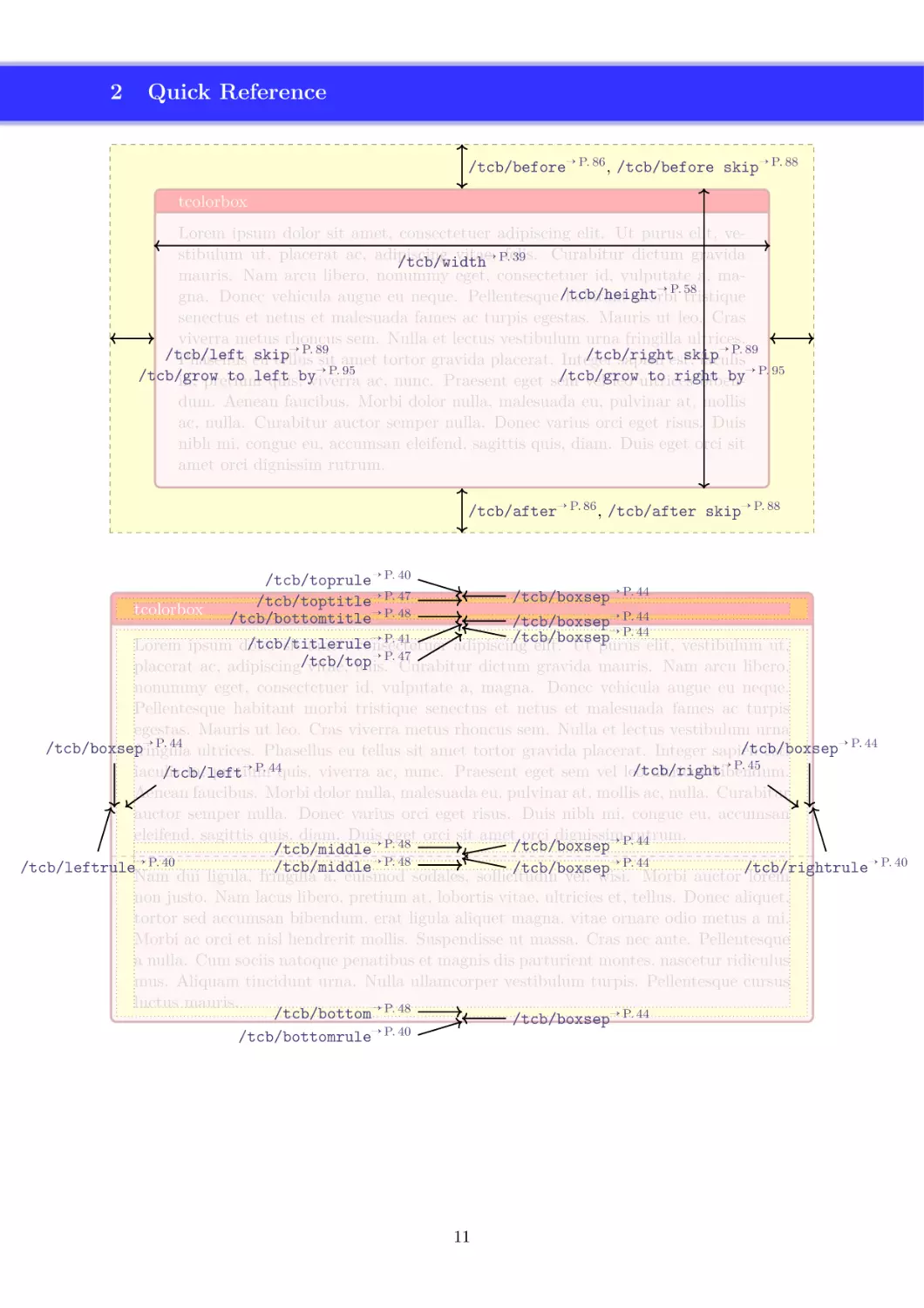
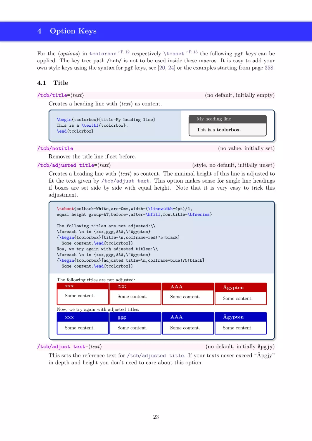
/tcb/before→ P. 86 , /tcb/before skip→ P. 88
tcolorbox
Lorem ipsum dolor sit amet, consectetuer adipiscing elit. Ut purus elit, vestibulum ut, placerat ac, adipiscing
vitae,
Curabitur dictum gravida
→ P.felis.
39
/tcb/width
mauris. Nam arcu libero, nonummy eget, consectetuer id, vulputate a, ma→ P. 58
gna. Donec vehicula augue eu neque. Pellentesque /tcb/height
habitant morbi tristique
senectus et netus et malesuada fames ac turpis egestas. Mauris ut leo. Cras
viverra metus rhoncus sem. Nulla et lectus vestibulum urna fringilla ultrices.
→ P. 89
→ P. 89
/tcb/left
skip
/tcb/right
skip
Phasellus eu
tellus sit amet tortor gravida placerat. Integer
sapien est,
iaculis
→ P. 95
/tcb/grow
to left
/tcb/grow
to right
by→ P. 95
in, pretium
quis,byviverra ac, nunc. Praesent eget sem
vel leo ultrices
bibendum. Aenean faucibus. Morbi dolor nulla, malesuada eu, pulvinar at, mollis
ac, nulla. Curabitur auctor semper nulla. Donec varius orci eget risus. Duis
nibh mi, congue eu, accumsan eleifend, sagittis quis, diam. Duis eget orci sit
amet orci dignissim rutrum.
/tcb/after→ P. 86 , /tcb/after skip→ P. 88
/tcb/toprule→ P. 40
/tcb/boxsep→ P. 44
/tcb/toptitle→ P. 47
tcolorbox
/tcb/bottomtitle→ P. 48
/tcb/boxsep→ P. 44
→ P. 44
/tcb/boxsep
→ P. 41
/tcb/titlerule
Lorem ipsum dolor
sit amet, consectetuer
adipiscing
elit. Ut purus elit, vestibulum ut,
→ P. 47
placerat ac, adipiscing/tcb/top
vitae, felis. Curabitur dictum gravida mauris. Nam arcu libero,
nonummy eget, consectetuer id, vulputate a, magna. Donec vehicula augue eu neque.
Pellentesque habitant morbi tristique senectus et netus et malesuada fames ac turpis
egestas. Mauris ut leo. Cras viverra metus rhoncus sem. Nulla et lectus vestibulum urna
→ P. 44
→ P. 44
/tcb/boxsep
/tcb/boxsep
fringilla ultrices. Phasellus eu tellus sit amet tortor gravida placerat. Integer sapien
est,
→
P.
45
→ P. 44quis, viverra ac, nunc. Praesent eget sem vel leo
/tcb/right
iaculis
in, pretium
ultrices bibendum.
/tcb/left
Aenean faucibus. Morbi dolor nulla, malesuada eu, pulvinar at, mollis ac, nulla. Curabitur
auctor semper nulla. Donec varius orci eget risus. Duis nibh mi, congue eu, accumsan
eleifend, sagittis quis, diam. Duis
eget orci sit amet orci dignissim
rutrum.
/tcb/boxsep→ P. 44
/tcb/middle→ P. 48
→ P. 44
/tcb/middle→ P. 48
/tcb/leftrule→ P. 40
/tcb/rightrule→ P. 40
/tcb/boxsep
Nam dui ligula, fringilla a, euismod sodales, sollicitudin
vel, wisi. Morbi auctor lorem
non justo. Nam lacus libero, pretium at, lobortis vitae, ultricies et, tellus. Donec aliquet,
tortor sed accumsan bibendum, erat ligula aliquet magna, vitae ornare odio metus a mi.
Morbi ac orci et nisl hendrerit mollis. Suspendisse ut massa. Cras nec ante. Pellentesque
a nulla. Cum sociis natoque penatibus et magnis dis parturient montes, nascetur ridiculus
mus. Aliquam tincidunt urna. Nulla ullamcorper vestibulum turpis. Pellentesque cursus
luctus mauris.
/tcb/bottom→ P. 48
/tcb/boxsep→ P. 44
→
P.
40
/tcb/bottomrule
11
3
3.1
Macros for Box Creation
Using tcolorbox and \tcbox
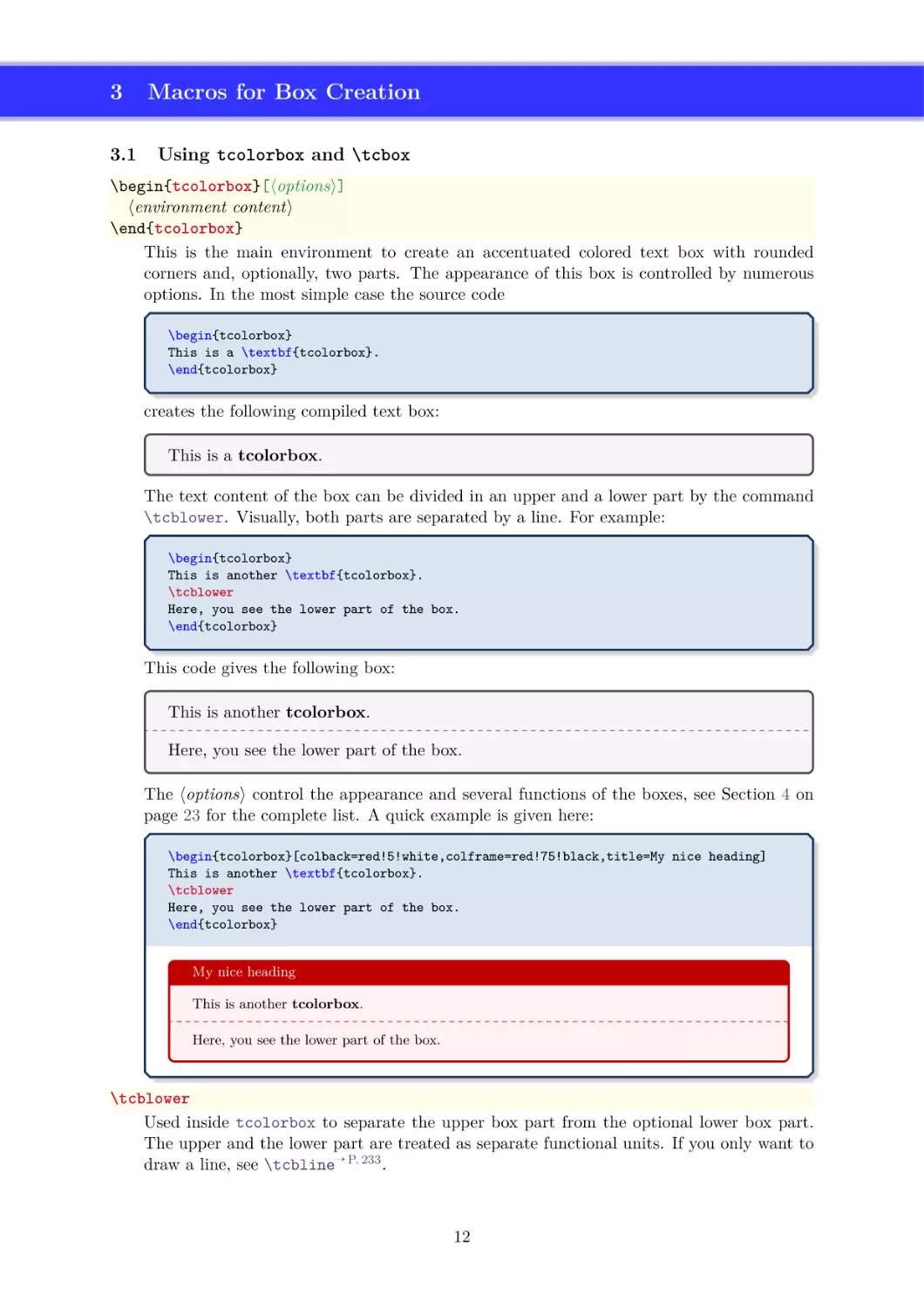
\begin{tcolorbox}[⟨options⟩]
⟨environment content⟩
\end{tcolorbox}
This is the main environment to create an accentuated colored text box with rounded
corners and, optionally, two parts. The appearance of this box is controlled by numerous
options. In the most simple case the source code
\begin{tcolorbox}
This is a \textbf{tcolorbox}.
\end{tcolorbox}
creates the following compiled text box:
This is a tcolorbox.
The text content of the box can be divided in an upper and a lower part by the command
\tcblower. Visually, both parts are separated by a line. For example:
\begin{tcolorbox}
This is another \textbf{tcolorbox}.
\tcblower
Here, you see the lower part of the box.
\end{tcolorbox}
This code gives the following box:
This is another tcolorbox.
Here, you see the lower part of the box.
The ⟨options⟩ control the appearance and several functions of the boxes, see Section 4 on
page 23 for the complete list. A quick example is given here:
\begin{tcolorbox}[colback=red!5!white,colframe=red!75!black,title=My nice heading]
This is another \textbf{tcolorbox}.
\tcblower
Here, you see the lower part of the box.
\end{tcolorbox}
My nice heading
This is another tcolorbox.
Here, you see the lower part of the box.
\tcblower
Used inside tcolorbox to separate the upper box part from the optional lower box part.
The upper and the lower part are treated as separate functional units. If you only want to
draw a line, see \tcbline→ P. 233 .
12
\tcbset{⟨options⟩}
Sets options for every following tcolorbox→ P. 12 inside the current TEX group. By default,
this does not apply to nested boxes, see Section 4.16 on page 102.
For example, the colors of the boxes may be defined for the whole document by this:
\tcbset{colback=red!5!white,colframe=red!75!black}
\tcbsetforeverylayer{⟨options⟩}
Sets options for every following tcolorbox→ P. 12 inside the current TEX group. In contrast
to \tcbset, this does also apply to nested boxes, see Section 4.16 on page 102. Technically,
the ⟨options⟩ are appended to the default values for every tcolorbox which are applied by
/tcb/reset→ P. 119 .
You should not use this macro, if you are not completely sure that you want to have the
⟨options⟩ also for boxes in boxes (in boxes in boxes . . . ).
\tcbset{colback=green!10!white}
\tcbsetforeverylayer{colframe=red!75!black}
\begin{tcolorbox}[title=All options for this box]
This is a tcolorbox.\par\medskip
\begin{tcolorbox}[title=Nested box]
Note that this nested box has a red frame but no green background.
\end{tcolorbox}
\end{tcolorbox}
\bigskip
\begin{tcolorbox}[reset]
Options given with |\tcbsetforeverylayer| survive a |reset|.
\end{tcolorbox}
All options for this box
This is a tcolorbox.
Nested box
Note that this nested box has a red frame but no green background.
Options given with \tcbsetforeverylayer survive a reset.
13
\tcbox[⟨options⟩]{⟨box content⟩}
Creates a colored box which is fitted to the width of the given ⟨box content⟩. In principle,
most ⟨options⟩ for a tcolorbox→ P. 12 can be used for \tcbox with some restrictions. A
\tcbox cannot have a lower part and cannot be broken.
\tcbset{colframe=blue!50!black,colback=white,colupper=red!50!black,
fonttitle=\bfseries,nobeforeafter,center title}
Text \tcbox[tcbox raise base]{Hello World}\hfill
%
\tcbox[left=0mm,right=0mm,top=0mm,bottom=0mm,boxsep=0mm,
toptitle=0.5mm,bottomtitle=0.5mm,title=My table]{%
\arrayrulecolor{blue!50!black}\renewcommand{\arraystretch}{1.2}%
\begin{tabular}{r|c|l}
One
& Two
& Three \\\hline\hline
Men
& Mice
& Lions \\\hline
Upper & Middle & Lower
\end{tabular}}\hfill
%
\tcbox[colback=blue!85!black,
left=0mm,right=0mm,top=0mm,bottom=0mm,boxsep=1mm,arc=0mm,boxrule=0.5pt,
title=My picture]{%
\includegraphics[width=5cm]{Basilica_5.png}}
My picture
My table
Text
Hello World
One
Two
Three
Men
Mice
Lions
Middle
Lower
Upper
% \usepackage{tikz}
\tcbset{colframe=blue!50!black,colback=white,colupper=red!50!black,
fonttitle=\bfseries,center title}
% Fixed width box
\begin{tcolorbox}Hello\\World!\end{tcolorbox}
% Fitted width box (like hbox or makebox)
\tcbox{Hello\\World!}
% Fitted width box (using a TikZ node)
\tcbox[tikznode]{Hello\\World!}
Hello
World!
HelloWorld!
Hello
World!
14
3.2
Producing tcolorbox Environments and Commands
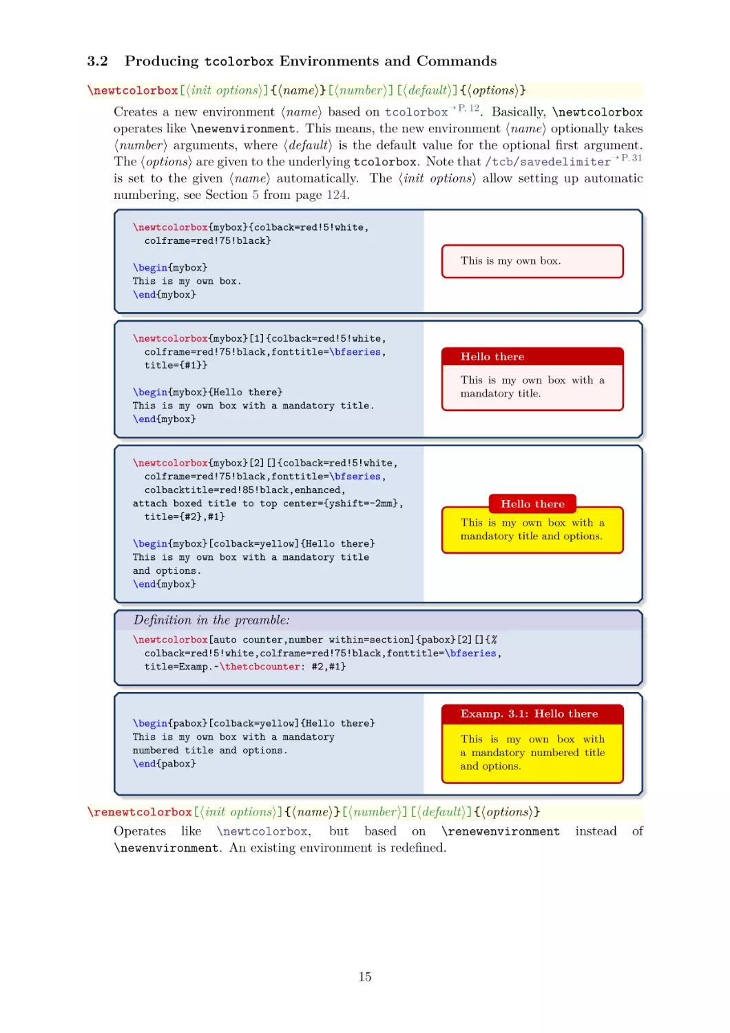
\newtcolorbox[⟨init options⟩]{⟨name⟩}[⟨number⟩][⟨default⟩]{⟨options⟩}
Creates a new environment ⟨name⟩ based on tcolorbox→ P. 12 . Basically, \newtcolorbox
operates like \newenvironment. This means, the new environment ⟨name⟩ optionally takes
⟨number⟩ arguments, where ⟨default⟩ is the default value for the optional first argument.
The ⟨options⟩ are given to the underlying tcolorbox. Note that /tcb/savedelimiter→ P. 31
is set to the given ⟨name⟩ automatically. The ⟨init options⟩ allow setting up automatic
numbering, see Section 5 from page 124.
\newtcolorbox{mybox}{colback=red!5!white,
colframe=red!75!black}
This is my own box.
\begin{mybox}
This is my own box.
\end{mybox}
\newtcolorbox{mybox}[1]{colback=red!5!white,
colframe=red!75!black,fonttitle=\bfseries,
title={#1}}
\begin{mybox}{Hello there}
This is my own box with a mandatory title.
\end{mybox}
\newtcolorbox{mybox}[2][]{colback=red!5!white,
colframe=red!75!black,fonttitle=\bfseries,
colbacktitle=red!85!black,enhanced,
attach boxed title to top center={yshift=-2mm},
title={#2},#1}
\begin{mybox}[colback=yellow]{Hello there}
This is my own box with a mandatory title
and options.
\end{mybox}
Hello there
This is my own box with a
mandatory title.
Hello there
This is my own box with a
mandatory title and options.
Definition in the preamble:
\newtcolorbox[auto counter,number within=section]{pabox}[2][]{%
colback=red!5!white,colframe=red!75!black,fonttitle=\bfseries,
title=Examp.~\thetcbcounter: #2,#1}
\begin{pabox}[colback=yellow]{Hello there}
This is my own box with a mandatory
numbered title and options.
\end{pabox}
Examp. 3.1: Hello there
This is my own box with
a mandatory numbered title
and options.
\renewtcolorbox[⟨init options⟩]{⟨name⟩}[⟨number⟩][⟨default⟩]{⟨options⟩}
Operates like \newtcolorbox, but based on \renewenvironment
\newenvironment. An existing environment is redefined.
15
instead
of
\NewTColorBox[⟨init options⟩]{⟨name⟩}{⟨specification⟩}{⟨options⟩}
Creates a new environment ⟨name⟩ based on tcolorbox→ P. 12 .
Basically, \NewTColorBox operates like \NewDocumentEnvironment. This means, the new
environment ⟨name⟩ is constructed with the given argument ⟨specification⟩. An error is
issued if an environment with ⟨name⟩ has already been defined. The ⟨options⟩ are given to
the underlying tcolorbox→ P. 12 .
Note that /tcb/savedelimiter→ P. 31 is set to the given ⟨name⟩ automatically.
The ⟨init options⟩ allow setting up automatic numbering, see Section 5 from page 124.
% counter from previous example
\NewTColorBox[use counter from=pabox]{mybox}{ O{red} m d"" !O{} }
{enhanced,colframe=#1!75!black,colback=#1!5!white,
fonttitle=\bfseries,title={\thetcbcounter~#2},
IfValueT={#3}{watermark text={#3}},#4}
\begin{mybox}{My title}
This is a tcolorbox.
\end{mybox}
\begin{mybox}[blue]{My title}
This is a tcolorbox.
\end{mybox}
\begin{mybox}[green]{My title}"My Watermark"
This is a tcolorbox.
\end{mybox}
\begin{mybox}[yellow]{My title}[colbacktitle=yellow!50!white,coltitle=black]
This is a tcolorbox.
\end{mybox}
\begin{mybox}[purple]{My title}"All together"[coltitle=yellow]
This is a tcolorbox.
\end{mybox}
3.2 My title
This is a tcolorbox.
3.3 My title
This is a tcolorbox.
3.4 My title
This is a tcolorbox.
My Watermark
3.5 My title
This is a tcolorbox.
3.6 My title
This is a tcolorbox.
All together
16
\RenewTColorBox[⟨init options⟩]{⟨name⟩}{⟨specification⟩}{⟨options⟩}
Operates like \NewTColorBox→ P. 16 , but based on \RenewDocumentEnvironment instead of
\NewDocumentEnvironment. An existing environment is redefined.
\ProvideTColorBox[⟨init options⟩]{⟨name⟩}{⟨specification⟩}{⟨options⟩}
Operates like \NewTColorBox→ P. 16 , but based on \ProvideDocumentEnvironment instead
of \NewDocumentEnvironment. The environment ⟨name⟩ is only created if it is not already
defined.
\DeclareTColorBox[⟨init options⟩]{⟨name⟩}{⟨specification⟩}{⟨options⟩}
Operates like \NewTColorBox→ P. 16 , but based on \DeclareDocumentEnvironment instead
of \NewDocumentEnvironment. The new environment is always created, irrespective of an
already existing environment with the same name.
17
\NewTotalTColorBox[⟨init options⟩]{\⟨name⟩}{⟨specification⟩}{⟨options⟩}{⟨content⟩}
Creates a new command \⟨name⟩ based on tcolorbox→ P. 12 .
In contrast to
\NewTColorBox→ P. 16 , also the ⟨content⟩ of the tcolorbox is specified.
Basically, \NewTotalTColorBox operates like \NewDocumentCommand. This means, the
new command \⟨name⟩ is constructed with the given argument ⟨specification⟩. An error
is issued if \⟨name⟩ has already been defined. The ⟨options⟩ are given to the underlying
tcolorbox→ P. 12 which is filled with the specified ⟨content⟩.
Note that /tcb/savedelimiter→ P. 31 is set to the given ⟨name⟩ automatically. Also
note that /tcb/saveto→ P. 28 and /tcb/savelowerto→ P. 29 cannot be used with
\NewTotalTColorBox and friends.
The ⟨init options⟩ allow setting up automatic numbering, see Section 5 from page 124.
\NewTotalTColorBox{\diabox}{ O{} v m }
{ bicolor,nobeforeafter,equal height group=diabox,width=5.7cm,
fonttitle=\bfseries\ttfamily,adjusted title={#2},center title,
colframe=blue!20!black,leftupper=0mm,rightupper=0mm,colback=black!75!white,#1}
{ \tikz\path[fill zoom image={#2}] (0,0) rectangle (\linewidth,4cm);%
\tcblower#3}
\diabox{blueshade.png}{Created with |GIMP|.\\\url{http://www.gimp.org}}
\diabox{goldshade.png}{Created with |GIMP|.\\\url{http://www.gimp.org}}
blueshade.png
Created with GIMP.
http://www.gimp.org
goldshade.png
Created with GIMP.
http://www.gimp.org
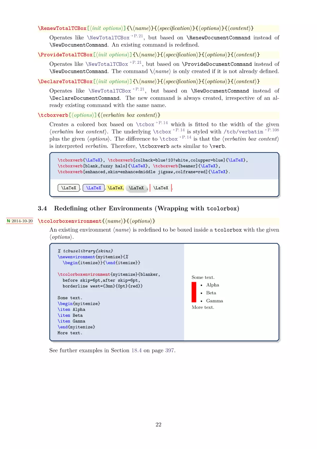
\RenewTotalTColorBox[⟨init options⟩]{\⟨name⟩}{⟨specification⟩}{⟨options⟩}{⟨content⟩}
Operates like \NewTotalTColorBox, but based on \RenewDocumentCommand instead of
\NewDocumentCommand. An existing command is redefined.
\ProvideTotalTColorBox[⟨init options⟩]{\⟨name⟩}{⟨specification⟩}{⟨options⟩}{⟨content⟩}
Operates like \NewTotalTColorBox, but based on \ProvideDocumentCommand instead of
\NewDocumentCommand. The command \⟨name⟩ is only created if it is not already defined.
\DeclareTotalTColorBox[⟨init options⟩]{\⟨name⟩}{⟨specification⟩}{⟨options⟩}{⟨content⟩}
Operates like \NewTotalTColorBox, but based on \DeclareDocumentCommand instead of
\NewDocumentCommand. The new command is always created, irrespective of an already
existing command with the same name.
18
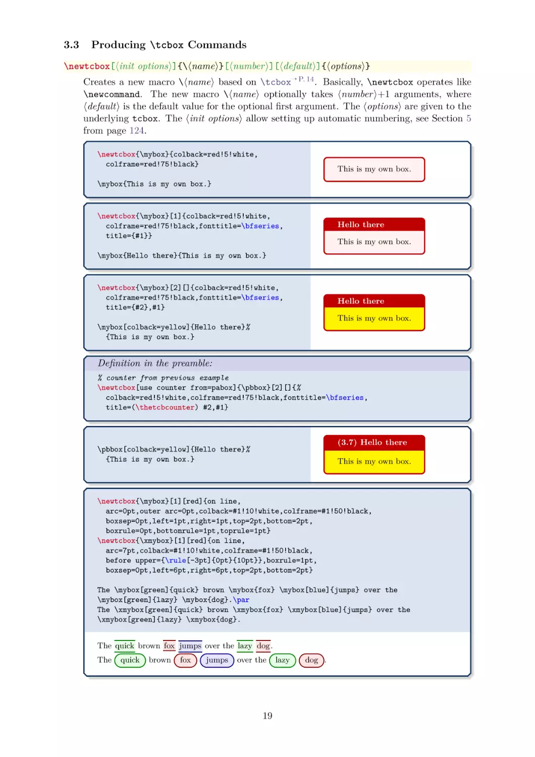
3.3
Producing \tcbox Commands
\newtcbox[⟨init options⟩]{\⟨name⟩}[⟨number⟩][⟨default⟩]{⟨options⟩}
Creates a new macro \⟨name⟩ based on \tcbox→ P. 14 . Basically, \newtcbox operates like
\newcommand. The new macro \⟨name⟩ optionally takes ⟨number⟩+1 arguments, where
⟨default⟩ is the default value for the optional first argument. The ⟨options⟩ are given to the
underlying tcbox. The ⟨init options⟩ allow setting up automatic numbering, see Section 5
from page 124.
\newtcbox{\mybox}{colback=red!5!white,
colframe=red!75!black}
This is my own box.
\mybox{This is my own box.}
\newtcbox{\mybox}[1]{colback=red!5!white,
colframe=red!75!black,fonttitle=\bfseries,
title={#1}}
Hello there
This is my own box.
\mybox{Hello there}{This is my own box.}
\newtcbox{\mybox}[2][]{colback=red!5!white,
colframe=red!75!black,fonttitle=\bfseries,
title={#2},#1}
Hello there
This is my own box.
\mybox[colback=yellow]{Hello there}%
{This is my own box.}
Definition in the preamble:
% counter from previous example
\newtcbox[use counter from=pabox]{\pbbox}[2][]{%
colback=red!5!white,colframe=red!75!black,fonttitle=\bfseries,
title=(\thetcbcounter) #2,#1}
(3.7) Hello there
\pbbox[colback=yellow]{Hello there}%
{This is my own box.}
This is my own box.
\newtcbox{\mybox}[1][red]{on line,
arc=0pt,outer arc=0pt,colback=#1!10!white,colframe=#1!50!black,
boxsep=0pt,left=1pt,right=1pt,top=2pt,bottom=2pt,
boxrule=0pt,bottomrule=1pt,toprule=1pt}
\newtcbox{\xmybox}[1][red]{on line,
arc=7pt,colback=#1!10!white,colframe=#1!50!black,
before upper={\rule[-3pt]{0pt}{10pt}},boxrule=1pt,
boxsep=0pt,left=6pt,right=6pt,top=2pt,bottom=2pt}
The \mybox[green]{quick} brown \mybox{fox} \mybox[blue]{jumps} over the
\mybox[green]{lazy} \mybox{dog}.\par
The \xmybox[green]{quick} brown \xmybox{fox} \xmybox[blue]{jumps} over the
\xmybox[green]{lazy} \xmybox{dog}.
The quick brown fox jumps over the lazy dog .
The
quick
brown
fox
jumps
over the
19
lazy
dog .
\renewtcbox[⟨init options⟩]{\⟨name⟩}[⟨number⟩][⟨default⟩]{⟨options⟩}
Operates like \newtcbox→ P. 19 , but based on \renewcommand instead of \newcommand. An
existing macro is redefined.
\NewTCBox[⟨init options⟩]{\⟨name⟩}{⟨specification⟩}{⟨options⟩}
Creates a new command \⟨name⟩ based on \tcbox→ P. 14 . Basically, \NewTCBox operates
like \NewDocumentCommand. This means, the new command \⟨name⟩ is constructed with
the given argument ⟨specification⟩. An error is issued if \⟨name⟩ has already been defined.
The ⟨options⟩ are given to the underlying \tcbox→ P. 14 .
Note that /tcb/savedelimiter→ P. 31 is set to the given ⟨name⟩ automatically.
The ⟨init options⟩ allow setting up automatic numbering, see Section 5 from page 124.
% counter from previous example
\NewTCBox[use counter from=pabox]{\mybox}{ s m s }
{ nobeforeafter,colback=red!5!white,colframe=red!75!black,
title={#2 (Box \thetcbcounter)},fonttitle=\bfseries,
IfBooleanT={#1}{enhanced,drop shadow},
IfBooleanT={#3}{colbacktitle=red!50!white} }
\mybox{Bird}{This is my first box.}
\hfill
\mybox*{Tree}{This is my second box.}
\par\bigskip
\mybox{Bike}*{This is my third box.}
\hfill
\mybox*{City}*{This is my fourth box.}
Bird (Box 3.8)
Tree (Box 3.9)
This is my first box.
This is my second box.
Bike (Box 3.10)
City (Box 3.11)
This is my third box.
This is my fourth box.
\RenewTCBox[⟨init options⟩]{\⟨name⟩}{⟨specification⟩}{⟨options⟩}
Operates like \NewTCBox, but based on \RenewDocumentCommand
\NewDocumentCommand. An existing command is redefined.
instead
of
\ProvideTCBox[⟨init options⟩]{\⟨name⟩}{⟨specification⟩}{⟨options⟩}
Operates like \NewTCBox, but based on \ProvideDocumentCommand instead of
\NewDocumentCommand. The command \⟨name⟩ is only created if it is not already
defined.
\DeclareTCBox[⟨init options⟩]{\⟨name⟩}{⟨specification⟩}{⟨options⟩}
Operates like \NewTCBox, but based on \DeclareDocumentCommand instead of
\NewDocumentCommand. The new command is always created, irrespective of an already
existing command with the same name.
20
\NewTotalTCBox[⟨init options⟩]{\⟨name⟩}{⟨specification⟩}{⟨options⟩}{⟨content⟩}
Creates a new command \⟨name⟩ based on \tcbox→ P. 14 . In contrast to \NewTCBox→ P. 20 ,
also the ⟨content⟩ of the tcbox is specified.
Basically, \NewTotalTCBox operates like \NewDocumentCommand. This means, the new command \⟨name⟩ is constructed with the given argument ⟨specification⟩. An error is issued if
\⟨name⟩ has already been defined. The ⟨options⟩ are given to the underlying \tcbox→ P. 14
which is filled with the specified ⟨content⟩.
Note that /tcb/savedelimiter→ P. 31 is set to the given ⟨name⟩ automatically.
The ⟨init options⟩ allow setting up automatic numbering, see Section 5 from page 124.
\NewTotalTCBox{\myverb}{ O{red} v !O{} }
{ fontupper=\ttfamily,nobeforeafter,tcbox raise base,arc=0pt,outer arc=0pt,
top=0pt,bottom=0pt,left=0mm,right=0mm,
leftrule=0pt,rightrule=0pt,toprule=0.3mm,bottomrule=0.3mm,boxsep=0.5mm,
colback=#1!10!white,colframe=#1!50!black,#3}{#2}
To set a word \textbf{bold} in \myverb{\LaTeX}, use
\myverb[green]{\textbf{bold}}. Alternatively, write
\myverb[yellow]{{\bfseries bold}}.
In \myverb[blue]{\LaTeX}[enhanced,fuzzy halo], other font settings are
done in the same way, e.\,g. \myverb{\textit}, \myverb{\itshape}\\
or \myverb[brown]{\texttt}, \myverb[brown]{\ttfamily}.
To set a word bold in \LaTeX , use \textbf{bold} . Alternatively, write {\bfseries bold} . In
\LaTeX , other font settings are done in the same way, e. g. \textit , \itshape
or \texttt , \ttfamily .
The next example uses \lstinline from the listings package to typeset the verbatim
content.
% \usepackage{listings} or \tcbuselibrary{listings}
\NewTotalTCBox{\commandbox}{ s v }
{verbatim,colupper=white,colback=black!75!white,colframe=black}
{\IfBooleanT{#1}{\textcolor{red}{\ttfamily\bfseries > }}%
\lstinline[language=command.com,keywordstyle=\color{blue!35!white}\bfseries]^#2^}
\commandbox*{cd "My Documents"} changes to directory \commandbox{My Documents}.
\commandbox*{dir /A} lists the directory content.
\commandbox*{copy example.txt d:\target} copies \commandbox{example.txt} to
\commandbox{d:\target}.
> cd "My␣Documents"
> dir /A
changes to directory
My Documents .
lists the directory content.
> copy example.txt d:\target
copies
example.txt
21
to
d:\target .
\RenewTotalTCBox[⟨init options⟩]{\⟨name⟩}{⟨specification⟩}{⟨options⟩}{⟨content⟩}
Operates like \NewTotalTCBox→ P. 21 , but based on \RenewDocumentCommand instead of
\NewDocumentCommand. An existing command is redefined.
\ProvideTotalTCBox[⟨init options⟩]{\⟨name⟩}{⟨specification⟩}{⟨options⟩}{⟨content⟩}
Operates like \NewTotalTCBox→ P. 21 , but based on \ProvideDocumentCommand instead of
\NewDocumentCommand. The command \⟨name⟩ is only created if it is not already defined.
\DeclareTotalTCBox[⟨init options⟩]{\⟨name⟩}{⟨specification⟩}{⟨options⟩}{⟨content⟩}
Operates like \NewTotalTCBox→ P. 21 , but based on \NewDocumentCommand instead of
\DeclareDocumentCommand. The new command is always created, irrespective of an already existing command with the same name.
\tcboxverb[⟨options⟩]{⟨verbatim box content⟩}
Creates a colored box based on \tcbox→ P. 14 which is fitted to the width of the given
⟨verbatim box content⟩. The underlying \tcbox→ P. 14 is styled with /tcb/verbatim→ P. 108
plus the given ⟨options⟩. The difference to \tcbox→ P. 14 is that the ⟨verbatim box content⟩
is interpreted verbatim. Therefore, \tcboxverb acts similar to \verb.
\tcboxverb{\LaTeX}, \tcboxverb[colback=blue!10!white,colupper=blue]{\LaTeX},
\tcboxverb[blank,fuzzy halo]{\LaTeX}, \tcboxverb[beamer]{\LaTeX},
\tcboxverb[enhanced,skin=enhancedmiddle jigsaw,colframe=red]{\LaTeX}.
\LaTeX ,
3.4
N 2014-10-20
\LaTeX , \LaTeX, \LaTeX ,
\LaTeX .
Redefining other Environments (Wrapping with tcolorbox)
\tcolorboxenvironment{⟨name⟩}{⟨options⟩}
An existing environment ⟨name⟩ is redefined to be boxed inside a tcolorbox with the given
⟨options⟩.
% tcbuselibrary{skins}
\newenvironment{myitemize}{%
\begin{itemize}}{\end{itemize}}
\tcolorboxenvironment{myitemize}{blanker,
before skip=6pt,after skip=6pt,
borderline west={3mm}{0pt}{red}}
Some text.
• Alpha
• Beta
Some text.
\begin{myitemize}
\item Alpha
\item Beta
\item Gamma
\end{myitemize}
More text.
• Gamma
More text.
See further examples in Section 18.4 on page 397.
22
4
Option Keys
For the ⟨options⟩ in tcolorbox→ P. 12 respectively \tcbset→ P. 13 the following pgf keys can be
applied. The key tree path /tcb/ is not to be used inside these macros. It is easy to add your
own style keys using the syntax for pgf keys, see [20, 24] or the examples starting from page 358.
4.1
Title
(no default, initially empty)
/tcb/title=⟨text⟩
Creates a heading line with ⟨text⟩ as content.
\begin{tcolorbox}[title=My heading line]
This is a \textbf{tcolorbox}.
\end{tcolorbox}
My heading line
This is a tcolorbox.
/tcb/notitle
(no value, initially set)
Removes the title line if set before.
/tcb/adjusted title=⟨text⟩
(style, no default, initially unset)
Creates a heading line with ⟨text⟩ as content. The minimal height of this line is adjusted to
fit the text given by /tcb/adjust text. This option makes sense for single line headings
if boxes are set side by side with equal height. Note that it is very easy to trick this
adjustment.
\tcbset{colback=White,arc=0mm,width=(\linewidth-4pt)/4,
equal height group=AT,before=,after=\hfill,fonttitle=\bfseries}
The following titles are not adjusted:\\
\foreach \n in {xxx,ggg,AAA,\"Agypten}
{\begin{tcolorbox}[title=\n,colframe=red!75!black]
Some content.\end{tcolorbox}}
Now, we try again with adjusted titles:\\
\foreach \n in {xxx,ggg,AAA,\"Agypten}
{\begin{tcolorbox}[adjusted title=\n,colframe=blue!75!black]
Some content.\end{tcolorbox}}
The following titles are not adjusted:
xxx
ggg
Some content.
Some content.
AAA
Ägypten
Some content.
Some content.
Now, we try again with adjusted titles:
xxx
ggg
AAA
Ägypten
Some content.
Some content.
Some content.
Some content.
(no default, initially Äpgjy)
/tcb/adjust text=⟨text⟩
This sets the reference text for /tcb/adjusted title. If your texts never exceed “Äpgjy”
in depth and height you don’t need to care about this option.
23
N 2014-11-24
/tcb/squeezed title=⟨text⟩
(style, no default, initially unset)
Creates a single heading line with ⟨text⟩ as content. If the ⟨text⟩ is longer than the available
space, the text is squeezed to fit into the available space.
% \tcbuselibrary{raster}
\begin{tcbitemize}[raster columns=3,raster equal height,
colframe=red!75!black,colback=red!5!white,fonttitle=\bfseries]
\tcbitem[squeezed title={Short title}]
First box
\tcbitem[squeezed title={This is a very very long title}]
Second box
\tcbitem[squeezed title={This title is clearly to long for this application}]
Third box
\end{tcbitemize}
N 2014-11-24
Short title
This is a very very long title
This title is clearly to long for this application
First box
Second box
Third box
(style, no default, initially unset)
/tcb/squeezed title*=⟨text⟩
This is a combination of /tcb/adjusted
title→ P. 23
and /tcb/squeezed title.
% \tcbuselibrary{raster}
\begin{tcbitemize}[raster columns=3,raster equal height,
colframe=red!75!black,colback=red!5!white,fonttitle=\bfseries]
\tcbitem[squeezed title*={Short title}]
First box
\tcbitem[squeezed title*={This is a very very long title}]
Second box
\tcbitem[squeezed title*={This title is clearly to long for this application}]
Third box
\end{tcbitemize}
N 2019-03-01
Short title
This is a very very long title
This title is clearly to long for this application
First box
Second box
Third box
/tcb/titlebox=⟨mode⟩
(no default, initially visible)
Controls the treatment of the title part of the box. Feasible values for ⟨mode⟩ are:
• visible: usual type setting of the title box,
• invisible: empty space instead of the title contents.
\begin{tcolorbox}[title=My invisible title,
titlebox=invisible]
This is a \textbf{tcolorbox}.
\end{tcolorbox}
This is a tcolorbox.
24
/tcb/detach title
(no value)
Detaches the title from its normal position. The text of the title is stored into
\tcbtitletext and the formatted title is available by \tcbtitle. The main application is
to move the title from its usual place to another one.
\newtcolorbox{mybox}[2][]{colbacktitle=red!10!white,
colback=blue!10!white,coltitle=red!70!black,
title={#2},fonttitle=\bfseries,#1}
\begin{mybox}{My title}
This is a \textbf{tcolorbox}.
\end{mybox}
\begin{mybox}[detach title,before upper={\tcbtitle\quad}]{My title}
This is a \textbf{tcolorbox}.
\end{mybox}
\begin{mybox}[detach title,after upper={\par\hfill\tcbtitle}]{My title}
This is a \textbf{tcolorbox}.
\end{mybox}
My title
This is a tcolorbox.
My title
This is a tcolorbox.
This is a tcolorbox.
My title
/tcb/attach title
(no value)
Attaches the title to its normal position. This option is used to reverse /tcb/detach title.
U 2015-07-08
/tcb/attach title to upper=⟨text⟩
(style, default empty, initially unset)
Attaches the title to the begin of the upper part of the box content. The optional ⟨text⟩ is
set between the formatted title and the box content.
\newtcolorbox{mybox}[2][]{colbacktitle=red!10!white,
colback=blue!10!white,coltitle=red!70!black,
title={#2},fonttitle=\bfseries,#1}
\begin{mybox}[attach title to upper={\ ---\ }]{My title}
This is a \textbf{tcolorbox}.
\end{mybox}
\begin{mybox}[attach title to upper,after title={:\ }]{My title}
This is a \textbf{tcolorbox}.
\end{mybox}
My title — This is a tcolorbox.
My title: This is a tcolorbox.
! More title options are documented in Section 4.11 on page 69 and Section 10.2 on page 175.
25
4.2
Subtitle
Inside the box content, one or more subtitles can be added. In general, a subtitle is a further
tcolorbox→ P. 12 which inherits some color and geometry options from the enclosing box. It may
be customized just like any other tcolorbox→ P. 12 .
N 2014-10-10
\tcbsubtitle[⟨options⟩]{⟨text⟩}
Used inside a tcolorbox→ P. 12 to add a subtitle box with the given ⟨text⟩. This is an independent tcolorbox→ P. 12 which is formatted by several inherited properties of the enclosing
box, by further settings from /tcb/subtitle style, and by the given ⟨options⟩.
\begin{tcolorbox}[title=My title,
colback=red!5!white,
colframe=red!75!black,
fonttitle=\bfseries]
This is a \textbf{tcolorbox}.
\tcbsubtitle[before skip=\baselineskip]%
{My subtitle}
Further text.
\end{tcolorbox}
\begin{tcolorbox}[title=My title,
colback=red!5!white,
colframe=red!75!black,
colbacktitle=yellow!50!red,
coltitle=red!25!black,
fonttitle=\bfseries]
This is a \textbf{tcolorbox}.
\tcbsubtitle[before skip=\baselineskip]%
{My subtitle}
Further text.
\end{tcolorbox}
N 2014-10-10
My title
This is a tcolorbox.
My subtitle
Further text.
My title
This is a tcolorbox.
My subtitle
Further text.
/tcb/subtitle style=⟨options⟩
(no default, initially empty)
Adds tcolorbox ⟨options⟩ to the settings for \tcbsubtitle.
\begin{tcolorbox}[title=My title,
colback=red!5!white,
colframe=red!75!black,
colbacktitle=yellow!50!red,
coltitle=red!25!black,
fonttitle=\bfseries,
subtitle style={boxrule=0.4pt,
colback=yellow!50!red!25!white,
colupper=red!75!gray} ]
This is a \textbf{tcolorbox}.
\tcbsubtitle{My subtitle}
Further text.
\tcbsubtitle{Second subtitle}
Further text.
\end{tcolorbox}
My title
This is a tcolorbox.
My subtitle
Further text.
Second subtitle
Further text.
26
4.3
Upper Part
The text content of a tcolorbox→ P. 12 may be parted into a mandatory upper part and an optional lower part. These parts are separated by \tcblower→ P. 12 . If there is no \tcblower→ P. 12
present, there is no lower part and the upper part forms the complete text content.
N 2015-01-06
/tcb/upperbox=⟨mode⟩
(no default, initially visible)
Controls the treatment of the upper part of the box. If there is no lower part, this is the
complete text content. Feasible values for ⟨mode⟩ are:
• visible: usual type setting of the upper part,
• invisible: empty space instead of the upper part contents.
\begin{tcolorbox}[upperbox=invisible,colback=white]
This is a \textbf{tcolorbox} (but invisible).
\end{tcolorbox}
\begin{tcolorbox}[upperbox=invisible,colback=white]
This is a \textbf{tcolorbox} (but invisible).
\tcblower
This is the lower part.
\end{tcolorbox}
This is the lower part.
N 2015-01-06
U 2019-03-01
N 2015-01-06
U 2019-03-01
(style, no value)
/tcb/visible
Shortcut for setting /tcb/upperbox, /tcb/lowerbox→ P. 29 , and /tcb/titlebox→ P. 24 to be
visible.
/tcb/invisible
(style, no value)
Shortcut for setting /tcb/upperbox, /tcb/lowerbox→ P. 29 , and /tcb/titlebox→ P. 24 to be
invisible.
\begin{tcolorbox}[invisible]
This is a \textbf{tcolorbox} (but invisible).
\end{tcolorbox}
27
N 2015-05-04
/tcb/saveto=⟨file name⟩
(no default, initially empty)
Saves the content of the box into a file for an optional later usage. This is the counterpart
of /tcb/savelowerto→ P. 29 , but is saves not only the upper part but the whole content. If
a lower part is present, it is also saved including \tcblower→ P. 12 .
! This option cannot be combined with /tcb/savelowerto
→ P. 29 .
\begin{tcolorbox}[invisible,saveto=\jobname_mysave1.tex,colback=white]
This is a \textbf{tcolorbox} which seems to be empty.
The content is saved for later usage.
\end{tcolorbox}
Now, we load the saved text:\\
\input{\jobname_mysave1.tex}
Now, we load the saved text:
This is a tcolorbox which seems to be empty. The content is saved for later usage.
\begin{tcolorbox}[saveto=\jobname_mysave2.tex]
This is a \textbf{tcolorbox}.
\tcblower
This is the lower part.
\end{tcolorbox}
Now, we load the saved text:
\begin{tcolorbox}[colframe=red,colback=red!10,
coltitle=black,colbacktitle=red!20,sidebyside,
title=Here we see the saved content including the lower part]
\input{\jobname_mysave2.tex}
\end{tcolorbox}
This is a tcolorbox.
This is the lower part.
Now, we load the saved text:
Here we see the saved content including the lower part
This is the lower part.
This is a tcolorbox.
28
4.4
Lower Part
/tcb/lowerbox=⟨mode⟩
(no default, initially visible)
Controls the treatment of the lower part of the box. Feasible values for ⟨mode⟩ are:
• visible: usual type setting of the lower part,
• invisible: empty space instead of the lower part contents,
• ignored: the lower part is not used (here).
The last two values are usually applied in connection with savelowerto.
\begin{tcolorbox}[lowerbox=invisible,colback=white]
This is a \textbf{tcolorbox}.
\tcblower
This is the lower part (but invisible).
\end{tcolorbox}
\begin{tcolorbox}[lowerbox=ignored,colback=white]
This is a \textbf{tcolorbox}.
\tcblower
This is the lower part (but ignored).
\end{tcolorbox}
This is a tcolorbox.
This is a tcolorbox.
U 2014-11-28
/tcb/savelowerto=⟨file name⟩
(no default, initially empty)
Saves the content of the lower part into a file for an optional later usage.
\begin{tcolorbox}[lowerbox=invisible,savelowerto=\jobname_bspsave.tex,colback=white]
This is a \textbf{tcolorbox}.
\tcblower
This is the lower part which may be quite complex:
$\displaystyle f(x)=\frac{1+x^2}{1-x^2}$.
\end{tcolorbox}
Now, we load the saved text:\\
\input{\jobname_bspsave.tex}
This is a tcolorbox.
Now, we load the saved text:
This is the lower part which may be quite complex: f (x) =
29
1 + x2
.
1 − x2
/tcb/lower separated=true|false
(default true, initially true)
If set to true, the lower part is visually separated from the upper part. It depends on the
chosen skin how the visualization of the separation is done.
% \tcbuselibrary{skins,raster}
\begin{tcbraster}[colback=red!5!white,colframe=red!75!black,
fonttitle=\bfseries,fontlower=\itshape]
%
\begin{tcolorbox}[title=Lower separated]
This is the upper part.
\tcblower
This is the lower part.
\end{tcolorbox}
%
\begin{tcolorbox}[title=Lower not separated,lower separated=false]
This is the upper part.
\tcblower
This is the lower part.
\end{tcolorbox}
%
\begin{tcolorbox}[sidebyside,title=Lower separated]
This is the upper part.
\tcblower
This is the lower part.
\end{tcolorbox}
%
\begin{tcolorbox}[sidebyside,title=Lower not separated,lower separated=false]
This is the upper part.
\tcblower
This is the lower part.
\end{tcolorbox}
%
\begin{tcolorbox}[beamer,title=Lower separated]
This is the upper part.
\tcblower
This is the lower part.
\end{tcolorbox}
%
\begin{tcolorbox}[beamer,title=Lower not separated,lower separated=false]
This is the upper part.
\tcblower
This is the lower part.
\end{tcolorbox}
%
\end{tcbraster}
Lower separated
Lower not separated
This is the upper part.
This is the upper part.
This is the lower part.
This is the lower part.
Lower separated
Lower not separated
This is the upper
part.
This is the lower
part.
This is the upper
part.
Lower separated
Lower not separated
This is the upper part.
This is the upper part.
This is the lower part.
This is the lower part.
30
This is the lower
part.
/tcb/savedelimiter=⟨name⟩
(no default, initially tcolorbox)
Used in connection with new environment definitions which extend tcolorbox and use
or allow the option savelowerto. To catch the end of the new box environment
⟨name⟩ has to be the name of this environment. Additionally, the environment definition has to use \tcolorbox instead of \begin{tcolorbox} and \endtcolorbox instead of
\end{tcolorbox}.
\newenvironment{mybox}[1]{%
\tcolorbox[savedelimiter=mybox,
savelowerto=\jobname_bspsave2.tex,lowerbox=ignored,
colback=red!5!white,colframe=red!75!black,fonttitle=\bfseries,
title={#1}]}%
{\endtcolorbox}
\begin{mybox}{My Example}
Upper part.
\tcblower
Saved lower part!
\end{mybox}
Now, the saved part is used:
\begin{tcolorbox}[colback=green!5]
\input{\jobname_bspsave2.tex}
\end{tcolorbox}
My Example
Upper part.
Now, the saved part is used:
Saved lower part!
The savedelimiter is used implicitely with \newtcolorbox→ P. 15 which allows a more
convenient usage:
\newtcolorbox{mybox}[1]{%
savelowerto=\jobname_bspsave2.tex,lowerbox=ignored,
colback=red!5!white,colframe=red!75!black,fonttitle=\bfseries,
title={#1}}%
\begin{mybox}{My Example}
Upper part.
\tcblower
Saved lower part!
\end{mybox}
Now, the saved part is used:
\begin{tcolorbox}[colback=green!5]
\input{\jobname_bspsave2.tex}
\end{tcolorbox}
My Example
Upper part.
Now, the saved part is used:
Saved lower part!
31
4.5
Colors and Fonts
(no default, initially black!75!white)
/tcb/colframe=⟨color⟩
Sets the frame ⟨color⟩ of the box.
\begin{tcolorbox}[colframe=red!50!white]
This is a \textbf{tcolorbox}.
\end{tcolorbox}
This is a tcolorbox.
(no default, initially black!5!white)
/tcb/colback=⟨color⟩
Sets the background ⟨color⟩ of the box.
Also see /tcb/colbacklower→ P. 244 of the
LIB
\begin{tcolorbox}[colback=red!50!white]
This is a \textbf{tcolorbox}.
\end{tcolorbox}
This is a tcolorbox.
skins library.
/tcb/title filled=true|false
(default true, initially false)
Switches the drawing of the title background according to the given value. This option
is set to true automatically by /tcb/colbacktitle, /tcb/opacitybacktitle→ P. 56 , and
/tcb/title style→ P. 171 , and /tcb/title code→ P. 159 .
\begin{tcolorbox}[title=My title,title filled]
This is a \textbf{tcolorbox}.
\end{tcolorbox}
\begin{tcolorbox}[title=My title,
title filled=false]
This is a \textbf{tcolorbox}.
\end{tcolorbox}
My title
This is a tcolorbox.
My title
This is a tcolorbox.
/tcb/colbacktitle=⟨color⟩
(no default, initially black!50!white)
Sets the background ⟨color⟩ of the title area of the box.
\begin{tcolorbox}[colbacktitle=red!50!white,
title=My title,coltitle=black,
fonttitle=\bfseries]
This is a \textbf{tcolorbox}.
\end{tcolorbox}
32
My title
This is a tcolorbox.
(no default, initially black)
/tcb/colupper=⟨color⟩
Sets the text ⟨color⟩ of the upper part.
\begin{tcolorbox}[colupper=red!75!black]
This is a \textbf{tcolorbox}.
\tcblower
This is the lower part.
\end{tcolorbox}
This is a tcolorbox.
This is the lower part.
(no default, initially black)
/tcb/collower=⟨color⟩
Sets the text ⟨color⟩ of the lower part.
\begin{tcolorbox}[collower=red!75!black]
This is a \textbf{tcolorbox}.
\tcblower
This is the lower part.
\end{tcolorbox}
This is a tcolorbox.
This is the lower part.
/tcb/coltext=⟨color⟩
(style, no default, initially black)
Sets the text ⟨color⟩ of the box. This is an abbreviation for setting colupper and collower
to the same value.
\begin{tcolorbox}[coltext=red!75!black]
This is a \textbf{tcolorbox}.
\tcblower
This is the lower part.
\end{tcolorbox}
This is a tcolorbox.
This is the lower part.
(no default, initially white)
/tcb/coltitle=⟨color⟩
Sets the title text ⟨color⟩ of the box.
\begin{tcolorbox}[coltitle=red!75!black,
colbacktitle=black!10!white,title=Test]
This is a \textbf{tcolorbox}.
\end{tcolorbox}
33
Test
This is a tcolorbox.
/tcb/fontupper=⟨text⟩
(no default, initially empty)
Sets ⟨text⟩ before the content of the upper part (e. g. font settings).
\begin{tcolorbox}[fontupper=Hello!~\sffamily]
This is a \textbf{tcolorbox}.
\end{tcolorbox}
Hello! This is a tcolorbox.
/tcb/fontlower=⟨text⟩
(no default, initially empty)
Sets ⟨text⟩ before the content of the lower part (e. g. font settings).
\begin{tcolorbox}[fontlower=\sffamily\bfseries]
This is a \textbf{tcolorbox}.
\tcblower
This is the lower part.
\end{tcolorbox}
This is a tcolorbox.
This is the lower part.
/tcb/fonttitle=⟨text⟩
(no default, initially empty)
Sets ⟨text⟩ before the content of the title text (e. g. font settings).
\begin{tcolorbox}[fonttitle=\sffamily\bfseries\large,title=Hello]
This is a \textbf{tcolorbox}.
\end{tcolorbox}
Hello
This is a tcolorbox.
! More color options are provided by using skins documented in Section 10 from page 168.
34
4.6
N 2015-05-07
N 2015-05-07
Text Alignment
/tcb/halign=⟨alignment⟩
(no default, initially justify)
/tcb/halign upper=⟨alignment⟩
(no default, initially justify)
If there is no lower part, halign determines the horizontal ⟨alignment⟩ of the text content.
Otherwise, halign determines the horizontal ⟨alignment⟩ of the upper part of the box
only. The feasible values for ⟨alignment⟩ are more or less identical to the corresponding
/tikz/align settings, even if the implementation differs.
• justify: usual left and right justified type setting.
• left: left border justification in analogy to plain TEX.
• flush left: left border justification with \raggedright of LATEX.
• right: right border justification in analogy to plain TEX.
• flush right: right border justification with \raggedleft of LATEX.
• center: centering in analogy to plain TEX.
• flush center: centering with \centering of LATEX.
The differences between the flush and non-flush version are explained in detail in the TikZ
manual [24]. The short story is that the non-flush versions will often look more balanced
but with more hyphenations. /tcb/halign upper is an alias for /tcb/halign.
\tcbset{colback=red!5!white,colframe=red!75!black,size=small,
fonttitle=\bfseries,width=3.5cm,box align=top,
nobeforeafter}
\begin{tcolorbox}[adjusted title=flush center,halign=flush center]
This is a demonstration text for showing how line breaking works.
\end{tcolorbox}
\begin{tcolorbox}[adjusted title=flush left,halign=flush left]
This is a demonstration text for showing how line breaking works.
\end{tcolorbox}
\begin{tcolorbox}[adjusted title=flush right,halign=flush right]
This is a demonstration text for showing how line breaking works.
\end{tcolorbox}
\begin{tcolorbox}[adjusted title=center,halign=center]
This is a demonstration text for showing how line breaking works.
\end{tcolorbox}
\begin{tcolorbox}[adjusted title=left,halign=left]
This is a demonstration text for showing how line breaking works.
\end{tcolorbox}
\begin{tcolorbox}[adjusted title=right,halign upper=right]
This is a demonstration text for showing how line breaking works.
\end{tcolorbox}
flush center
flush left
This is a
demonstration text
for showing how line
breaking works.
This is a
demonstration text
for showing how line
breaking works.
center
left
This is a demonstration text for
showing how line
breaking works.
flush right
This is a
demonstration text
for showing how line
breaking works.
right
This is a demonstration text for showing
how line breaking
works.
35
This is a demonstration text for
showing how line
breaking works.
N 2022-07-07
N 2022-07-07
(no default)
(no default)
/tcb/halign code={⟨code⟩}
/tcb/halign upper code={⟨code⟩}
If /tcb/halign→ P. 35 resp. /tcb/halign upper→ P. 35 is not flexible enough, /tcb/halign
code resp. /tcb/halign upper code allows to set arbitrary ⟨code⟩ to configure the horizontal alignment of the text content, e.g. using alignments from specialized packages.
N 2015-05-07
/tcb/halign lower=⟨alignment⟩
(no default, initially justify)
halign lower determines the horizontal ⟨alignment⟩ of the lower part of the box. The
feasible values for ⟨alignment⟩ are the same as for /tcb/halign→ P. 35 .
\begin{tcbraster}[raster columns=3,fonttitle=\bfseries,
colback=red!5!white,colframe=red!75!black]
\begin{tcolorbox}[adjusted title=flush center,halign lower=flush center]
Upper part. \tcblower Lower part.
\end{tcolorbox}
\begin{tcolorbox}[adjusted title=flush left,halign lower=flush left]
Upper part. \tcblower Lower part.
\end{tcolorbox}
\begin{tcolorbox}[adjusted title=flush right,halign lower=flush right]
Upper part. \tcblower Lower part.
\end{tcolorbox}
\begin{tcolorbox}[adjusted title=center,halign lower=center]
Upper part. \tcblower Lower part.
\end{tcolorbox}
\begin{tcolorbox}[adjusted title=left,halign lower=left]
Upper part. \tcblower Lower part.
\end{tcolorbox}
\begin{tcolorbox}[adjusted title=right,halign lower=right]
Upper part. \tcblower Lower part.
\end{tcolorbox}
\end{tcbraster}
flush center
flush left
flush right
Upper part.
Upper part.
Upper part.
Lower part.
Lower part.
center
left
right
Upper part.
Upper part.
Upper part.
Lower part.
N 2022-07-07
Lower part.
Lower part.
Lower part.
/tcb/halign lower code={⟨code⟩}
(no default)
If /tcb/halign lower is not flexible enough, /tcb/halign lower code allows to set arbitrary ⟨code⟩ to configure the horizontal alignment of the lower part of the box.
36
N 2015-05-07
/tcb/halign title=⟨alignment⟩
(no default, initially justify)
halign lower determines the horizontal ⟨alignment⟩ of the title of the box. The feasible
values for ⟨alignment⟩ are the same as for /tcb/halign→ P. 35 .
\begin{tcbraster}[raster columns=3,fonttitle=\bfseries,
colback=red!5!white,colframe=red!75!black]
\begin{tcolorbox}[adjusted title=flush center,halign title=flush center]
This is a \textbf{tcolorbox}.
\end{tcolorbox}
\begin{tcolorbox}[adjusted title=flush left,halign title=flush left]
This is a \textbf{tcolorbox}.
\end{tcolorbox}
\begin{tcolorbox}[adjusted title=flush right,halign title=flush right]
This is a \textbf{tcolorbox}.
\end{tcolorbox}
\begin{tcolorbox}[adjusted title=center,halign title=center]
This is a \textbf{tcolorbox}.
\end{tcolorbox}
\begin{tcolorbox}[adjusted title=left,halign title=left]
This is a \textbf{tcolorbox}.
\end{tcolorbox}
\begin{tcolorbox}[adjusted title=right,halign title=right]
This is a \textbf{tcolorbox}.
\end{tcolorbox}
\end{tcbraster}
flush center
This is a tcolorbox.
center
This is a tcolorbox.
N 2022-07-07
U 2015-05-07
flush left
This is a tcolorbox.
flush right
This is a tcolorbox.
left
right
This is a tcolorbox.
This is a tcolorbox.
/tcb/halign title code={⟨code⟩}
(no default)
If /tcb/halign title is not flexible enough, /tcb/halign title code allows to set arbitrary ⟨code⟩ to configure the horizontal alignment of the title of the box.
(style, no value)
/tcb/flushleft upper
Shortcut for setting /tcb/halign→ P. 35 to flush left.
U 2015-05-07
(style, no value)
/tcb/center upper
Shortcut for setting /tcb/halign→ P. 35 to flush center.
U 2015-05-07
(style, no value)
/tcb/flushright upper
Shortcut for setting /tcb/halign→ P. 35 to flush right.
U 2015-05-07
(style, no value)
/tcb/flushleft lower
Shortcut for setting /tcb/halign lower→ P. 36 to flush left.
U 2015-05-07
(style, no value)
/tcb/center lower
Shortcut for setting /tcb/halign lower→ P. 36 to flush center.
U 2015-05-07
(style, no value)
/tcb/flushright lower
Shortcut for setting /tcb/halign lower→ P. 36 to flush right.
37
U 2015-05-07
(style, no value)
/tcb/flushleft title
Shortcut for setting /tcb/halign
U 2015-05-07
to flush left.
(style, no value)
/tcb/center title
Shortcut for setting /tcb/halign
U 2015-05-07
title→ P. 37
title→ P. 37
to flush center.
(style, no value)
/tcb/flushright title
Shortcut for setting /tcb/halign
title→ P. 37
to flush right.
! natural height, see Section 4.10 on page 58.
The vertical alignment settings are only relevant for boxes which are larger than their
U 2015-07-16
/tcb/valign=⟨alignment⟩
(no default, initially top)
If the height of a tcolorbox is not the natural height, valign determines the vertical
⟨alignment⟩ of the upper part. Feasible values are
• top: Anchor text at top.
• center: Anchor text at center.
• bottom: Anchor text at bottom.
• scale: Scale text vertically to fit into the available space. This is brutal and may not
look very good. Consider Section 22 on page 449 alternatively.
• scale*: Like scale, but scaling is bounded by /tcb/valign scale limit.
For a box with natural height, these settings are meaningless.
\tcbset{width=(\linewidth-2mm)/4,before=,after=\hfill,
colframe=blue!75!black,colback=white,height=2cm}
\foreach \myalign in {top,center,bottom,scale}
{\begin{tcolorbox}[valign=\myalign]
This is a \textbf{tcolorbox}.
\end{tcolorbox}}
This is a tcolorbox.
N 2015-05-07
This is a tcolorbox.
This is a tcolorbox.
This is a tcolorbox.
(no default, initially top)
/tcb/valign upper=⟨alignment⟩
Alias for /tcb/valign.
/tcb/valign lower=⟨alignment⟩
(no default, initially top)
This key has the same meaning for the lower part as valign for the upper part, i. e., it
determines the vertical ⟨alignment⟩ of the lower part with feasible values top, center,
bottom, scale, and scale*.
N 2015-07-16
/tcb/valign scale limit=⟨real number⟩
(no default, initially 1.1)
Sets an upper scale limit for the scale* setting in /tcb/valign and /tcb/valign lower.
Note that this value is not reset by /tcb/reset→ P. 119 . So, changes also apply to embedded
boxes.
Also see /tcb/sidebyside align→ P. 135 for alignment settings when upper part and lower part
are set side-by-side.
38
4.7
Geometry
4.7.1
Width
(no default, initially \linewidth)
/tcb/width=⟨length⟩
Sets the total width of the colored box to ⟨length⟩. See also /tcb/height→ P. 58 .
\tcbset{colback=red!5!white,colframe=red!75!black}
\begin{tcolorbox}[width=\linewidth/2]
This is a \textbf{tcolorbox}.
\end{tcolorbox}
This is a tcolorbox.
N 2014-10-31
(style, no default)
/tcb/text width=⟨length⟩
Sets the text width of the upper part to ⟨length⟩. See also /tcb/text height→ P. 59 .
\tcbset{colback=red!5!white,colframe=red!75!black}
\begin{tcolorbox}[text width=4cm]
This is a \textbf{tcolorbox} where the text has a width of 4cm.
\end{tcolorbox}
This is a tcolorbox where
the text has a width of 4cm.
N 2014-11-07
/tcb/add to width=⟨length⟩
Adds ⟨length⟩ to the current total width of the colored box.
(style, no default)
\tcbset{width=4cm,colback=red!5!white,
colframe=red!75!black}
\begin{tcolorbox}
This is a \textbf{tcolorbox}.
\end{tcolorbox}
This is a tcolorbox.
This is a tcolorbox.
\begin{tcolorbox}[add to width=1cm]
This is a \textbf{tcolorbox}.
\end{tcolorbox}
See Section 4.10 on page 58 for setting fixed height values.
39
4.7.2
Rules
/tcb/toprule=⟨length⟩
Sets the line width of the top rule to ⟨length⟩.
(no default, initially 0.5mm)
\tcbset{colback=red!5!white,colframe=red!75!black}
\begin{tcolorbox}[toprule=3mm]
This is a \textbf{tcolorbox}.
\end{tcolorbox}
This is a tcolorbox.
/tcb/bottomrule=⟨length⟩
Sets the line width of the bottom rule to ⟨length⟩.
(no default, initially 0.5mm)
\tcbset{colback=red!5!white,colframe=red!75!black}
\begin{tcolorbox}[bottomrule=3mm]
This is a \textbf{tcolorbox}.
\end{tcolorbox}
This is a tcolorbox.
/tcb/leftrule=⟨length⟩
Sets the line width of the left rule to ⟨length⟩.
(no default, initially 0.5mm)
\tcbset{colback=red!5!white,colframe=red!75!black}
\begin{tcolorbox}[leftrule=3mm]
This is a \textbf{tcolorbox}.
\end{tcolorbox}
This is a tcolorbox.
/tcb/rightrule=⟨length⟩
Sets the line width of the right rule to ⟨length⟩.
\tcbset{colback=red!5!white,colframe=red!75!black}
\begin{tcolorbox}[rightrule=3mm]
This is a \textbf{tcolorbox}.
\end{tcolorbox}
This is a tcolorbox.
40
(no default, initially 0.5mm)
/tcb/titlerule=⟨length⟩
Sets the line width of the rule below the title to ⟨length⟩.
(no default, initially 0.5mm)
\tcbset{enhanced,colback=red!5!white,colframe=red!75!black,
colbacktitle=red!90!black}
\begin{tcolorbox}[titlerule=3mm,title=This is the title]
This is a \textbf{tcolorbox}.
\end{tcolorbox}
This is the title
This is a tcolorbox.
(style, no default, initially 0.5mm)
/tcb/boxrule=⟨length⟩
Sets all rules of the frame to ⟨length⟩, i. e. /tcb/toprule→ P. 40 , /tcb/bottomrule→ P. 40 ,
/tcb/leftrule→ P. 40 , /tcb/rightrule→ P. 40 , and /tcb/titlerule.
\tcbset{colback=red!5!white,colframe=red!75!black}
\begin{tcolorbox}[boxrule=3mm]
This is a \textbf{tcolorbox}.
\end{tcolorbox}
This is a tcolorbox.
!
More options for drawing a /tcb/borderline→ P. 198 are provided by using skins documented in Section 10 from page 168.
4.7.3
Arcs
/tcb/arc=⟨length⟩
Sets the inner radius of the four frame arcs to ⟨length⟩.
\tcbset{colback=red!5!white,colframe=red!75!black}
\begin{tcolorbox}[arc=0mm]
This is a \textbf{tcolorbox}.
\end{tcolorbox}
\begin{tcolorbox}[arc=3mm]
This is a \textbf{tcolorbox}.
\end{tcolorbox}
This is a tcolorbox.
This is a tcolorbox.
41
(no default, initially 1mm)
N 2015-05-05
(style, no value)
/tcb/circular arc
Sets
to match the half of the inner width of the colored box. If width and
height of the box are identical, this gives a circle.
/tcb/arc→ P. 41
! If the height of the box is smaller than the width, the result will look quite ugly.
\begin{tcolorbox}[width=3cm,
colback=red!5!white,
colframe=red!75!black,
halign=center,valign=center,
square,circular arc]
This is a \textbf{tcolorbox}.
\end{tcolorbox}
N 2015-05-05
This is a
tcolorbox.
(style, no value)
/tcb/bean arc
Sets
to match the smaller value of the half of the inner width and of the
inner height of the colored box.
/tcb/arc→ P. 41
!
This only works for a fixed /tcb/height→ P. 58 . Also, /tcb/bean arc must be used
after width and height are set by option keys.
\tcbset{size=fbox,boxrule=0.5mm,
colback=red!5!white,
colframe=red!75!black,
halign=center,valign=center}
Box A
\begin{tcolorbox}[width=3cm,height=2cm,
bean arc]
Box A
\end{tcolorbox}
Box B
\begin{tcolorbox}[width=2cm,height=3cm,
bean arc]
Box B
\end{tcolorbox}
N 2015-05-05
(style, no value)
/tcb/octogon arc
Sets
to match
of the inner width of the colored box. If width and
height of the box are identical, the interior is a regular octogon.
/tcb/arc→ P. 41
1√
2+ 2
\begin{tcolorbox}[enhanced,
size=minimal,auto outer arc,
width=2.1cm,octogon arc,
colback=red,colframe=white,colupper=white,
fontupper=\fontsize{7mm}{7mm}\selectfont\bfseries\sffamily,
halign=center,valign=center,
square,arc is angular,
borderline={0.2mm}{-1mm}{red} ]
STOP
\end{tcolorbox}
42
STOP
N 2015-05-05
/tcb/arc is angular
(no value, initially unset)
Using this options applies a patch which straightens the corners arcs of the boxes. The
little arcs are replaced by little straight lines.
! TikZ code. This change may break with future updates of TikZ.
This patch is considered as an experimental feature. It changes some of the original
\tcbset{colback=red!5!white,colframe=red!75!black,
arc=3mm}
This is a tcolorbox.
\begin{tcolorbox}[arc is angular]
This is a \textbf{tcolorbox}.
\end{tcolorbox}
\begin{tcolorbox}[arc is curved]
This is a \textbf{tcolorbox}.
\end{tcolorbox}
N 2015-05-05
This is a tcolorbox.
/tcb/arc is curved
(no value, initially set)
This option resets the patch from /tcb/arc is angular. The original TikZ code is activated.
/tcb/outer arc=⟨length⟩
(no default, initially unset)
Sets the outer radius of the four frame arcs to ⟨length⟩.
\tcbset{colback=red!5!white,colframe=red!75!black}
\begin{tcolorbox}[arc=4mm,outer arc=1mm]
This is a \textbf{tcolorbox}.
\end{tcolorbox}
This is a tcolorbox.
/tcb/auto outer arc
(no value, initially set)
Sets the outer radius of the four frame arcs automatically in dependency of the inner radius
given by /tcb/arc→ P. 41 .
43
4.7.4
Spacing
/tcb/boxsep=⟨length⟩
(no default, initially 1mm)
Sets a common padding of ⟨length⟩ between the text content and the frame of the box. This
value is added to the key values of left, right, top, bottom, and middle at the appropriate
places.
\tcbset{colback=red!5!white,colframe=red!75!black,width=(\linewidth-4mm)/2,
before=,after=\hfill}
\begin{tcolorbox}[boxsep=5mm]
This is a \textbf{tcolorbox}.
\end{tcolorbox}
\begin{tcolorbox}[boxsep=5mm,draft]
This is a \textbf{tcolorbox}.
\end{tcolorbox}
frame: w=195.33255pt, h=48.97505pt
upper:
This
is a w=141.2724pt,
tcolorbox. h=6.296pt
This is a tcolorbox.
interior: w=192.4873pt, h=46.1298pt
/tcb/left=⟨length⟩
(style, no default, initially 4mm)
Sets the left space between all text parts and frame (additional to boxsep). This is an
abbreviation for setting lefttitle, leftupper, and leftlower to the same value.
\tcbset{colback=red!5!white,colframe=red!75!black}
\begin{tcolorbox}[left=0mm]
This is a \textbf{tcolorbox}.
\end{tcolorbox}
This is a tcolorbox.
N 2017-02-16
/tcb/left*=⟨length⟩
(style, no default)
Sets /tcb/left such that ⟨length⟩ is the distance between the left bounding box and the
text parts.
\tcbset{colback=red!5!white,colframe=red!75!black}
This is some text.
\begin{tcolorbox}[grow to left by=5mm,left*=0mm,
enhanced,show bounding box]
This is a \textbf{tcolorbox}.
\end{tcolorbox}
This is some text.
This is a tcolorbox.
44
/tcb/lefttitle=⟨length⟩
(no default, initially 4mm)
Sets the left space between title text and frame (additional to boxsep).
\tcbset{colback=red!5!white,colframe=red!75!black}
\begin{tcolorbox}[lefttitle=3cm,title=My Title]
This is a \textbf{tcolorbox}.
\end{tcolorbox}
My Title
This is a tcolorbox.
/tcb/leftupper=⟨length⟩
(no default, initially 4mm)
Sets the left space between upper text and frame (additional to boxsep).
\tcbset{colback=red!5!white,colframe=red!75!black}
\begin{tcolorbox}[leftupper=3cm,title=My Title]
This is a \textbf{tcolorbox}.
\end{tcolorbox}
My Title
This is a tcolorbox.
/tcb/leftlower=⟨length⟩
(no default, initially 4mm)
Sets the left space between lower text and frame (additional to boxsep).
\tcbset{colback=red!5!white,colframe=red!75!black}
\begin{tcolorbox}[leftlower=3cm]
This is a \textbf{tcolorbox}.
\tcblower
This is the lower part.
\end{tcolorbox}
This is a tcolorbox.
This is the lower part.
/tcb/right=⟨length⟩
(style, no default, initially 4mm)
Sets the right space between all text parts and frame (additional to boxsep). This is an
abbreviation for setting righttitle, rightupper, and rightlower to the same value.
\tcbset{colback=red!5!white,colframe=red!75!black}
\begin{tcolorbox}[width=5cm,right=2cm]
This is a \textbf{tcolorbox}.
\end{tcolorbox}
This is a tcolorbox.
45
N 2017-02-16
(style, no default)
/tcb/right*=⟨length⟩
Sets
and the text parts.
/tcb/right→ P. 45
such that ⟨length⟩ is the distance between the right bounding box
\tcbset{colback=red!5!white,colframe=red!75!black}
\flushright This is some text.
\begin{tcolorbox}[grow to right by=5mm,right*=0mm,
halign=right,enhanced,show bounding box]
This is a \textbf{tcolorbox}.
\end{tcolorbox}
This is some text.
This is a tcolorbox.
/tcb/righttitle=⟨length⟩
(no default, initially 4mm)
Sets the right space between title text and frame (additional to boxsep).
\tcbset{colback=red!5!white,colframe=red!75!black}
\begin{tcolorbox}[width=5cm,righttitle=2cm,title=My very long title text]
This is a \textbf{tcolorbox} with standard upper box dimensions.
\end{tcolorbox}
My very long title text
This is a tcolorbox with
standard upper box dimensions.
/tcb/rightupper=⟨length⟩
(no default, initially 4mm)
Sets the right space between upper text and frame (additional to boxsep).
\tcbset{colback=red!5!white,colframe=red!75!black}
\begin{tcolorbox}[width=5cm,rightupper=2cm,title=My very long title text]
This is a \textbf{tcolorbox} with compressed upper box dimensions.
\end{tcolorbox}
My very long title text
This is a tcolorbox
with
compressed
upper
box
dimensions.
46
/tcb/rightlower=⟨length⟩
(no default, initially 4mm)
Sets the right space between lower text and frame (additional to boxsep).
\tcbset{colback=red!5!white,colframe=red!75!black}
\begin{tcolorbox}[width=5cm,rightlower=2cm]
This is a \textbf{tcolorbox} with standard upper box dimensions.
\tcblower
This is the lower part with large space at right.
\end{tcolorbox}
This is a tcolorbox with
standard upper box dimensions.
This is the lower
part with large
space at right.
/tcb/top=⟨length⟩
(no default, initially 2mm)
Sets the top space between text and frame (additional to boxsep).
\tcbset{colback=red!5!white,colframe=red!75!black}
\begin{tcolorbox}[top=0mm]
This is a \textbf{tcolorbox}.
\tcblower
This is the lower part.
\end{tcolorbox}
This is a tcolorbox.
This is the lower part.
/tcb/toptitle=⟨length⟩
(no default, initially 0mm)
Sets the top space between title and frame (additional to boxsep).
\tcbset{colback=red!5!white,colframe=red!75!black}
\begin{tcolorbox}[toptitle=3mm,title=My title]
This is a \textbf{tcolorbox}.
\end{tcolorbox}
My title
This is a tcolorbox.
47
/tcb/bottom=⟨length⟩
(no default, initially 2mm)
Sets the bottom space between text and frame (additional to boxsep).
\tcbset{colback=red!5!white,colframe=red!75!black}
\begin{tcolorbox}[bottom=0mm]
This is a \textbf{tcolorbox}.
\tcblower
This is the lower part.
\end{tcolorbox}
This is a tcolorbox.
This is the lower part.
/tcb/bottomtitle=⟨length⟩
(no default, initially 0mm)
Sets the bottom space between title and frame (additional to boxsep).
\tcbset{colback=red!5!white,colframe=red!75!black}
\begin{tcolorbox}[bottomtitle=3mm,title=My title]
This is a \textbf{tcolorbox}.
\end{tcolorbox}
My title
This is a tcolorbox.
/tcb/middle=⟨length⟩
(no default, initially 2mm)
Sets the space between upper and lower text to the separation line (additional to boxsep).
\tcbset{colback=red!5!white,colframe=red!75!black}
\begin{tcolorbox}[middle=0mm,boxsep=0mm]
This is a \textbf{tcolorbox}.
\tcblower
This is the lower part.
\end{tcolorbox}
This is a tcolorbox.
This is the lower part.
48
4.7.5
Size Shortcuts
(no default, initially normal)
/tcb/size=⟨name⟩
Sets all geometry keys with exception of
to predefined length values. For
⟨name⟩, the following values are feasible:
• normal: normal sized boxes e.g. of width \linewidth.
• title: title line sized boxes.
• small: small boxes e.g. for keyword highlighting.
• fbox: identical to the standard \fbox.
• tight: no padding space at all.
• minimal: no padding space, no box rules.
/tcb/width→ P. 39
\tcbset{colback=red!5!white,colframe=red!75!black}
\foreach \s in {normal,title,small,fbox,tight,minimal} {
\tcbox[size=\s,on line]{\s} }
\foreach \s in {normal,title,small,fbox,tight,minimal} {
\tcbox[size=\s,on line,title=Test]{\s} }
\foreach \s in {normal,title,small,fbox,tight,minimal} {
\begin{tcolorbox}[size=\s,on line,title=Test,width=2.2cm]
\s \tcblower lower\end{tcolorbox} }
normal
Test
normal
title
small
fbox
tight minimal
Test
Test
small
Test
fbox
Test Test
tight minimal
title
Test
normal
lower
boxrule
boxsep
left
right
top
bottom
toptitle
bottomtitle
middle
arc
outer arc
Test
title
Test
small
Test
fbox
lower
lower
lower
normal
0.5mm
1.0mm
4.0mm
4.0mm
2.0mm
2.0mm
0.0mm
0.0mm
2.0mm
1.0mm
auto
title
0.4mm
1.0mm
2.0mm
2.0mm
0.25mm
0.25mm
0.0mm
0.0mm
0.75mm
0.75mm
auto
Predefined values
small
fbox
0.3mm
0.4pt
1.0mm
3.0pt
1.0mm
0.0pt
1.0mm
0.0pt
0.0mm
0.0pt
0.0mm
0.0pt
0.0mm
0.0pt
0.0mm
0.0pt
0.5mm
1.0pt
0.5mm
1.0pt
auto
auto
49
Test
tight
lower
Test
minimal
lower
tight
0.4pt
0.0pt
0.0pt
0.0pt
0.0pt
0.0pt
0.0pt
0.0pt
0.2pt
0.0pt
0.0pt
minimal
0.0pt
0.0pt
0.0pt
0.0pt
0.0pt
0.0pt
0.0pt
0.0pt
0.0pt
0.0pt
0.0pt
/tcb/oversize=⟨length⟩
(style, default 0pt)
Sets the text width of the upper part to the current line width plus an optional ⟨length⟩.
This is achieved by changing the keys /tcb/width→ P. 39 /tcb/enlarge left by→ P. 94 , and
/tcb/enlarge right by→ P. 94 appropriately. The resulting box is overlapping into the left
and right margin of the page. Note that this style option has to be given after all other geometry keys! Also see /tcb/grow sidewards by→ P. 96 and /tcb/spread sidewards→ P. 99 .
\tcbset{colback=red!5!white,colframe=red!75!black,fonttitle=\bfseries}
\textit{Normal text for comparison:}\\
\lipsum[2]
\begin{tcolorbox}[oversize,title=Oversized box]
\lipsum[2]
\end{tcolorbox}
\begin{tcolorbox}[title=Normal box]
\lipsum[2]
\end{tcolorbox}
Normal text for comparison:
Nam dui ligula, fringilla a, euismod sodales, sollicitudin vel, wisi. Morbi auctor lorem non
justo. Nam lacus libero, pretium at, lobortis vitae, ultricies et, tellus. Donec aliquet, tortor sed
accumsan bibendum, erat ligula aliquet magna, vitae ornare odio metus a mi. Morbi ac orci et
nisl hendrerit mollis. Suspendisse ut massa. Cras nec ante. Pellentesque a nulla. Cum sociis
natoque penatibus et magnis dis parturient montes, nascetur ridiculus mus. Aliquam tincidunt
urna. Nulla ullamcorper vestibulum turpis. Pellentesque cursus luctus mauris.
Oversized box
Nam dui ligula, fringilla a, euismod sodales, sollicitudin vel, wisi. Morbi auctor lorem non
justo. Nam lacus libero, pretium at, lobortis vitae, ultricies et, tellus. Donec aliquet, tortor sed
accumsan bibendum, erat ligula aliquet magna, vitae ornare odio metus a mi. Morbi ac orci et
nisl hendrerit mollis. Suspendisse ut massa. Cras nec ante. Pellentesque a nulla. Cum sociis
natoque penatibus et magnis dis parturient montes, nascetur ridiculus mus. Aliquam tincidunt
urna. Nulla ullamcorper vestibulum turpis. Pellentesque cursus luctus mauris.
Normal box
Nam dui ligula, fringilla a, euismod sodales, sollicitudin vel, wisi. Morbi auctor lorem
non justo. Nam lacus libero, pretium at, lobortis vitae, ultricies et, tellus. Donec aliquet,
tortor sed accumsan bibendum, erat ligula aliquet magna, vitae ornare odio metus a mi.
Morbi ac orci et nisl hendrerit mollis. Suspendisse ut massa. Cras nec ante. Pellentesque
a nulla. Cum sociis natoque penatibus et magnis dis parturient montes, nascetur ridiculus
mus. Aliquam tincidunt urna. Nulla ullamcorper vestibulum turpis. Pellentesque cursus
luctus mauris.
50
4.7.6
U 2017-02-16
Toggle Left and Right
/tcb/toggle left and right=⟨toggle preset⟩
(default evenpage, initially none)
According to the ⟨toggle preset⟩, the left and the right settings of the tcolorbox are switched
or not. Feasible values are:
• none: no switching.
• forced: the values of the left and right rules, spaces, and corners are switched.
• evenpage: if the page is an even page, the values of the left and right rules, spaces,
and corners are switched. This value also sets /tcb/check odd page→ P. 114 to true.
!
Horizontal bounding box enlargements are not toggled by this option. They
can be toggled independently by /tcb/toggle enlargement→ P. 97 . For example,
/tcb/oversize→ P. 50 changes the bounding box.
% \usepackage{lipsum}
% \usetikzlibrary{patterns}
% \tcbuselibrary{skins,breakable}
\begin{tcolorbox}[enhanced,breakable,
toggle left and right,sharp corners,
boxrule=0mm,top=0mm,bottom=0mm,left=1mm,right=1mm,
rightrule=1cm,colupper=blue!25!black,
interior style={fill overzoom image=lichtspiel.jpg,fill image opacity=0.25},
frame style={pattern=crosshatch dots light steel blue},
overlay={%
\begin{tcbclipframe}
\tcbifoddpage{\coordinate (X) at ([xshift=-5mm]frame.east);}
{\coordinate (X) at ([xshift=5mm]frame.west);}
\fill[shading=ball,ball color=blue!50!white,opacity=0.5] (X) circle (4mm);
\end{tcbclipframe}}]
\lipsum[1-6]
\end{tcolorbox}
This example switches a 1cm thick rule from the left to the right side depending on the
page number. Thereby, the rule is always on the outer side of the double-sided paper.
Additionally, a ball is drawn on the outer side with help of an overlay.
Lorem ipsum dolor sit amet, consectetuer adipiscing elit. Ut purus elit, vestibulum
ut, placerat ac, adipiscing vitae, felis. Curabitur dictum gravida mauris. Nam arcu
libero, nonummy eget, consectetuer id, vulputate a, magna. Donec vehicula augue
eu neque. Pellentesque habitant morbi tristique senectus et netus et malesuada
fames ac turpis egestas. Mauris ut leo. Cras viverra metus rhoncus sem. Nulla et
lectus vestibulum urna fringilla ultrices. Phasellus eu tellus sit amet tortor gravida
placerat. Integer sapien est, iaculis in, pretium quis, viverra ac, nunc. Praesent
eget sem vel leo ultrices bibendum. Aenean faucibus. Morbi dolor nulla, malesuada
eu, pulvinar at, mollis ac, nulla. Curabitur auctor semper nulla. Donec varius orci
eget risus. Duis nibh mi, congue eu, accumsan eleifend, sagittis quis, diam. Duis
eget orci sit amet orci dignissim rutrum.
Nam dui ligula, fringilla a, euismod sodales, sollicitudin vel, wisi. Morbi auctor
lorem non justo. Nam lacus libero, pretium at, lobortis vitae, ultricies et, tellus.
Donec aliquet, tortor sed accumsan bibendum, erat ligula aliquet magna, vitae
ornare odio metus a mi. Morbi ac orci et nisl hendrerit mollis. Suspendisse ut
massa. Cras nec ante. Pellentesque a nulla. Cum sociis natoque penatibus et
magnis dis parturient montes, nascetur ridiculus mus. Aliquam tincidunt urna.
Nulla ullamcorper vestibulum turpis. Pellentesque cursus luctus mauris.
Nulla malesuada porttitor diam. Donec felis erat, congue non, volutpat at, tinci-
51
dunt tristique, libero. Vivamus viverra fermentum felis. Donec nonummy pellentesque ante. Phasellus adipiscing semper elit. Proin fermentum massa ac quam.
Sed diam turpis, molestie vitae, placerat a, molestie nec, leo. Maecenas lacinia.
Nam ipsum ligula, eleifend at, accumsan nec, suscipit a, ipsum. Morbi blandit
ligula feugiat magna. Nunc eleifend consequat lorem. Sed lacinia nulla vitae enim.
Pellentesque tincidunt purus vel magna. Integer non enim. Praesent euismod nunc
eu purus. Donec bibendum quam in tellus. Nullam cursus pulvinar lectus. Donec
et mi. Nam vulputate metus eu enim. Vestibulum pellentesque felis eu massa.
Quisque ullamcorper placerat ipsum. Cras nibh. Morbi vel justo vitae lacus tincidunt ultrices. Lorem ipsum dolor sit amet, consectetuer adipiscing elit. In hac
habitasse platea dictumst. Integer tempus convallis augue. Etiam facilisis. Nunc
elementum fermentum wisi. Aenean placerat. Ut imperdiet, enim sed gravida sollicitudin, felis odio placerat quam, ac pulvinar elit purus eget enim. Nunc vitae
tortor. Proin tempus nibh sit amet nisl. Vivamus quis tortor vitae risus porta
vehicula.
Fusce mauris. Vestibulum luctus nibh at lectus. Sed bibendum, nulla a faucibus
semper, leo velit ultricies tellus, ac venenatis arcu wisi vel nisl. Vestibulum diam.
Aliquam pellentesque, augue quis sagittis posuere, turpis lacus congue quam, in
hendrerit risus eros eget felis. Maecenas eget erat in sapien mattis porttitor. Vestibulum porttitor. Nulla facilisi. Sed a turpis eu lacus commodo facilisis. Morbi
fringilla, wisi in dignissim interdum, justo lectus sagittis dui, et vehicula libero dui
cursus dui. Mauris tempor ligula sed lacus. Duis cursus enim ut augue. Cras ac
magna. Cras nulla. Nulla egestas. Curabitur a leo. Quisque egestas wisi eget nunc.
Nam feugiat lacus vel est. Curabitur consectetuer.
Suspendisse vel felis. Ut lorem lorem, interdum eu, tincidunt sit amet, laoreet
vitae, arcu. Aenean faucibus pede eu ante. Praesent enim elit, rutrum at, molestie
non, nonummy vel, nisl. Ut lectus eros, malesuada sit amet, fermentum eu, sodales
cursus, magna. Donec eu purus. Quisque vehicula, urna sed ultricies auctor, pede
lorem egestas dui, et convallis elit erat sed nulla. Donec luctus. Curabitur et nunc.
Aliquam dolor odio, commodo pretium, ultricies non, pharetra in, velit. Integer
arcu est, nonummy in, fermentum faucibus, egestas vel, odio.
52
4.8
Corners
The four corners of any tcolorbox can be set individually as /tcb/sharp corners or
as /tcb/rounded corners→ P. 54 .
These settings are also reflected in the behavior of
→
P.
198
/tcb/borderline
and /tcb/shadow→ P. 209 as one would expect.
By default, all four corners are rounded. So, only the /tcb/sharp corners option will be
necessary for most use cases. The /tcb/rounded corners→ P. 54 option can be used to revert a
/tcb/sharp corners setting.
/tcb/sharp corners=⟨position⟩
(default all, initially unset)
The ⟨position⟩ denotes one or more of the four box corners to be set as sharp corners. The
not assigned corners will retain their mode. Feasible values for ⟨position⟩ are:
• northwest
•
northeast
•
southwest
•
southeast
•
north
•
south
•
east
•
west
•
downhill
•
uphill
•
all
\begin{tcolorbox}[colback=red!5!white,
colframe=red!75!black,
sharp corners=northwest ]
This is a \textbf{tcolorbox}.
\end{tcolorbox}
This is a tcolorbox.
\begin{tcolorbox}[colback=red!5!white,
colframe=red!75!black,
sharp corners ]
This is a \textbf{tcolorbox}.
\end{tcolorbox}
This is a tcolorbox.
53
(default all, initially all)
/tcb/rounded corners=⟨position⟩
The /tcb/rounded corners can be used to revert a /tcb/sharp corners→ P. 53 setting.
The ⟨position⟩ denotes one or more of the four box corners to be set as rounded corners.
The not assigned corners will retain their mode. Feasible values for ⟨position⟩ are2 :
• northwest
•
northeast
•
southwest
•
southeast
•
north
•
south
•
east
•
west
•
downhill
•
uphill
•
all
\begin{tcolorbox}[colback=red!5!white,
colframe=red!75!black,sharp corners,
rounded corners=northwest ]
This is a \textbf{tcolorbox}.
\end{tcolorbox}
This is a tcolorbox.
(style, no value)
/tcb/sharpish corners
Shortcut for setting
and /tcb/outer
to 0pt. With this setting,
rounded corners will appear as quasi-sharp, but e. g. the shadow will be somewhat rounder
than the shadow of really sharp corners.
/tcb/arc→ P. 41
arc→ P. 43
! to rounded corners, one has to adapt /tcb/arc
Corners are still of type rounded with this option, but appear sharp. To switch back
→ P. 41 and /tcb/outer arc→ P. 43 .
\begin{tcolorbox}[colback=red!5!white,
colframe=red!75!black,
sharpish corners ]
This is a \textbf{tcolorbox}.
\end{tcolorbox}
2
This is a tcolorbox.
The graphical examples assume that the boxes where set to have sharp corners before.
54
The following examples will show the differences between /tcb/rounded corners→ P. 54 ,
/tcb/sharpish corners→ P. 54 , and /tcb/sharp corners→ P. 53 . The later two give the same
core box, but /tcb/borderline→ P. 198 and /tcb/shadow→ P. 209 settings are slightly different.
The following examples use /tcb/drop fuzzy shadow→ P. 203 .
My title
This is a tcolorbox.
rounded corners
My title
This is a tcolorbox.
sharpish corners
My title
This is a tcolorbox.
sharp corners
55
4.9
Transparency
! Section 10.11 on page 222.
Transparency effects are likely to be used in conjunction with jigsaw skin variants, see
(no default, initially 1.0)
/tcb/opacityframe=⟨fraction⟩
Sets the frame opacity of the box to the given ⟨fraction⟩.
\begin{tcolorbox}[opacityframe=0.25,
colframe=red]
This is a \textbf{tcolorbox}.
\end{tcolorbox}
This is a tcolorbox.
/tcb/opacityback=⟨fraction⟩
(no default, initially 1.0)
Sets the background opacity of the box to the given ⟨fraction⟩.
Also see /tcb/opacitybacklower→ P. 244 of the
LIB
\begin{tcolorbox}[standard jigsaw,colframe=red,
opacityframe=0.5, opacityback=0.5]
This is a \textbf{tcolorbox}.
\end{tcolorbox}
This is a tcolorbox.
skins library.
/tcb/opacitybacktitle=⟨fraction⟩
(no default, initially 1.0)
Sets the title background opacity of the box to the given ⟨fraction⟩.
\begin{tcolorbox}[standard jigsaw,colframe=red,
opacityframe=0.5, opacitybacktitle=0.5,
title filled, title=This is a title]
This is a \textbf{tcolorbox}.
\end{tcolorbox}
This is a title
This is a tcolorbox.
/tcb/opacityfill=⟨fraction⟩
(style, no default, initially 1.0)
Sets the fill opacity for frame, interior and optionally the title background to the given
⟨fraction⟩.
\begin{tcolorbox}[standard jigsaw,colframe=red,
opacityfill=0.7, title=This is a title]
This is a \textbf{tcolorbox}.
\end{tcolorbox}
56
This is a title
This is a tcolorbox.
/tcb/opacityupper=⟨fraction⟩
(no default, initially 1.0)
Sets the text opacity of the upper box part to the given ⟨fraction⟩.
\begin{tcolorbox}[enhanced,opacityupper=0.5,
interior '
&style={preaction={fill=white},pattern=checkerboard,pattern '
This is a tcolorbox.
&color=gray!40}]
This is a \textbf{tcolorbox}.
\end{tcolorbox}
/tcb/opacitylower=⟨fraction⟩
(no default, initially 1.0)
Sets the text opacity of the lower box part to the given ⟨fraction⟩.
\begin{tcolorbox}[enhanced,opacitylower=0.5,
interior '
&style={preaction={fill=white},pattern=checkerboard,pattern '
This is a tcolorbox.
&color=gray!40}]
This is a \textbf{tcolorbox}.
This is the lower part.
\tcblower
This is the lower part.
\end{tcolorbox}
/tcb/opacitytext=⟨fraction⟩
(no default, initially 1.0)
Sets the text opacity of the upper and the lower box part to the given ⟨fraction⟩.
\begin{tcolorbox}[enhanced,opacitytext=0.5,
interior '
&style={preaction={fill=white},pattern=checkerboard,pattern '
This is a tcolorbox.
&color=gray!40}]
This is a \textbf{tcolorbox}.
This is the lower part.
\tcblower
This is the lower part.
\end{tcolorbox}
/tcb/opacitytitle=⟨fraction⟩
Sets the text opacity of the box title to the given ⟨fraction⟩.
(no default, initially 1.0)
\begin{tcolorbox}[enhanced,opacitytitle=0.7,
coltitle=black,
fonttitle=\bfseries,title=This is a title,
This is a title
title '
&style={preaction={fill=white},pattern=checkerboard,pattern
'
This is a tcolorbox.
&color=gray!40}]
This is a \textbf{tcolorbox}.
\end{tcolorbox}
\begin{tcolorbox}[enhanced jigsaw,fonttitle=\bfseries,title=This is a title,
opacityframe=0.5,opacityback=0.25,opacitybacktitle=0.25,opacitytext=0.8,
colback=red!5!white,colframe=red!75!black,colbacktitle=yellow!20!red]
This is a \textbf{tcolorbox}.
\end{tcolorbox}
This is a title
This is a tcolorbox.
57
4.10
Height Control
In a typical usage scenario, the height of a tcolorbox is computed automatically to fit the
content. Nevertheless, the height can be set to a fixed value or to fit commonly for several
boxes, e. g. if boxes are set side by side.
! /tcb/breakable
The height control keys are only applicable to unbreakable boxes. If a box is set to be
→ P. 400 , the height is always computed according to the natural height.
/tcb/natural height
(no value, initially set)
Sets the total height of the colored box to its natural height depending on the box content.
/tcb/height=⟨length⟩
(no default)
Sets the total height of the colored box to ⟨length⟩ independent of the box content. ⟨length⟩
is the minimum height of the box, if /tcb/height plus is larger than zero.
\tcbset{width=(\linewidth-2mm)/3,before=,after=\hfill,
colframe=blue!75!black,colback=white}
\begin{tcolorbox}[height=1cm,valign=center]
This box has a height of 1cm.
\end{tcolorbox}
\begin{tcolorbox}[height=2cm,valign=center]
This box has a height of 2cm.
\end{tcolorbox}
\begin{tcolorbox}[height=3cm,split=0.5,valign=center,valign lower=center]
This box has a height of 3cm.
\tcblower
Lower part.
\end{tcolorbox}
This box has a height of
3cm.
This box has a height of
1cm.
This box has a height of
2cm.
Lower part.
/tcb/height plus=⟨length⟩
(no default, initially 0pt)
The box may extend a given fixed /tcb/height up to the given ⟨length⟩.
\tcbset{colback=red!5!white,colframe=red!75!black,left=1mm,top=1mm,bottom=1mm,
right=1mm,boxsep=0mm,width=3cm,nobeforeafter}
\begin{tcolorbox}[height=1cm]
This is a tcolorbox.
\end{tcolorbox}
\begin{tcolorbox}[height=1cm,height plus=1cm]
This is a tcolorbox.
\end{tcolorbox}
\begin{tcolorbox}[height=1cm,height plus=1cm]
This is a tcolorbox. This is a tcolorbox. This is a tcolorbox.
\end{tcolorbox}
This is a tcolorbox.
This is a tcolorbox.
This is a tcolorbox.
This is a tcolorbox.
This is a tcolorbox.
58
/tcb/height from=⟨min⟩ to ⟨max⟩
Sets the box height to a dimension between ⟨min⟩ and ⟨max⟩.
(style, no default)
% \usepackage{lipsum}
\newtcolorbox{mybox}{colback=red!5!white,colframe=red!75!black,left=1mm,top=1mm,
bottom=1mm,right=1mm,boxsep=0mm,width=4.5cm,nobeforeafter,
height from=2cm to 8cm}
\begin{mybox}
This is a tcolorbox.
\end{mybox}
\begin{mybox}
This is a tcolorbox. This is a tcolorbox. This is a tcolorbox.
\end{mybox}
\begin{mybox}
\lipsum[2]
\end{mybox}
This is a tcolorbox.
N 2014-10-31
This is a tcolorbox. This is
a tcolorbox. This is a tcolorbox.
Nam dui ligula, fringilla a,
euismod sodales, sollicitudin
vel, wisi. Morbi auctor lorem non justo. Nam lacus libero, pretium at, lobortis vitae, ultricies et, tellus. Donec
aliquet, tortor sed accumsan
bibendum, erat ligula aliquet
magna, vitae ornare odio metus a mi. Morbi ac orci et
nisl hendrerit mollis. Suspendisse ut massa. Cras nec ante.
Pellentesque a nulla. Cum
sociis natoque penatibus et
magnis dis parturient montes,
nascetur ridiculus mus. Aliquam tincidunt urna. Nulla
ullamcorper vestibulum turpis. Pellentesque cursus luctus mauris.
/tcb/text height=⟨length⟩
(style, no default)
Sets the text height to ⟨length⟩. This is the length from the top of the upper part to the
bottom of the optional lower part. See also /tcb/text width→ P. 39 .
\tcbset{colback=red!5!white,colframe=red!75!black}
\begin{tcolorbox}[text height=2cm]
This is a \textbf{tcolorbox} where the text area has a height of 2cm.
\end{tcolorbox}
This is a tcolorbox where the text area has a height of 2cm.
59
N 2014-11-07
(style, no default)
/tcb/add to height=⟨length⟩
Adds ⟨length⟩ to the current height of the colored box.
has to be set
before this key is used! If this option is used several times, then the /tcb/height→ P. 58 is
also increased several times.
/tcb/height→ P. 58
\tcbset{height=2cm,
valign=center,width=(\linewidth-2mm)/2,
before=,after=\hfill,colframe=blue!75!black,colback=white}
\begin{tcolorbox}
This box has a height of 2cm.
\end{tcolorbox}
\begin{tcolorbox}[add to height=1cm]
This box has a height of 3cm.
\end{tcolorbox}
This box has a height of 3cm.
This box has a height of 2cm.
N 2016-02-16
/tcb/add to natural height=⟨length⟩
(style, no default)
The application of this option generates a box with natural height plus the given ⟨length⟩.
If this option is used several times, then the last setting of ⟨length⟩ wins. The resulting box
is not considered a fixed height box and the implementation is quite different to /tcb/add
to height.
\tcbset{valign=center,width=(\linewidth-2mm)/2,
before=,after=\hfill,colframe=blue!75!black,colback=white}
\begin{tcolorbox}
This box has natural height.
\end{tcolorbox}
\begin{tcolorbox}[add to natural height=1cm]
This box has natural height plus 1 cm.
\end{tcolorbox}
This box has natural height plus 1 cm.
This box has natural height.
60
! Note that the library
LIB
/tcb/height fill=true|false|maximum
(default true, initially false)
If set to true, the height of the tcolorbox is set to the rest of the available vertical space of
the current page. If set to maximum, the page is compressed as much as possible. Note that
the tcolorbox is always set as its own paragraph using this option. Also see /tcb/text
fill→ P. 74 .
breakable has to be loaded to use this key!
This height control key is only applicable to unbreakable boxes, but it uses code from
the library
breakable . The counterpart for breakable boxes is /tcb/height fixed
for→ P. 406 .
This option can and should not be used for boxes in boxes, but it can be used for boxes
inside a tcbraster→ P. 306 .
LIB
N 2014-09-22
U 2016-02-17
% \usepackage{lipsum}
% \tcbuselibrary{breakable}
\begin{tcolorbox}[height fill,
colback=red!5!white,colframe=red!75!black,fonttitle=\bfseries,
title=Box which fills the rest of the page]
\lipsum[1]
\end{tcolorbox}
Box which fills the rest of the page
Lorem ipsum dolor sit amet, consectetuer adipiscing elit. Ut purus elit, vestibulum ut,
placerat ac, adipiscing vitae, felis. Curabitur dictum gravida mauris. Nam arcu libero,
nonummy eget, consectetuer id, vulputate a, magna. Donec vehicula augue eu neque.
Pellentesque habitant morbi tristique senectus et netus et malesuada fames ac turpis
egestas. Mauris ut leo. Cras viverra metus rhoncus sem. Nulla et lectus vestibulum urna
fringilla ultrices. Phasellus eu tellus sit amet tortor gravida placerat. Integer sapien est,
iaculis in, pretium quis, viverra ac, nunc. Praesent eget sem vel leo ultrices bibendum.
Aenean faucibus. Morbi dolor nulla, malesuada eu, pulvinar at, mollis ac, nulla. Curabitur
auctor semper nulla. Donec varius orci eget risus. Duis nibh mi, congue eu, accumsan
eleifend, sagittis quis, diam. Duis eget orci sit amet orci dignissim rutrum.
61
N 2017-06-28
/tcb/inherit height=⟨fraction⟩
(default 1, initially unset)
If this option is used for a tcolorbox which is embedded inside another (outer) tcolorbox
and if this outer tcolorbox has a fixed height, then the given ⟨fraction⟩ of the available
text height of the outer tcolorbox is used as /tcb/height→ P. 58 for the current tcolorbox.
Otherwise, /tcb/natural height→ P. 58 is applied for the current tcolorbox.
\tcbset{colframe=blue!75!black,colback=white,fonttitle=\bfseries}
\begin{tcolorbox}[title=Outer box with fixed height 3.5cm,height=3.5cm]
\begin{tcolorbox}[title=Inner box,nobeforeafter,inherit height]
This inner box matches the available space.
\end{tcolorbox}
\end{tcolorbox}
\begin{tcolorbox}[title=Outer box with natural height]
\begin{tcolorbox}[title=Inner box,nobeforeafter,inherit height]
This inner box has its natural height.
\end{tcolorbox}
\end{tcolorbox}
\begin{tcolorbox}[title=Outer box with fixed height 5cm,height=5cm]
\begin{tcolorbox}[title=Inner box,nobeforeafter,inherit height]
\begin{tcolorbox}[colframe=red,beforeafter skip=0pt,inherit height=0.6]
Deeply nested box using 60 percent of the available space.
\end{tcolorbox}
\begin{tcolorbox}[colframe=red,beforeafter skip=0pt,inherit height=0.4]
Deeply nested box using 40 percent of the available space.
\end{tcolorbox}
\end{tcolorbox}
\end{tcolorbox}
Outer box with fixed height 3.5cm
Inner box
This inner box matches the available space.
Outer box with natural height
Inner box
This inner box has its natural height.
Outer box with fixed height 5cm
Inner box
Deeply nested box using 60 percent of the available space.
Deeply nested box using 40 percent of the available space.
62
N 2015-05-05
(style, no value)
/tcb/square
Sets
/tcb/height→ P. 58
to match the width of the colored box.
\begin{tcolorbox}[width=3cm,
colback=red!5!white,
colframe=red!75!black,
halign=center,valign=center,
square]
This is a \textbf{tcolorbox}.
\end{tcolorbox}
This is a
tcolorbox.
/tcb/space=⟨fraction⟩
(no default, initially 0)
If the height of a tcolorbox is not the natural height, the space difference between the
forced and the natural size is distributed between the upper and the lower part of the box.
This space could also be negative. ⟨fraction⟩ with a value between 0 and 1 is the amount
of space which is added to the upper part, the rest is added to the lower part. If there is
no lower part, then all of the space is added to the upper part always.
\tcbset{width=(\linewidth-2mm)/3,before=,after=\hfill,
colframe=blue!75!black,colback=white,height=3cm}
\foreach \f in {0.2,0.4,0.7}
{\begin{tcolorbox}[space=\f]
This is the upper part.
\tcblower
This is the lower part.
\end{tcolorbox}}
This is the upper part.
This is the lower part.
This is the upper part.
This is the upper part.
This is the lower part.
This is the lower part.
/tcb/space to upper
(style)
This is an abbreviation for space=1, i. e. all extra space is added to the upper part.
/tcb/space to lower
(style, initially set)
This is an abbreviation for space=0, i. e. all extra space is added to the lower part (if there
is any).
63
/tcb/space to both
(style)
This is an abbreviation for space=0.5, i. e. the extra space equally distributed between the
upper and the lower part.
\tcbset{width=(\linewidth-2mm)/3,before=,after=\hfill,
colframe=blue!75!black,colback=white,height=3cm}
\foreach \myspace in {space to upper,space to both,space to lower}
{\begin{tcolorbox}[\myspace]
This is the upper part.
\tcblower
This is the lower part.
\end{tcolorbox}}
This is the upper part.
This is the upper part.
This is the upper part.
This is the lower part.
This is the lower part.
This is the lower part.
N 2015-02-15
U 2020-07-30
/tcb/space to=⟨macro⟩
(no default, initially unset)
If the height of a tcolorbox is not the natural height, the space difference between the
forced and the natural size is saved into the given local ⟨macro⟩. This ⟨macro⟩ can and
should be used inside the box content to add content which is vertically sized to match
⟨macro⟩.
!
• The actual length saved into ⟨macro⟩ is adapted dynamically during several
compilations – at least two, but maybe more.
• Due to the adaption algorithm, objects can be sized with ⟨macro⟩ plus any offset
length.
• Never ever use ⟨macro⟩ multiplied with a factor. The only exception to this rule
is that the space can be split into parts which sum to ⟨macro⟩.
• Never use this in combination with /tcb/fit→ P. 454 .
\begin{tcolorbox}[colframe=blue!75!black,colback=white,height=3cm,
space to=\myspace]
This is my box of height 3cm. The space is filled with a picture:\\[2mm]
\includegraphics[width=\linewidth,height=\myspace]{goldshade.png}\\[1mm]
This is some other text.
\end{tcolorbox}
This is my box of height 3cm. The space is filled with a picture:
This is some other text.
64
\begin{tcolorbox}[colframe=blue!75!black,colback=white,height=3cm,
space to=\myspace]
\includegraphics[width=\linewidth,
height=0.33\dimexpr\myspace]{blueshade.png}\\[1mm]
This is my box of height 3cm.\\[2mm]
\includegraphics[width=\linewidth,
height=0.67\dimexpr\myspace]{goldshade.png}
\end{tcolorbox}
This is my box of height 3cm.
/tcb/split=⟨fraction⟩
(no default)
If the height of a tcolorbox is not the natural height, the ⟨fraction⟩ with a value between
0 and 1 determines the positioning of the segmentation between the upper and the lower
part. Here, 0 stands for top and 1 for bottom. Note that the box is split regardless of the
actual dimensions of the text parts!
\tcbset{width=(\linewidth-2mm)/3,before=,after=\hfill,height=3cm,
colback=white,colframe=blue!75!black,valign=center,valign lower=center}
\foreach \f in {0.1,0.5,0.8}
{\begin{tcolorbox}[split=\f]
This is the upper part.
\tcblower
This is the lower part with a lot of text in several lines.
\end{tcolorbox}}
This is the upper part.
This is the upper part.
This is the upper part.
This is the lower part
with a lot of text in several lines.
This is the lower part
with a lot of text in several lines.
This is the lower part
with a lot of text in several lines.
65
U 2014-11-07
/tcb/equal height group=⟨id⟩
(no default)
Boxes which are members of an equal height group will all get the same height, i. e.
the maximum of all their natural heights. The ⟨id⟩ serves to distinguish between different
height groups. Note that you have to compile twice to see changes and that height groups
are global definitions.
\tcbset{width=(\linewidth-2mm)/3,before=,after=\hfill,arc=0mm,
colframe=blue!75!black,colback=white,fonttitle=\bfseries}
\begin{tcolorbox}[equal height group=A,adjusted title={One}]
My smallest box.
\end{tcolorbox}%
\begin{tcolorbox}[equal height group=A,adjusted title={Two}]
This box is also small.
\tcblower
But with a lower part.
\end{tcolorbox}%
\begin{tcolorbox}[equal height group=A,adjusted title={Three}]
This box contains a lot of text just to fill the space
with word flowing and flowing and flowing until the box
is filled with all of it.
\end{tcolorbox}\linebreak
%
\tcbset{width=(\linewidth-1mm)/2,before=,after=\hfill,arc=0mm,
colframe=red!75!black,colback=white}
%
\begin{tcolorbox}[equal height group=B]
Now, we use another equal height group.
\end{tcolorbox}%
\begin{tcolorbox}[equal height group=B,after=]
\begin{equation*}
\int\limits_{0}^{1} x^2 = \frac13.
\end{equation*}
\end{tcolorbox}
One
Two
Three
My smallest box.
This box is also small.
This box contains a lot
of text just to fill the
space with word flowing
and flowing and flowing
until the box is filled with
all of it.
But with a lower part.
Now, we use another equal height group.
Z1
0
! See Section 16 on page 304 for more equal height options.
66
x2 =
1
.
3
/tcb/minimum for equal height group=⟨id⟩:⟨length⟩
(no default, initially unset)
Plants a ⟨length⟩ into the equal height group with the given ⟨id⟩. This ensures that the
height will not drop below ⟨length⟩. Note that you cannot reduce a computed height value
by using this key with a small value. The difference to applying /tcb/height→ P. 58 directly
is that the boxes are never too small for their content.
\tcbset{colframe=blue!75!black,colback=white,arc=0mm,
before=,after=\hfill,fonttitle=\bfseries,left=2mm,right=2mm,
width=3.5cm,
equal height group=C,
minimum for equal height group=C:3.5cm}
\begin{tcolorbox}
My first box. All boxes will get 3.5cm times 3.5cm
if the content height is not too large.
\end{tcolorbox}%
\begin{tcolorbox}
My second box.
\tcblower
This is the lower part.
\end{tcolorbox}%
\begin{tcblisting}{}
\textbf{Mixed}
with a listing.
\end{tcblisting}
\begin{tcolorbox}[title={Fourth box}]
My final box.
\end{tcolorbox}%
My first box. All
boxes will get 3.5cm
times 3.5cm if the
content height is
not too large.
N 2016-03-24
\textbf{Mixed}
with a listing.
My second box.
This is the lower
part.
Fourth box
My final box.
Mixed with a listing.
/tcb/minimum for current equal height group=⟨length⟩
(no default, initially unset)
Sets /tcb/minimum for equal height group for the current equal height group. Apparently, this only works for an already known equal height group, i.e. /tcb/equal height
group→ P. 66 has to be set before this option is used. This option is likely to be used in
combination with /tcb/raster equal height→ P. 315
% \tcbuselibrary{raster}
\begin{tcbitemize}[raster equal height,colframe=blue!75!black,colback=white,
raster every box/.style={minimum for current equal height group=2cm}]
\tcbitem A
\tcbitem B
\end{tcbitemize}
A
B
67
N 2015-11-27
U 2016-02-22
(style, default current group)
/tcb/use height from group=⟨id⟩
Sets the current box to a fixed
which is copied from an equal height
group with the given ⟨id⟩. If this height is not available during the current compilation, no
fixed height setting is used. If ⟨id⟩ is omitted, the current equal height group is used which
has to be set before by /tcb/equal height group→ P. 66 .
Note that the natural height of the current box is not considered for computation of the
group height. The main application for /tcb/use height from group is that the height
can be adapted further by /tcb/add to height→ P. 60 .
/tcb/height→ P. 58
\begin{tcolorbox}[use height from group=C,add to height=-2cm,
colframe=blue!75!black,colback=white]
Height from group \enquote{C} of the previous example, but reduced by 2cm.
\end{tcolorbox}%
Height from group “C” of the previous example, but reduced by 2cm.
% \tcbuselibrary{raster}
Every line is inside an equal height group:
\begin{tcbraster}[raster equal height=rows,
title=Box \thetcbrasternum,
enhanced,size=small,colframe=red!50!black,colback=red!10!white]
\begin{tcolorbox}First line\\second line\\
The height of this box rules.\end{tcolorbox}
\begin{tcolorbox}[use height from group]Test\end{tcolorbox}
\begin{tcolorbox}[use height from group]
First line\\second line\end{tcolorbox}
\begin{tcolorbox}The height of this box rules.\end{tcolorbox}
\end{tcbraster}
Every line is inside an equal height group:
N 2015-11-27
Box 1
First line
second line
The height of this box rules.
Box 2
Test
Box 3
First line
second line
Box 4
The height of this box rules.
\tcbheightfromgroup{⟨macro⟩}{⟨id⟩}
Saves the height from an equal height group with the given ⟨id⟩ to a ⟨macro⟩. If this height
is not available during the current compilation, ⟨macro⟩ is set to 0pt.
68
4.11
Box Content Additions
The following options introduce some arbitrary ⟨code⟩ to the content of a tcolorbox. These
additions can be given at the beginning or at the ending of the title, the upper part, or the lower
part.
U 2023-01-27
/tcb/before title=⟨code⟩
(no default, initially unset)
The given ⟨code⟩ is placed after the color and font settings and before the content of the
title. The ⟨code⟩ is appended by a final \ignorespaces.
\tcbset{before title={\textcolor{yellow}{\large Important:}~},
colback=red!5!white,colframe=red!75!black,fonttitle=\bfseries}
\begin{tcolorbox}[title=My title]
This is a \textbf{tcolorbox}.
\end{tcolorbox}
Important: My title
This is a tcolorbox.
N 2023-01-27
U 2023-01-27
/tcb/before title*=⟨code⟩
(no default, initially unset)
The given ⟨code⟩ is placed after the color and font settings and before the content of the
title. In contrast to /tcb/before title, no \ignorespaces is appended.
/tcb/after title=⟨code⟩
(no default, initially unset)
The given ⟨code⟩ is placed after the content of the title. The ⟨code⟩ is prepended by a
leading \unskip.
\tcbset{after title={\hfill\colorbox{Navy}{approved}},
colback=red!5!white,colframe=red!75!black,fonttitle=\bfseries}
\begin{tcolorbox}[title=My title]
This is a \textbf{tcolorbox}.
\end{tcolorbox}
My title
approved
This is a tcolorbox.
N 2023-01-27
/tcb/after title*=⟨code⟩
(no default, initially unset)
The given ⟨code⟩ is placed after the content of the title. In contrast to /tcb/after title,
no \unskip is prepended.
69
/tcb/before upper=⟨code⟩
(no default, initially empty)
The given ⟨code⟩ is placed after the color and font settings and before the content of the
upper part. The ⟨code⟩ is appended by a final \ignorespaces.
\tcbset{before upper={\textit{The story:}\par},
colback=red!5!white,colframe=red!75!black,fonttitle=\bfseries}
\begin{tcolorbox}[title=My title]
This is a \textbf{tcolorbox}.
\end{tcolorbox}
My title
The story:
This is a tcolorbox.
N 2019-02-26
/tcb/before upper*=⟨code⟩
(no default, initially unset)
The given ⟨code⟩ is placed after the color and font settings and before the content of the
upper part. In contrast to /tcb/before upper, no \ignorespaces is appended. Use this
for situations where \ignorespaces is not needed or causes harm.
\begin{tcolorbox}[size=small,tile,
colback=yellow!20,colbacktitle=yellow!70!black,
title=My table,hbox,center,center title,
before upper*=\begin{tabular}{cc},
after upper*=\end{tabular},
]
\multicolumn{2}{c}{Title}\\
one & two \\
three & four\\
\end{tcolorbox}
My table
Title
one
two
three four
70
U 2016-10-21
/tcb/after upper=⟨code⟩
(no default, initially empty)
The given ⟨code⟩ is placed after the content of the upper part. The ⟨code⟩ is prepended by
a leading \unskip.
\tcbset{after upper={\par\hfill\textit{Read more next week}},
colback=red!5!white,colframe=red!75!black,fonttitle=\bfseries}
\begin{tcolorbox}[title=My title]
This is a \textbf{tcolorbox}.
\end{tcolorbox}
My title
This is a tcolorbox.
Read more next week
\begin{tcolorbox}[before upper=\flqq,after upper=\frqq,
colback=red!5!white,colframe=red!75!black]
This is a \textbf{tcolorbox}.
\end{tcolorbox}
«This is a tcolorbox.»
N 2016-10-21
U 2019-02-28
/tcb/after upper*=⟨code⟩
(no default, initially unset)
The given ⟨code⟩ is placed after the content of the upper part. In contrast to /tcb/after
upper, no \unskip is prepended. Use this for situations where \unskip is not needed or
causes harm. See /tcb/before upper*→ P. 70 for an example.
!
From version 3.80 to 3.94, this option prepended an \unskip to the given ⟨code⟩.
From version 3.95 to 4.15, this option was deprecated.
From version 4.20, this option is re-established with changed semantic (no \unskip!)
71
/tcb/before lower=⟨code⟩
(no default, initially empty)
The given ⟨code⟩ is placed after the color and font settings and before the content of the
lower part. The ⟨code⟩ is appended by a final \ignorespaces.
\tcbset{before lower=\textit{Behold:~},colback=red!5!white,colframe=red!75!black}
\begin{tcolorbox}
This is a \textbf{tcolorbox}.
\tcblower
This is the lower part.
\end{tcolorbox}
This is a tcolorbox.
Behold: This is the lower part.
N 2019-02-26
/tcb/before lower*=⟨code⟩
(no default, initially unset)
The given ⟨code⟩ is placed after the color and font settings and before the content of the
lower part. In contrast to /tcb/before lower, no \ignorespaces is appended. Use this
for situations where \ignorespaces is not needed or causes harm.
\begin{tcolorbox}[size=small,bicolor,sidebyside,center lower,
colback=yellow!30,colbacklower=yellow!20,colframe=yellow!80!black,
before lower*=\begin{tabular}{cc},
after lower*=\end{tabular},
]
My table
\tcblower
\multicolumn{2}{c}{Title}\\
one & two \\
three & four\\
\end{tcolorbox}
Title
one
two
three four
My table
72
U 2016-10-21
/tcb/after lower=⟨code⟩
(no default, initially empty)
The given ⟨code⟩ is placed after the content of the lower part. The ⟨code⟩ is prepended by
a leading \unskip.
\begin{tcolorbox}[after lower=\ \textit{This is the end.},
colback=red!5!white,colframe=red!75!black]
This is a \textbf{tcolorbox}.
\tcblower
This is the lower part.
\end{tcolorbox}
This is a tcolorbox.
This is the lower part. This is the end.
N 2016-10-21
U 2019-02-28
/tcb/after lower*=⟨code⟩
(no default, initially unset)
The given ⟨code⟩ is placed after the content of the lower part. In contrast to /tcb/after
upper→ P. 71 , no \unskip is prepended. Use this for situations where \unskip is not needed
or causes harm.
\begin{tcolorbox}[before lower*=$,after lower*=$,
colback=red!5!white,colframe=red!75!black]
This is a \textbf{tcolorbox}.
\tcblower
\sin^2(x)+\cos^2(x)=1.
\end{tcolorbox}
This is a tcolorbox.
sin2 (x) + cos2 (x) = 1.
!
From version 3.80 to 3.94, this option prepended an \unskip to the given ⟨code⟩.
From version 3.95 to 4.15, this option was deprecated.
From version 4.20, this option is re-established with changed semantic (no \unskip!)
73
! If /tcb/text fill is used, one cannot have a lower part and the box is unbreakable.
N 2015-07-15
(style, no value)
/tcb/text fill
This style sets /tcb/before
and /tcb/after
to embed the upper part with a minipage. If a fixed height was applied e.g. by /tcb/height→ P. 58 or
/tcb/height fill→ P. 61 , this minipage gets a matching height. This allows to use vertical glue macros like \vfill to act like expected. If the box has no fixed height, setting
/tcb/text fill has no other effect as making the box unbreakable.
upper→ P. 70
upper→ P. 71
\begin{tcolorbox}[colback=red!5!white,colframe=red!75!black,fonttitle=\bfseries,
height=8cm,text fill,
title=My filled box]
This is a \textbf{tcolorbox}.
\par\vfill
\begin{center}
My middle text.
\end{center}
\par\vfill
This is the end of my box.
\end{tcolorbox}
My filled box
This is a tcolorbox.
My middle text.
This is the end of my box.
74
N 2019-09-19
(style)
/tcb/tabulars=⟨preamble⟩
This style sets /tcb/before
and /tcb/after
and several geometry keys to support a tabular* with the given ⟨preamble⟩. The packages array and
colortbl have to be loaded separately.
upper→ P. 70
upper→ P. 71
% \usepackage{array}
% \usepackage{colortbl} - or - \usepackage[table]{xcolor}
\tcbset{enhanced,fonttitle=\bfseries\large,fontupper=\normalsize\sffamily,
colback=yellow!10!white,colframe=red!50!black,colbacktitle=Salmon!30!white,
coltitle=black,center title}
\begin{tcolorbox}[tabulars={@{\extracolsep{\fill}\hspace{5mm}}lrrrrr@{\hspace{5mm}}},
boxrule=0.5pt,title=My table]
Group & One
& Two
& Three
& Four
& Sum\\\hline\hline
Red
& 1000.00 & 2000.00 & 3000.00 & 4000.00 & 10000.00\\\hline
Green & 2000.00 & 3000.00 & 4000.00 & 5000.00 & 14000.00\\\hline
Blue & 3000.00 & 4000.00 & 5000.00 & 6000.00 & 18000.00\\\hline\hline
Sum
& 6000.00 & 9000.00 & 12000.00 & 15000.00 & 42000.00
\end{tcolorbox}
My table
N 2019-09-19
Group
One
Two
Three
Four
Sum
Red
Green
Blue
1000.00
2000.00
3000.00
2000.00
3000.00
4000.00
3000.00
4000.00
5000.00
4000.00
5000.00
6000.00
10000.00
14000.00
18000.00
Sum
6000.00
9000.00
12000.00
15000.00
42000.00
/tcb/tabulars*={⟨code⟩}{⟨preamble⟩}
(style)
This is a variant of /tcb/tabulars which adds some ⟨code⟩ before the table starts.
% \usepackage{array}
% \usepackage{colortbl} - or - \usepackage[table]{xcolor}
\tcbset{enhanced,fonttitle=\bfseries\large,fontupper=\normalsize\sffamily,
colback=yellow!10!white,colframe=red!50!black,colbacktitle=Salmon!30!white,
coltitle=black,center title}
\begin{tcolorbox}[tabulars*={\arrayrulewidth0.5mm\renewcommand\arraystretch{1.4}}%
{@{\extracolsep{\fill}\hspace{20mm}}lll@{\hspace{20mm}}},
title=My table]
One
& Two
& Three \\\hline\hline
1000.00 & 2000.00 & 3000.00\\\hline
2000.00 & 3000.00 & 4000.00
\end{tcolorbox}
My table
One
Two
Three
1000.00
2000.00
3000.00
2000.00
3000.00
4000.00
75
! If /tcb/tabularx or /tcb/tabularx* are used, one cannot have a lower part.
/tcb/tabularx=⟨preamble⟩
(style)
This style sets /tcb/before
and /tcb/after
and several geometry keys to support a tabularx with the given ⟨preamble⟩. The packages tabularx [5],
array, and colortbl have to be loaded separately.
upper→ P. 70
upper→ P. 71
% \usepackage{array,tabularx}
% \usepackage{colortbl} - or - \usepackage[table]{xcolor}
\newcolumntype{Y}{>{\raggedleft\arraybackslash}X}% see tabularx
\tcbset{enhanced,fonttitle=\bfseries\large,fontupper=\normalsize\sffamily,
colback=yellow!10!white,colframe=red!50!black,colbacktitle=Salmon!30!white,
coltitle=black,center title}
\begin{tcolorbox}[tabularx={X||Y|Y|Y|Y||Y},title=My table]
Group & One
& Two
& Three
& Four
& Sum\\\hline\hline
Red
& 1000.00 & 2000.00 & 3000.00 & 4000.00 & 10000.00\\\hline
Green & 2000.00 & 3000.00 & 4000.00 & 5000.00 & 14000.00\\\hline
Blue & 3000.00 & 4000.00 & 5000.00 & 6000.00 & 18000.00\\\hline\hline
Sum
& 6000.00 & 9000.00 & 12000.00 & 15000.00 & 42000.00
\end{tcolorbox}
My table
Group
One
Two
Three
Four
Sum
Red
Green
Blue
1000.00
2000.00
3000.00
2000.00
3000.00
4000.00
3000.00
4000.00
5000.00
4000.00
5000.00
6000.00
10000.00
14000.00
18000.00
Sum
6000.00
9000.00
12000.00
15000.00
42000.00
/tcb/tabularx*={⟨code⟩}{⟨preamble⟩}
(style)
This is a variant of /tcb/tabularx which adds some ⟨code⟩ before the table starts.
% \usepackage{array,tabularx}
% \usepackage{colortbl} - or - \usepackage[table]{xcolor}
\tcbset{enhanced,fonttitle=\bfseries\large,fontupper=\normalsize\sffamily,
colback=yellow!10!white,colframe=red!50!black,colbacktitle=Salmon!30!white,
coltitle=black,center title}
\begin{tcolorbox}[tabularx*={\arrayrulewidth0.5mm}{X|X|X},title=My table]
One
& Two
& Three \\\hline\hline
1000.00 & 2000.00 & 3000.00\\\hline
2000.00 & 3000.00 & 4000.00
\end{tcolorbox}
My table
One
Two
Three
1000.00
2000.00
2000.00
3000.00
3000.00
4000.00
76
/tcb/tikz upper=⟨options⟩
(style)
This style adds a centered tikzpicture environment to the start and end of the upper
part. The ⟨options⟩ may be given as TikZ picture options.
% \usepackage{tikz}
\begin{tcolorbox}[tikz upper,fonttitle=\bfseries,colback=white,colframe=black,
title=\tikzname\ drawing]
\path[fill=yellow,draw=yellow!75!red] (0,0) circle (1cm);
\fill[red] (45:5mm) circle (1mm);
\fill[red] (135:5mm) circle (1mm);
\draw[line width=1mm,red] (215:5mm) arc (215:325:5mm);
\end{tcolorbox}
TikZ drawing
/tcb/tikz lower=⟨options⟩
(style)
This style adds a centered tikzpicture environment to the start and end of the lower part.
The ⟨options⟩ may be given as TikZ picture options.
% \usepackage{tikz}
% \tcbuselibrary{skins,listings}
\begin{tcblisting}{tikz lower,listing side text,fonttitle=\bfseries,
bicolor,colback=LightBlue!50!white,colbacklower=white,colframe=black,
righthand width=3cm,title=\tikzname\ drawing}
\path[fill=yellow,draw=yellow!75!red]
(0,0) circle (1cm);
\fill[red] (45:5mm) circle (1mm);
\fill[red] (135:5mm) circle (1mm);
\draw[line width=1mm,red]
(215:5mm) arc (215:325:5mm);
\end{tcblisting}
TikZ drawing
\path[fill=yellow,draw=yellow!75!red]
(0,0) circle (1cm);
\fill[red] (45:5mm) circle (1mm);
\fill[red] (135:5mm) circle (1mm);
\draw[line width=1mm,red]
(215:5mm) arc (215:325:5mm);
77
/tcb/tikznode upper=⟨options⟩
(style)
This style places the upper part content into a centered TikZ node. The ⟨options⟩ may be
given as TikZ node options. This style is especially useful for boxes with multiline texts
which are fitted to the text width.
% \usepackage{tikz}
\newtcbox{\headline}[1][]{enhanced,center,
ignore nobreak,fontupper=\Large\bfseries,
colframe=red!50!black,colback=red!10!white,
drop fuzzy shadow=yellow,tikznode upper,#1}
\headline{Important\\Headline}
Important
Headline
/tcb/tikznode lower=⟨options⟩
(style)
This style places the lower part content into a centered TikZ node. The ⟨options⟩ may be
given as TikZ node options.
% \usepackage{tikz}
\begin{tcolorbox}[bicolor,colback=LightBlue!50!white,colbacklower=white,
colframe=black,tikznode lower={inner sep=2pt,draw=red,fill=yellow}]
Upper part.
\tcblower
Lower part.
\end{tcolorbox}
Upper part.
Lower part.
/tcb/tikznode=⟨options⟩
(style)
Shortcut for setting /tcb/tikznode upper and /tcb/tikznode lower the same time.
/tcb/varwidth upper=⟨length⟩
(style, default /tcb/width→ P. 39 )
This style places the upper part content into a varwidth environment. This style needs
the varwidth package [1] to be loaded manually. The resulting box has a maximal width
of ⟨length⟩. This option is only senseful for a \tcbox→ P. 14 .
% \usepackage{varwidth}
\newtcbox{\varbox}{colframe=red!50!black,
colback=red!10!white,varwidth upper}
Short text.
\varbox{Short text.}
\varbox{This box contains is a longer text
which is broken.}
This box contains is a longer
text which is broken.
78
4.12
Overlays
With an overlay, arbitrary ⟨graphical code⟩ can be added to a tcolorbox. This code is executed
after the frame and interior are drawn and before the text content is drawn. Therefore, you
can decorate the tcolorbox with your own extensions. Common special cases are watermarks
which are implemented using overlays. See Subsection 10.3 from page 186 if you want to add
watermarks.
!
If you use the core package only, the ⟨graphical code⟩ has to be pgf code and there is
not much assistance for positioning. Therefore, the usage of the /tcb/enhanced→ P. 230
mode from the library skins is recommended which allows tikz code and gives access to
/tcb/geometry nodes→ P. 156 for positioning.
/tcb/overlay=⟨graphical code⟩
(no default, initially unset)
Adds ⟨graphical code⟩ to the box drawing process. This ⟨graphical code⟩ is drawn after the
frame and interior and before the text content.
% \tcbuselibrary{skins} % preamble
\tcbset{frogbox/.style={enhanced,colback=green!10,colframe=green!65!black,
enlarge top by=5.5mm,
overlay={\foreach \x in {2cm,3.5cm} {
\begin{scope}[shift={([xshift=\x]frame.north west)}]
\path[draw=green!65!black,fill=green!10,line width=1mm] (0,0) arc (0:180:5mm);
\path[fill=black] (-0.2,0) arc (0:180:1mm);
\end{scope}}}}}
\begin{tcolorbox}[frogbox,title=My title]
This is a \textbf{tcolorbox}.
\end{tcolorbox}
My title
This is a tcolorbox.
% \usetikzlibrary{patterns} % preamble
% \tcbuselibrary{skins}
% preamble
\tcbset{ribbonbox/.style={enhanced,colback=red!5!white,colframe=red!75!black,
fonttitle=\bfseries,
overlay={\path[fill=blue!75!white,draw=blue,double=white!85!blue,
preaction={opacity=0.6,fill=blue!75!white},
line width=0.1mm,double distance=0.2mm,
pattern=fivepointed stars,pattern color=white!75!blue]
([xshift=-0.2mm,yshift=-1.02cm]frame.north east)
-- ++(-1,1) -- ++(-0.5,0) -- ++(1.5,-1.5) -- cycle;}}}
\begin{tcolorbox}[ribbonbox,title=My title]
This is a \textbf{tcolorbox}.
\tcblower
This is the lower part.
\end{tcolorbox}
My title
This is a tcolorbox.
This is the lower part.
79
(style, no default, initially set)
/tcb/no overlay
Removes the overlay if set before.
(no default, initially unset)
/tcb/overlay broken=⟨graphical code⟩
If the box is set to be
and is broken actually, then the ⟨graphical
code⟩ is added to the box drawing process. /tcb/overlay→ P. 79 overwrites this key.
/tcb/breakable→ P. 400
(no default, initially unset)
/tcb/overlay unbroken=⟨graphical code⟩
If the box is set to be
but is not broken actually or if the box is
set to be /tcb/unbreakable→ P. 401 , then the ⟨graphical code⟩ is added to the box drawing
process. /tcb/overlay→ P. 79 overwrites this key.
/tcb/breakable→ P. 400
(no default, initially unset)
/tcb/overlay first=⟨graphical code⟩
If the box is set to be /tcb/breakable→ P. 400 and is broken actually, then the ⟨graphical
code⟩ is added to the box drawing process for the first part of the break sequence.
/tcb/overlay→ P. 79 overwrites this key.
(no default, initially unset)
/tcb/overlay middle=⟨graphical code⟩
If the box is set to be /tcb/breakable→ P. 400 and is broken actually, then the ⟨graphical
code⟩ is added to the box drawing process for the middle parts (if any) of the break sequence.
/tcb/overlay→ P. 79 overwrites this key.
(no default, initially unset)
/tcb/overlay last=⟨graphical code⟩
If the box is set to be /tcb/breakable→ P. 400 and is broken actually, then the ⟨graphical
code⟩ is added to the box drawing process for the last part of the break sequence.
/tcb/overlay→ P. 79 overwrites this key.
/tcb/overlay unbroken and first=⟨graphical code⟩
(no default, initially unset)
This is an optimized abbreviation for setting /tcb/overlay unbroken and /tcb/overlay
first together. /tcb/overlay→ P. 79 overwrites this key.
/tcb/overlay middle and last=⟨graphical code⟩
(no default, initially unset)
This is an optimized abbreviation for setting /tcb/overlay middle and /tcb/overlay
last together. /tcb/overlay→ P. 79 overwrites this key.
/tcb/overlay unbroken and last=⟨graphical code⟩
(no default, initially unset)
This is an optimized abbreviation for setting /tcb/overlay unbroken and /tcb/overlay
last together. /tcb/overlay→ P. 79 overwrites this key.
N 2014-09-19
/tcb/overlay first and middle=⟨graphical code⟩
(no default, initially unset)
This is an optimized abbreviation for setting /tcb/overlay first and /tcb/overlay
middle together. /tcb/overlay→ P. 79 overwrites this key.
This example demonstrates the application of break sequence specific overlay options.
Here, we define an environment myexample based on tcolorbox where the visible drawing
is done totally by overlay keys.
Here, the first application of myexample produces an unbroken tcolorbox. The frame is
drawn by the code given with /tcb/overlay unbroken.
The second application of myexample is broken into several parts which are drawn by
the codes given with /tcb/overlay first, /tcb/overlay middle, and /tcb/overlay
last.
% Preamble:
%\usepackage{tikz,lipsum}
%\tcbuselibrary{skins,breakable}
%\newcounter{example}
80
\colorlet{colexam}{red!75!black}
\newtcolorbox[use counter=example]{myexample}{%
empty,title={Example \thetcbcounter},attach boxed title to top left,
boxed title style={empty,size=minimal,toprule=2pt,top=4pt,
overlay={\draw[colexam,line width=2pt]
([yshift=-1pt]frame.north west)--([yshift=-1pt]frame.north east);}},
coltitle=colexam,fonttitle=\Large\bfseries,
before=\par\medskip\noindent,parbox=false,boxsep=0pt,left=0pt,right=3mm,top=4pt,
breakable,pad at break*=0mm,vfill before first,
overlay unbroken={\draw[colexam,line width=1pt]
([yshift=-1pt]title.north east)--([xshift=-0.5pt,yshift=-1pt]title.north-|frame.east)
--([xshift=-0.5pt]frame.south east)--(frame.south west); },
overlay first={\draw[colexam,line width=1pt]
([yshift=-1pt]title.north east)--([xshift=-0.5pt,yshift=-1pt]title.north-|frame.east)
--([xshift=-0.5pt]frame.south east); },
overlay middle={\draw[colexam,line width=1pt] ([xshift=-0.5pt]frame.north east)
--([xshift=-0.5pt]frame.south east); },
overlay last={\draw[colexam,line width=1pt] ([xshift=-0.5pt]frame.north east)
--([xshift=-0.5pt]frame.south east)--(frame.south west);},%
}
\begin{myexample}
\lipsum[1]
\end{myexample}
\begin{myexample}
\lipsum[2-11]
\end{myexample}
\lipsum[12]% following text
Example 1
Lorem ipsum dolor sit amet, consectetuer adipiscing elit. Ut purus elit, vestibulum ut, placerat
ac, adipiscing vitae, felis. Curabitur dictum gravida mauris. Nam arcu libero, nonummy eget,
consectetuer id, vulputate a, magna. Donec vehicula augue eu neque. Pellentesque habitant
morbi tristique senectus et netus et malesuada fames ac turpis egestas. Mauris ut leo. Cras
viverra metus rhoncus sem. Nulla et lectus vestibulum urna fringilla ultrices. Phasellus eu
tellus sit amet tortor gravida placerat. Integer sapien est, iaculis in, pretium quis, viverra
ac, nunc. Praesent eget sem vel leo ultrices bibendum. Aenean faucibus. Morbi dolor nulla,
malesuada eu, pulvinar at, mollis ac, nulla. Curabitur auctor semper nulla. Donec varius orci
eget risus. Duis nibh mi, congue eu, accumsan eleifend, sagittis quis, diam. Duis eget orci sit
amet orci dignissim rutrum.
Example 2
Nam dui ligula, fringilla a, euismod sodales, sollicitudin vel, wisi. Morbi auctor lorem non
justo. Nam lacus libero, pretium at, lobortis vitae, ultricies et, tellus. Donec aliquet, tortor
sed accumsan bibendum, erat ligula aliquet magna, vitae ornare odio metus a mi. Morbi ac
orci et nisl hendrerit mollis. Suspendisse ut massa. Cras nec ante. Pellentesque a nulla. Cum
sociis natoque penatibus et magnis dis parturient montes, nascetur ridiculus mus. Aliquam
tincidunt urna. Nulla ullamcorper vestibulum turpis. Pellentesque cursus luctus mauris.
Nulla malesuada porttitor diam. Donec felis erat, congue non, volutpat at, tincidunt tristique,
libero. Vivamus viverra fermentum felis. Donec nonummy pellentesque ante. Phasellus
adipiscing semper elit. Proin fermentum massa ac quam. Sed diam turpis, molestie vitae,
placerat a, molestie nec, leo. Maecenas lacinia. Nam ipsum ligula, eleifend at, accumsan nec,
suscipit a, ipsum. Morbi blandit ligula feugiat magna. Nunc eleifend consequat lorem. Sed
81
lacinia nulla vitae enim. Pellentesque tincidunt purus vel magna. Integer non enim. Praesent
euismod nunc eu purus. Donec bibendum quam in tellus. Nullam cursus pulvinar lectus.
Donec et mi. Nam vulputate metus eu enim. Vestibulum pellentesque felis eu massa.
Quisque ullamcorper placerat ipsum. Cras nibh. Morbi vel justo vitae lacus tincidunt ultrices.
Lorem ipsum dolor sit amet, consectetuer adipiscing elit. In hac habitasse platea dictumst.
Integer tempus convallis augue. Etiam facilisis. Nunc elementum fermentum wisi. Aenean
placerat. Ut imperdiet, enim sed gravida sollicitudin, felis odio placerat quam, ac pulvinar
elit purus eget enim. Nunc vitae tortor. Proin tempus nibh sit amet nisl. Vivamus quis tortor
vitae risus porta vehicula.
Fusce mauris. Vestibulum luctus nibh at lectus. Sed bibendum, nulla a faucibus semper, leo
velit ultricies tellus, ac venenatis arcu wisi vel nisl. Vestibulum diam. Aliquam pellentesque,
augue quis sagittis posuere, turpis lacus congue quam, in hendrerit risus eros eget felis. Maecenas eget erat in sapien mattis porttitor. Vestibulum porttitor. Nulla facilisi. Sed a turpis
eu lacus commodo facilisis. Morbi fringilla, wisi in dignissim interdum, justo lectus sagittis
dui, et vehicula libero dui cursus dui. Mauris tempor ligula sed lacus. Duis cursus enim ut
augue. Cras ac magna. Cras nulla. Nulla egestas. Curabitur a leo. Quisque egestas wisi eget
nunc. Nam feugiat lacus vel est. Curabitur consectetuer.
Suspendisse vel felis. Ut lorem lorem, interdum eu, tincidunt sit amet, laoreet vitae, arcu.
Aenean faucibus pede eu ante. Praesent enim elit, rutrum at, molestie non, nonummy vel,
nisl. Ut lectus eros, malesuada sit amet, fermentum eu, sodales cursus, magna. Donec eu
purus. Quisque vehicula, urna sed ultricies auctor, pede lorem egestas dui, et convallis elit
erat sed nulla. Donec luctus. Curabitur et nunc. Aliquam dolor odio, commodo pretium,
ultricies non, pharetra in, velit. Integer arcu est, nonummy in, fermentum faucibus, egestas
vel, odio.
Sed commodo posuere pede. Mauris ut est. Ut quis purus. Sed ac odio. Sed vehicula
hendrerit sem. Duis non odio. Morbi ut dui. Sed accumsan risus eget odio. In hac habitasse
platea dictumst. Pellentesque non elit. Fusce sed justo eu urna porta tincidunt. Mauris felis
odio, sollicitudin sed, volutpat a, ornare ac, erat. Morbi quis dolor. Donec pellentesque, erat
ac sagittis semper, nunc dui lobortis purus, quis congue purus metus ultricies tellus. Proin
et quam. Class aptent taciti sociosqu ad litora torquent per conubia nostra, per inceptos
hymenaeos. Praesent sapien turpis, fermentum vel, eleifend faucibus, vehicula eu, lacus.
Pellentesque habitant morbi tristique senectus et netus et malesuada fames ac turpis egestas.
Donec odio elit, dictum in, hendrerit sit amet, egestas sed, leo. Praesent feugiat sapien aliquet
odio. Integer vitae justo. Aliquam vestibulum fringilla lorem. Sed neque lectus, consectetuer
at, consectetuer sed, eleifend ac, lectus. Nulla facilisi. Pellentesque eget lectus. Proin eu
metus. Sed porttitor. In hac habitasse platea dictumst. Suspendisse eu lectus. Ut mi
mi, lacinia sit amet, placerat et, mollis vitae, dui. Sed ante tellus, tristique ut, iaculis eu,
malesuada ac, dui. Mauris nibh leo, facilisis non, adipiscing quis, ultrices a, dui.
Morbi luctus, wisi viverra faucibus pretium, nibh est placerat odio, nec commodo wisi enim
eget quam. Quisque libero justo, consectetuer a, feugiat vitae, porttitor eu, libero. Suspendisse sed mauris vitae elit sollicitudin malesuada. Maecenas ultricies eros sit amet ante. Ut
venenatis velit. Maecenas sed mi eget dui varius euismod. Phasellus aliquet volutpat odio.
Vestibulum ante ipsum primis in faucibus orci luctus et ultrices posuere cubilia Curae; Pellentesque sit amet pede ac sem eleifend consectetuer. Nullam elementum, urna vel imperdiet
sodales, elit ipsum pharetra ligula, ac pretium ante justo a nulla. Curabitur tristique arcu eu
metus. Vestibulum lectus. Proin mauris. Proin eu nunc eu urna hendrerit faucibus. Aliquam
auctor, pede consequat laoreet varius, eros tellus scelerisque quam, pellentesque hendrerit
ipsum dolor sed augue. Nulla nec lacus.
Suspendisse vitae elit. Aliquam arcu neque, ornare in, ullamcorper quis, commodo eu, libero.
82
Fusce sagittis erat at erat tristique mollis. Maecenas sapien libero, molestie et, lobortis in,
sodales eget, dui. Morbi ultrices rutrum lorem. Nam elementum ullamcorper leo. Morbi
dui. Aliquam sagittis. Nunc placerat. Pellentesque tristique sodales est. Maecenas imperdiet
lacinia velit. Cras non urna. Morbi eros pede, suscipit ac, varius vel, egestas non, eros.
Praesent malesuada, diam id pretium elementum, eros sem dictum tortor, vel consectetuer
odio sem sed wisi.
Sed feugiat. Cum sociis natoque penatibus et magnis dis parturient montes, nascetur ridiculus
mus. Ut pellentesque augue sed urna. Vestibulum diam eros, fringilla et, consectetuer eu,
nonummy id, sapien. Nullam at lectus. In sagittis ultrices mauris. Curabitur malesuada erat
sit amet massa. Fusce blandit. Aliquam erat volutpat. Aliquam euismod. Aenean vel lectus.
Nunc imperdiet justo nec dolor.
Etiam euismod. Fusce facilisis lacinia dui. Suspendisse potenti. In mi erat, cursus id, nonummy
sed, ullamcorper eget, sapien. Praesent pretium, magna in eleifend egestas, pede pede pretium
lorem, quis consectetuer tortor sapien facilisis magna. Mauris quis magna varius nulla scelerisque
imperdiet. Aliquam non quam. Aliquam porttitor quam a lacus. Praesent vel arcu ut tortor
cursus volutpat. In vitae pede quis diam bibendum placerat. Fusce elementum convallis neque.
Sed dolor orci, scelerisque ac, dapibus nec, ultricies ut, mi. Duis nec dui quis leo sagittis
commodo.
83
Floating box from floatplacement
I am floating
This floating box is placed at the top of a page.
4.13
Floating Objects
/tcb/floatplacement=⟨values⟩
(no default, initially htb)
Sets ⟨values⟩ as default values for the usage of /tcb/float and /tcb/float*. Feasible are
the usual parameters for floating objects.
\tcbset{enhanced,colback=red!5!white,colframe=red!75!black,
watermark color=red!15!white}
\begin{tcolorbox}[floatplacement=t,float,
title=Floating box from |floatplacement|,
watermark text={I am floating}]
This floating box is placed at the top of a page.
\end{tcolorbox}
/tcb/float=⟨values⟩
(default from floatplacement)
Turns the box to a floating object where ⟨values⟩ are the usual parameters for such
floating objects. If they are not used, the placement uses the default values given by
floatplacement.
\begin{tcolorbox}[float, title=Floating box from |float|,
enhanced,watermark text={I'm also floating}]
This box floats to a feasible place automatically. You do not have to
use a numbering for this floating object.
\end{tcolorbox}
Floating box from float
I’m also floating
This box floats to a feasible place automatically. You do not have to use a numbering for
this floating object.
/tcb/float*=⟨values⟩
(default from floatplacement)
Identical to /tcb/float, but for wide boxes spanning the whole page width of two column
documents or in conjunction with the packages multicol or paracol. Note that you have
to set width=\textwidth additionally, if the box should span the whole page width in these
cases!
\begin{tcolorbox}[float*=b, title=Floating box from |float*|,width=\textwidth,
enhanced,watermark text={I'm also floating}]
In this single column document, you will see no difference to |float|.
\end{tcolorbox}
(style, initially set)
/tcb/nofloat
Turns the floating behavior off.
Floating box from float*
I’m also floating
In this single column document, you will see no difference to float.
84
N 2014-09-19
(no default, initially empty)
/tcb/every float={⟨code⟩}
For floating objects, the
and /tcb/after→ P. 86 settings are ignored.
Instead, /tcb/before float and /tcb/after float can be used.
Further, with
/tcb/every float, the given ⟨code⟩ is inserted before a floating box. If the box is
/tcb/breakable→ P. 400 , the given ⟨code⟩ is inserted before every part of the break sequence.
The most common use case is every float=\centering.
/tcb/before→ P. 86
\tcbox[float=htb,title={Floating box},every float=\centering,
colback=blue!50!black,colframe=blue!50!white,colbacktitle=blue!10!white,
coltitle=black,center title]
{\includegraphics[height=6cm]{lichtspiel.jpg}}
Floating box
N 2022-06-21
N 2022-06-21
(no default, initially empty)
(no default, initially empty)
/tcb/before float={⟨code⟩}
/tcb/after float={⟨code⟩}
For floating objects, the /tcb/before→ P. 86 and /tcb/after→ P. 86 settings are ignored.
Code can be inserted after the begin of the float environment and before /tcb/every
float with /tcb/before float and between the end of the box and the end of the float
environment with /tcb/after float.
!
These options are not compatible with /tcb/breakable→ P. 400 floating objects and
are ignored, if the box is set to be breakable.
85
4.14
Embedding into the Surroundings
Typically, but not necessarily, a tcolorbox is put inside a separate paragraph and has some
vertical space before and after it. This behavior is controlled by the keys /tcb/before and
/tcb/after.
!
Before version 4.40, the default setting for /tcb/before and /tcb/after was given by
/tcb/autoparskip→ P. 90 . Starting with version 4.40, the default setting is given by
/tcb/before skip balanced→ P. 87 and /tcb/after skip balanced→ P. 87 .
Note that old documents may need adaptions of page breaks.
Alternatively, the old default setting can be restored by using
\tcbsetforeverylayer{autoparskip}
inside the document preamble.
/tcb/before=⟨code⟩
(no default, initially see /tcb/before skip balanced→ P. 87 )
Sets the ⟨code⟩ which is executed before the colored box. It is not used for floating
boxes. Also, it is not used, if the box follows a heading immediately and /tcb/ignore
nobreak→ P. 92 is set to false.
/tcb/after=⟨code⟩
(no default, initially see /tcb/after skip balanced→ P. 87 )
Sets the ⟨code⟩ which is executed after the colored box. It is not used for floating boxes.
/tcb/nobeforeafter
(style, no value)
Abbreviation for clearing the keys before and after. The colored box is not put into a
paragraph and there is no space before or after the box.
\tcbset{myone/.style={colback=LightGreen,colframe=DarkGreen,
equal height group=nobefaf,width=\linewidth/4,nobeforeafter}}
\begin{tcolorbox}[myone,title=Box 1]Box 1\end{tcolorbox}%
\begin{tcolorbox}[myone,title=Box 2]Box 2\end{tcolorbox}%
\begin{tcolorbox}[myone,title=Box 3]Box 3\end{tcolorbox}%
\begin{tcolorbox}[myone,title=Box 4]Box 4\end{tcolorbox}
Box 1
Box 2
Box 3
Box 4
Box 1
Box 2
Box 3
Box 4
/tcb/force nobeforeafter
(style, no value)
Forces the setting of /tcb/nobeforeafter even if /tcb/before and /tcb/after are set
to other values later. Do not use this option globally unless you really know what you do.
Note that embedded boxes do not inherit this forced clearance.
86
N 2020-09-25
/tcb/before skip balanced=⟨glue⟩
(no default, initially 0.5\baselineskip plus 2pt)
Inserts some vertical space before the colored box. This style sets /tcb/before→ P. 86 .
If the depth of the preceeding TEX box is between 0pt and 0.3\baselineskip, the
distance between the baseline of the preceeding TEX box and the tcolorbox ist set to
⟨glue⟩+0.3\baselineskip.
If the depth is larger, the distance of the preceeding TEX box and the tcolorbox ist set to
⟨glue⟩.
Alternatively, see /tcb/before skip→ P. 88 which ignores the baseline.
Some text.
\begin{tcolorbox}[before skip balanced=1cm,
colframe=red!50!white]
This is a \textbf{tcolorbox}.
\end{tcolorbox}
N 2020-09-25
This is a tcolorbox.
/tcb/after skip balanced=⟨glue⟩
(no default, initially 0.5\baselineskip plus 2pt)
Inserts some vertical space of the given ⟨glue⟩ after the colored box. This style sets
/tcb/after→ P. 86 . Additionally, \prevdepth is set to 0.3\baselineskip. The following TEX box may enlarge the space by further glue to adjust its baseline. Alternatively, see
/tcb/after skip→ P. 88 which ignores the baseline.
\begin{tcolorbox}[after skip balanced=1cm,
colframe=red!50!white]
This is a \textbf{tcolorbox}.
\end{tcolorbox}
Some text.
N 2020-09-25
Some text.
This is a tcolorbox.
Some text.
/tcb/beforeafter skip balanced=⟨glue⟩ (no default, initially 0.5\baselineskip plus 2pt)
Inserts some vertical space of the given ⟨glue⟩ before and after the colored box. This style
sets /tcb/before skip balanced and /tcb/after skip balanced.
\newtcolorbox{doubleline}[1][]{
beforeafter skip balanced=0pt,
height=1.8\baselineskip,
enlarge top by=.1\baselineskip,
enlarge bottom by=.1\baselineskip,
colframe=blue!20,colback=blue!5,
size=small,valign upper=center,#1 }
line 1
\noindent\begin{tikzpicture}
\path[use as bounding box] (0,0)
rectangle (0.1,0.1);
\foreach \y in {0,1,...,9} {
\draw[very thin,red]
(-0.2,-\y*\baselineskip) -(\linewidth+0.2cm,-\y*\baselineskip); }
\end{tikzpicture}
line 1\par
\begin{doubleline} Abc \end{doubleline}
\begin{doubleline} Def \end{doubleline}
line 2g\par
\begin{doubleline} Ghi \end{doubleline}
line 3\par
line 4 g
87
Abc
Def
line 2g
Ghi
line 3
line 4 g
N 2020-09-25
U 2015-03-16
/tcb/before skip=⟨glue⟩
(style, no default)
Inserts some vertical space of the given ⟨glue⟩ before the colored box. This style sets
/tcb/before→ P. 86 . In contrast to /tcb/before skip balanced→ P. 87 , this ⟨glue⟩ is relative
to the lower edge of the preceeding box and not to the baseline.
Some text.
Some text.
\begin{tcolorbox}[before skip=1cm,
colframe=red!50!white]
This is a \textbf{tcolorbox}.
\end{tcolorbox}
N 2020-09-25
U 2017-02-01
This is a tcolorbox.
/tcb/after skip=⟨glue⟩
(style, no default)
Inserts some vertical space of the given ⟨glue⟩ after the colored box. This style sets
/tcb/after→ P. 86 . In contrast to /tcb/after skip balanced→ P. 87 , this ⟨glue⟩ is relative
to the upper edge of the following box and not to the baseline.
\begin{tcolorbox}[after skip=1cm,
colframe=red!50!white]
This is a \textbf{tcolorbox}.
\end{tcolorbox}
Some text.
N 2014-10-10
This is a tcolorbox.
Some text.
/tcb/beforeafter skip=⟨glue⟩
(style, no default)
Inserts some vertical space of the given ⟨glue⟩ before and after the colored box. This style
sets /tcb/before skip and /tcb/after skip.
\tcbset{beforeafter skip=0pt,
colframe=red!50!white}
text before
text before
\begin{tcolorbox}
This is a \textbf{tcolorbox}.
\end{tcolorbox}
\begin{tcolorbox}
Second box.
\end{tcolorbox}
text after
This is a tcolorbox.
Second box.
text after
88
N 2014-11-07
/tcb/left skip=⟨length⟩
(style, no default, initially 0mm)
Inserts some horizontal space of the given ⟨length⟩ before the colored box. This style sets
/tcb/grow to left by→ P. 95 with the negated ⟨length⟩, i.e. the bounding box and box
width are changed.
\noindent\rule{\linewidth}{2pt}
\begin{tcolorbox}[left skip=1cm,
colframe=red!50!white]
This is a \textbf{tcolorbox}.
\end{tcolorbox}
N 2014-11-07
This is a tcolorbox.
/tcb/right skip=⟨length⟩
(style, no default, initially 0mm)
Inserts some horizontal space of the given ⟨length⟩ after the colored box. This style sets
/tcb/grow to right by→ P. 95 with the negated ⟨length⟩, i.e. the bounding box and box
width are changed.
\noindent\rule{\linewidth}{2pt}
\begin{tcolorbox}[right skip=1cm,
colframe=red!50!white]
This is a \textbf{tcolorbox}.
\end{tcolorbox}
N 2014-10-10
This is a tcolorbox.
/tcb/leftright skip=⟨length⟩
(style, no default)
Inserts some horizontal space of the given ⟨length⟩ before and after the colored box. This
style changes the bounding box and the box width.
\noindent\rule{\linewidth}{2pt}
\begin{tcolorbox}[leftright skip=1cm,
colframe=red!50!white]
This is a \textbf{tcolorbox}.
\end{tcolorbox}
This is a tcolorbox.
89
U 2017-02-01
(style, no value)
/tcb/parskip
This options is considered to be superseded by /tcb/before skip balanced→ P. 87 and
/tcb/after skip balanced→ P. 87 (see note on page 86).
Sets the keys before and after to values which are recommended, if the package parskip
is used and there is no better idea for before and after. This is similar to:
\tcbset{parskip/.style={before={\par\pagebreak[0]\parindent=0pt},
after={\par}}}
U 2017-02-01
(style, no value)
/tcb/noparskip
This options is considered to be superseded by /tcb/before skip balanced→ P. 87 and
/tcb/after skip balanced→ P. 87 (see note on page 86).
Sets the keys before and after to values which are recommended, if the package parskip
is not used and there is no better idea for before and after. This is similar to:
\tcbset{noparskip/.style={before={\par\pagebreak[0]\smallskip\parindent=0pt},
after={\par\smallskip}}}
(style, no value)
/tcb/autoparskip
This options is considered to be superseded by /tcb/before skip balanced→ P. 87 and
/tcb/after skip balanced→ P. 87 (see note on page 86).
Tries to detect the usage of the package parskip and sets the keys before and after
accordingly. Actually, the following is done:
• If the length of \parskip is greater than 0pt at the beginning of the document,
/tcb/parskip is executed. Here, the usage of package parskip is assumed.
• Otherwise, if the length of \parskip is not greater than 0pt at the beginning of the
document, /tcb/noparskip is executed. Here, the absence of package parskip is
assumed.
90
/tcb/baseline=⟨length⟩
(no default, initially 0pt)
Used to set the \pgfsetbaseline value of the resulting tcolorbox.
\tcbset{colframe=red!50!white,width=4cm,nobeforeafter}
Some text\dotfill
\begin{tcolorbox}[baseline=3mm]
One line.
\end{tcolorbox}
\begin{tcolorbox}[baseline=3mm]
First line.\\Second line.
\end{tcolorbox}
Some text. . . . . . . . . . . . . . . . . . . . . . . . . . . . . . . .
N 2014-10-10
One line.
First line.
Second line.
/tcb/box align=⟨alignment⟩
(style, no default, initially bottom)
Used to set the /tcb/baseline value of the resulting tcolorbox. Feasible values for
⟨alignment⟩ are:
• bottom: alignment with the box bottom,
• top: alignment with the box top,
• center: alignment with the box center,
• base: alignment with the box content base. This option is not applicable for a
tcolorbox→ P. 12 but for a \tcbox→ P. 14 only. It is an alias for /tcb/tcbox raise
base→ P. 108 .
\tcbset{colframe=red!50!white,width=4cm,nobeforeafter}
Some text\dotfill
\begin{tcolorbox}[box align=bottom]
One line.
\end{tcolorbox}
\begin{tcolorbox}[box align=bottom]
First line.\\Second line.
\end{tcolorbox}
One line.
First line.
Second line.
Some text. . . . . . . . . . . . . . . . . . . . . . . . . . . . . . . .
\tcbset{colframe=red!50!white,width=4cm,nobeforeafter}
Some text\dotfill
\begin{tcolorbox}[box align=top]
One line.
\end{tcolorbox}
\begin{tcolorbox}[box align=top]
First line.\\Second line.
\end{tcolorbox}
Some text. . . . . . . . . . . . . . . . . . . . . . . . . . . . . . . .
One line.
91
First line.
Second line.
\tcbset{colframe=red!50!white,width=4cm,nobeforeafter}
Some text\dotfill
\begin{tcolorbox}[box align=center]
One line.
\end{tcolorbox}
\begin{tcolorbox}[box align=center]
First line.\\Second line.
\end{tcolorbox}
Some text. . . . . . . . . . . . . . . . . . . . . . . . . . . . . . . .
One line.
First line.
Second line.
\tcbset{colframe=red!50!white,nobeforeafter}
Some text\dotfill
\tcbox[nobeforeafter,box align=base]{One line}
\tcbox[nobeforeafter,box align=base,size=fbox]{Another line}
Some text . . . . . . . . . . . . . . . . . . . . . . . . . . . . . . . . . . . . . . . . . . . . . . . . . . . . . . . . .
N 2014-12-11
N 2014-12-16
N 2017-02-23
One line
Another line
/tcb/ignore nobreak=true|false
(default true, initially false)
After a heading, LATEX tries to avoid a break by setting a nobreak boolean value. Starting
from version 3.33, the /tcb/before→ P. 86 respectively /tcb/before skip→ P. 88 settings are
not used after a heading if /tcb/ignore nobreak is set to false. For an unbreakable box,
/tcb/before nobreak is used instead. Further, a /tcb/breakable→ P. 400 box will also try
to avoid a break between a heading and a directly following first part of a break sequence.
Set /tcb/ignore nobreak to true, if nobreak should be ignored as prior to version 3.33.
Also, such a setting may be used locally to enforce the /tcb/before→ P. 86 setting.
/tcb/before nobreak=⟨code⟩
(no default, initially \noindent)
Sets the ⟨code⟩ which is executed before the colored box if it is unbreakable, if /tcb/ignore
nobreak is not set, and if the box follows a heading.
/tcb/parfillskip restore=true|false
(default true, initially true)
If this option is set to be true, the minimum value of \parfillskip is tested at specific
spots, if it is greater than 0pt. If so, \parfillskip is restored to \@flushglue which
happens to be the default value.
These tests are executed for /tcb/parskip→ P. 90 , /tcb/noparskip→ P. 90 , /tcb/after
skip→ P. 88 , /tcb/breakable→ P. 400 , and tcbraster→ P. 306 .
This option was created to automatically avoid overfull box warnings with \parfillskip
changing packages.
92
4.15
Bounding Box
Normally, every tcolorbox has a bounding box which fits exactly to the dimensions of the
outer frame. Therefore, LATEX reserves exactly the space needed for the box. This behavior
can be changed by enlarging (or shrinking) the bounding box. If the bounding box is enlarged,
the tcolorbox will get some clearance around it. If the bounding box is shrunk, i. e. enlarged
with negative values, the tcolorbox will overlap to other parts of the page. For example, the
tcolorbox could be stretched into the page margin.
4.15.1
LIB
!
The following examples use /tcb/show bounding box→ P. 200 to display the actual bounding box. For this, the library
skins has to be included and /tcb/enhanced→ P. 230 has
to be set.
Shifting Bounding Box Borders
/tcb/enlarge top initially by=⟨length⟩
(no default, initially 0mm)
Enlarges the bounding box distance to the top of the box by ⟨length⟩. If the box is breakable, only the first box of the break sequence gets enlarged. /tcb/enlarge top by→ P. 94
overwrites this key.
\tcbset{colframe=blue!75!black,colback=white}
\begin{tcolorbox}[enlarge top initially by=-5mm]
This is a \textbf{tcolorbox}.
\end{tcolorbox}
\begin{tcolorbox}[enlarge top initially by=5mm,enhanced,show bounding box]
This is a \textbf{tcolorbox}.
\end{tcolorbox}
This is a tcolorbox.
This is a tcolorbox.
/tcb/enlarge bottom finally by=⟨length⟩
(no default, initially 0mm)
Enlarges the bounding box distance to the bottom of the box by ⟨length⟩. If the box is
breakable, only the last box of the break sequence gets enlarged. /tcb/enlarge bottom
by→ P. 94 overwrites this key.
\tcbset{colframe=blue!75!black,colback=white}
\begin{tcolorbox}[enlarge bottom finally by=5mm]
This is a \textbf{tcolorbox}.
\end{tcolorbox}
\begin{tcolorbox}[enlarge bottom finally by=-5mm,enhanced,show bounding box]
This is a \textbf{tcolorbox}.
\end{tcolorbox}
This is a tcolorbox.
This is a tcolorbox.
93
/tcb/enlarge top at break by=⟨length⟩
(no default, initially 0mm)
Enlarges the bounding box distance to the top of the box by ⟨length⟩, if the box is
/tcb/breakable→ P. 400 . In this case, it is applied to middle and last parts in a break
sequence. /tcb/enlarge top by overwrites this key.
/tcb/enlarge bottom at break by=⟨length⟩
(no default, initially 0mm)
Enlarges the bounding box distance to the bottom of the box by ⟨length⟩, if the box is
/tcb/breakable→ P. 400 . In this case, it is applied to first and middle parts in a break
sequence. /tcb/enlarge bottom by overwrites this key.
/tcb/enlarge top by=⟨length⟩
(no default, initially 0mm)
Enlarges the bounding box distance to the top of the box by ⟨length⟩. /tcb/enlarge top
initially by→ P. 93 and /tcb/enlarge top at break by are set to ⟨length⟩.
/tcb/enlarge bottom by=⟨length⟩
(no default, initially 0mm)
Enlarges the bounding box distance to the bottom of the box by ⟨length⟩. /tcb/enlarge
bottom finally by→ P. 93 and /tcb/enlarge bottom at break by are set to ⟨length⟩.
/tcb/enlarge left by=⟨length⟩
(no default, initially 0mm)
Enlarges the bounding box distance to the left side of the box by ⟨length⟩.
\tcbset{colframe=blue!75!black,colback=white}
\begin{tcolorbox}[enlarge left by=2cm,width=5cm,enhanced,show bounding box]
This is a \textbf{tcolorbox}.
\end{tcolorbox}
\begin{tcolorbox}[enlarge left by=-2cm,width=\linewidth+2cm]
This is a \textbf{tcolorbox}.
\end{tcolorbox}
This is a tcolorbox.
This is a tcolorbox.
/tcb/enlarge right by=⟨length⟩
(no default, initially 0mm)
Enlarges the bounding box distance to the right side of the box by ⟨length⟩.
\tcbset{colframe=blue!75!black,colback=white}
\begin{tcolorbox}[enlarge right by=-2cm,width=\linewidth+2cm,
enhanced,show bounding box]
This is a \textbf{tcolorbox}.
\end{tcolorbox}
\begin{tcolorbox}[enlarge right by=2cm,width=\linewidth-2cm]
This is a \textbf{tcolorbox}.
\end{tcolorbox}
This is a tcolorbox.
This is a tcolorbox.
94
/tcb/enlarge by=⟨length⟩
(no default, initially 0mm)
Enlarges the bounding box distance to all sides of the box by ⟨length⟩.
\tcbset{colframe=blue!75!black,colback=white,width=5cm,nobeforeafter}
\begin{tcolorbox}
This is a \textbf{tcolorbox}.
\end{tcolorbox}
\begin{tcolorbox}[enlarge by=5mm,enhanced,show bounding box]
This is a \textbf{tcolorbox}.
\end{tcolorbox}
This is a tcolorbox.
This is a tcolorbox.
/tcb/grow to left by=⟨length⟩
(no default, initially 0mm)
Enlarges the current box width by ⟨length⟩ and enlarges (shrinks) the bounding box distance
to the left side of the box by −⟨length⟩. Also see /tcb/left skip→ P. 89 .
\tcbset{colframe=blue!75!black,colback=white}
\begin{tcolorbox}[width=5cm,grow to left by=2cm,enhanced,show bounding box]
This is a \textbf{tcolorbox} with a width of 7cm.
\end{tcolorbox}
This is a tcolorbox with a width of 7cm.
/tcb/grow to right by=⟨length⟩
(no default, initially 0mm)
Enlarges the current box width by ⟨length⟩ and enlarges (shrinks) the bounding box distance
to the right side of the box by −⟨length⟩. Also see /tcb/right skip→ P. 89 .
\tcbset{colframe=blue!75!black,colback=white}
\begin{tcolorbox}[grow to right by=2cm,enhanced,show bounding box]
This is a \textbf{tcolorbox}.
\end{tcolorbox}
\bigskip
\begin{tcolorbox}[grow to right by=2cm,grow to left by=1cm,
enhanced,show bounding box]
This is a \textbf{tcolorbox}.
\end{tcolorbox}
This is a tcolorbox.
This is a tcolorbox.
95
N 2018-03-22
(no default, initially 0mm)
/tcb/grow sidewards by=⟨length⟩
Shortcut for setting /tcb/grow to left
and /tcb/grow to right by→ P. 95 to
→
P.
50
⟨length⟩. Also see /tcb/oversize
and /tcb/spread sidewards→ P. 99 .
by→ P. 95
\tcbset{colframe=blue!75!black,colback=white}
\begin{tcolorbox}[grow sidewards by=2cm,enhanced,show bounding box]
This is a \textbf{tcolorbox}.
\end{tcolorbox}
This is a tcolorbox.
4.15.2
N 2015-11-20
Box Alignment
/tcb/flush left
Enlarges the bounding box to the right side to fill the line completely.
(style, no value)
\tcbset{colframe=blue!75!black,colback=white}
\begin{tcolorbox}[flush left,width=5cm,enhanced,show bounding box]
This is a \textbf{tcolorbox}.
\end{tcolorbox}
This is a tcolorbox.
N 2015-11-20
/tcb/flush right
Enlarges the bounding box to the left side to fill the line completely.
(style, no value)
\tcbset{colframe=blue!75!black,colback=white}
\begin{tcolorbox}[flush right,width=5cm,enhanced,show bounding box]
This is a \textbf{tcolorbox}.
\end{tcolorbox}
This is a tcolorbox.
N 2015-11-20
/tcb/center
(style, no value)
Enlarges the bounding box equally to both sides to fill the line completely.
\tcbset{colframe=blue!75!black,colback=white}
\begin{tcolorbox}[center,width=5cm,enhanced,show bounding box]
This is a \textbf{tcolorbox}.
\end{tcolorbox}
This is a tcolorbox.
96
Floating box from toggle enlargement
This page is an odd page. Therefore, the left and right enlargements are not toggled. This box
stretches to the right margin on odd pages and to the left margin on even pages. The current
document is one-sided – this feature makes sense for two-sided documents only.
4.15.3
U 2015-11-13
Toggle Enlargements
/tcb/toggle enlargement=⟨toggle preset⟩
(default evenpage, initially none)
According to the ⟨toggle preset⟩, the left and the right enlargements of the bounding box
are switched or not. Feasible values are:
• none: no switching.
• forced: the values of the left and right enlargement are switched.
• evenpage: if the page is an even page, the values of the left and right enlargement are
switched. This value also sets /tcb/check odd page→ P. 114 to true.
! See /tcb/toggle left and right
→ P. 51
to toggle geometry settings.
\tcbset{colframe=blue!75!black,colback=white,
grow to left by=20mm,grow to right by=-5mm}
\begin{tcolorbox}[toggle enlargement=none,enhanced,show bounding box]
This is a \textbf{tcolorbox}.
\end{tcolorbox}
\begin{tcolorbox}[toggle enlargement=forced]
This is a \textbf{tcolorbox}.
\end{tcolorbox}
\begin{tcolorbox}[toggle enlargement=evenpage]
This page is an \tcbifoddpage{odd}{even} page.
Therefore, the left and right enlargements
\tcbifoddpage{are not}{are} toggled.
\end{tcolorbox}
This is a tcolorbox.
This is a tcolorbox.
This page is an odd page. Therefore, the left and right enlargements are not toggled.
\begin{tcolorbox}[colframe=red!60!black,colback=red!15!white,
fonttitle=\bfseries,title=Floating box from \texttt{toggle enlargement},
width=\textwidth,grow to right by=2cm,toggle enlargement,float=t]
This page is an \tcbifoddpage{odd}{even} page.
Therefore, the left and right enlargements \tcbifoddpage{are not}{are} toggled.
This box stretches to the right margin on odd pages and to the left
margin on even pages. The current document is one-sided -- this feature makes
sense for two-sided documents only.
\end{tcolorbox}
97
4.15.4
!
N 2017-02-13
Spread Box to Page Borders
The following border options are not applicable to nested boxes, boxes insides tables, etc.
For boxes inside lists, the options may work, but not necessarily. Also, boxes should be
set with \noindent and full width.
/tcb/spread inwards=⟨length⟩
(default 0pt, initially unset)
Enlarges the current box width to match the inner page border (left-handed side for onesided documents). If the optional ⟨length⟩ is greater than 0pt, the box grows over the
border, if ⟨length⟩ is lower than 0pt, there is a margin between box and page border.
/tcb/toggle enlargement→ P. 97 is set automatically.
\begin{tcolorbox}[enhanced,spread inwards,
colframe=blue!75!black,colback=white,show bounding box]
This is a \textbf{tcolorbox}.
\end{tcolorbox}
This is a tcolorbox.
N 2017-02-13
/tcb/spread outwards=⟨length⟩
(default 0pt, initially unset)
Enlarges the current box width to match the outer page border (right-handed side for
one-sided documents). If the optional ⟨length⟩ is greater than 0pt, the box grows over
the border, if ⟨length⟩ is lower than 0pt, there is a margin between box and page border.
/tcb/toggle enlargement→ P. 97 is set automatically.
\begin{tcolorbox}[enhanced,spread outwards,
colframe=blue!75!black,colback=white,show bounding box]
This is a \textbf{tcolorbox}.
\end{tcolorbox}
This is a tcolorbox.
N 2017-02-13
N 2017-02-13
/tcb/move upwards=⟨length⟩
(default 0pt, initially unset)
Starts a new page with the box at the very top page border. If the optional ⟨length⟩ is
greater than 0pt, the box moves over the border, if ⟨length⟩ is lower than 0pt, there is a
margin between box and page border.
/tcb/move upwards*=⟨length⟩
(default 0pt, initially unset)
Identical to /tcb/move upwards, but without starting a new page.
(default 0pt, initially unset)
/tcb/fill downwards=⟨length⟩
Enlarges the height of the box until the very bottom page border. The library
breakable
has to be loaded, and /tcb/height fill→ P. 61 is set automatically. If the optional ⟨length⟩
is greater than 0pt, the box moves over the border, if ⟨length⟩ is lower than 0pt, there is a
margin between box and page border.
LIB
N 2017-02-13
\begin{tcolorbox}[enhanced,fill downwards,
colframe=blue!75!black,colback=white,show bounding box]
This is a \textbf{tcolorbox}.
\end{tcolorbox}
This is a tcolorbox.
98
This is an example for “spread upwards”.
N 2017-02-13
(default 0pt, initially unset)
/tcb/spread upwards=⟨length⟩
upwards→ P. 98 ,
Combination of /tcb/move
/tcb/spread inwards→ P. 98 , and /tcb/spread
outwards→ P. 98 . The optional ⟨length⟩ is used for all these keys.
\begin{tcolorbox}[enhanced,spread upwards,sharp corners=north,height=3cm,
colframe=blue!75!black,interior style={top color=blue!50,bottom color=white}]
This is an example for \enquote{spread upwards}.
\end{tcolorbox}
N 2017-02-13
(default 0pt, initially unset)
/tcb/spread upwards*=⟨length⟩
Identical to /tcb/move upwards→ P. 98 , but without starting a new page.
N 2017-02-13
(default 0pt, initially unset)
/tcb/spread sidewards=⟨length⟩
Combination of /tcb/spread inwards→ P. 98 and /tcb/spread outwards→ P. 98 . The optional ⟨length⟩ is used for all these keys. Also see /tcb/oversize→ P. 50 and /tcb/grow
sidewards by→ P. 96 .
\begin{tcolorbox}[enhanced,spread sidewards,
colframe=blue!75!black,colback=white,show bounding box]
This is a \textbf{tcolorbox}.
\end{tcolorbox}
This is a tcolorbox.
N 2017-02-13
(default 0pt, initially unset)
/tcb/spread=⟨length⟩
upwards→ P. 98 ,
Combination of /tcb/move
/tcb/fill downwards→ P. 98 , /tcb/spread
inwards→ P. 98 , and /tcb/spread outwards→ P. 98 . Such, the box fills the whole page. The
optional ⟨length⟩ is used for all these keys.
N 2017-02-13
(default 0pt, initially unset)
/tcb/spread downwards=⟨length⟩
downwards→ P. 98 ,
Combination of /tcb/fill
/tcb/spread inwards→ P. 98 ,
/tcb/spread outwards→ P. 98 . The optional ⟨length⟩ is used for all these keys.
\begin{tcolorbox}[enhanced,spread downwards,sharp corners=south,
colframe=red!75!black,interior style={top color=white,bottom color=red!50}]
This is an example for \enquote{spread downwards}.
\end{tcolorbox}
This is an example for “spread downwards”.
99
and
4.15.5
Box Extrusion
! The following keys should not be used with breakable boxes or boxes with a lower part.
/tcb/shrink tight
(style, no value, initially unset)
The total colored box is shrunk to the dimensions of the upper part. There should be no
lower part and no title. This style sets the /tcb/boxsep→ P. 44 to 0pt and other geometry
keys to fitting values. This option is likely to be used with the following extrusion keys.
\tcbset{colframe=blue!75!black,colback=white,arc=0mm,boxrule=0.4pt,
nobeforeafter,tcbox raise base,shrink tight}
\begin{tcolorbox}
This is a \textbf{tcolorbox}.
\end{tcolorbox}
Lorem \tcbox{ipsum} dolor sit amet, consectetuer adipiscing elit.
This is a tcolorbox.
Lorem ipsum dolor sit amet, consectetuer adipiscing elit.
U 2014-09-19
/tcb/extrude left by=⟨length⟩
(style, no default, initially unset)
The (upper part of the) colored box is extruded by the given ⟨length⟩ to the left side. The
inner width and the bounding box is kept unchanged and the operation is additive!
\tcbset{enhanced,colframe=red,colback=yellow!25!white,
frame style={opacity=0.25},interior style={opacity=0.5},
nobeforeafter,tcbox raise base,shrink tight,extrude by=2mm}
Lorem ipsum dolor sit amet, consectetuer adipiscing elit. Ut purus elit,
vestibulum ut, placerat ac, adipiscing vitae, felis.
\tcbox[extrude left by=1cm]{Curabitur} dictum gravida mauris.
Nam arcu libero, nonummy eget, consectetuer id, vulputate a, magna.
Lorem ipsum dolor sit amet, consectetuer adipiscing elit. Ut purus elit, vestibulum ut, placerat
ac, adipiscing vitae, felis. Curabitur dictum gravida mauris. Nam arcu libero, nonummy eget,
consectetuer id, vulputate a, magna.
U 2014-09-19
/tcb/extrude right by=⟨length⟩
(style, no default, initially unset)
The (upper part of the) colored box is extruded by the given ⟨length⟩ to the right side. The
inner width and the bounding box is kept unchanged and the operation is additive!
\tcbset{enhanced,colframe=red,colback=yellow!25!white,
frame style={opacity=0.25},interior style={opacity=0.5},
nobeforeafter,tcbox raise base,shrink tight,extrude by=2mm}
Lorem ipsum dolor sit amet, consectetuer adipiscing elit. Ut purus elit,
vestibulum ut, placerat ac, adipiscing vitae, felis.
\tcbox[extrude right by=1cm]{Curabitur} dictum gravida mauris.
Nam arcu libero, nonummy eget, consectetuer id, vulputate a, magna.
Lorem ipsum dolor sit amet, consectetuer adipiscing elit. Ut purus elit, vestibulum ut, placerat
ac, adipiscing vitae, felis. Curabitur dictum gravida mauris. Nam arcu libero, nonummy eget,
consectetuer id, vulputate a, magna.
100
/tcb/extrude top by=⟨length⟩
(style, no default, initially unset)
The (upper part of the) colored box is extruded by the given ⟨length⟩ to the top side. The
inner width and the bounding box is kept unchanged and the operation is additive!
\tcbset{enhanced,colframe=red,colback=yellow!25!white,
frame style={opacity=0.25},interior style={opacity=0.5},
nobeforeafter,tcbox raise base,shrink tight,extrude by=2mm}
Lorem ipsum dolor sit amet, consectetuer adipiscing elit. Ut purus elit,
vestibulum ut, placerat ac, adipiscing vitae, felis.
\tcbox[extrude top by=1cm]{Curabitur} dictum gravida mauris.
Nam arcu libero, nonummy eget, consectetuer id, vulputate a, magna.
Lorem ipsum dolor sit amet, consectetuer adipiscing elit. Ut purus elit, vestibulum ut, placerat
ac, adipiscing vitae, felis. Curabitur dictum gravida mauris. Nam arcu libero, nonummy eget,
consectetuer id, vulputate a, magna.
/tcb/extrude bottom by=⟨length⟩
(style, no default, initially unset)
The (upper part of the) colored box is extruded by the given ⟨length⟩ to the bottom side.
The inner width and the bounding box is kept unchanged and the operation is additive!
\tcbset{enhanced,colframe=red,colback=yellow!25!white,
frame style={opacity=0.25},interior style={opacity=0.5},
nobeforeafter,tcbox raise base,shrink tight,extrude by=2mm}
Lorem ipsum dolor sit amet, consectetuer adipiscing elit. Ut purus elit,
vestibulum ut, placerat ac, adipiscing vitae, felis.
\tcbox[extrude bottom by=1cm]{Curabitur} dictum gravida mauris.
Nam arcu libero, nonummy eget, consectetuer id, vulputate a, magna.
Lorem ipsum dolor sit amet, consectetuer adipiscing elit. Ut purus elit, vestibulum ut, placerat
ac, adipiscing vitae, felis. Curabitur dictum gravida mauris. Nam arcu libero, nonummy eget,
consectetuer id, vulputate a, magna.
/tcb/extrude by=⟨length⟩
(style, no default, initially unset)
The (upper part of the) colored box is extruded by the given ⟨length⟩ to all sides. The inner
width and the bounding box is kept unchanged and the operation is additive!
\tcbset{enhanced,colframe=red,colback=yellow!25!white,
frame style={opacity=0.25},interior style={opacity=0.5},
nobeforeafter,tcbox raise base,shrink tight,extrude by=2mm}
Lorem ipsum dolor sit amet, consectetuer adipiscing elit. Ut purus elit,
vestibulum ut, placerat ac, adipiscing vitae, felis. \tcbox{Curabitur} dictum
gravida mauris. \tcbox[colframe=Green,interior style={opacity=0.0}]{Nam}
arcu libero, nonummy eget, consectetuer id, \tcbox{vulputate} a, magna. Donec
vehicula augue eu neque. Pellentesque habitant morbi tristique senectus et netus
et malesuada fames ac turpis egestas. \tcbox{Mauris ut leo.}
Lorem ipsum dolor sit amet, consectetuer adipiscing elit. Ut purus elit, vestibulum ut, placerat
ac, adipiscing vitae, felis. Curabitur dictum gravida mauris. Nam arcu libero, nonummy eget,
consectetuer id, vulputate a, magna. Donec vehicula augue eu neque. Pellentesque habitant morbi
tristique senectus et netus et malesuada fames ac turpis egestas. Mauris ut leo.
101
4.16
Layered Boxes and Every Box Settings
A tcolorbox may contain another tcolorbox and so on. The package takes track of the nesting
level using a counter tcblayer. Counter values may be used for doing some fancy things, but
you should never change the counter value yourself.
The package takes special care for the first four layers or nesting levels, called managed layers.
Here, footnote texts are administrated to find their intended place and specific layer dependent
options may be set by changing /tcb/every box on layer n→ P. 103 . If needed, the number
of managed layers can be increased by setting \tcbsetmanagedlayers→ P. 103 to a higher value
than 4.
The following styles have a considerable influence on how layered boxes are processed. Note
especially that nested boxes are getting a /tcb/reset→ P. 119 by default. You can change this,
but be prepared for surprises if you do.
If the defaults are not changed, a tcolorbox gets its options in the following order. Following
options overwrite preceding options.
1. On package load, all options are set to default values.
2. Every \tcbset→ P. 13 command adds or changes options for the following boxes inside the
current TEX group.
3. While entering a tcolorbox, a /tcb/every box on layer n→ P. 103 or /tcb/every box
on higher layers→ P. 103 option list is applied. With default settings this means:
• For layer 1 (lowest layer), the /tcb/every box option list is applied. Not overwritten
options given by a preceding \tcbset→ P. 13 survive.
• For layer 2 and above (nested boxes), a /tcb/reset→ P. 119 followed by /tcb/every
box option list is applied. Every resettable options given by a preceding \tcbset→ P. 13
and by the sourrounding box(es) are reset.
4. The ⟨options⟩ given to the tcolorbox are applied. Or, if the box was generated by
\newtcolorbox→ P. 15 or friends, the ⟨options⟩ given there are applied.
5. If the box was generated by \newtcolorbox→ P. 15 or friends, some automated options are
applied.
(style)
/tcb/every box
By default, this style is empty.
% default setting:
\tcbset{every box/.style={}}
It may be changed by redefining this style.
% setting all boxes to be enhanced:
\tcbset{every box/.style={enhanced}}
!
The alternative for setting something for every box (on every layer) is
\tcbsetforeverylayer→ P. 13 :
% setting all boxes to be enhanced:
\tcbsetforeverylayer{enhanced}
102
/tcb/every box on layer n
(style)
Here, n has to be replaced by a number ranging from 1 to the highest managed layer number
(4 by default).
% default settings:
\tcbset{
every box on layer
every box on layer
every box on layer
every box on layer
}
1/.style={every box},
2/.style={reset,every box},
3/.style={reset,every box},
4/.style={reset,every box},
/tcb/every box on higher layers
Higher layers are layers above the highest managed layer number (4 by default).
(style)
% default setting:
\tcbset{every box on higher layers/.style={reset,every box}}
\tcbsetmanagedlayers{⟨number⟩}
Replaces the highest managed layer number by ⟨number⟩ where 4 is the default. This macro
can only be used inside the preamble. Using a ⟨number⟩ lower than 4 typically makes no
sense, but is not forbidden.
% \usepackage{lipsum}
\tcbuselibrary{skins,breakable}
\tcbset{colframe=red!75!black,fonttitle=\bfseries,
colback=red!5!white,
every box/.style={enhanced,watermark text=\thetcblayer,
before=\par\smallskip,after=\par\smallskip},
every box on layer 2/.append style={colback=yellow!10!white,drop fuzzy shadow}}
\begin{tcolorbox}[enhanced jigsaw,breakable,title=Layer 1 Box]
Here comes a footnote\footnote{Footnote from layer 1 box}.
\lipsum[2]
\begin{tcolorbox}[title=Layer 2 Box]
abc\footnote{The footnote of abc}
\end{tcolorbox}
\begin{tcolorbox}[title=Another Box,ams equation]
\tcbhighmath{\sum\limits_{n=1}^{\infty} \frac{1}{n}} = \infty.
\end{tcolorbox}
Some text\footnote{Footnote from some text}.
\begin{tcolorbox}[title=Yet Another Box]
\tcboxfit[height=2cm]{\lipsum[1]}
My text.
\begin{tcolorbox}
Another lipsum text\footnote{A lipsum text}. \lipsum[3]
\begin{tcolorbox}[title=Layer 4,colframe=blue,colback=white]
Layer 4\footnote{Layer 4 footnote}
\end{tcolorbox}
The End\footnote{Last footnote}.
\end{tcolorbox}
\end{tcolorbox}
\end{tcolorbox}
Layer 1 Box
1
Here comes a footnotea . Nam dui ligula, fringilla a, euismod sodales, sollicitudin vel,
wisi. Morbi auctor lorem non justo. Nam lacus libero, pretium at, lobortis vitae, ultricies
et, tellus. Donec aliquet, tortor sed accumsan bibendum, erat ligula aliquet magna, vitae
103
123
ornare odio metus a mi. Morbi ac orci et nisl hendrerit mollis. Suspendisse ut massa. Cras
nec ante. Pellentesque a nulla. Cum sociis natoque penatibus et magnis dis parturient
montes, nascetur ridiculus mus. Aliquam tincidunt urna. Nulla ullamcorper vestibulum
turpis. Pellentesque cursus luctus mauris.
Layer 2 Box
abca
a
The footnote of abc
Another Box
2
32
∞
X
1
n=1
Some textb .
Yet Another Box
n
= ∞.
3
Lorem ipsum dolor sit amet, consectetuer adipiscing elit. Ut purus elit, vestibulum ut, placerat ac, adipiscing vitae, felis. Curabitur dictum
gravida mauris. Nam arcu libero, nonummy eget, consectetuer id, vulputate a, magna. Donec vehicula augue eu neque. Pellentesque
habitant morbi tristique senectus et netus et malesuada fames ac turpis egestas. Mauris ut leo. Cras viverra metus rhoncus sem. Nulla et
lectus vestibulum urna fringilla ultrices. Phasellus eu tellus sit amet tortor gravida placerat. Integer sapien est, iaculis in, pretium quis,
viverra ac, nunc. Praesent eget sem vel leo ultrices bibendum. Aenean faucibus. Morbi dolor nulla, malesuada eu, pulvinar at, mollis ac,
nulla. Curabitur auctor semper nulla. Donec varius orci eget risus. Duis nibh mi, congue eu, accumsan eleifend, sagittis quis, diam. Duis
eget orci sit amet orci dignissim rutrum.
My text.
Another lipsum texta . Nulla malesuada porttitor diam. Donec felis erat,
congue non, volutpat at, tincidunt tristique, libero. Vivamus viverra fermentum felis. Donec nonummy pellentesque ante. Phasellus adipiscing semper
elit. Proin fermentum massa ac quam. Sed diam turpis, molestie vitae, placerat a, molestie nec, leo. Maecenas lacinia. Nam ipsum ligula, eleifend at,
accumsan nec, suscipit a, ipsum. Morbi blandit ligula feugiat magna. Nunc
eleifend consequat lorem. Sed lacinia nulla vitae enim. Pellentesque tincidunt purus vel magna. Integer non enim. Praesent euismod nunc eu purus.
Donec bibendum quam in tellus. Nullam cursus pulvinar lectus. Donec et
mi. Nam vulputate metus eu enim. Vestibulum pellentesque felis eu massa.
Layer 4
Layer 4a
a
Layer 4 footnote
The Endb .
a
b
a
b
4
A lipsum text
Last footnote
Footnote from layer 1 box
Footnote from some text
104
(1)
4.17
Capture Mode
LIB
/tcb/capture=⟨mode⟩
(no default, initially minipage)
The capture ⟨mode⟩ defines how the box content is processed.
Feasible values for ⟨mode⟩ are:
• minipage:
This is the default ⟨mode⟩ for tcolorbox→ P. 12 . The content may have an upper and
a lower part. Optionally, the box can be /tcb/breakable→ P. 400 . The box content is
put into a minipage or into something similar to a minipage.
• hbox:
This is the default ⟨mode⟩ for \tcbox→ P. 14 . The content cannot have a lower part and
cannot be broken. The colored box is sized according to the dimensions of the content.
A shortcut to set this mode is /tcb/hbox.
• fitbox: (needs the
fitting library)
This is the default ⟨mode⟩ for \tcboxfit→ P. 449 . The content cannot have a lower part
and cannot be broken. The content is sized according to the dimensions of the colored
box. A shortcut to set this mode is /tcb/fit→ P. 454 .
\tcbset{colframe=blue!75!black,colback=white}
\begin{tcolorbox}[capture=minipage]
This is a tcolorbox.
\end{tcolorbox}
\begin{tcolorbox}[capture=hbox]
This is a tcolorbox.
\end{tcolorbox}
\begin{tcolorbox}[capture=fitbox,height=9mm]% needs the `fitting' library
This is a tcolorbox.
\end{tcolorbox}
This is a tcolorbox.
This is a tcolorbox.
This is a tcolorbox.
(style, no default)
/tcb/hbox
Shortcut for capture=hbox.
\tcbset{colframe=blue!75!black,colback=white}
\begin{tcolorbox}[hbox]
This is a tcolorbox.
\end{tcolorbox}
This is a tcolorbox.
(style, no default)
/tcb/minipage
Shortcut for capture=minipage.
105
4.18
U 2015-10-14
Text Characteristics
/tcb/parbox=true|false
(default true, initially true)
A
The text inside a tcolorbox is formatted using a L TEX minipage if the box is unbreakable.
If breakable, the box tries a mimicry of a minipage. In a minipage or parbox, paragraphs
are formatted slightly different as the main text. If the key value is set to false, the normal
main text behavior is restored. In some situations, this has some unwanted side effects. It
is recommended that you use this experimental setting only where you really want to
have this feature.
% \usepackage{lipsum} % preamble
\tcbset{width=(\linewidth-2mm)/2,nobeforeafter,arc=1mm,
colframe=blue!75!black,colback=white,fonttitle=\bfseries,fontupper=\small,
left=2mm,right=2mm,top=1mm,bottom=1mm,equal height group=parbox}
\begin{tcolorbox}[parbox,adjusted title={parbox=true (normal)}]
\lipsum[1-2]
\end{tcolorbox}\hfill%
\begin{tcolorbox}[parbox=false,adjusted title={parbox=false}]
\lipsum[1-2]
\end{tcolorbox}%
parbox=true (normal)
parbox=false
Lorem ipsum dolor sit amet, consectetuer adipiscing elit. Ut purus elit, vestibulum ut, placerat ac, adipiscing vitae, felis. Curabitur dictum
gravida mauris. Nam arcu libero, nonummy
eget, consectetuer id, vulputate a, magna. Donec vehicula augue eu neque. Pellentesque habitant morbi tristique senectus et netus et malesuada fames ac turpis egestas. Mauris ut leo.
Cras viverra metus rhoncus sem. Nulla et lectus vestibulum urna fringilla ultrices. Phasellus
eu tellus sit amet tortor gravida placerat. Integer sapien est, iaculis in, pretium quis, viverra
ac, nunc. Praesent eget sem vel leo ultrices bibendum. Aenean faucibus. Morbi dolor nulla,
malesuada eu, pulvinar at, mollis ac, nulla. Curabitur auctor semper nulla. Donec varius orci
eget risus. Duis nibh mi, congue eu, accumsan
eleifend, sagittis quis, diam. Duis eget orci sit
amet orci dignissim rutrum.
Nam dui ligula, fringilla a, euismod sodales,
sollicitudin vel, wisi. Morbi auctor lorem non
justo. Nam lacus libero, pretium at, lobortis
vitae, ultricies et, tellus. Donec aliquet, tortor sed accumsan bibendum, erat ligula aliquet
magna, vitae ornare odio metus a mi. Morbi
ac orci et nisl hendrerit mollis. Suspendisse ut
massa. Cras nec ante. Pellentesque a nulla.
Cum sociis natoque penatibus et magnis dis
parturient montes, nascetur ridiculus mus. Aliquam tincidunt urna. Nulla ullamcorper vestibulum turpis. Pellentesque cursus luctus mauris.
106
/tcb/hyphenationfix=true|false
(default true, initially false)
Long words at the beginning of paragraphs in very narrow boxes will not be hyphenated
using pdflatex. This problem is circumvented by applying the hyphenationfix option.
\tcbset{colframe=blue!75!black,
fontupper=\normalsize,
colback=blue!5!white,width=4cm}
Rechnungsadjunktentochter.
Statthaltereikonzipist.
\begin{tcolorbox}
Rechnungsadjunktentochter.\par
Statthaltereikonzipist.
\end{tcolorbox}
Rechnungsadjunktentochter.
Statthaltereikonzipist.
\begin{tcolorbox}[hyphenationfix]
Rechnungsadjunktentochter.\par
Statthaltereikonzipist.
\end{tcolorbox}
! different box types and they do not blend very well.
parbox=false and hyphenationfix should not be used together. They are targeting
4.19
Files
(no default, initially \jobname.tcbtemp)
/tcb/tempfile=⟨file name⟩
Sets ⟨file name⟩ as name for the temporary file which is used inside tcbwritetemp→ P. 144
and \tcbusetemp→ P. 144 implicitely.
107
4.20
\tcbox Specials
The following options are applicable for \tcbox→ P. 14 and \tcboxmath→ P. 374 only.
(no default, initially 0pt)
/tcb/tcbox raise=⟨length⟩
Raises the
\tcbox→ P. 14
by the given ⟨length⟩.
\tcbset{colframe=blue!50!black,colback=white,colupper=red!50!black,
fonttitle=\bfseries,nobeforeafter,center title}
Test\dotfill
\tcbox[tcbox raise base]{Hello World 1}\dotfill
\tcbox{Hello World 2}\dotfill
\tcbox[tcbox raise=5mm]{Hello World 3}
Hello World 3
Hello World 2
Test . . . . . . . . .
Hello World 1
.........
.........
(style, no value, initially unset)
/tcb/tcbox raise base
Raises the
such that the base of its content matches the base of the environmental line; see example above.
\tcbox→ P. 14
(style, no value, initially unset)
/tcb/on line
Combines /tcb/tcbox raise base with /tcb/nobeforeafter→ P. 86 . The resulting box
behaves analogue to \fbox.
(style, no value)
/tcb/verbatim
\tcbox→ P. 14 .
Sets options for a verbatim style
Since the indented boxes may contain
only very few words, the dimensions are made smaller and /tcb/nobeforeafter→ P. 86 and
/tcb/tcbox raise base are set.
\DeclareTotalTCBox{\myverb}{ v }{verbatim,
colframe=red!75!black,colupper=blue}{#1}
\myverb{\textbf} is a \myverb{\LaTeX} command.
108
\textbf is a \LaTeX command.
N 2015-03-23
(no default, initially auto)
/tcb/tcbox width=⟨mode⟩
Controls how
respects a
setting. Feasible values for ⟨mode⟩
are:
• auto (initial setting): ignore /tcb/width→ P. 39 and set box width according to its
content.
• auto limited: Set box width according to its content, if it is smaller than
/tcb/width→ P. 39 . Otherwise, the content is set like in a tcolorbox→ P. 12 with line
breaks.
• forced center: Set box width according to /tcb/width→ P. 39 . The content is centered
and may overlap the box borders.
• forced left: Set box width according to /tcb/width→ P. 39 . The content is left
aligned and may overlap the box borders.
• forced right: Set box width according to /tcb/width→ P. 39 . The content is right
aligned and may overlap the box borders.
• minimum center: Set box width according to /tcb/width→ P. 39 , if the content fits
into. The content is centered and the box width may grow beyond /tcb/width→ P. 39 .
• minimum left: Set box width according to /tcb/width→ P. 39 , if the content fits into.
The content is left aligned and the box width may grow beyond /tcb/width→ P. 39 .
• minimum right: Set box width according to /tcb/width→ P. 39 , if the content fits into.
The content is right aligned and the box width may grow beyond /tcb/width→ P. 39 .
\tcbox→ P. 14
/tcb/width→ P. 39
\tcbset{size=small,on line,before upper=\strut,
colframe=blue!75!black,colback=blue!5!white,
fontupper=\normalsize,width=4cm}
\tcbox[tcbox
\tcbox[tcbox
\tcbox[tcbox
\tcbox[tcbox
\tcbox[tcbox
\tcbox[tcbox
\tcbox[tcbox
\tcbox[tcbox
\tcbox[tcbox
\tcbox[tcbox
\tcbox[tcbox
\tcbox[tcbox
\tcbox[tcbox
\tcbox[tcbox
\tcbox[tcbox
auto
width=auto]{auto}\qquad
width=auto limited]{auto limited}\qquad
width=auto limited]{auto limited with long text}\\
width=forced center]{forced center}\qquad
width=forced center]{forced center with long text}\\
width=forced left]{forced left}\qquad
width=forced left]{forced left with long text}\\
width=forced right]{forced right}\qquad
width=forced right]{forced right with long text}\\
width=minimum center]{minimum center}\qquad
width=minimum center]{minimum center with long text}\\
width=minimum left]{minimum left}\qquad
width=minimum left]{minimum left with long text}\\
width=minimum right]{minimum right}\qquad
width=minimum right]{minimum right with long text}
auto limited
forced center
forced left
auto limited
long text
with
forced center with long text
forced left with long text
forced right forced right with long text
minimum center
minimum left
minimum right
minimum center with long text
minimum left with long text
minimum right with long text
109
4.21
Counters, Labels, and References
/tcb/phantom=⟨code⟩
(no default, initially unset)
The ⟨code⟩ is put in a box at the upper left corner of the tcolorbox. If the tcolorbox
is breakable, the ⟨code⟩ is executed for the first box of the break sequence only. If there
already was some phantom code given, the new ⟨code⟩ is appended.
The ⟨code⟩ is intended to be used for counter stepping, labelling, and related operations
which do not produce visible text.
• The ⟨code⟩ is executed before the title and box content, i. e. counter values are ensured
to be increased before usage.
• Labels are ensured to reference the correct page number.
• The ⟨code⟩ is executed only once even during fitting operations for title and box content.
• In combination with the hyperref package, the hyper anchor is set to the upper left
corner of the tcolorbox, i. e. links inside the pdf document will jump to the box
pleasantly.
• Since the ⟨code⟩ is executed inside a TEX group, only global operations can survive
this group.
Examples for the phantom usage are given in Section 17.11 from page 365, e. g. Example
17.1 on page 366.
(no value, initially set)
/tcb/nophantom
Removes the phantom code if set before.
N 2023-02-08
N 2023-02-08
U 2023-02-08
N 2014-11-28
/tcb/label is label
(no value, initially set)
Sets \label as labelling for tcolorbox (global or per box). When /tcb/label and friends
are used, the underlying labeling macro is \label. References can be made by \ref,
\pageref, and similar macros. This is the default LATEX behaviour. Note that this option
is not getting reset by /tcb/reset→ P. 119 .
/tcb/label is zlabel
(no value, initially unset)
Sets \zlabel as labelling for tcolorbox (global or per box). When /tcb/label and friends
are used, the underlying labeling macro is \zlabel. This needs the zref package [13]
or packages building upon zref to be loaded. References can be made by \zref. If the
zref-clever package [2] is loaded, \zcref, \zcpageref, and similar macros can be applied.
Note that this option is not getting reset by /tcb/reset→ P. 119 .
/tcb/label=⟨marker⟩
(no default, initially unset)
The ⟨marker⟩ is set as label text with \label for a reference with the \ref macro, if
/tcb/label is label is active, or as label text with \zlabel for a reference with the
\zref macro and similar, if /tcb/label is zlabel is active. Typically, this option is used
for numbered boxes, see Subsection 5.1 from page 124, e. g. /tcb/new/auto counter→ P. 124 .
/tcb/phantomlabel=⟨marker⟩
(no default, initially unset)
Equivalent to /tcb/label for an unnumbered box. A \phantomsection from the package
hyperref [17] is used to set a correct hyperlink target. This is not needed for a numbered
box.
110
/tcb/step=⟨counter⟩
(no default, initially unset)
Shortcut for phantom={\refstepcounter{#1}}. The given ⟨counter⟩ is increased and ready
for labelling. This option is not needed when using the convenient automated numbering
introduced with version 2.40, see Subsection 5.1 from page 124.
/tcb/step and label={⟨counter⟩}{⟨marker⟩}
(no default, initially unset)
/tcb/label→ P. 110 .
Shortcut for using /tcb/step and
This option is not needed when using
the convenient automated numbering introduced with version 2.40, see Subsection 5.1 from
page 124.
U 2023-02-09
U 2023-02-09
/tcb/label type=⟨type⟩
(no default, initially unset)
This option has a different meaning based upon the chosen labeling mechanism.
• If /tcb/label is label→ P. 110 is active:
The option key /tcb/label type can be used only in conjunction with the cleveref
package [6] which has to be loaded separately. ⟨type⟩ has to be a cross-reference type
known to cleveref like theorem, algorithm, result, etc. References made with
cleveref will use this type. Note that using label type will result in compilation
errors, if cleveref is not loaded. For an example, see Theorem 18.3.5 on page 394.
• If /tcb/label is zlabel→ P. 110 is active:
The option key /tcb/label type can be used only in conjunction with the
zref-clever package [2] which has to be loaded separately.
⟨type⟩ has to
be a cross-reference type known to zref-clever.
This ⟨type⟩ is bound to
an automatic tcolorbox counter which has to be set up using /tcb/new/auto
counter→ P. 124 , /tcb/new/use counter from→ P. 125 , /tcb/new/use counter→ P. 125 ,
or /tcb/new/use counter*→ P. 125 . If /tcb/label is zlabel→ P. 110 is set, but
zref-clever is not loaded, using zref-clever countertype will be silently ignored.
/tcb/no label type
Removes a /tcb/label type, if set before.
111
(no value, initially set)
N 2016-06-22
U 2023-02-08
/tcb/nameref=⟨text⟩
(no default, initially unset)
If the nameref package is loaded, the given ⟨text⟩ is used for corresponding \nameref
macros. If the zref-titleref package is loaded, the given ⟨text⟩ is used to set the reference
text for \ztitleref. Typically, the ⟨text⟩ will be chosen to be identical or nearly identical
to the one for /tcb/title→ P. 23 .
Definition in the preamble:
\newtcolorbox[auto counter,number within=section]{pabox}[2][]{%
colback=red!5!white,colframe=red!75!black,fonttitle=\bfseries,
title=Examp.~\thetcbcounter: #2,#1}
\begin{pabox}[label={mynamelabel},nameref={Title or anything else}]{Title text}
This is a tcolorbox.
\end{pabox}
This box is automatically numbered with \ref{mynamelabel} on page
\pageref{mynamelabel}.
The box is titled \enquote{\nameref{mynamelabel}}.
Examp. 4.1: Title text
This is a tcolorbox.
This box is automatically numbered with 4.1 on page 112.
The box is titled “Title or anything else”.
! /tcb/nameref is used automatically inside \newtcbtheorem
N 2022-07-18
→ P. 371 .
(style, no default)
/tcb/short title=⟨text⟩
Sets both /tcb/list entry→ P. 133 and /tcb/nameref to ⟨text⟩. The most likely use case
is to set a short title for the «list of tcolorbox(es)» and for box referencing.
112
N 2017-02-03
/tcb/hypertarget=⟨marker⟩
(no default, initially unset)
A \hypertarget from the package hyperref [17] is used to create an internal link of an anchor ⟨marker⟩. This ⟨marker⟩ can be referenced by \hyperlink or /tcb/hyperlink→ P. 220 .
% \usepackage{hyperref}%
\begin{tcolorbox}[enhanced,
colback=red!10,colframe=red!50!black,
hypertarget=hypertwinA,
hyperlink=hypertwinB,
title=Box A]
Click me to jump to Box B.
\end{tcolorbox}
N 2017-02-10
N 2018-07-26
Example for using a
bookmark
Open the bookmark
view of the previewer to see the
bookmark.
/tcb/bookmark*={⟨options⟩}{⟨text⟩}
(no default, initially unset)
Identical to /tcb/bookmark, but additional ⟨options⟩ from the package bookmark [12] can
be given.
% \usepackage{bookmark}%
\begin{tcolorbox}[colback=red!10,colframe=red!50!black,
bookmark*={color=red,italic,bold}%
{Another bookmark example},
title=Red and bold bookmark]
Open the bookmark view of the previewer
to see the bookmark.
\end{tcolorbox}
N 2018-07-26
Click me to jump to
Box B.
/tcb/bookmark=⟨text⟩
(no default, initially unset)
Sets a PDF bookmark with the given ⟨text⟩, if the package bookmark [12] is loaded. This
bookmark is set with an automated destination (the current box) and is set one level below
the current bookmark level.
% \usepackage{bookmark}%
\begin{tcolorbox}[colback=blue!10,colframe=blue!50!black,
bookmark=Example for using a bookmark,
title=Example for using a bookmark]
Open the bookmark view of the previewer
to see the bookmark.
\end{tcolorbox}
N 2017-02-10
Box A
Red and bold bookmark
Open the bookmark
view of the previewer to see the
bookmark.
/tcb/index=⟨entry⟩
(no default, initially unset)
Adds an index ⟨entry⟩ for the box. This is a shortcut for setting \index{⟨entry⟩} to
/tcb/phantom→ P. 110 .
/tcb/index*={⟨name⟩}{⟨entry⟩}
(no default, initially unset)
Adds an ⟨entry⟩ to an index with a specific ⟨name⟩. This is a shortcut for setting
\index[⟨name⟩]{⟨entry⟩} to /tcb/phantom→ P. 110 . An index extension package like
imakeidx has to be loaded to use this option key.
113
4.22
!
U 2015-11-13
N 2015-11-13
Even and Odd Pages
Also see /tcb/toggle left and right→ P. 51 and /tcb/toggle enlargement→ P. 97 for
further even/odd options.
/tcb/check odd page=true|false
(default true, initially false)
If set to true, a precise even/odd page testing for the current box is applied. This is done
by using labels. If a box moves to another page, the document has to be compiled twice
for the correct settings. If set to false, even/odd page tests may give wrong results for the
first box of a page.
/tcb/toggle left and right→ P. 51 , /tcb/toggle enlargement→ P. 97 , and /tcb/if odd
page automatically set check odd page, but for \tcbifoddpage→ P. 116 this option has to
be set explicitely.
/tcb/if odd page={⟨odd options⟩}{⟨even options⟩}
(style, no default)
If the current box is on an odd page, the ⟨odd options⟩ are applied. On an even page, the
⟨even options⟩ are applied. /tcb/check odd page is automatically set for precise even/odd
page testing.
\begin{tcolorbox}[if odd page={colback=yellow!50}{colback=red!50}]
This box is colored in yellow on an odd page
and is colored in red on an even page.
\end{tcolorbox}
This box is colored in yellow on an odd page and is colored in red on an even page.
!
N 2016-11-18
If a box is /tcb/breakable→ P. 400 , using /tcb/if odd page only acts upon the first
box. If the setting should be repeated for every partial box of the break sequence,
the option should be packed into /tcb/extras→ P. 407 . In this case, /tcb/check odd
page has to be set explicitely! Also see /tcb/if odd page*→ P. 115 .
/tcb/if odd page or oneside={⟨odd options⟩}{⟨even options⟩}
(style, no default)
For onesided documents, the ⟨odd options⟩ are applied always. For twosided documents,
this style is identical to /tcb/if odd page.
114
/tcb/if odd page*={⟨odd options⟩}{⟨even options⟩}
! This option needs the
LIB
N 2015-11-13
(style, no default)
breakable library, see Section 19 on page 398.
For breakable boxes, if the current partial box is on an odd page, the ⟨odd options⟩ are
applied. On an even page, the ⟨even options⟩ are applied. /tcb/check odd page→ P. 114 is
automatically set for precise even/odd page testing.
In contrast to /tcb/if odd page→ P. 114 , /tcb/if odd page* is used on every partial box
of a break sequences and not only on the first box. Another difference is that /tcb/if
odd page* is applied quite late during option processing, while /tcb/if odd page→ P. 114
is applied immediately.
/tcb/if odd page* is implemented as /tcb/if odd page→ P. 114 packed into
/tcb/extras→ P. 407 .
% \tcbuselibrary{breakable}
\begin{tcolorbox}[breakable,if odd page*={colback=yellow!50}{colback=red!50}]
This breakable box is colored in yellow on an odd page
and is colored in red on an even page. For every partial box, the
test is repeated, i.e. this would give a yellow, red, yellow, red, \ldots\
sequence for a long content.
\end{tcolorbox}
This breakable box is colored in yellow on an odd page and is colored in red on an even page.
For every partial box, the test is repeated, i.e. this would give a yellow, red, yellow, red, . . .
sequence for a long content.
N 2016-11-18
/tcb/if odd page or oneside*={⟨odd options⟩}{⟨even options⟩}
(style, no default)
For onesided documents, the ⟨odd options⟩ are applied always. For twosided documents,
this style is identical to /tcb/if odd page*.
115
N 2015-11-13
\tcbifoddpage{⟨odd code⟩}{⟨even code⟩}
If the current box is on an odd page, the ⟨odd code⟩ is executed. On an even page, the ⟨even
code⟩ is executed. For precise even/odd page testing, the /tcb/check odd page→ P. 114 has
to be set manually inside the box options.
The macro \tcbifoddpage can be used inside underlay, overlay, or watermark code to test
if the box is on an odd page. This will work also for boxes in a break sequence.
The macro can also be used inside the box content text. For unbreakable boxes, the
correct page test is applied. But for /tcb/breakable→ P. 400 boxes, \tcbifoddpage will
always give the result for the page of the first box inside the box content text. If needed,
the methods from the packages changepage or ifoddpage could be used here.
\tcbset{colframe=blue!75!black,colback=white,fonttitle=\bfseries}
\begin{tcolorbox}[enhanced,check odd page,
title={Example for a box on an \tcbifoddpage{odd}{even} page},
watermark text={\tcbifoddpage{Odd}{Even} page!}]
\lipsum[1]
\end{tcolorbox}
Example for a box on an even page
Lorem ipsum dolor sit amet, consectetuer adipiscing elit. Ut purus elit, vestibulum ut, placerat ac, adipiscing vitae, felis. Curabitur dictum gravida mauris. Nam arcu libero, nonummy
eget, consectetuer id, vulputate a, magna. Donec vehicula augue eu neque. Pellentesque habitant morbi tristique senectus et netus et malesuada fames ac turpis egestas. Mauris ut leo.
Cras viverra metus rhoncus sem. Nulla et lectus vestibulum urna fringilla ultrices. Phasellus
eu tellus sit amet tortor gravida placerat. Integer sapien est, iaculis in, pretium quis, viverra
ac, nunc. Praesent eget sem vel leo ultrices bibendum. Aenean faucibus. Morbi dolor nulla,
malesuada eu, pulvinar at, mollis ac, nulla. Curabitur auctor semper nulla. Donec varius
orci eget risus. Duis nibh mi, congue eu, accumsan eleifend, sagittis quis, diam. Duis eget
orci sit amet orci dignissim rutrum.
Even page!
N 2016-11-18
\tcbifoddpageoroneside{⟨odd code⟩}{⟨even code⟩}
For onesided documents, the ⟨odd code⟩ is executed always. For twosided documents, this
macro is identical to \tcbifoddpage.
116
N 2015-11-13
\thetcolorboxnumber
This is a unique identifier (arabic number) for a tcolorbox. It is locally defined inside boxes
and has no meaning outside. It is used for precise even/odd page testing, but may also be
valuable for elaborate user code.
\begin{tcolorbox}[colback=yellow!5,title=Box \thetcolorboxnumber]
This box is \thetcolorboxnumber.
\tcbox[on line,size=fbox]{This box is \thetcolorboxnumber} and
\tcbox[on line,size=fbox]{this box is \thetcolorboxnumber}.
This box is \thetcolorboxnumber.
\end{tcolorbox}
Box 1240
This box is 1240. This box is 1241 and this box is 1242 . This box is 1240.
N 2015-11-13
\thetcolorboxpage
This macro contains the expanded arabic page number of the current tcolorbox. It is
locally defined inside boxes and has no meaning outside. It is precise only, if /tcb/check
odd page→ P. 114 was set.
\begin{tcolorbox}[colback=yellow!5,check odd page,
title=Box on page~\thetcolorboxpage]
This box is located on page~\thetcolorboxpage.
\end{tcolorbox}
Box on page 117
This box is located on page 117.
117
Externalization
! See Section 25 on page 476 for the
LIB
4.23
external library of tcolorbox.
If the externalization library of the tikz package is used and /tcb/graphical
environment→ P. 154 is set to tikzpicture, a tcolorbox could trigger the externalization
process which will arise a compilation error.
To avoid this, there are two possible strategies:
• Ensure, that \tikzexternaldisable is set before a tcolorbox is used. If you typically use
the pattern \tikzexternalenable some picture \tikzexternaldisable, there is nothing
to care about.
• If externalization is enabled globally, use /tcb/shield externalize to shield any
tcolorbox. The preamble code could look like this:
\usetikzlibrary{external}
\tikzexternalize
\tcbset{shield externalize}
/tcb/shield externalize=true|false
(default true, initially false)
If set to true, the drawing part of the tcolorbox is not being externalized which is a good
thing at the current state of art. Nevertheless, if the tcolorbox contains a tikzpicture,
this picture is still externalized. Pictures drawn with help of /tcb/tikz upper→ P. 77 or
alike are not externalized.
!
If a tcolorbox is used inside a node of an encircling tikzpicture which is externalized, do
not use \tikzexternaldisable in front of the tcolorbox. /tcb/shield externalize is
deactivated automatically inside a tikzpicture.
! TEX group and is not affected by /tcb/reset
/tcb/shield externalize is applied for every following tcolorbox inside the current
→ P. 119 .
LIB
/tcb/external=⟨file name⟩
(no default, initially unset)
Convenience option which calls \tikzsetnextfilename{⟨file name⟩}. Typically, it may
be used inside the option list of a tcolorbox to set the externalization ⟨file name⟩
for the first tikzpicture which is discovered inside the box content. The package
tikz [24] or the library
skins has to be loaded to use this option. Additionally,
\usetikzlibrary{external} has to be used.
LIB
/tcb/remake=true|false
(default true, initially false)
Convenience option which calls /tikz/external/remake next. Typically, it may be used
inside the option list of a tcolorbox to force the remake of the first tikzpicture which is
discovered inside the box content. The package tikz [24] or the library
skins has to be
loaded to use this option. Additionally, \usetikzlibrary{external} has to be used.
118
4.24
Miscellaneous
/tcb/reset
(no value, initially set)
Sets (nearly) all tcolorbox settings (including loaded libraries) back to their default values plus any settings given by \tcbsetforeverylayer→ P. 13 . /tcb/savedelimiter→ P. 31 ,
/tcb/capture→ P. 105 , and /tcb/shield externalize→ P. 118 keep their values. Also, all
raster values (see Section 16 on page 304) are not resetted.
This option is useful for boxes in boxes where the inner box should not inherit the settings
of the outer box. Note that for boxes inside boxes the reset is done automatically, if the
standard settings of the package are used (v2.40 and above), see Section 4.16 from page
102.
/tcb/code=⟨code⟩
(no default, initially unset)
The given ⟨code⟩ is executed immediately. This option is useful to place some arbitrary
code into an option list.
\tcbset{colback=red!5!white,colframe=red!75!black,
code={Useless at this spot but functional.},
fonttitle=\bfseries}
\begin{tcolorbox}[code={\newcommand{\mycommand}{\textit{working}}},
title=My \mycommand\ title]
This is a \textbf{tcolorbox}.
\end{tcolorbox}
Useless at this spot but functional.
My working title
This is a tcolorbox.
119
N 2022-05-25
N 2022-05-25
N 2022-05-25
/tcb/IfBlankTF={⟨token list⟩}{⟨true options⟩}{⟨false options⟩}
(no default)
/tcb/IfBlankT={⟨token list⟩}{⟨true options⟩}
(no default)
/tcb/IfBlankF={⟨token list⟩}{⟨false options⟩}
(no default)
Wraps the \tl_if_blank:n(TF) command(s) of expl3 for option setting. If the ⟨token list⟩
consists only of blank spaces or is entirely empty, the ⟨true options⟩ are set. Otherwise, the
⟨false options⟩ are set.
\newtcolorbox{mybox}[1]{ IfBlankF={#1}{title=`#1'} }
\begin{mybox}{My title}
This is a tcolorbox.
\end{mybox}
\begin{mybox}{
}
This is a tcolorbox.
\end{mybox}
‘My title’
This is a tcolorbox.
This is a tcolorbox.
N 2022-05-25
N 2022-05-25
N 2022-05-25
/tcb/IfEmptyTF={⟨token list⟩}{⟨true options⟩}{⟨false options⟩}
(no default)
/tcb/IfEmptyT={⟨token list⟩}{⟨true options⟩}
(no default)
/tcb/IfEmptyF={⟨token list⟩}{⟨false options⟩}
(no default)
Wraps the \tl_if_empty:n(TF) command(s) of expl3 for option setting. If the ⟨token list⟩
is entirely empty, the ⟨true options⟩ are set. Otherwise, the ⟨false options⟩ are set.
\newtcolorbox{mybox}[1]{ IfEmptyTF={#1}{colframe=red}{title=`#1'} }
\begin{mybox}{My title}
This is a tcolorbox.
\end{mybox}
\begin{mybox}{}
This is a tcolorbox.
\end{mybox}
‘My title’
This is a tcolorbox.
This is a tcolorbox.
120
N 2020-09-16
N 2020-09-16
/tcb/IfNoValueTF={⟨argument⟩}{⟨true options⟩}{⟨false options⟩}
(no default)
/tcb/IfNoValueT={⟨argument⟩}{⟨true options⟩}
(no default)
/tcb/IfNoValueF={⟨argument⟩}{⟨false options⟩}
(no default)
Wraps the \IfNoValue(TF) command(s) of xparse for option setting. If the ⟨argument⟩
has no value, the ⟨true options⟩ are set. Otherwise, the ⟨false options⟩ are set.
\DeclareTColorBox{mybox}{ o }{colframe=red!75!black,
IfNoValueTF={#1}{colback=red!5!white}{enhanced,interior style image=#1}}
\begin{mybox}
This is a tcolorbox.
\end{mybox}
\begin{mybox}[goldshade.png]
This is a tcolorbox.
\end{mybox}
This is a tcolorbox.
This is a tcolorbox.
N 2020-09-16
N 2020-09-16
/tcb/IfValueTF={⟨argument⟩}{⟨true options⟩}{⟨false options⟩}
(no default)
/tcb/IfValueT={⟨argument⟩}{⟨true options⟩}
(no default)
/tcb/IfValueF={⟨argument⟩}{⟨false options⟩}
(no default)
Wraps the \IfValue(TF) command(s) of xparse for option setting. If the ⟨argument⟩ has
a value, the ⟨true options⟩ are set. Otherwise, the ⟨false options⟩ are set.
\DeclareTColorBox{mybox}{ o }{colframe=red!75!black,colback=red!5!white,
IfValueT={#1}{title={\flqq #1\frqq},fonttitle=\bfseries}}
\begin{mybox}
This is a tcolorbox.
\end{mybox}
\begin{mybox}[My title]
This is a tcolorbox.
\end{mybox}
This is a tcolorbox.
«My title»
This is a tcolorbox.
121
N 2020-09-16
N 2020-09-16
/tcb/IfBooleanTF={⟨argument⟩}{⟨true options⟩}{⟨false options⟩}
(no default)
/tcb/IfBooleanT={⟨argument⟩}{⟨true options⟩}
(no default)
/tcb/IfBooleanF={⟨argument⟩}{⟨false options⟩}
(no default)
Wraps the \IfBoolean(TF) command(s) of xparse for option setting. If the ⟨argument⟩ is
\BooleanTrue, the ⟨true options⟩ are set. If the ⟨argument⟩ is \BooleanFalse, the ⟨false
options⟩ are set.
\DeclareTColorBox{mybox}{ s }{colframe=red!75!black,
IfBooleanTF={#1}{colback=yellow!50!red}{colback=red!5!white}}
\begin{mybox}
This is a tcolorbox.
\end{mybox}
\begin{mybox}*
This is a tcolorbox.
\end{mybox}
This is a tcolorbox.
This is a tcolorbox.
122
N 2016-10-21
/tcb/void
(no value, initially unset)
Annihilates the current tcolorbox as far as possible. Basically, this comments out the whole
tcolorbox by using a key. If the option list of the current tcolorbox contains arbitrary
code with global impact (like counter settings), these actions are not undone automatically. Nevertheless, the effects of /tcb/phantom→ P. 110 , /tcb/step→ P. 111 , /tcb/new/auto
counter→ P. 124 , etc., are removed by /tcb/void.
A%
\begin{tcolorbox}[
title=This box is completely removed by the following key,
void
]
This is a \textbf{tcolorbox}.
\end{tcolorbox}
B
AB
!
N 2019-03-01
This option key cannot be applied for every situation. For example, if several box
environments with the same environment name are nested, for the outer environment
/tcb/void cannot be used, since the end of the inner environment will be misinterpreted as end of the outer environment. Also, /tcb/void cannot be used for environments wrapped with \tcolorboxenvironment→ P. 22 .
/tcb/nirvana
(no value, initially unset)
The contents of the current tcolorbox are processed including counter settings, but the
box is just not drawn. Therefore, /tcb/nirvana is less radical than /tcb/void and several
box environments can be nested without problems.
A%
\begin{tcolorbox}[
title=This box is completely removed by the following key,
nirvana
]
This is a \textbf{tcolorbox}.
\begin{tcolorbox}
Nested Box
\end{tcolorbox}
\end{tcolorbox}%
B
AB
123
5
Initialization Option Keys
The initialization options are only applicable for the generation of new environments and commands based on tcolorbox and friends. Particularly, they can be used for
• \newtcolorbox→ P. 15 ,
• \newtcbox→ P. 19 ,
• \newtcblisting→ P. 330 ,
• \newtcbinputlisting→ P. 334 ,
• \newtcbtheorem→ P. 371 , and
• \newtcboxfit→ P. 451 .
!
5.1
Typically, these options may generate counters and alike. It is strongly recommended
that you use initialization options inside the preamble only. Otherwise, you may get
trouble when using LATEX’s \include features. Also, it is recommended to generate new
environments and commands with these options after hyperref is loaded to avoid warnings
about duplicate identifiers.
Numbered Boxes
Counters assigned using the initialization options are administrated automatically. Especially,
they are increased for each new box. Independent from the real counter name, the counter value
can be referenced by \thetcbcounter, e. g. inside the title of the box. The real counter name
is stored inside \tcbcounter.
(no value, initially unset)
/tcb/new/auto counter
Creates a new counter automatically.
With /tcb/new/number format→ P. 126 and
/tcb/new/number within→ P. 126 , the appearance and behavior of the counter can be
changed. The counter value is referenced by \thetcbcounter.
Definition in the preamble:
\newtcolorbox[auto counter,number within=section]{pabox}[2][]{%
colback=red!5!white,colframe=red!75!black,fonttitle=\bfseries,
title=Examp.~\thetcbcounter: #2,#1}
\begin{pabox}[label={myautocounter}]{Title with number}
This box is automatically numbered with \ref{myautocounter} on page
\pageref{myautocounter}. Inside the box, the \thetcbcounter\ can
also be referenced by |\thetcbcounter|.
The real counter name is \texttt{\tcbcounter}.
\end{pabox}
Examp. 5.1: Title with number
This box is automatically numbered with 5.1 on page 124. Inside the box, the 5.1 can also
be referenced by \thetcbcounter. The real counter name is tcb@cnt@pabox.
124
/tcb/new/use counter from=⟨tcolorbox⟩
(no default, initially unset)
Here, a counter from another ⟨tcolorbox⟩ is reused.
Note that the settings for
/tcb/new/number format→ P. 126 and /tcb/new/number within→ P. 126 are inherited and
cannot be changed. The counter value is referenced by \thetcbcounter.
\newtcolorbox[use counter from=pabox]{mybox}[2][]{%
colback=blue!5!white,colframe=blue!75!black,fonttitle=\bfseries,
title=Some Box \thetcbcounter: #2,#1}
\begin{mybox}[label={myusecounterfrom}]{Title with continued number}
This box is automatically numbered with \ref{myusecounterfrom} on page
\pageref{myusecounterfrom}. Inside the box, the \thetcbcounter\ can
also be referenced by |\thetcbcounter|.
The real counter name is \texttt{\tcbcounter}.
\end{mybox}
Some Box 5.2: Title with continued number
This box is automatically numbered with 5.2 on page 125. Inside the box, the 5.2 can also
be referenced by \thetcbcounter. The real counter name is tcb@cnt@pabox.
/tcb/new/use counter=⟨counter⟩
(no default, initially unset)
Here, an ordinary existing LATEX ⟨counter⟩ is used for numbering. With /tcb/new/number
format→ P. 126 and /tcb/new/number within→ P. 126 , the appearance and behavior of the
counter can be changed. The counter value is referenced by \thetcbcounter.
% \newcounter{myexample}% preamble
\newtcolorbox[use counter=myexample,number format=\Alph]{mybox}[2][]{%
colback=green!5!white,colframe=green!55!black,fonttitle=\bfseries,
title=Some Box \thetcbcounter: #2,#1}
\begin{mybox}[label={myusecounter}]{Title with \LaTeX\ number}
This box is automatically numbered with \ref{myusecounter} on page
\pageref{myusecounter}. Inside the box, the \thetcbcounter\ can
also be referenced by |\thetcbcounter|.
The real counter name is \texttt{\tcbcounter}.
\end{mybox}
Some Box A: Title with LATEX number
This box is automatically numbered with A on page 125. Inside the box, the A can also be
referenced by \thetcbcounter. The real counter name is myexample.
N 2014-09-19
/tcb/new/use counter*=⟨counter⟩
(no default, initially unset)
A
An existing L TEX ⟨counter⟩ is used for numbering. In contrast to /tcb/new/use counter,
the options /tcb/new/number format→ P. 126 and /tcb/new/number within→ P. 126 are ignored. Use this for counters which are already configured outside the tcolorbox package,
e. g. the standard figure counter.
/tcb/new/no counter
(no value, initially set)
The created boxes are not numbered. This is the default. The option may be used to
overrule a previous option.
N 2019-10-18
/tcb/new/reset counter on overlays=true|false
(default true, initially false)
For beamer slides, this invokes the \resetcounteronoverlays command for the box
counter. The counter is automatically reset on subsequent overlay slides of a frame.
Thereby, the counter will be the same on all slides of every frame.
125
/tcb/new/number within=⟨counter⟩
(no default, initially unset)
The automatic counter is set to zero, if ⟨counter⟩ is increased. Additionally, during output,
the value of ⟨counter⟩ is prepended to the value of the automatic counter.
To prepend the automatic counter with the chapter number and to reset it with every new
chapter, use:
number within=chapter
See /tcb/new/use counter→ P. 125 for a complete example.
/tcb/new/number format=⟨format macro⟩
(no default, initially \arabic)
Declares the format of the automatic counter. The ⟨format macro⟩ can be any valid LATEX
number formatting macro like \arabic, \roman, etc.
To display the counter value in large roman numbers, use:
number format=\Roman
See /tcb/new/auto counter→ P. 124 for a complete example.
/tcb/new/number freestyle=⟨code⟩
(no default, initially unset)
Allows advanced control over the complete number format. This option overrules the format
given by /tcb/new/number within and /tcb/new/number format. Nevertheless, you can
combine it with /tcb/new/number within to get the desired reset property.
The ⟨code⟩ is some formatting code which should contain \tcbcounter to reference the
automated counter. Since this ⟨code⟩ is expanded, you have to secure each macro with
\noexpand with exception of \tcbcounter.
Definition in the preamble:
\newtcolorbox[auto counter,number within=section,
number freestyle={(Q/\noexpand\thesection/\noexpand\Alph{\tcbcounter})},
]{phbox}[2][]{%
colback=yellow!15!white,colframe=blue!75!black,fonttitle=\bfseries,
title=Question~\thetcbcounter: #2,#1}
\begin{phbox}[label={myfreestyle}]{Title with freestyle number}
This box is automatically numbered with \ref{myfreestyle} on page
\pageref{myfreestyle}. Inside the box, the \thetcbcounter\ can
also be referenced by |\thetcbcounter|.
The real counter name is \texttt{\tcbcounter}.
\end{phbox}
Question (Q/5/A): Title with freestyle number
This box is automatically numbered with (Q/5/A) on page 126. Inside the box, the (Q/5/A)
can also be referenced by \thetcbcounter. The real counter name is tcb@cnt@phbox.
126
! the preamble.
The following options /tcb/new/crefname and /tcb/new/Crefname need to be set inside
U 2014-12-01
U 2014-12-01
/tcb/new/crefname={⟨singular⟩}{⟨plural⟩}
(no default, initially unset)
This option key can be used only in conjunction with the cleveref package [6] which has
to be loaded separately. It creates a cross-reference type for the new tcolorbox’es, where
the lowercase ⟨singular⟩ and ⟨plural⟩ forms of the cross-reference are given. This type is
the environment or macro name and /tcb/label type→ P. 111 is set automatically. See
/tcb/label type→ P. 111 and [6] for more information.
/tcb/new/Crefname={⟨singular⟩}{⟨plural⟩}
(no default, initially unset)
This option key can be used only in conjunction with the cleveref package [6] which has
to be loaded separately. It creates a cross-reference type for the new tcolorbox’es, where
the uppercase ⟨singular⟩ and ⟨plural⟩ forms of the cross-reference are given. This type
is the environment or macro name and /tcb/label type→ P. 111 is set automatically. See
/tcb/label type→ P. 111 and [6] for more information.
Definition in the preamble:
% \usepackage{cleveref}
\newtcolorbox[auto counter,number within=section,
crefname={bluebox}{blueboxes}]%
{mybluebox}[2][]{colback=blue!5!white,colframe=blue!75!black,fonttitle=\bfseries,
title=Bluebox \thetcbcounter: #2,#1}
% \usepackage{varioref}
% \usepackage{cleveref}
\begin{mybluebox}[label={myreference}]{My title}
This is an example.
\end{mybluebox}
\Cref{myreference}, \cref{myreference}.\\
\Cpageref{myreference}, \cpageref{myreference}.\\
\nameCref{myreference}, \namecref{myreference}.\\
\labelcref{myreference}, \labelcpageref{myreference}.\\
With \texttt{varioref}:\\
\Vref{myreference}, \vref{myreference}.\\
\Vref*{myreference}, \vref*{myreference}.
Bluebox 5.1: My title
This is an example.
Bluebox 5.1, bluebox 5.1.
Page 127, page 127.
Bluebox, bluebox.
5.1, 127.
With varioref:
Bluebox 5.1, bluebox 5.1.
Bluebox 5.1, bluebox 5.1.
127
N 2014-09-19
/tcb/new/blend into=⟨name⟩
(style, no default, initially unset)
Used to comfortably blend into an existing schema of naming and numbering for some
selected cases. For example, a tcolorbox can be used to display and entitle an image
pretending to be a standard figure environment. Here, /tcb/title→ P. 23 is used instead
of the standard \caption and /tcb/list text→ P. 133 can be used instead of the optional
parameter of the standard \caption.
Feasible values for ⟨name⟩ are:
• figures: blend into the standard figure environment.
• tables: blend into the standard table environment.
• listings: blend into the standard lstlisting environment of the package listings
[7].
!
Note that blend into=listings can only be used in the document content or, preferably, inside a \AtBeginDocument clause! Using it without
\AtBeginDocument inside the preamble does not work since the listings packages initializes its counter also inside \AtBeginDocument.
\begin{figure}[htb]
\centering\includegraphics[height=4cm]{lichtspiel.jpg}
\caption{A standard figure}
\end{figure}
\newtcolorbox[blend into=figures]{myfigure}[2][]{float=htb,capture=hbox,
title={#2},every float=\centering,#1}
\begin{myfigure}{A tcolorbox figure}
\includegraphics[height=4cm]{lichtspiel.jpg}
\end{myfigure}
Figure 1: A standard figure
Figure 2: A tcolorbox figure
128
N 2015-03-13
(no default, initially colon)
/tcb/blend before title=⟨value⟩
This option formats the title output of /tcb/new/blend into→ P. 128 . Note that this is a
common tcolorbox option which should be set globally or in the normal option part of
\newtcolorbox→ P. 15 .
Feasible values for ⟨value⟩ are:
• colon: use name/number plus colon.
• dash: use name/number plus dash.
• colon hang: use name/number plus colon with hanging indent.
• dash hang: use name/number plus dash with hanging indent.
\newtcolorbox[blend into=figures]{myfigure}[2][]{float=htb,capture=hbox,
blend before title=dash hang,title={#2},every float=\centering,#1}
\begin{myfigure}{A tcolorbox figure with quite a long title}
\includegraphics[height=5cm]{lichtspiel.jpg}
\end{myfigure}
Figure 3 – A tcolorbox figure with
quite a long title
129
N 2015-03-13
(no default)
/tcb/blend before title code=⟨code⟩
into→ P. 128 .
This option formats the title output of /tcb/new/blend
The ⟨code⟩ takes one
parameter, the name/number. Use this, if /tcb/blend before title→ P. 129 is not flexible
enough.
\newtcolorbox[blend into=figures]{myfigure}[2][]{float=htb,capture=hbox,
blend before title code={\fbox{##1}\ },title={#2},every float=\centering,#1}
\begin{myfigure}{A tcolorbox figure}
\includegraphics[height=6cm]{lichtspiel.jpg}
\end{myfigure}
Figure 4 A tcolorbox figure
130
5.2
Lists of tcolorboxes
For figures and tables, LATEX provides the \listoffigures and \listoftables commands to
create lists of these numbered entities. Also, a tcolorbox can be part of such a kind of list.
1. Assign a list ⟨name⟩ by the initialization option /tcb/new/list inside.
2. Optionally, a new ⟨type⟩ for list entries may be assigned by the initialization option
/tcb/new/list type.
3. List entries a generated automatically within each new tcolorbox using the above initialization.
• If /tcb/list entry→ P. 133 is set, the entry is generated with it.
• Otherwise, if /tcb/title→ P. 23 is set, the entry is generated with it.
• Otherwise, the entry is generated with the current number and the environment name.
4. The generated list is displayed by \tcblistof→ P. 132 .
/tcb/new/list inside=⟨name⟩
(no default, initially unset)
Assigns a list or contents file to the generated tcolorboxes. Entries to this list are saved
to a file which gets the ⟨name⟩ as file name extension. The list is referenced by this name
in \tcblistof→ P. 132 . For example:
list inside=exam
See Section 17.11 from page 365 for a complete example.
/tcb/new/list type=⟨type⟩
(no default, initially tcolorbox)
Optionally, some ⟨type⟩ can be assigned to the list entries. For a new ⟨type⟩, a macro
\l@⟨type⟩ has to exist which controls the format of the list entry. The default type is
defined by
\newcommand*\l@tcolorbox{\@dottedtocline{1}{1.5em}{2.3em}}
This is identical to the \l@section setting of LATEX. \l@tcolorbox can be redefined or a
new ⟨type⟩ can be assigned.
131
U 2021-05-20
\tcblistof[⟨macro⟩]{⟨name⟩}[⟨short⟩]{⟨title text⟩}
Displays the generated list of tcolorboxes with the given ⟨name⟩. The heading is generated
by ⟨macro⟩[⟨short⟩]{⟨title text⟩} where \section is the default setting for ⟨macro⟩. Here,
as usual, ⟨title text⟩ is the title of the section or chapter while ⟨short⟩ is a shorter title for
headings and table of contents.
• If ⟨macro⟩ ends with a *, \tcblistof mimics the behavior of \listoffigures from
the standard LATEX classes and adds the title to the left and right mark for headings.
• If ⟨macro⟩ starts with \chapter, a possible two column document setting is restored
to one column (as standard LATEX classes do for \listoffigures).
To display the list inside a subsection, use for example:
\tcblistof[\subsection]{exam}{List of Exercises}
The result of the example is found as Subsection 17.12 on page 368.
To apply the list similar to \listoffigures for a report or book, use for example:
\tcblistof[\chapter*]{exam}{List of Exercises}
To set a short title for headings with the default \section setting, use for example:
\tcblistof{exam}[List of Exercises]{Elaborate List of Fine Exercises
for all Students of my Course}
core of the list is generated by \@starttoc{⟨name⟩} which can be wrapped into
! The
an own macro.
132
! cally reasonable in connection with lists of tcolorboxes.
The following options are not initialization options, but common options, which are typi-
/tcb/list entry=⟨text⟩
(no default, initially unset)
If the «list of tcolorbox(es)» feature described in the current subsection is used, this key
describes the ⟨text⟩ for an entry into the generated list, e. g.
list entry={\protect\numberline{\thetcbcounter}My beautiful Example}
See Section 17.11 from page 365 for a complete example.
If \thetcbcounter is omitted, /tcb/list entry could be used for unnumbered boxes too.
! not to be given, because this entry will be generated automatically.
This is a customization option. For numbered boxes, /tcb/list entry typically has
N 2014-09-19
/tcb/list text=⟨text⟩
(style, no default)
This is a shortcut for setting /tcb/list entry to
\protect\numberline{\thetcbcounter}⟨text⟩. So, the following settings are identical:
list text={My beautiful Example},
list entry={\protect\numberline{\thetcbcounter}My beautiful Example}
See Section 17.11 from page 365 for a complete example.
/tcb/add to list={⟨list⟩}{⟨type⟩}
(no default, initially unset)
If the «list of tcolorbox(es)» feature described in the current subsection is used, list entries
are generated automatically. With this key, you can enforce an entry to the given ⟨list⟩
with the given ⟨type⟩. This issues:
\addcontentsline{⟨list⟩}{⟨type⟩}{⟨entry text⟩}
⟨entry text⟩ may be given by /tcb/list entry.
!
This is a customization option. For numbered boxes, this feature is configured automatically, where ⟨list⟩ is set by /tcb/new/list inside→ P. 131 and ⟨type⟩ is set by
/tcb/new/list type→ P. 131
133
6
Side by Side
A side by side box is a special tcolorbox→ P. 12 where the upper and lower part of the box are
set side by side. All boxes of this kind are unbreakable.
!
6.1
Further side by side options for code examples are /tcb/listing side text→ P. 346 ,
/tcb/text side listing→ P. 346 , /tcb/listing outside text→ P. 346 , and /tcb/text
outside listing→ P. 347 .
Basic Settings
/tcb/sidebyside=true|false
(default true, initially false)
Normally, the upper part and the lower part of the box have their positions as their names
suggest. If sidebyside is set to true, the upper part is drawn left-handed and the lower
part is drawn right-handed. Both parts are drawn together with the geometry settings of the
upper part but the space is divided horizontally according to the following options. Colors,
fonts, and box content additions are used individually. The resulting box is unbreakable.
\tcbset{colback=red!5!white,colframe=red!75!black,fonttitle=\bfseries}
\begin{tcolorbox}[title=My title,sidebyside]
This is the upper (\textit{left-handed}) part.
\tcblower
This is the lower (\textit{right-handed}) part.
\end{tcolorbox}
My title
This is the upper (left-handed) part.
This is the lower (right-handed) part.
% \usepackage{lipsum}
% \tcbuselibrary{skins}
\begin{tcolorbox}[bicolor,sidebyside,righthand width=3cm,
sharp corners,boxrule=.4pt,colback=green!5,colbacklower=green!50!black!50]
\lipsum[2]
\tcblower
\includegraphics[width=\linewidth]{goldshade}%
\end{tcolorbox}
Nam dui ligula, fringilla a, euismod sodales, sollicitudin vel, wisi.
Morbi auctor lorem non justo. Nam lacus libero, pretium at,
lobortis vitae, ultricies et, tellus. Donec aliquet, tortor sed accumsan bibendum, erat ligula aliquet magna, vitae ornare odio
metus a mi. Morbi ac orci et nisl hendrerit mollis. Suspendisse
ut massa. Cras nec ante. Pellentesque a nulla. Cum sociis natoque penatibus et magnis dis parturient montes, nascetur ridiculus mus. Aliquam tincidunt urna. Nulla ullamcorper vestibulum
turpis. Pellentesque cursus luctus mauris.
134
U 2015-02-06
/tcb/sidebyside align=⟨alignment⟩
(no default, initially center)
Sets the vertical ⟨alignment⟩ for the left-handed and right-handed part.
Feasible values for ⟨alignment⟩ are:
• center: identical to minipage option c.
• top: identical to minipage option t (aligns the top lines of the left-handed and righthanded side according to their baselines).
• bottom: identical to minipage option b (aligns the bottom lines of the left-handed and
right-handed side according to their baselines).
• center seam: aligns the center of the left-handed and right-handed side.
• top seam: aligns the very top seam of the left-handed and right-handed side.
• bottom seam: aligns the very bottom seam of the left-handed and right-handed side.
\tcbset{colback=red!5!white,colframe=red!75!black,fonttitle=\bfseries,nobeforeafter,
left=2mm,right=2mm,sidebyside,sidebyside gap=6mm,width=(\linewidth-2mm)/3}
\begin{tcolorbox}[adjusted title=center,sidebyside align=center]
This is a text which is too long for one line.
\tcblower
This is a short text.
\end{tcolorbox}\hfill
\begin{tcolorbox}[adjusted title=top,sidebyside align=top]
This is a text which is too long for one line.
\tcblower
This is a short text.
\end{tcolorbox}\hfill
\begin{tcolorbox}[adjusted title=bottom,sidebyside align=bottom]
This is a text which is too long for one line.
\tcblower
This is a short text.
\end{tcolorbox}
center
This is a
text which
is too long
for one line.
top
This is a
short text.
bottom
This is a
text which
is too long
for one line.
This is a
short text.
This is a
text which
is too long
for one line.
This is a
short text.
center, top, and bottom are identical to the known corresponding minipage options. While
this is the preferred approach for text content, the result for boxed content like tables or
images may not be as expected.
For such content, one may use center seam, top seam, and bottom seam. For example,
top seam aligns the very top seam of the left-handed and right-handed side.
135
\tcbset{colback=red!5!white,colframe=red!75!black,fonttitle=\bfseries,
size=small,righthand width=4cm,sidebyside,sidebyside gap=6mm,lower separated=false}
\begin{tcolorbox}[adjusted title=center seam,sidebyside align=center seam]
This is my description text for the pictures displayed on the right-handed side.
\tcblower
\includegraphics[width=\linewidth/2]{goldshade}%
\includegraphics[width=\linewidth/2]{blueshade}
\end{tcolorbox}
\begin{tcolorbox}[adjusted title=top seam,sidebyside align=top seam]
This is my description text for the pictures displayed on the right-handed side.
\tcblower
\includegraphics[width=\linewidth/2]{goldshade}%
\includegraphics[width=\linewidth/2]{blueshade}
\end{tcolorbox}
\begin{tcolorbox}[adjusted title=bottom seam,sidebyside align=bottom seam]
This is my description text for the pictures displayed on the right-handed side.
\tcblower
\includegraphics[width=\linewidth/2]{goldshade}%
\includegraphics[width=\linewidth/2]{blueshade}
\end{tcolorbox}
center seam
This is my description text for the pictures displayed on the
right-handed side.
top seam
This is my description text for the pictures displayed on the
right-handed side.
bottom seam
This is my description text for the pictures displayed on the
right-handed side.
136
/tcb/sidebyside gap=⟨length⟩
(no default, initially 10mm)
Sets the horizontal distance between the left-handed and right-handed part to ⟨length⟩.
\tcbset{colback=red!5!white,colframe=red!75!black,fonttitle=\bfseries,nobeforeafter,
sidebyside,width=(\linewidth-2mm)/2}
\begin{tcolorbox}[adjusted title=Wide gap,sidebyside gap=30mm]
This is a text which is too long for one line.
\tcblower
This is a short text.
\end{tcolorbox}\hfill
\begin{tcolorbox}[adjusted title=Narrow gap,sidebyside gap=1mm]
This is a text which is too long for one line.
\tcblower
This is a short text.
\end{tcolorbox}
Wide gap
This
is
a
text
which is
too long
for
one
line.
This
is
a
short
text.
Narrow gap
This is a text which
is too long for one This is a short text.
line.
/tcb/lefthand width=⟨length⟩
Sets the width of the left-handed part to the given ⟨length⟩.
(no default, initially unset)
\tcbset{colback=red!5!white,colframe=red!75!black,fonttitle=\bfseries}
\begin{tcolorbox}[title=My title,sidebyside,lefthand width=3cm]
This is the upper (\textit{left-handed}) part.
\tcblower
This is the lower (\textit{right-handed}) part.
\end{tcolorbox}
My title
This is the upper
(left-handed) part.
This is the lower (right-handed) part.
/tcb/righthand width=⟨length⟩
(no default, initially unset)
Sets the width of the right-handed part to the given ⟨length⟩.
\tcbset{colback=red!5!white,colframe=red!75!black,fonttitle=\bfseries}
\begin{tcolorbox}[title=My title,sidebyside,righthand width=3cm]
This is the upper (\textit{left-handed}) part.
\tcblower
This is the lower (\textit{right-handed}) part.
\end{tcolorbox}
My title
This is the lower
(right-handed) part.
This is the upper (left-handed) part.
137
/tcb/lefthand ratio=⟨fraction⟩
(no default, initially 0.5)
Sets the width of the left-handed part to the given ⟨fraction⟩ of the available space.
⟨fraction⟩ is a value between 0 and 1.
\tcbset{colback=red!5!white,colframe=red!75!black,fonttitle=\bfseries}
\begin{tcolorbox}[title=My title,sidebyside,lefthand ratio=0.25]
This is the upper (\textit{left-handed}) part.
\tcblower
This is the lower (\textit{right-handed}) part.
\end{tcolorbox}
My title
This is the upper
(left-handed) part.
This is the lower (right-handed) part.
/tcb/righthand ratio=⟨fraction⟩
(no default, initially 0.5)
Sets the width of the right-handed part to the given ⟨fraction⟩ of the available space.
⟨fraction⟩ is a value between 0 and 1.
\tcbset{colback=red!5!white,colframe=red!75!black,fonttitle=\bfseries}
\begin{tcolorbox}[title=My title,sidebyside,righthand ratio=0.25]
This is the upper (\textit{left-handed}) part.
\tcblower
This is the lower (\textit{right-handed}) part.
\end{tcolorbox}
My title
This is the lower
(right-handed) part.
This is the upper (left-handed) part.
138
If one side of a side-by-side box should be adapted to the width of its content, this width has
to be computed beforehand. The following example uses a savebox \mysavebox to store the
picture to determine its width. A more convenient way to handle this task is to use the methods
from Section 6.2 on page 140.
% \tcbuselibrary{skins,xparse}
% \usepackage{lipsum}
% \newsavebox\mysavebox % preamble
\DeclareTotalTColorBox{\mysidebox}{ O{} +m +m }{
bicolor,colback=white,colbacklower=yellow!10,
fonttitle=\bfseries,center title,
sidebyside,
code={\sbox{\mysavebox}{#2}},
lefthand width=\wd\mysavebox,
drop lifted shadow,
#1
}
{\usebox{\mysavebox}\tcblower#3}
\mysidebox[title=The Triangle]{%
\begin{tikzpicture}
\path[fill=red!20,draw=red!50!black]
(0,0) node[below]{A} -- (3,1) node[right]{B}
-- (1,4) node[above]{C} -- cycle;
\end{tikzpicture}%
}{%
\lipsum[1]
}
The Triangle
C
B
A
Lorem ipsum dolor sit amet, consectetuer adipiscing elit. Ut
purus elit, vestibulum ut, placerat ac, adipiscing vitae, felis. Curabitur dictum gravida mauris. Nam arcu libero, nonummy eget,
consectetuer id, vulputate a, magna. Donec vehicula augue eu
neque. Pellentesque habitant morbi tristique senectus et netus et
malesuada fames ac turpis egestas. Mauris ut leo. Cras viverra
metus rhoncus sem. Nulla et lectus vestibulum urna fringilla ultrices. Phasellus eu tellus sit amet tortor gravida placerat. Integer sapien est, iaculis in, pretium quis, viverra ac, nunc. Praesent
eget sem vel leo ultrices bibendum. Aenean faucibus. Morbi dolor nulla, malesuada eu, pulvinar at, mollis ac, nulla. Curabitur
auctor semper nulla. Donec varius orci eget risus. Duis nibh mi,
congue eu, accumsan eleifend, sagittis quis, diam. Duis eget orci
sit amet orci dignissim rutrum.
139
6.2
N 2015-11-20
Advanced Settings
\tcbsidebyside[⟨options⟩]{⟨left-handed content⟩}{⟨right-handed content⟩}
Creates a colored box using more or less arbitrary ⟨options⟩ for a tcolorbox→ P. 12 .
The /tcb/sidebyside→ P. 134 option is set to true and the ⟨left-handed content⟩ and
⟨right-handed content⟩ is filled into the box appropriately. The resulting box is unbreakable.
\tcbsidebyside is not only a shortcut for using a normal tcolorbox→ P. 12 with
/tcb/sidebyside→ P. 134 , but allows setting further options like /tcb/sidebyside
adapt→ P. 141 and /tcb/sidebyside switch→ P. 143 .
% \tcbuselibrary{skins,xparse}
% \usepackage{lipsum}
\tcbsidebyside[title=The Triangle,
sidebyside adapt=left,
bicolor,colback=white,colbacklower=yellow!10,
fonttitle=\bfseries,center title,drop lifted shadow,
]{%
\begin{tikzpicture}
\path[fill=red!20,draw=red!50!black]
(0,0) node[below]{A} -- (3,1) node[right]{B}
-- (1,4) node[above]{C} -- cycle;
\end{tikzpicture}%
}{%
\lipsum[1]
}
The Triangle
C
B
A
Lorem ipsum dolor sit amet, consectetuer adipiscing elit.
Ut purus elit, vestibulum ut, placerat ac, adipiscing vitae,
felis. Curabitur dictum gravida mauris. Nam arcu libero,
nonummy eget, consectetuer id, vulputate a, magna. Donec vehicula augue eu neque. Pellentesque habitant morbi
tristique senectus et netus et malesuada fames ac turpis
egestas. Mauris ut leo. Cras viverra metus rhoncus sem.
Nulla et lectus vestibulum urna fringilla ultrices. Phasellus
eu tellus sit amet tortor gravida placerat. Integer sapien est,
iaculis in, pretium quis, viverra ac, nunc. Praesent eget sem
vel leo ultrices bibendum. Aenean faucibus. Morbi dolor
nulla, malesuada eu, pulvinar at, mollis ac, nulla. Curabitur auctor semper nulla. Donec varius orci eget risus. Duis
nibh mi, congue eu, accumsan eleifend, sagittis quis, diam.
Duis eget orci sit amet orci dignissim rutrum.
140
N 2015-11-20
/tcb/sidebyside adapt=⟨side(s)⟩
(no default, initially none)
The option allows the left-handed and/or right-handed side to determine the dimensions of
the box. This option is only valid inside \tcbsidebyside→ P. 140 .
Feasible values for ⟨side(s)⟩ are:
• none: no measurement of left-handed and right-handed side.
• left: the actual width of the left-handed content is used to set /tcb/lefthand
width→ P. 137 .
• right: the actual width of the right-handed content is used to set /tcb/righthand
width→ P. 137 .
• both: the actual width of the left-handed and right-handed content is used
to set /tcb/lefthand width→ P. 137 , /tcb/righthand width→ P. 137 , and the overall
/tcb/width→ P. 39 .
% \tcbuselibrary{skins,xparse}
\tcbsidebyside[sidebyside adapt=left,
title=Very important table,
beamer,colframe=blue!50!black,colback=blue!10,
lower separated=false,sidebyside gap=5mm
]{%
\begin{tabular}{|l|c|r|}\hline
left & center & right\\\hline
A & B & C\\\hline
D & E & F\\\hline
\end{tabular}
}{%
This table contains the most important figures for
all future actions. You may notice that B follows A,
C follows B, and so on.
}
Very important table
left
A
D
center
B
E
right
C
F
This table contains the most important figures for all future actions. You may notice that B follows A, C follows B, and so on.
% \tcbuselibrary{skins,xparse}
\tcbsidebyside[sidebyside adapt=right,
blanker,sidebyside gap=5mm
]{%
\lipsum[2]
}{%
\begin{tikzpicture}
\path[fill=yellow,draw=yellow!75!red] (0,0) circle (1cm);
\fill[red] (45:5mm) circle (1mm);
\fill[red] (135:5mm) circle (1mm);
\draw[line width=1mm,red] (215:5mm) arc (215:325:5mm);
\end{tikzpicture}
}
Nam dui ligula, fringilla a, euismod sodales, sollicitudin vel, wisi. Morbi auctor
lorem non justo. Nam lacus libero, pretium at, lobortis vitae, ultricies et, tellus.
Donec aliquet, tortor sed accumsan bibendum, erat ligula aliquet magna, vitae
ornare odio metus a mi. Morbi ac orci et nisl hendrerit mollis. Suspendisse ut
massa. Cras nec ante. Pellentesque a nulla. Cum sociis natoque penatibus et
magnis dis parturient montes, nascetur ridiculus mus. Aliquam tincidunt urna.
Nulla ullamcorper vestibulum turpis. Pellentesque cursus luctus mauris.
141
% \tcbuselibrary{skins,xparse}
\tcbsidebyside[sidebyside adapt=both,
enhanced,center,
title=Both sides adapted,
attach boxed title to top center={yshift=-2mm},
coltitle=black,boxed title style={colback=red!25},
segmentation style=solid,colback=red!5,colframe=red!50
]{%
\begin{tabular}{|l|c|r|}\hline
left & center & right\\\hline
A & B & C\\\hline
D & E & F\\\hline
\end{tabular}
}{%
\begin{tikzpicture}
\path[fill=yellow,draw=yellow!75!red] (0,0) circle (1cm);
\fill[red] (45:5mm) circle (1mm);
\fill[red] (135:5mm) circle (1mm);
\draw[line width=1mm,red] (215:5mm) arc (215:325:5mm);
\end{tikzpicture}
}
Both sides adapted
left
A
D
center
B
E
right
C
F
142
N 2015-11-20
/tcb/sidebyside switch=true|false
(default true, initially false)
If set to true, the ⟨left-handed content⟩ and ⟨right-handed content⟩ of
\tcbsidebyside→ P. 140 are switched.
Obviously, this option is only valid inside
\tcbsidebyside→ P. 140 .
The side switching can be made even/odd page sensitive, if used inside /tcb/if odd
page→ P. 114 .
% \tcbuselibrary{skins,xparse}
\tcbsidebyside{Left}{Right}
\tcbsidebyside[sidebyside switch]{Left}{Right}
\tcbsidebyside[title=Very important table,
if odd page={sidebyside switch,sidebyside adapt=right,flushright title}%
{sidebyside adapt=left},
beamer,colframe=blue!50!black,colback=blue!10,
lower separated=false,sidebyside gap=5mm
]{%
\begin{tabular}{|l|c|r|}\hline
left & center & right\\\hline
A & B & C\\\hline
D & E & F\\\hline
\end{tabular}
}{%
This table contains the most important figures for
all future actions. You may notice that B follows A,
C follows B, and so on.
}
Left
Right
Right
Left
Very important table
This table contains the most important figures for all future actions. You may notice that B follows A, C follows B, and so on.
143
left
A
D
center
B
E
right
C
F
7
Saving and Loading of Verbatim Texts
The following macros are slightly modified versions of the original macros from the known
packages moreverb and verbatim. They are used implicitly inside of a tcolorbox environment,
but they can be used outside also.
\begin{tcbverbatimwrite}{⟨file name⟩}
⟨environment content⟩
\end{tcbverbatimwrite}
Saves the ⟨environment content⟩ to a file named by ⟨file name⟩. TEX macros inside the
environment are not expanded.
\begin{tcbverbatimwrite}{\jobname_verbexp.tex}
This text is saved \textit{as is}.
\end{tcbverbatimwrite}
Now, we are using the file:\par
\input{\jobname_verbexp.tex}
Now, we are using the file:
This text is saved as is.
This environment may be used inside an own environment. Note, that inside the environment definition \tcbverbatimwrite has to be used instead of \begin{tcbverbatimwrite}
and \endtcbverbatimwrite instead of \end{tcbverbatimwrite}.
\newenvironment{myverbatim}{%
\begingroup\tcbverbatimwrite{\jobname_myverb.tex}}%
{\endtcbverbatimwrite\endgroup}
\begin{myverbatim}
This is the text which is saved by my own environment.
\end{myverbatim}
Now, we are using the file:\par
\input{\jobname_myverb.tex}
Now, we are using the file:
This is the text which is saved by my own environment.
\begin{tcbwritetemp}
⟨environment content⟩
\end{tcbwritetemp}
Has the same function as tcbverbatimwrite, but uses the key value of tempfile for the
file name.
\begin{tcbwritetemp}
This text is saved \textit{as is}.
\end{tcbwritetemp}
Now, we are using the file:\par
\tcbusetemp
Now, we are using the file:
This text is saved as is.
\tcbusetemp
Loads the current temporary file which was saved by tcbwritetemp.
144
N 2017-07-05
/tcb/verbatim ignore percent=true|false
(default true, initially false)
If this option is set to be true, the percent sign % is silently ignored for
tcbverbatimwrite→ P. 144 and all macros and environments which are built using tcbverbatimwrite→ P. 144 , e.g. tcbwritetemp→ P. 144 , tcblisting→ P. 327 , or
dispExample→ P. 496 .
This option may be useful for creating some special effects, but mainly it is intended to be
applied for documentation with DocStrip. The creation of this option was motivated by
Yudai Nakata. Note that this option is not getting reset by /tcb/reset→ P. 119 .
Normal usage:
\begin{tcbwritetemp}
%\begin{center}\bfseries
This is my text.
%\end{center}
\end{tcbwritetemp}
Normal usage:
This is my text.
\tcbusetemp
\tcbset{verbatim ignore percent}
\bigskip Option applied:
\begin{tcbwritetemp}
%\begin{center}\bfseries
This is my text.
%\end{center}
\end{tcbwritetemp}
Option applied:
This is my text.
\tcbusetemp
! Note that every percent sign is removed, also escaped ones.
Normal
% \tcbuselibrary{listings}
\def\percent{\%}
%\begin{center}\bfseries
This is my 5\percent\ text
and this is my 10\% text.
%\end{center}
\begin{tcblisting}{title=Normal}
%\begin{center}\bfseries
This is my 5\percent\ text
and this is my 10\% text.
%\end{center}
\end{tcblisting}
This is my 5% text and this is my 10%
text.
Option applied
\begin{tcblisting}{
title=Option applied,
verbatim ignore percent}
%\begin{center}\bfseries
This is my 5\percent\ text
and this is my 10\% text.
%\end{center}
\end{tcblisting}
\begin{center}\bfseries
This is my 5\percent\ text
and this is my 10\ text.
\end{center}
This is my 5% text and this is
my 10 text.
145
N 2023-02-10
/tcb/verbatim ignore indention at end=true|false
(default true, initially true)
If this option is set to be true, spaces and tabs before \end{tcbverbatimwrite}
on the same line are ignored.
The same is true for all environments based on
tcbverbatimwrite→ P. 144 . If anything else precedes \end{tcbverbatimwrite} on the same
line, the complete content is written.
If this option is set to be false, everything preceding \end{tcbverbatimwrite} is written.
This was the default behavior before version 6.0.0.
The idea of /tcb/verbatim ignore indention at end is that the environment can be
indented. The creation of this option was inspired by Yukai Chou.
% \tcbuselibrary{minted}
\texttt{verbatim ignore indention at end=false}
\begin{tcblisting}{listing engine=minted, listing only,
verbatim ignore indention at end=false}
int a;
\end{tcblisting}
\begin{tcblisting}{listing engine=minted, listing only,
verbatim ignore indention at end=false}
int a;
int b; \end{tcblisting}
\texttt{verbatim ignore indention at end=true}
\begin{tcblisting}{listing engine=minted, listing only,
verbatim ignore indention at end}
int a;
\end{tcblisting}
\begin{tcblisting}{listing engine=minted, listing only,
verbatim ignore indention at end}
int a;
int b; \end{tcblisting}
verbatim ignore indention at end=false
int a;
int a;
int b;
verbatim ignore indention at end=true
int a;
int a;
int b;
146
8
Recording
The package provides some macros and options to take records during compilation. This is
done by LATEX file operations to save some data to a file for later usage. The main application
scenario is depicted in Section 8.3 on the next page where information about example solutions
is recorded and read again in Section 8.4 on page 151.
8.1
N 2014-11-28
Macros
\tcbstartrecording[⟨file name⟩]
Opens a file denoted by ⟨file name⟩ for writing the records. The default file name is
\jobname.records. See Section 8.3 on the next page for an example application.
In some situations, a not existing optional parameter may cause parsing problems. If
this happens (or just for precaution), use
! or
\tcbstartrecording\relax
\tcbstartrecording[\jobname.records]
N 2014-11-28
\tcbrecord{⟨content⟩}
Records any ⟨content⟩ to the record file. \tcbrecord is implemented as \immediate\write.
\tcbstartrecording has to be called before; otherwise, \tcbrecord is silently ignored.
\tcbrecord{\string\solution{\thetcbcounter}{solutions/exercise-\thetcbcounter.tex}}
N 2014-11-28
N 2014-11-28
\tcbstoprecording
Closes the current record file which was opened by \tcbstartrecording before.
\tcbinputrecords[⟨file name⟩]
Opens a file denoted by ⟨file name⟩ for reading the records via \input. The default file
name is the name of the last used record file for saving. \tcbstoprecording has to be
called before.
8.2
N 2014-11-28
Options
/tcb/record=⟨content⟩
(style, no default)
Records any ⟨content⟩ to the record file, see \tcbrecord. This key can be used several
times to write several lines.
record={\string\solution{\thetcbcounter}{solutions/exercise-\thetcbcounter.tex}}
N 2014-11-28
/tcb/no recording
Disables \tcbrecord and /tcb/record inside the current group.
147
8.3
Example: Exercises
The following application example creates exercises and their corresponding solutions. Each
pair is generated inside a single tcolorbox where the solution is given below \tcblower→ P. 12 .
For every example, the solution part is saved by /tcb/savelowerto→ P. 29 to a file. The saving
is recorded using /tcb/record→ P. 147 . To enlighten the possibilities, the second exercise has no
solution. Finally, the solutions are input in Section 8.4 on page 151.
Definition in the preamble:
% \tcbuselibrary{skins,xparse}
\NewTColorBox[auto counter,number within=section]{exercise}{+!O{}}{%
enhanced,colframe=green!20!black,colback=yellow!10!white,coltitle=green!40!black,
fonttitle=\bfseries,
underlay={\begin{tcbclipinterior}
\shade[inner color=green!80!yellow,outer color=yellow!10!white]
(interior.north west) circle (2cm);
\draw[help lines,step=5mm,yellow!80!black,shift={(interior.north west)}]
(interior.south west) grid (interior.north east);
\end{tcbclipinterior}},
title={Exercise~\thetcbcounter:},
label={exercise@\thetcbcounter},
attach title to upper=\quad,
after upper={\par\hfill\textcolor{green!40!black}%
{\itshape Solution on page~\pageref{solution@\thetcbcounter}}},
lowerbox=ignored,
savelowerto=solutions/exercise-\thetcbcounter.tex,
record={\string\solution{\thetcbcounter}{solutions/exercise-\thetcbcounter.tex}},
#1
}
\NewTotalTColorBox{\solution}{mm}{%
enhanced,colframe=red!20!black,colback=yellow!10!white,coltitle=red!40!black,
fonttitle=\bfseries,
underlay={\begin{tcbclipinterior}
\shade[inner color=red!50!yellow,outer color=yellow!10!white]
(interior.north west) circle (2cm);
\draw[help lines,step=5mm,yellow!80!black,shift={(interior.north west)}]
(interior.south west) grid (interior.north east);
\end{tcbclipinterior}},
title={Solution of Exercise~\ref{exercise@#1} on page~\pageref{exercise@#1}:},
phantomlabel={solution@#1},
attach title to upper=\par,
}{\input{#2}}
\tcbset{no solution/.style={no recording,after upper=}}
\tcbstartrecording\relax
\begin{exercise}
Compute the derivative of the following function:
\begin{equation*}
f(x)=\sin((\sin x)^2)
\end{equation*}
\tcblower
The derivative is:
\begin{align*}
f'(x) &= \left( \sin((\sin x)^2) \right)'
=\cos((\sin x)^2) 2\sin x \cos x.
\end{align*}
\end{exercise}
148
\begin{exercise}[no solution]
It holds:
\begin{equation*}
\frac{d}{dx}\left(\ln|x|\right) = \frac{1}{x}.
\end{equation*}
\end{exercise}
\begin{exercise}
Compute the derivative of the following function:
\begin{equation*}
f(x)=(\sin(\sin x))^2
\end{equation*}
\tcblower
The derivative is:
\begin{align*}
f'(x) &= \left( (\sin(\sin x))^2 \right)'
=2\sin(\sin x)\cos(\sin x)\cos x.
\end{align*}
\end{exercise}
\begin{exercise}
Compute the derivative of the following function:
\begin{equation*}
f(x)=\sqrt{x^3-6x^2+2x}
\end{equation*}
\tcblower
The derivative is:
\begin{align*}
f'(x) &= \left( \sqrt{x^3-6x^2+2x} \right)'
= \frac{3x^2-12x+2}{2\sqrt{x^3-6x^2+2x}}.
\end{align*}
\end{exercise}
\begin{exercise}
Compute the derivative of the following function:
\begin{equation*}
f(x)=\left(\frac{2+3x}{1-2x}\right)^3
\end{equation*}
\tcblower
The derivative is:
\begin{align*}
f'(x) &= \left( \left(\frac{2+3x}{1-2x}\right)^3 \right)'
= 3 \left(\frac{2+3x}{1-2x}\right)^2 \frac{(1-2x)3-(2+3x)(-2)}{(1-2x)^2}
= \frac{21(2+3x)^2}{(1-2x)^4}.
\end{align*}
\end{exercise}
\begin{exercise}
Compute the derivative of the following function:
\begin{equation*}
f(x)=\frac{\cos x}{(\tan 2x)^2}
\end{equation*}
\tcblower
The derivative is:
\begin{align*}
f'(x) &= \left( \frac{\cos x}{(\tan 2x)^2} \right)'
= \left( \frac{\cos x (\cos 2x)^2}{(\sin 2x)^2} \right)'\\
&= \frac{(\sin 2x)^2 [(-\sin x)(\cos 2x)^2+(\cos x)4\cos 2x (-\sin 2x)]
- \cos x (\cos 2x)^2 4\sin 2x \cos 2x}{(\sin 2x)^4}\\
&= -\frac{\cos(2x) [\sin x \sin 2x \cos 2x+ 4\cos x(\sin 2x)^2
+ 4 \cos x (\cos 2x)^2]}{(\sin 2x)^3}\\
&= -\frac{\cos(2x) [\sin x \sin 2x \cos 2x+ 4\cos x]}{(\sin 2x)^3}.
149
\end{align*}
\end{exercise}
\begin{exercise}
Compute the derivative of the following function:
\begin{equation*}
f(x)=\cos((2x^2+3)^3)
\end{equation*}
\tcblower
The derivative is:
\begin{align*}
f'(x) &= \left( \cos((2x^2+3)^3) \right)'
=-\sin((2x^2+3)^3) 3(2x^2+3)^2 2\cdot 2x\\
&=-12x(2x^2+3)^2\sin((2x^2+3)^3).
\end{align*}
\end{exercise}
\begin{exercise}
Compute the derivative of the following function:
\begin{equation*}
f(x)=(x^2+1)\sqrt{x^4+1}
\end{equation*}
\tcblower
The derivative is:
\begin{align*}
f'(x) &= \left( (x^2+1)\sqrt{x^4+1} \right)'
= 2x\sqrt{x^4+1} + \frac{2x^3(x^2+1)}{\sqrt{x^4+1}}.
\end{align*}
\end{exercise}
\tcbstoprecording
Exercise 8.1:
Compute the derivative of the following function:
f (x) = sin((sin x)2 )
Solution on page 151
Exercise 8.2:
It holds:
Exercise 8.3:
Compute the derivative of the following function:
1
d
(ln x) = .
dx
x
f (x) = (sin(sin x))2
Solution on page 151
Exercise 8.4:
Compute the derivative of the following function:
f (x) =
p
x3 − 6x2 + 2x
Solution on page 151
150
Exercise 8.5:
Compute the derivative of the following function:
f (x) =
2 + 3x
1 − 2x
3
Solution on page 152
Exercise 8.6:
Compute the derivative of the following function:
f (x) =
cos x
(tan 2x)2
Solution on page 152
Exercise 8.7:
Compute the derivative of the following function:
f (x) = cos((2x2 + 3)3 )
Solution on page 152
Exercise 8.8:
Compute the derivative of the following function:
p
f (x) = (x2 + 1) x4 + 1
8.4
Solution on page 152
Example: Solutions
This concludes the example given in Section 8.3 on page 148. Now, the saved and recorded
solutions are included.
\tcbinputrecords
Solution of Exercise 8.1 on page 150:
The derivative is:
f ′ (x) = sin((sin x)2 )
′
= cos((sin x)2 )2 sin x cos x.
Solution of Exercise 8.3 on page 150:
The derivative is:
f ′ (x) = (sin(sin x))2
′
= 2 sin(sin x) cos(sin x) cos x.
Solution of Exercise 8.4 on page 150:
The derivative is:
f ′ (x) =
p
x3 − 6x2 + 2x
′
151
3x2 − 12x + 2
= √
.
2 x3 − 6x2 + 2x
Solution of Exercise 8.5 on page 151:
The derivative is:
f (x) =
′
2 + 3x
1 − 2x
3 !′
2 + 3x
=3
1 − 2x
2
(1 − 2x)3 − (2 + 3x)(−2)
21(2 + 3x)2
=
.
(1 − 2x)2
(1 − 2x)4
Solution of Exercise 8.6 on page 151:
The derivative is:
f (x) =
′
cos x
(tan 2x)2
′
cos x(cos 2x)2
(sin 2x)2
=
!′
(sin 2x)2 [(− sin x)(cos 2x)2 + (cos x)4 cos 2x(− sin 2x)] − cos x(cos 2x)2 4 sin 2x cos 2x
(sin 2x)4
cos(2x)[sin x sin 2x cos 2x + 4 cos x(sin 2x)2 + 4 cos x(cos 2x)2 ]
=−
(sin 2x)3
cos(2x)[sin x sin 2x cos 2x + 4 cos x]
=−
.
(sin 2x)3
=
Solution of Exercise 8.7 on page 151:
The derivative is:
′
f ′ (x) = cos((2x2 + 3)3 )
= − sin((2x2 + 3)3 )3(2x2 + 3)2 2 · 2x
= −12x(2x2 + 3)2 sin((2x2 + 3)3 ).
Solution of Exercise 8.8 on page 151:
The derivative is:
p
f ′ (x) = (x2 + 1) x4 + 1
′
p
= 2x x4 + 1 +
152
2x3 (x2 + 1)
√
.
x4 + 1
9
Technical Overview and Customization
The following explanations also cover options and settings from the
tion 10 on page 168.
9.1
LIB
This section provides a technical overview of the skin concept of tcolorbox. For most applications of tcolorbox, one will not need to know the bells and whistles described herein. You
may proceed to Section 10 on page 168 where the customization options for most users are
documented.
skins library, see Sec-
Skins and Drawing Engines
LIB
From a technical point of view, a skin is a style definition for the appearance of a tcolorbox.
The core package provides some additional option keys for skins but only two skins called
standard→ P. 228 and standard jigsaw→ P. 229 . The
skins library adds several more skins. To
change to a skin, only one option from the core package has to be set.
/tcb/skin=⟨name⟩
(style, no default, initially standard)
Sets the current skin to ⟨name⟩. This is a style definition which sets all the following keys,
i. e. for many use cases there is nothing more to do.
\tcbset{colback=Salmon!50!white,colframe=FireBrick!75!black,
width=(\linewidth-8mm)/2,before=,after=\hfill,equal height group=ske}
\begin{tcolorbox}[adjusted title=My title]
This is my content.
\end{tcolorbox}
\begin{tcolorbox}[beamer,adjusted title=My title]
This is my content.
\end{tcolorbox}
My title
My title
This is my content.
This is my content.
(style, no default, initially standard)
/tcb/skin first=⟨name⟩
If the box is set to be
and is broken actually, then the skin for the
first part of the break sequence is set to ⟨name⟩, see Subsection 19.8 on page 414. Typically,
this key is set by a /tcb/skin.
/tcb/breakable→ P. 400
(style, no default, initially standard)
/tcb/skin middle=⟨name⟩
If the box is set to be /tcb/breakable→ P. 400 and is broken actually, then the skin for the
middle parts (if any) of the break sequence is set to ⟨name⟩, see Subsection 19.8 on page
414. Typically, this key is set by a /tcb/skin.
(style, no default, initially standard)
/tcb/skin last=⟨name⟩
If the box is set to be
and is broken actually, then the skin for the
last part of the break sequence is set to ⟨name⟩, see Subsection 19.8 on page 414. Typically,
this key is set by a /tcb/skin.
/tcb/breakable→ P. 400
153
/tcb/graphical environment=⟨name⟩
(no default, initially pgfpicture)
Sets the graphical environment for the tcolorbox to ⟨name⟩. Feasible values are
pgfpicture and tikzpicture or environments which inherit from one of these two. This
key is set by a /tcb/skin→ P. 153 and may seldom be used directly.
The skin of a tcolorbox is drawn by up to four engines. Afterwards, the text content is drawn
which is not part of a skin. The four steps are:
1. The frame of the box, drawn by /tcb/frame engine.
2. The interior of the box. The interior of a box with title is drawn differently from a box
without title. /tcb/interior titled engine or /tcb/interior engine→ P. 155 is used
to draw the interior.
3. The segmentation (line) of the box, if there is a lower part; drawn by /tcb/segmentation
engine→ P. 155 .
4. The title area of the box, if there is a title and /tcb/title filled→ P. 32 is set to true;
drawn by /tcb/title engine→ P. 155 .
/tcb/frame engine=⟨name⟩
(no default, initially standard)
Sets the frame drawing engine for a box to ⟨name⟩. Typically, this key is set by a
/tcb/skin→ P. 153 . Feasible values for ⟨name⟩ are:
• standard: the original code from the core package,
• path: a tikz path which is controlled by /tcb/frame style→ P. 168 ,
• pathjigsaw: a tikz path which is controlled by /tcb/frame style→ P. 168 ,
• pathfirst: a tikz path which is controlled by /tcb/frame style→ P. 168 ,
• pathfirstjigsaw: a tikz path which is controlled by /tcb/frame style→ P. 168 ,
• pathmiddle: a tikz path which is controlled by /tcb/frame style→ P. 168 ,
• pathmiddlejigsaw: a tikz path which is controlled by /tcb/frame style→ P. 168 ,
• pathlast: a tikz path which is controlled by /tcb/frame style→ P. 168 ,
• pathlastjigsaw: a tikz path which is controlled by /tcb/frame style→ P. 168 ,
• freelance: deprecated.
• spartan: a quite spartan code.
• empty: draw nothing.
/tcb/interior titled engine=⟨name⟩
(no default, initially standard)
Sets the interior drawing engine for a titled box to ⟨name⟩. Typically, this key is set by a
/tcb/skin→ P. 153 . Feasible values for ⟨name⟩ are:
• standard: the original code from the core package,
• path: a tikz path which is controlled by /tcb/interior style→ P. 169 ,
• pathfirst: a tikz path which is controlled by /tcb/interior style→ P. 169 ,
• pathmiddle: a tikz path which is controlled by /tcb/interior style→ P. 169 ,
• pathlast: a tikz path which is controlled by /tcb/interior style→ P. 169 ,
• freelance: deprecated.
• spartan: a quite spartan code.
• empty: draw nothing.
154
/tcb/interior engine=⟨name⟩
(no default, initially standard)
Sets the interior drawing engine for an untitled box to ⟨name⟩. Typically, this key is set
by a /tcb/skin→ P. 153 . Feasible values for ⟨name⟩ are:
• standard: the original code from the core package,
• path: a tikz path which is controlled by /tcb/interior style→ P. 169 ,
• pathfirst: a tikz path which is controlled by /tcb/interior style→ P. 169 ,
• pathmiddle: a tikz path which is controlled by /tcb/interior style→ P. 169 ,
• pathlast: a tikz path which is controlled by /tcb/interior style→ P. 169 ,
• freelance: deprecated.
• spartan: a quite spartan code.
• empty: draw nothing.
/tcb/segmentation engine=⟨name⟩
(no default, initially standard)
Sets the segmentation (line) drawing engine for a box to ⟨name⟩. Typically, this key is set
by a /tcb/skin→ P. 153 . Feasible values for ⟨name⟩ are:
• standard: the original code from the core package,
• path: a tikz path which is controlled by /tcb/segmentation style→ P. 171 ,
• freelance: deprecated.
• spartan: a quite spartan code.
• empty: draw nothing.
/tcb/title engine=⟨name⟩
(no default, initially standard)
Sets the title area drawing engine for a titled box to ⟨name⟩. Typically, this key is set by a
/tcb/skin→ P. 153 . Feasible values for ⟨name⟩ are:
• standard: the original code from the core package,
• path: a tikz path which is controlled by /tcb/title style→ P. 171 ,
• pathfirst: a tikz path which is controlled by /tcb/title style→ P. 171 ,
• pathmiddle: a tikz path which is controlled by /tcb/title style→ P. 171 ,
• pathlast: a tikz path which is controlled by /tcb/title style→ P. 171 ,
• freelance: deprecated.
• spartan: a quite spartan code.
• empty: draw nothing.
! using code option keys, see Section 9.2 on page 157.
After an engine is set to an initializing value, the resulting graphical code can be changed
155
/tcb/geometry nodes=true|false
(default true, initially false)
If set to true, up to four tikz nodes are defined for a tcolorbox which are named frame,
interior, segmentation, and title. These nodes describe the boundaries of the equally
named parts of a tcolorbox. They are used by most engines based on TikZ. Typically, this
key is set automatically by a /tcb/skin→ P. 153 .
\tcbset{colback=Salmon!50!white,colframe=FireBrick!75!black,
width=(\linewidth-8mm)/2,before=,after=\hfill,equal height group=geon}
\begin{tcolorbox}[adjusted title=The title]
The upper part.\tcblower The lower part.
\end{tcolorbox}
\begin{tcolorbox}[enhanced,adjusted title=The title,
frame code={\path[draw=red,fill=red!25]
(frame.south west) rectangle (frame.north east);},
interior titled code={\path[draw=blue,fill=blue!25]
(interior.south west) rectangle (interior.north east);},
segmentation code={\path[draw=green,fill=green!25]
(segmentation.south west) rectangle (segmentation.north east);},
title code={\path[draw=black,fill=brown!75!black]
(title.south west) rectangle (title.north east);}]
The upper part.\tcblower The lower part.
\end{tcolorbox}
The title
The title
The upper part.
The upper part.
The lower part.
The lower part.
156
9.2
Code Option Keys
The following code options are applicable for all skins. The used ⟨graphical code⟩ can be any
pgf code. For all skins with exception of standard→ P. 228 and standard jigsaw→ P. 229 , the
⟨graphical code⟩ can also be any TikZ code.
/tcb/frame code=⟨graphical code⟩
(code, default from standard)
The given ⟨graphical code⟩ is used for drawing the frame of the box.
\tcbset{colback=red!5!white,colframe=red!75!black}
\begin{tcolorbox}[enhanced,frame code={
\foreach \n in {north east,north west,south east,south west}
{\path [fill=red!75!black] (interior.\n) circle (3mm); } }]
This is a \textbf{tcolorbox}.
\tcblower
This is the lower part.
\end{tcolorbox}
This is a tcolorbox.
This is the lower part.
/tcb/frame empty
(style, no value)
This is a shortcut for setting /tcb/frame code to empty. This option removes the drawing
of the frame. Alternatively, use /tcb/frame hidden→ P. 169 .
/tcb/interior titled code=⟨graphical code⟩
(code, default from standard)
The given ⟨graphical code⟩ is used for drawing the interior of the box, if the box comes with
a title.
\tcbset{colback=red!5!white,colframe=red!75!black,fonttitle=\bfseries}
\begin{tcolorbox}[enhanced,title=My title,interior titled code={
\path[draw=red!5!white,line width=5mm,line cap=round]
([xshift=3mm,yshift=-3mm]interior.north west)
--([xshift=-3mm,yshift=3mm]interior.south east)
([xshift=3mm,yshift=3mm]interior.south west)
--([xshift=-3mm,yshift=-3mm]interior.north east);}]
This is a \textbf{tcolorbox}.
\tcblower
This is the lower part.
\end{tcolorbox}
My title
This is a tcolorbox.
This is the lower part.
/tcb/interior titled empty
(style, no value)
This is a shortcut for setting /tcb/interior titled code to empty. This option removes
the drawing of the untitled interior. Alternatively, use /tcb/interior hidden→ P. 170 .
157
/tcb/interior code=⟨graphical code⟩
(code, default from standard)
The given ⟨graphical code⟩ is used for drawing the interior of the box, if the box is without
a title.
\tcbset{colback=red!5!white,colframe=red!75!black}
\begin{tcolorbox}[enhanced,interior code={
\path[draw=red!5!white,line width=5mm,line cap=round]
([xshift=3mm,yshift=-3mm]interior.north west)
--([xshift=-3mm,yshift=3mm]interior.south east)
([xshift=3mm,yshift=3mm]interior.south west)
--([xshift=-3mm,yshift=-3mm]interior.north east);}]
This is a \textbf{tcolorbox}.
\tcblower
This is the lower part.
\end{tcolorbox}
This is a tcolorbox.
This is the lower part.
/tcb/interior empty
(style, no value)
This is a shortcut for setting /tcb/interior code to empty. This option removes the
drawing of the interior. Alternatively, use /tcb/interior hidden→ P. 170 .
/tcb/segmentation code=⟨graphical code⟩
(code, default from standard)
The given ⟨graphical code⟩ is used for drawing the segmentation area of the box.
\tcbset{colback=red!5!white,colframe=red!75!black,fonttitle=\bfseries}
\begin{tcolorbox}[enhanced,title=My title,segmentation code={
\path[top color=red!5!white,bottom color=red!5!white,middle color=blue]
(segmentation.south west) rectangle (segmentation.north east);}]
This is a \textbf{tcolorbox}.
\tcblower
This is the lower part.
\end{tcolorbox}
My title
This is a tcolorbox.
This is the lower part.
/tcb/segmentation empty
(style, no value)
This is a shortcut for setting /tcb/segmentation code to empty. This option removes the
drawing of the segmentation line. Alternatively, use /tcb/segmentation hidden→ P. 171 .
158
/tcb/title code=⟨graphical code⟩
(code, default from standard)
The given ⟨graphical code⟩ is used for drawing the title area of the box.
\tcbset{colback=red!5!white,colframe=red!75!black,fonttitle=\bfseries,
coltitle=black}
\begin{tcolorbox}[enhanced,title=My title,title code={
\path[draw=yellow,solid,decorate,line width=2mm,
decoration={coil,aspect=0,segment length=10.1mm}]
([xshift=1mm]title.west) -- ([xshift=-1mm]title.east);}]
This is a \textbf{tcolorbox}.
\tcblower
This is the lower part.
\end{tcolorbox}
My title
This is a tcolorbox.
This is the lower part.
/tcb/title empty
(style, no value)
This is a shortcut for setting /tcb/title code to empty. This option removes the drawing
of the title area. Alternatively, use /tcb/title hidden→ P. 172 .
159
9.3
Subskins
A subskin is a new /tcb/skin→ P. 153 based on an existing skin which is extended or changed.
!
Never use geometry settings or bounding box options inside a subskin definition! If one skin
is replaced by another skin, the overall bounding box should stay constant. Especially, if a
skin is used for a breakable box, unpredictable and unpleasant results could arise otherwise.
If you want to change the geometry also, use an additional style. See the skin beamer→ P. 257
and the style /tcb/beamer→ P. 257 as pattern.
LIB
\tcbsubskin{⟨name⟩}{⟨base skin⟩}{⟨options⟩}
Creates a new skin ⟨name⟩ which inherits all properties of an existing ⟨base skin⟩ plus the
given ⟨options⟩. The new skin ⟨name⟩ can be used as value for the keys /tcb/skin→ P. 153 ,
/tcb/skin first→ P. 153 , /tcb/skin middle→ P. 153 , and /tcb/skin last→ P. 153 . As ⟨base
skin⟩, one can take standard→ P. 228 , empty→ P. 264 , enhanced→ P. 230 , or any skin from the
skins library, see Section 10 on page 168.
% \tcbuselibrary{skins}
\tcbsubskin{mycross}{empty}{frame code={%
\draw[red,line width=5pt] (frame.south west)--(frame.north east);
\draw[red,line width=5pt] (frame.north west)--(frame.south east);},
skin first=mycross,skin middle=mycross,skin last=mycross }
\begin{tcolorbox}[skin=mycross]
This is my content.
\end{tcolorbox}
This is my content.
/tcb/skin first is subskin of={⟨base skin⟩}{⟨options⟩}
(no default, initially unset)
Creates a new unnamed skin which inherits all properties of an existing ⟨base skin⟩ plus the
given ⟨options⟩. This skin is set as /tcb/skin first→ P. 153 .
See a detailed example on page 270.
/tcb/skin middle is subskin of={⟨base skin⟩}{⟨options⟩}
(no default, initially unset)
Creates a new unnamed skin which inherits all properties of an existing ⟨base skin⟩ plus the
given ⟨options⟩. This skin is set as /tcb/skin middle→ P. 153 .
See a detailed example on page 270.
/tcb/skin last is subskin of={⟨base skin⟩}{⟨options⟩}
(no default, initially unset)
Creates a new unnamed skin which inherits all properties of an existing ⟨base skin⟩ plus the
given ⟨options⟩. This skin is set as /tcb/skin last→ P. 153 .
See a detailed example on page 270.
160
9.4
Drawing Scheme
Depending on the complexity of a tcolorbox definition, the resulting box is drawn in a more
or less complex series of steps.
To document and demonstrate these drawing steps, we consider the following box definition:
\newtcolorbox{testbox}[1][]{enhanced,title=Test Box,
boxrule=1mm,titlerule=0.5mm,colframe=blue!50!black,
interior style={top color=blue!20!green!50!white,bottom color=blue!20!yellow!50!white},
colbacktitle=blue!50!green!90!white,segmentation style={solid},
fonttitle=\bfseries,drop fuzzy shadow,borderline={0.3mm}{0.35mm}{yellow!50!white},
underlay={\path[fill image opacity=0.15,fill image scale=0.9,
fill stretch picture={\draw[blue,line width=2mm] circle (1);}]
(interior.south west) rectangle (interior.north east);},
watermark text={Watermark},watermark color={green!20!white},
finish={\begin{tcbclipframe}
\path[bottom color=black,top color=black!50!white,opacity=0.1]
(frame.south west) -- (frame.south east) -- (frame.north east) -- cycle;
\path[top color=white,bottom color=black!50!white,opacity=0.1]
(frame.south west) -- (frame.north east) -- (frame.north west) -- cycle;
\end{tcbclipframe}},#1}
For this definition, we get the maximal number of drawing steps:
Test Box
Nam dui ligula, fringilla a, euismod sodales, sollicitudin vel, wisi. Morbi auctor lorem
non justo. Nam lacus libero, pretium at, lobortis vitae, ultricies et, tellus. Donec aliquet,
tortor sed accumsan bibendum, erat ligula aliquet magna, vitae ornare odio metus a mi.
Morbi ac orci et nisl hendrerit mollis. Suspendisse ut massa. Cras nec ante. Pellentesque
1. shadow
a nulla. Cum sociis natoque penatibus et magnis dis parturient montes, nascetur ridiculus
mus. Aliquam tincidunt urna. Nulla ullamcorper vestibulum turpis. Pellentesque cursus
luctus mauris.
Lower part
• Section 10.6 on page 203.
Test Box
Nam dui ligula, fringilla a, euismod sodales, sollicitudin vel, wisi. Morbi auctor lorem
non justo. Nam lacus libero, pretium at, lobortis vitae, ultricies et, tellus. Donec aliquet,
tortor sed accumsan bibendum, erat ligula aliquet magna, vitae ornare odio metus a mi.
Morbi ac orci et nisl hendrerit mollis. Suspendisse ut massa. Cras nec ante. Pellentesque
2. frame
a nulla. Cum sociis natoque penatibus et magnis dis parturient montes, nascetur ridiculus
mus. Aliquam tincidunt urna. Nulla ullamcorper vestibulum turpis. Pellentesque cursus
luctus mauris.
Lower part
• /tcb/colframe→ P. 32 , /tcb/opacityframe→ P. 56
• /tcb/frame code→ P. 157
• /tcb/frame style→ P. 168
161
Test Box
Nam dui ligula, fringilla a, euismod sodales, sollicitudin vel, wisi. Morbi auctor lorem
non justo. Nam lacus libero, pretium at, lobortis vitae, ultricies et, tellus. Donec aliquet,
tortor sed accumsan bibendum, erat ligula aliquet magna, vitae ornare odio metus a mi.
Morbi ac orci et nisl hendrerit mollis. Suspendisse ut massa. Cras nec ante. Pellentesque
3. interior
a nulla. Cum sociis natoque penatibus et magnis dis parturient montes, nascetur ridiculus
mus. Aliquam tincidunt urna. Nulla ullamcorper vestibulum turpis. Pellentesque cursus
luctus mauris.
Lower part
• /tcb/colback→ P. 32 , /tcb/opacityback→ P. 56
• /tcb/interior code→ P. 158 , /tcb/interior titled code→ P. 157
• /tcb/interior style→ P. 169
Test Box
Nam dui ligula, fringilla a, euismod sodales, sollicitudin vel, wisi. Morbi auctor lorem
non justo. Nam lacus libero, pretium at, lobortis vitae, ultricies et, tellus. Donec aliquet,
tortor sed accumsan bibendum, erat ligula aliquet magna, vitae ornare odio metus a mi.
Morbi ac orci et nisl hendrerit mollis. Suspendisse ut massa. Cras nec ante. Pellentesque
4. title area
a nulla. Cum sociis natoque penatibus et magnis dis parturient montes, nascetur ridiculus
mus. Aliquam tincidunt urna. Nulla ullamcorper vestibulum turpis. Pellentesque cursus
luctus mauris.
Lower part
• /tcb/colbacktitle→ P. 32 , /tcb/opacitybacktitle→ P. 56
• /tcb/title code→ P. 159
• /tcb/title style→ P. 171
Test Box
Nam dui ligula, fringilla a, euismod sodales, sollicitudin vel, wisi. Morbi auctor lorem
non justo. Nam lacus libero, pretium at, lobortis vitae, ultricies et, tellus. Donec aliquet,
tortor sed accumsan bibendum, erat ligula aliquet magna, vitae ornare odio metus a mi.
Morbi ac orci et nisl hendrerit mollis.5.Suspendisse
ut massa. Cras nec ante. Pellentesque
segmentation
a nulla. Cum sociis natoque penatibus et magnis dis parturient montes, nascetur ridiculus
mus. Aliquam tincidunt urna. Nulla ullamcorper vestibulum turpis. Pellentesque cursus
luctus mauris.
Lower part
• /tcb/lower separated→ P. 30
• /tcb/segmentation code→ P. 158
• /tcb/segmentation style→ P. 171
162
Test Box
Nam dui ligula, fringilla a, euismod sodales, sollicitudin vel, wisi. Morbi auctor lorem
non justo. Nam lacus libero, pretium at, lobortis vitae, ultricies et, tellus. Donec aliquet,
tortor sed accumsan bibendum, erat ligula aliquet magna, vitae ornare odio metus a mi.
Morbi ac orci et nisl hendrerit mollis. Suspendisse ut massa. Cras nec ante. Pellentesque
6. border line
a nulla. Cum sociis natoque penatibus et magnis dis parturient montes, nascetur ridiculus
mus. Aliquam tincidunt urna. Nulla ullamcorper vestibulum turpis. Pellentesque cursus
luctus mauris.
Lower part
• Section 10.5 on page 198
Test Box
Nam dui ligula, fringilla a, euismod sodales, sollicitudin vel, wisi. Morbi auctor lorem
non justo. Nam lacus libero, pretium at, lobortis vitae, ultricies et, tellus. Donec aliquet,
tortor sed accumsan bibendum, erat ligula aliquet magna, vitae ornare odio metus a mi.
Morbi ac orci et nisl hendrerit mollis. Suspendisse
7. underlay ut massa. Cras nec ante. Pellentesque
a nulla. Cum sociis natoque penatibus et magnis dis parturient montes, nascetur ridiculus
mus. Aliquam tincidunt urna. Nulla ullamcorper vestibulum turpis. Pellentesque cursus
luctus mauris.
Lower part
• Section 10.2 on page 175
• Section 10.8 on page 216
Test Box
Nam dui ligula, fringilla a, euismod sodales, sollicitudin vel, wisi. Morbi auctor lorem
non justo. Nam lacus libero, pretium at, lobortis vitae, ultricies et, tellus. Donec aliquet,
tortor sed accumsan bibendum, erat ligula aliquet magna, vitae ornare odio metus a mi.
Morbi ac orci et nisl hendrerit mollis. Suspendisse
8. overlay ut massa. Cras nec ante. Pellentesque
a nulla. Cum sociis natoque penatibus et magnis dis parturient montes, nascetur ridiculus
mus. Aliquam tincidunt urna. Nulla ullamcorper vestibulum turpis. Pellentesque cursus
luctus mauris.
Watermark
Lower part
• Section 4.12 on page 79
• Section 10.3 on page 186
163
Test Box
Nam dui ligula, fringilla a, euismod sodales, sollicitudin vel, wisi. Morbi auctor lorem
non justo. Nam lacus libero, pretium at, lobortis vitae, ultricies et, tellus. Donec aliquet,
tortor sed accumsan bibendum, erat ligula aliquet magna, vitae ornare odio metus a mi.
Morbi ac orci et nisl hendrerit mollis. Suspendisse ut massa. Cras nec ante. Pellentesque
9. text content
a nulla. Cum sociis natoque penatibus et magnis dis parturient montes, nascetur ridiculus
mus. Aliquam tincidunt urna. Nulla ullamcorper vestibulum turpis. Pellentesque cursus
luctus mauris.
Watermark
Lower part
• /tcb/colupper→ P. 33 , /tcb/collower→ P. 33 , /tcb/coltitle→ P. 33
• /tcb/fontupper→ P. 34 , /tcb/fontlower→ P. 34 , /tcb/fonttitle→ P. 34
• /tcb/opacityupper→ P. 57 , /tcb/opacitylower→ P. 57 , /tcb/opacitytitle→ P. 57
Test Box
Nam dui ligula, fringilla a, euismod sodales, sollicitudin vel, wisi. Morbi auctor lorem
non justo. Nam lacus libero, pretium at, lobortis vitae, ultricies et, tellus. Donec aliquet,
tortor sed accumsan bibendum, erat ligula aliquet magna, vitae ornare odio metus a mi.
Morbi ac orci et nisl hendrerit mollis. Suspendisse ut massa. Cras nec ante. Pellentesque
10. finish
a nulla. Cum sociis natoque penatibus et magnis dis parturient montes, nascetur ridiculus
mus. Aliquam tincidunt urna. Nulla ullamcorper vestibulum turpis. Pellentesque cursus
luctus mauris.
Watermark
Lower part
• Section 10.9 on page 218
All together, the box is drawn:
% \usepackage{lipsum}
\begin{testbox}
\lipsum[2]
\tcblower
Lower part
\end{testbox}
Test Box
Nam dui ligula, fringilla a, euismod sodales, sollicitudin vel, wisi. Morbi auctor lorem non justo. Nam lacus libero, pretium at, lobortis vitae, ultricies et, tellus. Donec aliquet, tortor sed
accumsan bibendum, erat ligula aliquet magna, vitae ornare odio metus a mi. Morbi ac orci et
nisl hendrerit mollis. Suspendisse ut massa. Cras nec ante. Pellentesque a nulla. Cum sociis
natoque penatibus et magnis dis parturient montes, nascetur ridiculus mus. Aliquam tincidunt
urna. Nulla ullamcorper vestibulum turpis. Pellentesque cursus luctus mauris.
Watermark
Lower part
164
9.5
Color settings for a tcolorbox are saved into named colors which may be used inside a box, e.g.
for an overlay. These color names are
• tcbcolframe set by /tcb/colframe→ P. 32 (frame color)
• tcbcolback set by /tcb/colback→ P. 32 (background color)
• tcbcolbacktitle set by /tcb/colbacktitle→ P. 32 (background color of the title)
• tcbcolbacklower set by /tcb/colbacklower→ P. 244 (skin dependend background color of
the lower part; needs
skins to be loaded)
LIB
N 2019-01-18
Color Names
• tcbcolupper set by /tcb/colupper→ P. 33 (text color upper part)
• tcbcollower set by /tcb/collower→ P. 33 (text color lower part)
• tcbcoltitle set by /tcb/coltitle→ P. 33 (text color title)
% \tcbuselibrary{skins}
\begin{tcolorbox}[title=Color names,
colframe=blue!50!black,colback=blue!5,
colbacktitle=blue!50,colupper=red!35!black]
\foreach \name in {tcbcolframe,tcbcolback,tcbcolbacktitle,tcbcolbacklower,
tcbcolupper,tcbcollower,tcbcoltitle}
{\tikz\path[draw,fill=\name]
(0,0) rectangle node[right=4mm,font=\ttfamily]{\name} (0.8,0.8);\par}
\end{tcolorbox}
Color names
tcbcolframe
tcbcolback
tcbcolbacktitle
tcbcolbacklower
tcbcolupper
tcbcollower
tcbcoltitle
165
9.6
Useful Properties
The following macros describe certain properties which may be used for the drawing scheme, see
Section 9.4 on page 161. Sometimes, they are even available inside the box content. All of them
are considered to be read-only and should never be redefined by the user.
N 2016-02-16
\tcbheightspace
If the height of a tcolorbox is not the natural height, the space difference between the
forced and the natural size is hold by \tcbheightspace. This macro is not usable inside
the box content, but for skins or inside /tcb/underlay→ P. 216 , /tcb/overlay→ P. 79 , etc.
If such a space information is needed inside the box content, see /tcb/space to→ P. 64
instead.
% \tcbuselibrary{skins}
\newtcolorbox{testbox}[2][]{enhanced,size=fbox,
colframe=blue!75!black,colback=white,height=#2,
underlay={\node[above,inner sep=3pt] at (interior.south){%
\includegraphics[width=\tcbtextwidth,height=\tcbheightspace-3pt]{goldshade.png}};
},
#1}
\begin{testbox}{3cm}
This is my box. The space is filled with a picture.
\end{testbox}
\begin{testbox}{2cm}
This is my box. The space is filled with a picture.
\end{testbox}
This is my box. The space is filled with a picture.
This is my box. The space is filled with a picture.
N 2016-02-16
\tcbtextwidth
This property describes the box content width.
• If there also is a lower part, it describes the width of the upper part.
• For /tcb/sidebyside→ P. 134 boxes, it describes the combined text width plus segmentation.
• This property can be used inside the box content text with exception of /tcb/fit→ P. 454
boxes.
• \tcbtextwidth can be used for all box types for skins or inside /tcb/underlay→ P. 216 ,
/tcb/overlay→ P. 79 , etc.
\begin{tcolorbox}[colframe=blue!75!black]
Inside a box: \tcbtextwidth\ (=\the\linewidth).
\end{tcolorbox}
Inside a box: 370.74823pt (=370.74823pt).
166
N 2016-02-16
\tcbtextheight
This property describes the designated box content height. If the box is larger than the
natural height, the actual content will be smaller than \tcbtextheight.
• For boxes with a fixed /tcb/height→ P. 58 , this property can be used inside the box
content text. For other boxes, it denotes 0pt inside the box content.
• \tcbtextheight can be used for all box types for skins or inside /tcb/underlay→ P. 216 ,
/tcb/overlay→ P. 79 , etc.
% \tcbuselibrary{skins}
\begin{tcolorbox}[enhanced,colframe=blue!75!black,
underlay={\node[left,red] at (frame.east) {Here: \tcbtextheight};}]
Inside a box with natural height: \tcbtextheight.
\end{tcolorbox}
\begin{tcolorbox}[enhanced,colframe=blue!75!black,height=1cm,
underlay={\node[left,red] at (frame.east) {Here: \tcbtextheight};}]
Inside a box with fixed height: \tcbtextheight.
\end{tcolorbox}
Inside a box with natural height: 0pt.
Here: 7.95pt
Inside a box with fixed height: 8.5359pt.
N 2017-04-25
Here: 8.5359pt
\tcbsegmentstate
This macro contains 0, 1, or 2. It is set for every unbroken box and every broken partial
box with the following meaning:
• 0: The current (partial) box contains only an upper part.
• 1: The current (partial) box contains an upper and a lower part. The segmentation
node can be used for positioning.
• 2: The current (partial) box contains only a lower part. This can only be true for
parts of breakable boxes.
Skins like bicolor→ P. 242 use this property to paint the (partial) boxes.
% \tcbuselibrary{skins,raster}
\begin{tcbraster}[raster equal height,enhanced,
watermark text=\tcbsegmentstate]
\begin{tcolorbox}Upper part\end{tcolorbox}
\begin{tcolorbox}Upper part\tcblower Lower part\end{tcolorbox}
\end{tcbraster}
Upper part
0
Upper part
Lower part
167
1
Library
LIB
10
skins
The library is loaded by a package option or inside the preamble by:
\tcbuselibrary{skins}
This also loads the package tikz [24]. Typically but not necessarily, the following skins use
tikz instead of pgf.
In the following, general settings and options of the library are documented. The actual catalog
of skins is found in Section 11 on page 226.
10.1
Style Option Keys
The following style options are applicable for all skins which use engines of type path, pathfirst,
pathmiddle, or pathlast. Especially, the skin enhanced→ P. 230 supports all of them and
standard→ P. 228 none.
/tcb/frame style=⟨tikz keys⟩
(style, no default)
The ⟨tikz keys⟩ are used inside the tikz path command for drawing the frame of the box.
This option is available if the /tcb/frame engine→ P. 154 is set to path, pathfirst,
pathmiddle, or pathlast. It is not available for standard.
\tcbset{colback=red!5!white,fonttitle=\bfseries}
\begin{tcolorbox}[enhanced,title=My title,
frame style={left color=red!75!black,
right color=blue!75!black}]
This is a \textbf{tcolorbox}.
\tcblower
This is the lower part.
\end{tcolorbox}
My title
This is a tcolorbox.
This is the lower part.
/tcb/frame style image=⟨file name⟩
(no default, initially unset)
Fills the frame with an external image referenced by ⟨file name⟩.
\tcbset{colback=red!5!white,fonttitle=\bfseries}
\begin{tcolorbox}[enhanced,title=My title,
frame style image=blueshade.png]
This is a \textbf{tcolorbox}.
\tcblower
This is the lower part.
\end{tcolorbox}
168
My title
This is a tcolorbox.
This is the lower part.
/tcb/frame style tile={⟨graphics options⟩}{⟨file name⟩}
(no default, initially unset)
Fills the frame with a tile pattern based on an external image referenced by ⟨file name⟩.
The ⟨graphics options⟩ are given to the underlying \includegraphics command.
\tcbset{colback=red!5!white,coltitle=red!30!black,
opacityback=0.75,fonttitle=\bfseries}
\begin{tcolorbox}[enhanced,title=My title,
frame style tile={width=1cm}{pink_marble.png}]
This is a \textbf{tcolorbox}.
\tcblower
This is the lower part.
\end{tcolorbox}
My title
This is a tcolorbox.
This is the lower part.
/tcb/frame hidden
(style, no value)
This is a shortcut for frame style={draw=none,fill=none}. Depending on the skin, this
option switches off the drawing of the frame. Alternatively, use /tcb/frame empty→ P. 157 .
\tcbset{colback=red!5!white,colframe=red!75!black,
fonttitle=\bfseries,coltitle=black}
\begin{tcolorbox}[enhanced,title=My title,
frame hidden]
This is a \textbf{tcolorbox}.
\tcblower
This is the lower part.
\end{tcolorbox}
My title
This is a tcolorbox.
This is the lower part.
/tcb/interior style=⟨tikz keys⟩
The ⟨tikz keys⟩ are used inside the tikz path command for drawing
box. They are used for the titled and for the untitled version as well.
This option is available if the /tcb/interior titled engine→ P. 154
engine→ P. 155 is set to path, pathfirst, pathmiddle, or pathlast. It
standard.
(style, no default)
the interior of the
or /tcb/interior
is not available for
\tcbset{colframe=red!75!black,fonttitle=\bfseries}
\begin{tcolorbox}[enhanced,title=My title,
interior style={left color=red!20!white,
right color=yellow!50!white}]
This is a \textbf{tcolorbox}.
\tcblower
This is the lower part.
\end{tcolorbox}
169
My title
This is a tcolorbox.
This is the lower part.
/tcb/interior style image=⟨file name⟩
(no default, initially unset)
Fills the interior with an external image referenced by ⟨file name⟩.
\tcbset{colframe=red!75!black,fonttitle=\bfseries}
\begin{tcolorbox}[enhanced,title=My title,
interior style image=goldshade.png]
This is a \textbf{tcolorbox}.
\tcblower
This is the lower part.
\end{tcolorbox}
My title
This is a tcolorbox.
This is the lower part.
/tcb/interior style tile={⟨graphics options⟩}{⟨file name⟩}
(no default, initially unset)
Fills the interior with a tile pattern based on an external image referenced by ⟨file name⟩.
The ⟨graphics options⟩ are given to the underlying \includegraphics command.
\tcbset{colframe=red!75!black,fonttitle=\bfseries}
\begin{tcolorbox}[enhanced,title=My title,
interior style tile={width=2cm}{crinklepaper.png}]
This is a \textbf{tcolorbox}.
\tcblower
This is the lower part.
\end{tcolorbox}
My title
This is a tcolorbox.
This is the lower part.
/tcb/interior hidden
(style, no value)
This is a shortcut for interior style={draw=none,fill=none}. Depending on the skin,
this option switches off the drawing of the interior. Alternatively, use /tcb/interior
empty→ P. 158 and/or /tcb/interior titled empty→ P. 157 .
\tcbset{frame style={top color=red!20!white,
bottom color=red!20!white!75!black},
fonttitle=\bfseries,coltitle=black}
\begin{tcolorbox}[enhanced,title=My title,
interior hidden]
This is a \textbf{tcolorbox}.
\tcblower
This is the lower part.
\end{tcolorbox}
170
My title
This is a tcolorbox.
This is the lower part.
/tcb/segmentation style=⟨tikz keys⟩
(style, no default)
The ⟨tikz keys⟩ are used inside the tikz path command for drawing the segmentation line
of the box.
This option is available if the /tcb/segmentation engine→ P. 155 is set to path. It is not
available for standard.
\tcbset{colback=red!5!white,colframe=red!75!black,
fonttitle=\bfseries}
\begin{tcolorbox}[enhanced,title=My title,
segmentation style={double=white,draw=blue,
double distance=1pt,solid}]
This is a \textbf{tcolorbox}.
\tcblower
This is the lower part.
\end{tcolorbox}
My title
This is a tcolorbox.
This is the lower part.
/tcb/segmentation hidden
(style, no value)
This is a shortcut for segmentation style={draw=none,fill=none}. Depending on
the skin, this option switches off the drawing of the segmentation line. See also
/tcb/lower separated→ P. 30 which has the same effect for most skins. Alternatively, use
/tcb/segmentation empty→ P. 158 .
\tcbset{colback=red!5!white,colframe=red!75!black,
fonttitle=\bfseries}
\begin{tcolorbox}[title=My title,
enhanced,segmentation hidden]
This is a \textbf{tcolorbox}.
\tcblower
This is the lower part.
\end{tcolorbox}
My title
This is a tcolorbox.
This is the lower part.
/tcb/title style=⟨tikz keys⟩
(style, no default)
The ⟨tikz keys⟩ are used inside the tikz path command for drawing the title area of the
box.
This option is available if the /tcb/title engine→ P. 155 is set to path, pathfirst,
pathmiddle, or pathlast. It is not available for standard.
\tcbset{colback=red!5!white,colframe=red!75!black,
coltitle=blue!50!black,fonttitle=\bfseries}
\begin{tcolorbox}[enhanced,title=My title,
title style={left color=blue!15!yellow,
right color=red!85!black}]
This is a \textbf{tcolorbox}.
\tcblower
This is the lower part.
\end{tcolorbox}
171
My title
This is a tcolorbox.
This is the lower part.
/tcb/title style image=⟨file name⟩
(no default, initially unset)
Fills the title area with an external image referenced by ⟨file name⟩.
\tcbset{colback=blue!5!white,colframe=blue!75!black,
fonttitle=\bfseries}
\begin{tcolorbox}[enhanced,title=My title,
title style image=blueshade.png]
This is a \textbf{tcolorbox}.
\tcblower
This is the lower part.
\end{tcolorbox}
My title
This is a tcolorbox.
This is the lower part.
/tcb/title style tile={⟨graphics options⟩}{⟨file name⟩}
(no default, initially unset)
Fills the title area with a tile pattern based on an external image referenced by ⟨file name⟩.
The ⟨graphics options⟩ are given to the underlying \includegraphics command.
\tcbset{colback=red!5!white,colframe=red!75!black,
coltitle=blue!50!black,fonttitle=\bfseries}
\begin{tcolorbox}[enhanced,title=My title,
title style tile={width=1cm}{pink_marble.png}]
This is a \textbf{tcolorbox}.
\tcblower
This is the lower part.
\end{tcolorbox}
My title
This is a tcolorbox.
This is the lower part.
/tcb/title hidden
(style, no value)
This is a shortcut for title style={draw=none,fill=none}. Depending on the skin, this
option switches off the drawing of the title background. See also /tcb/title filled→ P. 32
for a similar effect. Alternatively, use /tcb/title empty→ P. 159 .
\tcbset{colback=red!5!white,colframe=red!75!black,
fonttitle=\bfseries}
\begin{tcolorbox}[title=My title,
enhanced,title hidden]
This is a \textbf{tcolorbox}.
\tcblower
This is the lower part.
\end{tcolorbox}
My title
This is a tcolorbox.
This is the lower part.
172
N 2015-01-14
/tcb/titlerule style=⟨tikz keys⟩
(style, no default)
The ⟨tikz keys⟩ are used to draw a title rule, i.e. a rule below the optional title. The
width of the rule is controlled by /tcb/titlerule→ P. 41 . It may be set directly to a
smaller width to create mixed effects with the standard rule. This option is implemented
as an /tcb/underlay→ P. 216 . Thus, it is not available for standard→ P. 228 and standard
jigsaw→ P. 229 , but for all other skins, e.g. enhanced→ P. 230 . As an underlay, this option can
be used multiple times and is removed by /tcb/no underlay→ P. 216 .
\begin{tcolorbox}[enhanced,
colback=red!5!white,colframe=red!75!black,
colbacktitle=red!50!yellow,fonttitle=\bfseries,
title=My title,
titlerule=1mm,
titlerule style=yellow ]
This is a \textbf{tcolorbox}.
\end{tcolorbox}
\begin{tcolorbox}[enhanced,
colback=red!5!white,colframe=red!75!black,
colbacktitle=red!50!yellow,fonttitle=\bfseries,
title=My title,
titlerule=1mm,
titlerule style={yellow,line width=0.5mm} ]
This is a \textbf{tcolorbox}.
\end{tcolorbox}
\begin{tcolorbox}[enhanced,
colback=red!10!white,colframe=red!75!black,
colbacktitle=red!50!yellow,fonttitle=\bfseries,
frame hidden,
title=My title,
boxrule=0pt,titlerule=1mm,
titlerule style=red!50!black ]
This is a \textbf{tcolorbox}.
\end{tcolorbox}
%\usetikzlibrary{arrows.meta}
\begin{tcolorbox}[empty,
coltitle=red!75!black,fonttitle=\bfseries,
borderline horizontal={0.5mm}{0pt}{red!50!white},
title=My title,
titlerule style={red,
arrows = {Hooks[arc=270]-Hooks[arc=270]}} ]
This is a \textbf{tcolorbox}.
\end{tcolorbox}
173
My title
This is a tcolorbox.
My title
This is a tcolorbox.
My title
This is a tcolorbox.
My title
This is a tcolorbox.
The combined TikZ style applied to frame, interior, and title background can used by authors
in customizing code.
/tikz/tcb fill frame
This is a TikZ style which is finally applied to the frame of the box.
% \tcbuselibrary{hooks}
\tcbset{enhanced,colback=red!5!white,
colframe=red!75!black,fonttitle=\bfseries,
frame code app={\path[tcb fill frame]
([yshift=-2mm]frame.north)
circle (8mm); } }
\begin{tcolorbox}[title=My title]
This is a \textbf{tcolorbox}.
\tcblower
This is the lower part.
\end{tcolorbox}
(style, no value)
My title
This is a tcolorbox.
This is the lower part.
/tikz/tcb fill interior
This is a TikZ style which is finally applied to the interior of the box.
% \tcbuselibrary{hooks}
\tcbset{enhanced,colback=red!5!white,
colframe=red!75!black,fonttitle=\bfseries,
interior titled code app={\path[tcb fill interior]
([yshift=-0.1pt]interior.north east)
--([yshift=3pt]interior.north)
--([yshift=-0.1pt]interior.north west)
--cycle;} }
(style, no value)
My title
This is a tcolorbox.
This is the lower part.
\begin{tcolorbox}[title=My title]
This is a \textbf{tcolorbox}.
\tcblower
This is the lower part.
\end{tcolorbox}
/tikz/tcb fill title
This is a TikZ style which is finally applied to the title area of the box.
% \tcbuselibrary{hooks}
\tcbset{enhanced,colback=red!5!white,
colframe=red!75!black,fonttitle=\bfseries,
colbacktitle=blue!75!black,
title code app={\path[tcb fill title]
(title) circle (5mm); } }
\begin{tcolorbox}[title=My title]
This is a \textbf{tcolorbox}.
\tcblower
This is the lower part.
\end{tcolorbox}
(style, no value)
My title
This is a tcolorbox.
This is the lower part.
174
10.2
10.2.1
Boxed Title Option Keys
Boxed Title Placement
The following options place the title text into an own \tcbox→ P. 14 . This boxed title can be
customized independently from the main box using /tcb/boxed title style→ P. 180 . The placement can be influenced by ⟨boxtitle options⟩.
(style, default empty)
/tcb/attach boxed title to top left={⟨boxtitle options⟩}
The title is boxed with a
and attached to the top left corner of the main box.
\tcbox→ P. 14
\begin{tcolorbox}[enhanced,title=My title,
attach boxed title to top left]
This is a \textbf{tcolorbox}.
\end{tcolorbox}
N 2021-07-30
My title
This is a tcolorbox.
(style, default empty)
/tcb/attach boxed title to top text left={⟨boxtitle options⟩}
The title is boxed with a
and attached to the top left corner of the main box
and shifted to match title text and box text.
\tcbox→ P. 14
\begin{tcolorbox}[enhanced,title=My title,
attach boxed title to top text left]
This is a \textbf{tcolorbox}.
\end{tcolorbox}
My title
This is a tcolorbox.
(style, default empty)
/tcb/attach boxed title to top center={⟨boxtitle options⟩}
The title is boxed with a
\tcbox→ P. 14
and attached to the top of the main box.
\begin{tcolorbox}[enhanced,title=My title,
attach boxed title to top center]
This is a \textbf{tcolorbox}.
\end{tcolorbox}
N 2021-07-30
My title
This is a tcolorbox.
/tcb/attach boxed title to top text right={⟨boxtitle options⟩}
(style, default empty)
The title is boxed with a \tcbox→ P. 14 and attached to the top right corner of the main box
and shifted to match title text and box text.
\begin{tcolorbox}[enhanced,title=My title,
halign=right,
attach boxed title to top text right]
This is a \textbf{tcolorbox}.
\end{tcolorbox}
/tcb/attach boxed title to top right={⟨boxtitle options⟩}
The title is boxed with a
\tcbox→ P. 14
My title
This is a tcolorbox.
(style, default empty)
and attached to the top right corner of the main box.
\begin{tcolorbox}[enhanced,title=My title,
attach boxed title to top right]
This is a \textbf{tcolorbox}.
\end{tcolorbox}
175
My title
This is a tcolorbox.
(style, default empty)
/tcb/attach boxed title to bottom left={⟨boxtitle options⟩}
The title is boxed with a
box.
\tcbox→ P. 14
and attached to the bottom left corner of the main
\begin{tcolorbox}[enhanced,title=My title,
attach boxed title to bottom left]
This is a \textbf{tcolorbox}.
\end{tcolorbox}
N 2021-07-30
This is a tcolorbox.
My title
/tcb/attach boxed title to bottom text left={⟨boxtitle options⟩} (style, default empty)
The title is boxed with a \tcbox→ P. 14 and attached to the bottom left corner of the main
box and shifted to match title text and box text. Note that this matches the upper part,
even, if there is a lower part.
\begin{tcolorbox}[enhanced,title=My title,
attach boxed title to bottom text left]
This is a \textbf{tcolorbox}.
\end{tcolorbox}
/tcb/attach boxed title to bottom center={⟨boxtitle options⟩}
The title is boxed with a
\tcbox→ P. 14
My title
(style, default empty)
and attached to the bottom of the main box.
\begin{tcolorbox}[enhanced,title=My title,
attach boxed title to bottom center]
This is a \textbf{tcolorbox}.
\end{tcolorbox}
N 2021-07-30
This is a tcolorbox.
This is a tcolorbox.
My title
/tcb/attach boxed title to bottom text right={⟨boxtitle options⟩}(style, default empty)
The title is boxed with a \tcbox→ P. 14 and attached to the bottom right corner of the main
box and shifted to match title text and box text. Note that this matches the upper part,
even, if there is a lower part.
\begin{tcolorbox}[enhanced,title=My title,
halign=right,
attach boxed title to bottom text right]
This is a \textbf{tcolorbox}.
\end{tcolorbox}
/tcb/attach boxed title to bottom right={⟨boxtitle options⟩}
The title is boxed with a
box.
\tcbox→ P. 14
This is a tcolorbox.
My title
(style, default empty)
and attached to the bottom right corner of the main
\begin{tcolorbox}[enhanced,title=My title,
attach boxed title to bottom right]
This is a \textbf{tcolorbox}.
\end{tcolorbox}
176
This is a tcolorbox.
My title
N 2016-02-26
/tcb/attach boxed title to top={⟨boxtitle options⟩}
(style, default empty)
This is a convenient style to mimic a standard title. It uses /tcb/attach boxed title to
top center→ P. 175 , /tcb/minipage boxed title→ P. 184 , and sizes the boxed title to match
the base box.
\begin{tcolorbox}[enhanced,title=My title,
attach boxed title to top,
boxed title style={colframe=red}]
This is a \textbf{tcolorbox}.
\end{tcolorbox}
N 2016-02-26
This is a tcolorbox.
This is a tcolorbox.
My title
/tcb/attach boxed title to bottom*={⟨boxtitle options⟩}
(style, default empty)
In contrast to /tcb/attach boxed title to top, this style uses smaller left and right
rules to avoid previewer glitches.
\begin{tcolorbox}[enhanced,title=My title,
attach boxed title to bottom*]
This is a \textbf{tcolorbox}.
\end{tcolorbox}
N 2016-02-26
My title
/tcb/attach boxed title to bottom={⟨boxtitle options⟩}
(style, default empty)
This is a convenient style to produce a standard-like title at the bottom of the
box. It uses /tcb/attach boxed title to bottom center→ P. 176 , /tcb/minipage boxed
title→ P. 184 , and sizes the boxed title to match the base box.
\begin{tcolorbox}[enhanced,title=My title,
attach boxed title to bottom,
boxed title style={colframe=red}]
This is a \textbf{tcolorbox}.
\end{tcolorbox}
N 2016-02-26
This is a tcolorbox.
/tcb/attach boxed title to top*={⟨boxtitle options⟩}
(style, default empty)
In contrast to /tcb/attach boxed title to top, this style uses smaller left and right
rules to avoid previewer glitches. Typically, one would not use different colors for the frame
as in the example below.
\begin{tcolorbox}[enhanced,title=My title,
attach boxed title to top*,
boxed title style={colframe=red}]
This is a \textbf{tcolorbox}.
\end{tcolorbox}
N 2016-02-26
My title
This is a tcolorbox.
My title
/tcb/flip title={⟨options⟩}
(style, default empty)
This style combines /tcb/attach boxed title to bottom* with /tcb/boxed title
style→ P. 180 . The ⟨options⟩ are given to /tcb/boxed title style→ P. 180 .
\begin{tcolorbox}[tile,flip title={sharp corners},
title=My title,colback=red!10,
colbacktitle=red!75!black]
This is a \textbf{tcolorbox}.
\end{tcolorbox}
177
This is a tcolorbox.
My title
10.2.2
Options for the Boxed Title Placement
The ⟨boxtitle options⟩ of the keys described above are shift values. The dimensions of the boxed
title are stored into two macros \tcboxedtitleheight and \tcboxedtitlewidth. These macros
can be used inside the following ⟨boxtitle options⟩:
/tcb/boxtitle/xshift=⟨length⟩
(no default, initially 0pt)
The boxed title is shifted by ⟨length⟩ in the horizontal direction.
\begin{tcolorbox}[enhanced,title=My title,
attach boxed title to top left={xshift=-2mm},
boxed title style={size=small,colback=blue}]
This is a \textbf{tcolorbox}.
\end{tcolorbox}
My title
This is a tcolorbox.
/tcb/boxtitle/yshift=⟨length⟩
The boxed title is shifted by ⟨length⟩ in the vertical direction.
\begin{tcolorbox}[enhanced,title=My title,
attach boxed title to top center=
{yshift=-\tcboxedtitleheight/2},
boxed title style={size=small,colback=blue}]
This is a \textbf{tcolorbox}.
\end{tcolorbox}
(no default, initially 0pt)
My title
This is a tcolorbox.
/tcb/boxtitle/yshifttext=⟨length⟩
(no default, initially 0pt)
The text inside the main box is shifted by ⟨length⟩ to give room for e. g. a sunken title.
\begin{tcolorbox}[enhanced,title=My title,
attach boxed title to top center=
{yshift=-3mm,yshifttext=-1mm},
boxed title style={size=small,colback=blue}]
This is a \textbf{tcolorbox}.
\end{tcolorbox}
My title
This is a tcolorbox.
/tcb/boxtitle/yshift*=⟨length⟩
(no default, initially 0pt)
Sets /tcb/boxtitle/yshift and /tcb/boxtitle/yshifttext the same time.
/tcb/boxtitle/yshifttext is only set if necessary.
\begin{tcolorbox}[enhanced,title=My title,
attach boxed title to top center={yshift*=-3mm},
boxed title style={size=small,colback=blue}]
This is a \textbf{tcolorbox}.
\end{tcolorbox}
!
My title
This is a tcolorbox.
The bounding box of the resulting total tcolorbox is adapted automatically to the vertical
dimensions of the boxed title. Possible horizontal enlargements are not automatically
computed.
\begin{tcolorbox}[enhanced,title=My title,
attach boxed title to top left=
{xshift=-2mm,yshift=-2mm},
boxed title style={size=small,colback=blue},
show bounding box]
This is a \textbf{tcolorbox}.
\end{tcolorbox}
178
My title
This is a tcolorbox.
10.2.3
!
Options for the Boxed Title Box
The boxed title options are implemented as an underlay, see Section 10.8 on page 216.
Therefore, a boxed title is not drawn, if a skin does not support underlays like
standard→ P. 228 . Still, the room for the boxed titles gets reserved in these cases.
! code
A TikZ node title is produced by a boxed title which can be used inside /tcb/frame
→ P. 157 , /tcb/interior code→ P. 158 , underlays, overlays, and finishes.
!
N 2016-02-26
A boxed title is almost always the first underlay. The only exceptions are underlays defined
by /tcb/underlay boxed title→ P. 217 which are drawn before. Additionally, underlays
defined by /tcb/underlay boxed title→ P. 217 are only drawn, if a boxed title is actually
set. They are ignored, if there is no boxed title.
/tcb/boxed title size=⟨size⟩
(no default, initially title)
This setting defines the basic size for the title box. Further settings can be applied using
/tcb/boxed title style→ P. 180 . Feasible values for ⟨size⟩ are:
• title: Sets the size according to /tcb/size→ P. 49 =title.
• standard: No size setting. Typically, this is identical to /tcb/size→ P. 49 =normal.
• copy: The size values for a title of the base box are copied for the title box.
% \tcbuselibrary{raster}
\begin{tcbraster}[raster columns=3,enhanced,boxrule=0.4pt,
title=My title,attach boxed title to top center]
\begin{tcolorbox}[boxed title size=title]
This is a \textbf{tcolorbox}.
\end{tcolorbox}
\begin{tcolorbox}[boxed title size=standard]
This is a \textbf{tcolorbox}.
\end{tcolorbox}
\begin{tcolorbox}[boxed title size=copy]
This is a \textbf{tcolorbox}.
\end{tcolorbox}
\end{tcbraster}
My title
This is a tcolorbox.
My title
This is a tcolorbox.
179
My title
This is a tcolorbox.
U 2016-02-26
(style, initially empty)
/tcb/boxed title style=⟨options⟩
By default, a boxed title is dimensioned with
and inherits the
/tcb/skin→ P. 153 and /tcb/colframe→ P. 32 of the main box. Also, the /tcb/colback→ P. 32
is inherited from the main /tcb/colbacktitle→ P. 32 . Font and color of the title text are set
as usual. All other ⟨options⟩ are set by the /tcb/boxed title style key. Since a boxed
title is set by \tcbox→ P. 14 , all tcolorbox options are applicable here. If /tcb/boxed title
style is used several times, the ⟨options⟩ are is appended.
/tcb/size→ P. 49 =title
\begin{tcolorbox}[enhanced,title=My title,
fonttitle=\bfseries,coltitle=green!25!black,
attach boxed title to top center=
{yshift=-2mm,yshifttext=-1mm},
boxed title style={colframe=green!75!black,
colback=yellow!50!green}]
This is a \textbf{tcolorbox}.
\end{tcolorbox}
\begin{tcolorbox}[enhanced,title=My title,
colframe=red!50!black,colback=red!10!white,
arc=1mm,colbacktitle=red!10!white,
fonttitle=\bfseries,coltitle=red!50!black,
attach boxed title to top text left=
{yshift=-0.50mm},
boxed title style={skin=enhancedfirst jigsaw,
size=small,arc=1mm,bottom=-1mm,
interior style={fill=none,
top color=red!30!white,
bottom color=red!20!white}}]
This is a \textbf{tcolorbox}.
\end{tcolorbox}
My title
This is a tcolorbox.
My title
This is a tcolorbox.
\begin{tcolorbox}[enhanced,title=My title,
colframe=blue!50!black,colback=blue!10!white,colbacktitle=blue!5!yellow!10!white,
fonttitle=\bfseries,coltitle=black,attach boxed title to top center=
{yshift=-0.25mm-\tcboxedtitleheight/2,yshifttext=2mm-\tcboxedtitleheight/2},
boxed title style={boxrule=0.5mm,
frame code={ \path[tcb fill frame] ([xshift=-4mm]frame.west)
-- (frame.north west) -- (frame.north east) -- ([xshift=4mm]frame.east)
-- (frame.south east) -- (frame.south west) -- cycle; },
interior code={ \path[tcb fill interior] ([xshift=-2mm]interior.west)
-- (interior.north west) -- (interior.north east)
-- ([xshift=2mm]interior.east) -- (interior.south east) -- (interior.south west)
-- cycle;} }]
\lipsum[2]
\end{tcolorbox}
My title
Nam dui ligula, fringilla a, euismod sodales, sollicitudin vel, wisi. Morbi auctor lorem non
justo. Nam lacus libero, pretium at, lobortis vitae, ultricies et, tellus. Donec aliquet, tortor
sed accumsan bibendum, erat ligula aliquet magna, vitae ornare odio metus a mi. Morbi ac
orci et nisl hendrerit mollis. Suspendisse ut massa. Cras nec ante. Pellentesque a nulla. Cum
sociis natoque penatibus et magnis dis parturient montes, nascetur ridiculus mus. Aliquam
tincidunt urna. Nulla ullamcorper vestibulum turpis. Pellentesque cursus luctus mauris.
180
% \usepackage{varwidth}
\newtcolorbox{mybox}[2][]{enhanced,skin=enhancedlast jigsaw,
attach boxed title to top left={xshift=-4mm,yshift=-0.5mm},
fonttitle=\bfseries\sffamily,varwidth boxed title=0.7\linewidth,
colbacktitle=blue!45!white,colframe=red!50!black,
interior style={top color=blue!10!white,bottom color=red!10!white},
boxed title style={empty,arc=0pt,outer arc=0pt,boxrule=0pt},
underlay boxed title={
\fill[blue!45!white] (title.north west) -- (title.north east)
-- +(\tcboxedtitleheight-1mm,-\tcboxedtitleheight+1mm)
-- ([xshift=4mm,yshift=0.5mm]frame.north east) -- +(0mm,-1mm)
-- (title.south west) -- cycle;
\fill[blue!45!white!50!black] ([yshift=-0.5mm]frame.north west)
-- +(-0.4,0) -- +(0,-0.3) -- cycle;
\fill[blue!45!white!50!black] ([yshift=-0.5mm]frame.north east)
-- +(0,-0.3) -- +(0.4,0) -- cycle; },
title={#2},#1}
\begin{mybox}{My title}
\lipsum[2]
\end{mybox}
My title
Nam dui ligula, fringilla a, euismod sodales, sollicitudin vel, wisi. Morbi auctor lorem non
justo. Nam lacus libero, pretium at, lobortis vitae, ultricies et, tellus. Donec aliquet, tortor
sed accumsan bibendum, erat ligula aliquet magna, vitae ornare odio metus a mi. Morbi ac
orci et nisl hendrerit mollis. Suspendisse ut massa. Cras nec ante. Pellentesque a nulla. Cum
sociis natoque penatibus et magnis dis parturient montes, nascetur ridiculus mus. Aliquam
tincidunt urna. Nulla ullamcorper vestibulum turpis. Pellentesque cursus luctus mauris.
% \usepackage{varwidth}
\newtcolorbox{mybox}[2][]{enhanced,
attach boxed title to top left={xshift=1cm,yshift=-2mm},
fonttitle=\bfseries,varwidth boxed title=0.7\linewidth,
colbacktitle=green!45!white,coltitle=green!10!black,colframe=green!50!black,
interior style={top color=yellow!10!white,bottom color=green!10!white},
boxed title style={boxrule=0.75mm,colframe=white,
borderline={0.1mm}{0mm}{green!50!black},
borderline={0.1mm}{0.75mm}{green!50!black},
interior style={top color=green!10!white,bottom color=green!10!white,
middle color=green!50!white},
drop fuzzy shadow},
title={#2},#1}
\begin{mybox}{My title}
\lipsum[2]
\end{mybox}
My title
Nam dui ligula, fringilla a, euismod sodales, sollicitudin vel, wisi. Morbi auctor lorem non
justo. Nam lacus libero, pretium at, lobortis vitae, ultricies et, tellus. Donec aliquet, tortor
sed accumsan bibendum, erat ligula aliquet magna, vitae ornare odio metus a mi. Morbi ac
orci et nisl hendrerit mollis. Suspendisse ut massa. Cras nec ante. Pellentesque a nulla. Cum
sociis natoque penatibus et magnis dis parturient montes, nascetur ridiculus mus. Aliquam
tincidunt urna. Nulla ullamcorper vestibulum turpis. Pellentesque cursus luctus mauris.
181
\newtcolorbox{flipbox}[2][]{
enhanced,colframe=blue!50!black,colback=yellow!5,fonttitle=\bfseries,
flip title={interior hidden},title={#2},#1}
\begin{flipbox}{My title}
\lipsum[2]
\end{flipbox}
Nam dui ligula, fringilla a, euismod sodales, sollicitudin vel, wisi. Morbi auctor lorem non
justo. Nam lacus libero, pretium at, lobortis vitae, ultricies et, tellus. Donec aliquet, tortor
sed accumsan bibendum, erat ligula aliquet magna, vitae ornare odio metus a mi. Morbi ac
orci et nisl hendrerit mollis. Suspendisse ut massa. Cras nec ante. Pellentesque a nulla. Cum
sociis natoque penatibus et magnis dis parturient montes, nascetur ridiculus mus. Aliquam
tincidunt urna. Nulla ullamcorper vestibulum turpis. Pellentesque cursus luctus mauris.
My title
% \usepackage{varwidth}
\newtcolorbox{mybox}[2][]{skin=enhancedlast jigsaw,interior hidden,
boxsep=0pt,top=0pt,colframe=red,coltitle=red!50!black,
fonttitle=\bfseries\sffamily,
attach boxed title to bottom center,
boxed title style={empty,boxrule=0.5mm},
varwidth boxed title=0.5\linewidth,
underlay boxed title={
\draw[white,line width=0.5mm]
([xshift=0.3mm-\tcboxedtitleheight*2,yshift=0.3mm]title.north west)
--([xshift=-0.3mm+\tcboxedtitleheight*2,yshift=0.3mm]title.north east);
\path[draw=red,top color=white,bottom color=red!50!white,line width=0.5mm]
([xshift=0.25mm-\tcboxedtitleheight*2,yshift=0.25mm]title.north west)
cos +(\tcboxedtitleheight,-\tcboxedtitleheight/2)
sin +(\tcboxedtitleheight,-\tcboxedtitleheight/2)
-- ([xshift=0.25mm,yshift=0.25mm]title.south west)
-- ([yshift=0.25mm]title.south east)
cos +(\tcboxedtitleheight,\tcboxedtitleheight/2)
sin +(\tcboxedtitleheight,\tcboxedtitleheight/2); },
title={#2},#1}
\begin{mybox}{My title}
\lipsum[2]
\end{mybox}
Nam dui ligula, fringilla a, euismod sodales, sollicitudin vel, wisi. Morbi auctor lorem non
justo. Nam lacus libero, pretium at, lobortis vitae, ultricies et, tellus. Donec aliquet, tortor
sed accumsan bibendum, erat ligula aliquet magna, vitae ornare odio metus a mi. Morbi ac
orci et nisl hendrerit mollis. Suspendisse ut massa. Cras nec ante. Pellentesque a nulla. Cum
sociis natoque penatibus et magnis dis parturient montes, nascetur ridiculus mus. Aliquam
tincidunt urna. Nulla ullamcorper vestibulum turpis. Pellentesque cursus luctus mauris.
My title
182
% \usepackage{varwidth}
\newtcolorbox{mybox}[2][]{enhanced,
before skip=2mm,after skip=2mm,
colback=black!5,colframe=black!50,boxrule=0.2mm,
attach boxed title to top left={xshift=1cm,yshift*=1mm-\tcboxedtitleheight},
varwidth boxed title*=-3cm,
boxed title style={frame code={
\path[fill=tcbcolback!30!black]
([yshift=-1mm,xshift=-1mm]frame.north west)
arc[start angle=0,end angle=180,radius=1mm]
([yshift=-1mm,xshift=1mm]frame.north east)
arc[start angle=180,end angle=0,radius=1mm];
\path[left color=tcbcolback!60!black,right color=tcbcolback!60!black,
middle color=tcbcolback!80!black]
([xshift=-2mm]frame.north west) -- ([xshift=2mm]frame.north east)
[rounded corners=1mm]-- ([xshift=1mm,yshift=-1mm]frame.north east)
-- (frame.south east) -- (frame.south west)
-- ([xshift=-1mm,yshift=-1mm]frame.north west)
[sharp corners]-- cycle;
},interior engine=empty,
},
fonttitle=\bfseries,
title={#2},#1}
\begin{mybox}[colbacktitle=green]{My title}
\lipsum[2]
\end{mybox}
\begin{mybox}[colbacktitle=red]{My title}
\lipsum[3]
\end{mybox}
My title
Nam dui ligula, fringilla a, euismod sodales, sollicitudin vel, wisi. Morbi auctor lorem non
justo. Nam lacus libero, pretium at, lobortis vitae, ultricies et, tellus. Donec aliquet, tortor
sed accumsan bibendum, erat ligula aliquet magna, vitae ornare odio metus a mi. Morbi ac
orci et nisl hendrerit mollis. Suspendisse ut massa. Cras nec ante. Pellentesque a nulla. Cum
sociis natoque penatibus et magnis dis parturient montes, nascetur ridiculus mus. Aliquam
tincidunt urna. Nulla ullamcorper vestibulum turpis. Pellentesque cursus luctus mauris.
My title
Nulla malesuada porttitor diam. Donec felis erat, congue non, volutpat at, tincidunt tristique,
libero. Vivamus viverra fermentum felis. Donec nonummy pellentesque ante. Phasellus
adipiscing semper elit. Proin fermentum massa ac quam. Sed diam turpis, molestie vitae,
placerat a, molestie nec, leo. Maecenas lacinia. Nam ipsum ligula, eleifend at, accumsan
nec, suscipit a, ipsum. Morbi blandit ligula feugiat magna. Nunc eleifend consequat lorem.
Sed lacinia nulla vitae enim. Pellentesque tincidunt purus vel magna. Integer non enim.
Praesent euismod nunc eu purus. Donec bibendum quam in tellus. Nullam cursus pulvinar
lectus. Donec et mi. Nam vulputate metus eu enim. Vestibulum pellentesque felis eu massa.
N 2016-02-26
(style, initially set)
/tcb/no boxed title style
Removes all options which were set by /tcb/boxed title style→ P. 180 .
183
/tcb/hbox boxed title
(no value, initially set)
The title text content is captured with a horizontal box. Especially, there are no linebreak
possible.
\newtcolorbox{mybox}[1]{hbox boxed title,
enhanced,attach boxed title to top center=
{yshift=-3mm,yshifttext=-1mm},
boxed title style={size=small,colback=red},
title={#1}}
\begin{mybox}{Short title}
This is a \textbf{tcolorbox}.
\end{mybox}\bigskip
Short title
This is a tcolorbox.
This title is not really very short
\begin{mybox}{This title is not really very short}
This is a \textbf{tcolorbox}.
\end{mybox}
This is a tcolorbox.
/tcb/minipage boxed title=⟨length⟩
(initially unset)
The title text content is captured with a minipage with a width of ⟨length⟩. By default, the
resulting boxed title is somewhat smaller than the main box.
\newtcolorbox{mybox}[1]{minipage boxed title,
enhanced,attach boxed title to top center=
{yshift=-3mm,yshifttext=-1mm},
boxed title style={size=small,colback=red},
center title,title={#1}}
\begin{mybox}{Short title}
This is a \textbf{tcolorbox}.
\end{mybox}\bigskip
Short title
This is a tcolorbox.
This title is not really
very short
\begin{mybox}{This title is not really very short}
This is a \textbf{tcolorbox}.
\end{mybox}
This is a tcolorbox.
/tcb/minipage boxed title*=⟨length⟩
(initially unset)
The title text content is captured with a minipage with a width of main box width plus
⟨length⟩. By default, the resulting boxed title is somewhat smaller than the main box.
\newtcolorbox{mybox}[1]{minipage boxed title*=-2cm,
enhanced,attach boxed title to top center=
{yshift=-3mm,yshifttext=-1mm},
boxed title style={size=small,colback=red},
center title,title={#1}}
\begin{mybox}{Short title}
This is a \textbf{tcolorbox}.
\end{mybox}\bigskip
Short title
This is a tcolorbox.
This title is not
really very short
\begin{mybox}{This title is not really very short}
This is a \textbf{tcolorbox}.
\end{mybox}
184
This is a tcolorbox.
/tcb/tikznode boxed title=⟨options⟩
(initially unset)
The title text content is captured with a TikZ node with given TikZ ⟨options⟩. The text is
centered by default
\newtcolorbox{mybox}[1]{tikznode boxed title,
enhanced,attach boxed title to top center=
{yshift=-3mm,yshifttext=-1mm},
boxed title style={size=small,colback=red},
title={#1}}
\begin{mybox}{Short title}
This is a \textbf{tcolorbox}.
\end{mybox}\bigskip
Short title
This is a tcolorbox.
This title
is not really
very short
\begin{mybox}{This title\\is not really\\very short}
This is a \textbf{tcolorbox}.
\end{mybox}
This is a tcolorbox.
/tcb/varwidth boxed title=⟨length⟩
(initially unset)
The title text content is captured with a varwidth environment with a width of ⟨length⟩.
This style needs the varwidth package [1] to be loaded manually. By default, the resulting
boxed title is somewhat smaller than the main box.
% \usepackage{varwidth}
\newtcolorbox{mybox}[1]{varwidth boxed title,
enhanced,attach boxed title to top center=
{yshift=-3mm,yshifttext=-1mm},
boxed title style={size=small,colback=red},
center title,title={#1}}
\begin{mybox}{Short title}
This is a \textbf{tcolorbox}.
\end{mybox}\bigskip
Short title
This is a tcolorbox.
This title is not really
very short
\begin{mybox}{This title is not really very short}
This is a \textbf{tcolorbox}.
\end{mybox}
This is a tcolorbox.
/tcb/varwidth boxed title*=⟨length⟩
(initially unset)
The title text content is captured with a varwidth environment with a width of main box
width plus ⟨length⟩. This style needs the varwidth package [1] to be loaded manually. By
default, the resulting boxed title is somewhat smaller than the main box.
% \usepackage{varwidth}
\newtcolorbox{mybox}[1]{varwidth boxed title*=-2cm,
enhanced,attach boxed title to top center=
{yshift=-3mm,yshifttext=-1mm},
boxed title style={size=small,colback=red},
center title,title={#1}}
\begin{mybox}{Short title}
This is a \textbf{tcolorbox}.
\end{mybox}\bigskip
Short title
This is a tcolorbox.
This title is not
really very short
\begin{mybox}{This title is not really very short}
This is a \textbf{tcolorbox}.
\end{mybox}
185
This is a tcolorbox.
10.3
Watermark Option Keys
The following watermark options are applicable for all skins which use tikzpicture as
/tcb/graphical environment→ P. 154 . Therefore, the skin standard→ P. 228 does not support
these watermarks, but all other skins, e. g. enhanced→ P. 230 .
LIB
!
The watermark options rely on the more general overlay options described in Section 4.12
from page 79. Therefore, watermarks and overlays cannot be used mixed. But a mixture
is possible with the
hooks library, see Section 23.
/tcb/watermark text=⟨text⟩
(no default, initially unset)
Writes some ⟨text⟩ in the center of the interior region of a tcolorbox. This ⟨text⟩ is written
after the frame and interior are drawn and before the text content is drawn. It is zoomed
or stretched according the values of /tcb/watermark zoom→ P. 189 or /tcb/watermark
stretch→ P. 191 .
\tcbset{colback=red!5!white,colframe=red!75!black,fonttitle=\bfseries}
\begin{tcolorbox}[enhanced,title=My title,watermark text=My Watermark]
\lipsum[1]
\tcblower
\lipsum[2]
\end{tcolorbox}
My title
Lorem ipsum dolor sit amet, consectetuer adipiscing elit. Ut purus elit, vestibulum ut, placerat ac, adipiscing vitae, felis. Curabitur dictum gravida mauris. Nam arcu libero, nonummy
eget, consectetuer id, vulputate a, magna. Donec vehicula augue eu neque. Pellentesque habitant morbi tristique senectus et netus et malesuada fames ac turpis egestas. Mauris ut leo.
Cras viverra metus rhoncus sem. Nulla et lectus vestibulum urna fringilla ultrices. Phasellus
eu tellus sit amet tortor gravida placerat. Integer sapien est, iaculis in, pretium quis, viverra
ac, nunc. Praesent eget sem vel leo ultrices bibendum. Aenean faucibus. Morbi dolor nulla,
malesuada eu, pulvinar at, mollis ac, nulla. Curabitur auctor semper nulla. Donec varius
orci eget risus. Duis nibh mi, congue eu, accumsan eleifend, sagittis quis, diam. Duis eget
orci sit amet orci dignissim rutrum.
My Watermark
Nam dui ligula, fringilla a, euismod sodales, sollicitudin vel, wisi. Morbi auctor lorem non
justo. Nam lacus libero, pretium at, lobortis vitae, ultricies et, tellus. Donec aliquet, tortor
sed accumsan bibendum, erat ligula aliquet magna, vitae ornare odio metus a mi. Morbi ac
orci et nisl hendrerit mollis. Suspendisse ut massa. Cras nec ante. Pellentesque a nulla. Cum
sociis natoque penatibus et magnis dis parturient montes, nascetur ridiculus mus. Aliquam
tincidunt urna. Nulla ullamcorper vestibulum turpis. Pellentesque cursus luctus mauris.
/tcb/watermark text on=⟨part⟩ is ⟨text⟩
(no default, initially unset)
This option writes some ⟨text⟩ in the center of the interior region of a tcolorbox as described
for /tcb/watermark text. But this is done only for boxes named ⟨part⟩ of a break sequence,
see /tcb/breakable→ P. 400 .
Feasible values for ⟨part⟩ are:
• broken: all broken box parts,
• unbroken: unbroken boxes only,
• first: first parts of a break sequence,
• middle: middle parts of a break sequence,
• last: last parts of a break sequence,
• unbroken and first: unbroken boxes and first parts of a break sequence,
• middle and last: middle and last parts of a break sequence.
• first and middle: first and middle parts of a break sequence.
186
/tcb/watermark graphics=⟨file name⟩
(no default, initially unset)
Draws an external picture referenced by ⟨file name⟩ in the center of the interior region of
a tcolorbox. The picture is drawn after the frame and interior are drawn and before the
text content is drawn. It is zoomed or stretched according the values of /tcb/watermark
zoom→ P. 189 or /tcb/watermark stretch→ P. 191 .
\tcbset{colback=red!5!white,colframe=red!75!black,fonttitle=\bfseries}
\begin{tcolorbox}[enhanced,title=My title,watermark graphics=Basilica_5.png,
watermark opacity=0.15]
\lipsum[1-2]
\tcblower
This example uses a public domain picture from\\
\url{http://commons.wikimedia.org/wiki/File:Basilica_5.png}
\end{tcolorbox}
My title
Lorem ipsum dolor sit amet, consectetuer adipiscing elit. Ut purus elit, vestibulum ut, placerat ac, adipiscing vitae, felis. Curabitur dictum gravida mauris. Nam arcu libero, nonummy
eget, consectetuer id, vulputate a, magna. Donec vehicula augue eu neque. Pellentesque habitant morbi tristique senectus et netus et malesuada fames ac turpis egestas. Mauris ut leo.
Cras viverra metus rhoncus sem. Nulla et lectus vestibulum urna fringilla ultrices. Phasellus
eu tellus sit amet tortor gravida placerat. Integer sapien est, iaculis in, pretium quis, viverra
ac, nunc. Praesent eget sem vel leo ultrices bibendum. Aenean faucibus. Morbi dolor nulla,
malesuada eu, pulvinar at, mollis ac, nulla. Curabitur auctor semper nulla. Donec varius
orci eget risus. Duis nibh mi, congue eu, accumsan eleifend, sagittis quis, diam. Duis eget
orci sit amet orci dignissim rutrum.
Nam dui ligula, fringilla a, euismod sodales, sollicitudin vel, wisi. Morbi auctor lorem non
justo. Nam lacus libero, pretium at, lobortis vitae, ultricies et, tellus. Donec aliquet, tortor
sed accumsan bibendum, erat ligula aliquet magna, vitae ornare odio metus a mi. Morbi ac
orci et nisl hendrerit mollis. Suspendisse ut massa. Cras nec ante. Pellentesque a nulla. Cum
sociis natoque penatibus et magnis dis parturient montes, nascetur ridiculus mus. Aliquam
tincidunt urna. Nulla ullamcorper vestibulum turpis. Pellentesque cursus luctus mauris.
This example uses a public domain picture from
http://commons.wikimedia.org/wiki/File:Basilica_5.png
/tcb/watermark graphics on=⟨part⟩ is ⟨file name⟩
(no default, initially unset)
This option draws a picture referenced by ⟨file name⟩ in the center of the interior region of
a tcolorbox as described for /tcb/watermark graphics. But this is done only for boxes
named ⟨part⟩ of a break sequence, see /tcb/breakable→ P. 400 .
Feasible values for ⟨part⟩ are:
• broken: all broken box parts,
• unbroken: unbroken boxes only,
• first: first parts of a break sequence,
• middle: middle parts of a break sequence,
• last: last parts of a break sequence,
• unbroken and first: unbroken boxes and first parts of a break sequence,
• middle and last: middle and last parts of a break sequence.
187
/tcb/watermark tikz=⟨graphical code⟩
(no default, initially unset)
Draws the given tikz ⟨graphical code⟩ in the center of the interior region of a tcolorbox.
The code is executed after the frame and interior are drawn and before the text content is drawn. The result is zoomed or stretched according the values of /tcb/watermark
zoom→ P. 189 or /tcb/watermark stretch→ P. 191 .
\tcbset{colback=red!5!white,colframe=red!75!black,fonttitle=\bfseries}
\begin{tcolorbox}[enhanced,title=My title,
watermark tikz={\draw[line width=2mm] circle (1cm)
node{\fontfamily{ptm}\fontseries{b}\fontsize{20mm}{20mm}\selectfont ?};}]
\lipsum[1]
\tcblower
\lipsum[2]
\end{tcolorbox}
My title
Lorem ipsum dolor sit amet, consectetuer adipiscing elit. Ut purus elit, vestibulum ut, placerat ac, adipiscing vitae, felis. Curabitur dictum gravida mauris. Nam arcu libero, nonummy
eget, consectetuer id, vulputate a, magna. Donec vehicula augue eu neque. Pellentesque habitant morbi tristique senectus et netus et malesuada fames ac turpis egestas. Mauris ut leo.
Cras viverra metus rhoncus sem. Nulla et lectus vestibulum urna fringilla ultrices. Phasellus
eu tellus sit amet tortor gravida placerat. Integer sapien est, iaculis in, pretium quis, viverra
ac, nunc. Praesent eget sem vel leo ultrices bibendum. Aenean faucibus. Morbi dolor nulla,
malesuada eu, pulvinar at, mollis ac, nulla. Curabitur auctor semper nulla. Donec varius
orci eget risus. Duis nibh mi, congue eu, accumsan eleifend, sagittis quis, diam. Duis eget
orci sit amet orci dignissim rutrum.
?
Nam dui ligula, fringilla a, euismod sodales, sollicitudin vel, wisi. Morbi auctor lorem non
justo. Nam lacus libero, pretium at, lobortis vitae, ultricies et, tellus. Donec aliquet, tortor
sed accumsan bibendum, erat ligula aliquet magna, vitae ornare odio metus a mi. Morbi ac
orci et nisl hendrerit mollis. Suspendisse ut massa. Cras nec ante. Pellentesque a nulla. Cum
sociis natoque penatibus et magnis dis parturient montes, nascetur ridiculus mus. Aliquam
tincidunt urna. Nulla ullamcorper vestibulum turpis. Pellentesque cursus luctus mauris.
/tcb/watermark tikz on=⟨part⟩ is ⟨graphical code⟩
(no default, initially unset)
This option draws the given tikz ⟨graphical code⟩ in the center of the interior region of a
tcolorbox as described for /tcb/watermark tikz. But this is done only for boxes named
⟨part⟩ of a break sequence, see /tcb/breakable→ P. 400 .
Feasible values for ⟨part⟩ are:
• broken: all broken box parts,
• unbroken: unbroken boxes only,
• first: first parts of a break sequence,
• middle: middle parts of a break sequence,
• last: last parts of a break sequence,
• unbroken and first: unbroken boxes and first parts of a break sequence,
• middle and last: middle and last parts of a break sequence.
(style, no default, initially set)
/tcb/no watermark
Removes the watermark if set before. This is an alias for /tcb/no overlay→ P. 80 .
188
(no default, initially 1.00)
/tcb/watermark opacity=⟨fraction⟩
Sets the opacity value ∈ [0, 1] for a watermark.
\tcbset{enhanced,colback=red!5!white,colframe=red!75!black,fonttitle=\bfseries,
watermark text=Watermark,nobeforeafter,width=(\linewidth-2mm)/2}
\begin{tcolorbox}[title=Opacity 1.00,watermark opacity=1.00]
\lipsum[2]
\end{tcolorbox}\hfill%
\begin{tcolorbox}[title=Opacity 0.50,watermark opacity=0.50]
\lipsum[2]
\end{tcolorbox}%
Opacity 1.00
Opacity 0.50
Nam dui ligula, fringilla a, euismod sodales, sollicitudin vel, wisi. Morbi auctor
lorem non justo. Nam lacus libero, pretium at, lobortis vitae, ultricies et, tellus. Donec aliquet, tortor sed accumsan
bibendum, erat ligula aliquet magna, vitae ornare odio metus a mi. Morbi ac
orci et nisl hendrerit mollis. Suspendisse
ut massa. Cras nec ante. Pellentesque
a nulla. Cum sociis natoque penatibus
et magnis dis parturient montes, nascetur
ridiculus mus. Aliquam tincidunt urna.
Nulla ullamcorper vestibulum turpis. Pellentesque cursus luctus mauris.
Watermark
U 2022-07-21
Watermark
/tcb/watermark zoom=⟨fraction⟩
(default 1, initially 0.75)
Sets the zoom value for a watermark. The zoom respects the aspect ratio. The value 1.0
means to fill the whole box until the watermark touches the frame.
\tcbset{enhanced,colback=red!5!white,colframe=red!75!black,fonttitle=\bfseries,
watermark text=Watermark,nobeforeafter,width=(\linewidth-2mm)/2}
\begin{tcolorbox}[title=Zoom 1.0,watermark zoom=1.0]
\lipsum[2]
\end{tcolorbox}\hfill%
\begin{tcolorbox}[title=Zoom 0.5,watermark zoom=0.5]
\lipsum[2]
\end{tcolorbox}%
Zoom 1.0
Zoom 0.5
Nam dui ligula, fringilla a, euismod sodales, sollicitudin vel, wisi. Morbi auctor
lorem non justo. Nam lacus libero, pretium at, lobortis vitae, ultricies et, tellus. Donec aliquet, tortor sed accumsan
bibendum, erat ligula aliquet magna, vitae ornare odio metus a mi. Morbi ac
orci et nisl hendrerit mollis. Suspendisse
ut massa. Cras nec ante. Pellentesque
a nulla. Cum sociis natoque penatibus
et magnis dis parturient montes, nascetur
ridiculus mus. Aliquam tincidunt urna.
Nulla ullamcorper vestibulum turpis. Pellentesque cursus luctus mauris.
Watermark
189
Watermark
U 2022-07-21
(default 1, initially unset)
/tcb/watermark shrink=⟨fraction⟩
zoom→ P. 189 ,
Identically to /tcb/watermark
but the watermark never gets enlarged. Thus,
the watermark keeps its original size or is shrunk.
U 2022-07-21
/tcb/watermark overzoom=⟨fraction⟩
(default 1, initially unset)
Sets the overzoom value for a watermark. The overzoom respects the aspect ratio. The
value 1.0 means to fill the whole box until the watermark touches all four sides of the frame.
\tcbset{enhanced,colback=white,colframe=blue!50!black,fonttitle=\bfseries,
watermark opacity=0.5,
watermark graphics=lichtspiel.jpg,nobeforeafter,width=(\linewidth-2mm)/2}
\begin{tcolorbox}[title=Zoom 1.0,watermark zoom=1.0]
\lipsum[1]
\end{tcolorbox}\hfill%
\begin{tcolorbox}[title=Overzoom 1.0,watermark overzoom=1.0]
\lipsum[1]
\end{tcolorbox}%
!
Zoom 1.0
Overzoom 1.0
Lorem ipsum dolor sit amet, consectetuer
adipiscing elit. Ut purus elit, vestibulum ut, placerat ac, adipiscing vitae, felis.
Curabitur dictum gravida mauris. Nam
arcu libero, nonummy eget, consectetuer
id, vulputate a, magna. Donec vehicula
augue eu neque. Pellentesque habitant
morbi tristique senectus et netus et malesuada fames ac turpis egestas. Mauris ut leo. Cras viverra metus rhoncus
sem. Nulla et lectus vestibulum urna fringilla ultrices. Phasellus eu tellus sit amet
tortor gravida placerat. Integer sapien
est, iaculis in, pretium quis, viverra ac,
nunc. Praesent eget sem vel leo ultrices
bibendum. Aenean faucibus. Morbi dolor
nulla, malesuada eu, pulvinar at, mollis
ac, nulla. Curabitur auctor semper nulla.
Donec varius orci eget risus. Duis nibh
mi, congue eu, accumsan eleifend, sagittis
quis, diam. Duis eget orci sit amet orci
dignissim rutrum.
If a /tcb/watermark overzoom value of 1.0 is used in connection with invisible top and
bottom rules which still have a thickness greater than 0pt, the space of these invisible rules
may not be covered by the watermark. For example, this situation may occur during the
breaking of /tcb/enhanced→ P. 230 boxes. To avoid this optical glitch, just set /tcb/pad
at break→ P. 405 to any desired value.
190
U 2022-07-21
/tcb/watermark stretch=⟨fraction⟩
(default 1, initially unset)
Sets the stretch value for a watermark. The stretch value is applied to width and height in
relation to the box dimensions. It does not respect the aspect ratio. The value 1.0 means
to fill the whole box.
\tcbset{enhanced,colback=white,colframe=blue!50!black,fonttitle=\bfseries,
watermark graphics=lichtspiel.jpg,watermark opacity=0.5,
nobeforeafter,width=(\linewidth-2mm)/2}
\begin{tcolorbox}[title=Stretch 1.00,watermark stretch=1.00]
\lipsum[2]
\end{tcolorbox}\hfill%
\begin{tcolorbox}[title=Stretch 0.50,watermark stretch=0.50]
\lipsum[2]
\end{tcolorbox}%
Stretch 1.00
Stretch 0.50
Nam dui ligula, fringilla a, euismod sodales, sollicitudin vel, wisi. Morbi auctor
lorem non justo. Nam lacus libero, pretium at, lobortis vitae, ultricies et, tellus. Donec aliquet, tortor sed accumsan
bibendum, erat ligula aliquet magna, vitae ornare odio metus a mi. Morbi ac
orci et nisl hendrerit mollis. Suspendisse
ut massa. Cras nec ante. Pellentesque
a nulla. Cum sociis natoque penatibus
et magnis dis parturient montes, nascetur
ridiculus mus. Aliquam tincidunt urna.
Nulla ullamcorper vestibulum turpis. Pellentesque cursus luctus mauris.
/tcb/watermark color=⟨color⟩
(no default, initially mixed background and frame color)
Sets the color for the watermark.
\tcbset{colback=red!5!white,colframe=red!75!black,fonttitle=\bfseries}
\begin{tcolorbox}[enhanced,title=My title,watermark text=My Watermark,
watermark color=yellow!50!red]
\lipsum[1]
\end{tcolorbox}
My title
Lorem ipsum dolor sit amet, consectetuer adipiscing elit. Ut purus elit, vestibulum ut, placerat ac, adipiscing vitae, felis. Curabitur dictum gravida mauris. Nam arcu libero, nonummy
eget, consectetuer id, vulputate a, magna. Donec vehicula augue eu neque. Pellentesque habitant morbi tristique senectus et netus et malesuada fames ac turpis egestas. Mauris ut leo.
Cras viverra metus rhoncus sem. Nulla et lectus vestibulum urna fringilla ultrices. Phasellus
eu tellus sit amet tortor gravida placerat. Integer sapien est, iaculis in, pretium quis, viverra
ac, nunc. Praesent eget sem vel leo ultrices bibendum. Aenean faucibus. Morbi dolor nulla,
malesuada eu, pulvinar at, mollis ac, nulla. Curabitur auctor semper nulla. Donec varius
orci eget risus. Duis nibh mi, congue eu, accumsan eleifend, sagittis quis, diam. Duis eget
orci sit amet orci dignissim rutrum.
My Watermark
191
/tcb/clip watermark=true|false
Sets the watermark to be clipped to the interior area.
(default true, initially true)
\tcbset{enhanced,colback=white,colframe=blue!50!white,fonttitle=\bfseries,
watermark opacity=0.5,watermark stretch=1.00,arc=3mm,
watermark graphics=lichtspiel.jpg}
\begin{tcolorbox}[title=Clip (default),clip watermark]
\lipsum[1]
\end{tcolorbox}
\begin{tcolorbox}[title=No clip,clip watermark=false]
\lipsum[1]
\end{tcolorbox}%
Clip (default)
Lorem ipsum dolor sit amet, consectetuer adipiscing elit. Ut purus elit, vestibulum ut, placerat ac, adipiscing vitae, felis. Curabitur dictum gravida mauris. Nam arcu libero, nonummy
eget, consectetuer id, vulputate a, magna. Donec vehicula augue eu neque. Pellentesque habitant morbi tristique senectus et netus et malesuada fames ac turpis egestas. Mauris ut leo.
Cras viverra metus rhoncus sem. Nulla et lectus vestibulum urna fringilla ultrices. Phasellus
eu tellus sit amet tortor gravida placerat. Integer sapien est, iaculis in, pretium quis, viverra
ac, nunc. Praesent eget sem vel leo ultrices bibendum. Aenean faucibus. Morbi dolor nulla,
malesuada eu, pulvinar at, mollis ac, nulla. Curabitur auctor semper nulla. Donec varius
orci eget risus. Duis nibh mi, congue eu, accumsan eleifend, sagittis quis, diam. Duis eget
orci sit amet orci dignissim rutrum.
No clip
Lorem ipsum dolor sit amet, consectetuer adipiscing elit. Ut purus elit, vestibulum ut, placerat ac, adipiscing vitae, felis. Curabitur dictum gravida mauris. Nam arcu libero, nonummy
eget, consectetuer id, vulputate a, magna. Donec vehicula augue eu neque. Pellentesque habitant morbi tristique senectus et netus et malesuada fames ac turpis egestas. Mauris ut leo.
Cras viverra metus rhoncus sem. Nulla et lectus vestibulum urna fringilla ultrices. Phasellus
eu tellus sit amet tortor gravida placerat. Integer sapien est, iaculis in, pretium quis, viverra
ac, nunc. Praesent eget sem vel leo ultrices bibendum. Aenean faucibus. Morbi dolor nulla,
malesuada eu, pulvinar at, mollis ac, nulla. Curabitur auctor semper nulla. Donec varius
orci eget risus. Duis nibh mi, congue eu, accumsan eleifend, sagittis quis, diam. Duis eget
orci sit amet orci dignissim rutrum.
!
Removing the clipping should be necessary only in very rare situations. Until version 5.1.1
(2022/06/24), theoretically, the watermark could be extended over the boundaries of the
box without limit. Newer versions restrict the watermark to a box scaled 4 times the actual
tcolorbox. If you really need to extend further, you are strongly advised to implement
this by using /tcb/overlay→ P. 79 or /tcb/underlay→ P. 216 directly where no restrictions
apply. Note that a watermark is just a special /tcb/overlay→ P. 79 .
192
10.4
Clip Environments
The following clip environments are applicable for all skins which use engines of type path,
pathfirst, pathmiddle, or pathlast. Especially, the skin enhanced→ P. 230 supports all of
them and standard→ P. 228 none. The typical area of application is inside overlay code, see
Section 4.12 from page 79.
\begin{tcbclipframe}
⟨environment content⟩
\end{tcbclipframe}
Defines a Tikz scope which clips to the frame area path.
\makeatletter
\newtcolorbox{picturebox}[2][]{%
enhanced,frame hidden,interior hidden,fonttitle=\bfseries,
overlay={\begin{tcbclipframe}\node at (frame)
{\includegraphics[width=\tcb@width,height=\tcb@height]{#2}};\end{tcbclipframe}%
\begin{tcbclipinterior}\fill[white,opacity=0.75]
(frame.south west) rectangle (frame.north east);\end{tcbclipinterior}},#1}
\makeatother
\begin{picturebox}[title=My Picture Box]{lichtspiel.jpg}
\lipsum[1]
\end{picturebox}
My Picture Box
Lorem ipsum dolor sit amet, consectetuer adipiscing elit. Ut purus elit, vestibulum ut, placerat ac, adipiscing vitae, felis. Curabitur dictum gravida mauris. Nam arcu libero, nonummy
eget, consectetuer id, vulputate a, magna. Donec vehicula augue eu neque. Pellentesque habitant morbi tristique senectus et netus et malesuada fames ac turpis egestas. Mauris ut leo.
Cras viverra metus rhoncus sem. Nulla et lectus vestibulum urna fringilla ultrices. Phasellus
eu tellus sit amet tortor gravida placerat. Integer sapien est, iaculis in, pretium quis, viverra
ac, nunc. Praesent eget sem vel leo ultrices bibendum. Aenean faucibus. Morbi dolor nulla,
malesuada eu, pulvinar at, mollis ac, nulla. Curabitur auctor semper nulla. Donec varius
orci eget risus. Duis nibh mi, congue eu, accumsan eleifend, sagittis quis, diam. Duis eget
orci sit amet orci dignissim rutrum.
193
\begin{tcbinvclipframe}
⟨environment content⟩
\end{tcbinvclipframe}
Defines a Tikz scope which clips to the outside of the frame area path.
\tcbset{enhanced jigsaw,fonttitle=\bfseries,opacityback=0.35,colback=blue!5!white,
frame style={left color=red!75!black,right color=red!10!yellow}}
\begin{tikzpicture}% draw two balls
\path[use as bounding box] (0,0.8) rectangle +(0.1,0.1);
\shadedraw [shading=ball] (0,0) circle (1cm);
\shadedraw [ball color=red] (3,-2.2) circle (1cm);
\end{tikzpicture}
\begin{tcolorbox}[title=A translucent box,
overlay={\begin{tcbinvclipframe}
\draw[red,line width=1cm] ([xshift=-2mm,yshift=2mm]frame.north west)
--([xshift=2mm,yshift=-2mm]frame.south east);
\draw[red,line width=1cm] ([xshift=-2mm,yshift=-2mm]frame.south west)
--([xshift=2mm,yshift=2mm]frame.north east);
\end{tcbinvclipframe}}]
\lipsum[2]
\end{tcolorbox}
A translucent box
Nam dui ligula, fringilla a, euismod sodales, sollicitudin vel, wisi. Morbi auctor lorem non
justo. Nam lacus libero, pretium at, lobortis vitae, ultricies et, tellus. Donec aliquet, tortor
sed accumsan bibendum, erat ligula aliquet magna, vitae ornare odio metus a mi. Morbi ac
orci et nisl hendrerit mollis. Suspendisse ut massa. Cras nec ante. Pellentesque a nulla. Cum
sociis natoque penatibus et magnis dis parturient montes, nascetur ridiculus mus. Aliquam
tincidunt urna. Nulla ullamcorper vestibulum turpis. Pellentesque cursus luctus mauris.
194
\begin{tcbclipinterior}
⟨environment content⟩
\end{tcbclipinterior}
Defines a Tikz scope which clips to the interior area path.
\begin{tcolorbox}[enhanced,title=My Title,
overlay={\begin{tcbclipinterior}
\draw[red,line width=1cm] (interior.north west)--(interior.south east);
\draw[red,line width=1cm] (interior.south west)--(interior.north east);
\end{tcbclipinterior}}]
\lipsum[1]
\end{tcolorbox}
My Title
Lorem ipsum dolor sit amet, consectetuer adipiscing elit. Ut purus elit, vestibulum ut, placerat ac, adipiscing vitae, felis. Curabitur dictum gravida mauris. Nam arcu libero, nonummy
eget, consectetuer id, vulputate a, magna. Donec vehicula augue eu neque. Pellentesque habitant morbi tristique senectus et netus et malesuada fames ac turpis egestas. Mauris ut leo.
Cras viverra metus rhoncus sem. Nulla et lectus vestibulum urna fringilla ultrices. Phasellus
eu tellus sit amet tortor gravida placerat. Integer sapien est, iaculis in, pretium quis, viverra
ac, nunc. Praesent eget sem vel leo ultrices bibendum. Aenean faucibus. Morbi dolor nulla,
malesuada eu, pulvinar at, mollis ac, nulla. Curabitur auctor semper nulla. Donec varius
orci eget risus. Duis nibh mi, congue eu, accumsan eleifend, sagittis quis, diam. Duis eget
orci sit amet orci dignissim rutrum.
\begin{tcbcliptitle}
⟨environment content⟩
\end{tcbcliptitle}
Defines a Tikz scope which clips to the title area path.
\begin{tcolorbox}[enhanced,title=My Title,colframe=blue,colback=yellow!10!white,
overlay={\begin{tcbcliptitle}\node at (title)
{\includegraphics[width=\linewidth]{lichtspiel.jpg}};\end{tcbcliptitle}}]
\lipsum[1]
\end{tcolorbox}
My Title
Lorem ipsum dolor sit amet, consectetuer adipiscing elit. Ut purus elit, vestibulum ut, placerat ac, adipiscing vitae, felis. Curabitur dictum gravida mauris. Nam arcu libero, nonummy
eget, consectetuer id, vulputate a, magna. Donec vehicula augue eu neque. Pellentesque habitant morbi tristique senectus et netus et malesuada fames ac turpis egestas. Mauris ut leo.
Cras viverra metus rhoncus sem. Nulla et lectus vestibulum urna fringilla ultrices. Phasellus
eu tellus sit amet tortor gravida placerat. Integer sapien est, iaculis in, pretium quis, viverra
ac, nunc. Praesent eget sem vel leo ultrices bibendum. Aenean faucibus. Morbi dolor nulla,
malesuada eu, pulvinar at, mollis ac, nulla. Curabitur auctor semper nulla. Donec varius
orci eget risus. Duis nibh mi, congue eu, accumsan eleifend, sagittis quis, diam. Duis eget
orci sit amet orci dignissim rutrum.
195
/tcb/clip title=true|false
Sets the title to be clipped to the title area.
(default true, initially false)
\tcbset{enhanced,width=5cm,colframe=red!50!white,coltitle=black,
colbacktitle=yellow!50!white}
\begin{tcolorbox}[title=\mbox{This is a title which is unbreakable and far too long}]
This is a tcolorbox.
\end{tcolorbox}
\begin{tcolorbox}[title=\mbox{This is a title which is unbreakable and far too long},
clip title]
This is a tcolorbox.
\end{tcolorbox}
This is a title which is unbreakable and far too long
This is a tcolorbox.
This is a title which is unbreakable and far too long
This is a tcolorbox.
/tcb/clip upper=true|false
Sets the upper part to be clipped to the interior area.
(default true, initially false)
\newcommand{\mygraphics}[2][]{%
\tcbox[enhanced,boxsep=0pt,top=0pt,bottom=0pt,left=0pt,
right=0pt,boxrule=0.4pt,drop fuzzy shadow,clip upper,
colback=black!75!white,toptitle=2pt,bottomtitle=2pt,nobeforeafter,
center title,fonttitle=\small\sffamily,title=\detokenize{#2}]
{\includegraphics[width=\the\dimexpr(\linewidth-4mm)/2\relax]{#2}}}
\mygraphics{lichtspiel.jpg}\hfill
\mygraphics{Basilica_5.png}
lichtspiel.jpg
Basilica_5.png
196
The example for /tcb/clip upper→ P. 196 sizes the box according to the dimensions of the picture. To do it the other way around, the watermark options provide an easy solution.
\newcommand{\mygraphics}[2][]{%
\tcbox[enhanced,capture=minipage,boxsep=0pt,top=0pt,bottom=0pt,left=0pt,
right=0pt,boxrule=0.4pt,drop fuzzy shadow,nobeforeafter,
colback=black!75!white,toptitle=2pt,bottomtitle=2pt,
center title,fonttitle=\small\sffamily,title=\detokenize{#2},
width=(\linewidth-4mm)/2,height=6cm,colbacktitle={black},
watermark zoom=1.0,watermark graphics={#2}]{}}
\mygraphics{lichtspiel.jpg}\hfill
\mygraphics{Basilica_5.png}
lichtspiel.jpg
Basilica_5.png
/tcb/clip lower=true|false
Sets the lower part to be clipped to the interior area.
(default true, initially false)
\tcbset{enhanced,width=5cm,colframe=red!50!black,text and listing}
\begin{tcblisting}{}
Donau\-dampf\-schiff\-fahrts\-ka\-pi\-t\"ans\-m\"ut\-zen\-fran\-sen
\end{tcblisting}
\begin{tcblisting}{clip lower}
Donau\-dampf\-schiff\-fahrts\-ka\-pi\-t\"ans\-m\"ut\-zen\-fran\-sen
\end{tcblisting}
Donaudampfschifffahrtskapitänsmützenfransen
Donau\-dampf\-schiff\-fahrts\-ka\-pi\-t\"ans\-m\"ut\-zen\-fran\-sen
Donaudampfschifffahrtskapitänsmützenfransen
Donau\-dampf\-schiff\-fahrts\-ka\-pi\-t\"ans\-m\"ut\-zen\-fran\-sen
197
10.5
Border Line Option Keys
The following borderline options are applicable for most skins which use tikzpicture as
/tcb/graphical environment→ P. 154 . Therefore, the skin standard→ P. 228 does not support
these border lines, but most other skins, e. g. enhanced→ P. 230 .
The borderlines are independent from the normal tcolorbox rules. They may be used with or
without the /tcb/segmentation engine→ P. 155 .
The borderlines are stackable, i. e. several different border lines can be used on the same
tcolorbox. They are drawn after the box frame and box interior and before overlays or watermarks.
! lines are created by a TikZ drawing process. This can be used to apply different effects.
Technically, the normal tcolorbox rules result from a TikZ filling process. The border
/tcb/borderline={⟨width⟩}{⟨offset⟩}{⟨options⟩}
(no default, initially unset)
Adds a new borderline to the stack of border lines. This border line is drawn with the given
⟨width⟩ and gets an ⟨offset⟩ computed from the frame outline. A positive ⟨offset⟩ value
moves the borderline inside the tcolorbox and a negative ⟨offset⟩ value moves it outside
without changing the bounding box.
The border line is drawn along a TikZ path with the given TikZ ⟨options⟩. Note that the
TikZ line width option should not be used here.
The border lines adapt to the rounded corners of the tcolorbox. An inside borderline will
switch to sharp corners if necessary, an outside borderline will always be rounded except
for /tcb/sharp corners→ P. 53 .
\begin{tcolorbox}[enhanced,title=Rounded corners,fonttitle=\bfseries,boxsep=5pt,
arc=8pt,
borderline={0.5pt}{0pt}{red},
borderline={0.5pt}{5pt}{blue,dotted},
borderline={0.5pt}{-5pt}{green} ]
This is a tcolorbox.
\end{tcolorbox}
\bigskip
\begin{tcolorbox}[enhanced,title=Sharp corners,fonttitle=\bfseries,boxsep=5pt,
arc=8pt,sharp corners=downhill,
borderline={0.5pt}{0pt}{red},
borderline={0.5pt}{5pt}{blue,dotted},
borderline={0.5pt}{-5pt}{green} ]
This is a tcolorbox.
\end{tcolorbox}
Rounded corners
This is a tcolorbox.
Sharp corners
This is a tcolorbox.
198
% \usepackage{lipsum}
\begin{tcolorbox}[enhanced,arc=3mm,boxrule=1.5mm,boxsep=1.5mm,
colback=yellow!20!white,
colframe=blue,
borderline={1mm}{1mm}{white},
borderline={1mm}{2mm}{red} ]
\lipsum[1]
\end{tcolorbox}
Lorem ipsum dolor sit amet, consectetuer adipiscing elit. Ut purus elit, vestibulum ut,
placerat ac, adipiscing vitae, felis. Curabitur dictum gravida mauris. Nam arcu libero,
nonummy eget, consectetuer id, vulputate a, magna. Donec vehicula augue eu neque. Pellentesque habitant morbi tristique senectus et netus et malesuada fames ac turpis egestas.
Mauris ut leo. Cras viverra metus rhoncus sem. Nulla et lectus vestibulum urna fringilla
ultrices. Phasellus eu tellus sit amet tortor gravida placerat. Integer sapien est, iaculis
in, pretium quis, viverra ac, nunc. Praesent eget sem vel leo ultrices bibendum. Aenean
faucibus. Morbi dolor nulla, malesuada eu, pulvinar at, mollis ac, nulla. Curabitur auctor
semper nulla. Donec varius orci eget risus. Duis nibh mi, congue eu, accumsan eleifend,
sagittis quis, diam. Duis eget orci sit amet orci dignissim rutrum.
% \usepackage{lipsum}
\begin{tcolorbox}[enhanced,arc=3mm,boxrule=1.5mm,
frame hidden,colback=blue!10!white,
borderline={1mm}{0mm}{blue,dotted} ]
\lipsum[2]
\end{tcolorbox}
Nam dui ligula, fringilla a, euismod sodales, sollicitudin vel, wisi. Morbi auctor lorem non
justo. Nam lacus libero, pretium at, lobortis vitae, ultricies et, tellus. Donec aliquet, tortor
sed accumsan bibendum, erat ligula aliquet magna, vitae ornare odio metus a mi. Morbi
ac orci et nisl hendrerit mollis. Suspendisse ut massa. Cras nec ante. Pellentesque a nulla.
Cum sociis natoque penatibus et magnis dis parturient montes, nascetur ridiculus mus.
Aliquam tincidunt urna. Nulla ullamcorper vestibulum turpis. Pellentesque cursus luctus
mauris.
% \usepackage{lipsum}
\begin{tcolorbox}[enhanced,skin=enhancedmiddle,
frame hidden,interior hidden,top=0mm,bottom=0mm,boxsep=0mm,
borderline={0.75mm}{0mm}{red},
borderline={0.75mm}{0.75mm}{red!50!yellow},
borderline={0.75mm}{1.5mm}{yellow}, ]
\lipsum[3]
\end{tcolorbox}
Nulla malesuada porttitor diam. Donec felis erat, congue non, volutpat at, tincidunt tristique, libero. Vivamus viverra fermentum felis. Donec nonummy pellentesque ante. Phasellus
adipiscing semper elit. Proin fermentum massa ac quam. Sed diam turpis, molestie vitae,
placerat a, molestie nec, leo. Maecenas lacinia. Nam ipsum ligula, eleifend at, accumsan nec,
suscipit a, ipsum. Morbi blandit ligula feugiat magna. Nunc eleifend consequat lorem. Sed
lacinia nulla vitae enim. Pellentesque tincidunt purus vel magna. Integer non enim. Praesent
euismod nunc eu purus. Donec bibendum quam in tellus. Nullam cursus pulvinar lectus.
Donec et mi. Nam vulputate metus eu enim. Vestibulum pellentesque felis eu massa.
199
% \usepackage{lipsum}
\newtcolorbox{mygreenbox}[2][]{%
enhanced,width=\linewidth-6pt,
enlarge top by=3pt,enlarge bottom by=3pt,
enlarge left by=3pt,enlarge right by=3pt,
title={#2},frame hidden,boxrule=0pt,top=1mm,bottom=1mm,
colframe=green!30!black, colbacktitle=green!50!yellow,
coltitle=black, colback=green!25!white,
borderline={0.5pt}{-0.5pt}{green!75!blue},
borderline={1pt}{-3pt}{green!50!blue},#1}
\begin{mygreenbox}{My title}
\lipsum[4]
\end{mygreenbox}
My title
Quisque ullamcorper placerat ipsum. Cras nibh. Morbi vel justo vitae lacus tincidunt
ultrices. Lorem ipsum dolor sit amet, consectetuer adipiscing elit. In hac habitasse platea
dictumst. Integer tempus convallis augue. Etiam facilisis. Nunc elementum fermentum wisi.
Aenean placerat. Ut imperdiet, enim sed gravida sollicitudin, felis odio placerat quam, ac
pulvinar elit purus eget enim. Nunc vitae tortor. Proin tempus nibh sit amet nisl. Vivamus
quis tortor vitae risus porta vehicula.
/tcb/no borderline
(no default, initially set)
Removes all borderlines if set before.
/tcb/show bounding box=⟨color⟩
(default red, initially unset)
Displays the bounding box borderline of a tcolorbox. Its intended use is debugging and
fine tuning. It should not be part of a final document. The optional ⟨color⟩ is the base
color for the bounding box borderline.
\tcbset{enhanced,nobeforeafter,width=4cm,fonttitle=\bfseries}
\begin{tcolorbox}[show bounding box,title=Normal]
This is a tcolorbox.
\end{tcolorbox}%
\begin{tcolorbox}[show bounding box=blue,title=Shadow,drop fuzzy shadow]
This is a tcolorbox.
\end{tcolorbox}%
\begin{tcolorbox}[show bounding box=green,title=Enlarged,drop fuzzy shadow,
enlarge by=2mm]
This is a tcolorbox.
\end{tcolorbox}
Enlarged
Normal
Shadow
This is a tcolorbox.
This is a tcolorbox.
200
This is a tcolorbox.
!
N 2014-10-20
The following partial borderlines act slightly different from the complete borderlines described before. They ignore rounded corner settings, their length is not modified by their
⟨offset⟩, they ignore skin settings but adapt to breakable boxes.
/tcb/borderline north={⟨width⟩}{⟨offset⟩}{⟨options⟩}
(no default, initially unset)
Adds a new borderline with the given ⟨width⟩ to the north of the tcolorbox. A positive
⟨offset⟩ value moves the borderline inside the tcolorbox and a negative ⟨offset⟩ value moves
it outside without changing the bounding box.
\begin{tcolorbox}[enhanced,
borderline north={2pt}{-2pt}{red}]
This is a \textbf{tcolorbox}.
\end{tcolorbox}
N 2014-10-20
This is a tcolorbox.
/tcb/borderline south={⟨width⟩}{⟨offset⟩}{⟨options⟩}
(no default, initially unset)
Adds a new borderline with the given ⟨width⟩ to the south of the tcolorbox. A positive
⟨offset⟩ value moves the borderline inside the tcolorbox and a negative ⟨offset⟩ value moves
it outside without changing the bounding box.
\begin{tcolorbox}[enhanced,
borderline south={2pt}{-2pt}{red}]
This is a \textbf{tcolorbox}.
\end{tcolorbox}
N 2014-10-20
This is a tcolorbox.
/tcb/borderline east={⟨width⟩}{⟨offset⟩}{⟨options⟩}
(no default, initially unset)
Adds a new borderline with the given ⟨width⟩ to the east of the tcolorbox. A positive
⟨offset⟩ value moves the borderline inside the tcolorbox and a negative ⟨offset⟩ value
moves it outside without changing the bounding box.
\begin{tcolorbox}[enhanced,
borderline east={2pt}{-2pt}{red}]
This is a \textbf{tcolorbox}.
\end{tcolorbox}
N 2014-10-20
This is a tcolorbox.
/tcb/borderline west={⟨width⟩}{⟨offset⟩}{⟨options⟩}
(no default, initially unset)
Adds a new borderline with the given ⟨width⟩ to the west of the tcolorbox. A positive
⟨offset⟩ value moves the borderline inside the tcolorbox and a negative ⟨offset⟩ value moves
it outside without changing the bounding box.
\begin{tcolorbox}[enhanced,
borderline west={2pt}{-2pt}{red}]
This is a \textbf{tcolorbox}.
\end{tcolorbox}
This is a tcolorbox.
201
N 2014-10-20
/tcb/borderline horizontal={⟨width⟩}{⟨offset⟩}{⟨options⟩}
(no default, initially unset)
Adds a new borderline with the given ⟨width⟩ to the north and south of the tcolorbox. A
positive ⟨offset⟩ value moves the borderlines inside the tcolorbox and a negative ⟨offset⟩
value moves them outside without changing the bounding box.
\begin{tcolorbox}[blanker,top=3mm,bottom=3mm,
borderline horizontal={2pt}{0pt}{red}]
This is a \textbf{tcolorbox}.
\end{tcolorbox}
N 2014-10-20
This is a tcolorbox.
/tcb/borderline vertical={⟨width⟩}{⟨offset⟩}{⟨options⟩}
(no default, initially unset)
Adds a new borderline with the given ⟨width⟩ to the east and west of the tcolorbox. A
positive ⟨offset⟩ value moves the borderlines inside the tcolorbox and a negative ⟨offset⟩
value moves them outside without changing the bounding box.
\begin{tcolorbox}[blanker,left=3mm,right=3mm,
borderline vertical={2pt}{0pt}{red}]
This is a \textbf{tcolorbox}.\\
My second line.
\end{tcolorbox}
This is a tcolorbox.
My second line.
\begin{tcolorbox}[enhanced,colback=yellow!10!white,boxrule=0pt,frame hidden,
borderline north={1mm}{-2mm}{red},
borderline south={1mm}{-2mm}{blue},
borderline west={1mm}{-2mm}{green},
borderline east={1mm}{-2mm}{yellow}]
\lipsum[1]
\end{tcolorbox}
Lorem ipsum dolor sit amet, consectetuer adipiscing elit. Ut purus elit, vestibulum ut, placerat
ac, adipiscing vitae, felis. Curabitur dictum gravida mauris. Nam arcu libero, nonummy eget,
consectetuer id, vulputate a, magna. Donec vehicula augue eu neque. Pellentesque habitant morbi
tristique senectus et netus et malesuada fames ac turpis egestas. Mauris ut leo. Cras viverra metus
rhoncus sem. Nulla et lectus vestibulum urna fringilla ultrices. Phasellus eu tellus sit amet tortor
gravida placerat. Integer sapien est, iaculis in, pretium quis, viverra ac, nunc. Praesent eget sem
vel leo ultrices bibendum. Aenean faucibus. Morbi dolor nulla, malesuada eu, pulvinar at, mollis
ac, nulla. Curabitur auctor semper nulla. Donec varius orci eget risus. Duis nibh mi, congue eu,
accumsan eleifend, sagittis quis, diam. Duis eget orci sit amet orci dignissim rutrum.
202
10.6
Shadow Option Keys
The following shadow options are applicable for most skins which use tikzpicture as
/tcb/graphical environment→ P. 154 . Therefore, the skin standard→ P. 228 does not support
these shadows, but most other skins, e. g. enhanced→ P. 230 .
The shadows are stackable, i. e. several different shadows can be used on the same tcolorbox.
They are drawn before the box frame is drawn.
(no default)
/tcb/no shadow
Removes all shadows if set before.
10.6.1
Common Shadows and Halos
/tcb/drop shadow=⟨color⟩
(style, default black!50!white)
Adds a new shadow with standard dimensions to the stack of shadows. Optionally, the
⟨color⟩ for the shadow can be changed.
\tcbset{enhanced,colback=red!5!white,
colframe=red!75!black,fonttitle=\bfseries}
\begin{tcolorbox}[drop shadow]
This is a tcolorbox.
\end{tcolorbox}\par\bigskip
\begin{tcolorbox}[title=Another shadow,
drop shadow=blue]
This is a tcolorbox.
\end{tcolorbox}
This is a tcolorbox.
Another shadow
This is a tcolorbox.
/tcb/drop fuzzy shadow=⟨color⟩
(style, default black!50!white)
Adds a new fuzzy shadow with standard dimensions to the stack of shadows. Optionally,
the ⟨color⟩ for the shadow can be changed.
\tcbset{enhanced,colback=red!5!white,
colframe=red!75!black,fonttitle=\bfseries}
\begin{tcolorbox}[drop fuzzy shadow]
This is a tcolorbox.
\end{tcolorbox}\par\bigskip
\begin{tcolorbox}[title=Another shadow,
drop fuzzy shadow=blue]
This is a tcolorbox.
\end{tcolorbox}
This is a tcolorbox.
Another shadow
This is a tcolorbox.
/tcb/drop midday shadow=⟨color⟩
(style, default black!50!white)
Adds a new shadow with standard dimensions to the stack of shadows. Optionally, the
⟨color⟩ for the shadow can be changed.
\tcbset{enhanced,colback=red!5!white,
colframe=red!75!black,fonttitle=\bfseries}
\begin{tcolorbox}[drop midday shadow]
This is a tcolorbox.
\end{tcolorbox}\par\bigskip
\begin{tcolorbox}[title=Another shadow,
drop midday shadow=blue]
This is a tcolorbox.
\end{tcolorbox}
203
This is a tcolorbox.
Another shadow
This is a tcolorbox.
/tcb/drop fuzzy midday shadow=⟨color⟩
(style, default black!50!white)
Adds a new fuzzy shadow with standard dimensions to the stack of shadows. Optionally,
the ⟨color⟩ for the shadow can be changed.
\tcbset{enhanced,colback=red!5!white,
colframe=red!75!black,fonttitle=\bfseries}
\begin{tcolorbox}[drop fuzzy midday shadow]
This is a tcolorbox.
\end{tcolorbox}\par\bigskip
\begin{tcolorbox}[title=Another shadow,
drop fuzzy midday shadow=blue]
This is a tcolorbox.
\end{tcolorbox}
This is a tcolorbox.
Another shadow
This is a tcolorbox.
/tcb/halo=⟨size⟩ with ⟨color⟩
(style, default 0.9mm with yellow)
Adds a new halo shadow with the given ⟨color⟩ which overlaps the colorbox an all sides by
⟨size⟩.
\tcbset{enhanced,colback=red!5!white,
colframe=red!75!black,fonttitle=\bfseries}
\begin{tcolorbox}[title=My own halo,halo]
This is a tcolorbox.
\end{tcolorbox}
\par\bigskip\bigskip
\begin{tcolorbox}[title=Another halo,
halo=2mm with green]
This is a tcolorbox.
\end{tcolorbox}
My own halo
This is a tcolorbox.
Another halo
This is a tcolorbox.
/tcb/fuzzy halo=⟨size⟩ with ⟨color⟩
(style, default 0.9mm with yellow)
Adds a new fuzzy halo shadow with the given ⟨color⟩ which overlaps the colorbox an all
sides by ⟨size⟩ plus 0.48mm.
\tcbset{enhanced,colback=red!5!white,
colframe=red!75!black,fonttitle=\bfseries}
\begin{tcolorbox}[title=My own halo,fuzzy halo]
This is a tcolorbox.
\end{tcolorbox}
\par\bigskip\bigskip
\begin{tcolorbox}[title=Another halo,
fuzzy halo=2mm with green]
This is a tcolorbox.
\end{tcolorbox}
My own halo
This is a tcolorbox.
Another halo
This is a tcolorbox.
\begin{tcolorbox}[blank,enhanced jigsaw,boxsep=2pt,arc=2pt,
fuzzy halo=2mm with red!50!white,
fuzzy halo=1mm with white]
\lipsum[1]
\end{tcolorbox}
Lorem ipsum dolor sit amet, consectetuer adipiscing elit. Ut purus elit, vestibulum ut, placerat
ac, adipiscing vitae, felis. Curabitur dictum gravida mauris. Nam arcu libero, nonummy eget,
consectetuer id, vulputate a, magna. Donec vehicula augue eu neque. Pellentesque habitant morbi
tristique senectus et netus et malesuada fames ac turpis egestas. Mauris ut leo. Cras viverra metus
rhoncus sem. Nulla et lectus vestibulum urna fringilla ultrices. Phasellus eu tellus sit amet tortor
gravida placerat. Integer sapien est, iaculis in, pretium quis, viverra ac, nunc. Praesent eget sem
vel leo ultrices bibendum. Aenean faucibus. Morbi dolor nulla, malesuada eu, pulvinar at, mollis
ac, nulla. Curabitur auctor semper nulla. Donec varius orci eget risus. Duis nibh mi, congue eu,
accumsan eleifend, sagittis quis, diam. Duis eget orci sit amet orci dignissim rutrum.
204
For all following shadows, the optionally given ⟨color⟩ for the shadow can be changed equivalent
to the preceding examples.
/tcb/drop shadow southeast=⟨color⟩
(style, default black!50!white)
Adds a new shadow with standard dimensions to the stack of shadows. This shadow is
identical to /tcb/drop shadow→ P. 203 .
\begin{tcolorbox}[drop shadow southeast,
enhanced,colback=red!5!white,colframe=red!75!black]
This is a tcolorbox.
\end{tcolorbox}
This is a tcolorbox.
/tcb/drop shadow south=⟨color⟩
(style, default black!50!white)
Adds a new shadow with standard dimensions to the stack of shadows. This shadow is
identical to /tcb/drop midday shadow→ P. 203 .
\begin{tcolorbox}[drop shadow south,
enhanced,colback=red!5!white,colframe=red!75!black]
This is a tcolorbox.
\end{tcolorbox}
This is a tcolorbox.
/tcb/drop shadow southwest=⟨color⟩
(style, default black!50!white)
Adds a new shadow with standard dimensions to the stack of shadows.
\begin{tcolorbox}[drop shadow southwest,
enhanced,colback=red!5!white,colframe=red!75!black]
This is a tcolorbox.
\end{tcolorbox}
This is a tcolorbox.
/tcb/drop shadow west=⟨color⟩
(style, default black!50!white)
Adds a new shadow with standard dimensions to the stack of shadows.
\begin{tcolorbox}[drop shadow west,
enhanced,colback=red!5!white,colframe=red!75!black]
This is a tcolorbox.
\end{tcolorbox}
This is a tcolorbox.
/tcb/drop shadow northwest=⟨color⟩
(style, default black!50!white)
Adds a new shadow with standard dimensions to the stack of shadows.
\begin{tcolorbox}[drop shadow northwest,
enhanced,colback=red!5!white,colframe=red!75!black]
This is a tcolorbox.
\end{tcolorbox}
This is a tcolorbox.
/tcb/drop shadow north=⟨color⟩
(style, default black!50!white)
Adds a new shadow with standard dimensions to the stack of shadows.
\begin{tcolorbox}[drop shadow north,
enhanced,colback=red!5!white,colframe=red!75!black]
This is a tcolorbox.
\end{tcolorbox}
205
This is a tcolorbox.
/tcb/drop shadow northeast=⟨color⟩
(style, default black!50!white)
Adds a new shadow with standard dimensions to the stack of shadows.
\begin{tcolorbox}[drop shadow northeast,
enhanced,colback=red!5!white,colframe=red!75!black]
This is a tcolorbox.
\end{tcolorbox}
This is a tcolorbox.
/tcb/drop shadow east=⟨color⟩
(style, default black!50!white)
Adds a new shadow with standard dimensions to the stack of shadows.
\begin{tcolorbox}[drop shadow east,
enhanced,colback=red!5!white,colframe=red!75!black]
This is a tcolorbox.
\end{tcolorbox}
This is a tcolorbox.
/tcb/drop fuzzy shadow southeast=⟨color⟩
(style, default black!50!white)
Adds a new fuzzy shadow with standard dimensions to the stack of shadows. This shadow
is identical to /tcb/drop fuzzy shadow→ P. 203 .
\begin{tcolorbox}[drop fuzzy shadow southeast,
enhanced,colback=red!5!white,colframe=red!75!black]
This is a tcolorbox.
\end{tcolorbox}
This is a tcolorbox.
/tcb/drop fuzzy shadow south=⟨color⟩
(style, default black!50!white)
Adds a new fuzzy shadow with standard dimensions to the stack of shadows. This shadow
is identical to /tcb/drop fuzzy midday shadow→ P. 204 .
\begin{tcolorbox}[drop fuzzy shadow south,
enhanced,colback=red!5!white,colframe=red!75!black]
This is a tcolorbox.
\end{tcolorbox}
This is a tcolorbox.
/tcb/drop fuzzy shadow southwest=⟨color⟩
(style, default black!50!white)
Adds a new fuzzy shadow with standard dimensions to the stack of shadows.
\begin{tcolorbox}[drop fuzzy shadow southwest,
enhanced,colback=red!5!white,colframe=red!75!black]
This is a tcolorbox.
\end{tcolorbox}
This is a tcolorbox.
/tcb/drop fuzzy shadow west=⟨color⟩
(style, default black!50!white)
Adds a new fuzzy shadow with standard dimensions to the stack of shadows.
\begin{tcolorbox}[drop fuzzy shadow west,
enhanced,colback=red!5!white,colframe=red!75!black]
This is a tcolorbox.
\end{tcolorbox}
206
This is a tcolorbox.
/tcb/drop fuzzy shadow northwest=⟨color⟩
(style, default black!50!white)
Adds a new fuzzy shadow with standard dimensions to the stack of shadows.
\begin{tcolorbox}[drop fuzzy shadow northwest,
enhanced,colback=red!5!white,colframe=red!75!black]
This is a tcolorbox.
\end{tcolorbox}
This is a tcolorbox.
/tcb/drop fuzzy shadow north=⟨color⟩
(style, default black!50!white)
Adds a new fuzzy shadow with standard dimensions to the stack of shadows.
\begin{tcolorbox}[drop fuzzy shadow north,
enhanced,colback=red!5!white,colframe=red!75!black]
This is a tcolorbox.
\end{tcolorbox}
This is a tcolorbox.
/tcb/drop fuzzy shadow northeast=⟨color⟩
(style, default black!50!white)
Adds a new fuzzy shadow with standard dimensions to the stack of shadows.
\begin{tcolorbox}[drop fuzzy shadow northeast,
enhanced,colback=red!5!white,colframe=red!75!black]
This is a tcolorbox.
\end{tcolorbox}
This is a tcolorbox.
/tcb/drop fuzzy shadow east=⟨color⟩
(style, default black!50!white)
Adds a new fuzzy shadow with standard dimensions to the stack of shadows.
\begin{tcolorbox}[drop fuzzy shadow east,
enhanced,colback=red!5!white,colframe=red!75!black]
This is a tcolorbox.
\end{tcolorbox}
207
This is a tcolorbox.
10.6.2
Lifted Shadows
/tcb/drop lifted shadow=⟨color⟩
(style, default black!50!white)
Adds a new lifted shadow with standard dimensions to the stack of shadows. Optionally,
the ⟨color⟩ for the shadow can be changed.
\tcbset{enhanced,colback=red!5!white,
boxrule=0.4pt,sharp corners,
colframe=red!75!black,fonttitle=\bfseries}
\begin{tcolorbox}[drop lifted shadow]
This is a tcolorbox.
\end{tcolorbox}\par\bigskip
\begin{tcolorbox}[title=Another shadow,
drop lifted shadow=blue]
This is a tcolorbox.
\end{tcolorbox}
This is a tcolorbox.
Another shadow
This is a tcolorbox.
/tcb/drop small lifted shadow=⟨color⟩
(style, default black!50!white)
Adds a new small lifted shadow with standard dimensions to the stack of shadows. Optionally, the ⟨color⟩ for the shadow can be changed.
\tcbset{enhanced,colback=red!5!white,
boxrule=0.4pt,sharp corners,
colframe=red!75!black,fonttitle=\bfseries}
\tcbox[drop small lifted shadow,size=fbox]
{This is a tcolorbox.}
\par\bigskip
\begin{tcolorbox}[title=Another shadow,
drop small lifted shadow=black]
This is a tcolorbox.
\end{tcolorbox}
This is a tcolorbox.
Another shadow
This is a tcolorbox.
/tcb/drop large lifted shadow=⟨color⟩
(style, default black!50!white)
Adds a new large lifted shadow with standard dimensions to the stack of shadows. Optionally, the ⟨color⟩ for the shadow can be changed.
\tcbset{enhanced,colback=red!5!white,
colframe=red!75!black,fonttitle=\bfseries}
\begin{tcolorbox}[drop large lifted shadow]
This is a tcolorbox.
\end{tcolorbox}\par\bigskip
\begin{tcolorbox}[title=Another shadow,
drop large lifted shadow=blue]
This is a tcolorbox.
\end{tcolorbox}
208
This is a tcolorbox.
Another shadow
This is a tcolorbox.
10.6.3
Generic Shadows
/tcb/shadow={⟨xshift⟩}{⟨yshift⟩}{⟨offset⟩}{⟨options⟩}
(no default)
Adds a new shadow to the stack of shadows. This shadow follows the outline of the
tcolorbox but is shifted by ⟨xshift⟩ and ⟨yshift⟩. The ⟨offset⟩ value is a distance value
from the frame outline. A positive ⟨offset⟩ value shrinks the shadow and a negative ⟨offset⟩
value enlarges the shadow. The shadow is filled along a TikZ path with the given TikZ
⟨options⟩.
The shadows adapt to the rounded corners of the tcolorbox. An shrinked shadow will
switch to sharp corners if necessary, an enlarged shadow may become more rounded depending on several factors. But /tcb/sharp corners→ P. 53 have sharp shadows.
!
Shadows are not considered for the bounding box computation by default. Large
shadows may be overlaped by the following content. But, the bounding box can be
adapted if necessary.
\tcbset{enhanced,colback=red!5!white,
colframe=red!75!black,fonttitle=\bfseries}
\begin{tcolorbox}[title=My own shadow,
shadow={2mm}{-1mm}{0mm}{black!50!white}]
This is a tcolorbox.
\end{tcolorbox}
\par\bigskip
\begin{tcolorbox}[title=Another shadow,
shadow={-1mm}{-2mm}{0mm}{fill=blue,
opacity=0.5}]
This is a tcolorbox.
\end{tcolorbox}
\par\bigskip
\begin{tcolorbox}[title=Double shadow,
shadow={-1.5mm}{-1.5mm}{0mm}{fill=blue,
opacity=0.25},
shadow={1.5mm}{-1.5mm}{0mm}{fill=red,
opacity=0.25}]
This is a tcolorbox.
\end{tcolorbox}
\par\bigskip
\begin{tcolorbox}[title=Far shadow,
shadow={5.5mm}{-3.5mm}{2mm}{fill=black,
opacity=0.25}]
This is a tcolorbox.
\end{tcolorbox}
\par\bigskip\bigskip
\begin{tcolorbox}[title=Halo shadow,
shadow={0mm}{0mm}{-1.5mm}%
{fill=yellow!75!red,opacity=0.5}]
This is a tcolorbox.
\end{tcolorbox}
209
My own shadow
This is a tcolorbox.
Another shadow
This is a tcolorbox.
Double shadow
This is a tcolorbox.
Far shadow
This is a tcolorbox.
Halo shadow
This is a tcolorbox.
/tcb/fuzzy shadow={⟨xshift⟩}{⟨yshift⟩}{⟨offset⟩}{⟨step⟩}{⟨options⟩}
(no default)
Adds a new fuzzy shadow to the stack of shadows. Actually, this option adds several
shadows which appear like a shadow with a fuzzy border. This fuzzy shadow follows the
outline of the tcolorbox but is shifted by ⟨xshift⟩ and ⟨yshift⟩. The ⟨offset⟩ value is a
distance value from the frame outline. A positive ⟨offset⟩ value shrinks the shadow and a
negative ⟨offset⟩ value enlarges the shadow. The {⟨step⟩} value describes a shrink offset
used for the combination of the partial shadows. The shadow is filled along a TikZ path
with the given TikZ ⟨options⟩ but any opacity value will be ignored.
\tcbset{enhanced,colback=red!5!white,
colframe=red!75!black,fonttitle=\bfseries}
\begin{tcolorbox}[title=My own shadow,
fuzzy shadow={2mm}{-1mm}{0mm}{0.1mm}%
{black!50!white}]
This is a tcolorbox.
\end{tcolorbox}
\par\bigskip
\begin{tcolorbox}[title=Another shadow,
fuzzy shadow={-1mm}{-2mm}{0mm}{0.2mm}%
{fill=blue}]
This is a tcolorbox.
\end{tcolorbox}
\par\bigskip
\begin{tcolorbox}[title=Double shadow,
fuzzy shadow={-1.5mm}{-1.5mm}{0mm}{0.1mm}%
{blue},
fuzzy shadow={1.5mm}{-1.5mm}{0mm}{0.1mm}%
{red}]
This is a tcolorbox.
\end{tcolorbox}
\par\bigskip
\begin{tcolorbox}[title=Far shadow,
fuzzy shadow={5.5mm}{-3.5mm}{0mm}{0.3mm}%
{black}]
This is a tcolorbox.
\end{tcolorbox}
\par\bigskip\bigskip
\begin{tcolorbox}[title=Glow shadow,
fuzzy shadow={0mm}{0mm}{-1.5mm}{0.15mm}%
{yellow!75!red}]
This is a tcolorbox.
\end{tcolorbox}
My own shadow
This is a tcolorbox.
Another shadow
This is a tcolorbox.
Double shadow
This is a tcolorbox.
Far shadow
This is a tcolorbox.
Glow shadow
This is a tcolorbox.
\newtcolorbox{mybox}[1][]{enhanced,
fuzzy shadow={1.0mm}{-1.0mm}{0.12mm}{0mm}{blue!50!white},
fuzzy shadow={-1.0mm}{-1.0mm}{0.12mm}{0mm}{red!50!white},
fuzzy shadow={-1.0mm}{1.0mm}{0.12mm}{0mm}{green!50!white},
fuzzy shadow={1.0mm}{1.0mm}{0.12mm}{0mm}{yellow!50!white},#1
}
\begin{mybox}[title=A multi shadow box]
This is a tcolorbox.
\end{mybox}
A multi shadow box
This is a tcolorbox.
210
N 2015-05-05
/tcb/smart shadow arc=true|false
(default true, initially true)
If set to true, the shadow drawing algorithm tries to do a somewhat smart calculation of
the arc for the shadow. The result is pleasing for typical boxes with rounded corners, but
gives strange results for circular boxes.
\tcbset{enhanced,nobeforeafter,colback=red!5!white,
colframe=red!75!black,width=3cm,square,halign=center,valign=center
}
\begin{tcolorbox}[drop shadow]
Smart shadow arc (arguably better than normal)
\end{tcolorbox}
\hfill
\begin{tcolorbox}[smart shadow arc=false, drop shadow]
Normal shadow arc
\end{tcolorbox}
\hfill
\begin{tcolorbox}[circular arc, drop shadow]
Smart shadow arc (worse than normal)
\end{tcolorbox}
\hfill
\begin{tcolorbox}[circular arc, smart shadow arc=false, drop shadow]
Normal shadow arc
\end{tcolorbox}
Smart
shadow arc
(arguably
better than
normal)
Smart
shadow arc
(worse than
normal)
Normal
shadow arc
Normal
shadow arc
/tcb/lifted shadow={⟨xshift⟩}{⟨yshift⟩}{⟨bend⟩}{⟨step⟩}{⟨options⟩}
(no default)
Adds a new lifted shadow to the stack of shadows. Actually, this option adds several
shadows which appear like a shadow with a fuzzy border. This lifted shadow follows the
outline of the tcolorbox but is shifted by ⟨xshift⟩ and ⟨yshift⟩ on the lower left corner and
by −⟨xshift⟩ and ⟨yshift⟩ on the lower right corner. Additionally, there is a ⟨bend⟩ in the
middle. The {⟨step⟩} value describes a shrink offset used for the combination of the partial
shadows. The shadow is filled along a TikZ path with the given TikZ ⟨options⟩ but any
opacity value will be ignored.
\tcbset{enhanced,colback=red!5!white,
boxrule=0.1pt,
colframe=red!75!black,fonttitle=\bfseries}
My own shadow
\begin{tcolorbox}[title=My own shadow,
lifted shadow={1mm}{-2mm}{3mm}{0.1mm}%
{black!50!white}]
This is a tcolorbox.
\end{tcolorbox}
211
This is a tcolorbox.
10.6.4
TikZ Shadows
Alternativ to the package shadow options described before, shadows from the «Shadows Library»
of TikZ can be used. Such shadows can be added directly to the frame path using /tcb/frame
style→ P. 168 .
% \usetikzlibrary{shadows}
\begin{tcolorbox}[enhanced,
colback=red!5!white,colframe=red!75!black,
frame style={drop shadow} ]
This is a tcolorbox.
\end{tcolorbox}
% \usetikzlibrary{shadows}
\begin{tcolorbox}[enhanced,height=3cm,
colback=red!5!white,colframe=red!75!black,
halign=center,valign=center,
frame style={circular drop shadow} ]
This is a tcolorbox.
\end{tcolorbox}
% \usetikzlibrary{shadows}
\begin{tcolorbox}[enhanced,width=2.5cm,
square,circular arc,
halign=center,valign=center,
colback=red!5!white,colframe=red!75!black,
frame style={circular glow={fill=red}} ]
tcolorbox
\end{tcolorbox}
212
This is a tcolorbox.
This is a tcolorbox.
tcolorbox
10.7
TikZ Picture Option Keys
The following general options are applicable for skins which use tikzpicture as
/tcb/graphical environment→ P. 154 . Therefore, the skin standard→ P. 228 does not support
these options, but most other skins, e. g. enhanced→ P. 230 .
/tcb/tikz=⟨tikz option list⟩
(no default, initially empty)
Adds the given ⟨tikz option list⟩ to the main tikzpicture environment used to draw the
color box, see [24]. If this option is applied a second time, the new ⟨tikz option list⟩ is
appended to the current option list.
\tcbset{enhanced,colback=red!5!white,
colframe=red!75!black,fonttitle=\bfseries}
Transparent box
\begin{tcolorbox}[title=Transparent box,
tikz={opacity=0.5,transparency group}]
This is a tcolorbox.
\end{tcolorbox}
\tcbset{enhanced,colback=red!5!white,
colframe=red!75!black,fonttitle=\bfseries,
fontupper=\bfseries\Huge,
halign title=center,halign=center}
This is a tcolorbox.
ta
Ro
x
bo
!
d
l
o
d
te
S
\begin{tcolorbox}[title=Rotated box,
tikz={rotate=30}]
Sold!
\end{tcolorbox}
/tcb/tikz reset
Removes all options given by /tcb/tikz.
(initially set)
/tcb/at begin tikz=⟨tikz code⟩
(no default, initially empty)
The given ⟨tikz code⟩ is executed at the beginning of the tikzpicture environment after
the TikZ option execute at begin picture was applied. If this option is applied a second
time, the new ⟨tikz code⟩ is appended to the current code.
/tcb/at begin tikz reset
Removes all code given by /tcb/at begin tikz.
(initially set)
/tcb/at end tikz=⟨tikz code⟩
(no default, initially empty)
The given ⟨tikz code⟩ is executed at the ending of the tikzpicture environment before the
TikZ option execute at end picture was applied. If this option is applied a second time,
the new ⟨tikz code⟩ is appended to the current code.
/tcb/at end tikz reset
Removes all code given by /tcb/at end tikz.
213
(initially set)
/tcb/rotate=⟨angle⟩
(no default, initially unset)
Rotates the tcolorbox by the given ⟨angle⟩. Note that this is a TikZ coordinate transformation i.e. not all graphical elements like shadings will really be rotated.
\tcbset{enhanced,colback=red!5!white,
colframe=red!75!black,fonttitle=\bfseries}
\begin{tcolorbox}[title=Rotated box,rotate=30]
This is a tcolorbox.
\end{tcolorbox}
x
.
bo
ox
d
e
rb
t
o
l
a
t
tco
Ro
sa
i
is
Th
/tcb/scale=⟨fraction⟩
(no default, initially unset)
Scales the tcolorbox by the given ⟨fraction⟩. Note that this is a TikZ coordinate transformation i.e. not all graphical elements like line widths will really be scaled.
\tcbset{enhanced,colback=red!5!white,
colframe=red!75!black,fonttitle=\bfseries}
Scaled box
This is a tcolorbox.
\begin{tcolorbox}[title=Scaled box,scale=0.5]
This is a tcolorbox.
\end{tcolorbox}
\begin{tcolorbox}[title=Scaled box,scale=1.25]
This is a tcolorbox.
\end{tcolorbox}
Scaled box
This is a tcolorbox.
/tcb/remember
(style, initially unset)
Shortcut for tikz={remember picture}. This allows one to reference nodes in other TikZ
pictures.
\begin{tcolorbox}[enhanced,remember,colback=red!5!white,colframe=red!75!black,
fonttitle=\bfseries,title=The four corners of a paper,
overlay={\draw[red!50!white,line width=1mm,opacity=0.5,shorten >=3mm]
(frame.north west) edge[->] (current page.north west)
(frame.north east) edge[->] (current page.north east)
(frame.south west) edge[->] (current page.south west)
(frame.south east) edge[->] (current page.south east);}]
This is a tcolorbox.
\end{tcolorbox}
The four corners of a paper
This is a tcolorbox.
214
/tcb/remember as=⟨name⟩
(style, no default, initially unset)
The frame node will be remembered by the given ⟨name⟩ to be referenced in other TikZ
pictures.
% \usepackage{lipsum}
\newtcolorbox{mybox}[1][]{enhanced,colframe=blue!75!black,colback=blue!10!white,
fonttitle=\bfseries,#1}
\begin{mybox}[title=First Box,nobeforeafter,width=\linewidth/4,remember as=one]
This is a test.
\end{mybox}
\hfill
\begin{mybox}[title=Second Box,nobeforeafter,width=\linewidth/4,remember as=two]
This is a test.
\end{mybox}
\hfill
\begin{mybox}[title=Third Box,nobeforeafter,width=\linewidth/4,remember as=three]
This is a test.
\end{mybox}
\lipsum[2]
\begin{mybox}[title=Fourth Box,remember as=four]
This is a test.
\end{mybox}
\begin{tikzpicture}[overlay,remember picture,line width=1mm,draw=red!75!black]
\draw[->] (one.east) to[bend right] node[above] {A} (two.west);
\draw[->] (two.east) to[bend left] node[above] {B} (three.west);
\draw[->] (three.east) to[bend left=90] node[right] {C} (four.east);
\draw[->] (four.west) to[bend left=90] node[left] {D} (one.west);
\end{tikzpicture}
First Box
This is a test.
D
Second Box
A
This is a test.
B
Third Box
This is a test.
Nam dui ligula, fringilla a, euismod sodales, sollicitudin vel, wisi. Morbi auctor lorem non justo.
Nam lacus libero, pretium at, lobortis vitae, ultricies et, tellus. Donec aliquet, tortor sed accumsan
bibendum, erat ligula aliquet magna, vitae ornare odio metus a mi. Morbi ac orci et nisl hendrerit
mollis. Suspendisse ut massa. Cras nec ante. Pellentesque a nulla. Cum sociis natoque penatibus et
magnis dis parturient montes, nascetur ridiculus mus. Aliquam tincidunt urna. Nulla ullamcorper
vestibulum turpis. Pellentesque cursus luctus mauris.
Fourth Box
This is a test.
215
C
10.8
Underlay Option Keys
Underlays are quite similar to overlays described in Section 4.12 on page 79. Underlays are
drawn after the frame and interior are drawn and before overlays and the text content is drawn;
see Section 9.4 on page 161 for the general drawing scheme.
The differences between underlays and overlays are:
• Underlays are not applicable for the skins standard→ P. 228 and standard jigsaw→ P. 229 ,
whereas overlays are applicable also for these skins. The skin spartan→ P. 274 supports
underlays but no overlays.
! If an underlay is used with the standard
→ P. 228
skin, it is silently ignored.
LIB
• Underlays are stackable, i. e. several different underlays can be used on the same
tcolorbox. Overlays are not stackable by default (but with some help of the library
hooks ).
• Boxed titles are implemented with underlays (Section 10.2 on page 175), watermarks are
implemented with overlays (Section 10.3 on page 186).
/tcb/underlay=⟨graphical code⟩
(no default, initially unset)
Adds ⟨graphical code⟩ to the box drawing process. This ⟨graphical code⟩ is drawn after the
frame and interior and before the text content.
\newtcolorbox{mybox}[1][]{enhanced,colback=red!5!white,
colbacktitle=red!85!black!50!white,
colframe=red!75!black,fonttitle=\bfseries,watermark color=yellow!50!white,
underlay={\begin{tcbclipinterior}
\draw[red!40!white,line width=1cm] (interior.south west)--(interior.north east);
\end{tcbclipinterior}},
attach boxed title to top center={yshift=-2mm},#1}
\begin{mybox}[title=My box,watermark text=My Watermark]
\lipsum[2]
\end{mybox}
My box
Nam dui ligula, fringilla a, euismod sodales, sollicitudin vel, wisi. Morbi auctor lorem non
justo. Nam lacus libero, pretium at, lobortis vitae, ultricies et, tellus. Donec aliquet, tortor
sed accumsan bibendum, erat ligula aliquet magna, vitae ornare odio metus a mi. Morbi ac
orci et nisl hendrerit mollis. Suspendisse ut massa. Cras nec ante. Pellentesque a nulla. Cum
sociis natoque penatibus et magnis dis parturient montes, nascetur ridiculus mus. Aliquam
tincidunt urna. Nulla ullamcorper vestibulum turpis. Pellentesque cursus luctus mauris.
My Watermark
(style, no default, initially set)
/tcb/no underlay
Removes the underlay if set before.
216
(no default, initially unset)
/tcb/underlay broken=⟨graphical code⟩
If the box is set to be
and is broken actually, then the ⟨graphical
code⟩ is added to the box drawing process. /tcb/underlay→ P. 216 overwrites this key.
/tcb/breakable→ P. 400
(no default, initially unset)
/tcb/underlay unbroken=⟨graphical code⟩
If the box is set to be
but is not broken actually or if the box is
→
P.
401
set to be /tcb/unbreakable
, then the ⟨graphical code⟩ is added to the box drawing
process. /tcb/underlay→ P. 216 overwrites this key.
/tcb/breakable→ P. 400
/tcb/no underlay unbroken
Removes the unbroken underlay if set before.
(style, no default, initially set)
(no default, initially unset)
/tcb/underlay first=⟨graphical code⟩
If the box is set to be /tcb/breakable→ P. 400 and is broken actually, then the ⟨graphical
code⟩ is added to the box drawing process for the first part of the break sequence.
/tcb/underlay→ P. 216 overwrites this key.
(style, no default, initially set)
/tcb/no underlay first
Removes the first underlay if set before.
(no default, initially unset)
/tcb/underlay middle=⟨graphical code⟩
If the box is set to be
and is broken actually, then the ⟨graphical
code⟩ is added to the box drawing process for the middle parts (if any) of the break sequence.
/tcb/underlay→ P. 216 overwrites this key.
/tcb/breakable→ P. 400
/tcb/no underlay middle
Removes the middle underlay if set before.
(style, no default, initially set)
(no default, initially unset)
/tcb/underlay last=⟨graphical code⟩
If the box is set to be /tcb/breakable→ P. 400 and is broken actually, then the ⟨graphical
code⟩ is added to the box drawing process for the last part of the break sequence.
/tcb/underlay→ P. 216 overwrites this key.
(style, no default, initially set)
/tcb/no underlay last
Removes the last underlay if set before.
/tcb/underlay boxed title=⟨graphical code⟩
(no default, initially unset)
If the box has a boxed title, see Section 10.2 on page 175, then the ⟨graphical code⟩ is added
to the box drawing process before the boxed title is drawn.
/tcb/no underlay boxed title
Removes the boxed title underlay if set before.
(style, no default, initially set)
/tcb/underlay unbroken and first=⟨graphical code⟩
(no default, initially unset)
This is an abbreviation for setting /tcb/underlay unbroken and /tcb/underlay first
together. /tcb/underlay→ P. 216 overwrites this key.
/tcb/underlay middle and last=⟨graphical code⟩
(no default, initially unset)
This is an abbreviation for setting /tcb/underlay middle and /tcb/underlay last together. /tcb/underlay→ P. 216 overwrites this key.
/tcb/underlay unbroken and last=⟨graphical code⟩
(no default, initially unset)
This is an abbreviation for setting /tcb/underlay unbroken and /tcb/underlay last
together. /tcb/underlay→ P. 216 overwrites this key.
N 2014-09-19
/tcb/underlay first and middle=⟨graphical code⟩
(no default, initially unset)
This is an abbreviation for setting /tcb/underlay first and /tcb/underlay middle together. /tcb/underlay→ P. 216 overwrites this key.
217
10.9
Finish Option Keys
Finishes are quite similar to underlays described in Section 10.8 on page 216 and overlays
described in Section 4.12 on page 79. Finishes are drawn after the text content is drawn; see
Section 9.4 on page 161 for the general drawing scheme. Therefore, a finish will reduce the
readability of the text content.
Finishes are intended for special effects like highlights or glosses or text over text.
• Finishes are only applicable for the skins enhanced→ P. 230 , empty→ P. 264 , freelance→ P. 277 ,
bicolor→ P. 242 , beamer→ P. 257 , and widget→ P. 261 .
! If a finish is used with the standard
→ P. 228
skin, it is silently ignored.
• Finishes are stackable, i. e. several different finishes can be used on the same tcolorbox.
/tcb/finish=⟨graphical code⟩
(no default, initially unset)
Adds ⟨graphical code⟩ to the box drawing process. This ⟨graphical code⟩ is drawn after the
text content.
\newtcolorbox{mybox}[1][]{enhanced,colback=red!5!white,
colbacktitle=red!85!black!50!white,colframe=red!75!black,fonttitle=\bfseries,
finish={\begin{tcbclipframe}
\path[bottom color=black,top color=black!50!white,opacity=0.1]
(frame.south west) -- (frame.south east) -- (frame.north east) -- cycle;
\path[top color=white,bottom color=black!50!white,opacity=0.1]
(frame.south west) -- (frame.north east) -- (frame.north west) -- cycle;
\end{tcbclipframe}},#1}
\begin{mybox}[title=My box]
\lipsum[2]
\end{mybox}
My box
Nam dui ligula, fringilla a, euismod sodales, sollicitudin vel, wisi. Morbi auctor lorem non
justo. Nam lacus libero, pretium at, lobortis vitae, ultricies et, tellus. Donec aliquet, tortor
sed accumsan bibendum, erat ligula aliquet magna, vitae ornare odio metus a mi. Morbi ac
orci et nisl hendrerit mollis. Suspendisse ut massa. Cras nec ante. Pellentesque a nulla. Cum
sociis natoque penatibus et magnis dis parturient montes, nascetur ridiculus mus. Aliquam
tincidunt urna. Nulla ullamcorper vestibulum turpis. Pellentesque cursus luctus mauris.
\newtcolorbox{mybox}[1][]{enhanced,colback=red!5!white,
colbacktitle=red!85!black!50!white,colframe=red!75!black,fonttitle=\bfseries,
finish={\node[draw,fill=white,fill opacity=0.85,inner sep=5mm,
rounded corners] at (frame.center) {\Huge\bfseries Finish!};},#1}
\begin{mybox}[title=My box]
\lipsum[2]
\end{mybox}
My box
Nam dui ligula, fringilla a, euismod sodales, sollicitudin vel, wisi. Morbi auctor lorem non
justo. Nam lacus libero, pretium at, lobortis vitae, ultricies et, tellus. Donec aliquet, tortor
sed accumsan bibendum, erat ligula aliquet magna, vitae ornare odio metus a mi. Morbi ac
orci et nisl hendrerit mollis. Suspendisse ut massa. Cras nec ante. Pellentesque a nulla. Cum
sociis natoque penatibus et magnis dis parturient montes, nascetur ridiculus mus. Aliquam
tincidunt urna. Nulla ullamcorper vestibulum turpis. Pellentesque cursus luctus mauris.
Finish!
218
(style, no default, initially set)
/tcb/no finish
Removes the finish if set before.
/tcb/finish broken=⟨graphical code⟩
(no default, initially unset)
If the box is set to be
and is broken actually, then the ⟨graphical
code⟩ is added to the box drawing process. /tcb/finish→ P. 218 overwrites this key.
/tcb/breakable→ P. 400
(no default, initially unset)
/tcb/finish unbroken=⟨graphical code⟩
If the box is set to be
but is not broken actually or if the box is
→
P.
401
set to be /tcb/unbreakable
, then the ⟨graphical code⟩ is added to the box drawing
process. /tcb/finish→ P. 218 overwrites this key.
/tcb/breakable→ P. 400
/tcb/no finish unbroken
Removes the unbroken finish if set before.
/tcb/finish first=⟨graphical code⟩
(style, no default, initially set)
(no default, initially unset)
If the box is set to be
and is broken actually, then the ⟨graphical
code⟩ is added to the box drawing process for the first part of the break sequence.
/tcb/finish→ P. 218 overwrites this key.
/tcb/breakable→ P. 400
(style, no default, initially set)
/tcb/no finish first
Removes the first finish if set before.
/tcb/finish middle=⟨graphical code⟩
(no default, initially unset)
If the box is set to be
and is broken actually, then the ⟨graphical
code⟩ is added to the box drawing process for the middle parts (if any) of the break sequence.
/tcb/finish→ P. 218 overwrites this key.
/tcb/breakable→ P. 400
(style, no default, initially set)
/tcb/no finish middle
Removes the middle finish if set before.
/tcb/finish last=⟨graphical code⟩
(no default, initially unset)
If the box is set to be /tcb/breakable→ P. 400 and is broken actually, then the ⟨graphical
code⟩ is added to the box drawing process for the last part of the break sequence.
/tcb/finish→ P. 218 overwrites this key.
/tcb/no finish last
(style, no default, initially set)
Removes the last finish if set before.
/tcb/finish unbroken and first=⟨graphical code⟩
(no default, initially unset)
This is an abbreviation for setting /tcb/finish unbroken and /tcb/finish first together. /tcb/finish→ P. 218 overwrites this key.
/tcb/finish middle and last=⟨graphical code⟩
(no default, initially unset)
This is an abbreviation for setting /tcb/finish middle and /tcb/finish last together.
/tcb/finish→ P. 218 overwrites this key.
/tcb/finish unbroken and last=⟨graphical code⟩
(no default, initially unset)
This is an abbreviation for setting /tcb/finish unbroken and /tcb/finish last together. /tcb/finish→ P. 218 overwrites this key.
N 2014-09-19
/tcb/finish first and middle=⟨graphical code⟩
(no default, initially unset)
This is an abbreviation for setting /tcb/finish first and /tcb/finish middle together.
/tcb/finish→ P. 218 overwrites this key.
219
10.10
Hyper Option Keys
All options of this section need the package hyperref [17] to be loaded separately. All these
options are implemented as /tcb/finish→ P. 218 and can be disabled by /tcb/no finish→ P. 219 .
!
N 2017-02-03
If the package hyperref [17] is not loaded or if the standard→ P. 228 skin is used, all hyper
option are silently ignored.
/tcb/hyperref=⟨marker⟩
(no default, initially unset)
The whole frame of a tcolorbox is make an active hyperlink for a ⟨marker⟩ which was
given by \label or /tcb/label→ P. 110 or /tcb/phantomlabel→ P. 110 . Such, the tcolorbox
is made a clickable button (depending on the previewer).
% \section{Library skins}\label{sec:skins}%
\begin{tcolorbox}[beamer,colback=red!50,
hyperref=sec:skins]
Jump to the heading of Section~\ref*{sec:skins}.
\end{tcolorbox}
N 2017-02-03
N 2017-02-03
N 2017-02-03
/tcb/hyperref interior=⟨marker⟩
(no default, initially unset)
Identical to /tcb/hyperref, but only the interior of a tcolorbox is made a hyperlink
(without frame and title).
/tcb/hyperref title=⟨marker⟩
(no default, initially unset)
Identical to /tcb/hyperref, but only the title of a tcolorbox is made a hyperlink.
/tcb/hyperref node={⟨marker⟩}{⟨node⟩}
(no default, initially unset)
Identical to /tcb/hyperref, but only the given TikZ ⟨node⟩ is made a hyperlink. This
⟨node⟩ may be frame, interior, title, or any other named node used for drawing the
tcolorbox. The ⟨node⟩ may be defined inside /tcb/underlay→ P. 216 , /tcb/overlay→ P. 79
or /tcb/finish→ P. 218 . If the later is used, define the node before /tcb/hyperref node is
applied.
% \section{Library skins}\label{sec:skins}%
\begin{tcolorbox}[enhanced,colback=yellow!10,
underlay={\node[red,fill=red!30,inner sep=3mm]
(click) at (frame.center) {X};},
hyperref node={sec:skins}{click}]
Jump to the heading of Section~\ref*{sec:skins}
(X marks the click point).
\end{tcolorbox}
N 2017-02-03
Jump to the heading
of Section 10.
Jump to the heading of Section 10
(X marksX the click
point).
/tcb/hyperlink=⟨marker⟩
(no default, initially unset)
The whole frame of a tcolorbox is make an active hyperlink for a ⟨marker⟩ which was given
by \hypertarget or /tcb/hypertarget→ P. 113 . Such, the tcolorbox is made a clickable
button (depending on the previewer).
% \usepackage{hyperref}%
\begin{tcolorbox}[enhanced,
colback=blue!10,colframe=blue!50!black,
hypertarget=hypertwinB,
hyperlink=hypertwinA,
title=Box B]
Click me to jump to Box A.
\end{tcolorbox}
220
Box B
Click me to jump to
Box A.
N 2017-02-03
/tcb/hyperlink→ P. 220 ,
N 2017-02-03
Identical to
link (without frame and title).
but only the interior of a tcolorbox is made a hyper-
/tcb/hyperlink title=⟨marker⟩
(no default, initially unset)
Identical to
N 2017-02-03
(no default, initially unset)
/tcb/hyperlink interior=⟨marker⟩
/tcb/hyperlink→ P. 220 ,
but only the title of a tcolorbox is made a hyperlink.
(no default, initially unset)
/tcb/hyperlink node={⟨marker⟩}{⟨node⟩}
Identical to /tcb/hyperlink→ P. 220 , but only the given TikZ ⟨node⟩ is made a hyperlink.
This ⟨node⟩ may be frame, interior, title, or any other named node used for drawing the
tcolorbox. The ⟨node⟩ may be defined inside /tcb/underlay→ P. 216 , /tcb/overlay→ P. 79
or /tcb/finish→ P. 218 . If the later is used, define the node before /tcb/hyperlink node
is applied.
N 2017-02-03
/tcb/hyperurl=⟨url⟩
(no default, initially unset)
The whole frame of a tcolorbox is make an active hyperlink for an ⟨url⟩ in the same manner
as using \href or \url. Such, the tcolorbox is made a clickable button (depending on the
previewer).
\begin{tcolorbox}[enhanced,colback=red!50,
hyperurl=https://www.ctan.org/pkg/tcolorbox]
View CTAN with a browser.
\end{tcolorbox}
N 2017-02-03
N 2017-02-03
N 2017-02-03
N 2017-02-03
/tcb/hyperurl interior=⟨url⟩
(no default, initially unset)
Identical to /tcb/hyperurl, but only the interior of a tcolorbox is made a hyperlink
(without frame and title).
/tcb/hyperurl title=⟨url⟩
(no default, initially unset)
Identical to /tcb/hyperurl, but only the title of a tcolorbox is made a hyperlink.
/tcb/hyperurl node={⟨url⟩}{⟨node⟩}
(no default, initially unset)
Identical to /tcb/hyperurl, but only the given TikZ ⟨node⟩ is made a hyperlink. This
⟨node⟩ may be frame, interior, title, or any other named node used for drawing the
tcolorbox. The ⟨node⟩ may be defined inside /tcb/underlay→ P. 216 , /tcb/overlay→ P. 79
or /tcb/finish→ P. 218 . If the later is used, define the node before /tcb/hyperurl node is
applied.
/tcb/hyperurl*={⟨options⟩}{⟨url⟩}
(no default, initially unset)
Identical to /tcb/hyperurl, but additional hyperref [17] ⟨options⟩ are applied.
\begin{tcolorbox}[enhanced,colback=green!50,
hyperurl*={page=3,pdfnewwindow=true}%
{tcolorbox-example.pdf}]
Open example file on Page~3.
\end{tcolorbox}
N 2017-02-03
N 2017-02-03
N 2017-02-03
View CTAN with a
browser.
Open example file
on Page 3.
/tcb/hyperurl* interior={⟨options⟩}{⟨url⟩}
(no default, initially unset)
Identical to /tcb/hyperurl interior, but additional hyperref [17] ⟨options⟩ are applied.
/tcb/hyperurl* title={⟨options⟩}{⟨url⟩}
(no default, initially unset)
Identical to /tcb/hyperurl title, but additional hyperref [17] ⟨options⟩ are applied.
/tcb/hyperurl* node={⟨options⟩}{⟨url⟩}{⟨node⟩}
(no default, initially unset)
Identical to /tcb/hyperurl node, but additional hyperref [17] ⟨options⟩ are applied.
221
10.11
Jigsaw Skin Variants
As described in Section 9.1 on page 153, a tcolorbox is drawn by up to four engines. Typically,
the frame engine fills the complete box area with color and the other engines fill certain areas
with other colors. Finally, only the area which you see as frame of the box will display the frame
color. For most applications, this is a good approach.
For certain boxes, a more delicate procedure is needed. E.g., if the box should be translucent, an already painted area cannot be made unpainted. Therefore, more elaborate frame
engines saw holes into the frame where the interior area and optionally the title area will be
painted. The resulting skins are called jigsaw skins. For standard→ P. 228 , enhanced→ P. 230 , and
bicolor→ P. 242 , there are variants called standard jigsaw→ P. 229 , enhanced jigsaw→ P. 236 , and
bicolor jigsaw→ P. 249 .
\newcommand{\ballexample}{\begin{tikzpicture}
\path[use as bounding box] (0,0.8) rectangle +(0.1,0.1);
\shadedraw [shading=ball] (0,0) circle (1cm);
\shadedraw [ball color=red] (3,-2.2) circle (1cm);
\end{tikzpicture}}
\tcbset{enhanced,colback=blue!5!white,
frame style={left color=red!75!black,right color=red!10!yellow},
fonttitle=\bfseries }
\ballexample
\begin{tcolorbox}[title=A normal box]
\lipsum[2]
\end{tcolorbox}
\ballexample
\begin{tcolorbox}[title=A translucent jigsaw box,
enhanced jigsaw,opacityback=0.35]
\lipsum[2]
\end{tcolorbox}
A normal box
Nam dui ligula, fringilla a, euismod sodales, sollicitudin vel, wisi. Morbi auctor lorem non justo.
Nam lacus libero, pretium at, lobortis vitae, ultricies et, tellus. Donec aliquet, tortor sed accumsan bibendum, erat ligula aliquet magna, vitae ornare odio metus a mi. Morbi ac orci et nisl
hendrerit mollis. Suspendisse ut massa. Cras nec ante. Pellentesque a nulla. Cum sociis natoque
penatibus et magnis dis parturient montes, nascetur ridiculus mus. Aliquam tincidunt urna. Nulla
ullamcorper vestibulum turpis. Pellentesque cursus luctus mauris.
A translucent jigsaw box
Nam dui ligula, fringilla a, euismod sodales, sollicitudin vel, wisi. Morbi auctor lorem non justo.
Nam lacus libero, pretium at, lobortis vitae, ultricies et, tellus. Donec aliquet, tortor sed accumsan bibendum, erat ligula aliquet magna, vitae ornare odio metus a mi. Morbi ac orci et nisl
hendrerit mollis. Suspendisse ut massa. Cras nec ante. Pellentesque a nulla. Cum sociis natoque
penatibus et magnis dis parturient montes, nascetur ridiculus mus. Aliquam tincidunt urna. Nulla
ullamcorper vestibulum turpis. Pellentesque cursus luctus mauris.
222
\tcbset{enhanced,colback=red!10!white,coltitle=black,
frame style={left color=red!75!black,right color=red!10!yellow},
fonttitle=\bfseries,interior hidden,title hidden}
\begin{tcolorbox}[title=A normal box with hidden interior and title]
This is a tcolorbox.
\end{tcolorbox}
\begin{tcolorbox}[enhanced jigsaw,
title=A jigsaw box with hidden interior and title]
This is a tcolorbox.
\end{tcolorbox}
A normal box with hidden interior and title
This is a tcolorbox.
A jigsaw box with hidden interior and title
This is a tcolorbox.
\newtcolorbox{mybox}{skin=enhancedmiddle jigsaw,leftrule=5mm,rightrule=5mm,
boxsep=0mm,top=0mm,bottom=0mm,
frame style={top color=blue,bottom color=red},interior hidden}
\begin{mybox}
\lipsum[2]
\end{mybox}
Nam dui ligula, fringilla a, euismod sodales, sollicitudin vel, wisi. Morbi auctor lorem non
justo. Nam lacus libero, pretium at, lobortis vitae, ultricies et, tellus. Donec aliquet, tortor
sed accumsan bibendum, erat ligula aliquet magna, vitae ornare odio metus a mi. Morbi ac
orci et nisl hendrerit mollis. Suspendisse ut massa. Cras nec ante. Pellentesque a nulla. Cum
sociis natoque penatibus et magnis dis parturient montes, nascetur ridiculus mus. Aliquam
tincidunt urna. Nulla ullamcorper vestibulum turpis. Pellentesque cursus luctus mauris.
223
10.12
Draft Mode
To reduce the compiliation time while drafting a document, the draft mode can be applied.
Basically, it changes all skins to spartan→ P. 274 and sets the /tcb/fit algorithm→ P. 460 to
squeeze. Especially, when fuzzy shadows are used, the speedup will be considerable high.
!
It is strongly recommended that the draft mode is not used for the final document. Use
spartan→ P. 274 directly, if you want to stay with it. The draft mode implementation may
change in future.
!
Normally, switching to the draft mode should not alter the geometry of your document.
Since overlays are deactivated, any code placed there (e.g. counter changes) is not executed
anymore! Also, /tcb/remember as→ P. 215 will not have any effect. You may exclude critical
code with \tcbinterruptdraftmode / \tcbcontinuedraftmode from converting to draft
mode.
\tcbstartdraftmode
Any following tcolorbox code is put into draft mode. All skin settings are overruled with
spartan→ P. 274 . Overlays, watermarks, shadows, borderlines, and rounded corners are deactivated for all tcolorbox layers.
\tcbstopdraftmode
The draft mode is deactivated for the following code.
\tcbinterruptdraftmode
If the compilation is in draft mode, the draft mode is deactivated until a following
\tcbcontinuedraftmode is detected.
If the compilation is not in draft mode, nothing happens and a following
\tcbcontinuedraftmode will not start the draft mode.
The pair \tcbinterruptdraftmode and \tcbcontinuedraftmode cannot be used
! nested.
\tcbcontinuedraftmode
Continues the draft mode which was suspended by a preceding \tcbinterruptdraftmode.
Nothing happens, if there was no draft mode before \tcbinterruptdraftmode.
! \tcbcontinuedraftmode is shielded from draft mode.
Code,
which
is
place
between
224
\tcbinterruptdraftmode
and
/tcb/draftmode=true|false
(default true, initially false)
If set to true, the draft mode is started. If set to false, the draft mode is stopped.
\newtcolorbox{mybeamer}[2][]{beamer,colback=Salmon!50!white,
colframe=FireBrick!75!black,adjusted title={#2},#1}
\begin{mybeamer}{Beamer box}
This box looks like a box provided by the \texttt{beamer} class.
\end{mybeamer}\par\medskip
\begin{mybeamer}[draftmode]{Beamer box}
This box looks like a box provided by the \texttt{beamer} class.
\end{mybeamer}
Beamer box
This box looks like a box provided by the beamer class.
Beamer box
This box looks like a box provided by the beamer class.
225
Library
LIB
11
skins - Catalog of Skins
LIB
LIB
skins library provides a catalog of skins to choose from which is documented in the
The
following. The
skins library has to be loaded by a package option or inside the preamble by:
See Section 10 on page 168 for the documentation of all other options of the
LIB
\tcbuselibrary{skins}
skins library.
• In principle, a skin is applied by choosing a value for /tcb/skin→ P. 153 , e.g. enhanced.
Since the parts of a breakable box should look different, there are individual skins for
breakable boxes, also see Section 19.8 on page 414. Skins for breakable boxes derived from
a base skin are called a skin family in the following.
• Instead of setting values for /tcb/skin→ P. 153 , equally named options can be used which
are shortcuts and which sometimes also change some geometry or style settings. These are
the intended options for normal users. Typically, one of the following options is sufficient
to select a skin:
– /tcb/standard→ P. 228
– /tcb/standard jigsaw→ P. 229
– /tcb/enhanced→ P. 230
– /tcb/enhanced jigsaw→ P. 236
– /tcb/enhanced standard→ P. 232
– /tcb/enhanced standard jigsaw→ P. 236
– /tcb/bicolor→ P. 243
– /tcb/tile→ P. 253
– /tcb/beamer→ P. 257
– /tcb/widget→ P. 261
– /tcb/empty→ P. 264
– /tcb/spartan→ P. 274
– /tcb/draft→ P. 275
Additionally, there are some special applications:
– /tcb/marker→ P. 238
– /tcb/blank→ P. 232
– /tcb/blanker→ P. 265
– /tcb/blankest→ P. 266
226
The auxiliary macro \skinExampleSet is used for the following examples to display skin applications. Note that \skinExampleSet is not part of the package, but is defined just for this
documentation.
\NewDocumentCommand{\skinExampleSet}{m}{%
\begin{tcbraster}[raster equal height,raster columns=3,
colback=LightGreen,colframe=DarkGreen,colbacktitle=LimeGreen!75!DarkGreen,
#1,
left=1mm,right=1mm,top=1mm,bottom=1mm,middle=1mm,
sidebyside gap=4mm]
\begin{tcolorbox}
This is my content.
\end{tcolorbox}
\begin{tcolorbox}
This is my content.
\tcblower
More content.
\end{tcolorbox}
\begin{tcolorbox}[sidebyside]
My content.
\tcblower
More content.
\end{tcolorbox}
\begin{tcolorbox}[adjusted title=My title]
This is my content.
\end{tcolorbox}
\begin{tcolorbox}[adjusted title=My title]
This is my content.
\tcblower
More content.
\end{tcolorbox}
\begin{tcolorbox}[adjusted title=My title,sidebyside]
My content.
\tcblower
More content.
\end{tcolorbox}
\end{tcbraster}
}
227
11.1
!
Skin Family “standard”
Note that the option keys /tcb/frame style→ P. 168 , /tcb/interior style→ P. 169 ,
/tcb/segmentation style→ P. 171 , and /tcb/title style→ P. 171 are not be applicable to
the standard skin. Also, watermarks (see Subsection 10.3) are not usable with the standard
skin.
/tcb/skin=standard
(skin)
This is the standard skin from the core package. All drawing engines are set to type
standard. The drawing is based on pgf commands and does not need the tikz package.
Environment and engines for the skin “standard”
/tcb/graphical environment→ P. 154 :
/tcb/frame engine→ P. 154 :
/tcb/interior titled engine→ P. 154 :
/tcb/interior engine→ P. 155 :
/tcb/segmentation engine→ P. 155 :
/tcb/title engine→ P. 155 :
pgfpicture
standard
standard
standard
standard
standard
(style, no value)
/tcb/standard
This is an abbreviation for setting skin=standard.
\skinExampleSet{standard}
This is my content.
This is my content.
My content.
More content.
More content.
My title
My title
My title
This is my content.
This is my content.
My content.
More content.
228
More content.
/tcb/skin=standard jigsaw
(skin)
This is the standard jigsaw skin from the core package. It differs from the skin
standard→ P. 228 by its frame engine, see Section 10.11 on page 222.
Environment and engines for the skin “standard jigsaw”
/tcb/graphical environment→ P. 154 :
/tcb/frame engine→ P. 154 :
/tcb/interior titled engine→ P. 154 :
/tcb/interior engine→ P. 155 :
/tcb/segmentation engine→ P. 155 :
/tcb/title engine→ P. 155 :
pgfpicture
standardjigsaw
standard
standard
standard
standard
(style, no value)
/tcb/standard jigsaw
This is an abbreviation for setting skin=standard jigsaw.
\skinExampleSet{standard jigsaw,
opacityframe=0.5,opacityback=0.5,opacitybacktitle=0.5,
}
This is my content.
This is my content.
My content.
More content.
More content.
My title
My title
My title
This is my content.
This is my content.
My content.
More content.
229
More content.
11.2
Skin Family “enhanced”
! features, the enhanced skin is what you are looking for.
If you like the standard appearance of a tcolorbox but you want to have some “enhanced”
/tcb/skin=enhanced
(skin)
This skin translates the drawing commands of the core package into tikz path commands. Therefore, it allows all tikz high level options for these paths and has
more flexibility compared to the standard→ P. 228 skin. You pay for this with some
prolonged compilation time.
The tikz path options can be given with the op→
P.
168 , /tcb/interior style→ P. 169 , /tcb/segmentation
tion keys /tcb/frame style
→
P.
171
style
, and /tcb/title style→ P. 171 .
Environment and engines for the skin “enhanced”
/tcb/graphical environment→ P. 154 :
/tcb/frame engine→ P. 154 :
/tcb/interior titled engine→ P. 154 :
/tcb/interior engine→ P. 155 :
/tcb/segmentation engine→ P. 155 :
/tcb/title engine→ P. 155 :
tikzpicture
path
path
path
path
path
(style, no value)
/tcb/enhanced
This is an abbreviation for setting skin=enhanced.
\skinExampleSet{enhanced}
This is my content.
This is my content.
My content.
More content.
More content.
My title
My title
My title
This is my content.
This is my content.
My content.
More content.
230
More content.
% \usetikzlibrary{shadings}
% preamble
\tcbset{skin=enhanced,fonttitle=\bfseries,
frame style={upper left=blue,upper right=red,lower left=yellow,lower right=green},
interior style={white,opacity=0.5},
segmentation style={black,solid,opacity=0.2,line width=1pt}}
\begin{tcolorbox}[title=Nice box in rainbow colors]
With the \enquote{enhanced} skin, it is quite easy to produce fancy looking effects.
\tcblower
Note that this is still a \texttt{tcolorbox}.
\end{tcolorbox}
Nice box in rainbow colors
With the “enhanced” skin, it is quite easy to produce fancy looking effects.
Note that this is still a tcolorbox.
% \usetikzlibrary{decorations.pathmorphing} % preamble
\tcbset{skin=enhanced,fonttitle=\bfseries,boxrule=1mm,
frame style={draw=FireBrick,fill=Salmon},drop fuzzy shadow,
interior style={draw=FireBrick,top color=Salmon!10,bottom color=Salmon!20},
segmentation style={draw=FireBrick,solid,decorate,
decoration={coil,aspect=0,segment length=10.1mm}}}
\begin{tcblisting}{title=A listing box with shadow and some specials}
Of course, skins can be used for listings also.
\begin{equation}
\int\limits_1^2 \frac{1}{x}~dx = \ln(2).
\end{equation}
\end{tcblisting}
A listing box with shadow and some specials
Of course, skins can be used for listings also.
\begin{equation}
\int\limits_1^2 \frac{1}{x}~dx = \ln(2).
\end{equation}
Of course, skins can be used for listings also.
Z2
1
dx = ln(2).
x
1
231
(2)
(style, no value)
/tcb/enhanced standard
/tcb/enhanced→ P. 230 .
For unbreakable boxes, this is identical to using
But, for breakable
boxes, the break sequence is identical to the standard→ P. 228 skin, see Section 19.8 from
page 414.
(style, initially unset)
/tcb/blank
This style relies on the skin enhanced→ P. 230 . All drawing operations are hidden and all
margins are set to 0pt. See /tcb/blanker→ P. 265 for switching off the drawing engines.
\begin{tcolorbox}[blank,watermark text=A blank box]
\lipsum[1]
\end{tcolorbox}
Lorem ipsum dolor sit amet, consectetuer adipiscing elit. Ut purus elit, vestibulum ut, placerat
ac, adipiscing vitae, felis. Curabitur dictum gravida mauris. Nam arcu libero, nonummy eget,
consectetuer id, vulputate a, magna. Donec vehicula augue eu neque. Pellentesque habitant morbi
tristique senectus et netus et malesuada fames ac turpis egestas. Mauris ut leo. Cras viverra metus
rhoncus sem. Nulla et lectus vestibulum urna fringilla ultrices. Phasellus eu tellus sit amet tortor
gravida placerat. Integer sapien est, iaculis in, pretium quis, viverra ac, nunc. Praesent eget sem
vel leo ultrices bibendum. Aenean faucibus. Morbi dolor nulla, malesuada eu, pulvinar at, mollis
ac, nulla. Curabitur auctor semper nulla. Donec varius orci eget risus. Duis nibh mi, congue eu,
accumsan eleifend, sagittis quis, diam. Duis eget orci sit amet orci dignissim rutrum.
A blank box
232
\tcbline
Sometimes, a line is only a line. With \tcblower→ P. 12 you separate the box content into two
functional units. \tcbline draws only a line which looks like the segmentation line between
upper and lower part. Furthermore, you can use \tcbline more than just once. \tcbline
always uses the path drawing engine. Therefore, the /tcb/segmentation style→ P. 171 can
be applied.
\tcbset{enhanced,colframe=blue!50!black,colback=white}
\begin{tcolorbox}[colupper=red!50!black,collower=green!50!black]
\lipsum[1]
\tcbline
\lipsum[2]
\tcblower
\lipsum[3]
\tcbline
\lipsum[4]
\end{tcolorbox}
Lorem ipsum dolor sit amet, consectetuer adipiscing elit. Ut purus elit, vestibulum ut, placerat ac, adipiscing vitae, felis. Curabitur dictum gravida mauris. Nam arcu libero, nonummy
eget, consectetuer id, vulputate a, magna. Donec vehicula augue eu neque. Pellentesque habitant morbi tristique senectus et netus et malesuada fames ac turpis egestas. Mauris ut leo.
Cras viverra metus rhoncus sem. Nulla et lectus vestibulum urna fringilla ultrices. Phasellus
eu tellus sit amet tortor gravida placerat. Integer sapien est, iaculis in, pretium quis, viverra
ac, nunc. Praesent eget sem vel leo ultrices bibendum. Aenean faucibus. Morbi dolor nulla,
malesuada eu, pulvinar at, mollis ac, nulla. Curabitur auctor semper nulla. Donec varius
orci eget risus. Duis nibh mi, congue eu, accumsan eleifend, sagittis quis, diam. Duis eget
orci sit amet orci dignissim rutrum.
Nam dui ligula, fringilla a, euismod sodales, sollicitudin vel, wisi. Morbi auctor lorem non
justo. Nam lacus libero, pretium at, lobortis vitae, ultricies et, tellus. Donec aliquet, tortor
sed accumsan bibendum, erat ligula aliquet magna, vitae ornare odio metus a mi. Morbi ac
orci et nisl hendrerit mollis. Suspendisse ut massa. Cras nec ante. Pellentesque a nulla. Cum
sociis natoque penatibus et magnis dis parturient montes, nascetur ridiculus mus. Aliquam
tincidunt urna. Nulla ullamcorper vestibulum turpis. Pellentesque cursus luctus mauris.
Nulla malesuada porttitor diam. Donec felis erat, congue non, volutpat at, tincidunt tristique, libero. Vivamus viverra fermentum felis. Donec nonummy pellentesque ante. Phasellus
adipiscing semper elit. Proin fermentum massa ac quam. Sed diam turpis, molestie vitae,
placerat a, molestie nec, leo. Maecenas lacinia. Nam ipsum ligula, eleifend at, accumsan
nec, suscipit a, ipsum. Morbi blandit ligula feugiat magna. Nunc eleifend consequat lorem.
Sed lacinia nulla vitae enim. Pellentesque tincidunt purus vel magna. Integer non enim.
Praesent euismod nunc eu purus. Donec bibendum quam in tellus. Nullam cursus pulvinar
lectus. Donec et mi. Nam vulputate metus eu enim. Vestibulum pellentesque felis eu massa.
Quisque ullamcorper placerat ipsum. Cras nibh. Morbi vel justo vitae lacus tincidunt ultrices. Lorem ipsum dolor sit amet, consectetuer adipiscing elit. In hac habitasse platea
dictumst. Integer tempus convallis augue. Etiam facilisis. Nunc elementum fermentum wisi.
Aenean placerat. Ut imperdiet, enim sed gravida sollicitudin, felis odio placerat quam, ac
pulvinar elit purus eget enim. Nunc vitae tortor. Proin tempus nibh sit amet nisl. Vivamus
quis tortor vitae risus porta vehicula.
\tcbline*
Equivalent to \tcbline, but in a breakable box, \tcbline* is removed if at a page/box
break. Also, it is removed at the end of a box.
233
(skin)
/tcb/skin=enhancedfirst
This is a flavor of
which is used as a first part in a break sequence for
enhanced→ P. 230 . Nevertheless, this skin can be applied independently.
enhanced→ P. 230
Environment and engines for the skin “enhancedfirst”
/tcb/graphical environment→ P. 154 :
/tcb/frame engine→ P. 154 :
/tcb/interior titled engine→ P. 154 :
/tcb/interior engine→ P. 155 :
/tcb/segmentation engine→ P. 155 :
/tcb/title engine→ P. 155 :
tikzpicture
pathfirst
pathfirst
pathfirst
path
pathfirst
\skinExampleSet{skin=enhancedfirst}
This is my content.
This is my content.
My content.
More content.
More content.
My title
My title
My title
This is my content.
This is my content.
My content.
More content.
More content.
(skin)
/tcb/skin=enhancedmiddle
This is a flavor of
which is used as a middle part in a break sequence for
→
P.
230
enhanced
. Nevertheless, this skin can be applied independently.
enhanced→ P. 230
Environment and engines for the skin “enhancedmiddle”
/tcb/graphical environment→ P. 154 :
/tcb/frame engine→ P. 154 :
/tcb/interior titled engine→ P. 154 :
/tcb/interior engine→ P. 155 :
/tcb/segmentation engine→ P. 155 :
/tcb/title engine→ P. 155 :
tikzpicture
pathmiddle
pathmiddle
pathmiddle
path
pathmiddle
\skinExampleSet{skin=enhancedmiddle}
This is my content.
This is my content.
My content.
More content.
More content.
My title
My title
My title
This is my content.
This is my content.
My content.
More content.
234
More content.
(skin)
/tcb/skin=enhancedlast
This is a flavor of
which is used as a last part in a break sequence for
enhanced→ P. 230 . Nevertheless, this skin can be applied independently.
enhanced→ P. 230
Environment and engines for the skin “enhancedlast”
/tcb/graphical environment→ P. 154 :
/tcb/frame engine→ P. 154 :
/tcb/interior titled engine→ P. 154 :
/tcb/interior engine→ P. 155 :
/tcb/segmentation engine→ P. 155 :
/tcb/title engine→ P. 155 :
tikzpicture
pathlast
pathlast
pathlast
path
pathlast
\skinExampleSet{skin=enhancedlast}
This is my content.
This is my content.
My content.
More content.
More content.
My title
My title
My title
This is my content.
This is my content.
My content.
More content.
235
More content.
(skin)
/tcb/skin=enhanced jigsaw
This is the jigsaw variant of skin
tion 10.11 on page 222.
enhanced→ P. 230 .
It differs by its frame engine, see Sec-
Environment and engines for the skin “enhanced jigsaw”
/tcb/graphical environment→ P. 154 :
/tcb/frame engine→ P. 154 :
/tcb/interior titled engine→ P. 154 :
/tcb/interior engine→ P. 155 :
/tcb/segmentation engine→ P. 155 :
/tcb/title engine→ P. 155 :
tikzpicture
pathjigsaw
path
path
path
path
(style, no value)
/tcb/enhanced jigsaw
This is an abbreviation for setting skin=enhanced jigsaw.
\skinExampleSet{enhanced jigsaw,
opacityframe=0.5,opacityback=0.5,opacitybacktitle=0.5,
}
This is my content.
This is my content.
My content.
More content.
More content.
My title
My title
My title
This is my content.
This is my content.
My content.
More content.
More content.
N 2017-07-01
/tcb/enhanced standard jigsaw
(style, no value)
For unbreakable boxes, this is identical to using /tcb/enhanced jigsaw. But, for breakable
boxes, the break sequence is identical to the standard jigsaw→ P. 229 skin, see Section 19.8
from page 414.
236
(skin)
/tcb/skin=enhancedfirst jigsaw
This is the jigsaw variant of skin
Section 10.11 on page 222.
enhancedfirst→ P. 234 .
It differs by its frame engine, see
Environment and engines for the skin “enhancedfirst jigsaw”
/tcb/graphical environment→ P. 154 :
/tcb/frame engine→ P. 154 :
/tcb/interior titled engine→ P. 154 :
/tcb/interior engine→ P. 155 :
/tcb/segmentation engine→ P. 155 :
/tcb/title engine→ P. 155 :
tikzpicture
pathfirstjigsaw
pathfirst
pathfirst
path
pathfirst
\skinExampleSet{skin=enhancedfirst jigsaw,
opacityframe=0.5,opacityback=0.5,opacitybacktitle=0.5,
}
This is my content.
This is my content.
My content.
More content.
More content.
My title
My title
My title
This is my content.
This is my content.
My content.
More content.
237
More content.
(skin)
/tcb/skin=enhancedmiddle jigsaw
This is the jigsaw variant of skin
Section 10.11 on page 222.
enhancedmiddle→ P. 234 .
It differs by its frame engine, see
Environment and engines for the skin “enhancedmiddle jigsaw”
/tcb/graphical environment→ P. 154 :
/tcb/frame engine→ P. 154 :
/tcb/interior titled engine→ P. 154 :
/tcb/interior engine→ P. 155 :
/tcb/segmentation engine→ P. 155 :
/tcb/title engine→ P. 155 :
tikzpicture
pathmiddlejigsaw
pathmiddle
pathmiddle
path
pathmiddle
\skinExampleSet{skin=enhancedmiddle jigsaw,
opacityframe=0.5,opacityback=0.5,opacitybacktitle=0.5,
}
This is my content.
This is my content.
My content.
More content.
More content.
My title
My title
My title
This is my content.
This is my content.
My content.
More content.
More content.
/tcb/marker
(style, no value)
This styles relies on the skin enhancedmiddle jigsaw. It is intended to be used as an
optical marker like a highlighter pen.
\begin{tcolorbox}[marker]
\lipsum[2]
\end{tcolorbox}
Nam dui ligula, fringilla a, euismod sodales, sollicitudin vel, wisi. Morbi auctor lorem non justo.
Nam lacus libero, pretium at, lobortis vitae, ultricies et, tellus. Donec aliquet, tortor sed accumsan
bibendum, erat ligula aliquet magna, vitae ornare odio metus a mi. Morbi ac orci et nisl hendrerit
mollis. Suspendisse ut massa. Cras nec ante. Pellentesque a nulla. Cum sociis natoque penatibus et
magnis dis parturient montes, nascetur ridiculus mus. Aliquam tincidunt urna. Nulla ullamcorper
vestibulum turpis. Pellentesque cursus luctus mauris.
!
238
This examples demonstrates the creation of several text marker environments based on
enhancedmiddle→ P. 234 .
\tcbset{textmarker/.style={%
skin=enhancedmiddle jigsaw,breakable,parbox=false,
boxrule=0mm,leftrule=5mm,rightrule=5mm,boxsep=0mm,arc=0mm,outer arc=0mm,
left=3mm,right=3mm,top=1mm,bottom=1mm,toptitle=1mm,bottomtitle=1mm,oversize}}
\newtcolorbox{yellow}{textmarker,colback=yellow!5!white,colframe=yellow}
\newtcolorbox{orange}{textmarker,colback=DarkOrange!5!white,
colframe=DarkOrange!75!yellow}
\newtcolorbox{red}{textmarker,colback=red!5!white,colframe=red}
\newtcolorbox{blue}{textmarker,colback=DeepSkyBlue!5!white,colframe=DeepSkyBlue}
\newtcolorbox{green}{textmarker,colback=Chartreuse!5!white,colframe=Chartreuse}
\newtcolorbox{rainbow}{textmarker,interior hidden,
frame style={top color=blue,bottom color=red,middle color=green}}
\begin{yellow}
\lipsum[1-3]
\end{yellow}
\begin{orange}
\lipsum[4]
\end{orange}
\begin{red}
\lipsum[5]
\end{red}
\begin{green}
\lipsum[6]
\end{green}
\begin{blue}
\lipsum[7]
\end{blue}
\begin{rainbow}
\lipsum[8]
\end{rainbow}
Lorem ipsum dolor sit amet, consectetuer adipiscing elit. Ut purus elit, vestibulum ut, placerat
ac, adipiscing vitae, felis. Curabitur dictum gravida mauris. Nam arcu libero, nonummy eget,
consectetuer id, vulputate a, magna. Donec vehicula augue eu neque. Pellentesque habitant
morbi tristique senectus et netus et malesuada fames ac turpis egestas. Mauris ut leo. Cras
viverra metus rhoncus sem. Nulla et lectus vestibulum urna fringilla ultrices. Phasellus eu tellus
sit amet tortor gravida placerat. Integer sapien est, iaculis in, pretium quis, viverra ac, nunc.
Praesent eget sem vel leo ultrices bibendum. Aenean faucibus. Morbi dolor nulla, malesuada
eu, pulvinar at, mollis ac, nulla. Curabitur auctor semper nulla. Donec varius orci eget risus.
Duis nibh mi, congue eu, accumsan eleifend, sagittis quis, diam. Duis eget orci sit amet orci
dignissim rutrum.
Nam dui ligula, fringilla a, euismod sodales, sollicitudin vel, wisi. Morbi auctor lorem non
justo. Nam lacus libero, pretium at, lobortis vitae, ultricies et, tellus. Donec aliquet, tortor sed
accumsan bibendum, erat ligula aliquet magna, vitae ornare odio metus a mi. Morbi ac orci et
nisl hendrerit mollis. Suspendisse ut massa. Cras nec ante. Pellentesque a nulla. Cum sociis
natoque penatibus et magnis dis parturient montes, nascetur ridiculus mus. Aliquam tincidunt
urna. Nulla ullamcorper vestibulum turpis. Pellentesque cursus luctus mauris.
Nulla malesuada porttitor diam. Donec felis erat, congue non, volutpat at, tincidunt tristique,
239
libero. Vivamus viverra fermentum felis. Donec nonummy pellentesque ante. Phasellus adipiscing semper elit. Proin fermentum massa ac quam. Sed diam turpis, molestie vitae, placerat
a, molestie nec, leo. Maecenas lacinia. Nam ipsum ligula, eleifend at, accumsan nec, suscipit a,
ipsum. Morbi blandit ligula feugiat magna. Nunc eleifend consequat lorem. Sed lacinia nulla
vitae enim. Pellentesque tincidunt purus vel magna. Integer non enim. Praesent euismod nunc
eu purus. Donec bibendum quam in tellus. Nullam cursus pulvinar lectus. Donec et mi. Nam
vulputate metus eu enim. Vestibulum pellentesque felis eu massa.
Quisque ullamcorper placerat ipsum. Cras nibh. Morbi vel justo vitae lacus tincidunt ultrices.
Lorem ipsum dolor sit amet, consectetuer adipiscing elit. In hac habitasse platea dictumst.
Integer tempus convallis augue. Etiam facilisis. Nunc elementum fermentum wisi. Aenean
placerat. Ut imperdiet, enim sed gravida sollicitudin, felis odio placerat quam, ac pulvinar elit
purus eget enim. Nunc vitae tortor. Proin tempus nibh sit amet nisl. Vivamus quis tortor vitae
risus porta vehicula.
Fusce mauris. Vestibulum luctus nibh at lectus. Sed bibendum, nulla a faucibus semper, leo velit
ultricies tellus, ac venenatis arcu wisi vel nisl. Vestibulum diam. Aliquam pellentesque, augue
quis sagittis posuere, turpis lacus congue quam, in hendrerit risus eros eget felis. Maecenas
eget erat in sapien mattis porttitor. Vestibulum porttitor. Nulla facilisi. Sed a turpis eu
lacus commodo facilisis. Morbi fringilla, wisi in dignissim interdum, justo lectus sagittis dui, et
vehicula libero dui cursus dui. Mauris tempor ligula sed lacus. Duis cursus enim ut augue. Cras
ac magna. Cras nulla. Nulla egestas. Curabitur a leo. Quisque egestas wisi eget nunc. Nam
feugiat lacus vel est. Curabitur consectetuer.
Suspendisse vel felis. Ut lorem lorem, interdum eu, tincidunt sit amet, laoreet vitae, arcu.
Aenean faucibus pede eu ante. Praesent enim elit, rutrum at, molestie non, nonummy vel, nisl.
Ut lectus eros, malesuada sit amet, fermentum eu, sodales cursus, magna. Donec eu purus.
Quisque vehicula, urna sed ultricies auctor, pede lorem egestas dui, et convallis elit erat sed
nulla. Donec luctus. Curabitur et nunc. Aliquam dolor odio, commodo pretium, ultricies non,
pharetra in, velit. Integer arcu est, nonummy in, fermentum faucibus, egestas vel, odio.
Sed commodo posuere pede. Mauris ut est. Ut quis purus. Sed ac odio. Sed vehicula hendrerit
sem. Duis non odio. Morbi ut dui. Sed accumsan risus eget odio. In hac habitasse platea
dictumst. Pellentesque non elit. Fusce sed justo eu urna porta tincidunt. Mauris felis odio,
sollicitudin sed, volutpat a, ornare ac, erat. Morbi quis dolor. Donec pellentesque, erat ac sagittis
semper, nunc dui lobortis purus, quis congue purus metus ultricies tellus. Proin et quam. Class
aptent taciti sociosqu ad litora torquent per conubia nostra, per inceptos hymenaeos. Praesent
sapien turpis, fermentum vel, eleifend faucibus, vehicula eu, lacus.
Pellentesque habitant morbi tristique senectus et netus et malesuada fames ac turpis egestas.
Donec odio elit, dictum in, hendrerit sit amet, egestas sed, leo. Praesent feugiat sapien aliquet
odio. Integer vitae justo. Aliquam vestibulum fringilla lorem. Sed neque lectus, consectetuer
at, consectetuer sed, eleifend ac, lectus. Nulla facilisi. Pellentesque eget lectus. Proin eu metus.
Sed porttitor. In hac habitasse platea dictumst. Suspendisse eu lectus. Ut mi mi, lacinia sit
amet, placerat et, mollis vitae, dui. Sed ante tellus, tristique ut, iaculis eu, malesuada ac, dui.
Mauris nibh leo, facilisis non, adipiscing quis, ultrices a, dui.
240
(skin)
/tcb/skin=enhancedlast jigsaw
This is the jigsaw variant of skin
Section 10.11 on page 222.
enhancedlast→ P. 235 .
It differs by its frame engine, see
Environment and engines for the skin “enhancedlast”
/tcb/graphical environment→ P. 154 :
/tcb/frame engine→ P. 154 :
/tcb/interior titled engine→ P. 154 :
/tcb/interior engine→ P. 155 :
/tcb/segmentation engine→ P. 155 :
/tcb/title engine→ P. 155 :
tikzpicture
pathlastjigsaw
pathlast
pathlast
path
pathlast
\skinExampleSet{skin=enhancedlast jigsaw,
opacityframe=0.5,opacityback=0.5,opacitybacktitle=0.5,
}
This is my content.
This is my content.
My content.
More content.
More content.
My title
My title
My title
This is my content.
This is my content.
My content.
More content.
241
More content.
11.3
Skin Family “bicolor”
(skin)
/tcb/skin=bicolor
This skin is quite similar to the
and
skin. But instead of a
segmentation line, the optional lower part of the box is filled with a different color or drawn
with a different style.
standard→ P. 228
enhanced→ P. 230
Environment and engines for the skin “bicolor”
/tcb/graphical environment→ P. 154 :
/tcb/frame engine→ P. 154 :
/tcb/interior titled engine→ P. 154 :
/tcb/interior engine→ P. 155 :
/tcb/segmentation engine→ P. 155 :
/tcb/title engine→ P. 155 :
tikzpicture
path
special
special
special
path
• The most basic usage of this skin is to set the background color of the lower part by
/tcb/colbacklower→ P. 244 and all other options like for the standard→ P. 228 skin.
\begin{tcolorbox}[skin=bicolor,title=The title,
colframe=FireBrick!75!black,colback=Salmon!50!white,colbacklower=Salmon]
The upper part.
\tcblower
The lower part.
\end{tcolorbox}
The title
The upper part.
The lower part.
• The more advanced usage of this skin is to apply the /tcb/frame style→ P. 168
and the /tcb/interior style→ P. 169 like for the enhanced→ P. 230 skin. Also, the
/tcb/segmentation style→ P. 171 can be used, but it is applied to the whole lower
part.
\begin{tcolorbox}[skin=bicolor,title=The title,
frame style={top color=FireBrick,
bottom color=FireBrick!15!white,draw=black},
interior style={left color=Salmon,right color=Salmon!50!white},
segmentation style={right color=Salmon,left color=Salmon!50!white}]
The upper part.
\tcblower
The lower part.
\end{tcolorbox}
The title
The upper part.
The lower part.
242
(style, no value)
/tcb/bicolor
This is an abbreviation for setting skin=bicolor.
\skinExampleSet{bicolor,
colbacklower=LimeGreen!75!LightGreen,
}
This is my content.
This is my content.
My content.
More content.
More content.
My title
My title
My title
This is my content.
This is my content.
My content.
More content.
243
More content.
!
The following options /tcb/colbacklower and /tcb/opacitybacklower are executed before /tcb/segmentation style→ P. 171 , i.e. /tcb/segmentation style→ P. 171 overrules
them.
/tcb/colbacklower=⟨color⟩
(no default, initially black!15!white)
Sets the background ⟨color⟩ of the lower part. It depends on the skin, if this value is used.
\tcbset{gitexample/.style={listing and comment,comment={#1},
skin=bicolor,boxrule=1mm,fonttitle=\bfseries,coltitle=black,
frame style={draw=black,left color=Gold,right color=Goldenrod!50!Gold},
colback=black,colbacklower=Goldenrod!75!Gold,
colupper=white,collower=black,
listing options={language={bash},aboveskip=0pt,belowskip=0pt,nolol,
basicstyle=\ttfamily\bfseries,extendedchars=true}}}
\begin{tcblisting}{title={Snapshot of the staging area},
gitexample={The option `-a' automatically stages all tracked and modified
files before the commit.\par
This can be combined with the message option `-m'
as seen in the third line.}}
git commit
git commit -a
git commit -am 'changes to my example'
\end{tcblisting}
Snapshot of the staging area
git commit
git commit -a
git commit - am ' changes ␣ to ␣ my ␣ example '
The option ‘-a’ automatically stages all tracked and modified files before the commit.
This can be combined with the message option ‘-m’ as seen in the third line.
N 2021-05-21
/tcb/opacitybacklower=⟨fraction⟩
(no default, initially 1.0)
Sets the background opacity of the lower part to the given ⟨fraction⟩. It depends on the
skin, if this value is used.
\begin{tcolorbox}[bicolor,
frame style={preaction={fill=blue!50!black},
pattern=checkerboard,pattern color=blue!50!gray},
fonttitle=\bfseries, overlaplower=0mm,
colback=blue!10, colbacklower=white, opacitybacklower=0.65,
title={Example for a semilucent lower part}]
This is the upper part.
\tcblower
And that is the lower part.
\end{tcolorbox}
Example for a semilucent lower part
This is the upper part.
And that is the lower part.
244
N 2022-01-11
N 2022-01-11
/tcb/overlaplower=⟨length⟩
(no default, initially 0.1mm)
The backgrounds of the lower parts for the skin families “bicolor”, “tile”, and “beamer” are
drawn differently than the backgrounds of the upper parts. If the distance between these
backgrounds of upper and lower parts is 0pt, some previewers show the frame color as thin
line between upper and lower part. To avoid this glitch, the lower part is drawn with an
overlap of ⟨length⟩ over the upper part.
This value can be adapted for special applications. For example, semilucent lower parts
better use 0pt, see /tcb/opacitybacklower→ P. 244 . Also see \tcboverlaplower for using
a larger value.
\tcboverlaplower
Macro which contains the length value set by /tcb/overlaplower. May be used for fine
positioning at the segmentation between upper and lower part and should be seen read-only.
\begin{tcolorbox}[bicolor, sharp corners,
colframe=blue!50!black, colback=blue!10, colbacklower=red!10,
top=5mm, bottom=2mm, middle=3.5mm, overlaplower=1.5mm,
underlay={
\node[minimum width=1cm,minimum height=0.5cm,outer sep=auto,
anchor=north east,fill=white] at (interior.north east)
{\itshape\small upper};
\node[minimum width=1cm,minimum height=0.5cm,outer sep=auto,
anchor=north east,fill=white]
at ([yshift=\tcboverlaplower]segmentation.east)
{\itshape\small lower};
}
]
This is the upper part.
\tcblower
And that is the lower part.
\end{tcolorbox}
upper
This is the upper part.
lower
And that is the lower part.
245
(skin)
/tcb/skin=bicolorfirst
This is a flavor of
which is used as a first part in a break sequence for
bicolor→ P. 242 . Nevertheless, this skin can be applied independently.
bicolor→ P. 242
Environment and engines for the skin “bicolorfirst”
/tcb/graphical environment→ P. 154 :
/tcb/frame engine→ P. 154 :
/tcb/interior titled engine→ P. 154 :
/tcb/interior engine→ P. 155 :
/tcb/segmentation engine→ P. 155 :
/tcb/title engine→ P. 155 :
tikzpicture
pathfirst
special
special
special
pathfirst
\skinExampleSet{skin=bicolorfirst,
colbacklower=LimeGreen!75!LightGreen,
}
This is my content.
This is my content.
My content.
More content.
More content.
My title
My title
My title
This is my content.
This is my content.
My content.
More content.
246
More content.
(skin)
/tcb/skin=bicolormiddle
This is a flavor of
which is used as a middle part in a break sequence for
bicolor→ P. 242 . Nevertheless, this skin can be applied independently.
bicolor→ P. 242
Environment and engines for the skin “bicolormiddle”
/tcb/graphical environment→ P. 154 :
/tcb/frame engine→ P. 154 :
/tcb/interior titled engine→ P. 154 :
/tcb/interior engine→ P. 155 :
/tcb/segmentation engine→ P. 155 :
/tcb/title engine→ P. 155 :
tikzpicture
pathmiddle
special
special
special
pathmiddle
\skinExampleSet{skin=bicolormiddle,
colbacklower=LimeGreen!75!LightGreen,
}
This is my content.
This is my content.
My content.
More content.
More content.
My title
My title
My title
This is my content.
This is my content.
My content.
More content.
247
More content.
(skin)
/tcb/skin=bicolorlast
This is a flavor of
which is used as a last part in a break sequence for
bicolor→ P. 242 . Nevertheless, this skin can be applied independently.
bicolor→ P. 242
Environment and engines for the skin “bicolorlast”
/tcb/graphical environment→ P. 154 :
/tcb/frame engine→ P. 154 :
/tcb/interior titled engine→ P. 154 :
/tcb/interior engine→ P. 155 :
/tcb/segmentation engine→ P. 155 :
/tcb/title engine→ P. 155 :
tikzpicture
pathlast
special
special
special
pathlast
\skinExampleSet{skin=bicolorlast,
colbacklower=LimeGreen!75!LightGreen,
}
This is my content.
This is my content.
My content.
More content.
More content.
My title
My title
My title
This is my content.
This is my content.
My content.
More content.
248
More content.
N 2021-05-21
(skin)
/tcb/skin=bicolor jigsaw
This is the jigsaw variant of skin
tion 10.11 on page 222.
bicolor→ P. 242 .
It differs by its frame engine, see Sec-
Environment and engines for the skin “bicolor jigsaw”
/tcb/graphical environment→ P. 154 :
/tcb/frame engine→ P. 154 :
/tcb/interior titled engine→ P. 154 :
/tcb/interior engine→ P. 155 :
/tcb/segmentation engine→ P. 155 :
/tcb/title engine→ P. 155 :
tikzpicture
pathjigsaw
special
special
special
path
(style, no value)
/tcb/bicolor jigsaw
This is an abbreviation for setting skin=enhanced jigsaw.
\skinExampleSet{bicolor jigsaw,
colbacklower=LimeGreen!75!LightGreen,
opacityframe=0.5,opacityback=0.5,opacitybacktitle=0.5,
opacitybacklower=0.5,
}
This is my content.
This is my content.
My content.
More content.
More content.
My title
My title
My title
This is my content.
This is my content.
My content.
More content.
249
More content.
N 2021-05-21
(skin)
/tcb/skin=bicolorfirst jigsaw
This is the jigsaw variant of skin
Section 10.11 on page 222.
bicolorfirst→ P. 246 .
It differs by its frame engine, see
Environment and engines for the skin “bicolorfirst jigsaw”
/tcb/graphical environment→ P. 154 :
/tcb/frame engine→ P. 154 :
/tcb/interior titled engine→ P. 154 :
/tcb/interior engine→ P. 155 :
/tcb/segmentation engine→ P. 155 :
/tcb/title engine→ P. 155 :
tikzpicture
pathfirstjigsaw
special
special
special
pathfirst
\skinExampleSet{skin=bicolorfirst jigsaw,
colbacklower=LimeGreen!75!LightGreen,
opacityframe=0.5,opacityback=0.5,opacitybacktitle=0.5,
opacitybacklower=0.5,
}
This is my content.
This is my content.
My content.
More content.
More content.
My title
My title
My title
This is my content.
This is my content.
My content.
More content.
250
More content.
N 2021-05-21
(skin)
/tcb/skin=bicolormiddle jigsaw
This is the jigsaw variant of skin
Section 10.11 on page 222.
bicolormiddle→ P. 247 .
It differs by its frame engine, see
Environment and engines for the skin “bicolormiddle jigsaw”
/tcb/graphical environment→ P. 154 :
/tcb/frame engine→ P. 154 :
/tcb/interior titled engine→ P. 154 :
/tcb/interior engine→ P. 155 :
/tcb/segmentation engine→ P. 155 :
/tcb/title engine→ P. 155 :
tikzpicture
pathmiddlejigsaw
special
special
special
pathmiddle
\skinExampleSet{skin=bicolormiddle jigsaw,
colbacklower=LimeGreen!75!LightGreen,
opacityframe=0.5,opacityback=0.5,opacitybacktitle=0.5,
opacitybacklower=0.5,
}
This is my content.
This is my content.
My content.
More content.
More content.
My title
My title
My title
This is my content.
This is my content.
My content.
More content.
251
More content.
N 2021-05-21
(skin)
/tcb/skin=bicolorlast jigsaw
This is the jigsaw variant of skin
Section 10.11 on page 222.
bicolorlast→ P. 248 .
It differs by its frame engine, see
Environment and engines for the skin “bicolorlast jigsaw”
/tcb/graphical environment→ P. 154 :
/tcb/frame engine→ P. 154 :
/tcb/interior titled engine→ P. 154 :
/tcb/interior engine→ P. 155 :
/tcb/segmentation engine→ P. 155 :
/tcb/title engine→ P. 155 :
tikzpicture
pathlastjigsaw
special
special
special
pathlast
\skinExampleSet{skin=bicolorlast jigsaw,
colbacklower=LimeGreen!75!LightGreen,
opacityframe=0.5,opacityback=0.5,opacitybacktitle=0.5,
opacitybacklower=0.5,
}
This is my content.
This is my content.
My content.
More content.
More content.
My title
My title
My title
This is my content.
This is my content.
My content.
More content.
252
More content.
11.4
N 2016-02-25
Skin Family “tile”
(skin)
/tcb/skin=tile
bicolor→ P. 242 .
This skin is a variant of skin
Especially, the optional lower part of the
box is colored by /tcb/colbacklower→ P. 244 . The main difference to bicolor→ P. 242 is that
tile has no frame.
Environment and engines for the skin “tile”
/tcb/graphical environment→ P. 154 :
/tcb/frame engine→ P. 154 :
/tcb/interior titled engine→ P. 154 :
/tcb/interior engine→ P. 155 :
/tcb/segmentation engine→ P. 155 :
/tcb/title engine→ P. 155 :
N 2016-02-25
tikzpicture
empty
special
special
special
path
(style, initially
skin=tile,boxrule=0pt,sharp corners,title filled,fonttitle=\bfseries)
This key applies skin=tile and in addition changes the geometry and some style options.
/tcb/tile
\skinExampleSet{tile,
colbacklower=LimeGreen!75!LightGreen,
}
This is my content.
This is my content.
My content.
More content.
More content.
My title
My title
My title
This is my content.
This is my content.
My content.
More content.
253
More content.
N 2016-02-25
(skin)
/tcb/skin=tilefirst
This is a flavor of
which is used as a first part in a break sequence for
Nevertheless, this skin can be applied independently.
tile→ P. 253
tile→ P. 253 .
Environment and engines for the skin “tilefirst”
/tcb/graphical environment→ P. 154 :
/tcb/frame engine→ P. 154 :
/tcb/interior titled engine→ P. 154 :
/tcb/interior engine→ P. 155 :
/tcb/segmentation engine→ P. 155 :
/tcb/title engine→ P. 155 :
tikzpicture
empty
special
special
special
pathfirst
\skinExampleSet{skin=tilefirst,
colbacklower=LimeGreen!75!LightGreen,
boxrule=0pt,
}
This is my content.
This is my content.
My content.
More content.
More content.
My title
My title
My title
This is my content.
This is my content.
My content.
More content.
254
More content.
N 2016-02-25
(skin)
/tcb/skin=tilemiddle
This is a flavor of
which is used as a middle part in a break sequence for
tile→ P. 253 . Nevertheless, this skin can be applied independently.
tile→ P. 253
Environment and engines for the skin “tilemiddle”
/tcb/graphical environment→ P. 154 :
/tcb/frame engine→ P. 154 :
/tcb/interior titled engine→ P. 154 :
/tcb/interior engine→ P. 155 :
/tcb/segmentation engine→ P. 155 :
/tcb/title engine→ P. 155 :
tikzpicture
empty
special
special
special
pathmiddle
\skinExampleSet{skin=tilemiddle,
colbacklower=LimeGreen!75!LightGreen,
boxrule=0pt,
}
This is my content.
This is my content.
My content.
More content.
More content.
My title
My title
My title
This is my content.
This is my content.
My content.
More content.
255
More content.
N 2016-02-25
(skin)
/tcb/skin=tilelast
This is a flavor of
which is used as a last part in a break sequence for
Nevertheless, this skin can be applied independently.
tile→ P. 253
tile→ P. 253 .
Environment and engines for the skin “tilelast”
/tcb/graphical environment→ P. 154 :
/tcb/frame engine→ P. 154 :
/tcb/interior titled engine→ P. 154 :
/tcb/interior engine→ P. 155 :
/tcb/segmentation engine→ P. 155 :
/tcb/title engine→ P. 155 :
tikzpicture
empty
special
special
special
pathlast
\skinExampleSet{skin=tilelast,
colbacklower=LimeGreen!75!LightGreen,
boxrule=0pt,
}
This is my content.
This is my content.
My content.
More content.
More content.
My title
My title
My title
This is my content.
This is my content.
My content.
More content.
256
More content.
11.5
Skin Family “beamer”
/tcb/skin=beamer
(skin)
This skin resembles boxes known from the beamer class and therefore is called “beamer”.
It uses the normal colors from the core package but shades them a little bit.
Environment and engines for the skin “beamer”
/tcb/graphical environment→ P. 154 :
/tcb/frame engine→ P. 154 :
/tcb/interior titled engine→ P. 154 :
/tcb/interior engine→ P. 155 :
/tcb/segmentation engine→ P. 155 :
/tcb/title engine→ P. 155 :
tikzpicture
path
special
special
special
path
(style, initially
skin=beamer,boxrule=0mm,titlerule=1mm,toptitle=0.5mm,
arc=2mm,fonttitle=\bfseries,drop fuzzy shadow)
This key applies skin=beamer and in addition changes the geometry and some style options.
/tcb/beamer
\skinExampleSet{beamer,title filled=false}
This is my content.
This is my content.
My content.
More content.
More content.
My title
My title
My title
This is my content.
This is my content.
My content.
More content.
More content.
\begin{tcolorbox}[beamer,colback=Salmon!50!white,colframe=FireBrick!75!black,
adjusted title=A colored box with the \enquote{beamer} skin]
This box looks like a box provided by the \texttt{beamer} class.
\end{tcolorbox}
A colored box with the “beamer” skin
This box looks like a box provided by the beamer class.
257
\begin{tcolorbox}[beamer,colframe=blue,colback=black,
watermark graphics=lichtspiel.jpg,
coltext=white,watermark opacity=0.75,watermark stretch=1.0,
title=Beamer Box with background picture]
\lipsum[1]
\end{tcolorbox}
Beamer Box with background picture
Lorem ipsum dolor sit amet, consectetuer adipiscing elit. Ut purus elit, vestibulum ut, placerat
ac, adipiscing vitae, felis. Curabitur dictum gravida mauris. Nam arcu libero, nonummy eget,
consectetuer id, vulputate a, magna. Donec vehicula augue eu neque. Pellentesque habitant morbi
tristique senectus et netus et malesuada fames ac turpis egestas. Mauris ut leo. Cras viverra metus
rhoncus sem. Nulla et lectus vestibulum urna fringilla ultrices. Phasellus eu tellus sit amet tortor
gravida placerat. Integer sapien est, iaculis in, pretium quis, viverra ac, nunc. Praesent eget sem
vel leo ultrices bibendum. Aenean faucibus. Morbi dolor nulla, malesuada eu, pulvinar at, mollis
ac, nulla. Curabitur auctor semper nulla. Donec varius orci eget risus. Duis nibh mi, congue eu,
accumsan eleifend, sagittis quis, diam. Duis eget orci sit amet orci dignissim rutrum.
\newtcolorbox{myblock}[2][]{%
beamer,breakable,colback=LightBlue,colframe=DarkBlue,#1,title={#2}}%
\begin{myblock}{Beamerish \texttt{block}: \texttt{myblock}}
\lipsum[1]
\end{myblock}
Beamerish block: myblock
Lorem ipsum dolor sit amet, consectetuer adipiscing elit. Ut purus elit, vestibulum ut, placerat
ac, adipiscing vitae, felis. Curabitur dictum gravida mauris. Nam arcu libero, nonummy eget,
consectetuer id, vulputate a, magna. Donec vehicula augue eu neque. Pellentesque habitant morbi
tristique senectus et netus et malesuada fames ac turpis egestas. Mauris ut leo. Cras viverra metus
rhoncus sem. Nulla et lectus vestibulum urna fringilla ultrices. Phasellus eu tellus sit amet tortor
gravida placerat. Integer sapien est, iaculis in, pretium quis, viverra ac, nunc. Praesent eget sem
vel leo ultrices bibendum. Aenean faucibus. Morbi dolor nulla, malesuada eu, pulvinar at, mollis
ac, nulla. Curabitur auctor semper nulla. Donec varius orci eget risus. Duis nibh mi, congue eu,
accumsan eleifend, sagittis quis, diam. Duis eget orci sit amet orci dignissim rutrum.
258
(skin)
/tcb/skin=beamerfirst
This is a flavor of
which is used as a first part in a break sequence for
beamer→ P. 257 . Nevertheless, this skin can be applied independently.
beamer→ P. 257
Environment and engines for the skin “beamerfirst”
/tcb/graphical environment→ P. 154 :
/tcb/frame engine→ P. 154 :
/tcb/interior titled engine→ P. 154 :
/tcb/interior engine→ P. 155 :
/tcb/segmentation engine→ P. 155 :
/tcb/title engine→ P. 155 :
tikzpicture
pathfirst
special
special
special
pathfirst
\skinExampleSet{beamer,title filled=false,skin=beamerfirst}
This is my content.
This is my content.
My content.
More content.
More content.
My title
My title
My title
This is my content.
This is my content.
My content.
More content.
More content.
(skin)
/tcb/skin=beamermiddle
This is a flavor of
which is used as a middle part in a break sequence for
→
P.
257
beamer
. Nevertheless, this skin can be applied independently.
beamer→ P. 257
Environment and engines for the skin “beamermiddle”
/tcb/graphical environment→ P. 154 :
/tcb/frame engine→ P. 154 :
/tcb/interior titled engine→ P. 154 :
/tcb/interior engine→ P. 155 :
/tcb/segmentation engine→ P. 155 :
/tcb/title engine→ P. 155 :
tikzpicture
pathmiddle
special
special
special
pathmiddle
\skinExampleSet{beamer,title filled=false,skin=beamermiddle}
This is my content.
This is my content.
My content.
More content.
More content.
My title
My title
My title
This is my content.
This is my content.
My content.
More content.
259
More content.
(skin)
/tcb/skin=beamerlast
This is a flavor of
which is used as a last part in a break sequence for
beamer→ P. 257 . Nevertheless, this skin can be applied independently.
beamer→ P. 257
Environment and engines for the skin “beamerlast”
/tcb/graphical environment→ P. 154 :
/tcb/frame engine→ P. 154 :
/tcb/interior titled engine→ P. 154 :
/tcb/interior engine→ P. 155 :
/tcb/segmentation engine→ P. 155 :
/tcb/title engine→ P. 155 :
tikzpicture
pathlast
special
special
special
pathlast
\skinExampleSet{beamer,title filled=false,skin=beamerlast}
This is my content.
This is my content.
My content.
More content.
More content.
My title
My title
My title
This is my content.
This is my content.
My content.
More content.
260
More content.
11.6
Skin Family “widget”
/tcb/skin=widget
(skin)
This skin uses the normal colors from the core package but shades them a little bit. The
appearance of the skin can be controlled by /tcb/frame style→ P. 168 , /tcb/interior
style→ P. 169 , and /tcb/segmentation style→ P. 171 , if needed.
Environment and engines for the skin “widget”
/tcb/graphical environment→ P. 154 :
/tcb/frame engine→ P. 154 :
/tcb/interior titled engine→ P. 154 :
/tcb/interior engine→ P. 155 :
/tcb/segmentation engine→ P. 155 :
/tcb/title engine→ P. 155 :
U 2020-09-23
tikzpicture
path
path
path
special
special
(style, initially
skin=widget,arc=0.5mm,fonttitle=,titlerule=0mm)
This key applies skin=widget and in addition changes the geometry and some style options.
/tcb/widget
\skinExampleSet{widget}
This is my content.
This is my content.
My content.
More content.
More content.
My title
My title
My title
This is my content.
This is my content.
My content.
More content.
More content.
\begin{tcolorbox}[widget,colback=Salmon!50!white,colframe=FireBrick!75!black,
adjusted title=A colored box with the \enquote{widget} skin]
This is my content.
\end{tcolorbox}
A colored box with the “widget” skin
This is my content.
261
(skin)
/tcb/skin=widgetfirst
This is a flavor of
which is used as a first part in a break sequence for
widget→ P. 261 . Nevertheless, this skin can be applied independently.
widget→ P. 261
Environment and engines for the skin “widgetfirst”
/tcb/graphical environment→ P. 154 :
/tcb/frame engine→ P. 154 :
/tcb/interior titled engine→ P. 154 :
/tcb/interior engine→ P. 155 :
/tcb/segmentation engine→ P. 155 :
/tcb/title engine→ P. 155 :
tikzpicture
pathfirst
pathfirst
pathfirst
special
special
\skinExampleSet{widget,skin=widgetfirst}
This is my content.
This is my content.
My content.
More content.
More content.
My title
My title
My title
This is my content.
This is my content.
My content.
More content.
More content.
(skin)
/tcb/skin=widgetmiddle
This is a flavor of widget→ P. 261 which is used as a middle part in a break sequence for
widget→ P. 261 . Nevertheless, this skin can be applied independently.
Environment and engines for the skin “widgetmiddle”
/tcb/graphical environment→ P. 154 :
/tcb/frame engine→ P. 154 :
/tcb/interior titled engine→ P. 154 :
/tcb/interior engine→ P. 155 :
/tcb/segmentation engine→ P. 155 :
/tcb/title engine→ P. 155 :
tikzpicture
pathmiddle
pathmiddle
pathmiddle
special
special
\skinExampleSet{widget,skin=widgetmiddle}
This is my content.
This is my content.
My content.
More content.
More content.
My title
My title
My title
This is my content.
This is my content.
My content.
More content.
262
More content.
(skin)
/tcb/skin=widgetlast
This is a flavor of
which is used as a last part in a break sequence for
widget→ P. 261 . Nevertheless, this skin can be applied independently.
widget→ P. 261
Environment and engines for the skin “widgetlast”
/tcb/graphical environment→ P. 154 :
/tcb/frame engine→ P. 154 :
/tcb/interior titled engine→ P. 154 :
/tcb/interior engine→ P. 155 :
/tcb/segmentation engine→ P. 155 :
/tcb/title engine→ P. 155 :
tikzpicture
pathlast
pathlast
pathlast
special
special
\skinExampleSet{widget,skin=widgetlast}
This is my content.
This is my content.
My content.
More content.
More content.
My title
My title
My title
This is my content.
This is my content.
My content.
More content.
263
More content.
11.7
Skin Family “empty”
/tcb/skin=empty
(skin)
This skin sets all engines to empty, i. e. nothing is drawn at all. Therefore, this skin is a
good starting point to create a complete new style by yourself.
Environment and engines for the skin “empty”
/tcb/graphical environment→ P. 154 :
/tcb/frame engine→ P. 154 :
/tcb/interior titled engine→ P. 154 :
/tcb/interior engine→ P. 155 :
/tcb/segmentation engine→ P. 155 :
/tcb/title engine→ P. 155 :
!
tikzpicture
empty
empty
empty
empty
empty
Note that the text colors stay unchanged when a skin is applied. Since the standard title
color is white, the title of a box with skin empty becomes invisible, if not set to another
color by /tcb/coltitle→ P. 33 .
(style, no value)
/tcb/empty
This is an abbreviation for setting skin=empty.
\skinExampleSet{empty,
coltitle=Navy,borderline={2pt}{0pt}{black!10!white},
}
This is my content.
This is my content.
My content.
More content.
More content.
My title
My title
My title
This is my content.
This is my content.
My content.
More content.
264
More content.
(style, initially unset)
/tcb/blanker
empty→ P. 264 .
This style relies on the skin
All engines are set to empty and all margins are
set to 0pt. In contrast to /tcb/blank→ P. 232 , the graphical paths are not constructed with
exception of the geometry nodes.
\begin{tcolorbox}[blanker,watermark text=A blank box]
\lipsum[1]
\end{tcolorbox}
Lorem ipsum dolor sit amet, consectetuer adipiscing elit. Ut purus elit, vestibulum ut, placerat
ac, adipiscing vitae, felis. Curabitur dictum gravida mauris. Nam arcu libero, nonummy eget,
consectetuer id, vulputate a, magna. Donec vehicula augue eu neque. Pellentesque habitant morbi
tristique senectus et netus et malesuada fames ac turpis egestas. Mauris ut leo. Cras viverra metus
rhoncus sem. Nulla et lectus vestibulum urna fringilla ultrices. Phasellus eu tellus sit amet tortor
gravida placerat. Integer sapien est, iaculis in, pretium quis, viverra ac, nunc. Praesent eget sem
vel leo ultrices bibendum. Aenean faucibus. Morbi dolor nulla, malesuada eu, pulvinar at, mollis
ac, nulla. Curabitur auctor semper nulla. Donec varius orci eget risus. Duis nibh mi, congue eu,
accumsan eleifend, sagittis quis, diam. Duis eget orci sit amet orci dignissim rutrum.
A blank box
% \tcbuselibrary{fitting}
\newtcboxfit{\mybox}[1]{blanker,width=4cm,height=7cm,top=4pt,
watermark text=#1}
\begin{tabular}{|c|c|c|}\hline
A & B & C\\\hline
\mybox{A}{\lipsum[1]} & \mybox{B}{\lipsum[2]} & \mybox{C}{\lipsum[3]}\\\hline
\end{tabular}
A
B
C
Lorem ipsum dolor sit amet, consectetuer adipiscing elit. Ut purus elit, vestibulum ut, placerat ac,
adipiscing vitae, felis. Curabitur
dictum gravida mauris. Nam arcu
libero, nonummy eget, consectetuer id, vulputate a, magna. Donec vehicula augue eu neque. Pellentesque habitant morbi tristique
senectus et netus et malesuada fames ac turpis egestas. Mauris ut
leo. Cras viverra metus rhoncus
sem. Nulla et lectus vestibulum
urna fringilla ultrices. Phasellus
eu tellus sit amet tortor gravida
placerat. Integer sapien est, iaculis in, pretium quis, viverra ac,
nunc. Praesent eget sem vel leo ultrices bibendum. Aenean faucibus.
Morbi dolor nulla, malesuada eu,
pulvinar at, mollis ac, nulla. Curabitur auctor semper nulla. Donec
varius orci eget risus. Duis nibh
mi, congue eu, accumsan eleifend,
sagittis quis, diam. Duis eget orci
sit amet orci dignissim rutrum.
Nam dui ligula, fringilla a,
euismod sodales, sollicitudin
vel, wisi. Morbi auctor lorem non justo. Nam lacus libero, pretium at, lobortis vitae, ultricies et, tellus. Donec aliquet, tortor sed accumsan bibendum, erat ligula aliquet magna, vitae ornare odio
metus a mi. Morbi ac orci et
nisl hendrerit mollis. Suspendisse ut massa. Cras nec ante.
Pellentesque a nulla. Cum sociis natoque penatibus et magnis dis parturient montes, nascetur ridiculus mus. Aliquam
tincidunt urna. Nulla ullamcorper vestibulum turpis. Pellentesque cursus luctus mauris.
Nulla malesuada porttitor diam.
Donec felis erat, congue non, volutpat at, tincidunt tristique, libero. Vivamus viverra fermentum felis. Donec nonummy pellentesque ante. Phasellus adipiscing semper elit. Proin fermentum massa ac quam. Sed diam
turpis, molestie vitae, placerat a,
molestie nec, leo. Maecenas lacinia. Nam ipsum ligula, eleifend
at, accumsan nec, suscipit a, ipsum. Morbi blandit ligula feugiat magna. Nunc eleifend consequat lorem. Sed lacinia nulla vitae enim. Pellentesque tincidunt
purus vel magna. Integer non
enim. Praesent euismod nunc eu
purus. Donec bibendum quam in
tellus. Nullam cursus pulvinar
lectus. Donec et mi. Nam vulputate metus eu enim. Vestibulum
pellentesque felis eu massa.
ABC
265
(style, initially unset)
/tcb/blankest
/tcb/blanker→ P. 265 .
This style extends
All engines are set to empty and all margins are
set to 0pt. In contrast to /tcb/blanker→ P. 265 , also title, shadow, underlay, overlay, finish
and borderline are removed.
% \tcbuselibrary{raster}
\begin{tcbraster}[raster columns=3,raster equal height,
title=Box \thetcbrasternum,
enhanced,size=small,colframe=red!50!black,colback=red!10!white,
coltitle=yellow!85!black,
drop fuzzy shadow,watermark text={Box \thetcbrasternum},
borderline={.25mm}{-0.5mm}{green!40!black},
finish={\begin{tcbclipframe}\draw[blue,opacity=0.1,line width=1cm]
(frame.south west) -- (frame.north east);\end{tcbclipframe}},
]
\begin{tcolorbox}\lipsum[4]\end{tcolorbox}
\begin{tcolorbox}[blanker]\lipsum[4]\end{tcolorbox}
\begin{tcolorbox}[blankest]\lipsum[4]\end{tcolorbox}
\end{tcbraster}
Box 1
Quisque ullamcorper placerat ipsum. Cras nibh. Morbi
vel justo vitae lacus tincidunt
ultrices. Lorem ipsum dolor sit amet, consectetuer adipiscing elit. In hac habitasse platea dictumst. Integer tempus convallis augue.
Etiam facilisis. Nunc elementum fermentum wisi. Aenean placerat.
Ut imperdiet, enim sed gravida sollicitudin, felis odio placerat
quam, ac pulvinar elit purus
eget enim. Nunc vitae tortor.
Proin tempus nibh sit amet
nisl. Vivamus quis tortor vitae risus porta vehicula.
Box 1
Box 2
Quisque ullamcorper placerat ipsum. Cras nibh. Morbi vel justo vitae lacus tincidunt ultrices. Lorem ipsum dolor sit amet,
consectetuer adipiscing elit. In
hac habitasse platea dictumst.
Integer tempus convallis augue.
Etiam facilisis. Nunc elementum
fermentum wisi. Aenean placerat. Ut imperdiet, enim sed gravida sollicitudin, felis odio placerat quam, ac pulvinar elit purus eget enim. Nunc vitae tortor. Proin tempus nibh sit amet
nisl. Vivamus quis tortor vitae
risus porta vehicula.
Box 2
266
Quisque ullamcorper placerat ipsum. Cras nibh. Morbi vel justo vitae lacus tincidunt ultrices. Lorem ipsum dolor sit amet,
consectetuer adipiscing elit. In
hac habitasse platea dictumst.
Integer tempus convallis augue.
Etiam facilisis. Nunc elementum
fermentum wisi. Aenean placerat. Ut imperdiet, enim sed gravida sollicitudin, felis odio placerat quam, ac pulvinar elit purus eget enim. Nunc vitae tortor. Proin tempus nibh sit amet
nisl. Vivamus quis tortor vitae
risus porta vehicula.
(skin)
/tcb/skin=emptyfirst
This is a flavor of
which is used as a first part in a break sequence for
empty→ P. 264 . Nevertheless, this skin can be applied independently.
empty→ P. 264
Environment and engines for the skin “emptyfirst”
/tcb/graphical environment→ P. 154 :
/tcb/frame engine→ P. 154 :
/tcb/interior titled engine→ P. 154 :
/tcb/interior engine→ P. 155 :
/tcb/segmentation engine→ P. 155 :
/tcb/title engine→ P. 155 :
tikzpicture
empty
empty
empty
empty
empty
\skinExampleSet{skin=emptyfirst,
coltitle=Navy,borderline={2pt}{0pt}{black!10!white},
}
This is my content.
This is my content.
My content.
More content.
More content.
My title
My title
My title
This is my content.
This is my content.
My content.
More content.
267
More content.
(skin)
/tcb/skin=emptymiddle
This is a flavor of
which is used as a middle part in a break sequence for
empty→ P. 264 . Nevertheless, this skin can be applied independently.
empty→ P. 264
Environment and engines for the skin “emptymiddle”
/tcb/graphical environment→ P. 154 :
/tcb/frame engine→ P. 154 :
/tcb/interior titled engine→ P. 154 :
/tcb/interior engine→ P. 155 :
/tcb/segmentation engine→ P. 155 :
/tcb/title engine→ P. 155 :
tikzpicture
empty
empty
empty
empty
empty
\skinExampleSet{skin=emptymiddle,
coltitle=Navy,borderline={2pt}{0pt}{black!10!white},
}
This is my content.
This is my content.
My content.
More content.
More content.
My title
My title
My title
This is my content.
This is my content.
My content.
More content.
268
More content.
(skin)
/tcb/skin=emptylast
This is a flavor of
which is used as a last part in a break sequence for
empty→ P. 264 . Nevertheless, this skin can be applied independently.
empty→ P. 264
Environment and engines for the skin “emptylast”
/tcb/graphical environment→ P. 154 :
/tcb/frame engine→ P. 154 :
/tcb/interior titled engine→ P. 154 :
/tcb/interior engine→ P. 155 :
/tcb/segmentation engine→ P. 155 :
/tcb/title engine→ P. 155 :
tikzpicture
empty
empty
empty
empty
empty
\skinExampleSet{skin=emptylast,
coltitle=Navy,borderline={2pt}{0pt}{black!10!white},
}
This is my content.
This is my content.
My content.
More content.
More content.
My title
My title
My title
This is my content.
This is my content.
My content.
More content.
269
More content.
This example demonstrates a breakable customized box. Here, we define an environment
freebox. The first application of freebox produces an unbroken tcolorbox. The box is
drawn by the code given by /tcb/frame code→ P. 157 and /tcb/interior code→ P. 158 .
The second application of freebox is broken into several parts which are drawn
by the codes given by /tcb/skin first is subskin of→ P. 160 , /tcb/skin middle is
subskin of→ P. 160 , and /tcb/skin last is subskin of→ P. 160 .
% Preamble:
%\usepackage{tikz,lipsum}
%\tcbuselibrary{skins,breakable}
\tikzset{coltria/.style={fill=red!15!white}}
\newtcolorbox{freebox}[1][]{empty,
breakable,height fixed for=first and middle,
leftrule=5mm,left=2mm,
frame style={fill,top color=red!75!black,bottom color=red!75!black,middle color=red},
colback=yellow!50!white,
watermark color=red!50!yellow!75!white,
watermark text on=unbroken is unbroken box,
watermark text on=first is first part,
watermark text on=middle is middle part,
watermark text on=last is last part,
% code for unbroken boxes:
frame code={\path[tcb fill frame] (frame.south west)--(frame.north west)
--([xshift=-5mm]frame.north east)--([yshift=-5mm]frame.north east)
--([yshift=5mm]frame.south east)--([xshift=-5mm]frame.south east)--cycle; },
interior code={\path[tcb fill interior] (interior.south west)--(interior.north west)
--([xshift=-4.8mm]interior.north east)--([yshift=-4.8mm]interior.north east)
--([yshift=4.8mm]interior.south east)--([xshift=-4.8mm]interior.south east)
--cycle; },
% code for the first part of a break sequence:
skin first is subskin of={emptyfirst}{%
frame code={\path[tcb fill frame] (frame.south west)--(frame.north west)
--([xshift=-5mm]frame.north east)--([yshift=-5mm]frame.north east)
--(frame.south east)--cycle;
\path[coltria] ([xshift=2.5mm,yshift=1mm]frame.south west) -- +(120:2mm)
-- +(60:2mm)-- cycle; },
interior code={\path[tcb fill interior] (interior.south west|-frame.south)
--(interior.north west)--([xshift=-4.8mm]interior.north east)
--([yshift=-4.8mm]interior.north east)--(interior.south east|-frame.south)
--cycle; },
},%
% code for the middle part of a break sequence:
skin middle is subskin of={emptymiddle}{%
frame code={\path[tcb fill frame] (frame.south west)--(frame.north west)
--(frame.north east)--(frame.south east)--cycle;
\path[coltria] ([xshift=2.5mm,yshift=-1mm]frame.north west) -- +(240:2mm)
-- +(300:2mm) -- cycle;
\path[coltria] ([xshift=2.5mm,yshift=1mm]frame.south west) -- +(120:2mm)
-- +(60:2mm) -- cycle;
},
interior code={\path[tcb fill interior] (interior.south west|-frame.south)
--(interior.north west|-frame.north)--(interior.north east|-frame.north)
--(interior.south east|-frame.south)--cycle; },
},
% code for the last part of a break sequence:
skin last is subskin of={emptylast}{%
frame code={\path[tcb fill frame] (frame.south west)--(frame.north west)
--(frame.north east)--([yshift=5mm]frame.south east)
--([xshift=-5mm]frame.south east)--cycle;
\path[coltria] ([xshift=2.5mm,yshift=-1mm]frame.north west) -- +(240:2mm)
-- +(300:2mm) -- cycle;
270
},
interior code={\path[tcb fill interior] (interior.south west)
--(interior.north west|-frame.north)--(interior.north east|-frame.north)
--([yshift=4.8mm]interior.south east)--([xshift=-4.8mm]interior.south east)
--cycle; },
},
#1}
\begin{freebox}
\lipsum[1]
\end{freebox}
\begin{freebox}
\lipsum[1-12]
\end{freebox}
Lorem ipsum dolor sit amet, consectetuer adipiscing elit. Ut purus elit, vestibulum ut,
placerat ac, adipiscing vitae, felis. Curabitur dictum gravida mauris. Nam arcu libero,
nonummy eget, consectetuer id, vulputate a, magna. Donec vehicula augue eu neque.
Pellentesque habitant morbi tristique senectus et netus et malesuada fames ac turpis
egestas. Mauris ut leo. Cras viverra metus rhoncus sem. Nulla et lectus vestibulum
urna fringilla ultrices. Phasellus eu tellus sit amet tortor gravida placerat. Integer
sapien est, iaculis in, pretium quis, viverra ac, nunc. Praesent eget sem vel leo ultrices
bibendum. Aenean faucibus. Morbi dolor nulla, malesuada eu, pulvinar at, mollis ac,
nulla. Curabitur auctor semper nulla. Donec varius orci eget risus. Duis nibh mi,
congue eu, accumsan eleifend, sagittis quis, diam. Duis eget orci sit amet orci dignissim
rutrum.
unbroken box
Lorem ipsum dolor sit amet, consectetuer adipiscing elit. Ut purus elit, vestibulum ut,
placerat ac, adipiscing vitae, felis. Curabitur dictum gravida mauris. Nam arcu libero,
nonummy eget, consectetuer id, vulputate a, magna. Donec vehicula augue eu neque.
Pellentesque habitant morbi tristique senectus et netus et malesuada fames ac turpis
egestas. Mauris ut leo. Cras viverra metus rhoncus sem. Nulla et lectus vestibulum
urna fringilla ultrices. Phasellus eu tellus sit amet tortor gravida placerat. Integer
sapien est, iaculis in, pretium quis, viverra ac, nunc. Praesent eget sem vel leo ultrices
bibendum. Aenean faucibus. Morbi dolor nulla, malesuada eu, pulvinar at, mollis ac,
nulla. Curabitur auctor semper nulla. Donec varius orci eget risus. Duis nibh mi,
congue eu, accumsan eleifend, sagittis quis, diam. Duis eget orci sit amet orci dignissim
rutrum.
Nam dui ligula, fringilla a, euismod sodales, sollicitudin vel, wisi. Morbi auctor lorem
non justo. Nam lacus libero, pretium at, lobortis vitae, ultricies et, tellus. Donec
aliquet, tortor sed accumsan bibendum, erat ligula aliquet magna, vitae ornare odio
metus a mi. Morbi ac orci et nisl hendrerit mollis. Suspendisse ut massa. Cras nec
ante. Pellentesque a nulla. Cum sociis natoque penatibus et magnis dis parturient
montes, nascetur ridiculus mus. Aliquam tincidunt urna. Nulla ullamcorper vestibulum
turpis. Pellentesque cursus luctus mauris.
Nulla malesuada porttitor diam. Donec felis erat, congue non, volutpat at, tincidunt
tristique, libero. Vivamus viverra fermentum felis. Donec nonummy pellentesque ante.
Phasellus adipiscing semper elit. Proin fermentum massa ac quam. Sed diam turpis,
molestie vitae, placerat a, molestie nec, leo. Maecenas lacinia. Nam ipsum ligula,
eleifend at, accumsan nec, suscipit a, ipsum. Morbi blandit ligula feugiat magna. Nunc
eleifend consequat lorem. Sed lacinia nulla vitae enim. Pellentesque tincidunt purus vel
first part
271
magna. Integer non enim. Praesent euismod nunc eu purus. Donec bibendum quam
in tellus. Nullam cursus pulvinar lectus. Donec et mi. Nam vulputate metus eu enim.
Vestibulum pellentesque felis eu massa.
Quisque ullamcorper placerat ipsum. Cras nibh. Morbi vel justo vitae lacus tincidunt
ultrices. Lorem ipsum dolor sit amet, consectetuer adipiscing elit. In hac habitasse
platea dictumst. Integer tempus convallis augue. Etiam facilisis. Nunc elementum
fermentum wisi. Aenean placerat. Ut imperdiet, enim sed gravida sollicitudin, felis odio
placerat quam, ac pulvinar elit purus eget enim. Nunc vitae tortor. Proin tempus nibh
sit amet nisl. Vivamus quis tortor vitae risus porta vehicula.
Fusce mauris. Vestibulum luctus nibh at lectus. Sed bibendum, nulla a faucibus semper,
leo velit ultricies tellus, ac venenatis arcu wisi vel nisl. Vestibulum diam. Aliquam
pellentesque, augue quis sagittis posuere, turpis lacus congue quam, in hendrerit risus
eros eget felis. Maecenas eget erat in sapien mattis porttitor. Vestibulum porttitor.
Nulla facilisi. Sed a turpis eu lacus commodo facilisis. Morbi fringilla, wisi in dignissim
interdum, justo lectus sagittis dui, et vehicula libero dui cursus dui. Mauris tempor
ligula sed lacus. Duis cursus enim ut augue. Cras ac magna. Cras nulla. Nulla egestas.
Curabitur a leo. Quisque egestas wisi eget nunc. Nam feugiat lacus vel est. Curabitur
consectetuer.
Suspendisse vel felis. Ut lorem lorem, interdum eu, tincidunt sit amet, laoreet vitae,
arcu. Aenean faucibus pede eu ante. Praesent enim elit, rutrum at, molestie non,
nonummy vel, nisl. Ut lectus eros, malesuada sit amet, fermentum eu, sodales cursus,
magna. Donec eu purus. Quisque vehicula, urna sed ultricies auctor, pede lorem egestas
dui, et convallis elit erat sed nulla. Donec luctus. Curabitur et nunc. Aliquam dolor
odio, commodo pretium, ultricies non, pharetra in, velit. Integer arcu est, nonummy in,
fermentum faucibus, egestas vel, odio.
Sed commodo posuere pede. Mauris ut est. Ut quis purus. Sed ac odio. Sed vehicula
hendrerit sem. Duis non odio. Morbi ut dui. Sed accumsan risus eget odio. In hac
habitasse platea dictumst. Pellentesque non elit. Fusce sed justo eu urna porta tincidunt.
Mauris felis odio, sollicitudin sed, volutpat a, ornare ac, erat. Morbi quis dolor. Donec
pellentesque, erat ac sagittis semper, nunc dui lobortis purus, quis congue purus metus
ultricies tellus. Proin et quam. Class aptent taciti sociosqu ad litora torquent per
conubia nostra, per inceptos hymenaeos. Praesent sapien turpis, fermentum vel, eleifend
faucibus, vehicula eu, lacus.
Pellentesque habitant morbi tristique senectus et netus et malesuada fames ac turpis
egestas. Donec odio elit, dictum in, hendrerit sit amet, egestas sed, leo. Praesent feugiat sapien aliquet odio. Integer vitae justo. Aliquam vestibulum fringilla lorem. Sed
neque lectus, consectetuer at, consectetuer sed, eleifend ac, lectus. Nulla facilisi. Pellentesque eget lectus. Proin eu metus. Sed porttitor. In hac habitasse platea dictumst.
Suspendisse eu lectus. Ut mi mi, lacinia sit amet, placerat et, mollis vitae, dui. Sed
ante tellus, tristique ut, iaculis eu, malesuada ac, dui. Mauris nibh leo, facilisis non,
adipiscing quis, ultrices a, dui.
Morbi luctus, wisi viverra faucibus pretium, nibh est placerat odio, nec commodo wisi
enim eget quam. Quisque libero justo, consectetuer a, feugiat vitae, porttitor eu, libero.
Suspendisse sed mauris vitae elit sollicitudin malesuada. Maecenas ultricies eros sit
amet ante. Ut venenatis velit. Maecenas sed mi eget dui varius euismod. Phasellus
aliquet volutpat odio. Vestibulum ante ipsum primis in faucibus orci luctus et ultrices
posuere cubilia Curae; Pellentesque sit amet pede ac sem eleifend consectetuer. Nullam
elementum, urna vel imperdiet sodales, elit ipsum pharetra ligula, ac pretium ante justo
a nulla. Curabitur tristique arcu eu metus. Vestibulum lectus. Proin mauris. Proin eu
nunc eu urna hendrerit faucibus. Aliquam auctor, pede consequat laoreet varius, eros
tellus scelerisque quam, pellentesque hendrerit ipsum dolor sed augue. Nulla nec lacus.
middle part
272
Suspendisse vitae elit. Aliquam arcu neque, ornare in, ullamcorper quis, commodo eu,
libero. Fusce sagittis erat at erat tristique mollis. Maecenas sapien libero, molestie et,
lobortis in, sodales eget, dui. Morbi ultrices rutrum lorem. Nam elementum ullamcorper
leo. Morbi dui. Aliquam sagittis. Nunc placerat. Pellentesque tristique sodales est.
Maecenas imperdiet lacinia velit. Cras non urna. Morbi eros pede, suscipit ac, varius
vel, egestas non, eros. Praesent malesuada, diam id pretium elementum, eros sem dictum
tortor, vel consectetuer odio sem sed wisi.
Sed feugiat. Cum sociis natoque penatibus et magnis dis parturient montes, nascetur
ridiculus mus. Ut pellentesque augue sed urna. Vestibulum diam eros, fringilla et,
consectetuer eu, nonummy id, sapien. Nullam at lectus. In sagittis ultrices mauris. Curabitur malesuada erat sit amet massa. Fusce blandit. Aliquam erat volutpat. Aliquam
euismod. Aenean vel lectus. Nunc imperdiet justo nec dolor.
Etiam euismod. Fusce facilisis lacinia dui. Suspendisse potenti. In mi erat, cursus id,
nonummy sed, ullamcorper eget, sapien. Praesent pretium, magna in eleifend egestas,
pede pede pretium lorem, quis consectetuer tortor sapien facilisis magna. Mauris quis
magna varius nulla scelerisque imperdiet. Aliquam non quam. Aliquam porttitor quam
a lacus. Praesent vel arcu ut tortor cursus volutpat. In vitae pede quis diam bibendum
placerat. Fusce elementum convallis neque. Sed dolor orci, scelerisque ac, dapibus nec,
ultricies ut, mi. Duis nec dui quis leo sagittis commodo.
last part
273
11.8
Skin “spartan”
/tcb/skin=spartan
(skin)
This skin is quite . . . spartan. It supports no rounded corners, no overlays, no shadows, no
borderlines, and no finishes. The only exception are underlays. One cannot do very fancy
things with this skin, but it compiles very fast. Therefore, the spartan skin is used for the
draft mode, see Section 10.12 on page 224. Nevertheless, it can be used as a normal skin.
Environment and engines for the skin “spartan”
/tcb/graphical environment→ P. 154 :
/tcb/frame engine→ P. 154 :
/tcb/interior titled engine→ P. 154 :
/tcb/interior engine→ P. 155 :
/tcb/segmentation engine→ P. 155 :
/tcb/title engine→ P. 155 :
tikzpicture
spartan
spartan
spartan
spartan
spartan
(style, no value)
/tcb/spartan
This is an abbreviation for setting skin=spartan.
\skinExampleSet{spartan}
This is my content.
This is my content.
My content.
More content.
More content.
My title
My title
My title
This is my content.
This is my content.
My content.
More content.
274
More content.
11.9
Skin “draft”
/tcb/skin=draft
(skin)
This skin is intended to be used while drafting new geometric settings for a tcolorbox.
Environment and engines for the skin “draft”
/tcb/graphical environment→ P. 154 :
/tcb/frame engine→ P. 154 :
/tcb/interior titled engine→ P. 154 :
/tcb/interior engine→ P. 155 :
/tcb/segmentation engine→ P. 155 :
/tcb/title engine→ P. 155 :
tikzpicture
special
special
special
path
path
(style, no value)
/tcb/draft
This is an abbreviation for setting skin=draft.
\skinExampleSet{draft}
frame: w=137.5217pt, h=56.11296pt frame: w=137.5217pt, h=56.11296pt frame: w=137.5217pt, h=56.11296pt
This is my content.
upper:
This isw=123.29541pt,
my content. h=7.95pt
My content.
More content.
upper: w=123.29541pt, h=41.88667pt
upper: w=55.95715pt,
lower:
h=41.88667pt
w=55.95717pt, h=41.88667pt
More content.
lower: w=123.29541pt, h=22.55563pt
interior: w=134.67645pt, h=53.26772ptinterior: w=134.67645pt, h=53.26772ptinterior: w=134.67645pt, h=53.26772pt
frame: w=137.5217pt, h=56.11296pt frame: w=137.5217pt, h=56.11296pt frame: w=137.5217pt, h=56.11296pt
title:
w=123.29541pt, h=9.2425pt
My title
title:
w=123.29541pt, h=9.2425pt
My title
title:
w=123.29541pt, h=9.2425pt
My title
upper:
This is my content.
This isw=123.29541pt,
my content. h=7.95pt
My content.
More content.
upper: w=123.29541pt, h=25.53104pt
upper: w=55.95715pt,
lower:
h=25.53104pt
w=55.95717pt, h=25.53104pt
lower:w=134.67645pt,
w=123.29541pt,h=36.91208pt
h=6.2pt interior: w=134.67645pt, h=36.91208pt
More
content.
interior: w=134.67645pt, h=36.91208ptinterior:
275
\vspace*{3mm}
\begin{tcolorbox}[draft,title=A colored box with the \enquote{draft} skin]
\lipsum[1-3]
\tcblower
\lipsum[4-6]
\end{tcolorbox}
frame: w=423.94617pt, h=506.20157pt
title: w=392.64822pt, h=6.2pt
A colored box with the “draft” skin
Lorem ipsum dolor sit amet, consectetuer adipiscing elit. Ut purus elit, vestibulum ut, placerat
ac, adipiscing vitae, felis. Curabitur dictum gravida mauris. Nam arcu libero, nonummy eget,
consectetuer id, vulputate a, magna. Donec vehicula augue eu neque. Pellentesque habitant morbi
tristique senectus et netus et malesuada fames ac turpis egestas. Mauris ut leo. Cras viverra metus
rhoncus sem. Nulla et lectus vestibulum urna fringilla ultrices. Phasellus eu tellus sit amet tortor
gravida placerat. Integer sapien est, iaculis in, pretium quis, viverra ac, nunc. Praesent eget sem
vel leo ultrices bibendum. Aenean faucibus. Morbi dolor nulla, malesuada eu, pulvinar at, mollis
ac, nulla. Curabitur auctor semper nulla. Donec varius orci eget risus. Duis nibh mi, congue eu,
accumsan eleifend, sagittis quis, diam. Duis eget orci sit amet orci dignissim rutrum.
Nam dui ligula, fringilla a, euismod sodales, sollicitudin vel, wisi. Morbi auctor lorem non justo.
Nam lacus libero, pretium at, lobortis vitae, ultricies et, tellus. Donec aliquet, tortor sed accuupper:
w=392.64822pt,
h=249.95pt
msan bibendum, erat ligula aliquet
magna,
vitae ornare
odio metus a mi. Morbi ac orci et nisl
hendrerit mollis. Suspendisse ut massa. Cras nec ante. Pellentesque a nulla. Cum sociis natoque
penatibus et magnis dis parturient montes, nascetur ridiculus mus. Aliquam tincidunt urna. Nulla
ullamcorper vestibulum turpis. Pellentesque cursus luctus mauris.
Nulla malesuada porttitor diam. Donec felis erat, congue non, volutpat at, tincidunt tristique,
libero. Vivamus viverra fermentum felis. Donec nonummy pellentesque ante. Phasellus adipiscing
semper elit. Proin fermentum massa ac quam. Sed diam turpis, molestie vitae, placerat a, molestie
nec, leo. Maecenas lacinia. Nam ipsum ligula, eleifend at, accumsan nec, suscipit a, ipsum.
Morbi blandit ligula feugiat magna. Nunc eleifend consequat lorem. Sed lacinia nulla vitae enim.
Pellentesque tincidunt purus vel magna. Integer non enim. Praesent euismod nunc eu purus.
Donec bibendum quam in tellus. Nullam cursus pulvinar lectus. Donec et mi. Nam vulputate
metus eu enim. Vestibulum pellentesque felis eu massa.
Quisque ullamcorper placerat ipsum. Cras nibh. Morbi vel justo vitae lacus tincidunt ultrices.
Lorem ipsum dolor sit amet, consectetuer adipiscing elit. In hac habitasse platea dictumst. Integer
tempus convallis augue. Etiam facilisis. Nunc elementum fermentum wisi. Aenean placerat. Ut
imperdiet, enim sed gravida sollicitudin, felis odio placerat quam, ac pulvinar elit purus eget enim.
Nunc vitae tortor. Proin tempus nibh sit amet nisl. Vivamus quis tortor vitae risus porta vehicula.
Fusce mauris. Vestibulum luctus nibh at lectus. Sed bibendum, nulla a faucibus semper, leo velit
ultricies tellus, ac venenatis arcu wisi vel nisl. Vestibulum diam. Aliquam pellentesque, augue quis
sagittis posuere, turpis lacus congue quam, in hendrerit risus eros eget felis. Maecenas eget erat
in sapien mattis porttitor. Vestibulum porttitor. Nulla facilisi. Sed a turpis eu lacus commodo
lower: w=392.64822pt,
h=205.95pt
facilisis. Morbi fringilla, wisi in dignissim
interdum, justo
lectus sagittis dui, et vehicula libero dui
cursus dui. Mauris tempor ligula sed lacus. Duis cursus enim ut augue. Cras ac magna. Cras
nulla. Nulla egestas. Curabitur a leo. Quisque egestas wisi eget nunc. Nam feugiat lacus vel est.
Curabitur consectetuer.
Suspendisse vel felis. Ut lorem lorem, interdum eu, tincidunt sit amet, laoreet vitae, arcu. Aenean
faucibus pede eu ante. Praesent enim elit, rutrum at, molestie non, nonummy vel, nisl. Ut
lectus eros, malesuada sit amet, fermentum eu, sodales cursus, magna. Donec eu purus. Quisque
vehicula, urna sed ultricies auctor, pede lorem egestas dui, et convallis elit erat sed nulla. Donec
luctus. Curabitur et nunc. Aliquam dolor odio, commodo pretium, ultricies non, pharetra in,
velit. Integer arcu est, nonummy in, fermentum faucibus, egestas vel, odio.
interior: w=421.10092pt, h=490.04318pt
276
11.10
!
Skin Family “freelance”
This skin family “freelance” is deprecated with tcolorbox 3.00. It is not longer needed,
because /tcb/frame code→ P. 157 , /tcb/interior code→ P. 158 , /tcb/interior titled
code→ P. 157 , and /tcb/title code→ P. 159 can be applied to every skin now. In this sense,
everything has become freelance now.
For users of /tcb/freelance: Old code should continue to work. There may be exceptions for breakable freelance boxes under certain circumstances. For new code, use
/tcb/empty→ P. 264 or /tcb/enhanced→ P. 230 where you would have used /tcb/freelance
before.
/tcb/skin=freelance
(skin)
This skin gives full freedom for the appearance of the tcolorbox. All drawing engines
are set to type freelance; they use the tikz package and compute the /tcb/geometry
nodes→ P. 156 .
Environment and engines for the skin “freelance”
/tcb/graphical environment→ P. 154 :
/tcb/frame engine→ P. 154 :
/tcb/interior titled engine→ P. 154 :
/tcb/interior engine→ P. 155 :
/tcb/segmentation engine→ P. 155 :
/tcb/title engine→ P. 155 :
tikzpicture
freelance
freelance
freelance
freelance
freelance
/tcb/freelance
This is an abbreviation for setting skin=freelance.
(style, no value)
/tcb/skin=freelancefirst
(skin)
This skin equals freelance with exception of the break sequence, see Section 19.8 on
page 414.
/tcb/skin=freelancemiddle
(skin)
This skin equals freelance with exception of the break sequence, see Section 19.8 on
page 414.
/tcb/skin=freelancelast
(skin)
This skin equals freelance with exception of the break sequence, see Section 19.8 on
page 414.
/tcb/extend freelance=⟨options⟩
(no default, initially empty)
The ⟨options⟩ are added to the skin definition of freelance.
/tcb/extend freelancefirst=⟨options⟩
(no default, initially empty)
The ⟨options⟩ are added to the skin definition of freelancefirst which is used as first
part of the break sequence of freelance. See /tcb/skin first is subskin of→ P. 160 for
a substitute of this key.
/tcb/extend freelancemiddle=⟨options⟩
(no default, initially empty)
The ⟨options⟩ are added to the skin definition of freelancemiddle which is used as middle
part of the break sequence of freelance. See /tcb/skin middle is subskin of→ P. 160
for a substitute of this key.
/tcb/extend freelancelast=⟨options⟩
(no default, initially empty)
The ⟨options⟩ are added to the skin definition of freelancelast which is used as last
part of the break sequence of freelance. See /tcb/skin last is subskin of→ P. 160 for
a substitute of this key.
277
12
Inclusion of Boxed Image Files
LIB
LIB
The
skins library adds some commands to conveniently include boxed image files. For the
following macros and options, the
skins library has to be loaded by a package option or inside
the preamble by:
See Section 10 on page 168 for the documentation of all other options of the
12.1
N 2014-11-14
U 2016-07-13
LIB
\tcbuselibrary{skins}
skins library.
Macros
\tcbincludegraphics[⟨options⟩]{⟨file name⟩}
In principle, this macro includes an image file denoted by ⟨file name⟩ using the standard
\includegraphics and puts it into a tcolorbox→ P. 12 . The ⟨options⟩ are tcolorbox keys
to set up the colored box. Use /tcb/graphics options→ P. 281 to specify options for the
underlying \includegraphics. Some tcolorbox option keys are automatically set, namely
/tcb/enhanced→ P. 230 and options to center the image inside the box.
The sizing of the included image is done depending on the following:
• If a /tcb/width→ P. 39 is specified, but no fixed /tcb/height→ P. 58 , the image is sized
to fill the inner width of the box. The height of the box adapts to the image.
• If a fixed /tcb/height→ P. 58 is specified, the image is sized to fill the fixed inner area
of the box.
• If the /tcb/capture→ P. 105 mode /tcb/hbox→ P. 105 is specified, the image is sized
according to given \includegraphics options only. The box adapts to the image.
% \tcbuselibrary{raster}
\begin{tcbraster}[raster columns=3,raster force size=false,size=fbox,
colframe=red!50!black,colback=red!20!black,
fonttitle=\bfseries,center title,drop fuzzy shadow]
\tcbincludegraphics[title=Normal]{goldshade.png}
\tcbincludegraphics[title=Fixed height,height=3cm]{goldshade.png}
\tcbincludegraphics[title=hbox mode,hbox,graphics options={width=3cm}]
{goldshade.png}
\end{tcbraster}
Normal
hbox mode
Fixed height
278
The auxiliary macro \imagename may be used inside \tcbincludegraphics→ P. 278 to display the name of the file. \imagename is already partially detokenized and is allowed to
contain special characters like the underscore. Note that an appropriate font is required to
display such characters.
% \tcbuselibrary{raster}
\begin{tcbraster}[size=fbox,
colframe=red!50!black,colback=red!20!black,
fonttitle=\bfseries\ttfamily,center title,drop fuzzy shadow]
\tcbincludegraphics[title=\imagename]{goldshade.png}
\tcbincludegraphics[finish={
\node[fill=white,fill opacity=0.5,text opacity=1]
at (frame.center) {\bfseries\ttfamily\imagename};}]{blueshade.png}
\end{tcbraster}
goldshade.png
blueshade.png
279
N 2014-11-14
\tcbincludepdf[⟨options⟩]{⟨file name⟩}
This is a generalized version of \tcbincludegraphics→ P. 278 which allows to include a
complete PDF file denoted by ⟨file name⟩. Every page is boxed into an own tcolorbox→ P. 12
customized by the given ⟨options⟩. It is reasonable to put such a series of boxes inside a
tcbraster→ P. 306 for alignment.
Use /tcb/graphics pages→ P. 281 to use a selection of pages instead of using the whole file.
The auxiliary macro \imagepage may be used inside \tcbincludepdf to display the current
page number.
% \tcbuselibrary{raster}
\begin{tcbraster}[raster columns=3,colframe=blue,colback=white,
colbacktitle=blue!50!white,fonttitle=\small\bfseries\ttfamily,
left=0pt,right=0pt,top=0pt,bottom=0pt,boxsep=0pt,boxrule=0.6pt,
toptitle=1mm,bottomtitle=1mm,drop lifted shadow,center title,
graphics pages={1,...,6},title={\imagename\ [\imagepage]}]
\tcbincludepdf{tcolorbox-example.pdf}
\end{tcbraster}
tcolorbox-example.pdf [1]
1
Colored boxes
tcolorbox-example.pdf [2]
2
My box.
LATEX-Examples
tcolorbox-example.pdf [3]
4
My title
My box with my title.
Here, you see my nice box with a picture as a watermark. This picture
is automatically resized to fit the dimensions of my box. Instead of a
picure, some text could be used or arbitrary graphical code. See the
documentation for more options.
This is a LATEX example:
Upper part of my box.
n
X
Lower part of my box.
i=
i=1
n(n + 1)
.
2
5
(1)
Box inside box
This is a LATEX example:
This is a \LaTeX\ example:
\begin{equation}
\sum\limits_{i=1}ˆn i =
\frac{n(n+1)}{2}.
\end{equation}
I can do this also with a title.
Lower part of my box.
n
X
i=1
i=
n(n + 1)
.
2
Box inside box inside box
And now for something completely different: Boxes!
(2)
This
Now, we play hide and seek. Where is the lower part?
3
Theorems
Theorem 3.1: Summation of Numbers
Here I am
6
For all natural number n it holds:
I’m invisible until you find me.
n
X
i=
i=1
Funny settings.
(3)
3.2 Theorem (Summation of Numbers): For all natural number n it holds:
This box is filled with an external image.
Title and interior are made partly transparent to show the image.
My title
n
X
i=1
i=
n(n + 1)
.
2
(4)
This box uses a boxed title. The box of the title can be formatted independently from the main box.
is
another
box.
I
Breakable Boxes
Breakable box
n(n + 1)
.
2
We have given Theorem 3.1 on page 2.
My title
Boxes in boxes
Box
Side by side
My title
Watermarks
Box with a watermark picture
This is a \LaTeX\ example:
\begin{equation}
\sum\limits_{i=1}ˆn i = \frac{n(n+1)}{2}.
\end{equation}
Lorem ipsum dolor sit amet, consectetuer adipiscing elit. Ut purus elit,
vestibulum ut, placerat ac, adipiscing vitae, felis. Curabitur dictum gravida mauris. Nam arcu libero, nonummy eget, consectetuer id, vulputate
a, magna. Donec vehicula augue eu neque. Pellentesque habitant morbi
tristique senectus et netus et malesuada fames ac turpis egestas. Mauris
ut leo. Cras viverra metus rhoncus sem. Nulla et lectus vestibulum urna
fringilla ultrices. Phasellus eu tellus sit amet tortor gravida placerat.
Integer sapien est, iaculis in, pretium quis, viverra ac, nunc. Praesent
eget sem vel leo ultrices bibendum. Aenean faucibus. Morbi dolor nulla,
malesuada eu, pulvinar at, mollis ac, nulla. Curabitur auctor semper
nulla. Donec varius orci eget risus. Duis nibh mi, congue eu, accumsan eleifend, sagittis quis, diam. Duis eget orci sit amet orci dignissim
rutrum.
Nam dui ligula, fringilla a, euismod sodales, sollicitudin vel, wisi. Morbi
auctor lorem non justo. Nam lacus libero, pretium at, lobortis vitae,
ultricies et, tellus. Donec aliquet, tortor sed accumsan bibendum, erat
ligula aliquet magna, vitae ornare odio metus a mi. Morbi ac orci et
1
2
tcolorbox-example.pdf [4]
tcolorbox-example.pdf [5]
tcolorbox-example.pdf [6]
nisl hendrerit mollis. Suspendisse ut massa. Cras nec ante. Pellentesque
a nulla. Cum sociis natoque penatibus et magnis dis parturient montes, nascetur ridiculus mus. Aliquam tincidunt urna. Nulla ullamcorper
vestibulum turpis. Pellentesque cursus luctus mauris.
Nulla malesuada porttitor diam. Donec felis erat, congue non, volutpat
at, tincidunt tristique, libero. Vivamus viverra fermentum felis. Donec
nonummy pellentesque ante. Phasellus adipiscing semper elit. Proin fermentum massa ac quam. Sed diam turpis, molestie vitae, placerat a,
molestie nec, leo. Maecenas lacinia. Nam ipsum ligula, eleifend at, accumsan nec, suscipit a, ipsum. Morbi blandit ligula feugiat magna. Nunc
eleifend consequat lorem. Sed lacinia nulla vitae enim. Pellentesque tincidunt purus vel magna. Integer non enim. Praesent euismod nunc eu
purus. Donec bibendum quam in tellus. Nullam cursus pulvinar lectus.
Donec et mi. Nam vulputate metus eu enim. Vestibulum pellentesque
felis eu massa.
Quisque ullamcorper placerat ipsum. Cras nibh. Morbi vel justo vitae
lacus tincidunt ultrices. Lorem ipsum dolor sit amet, consectetuer adipiscing elit. In hac habitasse platea dictumst. Integer tempus convallis
augue. Etiam facilisis. Nunc elementum fermentum wisi. Aenean placerat. Ut imperdiet, enim sed gravida sollicitudin, felis odio placerat quam,
ac pulvinar elit purus eget enim. Nunc vitae tortor. Proin tempus nibh
sit amet nisl. Vivamus quis tortor vitae risus porta vehicula.
Fusce mauris. Vestibulum luctus nibh at lectus. Sed bibendum, nulla a
faucibus semper, leo velit ultricies tellus, ac venenatis arcu wisi vel nisl.
Vestibulum diam. Aliquam pellentesque, augue quis sagittis posuere,
turpis lacus congue quam, in hendrerit risus eros eget felis. Maecenas
eget erat in sapien mattis porttitor. Vestibulum porttitor. Nulla facilisi.
Sed a turpis eu lacus commodo facilisis. Morbi fringilla, wisi in dignissim
interdum, justo lectus sagittis dui, et vehicula libero dui cursus dui.
Mauris tempor ligula sed lacus. Duis cursus enim ut augue. Cras ac
magna. Cras nulla. Nulla egestas. Curabitur a leo. Quisque egestas wisi
eget nunc. Nam feugiat lacus vel est. Curabitur consectetuer.
Suspendisse vel felis. Ut lorem lorem, interdum eu, tincidunt sit amet,
laoreet vitae, arcu. Aenean faucibus pede eu ante. Praesent enim elit,
rutrum at, molestie non, nonummy vel, nisl. Ut lectus eros, malesuada sit
amet, fermentum eu, sodales cursus, magna. Donec eu purus. Quisque
vehicula, urna sed ultricies auctor, pede lorem egestas dui, et convallis
elit erat sed nulla. Donec luctus. Curabitur et nunc. Aliquam dolor
odio, commodo pretium, ultricies non, pharetra in, velit. Integer arcu
est, nonummy in, fermentum faucibus, egestas vel, odio.
Sed commodo posuere pede. Mauris ut est. Ut quis purus. Sed ac odio.
Sed vehicula hendrerit sem. Duis non odio. Morbi ut dui. Sed accumsan
risus eget odio. In hac habitasse platea dictumst. Pellentesque non elit.
Fusce sed justo eu urna porta tincidunt. Mauris felis odio, sollicitudin
sed, volutpat a, ornare ac, erat. Morbi quis dolor. Donec pellentesque,
erat ac sagittis semper, nunc dui lobortis purus, quis congue purus metus
ultricies tellus. Proin et quam. Class aptent taciti sociosqu ad litora
torquent per conubia nostra, per inceptos hymenaeos. Praesent sapien
turpis, fermentum vel, eleifend faucibus, vehicula eu, lacus.
Pellentesque habitant morbi tristique senectus et netus et malesuada
fames ac turpis egestas. Donec odio elit, dictum in, hendrerit sit amet,
egestas sed, leo. Praesent feugiat sapien aliquet odio. Integer vitae justo.
Aliquam vestibulum fringilla lorem. Sed neque lectus, consectetuer at,
consectetuer sed, eleifend ac, lectus. Nulla facilisi. Pellentesque eget
lectus. Proin eu metus. Sed porttitor. In hac habitasse platea dictumst.
Suspendisse eu lectus. Ut mi mi, lacinia sit amet, placerat et, mollis
vitae, dui. Sed ante tellus, tristique ut, iaculis eu, malesuada ac, dui.
Mauris nibh leo, facilisis non, adipiscing quis, ultrices a, dui.
Morbi luctus, wisi viverra faucibus pretium, nibh est placerat odio, nec
commodo wisi enim eget quam. Quisque libero justo, consectetuer a,
feugiat vitae, porttitor eu, libero. Suspendisse sed mauris vitae elit sollicitudin malesuada. Maecenas ultricies eros sit amet ante. Ut venenatis
velit. Maecenas sed mi eget dui varius euismod. Phasellus aliquet volutpat odio. Vestibulum ante ipsum primis in faucibus orci luctus et
ultrices posuere cubilia Curae; Pellentesque sit amet pede ac sem eleifend consectetuer. Nullam elementum, urna vel imperdiet sodales, elit
ipsum pharetra ligula, ac pretium ante justo a nulla. Curabitur tristique
arcu eu metus. Vestibulum lectus. Proin mauris. Proin eu nunc eu urna
hendrerit faucibus. Aliquam auctor, pede consequat laoreet varius, eros
tellus scelerisque quam, pellentesque hendrerit ipsum dolor sed augue.
Nulla nec lacus.
Suspendisse vitae elit. Aliquam arcu neque, ornare in, ullamcorper quis,
commodo eu, libero. Fusce sagittis erat at erat tristique mollis. Maecenas sapien libero, molestie et, lobortis in, sodales eget, dui. Morbi ultrices rutrum lorem. Nam elementum ullamcorper leo. Morbi dui. Aliquam
sagittis. Nunc placerat. Pellentesque tristique sodales est. Maecenas imperdiet lacinia velit. Cras non urna. Morbi eros pede, suscipit ac, varius
vel, egestas non, eros. Praesent malesuada, diam id pretium elementum,
eros sem dictum tortor, vel consectetuer odio sem sed wisi.
Sed feugiat. Cum sociis natoque penatibus et magnis dis parturient montes, nascetur ridiculus mus. Ut pellentesque augue sed urna. Vestibulum
diam eros, fringilla et, consectetuer eu, nonummy id, sapien. Nullam at
lectus. In sagittis ultrices mauris. Curabitur malesuada erat sit amet
massa. Fusce blandit. Aliquam erat volutpat. Aliquam euismod. Aenean vel lectus. Nunc imperdiet justo nec dolor.
Etiam euismod. Fusce facilisis lacinia dui. Suspendisse potenti. In
mi erat, cursus id, nonummy sed, ullamcorper eget, sapien. Praesent
pretium, magna in eleifend egestas, pede pede pretium lorem, quis consectetuer tortor sapien facilisis magna. Mauris quis magna varius nulla
scelerisque imperdiet. Aliquam non quam. Aliquam porttitor quam a
lacus. Praesent vel arcu ut tortor cursus volutpat. In vitae pede quis
diam bibendum placerat. Fusce elementum convallis neque. Sed dolor
orci, scelerisque ac, dapibus nec, ultricies ut, mi. Duis nec dui quis leo
sagittis commodo.
4
5
6
II
3
IV
III
280
12.2
N 2014-11-14
U 2018-03-18
Option Keys
(no default, initially empty)
/tcb/graphics options=⟨options⟩
Used for
\includegraphics ⟨options⟩.
and
\tcbincludegraphics→ P. 278
\tcbincludepdf→ P. 280
to
specify
% \tcbuselibrary{raster}
\begin{tcbraster}[raster columns=3,size=fbox,raster equal height,
colframe=red!50!black,colback=red!20!black,drop fuzzy shadow]
\tcbincludegraphics{goldshade.png}
\newcommand{\myangle}{angle=20}%
\tcbincludegraphics[graphics options=\myangle]{goldshade.png}
\tcbincludegraphics[graphics options={viewport=0cm 0cm 8cm 4cm,clip}]
{goldshade.png}
\end{tcbraster}
N 2014-11-14
(no default, initially empty)
/tcb/graphics directory=⟨directory⟩
Used for
and
⟨directory⟩ where the image files are located.
\tcbincludegraphics→ P. 278
\tcbincludepdf→ P. 280
to specify a file system
\tcbset{
graphics directory={.},
graphics directory={examples},
graphics directory={../../pictures},
}
! /tcb/graphics directory may be used especially for \tcbincludepdf
The \graphicspath macro from the graphics package is superior to this option.
→ P. 280 .
N 2014-11-14
(no default, initially 1,...,\pdfpages)
/tcb/graphics pages=⟨selection⟩
Used for
to specify a ⟨selection⟩ of pages to be included. The largest
page number is accessible by \pdfpages. The ⟨selection⟩ has to be given using the \foreach
syntax of TikZ.
\tcbincludepdf→ P. 280
\tcbset{
graphics
graphics
graphics
graphics
}
pages={1,3,7},
pages={1,...,10},
pages={1,3,...,18},
pages={100,...,\pdfpages},
281
N 2018-03-21
(no default, initially as-is)
/tcb/graphics orientation=⟨orientation⟩
Used for
and
to guarantee a certain
⟨orientation⟩ of the included image. After all other options for the image are processed, the
result is possibly rotated to be in landscape or portrait mode.
Feasible values for ⟨orientation⟩ are:
• as-is: no rotation of the processed image.
• landscape: the processed image is possibly rotated by 90 degrees to ensure that the
final width is not smaller than the final height.
• landscape*: the processed image is possibly rotated by -90 degrees to ensure that the
final width is not smaller than the final height.
• portrait: the processed image is possibly rotated by 90 degrees to ensure that the
final height is not smaller than the final width.
• portrait*: the processed image is possibly rotated by -90 degrees to ensure that the
final height is not smaller than the final width.
\tcbincludegraphics→ P. 278
\tcbincludepdf→ P. 280
% \tcbuselibrary{raster}
\begin{tcbraster}[raster columns=6,size=fbox,raster equal height,
colframe=red!50!black,colback=red!20!black,drop fuzzy shadow]
\tcbincludegraphics{Basilica_5.png}
\tcbincludegraphics[graphics orientation=landscape]{Basilica_5.png}
\tcbincludegraphics[graphics orientation=portrait]{Basilica_5.png}
\tcbincludegraphics[graphics orientation=portrait*]{Basilica_5.png}
\tcbincludegraphics[graphics options={viewport=0cm 0cm 2cm 3cm,clip}]
{goldshade.png}
\tcbincludegraphics[graphics options={viewport=0cm 0cm 2cm 3cm,clip},
graphics orientation=landscape]{goldshade.png}
\end{tcbraster}
282
13
TikZ Auxiliary Macros
LIB
LIB
The
skins library adds some auxiliary options to the vast option set of TikZ [24]. These
options can be used in any tikzpicture. For the following options, the
skins library has to
be loaded by a package option or inside the preamble by:
See Section 10 on page 168 for the documentation of all other options of the
!
LIB
\tcbuselibrary{skins}
skins library.
Up to version 5.1.1 (2022/06/24) of tcolorbox, TikZ image and picture fill extensions
were documented here. These extensions are now separate TikZ libraries and part of the
tikzfill package where they are documented now.
13.1
Straightening of the Arcs
! code. This change may break with future updates of TikZ.
This patch is considered as an experimental feature. It changes some of the original TikZ
N 2014-05-05
\tcbpatcharcangular
The TikZ package provides a nice rounded corners option to replace all corners by little
arcs. \tcbpatcharcangular is a patch which straightens the arcs. To say it more prosaic,
the little arcs are replaced by little straight lines.
\begin{tikzpicture}
\draw[thick,rounded corners=8pt]
(0,0) -- (0,2) -- (1,3.25) -- (2,2) -- (2,0)
-- (0,2) -- (2,2) -- (0,0) -- (2,0);
\tcbpatcharcangular
\draw[thick,rounded corners=8pt,xshift=2.5cm]
(0,0) -- (0,2) -- (1,3.25) -- (2,2) -- (2,0)
-- (0,2) -- (2,2) -- (0,0) -- (2,0);
\end{tikzpicture}
N 2014-05-05
\tcbpatcharcround
This macro reverts \tcbpatcharcangular, i.e., the patch from \tcbpatcharcangular is
replaced by the original code.
283
13.2
Extracting Node Dimensions
LIB
skins library. They allow to determine
The following auxiliary macros are defined by the
the width and height of an arbitrary TikZ node. To be more specific, they determine the eastto-west and the north-to-south dimensions which may be not the maximal dimensions for a
non-rectangular node. Note that the following dimensions are measured exactly including the
line width of the border line. If a new rectangle or node with the same dimensions and a border
is to be drawn, this border width has to be substracted.
N 2014-09-19
N 2014-09-19
N 2014-09-19
N 2014-09-19
\tcbsettowidthofnode{⟨register⟩}{⟨node⟩}
Sets the east-to-west dimension of the given ⟨node⟩ to the TEX ⟨register⟩.
\tcbsetmacrotowidthofnode{⟨macro⟩}{⟨node⟩}
Defines ⟨macro⟩ as the east-to-west dimension of the given ⟨node⟩.
\tcbsettoheightofnode{⟨register⟩}{⟨node⟩}
Sets the north-to-south dimension of the given ⟨node⟩ to the TEX ⟨register⟩.
\tcbsetmacrotoheightofnode{⟨macro⟩}{⟨node⟩}
Defines ⟨macro⟩ as the north-to-south dimension of the given ⟨node⟩.
\begin{tikzpicture}
\node[align=center,draw=red,fill=yellow] (A) {This is my\\example node};
\tcbsetmacrotowidthofnode\mywidth{A}
\tcbsetmacrotoheightofnode\myheight{A}
\path[fill=blue!25!white]
% rectangle widthout border
([xshift=2mm]A.south east)
rectangle node{Copy} +(\mywidth,\myheight);
\node[draw=blue,fill=blue!25!white, % standard border width 0.4pt
minimum width=\mywidth-0.4pt,
% minus width of border
minimum height=\myheight-0.4pt
% minus height of border
]
at ([xshift=5cm]A) {Copy 2};
\end{tikzpicture}
This is my
example node
Copy 2
Hyper Nodes
The following auxiliary macro is defined by the
N 2016-02-03
LIB
13.3
Copy
skins library.
\tcbhypernode{⟨macro⟩}{⟨node⟩}
Applies a hyperlink creating ⟨macro⟩ from the package hyperref [17] to an existing tikz
⟨node⟩. \tcbhypernode can only be used inside a tikzpicture environment. The last
argument of the ⟨macro⟩ is to be omitted and should stand for an object (text) which is to be
made a hyperlink. For example, use \hyperref[name] instead of \hyperref[name]{text}.
% \usepackage{hyperref}
\begin{tikzpicture}
\node[align=center,draw=red,fill=red!5] (mybutton)
{Click me to jump to Section~\ref*{sec:tikzimagefilling}};
\tcbhypernode{\hyperref[sec:tikzimagefilling]}{mybutton}
\end{tikzpicture}
Click me to jump to Section 13
284
14
Beamer Support
LIB
LIB
The skins library adds some supporting options for the beamer package [25]. For the following
options, the
skins library has to be loaded by a package option or inside the preamble by:
See Section 10 on page 168 for the documentation of all other options of the
N 2015-01-09
U 2019-03-01
LIB
\tcbuselibrary{skins}
skins library.
/tcb/only=<⟨overlay specification⟩>{⟨options⟩}
(style, no default, initially unset)
Sets the given tcolorbox ⟨options⟩ in dependency of a beamer ⟨overlay specification⟩. Note
that this needs the beamer class [25]. The ⟨options⟩ will only be used on the specified beamer
frames.
\documentclass{beamer}
\usepackage[many]{tcolorbox}
\begin{document}
\begin{frame}
\begin{tcolorbox}[title=My title,fonttitle=\bfseries,
enhanced,colframe=red!50!black,colback=red!10,colbacktitle=red,
sidebyside,righthand width=3cm,
lowerbox=invisible,lower separated=false,
drop lifted shadow,
only=<1>{colbacktitle=yellow,coltitle=red!50!black,colframe=red},
only=<3>{colback=yellow!50,watermark text={Attention!}},
only=<3->{lowerbox=visible} ]
This is a test.
\begin{itemize}[<+->]
\item One
\item Two
\item \alert<3>{Three}
\item Four
\end{itemize}
\tcblower
\begin{equation*}
\int\limits_{1}^{x} \frac{1}{t}~dt = \ln(x).
\end{equation*}
\end{tcolorbox}
\end{frame}
\end{document}
My title
My title
This is a test.
▶ One
This is a test.
▶ One
▶ Two
285
My title
My title
This is a test.
▶ One
This is a test.
▶ One
Attention!
Zx
▶ Two
▶ Three
▶ Two
▶ Three
1
dt = ln(x).
t
1
▶ Four
Zx
1
dt = ln(x).
t
1
\documentclass{beamer}
\usepackage[most]{tcolorbox}
\begin{document}
\begin{frame}[fragile]
\begin{tcblisting}{beamer,colback=blue!5,colframe=blue!20!gray,coltitle=yellow,
title=Example,
only=<1>{lowerbox=invisible},only=<2>{}
}
This is an \textbf{example listing}
\end{tcblisting}
\end{frame}
\end{document}
Example
Example
This is an \textbf{example listing}
This is an \textbf{example listing}
This is an example listing
! The option /tcb/only
→ P. 285
N 2019-03-01
N 2019-03-01
belonged to the base package before version 4.20.
/tcb/hide=<⟨overlay specification⟩>
(style, no default, initially unset)
Sets the /tcb/beamer hidden style in dependency of a beamer ⟨overlay specification⟩.
/tcb/beamer hidden can be redefined for customization.
/tcb/beamer hidden
(style, no options, initially nirvana)
This style is not intended to be used directly, but in concealed way by applying /tcb/hide.
The style can be redefined.
\tcbset{
beamer hidden/.style={invisible,interior hidden,colframe=blue!20!gray!15},
}
286
N 2019-03-01
/tcb/alert=<⟨overlay specification⟩>
(style, no default, initially unset)
Sets the /tcb/beamer alerted style in dependency of a beamer ⟨overlay specification⟩.
/tcb/beamer alerted can be redefined for customization.
/tcb/beamer alerted
(style, no options, initially fuzzy halo)
This style is not intended to be used directly, but in concealed way by applying /tcb/alert.
The style can be redefined.
\tcbset{
beamer alerted/.style={colframe=red!50!gray},
}
The following examples use tcbitemize→ P. 307 from
boxes which are uncovered one by one.
LIB
N 2019-03-01
raster for convenient use of a list of
\documentclass{beamer}
\usepackage[most]{tcolorbox}
\begin{document}
\begin{frame}
\begin{tcbitemize}[raster equal height=rows,
enhanced,colback=blue!5,colframe=blue!20!gray,coltitle=yellow,
]
\tcbitem[title=One,alert=<1>]
First Statement
\tcbitem[title=Two,hide=<-1>,alert=<2>]
Second Statement
\tcbitem[title=Three,hide=<-2>,alert=<3>]
Test
\tcbitem[title=Four,hide=<-3>,alert=<4>]
\begin{equation*}
\int\limits_{1}^{x} \frac{1}{t}~dt = \ln(x).
\end{equation*}
\tcbitem[title=Five,hide=<-4>,alert=<5>]
\includegraphics[width=1cm]{goldshade.png}
\tcbitem[title=Six,hide=<-5>,alert=<6>]
Test
\end{tcbitemize}
\end{frame}
\end{document}
One
One
Two
First Statement
First Statement
Second Statement
287
One
Two
First Statement
Second Statement
Three
One
Two
First Statement
Second Statement
Three
Four
Test
Zx
Test
1
dt = ln(x).
t
1
One
Two
One
Two
First Statement
Second Statement
First Statement
Second Statement
Three
Four
Three
Four
Test
Zx
Test
1
dt = ln(x).
t
Zx
1
1
dt = ln(x).
t
1
Five
Five
Six
Test
\documentclass{beamer}
\usepackage[most]{tcolorbox}
\begin{document}
\begin{frame}
\begin{tcbitemize}[raster equal height=rows,
enhanced,colback=blue!5,colframe=blue!20!gray,coltitle=yellow,
beamer hidden/.style={invisible,interior hidden,colframe=blue!20!gray!15},
beamer alerted/.style={colframe=red!50!gray},
]
\tcbitem[title=One,alert=<1>]
First Statement
\tcbitem[title=Two,hide=<-1>,alert=<2>]
Second Statement
\tcbitem[title=Three,hide=<-2>,alert=<3>]
Test
\tcbitem[title=Four,hide=<-3>,alert=<4>]
\begin{equation*}
\int\limits_{1}^{x} \frac{1}{t}~dt = \ln(x).
\end{equation*}
\tcbitem[title=Five,hide=<-4>,alert=<5>]
\includegraphics[width=1cm]{goldshade.png}
\tcbitem[title=Six,hide=<-5>,alert=<6>]
Test
\end{tcbitemize}
\end{frame}
\end{document}
288
One
One
Two
First Statement
First Statement
Second Statement
One
Two
One
Two
First Statement
Second Statement
First Statement
Second Statement
Three
Three
Four
Test
Test
Zx
1
dt = ln(x).
t
1
One
Two
One
Two
First Statement
Second Statement
First Statement
Second Statement
Three
Four
Three
Four
Test
Zx
Test
1
dt = ln(x).
t
Zx
1
1
dt = ln(x).
t
1
Five
Five
Six
Test
\documentclass{beamer}
\usepackage[most]{tcolorbox}
\begin{document}
\begin{frame}
\begin{tcbitemize}[raster equal height=rows,
beamer,colback=blue!5,colframe=blue!20!gray,coltitle=yellow,
beamer '
&hidden/.style={colback=white,colframe=gray!50,opacityupper=0.2,opacitytitle=0.2},
beamer alerted/.style={colframe=red!50!gray,fuzzy halo},
]
\tcbitem[title=One,alert=<1>]
First Statement
\tcbitem[title=Two,hide=<-1>,alert=<2>]
Second Statement
\tcbitem[title=Three,hide=<-2>,alert=<3>]
289
Test
\tcbitem[title=Four,hide=<-3>,alert=<4>]
\begin{equation*}
\int\limits_{1}^{x} \frac{1}{t}~dt = \ln(x).
\end{equation*}
\tcbitem[title=Five,hide=<-4>,alert=<5>]
\includegraphics[width=1cm]{goldshade.png}
\tcbitem[title=Six,hide=<-5>,alert=<6>]
Test
\end{tcbitemize}
\end{frame}
\end{document}
One
Two
One
Two
First Statement
Second Statement
First Statement
Second Statement
Three
Four
Three
Four
Test
Zx
Test
1
dt = ln(x).
t
Zx
1
Five
1
dt = ln(x).
t
1
Six
Five
Test
Six
Test
One
Two
One
Two
First Statement
Second Statement
First Statement
Second Statement
Three
Four
Three
Four
Test
Zx
Test
1
dt = ln(x).
t
Zx
1
Five
1
dt = ln(x).
t
1
Six
Five
Test
Six
Test
One
Two
One
Two
First Statement
Second Statement
First Statement
Second Statement
Three
Four
Three
Four
Test
Zx
Test
1
dt = ln(x).
t
Zx
1
Five
1
Six
Five
Test
Six
Test
290
1
dt = ln(x).
t
Library
LIB
15
vignette
The library is loaded by a package option or inside the preamble by:
This also loads the
[24].
15.1
N 2016-04-22
LIB
\tcbuselibrary{vignette}
skins library, see Section 10 on page 168, and the fadings library of tikz
Vignette Drawing
\tcbvignette{⟨options⟩}
In this context, a vignette is a four part rectangular frame. It is constructed as several
TikZ paths and, therefore, can only be used inside a tikzpicture environment or inside
tcolorbox→ P. 12 options.
The ⟨options⟩ control position, size and style settings of the vignette. Theses options have
the common key path /tcb/vig/ and are described in the following.
The next examples show direct \tcbvignette usage without a tcolorbox→ P. 12 .
\begin{tikzpicture}
\tcbvignette{}
\end{tikzpicture}
\begin{tikzpicture}
\node[draw,fill=blue!15!white] (A) {Test};
\tcbvignette{outside node=A,raised color=blue}
\end{tikzpicture}
\begin{tikzpicture}
\node[draw,fill=blue!15!white] (A) {Another Test};
\tcbvignette{size=3mm,outside node=A,
north style=red,east style=yellow,
south style=blue,west style=green}
\end{tikzpicture}
\begin{tikzpicture}
\node[inner sep=3mm,fill=red!75] (A) {Test};
\tcbvignette{over node=A,fade in}
\end{tikzpicture}
Test
Another Test
Test
\tcbvignette can be used directly inside appropriate options keys for tcolorbox→ P. 12 .
Note that options like /tcb/underlay→ P. 216 need /tcb/enhanced→ P. 230 or similar settings.
\begin{tcolorbox}[enhanced,size=small,sharp corners,
colback=green!10,colframe=green!50!black,
boxrule=1mm,titlerule=0mm,
title=My title,center title,fonttitle=\bfseries,
underlay={\tcbvignette{size=1mm,inside node=frame,
raised color=green!50!black}}]
This is a tcolorbox.
\end{tcolorbox}
291
My title
This is a tcolorbox.
Mostly, convenient short cuts like /tcb/underlay vignette→ P. 299 can be used to add a
vignette to a tcolorbox→ P. 12 . Here, \tcbvignette is used internally.
\begin{tcolorbox}[enhanced,size=small,sharp corners,
colback=green!10,colframe=green!50!black,
boxrule=1mm,titlerule=0mm,
title=My title,center title,fonttitle=\bfseries,
underlay vignette]
This is a tcolorbox.
\end{tcolorbox}
15.2
N 2016-04-22
Generic Geometry Settings
(no default, initially 0pt)
/tcb/vig/xmin=⟨length⟩
Sets the lower horizontal limit of a
N 2016-04-22
My title
This is a tcolorbox.
\tcbvignette→ P. 291 .
(no default, initially 1cm)
/tcb/vig/xmax=⟨length⟩
Sets the upper horizontal limit of a \tcbvignette→ P. 291 .
N 2016-04-22
(no default, initially 0pt)
/tcb/vig/ymin=⟨length⟩
Sets the lower vertical limit of a \tcbvignette→ P. 291 .
N 2016-04-22
(no default, initially 1cm)
/tcb/vig/ymax=⟨length⟩
Sets the upper vertical limit of a \tcbvignette→ P. 291 .
\begin{tikzpicture}
\fill [black!20] (0,0) rectangle (3,2);
\path [pattern=checkerboard,pattern color=black!30]
(0,0) rectangle (3,2);
\tcbvignette{xmin=1cm,xmax=2.5cm,ymin=0.5cm,ymax=1.75cm}
\end{tikzpicture}
N 2016-04-22
Sets the lower left corner of a
/tcb/vig/ymin.
N 2016-04-22
(style, initially 0,0)
/tcb/vig/lower left corner=⟨coordinates⟩
\tcbvignette→ P. 291 .
This style sets /tcb/vig/xmin and
/tcb/vig/upper right corner=⟨coordinates⟩
(style, initially 1,1)
Sets the upper right corner of a \tcbvignette→ P. 291 . This style sets /tcb/vig/xmax and
/tcb/vig/ymax.
\begin{tikzpicture}
\fill [black!20] (0,0) rectangle (3,2);
\path [pattern=checkerboard,pattern color=black!30]
(0,0) rectangle (3,2);
\tcbvignette{lower left corner={1,0.5},
upper right corner={2.5,1.75}}
\end{tikzpicture}
N 2016-04-22
(style, initally unset)
/tcb/vig/inside node=⟨name⟩
Places the \tcbvignette→ P. 291 inside the node with the given ⟨name⟩. The outer limits of
the vignette are adapted to the node geometry.
\begin{tikzpicture}
\node[minimum width=2cm,minimum height=1cm] (A) {Node A};
\tcbvignette{inside node=A}
\draw[very thick] (A.south west) rectangle (A.north east);
\end{tikzpicture}
292
Node A
N 2016-04-22
(style, initally unset)
/tcb/vig/outside node=⟨name⟩
Places the
outside the node with the given ⟨name⟩. The inner limits
of the vignette are adapted to the node geometry.
\tcbvignette→ P. 291
\begin{tikzpicture}
\node[minimum width=2cm,minimum height=1cm] (A) {Node A};
\tcbvignette{outside node=A}
\draw[very thick] (A.south west) rectangle (A.north east);
\end{tikzpicture}
N 2016-04-22
Node A
(style, initally unset)
/tcb/vig/over node=⟨name⟩
Places the
over the node with the given ⟨name⟩. The outer limits of the
vignette are adapted to the node geometry, but are shifted to the outside by /tcb/vig/over
node offset.
\tcbvignette→ P. 291
\begin{tikzpicture}
\node[minimum width=2cm,minimum height=1cm] (A) {Node A};
\tcbvignette{over node offset=1mm,over node=A}
\draw[very thick] (A.south west) rectangle (A.north east);
\end{tikzpicture}
N 2016-04-22
N 2016-04-22
Node A
/tcb/vig/over node offset=⟨length⟩
(no default, initially 0.1mm)
Determines the shift value for /tcb/vig/over node. Note that /tcb/vig/over node
offset has to be set before /tcb/vig/over node is used.
/tcb/vig/north size=⟨length⟩
Sets the thickness of the north vignette part.
(no default, initially 2mm)
\begin{tikzpicture}
\tcbvignette{north size=4mm}
\end{tikzpicture}
N 2016-04-22
/tcb/vig/south size=⟨length⟩
Sets the thickness of the south vignette part.
(no default, initially 2mm)
\begin{tikzpicture}
\tcbvignette{south size=4mm}
\end{tikzpicture}
N 2016-04-22
/tcb/vig/east size=⟨length⟩
Sets the thickness of the east vignette part.
(no default, initially 2mm)
\begin{tikzpicture}
\tcbvignette{east size=4mm}
\end{tikzpicture}
N 2016-04-22
/tcb/vig/west size=⟨length⟩
Sets the thickness of the west vignette part.
\begin{tikzpicture}
\tcbvignette{west size=4mm}
\end{tikzpicture}
293
(no default, initially 2mm)
N 2016-04-22
(style, initially 2mm)
/tcb/vig/vertical size=⟨length⟩
Sets /tcb/vig/north
size→ P. 293
and /tcb/vig/south
size→ P. 293 ,
to the given ⟨length⟩.
\begin{tikzpicture}
\tcbvignette{vertical size=4mm}
\end{tikzpicture}
N 2016-04-22
(style, initially 2mm)
/tcb/vig/horizontal size=⟨length⟩
Sets /tcb/vig/east size→ P. 293 and /tcb/vig/west size→ P. 293 , to the given ⟨length⟩.
\begin{tikzpicture}
\tcbvignette{horizontal size=4mm}
\end{tikzpicture}
N 2016-04-22
(style, initially 2mm)
/tcb/vig/size=⟨length⟩
size→ P. 293 ,
size→ P. 293 ,
Sets /tcb/vig/north
/tcb/vig/south
→
P.
293
→
P.
293 to the given ⟨length⟩.
size
, and /tcb/vig/west size
/tcb/vig/east
\begin{tikzpicture}
\tcbvignette{size=4mm}
\end{tikzpicture}
!
/tcb/vig/north size→ P. 293 , /tcb/vig/south size→ P. 293 , etc. have to be set before
/tcb/vig/outside node→ P. 293 is used.
15.3
N 2016-04-22
Generic Color and Style Settings
/tcb/vig/north style={⟨style⟩}
(no default, initially red!50!white)
Sets TikZ ⟨style⟩ options for the north vignette part.
\begin{tikzpicture}
\tcbvignette{north style=blue}
\end{tikzpicture}
N 2016-04-22
/tcb/vig/south style={⟨style⟩}
(no default, initially red!50!black)
Sets TikZ ⟨style⟩ options for the south vignette part.
\begin{tikzpicture}
\tcbvignette{south style={draw=blue,fill=yellow}}
\end{tikzpicture}
N 2016-04-22
/tcb/vig/east style={⟨style⟩}
Sets TikZ ⟨style⟩ options for the east vignette part.
(no default, initially red!75!black)
\begin{tikzpicture}
\tcbvignette{east style={left color=yellow!75!black,
right color=blue!75!black}}
\end{tikzpicture}
294
N 2016-04-22
/tcb/vig/west style={⟨style⟩}
Sets TikZ ⟨style⟩ options for the west vignette part.
(no default, initially red!75!white)
\begin{tikzpicture}
\tcbvignette{west style={preaction={fill=black!20},
pattern=checkerboard,
pattern color=black!30}}
\end{tikzpicture}
N 2016-05-24
/tcb/vig/scope={⟨style⟩}
(no default, initially empty)
The four vignette parts are drawn inside a TikZ scope environment which takes the given
⟨style⟩ as option.
\begin{tikzpicture}
\tcbvignette{scope={transparency group,opacity=0.25}}
\end{tikzpicture}
N 2016-04-22
/tcb/vig/raised color=⟨color⟩
(no default)
Creates a raised frame impression by setting the four style options /tcb/vig/north
style→ P. 294 ,
/tcb/vig/south style→ P. 294 ,
/tcb/vig/east style→ P. 294 ,
and
/tcb/vig/west style to darkened and lightened variations of the given ⟨color⟩.
\begin{tikzpicture}
\tcbvignette{raised color=blue}
\end{tikzpicture}
N 2016-04-22
/tcb/vig/lowered color=⟨color⟩
(no default)
Creates a lowered frame impression by setting the four style options /tcb/vig/north
style→ P. 294 ,
/tcb/vig/south style→ P. 294 ,
/tcb/vig/east style→ P. 294 ,
and
/tcb/vig/west style to darkened and lightened variations of the given ⟨color⟩.
\begin{tikzpicture}
\tcbvignette{lowered color=green!75!black}
\end{tikzpicture}
N 2016-04-22
(no default)
/tcb/vig/color from=⟨inner⟩ to ⟨outer⟩
style→ P. 294 ,
Sets the four style options /tcb/vig/north
/tcb/vig/south style→ P. 294 ,
/tcb/vig/east style→ P. 294 , and /tcb/vig/west style such that the color shades from
the ⟨inner⟩ color to the ⟨outer⟩ color.
\begin{tikzpicture}
\tcbvignette{color from=red to blue!50}
\end{tikzpicture}
N 2016-04-22
/tcb/vig/base color=⟨color⟩
(no default)
Sets the base color for /tcb/vig/raised color, /tcb/vig/lowered color, /tcb/finish
fading vignette→ P. 302 . Typically, this value has not to be set directly.
295
/tcb/vig/draw method=direct|clipped
(no default, initially direct)
Especially, if shadings or fadings are used, the drawn vignette graphs are displayed sometimes not as perfect as expected. Glitches and imperfections are very dependent on the
previewer software. The /tcb/vig/draw method intends to give a choice of alternative
drawing methods.
• direct: The vignette parts are drawn/filled by using a single TikZ graph. This is the
preferred (and default) method for solid color graphs.
• clipped: The vignette parts are drawn somewhat oversized and are clipped to the
intended region. In combination with shadings and fadings this seems to give a better/different optical result (depends on the previewer).
\begin{tikzpicture}
\tcbvignette{color from=red to yellow}
\end{tikzpicture}
\begin{tikzpicture}
\tcbvignette{color from=red to yellow,draw method=clipped}
\end{tikzpicture}
! This option is a stopgap and may be changed or preferably removed in future.
15.4
Generic Fading Settings
LIB
The fadings library of tikz [24] is loaded automatically by the
vignette library. Amongst
others, the fadings west, east, north, and south are defined inside the fadings library.
vignette library adds some more fadings called semi west, semi east, semi north,
The
and semi south. These fadings are much weaker than the normal fadings.
LIB
N 2016-04-22
\begin{tikzpicture}
\fill [black!20] (0,0) rectangle (1,1);
\path [pattern=checkerboard,pattern color=black!30]
(0,0) rectangle (1,1);
\fill [path fading=semi west,blue] (0,0) rectangle (1,1);
\end{tikzpicture}
Comparison of the Fadings
west
east
north
south
semi west
semi east
semi north
semi south
296
N 2016-04-22
(style, default white)
/tcb/vig/fade in={⟨style⟩}
style→ P. 294 ,
Sets the four style options /tcb/vig/north
/tcb/vig/south style→ P. 294 ,
→
P.
294
→
/tcb/vig/east style
, and /tcb/vig/west style P. 295 such that the paths fade
from outside to inside.
\begin{tikzpicture}
\fill [black!20] (-0.5,-0.5) rectangle (1.5,1.5);
\path [pattern=checkerboard,pattern color=black!30]
(-0.5,-0.5) rectangle (1.5,1.5);
\tcbvignette{fade in=blue}
\end{tikzpicture}
N 2016-04-22
(style, default white)
/tcb/vig/fade out={⟨style⟩}
Sets the four style options /tcb/vig/north style→ P. 294 , /tcb/vig/south style→ P. 294 ,
/tcb/vig/east style→ P. 294 , and /tcb/vig/west style→ P. 295 such that the paths fade
from inside to outside.
\begin{tikzpicture}
\fill [black!20] (-0.5,-0.5) rectangle (1.5,1.5);
\path [pattern=checkerboard,pattern color=black!30]
(-0.5,-0.5) rectangle (1.5,1.5);
\tcbvignette{fade out=blue}
\end{tikzpicture}
N 2016-04-22
(style, default white)
/tcb/vig/semi fade in={⟨style⟩}
style→ P. 294 ,
Sets the four style options /tcb/vig/north
/tcb/vig/south style→ P. 294 ,
/tcb/vig/east style→ P. 294 , and /tcb/vig/west style→ P. 295 such that the paths fade
weak from outside to inside.
\begin{tikzpicture}
\fill [black!20] (-0.5,-0.5) rectangle (1.5,1.5);
\path [pattern=checkerboard,pattern color=black!30]
(-0.5,-0.5) rectangle (1.5,1.5);
\tcbvignette{semi fade in=blue}
\end{tikzpicture}
N 2016-04-22
(style, default white)
/tcb/vig/semi fade out={⟨style⟩}
Sets the four style options /tcb/vig/north style→ P. 294 , /tcb/vig/south style→ P. 294 ,
/tcb/vig/east style→ P. 294 , and /tcb/vig/west style→ P. 295 such that the paths fade
weak from inside to outside.
\begin{tikzpicture}
\fill [black!20] (-0.5,-0.5) rectangle (1.5,1.5);
\path [pattern=checkerboard,pattern color=black!30]
(-0.5,-0.5) rectangle (1.5,1.5);
\tcbvignette{semi fade out=blue}
\end{tikzpicture}
297
It is possible to assign different fadings for each side of the vignette, if needed.
Therefore, the fadings have to be applied individually with the four style options
/tcb/vig/north style→ P. 294 , /tcb/vig/south style→ P. 294 , /tcb/vig/east style→ P. 294 ,
and /tcb/vig/west style→ P. 295 .
\begin{tikzpicture}
\fill [black!20] (-0.5,-0.5) rectangle (1.5,1.5);
\path [pattern=checkerboard,pattern color=black!30]
(-0.5,-0.5) rectangle (1.5,1.5);
\tcbvignette{
north style={blue,path fading=south},
east style ={blue,path fading=semi west},
south style={blue,path fading=semi north},
west style ={blue,path fading=east}
}
\end{tikzpicture}
\begin{tikzpicture}
\fill [black!20] (-0.5,-0.5) rectangle (1.5,1.5);
\path [pattern=checkerboard,pattern color=black!30]
(-0.5,-0.5) rectangle (1.5,1.5);
\tcbvignette{
north style={blue,path fading=west},
east style ={blue,path fading=south},
south style={red,path fading=east},
west style ={red,path fading=north}
}
\end{tikzpicture}
298
15.5
N 2016-04-22
Vignette as Underlay
(style, no default)
/tcb/underlay vignette={⟨options⟩}
This puts a
with the given ⟨options⟩ as /tcb/underlay→ P. 216 to
→
P.
12
a tcolorbox
. The dimensions of the vignette are matched to the dimensions
→
of the tcolorbox P. 12 . For example, /tcb/leftrule→ P. 40 is used as /tcb/vig/west
size→ P. 293 . Also, /tcb/colframe→ P. 32 is used as /tcb/vig/raised color→ P. 295 .
For a /tcb/breakable→ P. 400 tcolorbox, the vignette is also been broken. Alternatively,
\tcbvignette→ P. 291 could be used directly inside an /tcb/underlay→ P. 216 with appropriate settings.
\tcbvignette→ P. 291
\begin{tcolorbox}[enhanced,size=small,sharp corners,
colback=green!10,colframe=green!50!black,
boxrule=2mm,titlerule=0mm,
title=My title,center title,fonttitle=\bfseries,
underlay vignette]
This is a tcolorbox.
\end{tcolorbox}
\begin{tcolorbox}[enhanced,size=small,arc=0pt,
colback=blue!10,colframe=blue,boxrule=2mm,
underlay vignette={size=1.5mm}]
This is a tcolorbox.
\end{tcolorbox}
\begin{tcolorbox}[enhanced,size=small,sharp corners,
colframe=red,interior hidden,boxrule=2mm,
colupper=white,center upper,fontupper=\bfseries,
underlay vignette]
This is a tcolorbox.
\end{tcolorbox}
\begin{tcolorbox}[enhanced,size=small,sharp corners,
colback=red!50!yellow,frame hidden,boxrule=2mm,
underlay vignette={color from=red!50!yellow to white,
draw method=clipped,size=2.1mm}]
This is a tcolorbox.
\end{tcolorbox}
My title
This is a tcolorbox.
This is a tcolorbox.
This is a
tcolorbox.
This is a tcolorbox.
\tcbox[enhanced,sharp corners,colback=red!10,colframe=red]
{Test}
Test
\tcbox[enhanced,sharp corners,colback=red!10,colframe=red,
underlay vignette]{Test}
Test
299
N 2016-04-22
/tcb/underlay raised shading vignette={⟨options⟩}
This is a special style derived from /tcb/underlay
is shaded to create a soft raised frame impression.
vignette→ P. 299 ,
\begin{tcolorbox}[enhanced,sharp corners,
colback=green!10,
colframe=green!50!black,
size=small,boxrule=2mm,titlerule=0mm,
title=My title,center title,fonttitle=\bfseries,
underlay raised shading vignette]
This is a tcolorbox.
\end{tcolorbox}
N 2016-04-22
where the frame color
My title
This is a tcolorbox.
/tcb/underlay raised fading vignette={⟨options⟩}
(style, no default)
This style gives a similar effect as /tcb/underlay raised shading vignette, but a path
fading is used here. Different optical impression are very previewer-dependent.
\begin{tcolorbox}[enhanced,sharp corners,
colback=green!10,
colframe=green!50!black,
size=small,boxrule=2mm,titlerule=0mm,
title=My title,center title,fonttitle=\bfseries,
underlay raised fading vignette]
This is a tcolorbox.
\end{tcolorbox}
N 2016-04-22
(style, no default)
(style, no default)
/tcb/underlay shade in vignette={⟨options⟩}
This is a special style derived from /tcb/underlay
is shaded into the interior color.
vignette→ P. 299 ,
\begin{tcolorbox}[enhanced,sharp corners,frame hidden,
colback=green!10,
colframe=green!50!black,
size=small,boxrule=2mm,titlerule=0mm,
underlay shade in vignette]
This is a tcolorbox.
\end{tcolorbox}
300
My title
This is a tcolorbox.
where the frame color
This is a tcolorbox.
15.6
N 2016-04-22
Vignette as Finish
(style, no default)
/tcb/finish vignette={⟨options⟩}
This puts a
with the given ⟨options⟩ as /tcb/finish→ P. 218 to a
→
P.
12
tcolorbox
. The default style settings create a raised frame impression by drawing
black and white color parts with reduced opacity.
\tcbvignette→ P. 291
\begin{tcolorbox}[enhanced,size=small,
colback=green!10,colframe=green!50!black,
boxrule=0.5mm,titlerule=0mm,
title=My title,center title,fonttitle=\bfseries,
finish vignette={size=1mm}]
This is a tcolorbox.
\end{tcolorbox}
My title
This is a tcolorbox.
\tcbincludegraphics[blankest,width=3cm,
finish vignette={size=3mm}]{pink_marble.png}
N 2016-04-22
/tcb/finish raised fading vignette={⟨options⟩}
(style, no default)
This puts a
with the given ⟨options⟩ as /tcb/finish→ P. 218 to a
→
P.
12
tcolorbox
. The default style settings create a soft raised frame impression by drawing
fading black and white color parts.
\tcbvignette→ P. 291
\begin{tcolorbox}[enhanced,size=small,
colback=green!10,colframe=green!50!black,
boxrule=0.5mm,titlerule=0mm,
title=My title,center title,fonttitle=\bfseries,
finish raised fading vignette={size=1mm}]
This is a tcolorbox.
\end{tcolorbox}
\tcbincludegraphics[blankest,width=3cm,
finish raised fading vignette={size=3mm}]{pink_marble.png}
301
My title
This is a tcolorbox.
N 2016-04-22
(style, no default)
/tcb/finish fading vignette={⟨options⟩}
This puts a
with the given ⟨options⟩ as /tcb/finish→ P. 218 to a
→
P.
12
tcolorbox
. The default style settings fade the box into white from inside to outside.
Note that /tcb/vig/over node→ P. 293 is used here. /tcb/vig/over node offset→ P. 293
can be adapted to overlap the box more or less. The fade color can be set using
/tcb/vig/base color→ P. 295 .
\tcbvignette→ P. 291
\begin{tcolorbox}[enhanced,size=small,
colback=green!10,colframe=green!50!black,
boxrule=0.5mm,titlerule=0mm,
title=My title,center title,fonttitle=\bfseries,
finish fading vignette={size=2mm}]
This is a tcolorbox.
\end{tcolorbox}
My title
This is a tcolorbox.
\tcbincludegraphics[blankest,width=3cm,
finish fading vignette={size=3mm}]{pink_marble.png}
Example
\begin{tcolorbox}[colback=blue!50!black,size=small,
title=Example]
\tcbincludegraphics[blankest,
finish fading vignette={base color=blue!50!black,size=3mm,
over node offset=0.2mm}]{pink_marble.png}
\end{tcolorbox}
302
\begin{tcbitemize}[raster columns=3,bicolor,
raster equal height,sharp corners,boxrule=2mm,
colframe=red,colback=yellow!5,colbacklower=yellow!25!red!20]
\tcbitem A
\tcbitem[underlay vignette] B
\tcbitem[underlay={\tcbvignette{inside node=interior,
lowered color=red,size=1mm}}] C
\tcbitem[underlay vignette,
underlay={\tcbvignette{inside node=interior,
lowered color=red,size=1mm}}] D
\tcbitem[boxrule=3mm,underlay vignette={size=2mm},
underlay={\tcbvignette{inside node=interior,
lowered color=red,size=1mm}}] E
\tcbitem[underlay raised shading vignette] F
\tcbitem[underlay raised shading vignette,
underlay={\tcbvignette{inside node=interior,
lowered color=red,size=1mm}}] G
\tcbitem[title=H1,underlay={\tcbvignette{inside node=interior,
lowered color=red,size=1mm}},finish vignette] H2
\tcbitem[boxrule=0.25mm,colback=red!30,finish vignette] I1 \tcblower I2
\tcbitem[tile,colback=red!30,finish raised fading vignette] J1 \tcblower J2
\tcbitem[boxrule=1mm,underlay={\tcbvignette{inside node=interior,
raised color=red,size=1mm}}] K
\tcbitem[boxrule=1mm,title=L1,underlay={\tcbvignette{inside node=title,
lowered color=red,size=0.5mm}}] L2
\end{tcbitemize}
A
B
C
D
E
F
G
J1
H1
I1
H2
I2
L1
K
L2
J2
303
Library
LIB
16
raster
The library is loaded by a package option or inside the preamble by:
\tcbuselibrary{raster}
16.1
Concept of Rasters
A raster is used to align several colored boxes in a regular way. It can be seen as a far related
counterpart to the matrix construct of TikZ, but it differs in many aspects.
In principle, tcolorboxes are arranged in rows and columns when put inside a tcbraster→ P. 306
environment. The boxes are fluently added to the raster like adding text to a paragraph.
Especially, line/row breaks are done automatically and one cannot end a line/row ahead of
schedule. Further, a raster is not restricted to a single page but may break into an arbitrary
series of pages.
Box #1
/tcb/raster before skip→ P. 312
Box #2
Nam→dui
ligula, fringilla a, euismod sodales, sollicituP. 310
/tcb/raster width
din vel, wisi. Morbi auctor lorem non justo. Nam lacus
Lorem ipsum dolor sit amet, consectetuer adipiscing
elit. Ut purus elit, vestibulum ut, placerat ac, adipiscing vitae, felis. Curabitur dictum gravida mauris.
Nam arcu libero, nonummy eget, consectetuer id, vulputate a, magna. Donec vehicula augue eu neque. Pellentesque habitant morbi tristique senectus et netus et
malesuada fames ac turpis egestas. Mauris ut leo. Cras
viverra metus rhoncus sem. Nulla et lectus vestibulum
→ P. 313
urna fringilla ultrices. Phasellus eu tellus sit amet tortor
gravida placerat. Integer sapien est, iaculis in, pretium
quis, viverra ac, nunc. Praesent eget sem vel leo ultrices
bibendum. Aenean faucibus. Morbi dolor nulla, malesuada eu, pulvinar at, mollis ac, nulla. Curabitur auctor
semper nulla. Donec varius orci eget risus. Duis nibh
mi, congue eu, accumsan eleifend, sagittis quis, diam.
Duis eget orci sit amet orci dignissim rutrum.
libero, pretium at, lobortis vitae, ultricies et, tellus. Donec aliquet, tortor sed accumsan bibendum, erat ligula
aliquet magna, vitae ornare odio metus a mi. Morbi ac
orci et nisl hendrerit mollis. Suspendisse ut massa. Cras
nec ante. Pellentesque a nulla. Cum sociis natoque penatibus et magnis dis parturient montes, nascetur ridi→ P. 313
culus mus. Aliquam tincidunt urna. Nulla ullamcorper
vestibulum turpis. Pellentesque cursus luctus mauris.
/tcb/raster left skip
/tcb/raster right skip
/tcb/raster column skip→ P. 313
/tcb/raster row skip→ P. 313
Box #3
Box #4
Nulla malesuada porttitor diam. Donec felis erat, congue non, volutpat at, tincidunt tristique, libero. Vivamus viverra fermentum felis. Donec nonummy pellentesque ante. Phasellus adipiscing semper elit. Proin
fermentum massa ac quam. Sed diam turpis, molestie
vitae, placerat a, molestie nec, leo. Maecenas lacinia.
Nam ipsum ligula, eleifend at, accumsan nec, suscipit
a, ipsum. Morbi blandit ligula feugiat magna. Nunc
eleifend consequat lorem. Sed lacinia nulla vitae enim.
Pellentesque tincidunt purus vel magna. Integer non
enim. Praesent euismod nunc eu purus. Donec bibendum quam in tellus. Nullam cursus pulvinar lectus. Donec et mi. Nam vulputate metus eu enim. Vestibulum
pellentesque felis eu massa.
Quisque ullamcorper placerat ipsum. Cras nibh. Morbi
vel justo vitae lacus tincidunt ultrices. Lorem ipsum
dolor sit amet, consectetuer adipiscing elit. In hac habitasse platea dictumst. Integer tempus convallis augue. Etiam facilisis. Nunc elementum fermentum wisi.
Aenean placerat. Ut imperdiet, enim sed gravida sollicitudin, felis odio placerat quam, ac pulvinar elit purus
eget enim. Nunc vitae tortor. Proin tempus nibh sit
amet nisl. Vivamus quis tortor vitae risus porta vehicula.
/tcb/raster height→ P. 312
/tcb/raster after skip→ P. 312
304
\begin{tcbraster}[raster columns=3,raster rows=3,raster height=\linewidth,
enhanced,size=small,sharp corners,arc=8mm,colframe=red!50!black,
colback=yellow!10!white,watermark overzoom=1.0,fit algorithm=hybrid* ]
\begin{tcolorbox}[rounded corners=northwest,boxrule=0pt,
watermark graphics=lichtspiel.jpg]\end{tcolorbox}
\tcboxfit{\lipsum[1]}
\begin{tcolorbox}[rounded corners=northeast,boxrule=0pt,
watermark graphics=goldshade.png]\end{tcolorbox}
\tcboxfit{\lipsum[2]}
\begin{tcolorbox}[valign=center,halign=center]Nine Boxes.\end{tcolorbox}
\tcboxfit{\lipsum[3]}
\begin{tcolorbox}[rounded corners=southwest,boxrule=0pt,
watermark graphics=goldshade.png]\end{tcolorbox}
\tcboxfit{\lipsum[4]}
\begin{tcolorbox}[rounded corners=southeast,boxrule=0pt,
watermark graphics=lichtspiel.jpg]\end{tcolorbox}
\end{tcbraster}
Lorem ipsum dolor sit amet, consectetuer
adipiscing elit. Ut purus elit, vestibulum
ut, placerat ac, adipiscing vitae, felis. Curabitur dictum gravida mauris. Nam arcu
libero, nonummy eget, consectetuer id, vulputate a, magna. Donec vehicula augue eu
neque. Pellentesque habitant morbi tristique senectus et netus et malesuada fames ac
turpis egestas. Mauris ut leo. Cras viverra
metus rhoncus sem. Nulla et lectus vestibulum urna fringilla ultrices. Phasellus eu tellus sit amet tortor gravida placerat. Integer
sapien est, iaculis in, pretium quis, viverra
ac, nunc. Praesent eget sem vel leo ultrices
bibendum. Aenean faucibus. Morbi dolor
nulla, malesuada eu, pulvinar at, mollis ac,
nulla. Curabitur auctor semper nulla. Donec varius orci eget risus. Duis nibh mi,
congue eu, accumsan eleifend, sagittis quis,
diam. Duis eget orci sit amet orci dignissim
rutrum.
Nam dui ligula, fringilla a, euismod sodales, sollicitudin vel, wisi. Morbi auctor lorem non justo. Nam lacus libero,
pretium at, lobortis vitae, ultricies et,
tellus. Donec aliquet, tortor sed accumsan bibendum, erat ligula aliquet
magna, vitae ornare odio metus a mi.
Morbi ac orci et nisl hendrerit mollis.
Suspendisse ut massa. Cras nec ante.
Pellentesque a nulla. Cum sociis natoque penatibus et magnis dis parturient montes, nascetur ridiculus mus.
Aliquam tincidunt urna. Nulla ullamcorper vestibulum turpis. Pellentesque cursus luctus mauris.
Nine Boxes.
Quisque ullamcorper placerat ipsum. Cras nibh. Morbi vel justo
vitae lacus tincidunt ultrices. Lorem ipsum dolor sit amet, consectetuer adipiscing elit. In hac habitasse platea dictumst. Integer tempus convallis augue. Etiam facilisis. Nunc elementum fermentum
wisi. Aenean placerat. Ut imperdiet, enim sed gravida sollicitudin,
felis odio placerat quam, ac pulvinar elit purus eget enim. Nunc vitae tortor. Proin tempus nibh sit
amet nisl. Vivamus quis tortor vitae risus porta vehicula.
305
Nulla malesuada porttitor diam. Donec
felis erat, congue non, volutpat at, tincidunt tristique, libero. Vivamus viverra
fermentum felis. Donec nonummy pellentesque ante. Phasellus adipiscing semper
elit. Proin fermentum massa ac quam.
Sed diam turpis, molestie vitae, placerat
a, molestie nec, leo. Maecenas lacinia.
Nam ipsum ligula, eleifend at, accumsan
nec, suscipit a, ipsum. Morbi blandit ligula feugiat magna. Nunc eleifend consequat lorem. Sed lacinia nulla vitae enim.
Pellentesque tincidunt purus vel magna.
Integer non enim. Praesent euismod nunc
eu purus. Donec bibendum quam in tellus. Nullam cursus pulvinar lectus. Donec et mi. Nam vulputate metus eu enim.
Vestibulum pellentesque felis eu massa.
16.2
N 2014-11-10
U 2017-02-01
Macros of the Library
\begin{tcbraster}[⟨options⟩]
⟨environment content⟩
\end{tcbraster}
A raster arranges enclosed boxes in a regular way, mainly into rows and columns. The
⟨options⟩ are used to control the raster parameters and to set the properties for the enclosed
boxes.
• The raster is only allowed to contain a series of tcolorbox→ P. 12 environments or
derived constructs. With some small restrictions, boxes created with \tcboxfit→ P. 449
can also be added. Boxes created with \tcbox→ P. 14 are not reasonable here, but may
be used to a certain degree.
• Do not add anything else between the boxes inside the raster with exception of whitespace. Especially, do not use \\ or \par to end a row; row breaks are done automatically.
• The boxes inside a raster are numbered automatically. \thetcbrasternum may be
used inside a box to access this number. The LATEX counter tcbrastercolumn holds
the current column, the counter tcbrasterrow holds the current row, and the counter
tcbrasternum holds the current box number.
\begin{tcbraster}[raster columns=3, raster equal height,
size=small,colframe=red!50!black,colback=red!10!white,colbacktitle=red!50!white,
title={Box \# \thetcbrasternum}]
\begin{tcolorbox}First box\end{tcolorbox}
\begin{tcolorbox}Second box\end{tcolorbox}
\begin{tcolorbox}This is a box\\with a second line\end{tcolorbox}
\begin{tcolorbox}Another box\end{tcolorbox}
\begin{tcolorbox}A box again\end{tcolorbox}
\end{tcbraster}
Box # 1
Box # 2
Box # 3
First box
Second box
This is a box
with a second line
Box # 4
Box # 5
Another box
A box again
\begin{tcbraster}[raster columns=2, raster equal height=rows,
size=small,colframe=red!50!black,colback=red!10!white,colbacktitle=red!50!white,
title={Box \# \thetcbrasternum}]
\begin{tcolorbox}First box\end{tcolorbox}
\begin{tcolorbox}Second box\end{tcolorbox}
\begin{tcolorbox}This is a box\\with a second line\end{tcolorbox}
\begin{tcolorbox}Another box\end{tcolorbox}
\begin{tcolorbox}A box again\end{tcolorbox}
\end{tcbraster}
Box # 1
Box # 2
First box
Second box
Box # 3
Box # 4
This is a box
with a second line
Another box
Box # 5
A box again
306
N 2014-11-10
\begin{tcbitemize}[⟨options⟩]
⟨environment content⟩
\end{tcbitemize}
This is a special case of a tcbraster→ P. 306 with the given ⟨options⟩.
• Here, the enclosed boxes are created using \tcbitem.
• There has to be at least one \tcbitem.
• One cannot use anything else than \tcbitem to add something to the raster.
This leads to a very compact syntax.
\begin{tcbitemize}[raster columns=2, raster equal height=rows,
size=small,colframe=red!50!black,colback=red!10!white,colbacktitle=red!50!white,
title={Box \# \thetcbrasternum}]
\tcbitem First box
\tcbitem Second box
\tcbitem This is a box\\with a second line
\tcbitem[colback=yellow,colbacktitle=yellow!50!black] Another box
\tcbitem A box again
\end{tcbitemize}
Box # 1
Box # 2
First box
Second box
Box # 3
Box # 4
This is a box
with a second line
Another box
Box # 5
A box again
!
N 2014-11-10
tcbitemize has more restrictions than tcbraster→ P. 306 .
Especially, the
→
P.
105
/tcb/capture
mode has to be minipage. For example, /tcb/fit→ P. 454 cannot
be used safely. If /tcb/fit→ P. 454 should be used, turn over to tcbraster→ P. 306 .
\tcbitem[⟨options⟩]
Used inside tcbitemize to create a new tcolorbox→ P. 12 with the given ⟨options⟩.
307
N 2016-02-19
\begin{tcboxedraster}[⟨raster options⟩]{⟨box options⟩}
⟨environment content⟩
\end{tcboxedraster}
This is a convenience environment which combines a tcolorbox→ P. 12 with an embedded
tcbraster→ P. 306 . The ⟨box options⟩ are given to the outer tcolorbox→ P. 12 , while the
⟨raster options⟩ are given to the embedded tcbraster→ P. 306 . This environment is especially
useful for rasters inside rasters.
\begin{tcboxedraster}[raster columns=3, raster equal height,
size=small,colframe=red!50!black,colback=red!10!white,colbacktitle=red!50!white,
title={Box \# \thetcbrasternum}]
{colback=yellow!10,fonttitle=\bfseries,title=Boxed Raster}
\begin{tcolorbox}First box\end{tcolorbox}
\begin{tcolorbox}Second box\end{tcolorbox}
\begin{tcolorbox}This is a box\\with a second line\end{tcolorbox}
\begin{tcolorbox}Another box\end{tcolorbox}
\begin{tcolorbox}A box again\end{tcolorbox}
\end{tcboxedraster}
Boxed Raster
Box # 1
Box # 2
Box # 3
First box
Second box
This is a box
with a second line
Box # 4
Box # 5
Another box
A box again
% \tcbuselibrary{skins}
\begin{tcbraster}[raster columns=2, raster equal height,
raster every box/.style={size=small,colframe=red!50!black,colback=red!10!white,
valign=center,halign=center}]
\begin{tcolorbox}One\end{tcolorbox}
\begin{tcolorbox}Two\end{tcolorbox}
\begin{tcboxedraster}{blankest}
\begin{tcolorbox}Three\end{tcolorbox}
\begin{tcolorbox}Four\end{tcolorbox}
\begin{tcolorbox}Five\end{tcolorbox}
\begin{tcolorbox}Six\end{tcolorbox}
\end{tcboxedraster}
\begin{tcolorbox}Seven\end{tcolorbox}
\end{tcbraster}
One
Two
Three
Four
Five
Six
Seven
308
N 2016-04-27
\begin{tcboxeditemize}[⟨raster options⟩]{⟨box options⟩}
⟨environment content⟩
\end{tcboxeditemize}
This is a convenience environment which combines a tcolorbox→ P. 12 with an embedded
tcbitemize→ P. 307 . The ⟨box options⟩ are given to the outer tcolorbox→ P. 12 , while the
⟨raster options⟩ are given to the embedded tcbitemize→ P. 307 . This environment is especially useful for rasters inside rasters.
\begin{tcboxeditemize}[raster columns=3, raster equal height,
size=small,colframe=red!50!black,colback=red!10!white,colbacktitle=red!50!white,
title={Box \# \thetcbrasternum}]
{colback=yellow!10,fonttitle=\bfseries,title=Boxed Itemize}
\tcbitem First box
\tcbitem Second box
\tcbitem This is a box\\with a second line
\tcbitem Another box
\tcbitem A box again
\end{tcboxeditemize}
Boxed Itemize
Box # 1
Box # 2
Box # 3
First box
Second box
This is a box
with a second line
Box # 4
Box # 5
Another box
A box again
309
16.3
N 2014-11-10
Option Keys of the Library
(no default, initially 2)
/tcb/raster columns=⟨number⟩
Sets the ⟨number⟩ of columns for a raster.
\begin{tcbitemize}[raster columns=3,
size=small,colframe=red!50!black,colback=red!10!white]
\tcbitem One
\tcbitem Two
\tcbitem Three
\tcbitem Four
\end{tcbitemize}
\begin{tcbitemize}[raster columns=4,
size=small,colframe=blue!50!black,colback=blue!10!white]
\tcbitem One
\tcbitem Two
\tcbitem Three
\tcbitem Four
\end{tcbitemize}
One
Two
Three
Four
One
N 2014-11-10
N 2014-11-10
Two
Three
Four
/tcb/raster rows=⟨number⟩
(no default, initially 2)
Sets the ⟨number⟩ of rows for a raster. Note that this is only relevant in connection with
setting /tcb/raster height→ P. 312 to a value greater than 0pt. Then, it defines the number
of rows per given height.
(no default, initially \linewidth)
/tcb/raster width=⟨length⟩
Sets the total raster width to the given ⟨length⟩. /tcb/raster left skip→ P. 313 and
/tcb/raster right skip→ P. 313 are part of the total width. Note that both skip values
are not changed by this option.
\begin{tcbitemize}[raster width=\linewidth/2,
size=small,colframe=red!50!black,colback=red!10!white]
\tcbitem One
\tcbitem Two
\tcbitem Three
\tcbitem Four
\end{tcbitemize}
One
Two
Three
Four
310
N 2018-11-30
(style, no default)
/tcb/raster width flush left=⟨length⟩
Sets the total /tcb/raster
to \linewidth and adapts /tcb/raster left
skip→ P. 313 and /tcb/raster right skip→ P. 313 to place the raster on the left hand side
with a visual width of the given ⟨length⟩.
width→ P. 310
\begin{tcbitemize}[raster width flush left=\linewidth/2,
size=small,colframe=red!50!black,colback=red!10!white]
\tcbitem One
\tcbitem Two
\tcbitem Three
\tcbitem Four
\end{tcbitemize}
One
Two
Three
Four
Note that the results of /tcb/raster width→ P. 310 and /tcb/raster width flush left
look identical, but differ on technical side since the later always fills the available
\linewidth.
N 2018-11-30
(style, no default)
/tcb/raster width center=⟨length⟩
Sets the total /tcb/raster
to \linewidth and adapts /tcb/raster left
→
P.
313
skip
and /tcb/raster right skip→ P. 313 to center the raster with a visual width
of the given ⟨length⟩.
width→ P. 310
\begin{tcbitemize}[raster width center=\linewidth/2,
size=small,colframe=red!50!black,colback=red!10!white]
\tcbitem One
\tcbitem Two
\tcbitem Three
\tcbitem Four
\end{tcbitemize}
N 2018-11-30
One
Two
Three
Four
(style, no default)
/tcb/raster width flush right=⟨length⟩
Sets the total /tcb/raster
to \linewidth and adapts /tcb/raster left
→
P.
313
→
skip
and /tcb/raster right skip P. 313 to place the raster on the right hand side
with a visual width of the given ⟨length⟩.
width→ P. 310
\begin{tcbitemize}[raster width flush right=\linewidth/2,
size=small,colframe=red!50!black,colback=red!10!white]
\tcbitem One
\tcbitem Two
\tcbitem Three
\tcbitem Four
\end{tcbitemize}
311
One
Two
Three
Four
N 2014-11-10
(no default, initially 0pt)
/tcb/raster height=⟨length⟩
Sets the raster height per /tcb/raster
to the given ⟨length⟩. This forces an
appropriate height for the enclosed boxes. /tcb/raster before skip and /tcb/raster
after skip are not part of this calculation. If the ⟨length⟩ is set to 0pt, this feature is
deactivated.
rows→ P. 310
\begin{tcbitemize}[raster height=4cm, raster rows=2,
size=small,colframe=red!50!black,colback=red!10!white]
\tcbitem One
\tcbitem Two
\tcbitem[enhanced,
finish={\draw[blue,very thick,<->] (frame.south)
-- node[right,pos=.75]{4cm} +(0,4); }]
Three
\tcbitem Four
\tcbitem Five
\end{tcbitemize}
One
Two
4cm
Three
Four
Five
N 2014-11-10
U 2014-12-16
/tcb/raster before skip=⟨glue⟩
(no default, initially 2mm)
Space of the given ⟨glue⟩ is inserted vertically before the raster. This space is discardable.
N 2014-11-10
U 2014-12-16
/tcb/raster after skip=⟨glue⟩
(no default, initially 2mm)
Space of the given ⟨glue⟩ is inserted vertically after the raster. This space is discardable.
N 2015-01-08
/tcb/raster equal skip=⟨length⟩
(style, no default)
Shortcut to set /tcb/raster before skip, /tcb/raster after skip, /tcb/raster
column skip→ P. 313 , and /tcb/raster row skip→ P. 313 to the same ⟨length⟩ value.
\begin{tcbitemize}[raster equal skip=4mm,
size=small,colframe=red!50!black,colback=red!10!white]
\tcbitem One
\tcbitem Two
\tcbitem Three
\tcbitem Four
\end{tcbitemize}
One
Two
Three
Four
312
N 2014-11-10
/tcb/raster left skip=⟨length⟩
(no default, initially 0pt)
Space of the given ⟨length⟩ is inserted horizontally left of the raster.
\begin{tcbitemize}[raster left skip=2cm,
size=small,colframe=red!50!black,colback=red!10!white]
\tcbitem One
\tcbitem Two
\tcbitem Three
\tcbitem Four
\end{tcbitemize}
N 2014-11-10
One
Two
Three
Four
/tcb/raster right skip=⟨length⟩
(no default, initially 0pt)
Space of the given ⟨length⟩ is inserted horizontally right of the raster.
\begin{tcbitemize}[raster right skip=2cm,
size=small,colframe=red!50!black,colback=red!10!white]
\tcbitem One
\tcbitem Two
\tcbitem Three
\tcbitem Four
\end{tcbitemize}
N 2014-11-10
One
Two
Three
Four
/tcb/raster column skip=⟨length⟩
(no default, initially 2mm)
Space of the given ⟨length⟩ is inserted horizontally between the columns.
\begin{tcbitemize}[raster column skip=2cm,
size=small,colframe=red!50!black,colback=red!10!white]
\tcbitem One
\tcbitem Two
\tcbitem Three
\tcbitem Four
\end{tcbitemize}
N 2014-11-10
One
Two
Three
Four
/tcb/raster row skip=⟨length⟩
(no default, initially 2mm)
Space of the given ⟨length⟩ is inserted vertically between the rows.
\begin{tcbitemize}[raster row skip=0pt,
size=small,colframe=red!50!black,colback=red!10!white]
\tcbitem One
\tcbitem Two
\tcbitem Three
\tcbitem Four
\end{tcbitemize}
One
Two
Three
Four
313
N 2014-11-10
/tcb/raster halign=⟨alignment⟩
(no default, initially left)
Defines the horizontal alignment for the boxes of the rows of a raster, if these rows are not
completely filled (mainly: the last one).
Feasible values for ⟨alignment⟩ are:
• left: align to the left side,
• center: align to the center,
• right: align to the right side.
\begin{tcbitemize}[raster halign=center,
size=small,colframe=red!50!black,colback=red!10!white]
\tcbitem One
\tcbitem Two
\tcbitem Three
\end{tcbitemize}
One
Two
Three
N 2014-11-10
/tcb/raster valign=⟨alignment⟩
(no default, initially center)
Defines the vertical alignment for the boxes of a row, if the boxes do not have equal height.
This sets the /tcb/box align→ P. 91 option.
Feasible values for ⟨alignment⟩ are:
• top: align to the top side,
• center: align to the center,
• bottom: align to the bottom side.
\begin{tcbitemize}[raster valign=top, raster columns=3,
size=small,colframe=red!50!black,colback=red!10!white]
\tcbitem \Huge One
\tcbitem \Large Two
\tcbitem Three
\end{tcbitemize}
\begin{tcbitemize}[raster valign=center, raster columns=3,
size=small,colframe=blue!50!black,colback=blue!10!white]
\tcbitem \Huge One
\tcbitem \Large Two
\tcbitem Three
\end{tcbitemize}
\begin{tcbitemize}[raster valign=bottom, raster columns=3,
size=small,colframe=green!50!black,colback=green!10!white]
\tcbitem \Huge One
\tcbitem \Large Two
\tcbitem Three
\end{tcbitemize}
One
One
One
Two
Three
Two
Three
Two
Three
314
N 2014-11-10
U 2017-02-28
(default all, initially none)
/tcb/raster equal height=⟨type⟩
Puts the enclosed boxes into a common /tcb/equal height group→ P. 66 . The ⟨id⟩ of the
equal height group is chosen automatically, but it may be set manually by /tcb/raster
equal height group. Also see /tcb/minimum for current equal height group→ P. 67 .
Feasible values for ⟨type⟩ are:
• none: no equal height setting,
• rows: all boxes in a row are set to equal height,
• all: all boxes in the raster are set to equal height.
Note that you have to compile twice to see changes.
\begin{tcbitemize}[raster equal height=rows,
size=small,colframe=red!50!black,colback=red!10!white]
\tcbitem One
\tcbitem \Huge Two
\tcbitem Three
\tcbitem Four
\end{tcbitemize}
One
Two
Three
Four
\begin{tcbitemize}[raster equal height,
size=small,colframe=red!50!black,colback=red!10!white]
\tcbitem One
\tcbitem \Huge Two
\tcbitem Three
\tcbitem Four
\end{tcbitemize}
N 2014-11-10
One
Two
Three
Four
/tcb/raster equal height group=⟨id⟩
(no default)
Overwrites the automatically chosen id with the given ⟨id⟩. If this is used to share a
common height between the raster and another raster or box, the /tcb/raster equal
height option should be set to all.
\tcbset{size=small,colframe=red!50!black,colback=red!10!white}
\begin{tcolorbox}[equal height group=raster-manual-id]
A single box
\end{tcolorbox}
\begin{tcbitemize}[raster equal height,raster equal height group=raster-manual-id]
\tcbitem One
\tcbitem \Huge Two
\end{tcbitemize}
A single box
One
Two
315
N 2014-11-10
/tcb/raster force size=true|false
(default true, initially true)
Enforces the raster size computations onto the enclosed boxes. If set to false, individual
settings can be used (for the better or worse).
\begin{tcbitemize}[raster force size=false, raster halign=center,
size=small,colframe=red!50!black,colback=red!10!white]
\tcbitem One
\tcbitem Two
\tcbitem[add to width=-3cm] Three
\tcbitem[add to width=-3cm] Four
\tcbitem[add to width=-3cm] Five
\tcbitem[add to width=3cm] Six
\end{tcbitemize}
One
Two
Three
Five
N 2014-11-10
Four
Six
(no value)
/tcb/raster reset
Sets all raster settings back to their default values. Note that
does not
execute this option. Style settings like /tcb/raster odd column etc. are not touched by
/tcb/raster reset.
/tcb/reset→ P. 119
16.4
Adding Styles for Specific Boxes
The following styles can be defined to address certain boxes inside a raster. Note that such style
definitions are not removed by /tcb/reset→ P. 119 or /tcb/raster reset. The style definitions
are used in the order given below.
N 2014-11-24
N 2014-11-10
/tcb/raster every box
This style is used for every box.
(style)
/tcb/raster odd column
This style is used for every box in an odd column.
(style)
\begin{tcbitemize}[size=small,colframe=red!50!black,colback=red!10!white,
raster odd column/.style={colframe=blue!50!black,colback=blue!10!white}]
\tcbitem One
\tcbitem Two
\tcbitem Three
\tcbitem Four
\end{tcbitemize}
N 2014-11-10
N 2014-11-10
N 2014-11-10
One
Two
Three
Four
/tcb/raster even column
This style is used for every box in an even column.
(style)
/tcb/raster column n
(style)
This style is used for every box in the n-th column. n has to be replaced by a number.
/tcb/raster odd row
This style is used for every box in an odd row.
316
(style)
N 2014-11-10
N 2014-11-10
(style)
/tcb/raster even row
This style is used for every box in an even row.
/tcb/raster row m
(style)
This style is used for every box in the m-th row. m has to be replaced by a number.
\begin{tcbitemize}[size=small,colframe=red!50!black,colback=red!10!white,
raster row 2/.style={colframe=blue!50!black,colback=blue!10!white}]
\tcbitem One
\tcbitem Two
\tcbitem Three
\tcbitem Four
\end{tcbitemize}
N 2014-11-10
N 2014-11-10
One
Two
Three
Four
/tcb/raster odd number
This style is used for every box with an odd number.
(style)
/tcb/raster even number
This style is used for every box with an even number.
(style)
\begin{tcbitemize}[size=small,colframe=red!50!black,colback=red!10!white,
raster columns=3,
raster even number/.style={colframe=blue!50!black,colback=blue!10!white}]
\tcbitem One
\tcbitem Two
\tcbitem Three
\tcbitem Four
\tcbitem Five
\tcbitem Six
\end{tcbitemize}
N 2014-11-10
N 2014-11-10
One
Two
Three
Four
Five
Six
/tcb/raster row m column n
(style)
This style is used for the box in the m-th row and n-th column. m and n have to be replaced
by numbers.
/tcb/raster number n
This style is used for the box with number n. n has to be replaced by a number.
\begin{tcbitemize}[size=small,colframe=red!50!black,colback=red!10!white,
raster number 4/.style={colframe=blue!50!black,colback=blue!10!white}]
\tcbitem One
\tcbitem Two
\tcbitem Three
\tcbitem Four
\end{tcbitemize}
One
Two
Three
Four
317
(style)
16.5
N 2016-02-19
Combining Columns or Rows
(no default, initially unset)
/tcb/raster multicolumn=⟨number⟩
This option has to be set inside the option list of a
inside a tcbraster→ P. 306
→
P.
307
→
P.
307
or inside \tcbitem
inside tcbitemize
. It merges the given ⟨number⟩ of boxes
into one single box on the same line. The resulting box gets the \thetcbrasternum of the
first box. If there are not enough boxes available on the current line, this option is ignored
and a warning is given.
tcolorbox→ P. 12
\begin{tcbitemize}[raster equal height=rows,raster columns=3,
title=\thetcbrasternum,colframe=red!50!black,colback=red!10!white]
\tcbitem[colframe=blue!50!black,colback=blue!10!white,raster multicolumn=1]
multicolumn=1
\tcbitem
\tcbitem
\tcbitem[colframe=blue!50!black,colback=blue!10!white,raster multicolumn=2]
multicolumn=2
\tcbitem
\tcbitem[colframe=blue!50!black,colback=blue!10!white,raster multicolumn=3]
multicolumn=3
\tcbitem
\tcbitem[colframe=blue!50!black,colback=blue!10!white,raster multicolumn=2]
multicolumn=2
\end{tcbitemize}
1
2
3
multicolumn=1
4
6
multicolumn=2
7
multicolumn=3
10
11
multicolumn=2
318
N 2016-02-19
(no default, initially unset)
/tcb/raster multirow=⟨number⟩
This option has to be set inside the option list of a
inside a tcbraster→ P. 306
→
P.
307
→
P.
307
or inside \tcbitem
inside tcbitemize
. This option not really merges boxes,
but simply sizes the current box to fit the space of ⟨number⟩ rows.
tcolorbox→ P. 12
!
/tcb/raster multirow needs /tcb/raster height→ P. 312 to be set. How to achieve
a similar result for boxes without fixed /tcb/raster height→ P. 312 is shown afterwards.
\begin{tcbitemize}[raster rows=3,raster columns=3,raster height=6cm,
raster every box/.style={colframe=red!50!black,colback=red!10!white}]
\tcbitem
\tcbitem
\tcbitem
\tcbitem[colframe=blue!50!black,colback=blue!10!white,raster multirow=2]
multirow=2
\tcbitem[raster multicolumn=2,raster multirow=2,blankest]
\begin{tcbitemize}[raster rows=2,raster columns=2,raster height=\tcbtextheight]
\tcbitem
\tcbitem
\tcbitem
\tcbitem
\end{tcbitemize}
\end{tcbitemize}
multirow=2
319
For rasters without fixed /tcb/raster height→ P. 312 , /tcb/raster multirow→ P. 319 cannot be used. Note that \tcbtextheight→ P. 167 also cannot be used like in the previous
example.
But, with combination of /tcb/raster equal height→ P. 315 and /tcb/space to→ P. 64 , a
similar effect can be created:
\begin{tcbitemize}[raster columns=3,raster equal height=rows,
raster every box/.style={colframe=red!50!black,colback=red!10!white}]
\tcbitem
\tcbitem
\tcbitem
\tcbitem[colframe=blue!50!black,colback=blue!10!white]
\lipsum[2]
\tcbitem[raster multicolumn=2,blankest,space to=\myspace]
\begin{tcbitemize}[raster columns=2]
\tcbitem This is a box of the inner raster.
\tcbitem
\tcbitem[height=\myspace]
\tcbitem[height=\myspace]
\end{tcbitemize}
\end{tcbitemize}
Nam dui ligula, fringilla a, euismod sodales, sollicitudin vel, wisi.
Morbi auctor lorem non
justo.
Nam lacus libero, pretium at, lobortis vitae, ultricies et,
tellus. Donec aliquet,
tortor sed accumsan bibendum, erat ligula aliquet magna, vitae ornare odio metus a mi.
Morbi ac orci et nisl hendrerit mollis. Suspendisse ut massa. Cras
nec ante. Pellentesque
a nulla. Cum sociis natoque penatibus et magnis dis parturient montes, nascetur ridiculus
mus. Aliquam tincidunt
urna. Nulla ullamcorper
vestibulum turpis. Pellentesque cursus luctus
mauris.
This is a box of the inner
raster.
320
16.6
Rasters inside Rasters
A raster inside a raster cannot be used directly, because a raster can only contain a tcolorbox
or something derived from a tcolorbox. So, a raster can be put inside a tcolorbox inside a raster.
Some examples for such constructions can be found at tcboxedraster→ P. 308 , /tcb/raster
multicolumn→ P. 318 , /tcb/raster multirow→ P. 319 .
16.6.1
Raster Setup
The intermediating tcolorbox→ P. 12 can be made invisible by using /tcb/blankest→ P. 266 .
\begin{tcbraster}[raster equal height=rows,
raster every box/.style={colframe=red!50!black,colback=red!10!white}]
\begin{tcolorbox}[blankest]
\begin{tcbraster}[raster columns=1]
\begin{tcolorbox}One\end{tcolorbox}
\begin{tcolorbox}Two\end{tcolorbox}
\end{tcbraster}
\end{tcolorbox}
\begin{tcolorbox}raster+tcolorbox+raster\end{tcolorbox}
\end{tcbraster}
One
raster+tcolorbox+raster
Two
\begin{tcbraster}[raster equal height=rows,
raster every box/.style={colframe=red!50!black,colback=red!10!white}]
\begin{tcboxedraster}[raster columns=1]{blankest}
\begin{tcolorbox}One\end{tcolorbox}
\begin{tcolorbox}Two\end{tcolorbox}
\end{tcboxedraster}
\begin{tcolorbox}raster+tcboxedraster\end{tcolorbox}
\end{tcbraster}
One
raster+tcboxedraster
Two
\begin{tcbitemize}[raster equal height=rows,
raster every box/.style={colframe=red!50!black,colback=red!10!white}]
\tcbitem[blankest]
\begin{tcbitemize}[raster columns=1]
\tcbitem One
\tcbitem Two
\end{tcbitemize}
\tcbitem tcbitemize+tcbitem+tcbitemize
\end{tcbitemize}
One
tcbitemize+tcbitem+tcbitemize
Two
321
16.6.2
Placing Spaces
If the heights of boxes inside staggered rasters should be matched, the space has to be distributed
accordingly.
• For fixed height boxes/rasters using /tcb/raster height→ P. 312 , the height of boxes is
available by \tcbtextheight→ P. 167 . This can be used to size deeper layered boxes/rasters.
• For boxes/rasters layed out using /tcb/raster equal height→ P. 315 , space can be distributed by /tcb/space to→ P. 64 . It can take several compilations until all spaces are
distributed correctly.
\begin{tcbitemize}[raster rows=2,raster height=6cm,
raster every box/.style={colframe=red!50!black,colback=red!10!white}]
\tcbitem[blankest]
\begin{tcbitemize}[raster columns=1,raster rows=2,raster height=\tcbtextheight]
\tcbitem One
\tcbitem Two
\end{tcbitemize}
\tcbitem This is a fixed height box.
\tcbitem Three
\tcbitem Four
\end{tcbitemize}
One
This is a fixed height box.
Two
Three
Four
322
\begin{tcbitemize}[raster columns=4,raster rows=4,raster height=0.8\linewidth,
raster every box/.style={size=small,beamer,
colframe=blue!75!yellow,colback=red!75!yellow!20,
center title,title=Box}]
\tcbitem One
\tcbitem Two
\tcbitem Three
\tcbitem Four
\tcbitem[raster multirow=2,blankest]
\begin{tcbitemize}[raster columns=1,raster rows=2,raster height=\tcbtextheight]
\tcbitem Twelve
\tcbitem Eleven
\end{tcbitemize}
\tcbitem[raster multirow=2,raster multicolumn=2,
colframe=red!75!yellow,colback=blue!75!yellow!20]
This is an example with fixed height boxes.
\tcbitem[raster multirow=2,blankest]
\begin{tcbitemize}[raster columns=1,raster rows=2,raster height=\tcbtextheight]
\tcbitem Five
\tcbitem Six
\end{tcbitemize}
\tcbitem Ten
\tcbitem Nine
\tcbitem Eight
\tcbitem Seven
\end{tcbitemize}
Box
One
Box
Box
Two
Three
Box
Box
Twelve
Box
Four
Box
This is an example with fixed height boxes.
Five
Box
Box
Eleven
Six
Box
Ten
Box
Box
Nine
Eight
323
Box
Seven
\begin{tcbitemize}[raster equal height=rows,
raster every box/.style={colframe=red!50!black,colback=red!10!white}]
\tcbitem[blankest,space to=\myspace]
\begin{tcbitemize}[raster columns=1]
\tcbitem One
\tcbitem[add to natural height=\myspace]
This box will adapt its height.
\end{tcbitemize}
\tcbitem This is a flexible height box.
\tcbitem \lipsum[4]
\tcbitem[blankest,space to=\myspace]
\begin{tcbitemize}[raster columns=1]
\tcbitem One
\tcbitem[add to natural height=\myspace]
This box will adapt its height.
\end{tcbitemize}
\end{tcbitemize}
One
This is a flexible height box.
This box will adapt its height.
Quisque ullamcorper placerat ipsum. Cras
nibh. Morbi vel justo vitae lacus tincidunt
ultrices. Lorem ipsum dolor sit amet, consectetuer adipiscing elit. In hac habitasse
platea dictumst. Integer tempus convallis
augue. Etiam facilisis. Nunc elementum fermentum wisi. Aenean placerat. Ut imperdiet, enim sed gravida sollicitudin, felis odio
placerat quam, ac pulvinar elit purus eget
enim. Nunc vitae tortor. Proin tempus nibh
sit amet nisl. Vivamus quis tortor vitae risus
porta vehicula.
One
This box will adapt its height.
324
\begin{tcbitemize}[raster equal height=rows,
raster every box/.style={colframe=red!50!black,colback=red!10!white}]
\tcbitem[blankest,space to=\myspace]
\begin{tcbitemize}[raster columns=1]
\tcbitem One
\tcbitem[add to natural height=\myspace]
This box will adapt its height.
\tcbitem \lipsum[4]
\end{tcbitemize}
\tcbitem[blankest,space to=\myspace]
\begin{tcbitemize}[raster columns=1]
\tcbitem[blankest]\includegraphics[width=\linewidth]{goldshade.png}
\tcbitem[add to natural height=\myspace]
This box will adapt its height.
\end{tcbitemize}
\end{tcbitemize}
One
This box will adapt its height.
Quisque ullamcorper placerat ipsum. Cras
nibh. Morbi vel justo vitae lacus tincidunt
ultrices. Lorem ipsum dolor sit amet, consectetuer adipiscing elit. In hac habitasse
platea dictumst. Integer tempus convallis
augue. Etiam facilisis. Nunc elementum fermentum wisi. Aenean placerat. Ut imperdiet, enim sed gravida sollicitudin, felis odio
placerat quam, ac pulvinar elit purus eget
enim. Nunc vitae tortor. Proin tempus nibh
sit amet nisl. Vivamus quis tortor vitae risus
porta vehicula.
This box will adapt its height.
325
17.1
listingsutf8 , and
LIB
listings ,
LIB
Libraries
LIB
17
minted
Loading the Libraries
The order in which the libraries are included influences the default settings and the
/tcb/reset→ P. 119 behavior. The settings of a later loaded library overwrite the settings
of a previous loaded library. A library is never loaded twice.
17.1.1
Loading
LIB
!
LIB
LIB
LIB
LIB
LIB
LIB
listings ,
listingsutf8 , and
In contrast to other tcolorbox→ P. 12 libraries, the libraries
minted are concurrent in the sense that they all do the same thing, i. e. displaying listings with or without typesetting the listing in LATEX parallel. The difference is the underlying
LATEX package which does the core job for displaying a listing. So, typically, you need just one
of these libraries. If you do not have a clue which one of them you should use and you are using
pdflatex, you should take
listingsutf8 . If you are using xelatex or lualatex, you should
take
listings as xelatex and lualatex are not compatible with
listingsutf8 .
listings
This library uses the package listings [7] to typeset listings. It is loaded by a package option
or inside the preamble by:
\tcbuselibrary{listings}
This also loads the package listings [7].
The /tcb/listing engine→ P. 341 is set to listings by the library. To reactivate this setting,
if overwritten by other libraries, use
17.1.2
listingsutf8
This library is not needed (and troublesome) when using XeLATEX or LuaLATEX. Therefore,
loading this library is automatically replaced by loading
listings only, if pdfLATEX is not
used.
LIB
!
Loading
LIB
\tcbset{listing engine=listings}
LIB
To extend listings for UTF-8 encoded sources, you can use the support from the package
listingsutf8 [11] by loading the library variant
listingsutf8 .
This also loads the library
LIB
\tcbuselibrary{listingsutf8}
\tcbset{listing utf8=latin1}% optional; `latin1' is the default.
listings and the packages listings [7] and listingsutf8 [11].
The /tcb/listing engine→ P. 341 is set to listings by the library. To reactivate this setting,
if overwritten by other libraries, use
\tcbset{listing engine=listings}
326
Loading
LIB
17.1.3
minted
This library uses the package minted [14] to typeset listings. It is loaded by a package option
or inside the preamble by:
\tcbuselibrary{minted}
This also loads the package minted [14].
LIB
!
The minted package uses the external tool Pygments [16] to apply syntax highlighting.
It has to be installed and set up, before the library can be used, see [14] and [16]. The
tcolorbox→ P. 12 library
minted does not work, if the package minted [14] does not
work.
The /tcb/listing engine→ P. 341 is set to minted by the library. To reactivate this setting, if
overwritten by other libraries, use
\tcbset{listing engine=minted}
17.2
Common Macros of the Libraries
\begin{tcblisting}{⟨options⟩}
⟨environment content⟩
\end{tcblisting}
Creates a colored box based on a tcolorbox→ P. 12 . Controlled by the given ⟨options⟩, the
environment content is typeset normally and/or as a listing. Furthermore, the ⟨options⟩
control appearance and functions of the tcolorbox→ P. 12 . By default, the listing is interpreted as a LATEX listing.
\begin{tcblisting}{colback=red!5!white,colframe=red!75!black}
This is a \LaTeX\ example which displays the text as source code
and in compiled form.
\end{tcblisting}
This is a \LaTeX\ example which displays the text as source code
and in compiled form.
This is a LATEX example which displays the text as source code and in compiled form.
327
% \tcbuselibrary{listings} /or/ \tcbuselibrary{listingsutf8}
\begin{tcblisting}{colback=yellow!5,colframe=yellow!50!black,listing only,
title=This is source code in another language (XML), fonttitle=\bfseries,
listing options={language=XML,columns=fullflexible,keywordstyle=\color{red}}}
<?xml version="1.0"?>
<project name="Package tcolorbox" default="documentation" basedir=".">
<description>
Apache Ant build file (http://ant.apache.org/)
</description>
</project>
\end{tcblisting}
This is source code in another language (XML)
<?xml version="1.0"?>
<project name="Package␣tcolorbox" default="documentation" basedir=".">
<description>
Apache Ant build file (http://ant.apache.org/)
</description>
</project>
% \tcbuselibrary{minted}
\begin{tcblisting}{colback=yellow!5,colframe=yellow!50!black,listing only,
title=This is source code in another language (XML), fonttitle=\bfseries,
listing engine=minted,minted language=xml}
<?xml version="1.0"?>
<project name="Package tcolorbox" default="documentation" basedir=".">
<description>
Apache Ant build file (http://ant.apache.org/)
</description>
</project>
\end{tcblisting}
This is source code in another language (XML)
<?xml version="1.0"?>
<project name="Package tcolorbox" default="documentation" basedir=".">
<description>
Apache Ant build file (http://ant.apache.org/)
</description>
</project>
% This box is as wide as needed (listing only !!)
% \tcbuselibrary{skins}
\begin{tcblisting}{colback=green!5!white,colframe=green!50!black,listing only,
hbox,enhanced,drop fuzzy shadow,before=\begin{center},after=\end{center}}
\begin{tikzpicture}
\fill[red] (0,0) rectangle (1,1);
\end{tikzpicture}
\end{tcblisting}
\begin{tikzpicture}
\fill[red] (0,0) rectangle (1,1);
\end{tikzpicture}
328
\begin{tcboutputlisting}
⟨environment content⟩
\end{tcboutputlisting}
Saves the environment content to a file which is named by the key value of /tcb/listing
file→ P. 341 . Later, this file can be loaded by \tcbinputlisting or \tcbuselistingtext
or \tcbuselistinglisting.
\begin{tcboutputlisting}
This \textbf{text} is written to a standardized file for later usage.
\end{tcboutputlisting}
\tcbinputlisting{⟨options⟩}
Creates a colored boxed based on a tcolorbox→ P. 12 . The text content is read from a file
named by the key value of /tcb/listing file→ P. 341 . Apart from that, the function is
equal to that of tcblisting→ P. 327 .
\tcbinputlisting{colback=red!5!white,colframe=red!75!black,text only}
\tcbinputlisting{colback=green!5,colframe=green!75!black,listing only}
\begin{tikzpicture}
\fill[red] (0,0) rectangle (1,1);
\end{tikzpicture}
\tcbuselistingtext
Loads text from a file named by the key value of /tcb/listing file→ P. 341 .
\tcbuselistingtext
\tcbuselistinglisting
Typesets text as listing from a file named by the key value of /tcb/listing file→ P. 341 .
\tcbuselistinglisting
\begin{tikzpicture}
\fill[red] (0,0) rectangle (1,1);
\end{tikzpicture}
\tcbusetemplisting
Typesets text as listing from a temporary file which was written by tcbwritetemp→ P. 144 .
329
17.3
!
Producing tcblisting Environments
If a new sort of tcblisting→ P. 327 environments should be created with one optional argument only, one is highly recommended to use \DeclareTCBListing→ P. 332 or
\NewTCBListing→ P. 332 instead of \newtcblisting to avoid content scanning problems.
\newtcblisting[⟨init options⟩]{⟨name⟩}[⟨number⟩][⟨default⟩]{⟨options⟩}
Creates a new environment ⟨name⟩ based on tcblisting→ P. 327 . Basically, \newtcblisting
operates like \newenvironment. This means, the new environment ⟨name⟩ optionally
takes ⟨number⟩ arguments, where ⟨default⟩ is the default value for the optional first
argument. The ⟨options⟩ are given to the underlying tcblisting→ P. 327 . Note that
/tcb/savedelimiter→ P. 31 is set to the given ⟨name⟩ automatically. The ⟨init options⟩
allow setting up automatic numbering, see Section 5 from page 124.
\newtcblisting{mybox}{%
colback=red!5!white,
colframe=red!75!black}
This is my \LaTeX\ box.
\begin{mybox}
This is my \LaTeX\ box.
\end{mybox}
This is my LATEX box.
\newtcblisting{mybox}[1]{%
colback=red!5!white,
colframe=red!75!black,
fonttitle=\bfseries,
title={#1}}
Listing Box
This is my \LaTeX\ box.
\begin{mybox}{Listing Box}
This is my \LaTeX\ box.
\end{mybox}
This is my LATEX box.
\newtcblisting{mybox}[2][]{%
colback=red!5!white,
colframe=red!75!black,
fonttitle=\bfseries,
title={#2},#1}
Listing Box
This is my \LaTeX\ box.
\begin{mybox}[listing only]
{Listing Box}
This is my \LaTeX\ box.
\end{mybox}
\bigskip
Listing Box
This is my
\LaTeX\ box.
\begin{mybox}[listing side text]
{Listing Box}
This is my
\LaTeX\ box.
\end{mybox}
330
This is my
LATEX box.
Definition in the preamble:
\newtcblisting[auto counter]{mycbox}[1]{%
colback=red!5!white,colframe=red!75!black,fonttitle=\bfseries,
title=Listing \thetcbcounter: #1}
Listing 1: Listing Box
\begin{mycbox}{Listing Box}
This is my \LaTeX\ box.
\end{mycbox}
This is my \LaTeX\ box.
This is my LATEX box.
\renewtcblisting[⟨init options⟩]{⟨name⟩}[⟨number⟩][⟨default⟩]{⟨options⟩}
Operates like \newtcblisting→ P. 330 , but based on \renewenvironment instead of
\newenvironment. An existing environment is redefined.
331
\NewTCBListing[⟨init options⟩]{⟨name⟩}{⟨specification⟩}{⟨options⟩}
Creates a new environment ⟨name⟩ based on tcblisting→ P. 327 .
Basically, \NewTCBListing operates like \NewDocumentEnvironment. This means, the new
environment ⟨name⟩ is constructed with the given argument ⟨specification⟩. An error is
issued if ⟨name⟩ has already been defined. The ⟨options⟩ are given to the underlying
tcblisting→ P. 327 .
Note that /tcb/savedelimiter→ P. 31 is set to the given ⟨name⟩ automatically.
The ⟨init options⟩ allow setting up automatic numbering, see Section 5 from page 124.
\NewTCBListing{mybox}{ s O{} m }{%
colback=red!5!white,
colframe=red!75!black,
fonttitle=\bfseries,
IfBooleanTF={#1}
{listing side text}
{text side listing},
title={#3},#2}
Listing Box
\begin{mybox}{Listing Box}
This is my
\LaTeX\ box.
\end{mybox}
\bigskip
Listing Box
This is my
LATEX box.
This is my
\LaTeX\ box.
\begin{mybox}*{Listing Box}
This is my
\LaTeX\ box.
\end{mybox}
\bigskip
This is my
\LaTeX\ box.
This is my
LATEX box.
Listing Box
This is my
LATEX box.
\begin{mybox}[colback=yellow]
{Listing Box}
This is my
\LaTeX\ box.
\end{mybox}
This is my
\LaTeX\ box.
\RenewTCBListing[⟨init options⟩]{⟨name⟩}{⟨specification⟩}{⟨options⟩}
Operates like \NewTCBListing, but based on \RenewDocumentEnvironment instead of
\NewDocumentEnvironment. An existing environment is redefined.
\ProvideTCBListing[⟨init options⟩]{⟨name⟩}{⟨specification⟩}{⟨options⟩}
Operates like \NewTCBListing, but based on \ProvideDocumentEnvironment instead of
\NewDocumentEnvironment. The environment ⟨name⟩ is only created if it is not already
defined.
\DeclareTCBListing[⟨init options⟩]{⟨name⟩}{⟨specification⟩}{⟨options⟩}
Operates like \NewTCBListing, but based on \DeclareDocumentEnvironment instead of
\NewDocumentEnvironment. The new environment is always created, irrespective of an
already existing environment with the same name.
332
!
With date of 2018-05-12, the xparse [15] package changed the argument collection process
(now part of the LATEX kernel). Spaces are ignored which leads to a serious change for
listing environments ending with an optional argument like O{}. The former behavior of
respecting spaces can be preserved by adding a «!». Note that the following code uses
!O{} now.
• For older xparse versions, the following code is correct when using O{}.
• For xparse of 2018-05-12, only the first two examples of the following code using
O{} are really «good» – all others do not work.
• For xparse of 2018-05-12 and later, the following code is correct when using !O{}.
Caveats of using an environment ending with an optional argument
\DeclareTCBListing{mybox}{ !O{} }{listing only,#1}
\begin{mybox}[colframe=red]
\good
\end{mybox}
\begin{mybox}[colframe=red]\good\end{mybox}
\begin{mybox}
\good
\end{mybox}
\begin{mybox} \good\end{mybox}
\begin{mybox}\bad!\end{mybox}
\begin{mybox}
[\good]
\end{mybox}
\begin{mybox} [\good]\end{mybox}
\begin{mybox}[\bad!]\end{mybox}
333
17.4
Producing \tcbinputlisting Commands
\newtcbinputlisting[⟨init options⟩]{\⟨name⟩}[⟨number⟩][⟨default⟩]{⟨options⟩}
Creates a new macro \⟨name⟩ based on \tcbinputlisting→ P. 329 .
Basically,
\newtcbinputlisting operates like \newcommand. The new macro \⟨name⟩ optionally takes ⟨number⟩ arguments, where ⟨default⟩ is the default value for the optional first
argument. The ⟨options⟩ are given to the underlying \tcbinputlisting→ P. 329 . The ⟨init
options⟩ allow setting up automatic numbering, see Section 5 from page 124.
\newtcbinputlisting[use counter from=mycbox]{\mylisting}[2][]{%
listing file={#2},
title=Listing (\thetcbcounter) of \texttt{#2},
colback=red!5!white,colframe=red!75!black,fonttitle=\bfseries,
listing only,breakable,#1}
\mylisting[before upper=\textit{This is the included file content:}]
{\jobname.tcbtemp}
Listing (2) of tcolorbox.tcbtemp
This is the included file content:
\newtcbinputlisting[use counter from=mycbox]{\mylisting}[2][]{%
listing file={#2},
title=Listing (\thetcbcounter) of \texttt{#2},
colback=red!5!white,colframe=red!75!black,fonttitle=\bfseries,
listing only,breakable,#1}
\mylisting[before upper=\textit{This is the included file content:}]
{\jobname.tcbtemp}
\newtcbinputlisting[use counter from=mycbox]{\mylisting}[2][]{%
listing engine=minted,minted language=latex,minted style=colorful,
listing file={#2},
title=Listing (\thetcbcounter) of \texttt{#2},
colback=red!5!white,colframe=red!75!black,fonttitle=\bfseries,
listing only,breakable,#1}
\mylisting[before upper=\textit{This is the included file content:}]
{\jobname.tcbtemp}
Listing (3) of tcolorbox.tcbtemp
This is the included file content:
\newtcbinputlisting[use counter from=mycbox]{\mylisting}[2][]{%
listing engine=minted,minted language=latex,minted style=colorful,
listing file={#2},
title=Listing (\thetcbcounter) of \texttt{#2},
colback=red!5!white,colframe=red!75!black,fonttitle=\bfseries,
listing only,breakable,#1}
\mylisting[before upper=\textit{This is the included file content:}]
{\jobname.tcbtemp}
\renewtcbinputlisting[⟨init options⟩]{\⟨name⟩}[⟨number⟩][⟨default⟩]{⟨options⟩}
Operates like \newtcbinputlisting, but based on \renewcommand instead of \newcommand.
An existing macro is redefined.
334
\NewTCBInputListing[⟨init options⟩]{\⟨name⟩}{⟨specification⟩}{⟨options⟩}
Creates a new command \⟨name⟩ based on \tcbinputlisting→ P. 329 .
Basically,
\NewTCBInputListing operates like \NewDocumentCommand. This means, the new command \⟨name⟩ is constructed with the given argument ⟨specification⟩. An error is issued if \⟨name⟩ has already been defined. The ⟨options⟩ are given to the underlying
\tcbinputlisting→ P. 329 .
The ⟨init options⟩ allow setting up automatic numbering, see Section 5 from page 124.
% counter from previous example
\NewTCBInputListing[use counter from=pabox]{\mylisting}{ O{} O{red} m }{%
listing file={#3},title=Listing~\thetcbcounter,
colback=#2!5!white,colframe=#2!50!black,colbacktitle=#2!75!black,
fonttitle=\bfseries,listing only,#1}
\mylisting[before upper=\textit{This is the included file content:}]
[blue]{\jobname.tcbtemp}
Listing 17.1
This is the included file content:
% counter from previous example
\NewTCBInputListing[use counter from=pabox]{\mylisting}{ O{} O{red} m
}{%
listing file={#3},title=Listing~\thetcbcounter,
colback=#2!5!white,colframe=#2!50!black,colbacktitle=#2!75!black,
fonttitle=\bfseries,listing only,#1}
\mylisting[before upper=\textit{This is the included file content:}]
[blue]{\jobname.tcbtemp}
\RenewTCBInputListing[⟨init options⟩]{\⟨name⟩}{⟨specification⟩}{⟨options⟩}
Operates like \NewTCBInputListing, but based on \RenewDocumentCommand instead of
\NewDocumentCommand. An existing command is redefined.
\ProvideTCBInputListing[⟨init options⟩]{\⟨name⟩}{⟨specification⟩}{⟨options⟩}
Operates like \NewTCBInputListing, but based on \ProvideDocumentCommand instead of
\NewDocumentCommand. The command \⟨name⟩ is only created if it is not already defined.
\DeclareTCBInputListing[⟨init options⟩]{\⟨name⟩}{⟨specification⟩}{⟨options⟩}
Operates like \NewTCBInputListing, but based on \DeclareDocumentCommand instead of
\NewDocumentCommand. The new command is always created, irrespective of an already
existing command with the same name.
335
Option Keys of the
LIB
17.5
listings Library
/tcb/listing options=⟨key list⟩
(no default, initially style=tcblatex)
Sets the options from the package listings [7] which are used during typesetting of the
listing. For LATEX listings, there is a predefined listings style named tcblatex which can
be used.
\begin{tcblisting}{colback=red!5!white,colframe=red!25,left=6mm,
listing options={style=tcblatex,numbers=left,numberstyle=\tiny\color{red!75!black}}}
This is a \LaTeX\ example which displays the text as source code
and in compiled form. Additionally, we use line numbers here.
\end{tcblisting}
1
2
This is a \LaTeX\ example which displays the text as source code
and in compiled form. Additionally, we use line numbers here.
This is a LATEX example which displays the text as source code and in compiled form.
Additionally, we use line numbers here.
/tcb/no listing options
(no value, initially unset)
Abbreviation for listing options={}. This removes all options for the listings package.
This includes the tcblisting→ P. 327 standard style tcblatex and the encoding presets.
Use this option, if you want to set the listings options outside of tcblisting→ P. 327 , e. g.
globally in the preamble.
\begin{tcblisting}{no listing options}
All \textit{listings} options removed.
\end{tcblisting}
A l l \ t e x t i t { l i s t i n g s } o p t i o n s removed .
All listings options removed.
/tcb/listing style=⟨style⟩
(no default, initially tcblatex)
Abbreviation for listing options={style=...}. This key sets a ⟨style⟩ for the listings
package, see [7]. For LATEX, there is a predefined style named tcblatex.
\begin{tcblisting}{colback=red!5!white,colframe=red!75!black,
listing style=tcblatex}
Here, we use the predefined style.
\end{tcblisting}
Here, we use the predefined style.
Here, we use the predefined style.
336
LIB
/tcb/listing inputencoding=⟨encoding⟩
(no default, initially \inputencodingname)
Sets the input encoding value for the predefined listing style tcblatex and
tcbdocumentation from the library
documentation . The initial value is derived
from the package inputenc if used.
/tcb/listing remove caption=true|false
(default true, initially true)
If set to true, some part of the caption building code of the listings package is silenced to
prevent some unwanted interaction with the hyperref package resulting in additional vertical space. If set to false, the listings package code is kept unchanged. Note that listings
outside tcblisting→ P. 327 and \tcbinputlisting→ P. 329 are always processed normally.
Typically, a user is not expected to use this key at all.
/tcb/every listing line=⟨text⟩
(no default, initially unset/empty)
Inserts some ⟨text⟩ to the begin of every line of a listing. Note that this a hack of the
listings package code. This may become unusable or superfluous in the future.
\newtcblisting{commandshell}{colback=black,colupper=white,colframe=yellow!75!black,
listing only,listing options={style=tcblatex,language=sh},
every listing line={\textcolor{red}{\small\ttfamily\bfseries root \$> }}}
\begin{commandshell}
ls -al
cd /usr/lib
\end{commandshell}
root $> ls -al
root $> cd /usr/lib
(no default, initially unset/empty)
/tcb/every listing line*=⟨text⟩
Identical to /tcb/every listing line plus additional enlargement of /tcb/rightupper→ P. 46
by the width of ⟨text⟩. Therefore, this option has to be used after the geometry settings
are done. This option is intended to be used in conjunction with /tcb/hbox→ P. 105 .
\newtcblisting{commandshell}{colback=black,colupper=white,colframe=yellow!75!black,
listing only,listing options={style=tcblatex,language=sh},hbox,
every listing line*={\textcolor{red}{\small\ttfamily\bfseries root \$> }}}
\begin{commandshell}
ls -al
cd /usr/lib
\end{commandshell}
root $> ls -al
root $> cd /usr/lib
See further options in Section 17.8 on page 341.
!
For an combined example of using \lstinline inside a tcolorbox→ P. 12 ,
\DeclareTotalTCBox→ P. 22 .
337
see
listingsutf8 Library
The
listingsutf8 library is not needed (and troublesome) when using XeLATEX or
A
LuaL TEX. Therefore, loading this library is automatically replaced by loading
listings
only, if pdfLATEX is not used.
LIB
The
listingsutf8 library is an extension of the
tion 17.5 on page 336 are applicable.
LIB
LIB
LIB
!
Option Keys of the
LIB
17.6
listings library, so all options from Sec(style, no default, initially latin1)
/tcb/listing utf8=⟨one-byte-encoding⟩
LIB
LIB
LIB
Abbreviation for using /tcb/listing inputencoding→ P. 337 together with UTF-8 support
from the package listingsutf8 [11]. This option is available only for the library variant
listingsutf8 . The ⟨one-byte-encoding⟩ is one of the applicable encodings from [11], e. g.
latin1 which is the default.
Be aware that this means restriction to this specific ⟨one-byte-encoding⟩: e. g. latin1 comprises umlauts and other accented characters, but not the Euro sign. If you want to use
the listings package and «real» UTF-8 source code, then do not use
listingsutf8 but
→
P.
337
listings with /tcb/listing inputencoding
=utf8 and with specific manual hacks
for specific UTF-8-encoded characters.
See further options in Section 17.8 on page 341.
338
Option Keys of the
LIB
17.7
minted Library
/tcb/minted language=⟨programming language⟩
Sets a ⟨programming language⟩ known to Pygments [16].
(no default, initially latex)
\begin{tcblisting}{listing engine=minted,minted style=trac,
minted language=java,
colback=red!5!white,colframe=red!75!black,listing only}
public class HelloWorld {
// A `Hello World' in Java
public static void main(String[] args) {
System.out.println("Hello World!");
}
}
\end{tcblisting}
public class HelloWorld {
// A `Hello World' in Java
public static void main(String[] args) {
System.out.println("Hello World!");
}
}
U 2021-12-15
(no default, initially
see /tcb/default minted options→ P. 340 )
Sets the options from the package minted [14] which are used during typesetting of the
listing. Also see /tcb/minted options app→ P. 474 and /tcb/minted options pre→ P. 474 .
/tcb/minted options=⟨key list⟩
% \tcbuselibrary{skins}
\newtcblisting{myjava}{listing engine=minted,
minted style=colorful,
minted language=java,
minted options={fontsize=\small,breaklines,autogobble,linenos,numbersep=3mm},
colback=blue!5!white,colframe=blue!75!black,listing only,
left=5mm,enhanced,
overlay={\begin{tcbclipinterior}\fill[red!20!blue!20!white] (frame.south west)
rectangle ([xshift=5mm]frame.north west);\end{tcbclipinterior}}}
\begin{myjava}
public class HelloWorld {
// A `Hello World' in Java
public static void main(String[] args) {
System.out.println("Hello World!");
}
}
\end{myjava}
1
2
3
4
5
6
public class HelloWorld {
// A `Hello World' in Java
public static void main(String[] args) {
System.out.println("Hello World!");
}
}
339
N 2021-12-15
/tcb/default minted options=⟨key list⟩ (no default, initially tabsize=2,fontsize=\small,
breaklines,autogobble)
Sets the options from the package minted [14] which are used during typesetting of the
listing, if /tcb/minted options→ P. 339 are not used. The intended use is inside the preamble to change the default behavior. Note that setting /tcb/default minted options also
resets /tcb/minted options→ P. 339 . Since minted [14] v2.6 set stripnl=false, adding
stripnl could be helpful to remove leading and trailing blank lines.
% inside the preamble
\tcbset{%
default minted options={tabsize=4,fontsize=\normalsize},
}
/tcb/minted style=⟨style⟩
(no default, initially unset)
Sets a ⟨style⟩ known to Pygments [16].
This is independent from /tcb/minted
options→ P. 339 . Note that styles are always applied globally; all following examples
will be set in the given ⟨style⟩ until a new style is set. Also note that setting
\usemintedstyle{⟨style⟩} only once per document is more economic, if all styles in a
document are the same. For examples of different styles, see /tcb/minted language→ P. 339
and /tcb/minted options→ P. 339 .
See further options in Section 17.8 on the following page.
340
17.8
Common Option Keys of all Libraries
For the ⟨options⟩ in tcblisting→ P. 327 respectively \tcbinputlisting→ P. 329 the following pgf
keys can be applied. The key tree path /tcb/ is not to be used inside these macros.
LIB
(no default)
LIB
LIB
/tcb/listing engine=⟨engine⟩
Sets the ⟨engine⟩ which typesets the listings. Feasible values are
listings or
listingsutf8 is loaded.
• listings, if library
minted is loaded.
• minted, if library
/tcb/listing file=⟨file name⟩
(no default, initially \jobname.listing)
Sets the ⟨file name⟩ of the file which is used to save listings.
/tcb/listing and text
(no value, initially set)
Typesets the environment content as listing in the upper part and as compiled text in the
lower part.
\begin{tcblisting}{colback=red!5!white,colframe=red!75!black,listing and text}
This is a \LaTeX\ example.
\end{tcblisting}
This is a \LaTeX\ example.
This is a LATEX example.
/tcb/text and listing
(no value)
Typesets the environment content as compiled text in the upper part and as listing in the
lower part.
\begin{tcblisting}{colback=red!5!white,colframe=red!75!black,text and listing}
This is a \LaTeX\ example.
\end{tcblisting}
This is a LATEX example.
This is a \LaTeX\ example.
/tcb/listing only
Typesets the environment content as listing.
\begin{tcblisting}{colback=red!5!white,colframe=red!75!black,listing only}
This is a \LaTeX\ example.
\end{tcblisting}
This is a \LaTeX\ example.
341
(no value)
(no value)
/tcb/text only
Typesets the environment content as compiled text.
\begin{tcblisting}{colback=red!5!white,colframe=red!75!black,text only}
This is a \LaTeX\ example.
\end{tcblisting}
This is a LATEX example.
/tcb/comment=⟨text⟩
(no default, initially empty)
Records a comment with ⟨text⟩ as content. The comment is displayed e. g. in conjunction
with /tcb/listing and comment→ P. 345 and /tcb/comment and listing→ P. 345 .
\begin{tcblisting}{comment={This comment is really only a comment},
colback=red!5!white,colframe=red!75!black}
This is a \textbf{tcolorbox}.
\end{tcblisting}
This is a \textbf{tcolorbox}.
This is a tcolorbox.
N 2014-11-17
(no value)
/tcb/comment only
Typesets the environment content with the comment text.
\begin{tcblisting}{comment only,
comment={This is a comment.},
colback=red!5!white,colframe=red!75!black}
This is a \textbf{tcolorbox}.
\end{tcblisting}
This is a comment.
/tcb/image comment={⟨options⟩}{⟨filename⟩}
(style, no default, initially unset)
Uses an image denoted by ⟨filename⟩ as comment for the listing. The image is included by
the standard \includegraphics macro with given ⟨options⟩.
\begin{tcblisting}{colback=red!5!white,colframe=red!75!black,listing side comment,
image comment={width=2.5cm}{example-image-a.pdf},center lower}
This is a \LaTeX\ example.
\end{tcblisting}
A
This is a \LaTeX\ example.
342
/tcb/tcbimage comment=⟨filename⟩
(style, no default, initially unset)
Uses an image denoted by ⟨filename⟩ as comment for the listing. The image is included by
the \tcbincludegraphics→ P. 278 macro. The inclusion can be customized by /tcb/comment
style→ P. 345 .
! The library
LIB
N 2014-11-14
skins is needed to apply this option.
% \tcbuselibrary{skins}
\begin{tcblisting}{colback=red!5!white,colframe=red!75!black,listing side comment,
righthand width=3cm,lower separated=false,
tcbimage comment={example-image-a.pdf},
comment style={size=fbox,colframe=blue,colback=blue!50,sharp corners,
drop fuzzy shadow}}
This is a \LaTeX\ example.
\end{tcblisting}
A
This is a \LaTeX\ example.
343
! The libraries
skins and
LIB
/tcb/pdf comment=⟨filename⟩
(style, default listing file, initially unset)
Uses a PDF file denoted by ⟨filename⟩ as comment for the listing. The image is included
by \tcbincludepdf→ P. 280 inside a tcbraster→ P. 306 . The inclusion can be customized by
/tcb/comment style→ P. 345 .
LIB
N 2014-11-14
raster are needed to apply this option.
% \tcbuselibrary{skins,raster}
\begin{tcblisting}{colback=red!5!white,colframe=red!75!black,listing and comment,
righthand width=3cm,lower separated=false,middle=1mm,
pdf comment={tcolorbox-example.pdf},
comment style={raster columns=3,graphics pages={1,2,3},
colframe=blue,drop fuzzy shadow}}
This is a \LaTeX\ example.
\end{tcblisting}
This is a \LaTeX\ example.
1
Colored boxes
2
My box.
LATEX-Examples
4
My box with my title.
Here, you see my nice box with a picture as a watermark. This picture
is automatically resized to fit the dimensions of my box. Instead of a
picure, some text could be used or arbitrary graphical code. See the
documentation for more options.
This is a LATEX example:
Upper part of my box.
n
X
Lower part of my box.
i=
i=1
n(n + 1)
.
2
5
(1)
Box inside box
This is a LATEX example:
This is a \LaTeX\ example:
\begin{equation}
\sum\limits_{i=1}ˆn i =
\frac{n(n+1)}{2}.
\end{equation}
I can do this also with a title.
Lower part of my box.
n
X
i=1
i=
n(n + 1)
.
2
Box inside box inside box
And now for something completely different: Boxes!
(2)
This
Now, we play hide and seek. Where is the lower part?
3
Theorems
Theorem 3.1: Summation of Numbers
Here I am
6
For all natural number n it holds:
I’m invisible until you find me.
n
X
i=
i=1
Funny settings.
(3)
3.2 Theorem (Summation of Numbers): For all natural number n it holds:
This box is filled with an external image.
Title and interior are made partly transparent to show the image.
My title
n
X
i=
i=1
n(n + 1)
.
2
This box uses a boxed title. The box of the title can be formatted independently from the main box.
2
1
344
(4)
is
another
I
box.
Breakable Boxes
Breakable box
n(n + 1)
.
2
We have given Theorem 3.1 on page 2.
My title
Boxes in boxes
Box
Side by side
My title
Watermarks
Box with a watermark picture
This is a \LaTeX\ example:
\begin{equation}
\sum\limits_{i=1}ˆn i = \frac{n(n+1)}{2}.
\end{equation}
My title
Lorem ipsum dolor sit amet, consectetuer adipiscing elit. Ut purus elit,
vestibulum ut, placerat ac, adipiscing vitae, felis. Curabitur dictum gravida mauris. Nam arcu libero, nonummy eget, consectetuer id, vulputate
a, magna. Donec vehicula augue eu neque. Pellentesque habitant morbi
tristique senectus et netus et malesuada fames ac turpis egestas. Mauris
ut leo. Cras viverra metus rhoncus sem. Nulla et lectus vestibulum urna
fringilla ultrices. Phasellus eu tellus sit amet tortor gravida placerat.
Integer sapien est, iaculis in, pretium quis, viverra ac, nunc. Praesent
eget sem vel leo ultrices bibendum. Aenean faucibus. Morbi dolor nulla,
malesuada eu, pulvinar at, mollis ac, nulla. Curabitur auctor semper
nulla. Donec varius orci eget risus. Duis nibh mi, congue eu, accumsan eleifend, sagittis quis, diam. Duis eget orci sit amet orci dignissim
rutrum.
Nam dui ligula, fringilla a, euismod sodales, sollicitudin vel, wisi. Morbi
auctor lorem non justo. Nam lacus libero, pretium at, lobortis vitae,
ultricies et, tellus. Donec aliquet, tortor sed accumsan bibendum, erat
ligula aliquet magna, vitae ornare odio metus a mi. Morbi ac orci et
3
N 2014-11-14
(no default, initially pdf)
/tcb/pdf extension=⟨extension⟩
Sets the PDF file name extension for /tcb/pdf
to ⟨extension⟩. Note that
⟨extension⟩ always overwrites any actual extension given inside /tcb/pdf comment→ P. 344 .
comment→ P. 344
N 2014-11-14
(no default, initially empty)
/tcb/comment style=⟨options⟩
Sets the ⟨options⟩ for /tcb/tcbimage
and /tcb/pdf comment→ P. 344 . These
are tcolorbox→ P. 12 options to customize the colored box drawn around the image(s), also
image options encapsulated by /tcb/graphics options→ P. 281 , and tcbraster→ P. 306 options for /tcb/pdf comment→ P. 344 .
comment→ P. 343
/tcb/listing and comment
(no value)
Typesets the environment content as listing in the upper part and a given comment in the
lower part.
\begin{tcblisting}{colback=red!5!white,colframe=red!75!black,listing and comment,
comment={This is my comment. It may contain line breaks.\par
It can even use the environment content
\flqq\ignorespaces\tcbuselistingtext\unskip\frqq}}
This is a \LaTeX\ example.
\end{tcblisting}
This is a \LaTeX\ example.
This is my comment. It may contain line breaks.
It can even use the environment content «This is a LATEX example.»
/tcb/comment and listing
(no value)
Typesets a given comment in the upper part and the environment content as listing in the
lower part.
\begin{tcblisting}{colback=red!5!white,colframe=red!75!black,comment and listing,
comment={This is my comment.}}
This is a \LaTeX\ example.
\end{tcblisting}
This is my comment.
This is a \LaTeX\ example.
345
/tcb/listing side text
(style, no value)
Typesets the environment content side by side as listing in the left (upper) part and as
compiled text in the right (lower) part. This is a shortcut for setting /tcb/listing and
text→ P. 341 and /tcb/sidebyside→ P. 134 .
\begin{tcblisting}{colback=red!5!white,colframe=red!75!black,listing side text}
This is a \LaTeX\ example.
\end{tcblisting}
This is a \LaTeX\ example.
This is a LATEX example.
that sidebyside=false has to be added, if the setting of /tcb/listing side
! Note
text is to be annihilated.
/tcb/text side listing
(style, no value)
Typesets the environment content side by side as compiled text in the left (upper) part
and as listing in the right (lower) part. This is a shortcut for setting /tcb/text and
listing→ P. 341 and /tcb/sidebyside→ P. 134 .
\begin{tcblisting}{colback=red!5!white,colframe=red!75!black,text side listing}
This is a \LaTeX\ example.
\end{tcblisting}
This is a \LaTeX\ example.
This is a LATEX example.
(no value)
/tcb/listing outside text
Typesets the environment content side by side as listing in a
and as compiled text outside the box in the right part of the page. Nevertheless, the outside text
is treated as lower part of the tcolorbox→ P. 12 and can be formatted with all lower part
options. The space partitioning is done with the side by side options from Section 6 on
page 134.
tcolorbox→ P. 12
\begin{tcblisting}{colback=red!5!white,colframe=red!75!black,listing outside text}
This is a \LaTeX\ example.
\end{tcblisting}
This is a \LaTeX\ example.
This is a LATEX example.
346
(no value)
/tcb/text outside listing
Typesets the environment content side by side as listing in a
and as compiled text outside the box in the left part of the page. Nevertheless, the outside text is
treated as lower part of the tcolorbox→ P. 12 and can be formatted with all lower part
options. The space partitioning is done with the side by side options from Section 6 on
page 134.
tcolorbox→ P. 12
\begin{tcblisting}{colback=red!5!white,colframe=red!75!black,text outside listing}
This is a \LaTeX\ example.
\end{tcblisting}
This is a \LaTeX\ example.
This is a LATEX example.
/tcb/listing side comment
(style, no value)
Typesets the environment content side by side as listing in the left (upper) part and a
given comment in the right (lower) part. This is a shortcut for setting /tcb/listing and
comment→ P. 345 and /tcb/sidebyside→ P. 134 .
\begin{tcblisting}{colback=red!5!white,colframe=red!75!black,listing side comment,
righthand width=1.5cm,image comment={width=1.5cm}{example-image-a.pdf}}
This is a \LaTeX\ example.
\end{tcblisting}
A
This is a \LaTeX\ example.
/tcb/comment side listing
(style, no value)
Typesets the environment content side by side with a given comment in the left (upper)
part and as listing in the right (lower) part. This is a shortcut for setting /tcb/comment
and listing→ P. 345 and /tcb/sidebyside→ P. 134 .
\begin{tcblisting}{colback=red!5!white,colframe=red!75!black,comment side listing,
lefthand width=1.5cm,image comment={width=1.5cm}{example-image-a.pdf}}
This is a \LaTeX\ example.
\end{tcblisting}
A
This is a \LaTeX\ example.
347
(no value)
/tcb/listing outside comment
Typesets the environment content side by side as listing in a
and a given
comment outside the box in the right part of the page. Nevertheless, the outside text is
treated as lower part of the tcolorbox→ P. 12 and can be formatted with all lower part
options. The space partitioning is done with the side by side options from Section 6 on
page 134.
tcolorbox→ P. 12
\begin{tcblisting}{colback=red!5!white,colframe=red!75!black,listing outside comment,
righthand width=1.5cm,image comment={width=1.5cm}{example-image-a.pdf}}
This is a \LaTeX\ example.
\end{tcblisting}
A
This is a \LaTeX\ example.
(no value)
/tcb/comment outside listing
Typesets the environment content side by side as listing in a
and a given
comment outside the box in the left part of the page. Nevertheless, the outside text is
treated as lower part of the tcolorbox→ P. 12 and can be formatted with all lower part
options. The space partitioning is done with the side by side options from Section 6 on
page 134.
tcolorbox→ P. 12
\begin{tcblisting}{colback=red!5!white,colframe=red!75!black,comment outside listing,
lefthand width=1.5cm,image comment={width=1.5cm}{example-image-a.pdf}}
This is a \LaTeX\ example.
\end{tcblisting}
A
This is a \LaTeX\ example.
(no value)
/tcb/listing above text
Typesets the environment content as listing in a
and as compiled text
outside and below the box. The outside text is treated as lower part of the tcolorbox→ P. 12
and can be formatted with all lower part options. The distance between box and text is
controlled by /tcb/middle→ P. 48 .
tcolorbox→ P. 12
\begin{tcblisting}{colback=red!5!white,colframe=red!75!black,listing above text}
This is a \LaTeX\ example.
\end{tcblisting}
This is a \LaTeX\ example.
This is a LATEX example.
N 2014-11-07
/tcb/listing above* text
(no value)
Widely equal to /tcb/listing above text, but the outside text is not formatted with the
lower part options. Also, it is not put into a minipage and it may span several pages. The
distance between box and text is controlled by /tcb/after→ P. 86 .
348
(no value)
/tcb/text above listing
Typesets the environment content as listing in a
and as compiled text
outside and above the box. The outside text is treated as lower part of the tcolorbox→ P. 12
and can be formatted with all lower part options. The distance between box and text is
controlled by /tcb/middle→ P. 48 .
tcolorbox→ P. 12
\begin{tcblisting}{colback=red!5!white,colframe=red!75!black,text above listing}
This is a \LaTeX\ example.
\end{tcblisting}
This is a LATEX example.
This is a \LaTeX\ example.
N 2014-11-07
/tcb/text above* listing
(no value)
Widely equal to /tcb/text above listing, but the outside text is not formatted with the
lower part options. Also, it is not put into a minipage and it may span several pages. The
distance between box and text is controlled by /tcb/before→ P. 86 .
(no value)
/tcb/listing above comment
Typesets the environment content as listing in a
and a given comment
outside and below the box. The outside text is treated as lower part of the tcolorbox→ P. 12
and can be formatted with all lower part options. The distance between box and comment
is controlled by /tcb/middle→ P. 48 .
tcolorbox→ P. 12
\begin{tcblisting}{colback=red!5!white,colframe=red!75!black,listing above comment,
center lower,image comment={width=3cm}{example-image-a.pdf}}
This is a \LaTeX\ example.
\end{tcblisting}
This is a \LaTeX\ example.
A
N 2014-11-07
/tcb/listing above* comment
(no value)
Widely equal to /tcb/listing above comment, but the outside comment is not formatted
with the lower part options. Also, it is not put into a minipage and it may span several
pages. The distance between box and comment is controlled by /tcb/after→ P. 86 .
349
(no value)
/tcb/comment above listing
Typesets the environment content as listing in a
and a given comment
outside and above the box. The outside text is treated as lower part of the tcolorbox→ P. 12
and can be formatted with all lower part options. The distance between box and comment
is controlled by /tcb/middle→ P. 48 .
tcolorbox→ P. 12
\begin{tcblisting}{colback=red!5!white,colframe=red!75!black,comment above listing,
center lower,image comment={width=3cm}{example-image-a.pdf}}
This is a \LaTeX\ example.
\end{tcblisting}
A
This is a \LaTeX\ example.
N 2014-11-07
/tcb/comment above* listing
(no value)
Widely equal to /tcb/comment above listing, but the outside comment is not formatted
with the lower part options. Also, it is not put into a minipage and it may span several
pages. The distance between box and comment is controlled by /tcb/before→ P. 86 .
350
17.9
Option Keys for Processing and Full Document Examples
A complete LATEX document including \documentclass, \begin{document} and
\end{document} cannot be processed directly by tcolorbox→ P. 12 . It always has to be
compiled separately. There are two methods supported by the package to process and display
such a full document example:
• Prepare and compile the example document independent from your main document. The
source file and the resulting PDF file can be included into the main document afterwards.
This is the most economic way since the example document can be left untouched after
the example is complete.
• The other possibility is to compile the example on the fly while the main document is
compiled. This way has some charm, because the example can be edited inside the main
document. But be aware that the compilation of the example is issued on every run of the
main document. Also, there are fewer degrees of freedom how the example is compiled.
For both methods, the resulting example PDF file can be included as a /tcb/pdf comment→ P. 344 .
The following example shows how to apply the first method. There already is a file
tcolorbox-example.tex and a PDF file tcolorbox-example.pdf. Both of them are input
partly by the following:
% \tcbuselibrary{breakable,skins,raster}
\tcbinputlisting{
enhanced jigsaw,breakable,pad at break*=2mm,height fixed for=first and middle,
lower separated=false,
leftlower=0pt,rightlower=0pt,middle=0pt,
colframe=red!50!black,colback=yellow!10!white,
listing and comment,
listing file={tcolorbox-example},
listing options=
{style=tcblatex,texcsstyle=*\color{red!70!black},firstline=20,lastline=85},
after upper={\par\bigskip\texttt{\ldots}\par},
pdf comment,
comment style={drop lifted shadow,graphics pages={1,...,4}},
}
% arara: pdflatex: { }
% arara: pdflatex: { synctex: yes }
%
\documentclass{article}
\usepackage{tikz,lipsum,lmodern}
\usepackage[most]{tcolorbox}
\begin{document}
%---------------------------------------------------------\section{Colored boxes}
\begin{tcolorbox}[colback=red!5!white,colframe=red!75!black]
My box.
\end{tcolorbox}
\begin{tcolorbox}[colback=blue!5!white,colframe=blue!75!black,title=My title]
My box with my title.
\end{tcolorbox}
351
\begin{tcolorbox}[colback=green!5!white,colframe=green!75!black]
Upper part of my box.
\tcblower
Lower part of my box.
\end{tcolorbox}
\begin{tcolorbox}[colback=yellow!5!white,colframe=yellow!50!black,
colbacktitle=yellow!75!black,title=My title]
I can do this also with a title.
\tcblower
Lower part of my box.
\end{tcolorbox}
\begin{tcolorbox}[colback=yellow!10!white,colframe=red!75!black,lowerbox=invisible,
savelowerto=\jobname_ex.tex]
Now, we play hide and seek. Where is the lower part?
\tcblower
I'm invisible until you find me.
\end{tcolorbox}
\begin{tcolorbox}[colback=yellow!10!white,colframe=red!75!black,title=Here I am]
\input{\jobname_ex.tex}
\end{tcolorbox}
\begin{tcolorbox}[enhanced,sharp corners=uphill,
colback=blue!50!white,colframe=blue!25!black,coltext=yellow,
fontupper=\Large\bfseries,arc=6mm,boxrule=2mm,boxsep=5mm,
borderline={0.3mm}{0.3mm}{white}]
Funny settings.
\end{tcolorbox}
\begin{tcolorbox}[enhanced,frame style image=blueshade.png,
opacityback=0.75,opacitybacktitle=0.25,
colback=blue!5!white,colframe=blue!75!black,
title=My title]
This box is filled with an external image.\par
Title and interior are made partly transparent to show the image.
\end{tcolorbox}
\begin{tcolorbox}[enhanced,attach boxed title to top
center={yshift=-3mm,yshifttext=-1mm},
colback=blue!5!white,colframe=blue!75!black,colbacktitle=red!80!black,
title=My title,fonttitle=\bfseries,
boxed title style={size=small,colframe=red!50!black} ]
...
352
1
Colored boxes
2
My box.
LATEX-Examples
This is a \LaTeX\ example:
\begin{equation}
\sum\limits_{i=1}ˆn i = \frac{n(n+1)}{2}.
\end{equation}
My title
My box with my title.
This is a LATEX example:
Upper part of my box.
n
X
Lower part of my box.
i=
i=1
n(n + 1)
.
2
(1)
Side by side
My title
This is a LATEX example:
This is a \LaTeX\ example:
\begin{equation}
\sum\limits_{i=1}ˆn i =
\frac{n(n+1)}{2}.
\end{equation}
I can do this also with a title.
Lower part of my box.
n
X
i=1
i=
n(n + 1)
.
2
(2)
Now, we play hide and seek. Where is the lower part?
3
Theorems
Theorem 3.1: Summation of Numbers
Here I am
For all natural number n it holds:
I’m invisible until you find me.
n
X
i=
i=1
Funny settings.
n(n + 1)
.
2
(3)
We have given Theorem 3.1 on page 2.
My title
3.2 Theorem (Summation of Numbers): For all natural number n it holds:
This box is filled with an external image.
Title and interior are made partly transparent to show the image.
n
X
My title
i=1
i=
n(n + 1)
.
2
This box uses a boxed title. The box of the title can be formatted independently from the main box.
1
4
2
Watermarks
nisl hendrerit mollis. Suspendisse ut massa. Cras nec ante. Pellentesque
a nulla. Cum sociis natoque penatibus et magnis dis parturient montes, nascetur ridiculus mus. Aliquam tincidunt urna. Nulla ullamcorper
vestibulum turpis. Pellentesque cursus luctus mauris.
Nulla malesuada porttitor diam. Donec felis erat, congue non, volutpat
at, tincidunt tristique, libero. Vivamus viverra fermentum felis. Donec
nonummy pellentesque ante. Phasellus adipiscing semper elit. Proin fermentum massa ac quam. Sed diam turpis, molestie vitae, placerat a,
molestie nec, leo. Maecenas lacinia. Nam ipsum ligula, eleifend at, accumsan nec, suscipit a, ipsum. Morbi blandit ligula feugiat magna. Nunc
eleifend consequat lorem. Sed lacinia nulla vitae enim. Pellentesque tincidunt purus vel magna. Integer non enim. Praesent euismod nunc eu
purus. Donec bibendum quam in tellus. Nullam cursus pulvinar lectus.
Donec et mi. Nam vulputate metus eu enim. Vestibulum pellentesque
felis eu massa.
Quisque ullamcorper placerat ipsum. Cras nibh. Morbi vel justo vitae
lacus tincidunt ultrices. Lorem ipsum dolor sit amet, consectetuer adipiscing elit. In hac habitasse platea dictumst. Integer tempus convallis
augue. Etiam facilisis. Nunc elementum fermentum wisi. Aenean placerat. Ut imperdiet, enim sed gravida sollicitudin, felis odio placerat quam,
ac pulvinar elit purus eget enim. Nunc vitae tortor. Proin tempus nibh
sit amet nisl. Vivamus quis tortor vitae risus porta vehicula.
Fusce mauris. Vestibulum luctus nibh at lectus. Sed bibendum, nulla a
faucibus semper, leo velit ultricies tellus, ac venenatis arcu wisi vel nisl.
Vestibulum diam. Aliquam pellentesque, augue quis sagittis posuere,
turpis lacus congue quam, in hendrerit risus eros eget felis. Maecenas
eget erat in sapien mattis porttitor. Vestibulum porttitor. Nulla facilisi.
Sed a turpis eu lacus commodo facilisis. Morbi fringilla, wisi in dignissim
interdum, justo lectus sagittis dui, et vehicula libero dui cursus dui.
Mauris tempor ligula sed lacus. Duis cursus enim ut augue. Cras ac
magna. Cras nulla. Nulla egestas. Curabitur a leo. Quisque egestas wisi
eget nunc. Nam feugiat lacus vel est. Curabitur consectetuer.
Suspendisse vel felis. Ut lorem lorem, interdum eu, tincidunt sit amet,
laoreet vitae, arcu. Aenean faucibus pede eu ante. Praesent enim elit,
rutrum at, molestie non, nonummy vel, nisl. Ut lectus eros, malesuada sit
amet, fermentum eu, sodales cursus, magna. Donec eu purus. Quisque
vehicula, urna sed ultricies auctor, pede lorem egestas dui, et convallis
elit erat sed nulla. Donec luctus. Curabitur et nunc. Aliquam dolor
odio, commodo pretium, ultricies non, pharetra in, velit. Integer arcu
est, nonummy in, fermentum faucibus, egestas vel, odio.
Sed commodo posuere pede. Mauris ut est. Ut quis purus. Sed ac odio.
Sed vehicula hendrerit sem. Duis non odio. Morbi ut dui. Sed accumsan
risus eget odio. In hac habitasse platea dictumst. Pellentesque non elit.
Fusce sed justo eu urna porta tincidunt. Mauris felis odio, sollicitudin
sed, volutpat a, ornare ac, erat. Morbi quis dolor. Donec pellentesque,
II
Box with a watermark picture
Here, you see my nice box with a picture as a watermark. This picture
is automatically resized to fit the dimensions of my box. Instead of a
picure, some text could be used or arbitrary graphical code. See the
documentation for more options.
5
Boxes in boxes
Box
Box inside box
Box inside box inside box
And now for something completely different: Boxes!
This
6
is
another
box.
I
Breakable Boxes
Breakable box
Lorem ipsum dolor sit amet, consectetuer adipiscing elit. Ut purus elit,
vestibulum ut, placerat ac, adipiscing vitae, felis. Curabitur dictum gravida mauris. Nam arcu libero, nonummy eget, consectetuer id, vulputate
a, magna. Donec vehicula augue eu neque. Pellentesque habitant morbi
tristique senectus et netus et malesuada fames ac turpis egestas. Mauris
ut leo. Cras viverra metus rhoncus sem. Nulla et lectus vestibulum urna
fringilla ultrices. Phasellus eu tellus sit amet tortor gravida placerat.
Integer sapien est, iaculis in, pretium quis, viverra ac, nunc. Praesent
eget sem vel leo ultrices bibendum. Aenean faucibus. Morbi dolor nulla,
malesuada eu, pulvinar at, mollis ac, nulla. Curabitur auctor semper
nulla. Donec varius orci eget risus. Duis nibh mi, congue eu, accumsan eleifend, sagittis quis, diam. Duis eget orci sit amet orci dignissim
rutrum.
Nam dui ligula, fringilla a, euismod sodales, sollicitudin vel, wisi. Morbi
auctor lorem non justo. Nam lacus libero, pretium at, lobortis vitae,
ultricies et, tellus. Donec aliquet, tortor sed accumsan bibendum, erat
ligula aliquet magna, vitae ornare odio metus a mi. Morbi ac orci et
3
4
353
(4)
N 2014-11-14
N 2014-11-14
(no default)
/tcb/no process
Removes all processing commands if set before.
(no default, initially empty)
/tcb/process code=⟨code⟩
Adds ⟨code⟩ which is executed during
and tcblisting→ P. 327 . At
the time of executing the given ⟨code⟩, the listing is already written to /tcb/listing
file→ P. 341 , but the colored box is not constructed yet. Its intended use is to process the listing somehow before displaying. The processing result can be used inside a
/tcb/comment→ P. 342 . Several /tcb/process code options can be given which are processed in the given order. Typically, ⟨code⟩ is added by using the following styles /tcb/run
system command, /tcb/run pdflatex, etc.
\tcbinputlisting→ P. 329
!
N 2014-11-14
N 2014-11-14
U 2016-05-27
To use the further options, the compiler has to be called with the -shell-escape permission to authorize potentially dangerous system calls. Be warned that this is a security risk.
Anyway, it’s more economic to compile examples independent from the main document
and to include them as shown in the previous pages.
/tcb/run system command=⟨system command⟩
(style, no default, initially unset)
Runs a ⟨system command⟩, if the document is compiled with the -shell-escape permission.
The current listing file can be accessed as \filename@area\filename@base\filename@ext.
This ⟨system command⟩ is added to /tcb/process code.
Sets /tcb/listing file→ P. 341 to \jobname-listing-⟨counter⟩.
!
N 2014-11-14
(style, no default)
/tcb/compilable listing
The default /tcb/listing file→ P. 341 setting cannot be used to compile a listing,
since the base name equals the \jobname and the included PDF files should be unique.
Therefore, to use /tcb/run pdflatex etc., the /tcb/listing file→ P. 341 has to be
set to a unique value. One may use /tcb/compilable listing for this purpose.
/tcb/run pdflatex=⟨arguments⟩
(style, no default, initially unset)
Issues a pdflatex compilation of the listing with the given ⟨arguments⟩.
• The main document has to be compiled with the -shell-escape permission.
• The /tcb/listing file→ P. 341 has to be unique for the listing.
• If the listing has to be compiled twice, add run pdflatex two times to the option list.
\begin{tcblisting}{enhanced jigsaw,lower separated=false,
leftlower=0pt,rightlower=0pt,
colframe=red!50!black,colback=yellow!10!white,
listing options={style=tcblatex,texcsstyle=*\color{red!70!black}},
listing and comment,
pdf comment,freeze pdf,
compilable listing,
run pdflatex
}
\documentclass{beamer}
\usetheme{Warsaw}
\begin{document}
\begin{frame}{Beamer example}
\begin{block}{Hello World}
\begin{itemize}[<+->]
\item One
\item Two
\end{itemize}
\end{block}
354
\begin{alertblock}{Integral}
\begin{equation}
\visible<3->{\int\limits_1^x \frac{1}{t}~dt}
\visible<4->{ = \ln(x).}
\end{equation}
\end{alertblock}
\end{frame}
\end{document}
\end{tcblisting}
\documentclass{beamer}
\usetheme{Warsaw}
\begin{document}
\begin{frame}{Beamer example}
\begin{block}{Hello World}
\begin{itemize}[<+->]
\item One
\item Two
\end{itemize}
\end{block}
\begin{alertblock}{Integral}
\begin{equation}
\visible<3->{\int\limits_1^x \frac{1}{t}~dt}
\visible<4->{ = \ln(x).}
\end{equation}
\end{alertblock}
\end{frame}
\end{document}
Beamer example
Beamer example
Hello World
One
Hello World
One
Two
Integral
Integral
(1)
(1)
Beamer example
Beamer example
Hello World
One
Hello World
One
Two
Two
Integral
Integral
Zx
1
dt
t
Zx
(1)
1
1
355
1
dt = ln(x).
t
(1)
N 2014-11-14
N 2014-11-14
N 2014-11-14
N 2014-11-14
N 2014-11-14
N 2014-11-14
N 2014-11-14
N 2014-11-14
N 2014-11-14
/tcb/run xelatex=⟨arguments⟩
(style, no default, initially unset)
Issues a xelatex compilation of the listing with the given ⟨arguments⟩.
/tcb/run lualatex=⟨arguments⟩
(style, no default, initially unset)
Issues a lualatex compilation of the listing with the given ⟨arguments⟩.
/tcb/run makeindex=⟨arguments⟩
(style, no default, initially unset)
Issues a makeindex compilation of the listing with the given ⟨arguments⟩.
/tcb/run bibtex=⟨arguments⟩
(style, no default, initially unset)
Issues a bibtex compilation of the listing with the given ⟨arguments⟩.
/tcb/run biber=⟨arguments⟩
(style, no default, initially unset)
Issues a biber compilation of the listing with the given ⟨arguments⟩.
/tcb/run arara=⟨arguments⟩
(style, no default, initially unset)
Issues an arara compilation of the listing with the given ⟨arguments⟩.
/tcb/run latex=⟨arguments⟩
(style, no default, initially unset)
Issues a latex compilation of the listing with the given ⟨arguments⟩.
/tcb/run dvips=⟨arguments⟩
(style, no default, initially unset)
Issues a dvips compilation of the listing with the given ⟨arguments⟩.
/tcb/run ps2pdf=⟨arguments⟩
(style, no default, initially unset)
Issues a ps2pdf compilation of the listing with the given ⟨arguments⟩.
\begin{tcblisting}{enhanced jigsaw,
title={PSTricks with pdflatex},fonttitle=\bfseries,
colframe=red!50!black,colback=yellow!10!white,
listing options={style=tcblatex,texcsstyle=*\color{red!70!black}},
lower separated=false,middle=0pt,
listing side comment,righthand width=4cm,
compilable listing,
run latex,run dvips,run ps2pdf,
pdf comment,freeze pdf,
comment style={raster columns=1,
graphics options={viewport=0.5in 7.7in 3.5in 10.5in,clip}},
}
\documentclass{article}
\usepackage{pstricks,multido}
\begin{document}
\psset{unit=3}%
\multido{\nHue=0.01+0.01}{100}{%
\definecolor{MyColor}{hsb}{\nHue,1,1}%
\pscircle[linewidth=0.01,linecolor=MyColor]{\nHue}}
\end{document}
\end{tcblisting}
PSTricks with pdflatex
\documentclass{article}
\usepackage{pstricks,multido}
\begin{document}
\psset{unit=3}%
\multido{\nHue=0.01+0.01}{100}{%
\definecolor{MyColor}{hsb}{\nHue,1,1}%
\pscircle[linewidth=0.01,linecolor=MyColor]{\nHue}}
\end{document}
356
! pdf file is only refreshed, if the source for this file has changed.
For most applications, you will like to add /tcb/freeze pdf as option, since the included
N 2016-07-14
N 2016-07-14
N 2016-07-14
(no default, initially unset)
/tcb/freeze file=⟨file⟩
Observes some ⟨file⟩, usually the final file produced by /tcb/process code→ P. 354 ,
/tcb/run system command→ P. 354 , /tcb/run pdflatex→ P. 354 , etc. If the MD5 checksum
of the current /tcb/listing file→ P. 341 is unchanged and ⟨file⟩ exists, the processing is
skipped and the ⟨file⟩ is kept (frozen). Typically, the style /tcb/freeze pdf can be used
for convenience.
/tcb/freeze none
(no default, initially set)
Freeze no file and always execute the given process commands.
(style, no default)
/tcb/freeze extension=⟨text⟩
Calls /tcb/freeze file with the current /tcb/listing
tension plus ⟨text⟩ as new extension.
...
listing file=myfile.tex,
freeze extension=-modified.pdf,
...
N 2016-07-14
% ->
file→ P. 341
myfile-modified.pdf
stripped with its ex-
is observed
(no value)
/tcb/freeze pdf
Calls /tcb/freeze file with the current /tcb/listing file→ P. 341 stripped with its extension plus .pdf as new extension.
N 2016-07-14
(no value)
/tcb/freeze png
Calls /tcb/freeze file with the current /tcb/listing
stripped with its extension plus .png as new extension. See the examples for /tcb/run pdflatex→ P. 354 and
/tcb/run ps2pdf→ P. 356 .
file→ P. 341
N 2016-07-14
(no value)
/tcb/freeze jpg
Calls /tcb/freeze file with the current /tcb/listing
tension plus .jpg as new extension.
357
file→ P. 341
stripped with its ex-
17.10
Creation of LATEX Tutorials
The following source code gives a guideline for the creation of LATEX tutorials. In the next section,
a framework for LATEX exercises is described. All examples shall be numbered optionally.
Firstly, some additional tcb keys are defined for the appearance. For the examples, three
environments texexp, texexptitled, and texexptitledspec are defined with automatic numbering.
• texexp is used for untitled examples,
• texexptitled is used for titled examples,
• texexptitledspec is used for titled examples with special treatment.
Definition in the preamble:
\tcbset{
texexp/.style={colframe=red!50!yellow!50!black, colback=red!50!yellow!5!white,
coltitle=red!50!yellow!3!white,
fonttitle=\small\sffamily\bfseries, fontupper=\small, fontlower=\small},
example/.style 2 args={texexp,
title={Example \thetcbcounter: #1},label={#2}},
}
\newtcblisting{texexp}[1]{texexp,#1}
\newtcblisting[auto counter,number within=section]{texexptitled}[3][]{%
example={#2}{#3},#1}
\newtcolorbox[use counter from=texexptitled]{texexptitledspec}[3][]{%
example={#2}{#3},#1}
\begin{tcblisting}{texexp}
This is a \LaTeX\ example which displays the text as source code
and in compiled form.
\end{tcblisting}
This is a \LaTeX\ example which displays the text as source code
and in compiled form.
This is a LATEX example which displays the text as source code and in compiled form.
\begin{texexptitled}{First example with a title line}{firstExample}
Here, we use Example \ref{firstExample} with a title line.
\end{texexptitled}
Example 17.1: First example with a title line
Here, we use Example \ref{firstExample} with a title line.
Here, we use Example 17.1 with a title line.
358
\begin{texexp}{}
This is a \LaTeX\ example which displays the text as source code
and in compiled form.
\end{texexp}
This is a \LaTeX\ example which displays the text as source code
and in compiled form.
This is a LATEX example which displays the text as source code and in compiled form.
\begin{texexp}{text and listing}
This is a \LaTeX\ example which displays the text as source code
and in compiled form.
\end{texexp}
This is a LATEX example which displays the text as source code and in compiled form.
This is a \LaTeX\ example which displays the text as source code
and in compiled form.
\begin{texexp}{listing only}
This is a \LaTeX\ example which displays the text as source code only.
\end{texexp}
This is a \LaTeX\ example which displays the text as source code only.
\begin{texexp}{text only}
This is a \LaTeX\ example which displays the text in compiled form only.
\end{texexp}
This is a LATEX example which displays the text in compiled form only.
\begin{texexptitled}{An Example with a Heading}{heading1}
This is a \LaTeX\ example with a numbered heading line
which can be referred to.
\end{texexptitled}
Here, we see Example \ref{heading1}.
Example 17.2: An Example with a Heading
This is a \LaTeX\ example with a numbered heading line
which can be referred to.
This is a LATEX example with a numbered heading line which can be referred to.
Here, we see Example 17.2.
359
\begin{texexptitled}[listing only]{Another Example with a Heading}{heading2}
The keys can be used in combination. Here, an example with a heading line
and source code only is given.
\end{texexptitled}
Here, we see Example \ref{heading2}.
Example 17.3: Another Example with a Heading
The keys can be used in combination. Here, an example with a heading line
and source code only is given.
Here, we see Example 17.3.
\begin{texexptitled}[float]{A floating Example with a Heading}{heading3}
This is another \LaTeX\ example with numbered heading line.
But now, the box is a floating object.
\end{texexptitled}
Example 17.4: A floating Example with a Heading
This is another \LaTeX\ example with numbered heading line.
But now, the box is a floating object.
This is another LATEX example with numbered heading line. But now, the box is a floating object.
The floating box of the last example is seen as Example \ref{heading3}
on page \pageref{heading3}.
The floating box of the last example is seen as Example 17.4 on page 360.
\begin{texexptitledspec}{Special application}{texexpbox1}
\begin{lstlisting}[style=tcblatex]
Some \LaTeX\ source code.
\end{lstlisting}
\tcblower
For special cases, the environment |texexptitledspec| with style
|example| can be used directly. As one can see, the upper and the lower
part of the box can be used uncoupled also.
\end{texexptitledspec}
Example 17.5: Special application
Some \LaTeX\ source code.
For special cases, the environment texexptitledspec with style example can be used
directly. As one can see, the upper and the lower part of the box can be used uncoupled
also.
The following series of examples demonstrate the application of tcolorbox→ P. 12 options for
diversification.
360
\begin{texexptitled}{How to use options (1):\par The basic example}{options1}
\begin{tikzpicture}
\path[fill=yellow!50!white] (0,0) circle (11mm);
\path[fill=white] (0,0) circle (9mm);
\foreach \w/\c in {90/red,210/green,330/blue}
{\path[shading=ball,ball color=\c] (\w:1cm) circle (7mm);}
\end{tikzpicture}
\end{texexptitled}
Example 17.6: How to use options (1):
The basic example
\begin{tikzpicture}
\path[fill=yellow!50!white] (0,0) circle (11mm);
\path[fill=white] (0,0) circle (9mm);
\foreach \w/\c in {90/red,210/green,330/blue}
{\path[shading=ball,ball color=\c] (\w:1cm) circle (7mm);}
\end{tikzpicture}
\begin{texexptitled}[center lower,enhanced,segmentation hidden,middle=0mm]
{How to use options (2):\par The text output is centered and the
segmentation line has vanished.}{options2}
\begin{tikzpicture}
\path[fill=yellow!50!white] (0,0) circle (11mm);
\path[fill=white] (0,0) circle (9mm);
\foreach \w/\c in {90/red,210/green,330/blue}
{\path[shading=ball,ball color=\c] (\w:1cm) circle (7mm);}
\end{tikzpicture}
\end{texexptitled}
Example 17.7: How to use options (2):
The text output is centered and the segmentation line has vanished.
\begin{tikzpicture}
\path[fill=yellow!50!white] (0,0) circle (11mm);
\path[fill=white] (0,0) circle (9mm);
\foreach \w/\c in {90/red,210/green,330/blue}
{\path[shading=ball,ball color=\c] (\w:1cm) circle (7mm);}
\end{tikzpicture}
361
\begin{texexptitled}[tikz lower,bicolor,colbacklower=white]
{How to use options (3):\par Here, the |tikzpicture| is totally hidden.
The |bicolor| skin highlights the output.}{options3}
\path[fill=yellow!50!white] (0,0) circle (11mm);
\path[fill=white] (0,0) circle (9mm);
\foreach \w/\c in {90/red,210/green,330/blue}
{\path[shading=ball,ball color=\c] (\w:1cm) circle (7mm);}
\end{texexptitled}
Example 17.8: How to use options (3):
Here, the tikzpicture is totally hidden. The bicolor skin highlights the output.
\path[fill=yellow!50!white] (0,0) circle (11mm);
\path[fill=white] (0,0) circle (9mm);
\foreach \w/\c in {90/red,210/green,330/blue}
{\path[shading=ball,ball color=\c] (\w:1cm) circle (7mm);}
\begin{texexptitled}[center lower,listing side text,righthand width=3.5cm,
bicolor,colbacklower=white]
{How to use options (4):\par The |bicolor| skin also works with side
by side mode}{options4}
\begin{tikzpicture}
\path[fill=yellow!50!white] (0,0) circle (11mm);
\path[fill=white] (0,0) circle (9mm);
\foreach \w/\c in {90/red,210/green,330/blue}
{\path[shading=ball,ball color=\c]
(\w:1cm) circle (7mm);}
\end{tikzpicture}
\end{texexptitled}
Example 17.9: How to use options (4):
The bicolor skin also works with side by side mode
\begin{tikzpicture}
\path[fill=yellow!50!white] (0,0) circle (11mm);
\path[fill=white] (0,0) circle (9mm);
\foreach \w/\c in {90/red,210/green,330/blue}
{\path[shading=ball,ball color=\c]
(\w:1cm) circle (7mm);}
\end{tikzpicture}
362
\begin{texexptitled}[center lower,listing outside text,righthand width=3.5cm]
{How to use options (5):\par Putting our picture outside is just
a matter of one word.}{options5}
\begin{tikzpicture}
\path[fill=yellow!50!white] (0,0) circle (11mm);
\path[fill=white] (0,0) circle (9mm);
\foreach \w/\c in {90/red,210/green,330/blue}
{\path[shading=ball,ball color=\c]
(\w:1cm) circle (7mm);}
\end{tikzpicture}
\end{texexptitled}
Example 17.10: How to use options (5):
Putting our picture outside is just a matter of one word.
\begin{tikzpicture}
\path[fill=yellow!50!white] (0,0) circle (11mm);
\path[fill=white] (0,0) circle (9mm);
\foreach \w/\c in {90/red,210/green,330/blue}
{\path[shading=ball,ball color=\c]
(\w:1cm) circle (7mm);}
\end{tikzpicture}
\begin{texexptitled}[center lower,text above listing]
{How to use options (6):\par The picture may also be put above
the listing box.}{options6}
\begin{tikzpicture}
\path[fill=yellow!50!white] (0,0) circle (11mm);
\path[fill=white] (0,0) circle (9mm);
\foreach \w/\c in {90/red,210/green,330/blue}
{\path[shading=ball,ball color=\c]
(\w:1cm) circle (7mm);}
\end{tikzpicture}
\end{texexptitled}
Example 17.11: How to use options (6):
The picture may also be put above the listing box.
\begin{tikzpicture}
\path[fill=yellow!50!white] (0,0) circle (11mm);
\path[fill=white] (0,0) circle (9mm);
\foreach \w/\c in {90/red,210/green,330/blue}
{\path[shading=ball,ball color=\c]
(\w:1cm) circle (7mm);}
\end{tikzpicture}
363
\begin{texexptitled}[beamer,center lower,text outside listing,lefthand width=3.5cm]
{How to use options (7):\par Our style is easily transformed into
a beamerish one.}{options7}
\begin{tikzpicture}
\path[fill=yellow!50!white] (0,0) circle (11mm);
\path[fill=white] (0,0) circle (9mm);
\foreach \w/\c in {90/red,210/green,330/blue}
{\path[shading=ball,ball color=\c]
(\w:1cm) circle (7mm);}
\end{tikzpicture}
\end{texexptitled}
Example 17.12: How to use options (7):
Our style is easily transformed into a beamerish one.
\begin{tikzpicture}
\path[fill=yellow!50!white] (0,0) circle (11mm);
\path[fill=white] (0,0) circle (9mm);
\foreach \w/\c in {90/red,210/green,330/blue}
{\path[shading=ball,ball color=\c]
(\w:1cm) circle (7mm);}
\end{tikzpicture}
364
17.11
Creation of LATEX Exercises
In the following, a guideline is given for the creation of LATEX exercises with solutions. These
solutions are saved to disk for application at a place of choice. Therefore, all used exercises are
logged to a file \jobname.records for automatic processing. The solution contents themselves
are saved to a subdirectory named solutions. Also see Section 8 on page 147.
• Before the first exercise is given, \tcbstartrecording→ P. 147 has to be called to start
recording.
• The solution is given as content of a tcboutputlisting→ P. 329 environment. Note, that you
can use this content also inside the exercise with \tcbuselistingtext→ P. 329 in compiled
form.
• After the last exercise is given (and before using the solutions), \tcbstoprecording→ P. 147
has to be called to stop recording.
• The solutions are loaded by \tcbinputrecords→ P. 147 .
Inside the exercise text, there may be text parts which are needed as LATEX source code and as
compiled text as well. These parts can be saved by tcbwritetemp→ P. 144 and used in compiled
form by \tcbusetemp→ P. 144 or as source code by \tcbusetemplisting→ P. 329 .
At first, we generate some a common style for the exercises and the solutions. Further, since
exercises and solutions should be numbered, we force to use a label ⟨marker⟩. Automatically,
the label exe:⟨marker⟩ is used to mark the exercise and the label sol:⟨marker⟩ is used to mark
the solution.
\tcbset{texercisestyle/.style={arc=0.5mm, colframe=blue!25!yellow!90!white,
colback=blue!25!yellow!5!white, coltitle=blue!25!yellow!40!black,
fonttitle=\small\sffamily\bfseries, fontupper=\small, fontlower=\small,
listing options={style=tcblatex,texcsstyle=*\color{red!40!black}},
}}
With these preparations, the kernel environment texercise for our exercises is created quickly:
Definition in the preamble:
\newtcolorbox[auto counter,number within=section,list inside=exam]{texercise}[2][]{%
texercisestyle,
listing file={solutions/texercise\thetcbcounter.tex},
label={exe:#2},
record={\string\processsol{solutions/texercise\thetcbcounter.tex}{#2}},
title={Exercise \thetcbcounter\hfill\mdseries Solution on page \pageref{sol:#2}},
list text={Exercise with solution on page \pageref{sol:#2}},#1}
365
The following examples demonstrate the application.
\tcbstartrecording
\begin{texercise}{tabular_example}
\textit{Create the following table:}\par\smallskip%
\begin{tcboutputlisting}
\begin{tabular}{|p{3cm}|p{3cm}|p{3cm}|p{3cm}|}\hline
\multicolumn{4}{|c|}{\bfseries\itshape Das alte Italien}\\\hline
\multicolumn{2}{|c|}{\bfseries Antike} &
\multicolumn{2}{c|}{\bfseries Mittelalter}\\\hline
\multicolumn{1}{|c|}{\itshape Republik}&
\multicolumn{1}{c|}{\itshape Kaiserreich}&
\multicolumn{1}{c|}{\itshape Franken}&
\multicolumn{1}{c|}{\itshape Teilstaaten}\\\hline
In den Zeiten der r\"{o}mischen Republik standen dem Staat jeweils zwei
Konsuln vor, deren Machtbefugnisse identisch waren. &
Das r\"{o}mische Kaiserreich wurde von einem Alleinherrscher, dem Kaiser,
regiert.
& In der V\"{o}lkerwanderungszeit \"{u}bernahmen die Goten und sp\"{a}ter die
Franken die Vorherrschaft.
& Im sp\"{a}teren Mittelalter regierten F\"{u}rsten einen Fleckenteppich
von Einzelstaaten.\\\hline
\end{tabular}
\end{tcboutputlisting}
\tcbuselistingtext%
\end{texercise}
Exercise 17.1
Solution on page 369
Create the following table:
Das alte Italien
Antike
Republik
Kaiserreich
In den Zeiten der Das
römische
römischen Repub- Kaiserreich wurde
lik standen dem von einem AlleinStaat jeweils zwei herrscher,
dem
Konsuln vor, deren Kaiser, regiert.
Machtbefugnisse
identisch waren.
Mittelalter
Franken
Teilstaaten
In
der
Völker- Im späteren Mitwanderungszeit
telalter
regierten
übernahmen
die Fürsten
einen
Goten und später Fleckenteppich von
die Franken die Einzelstaaten.
Vorherrschaft.
366
\begin{texercise}{macro_oneparam}
\begin{tcboutputlisting}
\newcommand{\headingline}[1]{%
\begin{center}\Large\bfseries #1\end{center}}
\end{tcboutputlisting}
\tcbuselistingtext%
Create a new macro \verb+\headingline+ which produces the
following output:\par\smallskip
\begin{tcbwritetemp}
\headingline{Very important heading}
\end{tcbwritetemp}
\tcbusetemplisting\tcbusetemp%
\end{texercise}
Exercise 17.2
Solution on page 369
Create a new macro \headingline which produces the following output:
\headingline{Very important heading}
Very important heading
\begin{texercise}{macro_twoparam}
\begin{tcboutputlisting}
\newcommand{\minitable}[2]{%
\begin{center}\begin{tabular}{p{10cm}}\hline%
\multicolumn{1}{c}{\bfseries#1}\\\hline%
#2\\\hline%
\end{tabular}\end{center}}
\end{tcboutputlisting}
\tcbuselistingtext%
Create a new macro \verb+\minitable+ which produces the
following output:\par\smallskip
\begin{tcbwritetemp}
\minitable{My heading}{In this tiny tabular, there is only a heading
and some text below which has a width of ten centimeters.}
\end{tcbwritetemp}
\tcbusetemplisting\par\smallskip\tcbusetemp%
\end{texercise}
Exercise 17.3
Solution on page 369
Create a new macro \minitable which produces the following output:
\minitable{My heading}{In this tiny tabular, there is only a heading
and some text below which has a width of ten centimeters.}
My heading
In this tiny tabular, there is only a heading and some text below
which has a width of ten centimeters.
367
\begin{texercise}{macro_threeparam}
\begin{tcboutputlisting}
\newcommand{\synop}[3]{%
\begin{tabular}{@{}p{(\linewidth-\tabcolsep*2-\arrayrulewidth)/2}|%
p{(\linewidth-\tabcolsep*2-\arrayrulewidth)/2}@{}}\hline
\multicolumn{2}{c}{\bfseries #1}\\\hline
\multicolumn{1}{c|}{\itshape English}&
\multicolumn{1}{c}{\itshape German}\\\hline
#2 & #3
\end{tabular}}
\end{tcboutputlisting}
\tcbuselistingtext%
Create a new macro \verb+\synop+ which typesets a synoptic text according
to the following example. Base your macro on a tabular which takes the
total line width.\par\smallskip
\begin{tcbwritetemp}
\synop{Neil Armstrong}%
{That's one small step for a man, one giant leap for mankind.}%
{Das ist ein kleiner Schritt f\"{u}r einen Mann,
ein riesiger Sprung f\"{u}r die Menschheit.}
\end{tcbwritetemp}
\tcbusetemplisting\par\smallskip\tcbusetemp%
\end{texercise}
Exercise 17.4
Solution on page 370
Create a new macro \synop which typesets a synoptic text according to the following
example. Base your macro on a tabular which takes the total line width.
\synop{Neil Armstrong}%
{That's one small step for a man, one giant leap for mankind.}%
{Das ist ein kleiner Schritt f\"{u}r einen Mann,
ein riesiger Sprung f\"{u}r die Menschheit.}
Neil Armstrong
English
German
That’s one small step for a man, one giant Das ist ein kleiner Schritt für einen Mann,
leap for mankind.
ein riesiger Sprung für die Menschheit.
\tcbstoprecording
Now, we give a list of all exercises with:
\tcblistof[\subsection]{exam}{List of Exercises%
\label{listofexercises}}
17.12
17.1
17.2
17.3
17.4
List of Exercises
Exercise
Exercise
Exercise
Exercise
with
with
with
with
solution
solution
solution
solution
on
on
on
on
page
page
page
page
369
369
369
370
.
.
.
.
.
.
.
.
.
.
.
.
368
.
.
.
.
.
.
.
.
.
.
.
.
.
.
.
.
.
.
.
.
.
.
.
.
.
.
.
.
.
.
.
.
.
.
.
.
.
.
.
.
.
.
.
.
.
.
.
.
.
.
.
.
.
.
.
.
.
.
.
.
.
.
.
.
.
.
.
.
.
.
.
.
.
.
.
.
.
.
.
.
.
.
.
.
.
.
.
.
.
.
.
.
366
367
367
368
17.13
Solutions for the given LATEX Exercises
For all solutions, a macro \processsol was written to the file \jobname.records. Now, we
need a definition for this macro to use the solutions.
% \usepackage{hyperref} % for phantomlabel
\newtcbinputlisting{\processsol}[2]{%
texercisestyle,
listing only,
listing file={#1},
phantomlabel={sol:#2},%
title={Solution for Exercise \ref{exe:#2} on page \pageref{exe:#2}},
}
The loading of all solutions is done by:
\tcbinputrecords
With this, we get:
Solution for Exercise 17.1 on page 366
\begin{tabular}{|p{3cm}|p{3cm}|p{3cm}|p{3cm}|}\hline
\multicolumn{4}{|c|}{\bfseries\itshape Das alte Italien}\\\hline
\multicolumn{2}{|c|}{\bfseries Antike} &
\multicolumn{2}{c|}{\bfseries Mittelalter}\\\hline
\multicolumn{1}{|c|}{\itshape Republik}&
\multicolumn{1}{c|}{\itshape Kaiserreich}&
\multicolumn{1}{c|}{\itshape Franken}&
\multicolumn{1}{c|}{\itshape Teilstaaten}\\\hline
In den Zeiten der r\"{o}mischen Republik standen dem Staat jeweils zwei
Konsuln vor, deren Machtbefugnisse identisch waren. &
Das r\"{o}mische Kaiserreich wurde von einem Alleinherrscher, dem Kaiser,
regiert.
& In der V\"{o}lkerwanderungszeit \"{u}bernahmen die Goten und sp\"{a}ter die
Franken die Vorherrschaft.
& Im sp\"{a}teren Mittelalter regierten F\"{u}rsten einen Fleckenteppich
von Einzelstaaten.\\\hline
\end{tabular}
Solution for Exercise 17.2 on page 367
\newcommand{\headingline}[1]{%
\begin{center}\Large\bfseries #1\end{center}}
Solution for Exercise 17.3 on page 367
\newcommand{\minitable}[2]{%
\begin{center}\begin{tabular}{p{10cm}}\hline%
\multicolumn{1}{c}{\bfseries#1}\\\hline%
#2\\\hline%
\end{tabular}\end{center}}
369
Solution for Exercise 17.4 on page 368
\newcommand{\synop}[3]{%
\begin{tabular}{@{}p{(\linewidth-\tabcolsep*2-\arrayrulewidth)/2}|%
p{(\linewidth-\tabcolsep*2-\arrayrulewidth)/2}@{}}\hline
\multicolumn{2}{c}{\bfseries #1}\\\hline
\multicolumn{1}{c|}{\itshape English}&
\multicolumn{1}{c}{\itshape German}\\\hline
#2 & #3
\end{tabular}}
370
Library
LIB
18
theorems
The library is loaded by a package option or inside the preamble by:
\tcbuselibrary{theorems}
This also loads the package amsmath.
Denis Bitouzé, Muzimuzhi, and many others provided very valuable input for this library.
18.1
U 2022-07-18
U 2022-07-18
Macros of the Library
\NewTcbTheorem[⟨init options⟩]{⟨name⟩}{⟨display name⟩}{⟨options⟩}{⟨prefix⟩}
\newtcbtheorem[⟨init options⟩]{⟨name⟩}{⟨display name⟩}{⟨options⟩}{⟨prefix⟩}
Creates new environments ⟨name⟩ and ⟨name⟩* based on tcolorbox to frame a (mathematical) theorem. The ⟨display name⟩ is used in the title line with a number, e. g.
«Theorem 5.1». The ⟨options⟩ are given to the underlying tcolorbox to control the appearance. The ⟨init options⟩ allow setting up automatic numbering, see Section 5 on page 124.
If ⟨name⟩ is chosen as footheorem, the new environments are described by
\begin{footheorem}[⟨keys⟩][⟨short⟩]{⟨title⟩}{⟨marker⟩}
⟨environment content⟩
\end{footheorem}
Here, ⟨title⟩ is the title text for the theorem and is also set as /tcb/nameref→ P. 112
identifier. Optionally, the ⟨short⟩ title used instead as /tcb/nameref→ P. 112 identifier
and in lists of theorems. ⟨keys⟩ supplement the ⟨options⟩ and may be used only in rare
cases. The theorem is automatically labeled with ⟨prefix⟩⟨separator⟩⟨marker⟩ where
⟨separator⟩ is predefined as “:”, see /tcb/label separator→ P. 379 .
\begin{footheorem*}[⟨keys⟩]{⟨title⟩}
⟨environment content⟩
\end{footheorem*}
This represents an unnumbered variant. Again, ⟨title⟩ is the title text for the theorem
and ⟨keys⟩ supplement the ⟨options⟩. This variant is not labeled and not listed in lists
of theorems.
\NewTcbTheorem
! \NewTColorBox
and \newtcbtheorem are identical
based on \NewDocumentCommand.
→ P. 16
371
and
both
rely
on
Definition in the preamble:
\NewTcbTheorem[number within=section]{mytheo}{My Theorem}%
{colback=green!5,colframe=green!35!black,fonttitle=\bfseries}{th}
% usage of `\nameref' needs `nameref' or `hyperref' to be loaded
\begin{mytheo}{This is my title}{theoexample}
This is the text of the theorem. The counter is automatically assigned and,
in this example, prefixed with the section number. This theorem is numbered with
\ref{th:theoexample}, it is given on page~\pageref{th:theoexample},
and it is titled \flqq\nameref{th:theoexample}\frqq.
\end{mytheo}
My Theorem 18.1: This is my title
This is the text of the theorem. The counter is automatically assigned and, in this example, prefixed with the section number. This theorem is numbered with 18.1, it is given on
page 372, and it is titled «This is my title».
% usage of `\nameref' needs `nameref' or `hyperref' to be loaded
\begin{mytheo}[][Concise title]{This my very long theorem title with
too much words}{theoexample2}
Here we have a long and a short title. This theorem is numbered with
\ref{th:theoexample2}, it is given on page~\pageref{th:theoexample2},
and it is titled \flqq\nameref{th:theoexample2}\frqq.
\end{mytheo}
My Theorem 18.2: This my very long theorem title with too much words
Here we have a long and a short title. This theorem is numbered with 18.2, it is given on
page 372, and it is titled «Concise title».
\begin{mytheo}[label=myownlabel]{This is my title}{}
The label parameter can be left empty without \LaTeX\ error.
Or you may use an own label to reference Theorem \ref{myownlabel}.
\end{mytheo}
My Theorem 18.3: This is my title
The label parameter can be left empty without LATEX error. Or you may use an own label
to reference Theorem 18.3.
\begin{mytheo}{}{}
The title can also be left empty without problem. Note that the \enquote{:}
vanished magically.
\end{mytheo}
My Theorem 18.4
The title can also be left empty without problem. Note that the “:” vanished magically.
372
\begin{mytheo*}{Unnumbered Theorem}
This theorem is not numbered.
\end{mytheo*}
My Theorem: Unnumbered Theorem
This theorem is not numbered.
\begin{mytheo*}{}
This theorem has no number and no title.
\end{mytheo*}
My Theorem
This theorem has no number and no title.
! ⟨options⟩ list.
To switch off the nameref feature permanently, add nameref/.style={} inside the
U 2022-07-18
U 2022-07-18
\RenewTcbTheorem[⟨init options⟩]{⟨name⟩}{⟨display name⟩}{⟨options⟩}{⟨prefix⟩}
\renewtcbtheorem[⟨init options⟩]{⟨name⟩}{⟨display name⟩}{⟨options⟩}{⟨prefix⟩}
Operates like \NewTcbTheorem→ P. 371 , but based on \RenewDocumentEnvironment instead
of \NewDocumentEnvironment. Existing environments are redefined.
N 2022-07-18
\ProvideTcbTheorem[⟨init options⟩]{⟨name⟩}{⟨display name⟩}{⟨options⟩}{⟨prefix⟩}
Operates like \NewTcbTheorem→ P. 371 , but based on \ProvideDocumentEnvironment instead of \NewDocumentEnvironment. New environments are is only created if they are not
already defined.
N 2022-07-18
\DeclareTcbTheorem[⟨init options⟩]{⟨name⟩}{⟨display name⟩}{⟨options⟩}{⟨prefix⟩}
Operates like \NewTcbTheorem→ P. 371 , but based on \DeclareDocumentEnvironment instead of \NewDocumentEnvironment. New environments are always created and possibly
redefine existing ones.
373
\tcboxmath[⟨options⟩]{⟨mathematical box content⟩}
Creates a tcolorbox→ P. 12 which is fitted to the width of the given ⟨mathematical box
content⟩. This box is intended to be applied as part of a larger formula and may be used
as replacement for the \boxed macro of amsmath.
\begin{equation}
\tcbset{fonttitle=\scriptsize}
\tcboxmath[colback=LightBlue!25!white,colframe=blue]{ a^2 = 16 }
\quad \Rightarrow \quad
\tcboxmath[colback=Salmon!25!white,colframe=red,title=Implication]%
{ a = 4 ~\vee~ a=-4. }
\end{equation}
Implication
a2 = 16
⇒
a = 4 ∨ a = −4.
(3)
\tcbhighmath[⟨options⟩]{⟨mathematical box content⟩}
This is a special case of the \tcboxmath macro which uses the style /tcb/highlight
math→ P. 384 . It is intended to provide context sensitive highlighting of formula parts. The
color settings via /tcb/highlight math style→ P. 384 may be different inside theorems or
other colored areas and outside.
\tcbset{myformula/.style={colback=yellow!10!white,colframe=red!50!black,
every box/.style={highlight math style={colback=LightBlue!50!white,colframe=Navy}}
}}
\begin{align}
\tcbhighmath{\sum\limits_{n=1}^{\infty} \frac{1}{n}} &= \infty.\\
\int x^2 ~\text{d}x
&= \frac13 x^3 + c.
\end{align}
\begin{tcolorbox}[ams align,myformula]
\tcbhighmath{\sum\limits_{n=1}^{\infty} \frac{1}{n}} &= \infty.\\
\int x^2 ~\text{d}x
&= \frac13 x^3 + c.
\end{tcolorbox}
∞
X
1
n=1
Z
n
x2 dx =
∞
X
1
n=1
Z
= ∞.
n
374
1 3
x + c.
3
= ∞.
x2 dx =
(4)
1 3
x + c.
3
(5)
(6)
(7)
\tcbhighmath→ P. 374 can be used in symbiosis with the empheq package which allows to
specify own boxing commands to mark multiline formulas.
% \usepackage{empheq}
\begin{empheq}[box=\tcbhighmath]{align}
a&=\sin(z)\\
E&=mc^2 + \int_a^b x\, dx
\end{empheq}
\tcbset{highlight math style={enhanced,
colframe=red!60!black,colback=yellow!50!white,arc=4pt,boxrule=1pt,
drop fuzzy shadow}}
\begin{empheq}[box=\tcbhighmath]{align}
a&=\sin(z)\\
E&=mc^2 + \int_a^b x\, dx
\end{empheq}
a = sin(z)
E = mc2 +
Z
(8)
b
x dx
(9)
a
a = sin(z)
E = mc2 +
Z
(10)
b
x dx
(11)
a
Besides \tcbhighmath→ P. 374 , one can easily define an independent new box based on
\tcbox→ P. 14 which acts like \tcbhighmath→ P. 374 :
% \usepackage{empheq}
\newtcbox{\otherbox}[1][]{nobeforeafter,math upper,tcbox raise base,
enhanced,frame hidden,boxrule=0pt,interior style={top color=green!10!white,
bottom color=green!10!white,middle color=green!50!yellow},
fuzzy halo=1pt with green,#1}
\begin{empheq}[box=\otherbox]{align}
a&=\sin(z)\\
E&=mc^2 + \int_a^b x\, dx
\end{empheq}
\begin{equation}
\tcbhighmath{E} = \otherbox{mc^2}
\end{equation}
a = sin(z)
E = mc2 +
Z
(12)
b
x dx
(13)
a
E
=
375
mc2
(14)
18.2
Option Keys of the Library
/tcb/separator sign=⟨sign⟩
(no default, initially :)
The given ⟨sign⟩ is used inside the title text of a theorem as separater between display name
combined with number and the specific title text. It is omitted, if there is no specific title
text.
% \usepackage{amssymb}
\newtcbtheorem[use counter from=mytheo]{sometheorem}{Theorem}%
{colback=white,colframe=red!50!black,fonttitle=\bfseries,
separator sign={\ $\blacktriangleright$}}{theo}
\begin{sometheorem}{My example}{}
My theorem text.
\end{sometheorem}
Theorem 18.5 ▶ My example
My theorem text.
/tcb/separator sign colon
Sets /tcb/separator sign to the default colon : sign.
(style, no value, initially set)
/tcb/separator sign dash
Sets /tcb/separator sign to an en-dash sign.
(style, no value)
\newtcbtheorem[use counter from=mytheo]{sometheorem}{Theorem}%
{colback=white,colframe=red!50!black,fonttitle=\bfseries,
separator sign dash}{theo}
\begin{sometheorem}{My example}{}
My theorem text.
\end{sometheorem}
Theorem 18.6 – My example
My theorem text.
(style, no value)
/tcb/separator sign none
Sets /tcb/separator sign to empty.
\newtcbtheorem[use counter from=mytheo]{sometheorem}{Theorem}%
{colback=white,colframe=red!50!black,fonttitle=\bfseries,
separator sign none}{theo}
\begin{sometheorem}{My example}{}
My theorem text.
\end{sometheorem}
Theorem 18.7 My example
My theorem text.
376
/tcb/description delimiters={⟨left⟩}{⟨right⟩}
(no default, initially empty)
The given ⟨left⟩ and ⟨right⟩ delimiter signs are used to frame the descriptive title text of a
theorem.
\newtcbtheorem[use counter from=mytheo]{sometheorem}{Theorem}%
{colback=white,colframe=red!50!black,fonttitle=\bfseries,
description delimiters={\flqq}{\frqq}}{theo}
\begin{sometheorem}{My example}{}
My theorem text.
\end{sometheorem}
Theorem 18.8: «My example»
My theorem text.
(style, no value)
/tcb/description delimiters parenthesis
Sets /tcb/description delimiters to ( and ).
\newtcbtheorem[use counter from=mytheo]{sometheorem}{Theorem}%
{colback=white,colframe=red!50!black,fonttitle=\bfseries,
description delimiters parenthesis}{theo}
\begin{sometheorem}{My example}{}
My theorem text.
\end{sometheorem}
Theorem 18.9: (My example)
My theorem text.
/tcb/description delimiters none
(style, no value, initially set)
Sets /tcb/description delimiters to the default empty texts.
(default empty, initially empty)
/tcb/description color=⟨color⟩
Sets the ⟨color⟩ of the descriptive title text deviating from /tcb/coltitle→ P. 33 . The color
is reset to /tcb/coltitle→ P. 33 , if description color is used without value.
\newtcbtheorem[use counter from=mytheo]{sometheorem}{Theorem}%
{colback=white,colframe=red!50!black,fonttitle=\bfseries,
description color=red!25!yellow}{theo}
\begin{sometheorem}{My example}{}
My theorem text.
\end{sometheorem}
Theorem 18.10: My example
My theorem text.
377
/tcb/description font=⟨text⟩
(default empty, initially empty)
Sets ⟨text⟩ (e. g. font settings) before the descriptive title text deviating from
/tcb/fonttitle→ P. 34 . The ⟨text⟩ is removed, if description font is used without
value.
\newtcbtheorem[use counter from=mytheo]{sometheorem}{Theorem}%
{colback=white,colframe=red!50!black,fonttitle=\bfseries,
description delimiters={\glqq}{\grqq},
description font=\mdseries\itshape}{theo}
\begin{sometheorem}{My example}{}
My theorem text.
\end{sometheorem}
Theorem 18.11: „My example“
My theorem text.
/tcb/description formatter=⟨macro⟩
(default empty, initially empty)
Sets ⟨macro⟩ as formatter for the descriptive title text. The ⟨macro⟩ has to take one mandatory argument (the description text).
Note that /tcb/description delimiters→ P. 377 , /tcb/description color→ P. 377 , and
/tcb/description font are ignored, if this option is used.
If description formatter is used without value, the formatter is reset to its standard
behavior.
\newtcbox{\formbox}{enhanced,frame empty,size=minimal,boxsep=2pt,arc=1pt,
on line,interior style image=goldshade.png}
\newtcbtheorem[use counter from=mytheo]{sometheorem}{Theorem}%
{colback=white,colframe=red!50!black,fonttitle=\bfseries,
description formatter=\formbox}{theo}
\begin{sometheorem}{My example}{}
My theorem text.
\end{sometheorem}
Theorem 18.12: My example
My theorem text.
/tcb/terminator sign=⟨sign⟩
(no default, initially empty)
The given ⟨sign⟩ is used as terminator at the end of the title text of a theorem.
\newtcbtheorem[use counter from=mytheo]{sometheorem}{Theorem}%
{colback=white,colframe=red!50!black,fonttitle=\bfseries,
terminator sign={.}}{theo}
\begin{sometheorem}{My example}{}
My theorem text.
\end{sometheorem}
Theorem 18.13: My example.
My theorem text.
378
(style, no value, initially set)
/tcb/terminator sign colon
Sets /tcb/terminator
sign→ P. 378
to the colon : sign.
\newtcbtheorem[use counter from=mytheo]{sometheorem}{Theorem}%
{colback=white,colframe=red!50!black,fonttitle=\bfseries,
separator sign dash,terminator sign colon}{theo}
\begin{sometheorem}{My example}{}
My theorem text.
\end{sometheorem}
Theorem 18.14 – My example:
My theorem text.
(style, no value)
/tcb/terminator sign dash
Sets /tcb/terminator sign→ P. 378 to an en-dash sign.
\newtcbtheorem[use counter from=mytheo]{sometheorem}{Theorem}%
{colback=white,colframe=red!50!black,fonttitle=\bfseries,
terminator sign dash}{theo}
\begin{sometheorem}{My example}{}
My theorem text.
\end{sometheorem}
Theorem 18.15: My example –
My theorem text.
(style, no value)
/tcb/terminator sign none
Sets /tcb/terminator sign→ P. 378 to the default empty text.
N 2016-04-19
/tcb/label separator=⟨separator⟩
(no default, initially :)
The given ⟨separator⟩ is used for labels created with environments which are defined themselves by \newtcbtheorem→ P. 371 . This ⟨separator⟩ is put between ⟨prefix⟩ (defined by
\newtcbtheorem→ P. 371 ) and ⟨marker⟩ (defined by an actual theorem environment).
\newtcbtheorem[use counter from=mytheo]{sometheorem}{Theorem}%
{colback=white,colframe=red!50!black,fonttitle=\bfseries,
label separator=*}{theo}
\begin{sometheorem}{My example}{myex}
My theorem text.
\end{sometheorem}
See Example~\ref{theo*myex}.
Theorem 18.16: My example
My theorem text.
See Example 18.16.
379
N 2018-01-12
/tcb/theorem full label supplement={⟨style⟩}
(no default, initially empty)
The given ⟨style⟩ is used in connection with labels created with environments which are
defined themselves by \newtcbtheorem→ P. 371 . This ⟨style⟩ uses one argument which is
automatically set to the full label marker of the environment, i.e. a text consisting of
⟨prefix⟩ (defined by \newtcbtheorem→ P. 371 ), /tcb/label separator→ P. 379 , and ⟨marker⟩
(defined by an actual theorem environment).
% The following adds a hyper target to all environments
% created with \newtcbtheorem
\tcbset{theorem full label supplement={hypertarget={#1}}}
\newtcbtheorem[use counter from=mytheo]{sometheorem}{Theorem}%
{colback=white,colframe=red!50!black,fonttitle=\bfseries}{theo}
\begin{sometheorem}{My example}{myex2}
My theorem text.
\end{sometheorem}
This automated \hyperlink{theo:myex2}{hyper target can be linked to with a
hyper link}.
Theorem 18.17: My example
My theorem text.
This automated hyper target can be linked to with a hyper link.
A second usage of /tcb/theorem full label supplement overwrites the first setting.
N 2018-01-12
/tcb/theorem label supplement={⟨style⟩}
(no default, initially empty)
The given ⟨style⟩ is used in connection with labels created with environments which are
defined themselves by \newtcbtheorem→ P. 371 . This ⟨style⟩ uses one argument which is
automatically set to the label ⟨marker⟩ defined by an actual theorem environment.
A second usage of /tcb/theorem label supplement overwrites the first setting, but
/tcb/theorem full label supplement and /tcb/theorem label supplement can be
used independently.
% `marginnote' has to be loaded
\newtcbtheorem[use counter from=mytheo]{sometheorem}{Theorem}%
{colback=white,colframe=red!50!black,fonttitle=\bfseries,
theorem label supplement={hypertarget={XYZ-##1}},
theorem full label supplement={code={\marginnote{##1}}}
}{theo}
\begin{sometheorem}{My example}{myex3}
My theorem text.
\end{sometheorem}
This automated \hyperlink{XYZ-myex3}{hyper target can be linked to with a
hyper link}.
theo:myex3
Theorem 18.18: My example
My theorem text.
This automated hyper target can be linked to with a hyper link.
380
N 2020-10-21
/tcb/theorem hanging indent=auto|⟨length⟩
(default auto, initially auto)
Sets the hanging indent of the theorem title to auto or the given ⟨length⟩. For auto, the
hanging indent matches the display name, number and separator sign of the theorem. If
⟨length⟩ is negative, the theorem title is indented positively without hanging indent.
\newtcbtheorem[use counter from=mytheo]{sometheorem}{Theorem}%
{colback=white,colframe=red!50!black,fonttitle=\bfseries}{theo}
\begin{sometheorem}{This is a very long and complicated title for a quite
short and nearly empty theorem}{myexA1}
My theorem text.
\end{sometheorem}
\begin{sometheorem}[theorem hanging indent=5mm]{This is a very long and
complicated title for a quite short and nearly empty theorem}{myexA2}
My theorem text.
\end{sometheorem}
\begin{sometheorem}[theorem hanging indent=0pt]{This is a very long and
complicated title for a quite short and nearly empty theorem}{myexA3}
My theorem text.
\end{sometheorem}
\begin{sometheorem}[theorem hanging indent=-5mm]{This is a very long and
complicated title for a quite short and nearly empty theorem}{myexA4}
My theorem text.
\end{sometheorem}
Theorem 18.19: This is a very long and complicated title for a quite short and
nearly empty theorem
My theorem text.
Theorem 18.20: This is a very long and complicated title for a quite short and
nearly empty theorem
My theorem text.
Theorem 18.21: This is a very long and complicated title for a quite short and
nearly empty theorem
My theorem text.
Theorem 18.22: This is a very long and complicated title for a quite short
and nearly empty theorem
My theorem text.
381
/tcb/theorem name and number
(style, no value, initially set)
Prints theorem name followed by theorem number inside the title.
\newtcbtheorem[use counter from=mytheo]{sometheorem}{Theorem}%
{colback=white,colframe=red!50!black,fonttitle=\bfseries,
theorem name and number}{theo}
\begin{sometheorem}{My example}{}
My theorem text.
\end{sometheorem}
Theorem 18.23: My example
My theorem text.
/tcb/theorem number and name
Prints theorem number followed by theorem name inside the title.
(style, no value)
\newtcbtheorem[use counter from=mytheo]{sometheorem}{Theorem}%
{colback=white,colframe=red!50!black,fonttitle=\bfseries,
theorem number and name}{theo}
\begin{sometheorem}{My example}{}
My theorem text.
\end{sometheorem}
18.24 Theorem: My example
My theorem text.
/tcb/theorem name
Prints theorem name without number inside the title.
(style, no value)
\newtcbtheorem[use counter from=mytheo]{sometheorem}{Theorem}%
{enhanced,colback=white,colframe=red!50!black,fonttitle=\bfseries,
theorem name,watermark text={\thetcbcounter}}{theo}
\begin{sometheorem}{My example}{}
My theorem text.
\end{sometheorem}
Theorem: My example
My theorem text.
N 2021-12-03
18.25
/tcb/theorem number
Prints theorem number without name inside the title.
\newtcbtheorem[use counter from=mytheo]{sometheorem}{Theorem}%
{enhanced,colback=white,colframe=red!50!black,fonttitle=\bfseries,
theorem number}{theo}
\begin{sometheorem}{My example}{}
My theorem text.
\end{sometheorem}
18.26: My example
My theorem text.
382
(style, no value)
/tcb/theorem={⟨display name⟩}{⟨counter⟩}{⟨title⟩}{⟨marker⟩}
(no default)
This key can be used directly in a tcolorbox for a more flexible approach to create a
theorem type box. The ⟨display name⟩ is used together with the increased ⟨counter⟩ value
and the ⟨title⟩ for the title line of the box. Additionally, a \label with the given ⟨marker⟩
is created.
% \newcounter{texercise}% preamble
\begin{tcolorbox}[colback=green!10,colframe=green!50!black,arc=4mm,
theorem={Test}{texercise}{Direct usage}{myMarker}]
Here, we see the test \ref{myMarker}.
\end{tcolorbox}
Test 1: Direct usage
Here, we see the test 1.
For a common appearance inside the document, the key theorem should not be used directly
as in the example above, but as part of a new environment created by hand or using
\newtcbtheorem→ P. 371 .
383
(style, no value)
/tcb/highlight math
A style which is used for
and which is predefined as
notitle,nophantom,colframe=red,colback=yellow!25!white.
It can be changed with the usual pgf techniques or with /tcb/highlight math style.
\tcbhighmath→ P. 374
\begin{align*}
\tcbhighmath{1} + 1 &= 2,\\
\tcbset{highlight math/.append style={left=0mm,right=0mm,top=0mm,bottom=0mm}}
\tcbhighmath{1} + 1 &= 2.
\end{align*}
1
+ 1 = 2,
1 + 1 = 2.
/tcb/highlight math style=⟨style definition⟩
(style, no default)
Changes the definition for /tcb/highlight math to notitle,nophantom plus the given
⟨style definition⟩. See \tcbhighmath→ P. 374 for another example.
% \tcbuselibrary{skins}
\tcbset{highlight math style={enhanced,%<-- needed for the `remember' options
colframe=red,colback=red!10!white,boxsep=0pt}}
\begin{align*}
\tcbhighmath[remember as=fx]{f(x)}
&= \int\limits_{1}^{x} \frac{1}{t^2}~dt
= \left[ -\frac{1}{t} \right]_{1}^{x}\\
&= -\frac{1}{x} + \frac{1}{1}\\
&=
\tcbhighmath[remember,overlay={%
\draw[blue,very thick,->] (fx.south) to[bend right] ([yshift=2mm]frame.west);}]
{1-\frac{1}{x}.}
\end{align*}
f (x)
=
Zx
h
1
1
dt = −
t2
t
1
=−
=
384
1
1
+
x
1
1−
1
.
x
ix
1
/tcb/math upper
Sets the upper part to mathematical mode with font \displaystyle.
(style, no value)
/tcb/math lower
Sets the lower part to mathematical mode with font \displaystyle.
(style, no value)
/tcb/math
(style, no value)
Sets the upper part and lower part to mathematical mode with font \displaystyle.
\begin{tcolorbox}[math,colback=yellow!10!white,colframe=red!50!black]
\sum\limits_{n=1}^{\infty} \frac{1}{n} = \infty.
\end{tcolorbox}
∞
X
1
n=1
!
U 2014-10-30
U 2014-10-30
U 2014-10-30
n
= ∞.
The following styles are only tested to work with the original amsmath environments. If
e.g. the equation environment is redefined as gather, then /tcb/ams equation should /
could not be used. Obviously, you are encouraged to use /tcb/ams gather→ P. 387 in this
case.
/tcb/ams equation upper
(style, no value)
Adds an amsmath equation environment to the start and end of the upper part.
/tcb/ams equation lower
(style, no value)
Adds an amsmath equation environment to the start and end of the lower part.
/tcb/ams equation
(style, no value)
Adds an amsmath equation environment to the start and end of the upper and lower part.
\begin{tcolorbox}[ams equation,colback=yellow!10!white,colframe=red!50!black]
\sum\limits_{n=1}^{\infty} \frac{1}{n} = \infty.
\end{tcolorbox}
∞
X
1
n=1
U 2014-10-30
U 2014-10-30
U 2014-10-30
n
= ∞.
(15)
/tcb/ams equation* upper
(style, no value)
Adds an amsmath equation* environment to the start and end of the upper part.
/tcb/ams equation* lower
(style, no value)
Adds an amsmath equation* environment to the start and end of the lower part.
/tcb/ams equation*
(style, no value)
Adds an amsmath equation* environment to the start and end of the upper and lower part.
\begin{tcolorbox}[ams equation*,colback=yellow!10!white,colframe=red!50!black]
\sum\limits_{n=1}^{\infty} \frac{1}{n} = \infty.
\end{tcolorbox}
∞
X
1
n=1
n
385
= ∞.
/tcb/ams align upper
(style, no value)
Adds an amsmath align environment to the start and end of the upper part.
/tcb/ams align lower
(style, no value)
Adds an amsmath align environment to the start and end of the lower part.
/tcb/ams align
(style, no value)
Adds an amsmath align environment to the start and end of the upper and lower part.
\begin{tcolorbox}[ams align,colback=yellow!10!white,colframe=red!50!black]
\sum\limits_{n=1}^{\infty} \frac{1}{n} &= \infty.\\
\int x^2 ~\text{d}x
&= \frac13 x^3 + c.
\end{tcolorbox}
Z
∞
X
1
n=1
n
= ∞.
x2 dx =
1 3
x + c.
3
(16)
(17)
/tcb/ams align* upper
(style, no value)
Adds an amsmath align* environment to the start and end of the upper part.
/tcb/ams align* lower
(style, no value)
Adds an amsmath align* environment to the start and end of the lower part.
/tcb/ams align*
(style, no value)
Adds an amsmath align* environment to the start and end of the upper and lower part.
\begin{tcolorbox}[ams align*,colback=yellow!10!white,colframe=red!50!black]
\sum\limits_{n=1}^{\infty} \frac{1}{n} &= \infty.\\
\int x^2 ~\text{d}x
&= \frac13 x^3 + c.
\end{tcolorbox}
Z
∞
X
1
n=1
n
= ∞.
x2 dx =
386
1 3
x + c.
3
/tcb/ams gather upper
(style, no value)
Adds an amsmath gather environment to the start and end of the upper part.
/tcb/ams gather lower
(style, no value)
Adds an amsmath gather environment to the start and end of the lower part.
/tcb/ams gather
(style, no value)
Adds an amsmath gather environment to the start and end of the upper and lower part.
\begin{tcolorbox}[ams gather,colback=yellow!10!white,colframe=red!50!black]
\sum\limits_{n=1}^{\infty} \frac{1}{n} = \infty.\\
\int x^2 ~\text{d}x = \frac13 x^3 + c.
\end{tcolorbox}
Z
∞
X
1
n=1
n
= ∞.
x2 dx =
1 3
x + c.
3
(18)
(19)
/tcb/ams gather* upper
(style, no value)
Adds an amsmath gather* environment to the start and end of the upper part.
/tcb/ams gather* lower
(style, no value)
Adds an amsmath gather* environment to the start and end of the lower part.
/tcb/ams gather*
(style, no value)
Adds an amsmath gather* environment to the start and end of the upper and lower part.
\begin{tcolorbox}[ams gather*,colback=yellow!10!white,colframe=red!50!black]
\sum\limits_{n=1}^{\infty} \frac{1}{n} = \infty.\\
\int x^2 ~\text{d}x = \frac13 x^3 + c.
\end{tcolorbox}
Z
∞
X
1
n=1
n
= ∞.
x2 dx =
387
1 3
x + c.
3
/tcb/ams nodisplayskip upper
(style, no value)
Neutralizes the \abovedisplayskip of a following align or gather environment for the
upper part. Note that the text content has to start with such a formula.
/tcb/ams nodisplayskip lower
(style, no value)
Neutralizes the \abovedisplayskip of a following align or gather environment for the
lower part. Note that the text content has to start with such a formula.
/tcb/ams nodisplayskip
(style, no value)
Neutralizes the \abovedisplayskip of a following align or gather environment for the
upper part and lower part. Note that the text content has to start with such a formula.
\begin{tcolorbox}[ams nodisplayskip,colback=yellow!10!white,colframe=red!50!black]
\begin{gather}
\sum\limits_{n=1}^{\infty} \frac{1}{n} = \infty.\\
\int x^2 ~\text{d}x = \frac13 x^3 + c.
\end{gather}
And now for something completely different.
\end{tcolorbox}
Z
∞
X
1
n
n=1
= ∞.
x2 dx =
1 3
x + c.
3
(20)
(21)
And now for something completely different.
New colored mathematical environments are easily created using \newtcolorbox→ P. 15 :
\newtcolorbox{mymath}{ams gather*,colback=yellow!10!white,colframe=red!50!black}
\begin{mymath}
\sum\limits_{n=1}^{\infty} \frac{1}{n} = \infty.\\
\int x^2 ~\text{d}x = \frac13 x^3 + c.
\end{mymath}
Z
!
∞
X
1
n=1
n
= ∞.
x2 dx =
1 3
x + c.
3
All described options like /tcb/ams gather upper→ P. 387 ,
/tcb/ams gather
lower→ P. 387 , /tcb/ams gather→ P. 387 are (partially) setting (overwritting) the
keys /tcb/before upper→ P. 70 , /tcb/after upper→ P. 71 , /tcb/before lower→ P. 72 ,
/tcb/after lower→ P. 73 .
Therefore, e. g. \tcbset{ams gather,before upper={\text{Pythagoras:}}} produces
an invalid result. For this case, you are invited to use
\tcbset{ams gather,before upper app={\text{Pythagoras:}}},
see /tcb/before upper app→ P. 464 .
388
/tcb/theorem style=⟨name⟩
(no default, initially standard)
Applies a predefined style ⟨name⟩ to the theorem environment. Some of the feasible ⟨name⟩
values resemble style names from the packages theorem and ntheorem to give convenient
access to known patterns.
!
The
styles
alter
/tcb/separator sign→ P. 376 ,
/tcb/description
→
P.
377
delimiters
, /tcb/terminator sign→ P. 378 , and more.
Therefore, one
should apply such keys after a theorem style.
For the following examples, we use:
Definition in the preamble:
\NewTcbTheorem[use counter from=mytheo]{theorem}{Theorem}{%
fonttitle=\bfseries\upshape,fontupper=\itshape,
colframe=green!50!black,colback=green!10!white,
colbacktitle=green!20!white,coltitle=blue!75!black}{theo}
The predefined styles are:
• standard: This is the initial value.
\begin{theorem}[theorem style=standard]{standard}{}
This is my theorem. \begin{equation*} a^2 + b^2 = c^2. \end{equation*}
\end{theorem}
Theorem 18.27: standard
This is my theorem.
a2 + b2 = c2 .
• change standard
\begin{theorem}[theorem style=change standard]{change standard}{}
This is my theorem. \begin{equation*} a^2 + b^2 = c^2. \end{equation*}
\end{theorem}
18.28 Theorem: change standard
This is my theorem.
a2 + b2 = c2 .
• plain
\begin{theorem}[theorem style=plain]{plain}{}
This is my theorem. \begin{equation*} a^2 + b^2 = c^2. \end{equation*}
\end{theorem}
Theorem 18.29 (plain): This is my theorem.
a2 + b2 = c2 .
389
• break
\begin{theorem}[theorem style=break]{break}{}
This is my theorem. \begin{equation*} a^2 + b^2 = c^2. \end{equation*}
\end{theorem}
Theorem 18.30 (break):
This is my theorem.
a2 + b2 = c2 .
• plain apart
\begin{theorem}[theorem style=plain apart]{plain apart}{}
This is my theorem. \begin{equation*} a^2 + b^2 = c^2. \end{equation*}
\end{theorem}
Theorem 18.31 (plain apart)
This is my theorem.
a2 + b2 = c2 .
• change
\begin{theorem}[theorem style=change]{change}{}
This is my theorem. \begin{equation*} a^2 + b^2 = c^2. \end{equation*}
\end{theorem}
18.32 Theorem (change): This is my theorem.
a2 + b2 = c2 .
• change break
\begin{theorem}[theorem style=change break]{change break}{}
This is my theorem. \begin{equation*} a^2 + b^2 = c^2. \end{equation*}
\end{theorem}
18.33 Theorem (change break):
This is my theorem.
a2 + b2 = c2 .
• change apart
\begin{theorem}[theorem style=change apart]{change apart}{}
This is my theorem. \begin{equation*} a^2 + b^2 = c^2. \end{equation*}
\end{theorem}
18.34 Theorem (change apart)
This is my theorem.
a2 + b2 = c2 .
390
• margin
\begin{theorem}[theorem style=margin,left=10mm]{margin}{}
This is my theorem. \begin{equation*} a^2 + b^2 = c^2. \end{equation*}
\end{theorem}
\begin{theorem}[theorem style=margin,left=10mm,oversize]{margin}{}
This is my theorem. \begin{equation*} a^2 + b^2 = c^2. \end{equation*}
\end{theorem}
18.35 Theorem (margin): This is my theorem.
a2 + b2 = c2 .
18.36 Theorem (margin): This is my theorem.
a2 + b2 = c2 .
• margin break
\begin{theorem}[theorem style=margin break,left=10mm]{margin break}{}
This is my theorem. \begin{equation*} a^2 + b^2 = c^2. \end{equation*}
\end{theorem}
\begin{theorem}[theorem style=margin break,left=10mm,oversize]{margin break}{}
This is my theorem. \begin{equation*} a^2 + b^2 = c^2. \end{equation*}
\end{theorem}
18.37 Theorem (margin break):
This is my theorem.
a2 + b2 = c2 .
18.38 Theorem (margin break):
This is my theorem.
a2 + b2 = c2 .
• margin apart
\begin{theorem}[theorem style=margin apart,left=10mm]{margin apart}{}
This is my theorem. \begin{equation*} a^2 + b^2 = c^2. \end{equation*}
\end{theorem}
\begin{theorem}[theorem style=margin apart,left=10mm,oversize]{margin apart}{}
This is my theorem. \begin{equation*} a^2 + b^2 = c^2. \end{equation*}
\end{theorem}
18.39 Theorem (margin apart)
This is my theorem.
a2 + b2 = c2 .
18.40 Theorem (margin apart)
This is my theorem.
a2 + b2 = c2 .
391
18.3
Examples for Definitions and Theorems
In the following, the application of \newtcbtheorem→ P. 371 to highlight mathematical definitions,
theorems, or the like is demonstrated.
At first, additional tcb keys are created for the appearance of the colored boxes. It is assumed
that theorems and corollaries should be identically colored. All following environments are
numbered with a common counter, but this can be changed easily. Here, the counter output is
supplemented by the subsection number. Further, the cleveref package [6] is used for clever
references.
Definition in the preamble:
% \usepackage{cleveref}
\tcbset{
defstyle/.style={fonttitle=\bfseries\upshape, fontupper=\slshape,
arc=0mm, colback=blue!5!white,colframe=blue!75!black},
theostyle/.style={fonttitle=\bfseries\upshape, fontupper=\slshape,
colback=red!10!white,colframe=red!75!black},
}
\NewTcbTheorem[number within=subsection,crefname={definition}{definitions}]%
{Definition}{Definition}{defstyle}{def}
\NewTcbTheorem[use counter from=Definition,crefname={theorem}{theorems}]%
{Theorem}{Theorem}{theostyle}{theo}
\NewTcbTheorem[use counter from=Definition,crefname={corollary}{corollaries}]%
{Corollary}{Corollary}{theostyle}{cor}
By \newtcbtheorem→ P. 371 , commonly numbered theorem environments are created now.
defstyle and theostyle are used for the appearance.
Now, everything is prepared for the following examples.
The following theorem is numbered as \Cref{theo:diffbarstetig} and
referenced with the marker \texttt{theo:diffbarstetig}.
\begin{Theorem}{Differenzierbarkeit bedingt Stetigkeit, wobei diese Benennung
zu Testzwecken ungew\"{o}hnlich lang ist}{diffbarstetig}%
Eine Funktion $f:I\to\mathbb{R}$ ist in $x_0\in I$ stetig, wenn $f$ in
$x_0$ differenzierbar ist.
\end{Theorem}
The following theorem
theo:diffbarstetig.
is
numbered
as
Theorem
18.3.1
and
referenced
with
the
marker
Theorem 18.3.1: Differenzierbarkeit bedingt Stetigkeit, wobei diese Benennung zu
Testzwecken ungewöhnlich lang ist
Eine Funktion f : I → R ist in x0 ∈ I stetig, wenn f in x0 differenzierbar ist.
392
The following definition is numbered as \Cref{def:diffbarkeit} and
referenced with the marker \texttt{def:diffbarkeit}.\bigskip
\begin{Definition}{Differenzierbarkeit}{diffbarkeit}
Eine Funktion $f:~I\to\mathbb{R}$ auf einem Intervall $I$ hei\ss{}t in
$x_0\in I$ differenzierbar oder linear approximierbar,
wenn der Grenzwert
\begin{equation*}
\lim\limits_{x\to x_0}\frac{f(x)-f(x_0)}{x-x_0}=
\lim\limits_{h\to 0}\frac{f(x_0+h)-f(x_0)}{h}
\end{equation*}
existiert. Bei Existenz hei\ss{}t dieser Grenzwert Ableitung
oder Differentialquotient von $f$ in $x_0$ und man
schreibt f\"{u}r ihn
\begin{equation*}
f'(x_0)\quad\text{oder}\quad\frac{df}{dx}(x_0).
\end{equation*}
\end{Definition}
The following definition is numbered as Definition 18.3.2 and referenced with the marker def:diffbarkeit.
Definition 18.3.2: Differenzierbarkeit
Eine Funktion f : I → R auf einem Intervall I heißt in x0 ∈ I differenzierbar oder linear
approximierbar, wenn der Grenzwert
lim
x→x0
f (x) − f (x0 )
f (x0 + h) − f (x0 )
= lim
h→0
x − x0
h
existiert. Bei Existenz heißt dieser Grenzwert Ableitung oder Differentialquotient von f in x0 und
man schreibt für ihn
df
(x0 ).
f ′ (x0 ) oder
dx
The following corollary is numbered as \Cref{cor:nullstellen} and
referenced with the marker \texttt{cor:nullstellen}.\bigskip
\begin{Corollary}{Nullstellenexistenz}{nullstellen}
Ist $f:[a,b]\to\mathbb{R}$ stetig und haben $f(a)$ und $f(b)$ entgegengesetzte
Vorzeichen, also $f(a)f(b)<0$, so besitzt $f$ eine Nullstelle $x_0\in]a,b[$,
also $f(x_0)=0$.
\end{Corollary}
The following corollary is numbered as Corollary 18.3.3 and referenced with the marker cor:nullstellen.
Corollary 18.3.3: Nullstellenexistenz
Ist f : [a, b] → R stetig und haben f (a) und f (b) entgegengesetzte Vorzeichen, also f (a)f (b) < 0,
so besitzt f eine Nullstelle x0 ∈]a, b[, also f (x0 ) = 0.
393
\begin{Theorem}[boxrule=2mm,toptitle=-1.5mm,bottomtitle=-1.5mm]{%
Hinreichende Bedingung f\"{u}r Wendepunkte}{wendehinreichend}%
$f$ sei eine auf einem Intervall $]a,b[$ dreimal stetig differenzierbare Funktion.
Ist $f''(x_0)=0$ in $x_0\in]a,b[$ und $f'''(x_0)\ne 0$, so ist
$(x_0,f(x_0))$ ein Wendepunkt von $f$.
\end{Theorem}
Theorem 18.3.4: Hinreichende Bedingung für Wendepunkte
f sei eine auf einem Intervall ]a, b[ dreimal stetig differenzierbare Funktion. Ist f ′′ (x0 ) = 0 in
x0 ∈]a, b[ und f ′′′ (x0 ) ̸= 0, so ist (x0 , f (x0 )) ein Wendepunkt von f .
% \usepackage{varioref}
% \usepackage{cleveref}
% \tcbuselibrary{skins}
\newtcbtheorem[use counter from=Definition]{YetAnotherTheorem}{Theorem}%
{theorem style=plain apart,label type=theorem,enhanced,frame hidden,
boxrule=2mm,titlerule=0mm,toptitle=1mm,bottomtitle=1mm,
fonttitle=\bfseries\large,fontupper=\normalsize,
coltitle=green!35!black,colbacktitle=green!15!white,
colback=green!50!yellow!15!white,borderline={1pt}{0pt}{green!25!blue},
}{theo}
\begin{YetAnotherTheorem}{Mittelwertsatz f\"{u}r $n$ Variable}{meanvaluetheorem}%
Es sei $n\in\mathbb{N}$, $D\subseteq\mathbb{R}^n$ eine offene Menge und
$f\in C^{1}(D,\mathbb{R})$. Dann gibt es auf jeder Strecke
$[x_0,x]\subset D$ einen Punkt $\xi\in[x_0,x]$, so dass gilt
\begin{equation*}
f(x)-f(x_0) = \operatorname{grad} f(\xi)^{\top}(x-x_0)
\end{equation*}
\end{YetAnotherTheorem}
\medskip
Here, |cleveref| support is used to reference \Cref{theo:meanvaluetheorem}
on \Cpageref{theo:meanvaluetheorem}. This \namecref{theo:meanvaluetheorem}
can also be referenced by |\Vref| resulting in \Vref{theo:meanvaluetheorem}.
Theorem 18.3.5 (Mittelwertsatz für n Variable)
Es sei n ∈ N, D ⊆ Rn eine offene Menge und f ∈ C 1 (D, R). Dann gibt es auf
jeder Strecke [x0 , x] ⊂ D einen Punkt ξ ∈ [x0 , x], so dass gilt
f (x) − f (x0 ) = grad f (ξ)⊤ (x − x0 )
Here, cleveref support is used to reference Theorem 18.3.5 on Page 394. This theorem can also be
referenced by \Vref resulting in Theorem 18.3.5.
that /tcb/label type
was used in the example above to feed cleveref [6]
! Note
with the needed name information.
→ P. 111
394
Here, using |\Vref| resulting in \Vref{theo:meanvaluetheorem} is more interesting\ldots
Here, using \Vref resulting in Theorem 18.3.5 on the preceding page is more interesting. . .
% \tcbuselibrary{skins}
\newtcbtheorem[use counter from=Definition]{YetAnotherTheorem}{Theorem}%
{theorem style=change apart,enhanced,arc=0mm,outer arc=0mm,
boxrule=0mm,toprule=1mm,bottomrule=1mm,left=1mm,right=1mm,
titlerule=0mm,toptitle=0mm,bottomtitle=1mm,top=0mm,
colframe=red!50!black,colback=red!5!white,coltitle=red!50!black,
title style={top color=yellow!50!white,bottom color=red!5!white,
middle color=yellow!50!white},
fonttitle=\bfseries\sffamily\normalsize,fontupper=\normalsize\itshape,
}{theo}
\begin{YetAnotherTheorem}{Mittelwertsatz f\"{u}r $n$ Variable}{mittelwertsatz_n2}%
Es sei $n\in\mathbb{N}$, $D\subseteq\mathbb{R}^n$ eine offene Menge und
$f\in C^{1}(D,\mathbb{R})$. Dann gibt es auf jeder Strecke
$[x_0,x]\subset D$ einen Punkt $\xi\in[x_0,x]$, so dass gilt
\begin{equation*}
f(x)-f(x_0) = \operatorname{grad} f(\xi)^{\top}(x-x_0)
\end{equation*}
\end{YetAnotherTheorem}
18.3.6 Theorem (Mittelwertsatz für n Variable)
Es sei n ∈ N, D ⊆ Rn eine offene Menge und f ∈ C 1 (D, R). Dann gibt es auf jeder
Strecke [x0 , x] ⊂ D einen Punkt ξ ∈ [x0 , x], so dass gilt
f (x) − f (x0 ) = grad f (ξ)⊤ (x − x0 )
% \usepackage{varwidth}
\tcbuselibrary{skins}
\newtcbtheorem[use counter from=Definition]{YetAnotherTheorem}{Theorem}%
{enhanced,frame empty,interior empty,colframe=ForestGreen!50!white,
coltitle=ForestGreen!50!black,fonttitle=\bfseries,colbacktitle=ForestGreen!15!white,
borderline={0.5mm}{0mm}{ForestGreen!15!white},
borderline={0.5mm}{0mm}{ForestGreen!50!white,dashed},
attach boxed title to top center={yshift=-2mm},
boxed title style={boxrule=0.4pt},varwidth boxed title}{theo}
\begin{YetAnotherTheorem}{Mittelwertsatz f\"{u}r $n$ Variable}{mittelwertsatz_n3}%
Es sei $n\in\mathbb{N}$, $D\subseteq\mathbb{R}^n$ eine offene Menge und
$f\in C^{1}(D,\mathbb{R})$. Dann gibt es auf jeder Strecke
$[x_0,x]\subset D$ einen Punkt $\xi\in[x_0,x]$, so dass gilt
\begin{equation*}
f(x)-f(x_0) = \operatorname{grad} f(\xi)^{\top}(x-x_0)
\end{equation*}
\end{YetAnotherTheorem}
Theorem 18.3.7: Mittelwertsatz für n Variable
Es sei n ∈ N, D ⊆ Rn eine offene Menge und f ∈ C 1 (D, R). Dann gibt es auf jeder Strecke
[x0 , x] ⊂ D einen Punkt ξ ∈ [x0 , x], so dass gilt
f (x) − f (x0 ) = grad f (ξ)⊤ (x − x0 )
395
You need more attention for your theorems? Here, you are . . .
% tcbuselibrary{skins} % preamble
\begin{Theorem}[enhanced,
fuzzy halo=3mm with yellow,
fuzzy halo=2mm with red,
fuzzy halo=1mm with yellow,
watermark color=red!35!white,
watermark text={Overacting\\Fundamental Theorem}]%
{Fundamental Theorem of Theorems}{fundamental}%
\lipsum[1-2]
\end{Theorem}
Theorem 18.3.8: Fundamental Theorem of Theorems
Lorem ipsum dolor sit amet, consectetuer adipiscing elit. Ut purus elit, vestibulum ut, placerat
ac, adipiscing vitae, felis. Curabitur dictum gravida mauris. Nam arcu libero, nonummy eget,
consectetuer id, vulputate a, magna. Donec vehicula augue eu neque. Pellentesque habitant morbi
tristique senectus et netus et malesuada fames ac turpis egestas. Mauris ut leo. Cras viverra metus
rhoncus sem. Nulla et lectus vestibulum urna fringilla ultrices. Phasellus eu tellus sit amet tortor
gravida placerat. Integer sapien est, iaculis in, pretium quis, viverra ac, nunc. Praesent eget sem
vel leo ultrices bibendum. Aenean faucibus. Morbi dolor nulla, malesuada eu, pulvinar at, mollis
ac, nulla. Curabitur auctor semper nulla. Donec varius orci eget risus. Duis nibh mi, congue eu,
accumsan eleifend, sagittis quis, diam. Duis eget orci sit amet orci dignissim rutrum.
Nam dui ligula, fringilla a, euismod sodales, sollicitudin vel, wisi. Morbi auctor lorem non justo.
Nam lacus libero, pretium at, lobortis vitae, ultricies et, tellus. Donec aliquet, tortor sed accumsan bibendum, erat ligula aliquet magna, vitae ornare odio metus a mi. Morbi ac orci et nisl
hendrerit mollis. Suspendisse ut massa. Cras nec ante. Pellentesque a nulla. Cum sociis natoque
penatibus et magnis dis parturient montes, nascetur ridiculus mus. Aliquam tincidunt urna. Nulla
ullamcorper vestibulum turpis. Pellentesque cursus luctus mauris.
Overacting
Fundamental Theorem
Let’s try a more conservative approach:
% \tcbuselibrary{skins}
\newtcbtheorem[use counter from=Definition]{YetAnotherTheorem}{Theorem}%
{theorem style=plain,enhanced,colframe=blue!50!black,colback=yellow!20!white,
coltitle=red!50!black,fonttitle=\upshape\bfseries,fontupper=\itshape,
drop fuzzy shadow=blue!50!black!50!white,boxrule=0.4pt}{theo}
\begin{YetAnotherTheorem}{Mittelwertsatz f\"{u}r $n$ Variable}{mittelwertsatz_n4}%
Es sei $n\in\mathbb{N}$, $D\subseteq\mathbb{R}^n$ eine offene Menge und
$f\in C^{1}(D,\mathbb{R})$. Dann gibt es auf jeder Strecke
$[x_0,x]\subset D$ einen Punkt $\xi\in[x_0,x]$, so dass gilt
\begin{equation*}
f(x)-f(x_0) = \operatorname{grad} f(\xi)^{\top}(x-x_0)
\end{equation*}
\end{YetAnotherTheorem}
Theorem 18.3.9 (Mittelwertsatz für n Variable): Es sei n ∈ N, D ⊆ Rn eine offene Menge
und f ∈ C 1 (D, R). Dann gibt es auf jeder Strecke [x0 , x] ⊂ D einen Punkt ξ ∈ [x0 , x], so dass gilt
f (x) − f (x0 ) = grad f (ξ)⊤ (x − x0 )
396
18.4
Using other theorem environments with tcolorbox
Instead of creating theorem environments with the methods described before, environments from
other packages can be boxed with a tcolorbox.
Environments may be created e.g. by methods from the theorem package or the amsthm package.
\tcolorboxenvironment→ P. 22 can be used to put a box around these environments.
Definition in the preamble:
\usepackage{amsthm}
\theoremstyle{plain}%
from `amsthm'
\newtheorem{lem}{Lemma}% from `amsthm'
\tcolorboxenvironment{lem}{
enhanced jigsaw,colframe=cyan,interior hidden,
breakable,before skip=10pt,after skip=10pt }
\tcolorboxenvironment{proof}{% `proof' from `amsthm'
blanker,breakable,left=5mm,
before skip=10pt,after skip=10pt,
borderline west={1mm}{0pt}{red}}
\begin{lem}
\lipsum[2]
\end{lem}
\lipsum[3]
\begin{proof}
\lipsum*[4]
\end{proof}
Lemma 1. Nam dui ligula, fringilla a, euismod sodales, sollicitudin vel, wisi. Morbi auctor lorem
non justo. Nam lacus libero, pretium at, lobortis vitae, ultricies et, tellus. Donec aliquet, tortor
sed accumsan bibendum, erat ligula aliquet magna, vitae ornare odio metus a mi. Morbi ac orci
et nisl hendrerit mollis. Suspendisse ut massa. Cras nec ante. Pellentesque a nulla. Cum sociis
natoque penatibus et magnis dis parturient montes, nascetur ridiculus mus. Aliquam tincidunt
urna. Nulla ullamcorper vestibulum turpis. Pellentesque cursus luctus mauris.
Nulla malesuada porttitor diam. Donec felis erat, congue non, volutpat at, tincidunt tristique, libero.
Vivamus viverra fermentum felis. Donec nonummy pellentesque ante. Phasellus adipiscing semper elit.
Proin fermentum massa ac quam. Sed diam turpis, molestie vitae, placerat a, molestie nec, leo. Maecenas
lacinia. Nam ipsum ligula, eleifend at, accumsan nec, suscipit a, ipsum. Morbi blandit ligula feugiat
magna. Nunc eleifend consequat lorem. Sed lacinia nulla vitae enim. Pellentesque tincidunt purus vel
magna. Integer non enim. Praesent euismod nunc eu purus. Donec bibendum quam in tellus. Nullam
cursus pulvinar lectus. Donec et mi. Nam vulputate metus eu enim. Vestibulum pellentesque felis eu
massa.
Proof. Quisque ullamcorper placerat ipsum. Cras nibh. Morbi vel justo vitae lacus tincidunt ultrices.
Lorem ipsum dolor sit amet, consectetuer adipiscing elit. In hac habitasse platea dictumst. Integer
tempus convallis augue. Etiam facilisis. Nunc elementum fermentum wisi. Aenean placerat. Ut
imperdiet, enim sed gravida sollicitudin, felis odio placerat quam, ac pulvinar elit purus eget enim.
Nunc vitae tortor. Proin tempus nibh sit amet nisl. Vivamus quis tortor vitae risus porta vehicula.
397
Library
LIB
19
breakable
The library is loaded by a package option or inside the preamble by:
\tcbuselibrary{breakable}
This also loads the package pdfcol.
19.1
Technical Overview
LIB
The library
breakable supports the automatic breaking of a tcolorbox. This feature is
enabled by /tcb/breakable→ P. 400 and disabled by /tcb/unbreakable→ P. 401 .
If a tcolorbox is set to be /tcb/breakable→ P. 400 , then the following algorithm is executed:
1. The box content is read to a box register similar but not identical to the unbreakable case.
2. If the total box fits into the current page, it is shipped out visibly unbroken and the
algorithm stops.
Unbroken Box
The box.
unbroken
3. Otherwise, it is checked if at least /tcb/lines before break→ P. 401 of the upper box can
be placed on the current page. If not, a page break is inserted and the algorithm goes
back to Step 2.
4. Now, the break sequence starts. The upper box part or the lower box part is split such
that it fits into the current page. The fitting part is named first part of the break sequence
and shipped out.
Broken Box
The box.
first
5. If the remaining content of the total box fits into the current page, the algorithm continues
with Step 7, else with Step 6.
6. The upper box part or the lower box part is split such that it fits into the current page.
The fitting part is named middle part of the break sequence and shipped out. Then, the
algorithm goes back to Step 5.
The box.
middle
7. The remaining part is named last part of the break sequence and shipped out. The algorithm stops.
The box.
last
The algorithm takes care that the optional segmentation line never appears at the end of a box.
The optional lower box part is also checked to have at least /tcb/lines before break→ P. 401 .
398
In principle, all boxes of the break sequence share the same geometric parameters. The differences
are:
• The given /tcb/before→ P. 86 and /tcb/after→ P. 86 values are used only before the first
and after the last part of the break sequence.
• A special behavior between the parts of the break sequence can be given by /tcb/toprule
at break→ P. 405 ,
/tcb/bottomrule at break→ P. 405 ,
/tcb/enlarge top at break
→
P.
94
→
P.
94
by
, and /tcb/enlarge bottom at break by
.
• The /tcb/skin→ P. 153 decides how the first, middle, and last part look like. Actually,
every part type has its own skin given by the options /tcb/skin first→ P. 153 , /tcb/skin
middle→ P. 153 , and /tcb/skin last→ P. 153 . Typically, these options are set automatically
by the main skin, see Subsection 19.8 from page 414.
19.2
Limitations and Known Bugs
• The maximal total height of the upper and of the lower part of normal breakable
tcolorboxes is about 65536pt (ca. 2300cm) apiece. If such a part gets longer, the output
will get buggy without warning. For very oversized boxes which are longer than 65536pt,
use the unlimited value for /tcb/breakable→ P. 400 . With the unlimited setting, the
applied algorithm has (virtually) no height limit for boxes, but very likely the compiler
memory will have to be increased for boxes longer than 300 pages (depending on compiler
settings and box content). But it is recommended to use unlimited for critical large boxes
only.
• You can nest an unbreakable tcolorbox inside another tcolorbox, even inside a breakable one. But you cannot not nest a breakable box inside a breakable box. The
/tcb/breakable→ P. 400 key for a nested box is ignored automatically3 , i. e. inner boxes
are always unbreakable.
After all, in the unlikely case you really want to have the nested box to be breakable, use
/tcb/enforce breakable→ P. 401 for the nested box4 . But, a breakable box inside a
breakable box will usually give a mess.
N 2014-10-30
N 2016-02-15
N 2016-05-25
• Depending on the LATEX engine, if your text content contains some text color changing
commands, your color may not survive the break to the next box. See the documentation
for /tcb/use color stack→ P. 403 for more information.
• The perpage option of the footmisc package is deliberately deactivated inside a breakable
box since all footnotes are placed at the end of the box (possibly far away from the reference
point).
• Making a box /tcb/breakable→ P. 400 which actually is not broken creates a box which acts
almost like an unbreakable box. Visual differences are kept as indiscernible as possible,
but can appear with certain /tcb/before→ P. 86 and /tcb/after→ P. 86 settings, especially,
if there is an automatic page break before the box.
• LuaTEX version 0.95 changes the behavior of the basic \vsplit (a bug?!) resulting in
badly broken boxes. Thanks to Jeremy Engel, the
breakable library contains a patch
for this which also loads the the ifluatex package.
LIB
N 2020-09-17
3
4
Until tcolorbox 3.04, the /tcb/breakable→ P. 400 key was not ignored for nested boxes.
/tcb/enforce breakable→ P. 401 acts like /tcb/breakable→ P. 400 until tcolorbox 3.04.
399
19.3
U 2017-02-01
Main Option Keys
/tcb/breakable=true|false|unlimited
(default true, initially false)
Allows the tcolorbox to be breakable. If the box is larger than the available space at the
current page, the box is automatically broken and continued to the next page. All sorts of
tcolorbox can be made breakable. It depends on the skin how the breaking looks like. If
you do not know better, use /tcb/enhanced→ P. 230 for breaking a box. The parts of the
break sequence are numbered by the counter tcbbreakpart.
• false: Sets the tcolorbox to be unbreakable.
• true: Breaks the tcolorbox from one page to another. The maximal total height of
the upper and of the lower part is about 65536pt (ca. 2300cm or ca. 90 pages) apiece.
• unlimited: Experimental code for unlimited total height of breakable boxes. For
boxes longer than 300 pages (or even shorter ones) the compiler memory will have to
be increased.
1
% \usepackage{lipsum} % preamble
\tcbset{enhanced jigsaw,colback=red!5!white,colframe=red!75!black,
watermark color=yellow!25!white,watermark text=\arabic{tcbbreakpart},
fonttitle=\bfseries}
\begin{tcolorbox}[breakable,title=My breakable box]
\lipsum[1-6]
\end{tcolorbox}
My breakable box
Lorem ipsum dolor sit amet, consectetuer adipiscing elit. Ut purus elit, vestibulum ut,
placerat ac, adipiscing vitae, felis. Curabitur dictum gravida mauris. Nam arcu libero,
nonummy eget, consectetuer id, vulputate a, magna. Donec vehicula augue eu neque.
Pellentesque habitant morbi tristique senectus et netus et malesuada fames ac turpis
egestas. Mauris ut leo. Cras viverra metus rhoncus sem. Nulla et lectus vestibulum urna
fringilla ultrices. Phasellus eu tellus sit amet tortor gravida placerat. Integer sapien est,
iaculis in, pretium quis, viverra ac, nunc. Praesent eget sem vel leo ultrices bibendum.
Aenean faucibus. Morbi dolor nulla, malesuada eu, pulvinar at, mollis ac, nulla. Curabitur
auctor semper nulla. Donec varius orci eget risus. Duis nibh mi, congue eu, accumsan
eleifend, sagittis quis, diam. Duis eget orci sit amet orci dignissim rutrum.
Nam dui ligula, fringilla a, euismod sodales, sollicitudin vel, wisi. Morbi auctor lorem
non justo. Nam lacus libero, pretium at, lobortis vitae, ultricies et, tellus. Donec aliquet,
tortor sed accumsan bibendum, erat ligula aliquet magna, vitae ornare odio metus a mi.
Morbi ac orci et nisl hendrerit mollis. Suspendisse ut massa. Cras nec ante. Pellentesque
a nulla. Cum sociis natoque penatibus et magnis dis parturient montes, nascetur ridiculus
mus. Aliquam tincidunt urna. Nulla ullamcorper vestibulum turpis. Pellentesque cursus
luctus mauris.
Nulla malesuada porttitor diam. Donec felis erat, congue non, volutpat at, tincidunt
tristique, libero. Vivamus viverra fermentum felis. Donec nonummy pellentesque ante.
Phasellus adipiscing semper elit. Proin fermentum massa ac quam. Sed diam turpis,
molestie vitae, placerat a, molestie nec, leo. Maecenas lacinia. Nam ipsum ligula, eleifend
at, accumsan nec, suscipit a, ipsum. Morbi blandit ligula feugiat magna. Nunc eleifend
consequat lorem. Sed lacinia nulla vitae enim. Pellentesque tincidunt purus vel magna.
Integer non enim. Praesent euismod nunc eu purus. Donec bibendum quam in tellus.
Nullam cursus pulvinar lectus. Donec et mi. Nam vulputate metus eu enim. Vestibulum
pellentesque felis eu massa.
Quisque ullamcorper placerat ipsum. Cras nibh. Morbi vel justo vitae lacus tincidunt
400
2
ultrices. Lorem ipsum dolor sit amet, consectetuer adipiscing elit. In hac habitasse platea
dictumst. Integer tempus convallis augue. Etiam facilisis. Nunc elementum fermentum
wisi. Aenean placerat. Ut imperdiet, enim sed gravida sollicitudin, felis odio placerat
quam, ac pulvinar elit purus eget enim. Nunc vitae tortor. Proin tempus nibh sit amet
nisl. Vivamus quis tortor vitae risus porta vehicula.
Fusce mauris. Vestibulum luctus nibh at lectus. Sed bibendum, nulla a faucibus semper,
leo velit ultricies tellus, ac venenatis arcu wisi vel nisl. Vestibulum diam. Aliquam
pellentesque, augue quis sagittis posuere, turpis lacus congue quam, in hendrerit risus
eros eget felis. Maecenas eget erat in sapien mattis porttitor. Vestibulum porttitor.
Nulla facilisi. Sed a turpis eu lacus commodo facilisis. Morbi fringilla, wisi in dignissim
interdum, justo lectus sagittis dui, et vehicula libero dui cursus dui. Mauris tempor
ligula sed lacus. Duis cursus enim ut augue. Cras ac magna. Cras nulla. Nulla egestas.
Curabitur a leo. Quisque egestas wisi eget nunc. Nam feugiat lacus vel est. Curabitur
consectetuer.
Suspendisse vel felis. Ut lorem lorem, interdum eu, tincidunt sit amet, laoreet vitae, arcu.
Aenean faucibus pede eu ante. Praesent enim elit, rutrum at, molestie non, nonummy vel,
nisl. Ut lectus eros, malesuada sit amet, fermentum eu, sodales cursus, magna. Donec eu
purus. Quisque vehicula, urna sed ultricies auctor, pede lorem egestas dui, et convallis elit
erat sed nulla. Donec luctus. Curabitur et nunc. Aliquam dolor odio, commodo pretium,
ultricies non, pharetra in, velit. Integer arcu est, nonummy in, fermentum faucibus,
egestas vel, odio.
/tcb/unbreakable
(no value, initially set)
Sets the tcolorbox to be unbreakable.
/tcb/enforce breakable
(no value)
A tcolorbox inside a tcolorbox is automatically set to be unbreakable.
Using
→
P.
400
/tcb/breakable
on such an inner box has no effect. If one really wants the inner box to be breakable, use /tcb/enforce breakable. This will usually give a mess
of shattered boxes. You are advised to not use this option.
Note that /tcb/enforce breakable has the functionality that /tcb/breakable→ P. 400 had
until package version 3.04 and exists for backward compatibility.
U 2018-07-26
(no default, initially empty)
/tcb/title after break=⟨text⟩
The
is used only for the first part of a break sequence.
Use
title after break to create a heading line with ⟨text⟩ as content for all following parts.
Also see /tcb/extras title after break→ P. 408 for formatting the title text.
/tcb/title→ P. 23
/tcb/notitle after break
(no value, initially set)
Removes the title line or following parts in a break sequence if set before.
(style, no default, initially unset)
/tcb/adjusted title after break=⟨text⟩
Works like /tcb/adjusted
title→ P. 23
but applied to /tcb/title after break.
/tcb/lines before break=⟨number⟩
(no default, initially 2)
Assures that the given ⟨number⟩ of lines of the upper box part or the lower box part are
placed before a break happens.
401
U 2017-07-05
/tcb/break at=⟨length⟩/⟨length⟩/.../⟨length⟩
(no default, initially 0pt)
Defines break points at the given ⟨length⟩ values. The first ⟨length⟩ defines the (maximal)
height of the first partial box, the second ⟨length⟩ defines the (maximal) height of the second
partial box, and so on. The last ⟨length⟩ value is applied to all following partial boxes if
any.
• Setting a ⟨length⟩ to 0pt means that the naturally available space is used for breaking.
• Setting a ⟨length⟩ to a negative value means that the sum of this negative value and
the naturally available space is used for breaking (boxes will shrink in height). Note
that before version 4.10 negative values were treated like 0pt.
% \usepackage{multicol,lipsum}
\begin{multicols}{3}\footnotesize
Breakable boxes inside a |multicols| environment need special attendance.
They are broken by default at |\textheight|.
The |break at| option can be used to insert better break points by hand.
\begin{tcolorbox}[enhanced jigsaw,size=small,vfill before first,
colframe=red,colback=yellow!10!white,before title=\raggedright,
title={Broken box inside a |multicols| environment},fonttitle=\bfseries,
enforce breakable,% use only breakable in the real world!
pad at break=1mm,break at=3cm/6.3cm ]
\lipsum[1]
\end{tcolorbox}
\refKey{/tcb/height fixed for} may also be considered for |multicols| environments.
\end{multicols}
Breakable boxes inside a
multicols environment need
special attendance.
They
are broken by default at
\textheight. The break at
option can be used to insert
better break points by hand.
Broken box inside a
multicols environment
Lorem ipsum dolor sit amet,
consectetuer adipiscing elit.
Ut purus elit, vestibulum ut,
placerat ac, adipiscing vitae, felis. Curabitur dic-
tum gravida mauris. Nam
arcu libero, nonummy eget,
consectetuer id, vulputate a,
magna. Donec vehicula augue eu neque.
Pellentesque habitant morbi tristique
senectus et netus et malesuada fames ac turpis egestas. Mauris ut leo. Cras
viverra metus rhoncus sem.
Nulla et lectus vestibulum
urna fringilla ultrices. Phasellus eu tellus sit amet tortor gravida placerat. Integer sapien est, iaculis in, pretium quis, viverra ac, nunc.
Praesent eget sem vel leo
ultrices bibendum. Aenean
faucibus. Morbi dolor nulla,
malesuada eu, pulvinar at,
mollis ac, nulla. Curabitur
auctor semper nulla. Donec
varius orci eget risus. Duis
nibh mi, congue eu, accumsan eleifend, sagittis quis,
diam. Duis eget orci sit amet
orci dignissim rutrum.
/tcb/height fixed for→ P. 406
may also be considered for
multicols environments.
/tcb/enlargepage=⟨length⟩/⟨length⟩/.../⟨length⟩
(no default, initially 0pt)
Inserts a \enlargethispage{⟨length⟩} to the pages of the break sequence, i. e. allows one
to enlarge (or shrink) partial boxes. The first ⟨length⟩ is applied to the first partial box, the
second ⟨length⟩ is applied to the second partial box, and so on. The last ⟨length⟩ value is
applied to all following partial boxes if any. Note that floating boxes will not be enlarged.
\begin{tcolorbox}[breakable,enlargepage=0mm/\baselineskip/2\baselineskip/0mm,...
The example code enlarged the second partial box by one line, the third partial box by two
lines, and all following parts are not enlarged.
!
If an automated page break occures before the first partial box, the page enlargement
is applied to the page before the first partial box and again to the page of the first
partial box. Insert a manual break to prevent this.
In general, enlargepage should be used at the final stage of a document for fine-tuning
only.
402
/tcb/enlargepage flexible=⟨length⟩
(no default, initially 0pt)
This allows an automated page enlargement for up to ⟨length⟩. The algorithm can use this
to avoid breaking a box, if there is anough room after enlargement. Also, the last partial
box of a break sequence may be enlarged to avoid further breaking.
Note that this potential enlargement is additive to settings of /tcb/enlargepage→ P. 402 .
But /tcb/enlargepage flexible overwrites settings of /tcb/pad before break*→ P. 405
or /tcb/pad at break*→ P. 405 .
% The following setting hinders orphan lines for the last partial box
\tcbset{enlargepage flexible=\baselineskip}
N 2014-12-15
/tcb/compress page=⟨option⟩
(default all, initially baselineskip)
This option controls the space management on the page which contains the unbroken box
or the first part of a break sequence. Feasible ⟨option⟩ values are:
• all (default value): All shrinkable glue on the page is potentially used for the unbroken
box or the first part of a break sequence. Thus, all vertical spaces on the page will
potentially be reduced to their minimal values.
• baselineskip (initial value): Shrinkable glue up to one \baselineskip on the page
is potentially used for the unbroken box or the first part of a break sequence.
• none: The break algorithm respects the target size of the given glue values on the
page. This was the inital value before version 3.34.
! Note that the box content is not influenced by this option.
/tcb/shrink break goal=⟨length⟩
(no default, initially 0pt)
This is an emergency parameter if the break algorithm produces unpleasant breaks. It
shrinks the goal height of the current box part by ⟨length⟩ which may result in smaller
boxes. Never use negative values. Usually, this option will never be needed at all.
N 2020-10-09
/tcb/use color stack=true|false
(default true, initially false)
Depending on the LATEX engine and loaded packages, if your text contains some color
changing commands, your color may not survive the break to the next box. For some
engines, there is support for additional color stacks which allow colors to survive breaks.
Such an color stack can be activated by /tcb/use color stack with help of the pdfcol
package. This can be done globally or per box.
!
Note that activating /tcb/use color stack inserts a color command with a whatsit
at the begin of the upper part and of the lower part of a tcolorbox→ P. 12 . This may
add additional vertical space, e.g. if your box text starts with a list like enumerate!
• pdfTEX: color stacks supported.
• LuaTEX: color stacks supported, but you should consider loading the luacolor package instead which avoids the spacing problem.
• XeTEX: color stacks not supported (yet?). From hearsay, with the fontspec package,
you may use \addfontfeatures{Color=mycolor} to add a font color which survives
the break.
If pdfcol cannot initialize an additional color stack for the used engine, /tcb/use color
stack is silently ignored.
403
The result of the following example depends on the used LATEX engine and loaded packages.
The right-hand side is blue, if compiled using pdfTEX, LuaTEX without luacolor, and
XeTEX. LuaTEX with luacolor gives the next but one result.
% \usepackage{multicol,lipsum}
\begin{multicols}{2}\footnotesize
Breakable box without color stack.
\begin{tcolorbox}[enhanced jigsaw,
size=small, colframe=gray, colback=yellow!10!white, colupper=blue,
enforce breakable,% use only breakable in the real world!
vfill before first, pad at break=1mm, break at=33mm ]
Some blue text.\par\smallskip
{\color{red}\itshape\lipsum[2]}\par\smallskip
More blue text.
\end{tcolorbox}
Text after box.
\end{multicols}
Breakable box without color stack.
Some blue text.
Nam dui ligula, fringilla a, euismod sodales,
sollicitudin vel, wisi. Morbi auctor lorem non
justo. Nam lacus libero, pretium at, lobortis vitae, ultricies et, tellus. Donec aliquet,
tortor sed accumsan bibendum, erat ligula aliquet magna, vitae ornare odio metus a mi.
Morbi ac orci et nisl hendrerit mollis. Suspen-
disse ut massa. Cras nec ante. Pellentesque
a nulla. Cum sociis natoque penatibus et magnis dis parturient montes, nascetur ridiculus
mus. Aliquam tincidunt urna. Nulla ullamcorper vestibulum turpis. Pellentesque cursus
luctus mauris.
More blue text.
Text after box.
We do again with /tcb/use color stack→ P. 403 . Again, the result depends on the used
LATEX engine. The right-hand side stays blue for XeTEX and and is red and blue for pdfTEX
and LuaTEX.
% \usepackage{multicol,lipsum}
\begin{multicols}{2}\footnotesize
Breakable box with color stack.
\begin{tcolorbox}[enhanced jigsaw, use color stack,
size=small, colframe=gray, colback=yellow!10!white, colupper=blue,
enforce breakable,% use only breakable in the real world!
vfill before first, pad at break=1mm, break at=33mm ]
Some blue text.\par\smallskip
{\color{red}\itshape\lipsum[2]}\par\smallskip
More blue text.
\end{tcolorbox}
Text after box.
\end{multicols}
Breakable box with color stack.
Some blue text.
Nam dui ligula, fringilla a, euismod sodales,
sollicitudin vel, wisi. Morbi auctor lorem non
justo. Nam lacus libero, pretium at, lobortis vitae, ultricies et, tellus. Donec aliquet,
tortor sed accumsan bibendum, erat ligula aliquet magna, vitae ornare odio metus a mi.
Morbi ac orci et nisl hendrerit mollis. Suspen-
404
disse ut massa. Cras nec ante. Pellentesque
a nulla. Cum sociis natoque penatibus et magnis dis parturient montes, nascetur ridiculus
mus. Aliquam tincidunt urna. Nulla ullamcorper vestibulum turpis. Pellentesque cursus
luctus mauris.
More blue text.
Text after box.
19.4
Option Keys for the Break Appearance
(no default, initially 0.5mm)
/tcb/toprule at break=⟨length⟩
Sets the line width of the top rule to ⟨length⟩ if the box is /tcb/breakable→ P. 400 .
In this case, it is applied to middle and last parts in a break sequence. Note that
/tcb/toprule→ P. 40 overwrites this value if used afterwards.
(no default, initially 0.5mm)
/tcb/bottomrule at break=⟨length⟩
Sets the line width of the bottom rule to ⟨length⟩ if the box is /tcb/breakable→ P. 400 .
In this case, it is applied to first and middle parts in a break sequence. Note that
/tcb/bottomrule→ P. 40 overwrites this value if used afterwards.
/tcb/topsep at break=⟨length⟩
(no default, initially 0mm)
Additional vertical space of ⟨length⟩ which is added at the top of middle and last parts in a
break sequence. In general, it is not advisable to change this value if these parts start with
a rule or a title.
/tcb/bottomsep at break=⟨length⟩
(no default, initially 0mm)
Additional vertical space of ⟨length⟩ which is added at the bottom of first and middle parts
in a break sequence. In general, it is not advisable to change this value if these parts end
with a rule.
/tcb/pad before break=⟨length⟩
(style, no default, initially 3.5mm)
Sets the total amount of vertical space after the text content and before the break point
to ⟨length⟩. This style sets /tcb/toprule at break to 0pt and changes /tcb/topsep at
break as required. In general, it is not advisable to change this value if the middle and last
parts in a break sequence start with a rule or a title.
(style, no default)
/tcb/pad before break*=⟨length⟩
Sets /tcb/pad before break to ⟨length⟩ and /tcb/enlargepage flexible→ P. 403 to an
appropriate value such that empty closing frames are avoided.
/tcb/pad after break=⟨length⟩
(style, no default, initially 3.5mm)
Sets the total amount of vertical space after the break point and before the text content to
⟨length⟩. This style sets /tcb/bottomrule at break to 0pt and changes /tcb/bottomsep
at break as required. In general, it is not advisable to change this value if the first and
middle parts in a break sequence end with a rule.
/tcb/pad at break=⟨length⟩
(style, no default, initially 3.5mm)
Abbreviation for setting ⟨length⟩ to /tcb/pad before break and /tcb/pad after break.
(style, no default)
/tcb/pad at break*=⟨length⟩
Sets /tcb/pad at break to ⟨length⟩ and /tcb/enlargepage flexible→ P. 403 to an appropriate value such that empty closing frames are avoided.
% \usepackage{lipsum} % preamble
\tcbset{colback=red!5!white,colframe=red!75!black,fonttitle=\bfseries}
\begin{tcolorbox}[enhanced jigsaw,breakable,pad at break*=0mm,
title={For this box, the pad space at the break point is set to 0mm}]
\lipsum[1-2]
\end{tcolorbox}
For this box, the pad space at the break point is set to 0mm
Lorem ipsum dolor sit amet,
placerat ac, adipiscing vitae,
nonummy eget, consectetuer
Pellentesque habitant morbi
consectetuer adipiscing elit. Ut purus elit, vestibulum ut,
felis. Curabitur dictum gravida mauris. Nam arcu libero,
id, vulputate a, magna. Donec vehicula augue eu neque.
tristique senectus et netus et malesuada fames ac turpis
405
egestas. Mauris ut leo. Cras viverra metus rhoncus sem. Nulla et lectus vestibulum urna
fringilla ultrices. Phasellus eu tellus sit amet tortor gravida placerat. Integer sapien est,
iaculis in, pretium quis, viverra ac, nunc. Praesent eget sem vel leo ultrices bibendum.
Aenean faucibus. Morbi dolor nulla, malesuada eu, pulvinar at, mollis ac, nulla. Curabitur
auctor semper nulla. Donec varius orci eget risus. Duis nibh mi, congue eu, accumsan
eleifend, sagittis quis, diam. Duis eget orci sit amet orci dignissim rutrum.
Nam dui ligula, fringilla a, euismod sodales, sollicitudin vel, wisi. Morbi auctor lorem
non justo. Nam lacus libero, pretium at, lobortis vitae, ultricies et, tellus. Donec aliquet,
tortor sed accumsan bibendum, erat ligula aliquet magna, vitae ornare odio metus a mi.
Morbi ac orci et nisl hendrerit mollis. Suspendisse ut massa. Cras nec ante. Pellentesque
a nulla. Cum sociis natoque penatibus et magnis dis parturient montes, nascetur ridiculus
mus. Aliquam tincidunt urna. Nulla ullamcorper vestibulum turpis. Pellentesque cursus
luctus mauris.
!
/tcb/pad at break→ P. 405 or /tcb/pad at break*→ P. 405 should be used as very last option in an option list, because they adapt other settings.
!
Also see /tcb/enlarge top at break by→ P. 94 and /tcb/enlarge bottom at break
by→ P. 94 .
/tcb/height fixed for=⟨part⟩
(no default, initially none)
When certain amount of space is available for a partial box of a break sequence, the partial
box typically is smaller than this space (depending on the box content). For given ⟨part⟩(s),
the height can be set to all available space.
• none: Every partial tcolorbox is set with its natural height.
• first: The first partial box is set to a height which matches the available space.
• middle: All middle partial boxes are set to a height which matches the available space.
• last: The last partial box is set to a height which matches the available space.
• first and middle: The first and all middle partial boxes are set to a height which
matches the available space.
• middle and last: All middle partial boxes and the last partial box are set to a height
which matches the available space.
• all: All partial boxes are set to a height which matches the available space.
!
N 2017-03-20
If the box keeps unbroken, this option is not applied. See /tcb/height→ P. 58 for
setting a fixed height for unbroken boxes. See /tcb/height fill→ P. 61 for giving
unbroken boxes maximum height.
/tcb/vfill before first=true|false
(default true, initially false)
Inserts a \vfill at the begin of the first partial box to move this partial box to the end of
the current page. This may be used as an alternative to /tcb/height fixed for=first
to get justified columns or pages. The \vfill is not inserted, if the box gets not actually
broken.
/tcb/segmentation at break=true|false
(default true, initially true)
If a breakable box contains an upper part and a lower part and the break happens at the
segmentation between both parts, then
• the segmenation line (or similar) is drawn as first element of the partial box containing
the lower part, if /tcb/segmentation at break is set to be true.
• the segmenation line (or similar) is not drawn at all, if /tcb/segmentation at break
is set to be false. This may be preferable for skins like bicolor→ P. 242 , tile→ P. 253 ,
or beamer→ P. 257 .
406
19.5
N 2015-07-16
N 2015-07-16
N 2015-07-16
Extra Options for Partial Boxes
/tcb/extras={⟨options⟩}
(no default, initially unset)
Adds tcolorbox ⟨options⟩ to every box of a break sequence after skin settings are done.
This is quite late in box processing. Geometry and break settings should not be used here,
because they will either be ignored or have unexpected negative results. But it is possible
to change most colors, skin effects, shadows, borders, frame code, etc. Note that using
/tcb/extras for every box is very seldom an advantage over setting the options directly.
Usually, /tcb/extras first, /tcb/extras middle, etc. are sensible to apply.
(style, no default, initially set)
/tcb/no extras
Removes all extras if set before.
/tcb/extras broken={⟨options⟩}
(no default, initially unset)
If the box is set to be /tcb/breakable→ P. 400 and is broken actually, then the ⟨options⟩ are
added to every box of the break sequence. /tcb/extras overwrites this key.
N 2015-07-16
(no default, initially unset)
/tcb/extras unbroken={⟨options⟩}
If the box is set to be
but is not broken actually or if the box is
set to be /tcb/unbreakable→ P. 401 , then the ⟨options⟩ are added to the box. /tcb/extras
overwrites this key.
/tcb/breakable→ P. 400
N 2015-07-16
N 2015-07-16
/tcb/no extras unbroken
Removes the unbroken extras if set before.
/tcb/extras first={⟨options⟩}
(style, no default, initially set)
(no default, initially unset)
If the box is set to be /tcb/breakable→ P. 400 and is broken actually, then the ⟨options⟩ are
added to the first box of the break sequence. /tcb/extras overwrites this key.
N 2015-07-16
N 2015-07-16
(style, no default, initially set)
/tcb/no extras first
Removes the first extras if set before.
/tcb/extras middle={⟨options⟩}
(no default, initially unset)
If the box is set to be
and is broken actually, then the ⟨options⟩ are
added to every middle box (if any) of the break sequence. /tcb/extras overwrites this key.
/tcb/breakable→ P. 400
N 2015-07-16
N 2015-07-16
(style, no default, initially set)
/tcb/no extras middle
Removes the middle extras if set before.
/tcb/extras last={⟨options⟩}
(no default, initially unset)
If the box is set to be /tcb/breakable→ P. 400 and is broken actually, then the ⟨options⟩ are
added to the last box of the break sequence. /tcb/extras overwrites this key.
N 2015-07-16
N 2015-07-16
N 2015-07-16
N 2015-07-16
/tcb/no extras last
(style, no default, initially set)
Removes the last extras if set before.
/tcb/extras unbroken and first={⟨options⟩}
(no default, initially unset)
This is an abbreviation for setting /tcb/extras unbroken and /tcb/extras first together. /tcb/extras overwrites this key.
/tcb/extras middle and last={⟨options⟩}
(no default, initially unset)
This is an abbreviation for setting /tcb/extras middle and /tcb/extras last together.
/tcb/extras overwrites this key.
/tcb/extras unbroken and last={⟨options⟩}
(no default, initially unset)
This is an abbreviation for setting /tcb/extras unbroken and /tcb/extras last together. /tcb/extras overwrites this key.
407
N 2015-07-16
/tcb/extras first and middle={⟨options⟩}
(no default, initially unset)
This is an abbreviation for setting /tcb/extras
middle→ P. 407 together. /tcb/extras→ P. 407 overwrites this key.
first→ P. 407
N 2018-07-26
/tcb/extras title after break={⟨options⟩}
and /tcb/extras
(no default, initially unset)
break→ P. 401 ,
If the box has a /tcb/title after
then the ⟨options⟩ are added for all
titles after the first break, i.e. all middle and last. The color, font, and alignment
of titles after break can be adapted choosing ⟨options⟩, e.g. by /tcb/coltitle→ P. 33 ,
/tcb/fonttitle→ P. 34 , /tcb/halign title→ P. 37 . Note that /tcb/colbacktitle→ P. 32 has
to be placed into /tcb/extras middle and last→ P. 407 .
N 2018-07-26
/tcb/no extras title after break
Removes the title after break extras if set before.
408
(style, no default, initially set)
% \usepackage{lipsum,multicol}
% \usetikzlibrary{decorations.pathmorphing}
% \tcbuselibrary{skins}
\newtcolorbox{mybox}[1][]{
tile,
colback=green!7,coltitle=blue!50!black,colbacktitle=blue!5,
center title,
toprule=1.25mm,bottomrule=1.25mm,
extras unbroken and first={
borderline north={0.25mm}{0.5mm}{blue,decoration={zigzag,amplitude=0.5mm},decorate}},
extras unbroken and last={
borderline south={0.25mm}{0.5mm}{blue,decoration={zigzag,amplitude=0.5mm},decorate}},
#1
}
\begin{mybox}[title=My unbroken box]
\lipsum[1]
\end{mybox}
\begin{multicols}{3}
\begin{mybox}[title=My broken box,
enforce breakable,% use only breakable in the real world!
break at=4.2cm,pad at break=2mm,
height fixed for=first and middle, ]
\lipsum[2]
\end{mybox}
\end{multicols}
My unbroken box
Lorem ipsum dolor sit amet, consectetuer adipiscing elit. Ut purus elit, vestibulum ut, placerat
ac, adipiscing vitae, felis. Curabitur dictum gravida mauris. Nam arcu libero, nonummy eget,
consectetuer id, vulputate a, magna. Donec vehicula augue eu neque. Pellentesque habitant morbi
tristique senectus et netus et malesuada fames ac turpis egestas. Mauris ut leo. Cras viverra metus
rhoncus sem. Nulla et lectus vestibulum urna fringilla ultrices. Phasellus eu tellus sit amet tortor
gravida placerat. Integer sapien est, iaculis in, pretium quis, viverra ac, nunc. Praesent eget sem
vel leo ultrices bibendum. Aenean faucibus. Morbi dolor nulla, malesuada eu, pulvinar at, mollis
ac, nulla. Curabitur auctor semper nulla. Donec varius orci eget risus. Duis nibh mi, congue eu,
accumsan eleifend, sagittis quis, diam. Duis eget orci sit amet orci dignissim rutrum.
My broken box
Nam dui ligula, fringilla
a, euismod sodales, sollicitudin vel, wisi. Morbi
auctor lorem non justo.
Nam lacus libero, pretium
at, lobortis vitae, ultricies et, tellus. Donec aliquet, tortor sed accumsan
bibendum, erat ligula aliquet magna, vitae ornare
odio metus a mi. Morbi
ac orci et nisl hendrerit
mollis.
Suspendisse ut
massa. Cras nec ante. Pellentesque a nulla. Cum
sociis natoque penatibus
et magnis dis parturient
montes, nascetur ridiculus
409
mus. Aliquam tincidunt
urna. Nulla ullamcorper
vestibulum turpis. Pellentesque cursus luctus mauris.
19.6
!
Breakable boxes and the multicol package
With version 4.10, the algorithm for detecting the available height for a tcolorbox inside
a multicol environment was improved with help of Frank Mittelbach. This change may
impact existing user code which may have to be adapted.
Unbreakable tcolorboxes can be used without special care inside a multicols environment from the multicol package [10].
Since version 3.10, a breakable tcolorbox
detects, if it is used inside a multicols
environment. But choosing break points
for a breakable box cannot be done by the
balancing routine of multicols. By default, boxes will break at maximum column height. To get pleasant results, use
the /tcb/break at→ P. 402 and /tcb/height
fixed for→ P. 406 options.
% \usepackage{lipsum,multicol} % preamble
\footnotesize
\begin{multicols}{2}
\lipsum[1]
\begin{tcolorbox}[enhanced jigsaw,breakable,size=title,
colback=red!5!white,colframe=red!75!black,fonttitle=\bfseries,
title=My breakable box,pad at break=1mm, break at=-\baselineskip/0pt ]
\lipsum[2-4]
\end{tcolorbox}
\lipsum[4]
\end{multicols}
pellentesque ante. Phasellus adipiscing semper elit.
Proin fermentum massa ac quam. Sed diam turpis,
molestie vitae, placerat a, molestie nec, leo. Maecenas lacinia. Nam ipsum ligula, eleifend at, accumsan nec, suscipit a, ipsum. Morbi blandit ligula
feugiat magna. Nunc eleifend consequat lorem.
Sed lacinia nulla vitae enim. Pellentesque tincidunt purus vel magna. Integer non enim. Praesent
euismod nunc eu purus. Donec bibendum quam
in tellus. Nullam cursus pulvinar lectus. Donec et
mi. Nam vulputate metus eu enim. Vestibulum
pellentesque felis eu massa.
Quisque ullamcorper placerat ipsum. Cras nibh.
Morbi vel justo vitae lacus tincidunt ultrices. Lorem ipsum dolor sit amet, consectetuer adipiscing
elit. In hac habitasse platea dictumst. Integer tempus convallis augue. Etiam facilisis. Nunc elementum fermentum wisi. Aenean placerat. Ut imperdiet, enim sed gravida sollicitudin, felis odio placerat quam, ac pulvinar elit purus eget enim. Nunc
vitae tortor. Proin tempus nibh sit amet nisl. Vivamus quis tortor vitae risus porta vehicula.
Lorem ipsum dolor sit amet, consectetuer adipiscing
elit. Ut purus elit, vestibulum ut, placerat ac, adipiscing vitae, felis. Curabitur dictum gravida mauris.
Nam arcu libero, nonummy eget, consectetuer id, vulputate a, magna. Donec vehicula augue eu neque. Pellentesque habitant morbi tristique senectus et netus et
malesuada fames ac turpis egestas. Mauris ut leo. Cras
viverra metus rhoncus sem. Nulla et lectus vestibulum
urna fringilla ultrices. Phasellus eu tellus sit amet tortor
gravida placerat. Integer sapien est, iaculis in, pretium
quis, viverra ac, nunc. Praesent eget sem vel leo ultrices
bibendum. Aenean faucibus. Morbi dolor nulla, malesuada eu, pulvinar at, mollis ac, nulla. Curabitur auctor
semper nulla. Donec varius orci eget risus. Duis nibh
mi, congue eu, accumsan eleifend, sagittis quis, diam.
Duis eget orci sit amet orci dignissim rutrum.
My breakable box
Nam dui ligula, fringilla a, euismod sodales, sollicitudin vel, wisi. Morbi auctor lorem non justo.
Nam lacus libero, pretium at, lobortis vitae, ultricies et, tellus. Donec aliquet, tortor sed accumsan
bibendum, erat ligula aliquet magna, vitae ornare
odio metus a mi. Morbi ac orci et nisl hendrerit
mollis. Suspendisse ut massa. Cras nec ante. Pellentesque a nulla. Cum sociis natoque penatibus
et magnis dis parturient montes, nascetur ridiculus mus. Aliquam tincidunt urna. Nulla ullamcorper vestibulum turpis. Pellentesque cursus luctus
mauris.
Nulla malesuada porttitor diam. Donec felis erat,
congue non, volutpat at, tincidunt tristique, libero.
Vivamus viverra fermentum felis. Donec nonummy
Quisque ullamcorper placerat ipsum. Cras nibh. Morbi
vel justo vitae lacus tincidunt ultrices. Lorem ipsum
dolor sit amet, consectetuer adipiscing elit. In hac habitasse platea dictumst. Integer tempus convallis augue.
Etiam facilisis. Nunc elementum fermentum wisi. Aenean placerat. Ut imperdiet, enim sed gravida sollicitudin, felis odio placerat quam, ac pulvinar elit purus eget
enim. Nunc vitae tortor. Proin tempus nibh sit amet
nisl. Vivamus quis tortor vitae risus porta vehicula.
410
This example is already set inside a multicols environment. This time, a middle part has full column
height (here \textheight). /tcb/height fixed
for→ P. 406 is used to spread this box part over the
full height to align with neighboring columns.
% \usepackage{lipsum,multicol}
\lipsum[1]
\begin{tcolorbox}[enhanced jigsaw,
breakable,
size=title,
colback=red!5!white,
colframe=red!75!black,
fonttitle=\bfseries,
title=My breakable box,
pad at break=2mm,
break at=-\baselineskip/0pt,
height fixed for=middle ]
\lipsum[2-7]
\end{tcolorbox}
\lipsum[8]
Lorem ipsum dolor sit amet, consectetuer adipiscing
elit. Ut purus elit, vestibulum ut, placerat ac, adipiscing vitae, felis. Curabitur dictum gravida mauris. Nam arcu libero, nonummy eget, consectetuer
id, vulputate a, magna. Donec vehicula augue eu
neque. Pellentesque habitant morbi tristique senectus et netus et malesuada fames ac turpis egestas.
Mauris ut leo. Cras viverra metus rhoncus sem.
Nulla et lectus vestibulum urna fringilla ultrices.
Phasellus eu tellus sit amet tortor gravida placerat.
Integer sapien est, iaculis in, pretium quis, viverra
ac, nunc. Praesent eget sem vel leo ultrices bibendum. Aenean faucibus. Morbi dolor nulla, malesuada eu, pulvinar at, mollis ac, nulla. Curabitur
auctor semper nulla. Donec varius orci eget risus.
Duis nibh mi, congue eu, accumsan eleifend, sagittis quis, diam. Duis eget orci sit amet orci dignissim
rutrum.
My breakable box
Nam dui ligula, fringilla a, euismod sodales,
sollicitudin vel, wisi. Morbi auctor lorem non
justo. Nam lacus libero, pretium at, lobortis
vitae, ultricies et, tellus. Donec aliquet, tortor sed accumsan bibendum, erat ligula aliquet
magna, vitae ornare odio metus a mi. Morbi
ac orci et nisl hendrerit mollis. Suspendisse ut
massa. Cras nec ante. Pellentesque a nulla.
Cum sociis natoque penatibus et magnis dis
parturient montes, nascetur ridiculus mus. Aliquam tincidunt urna. Nulla ullamcorper vestibulum turpis. Pellentesque cursus luctus mauris.
Nulla malesuada porttitor diam. Donec felis
erat, congue non, volutpat at, tincidunt tristique, libero. Vivamus viverra fermentum felis.
411
Donec nonummy pellentesque ante. Phasellus
adipiscing semper elit. Proin fermentum massa
ac quam. Sed diam turpis, molestie vitae, placerat a, molestie nec, leo. Maecenas lacinia.
Nam ipsum ligula, eleifend at, accumsan nec,
suscipit a, ipsum. Morbi blandit ligula feugiat
magna. Nunc eleifend consequat lorem. Sed lacinia nulla vitae enim. Pellentesque tincidunt
purus vel magna. Integer non enim. Praesent euismod nunc eu purus. Donec bibendum
quam in tellus. Nullam cursus pulvinar lectus.
Donec et mi. Nam vulputate metus eu enim.
Vestibulum pellentesque felis eu massa.
Quisque ullamcorper placerat ipsum. Cras
nibh. Morbi vel justo vitae lacus tincidunt ultrices. Lorem ipsum dolor sit amet, consectetuer adipiscing elit. In hac habitasse platea dictumst. Integer tempus convallis augue. Etiam
facilisis. Nunc elementum fermentum wisi. Aenean placerat. Ut imperdiet, enim sed gravida
sollicitudin, felis odio placerat quam, ac pulvinar elit purus eget enim. Nunc vitae tortor.
Proin tempus nibh sit amet nisl. Vivamus quis
tortor vitae risus porta vehicula.
Fusce mauris. Vestibulum luctus nibh at lectus. Sed bibendum, nulla a faucibus semper,
leo velit ultricies tellus, ac venenatis arcu wisi
vel nisl. Vestibulum diam. Aliquam pellentesque, augue quis sagittis posuere, turpis lacus
congue quam, in hendrerit risus eros eget felis.
Maecenas eget erat in sapien mattis porttitor.
Vestibulum porttitor. Nulla facilisi. Sed a turpis eu lacus commodo facilisis. Morbi fringilla,
wisi in dignissim interdum, justo lectus sagittis
dui, et vehicula libero dui cursus dui. Mauris tempor ligula sed lacus. Duis cursus enim
ut augue. Cras ac magna. Cras nulla. Nulla
egestas. Curabitur a leo. Quisque egestas wisi
eget nunc. Nam feugiat lacus vel est. Curabitur consectetuer.
Suspendisse vel felis. Ut lorem lorem, interdum
eu, tincidunt sit amet, laoreet vitae, arcu. Aenean faucibus pede eu ante. Praesent enim elit,
rutrum at, molestie non, nonummy vel, nisl. Ut
lectus eros, malesuada sit amet, fermentum eu,
sodales cursus, magna. Donec eu purus. Quisque vehicula, urna sed ultricies auctor, pede lorem egestas dui, et convallis elit erat sed nulla.
Donec luctus. Curabitur et nunc. Aliquam dolor odio, commodo pretium, ultricies non, pharetra in, velit. Integer arcu est, nonummy in,
fermentum faucibus, egestas vel, odio.
Sed commodo posuere pede. Mauris ut est. Ut
quis purus. Sed ac odio. Sed vehicula hendrerit
sem. Duis non odio. Morbi ut dui. Sed accumsan risus eget odio. In hac habitasse platea dictumst. Pellentesque non elit. Fusce sed justo
eu urna porta tincidunt. Mauris felis odio, sollicitudin sed, volutpat a, ornare ac, erat. Morbi
quis dolor. Donec pellentesque, erat ac sagittis
semper, nunc dui lobortis purus, quis congue
purus metus ultricies tellus. Proin et quam.
Class aptent taciti sociosqu ad litora torquent
per conubia nostra, per inceptos hymenaeos.
Praesent sapien turpis, fermentum vel, eleifend
faucibus, vehicula eu, lacus.
Pellentesque habitant morbi tristique senectus et
netus et malesuada fames ac turpis egestas. Donec odio elit, dictum in, hendrerit sit amet, egestas
sed, leo. Praesent feugiat sapien aliquet odio. Integer vitae justo. Aliquam vestibulum fringilla lorem.
Sed neque lectus, consectetuer at, consectetuer sed,
eleifend ac, lectus. Nulla facilisi. Pellentesque eget
lectus. Proin eu metus. Sed porttitor. In hac habitasse platea dictumst. Suspendisse eu lectus. Ut mi
mi, lacinia sit amet, placerat et, mollis vitae, dui.
Sed ante tellus, tristique ut, iaculis eu, malesuada
ac, dui. Mauris nibh leo, facilisis non, adipiscing
quis, ultrices a, dui.
The following example has a \tcolorbox which fills the \multicols environment completely.
Here, /tcb/height fixed for→ P. 406 is used to give all three columns the full height. Note that
the appropriate /tcb/break at→ P. 402 value is not computed automatically but set manually.
% \usepackage{lipsum,multicol} % preamble
\small
\begin{multicols}{3}
\begin{tcolorbox}[enhanced jigsaw,breakable,size=small,
colback=red!5!white,colframe=red!75!black,fonttitle=\bfseries,
title=My breakable box,pad at break=2mm,drop fuzzy shadow,
height fixed for=all, break at=11.4cm ]
\lipsum[1-3]
\end{tcolorbox}
\end{multicols}
My breakable box
Lorem ipsum dolor sit amet,
consectetuer adipiscing elit.
Ut purus elit, vestibulum ut,
placerat ac, adipiscing vitae,
felis. Curabitur dictum gravida mauris. Nam arcu libero, nonummy eget, consectetuer id, vulputate a, magna. Donec vehicula augue
eu neque. Pellentesque habitant morbi tristique senectus
et netus et malesuada fames
ac turpis egestas. Mauris ut
leo. Cras viverra metus rhoncus sem. Nulla et lectus vestibulum urna fringilla ultrices. Phasellus eu tellus sit
amet tortor gravida placerat.
Integer sapien est, iaculis in,
pretium quis, viverra ac, nunc.
Praesent eget sem vel leo ultrices bibendum. Aenean faucibus. Morbi dolor nulla, malesuada eu, pulvinar at, mollis ac, nulla. Curabitur auc-
tor semper nulla. Donec varius
orci eget risus. Duis nibh mi,
congue eu, accumsan eleifend,
sagittis quis, diam. Duis eget
orci sit amet orci dignissim rutrum.
Nam dui ligula, fringilla a,
euismod sodales, sollicitudin
vel, wisi. Morbi auctor lorem non justo. Nam lacus libero, pretium at, lobortis vitae, ultricies et, tellus. Donec aliquet, tortor sed accumsan bibendum, erat ligula aliquet magna, vitae ornare odio
metus a mi. Morbi ac orci et
nisl hendrerit mollis. Suspendisse ut massa. Cras nec ante.
Pellentesque a nulla. Cum sociis natoque penatibus et magnis dis parturient montes, nascetur ridiculus mus. Aliquam
tincidunt urna. Nulla ullamcorper vestibulum turpis. Pellentesque cursus luctus mauris.
412
Nulla malesuada porttitor
diam. Donec felis erat, congue
non, volutpat at, tincidunt
tristique, libero. Vivamus viverra fermentum felis. Donec
nonummy pellentesque ante.
Phasellus adipiscing semper
elit. Proin fermentum massa
ac quam. Sed diam turpis,
molestie vitae, placerat a,
molestie nec, leo. Maecenas
lacinia. Nam ipsum ligula,
eleifend at, accumsan nec, suscipit a, ipsum. Morbi blandit
ligula feugiat magna. Nunc
eleifend consequat lorem.
Sed lacinia nulla vitae enim.
Pellentesque tincidunt purus
vel magna. Integer non enim.
Praesent euismod nunc eu purus. Donec bibendum quam in
tellus. Nullam cursus pulvinar
lectus. Donec et mi. Nam
vulputate metus eu enim.
Vestibulum pellentesque felis
eu massa.
19.7
N 2017-07-05
Break Point Insertion
\tcbbreak
A breakable box is not broken, if there is enough space on the current page or column.
Therefore, typical penalty insertion with \break, \pagebreak, \columnbreak, . . . may only
work as expected, if the box is broken at least into two parts without inserting the penalties.
To force a page or column break, \tcbbreak starts a new paragraph and inserts an insane
tall rule which causes a break and which is immediately discarded. You may ignore this
technical information and just use it as you would use \pagebreak.
For an unbreakable box, \tcbbreak is identical to insert \par, i.e. it just starts a new
paragraph.
Also see /tcb/break at→ P. 402 for defining height dependend breaks.
% \usepackage{lipsum,multicol} % preamble
\begin{multicols}{3}
\begin{tcolorbox}[breakable,enhanced jigsaw,size=small,
colback=red!5!white,colframe=red!75!black,fonttitle=\bfseries,
title=Break into parts
]
First part\tcbbreak
Second part\tcbbreak
Third part
\end{tcolorbox}
\end{multicols}
\begin{multicols}{3}
\begin{tcolorbox}[enhanced jigsaw,size=small,
colback=red!5!white,colframe=red!75!black,fonttitle=\bfseries,
title=You shall not break
]
First part\tcbbreak
Second part\tcbbreak
Third part
\end{tcolorbox}
\end{multicols}
Break into parts
First part
Second part
You shall not break
First part
Second part
Third part
413
Third part
19.8
Break Sequence for the Skins
The following diagrams document the break sequence for different skins. Depending on the main
skin of a tcolorbox, the actual skins of the break sequence parts are displayed.
Unbroken Box
Broken Boxes
skin=standard
skin=standard
skin=standard
skin=standard
Unbroken Box
Broken Boxes
skin=standard jigsaw
skin=standard jigsaw
skin=standard jigsaw
skin=standard jigsaw
Unbroken Box
Broken Boxes
skin=spartan
skin=spartan
skin=spartan
skin=spartan
414
Unbroken Box
Broken Boxes
skin=enhanced
skin=enhancedfirst
first
unbroken
middle
skin=enhancedlast
last
skin=enhancedmiddle
Unbroken Box
Broken Boxes
skin=enhancedfirst
skin=enhancedfirst
first
unbroken
middle
skin=enhancedmiddle
last
skin=enhancedmiddle
Unbroken Box
Broken Boxes
skin=enhancedmiddle
skin=enhancedmiddle
first
unbroken
middle
skin=enhancedmiddle
last
skin=enhancedmiddle
Unbroken Box
Broken Boxes
skin=enhancedlast
skin=enhancedmiddle
first
unbroken
middle
skin=enhancedlast
last
skin=enhancedmiddle
415
Unbroken Box
Broken Boxes
skin=enhanced jigsaw
skin=enhancedfirst jigsaw
first
unbroken
middle
skin=enhancedlast jigsaw
last
skin=enhancedmiddle jigsaw
Unbroken Box
Broken Boxes
skin=enhancedfirst jigsaw
skin=enhancedfirst jigsaw
first
unbroken
middle
skin=enhancedmiddle jigsaw
last
skin=enhancedmiddle jigsaw
Unbroken Box
Broken Boxes
skin=enhancedmiddle jigsaw
skin=enhancedmiddle jigsaw
first
unbroken
middle
skin=enhancedmiddle jigsaw
last
skin=enhancedmiddle jigsaw
Unbroken Box
Broken Boxes
skin=enhancedlast jigsaw
skin=enhancedmiddle jigsaw
first
unbroken
middle
skin=enhancedlast jigsaw
last
skin=enhancedmiddle jigsaw
416
Unbroken Box
Broken Boxes
skin=empty
skin=emptyfirst
first
unbroken
middle
skin=emptylast
last
skin=emptymiddle
Unbroken Box
Broken Boxes
skin=emptyfirst
skin=emptyfirst
first
unbroken
middle
skin=emptymiddle
last
skin=emptymiddle
Unbroken Box
Broken Boxes
skin=emptymiddle
skin=emptymiddle
first
unbroken
middle
skin=emptymiddle
last
skin=emptymiddle
Unbroken Box
Broken Boxes
skin=emptylast
skin=emptymiddle
first
unbroken
middle
skin=emptylast
last
skin=emptymiddle
417
Unbroken Box
Broken Boxes
skin=bicolor
skin=bicolorfirst
first
unbroken
middle
skin=bicolorlast
last
skin=bicolormiddle
Unbroken Box
Broken Boxes
skin=bicolorfirst
skin=bicolorfirst
first
unbroken
middle
skin=bicolormiddle
last
skin=bicolormiddle
Unbroken Box
Broken Boxes
skin=bicolormiddle
skin=bicolormiddle
first
unbroken
middle
skin=bicolormiddle
last
skin=bicolormiddle
Unbroken Box
Broken Boxes
skin=bicolorlast
skin=bicolormiddle
first
unbroken
middle
skin=bicolorlast
last
skin=bicolormiddle
418
Unbroken Box
Broken Boxes
skin=bicolor jigsaw
skin=bicolorfirst jigsaw
first
unbroken
middle
skin=bicolorlast jigsaw
last
skin=bicolormiddle jigsaw
Unbroken Box
Broken Boxes
skin=bicolorfirst jigsaw
skin=bicolorfirst jigsaw
first
unbroken
middle
skin=bicolormiddle jigsaw
last
skin=bicolormiddle jigsaw
Unbroken Box
Broken Boxes
skin=bicolormiddle jigsaw
skin=bicolormiddle jigsaw
first
unbroken
middle
skin=bicolormiddle jigsaw
last
skin=bicolormiddle jigsaw
Unbroken Box
Broken Boxes
skin=bicolorlast jigsaw
skin=bicolormiddle jigsaw
first
unbroken
middle
skin=bicolorlast jigsaw
last
skin=bicolormiddle jigsaw
419
Unbroken Box
Broken Boxes
skin=tile
skin=tilefirst
first
unbroken
middle
last
skin=tilemiddle
skin=tilelast
Unbroken Box
Broken Boxes
skin=tilefirst
skin=tilefirst
first
unbroken
middle
last
skin=tilemiddle
skin=tilemiddle
Unbroken Box
Broken Boxes
skin=tilemiddle
skin=tilemiddle
first
unbroken
middle
last
skin=tilemiddle
skin=tilemiddle
Unbroken Box
Broken Boxes
skin=tilelast
skin=tilemiddle
first
unbroken
middle
last
skin=tilemiddle
skin=tilelast
420
Unbroken Box
Broken Boxes
skin=beamer
skin=beamerfirst
first
unbroken
middle
last
skin=beamermiddle
skin=beamerlast
Unbroken Box
Broken Boxes
skin=beamerfirst
skin=beamerfirst
first
unbroken
middle
last
skin=beamermiddle
skin=beamermiddle
Unbroken Box
Broken Boxes
skin=beamermiddle
skin=beamermiddle
first
unbroken
middle
last
skin=beamermiddle
skin=beamermiddle
Unbroken Box
Broken Boxes
skin=beamerlast
skin=beamermiddle
first
unbroken
middle
last
skin=beamermiddle
skin=beamerlast
421
Unbroken Box
Broken Boxes
skin=widget
skin=widgetfirst
first
unbroken
middle
skin=widgetlast
last
skin=widgetmiddle
Unbroken Box
Broken Boxes
skin=widgetfirst
skin=widgetfirst
first
unbroken
middle
skin=widgetmiddle
last
skin=widgetmiddle
Unbroken Box
Broken Boxes
skin=widgetmiddle
skin=widgetmiddle
first
unbroken
middle
skin=widgetmiddle
last
skin=widgetmiddle
Unbroken Box
Broken Boxes
skin=widgetlast
skin=widgetmiddle
first
unbroken
middle
skin=widgetlast
last
skin=widgetmiddle
frame: w=199.16928pt, h=108.12054pt
title: w=167.87134pt, h=7.65457pt
frame: w=199.16928pt, h=39.83368pt
title: w=167.87134pt, h=7.65457pt
Unbroken Box
Broken Boxes
skin=draft
skin=draft
interior: w=196.32404pt, h=22.22072pt
upper: w=167.87134pt, h=5.14912pt
frame: w=199.16928pt, h=28.45274pt
upper: w=167.87134pt, h=8.5359pt
upper: w=167.87134pt, h=73.43599pt
skin=draft
interior: w=196.32404pt, h=25.6075pt
frame: w=199.16928pt, h=28.45274pt
upper: w=167.87134pt, h=8.5359pt
skin=draft
interior: w=196.32404pt, h=25.6075pt
interior: w=196.32404pt, h=90.50758pt
422
Unbroken Box
Broken Boxes
skin=freelance
skin=freelancefirst
first
unbroken
middle
skin=freelancelast
last
skin=freelancemiddle
Unbroken Box
Broken Boxes
skin=freelancefirst
skin=freelancefirst
first
unbroken
middle
skin=freelancemiddle
last
skin=freelancemiddle
Unbroken Box
Broken Boxes
skin=freelancemiddle
skin=freelancemiddle
first
unbroken
middle
skin=freelancemiddle
last
skin=freelancemiddle
Unbroken Box
Broken Boxes
skin=freelancelast
skin=freelancemiddle
first
unbroken
middle
skin=freelancelast
last
skin=freelancemiddle
423
19.9
Break by Hand (Faked Break)
! See Section 19.6 on page 410 for real column breaks.
LIB
Since the appearance of broken boxes is done by skins, it is quite easy to ’fake a break’. For this,
you actually don’t need the
breakable library at all.
\tcbset{enhanced,equal height group=fakedbreak,
colback=LightGreen,colframe=DarkGreen,
width=(\linewidth-6mm)/3,nobeforeafter,
left=1mm,right=1mm,top=1mm,bottom=1mm,middle=1mm}
%
\begin{tcolorbox}[title=My broken box,skin=enhancedfirst]
This is a box which breaks from one column to another
\end{tcolorbox}\hfill
\begin{tcolorbox}[skin=enhancedmiddle]
column. I am sorry to say that this is a trick.
Nevertheless, you may use this trick for your
\end{tcolorbox}\hfill
\begin{tcolorbox}[skin=enhancedlast]
own purposes.
\end{tcolorbox}
My broken box
This is a box which breaks
from one column to another
column. I am sorry to say that
this is a trick. Nevertheless,
you may use this trick for your
424
own purposes.
Library
LIB
20
magazine
The main purpose of this library is to store a tcolorbox
into an array of box registers for later usage.
If the tcolorbox is not breakable, there is not much addon compared to usual TEX/LATEX box storage and usage
(and you do not really need this library for that use case).
For a breakable tcolorbox, this library allows to capture
all partial boxes into a sequence of registers. The partial
boxes can be used anywhere in arbitrary order.
1
Example Article
This is an example for an article which starts right here and is
continued to the following pages.
The body text for the article is
written inside a single tcolorbox.
This box is split into parts using the tools from this section,
— continued on page 428 —
The name of this library indicates magazine in the sense of storage, but also in the sense of a
journal where an article often is continued on page x. An example for this kind of application is
given throughout this section starting on the right hand side. The creation of this library was
motivated by Ulrike Fischer and Steven B. Segletes.
The library is loaded by a package option or inside the preamble by:
This also loads the library
!
breakable , see Section 19 on page 398.
The box register operations of this library are global. TEX grouping will not clear the
registers when leaving the current group. Also be aware that extensive use of large box
arrays may eat up TEX’s available memory and registers.
20.1
N 2015-07-13
LIB
\tcbuselibrary{magazine}
Creation and Resetting of Box Arrays
\newboxarray{⟨name⟩}
This creates a new box array called ⟨name⟩. There already is a box array available with
name default which can be used directly. Note that the creation is a global operation.
\newboxarray{myarray}
N 2015-07-13
\boxarrayreset[⟨name⟩]
Resets the size counter of a box array ⟨name⟩ to zero. If ⟨name⟩ is not provided, default
is used as name. Use this or /tcb/reset box array before you apply /tcb/store to box
array→ P. 426 . Otherwise, all boxes would be appended to the already existing boxes. This
command does not clear box registers.
\boxarrayreset
\boxarrayreset{myarray}
N 2015-07-13
% resets `default'
% resets `myarray'
/tcb/reset box array=⟨name⟩
(default default, initially unset)
Resets the size counter of a box array ⟨name⟩ to zero. Use this or \boxarrayreset (which
does the same) before you apply /tcb/store to box array→ P. 426 .
\tcbset{
reset box array,
% resets `default'
reset box array=myarray, % resets `myarray'
}
425
N 2015-07-13
\boxarrayclear[⟨name⟩]
Works like \boxarrayreset→ P. 425 to reset the size counter of a box array ⟨name⟩ to
zero. Additionally, all allocated box registers of the box array are cleared of their content. Note that the allocated box registers stay allocated. So, this may be useful to clear
memory, but not to free registers for other applications. If \consumeboxarray→ P. 429 or
\consumetcboxarray→ P. 429 was used to apply the stored boxes, there is no advantage in
using \boxarrayclear.
\boxarrayclear
\boxarrayclear{myarray}
20.2
N 2015-07-13
% clears `default'
% clears `myarray'
Storing Content
/tcb/store to box array=⟨name⟩
(default default, initially unset)
Stores a tcolorbox or all parts of a break sequence of a tcolorbox into a box array ⟨name⟩.
If no ⟨name⟩ is given, the already existing default box array is used. Otherwise, the box
array has to be created beforehand with \newboxarray→ P. 425 . Note that the box has to be
/tcb/breakable→ P. 400 , if the box shall break into several parts. Typically, manual break
points are additionally defined by /tcb/break at→ P. 402 . Otherwise, the box parts will
have a length of about \textheight. For most use cases, a /tcb/reset box array→ P. 425
should be applied to reset the box array counter.
% \usepackage{lipsum}
\begin{tcolorbox}[enhanced jigsaw,size=fbox,width=4cm,
colback=yellow!10,colframe=yellow!10!black,
enforce breakable,% use only breakable in the real world!
break at=7cm/4cm,
height fixed for=all,
watermark text=\arabic{tcbbreakpart},
reset box array,
store to box array
]
\lipsum[1]
\end{tcolorbox}
\useboxarray{1}\hfill
\begin{tabular}[b]{cc}
\multicolumn{2}{c}{\includegraphics[width=7cm]{Basilica_5.png}}\\
\useboxarray{2} & \useboxarray{3}
\end{tabular}
Lorem ipsum dolor sit
amet, consectetuer adipiscing elit.
Ut purus
elit, vestibulum ut, placerat ac, adipiscing vitae, felis. Curabitur dictum gravida mauris. Nam arcu libero, nonummy eget, consectetuer id, vulputate a,
magna.
Donec vehicula
augue eu neque. Pellentesque habitant morbi tristique senectus et netus et
malesuada fames ac turpis egestas.
Mauris ut
leo.
Cras viverra metus rhoncus sem. Nulla
1 23
et lectus vestibulum urna
fringilla ultrices. Phasellus eu tellus sit amet tortor gravida placerat. Integer sapien est, iaculis
in, pretium quis, viverra
ac, nunc. Praesent eget
sem vel leo ultrices bibendum.
Aenean faucibus.
Morbi dolor nulla, male-
426
suada eu, pulvinar at, mollis ac, nulla. Curabitur
auctor semper nulla. Donec varius orci eget risus.
Duis nibh mi, congue eu,
accumsan eleifend, sagittis
quis, diam. Duis eget orci
sit amet orci dignissim rutrum.
If the first box part should fill the rest of the available space of the current page, you can use
\pagegoal-\pagetotal minus some distance for the first element of /tcb/break at→ P. 402 .
You may want to have some additional distance to the preceeding text.
% \usepackage{lipsum}
\begin{tcolorbox}[enhanced,breakable,
reset box array,
store to box array,
break at=\pagegoal-\pagetotal-5mm/0pt,
height fixed for=first and middle]
\lipsum[1-15]
\end{tcolorbox}%
%
\consumetcboxarray{1}{blanker,before=\par\vfill\noindent}
\begin{tcolorbox}[blanker,width=4cm,
fontupper=\footnotesize,
enforce breakable,% use only breakable in the real world!
break at=4cm,
height fixed for=all,
watermark text=\arabic{tcbbreakpart},
reset box array,
store to box array
]
\includegraphics[width=\linewidth]{Basilica_5.png}\par
\lipsum[1-2]
\end{tcolorbox}
\begin{tcbitemize}[raster columns=3,raster equal height,
size=small,halign=center,sharp corners,colback=blue!5]
\tcbitem\consumeboxarray{5}
\tcbitem\consumeboxarray{6}
\tcbitem\consumeboxarray{1}
\tcbitem\consumeboxarray{2}
\tcbitem\consumeboxarray{3}
\tcbitem\consumeboxarray{4}
\end{tcbitemize}
bero, pretium at, lobortis vitae, ultricies et, tellus. Donec aliquet, tortor sed accumsan bibendum, erat ligula
aliquet magna, vitae ornare
odio metus a mi. Morbi ac
orci et nisl hendrerit mollis. Suspendisse ut massa.
Cras nec ante. Pellentesque
a nulla. Cum sociis natoque
penatibus et magnis dis parturient montes, nascetur ridiculus mus. Aliquam tincidunt urna. Nulla ullamcorper vestibulum turpis. Pellentesque cursus luctus mauris.
arcu libero, nonummy eget,
consectetuer id, vulputate a,
magna. Donec vehicula augue eu neque.
Pellentesque habitant morbi tristique
senectus et netus et malesuada fames ac turpis egestas. Mauris ut leo. Cras
viverra metus rhoncus sem.
Nulla et lectus vestibulum
urna fringilla ultrices. Phasellus eu tellus sit amet tortor gravida placerat. Integer sapien est, iaculis in, pretium quis, viverra ac, nunc.
Praesent eget sem vel leo
ultrices bibendum. Aenean
faucibus. Morbi dolor nulla,
malesuada eu, pulvinar at,
mollis ac, nulla. Curabitur
5 6 1
2 3 4
427
Lorem ipsum dolor sit amet,
consectetuer adipiscing elit.
Ut purus elit, vestibulum ut,
placerat ac, adipiscing vitae, felis. Curabitur dictum gravida mauris. Nam
auctor semper nulla. Donec
varius orci eget risus. Duis
nibh mi, congue eu, accumsan eleifend, sagittis quis,
diam. Duis eget orci sit
amet orci dignissim rutrum.
Nam dui ligula, fringilla a,
euismod sodales, sollicitudin
vel, wisi. Morbi auctor lorem non justo. Nam lacus li-
N 2015-07-13
/tcb/reset and store to box array=⟨name⟩
Combination of /tcb/reset box
N 2015-07-13
(style, default default, initially unset)
and /tcb/store to box array→ P. 426 .
(style, no default, initially set)
/tcb/do not store to box array
Disables the /tcb/store to box
N 2015-07-13
array→ P. 425
array→ P. 426
option, if set before.
\begin{boxarraystore}{⟨name⟩}
⟨environment content⟩
\end{boxarraystore}
Stores the environment content into a box array ⟨name⟩. This corresponds to the
standard LATEX environment lrbox, but the storage operation is global. As long as
\boxarrayreset→ P. 425 is not used, every new boxarraystore adds a further box to the
array.
\boxarrayreset
\begin{boxarraystore}{default}\fbox{Mary}\end{boxarraystore}
\begin{boxarraystore}{default}\fbox{Had}\end{boxarraystore}
\begin{boxarraystore}{default}\fbox{a}\end{boxarraystore}
\begin{boxarraystore}{default}\fbox{Little}\end{boxarraystore}
\begin{boxarraystore}{default}\fbox{Lamb}\end{boxarraystore}
\useboxarray{5}\useboxarray{4}\useboxarray{3}\useboxarray{2}\useboxarray{1}\hfill
\useboxarray{1}\useboxarray{5}
Lamb Little a Had Mary
20.3
N 2015-07-13
Mary Lamb
Retrieving Content
\boxarraygetsize[⟨name⟩]{⟨macro⟩}
Stores the current size of a box array ⟨name⟩ into
a given ⟨macro⟩. If no ⟨name⟩ is given, the already
existing default box array is used.
\boxarraygetsize{\mysize}
Current size of the default box array:
\mysize.
Current size of the default box array: 5.
2
— continued from page 425 —
namely /tcb/reset and store to
box array→ P. 428 with a new box array myarticle which was created by
\newboxarray{myarticle}.
The resulting parts are distributed throughout this Section 20 on page 425 using
\consumetcboxarray→ P. 429
at
— continued on page 429 —
N 2015-07-13
\useboxarray[⟨name⟩]{⟨index⟩}
Typesets the box with the given ⟨index⟩ number from the box array ⟨name⟩. If no ⟨name⟩
is given, the already existing default box array is used. It is considered an error, if a not
existing box array ⟨name⟩ is used. It is silently ignored, if the ⟨index⟩ is out of range. Note
that \useboxarray corresponds to the standard \usebox macro, respectively, \copy.
\boxarraygetsize{\mysize}
\foreach \n in {1,...,\mysize} { \useboxarray{\n} }
Mary
Had
a
Little
Lamb
428
N 2015-07-13
\usetcboxarray[⟨name⟩]{⟨index⟩}{⟨options⟩}
Typesets the box with the given ⟨index⟩ number from the box array ⟨name⟩ using
\useboxarray→ P. 428 as content of a \tcbox→ P. 14 . If no ⟨name⟩ is given, the already existing default box array is used. It is considered an error, if a not existing box array
⟨name⟩ is used. It is silently ignored, if the ⟨index⟩ is out of range. The \tcbox→ P. 14 can
be customized by tcolorbox ⟨options⟩.
\boxarraygetsize{\mysize}
\foreach \n in {1,...,\mysize} { \usetcboxarray{\n}{on line,colframe=yellow,
colback=yellow!10} }
Mary
N 2015-07-13
Had
a
Little
Lamb
\consumeboxarray[⟨name⟩]{⟨index⟩}
Typesets the box with the given ⟨index⟩ number from the box array ⟨name⟩. If no ⟨name⟩
is given, the already existing default box array is used. It is considered an error, if a
not existing box array ⟨name⟩ is used. It is silently ignored, if the ⟨index⟩ is out of range.
In contrast to \useboxarray→ P. 428 , \consumeboxarray corresponds to the standard \box
macro, i.e. after typesetting the box register is cleared and cannot be used again.
\boxarraygetsize{\mysize}
First run: \foreach \n in {1,...,\mysize} { \consumeboxarray{\n} }
\par
Second run: \foreach \n in {1,...,\mysize} { \consumeboxarray{\n} }
First run: Mary
Second run:
N 2015-07-13
Had
a
Little
Lamb
\consumetcboxarray[⟨name⟩]{⟨index⟩}{⟨options⟩}
Typesets the box with the given ⟨index⟩ number
from the box array ⟨name⟩ using \consumeboxarray
as content of a \tcbox→ P. 14 . If no ⟨name⟩ is given,
the already existing default box array is used. It
is considered an error, if a not existing box array
⟨name⟩ is used. It is silently ignored, if the ⟨index⟩
is out of range. The \tcbox→ P. 14 can be customized
by tcolorbox ⟨options⟩. After typesetting the box
register is cleared and cannot be used again.
429
3
— continued from page 428 —
the appropriate places you see. The
linking texts like continued on page x
are created by /tcb/finish→ P. 218
commands for the embedding
\tcbox→ P. 14 .
To label the box
parts, /tcb/phantomlabel→ P. 110 is
used.
These quite small partial boxes are
— continued on page 432 —
% \usepackage{lipsum}
\begin{tcolorbox}[enhanced jigsaw,size=fbox,width=6cm,
colback=yellow!10,colframe=yellow!10!black,
enforce breakable,% use only breakable in the real world!
break at=5cm,
watermark text=\arabic{tcbbreakpart},
reset and store to box array
]
\lipsum[1]
\end{tcolorbox}
\consumeboxarray{2} \hfill \consumeboxarray{1} \hfill \consumeboxarray{1}
Lorem ipsum dolor sit amet, consectetuer adipiscing elit. Ut purus elit, vestibulum ut, placerat ac, adipiscing vitae,
felis. Curabitur dictum gravida mauris.
Nam arcu libero, nonummy eget, consectetuer id, vulputate a, magna. Donec
vehicula augue eu neque. Pellentesque
habitant morbi tristique senectus et netus et malesuada fames ac turpis egestas.
Mauris ut leo. Cras viverra metus rhoncus sem. Nulla et lectus vestibulum urna
fringilla ultrices. Phasellus eu tellus sit
1
amet tortor gravida placerat. Integer sapien est, iaculis in, pretium quis, viverra
ac, nunc. Praesent eget sem vel leo ultrices bibendum. Aenean faucibus. Morbi
dolor nulla, malesuada eu, pulvinar at,
mollis ac, nulla. Curabitur auctor semper nulla. Donec varius orci eget risus.
Duis nibh mi, congue eu, accumsan eleifend, sagittis quis, diam. Duis eget orci
sit amet orci dignissim rutrum.
2
N 2015-07-13
\boxarraygetbox[⟨name⟩]{⟨macro⟩}{⟨index⟩}
Assigns the box with the given ⟨index⟩ number from the box array ⟨name⟩ to a ⟨macro⟩.
If no ⟨name⟩ is given, the already existing default box array is used. It is considered an
error, if a not existing box array ⟨name⟩ is used. If the ⟨index⟩ is out of range, the ⟨macro⟩
will be undefined.
\tcbox[size=small,colframe=blue!20,colback=yellow!5,on line,
reset and store to box array]{Test}
\boxarraygetsize{\mysize} Array size: \mysize
\boxarraygetbox{\mybox}{1}
Box width: \the\wd\mybox
\quad\usebox{\mybox}
Array size: 1
Box width: 30.35799pt
N 2017-06-27
Test
\ifboxarrayempty[⟨name⟩]{⟨index⟩}{⟨true⟩}{⟨false⟩}
Tests the box with the given ⟨index⟩ number from the box array ⟨name⟩ for emptiness be
empty and executes ⟨true⟩ if it is empty, and ⟨false⟩ otherwise. If no ⟨name⟩ is given, the
already existing default box array is used. It is considered an error, if a not existing box
array ⟨name⟩ is used.
\tcbox[size=small,colframe=blue!20,colback=yellow!5,on line,
reset and store to box array]{Test}
\ifboxarrayempty{1}{no Box~1}{Box~1: \useboxarray{1}},
\ifboxarrayempty{2}{no Box~2}{Box~2: \useboxarray{2}}
Box 1:
Test , no Box 2
430
20.4
N 2015-07-13
Box Dimensions
\boxarraygetwidth[⟨name⟩]{⟨macro⟩}{⟨index⟩}
Assigns the width of the box with the given ⟨index⟩ number from the box array ⟨name⟩
to a ⟨macro⟩. If no ⟨name⟩ is given, the already existing default box array is used. It
is considered an error, if a not existing box array ⟨name⟩ is used. If the ⟨index⟩ is out of
range, the ⟨macro⟩ will be set to 0pt.
\tcbox[size=small,colframe=blue!20,colback=yellow!5,on line,
reset and store to box array]{Test}
\begin{tabular}{ll}
\useboxarray{1} & width of box 1: \boxarraygetwidth{\mylen}{1} \mylen\\
\useboxarray{2} & width of box 2: \boxarraygetwidth{\mylen}{2} \mylen
\end{tabular}
Test
N 2015-07-13
width of box 1: 30.35799pt
width of box 2: 0pt
\boxarraygetheight[⟨name⟩]{⟨macro⟩}{⟨index⟩}
Assigns the height of the box with the given ⟨index⟩ number from the box array ⟨name⟩
to a ⟨macro⟩. If no ⟨name⟩ is given, the already existing default box array is used. It
is considered an error, if a not existing box array ⟨name⟩ is used. If the ⟨index⟩ is out of
range, the ⟨macro⟩ will be set to 0pt.
\tcbox[size=small,colframe=blue!20,colback=yellow!5,on line,
reset and store to box array]{Test}
\begin{tabular}{ll}
\useboxarray{1} & height of box 1: \boxarraygetheight{\mylen}{1} \mylen\\
\useboxarray{2} & height of box 2: \boxarraygetheight{\mylen}{2} \mylen
\end{tabular}
Test
N 2015-07-13
height of box 1: 9.89883pt
height of box 2: 0pt
\boxarraygetdepth[⟨name⟩]{⟨macro⟩}{⟨index⟩}
Assigns the depth of the box with the given ⟨index⟩ number from the box array ⟨name⟩
to a ⟨macro⟩. If no ⟨name⟩ is given, the already existing default box array is used. It
is considered an error, if a not existing box array ⟨name⟩ is used. If the ⟨index⟩ is out of
range, the ⟨macro⟩ will be set to 0pt.
\tcbox[size=small,colframe=blue!20,colback=yellow!5,on line,
reset and store to box array]{Test}
\begin{tabular}{ll}
\useboxarray{1} & depth of box 1: \boxarraygetdepth{\mylen}{1} \mylen\\
\useboxarray{2} & depth of box 2: \boxarraygetdepth{\mylen}{2} \mylen
\end{tabular}
Test
depth of box 1: 3.69884pt
depth of box 2: 0pt
431
N 2015-07-13
\boxarraygettotalheight[⟨name⟩]{⟨macro⟩}{⟨index⟩}
Assigns the total height of the box with the given
⟨index⟩ number from the box array ⟨name⟩ to a
⟨macro⟩. If no ⟨name⟩ is given, the already existing default box array is used. It is considered an
error, if a not existing box array ⟨name⟩ is used. If
the ⟨index⟩ is out of range, the ⟨macro⟩ will be set
to 0pt.
4
— continued from page 429 —
for demonstration purposes. With
the tools of this section, a magazine
type document could be created, but
this still needs a lot of manual control.
\boxarrayreset
\tcbox[size=small,colframe=blue!20,colback=yellow!5,on line,
store to box array]{Test}
\begin{tabular}{ll}
\useboxarray{1} & total height of box 1: \boxarraygettotalheight{\mylen}{1} \mylen\\
\useboxarray{2} & total height of box 2: \boxarraygettotalheight{\mylen}{2} \mylen
\end{tabular}
Test
total height of box 1: 13.59767pt
total height of box 2: 0pt
432
20.5
Leaflet Example
The following full application example can be used to create leaflets. Obviously, the code can
be adapted and customized in many ways.
\documentclass[a4paper,landscape]{article}
\usepackage[noheadfoot,margin=0pt]{geometry}
\usepackage[skins,raster,magazine]{tcolorbox}
\usepackage{lipsum}
\newenvironment{leaflet}[1][]{%
\begin{tcolorbox}[nobeforeafter,empty,colback=white,
sharp corners,size=minimal,left=10mm,right=10mm,top=10mm,bottom=10mm,
width=\textwidth/3,
breakable,
break at=\textheight,
height fixed for=all,
reset box array,
store to box array,#1]}
{\end{tcolorbox}%
\begin{tcbitemize}[raster columns=3,raster equal skip=0pt,blankest]
\tcbitem\consumeboxarray{5}
\tcbitem\consumeboxarray{6}
\tcbitem\consumeboxarray{1}
\tcbitem\consumeboxarray{2}
\tcbitem\consumeboxarray{3}
\tcbitem\consumeboxarray{4}
\end{tcbitemize}%
}
\pagestyle{empty}
\begin{document}
\begin{leaflet}[underlay={\node[above=5mm,font=\footnotesize]
at (frame.south) {- \arabic{tcbbreakpart} -};}]
\includegraphics[width=\linewidth]{Basilica_5.png}
\begin{center}
\bfseries\LARGE Example
\end{center}
\section{Introduction}
\lipsum[1]
\section{Main Part A}
\lipsum[2-8]
\section{Main Part B}
\lipsum[9-15]
\section{Conclusion}
\lipsum[16-18]
\end{leaflet}
\end{document}
433
gue nulla arcu et pede. Ut suscipit enim vel sapien.
Donec congue. Maecenas urna mi, suscipit in, placerat ut, vestibulum ut, massa. Fusce ultrices nulla
et nisl.
Etiam ac leo a risus tristique nonummy. Donec dignissim tincidunt nulla. Vestibulum rhoncus molestie odio. Sed lobortis, justo et pretium lobortis,
mauris turpis condimentum augue, nec ultricies nibh
arcu pretium enim. Nunc purus neque, placerat id,
imperdiet sed, pellentesque nec, nisl. Vestibulum
imperdiet neque non sem accumsan laoreet. In hac
habitasse platea dictumst. Etiam condimentum facilisis libero. Suspendisse in elit quis nisl aliquam
dapibus. Pellentesque auctor sapien. Sed egestas
sapien nec lectus. Pellentesque vel dui vel neque bibendum viverra. Aliquam porttitor nisl nec pede.
Proin mattis libero vel turpis. Donec rutrum mauris et libero. Proin euismod porta felis. Nam lobortis, metus quis elementum commodo, nunc lectus
elementum mauris, eget vulputate ligula tellus eu
neque. Vivamus eu dolor.
Nulla in ipsum. Praesent eros nulla, congue vitae,
euismod ut, commodo a, wisi. Pellentesque habitant morbi tristique senectus et netus et malesuada
fames ac turpis egestas. Aenean nonummy magna
non leo. Sed felis erat, ullamcorper in, dictum non,
ultricies ut, lectus. Proin vel arcu a odio lobortis
euismod. Vestibulum ante ipsum primis in faucibus
orci luctus et ultrices posuere cubilia Curae; Proin
ut est. Aliquam odio. Pellentesque massa turpis,
cursus eu, euismod nec, tempor congue, nulla. Duis
viverra gravida mauris. Cras tincidunt. Curabitur
eros ligula, varius ut, pulvinar in, cursus faucibus,
augue.
4
in, odio. Aenean consequat arcu a ante. Pellentesque porta elit sit amet orci. Etiam at turpis nec elit
ultricies imperdiet. Nulla facilisi. In hac habitasse
platea dictumst. Suspendisse viverra aliquam risus.
Nullam pede justo, molestie nonummy, scelerisque
eu, facilisis vel, arcu.
Curabitur tellus magna, porttitor a, commodo a,
commodo in, tortor. Donec interdum. Praesent scelerisque. Maecenas posuere sodales odio. Vivamus
metus lacus, varius quis, imperdiet quis, rhoncus a,
turpis. Etiam ligula arcu, elementum a, venenatis
quis, sollicitudin sed, metus. Donec nunc pede, tincidunt in, venenatis vitae, faucibus vel, nibh. Pellentesque wisi. Nullam malesuada. Morbi ut tellus ut
pede tincidunt porta. Lorem ipsum dolor sit amet,
consectetuer adipiscing elit. Etiam congue neque id
dolor.
Donec et nisl at wisi luctus bibendum. Nam interdum tellus ac libero. Sed sem justo, laoreet vitae,
fringilla at, adipiscing ut, nibh. Maecenas non sem
quis tortor eleifend fermentum. Etiam id tortor ac
mauris porta vulputate. Integer porta neque vitae
massa. Maecenas tempus libero a libero posuere dictum. Vestibulum ante ipsum primis in faucibus orci
luctus et ultrices posuere cubilia Curae; Aenean quis
mauris sed elit commodo placerat. Class aptent taciti sociosqu ad litora torquent per conubia nostra,
per inceptos hymenaeos. Vivamus rhoncus tincidunt
libero. Etiam elementum pretium justo. Vivamus
est. Morbi a tellus eget pede tristique commodo.
Nulla nisl. Vestibulum sed nisl eu sapien cursus rutrum.
Example
1
Introduction
Lorem ipsum dolor sit amet, consectetuer adipiscing
elit. Ut purus elit, vestibulum ut, placerat ac, adipiscing vitae, felis. Curabitur dictum gravida mauris.
Nam arcu libero, nonummy eget, consectetuer id,
vulputate a, magna. Donec vehicula augue eu neque. Pellentesque habitant morbi tristique senectus
et netus et malesuada fames ac turpis egestas. Mauris ut leo. Cras viverra metus rhoncus sem. Nulla et
lectus vestibulum urna fringilla ultrices. Phasellus
eu tellus sit amet tortor gravida placerat. Integer
sapien est, iaculis in, pretium quis, viverra ac, nunc.
Praesent eget sem vel leo ultrices bibendum. Aenean
faucibus. Morbi dolor nulla, malesuada eu, pulvinar
at, mollis ac, nulla. Curabitur auctor semper nulla.
Donec varius orci eget risus. Duis nibh mi, congue
eu, accumsan eleifend, sagittis quis, diam. Duis eget
orci sit amet orci dignissim rutrum.
2
Main Part A
Nam dui ligula, fringilla a, euismod sodales, sollicitudin vel, wisi. Morbi auctor lorem non justo. Nam
lacus libero, pretium at, lobortis vitae, ultricies et,
tellus. Donec aliquet, tortor sed accumsan bibendum, erat ligula aliquet magna, vitae ornare odio
metus a mi. Morbi ac orci et nisl hendrerit mollis.
Suspendisse ut massa. Cras nec ante. Pellentesque
a nulla. Cum sociis natoque penatibus et magnis
dis parturient montes, nascetur ridiculus mus. Aliquam tincidunt urna. Nulla ullamcorper vestibulum
turpis. Pellentesque cursus luctus mauris.
Conclusion
Nulla mattis luctus nulla. Duis commodo velit at
leo. Aliquam vulputate magna et leo. Nam vestibulum ullamcorper leo. Vestibulum condimentum rutrum mauris. Donec id mauris. Morbi molestie justo
et pede. Vivamus eget turpis sed nisl cursus tempor. Curabitur mollis sapien condimentum nunc. In
wisi nisl, malesuada at, dignissim sit amet, lobortis
-5-
-6-
-1-
Nulla malesuada porttitor diam. Donec felis erat,
congue non, volutpat at, tincidunt tristique, libero.
Vivamus viverra fermentum felis. Donec nonummy
pellentesque ante. Phasellus adipiscing semper elit.
Proin fermentum massa ac quam. Sed diam turpis,
molestie vitae, placerat a, molestie nec, leo. Maecenas lacinia. Nam ipsum ligula, eleifend at, accumsan
nec, suscipit a, ipsum. Morbi blandit ligula feugiat
magna. Nunc eleifend consequat lorem. Sed lacinia
nulla vitae enim. Pellentesque tincidunt purus vel
magna. Integer non enim. Praesent euismod nunc
eu purus. Donec bibendum quam in tellus. Nullam
cursus pulvinar lectus. Donec et mi. Nam vulputate metus eu enim. Vestibulum pellentesque felis
eu massa.
Quisque ullamcorper placerat ipsum. Cras nibh.
Morbi vel justo vitae lacus tincidunt ultrices. Lorem ipsum dolor sit amet, consectetuer adipiscing
elit. In hac habitasse platea dictumst. Integer tempus convallis augue. Etiam facilisis. Nunc elementum fermentum wisi. Aenean placerat. Ut imperdiet, enim sed gravida sollicitudin, felis odio placerat
quam, ac pulvinar elit purus eget enim. Nunc vitae
tortor. Proin tempus nibh sit amet nisl. Vivamus
quis tortor vitae risus porta vehicula.
Fusce mauris. Vestibulum luctus nibh at lectus. Sed
bibendum, nulla a faucibus semper, leo velit ultricies
tellus, ac venenatis arcu wisi vel nisl. Vestibulum
diam. Aliquam pellentesque, augue quis sagittis posuere, turpis lacus congue quam, in hendrerit risus
eros eget felis. Maecenas eget erat in sapien mattis
porttitor. Vestibulum porttitor. Nulla facilisi. Sed
a turpis eu lacus commodo facilisis. Morbi fringilla,
wisi in dignissim interdum, justo lectus sagittis dui,
et vehicula libero dui cursus dui. Mauris tempor ligula sed lacus. Duis cursus enim ut augue. Cras ac
magna. Cras nulla. Nulla egestas. Curabitur a leo.
Quisque egestas wisi eget nunc. Nam feugiat lacus
vel est. Curabitur consectetuer.
Suspendisse vel felis. Ut lorem lorem, interdum eu,
tincidunt sit amet, laoreet vitae, arcu. Aenean faucibus pede eu ante. Praesent enim elit, rutrum at,
molestie non, nonummy vel, nisl. Ut lectus eros,
malesuada sit amet, fermentum eu, sodales cursus,
magna. Donec eu purus. Quisque vehicula, urna
sed ultricies auctor, pede lorem egestas dui, et convallis elit erat sed nulla. Donec luctus. Curabitur
et nunc. Aliquam dolor odio, commodo pretium,
ultricies non, pharetra in, velit. Integer arcu est,
nonummy in, fermentum faucibus, egestas vel, odio.
Sed commodo posuere pede. Mauris ut est. Ut quis
purus. Sed ac odio. Sed vehicula hendrerit sem.
Duis non odio. Morbi ut dui. Sed accumsan risus
eget odio. In hac habitasse platea dictumst. Pellentesque non elit. Fusce sed justo eu urna porta
tincidunt. Mauris felis odio, sollicitudin sed, volutpat a, ornare ac, erat. Morbi quis dolor. Donec
pellentesque, erat ac sagittis semper, nunc dui lobortis purus, quis congue purus metus ultricies tellus. Proin et quam. Class aptent taciti sociosqu
ad litora torquent per conubia nostra, per inceptos
hymenaeos. Praesent sapien turpis, fermentum vel,
eleifend faucibus, vehicula eu, lacus.
Pellentesque habitant morbi tristique senectus et netus et malesuada fames ac turpis egestas. Donec
odio elit, dictum in, hendrerit sit amet, egestas sed,
leo. Praesent feugiat sapien aliquet odio. Integer vitae justo. Aliquam vestibulum fringilla lorem. Sed
neque lectus, consectetuer at, consectetuer sed, eleifend ac, lectus. Nulla facilisi. Pellentesque eget lectus. Proin eu metus. Sed porttitor. In hac habitasse
platea dictumst. Suspendisse eu lectus. Ut mi mi,
lacinia sit amet, placerat et, mollis vitae, dui. Sed
ante tellus, tristique ut, iaculis eu, malesuada ac,
dui. Mauris nibh leo, facilisis non, adipiscing quis,
ultrices a, dui.
tuer. Nullam elementum, urna vel imperdiet sodales, elit ipsum pharetra ligula, ac pretium ante justo
a nulla. Curabitur tristique arcu eu metus. Vestibulum lectus. Proin mauris. Proin eu nunc eu urna
hendrerit faucibus. Aliquam auctor, pede consequat
laoreet varius, eros tellus scelerisque quam, pellentesque hendrerit ipsum dolor sed augue. Nulla nec
lacus.
Suspendisse vitae elit. Aliquam arcu neque, ornare
in, ullamcorper quis, commodo eu, libero. Fusce
sagittis erat at erat tristique mollis. Maecenas sapien libero, molestie et, lobortis in, sodales eget, dui.
Morbi ultrices rutrum lorem. Nam elementum ullamcorper leo. Morbi dui. Aliquam sagittis. Nunc
placerat. Pellentesque tristique sodales est. Maecenas imperdiet lacinia velit. Cras non urna. Morbi
eros pede, suscipit ac, varius vel, egestas non, eros.
Praesent malesuada, diam id pretium elementum,
eros sem dictum tortor, vel consectetuer odio sem
sed wisi.
Sed feugiat. Cum sociis natoque penatibus et magnis dis parturient montes, nascetur ridiculus mus.
Ut pellentesque augue sed urna. Vestibulum diam
eros, fringilla et, consectetuer eu, nonummy id, sapien. Nullam at lectus. In sagittis ultrices mauris.
Curabitur malesuada erat sit amet massa. Fusce
blandit. Aliquam erat volutpat. Aliquam euismod.
Aenean vel lectus. Nunc imperdiet justo nec dolor.
Etiam euismod. Fusce facilisis lacinia dui. Suspendisse potenti. In mi erat, cursus id, nonummy sed,
ullamcorper eget, sapien. Praesent pretium, magna
in eleifend egestas, pede pede pretium lorem, quis
consectetuer tortor sapien facilisis magna. Mauris
quis magna varius nulla scelerisque imperdiet. Aliquam non quam. Aliquam porttitor quam a lacus.
Praesent vel arcu ut tortor cursus volutpat. In vitae
pede quis diam bibendum placerat. Fusce elementum convallis neque. Sed dolor orci, scelerisque ac,
dapibus nec, ultricies ut, mi. Duis nec dui quis leo
sagittis commodo.
Aliquam lectus. Vivamus leo. Quisque ornare tellus
ullamcorper nulla. Mauris porttitor pharetra tortor. Sed fringilla justo sed mauris. Mauris tellus.
Sed non leo. Nullam elementum, magna in cursus
sodales, augue est scelerisque sapien, venenatis con-
-2-
-3-
3
Main Part B
Morbi luctus, wisi viverra faucibus pretium, nibh est
placerat odio, nec commodo wisi enim eget quam.
Quisque libero justo, consectetuer a, feugiat vitae,
porttitor eu, libero. Suspendisse sed mauris vitae
elit sollicitudin malesuada. Maecenas ultricies eros
sit amet ante. Ut venenatis velit. Maecenas sed
mi eget dui varius euismod. Phasellus aliquet volutpat odio. Vestibulum ante ipsum primis in faucibus orci luctus et ultrices posuere cubilia Curae;
Pellentesque sit amet pede ac sem eleifend consecte-
434
-4-
Library
LIB
21
poster
The main purpose of this library is to support creation of single page posters with tcolorboxes.
A tcbposter→ P. 436 is a tikzpicture where tcolorboxes can be placed in a column oriented
manner using \posterbox→ P. 441 commands. This base concept is more or less copied from the
great baposter package.
LIB
The
raster library, see Section 16 on page 304, can produce similar looking results and may
be more appropriate depending on the actual project.
LIB
LIB
• The
raster library has a flow oriented concept, just like a convential text flow. The text
flow (box flow) is a merely endless ribbon which gets broken into lines (and paragraphs)
and the lines are broken into pages.
raster shapes the boxes to convenient sizes to fill
lines and pages in a pleasant way.
LIB
LIB
• The
tcbposter library supports a quite free placement of boxes inside a page. Basically,
boxes are placed like nodes are placed inside a tikzpicture. In contrast to
raster , this
is a single page and not a flow of pages. The poster is divided into columns and rows.
There is a more or less gentle force to use the columns (or spans of columns) for positioning
and sizing while the row placement is completely optional.
The creation of this library was motivated by Ignasi.
LIB
!
Inside a tikzpicture there should be no embedded tikzpictures. This rule is violated
by the
poster library. Be aware that there may be some unwanted interactions between
the main tikzpicture and the embedded ones inside the tcolorboxes.
The library is loaded by a package option or inside the preamble by:
\tcbuselibrary{poster}
21.1
LIB
LIB
LIB
LIB
This also loads the libraries
skins , see Section 10 on page 168,
breakable , see Section 19 on
magazine , see Section 20 on page 425, and
fitting , see Section 22 on page 449.
page 398,
Overview
Click me to see the tutorial
LIB
You get the best overview of the
poster library and its facilities, if you look at the
Poster Tutorial which is part of the tcolorbox documentation:
tcolorbox-tutorial-poster.pdf
435
21.2
N 2017-07-03
Main Poster Environment
\begin{tcbposter}[⟨options⟩]
⟨environment content⟩
\end{tcbposter}
This creates a tikzpicture environment with suitable additional settings defined by the
given ⟨options⟩. Basically, \posterbox→ P. 441 and posterboxenv→ P. 441 are used to place
tcolorboxes as nodes into the environment, but additional TikZ code can also be used.
As ⟨options⟩ all /tcb/posterset/ keys may be applied, namely:
• /tcb/posterset/poster→ P. 438 : poster settings like columns, rows, sizes. . .
• /tcb/posterset/coverage→ P. 439 and /tcb/posterset/no coverage→ P. 439 : settings
for a surrounding tcolorbox for background and margins.
• /tcb/posterset/boxes→ P. 440 : style of the tcolorboxes used for the poster.
• /tcb/posterset/fontsize→ P. 440 : scaling of used fonts.
\begin{tcbposter}[
poster = {showframe,height=10cm,spacing=2mm},
boxes = {beamer,colframe=blue!50!black,colback=blue!50,colupper=yellow!50},
]
\posterbox{name=A,column=3,row=2}{My first box}
\posterbox[adjusted title=Second box]
{name=B,column=2,span=2,below=A}{My second box}
\posterbox[adjusted title=Third box]
{name=C,column=2,between=B and bottom}{My third box}
\end{tcbposter}
col1
col2
col3
row1
row2
My first box
A
row3
Second box
My second box
Third box
row4
My third box
C
436
B
Inside tcbposter→ P. 436 , there are several predefined TikZ nodes. These nodes share a common
/tcb/poster/prefix→ P. 438 which is TCBPOSTER@ by default. This prefix is used to discriminate
the poster nodes from local nodes of any embedded tikzpicture environment. You will never
need this prefix using \posterbox→ P. 441 and its placement options, but if you want to refer to
a predefined node using pure TikZ code. The predefined nodes (shown without prefix) are:
• poster: defines the bounding box of the poster (without the coverage).
• top: top position plus row spacing
• bottom: bottom position minus row spacing
• middle: vertical middle position
• col1, col2, . . . : bounding box of column 1, column 2, . . .
• row1, row2, . . . : bounding box of row 1, row 2, . . .
Further nodes are defined using the /tcb/posterloc/name→ P. 442 option.
!
Never use a tcbposter→ P. 436 inside a tcbposter→ P. 436 . But, if you do anyway, use a
different /tcb/poster/prefix→ P. 438 for the embedded poster or you surely get a total
mess.
There are several properties inside a tcbposter→ P. 436 which may be useful for advanced code
(skip the following on first reading):
• \tcbposterwidth: Width of the poster (without margins).
• \tcbposterheight: Height of the poster (without margins).
• \tcbpostercolspacing: Column distance.
• \tcbposterrowspacing: Row distance.
• \tcbpostercolumns: Column quantity.
• \tcbposterrows: Row quantity.
• \tcbpostercolwidth: Width of a column.
• \tcbposterrowheight: Height of a row.
N 2017-07-03
\tcbposterset{⟨options⟩}
Sets options for every following tcbposter→ P. 436 inside the current TEX group. For example, the numbers for rows and columns may be defined for the whole document by this:
\tcbposterset{poster={columns=2,rows=3}}
See tcbposter→ P. 436 for all feasible options.
437
21.3
N 2017-07-03
Poster Settings
(style, no default)
/tcb/posterset/poster={⟨option list⟩}
This option can be applied inside
given poster ⟨option list⟩, e.g.
tcbposter→ P. 436
and \tcbposterset→ P. 437 to set the
\tcbposterset{poster={width=20cm,height=15cm}}
For the ⟨option list⟩, see the following keys.
N 2017-07-03
(no default, initially 3)
/tcb/poster/columns=⟨number⟩
Sets the ⟨number⟩ of columns for a tcbposter.
\begin{tcbposter}[
poster = {showframe,columns=5,rows=2,spacing=1mm,height=4cm},
]
\end{tcbposter}
col1
col2
col3
col4
col5
row1
row2
N 2017-07-03
N 2017-07-03
N 2017-07-03
N 2017-07-03
N 2017-07-03
N 2017-07-03
N 2017-07-03
/tcb/poster/rows=⟨number⟩
Sets the ⟨number⟩ of rows for a tcbposter.
(no default, initially 4)
/tcb/poster/colspacing=⟨length⟩
Sets ⟨length⟩ as distance between columns.
(no default, initially 4mm)
/tcb/poster/rowspacing=⟨length⟩
Sets ⟨length⟩ as distance between rows.
(no default, initially 4mm)
/tcb/poster/spacing=⟨length⟩
Sets ⟨length⟩ as distance between columns and rows.
(style, no default, initially 4mm)
/tcb/poster/showframe=true|false
(default true, initially false)
Displays a red auxiliary mesh as optical support during poster creation. Also, every
/tcb/posterloc/name→ P. 442 is displayed.
/tcb/poster/width=⟨length⟩
(no default, initially \linewidth)
Sets ⟨length⟩ as width of the poster. For a typical poster, this has not to be set manually.
Especially, if /tcb/posterset/coverage→ P. 439 is present, use coverage={width=⟨length⟩}
instead to change the overall width.
/tcb/poster/height=⟨length⟩
(no default, initially unset)
Sets ⟨length⟩ as height of the poster. For a typical poster, this has not to be set manually, but
is set automatically to an appropriate value. If /tcb/posterset/coverage→ P. 439 is present,
use only one if any option coverage={height=⟨length⟩} or poster={height=⟨length⟩}.
/tcb/poster/prefix=⟨name⟩
(no default, initially TCBPOSTER@)
⟨name⟩ is set as prefix for any TikZ node which is generated automatically by the
poster
library. This encompasses predefined nodes like top, bottom, . . . , and nodes defined by
using /tcb/posterloc/name→ P. 442 . Also, see Section 21.2 on page 436. For a typical
poster, this value can stay as it is.
438
LIB
N 2017-07-03
21.4
N 2017-07-03
Coverage
(style, no default)
/tcb/posterset/coverage={⟨option list⟩}
This option can be applied inside
and
and it adds
an optional coverage for the poster which is a surrounding tcolorbox with the given ⟨option
list⟩. Here, margins and background settings for the poster can be given. The coverage has
several default tcolorbox settings suitable for the purpose:
tcbposter→ P. 436
\tcbposterset→ P. 437
enhanced, frame hidden, sharp corners, boxsep=0pt, boxrule=0pt,
top=4mm, bottom=4mm, left=4mm, right=4mm,
toptitle=2mm, bottomtitle=2mm, colback=white
The ⟨option list⟩ can contain any tcolorbox option.
\begin{tcbposter}[
poster
= {showframe,spacing=1mm},
coverage = {height=5cm,
interior style={top color=yellow,bottom color=yellow!50!red},
watermark text={My Poster},watermark color=white,
},
]
\end{tcbposter}
col1
col2
col3
row1
row2
row3
My Poster
row4
• For a typical poster, the option /tcb/spread→ P. 99 will use the whole page for the
poster coverage.
• Poster margins can be adapted by /tcb/left→ P. 44 , /tcb/right→ P. 45 , /tcb/top→ P. 47 ,
/tcb/bottom→ P. 48 .
• Poster background can be changed by /tcb/colback→ P. 32 , /tcb/interior
style→ P. 169 , /tcb/interior style image→ P. 170 , etc.
• Do not use /tcb/poster/width→ P. 438 and /tcb/poster/height→ P. 438 in combination with a coverage. Note that you may use /tcb/width→ P. 39 and /tcb/height→ P. 58
inside the coverage ⟨option list⟩. Note that this also is not necessary when
/tcb/spread→ P. 99 is applied.
N 2017-07-03
/tcb/posterset/no coverage
Removes the surrounding tcolorbox completely.
439
(style, no value, initially set)
21.5
N 2017-07-03
Common Box Settings
(style, no default)
/tcb/posterset/boxes={⟨option list⟩}
This option can be applied inside
and
and it is used
to set up the style of the tcolorboxes inside the poster. The ⟨option list⟩ can contain any
tcolorbox option, but box size options are not assumed to be useful here, because the size
will be determined by the placement options.
tcbposter→ P. 436
\tcbposterset→ P. 437
\begin{tcbposter}[
poster
= {spacing=2mm,columns=3,rows=2},
coverage = {height=5cm,
interior style={top color=yellow,bottom color=yellow!50!red},
},
boxes
= {sharp corners=downhill,arc=3mm,boxrule=1mm,
colback=white,colframe=cyan,
title style={left color=black,right color=cyan},
fonttitle=\bfseries}
]
\posterbox[adjusted title=First]{column=1,row=1,span=2}{First box}
\posterbox[adjusted title=Second]{column=1,row=2,span=2}{Second box}
\posterbox[adjusted title=Third]{column=3,row=1,rowspan=2}{Third box}
\end{tcbposter}
First
Third
First box
Third box
Second
Second box
21.6
N 2017-07-03
Font Scaling
(style, no default, initially unset)
/tcb/posterset/fontsize=⟨length⟩
This option can be applied inside tcbposter→ P. 436 and \tcbposterset→ P. 437 . It uses
/tcb/fit basedim→ P. 455 and /tcb/fit fontsize macros→ P. 456 to redefine \normalsize
to ⟨length⟩ and all other standard font size macros like \small and \large accordingly.
This needs a freely scalable font family like lmodern to work. If /tcb/posterset/fontsize
is not applied, there standard font size macros are not changed in any way.
\begin{tcbposter}[
poster
= {spacing=2mm,columns=3,rows=2},
coverage = {height=5cm,
interior style={top color=yellow,bottom color=yellow!50!red},
},
fontsize = 15pt,
% <--- \normalsize is now 15pt
]
...
440
21.7
N 2017-07-03
Box Placement
\posterbox[⟨options⟩]{⟨placement⟩}{⟨box content⟩}
Inside a tcbposter→ P. 436 environment, this places a tcolorbox with additional tcolorbox
⟨options⟩ and the given ⟨box content⟩ at a place determined by ⟨placement⟩. All ⟨placement⟩
options are described in the following. Note that ⟨box content⟩ cannot contain verbatim
material, see posterboxenv.
\begin{tcbposter}[
poster = {showframe,height=4cm,spacing=2mm,rows=2},
boxes = {beamer,colframe=blue!50!black,colback=blue!50,colupper=yellow!50},
]
\posterbox[title=My title]{name=A,column=2,row=2}{My first box}
\end{tcbposter}
col1
col2
col3
row1
row2
My title
A
My first box
N 2017-07-03
\begin{posterboxenv}[⟨options⟩]{⟨placement⟩}
⟨environment content⟩
\end{posterboxenv}
This is the environment version of \posterbox, i.e. inside a tcbposter→ P. 436 environment,
this places a tcolorbox with additional tcolorbox ⟨options⟩ and the given ⟨environment
content⟩ at a place determined by ⟨placement⟩. In contrast to \posterbox, the ⟨environment
content⟩ is allowed to contain verbatim material. Note that the implementation of
\posterbox is more efficient than the implementation of posterboxenv.
\begin{tcbposter}[
poster = {showframe,height=4cm,spacing=2mm,rows=2},
boxes = {size=small,beamer,
colframe=blue!50!black,colback=blue!50,colupper=yellow!50},
]
\begin{posterboxenv}[title=My title]{name=A,column=2,between=top and bottom}
My first box.
\begin{tcblisting}{size=small,colback=yellow!10}
My \textbf{first}
poster listing.
\end{tcblisting}
\end{posterboxenv}
\end{tcbposter}
col1
row1
col2
col3
My title
My first box.
row2
My \textbf{first}
poster listing.
A
My first poster listing.
441
N 2017-07-03
(no default, initially @)
/tcb/posterloc/name=⟨name⟩
Sets ⟨name⟩ as reference for the current
or posterboxenv→ P. 441 . A TikZ
shape name is constructed automatically as combination of /tcb/poster/prefix→ P. 438 and
⟨name⟩.
\posterbox→ P. 441
\begin{tcbposter}[
poster = {showframe,height=2.5cm,spacing=2mm,rows=2},
boxes = {beamer,colframe=blue!50!black,colback=blue!50,colupper=yellow!50},
]
\posterbox{name=A,column=2,row=2}{My first box}
\node[below right=4mm,fill=yellow] (X) at (TCBPOSTER@poster.north west) {Example A};
\draw[blue,very thick,->] (X) |- (TCBPOSTER@A);
\end{tcbposter}
col1
col2
col3
row1
Example A
row2
My first box
A
N 2017-07-03
(no default, initially 1)
/tcb/posterloc/column=⟨number⟩
Places the box at the column denoted by ⟨number⟩. If /tcb/posterloc/span→ P. 443 is not
1, the box is aligned to the left side of column ⟨number⟩.
\begin{tcbposter}[
poster = {showframe,height=2.5cm,spacing=2mm,rows=2},
boxes = {beamer,colframe=blue!50!black,colback=blue!50,colupper=yellow!50},
]
\posterbox{row=1,column=2,span=2}{First box}
\posterbox{row=2,column=2,span=0.8}{Second box}
\end{tcbposter}
col1
col2
row1
First box
row2
N 2017-07-03
col3
Second box
(no default, initially unset)
/tcb/posterloc/column*=⟨number⟩
Places the box at the column denoted by ⟨number⟩. If /tcb/posterloc/span→ P. 443 is not
1, the box is aligned to the right side of column ⟨number⟩.
\begin{tcbposter}[
poster = {showframe,height=2.5cm,spacing=2mm,rows=2},
boxes = {beamer,colframe=blue!50!black,colback=blue!50,colupper=yellow!50},
]
\posterbox{row=1,column*=2,span=2}{First box}
\posterbox{row=2,column*=2,span=0.8}{Second box}
\end{tcbposter}
col1
row1
row2
col2
col3
First box
Second box
442
N 2017-07-03
N 2017-07-03
/tcb/posterloc/span=⟨number⟩
(no default, initially 1)
Sets the width of the current box to span ⟨number⟩ columns. ⟨number⟩ is also allowed to be a real number like 0.5 or 1.7. See /tcb/posterloc/column→ P. 442 and
/tcb/posterloc/column*→ P. 442 for examples.
/tcb/posterloc/row=⟨number⟩
(no default, initially unset)
If this option is applied, the box is placed at the row denoted by ⟨number⟩. Also, the height
is set as fixed according to /tcb/posterloc/rowspan.
\begin{tcbposter}[
poster = {showframe,height=2.5cm,spacing=2mm,rows=2},
boxes = {beamer,colframe=blue!50!black,colback=blue!50,colupper=yellow!50},
]
\posterbox{row=1,column=1}{First box}
\posterbox{row=1,column=2,rowspan=2}{Second box}
\posterbox[natural height]{row=1,column=3}{Third box}
\end{tcbposter}
col1
row1
First box
col2
col3
Second box
Third box
row2
N 2017-07-03
/tcb/posterloc/rowspan=⟨number⟩
(no default, initially 1)
Sets the height of the current box to span ⟨number⟩ rows. ⟨number⟩ is also allowed to be a
real number like 0.5 or 1.7.
\begin{tcbposter}[
poster = {showframe,height=2.5cm,spacing=2mm,rows=2},
boxes = {beamer,colframe=blue!50!black,colback=blue!50,colupper=yellow!50},
]
\posterbox{row=1,column=1,rowspan=0.9}{First box}
\posterbox{row=1,column=2,rowspan=1.5}{Second box}
\posterbox{row=1,column=3,rowspan=2}{Third box}
\end{tcbposter}
col1
row1
First box
col2
col3
Second box
Third box
row2
N 2017-07-03
/tcb/posterloc/fixed height
(no value, initially 0pt)
Sets the height of the current box span rows as denoted by /tcb/posterloc/rowspan. This
can be used, if not /tcb/posterloc/row, but another height placement option is applied.
443
N 2017-07-03
/tcb/posterloc/below=⟨name⟩
(no default, initially top)
The box is placed below another box with the given ⟨name⟩. Also, ⟨name⟩ can be a
predefined node, see Section 21.2 on page 436.
\begin{tcbposter}[
poster = {showframe,height=3cm,spacing=2mm,rows=2},
boxes = {beamer,colframe=blue!50!black,colback=blue!50,colupper=yellow!50},
]
\posterbox{name=A,column=1,below=top}{First box}
\posterbox{name=B,column=1,below=A}{Second box}
\posterbox{name=C,column=2,below=B}{Third box}
\posterbox{name=D,column=3,below=row1}{Fourth box}
\end{tcbposter}
col1
row1
row2
First box
col2
col3
A
Second boxB
Third box
N 2017-07-03
C
Fourth box D
/tcb/posterloc/above=⟨name⟩
(no default, initially unset)
The box is placed above another box with the given ⟨name⟩. Also, ⟨name⟩ can be a
predefined node, see Section 21.2 on page 436.
\begin{tcbposter}[
poster = {showframe,height=3cm,spacing=2mm,rows=2},
boxes = {beamer,colframe=blue!50!black,colback=blue!50,colupper=yellow!50},
]
\posterbox{name=A,column=1,above=bottom}{First box}
\posterbox{name=B,column=1,above=A}{Second box}
\posterbox{name=C,column=2,above=B}{Third box}
\posterbox{name=D,column=3,above=row2}{Fourth box}
\end{tcbposter}
col1
col2
col3
row1
Third box
row2
C
Second boxB
First box
A
444
Fourth box D
N 2017-07-03
/tcb/posterloc/at=⟨name⟩
(no default, initially unset)
The box is placed at the position with the given ⟨name⟩. This is quite likely a predefined
node, see Section 21.2 on page 436.
\begin{tcbposter}[
poster = {showframe,height=3cm,spacing=2mm,rows=2},
boxes = {beamer,colframe=blue!50!black,colback=blue!50,colupper=yellow!50},
]
\posterbox{name=A,column=1,at=middle}{First box}
\posterbox{name=B,column=2,at=row1}{Second box}
\end{tcbposter}
col1
col2
col3
row1
Second boxB
First box
row2
N 2017-07-03
A
/tcb/posterloc/between=⟨name1 ⟩ and ⟨name2 ⟩
(no default, initially unset)
The box is placed below a box ⟨name1 ⟩ and above another box ⟨name2 ⟩. Also, ⟨name1 ⟩
and ⟨name2 ⟩ can be predefined nodes, see Section 21.2 on page 436.
\begin{tcbposter}[
poster = {showframe,height=3cm,spacing=2mm,rows=2},
boxes = {beamer,colframe=blue!50!black,colback=blue!50,colupper=yellow!50},
]
\posterbox{name=A,column=1,below=top}{First box}
\posterbox{name=B,column=1,between=A and bottom}{Second box}
\posterbox{name=C,column=2,above=bottom}{Third box}
\posterbox{name=D,column=2,between=top and C,span=2}{Fourth box}
\posterbox{name=E,column=3,between=D and bottom}{Fifth box}
\end{tcbposter}
col1
row1
First box
col2
A
col3
Fourth box
D
Second box
row2
B
Third box
C
445
Fifth box
E
N 2017-07-03
/tcb/posterloc/sequence=⟨sequence⟩
(no default, initially unset)
The box is broken into partial boxes. These partial boxes are placed following the given
⟨sequence⟩ of placements. The feasible syntax for the ⟨sequence⟩ is:
⟨column a⟩ between ⟨name a1 ⟩ and ⟨name a2 ⟩ then
⟨column b⟩ between ⟨name b1 ⟩ and ⟨name b2 ⟩ then
⟨column c⟩ between ⟨name c1 ⟩ and ⟨name c2 ⟩ then. . .
Obviously, this places the first part box at ⟨column a⟩ between ⟨name a2 ⟩ and ⟨name a2 ⟩.
The second box part is placed at ⟨column b⟩ between ⟨name b2 ⟩ and ⟨name b2 ⟩, and so on.
\begin{tcbposter}[
poster = {showframe,height=6cm,spacing=2mm,rows=2},
boxes = {beamer,colframe=blue!50!black,colback=blue!50,colupper=yellow!50},
]
\posterbox[adjusted title=A]{name=A,column=1,below=top,span=2}{First box}
\posterbox{name=B,column=2,above=bottom,span=2}{Second box}
\posterbox[adjusted title=C,colframe=red!50!black,colback=red!50]{
name=C, sequence=1 between A and bottom then
2 between A and B then
3 between top and B
}{\lipsum[2]}
\end{tcbposter}
col1
row1
First box
C
row2
col2
col3
A
Nam dui ligula, fringilla
a, euismod sodales, sollicitudin vel, wisi. Morbi
C1non justo.
auctor lorem
Nam lacus libero, pretium at, lobortis vitae,
ultricies et, tellus. Donec
aliquet, tortor sed accu-
a nulla. Cum sociis natoque penatibus et magnis dis parturient montes, nascetur ridiculus
mus. Aliquam tincidunt
urna. Nulla ullamcorper
C3
vestibulum turpis. Pellentesque cursus luctus
mauris.
A
msan bibendum, erat ligula aliquet magna, vitae ornare odio metus a
mi.
Morbi
C2ac orci et
nisl hendrerit mollis. Suspendisse ut massa. Cras
nec ante. Pellentesque
Second box
446
B
N 2017-07-03
(style, no value)
/tcb/placeholder
If the box content of a
is too short to fill all reserved
box parts, the empty boxes are drawn with the /tcb/placeholder style. This style can be
redefined, e.g. to /tcb/blankest→ P. 266 , if nothing should be drawn for empty boxes.
/tcb/posterloc/sequence→ P. 446
\begin{tcbposter}[
poster = {showframe,height=2.5cm,spacing=2mm,rows=2},
boxes = {beamer,colframe=blue!50!black,colback=blue!50,colupper=yellow!50},
]
\posterbox{name=A,column=1,below=top,span=2}{First box}
\posterbox[colframe=red!50!black,colback=red!50]{
name=B, sequence=1 between A and bottom then
2 between A and bottom then
3 between top and bottom
}{Second box followed by placeholder boxes}
\end{tcbposter}
col1
row1
row2
N 2017-07-03
col2
col3
A
First box
B3
Second box followed by
placeholderB1
boxes
B2
(no default, initially 0pt)
/tcb/posterloc/xshift=⟨length⟩
Horizontal shift of a box by ⟨length⟩.
\begin{tcbposter}[
poster = {showframe,height=3cm,spacing=2mm,rows=2},
boxes = {beamer,colframe=blue!50!black,colback=blue!50,colupper=yellow!50},
]
\posterbox{name=A,column=1,row=1,xshift=6mm}{First box}
\posterbox{name=B,column=2,row=2,xshift=-6mm}{Second box}
\end{tcbposter}
col1
row1
row2
col2
First box
col3
A
Second box
B
447
N 2017-07-03
(no default, initially 0pt)
/tcb/posterloc/yshift=⟨length⟩
Vertical shift of a box by ⟨length⟩.
\begin{tcbposter}[
poster = {showframe,height=3cm,spacing=2mm,rows=2},
boxes = {beamer,colframe=blue!50!black,colback=blue!50,colupper=yellow!50},
]
\posterbox{name=A,column=1,row=1,yshift=-4mm}{First box}
\posterbox{name=B,column=2,row=2,yshift=4mm}{Second box}
\end{tcbposter}
col1
col2
col3
row1
First box
row2
A
Second box
B
448
Library
LIB
22
fitting
The library is loaded by a package option or inside the preamble by:
\tcbuselibrary{fitting}
22.1
Macros of the Library
\tcboxfit[⟨options⟩]{⟨box content⟩}
Creates a colored box where the given ⟨box content⟩ is fitted to the width and height of the
box. A tcboxfit has to have a fixed height. If no fixed height is given, a square box is
constructed. In principle, most ⟨options⟩ for a tcolorbox→ P. 12 can be used for \tcboxfit
with some restrictions. A \tcboxfit cannot have a lower part and cannot be broken.
% \usepackage{lipsum} \tcbuselibrary{raster}
\tcbset{colframe=blue!50!black,colback=red!10!white,
boxsep=0pt,top=1mm,bottom=1mm,left=1mm,right=1mm,
fit algorithm=hybrid*,raster equal skip=1mm}
\begin{tcbraster}[raster columns=3,raster valign=bottom]
\tcboxfit[height=8cm]{\lipsum[1]}
\tcboxfit[height=4cm]{\lipsum[1]}
\tcboxfit[height=2cm]{\lipsum[1]}
\end{tcbraster}
\begin{tcbraster}[colback=green!10!white,boxsep=1mm]
\tcboxfit[height=4cm]{\lipsum[2]}
\tcboxfit[height=4cm,title=With a title]{\lipsum[2]}
\end{tcbraster}
Lorem ipsum dolor sit amet, consectetuer adipiscing elit. Ut purus elit,
vestibulum ut, placerat ac, adipiscing vitae, felis. Curabitur dictum
gravida mauris. Nam arcu libero,
nonummy eget, consectetuer id, vulputate a, magna. Donec vehicula augue eu neque. Pellentesque habitant
morbi tristique senectus et netus et
malesuada fames ac turpis egestas.
Mauris ut leo. Cras viverra metus
rhoncus sem. Nulla et lectus vestibulum urna fringilla ultrices. Phasellus
eu tellus sit amet tortor gravida placerat. Integer sapien est, iaculis in,
pretium quis, viverra ac, nunc. Praesent eget sem vel leo ultrices bibendum. Aenean faucibus. Morbi dolor nulla, malesuada eu, pulvinar at,
mollis ac, nulla. Curabitur auctor
semper nulla. Donec varius orci eget
risus. Duis nibh mi, congue eu, accumsan eleifend, sagittis quis, diam.
Duis eget orci sit amet orci dignissim
rutrum.
Lorem ipsum dolor sit amet, consectetuer adipiscing elit.
Ut purus elit, vestibulum ut,
placerat ac, adipiscing vitae, felis. Curabitur dictum gravida mauris. Nam arcu libero,
nonummy eget, consectetuer id, vulputate a,
magna. Donec vehicula augue eu neque. Pellentesque habitant morbi tristique senectus et
netus et malesuada fames ac turpis egestas.
Mauris ut leo. Cras viverra metus rhoncus
sem. Nulla et lectus vestibulum urna fringilla
ultrices. Phasellus eu tellus sit amet tortor
gravida placerat. Integer sapien est, iaculis in,
pretium quis, viverra ac, nunc. Praesent eget
sem vel leo ultrices bibendum. Aenean faucibus. Morbi dolor nulla, malesuada eu, pulvinar at, mollis ac, nulla. Curabitur auctor semper nulla. Donec varius orci eget risus. Duis
nibh mi, congue eu, accumsan eleifend, sagittis quis, diam. Duis eget orci sit amet orci
dignissim rutrum.
Nam dui ligula, fringilla a, euismod sodales, sollicitudin vel, wisi. Morbi auctor lorem non justo. Nam
lacus libero, pretium at, lobortis vitae, ultricies et,
tellus. Donec aliquet, tortor sed accumsan bibendum, erat ligula aliquet magna, vitae ornare odio
metus a mi. Morbi ac orci et nisl hendrerit mollis.
Suspendisse ut massa. Cras nec ante. Pellentesque
a nulla. Cum sociis natoque penatibus et magnis dis
parturient montes, nascetur ridiculus mus. Aliquam
tincidunt urna. Nulla ullamcorper vestibulum turpis. Pellentesque cursus luctus mauris.
449
Lorem ipsum dolor sit amet, consectetuer adipiscing elit. Ut purus
elit, vestibulum ut, placerat ac, adipiscing vitae, felis. Curabitur
dictum gravida mauris. Nam arcu libero, nonummy eget, consectetuer id, vulputate a, magna. Donec vehicula augue eu neque. Pellentesque habitant morbi tristique senectus et netus et malesuada
fames ac turpis egestas. Mauris ut leo. Cras viverra metus rhoncus
sem. Nulla et lectus vestibulum urna fringilla ultrices. Phasellus
eu tellus sit amet tortor gravida placerat. Integer sapien est, iaculis in, pretium quis, viverra ac, nunc. Praesent eget sem vel leo
ultrices bibendum. Aenean faucibus. Morbi dolor nulla, malesuada
eu, pulvinar at, mollis ac, nulla. Curabitur auctor semper nulla.
Donec varius orci eget risus. Duis nibh mi, congue eu, accumsan
eleifend, sagittis quis, diam. Duis eget orci sit amet orci dignissim
rutrum.
With a title
Nam dui ligula, fringilla a, euismod sodales, sollicitudin
vel, wisi. Morbi auctor lorem non justo. Nam lacus libero, pretium at, lobortis vitae, ultricies et, tellus. Donec aliquet, tortor sed accumsan bibendum, erat ligula
aliquet magna, vitae ornare odio metus a mi. Morbi
ac orci et nisl hendrerit mollis. Suspendisse ut massa.
Cras nec ante. Pellentesque a nulla. Cum sociis natoque penatibus et magnis dis parturient montes, nascetur ridiculus mus. Aliquam tincidunt urna. Nulla ullamcorper vestibulum turpis. Pellentesque cursus luctus
mauris.
U 2020-04-24
\tcbfitdim
(read-only LATEX length)
This is a LATEX length adapted automatically by most variants of /tcb/fit
algorithm→ P. 460 . Therefore, it never is to be changed by the user, but may be applied read-only. The \tcbfitdim corresponds to the font size and may also be used to
calculate box margins or other distances in dependency. The initial and maximum value
for \tcbfitdim is set by /tcb/fit basedim→ P. 455 .
\tcbfontsize{⟨factor⟩}
Selects a font size inside a tcolorbox which is scaled with the given ⟨factor⟩ relative to
\tcbfitdim. Also see /tcb/fit fontsize macros→ P. 456
\tcbset{colback=red!5!white,size=small,
colframe=red!75!black}
\begin{tcolorbox}[fit basedim=10pt]
{\tcbfontsize{0.25} Very tiny,}\\
{\tcbfontsize{0.5} Small,}\\
{\tcbfontsize{1} Normal,}\\
{\tcbfontsize{2} Large,}\\
{\tcbfontsize{4} Huge.}
\end{tcolorbox}
\tcbset{colback=red!5!white,size=small,
colframe=red!75!black}
\begin{tcolorbox}[fit basedim=10pt,
fit to height=2cm]
{\tcbfontsize{0.25} Very tiny,}\\
{\tcbfontsize{0.5} Small,}\\
{\tcbfontsize{1} Normal,}\\
{\tcbfontsize{2} Large,}\\
{\tcbfontsize{4} Huge.}
\end{tcolorbox}
450
Very tiny,
Small,
Normal,
Large,
Huge.
Very tiny,
Small,
Normal,
Large,
Huge.
22.2
Producing \tcboxfit Commands
\newtcboxfit[⟨init options⟩]{\⟨name⟩}[⟨number⟩][⟨default⟩]{⟨options⟩}
Creates a new macro \⟨name⟩ based on \tcboxfit→ P. 449 . Basically, \newtcboxfit operates like \newcommand. The new macro \⟨name⟩ optionally takes ⟨number⟩+1 arguments,
where ⟨default⟩ is the default value for the optional first argument. The ⟨options⟩ are given
to the underlying tcboxfit. The ⟨init options⟩ allow setting up automatic numbering, see
Section 5 from page 124.
\newtcboxfit{\mybox}{colback=red!5!white,
colframe=red!75!black,width=4cm,
height=1.5cm,halign=center}
\mybox{This is my own box.}\par
\mybox{This is my own box with more text
to be written.}
This is my
own box.
This is my own
box with more
text to be written.
First box
% \usepackage{lipsum}
\newtcboxfit{\mybox}[2]{colback=red!5!white,
colframe=red!75!black,fonttitle=\bfseries,
boxsep=1mm,left=0mm,right=0mm,top=0mm,
bottom=0mm,halign=center,valign=center,
nobeforeafter,width=#1,height=#2}
\mybox{2.5cm}{1cm}{First box}%
\mybox{2.5cm}{1cm}{Second box with more text}\\
\mybox{5cm}{2cm}{Third box with text}\\
\mybox{5cm}{3cm}{\lipsum[1]}
% \usepackage{lipsum}
\newtcboxfit{\mybox}[2][]{colback=red!5!white,
colframe=red!75!black,
width=#2,height=#2/3*2,#1}
\mybox[colback=yellow]{5cm}%
{\lipsum[2]}
Second box
with more text
Third box with text
Lorem ipsum dolor sit amet, consectetuer adipiscing
elit. Ut purus elit, vestibulum ut, placerat ac, adipiscing vitae, felis. Curabitur dictum gravida mauris.
Nam arcu libero, nonummy eget, consectetuer id, vulputate a, magna. Donec vehicula augue eu neque. Pellentesque habitant morbi tristique senectus et netus et
malesuada fames ac turpis egestas. Mauris ut leo. Cras
viverra metus rhoncus sem. Nulla et lectus vestibulum
urna fringilla ultrices. Phasellus eu tellus sit amet tortor gravida placerat. Integer sapien est, iaculis in, pretium quis, viverra ac, nunc. Praesent eget sem vel leo
ultrices bibendum. Aenean faucibus. Morbi dolor nulla,
malesuada eu, pulvinar at, mollis ac, nulla. Curabitur
auctor semper nulla. Donec varius orci eget risus. Duis
nibh mi, congue eu, accumsan eleifend, sagittis quis,
diam. Duis eget orci sit amet orci dignissim rutrum.
Nam dui ligula, fringilla a, euismod sodales, sollicitudin vel, wisi. Morbi auctor
lorem non justo. Nam lacus libero, pretium at, lobortis vitae, ultricies et, tellus. Donec aliquet, tortor sed accumsan
bibendum, erat ligula aliquet magna, vitae ornare odio metus a mi.
Morbi ac
orci et nisl hendrerit mollis. Suspendisse
ut massa. Cras nec ante. Pellentesque
a nulla.
Cum sociis natoque penatibus
et magnis dis parturient montes, nascetur
ridiculus mus.
Aliquam tincidunt urna.
Nulla ullamcorper vestibulum turpis. Pellentesque cursus luctus mauris.
\renewtcboxfit[⟨init options⟩]{\⟨name⟩}[⟨number⟩][⟨default⟩]{⟨options⟩}
Operates like \newtcboxfit, but based on \renewcommand instead of \newcommand. An
existing macro is redefined.
451
\NewTCBoxFit[⟨init options⟩]{\⟨name⟩}{⟨specification⟩}{⟨options⟩}
Creates a new command \⟨name⟩ based on \tcboxfit→ P. 449 . Basically, \NewTCBoxFit
operates like \NewDocumentCommand. This means, the new command \⟨name⟩ is constructed
with the given argument ⟨specification⟩. An error is issued if \⟨name⟩ has already been
defined. The ⟨options⟩ are given to the underlying \tcboxfit→ P. 449 .
Note that /tcb/savedelimiter→ P. 31 is set to the given ⟨name⟩ automatically.
The ⟨init options⟩ allow setting up automatic numbering, see Section 5 from page 124.
Nam dui ligula, fringilla a, euismod sodales, sollicitudin vel, wisi. Morbi auctor
lorem non justo. Nam lacus libero, pretium at, lobortis vitae, ultricies et, tellus. Donec aliquet, tortor sed accumsan
bibendum, erat ligula aliquet magna, vitae ornare odio metus a mi.
Morbi ac
orci et nisl hendrerit mollis. Suspendisse
ut massa. Cras nec ante. Pellentesque
a nulla.
Cum sociis natoque penatibus
et magnis dis parturient montes, nascetur
ridiculus mus.
Aliquam tincidunt urna.
Nulla ullamcorper vestibulum turpis. Pellentesque cursus luctus mauris.
% \usepackage{lipsum}
\NewTCBoxFit{\mybox}{ O{} m !o }
{colback=red!5!white,
colframe=red!75!black,
width=#2,height=#2/3*2,
IfValueT={#3}{height=#3},
#1}
\mybox[colback=yellow]{5cm}%
{\lipsum[2]}
\mybox[colback=yellow]{5cm}[4cm]{\lipsum[2]}
Nam dui ligula, fringilla a, euismod
sodales, sollicitudin vel, wisi. Morbi
auctor lorem non justo.
Nam lacus libero, pretium at, lobortis vitae, ultricies et, tellus. Donec aliquet, tortor sed accumsan bibendum,
erat ligula aliquet magna, vitae ornare odio metus a mi. Morbi ac orci
et nisl hendrerit mollis. Suspendisse
ut massa. Cras nec ante. Pellentesque a nulla. Cum sociis natoque penatibus et magnis dis parturient montes, nascetur ridiculus mus. Aliquam
tincidunt urna.
Nulla ullamcorper
vestibulum turpis. Pellentesque cursus luctus mauris.
\RenewTCBoxFit[⟨init options⟩]{\⟨name⟩}{⟨specification⟩}{⟨options⟩}
Operates like \NewTCBoxFit, but based on \RenewDocumentCommand instead of
\NewDocumentCommand. An existing command is redefined.
\ProvideTCBoxFit[⟨init options⟩]{\⟨name⟩}{⟨specification⟩}{⟨options⟩}
Operates like \NewTCBoxFit, but based on \ProvideDocumentCommand instead of
\NewDocumentCommand. The command \⟨name⟩ is only created if it is not already
defined.
\DeclareTCBoxFit[⟨init options⟩]{\⟨name⟩}{⟨specification⟩}{⟨options⟩}
Operates like \NewTCBoxFit, but based on \DeclareDocumentCommand instead of
\NewDocumentCommand. The new command \⟨name⟩ is always created, irrespective of
an already existing command with the same name.
452
\NewTotalTCBoxFit[⟨init options⟩]{\⟨name⟩}{⟨specification⟩}{⟨options⟩}{⟨content⟩}
Creates a new command \⟨name⟩ based on \tcboxfit→ P. 449 .
In contrast to
\NewTCBoxFit→ P. 452 , also the ⟨content⟩ of the tcboxfit is specified.
Basically, \NewTotalTCBoxFit operates like \NewDocumentCommand. This means, the new
command \⟨name⟩ is constructed with the given argument ⟨specification⟩. An error is
issued if \⟨name⟩ has already been defined. The ⟨options⟩ are given to the underlying
\tcboxfit→ P. 449 which is filled with the specified ⟨content⟩.
Note that /tcb/savedelimiter→ P. 31 is set to the given ⟨name⟩ automatically.
The ⟨init options⟩ allow setting up automatic numbering, see Section 5 from page 124.
% \usepackage{lipsum}
\NewTotalTCBoxFit{\multibox}{ O{} m O{10} m }
{nobeforeafter,colback=red!5!white,colframe=red!75!black,width=#2,height=#2/3*2,
valign=center,#1}
{ \foreach \n in {1,...,#3} { #4} }
\multibox{5cm}{I shall not repeat.}
\multibox[colframe=blue!75!white]{5cm}[20]{I shall not repeat.}\\
\multibox[colback=yellow,height=5cm]{14cm}[100]{I shall not repeat.}
I shall not repeat. I shall
not repeat. I shall not repeat. I shall not repeat. I
shall not repeat. I shall not
repeat. I shall not repeat. I
shall not repeat. I shall not
repeat. I shall not repeat.
I shall not repeat.
I shall not repeat.
I shall not repeat.
I shall not repeat.
I shall not repeat.
I shall not repeat.
I shall not repeat.
I shall not repeat.
I shall not repeat.
I shall not repeat.
I shall not repeat.
I shall not repeat.
I shall not repeat.
I shall not repeat.
I shall not repeat.
I shall not repeat.
I shall not repeat.
I shall not repeat.
I shall not repeat.
I shall not repeat.
I shall not repeat. I shall not repeat. I shall not repeat. I shall not repeat. I shall not repeat.
shall not repeat. I shall not repeat. I shall not repeat. I shall not repeat. I shall not repeat.
shall not repeat. I shall not repeat. I shall not repeat. I shall not repeat. I shall not repeat.
shall not repeat. I shall not repeat. I shall not repeat. I shall not repeat. I shall not repeat.
shall not repeat. I shall not repeat. I shall not repeat. I shall not repeat. I shall not repeat.
shall not repeat. I shall not repeat. I shall not repeat. I shall not repeat. I shall not repeat.
shall not repeat. I shall not repeat. I shall not repeat. I shall not repeat. I shall not repeat.
shall not repeat. I shall not repeat. I shall not repeat. I shall not repeat. I shall not repeat.
shall not repeat. I shall not repeat. I shall not repeat. I shall not repeat. I shall not repeat.
shall not repeat. I shall not repeat. I shall not repeat. I shall not repeat. I shall not repeat.
shall not repeat. I shall not repeat. I shall not repeat. I shall not repeat. I shall not repeat.
shall not repeat. I shall not repeat. I shall not repeat. I shall not repeat. I shall not repeat.
shall not repeat. I shall not repeat. I shall not repeat. I shall not repeat. I shall not repeat.
shall not repeat. I shall not repeat. I shall not repeat. I shall not repeat. I shall not repeat.
shall not repeat. I shall not repeat. I shall not repeat. I shall not repeat. I shall not repeat.
shall not repeat. I shall not repeat. I shall not repeat. I shall not repeat. I shall not repeat.
shall not repeat. I shall not repeat. I shall not repeat. I shall not repeat.
I shall
I shall
I shall
I shall
I shall
I shall
I shall
I shall
I shall
I shall
I shall
I shall
I shall
I shall
I shall
I shall
not
not
not
not
not
not
not
not
not
not
not
not
not
not
not
not
repeat.
repeat.
repeat.
repeat.
repeat.
repeat.
repeat.
repeat.
repeat.
repeat.
repeat.
repeat.
repeat.
repeat.
repeat.
repeat.
I
I
I
I
I
I
I
I
I
I
I
I
I
I
I
I
\RenewTotalTCBoxFit[⟨init options⟩]{\⟨name⟩}{⟨specification⟩}{⟨options⟩}{⟨content⟩}
Operates like \NewTotalTCBoxFit, but based on \RenewDocumentCommand instead of
\NewDocumentCommand. An existing command is redefined.
\ProvideTotalTCBoxFit[⟨init options⟩]{\⟨name⟩}{⟨specification⟩}{⟨options⟩}{⟨content⟩}
Operates like \NewTotalTCBoxFit, but based on \ProvideDocumentCommand instead of
\NewDocumentCommand. The command \⟨name⟩ is only created if it is not already defined.
\DeclareTotalTCBoxFit[⟨init options⟩]{\⟨name⟩}{⟨specification⟩}{⟨options⟩}{⟨content⟩}
Operates like \NewTotalTCBoxFit, but based on \DeclareDocumentCommand instead of
\NewDocumentCommand. The new command \⟨name⟩ is always created, irrespective of an
already existing command with the same name.
453
22.3
Option Keys of the Library
The font size for the content of a box with fixed width and fixed height can be adjusted automatically. This is called the fitbox capture mode. Note that the fit control algorithm constructs
a series of versions for the box and selects the “best”. Therefore, the compilation time is quite
longer than for a normal box. The algorithm will fail, if a different selected font size does not
change the overall size of the box content. The \tcboxfit→ P. 449 macro uses this algorithm by
default.
! box content should not change counters.
The fit control keys are only applicable to unbreakable boxes without a lower part. The
(style, initially unset)
/tcb/fit
Sets the
mode to fitbox, i. e. enables the font size adjustment algorithm. Thereby, a tcolorbox→ P. 12 acts like \tcboxfit→ P. 449 where the given ⟨box content⟩
is fitted to the width and height of the box. Therefore, the box has to have a fixed height. If
no fixed height is given, a square box is constructed. The font dimension \tcbfitdim→ P. 450
can also be used to adjust the margins of the box since a box with a tiny font may not need
large margins. The number of constructed boxes is saved to the macro \tcbfitsteps for
analysis.
/tcb/capture→ P. 105
% \usepackage{lipsum}
% \tcbuselibrary{skins}
\newtcolorbox{fitting}[2][]{fit,height=#2,boxsep=1pt,valign=center,opacityupper=0.5,
top=0.4\tcbfitdim,bottom=0.4\tcbfitdim,left=0.75\tcbfitdim,right=0.75\tcbfitdim,
enhanced,watermark text={\tcbfitsteps},colframe=blue!75!black,colback=white,#1}
\begin{fitting}{4cm}
\lipsum[1]
\end{fitting}
\begin{fitting}{2cm}
\lipsum[2]
\end{fitting}
\begin{fitting}{1cm}
\lipsum[3]
\end{fitting}
7
Lorem ipsum dolor sit amet, consectetuer adipiscing elit. Ut purus elit, vestibulum ut, placerat
ac, adipiscing vitae, felis. Curabitur dictum gravida mauris. Nam arcu libero, nonummy eget,
consectetuer id, vulputate a, magna. Donec vehicula augue eu neque. Pellentesque habitant morbi
tristique senectus et netus et malesuada fames ac turpis egestas. Mauris ut leo. Cras viverra metus
rhoncus sem. Nulla et lectus vestibulum urna fringilla ultrices. Phasellus eu tellus sit amet tortor
gravida placerat. Integer sapien est, iaculis in, pretium quis, viverra ac, nunc. Praesent eget sem
vel leo ultrices bibendum. Aenean faucibus. Morbi dolor nulla, malesuada eu, pulvinar at, mollis
ac, nulla. Curabitur auctor semper nulla. Donec varius orci eget risus. Duis nibh mi, congue eu,
accumsan eleifend, sagittis quis, diam. Duis eget orci sit amet orci dignissim rutrum.
7
Nam dui ligula, fringilla a, euismod sodales, sollicitudin vel, wisi. Morbi auctor lorem non justo. Nam lacus
libero, pretium at, lobortis vitae, ultricies et, tellus. Donec aliquet, tortor sed accumsan bibendum, erat ligula
aliquet magna, vitae ornare odio metus a mi. Morbi ac orci et nisl hendrerit mollis. Suspendisse ut massa.
Cras nec ante. Pellentesque a nulla. Cum sociis natoque penatibus et magnis dis parturient montes, nascetur
ridiculus mus. Aliquam tincidunt urna. Nulla ullamcorper vestibulum turpis. Pellentesque cursus luctus mauris.
9
Nulla malesuada porttitor diam. Donec felis erat, congue non, volutpat at, tincidunt tristique, libero. Vivamus viverra fermentum felis. Donec nonummy pellentesque ante. Phasellus
adipiscing semper elit. Proin fermentum massa ac quam. Sed diam turpis, molestie vitae, placerat a, molestie nec, leo. Maecenas lacinia. Nam ipsum ligula, eleifend at, accumsan
nec, suscipit a, ipsum. Morbi blandit ligula feugiat magna. Nunc eleifend consequat lorem. Sed lacinia nulla vitae enim. Pellentesque tincidunt purus vel magna. Integer non enim.
Praesent euismod nunc eu purus. Donec bibendum quam in tellus. Nullam cursus pulvinar lectus. Donec et mi. Nam vulputate metus eu enim. Vestibulum pellentesque felis eu
massa.
454
(style, initially unset)
/tcb/fit to=⟨width⟩ and ⟨height⟩
Shortcut for using
/tcb/fit→ P. 454
and setting the ⟨width⟩ and ⟨height⟩ values separately.
\tcbset{colback=red!5!white,colframe=red!75!black}
\begin{tcolorbox}[fit to=3cm and 2cm]
This box content is fitted to the given
dimensions.
\end{tcolorbox}
This box content is fitted
to the given
dimensions.
(style, initially unset)
/tcb/fit to height=⟨height⟩
Shortcut for using /tcb/fit→ P. 454 and setting the ⟨height⟩ value separately.
\tcbset{colback=red!5!white,colframe=red!75!black}
\begin{tcolorbox}[fit to height=2cm]
This box content is fitted to the given
height.
\end{tcolorbox}
This box content is fitted to
the given height.
/tcb/fit basedim=⟨length⟩
(no default, initially 10pt)
Sets the starting font dimension for the font size adjustment algorithm to ⟨length⟩. The
algorithm never enlarges this dimension. Therefore, the final \tcbfitdim→ P. 450 is identical
to or small than ⟨length⟩.
\tcbset{colback=red!5!white,colframe=red!75!black}
\begin{tcolorbox}[fit to=4cm and 2cm]
Too few words for the box.
\end{tcolorbox}
\begin{tcolorbox}[fit to=4cm and 2cm,
fit basedim=50pt]
Enough words for the box.
\end{tcolorbox}
Too few words for
the box.
Enough words
for the box.
(no default, initially 1.2)
/tcb/fit skip=⟨real value⟩
Sets the skip value of the selected font to ⟨real value⟩ times \tcbfitdim→ P. 450 .
% \usepackage{lipsum}
\tcbset{colback=red!5!white,
colframe=red!75!black,left=1mm,
right=1mm,boxsep=0mm}
Lorem ipsum dolor sit amet, consectetuer
adipiscing elit. Ut purus elit, vestibulum
ut, placerat ac, adipiscing vitae, felis. Curabitur dictum gravida mauris. Nam arcu
libero, nonummy eget, consectetuer id, vulputate a, magna. Donec vehicula augue eu
neque. Pellentesque habitant morbi tristique
senectus et netus et malesuada fames ac turpis egestas. Mauris ut leo. Cras viverra metus rhoncus sem. Nulla et lectus vestibulum
urna fringilla ultrices. Phasellus eu tellus sit
amet tortor gravida placerat. Integer sapien
est, iaculis in, pretium quis, viverra ac, nunc.
Praesent eget sem vel leo ultrices bibendum.
Aenean faucibus. Morbi dolor nulla, malesuada eu, pulvinar at, mollis ac, nulla. Curabitur auctor semper nulla. Donec varius orci
eget risus. Duis nibh mi, congue eu, accumsan eleifend, sagittis quis, diam. Duis eget
orci sit amet orci dignissim rutrum.
\begin{tcolorbox}[fit to=5cm and 4cm,
fit skip=1.0 ]
\lipsum[1]
\end{tcolorbox}
455
/tcb/fit fontsize macros
(style, initially unset)
Redefines the standard LATEX font size macros \tiny, \scriptsize, \footnotesize,
\small, \normalsize, \large, \Large, \LARGE, \huge, and \Huge, to set font sizes relative to the current \tcbfitdim→ P. 450 . Note that the display skip values for mathematical
formulas are respected by the redefined macros. Also see \tcbfontsize→ P. 450 .
This text
adapted:
% \usepackage{lipsum}
\tcbset{colback=red!5!white,
colframe=red!75!black,left=1mm,
right=1mm,boxsep=0mm}
is
not
Nam dui ligula, fringilla a, euismod sodales, sollicitudin vel, wisi. Morbi auctor lorem non justo.
Nam lacus libero, pretium at, lobortis vitae, ultricies et, tellus. Donec aliquet, tortor sed accumsan
bibendum, erat ligula aliquet magna, vitae ornare
odio metus a mi. Morbi ac orci et nisl hendrerit
mollis. Suspendisse ut massa. Cras nec ante. Pellentesque a nulla. Cum sociis natoque penatibus
et magnis dis parturient montes, nascetur ridiculus mus. Aliquam tincidunt urna. Nulla ullamcorper vestibulum turpis. Pellentesque cursus luctus
mauris.
\begin{tcolorbox}[fit to height=4cm]
{\Large\bfseries This text is
not adapted:\par}
\lipsum[2]
\end{tcolorbox}
This text is adapted:
\begin{tcolorbox}[fit to height=4cm,
fit fontsize macros ]
{\Large\bfseries This text is adapted:\par}
\lipsum[2]
\end{tcolorbox}
Nam dui ligula, fringilla a, euismod sodales,
sollicitudin vel, wisi. Morbi auctor lorem non
justo. Nam lacus libero, pretium at, lobortis
vitae, ultricies et, tellus. Donec aliquet, tortor sed accumsan bibendum, erat ligula aliquet
magna, vitae ornare odio metus a mi. Morbi
ac orci et nisl hendrerit mollis. Suspendisse ut
massa. Cras nec ante. Pellentesque a nulla.
Cum sociis natoque penatibus et magnis dis
parturient montes, nascetur ridiculus mus. Aliquam tincidunt urna. Nulla ullamcorper vestibulum turpis. Pellentesque cursus luctus mauris.
\tcbset{colback=red!5!white,
colframe=red!75!black,left=1mm,
right=1mm,boxsep=0mm}
\let\realHuge=\Huge
The relative relative font size macros are
also usable without the fit algorithm.
\begin{tcolorbox}[fit basedim=7pt,
fontupper=\normalsize,
fit fontsize macros]
The relative relative font size macros
are also usable without the
\textit{fit} algorithm.\par
{\Huge Adapted Huge} --{\realHuge Original Huge}
\end{tcolorbox}
Adapted
Huge
—
Original Huge
Adapted title
Nam dui ligula, fringilla a, euismod sodales, sollicitudin vel, wisi. Morbi auctor lorem non justo. Nam lacus libero,
pretium at, lobortis vitae, ultricies et,
tellus. Donec aliquet, tortor sed accumsan bibendum, erat ligula aliquet magna, vitae ornare odio metus a mi. Morbi
ac orci et nisl hendrerit mollis. Suspendisse ut massa. Cras nec ante. Pellentesque a nulla. Cum sociis natoque penatibus et magnis dis parturient montes, nascetur ridiculus mus. Aliquam tincidunt
urna. Nulla ullamcorper vestibulum turpis. Pellentesque cursus luctus mauris.
\tcbset{size=fbox,colback=red!5!white,
colframe=red!75!black}
\tcboxfit[height=5cm,
fit fontsize macros,
fonttitle=\normalsize\bfseries,
title=Adapted title]
{\lipsum[2]}
456
/tcb/fit height plus=⟨dimension⟩
(no default, initially 0pt)
The box is allowed to enlarge the fixed height up to the given ⟨dimension⟩, before a font
size fit is applied. An optional /tcb/fit width plus is tried after the height adaption.
% \usepackage{lipsum}
\tcbset{colback=red!5!white,colframe=red!75!black,left=1mm,top=1mm,bottom=1mm,
right=1mm,boxsep=0mm,width=3cm,height=3cm,nobeforeafter}
\begin{tcolorbox}[fit]
This is a tcolorbox.
\end{tcolorbox}
\begin{tcolorbox}[fit,fit height plus=1cm]
This is a tcolorbox.
\end{tcolorbox}
\begin{tcolorbox}[fit]
\lipsum[2]
\end{tcolorbox}
\begin{tcolorbox}[fit,fit height plus=1cm]
\lipsum[2]
\end{tcolorbox}
This is a tcolorbox.
This is a tcolorbox.
Nam dui ligula, fringilla a, euismod sodales, sollicitudin vel,
wisi. Morbi auctor lorem non justo. Nam lacus libero, pretium at,
lobortis vitae, ultricies et, tellus.
Donec aliquet, tortor sed accumsan bibendum, erat ligula aliquet
magna, vitae ornare odio metus a
mi. Morbi ac orci et nisl hendrerit mollis. Suspendisse ut massa.
Cras nec ante.
Pellentesque a
nulla. Cum sociis natoque penatibus et magnis dis parturient montes, nascetur ridiculus mus. Aliquam tincidunt urna. Nulla ullamcorper vestibulum turpis. Pellentesque cursus luctus mauris.
Nam dui ligula, fringilla a,
euismod sodales, sollicitudin
vel, wisi. Morbi auctor lorem non justo. Nam lacus libero, pretium at, lobortis vitae, ultricies et, tellus. Donec
aliquet, tortor sed accumsan
bibendum, erat ligula aliquet
magna, vitae ornare odio metus a mi. Morbi ac orci et nisl
hendrerit mollis. Suspendisse
ut massa. Cras nec ante. Pellentesque a nulla. Cum sociis natoque penatibus et magnis dis parturient montes,
nascetur ridiculus mus. Aliquam tincidunt urna. Nulla
ullamcorper vestibulum turpis. Pellentesque cursus luctus mauris.
/tcb/fit width plus=⟨dimension⟩
(no default, initially 0pt)
The box is allowed to enlarge the fixed width up to the given ⟨dimension⟩, before a font
size fit is applied. An optional /tcb/fit height plus is tried before the width adaption.
% \usepackage{lipsum}
\tcbset{colback=red!5!white,colframe=red!75!black,left=1mm,top=1mm,bottom=1mm,
right=1mm,boxsep=0mm,width=3cm,height=3cm,nobeforeafter}
\begin{tcolorbox}[fit]
This is a tcolorbox.
\end{tcolorbox}
\begin{tcolorbox}[fit,fit width plus=1cm]
This is a tcolorbox.
\end{tcolorbox}
\begin{tcolorbox}[fit]
\lipsum[2]
\end{tcolorbox}
\begin{tcolorbox}[fit,fit width plus=1cm]
\lipsum[2]
\end{tcolorbox}
This is a tcolorbox.
This is a tcolorbox.
Nam dui ligula, fringilla a, euismod sodales, sollicitudin vel,
wisi. Morbi auctor lorem non justo. Nam lacus libero, pretium at,
lobortis vitae, ultricies et, tellus.
Donec aliquet, tortor sed accumsan bibendum, erat ligula aliquet
magna, vitae ornare odio metus a
mi. Morbi ac orci et nisl hendrerit mollis. Suspendisse ut massa.
Cras nec ante.
Pellentesque a
nulla. Cum sociis natoque penatibus et magnis dis parturient montes, nascetur ridiculus mus. Aliquam tincidunt urna. Nulla ullamcorper vestibulum turpis. Pellentesque cursus luctus mauris.
457
Nam dui ligula, fringilla a, euismod sodales, sollicitudin vel, wisi. Morbi auctor lorem non justo. Nam lacus libero,
pretium at, lobortis vitae, ultricies et,
tellus.
Donec aliquet, tortor sed accumsan bibendum, erat ligula aliquet
magna, vitae ornare odio metus a mi.
Morbi ac orci et nisl hendrerit mollis.
Suspendisse ut massa. Cras nec ante.
Pellentesque a nulla. Cum sociis natoque penatibus et magnis dis parturient
montes, nascetur ridiculus mus.
Aliquam tincidunt urna. Nulla ullamcorper
vestibulum turpis. Pellentesque cursus
luctus mauris.
!
Typically but not necessarily, the optional title of a tcolorbox is not part of the fit
operation. If a /tcb/fit width plus is applied, the title is also adapted to the new
width. If counters are increased inside the title text, they may be increased more than one
time. To avoid this, you are encouraged to use /tcb/phantom→ P. 110 or /tcb/step and
label→ P. 111 to set counters or use automatic numbering, see Subsection 5.1 from page
124.
/tcb/fit width from=⟨min⟩ to ⟨max⟩
(style, no default)
Sets the box width to ⟨min⟩ and allows the width to grow up to ⟨max⟩.
% \usepackage{lipsum}
\tcbset{colback=red!5!white,colframe=red!75!black,left=1mm,top=1mm,bottom=1mm,
right=1mm,boxsep=0mm,height=4cm}
\begin{tcolorbox}[fit,width=\linewidth/2]
\lipsum[2]
\end{tcolorbox}\par
\begin{tcolorbox}[fit width from=\linewidth/2 to \linewidth]
\lipsum[2]
\end{tcolorbox}\par
Nam dui ligula, fringilla a, euismod sodales, sollicitudin vel, wisi. Morbi auctor lorem non justo. Nam
lacus libero, pretium at, lobortis vitae, ultricies et,
tellus. Donec aliquet, tortor sed accumsan bibendum, erat ligula aliquet magna, vitae ornare odio
metus a mi. Morbi ac orci et nisl hendrerit mollis.
Suspendisse ut massa. Cras nec ante. Pellentesque
a nulla. Cum sociis natoque penatibus et magnis dis
parturient montes, nascetur ridiculus mus. Aliquam
tincidunt urna. Nulla ullamcorper vestibulum turpis. Pellentesque cursus luctus mauris.
Nam dui ligula, fringilla a, euismod sodales, sollicitudin vel,
wisi. Morbi auctor lorem non justo. Nam lacus libero, pretium
at, lobortis vitae, ultricies et, tellus. Donec aliquet, tortor sed
accumsan bibendum, erat ligula aliquet magna, vitae ornare
odio metus a mi. Morbi ac orci et nisl hendrerit mollis. Suspendisse ut massa. Cras nec ante. Pellentesque a nulla. Cum
sociis natoque penatibus et magnis dis parturient montes, nascetur ridiculus mus. Aliquam tincidunt urna. Nulla ullamcorper vestibulum turpis. Pellentesque cursus luctus mauris.
458
/tcb/fit height from=⟨min⟩ to ⟨max⟩
(style, no default)
Sets the box height to ⟨min⟩ and allows the height to grow up to ⟨max⟩.
% \usepackage{lipsum}
\newtcolorbox{mybox}{colback=red!5!white,colframe=red!75!black,left=1mm,top=1mm,
bottom=1mm,right=1mm,boxsep=0mm,width=4cm,nobeforeafter,
fit height from=1cm to 8cm}
\begin{mybox}
This is a tcolorbox.
\end{mybox}
\begin{mybox}
This is a tcolorbox. This is a tcolorbox. This is a tcolorbox.
\end{mybox}
\begin{mybox}
\lipsum[2]
\end{mybox}
This is a tcolorbox.
This is a tcolorbox. This
is a tcolorbox. This is a
tcolorbox.
459
Nam dui ligula, fringilla a,
euismod sodales, sollicitudin vel, wisi. Morbi auctor lorem non justo. Nam
lacus libero, pretium at,
lobortis vitae, ultricies et,
tellus. Donec aliquet, tortor sed accumsan bibendum, erat ligula aliquet
magna, vitae ornare odio
metus a mi. Morbi ac orci
et nisl hendrerit mollis. Suspendisse ut massa. Cras
nec ante. Pellentesque a
nulla. Cum sociis natoque
penatibus et magnis dis
parturient montes, nascetur ridiculus mus. Aliquam
tincidunt urna. Nulla ullamcorper vestibulum turpis.
Pellentesque cursus luctus
mauris.
/tcb/fit algorithm=⟨name⟩
(no default, initially fontsize)
Sets the algorithm for the fitting process after optionally width and height are adapted. In
the following, adapting the font size means adapting \tcbfitdim→ P. 450 . Feasible values for
⟨name⟩ are:
• fontsize (initial): The algorithm is a bisection method that adapts the font size until
certain stop conditions are fulfilled. This is the most time-consuming method but it is
robust and gives pleasant results.
! is not scaled down. The aspect ratio is fully garanteed.
The used font has to be freely scalable for this method! Other content than text
N 2014-10-29
• fontsize*: First, the fontsize algorithm is applied. If the font was scaled down and
the resulting height is too small, the box is squeezed to fit the area.
!
The used font has to be freely scalable for this method! Other content than text
may be slightly rescaled. The aspect ratio cannot be fully garanteed.
• areasize: The algorithm calculates the area size for the text without scaling the font.
The text box is shaped for the needed aspect ratio in one or two steps. Finally, it is
scaled down with a standard \resizebox macro.
! aspect ratio cannot be fully garanteed.
The used font has not to be scalable. Every box content is scaled down. The
N 2014-10-29
• areasize*: The areasize algorithm is applied, but if the content was scaled down
and the resulting height is too small, the box is squeezed to fit the area.
! aspect ratio cannot be fully garanteed.
The used font has not to be scalable. Every box content is scaled down. The
• hybrid: First, this algorithm estimates the needed font size in one or two steps. Then
an areasize fitting as above is a applied.
! may be slightly rescaled. The aspect ratio cannot be fully garanteed.
The used font has to be freely scalable for this method! Other content than text
N 2014-10-29
• hybrid*: First, this algorithm estimates the needed font size in one or two steps. Then
an areasize* fitting as above is a applied.
! may be slightly rescaled. The aspect ratio cannot be fully garanteed.
The used font has to be freely scalable for this method! Other content than text
• squeeze: The text box is brutally scaled down to fit.
aspect ratio is very likely to be horrible. You should not use this method
! The
for final documents.
460
% \usepackage{lipsum}
\newtcboxfit{\mybox}[1]{colback=red!5!white,colframe=red!75!black,left=1mm,top=1mm,
bottom=1mm,right=1mm,boxsep=0mm,width=3.5cm,height=7cm,nobeforeafter,
before upper=\textcolor{blue}{\rule{5mm}{5mm}}\ ,
enhanced,watermark text={\tcbfitsteps},
fonttitle=\bfseries,adjusted title={#1},fit algorithm=#1}
\mybox{fontsize}{\lipsum[2]}\hfill
\mybox{hybrid}{\lipsum[2]}\hfill
\mybox{areasize}{\lipsum[2]}\hfill
\mybox{squeeze}{\lipsum[2]}
Quality \dotfill versus \dotfill Speed
fontsize
hybrid
areasize
squeeze
Nam dui ligula, fringilla a, euismod sodales, sollicitudin vel, wisi. Morbi
auctor lorem non justo.
Nam lacus libero, pretium
at, lobortis vitae, ultricies
et, tellus. Donec aliquet,
tortor sed accumsan bibendum, erat ligula aliquet magna, vitae ornare odio metus a mi. Morbi ac orci et
nisl hendrerit mollis. Suspendisse ut massa. Cras
nec ante.
Pellentesque a
nulla. Cum sociis natoque
penatibus et magnis dis parturient montes, nascetur ridiculus mus. Aliquam tincidunt urna.
Nulla ullamcorper vestibulum turpis.
Pellentesque cursus luctus
mauris.
Nam dui ligula, fringilla a, euismod sodales,
sollicitudin vel, wisi. Morbi
auctor lorem non justo.
Nam lacus libero, pretium
at, lobortis vitae, ultricies
et, tellus. Donec aliquet,
tortor sed accumsan bibendum, erat ligula aliquet magna, vitae ornare odio metus a mi. Morbi ac orci et
nisl hendrerit mollis. Suspendisse ut massa. Cras
nec ante. Pellentesque a
nulla.
Cum sociis natoque penatibus et magnis dis
parturient montes, nascetur
ridiculus mus. Aliquam tincidunt urna.
Nulla ullamcorper vestibulum turpis.
Pellentesque cursus luctus
mauris.
Nam dui ligula, fringilla
a, euismod sodales, sollicitudin vel, wisi. Morbi auctor lorem non justo. Nam
lacus libero, pretium at, lobortis vitae, ultricies et, tellus. Donec aliquet, tortor sed
accumsan bibendum, erat ligula aliquet magna, vitae ornare odio metus a mi. Morbi
ac orci et nisl hendrerit mollis. Suspendisse ut massa.
Cras nec ante. Pellentesque
a nulla. Cum sociis natoque
penatibus et magnis dis parturient montes, nascetur ridiculus mus. Aliquam tincidunt urna. Nulla ullamcorper vestibulum turpis. Pellentesque cursus luctus mauris.
Nam dui ligula,
fringilla a, euismod
sodales,
sollicitudin
vel,
wisi.
Morbi
auctor
lorem
non
justo.
Nam
lacus
libero,
pretium
at,
lobortis
vitae,
ultricies
et,
tellus.
Donec aliquet, tortor
sed
accumsan
bibendum, erat ligula
aliquet magna, vitae
ornare
odio
metus
a mi. Morbi ac orci
et
nisl
hendrerit
mollis.
Suspendisse
ut massa.
Cras nec
ante.
Pellentesque
a nulla.
Cum sociis
natoque
penatibus
et
magnis
dis
parturient
montes,
nascetur
ridiculus
mus.
Aliquam tincidunt urna.
Nulla
ullamcorper
vestibulum
turpis.
Pellentesque
cursus
luctus mauris.
8331
Quality . . . . . . . . . . . . . . . . . . . . . . . . . . . . . . . . . . . . . . . . . versus . . . . . . . . . . . . . . . . . . . . . . . . . . . . . . . . . . . . . . . . . Speed
% \usepackage{lipsum}
\newtcboxfit{\mybox}[2]{colback=red!5!white,colframe=red!75!black,left=1mm,top=1mm,
size=tight,width=7.2cm,height=5cm,nobeforeafter,
before upper=\textcolor{blue}{\rule{5mm}{5mm}}\ ,
enhanced,fonttitle=\bfseries,adjusted title={#2},fit algorithm=#1}
\mybox{hybrid}{hybrid (possible gap at end)}{\lipsum[1]}\hfill
\mybox{hybrid*}{hybrid* (no gap but possibly squeezed)}{\lipsum[1]}
hybrid (possible gap at end)
hybrid* (no gap but possibly squeezed)
Lorem ipsum dolor sit amet, consectetuer adipiscing elit.
Ut purus elit, vestibulum ut, placerat ac, adipiscing vitae,
felis. Curabitur dictum gravida mauris. Nam arcu libero,
nonummy eget, consectetuer id, vulputate a, magna. Donec
vehicula augue eu neque. Pellentesque habitant morbi tristique senectus et netus et malesuada fames ac turpis egestas.
Mauris ut leo. Cras viverra metus rhoncus sem. Nulla et
lectus vestibulum urna fringilla ultrices. Phasellus eu tellus
sit amet tortor gravida placerat. Integer sapien est, iaculis
in, pretium quis, viverra ac, nunc. Praesent eget sem vel leo
ultrices bibendum. Aenean faucibus. Morbi dolor nulla, malesuada eu, pulvinar at, mollis ac, nulla. Curabitur auctor
semper nulla. Donec varius orci eget risus. Duis nibh mi,
congue eu, accumsan eleifend, sagittis quis, diam. Duis eget
orci sit amet orci dignissim rutrum.
461
!
The following options set control parameters for the fit algorithm. Mainly, they apply
to the fontsize variant, see /tcb/fit algorithm→ P. 460 . The options should be seen as
experimental and are likely to change in future versions, if necessary.
/tcb/fit maxstep=⟨number⟩
(no default, initially 20)
Sets the maximal step size for the font size adjustment algorithm. In normal situations,
the algorithm stops before reaching the intial value of 20 steps. If the box content does not
shrink, this value prevents an endless loop.
/tcb/fit maxfontdiff=⟨dimension⟩
(no default, initially 0.1pt)
The algorithm stops, if the font size is determined within a deviation of ⟨dimension⟩.
/tcb/fit maxfontdiffgap=⟨dimension⟩
(no default, initially 1pt)
The algorithm stops, if the number of lines is determined and the font size is determined
within a deviation of ⟨dimension⟩.
/tcb/fit maxwidthdiff=⟨dimension⟩
(no default, initially 1pt)
The algorithm stops, if the (optionally) flexible box width is determined within a deviation
of ⟨dimension⟩.
/tcb/fit maxwidthdiffgap=⟨dimension⟩
(no default, initially 10pt)
The algorithm stops, if the number of lines is determined and the (optionally) flexible box
width is determined within a deviation of ⟨dimension⟩.
/tcb/fit warning=⟨value⟩
(no default, initially off)
Typically, the fit control algorithm constructs several auxiliary boxes to determine the
optimal one. If not switched off, the construction of the auxiliary boxes may produce many
hbox warnings. This option key changes the \hbadness value.
• off: Most of ‘Underfull \hbox’ and ‘Overfull \hbox’ warnings are switched off
(including the ones for the finally used box).
• on: All warnings for all auxiliary boxes are displayed.
• final: Only warnings for the finally used box are displayed. Note that an additional
box has to be contructed for theses messages.
462
Library
LIB
23
hooks
The library is loaded by a package option or inside the preamble by:
For the skin related options, the library
23.1
LIB
\tcbuselibrary{hooks}
skins has to be loaded separately.
Concept of Hooks
A hook is a placeholder in some LATEX code where additional code can be added. For example,
the LATEX macro \AtBeginDocument adds code to a hook which is placed at the beginning of
every document.
Several option keys of tcolorbox allow providing some code which is added to specific places
of a colored box. For example, /tcb/before upper→ P. 70 places code before the content of the
upper part. A following usage of this key overwrites any prior settings.
LIB
The library hooks extends /tcb/before upper→ P. 70 and several more existing keys to “hookable” versions, e. g. /tcb/before upper app→ P. 464 and /tcb/before upper pre→ P. 464 . The
“hookable” keys don’t overwrite prior settings but either append or prepend the newly given
code to the existing code.
The general naming convention (with some small exceptions) is:
• ⟨option key⟩ app: works like ⟨option key⟩ but appends its code to the existing code.
• ⟨option key⟩ pre: works like ⟨option key⟩ but prepends its code to the existing code.
If the original ⟨option key⟩ is used (again), all code will be overwritten. Therefore, the order of
the option key usage is crucial.
% \usepackage{array,tabularx}
\newcolumntype{Y}{>{\raggedleft\arraybackslash}X}% see tabularx
\tcbset{enhanced,fonttitle=\bfseries\large,fontupper=\normalsize\sffamily,
colback=yellow!10!white,colframe=red!50!black,colbacktitle=Salmon!30!white,
coltitle=black,center title,
tabularx={X||Y|Y|Y|Y||Y},% this sets `before upper' and `after upper'
before upper app={Group & One & Two & Three & Four & Sum\\\hline\hline} }
\begin{tcolorbox}[title=My table]
Red
& 1000.00 & 2000.00 & 3000.00
Green & 2000.00 & 3000.00 & 4000.00
Blue & 3000.00 & 4000.00 & 5000.00
Sum
& 6000.00 & 9000.00 & 12000.00
\end{tcolorbox}
& 4000.00
& 5000.00
& 6000.00
& 15000.00
&
&
&
&
10000.00\\\hline
14000.00\\\hline
18000.00\\\hline\hline
42000.00
My table
Group
One
Two
Three
Four
Sum
Red
Green
Blue
1000.00
2000.00
3000.00
2000.00
3000.00
4000.00
3000.00
4000.00
5000.00
4000.00
5000.00
6000.00
10000.00
14000.00
18000.00
Sum
6000.00
9000.00
12000.00
15000.00
42000.00
463
23.2
Box Content Additions
The following option keys extend the options given in Subsection 4.11 from page 69.
(no default)
/tcb/before title app=⟨code⟩
Appends the given ⟨code⟩ to /tcb/before
before the content of the title.
title→ P. 69
after the color and font settings and
(no default)
/tcb/before title pre=⟨code⟩
Prepends the given ⟨code⟩ to /tcb/before
and before the content of the title.
title→ P. 69
after the color and font settings
(no default)
/tcb/after title app=⟨code⟩
Appends the given ⟨code⟩ to /tcb/after title→ P. 69 after the content of the title.
(no default)
/tcb/after title pre=⟨code⟩
Prepends the given ⟨code⟩ to /tcb/after
title→ P. 69
after the content of the title.
(no default)
/tcb/before upper app=⟨code⟩
Appends the given ⟨code⟩ to /tcb/before
or /tcb/before upper*→ P. 70 after
the color and font settings and before the content of the upper part.
upper→ P. 70
(no default)
/tcb/before upper pre=⟨code⟩
Prepends the given ⟨code⟩ to /tcb/before
or /tcb/before upper*→ P. 70 after
the color and font settings and before the content of the upper part.
upper→ P. 70
(no default)
/tcb/after upper app=⟨code⟩
Appends the given ⟨code⟩ to /tcb/after upper→ P. 71 or /tcb/after upper*→ P. 71 after
the content of the upper part.
(no default)
/tcb/after upper pre=⟨code⟩
Prepends the given ⟨code⟩ to /tcb/after
the content of the upper part.
upper→ P. 71
or /tcb/after upper*→ P. 71 after
% \tcbuselibrary{theorems}
\begin{tcolorbox}[
ams align,% this sets `before upper*' and `after upper*'
colback=yellow!10!white,colframe=red!50!black,
before upper app={\frac{2}{\sqrt{2}}&=\sqrt{2}.\\},
after upper pre={\\\sin\left(\frac{\pi}{2}\right)&=1.},
]
\sum\limits_{n=1}^{\infty} \frac{1}{n} &= \infty.\\
\int x^2 ~\text{d}x &= \frac13 x^3 + c.
\end{tcolorbox}
√
2
√ = 2.
2
Z
∞
X
1
n=1
n
= ∞.
x2 dx =
sin
π
2
1 3
x + c.
3
= 1.
464
(22)
(23)
(24)
(25)
(no default)
/tcb/before lower app=⟨code⟩
Appends the given ⟨code⟩ to /tcb/before
or /tcb/before lower*→ P. 72 after
the color and font settings and before the content of the lower part.
lower→ P. 72
(no default)
/tcb/before lower pre=⟨code⟩
Prepends the given ⟨code⟩ to /tcb/before
or /tcb/before lower*→ P. 72 after
the color and font settings and before the content of the lower part.
lower→ P. 72
(no default)
/tcb/after lower app=⟨code⟩
Appends the given ⟨code⟩ to /tcb/after lower→ P. 73 or /tcb/after lower*→ P. 73 after
the content of the lower part.
(no default)
/tcb/after lower pre=⟨code⟩
Prepends the given ⟨code⟩ to /tcb/after
the content of the lower part.
lower→ P. 73
465
or /tcb/after lower*→ P. 73 after
23.3
Embedding into the Surroundings
The following option keys extend the options given in Subsection 4.14 from page 86.
!
The “hookable” versions are usable inside the document. In the preamble, they can
only be used after explicit setting of /tcb/before→ P. 86 and /tcb/after→ P. 86 or by e. g.
/tcb/parskip→ P. 90 .
(no default)
/tcb/before app=⟨code⟩
Appends the given ⟨code⟩ to
/tcb/before→ P. 86
before the colored box.
(no default)
/tcb/before pre=⟨code⟩
Prepends the given ⟨code⟩ to
/tcb/before→ P. 86
before the colored box.
(no default)
/tcb/after app=⟨code⟩
Appends the given ⟨code⟩ to /tcb/after→ P. 86 after the colored box.
(no default)
/tcb/after pre=⟨code⟩
Prepends the given ⟨code⟩ to /tcb/after→ P. 86 after the colored box.
\tcbset{colback=red!5!white,colframe=red!75!black,fonttitle=\bfseries}
\begin{tcolorbox}[title=My title,before app={The box follows:\\[4pt]},
after app={This is the end.}]
This is a \textbf{tcolorbox}.
\end{tcolorbox}
The box follows:
My title
This is a tcolorbox.
This is the end.
(no default)
/tcb/before float app=⟨code⟩
Appends the given ⟨code⟩ to /tcb/before
before the colored box.
float→ P. 85
(no default)
/tcb/before float pre=⟨code⟩
Prepends the given ⟨code⟩ to /tcb/before
float→ P. 85
before the colored box.
(no default)
/tcb/after float app=⟨code⟩
Appends the given ⟨code⟩ to /tcb/after
float→ P. 85
after the colored box.
(no default)
/tcb/after float pre=⟨code⟩
Prepends the given ⟨code⟩ to /tcb/after
float→ P. 85
466
after the colored box.
23.4
Overlays
The following option keys extend the options given in Subsection 4.12 from page 79.
(no default)
/tcb/overlay app=⟨graphical code⟩
Appends the given ⟨graphical code⟩ to
/tcb/overlay→ P. 79 .
% \usetikzlibrary{patterns} % preamble
% \tcbuselibrary{skins} % preamble
\tcbset{frogbox/.style={enhanced,colback=green!10,colframe=green!65!black,
enlarge top by=5.5mm,
overlay={\foreach \x in {2cm,3.5cm} {
\begin{scope}[shift={([xshift=\x]frame.north west)}]
\path[draw=green!65!black,fill=green!10,line width=1mm] (0,0) arc (0:180:5mm);
\path[fill=black] (-0.2,0) arc (0:180:1mm);
\end{scope}}}}}
\tcbset{ribbon/.style={overlay app={%
\path[fill=blue!75!white,draw=blue,double=white!85!blue,
preaction={opacity=0.6,fill=blue!75!white},
line width=0.1mm,double distance=0.2mm,
pattern=fivepointed stars,pattern color=white!75!blue]
([xshift=-0.2mm,yshift=-1.02cm]frame.north east)
-- ++(-1,1) -- ++(-0.5,0) -- ++(1.5,-1.5) -- cycle;}}}
\begin{tcolorbox}[frogbox,title=My title]
This is a \textbf{tcolorbox}.
\end{tcolorbox}
\begin{tcolorbox}[frogbox,ribbon,title=My title]
This is a \textbf{tcolorbox}.\par
Here, we apply a second overlay.
\end{tcolorbox}
My title
This is a tcolorbox.
My title
This is a tcolorbox.
Here, we apply a second overlay.
(no default)
/tcb/overlay pre=⟨graphical code⟩
Prepends the given ⟨graphical code⟩ to
/tcb/overlay→ P. 79 .
(no default)
/tcb/overlay unbroken app=⟨graphical code⟩
Appends the given ⟨graphical code⟩ to /tcb/overlay
unbroken→ P. 80 .
(no default)
/tcb/overlay unbroken pre=⟨graphical code⟩
Prepends the given ⟨graphical code⟩ to /tcb/overlay
unbroken→ P. 80 .
(no default)
/tcb/overlay first app=⟨graphical code⟩
Appends the given ⟨graphical code⟩ to /tcb/overlay first→ P. 80 .
(no default)
/tcb/overlay first pre=⟨graphical code⟩
Prepends the given ⟨graphical code⟩ to /tcb/overlay first→ P. 80 .
467
(no default)
/tcb/overlay middle app=⟨graphical code⟩
Appends the given ⟨graphical code⟩ to /tcb/overlay
middle→ P. 80 .
(no default)
/tcb/overlay middle pre=⟨graphical code⟩
middle→ P. 80 .
Prepends the given ⟨graphical code⟩ to /tcb/overlay
(no default)
/tcb/overlay last app=⟨graphical code⟩
Appends the given ⟨graphical code⟩ to /tcb/overlay
last→ P. 80 .
(no default)
/tcb/overlay last pre=⟨graphical code⟩
Prepends the given ⟨graphical code⟩ to /tcb/overlay
last→ P. 80 .
(no default)
/tcb/overlay broken app=⟨graphical code⟩
Appends the given ⟨graphical code⟩ to /tcb/overlay broken→ P. 80 .
(no default)
/tcb/overlay broken pre=⟨graphical code⟩
Prepends the given ⟨graphical code⟩ to /tcb/overlay broken→ P. 80 .
(no default)
/tcb/overlay unbroken and first app=⟨graphical code⟩
Appends the given ⟨graphical code⟩ to /tcb/overlay unbroken and first→ P. 80 .
(no default)
/tcb/overlay unbroken and first pre=⟨graphical code⟩
Prepends the given ⟨graphical code⟩ to /tcb/overlay unbroken and
first→ P. 80 .
(no default)
/tcb/overlay middle and last app=⟨graphical code⟩
Appends the given ⟨graphical code⟩ to /tcb/overlay middle and
last→ P. 80 .
(no default)
/tcb/overlay middle and last pre=⟨graphical code⟩
Prepends the given ⟨graphical code⟩ to /tcb/overlay middle and
last→ P. 80 .
/tcb/overlay unbroken and last app=⟨graphical code⟩
Appends the given ⟨graphical code⟩ to /tcb/overlay unbroken and
/tcb/overlay unbroken and last pre=⟨graphical code⟩
(no default)
last→ P. 80 .
(no default)
Prepends the given ⟨graphical code⟩ to /tcb/overlay unbroken and last→ P. 80 .
N 2014-09-19
/tcb/overlay first and middle app=⟨graphical code⟩
(no default)
Appends the given ⟨graphical code⟩ to /tcb/overlay first and middle→ P. 80 .
N 2014-09-19
/tcb/overlay first and middle pre=⟨graphical code⟩
(no default)
Prepends the given ⟨graphical code⟩ to /tcb/overlay first and middle→ P. 80 .
468
23.5
Watermarks
Watermarks are special overlays. The
! watermarks
and overlays.
LIB
The following option keys extend the options given in Subsection 10.3 from page 186.
hooks library allows the combination of several
(no default)
/tcb/watermark text app=⟨text⟩
Appends a /tcb/watermark
text→ P. 186
to the colored box.
\tcbset{colback=red!5!white,colframe=red!75!black,fonttitle=\bfseries}
\begin{tcolorbox}[enhanced,title=My title,watermark graphics=Basilica_5.png,
watermark opacity=0.25,
watermark text app=Basilica,watermark color=Navy
]
\lipsum[1-2]
\tcblower
This example uses a public domain picture from\\
\url{http://commons.wikimedia.org/wiki/File:Basilica_5.png}
\end{tcolorbox}
My title
Lorem ipsum dolor sit amet, consectetuer adipiscing elit. Ut purus elit, vestibulum ut, placerat ac, adipiscing vitae, felis. Curabitur dictum gravida mauris. Nam arcu libero, nonummy
eget, consectetuer id, vulputate a, magna. Donec vehicula augue eu neque. Pellentesque habitant morbi tristique senectus et netus et malesuada fames ac turpis egestas. Mauris ut leo.
Cras viverra metus rhoncus sem. Nulla et lectus vestibulum urna fringilla ultrices. Phasellus
eu tellus sit amet tortor gravida placerat. Integer sapien est, iaculis in, pretium quis, viverra
ac, nunc. Praesent eget sem vel leo ultrices bibendum. Aenean faucibus. Morbi dolor nulla,
malesuada eu, pulvinar at, mollis ac, nulla. Curabitur auctor semper nulla. Donec varius
orci eget risus. Duis nibh mi, congue eu, accumsan eleifend, sagittis quis, diam. Duis eget
orci sit amet orci dignissim rutrum.
Nam dui ligula, fringilla a, euismod sodales, sollicitudin vel, wisi. Morbi auctor lorem non
justo. Nam lacus libero, pretium at, lobortis vitae, ultricies et, tellus. Donec aliquet, tortor
sed accumsan bibendum, erat ligula aliquet magna, vitae ornare odio metus a mi. Morbi ac
orci et nisl hendrerit mollis. Suspendisse ut massa. Cras nec ante. Pellentesque a nulla. Cum
sociis natoque penatibus et magnis dis parturient montes, nascetur ridiculus mus. Aliquam
tincidunt urna. Nulla ullamcorper vestibulum turpis. Pellentesque cursus luctus mauris.
Basilica
This example uses a public domain picture from
http://commons.wikimedia.org/wiki/File:Basilica_5.png
(no default)
/tcb/watermark text pre=⟨text⟩
Prepends a /tcb/watermark
text→ P. 186
to the colored box.
/tcb/watermark text app on=⟨part⟩ is ⟨text⟩
Appends a /tcb/watermark text
on→ P. 186
/tcb/watermark text pre on=⟨part⟩ is ⟨text⟩
Prepends a /tcb/watermark text
on→ P. 186
469
(no default)
the named ⟨part⟩ of a break sequence.
(no default)
the named ⟨part⟩ of a break sequence.
(no default)
/tcb/watermark graphics app=⟨file name⟩
Appends a /tcb/watermark
graphics→ P. 187
referenced by ⟨file name⟩ to the colored box.
(no default)
/tcb/watermark graphics pre=⟨file name⟩
Prepends a /tcb/watermark
graphics→ P. 187
referenced by ⟨file name⟩ to the colored box.
/tcb/watermark graphics app on=⟨part⟩ is ⟨file name⟩
Appends a /tcb/watermark graphics
The picture is referenced by ⟨file name⟩.
on→ P. 187
(no default)
the named ⟨part⟩ of a break sequence.
/tcb/watermark graphics pre on=⟨part⟩ is ⟨file name⟩
(no default)
Prepends a /tcb/watermark graphics on→ P. 187 the named ⟨part⟩ of a break sequence.
The picture is referenced by ⟨file name⟩.
(no default)
/tcb/watermark tikz app=⟨graphical code⟩
Appends a /tcb/watermark
with the given tikz ⟨graphical code⟩ to the colored
box.
/tcb/watermark tikz pre=⟨graphical code⟩
(no default)
tikz→ P. 188
Prepends a /tcb/watermark tikz→ P. 188 with the given tikz ⟨graphical code⟩ to the colored
box.
% \usepackage{tikz}
\tcbset{colback=red!5!white,colframe=red!75!black,fonttitle=\bfseries,
watermark color=Navy,watermark opacity=0.25,
smiley/.style={watermark tikz pre={%
\path[fill=yellow,draw=yellow!75!red] (0,0) circle (1cm);
\fill[red] (45:5mm) circle (1mm);
\fill[red] (135:5mm) circle (1mm);
\draw[line width=1mm,red] (215:5mm) arc (215:325:5mm);}}}
\begin{tcolorbox}[enhanced,title=My title, watermark text=Watermark,
smiley]
\lipsum[1-2]
\end{tcolorbox}
My title
Lorem ipsum dolor sit amet, consectetuer adipiscing elit. Ut purus elit, vestibulum ut, placerat ac, adipiscing vitae, felis. Curabitur dictum gravida mauris. Nam arcu libero, nonummy
eget, consectetuer id, vulputate a, magna. Donec vehicula augue eu neque. Pellentesque habitant morbi tristique senectus et netus et malesuada fames ac turpis egestas. Mauris ut leo.
Cras viverra metus rhoncus sem. Nulla et lectus vestibulum urna fringilla ultrices. Phasellus
eu tellus sit amet tortor gravida placerat. Integer sapien est, iaculis in, pretium quis, viverra
ac, nunc. Praesent eget sem vel leo ultrices bibendum. Aenean faucibus. Morbi dolor nulla,
malesuada eu, pulvinar at, mollis ac, nulla. Curabitur auctor semper nulla. Donec varius
orci eget risus. Duis nibh mi, congue eu, accumsan eleifend, sagittis quis, diam. Duis eget
orci sit amet orci dignissim rutrum.
Nam dui ligula, fringilla a, euismod sodales, sollicitudin vel, wisi. Morbi auctor lorem non
justo. Nam lacus libero, pretium at, lobortis vitae, ultricies et, tellus. Donec aliquet, tortor
sed accumsan bibendum, erat ligula aliquet magna, vitae ornare odio metus a mi. Morbi ac
orci et nisl hendrerit mollis. Suspendisse ut massa. Cras nec ante. Pellentesque a nulla. Cum
sociis natoque penatibus et magnis dis parturient montes, nascetur ridiculus mus. Aliquam
tincidunt urna. Nulla ullamcorper vestibulum turpis. Pellentesque cursus luctus mauris.
Watermark
/tcb/watermark tikz app on=⟨part⟩ is ⟨graphical code⟩
Appends a /tcb/watermark tikz
on→ P. 188
(no default)
the named ⟨part⟩ of a break sequence.
/tcb/watermark tikz pre on=⟨part⟩ is ⟨graphical code⟩
(no default)
Prepends a /tcb/watermark tikz on→ P. 188 the named ⟨part⟩ of a break sequence.
470
23.6
Underlays
The following option keys extend the options given in Section 10.8 on page 216. There are no
app type keys since underlays are stackable by default.
(no default)
/tcb/underlay pre=⟨graphical code⟩
Prepends the given ⟨graphical code⟩ to
/tcb/underlay→ P. 216 .
(no default)
/tcb/underlay unbroken pre=⟨graphical code⟩
Prepends the given ⟨graphical code⟩ to /tcb/underlay unbroken→ P. 217 .
(no default)
/tcb/underlay first pre=⟨graphical code⟩
Prepends the given ⟨graphical code⟩ to /tcb/underlay first→ P. 217 .
(no default)
/tcb/underlay middle pre=⟨graphical code⟩
Prepends the given ⟨graphical code⟩ to /tcb/underlay
middle→ P. 217 .
(no default)
/tcb/underlay last pre=⟨graphical code⟩
Prepends the given ⟨graphical code⟩ to /tcb/underlay
last→ P. 217 .
(no default)
/tcb/underlay boxed title pre=⟨graphical code⟩
Prepends the given ⟨graphical code⟩ to /tcb/underlay boxed
title→ P. 217 .
(no default)
/tcb/underlay broken pre=⟨graphical code⟩
Prepends the given ⟨graphical code⟩ to /tcb/underlay
broken→ P. 217 .
/tcb/underlay unbroken and first pre=⟨graphical code⟩
(no default)
Prepends the given ⟨graphical code⟩ to /tcb/underlay unbroken and first→ P. 217 .
/tcb/underlay middle and last pre=⟨graphical code⟩
(no default)
Prepends the given ⟨graphical code⟩ to /tcb/underlay middle and last→ P. 217 .
/tcb/underlay unbroken and last pre=⟨graphical code⟩
(no default)
Prepends the given ⟨graphical code⟩ to /tcb/underlay unbroken and last→ P. 217 .
N 2014-09-19
/tcb/underlay first and middle pre=⟨graphical code⟩
Prepends the given ⟨graphical code⟩ to /tcb/underlay first and
471
(no default)
middle→ P. 217 .
23.7
Finishes
The following option keys extend the options given in Section 10.9 on page 218. There are no
app type keys since finishes are stackable by default.
(no default)
/tcb/finish pre=⟨graphical code⟩
Prepends the given ⟨graphical code⟩ to
/tcb/finish→ P. 218 .
(no default)
/tcb/finish unbroken pre=⟨graphical code⟩
Prepends the given ⟨graphical code⟩ to /tcb/finish unbroken→ P. 219 .
(no default)
/tcb/finish first pre=⟨graphical code⟩
Prepends the given ⟨graphical code⟩ to /tcb/finish first→ P. 219 .
(no default)
/tcb/finish middle pre=⟨graphical code⟩
Prepends the given ⟨graphical code⟩ to /tcb/finish
middle→ P. 219 .
(no default)
/tcb/finish last pre=⟨graphical code⟩
Prepends the given ⟨graphical code⟩ to /tcb/finish
last→ P. 219 .
(no default)
/tcb/finish broken pre=⟨graphical code⟩
Prepends the given ⟨graphical code⟩ to /tcb/finish
broken→ P. 219 .
(no default)
/tcb/finish unbroken and first pre=⟨graphical code⟩
Prepends the given ⟨graphical code⟩ to /tcb/finish unbroken and
first→ P. 219 .
(no default)
/tcb/finish middle and last pre=⟨graphical code⟩
Prepends the given ⟨graphical code⟩ to /tcb/finish middle and last→ P. 219 .
(no default)
/tcb/finish unbroken and last pre=⟨graphical code⟩
Prepends the given ⟨graphical code⟩ to /tcb/finish unbroken and last→ P. 219 .
N 2014-09-19
(no default)
/tcb/finish first and middle pre=⟨graphical code⟩
Prepends the given ⟨graphical code⟩ to /tcb/finish first and middle→ P. 219 .
23.8
Skin Code
The following option keys extend the options given in Subsection 9.2 from page 157.
(no default)
/tcb/frame code app=⟨graphical code⟩
Appends the given ⟨graphical code⟩ to /tcb/frame
code→ P. 157 .
(no default)
/tcb/frame code pre=⟨graphical code⟩
Prepends the given ⟨graphical code⟩ to /tcb/frame
code→ P. 157 .
/tcb/interior titled code app=⟨graphical code⟩
Appends the given ⟨graphical code⟩ to /tcb/interior titled code→ P. 157 .
472
(no default)
\begin{tcolorbox}[title=My title,enhanced,colframe=Navy,
frame code app={\draw[yellow,line width=1cm] (
frame.south west)--(frame.north east);},
interior titled code app={\draw[red,line width=1cm]
(frame.north west)--(frame.south east);},
]
\lipsum[1]
\end{tcolorbox}
My title
Lorem ipsum dolor sit amet, consectetuer adipiscing elit. Ut purus elit, vestibulum ut, placerat ac, adipiscing vitae, felis. Curabitur dictum gravida mauris. Nam arcu libero, nonummy
eget, consectetuer id, vulputate a, magna. Donec vehicula augue eu neque. Pellentesque habitant morbi tristique senectus et netus et malesuada fames ac turpis egestas. Mauris ut leo.
Cras viverra metus rhoncus sem. Nulla et lectus vestibulum urna fringilla ultrices. Phasellus
eu tellus sit amet tortor gravida placerat. Integer sapien est, iaculis in, pretium quis, viverra
ac, nunc. Praesent eget sem vel leo ultrices bibendum. Aenean faucibus. Morbi dolor nulla,
malesuada eu, pulvinar at, mollis ac, nulla. Curabitur auctor semper nulla. Donec varius
orci eget risus. Duis nibh mi, congue eu, accumsan eleifend, sagittis quis, diam. Duis eget
orci sit amet orci dignissim rutrum.
(no default)
/tcb/interior titled code pre=⟨graphical code⟩
Prepends the given ⟨graphical code⟩ to /tcb/interior titled
code→ P. 157 .
(no default)
/tcb/interior code app=⟨graphical code⟩
Appends the given ⟨graphical code⟩ to /tcb/interior
code→ P. 158 .
(no default)
/tcb/interior code pre=⟨graphical code⟩
Prepends the given ⟨graphical code⟩ to /tcb/interior
code→ P. 158 .
(no default)
/tcb/segmentation code app=⟨graphical code⟩
Appends the given ⟨graphical code⟩ to /tcb/segmentation code→ P. 158 .
(no default)
/tcb/segmentation code pre=⟨graphical code⟩
Prepends the given ⟨graphical code⟩ to /tcb/segmentation code→ P. 158 .
(no default)
/tcb/title code app=⟨graphical code⟩
Appends the given ⟨graphical code⟩ to /tcb/title code→ P. 159 .
(no default)
/tcb/title code pre=⟨graphical code⟩
Prepends the given ⟨graphical code⟩ to /tcb/title
473
code→ P. 159 .
23.9
Extras
The following option keys extend the options given in Section 19.5 on page 407. There are no
app type keys since extras are stackable by default.
N 2015-07-16
Prepends the given ⟨options⟩ to
N 2015-07-16
(no default)
/tcb/extras pre={⟨options⟩}
/tcb/extras→ P. 407 .
(no default)
/tcb/extras unbroken pre={⟨options⟩}
Prepends the given ⟨options⟩ to /tcb/extras unbroken→ P. 407 .
N 2015-07-16
(no default)
/tcb/extras first pre={⟨options⟩}
Prepends the given ⟨options⟩ to /tcb/extras first→ P. 407 .
N 2015-07-16
(no default)
/tcb/extras middle pre={⟨options⟩}
Prepends the given ⟨options⟩ to /tcb/extras
N 2015-07-16
middle→ P. 407 .
(no default)
/tcb/extras last pre={⟨options⟩}
Prepends the given ⟨options⟩ to /tcb/extras
N 2015-07-16
last→ P. 407 .
(no default)
/tcb/extras broken pre={⟨options⟩}
Prepends the given ⟨options⟩ to /tcb/extras
N 2015-07-16
broken→ P. 407 .
Prepends the given ⟨options⟩ to /tcb/extras unbroken and
N 2015-07-16
(no default)
/tcb/extras unbroken and first pre={⟨options⟩}
first→ P. 407 .
(no default)
/tcb/extras middle and last pre={⟨options⟩}
Prepends the given ⟨options⟩ to /tcb/extras middle and last→ P. 407 .
N 2015-07-16
(no default)
/tcb/extras unbroken and last pre={⟨options⟩}
Prepends the given ⟨options⟩ to /tcb/extras unbroken and last→ P. 407 .
N 2015-07-16
(no default)
/tcb/extras first and middle pre={⟨options⟩}
Prepends the given ⟨options⟩ to /tcb/extras first and middle→ P. 408 .
23.10
Listings
The following option keys extend the options given in Section 17 from page 326.
N 2019-07-11
(no default)
/tcb/listing options app={⟨options⟩}
Appends the given ⟨options⟩ to /tcb/listing
N 2019-07-11
(no default)
/tcb/listing options pre={⟨options⟩}
Prepends the given ⟨options⟩ to /tcb/listing
N 2019-07-11
options→ P. 336 .
options→ P. 336 .
(no default)
/tcb/minted options app={⟨options⟩}
Appends the given ⟨options⟩ to /tcb/minted options→ P. 339 .
N 2019-07-11
(no default)
/tcb/minted options pre={⟨options⟩}
Prepends the given ⟨options⟩ to /tcb/minted options→ P. 339 .
474
Library
LIB
24
xparse
The library is loaded by a package option or inside the preamble by:
\tcbuselibrary{xparse}
This loads the package xparse [15].
Note that up to version 5.0.2 this library contained code which needed the xparse package.
Since nowadays this package has become basically a part of the LATEX kernel, the code of the
library was migrated to other parts of the tcolorbox package. So, the remaining library is
nearly a stub which only loads xparse.
Instead of including the xparse library, it is recommended to include the xparse package directly, if really needed (the LATEX kernel contains essentially everything needed). The library
is kept for compatibility.
475
Library
LIB
25
external
The library is loaded by a package option or inside the preamble by:
\tcbuselibrary{external}
The purpose of this library is to support externalization of document snippets like graphics or
boxes which can be compiled stand-alone. These snippets are written to external files, compiled
and the resulting pdf files are included to the main document as images. The whole procedure
saves compilation time, if such a snippet is costly to compile but needs to compile just once or
very seldom.
The main differences between TikZ externalization and
LIB
LIB
There are very good alternatives to this library. One should consider the standalone package
or the TikZ externalization library instead. The
external library is something in between
and can be seen as poor man variant of the TikZ externalization library.
external are:
LIB
• TikZ external compiles the whole original document in a sophisticated way while
external uses only the preamble or a part of the preamble of the original document.
LIB
• TikZ external can automatically externalize all tikzpicture environments while
external externalizes marked snippets only.
LIB
• Code snippets to be externalized by
external are not restricted to tikzpicture environments. But these snippets have to be stand-alone without dependencies to the rest of
the document.
LIB
LIB
Why should somebody use
external instead of the more powerful TikZ external? One
reason could be compilation speed, but the main reason for creating the library at all was that
TikZ external tends to choke on complicated documents where the sophisticated mechanism
external does not use the original document body for compilation, this
stumbles. Since
cannot happen.
!
Source snippets are compiled, if their md5 checksum has changed. They are not compiled
automatically, if option settings are changed or anything outside the snippet is changed.
Use /tcb/external/force remake→ P. 477 to force compilation in this case or simply delete
the externalized pdf oder md5 files.
!
To use the externalization options, the compiler has to be called with the -shell-escape
permission to authorize potentially dangerous system calls. Be warned that this is a
security risk.
476
25.1
Preparation of a Document for Externalization
The preamble of the main document has to contain the \tcbEXTERNALIZE command. Without
this command, no externalization operation will be executed.
N 2015-03-11
\tcbEXTERNALIZE
It is mandatory for externalization that this command is used once in the preamble of the
main document. Every setting before \tcbEXTERNALIZE will also be used for compiling
an external snippet. Every setting after \tcbEXTERNALIZE will be ignored for compiling
an external snippet. Place this command right before \begin{document}, if you are not
absolutely sure about another place.
The main document has to look like the following:
\documentclass[a4paper]{book}%
for example
\usepackage{...}%
anything
% ...
% Tpyically, all or the very most settings for the document.
\tcbEXTERNALIZE% Typically, just before \begin{document}
% Additional settings which are ABSOLUTELY irrelevant for the
% stand-alone snippets.
%
\begin{document}
% The document.
% This also contains the marked snippets for externalization.
\end{document}
During compilation, a /tcb/external/runner file is dynamically created (several times). This
is the actual main file for compiling an externalized snippet.
N 2015-03-11
/tcb/external/runner=⟨file name⟩
(no default, initially \jobname_run.tex)
Sets the ⟨file name⟩ for dynamically created runner file. This is the actual main file for a
document snippet. Typically, the initial setting is not needed to be changed.
\tcbset{external/runner=myrunner.tex}
N 2015-03-11
(no default, initially external/)
/tcb/external/prefix=⟨text⟩
The ⟨text⟩ is prefixed to any
for an externalization snippet.
The initial setting implies saving all snippets into an external/ subdirectory. Depending
on the operation system, the subdirectory may have to be created manually once.
/tcb/external/name→ P. 479
% Use a 'real' prefix instead of writing into a subdirectory:
\tcbset{external/prefix=ext_}
N 2015-03-11
N 2015-03-11
/tcb/external/externalize=true|false
(default true, initially true)
If set to true, the marked snippets are compiled if necessary. If set to false, the marked
snippets are not compiled but included as text. /tcb/external/externalize can only be
used after \tcbEXTERNALIZE.
/tcb/external/force remake=true|false
(default true, initially false)
If set to true, the marked snippets are always compiled. If set to true, the marked snippets
are compiled only if necessary. The necessity is given, if a compiled pdf file is missing or
the md5 checksum of the source snippet has changed.
N 2015-03-11
U 2017-02-24
/tcb/external/!
Shortcut for setting /tcb/external/force remake to true.
(style)
N 2015-06-12
U 2017-02-24
/tcb/external/Shortcut for setting /tcb/external/externalize to false.
(style)
477
25.2
N 2015-03-11
Marking Externalization Snippets
\begin{tcbexternal}[⟨options⟩]{⟨name⟩}
⟨environment content⟩
\end{tcbexternal}
Marks the environment content as a snippet for externalization. Typically, the content is a
tikzpicture or something similar. It is important to note that the snippet should not have
any dependencies with the rest of the document, e.g. referencing counters or setting counters
is not possible. The ⟨name⟩ is automatically prefixed with /tcb/external/prefix→ P. 477 .
In combination, this has to be a unique file name. It is advised to not use spaces or umlauts
for the name. The ⟨options⟩ are keys from the /tcb/external/ key tree.
\begin{tcbexternal}{example_tikzpicture}
\begin{tikzpicture}
\path[fill=yellow!50!white] (0,0) circle (11mm);
\path[fill=white] (0,0) circle (9mm);
\foreach \w/\c in {90/red,210/green,330/blue}
{\path[shading=ball,ball color=\c] (\w:1cm) circle (7mm);}
\end{tikzpicture}
\end{tcbexternal}
If a tcolorbox→ P. 12 is externalized, one should use /tcb/nobeforeafter→ P. 86 for the box.
Indention and distances to the text before and after have to be given separately outside the
tcbexternal environment.
\noindent%
\begin{tcbexternal}[minipage]{example_tcolorbox}
\begin{tcolorbox}[nobeforeafter,enhanced,
fonttitle=\bfseries,title=Externalized Box,
colframe=red!50!black,drop fuzzy shadow,
interior style={fill overzoom image=goldshade.png}]
This complete tcolorbox is externalized. One cannot use numbered
boxes here. Note the \texttt{minipage} option which tells the
current line width to the external snippet.
\end{tcolorbox}
\end{tcbexternal}
Externalized Box
This complete tcolorbox is externalized. One cannot use numbered boxes here. Note the
minipage option which tells the current line width to the external snippet.
478
\begin{tcolorbox}[nobeforeafter,enhanced,
fonttitle=\bfseries,title=Externalized Box,
colframe=blue!50!black,
interior style={fill overzoom image=blueshade.png}]
\begin{tcbexternal}[minipage]{example_tcolorbox2}
\color{white}%
The interior of the tcolorbox is externalized.
One can use numbered boxes without problems.
Note that the text color has to be set for the text manually
since it is converted into an image.
\end{tcbexternal}
\end{tcolorbox}
Externalized Box
The interior of the tcolorbox is externalized. One can use numbered boxes without problems.
Note that the text color has to be set for the text manually since it is converted into an image.
\begin{tcbexternal}[minipage]{example_tabularx}
\newcolumntype{Y}{>{\raggedleft\arraybackslash}X}%
\begin{tabularx}{\linewidth}{|l||Y|Y|Y|Y||Y|}\hline
Group & One & Two & Three & Four & Sum\\\hline\hline
Red & 1000.00 & 2000.00 & 3000.00 & 4000.00 & 10000.00\\\hline
Green & 2000.00 & 3000.00 & 4000.00 & 5000.00 & 14000.00\\\hline
Blue & 3000.00 & 4000.00 & 5000.00 & 6000.00 & 18000.00\\\hline\hline
Sum & 6000.00 & 9000.00 & 12000.00 & 15000.00 & 42000.00\\\hline
\end{tabularx}
\end{tcbexternal}
N 2015-03-11
Group
One
Two
Three
Four
Sum
Red
Green
Blue
1000.00
2000.00
3000.00
2000.00
3000.00
4000.00
3000.00
4000.00
5000.00
4000.00
5000.00
6000.00
10000.00
14000.00
18000.00
Sum
6000.00
9000.00
12000.00
15000.00
42000.00
(no default, initially unnamed)
/tcb/external/name=⟨name⟩
The ⟨name⟩ is automatically prefixed with /tcb/external/prefix→ P. 477 . In combination,
this has to be a unique file name for externalization. Typically, this key is not used directly
but is set indirectly as mandatory parameter, see tcbexternal→ P. 478 .
479
N 2015-03-11
\begin{extcolorbox}[⟨options⟩]{⟨name⟩}[⟨tcolorbox options⟩]
⟨environment content⟩
\end{extcolorbox}
This is an externalized version of tcolorbox→ P. 12 created using
\newtcbexternalizetcolorbox→ P. 485 :
\newtcbexternalizetcolorbox{extcolorbox}{tcolorbox}{}{}
⟨options⟩ and ⟨name⟩ are given to the underlying tcbexternal→ P. 478 environment, while
⟨tcolorbox options⟩ are given to tcolorbox→ P. 12 .
!
Note that you should not redefine /tcb/before→ P. 86 and /tcb/after→ P. 86 inside
the ⟨tcolorbox options⟩, since the externalized version would not be identical to the
non-externalized otherwise.
\begin{extcolorbox}[minipage]{example_extcolorbox}
[ enhanced,colframe=red!50!black,colback=yellow!10,
fonttitle=\bfseries,drop fuzzy shadow,
title=My external box ]
This box is completely externalized.
\begin{tcolorbox}[colframe=blue,colback=blue!5,before skip=6pt]
Inner box.
\end{tcolorbox}
\end{extcolorbox}
My external box
This box is completely externalized.
Inner box.
!
• Never externalize numbered boxes.
• Never externalize boxes which contain references to other things, e.g. using \ref
or \cite.
• Never externalize breakable boxes.
480
\begin{extikzpicture}[⟨options⟩]{⟨name⟩}[⟨tikz options⟩]
⟨environment content⟩
\end{extikzpicture}
This is an externalized version of tikzpicture created using
\newtcbexternalizeenvironment→ P. 485 :
\newtcbexternalizeenvironment{extikzpicture}{tikzpicture}{}{}{}
⟨options⟩ and ⟨name⟩ are given to the underlying tcbexternal→ P. 478 environment, while
⟨tikz options⟩ are given to tikzpicture.
\begin{center}
\begin{extikzpicture}[
preamble={\usepackage{pgfplots}}, % add package for external graph
input source on error=false,
% do not load source on error
]{example_pgfplots}
\pgfplotsset{width=12cm}
\begin{axis}[3d box=background,grid=major,
xlabel=$x$, ylabel=$y$, zlabel=$z$, view/h=40,
mesh/interior colormap name=hot,
colormap/blackwhite,
z buffer=sort,domain=0:90,y domain=0:60,
zmin=0,zmax=2,z post scale=1.2,
]
\addplot3[surf,mesh/interior colormap name=blackwhite,
colormap/hot,] ( {cos(x)},{sin(x)}, {2*sin(y)} );
\addplot3[surf] ( {2*cos(x)*cos(y)},{2*sin(x)*cos(y)}, {2*sin(y)} );
\end{axis}
\end{extikzpicture}
\end{center}
2
1.5
z
N 2015-03-11
1
0.5
0
0
2
0.5
1
x
1.5
1
1.5
481
2 0
0.5
y
N 2015-03-11
(style, no default)
/tcb/externalize listing=⟨name⟩
The text content of a
the listing part is not externalized.
tcblisting→ P. 327
is externalized with the given ⟨name⟩. Note that
\begin{tcblisting}{externalize listing=example_listing,
bicolor,colback=yellow!10,colframe=yellow!50!black,
colbacklower=white,center lower}
\begin{tikzpicture}
\path[fill=yellow!50!white] (0,0) circle (11mm);
\path[fill=white] (0,0) circle (9mm);
\foreach \w/\c in {90/red,210/green,330/blue}
{\path[shading=ball,ball color=\c] (\w:1cm) circle (7mm);}
\end{tikzpicture}
\end{tcblisting}
\begin{tikzpicture}
\path[fill=yellow!50!white] (0,0) circle (11mm);
\path[fill=white] (0,0) circle (9mm);
\foreach \w/\c in {90/red,210/green,330/blue}
{\path[shading=ball,ball color=\c] (\w:1cm) circle (7mm);}
\end{tikzpicture}
N 2015-03-11
(style, no default)
/tcb/externalize listing!=⟨name⟩
Combination of /tcb/externalize listing and /tcb/external/force remake→ P. 477 .
N 2015-03-11
(style, no default)
/tcb/externalize example=⟨name⟩
The text content of a
that the listing part is not externalized.
dispExample*→ P. 496
is externalized with the given ⟨name⟩. Note
\begin{dispExample*}{sidebyside,externalize example=example_example}
\tikz\path[shading=ball,
ball color=red] circle (7mm);
\end{dispExample*}
\tikz\path[shading=ball,
ball color=red] circle (7mm);
N 2015-03-11
(style, no default)
/tcb/externalize example!=⟨name⟩
Combination of /tcb/externalize example and /tcb/external/force remake→ P. 477 .
482
25.3
N 2015-03-11
N 2015-03-11
N 2015-05-05
N 2015-03-11
N 2015-03-11
N 2015-03-11
N 2015-03-11
Customization
/tcb/external/safety=⟨length⟩
(no default, initially 2mm)
The snippet box is surrounded with a safety border with a thickness of ⟨length⟩. This
border is automatically trimmed during picture inclusion. The reason for this mechanism
is to catch box content which extrudes over the bounding box. For example, shadows of a
tcolorbox are painted outside the bounding box and would be lost otherwise.
/tcb/external/environment=⟨env⟩
(no default, initially unset)
Surrounds the exported snippet text with an environment ⟨env⟩ without parameters. Note
that this option is ignored for /tcb/externalize listing→ P. 482 .
/tcb/external/environment with percent=true|false
(default true, initially true)
If set to true, the \begin and \end code of /tcb/external/environment is appended with
a percent sign. For verbatim environments, this option typically has to be se to false.
/tcb/external/minipage=⟨length⟩
(default \linewidth, initially unset)
Surrounds the exported snippet text with a minipage. The optional ⟨length⟩ parameter sets
the width of the minipage. Note that the default width is the current line width of the
main document. See tcbexternal→ P. 478 for examples. Note that this option is ignored for
/tcb/externalize listing→ P. 482 .
/tcb/external/plain
(no value, initially set)
Removes any text which was set to surround the snippet. This removes the setting of
/tcb/external/minipage, but is independent of /tcb/external/safety.
/tcb/external/compiler=⟨text⟩
(no default, initially pdflatex)
Sets the name of the compiler for the snippets. Note that this compiler has to support
the \pdfmdfivesum primitive e.g. using the pdftexcmds package. This should work for
xelatex and lualatex.
/tcb/external/runs=⟨number⟩
(no default, initially 1)
Sets the number of compiler runs for the snippet.
\begin{tcbexternal}[minipage,runs=2]{example_raster}
\begin{tcbitemize}[raster equal height,
size=small,colframe=red!50!black,colback=red!10!white]
\tcbitem One
\tcbitem \Huge Two
\tcbitem Three
\tcbitem Four
\end{tcbitemize}
\end{tcbexternal}
N 2015-03-11
One
Two
Three
Four
/tcb/external/input source on error=true|false
(default true, initially true)
If set to true, the source code of the snippet is loaded instead of the failed pdf picture.
Typically, this will lead to an error stop at the faulty place of the source and such helps
detecting the cause. If the source input compiles without error, the document setup may
be incorrect, see Section 25.1 on page 477. Maybe, the external/ subdirectory has to be
created manually in this case, see /tcb/external/prefix→ P. 477 .
If the option is set to false, the compilation stops immediately on an error. The log file of
the external snippet has to be consulted for error messages in this case.
483
N 2015-05-05
N 2015-05-05
N 2015-05-05
N 2015-05-05
N 2015-03-11
N 2015-05-05
/tcb/external/preclass=⟨code⟩
(no default, initially unset)
The given ⟨code⟩ is added before the snippet document. Typically, this means before
\documentclass. This is not used for compilation of the main document.
/tcb/external/PassOptionsToPackage={⟨options⟩}{⟨package⟩} (no default, initially unset)
The given ⟨options⟩ are passed to the given ⟨package⟩ for the snippet document. This is a
shortcut for using /tcb/external/preclass with \PassOptionsToPackage. This not used
for compilation of the main document.
/tcb/external/PassOptionsToClass={⟨options⟩}{⟨class⟩}
(no default, initially unset)
The given ⟨options⟩ are passed to the given ⟨class⟩ for the snippet document. This is a
shortcut for using /tcb/external/preclass with \PassOptionsToClass. This not used
for compilation of the main document.
/tcb/external/clear preclass
Removes all additional /tcb/external/preclass settings.
(no value)
/tcb/external/preamble=⟨code⟩
(no default, initially unset)
The given ⟨code⟩ is added to the preamble of the snippet document. This is not used for
compilation of the main document.
(no default, initially unset)
/tcb/external/preamble tcbset=⟨options⟩
The given ⟨options⟩ are added as parameter for \tcbset→ P. 13 to the preamble of the snippet
document. This are not used for compilation of the main document.
N 2015-03-16
N 2015-03-11
/tcb/external/clear preamble
Removes all additional /tcb/external/preamble settings.
(no value)
\tcbifexternal{⟨true⟩}{⟨false⟩}
Expands to ⟨true⟩, if executed during snippet compilation, and to ⟨false⟩, if executed during main document compilation. This can be used before \tcbEXTERNALIZE→ P. 477 to give
different setting to snippet and main document.
\tcbifexternal{
\usepackage{onlyforexternal}
}{
\usepackage{onlyformain}
}
484
N 2015-03-11
\newtcbexternalizeenvironment{⟨newenv⟩}{⟨env⟩}{⟨options⟩}{⟨begin⟩}{⟨end⟩}
Creates a new environment ⟨newenv⟩ which is based on tcbexternal→ P. 478 . This enviroment takes at least one optional parameter and one mandatory parameter. These two
parameters are passed to tcbexternal→ P. 478 . Further, the given ⟨options⟩ are always added
to the option list of tcbexternal→ P. 478 .
The environment content is externalized and the external snippet is surrounded by an
environment ⟨env⟩. All further parameters of ⟨newenv⟩ are given to ⟨env⟩ as parameters.
The included image is prepended by ⟨begin⟩ and appended by ⟨end⟩.
extikzpicture→ P. 481 is an example application for \newtcbexternalizeenvironment.
\newtcbexternalizeenvironment{extabular}{tabular}{}{\par\centering}{\par}
\begin{extabular}{example_tabular}{|l|p{6cm}|r|}\hline
A & B & C\\\hline
a & This table is externalized as snippet. Obviously,
this only makes sense for highly complex tables.
& b\\\hline
\end{extabular}
A
a
N 2015-03-11
N 2015-03-11
B
This table is externalized as snippet. Obviously, this only makes sense for highly
complex tables.
C
b
\renewtcbexternalizeenvironment{⟨newenv⟩}{⟨env⟩}{⟨options⟩}{⟨begin⟩}{⟨end⟩}
Identical to \newtcbexternalizeenvironment, but the environment ⟨newenv⟩ is created
by \renewenvironment instead of \newenvironment.
\newtcbexternalizetcolorbox{⟨newenv⟩}{⟨env⟩}{⟨options⟩}{⟨begin end options⟩}
Creates a new environment ⟨newenv⟩ which is based on tcbexternal→ P. 478 . This enviroment takes at least one optional parameter and one mandatory parameter. These two
parameters are passed to tcbexternal→ P. 478 . Further, the given ⟨options⟩ are always added
to the option list of tcbexternal→ P. 478 .
The environment content is externalized and the external snippet is surrounded by an
environment ⟨env⟩. All further parameters of ⟨newenv⟩ are given to ⟨env⟩ as parameters.
In contrast to \newtcbexternalizeenvironment, the environment ⟨env⟩ is intended
to be based on tcolorbox→ P. 12 or tcblisting→ P. 327 .
The ⟨begin end options⟩ are options for settings the space before and after the included image using /tcb/before→ P. 86 , /tcb/before skip→ P. 88 , /tcb/after→ P. 86 , or /tcb/after
skip→ P. 88 .
!
Use the exact identical values for /tcb/before→ P. 86 and /tcb/after→ P. 86 inside
⟨begin end options⟩ as they where used for definition of ⟨env⟩! Otherwise, externalized
and non-externalized version will have different spacings.
extcolorbox→ P. 480 is an example application for \newtcbexternalizetcolorbox.
485
Definition in the preamble:
\newtcblisting{myownlisting}[2][]{
enhanced,colback=red!5!white,colframe=red!75!black,fonttitle=\bfseries,
colbacktitle=red!50!yellow,before skip=6pt,after skip=6pt,
title={#2},#1}
\newtcbexternalizetcolorbox{exmyownlisting}{myownlisting}%
{minipage,environment with percent=false}%
{before skip=6pt,after skip=6pt}% same values as for mylisting
\begin{exmyownlisting}{example_mylisting}% <- name for the external file
{My externalized example box}
This is my \LaTeX\ box.
\end{exmyownlisting}
My externalized example box
This is my \LaTeX\ box.
This is my LATEX box.
N 2015-03-11
\renewtcbexternalizetcolorbox{⟨newenv⟩}{⟨env⟩}{⟨options⟩}{⟨begin end options⟩}
Identical to \newtcbexternalizetcolorbox→ P. 485 , but the environment ⟨newenv⟩ is created by \renewenvironment instead of \newenvironment.
N 2016-07-14
\tcbiffileprocess{⟨condition⟩}{⟨source⟩}{⟨md5-file⟩}{⟨target⟩}{⟨true⟩}{⟨false⟩}
This is a low-level macro which is internally used. The MD5 digest of a ⟨source⟩ file is
compared with a stored MD5 digest from an auxiliary ⟨md5-file⟩. If they are not equal, the
auxiliary ⟨md5-file⟩ is updated to store the current MD5 digest. Further,
• if ⟨condition⟩ equals 0, ⟨true⟩ is executed.
• if ⟨condition⟩ equals 1:
If the current and stored MD5 digests were different, ⟨true⟩ is executed.
Otherwise, if the ⟨target⟩ file is not existing, ⟨true⟩ is executed.
Otherwise, if the ⟨target⟩ file is older than the ⟨md5-file⟩, ⟨true⟩ is executed.
Otherwise, ⟨false⟩ is executed.
• if ⟨condition⟩ equals 2, ⟨false⟩ is executed.
The intended processing purpose of the ⟨true⟩ code is to produce a ⟨target⟩ file from the
given ⟨source⟩ file.
486
25.4
Troubleshooting and FAQ
• I use the default settings, but the external subdirectory is not created.
Depending on operating system and compiler, an external subdirectory is automatically
created or not. If not, create such a directory manually or add the following to your
document5 :
\ShellEscape{mkdir external}
or
\ShellEscape{mkdir -p external}
If the combination of /tcb/external/prefix→ P. 477 and chosen snippet name points to
another subdirectory than external, this has to be adapted.
• I use the minted package and I get a cache directory for every externalized
snippet.
To avoid this problem, there are several ways.
– If you do not need minted inside the snippet code, you may use
\usepackage{minted} after \tcbEXTERNALIZE→ P. 477 or use \tcbifexternal→ P. 484
to switch minted off for the external code. If minted is already included by another
package, add the following to your preamble:
\tcbset{external/PassOptionsToPackage={draft}{minted}}
– If minted is needed for the snippet code, caching can be switched off by adding the
following to your preamble:
\tcbset{external/PassOptionsToPackage={cache=false}{minted}}
Alternatively, the cachedir option of minted may be used to redirect the cache.
5
The shellesc package is loaded automatically by the library.
487
Library
LIB
26
documentation
This library has the single purpose to support LATEX package documentations like this one.
Actually, the visual nature follows the approach from Till Tantau’s pgf [24] documentation.
Typically, this library is assumed to be used in conjunction with the class ltxdoc or alike.
Denis Bitouzé, Muzimuzhi, and many others provided very valuable input for this library.
The library is loaded by a package option or inside the preamble by:
\tcbuselibrary{documentation}
!
LIB
LIB
LIB
LIB
This also loads the library
skins , see Section 10 on page 168, the library
raster , see
Section 16 on page 304, the library
listings , see Section 17 on page 326, the library
xparse ,
see Section 24 on page 475, and a bunch of packages, namely makeidx, marginnote, refcount,
and hyperref. The packages pifont and marvosym should be installed for some symbols, but
need not to be loaded.
The package makeidx is loaded only, if \printindex is not already defined. Therefore,
one can include an alternative to makeidx like imakeidx before the library documentation
is used.
! The package marginnote is loaded only, if \marginnote is not already defined.
LIB
!
In contrast to other tcolorbox options, the option settings for
documentation are
→
P.
119
typically not getting reset by /tcb/reset
, i.e. they keep their values for embedded
boxes.
! In combination with DocStrip, /tcb/verbatim ignore percent
→ P. 145
may be helpful.
For UTF-8 support load (ignore this when using XeLATEX):
\tcbuselibrary{listingsutf8,documentation}
For minted [14] support, load:
\tcbuselibrary{documentation,minted}
\tcbset{listing engine=minted}
26.1
U 2020-04-22
Macros of the Library
\begin{docCommand}[⟨options⟩]{⟨name⟩}{⟨parameters⟩}
⟨command description⟩
\end{docCommand}
Documents a LATEX macro with given ⟨name⟩ where ⟨name⟩ is written without backslash. The given ⟨options⟩ are set with \tcbset→ P. 13 . This macro takes mandatory or optional ⟨parameters⟩. It is automatically indexed and can be referenced with
\refCom→ P. 499 {⟨name⟩}.
488
\begin{docCommand}{foomakedocSubKey}{\marg{name}\marg{key path}}
Creates a new environment \meta{name} based on \refEnv{docKey} for the
documentation of keys with the given \meta{key path}.
\end{docCommand}
\foomakedocSubKey{⟨name⟩}{⟨key path⟩}
Creates a new environment ⟨name⟩ based on docKey→ P. 492 for the documentation of keys with
the given ⟨key path⟩.
\begin{docCommand}[color definition=blue]{foomakedocSubKey*}%
{\marg{name}\marg{key path}}
Creates a new environment \meta{name} based on \refEnv{docKey} for the
documentation of keys with the given \meta{key path}.
\end{docCommand}
\foomakedocSubKey*{⟨name⟩}{⟨key path⟩}
Creates a new environment ⟨name⟩ based on docKey→ P. 492 for the documentation of keys with
the given ⟨key path⟩.
U 2020-04-22
\begin{docCommand*}[⟨options⟩]{⟨name⟩}{⟨parameters⟩}
⟨command description⟩
\end{docCommand*}
Identical to docCommand→ P. 488 , but without index entry.
N 2020-04-22
\begin{docCommands}[⟨options⟩]{{⟨variant1 ⟩},{⟨variant2 ⟩},...}
⟨command description⟩
\end{docCommands}
Documents several (similar) LATEX macro variants simultaneously. The given ⟨options⟩ are
set with \tcbset→ P. 13 and are valid for all variants and the documentation text. Every
variant is described by an option set ⟨variant1 ⟩, ⟨variant2 ⟩, and so on. The most crucial
options are /tcb/doc name→ P. 502 and /tcb/doc parameter→ P. 502 .
\begin{docCommands}[
doc no index, % no index entries for this example
doc name
= newtheorem,
doc parameter = \marg{envname},
]
{
{ },
{ doc parameter = \marg{envname}\oarg{numbered within} },
{ doc parameter = \oarg{numbered like}\marg{envname} },
{ doc name
= newtheorem* },
}
example
\end{docCommands}
\newtheorem{⟨envname⟩}
\newtheorem{⟨envname⟩}[⟨numbered within⟩]
\newtheorem[⟨numbered like⟩]{⟨envname⟩}
\newtheorem*{⟨envname⟩}
example
489
U 2020-04-22
\begin{docEnvironment}[⟨options⟩]{⟨name⟩}{⟨parameters⟩}
⟨environment description⟩
\end{docEnvironment}
Documents a LATEX environment with given ⟨name⟩. The given ⟨options⟩ are set with
\tcbset→ P. 13 . This environment takes mandatory or optional ⟨parameters⟩. It is automatically indexed and can be referenced with \refEnv→ P. 499 {⟨name⟩}.
\begin{docEnvironment}{foocolorbox}{\oarg{options}}
This is the main environment to create an accentuated colored text box with
rounded corners and, optionally, two parts.
\end{docEnvironment}
\begin{foocolorbox}[⟨options⟩]
⟨environment description⟩
\end{foocolorbox}
This is the main environment to create an accentuated colored text box with rounded corners
and, optionally, two parts.
\begin{docEnvironment}%
[doclang/environment content=My content text]%
{foocolorbox*}{\oarg{options}}
This is the main environment to create an accentuated colored text box with
rounded corners and, optionally, two parts.
\end{docEnvironment}
\begin{foocolorbox*}[⟨options⟩]
⟨My content text⟩
\end{foocolorbox*}
This is the main environment to create an accentuated colored text box with rounded corners
and, optionally, two parts.
U 2020-04-22
\begin{docEnvironment*}[⟨options⟩]{⟨name⟩}{⟨parameters⟩}
⟨environment description⟩
\end{docEnvironment*}
Identical to docEnvironment, but without index entry.
490
N 2020-04-22
\begin{docEnvironments}[⟨options⟩]{{⟨variant1 ⟩},{⟨variant2 ⟩},...}
⟨environment description⟩
\end{docEnvironments}
Documents several (similar) LATEX environment variants simultaneously. The given
⟨options⟩ are set with \tcbset→ P. 13 and are valid for all variants and the documentation text. Every variant is described by an option set ⟨variant1 ⟩, ⟨variant2 ⟩, and so on.
The most crucial options are /tcb/doc name→ P. 502 and /tcb/doc parameter→ P. 502 .
\begin{docEnvironments}[
doc no index,
% no index entries for this example
doc parameter = \oarg{options}\marg{title},
doclang/environment content = box content,
]
{
{
doc name
= redbox,
doc description = a red colored box,
},
{
doc name
= greenbox,
doc description = a green colored box,
},
{
doc name
= bluebox,
doc description = a blue colored box,
},
{
doc name
= custombox,
doc parameter
= \oarg{options}\marg{color}\marg{title},
doc description = a colored box,
},
}
example
\end{docEnvironments}
\begin{redbox}[⟨options⟩]{⟨title⟩}
⟨box content⟩
\end{redbox}
\begin{greenbox}[⟨options⟩]{⟨title⟩}
⟨box content⟩
\end{greenbox}
\begin{bluebox}[⟨options⟩]{⟨title⟩}
⟨box content⟩
\end{bluebox}
\begin{custombox}[⟨options⟩]{⟨color⟩}{⟨title⟩}
⟨box content⟩
\end{custombox}
example
491
(a red colored box)
(a green colored box)
(a blue colored box)
(a colored box)
U 2020-04-22
\begin{docKey}[⟨key path⟩][⟨options⟩]{⟨name⟩}{⟨parameters⟩}{⟨description⟩}
⟨key description⟩
\end{docKey}
Documents a key with given ⟨name⟩ and an optional ⟨key path⟩. The given ⟨options⟩
are set with \tcbset→ P. 13 . This key takes mandatory or optional ⟨parameters⟩ as value
with a short ⟨description⟩. It is automatically indexed and can be referenced with
\refKey→ P. 499 {⟨name⟩}.
\begin{docKey}[foo]{footitle}{=\meta{text}}{no default, initially empty}
Creates a heading line with \meta{text} as content.
\end{docKey}
/foo/footitle=⟨text⟩
(no default, initially empty)
Creates a heading line with ⟨text⟩ as content.
U 2020-04-22
N 2020-04-22
\begin{docKey*}[⟨key path⟩][⟨options⟩]{⟨name⟩}{⟨parameters⟩}{⟨description⟩}
⟨key description⟩
\end{docKey*}
Identical to docKey, but without index entry.
\begin{docKeys}[⟨options⟩]{{⟨variant1 ⟩},{⟨variant2 ⟩},...}
⟨key description⟩
\end{docKeys}
Documents several (similar) key variants simultaneously. The given ⟨options⟩ are set with
\tcbset→ P. 13 and are valid for all variants and the documentation text. Every variant is described by an option set ⟨variant1 ⟩, ⟨variant2 ⟩, and so on. The most crucial
options are /tcb/doc keypath→ P. 502 , /tcb/doc name→ P. 502 , /tcb/doc parameter→ P. 502 ,
and /tcb/doc description→ P. 503 .
\begin{docKeys}[
doc no index,
% no index entries for this example
doc keypath
= mykeyroot,
doc parameter = {=\meta{length}},
]
{
{
doc name
= width,
doc description = initially \texttt{10cm},
},
{
doc name
= height,
doc description = initially \texttt{7cm},
},
}
example
\end{docKeys}
/mykeyroot/width=⟨length⟩
/mykeyroot/height=⟨length⟩
(initially 10cm)
(initially 7cm)
example
492
N 2019-09-18
U 2020-04-22
\begin{docPathOperation}[⟨options⟩]{⟨name⟩}{⟨parameters⟩}
⟨operation description⟩
\end{docPathOperation}
Documents a TikZ path operation with given ⟨name⟩. The given ⟨options⟩ are set with
\tcbset→ P. 13 . This TikZ path operation takes mandatory or optional ⟨parameters⟩. It is
automatically indexed and can be referenced with \refPathOperation→ P. 500 {⟨name⟩}.
\begin{docPathOperation}{fooop}{\oarg{opt}(\meta{name})\colOpt{at(\meta{coord})}}
Imaginary path operation for illustration.
\end{docPathOperation}
\path ... fooop[⟨opt⟩](⟨name⟩)at(⟨coord⟩) ...;
Imaginary path operation for illustration.
N 2019-09-18
U 2020-04-22
\begin{docPathOperation*}[⟨options⟩]{⟨name⟩}{⟨parameters⟩}
⟨command description⟩
\end{docPathOperation*}
Identical to docPathOperation, but without index entry.
N 2020-04-22
\begin{docPathOperations}[⟨options⟩]{{⟨variant1 ⟩},{⟨variant2 ⟩},...}
⟨command description⟩
\end{docPathOperations}
Documents several (similar) TikZ path operation variants simultaneously. The given
⟨options⟩ are set with \tcbset→ P. 13 and are valid for all variants and the documentation text. Every variant is described by an option set ⟨variant1 ⟩, ⟨variant2 ⟩, and so on.
The most crucial options are /tcb/doc name→ P. 502 and /tcb/doc parameter→ P. 502 .
\begin{docPathOperations}[
doc no index,
% no index entries for this example
]
{
{
doc name
= rectangle,
doc parameter = \meta{corner or cycle},
},
{
doc name
= circle,
doc parameter = \oarg{options},
},
{
doc name
= ellipse,
doc parameter = \oarg{options},
},
}
example
\end{docPathOperations}
\path ... rectangle⟨corner or cycle⟩ ...;
\path ... circle[⟨options⟩] ...;
\path ... ellipse[⟨options⟩] ...;
example
493
U 2020-04-23
\docValue[⟨options⟩]{⟨name⟩}
\docValue*[⟨options⟩]{⟨name⟩}
Documents a value with given ⟨name⟩. Typically, this is a value for a key. The given
⟨options⟩ are set with \tcbset→ P. 13 . This value is automatically indexed for \docValue
and has no index entry for \docValue*.
A feasible value for \refKey{/foo/footitle} is \docValue*{foovalue}.
A feasible value for /foo/footitle→ P. 492 is foovalue.
U 2020-04-23
\docAuxCommand[⟨options⟩]{⟨name⟩}
\docAuxCommand*[⟨options⟩]{⟨name⟩}
Documents an auxiliary or minor LATEX macro with given ⟨name⟩ where ⟨name⟩ is written without backslash. The given ⟨options⟩ are set with \tcbset→ P. 13 . This macro is
automatically indexed for \docAuxCommand and has no index entry for \docAuxCommand*.
The macro \docAuxCommand{fooaux} holds some interesting data.
The macro \fooaux holds some interesting data.
U 2020-04-23
\docAuxEnvironment[⟨options⟩]{⟨name⟩}
\docAuxEnvironment*[⟨options⟩]{⟨name⟩}
Documents an auxiliary or minor LATEX environment with given ⟨name⟩. The given
⟨options⟩ are set with \tcbset→ P. 13 . This macro is automatically indexed indexed for
\docAuxEnvironment and has no index entry for \docAuxEnvironment*.
The environment \docAuxEnvironment{fooauxenv} holds some interesting data.
The environment fooauxenv holds some interesting data.
U 2020-04-23
\docAuxKey[⟨key path⟩][⟨options⟩]{⟨name⟩}
\docAuxKey*[⟨key path⟩][⟨options⟩]{⟨name⟩}
Documents an auxiliary key with given ⟨name⟩ and an optional ⟨key path⟩. The given
⟨options⟩ are set with \tcbset→ P. 13 . It is automatically indexed for \docAuxKey and has
no index entry for \docAuxKey*.
The key \docAuxKey[foo]{fooaux} holds some interesting data.
The key /foo/fooaux holds some interesting data.
U 2020-04-23
\docCounter[⟨options⟩]{⟨name⟩}
\docCounter*[⟨options⟩]{⟨name⟩}
Documents a counter with given ⟨name⟩. The given ⟨options⟩ are set with \tcbset→ P. 13 .
The counter is automatically indexed for \docCounter and has no index entry for
\docCounter*.
The counter \docCounter{foocounter} can be used for computation.
The counter foocounter can be used for computation.
494
U 2020-04-23
\docLength[⟨options⟩]{⟨name⟩}
\docLength*[⟨options⟩]{⟨name⟩}
Documents a length with given ⟨name⟩. The given ⟨options⟩ are set with \tcbset→ P. 13 . The
length is automatically indexed for \docLength and has no index entry for \docLength*.
The length \docLength{foolength} can be used for computation.
The length \foolength can be used for computation.
U 2020-04-23
\docColor[⟨options⟩]{⟨name⟩}
\docColor*[⟨options⟩]{⟨name⟩}
Documents a color with given ⟨name⟩. The given ⟨options⟩ are set with \tcbset→ P. 13 . The
color is automatically indexed for \docColor and has no index entry for \docColor*.
The color \docColor{foocolor} is available.
The color foocolor is available.
\cs{⟨name⟩}
Macro from ltxdoc [4] to typeset a command word ⟨name⟩ where the backslash is prefixed.
The library overwrites the original macro.
This is a \cs{foocommand}.
This is a \foocommand.
\meta{⟨text⟩}
Macro from doc [9] to typeset a meta ⟨text⟩. The library overwrites the original macro.
This is a \meta{text}.
This is a ⟨text⟩.
\marg{⟨text⟩}
Macro from ltxdoc [4] to typeset a ⟨text⟩ with curly brackets as a mandatory argument.
The library overwrites the original macro.
This is a mandatory \marg{argument}.
This is a mandatory {⟨argument⟩}.
\oarg{⟨text⟩}
Macro from ltxdoc [4] to typeset a ⟨text⟩ with square brackets as an optional argument.
The library overwrites the original macro.
This is an optional \oarg{argument}.
This is an optional [⟨argument⟩].
495
\brackets{⟨text⟩}
Sets the given ⟨text⟩ with curly brackets.
Here we use \brackets{some text}.
Here we use {some text}.
U 2014-10-10
\begin{dispExample}
⟨environment content⟩
\end{dispExample}
Creates a colored box based on a tcolorbox→ P. 12 . It displays the environment content
as source code in the upper part and as compiled text in the lower part of the box.
The appearance is controlled by /tcb/documentation listing style→ P. 510 and the style
/tcb/docexample→ P. 510 . It may be changed by redefining this style.
\begin{dispExample}
This is a \LaTeX\ example.
\end{dispExample}
This is a \LaTeX\ example.
This is a LATEX example.
U 2014-10-10
\begin{dispExample*}{⟨options⟩}
⟨environment content⟩
\end{dispExample*}
The starred version of dispExample takes tcolorbox→ P. 12 ⟨options⟩ as parameter. These
⟨options⟩ are executed after /tcb/docexample→ P. 510 .
\begin{dispExample*}{sidebyside}
This is a \LaTeX\ example.
\end{dispExample*}
This is a \LaTeX\ example.
This is a LATEX example.
496
\begin{dispListing}
⟨environment content⟩
\end{dispListing}
Creates a colored box based on a tcolorbox→ P. 12 . It displays the environment content as
source code. The appearance is controlled by /tcb/documentation listing style→ P. 510
and the style /tcb/docexample→ P. 510 . It may be changed by redefining this style.
\begin{dispListing}
This is a \LaTeX\ example.
\end{dispListing}
This is a \LaTeX\ example.
\begin{dispListing*}{⟨options⟩}
⟨environment content⟩
\end{dispListing*}
The starred version of dispListing takes tcolorbox→ P. 12 ⟨options⟩ as parameter. These
⟨options⟩ are executed after /tcb/docexample→ P. 510 .
\begin{dispListing*}{title=My listing}
This is a \LaTeX\ example.
\end{dispListing*}
My listing
This is a \LaTeX\ example.
\begin{absquote}
⟨environment content⟩
\end{absquote}
Used to typeset an abstract as quoted and small text.
\begin{absquote}
|tcolorbox| provides an environment for colored and framed text boxes with a
heading line. Optionally, such a box can be split in an upper and a lower part.
\end{absquote}
tcolorbox provides an environment for colored and framed text boxes
with a heading line. Optionally, such a box can be split in an upper and
a lower part.
497
U 2020-04-22
\tcbmakedocSubKey{⟨name⟩}{⟨key path⟩}
Creates a new environment ⟨name⟩ based on docKey→ P. 492 for the documentation of keys
with the given ⟨key path⟩ as root. The new environment ⟨name⟩ takes the same parameters
as docKey→ P. 492 itself. A second starred environment ⟨name⟩ is also created, which is
identical to ⟨name⟩ but without index entry.
\tcbmakedocSubKey{docFooKey}{foo}
\begin{docFooKey}{foodummy}{=\meta{nothing}}{no default, initially empty}
Some key.
\end{docFooKey}
\begin{docFooKey*}{foo another dummy}{=\meta{nothing}}{no default, initially empty}
Some key (not indexed).
\end{docFooKey*}
/foo/foodummy=⟨nothing⟩
(no default, initially empty)
Some key.
/foo/foo another dummy=⟨nothing⟩
(no default, initially empty)
Some key (not indexed).
N 2020-04-22
\tcbmakedocSubKeys{⟨name⟩}{⟨key path⟩}
Creates a new environment ⟨name⟩ based on docKeys→ P. 492 for the documentation of keys
with the given ⟨key path⟩ as root. The new environment ⟨name⟩ takes the same parameters
as docKeys→ P. 492 itself.
\tcbmakedocSubKeys{docFooKeys}{foo}
\begin{docFooKeys}[
doc parameter
= {=\meta{nothing}},
doc description = {no default, initially empty},
]
{
{
doc name = foodummy 2,
},
{
doc name = foo another dummy 2,
doc no index,
}
}
Some description.
\end{docFooKeys}
/foo/foodummy 2=⟨nothing⟩
/foo/foo another dummy 2=⟨nothing⟩
(no default, initially empty)
(no default, initially empty)
Some description.
498
\refCom{⟨name⟩}
References a documented LATEX macro with given ⟨name⟩ where ⟨name⟩ is written without
backslash. The page reference is suppressed if it links to the same page.
We have created \refCom{foomakedocSubKey} as an example.
We have created \foomakedocSubKey→ P. 489 as an example.
\refCom*{⟨name⟩}
References a documented LATEX macro with given ⟨name⟩ where ⟨name⟩ is written without
backslash. There is no page reference.
We have created \refCom*{foomakedocSubKey} as an example.
We have created \foomakedocSubKey as an example.
\refEnv{⟨name⟩}
References a documented LATEX environment with given ⟨name⟩. The page reference is
suppressed if it links to the same page.
We have created \refEnv{foocolorbox} as an example.
We have created foocolorbox→ P. 490 as an example.
\refEnv*{⟨name⟩}
References a documented LATEX environment with given ⟨name⟩. There is no page reference.
We have created \refEnv*{foocolorbox} as an example.
We have created foocolorbox as an example.
\refKey{⟨name⟩}
References a documented key with given ⟨name⟩ where ⟨name⟩ is the full path name of the
key. The page reference is suppressed if it links to the same page.
We have created \refKey{/foo/footitle} as an example.
We have created /foo/footitle→ P. 492 as an example.
\refKey*{⟨name⟩}
References a documented key with given ⟨name⟩ where ⟨name⟩ is the full path name of the
key. There is no page reference.
We have created \refKey*{/foo/footitle} as an example.
We have created /foo/footitle as an example.
499
N 2019-09-17
\refPathOperation{⟨name⟩}
References a documented TikZ path operation with given ⟨name⟩. The page reference is
suppressed if it links to the same page.
We have created \refPathOperation{fooop} as an example.
We have created fooop→ P. 493 as an example.
N 2019-09-17
\refPathOperation*{⟨name⟩}
References a documented TikZ path operation with given ⟨name⟩. There is no page reference.
We have created \refPathOperation*{fooop} as an example.
We have created fooop as an example.
U 2020-02-11
\refAux{⟨name⟩}
References some auxiliary environment, key, value, or color. The ⟨name⟩ is colored according
to /tcb/color hyperlink→ P. 512 , if hyperref colorlinks are set, but there is no real link.
Some pages back, one can see \refAux{/foo/footitle} as an example.
Some pages back, one can see /foo/footitle as an example.
U 2020-02-11
\refAuxcs{⟨name⟩}
References some auxiliary macro ⟨name⟩ where ⟨name⟩ is written without backslash. The
⟨name⟩ is colored according to /tcb/color hyperlink→ P. 512 , if hyperref colorlinks are
set, but there is no real link.
Some pages back, one can see \refAuxcs{fooaux} as an example.
Some pages back, one can see \fooaux as an example.
\colDef{⟨text⟩}
Sets ⟨text⟩ with the command color, see /tcb/color command→ P. 512 .
This is my \colDef{text}.
This is my text.
\colOpt{⟨text⟩}
Sets ⟨text⟩ with the option color, see /tcb/color option→ P. 512 .
This is my \colOpt{text}.
This is my text.
500
N 2019-09-18
\colFade{⟨text⟩}
Sets ⟨text⟩ with the fade color, see /tcb/color fade→ P. 512 .
This is my \colFade{text}.
This is my text.
N 2014-09-19
\tcbdocmarginnote[⟨options⟩]{⟨text⟩}
Creates a tcolorbox note with the given ⟨text⟩ inside the margin using the marginnote
package. The style of the tcolorbox is predefined and can be altered by /tcb/doc
marginnote→ P. 504 and the given ⟨options⟩.
Some text\tcbdocmarginnote{Note A}
which is commented by a note inside the margin.
Alternatively to |\tcbdocmarginnote|, you can always use
|\marginnote| with a |tcolorbox| directly.\par
This is further text%
\tcbdocmarginnote[colframe=blue!50!white,colback=blue!5!white]{Note B}
with another note.
Note A
Note B
N 2014-09-19
Some text which is commented by a note inside the margin. Alternatively to \tcbdocmarginnote,
you can always use \marginnote with a tcolorbox directly.
This is further text with another note.
\tcbdocnew{⟨date⟩}
Auxiliary macro which typesets the /tcb/doclang/new→ P. 513 text with the given ⟨date⟩.
It may be redefined for customization.
New:
1978-02-09
N 2014-09-19
\tcbdocnew{1981-10-29}.
% Next one is displayed in the margin:
\tcbdocmarginnote{\tcbdocnew{1978-02-09}}
New: 1981-10-29.
\tcbdocupdated{⟨date⟩}
Auxiliary macro which typesets the /tcb/doclang/updated→ P. 513 text with the given
⟨date⟩. It may be redefined for customization.
\tcbdocupdated{2014-09-19}.
Updated: 2014-09-19.
501
26.2
N 2020-04-22
Entry Content Option Keys
/tcb/doc name=⟨name⟩
(no default, initially empty)
Sets the ⟨name⟩ of the entry to document, i.e. the ⟨name⟩ of the command, environment,
key, etc. For docCommand→ P. 488 , docEnvironment→ P. 490 , etc. the ⟨name⟩ is set by a mandatory parameter, but can also be set by /tcb/doc name. /tcb/doc name also sets ⟨name⟩
to /tcb/doc label→ P. 503 , /tcb/doc index→ P. 503 , and /tcb/doc sort index→ P. 503 .
\begin{docCommands}[
doc no index, % no index entries for this example
doc name
= bfseries,
] {}
Font setting to bold face.
\end{docCommands}
\bfseries
Font setting to bold face.
N 2020-04-22
/tcb/doc parameter=⟨parameters⟩
(no default, initially empty)
Sets the ⟨parameters⟩ of the entry to document, i.e. the ⟨parameters⟩ of the command, environment, key, etc. For docCommand→ P. 488 , docEnvironment→ P. 490 , etc. the ⟨parameters⟩
is set by a mandatory option, but can also be set by /tcb/doc parameter.
\begin{docCommands}[
doc no index, % no index entries for this example
doc name
= textbf,
doc parameter = \marg{text},
] {}
Sets \meta{text} in bold face.
\end{docCommands}
\textbf{⟨text⟩}
Sets ⟨text⟩ in bold face.
N 2020-04-22
(no default, initially empty)
/tcb/doc keypath=⟨key path⟩
Sets the ⟨key path⟩ of the key to document. For
and docKey*→ P. 492 the ⟨key
path⟩ is set by a specialized option, but can also be set by /tcb/doc keypath.
docKey→ P. 492
\begin{docKeys}[
doc no index, % no index entries for this example
doc keypath
= tikz,
doc name
= fill,
doc parameter
= \colOpt{=\meta{color}},
doc description = default is scope's color setting,
] {}
This option causes the path to be filled.
\end{docKeys}
/tikz/fill=⟨color⟩
(default is scope’s color setting)
This option causes the path to be filled.
502
(no default, initially empty)
/tcb/doc description=⟨description⟩
docCommand→ P. 488 ,
Sets a (short!) additional ⟨description⟩ for
docEnvironment→ P. 490 , or
→
P.
493
docPathOperation
. Such a description is mandatory for docKey→ P. 492 .
\begin{docCommand*}[doc description=my description]{myCommandF}{\marg{argument}}
This is the documentation of \refCom{myCommandF} which takes one \meta{argument}.
\refCom{myCommandF} does some funny things with its \meta{argument}.
\end{docCommand*}
\myCommandF{⟨argument⟩}
(my description)
This is the documentation of \myCommandF which takes one ⟨argument⟩. \myCommandF does some
funny things with its ⟨argument⟩.
! long. Linebreaks can be used inside the ⟨text⟩.
Note that the description ⟨text⟩ may overlap with the text on the left hand side if too
N 2019-09-18
(no default, initially unset)
/tcb/doc label=⟨text⟩
docCommand→ P. 488 ,
If used inside the option list of
docEnvironment→ P. 490 , docKey→ P. 492 ,
etc, then ⟨text⟩ is used for labeling instead of the name of the definition.
\begin{docPathOperation*}[doc label=pathline]{-{}-}{\meta{coordinate or cycle}}
This is the documentation of \refPathOperation{pathline}.
\end{docPathOperation*}
\path ... --⟨coordinate or cycle⟩ ...;
This is the documentation of --.
N 2020-01-07
(no default, initially unset)
/tcb/doc index=⟨text⟩
If used inside the option list of docCommand→ P. 488 , docEnvironment→ P. 490 , docKey→ P. 492 ,
etc, then ⟨text⟩ is used for the index instead of the name of the definition.
\begin{docPathOperation}[doc index=foo path (horizontal then vertical),
doc label=pathline2]{-\textbar}{\meta{coordinate or cycle}}
This is the documentation of \refPathOperation{pathline2}.
\end{docPathOperation}
\path ... -|⟨coordinate or cycle⟩ ...;
This is the documentation of -|.
N 2020-04-23
(no default, initially unset)
/tcb/doc sort index=⟨text⟩
docCommand→ P. 488 ,
If used inside the option list of
docEnvironment→ P. 490 , docKey→ P. 492 ,
etc, then ⟨text⟩ is used for as sort key for the index instead of the name of the definition.
\begin{docCommands}[
doc name
= l_tcobox_example_tl,
doc sort index = example_tl, % sorted unter e like example
]{}
\end{docCommands}
503
/tcb/doc into index=true|false
(default true, initially true)
If set to false, no index entries are written for the main documentation environments. The
same effect is achieved by using e. g. docCommand*→ P. 489 instead of docCommand→ P. 488 .
N 2020-04-22
N 2014-09-19
/tcb/doc no index
(style, initially unset)
If set, no index entries are written for the main documentation environments. This is a
shortcut for using /tcb/doc into index=false.
(no default, initially empty)
/tcb/doc marginnote=⟨options⟩
Sets style ⟨options⟩ for the displayed box of the \tcbdocmarginnote→ P. 501 command.
\tcbset{doc marginnote={colframe=blue!50!white,colback=blue!5!white}}%
This is some text\tcbdocmarginnote{Note A}
which is commented by a note inside the margin.
Note A
N 2014-09-19
This is some text which is commented by a note inside the margin.
/tcb/doc new=⟨date⟩
(style, no default)
Adds a a marginnote with a “New: ⟨date⟩” message at the beginning of the upper box part.
The intended use is inside the option list of docCommand→ P. 488 , docEnvironment→ P. 490 , etc.
\begin{docCommand}[doc new=2000-01-01]{foosomething}{\marg{text}}
Some command for something.
\end{docCommand}
New:
2000-01-01
N 2014-09-19
N 2014-09-19
\foosomething{⟨text⟩}
Some command for something.
/tcb/doc updated=⟨date⟩
(style, no default)
Adds a marginnote with a “Updated: ⟨date⟩” message at the beginning of the upper box
part. See /tcb/doc new.
/tcb/doc new and updated={⟨new date⟩}{⟨update date⟩}
(style, no default)
Adds a marginnote with “New: ⟨new date⟩” and “Updated: ⟨update date⟩” messages at the
beginning of the upper box part. See /tcb/doc new.
504
26.3
Entry Customization Option Keys
(no default, initially 2em)
/tcb/doc left=⟨length⟩
Sets the left hand offset of the documentation texts from docCommand→ P. 488 ,
docEnvironment→ P. 490 , docKey→ P. 492 , etc, to ⟨length⟩.
\begin{docCommand*}[doc left=2cm,doc left indent=-2cm]{myCommandA}{\marg{argument}}
This is the documentation of \refCom{myCommandA} which takes one \meta{argument}.
\refCom{myCommandA} does some funny things with its \meta{argument}.
\end{docCommand*}
\myCommandA{⟨argument⟩}
This is the documentation of \myCommandA which takes one ⟨argument⟩. \myCommandA
does some funny things with its ⟨argument⟩.
(no default, initially 0em)
/tcb/doc right=⟨length⟩
Sets the right hand offset of the documentation texts from docCommand→ P. 488 ,
docEnvironment→ P. 490 , docKey→ P. 492 , etc, to ⟨length⟩.
\begin{docCommand*}[doc right=2cm]{myCommandB}{\marg{argument}}
This is the documentation of \refCom{myCommandB} which takes one \meta{argument}.
\refCom{myCommandB} does some funny things with its \meta{argument}.
\end{docCommand*}
\myCommandB{⟨argument⟩}
This is the documentation of \myCommandB which takes one ⟨argument⟩.
\myCommandB does some funny things with its ⟨argument⟩.
(no default, initially -2em)
/tcb/doc left indent=⟨length⟩
Sets the left hand indent of documentation heads
docEnvironment→ P. 490 , docKey→ P. 492 , etc, to ⟨length⟩.
from
docCommand→ P. 488 ,
\begin{docCommand*}[doc left indent=2cm]{myCommandC}{\marg{argument}}
This is the documentation of \refCom{myCommandC} which takes one \meta{argument}.
\refCom{myCommandC} does some funny things with its \meta{argument}.
\end{docCommand*}
\myCommandC{⟨argument⟩}
This is the documentation of \myCommandC which takes one ⟨argument⟩. \myCommandC does some
funny things with its ⟨argument⟩.
(no default, initially 0pt)
/tcb/doc right indent=⟨length⟩
Sets the right hand indent of documentation heads
docEnvironment→ P. 490 , docKey→ P. 492 , etc, to ⟨length⟩.
from
docCommand→ P. 488 ,
\begin{docCommand*}[doc right indent=-10mm,doc right=10mm,
doc description=test value]{myCommandD}{\marg{argument}}
This is the documentation of \refCom{myCommandD} which takes one \meta{argument}.
\refCom{myCommandD} does some funny things with its \meta{argument}.
\end{docCommand*}
\myCommandD{⟨argument⟩}
(test value)
This is the documentation of \myCommandD which takes one ⟨argument⟩. \myCommandD
does some funny things with its ⟨argument⟩.
505
The head lines of the main documentation environments docCommand→ P. 488 ,
docEnvironment→ P. 490 , docKey→ P. 492 , etc, are tcolorboxes inside a tcbraster→ P. 306 . Options
to the surrounding tcbrasters and the embedded tcolorboxes can be given using the following
keys.
N 2020-04-24
(no default, initially empty)
/tcb/doc raster command=⟨options⟩
Sets ⟨options⟩ for the surrounding
of
docCommand→ P. 488 , docCommand*→ P. 489 , and docCommands→ P. 489 .
tcbraster→ P. 306
\tcbset{doc raster command={raster before skip=7mm,raster after skip=0mm}}
The is an example text.
\begin{docCommand*}{myCommandI}{\marg{argument}}
This is the documentation of \refCom{myCommandI} which takes one \meta{argument}.
\refCom{myCommandI} does some funny things with its \meta{argument}.
\end{docCommand*}
The is an example text.
\myCommandI{⟨argument⟩}
This is the documentation of \myCommandI which takes one ⟨argument⟩. \myCommandI does some
funny things with its ⟨argument⟩.
N 2020-04-24
(no default, initially empty)
/tcb/doc raster environment=⟨options⟩
Sets ⟨options⟩ for the surrounding tcbraster→ P. 306 of
docEnvironment→ P. 490 , docEnvironment*→ P. 490 , and docEnvironments→ P. 491 .
N 2020-04-24
(no default, initially empty)
/tcb/doc raster key=⟨options⟩
Sets ⟨options⟩ for the surrounding
of
docKey→ P. 492 , docKey*→ P. 492 , and docKeys→ P. 492 .
tcbraster→ P. 306
N 2020-04-24
(no default, initially empty)
/tcb/doc raster path=⟨options⟩
Sets ⟨options⟩ for the surrounding tcbraster→ P. 306 of
docPathOperation→ P. 493 , docPathOperation*→ P. 493 , and docPathOperations→ P. 493 .
N 2020-04-24
/tcb/doc raster=⟨options⟩
(no default, initially empty)
Shortcut for setting the same ⟨options⟩ for /tcb/doc raster command, /tcb/doc raster
environment, /tcb/doc raster key, and /tcb/doc raster path.
(no default, initially empty)
/tcb/doc head command=⟨options⟩
Sets ⟨options⟩ for the head line of
docCommands→ P. 489 .
docCommand→ P. 488 ,
docCommand*→ P. 489 ,
and
\tcbset{doc head command={interior style={fill,left color=red!20!white,
right color=blue!20!white}}}
\begin{docCommand*}{myCommandE}{\marg{argument}}
This is the documentation of \refCom{myCommandE} which takes one \meta{argument}.
\refCom{myCommandE} does some funny things with its \meta{argument}.
\end{docCommand*}
\myCommandE{⟨argument⟩}
This is the documentation of \myCommandE which takes one ⟨argument⟩. \myCommandE does some
funny things with its ⟨argument⟩.
506
(no default, initially empty)
/tcb/doc head environment=⟨options⟩
Sets ⟨options⟩ for the head line of
docEnvironments→ P. 491 .
docEnvironment→ P. 490 ,
docEnvironment*→ P. 490 , and
\tcbset{doc head environment={beamer,boxsep=2pt,arc=2pt,colback=green!20!white}}
\begin{docEnvironment*}{myEnvironment}{\marg{argument}}
This is the documentation of \refEnv{myEnvironment} which
takes one \meta{argument}.
\end{docEnvironment*}
\begin{myEnvironment}{⟨argument⟩}
⟨environment content⟩
\end{myEnvironment}
This is the documentation of myEnvironment which takes one ⟨argument⟩.
(no default, initially empty)
/tcb/doc head key=⟨options⟩
Sets ⟨options⟩ for the head line of
docKey→ P. 492 ,
docKey*→ P. 492 ,
and docKeys→ P. 492 .
\tcbset{doc head key={boxsep=4pt,arc=4pt,boxrule=0.6pt,
frame style=fill,interior style=fill,colframe=green!50!black}}
\begin{docKey}{/foo/myKey}{}{no value}
This is the documentation of \refKey{/foo/myKey}.
\end{docKey}
/foo/myKey
(no value)
This is the documentation of /foo/myKey.
N 2019-09-18
(no default, initially empty)
/tcb/doc head path=⟨options⟩
Sets ⟨options⟩ for the head line of
and docPathOperations→ P. 493 .
docPathOperation→ P. 493 ,
docPathOperation*→ P. 493 ,
\tcbset{doc head command={interior style={fill,left color=red!7!white,
right color=blue!7!white}}}
\begin{docPathOperation*}{-{}-}{\meta{coordinate or cycle}}
This is the documentation of \refPathOperation{-{}-}.
\end{docPathOperation*}
\path ... --⟨coordinate or cycle⟩ ...;
This is the documentation of --.
U 2019-09-18
(no default, initially empty)
/tcb/doc head=⟨options⟩
Shortcut for setting the same ⟨options⟩ for /tcb/doc head command→ P. 506 , /tcb/doc head
environment, /tcb/doc head key, and /tcb/doc head path.
507
The description texts of the main documentation environments docCommand→ P. 488 ,
docEnvironment→ P. 490 , docKey→ P. 492 , etc, are set in a compact form without indention
and parskip=0pt. This settings can overruled by using the following keys to insert code before
(or after) the description texts.
N 2015-10-09
(no default, initially empty)
/tcb/before doc body command=⟨code⟩
Executes ⟨code⟩ before the description texts of
docCommand→ P. 488
and docCommand*→ P. 489 .
\tcbset{before doc body command={%
\setlength{\parindent}{2.5em}%
\setlength{\parskip}{1ex plus 0.75ex minus 0.25ex}%
}}
\begin{docCommand*}{myCommandG}{\marg{argument}}
This is the documentation of \refCom{myCommandG} which takes one \meta{argument}.
\refCom{myCommandG} does some funny things with its \meta{argument}.
\end{docCommand*}
\myCommandG{⟨argument⟩}
This is the documentation of \myCommandG which takes one ⟨argument⟩. \myCommandG does
some funny things with its ⟨argument⟩.
N 2015-10-09
(no default, initially empty)
/tcb/after doc body command=⟨code⟩
Executes ⟨code⟩ after the description texts of
docCommand→ P. 488
and docCommand*→ P. 489 .
\tcbset{after doc body command={%
\hfill\nolinebreak[1]\hspace*{\fill}\textcolor{red}{$\diamondsuit$}%
}}
\begin{docCommand*}{myCommandH}{\marg{argument}}
This is the documentation of \refCom{myCommandH} which takes one \meta{argument}.
\refCom{myCommandH} does some funny things with its \meta{argument}.
\end{docCommand*}
\myCommandH{⟨argument⟩}
This is the documentation of \myCommandH which takes one ⟨argument⟩. \myCommandH does some
funny things with its ⟨argument⟩.
♢
(no default, initially empty)
N 2015-10-09
/tcb/before doc body environment=⟨code⟩
texts
N 2015-10-09
Executes ⟨code⟩ before the description
docEnvironment*→ P. 490 .
/tcb/after doc body environment=⟨code⟩
texts
N 2015-10-09
Executes ⟨code⟩ after the
docEnvironment*→ P. 490 .
/tcb/before doc body key=⟨code⟩
description
docEnvironment→ P. 490
and
(no default, initially empty)
of
docEnvironment→ P. 490
and
(no default, initially empty)
Executes ⟨code⟩ before the description texts of
N 2015-10-09
of
docKey→ P. 492
and docKey*→ P. 492 .
(no default, initially empty)
/tcb/after doc body key=⟨code⟩
Executes ⟨code⟩ after the description texts of
508
docKey→ P. 492
and docKey*→ P. 492 .
N 2019-09-18
Executes ⟨code⟩ before the
docPathOperation*→ P. 493 .
N 2019-09-18
N 2015-10-09
U 2019-09-18
description
texts
of
docPathOperation→ P. 493
and
(no default, initially empty)
/tcb/after doc body path=⟨code⟩
Executes ⟨code⟩ after the
docPathOperation*→ P. 493 .
N 2015-10-09
U 2019-09-18
(no default, initially empty)
/tcb/before doc body path=⟨code⟩
description
texts
of
docPathOperation→ P. 493
and
(no default, initially empty)
/tcb/before doc body=⟨options⟩
Shortcut for setting the same ⟨options⟩ for /tcb/before doc body command→ P. 508 ,
/tcb/before doc body environment→ P. 508 , /tcb/before doc body key→ P. 508 , and
/tcb/before doc body path.
(no default, initially empty)
/tcb/after doc body=⟨options⟩
Shortcut for setting the same ⟨options⟩ for /tcb/after doc body command→ P. 508 ,
/tcb/after doc body environment→ P. 508 ,
/tcb/after doc body key→ P. 508 ,
and
/tcb/after doc body path.
509
26.4
U 2015-03-16
General Customization Option Keys
(style, no value)
/tcb/docexample
Sets the style for
and
with the colors ExampleBack
and ExampleFrame. To change the appearance of the examples, this style can be redefined.
dispExample→ P. 496
dispListing→ P. 497
% Predefined style:
\tcbset{
docexample/.style={colframe=ExampleFrame,colback=ExampleBack,
before skip=\medskipamount,after skip=\medskipamount,
fontlower=\footnotesize}
}
/tcb/documentation listing options=⟨key list⟩
(no default,
initially style=tcbdocumentation)
Sets the options from the package listings [7]. They are used inside dispExample→ P. 496
and dispListing→ P. 497 to typeset the listings. Note that this is not identical to the key
/tcb/listing options→ P. 336 which is used for “normal” listings.
Used for /tcb/listing engine→ P. 341 =listings only.
/tcb/documentation listing style=⟨listing style⟩ (no default, initially tcbdocumentation)
Abbreviation for documentation listing options={style=...}. This key sets a ⟨style⟩
for the listings package, see [7]. Note that this is not identical to the key /tcb/listing
style→ P. 336 which is used for “normal” listings.
Used for /tcb/listing engine→ P. 341 =listings only.
(no default,
initially tabsize=2,fontsize=\small)
Sets the options from the package minted [14] which are used during typesetting of the
listing, if used. Note that this is not identical to the key /tcb/minted options→ P. 339
which is used for “normal” listings.
Used for /tcb/listing engine→ P. 341 =minted only.
/tcb/documentation minted options=⟨key list⟩
/tcb/documentation minted style=⟨key list⟩
(no default, initially unset)
Sets a ⟨style⟩ known to Pygments [16] for the package minted [14], if used. Note that this
is not identical to the key /tcb/minted style→ P. 340 which is used for “normal” listings.
Used for /tcb/listing engine→ P. 341 =minted only.
N 2017-04-24
/tcb/documentation minted language=⟨programming language⟩ (no default, initially latex)
Sets a ⟨programming language⟩ known to Pygments [16] for the package minted [14], if used.
Note that this is not identical to the key /tcb/minted language→ P. 339 which is used for
“normal” listings.
Used for /tcb/listing engine→ P. 341 =minted only.
!
U 2015-03-16
The following two keys are deprecated and without function (v3.50 and above). Use
/tcb/before→ P. 86 and /tcb/after→ P. 86 with appropriate values instead. Also see
/tcb/docexample.
(no default, initially empty)
/tcb/before example=⟨macros⟩
deprecated
Sets the ⟨macros⟩ which are executed before dispExample→ P. 496 and dispListing→ P. 497
additional to /tcb/before→ P. 86 .
(no default, initially empty)
/tcb/after example=⟨macros⟩
deprecated
Sets the ⟨macros⟩ which are executed after dispExample→ P. 496 and dispListing→ P. 497
additional to /tcb/after→ P. 86 .
510
N 2017-04-25
(default true, initially true)
/tcb/keywords bold=true|false
docEnvironment→ P. 490 ,
docCommand→ P. 488 ,
Keyword used in
etc. are printed boldface (or
not). Since the typewriter font is used, the effect may be invisible with Computer Modern
fonts or similar which do not have a bold variant. Note that references to keywords are not
printed boldface at all.
\LARGE
\docAuxCommand{fooaux}, \refCom{tcbset}
\tcbset{keywords bold=false}
\docAuxCommand{fooaux}, \refCom{tcbset}
N 2015-01-09
\fooaux, \tcbset→ P. 13
\fooaux, \tcbset→ P. 13
/tcb/index command=⟨macro⟩
(no default, initially \index)
Replaces the internally used \index macro by the given ⟨macro⟩. The ⟨macro⟩ has to take
one mandatory argument like \index. This option is mutually exclusive with /tcb/index
command name.
\tcbset{index command=\myindexcommand}
N 2015-01-09
/tcb/index command name=⟨name⟩
(no default, initially unset)
Replaces the internally used \index macro by \index[⟨name⟩], i.e. \index{...} is replaced by \index[⟨name⟩]{...}. This option is intended to be used with imakeidx and
is mutually exclusive with /tcb/index command.
\tcbset{index command name=mydoc}
/tcb/index format=⟨format⟩
(no default, initially pgf)
Determines the basic ⟨format⟩ of the generated index. Feasible values are:
• pgfsection: The index is formatted like in the pgf documentation (as a section).
• pgfchapter: The index is formatted like in the pgf documentation (as a chapter).
• pgf: Alias for pgfsection.
• doc: The index is assumed to be formatted by doc or ltxdoc. The usage of makeindex
with -s gind.ist is assumed. The package hypdoc has to be loaded before tcolorbox.
Only a limited set of customizations will work! This option cannot be unset when used!
• off: The index is not formatted by tcolorbox. Use this, if the index is formatted by
other package like imakeidx.
/tcb/index actual=⟨character⟩
Sets the character for “actual” in automatic indexing.
(no default, initially @)
/tcb/index quote=⟨character⟩
Sets the character for “quote” in automatic indexing.
(no default, initially ")
/tcb/index level=⟨character⟩
Sets the character for “level” in automatic indexing.
(no default, initially !)
/tcb/index default settings
(style, no value)
Sets the makeindex default values for /tcb/index actual, /tcb/index quote, and
/tcb/index level.
/tcb/index german settings
(style, no value)
Sets the makeindex values recommended for German language texts. This is identical to
setting the following:
\tcbset{index actual={=},index quote={!},index level={>}}
511
/tcb/index annotate=true|false
(default true, initially true)
If set to true, the index entries are annotated with short descriptions given by
/tcb/doclang/environment→ P. 513 , /tcb/doclang/key→ P. 513 , and others.
/tcb/index colorize=true|false
(default true, initially false)
If set to true, the index entries colorized according to the color settings given by /tcb/color
environment, /tcb/color key, and others.
N 2022-06-20
N 2022-06-20
N 2022-06-20
N 2022-06-20
N 2022-06-20
N 2022-06-20
N 2022-06-20
N 2022-06-20
N 2022-06-20
N 2022-06-20
/tcb/index gather colors=true|false
(default true, initially true)
/tcb/index gather commands=true|false
(default true, initially true)
/tcb/index gather counters=true|false
(default true, initially true)
/tcb/index gather environments=true|false
(default true, initially true)
/tcb/index gather keys=true|false
(default true, initially true)
/tcb/index gather lengths=true|false
(default true, initially true)
/tcb/index gather paths=true|false
(default true, initially true)
/tcb/index gather values=true|false
(default true, initially true)
If set to true, an additional index grouping is created where entries are gathered, e.g.
/tcb/index gather counters creates an index entry ‘Colors’, see
/tcb/doclang/colors→ P. 513 , which gets all colors as sub entries.
/tcb/index gather all
(style, initially set)
/tcb/index gather none
(style)
Switches all index gather options from above to true (all) or false (none).
/tcb/color command=⟨color⟩
Sets the highlight color used by macro definitions.
(no default, initially Definition)
/tcb/color environment=⟨color⟩
(no default, initially Definition)
Sets the highlight color used by environment definitions.
/tcb/color key=⟨color⟩
Sets the highlight color used by key definitions.
N 2019-09-18
N 2015-01-08
N 2015-01-08
U 2019-09-18
(no default, initially Definition)
/tcb/color path=⟨color⟩
(no default, initially Definition)
Sets the highlight color used by TikZ path operation definitions.
/tcb/color value=⟨color⟩
Sets the highlight color used by value definitions.
(no default, initially Definition)
/tcb/color counter=⟨color⟩
Sets the highlight color used by counter definitions.
(no default, initially Definition)
/tcb/color length=⟨color⟩
Sets the highlight color used by length definitions.
(no default, initially Definition)
/tcb/color color=⟨color⟩
Sets the highlight color used by color definitions.
(no default, initially Definition)
/tcb/color definition=⟨color⟩
(no default, initially Definition)
Sets the highlight color for /tcb/color command, /tcb/color environment, /tcb/color
key, /tcb/color path, /tcb/color value, /tcb/color counter, /tcb/color length,
and /tcb/color color.
/tcb/color option=⟨color⟩
Sets the color used for optional arguments.
(no default, initially Option)
(no default, initially Fade)
/tcb/color fade=⟨color⟩
Sets the color used for faded text like \path in docPathOperation→ P. 493 .
/tcb/color hyperlink=⟨color⟩
(no default, initially Hyperlink)
Sets the color for all hyper-links, i. e. all internal and external links.
512
26.5
Language Option Keys
The following keys are provided for language specific settings. The English language is predefined.
/tcb/english language
(style, no value)
Sets all language specific settings to English.
(no default, initially color)
/tcb/doclang/color=⟨text⟩
Text used in the index for colors.
/tcb/doclang/colors=⟨text⟩
Heading text in the index for colors.
N 2022-06-20
N 2015-01-08
N 2015-01-08
(no default, initially Colors)
(no default, initially Commands)
/tcb/doclang/commands=⟨text⟩
Heading text in the index for commands.
(no default, initially counter)
/tcb/doclang/counter=⟨text⟩
Text used in the index for counters.
/tcb/doclang/counters=⟨text⟩
Heading text in the index for counters.
(no default, initially Counters)
(no default, initially environment)
/tcb/doclang/environment=⟨text⟩
Text used in the index for environments.
/tcb/doclang/environments=⟨text⟩
Heading text in the index for environments.
(no default, initially Environments)
(no default, initially environment content)
/tcb/doclang/environment content=⟨text⟩
docEnvironment→ P. 490 .
Text used in
/tcb/doclang/index=⟨text⟩
Heading text for the index.
(no default, initially Index)
(no default, initially key)
/tcb/doclang/key=⟨text⟩
Text used in the index for keys.
(no default, initially Keys)
/tcb/doclang/keys=⟨text⟩
Heading text used in the index for keys.
N 2015-01-08
N 2015-01-08
N 2014-09-19
N 2019-09-18
N 2019-09-18
(no default, initially length)
/tcb/doclang/length=⟨text⟩
Text used in the index for lengths.
(no default, initially Lengths)
/tcb/doclang/lengths=⟨text⟩
Heading text in the index for lengths.
/tcb/doclang/new=⟨text⟩
Announcement text for new content.
/tcb/doclang/path=⟨text⟩
Text used in the index for path operations.
/tcb/doclang/paths=⟨text⟩
Heading text in the index for path operations.
(no default, initially path operation)
(no default, initially Path operations)
(no default, initially P.)
/tcb/doclang/pageshort=⟨text⟩
Short text for page references.
N 2014-09-19
(no default, initially New)
(no default, initially Updated)
/tcb/doclang/updated=⟨text⟩
Announcement text for updated content.
513
(no default, initially value)
/tcb/doclang/value=⟨text⟩
Text used in the index for values.
/tcb/doclang/values=⟨text⟩
Heading text in the index for values.
26.6
U 2019-09-18
(no default, initially Values)
Predefined Colors of the Library
The following colors are predefined. They are used as default colors in some library commands.
Option
, Definition
, ExampleFrame
, ExampleBack
514
, Hyperlink
, Fade
.
A
Picture Credits
The following pictures were used inside this documentation.
Basilica_5.png
lichtspiel.jpg
http://commons.wikimedia.org/wiki/File:
Basilica_5.png
Photograph taken by Thomas F. Sturm.
crinklepaper.png
pink_marble.png
Created with GIMP.
http://www.gimp.org
Created with GIMP.
http://www.gimp.org
blueshade.png
goldshade.png
Created with GIMP.
http://www.gimp.org
Created with GIMP.
http://www.gimp.org
515
References
[1]
Donald Arseneau. The varwidth package. Sept. 26, 2011.
https://mirrors.ctan.org/macros/latex/contrib/varwidth/varwidth-doc.pdf.
[2]
Gustavo Barros. The zref-clever package. Jan. 3, 2023.
https://mirrors.ctan.org/macros/latex/contrib/zref-clever/zref-clever.pdf.
[3]
Peter Breitenlohner. The ε-TEX manual. Version 2. Feb. 1998.
https://mirrors.ctan.org/systems/doc/etex/etex_man.pdf.
[4]
David Carlisle. The file ltxdoc.dtx for use with LATEX 2ε . Sept. 16, 2019.
https://mirror.ctan.org/macros/latex/base/ltxdoc.pdf.
[5]
David Carlisle. The tabularx package. Jan. 15, 2020.
https://mirror.ctan.org/macros/latex/required/tools/tabularx.pdf.
[6]
Toby Cubitt. The cleveref Package. Mar. 27, 2018.
https://mirror.ctan.org/macros/latex/contrib/cleveref/cleveref.pdf.
[7]
Carsten Heinz, Brooks Moses, and Jobst Hoffmann. The Listings Package. Version 1.8d.
Mar. 24, 2020.
https://mirror.ctan.org/macros/latex/contrib/listings/listings.pdf.
[8]
Philipp Lehman and Joseph Wright. The etoolbox Package. Oct. 5, 2020.
https://mirror.ctan.org/macros/latex/contrib/etoolbox/etoolbox.pdf.
[9]
Frank Mittelbach. The doc and shortvrb Packages. June 30, 2011.
https://mirror.ctan.org/macros/latex/base/doc.dtx.
[10]
Frank Mittelbach. An environment for multicolumn output. Oct. 31, 2022.
https://mirror.ctan.org/macros/latex/required/tools/multicol.pdf.
[11]
Heiko Oberdiek. The listingsutf8 package. Dec. 10, 2019.
http://mirrors.ctan.org/macros/latex/contrib/listingsutf8/listingsutf8.pdf.
[12]
Heiko Oberdiek. The bookmark package. Nov. 6, 2020.
https://mirrors.ctan.org/macros/latex/contrib/bookmark/bookmark.pdf.
[13]
Heiko Oberdiek. The zref package. Apr. 7, 2022.
https://mirrors.ctan.org/macros/latex/contrib/zref/zref.pdf.
[14]
Geoffrey M. Poore. The minted package. Highlighted source code in LATEX. Dec. 12, 2022.
https://mirror.ctan.org/macros/latex/contrib/minted/minted.pdf.
[15]
The LATEX3 Project. The xparse Package. Feb. 2, 2023.
https://mirror.ctan.org/macros/latex/contrib/l3packages/xparse.pdf.
[16] Pygments. Python syntax highlighter. 2023.
https://pygments.org/.
[17]
Sebastian Rahtz and Heiko Oberdiek. Hypertext marks in LATEX: a manual for hyperref.
Feb. 7, 2023.
https://mirrors.ctan.org/macros/latex/contrib/hyperref/doc/hyperref-doc.pdf.
[18]
Will Robertson. A couple of things involving environments. May 4, 2014.
https://mirror.ctan.org/macros/latex/contrib/environ/environ.pdf.
[19]
Rainer Schöpf, Bernd Raichle, and Chris Rowley. A New Implementation of LATEX’s verbatim and verbatim* Environments. Mar. 12, 2001.
https://mirror.ctan.org/macros/latex/required/tools/verbatim.pdf.
[20]
Thomas F. Sturm. LATEX– Einführung in das Textsatzsystem. 12th edition. IT-Handbücher.
Hannover: Leibnitz Universität Hannover IT Services (LUIS), July 2019.
https://www.luis.uni-hannover.de/de/services/kurse-beratung-und-support/handbuecher/ithandbuecher-und-ebooks/details/manuals/latex.
516
[21]
Thomas F. Sturm. Höhere Mathematik: Fortgeschrittene mathematische Methoden
(M.Eng.) Vorlesungs-Skriptum. Neubiberg: Universität der Bundeswehr München, 2019.
https://www.unibw.de/bw/professuren/thomas-sturm.
[22]
Thomas F. Sturm. Mathematik 1 (B.Eng.) Vorlesungs-Skriptum. Neubiberg: Universität
der Bundeswehr München, 2019.
https://www.unibw.de/bw/professuren/thomas-sturm.
[23]
Thomas F. Sturm. Mathematik 2 (B.Eng.) Vorlesungs-Skriptum. Neubiberg: Universität
der Bundeswehr München, 2019.
https://www.unibw.de/bw/professuren/thomas-sturm.
[24]
Till Tantau. The TikZ and PGF Packages. Manual for version 3.1.10. Jan. 15, 2023.
https://mirrors.ctan.org/graphics/pgf/base/doc/pgfmanual.pdf.
[25]
Till Tantau, Joseph Wright, and Vedran Miletić. The Beamer Class. User Guide for version
3.68. Sept. 17, 2022.
https://mirrors.ctan.org/macros/latex/contrib/beamer/doc/beameruserguide.pdf.
517
Index
- key, 477
foo path (horizontal then vertical) path
operation, 503
/foo/myKey key, 507
! key, 477
ams equation upper key, 385
ams equation* key, 385
ams equation* lower key, 385
ams equation* upper key, 385
ams gather key, 387
ams gather lower key, 387
ams gather upper key, 387
ams gather* key, 387
ams gather* lower key, 387
ams gather* upper key, 387
ams nodisplayskip key, 388
ams nodisplayskip lower key, 388
ams nodisplayskip upper key, 388
arc key, 41
arc is angular key, 43
arc is curved key, 43
areasize value, 460
areasize* value, 460
as-is value, 282
at key, 445
at begin tikz key, 213
at begin tikz reset key, 213
at end tikz key, 213
at end tikz reset key, 213
attach boxed title to bottom key, 177
attach boxed title to bottom center key,
176
attach boxed title to bottom left key, 176
attach boxed title to bottom right key,
176
attach boxed title to bottom text left
key, 176
attach boxed title to bottom text right
key, 176
attach boxed title to bottom* key, 177
attach boxed title to top key, 177
attach boxed title to top center key, 175
attach boxed title to top left key, 175
attach boxed title to top right key, 175
attach boxed title to top text left key,
175
attach boxed title to top text right key,
175
attach boxed title to top* key, 177
attach title key, 25
attach title to upper key, 25
auto value, 109, 381
auto counter key, 124
auto limited value, 109
auto outer arc key, 43
autoparskip key, 90
0 value, 167
1 value, 167
2 value, 167
above key, 444
absquote environment, 497
add to height key, 60
add to list key, 133
add to natural height key, 60
add to width key, 39
adjust text key, 23
adjusted title key, 23
adjusted title after break key, 401
after key, 86
after app key, 466
after doc body key, 509
after doc body command key, 508
after doc body environment key, 508
after doc body key key, 508
after doc body path key, 509
after example key, 510
after float key, 85
after float app key, 466
after float pre key, 466
after lower key, 73
after lower app key, 465
after lower pre key, 465
after lower* key, 73
after pre key, 466
after skip key, 88
after skip balanced key, 87
after title key, 69
after title app key, 464
after title pre key, 464
after title* key, 69
after upper key, 71
after upper app key, 464
after upper pre key, 464
after upper* key, 71
alert key, 287
all key, 10
all value, 53, 54, 315, 403, 406
ams align key, 386
ams align lower key, 386
ams align upper key, 386
ams align* key, 386
ams align* lower key, 386
ams align* upper key, 386
ams equation key, 385
ams equation lower key, 385
base value, 91
base color key, 295
baseline key, 91
baselineskip value, 403
518
beamer key, 257
beamer Skin, 257
beamer alerted key, 287
beamer hidden key, 286
beamerfirst Skin, 259
beamerlast Skin, 260
beamermiddle Skin, 259
bean arc key, 42
before key, 86
before app key, 466
before doc body key, 509
before doc body command key, 508
before doc body environment key, 508
before doc body key key, 508
before doc body path key, 509
before example key, 510
before float key, 85
before float app key, 466
before float pre key, 466
before lower key, 72
before lower app key, 465
before lower pre key, 465
before lower* key, 72
before nobreak key, 92
before pre key, 466
before skip key, 88
before skip balanced key, 87
before title key, 69
before title app key, 464
before title pre key, 464
before title* key, 69
before upper key, 70
before upper app key, 464
before upper pre key, 464
before upper* key, 70
beforeafter skip key, 88
beforeafter skip balanced key, 87
below key, 444
between key, 445
bicolor key, 243
bicolor Skin, 242
bicolor jigsaw key, 249
bicolor jigsaw Skin, 249
bicolorfirst Skin, 246
bicolorfirst jigsaw Skin, 250
bicolorlast Skin, 248
bicolorlast jigsaw Skin, 252
bicolormiddle Skin, 247
bicolormiddle jigsaw Skin, 251
blank key, 232
blanker key, 265
blankest key, 266
blend before title key, 129
blend before title code key, 130
blend into key, 128
bookmark key, 113
bookmark* key, 113
borderline key, 198
borderline east key, 201
borderline horizontal key, 202
borderline north key, 201
borderline south key, 201
borderline vertical key, 202
borderline west key, 201
both value, 141
bottom key, 48
bottom value, 38, 91, 135, 314
bottom seam value, 135
bottomrule key, 40
bottomrule at break key, 405
bottomsep at break key, 405
bottomtitle key, 48
box align key, 91
\boxarrayclear, 426
\boxarraygetbox, 430
\boxarraygetdepth, 431
\boxarraygetheight, 431
\boxarraygetsize, 428
\boxarraygettotalheight, 432
\boxarraygetwidth, 431
\boxarrayreset, 425
boxarraystore environment, 428
boxed title size key, 179
boxed title style key, 180
boxes key, 440
boxrule key, 41
boxsep key, 44
\brackets, 496
break value, 390
break at key, 402
breakable key, 9, 400
broken value, 186–188
capture key, 105
center key, 96
center value, 35, 38, 91, 135, 314
center lower key, 37
center seam value, 135
center title key, 38
center upper key, 37
change value, 390
change apart value, 390
change break value, 390
change standard value, 389
check odd page key, 114
circular arc key, 42
clear preamble key, 484
clear preclass key, 484
clip lower key, 197
clip title key, 196
clip upper key, 196
clip watermark key, 192
clipped value, 296
code key, 119
colback key, 32
colbacklower key, 244
colbacktitle key, 32
\colDef, 500
\colFade, 501
519
colframe key, 32
collower key, 33
colon value, 129
colon hang value, 129
\colOpt, 500
color key, 513
color color key, 512
color command key, 512
color counter key, 512
color definition key, 512
color environment key, 512
color fade key, 512
color from key, 295
color hyperlink key, 512
color key key, 512
color length key, 512
color option key, 512
color path key, 512
color value key, 512
Colors
Definition, 514
ExampleBack, 514
ExampleFrame, 514
Fade, 514
foocolor, 495
Hyperlink, 514
Option, 514
tcbcolback, 165
tcbcolbacklower, 165
tcbcolbacktitle, 165
tcbcolframe, 165
tcbcollower, 165
tcbcoltitle, 165
tcbcolupper, 165
colors key, 513
colspacing key, 438
coltext key, 33
coltitle key, 33
column key, 442
column* key, 442
columns key, 438
colupper key, 33
Commands
\boxarrayclear, 426
\boxarraygetbox, 430
\boxarraygetdepth, 431
\boxarraygetheight, 431
\boxarraygetsize, 428
\boxarraygettotalheight, 432
\boxarraygetwidth, 431
\boxarrayreset, 425
\brackets, 496
\colDef, 500
\colFade, 501
\colOpt, 500
\consumeboxarray, 429
\consumetcboxarray, 429
\cs, 495
\DeclareTCBInputListing, 335
\DeclareTCBListing, 332
\DeclareTCBox, 20
\DeclareTCBoxFit, 452
\DeclareTcbTheorem, 373
\DeclareTColorBox, 17
\DeclareTotalTCBox, 22
\DeclareTotalTCBoxFit, 453
\DeclareTotalTColorBox, 18
\docAuxCommand, 494
\docAuxCommand*, 494
\docAuxEnvironment, 494
\docAuxEnvironment*, 494
\docAuxKey, 494
\docAuxKey*, 494
\docColor, 495
\docColor*, 495
\docCounter, 494
\docCounter*, 494
\docLength, 495
\docLength*, 495
\docValue, 494
\docValue*, 494
\fooaux, 494, 511
\foomakedocSubKey, 489
\foomakedocSubKey*, 489
\foosomething, 504
\ifboxarrayempty, 430
\imagename, 279
\imagepage, 280
\marg, 495
\meta, 495
\newboxarray, 425
\newtcbexternalizeenvironment, 485
\newtcbexternalizetcolorbox, 485
\NewTCBInputListing, 335
\newtcbinputlisting, 334
\NewTCBListing, 332
\newtcblisting, 330
\NewTCBox, 20
\newtcbox, 19
\NewTCBoxFit, 452
\newtcboxfit, 451
\NewTcbTheorem, 371
\newtcbtheorem, 371
\NewTColorBox, 16
\newtcolorbox, 15
\NewTotalTCBox, 21
\NewTotalTCBoxFit, 453
\NewTotalTColorBox, 18
\oarg, 495
\pdfpages, 281
\posterbox, 441
\ProvideTCBInputListing, 335
\ProvideTCBListing, 332
\ProvideTCBox, 20
\ProvideTCBoxFit, 452
\ProvideTcbTheorem, 373
\ProvideTColorBox, 17
\ProvideTotalTCBox, 22
520
\ProvideTotalTCBoxFit, 453
\ProvideTotalTColorBox, 18
\refAux, 500
\refAuxcs, 500
\refCom, 499
\refCom*, 499
\refEnv, 499
\refEnv*, 499
\refKey, 499
\refKey*, 499
\refPathOperation, 500
\refPathOperation*, 500
\renewtcbexternalizeenvironment, 485
\renewtcbexternalizetcolorbox, 486
\RenewTCBInputListing, 335
\renewtcbinputlisting, 334
\RenewTCBListing, 332
\renewtcblisting, 331
\RenewTCBox, 20
\renewtcbox, 20
\RenewTCBoxFit, 452
\renewtcboxfit, 451
\RenewTcbTheorem, 373
\renewtcbtheorem, 373
\RenewTColorBox, 17
\renewtcolorbox, 15
\RenewTotalTCBox, 22
\RenewTotalTCBoxFit, 453
\RenewTotalTColorBox, 18
\skinExampleSet, 227
\tcbbreak, 413
\tcbcontinuedraftmode, 224
\tcbcounter, 124
\tcbdocmarginnote, 501
\tcbdocnew, 501
\tcbdocupdated, 501
\tcbEXTERNALIZE, 477
\tcbfitdim, 450
\tcbfitsteps, 454
\tcbfontsize, 450
\tcbheightfromgroup, 68
\tcbheightspace, 166
\tcbhighmath, 374
\tcbhypernode, 284
\tcbifexternal, 484
\tcbiffileprocess, 486
\tcbifoddpage, 116
\tcbifoddpageoroneside, 116
\tcbincludegraphics, 278
\tcbincludepdf, 280
\tcbinputlisting, 329
\tcbinputrecords, 147
\tcbinterruptdraftmode, 224
\tcbitem, 307
\tcbline, 233
\tcbline*, 233
\tcblistof, 132
\tcblower, 12
\tcbmakedocSubKey, 498
\tcbmakedocSubKeys, 498
\tcboverlaplower, 245
\tcbox, 14
\tcboxedtitleheight, 178
\tcboxedtitlewidth, 178
\tcboxfit, 449
\tcboxmath, 374
\tcboxverb, 22
\tcbpatcharcangular, 283
\tcbpatcharcround, 283
\tcbpostercolspacing, 437
\tcbpostercolumns, 437
\tcbpostercolwidth, 437
\tcbposterheight, 437
\tcbposterrowheight, 437
\tcbposterrows, 437
\tcbposterrowspacing, 437
\tcbposterset, 437
\tcbposterwidth, 437
\tcbrecord, 147
\tcbsegmentstate, 167
\tcbset, 13
\tcbsetforeverylayer, 13
\tcbsetmacrotoheightofnode, 284
\tcbsetmacrotowidthofnode, 284
\tcbsetmanagedlayers, 103
\tcbsettoheightofnode, 284
\tcbsettowidthofnode, 284
\tcbsidebyside, 140
\tcbstartdraftmode, 224
\tcbstartrecording, 147
\tcbstopdraftmode, 224
\tcbstoprecording, 147
\tcbsubskin, 160
\tcbsubtitle, 26
\tcbtextheight, 167
\tcbtextwidth, 166
\tcbtitle, 25
\tcbtitletext, 25
\tcbuselibrary, 9
\tcbuselistinglisting, 329
\tcbuselistingtext, 329
\tcbusetemp, 144
\tcbusetemplisting, 329
\tcbvignette, 291
\tcolorboxenvironment, 22
\thetcbcounter, 124, 125
\thetcbrasternum, 306, 318
\thetcolorboxnumber, 117
\thetcolorboxpage, 117
\useboxarray, 428
\usetcboxarray, 429
commands key, 513
comment key, 342
comment above listing key, 350
comment above* listing key, 350
comment and listing key, 345
comment only key, 342
comment outside listing key, 348
521
comment side listing key, 347
comment style key, 345
compilable listing key, 354
compiler key, 483
compress page key, 403
\consumeboxarray, 429
\consumetcboxarray, 429
copy value, 179
counter key, 513
Counters
foocounter, 494
tcbrastercolumn, 306
tcbrasternum, 306
tcbrasterrow, 306
counters key, 513
coverage key, 439
Crefname key, 127
crefname key, 127
\cs, 495
doc marginnote key, 504
doc name key, 502
doc new key, 504
doc new and updated key, 504
doc no index key, 504
doc parameter key, 502
doc raster key, 506
doc raster command key, 506
doc raster environment key, 506
doc raster key key, 506
doc raster path key, 506
doc right key, 505
doc right indent key, 505
doc sort index key, 503
doc updated key, 504
\docAuxCommand, 494
\docAuxCommand*, 494
\docAuxEnvironment, 494
\docAuxEnvironment*, 494
\docAuxKey, 494
\docAuxKey*, 494
\docColor, 495
\docColor*, 495
docCommand environment, 488
docCommand* environment, 489
docCommands environment, 489
\docCounter, 494
\docCounter*, 494
docEnvironment environment, 490
docEnvironment* environment, 490
docEnvironments environment, 491
docexample key, 510
docKey environment, 492
docKey* environment, 492
docKeys environment, 492
\docLength, 495
\docLength*, 495
docPathOperation environment, 493
docPathOperation* environment, 493
docPathOperations environment, 493
documentation key, 10
documentation listing options key, 510
documentation listing style key, 510
documentation minted language key, 510
documentation minted options key, 510
documentation minted style key, 510
\docValue, 494
\docValue*, 494
downhill value, 53, 54
draft key, 275
draft Skin, 275
draftmode key, 225
draw method key, 296
drop fuzzy midday shadow key, 204
drop fuzzy shadow key, 203
drop fuzzy shadow east key, 207
drop fuzzy shadow north key, 207
drop fuzzy shadow northeast key, 207
drop fuzzy shadow northwest key, 207
dash value, 129
dash hang value, 129
\DeclareTCBInputListing, 335
\DeclareTCBListing, 332
\DeclareTCBox, 20
\DeclareTCBoxFit, 452
\DeclareTcbTheorem, 373
\DeclareTColorBox, 17
\DeclareTotalTCBox, 22
\DeclareTotalTCBoxFit, 453
\DeclareTotalTColorBox, 18
default minted options key, 340
Definition color, 514
description color key, 377
description delimiters key, 377
description delimiters none key, 377
description delimiters parenthesis key,
377
description font key, 378
description formatter key, 378
detach title key, 25
direct value, 296
dispExample environment, 496
dispExample* environment, 496
dispListing environment, 497
dispListing* environment, 497
do not store to box array key, 428
doc value, 511
doc description key, 503
doc head key, 507
doc head command key, 506
doc head environment key, 507
doc head key key, 507
doc head path key, 507
doc index key, 503
doc into index key, 504
doc keypath key, 502
doc label key, 503
doc left key, 505
doc left indent key, 505
522
drop
drop
drop
drop
drop
drop
drop
drop
drop
drop
drop
drop
drop
drop
drop
drop
drop
fuzzy shadow south key, 206
fuzzy shadow southeast key, 206
fuzzy shadow southwest key, 206
fuzzy shadow west key, 206
large lifted shadow key, 208
lifted shadow key, 208
midday shadow key, 203
shadow key, 203
shadow east key, 206
shadow north key, 205
shadow northeast key, 206
shadow northwest key, 205
shadow south key, 205
shadow southeast key, 205
shadow southwest key, 205
shadow west key, 205
small lifted shadow key, 208
dispExample*, 496
dispListing, 497
dispListing*, 497
docCommand, 488
docCommand*, 489
docCommands, 489
docEnvironment, 490
docEnvironment*, 490
docEnvironments, 491
docKey, 492
docKey*, 492
docKeys, 492
docPathOperation, 493
docPathOperation*, 493
docPathOperations, 493
extcolorbox, 480
extikzpicture, 481
fooauxenv, 494
foocolorbox, 490
foocolorbox*, 490
posterboxenv, 441
tcbclipframe, 193
tcbclipinterior, 195
tcbcliptitle, 195
tcbexternal, 478
tcbinvclipframe, 194
tcbitemize, 307
tcblisting, 327
tcboutputlisting, 329
tcboxeditemize, 309
tcboxedraster, 308
tcbposter, 436
tcbraster, 306
tcbverbatimwrite, 144
tcbwritetemp, 144
tcolorbox, 12
environments key, 513
equal height group key, 66
evenpage value, 51, 97
every box key, 102
every box on higher layers key, 103
every box on layer n key, 103
every float key, 85
every listing line key, 337
every listing line* key, 337
ExampleBack color, 514
ExampleFrame color, 514
extcolorbox environment, 480
extend freelance key, 277
extend freelancefirst key, 277
extend freelancelast key, 277
extend freelancemiddle key, 277
external key, 10, 118
externalize key, 477
externalize example key, 482
externalize example! key, 482
externalize listing key, 482
externalize listing! key, 482
extikzpicture environment, 481
east fading, 296
east value, 53, 54
east size key, 293
east style key, 294
empty key, 264
empty Skin, 264
empty value, 154, 155
emptyfirst Skin, 267
emptylast Skin, 269
emptymiddle Skin, 268
enforce breakable key, 401
english language key, 513
enhanced key, 230
enhanced Skin, 230
enhanced jigsaw key, 236
enhanced jigsaw Skin, 236
enhanced standard key, 232
enhanced standard jigsaw key, 236
enhancedfirst Skin, 234
enhancedfirst jigsaw Skin, 237
enhancedlast Skin, 235
enhancedlast jigsaw Skin, 241
enhancedmiddle Skin, 234
enhancedmiddle jigsaw Skin, 238
enlarge bottom at break by key, 94
enlarge bottom by key, 94
enlarge bottom finally by key, 93
enlarge by key, 95
enlarge left by key, 94
enlarge right by key, 94
enlarge top at break by key, 94
enlarge top by key, 94
enlarge top initially by key, 93
enlargepage key, 402
enlargepage flexible key, 403
environment key, 483, 513
environment content key, 513
environment with percent key, 483
Environments
absquote, 497
boxarraystore, 428
dispExample, 496
523
extras key, 407
extras broken key, 407
extras broken pre key, 474
extras first key, 407
extras first and middle key, 408
extras first and middle pre key, 474
extras first pre key, 474
extras last key, 407
extras last pre key, 474
extras middle key, 407
extras middle and last key, 407
extras middle and last pre key, 474
extras middle pre key, 474
extras pre key, 474
extras title after break key, 408
extras unbroken key, 407
extras unbroken and first key, 407
extras unbroken and first pre key, 474
extras unbroken and last key, 407
extras unbroken and last pre key, 474
extras unbroken pre key, 474
extrude bottom by key, 101
extrude by key, 101
extrude left by key, 100
extrude right by key, 100
extrude top by key, 101
finish unbroken key, 219
finish unbroken and first key, 219
finish unbroken and first pre key, 472
finish unbroken and last key, 219
finish unbroken and last pre key, 472
finish unbroken pre key, 472
finish vignette key, 301
first value, 186–188, 406
first and middle value, 186, 406
fit key, 454
fit algorithm key, 460
fit basedim key, 455
fit fontsize macros key, 456
fit height from key, 459
fit height plus key, 457
fit maxfontdiff key, 462
fit maxfontdiffgap key, 462
fit maxstep key, 462
fit maxwidthdiff key, 462
fit maxwidthdiffgap key, 462
fit skip key, 455
fit to key, 455
fit to height key, 455
fit warning key, 462
fit width from key, 458
fit width plus key, 457
fitbox value, 105
fitting key, 9
fixed height key, 443
flip title key, 177
float key, 84
float* key, 84
floatplacement key, 84
flush center value, 35, 37, 38
flush left key, 96
flush left value, 35, 37, 38
flush right key, 96
flush right value, 35, 37, 38
flushleft lower key, 37
flushleft title key, 38
flushleft upper key, 37
flushright lower key, 37
flushright title key, 38
flushright upper key, 37
fontlower key, 34
fontsize key, 440
fontsize value, 460
fontsize* value, 460
fonttitle key, 34
fontupper key, 34
\fooaux, 494, 511
fooaux key, 494
fooauxenv environment, 494
foocolor color, 495
foocolorbox environment, 490
foocolorbox* environment, 490
foocounter counter, 494
foodummy key, 498
foodummy 2 key, 498
Fade color, 514
fade in key, 297
fade out key, 297
Fadings
east, 296
north, 296
semi east, 296
semi north, 296
semi south, 296
semi west, 296
south, 296
west, 296
false value, 86, 92, 316, 400
fbox value, 49
figures value, 128
fill downwards key, 98
final value, 462
finish key, 218
finish broken key, 219
finish broken pre key, 472
finish fading vignette key, 302
finish first key, 219
finish first and middle key, 219
finish first and middle pre key, 472
finish first pre key, 472
finish last key, 219
finish last pre key, 472
finish middle key, 219
finish middle and last key, 219
finish middle and last pre key, 472
finish middle pre key, 472
finish pre key, 472
finish raised fading vignette key, 301
524
\foolength length, 495
\foomakedocSubKey, 489
\foomakedocSubKey*, 489
fooop path operation, 493
\foosomething, 504
footitle key, 492
force nobeforeafter key, 86
force remake key, 477
forced value, 51, 97
forced center value, 109
forced left value, 109
forced right value, 109
frame code key, 157
frame code app key, 472
frame code pre key, 472
frame empty key, 157
frame engine key, 154
frame hidden key, 169
frame style key, 168
frame style image key, 168
frame style tile key, 169
freelance key, 277
freelance Skin, 277
freelance value, 154, 155
freelancefirst Skin, 277
freelancelast Skin, 277
freelancemiddle Skin, 277
freeze extension key, 357
freeze file key, 357
freeze jpg key, 357
freeze none key, 357
freeze pdf key, 357
freeze png key, 357
fuzzy halo key, 204
fuzzy shadow key, 210
height fixed for key, 406
height from key, 59
height plus key, 58
hide key, 286
highlight math key, 384
highlight math style key, 384
hooks key, 9
horizontal size key, 294
hybrid value, 460
hybrid* value, 460
Hyperlink color, 514
hyperlink key, 220
hyperlink interior key, 221
hyperlink node key, 221
hyperlink title key, 221
hyperref key, 220
hyperref interior key, 220
hyperref node key, 220
hyperref title key, 220
hypertarget key, 113
hyperurl key, 221
hyperurl interior key, 221
hyperurl node key, 221
hyperurl title key, 221
hyperurl* key, 221
hyperurl* interior key, 221
hyperurl* node key, 221
hyperurl* title key, 221
hyphenationfix key, 107
if odd page key, 114
if odd page or oneside key, 114
if odd page or oneside* key, 115
if odd page* key, 115
IfBlankF key, 120
IfBlankT key, 120
IfBlankTF key, 120
IfBooleanF key, 122
IfBooleanT key, 122
IfBooleanTF key, 122
\ifboxarrayempty, 430
IfEmptyF key, 120
IfEmptyT key, 120
IfEmptyTF key, 120
IfNoValueF key, 121
IfNoValueT key, 121
IfNoValueTF key, 121
IfValueF key, 121
IfValueT key, 121
IfValueTF key, 121
ignore nobreak key, 92
ignored value, 29
image comment key, 342
\imagename, 279
\imagepage, 280
index key, 113, 513
index actual key, 511
index annotate key, 512
index colorize key, 512
index command key, 511
geometry nodes key, 156
graphical environment key, 154
graphics directory key, 281
graphics options key, 281
graphics orientation key, 282
graphics pages key, 281
grow sidewards by key, 96
grow to left by key, 95
grow to right by key, 95
halign key, 35
halign code key, 36
halign lower key, 36
halign lower code key, 36
halign title key, 37
halign title code key, 37
halign upper key, 35
halign upper code key, 36
halo key, 204
hbox key, 105
hbox value, 105
hbox boxed title key, 184
height key, 58, 438
height fill key, 61
525
index command name key, 511
index default settings key, 511
index format key, 511
index gather all key, 512
index gather colors key, 512
index gather commands key, 512
index gather counters key, 512
index gather environments key, 512
index gather keys key, 512
index gather lengths key, 512
index gather none key, 512
index gather paths key, 512
index gather values key, 512
index german settings key, 511
index level key, 511
index quote key, 511
index* key, 113
inherit height key, 62
input source on error key, 483
inside node key, 292
interior code key, 158
interior code app key, 473
interior code pre key, 473
interior empty key, 158
interior engine key, 155
interior hidden key, 170
interior style key, 169
interior style image key, 170
interior style tile key, 170
interior titled code key, 157
interior titled code app key, 472
interior titled code pre key, 473
interior titled empty key, 157
interior titled engine key, 154
invisible key, 27
invisible value, 24, 27, 29
after doc body key, 508
after doc body path, 509
after example, 510
after float, 85
after float app, 466
after float pre, 466
after lower, 73
after lower app, 465
after lower pre, 465
after lower*, 73
after pre, 466
after skip, 88
after skip balanced, 87
after title, 69
after title app, 464
after title pre, 464
after title*, 69
after upper, 71
after upper app, 464
after upper pre, 464
after upper*, 71
alert, 287
ams align, 386
ams align lower, 386
ams align upper, 386
ams align*, 386
ams align* lower, 386
ams align* upper, 386
ams equation, 385
ams equation lower, 385
ams equation upper, 385
ams equation*, 385
ams equation* lower, 385
ams equation* upper, 385
ams gather, 387
ams gather lower, 387
ams gather upper, 387
ams gather*, 387
ams gather* lower, 387
ams gather* upper, 387
ams nodisplayskip, 388
ams nodisplayskip lower, 388
ams nodisplayskip upper, 388
arc, 41
arc is angular, 43
arc is curved, 43
at begin tikz, 213
at begin tikz reset, 213
at end tikz, 213
at end tikz reset, 213
attach boxed title to bottom, 177
attach boxed title to bottom
center, 176
attach boxed title to bottom left,
176
attach boxed title to bottom right,
176
attach boxed title to bottom text
left, 176
justify value, 35
key key, 513
Keys
/foo/myKey, 507
/foo/
fooaux, 494
foodummy, 498
foodummy 2, 498
footitle, 492
/tcb/
add to height, 60
add to list, 133
add to natural height, 60
add to width, 39
adjust text, 23
adjusted title, 23
adjusted title after break, 401
after, 86
after app, 466
after doc body, 509
after doc body command, 508
after doc body environment, 508
526
bookmark, 113
bookmark*, 113
borderline, 198
borderline east, 201
borderline horizontal, 202
borderline north, 201
borderline south, 201
borderline vertical, 202
borderline west, 201
bottom, 48
bottomrule, 40
bottomrule at break, 405
bottomsep at break, 405
bottomtitle, 48
box align, 91
boxed title size, 179
boxed title style, 180
boxrule, 41
boxsep, 44
break at, 402
breakable, 400
capture, 105
center, 96
center lower, 37
center title, 38
center upper, 37
check odd page, 114
circular arc, 42
clip lower, 197
clip title, 196
clip upper, 196
clip watermark, 192
code, 119
colback, 32
colbacklower, 244
colbacktitle, 32
colframe, 32
collower, 33
color color, 512
color command, 512
color counter, 512
color definition, 512
color environment, 512
color fade, 512
color hyperlink, 512
color key, 512
color length, 512
color option, 512
color path, 512
color value, 512
coltext, 33
coltitle, 33
colupper, 33
comment, 342
comment above listing, 350
comment above* listing, 350
comment and listing, 345
comment only, 342
comment outside listing, 348
attach boxed title to bottom text
right, 176
attach boxed title to bottom*, 177
attach boxed title to top, 177
attach boxed title to top center,
175
attach boxed title to top left, 175
attach boxed title to top right,
175
attach boxed title to top text
left, 175
attach boxed title to top text
right, 175
attach boxed title to top*, 177
attach title, 25
attach title to upper, 25
auto outer arc, 43
autoparskip, 90
baseline, 91
beamer, 257
beamer alerted, 287
beamer hidden, 286
bean arc, 42
before, 86
before app, 466
before doc body, 509
before doc body command, 508
before doc body environment, 508
before doc body key, 508
before doc body path, 509
before example, 510
before float, 85
before float app, 466
before float pre, 466
before lower, 72
before lower app, 465
before lower pre, 465
before lower*, 72
before nobreak, 92
before pre, 466
before skip, 88
before skip balanced, 87
before title, 69
before title app, 464
before title pre, 464
before title*, 69
before upper, 70
before upper app, 464
before upper pre, 464
before upper*, 70
beforeafter skip, 88
beforeafter skip balanced, 87
bicolor, 243
bicolor jigsaw, 249
blank, 232
blanker, 265
blankest, 266
blend before title, 129
blend before title code, 130
527
comment side listing, 347
comment style, 345
compilable listing, 354
compress page, 403
default minted options, 340
description color, 377
description delimiters, 377
description delimiters none, 377
description delimiters parenthesis,
377
description font, 378
description formatter, 378
detach title, 25
do not store to box array, 428
doc description, 503
doc head, 507
doc head command, 506
doc head environment, 507
doc head key, 507
doc head path, 507
doc index, 503
doc into index, 504
doc keypath, 502
doc label, 503
doc left, 505
doc left indent, 505
doc marginnote, 504
doc name, 502
doc new, 504
doc new and updated, 504
doc no index, 504
doc parameter, 502
doc raster, 506
doc raster command, 506
doc raster environment, 506
doc raster key, 506
doc raster path, 506
doc right, 505
doc right indent, 505
doc sort index, 503
doc updated, 504
docexample, 510
documentation listing options, 510
documentation listing style, 510
documentation minted language, 510
documentation minted options, 510
documentation minted style, 510
draft, 275
draftmode, 225
drop fuzzy midday shadow, 204
drop fuzzy shadow, 203
drop fuzzy shadow east, 207
drop fuzzy shadow north, 207
drop fuzzy shadow northeast, 207
drop fuzzy shadow northwest, 207
drop fuzzy shadow south, 206
drop fuzzy shadow southeast, 206
drop fuzzy shadow southwest, 206
drop fuzzy shadow west, 206
drop large lifted shadow, 208
drop lifted shadow, 208
drop midday shadow, 203
drop shadow, 203
drop shadow east, 206
drop shadow north, 205
drop shadow northeast, 206
drop shadow northwest, 205
drop shadow south, 205
drop shadow southeast, 205
drop shadow southwest, 205
drop shadow west, 205
drop small lifted shadow, 208
empty, 264
enforce breakable, 401
english language, 513
enhanced, 230
enhanced jigsaw, 236
enhanced standard, 232
enhanced standard jigsaw, 236
enlarge bottom at break by, 94
enlarge bottom by, 94
enlarge bottom finally by, 93
enlarge by, 95
enlarge left by, 94
enlarge right by, 94
enlarge top at break by, 94
enlarge top by, 94
enlarge top initially by, 93
enlargepage, 402
enlargepage flexible, 403
equal height group, 66
every box, 102
every box on higher layers, 103
every box on layer n, 103
every float, 85
every listing line, 337
every listing line*, 337
extend freelance, 277
extend freelancefirst, 277
extend freelancelast, 277
extend freelancemiddle, 277
external, 118
externalize example, 482
externalize example!, 482
externalize listing, 482
externalize listing!, 482
extras, 407
extras broken, 407
extras broken pre, 474
extras first, 407
extras first and middle, 408
extras first and middle pre, 474
extras first pre, 474
extras last, 407
extras last pre, 474
extras middle, 407
extras middle and last, 407
extras middle and last pre, 474
528
extras middle pre, 474
extras pre, 474
extras title after break, 408
extras unbroken, 407
extras unbroken and first, 407
extras unbroken and first pre, 474
extras unbroken and last, 407
extras unbroken and last pre, 474
extras unbroken pre, 474
extrude bottom by, 101
extrude by, 101
extrude left by, 100
extrude right by, 100
extrude top by, 101
fill downwards, 98
finish, 218
finish broken, 219
finish broken pre, 472
finish fading vignette, 302
finish first, 219
finish first and middle, 219
finish first and middle pre, 472
finish first pre, 472
finish last, 219
finish last pre, 472
finish middle, 219
finish middle and last, 219
finish middle and last pre, 472
finish middle pre, 472
finish pre, 472
finish raised fading vignette, 301
finish unbroken, 219
finish unbroken and first, 219
finish unbroken and first pre, 472
finish unbroken and last, 219
finish unbroken and last pre, 472
finish unbroken pre, 472
finish vignette, 301
fit, 454
fit algorithm, 460
fit basedim, 455
fit fontsize macros, 456
fit height from, 459
fit height plus, 457
fit maxfontdiff, 462
fit maxfontdiffgap, 462
fit maxstep, 462
fit maxwidthdiff, 462
fit maxwidthdiffgap, 462
fit skip, 455
fit to, 455
fit to height, 455
fit warning, 462
fit width from, 458
fit width plus, 457
flip title, 177
float, 84
float*, 84
floatplacement, 84
flush left, 96
flush right, 96
flushleft lower, 37
flushleft title, 38
flushleft upper, 37
flushright lower, 37
flushright title, 38
flushright upper, 37
fontlower, 34
fonttitle, 34
fontupper, 34
force nobeforeafter, 86
frame code, 157
frame code app, 472
frame code pre, 472
frame empty, 157
frame engine, 154
frame hidden, 169
frame style, 168
frame style image, 168
frame style tile, 169
freelance, 277
freeze extension, 357
freeze file, 357
freeze jpg, 357
freeze none, 357
freeze pdf, 357
freeze png, 357
fuzzy halo, 204
fuzzy shadow, 210
geometry nodes, 156
graphical environment, 154
graphics directory, 281
graphics options, 281
graphics orientation, 282
graphics pages, 281
grow sidewards by, 96
grow to left by, 95
grow to right by, 95
halign, 35
halign code, 36
halign lower, 36
halign lower code, 36
halign title, 37
halign title code, 37
halign upper, 35
halign upper code, 36
halo, 204
hbox, 105
hbox boxed title, 184
height, 58
height fill, 61
height fixed for, 406
height from, 59
height plus, 58
hide, 286
highlight math, 384
highlight math style, 384
hyperlink, 220
529
hyperlink interior, 221
hyperlink node, 221
hyperlink title, 221
hyperref, 220
hyperref interior, 220
hyperref node, 220
hyperref title, 220
hypertarget, 113
hyperurl, 221
hyperurl interior, 221
hyperurl node, 221
hyperurl title, 221
hyperurl*, 221
hyperurl* interior, 221
hyperurl* node, 221
hyperurl* title, 221
hyphenationfix, 107
if odd page, 114
if odd page or oneside, 114
if odd page or oneside*, 115
if odd page*, 115
IfBlankF, 120
IfBlankT, 120
IfBlankTF, 120
IfBooleanF, 122
IfBooleanT, 122
IfBooleanTF, 122
IfEmptyF, 120
IfEmptyT, 120
IfEmptyTF, 120
IfNoValueF, 121
IfNoValueT, 121
IfNoValueTF, 121
IfValueF, 121
IfValueT, 121
IfValueTF, 121
ignore nobreak, 92
image comment, 342
index, 113
index actual, 511
index annotate, 512
index colorize, 512
index command, 511
index command name, 511
index default settings, 511
index format, 511
index gather all, 512
index gather colors, 512
index gather commands, 512
index gather counters, 512
index gather environments, 512
index gather keys, 512
index gather lengths, 512
index gather none, 512
index gather paths, 512
index gather values, 512
index german settings, 511
index level, 511
index quote, 511
index*, 113
inherit height, 62
interior code, 158
interior code app, 473
interior code pre, 473
interior empty, 158
interior engine, 155
interior hidden, 170
interior style, 169
interior style image, 170
interior style tile, 170
interior titled code, 157
interior titled code app, 472
interior titled code pre, 473
interior titled empty, 157
interior titled engine, 154
invisible, 27
keywords bold, 511
label, 110
label is label, 110
label is zlabel, 110
label separator, 379
label type, 111
left, 44
left skip, 89
left*, 44
lefthand ratio, 138
lefthand width, 137
leftlower, 45
leftright skip, 89
leftrule, 40
lefttitle, 45
leftupper, 45
lifted shadow, 211
lines before break, 401
list entry, 133
list text, 133
listing above comment, 349
listing above text, 348
listing above* comment, 349
listing above* text, 348
listing and comment, 345
listing and text, 341
listing engine, 341
listing file, 341
listing inputencoding, 337
listing only, 341
listing options, 336
listing options app, 474
listing options pre, 474
listing outside comment, 348
listing outside text, 346
listing remove caption, 337
listing side comment, 347
listing side text, 346
listing style, 336
listing utf8, 338
lower separated, 30
lowerbox, 29
530
marker, 238
math, 385
math lower, 385
math upper, 385
middle, 48
minimum for current equal height
group, 67
minimum for equal height group, 67
minipage, 105
minipage boxed title, 184
minipage boxed title*, 184
minted language, 339
minted options, 339
minted options app, 474
minted options pre, 474
minted style, 340
move upwards, 98
move upwards*, 98
nameref, 112
natural height, 58
nirvana, 123
no borderline, 200
no boxed title style, 183
no extras, 407
no extras first, 407
no extras last, 407
no extras middle, 407
no extras title after break, 408
no extras unbroken, 407
no finish, 219
no finish first, 219
no finish last, 219
no finish middle, 219
no finish unbroken, 219
no label type, 111
no listing options, 336
no overlay, 80
no process, 354
no recording, 147
no shadow, 203
no underlay, 216
no underlay boxed title, 217
no underlay first, 217
no underlay last, 217
no underlay middle, 217
no underlay unbroken, 217
no watermark, 188
nobeforeafter, 86
nofloat, 84
noparskip, 90
nophantom, 110
notitle, 23
notitle after break, 401
octogon arc, 42
on line, 108
only, 285
opacityback, 56
opacitybacklower, 244
opacitybacktitle, 56
opacityfill, 56
opacityframe, 56
opacitylower, 57
opacitytext, 57
opacitytitle, 57
opacityupper, 57
outer arc, 43
overlaplower, 245
overlay, 79
overlay app, 467
overlay broken, 80
overlay broken app, 468
overlay broken pre, 468
overlay first, 80
overlay first and middle, 80
overlay first and middle app, 468
overlay first and middle pre, 468
overlay first app, 467
overlay first pre, 467
overlay last, 80
overlay last app, 468
overlay last pre, 468
overlay middle, 80
overlay middle and last, 80
overlay middle and last app, 468
overlay middle and last pre, 468
overlay middle app, 468
overlay middle pre, 468
overlay pre, 467
overlay unbroken, 80
overlay unbroken and first, 80
overlay unbroken and first app, 468
overlay unbroken and first pre, 468
overlay unbroken and last, 80
overlay unbroken and last app, 468
overlay unbroken and last pre, 468
overlay unbroken app, 467
overlay unbroken pre, 467
oversize, 50
pad after break, 405
pad at break, 405
pad at break*, 405
pad before break, 405
pad before break*, 405
parbox, 106
parfillskip restore, 92
parskip, 90
pdf comment, 344
pdf extension, 345
phantom, 110
phantomlabel, 110
placeholder, 447
process code, 354
raster after skip, 312
raster before skip, 312
raster column n, 316
raster column skip, 313
raster columns, 310
raster equal height, 315
531
raster equal height group, 315
raster equal skip, 312
raster even column, 316
raster even number, 317
raster even row, 317
raster every box, 316
raster force size, 316
raster halign, 314
raster height, 312
raster left skip, 313
raster multicolumn, 318
raster multirow, 319
raster number n, 317
raster odd column, 316
raster odd number, 317
raster odd row, 316
raster reset, 316
raster right skip, 313
raster row m, 317
raster row m column n, 317
raster row skip, 313
raster rows, 310
raster valign, 314
raster width, 310
raster width center, 311
raster width flush left, 311
raster width flush right, 311
record, 147
remake, 118
remember, 214
remember as, 215
reset, 119
reset and store to box array, 428
reset box array, 425
right, 45
right skip, 89
right*, 46
righthand ratio, 138
righthand width, 137
rightlower, 47
rightrule, 40
righttitle, 46
rightupper, 46
rotate, 214
rounded corners, 54
run arara, 356
run biber, 356
run bibtex, 356
run dvips, 356
run latex, 356
run lualatex, 356
run makeindex, 356
run pdflatex, 354
run ps2pdf, 356
run system command, 354
run xelatex, 356
savedelimiter, 31
savelowerto, 29
saveto, 28
scale, 214
segmentation at break, 406
segmentation code, 158
segmentation code app, 473
segmentation code pre, 473
segmentation empty, 158
segmentation engine, 155
segmentation hidden, 171
segmentation style, 171
separator sign, 376
separator sign colon, 376
separator sign dash, 376
separator sign none, 376
shadow, 209
sharp corners, 53
sharpish corners, 54
shield externalize, 118
short title, 112
show bounding box, 200
shrink break goal, 403
shrink tight, 100
sidebyside, 134
sidebyside adapt, 141
sidebyside align, 135
sidebyside gap, 137
sidebyside switch, 143
size, 49
skin, 153
skin first, 153
skin first is subskin of, 160
skin last, 153
skin last is subskin of, 160
skin middle, 153
skin middle is subskin of, 160
smart shadow arc, 211
space, 63
space to, 64
space to both, 64
space to lower, 63
space to upper, 63
spartan, 274
split, 65
spread, 99
spread downwards, 99
spread inwards, 98
spread outwards, 98
spread sidewards, 99
spread upwards, 99
spread upwards*, 99
square, 63
squeezed title, 24
squeezed title*, 24
standard, 228
standard jigsaw, 229
step, 111
step and label, 111
store to box array, 426
subtitle style, 26
tabulars, 75
532
tabulars*, 75
tabularx, 76
tabularx*, 76
tcbimage comment, 343
tcbox raise, 108
tcbox raise base, 108
tcbox width, 109
tempfile, 107
terminator sign, 378
terminator sign colon, 379
terminator sign dash, 379
terminator sign none, 379
text above listing, 349
text above* listing, 349
text and listing, 341
text fill, 74
text height, 59
text only, 342
text outside listing, 347
text side listing, 346
text width, 39
theorem, 383
theorem full label supplement, 380
theorem hanging indent, 381
theorem label supplement, 380
theorem name, 382
theorem name and number, 382
theorem number, 382
theorem number and name, 382
theorem style, 389
tikz, 213
tikz lower, 77
tikz reset, 213
tikz upper, 77
tikznode, 78
tikznode boxed title, 185
tikznode lower, 78
tikznode upper, 78
tile, 253
title, 23
title after break, 401
title code, 159
title code app, 473
title code pre, 473
title empty, 159
title engine, 155
title filled, 32
title hidden, 172
title style, 171
title style image, 172
title style tile, 172
titlebox, 24
titlerule, 41
titlerule style, 173
toggle enlargement, 97
toggle left and right, 51
top, 47
toprule, 40
toprule at break, 405
topsep at break, 405
toptitle, 47
unbreakable, 401
underlay, 216
underlay boxed title, 217
underlay boxed title pre, 471
underlay broken, 217
underlay broken pre, 471
underlay first, 217
underlay first and middle, 217
underlay first and middle pre, 471
underlay first pre, 471
underlay last, 217
underlay last pre, 471
underlay middle, 217
underlay middle and last, 217
underlay middle and last pre, 471
underlay middle pre, 471
underlay pre, 471
underlay raised fading vignette,
300
underlay raised shading vignette,
300
underlay shade in vignette, 300
underlay unbroken, 217
underlay unbroken and first, 217
underlay unbroken and first pre,
471
underlay unbroken and last, 217
underlay unbroken and last pre, 471
underlay unbroken pre, 471
underlay vignette, 299
upperbox, 27
use color stack, 403
use height from group, 68
valign, 38
valign lower, 38
valign scale limit, 38
valign upper, 38
varwidth boxed title, 185
varwidth boxed title*, 185
varwidth upper, 78
verbatim, 108
verbatim ignore indention at end,
146
verbatim ignore percent, 145
vfill before first, 406
visible, 27
void, 123
watermark color, 191
watermark graphics, 187
watermark graphics app, 470
watermark graphics app on, 470
watermark graphics on, 187
watermark graphics pre, 470
watermark graphics pre on, 470
watermark opacity, 189
watermark overzoom, 190
watermark shrink, 190
533
watermark stretch, 191
watermark text, 186
watermark text app, 469
watermark text app on, 469
watermark text on, 186
watermark text pre, 469
watermark text pre on, 469
watermark tikz, 188
watermark tikz app, 470
watermark tikz app on, 470
watermark tikz on, 188
watermark tikz pre, 470
watermark tikz pre on, 470
watermark zoom, 189
widget, 261
width, 39
/tcb/boxtitle/
xshift, 178
yshift, 178
yshift*, 178
yshifttext, 178
/tcb/doclang/
color, 513
colors, 513
commands, 513
counter, 513
counters, 513
environment, 513
environment content, 513
environments, 513
index, 513
key, 513
keys, 513
length, 513
lengths, 513
new, 513
pageshort, 513
path, 513
paths, 513
updated, 513
value, 514
values, 514
/tcb/external/
-, 477
!, 477
clear preamble, 484
clear preclass, 484
compiler, 483
environment, 483
environment with percent, 483
externalize, 477
force remake, 477
input source on error, 483
minipage, 483
name, 479
PassOptionsToClass, 484
PassOptionsToPackage, 484
plain, 483
preamble, 484
preamble tcbset, 484
preclass, 484
prefix, 477
runner, 477
runs, 483
safety, 483
/tcb/library/
all, 10
breakable, 9
documentation, 10
external, 10
fitting, 9
hooks, 9
listings, 9
listingsutf8, 9
magazine, 9
many, 10
minted, 9
most, 10
poster, 9
raster, 9
skins, 9
theorems, 9
vignette, 9
xparse, 10
/tcb/new/
auto counter, 124
blend into, 128
Crefname, 127
crefname, 127
list inside, 131
list type, 131
no counter, 125
number format, 126
number freestyle, 126
number within, 126
reset counter on overlays, 125
use counter, 125
use counter from, 125
use counter*, 125
/tcb/poster/
colspacing, 438
columns, 438
height, 438
prefix, 438
rows, 438
rowspacing, 438
showframe, 438
spacing, 438
width, 438
/tcb/posterloc/
above, 444
at, 445
below, 444
between, 445
column, 442
column*, 442
fixed height, 443
name, 442
534
row, 443
rowspan, 443
sequence, 446
span, 443
xshift, 447
yshift, 448
/tcb/posterset/
boxes, 440
coverage, 439
fontsize, 440
no coverage, 439
poster, 438
/tcb/vig/
base color, 295
color from, 295
draw method, 296
east size, 293
east style, 294
fade in, 297
fade out, 297
horizontal size, 294
inside node, 292
lower left corner, 292
lowered color, 295
north size, 293
north style, 294
outside node, 293
over node, 293
over node offset, 293
raised color, 295
scope, 295
semi fade in, 297
semi fade out, 297
size, 294
south size, 293
south style, 294
upper right corner, 292
vertical size, 294
west size, 293
west style, 295
xmax, 292
xmin, 292
ymax, 292
ymin, 292
/tikz/
tcb fill frame, 174
tcb fill interior, 174
tcb fill title, 174
keys key, 513
keywords bold key, 511
left value, 35, 141, 314
left skip key, 89
left* key, 44
lefthand ratio key, 138
lefthand width key, 137
leftlower key, 45
leftright skip key, 89
leftrule key, 40
lefttitle key, 45
leftupper key, 45
length key, 513
Lengths
\foolength, 495
lengths key, 513
lifted shadow key, 211
lines before break key, 401
list entry key, 133
list inside key, 131
list text key, 133
list type key, 131
listing above comment key, 349
listing above text key, 348
listing above* comment key, 349
listing above* text key, 348
listing and comment key, 345
listing and text key, 341
listing engine key, 341
listing file key, 341
listing inputencoding key, 337
listing only key, 341
listing options key, 336
listing options app key, 474
listing options pre key, 474
listing outside comment key, 348
listing outside text key, 346
listing remove caption key, 337
listing side comment key, 347
listing side text key, 346
listing style key, 336
listing utf8 key, 338
listings key, 9
listings value, 128, 341
listingsutf8 key, 9
lower left corner key, 292
lower separated key, 30
lowerbox key, 29
lowered color key, 295
magazine key, 9
many key, 10
\marg, 495
margin value, 391
margin apart value, 391
margin break value, 391
marker key, 238
math key, 385
math lower key, 385
math upper key, 385
maximum value, 61
\meta, 495
label key, 110
label is label key, 110
label is zlabel key, 110
label separator key, 379
label type key, 111
landscape value, 282
landscape* value, 282
last value, 186–188, 406
left key, 44
535
middle key, 48
middle value, 186–188, 406
middle and last value, 186–188, 406
minimal value, 49
minimum center value, 109
minimum for current equal height group
key, 67
minimum for equal height group key, 67
minimum left value, 109
minimum right value, 109
minipage key, 105, 483
minipage value, 105, 307
minipage boxed title key, 184
minipage boxed title* key, 184
minted key, 9
minted value, 341
minted language key, 339
minted options key, 339
minted options app key, 474
minted options pre key, 474
minted style key, 340
most key, 10
move upwards key, 98
move upwards* key, 98
no finish last key, 219
no finish middle key, 219
no finish unbroken key, 219
no label type key, 111
no listing options key, 336
no overlay key, 80
no process key, 354
no recording key, 147
no shadow key, 203
no underlay key, 216
no underlay boxed title key, 217
no underlay first key, 217
no underlay last key, 217
no underlay middle key, 217
no underlay unbroken key, 217
no watermark key, 188
nobeforeafter key, 86
nofloat key, 84
none value, 51, 97, 141, 315, 403, 406
noparskip key, 90
nophantom key, 110
normal value, 49, 179
north fading, 296
north value, 53, 54
north size key, 293
north style key, 294
northeast value, 53, 54
northwest value, 53, 54
notitle key, 23
notitle after break key, 401
number format key, 126
number freestyle key, 126
number within key, 126
name key, 442, 479
nameref key, 112
natural height key, 58
new key, 513
\newboxarray, 425
\newtcbexternalizeenvironment, 485
\newtcbexternalizetcolorbox, 485
\NewTCBInputListing, 335
\newtcbinputlisting, 334
\NewTCBListing, 332
\newtcblisting, 330
\NewTCBox, 20
\newtcbox, 19
\NewTCBoxFit, 452
\newtcboxfit, 451
\NewTcbTheorem, 371
\newtcbtheorem, 371
\NewTColorBox, 16
\newtcolorbox, 15
\NewTotalTCBox, 21
\NewTotalTCBoxFit, 453
\NewTotalTColorBox, 18
nirvana key, 123
no borderline key, 200
no boxed title style key, 183
no counter key, 125
no coverage key, 439
no extras key, 407
no extras first key, 407
no extras last key, 407
no extras middle key, 407
no extras title after break key, 408
no extras unbroken key, 407
no finish key, 219
no finish first key, 219
\oarg, 495
octogon arc key, 42
off value, 462, 511
on value, 462
on line key, 108
only key, 285
opacityback key, 56
opacitybacklower key, 244
opacitybacktitle key, 56
opacityfill key, 56
opacityframe key, 56
opacitylower key, 57
opacitytext key, 57
opacitytitle key, 57
opacityupper key, 57
Option color, 514
outer arc key, 43
outside node key, 293
over node key, 293
over node offset key, 293
overlaplower key, 245
overlay key, 79
overlay app key, 467
overlay broken key, 80
overlay broken app key, 468
overlay broken pre key, 468
536
overlay first key, 80
overlay first and middle key, 80
overlay first and middle app key, 468
overlay first and middle pre key, 468
overlay first app key, 467
overlay first pre key, 467
overlay last key, 80
overlay last app key, 468
overlay last pre key, 468
overlay middle key, 80
overlay middle and last key, 80
overlay middle and last app key, 468
overlay middle and last pre key, 468
overlay middle app key, 468
overlay middle pre key, 468
overlay pre key, 467
overlay unbroken key, 80
overlay unbroken and first key, 80
overlay unbroken and first app key, 468
overlay unbroken and first pre key, 468
overlay unbroken and last key, 80
overlay unbroken and last app key, 468
overlay unbroken and last pre key, 468
overlay unbroken app key, 467
overlay unbroken pre key, 467
oversize key, 50
placeholder key, 447
plain key, 483
plain value, 389
plain apart value, 390
portrait value, 282
portrait* value, 282
poster key, 9, 438
\posterbox, 441
posterboxenv environment, 441
preamble key, 484
preamble tcbset key, 484
preclass key, 484
prefix key, 438, 477
process code key, 354
\ProvideTCBInputListing, 335
\ProvideTCBListing, 332
\ProvideTCBox, 20
\ProvideTCBoxFit, 452
\ProvideTcbTheorem, 373
\ProvideTColorBox, 17
\ProvideTotalTCBox, 22
\ProvideTotalTCBoxFit, 453
\ProvideTotalTColorBox, 18
raised
raster
raster
raster
raster
raster
raster
raster
raster
raster
raster
raster
raster
raster
raster
raster
raster
raster
raster
raster
raster
raster
raster
raster
raster
raster
raster
raster
raster
raster
raster
raster
raster
raster
raster
record
pad after break key, 405
pad at break key, 405
pad at break* key, 405
pad before break key, 405
pad before break* key, 405
pageshort key, 513
parbox key, 106
parfillskip restore key, 92
parskip key, 90
PassOptionsToClass key, 484
PassOptionsToPackage key, 484
path key, 513
path value, 154, 155
Path operations
foo path (horizontal then vertical),
503
fooop, 493
pathfirst value, 154, 155
pathfirstjigsaw value, 154
pathjigsaw value, 154
pathlast value, 154, 155
pathlastjigsaw value, 154
pathmiddle value, 154, 155
pathmiddlejigsaw value, 154
paths key, 513
pdf comment key, 344
pdf extension key, 345
\pdfpages, 281
pgf value, 511
pgfchapter value, 511
pgfsection value, 511
phantom key, 110
phantomlabel key, 110
537
color key, 295
key, 9
after skip key, 312
before skip key, 312
column n key, 316
column skip key, 313
columns key, 310
equal height key, 315
equal height group key, 315
equal skip key, 312
even column key, 316
even number key, 317
even row key, 317
every box key, 316
force size key, 316
halign key, 314
height key, 312
left skip key, 313
multicolumn key, 318
multirow key, 319
number n key, 317
odd column key, 316
odd number key, 317
odd row key, 316
reset key, 316
right skip key, 313
row m key, 317
row m column n key, 317
row skip key, 313
rows key, 310
valign key, 314
width key, 310
width center key, 311
width flush left key, 311
width flush right key, 311
key, 147
\refAux, 500
\refAuxcs, 500
\refCom, 499
\refCom*, 499
\refEnv, 499
\refEnv*, 499
\refKey, 499
\refKey*, 499
\refPathOperation, 500
\refPathOperation*, 500
remake key, 118
remember key, 214
remember as key, 215
\renewtcbexternalizeenvironment, 485
\renewtcbexternalizetcolorbox, 486
\RenewTCBInputListing, 335
\renewtcbinputlisting, 334
\RenewTCBListing, 332
\renewtcblisting, 331
\RenewTCBox, 20
\renewtcbox, 20
\RenewTCBoxFit, 452
\renewtcboxfit, 451
\RenewTcbTheorem, 373
\renewtcbtheorem, 373
\RenewTColorBox, 17
\renewtcolorbox, 15
\RenewTotalTCBox, 22
\RenewTotalTCBoxFit, 453
\RenewTotalTColorBox, 18
reset key, 119
reset and store to box array key, 428
reset box array key, 425
reset counter on overlays key, 125
right key, 45
right value, 35, 141, 314
right skip key, 89
right* key, 46
righthand ratio key, 138
righthand width key, 137
rightlower key, 47
rightrule key, 40
righttitle key, 46
rightupper key, 46
rotate key, 214
rounded corners key, 54
row key, 443
rows key, 438
rows value, 315
rowspacing key, 438
rowspan key, 443
run arara key, 356
run biber key, 356
run bibtex key, 356
run dvips key, 356
run latex key, 356
run lualatex key, 356
run makeindex key, 356
run pdflatex key, 354
run ps2pdf key, 356
run system command key, 354
run xelatex key, 356
runner key, 477
runs key, 483
safety key, 483
savedelimiter key, 31
savelowerto key, 29
saveto key, 28
scale key, 214
scale value, 38
scale* value, 38
scope key, 295
segmentation at break key, 406
segmentation code key, 158
segmentation code app key, 473
segmentation code pre key, 473
segmentation empty key, 158
segmentation engine key, 155
segmentation hidden key, 171
segmentation style key, 171
semi east fading, 296
semi fade in key, 297
semi fade out key, 297
semi north fading, 296
semi south fading, 296
semi west fading, 296
separator sign key, 376
separator sign colon key, 376
separator sign dash key, 376
separator sign none key, 376
sequence key, 446
shadow key, 209
sharp corners key, 53
sharpish corners key, 54
shield externalize key, 118
short title key, 112
show bounding box key, 200
showframe key, 438
shrink break goal key, 403
shrink tight key, 100
sidebyside key, 134
sidebyside adapt key, 141
sidebyside align key, 135
sidebyside gap key, 137
sidebyside switch key, 143
size key, 49, 294
skin key, 153
skin first key, 153
skin first is subskin of key, 160
skin last key, 153
skin last is subskin of key, 160
skin middle key, 153
skin middle is subskin of key, 160
\skinExampleSet, 227
Skins
beamer, 257
beamerfirst, 259
beamerlast, 260
538
beamermiddle, 259
bicolor, 242
bicolor jigsaw, 249
bicolorfirst, 246
bicolorfirst jigsaw, 250
bicolorlast, 248
bicolorlast jigsaw, 252
bicolormiddle, 247
bicolormiddle jigsaw, 251
draft, 275
empty, 264
emptyfirst, 267
emptylast, 269
emptymiddle, 268
enhanced, 230
enhanced jigsaw, 236
enhancedfirst, 234
enhancedfirst jigsaw, 237
enhancedlast, 235
enhancedlast jigsaw, 241
enhancedmiddle, 234
enhancedmiddle jigsaw, 238
freelance, 277
freelancefirst, 277
freelancelast, 277
freelancemiddle, 277
spartan, 274
standard, 228
standard jigsaw, 229
tile, 253
tilefirst, 254
tilelast, 256
tilemiddle, 255
widget, 261
widgetfirst, 262
widgetlast, 263
widgetmiddle, 262
skins key, 9
small value, 49
smart shadow arc key, 211
south fading, 296
south value, 53, 54
south size key, 293
south style key, 294
southeast value, 53, 54
southwest value, 53, 54
space key, 63
space to key, 64
space to both key, 64
space to lower key, 63
space to upper key, 63
spacing key, 438
span key, 443
spartan key, 274
spartan Skin, 274
spartan value, 154, 155
split key, 65
spread key, 99
spread downwards key, 99
spread inwards key, 98
spread outwards key, 98
spread sidewards key, 99
spread upwards key, 99
spread upwards* key, 99
square key, 63
squeeze value, 460
squeezed title key, 24
squeezed title* key, 24
standard key, 228
standard Skin, 228
standard value, 154, 155, 179, 389
standard jigsaw key, 229
standard jigsaw Skin, 229
step key, 111
step and label key, 111
store to box array key, 426
subtitle style key, 26
tables value, 128
tabulars key, 75
tabulars* key, 75
tabularx key, 76
tabularx* key, 76
tcb fill frame key, 174
tcb fill interior key, 174
tcb fill title key, 174
\tcbbreak, 413
tcbclipframe environment, 193
tcbclipinterior environment, 195
tcbcliptitle environment, 195
tcbcolback color, 165
tcbcolbacklower color, 165
tcbcolbacktitle color, 165
tcbcolframe color, 165
tcbcollower color, 165
tcbcoltitle color, 165
tcbcolupper color, 165
\tcbcontinuedraftmode, 224
\tcbcounter, 124
\tcbdocmarginnote, 501
\tcbdocnew, 501
\tcbdocupdated, 501
tcbexternal environment, 478
\tcbEXTERNALIZE, 477
\tcbfitdim, 450
\tcbfitsteps, 454
\tcbfontsize, 450
\tcbheightfromgroup, 68
\tcbheightspace, 166
\tcbhighmath, 374
\tcbhypernode, 284
\tcbifexternal, 484
\tcbiffileprocess, 486
\tcbifoddpage, 116
\tcbifoddpageoroneside, 116
tcbimage comment key, 343
\tcbincludegraphics, 278
\tcbincludepdf, 280
\tcbinputlisting, 329
539
\tcbinputrecords, 147
\tcbinterruptdraftmode, 224
tcbinvclipframe environment, 194
\tcbitem, 307
tcbitemize environment, 307
\tcbline, 233
\tcbline*, 233
tcblisting environment, 327
\tcblistof, 132
\tcblower, 12
\tcbmakedocSubKey, 498
\tcbmakedocSubKeys, 498
tcboutputlisting environment, 329
\tcboverlaplower, 245
\tcbox, 14
tcbox raise key, 108
tcbox raise base key, 108
tcbox width key, 109
tcboxeditemize environment, 309
tcboxedraster environment, 308
\tcboxedtitleheight, 178
\tcboxedtitlewidth, 178
\tcboxfit, 449
\tcboxmath, 374
\tcboxverb, 22
\tcbpatcharcangular, 283
\tcbpatcharcround, 283
tcbposter environment, 436
\tcbpostercolspacing, 437
\tcbpostercolumns, 437
\tcbpostercolwidth, 437
\tcbposterheight, 437
\tcbposterrowheight, 437
\tcbposterrows, 437
\tcbposterrowspacing, 437
\tcbposterset, 437
\tcbposterwidth, 437
tcbraster environment, 306
tcbrastercolumn counter, 306
tcbrasternum counter, 306
tcbrasterrow counter, 306
\tcbrecord, 147
\tcbsegmentstate, 167
\tcbset, 13
\tcbsetforeverylayer, 13
\tcbsetmacrotoheightofnode, 284
\tcbsetmacrotowidthofnode, 284
\tcbsetmanagedlayers, 103
\tcbsettoheightofnode, 284
\tcbsettowidthofnode, 284
\tcbsidebyside, 140
\tcbstartdraftmode, 224
\tcbstartrecording, 147
\tcbstopdraftmode, 224
\tcbstoprecording, 147
\tcbsubskin, 160
\tcbsubtitle, 26
\tcbtextheight, 167
\tcbtextwidth, 166
\tcbtitle, 25
\tcbtitletext, 25
\tcbuselibrary, 9
\tcbuselistinglisting, 329
\tcbuselistingtext, 329
\tcbusetemp, 144
\tcbusetemplisting, 329
tcbverbatimwrite environment, 144
\tcbvignette, 291
tcbwritetemp environment, 144
tcolorbox environment, 12
\tcolorboxenvironment, 22
tempfile key, 107
terminator sign key, 378
terminator sign colon key, 379
terminator sign dash key, 379
terminator sign none key, 379
text above listing key, 349
text above* listing key, 349
text and listing key, 341
text fill key, 74
text height key, 59
text only key, 342
text outside listing key, 347
text side listing key, 346
text width key, 39
theorem key, 383
theorem full label supplement key, 380
theorem hanging indent key, 381
theorem label supplement key, 380
theorem name key, 382
theorem name and number key, 382
theorem number key, 382
theorem number and name key, 382
theorem style key, 389
theorems key, 9
\thetcbcounter, 124, 125
\thetcbrasternum, 306, 318
\thetcolorboxnumber, 117
\thetcolorboxpage, 117
tight value, 49
tikz key, 213
tikz lower key, 77
tikz reset key, 213
tikz upper key, 77
tikznode key, 78
tikznode boxed title key, 185
tikznode lower key, 78
tikznode upper key, 78
tile key, 253
tile Skin, 253
tilefirst Skin, 254
tilelast Skin, 256
tilemiddle Skin, 255
title key, 23
title value, 49, 179
title after break key, 401
title code key, 159
title code app key, 473
540
title code pre key, 473
title empty key, 159
title engine key, 155
title filled key, 32
title hidden key, 172
title style key, 171
title style image key, 172
title style tile key, 172
titlebox key, 24
titlerule key, 41
titlerule style key, 173
toggle enlargement key, 97
toggle left and right key, 51
top key, 47
top value, 38, 91, 135, 314
top seam value, 135
toprule key, 40
toprule at break key, 405
topsep at break key, 405
toptitle key, 47
true value, 92, 400
use height from group key, 68
\useboxarray, 428
\usetcboxarray, 429
valign key, 38
valign lower key, 38
valign scale limit key, 38
valign upper key, 38
value key, 514
Values
0, 167
1, 167
2, 167
all, 53, 54, 315, 403, 406
areasize, 460
areasize*, 460
as-is, 282
auto, 109, 381
auto limited, 109
base, 91
baselineskip, 403
both, 141
bottom, 38, 91, 135, 314
bottom seam, 135
break, 390
broken, 186–188
center, 35, 38, 91, 135, 314
center seam, 135
change, 390
change apart, 390
change break, 390
change standard, 389
clipped, 296
colon, 129
colon hang, 129
copy, 179
dash, 129
dash hang, 129
direct, 296
doc, 511
downhill, 53, 54
east, 53, 54
empty, 154, 155
evenpage, 51, 97
false, 86, 92, 316, 400
fbox, 49
figures, 128
final, 462
first, 186–188, 406
first and middle, 186, 406
fitbox, 105
flush center, 35, 37, 38
flush left, 35, 37, 38
flush right, 35, 37, 38
fontsize, 460
fontsize*, 460
forced, 51, 97
forced center, 109
forced left, 109
forced right, 109
unbreakable key, 401
unbroken value, 186–188
unbroken and first value, 186–188
underlay key, 216
underlay boxed title key, 217
underlay boxed title pre key, 471
underlay broken key, 217
underlay broken pre key, 471
underlay first key, 217
underlay first and middle key, 217
underlay first and middle pre key, 471
underlay first pre key, 471
underlay last key, 217
underlay last pre key, 471
underlay middle key, 217
underlay middle and last key, 217
underlay middle and last pre key, 471
underlay middle pre key, 471
underlay pre key, 471
underlay raised fading vignette key, 300
underlay raised shading vignette key, 300
underlay shade in vignette key, 300
underlay unbroken key, 217
underlay unbroken and first key, 217
underlay unbroken and first pre key, 471
underlay unbroken and last key, 217
underlay unbroken and last pre key, 471
underlay unbroken pre key, 471
underlay vignette key, 299
unlimited value, 399, 400
updated key, 513
uphill value, 53, 54
upper right corner key, 292
upperbox key, 27
use color stack key, 403
use counter key, 125
use counter from key, 125
use counter* key, 125
541
freelance, 154, 155
hbox, 105
hybrid, 460
hybrid*, 460
ignored, 29
invisible, 24, 27, 29
justify, 35
landscape, 282
landscape*, 282
last, 186–188, 406
left, 35, 141, 314
listings, 128, 341
margin, 391
margin apart, 391
margin break, 391
maximum, 61
middle, 186–188, 406
middle and last, 186–188, 406
minimal, 49
minimum center, 109
minimum left, 109
minimum right, 109
minipage, 105, 307
minted, 341
none, 51, 97, 141, 315, 403, 406
normal, 49, 179
north, 53, 54
northeast, 53, 54
northwest, 53, 54
off, 462, 511
on, 462
path, 154, 155
pathfirst, 154, 155
pathfirstjigsaw, 154
pathjigsaw, 154
pathlast, 154, 155
pathlastjigsaw, 154
pathmiddle, 154, 155
pathmiddlejigsaw, 154
pgf, 511
pgfchapter, 511
pgfsection, 511
plain, 389
plain apart, 390
portrait, 282
portrait*, 282
right, 35, 141, 314
rows, 315
scale, 38
scale*, 38
small, 49
south, 53, 54
southeast, 53, 54
southwest, 53, 54
spartan, 154, 155
squeeze, 460
standard, 154, 155, 179, 389
tables, 128
tight, 49
title, 49, 179
top, 38, 91, 135, 314
top seam, 135
true, 92, 400
unbroken, 186–188
unbroken and first, 186–188
unlimited, 399, 400
uphill, 53, 54
visible, 24, 27, 29
west, 53, 54
values key, 514
varwidth boxed title key, 185
varwidth boxed title* key, 185
varwidth upper key, 78
verbatim key, 108
verbatim ignore indention at end key, 146
verbatim ignore percent key, 145
vertical size key, 294
vfill before first key, 406
vignette key, 9
visible key, 27
visible value, 24, 27, 29
void key, 123
watermark color key, 191
watermark graphics key, 187
watermark graphics app key, 470
watermark graphics app on key, 470
watermark graphics on key, 187
watermark graphics pre key, 470
watermark graphics pre on key, 470
watermark opacity key, 189
watermark overzoom key, 190
watermark shrink key, 190
watermark stretch key, 191
watermark text key, 186
watermark text app key, 469
watermark text app on key, 469
watermark text on key, 186
watermark text pre key, 469
watermark text pre on key, 469
watermark tikz key, 188
watermark tikz app key, 470
watermark tikz app on key, 470
watermark tikz on key, 188
watermark tikz pre key, 470
watermark tikz pre on key, 470
watermark zoom key, 189
west fading, 296
west value, 53, 54
west size key, 293
west style key, 295
widget key, 261
widget Skin, 261
widgetfirst Skin, 262
widgetlast Skin, 263
widgetmiddle Skin, 262
width key, 39, 438
xmax key, 292
542
xmin key, 292
xparse key, 10
xshift key, 178, 447
ymax key, 292
ymin key, 292
yshift key, 178, 448
yshift* key, 178
yshifttext key, 178
543