/


Текст
KEITH JOHNSON 0
For Erin
Quantitative Methods in Linguistics
Keith Johnson
f Л Blackwell
T// Publishing
© 2008 by Keith Johnson
BLACKWELL PUBLISHING
350 Main Street, Malden, MA 02148-5020, USA
9600 Garsington Road, Oxford OX4 2DQ, UK
550 Swanston Street, Carlton, Victoria 3053, Australia
The right of Keith Johnson to be identified as the author of this work has been
asserted in accordance with the UK Copyright, Designs, and Patents Act 1988.
All rights reserved .No part of this publication may be reproduced, stored in a
retrieval system, or transmitted, in any form or by any means, electronic, mechanical,
photocopying, recording or otherwise, except as permitted by the UK Copyright,
Designs, and Patents Act 1988, without the prior permission of the publisher.
Designations used by companies to distinguish their products are often claimed as
trademarks. All brand names and product names used in this book are trade names,
service marks, trademarks, or registered trademarks of their respective owners. The
publisher is not associated with any product or vendor mentioned in this book.
This publication is designed to provide accurate and authoritative information
in regard to the subject matter covered. It is sold on the understanding that the
publisher is not engaged in rendering professional services If professional advice
or other expert assistance is required, the services of a competent professional
should be sought.
First published 2008 by Blackwell Publishing Ltd
1 2008
Library of Congress Cataloging-in-Publication Data
Johnson, Keith, 1958-
Quantitative methods in linguistics / Keith Johnson,
p cm.
Includes bibliographical references and index.
ISBN 978-1-4051-4424-7 (hardcover : alk. paper) — ISBN 978-1-4051-4425-4 (pbk. :
alk. paper) 1. Linguistics—Statistical methods. I. Title.
P138.5.J64 2008
401.2'1—dc22
2007045515
A catalogue record for this title is available from the British Library.
Set in Palatino 10/12.5
by Graphicraft Limited Hong Kong
Printed and bound in Singapore
by Utopia Press Pte Ltd
The publisher's policy is to use permanent paper from mills that operate a
sustainable forestry policy, and which has been manufactured from pulp
processed using acid-free and elementary chlorine-free practices. Furthermore,
the publisher ensures that the text paper and cover board used have met
acceptable environmental accreditation standards.
For further information on r- "— ,. *L I
Blackwell Publishing, visit our website atl M*-’’ :;} Г» f
www.blackwellpublishing.com ’ l _ 1
Contents
Acknowledgments viii
Design of the Book x
1 Fundamentals of Quantitative Analysis 1
1.1 What We Accomplish in Quantitative Analysis 3
1.2 How to Describe an Observation 3
1.3 Frequency Distributions: A Fundamental Building
Block of Quantitative Analysis 5
1.4 Types of Distributions 13
1.5 Is Normal Data, Well, Normal? 15
1.6 Measures of Central Tendency 24
1.7 Measures of Dispersion 28
1.8 Standard Deviation of the Normal Distribution 29
Exe rcises 32
2 Patterns and Tests 34
2.1 Sampling 34
2.2 Data 36
2.3 Hypothesis Testing 37
2.3.1 The central limit theorem 38
2.3.2 Score keeping 49
2.3.3 Ho:/1 = 100 50
2.3.4 Type I and type II error 53
2.4 Correlation 57
2.4.1 Covariance and correlation 61
2.4.2 The regression line 62
2.4.3 Amount of variance accounted for 64
Exe rcises 68
VI
CONTENTS
3 Phonetics 70
3.1 Comparing Mean Values 70
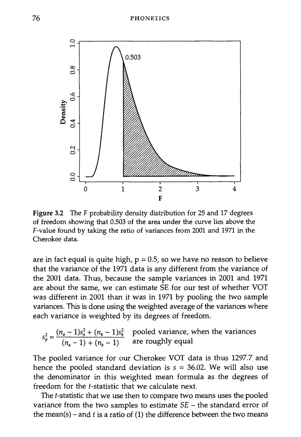
3.1.1 Cherokee voice onset time: ц197] = р.2ооз 70
3.1.2 Samples have equal variance 74
3.1.3 If the samples do not have equal variance 78
3.1.4 Paired t-test: Are men different from women? 79
3.1.5 The sign test 82
3.2 Predicting the Back of the Tongue from the Front:
Multiple Regression 83
3.2.1 The covariance matrix 84
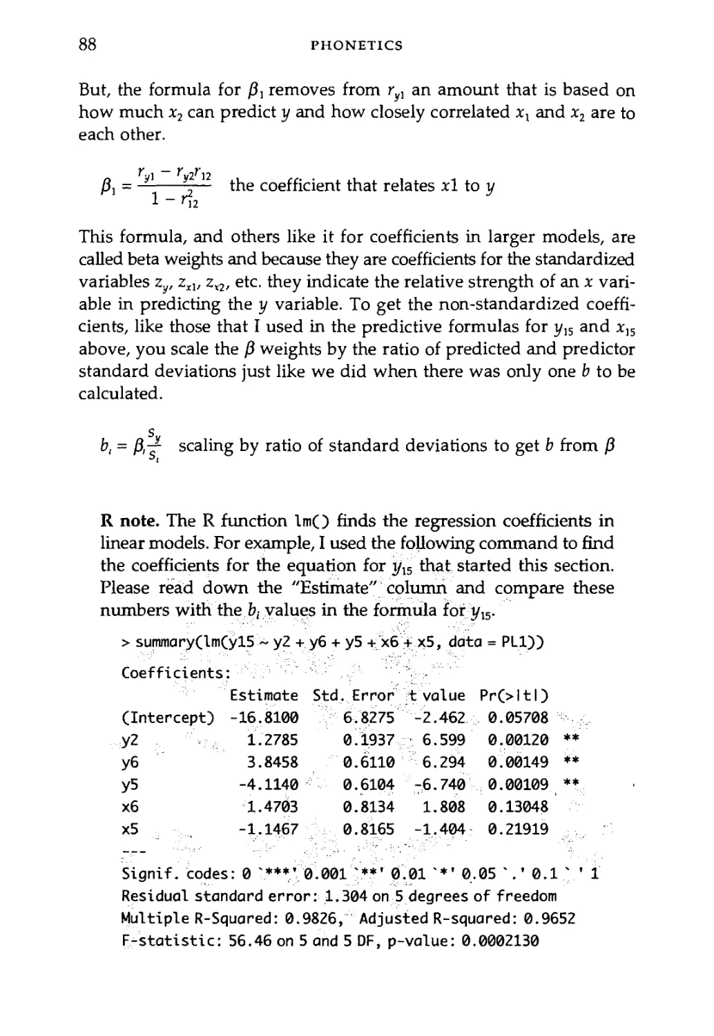
3.2.2 More than one slope: The p, 87
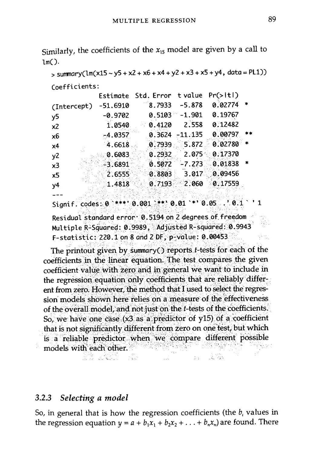
3.2.3 Selecting a model 89
3.3 Tongue Shape Factors: Principal Components Analysis 95
Exercises 102
4 Psycholinguistics 104
4.1 Analysis of Variance: One Factor, More than
Two Levels 105
4.2 Two Factors: Interaction 115
4.3 Repeated Measures 121
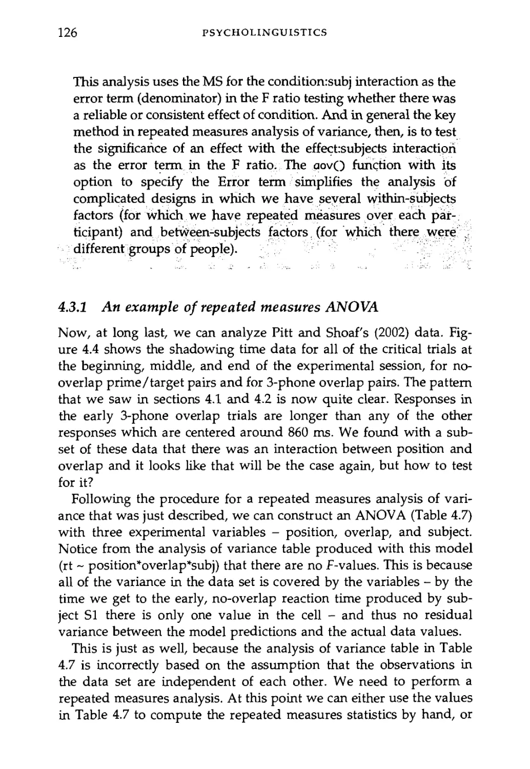
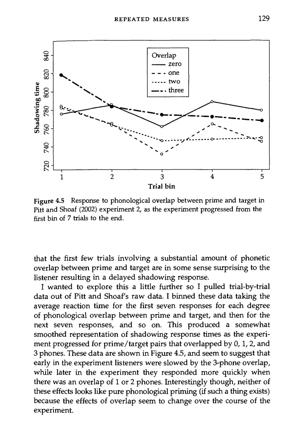
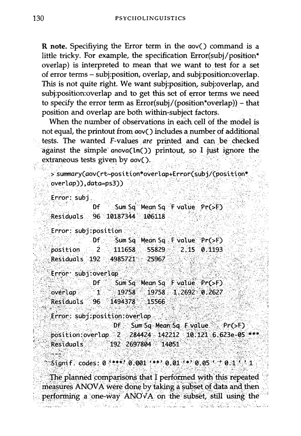
4.3.1 An example of repeated measures ANOVA 126
4.3.2 Repeated measures ANOVA with a between-
subjects factor 131
4.4 The "Language as Fixed Effect" Fallacy 134
Exercises 141
5 Sociolinguistics 144
5.1 When the Data are Counts: Contingency Tables 145
5.1.1 Frequency in a contingency table 148
5.2 Working with Probabilities: The Binomial Distribution 150
5.2.1 Bush or Kerry? 151
5.3 An Aside about Maximum Likelihood Estimation 155
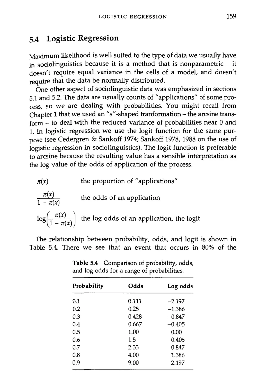
5.4 Logistic Regression 159
5.5 An Example from the [Jjtreets of Columbus 161
5.5.1 On the relationship between %2 and G2 162
5.5.2 More than one predictor 165
5.6 Logistic Regression as Regression: An Ordinal Effect
- Age 170
5.7 Varbrul/R Comparison 174
Exercises 180
CONTENTS vii
6 Historical Linguistics 182
6.1 Cladistics: Where Linguistics and Evolutionary
Biology Meet 183
6.2 Clustering on the Basis of Shared Vocabulary 184
6.3 Cladistic Analysis: Combining Character-Based
Subtrees 191
6.4 Clustering on the Basis of Spelling Similarity 201
6.5 Multidimensional Scaling: A Language Similarity
Space 208
Exercises 214
7 Syntax 216
7.1 Measuring Sentence Acceptability 218
7.2 A Psychogrammatical Law? 219
7.3 Linear Mixed Effects in the Syntactic Expression
of Agents in English 229
7.3.1 Linear regression: Overall, and separately by verbs 231
7.3.2 Fitting a linear mixed-effects model: Fixed and
random effects 237
7.3.3 Fitting five more mixed-effects models: Finding
the best model 241
7.4 Predicting the Dative Alternation: Logistic Modeling
of Syntactic Corpora Data 247
7.4.1 Logistic model of dative alternation 250
7.4.2 Evaluating the fit of the model 253
7.4.3 Adding a random factor: Mixed-effects logistic
regression 259
Exercises 264
Appendix 7A 266
References 270
Index 273
Acknowledgments
This book began at Ohio State University and Mary Beckman is
largely responsible for the fact that I wrote it. She established a course
in "Quantitative Methods in Linguistics" which I also got to teach a
few times. Her influence on my approach to quantitative methods can
be found throughout this book and in my own research studies, and
of course I am very grateful to her for all of the many ways that she
has encouraged me and taught me over the years.
I am also very grateful to a number of colleagues from a variety of
institutions who have given me feedback on this volume, including:
Susanne Gahl, Chris Manning, Christine Mooshammer, Geoff
Nicholls, Gerald Penn, Bonny Sands, and a UC San Diego student read-
ing group led by Klinton Bicknell. Students at Ohio State also helped
sharpen the text and exercises - particularly Kathleen Currie-Hall, Matt
Makashay, Grant McGuire, and Steve Winters. I appreciate their feed-
back on earlier handouts and drafts of chapters. Grant has also taught
me some R graphing strategies. I am very grateful to UC Berkeley stu-
dents Molly Babel, Russell Lee-Goldman, and Reiko Kataoka for their
feedback on several of the exercises and chapters. Shira Katseff
deserves special mention for reading the entire manuscript during
fall 2006, offering copy-editing and substantive feedback. This was
extremely valuable detailed attention - thanks’ I am especially grate-
ful to OSU students Amanda Boomershine, Hope Dawson, Robin
Dodsworth, and David Durian who not only offered comments on chap-
ters but also donated data sets from their own very interesting
research projects. Additionally, I am very grateful to Joan Bresnan, Beth
Hume, Barbara Luka, and Mark Pitt for sharing data sets for this book.
The generosity and openness of all of these "data donors" is a high
ACKNOWLEDGMENTS ix
standard of research integrity. Of course, they are not responsible for
any mistakes that I may have made with their data. I wish that I could
have followed the recommendation of Johanna Nichols and Balthasar
Bickel to add a chapter on typology. They were great, donating a data
set and a number of observations and suggestions, but in the end I ran
out of time. I hope that there will be a second edition of this book
so I can include typology - and perhaps by then some other areas of
linguistic research as well.
Finally, I would like to thank Nancy Dick-Atkinson for sharing her
cabin in Maine with us in the summer of 2006, and Michael for the
whiffle-ball breaks. What a nice place to work!
Design of the Book
One thing that I learned in writing this book is that I had been
wrongly assuming that we phoneticians were the main users of quan-
titative methods in linguistics. I discovered that some of the most sophis-
ticated and interesting quantitative techniques for doing linguistics are
being developed by sociolinguists, historical linguists, and syntacticians.
So, I have tried with this book to present a relatively representative
and usable introduction to current quantitative research across many
different subdisciplines within linguistics.1
The first chapter "Fundamentals of quantitative analysis" is an
overview of, well, fundamental concepts that come up in the remain-
der of the book. Much of this will be review for students who have
taken a general statistics course. The discussion of probability distri-
butions in this chapter is key. Least-square statistics - the mean and
standard deviation, are also introduced.
The remainder of the chapters introduce a variety of statistical
methods in two thematic organizations. First, the chapters (after the
second general chapter on "Patterns and tests") are organized by
linguistic subdiscipline - phonetics, psycholinguistics, sociolinguistics,
historical linguistics, and syntax.
1 I hasten to add that, even though there is very much to be gained by studying tech-
niques in natual language processing (NLP), this book is not a language engineering
book. For a very authoritative introduction to NLP I would recommend Manning and
Schiitze's Foundations of Statistical Natural Language Processing (1999).
DESIGN OF THE BOOK
xi
This organization provides some familiar landmarks for students and
a convenient backdrop for the other organization of the book which
centers around an escalating degree of modeling complexity culminating
in the analysis of syntactic data. To be sure, the chapters do explore
some of the specialized methods that are used in particular disciplines
- such as principal components analysis in phonetics and cladistics in
historical linguistics - but I have also attempted to develop a coherent
progression of model complexity in the book.
Thus, students who are especially interested in phonetics are well
advised to study the syntax chapter because the methods introduced
there are more sophisticated and potentially more useful in phonetic
research than the methods discussed in the phonetics chapter!
Similarly, the syntactic!an will find the phonetics chapter to be a use-
ful precursor to the methods introduced finally in the syntax chapter.
The usual statistics textbook introduction suggests what parts of the
book can be skipped without a significant loss of comprehension.
However, rather than suggest that you ignore parts of what I have writ-
ten here (naturally, I think that it was all worth writing, and I hope it
will be worth your reading) I refer you to Table 0.1 that shows the con-
tinuity that I see among the chapters.
The book examines several different methods for testing research
hypotheses. These focus on building statistical models and evaluating
them against one or more sets of data. The models discussed in the
book include the simple f-test which is introduced in Chapter 2 and
elaborated in Chapter 3, analysis of variance (Chapter 4), logistic
regression (Chapter 5), linear mixed effects models and logistic linear
mixed effects models discussed in Chapter 7. The progression here is
from simple to complex. Several methods for discovering patterns in
data are also discussed in the book (in Chapters 2, 3, and 6) in pro-
gression from simpler to more complex. One theme of the book is that
despite our different research questions and methodologies, the statistical
methods that are employed in modeling linguistic data are quite
coherent across subdisciplines and indeed are the same methods that
are used in scientific inquiry more generally. I think that one measure
of the success of this book will be if the student can move from this
introduction - oriented explicitly around linguistic data - to more gen-
eral statistics reference books. If you are able to make this transition I
think I will have succeeded in helping you connect your work to the
larger context of general scientific inquiry.
xii
DESIGN OF THE BOOK
Table 0.1 The design of the book as a function of statistical approach
(hypothesis testing vs. pattern discovery), type of data, and type of
predictor variables.
Hypothesis testing Predictor variables
factorial (nominal) Continuous Mixed random and fixed factors
Type of data Ratio t-test (Chs 2 & 3) Linear Repeated measures
(continuous) ANOVA (Ch. 4) regression (Chs 2 & 3) ANOVA (Ch. 4) Linear mixed effects (Ch. 7)
Nominal X2 test (Ch. 5) Logistic Logistic linear mixed
(counting) Logistic regression (Ch. 5) regression (Ch. 5) effects (Ch. 7)
Pattern discovery Type of pattern
Categories Continuous
Type of data Many continuous Principal components Linear regression
dimensions (Ch. 3) (Ch. 3) Principal components (Ch. 3)
Distance matrix Clustering (Ch. 6) MD Scaling (Ch. 6)
Shared traits Cladistics (Ch. 6)
A Note about Software
One thing that you should be concerned with in using a book that
devotes space to learning how to use a particular software package is
that some software programs change at a relatively rapid pace.
In this book, I chose to focus on a software package (called "R") that
is developed under the GNU license agreement. This means that the
software is maintained and developed by a user community and is dis-
tributed not for profit (students can get it on their home computers
at no charge). It is serious software. Originally developed at AT&T
Bell Labs, it is used extensively in medical research, engineering, and
DESIGN OF THE BOOK
xiii
science. This is significant because GNU software (like Unix, Java, C,
Perl, etc.) is more stable than commercially available software -
revisions of the software come out because the user community needs
changes, not because the company needs cash. There are also a number
of electronic discussion lists and manuals covering various specific tech-
niques using R. You'll find these resources at the R project web page
(http://www.r-project.org).
At various points in the text you will find short tangential sections
called "R notes." I use the R notes to give you, in detail, the com-
mand language that was used to produce the graphs or calculate the
statistics that are being discussed in the main text. These commands
have been student tested using the data and scripts that are avail-
able at the book web page, and it should be possible to copy the com-
mands verbatim into an open session of R and reproduce for yourself
the results that you find in the text. The aim of course is to reduce
the R learning curve a bit so you can apply the concepts of the book
as quickly as possible to your own data analysis and visualization
problems.
Contents of the Book Web Site
The data sets and scripts that are used as examples in this book
are available for free download at the publisher's web site - www.
blackwellpublishing.com. The full listing of the available electronic
resources is reproduced here so you will know what you can get from
the publisher.
Chapter 2 Patterns and Tests
Script: Figure 2.1.
Script: The central limit function from a uniform distribution
(central.limit.unif).
Script: The central limit function from a skewed distribution
(central.limit).
Script: The central limit function from a normal distribution.
Script: Figure 2.5.
Script: Figure 2.6 (shade.tails)
Data: Male and female Fl frequency data (Fl_data.txt).
Script: Explore the chi-square distribution (chisq).
xiv
DESIGN OF THE BOOK
Chapter 3 Phonetics
Data: Cherokee voice onset times (cherokeeVOT.txt).
Data: The tongue shape data (chaindata.txt).
Script: Commands to calculate and plot the first principal component
of tongue shape.
Script: Explore the F distribution (shade.tails.df).
Data: Made-up regression example (regression.txt).
Chapter 4 Psycholinguistics
Data: One observation of phonological priming per listener from Pitt
and Shoaf's (2002).
Data: One observation per listener from two groups (overlap versus
no overlap) from Pitt and Shoaf's study.
Data: Hypothetical data to illustrate repeated measures of analysis.
Data: The full Pitt and Shoaf data set.
Data: Reaction time data on perception of flap, /d/, and eth by
Spanish-speaking and English-speaking listeners.
Data: Luka and Barsalou (2005) "by subjects" data.
Data: Luka and Barsalou (2005) "by items" data.
Data: Boomershine's dialect identification data for exercise 5.
Chapter 5 Sociolinguistics
Data: Robin Dodsworth's preliminary data on /1/ vocalization in
Worthington, Ohio.
Data: Data from David Durian's rapid anonymous survey on /str/ in
Columbus, Ohio.
Data: Hope Dawson's Sanskrit data.
Chapter 6 Historical Linguistics
Script: A script that draws Figure 6.1.
Data: Dyen, Kruskal, and Black's (1984) distance matrix for 84 Indo-
European languages based on the percentage of cognate words
between languages.
Data: A subset of the Dyen et al. (1984) data coded as input to the Phylip
program "pars."
DESIGN OF THE BOOK
XV
Data: IE-lists.txt: A version of the Dyen et al. word lists that is read-
able in the scripts below.
Script: make_dist: This Perl script tabulates all of the letters used in
the Dyen et al. word lists.
Script: get_IE_distance: This Perl script implements the "spelling dis-
tance" metric that was used to calculate distances between words in
the Dyen et al. list.
Script: make_matrix: Another Perl script. This one takes the output of
get_IE_distance and writes it back out as a matrix that R can easily
read.
Data: A distance matrix produced from the spellings of words in the
Dyen et al. (1984) data set.
Data: Distance matrix for eight Bantu languages from the Tanzanian
Language Survey.
Data: A phonetic distance matrix of Bantu languages from Ladefoged,
Glick, and Criper (1971).
Data: The TLS Bantu data arranged as input for phylogenetic parsi-
mony analysis using the Phylip program pars.
Chapter 7 Syntax
Data: Results from a magnitude estimation study.
Data: Verb argument data from CoNLL-2005.
Script: Cross-validation of linear mixed effects models.
Data: Bresnan et al.'s (2007) dative alternation data.
1 Fundamentals of
Quantitative Analysis
In this chapter, I follow the outline of topics used in the first chapter
of Kachigan, Multivariate Statistical Analysis, because I think that that
is a very effective presentation of these core ideas.
Increasingly, linguists handle quantitative data in their research.
Phoneticians, sociolinguists, psycholinguists, and computational linguists
deal in numbers and have for decades. Now also, phenologists, synta-
cticians, and historical linguists are finding linguistic research to
involve quantitative methods. For example, Keller (2003) measured
sentence acceptibility using a psychophysical technique called magni-
tude estimation. Also, Boersma and Hayes (2001) employed probablis-
tic reasoning in a constraint reranking algorithm for optimality theory.
Consequently, mastery of quantitative methods is increasingly
becoming a vital component of linguistic training. Yet, when I am asked
to teach a course on quantitative methods I am not happy with the avail-
able textbooks. I hope that this book will deal adequately with the fun-
damental concepts that underlie common quantitative methods, and
more than that will help students make the transition from the basics
to real research problems with explicit examples of various common
analysis techniques.
Of course, the strategies and methods of quantitative analysis are of
primary importance, but in these chapters practical aspects of handling
quantitative linguistic data will also be an important focus. We will be
concerned with how to use a particular statistical package (R) to dis-
cover patterns in quantitative data and to test linguistic hypotheses.
This theme is very practical and assumes that it is appropriate and use-
ful to look at quantitative measures of language structure and usage.
We will question this assumption. Salsburg (2001) talks about
a "statistical revolution" in science in which the distributions of
2
FUNDAMENTALS OF QUANTITATIVE ANALYSIS
measurements are the objects of study. We will, to some small extent,
consider linguistics from this point of view. Has linguistics participated
in the statistical revolution? What would a quantitative linguistics be
like? Where is this approach taking the discipline?
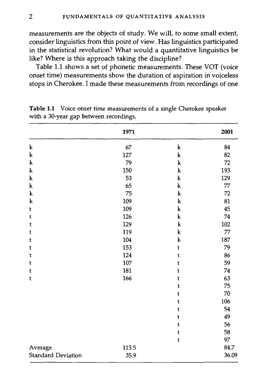
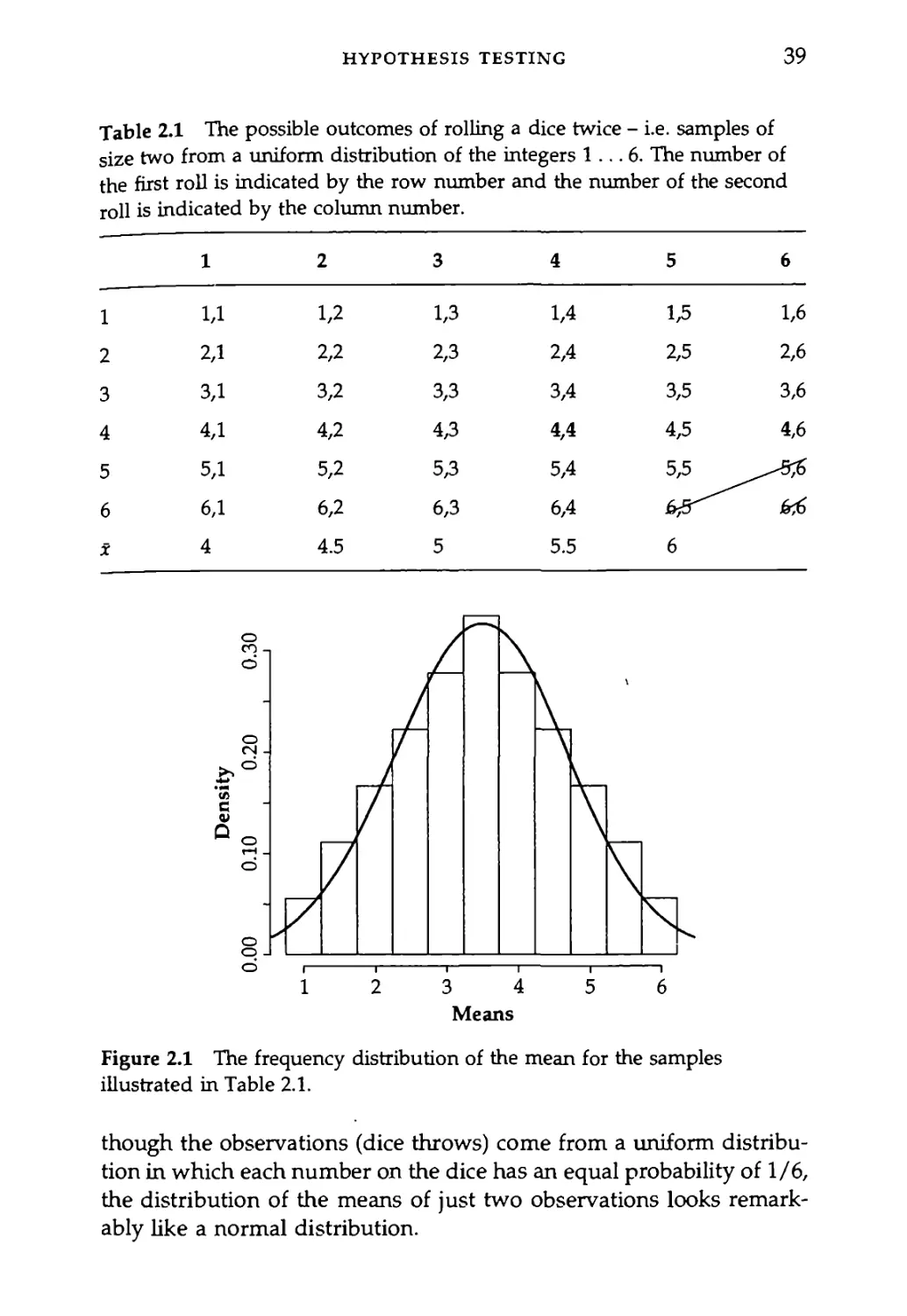
Table 1.1 shows a set of phonetic measurements. These VOT (voice
onset time) measurements show the duration of aspiration in voiceless
stops in Cherokee. I made these measurements from recordings of one
Table 1.1 Voice onset time measurements of a single Cherokee speaker
with a 30-year gap between recordings.
1971 2001
к 67 к 84
к 127 к 82
к 79 к 72
к 150 к 193
к 53 к 129
к 65 к 77
к 75 к 72
к 109 к 81
t 109 к 45
t 126 к 74
t 129 к 102
t 119 к 77
t 104 к 187
t 153 t 79
t 124 t 86
t 107 t 59
t 181 t 74
t 166 t 63
t 75
t 70
t 106
t 54
t 49
t 56
t 58
t 97
Average 113.5 84.7
Standard Deviation 35.9 36.09
WHAT WE ACCOMPLISH IN QUANTITATIVE ANALYSIS
3
speaker, the Cherokee linguist Durbin Feeling, that were made in 1971
and 2001. The average VOT for voiceless stops /к/ and /t/ is shorter
in the 2001 dataset. But is the difference "significant"? Or is the dif-
ference between VOT in 1971 and 2001 just an instance of random vari-
ation - a consequence of randomly selecting possible utterances in the
two years that, though not identical, come from the same underlying
distribution of possible VOT values for this speaker? I think that one
of the main points to keep in mind about drawing conclusions from
data is that it is all guessing. Really. But what we are trying to do with
statistical summaries and hypothesis testing is to quantify just how reli-
able our guesses are.
1.1 What We Accomplish in Quantitative Analysis
Quantitative analysis takes some time and effort, so it is important to
be clear about what you are trying to accomplish with it. Note that
"everybody seems to be doing it" is not on the list. The four main goals
of quantitative analysis are:
1 data reduction: summarize trends, capture the common aspects of
a set of observations such as the average, standard deviation, and
correlations among variables;
2 inference: generalize from a representative set of observations to a
larger universe of possible observations using hypothesis tests
such as the t-test or analysis of variance;
3 discovery of relationships: find descriptive or causal patterns in data
which may be described in multiple regression models or in factor
analysis;
4 exploration of processes that may have a basis in probability:
theoretical modeling, say in information theory, or in practical
contexts such as probabilistic sentence parsing.
1.2 How to Describe an Observation
An observation can be obtained in some elaborate way, like visiting
a monastery in Egypt to look at an ancient manuscript that hasn't
been read in a thousand years, or renting an MRI machine for an hour
of brain imaging. Or an observation can be obtained on the cheap -
4
FUNDAMENTALS OF QUANTITATIVE ANALYSIS
asking someone where the shoes are in the department store and not-
ing whether the talker says the /г/'s in "fourth floor."
Some observations can't be quantified in any meaningful sense. For
example if that ancient text has an instance of a particular form and
your main question is "how old is the form?" then your result is that
the form is at least as old as the manuscript. However, if you were to
observe that the form was used 15 times in this manuscript, but only
twice in a slightly older manuscript, then these frequency counts
begin to take the shape of quantified linguistic observations that can
be analyzed with the same quantitative methods used in science and
engineering. I take that to be a good thing - linguistics as a member
of the scientific community.
Each observation will have several descriptive properties - some
will be qualitative and some will be quantitative - and descriptive
properties (variables) come in one of four types:
Nominal: Named properties - they have no meaningful order on a scale
of any type.
Examples: What language is being observed? What dialect? Which
word? What is the gender of the person being observed? Which vari-
ant was used: going or goin"?
Ordinal: Orderable properties - they aren't observed on a measurable
scale, but this kind of property is transitive so that if a is less than b
and b is less than c then a is also less than c.
Examples: Zipf's rank frequency of words, rating scales (e.g. excel-
lent, good, fair, poor)?
Interval: This is a property that is measured on a scale that does not
have a true zero value. In an interval scale, the magnitude of differ-
ences of adjacent observations can be determined (unlike the adjacent
items on an ordinal scale), but because the zero value on the scale is
arbitrary the scale cannot be interpreted in any absolute sense.
Examples: temperature (Fahrenheit or Centigrade scales), rating
scales?, magnitude estimation judgments.
Ratio: This is a property that we measure on a scale that does have an
absolute zero value. This is called a ratio scale because ratios of these
measurements are meaningful. For instance, a vowel that is 100 ms long
is twice as long as a 50 ms vowel, and 200 ms is twice 100 ms. Contrast
FREQUENCY DISTRIBUTIONS
5
this with temperature - 80 degrees Fahrenheit is not twice as hot as
40 degrees.
Examples: Acoustic measures - frequency, duration, frequency
counts, reaction time.
1.3 Frequency Distributions: A Fundamental
Building Block of Quantitative Analysis
You must get this next bit, so pay attention. Suppose we want to know
how grammatical a sentence is. We ask 36 people to score the sentence
on a grammaticality scale so that a score of 1 means that it sounds pretty
ungrammatical and 10 sounds perfectly OK. Suppose that the ratings
in Table 1.2 result from this exercise.
Interesting, but what are we supposed to learn from this? Well,
we're going to use this set of 36 numbers to construct a frequency
Table 1.2 Hypothetical data of grammaticality ratings for a group of
36 raters.
Person # Rating Person # Rating
1 5 19 3
2 4 20 9
3 6 21 5
4 5 22 6
5 5 23 5
6 4 24 1
7 6 25 5
8 1 26 7
9 4 27 4
10 3 28 5
11 6 29 2
12 3 30 4
13 4 31 5
14 5 32 3
15 4 33 3
16 5 34 6
17 5 35 3
18 4 36 5
6
FUNDAMENTALS OF QUANTITATIVE ANALYSIS
distribution and define some of the terms used in discussing fre-
quency distributions.
R note. I guess I should confess that I made up the "ratings" in
Table 1.2.1 used a function in the R statistics package to draw 36
random integer observations from a, normal distribution -that
had a mean value of 4.5 and a standard deviation of 2. Here's the
command that I used to produce the made up data:
round(rnormC36,4.5/2))
If you issue this command in R you will almost certainly get
different set of ratings (that's the nature, of random selection), but
the distribution of your scores should match the one . in. the
example.
Look again at Table 1.2. How many people gave the sentence a
rating of "1"? How many rated it a "2"? When we answer these ques-
tions for all of the possible ratings we have the values that make up
the frequency distribution of our sentence grammaticality ratings.
These data and some useful recodings of them are shown in Table 1.3.
You'll notice in Table 1.3 that we counted two instances of rating
"1", one instance of rating "2", six instances of rating "3", and so on.
Since there were 36 raters, each giving one score to the sentence, we
have a total of 36 observations, so we can express the frequency counts
in relative terms - as a percentage of the total number of observations.
Note that percentages (as the etymology of the word would suggest)
are commonly expressed on a scale from 0 to 100, but you could express
the same information as proportions ranging from 0 to 1.
The frequency distribution in Table 1.3 shows that most of the
grammaticality scores are either "4" or "5," and that though the scores
span a wide range (from 1 to 9) the scores are generally clustered in
the middle of the range. This is as it should be because I selected the
set of scores from a normal (bell-shaped) frequency distribution that
centered on the average value of 4.5 - more about this later.
The set of numbers in Table 1.3 is more informative than the set in
Table 1.2, but nothing beats a picture. Figure 1.1 shows the frequen-
cies from Table 1.3. This figure highlights, for the visually inclined, the
same points that we made regarding the numeric data in Table 1.3.
FREQUENCY DISTRIBUTIONS
7
Table 1.3 Frequency distributions of the grammaticality rating data in
Table 1.2.
Rating Frequencies Relative frequencies Cumulative frequencies Relative cumulative frequencies
1 2 5.6 2 5.6
2 1 2.8 3 8.3
3 6 16.7 9 25.0
4 8 22.2 17 47.2
5 12 33.3 29 80.6
6 5 13.9 34 94.4
7 1 2.8 35 97.2
8 0 0.0 35 97.2
9 1 2.8 36 100.0
Total 36 100.0 36 100.0
Figure 1.1 The frequency distribution of the grammaticality rating data
that was presented in Table 1.2.
8
FUNDAMENTALS OF QUANTITATIVE ANALYSIS
R note. I produced Figure 1.1 using the pl ot() command in
R. I first typed in the frequency count data and the scores that
correspond to these frequency counts^ so that, the vector data
contains, the counts and the vector rating has the rating values.
Then I fold plot О that we want a line plot with both (type = “b?)
lines and points.
data -c(2, 1,6,8,12,5; 1>0,T) ' ' 5
rating = c<l-2,3,4,5,6,7,8,91
plot(rating,data,type = ’'b" main = Sentence rating frequency
> distribution" xlab = "Rating" ylab = Frequency")
The property that we are seeking to study with the "grammatical-
ity score" measure is probably a good deal more gradient than we
permit by restricting our rater to a scale of integer numbers. It may be
that not all sentences that he/she would rate as a "5" are exactly equi-
valent to each other in the internal feeling of grammaticality that they
evoke. Who knows? But suppose that it is true that the internal gram-
maticality response that we measure with our rating scale is actually
a continuous, gradient property. We could get at this aspect by pro-
viding a more and more continuous type of rating scale - we'll see more
of this when we look at magnitude estimation later - but whatever scale
we use, it will have some degree of granularity or quantization to
it. This is true of all of the measurement scales that we could imagine
using in any science.
So, with a very fine-grained scale (say a grammaticality rating on a
scale with many decimal points) it doesn't make any sense to count the
number of times that a particular measurement value appears in the
data set because it is highly likely that no two ratings will be exactly
the same. In this case, then, to describe the frequency distribution of
our data we need to group the data into contiguous ranges of scores
(bins) of similar values and then count the number of observations in
each bin. For example, if we permitted ratings on the 1 to 10 gram-
maticality scale to have many decimal places, the frequency distribu-
tion would look like the histogram in Figure 1.2, where we have a count
of 1 for each rating value in the data set.
Figure 1.3 shows how we can group these same data into ranges
(here ratings between 0 and 1, 1 and 2, and so on) and then count the
number of rating values in each range, just as we counted before, the
FREQUENCY DISTRIBUTIONS
9
Figure 1.2 A histogram of the frequency distribution of grammaticality
ratings when rating values come on a continuous scale.
Figure 1.3 The same continuous rating data that was shown in Figure 1.2,
but now the frequency distribution is plotted in bins.
10
FUNDAMENTALS OF QUANTITATIVE ANALYSIS
number of ratings of a particular value. So, instead of counting the num-
ber of times the rating "6" was given, now we are counting the number
of ratings that are greater than or equal to 5 and less than 6.
OK. This process of grouping measurements on a continuous scale
is a useful, practical thing to do, but it helps us now make a serious
point about theoretical frequency distributions. This point is the foun-
dation of all of the hypothesis testing statistics that we will be looking
at later. So, pay attention!
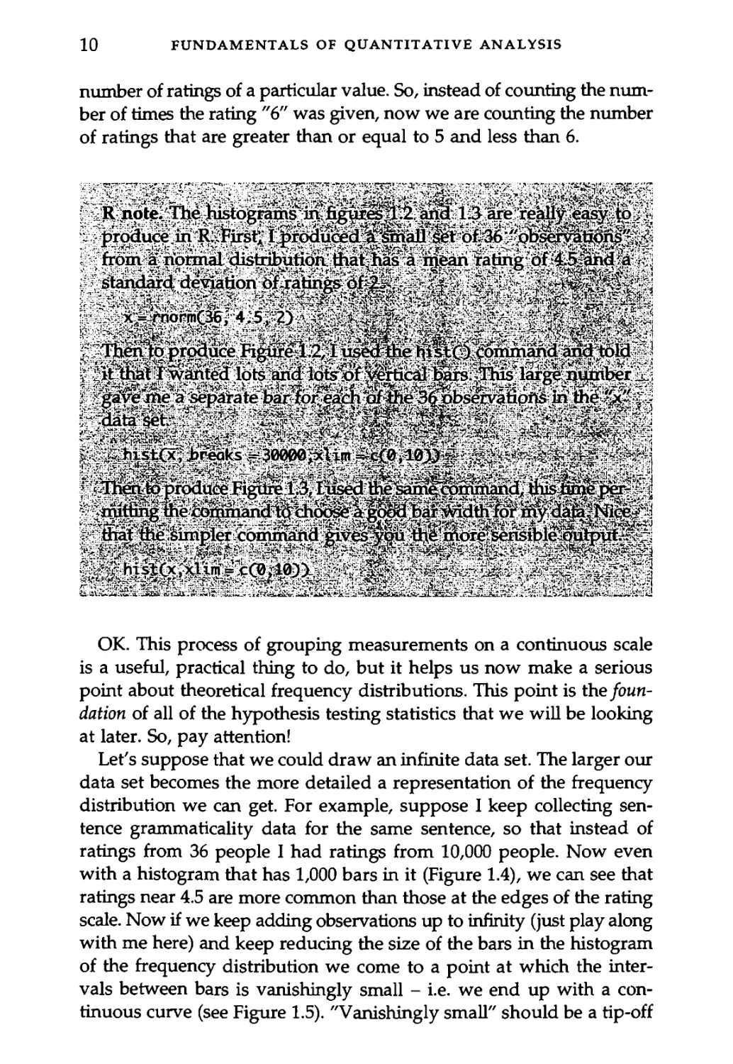
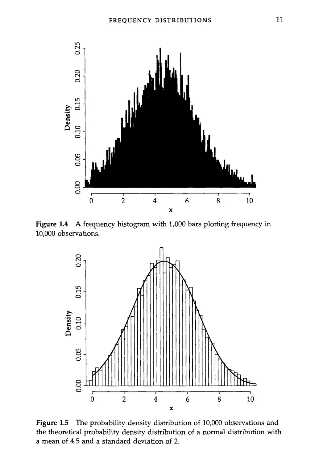
Let's suppose that we could draw an infinite data set. The larger our
data set becomes the more detailed a representation of the frequency
distribution we can get. For example, suppose I keep collecting sen-
tence grammaticality data for the same sentence, so that instead of
ratings from 36 people I had ratings from 10,000 people. Now even
with a histogram that has 1,000 bars in it (Figure 1.4), we can see that
ratings near 4.5 are more common than those at the edges of the rating
scale. Now if we keep adding observations up to infinity (just play along
with me here) and keep reducing the size of the bars in the histogram
of the frequency distribution we come to a point at which the inter-
vals between bars is vanishingly small - i.e. we end up with a con-
tinuous curve (see Figure 1.5). "Vanishingly small" should be a tip-off
FREQUENCY DISTRIBUTIONS
11
Figure 1.4 A frequency histogram with 1,000 bars plotting frequency in
10,000 observations.
Figure 1.5 The probability density distribution of 10,000 observations and
the theoretical probability density distribution of a normal distribution with
a mean of 4.5 and a standard deviation of 2.
12
FUNDAMENTALS OF QUANTITATIVE ANALYSIS
that we have entered the realm of calculus. Not to worry though, we're
not going too far.
R note. The cool .thing about figure 1.5 is that we cpmbine a his-
togram of the observed frequency distribution of a set of data witK. t
a theoretical normaljdistribution curve .(see.Chapter2 Tegardihgl,
" probability density)^it js^efulto be able to dothisr.TJere-are the’
«commands I used: v Л?” v X-7
rnpm(100^j>4;^^^^’e^ratei0;000datapainty>, J:?
: Of course, the c^cellent fit between the p^s^^ya^Jme^.
thebreticardistributibrs is help|d by the fact thaf^ed^bem^;.
, plotted here ^^eg^^t^b^^dom^e^^r^r^Si^^f obserj .
> ^yationS from.the ^eoretic^ ^normal b
The "normal distribution" is an especially useful theoretical function.
It seems intuitively reasonable to assume that in most cases there is
some underlying property that we are trying to measure - like gram-
maticality, or typical duration, or amount of processing time - and that
there is some source of random error that keeps us from getting an
exact measurement of the underlying property. If this is a good
description of the source of variability in our measurements, then we
can model this situation by assuming that the underlying property -
the uncontaminated "true" value that we seek - is at the center of the
frequency distribution that we observe in our measurements and that
the spread of the distribution is caused by error, with bigger errors being
less likely to occur than smaller errors.
These assumptions give us a bell-shaped frequency distribution
which can be described by the normal curve, an extremely useful bell-
shaped curve, which is an exponential function of the mean value (Greek
letter Ц "mew") and the variance (Greek letter о "sigma").
fz = —^=e_(l-M)2/2<Tl the normal distribution
Jx gJ2jc
TYPES OF DISTRIBUTIONS
13
One useful aspect of this definition of a theoretical distribution of
data (besides that it derives from just two numbers, the mean value
and a measure of how variable the data are) is that sum of the area
under the curve fx is 1. So, instead of thinking in terms of a "frequency"
distribution, the normal curve gives us a way to calculate the prob-
ability of any set of observations by finding the area under any por-
tion of the curve. We'll come back to this.
1.4 Types of Distributions
Data come in a variety of shapes of frequency distributions (Figure 1.6).
For example, if every outcome is equally likely then the distribution
is uniform. This happens for example with the six sides of a dice - each
one is (supposed to be) equally likely, so if you count up the number
of rolls that come up "1" it should be on average 1 out of every 6 rolls.
In the normal - bell-shaped - distribution, measurements tend to
congregate around a typical value and values become less and less
likely as they deviate further from this central value. As we saw in the
section above, the normal curve is defined by two parameters - what
the central tendency is (p.) and how quickly probability goes down as
you move away from the center of the distribution (o).
If measurements are taken on a scale (like the 1-9 grammaticality
rating scale discussed above), as we approach one end of the scale the
frequency distribution is bound to be skewed because there is a limit
beyond which the data values cannot go. We most often run into skewed
frequency distributions when dealing with percentage data and reac-
tion time data (where negative reaction times are not meaningful).
The J-shaped distribution is a kind of skewed distribution with most
observations coming from the very end of the measurement scale. For
example, if you count speech errors per utterance you might find that
most utterances have a speech error count of 0. So in a histogram, the
number of utterances with a low error count will be very high and will
decrease dramatically as the number of errors per utterance increases.
A bimodal distribution is like a combination of two normal distribu-
tions - there are two peaks. If you find that your data fall in a bimodal
distribution you might consider whether the data actually represent
two separate populations of measurements. For example, voice fun-
damental frequency (the acoustic property most closely related to the
pitch of a person's voice) falls into a bimodal distribution when you
14
FUNDAMENTALS ОБ QUANTITATIVE ANALYSIS
function(x) (dnormix, mean = 3, sd = 1) function(x) dunifix,
function(x)df (x, 1,10) 3 + dnorm(x, mean = -3, (x) sd = l)n2 (x) min = -3, max = 3) (x)
Figure 1.6 Types of probability distributions.
IS NORMAL DATA NORMAL?
15
pool measurements from men and women because men tend to have
lower pitch than women.
If you ask a number of people how strongly they supported the US
invasion of Iraq you would get a very polarized distribution of results.
In this U-shaped distribution most people would be either strongly in
favor or strongly opposed with not too many in the middle.
R note. Figure J.6 not only illustrates different types of probab-
ility distributions, it also shows how td combine several graphs
into one figure jn R. The command parQ lets you set many dif-
ferent graphics parameters. I set the graph window to expect two '
rows that each have three graphs by entering this command:
1 par(mfcol=c(2,3)) v ’
Then I entered the six plot commands?m the following order:
> plot(functionCx)dunif(x,min=-3,fnax=3),-3,3, t t - t
v main="Uniforrii”) tV Л. s. : ’ t
> plotCfunctionCx^dnormCxSj-B^, njain="Normai"1)l
’ > plot(function(x)df(x;3“ 100),0,4,mqiWeSI$ewed right’’)
> plot(functionCx)df(x,l 10)/3,0.2,3, main=*J-shaped")
> plot (function (x)(dnorm(x, fnean=3, sd=l)+dnorm(x,njean=-3,
^isd=l))/2,-6,6’, main="Bimodal”)' \ 1 2
.. >plot(function(x)’-dnorm(x),-3,3,main=',U-shapedn) . v
And, voila. The figure isdohe. When youlqiow that you will want
* Tp'repeat the same, or {a very^similar, sequence pf commands Tor
* a new .data set, you can save a lisf of commands like this asa~’
custom command, and then, just enter your ’own "plot my data '
my way* command.- " д л к t'
1.5 Is Normal Data, Well, Normal?
The normal distribution is a useful way to describe data. It embodies
some reasonable assumptions about how we end up with variability
in our data sets and gives us some mathematical tools to use in two
important goals of statistical analysis. In data reduction, we can
describe the whole frequency distribution with just two numbers - the
16
FUNDAMENTALS OF QUANTITATIVE ANALYSIS
mean and the standard deviation (formal definitions of these are
just ahead.) Also, the normal distribution provides a basis for drawing
inferences about the accuracy of our statistical estimates.
So, it is a good idea to know whether or not the frequency distribu-
tion of your data is shaped like the normal distribution. I suggested
earlier that the data we deal with often falls in an approximately
normal distribution, but as discussed in section 1.4, there are some
common types of data (like percentages and rating values) that are not
normally distributed.
We're going to do two things here. First, we'll explore a couple of
ways to determine whether your data are normally distributed, and
second we'll look at a couple of transformations that you can use
to make data more normal (this may sound fishy, but transformations
are legal!).
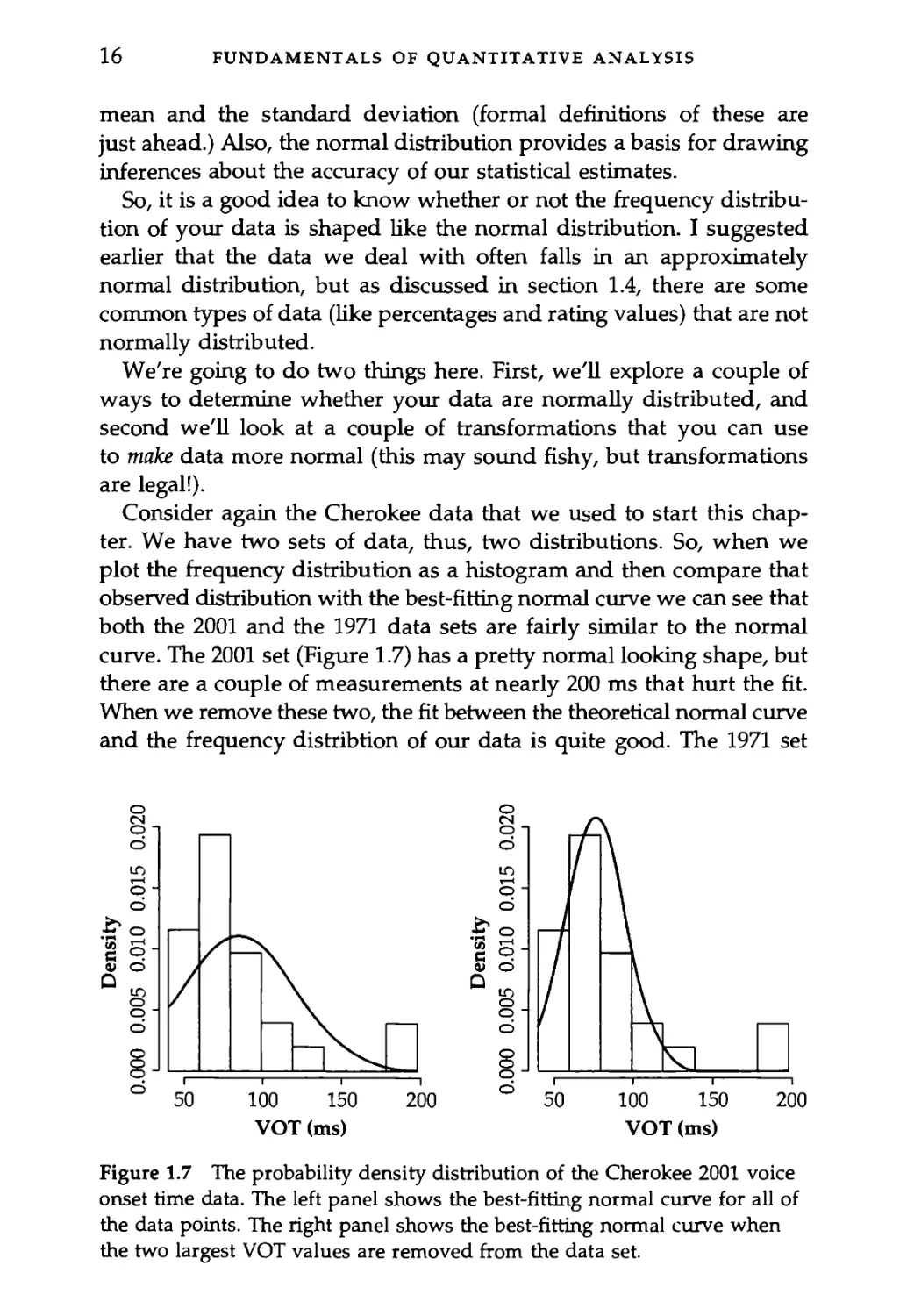
Consider again the Cherokee data that we used to start this chap-
ter. We have two sets of data, thus, two distributions. So, when we
plot the frequency distribution as a histogram and then compare that
observed distribution with the best-fitting normal curve we can see that
both the 2001 and the 1971 data sets are fairly similar to the normal
curve. The 2001 set (Figure 1.7) has a pretty normal looking shape, but
there are a couple of measurements at nearly 200 ms that hurt the fit.
When we remove these two, the fit between the theoretical normal curve
and the frequency distribtion of our data is quite good. The 1971 set
VOT (ms)
Figure 1.7 The probability density distribution of the Cherokee 2001 voice
onset time data. The left panel shows the best-fitting normal curve for all of
the data points. The right panel shows the best-fitting normal curve when
the two largest VOT values are removed from the data set.
IS NORMAL DATA NORMAL?
17
Figure 1.8 The probability density distribution of the Cherokee 1971 voice
onset time data. The best-fitting normal curve is also shown.
(Figure 1.8) also looks roughly like a normally distributed data set,
though notice that there were no observations between 80 and 100 ms
in this (quite small) data set. Though if these data came from a nor-
mal curve we would have expected several observations in this range.
R note/In producing Figures 1.7 and" 1 loused the^tO function
r' ’to type in the two'vectofsvot01for.the|2OOl data апД yot7T-iorJ.
.' the 1971 data.Ju^tahead lTl introduce metoods forxeadiiig^XB
< froiji computer 'files intoJ-R^- you don't, usually. haVe/td^ype f
; - jn youridatar^OT J?used.the
culate The means and standard deviations -for thesedata"vS^s..
.Finally, I used the histOГarid plotQ commands to drawjthe'a^^l 7 „
-and theoretical frequency:distributions in The figures.; “ 1'
(r л C uC *1. b j v 1
> vot^l= c(84, 82, 72,193,129, 77, 72; 81, 45, 74^102 j
C < -187,4 79, ^ 59, 74/^3^75, 70^:106;^ 49,
> yot7r=c(67,’ 127, 79'; 150; 53, 65, .75/109, 109, Д26^С/?'
119, 104, 153, 124, 107, 181, 166) ‘ C' ~ '
18
FUNDAMENTALS OF QUANTITATIVE ANALYSIS
> mean(vot01)
£1] 84.65385
> sd(vot01)
Cl] 36.08761
> hist(vot01,freq=FALSE)
..> plot(function(x)dnorm(x, mean=84.654^sd=36.088), 40,
200, ddd=TRUE)
You might also be interested to see how to take the mean and
standard deviation with outliers removed. I decided that the two
VOT measurements in vot01 that are greater than Л80 ms are
outliers and so calcuated the mean and standard deviation for
only those numbers in the vector that are less than 180 using the
following statements. . <
> mean(vot01£vot01<180])
fl] 75:875
sd(yot01Cvot01<180])
[1] 19.218 , ,
Read vot01Cvot01<180] as "the numbers in vot01that are less than
180." When we have data sets that are composed of several linked
vectors we can extract subsets of data using similar syntax. < /
Note though that I have just told, ypuhdw to "remove outliers"
as if it is perfectly fine to remove weird data. It is not! You should
use nil of the data you collect, unless ydiihavegood independ-
ent for not doing so.' For example, data values can be
removed if you know that th^e Kasbeen ^memeasurement error
that results in the weird value/ if you kno^. that the persdn
providing the "data was dffferent'from-..ti^iotherripartidpants
in the study in some way that bears on the aims of the study
(e;g5by virtue of having fallen asleep during a perception ^experi-
ment, by not being a native^, speaker of the language under
study), the token is different in some crucial way (e.g. by virtue
_ of.being spoken in error or with .a disfluency). Because such vari-
ation on the part of the people we study is bound to happen,
it is ‘acceptable tc/trun Йю ^%'mpsf,extr^he‘ data Values from
.large and noisy database where manual: irispectiomof the. entire
database is “not practical. / _r
IS NORMAL DATA NORMAL?
19
These frequency distribution graphs give an indication of whether
our data is distributed on a normal curve, but we are essentially
waving our hands at the graphs and saying "looks pretty normal to
me." I guess you shouldn't underestimate how important it is to look
at the data, but it would be good to be able to measure just how
"normally distributed" these data are.
To do this we measure the degree of fit between the data and the
normal curve with a quantile/quantile plot and a correlation between
the actual quantile scores and the quantile scores that are predicted
by the normal curve. The NIST Handbook of Statistical Methods (2004)
has this to say about Q-Q plots.
The quantile-quantile (q-q) plot is a graphical technique for determining
if two data sets come from populations with a common distribution.
A q-q plot is a plot of the quantiles of the first data set against the
quantiles of the second data set. By a quantile, we mean the fraction (or
percent) of points below the given value. That is, the 0.3 (or 30%) quan-
tile is the point at which 30% percent of the data fall below and 70% fall
above that value.
A 45-degree reference line is also plotted. If the two sets come from a
population with the same distribution, the points should fall approxi-
mately along this reference line. The greater the departure from this
reference line, the greater the evidence for the conclusion that the two
data sets have come from populations with different distributions.
The advantages of the q-q plot are:
1 The sample sizes do not need to be equal.
2 Many distributional aspects can be simultaneously tested. For ex-
ample, shifts in location, shifts in scale, changes in symmetry, and the
presence of outliers can all be detected from this plot. For example,
if the two data sets come from populations whose distributions differ
only by a shift in location, the points should lie along a straight line
that is displaced either up or down from the 45-degree reference line.
The q-q plot is similar to a probability plot. For a probability plot, the
quantiles for one of the data samples are replaced with the quantiles of
a theoretical distribution.
Further regarding the "probability plot" the Handbook has this to say:
The probability plot (Chambers et al. 1983) is a graphical technique for
assessing whether or not a data set follows a given distribution such as
the normal or Weibull.
20
FUNDAMENTALS OF QUANTITATIVE ANALYSIS
Theoretical quantiles
Figure 1.9 The quantiles-quantiles probability plot comparing the Cherokee
1971 data with the normal distribution.
The data are plotted against a theoretical distribution in such a way
that the points should form approximately a straight line. Departures from
this straight line indicate departures from the specified distribution.
As you can see in Figure 1.9 the Cherokee 1971 data are just as you
would expect them to be if they came from a normal distribution. In
fact, the data points are almost all on the line showing perfect identity
between the expected "Theoretical quantiles" and the actual "Sample
quantiles." This good fit between expected and actual quantiles is
reflected in a correlation coefficient of 0.987 - almost a perfect 1 (you'll
find more about correlation in the phonetics chapter, Chapter 3).
Contrast this excellent fit with the one between the normal distri-
bution and the 2001 data (Figure 1.10). Here we see that most of the
data points in the 2001 data set are just where we would expect them
to be in a normal distribution. However the two (possibly three)
largest VOT values are much larger than expected. Consequently, the
correlation between expected and observed quantiles for this data set
(r = 0.87) is lower than what we found for the 1971 data. It may be that
this distribution would look more normal if we collected more data
IS NORMAL DATA NORMAL?
21
Theoretical quantiles
Figure 1.10 The quantiles-quantiles probability plot comparing the
Cherokee 2001 data with the normal distribution.
points, or we might find that we have a bimodal distribution such that
most data comes from a peak around 70 ms, but there are some VOTs
(perhaps in a different speaking style?) that center around a much longer
(190 ms) VOT value. We will eventually be testing the hypothesis that
this speaker's VOT was shorter in 2001 than it was in 1971 and the out-
lying data values work against this hypothesis. But, even though these
two very long VOT values are inconvenient, there is no valid reason
to remove them from the data set (they are not errors of measurement,
or speech dysfluencies), so we will keep them.
R note. Making1 a quantile-quantile plot in R is easy using the
. qqnormO and qqlineQ functions. The function qqnormQ takes a
vector of values (the data set) as input and draws a Q-Q plot of
the data. I also captured the values used to plot the x-axis of the
graph into the vector vot71. qq for later use in the correlation func-
tion corQ. qqlineQ adds the 45-degree reference line to-the plot/
22
FUNDAMENTALS OF QUANTITATIVE ANALYSIS
and corO measures how well the points fit on the line (0 for no
fit at all and 1 for a perfect fit).,
vot71.qq = qqnormCvot71)$x # make the quantile/quantile plot
vot01.qq = qqnormCvot01)$x # and keep the x axis of the plot
qqline(vot71) # put the line on the plot
cor(vot71,vot71.qq) # compute the correlation
[1] 0.9868212
> cor(vot01,vot01.qq)
[13 0.8700187
Now, let's look at a non-normal distribution. We have some rating
data that are measured as proportions on a scale from 0 to 1, and in
one particular condition several of the participants gave ratings that
were very close to the bottom of the scale - near zero. So, when we
plot these data in a quantile-quantile probability plot (Figure 1.11), you
Theoretical quantiles
Figure 1.11 The Normal quantile-quantile plot for a set of data that is not
normal because the score values (which are probabilities) cannot be less
than zero.
IS NORMAL DATA NORMAL?
23
can see that, as the sample quantile values approach zero, the data points
fall on a horizontal line. Even with this non-normal distribution,
though, the correlation between the expected normal distribution and
the observed data points is pretty high (r = 0.92).
One standard method that is used to make a data set fall on a more
normal distribution is to transform the data from the original meas-
urement scale and put it on a scale that is stretched or compressed in
helpful ways. For example, when the data are proportions it is usually
recommended that they be transformed with the arcsine transform. This
takes the original data x and converts it to the transformed data у using
the following formula:
у = -|arcsin(//x ) arcsine transformation
This produces the transformation shown in Figure 1.12, in which
values that are near 0 or 1 on the x-axis are spread out on the y-axis.
Figure 1.12 The arcsine transformation. Values of x that are near 0 or 1 are
stretched out on the arcsine axis. Note that the transformed variable spans a
range from 0 to it.
24
FUNDAMENTALS OF QUANTITATIVE ANALYSIS
R note. The command for plotting the arcsine transformation in
Figure 1.12 uses the plot function method.
> plot(function(x)2/pi*asin(sqrt(x)),0,l)
And as in this plot command, the command to transform the ori-
ginal data set (the vector "daU") also uses the functions a sin О
and sqrtQ to implement the arcsine and square root operations
to create the new . vector of values "x.arcsin. "Read this as
"x.arcsin is produced by taking the arcsine of the square root of
data and multiplying it by 2 divided by тс."
> x.arcsin = 2/pi*asinCsqrt(x))
The correlation between the expected values from a normal frequency
distribution and the actual data values on the arcsine transformed
measurement scale (r = 0.96) is higher than it was for the untransformed
data. The better fit of the normal distribution to the observed data
values is also apparent in the normal Q-Q plot of the transformed
data (Figure 1.13). This indicates that the arcsine transform did what
we needed it to do - it made our data more normally distributed
so that we can use statistics that assume that the data fall in a normal
distribution.
1.6 Measures of Central Tendency
Figure 1.14 shows three measures of the the central tendency, or
mid-point, of a skewed distribution of data.
The mode of the distribution is the most frequently occurring value
in the distribution - the tip of the frequency distribution. For the
skewed distribution in Figure 1.14, the mode is at about 0.6.
Imagine ordering a data set from the smallest value to the largest.
The median of the distribution is the value in the middle of the ordered
list. There are as many data points greater than the median value then
are less than the median. This is sometimes also called the "center of
gravity".
The mean value, or the arithmetic average, is the least squares esti-
mate of central tendency. First, how to calculate the mean - sum the
data values and then divide by the number of values in the data set.
MEASURES OF CENTRAL TENDENCY
25
Theoretical quantiles
Figure 1.13 The normal quantile-quantile plot for the arcsine transform of
the data shown in Figure 1.11.
Figure 1.14 The mode, median, and mean of a skewed distribution.
26
FUNDAMENTALS OF QUANTITATIVE ANALYSIS
x =------- mean
n
Second, what does it mean to be the least squares estimate of cen-
tral tendency? This means that if we take the difference between the
mean and each value in our data set, square these differences and add
them up, we will have a smaller value than if we were to do the same
thing with the median or any other estimate of the "mid-point" of the
data set.
d2 = “ *)2 sum °f the squared deviations (also called SS)
So, in the data set illustrated in Figure 1.14, the value of d2, the sum
of the squared deviations from the mean, is 4,570, but if we calculate
the sum of squared deviations from the median value we get a d2 value
of 4,794. This property, being the least squares estimate of central
tendency, is a very useful one for the derivation of statistical tests
of significance.
I should also note that I used a skewed distribution to show how
the mode, median, and mean differ from each other because with a
normal distribution these three measures of central tendency give the
same value.
R note. The skewed distribution in^Figure ДД4 comes, from the
"FT? family of probability density distributions and is drawn in R
using the dfQ density of "F"Cfunction.
/ plot(functipri(x)df(x,5 ДЭД);0»Л,тспп=л Measures of central
^tendency")
The "vertical lines were.'drawnwith'the linesQ command--! used
the df () function again to'decide how tall to draw the lines and
I used the meant) ahd median() commands with a data set drawn
from this distribution to determine where on the x-axis to draw
the mean and median lines.
lines^x = c(0.6,0.6), у c(0,df(0.6,5,100)))
‘ skew.data <- rf(10000,5,100)
lines(
MEASURES OF CENTRAL TENDENCY
27
= c(mean(skew.data),mean(skew.data)),
у = c(0,df(mean(skew.data),5,100)))
lines(
- c(median(skew. data):,median(skew. data)),
у = c(0,df(medianCskew.data),5,100))) '
And finally, the text labels were added with the ,text() graphics
command. Ltried a couple of different x,y locations for each label <
before deciding on these.
textfl ,0.75,labelss"mode")'' '
text(1.3,0.67,labels="median”) ' ‘ \
text(1.35,0.6,ldbels="mean4f) - “ \
Oh, and you might be interested in how I got the squared devi- , ,
ation d2 values above. This illustrated how heatlyyou cando math
in R. To square the difference between the me&ri-.and^adidata'
value in the Vector J put the expression for the difference in()
and then л2 to square' the differences. These then^gd inside the
sum() function to add them up over the entire data vector. Your
results will differ slightly because skew .data i§ a-random sample
from the Г distribution and your random samplewill-Ьёr differ- у
ent from mine. .
sum((mean(skew#data)-skew.data)A2) / 'v .
£1] 4570.231;- - r ' ’• ’ '
’ sumC(medidn(skew'.data)-skewidata)A2)
[13 47941141 ' ’
We should probably also say something about the weighted mean.
Suppose you asked someone to rate the grammaticality of a set of sen-
tences, but you also let the person rate their ratings, to say that they
feel very sure or not very sure at all about the rating given. These con-
fidence values could be used as weights (w,) in calculating the central
tendency of the ratings, so that ratings given with high confidence influ-
ence the measure more than ratings given with a sense of confusion.
x = ---- weighted mean
2^1=0^'
28
FUNDAMENTALS OF QUANTITATIVE ANALYSIS
1.7 Measures of Dispersion
In addition to wanting to know the central point or most typical value
in the data set we usually want to also know how closely clustered the
data are around this central point - how dispersed are the data values
away from the center of the distribution? The minimum possible
amount of dispersion is the case in which every measurement has the
same value. In this case there is no variation. I'm not sure what the
maximum of variation would be.
A simple, but not very useful measure of dispersion is the range
of the data values. This is the difference between the maximum and
minimum values in the data set. The disadvantages of the range as
a statistic are that (1) it is based on only two observations, so it may
be sensitive to how lucky we were with the tails of the sampling dis-
tribution, and (2) range is undefined for most theoretical distributions
like the normal distribution which extend to infinity.
I don't know of any measures of dispersion that use the median
- the remaining measures discussed here refer to dispersion around
the mean.
The average deviation, or the mean absolute deviation, measures the
absolute difference between the mean and each observation. We take
the absolute difference because if we took raw differences we would
be adding positive and negative values for a sum of about zero no mat-
ter how dispersed the data are. This measure of deviation is not as well
defined as is the standard deviation, partly because the mean is the
least squares estimator of central tendency - so a measure of deviation
that uses squared deviations is more comparable to the mean.
Variance is like the mean absolute deviation except that we square
the deviations before averaging them. We have definitions for variance
of a population and for a sample drawn from a larger population.
a2 = ^)2/N population variance
s2 - £(*,- *)2/(и - 1) sample variance
Notice that this formula uses the Sum of Squares (SS, also called d2
above, the sum of squared deviations from the mean) and by dividing
by N or n - 1, we get the Mean Squares (MS, also called s2 here).
We will see these names (SS, and MS) when we discuss the ANOVA
later.
STANDARD DEVIATION
29
We take (и - 1) as the denominator in the definition of s2, sample
variance, because x is not Ц. The sample mean x is only an estimate
of |i, derived from the xt, so in trying to measure variance we have to
keep in mind that our estimate of the central tendency x is probably
wrong to a certain extent. We take this into account by giving up a
"degree of freedom" in the sample formula. Degree of freedom is a
measure of how much precision an estimate of variation has. Of
course this is primarily related to the number of observations that serve
as the basis for the estimate, but as a general rule the degrees of
freedom decrease as we estimate more parameters with the same data
set - here estimating both the mean and the variance with the set of
observations xv
The variance is the average squared deviation - the units are
squared - to get back to the original unit of measure we take the square
root of the variance.
a = Ja2 population standard deviation
s = Js2 sample standard deviation
This is the same as the value known as the RMS (root mean square),
a measure of deviation used in acoustic phonetics (among other
disciplines).
S(x.-x)2
J (n - 1)
RMS = sample standard deviation
1.8 Standard Deviation of the Normal
Distribution
If you consider the formula for the normal distribution again, you will
note that it can be defined for any mean value |i, and any standard
deviation o. However, I mentioned that this distribution is used to cal-
culate probabilities, where the total area under the curve is equal to 1,
so the area under any portion of the curve is equal to some proportion
of 1. This is the case when the mean of the bell-shaped distribution
is 0 and the standard deviation is 1. This is sometimes abbreviated as
N(0,l) - a normal curve with mean 0 and standard deviation 1.
30
FUNDAMENTALS OF QUANTITATIVE ANALYSIS
1.0 1.5 2.0 2.5 3.0 3.5 4.0
Rating
Theoretical quantiles
Figure 1.15 Histogram and Q-Q plot of some sample rating data.
fx x /2 the normal distribution: N(0,l)
I would like to make two points about this.
First, because the area under the normal distribution curve is 1, we
can state the probability (area under the curve) of finding a value larger
than any value of x, smaller than any value of x, or between any two
values of x.
Second, because we can often approximate our data with a normal
distribution we can state such probabilities for our data given the mean
and standard deviation.
Let's take an example of this from some rating data (Figure 1.15).
Listeners were asked to rate how similar two sounds were on a scale
from 1 to 5 and their average ratings for a particular condition in the
experiment ("How different do [d] and [r] sound?") will be analyzed
here. Though the histogram doesn't look like a smooth normal curve
(there are only 18 data points in the set), the Q-Q plot does reveal that
the individual data points do follow the normal curve pretty well
(r = 0.97). Now, how likely is it, given these data and the normal curve
that they fall on, that an average rating of less than 1.5 would be
given? The area to the left of 1.5 under the normal curve in the his-
togram plot is 0.134, so we can say that 13% of the distribution covers
rating values less than 1.5, so that if we are drawing more average rat-
ing values from our population - ratings given by speakers of Latin
STANDARD DEVIATION
31
American Spanish - we could predict that 13% of them would have
average ratings less than 1.5.
R note. Figure 1Л5 comes from the ^following commands
(assuming a vector of data). This is all pretty familiar-by now?
parCmfrow = c(l,2)) "
hist(data, freq=F> . _
plot(function(x3dnormCx}ffiean=fneanCdata^, sd=sd(data) >, 1,4<
add=T) '' ' /<- * v
qqnorm(data)\ gj / .
qqUne(data) " » - ' . ' > s "*"
I calculated the probability of ar raprig valueless (han 1.5by call- '
mg the pnormO function ~ * Д * V '
pnonn(1.5,mean?=mean(data>1sd=sdCdata3) f
•’ ’T > ' Л 4* < " *-'Ч?
PnormO also gives theprobabiliiyof value greater than'
3.5 but this time specifying that we want Де probability of the
upper tail of the distribution (values great£r“than 3.5); '
pnorm(3 J5, mean=mean(data)> sd=sdtdqta J .lower 7tail=F^
fl] 0.05107909 ' '
How does this work? We can relate the frequency distribution of our
data to the normal distribution because we know the mean and stand-
ard deviation of both. The key is to be able to express any value in a
data set in terms of its distance in standard deviations from the mean.
For example, in these rating data the mean is 2.3 and the standard
deviation is 0.7. Therefore, a rating of 3 is one standard deviation above
the mean, and a rating of 1.6 is one standard deviation below the mean.
This way of expressing data values, in standard deviation units, puts
our data on the normal distribution - where the mean is 0 and the
standard deviation is 1.
I'm talking about standardizing a data set - converting the data
values into z-scores, where each data value is replaced by the distance
between it and the sample mean where the distance is measured as
the number of standard deviations between the data value and the mean.
As a result of "standardizing" the data, z-scores always have a mean
32
FUNDAMENTALS OF QUANTITATIVE ANALYSIS
Figure 1.16 95% of the area under the normal distribution lies between
-1.96s and 1.96s. 97.5% is above -1.96s and 97.5% is less than 1.96s.
of 0 and a standard deviation of 1, just like the normal distribution.
Here's the formula for standardizing your data:
z, = — z-score standardization
With standardized values we can easily make probability statements.
For example, as illustrated in Figure 1.16, the area under the normal
curve between -1.96 and 1.96 is 0.95. This means that 95% of the val-
ues we draw from a normal distribution will be between 1.96 standard
deviations below the mean and 1.96 standard deviations above the mean.
EXERCISES
1 Open a dictionary of any language to a random page. Count the
number of words that have 1, 2, 3, 4, etc. syllables. What kind of
distribution do you get?
2 On the same page of the dictionary, count the number of instances
of the different parts of speech - noun, verb, adjective, function word.
EXERCISES
33
What kind of variable is part of speech and why can't you draw a
reasonable distribution of part of speech?
3 Calculate the average number of syllables per word on this page.
You can do this as a weighted mean, using the count as the weight
for each syllable length.
4 What is the standard deviation of the average length in syl-
lables? How do you calculate this? Hint: The raw data have one
observation per word, while the count data have several words
summarized for each syllable length.
5 Are these data an accurate representation of word length in this
language? How could you get a more accurate estimate?
6 Using your word length data from question 1 above, produce a
quantile-quantile (Q-Q) plot of the data. Are these data approxi-
mately normally distributed? What is the correlation between the
normal curve quantiles (the theoretical quantiles) and the observed
data?
7 Make a histogram of the data. Do these data seem to follow a
normal distribution? Hint: Plotting the syllable numbers on the
x-axis and the word counts on the у-axis (like Figure 1.1) may be
a good way to see the frequency distribution.
8 Assuming a normal distribution, what is the probability that a word
will have more than three syllables? How does this relate to the
observed percentage of words that have more than three syllables
in your data?
2 Patterns and Tests
In this chapter, I will present two key strategies in the quantitative ana-
lysis of linguistic data. We will come back to these in several different
contexts in later chapters, so this is supposed to provide a foundation
for those later discussions of how to apply hypothesis testing and regres-
sion analysis to data.
2.1 Sampling
But first I would like to say something about sampling. In Chap-
ter 1, I made the distinction between a population parameter (Greek
letter symbols like p, o, a2) and sample statistics (Roman letter sym-
bols like x, s, s2). These differ like this: If we take the average height
of everyone in the room, then the mean value that we come up with
is the population parameter p, of the population "everyone in the room."
But if we would like to think that this group of people is repres-
entative of a larger group like "everyone at this university" or "every-
one in this town," then our measured mean value is a sample statistic
x that may or may not be a good estimate of the larger population
mean.
In the normal course of events as we study language, we rely on
samples to represent larger populations. It isn't practical to directly
measure a population parameter. Imagine trying to find the grammat-
icality of a sentence from everyone who speaks a language! So we
take a small, and we hope, representative sample from the population
of ultimate interest.
SAMPLING
35
So, what makes a good sample? To be an adequate representation
of a population, the sample should be (1) large enough, and (2)
random. Small samples are too sensitive to the effects of the occa-
sional "odd" value, and nonrandom samples are likely to have some
bias (called sampling bias) in them.
To be random it must be the case that every member of the
population under study has an equal chance of being included in
the sample. Here are two ways in which our linguistic samples are
usually nonrandom.
1 We limit participation in our research to only certain people. For
example, a consultant must be bilingual in a language that the
linguist knows, college students are convenient for our listening
experiments, we design questionnaires and thereby require our
participants to be literate.
2 We observe linguistic performance only in certain restricted con-
texts. For example, we make tape recordings while people are
reading a list of words or sentences. We ask for sentence judgments
of sentences in a particular order on a questionnaire.
Obviously, it is pretty easy to violate the maxims of good sampling,
but what should you do if your sample isn't representative of the
population that you would most like to study? One option is to try
harder to find a way to geta more random, representative sample. For
instance you might collect some data from monolingual speakers and
compare this with your data drawn from bilingual speakers. Or you
might try conducting a telephone survey, using the listing of people
in the phone book as your "population." And to address the context
issue, you might try asking people meaningful questions in a natural
context, so that they don't know that you are observing their speech.
Or you might simply reverse the order of your list of sentences on the
questionnaire.
In sum, there is a tradeoff between the feasibility of research and
the adequacy of the sample. We have to balance huge studies that
address tiny questions against small studies that cover a wider range
of interesting issues. A useful strategy for the discipline is probably
to encourage a certain amount of "calibration" research that answers
limited questions with better sampling.
36
PATTERNS AND TESTS
2.2 Data
Some of this discussion may reveal that I have a particular attitude
about what linguistic data are, and I think this attitude is not all that
unusual but worth stating explicitly. The data in linguistics are any
observations about language. So, I could observe people as they speak
or as they listen to language, and call this a type of linguistic data.
Additionally, a count of forms used in a text, whether it be modern
newspaper corpora or ancient carvings, is data. I guess you could say
that these are observations of people in the act of writing language and
we could also observe people in the act of reading language as well.
Finally, I think that when you ask a person directly about language,
their answers are linguistic data. This includes native speaker judgments,
perceptual judgments about sounds, and language consultants'
answers to questions like "what is your word for finger?"
Let's consider an observation and some of its variables.
The observation is this: A native speaker of American English
judges the grammaticality of the sentence "Josie didn't owe nobody
nothing" to be a 3 on a 7-point scale.
There are a large number of variables associated with this observa-
tion. For example, there are some static properties of the person who
provided the judgment - gender, age, dialect, socioeconomic status, size
of vocabulary, linguistic training. Additionally, aspects of the situation
in which the judgment occurs may influence the participant. One com-
mon factor is what prior judgments were given already in this session.
Perhaps we can't try all possible orderings of the sentences that we want
to test, but we should pay attention to the possibility that order mat-
ters. Additionally, the person's prior experience in judging sentences
probably matters. I've heard syntacticians talk about how their judg-
ments seem to evolve over time and sometimes reflect theoretical
commitments.
The task given to the participant may also influence the type of
answer we get. For example, we may find that a fine-grained judgment
task provides greater separation of close cases, or we may find that
variance goes up with a fine-grained judgment task because the par-
ticipant tends to focus on the task instead of on the sentences being
presented.
We may also try to influence the participant's performance by
instructing them to pay particular attention to some aspect of the
HYPOTHESIS TESTING
37
stimuli or approach the task in a particular way. I've done this to
no effect (Johnson, Flemming, & Wright, 1993) and to startling effect
(Johnson, Strand, & D'Imperio, 1999). The participants in Johnson,
Flemming, & Wright gave the same answers regardless (so it seemed)
of the instructions that we gave them. But the "instruction set
manipulation" in Johnson, Strand, & D'Imperio changed listeners'
expectations of the talker and thus changed their performance in a
listening experiment. My main point here is that how we interact with
participants may influence their performance in a data collection
situation.
An additional, very important task variable is the list of materials.
The context in which a judgment occurs influences it greatly. So if the
test sentence appears in a list that has lots of "informal" sentences
of the sort that language mavens would cringe at, it may get a higher
rating than if it appeared in a list of "correct" sentences.
The observation "3 on a 7-point scale" might have been different if
we had changed any one of these variables. This large collection of poten-
tially important variables is typical when we study complex human
behavior, especially learned behavior like language. There are too
many possible experiments. So the question we have to address is: Which
variables are you interested in studying and which would you like to
ignore? You have to ignore variables that probably could affect the
results, and one of the most important elements of research is learn-
ing how to ignore variables.
This is a question of research methods which lies beyond the scope
of this chapter. However, I do want to emphasize that (1) our ability
to generalize our findings depends on having a representative sample
of data - good statistical analysis can't overcome sampling inade-
quacy - and (2) the observations that we are exploring in linguistics
are complex with many potentially important variables. The balancing
act that we attempt in research is to stay aware of the complexity, but
not let it keep us from seeing the big picture.
2.3 Hypothesis Testing
Now, keeping in mind the complexities in collecting representative
samples of linguistic data and the complexities of the data themselves,
we come to the first of the two main points of this chapter - hypo-
thesis testing.
38
PATTERNS AND TESTS
We often want to ask questions about mean values. Is this average
voice onset time (VOT) different from that one? Do these two con-
structions receive different average ratings? Does one variant occur more
often than another? These all boil down to the question is x (the mean
of the data xt) different from у (the mean of the data yj?
The smarty-pants answer is that you just look at the numbers, and
they either are different or they aren't. The sample mean simply is what
it is. So x is either the same number as у or it isn't. So what we are
really interested in is the population parameter estimated by x and у -
call them p.x and ду. Given that we know the sample mean values x
and y, can we say with some degree of confidence that (ix is different
from ду? Since the sample mean is just an estimate of the population
parameter, if we could measure the error of the sample mean then we
could put a confidence value on how well it estimates д.
2.3.1 The central limit theorem
A key way to approach this is to consider the sampling distribu-
tion of x. Suppose we take 100 samples from a particular population.
What will the distribution of the means of our 100 samples look
like?
Consider sampling from a uniform distribution of the values 1... 6,
i.e. roll a dice. If we take samples of two (roll the dice once, write down
the number shown, roll it again, and write down that number), we have
62 possible results, as shown in Table 2.1. Notice that the average of
the two rolls is the same for cells in the diagonals. For example, the
only way to average 6 is to roll 6 in both trials, but there are two ways
to average 5.5 - roll a 6 and then a 5 or a 5 and then a 6. As you can
see from Table 2.1, there are six ways to get an average of 3.5 on two
rolls of the dice. Just to drive the point home, excuse the excess of this,
the average of the following six two dice trials is 3.5 - (6,1), (5,2), (4,3),
(3,4), (2,5), and (1,6). So, if we roll two dice, the probability of having
an average number of dots equal to 3.5 is 6 times out of 36 trials (6 of
the 36 cells in table 2.1).
In general the frequency distribution of the mean for two rolls of a
dice has a shape like the normal distribution - this is shown in Figure
2.1. This is the beginning of a proof of the central limit theorem, which
states that as the number of observations in each sample increases, the
distribution of the means drawn from these samples tends toward
the normal distribution. We can see in this simple example that even
HYPOTHESIS TESTING
39
Table 2.1 The possible outcomes of rolling a dice twice - i.e. samples of
size two from a uniform distribution of the integers 1 ... 6. The number of
the first roll is indicated by the row number and the number of the second
roll is indicated by the column number.
1 2 3 4 5 6
1 1,1 1,2 1,3 1,4 1,5 1,6
2 2,1 2,2 2,3 2,4 2,5 2,6
3 3,1 3,2 3,3 3,4 3,5 3,6
4 4,1 4,2 4,3 4,4 4,5 4,6
5 5,1 5,2 5,3 5,4 5,5
6 6,1 6,2 6,3 6,4 6^
X 4 4.5 5 5.5 6
Figure 2.1 The frequency distribution of the mean for the samples
illustrated in Table 2.1.
though the observations (dice throws) come from a uniform distribu-
tion in which each number on the dice has an equal probability of 1/6,
the distribution of the means of just two observations looks remark-
ably like a normal distribution.
40
PATTERNS AND TESTS
R note. Here's how I made Figure 2.1. First I entered a vector
"means" that lists the mean value of each cell in Table 2.1. Then
I entered a vector "b" to mark the edges of the bars that I want
in the histogram. Then I plotted the histogram and best-fitting
normal curve.
means = c(l, 1.5,1.5, 2,2,2, 2.5,2.5,2.5,2.5, 3,3,3,3,3,
3.5,3.5,3.5,3.5,3.5,3.5, 4,4,4,4,4, 4.5,4.5,4.5,4.5,
5,5,5, 5.5,5.5, 6)
b = c(0.75,1.25,1.75,2.25,2.75,3.25,3.75,4.25,4.75,
5.25,5.75,6.25) . - _
hist(means,breaks-b,freq=F)
. plot(function(x)dnormCx,mean=meanCmeans), sd=sdCmeans)),
0.5,6.5, add=T)
Before we continue with this discussion of the central limit theorem
we need step aside slightly to address one question that arises when
you look at Figure 2.1. To the discriminating observer, the vertical axis
doesn't seem right. The probability of averaging 3.5 dots on two rolls
of the dice is 6/36 = 0.1666. So, why does the vertical axis in Figure 2.1
go up to 0.3? What does it mean to be labelled "density" and how is
probability density different from probability?
Consider the probability of getting exactly some particular value
on a continuous measurement scale. For example, if we measure the
amount of time it takes someone to respond to a sound, we typically
measure to some chosen degree of accuracy - typically the nearest
millisecond. However, in theory we could have produced an arbitr-
arily precise measurement to the nanosecond and beyond. So, on a
continuous measurement scale that permits arbitrarily precise values,
the probability of finding exactly one particular value, say exactly
500 ms, is actually zero because we can always specify some greater
degree of precision that will keep our observation from being exactly
500 ms - 500.00000001 ms. So on a continuous dimension, we can't give
a probability for a specific value of the measurement variable. Instead
we can only state the probability of a region under the cumulative dis-
tribution curve. For instance, we can't say what the probability of a
measurement of 500 is, but we can say for example that about 16% of
the cumulative distribution in Figure 2.2 falls to the left of 500 ms -
that given a population like this one (mean = 600, standard deviation
HYPOTHESIS TESTING
41
Figure 2.2 The cumulative probability function of the normal curve
steadily increases from 0 to 1, while the probability density function (pdf)
takes the familiar bell-shaped curve.
= 100) we expect 16% of the values in a representative sample to be
lower than 500.
The probability density curve in the bottom panel of Figure 2.2 shows
this same point, but in terms of the area under the curve instead of the
42
PATTERNS AND TESTS
value of the function at a particular point. In the probability density
function, the area under the curve from 0 to 500 ms is 16% of the total
area under the curve, so the value of the cumulative density function
at 500 ms is 0.16. This relationship is illustrated in figure 2.2.
The probability density that we see in Figures 2.1 and 2.2 indicates
the amount of change in (the derivative of) the cumulative probabil-
ity function. If/(x) is the probability density function, and F(x) is the
cumulative probability function then the relationship is:
the density function from the cumulative
probability function
The upshot is that we can't expect the density function to have
the values on the у-axis that we would expect for a cumulative fre-
quency curve, and what we get by going to the trouble of defining a
probability density function in this way is a method for calculating
probability for areas under the normal probability density function.
Let's return now to the main point of Figure 2.1. We have an equal
probability in any particular trial of rolling any one of the numbers on
the dice - a uniform distribution - but the frequency distribution of the
sample mean, even of a small sample size of only two rolls, follows the
normal distribution. This is only approximately true with an n of 2. As
we take samples of larger and larger n the distribution of the means
of those samples becomes more and more perfectly normal. In looking
at this example of two rolls of the dice, I was struck by how normal
the distribution of means is for such small samples. This property of
average values - that they tend to fall in a normal distribution as n
increases - is called the central limit theorem. The practical consequence
of the central limit theorem is that we can use the normal distribution
(or, as we will see, a close approximation) to make probability state-
ments about the mean - like we did with z-scores - even though the
population distribution is not normal.
Let's consider another example this time of a skewed distribution.
To produce the left side of Figure 2.3,1 started with a skewed popula-
tion distribution as shown in the figure and took 1,000 random samples
from the distribution with a sample size of 10 data points per sample.
I calculated the mean of each of the 1,000 samples so that now I have
a set of 1,000 means. These are plotted in a histogram and theoretical
curve of the histogram that indicate that the frequency distribution of
the mean is a normal distribution. Also, a Q-Q plot (not shown) of these
HYPOTHESIS TESTING
43
Sample size = 10
Standard error = 0.19
Sample size = 50
Standard error = 0.085
0.0 0.5 1.0 1.5 2.0 2.5 0.0 0.5 1.0 1.5 2.0 2.5
Means
Means
Figure 2.3 The sampling distribution of the mean taken from 1,000
samples that were drawn from a skewed population distribution when
the sample size was only 10 observations, and when the sample size was
50 observations.
has a correlation of 0.997 between the normal distribution and the
sampling distribution of the mean.
The panel on the right side of Figure 2.3 shows a similar situation
except that each of the 1,000 samples had 50 observations in it instead
of 10. Again the frequency distribution of the mean is normal (the
Q-Q correlation was 0.998) and the fit to the normal curve is a little
better than it was when we took samples of size 10 from this skewed
distribution.
Notice in Figure 2.3 that I report the "standard error" of the 1,000
means in each panel. By standard error I mean simply the standard
deviation of the sample of 1,000 means. As is apparent from the
pictures, the standard deviation of the means is smaller when we take
samples of 50 than when we take samples of 10 from the skewed dis-
tribution. This is a general feature. We are able to get a more accurate
estimate of the population mean with a larger sample. You can see that
this is so if we were to limit our samples to only one observation each.
In such a case, the standard error of the mean would be the same as
the standard deviation of the population being sampled. With larger
samples the effects of observations from the tails of the distribution
44
PATTERNS AND TESTS
are dampened by the more frequently occurring observations from the
middle of the distribution.
In fact, this value, the standard deviation of a sample of means, tells
us just that - how accurately we can measure the mean of our raw data
population. If you take a bunch of different samples and find that their
means are really different from each other, then you have to wonder
how accurate any one particular mean is when it comes to estimating
the true mean of the population. Clearly one factor that matters is
the size of the sample. The means drawn from samples of size 10 were
much more spread out than were the means drawn from samples
of size 50. Next we'll look at another factor that determines how
accurately we can measure the population mean from samples drawn
from that population.
R note. To explore the central limit theorem I wrote a function
in R called central. iimitO- Then to produce the graphs shown
in Figure 2.3 all I had to do was type:
sourceC’central .limit")
parCmfrow=c(l,2)) # to have one row with two graphs
central.limit(10) # to make the first graph
central.limit(50) # to make the second graph
I also made it so we can look at a Q-Q plot of the distribution of
the means by changing the function call slightly. .
central.limit(10,qq=TRUE)
I put a little effort into this central .limitQ function so that I could
change the shape of the population distribution, change the
sample size, and the number of samples drawn, and to add some
: information to the output. Here's the definition of central. limit()
that I stored in a text file called "central.limit" and that is read
into R with the sourceO command above. •
#-------- central.limit -------
# The input parameters are: ' .
# n - size of each sample
# m - number of samples of size n to select
# qq - TRUE means show the Q-Q plots
HYPOTHESIS TESTING
45
# dfl, df2 - the df of the FQ distribution from which
# samples are drawn ,
# xlow, xhigh - x-axis limits for plots ? -
central.limit = functionCn=15,m=1000,qq=FALSE,
dfl=6,df2=200,xlow=0,xhigh=2.5) {
means = vectorQ # I hereby declare that “means” is a <
# vector
for Ci in l:m) get m samples from a skewed 1
distribution
. data= rf(n,dfl,df2) # the FQ distribution is
# nice and skewed
means[i] = mean(data) # means is our array of means-
} ' . • - .. ‘ ‘ ‘
if Cqq) { # call with TRUE and it makes the q-q plots ’ ;
' x=qqnorm(means)$x
qqline(means)
caption = pasteC'n =",n, ”, Correlation = ",
signif(corCmeans,x),3)j
mtext(caption)
} else { # the default behavior
- title = paste("Sample size = ”,n)
- 7 histCmeqns, xlim = cCxlow,xhigh),main=titie,
freq=F)
plot(function(x)dnormCx,mean=ffleanCmeans),
sd=sdCmeans)), xlow, xhigh, add=T)
. plot(functionCx)df(x,dfl,df2),xlow,xhigh,add=T)
' ' - caption = pasteC’Standard error = ”,
signifCsdCmeans),3))
-mtext(caption)
} ‘ '
This looks pretty complicated, I know, but I really think it
is worth knowing how "to put together an R function because
(1) being able to write functions is one of the strengths of R, and
(2) having a. function that does exactly what you want done is
extremely valuable. I do a number of new things in this function,
but I also do a number of things that we saw in Chapter 1. For
46
PATTERNS AND TESTS
example, we saw earlier how to sample randomly from the
F-distribution using the rfQ command, and we saw how to plot
a histogram together with a normal distribution curve. We also
saw earlier how to draw Q-Q plots. So really, this function just puts
together a number of things that we already know how to do.
There are only three new R capabilities that I used in writing
the central function:
function^). The first is that central .limit Q shows how to
create a new command in R using the functionO command.
For example, this line:
>square = functionCx) {returnCx*x)}
creates, or defines, a function called squareQ that returns the square
(x times x) of the input value. So now if you enter:
->squareC1532)
R will return with the number "2347024". Note that in my defi-
nition of "central.limitO" I gave each input parameter a default
value. This way the user doesn't have to enter values for these
parameters, but can instead pick and choose which variable
names to set manually. Because I set default values for the input
variables in the central limit function, central.Iimit(df1=3) is a
legal command that works so that the default values are used for
each input parameter except dfl. You can save function defini-
tions in text files and use the source'Q command to read them
into R and make them available for use.
for (i...). The central .limit() function shows how to use a
"for loop" to do something over and over. I wanted to draw lots
(m) of random samples from the skewed F-distribution, store all
of the means of these samples and then make a histogram of the
means. So, I used a "for loop" to execute two commands over
and over:
data= rfCn,dfl,df2) -
- means[i] = mean(data) ,
The first one draws a new random sample of и data points from
the F-distribution, and the second one calculates the mean of this
HYPOTHESIS TESTING
47
sample and stores it in the zth location in the "means" vector. By
putting these two commands inside the following lines we
indicate that we want the variable i to start with a value of 1 and
we want to repeat the commands bracketed by {...} counting
up from i = 1 until i = m. This gives us a vector of m mean
values stored in meansfl]... meansfm].
for (i in l:m) {
# my repeated stuff here .
}
if Q. Finally, central.limitO shows how to use an "if state-
ment" to choose to do one Set of commands or another. I wanted
to have the option to look at a histogram and report the standard
deviation, or to look at a Q-Q plot and report the correlation with
the normeil distribution. So, I had central.limitO choose one
of these two options depending on whether the input parameter
"qq" is TRUE or FALSE.
; if Cqq) {
# do this if “qq” is TRUE
else {
. # do this if “qq” is not TRUE
} • ’ ‘
I made a new version of central.limitO that I decided to call
central.limit.normO because instead of sampling from a skewed
population distribution, I sampled from a normal distribution. In all
other regards central.limit.normO is exactly like central.limitO.
Figure 2.4 shows the population distribution (notice that now it is
a normal distribution), a histogram of 5,000 means drawn from the
population, and a normal curve fit to the histogram of means. The
panels on the left had a population standard deviation (o) of 1, while
the panels op the right had a о of 0.6. The top panels had a sample
size (n) of 15, while for the bottom panels n = 50.
We saw in Figure 2.3 that our estimate of ц was more accurate (the
standard deviation of x was smaller) when the sample size increased.
What we see in Figure 2.4 is that the error of our estimates of ц are
also smaller when the standard deviation of the population (o) is
smaller. In fact, figure 2.4 makes it clear that the standard error of
48
PATTERNS AND TESTS
Sample size = 15 sigma = 1
Standard error = 0.266
Means
Sample size = 15 sigma = 0.6
Standard error = 0.154
Means
Sample size = 50 sigma = 1
Standard error = 0.142
Sample size = 50 sigma = 0.6
Standard error = 0.0842
-2-10 1 2
Means
Figure 2.4 The sampling distribution of the mean of a normal distribution
is a function of sample size and the population standard deviation (o).
Right panels: the population distribution has a о of 1. Left panels: о is 0.6.
Top panels: Sample size (и) was 15. Bottom panels: n is 50.
Means
the mean depends on both sample size and a. So, we saw earlier in
Figure 2.3 that the distribution of sample means x is more tightly focused
around the true population mean ц when the sample n is larger. What
we see in Figure 2.4 is that the distribution of sample means is also
more tightly focused around the true mean when the population
distribution is smaller.
HYPOTHESIS TESTING
49
Check this out. Let's abbreviate the standard error of the mean to
SE - this is the standard deviation of x values that we calculate from
successive samples from a population and it indicates how accurately
we can estimate the population mean p. from a random sample of data
drawn from that population. It turns out (as you might expect from
the relationships apparent in Figure 2.4) that you can measure the
standard error of the mean from a single sample - it isn't necessary to
take thousands of samples and measure SE directly from the distribu-
tion of means. This is a good thing. Can you imagine having to per-
form every experiment 1,000 times so you can measure SE directly?
The relationship between SE and a (or our sample estimate of a, s) is:
SE = sx= standard error of the mean: population
Tn
SE = sx= ~= standard error of the mean: sample
You can test this out on the values shown in Figure 2.4:
= 7^ = 0.141
Tn Л0
= 0.0849
Tn Л0
The calculated values are almost exactly the same as the measured
values of the standard deviation of the sets of 5,000 means.
2.3.2 Score keeping
Here's what we've got so far about how to test hypotheses regarding
means.
1 You can make probability statements about variables in normal
distributions.
2 You can estimate the parameters of empirical distributions as the
least squares estimates of x and s.
3 Means themselves, of samples drawn from a population, fall in a
normal distribution.
4 You can estimate the standard error (SE) of the normal distribution
of x values from a single sample.
50
PATTERNS AND TESTS
What this means for us is that we can make probability statements
about means.
2.3.3 Но:Ц = 1ОО
Recall that when we wanted to make probability statements about
observations using the normal distribution, we converted our observa-
tion scores into z-scores (the number of standard deviations different
from the mean) using the z-score formula.
So, now to test a hypothesis about the population mean Qi) on the
basis of our sample mean and the standard error of the mean we will
use a very similar approach.
x — X
z = —----- z-score
s
X - 11
t =------- t- value
sx
However, we usually (almost always) don't know the population
standard deviation. Instead we estimate it with the sample standard
deviation, and the uncertainty introduced by using s instead of о means
that we are off a bit and can't use the normal distribution to compare
x to |i. Instead, to be a little more conservative, we use a distribution
(or family of distributions), called the t-distribution that takes into account
how certain we can be about our estimate of o. Just as we saw that a
larger sample size gives us a more stable estimate of the population
mean, so we get a better estimate of the population standard deviation
with larger sample sizes. So the larger the sample size, the closer the
t-distribution is to normal. 1 show this in Figure 2.5 for the normal
distribution and t-distributions for three different sample sizes. So we
are using a slightly different distribution to talk about mean values, but
the procedure is practically the same as if we were using the normal
distribution. Nice that you don't have to learn something totally new.
To make a probability statement about a z-score you refer to the
normal distribution, and to make a probability statement about a
t-value you refer to the t-distribution. It may seem odd to talk about
comparing the sample mean to the population mean because we we
can easily calculate the sample mean but the population mean is not
a value that we can know. However, if you think of this as a way to
HYPOTHESIS TESTING
51
Figure 2.5 The normal distribution (solid line) and t-distributions for
samples of size n - 21 (dash), n = 7 (dot) and n = 3 (dot, dash).
test a hypothesis, then we have something. For instance, with the
Cherokee VOT data, where we observed that x = 84.7 and s = 36.1 for the
stops produced in 2001, we can now ask whether the population mean
у. is different from 100. Let's just plug the numbers into the formula:
. - IsE _ 847 - 100 _ -15.3 _ _9
SX - 36.1/Л6 " 7.08 " 2 68
So we can use the formula for t to find that the f-value in this test
is -2.168. But what does that mean? We were testing the hypothesis
that the average VOT value of 84.7 ms is not different from 100 ms.
This can be written as Ho: p. = 100. Meaning that the null hypothesis
(the "no difference" hypothesis Ho) is that the population mean is 100.
Recall that the statistic t is analogous to z - it measures how different
the sample mean x is from the hypothesized population mean |i, as meas-
ured in units of the standard error of the mean. As we saw in Chapter
1, observations that are more than 1.96 standard deviations away from
the mean in a normal distribution are pretty unlikely - only 5% of the
area under the normal curve. So this t-value of -2.168 (a little more
52
PATTERNS AND TESTS
Figure 2.6 The probability density function of t with 25 degrees of
freedom. The area of the shaded region at t < -2.168 indicates that only a
little over 2% of the area under this curve has a t-value less than -2.168.
than 2 standard errors less than the hypothesized mean) might be a
pretty unlikely one to find if the population mean is actually 100 ms.
How unlikely? Well, the probability density function of t with 25
degrees of freedom (since we had 26 observations in the VOT data set)
shows that only 2% of all t-values in this distribution are less than
-2.16 (Figure 2.6). Recall that we are evaluating the null hypothesis
that p. = 100. Therefore, this probability value says that if we assume
that p. = 100 it is pretty unlikely (2 times in 100) that we would draw
a sample that has an x of 84.7. The more likely conclusion that we should
draw is that the population mean is less than 100.
R note. I wrote a script to produce t probability density functions
with shaded tails such as the one in Figure 2.6. The function is
called "shade.tails" (check for it in the "Data sets and scripts" part
of the book web page), and to produce Figure 2.6,1 entered the
t-value we calculated above, the degrees of freedom for the t-
distribution, and indicated that we want the probability of a lower
HYPOTHESIS TESTING
53
t-value. The key functions in shade.tails are pt(), the probab-
ility of getting a smaller or larger t-value, and dt() the density
functon of t. For example, the probability of finding a smaller
t-value, given 25 degrees of freedom is calculated by the pt О
function.
> shade.tails(2.16,tail="lower",df=25)
> ptC-2.168,25)
£1) 0.01994047
This hypothesis test - using the mean, standard deviation, and
hypothesized population mean (|i) to calculate a t-value, and then
look up the probability of the t-value - is a very common statis-
tical test. Therefore, there is a procedure in R that does it for us.
>vot01 = c(84, 82, 72, 193, 129, 77, 72, 81, 45, 74, 102, 77,
187, 79, 86, 59, 74, 63, 75, 70, 106, 54, 49, 56, 58, 97)
>vot71=c(67, 127,79, 150, 53, 65, 75, 109, 109, 126, 129,
119, 104, 153, 124, 107, 181, 166)
> t.test(vot01,mu=100,alternative="less")
One Sample t-test
data: vot01
t = -2.1683, df = 25, p-value = 0.01993
alternative hypothesis: true mean is less than 100
95 percent confidence interval:
-Inf 96.74298
sample estimates:
mean of x
84.65385
In this call to t.testQ, I entered the name of the vector that
contains my data, the hypothesized population mean, for these
data, and that I want to know how likely it is to have a lower
t-value.
2.3.4 Type I and type II error
We seek to test the hypothesis that the true Cherokee VOT in 2001 (p.)
is 100 ms by taking a sample from a larger population of possible
54
PATTERNS AND TESTS
measurements. If the sample mean (x) is different enough from 100 ms,
then we reject this hypothesis; otherwise we accept it.
The question is, how different is different enough? We can quan-
tify the difference between the sample mean and the hypothesized
population mean in terms of a probability. As we saw above, if the
population mean is 100 ms, then in only 2 times in 100 could we get
a sample mean of 84.7 or less. Suppose that we decide then that this
is a big enough difference - the probability of a sample of 84.7 mean
coming from a population that has a mean of 100 ms is pretty darn
low - so we reject the hypothesis that p. = 100 (let's label it Ho), and
instead accept the alternative hypothesis that p. < 100 (call this and
note that this is only one of several possible alternative hypotheses).
Ho: p. = 100 Reject
Hp p. < 100 Accept
We have to admit, though, that 2 times out of 100 this decision
would be wrong. It may be unlikely, but it is still possible that Ho is
correct - the population mean really could be 100 ms even though our
sample mean is a good deal less than 100 ms. This error probability
(0.02) is called the probability of making a type I error. A type I error
is that we incorrectly reject the null hypothesis - we claim that the
population mean is less than 100, when actually we were just unlucky
and happened to draw one of the 2 out of 100 samples for which the
sample mean was equal to or less than 84.7.
No matter what the sample mean is, you can't reject the null
hypothesis with certainty because the normal distribution extends
from negative infinity to positive infinity. So, even with a population
mean of 100 ms we could have a really unlucky sample that has a mean
of only 5 ms. This probably wouldn't happen, but it might. So we have
to go with our best guess.
In practice, "going with your best guess" means choosing a type I error
probability that you are willing to tolerate. Most often we are willing
to accept a 1 in 20 chance that we just got an unlucky sample that leads
us to make a type I error. This means that if the probability of the t-value
that we calculate to test the hypothesis is less than 0.05, we are willing
to reject Ц) (p. - 100) and conclude that the sample mean comes from a
population that has a mean that is less than 100 (|i < 100). This crite-
rion probability value (p < 0.05) is called the "alpha" (a) level of the test.
The a level is the acceptable type I error rate for our hypothesis test.
HYPOTHESIS TESTING
55
Table 2.2 The decision to accept or reject the null hypothesis may be
wrong in two ways. An incorrect rejection, a type I error, is when we claim
that the means are different but in reality they aren't, and an incorrect
acceptance, a type II error, is when we claim that the means are not
different but in reality they are.
accept Ho
Decision
reject Ho
Reality
Ho is true Ho is false
correct Type II error
Type I error correct
Where there is a type I error, there must be a type П error also (see
Table 2.2). A type II error occurs when we incorrectly accept the null
hypothesis. Suppose that we test the hypothesis that the average VOT
for Cherokee (or at least this speaker) is 100 ms, but the actual true
mean VOT is 95 ms. If our sample mean is 95 ms and the standard
deviation is again about 35 ms we are surely going to conclude that
the null hypothesis (Ho: p = 100) is probably true. At least our data is
not inconsistent with the hypothesis because 24% of the time (p = 0.24)
we can get a t-value that is equal to or less than -0.706.
t *22 = = -0.706 testing for a small difference
bf эо.1^2о /.Uo
Nonetheless, by accepting the null hypothesis we have made a type II
error. Just as we can choose a criterion a level for the acceptable type
I error rate, we can also require that our statistics avoid type II errors.
The probability of making a type II error is called 0, and the value
we are usually interested in is 1 - 0, the power of our statistical test.
As my example illustrates, to avoid type II errors you need to have
statistical tests that are sensitive enough to catch small differences
between the sample mean and the population mean - to detect that 95
really is different from 100. With only 26 observations {n = 26) and a
standard deviation of 36.1, if we set the power of our test to 0.8 (that
is, accept type II errors 20% of the time with 0 = 0.2) the difference
between the hypothesized mean and the true population mean would
56
PATTERNS AND TESTS
have to be 18 ms before we could detect the difference. To detect a
smaller difference like 5 ms we would have to increase the power of
the hypothesis test.
You'll notice that in the calculation of t there are two parameters other
than the sample mean and the population mean that affect the f-value.
These are the standard deviation of the sample (s) and the size of the
sample (n). To increase the power of the f-test we need to either
reduce the standard deviation or increase the number of observations.
Sometimes you can reduce the standard deviation by controlling some
uncontrolled sources of variance. For example, in this VOT data I pooled
observations from both /t/ and /к/. These probably do have overall
different average VOT, so by pooling them I have inflated the stand-
ard deviation. If we had a sample of all /к/ VOTs the standard
deviation might be lower and thus the power of the f-test greater.
Generally, though, the best way to increase the power of your test is
to get more data. In this case, if we set the probability of a type I error
at 0.05, the probability of a type II error at 0.2, and we want to be
able to detect that 95 ms is different from the hypothesized 100 ms,
then we need to have an n of 324 observations (see the R note for the
magic).
R note. The R function power.t.testQ provides a way to esti-
mate how many observations you need to make in order to
detect differences between means of any specified magnitude
with a and p error probabilities controlled. In the call below,
I specified that I want to detect a difference of 5 ms (delta=5),
that I expect that the standard deviation of my observations
will be 36,1 (sd=36.1), and that we are testing whether the "sam-
ple mean is less than the hypothesized mean, not just different
one way or the other (alternative = "one. sided"). With a = 0.05
(sig.level=0.05) and p = 0.2 (power=0.8), this function reports
that we need 324 (n = 323.6439) observations to detect the 5 ms
difference.
power.t.test(power=0.8,sig.level=0.05,delta=5,sd=36.1,
type="one.sample",alternative^’one.sided")
One-sample t test power calculation
n = 323.6439
CORRELATION
57
delta = 5
sd = 36.1
sig.level = 0.05
power = 0.8
alternative = one.sided
Of course, collecting more data is time consuming, so it is wise
to ask, as Use Lehiste once asked me, "sure it is significant, but is it
important?" It may be that a 5 ms difference is too small to be of
much practical or theoretical importance, so taking the trouble to col-
lect enough data so that we can detect such a small difference is really
just a waste of time.
2.4 Correlation
So far we have been concerned in this chapter with the statistical
background assumptions that make it possible to test hypotheses
about the population mean. This is the "tests" portion of this chapter
on "Patterns and tests." You can be sure that we will be coming back
to this topic in several practical applications in chapters to follow.
However, because this chapter is aiming to establish some of the basic
building blocks that we will return to over and over in the subsequent
chapters, I would like to suspend the "tests" discussion at this point
and turn to the "patterns" portion of the chapter. The aim here is to
explain some of the key concepts that underlie studies of relationships
among variables - in particular to review the conceptual and math-
ematical underpinnings of correlation and regression.
One way to explore the relationship between two variables is by look-
ing at counts in a contingency table. For example, we have a data set
of two measurements of the lowest vocal tract resonance frequency -
the first formant (Fl). We have Fl values for men and women for the
vowels /i/, /е/, /а/, /о/, and /и/ in four different languages (see
the data file "Fl_data.txt"). Women tend to have shorter vocal tracts
than men and thus to have higher resonance frequencies. This is the
case in our data set, where the average Fl of the women is 534.6 Hz
and the average Fl for men is 440.9. We can construct a contingency
table by counting how many of the observations in this data set fall
58
PATTERNS AND TESTS
Table 2.3 A 2 x 2 contingency table showing the number of Fl values
above or below the average Fl for men and women in the small
"Fl_data.txt" data set.
Female Fl
below above
above
Male Fl
below
0 6
12 1
above or below the mean on each of the two variables being compared.
For example, we have the five vowels in Sele (a language spoken in
Ghana) measured on two variables - male Fl and female Fl - and we
are interested in studying the relationship or correlation between male
and female Fl frequency. The contingency table in Table 2.3 then
shows the number of times that we have a vowel that has female Fl
above the average female Fl value while for the same vowel in the same
language we have male Fl above the male Fl average - this "both above"
condition happens six times in this small data set. Most of the other
vowels (twelve) have both male and female Fl falling below their respec-
tive means, and in only one vowel was there a discrepancy, where the
female Fl was above the female mean while the male Fl was below
the male Fl.
So, Table 2.3 shows how the Fl values fall in a two by two (2 x 2)
contingency table. This table shows that for a particular vowel in a
particular language (say /i/ in Sele), if the male Fl falls below the aver-
age male Fl, then the female Fl for that vowel will probably also fall
below the average Fl for female speakers. In only one case does this
relationship not hold.
I guess it is important to keep in mind that Table 2.3 didn't have
to come out this way. For instance, if Fl was not acoustically related
to vowel quality, then pairing observations of male and female talkers
according to which vowel they were producing would not have
resulted in matched patterns of Fl variation.
Contingency tables are a useful way to see the relationship, or lack
of one, between two variables, and we will see in Chapter 5 that when
CORRELATION
59
the counts are a good deal larger than these - particularly when we
have more than 5 or 10 observations even in the smallest cell of the
table - we can test the strength of the relationship using the /2 distri-
bution. However, we threw away a lot of information by constructing
this contingency table. From Table 2.3 all we know is that if the male
Fl is above average so is the female Fl, but we don't know whether
they tend to be the same amount above average or if sometimes the
amount above average for males is much more than it is for females.
It would be much better to explore the relationship of these two vari-
ables without throwing out this information.
In Figure 2.7 you can see the four cells of Table 2.3. There are 6 data
points in the upper right quadrant of the graph, 12 data points in the
lower left, and 1 that just barely ended up in the lower right quadrant.
These quadrants were marked in the graph by drawing a dashed line
at the mean values for the male (441 Hz) and female (535 Hz) talkers.
As you can see, the relationship between male and female Fl values
goes beyond simply being in one quadrant of the graph or not. In fact,
Female
Figure 2.7 Nineteen pairs of male and female Fl values drawn from four
different languages and 4 or 5 vowels in each language. The grid lines mark
the average female (vertical line) and male (horizontal line) Fl values. The
diagonal line is the best-fitting straight line (the linear regression) that
relates female Fl to male Fl.
60
PATTERNS AND TESTS
it looks as though if we divided the lower left and the upper right quad-
rants into quadrants again we would still have the relationship, higher
male Fl is associated with higher female Fl. We need a measure of
association that will give us a consistent indication of how closely related
two variables are.
R note. For the example in Table 2.3 and Figure 2.7,1 used data
that are stored in a data file that I called "Fl_data.txt". This
is laid out like a spread sheet, but it is important to keep in
mind that it is a text file. So, if you are preparing data for import
into R you should be sure to save your data file as a ".txt"
file (actually R doesn't care about the file name extension, but
some programs do). The first three lines of my data file look
like this:
female male vowel language
391 339 i W. Apache
561 512 e W. Apache
The first row contains the names of the variables, and the follow-
ing rows each contain one pair of observations. For example, the
first row indicates that the vowel [i] in Western Apache has an
Fl value of 391 Hz for women and 339 Hz for men. I used the
read.delimO function to read my data from the file into an R
data.frame object.
fldata = read.delimC’Fl-data.txt")
This object f ldata is composed of four vectors, one for each col-
umn in the data file. So, if I would like to see the vector of female
Fl measurements I can type the name of the data frame followed
by a dollar sign and then the name of the vector within that data
frame.
> fldataSfemale
[1] 391 561 826 453 358 454 991 561 398 334 444 796 542 333
[15] 343 520 989 507 357
The command summaryO is a useful one for verifying that your
data file has been read correctly.
CORRELATION
61
> summary(fldata)
female male vowel language
Min. :333.0 Min. :291.0 a:4 CAEnglish:5
lstQu.:374.5 lstQu.:317.5 e:4 Ndumbea :5
Median :454.0 Median :367.0 i:4 Sele :5
Mean :534.6 Mean :440.9 o:4 W.Apache :4
3rdQu.:561.0 3rdQu.:493.0 u:3
Max. :991.0 Max. :809.0
It is a bit of a pain to keep typing fldata$female to refer to а
vector, so the attachO command is useful because once a data
frame has been attached you don't have to mention the data frame
name.
attach(fldata) ;
Now, having read in the data, here are the commands I used
to produce Figure 2.7 (I'll discuss the diagonal line later):
plot(female,male)
lines(x=c(mean(female),mean(female)),y=c(200,900),lty=2)
lines(x=cC200,1100),y=c(mean(male),mean(male)),lty=2)
Finally, as you might expect, R has built-in functions to calcluate
the covariance and correlation between two variables.
> cov(female,male)
Cl] 33161.79-
> cor(female,male)
[1] 0.9738566
2.4.1 Covariance and correlation
The key insight in developing a measure of association between two
variables is to measure deviation from the mean (x, - x). As we saw
in Figure 2.7, the association of male Fl and female Fl can be captured
by noticing that when female Fl (let's name this variable x) was higher
than the female mean, male Fl (y) was also higher than the male mean.
That is, if x, - x is positive then yt - у is also positive. What is more, the
association is strongest when the magnitudes of these deviations are
matched - when xt is quite a bit larger than the x mean and yt is also
62
PATTERNS AND TESTS
quite a bit larger than the у mean. We can get an overall sense of how
strong the association of two variables is by multiplying the deviations
of x and у and summing these products for all of the observations.
X"=o(x« _ *)(У< “ У) sum Pr°duct of deviations
Notice that if xt is much larger than the mean and y, is also much larger
than the mean then the product will be greater than if y, is only a
little larger than the mean. Notice also that if x, is quite a bit less than
the mean and y, is also quite a bit less than the mean the product will
again be a large positive value.
The product of the deviations will be larger as we have a larger and
larger data set, so we need to normalize this value to the size of the
data set by taking the average of the paired deviations. This average
product of the deviations is called the covariance of X and Y.
------------------ covariance of X and Y
n
Of course, the size of a deviation from the mean can be standard-
ized so that we can compare deviations from different data sets on the
same measurement scale. We saw that deviation can be expressed
in units of standard deviation with the z-score normalization. This is
commonly done when we measure association too.
yn fa-^Yy.-y^
4 sx JI J fY ,Y
= = гп correlation of X and Y
n------------------------n
The main result here is that the correlation coefficient riy is simply a
scaled version of the sum of the product of the deviations using the
idea that this value will be highest when x and у deviate from their
means in comparable magnitude. Correlation is identical to covariance,
except that correlation is scaled by the standard deviations. So covari-
ance can have any value, and correlation ranges from 1 to -1 (perfect
positive correlation is 1 and perfect negative correlation is -1).
2.4.2 The regression line
Notice in Figure 2.7 that I put a diagonal line through the data points
that shows generally the relationship between female and male Fl. This
CORRELATION
63
line was not drawn by hand, but was calculated to be the best fitting
straight line that could possibly be drawn. Well, let's qualify that by
saying that it is the best-fitting least-squares estimate line. Here the
squared deviations that we are trying to minimize as we find the best
line are the differences between the predicted values of y„ which we
will write as y, hat (y,), and the actual values. So the least-squares
estimate will minimize £(y, - y,)2. The difference between the predicted
value and the actual value for any observation of y, is called the
"'residual."
Here's how to find the best-fitting line. If we have a perfect corre-
lation between x and у then the deviations zx and zy are equal to each
other for every observation. So we have:
V, - у x. - x , . . . ,
——— ---------- deviations are equivalent if = 1
Sy sx
So, if we solve for y, to get the formula for the predicted y, if the
correlation is perfect, then we have:
y, = |^(x, - x) + у predicting y, from x, when = 1
Because we want our best prediction even when the correlation
isn't perfect and the best prediction of zy is times zx/ then our best
prediction of y, is:
y, = rxy|^(x, - x) + у predicting y, from x, when * 1
Now to put this into the form of an equation for a straight line
(y, = A + Bx,) we let the slope of the line В = rxy(sx/sy) and the intercept
of the line A = у - Bx.
R note. Let's return to the male versus female vowel Fl data and
see if we can find the slope and intercept of the best-fitting line
that relates these two variables. Note that we are justified in
fitting a line to these data because when we look at the graph,
the relationship looks linear.
64
PATTERNS AND TESTS
Using the correlation function cor() and the standard deviation
function sd(), we can calculate the slope of the regression line.
cor(male,female)
[1] 0.9738566
sd(male)
[1] 160.3828
sd(female)
[1] 212.3172
В = cor(male,female)*(sd(male)/sd(female))
A = mean(male) - B*mean(female)
A
[1] 47.59615
... В .. • . ,
[1] 0.7356441
Now we have values for A and B, so that we can predict the male
Fl value from the female Fl: .
male Fl = 0.736 * female Fl + 47.6
Consider, for example, what male Fl value we expect if the
female Fl is 700 Hz. The line we have in Figure 2.7 leads us to
expect a male Fl that is a little higher than 550 Hz. We get a more
exact answer by applying the linear regression coefficients:
_> B*700 + A
[1] 562.547
2.4.3 Amount of variance accounted for
So now we have a method to measure the association between two
continuous variables giving us the Pearson's product moment cor-
relation (r^), and a way to use that measure to determine the slope and
intercept of the best-fitting line that relates x and у (assuming that a
linear relationship is correct).
So what I'd like to present in this section is a way to use the corre-
lation coefficient to measure the percent of variance in у that we can
correctly predict as a linear function of x. Then we will see how to put
all of this stuff together in R, which naturally has a function that does
it all for you.
CORRELATION
65
So, we have a statistic that ranges from -1 to 1 that indicates the
degree of association between two variables. And we have a linear func-
tion y, = A + Bx, that uses to predict у from x. What we want now
is a measure of how much of the variability of у is accurately predicted
by this linear function. This will be the "amount of variance accounted
for" by our linear model.
Is it a model or just a line? What's in a name? If it seems reasonable
to think that x might cause у we can think of the linear function as a
model of the causal relationship and call it a "regression model." If
a causal relationship doesn't seem reasonable then we'll speak of the
correlation of two variables.
As it turns out, you can simply square the correlation coefficient
to get the amount of variance in у that the line A + Bx accounts for.
I hope that it will add some insight to look at how we come to this
conclusion.
r2 = rxyrxy r-squared, the amount of variance accounted for
The variance of у is s2. We are trying to measure how much of this
variance can be accounted for by the line y, = A + Bx,. The amount of
variance that is predicted by this "linear regression function" is sj. Which
means that the unpredicted variance is the variance of the deviation
between the actual y, values and the predicted values yr Call this unpre-
dicted, or residual, variance s2^. Because we used the optimal rule (the
least-squares criterion) to relate x and y, sj and s2_y are not correlated
with each other, therefore
s2 = s2 + s2
у ° у y-y
In words that is: The total variance of у is composed of the part that
can be predicted if we know x and the part that is independent of x.
If we consider this same relationship in terms of z-scores instead of
in terms of the raw data (s^ = sZf + s2^Zi) we can equivalently talk about
it in terms of proportion of variance because the variance s2z of the
normal distribution is equal to one. Then instead of dividing the total
amount of variance into a part that can be predicted by the line and a
part that remains unpredicted we can divide it into a proportion can
be predicted and a remainder.
In terms of z-scores the line equation у = A + Bx is zy = rzx and from
the definition of variance, then,
66
PATTERNS AND TESTS
w_?.2Ea
r2 proportion of variance accounted for is r2
I guess, in deciphering this it helps to know that Xz2 = n because the
standard deviation of z is 1.
The key point here is that r2 is equivilent to s2, the proportion of
total variance of у that can be predicted by the line.
R note. We return once again to the male and female vowel
Fl data. Earlier we calculated the regression coefficients from the
standard deviations and the correlation of male and female Fl
values. What I'd like to do here is to introduce the function lmC).
This function calculates a linear model in which we try to pre-
dict one variable from another variable (or several).
In this example, I ask to see a summary of the linear model in
which we try to predict male Fl from female Fl. You can read
“male-female” as "male as a function of female"
> summary(lmCmale-female))
Call:
lm(formula = male - female)
Residuals:
Min IQ Median 3Q * Max
-70.619 -18.170 3.767 26.053 51.707
Coefficients: - ' :
Estimate Std. Error t value PrC>ltI)
CIntercept) 47.59615 23.85501 .1.995 0.0623
female 0.73564 0.04162 17.676 2.23e-12 ♦♦♦ ’
Signif. codes: 0 0.001 '**' 0.01 '*’ 0.05 ' V0.1 ' ’ 1
Residual standard error: 37.49 on 17 degrees of freedom .
Multiple R-Squared: 0.9484, Adjusted R-squared: 0.9454
F-statistic: 312.4 on 1 and 17 DF, p-value: 2.230e-12
Notice that this summary statement gives us a report on several
aspects of the linear regression fit. The first section of the report
is on the residuals (y, - y,) that shows their range, median, and
CORRELATION
67
quartiles. The second section reports the coefficients. Notice that
ImO calculates the same A and В coefficients that we calcuated
in explicit formulas above. But now we also have a t-test for both
the intercept and the slope.
Finally, ImO reports the r2 value and again tests whether this
amount of variance accounted for is greater than zero - using an
F-test. The line Flmale = 47.596 + 0.7356*Flfemale accounts for almost
95% of the variance in the male Fl values.
The /-tests for A and В (the regression coefficients) above indi-
cate that the slope (labeled female) is definitely different from
zero but that the intercept may not be reliably different from
zero. This means that we might simplify the predictive formula
by rerunning ImO specifying that we don't want the equation to
have an:intercept value. When I did this, using the command
lm(male ~ female7l), where adding "-1" to the formula means
"leave out the intercept (A) parameter," the regression accounted'
for 99% of the male Fl variance by simply multiplying each
paired female Fl value by 0.813, That is, the regression formula
was Fl^ = 0.813*Flfemale. The two regression analyses (with and
without the intercept coefficient) are shown in Figure 2.8.
Female
Figure 2.8 Regression lines at у = 47.5 + 0.736x (solid line) and
у = 0.81x (dashed line).
68
PATTERNS AND TESTS
EXERCISES
1 Given a skewed distribution (Figure 2.3) what distribution of the
mean do you expect for samples of size n = 1?
2 I used the custom R function central. limit О to draw Q-Q plots for
samples from this skewed distribution for samples of size n = 1
through n = 8. Here are the correlations between the normal distri-
bution and the distribution of the means for samples of these sizes:
n 1 2 3 4 6 8
correlation 0.965 0.981 0.988 0.991 0.993 0.997
What do these values indicate about the distribution of the mean?
Where was the biggest change in the correlation?
3 We test the hypothesis that the mean of our data set (x = 113.5,
s = 35.9, n = 18) is no different from 100, and find that the t is 1.59,
and the probability of finding a higher t is 0.065. Show how to get
this t-value and this probability from the t-distribution. What do
you conclude from this t-test?
4 Calculate the covariance and correlation of the following data set
by hand (well, use a calculator!). Plot the data and notice that the
relationship is such that as Y gets bigger X gets smaller. How do
your covariance and correlation values reflect this "down going"
trend in the data?
X Y
90 -7
82 -0.5
47 8
18 32
12 22
51 17
46 13
2 31
48 11
72 4
18 29
13 32
5 Source О the following function and explore the /2 distribution.
It is said that the expression (n - l)s2/cr2 is distributed in a family
of distributions (one slightly different distribution for each value
EXERCISES
69
of и) that is analogous to the t-distribution. Try this function out
with different values of n, and different population standard
deviations. Describe what this function does in a flow chart or a
paragraph - whatever makes most sense to you. What is the effect
of choosing samples of different size (и = 4,..., 50)?
#---------chisqu----------------
#
#The input parameters are:
# n - size of each sample
# m - number of samples of size n to select
# mu, sigma - the mean and sd the normal distribution from
which samples are drawn
chisq = function(n=15,m=5000,mu=0,sigma=l) {
sigsq=(sigma*sigma)
xlow = 0
xhigh = 2*n
vars = vectorQ # I hereby declare that “vars” is a vector
for (i in l:m) { # get m samples
data= rnorm(n,mu,sigma) # sample the normal dist
vars[i] = var(data) # vars is our array of variances
}
title = paste(“Sample size = ",n, "df = " ,n-l)
hist((n-l)*vars/sigsq,
xlim=(xlow,xhigh),main=title,freq=F)
plot(function(x)dchisq(x,df=(n-l)),xlow,xhigh,add=T)
}
6 Is the population mean (p.) of the 1971 Cherokee VOT data
(Chapter 1, Table 1.1) 100 ms? How sure are you?
7 You want to be able to detect a reaction time difference as small
as 20 ms between two conditions in a psycholinguistic experiment.
You want your t-test to have a criterion type I error rate of 0.05 and
you want the type II error rate to be 0.2. The standard deviation in
such experiments is typically about 60 ms, so how many observa-
tions do you have to make in order to detect a 20 ms difference?
Try this with the type of comparison being "paired" instead of "two.
sample" and with the standard deviation of the differences being
20 ms. Which method do you prefer - two independent samples,
or paired observations?
3 Phonetics
Phoneticians have a long tradition of quantifying their observations of
pronunciation and hearing. In this history both hypothesis testing and
regression techniques have been extensively used. Obviously the full
range of methods used in the quantitative analysis of phonetic data
cannot be covered in a short chapter on the topic, however I do hope
to extend the discussion of f-test and regression in interesting ways here,
and to introduce factor analysis.
3.1 Comparing Mean Values
We saw in Chapter 2 that we can test the hypothesis that a sample mean
value x is the same as or different from a particular hypothesized
population mean p. Sometimes, this is a test that we are interested in.
For example, we might want to know if the observed, sample mean x
is reliably different from zero, but, in many cases the x-jj. comparison is
not really what we want because we are comparing two sample means.
For example, the key question of interest with the Cherokee 1971/
2001 data is the comparison of two sample means. Is the mean VOT in
1971 different from the mean VOT in 2001, as the boxplot in Figure 3.1
suggests? This comparison will be the focal example of this section.
3.1.1 Cherokee voice onset time: |1I97I = ji200I
We want to test whether the average VOT in 1971 was equal to the
average VOT in 2001, because we think that for this speaker there
may have been a slow drift in the aspiration of voiceless stops as a
result of language contact. This question provides us with the null
COMPARING MEAN VALUES
71
Figure 3.1 A boxplot of voice onset time measurements for Cherokee
voiceless stops /t/ and /к/ produced by speaker DF in 1971 and in 2001.
hypothesis that there was no reliable difference in the true, population,
means for these two years - that is: Ho: /г1971 = д2001.
We can test this hypothesis with a f-test similar to the "one sample"
f-test that was discussed in Chapter 2. In that discussion, just to
review, we tested the null hypothesis: Ho: |i1971 = |ihyp, where we sup-
plied the hypothesized population mean. Recall that the idea with the
f-test is that we expect the difference between means to be zero - the
null hypothesis is that there is no difference - and we measure the mag-
nitude of the observed difference relative to the magnitude of random
or chance variation we expect in mean values (the standard error of
the mean). If the difference between means is large, more than about
two standard errors (a f-value of 2 or -2), we are likely to conclude
that the sample mean comes from a population that has a different mean
than the hypothesized population mean.
_ _ the f-statistic is the difference between observed and
t = expected mean, divided by standard error of the
observed mean
So in testing whether the mean VOT in 1971 is different from the
mean VOT in 2001 for this talker we are combining two null hypotheses:
72
PHONETICS
НО: ц1971 = р.
НО: р.2001 = Р-
НО: |11971 = Р-2001
The expected mean value of the 1971 sample is the same as the
expected value of the 2001 sample, so just as with a one-sample t-test
the expected value of the difference is 0. Therefore we can compute a
t-statistic from the difference between the means of our two samples.
t = ~I971gg ~2001 the two-sample t-value
There is one little complication when we compare the two means in
this computation of t. We have two samples of data, one from 1971
and one from 2001 and therefore we have two estimates of the stand-
ard error of the mean (SE). So, in calculating the t-statistic we need to
take information from both the 1971 data set and the 2001 data set when
we compute the SE for this test.
R note. Before running f-tests on the Cherokee data we need to
read the data from a text file. The Cherokee data are in
"cherokeeVOT.txt" and are arranged in three columns (I made
this text file in a spreadsheet program using the "save as" com-
mand to save the data as "tab delimited text"). The first column
has the VOT measurement in milliseconds, the second column indi-
cates that this VOT measurement is from a 1971 recording or a
2001 recording, and the third column indicates that the measure-
ment comes from either а /к/ or a /t/. Use read.delimO to read
the data file. I usually type the name of the data frame to see the
column names and data values to be sure that the file was read
correctly - here I show only the first five lines of the printout.
> vot <- read.delimC'cherokeeVOT.txt”)
> vot
VOT year Consonant
1 67 1971 к
. v 2 -127 1971 k .
3 79 1971 к
4 150 1971 к
5 53 1971 к
COMPARING MEAN VALUES
73
Everything is apparently fine, but when we look at a summaryQ
to get some descriptive statistics of the variables we see a prob-
lem. This R function is convenient when you have a large data
file and you want to quickly verify that your data have been read
correctly.
summary(vot)
VOT year Consonant
Min. : 45.00 Min. :1971 k:21
1st Qu.: 71.50 lstQu.:1971 t:23
Median : 81.50 Median :2001
Mean : 96.45 Mean :1989
3rd Qu,: 120.25 3rd Qu.:2001
Max. :193.00 Max. :2001
The data summa ryQ indicates a problem because I intended
"year" to be a nominal variable that has only two levels "2001"
and "1971." R, quite naturally, saw that the column was filled with
numbers and so treated the variable as continuous (either a ratio
or interval variable). This needs to be changed explicitly by
instructing R to treat the "year" column as a factorO- After enter-
ing the factorO command "year" shows up as a nominal vari-
able with 18 data points from 1971 and 26 data points from 2001.
> vot$year <- factor(vot$year)
> summary(vot) -
VOT year Consonant
Min. : 45.00 1971:18, k:21
1st Qu.: 71.50 2001:26 t:23
Median : 81.50
Mean : 96.45
3rd Qu.: 120.25
Max. :193.00
If you wish to add a new column to the data.frame that has
the factorized "year", rather than changing "year" in place, you
can type the command as: >vot$fyear <- factor(vot$year).
Use attachCvot) to instruct future commands to look in the "vot"
spreadsheet/data.frame for the variables that we mention (this is
so we can refer to "year" instead of "vot$year"). Now we can use
74
PHONETICS
meanO and sd() to get the means and standard deviations for the
1971 and 2001 data.
> mean(V0T[year=="1971"])
[1] 113.5
> mean(VOT[year=="2001"J)
[1] 84.65385
> sd(V0T[year=="1971"J)
[1] 35.92844
> sd(VOT[year="2001"])
[11 36.08761
The notation V0T[year==“1971”] specifies, a subset of the VOT
values for which the variable year is equal to "1971."
Oh, by the way. I made Figure 3.1 with the boxpl otO command.
A boxplot is a very good way to see the central tendency and the
range of variability of the data.
> boxpIot(V0T~year,data-vot,col="lightgrey",
ylab = "Voice Onset Time (ms)")
3.1.2 Samples have equal variance
So we are testing the null hypothesis that one Cherokee speaker's
average VOT was the same in 1971 and 2001. That is: Hq: /i1971 = Д200Р
We have two samples of data, one from each year and we want to use
our sample data to calculate a value of t that will tell us whether it is
likely that the null hypothesis is true.
t = *1971 *2001 t from the deviation between sample means
Our sample estimates of the means are easy - x1971 and x2001 are the
least squares estimates of these parameters. What is our estimate of
the standard error of the mean? With only one sample we used the
standard deviation or the variance of the sample to estimate the
standard error:
the usual definition of sample standard error of
Уй J n the mean
COMPARING MEAN VALUES
75
With two samples, there are two estimates of variance, s2^ and s^oi-
If we can assume that these two represent essentially the same value
then we can pool them by taking the weighted average as our best
estimate of SE.
Before pooling the variances from our 1971 and 2001 samples we need
to test the hypothesis that they do not differ (i.e. HO: s?971 = Sjooi)- This
hypothesis can be tested using the F-distribution - a theoretical prob-
ability distribution that gives probabilities for ratios of variances.
Incidentally, this distribution is named after the eminent statistician
Ronald Fisher, inventor of ANOVA and maximum likelihood. We'll
come back to F in later chapters, so here we will only note that the
expected value of F is 1 if the null hypothesis is true. Because the two
estimates of variance are based on independent samples, F is actu-
ally a family of distributions, the exact shape of which depends on the
degrees of freedom of both variances. One caveat about using the
F-distribution to compare variances is that it is quite sensitive to
whether the population distributions are normal (Hays 1973: 450-1).
So, if we want to know if the two estimates of variance are equal to
each other we can simply take their ratio and test the probability of
this ratio, given the degrees of freedom that went into each variance
estimate. We do this with the F-distribution because this distribution
lets us specify degrees of freedom for the numerator and the denom-
inator of the ratio.
г _ ^ooi _ 36.08762 _ 1302.32 _ F-test of equality of
" S12971 " 35.92842 “ 1290.85 " iW variance
It is pretty obvious that the variances are not very different from each
other (36.1 ms versus 35.9 ms), so the variances are also very similar
in magnitude and thus the F-ratio is close to one. We look up the prob-
ability of getting an F of 1.0089 or higher using the R pfO function:
> pfCl.0089,25,17,lower.tail=F)
[1] 0.5034847
In this function call I specified the degrees of freedom of the numer-
ator (h2Ooi - 1 = 25) and of the denominator (и1971 - 1 = 17) for the two
estimates of variance that went into the F-ratio. I also specified that we
are looking at the upper tail of the F-distribution because, as is usu-
ally done, I put the larger of the two variances as the numerator. The
probability of getting an F value of 1.0089 or higher when the variances
76
PHONETICS
F
Figure 3.2 The F probability density distribution for 25 and 17 degrees
of freedom showing that 0.503 of the area under the curve lies above the
F-value found by taking the ratio of variances from 2001 and 1971 in the
Cherokee data.
are in fact equal is quite high, p = 0.5, so we have no reason to believe
that the variance of the 1971 data is any different from the variance of
the 2001 data. Thus, because the sample variances in 2001 and 1971
are about the same, we can estimate SE for our test of whether VOT
was different in 2001 than it was in 1971 by pooling the two sample
variances. This is done using the weighted average of the variances where
each variance is weighted by its degrees of freedom.
2 _ (na - l)g2 + (nb - l)sj pooled variance, when the variances
Sp ~ (na - 1) + (nb - 1) are roughly equal
The pooled variance for our Cherokee VOT data is thus 1297.7 and
hence the pooled standard deviation is s = 36.02. We will also use
the denominator in this weighted mean formula as the degrees of
freedom for the f-statistic that we calculate next.
The f-statistic that we use then to compare two means uses the pooled
variance from the two samples to estimate SE - the standard error of
the mean(s) - and f is a ratio of (1) the difference between the two means
COMPARING MEAN VALUES
77
(x„ - xb) with (2) SE calculated from the pooled variance. If the means
differ from each other by much more than you would expect (the
standard error) then we are likely to declare that the two samples
(VOT 2001, and VOT 1971) have different means.
f Js2p/(na + nb)
This works out to be t = 2.6116 for our data, and the degrees of free-
dom is (18 - 1) + (26 - 1) = 42. So the probability of getting a t-value
this big if there is actually no difference between mean VOT in 1971
and 2001 (as compared with the hypothesis that VOT in 2001 was less
than it was in 1971) is less than 1 in 100 (p < 0.01). So we conclude that
this speaker's VOT was shorter in 2001 than it was in 1971. This in itself
is an interesting finding - perhaps indicating a gradual phonetic
change that may be due to language contact. Of course this result, based
on one talker, doesn't really tell us anything about Cherokee as a whole.
R note. I specified the t-test contrasting Cherokee VOT in 1971
and 2001 with the command given below. I used the subset
notation V0T[year==“1971”] to say that I wanted all of the VOT
values for which the variable year is equal to "1971." I specified
that the variance in the 1971 data is equivalent to the variance in
the 2001 data with var. equal=Tz and I specified that I expected
VOT to be greater in 1971 than in 2001 because I hypothesized
that this would be the direction of change if there was an impact
of English on Cherokee.
> t.test(V0T[year=="1971"],VOT[year=="2001"], var.equal=T,
alternative="greater")
Two Sample t-test '
data: VOTfyear == "1971"] and VOTfyear = "2001"]
t = 2.6116, df = 42, p-value = 0.006223
alternative hypothesis: true difference in means is greater
than 0 95 percent confidence interval:
10.2681 Inf
sample estimates:
mean of x mean of у
113 50000 84.65385
78
PHONETICS
SE = J(s2a/na + s2b/nb)
3.1.3 If the samples do not have equal variance
What if we find that the variances of our two samples are not equal?
Instead of using the pooled variance, we calculate the standard error
of the mean as:
standard error of the mean for unequal
variances
The f-value calculated with this estimated standard error (f* = (xa - xb)/SE)
follows the normal distribution if both samples have greater than 30
data points (na > 30 & nb > 30). For smaller samples the t distribution
is used with a degrees of freedom equal to:
df=____________________________2
7 V2/(ne - 1) + W2/(nb - 1)
where
V = $\lna, the Welch correction of degrees of freedom
W = s£/nb,
and
U2 = V+ W
By adusting the degrees of freedom, this correction puts us on a more
conservative version of the t-distribution. Recall that t is a family of
distributions and that the tails of the distribution grow as the df
decreases - see Figure 2.5. The Welch correction is done by default for
two-sample f-tests in R, so that in order to conduct the test with the
assumption that the variances are equal you have to actually declare
that var. equal=TRUE. In my experience, I've not noticed much differ-
ence between the two ways of calculating t, but maybe I haven't really
dealt yet with a situation where the variances are strongly unequal.
R note. Below is the t.testQ call when we do not assume that
the variance in 2001 equals the variance in 1971. In this call, I used
the function notation rather than specifying two vectors of
numbers. You read the expression V0T~year as "VOT varies as a
COMPARING MEAN VALUES
79
function of year." In formula notation, the "dependent variable"
or the "criterion variable" appears on the left of the tilde (~) and
the "independent variables" or the "predictive factors" appear
on the right side of the tilde. Because year only has two levels in
this data set (1971 and 2001) we can use this notation to describe
the desired f-test.
This test reports that the Welch correction of degrees of free-
dom was used (notice that we now have df = 36.825, instead of
df = 42). The f-statistic is also slightly different because the SE used
in calculating t was different in this test than in the one for equal
variance. The conclusion that we draw from this test is the same
as the conclusion we arrived at when we assumed equal variances
(S1971 = S2001)-
> t.test(V0T ~year, alternateve=”greater")
Welch Two Sample t-test
data: VOT by year
t = 2;6137, df = 36.825, p-value = 0.006448
alternative hypothesis: true difference in means is greater
than 0
95 percent confidence interval:
10.22436 Inf
sample estimates:
mean in group 1971 mean in group 2001
113.50000 84.65385
3.1.4 Paired t-test: Are men different from women?
There is a particularly powerful and easy-to-use kind of f-test if you
have observations that are meaningfully paired. What "meaningfully
paired" means is that the observations naturally come in pairs. For
example, there is no rational way to pair VOT measurements from
1971 with measurements taken in 2001. We could suggest that VOTs
taken from /t/ should be matched with each other, but there is no
meaningful way to choose which 2001 /t/ VOT should be paired with
the first /1 / VOT on the 1971 list, for example. Now, if we had measure-
ments from the same words spoken once in 1971 and again in 2001 it
would be meaningful to pair the measurements for each of the words.
80
PHONETICS
Figure 3.3 Boxplot comparing male (white boxes) and female (gray boxes)
vowel Fl frequencies for five different vowels. The overall average Fl
values for men and women are plotted with dashed lines.
In Chapter 2 though, we looked at a data set for which the observa-
tions are meaningfully paired. The first formant data in "Fl_data.txt"
was given for men and women for each language and vowel in the
data set, so that it is natural to match, for example, the male Fl of /а/
in Sele with the female Fl of /а/ in Sele, the male Fl of /i/ in Sele
with the female Fl of /i/ in Sele, and so on. Figure 3.3 shows that men
and women tend to have systematically different vowel Fl frequency,
but that the difference between vowels can be bigger than the over-
all male/female difference. To have a sensitive test of the male/female
difference we need to control for the vowel differences. Pairing
male/female differences by vowel provides just such control.
With paired observations we can then define a derived variable -
the difference between the paired observations
d, = xa, - xbJ the difference between paired observations
then calculate the mean and variance of the difference as we would
for any other variable:
COMPARING MEAN VALUES
81
- 2A , Z(4-rf)2
d =---, Sj =---------— the mean and variance of the differences
n n - 1
Now we test the null hypothesis that there is no difference between
the paired observations, i.e. that Ho: d = 0. The f-value, with degrees
of freedom n - 1, is:
t = * does d. differ from zero?
Vsyn
The beauty of the paired f-test is that pairing the observations
removes any systematic differences that might be due to the paired ele-
ments. For example, this measure of Fl difference is immune to any
vowel or language influences on Fl. So, if Fl varies as a function of
language or vowel category these effects will be automatically controlled
by taking paired Fl measurements from the same vowels spoken by
speakers of the same language. In some other situations we are most
interested in letting each person serve as his/her own control, because
if we sample from a population of people, each of whom may differ
from other members of the population in some systematic way, paired
observations from the same person provide a control over individual
sources of variation. Consequently, the paired f-test tends to be much
more sensitive (powerful) than the two-sample f-test.
The increased power of the paired f-test is seen in a comparison of
"independent samples" and "paired comparisons" tests of the null
hypothesis that male Fl frequencies are no different from female Fl
frequencies. We'll contrast this hypothesis with the Hlz suggested
by years of research, that female Fl is higher than male Fl.
The independent samples comparison suggests that men and women
are not reliably different from each other (t(36) = 1.5, p = 0.067], while
the paired comparison results in a much higher f-value [t(18) = 6.1,
p < 0.01] showing a much more reliable difference. Evidently, in
the independent samples comparison, the gender difference was
swamped by variation due to vowel and perhaps language differences,
and when we control for these sources of variation by contrasting
men's and women's Fl values for matched vowels and languages, the
gender difference is significant. Note that in this report of the results
I'm using a standard style for reporting f-test results: put the f-value
and its associated degrees of freedom and probability value in square
brackets. The degrees of freedom is in parentheses after the letter "t,"
and the probability is reported as p = 0.067 if the value is above the
82
PHONETICS
Type I error criterion ot(O.Ol), or if the probability of t is less than a
then you should report p < 0.01. It is preferable to round off t to one
or two places after the decimal point.
R note. The two f-tests contrasting vowel Fl frequencies for men
and women in the "Fl_data.txt" data set are shown below.
> fl <-read.delim(“Fl_data.txt”)
> attach(fl)
> t.test(female,male,alternative="greater",var.equal = T)
Two Sample t-test
data: female and male
t = 1.5356, df = 36, p-value = 0.0667
.alternative hypothesis: true difference in means is greater
than 0
95 percent confidence interval:
-9.323753 Inf
sample estimates:
mean of x mean of у
534.6316 440.8947
> t.test(female,male,paired=T,alternative="greater")
Paired t-test
data: female and male
t = 6.1061, df = 18, p-value = 4.538e-06 ' '
'alternative hypothesis: true difference in^means is greater
than 0
95 percent confidence interval:
67.11652 Inf \ ~
-sample estimates:
•mean of the differences
93.73684
3.1.5 The sign test
A quick and easy variant of the paired t-test works with the signs of
the differences - no calculation of the mean or standard deviation of
MULTIPLE REGRESSION
83
the differences, just coding whether the difference for each pair is pos-
itive or negative. But keep in mind that the "sign test" is only valid
if you have 25 or more pairs.
Here's how it works. Mark each paired observation according to
whether dt is greater than zero or less than zero. Let n+ be the number
of pairs with d, greater than zero, and n~ be the number of pairs with
d, less than zero. The probability of the null hypothesis xa = xb is given
by the probability of having a smaller or larger (two-tailed) z-score:
ln+ - n'| - 1 ,
2 = ~— z-score used in the sign test
Уи+ + n
3.2 Predicting the Back of the Tongue from the
Front: Multiple Regression
Suppose that you have a method for tracking the locations of three or
four small gold pellets or electromagnetic transducers that are glued
onto the upper surface of the tongue. Phoneticians do this (X-ray
microbeam, EMMA). Such a point-tracking system provides some
very valuable information about speech production, but the root of the
tongue is not represented.
Now, suppose that data about the location of points on the top sur-
face of the tongue could be used to predict the location of a point
on the root of the tongue. It seems to be reasonable that we could do
this. After all, we are dealing with a physical structure with extrinsic
tongue muscles that move the tongue up, front, and back as whole.
Additionally, because the tongue is an incompressible mass, the
intrinsic tongue muscles that reshape the tongue produce predict-
able effects (like squeezing a water balloon - squeeze the back of the
tongue and the top goes up).
So the nature of the tongue suggests that we might be able to make
good guesses about the root of the tongue (which can't be tracked in
the current systems) from the information that we have about the front
of the tongue. Multiple regression is the key.
We saw in Chapter 2 that we can define a regression line у = a + bx
that captures whatever linear relationship might exist between two vari-
ables, and that we can measure the strength of linear association
between two variables with the Pearson's product moment correlation
coefficient r.
84
PHONETICS
Now we will extend this idea to consider regression equations that
have more than one predictor variable, e.g. у = a + b^i + b2x2 +. ..+
bnxn. Such equations have some valuable practical applications in
phonetics, one of which we will explore, but they also provide a formal
basis for building models of causal relationships in many domains of
scientific inquiry.
3.2.1 The covariance matrix
We have some data that shows the top of the tongue as well as the
root (Johnson, Ladefoged, & Lindau 1993). So we might be able to use
this data to develop a regression equation that will let us predict the
location of the back of the tongue from the front. A chain of 15 small
gold pellets was draped over the tongue of one of the talkers in
Johnson et al. (1993). This talker, unlike the others, was able to toler-
ate having the chain go very far back in the mouth extending back over
the root of the tongue. X-ray images were taken of the tongue position
during 11 different vowels, and Figure 3.4 shows the tongue shape that
Figure 3.4 A chain of 15 small gold pellets was draped over the tongue
and the positions of the pellets were recorded from X-ray scans.
MULTIPLE REGRESSION
85
was recorded in the x and у locations of the pellets for the corner
vowels [i], [a], and [u].
The 15 pellets in the chain each have an x and a у location in space,
so we have 30 variables in this data set. Some of them are highly cor-
related with each other. For example, the vertical (y) location of the
fifteenth pellet is correlated with the у location of the fourteenth
pellet with r = 0.9986. So with a regression formula we can predict
99.7% of the variance of pellet 14's у location if we know the у loca-
tion of pellet 15. There is some indication also that it may be possible
to predict the xy location of one of the back pellets from one of the
front pellets. For example, the correlation between the у locations of
pellet 1 and pellet 14 is r = 0.817. However, the highest correlation
between the x location of pellet 14 and any of the front pellets is with
the у location of pellet 6 (r = 0.61).
We could explore this data set for quite some time calculating cor-
relations among the 30 variables, but with so many correlations to look
at (435 r-values) and with so many of them falling at approximately
the same level, it isn't clear how to pick and choose among the correla-
tions to highlight comparisons that are especially meaningful. Of
course we could show all 435 of the r-values in a table, but that would
be mean and a waste of paper.
R note. Perhaps it is mean and a waste of paper to show all 435
of the correlations among 30 variables in a table, but it sure is
easy to produce such a table in R! In the data set "chaindata.txt,"
I named the x location of pellet 1, xl, and so on. subsetO is used
to extract data, for talker PL1 (there are five other talkers in
the data file, though only PL1 had 15 points in the chain of gold
pellets - the others didn't tolerate the chain as far back on the
tongue). If you use subset О to extract data for any of the other
talkers you will need to specify which of the 30 variables to extract
more laboriously (e.g. xl:xl2,yl:yl2) than I did in this command
where I could specify xx through y15 with xl:yl5.
The correlation matrix is produced by corQ. Note that xl is per-
fectly correlated (r = 1) with itself. Note also that the matrix is
symmetrical - the correlation of xx and x2 is the same in row xv
column Xj as it is in row xXt column x2 (r = 0.9972439).
86
PHONETICS
> chain <- read.delimC'chaindata.txt")
> PL1 <- subset(chain,talker="PLl" ,xl:y!5)
> cor(PLl)
xl x2 хЗ x4 x5 x6
xl 1.0000000 0.9972439 0.9586665 0.9727643 0.9485555 0.9313837
x2 0.9972439 1.0000000 0.9737532 0.9839730 0.9647815 0.9452476
x3 0.9586665 0.9737532 1.0000000 0.9911912 0.9933240 0.9844554
x4 0.9727643 0.9839730 0.9911912 1.0000000 0.9939075 0.9706192
x5 0.9485555 0.9647815 0.9933240 0.9939075 1.0000000 0.9791682
x6 0.9313837 0.9452476 0.9844554 0.9706192 0.9791682 1.0000000
x7 0.8826467 0.9045604 0:9676897 0.9444815 0.9590505 0.9857084
x8
The covariance matrix is also easy to produce, using cov(). Note
that both of these functions (corO and cov()) are able to work
with PL1 because in the subset command I extracted continuous
numeric vectors into the subset leaving out the talker and vowel
columns of the original data set. If I had used; subset(chain,
talker==“PLl”) each row would have been labeled with a vowel
label copied from the original spreadsheet. Then the xl:yl5 col-
umns would have to be specified explicitly in cor О and covQ.
> cov(PLl)
xl x2 хЗ ' x4 x5 хб
Л xl 18.688494 20.257932.19:559742. -.20.71310 18.317303 16.912481
x2 20.257932 22.080714 21.595530 22.77404 20.251032 18.657079
x3 19.559742 21.595530 22/274955^ 23.04179 20.941653 19.516232
x4 20.713102 22.774042 23.041793 !;£24.26056 21.867947 > 20.081253
x5 1§.317303 20.251032 20.941653 - 21.86795 19.953692 18.372171
x6 16.912481 18.657079 19.516232'20.08125 18.372171 17.643432
x7 16.101781.17.936760 19.272782. 19.63106 18.078109 17.471889
x8 ................. 1 ’
The patterns of interrelatedness, and perhaps causal relationships in
the data are implicit in the correlation and covariance matrices and there
are several techniques that can be used to discover and visualize these
patterns (one of which will be the topic of section 3.3). In the remain-
der of this section, though, we will examine a stepwise method to find
the best linear combination of variables that can be used to predict
the value of a criterion variable. In this case we want to predict the
MULTIPLE REGRESSION
87
location of the root of the tongue (which is hard to observe directly)
from the locations of pellets on the top of the tongue (which can be
tracked without too much trouble).
3.2.2 More than one slope: The pj
The best way to predict the у location of pellet 15 on the root of the
tongue from the locations of pellets 2 through 6 on the top of the tongue
is with the following formula:
y15 = -16.81 + 1.28y2 + 3.85y6 - 4.11*5 + l-47*6 - 1.15*5
This formula, a linear combination of some of the tongue pellet *y
variables, produces an estimate of y15 that accounts for 98% of the
variance of the у location of pellet 15.
Similarly, we can predict the x location of pellet 15 from the front
pellets with this formula:
*15 = -51.69 - 0.97y5 + 1.05x2 - 4.04*6 + 4.66*4 + 0.61y2 - 3.69*3
+ 2.66*5 + 1.48y4
This linear equation predicts 99% of the variance of the * location of
pellet 15. With these two equations we should be able to make pretty
good guesses about the location of the root of the tongue based on our
knowledge of the top of the tongue. Of course, this could be a very
valuable bit of knowledge as we attempt to model processes of speech
articulation on the basis of X-ray microbeam, or EMMA data.
Now the method for coming up with these linear equations is not
exactly magic, but it is still pretty neat.
First, let's recall that the equation for the regression line with one
variable (y = A + Bx) can be expressed as 2y = rzx using the standard-
ized z-scores. Then from this we get the slope В from the correlation
r and the ratio of standard deviations: В = r(sx/Sy). In determining the
P coefficients in the multiple regression equation zy = pAzXx 4 p2zX2...
ftnzXr we must take into account the correlations of the * predictor coef-
ficients as well as the correlation between * and y. Unlike our calcu-
lation for r which is based on the product of z-scores, values from the
correlation matrix are used to compute the /3 values. The coefficient
for predictor variable хг is based, naturally enough, on the correlation
between variable хг and the variable (y) that we are trying to predict.
88
PHONETICS
But, the formula for removes from ryl an amount that is based on
how much x2 can predict у and how closely correlated x1 and x2 are to
each other.
Г,] ^y2^12
Д] =------—— the coefficient that relates xl to у
1 - Г]2
This formula, and others like it for coefficients in larger models, are
called beta weights and because they are coefficients for the standardized
variables zyz zxl, zt2, etc. they indicate the relative strength of an x vari-
able in predicting the у variable. To get the non-standardized coeffi-
cients, like those that I used in the predictive formulas for y15 and x15
above, you scale the Д weights by the ratio of predicted and predictor
standard deviations just like we did when there was only one b to be
calculated.
s
b, = Д-^ scaling by ratio of standard deviations to get b from Д
R note. The R function lm() finds the regression coefficients in
linear models. For example, I used the following command to find
the coefficients for the equation for y15 that started this section.
Please read down the "Estimate" column and compare these
numbers with the values in the formula for y15.
> summary(lm(y 15 ~ yZ + уб + y5 + x6 + x5, data = PL1))
Coefficients:
Estimate Std. Error t value Pr(>lt1)
(Intercept) -16.8100 6.8275 -2.462 0.05708
У2 1.2785 0.1937 6.599 0.00120 **
уб 3.8458 0.6110 6.294 0.00149 **
У5 -4.1140 0.6104 -6.740 0.00109 **
хб 1.4703 0.8134 1.808 0.13048
x5 -1.1467 0.8165 -1.404 0.21919
Signif. codes: 0 '*♦*’ 0.001 '**’ 0.01 0.05 0.1 ' ’ 1
Residual standard error: 1.304 on 5 degrees of freedom
Multiple R-Squared: 0.9826, Adjusted R-squared: 0.9652
F-statistic: 56.46 on 5 and 5 DF, p-value: 0.0002130
MULTIPLE REGRESSION
89
Similarly, the coefficients of the x15 model are given by a call to
ImO-
> summary(lm(xl5 ~ y5 + x2 + x6 + x4 + y2 + x3 + x5 + y4, data = PL1))
Coefficients:
Estimate Std. Error t value Pr(>ltl)
(Intercept) -51.6910 8.7933 -5.878 0.02774 *
ys -0.9702 0.5103 -1.901 0.19767
x2 1.0540 0.4120 2.558 0.12482
x6 -4.0357 0.3624 -11.135 0.00797 **
x4 4.6618 0.7939 5.872 0.02780 *
У2 0.6083 0.2932 2.075 0.17370
x3 -3.6891 0.5072 -7.273 0.01838 *
x5 2.6555 0.8803 3.017 0.09456
У4 1.4818 0.7193 2.060 0.17559
Signif. codes . 0 '♦♦♦• 0.001 0 .01 0. .05 .’,0.1
Residual standard error* 0.5194 on 2 degrees of freedom
Multiple R-Squared: 0.9989, .Adjusted R-squared* 0.9943
F-statistic: 220.1 on 8 and 2 DF, p-value: 0.00453
The printout given by summaryO reports t-tests for each of the
coefficients in the linear equation. The test compares the given
coefficient value with zero and in general we want to include in
the regression equation only coefficients that are reliably differ-
ent from zero. However, the method that I used to select the regres-
sion models shown here relies on a measure of the effectiveness
of the overall model, and not just on the f-tests of the coefficients.
So, we have one case (x3. as a .predictor of yl5) of a coefficient
that is not significantly different from zero on one test, but which
is a reliable predictor when we compare different possible
models with each other.
3.2.3 Selecting a model
So, in general that is how the regression coefficients (the b, values in
the regression equation у = a + b}xx + b2x2 + ... + b„xt) are found. There
90
PHONETICS
is an art, though, to selecting a model. I restricted the model search for
predicting the root of the tongue from the top of the tongue to models
that use some combination of the x and у locations of pellets 2, 3, 4, 5,
and 6. I felt that pellet 1 was sometimes not actually on the surface of
the tongue (see the low back vowel [a] in Figure 3.4), and I didn't want
to go back further than pellet 6. Even with this restriction, though, there
are 10 variables in the predictor set (5 pellets, x and у dimensions), so
there are 210 possible regression models. Choosing the best one from
this set of possibilities is the subject of this section.
The procedure that is illustrated here is only one of several ap-
proaches that exist. These different approaches have their advocates
and a discussion of the pros and cons of them is beyond the scope of
this chapter - though we will return to this later. Perhaps one lesson
to draw from the fact that there is more than one way to do this is that
choosing the correct model is a bit of an art. The balancing act in this
art is between high within-dataset accuracy on the one hand, and high
predictive accuracy for new data on the other. So, with enough para-
meters you can account for all of the variation that is present in a set
of data - particularly a tiny data set like the one we are looking at
in this illustration of multiple regression. However, such "over-fitted"
models are brittle and tend to break down when confronted with new
data. So we are looking for a model that will use only a few parame-
ters to fit the data - get as good a fit as possible with a minimum of
predictive variables. For this, the stepO function in R uses the Akaike
Information Criterion (AIC). This criterion uses a log-likelihood
measure of how well the model fits the data and adds a penalty for
each new parameter (regression variable) that is added to the model.
So, to overcome the "added parameter" penalty the model predictions
have to improve by a substantial amount. Tiny improvements don't
make the cut.
Log-likelihood is a way of measuring model fit that is analogous to
least-squares. We call the arithmetic average the least-squares estimate
of central tendency because this measure minimizes the squared devi-
ations. A log-likelihood estimate seeks to maximize likelihood of the
model and is a bit like an information measure. At this point, that's
about all I'm going to say about it, but we will be returning to this
topic in the sociolinguistics chapter.
For now, I present the the formula for AIC acknowledging that it
has a magical part L(M) the likelihood of model M. Realizing that this
is a measure of model fit we can see that AIC is composed of two terms,
MULTIPLE REGRESSION
91
the first is related to model fit and the second is related to model size,
where nm is the number of coefficients in the regression equation.
д/С = -21og L(M) + 2nM Akaike Information Criterion
R note. I used stepO to select a model to predict the у location
of pellet 15 in the PLlchain data set (which is assumed because
of an earlier attach(PLlchoin) command). The initial model has
only one parameter - the intercept value. This is specified with
у 15-1. The largest model I want to consider has the xy locations
for pellets 2, 3, 4, 5, and 6.
> summary(y.step <- step(lm(yl5 lidata=PLl),yl5~ x2+y2 +
x3+y3+ x4+y4 + x5+y5+ x6+y6))
Start: AIC= 43.74 '
yl5 -1 . ,
Of Sum of Sq RSS AIC '
+ у 2 11 400.03 88.79 26.97
+ y3 1_- 323.32 165.50 33.82 _ Л
+ y6 1 315.23 173.59 34.35
+ y4 1- 301.93 186.90 35.16 ’
+ y5 1 296.26 192.56 35.49 '
+ x4 1 ‘ 121.77 367.06 42.58 , *' ’ . ' ‘
+ x2 Г, 114.65 374.18 42.80 , J’ .
+ x5' 1 105.75 383.08 43.05 * / '
+ x3 1 93.55 395.28 43.40 7 " ’
<none> 488.82 43.74 : ' ’
+ x6 Ь 56.78 432.05J44.38 “ \ ‘
. What the printout shows is the first step in the stepwise search :
for the best combination of variables to include in the model.
A plus sign in the first column indicates that the program con-
sidered what would happen if the variable named pn that 'row >
was added to the. model. The result of adding y2 for example is
that the sum of squared variance accounted for would go up leav-
ing a small residual sum ofisquares and a smaller AIC value; The
decision to add y2 to the model at this step is taken because this
model (with y2 added) results in the lowest AIC as compared with
any other model that is considered at this step. In particular; adding <
92
PHONETICS
this variable reduces the AIC when compared with no change in
the model <none>. So, the program adds y2 and considers adding
other variables.
Step: AIC= 26.97
yl5 ~ у2
Df Sum of Sq RSS AIC
+ y3 1 20.84 67.95 26.03
+ y4 1 15.87 72.92 26.81
<none> 88.79 26.97
+ У5 1 10.68 78.11 27.56
+ x2 1 2.83 85.96 28.62
+ y6 1 2.10 86.69 28.71
+ x4 1 1.78 87.01 28.75
+ хЗ 1 0.93 87.86 28.86
+ хб 1 0.61 88.18 28.90
+ x5 1 0.50 88.29 28.91
- У.2- 1 400.03 488.82 43.74
So, the starting point for this step is the y!5 ~ y2 model, and
the printout shows that the best possible thing to do now is to
add y3 to the model, and the. worst possible thing to do is to remove
у2 (the row marked y2”). The "do nothing" approach <none>
is also less good than adding y3. One thing to notice here is that
the ordering of the variables has changed from step 1 to step 2.
At step 1 the second best thing we could have done would have
been to add not y6 to the model. At this step y6 appears in sixth
place-on the. list. Evidently the correlation between y2 and y6 has
resulted in “a situation that when we add y2 to the model now y6
doesn't make "such a large unique contribution in predicting the
value df y15. Ready for step 3. ~ >
Step: AIC= 26.03
yl5 ~ y2 + y3
Df - Sum of Sq RSS AIC '
+ y6 1 32.429 35.525 20.896
+ y5 1 11.557 56.397 25.980
<none> 67.954 26.030
-y3. 1 20.836 88.790 26.972
MULTIPLE REGRESSION
93
+ x2 1
+ y4 1
+ x5 1
+ x4 1
+ x3 1
+ x6 1
-yZ 1
3.243 64.711 27.492
3.049 64.905 27.525
2.612 65.342 27.599
2.292 65.662 27.653
2.175 65.779 27.672
1.706 66.248 27.751
97.548 165.502 33.822
Now we can add y6! Notice that the option to remove y3 is pretty
far up the list. One other thing to notice is that by optimizing AIC
we give up on having the smallest possible residual error from
our model. The idea is that we are seeking a stable model that
produces a good fit to the data, and the AIC approach scores
stability in terms of the information gain, per coefficient added
to the model. This tends to keep out weak, unstable coefficients
so that we avoid modeling the randomness of the data set and
instead only capture robust relationships.
This process of adding variables, considering the possibility of
making no change to the model, or even of removing variables
that had been added at a previous step, is continued until the <none>
option appears at the top of the list. Here's a summary of the steps
that were taken on this run:
step 1 + y2
step 2 + y3
step 3 + y6
step 4 + y5
step 5 +.x6
step 6 -y3 (remove y3)
step 7 + x5 .
step 8 <none> (finished)
The resulting model, with the variables that survived the process
of adding and removing variables (yl5 ~ yZ + уб + y5 + x6 + x5),
is declared the winner because it produced the lowest AIC value.
The procedure for finding the best predictive model of x15 is
exactly comparable to this. .
> summary(x.step <- step(lm(xl5 ~ l,data=PLl),xl5~ x2+y2 +
хЗ+уЗ+ x4+y4 + x5+y5+ хб+уб))
94
PHONETICS
How good is 99% variance accounted for? There are only 11 differ-
ent vowels in the PL1 chain data, and we are using eight parameters
to estimate the 11 x15 data values and six parameters to estimate the
11 y15 values. So it isn't too surprising that we can get very high vari-
ance accounted for in these cases. A more robust and realistic use of
multiple regression would draw on many more observations provid-
ing presumably more variance to be accounted for and more variance
in the values of the predictor variables as well.
Despite these caveats regarding this tongue position example, I
decided to try the regression equations for predicting the location of
pellet 15 by using the average pellet locations for pellets 2, 3, 4, 5, and
6 to predict pellet 15 (Figure 3.5). Though the regression never saw
the average tongue shape, it does an excellent job of predicting the
average location of pellet 15 from the top of the tongue pellets.
This is a very informal evaluation of a model fit, more like a "gee
whiz" demo. What is really needed is a dataset large enough to split
into two pieces. Then the first piece could be used to produce the fit
Figure 3.5 The average pellet locations, averaged across 11 vowels. The
locations of five pellets on the top of the tongue were used to predict the
location of pellet 15.
PRINCIPAL COMPONENTS ANALYSIS
95
and the remainder could be used to make predictions and evaluate the
model by measuring the differences between the predicted and the actual
locations of pellet 15 for tokens that weren't used to build the model
(see Chapter 7 for an example of this method).
What about the other pellets? If we can predict the location of
pellet 15, why not use the same method to predict 14, 13, 12, etc.? In
other words, doesn't the covariance matrix contain information that
would make it possible for us to characterize all of the pellets at once?
The answer is "yes" and this leads us to principal components
analysis.
3.3 Tongue Shape Factors: Principal Components
Analysis
One of the primary aims of quantitative analysis in phonetics, as well
as in other subareas in linguistics, is to discover underlying factors that
in some sense "cause" the pattern of data that we observe in our studies.
As we saw in section 3.2, adjacent points on the tongue are not
physically or statistically independent of each other. The natural next
question is: how many independent parameters of tongue movement
are there? To answer this question we will use principal components
analysis (PCA) to extract independent factors of tongue movement
from the covariance matrix.
The main idea with PCA is to use the correlations of raw data vari-
ables to define abstract components of correlated variation. With
tongue motion, we want to find the main components of tongue shape
variation. As we saw earlier, the second point and the third point on
the tongue are highly correlated with each other, suggesting that we
could account for both of these variables and probably others by a
single abstract factor. The linguistic analysis of tongue position in
vowels suggests that there may be only two factors - tongue height
and tongue backness.
I think of PCA as a series of multiple regression analyses. We saw
that in regression we can describe the relationship between two vari-
ables as a line so that for any one location on the regression line you
know the value for both of the correlated variables that define the line.
This is a kind of data reduction technique because we go from two axes,
x and y, to one derived line, a new axis F. So, imagine (see Figure 3.6)
that our derived factor F is a line that captures the correlation between
96
PHONETICS
Figure 3.6 A derived factor is a line that relates x and у to each other.
By knowing one value on the factor axis (z) you know two values (% and y)
in the raw data.
x and y, and we let values on this line range from -1 to 1. When we
say that an observation has a value (z) on the factor axis - the regres-
sion line - we can expand this into a statement about the x and у
values of this observation. In Figure 3.6, I put the value of z at 0 on
the factor axis (halfway between -1 and 1). This corresponds to an x
value of 0.5 and a у value of 20. In this way, principal components
analysis uses correlations among raw data variables to define the main
components of variation in our data set and reduce the dimensions of
description from many variables to only a few principal components
of variation.
How it works. With two variables, x and y, it is fairly easy to
imagine how principal components analysis works. We rotate the
two-dimensional space so that the slope of the best-fitting regression
line is zero and the у intercept is zero. Now we have a horizontal line
- our new derived axis replaces the two raw variables x and y. No
further reduction of dimensions is possible because we have reduced
from two dimensions (x and y) to one.
PRINCIPAL COMPONENTS ANALYSIS
97
With a larger number of variables, such as the x and у locations of
pellets on the tongue, it is harder to visualize the principal components.
The strategy that I and others have taken with tongue shape data is to
plot the principal components (the "loadings" matrix, as discussed below)
in the original data dimensions. For example, the first principal
component of tongue shape usually corresponds to the high/low
distinction and the second principal component corresponds to the
front/back distinction.
Because a component of variation is a way of describing deviation
from the mean, we start with the average values of the x and у vari-
ables in our tongue shape data for talker PL1. We only have 11 vowel
shapes to work with, so we can have no more than 11 variables in the
input (recall that with 15 pellets in two-dimensional space we have
30 variables). Therefore, I choose five pellets to represent the general
shape of the tongue. The average x and у locations of these five pellets
is shown in Figure 3.7.
The correlations among the 10 input variables {xy locations of
5 pellets) are analyzed in princompO and a principal components
analysis is calculated. This model has 10 principal components but the
Figure 3.7 The average location of the five pellets that were analyzed.
98
PHONETICS
Figure 3.8 The cumulative proportion of variance accounted for by the first
five principal components of tongue shape.
first 2 components account for most of the variance in the tongue
shape data. As Figure 3.8 shows, the first principal component
accounts for 66% of the variance and the first 2 components together
account for 93% of the variance. Each additional component accounts
for a very small amount of variance (5% for component 3, 2% for
component 4, and less than 1% for all the others). Therefore, our
most robust results are to be found in looking at the first 2 components.
The higher components are likely to code minor quirks that are only
present in these particular data that won't generalize to other similar
data sets.
We are using principal components analysis to discover the main cor-
related patterns of variation that distinguish vowels in the tongue shape
data set. We have found so far that the variation in these 10 variables
can be described in terms of just two dimensions of variation. Another
way of thinking about this is to say that any particular tongue shape
in the data set can be described as a combination of two basic
shapes - two "principal components" of variation. This is because
PRINCIPAL COMPONENTS ANALYSIS
99
principal components analysis decomposes the data matrix X into two
matrices V and U, such that X = V * U, where V is the set of principal
components (also called the "loadings" matrix), and U is the set of
"scores" on those components for each observation. You can reconstruct
the data values X from the scores and loadings. The loadings matrix
is an abstraction over the data set that captures a few main patterns
of correlation that are present in the data set, and the scores matrix
indicates for each vowel how much of each principal component
(positive or negative) can be found in the vowel's tongue shape. With
two principal components each vowel will be represented with only
two numbers - a score for principal component 1 and a score for prin-
cipal component 2. The PCA loadings will translate these scores into
detailed tongue shapes.
To visualize the two main principal components of tongue shape
we will plot values from the loadings matrix to draw pictures of the
tongue shape differences that are captured in the first and second prin-
cipal components. PCA loadings are z-scores, so to visualize them you
take loading times standard deviation, then add that to the variable's
mean value to put the loading back into the original measurement
units. For instance, if principal component 1 has a loading of 0.5 on
data variable xu this means that if a vowel has a score of 1 for the first
principal component then the predicted value of xy for that vowel is
the average tongue position plus 0.5 times the standard deviation
associated with the first principal component. The loadings for the first
principal component (Table 3.1) are mainly on the у variables - this is
a high/low component of tongue movement, while the second prin-
cipal component loadings are mainly on the x variables - a front/back
component.
We can visualize the principal components of tongue shape varia-
tion for this talker by graphing weighted deviations from the average
Table 3.1 Loadings of the tongue x and у variables on the first two
principal components of variation. PCI is an abbrevation of "principal
component 1." Values near 0 are not listed in the table.
x2 x6 x8 xlO xl4 y2 уб y8 ylO yl4
PCI .2 .47 .5 .45 .36 .37
PC2 .43 .37 .36 .44 .55 .12 -.15
100
PHONETICS
The first principal component
Figure 3.9 The first two principal components of variation in the tongue
shape data of talker PL1.
The second principal component
tongue shape. The first two components are shown in Figure 3.9. The
principal components analysis of tongue shapes "decomposes" all
tongue shapes into some combination of these two basic tongue shape
components, one for the front/back location of the tongue and one for
the high/low location of the tongue. This two-component decomposi-
tion of tongue shape was not prespecified by me in setting up the
analysis, but emerges from the data. To plot PCI in that figure I took
the average locations of the pellets and added the standard deviation
of PCI multiplied by the loading (written w in the formula below) to
get one of the dotted lines and then subtracted the standard deviation
times the loading to get the other dotted line. These lines show tongue
shapes associated with the variation captured by PCI.
xJt = x,± SjW}, to visualize the variance of variable i encoded in PCj
R note. Computing the principal components analysis and plot-
ting the results is actually pretty easy. We have some data in PL1
with xy locations of pellets on the tongue. I chose to use pellets 2,
6, 8,10, and 14 for this analysis. Because the data set only has 11
vowels for this talker, we can analyze only 11 or fewer variables.
PRINCIPAL COMPONENTS ANALYSIS
1
> summaryCpc <- princomp(~ xZ+x6+x8+xl0+xl4+yZ+y6+y8+yl0
+yl4, data = PL1))
Importance of components:
Comp.l Comp.2 Comp.3 Comp.4 Comp.5
Standard deviation 15.3389055 9.6094120 4.13258604 2.48945962 1.230628457
Proportion of Variance 0.6664402 0.2615568 0.04837448 0.01755426 0.004289695
Cumulative Proportion 0.6664402 0.9279971 0.97637154 0.99392580 0.998215497
The summary produces an "Importance of components" print-
out. From this I used the standard deviations of components
1 and 2 in producing Figure 3.9 (Sj = 15.33, and s2 = 9.6). Addi-
tionally the proportion of variance accounted for is reported. I
plotted the cumulative proportion of variance accounted for of
the first five components in Figure 3.8.
The object pc contains a number of other results. For example,
the values returned by pc$center are the average values for each
of the variables (x( in the formula above). I plotted the average
values in Figure 3.7 and again as the solid lines in Figure 3.9.
> pcScenter
x2 x6 x8 xl0 x!4 y2
-20.911655 -43.554792 -53.972281 -62.819160 -64.590483-11.240615
y6 y8 yl0 yl4
-5.194050 -7.400377 -17.428613 -40.752770
The factor loadings (the in the formula above) are saved in
pcScenter. I reported these in Table 3.1 and used them together
•with the averages and standard deviations to produce Figure 3.9.
> pcSloadings
Loadings:
Comp.l Comp.Z
xZ -0.427
x6 - -0.369
x8 -0.355 ‘
xl0 - -0.443
xl4 -0.Z01 -0.549.-'
yZ -0.47Z .
y6 -0.498 -0.119 .
y8 -0.45Z л.
у10 -0.360.
у14 -0.368 0.15Z
102
PHONETICS
In particular, the plot commands for the left side of Figure 3.9 (of
PCI) were:
> attach(pc)
> plot(centerLl:5]+loadings[l:5,lj*15, center[6:10e+
loadings[6:10,1]*15, ylim=c(-50,10),
xlim=c(-80,0),xlab = "x", ylab = "y”, type="b",lty=2)
> pointsCcenter[l:5]-loadings[l:5,l]*15, center[6:10]-
lcodings[6:10,1] *15, type=,,b",lty=2)
> lines(center[l:5],center£6:10]) ,
To produce the right side of the figure (PC2), you replace the
standard deviation 15 with the PC2 value 9.6, and refer to load-
ings^, 2] instead of loadings [,1].
EXERCISES
1 Pooled error variance. At one point I just declared that the pooled
variance in the Cherokee VOT data is 1297.7. Show how this
number was derived from the data. Why is this different from the
overall variance of VOT in this data set (note: sd(V0T)A2 = 1473.3)?
2 Calculate the sign test contrasting male and female vowel first
formant frequency from the data in "Fl-data.txt./z
3 Below is a matrix of correlations among three variables, xv x2, and
y. The standard deviations of these three variables are: sxl = 11.88,
s12 = 6.02, and sy = 9.95. Use these correlations and standard devi-
ations to compute a regression formula to predict the value of у from
л?! and x2. Show your calculations. Use the regression equation to
predict the value of у when x, is 30 and x2 is 6.
у xl x2
у 1.000000 0.7623830 -0.8292570
xl 0.762383 1.0000000 -0.3596465
x2 -0.829257 -0.3596465 1.0000000
4 Variations on the t. test( ) command. Read the "cherokeeVOT.txt"
data with read.delim() and try these variations on the t. test О
command illustrated in this chapter.
t .test(V0T[year=="1971") ,VOT[year=="2001":|,
alternative="greater")
EXERCISES
103
t.test(V0T~year, alternative="greater")
t.test(VOT-year)
What changes in the results? What do these changes suggest, as
regards the hypothesis being tested and the conclusions that
you can reach with the test? Hint: you can look at the help page
>help(t.test) to see a list of the options taken by the t.testQ
function. Do the default values always produce the most conser-
vative test?
5 Use the data file "regression.txt." Read this data into a data.frame
called reg. Look at the results of plot(reg) and compare the graph
there to the correlation matrix given by cor(reg). Use ImO to fit
three models у ~ x}, у ~ x2, у ~ + x2. Which do you prefer to account
for variance in y? What is the regression equation? Use the regres-
sion equation to predict the value of у when is 30 and x2 is 6.
6 Use the data file "chaindata.txt." Read this data into a data.frame
called chain. Use subsetO to extract the data for one of the other
talkers in the data set (not PL1), and perform a principal com-
ponents analysis of the tongue shape for this talker. How many
factors seem to be needed to model the variance in this talker's
productions? See if you can produce graphs of the principal com-
ponents like those in Figure 3.9.
7 The F-distribution. I said that it is common to put the larger of two
variances as the numerator in an F-ratio testing whether two vari-
ances are equal. Is this necessary or merely conventional? Use the
function shade, tai Is. dfO, which you will find on the book web
page (don't forget to "source" the function), and find the F-value
and probability of a more extreme F for these values:
s2 = 300, s2b = 1200, na = 15, nb = 50
Do this once with F = s2/s2b and once with F = s2b/s2.
4 Psycholinguistics
In psycholinguistic experiments, research factors such as word frequency,
syntactic construction, or linguistic context are manipulated in a set of
materials and then participants provide responses that can be scored
on a continuous scale - such as reaction time, preference, or accuracy.
The gold standard approach to the quantitative analysis of this type
of data (continuous response measure, factorial experimental conditions)
testing hypotheses about experimental factors is the analysis of vari-
ance (ANOV A).
Of course, psycholinguistics is not the only subdiscipline of lingusitics
for which ANOVA is relevant. In fact, the structure of this book around
particular subdisciplines of linguistics is a little artificial because most
of the techniques find application in most of the subdisciplines. None-
theless, multifactor experiments with analysis of variance hypothesis
testing is the primary methodology in psycholinguistics.
We are returning to the two key ideas of Chapter 2 that I called "pat-
terns" and "tests." In that chapter I introduced hypothesis testing and
correlation. That was pass number one. In Chapter 3 we went further
into the t-test, emphasizing that the t-test is a comparison (a ratio) of
two estimates of variability, and we spent some time discussing how
to find the right estimates of variation for use in the t-ratio. Then we
dipped into the correlation matrix to see how to find data patterns using
regression and principal components analysis. That was pass number
two. In this chapter we are going to stay with hypothesis testing all
the way - keeping our focus on analysis of variance. Then in the fol-
lowing chapter on sociolinguistics we will stay in pattern discovery for
a chapter. The interesting thing is that by the end of all this we will
have blurred the line between hypothesis testing and pattern analysis
ANALYSIS OF VARIANCE
105
showing how the same basic statistical tools can be used in both,
concluding that the difference lies primarily in your approach to
research rather than in the quantitative methods you use.
4.1 Analysis of Variance: One Factor, More than
Two Levels
With only two levels of a factor (for instance sex is male or female) we
can measure an experimental effect with a t-test. However, as soon as
we go from two to three levels the t-test is not available and we move
to analysis of variance.
I will start the discussion (in this section and the next) with a set of
data contributed by Mark Pitt, Professor of Psychology at Ohio State
University. Pitt and Lisa Shoaf (2002) studied phonological priming in
word perception. They were interested in knowing if the effect of phono-
logical overlap between a prime word and the following target word
would be the same throughout an experiment. They reasoned that
if the priming effect changed as the experiment progressed then one
might conclude that the priming effect has more to do with the listener's
strategy in the experiment than with a necessary benefit (or impedi-
ment) of phonological overlap.
In a phonological priming study the listener hears a prime word,
to which no response is given, and then a target word, which does recieve
a response. The response measured by Pitt and Shoaf was "shad-
owing time" - that is, how long in milliseconds it took the listener to
begin to repeat the target word. For example, in a 3-phone overlap trial
the listener would hear the prime "stain" and then the target "stage"
and then respond by saying "stage." In a 0-phone overlap trial the prime
might be "wish" and the target "brain." Shadowing time was measured
from the onset of the target to the onset of the listener's production
of the target. Pitt and Shoaf had a large number of listeners in the
study (96) and were able to compare the first occurence of a 3-phone
overlap trial (after a long initial run of trials with zero overlap) with
the last 3-phone overlap at the end of the experiment. We'll take
advantage of their large subject pool to first explore analysis of
variance with data sets that have a single observation per listener -
reaction time from a single trial.
The simple models that we are starting with don't work for most
psycholinguistics experiments because psycholinguists almost always
106
PSYCHOLINGUISTICS
use repeated measures (see section 4.3), so Гт using simple models to
test subsets of the Pitt and Shoaf data where we have only a single
observation per listener. Keeping our analysis for now confined to a
single data point per person allows us to avoid the complications that
arise when we examine data that involve multiple observations per
person. Another characteristic of these initial datasets that makes it
possible to use classical ANOVA is that we have an equal number of
measurements in each cell.
A short note about models. The analysis of variance is a test of
a statistical model of the data. "Model" is a pretty popular term
and is used to mean different things in different research contexts,
so let's step back and get clear about what a statistical model is.
A computer simulation of a proposed neural circuit for process-
ing language is a type of model, so is a box diagram of proposed
stages of processing in some cognitive process, and so is a
proposed account of social-mediated sound change. In each of
these, the model embodies some assumptions or bits of know-
ledge about the components of a system and the nature of the
modeler's task is to derive empirical predictions from the pro-
posed model. A statistical model, on the other hand/is a proposed
mathematical description of the data with no assumptions about
the possible mechanisms that cause the data to be the way they
are. For instance, if we include word frequency as an experimental
factor and then test whether word frequency has a statistically
reliable (non-zero) effect on the experimental results, the statist-
ical test involves "modeling" the data, but at the end of the day
all the statistical test tells us is whether or not word frequency
seems to influence behavior in the experiment. The model does
not explain why word frequency matters - that requires a model
of Лё honstatistical type (a theory).
Here's a simple statistical model of the sort we are consider-
ing in this section:
Xfj = p,+ r, + "treatments" model
This statement says that we can describe an observed value xiy(a
response time, or accuracy measure, for example) as made up of
three components: the overall mean ц, the average effect of Ле
ANALYSIS OF VARIANCE
107
tth treatment effect (t,), and a random error component (ef/) that
is unique to this particular observation j of treatment i. This
statistical model assumes that the treatment effects (t,) which are
the experimental factors or conditions in a psycholinguistic
experiment are different from each other. When we find that
the treatment effects are different from each other (see below) we
can report that there was "a main effect of factor x" (we'll get to
interaction effects later). This means that the best-fitting statistical
model includes this factor. The ANOVA compares the model with
т against the null hypothesis which says that we can just as
accurately describe the data with a "no treatments" model:
хч = Д + €tj "no treatments" model
But, "describe the data" is the right way to characterize what
these statistical models do. An explanatory account of why the
treatment affects the response requires a theory that specifies the
mechanism - the statistical model is good for testing whether there
is any effect to be explained but does not provide the explanation.
The analyses that I will describe in this section and in section 4.2
assume that each observation in the data set is independent from the
others. I selected data from Pitt and Shoaf's raw data files so that this
would be true by following the sampling plan shown schematically in
Table 4.1. Listener SI provides a data point (xl) in the no-overlap, early
position condition; listener S2 provides a data point in the no-overlap,
mid position cell, and so on. With this sampling plan we know that
observation xl is independent of all of the other observations as
assumed by the analysis of variance. It was possible to follow this
data sampling plan because Pitt and Shoaf tested 96 listeners (16 in
each column of Table 4.1) and this is a large enough sample to provide
relatively stable estimates of shadowing time.
In this section we will discuss an analysis of variance that only
has one factor and this factor has three levels, or in terms of the model
outlined above we have three "treatments" that will be compared with
each other - the reaction time when prime and target overlap by 3 phones
at the beginning, middle, and end of a list of phonological priming
trials. The measurements of reaction time (RT) for the beginning trial
is modeled as:
108
PSYCHOLINGUISTICS
Table 4.1 Data sampling plan with no repeated measures - one
observation per listener.
no overlap 3-phone overlap
early mid late early mid late
SI xl
S2 x2
S3 x3
S4 x4
S5 x5
S6 x6
R^beg P- + ^beg + £beg,i
RTbeg = 810 + 78 + Sfeg'j our best guess for RT at the beginning of the list
where Д is estimated by the overall sample average (810 ms in this par-
ticular experiment) and Tbeg is estimated by the difference between the
average RT for the beginning trial and the overall average (78 ms).
The model predictions for the other list predictions are constructed in
the same way. Now the test is whether the treatment effects, the T„ are
reliably different from zero. Another way of stating this null hypoth-
esis is to say that we are testing whether the treatment effects are the
same, that is: Tbeg = Tmid = Tetul.
Now the treatment effects that we observe in the data (the differ-
ences between the means of reaction time at different positions and the
overall mean) are undoubtably not exactly equal to each other - it would
be odd indeed to take a random sample of observations and find the
average values exactly match each other even if the treatments are actu-
ally not different - so the question we have to answer is this: Are the
observed differences big enough to reject the null hypothesis?
The analysis of variance addresses this question by comparing a model
with treatments specified to one with no treatments specified. If the
null hypothesis is true in supposing that any observed differences among
the treatment effects is a function of the random variation component
ei; in a model which does not have treatment effects, then the magni-
tude of the differences between beginning, middle, and end positions,
ANALYSIS OF VARIANCE
109
for example, should be comparable to the magnitude of the random
component £,r
So we have two ways to estimate the random, error variance. If vari-
ance measured from the t, is equivalent to variance measured from £,
(in the model with treatment effects), then we can assume that the null
hypothesis is correct - the differences among the t, are due solely to
error variance of £I; and the null hypothesis model is correct.
To calculate an estimate of error variance from the treatment means
in the Pitt and Shoaf dataset we compare the means for 3-phone
overlap trials from different list positions with the overall mean of the
data set.
The overall average RT of the 96 measurements in our data set is
810 ms. We will symbolize this as x - read this as "x-bar, dot, dot."
(Ninety-six measurements are for 32 listeners tested at each list
position - beginning, middle, end. In this section we will take a
subset of these data so that we have only one measurement from
each listener.) The squared deviation between the means of the con-
ditions (the "treatment" means) and the overall mean is calculated
in Table 4.2 - 10,891 is the sum of squared deviations of the treat-
ment means from the grand mean. To get sum of squared deviations
per observation from this we multiply by the number of observations
in each cell (in the formula below "r" is used as the number of
observations per treatment). Thus, each mean in Table 4.2 stands for
18 observations and so represents 18 deviations of about this magni-
tude. We have then a sum of squared deviations due to differences
among consonants (SS^^) of 347,155 (-32*10891). This measure is
then converted to variance (the mean squared deviation) by dividing
by the degrees of freedom of the estimate, which in this case is 2
(the number of treatments minus 1). This gives an estimate of the
variance in our dataset of 173,577.
SS treatment = “ x У sum °f squares: treatment
MStreatment
_ treatment
dftreatment
mean square deviation (variance): treatment
If the differences among the means for different conditions are
typical of the differences among the observations in the data set gen-
erally, then we expect the variance of the dataset to be 173,577. If you
ignore condition differences entirely and just calculate the variance of
no
PSYCHOLINGUISTICS
Table 4.2 Calculation of the sum of the squared deviations of the
treatment means from the overall mean RT value in the Pitt_Shoafl.txt
data set.
Beginning Middle End Overall
X 889 805 741 x =810
X — X 78 -4.6 -69
(x, - X )2 6,111 21.1 4,759 sum = 10,891
the 96 numbers in the data set (recall that variance is the square of the
standard deviation) you get a variance of 36,669. This is clearly much
smaller than the estimate that comes from the differences between the
list position averages, but it is still not a good estimate of variance in
the data set because it includes the list position differences. We need
to be able to remove variance that is due to position differences from
our estimate of the random effect in the treatments model.
One way to partition out the treatment variance is to subtract the
sum of squared deviation due to treatment differences from the total
sum of squared deviations. The total sum of squared deviation is
found by summing the squared deviations between each data point com-
pared with the grand mean, without regard for which treatment the
data point represents.
SSfof = - x )2 SStotal is calculated from the grand mean
This measure of the sum of squares total for the Pitt and Shoaf
data set is 3,483,523. So we can estimate that the sum of squares that
results from removing the treatment effect from the total is 3,136,368
(= 3,483,523 - 347,155). This is called the sum of squares of error, SSerror,
or the residual sum of squares. It is a measure of how much random
variation exists within each cell of the design. We calculated it by
subtracting SStreatment from SStot(j(, but we could also have calculated
it directly. For example, we could add the sum of squared deviations
of the beginning reaction times from the average RT for beginning
trials with the sum of squared deviations for middle RTs and for the
end RTs. This somewhat direct approach measures how variable the
items are within the set of RTs for trials at each position in the list.
ANALYSIS OF VARIANCE
111
Table 4.3 Analysis of variance table for reaction times in Pitt_Shoafl.txt.
Df Sum of squares Mean square F-value Pr (> F)
Treatment 2 347,155 173,577 5.15 <0.01
Error 93 3,136,368 33,724
Total 95 3,483,523
I used this method to measure the SSerror for this dataset and found it
to be 3,136,368. This divided by the degrees of freedom for the cal-
culation (n - t = 96 - 3 = 93) yields an estimate of within-treatment
variance of 33,724 (recall that the variance when we ignored treatment
differences was 36,669).
SSerror = “ *«.)2 calculated from the treatment means
The partition of variance in our data set into the treatment and
error components results in an analysis of variance (ANOVA) table
- see Table 4.3. The model that we are assuming here is that each
observation is composed of a treatment effect and some amount of
random variation.
xtJ = fl + T, + £,; the model assumed in a one-way analysis of variance
We have an estimate of variance from how widely the treatment
means differ from each other (the treatment effect, t,) and from how
variable the observations are when the treatment doesn't vary (random
error, £,;). The ratio of these two estimates of variance (MS^^t/
MSerror) has a known distribution (named the "F-distribution”) for the
null hypothesis that the treatment effects are all equal to 0. In par-
ticular, if the treatment effects are all equal to 0 then the F ratio
(MStreahrient/MSerror) should be close to 1. Because we are dealing with
a sample of data from a larger population, we can estimate the prob-
ability that a particular F-value is drawn from a population where the
treatment effects are all 0. The procedure for estimating this F-ratio prob-
ability distribution is analogous to the procedure used to derive the
f-distribution. In essence though, the further an F-value is from 1, the
less likely it is that the null hypothesis is correct. A "significant" F-value
(p < 0.05) thus indicates that in all likelihood the best fitting statistical
112
PSYCHOLINGUISTICS
model is one that includes treatment effects - that is, that the treatments
differ from each other.
HO: Tearly = Tmd = rlate = 0 The null hypothesis
Table 4.3 shows the analysis of variance table for the Pitt and Shoaf
reaction time data (one observation per listener). The F-value is the ratio
between variance calculated from the treatment effects (MS^^,)
and the pooled variance of the observations within each treatment
(MSerror). This value should be equal to 1 (MSt = MSe) if there are no
treatment effects in the data. The observed F-value for this data set is
so large that it is unlikely that these data could have been generated
by a "no treatments" model - the differences between the treatments
are too large to be the result of random differences.
The analysis of variance is based on several assumptions about
the data. First, ANOVA assumes the equality of the variance within
each treatment. We pool the variance among the early, mid, and late
list positions voice onset times to get an estimate of the error variance
on the assumption that variance in these treatments is approximately
the same. We saw this same assumption in the t-test and discussed
in Chapter 3 a method to compare variance before pooling. ANOVA
also assumes that the error values £,; are normally distributed and
independent from each other. In practice, these assumptions are
approximately correct in psycholinguistic data, and when the as-
sumptions aren't exactly met by psycholinguistic data, the mismatch
between model assumptions and data isn't enough to cause concern
(ANOVA is actually pretty robust in the face of assumption violations,
except that the independence assumption turns out to be very import-
ant. We'll discuss this further in a later section).
R note. The data for this first illustration are in the file
"Pitt_Shoafl.txt." The reaction time measurements are in the col-
umn "rt," and the list position is indicated in column "position."
> psi <- read.delimCTitt_Shoafl.txt", sep="
> attach(psl)
There are 32 (r = 32) instances of each of 3 (f = 3) positions.
I extracted this data from Pitt and Shoaf's larger data set by
ANALYSIS OF VARIANCE
113
arbitrarily assigning the 96 listeners to either the early, mid, or
late groups and then taking a single reaction time measurement
from each listener's data. This arbitrary selection of data defeats
Pitt and Shoafs careful construction of test lists that put each word
in each position an equal number of times. Later in the chapter
we will use the full controlled data set in a repeated measures
ANOVA. Although the data are more variable, taking one obser-
vation from each listener, the conclusions that we draw from them
are the same.
Recall that the definition of variance is:
, . Z(XV-*)2
vaIW= rt-1
where r is the number of observations in each treatment and t is
the number of treatments. .
The reason for dealing in squared deviations rather than vari-
ance in analysis of variance is that we can linearly partition the
sum of squared deviations into deviations due to differences
between the treatments (Table 4.3) and to deviation within treat-
ment conditions without worrying about die divisors that are used
in calculating variance. We are working here with squared devi-
ations from the mean, and if you will recall, the variance of a data
set is the average of the squared deviations from the mean - the
sum of squared deviations divided by the number of observations
in the data set. Therefore, if we know the variance in a data set
we can calculate the sum of squared deviations by multiplying
the variance times the degrees of freedom.
SSM == E(xf/ - * )2 = <rt ~ l)var(x)
I used this association between variance and sum of squared devi-
ations (SS = variance * df) to calculate the SS^ for this VOT data
set. It is:
> yar(rtEposition="early"])*30 + varCrt[position==
+ varCrtCposition=="late"])*32
[1] 3136368
The total sum of squared deviations (SStot) in the data set can
also be calculated from the variance. There are 96 measurements
114
PSYCHOLINGUISTICS
in the data set, so the degrees of freedom is 95. You should notice
that these two numbers are in table 4.3.
> var(rt)*95
[1] 3483523
Subtract SSerror from SStot to get 55^а1тет or calculate the treatment
effect from Table 4.2. Either way we get about the same answer
(the uneven number of observations in different list positions
complicates this slightly).
Naturally, you don't have to do these calculations to do ana-
lysis of variance in R. There is a way of reporting or summariz-
ing a linear equation model to give the analysis of variance table.
This is the same lm() that we used to perform linear regression
in the last chapter. It is clearly a very versatile function.
> anova(lm(rt~position,data=psl))
Analysis of Variance Table
Response: rt
, Df Sum Sq Mean Sq F value Pr(>F)
position < 2 347155 173577 5.1469 0.007586 **
Residuals 93 3136368 33724
Signif. codes. 0 0.001 ‘**> 0.01 *♦' 0.05 ‘ ’ 0.1 ‘ ’ 1
This result tells us that the shadowing time values at the begin-
ning, middle/and end of the experiment are not all equal to each
other. Given prior results we expect that the shadowing times at
the beginning of the list will be longer. Prior expectation, based
on theory or previous experience, justifies the use of planned
comparisons (f-tests) to test particular contrasts. For these data,
planned comparisons contrasting list positions find that shadowing
time early in the list was longer than in the middle [t(61) = 2.06,
p < 0.05], and end [t(62) - 3.04, p < 0.01]. Shadowing times from
the middle and end of the list were not reliably different from
each other [t(63) = 1.3, p = 0.189].
. > t.test(rt[position==”early”],rt[position==”mid"],
? var.equal-T)
TWO factors: interaction
115
Two Sample t-test
data: rt[position == "early"] and rt[position == "mid"]
t = 2.0621, df = 61, p-value = 0.04346
alternative hypothesis: true difference in means is not
equal to 0
95 percent confidence interval:
2.509136 163.027154
sample estimates:
mean of x mean of у
888.5806 805.8125
> t .testCr’t[position=="early"] ,rt[position=="late"],
var.equal=T)
Two Sample t-test
data: rt[position = "early"] and rt[position == "late"]
t = 3.0401, df = 62, p-value = 0.003462
alternative hypothesis: true difference in means is not
equal to 0
95 percent confidence interval:
50.39623 243.91657
sample estimates:
mean of x mean of у
888.5806 741.4242
4.2 Two Factors: Interaction
Now, the finding that reaction time is slower at the beginning of an
experiment than at the end may simply suggest that listeners get
better at the task, and thus has nothing to do with a response strategy.
Pitt and Shoaf thought of this too and added a condition in which the
prime and the target do not overlap at all. Contrasting this no-overlap
condition at the beginning, middle, and end of the experiment with
the 3-phone overlap condition that we examined above will give a clearer
picture as to whether we are dealing with a practice effect (which should
affect all responses) or a phonological priming effect (which should affect
only the overlap trials).
116
PSYCHOLINGUISTICS
Table 4.4 Two factors in a study of phonological priming.
Early Mid Late x
0-phone 3-phone 745 905 701 784 910 820 691 807
x 828 863 696 795
In particular, Pitt and Shoaf (2002) suggested that slower response
times observed for 3-phone overlap trials (Table 4.4) may be due to
the listener's strategy for completing rather than to any stable prop-
erty of lexical processing. This conclusion is based on the interaction
between the overlap factor (0- vs. 3-phones overlap between the prime
and the target), and the list position factor (trials early, mid, and late
in the experiment). Their argument was that if phonological overlap
affects lexical processing in general then the effect of overlap should
be seen throughout the experiment. Instead, Pitt and Shoaf found an
interaction: that the overlap effect was only present in the first part of
the trial list.
The model tested in this two-factor analysis is:
Xt)k = P- + + P) + ^iP/ + £цк
The a, and Д effects are exactly analogous with the T, (treatment) effect
that we examined in the one-factor ANOVA of section 4.1. The esti-
mated variance (MSposlhon and MSoverlap in our example) is derived by
comparing treatment means (the row and column means in Table 4.4)
with the grand mean. The sum of square total, SStot, is also caluclated
exactly as in section 4.1. The interaction effect а,Д„ though, is new. This
effect depends on the interaction of the two factors a and Д.
A note on effects. In the two-factor analysis of variance, we have
two main effects (a and b) and one interaction effect (ab). It is pretty
easy to compute each one of the coefficients in the model directly
off of the average values in Table 4.4. For example, the effect for
3-phone overlap is a[31 = 807 - 795 = +12, the difference between ;
two factors: interaction
117
the RT of overlap trials and the overall average RT in the data
set. The other main effect coefficients are calculated in the same
way, subtracting the actual value from the predicted value. Note
that the treatment effects coefficients for an effect sum to 0.
a(3] = 807 - 795 - +11.6
a]0) = 784 - 795 = -11.6
Nearly] = 828 -795 = +32.2
fed) = 863 - 795 = +67.1
fete) = 696- 795 = -99.3
The interaction effects can also be easily calculated now that
we have the main effects. For instance, given our main effects for
position and overlap we expect the RT for early 3-phone over-
lapped trials to be 839 - the overall mean (795 ms) plus the effect
for overlap (+11.6 ms), plus the effect for being early in the list
(+32.2 ms). The actual average RT of 3-phone overlapped trials
early in the list was 910 ms, thus the interaction term a[3]p[beg] is
910 - 839 = 71 ms. .
KT[3]W = Д + a[3J + P[beg] + a[3]P[beg] + £ ;
= 795 + 12 + 32 + 71 + £
= 910 + £
It is useful to look at the size of the effects like this. The posi-
tion effect is larger than the overlap effect while the interaction
is the largest effect of all. You can work out the other interaction
effect terms to see how symmetrical and consistently large they
are.
The shadowing time data distributions are shown in Figure 4.1. As
we saw when we looked at the 3-phone overlap data, shadowing times
seem to be longer in the 3-phone overlap trials early in the experiment
but not later. Now comparing data from a control condition - trials
that have no overlap between the prime and the target - we can test
whether the faster shadowing times that we see in die later 3-phone
overlap trials are a result of a general improvement over the course of
the experiment. According to the general improvement hypothesis we
would expect the no-overlap data to pattern with the 3-phone overlap
118
PSYCHOLINGUISTICS
Figure 4.1 Shadowing time for no-overlap (gray) and 3-phone overlap
(white) phonological priming, as a function of list position (a subset of data
from Pitt & Shoaf, 2002, experiment 2).
data. This is a test of an interaction - do the factors list position and
overlap interact with each other? The "general improvement" hypoth-
esis predicts that there will be no interaction - the overlap conditions
will show the same pattern over the different list positions. The "some-
thing is going on with overlap" hypothesis predicts that the pattern
over list positions will be different for the no-overlap and 3-phone
overlap trials. This means that the interaction terms a^p^ a[3]p[mid]/
a[3]P[end]/ etc. will be different from each other, that the best-fitting
statistical models should include the interaction terms.
The analysis of variance (Table 4.5) of this subset of the Pitt and Shoaf
(2002, experiment 2) data suggests that there is a reliable interaction.
We find a significant main effect of position [F(2,90) = 8.3, p < 0.01] and
more importantly for the test distinguishing our two hypotheses we
find a reliable interaction between position and overlap [F(2,90) = 4.98,
p < 0.01]. This crucial interaction is shown in Figure 4.1. A set of planned
comparisons between the no-overlap "control" data and the 3-phone
overlap phonological priming data indicate that the 3-phone overlap
two factors: interaction
119
Table 4.5 Two-factor analysis of variance of the "Pitt_Shoaf2.txt"
data set. The R command to produce this table was:
anovaClm(rt--position*overlap, data=ps2)).
Analysis of Variance Table
Response: rt
Df Sum Sq Mean Sq F value Pr(>F)
position 2 476184 238092 8.3465 0.0004729 ***
overlap 1 10592 10592 0.3713 0.5438308
position:overlap 2 284302 142151 4.9832 0.0088608 **
Residuals 90 2567333 28526
Signif. codes: 0 *’ 0.001 '**’ 0.01 0.05 0.1 ‘ ’
pairs were shadowed more slowly than the no-overlap prime-target
pairs at the beginning of the experiment [t(26.7) = -3.4, p < 0.01], while
the no-overlap and 3-phone overlap conditions did not differ from
each other in the middle of the experiment [t(29.2) = 1.4, p = 0.18] and
at the end of the experiment [t(30) = 0.29, p = 0.78].
R note. The data for this section are in the file "Pitt_Shoaf2.txt."
As with Pitt_Shoafl.txt, I took only a single reaction time
measurement from each .listener in the experiment for the data
set in Pitt_Shoaf2.txt. We have six groups (3 positions x 2 over-
laps), each of which is made up of l6 listeners. The selection of
which listeners would be in each group was done arbitrarily.
>detach(psl) . " 1
> psZ <- read.delimC"Pitt_ShoafZ.txt", sep=" ")
’ > attachCpsZ) 4 ~ ,, . (~ 7
The factor О function is used toput the levels of the ^position" 1
factor into a sensible (nonalphabefic} order, sd Bigiife 4;l^will look ts.
rigllt. ' ’ ‘ , ;
> psZSposition <- factor(psZ$position,levels^cC’eariy"; \
"mid”,"late”)) i 1 7v ’ ' -
Pigure 4.1 was created using the boxplotO procedure? The first ’
call plots the gray boxes for the subset of shadowings times .
120
PSYCHOLINGUISTICS
where there was no phonological overlap between prime and
target. The second call adds narrower white boxes plotting the
distributions of times when the overlap was 3 phones.
> boxplot(rt~position,data=ps2,notch=T, col="gray",
subset=overlap=="zero'', boxwex=0.7, ylim=c(450,1250))
> boxplot(rt~position,data=ps2,notch=T, col="white",
subset=overlap=="three", boxwex=0.5, add=T)
> legend(2.8,1225,c("zero,r, "three"),f ill^CTightgray",
"white"))
BoxplotQ produces a "box and whisker" summary of the data
distributions. The box has a notch at the median and covers the
first and third quartiles of the distribution. This means that 50 per-
cent of the data points lie within the box. The whiskers extend
out to the largest and smallest data values unless they are
beyond 1.5 times the length of the box away from the box, in which
case the outlier data values are plotted with dots. So what we see
in Figure 4.1 is a representation of six distributions of data.
The planned comparisons that explore the position X overlap
interaction are illustrated below. Note that I used the subset
syntax to select RT measurements to include in the tests. For exam-
ple, rt [posit ion=wearly” & overlap=“zero”] selects the reaction
times for the 16 listeners who were selected to represent the
no-overlap, early condition.
> t. test Crt[position=" early" & overlap=="zero"],
. rtCpositlon=="early" & overlap=="three"])
Welch Two Sample t-test
. data: rt [posit ion == "early "& overlap = "zero"] and
rt [position = "early" & overlap == "three"] .
t = -3.4015, df = 26.669, p-value = 0.002126
alternative hypothesis: true difference in means is not
equal to 0
95 percent confidence interval:
-278.23698 -68.78802
sample estimates:
mean of x mean of у
744.6875 918.2000
REPEATED MEASURES
121
4.3 Repeated Measures
As I mentioned in section 4.1, the analyses described in sections 4.1
and 4.2 assume that each observation in the data set is independent
from the others, and I made it this way by selecting data from Pitt
and Shoafs raw data files following the sampling plan shown in
Table 4.1.
This sampling plan gives us a data set that meets the independence
assumption of the analysis of variance, but this type of sampling is dis-
advantageous for two main reasons. First, it requires that we test many
more subjects than are actually necessary. And second, it keeps us from
using each subject as his/her own control. Table 4.6 expands on this
second point. Here we see a data sampling plan with repeated meas-
ures. In this scheme, which was used by Pitt and Shoaf in their study,
we collect six reaction time values from each listener. Recall that I said
that the "no-overlap" condition was added as a control to help guide
our interpretation of the 3-phone overlap condition. In the independ-
ent observations scheme of Table 4.1 listeners SI, S2, and S3 provide
the control reaction times which will then be compared with the
reaction times given by listeners S4, S5, and S6. Thus, any individual
differences between the listeners (alertness level, motivation, etc.)
contribute to random unexplained variation among the conditions. When
we compare listener Si's reaction times in the six conditions, though,
we have a somewhat more sensitive measure of the differences among
Table 4.6 Data sampling plan using repeated measures - six observations
per listener.
no overlap 3-phone overlap
early mid late early mid late
Si xl x2 x3 x4 x5 x6
S2 x7 x8 x9 xlO xll xl2
S3 and so on ...
S4
S5
S6
122
PSYCHOLINGUISTICS
the conditions because presumably his/her alertness and motivation
is relatively constant in the test session.
The statistical complication of the repeated measures sampling
scheme is that now the individual observations are not independent
of each other (e.g. xl-6 were all contributed by SI), so the standard
analysis of variance cannot be used.
We saw in Chapter 3 that if you have two measurements from each
person you can use a paired f-test instead of an independent samples
f-test and the test is much more powerful because each person serves
as his/her own control. Recall, in the paired f-test the overall level for
a person may be relatively high or low, but if people with slow reac-
tion times show a difference between conditions and people with fast
reaction times also show a difference, then the overall difference
between people doesn't matter so much - the paired comparison tests
the difference between conditions while ignoring overall differences
between people.
That's what repeated measures analysis of variance does too.
However, just as standard ANOVA lets us look at factors that
have more than two levels, and lets us look at interactions among
factors for independent observations, so repeated measures ANOVA
extends the concept of matched comparisons to more complicated
designs.
In a data set with more than one observation per person, the obser-
vations all from one person (within subject) are often more highly
correlated with each other than they are with observations of other
people. For example, in reaction time experiments subjects typically
differ from each other in their average reaction time. One person may
be a bit faster while another is a bit slower. It may be that despite
this overall difference in reaction time an experimental manipulation
does impact behavior in a consistent way for the two subjects.
Here's an illustration using hypothetical data to show how repeated
measures analysis of variance works. If we want to know if an effect
is consistently present among the participants of a study we need to
look at the subjects individually to see if they all show the same pat-
tern. This is shown in the comparison of two hypothetical experiments
in Figures 4.2 and 4.3. In these hypothetical data we have two experi-
ments that resulted in the same overall mean difference between con-
dition A and condition B. In condition A the average response was 10
and in condition В the average response was 20. However, as the fig-
ures make clear, in experiment 1 the subjects all had a higher response
REPEATED MEASURES
123
Figure 4.2 The average response in condition A was 10, and the average
response in condition В was 20. In this hypothetical experiment the subjects
(each of which is plotted individually) showed the same basic tendency to
have a higher response in condition B. Thus the condition by subjects
interaction is relatively small.
for condition В than condition A, while in experiment 2 some subjects
showed this effect and some didn't.
If we act as if the observations in the data sets are independent
of each other - as if we did not have repeated measures - then ana-
lysis of variance shows a significant difference between condition A
and condition В in both experiments. The F-value for experiment 1 in
this independent observations ANOVA was F(l,30) = 212, p < 0.01,
and for experiment 2 it was F(l,30) = 13.2, p < 0.01. However, when
we conduct the ANOVA with repeated measures we find that the
difference between conditions A and В was significantly greater
than chance in experiment 1 [F(l,15) = 168, p < 0.01] while this dis-
tinction was less reliable in experiment 2 (F(l,15) = 7, p = 0.018]. The
inconsistency among subjects in realizing the A/В contrast results
in a lower likelihood that we should conclude that there is a real
difference between A and В in this population, even though the
average difference is the same.
124
PSYCHOLINGUISTICS
Condition
Figure 4.3 In this experiment the average response in condition A was
again 10 and the average response in condition В was 20, but this time there
was a subset of subjects (marked with filled symbols) who showed the
opposite trend from that shown by the majority of the subjects.
R note. The comparison of the hypothetical experiments 1 and 2
(Figures 4.2 and 4.3) was done with the following R commands.
elZ <- read.delimC'explversusexpZ.txt”)# read the data
elZSsubj <- factor(eiZ$subj) # treat subject as a nominal
variable
el <~ subset (elZ,experiment="expl") #get the expl data
eZ <-subset(elZ,experiment=="exp2") # get the expZ data
# an incorrect analysis of variance - yes R lets you make
mistakes
anova(lm(response~condition,data=el)) # incorrect!•11
To see what is happening in the repeated measures analysis -
the correct analysis with (subj) as the error term in the test of the
condition, main effect - look at these three ANOVA tables. First,
we have a test of lm(response~condition, data=eZ).
REPEATED MEASURES
125
Df Sum Sq Mean Sq F value Pr(>F)
condition 1 736.80 736.80 13.261 0.001012 **
Residuals 30 1666.85 55.56
The F-value here is 736.8 divided by 55.6. The error term, 55.6, is
the variance of the data values around the means of conditions
A and B, incorrectly treating each observation as if it is independent
of all the others. We saw in Figure 4.3 that the subjects were not
consistent in their responses to the A/В contrast, so we might
expect the interaction between condition and subject to be large
in this data set. The table produced by lm(response~condition*
subj) shows a pretty large MS value (variance) attributable to the
conditiomsubj interaction, as we would expect because the sub-
jects showed different patterns from each other.
Df Sum Sq Mean Sq F value PrC>F)
condition 1 736.80 736.80
subj 15 89.38 5.96
condition:subj 15 1577.47 105.16
Residuals 0 0.00
To test whether the condition main effect was consistent
across subjects we use the MS for the condition:subj interaction
as the denominator (error term) in the F ratio. In this case that
means that we would take F(l,15) = 736.8/105.16 = 7. Note that
the variance due to condition is the same in both the repeated
measures analysis (with conditionrsubj as the error term) as it is
in the non-repeated measures analysis (with the residual mean
square as the error term). The only change is in the selection of
the error term. The correct error term is selected automatically in
R using aov() with subject specified as the error variable, and
that we have repeated measures over the factor condition. ,
> summary(aovCresponse~condition+Error(subj/condition),
data=e2))
Error: subj
Df Sum Sq Mean Sq F value PrC>F) <
Residuals 15 89.382 5.959
Error: Within
Df Sum Sq Mean Sq F value Prf>F)
condition 1 736.80 736.80 7.0062- 0.01830 *
Residuals 15 1577.47 105.16
126
PSYCHOLINGUISTICS
This analysis uses the MS for the condition:subj interaction as the
error term (denominator) in the F ratio testing whether there was
a reliable or consistent effect of condition. And in general the key
method in repeated measures analysis of variance, then, is to test
the significance of an effect with the effectsubjects interaction
as the error term in the F ratio. The qov() function with its
option to specify the Error term simplifies the analysis of
complicated designs in which we have several within-subjects
factors (for which we have repeated measures over each par-
ticipant) and betWeen-subjects factors (for which there were
different groups of people).
4.3.1 An example of repeated measures ANOVA
Now, at long last, we can analyze Pitt and Shoafs (2002) data. Fig-
ure 4.4 shows the shadowing time data for all of the critical trials at
the beginning, middle, and end of the experimental session, for no-
overlap prime/target pairs and for 3-phone overlap pairs. The pattern
that we saw in sections 4.1 and 4.2 is now quite clear. Responses in
the early 3-phone overlap trials are longer than any of the other
responses which are centered around 860 ms. We found with a sub-
set of these data that there was an interaction between position and
overlap and it looks like that will be the case again, but how to test
for it?
Following the procedure for a repeated measures analysis of vari-
ance that was just described, we can construct an ANOVA (Table 4.7)
with three experimental variables - position, overlap, and subject.
Notice from the analysis of variance table produced with this model
(rt ~ position*overlap*subj) that there are no F-values. This is because
all of the variance in the data set is covered by the variables - by the
time we get to the early, no-overlap reaction time produced by sub-
ject SI there is only one value in the cell - and thus no residual
variance between the model predictions and the actual data values.
This is just as well, because the analysis of variance table in Table
4.7 is incorrectly based on the assumption that the observations in
the data set are independent of each other. We need to perform a
repeated measures analysis. At this point we can either use the values
in Table 4.7 to compute the repeated measures statistics by hand, or
REPEATED MEASURES
127
Figure 4.4 Phonological priming effect contrasting trials with 3 phones
overlapping between the prime and target and with no overlap between
prime and target. This comparison is made at three points during the
experimental session (data from Pitt & Shoaf, 2002, experiment 2).
Table 4.7 Analysis of variance table for the repeated measures analysis of
Pitt and Shoaf (2002) experiment 2. The R call to produce this table was:
anova(lm(rt~position*overlap*subj,data=ps3)).
Df Sum Sq Mean Sq F value Pr(>F)
position 2 111658 55829
overlap 1 19758 19758
subj 96 10187344 106118
position:overlap 2 284424 142212
positiomsubj 192 4985721 25967
overlap:subj 96 1494378 15566
position:overlap:subj 192 2697804 14051
Residuals 0 0
128
PSYCHOLINGUISTICS
Table 4.8 Repeated measures ANOVA table for Pitt and Shoaf
(2002) experiment 2. The R call to produce this table was:
summaryCaovCrt~position*overlap+ErrorCsubj/(position*overlap)),data=ps3)).
Df Sum Sq Mean Sq F value Pr(>F)
position 2 111658 55829 2.15 0.12
positiomsubj 192 4985721 25967
overlap 1 19758 19758 1.27 0.26
overlap:subj 96 1494378 15566
position:overlap 2 284424 142212 10.12 <0.01
position:overlap:subj 192 2697804 14051
use a different R call to compute the repeated measures statistics
for us. It isn't hard to compute the F-values that we are interested in.
The position main effect is MSp/MSps = 55,829/25,967 = 2.15. The
overlap main effect is MSo/MSos = 19,758/15,566 = 1.27. And the posi-
tion by overlap interaction is MSpo/MSp;o:s = 142,212/14,051 = 10.12.
A call to summary(aovO) with these data, and the error term
Error(subj/(position*overlap)) indicating that position and overlap
are within-subject factors, produces the same F-values that I calculated
above, but also gives their probabilities. In the earlier analysis we had
a significant main effect for position as well as the significant inter-
action between position and overlap. With the larger set of data it
becomes apparent that the interaction is the more robust of these two
effects.
Naturally, we want to explore these findings further in a planned
comparison or post-hoc test. However the t-tests that we used earlier
assume the independence of the observations, and since we have
repeated measures we can't use t-test to explore the factors in more
detail. The usual strategy at this point in psycholinguists is to perform
another repeated measures ANOVA on a subset of the data. For
example, I looked at the effect of overlap for the early, mid, and late
trials in three separate repeated measures ANOVAs and found a signi-
ficant difference between the no-overlap and 3-phone overlap condi-
tions in the early list position [F(l,96) = 21, p < 0.01], but no significant
phonological priming effects at the middle [F(l,96) = 1.3, p = 0.25] or
end [F(l,96) = 1.16, p = 0.28] of the experiment. These analyses suggest
REPEATED MEASURES
129
Figure 4.5 Response to phonological overlap between prime and target in
Pitt and Shoaf (2002) experiment 2, as the experiment progressed from the
first bin of 7 trials to the end.
that the first few trials involving a substantial amount of phonetic
overlap between prime and target are in some sense surprising to the
listener resulting in a delayed shadowing response.
I wanted to explore this a little further so I pulled trial-by-trial
data out of Pitt and Shoafs raw data. I binned these data taking the
average reaction time for the first seven responses for each degree
of phonological overlap between prime and target, and then for the
next seven responses, and so on. This produced a somewhat
smoothed representation of shadowing response times as the experi-
ment progressed for prime/target pairs that overlapped by 0,1,2, and
3 phones. These data are shown in Figure 4.5, and seem to suggest that
early in the experiment listeners were slowed by the 3-phone overlap,
while later in the experiment they responded more quickly when
there was an overlap of 1 or 2 phones. Interestingly though, neither of
these effects looks like pure phonological priming (if such a thing exists)
because the effects of overlap seem to change over the course of the
experiment.
130
PSYCHOLINGUISTICS
R note. Specifiying the Error term in the aovQ command is a
little tricky. For example, the specification Error(subj/position*
overlap) is interpreted to mean that we want to test for a set
of error terms - supposition, overlap, and subj:position:overlap.
This is not quite right. We want supposition, supoverlap, and
supposition.overlap and to get this set of error terms we need
to specify the error term as Error(subj/(position*overlap)) - that
position and overlap are both within-subject factors.
When the number of observations in each cell of the model is
not equal, the printout from aovQ includes a number of additional
tests. The wanted F-values are printed and can be checked
against the simple anovaflmO) printout, so I just ignore the
extraneous tests given by aovC).
> summary(aov(rt~position*overlap+Error(subj/(position*
overlap)),data=ps3))
Error: subj
Df Sum Sq Mean Sq "F value Pr(>F)
Residuals 96 10187344 106118
Error: subj:position
Df Sum Sq Mean Sq F value Pr(>F)
1 position 2 111658 55829 2.15 0.1193
- Residuals 192 498572Г 25967
Error* subj:overlap ?
Df Sum Sq Mean Sq F value Pr(>F)
overlap 1 19758 19758 1.2692? 0.2627
Residuals 96 1494378’ 15566 4
Jirror: subj:position:overlap .
Df Sum Sq Mean Sq F value ' . Pr(>F)
position .-overlap 2 284424 142212 10’121 6.623e-05 ***
' ' Residuals 192 2697804 14051 ' г '
" Signif. codes: 0 ‘***<0.001 0.01 ‘*’ 0.05 ‘ 0.1 ‘ ’ 1
— pie planned comparisons that I performed with this repeated
measures ANOVA were done by taking a subset of data and then
/performing a one-way ANOVA on the subset, still using the
REPEATED MEASURES
131
subject-overlap mean square as the error term since we have
repeated measures on the items being compared.
> subset(ps3,c(position=="early")) -> ps3.early
> summary(aovCrt~overlap+Error(subj/overlap),
data=ps3,early))
Error: subj
Df Sum Sq Mean Sq F value Pr(>F)
Residuals 96 4133049 43053
Error: subj:overlap .
Df Sum Sq Mean Sq F value . PrC>F) <
overlap 1 266252 266252 21.55 1.093e-05 ***
Residuals 96 1186098. 12355
Signif. codes; 0'***’0.001'**’0.01'*’0.05 ’0.1 *1
Figure 4.4 was made using the plotmeansf) function which is
available in the "gplots" package of routines. This is not a stand-
ard part of the R package so you may need.to dowiiload the
package from CRAN using the "package installer.'' Once it is down-
loaded you use the libraryO function to make the functions in
the package available in your R session. Here are the commands
that I used for Figure 4-4:
> plotmeans(rt~position,data=ps3, subset=(overlap== \
"zero”), h.label=F, ylim=c(750,950), ylab=”Reaction
Time Cms)n, xlab^’", cex=2) '
> plotmeans(rt~position,data=ps3, subset=(overlap= • “
"three"); n.label=F, cex=2,'pch=2, add=T)
> legend(2,950,title="Phonetic overlap" ,legend=c("zero
phones","three phones");pch=c(l,2)) .
4.3.2 Repeated measures ANOVA with a
between-subjects factor
Here's another quick example of repeated measures ANOVA, this
time with a between-subjects grouping variable. We're using a data set
of reaction times in an AX phonetic discrimination task. Listeners hear
132
PSYCHOLINGUISTICS
two sounds and press either the "same" button if the two are identical
or the "different" button if the two sounds are different in any way.
The raw data (correct responses only) were processed to give the
median reaction time measurement for each listener for each pair of
sounds presented. These are our estimates of how long it took each
person to decide if the pair is the same or different, and we think that
this is a good measure of how different the two sounds are. So each
listener is measured on each of the pairs of sounds. This is our
"within-subjects" repeated measurements variable because we have
repeatedly measured reaction time for the same person, and we have
an estimate of reaction time for each listener on each of three differ-
ent pairs of sounds.
We also have one "b etween-subjects" variable because we have
four groups of listeners - American English native speakers who
never studied Spanish, have a beginner's knowledge of Spanish, or
have an "intermediate" knowledge of Spanish, and then a group of
Latin American Spanish native speakers.
When I analyzed this data in SPSS I set the data up so that there
was one line for each listener. So subject 229, who is in the "begin-
ning Spanish" group of listeners had a median RT for the same pair
/d/-/d/ of 645 milliseconds, for the different pair /d/-/r/ of 639, and
so on.
group listener d_d d_r d_th r_r r_th th_th
begin 229 645.0 639.0 620.0 587.0 635.0 618.0
begin 230 631.0 635.5 595.0 607.0 603.0 728.0
begin 234 746.0 781.5 719.5 704.0 768.0 715.0
begin 235 800.5 708.5 668.0 708.0 663.0 719.5
begin 236 582.0 849.5 596.0 557.5 629.5 585.0
The SPSS "repeated measures" analysis produced using this data
organization is very complete. Here's what I did to produce a similar
analysis in R.
Note, this analysis style has the advantage that if you test several
within-subjects factors the data file is easier to produce and manage.
1 Organize the data with a single column for the dependent measure
- MedianRT - and a column also for each independent measure. I
used the E-Prime utility program "Data Aid" to produce this data
file. You can also use a spreadsheet program, just remember that
REPEATED MEASURES
133
R wants to read files in raw .txt format. Here are the first few lines
of the data file.
group pair listener MedianRT
begin d_d 229 645.0
begin d_d 230 631.0
begin d_d 234 746.0
begin d_d 235 800.5
begin d_d 236 582.0
begin d_d 247 646.0
begin d_d 250 954.0
begin d_d 252 692.5
begin d_d 253 1080.0
2 Read the data into R. > spaneng <- read.delim("spanengRT.txt")
> spanengSlistener <- factor(spaneng$listener)
3 Take a subset of the data - just the "different" pairs. I could have
done this in step (1) above, but it isn't too hard to do it in R either.
> speng.subset <- subset(spaneng, pair == "d_r" I pair ==
"d_th" I pair== "r_th", select=c(group,pair,listener,
MedianRT))
4 Now use the aovQ function in R to perform the repeated measures
analysis of variance. Notice in this command that we specify the
data object "speng.subset" and a model to predict the MedianRT
from which pair of sounds was being played and which group the
listener belongs to. The key element of this analysis is that we are
specifying that we want analyses for error terms that nest pair within
the Subject factor. So the term "Error(Subject/pair)" is the key to
making this a repeated measures analysis.
> summary(aov(MedianRT~pair*group+Error(listener/pair),
data=speng.subset))
Error: listener
Df Sum Sq Mean Sq F value Pr(>F)
group 3 461500 153833 3.3228 0.02623 *
Residuals 55 2546290 46296
Signif. codes: 0 '♦♦♦’ 0.001 0.01 0.05 ' 0.1 ' ’ 1
134
PSYCHOLINGUISTICS
Error:listener:pair
Df Sum Sq Mean Sq F value Pr(>F)
pair 2 121582 60791 47.9356 1.069e-15 ***
pair:group 6 38001 6334 4.9942 0.0001467 ***
Residuals 110 139500 1268
Signif. codes: 0 '***’ 0.001 0.01 0.05 0.1 ' ’ 1
I'll leave as an exercise for the reader to explore the "pair by group"
interaction further with planned comparisons and graphs. Here's one
way to graph the results of this experiment:
> plotmeans(MedianRT~pair,data=speng.subset,subset=group==
"nospan", n.label=F, ylim=c(600,950), ylab="Reaction Time
(ms)", cex=2)
> plotmeans(MedianRT~pair,data=speng.subset,
subset=group="spannat", n.label=F, cex=2,add=T,pch=2,)
4.4 The "Language as Fixed Effect" Fallacy
The heading of this section is the title of a seminal paper by Herb Clark
(1973). He pointed out that when we choose some words to ask people
to say, or choose some sentences to ask people to rate, we are samp-
ling from all of the possible words and sentences that could have been
used in the experiment, just as we sample from a population of poten-
tial subjects. Do your results generalize to other similar words or sen-
tences? In repeated measures analysis we treated subjects as a random
effect by using the subjects by treatment interactions as the error
variance estimates in ANOVA. Clark advocated doing this also with
language materials, essentially suggesting that we do two separate
analyses of each dataset. First, asking whether these effects seem to be
generalizable to other people, and again asking if the results seem to
be generalizable to other words or sentences.1
1 Raaijmakers, Schrijnemakers, and Gremmen (1999) emphasize that it is important
to report the minF', which will be discussed later in this section, and not just the Fl
and F2. They also point out that in many psycholinguistic studies the language items
that are utilized are tested in counter-balanced designs or with matched item designs
for which an items analysis is not needed at all. This is an important reference!
THE "LANGUAGE AS FIXED EFFECT" FALLACY
135
I will use an interesting data set donated by Barbara Luka
(Psychology, Bard College) to illustrate the use of two F-values to test
every effect - the subjects analysis and the items analysis. Following
Clark's (1973) suggestion, we will combine F-values found in the sub-
jects analysis and F-values from the items analysis to calculate the minF'
- our best estimate of the reliability of effects over people and sentences.
Luka and Barsalou (2005) tested whether subjects' judgment of the gram-
maticality of a sentence would be influenced by mere exposure to the
sentence, or even by mere exposure to a sentence that has a similar
grammatical structure to the one they are judging. In their experiment
4, Luka and Barsalou asked participants to read a set of sentences out
loud for a tape recording. Then after a short distractor task (math prob-
lems) they were asked to rate the grammaticality of a set of sentences
on a scale from 1 "very ungrammatical" to 7 "perfectly grammatical."
One half of the 48 sentences in the grammaticality set were related in
some way to the sentences in the recording session - 12 were exactly
the same, and 12 were structurally similar but with different words.
Half of the test sentences were judged in a pretest to be highly gram-
matical and half were judged to be moderately grammatical.
(1) highly grammatical:
reading task It was simple for the surgeon to hide the evidence,
identical It was simple for the surgeon to hide the evidence,
structural It is difficult for Kate to decipher your
handwriting.
(2) moderately grammatical:
reading task There dawned an unlucky day.
identical There dawned an unlucky day.
structural There erupted a horrible plague.
After the experiment was over Luka and Barsalou asked the par-
ticipants whether they noticed the identical and structural repetition.
Twenty-two of 24 said they noticed the identical repetitions and 18 of
24 said that they noticed the structural repetitions - saying things like
"grammatical errors were alike in both sections" or "wording of the
sentences was in the same pattern," but also "same type of words."
So, just as with the Pitt and Shoaf (2002) phonological priming study,
the participant's awareness of repetition and perhaps strategic re-
sponse to the repetition may be a factor in this experiment.
136
PSYCHOLINGUISTICS
Figure 4.6 Results of Luka and Barsalou (2005) experiment 4. The two
boxes on the left show results for the highly grammatical sentences, while
the two boxes on the right are for the moderately grammatical sentences.
Within these groupings the identical repetitions are on the left and the
structural repetitions are on the right. Gray boxes plot the grammaticality
rating when the sentence was repeated (identically or structurally) and
white boxes plot the ratings when the same sentence was not primed during
the reading portion of the experiment.
In a nutshell (see Figure 4.6), what Luka and Barsalou found is that
repetition, either identical or structural, results in higher grammaticality
judgments. This finding is rather interesting for a couple of different
reasons, but before we get to that let's talk about how to test the result.
The first step is that we conduct a repeated measures analysis of vari-
ance with repetitions over subjects. Luka and Barsalou did this by
taking the average rating for each person in the experiment, for each
combination of factors - familiarity, grammaticality, and type of
repetition. This results in eight average rating values for each subject,
corresponding to the eight boxes in Figure 4.6. Keep in mind here
that we are averaging over different sentences, and acting as if the
differences between the sentences don't matter. This is OK because
later we will pay attention to the differences between the sentences.
The "subjects" analysis then is a repeated measures analysis of vari-
ance exactly as we have done in each of the examples in section 4.3.
Using the raw rating data we get exactly the same F-values reported
THE "LANGUAGE AS FIXED EFFECT" FALLACY
137
by Luka and Barsalou (2005). I decided to use the arcsine transform
with these data because the rating scale has a hard upper limit and
ratings for the "highly grammatical" sentences were smooshed up against
that limit, making it difficult to measure differences between sen-
tences. In this analyis, as in Luka and Barsalou's analysis, we have main
effects for grammaticality [Ft(l,25) = 221, p < 0.01] and familiarity [Рг(1,25)
= 10.5, p < 0.01]. Two effects came close to significant (this analysis
is using a = 0.01 as the critical value): repetition type ^(1,25) = 5.6,
p < 0.05], and the three-way interaction between grammaticality,
familiarity, and repetition type [Рг(1,25) = 3.7, p = 0.06]. Notice that in
this report I am using the symbol Fj in place of plain F. Following Clark
(1973), this is the usual way that psycholinguists refer to the F-values
obtained in a subjects analysis. The items analysis F-values are writ-
ten with F2 and in general we expect that if we are going to claim that
we have found an effect in the experiment it must be significant in both
the subject analysis and in the item analysis and the minF' combina-
tion of F-values must also be significant.
The items analysis of these grammaticality rating data has repeated
measures over just one factor. Sentences were reused in different lists
of the materials so that each sentence was presented half the time as
a novel sentence and half the time as a repeated sentence (either struc-
tural repetitition or identical repetition). Obviously Luka and Barsalou
couldn't have used the same sentence in both the highly grammatical
condition and in the moderately grammatical condition, so grammat-
icality was a between-items factor. In addition they treated the kind
of repetition as a between-items factor as well. So the repeated meas-
ures analysis of variance uses the "items" main effect as the error term
for the between-items effects, and the items by familiarity interaction
as the error term for the familiarity main effect and all interactions
involving familiarity.
This analysis, again using the arcsine transform to make the data dis-
tributions more normal, found the same two significant effects that we
found in the subjects analysis. Highly grammatical sentences were judged
to be more grammatical than the moderately grammatical sentences
[F2(l,43) = 7 7, p < 0.01]. This indicates that the participants in the ex-
periment agreed with the participants in the pretest (whose judgments
were used to determine the grammaticality category of each sentence).
There was also a significant effect of familiarity (F2(l,43) = 9.4, p < 0.01].
New items had an average familiarity rating of 5.6 while repeated items
(averaging over identical repetition and structural repetition) had a higher
138
PSYCHOLINGUISTICS
average rating of 5.8. This increased "grammaticality" for repeated
sentences and sentence structures was found to be significant in both
the subjects analysis and in the items analysis.
Now we combine the information from the subjects analysis and
the items analysis to calculate the minF' - the ultimate measure of
whether the experimental variable had a reliable effect on responses,
generalizing over both subjects and items. MinF' is an estimate of the
lower limit of the statistic F' (F-prime) which cannot usually be
directly calculated from psycholinguistic data. This statistic evaluates
whether the experimental manipulations were reliable over subjects
and items simulataneously. I would say at this point that the minF'
statistic is a high bar to pass. Because minF' is a lower-limit estimate,
telling us the lowest value F' could have given the separate subjects
and items estimates, it is a conservative statistic which requires strong
effects in both subject and items analyses (which means lots of items).
In experiments where the items are matched across conditions or
counter-balanced across subjects, it may not necessary to use items ana-
lysis and the minF' statistic. See Raaijmakers et al. (1999) for guidance.
To calculate minF' divide the product of Fj and F2 by their sum:
• r' F*Fi
mtnF =f^f2
The degrees of freedom for the minF' is also a function of the subjects
and items analyses:
(fi + F2)2
Ff* n2 + F2 *
In this formula, щ is the degrees of freedom of the error term for F}
and n2 is the degrees of freedom of the error term for F2.
Table 4.9 shows the results of the minF' analysis of Luka and
Barsalou's data. Both the grammaticality and familiarity main effects
are significant in the minF' analysis, just as they were in the separate
subjects and items analyses, but the minF' values make clear that the
repetition type effect which was significant by subjects and somewhat
marginally significant in the items analysis (p = 0.195) is not even close
to being significant.
Before wrapping up this chapter I would like to say that I think that
Luka and Barsalou's (2005) finding is very interesting for linguistics
THE "LANGUAGE AS FIXED EFFECT" FALLACY
139
Table 4.9 MinF' values (and the error degrees of freedom) in the analysis
of Luka and Barsalou's data. The F-values found in the subjects analysis are
shown in the first column. The second column shows the F-values from the
items analysis. F-values that are significant at p < 0.05 are underlined.
Fl F2 minF' df
grammaticality 221.0 77.0 57.10 65
familiarity 10.5 24 4.96 65
repetition type £.6 1.7 1.32 63
fam*rep 1.4 3.5 1.00 45
gram*fam*rep 3.7 1.3 0.95 65
because it suggests that grammaticality is malleable - that "mere
exposure" tends to increase the acceptability of a sentence structure.
Additionally, it is interesting to me that it is structure that seems to be
exposed in these sentences because there were no reliable differences
between the identical repetitions and the structural repetitions and
because the identical repetitions are also structural repetitions. The impli-
cation is that sharing the words in the repetition added nothing to the
strength of the repetition effect. The picture of syntactic knowledge that
seems to emerge from this experiment (and others like it in the literat-
ure) is that syntactic knowledge is about structures rather than exem-
plars, and yet that it emerges gradiently from exposure to exemplars.
К note. Many thanks to Barbara Luka for the data files. We have
for this example two sets of data. One has the average rating given
by each subject for each combination of factors'in the;experiment,
so this means that there are eight data points for eajch^f26 sub-
jects in this file. The commands tosread the file ahdperform the
"subjects" analysis are: ' '
' -r r sh"*14’
> LB1 <- read.delimC'LukaBars05Exp4_subj.t^t”)
> LB1$SUBJ <-factor(LBl$SUBJ) ' ‘ "
> summaryCaov(2/pi*asin(sqrt(CRATING>7)))~GRAM^TICALITY*
FAMILIARITY* TYPE .TOKEN+Error(SUBJ/(GRAMMATICALITY* '
FAMILIARITY*TYPE.TOKEN)),data=LBl))
140
PSYCHOLINGUISTICS
Note that I'm using the arcsine transform for this analysis. I
felt that this was appropriate because the rating scale has a strict
maximum value and there was a good deal of compression at
the top of the range for the highly grammatical sentences. The
arcsine transform expands the scale at the top so that rating
differences near 7 will come out.
The items analysis uses a different data file which has the aver-
age rating value (averaged over subjects) for each test sentence.
Different test sentences were used for the grammaticality and
type.token experimental factors, so the only repeated factor was
familiarity. That is, the same sentence was used (with different
participants) as a novel or repeated sentence.
. > LB2 <- read.delimC"LukaBars05Exp4_items.txt")
. > LB2$Item <-factorCLB2$Item)
> LB2 <-. na.omit(LB2) # one sentence had to be omitted
> summary(aov(2/pi*asinCsqrt(RATING/7)) - GRAMMATICALITY *
FAMILIARITY * REPETITION + Error(Item/FAMILIARITY),
data=LB2))
; Finally, for your appreciation and admiration, and so I'll have
something to refer back to in similar cases, the lines below were
lased to create Figure 4.6<To keep the "boxplot" statements relat-
ively clean I used subsetO to select data for the plot statements.
. > subset (LB1, FAMILIARlTY="New")->LB. New , , ,
> attach(LB.New) - , -
/ > boxplot(2/pi*asin(sqrt(RATING/7))~ TYPE.TOKEN +
GRAMMATICALITY, notch=T, ylab=”Arcsin(rating)",
boxwex=0.7) - ’ \ '
. > subset(LBl, FAMILIARITY="01d")->LB .Old
> attach(LB.Old) - /
’ > boxplot(2/pi*asin(sqrtCRATING/7)) - TYPE.TOKEN +
GRAMMATICALITY, notch=T,-bdxwex=0.5, col="lightgray",
add=T)
> legendCZ.7,0.99,legend=cC'Repeated","Novel"), <
. . fill=cC"gray","white"), title="Familiarity")
EXERCISES
141
exercises
1 In this chapter I said that the F-statistic is a ratio of two estimates
of variance. What two estimates? I.e. what is the numerator m the
F-statistic, and what is the denominator, and why is a ratio a
meaningful way to present and test the strength of a hypothesized
effect?
2 In Luka and Barsalou's (2005) experiment 4, the three-way inter-
action grammaticality by repetition type by familiarity was almost
significant in the subjects analysis. The likely cause of the three-way
interaction is visible in the data in Figure 4.6. What aspect of the
results shown in Figure 4.6 would lead you to suspect that a three
way interaction might be present?
3 Suppose that you analyze the results of an experiment using both
subjects analysis and items analysis and find that Fj is significant
F2 is not. What is going on?
4 The data file VCVdiscrim.txt is available on the book website. This
"question" takes you step-by-step through a repeated measures
ANOVA of this data. The interesting thing about this data set is
that it has two within-subjects factors.
(1) Use these commands to read this data into R and verify that
it was read successfully.
vcv <- read.delimC'VCVdiscrim.txt")
vcv$Subject <- factor(vcv$Subject)
summary(vcv)
(2) vowel and pair? are within-subjects factors. How many differ-
ent listeners participated in this experiment, and how many
repeated measures were taken of each listener? The tableQ
command may help you answer these questions.
table(vcv$Subject)
table(vcv$vowel,vcv$pair2)
(3) Now, do a univariate non-repeated measures analysis of vari-
ance. Be very patient, it is calculating a very large covariance
matrix and a regression formula with several hundred coeffi-
cients. It didn't die, it is just working. With a long calculation
like this it is helpful to save the result - I put it in a linear
model object that I named mylm.
142
PSYCHOLINGUISTICS
mylm <- lm(medianRT~L.lang*pairZ*vowel*Subject,data=vcv)
To see the coefficients you can type: summary(mylm). But we are
really most interested in the anova table: anova(mylm). Before
you go on to step 4, fill in the following table (looking at the
anova table for mylm). Keep in mind that L.lang is a between-
subjects effect -1 have two groups of listeners - and that both
vowel and pai rZ are within-subjects effects. What are the error
terms for the following tests, and what is the F-ratio assum-
ing those error terms?
Name of MS treatment MS error F
error term
L.lang
pair2
vowel
pai r2: vowel
L.lang:vowel
L.lang:pair2
L.lang-.pair2:vowel
(4) You can find the correct answers for this table by using the
aovO command with the error term: Subject/(pairZ*vowel).
This calculates separate anova tables for the following error
terms: Subject, pairZ'.Sub ject, vowel :Sub ject, and pairZ:vowel:
Subject. Then aovO matches these to the correct effects, just
like you did in the table:
summary(aov(medianRT~L.lang*pairZ*vowel+Error(Subject/
(pairZ*vowel)), data=vcv))
(5) One of the effects found in this analysis is the vowel main effect.
It was also found th^t this effect was present for both groups
of listeners (the vowekL.lang interaction was not significant).
Look at the table of reaction times, and the (hacky) graph pro-
duced by the following commands. What would it look like
for there to be an interaction in these data? (hint: you can make
up data and plot it using c() the way I made up the x-axis
for the plot).
myv <- aggregate(vcv$medianRT,list(v=vcv$vowel,
lang=L.lang),mean)
EXERCISES
143
attach(myv)
plot(c(l,Z,3),x[lang=="AE"),type="b",ylim=c(600,750),
xlim=c(0.5,3.5))
lines(c(l,2,3),x[lang=="D"),type="b")
5 Try a repeated measures analysis of a different data set.
This example shows the analysis of an experiment with one
within-subjects varianble and one between-subjects variable. We want
to know whether these two factors interact with each other.
Amanda Boomershine asked Spanish speakers to judge the dialect
of other Spanish speakers. The question was: "Does this person speak
local Spanish, or is he/she from another country?" The talkers
and listeners were from Mexico and Puerto Rico. The data are
in "dialectID.txt." The data set has four columns: "T.lang" is the
dialect of the talker (Puerto Rican or Mexican), "L.lang" is the
dialect of the listener (PR or M), "Listener" is the ID number of
the listener, and "pcorrect" is the proportion of correct responses.
We have two groups of listeners so the Listener variable is
"nested" within the L.lang variable (subject #1 for example only
appears in listener group M).
Boomershine took repeated measures of the talker dialect vari-
able. That is, each listener provided judgements about both Puerto
Rican and Mexican talkers. So T.Lang is a "within-subjects" vari-
able because we have data from each listener for both levels. The
L.lang variable is a "between-subjects" variable because for any
one person we only have one level on that variable - each listener
is either from Puerto Rico or Mexico. You should also apply the
arcsine transform to the probability correct data.
2/pi*asin(sqrt(pcorrect)) # arcsine transform
dlect <- read.delimC'dialectID.txt") # read the data
dlect$Listener <- factor(dlect$Listener) # treat listener as
nominal
5 Sociolinguistics
The main data that we study in sociolinguistics are counts of the
number of realizations of sociolinguistic variables. For example, a phon-
ological variable might span the different realizations of a vowel. In
some words, like pen, I say [i] so that pen rhymes with pin, while other
speakers say [e]. The data that go into a quantitative analysis of this
phonological variable are the categorical judgments of the researcher
- did the talker say [i] or [e]? Each word of interest gets scored for
the different possible pronunciations of /е/ and several factors that
might influence the choice of variant are also noted. For example, my
choice of [i] in pen is probably influenced by my native dialect of English
and the fact that this /е/ occurs with a following /п/ in the syllable
coda. Perhaps, also, the likelihood that I will say [i] is influenced by
my age, socioeconomic status, gender, current peer group, etc.
Other sociolinguistic variables have to do with other domains of
language. For example, we can count how many times a person uses
a particular verb inflection and try to predict this morphological usage
as a function of syntactic environment, social group, etc. Or we could
count how many times a person uses a particular syntactic con-
struction, and try to model this aspect of language behavior by noting
relevant linguistic and social aspects of the performance.
The key difference between these data and the data that we typ-
ically deal with in phonetics and psycholinguistics is that the critical
variable - the dependent measure - is nominal. We aren't measuring
a property like formant frequency or reaction time on a continuous scale,
but instead are noting which of a limited number of possible categor-
ical variants was produced by the speaker. So, in this chapter we turn
CONTINGENCY TABLES
145
to a couple of different analytical techniques to find patterns in these
nominal response measures.
Of course, other areas of linguistics also deal with nominal data. In
phonetics we sometimes count how many times a listener chooses one
alternative or another in a listening task. In phonology we may be inter-
ested in how often a feature is used in the languages of the world, or
how often a "free" variant pronunciation is used. In syntax, as we will
see in Chapter 7, we analyze counts of the number of times particular
constructions are used in different contexts. The methods discussed in
this chapter on sociolinguistics are thus applicable in these and other
subdisciplines of linguistics.
5.1 When the Data are Counts: Contingency
Tables
We can compare the observed frequency of occurrence of an event with
its theoretically expected frequency of occurrence using the /2 dis-
tribution. In some situations you can posit some expected frequency
values on the basis of a theory. For example, you might expect the
number of men and women in a statistics class to be about equal because
there are about as many men as there are women in the world. So if
the class has a total of 20 students the expected frequency of men is
10 and the expected frequency of women is 10.
In another type of case, if we assume that a set of observations comes
from a normal distribution then we should find that most of the obser-
vations fall near the mean value and that a histogram of the data should
have frequency counts that fit the normal curve defined by the data
set's mean and standard deviation.
The difference between the observed counts and counts expected
given a particular hypothesis, say that there should be an equal number
of men and women in the class or that the data should follow a
normal curve, can be measured on the /2 distribution. If the difference
between observed and expected frequency is much greater than
chance you might begin to wonder what is going on. Perhaps an
explanation is called for.
To calculate /2 from observed and expected frequencies you sum over
all of the cells in a contingency table the squared difference of the
observed count (o = say 5 men in the class) minus the expected count
146
SOCIOLINGUISTICS
(e = 10 men) divided by the expected count. For the case in which we
have 5 men and 15 women in a class of 20, and we expect 10 men and
10 women, the /2 value that tests the accuracy of our expectation is
%2 = (5 - 10)710 + (15 - 10)710 = 2.5 + 2.5 = 5.
/2 = calculating /2 from observed and expected counts
To determine the correctness of the assumption that we used in deriv-
ing the expected values, we compare the calculated value of /2 with a
critical value of /2. If the calculated value of /2 is larger than the
critical value then the assumption that gives us the expected values
is false. Because the distribution is different for different degrees of
freedom you will need to identify the degrees of freedom for your test.
In the case of gender balance in a class, because we have two expected
frequencies (one for the number of men and one for the number of
women in a class) there is 1 degree of freedom. The probability of
getting a x2 value of 5 when we have only 1 degree of freedom is only
p = 0.025, so the assumption that men and women are equally likely
to take statistics is probably not true (97 times in a 100 cases) when
there are only 5 men in a class of 20. The remainder of this section
explores how x2 can be used to analyze count data in contingency
tables.
The way that the /2 test works is based in the definition of the
X1 distribution as a sum of squared z-scores. In other words, the /2
distribution is just a particular way of looking at random variation.
Because the z-scores are squared the x2 distribution is always positive,
and because we expect a certain amount of randomness to be contributed
by each z-score that is added to the sum, the /2 probability density dis-
tribution peaks at higher /2 values and becomes flatter as the number
of z-scores increases (see figure 5.1).
X(«) ~ the definition of the /2 distribution
Notice that the expression for how to calculate /2 from observed and
expected frequencies has exactly the same form as the expression of
X2 in terms of z-scores. This is why you can use the /2 distribution to
measure how different the expected and observed frequencies are.
We let et serve as our best estimate of a2 and use this to convert the
CONTINGENCY TABLES
147
Figure 5.1 The /2 distribution at four different degrees of freedom. The
peak of the probability density function is at a higher value for versions
of the /2 distribution with higher degrees of freedom (e.g. the peak of the
df = 15 distribution is near /2= 13 while the peak of the df = 10 distribution
is near /2= 8).
differences between observed and expected frequencies into squared
z-scores for evaluation with j£2.
In Figure 5.1 you can see that the most highly probable value of
£2 (the peak of the probability density function) is always just a little
below the number of degrees of freedom of the statistic. £2 is different
from the ratio statistics we discussed in Chapters 3 and 4. No matter
what the degrees of freedom were, we expected the t and F statistics
to be approximately equal to 1 if the null hypothesis were true and sub-
stantially larger than 1 if the null hypothesis were false. With j£2 on the
other hand, we expect the statistic to be almost equal to the degrees
of freedom if the null hypothesis is true and substantially larger than
the degrees of freedom if the null hypothesis should be rejected. This
is because the expected value of z2, on average over all y(, is 1, and j£2
is a sum of squared z-scores (this is because the average deviation from
the mean in any data set is by definition a "standard" deviation).
148
SOCIOLINGUISTICS
5.1.1 Frequency in a contingency table
A contingency table is the count of events classified two ways - on two
variables. For example, we might count the number of times that coda
/1/ is "vocalized" in the speech of people of different ages. Robin
Dodsworth did this in Worthington, Ohio and has kindly shared her
data for this example. The pronunciation difference under examination
here is between /1/ produced with the tongue tip against the alveolar
ridge - usually also with the tongue body raised, a "dark" /1/ -
versus a realization in which the tongue tip is not touching the roof of
the mouth so that the /1/ sound would be transcribed as [w], or even
a vowel off-glide like [и]. The contingency table (see Table 5.1) has
columns for each age level, and rows for the two realizations of /1/.
If the rate of /1/ vocalization does not differ for people of different
ages then we expect the proportion of /1/ vocalization to be the same
for each age group. That is, our expectation for each age group is guided
by the overall frequency of /1/ vocalization disregarding age.
This way of deriving expectations in a contingency table is exactly
analogous to the way that I derived expected frequencies for the
gender composition of statistics classes, however the expected values
Table 5.1 A two-way contingency table of the frequency of /1/
vocalization as a function of talker age. The expected table shows the
expected values (the underlined numbers), which were calculated from
the marginal proportions, assuming that age groups did not differ from
each other.
Teens Twenties Forties Fifties Total Prop.
Observed unvocalized 91 47 36 44 218 0.41
vocalized 110 123 26 54 313 0.59
total 201 170 62 98 531
proportion 0.38 0.32 0.12 0.18 1.00
Expected unvocalized 83 70 25 4Q 218 0.41
vocalized 118 100 37 58 313 0.59
total 201 170 62 98 531
proportion 0.38 0.32 0.12 0.18
((o-e)2)/e unvocalized 0.87 7.44 4.37 0.35
vocalized 0.61 5.18 3.04 0.24
X2 = 22.18
CONTINGENCY TABLES
149
are taken from the overall observed proportion of vocalized and
unvocalized utterances in the study rather than from population demo-
graphics (50% men).
So, in Table 5.1, the expected frequency of unvocalized /1/ for teens
is 83 and this expectation comes from taking the total number of
observations of /1/ produced by teens multiplied by the overall pro-
portion of unvocalized /1/ (0.41 * 201 = 83). If you want you can get
the same expected number of unvocalized /1/ for teens by taking the
total number of unvocalized /1/ and multiplying that by the propor-
tion of observations coming from teens (0.38 * 218 = 83). The expected
number is calculated on the assumption that teens are just as likely to
produce unvocalized /1/ as any of the other age groups. If, for example
there was a tendency for teens to produce vocalized /1/ almost all
of the time, then the expected value that we derive by assuming that
teens are no different would be wrong. %2 tests the independence
assumption inherent in these expected values by summing up how
wrong the expected values are. As Table 5.1 shows, our expected
values are pretty close to the observed values for teens and fifties, but
people in their twenties and forties differed quite a lot from the expected
frequencies (twenties showing less vocalization than expected and
forties showing more). These deviations from the expected counts are
enough to cause the overall %2 to total 22.1, which with 3 degrees of
freedom is large enough to reject the null hypothesis that age doesn't
matter for predicting /1/ vocalization. The degrees of freedom for this
test is (number of age levels - 1) times (number of /1/ vocalization
types - 1), which works out in this case as (4 - 1) * (2 - 1) = 3.
R note. I recoded Dodsworth's data a bit for this;example. She;
had coded age with 1 for teens, 2 for twenties, and so on. To
produce the contingency table, this would have to be converted
into a factor anyway, so in the factor statement landed new, easy;
to-read labels for the age groups. I did the same thing for
Dodsworth's "/1/ vocalization" factor. She scored productions as
1 for "unvocalized," 3 for "vocalized," and >2 for "intermediate."
There were only 11 productions scored as "intermediate" (out of
542 total observations), so I decided, to exclude them from the
dataset.
150
SOCIOLINGUISTICS
> rd <- read.delimCRobins_data.txt")
> rd$newage <- factor(rd$age,levels=c(l,2,4,5),
labels=c("teens","twenties”,"forties","fifties"))
> rd$lvoc <- factor(rd$l,levels=c(l,3),
labels=cC'unvocalized","vocalized"),exclude=c(2))
talker age I gender conscious newage Ivoc
1 bh 5 3 female connect fifties vocalized
2 bh 5 1 female connect fifties unvocalized
3 bh 5 3 female connect fifties vocalized
4 bh 5 3 female connect fifties vocalized
5 . bh 5 3 female connect fifties vocalized
6 ; bh 5 3 female connect fifties vocalized
7 bh 5 1 female connect fifties unvocalized
8 bh 5 1. female connect fifties unvocalized
9 bh 5 3 female connect fifties vocalized
10 bh 5 2 female connect fifties <NA>
11 bh 5 1 female connect fifties unvocalized
. The frequency table that has counts for /1/ vocalization as
a function of age is produced by tableQ, and the test of the
independence of Ivoc and newage is given by summary(table()).
> attach(rd) 4
> table(lvoc,newage)
teens twenties forties fifties
unvocalized 91 47 36 44
vocalized 110 123 26 54
> summaryCtable(lvoc,newage))'
Number of cases in table: 531
Number of factors: 2
Test for independence of all factors:
Chisq = 22.118df = 3, p-value = 6.166e-05
5.2 Working with Probabilities: The Binomial
Distribution
It is often the case in analyzing the frequency of occurrence of a lin-
guistic variable that we are dealing with binomial probabilities. That
THE BINOMIAL DISTRIBUTION
151
means that we classify each production as to whether a process
applied or not - so we could code the data as 1 (process applied), 0
(process did not apply). There are number of ways of treating bino-
mial probabilities in quantitative analysis. By way of introduction I
will take an example from electoral politics, and then we will see how
the techniques and concepts from this example extend to an analytic
technique with regression analysis.
A warning: In this section and section 5.4 on logistic regression I will
follow the standard practice in statistics and will use the symbol л to
refer to the "population" probability which we are trying to estimate
from a sample probability p. This is directly analogous to the use of
Greek and Roman letter variables for variance (o and s). However, most
of us think of n as a geometric term for the number of radians in a
circle, 3.14. Try to suppress this association and think of л from now
on (in this book) as a probability.
5.2.1 Bush or Kerry?
Let's consider the closely contested state of Ohio two days before
election day 2004 and use poll results as an example of how to test
hypotheses about binomial data. Responses to a poll can be con-
sidered a "success" for Kerry when the respondent says he/she plans
to vote for Kerry and a "failure" for Kerry for any other response.
For instance, Cleveland, Ohio's largest newspaper, the Plain Dealer,
asked 1,500 likely voters in Ohio who they planned to vote for and
found that 720 said "Bush," 675 said "Kerry," and the rest were either
undecided or had determined to vote for other candidates. These poll
results can be given in a contingency table (see Table 5.2).
Table 5.2 Opinion poll results as "success" or "failure" of a particular
candidate. The count of success and failure (in a sample of 1,500 voters) is
shown in the left table. In the center table these are converted to observed
probabilities, and the right table shows the model parameters that these
probabilities estimate.
Success Failure Success Failure Success Failure
Kerry 675 825 0.45 0.55 nk (1 - як)
Bush 720 780 0.48 0.52 nb (1 - ль)
152
SOCIOLINGUISTICS
The expected value of the probability of a "Kerry" response in the
survey sample is - the proportion in the sample who say they will
vote for Kerry. The standard error of this estimate is given by,
~ expected value of the standard error of the
V N parameter n
It may seem a little mysterious that you can calculate the standard
error of a probability from the probability itself (if you want to see a
derivation of this result see Hays, 1973). Figure 5.2 illustrates the
standard error of a binomial variable for different sample sizes and
proportions (p). You can imagine that if everybody said they would vote
for Kerry (p = 1.0) then there would be no variation at all in the data
set. Similarly if everyone planned to not vote for Kerry (p = 0.0) the
standard error of the estimate would also be zero, and the situation
where we have the greatest amount of variation is when the popu-
lation is evenly split (p = 0.5). This is what we see in Figure 5.2. The
Figure 5.2 The standard error of p, for a samples of size 50, 200, 500, and
1,000. Standard error of a probability decreases near 0 and 1, and is also
smaller as sample size increases.
THE BINOMIAL DISTRIBUTION
153
figure also shows that larger samples have smaller standard error of
the statistical estimate of n.
So, with a way of estimating the standard error of a proportion we
can then test a hypothesis about the Plain Dealer poll. The hypothesis
is that Bush and Kerry are tied in Ohio. That is: Ho: лк = ль. We'll test
this null hypothesis by calculating a z-score from the difference
between the two probabilities.
,= Pb~P*
s(Pb - Pk)
The standard error used in this statistic is related to the method used
to calculate standard error for a single probability.
Entering 0.48 for pb, 0.45 for pk, and 720 for nb and 675 for nk we get
a standard error of 0.027 (this is the "plus or minus 2.7%" that is reported
with poll results), and this gives a z-score of 1.123. This is not a very
large z-score, in fact if we took 100 polls 13 of them would have a larger
z-score even though Bush and Kerry are actually tied in Ohio. That is,
this statistical test [z = 1.123, p = 0.13] does not lead me to reject the
null hypothesis that 7ik = ль.
I conducted the same analysis for a number of different polls, and
pooled results of them, from Ohio, Florida, and Pennsylvania. These
results are shown in Table 5.3. The z-score for the sum of polls in
Ohio is clearly not significant (p = 0.39), indicating that the poll results
can't predict the winner in this state. The Florida sum of polls result
shows Bush leading Kerry 48% to 47% and this difference is not
significant (p = 0.088). The difference between Bush and Kerry in
the Pennsylvania sum of polls is marginally reliable (p < 0.03).
What we saw on election night 2004 was an indication of the
strengths and limitations of statistical inference. In all three states the
candidate who was leading in the sum of polls ended up winning
the state, though in two cases - Ohio and Florida - we couldn't have
confidently predicted the outcome. However, we see the odd result that
in Ohio more of the undecided or non-responsive people in the polls
seem to have voted for Bush than for Kerry (about 65% vs. 35%). This
discrepancy was even more pronounced in Florida (about 80% vs.
20%). The situation in Pennsylvania is more like we would expect given
154
SOCIOLINGUISTICS
Table 5.3 Poll results and significance tests for three "battleground" states
in the 2004 US presidential election.
Total Counts Bush Kerry Proportions HO: Bush=Kerry
Bush Kerry error z
Ohio 2004 results Sum of 7 polls 5279 2508 2487 0.51 0.475 0.49 0.471 0.014 0.28
Florida 2004 results Sum of 10 polls 6332 3068 2958 0.52 0.48 0.47 0.47 0.013 1.35
Pennsylvania 2004 results Sum of 9 polls 6880 3216 3377 0.49 0.467 0.51 0.49 0.012 -1.90
the nearly even split in the poll results - about 53% of the undecided
or non-responsive voters ended up counting for Bush and 47% for
Kerry. The discrepancy between the poll results and the election results
indicates that there was either a bias toward Kerry in how the polls
were taken, or a bias toward Bush in how the election was conducted.
R note. Instead of looking up the probability of z-scores like those
in Table 5.3, you can use the pnormQ function in R.'
> pnormC0.28,lower.tail=F) # ohiо pooled polls
fl]'0.3897388 _ ‘ .
> pnorm(l.35,lower.tail=F) - # florida pooled polls
‘ fl] 0.088508 ч ’
> pnorm(-l.-9) - т # Pennsylvania pooled polls
fl] 0.02871656' z . . ,
One thing that I learned from this is why pollsters use samples of
600 people. If you look at the standard error values for the different
polls, it is apparent that the polls with larger samples have lower stan-
dard error, but not substantially so. For instance, to go from standard
error of 4.2% to 1.2% the sample size had to increase from 600 to 6,000.
Probably, in most instances the extra effort and expense needed to inter-
view 10 times as many people is not worth the extra accuracy.
MAXIMUM LIKELIHOOD ESTIMATION
155
Figure 5.3 Standard error as a function of sample size for a two-altemative
poll with ?rfl = щ = 0.5.
The tradeoff between accuracy [s(pa - pb)] and sample size in a two-
altemative poll is shown in Figure 5.3. As you can see in the figure,
the pollster's preferred sample size, 600, is just below the inflection point
in this curve where increased sample size begins to result in sharply
diminishing improved accuracy. I thought that that was an interesting
thing to learn about binomial distributions and error in estimating a
population proportion from a sample proportion.
5.3 An Aside about Maximum Likelihood
Estimation
Maximum likelihood (ML) estimation of model parameters is a key
building block of the main statistical analysis technique used in
modeling sociolinguistic data - logistic regression. So before we dive
into logistic regression we'll briefly touch on ML estimation.
It is perhaps intuitive to understand that the best possible estimate
of a population parameter тг - the probability of an event - is the
156
SOCIOLINGUISTICS
observed probability that is found in the data. Indeed, the expected value
of p (the observed probability) is я (the population probability).
However, when you deal with multifactor models using logistic
regression, direct estimation of model parameters from data is more
complicated.
We saw in Chapter 4 that model parameters in analysis of variance
and linear regression are estimated using the least squares (LS) cri-
terion. The best model parameter is the one that produces the smallest
sum of squared deviations from the observed data. This approach is
very powerful because exact solutions are possible. For instance, the
mean is the least squares estimate of central tendency and there is
only one way to calculate the mean, with no guesswork. You calculate
it and there you have it - the best-fitting (least squares) estimate of
central tendency.
The main limitations of LS estimates are that we must have homo-
geneous variance across conditions (remember the equal variance test
for t-test, section 3.1.2?) and it must be reasonable to assume that the
data fall in a normal distribution. Neither of these assumptions is true
of count data. We usually have different numbers of observations in
each cell of a table and maybe even some empty cells, so the variance
is not homogeneous. Additionally, dichotomous, "success/failure"
responses do not fall on a normal distribution.
Maximum likelihood to the rescue. The idea with maximum
likelihood estimation is that we determine a likelihood function for
the parameter values being estimated and then find the peak in the
likelihood function. For example, the likelihood function for estim-
ating я from a binomial probability distribution with у successes and
N total observations is:
Л = яу(1 - n)N~v binomial probability density function
/дл
In this function, the notation is the number of sets of size v from
a list of N elements - the "choose" у from N. This can be calculated
as the ratio of factorials f | = N'—-, where M is equal to 1 * 2 *
IV) y!(N-y)!
... * N. You can use this binomial probability function in a number of
ways, for example to rate the probability of finding 20 heads out
of 30 tosses of a true (n = 0.5) coin (2.8% of samples).
MAXIMUM LIKELIHOOD ESTIMATION
157
R note. The binomial distribution is handled by a family of func-
tions in R, just as the normal distribution, the t distribution, F, %2
and others. For example, to examine the coin toss example I used
dbinomQ to calcuate the probability of throwing 20 heads in 30
tosses of a fair coin. You can also calculate this directly utilizing
the chooseQ function in the binomial probability formula.
> dbi nom(20,30,.5)
[1] 0.0279816
> choose(30,20) * .5*20 * (1-.5)*(30-20)
[1] 0.0279816
Yet another way to get the same answer is to subtract the
probability of getting 19 or fewer heads from the probability of
getting 20 or fewer heads using the pbinomO function.
> pbinom(20,30,0.5)-pbinom(19,30,0.5)
[1] 0.0279816
In maximum likelihood estimation we know the values of our sam-
ple observations (the N and y) and we would like to find the most likely
value of n- the one that produces the maximum value of Л. But, there
is no direct way to calculate the maximum of the likelihood function,
so instead the peak must be found using an iterative search. This is
illustrated in Figure 5.4, where the likelihood function (from the bino-
mial probability density function, above) is shown for a sample that
has 5 successes in 50 trials. The horizontal axis shows different values
of n while the vertical axis shows the resulting likelihood values Л. The
aim of maximum likelihood estimation is to find the value of n that
has the highest likelihood. The vertical line drawn at n = 0.1 is the peak
of this likelihood function, the point that is chosen as the best estimate
of the population parameter n. In this case, it is simply the probab-
ility of a success (5/50 = 0.1) in the sample. As we will see in the next
section, this method can also be applied to find the model parameters
of complicated regression models (of course I haven't actually said any-
thing about the gradient ascent peak finding methods used in the search
for the maximum likelihood, and I won't either).
A final note about maximum likelihood estimation. This method of
finding the parameters of a model is not limited to logistic regression.
You can also use ML estimation to find the coefficients of a regression
158
SOCIOLINGUISTICS
Figure 5.4 The likelihood function used to estimate it, for a sample of
50 trials in which 5 were "successes." The vertical axis is the likelihood of
я [Л(тг)1, and the horizontal axis represents different values of <p that could
be considered in the search for the л with the maximum Л(тг). The maximum
likelihood estimate is 0.1 = 5/50.
equation or the effects of an analysis of variance. The only change is
that the method of fitting the statistical model to the data is the max-
imum likelihood strategy rather than the least squares method. This
parallelism is reflected in the R statistical language. The ImO function
fits models using least squares estimation, while glm() uses maximum
likelihood.
R note. Figure 5.4 is produced by this R command. Note that you
could use facto rial О in this plot statement to spell out the
choose function, however the factorial function is undefined in R
beyond 170, which is a huge number (7.257416e + 306)!
curve(choose(50,5)*xA5*(lTx)AC50-5),0,0.4,ylab=
"likelihood”,, jxlab="p i”,main=nLikelihood function for
y=5, N=50")
LOGISTIC REGRESSION
159
5.4 Logistic Regression
Maximum likelihood is well suited to the type of data we usually have
in sociolinguistics because it is a method that is nonparametric - it
doesn't require equal variance in the cells of a model, and doesn't
require that the data be normally distributed.
One other aspect of sociolinguistic data was emphasized in sections
5.1 and 5.2. The data are usually counts of "applications" of some pro-
cess, so we are dealing with probabilities. You might recall from
Chapter 1 that we used an "s"-shaped tranformation - the arcsine trans-
form - to deal with the reduced variance of probabilities near 0 and
1. In logistic regression we use the logit function for the same pur-
pose (see Cedergren & Sankoff 1974; Sankoff 1978, 1988 on the use of
logistic regression in sociolinguistics). The logit function is preferable
to arcsine because the resulting value has a sensible interpretation as
the log value of the odds of application of the process.
л(х) the proportion of "applications"
_2EW_
1 - n(x)
the odds of an application
the log odds of an application, the logit
The relationship between probability, odds, and logit is shown in
Table 5.4. There we see that an event that occurs in 80% of the
Table 5.4 Comparison of probability, odds,
and log odds for a range of probabilities.
Probability Odds Log odds
0.1 0.111 -2.197
0.2 0.25 -1.386
0.3 0.428 -0.847
0.4 0.667 -0.405
0.5 1.00 0.00
0.6 1.5 0.405
0.7 2.33 0.847
0.8 4.00 1.386
0.9 9.00 2.197
160
SOCIOLINGUISTICS
Figure 5.5 The logit transform у = log(p/(l - p)). The inverse of this is
P = exp(y)/(l + exp(y)).
observed cases has an odds ratio of 4 to 1 (the event is 4 times more
likely to occur than the non-event). The logit value of 1.386 is not intu-
itively meaningful if you don't normally deal in log odds (who does?),
but it is easy to map logits into odds or probabilities, and the values
are centered symmetrically around zero. The logit function is shown
in Figure 5.5 as a function of probability. In interpreting the results of
a logistic regression some analysts (particularly in medical research)
refer directly to the odds or the log odds of an event, such as recov-
ery from a disease. I find it more understandable to translate the coef-
ficients that are found in logistic regression back into probabilities via
the inverse logit function.
the logit, or logistic, function
^x)=ih-
the inverse logit (to calculate probabilities from
logits)
AN EXAMPLE FROM THE [J]TREETS OF COLUMBUS
161
5.5 An Example from the [fttreets of Columbus
Now, let's turn to an example of a logistic regression analyis of some
sociolinguistic data. These data are found in the file "DDRASSTR.txt"
and were contributed by David Durian. Durian describes his study
this way:
Data from 120 Caucasian, native-English speaking Columbus, OH
store clerks (40 store clerks working in a variety of stores at each of 3
Columbus malls [Easton, Polaris, and City Center]) were elicited via the
Rapid Anonymous Survey technique. The entire set of store clerks were
also stratified by the following social factors: age (15-30, 35-50, 55-70,
40 speakers in each age group); social class (working class - WC, lower
middle class - LMC, and upper middle class - UMC, 40 speakers of each
class); and gender (60 males/60 females).
From each of the 120 speakers, two tokens of words containing word-
initial "str" clusters were obtained. The first, in a less emphatic speech
environment; the second in a more emphatic one. This leads to a total
of 240 tokens (120 more emphatic; 120 less emphatic). The two variant
realizations of "str" were rated impressionistically by the researcher as
closer to [str] or [Jtr].
All of the data were elicited by the researcher asking for directions
to a known street in the area of the mall that was misidentified as a
"road." The speaker then corrected the researcher by saying "you mean
X street," and the first "str" token was obtained. Following this first
utterance, the researcher said, "excuse me, what did you say" and the
speaker would more emphatically repeat the phrase "x street" pro-
ducing the second "str" token. In the case of Polaris Mall no widely
identified street is located within proximity to the mall (everything
there is a Road, Parkway, Place, etc.), and so the researcher asked for
directions to a part of the store that would yield the word "straight" in
place of "street."
Data were written down on a sheet of paper just after leaving eye-
sight of the informant. No audio recordings were made. The only judg-
ment made on the sounds was the researcher's own impressionistic
rating.
I edited Durian's description to simplify the description of how
he assigned talkers to different class levels. After collecting the data
from a number of different stores, in the initial design with 40 talkers
from each of three presumed classes, he had students at Ohio State
162
SOCIOLINGUISTICS
Table 5.5 Number [Jtr] and [str] productions
as a function of emphasis.
Emphasis Less More
Jtr str 43 14 77 106
University estimate the average class background of the shoppers
in the stores. These judgments were used to estimate the clerks' class
for the logistic analysis.
5.5.1 On the relationship between %2 and G2
Logistic regression results in a statistic called G2 which is the log-
likelihood analog of %2. So, in this section we'll demonstrate the similar-
ity between %2 and G2 and talk about where this G2 statistic comes from.
Table 5.5 shows the number of [Jtr] and [str] productions in
Durian's study as a function of whether the utterance was produced
without emphasis or in a relatively more emphatic utterance. It looks
as if people were much more likely to say [Jtr] in the less emphatic
case (35% versus 12%). The value of %2 for this table, found using the
R statement summary(table(str,emphatic)), is 19.35, which is signfi-
cantly greater than chance for a %2 with one degree of freedom.
Now the logistic regression analysis of these same data is done using
the general linear model - glmO - which fits model parameters using
maximum likelihood estimation instead of least squares. Results of the
glm model fit can be printed as an analysis of deviance table which is
analogous to the analysis of variance table. This analysis of deviance
table for the [Jtr] by emphasis data is shown in Table 5.6. The G2 value
(labeled "Deviance") is 20.08 - almost the same as the %2 value.
Although, in the paragraphs to follow we will discuss how G2 is
derived from likelihood ratios in model fitting, it may be interesting
to some readers to note that like %2, G2 can be calculated directly from
the observed and expected frequencies of a contengency table. Using
the same counts of observed and expected frequency that are used in
calculating %2,
AN EXAMPLE FROM THE [f]TREETS OF COLUMBUS
163
Table 5.6 Analysis of deviance table for a logistic regression analysis of the
data shown in Table 5.5.
Df Deviance Resid. Df Resid. Dev P(>|Chi|)
NULL 239 263.13
emphatic 1 20.08 238 243.04 7.416e-06
(o, - et)2
z2 = E
G2 is calculated from the natural log of the ratio of observed and expected
frequency. One of the exercises at the end of the chapter has you derive
19.35 as the %2 and 20.08 as the G2 of the data in Table 5.5.
G2 = -2£o,log|^l
R note. The command that produced the analysis of deviance table
shown in Table 5.6 was: ' :
> dd<-read.delim("DDRASSTR.txt")
> attach(dd) -
> anova(glm(str~emphatic,family=binomial,data^dd), *
test-"Chisq”) ’ ..
Parts of this command are familiar from previous chapters.
For example, we specify a. model str~emphatic such that the
response variable, whether the person said [str] or [Jtr], is a func-
tion of whether the utterance was emphatic or not This model is >
evaluated by the glm( ) function much as we used the ImQ func-
tion to produce analysis of variance tables in Chapter 4. Because
the response measure is binomial rather than a measurement on
a continuous scaled we specify that the model should be evalu-'
ated with family=binomial: This results in the use of the logistic
scores. Finally, anovaC) requests that the results be printed as an
analysis of deviance table and test=wChisq” specifies that the
deviance score should be evaluated on the %2 distribution.
164
SOCIOLINGUISTICS
In logistic regression, since we are using maximum likelihood
parameter estimation to find the best-fitting model of the data, the
measure that is used to test the degree of fit of a model is the likelihood
ratio. The idea here is to compare the maximum likelihood found in
a model that includes a possible explanatory factor (like emphasis)
with the maximum likelihood of a model that does not include that
explanatory factor. In the null model, which includes no explanatory
factors at all, the only basis for making a prediction is the average prob-
ability of [Jtr] productions. This serves as a baseline and then we add
a possible explanatory factor and measure how much the likelihood
of the model improves.
To compare models with and without a factor we take the likelihood
ratio. The idea here is analogous to the use of ratio measures in all of
the other statistical hypothesis tests that we've discussed so far (t-test,
F-test, z-score). If the ratio is close to unity (1) then the improved fit
offered by the added factor is insubstantial and considered a non-
significant predictor of the criterion variable.
Likelihood ratios fall on a different distribution than variance ratios,
so we use a different statistic called G2 to test their significance. G2
has the same distribution as %2, so in looking up significance of G2 you
use the tables, but because it is calculated a different way we give
it a different name. G2 is called Deviance in Table 5.6 and can be
calculated from the sum of deviance scores (y, - y) when the data
are normally distributed and the true a is known.
G2 = -Zlogl—2-1, comparing the likelihoods of two models
\/m-l)
The likelihood ratio in this formula compares two models, m and
m - 1, where m has one additional predictive factor that was not
included in m - 1. This value in table 5.6 was 20.08. In practice it
is convenient to calculate G2 from two other G2 (deviance) scores. The
highest possible likelihood value can be obtained when there is a
parameter for every observation in the data set. This one-parameter-
per-data-value model is called the saturated model. Any other model
can be compared to the saturated model with a G2 value to measure
the improvement in fit. This gives a "residual Deviance" that indicates
how much better the saturated model predicts the data compared to
a smaller (perhaps more explanatory) model.
AN EXAMPLE FROM THE [J]TREETS OF COLUMBUS
165
G2(m) = -21ogfyi = -2[log(!„) - log(!.)]
Vs z
= -2[Lm - Ls] deviance of model m
Note that in this statement we take advantage of the fact that the log
of a ratio is equal to the difference of the log values. So to calculate
the log of the ratio we can take the difference of the log-likelihoods.
Now to calculate G2 comparing model m and model m - 1 we can
simply take the difference between deviance scores.
G2(m\m - 1) = -2[Lm - Lm^] = -2[Lm - Ls] - [-21^ - Ц]
= G2(m) - G\m - 1)
This is distributed on the %2 distribution with degrees of freedom
equal to the difference between the residual degrees of freedom for the
two models (the number of coefficients added to the model in going
from m - 1 to m).
This has been a fairly long explanation of the central observation
of this section. The G2 that we get in logistic regression analysis of
deviance is simply a different way to measure the same thing that
we measured with %2. In the case of our example from the [J]treets of
Columbus, Ohio the question is: "Does emphasis play a role in the pro-
duction of [str]"? With a Pearson's /2 analysis of the tabulated data
we found a significant /2 value of 19.35 (with one degree of freedom).
With logistic regression we found a significant G2 value of 20.08 (again
with one degree of freedom). This is supposed to illustrate that these
two analyses are two ways of testing the same hypothesis.
Logistic regression has several advantages, some of which we will
explore in the remaining sections of this chapter.
5.5.2 More than one predictor
One of the main advantages of logistic regression over Pearson's %2 is
that we can fit complicated models to the data using logistic regres-
sion. As an example of this we will consider a set of four predictor vari-
ables and their interactions in the Durian [Jtr] data. Recall that in addition
to recording productions in emphatic and non-emphatic context, he col-
lected data from an equal number of men and women, from people in
three different age ranges, and classified his talkers according to the
166
SOCIOLINGUISTICS
economic/social class of their customers. With logistic regression, as
with analysis of variance, we can test all of these factors at once.
I want to emphasize that this analysis is possible not only because
logistic regression is a great analysis tool, but also because Durian col-
lected enough data to provide a relatively balanced model with about
10 observations in each cell of the model. This involved collecting data
from 120 people. Less than this and he would have had to give up an
experimental variable, like age or class, for lack of statistical power
to examine the interactions among the factors. It is often necessary in
sociolinguistics to study many fewer people because ethnographically
careful data collection requires a substantial investment of the invest-
igator's time for each subject in a research study. The tradeoff that we
have to keep in mind in these cases is that there may not be enough
data to permit investigation of more than one or two research variables,
and particularly not the interaction of variables. This is too bad be-
cause interactions are often much more informative than main effects.
The interaction that we will be exploring in the [Jtr] data is between
age and gender. The conclusion is that young women are much more
likely to use [Jtr] than either young men or older women, i.e. that young
women are leading a sound change in Columbus, Ohio. We'll look at
two strategies for approaching this analysis.
The first analysis is exactly like the one shown above in Table 5.6,
except here we specified a full model which includes 15 predictive
factors - four main effects (age, gender, emphasis, and class) plus all of
the possible interactions of these effects. As the bold print in Table 5.7
indicates, all four of the main effects were found to have a significant
effect on the frequency of [Jtr] production, while only one interaction
seems to matter. That interaction is between age and gender.
Notice in Table 5.7 the statement at the top that the terms were added
sequentially. What this means is that unlike analysis of variance, in logis-
tic regression the order in which the factors are mentioned in our model
statement (when invoking glmO) has an impact on the statistical test
of the factors. In particular, if two predictive factors T1 and T2 are highly
correlated with each other, if we enter T1 first then T2 will probably
not show up as significant, because to test the effect of T2 the regres-
sion tests whether adding T2 to a model that already includes T1 is an
improvement over the model with Tl. When T2 is correlated with T1
then it provides very little improvement over a model that includes
Tl, and the nature of the model-fitting procedure never tests T2 alone
without Tl already in the model. The situation is reversed if T2 is men-
tioned first in the list of predictor variables.
AN EXAMPLE FROM THE [/]TREETS OF COLUMBUS
167
Table 5.7 Analysis of deviance table for a full model of the [Jtr] data.
Statistically reliable main effects and interactions are printed in
bold face.
Model: binomial, link: logit
Response: str
Terms added sequentially (first to last)
Df Deviance Resid. Df Resid. Dev P(>|Chi|)
NULL 239 263.127
Main effects age 2 17.371 237 245.756 1.690e-04
gender 1 9.019 236 236.737 0.003
emphatic 1 22.537 235 214.200 2.062e-06
class 2 21.481 233 192.719 2.165e-05
2-way age:gender 2 8.187 231 184.532 0.017
age:emphatic 2 0.151 229 184.381 0.927
age:class 4 7.656 225 176.725 0.105
gendenemphatic 1 1.463 224 175.262 0.226
gender: class 2 3.542 222 171.719 0.170
emphatic.class 2 1.528 220 170.191 0.466
3-way age:gender:e mphatic 2 4.960 218 165.231 0.084
age:gender:class 4 5.356 214 159.876 0.253
age:emphatic:class 4 3.333 210 ’ 156.543 0.504
gender:emphatic:class 2 0.001 208 156.542 1.000
4-way age:gender:emphatic:class 4 0.001 204 156.541 1.000
Notice also that interactions are always added into the analysis after
the main effects or smaller interactions (in both the full model and in
the stepwise procedure below). This is entirely appropriate because we
want to test if there is any variance to account for by the interaction
after removing variance due to the higher-level effects.
But to determine whether it would be better to use T1 or T2 to pre-
dict our data we might want to use a stepwise procedure that will test
them independently in order to determine their best order in the
model statement. We saw stepwise regression procedures earlier in
Chapter 3 and here will use the stepO function with logistic regres-
sion just as we did with linear regression.
As Table 5.8 shows, the stepwise procedure selected the main
effects in a different order than I had entered them for the full model
analysis in Table 5.7, but the results are unchanged - all four main effects,
as well as the age by gender interaction, are selected as significant.
168
SOCIOLINGUISTICS
Table 5.8 Analysis of deviance table for the stepwise analysis of the
[jtr] data.
Df Deviance Resid. Df Resid. Dev P(>|Chi[)
NULL 239 263.127
emphatic 1 20.083 238 243.044 7.416e-06
class 2 23.583 236 219.462 7.570e-06
age 2 16.153 234 203.308 3.107e-04
gender 1 10.589 233 192.719 0.001
age:gender 2 8.187 231 184.532 0.017
We've seen the effect of emphasis - namely that the rate of [Jtr] is
35% in less emphatic context and drops to 12% in more careful speech.
Class had a similarly dramatic influence on [Jtr] rates with 37% for work-
ing class, 27% for lower middle class and only 8% for upper working
class averaged across levels of all other factors. By the way, averaging
across all other factors is justified by the lack of any interactions with
Young
ИЗ male
□ female
Figure 5.6 The age by gender interaction in Durian's [Jtr] study. Data for
male talkers is shaded gray, while the bars showing data for female talkers
are white.
AN EXAMPLE FROM THE [f]TREETS OF COLUMBUS
169
other factors in the logistic regression. Younger speakers had a greater
proportion of [Jtr] than did older speakers (34% versus 9%). Similarly,
women were more likely to use [Jtr] than were men (32% versus 16%).
However, the age by gender interaction indicates that it is misleading
to average over gender when we evaluate the age effect, or to average
over age when we evaluate the gender effect. Figure 5.6, which shows
the age by gender interaction, illustrates why this is so. Men had a rel-
atively constant rate of [Jtr] production regardless of age, while the young
and middle age women had much higher rates of [Jtr] than did the older
women. Thus, the age effect is confined primarily to women and the
gender effect is confined primarily to the young and mid aged speakers.
R note. The first analysis was called the "full" analysis, because
I included all four factors and all of their their interactions. The
order in which the factors are listed in the model statement - here
with age first and class last - matters in the statistical test, c.-
anovaCglmCstr~age*gender*emphatic*class, family=binomiat,
data=dd), test = “Chisq”)
The stepwise logistic regression was performed with this
statement:
dd.glm <- step(glm(str~l, family=binomial, data=dd),
str-age * gender * class *.emphatic) .
Table 5.9 can then be produdedby anova(dd.glm,test="Chisq").
The stepwise procedure gives you a blow-by-blow printout as
it builds up the model from the null model to the model that
contains only those factors that are determined to be statistically
reliable. , -
Figure 5.6 was produced with the barplot() command, which
requires that the input be a matrix. .! constructed the matrix from
a vector of the proportion [Jtr] responses.
v <- c(7,7,5,20,16,2)/40 '
m <- matrix(v,nrow=2,byrow=T)
barplot(m,beside=T,names.arg=c("young","mid","old"),
legend=c("male","female"),col=cC'gray","white"),
ylab="Proportion 'shtreet'")
170
SOCIOLINGUISTICS
5.6 Logistic Regression as Regression: An Ordinal
Effect - Age
Just briefly here it makes sense to consider how an ordinal effect can
be treated in a regression model - this applies both to the least squares
models that we discussed in previous chapters and to the maximum
likelihood models that we are considering in this chapter. For
instance, in Dodsworth's /1/ vocalization data set (section 5.1) we have
a factor "age" that takes one of four levels - teens, twenties, forties, or
fifties. The levels of this factor are obviously ordered from youngest
to oldest, so it would make sense to treat age as an ordinal variable.
This is done by using "polynomial" coding to convert the levels of the
age factor into a numeric code. The three variables are used to encode
ordered trends as age relates to /1/ vocalization. For example, if /1/
vocalization occurs more frequently in the speech of older talkers than
in younger talkers, we would expect the linear encoding of age to be
significant, meaning that as age increases /1/ vocalization increases just
as the linear coefficient values increase linearly from -0.67 to 0.67. The
encoding scheme for age from Table 5.9 is shown also in Figure 5.7.
Just as with other coding schemes (treatment coding and effects
coding) there are three variables in the regression formula for this
four-level factor - one variable fewer than the number of levels.
However in this case the first variable encodes a linear increase over
the four levels, the second factor encodes the possibility of a dip or
bulge in the middle of the age range, while the third factor encodes
the more complicated possibility that /1/ vocalization "zigzags"
among the age levels.
Now, when we conduct the logistic regression with age as an
ordinal factor, the regression coefficient (Table 5.10) for the cubic
ordered pattern age. C is larger than either the linear or the quadratic
Table 5.9 Polynomical coding of an ordinal factor.
Linear Quadratic Cubic
Teens -0.67 0.5 -0.22
Twenties -0.22 -0.5 0.67
Forties 0.22 -0.5 -0.67
Fifties 0.67 0.5 0.22
LOGISTIC REGRESSION AS REGRESSION
171
Age level Age level
Age level
Figure 5.7 The polynomial encoding scheme for the different levels of
"age" - "teens" (1.0 on the x-axis), "twenties" (2.0 on the x-axis), etc. The
linear, quadratic, and cubic encoding schemes are shown.
coefficients, and the cubic coefficient is also reliably different from zero.
This means that the pattern of /1/ vocalization as a function of the age of
the talker was more like the "zigzag" pattern shown by the cubic encod-
ing scheme in Figure 5.7. That this is in fact the pattern of of /1/ vocaliza-
tion is shown in the graph of proportion of /1/ vocalization in Figure 5.8.
So, it is possible, by treating an ordinal factor as ordinal, to deter-
mine whether the relationship between that factor and the predicted
variable is basically linear, or if there are quadratic, or cubic powers
(or higher powers, if more levels are considered). The overall inde-
pendence of /1/ vocalization from age is tested in exactly the same way
whether we treat age as ordinal or as nominal, and the success of the
172
SOCIOLINGUISTICS
Table 5.10 Regression coefficients from a logistic regression analysis of /1/
vocalization. This analysis focused on the ordinal effect of age.
Coefficients:
Estimate Std. Error z value Pr (>|z|)
(Intercept) 0.25776 0.09905 2.602 0.00926**
age.L -0.27771 0.17994 -1.543 0.12275
age.Q -0.12110 0.19810 -0.611 0.54099
age.C -0.86705 0.21473 4.038 5.39e-05***
Figure 5.8 Proportion of /1/ vocalization for each of four different age
groups. The pattern here is most like the "cubic" ordinal effect.
regression model does not depend on this - effects coding of age, and
ordinal coding of age captures exactly the same amount of variation.
However, being able to specify that a factor is ordinal lets us deter-
mine the type of trend that relates this ordered factor to the response
variable. I guess in most situations you would hope for something pretty
simple like a linear or quadratic trend. This cubic trend requires a
special kind of theory to explain it.
LOGISTIC REGRESSION AS REGRESSION
173
R note. I mentioned earlier that I recoded Dodsworth's data a
little for this chapter. To encode the fact that age is an ordinal
variable I added "ordered = T" to the factorO statement that I
had earlier used to recode "age" into "newage." Additionally, you
can use orderedQ to indicate that an existing factor should be
treated as an ordered factor - this using the levels option to list
the factor levels in order.
rd$newage <- factor(rd$age,levels=c(l,2,4,5), labels=
cC’teens”, ’’twenties”, "forties", "fifties"), ordered = T)
rd$newage <- ordered(rd$newage, levels =c("teens",
"twenties", "forties^’, "fifties"))
Table 5.9 is the output from contrasts(rd$newage), and table 5.8
was produced by the following command:
> summary(glm(lvoc ~ newage, data=rd, family=binomial))
For example, when we consider whether age influences /1/ vocal-
ization the analysis of deviance table from the logistic regression
analysis shows that the null model has a deviance, or G2, value of
719.03. This is G\m - 1). When we add age as a predictor variable the
deviance of this new model m is 696.47. This is G2(m). The difference
between these two gives the G2 value that we use in testing the
hypothesis that age influences /1/ vocalization. This difference value
G2(m\m - 1) is 22.56, which on the %2 distribution with 3 degrees of
freedom is a large enough value that is unlikely to have occured by
chance. We conclude that age is an important predictor of /1/ vocal-
ization. One thing to recall is that the %2 value testing the independence
of /1/ vocalization and age was also 22. In other words these are two
ways of calculating the same thing.
Analysis of Deviance Table
Df Deviance Resid. Df Resid. Dev
NULL 530 719.03
newage 3 22.56 527 696.47
This illustrates the similarity between G2 and %2 in the case where a
single factor is being tested. Now if you think about it a bit you may
174
SOCIOLINGUISTICS
realize that the order in which you add factors to a model will have
an impact on the G2 value that you find for each factor in the model.
This is because G2 for a particular factor is not being tested against an
overall residual error variance but against the likelihood of a model
that differs only by not having the factor in the model.
Consider, for example, a two-factor model that has age and conscious
as factors for /1/ vocalization. When we add age first the deviance is
as we found in the one-factor model, but when we add age second
the G2 value drops to 13.68. This is still significant but highlights the
importance of the order in which the factors are added to a model.
Analysis of Deviance Table
Df Deviance Resid. Df Resid. Dev
NULL 530 719.03
newage 3 22.56 527 696.47
conscious 3 9.41 524 687.06
Analysis of Deviance Table
Df Deviance Resid. Df Resid. Dev
NULL 530 719.03
conscious 3 18.29 527 700.74
newage 3 13.68 524 687.06
There are a couple of ways that you could choose to order factors
in a model. Cohen and Cohen (1983) recommend adding prior factors
first. That would mean putting factors that describe unchanging
aspects of the situation before adding factors that describe aspects that
might change from observation to observation. So factors that describe
people come first and factors that describe the words they say come
last. However, in this case both age and social consciousness describe
the people under study.
A second approach is to add factors according to their "import-
ance," in a stepwise model selection procedure. We've seen this before
in Chapter 3.
5.7 Varbrul/R Comparison
Varbrul is an implementation of logistic regression that is used by many
sociolinguists (Cedergren & Sankoff, 1974; Sankoff, 1978, 1988). This
implementation of logistic regression has been very important in the
VARBRUL/R COMPARISON
175
history of sociolinguistics because it conveniently made logistic
regression available to researchers before the standard statistical pack-
ages included logistic regression. At this point Varbrul is a bit of a
"legacy" program because most major statistical packages now do
provide logistic regression. There are several reasons to use a general
purpose software package rather than a specialized implementation
like Varbrul. For instance, data handling, graphics, and model speci-
fication are additionally supplied in the general purpose package, as
are other data analysis techniques (such as repeated measures logistic
regression, which will be discussed in Chapter 7).
One hurdle, though, in using a general purpose statistics package
is that the analytic procedures (such as stepwise regression) are quite
flexible, presenting a wide range of possible analysis strategies.
This can be confusing at times. Unfortunately I will not be able to
explore the range of analysis strategies that one might employ using
the R glmO function. We have seen that stepO implements a stepwise
regression strategy that is familiar to Varbrul users. We will also see
a training/testing strategy in Chapter 7, which should be seriously
considered for sociolinguistic data analysis.
Another hurdle we face with a general purpose software package is
that one doesn't know which of the sometimes many values reported
in summary and print statements should be used. In this section we
will compare a Varbrul analysis of the Durian str/jtr data to a logis-
tic regression in R. My aim here is to show the interested reader how
to compute the familiar Varbrul results table.
David Durian provided a Varbrul analysis of his data which is
shown here as Table 5.11.
R note. In conducting the analyses described in this section I used
a couple of helpful functions that are described in more detail in
this note. - ’ 4
We start the R analysis with the R commands tp read in the
data and produce a logistic regression analysis of these data. -
> ddc-read.delijnC’DDRASSTR.txt") Г 3 . ? ,
\ >dd<glm<-glm(str~emphatix4<lass",data=dd,family=bindmi.al)
In preliminary analyses Г noticed thatbecatise of the order of "
the levels "str" and "shtr" in the descriptioii of the data, my ana-
lyses were treating "str" as a "success" or an "application" of the
176
SOCIOLINGUISTICS
Table 5.11 Results from a Varbrul analysis of the Durian str/jtr data.
Log Likelibood =86.816
Significance .001
Input 0.102
Chi-square Cell .7579
Group Factor Weight App/Total Input & Weight
1: Gender M 0.334 0.016 0.05
W 0.666 0.032 0.18
2: Environment Less Emphatic 0.731 0.36 0.24
More Emphatic 0.269 0.12 0.04
3: Age 15-55* 0.663 0.31 0.18
55-70 0.206 0.09 0.03
4: Region Polaris/Enston* 0.562 0.27 0.13
City Center 0.376 0.16 0.06
5: Social Class MWC-LWC 0.863 0.47 0.42
LWC-MWC 0.711 0.26 0.22
UWC-LMC 0.740 0.367 0.24
LMC-MMC 0.584 0.22 0.14
UMC-UC 0.061 0.02 0.01
process. I wanted to have the opposite be true, that "shtr" be the
focus of the investigation. So I used relevelО to stipulate that
"str" is the default value of response.
> dd$response <- relevel(dd$response,"str”)
I also found, in presenting the results in this section, that it
was useful to be able to know how the different factor cod-
ing schemes work. For. this/ the contrastsO is invaluable. The
output from contrasts^) shows the mapping between nominal
variables, listed in rows, arid the: numerical codes used in the
regression For example, the columns below correspond to
"classUMC"and "classWC" in the regression formula.
> contrasts (cl ass) . 1
UMC WC
LMC 0 -0
UMC 1* 0
WC 0 1
VARBRUL/R COMPARISON
177
Similarly, when the coding scheme is contr.sum, contrastsQ
shows how the three levels of "class" will be coded. The first
column shows the coding scheme for the classl variable in the
regression formula, and the second column shows the coding for
the class2 variable.
> contrastsCclass)
E,l] C,2]
LMC 1 0
UMC 0 1
WC -1 -1
There are two different ways to specify that you want "sum"
coding instead of "treatment" coding. One is to add a list of
contrasts to the giro command. In the list you name the contrast
coding scheme for each variable.
> dd.glm <- glm(str~emphatic+class, data=dd,
fgmily=binomial, contrasts=list(emphatic=”contr.sum"
class="contr.sum"))
An alternative method is to change the global options used in
R. There are two default contrasts specifications in R. The first
indicates how nominal variables will be treated and the second
indicates how ordinal variables will be treated. So, using
optionsQ we can specify that we want all nominal variables to
be coded using the "contr.sum" coding scheme?
> pptions(contrasts = c("contr.sum","contr.poly")) 7
Finally, to find the inverse of the logit function (to translate from
coefficients in the logistic model to predicted probabilities) you
can use the inv.logitQ function. Naturally enough'there is also
a logitQ function to calculate the log odds of a probability.
> libraryCgtools) # this library has the inv.logitQ and
JogitQ functions
> inv.logitC0.1889)
Cl] 0.54708
Two factors here were compressed into two levels from three.
Here's how I did that in R.
178
SOCIOLINGUISTICS
> summary(dd$age)
mid old young
80 80 80
> levels(dd$age) <- €("15-55","55-70",”15-55")
> summary(dd$Mall)
CityCenter Easton Polaris
79 80 81
> levels(dd$Mall) <- c("CityCenter","EastonPolaris",
"EastonPolaris")
The logistic regression is then:
> dd.glm <- glm(str~gender+emphatic+age+Mall+bank,
family=binomial, data=dd)
> anova(dd.glm,test="Chisq")
Analysis of Deviance Table
Model: binomial, link: logit
Response: str
Terms added sequentially (first to last)
Df Deviance Resid. Df Resid. Dev P(>1 Chi 1)
NULL 239 263.127
gender 1 8.432 238 254.695 0.004
emphatic 1 20.837 237 233.858 5.001e-06
age 1 19.102 236 214.755 1.239e-05
Mall 1 5.171 235 209.584 0.023
bank 4 38.469 231 171.115 8.965e-08
Recall that Deviance is -2[L] where L is the log-likelihood of the
current model versus the saturated model. So, the log-likelihood of
the final model in the list (the one that has all of the terms added is:
> 171.115/-2
Cl] -85.5575
This corresponds to the Varbrul overall log-likelihood which is
reported as -86.8 for this analysis (the R results are close but not exactly
identical to the Varbrul output - perhaps a difference in the search
algorithm being used or in the details of the data?).
From the table of coefficients (summary(dd.glm)) we can calculate the
Varbrul weights.
VARBRUL/R COMPARISON
179
Coefficients Estimate Std. Error z value Pr(>1zl)
(Intercept) • -2.3724 0.3682 -6.443 1.17e-10 ***
genderl -0.6937 0.2017 -3.439 0.000585 ***
emphaticl 1.0044 0.2110 4.760 1.94e-06 ***
agel 1.0168 0.2656 3.829 0.000129 ***
Malli -0.3778 0.2426 -1.557 0.119370
bankl 0.7714 0.4397 1.754 0.079353
bank2 0.0633 0.3584 0.177 0.859800
bank3 0.6262 0.4830 1.296 0.194813
bank4 -3.0241 0.8539 -3.542 0.000398 ***
Now to calculate the weights we can take the inverse logits of the
logistic regression coefficients. For example, the weights for gender
in the Varbrul analysis were 0.33 for men and 0.66 for women. We see
from the R analysis that the contrast for gender contrasts(dd$gender)
has men coded as 1 and women coded as -1. So, taking the inverse
logit of the gender coefficient times the gender codes gives the same
values that are in the Varbrul output.
inv.logit(- .6937 * 1) = 0.3332105 # for men
inv.logit(-.6937 * -1) = 0.6667895 # for women
Similarly, the Varbrul weights for more and less emphatic produc-
tions are given by noting (from contrasts(dd$emphatic)) that less
emphatic was coded with 1 and more emphatic was coded with -1.
The inverse logit of the coefficient gives the Varbrul weights.
inv.logit(1.004 * 1) = 0.7318443 # less emphatic
inv.logit(1.004 * -1) = 0.2681557 # more emphatic
The App/Total column in the Varbrul output is the actual prob-
ability of "shtr" in the dataset. In R we compute this from the con-
tingency table. For example, the proportion of utterances with "shtr"
in speech produced by men was 19 out of 120 total observations, for
a proportion of 0.158. This is the value shown in the App/Total for
men in the Varbrul printout.
> table(dd$str,dd$gender)
m w
str 101 82
shtr 19 38
180
SOCIOLINGUISTICS
Finally, the Input & Weight column is the predicted proportion of
"shtr" given by the model parameters. In this case we find the same
degree of mismatch between predicted and actual that was found in
Varbrul. The predicted proportion of "shtr" productions is the inverse
logit of the intercept plus the factor coefficient.
inv.logit(-2.3724 - 0.6937) = 0.04452746 # for men
inv.logit(-2.3724 + 0.6937) = 0.1572677 # for women
The logistic regression model is predicting that men will produce
"shtr" 4% of the time, when actually they say "shtr" in almost 16% of
their utterances.
EXERCISES
1 Calculate %2 to test the hypothesis that one of your classes has an
equal number of men and women.
2 In section 5.5.1, I said that the %2 for the data in Table 5.5 (testing
whether emphasis influences [Jtr] production) was 19.35. Table
5.6 also shows that the G2 value from a logistic regression of these
data is 20.08. Compute these two numbers using the formulas in
section 5.5.1.
3 Using "Robins_data.txt" produce a contingency table of the vari-
ables Ivoc (which you will have to create as in the R-note above)
and gender. Show how to calculate the %2 to test whether /1/
vocalization depends on the gender of the talker - this means that
you produce a table like Table 5.1. Then check your answer with
summary(table(lvoc,gender)).
4 Two variables in the DDRASSTR.txt data set code economic class.
One is called "class" and has three levels (working class, lower
middle class, and upper middle class). The other is called "bank" and
has five levels (middle and upper working class, and three levels
of middle class). Compare logistic regression models that include
one or the other of these economic class variables evaluating their
overall significance and the significance of their interactions with
other predictor variables. Also examine the model coefficients that
correspond to different levels of these factors. Last, but not least,
look at the data! Examine the actual probability of "shtr" as a func-
tion of economic class and other variables. Your goal in all of this
activity is to decide which of the two methods of encoding economic
EXERCISES
181
class seems to be more sensible or valuable in analyzing the data
(if such a determination can be made).
dd.glm.class <- glm(str~age*gender*class*emphatic,
family=binomial, data=dd)
dd.glm.bank <- glm(str~age*gender*bank*emphatic,
family=binomial, data=dd)
6 Historical Linguistics
Though there are many opportunities to use quantitative methods in
historical linguistics, this chapter will focus on how historical linguists
take linguistic data and produce tree diagrams showing the historical
"family" relationships among languages. For example, Figure 6.1
shows a phylogenetic tree of Indo-European languages (after figure 6
of Nakhleh, Ringe, & Warnow, 2005). This tree embodies many asser-
tions about the history of these languages. For example, the lines
connecting Old Persian and Avestan assert that these two languages
share a common ancestor language and that earlier proto-Persian/
Avestan split in about 1200 BC. As another example, consider the top
of the tree. Here the assertion is that proto Indo-European, the
hypothesized common ancestor of all of these languages, split in 4000
BC in two languages - one that would eventually develop into Hittite,
Luvian and Lycian, and another ancient language that was the progenitor
of Latin, Vedic, Greek and all of the other Indo-European languages
in this sample. The existence of historical proto-languages is thus
asserted by the presence of lines connecting languages or groups of
languages to each other, and the relative height of the connections
between branches shows how tightly the languages bind to each other
and perhaps the historical depth of their connection (though placing
dates on proto-languages is generally not possible without external
historical documentation).
CLADISTICS
183
AD ВС
-2000 -1000 0 1000 2000 3000 4000
Old. Persian
Avestan
Lithuanian-----1_____
Latvian-----' I____________
Old. Prussian-----'
Old.Church.Slavonic
Gothic
Old.Norse
Old.High.German
Old.English
Ancient.Green
Classical. Armenian
Oscan------1
Umbrian-------Г
Latin
Old.Irish-----1_
Welsh-------Г
Tocharian.B------1
Tocharian.A------'
Albanian-------
Luvian
Lycian
Figure 6.1 A phylogenetic tree of Indo-European proposed by Nakhleh,
Ringe, and Warnow (2005).
6.1 Cladistics: Where Linguistics and
Evolutionary Biology Meet
The aims of historical linguistics are to trace the history of languages
and offer explanations of language change. Central to this research is
the observation that languages can be grouped into families on the basis
of their shared history - so that two distinct languages in the present
(e.g. French and Italian) can be grouped together in a family tree because
they are both descendants of Latin, and thus "genetically" related, aris-
ing from the same source.
184
HISTORICAL LINGUISTICS
This conception of language history assumes (1) that it is possible
to identify groups of languages that are related by descent to a com-
mon ancestor language, (2) that languages change over time, and (3)
that a language will split into daughter languages when the speakers
of the language split into different geographically or culturally separ-
ated communities. Analogs of these three assumptions also underlie
the construction of family trees in evolutionary biology. Consequently,
historical linguists and evolutionary biologists have been exploring
methods of quantitative analysis that they call "cladistics" (Gk.
кХабоа - "branch").
From the point of view of general quantitative methods in data
analysis, cladistics is interesting because in these studies biologists
and linguists have, to some extent, made simultaneous independent
discoveries, arriving at data analysis techniques that have also been
explored in other areas of science (and are available in R). However,
the unique set of constraints on biological and linguistic evolution
has resulted in unique analysis strategies. Thus, we will see in this
chapter that special purpose software is being used for state-of-the-art
cladistic analysis and although the functionality of this software could
in principle be replicated in R, so far it hasn't been.
6.2 Clustering on the Basis of Shared Vocabulary
One quantitative approach to judging historical relatedness was
reported by Dyen, Kruskal, and Black (1992). They took the number
of shared cognates in a list of 200 cross-linguistically common words
(Swadesh 1952) as a measure of overall similarity among 84 Indo-
European languages and then used a cluster analysis to produce a
phylogenetic tree of Indo-European. For example, a portion of the
Dyen et al. data set is shown in Table 6.1. There are four cognate sets
for words meaning "animal" among the 19 languages listed here - I
numbered them 1 through 4. The English word animal is listed as "B"
for borrowed because this word did not come into modern English
by descent from Old English, instead it was borrowed from French
after the Norman invasion of England.
With this list of words we can calculate the similarity of Spanish,
Portuguese, French, and Italian as 100% because all five of the words
are cognates with each other in these languages. The Romance languages
share no cognates (in this set of only five words) with Hindi, one with
clustering: shared vocabulary
185
Table 6.1 Patterns of cognation among some of the languages in the Dyen
et al. data set for 5 of the 200 meanings listed in that set.
"animal" "bark (of "bird" "black" "to breathe"
a tree)"
Dutch dier 1 schors 3 vogel 4 zwart 1 a demen 2
Danish dyr 1 bark 1 fugl 4 sort 1 aande 5
Swedish djur 1 bark 1 fagel 4 svart 1 andas 5
German tier 1 rinde 2 vogel 4 schwarz 1 atmen 2
English animal В bark 1 bird В black 6 to breathe В
Slovenian zver 2 kora 3 ptica 5 cm 3 dihati 1
Russian zver 2 kora 3 ptica 5 cernyj 3 dysat 1
Polish zwierze 2 kora 3 ptak 5 czarny 3 oddychac 1
Czech zvire 2 kura 3 ptak 5 cemy 3 dychati 1
Greek Mod zoo 2 fludha 6 pouli 1 mauros 7 anapneo 3
Kashmiri janawar 3 del в pankhi 3 kala 2 shah hyonu 4
Gujarati jenawer 3 chai 4 penkhi 3 kalu 2 swaslewo 4
Marathi jenaver 3 sal 4 peksi 3 kala 2 svas ghene 4
Hindi janver 3 chai 4 peksi 3 kala 2 sas lena 4
Waziri dzanawar 3 patikai 5 marghai 6 tor 5 saya 4
Portuguese animal 4 cortica 3 ave 2 negro 4 respirar 6
Spanish animal 4 corteza 3 ave 2 negro 4 respirar 6
Italian anima le 4 scorza 3 uccello 2 nero 4 respirare 6
French animal 4 ecorce 3 oiseau 2 noir 4 respirer 6
Russian, and none with German. Dyen et al. (1992) counted the
number of cognate words between languages in this way to estimate
the phylogenetic relatedness of the 84 Indo-European languages. That
is to say, they collected a list of 200 words from each of 84 languages
and for each word judged the cognate sets as I have illustrated for a
small subset of only five words in Table 6.1.
I will now use a small portion of the Dyen et al. (DKB) database to
illustrate how one goes about cluster analysis. We'll do this by hand
for this small example and then see how to perform cluster analysis
in R.
Before turning to this example, though, I want to make a pitch for
using general purpose statistical software rather than discipline-
specific software. Hierarchical clustering is a well-known procedure in
186
HISTORICAL LINGUISTICS
statistics, though in evolutionary biology different names are given to
the same procedures. For example, I think that the "single linkage"
method described in this section is the same as the method called
Unweighted Pair Group Method of Arithmetic averages (UPGMA)
in the evolutionary biology literature, while the "average linkage"
method is the method called by the biologists the Weighted Pair
Group Method of Arithmetic averages (WPGMA). My preference is to
use the more generally accepted terms (as with "logistic regression"
instead of "Varbrul" in Chapter 5) so that our research is more closely
tied with the state of the art in statistics and other sciences, and so that
statistics manuals won't seem so disconnected from what we do in
linguistic research. For example, identifying UPGMA and WPGMA with
the single linkage and average linkage methods of hierarchical clus-
tering opens the way to using general purpose statistical software like
R in historical linguistics. This has many advantages including that
(1) data entry and management are much easier and more convenient,
(2) the general purpose software is less brittle with a wider base of
users working out the kinks, (3) linguists use the same tools as other
scientists, enhancing interdisciplinary possibilities, and (4) alternative
data analysis methods may be suggested. On this last point Pm think-
ing, for example, of Ward's method of clustering, or the complete link-
age approach. These clustering methods share features of single and
average linkage and have not yet found their way into the biologist's
toolbox (perhaps for good reason, perhaps not).
Now back to the example of cluster analysis. Table 6.2 shows a small
portion of the DKB Celtic speech varieties "relatedness" matrix which
Table 6.2 Percent cognate words among seven Celtic speech varieties
(Dyen et al. 1992).
Irish A Irish В Welsh N Welsh C Breton List Breton SE Breton ST
Irish A
Irish В 82.6
Welsh N 34.4 35.5
Welsh C 34.2 36.0 93.9
Breton List 31.1 33.5 63.9 61.5
Breton SE 30.9 32.1 62.9 61.0 88.8
Breton ST 31.9 32.8 64.1 61.7 92.9 94.9
clustering: shared vocabulary
187
0
Height
40
Irish A
IrishJB
Welsh_N------1
Welsh_C------1”
Breton_List------1
Breton_SE-------1 |
Breton_ST-------
Figure 6.2 Results of hierarchical clustering of the data in Table 6.2.
Height, measured at nodes where clusters join each other, is 100 minus
the percentage of cognates, so that the data reflect distance rather than
similarity, and the linkage was done by averaging.
was calcuated in terms of the percent cognates in their 200 words. This
set of similarity measures provides a nice way to demonstrate three
key methods of clustering languages into a family tree. The tree given
by hierarchical clustering using the "average linkage" model is shown
in Figure 6.2.
Perhaps the simplest hierarchical clustering algorithm is called
single linkage. The idea is to join items into clusters on the basis of the
similarity of a to-be-added item and the most similar member of
the cluster. There are three steps:
Single linkage
1 Find two most similar items.
2 Link them into a cluster and collapse the rows and columns for the
two items. If one is in an existing cluster add the new item into that
cluster.
3 Repeat steps (1) and (2) until all items belong to a cluster.
So, for example, in Table 6.2 Breton SE and Breton ST are the most
similar two languages because they have the highest percentage of
cognates (94.9%). So we join them into a cluster and measure the
similarity of that cluster with the remaining languages in terms of the
highest similarity between either Breton SE and Breton ST. This means
that we can keep the percent cognate values shown in bold face in
Table 6.2 and remove the values shown in italics. Now we have
188
HISTORICAL LINGUISTICS
Table 6.3 Collapsing Table 6.2 by one row and one column (using single
linkage).
Irish A Irish В Welsh N Welsh C Breton List Cluster 1
Irish A
Irish В 82.6
Welsh N 34.4 35.5
Welsh C 34.2 36.0 93.9
Breton List 31.1 33.5 63.9 61.5
Cluster 1 31.9 32.8 64.1 61.7 92.9
reduced the size of the similarity matrix by one row and one column
(Table 6.3). This single linkage method looks for only one good match
between a member of the cluster and the other items to be clustered.
It could have happened that Breton SE is very similar to Breton List,
while Breton ST is not similar to Breton List at all. In single linkage
we ignore the mismatch between Breton ST and Breton List and base
our decision about whether or not to add Breton List to Cluster 1 on
the basis of the similarity of Breton SE and Breton List. As we will see,
other clustering methods do not ignore mismatches. Now, we return
to step (1) and search for the two most similar items in the matrix.
This time Welsh N and Welsh C are most similar, and following the
single linkage rule for collapsing rows and columns we keep the bold
face items and delete the italicized similarity measures. This gives us
Table 6.4.
Table 6.4 Collapsing Table 6.3 by one row and one column (using single
linkage).
Irish A Irish В Cluster 2 Breton List Cluster 1
Irish A
Irish В 82.6
Cluster 2 34.4 36.0
Breton List 31.1 33.5 63.9
Cluster 1 31.9 32.8 64.1 92.9
clustering: shared vocabulary
189
Table 6.5 linkage). Collapsing Table 6.4 by one row and one column (using single
Irish A Irish В Cluster 2 Cluster 1 Irish A Irish В Cluster 2 Cluster 1 82.6 34.4 36.0 31.9 33.5 64.1
In Table 6.4, the most similar items are Breton List and Cluster 1,
so we add Breton List to Cluster 1 and collapse their rows keeping
the bold-face highest similarities and deleting the italicized lowest
similarities. The result is in Table 6.5. Irish A and В will be joined together
into a third cluster because they have the highest similarity, and then
Cluster 1 and Cluster 2 will be joined on the basis of the 64% cogna-
tion between Welsh N and Breton List, and finally Cluster 3 (the Irish
varieties) will be joined to the Breton/Welsh varieties on the basis of
the 36% cognatives between Irish В and Welsh C.
The two other most commonly used hierarchical clustering methods
are almost identical to this one, except that in "complete linkage" we
keep the italicized similarities instead of the bold-faced ones, and in
"average linkage" we keep the average of the italicized and bold-face
similarities. The two extreme methods (single linkage and complete
linkage) ignore either the lower or higher similarities and tend to be
a little less stable than average linkage, so in the analyses presented
below I used average linkage. Dyen et al. also indicated that, in their
method of clustering, average linkage was used. For more details
about cluster analysis, measures of similarity, and very helpful prac-
tical suggestions, see Aldendorfer and Blashfield (1984).
As seen in Figure 6.3, cluster analysis of the DKB cognates data
produces a family tree that is very sensible from a historical per-
spective. All of the major subfamilies of Indo-European are found
(when representatives were available in the data set) and the further
subgroupings are interesting and possibly correct. Nakhleh, Warnow
et al. (2005), however, compared single linkage clustering with the
cladistic methods that I will discuss in the next section and concluded
single linkage was "clearly inferior."
Height
20 40
80
dperc
hclust (*, "average")
GreekJC
Greek_Mod
Creek_D -
Greek.ML---
Greek.MD----
Hellenic
Cluster Dendrogram
Figure 6.3 The full cluster solution for the DKB percent cognates data,
plotted as a "dendrogram."
CLADISTIC ANALYSIS
191
R note. DKB's percent cognates data set is in "IE-perc84.txt" To
produce the cluster analysis presented in this section I used the
following R commands.
Read it as a matrix.
> m <- read.tableCTE-perc84.txt")
This is a matrix of similarity measures, and the hclustO algorithm
wants to have distance measures. Also I wanted to present the
data in percentages, while the DKB table is in 1/10 of a percent,
so I converted the values by applying a function to the table that
subtracts the percent cognates values in the table from 1,000 and
divides by 10. The c(l,2) says to apply this to both the rows and
columns of the table, as .distQ converts the matrix into a distance
matrix object which is expected by hclustO-
> subtr <- function(x) c((1000-x)/T0)
> d <- as.dist(apply(m[1:84],c(l,2),subtr))
Now for a pretty printout we add names to the distance
matrix. This was stored as column 85 of the input matrix in
IE-perc84.txt. ;
> names(d) <- m$V85
Finally, we use: average linkage in the clustering algorithm and
plot the resulting object, which because it is a cluster object plots
as a hierarchical tree.
> clus <- hclust(d,,,ave") .
> plot(clus)
6.3 Cladistic Analysis: Combining Character-
Based Subtrees
An important alternative to cluster analysis for the determination of
historical family trees comes to linguistics from evolutionary biology.
Biologists have worked out a set of methods to reconstruct family trees
of species on the basis of shared inherited traits and this "cladistic"
analysis is now also being used in historical linguistics. In this section
I will explain the cladistic approach and the assumptions that it
192
HISTORICAL LINGUISTICS
involves, and then give a specific example using a portion of the
Dyen et al. (1992) data set. The main points of this section are that
cladistics is not hard to understand and the software is easy to down-
load and use.
R note. That's right, here finally we have found something that
isn't implemented yet in R. However, the "ape" library does have
some utility functions that are evidently useful to evolutionary
biologists, and I guess this is a good time to mention that there
are hundreds of contributed packages that contain libraries of use-
ful R functions. Well, some are more useful than others and the
R development team includes the most useful and bug-free in the
standard distribution of R. The fact that some evolutionary bio-
logists have been adding functions to a specialized phylogenetic
analysis package suggests that in the not too .distant future you
will be able to peform cladistic analysis in R.
Let's say that when languages share a cognate word they share a
heritable "character." In biology, characters may be things like "has legs"
or "is warm blooded." In linguistics we may consider characters that
are based on the lexicon such as "the word for 'animal' decends from
a proto form [dyr]," but may also include things like "has the RUKI
rule", or "underwent Grimm's law." I won't say much about how one
determines the characters that go into the cladistic method, except to
say that, as with all quantitative methods, the data that go into the ana-
lysis determine its success. Phylogenetic trees produced by computer
programs can be just as wrong as trees produced by hand; it depends
on the quality of the data. I'll be illustrating this principle further in
this section, when I show you "family trees" of Indo-European that are
obviously wrong. One key thing to avoid in constructing a data set
for cladistic analysis is to avoid using language "characters" that
could easily develop independently in different languages. For example,
basic clausal word order is probably not a good character to use in
grouping languages because SOV languages have developed into SVO
independently in different language families. Cognate words are good
because analysis of sound change can identify words that are similar
in two languages because of common descent, clearly indicating a
historical genetic relation between the languages.
CLADISTIC ANALYSIS
193
(a)
dier dyr djur tier
Dut. Dan. Sw. Ger.
(b)
bark bark bark
Dan. Sw. Eng.
(c)
aande andas
Dan. Sw.
(d)
A
ademan atmen
Dut. Ger.
Figure 6.4 Germanic language groupings suggested by cognates for the
words "animal", "bark (of a tree)", and "to breathe" in Table 6.1. (Dut. =
Dutch, Dan. = Danish, Sw. = Swedish, Ger. = German, Eng. = English).
Figure 6.4 shows groups of Germanic languages that we can iden-
tify on the basis of the words for "animal", "bark (of tree)", and "to breathe"
from Table 6.1. We can consider these groupings to be subtrees of a
single larger tree and consider ways to join the trees with each other.
For example, if we start with the largest group (a) and look at the two
groups that are embedded in it, namely trees (c) and (d), we come up
with the tree shown in Figure 6.5(a). There is a node that encompases
Dutch and German (group d), a node that encompases Danish and
Swedish (group c) and a node that encompases all four languages (group
a). Unfortunately, though, there is no node that groups together
Danish, Swedish, and English as is suggested by the word for "bark"
(group b). The tree in Figure 6.5(b) shows a configuration that does
have a node for group (b). However, note now that group (a) is not
represented.
Dutch German Danish Swedish English
Dutch German Danish Swedish English
Figure 6.5 Two phylogenetic trees that are suggested by the groupings in
figure 6.4.
194
HISTORICAL LINGUISTICS
This short illustration gives a flavor of the subtree combining
method and illustrates the main problem in cladistics. Real data
almost never define a single best-fitting tree, thus the method must
choose from among many possible trees. Well, actually the method must
be smart enough to generate lots of different trees that are all fairly
consistent with the set of characters, and then measure how well
the trees fit the data, and from a set of equally good trees choose a
consensus tree that best represents the set of equally good trees.
Generating lots of different trees involves repeating the process of
generating a tree from a number of different starting points (note how
I suggested we start from group (a) or group (b) above), and adds nodes
to the tree in different random orders. The options are fairly limited
in the simple example in Figures 6.4 and 6.5, but you can probably imag-
ine how complicated the picture can become as we add hundreds of
characters and dramatically increase the number of languages in the
set as we would in a real research question.
When it comes to measuring how well a tree fits the data, one of the
most successful solutions is a maximum compatibility criterion that
measures the success of a tree in term of the number of subtrees that
are compatible with the overall tree. For example, both of the trees in
Figure 6.5 are compatible with three of the four subtrees in Figure 6.4.
The tree in Figure 6.5(a) is incompatible with 6.4(b) and the tree in Figure
6.5(b) is incompatible with 6.4(a). This means that they are equally
compatible with the subtrees suggested by the characters we derived
from the words for "animal", "bark", and "to breathe". To decide
between these two options we need data from more words, or we need
to put different weights on some of the characters so that some kinds
of incompatibility are more costly than others. For example, if I were
to decide that the weight of a character should be proportional to the
number of languages that share that character (warning, I have no good
reason for supposing this), then tree 6.5(a) wins because character
6.4(a) is shared by four languages and 6.4(b) is shared by only three.
In a more realistic example of character weighting, Nakhleh et al. (2005)
gave larger weights to phonological or morphological characters
(like Grimm's law and the RUKI rule) than they did to lexical cognates.
This is a way of allowing for the possibility that some of the cognate
decisions may have been wrong.
To me the maximum compatibility measure is a pretty intuitive
measure of how well a tree accounts for character data. It also seems
to be the measure of choice in recent linguistic research (Nakhleh et al.
CLADISTIC ANALYSIS
195
Dutch German Danish Swedish English
Dutch German Danish Swedish English
Figure 6.6 Two possible trees of Germanic languages showing character-
state changes for calculation of the maximum parsimony goodness criterion.
2005). Interestingly, though, in evolutionary biology a different
method - the maximum parsimony criterion - is the most common
method of measuring the goodness of a phylogenetic tree, and most
software packages are designed to optimize parsimony rather than com-
patibility. In practice, the maximum parsimony method (see below) is
used to generate a set of candidate trees which can then be evaluated
by the maximum compatibility method.
Figure 6.6 illustrates how maximum parsimony is calcuated for the
two candidate trees of Germanic that we saw in Figure 6.5. The trees
have now been labeled with letters that correspond to the characters
(that is, the subtrees) shown in Figure 6.4. For example, both trees have
a hatch mark labeled D on the branch that leads to Dutch and
German. This signifies that Dutch and German "developed" character
D - a cognate word for 'to breathe' that is different from the word 'to
breathe' in the other languages. This concept of developing a char-
acter, or sharing a character state change, is obviously relevant for
physical characters like "has legs" but can also be applied to linguistic
characters as well (perhaps more naturally for sound changes like
"underwent the RUKI rule"). So, each labeled hatch mark on the tree
corresponds to the development of a character. Notice that in Figure
6.6(a) character A appears on the tree in two places - on the branch
leading to Dutch and German, and on the branch leading to Danish
196
HISTORICAL LINGUISTICS
and Swedish. The most parsimonious tree will have each character listed
in only one place, so we can measure the parsimony of the tree by
simply counting the number of hatch marks on it
Tree 6.6(b) is more parsimonious than tree 6.6(a) with respect to
character A, but now character В has to be marked at two places on
the tree. The net result is that the two trees are equally parsimonious,
just as they are equally compatible with the set of subtrees defined by
the character set.
Now, to conclude this section I'd like to walk you through an
analysis using a parsimony-criterion optimization method for find-
ing phylogenetic trees. The analysis is carried out using the software
package Phylip which was developed by Joseph Felsenstein. This
package is one of the two most frequently cited in the evolutionary
biology literature and unlike the other "Paup" is available for a free
download (see http://evolution.gs.washington.edu/phylip.html).
Table 6.6 A subset of the Dyen et al. (1992) Indo-European cognates data.
This data is formatted for input to the Phylip "pars" program.
1914
Dutch 1 3 4 1 2 3 3 2 1 2 3 1 1 2
Danish 1 1 4 1 5 3 3 2 1 4 3 1 1 2
Swedish 1 1 4 1 5 3 3 2 1 4 3 1 1 2
German 1 2 4 1 2 3 3 2 1 2 3 1 1 2
English В 1 В 6 В 3 3 В 1 2 3 1 1 2
Slovenian 2 3 5 3 1 2 3 2 1 3 1 2 4 3
Russian 2 3 5 3 1 2 3 2 2 3 1 2 4 3
Polish 2 3 5 3 1 2 3 2 1 3 2 2 4 3
Czech 2 3 5 3 1 2 3 2 1 3 1 2 4 3
Greek 2 6 1 7 3 1 3 2 1 5 3 2 7 6
Kashmiri 3 в 3 2 4 2 2 В 1 В 3 2 5 4
Gujarati 3 4 3 2 4 2 2 1 1 3 в В 5 В
Marathi 3 4 3 2 4 2 2 1 В 3 3 2 6 4
Hindi 3 4 3 2 4 2 2 1 1 3 3 2 5 4
Waziri 3 5 6 5 4 4 1 2 3 6 4 2 2 5
Portuguese 4 3 2 4 6 2 3 2 1 1 3 2 3 1
Spanish 4 3 2 4 6 2 3 2 1 1 3 2 3 1
Italian 4 3 2 4 6 2 3 2 1 1 3 2 3 1
French 4 3 2 4 6 2 3 2 1 1 3 2 3 1
CLADISTIC ANALYSIS
197
The data that we'll analyze is again drawn from Dyen et al.'s Indo-
European cognates data. Table 6.6 shows the cognates data that
were used as input to the analysis. You may recognize the first six
columns of data as coming from Table 6.1. That is, the column that reads
1,1,1,1,B,2,2, etc. codes the cognates among words for "animal". The
second column (beginning 3,1,1,2,1, etc.) codes the cognates among
words for "bark (of a tree)", and so on. Table 6.1 has only five words
in it and for this analysis I added nine more words so it would be a
little less of a toy problem. The format of the first column - the list
of names - is very strict. There must be exactly ten characters in this
column. The first line is also needed by the Phylip software. This line
specifies that there are 19 rows and 14 columns of data (not counting
the names).
To construct a phylogenetic tree that shows the linguistic family tree
(Figures 6.7 and 6.8) I used a sequence of three programs in the Phylip
Figure 6.7 The consensus tree produced by maximum parsimony cladistic
analysis of the data in Table 6.6. The tree is rooted from its midpoint, with
about as many languages on either branch from the root. Line length
indicates the number of characters that distinguish the cluster or language
linked by the line.
198
HISTORICAL LINGUISTICS
Figure 6.8 The same tree as in Figure 6.7, but with no root assigned. The
arrow marks the link that was chosen for the root in Figure 6.7.
package (these are discussed in more detail in the "Phylip note"
below). As we saw above, it is usually the case that there is no one
best tree to account for all of the data whether we use the maximum
compatibility method or the maximum parsimony method, so the
usual method in cladistic analysis is to produce a number of equally
good trees and then construct a consensus tree that retains clusters that
are in most of the "good" trees.
In order to explore the (very large) space of possible good trees for
this data set I had the program randomize the order in which the lan-
guages would be considered differently for each new tree, and to keep
as many as 100 different trees that tied for best. Then I used a major-
ity rule method to select a tree that retains groupings that are present
in most of the candidate trees. Interestingly, this process results in the
tree shown in Figure 6.8, with no root node. Selection of a root node
is actually sort of arbitrary. You can imagine picking the tree in Figure
6.8 up by any node, which then becomes the root. For Figure 6.71 used
a third program to "retree" the tree assigning a root node using the
midpoint method.
CLADISTIC ANALYSIS
199
Phylip note. In this section I used programs in the Phylogeny
Inference Package (Phylip) by Joseph Felsenstein (see http://
evolution.gs.washington.edu/phylip.html to download it). I
stored the data set that was shown in Table 6.5 in a file called
"dyen_subset_coded.txt" and used that as input to the pars pro-
gram. pars uses the Wagner parsimony .method to find maximum
parsimony phylogenetic trees. I used the "J" option to random-
ize the input order of the data differently for different runs so
that a range of possible trees would be generated. The program
saves all of the trees (up to 100 by default) that are tied for best.
The output of pars is then fed into the program consense to com-
pute one tree that captures most of the structure that is shared
by the trees hound by pars. Finally, the retree, program is used
to add a root to the consensus tree and to adjust the orientation
of the leaves of the tree so that it looks good. Finally, not shown
here, there is a program to draw a nice picture using the tree file
created by retree.
In general, you must interact with these programs in a rather
clunky text interface. The problem with this is not that it is a text
interface, but that you can't save a set of commands for. later
reference or reuse. You basically have to remember what you
did and go through the entire procedure again next time. Also,
all input files, such as dyen_subset_cdded.txt, must be copied
into the phylip folder and output files are automatically J written
in that folder. Here are what the interfaces of each of these
programs look like.
------Interacting with the pars program —777—~——
Pars: can’t find input file “infile” . >
Please enter a new file name>dyen_subset_coded.txt : =
Pars: the file “outfile” that you wanted to
use as output file already exists. ‘ '
Do you want to Replace it, Append to it,
write to a new File, or Quit?
(please type R, A, F, or Q) , / . .“ .
r
Discrete character, parsimony algorithm, version 3.65;
200
HISTORICAL LINGUISTICS
Setting for this run:
U Search for best tree? Yes
S Search option? More thorough search
V Number of trees to save? 100
J Randomize input order of species? No. Use input order
0
T
w
Outgroup root?
Use Threshold parsimony?
Sites weighted?
No, use as outgroup species 1
No, use ordinary parsimony
No
M Analyze multiple data sets? No
I Input species interleaved? Yes
0 Terminal type (IBM PC, ANSI, none)? (none)
1 Print out the data at start of run No
2 Print indications of progress of run Yes
3 Print out tree Yes
4 Print out steps in each.site No
5 Print character at all nodes of tree No
6 Write out trees onto tree file? Yes
Y to accept these or type the letter for one to change
----------Interacting with the consense program----------------
Consense: can’t find input tree file “intree” .
Please enter a new file name> parstree
Consense: the file “outfile” that you wanted to use as output
file already exists?
Do you want to Replace it, Append to it,
write to a new File, or Quit?
. (please type R, A, F, or Q)
f ?
Please enter a new file name> consenseout.txt
Consensus tree program, version 3.65 '
Settings for this run:
C . Consensus type (MRe, strict,^MR, M1): . Majority rule.(extended) ..
0 Outgroup root: No,.outgroup species 1
R Trees to be treated as Rooted: No'
T Terminal type (IBM PC, ANSI, none): (none)
1 Print but the sets of species: Yes : .
2 Print indications of progress.of run: Yes
3 _ Print out tree: Yes ' '
4 . Write out trees onto .tree file: Yes
Are these settings correct? (type Y or the letter for one to
change)
clustering: shared spelling similarity
201
----------Interacting with the retree program-------------
Tree Rearrangement, version 3.65
Settings for this run:
II Initial tree (arbitrary, user, specify)? User tree from file
N Format to write out trees (PHYLIP, Nexus, XML)? PHYLIP
0 Graphics type (IBM PC, ANSI)? (none)
W Width of terminal screen, of plotting area? 80, 80
L Number of lines on screen? 24
Are these settings correct? (type Y or the letter for one to
change)
The cladistic method for combining character-based trees is a pretty
intuitively simple one and does yield sensible trees. However, the results
are not stable depending on luck of the draw in the random orderings
that get tested, and more importantly on the accuracy of particular
judgments that the linguist makes in establishing the character sets
used as input to the process. In fact Nakhleh, Wamow et al. (2005) con-
clude their methodological study with the sobering suggestion that
"it seems possible that phylogenetic reconstruction methods are best
suited to working out, in a maximally rigorous fashion, the con-
sequences of linguist's judgements" (p. 22). This is a useful thing to
do, but does indicate that cladistic analysis is not a magic method that
will automatically deliver the phylogenetic tree of a language family.
6.4 Clustering on the Basis of Spelling Similarity
There are some problems with cladistics that limit its utility in some
circumstances. In order to use the method we have to know enough
about the history of each language under investigation to be able to
identify words as cognates. For comparisons at a fairly shallow time
depth, or with a small number of languages, this is not a problem, but
for more distant undocumented relationships we can't really know
whether languages are similar because of borrowing or direct descent.
Nakhleh et al. (2005) indicate this in their "phylogenetic networks"
approach when they add links for borrowing in a tree determined on
the basis of cognate words (among other things). It may be that no
202
HISTORICAL LINGUISTICS
methodology is immune from this concern, but I would like to con-
sider an additional technique here, as an additional tool for historical
phonetic research.
Even for comparisons of relatively shallow time depth, in working
with languages for which we don't have a body of documentary evid-
ence we can't always know whether words are cognates with each other.
Especially for non-Indo-European languages it would be convenient
to be able to explore the similarities among speech varieties even
when historical information may not be available or reliable.
For example, Ladefoged, Glick, and Criper (1971: 34) in their study
of the languages of Uganda (now Tanzania) noted some cases of
historical uncertainties in the movements and interactions among
peoples. They suggested that, "because of mixtures of this kind, and
because we do not know enough about the past relations between
the tribal groupings in Uganda, the historical method is not very
useful in trying to make a detailed classification of the languages
of Uganda." They introduced a technique for clustering languages
on the basis of their phonetic similarities. This section presents an
extension of their method.
I told Peter Ladefoged about this "new" clustering method that
I was toying with. He was gracious about it but basically told me
that he had also thought of exploring language similarities on the
basis of phonetic comparisons of words - when I was in junior
high school! One of the homework exercises at the end of this chap-
ter involves constructing a map of Bantu languages using data
from Ladefoged et al. (1971). ' ’
To explore the utility of cluster analysis without historical recon-
structions I used a dynamic time warping method to calculate the dis-
tances between words on the basis of their spellings and then entered
these distances into a cluster analysis of Indo-European. I should say
that I don't think that this takes the place of making cognate decisions
on the basis of systematic sound changes. Instead, I am offering this
method as an exploratory tool that may be valuable in the investiga-
tion of language prehistory.
The dynamic time warping method has been used to calculate the
similarities of dialects in computational dialectology (Heeringa, 2004;
clustering: shared spelling similarity
203
see also Heeringa & Braun, 2003 and Heeringa & Gooskens, 2003; and
especially Sankoff & Kruskal, 1983/1999), and in the analysis of
phonetic reduction in conversational speech (Johnson, 2004). However,
in both my earlier work and in Heeringa's work, the method calculates
pronunciation differences using phonetic transcriptions, so in this
study there was no guarantee that spelling similarity would produce
a sensible analysis of the Indo-European language family. The reason
that I decided to try this is that it is often very difficult to know whether
two words are cognate with each other in two languages - especi-
ally if the languages are distantly related. Additionally, it might be of
some interest to compare a historical relatedness tree with a tree of
language similarity which takes into account borrowing as a source
of similarity. This spelling similarity method, though very crude,
makes the beginnings of such a comparison possible. Perhaps there
is a way to measure how much of language similarity is due to
"genetic" relatedness, and how much is due to chance similarity or
borrowing.
In the spelling comparison algorithm, the spellings are aligned with
each other allowing for insertion, deletion, and substitution of symbols,
so that identical symbols will be aligned with each other and so that
vowel symbols will tend to line up with each other. Three example
spelling alignments are shown in Table 6.7. In this table, the only dif-
ference between English "animal" and Italian "animale" is the dele-
tion of the final "e" in English (or insertion of "e" in Italian, if you want
to think of English as the base). Vowel substitutions added 1 to the
distance. Insertions and deletions added 1.5, and substitutions involv-
ing consonants added 2 to the distance. The reported distance is the
Table 6.7 Spelling "distance" produced by the dynamic time warping
algorithm. The letters align with each other in columns according to the
algorithm's choice for the best possible alignment of the spellings.
English a n i m a 1
Italian a n i m a 1 e 0.115
English a n i m a 1
Kashmiri j a n a w a r 0.499
English a n i m a ] [
Russian z i v о t n о e 0.856
204
HISTORICAL LINGUISTICS
average distance. For example, the total distance between the English
and Italian words is 1.5 so the average is 1.5/(6 + 7) because there are
six letters in "'animal" and seven in "animate" (Heeringa, 2004, prefers
to divide by the length of the longest string).
Now to come up with an overall measure of similarity between
English and Italian, for example, we take the average of the 200 word
similarities. This value for English and Italian is 0.755. The speech
variety that scored the most similar to English is Frisian with an
average distance of 0.566, though in the cluster solution below Frisian
groups with Afrikaans, Dutch, and Flemish rather than with English
because it is even more similar to these (particularly Dutch with a
distance of only 0.391).
With a matrix of overall spelling similarities among the languages
we can apply hierarchical clustering as we did with the percent
cognates data. The results are shown in Figure 6.9. What is interesting
about these results is that the major language families are again found,
despite the very crude methodology used to compare languages.
Some of the differences between a family tree based on cognation
(Figure 6.3) and this one based only on spelling similarity must result
from chance similarity, and perhaps also from the presence of borrowed
word similarity. For instance, Albanian, a separate branch of Indo-
European, shows greater affinity for the Hellenic branch (from which
it has borrowed many words) in this spelling similarity analysis.
You will notice in Figure 6.9 that I also added Sanskrit, Ancient Greek,
and Latin word lists to the lists that were analyzed in Dyen et al.
(1992). Interestingly, in the analysis of spelling similarities, these
ancient languages cluster with their historical descendants, being the
last to cluster with their family near the top of the tree. Of course you
wouldn't want to make too much of this because creole languages,
like French Creole, and languages that have many borrowed words,
like English and Ossetic, also cluster more weakly with their relat-
ives. Nonetheless, it is very interesting that such a crude analysis of
overall language similarity could produce such an informative picture
of the language family.
Naturally, there is a caveat. It could be that much of the successful
grouping found in Figure 6.9 arises from the borrowing of writing
systems, or more recently shared conventions of romanization. This
analysis needs to be done on the basis of broad phonetic transcription
rather than on orthography. Despite this concern, I'll mention a couple
of other steps of analysis using the spelling similarity data.
0.0
Height
02 04
06 08
dspell
hclust (*m "average")
Figure 6.9 Dendrogram of clusters produced in a hierarchical clustering
analysis of spelling distances.
Cluster Dendrogram
206
HISTORICAL LINGUISTICS
R note. The Perl script that I used to calculate the spelling dis-
tances between languages is "get_IE_distance." There are also
a couple of support scripts, to condition the data into a distance
matrix. You can get these on the book web page, and read the
comments in the scripts to see what I did. The R commands to
produce Figure 6.9 are pretty much the same as those we used
to produce Figure 6.3.
> m <- read.table("IE-distmatrix.txt",sep =
> dspell <- as.dist(m[l:87]) # dyen’s 84 languages + 3
ancient langs.
> names(dspell) <- m$V88
> plot<hclust<dspell,"ave"))
Perhaps one could measure the impact of borrowing in the spelling
similarity analysis by correlating genetic distance from Dyen et al.'s
(1992) "percent cognates" distance measure with this simple spelling
distance measure. I did this by regressing the spelling distance meas-
ure against the percent cognates distance measure. As Figure 6.10 shows,
the relationship between these two measures of language similarity is
nonlinear so 1 regressed the log of cognate distance against the spell-
ing distance. The R2 value gives a proportion of genetic similarity that
is accounted for by spelling similarity. The value that I obtained for
this R2 value was 0.86, indicating that 86% of the variance in the cog-
nate judgments can be predicted from the spellings of the words. The
remaining 14% of variance is possibly contributed by borrowing.
R note. I converted the distance matrices that were read for the
r cluster analyses above into vectors using the command:
> vcog = c(m$Vl,m$V2, ... m$V84)
I removed the diagonal of the matrix, where distance values
were zero, and then-did a regression analysis’
. > vcog2 = vcog[vcog>0]
> vspellZ = vspellEvspell>0]
I had looked at the graph and knew that the relationship was non-
linear so I did the regression on the log of the cognates distance
clustering: shared spelling similarity
207
100-%cognates
Figure 6.10 Spelling distance is correlated with genetic distance. Each dot
in this graph is a language comparison representing the overall distance
on the 200-word Swadesh (1952) list. Most languages in the data set share
fewer than 25% cognate words (the clump of dots in the upper right of the
graph). The regression line is for the formula: log(cognate_distance + 5) =
2.2299 + 2.83923 * spelling_distance.
(percent non-cognates) and found by trial and error that add-
ing 5% (i.e. increasing the cognates distance slightly) and then
taking the log produced.a slightly better fit to the data.
, > summaryC|.m(log(vcog2+5)~vspell2))
Call: Imfforrnpla = log(vcog2 + 5) ~ vspell2) .
Residuals: - - "
Min' - IQ Median -3Q - Max. . <,
’ -0.86603 -0.06250 0.00598 0.07110 0.51236..
208
HISTORICAL LINGUISTICS
Coefficients:
Estimate Std. Error t value Pr(>ltl)
(Intercept) 2.22990 0.01027 217.2 <2e-16 ♦**
vspell2 2.83923 0.01347 210.8 <2e-16 ***
— Signif. codes:
0 '***’ 0.001 0.01 0.05 '. ’ 0.1 ' ’1
Residual standard error: 0.1201 on 6970 degrees of freedom
Multiple R-Squared: 0.8644, Adjusted R-squared: 0,8644
F-statistic: 4.444e+04 on 1 and 6970 DF, p-value:
<2.2e-16
Figure 6.10 was produced by these commands.
> plot(vspell2,vcog2,xlab="Spelling distance",
ylab="100 - %cognates")
> curve(exp(2.2299+2.83923*x)-5,add=T)
6.5 Multidimensional Scaling: A Language
Similarity Space
Multidimensional scaling (MDS) is a method for visualizing dissim-
ilarity data. The basic idea is that we can make a map using estimated
distances between the points on the map by using a method of
triangulation and iterative improvement between the data and the
map. For example, if you know that the distance between Albany
and Albuquerque is 2,040 miles, and the distance between Albany and
Atlanta is 1,010 miles, and the distance between Albuquerque and
Atlanta is 1,400 miles, then you can construct a map showing the rel-
ative locations of these cities. Chapter 4 of my Acoustic and Auditory
Phonetics (2002) has a fairly long non-technical discussion of MDS, and
if you want to use MDS in any serious way you should study Kruskal
and Wish (1978).
The spelling distance matrix can be used to plot a "similarity" space
of languages using multidimensional scaling. This approach to the
analysis of Indo-European might be valuable if we wish to explore
similarities among the languages without assuming the genetic
relationships as depicted in a family tree. Note that unlike principal
components analysis, in order to perform multidimensional scaling we
MULTIDIMENSIONAL SCALING
209
Figure 6.11 Stress of MDS solutions of 1 to 5 dimensions. Adding a
fourth or fifth dimension does not substantially improve over the
three-dimensional solution.
do not need to measure the languages on any variables - the only
information we need is some measure of distance between languages,
it could even be subjective judgments given by Indo-Europeanists if
we wish!
The MDS solution for a three-dimensional similarity space is pro-
duced using Kruskal's nonmetric MDS (see Kruskal & Wish 1978)
to map the language differences as measured by our spelling distance
comparison.
Unlike a road map, in our map of Indo-European we don't know
how many dimensions to include in the language similarity space
so we try a number of maps and measure how well the map matches
the data using a parameter called "stress" (Figure 6.11). This is a
number on a scale from 0 (perfect fit) to 100 (the map captures
nothing about the data). Generally, we are looking for a stress value
less than 20 and an "elbow" in the stress by number of dimensions
plot. The elbow indicates a point of diminishing returns where adding
new dimensions to the similarity space does not result in much
increase in correspondence between the map distances and the raw
data distances.
210
HISTORICAL LINGUISTICS
Albanian C
Albanian G
Ancient Greek
Albanian T
Greek Mod
Albanian К Greek К
Albanian Top Greek ML
C„£f.SD
Irish В
Welsh N
Welsh C Armenian List
Irish A Breton §reton SE
Armenian Mod
Gypsy Gk
Fr<™* Sardinian N
Breton List L1S‘
Persian Lis^indl
Macedonian
LVffiiallan
Ossetic
Takit^dkhlsansknt
АЙ&
GemanST Swedish List
English ST FafOeSe
D^wedish Up
Icelandic ST
Lusatian L
Lusatian U
P&lshVL
Penn Duth
mds$points[,l]
Figure 6.1 2 A plot of dimension one (horizontal axis) and dimension
two (vertical axis) of the MDS similarity map of Indo-European speech
varieties.
Figure 6.11 indicates that the best solution is probably the one
with three dimensions. This three-dimensional solution is shown in
detail in Figures 6.12 and 6.13, and in a slightly less detailed way in
Figure 6.14. These views of Indo-European are complicated and rich,
and perhaps informative about the historical and contemporary rela-
tions among the languages in ways that a cladistic view may not be
capable of representing. Whether or not MDS will be of much use
in historical linguistics is an open question, though the technique has
been used with success in dialectology and language documentation
(e.g. Ladefoged et al. 1971).
MULTIDIMENSIONAL SCALING
211
French Creole D
French Creole C
Latin
Insh A
French
Walloon c . ,
English SIdin
Penn Dutch
mds$points[,31
Wels№lshNinshB
Breton
Breton ST
Fnsian (
MSahnsV Albani
German ST Swedish Up™
Flemish Icelandic ST
„DutahLtst,. raroese
Ancient Greek
Latvian
Serbocroatian
Macedonian-260*1
Lithuanian ST
Iranian Byelorussia*
Greek^BJeet^felod
Greek К
Nepali List
A'H'^AfMian L.st
Kashmir,,
W“” Latad.
№1
Persian List
-3-2-10 1 2
mds$points[,l]
Figure 6.1 3 A plot of dimension one (horizontal axis) and dimension three
(vertical axis) of the MDS similarity map of Indo-European speech varieties.
R note. You can use the "metric" or "classical" multidimensional
scaling procedure cmdscaleC) to produce a map from city distances.
For example, try out this code for a map of cities starting with
the letter "A."
> tn <-
matri x(c(0,2040,1010,2040,0,1400,1010,1400, 0) /
n row=3, n col==3, by row=T,
dimnarnes=li.st(c("Albany",’’Albuquerque", "Atlanta"),
cC’Albany","Albuquerque"/’Atlanta")))
212
HISTORICAL LINGUISTICS
Figure 6.14 A plot of the three-dimensional similarity space of Indo-
European languages, based on spelling similarity. Germanic languages
are coded with "G," Hellenic with "H," Slavic with "S," Romance with "R,"
Baltic with "B," Celtic with "C," and the dead languages with "D." Indic
and Iranian are both coded with "I," and Albanian and Armenian are both
coded with "A" - Albanian is closer to Hellenic. The letters are also coded
in different colors in the original.
> d <- as.dist(m)
>d
Albany Albuquerque
Albuquerque 2040
Atlanta 1010 1400
> mds <- cmdscale(d)
> plot(mds,ylim=c(500,-300),xlim=c(-1500,1200),type="n”)
> text(mds,as. character(dimnames(rn)E[13]))
MULTIDIMENSIONAL SCALING
213
The nonmetric, rank-order multidimensional scaling pro-
cedure that I used to visualize our language similarity data is
implemented by the isoMDS() command, which is in the R
library MASS. Here are commands to load that library and ask
for a two-dimensional solution for the dspell data set.
> library(MASS)
> m <- read.tableC'IE-distmatrix.txt",sep=",")
> d <- as.dist(m[l:87])
> names(d) <- m$V88
> mds <- isoMDS(d,k=3)
initial value 37.282523
iter 5 value 22.490628
iter 10 value 17.671007
iter 15 value 17.073035
final value 16.780951
converged
The final "stress" value measures the degree of correspond-
ence between distances in the data and distances in the map and
is given on a scale from 0 to 100 (in some implementations
the stress scale is 0 to 1). As the fit improves the stress value
approaches zero, and generally fits that have stress greater than
15-20 are considered unstable and not to be trusted. The the three-
dimensional solution represents a 12-point improvement over the
two-dimensional solution (stress = 29 versus stress = 16.8) and so
is presented here. .
> stress <- c(45.86,29.09,16.78,12.64,10.11)
> dime- cCl,2,3,4,5)
> plot(stress,dim,type=b,xlab="Number of dimensions",
ylab="Stress")
The two figures showing the MDS similarity space (Figures 6.12
and 6.13) were created with:
> plot(mds$points,type="n")
> text(mds$points,as.character(names(d)),cex=0.5)
> plotCmds$points[,l],mds$points[,3],type="n")
> text(mds$points[,l],mds$points[,3],as.character
(names(d)), cex=0.5)
214
HISTORICAL LINGUISTICS
I made a data frame that I called "space" to hold the language
names, and the mds$points columns from the multidimensonal
scaling solution. I also added a column that identifies the language
family of each language, as revealed in the cluster analysis -
except that I created a group called "DEAD" that includes Latin,
Ancient Greek, and Sanskit so we can more easily see where they
fall in the three-dimensional similarity space.
> space <- read.del i.mC'3dspace.txt")
> space
language group dl d2 d3
1 Afghan Iranian -0.9160043711 0.28414069 -2.08811418
2 Afrikaans Germanic -0.7752611315 -1.32240609 0.44734323
3 AlbanianC Albanian 0.0338698088 2.57451648 1.16025233
4 AlbanianG Albanian 0.1064020998 2.30977783 0.51065756
To produce the three-dimensional graph in Figure 6.14,1 used
the "lattice" library of graphics commands (steeper learning
curve than the other plotting routines in R, but fancier graphs).
> library(lattice)
> Iset(col.whitebgO)
> lset(list(superpose.symbol=list(pch
=cC’A","A","В","C","D","G","H","I","I","R","S"))))
> cloud(dl~ d2*d3,groups=group,data=space,cex=1.7i ,
screen=list(z=40,x=-70))
EXERCISES
1 File "bantu_matrix.txt" contains a distance matrix for eight Bantu
languages from the Tanzanian Language Survey (http://www.
cbold.ddl.ish-lyon.cnrs.fr/Docs/TLS.html). I selected 33 words in
the survey and judged whether the languages seemed to have the
same stem for the word. The distance value in this table then is the
number of times the two languages had a different stem out of 33.
Construct, by hand, a hierarchical clustering tree of the languages
using the single-linkage method, just as I did for the Celtic languages
in section 6.2 of this chapter.
2 Using the distance matrix in file "bantu_matrix.txt" of Bantu
languages in Tanzania, perform hierarchical cluster analyses using
EXERCISES
215
average linkage, complete linkage, and Ward's method. How do
these differ from each other and how do they differ from the single
linkage tree you drew by hand for question 1. Explain any differ-
ences that you find.
3 File "LGC_phonctic.txt" contains phonetic distance data from
Ladefoged et al. (1971). These data contrast Bantu languages in
Tanzania according to how phonetically different they are for a set
of 22 words. Phonetic differences were defined in terms of the
number of phonetic features the stems of the words shared.
Produce a hierarchical analysis of the data.
4 File "bantu_pars.txt" contains data for the eight Bantu languages
in the Tanzanian Language Survey (see question 1) in a format that
is appropriate for phylogenetic parsimony analysis by the Phylip
program "pars." Follow the steps outlined in section 6.3 to produce
a phylogenetic tree of these languages. How does this differ from
the hierarchical clustering tree? Can you identify the language
named "Gwere" with any of the languages in the Ladefoged et al.
data set?
7 Syntax
In syntactic research, it is important to distinguish between judgments
that bear on grammaticality and those that bear on semantic anomaly.
For example, though it is syntactically well-formed, and thus gram-
matical, the phrase colorless green ideas is semantically anomalous.
Table 7.1 illustrates the distinction between grammaticality judgments
and semantic anomaly judgments.
However, the grammaticality/anomaly distinction is over-simple.
For example, with the appropriate discourse context leading up to
it the apparently anomalous colorless green ideas can be judged as
semantically well-formed. Similarly, when a phrase is grammatically
ill-formed like subversive ideas communist is given an appropriate con-
text, it isn't clear that it actually has a compositional semantic inter-
pretation. Nonetheless, the distinction between grammaticality and
anomaly is central to any discussion of syntactic theory.
I bring this up because recently researchers have been turning to naive
speakers for syntactic data (Bard, Robertson, & Sorace, 1996; Schiitze,
1996; Cowart, 1997; Keller, 2000, and many others). The problem is that
Table 7.1 Illustration of the difference between grammaticality and
semantic anomaly.
Grammatically well-formed Grammatically ill-formed
Semantically well-formed subversive communist ideas subversive ideas communist
Semantically anomalous colorless green ideas colorless ideas green
SYNTAX
217
naive speakers can't tell you that colorless green ideas is syntactically
OK but semantically odd. They just think it isn't nearly as natural, or
acceptable, as subversive communist ideas. So, to use data given by
naive speakers we have to devote a good deal more effort to acquir-
ing syntactic data, and still there are likely to be concerns that we
don't actually know why a person judged one phrase to be relatively
unacceptable while another is perfectly fine.
Why bother then? Why not just continue to use judgments given by
people (linguists) who can factor out semantic anomaly and report only
the grammaticality of a sentence or phrase? There are two very good
reasons to bother. First, linguists' grammaticality judgments are sus-
pect. Our experience of language is unusual because we have encoun-
tered, and even memorized, example sentences from the linguistic
literature. Students who first encounter this literature often remark that
the judgments are really not clear to them, and it may be that a part
of acculturation in the study of syntax is the development of intuitions
that are not really present in normal language processing (for a spec-
tacular example of this, see Ferreira 2003). Now one argument is that
what is happening is that the budding linguist is developing the
distinction between grammaticality and anomaly, but it seems just
as likely that we are learning to have stronger opinions or intuitions
about grammaticality than nonlinguists. The possibility that the "data"
are infected with the researcher's expectations is a fundamental concern
that appears to be driving the push to get syntactic data from naive
speakers (see Inton-Peterson, 1983; and Goldinger & Azumi, 2003 for
evidence that expectations can color the results even in "low-level" tasks).
The second good reason to bother getting data from naive speakers
has to do with sampling theory. If we want to say things about
English syntax, for example, then we need to get data from a repres-
entative sample of the population of people who speak English (of some
variety).
I don't think that there is much disagreement about these problems
with using linguists' intuitions as the data base for syntactic theory,
but there has to be a viable alternative. One of the most serious con-
cerns about "experimental" or "empirical" alternatives has to do with
whether information about grammaticality can be gleaned from naive
speakers' acceptability judgments. Consider Table 7.1 again. If we
collect acceptability judgments for items in all four cells of the table
we can distinguish, to a certain degree, between judgments that are
responsive primarily to semantic anomaly (the rows in the table) from
judgments that are responsive to grammaticality. Here we are using
218
SYNTAX
a hypothesis testing approach, in which we hypothesize that these
utterances differ in the ways indicated in the table on the basis of our
linguistically sophisticated judgments.
7.1 Measuring Sentence Acceptability
In syntax research an interval scale of grammaticality is commonly used.
Sentences are rated as grammatical, questionable (?, or ??), and
ungrammatical (*, or **). This is essentially a five-point category rat-
ing scale, and we could give people this rating scale and average the
results, where ** = 5, * = 4, ?? = 3, ? = 2, and no mark = 1. However, it
has been observed in the study of sensory impressions (Stevens 1975)
that raters are more consistent with an open-ended ratio scale than they
are with category rating scales. So, in recent years, methods from the
study of psychophysics (subjective impressions of physical properties
of stimuli) have been adapted in the study of sentence acceptability.
The technique that I am talking about here - using an open-ended
ratio scale for reporting impressions - is called magnitude estimation.
Lodge (1981) lists three advantages of magnitude estimation over cat-
egory scaling. First, category scaling has limited resolution. Though you
may feel that a sentence is something like a 4.5 (a little worse than prior
sentences that you rated as 5 and a little better than sentences that
you rated as 4), gradient ratings are not available in category scaling.
Magnitude estimation permits as much resolution as the rater wishes
to employ. Second, category scaling uses an ordinal scale. So, though
we may average the ratings given on a category scale, there is no guar-
antee that the interval between * and ** represents the same difference
of impression as the difference between ? and ??. Magnitude estima-
tion provides judgments on an interval scale for which averages and
standard deviations can be more legitimately used. Third, categorical
scaling limits our ability to compare results across experiments. The
range of acceptability for a set of sentences has to be fit to the scale,
so what counts as ?? for one set of sentences may be quite different
than what counts as ?? for another set of sentences. YouTl notice that
I've employed a set of instructions (Appendix 7A) that imposes a
similar range on the magnitude estimation scale. I did this by giving
a "modulus" phrase and instructed the raters to think of this as being
an example of a score of 50. I did this to reduce the variability in the
raters' responses, but it put the results onto an experiment-internal scale
A PSYCHOGRAMMATICAL LAW’
219
so that the absolute values given by these raters cannot be compared
to the ratings given in other experiments that use different instructions
with a different modulus phrase.
In sum, magnitude estimation avoids some serious limitations of
category scaling. But what exactly is magnitude estimation? The best
way I know to explain it is by way of demonstration, so we'll work
through an example of magnitude estimation in the next section.
7.2 A Psychogrammatical Law?
Keller (2003) proposes a psychogrammatical law relating the number
of word order constraint violations and the perceived acceptability
of the sentence, using magnitude estimation to estimate sentence
acceptability. The relationship can be expressed as a power function:
R = kNp a syntactic power law
where R is the raters' estimation of sentence acceptability and Nv is
the number of constraint violations in the sentence being judged, p is
exponent of the power function and к is a scale factor. Note that this
relationship can also be written as a simple linear equation using the
log values of and R:
log# = log к + plogNv expressed as a linear regression equation
The exponent (p) in Keller's power law formulation for the relation-
ship between acceptability and constraint violations was 0.36.
In the example discussed in this chapter we will be looking for a power
law involving violations of an adjective order template in English
adjective phrases.
Hetzron (1978) proposed a word order template for prenominal
adjectives in English (Table 7.2) that putatively follows universal con-
straints having to do with semantic or pragmatic properties of
adjectives, but apparently the best predictions of adjective ordering
in English corpora come from considerations of language-specific and
often adjective-specific conventions rather than universal principles
(Malouf, 2000). Nonetheless, TIetzron's template accounts for at least
some portion of the prenominal adjective order patterns found in
spoken English (Wulff, 2003).
220
SYNTAX
Table 7.2 The Hetzron (1978) template of prenominal adjective order.
13 epistemic qualifier
12 evaluation*
11 static permanent property*
10 sensory contact property
9 speed
8 social property
7 age*
6 shape
5 color*
4 physical defect
3 origin*
2 composition*
1 purpose
0 NOUN
"famous"
"good," "bad," "nice"
"wide," "tall," "big"
"sweet," "rough", "cold"
"fast," "slow"
"cheap"
"young," "new," "old"
"round," "square"
"blue," "red," "orange"
"deaf," "chipped," "dented'
"Asian," "French"
"woolen," "silk," "steel"
"ironing"
* I used these in the experiment.
So we will use Hetzron's word order template to make predictions
about acceptability, in search of a psychogrammatical law similar to
the one Keller suggested. In Hetzron's template, position 0 is the head
noun of the phrase and prenominal adjectives in a noun phrase typic-
ally come in the order shown in table 7.2 (with some of these categor-
ies being mutually exclusive). The hypothesis that I wish to test is
that placing adjectives in the "wrong" order will result in a greater
decrease in acceptability if the adjectives are from categories that are
further apart from each other on this scale. This predicts that "woolen
nice hat" (transposing adjectives from category 12 and 2) is worse than
"woolen Asian hat" (categories 2 and 3). In some cases this seems
intuitively to be true, in others it may not be quite right. An empirical
study is called for.
I created a small grammar with the following lexicon (these are
annotated lines from the Perl script that I used to generate noun
phrases for the experiment):
[12]attitude = ("good","nice","pleasant","fun","tremendous",
"wonderful","intelligent");
[ll]size = ("big","tall","small","large","tiny","huge","wide",
"narrow","short");
A PSYCHOGRAMMATICAL LAW?
221
[7]age = ("old","young","new");
[5]color = ("black", "white"," red "/'blue","pink", "orange");
[3]origin = ("French"/'Dutch","English"/'Asian"/'Irish","Turkish");
[2]material = ("steel"," woolen","wooden","lead "/'fabric");
[0]noun = ("hat"/"plate"/,knob","wheel"/"frame"/"sock"/
"book"/,sign"/,dish"/"box"/'chair"/,car","baH");
Phrases were then generated by selecting randomly from these sets to
form phrases with differing degrees of separation along the template.
Random generation of phrases produces some that are semantically
odd ("pleasant Asian sock") and others that are semantically fine
("old pink plate"). I used different randomly generated lists for each
participant in order to provide a rough control for the effects of
semantic anomaly, because the results were then averaged over
semantically anomalous and non-anomalous phrases. However, a
more careful control would have not left the factor of semantic
anomaly to chance, instead controlling anomaly explicitly on the basis
of a pretest to insure that either no anomalous phrases were used
or that each participant saw a fixed number of anomalous and non-
anomalous phrases.
There were four types of stimuli involving adjectives at four differ-
ent degrees of difference on the Hetzron template. The group 1 pairs
of adjectives come from slots that are close to each other on the tem-
plate, while the group 4 pairs come from distant slots. If the template
distance hypothesis is on the right track, group 4 order reversals will
be less acceptable than group 1 order reversals.
The experiment (Appendix 7A) starts with a demonstration of
magnitude estimation by asking participants to judge the lengths of a
few lines. These "practice" judgments provide a sanity check in which
we can evaluate participants' ability to use magnitude estimation to
report their impressions. Previous research (Stevens 1975) has found
that numerical estimates of line length have a one-to-one relationship
with actual line length (that is the slope of the function relating them
is 1).
Figure 7.1 shows the relationship between the actual line length
on the horizontal axis and participants' numerical estimates of the
lengths of the lines. The figure illustrates that participants' estimates
are highly correlated (R2 = 0.952) with line length and the slope of the
line is about equal to one (1.13) - a one-to-one relationship between
length and estimated length. In general, this result assures us that these
222
SYNTAX
Table 7.3 Adjective order template distance of the four groups of phrases
used in the experiment. Template "distance" is the difference between the
indices in the Hetzron template of the two adjectives in the phrase.
Group 1
attitude, size
size, age
age, color
origin, color
Group 2
attitude, age
size, color
age, origin
color, material
Group 3
attitude, color
size, origin
age, material
Group 4
attitude, origin
size, material
12 - 11 = 1
11-7 = 4
7-5 = 2
3-2=1
12 - 7 = 5
11 - 5 = 6
7-3 = 4
5-2 = 3
12 - 5 = 7
11-3 = 8
7-2=5
12 - 3 = 9
11-2 = 9
average distance = 2
average distance = 4.5
average distance = 6.33
average distance = 9
Figure 7.1 Participants' numerical estimates of line length are highly
correlated with actual line length.
A PSYCHOGRAMMATICAL LAW?
223
people can use magnitude estimation to report their subjective
impressions.
R note. The actual lengths of the lines (in mm) are put in ?x" and
the numeric estimates are put in "y." . ; ,
>x <- c(42,18,61,141,44,84) . * - " \ У
You can enter data for more than one person into a table of rows
and columns like this: ?
> y<- rbind(c(50,50,50,50,50,50,50,50,50,50,50,50),' \ -
c(10,5,10,10,12.5,10,12.5/10,10,7,10,10), / _
c(75,65,70,70,75,70,75,60,70,65,70,60),?/ ,
c(150,150,170,200,150;150,125,150,150,150,150,150)/
c<50,50,60,50,50,50,50,50,45,50,50,50),' ?
c(100,100,120,100,100,100,100,70i85,80,100,100))
which produces a table where rows arp for "different lines -and
columns are for different participants: ' - ’ .
. //;'/-////
[ДЗ [,?3 [,33 [,4J [,53 [,S3 [,73 [,8J [,9]1,103 [,11]
[1,3 50 50 50 50 50.0 50 50.0 50 50 / 50 50 . 50
[2,3 10 5 10 10 12.5 10 12.5 10 _ 10 '* 7 10'." ‘ 10
[3,3 75 65 70 70.75.0 70 75.0/60 , 70 65 70 60
[4J ,150 150 ,170 200 150.0 150 125.0" 150 150 , 150 150 150
[5,3 50 50 ‘ 60_ 50 50.0 50 50.0 50 45 50 50 50
[6,3 100 100 120 100 100.0 100 100.0 70 ' 85 80 100 100
If you wish to examinfe the means estimated line lengthy averag-
ing over participants, you can use a little "for" Joop:
> mean.у = vector() - , _
> for (i in 1:6) { mean.y[i] = mean(c(y[v,])) } >
and this gives tjs a vector of the six average responses given/by
the participants (one mean for each row in the table of raw data):
>mean.y,
[1] 50.0 9.75 68.75 153.75 50.42 96.25
>x ” %
[1] 42.0 18 61141 44 84 t
224
SYNTAX
Clearly, the average subjective estimate (mean.y) is similar to
the actual line length (x). The relationship can be quantified with
a linear regression predicting the numeric responses from the actual
line lengths. The function as. vector О is used to list the matrix
у as a single vector of numbers. The function repf) repeats the x
vector 12 times (one copy for each of the 12 participants).
> summary(lm(as.vector(y)~rep(x,12)))
Call:
lm(formula = as.vector(y) ~ rep(x, 12))
Residuals:
Min IQ Median 3Q Max
- 32.583 -7.583 2.304 4.569 42.417
Coefficients:
Estimate Std. : Error t value Pr(>ltl)
(Intercept) -2.14910 2.29344 -0.937 0.352
rep(x, 12) 1.13285 0.03017 37.554 <2e-16 ***
Signif. codes: 0 ‘***’:0.001 0.01 *♦” 0.05 ‘ ’ 0.1 ‘ ’ 1
Residual standard error: 10.09 on 70 degrees of freedom
Multiple R-Squared: 0.9527, Adjusted Rrsquared: 0.952
F-statistic: 1410 on 1 and 70 DF^ p-value: <2.2e-16
The average residual standard error of the participants'judgments
is about 10 mm and the correlation between estimated line
length and actual line length is high (R2 = 0.952). As Figure 7.1
shows, larger errors occur, for -.the: longer line length: This may
be related to Weber's law - sensitivity tb differences decreases
as magnitude increases - so that judgments about long lines are
likely to be less accurate than judgments about short lines.
The degree of fit of .the regression line can be visualized in a
plot, (see Figure 7.1). Try adding log=“xy” to this plot command
to see why psychophysical judgment data are often converted to
a logarithmic scale before analysis:
> pTot(rep(x,12),qs.vector(y),xlab-"dctual line length",
ylab="numeric estimate") - . -
> curve(-2.1490 +1.13285*x,0,140,add=T) '
A PSYCHOGRAMMATICAL LAW?
225
Participants in this example experiment were asked to judge
phrases in two ways: (1) by giving a numeric estimate of acceptability
for each phrase, as they did for the lengths of the lines in the practice
section; and (2) by drawing lines to represent the acceptability of each
line. Bard et al. (1996) found that participants sometimes think of
numeric estimates as something like academic test scores, and so limit
their responses to a somewhat categorical scale (e.g. 70, 80, 90, 100),
rather than using a ratio scale as intended in magnitude estimation.
People have no such preconceptions about using line length to report
their impressions, so we might expect more gradient, unbounded
responses by measuring the lengths of lines that participants draw to
indicate their impressions of phrase acceptability.
We have two measures of adjective order acceptability - line draw-
ing and numerical estimation. These should have about a one-to-one
relation with each other as they did in the numerical estimation of line
length, so we will look for a slope of 1 between them as a measure of
the validity of magnitude estimation as a measure of acceptability (see
Bard et al. 1996). As you can see in Figure 7.2, looking at all of the raw
data points in the data set, participants' judgments of phrase accept-
ability using line length were correlated with their numerical estimates.
Figure 7.2 Cross-modal validation of adjective phrase acceptability
judgments, log(lines) = -0.0335 + 0.96 * log(numbers), R2 = 0.744.
226
SYNTAX
The slope of this relationship is nearly exactly 1, but there is a certain
amount of spread which seems to indicate that their impressions of the
acceptability of the phrases were not as stable as were their impres-
sions of line length.
Note also that the dots in Figure 7.2 appear in vertical stripes.
This indicates that there were some "favorite" numbers given in
the numerical estimates. For instance, the cluster of dots over x = 2
indicates that the numerical estimate 100 was given by many of the
participants.
R note. I saved the raw line length and numeric estimate data in
a text file "magest2.txt."
> mag <- read.delimC'magestZ/txt")
Figure 7.2 was made with the following commands.
"> summary(lm(log(mag$liries)~Log(mag$riumbers))) -
> plot(mag$numbers,mag$lines,log="xy",xlab="numeric
estimates" ,ylab="line drawing")
. > abline(lm(log(mag$lines)~log(mag$numbers)))
Now, finally, we are ready to consider the linguistic question under
discussion, namely whether acceptability is a function of the distance
on the Hetzron (1978) template of preferred adjective order. We are
concerned primarily with the consequences of putting the adjectives
in the "wrong" order, testing the hypothesis that violations of the order
predicted by the template will be more unacceptable the further the
adjectives are from each other in the template.
I coded Hetzron distance as 1 if the adjectives were in the order
predicted by the template, and 1 + the number of template slots that
separate the adjectives when they were not in the correct order. I did
this on the average distances in the four groups of experimental stimuli,
so for each participant there were five categories of stimuli - correct,
and then incorrect order with adjectives from group 1, 2, 3, or 4. There
were 12 students in my class, who participated in this experiment (thanks
guys!). Five of them were native speakers of English and 7 were non-
native speakers of English.
Figure 7.3 shows the averaged results (again using the geometric mean
to take the averages) separately for native speakers and normative
A PSYCHOGRAMMATICAL LAW?
227
Native speakers Native speakers
Hetzron distance
Hetzron distance
Hetzron distance
Hetzron distance
Figure 7.3 Adjective ordering acceptability, measured by line length
responses (left panel) or by numerical estimates of acceptability (right
panel), as a function of group number. Responses from native English
speakers are in the top graphs and by normative speakers of English are
in the bottom graphs.
speakers. Interestingly, the hypothesis is generally supported by the
data. We find that acceptability goes down (on the vertical axis) as
Hetzron distance goes up (on the horizontal axis). This was true for
both native and normative speakers whether they were using numer-
ical estimates of acceptability (the graphs on the right) or drawing lines
to indicate acceptability (the graphs on the left).
Table 7.4 summarizes the line fits shown in Figure 7.3. The linear
fits (in this log-log representation of the data) were generally quite good
228
SYNTAX
Table 7.4 Analysis of an adjective ordering psychogrammatical law for
native speakers of English and normative speakers of English.
Slope Fit
Native lines -0.61 0.90
numbers -0.42 0.89
Nonnative lines -0.20 0.75
numbers -0.19 0.91
for both groups of participants, with three of the four R2 values near
0.9. The normative speakers produced functions that are about half
as steep as the native speakers, indicating that their impressions of
the acceptability of the phrases were generally less extreme than the
impressions recorded by the native speakers. Interestingly, the slope
of the line fitting the native speakers' responses was steeper for the
line-drawing task than it was for the numerical estimation task. This
may have been due to a tendency to limit the upper bound of their
responses at 100.
In sum, this example magnitude estimation experiment illustrates
the use of an empirical technique to elicit acceptability judgments.
The hypothesis I tested is a somewhat naive one, but I hope that this
demonstration will be provocative enough to cause someone to want
to use magnitude estimation to study syntax.
R note. Figure 7.4 was drawn with these R commands. I also used
ImO to calculate the regression coefficients used in the curveQ
commands here, and for the report of slopes and fits in Table 7.4.
. > nl .<- c(70.5, 33,19, 26.3, 15.8)
> fl <- c(52.6, 39.2, 31.8, 39.9, 31.5)
> nn <-c(83.1, 38.8, 36.7, 38.1, 27.7) .
> fn <-c(59.9, 44.1, 40.8, 42.9, 37.4)
> d<- c<l,3, 5.5, 7.33, 10)
The Hetzron distance (d) that I entered into these graphs
is 1 plus the number of slots that separate the adjectives in the
LINEAR MIXED EFFECTS
229
template (see Table 7.3) for those phrases in which the adjectives
are in the wrong order. Phrases in which the adjectives were in
the correct order were given a 1 on the distance axis (d) in these
figures. The loglO of d then ranges from 0 to 1.
> par(mfrow(c(2,2))
> plot(logl0(d),logl0(nl),ylim = c(1.2,2),main=”Native
speakers",xlab="Hetzron distance", ylab="line length")
> curved.82853 - 0.60942*x,0,l,add=T)
> plot(logl0(d),logl0(nn),ylim = c(1.2,2),main="Native
speakers",xlab="Hetzron distance", ylab="numeric
estimate")
> curved.88125 - 0.42488*x,0,l,add=T)
> plotClogl0(d),logl0(fl),ylim = c(1.2,2),main="Non-native
speakers",xlab="Hetzron distance", ylab="line length”)
> curved-70625 - 0.1996*x,0,1,add=T)
> plot(logl0(d),logl0(fn),ylim = c(1.2,2),main="Non-native
speakers",xlab="Hetzron distance", уlab="numeric
estimate")
> curved-76282 - 0.18694*x,0,l,add=T)
7.3 Linear Mixed Effects in the Syntactic
Expression of Agents in English
In this section we will be using a data set drawn from the Wall Street
Journal text corpus that was used in the CoNLL-2005 (Conference on
Computational Natural Language Learning) shared task to develop
methods for automatically determining semantic roles in sentences of
English. Semantic roles such as agent, patient, instrument, etc. are import-
ant for syntactic and semantic descriptions of sentences, and automatic
semantic role determination also has a practical application, because
in order for a natural language processing system to function correctly
(say to automatically summarize a text), it must be able to get the gist
of each sentence and how the sentences interact with each other in a
discourse. This kind of task crucially requires knowledge of semantic
roles - who said what, or who did what to whom.
230
SYNTAX
Well, that's what the CoNLL-2005 shared task was. In this section,
I'm just using their database for an example of mixed-effects model-
ing asking a very simple (if not simplistic) question. We want to
know whether the size (in number of words used to express it) of
the noun phrase that corresponds to the "agent" role in a sentence is
related to the size (again in number of words) of the material that comes
before the clause that contains the agent expression. The idea is that
expression of agent may be abbreviated in subordinate or subsequent
clauses.
What we will do in this section is investigate a method for fitting
linear "mixed-effects" models where we have some fixed effects and
some random effects. Particularly, we will be looking at linear mixed-
effects models and a logistic regression extension of this approach to
modeling linguistic data. As I mentioned in the introduction to the book,
this is some of the most sophisticated modeling done in linguistic
research and even more than with other methods introduced in this
book it is important to consult more detailed reference works as you
work with these models. In particular, the book Mixed-Effect Models
in S and S-Plus by Pinheiro and Bates (2004) is very helpful.
In the example here, we will use the Wall Street Journal corpus data
compiled for CoNLL-2005 to build linear mixed-effects models that
predict the size (in words) of the agent expression. Some examples
will help to clarify how the data is coded.
With "take" in the sense of "to acquire or come to have" (this is verb
sense 01 for "take" in Verbnet), argument zero (AO) is the taker, and
argument one (Al) is the thing taken. So the sentence "President Carlos
Menem took office July 8" is tagged as:
(AO President Carlos Menem)(V took)(Al office)(AM July 8).
where the tag "AM" is a generic tag for modifiers. In almost all cases
AO is used to tag the agent role.
In the longer sentence below, the clause containing "take" is em-
bedded in a matrix clause "the ruling gives x." The phrase "pipeline
companies" is coded as AO, and "advantage" as Al. In addition to
this, the fact that there was earlier material in the sentence is coded
using the label NO. So the argument structure frame for the verb
"take" in this sentence is:
(N0)(A0)(V=take)(Al)(A2)
LINEAR MIXED EFFECTS
231
According to industry lawyers, the ruling gives pipeline companies
an important second chance to resolve remaining disputes and take
advantage of the cost-sharing mechanism.
The question that we are concerned with in this example is whether
there is any relationship between the number of words used to
express the agent, AO, and the number of words earlier in the sentence,
NO. There are a number of indeterminacies in the data that will add
noise to our predictive models. The NO labels do not contain information
as to whether the target verb, "take" in the examples above, is the matrix
verb of the sentence, or in an embedded clause. Additionally, the
dependent measure that we are looking at here, the number of words
used to express AO, is a very rough way of capturing the potential
syntactic complexity of the agent expression (if indeed an agent is
specifically mentioned at all). Nonetheless, this little exercise will help
to demonstrate mixed-effects modeling.
7.3.1 Linear regression: Overall, and separately
by verbs
The relationship between the number of words used to express the agent
(д0) and the number of words present in an earlier portion of the
sentence (n0) is shown in Figure 7.4. This figure illustrates that agent
size is clearly not determined by the quantity of prior material in a
sentence. There may be some non-trivial, reliable relationship but
there are clearly other factors at work. This is normal. In a complicated
system such as language many factors (including randomness and
experimenter error) are at work. We'll be investigating our ability to
detect patterns in such noisy data.
The data in Figure 7.4 are plotted on a log scale, and all of the ana-
lyses described here were done with log transformed data because the
raw data are positively skewed (the size of a clause cannot be less than
zero). The log transform removes some of the skewness and decreases
the impact of some of the rare longer agent phrases (the longest of which
was 53 words!).
The negative slope of the regression line in Figure 7.4 (a simple
linear regression predicting a0 from n0) indicates that, overall, there
is a relationship between the size of the agent phrase (a0) and the size
of the preceding words (n0). As the size of the preceding material
increases, the size of the agent clause decreases.
232
SYNTAX
Figure 7.4 A scatter plot of the relationship between the (log) number of
words prior to the target verb clause (n0) and the (log) number of words in
the agent of the clause (a0). Symbols are "jittered" so it is more apparent that
there are many instances of particular combinations of aQ and n0.
Although the linear regression model does find a significant rela-
tionship between a0 and n0 [t(30588) = -53.46, p < 0.01] (see table 7.5),
the amount of variance in a0 that is captured by this regression is only
8.5% (R2 = 0.085). The large number of observations in the corpus sort
of guarantees that we will find a "significant" effect, but the magni-
tude of the effect is small.
Additionally, the overall regression in Figure 7.4 and Table 7.5
assumes, incorrectly, that all of the verbs in the corpus have the same
negative relationship between agent size and the size of the preceding
material in the sentence. Furthermore, the overall regression assumes
LINEAR MIXED EFFECTS
233
Table 7.5 Coefficients in an overall linear regression predicting a0 from n0.
Coefficients:
Estimate Std. Error t value Pr(>ltl)
(Intercept) 1.146171 0.005827 196.68 <2e-16 ***
П0 -0.194533 0.003639 -53.46 <2e-16 ***
that each observation in the database is independent of all of the
others, when we should suspect that observations from different verbs
might systematically differ from each other. We have seen a situation
like this in the chapter on psycholinguistics above (Ch. 4), where we
dealt with data containing repeated measurements over an experimental
"unit," like people or language materials, by performing separate
ANOVAs for subjects as a random effect and items as a random effect.
Mixed effects modeling (the topic of this section) is an alternative
approach for handling data with mixed random and fixed factors, and
is particularly appropriate for data with uneven numbers of observa-
tions on the random effects because it uses maximum likelihood esti-
mation procedures (as is done in glm() for logistic regression) rather
than least squares estimation. This is important for these agent
complexity data because the number of observations per verb is not
equal. "Say" occurs in the data set 8,358 times while there are only 412
occurrences of "know." (The implications of this asymmetry regard-
ing the type of reporting in the Wall Street Journal is beyond the scope
of this chapter.)
We will analyze these agent complexity data with mixed-effects
models in which the verbs are treated as random - as if we were
selecting verbs from a larger population of verbs. This is not entirely
accurate because I simply selected data for all of the verbs that occur
at least 400 times in the corpus, so the sample is biased so that our
results characterize frequent verbs more than infrequent ones.
Figure 7.5 shows the intercept and slope values (with their confidence
intervals) for 32 separate linear regressions - one for each of the verbs
in the "vbarg" data set. This figure shows that the intercept values par-
ticularly, and perhaps also the slope values, are different for different
verbs. Two of the verbs ("rise" and "fall") never occur with an explicit
234
SYNTAX
Figure 7.5 Intercept and slope (labeled "nQ") and their confidence intervals
from separate linear regressions predicting a0 from n0 for each of 32 verbs in
vbarg.txt.
agent in this corpus, so they always have a0 of zero, while "say" tends
to have a long a0 (an average length of about five words).
Because the verbs differ from each other in how n0 and a0 are related
to each other, we need to devise a model that takes verb differences
into account in order to correctly evaluate any general (verb inde-
pendent) relationship between n0 and a0.
LINEAR MIXED EFFECTS
235
R note. The agent complexity data are in the text data file
"vbarg.txt." This file has columns indicating the location of the
verb in the sentence (vnum) counting from 0 up, the identity of
the verb, the verb sense number (see http://verbs.colorado.edu/
framesets/ for a complete listing), a text field that shows the argu-
ment structure of the verb, a number indicating the location of
AO in the argument structure where -1 means that AO immedi-
ately precedes the verb and 1 means that AO is immediately after
the verb. The next column in the dataset similarly codes the loca-
tion of the patient (Al). The remaining columns have numbers
indicating the number of words that are used to express A0-A3
and that occur before (NO) or after (Nl) the verb clause.
vnum,verb, sense, args, AOloc, Alloc, AOsize, Al size, A2size,A3size,
NOsize,Nlsize
1,'take, 01, (NO)(AO)(V)(A1)(AM)(N1), -1,1,2,2,0,0,17,25
0, say, 01, (AO)(V)(A1),-1,1,4,14,0,0,0,0
1,expect,01,(N0)(A0)(V)(Al),-1,1,1,12,0,0,5,0
0,seU,01,(A0)(AM)(V)(Al)(AM),-2,l,4,2,0,0,0,0
0,say,01,(A0)(V)(Al),-l,l,9,18,O,0,0,0
0,increase,01,(AO)(V)(A1)(A4)(A3),-1,1,3,2,0,5,0,0
The data set can be read into R using csv() and you can see the
column headings with namesO, and an overall summary of the
data with summaryQ.
>vbarg <- read.csvC'vbarg.txt")
>names(vbarg)
• [1] "vnum” "verb" . "sense" "args" "A0loc" "Alloc" ”A0size"
[8] "Alsize" "A2size" "A3size"."N0size" "Nlsize"
The summary results indicate that "say" is the most frequent
verb in this dataset (I should mention that I only included verbs
that occurred at least 400 times in the larger training set). The most
common argument structure was (A0)(V)(Al), and the median
values for AOloc and Alloc (-1 and 1) are as we would expect
given the most frequent argument structures. AOsize tends to
be smaller than Alsize and NOsize.
I added log transformed counts for AOsize and NOsize with the
following commands. These commands add new columns to
the data frame.
236
SYNTAX
> vbarg$a0 <- log(vbarg$A0size+l)
> vbarg$n0 <- log(vbarg$N0size+l)
For some of the plotting commands in the nlme library it is very
convenient to convert the data frame into a grouped data object.
This type of data object is exactly like the original data frame but
with a header containing useful information about how to plot the
data; including a formula that indicates the response and covariate
variables and the grouping variable, and some labels to use on plots.
> library(nlme) # this line loads the nonlinear mixed effects
library
> vbarg.gd <- groupedOata(a0~n0lverb,vbarg)
ТЪё overall linear regression shown in Figure 7.4 was done with
the familiar ImO command and a simple plotQ and ablineQ
command. Note the use of the jitterQ function to displace
the points slightly during drawing.
> summary(lm(vbarg$a0~vbarg$n0)->alla0n0)
> plot(jitter(vbarg$a0,4)~jitter(vbarg$n0}4), ylab="Agent
size (a0)", xlab="Preceding words (n0)")
> abline(lm(vbarg$a0~vbarg$n0))
The graph of 32 separate linear regression fits (Figure 7.5) was
produced using the very convenient function ImListO in the nlme
library of R routines. The formula statement for this command
is the same as the one we use in a standard linear regression,
except that after a vertical bar, a grouping factor is listed, so that
in thisTmListQ statement, the data are first sorted according to
the verb and then the a0 ~ n0 regression fit is calculated for each
verb. The intervals() command returns the estimated regression
coefficients for each verb, and gives the high and low bounds of
a 95% confidence interval around the estimate..
> library(lattice) # graphics routines
> trellis.device(color=F) # set the graphics device to black
and white
> a0n0.lis <- lmList(a0~n0lverb,data=vbarg.gd)
> plot(intervals(a0n0.lis)) # figure 7.5
LINEAR MIXED EFFECTS
237
7.3.2 Fitting a linear mixed-effects model: Fixed and
random effects
Linear mixed-effects modeling uses restricted maximum likelihood
estimation (REML) to fit a mixed-effects model to the data. The model
is specified in two parts. The first defines the fixed effects, which for
this model is the formula a0 ~ n0 to specify that we are trying to pre-
dict the (log) size of agent expression from the (log) size of whatever
occurred prior to the verb clause. In the first model, the one I named
"aOnO.lme," the random component is identified as the grouping
factor "verb" alone (random = ~ 1 I verb). This produces a separate
intercept value for each verb, so that this model, unlike the overall
regression, does not assume that average agent size is the same for each
verb. We also do not let the most frequent verb dominate the estimate
of the fixed effect. The difference between "say" and other verbs is
captured in the random effects estimates, so that the fixed effects esti-
mates represent the pattern of a0 ~ n0 found across verbs - controlling
for verb-specific differences.
The summaryO results of this analysis suggest that there is a strong
effect of n0 on a0 even after we control for the the different average size
of a0 for different verbs (this is an intercept-only model in which we
assume that the slope of the n0 effect is the same for each verb). A
t-test of the n0 coefficient shows that this fixed coefficient (-0.10) is
reliably different from zero [t(30557) = -31.4, p < 0.01].
Interestingly, it is not clear from the statistics literature how to com-
pare the goodness of fit of a linear mixed-effects model and a simple
linear model. Because of the extra parameters involved in calculating
the mixed-effects model we should always have a better fit in abso-
lute terms, and because the assumptions of the mixed-effects model
are a better match to the data than are the assumptions of the simple
linear model, we should go ahead and use linear mixed effects. Then
to compare different mixed-effects models we use a log-likelihood ratio
test that will be outlined below.
I offer here two ways to compare the goodness of fit of linear
mixed-effects models and simple linear models. In one measure we take
the root mean square of the residual errors as a measure of the degree
to which the model fails to predict the data. These values are calcu-
lated using the R function residO- An alternative measure suggested
by Jose Pinhiero is to estimate the variance accounted for by each model
(the R2). This method uses the functions fittedO and getResponseQ
238
SYNTAX
Table 7.6 Degree of fit measured two ways for various models of the verb
argument size data.
RMS of the residuals Estimated R2
All data Subset (a0 > 0) All data Subset (я0 > 0)
Linear model 0.77 0.615 0.085 0.080
Mixed-effects models
slope only 0.734 0.606 0.170 0.107
intercept only 0.626 0.595 0.395 0.139
intercept and slope 0.624 0.594 0.403 0.143
to calculate the correlation between model predictions and input data.
As Table 7.6 shows by both of these measures, the mixed-effects
model that permits a random factor for the intercept for each verb is
a better fit. The size of the residual goes down (from 0.77 in the linear
model to 0.626 in the LME model) and the variance accounted for goes
up (from 0.085 to 0.395).
I would mention also that I used a cross-validation technique to meas-
ure the robustness of these models. In order to be sure that the model
parameters were not overfitted to the data I calculated each model 100
times using 85% of the data set to calculate the model and then using
the remaining 15% of the cases as a test set to evaluate the fit of the
model. The RMS and R2 values that are shown in Table 7.6 are the mean
values found in the cross-validation runs. The standard deviation of
the 100 RMS estimates was always at about 0.007. Thus, the 95% con-
fidence interval for the RMS in the slope-only model for "all data" was
0.72-0.748. The standard deviation of the R2 was also extremely low
at about 0.01. So, for example, the 95% confidence interval around the
intercept-only "all data" model was 0.376-0.414. This encompasses the
intercept and slope model, so we would conclude that adding slope
coefficients to the model doesn't significantly improve the fit of the
model. Cross-validation is an extremely powerful way to determine
the success of a statistical model. Without it we don't really know
whether a model will have acceptable performance on new data.
Table 7.6 also shows that in exploring these data I also looked at five
other mixed-effects models. We turn now to these.
LINEAR MIXED EFFECTS
239
R note. In all of the models tested in this section the fixed effects
formula is aQ ~ n0- that is, we test the degree to which aQ can be
predicted from n0. In the first mixed-effects model (the one I named
"aOnO.lme") the random component is identified as the group-
ing factor "verb" using "random = ~ 1 I. verb. The 1 in the formula
indicates that we want to include the intercepts and not. the
slopes. This produces a separate intercept estimate for each verb,
as if the only difference from verb to verb is the average size of
the agent that the verb typically takes. I then used the updateO
function to change this model by modifying the random state-
ment so that it includes a separate slope estimate for each verb
as well as the different intercepts.
> a0n0.1me <- Ime(a0~n0,data=vbarg.gd,random = ~ IIverb)
> a0n0.lme2 <- update(a0n0.lme, random = ~ n0lverb)
The random statement to get by-verb estimates of slope with no
random intercept values is:
> a0n0.lme5 <- update(a0n0.lme, random = ~ n0 - 11 verb)
The RMS of the residuals is calculated from the output
of reside). The lme() object has multiple levels of residuals
depending on the number of grouping variables. Level 1 indicates
that we want. residuals taken using both fixed and random
-effects in the model. Level 0 would give residuals from the fixed-
effects only model. % ~
> sqrt(mean(resid(a0n0.1me2,level=l)A2))
> sqrt(meanCresidCa0n0.1m)A2)) ’
Estimated R- values for lme() models can be obtained from the
fitted values and the input values. That is, the output of
getResponse is a vector of the same-Values that you will find in
vbarg$aO. So this statement simply takes the (square of the) cor-
relation between the model's preebeted values for each vdrb in
the data set, and the actual values in the data set. I have seen some
complaints in online ^discussion -groups that this estimate is
incorrect, but it looks reasonable to me. s ,л
cor(fitted(a0n0.lme2),getResp6nse(a0n0.lme2))A2. . .
240
SYNTAX
The cross-validation technique can be implemented with a
small "for" loop which repeats the linear mixed-effect model
fitting operation one hundred times. I used two arrays to store
the RMS and R2 results of each analysis. One trick in this procedure
is that the split() command creates a new data set, here called
"xx," which has a TRUE subset which is about 85% of the obser-
vations, and a FALSE subset which is about 15% of the observa-
tions. Thus the designation "xx$'TRUE'" is a dataset composed
of 85% of the observations in "vbarg.gd." The predictO command
takes the model specification in mod and applies it to the dataset
in "xx$'FALSE'" giving a set of predicted aQ argument sizes. We
can then compare these predicted values with the actual values
in the test set to derived RMS error or R2 "variance accounted for"
measures of how well a model calculated from the training data
fits the test set of data.
# here is a loop to split the vbarg data set - 85% training,
15% test
# fit a nlme model to the training data,
# see how well the model predicts the argument size in the
# test data, and collect the results for averaging/plotting
RMS<-array(dim=100) # allocate space for results
Rsquared <- array(dim=100)
for (i in 1:100) {
# step 1: Split the data into training and test sets
splitCvbarg.gd,factor(runif(30590)>0.15))->xx
# step 2: estimate model parameters with the training set
mod <-lme(a0 ~ n0,data=xx$'TRUE',random = ~ 11 verb)
# step 3: get model predictions for the test set
predict(mod,xx$'FALSE')->pred
# calculate the root mean square error of the prediction
RMS[i] <- sqrt(mean((pred-xx$'FALSE'$a0)A2))
Rsquared[iJ <- cor(pred,xx$'FALSE'$a0)A2
}
mean(RMS)
sd(RMS)
mean(Rsquared)
sd(Rsquared)
LINEAR MIXED EFFECTS
241
7.3.3 Fitting five more mixed-effects models: Finding the
best model
We noticed in Figure 7.5 that the intercept values for verb-specific lin-
ear regressions were noticeably different, so we used a mixed-effects
model that has random effects for the intercepts. It is also apparent in
Figure 7.5, though, that the slope values relating n0 to a0 are also some-
what different from one verb to the next. Because we are especially
interested in testing for a general trend for the slope across verbs it is
important to control for verb-specific slope values. This is done by chang-
ing the specification of the random component of our model so that it
includes an indication that we want to treat slope as a verb-specific
random component (random = ~ nO I verb).
Now we can perform a couple of tests to determine (1) whether this
new "verb-specific" intercept and slope model is an improvement
over the intercept only model, and (2) whether there is still a fixed effect
for slope.
The first of these is a test of whether a model with random effects
for slope and intercept (verb-specific estimates) fits the data better than
a model with only verb-specific intercept estimates. And this is done
with a likelihood ratio test. The likelihood ratio is familiar from the
discussion in Chapter 5, where we saw that the likelihood ratio is asymp-
totically distributed as %2, and we used this likelihood ratio test to
compare models. The same procedure is used with mixed-effects
models. The likelihood ratio comparing an "intercept only" model with
an "intercept and slope" model is 320, which is significantly greater
than chance (p < 0.001). This indicates that adding a random factor for
slope significantly improved the fit of the model.
The second test we perform is a test of the fixed effects coefficients.
After adding a random effect for slope, it may now be that any effect
of n0 is to be found in the random slope values for the verbs, and there
is then no remaining overall fixed effect for n0 on a0. A t-test, produced
by the R summaryQ function, evaluating whether the n0 slope coefficient
is significantly different from zero, suggests that it is [t(30557) = -8.32,
p < 0.001]. As in the simple linear regression, the slope coefficient is
negative, suggesting that as the preceding material increases in size the
agent phrase decreases in size.
242
SYNTAX
R note. The anovaO function is defined to calculate the likelihood
ratio test for comparing two mixed-effects models (if they have
different degrees of freedom).
> anova(a0n0.lme,a0n0.lme2)# intercept only vs. intercept
and slope
Model df AIC BIC logLik Test L.Ratio p-value
a0n0.lme 1 4 58410.54 58443.86 -29201.27
a0n0.lme2 2 6 58094.34 58144.31 -29041.17 1 vs 2 320.2043 <.0001
To see a t-test of the fixed effects coefficients use the summaryO
function. This printout also suggests that the random effects for
intercept and slope are negatively correlated with each other
(Corr = -0.837) as shown in Figure 7.7.
> summary(a0n0.lme2)
Linear mixed-effects model fit by REML
Data: vbarg
AIC BIC logLik
58094.34 58144.31 -29041.17
Random effects:
Formula: ~n0 1 verb
Structure: General positive-definite, Log-Cholesky
parametrization
StdDev Corr
(Intercept) 0.46999336 (Intr)
n0 0.06576902 -0.837
Residual 0.62275052
Fixed effects: a0 ~ n0
Value Std.Error DF. t-value p-value
(Intercept) 0.8528160 0.08333595 30557 10.233470 0
n0 -0.1011621 0.01216013 30557 -8.319166 0
Correlation:
(Intr)
n0-0.814
Standardized Within-Group Residuals:
Min QI Med Q3 Max
-2.5221371 -0.6895952-0.1013437 0.4215483 5.0763747
Number of Observations: 30590
Number of Groups: 32
LINEAR MIXED EFFECTS
243
This is visualized in Figure 7.6. In this figure, the regression lines
are those predicted by the linear mixed-effects model with random verb
effects for both the intercept and slope of the regression. Note that the
slopes are negative for most verbs. It is also apparent that these data
are not especially well fit by a linear function (at least one with only
a single predictor variable), but the modeling results do suggest that
amongst all this noise there is a relationship between a0 and nQ - we
do seem to have identified n0 as a general predictor of agent size inde-
pendent of any verb-specific effects.
Just for completeness, I also constructed a "slope only" model with
random verb-specific effects only for the slope of the a0 ~ n0 regres-
sion, and again found that the "intercept and slope" model provides
the best fit to the data.
However, another diagnostic plot (Figure 7.7) calls into question
the conclusion that there is a general verb-independent relationship
between a0 and n0. In Figure 7.7 we see that the random intercept
and slope estimates in this model (the two random effects that were
estimated for each verb) are clearly related to each other. When the
intercept was bigger, the slope was more strongly negative. You can
see how this might be an artifact of agentless sentences by looking again
at the data in Figure 7.6.
If we hypothesize that agentless (a0 = 0) clauses are more likely in
embedded clauses (at least some of the sentences with n0 > 0), as the
scatter plots in Figure 7.6 might suggest, then it may be that the num-
ber of agentless sentences in which a verb appears determines both the
slope and the intercept of the a0 ~ n0 regression. I tested whether the
presence of agentless clauses might be the source of the finding that
size of agent phrase is predicted by size of prior material by rerunning
the analyses with a subset of the vbarg.txt data set from which I
removed agentless sentences.
The conclusion we draw from this analysis of cases in which there
was an overt agent expression is no different from the conclusion
we arrived at using the whole data set. Even allowing for random
verb-specific effects for both the average size of the agent phrase (the
intercept) and the relationship between agent phrase size and size
of prior material (the slope), there was a significant overall fixed
effect of NOsize on agent phrase size [coef = -0.108, t(21822) = -16,
p < 0.001]. Recall that the slope coefficient from the best-fitting model
of the whole data set was -0.101, almost the same as the slope
value found in this analysis of a subset of data. The best-fitting
244
SYNTAX
0 12 3 4
0 12 3 4
0 12 3 4
0 12 3 4
nO
Figure 7.6 The dots in each graph show the raw data for the (log) size of
the agent phrase (й0) as a function of the (log) size of the phrase that occurs
before the agent phrase (n0). Each panel in this plot corresponds to a verb-
specific plot of the data shown in Figure 7.4. This plot was generated with
the R command: plotCaugPredCa0n0.lme2), col=l, cex=0.2, lwd=2).
LINEAR MIXED EFFECTS
245
-0.5 0.0 0.5
(Intercept)
Figure 7.7 The estimates of the random effects in the mixed-effects
model of the verb argument data. Each dot shows the intercept and
slope parameters for one of the verbs ("say" is the only one labeled).
The command to produce this graph was: pairs(a0n0.lme2,~ranef(.),
id=~verb=="say",adj=l.3).
lines of the two analyses are plotted against the whole data set in
Figure 7.8.
R note. I used the subsetQ function to remove agenfless clauses
and then used. ImeO and updateO to fit the’mixed-effects model
to the subset. J J 1 w'
__ > vbarg. subset <- subset(vbarg ,a0>0) # extract the subset
~ s x> ybarg.subset.gd <- groupedbata(a0^n0ivgrb,vbarg.subset)
jr > a0n0.lme4 <-1те(а0~п0^ data=v6arg.subset.gd, random =
ЛЛ * Л Г4- —7- „ , <*'ЛА’ * Л > --
. >u0n0.lme5 <- UpdateCa0n0.lme4,~ Random «гп0 -Л)уегЬ) ? / '
-> а0п0.1теЗ к- Updqte(a0n0 lme4.” randorti?= ~ n0lverb) >> *~ ,
246
SYNTAX
Figure 7.8 Comparison of the fixed effects regression fits for the best-fitting
model that included agentless clauses (solid line) and for the best model of
the subset of data that did have an overt agent expression (dashed line). The
figure shows that the two models have almost identical slope values and
only differ on their y-intercept.
> anova(a0n0.1me4,a0n0.1me3) #
and slope .
; • Model df AIC BIC
O0n0.1me4 1 4 39450.03 39481.99
a0n0.lme3 - 2 6 39412.69 39460.64
intercept only vs. intercept
logLik . Test L.Ratio p-value
-19721.01
-19700.35 1 vs 2 41.33428 <.0001
PREDICTING THE DATIVE ALTERNATION
247
> anova(a0n0.lme5,a0n0.lme3) #
slope
Model df AIC BIC
a0n0.1me5 1 4 40246.02 40277.99
a0n0.1me3 2 6 39412.69 39460.64
slope only vs. intercept and
logLik Test L.Ratio p-value
-20119.01
-19700.35 1 vs 2 837.3299 <.0001
I would note here that the Ime object can be passed to anovaO
for a test of fixed effect factors in a mixed-effects model. In these
models I didn't use this because n0 is a numeric variable and hence
only a single coefficient is estimated. In this case the t-value
returned by summaryO suffices - and is the square-root of the
F-value reported by anovaQ. But if you have a multilevel factor
there will be a t-value for each dummy variable coefficient used
to represent the levels of the factor, arid thus anovaO is a handy
way to test for an overall effect of the factor.
> anova(a0n0.lme3)
numDF denDF F-value p-value
(Intercept) 1 21822 1823.516 <.0001
n0 1 21822 256.255 <.0001
7.4 Predicting the Dative Alternation: Logistic
Modeling of Syntactic Corpora Data
Bresnan et al. (2007) published an elegant paper describing a series
of logistic regression analyses of the English dative alternation. They
were also kind enough to share their data with me, so this section
describes how they analyzed their data. I also agree with the larger
point of their paper and so I'll mention here that this analysis of the
syntactic realization of data is an important demonstration of the
gradient, non-modular nature of linguistic knowledge. All-or-none,
deterministic rules of grammar are an inadequate formalism for cap-
turing the richness of linguistic knowledge. This basic outlook is one
of the main reasons that I wrote this book (here, finally, in the last sec-
tion of the last chapter of the book I reveal my motives!). I think that
for linguistics as a discipline to make any significant strides forward
in our understanding of language, linguists need to be equipped with
the tools of quantitative analysis.
248
SYNTAX
So, let's see what the dative alternation situation is about and how
Bresnan et al. used statistical analysis of corpus data to understand the
facts of dative alternation.
Of the two alternative ways to say the same thing:
(1) a That movie gave the creeps to me.
b That movie gave me the creeps.
The first is probably not as acceptable to you as the second. The
question addressed by Bresnan et al. is to account for this preference.
Sentences (la) and (lb) illustrate the dative alternation in which the
recipient ("me" in these sentences) can be expressed in a prepositional
phrase "to me" or as a bare noun phrase. So sentence (la) illustrates
the prepositional dative structure and sentence (lb) illustrates the
double object dative structure.
Although the prepositional structure (la) is dispreferred, it doesn't
take much investigation to find sentences where the prepositional
dative structure is probably better. Consider for example sentences (2a)
and (2b):
(2) a I pushed the box to John.
b I pushed John the box.
Here it is likely that you will find (2a), the prepositional structure, to
be preferable to (2b).
There are a number of possible factors that may influence whether
the prepositional dative seems preferable to the double object dative.
For example, whether the recipient ("me" or "John") is expressed as a
pronoun or as a longer phrase may influence whether the prepositional
dative structure or the double object construction seems more natural.
So you may be happier with (3a) than (3b):
(3) a This will give the creeps to just about anyone,
b This will give just about anyone the creeps.
Whether or not the theme has been mentioned more recently in the
discourse (has greater discourse accessibility) affects realization of the
dative - such that the given (discourse accessible) argument is more
PREDICTING THE DATIVE ALTERNATION
249
likely to occur just after the verb. For example, sentence (2a) is more
likely in discourse fragment (4a) in which "box" is given in prior
discourse context, while sentence (2b) is more likely in a discourse
context in which John is given (4b).
(4) a I got down a box of crayons. I pushed the box to John.
b John is one of those people who has to see for himself. I
pushed John the box.
This factor in dative alternation is one of an interesting constellation
of factors that seem to influence the order of verb arguments conspir-
ing (in English at least) to "save the good stuff 'til last."
• Given information precedes new.
• Pronouns precede nonpronouns.
• Definites precede nondefinites.
• Shorter NPs precede longer NPs.
These factors can be evaluated in dative alternation.
R note. You will find the Bresnan et al. (2007) dative data in the
file "BresDative.txt." This is a recoding of their original data file
in which I used mnemonic labels for the codes that they applied
to each example. You will note that the results discussed in this
chapter are slightly different, from the results given in Bresnan et
al. This is because a couple of minor predictive factors that they
used in their models are not available in this data set.
> dot <- read.tableC'BresDative.txt”,header=T)
> namesCdat)
[1] "real'- "verb" "class" "vsense" "animrec" "animth"
[7] "defrec" "defth" "prorec" "proth" "accrec" "accth"
[13] "Idiff" "mod"
The data come from two corpora -2,360 instances from the
Switchboard corpus of conversational speech, and 905 instances
from the Wall 'Street Journal corpus of text. I coded this difference
with labels in the "mod" column of the data set.
250
SYNTAX
> attach(dat)
> table(mod)
mod
switchboard wallstreet
2360 905
We will use the Switchboard and Wall Street Journal subsets sep-
arately so we'll pull these data into separate data frames.
> subset(dat,mod="switchboard") -> SwitchDat
> subsetCdat,mod=="wallstreet") -> WSJDat
Bresnan et al. (2007) coded 3,265 datives taken from two corpora
of American English. The coding scheme marked the realization of
the dative (PP = Prepositional construction, NP = double object con-
struction) and then for each instance marked the discourse accessibil-
ity, definiteness, animacy, and pronominality of the recipient and
theme. They also noted the semantic class of the verb (abstract, trans-
fer, future transfer, prevention of possession, and communication).
Finally, we also have in the data set a measure of the difference
between the (log) length of the recipient and (log) length of the theme.
Obviously, the collection of such a carefully coded data set is nine-
tenths of the research. The statistical analysis is the easy part (espe-
cially with a helpful chapter like this!), and no statistical analysis
in the world can compensate for an unrepresentative, incomplete, or
too small data set.
7.4.1 Logistic model of dative alternation
The variable that we wish to predict, or wish our model to account
for, is the realization of the dative. This is a binary outcome variable
- the person either used a preposition construction or a double object
construction. In other words, the analysis problem here is exactly
what we saw in the sociolinguistics chapter with variable pronuncia-
tion outcomes.
So it should come as no surprise that we can use the generalized
linear model [glm()] to fit a logistic regression predicting dative
outcome from discourse accessibility, semantic class, etc.
PREDICTING THE DATIVE ALTERNATION
251
R note. The logistic model of dative alternation is fit with the glm( )
function, just as in Chapter 5.
> modelA <-glm(real ~ class + accrec + accth + prorec + proth
+ defrec + defth + animrec + Idiff, family=binomial,
data=SwitchDat)
> summary(modelA)
Call:
glmCformula = real ~ class + accrec + accth + prorec + proth +
defrec + defth + animrec +Idiff, family = binomial)
Deviance Residuals:
Min IQ Median 3Q Max
• -2.60321 -0.30798 -0.15854 -0.03099 3.33739
Coefficients:
Estimate Std 1. Error z value Pr(>lzl)
(Intercept) 0.3498 0.3554 0.984 0.32503
classc . -1.3516 0.3141 -4.303 1.68e-05 ***
classf 0.5138 0.4922 1.044 0.29651
classp -3.4277 1.2504 -2.741 0.00612 **
classt 1.1571 0.2055 5.631 1.80e-08 ***
accrecnotgiven 1.1282 0.2681 4.208 2.57e-05 ***
accthnotgiven -1.2576 0.2653 -4.740 2.13e-06 ***
prorecpronom -1.4661 0.2509 -5.843 5.13e-09 . *♦*
prothpronom 1.5993 0.2403 6.654 2.85e-ll, ***
defrecindef 0.8446 0.2577 3.277 . 0.00105 **
defthindef -1.1950 0.2202 -5.426 5.78e-08 ***
animrecinanim 2.6761 0.3013 8.881 <2e-16 ***
Idiff -0.9302 0.1115 -8.342 <2e-16 ***
Signif. codes: 0 *♦♦♦’ 0.001 ‘ **’ 0.01 0.05 ‘ ’ 0.1* ’ 1
(Dispersion parameter for binomial family taken to be 1) .
Null deviance: 2440.1 on 2359 degrees of freedom
Residual deviance: 1056.9 on 2347 degrees of freedom
AIC: 1082.9
Number of Fisher Scoring iterations: 8
252
SYNTAX
Table 7.7 The coefficients and observed percentages of prepositional
realizations of dative (%PP) are shown for several of the factors in a logistic
model of dative realization in the Switchboard corpus.
Percent prepositional dative (PP)
Accessibility of recipient (1.13) Given Not given Accessibility of theme (-1.26) Given Not given Pronominality of recipient (-1.47) Pronoun Not pronoun Pronominality of theme (1.6) Pronoun Not pronoun Definiteness of recipient (0.85) Definite Not definite Definiteness of theme (-1.2) Definite Not definite Animacy of recipient (2.68) Animate Not animate 12% 58% 62 % 12% 12% 60% 62% 13% 17% 64% 44% 11% 19% 49%
Let's see how to interpret this model by discussing a few of the
coefficients. These are listed under "Estimate" in the summaryQ of
the model.
Discourse accessibility of the recipient (accrec) influenced realization
of the dative (see Table 7.7). When the recipient was "given" in the
preceding discourse the prepositional dative construction was used only
12% of the time, but when the recipient was not given the prepositional
dative construction was used 58% of the time. The regression coeffi-
cient was 1.13 indicating a positive correlation between "not given" and
"PP" (prepositional dative construction). One way to interpret the
logistic regression coefficient is in terms of the odds ratio. In this
PREDICTING THE DATIVE ALTERNATION
253
case, the prepositional dative construction is about 3 times [exp(1.13)J
more likely when the recipient is not given in prior discourse. If we
keep in mind that in the prepositional dative construction ("give
theme to recipient") the theme comes before the recipient, then we
can see that when the recipient is given in prior discourse it is usu-
ally mentioned first in the dative construction (only 12% of the
"given" recipients are mentioned in prepositional construction). This
fits with the idea that good stuff - in this case new information - is
saved 'til last.
The pattern of realization as a function of the discourse accessibil-
ity of the theme also follows this pattern - when the theme is given in
prior discourse is it is mentioned first by using the prepositional
dative construction (62%). This is because the theme in "give theme to
recipient" comes first in the prepositional construction.
All of the other factors in the logistic regression model of dative
alternation fit the general idea that "good stuff" (new, non-pronominal,
definite, animate objects) comes later in the sentence.
7.4.2 Evaluating the fit of the model
So far here is what we have. Using logistic regression we have found
that several factors are included in a predictive statistical model of dative
realization, and these factors are consistent with a harmonic set of
constraints on syntactic forms.
It is reasonable to ask at this point whether this statistical model is
really very good at predicting the realization of dative in English, because
it could be that our model does account for some nonrandom com-
ponent of variance in the corpus data, but fails to correctly predict
the majority of cases. This can happen when we fail to include some
important factor(s) in the model. In this section we will look at three
ways to evaluate the fit of the logistic model.
The first is to consider how well the model predicts the training data.
The general linear model fitting procedure glm() finds model para-
meters (the regression coefficients) that produce the best possible pre-
dictions given the predictive factors included in the model. Therefore,
our first test is to evaluate the goodness of this fit. The function pre-
dict (modelA) returns a "prediction score" for each data case in the data
frame used to find the coefficients in modelA. This is the application
of the linear regression formula to each data case: score = intercept +
coeff^data! + coeff2«data2 + ... + coeffn«datan. If this score is greater
254
SYNTAX
Figure 7.9 Prediction scores for the Switchboard dative data.
than zero the predicted realization is prepositional and if it is less
than zero the predicted realization is double object. Figure 7.9 shows
the distributions of the prediction scores for the datives from the
Switchboard corpus. In this figure the gray bars below zero plot cases
of prepositional dative construction which were incorrectly predicted
to be double object construction, and the hatched bars above zero
(hidden behind the gray bars) show cases of double object construc-
tion which were incorrectly scored as PP.
To evaluate the statistical model we tabulate the actual realizations
and the predicted realizations it produces using these prediction
scores. The result is that for 91% of the data cases the model gives the
correct prediction. Tabulating comparisons of model predictions and
actual realizations for various subsets of data will show where this model
may be more or less accurate. Note that the imbalance of realization
in the data set makes it possible to produce a model with no para-
meters at all that correctly predicts 79% of the data cases by simply
predicting that dative is always realized in the double object construction
PREDICTING THE DATIVE ALTERNATION
255
(because 79% of the cases are actually realized as double objects). This
is the lower bound of possible model predictions. Still, 91% correct
predictions from a model that only uses a few general properties of
sentences is pretty good.
A second test of the success of our statistical model of dative alter-
nation uses the splits ) function to randomly hold back 15% of the data
set as a group of test sentences. We estimate the model parameters using
85% of the sentences and then, using predictO, calculate dative real-
ization scores for the test sentences. This split-glm-predict procedure
is repeated 100 times to get a stable estimate of how well the statist-
ical model can predict dative realization in sentences that were not
part of the training data.
Testing a model on unseen data is an important test of a model
because it is possible to "over-fit" a statistical model and have
model parameters that capture information in only one or two out-
lier observations rather than capturing generalizations over many
observations. Testing on never-before-seen data is a good way to test
for over-fitting.
The dative alternation model gets an average of 91% correct in 100
random splits into 85% training and 15% test data. This is very close
to the 91% correct observed for the model fit to all of the data and the
good match between the two procedures indicates that the model
is not over-fit. The distribution of these 100 test results is shown in
Figure 7.10.
Finally, we can evaluate the validity of the statistical model of
dative alternation by testing its predictions on a completely different
data set. Recall that in addition to Switchboard, Bresnan et al. coded
905 datives from the Wall Street Journal corpus. Switchboard is a
conversational speech corpus in which about 79% of datives are
realized in the double object construction, while the Wall Street Journal
corpus, as the name implies, is a corpus of written and edited text.
The dative is usually also realized in the double object construction in
this corpus, but at 62% the base probability of double object is quite
a bit lower. If the model is capturing something real about English
syntax then we would expect good predictive power despite these cor-
pus differences.
Using the predict() function to calculate dative scores for the Wall
Street Journal corpus we find a much higher number of predicted PP
cases than in Switchboard, and also good prediction accuracy (83% -
up from a base line of 62%).
256
SYNTAX
Figure 7.10 Distribution of 100 tests of the logistic model of dative
alternation showing that most of the 100 random splits (into training and
testing data sets) produced correct prediction of the dative alternation in
over 90% of the test sentences.
R note. The commands for our three ways of evaluating the dative
alternation logistic regression are shown in this note.
The first method, using predictQ, is a vision of simplicity.
Simply compare the prediction score with the actual realization
code.
>table((predict(modelA)>0.0)=(SwitchDat$real=="PP"))
FALSE , TRUE
201'2159
> 2159/(2159+201)
[1] 0.9148305
To get a little more information about the fit we can cross-tabulate
the prediction score accuracy as a function of the predictor
variables. For .example, discourse accessibility of the recipient was
PREDICTING THE DATIVE ALTERNATION
257
a less consistently useful predictor than was the accessibility of
the theme:
> table((predict(modelA)>0.0)=(SwitchDat$real="PP”),
accrec)
accrec
given notgiven
FALSE 98 103
TRUE 1773 386
% correct 95% 79%
> table((predictCmodelA)>0.0)==(SwitchDat$real==’,PP’'),
accth)
accth
given notgiven
FALSE 40 161
TRUE 401 1758
% correct 91% 92%
Bresnan et al. also showed a useful cross-tabulation (their table
1) produced with this command:
> table((SwitchDat$real==''PP"),predict(modelA)>0.0).
NP PP
NP 1788 71 96%
PP 130 371 74%
The following commands produce Figure 7.9;
> histCsubset(predict(modelA),real=="NP”), dens=c(10), angle
_=c(45), main=,"’,xlabs="prediction score",xlim=c(-10,10))
> hist(subset(predictCmodelA),real="PP"), add=T, .
breaks=c(-9,-8,-7,-6,-5,-4,-3,-2,-l,0,l,2,3,4,5,6,7,8,
9,10),col="gray") ’ *' - '
> legend(5,350,legend=cC'NP","PP"),fill=c("black","gray”),
density=c(10,-1), .angle=c(45,-1), cex=l. 5)
The second evaluation method discussed in this section
involves the use of a "for" loop to produce 100 separate partis
tions of the data set into training and test components, with model
fits and evaluations produced for each random split of the data
258
SYNTAX
set. I used runifQ to produce 2,360 random numbers in the
range (0,1) and then produced a factor that had 2,360 values, either
true or false, coding whether the random number was above or
below 0.15. This produces a split that has approximately 15% of
the data cases in the TRUE subset and 85% in the FALSE subset.
> split(SwitchDat,factor(runif(2360)>0.15))->xx # split
approximately 85/15
> tqble(xx$'TRUE'$real) # this set will be used for training
a model
NP PP
1571 441
> table(xx$'FALSE'$real) # this set will be used for testing
the model
NP PP
288 60
# here is a loop to split switchboard - 85% training, 15% test
# fit a glm model to the training data,
# see how well the model predicts the Dative realization in the
# test data, and collect the results for averaging/plotting
pcorrect<-array(dim=100) # allocate space for results
for (i in 1:100) {
# step 1: Split the data into training and test sets -
split(SwitchDat,factor(runif(2360)>0;15))->xx /
# step 2: estimate model parameters with the training set
mod <-glm(real ~ class + accrec + accth + prorec + proth
+ defrec + defth + animrec + Idiff, family=binomial;
data=xx$'TRUE')
# step 3: get model predictions for the test set
predict(mod,xx$'FALSE')->pred
# bookkeeping 1: tabulate the responses
table((pred>0.0)==(xx$' FALSE' $real="PP"))->tab
# bookkeeping 2: save the probability of a correct answer
pcorrect[i] <- tab[2]/(tabEl]+tab[2])
‘ 1 '
PREDICTING THE DATIVE ALTERNATION
259
After running this "for" loop (you can type it directly at the R
command prompt) pcorrect contains 100 values: one record for
each test set telling how accurately the test data could be predicted
by the model. We can then take the average of these 100 tests and
plot the distribution of the test results.
> mean(pcorrect)
[1] 0.9107247 .
> histCpcorrect) # this produces figure 7.10
Here is how to use the model built on the Switchboard corpus
to predict dative realization in the Wall Street Journal corpus. We
get 83% correct on the WSJ.
> predictCmodelA, WSJDat)
> table(CWSJDat$real=''PP")==(predict(modelA,WSJDat)>0.0)) ’
FALSE TRUE
151 754 83% correct
> tableCCWSJDat$real^,,PP"),predictCmodelA,WSJDat>0.0) .
' NP PR
NP 510 47 92%
PP 104 244 70%
7.4.3 Adding a random factor: Mixed-effects logistic
regression
So far we have pooled sentences regardless of the verb used in the
sentence, as if the verb doesn't matter. This is an erroneous assump-
tion. For whatever reason - the particular semantics of the verb, some
fossilized conventions associated with a particular verb, or whatever
- it is apparent that some verbs are biased toward the double object
construction while others are biased toward the prepositional dative.
More than this, it seems clear that verb bias relates to the particular
sense of the verb. For example, "pay" in its transfer sense (e.g. "to pay
him some money") tends to take an animate recipient and tends to
appear in the double object construction, while "pay" in a more abstract
sense (e.g. "to pay attention to the clock") tends to take an inanimate
recipient and tends to appear in the pre-positional dative construction.
We don't know which is the true predictive factor - the particular verb
260
SYNTAX
sense, or general predictive factors such as the animacy of the recipient,
or some combination of these random (verb) and fixed (animacy) factors.
Therefore, we need to be able to evaluate the effect of animacy (and
the other predictive factors that we included in the models above) while
simultaneously taking into consideration the possibility that the verb
senses have their own preferred constructions, the choice of which is
independent of the general "predictive" factors. This requires a mixed
model directly analogous to the models we explored in section 7.3 -
though in this case the response variable is a binary choice (double object
versus prepositional dative) and thus we need to fit a mixed-effects
logistic regression model. The R function glmmPQLO - generalized lin-
ear mixed models fit using Penalized Quasi-Likelihood - is analogous
to ImeQ in that we specify a fixed component and a random com-
ponent of the model, while also providing the capability of glm() to
allow us to fit a logistic model.
In the case of dative alternation we specify the fixed factors in
our model exactly as we did with the glm() function, but we also
add a random formula (random= ~l/vsense) which adds an inter-
cept value for each verb sense (where the verb senses are pay.t for
"pay" in the transfer sense, pay.a for "pay" in the abstract sense, etc.)
to account for bias attributable to each verb sense. The main question
we have is the same type of question we have in repeated measures
analysis of variance - if we include a term to explicitly model par-
ticular verb sense biases do we still see any effect of discourse
accessibility, pronominality, definiteness, animacy, or argument size
difference? If these factors remain significant even when we add a
factor for verb sense then we have support for a model that uses them
as general predictive factors.
The mixed-effects logistic regression correctly predicts the dative
alternation in 94% of the Switchboard sentences. This is up from 91%
correct prediction for the glm() logistic model. Interestingly though,
as figure 7.11 shows, the regression coefficients for the fixed factors that
the two models share are very similar to each other, and as the sum-
mary table shows, all of these factors (with the exception of a couple
of specific semantic classes) continue to have regression coefficients that
are significantly different from zero.
I won't go through the procedure for splitting the Switchboard cor-
pus into training and test sets to evaluate whether over-fitting might
be a problem with this model (this could be an exercise for you to try),
but we could certainly do this. We can also evaluate how well our new
mixed-effects model deals with the WaZZ Street Journal corpus, and here
PREDICTING THE DATIVE ALTERNATION
261
Figure 7.11 A comparison of logistic regression coefficients for a glm()
model with the fixed effects shown on the x-axis of the figure, and a
glmmPQLQ mixed-effects model with the same fixed effects but also treating
verb sense as a random effect.
what we find is also an increase in prediction accuracy - 86% correct
with the mixed-effects model where we had found 83% correct with
the simpler glm() model.
R note. The mixed-effects logistic model is fit with the. function
glmmPQLO which can be found in the MASS library of routines.
So load. MASS. **'
> librdry(MASS) - > ,
The model formula for glmmPQLO is just like' the formulas that'
we have used before. Adding -1 to the list of factors removes the
262
SYNTAX
intercept so that we will then have coefficients for each semantic
class. What is new in this model is that we can specify a random
factor as with lme() in section 7.6. Here we specify that each verb
sense is modeled with a different intercept value. We also spec-
ify the binomial link function which causes this to be a logistic
regression model in the same way that family=binomial produces
a fixed effects logistic regression model with glm().
> models <-glmmPQL(real ~ -l+class+accrec+accth+prorec+
proth+defrec+defth+animrec+ldiff, random = ~11vsense,
family=binomial, data=SwitchDat)
. > summary(modelB)
Linear mixed-effects model fit by maximum likelihood
Data: SwitchDat
AIC BIC logLik '
NA NA NA
Random effects: -
Formula: ~1 I vsense
(Intercept) Residual
StdDev: 2.214329 0.774242
Variance function:
Structure: fixed weights
Formula: -invwt
Fixed effects: real ~ -1 + class + accrec + accth + prorec +
proth + defrec + defth + animrec + Idiff
Value Std.Error DF ; t-value p-value
classa 1.3963671 0.7207442 50 1.937396 0.0584
classc 0.0283174 0.9258208 50 0.030586 0.9757
classf 1.0472398 1.1229654 50 .0.932566 0.3555
classp -3.0380798 1.9301478 50 -1.574014 • 0.1218
classt 2.2155467 0.7306823 50 3.032161 0.0038
accrecnotgiven 1.6576244 0.2644031 2298 6.269.308 0.0000
occthnotgiven -1.5084472 0.2500311 2298 -6.033039 0.0000
prorecpronom -1.9662302 0.2556799 2298 :-7.690202 0.0000
prothpronom 2.3641768 0.2232062 2298 10.591895 0.0000
defrecindef 0.6747985 0.2451833 2298 2.752221 0.0060
defthindef -1.4160615 0.2116592 2298 -6.690291 0.0000
animrecinanim 1.6529828 0.3669455 2298 4.504709 0.0000
Idiff -0.9410820 0.1059198 2298 -8.884858 0.0000
PREDICTING THE DATIVE ALTERNATION
263
> table((SwitchDat$real=="PP,,),predict(modelB)>0.0)
FALSE TRUE
FALSE 1804 55 97%
TRUE 78 423 84%
94%
I used three commands to set up the arrays for Figure 7.11.
> a <- modelAScoefficients # get the glm() coefficients
> b <- modelB$coefficients$fixed # get the glmmPQL coefficients
> barnames = c("class.a", "class.c", "class.f", "class.p",
"class.t", "accrec", "accth", "prorec", "proth",
"defrec", "defth", "animrec", "Idiff")
Then barplotQ and legendQ produce the figure.
> barplot(matrix(c(q,b),ncol=13,byrow=T),names.arg
=barnames,beside=T)
legend(l,2.5,fill=c(l,0),legend=c("glm","glmmPQL"))
Predictions for the Wall Street Journal corpus can be generated
exactly as we did for the glm() model. However, not all instances
in the WSJ corpus are available for use.
> table((WSJDat$real=="PP")==(predict(modelB,WSJDat)>0.0))
FALSE TRUE
109 669
> 669/(669+109)
[1] 0.8598972 = 86% correct
Only 778 out of 905 (86%) of tokens in WSJDat can be tested with
the glmmPQL () model because predictions are only available for
tokens with verbs that are also found in Switchboard. The other
127 tokens have verbs that were not found in Switchboard and
are thus given values of NA in the results of predict().
• • >669+109
[1] 778
> length(WSJDatSreal)
[1] 905
> 778/905
[le 0.8596685 .
264
SYNTAX
To conclude this discussion of mixed-effects logistic regression, and
to conclude the book, I would like to point out that the modeling strat-
egies that we have been considering here in the context of analyzing
a syntactic pattern in English can be applied to many of the quantitat-
ive analysis methods described in earlier chapters of the book. For
example, in sociolinguistics, phonetics, and psycholinguistics we often
take data from several subjects and we could construct more accurate
statistical models by adding random factors to capture idiosyncratic
differences between people in addition to the effects of the fixed fac-
tors in our models. Perhaps lme() and glmmPQL() should be more
widely used in all branches of linguistics. Similarly, we have explored
in this last section some very appealing methods for evaluating the
success of a statistical model - splitting a large data set into training
and testing portions to evaluate the robustness of a model when it
faces new data and applying model predictions to a second data set
that differs in some important regards from the original data are both
very powerful methods for model evaluation which should be used in
other disciplines of linguistics - not just syntax.
EXERCISES
1 Use the magnitude estimation technique to evaluate the claims that
I made in section 7.4 about the relative acceptability of sentences
la, lb, 2a, 2b, 3a, 3b, 4a, 4b. Make up a number of filler sentences
spanning a clear range of grammaticality and present the sentences
in random order. Are your results consistent with the claims I made
in the chapter?
2 Using the data set vbarg.txt (section 7.3) and lme() determine
whether the relative locations of AO and Al (Alloc-AOloc) is
related to the size of the agent (AOsize).
3 With only one factor (the animacy of the recipient), we can accur-
ately predict the dative realization in 79% of the cases in the
Switchboard corpus (the R code for this test is shown below). Are
you impressed by this number (why or why not)? Which of the
factors in the Bresnan et al. data set gives the most accurate pre-
diction in a one-factor model? How does this best one-factor model
do with the Wall Street Journal corpus?
> modi <-glm(real ~ animrec, family=binomial, data=SwitchDat)
> tableCCfittedCmodl)>0.5)==(SwitchDat$real=="PP’')) -> tab
EXERCISES
265
> tab[2]/(tab[l]+tab[2])
TRUE
0.7877119
4 With two factors interacting with each other (the definiteness of
the theme and the discourse accessibility of the theme), we can
accurately predict the dative realization in 85% of the cases in the
Switchboard corpus. Can you find a better combination of factors
than this? What happens with a three-factor or four-factor model?
> mod <-glm(real ~ defth*accth, family=binomial,
data=SwitchDat)
> anova(mod,test="Chisq")
Analysis of Deviance Table
Model: binomial, link: logit
Response: real
Terms added sequentially (first to last)
Df Deviance Resid. Df Resid. Dev P(> I Chi I)
NULL 2359 2440.11
defth 1 302.75 2358 2137.36 8.302e-68
accth 1 186.31 2357 1951.05 2.033e-42
defth:accth 1 58.84 2356 1892.22 1.715e-14
> table((fitted(mod)>0.5)==(SwitchDat$real=="PP")) -> tab
> tab[2]/Ctab[l]+tab[2])
0.8529661
Appendix 7A
This appendix contains example instructions for a magnitude estima-
tion experiment. I adapted parts of this appendix from Frank Keller's
Magnitude Estimation demo at http://www.webexp.info.
MAGNITUDE ESTIMATION INSTRUCTIONS.
Section 1 Judging the lengths of lines
I'm going to ask you to judge how long lines are relative to each other.
This is practice for a linguistic judgment task. For instance, let's say
that the line below has a length of 50.
_____________________50
Now if you had to judge this new line you might give it a length
of 18.
_________18
And this one might be 85.
______________________________________85
There is no limit to the range of numbers you may use. You may use
whole numbers or decimals.
APPENDIX
267
Now I'm going to give you a series of lines and your job is to esti-
mate their lengths assuming that the length of the first line is 50. Write
your best estimate of the length of each line.
Section 2 Judging the acceptability of phrases: Practice.
Now for the linguistic part of the task. I'm going to present you with
16 phrases. Each phrase is different. Some will seem perfectly OK
to you, but others will not. Your task is to judge how good or bad each
phrase is by drawing a line that has a length proportional to the
acceptability of the phrase. Suppose, for example that the phrase
"pink narrow hat" is the first item in the list. We'll rate the acceptability
of "pink narrow hat" with the "50" line from the line-judging task on
the previous page. If you now are confronted with a phrase that is less
acceptable than this one you should draw a shorter line, so that the
length of the line is proportional to the acceptability of the phrase. And
if the next phrase is more acceptable you should draw a longer line,
proportional to the acceptability of the phrase.
For example, if "nice Dutch sock," the second phrase in the list, is
about equally acceptable as "pink narrow hat," then the line you give
it should be about the same length as the one for "pink narrow hat."
If you think "nice Dutch sock" is less acceptable, then the line you draw
should be shorter than the one for "pink narrow hat," and if "nice Dutch
sock" seems more acceptable the line you draw should be longer than
the one for "pink narrow hat."
Here are some practice phrases. Draw lines next to these according
to your estimate of their acceptability as phrases of English.
1 pink narrow hat________________________
2 nice Dutch sock
3 old blue plate
4 old tiny hat
5 Irish good frame
268
SYNTAX
Section 3 Judging the acceptability of phrases: Line length
You have been given a list of 16 phrases. Please estimate the accept-
ability of these phrases by drawing lines, indicating your impression
of the acceptability of the phrase by the length of line you draw for
the phrase. Once again, we'll start with a line for the phrase "pink
narrow hat" as a reference for your other lines. Please look at this
item and then work down the list of 16 phrases, drawing one line for
each phrase.
There are no "correct" answers, so whatever seems right to you is a
valid response. We are interested in your first impressions, so please
don't take too much time to think about any one sentence: try to make
up your mind quickly, spending less than 10 seconds on each phrase.
0 pink narrow hat____________________________
1
2
14
15
16
Section 4 Judging the acceptability of phrases: Numerical estimation
Now I'll ask you to look again at the list of 16 phrases. This time, please
estimate the acceptability of these phrases the way we did with line
length at the beginning by indicating your impression of the accept-
ability of the phrase with a number. We'll start with the number 50
for the phrase "pink narrow hat" as a reference for the other numbers.
Please look at this item and then work down the list of 16 phrases giv-
ing one number for each phrase. Remember that if the phrase is more
acceptable than "pink narrow hat" you would give it a larger number,
and if it is less acceptable than "pink narrow hat" you would give it
a smaller number.
You can use any range of positive numbers that you like, including
decimal numbers. There is no upper or lower limit to the numbers you can
use, except that you cannot use zero or negative numbers. Try to use
a wide range of numbers and to distinguish as many degrees of acceptability
as possible.
There are no "correct" answers, so whatever seems right to you is a
valid response. We are interested in your first impressions, so please
APPENDIX
269
don't take too much time to think about any one sentence: try to
make up your mind quickly, spending less than 10 seconds on each
sentence.
0 pink narrow hat 50
1
2
14
15
16
References
Aldenderfer, M. S. and Blashfield, R. K. (1984) Cluster Analysis. Beverly Hills,
CA: Sage Press.
Bard, E. G., Robertson, D., and Sorace, A. (1996) Magnitude estimation of
linguistic acceptability. Language 72: 32-68.
Boersma, P. and Hayes, B. (2001) Empirical tests of the Gradual Learning
Algorithm. Linguistic Inquiry 32: 45-86.
Bresnan, J., Cueni, A., Nikitina, T., and Baayen, R. H. (2007) Predicting the dative
alternation. In G. Bouma, I. Kraemer, and J. Zwarts (eds.), Cognitive
Foundations of Interpretation. Amsterdam: Royal Netherlands Academy of
Science, pp. 69-94.
Cedergren, H. and Sankoff, D. (1974) Variable rules: Performance as a stat-
istical reflection of competence. Language 50: 333-55.
Chambers, J., Cleveland, W., Kleiner, B., and Tukey, P. (1983) Graphical
Methods for Data Analysis. Boston, MA: Duxbury Press.
Clark, H. H. (1973) The language as a fixed-effect fallacy: A critique of lan-
guage statistics in psychological research. Journal of Verbal Learning and Verbal
Behavior 12: 335-59.
Cohen, J. and Cohen, P. (1983) Applied Multiple Regression/Correlation Analysis
for the Behavioral Sciences. Hillsdale, NJ: Lawrence Erlbaum.
Cowart, W. (1997) Experimental Syntax: Applying Objective Methods to Sentence
Judgments. Thousand Oaks, CA: Sage Publications.
Dyen, I., Kruskal, J. B., and Black, P. (1992) An Indoeuropean classification:
A lexicostatistical experiment. Transactions of the American Philosophical
Society 82(5): 1-132.
Ferreira, F. (2003) The misinterpretation of noncanonical sentences. Cognitive
Psychology 47: 164-203.
Goldinger, S. D. and Azuma, T. (2003) Puzzle-solving science: The quixotic quest
for units in speech perception. Journal of Phonetics 31: 305-20.
Hays, William L. (1973) Statistics for the Social Sciences. New York: Holt,
Rinehart and Winston.
REFERENCES
271
Heeringa, W. (2004) Measuring Dialect Pronunciation Differences using
Levenshtein Distance. PhD dissertation, Rijksuniversiteit Groningen.
Heeringa, W. and Braun, A. (2003) The use of the Almeida-Braun system in
the measurement of Dutch dialect distances. Computers and the Humanities
37: 257-71.
Heeringa, W. and Gooskens, C. (2003) Norwegian dialects examined percep-
tually and acoustically. Computers and the Humanities 37: 293-315.
Hetzron, R. (1978) On the relative order of adjectives. In H. Seiler (ed.),
Language Universals. Tubingen: Narr, pp. 165-84.
Inton-Peterson, M. J. (1983) Imagery paradigms: How vulnerable are they to
experimenters' expectations? Journal of Experimental Psychology: Human
Perception and Performance 9: 394-412.
Johnson, K. (2002) Acoustic and Auditory Phonetics (2nd edn.). Oxford:
Blackwell. (1st edn. 1997.)
Johnson, K. (2004) Aligning phonetic transcriptions with their citation forms.
Acoustic Research Letters On-line 5: 19-24.
Johnson, K., Flemming, E., and Wright, R. (1993) The hyperspace effect:
Phonetic targets are hyperarticulated. Language 69: 505-28.
Johnson, K., Ladefoged, P., and Lindau, M. (1993) Individual differences in vowel
production. Journal of the Acoustical Society of America 94: 701-14.
Johnson, K., Strand, E. A., and D'lmperio, M. (1999) Auditory-visual integra-
tion of talker gender in vowel perception. Journal of Phonetics 27: 359-84.
Katchingan, S. K. (1991) Multivariate Statistical Analysis: A Comprehensive
Introduction (2nd edn.). New York: Radius Press.
Keller, F. (2000) Gradience in Grammar: Experimental and Computational
Aspects of Degrees of Grammaticality. PhD dissertation, University of
Edinburgh.
Keller, F. (2003) A psychophysical law for linguistic judgments. In R.
Alterman and D. Kirsh (eds.), Proceedings of the 25th Annual Conference
of the Cognitive Science Society, Boston, MA: Cognitive Science Scoeity,
pp. 652-57.
Kruskal, J. B. and Wish, M. (1978) Multidimensional Scaling. Beverly Hills, CA:
Sage Press.
Ladefoged, P., Glick, R., and Criper, C. (1971) Language in Uganda. Nairobi: Oxford
University Press.
Lodge, M. (1981) Magnitude Scaling: Quantitative Measurement of Opinions.
Beverly Hills, CA: Sage Publications.
Luka, B. J. and Barsalou, L. W. (2005) Structural facilitation: Mere exposure
effects for grammatical acceptability as evidence for syntactic priming in
comprehension. Journal of Memory and Language 52: 436-59.
Malouf, R. (2000) The order of prenominal adjectives in natural language
generation. Proceedings of the 38th Annual Meeting of the Association for
Computational Linguistics. Hong Kong: Asociation for Computational
Linguistics, pp. 85-92.
272
REFERENCES
Manning, C. D. and Schiitze, H. (2000) Foundations of Statistical Natural
Language Processing. Cambridge, MA: MIT Press.
Nakhleh, L., Ringe, D., and Wamow, T. (2005) Perfect phylogenetic networks:
A new methodology for reconstructing the evolutionary history of natural
languages. Language 81(2): 382-420.
Nakhleh, L., Wamow, T., Ringe, D., and Evans, S. N. (2005) A comparison of
phylogenetic reconstruction methods on an IE dataset. Transactions of the
Philological Society 3(2): 171-92.
NIST/SEMATECH e-Handbook of Statistical Methods, http://www.itl.nist.gov/
div898/handbook/, accessed September 2004.
Pinheiro, J. and Bates, D. M. (2004) Mixed-effects Models in S and S-PLUS. New
York: Springer.
Pitt, M. and Shoaf, L. (2002) Revisiting bias effects in word-initial phonolo-
gical priming. Journal of Experimental Psychology: Human Perception and
Performance 28: 1120-30.
Raaijmakers, J. G., Schrijnemakers, J. M. C., and Gremmen, G. (1999) How to
deal with "the language-as-fixed-effect fallacy": Common misconceptions
and alternative solutions. Journal of Memory and Language 41: 416-26.
Sakamoto, Y., Ishiguro, M., and Kitagawa, G. (1986) Akaike Information
Criterion Statistics. Dordrecht: D. Reidel.
Salsburg, D. (2001) The Lady Tasting Tea: How Statistics Revolutionized Science in
the Twentieth Century. New York: W. H. Freeman.
Sankoff, D. (1978) Linguistic Variation: Models and Methods. New York:
Academic Press.
Sankoff, D. (1988) Variable rules, In U. Ammon, N. Dittmar, and K. J.
Mattheier (eds.), Sociolinguistics: An International Handbook of the Science of
Language and Society. Berlin & New York: de Gruyter, pp. 984-97.
Sankoff, D. and Kruskal, J. (eds.) (1983/1999) Time Warps, String Edits and
Macromolecules: The Theory and Practice of Sequence Comparison. Reading, MA:
Addison-Wesley. Reprinted 1999 Stanford, CA: CSLI Publications.
Schiitze, C. (1996) The Empirical Base of Linguistics: Grammaticality Judgments and
Linguistic Methodology. Chicago: University of Chicago Press.
Stevens, S. S. (1975) Psychophysics: Introduction to its Perceptual, Neuronal, and
Social Prospects. New York: John Wiley.
Swadesh, M. (1952) Lexico-statistic dating of prehistoric ethnic contacts: With
special reference to North American Indians and Eskimos. Proceedings of
the American Philosophical Society 96: 452-63.
Wulff, S. (2003) A multifactorial corpus analysis of adjective order in English.
International Journal of Corpus Linguistics 8: 245-82.
Index
acceptability, in relation to
grammaticality 217
add a root to a phylogenetic tree -
retree 199-201
adjective ordering acceptability 227
agent phrase size 231
Akaike Information Criterion (AIC)
90-1
alpha level 54
analysis of deviance, table 163
analysis of variance (ANOV A)
-anova(lm()) 114
assumptions 112
between-subjects factor 131-4
by items 134
by subjects 134
error term-ErrorO 125,128,130
one factor 105-6
repeated measures 121-6
table 119,128
two factor 115-16
arcsine transform-asinQ 24,140
area under the normal distribution
31-2
attach a data frame-attach О 61
b coefficients in multiple regression
88
Bantu, language similarities 214-15
bell-shaped (normal) distribution 6
beta coefficients, in multiple
regression 87-8
bimodal distribution 13,150-7
bins of data 8
biology, and linguistics 183
book web site xiii
borrowing, in phylogenetic trees
201
breaks, in a histogram 40
Bush vs. Kerry 151-5
central limit function -
central.limit() 44-5
central limit theorem 38-49
change a linear model - updateO
239
characters in cladistics 192,194
Cherokee voice onset time 51,70
choosey from N-chooseO 157
cladistics, combining subtrees 183,
191-201
clustering 184-91
average linkage 189
complete linkage 189
hierarchical-hclustO 191
single linkage 187
spelling similarity 201-8
Ward's method 186
274
INDEX
coding
sum-"contr.sum" 177
treatment-"contr. treat" 177
cognates 185
column of data-cO 8
compare fit of linear model and mixed
effects model 237-40
comparing sample means 70-3
consensus phylogenetic tree- cons
199-201
contingency table 57,145
convert a numeric variable into a
factor-factor О 73
convert a vector to a matrix - matrixQ
169
convert data frame to grouped data
object-groupedDataO 236
convert to a distance matrix -
as.distQ 191
correlated slope and intercept
estimates 243
correlation-corO 61
correla tion coefficient, r 62
correlation matrix-corO 85
count the number of items in a vector -
lengthQ 263
counts 144
covariance-covQ 61
covariance, formula 62
covariance matrix-covQ 84-6
cross-validation 238
cumulative frequency 7
cumulative probability function 41-2
data reduction 3
dative alternation 248,250-3
declare a vector-vector О 223
default level of factor - relevelО 176
Deviance, G2 162
deviation, mean absolute 28
discourse accessibility 248
dynamic time warping, spelling
similarity 202
error variance 109
exploratory language clustering 202
extract data from a model-
getResponseQ 239
extract predicted values from a model
-fittedQ 239
F probability density function - dfО
76
F-distribution 75
F-value, as a ratio 111
F-value, probability of-pf О 75
factor, coding scheme - cont rastsQ
176
formula notation-x~y 79
frequency distribution 5-13
frequency of occurrence, expected
145
function, define a new R command -
functionO 46,191
G2
formula 163
ratio of likelihoods 165
relation to x2 162-5
general purpose software 185-6
generalized linear mixed model-
glmmPQLO 260-2
generalized linear model - glmO 158,
163
grammaticality judgments 134,217
Hetzron template of adjective order
220
hierarchical clustering 187
see also clustering
hold back a test set of data-splitO
255,258-9
hypothesis test, mean equals a
particular value 50-2
if statement-if О 47
independent observations 107
INDEX
275
Indo-European family tree 182
inference 3
instruction effects 36-7
interaction effect, in ANOVA 116
interaction, three-way 141
interval variable 4
inverse logit, formula 160
/1/vocalization 148,170-4
language as fixed effect 134
lattice graphics routines 236
least squares estimate 26,90
likelihood ratio test 241-2
line length, in magnitude estimation
221-9
linear and nonlinear mixed effects, R
library-nlnte 236
linear mixed-effects model -1 meQ
230
linear model-ImO 66
linear model, no intercept 67
list a matrix as a vector-as. vectorQ
224
load an Rmodule-libraryО 177
load an R script-sourceQ 44
log odds (logit), formula 159
log-likelihood estimate 90
logistic function, formula 160
logistic regression 159-60
analysis of deviance table 167
coefficients 252
interactions 166
more than one predictor 165-9
ordinal effect 170-4
stepwise 167,169
logistic regression-glm(... family=
brnomial...) 163,251
loop control - for (i...) 46
magnitude estimation 218
example 266-8
modulus phrase 218
matrix math operation-apply О 191
maximum compatibility criterion 194
maximum likelihood estimation
155-8
maximum parsimony criterion 195
maximum parsimony method -pars
199-201
mean-meanO 12,18,24
mean squares (MS) 28,109
median 24
minF', formula 138
mixed-effects models 230
comparing fits 241-7
random effects 237
mixed-effects logistic regression
259-64
mode 24
model complexity xi
model predictions for new cases-
predict О 253,256-9
models, explanatory versus statistical
106
multidimensional scaling (MDS)
208-14
metric (classical)-cmdscaleQ 211
nonmetric 209
nonmetric-isoMDSQ 213
stress 209
versus hierarchical clustering 208
multiple regression equation 87
name rows in a distance matrix-
namesO 191
NLP (natural language processing) x
nominal variable 4
normal distribution - rnomr О > dnorm()
6,12
normal distribution 13
formula 30
test for 20
null hypothesis 70,112
observations 3-5,36
odds, formula 159
276
INDEX
order
of factors in a regression 174
specifying in a factor- orderedQ
173
order effects 36
ordinal effect 170-4
ordinal variable 4
outliers 18
over-fitting 255
paired t-test-paired=T 82
phonological priming 105,127
Phylip, phylogeny inference package
196,199
plot
add line to graph-linesQ 26
box plot -boxplotO 74
histogram-histQ 8,10,257
labels only 212
legend, in graph-legendQ 120
meanvalues-plotmeansQ 134
multiple panels in one figure -
mfcolO 15
plot a 3D cloud of data points- cloudO
214
plot a function-curve Q 158
plot a function-plot(functionO)
12
plotaline(x=a + b*y)-ablineQ 226
plus or minus 6% 153
pooled variance, formula 76
power, of statistical test 55-6
predict model response in new
situation-predictO 240
prenominal adjective order 219
Principal components analysis (PCA)
95-102
calculate in R-princompO 101
loadings 99
number of factors 97-8
visualization 97,99-100
probability density function (pdf) 10,
40-2
probability
from normal distribution 30-1
population vs. sample 151
proportion of variance accounted for,
t2 232
proto-language 182
quantile-quantile plot 18-22
quantile-quantile plot-qqnormO 21-2
R software, downloading xiii
random component, in ANOVA 108
random numbers, from a uniform
distribution-runifО 258
random sample 35
ratio variable 4
read data from a file-read. delimO 60
recode data-factor О 150
regression-Im О 66
regression line 62-3,65
regression, with grouped data -
ImListO 236
reorder levels-factor О 119
repeat a value or vector-repO 224
repeated measures ANOVA - aovQ
125
residuals, of a fitted model - r esidQ
239
rolling dice 38
root mean square (RMS) 29
of the residuals 238
round to nearest integer-roundO 6
[J]treets of Columbus 161-9
sampling 34
semantic roles 229-30
shadetails-shade.tailsO 52
sign test 82-3
single trial per listener 105
skewed distribution 13
Spanish, dialect differences 143
special purpose (vs. general purpose)
software 175
INDEX
277
spelling comparison algorithm 203
spelling distance versus cognate
distance 206-8
squared deviations 26
standard deviation, s, a- sd() 18,29
standard error, binomial 152-3
standard error of the mean (SE) 43-4,
49
standardized data, z-score 31
statisticairevolution 1
stepwise multiple regression - stepQ
90-3
subset of data -d[d<x] 18
subsetofdata-subsetO 245
subtrees, from cognates 193
sum of squares (SS) 28,109-11
summary statistics -summaryO 60
Switchboard corpus 249
syntactic power law 219
f-statistic, formula 71
t-test 50-1
t-test
paired 79-82
power-power.t.testQ 56
samples have equal variance 74-7
samples have unequal variance
78-9
t-value, probability of-pt() 53
tabulate data-tableO 140,150,
256-7
tabulate, predicted versus actual 257
task effects 36
text summarization 229
tongue shape, predicting 83-102
transformation, arcsine 22-4,140
transformation, log 231
transformation, logit 160
treatmenteffect, in ANOVA 107-8
type I error 54
type II error 55
uniform distribution 13-15,39
Varbrul
example 174-6
weights 178-9
variables of observations 36
variance accounted for, r2 64-6
o2,s2-var() 12,28,113
test equality of 75
VOT (voice onset time) 2
Wall Street Journal corpus 229,248
weighted mean 27
Welch correction, degrees of freedom
in t-test 78
x-y plot-plotО 8
X2
calculated from table 146
defining formula 146
distribution 147
expected value of 147
plot the distribution-chisq() 69
z-score, formula 32
z-scores, standardized 31