/


Автор: Kernighan B.W.
Теги: programming languages programming computer science microprocessors reverse engineering
ISBN: 978-0-691-18277-3
Год: 2018


Текст
MILLIONS, BILLIONS, ZILLIONS
Also by Brian W. Kernighan:
The Elements of Programming Style (with P. J. Plauger)
Software Tools (with P. J. Plauger)
Software Tools in Pascal (with P. J. Plauger)
The C Programming Language (with Dennis Ritchie)
The AWK Programming Language
(with Al Aho and Peter Weinberger)
The Unix Programming Environment (with Rob Pike)
AMPL: A Modeling Language for Mathematical Programming
(with Robert Fourer and David Gay)
The Practice of Programming (with Rob Pike)
Hello, World: Opinion Columns from the Daily Princetonian
The Go Programming Language (with Alan Donovan)
Understanding the Digital World
MILLIONS
BILLIONS
ZILLIONS
DEFENDING YOURSELF IN A WORLD
OF TOO MANY NUMBERS
BRIAN W. KERNIGHAN
PRINCETON UNIVERSITY PRESS
PRINCETON AND OXFORD
Copyright © 2018 by Princeton University Press
Published by Princeton University Press
41 William Street, Princeton, New Jersey 08540
In the United Kingdom: Princeton University Press
6 Oxford Street, Woodstock, Oxfordshire OX20 1TR
press.princeton.edu
All Rights Reserved
Library of Congress Control Number: 2018942714
ISBN 978-0-691-18277-3
British Library Cataloging-in-Publication Data is available
Editorial: Vickie Kearn and Lauren Bucca
Production Editorial: Nathan Carr
Jacket/Cover Design: Lorraine Doneker
Production: Erin Suydam
Jacket image courtesy of 123RF
Proofreader: Wendy Washburn
Publicity: Sara Henning-Stout and Kathryn Stevens
Camera-ready copy for this book was produced by the author
in Times Roman and Helvetica, using groff, ghostscript,
and other open source Unix tools.
Printed on acid-free paper. ∞
Printed in the United States of America
10 9 8 7 6 5 4 3 2 1
For Meg and Mark
Contents
Preface
xi
Chapter 1: Getting Started
1
Chapter 2: Millions, Billions, Zillions 9
2.1 How long will it last? 10
2.2 How can this be? 11
2.3 Check the units 14
2.4 Summary 17
Chapter 3: Big Numbers 19
3.1 Number numb 20
3.2 What’s my share? 22
3.3 High finance 25
3.4 Other big numbers 27
3.5 Visualizations and graphical explanations
3.6 Summary 30
Chapter 4: Mega, Giga, Tera, and Beyond 31
4.1 How big is an e-book? 32
4.2 Scientific notation 36
4.3 Mangled units 38
4.4 Summary 39
28
viii
CONTENTS
Chapter 5: Units 41
5.1 Get the units right 41
5.2 Reasoning backwards 43
5.3 Summary 46
Chapter 6: Dimensionality 49
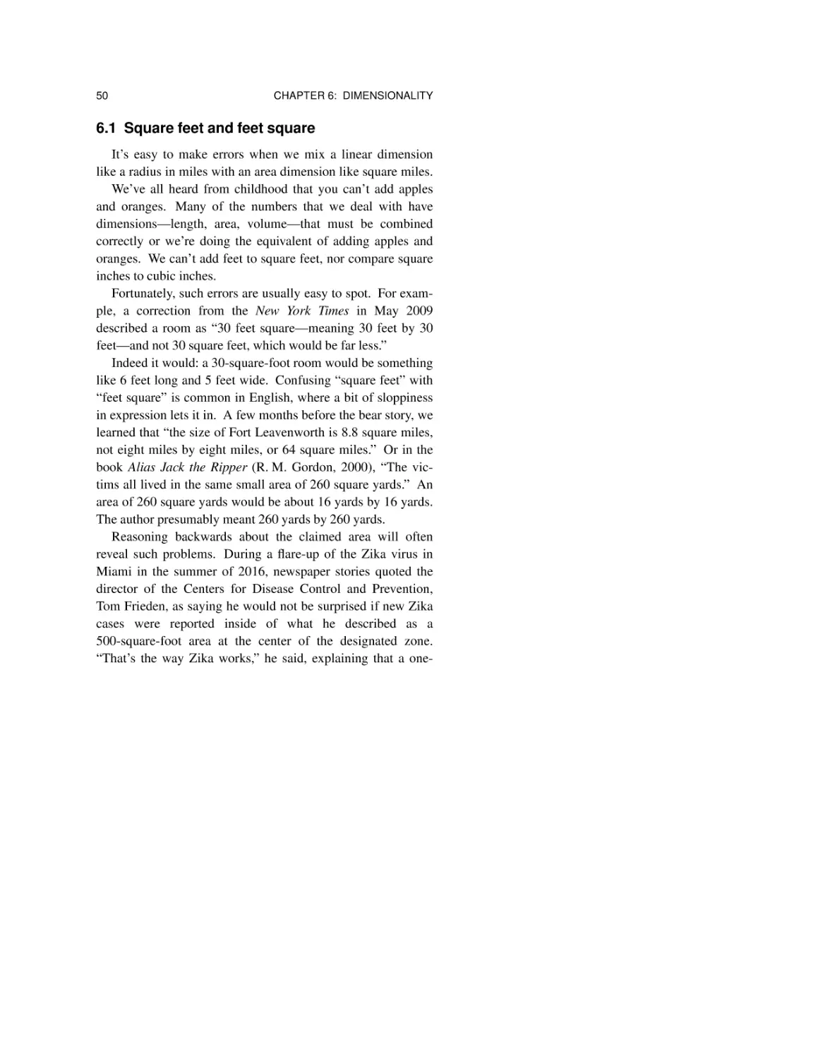
6.1 Square feet and feet square
6.2 Area 51
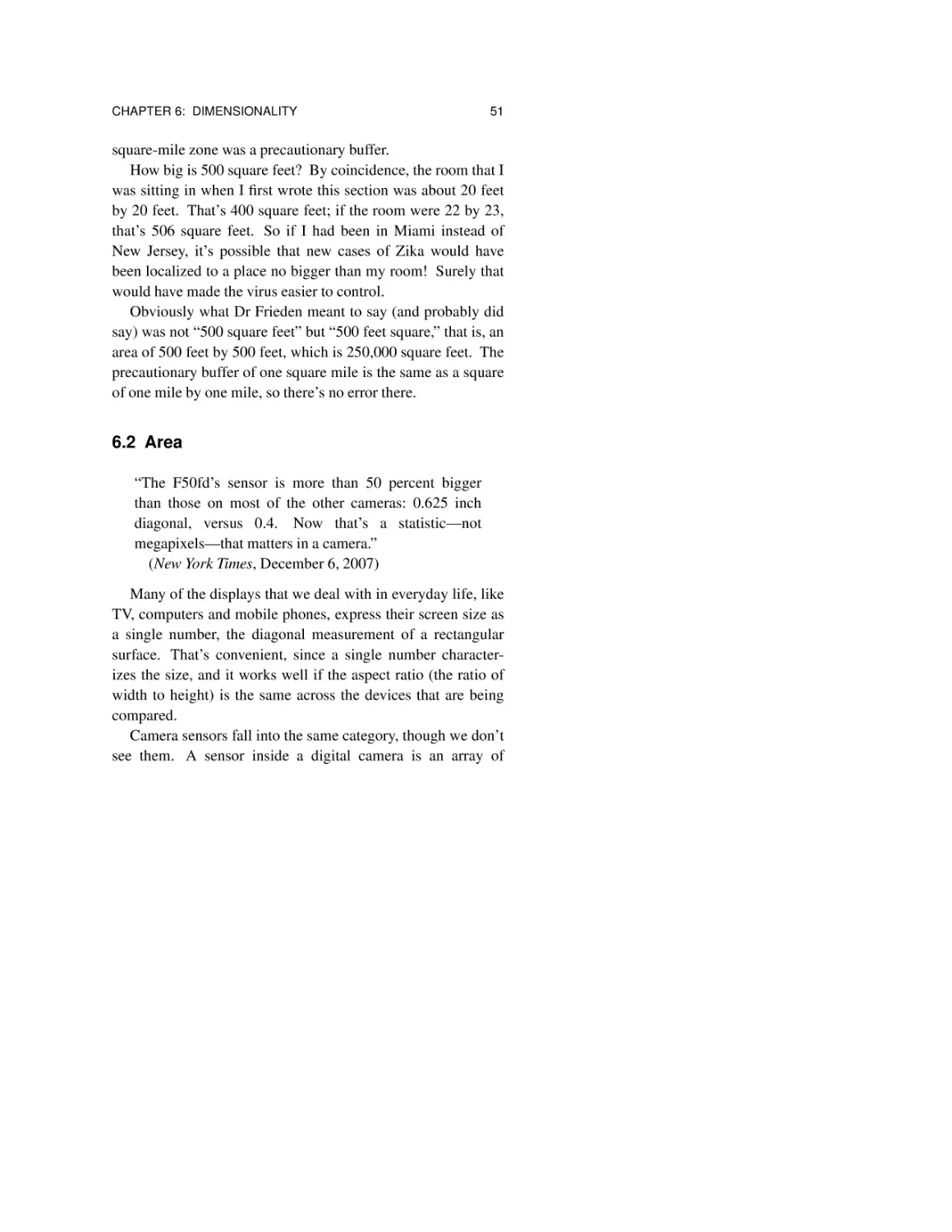
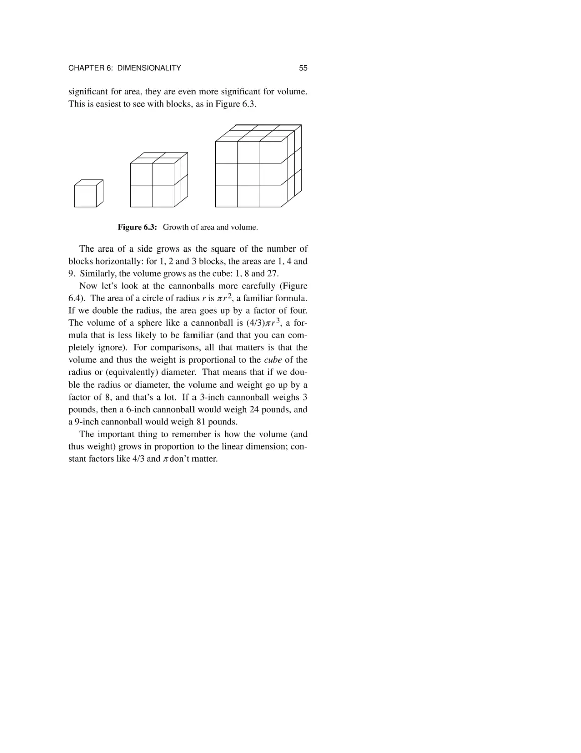
6.3 Volume 54
6.4 Summary 57
50
Chapter 7: Milestones 59
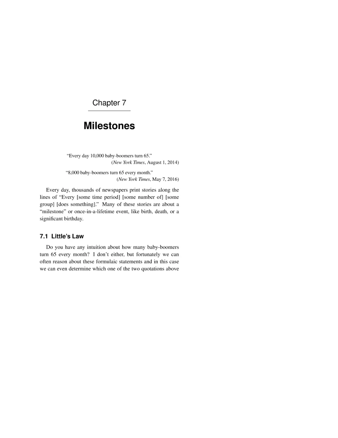
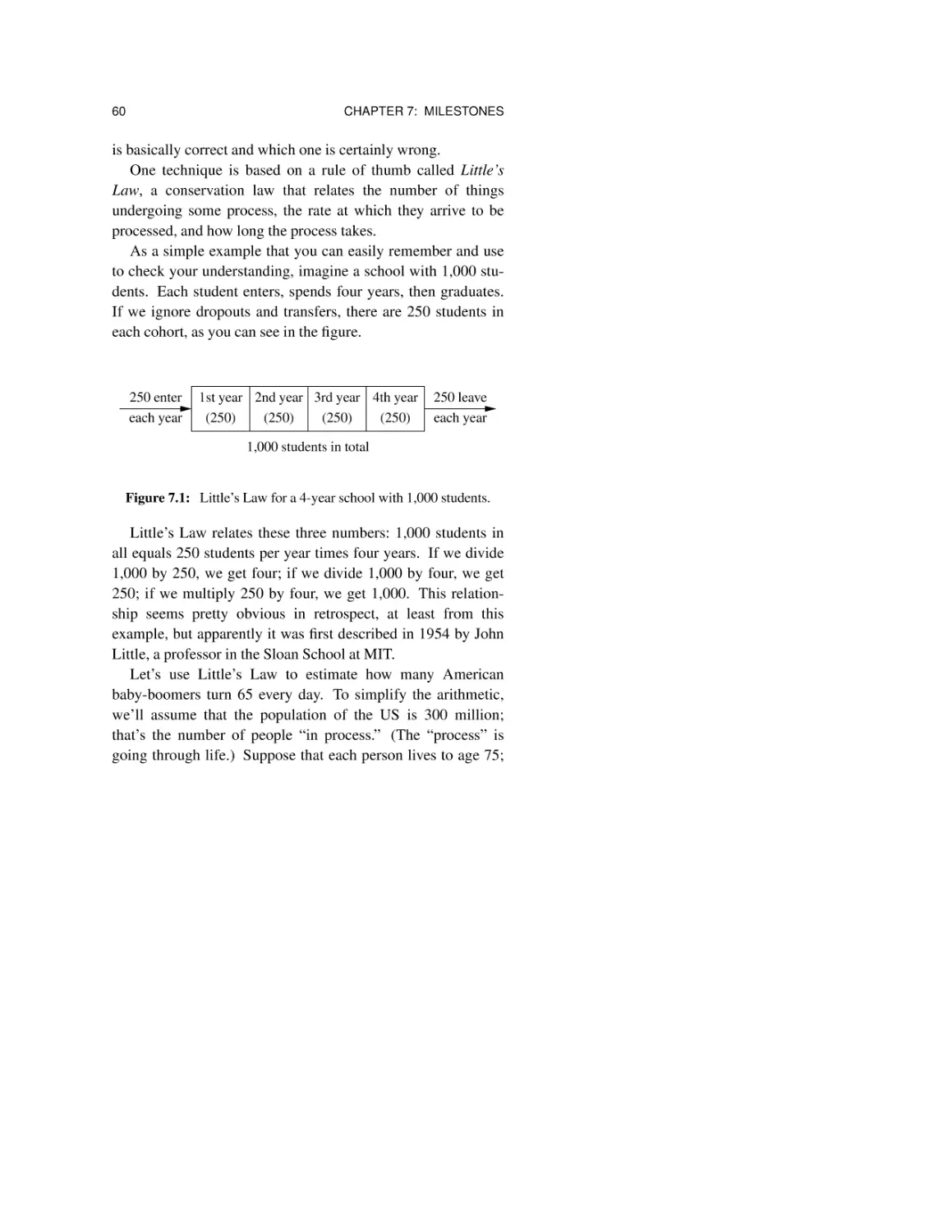
7.1 Little’s Law 59
7.2 Consistency 62
7.3 Another example 65
7.4 Summary 65
Chapter 8: Specious Precision 69
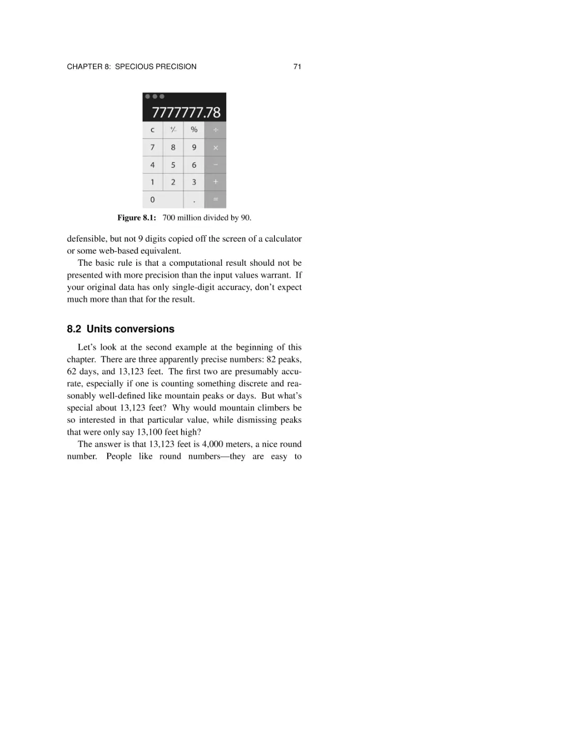
8.1 Watch out for calculators 70
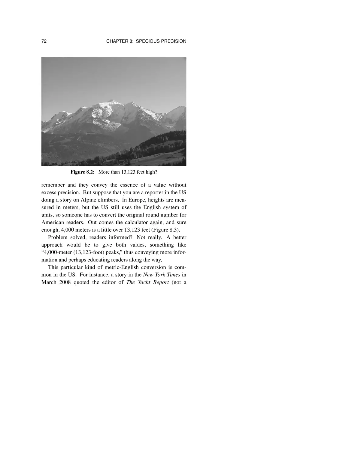
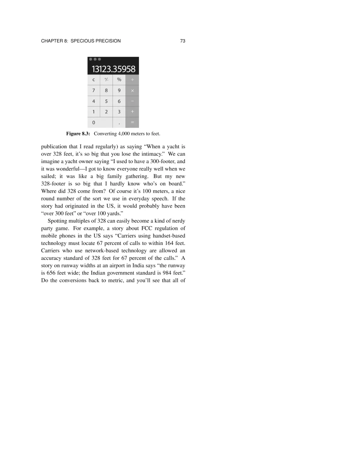
8.2 Units conversions 71
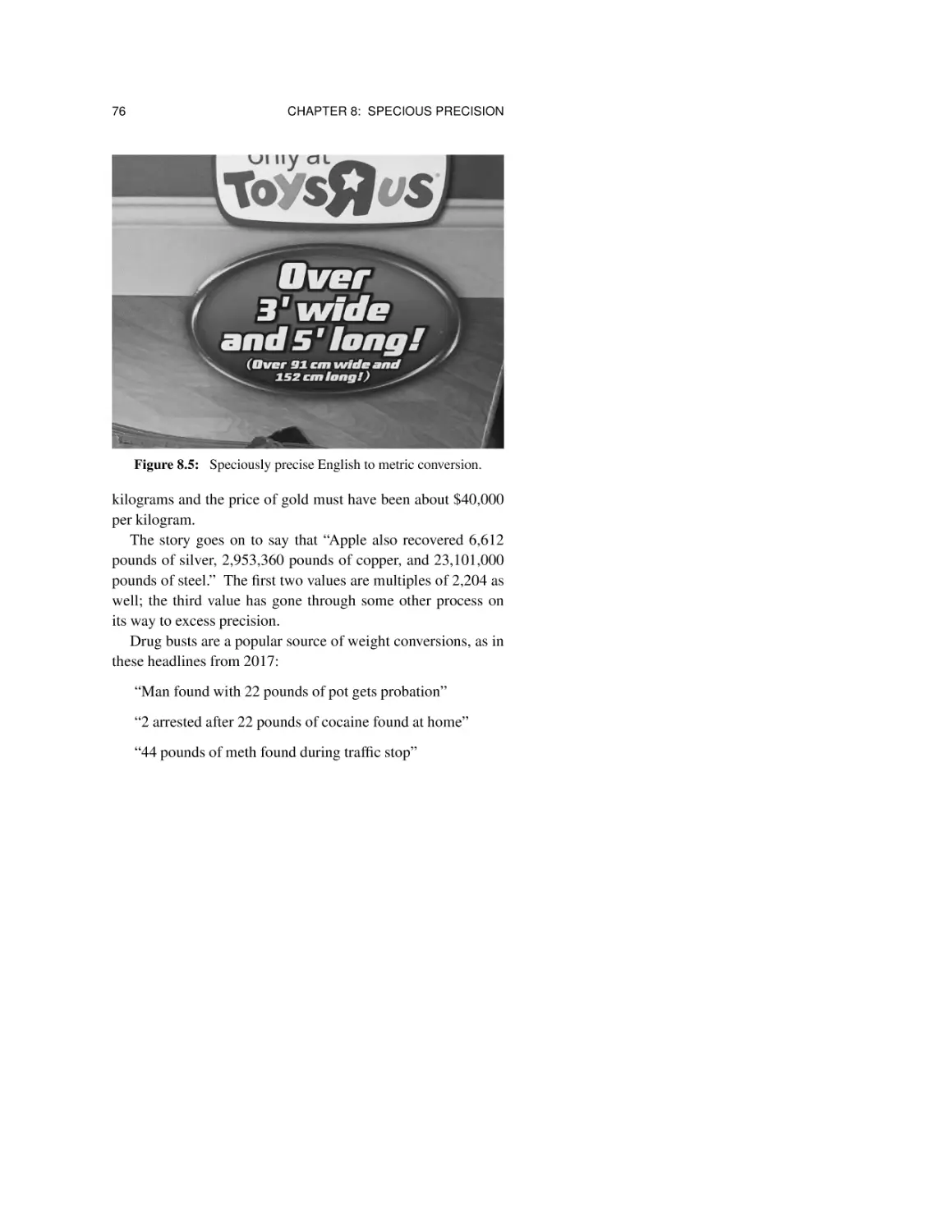
8.3 Temperature conversions 77
8.4 Ranking schemes 79
8.5 Summary 81
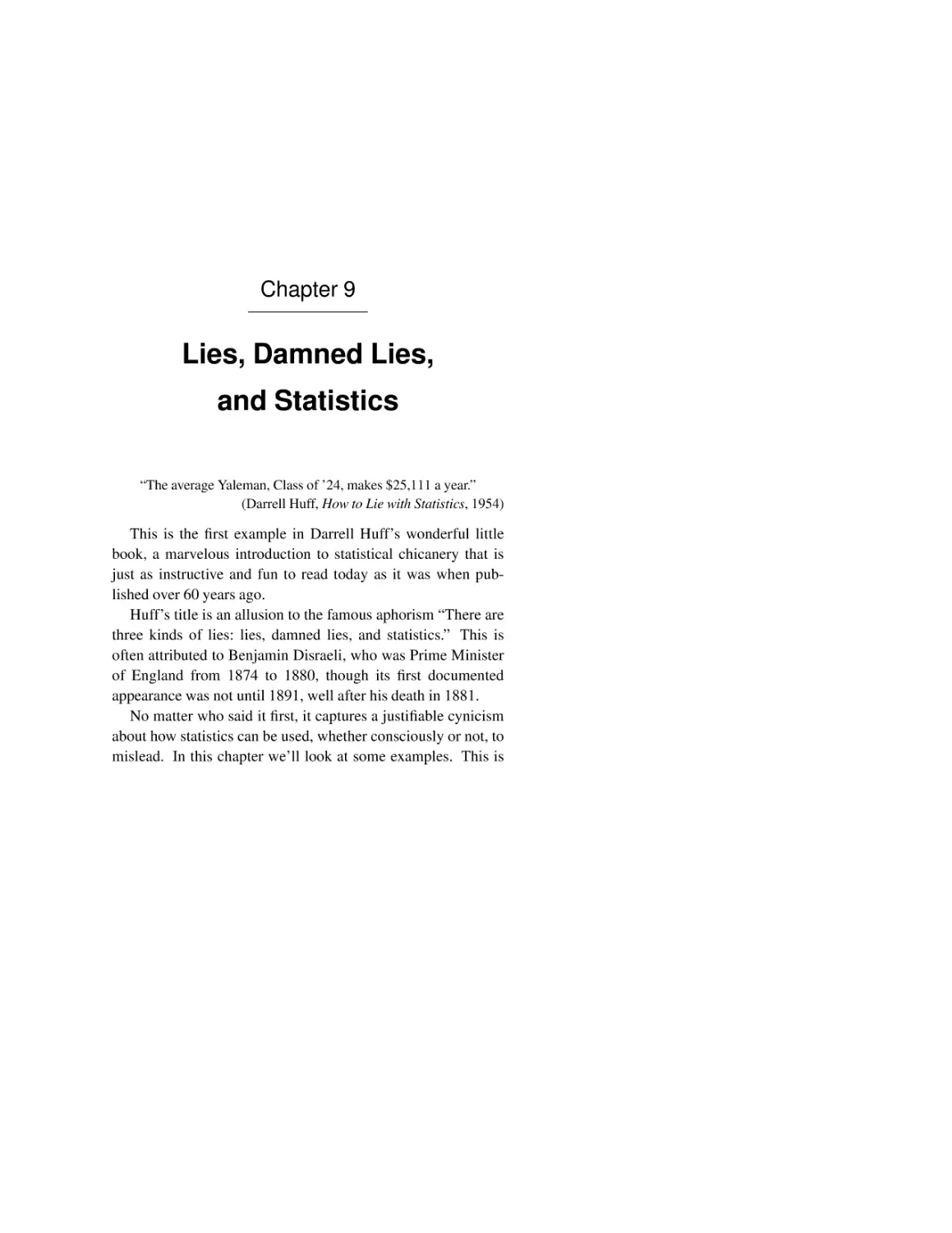
Chapter 9: Lies, Damned Lies, and Statistics 85
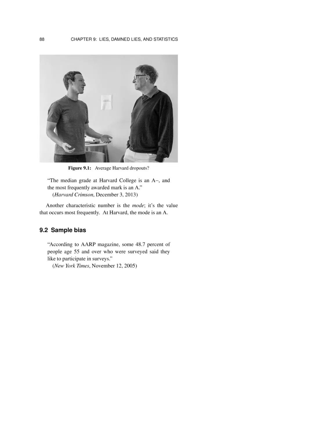
9.1 Average versus median 86
9.2 Sample bias 88
9.3 Survivor bias 90
9.4 Correlation and causation 91
9.5 Summary 92
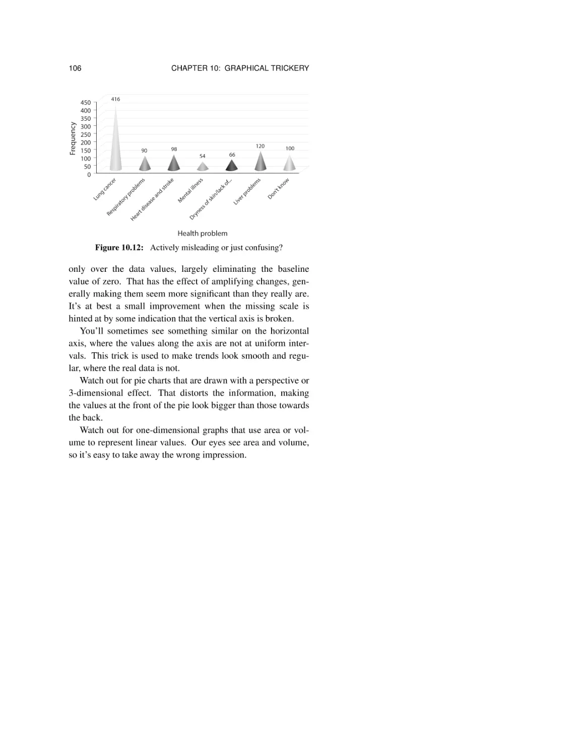
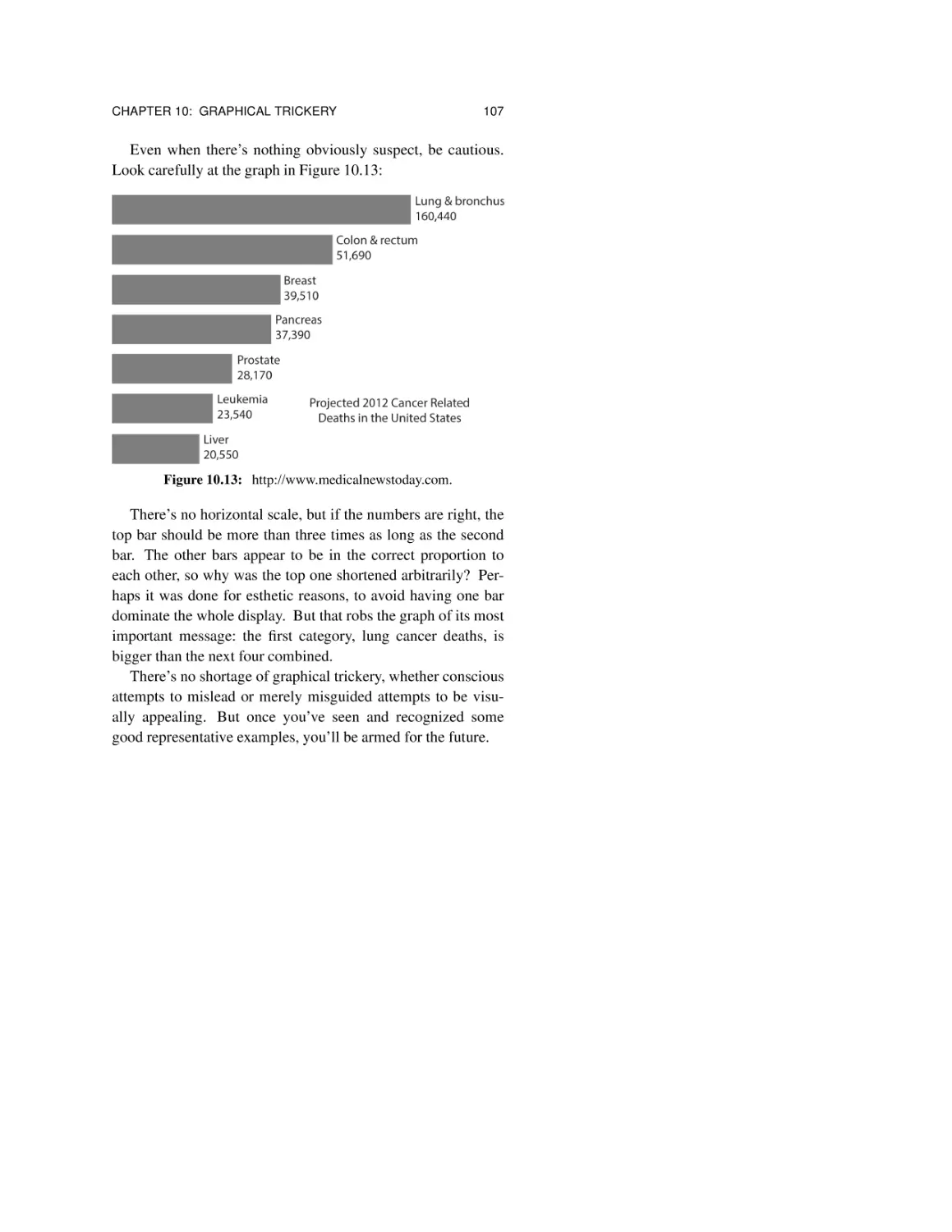
Chapter 10: Graphical Trickery 95
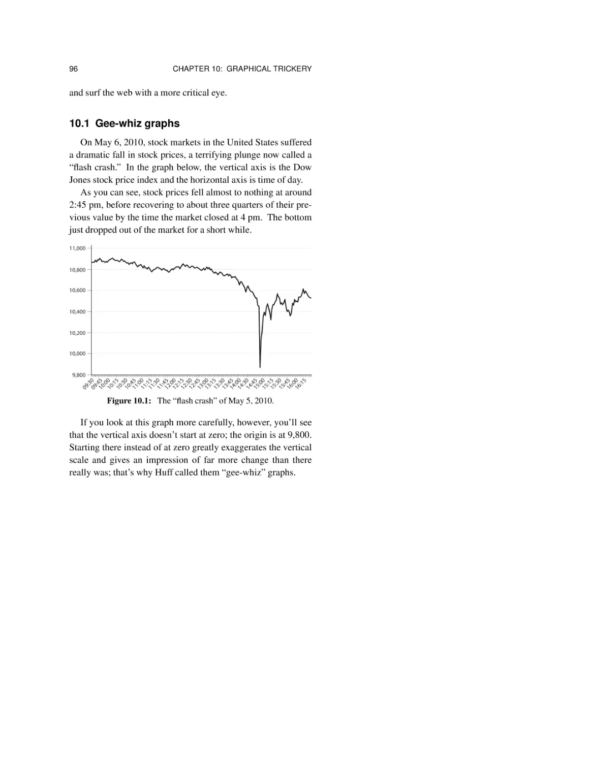
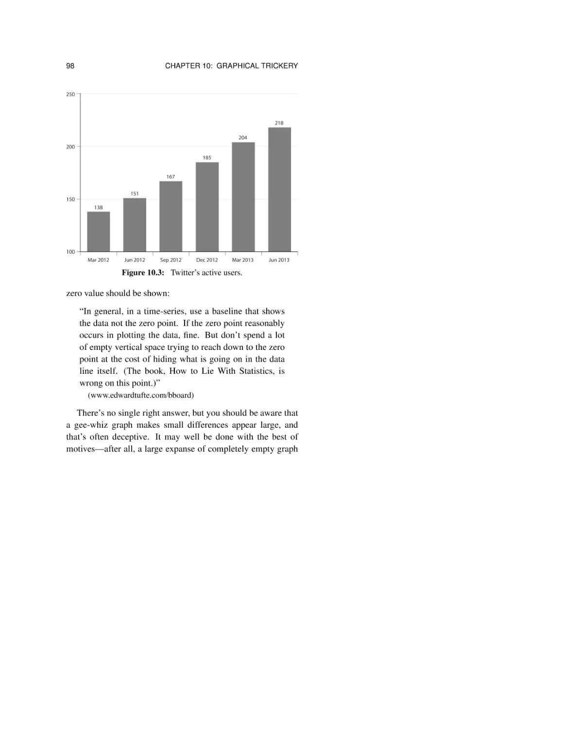
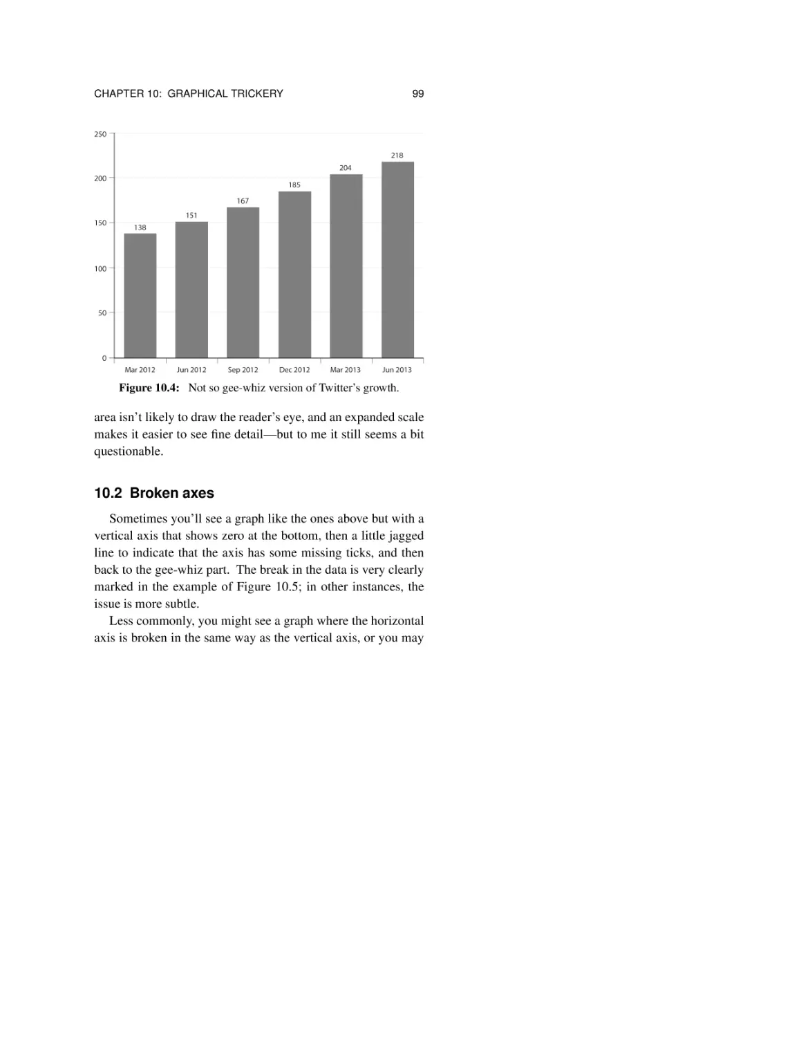
10.1 Gee-whiz graphs 96
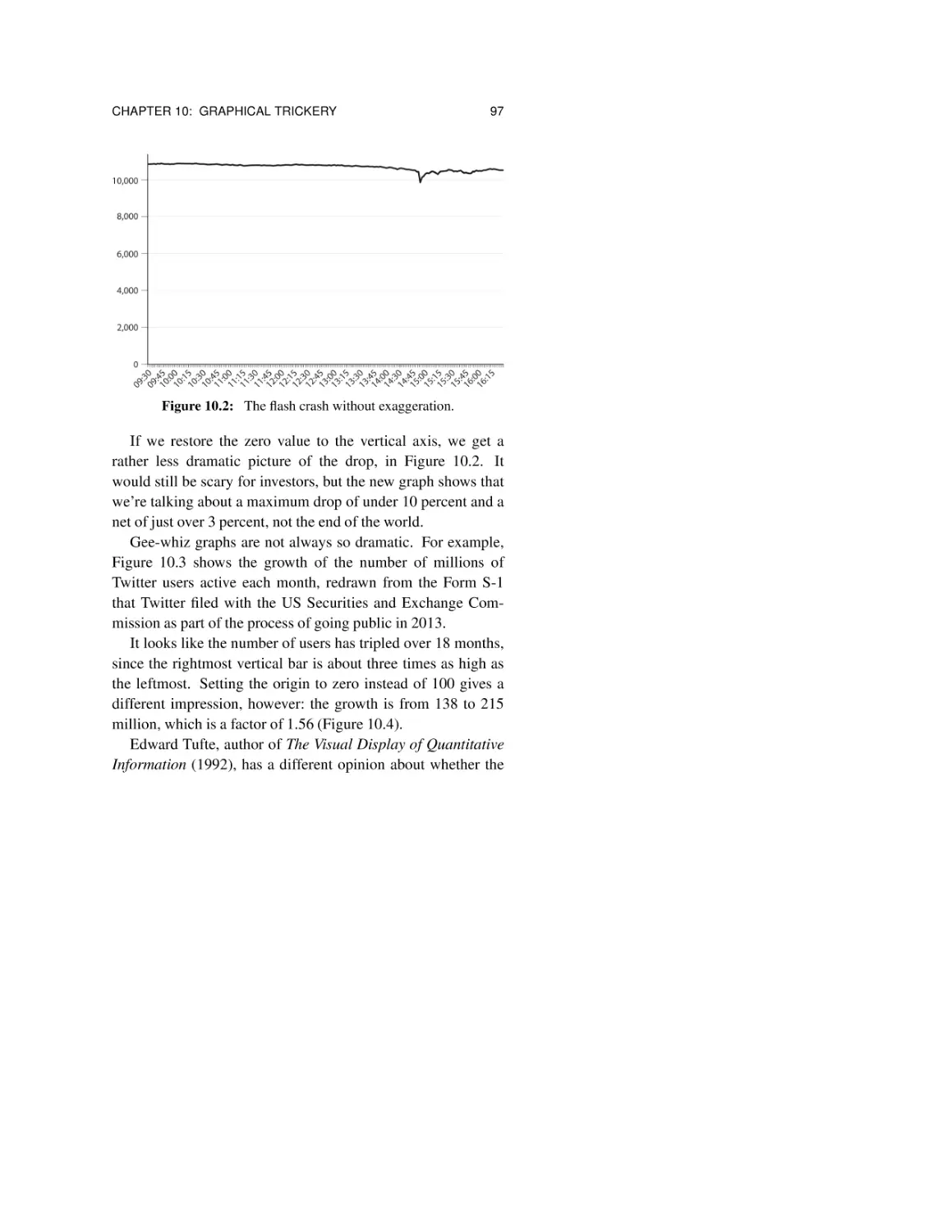
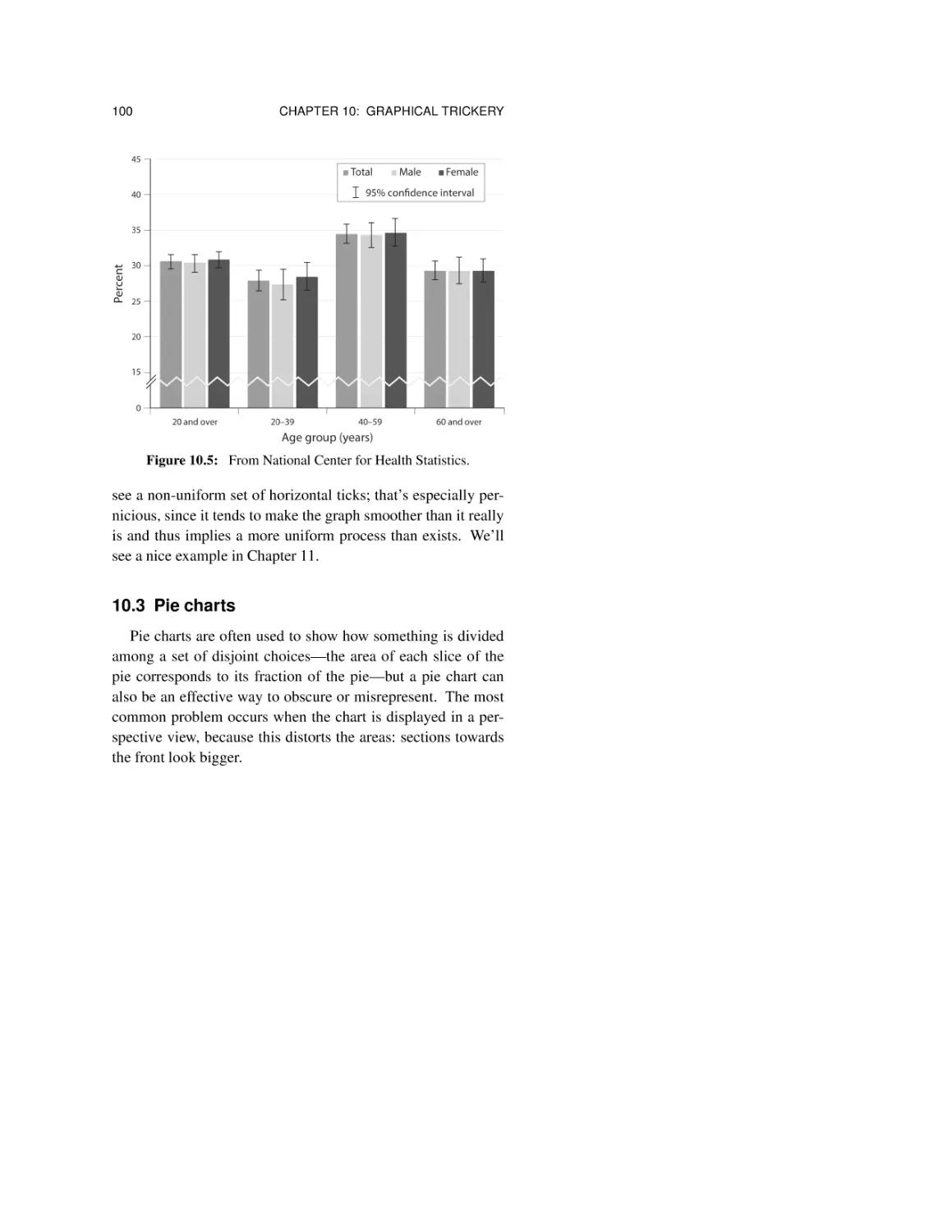
10.2 Broken axes 99
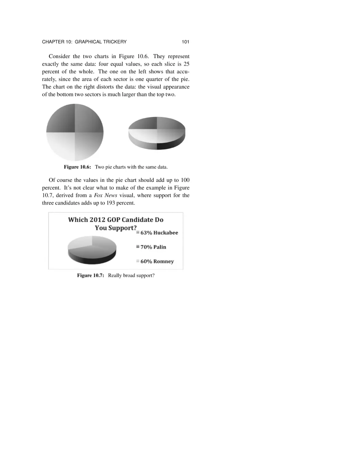
10.3 Pie charts 100
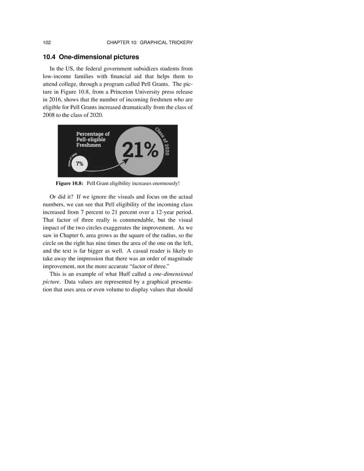
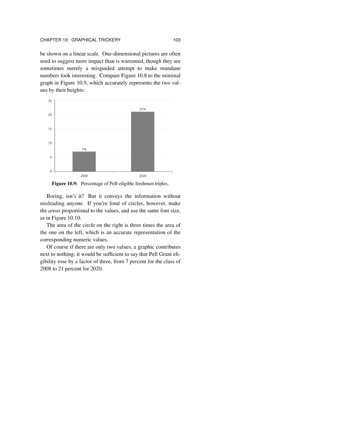
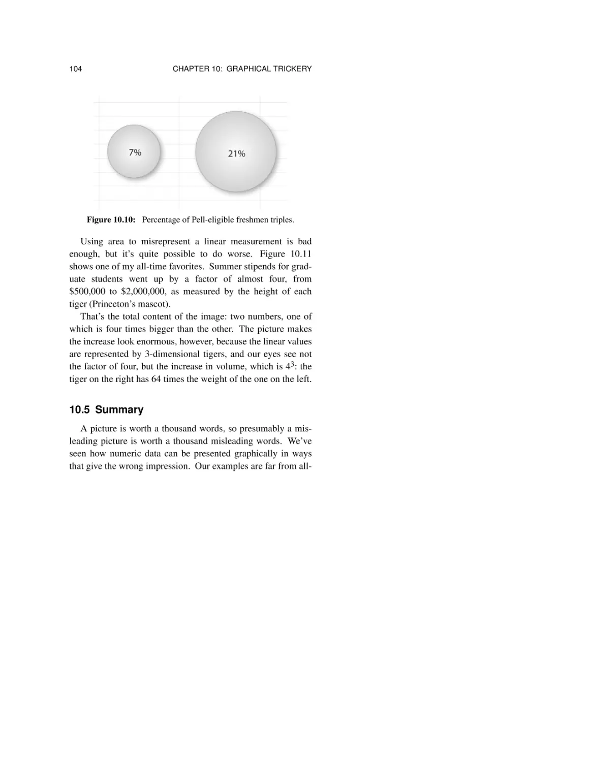
10.4 One-dimensional pictures 102
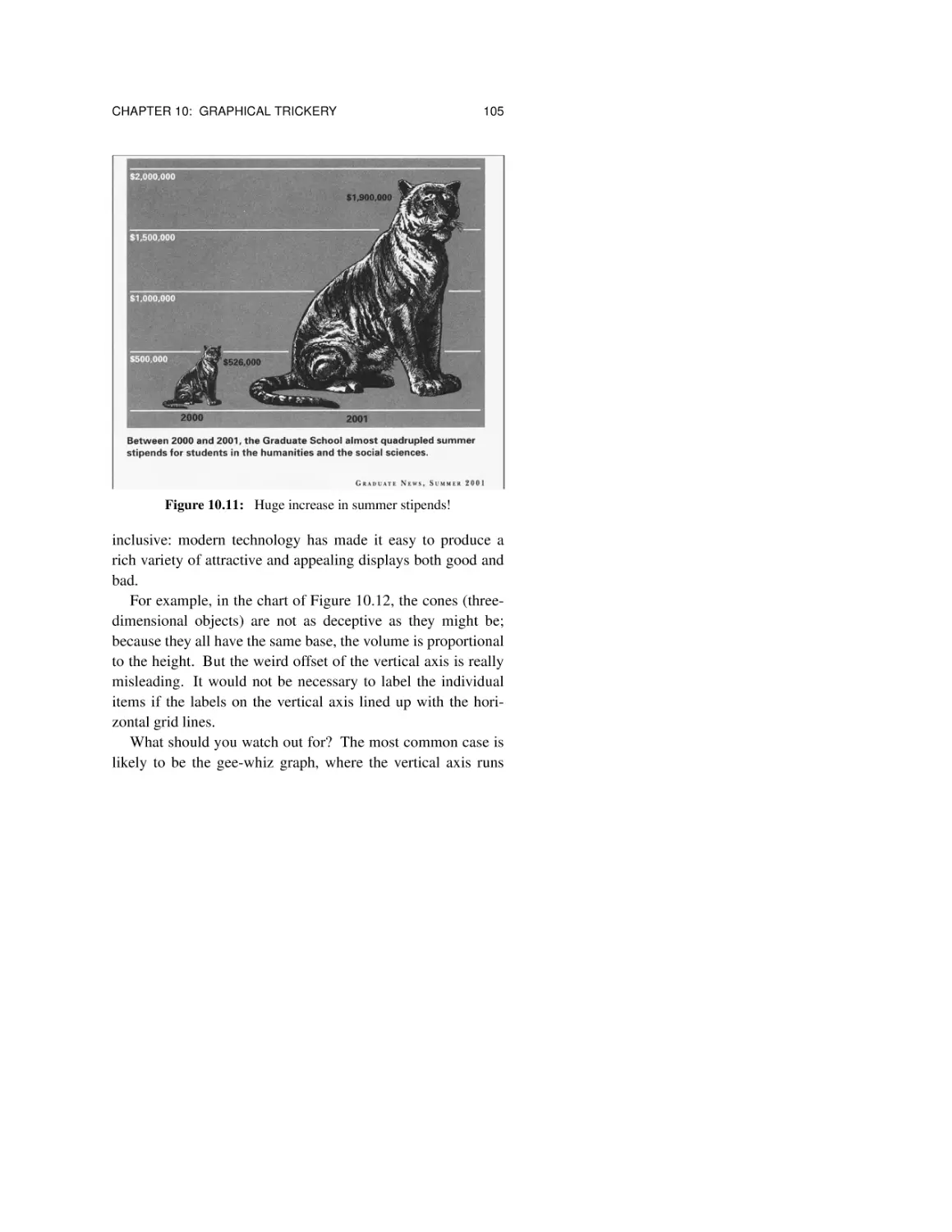
10.5 Summary 104
CONTENTS
ix
Chapter 11: Bias 109
11.1 Who says so? 110
11.2 Why do they care? 112
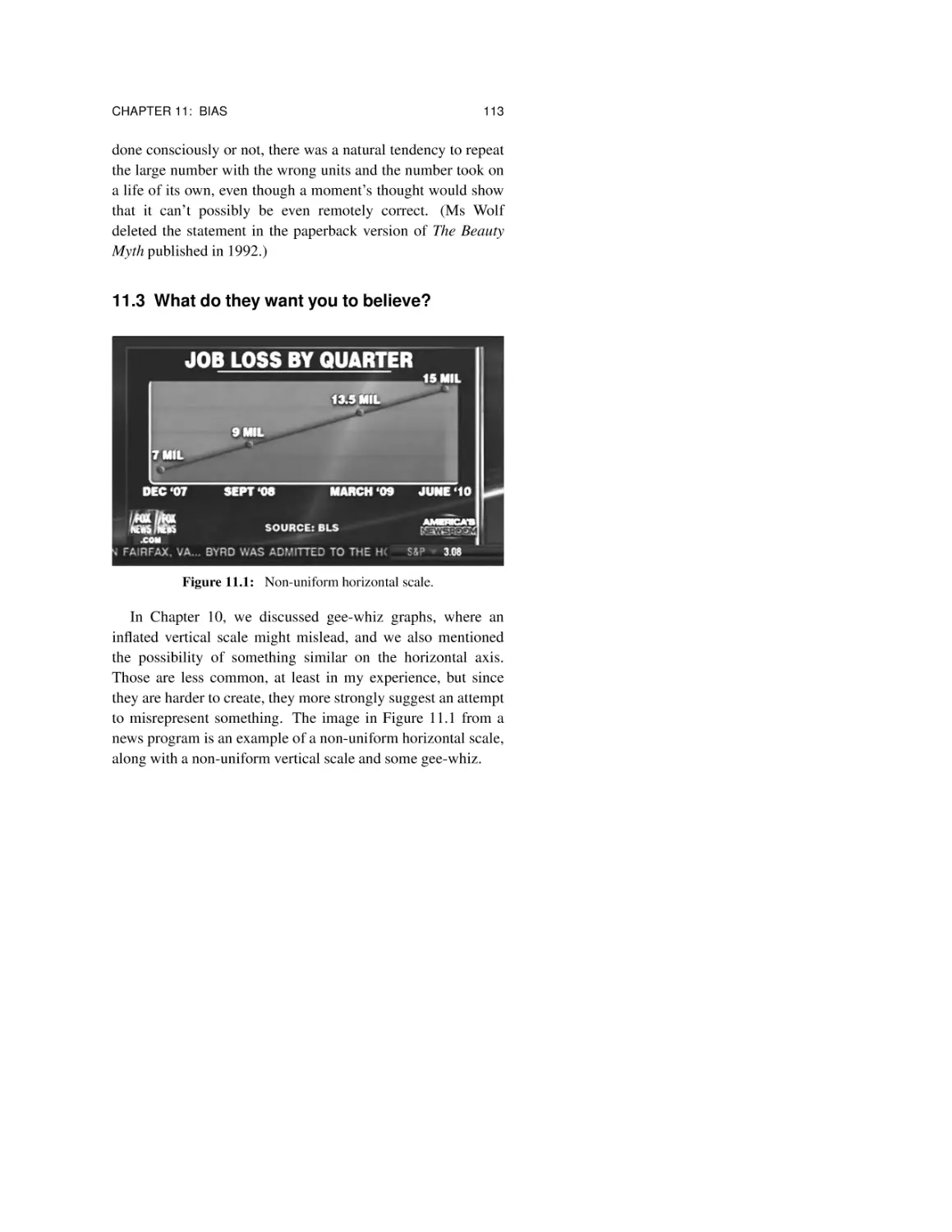
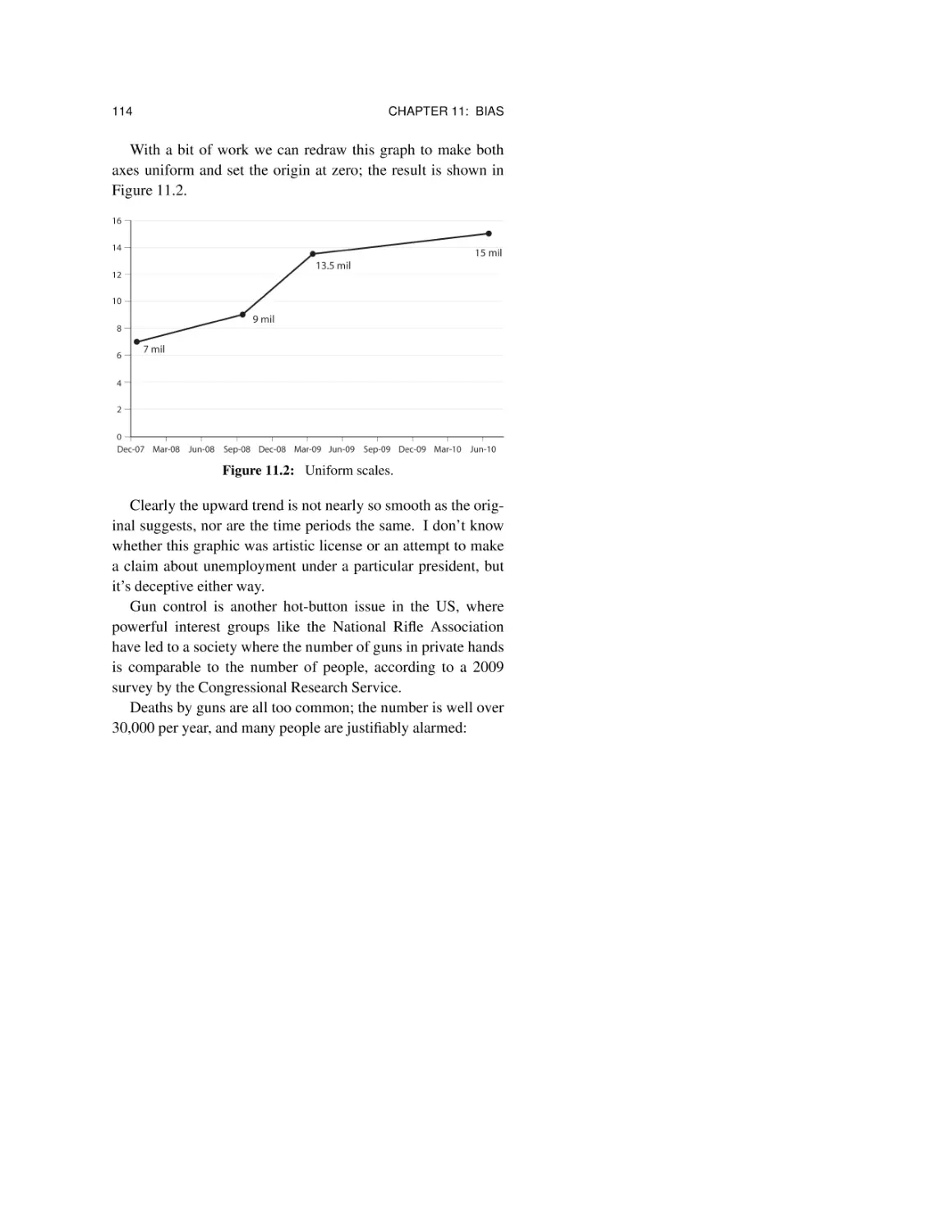
11.3 What do they want you to believe?
11.4 Summary 116
113
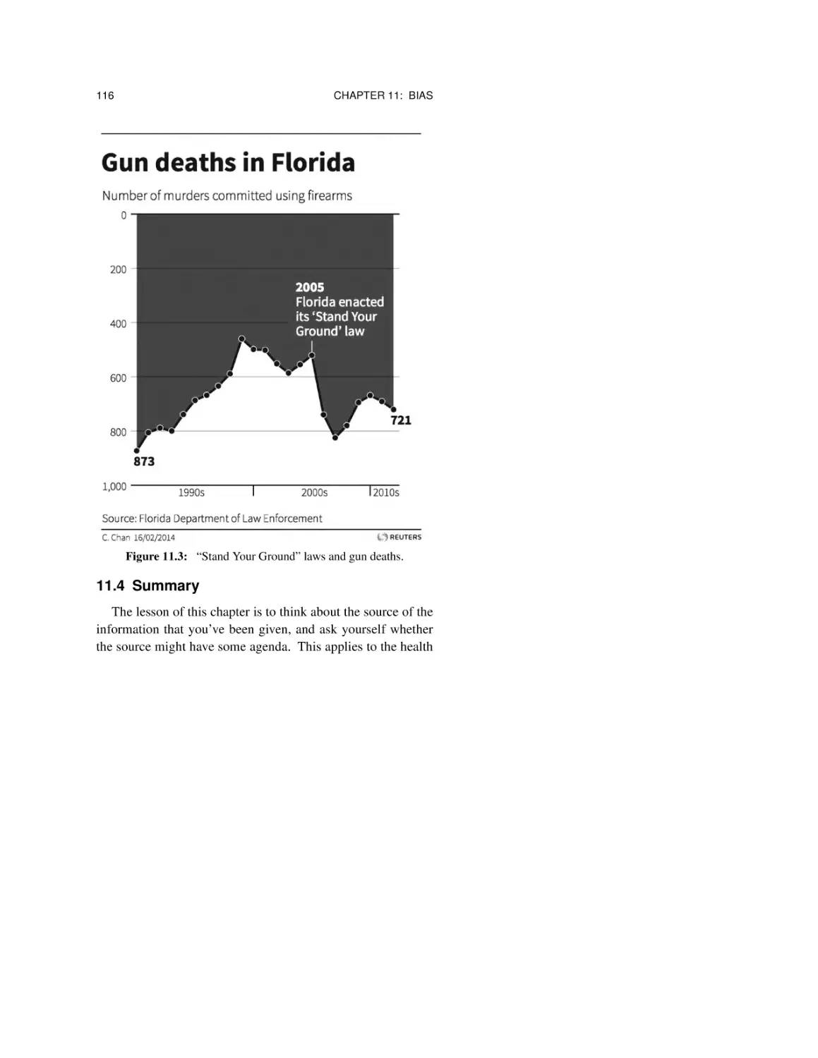
Chapter 12: Arithmetic 119
12.1 Do the math! 120
12.2 Approximate arithmetic, round numbers 121
12.3 Annual and lifetime rates 122
12.4 Powers of 2 and powers of 10 124
12.5 Compounding and the Rule of 72 126
12.6 It’s growing exponentially! 129
12.7 Percentages and percentage points 131
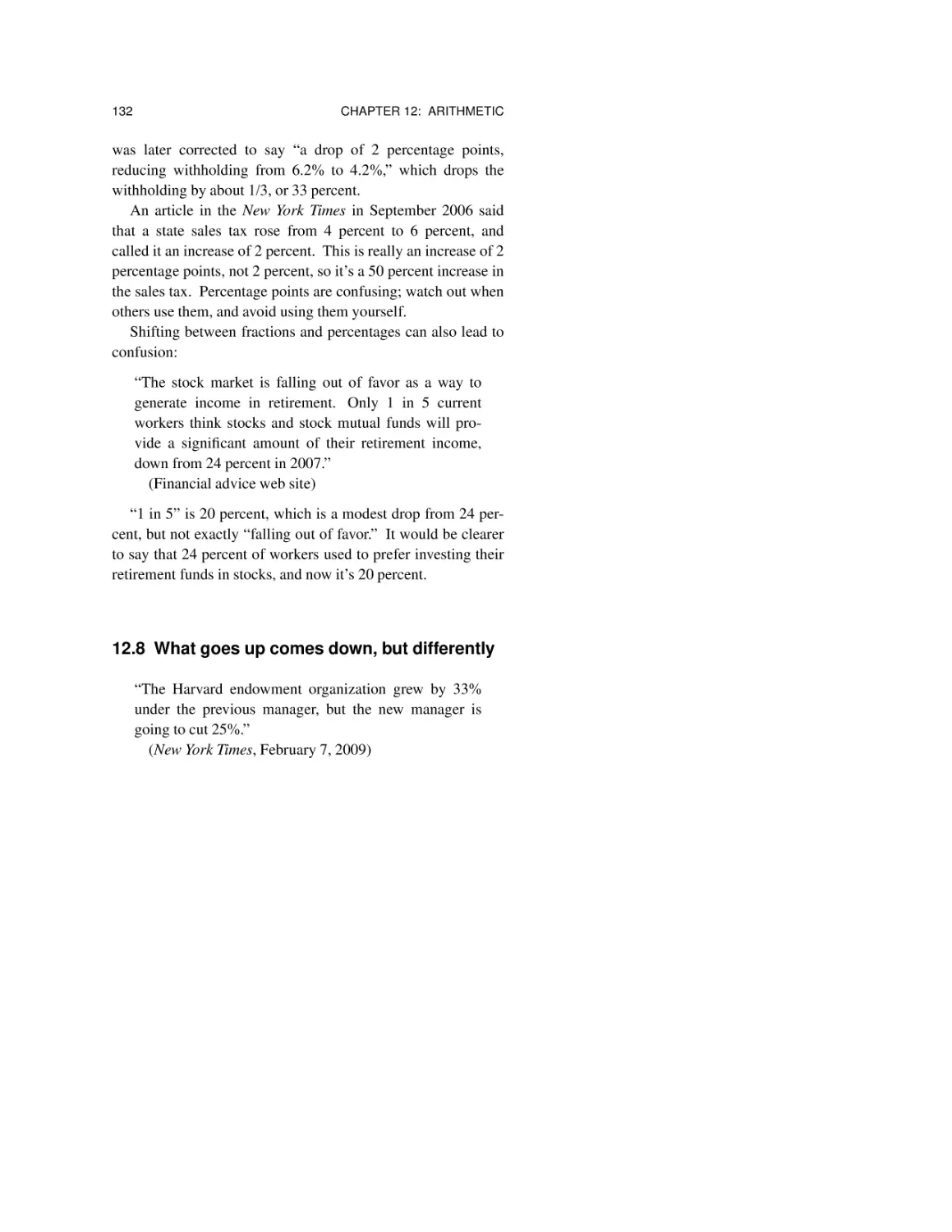
12.8 What goes up comes down, but differently 132
12.9 Summary 135
Chapter 13: Estimation 137
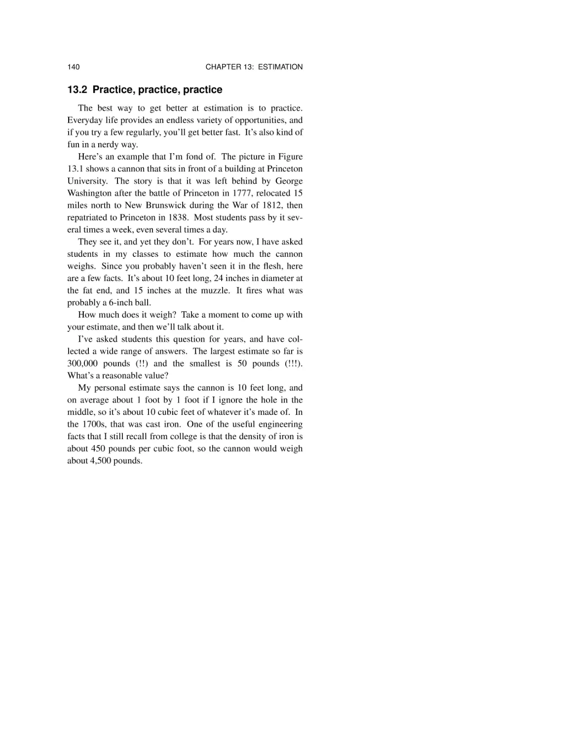
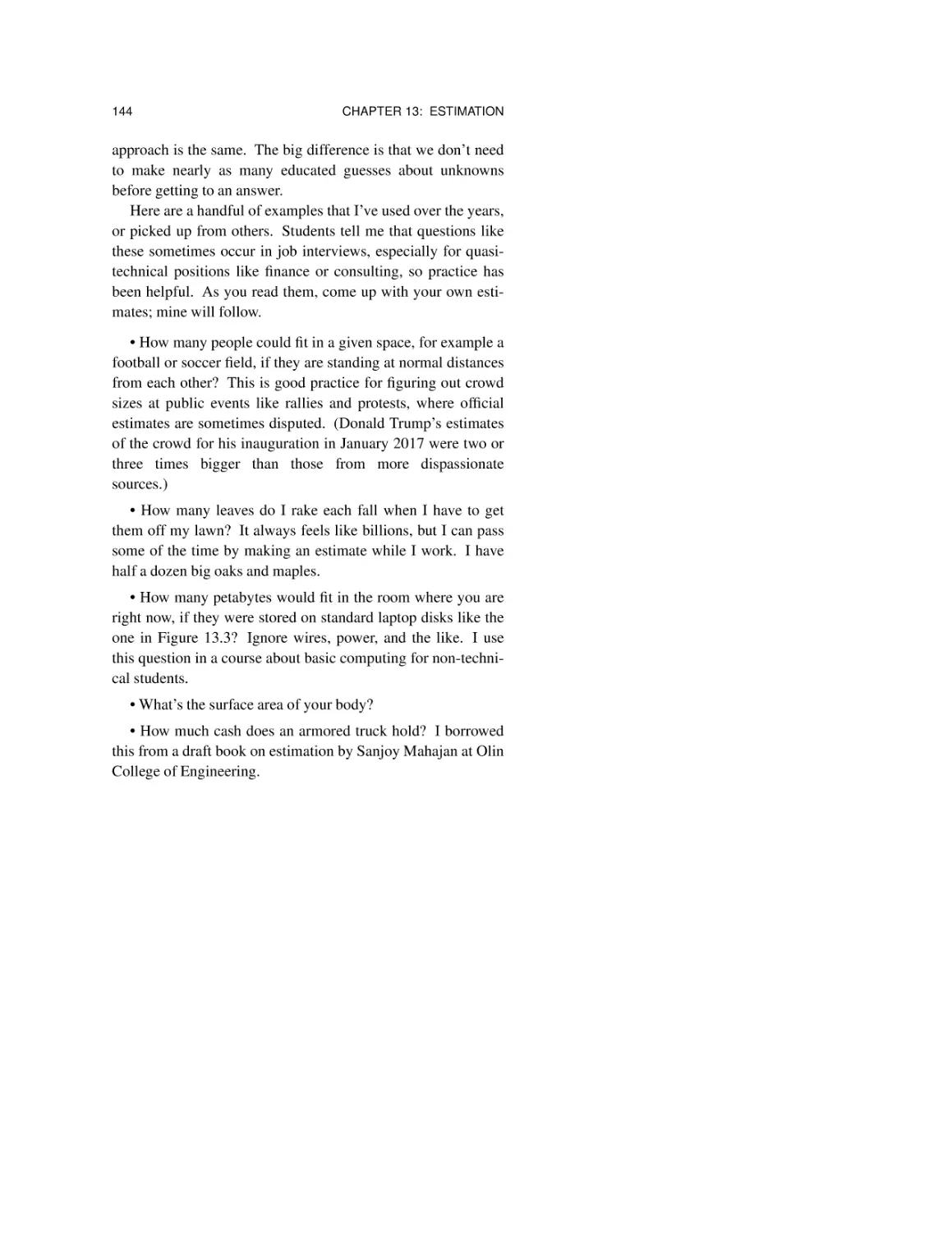
13.1 Make your own estimate first 138
13.2 Practice, practice, practice 140
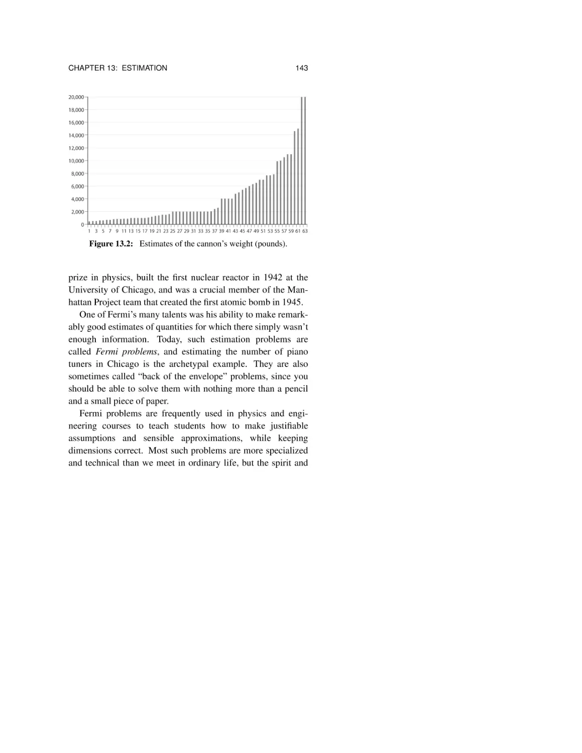
13.3 Fermi problems 142
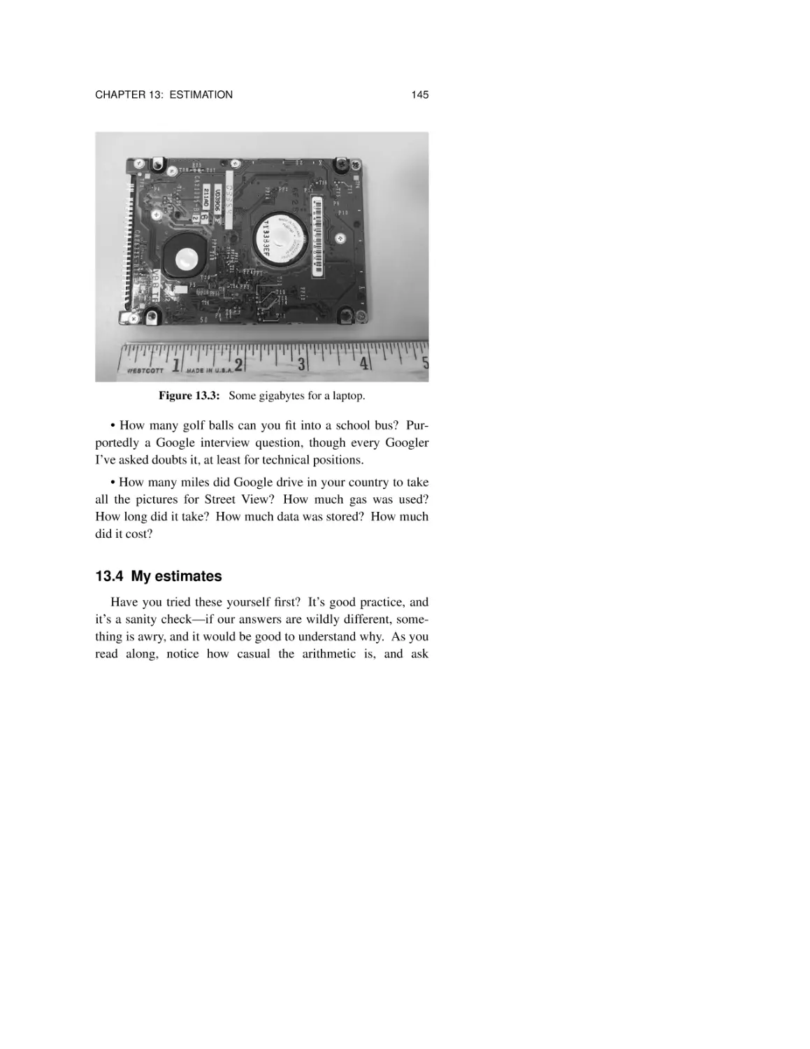
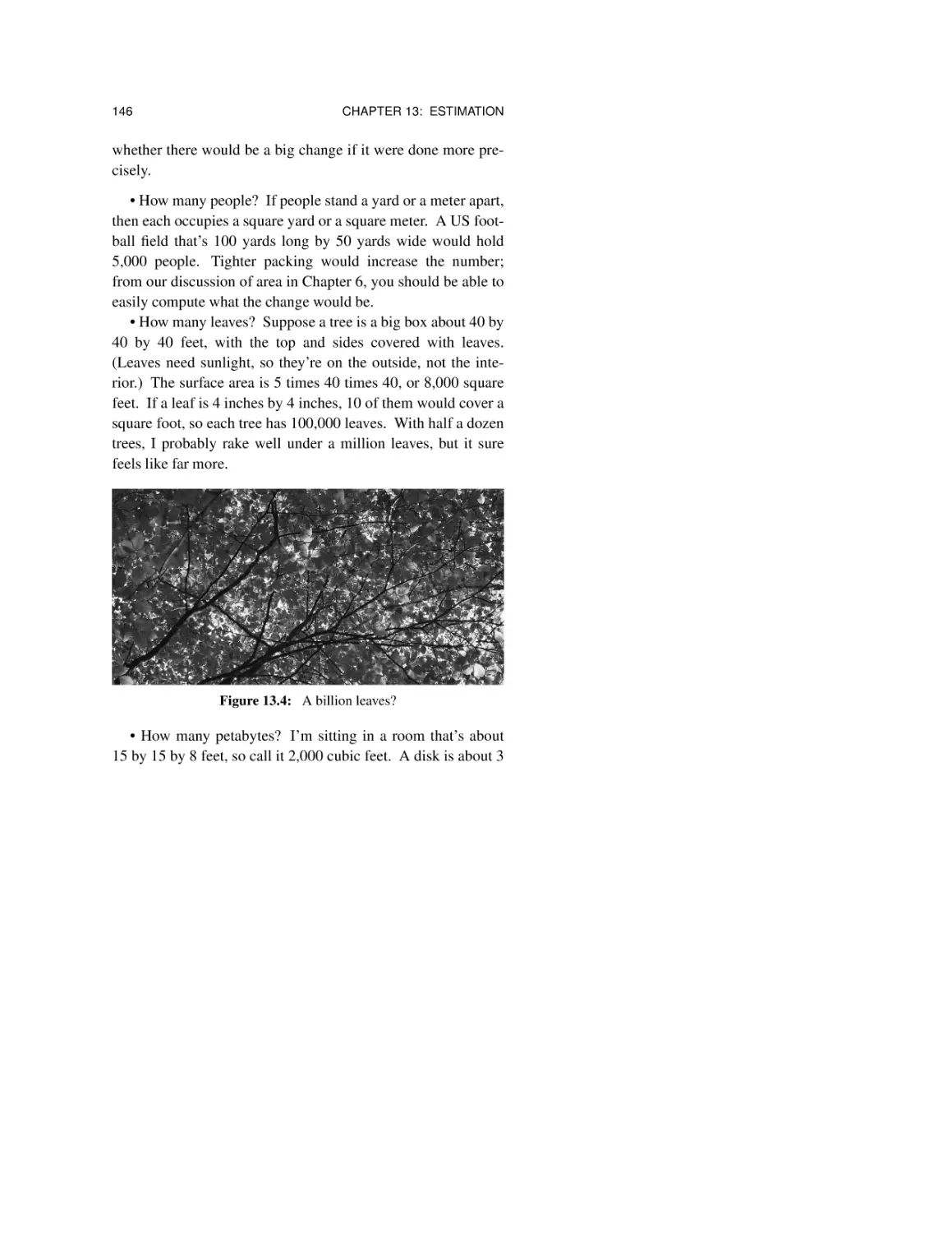
13.4 My estimates 145
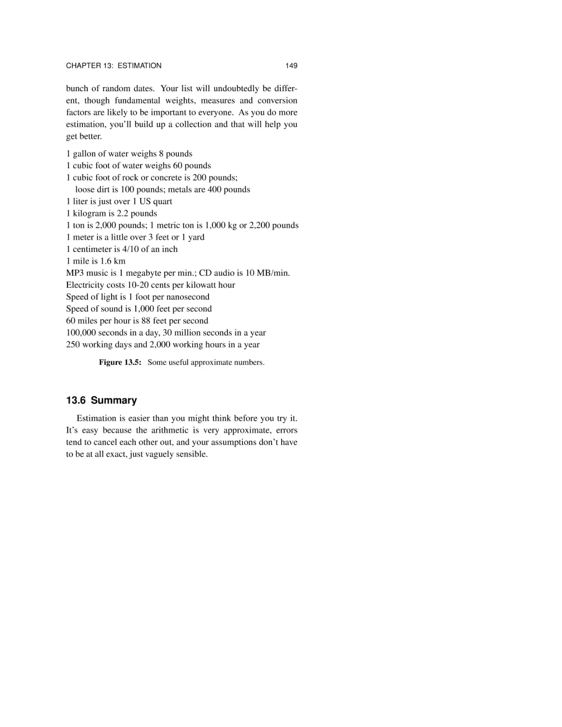
13.5 Know some facts 148
13.6 Summary 149
Chapter 14: Self Defense 151
14.1 Recognize the enemy 151
14.2 Beware of the source 153
14.3 Learn some numbers, facts, and shortcuts 154
14.4 Use your common sense and experience 155
Further Reading
Figure Credits
157
159
Preface
“When you have mastered numbers, you will in fact no longer be
reading numbers, any more than you read words when reading books.
You will be reading meanings.”
(W. E. B. Du Bois, sociologist, writer and civil rights activist)
“You don’t have to be a mathematician to have a feel for numbers.”
(John Nash, mathematician and Nobel Prize winner)
“On average, people should be more skeptical when they see
numbers. They should be more willing to play around
with the data themselves.”
(Nate Silver, statistician)
We are surrounded by numbers. Computers produce them
at a furious rate, and they are passed along by politicians,
reporters and bloggers, and included in the endless advertising
barrage that we are all subjected to. Indeed, the flow of numbers is so high that most people (including me) can’t cope, and
our brains tune it all out. At best we take away a vague
xii
PREFACE
impression that something is important and should be believed
because it has numbers attached to it.
Tuning out is a bad strategy, however, since most of those
numbers are intended to convince us of something, whether to
behave a particular way, or believe some politician, or buy a
gadget, or get something to eat, or make an investment.
The goal of this book is to help you to assess the numbers
that you encounter every day and to be able to produce numbers of your own when you have to, for your own good or
merely as a counterweight to what you are being told by others. You should be able to recognize potential problems in
what you hear, and to be leery of taking too much at face value.
This book will help you to be intelligently skeptical about
the numbers that you see, to be able to reason about them, to
decide whether some claim might be true or is clearly false,
and to compute your own numbers when you need them to
make important decisions. The general approach is to look at
an example of some numeric value that’s clearly, or at least
probably, wrong, show how you can deduce that it’s wrong,
help you come up with your own number that’s more likely to
be right, and finally to draw some general lessons.
Once you’ve been properly armed, there are many different
ways in which you can look after yourself. The primary thing
you need is common sense, augmented by healthy skepticism,
basic facts and a few ways of reasoning. It will help if you
become comfortable doing approximate arithmetic—few problems need precise computation—and there are shortcuts to
make it easier; we’ll talk about them along the way.
The book is aimed at anyone who wants to be better
informed and a lot more cautious about believing what they are
being told. There is so much misinformation and deliberate
PREFACE
xiii
falsehood today that we really have to pay attention if we hope
to spot the errors, the outright lies, and the subtle misrepresentations and exaggerations.
None of this is rocket science, and it’s not “mathematics”
either. I’ve heard all too many people say “I was never any
good at math.” They are being unfair to themselves. What that
really means is that they were not well taught, and never got
much chance to use simple arithmetic in the service of day-today life. The material here requires nothing beyond elementary-school arithmetic. If you got to grade 5 or 6 in the United
States or the equivalent somewhere else, that’s all the technical
or math background you need. After that, you just have to use
your head and what you already know. You may even find that
it’s fun.
Acknowledgments
I am deeply indebted to Jon Bentley for his detailed comments on literally every page of multiple drafts of the manuscript. The book is much the better for Jon’s contributions.
Paul Kernighan provided a number of fine examples, and his
eagle eye spotted an embarrassingly large number of typographical errors; any remaining typos are entirely my fault.
I am also grateful for helpful suggestions from Josh Bloch,
Stu Feldman, Jonathan Frankle, Sungchang Ha, Gerard Holzmann, Vickie Kearn, Mark Kernighan, Harry Lewis, Steve
Lohr, Madeleine Planeix-Crocker, Arnold Robbins, Jonah
Sinowitz, Howard Trickey and Peter Weinberger. The production team at Princeton University Press—Lauren Bucca,
Nathan Carr, Lorraine Doneker, Dimitri Karetnikov and Susannah Shoemaker—has been a pleasure to work with.
xiv
PREFACE
As always, my profound thanks to my wife Meg for insightful comments on the manuscript, and for her support, enthusiasm and good advice for many years.
I would also like to acknowledge the newspapers and magazines, especially the New York Times, that have provided many
of the examples here. They occasionally make mistakes, but
they publish corrections. In a time of far too much “fake
news” and outright lies, it’s invaluable to have sources that care
so much about truth and accuracy.
The web site at millionsbillionszillions.com has examples
that didn’t make it into the book, and new ones will be added
over time. Please send along anything you find; I’d love to
hear from you.
MILLIONS, BILLIONS, ZILLIONS
Chapter 1
Getting Started
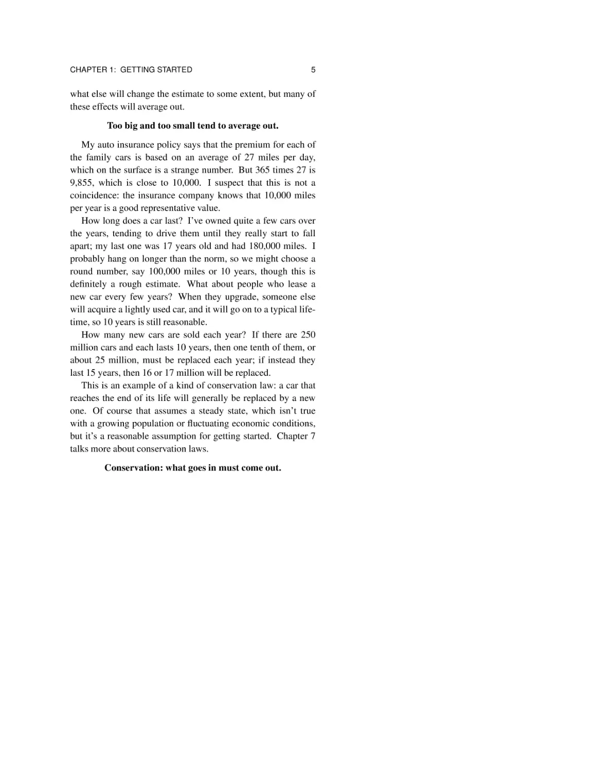
“How many @#$%ˆ&* cars are there?”
(the author, stuck in yet another endless traffic jam)
I’ve asked myself this question any number of times when
I’m in a traffic jam with no end in sight, just immobile cars as
far as the eye can see. This has happened to me in the United
States, Canada, England and France over the past few years;
you’ve undoubtedly had similar experiences somewhere.
So how many cars are there? You might wonder about the
number on the road ahead, or in the town you live in, or the
total in your home country.
Stop right now! Don’t reach for your computer or your
phone; don’t ask Siri or Alexa. Imagine that you’re in a situation where you simply can’t ask. Perhaps your traffic jam is
out in the countryside where there is no cell service, or you’re
on a plane without Internet connectivity, or maybe you’re in an
interview where a prospective employer wants to see whether
you can think for yourself.
2
CHAPTER 1: GETTING STARTED
Figure 1.1: How many cars are there?
Your job is to figure out sensible answers on your own,
without consulting any other sources—in other words, to come
up with an estimate. Dictionary.com defines the noun estimate
as “an approximate judgment or calculation, as of the value,
amount, time, size, or weight of something,” and the verb as
“to form an approximate judgment or opinion regarding the
worth, amount, size, weight, etc., of.” That’s exactly what you
should do first.
Make your own estimate first.
As a specific example, let’s estimate the number of cars in
the United States. The way we approach this would be the
same in other parts of the world, though the details might well
be different.
It’s often easiest to work from the bottom up, starting from
something concrete that you know or have experience with,
then build on that to the general situation. I would start with
CHAPTER 1: GETTING STARTED
3
my own experience: there are three people in my immediate
family, and we each have one car. If it were that simple—one
car per person—then we’re done. The population of the US
today is around 330 million, so there are 330 million cars. And
for many purposes, that estimate would be entirely adequate.
A rough estimate is often good enough.
Notice that our estimate came from two things: personal
experience and knowledge of a single fact, the approximate
population of the country. As we’ll see in the rest of the book,
we can make remarkably good estimates without detailed
knowledge, but in the end, we do have to know something.
The more you know, the better your estimates.
330 million is probably too high, since many people don’t
have cars—children up to some age like 18 or 20, elderly people who no longer drive, and of course those who live in big
cities where parking is expensive and public transportation is
good. On the other side, some people will have more than one
car, but that’s likely to be much less common.
Taking such factors into account, we can refine the estimate
of 330 million. If more than half of the population in the US
has a car, perhaps even two thirds or three quarters, that leads
to a more refined estimate of 200 to 250 million cars.
Refine your estimate if necessary.
Don’t forget the “if necessary” part. Very often, a rough
answer is entirely adequate, and sometimes there’s no way to
get information that would make it possible to refine anyway.
We’ll see plenty of examples of that along the way, and Chapter 13 offers some advice and a chance to practice.
4
CHAPTER 1: GETTING STARTED
We’ll also see examples where people claim more knowledge and more accuracy than they could possibly have; that’s a
sign of something sketchy going on. If you’ve done your own
estimation before accepting someone else’s values, you’ll be
alert for such situations.
If we now turn to a computer or phone, we can compare our
estimate to other sources. For instance, Wikipedia says that
“there were an estimated 263.6 million registered passenger
vehicles in the United States in 2015.” The top Google hit is a
story from the Los Angeles Times that says 253 million cars.
Our estimate is certainly close to those, which is an encouraging sign.
Independent estimates should be similar.
Consensus is a good sign, unless everyone is making the
same error. If two independently created estimates are significantly different, however, something is awry and at least one of
them is wrong.
Now that we have a decent value for the number of cars, we
can think about related questions. For example, how many
miles does a typical car get driven in a year? How long does it
last? How many cars are sold each year? How much does it
cost to own a car?
How many miles does a car travel in a year? As above, it’s
useful to start with personal experience or observation. For
instance, suppose you or some family member commutes to
work 20 miles each way. That’s 200 miles in a week, and thus
about 10,000 miles in a 50-week year. Again, there will be a
lot of variability: some people will have longer commutes,
while others will have shorter, and still others will use public
transportation. Short weeks and vacation trips and who knows
CHAPTER 1: GETTING STARTED
5
what else will change the estimate to some extent, but many of
these effects will average out.
Too big and too small tend to average out.
My auto insurance policy says that the premium for each of
the family cars is based on an average of 27 miles per day,
which on the surface is a strange number. But 365 times 27 is
9,855, which is close to 10,000. I suspect that this is not a
coincidence: the insurance company knows that 10,000 miles
per year is a good representative value.
How long does a car last? I’ve owned quite a few cars over
the years, tending to drive them until they really start to fall
apart; my last one was 17 years old and had 180,000 miles. I
probably hang on longer than the norm, so we might choose a
round number, say 100,000 miles or 10 years, though this is
definitely a rough estimate. What about people who lease a
new car every few years? When they upgrade, someone else
will acquire a lightly used car, and it will go on to a typical lifetime, so 10 years is still reasonable.
How many new cars are sold each year? If there are 250
million cars and each lasts 10 years, then one tenth of them, or
about 25 million, must be replaced each year; if instead they
last 15 years, then 16 or 17 million will be replaced.
This is an example of a kind of conservation law: a car that
reaches the end of its life will generally be replaced by a new
one. Of course that assumes a steady state, which isn’t true
with a growing population or fluctuating economic conditions,
but it’s a reasonable assumption for getting started. Chapter 7
talks more about conservation laws.
Conservation: what goes in must come out.
6
CHAPTER 1: GETTING STARTED
How much does it cost to own a car? For practice, you
might estimate how much per mile it costs to drive. This
includes variable costs like fuel, fixed costs like insurance,
unpredictable costs like repairs, and the money you’ll need for
a new car when the old one dies.
You may have noticed that for all of the estimates above, we
used no arithmetic operations more complicated than multiplication and division, and we rounded off numeric values ruthlessly to make the computations easy.
Multiplication, division and
approximate arithmetic are good enough.
This will be true of the rest of the book as well—we’re not
doing “mathematics,” but elementary-school arithmetic in a
really relaxed way. Chapter 12 has a more extended discussion
of arithmetic, with some shortcuts and rules of thumb to make
it easier.
I’ve written this chapter mostly in terms of cars, which may
not be of direct interest to you. But even if not, in later chapters we’ll see that the approaches and techniques are applicable
to any situation where you have to estimate something from
incomplete information. Most of the time, you can get a value
by looking it up, but you will be much better off if, before you
resort to a search engine, you make your own estimate. It
won’t take long and you’ll quickly get good at it. Practice will
arm you for a lifetime of being wary about what people are
telling you. If you have already thought about some numeric
value and have done a bit of easy arithmetic, it’s much less
likely that someone can put something over on you.
CHAPTER 1: GETTING STARTED
7
A note on units
Given the accident of where I live, the majority of the examples in this book come from American sources. I’m not too
worried about this fact; any part of the world will have similar
stories.
I’m more concerned that the units of measure in many
examples—lengths, weights, capacities—are expressed in
“English” units because the US is almost unique in not adopting the metric system, and still uses English units for pretty
much all weights and measures. Readers who are not familiar
with feet, pounds and gallons may sometimes be perplexed by
unfamiliar units. I’ve tried to alleviate this when possible, but
failing to get the units right is often the point of the story.
Meanwhile, here’s a list of the most common English units
that appear in the book, with approximate conversions to and
from metric units.
1 inch = 2.54 cm
1 foot = 12 inches = 30.48 cm
1 yard = 3 feet = 0.9144 meters
1 mile = 5,280 feet = 1,609 meters
1 cm = 0.3937 inches
1 meter = 3.28 feet
= 39.37 inches
1 meter = 1.09 yards
1 km = 0.62 miles
= 3,281 feet
1 ounce = 28.3 grams
1 pound = 16 ounces = 453.6 grams
1 ton = 2,000 pounds = 907.2 kg
1 gram = 0.035 ounces
1 kg = 2.204 pounds
1 metric ton = 1,000 kg
= 2,204 pounds
1 US pint = 16 fluid ounces = 0.47 liters
1 gallon = 4 quarts = 8 pints = 3.79 liters
1 liter = 2.11 US pints
1 liter = 0.26 gallons
= 1.06 quarts
8
CHAPTER 1: GETTING STARTED
1 acre = 0.405 hectares
1 square mile = 640 acres
1 Fahrenheit degree = 5/9 Celsius degrees
1 hectare = 2.47 acres
1 hectare =
0.0039 square miles
1 Celsius degree =
1.8 Fahrenheit degrees
If you look at these conversions carefully, you can see some
handy approximations:
1 meter ∼ 1 yard
1 kilogram ∼ 2 pounds
1 liter ∼ 1 quart
1 Celsius degree ∼ 2 Fahrenheit degrees
These are all within 10 percent of the true values. If you really
need more accuracy, then add these adjustment factors:
1 meter ∼ 1 yard + 10%
1 kilogram ∼ 2 pounds + 10%
1 liter ∼ 1 quart + 5%
1 Celsius degree ∼ 2 Fahrenheit degrees − 10%
The adjusted values are all within about 1 percent of the true
values, which will almost always be good enough for making
estimates.
Chapter 2
Millions, Billions,
Zillions
“Perhaps the Bush administration could use the 660-billion-barrel
Strategic Petroleum Reserve to push prices down.”
(Newsweek, May 24, 2004)
Some years ago, at a time when gasoline prices had risen
significantly (although they were still well under two dollars a
gallon), Newsweek suggested increasing the supply of gasoline
in the hope of reducing prices for consumers. The United
States maintains a large emergency reserve of petroleum in
underground salt caverns along the Gulf of Mexico in Texas
and Louisiana; the idea was that releasing some of that onto the
open market would increase the supply and thus drive down
prices.
Besides the size of the Reserve, the article provided another
useful fact: “The average vehicle uses 550 gallons per year.”
10
CHAPTER 2: MILLIONS, BILLIONS, ZILLIONS
Thus, a natural question might be to ask how long the Strategic
Petroleum Reserve would last if it were just used to satisfy
consumer demand. If you like, take a moment and try to work
that out for yourself. You might begin by converting 550 gallons in a year to something more readily visualized: dividing
550 by 365, it’s close to 1½ gallons a day.
2.1 How long will it last?
To figure that out, we need to know how many vehicles
there are, and how big a barrel is.
How many vehicles are there? In the last chapter, we came
up with 200 to 250 million. That’s good enough for now and
we can fix it up later if we learn more.
How big is a barrel? That’s harder, but if we think about the
55-gallon drums that litter construction sites and dumps, or
perhaps the beer kegs that one sometimes sees at parties or
behind restaurants, we can make an informed guess. Since we
don’t know for sure, let’s call a barrel 55 gallons, and come
back later to adjust that if necessary.
One reason for assuming that a barrel is 55 gallons is that it
makes the arithmetic easy. If each vehicle uses 550 gallons per
year and a barrel is 55 gallons, then each vehicle uses 10 barrels per year. Multiplying 250 million vehicles by 10 barrels
per vehicle gives 2.5 billion barrels per year total. This computation is a bit rough since we had to estimate both vehicle count
and barrel size, but it’s not likely to be wrong by a huge factor.
Newsweek says that the Reserve holds 660 billion barrels,
and we use about 2.5 billion barrels per year. 660 divided by
2.5 is 264, which tells us that the Reserve should last over 260
years! Why are we so worried about oil? It sounds like we
CHAPTER 2: MILLIONS, BILLIONS, ZILLIONS
11
Figure 2.1: How big is a barrel?
could just ignore all the troubled parts of the world where war
and politics interfere with oil production; the United States can
tell them to go away, since it has plenty of oil already.
Something is wrong.
2.2 How can this be?
This is the place where if I’m talking to a group of people—
giving a lecture, for example—someone raises an objection.
The estimate of vehicles is too low because I didn’t include
trucks and buses, and they use a lot of fuel. Or it fails to take
into account population growth. Or a barrel is smaller than I
said. Or the refining process doesn’t convert 100 percent of the
crude oil to gasoline. Or there are other uses for petroleum.
12
CHAPTER 2: MILLIONS, BILLIONS, ZILLIONS
All of these are perfectly valid points. But even if my estimate is wrong by a factor of two, three, or even ten, the conclusion remains the same: there’s plenty of oil in the Reserve and
it will last a long time. Something is really wrong here, not
something that can be fixed by minor adjustments. What’s
going on?
The answer became clear a couple of weeks later, when
Newsweek published a correction: “... we said that the size of
the Strategic Petroleum Reserve is 660 billion barrels. It is
actually 660 million barrels.” In other words, Newsweek’s confusion between million and billion resulted in an error of a factor of a thousand, and that is a big deal.
We could repeat the arithmetic with millions instead of billions, but there’s no need; we’ve already done the work. If we
divide 250 years by 1,000, that’s one quarter of a year. The
Reserve would last only three months! Dipping into the
Reserve would make at most a tiny temporary dent in gas
prices, while using up the oil in almost no time. The country is
right to be worried about oil, and the president was wise to
ignore this suggestion.
As an aside, this idea resurfaces from time to time. President Obama considered it in 2011; on March 7 Business
Insider said “the White House appears to be attempting to talk
down the price of crude by referencing its 800 billion gallon
reserve of oil.” The same story referred to the same reserve as
727 million barrels (the correct value) only five short paragraphs later, which suggests that the article was glued together
in haste and never read carefully.
Million and billion are confused surprisingly often: surprising because a billion is a thousand times bigger than a million,
that is, a factor of 1,000. Let me try to make that factor more
CHAPTER 2: MILLIONS, BILLIONS, ZILLIONS
13
meaningful. Suppose you think you have $100 in your pocket
right now. If that’s too small by a factor of a thousand, then
you really have $100,000, which is enough to buy a fancy car
or even a modest condo in some parts of the country. On the
other hand, if the amount is too big by a factor of a thousand,
then you only have ten cents, and that’s not enough to buy anything.
The Newsweek story is not all that atypical. A reliable and
responsible source says something about big numbers. Others
may act on the story, or pass it on. Most of us let it wash over
us, leaving no trace except perhaps a vague feeling that somebody should do something. But as we just saw, an analysis that
used nothing more than general knowledge, rough approximations, and a bit of elementary-school arithmetic revealed a
major error in the story.
How many of the numbers that we see every day are equally
wrong, a factor of a thousand off in one direction or the other,
and just as misleading? And how many are produced by much
less reliable and disinterested sources, whose goal is not to
inform but to sell us some thing or some idea?
Take a look back at how we spotted the error. The first step,
of course, was to pause long enough to think about it. Then we
made some rough but defensible estimates of a couple of the
values we needed. We did some simple arithmetic, and came
up with a conclusion that couldn’t possibly be right. No matter
how rough our estimates and arithmetic, there’s no way they
could have been off by a factor of a thousand. Thus some
number in the original story must have been wrong.
We’ll see this same pattern throughout the rest of the book,
as we explore how to spot potential problems, how to make
reasonable estimates, how to do approximate arithmetic easily,
14
CHAPTER 2: MILLIONS, BILLIONS, ZILLIONS
and how to reason backwards from conclusions to truth or
falsehood.
2.3 Check the units
Years ago, when I first started thinking about the general
area of numeric self defense, oil prices were rising rapidly.
They went even higher, fell back somewhat, then rose again, in
a cycle that’s likely to continue until we no longer depend on
fossil fuels. Energy is an important topic today and will probably remain so for a long time, so there’s no shortage of news
stories that use big numbers to make their points about prices,
environmental concerns, and the like.
It’s easy to make mistakes when there are two units in play,
especially when one of them is not familiar from everyday life.
Thus, the New York Times said in an editorial on April 26,
2006, “The [strategic petroleum] reserve has a capacity of 727
million gallons”; on October 3, the Times corrected the units to
barrels. The capacity number is ten percent higher than
Newsweek’s number. The official web site at energy.gov says
that the capacity is somewhat over 700 million (not billion!)
barrels. These values, from different sources and different
times, are all pretty close to each other; such consistency is a
good sign.
How big is a barrel? It turns out that an oil barrel is smaller
than the familiar 55-gallon drum; as the New York Times said
on June 9, 2010, correcting a story about the oil spill in the
Gulf of Mexico, “A barrel holds 42 gallons, not 42,000 gallons.” (There’s that factor of a thousand again.) We originally
estimated that an oil barrel was 55 gallons, so our estimates
were wrong, but only by 25 or 30 percent (42/55 is 0.76; 55/42
CHAPTER 2: MILLIONS, BILLIONS, ZILLIONS
15
is 1.31), so it’s not a big deal, especially when we don’t know
the other numbers accurately either.
The Gulf of Mexico oil spill mentioned above was caused
when the Deepwater Horizon drilling rig exploded and sank in
April 2010. The spill went on for three months before being
brought under control; while it was active, it provided its own
steady flow of numbers, often wrong and sometimes seriously
misleading.
It was bad enough that the operator of the rig and various
government agencies couldn’t make accurate estimates of the
volume of oil that was escaping, but the errors were compounded by erroneous units and factors. For example, a New
York Times story in May 2010 said that the drilling rig was carrying 750,000 barrels of diesel fuel. Barrels were corrected to
gallons shortly thereafter.
Oil is always in the news. On January 4, 2008, the Newark
Star-Ledger said “a map showing oil production around the
world [yesterday] misstated the amount of crude pumped each
day. For each country listed, the amount should have been in
millions and not billions of barrels.”
In March 2008 the New York Times said that Americans
used 3.395 billion gallons of gasoline in 2007. Since the population of the US is over 300 million, each American must have
used 10 gallons during the year. This is clearly far too low; filling up a single car even once would use more than a person’s
annual amount. Replacing gallons by barrels brings it up to
about 10 barrels per person per year, nearly the same number
as we saw above. That consistency is a helpful check: if independent sources and computations come up with similar
answers, they’re more likely to be correct than if they are
wildly different.
16
CHAPTER 2: MILLIONS, BILLIONS, ZILLIONS
Later that year, we learned that Cuba’s off-shore oil reserves
contain “as many as 20 million barrels,” which seems small
enough that one might suspect (correctly) that it should have
been 20 billion.
The New York Times said in April 2008 that Mexico’s oil
production in the previous year dropped to about 3.1 billion
barrels a day. Since there are over 7 billion people on earth,
that would imply a production of nearly half a barrel per person every day, and just from Mexico! If that were correct, we
couldn’t get rid of the stuff fast enough. Sure enough, there
was a correction soon after, replacing billion by million. Gallons versus barrels (a factor of 42) and millions versus billions
(1,000) are both common errors.
How does one spot such errors? It’s helpful to know a few
relevant facts. First, as we saw above, there are roughly 250
million vehicles in the US. Second, the national average is
about 10,000 miles driven per year per car. Cars get about 20
miles per gallon, so annual usage is about 500 gallons, or
somewhat over 10 barrels. If you know a couple of these numbers, you can estimate the others. For example, is 10,000 miles
per year a reasonable value? As we saw in Chapter 1, if you
drive 20 miles each way five days a week, that’s 200 miles per
week, and if you do that for 50 weeks, that’s 10,000 miles. Of
course this story would be different in detail in other parts of
the world, for example in Europe, which has higher gas prices,
shorter distances, and better public transportation.
Another common way to muddle things is to confuse time
units. On February 12, 2007, the Newark Star-Ledger issued a
correction: “In an editorial yesterday about alternative fuels, it
was incorrectly stated that the use of motor fuel in the United
States could rise to 170 billion gallons per day in 10 years. It
CHAPTER 2: MILLIONS, BILLIONS, ZILLIONS
17
should have said 170 billion gallons a year.”
Reputable news outlets try hard to get their facts right, and
they make a point of correcting errors prominently, for which
they deserve credit. For instance, in May 2010, the Wall Street
Journal published a correction that read “The euro zone consumed 10.5 million barrels of oil a day last year. A May 21
Heard on the Street article about the impact of Europe’s woes
on commodity prices incorrectly said the euro zone consumed
10.5 million barrels last year.” Mixing up days and years leads
to an error of a factor of 365.
2.4 Summary
Looking back at the examples in this chapter, we can see
some ways to reason about numeric claims.
First, it’s important to know some real facts—how many
people there are in various parts of the world, how big everyday items are or how much they weigh, how often things happen, and the like. Real-world experience is a big help here, and
the more experience you have, the more likely that relevant
facts will be near to hand when you need them. The Internet is
invaluable but it may not always be available, and even if it is,
it may not be accurate.
Second, there’s no need for precise arithmetic; ballpark figures and approximate computations are fine. Whether a barrel
of oil is 55 gallons or 50 or 42 makes little difference if the
fundamental error is a factor of a thousand, so we can safely
cut corners, round values off to multiples of 5 or 10 for easy
arithmetic, and generally take computational shortcuts. In
practice, if one such approximation or estimate is too high,
another might be too low, so the results will tend towards
18
CHAPTER 2: MILLIONS, BILLIONS, ZILLIONS
sensible values automatically.
Third, we can reason backwards from conclusions to
assumptions and given data. If some number is claimed to be
correct—for instance, the petroleum reserve will last 250
years—what are the implications of that? If the implications
are nonsensical or plain impossible, that means there must be
some mistake, and we can backtrack to figure out what might
have gone wrong.
Fourth, we can look for consistency among independent
computations or sources. If there are multiple ways to arrive at
a value, the different values should be reasonably close to each
other; if they are not, something is awry. We saw this with
independent computations that all seemed to suggest that the
average distance driven in a year is about 10,000 miles in the
US. If one computation says the average is a thousand miles
and another says a hundred thousand, at least one is wrong, if
not both.
Finally, and most important, we can use our heads. Rather
than taking numbers at face value, or letting them roll over us
unexamined, we can think about whether they might make
sense, or whether perhaps they’re a bit flaky. With a little practice, this gets easier, and as a result we become more confident
in making our own estimates and in assessing numbers from
sources like newspapers, TV, advertisers, politicians, government agencies, bloggers, and random web sites.
Chapter 3
Big Numbers
“zillion: A generic word for a very large number.
The term has no well-defined mathematical meaning.”
(Wolfram.com)
Words like million, billion and trillion have no intuitive
meaning to most people, myself included, and thus we tend to
treat them as synonyms for “big,” “really big,” and “really
really big.” Over the years, I’ve collected hundreds of examples where a newspaper story or magazine article has used one
of these words when a different one was needed. Indeed, one
can search online for variants of “millions, not billions” and
get a long list of corrections; presumably plenty more have
gone uncorrected, noticed by no one at all.
These “big number” words tend to show up in business and
finance (big bucks), government (big budgets and big deficits),
politics (big promises) and social concerns (big populations
and big problems). In this chapter, we’ll look at some examples, and talk about how to cut the big words down to size and
20
CHAPTER 3: BIG NUMBERS
put some meaning on them.
3.1 Number numb
In September 2008, at the height (or, more accurately,
depth) of the US financial crisis, a blogger named T. J. Birkenmeier posted a story with an interesting idea, which he called
“The Birk Economic Recovery Plan,” quoted verbatim here:
“I’m against the $85,000,000,000.00 bailout of AIG. Instead,
I’m in favor of giving $85,000,000,000 to America in a “We
Deserve it Dividend”. To make the math simple, let’s assume
there are 200,000,000 bona fide U.S. Citizens 18+. Our population is about 301,000,000 +/− counting every man, woman
and child. So 200,000,000 might be a fair stab at adults 18
and up. So divide 200 million adults 18+ into $85 billon that
equals $425,000.00.”
Birkenmeier’s plan resonated with many who felt a sort of
populist anger at the financial institutions that had failed so
completely in their fiduciary duties, and the blog post went
viral. Among the typical responses were comments like these
(also verbatim):
“Ordinary citizens with great common sense sometime make
our lawmakers and economists look like they are still in first
grade. Here’s a great example!”
“I REALLY like this plan!”
“Interesting idea. Of course, the politicians would never do
anything this logical.”
“THE PERFECT SOLUTION. Sounds reasonable, don’t you
think?”
“i’d vote for that puppy tomorrow!”
CHAPTER 3: BIG NUMBERS
21
“DUH! Seems like a no brainer to me!”
“Here’s a GREAT IDEA!! I don’t know who this Birk fella is
but I would vote for him for president.”
Other readers weighed in with a somewhat different assessment, based on their own computations:
“The real reason this wouldn’t work is simply due to the math.
85 bil devided by 200 mil equals 4250.”
“Whoever wrote this plan needs to buy a calculator...it is not
anywhere near $42,500 per person...42,500 per adult for 200
million people would be 8.5 Trillion dollars.”
A handful of commenters both read the post carefully and
did the arithmetic correctly:
“Uh, do the math. Its only $425.00. You may resume smoking whatever it is you’re smoking.”
Birkenmeier himself clarified: it had all been an experiment,
one that successfully made his point:
“I wanted to see how many people really do do the math. So I
sent the message below to 100 of my pals at random. I
wanted to see how many folks would catch my intentional
three-digit error...just three little zeros. So far only 2 people
have actually done the math and let me know about it. [...]
So what’s my point? We are all number numb. And, very few
people, even really smart folks rarely do the math.”
The phrase “number numb” is a good description of the problem for many of us—there are too many numbers to assess, to
the point where we ignore them or take them at face value,
rather than thinking about them. Even when we do find time
and inclination, arithmetic errors can compound the problem.
22
CHAPTER 3: BIG NUMBERS
Since big numbers don’t carry enough intuitive meaning, we
need to cut them down to size, to bring them into a range where
there’s a decent chance of understanding them.
3.2 What’s my share?
One good way to reduce large numbers like the national
debt or the cost of a corporate takeover to human scale is by
expressing them as the amount per person or per family. For
example, on October 24, 2010, an editorial in the New York
Times said “The yearly budget deficit stands at $1.3 billion.”
Converting billions to millions, $1.3 billion is $1,300 million.
If there were 300 million Americans at the time, my share of
the deficit, and yours if you lived in the US, was 1,300 million
divided by 300 million, or 1,300 divided by 300, or a little over
four dollars.
Accordingly, I offer not one but two plans for reducing or
even eliminating the deficit. First, we could declare one day as
“Do without fancy coffee day.” Rather than having an expensive coffee and a muffin, each person instead sends four dollars
to Washington. Deficit eliminated, in one painless day of minimal sacrifice.
Alternatively we might find some public-spirited billionaire,
perhaps one of the bankers or hedge fund operators who made
out so well during the financial crisis, who would be willing to
simply pay off the deficit himself or herself.
What’s wrong with my plan? This is a place where the
“what would that mean to me personally?” approach applies.
The number involved, $4, is so small that it’s within range for
an individual. But that makes no possible sense—if the deficit
were that easily dealt with, it would have been—so something
CHAPTER 3: BIG NUMBERS
23
is wrong. It’s trillions instead of billions this time, of course:
the deficit was $1.3 trillion, which is $4,000 per person, and
there’s little hope that each of us will send that much money to
Washington if we don’t have to.
Let’s try another example. If the US budget is $3.9 trillion
(about right for 2016) and there are 300 million Americans
then each person’s share of the budget is $3.9T/$300M. It’s
easier to do arithmetic if the units are the same, so start by converting trillions into millions: $3.9 trillion is $3,900,000 million. Divide that by 300 million people, and we get $13,000
per person. If there are four people in a typical family, that’s
$52,000 per family.
Could you imagine paying your share all by yourself? In a
sense, we all do, through some combination of personal and
corporate taxes, though the burden falls very differently on different people. But at least the average seems within range,
which is a good sign.
Of course if you want to do this kind of calculation, you
have to know something about the number of people involved;
that’s one reason why it’s a good idea to have ballpark figures
in hand for how many people there are in the world (about 7.5
billion in 2017), your country (1.4 billion for China, 750 million for the European Union, 36 million for Canada), your state
or province (40 million for California and 14 million for
Ontario, for instance), and perhaps the town or city that you
live in (30,000 for Princeton, 100,000 for Boulder, 800,000 for
San Francisco, 9 million for London, 22 million for Beijing).
All of these are approximations of moving targets, but they are
good enough for reasoning about your individual share of budgets, deficits, taxes and the like for at least a few years in the
past or into the future.
24
CHAPTER 3: BIG NUMBERS
In August 2007, the New York Times stated that the average
annual income for all Americans from 2000 to 2005 was $7.43
billion. Does this make sense? It would imply that the average
income per family was $7 billion divided by say 100 million
families, or around $70 per family, which even in perilous economic times is clearly nonsense. The original number should
have been $7.43 trillion; that factor of 1,000 brings average
family income up to $70,000, which seems high but is probably within a factor of two. (Chapter 9 explains why an arithmetic average like this may not be the best way to characterize
income when there is a wide range of values.)
The United States is not the only place in the world that has
had financial problems, of course; the European Union has had
to bail out several weak economies. The same kinds of big
financial numbers and big errors appear; as the New York Times
reported on May 25, 2010, the rescue package was “750 billion
euros, not 750 million euros.” The population of the European
Union is around 750 million; if the rescue really only required
one euro per person, it wouldn’t have been hard to arrange.
And as one final example, a web site that I visited recently
said “Americans spend $1.7 billion annually handling chronic
diseases.” It looks like our share of the chronic-disease bill is
about $5 per year for each of us, doesn’t it? The cost of dealing with chronic conditions is a significant part of health care
costs in most countries, and certainly in the US where there is
an endless acrimonious and ideological debate about how
health care should be funded. If the cost were only five or ten
dollars per person per year, perhaps the debate would be easier
to resolve. Unfortunately, the spending is $1.7 trillion, not billion. If each person’s share is thus five or ten thousand dollars
a year, that’s certainly big enough to warrant debate, and you
CHAPTER 3: BIG NUMBERS
25
can see how it relates to annual income and annual taxes, at
least approximately.
3.3 High finance
Big numbers abound in the financial industry, where companies sell billions of dollars worth of goods and services each
year, and are themselves bought and sold for billions as well.
Exalted beings are also so wealthy that their worth is measured
in billions—the 2017 Forbes list of the world’s billionaires has
2,043 names! (That’s up from 937 in 2010.) When I last
looked, Jeff Bezos, founder of Amazon, was worth nearly $130
billion, Bill Gates was worth $90 billion, and Warren Buffett
around $84 billion; they are likely to be even better off by now.
I’m in no immediate danger of becoming a billionaire or
indeed anything remotely close to it, and I suspect you aren’t
either, but the same kind of “what would that mean to me personally” reasoning can be used to assess big financial numbers,
even if few of us are ever likely to experience such off-scale
wealth.
An article in the New York Times in May 2006 said that the
sale of The Philadelphia Inquirer and Daily News newspapers
was expected to bring $600,000. I couldn’t pay that much
myself, but that price is clearly within range of one perfectly
ordinary person, and there would be some cachet in being able
to say, “Oh, yes, I own the Philadelphia Inquirer,” a respected
paper that began publishing in 1829. As you might suspect by
now, the number should have been $600 million, dashing my
hopes of a personal media empire.
The “On Media” column on the MediaDailyNews web site
in February 2008 said that MySpace’s estimated worth was
26
CHAPTER 3: BIG NUMBERS
$10 million, out of reach for most individuals but manageable
by a small consortium of well-off friends. The corrected figure
was $10 billion. Ask yourself “Could I afford it personally?”
That’s often a valuable corrective.
Of course, MySpace went through some bad times soon
after, and actually did trade hands for $35 million only a few
years later, so perhaps the original article was prescient,
instead of wrong by a factor of a thousand.
A 2005 article in Business Day about Verizon’s stock price
said that the amount that Vodafone was likely to want for its 45
percent stake in Verizon Wireless was $20 million. This is
consistent with an article in 2008 that gave Verizon’s 2007 revenues at $93.4 million. Although consistency is almost always
a good thing when reasoning about numbers, unfortunately
both of these dollar figures should have been in billions, not
millions.
The flip side of a ridiculously low value for a big company
that you’ve heard of is a very large value for a company that
you’ve never heard of. For instance, a March 2010 Associated
Press story about Sonic Corporation (who?) in the Seattle
Times said that the company’s revenue totaled $112.8 billion,
which was significantly larger than the revenues of a couple of
other Seattle-area companies that you might have encountered:
Microsoft and Amazon. A subsequent correction scaled
Sonic’s revenue back to millions.
Closer to home, a 2008 story in my local paper reported that
a nearby veterinary practice’s “estimated annual billing was
$18 million, not $18 billion.” It caught my eye because we had
in fact once taken our cat there for treatment; it did not look
like a multi-billion dollar enterprise, though they did charge us
a hefty sum.
CHAPTER 3: BIG NUMBERS
27
3.4 Other big numbers
Not all big numbers involve money. For instance, in March
2008, the New York Times said “the number of people [in
India] who rely on animal waste and firewood as fuel for cooking [...] is about 700 million, not 700,000.” Both of these seem
surprising to someone with only a superficial knowledge of
India; one might have expected something between.
Around the same time, a newspaper story “misstated the
number of Catholics in South America. It is 324 million, not
324,000.” The smaller number would seem unlikely, given that
much of South America was settled by people from Spain and
Portugal, both strongly Catholic countries.
The physical world is the source of many numbers large and
small, and thus provides another place for things to go wrong.
It’s helpful here to know some real facts, like the age of the
universe (about 14 billion years), distances to the moon
(240,000 miles or 380,000 km), to the sun (93 million miles or
150 million km), around the world (25,000 miles or 40,000
km), and across the country. The speed of light (186,000 miles
or 300,000 km per second) and the speed of sound (1,120
feet/sec or 340 m/sec) are also useful values to have in mind.
“Scientists now say the Big Bang happened 13.7 billion
years ago, plus or minus 150 million years—not plus or minus
150,000 years.” As the San Francisco Chronicle said in January 2006 in an article about two stars in the Milky Way galaxy, the age of one of the stars is 300 million years, not 300 billion years. If you know a few of the key values, you can more
easily detect places where something is wrong by a big factor.
One caveat: reasoning backwards and scaling up or down
are invaluable tools, but they can’t identify all numeric problems. For example, on February 27, 2018, the New York Times
28
CHAPTER 3: BIG NUMBERS
printed a correction: “An article on Sunday about Warren Buffett’s annual letter to Berkshire Hathaway’s shareholders misstated the book value for Berkshire Hathaway in 2017. The
value rose to $348 billion, not $358 billion.” Although the dollar amount is large, the percentage error (less than 3 percent) is
so small that no casual reader could spot it; fortunately, the
Times is scrupulous about fixing even minor misstatements.
3.5 Visualizations and graphical explanations
Journalists are fond of visual imagery to try to convey an
impression of size or scale, like this example from the New
York Times in August 2000, describing a massive recall of
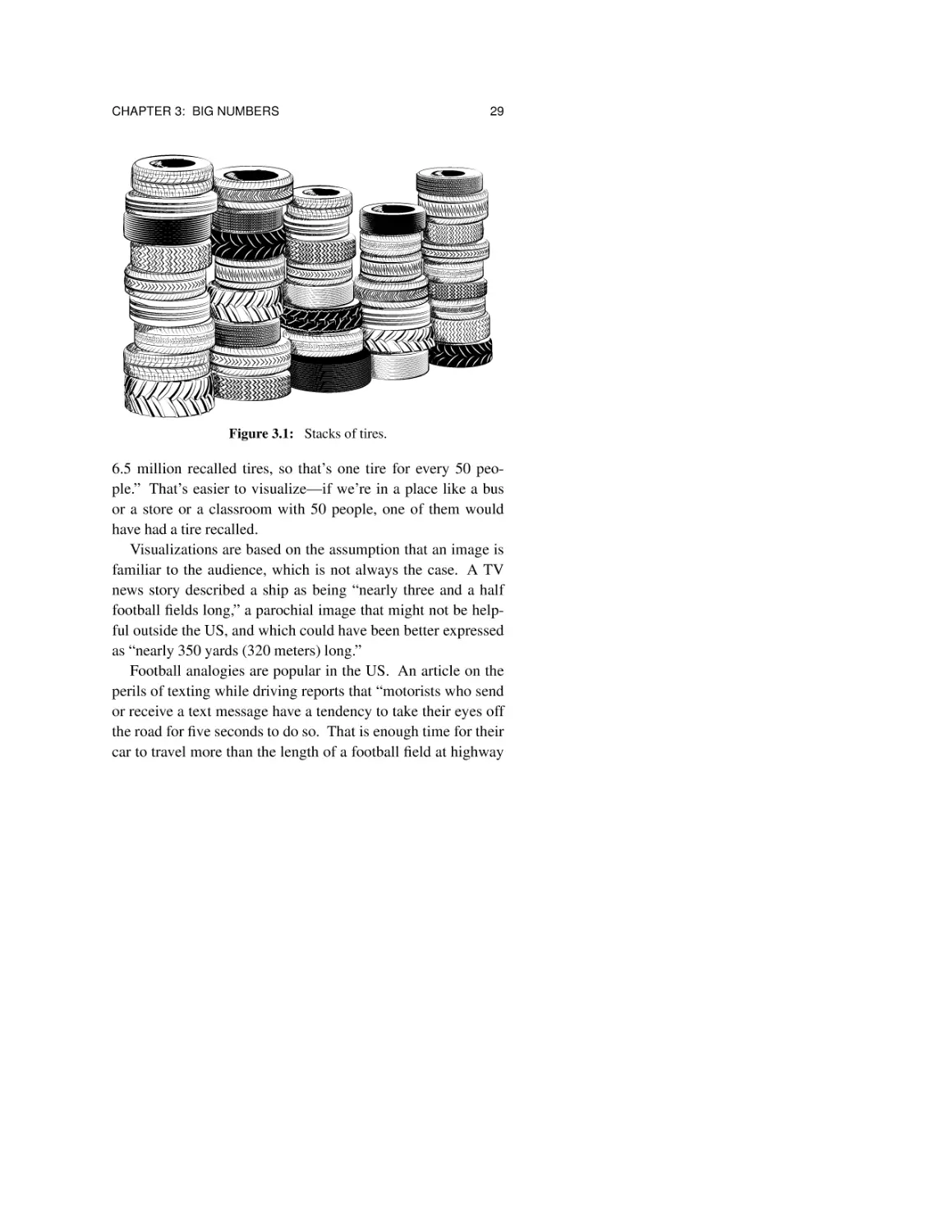
defective car tires: “If the 6.5 million Firestone tires recalled so
far were stacked vertically, they would make a column 949
miles high.”
Is this computation accurate? We can figure that out. If the
tires are stacked on their sides and each tire is one foot wide, a
stack of 6.5 million tires will be 6.5 million feet high. We
could divide 6.5 million by 5,280 (feet in a mile) or simplify by
dividing 6 million by 5,000; both lead to about 1,200 miles. If
instead the tires are 9 inches wide, that’s ¾ of 1,200, or 900
miles. So the computation is correct, though excessively precise, a topic that we will come back to in Chapter 8.
I’m not convinced that visualizations like this one are helpful, except to convey the impression that some number is “big”
or perhaps “really big.” After all, what’s your mental picture
of 949 miles, especially straight up? (Check Figure 3.1.)
A visualization that brings the data into a range where it’s
easy to relate to is a different story. Instead of an improbable
tower of tires, we could say “There are 330 million people and
CHAPTER 3: BIG NUMBERS
29
Figure 3.1: Stacks of tires.
6.5 million recalled tires, so that’s one tire for every 50 people.” That’s easier to visualize—if we’re in a place like a bus
or a store or a classroom with 50 people, one of them would
have had a tire recalled.
Visualizations are based on the assumption that an image is
familiar to the audience, which is not always the case. A TV
news story described a ship as being “nearly three and a half
football fields long,” a parochial image that might not be helpful outside the US, and which could have been better expressed
as “nearly 350 yards (320 meters) long.”
Football analogies are popular in the US. An article on the
perils of texting while driving reports that “motorists who send
or receive a text message have a tendency to take their eyes off
the road for five seconds to do so. That is enough time for their
car to travel more than the length of a football field at highway
30
CHAPTER 3: BIG NUMBERS
speeds.” If you don’t know how big a football field is, you
have no way of knowing whether this is important or not. (Of
course taking your eyes off the road for five seconds is likely to
be a bad idea no matter how big the field is.) Or we might say
that since “football” in much of the world is the game Americans know as soccer, and a soccer field is only moderately bigger, no harm has been done.
3.6 Summary
As Daniel Kahneman, winner of the 2002 Nobel Prize in
economics, and author of Thinking, Fast and Slow, once said,
“Human beings cannot comprehend very large or very
small numbers. It would be useful for us to acknowledge that fact.”
One of the most effective ways to understand big numbers is
to try to scale them down, for example, by asking what your
share of a big number is or how it would affect your family or
some other small group. No one can personally relate to a trillion dollar budget, but it’s reasonably intuitive to say that your
personal share of the budget is a bit over $3,000.
Visualizations of big numbers are a mixed lot. Some work
well, but in many cases they simply replace an unintuitive
number by a similarly unintuitive image, like a pile of tires or a
trip to the moon. And they are less helpful if they’re based on
a cultural reference like football fields that doesn’t translate
well from its origin.
Chapter 4
Mega, Giga, Tera,
and Beyond
“A zettabyte is equal to one billion trillion bytes: a 1 with 21 zeros
at the end. A single zettabyte is equivalent to 100 billion copies
of all the books in the Library of Congress.”
(New York Times, December 10, 2009)
Technology is a plentiful source of big numbers, many
expressed in unfamiliar units, so there is another set of “big”
words to add to the mix: mega, giga and tera are part of everyday speech, while further-out ones like peta and exa now
appear in public with some regularity. Computers and smartphones are so pervasive that we’re all used to reading about
gigabytes and megapixels, but since these prefixes often refer
to invisible entities like bytes, we have even less idea of what
these terms mean than the more familiar billions and trillions.
32
CHAPTER 4: MEGA, GIGA, TERA, AND BEYOND
To put everyone on the same footing, kilo is one thousand,
mega is one million, giga (pronounced with a hard “g” as in
“gig”) is one billion, and tera is one trillion. If you want to
future-proof yourself as technology advances, the rest of the
sequence is peta, exa, zetta and yotta. Each one is 1,000 times
bigger than the previous one.
In a similar vein, computers are so fast and made of such
tiny components that there is a parallel universe of even more
unfamiliar prefixes for small quantities and sizes: milli, micro,
nano, and pico, which are one thousandth, one millionth, one
billionth, and one trillionth. These are most often applied to
lengths and times, like millimeters and nanoseconds.
Since most of us have little intuition about such numbers
and don’t know the data that they are based on anyway, we’re
at the mercy of whoever provides them. Here are several illuminating examples.
4.1 How big is an e-book?
There was much pre-Christmas buzz some years ago about
Amazon’s Kindle and other newly-available e-readers as
potential gifts, along with speculation about a tablet device
from Apple. (The iPad was announced in late January of 2010,
but didn’t ship until March.) On December 9, 2009, the Wall
Street Journal said that Barnes & Noble’s Nook e-book reader
had two gigabytes of memory, “enough to hold about 1,500
digital books.” A day later, the New York Times made its observation that a zettabyte “is equivalent to 100 billion copies of all
the books in the Library of Congress.”
By good luck, I was right then in the early stages of inventing questions for the final exam in my class, so this confluence
CHAPTER 4: MEGA, GIGA, TERA, AND BEYOND
33
of technological numbers was a gift from the gods. On the
exam, I asked, “Supposing that these two statements are correct, compute roughly how many books are in the Library of
Congress.”
This required only straightforward arithmetic, albeit with
big numbers, which is not something that most people are good
at. The brain refuses to cooperate when there are too many
zeroes. Writing them all out (“a 1 with 21 zeros at the end”)
might help, but it’s easy to slip up. As we will see shortly, scientific notation like 1021 is better, but units like zetta, completely unknown outside a tiny population, convey nothing at
all to most people.
Since intuition is of no help here, let’s do careful arithmetic.
Taking the Journal at its word, 2 gigabytes (2 billion bytes) for
1,500 books means that a single book is somewhat over a million bytes. Taking the Times at its word, a hundred billion
copies is 1011 copies; dividing 1021 total bytes by 1011 copies
implies that there are about 1010 bytes in a single copy of all
the books. If each book is 106 bytes, then (dividing 1010 by
106), we conclude that the Library of Congress must hold
about 104 or 10,000 books. (If the use of exponents and scientific notation here is unfamiliar, there’s more explanation in the
next section.)
Is 10,000 books a reasonable estimate? One useful alternative to blind guessing is a kind of numeric triage, which led to
the second part of the exam question: “Does your computed
number seem much too high, much too low, or about right, and
why do you say so?” Of course if one didn’t do the arithmetic
correctly, all bets are off. A number of students found themselves in that predicament, and thus had to rationalize faulty
values from fractions to bazillions.
34
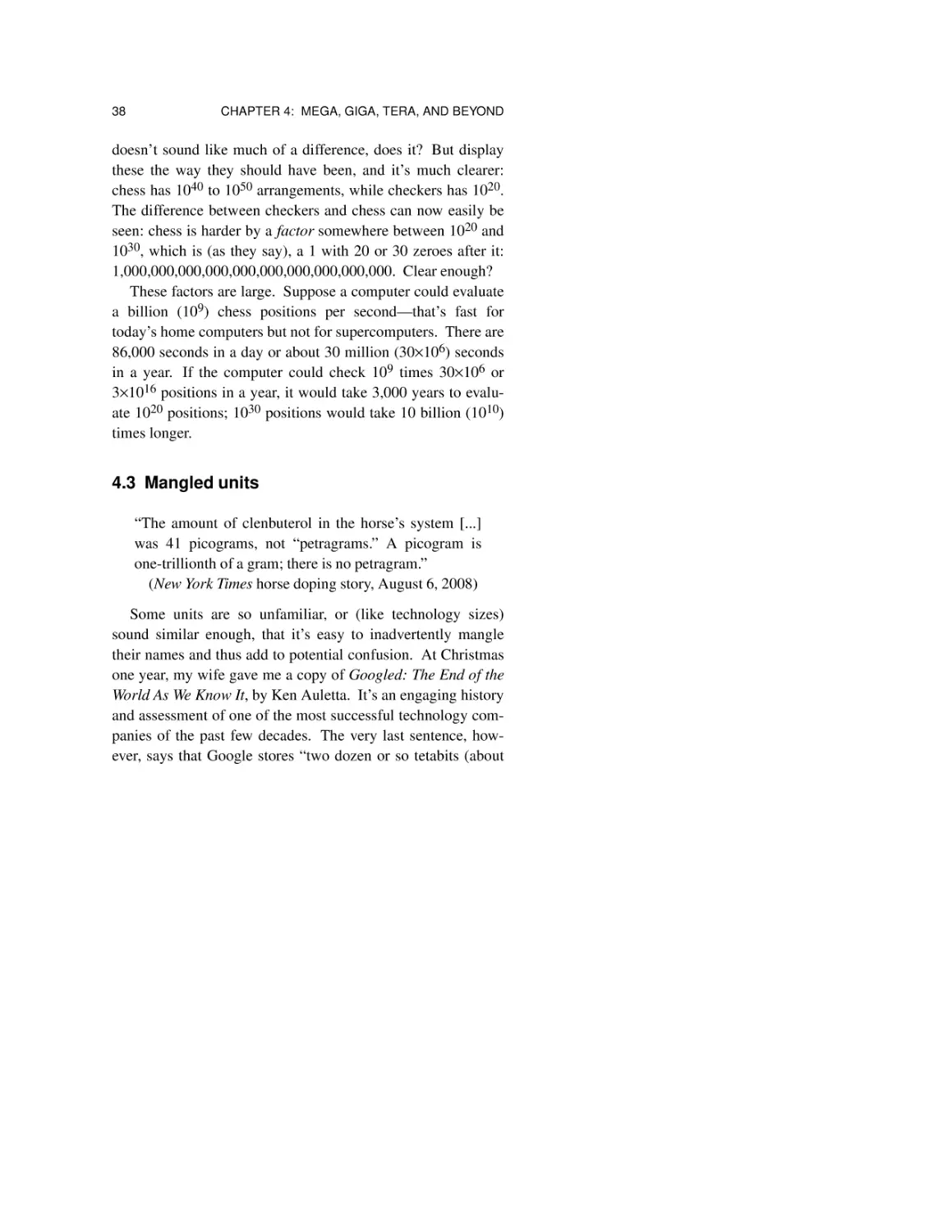
CHAPTER 4: MEGA, GIGA, TERA, AND BEYOND
Figure 4.1: 10,000 books? One building of the Library of Congress.
Those who did the arithmetic correctly were better off, but
some still had trouble assessing plausibility. Apparently even
small big numbers are hard to visualize, for a surprising number of students thought that 10,000 books was reasonable for a
big library. “I would guess that even Princeton’s library holds
over 10,000 books” was one response. That’s technically true,
of course, but not a good answer—even I have over 500 books
in my office, and I’ll bet that many of my more scholarly colleagues have thousands. The university library, housed in a
large building at the center of campus and ostensibly familiar
to all students, holds well over six million.
How big is a book really? How big is a terabyte, or even a
megabyte for that matter? Here’s a partial answer. One byte
holds a single alphabetic character in the most common
CHAPTER 4: MEGA, GIGA, TERA, AND BEYOND
35
representation of text. Jane Austen’s Pride and Prejudice has
about 97,000 words or 550,000 characters, so a megabyte for a
purely textual book like a romance novel or a biography is a
good round number, and a gigabyte could hold a thousand
books of similar size. (Pictures take up more space, kilobytes
to megabytes each.) The Journal’s computations were reasonable, but the Times, by contrast, was way off.
Now we can assess these three quotations about the sizes of
e-books:
“If you had a word processing file holding the King
James Bible, it likely would consume somewhat less
than 500 kilobytes.”
“In terms of text, each gigabyte holds the equivalent of
2,000 Bible-size books.”
“Entire programs like Microsoft’s Office suite take up
about 1 fat book’s worth of drive space. Microsoft’s
Office Small Business Edition, for example, takes up a
mere 560 MB.”
The Bible is quite a bit longer than Pride and Prejudice; at
almost 800,000 words or about 4.5 megabytes of plain text, it
qualifies as a fat book. The first two of these statements are
thus reasonably consistent, though optimistic. (Data compression techniques can reduce the number of bytes required,
though not quite down to 500 kilobytes.) The third is off by a
factor of a thousand, however, since 560 MB of Microsoft
Office is more like 500 fat books worth of disk space.
By the way, according to loc.gov, the Library of Congress
has more like 16 million books and 120 million other items.
As an amusing aside, the original story about e-book readers
36
CHAPTER 4: MEGA, GIGA, TERA, AND BEYOND
tried to help readers to visualize how many books there are in
the Library of Congress: it would be “seven layers of textbooks
covering the continental United States and Alaska.” I’ll leave
it to you to decide whether this is accurate (passing over
whether it’s helpful). To give you a start, however, consider
that a square mile is well over 25 million square feet, and a
textbook isn’t much bigger than what you’re holding as you
read.
4.2 Scientific notation
When they get to numbers that are beyond “really really
big,” news sources resort to compounding. As the New York
Times said in a correction in March 2008, “[A petaflop] can be
expressed as a thousand trillion instructions per second, not a
million trillion.” Or, quoting Computerworld in December
2007, “In the private sector alone electronic archives will take
up 27,000 petabytes (27 billion gigabytes) by 2010.” Or, in
June 2017,
“According to CERN, the long-sought [Higgs] boson,
the keystone to the Standard Model, weighs 125 billion
electron volts, or as much as a whole iodine atom. But
that is ridiculously too light, according to theoretical
calculations. The mass of the Higgs should be some
thousands of quadrillion times as high.”
Not only compounds, but mixtures of regular big numbers like
billion and trillion, rarer ones like quadrillion, and their technology siblings giga and peta! What is the poor reader to do?
One way to deal with big numbers is to write them out in
their full glory, rather than using words like million and billion.
CHAPTER 4: MEGA, GIGA, TERA, AND BEYOND
37
So a million is 1,000,000, and a billion is 1,000,000,000.
Much further beyond, as the Times explained, “A zettabyte is
equal to one billion trillion bytes: a 1 with 21 zeros at the end.”
(The “21” comes from adding the 9 zeroes for a billion and the
12 zeroes for a trillion.)
In scientific notation, we use a power of 10 to express the
number of zeroes that follow the 1. In this notation, a thousand
is 103, that is, 10 to the third power, or 10 multiplied by itself 3
times (10×10×10). Similarly, a million is 106, a billion is 109,
and a trillion is 1012, that is, 10 to the 12th power, or 10 multiplied by itself 12 times. To multiply powers of 10, like 109
times 1012, add the exponents: 109+12 is 1021. For division,
subtract the powers: 1021 divided by 1011 is 1021−11 or 1010.
This is simple, compact, and less vulnerable to errors than
using big words or counting zeroes. For example, in Broadbandits, a 2003 exposé of the telecom industry meltdown, the
author says that a data transfer rate of 6.5 terabits per second is
“almost a million times faster” than 56 kilobits per second. Is
the factor of a million correct? Comparing 6 terabits (6 times
1012) to 60 kilobits (60 times 103, which is 6 times 104), it’s
easy to see that the correct factor is close to 108, or 100 million
times faster.
Unfortunately, however, many people are uncomfortable
with scientific notation, so it doesn’t get used as often as it
could be in day-to-day life.
Sometimes technology gets in the way of clear expression:
newspapers seem to be unable to print superscripts. A story in
the New York Times in December 2007 said that chess is a
much harder game than checkers for computers to master
because it has between 1040 and 1050 possible arrangements
of pieces, while checkers has more like 1020 positions. That
38
CHAPTER 4: MEGA, GIGA, TERA, AND BEYOND
doesn’t sound like much of a difference, does it? But display
these the way they should have been, and it’s much clearer:
chess has 1040 to 1050 arrangements, while checkers has 1020.
The difference between checkers and chess can now easily be
seen: chess is harder by a factor somewhere between 1020 and
1030, which is (as they say), a 1 with 20 or 30 zeroes after it:
1,000,000,000,000,000,000,000,000,000,000. Clear enough?
These factors are large. Suppose a computer could evaluate
a billion (109) chess positions per second—that’s fast for
today’s home computers but not for supercomputers. There are
86,000 seconds in a day or about 30 million (30×106) seconds
in a year. If the computer could check 109 times 30×106 or
3×10¹⁶ positions in a year, it would take 3,000 years to evaluate 1020 positions; 1030 positions would take 10 billion (1010)
times longer.
4.3 Mangled units
“The amount of clenbuterol in the horse’s system [...]
was 41 picograms, not “petragrams.” A picogram is
one-trillionth of a gram; there is no petragram.”
(New York Times horse doping story, August 6, 2008)
Some units are so unfamiliar, or (like technology sizes)
sound similar enough, that it’s easy to inadvertently mangle
their names and thus add to potential confusion. At Christmas
one year, my wife gave me a copy of Googled: The End of the
World As We Know It, by Ken Auletta. It’s an engaging history
and assessment of one of the most successful technology companies of the past few decades. The very last sentence, however, says that Google stores “two dozen or so tetabits (about
CHAPTER 4: MEGA, GIGA, TERA, AND BEYOND
39
twenty-four quadrillion bits) of data.”
As the Times might have said, there is no tetabit; if
quadrillion (1015) is correct, then the word should have been
petabits, since peta is 1015. This led me to another exam question: “Assuming that the word should have been petabits, how
many gigabytes does Google store?” Answering it required
converting petabits to gigabits, then converting bits to bytes (by
dividing by 8 bits per byte) to get 3 million gigabytes. But
“tetabit” is also only one letter away from another valid unit,
terabit, so the second half of the question asked, “If tetabits
really should have been terabits, how many gigabytes would
there be?” I’ll leave that as an easy exercise.
As an aside, Googled was published in 2009. Technology
marches on very quickly, and it won’t be long before storage
numbers are denominated in exabytes, and we’ll undoubtedly
see frequent stories about “a 1 followed by 18 zeroes.”
4.4 Summary
The prefixes that stand for big and little numbers from technology—mega, giga, nano, and the like—have the same problems as conventional big words like million and billion: they
don’t give an intuitive feel for size, just a vague impression of
relative levels of bigness. At the same time, they are less
familiar, so the impression is even less likely to convey an
accurate meaning.
Familiarity with the words will help, and becoming familiar
and comfortable with scientific notation, the use of exponents
instead of words or long strings of zeroes, will make all of
them more comprehensible and meaningful. When you see
compound strings like “million million trillion,” take the time
40
CHAPTER 4: MEGA, GIGA, TERA, AND BEYOND
to convert them into exponents; it’s easier to get an accurate
impression of size and much easier to do computations with
big numbers.
Chapter 5
Units
“Americans receive almost two million tons of junk mail daily.”
(Dear Abby newspaper advice column, January, 1996)
Even with the advent of the paperless society and metaphorical tons of email spam, I still get plenty of physical junk mail
at my home every day. But two million tons a day sure sounds
like a lot. Is Dear Abby’s claim reasonable? Let’s think about
whether it is or not.
5.1 Get the units right
We can start by asking the question from Chapter 3: how
would that affect me personally? Two million tons is four billion pounds. If there were 300 million Americans in 1996,
that’s over 13 pounds of junk mail per person per day.
42
CHAPTER 5: UNITS
Somehow that doesn’t seem realistic, especially when I
think of Joe, the long-serving and conscientious mailman who
has faithfully delivered mail to my house for nearly twenty
years. That would be 26 pounds every day just for me and my
wife. Abby’s value is clearly too high.
This seems likely to be a classic error of using the wrong
units—gallons instead of barrels, kilometers instead of meters,
seconds instead of minutes, days instead of months or years.
The specific number might well be right, but if the wrong unit
has been attached to it, the ultimate value is wrong.
I suspect that’s the problem here: either the wrong time unit
or an incorrect weight unit. For example, suppose “two million
tons” is right but “per day” should have been “per month” or
“per year.” Thirteen pounds a month would be about six or
seven ounces a day, which still seems high. But thirteen
pounds a year would be more like half an ounce per person per
day, or an ounce for a family of two. That might be a little low,
but it’s not unreasonable.
Alternatively, perhaps “two million” is right but “tons”
should have been “pounds.” Two million pounds is 32 million
ounces; dividing that by 300 million gives us about 1/10 of an
ounce per day per person. That seems low, though not
absurdly, so it’s a legitimate possibility. And I’m sure there are
other options as well.
Think about how we reasoned through this. Convert the big
number in the original statement into a smaller number that
represents its individual effect on us. If that number is clearly
wrong, think about what might have been wrong with the original statement, and work through some of the possible errors to
see whether a simple change could explain the original and
thus lead to a more likely answer.
CHAPTER 5: UNITS
43
5.2 Reasoning backwards
Reasoning backwards from a conclusion to check its data
and assumptions is a valuable technique, applicable in many
situations. Let’s take a look at some more examples.
“Shutting down your computer and monitor overnight
rather than running them 24 hours a day will save $88 a
day.”
(Newark Star-Ledger, December 2004)
This story was published at a time when CRT monitors were
by far the most common form of computer display. It certainly
sounds like turning off the monitor would not be just a good
idea, but necessary for financial solvency. If it really did cost
$88 for half a day of electricity use, there would be precious
few personal computers at all, since the cost for electricity
alone would add up to more than $30,000 per year. Even back
in 2004, the number couldn’t possibly be right.
If you know how much electricity costs, which is about
10-15 cents per kilowatt hour in my part of the world, and how
much power a computer and a monitor use (typically 100-200
watts, or 1 or 2 tenths of a kilowatt, about the same as a couple
of incandescent light bulbs), then you can estimate that it
would cost a cent or two per hour to run a monitor. Running a
computer and monitor 10 hours a day for a full year would cost
about $80. That strongly suggests that the time unit in the
original story should have been “per year,” not “per day,” and
indeed that was the case, as the Star-Ledger made clear in a
correction a few days later.
A story in the London Times in November 2004 described a
NASA jet that can travel 850 miles in 10 seconds, or 7,000
miles per hour. The first number, 850 miles in 10 seconds, is
44
CHAPTER 5: UNITS
clearly inconsistent with 7,000 mph: at 850 miles in 10 seconds, the jet would travel 5,000 miles in a minute and thus
300,000 miles in an hour. The story went on to say that an aircraft that can fly at ten times the speed of sound was about to
be tested over the Pacific Ocean, with the possible goal of a
“hypersonic” cruise missile that could travel from Los Angeles
to Pyongyang in less than an hour. The speed of sound is
somewhat over 700 mph, so 7,000 mph is perfectly plausible
for a missile.
By the way, you perhaps learned as a child to estimate how
far away a lightning strike was during a thunderstorm: every
five seconds between the flash and the sound is a mile away.
That works because 720 miles per hour is 12 miles per minute
and thus one mile is 5 seconds.
What are the implications of a passenger jet that could travel
850 miles in 10 seconds? It would certainly reduce the pain of
air travel. Imagine yourself getting on a plane in London. The
plane takes off, and 40 seconds later comes an announcement:
“Please fasten your seatbelts. We’ll be landing in New York in
a few minutes.”
A speed of 7,000 miles per hour may be reasonable for a
missile, but it’s far too high for a commercial plane. Commercial jets fly at 500 to 600 miles per hour, and the Concorde’s
top speed was 1,300 miles per hour, nearly twice the speed of
sound.
That makes one wonder about a story in the Manchester
Guardian in September 1993 that said “[A Boeing 747] is a
vehicle, a man-made object capable of hurtling down a runway
at speeds well over 2,000 miles an hour and lifting off into the
air.” A 747 taking off is truly impressive but its takeoff speed
is more like 200 miles per hour.
CHAPTER 5: UNITS
45
Figure 5.1: 2,000 miles per hour?
Meanwhile, back on the ground, in 2005 New York City
tried to sell the aging Willis Avenue Bridge that crosses the
Harlem River between Manhattan and the Bronx. The price
was a mere one dollar, and the city would even deliver it free to
any location within 15 miles. Sadly, there were no takers, so it
was ultimately demolished.
A newspaper story at the time included a traffic analysis: the
bridge was used by only 75,000 vehicles a year. A bit of arithmetic says that’s about 200 vehicles a day or fewer than one
every 5 minutes, which is lightly traveled indeed, especially in
New York, a city with a population of at least 8 million. Not
surprisingly, there was a correction a few days later: bridge
traffic was 75,000 vehicles per day, not per year.
Some units are more technical and less familiar, and thus
easier to get wrong. For instance, I once saw an article that
46
CHAPTER 5: UNITS
described the use of electroshock therapy on children with
severe behavioral problems. The story said that children were
treated with current ranging from 15 to 45 amperes. Don’t try
this at home! The right units should have been milliamperes,
or thousandths of an ampere; as Wikipedia says, 30 milliamps
is enough to cause fibrillation and 30 amps would be instantly
fatal.
And on a happier note, the Newark Star-Ledger ran a story
some years ago about a local bar, Tierney’s Tavern in Montclair, which was offering pitchers of beer for $1.25 during
happy hour. A pitcher of beer is usually 60 ounces, or a couple
of liters; that much beer would certainly make me happy, at
least for a while. The story was later corrected. The price
should have been $1.25 for a 16-ounce pint, not a pitcher—still
pretty cheap, but roughly four times higher than the original.
5.3 Summary
It’s just as easy to make a mistake with units as it is with
millions and billions. Depending on the particular error, the
effect might be smaller—confusing day with year is “only” a
factor of 365—while mixing up pounds and tons is a factor of
2,000, and interchanging feet and miles is a factor of 5,280.
(“The distance above sea level of Colorado Springs is 6,000
feet, not 6,000 miles.”)
From time to time, a units error has serious consequences.
In 1999, the Mars Orbiter space probe disintegrated in the atmosphere of Mars. The cause: one part of the software used
data in conventional English units, while a different part used
standard metric units. The discrepancy led to an invalid computation of the amount of thrust to be applied for an orbital
CHAPTER 5: UNITS
47
correction, which brought the craft too close to the surface.
As another example, in 1983 an Air Canada flight ran out of
fuel since the amount of fuel loaded had been measured in
pounds when it should have been in kilograms; as a result, the
plane had less than half the necessary amount. Because of
faulty instrumentation and some human errors, this was not
noticed until the engines stopped while the plane was flying at
12,500 meters somewhere over Manitoba. Thanks to good
luck and some truly exceptional piloting, the plane landed
safely, without power and most of its instruments, on a landing
strip at an unused former air force base.
In some cases, errors in units can be spotted by reasoning
backwards. In others, like the two incidents described above,
there is no real solution except to be very careful.
Chapter 6
Dimensionality
“Young males can roam 60 to 100 square miles looking
for food and mates, but females stay close to the cave,
foraging within a 10-mile radius.”
(Newark Star-Ledger, July 9, 1999)
It’s clear that male bears wander around a lot of territory.
How does the area that male bears cover compare to the area
covered by the more stay-at-home females?
Let’s do the arithmetic. A circle of radius r has an area of
π r 2, and π is approximately 3.14, so a circle with a ten-mile
radius has an area of over 300 square miles! Something is
clearly wrong, at least if we take at face value the implication
that lady bears stay closer to their caves than their gentlemen
friends do.
What might the problem be?
50
CHAPTER 6: DIMENSIONALITY
6.1 Square feet and feet square
It’s easy to make errors when we mix a linear dimension
like a radius in miles with an area dimension like square miles.
We’ve all heard from childhood that you can’t add apples
and oranges. Many of the numbers that we deal with have
dimensions—length, area, volume—that must be combined
correctly or we’re doing the equivalent of adding apples and
oranges. We can’t add feet to square feet, nor compare square
inches to cubic inches.
Fortunately, such errors are usually easy to spot. For example, a correction from the New York Times in May 2009
described a room as “30 feet square—meaning 30 feet by 30
feet—and not 30 square feet, which would be far less.”
Indeed it would: a 30-square-foot room would be something
like 6 feet long and 5 feet wide. Confusing “square feet” with
“feet square” is common in English, where a bit of sloppiness
in expression lets it in. A few months before the bear story, we
learned that “the size of Fort Leavenworth is 8.8 square miles,
not eight miles by eight miles, or 64 square miles.” Or in the
book Alias Jack the Ripper (R. M. Gordon, 2000), “The victims all lived in the same small area of 260 square yards.” An
area of 260 square yards would be about 16 yards by 16 yards.
The author presumably meant 260 yards by 260 yards.
Reasoning backwards about the claimed area will often
reveal such problems. During a flare-up of the Zika virus in
Miami in the summer of 2016, newspaper stories quoted the
director of the Centers for Disease Control and Prevention,
Tom Frieden, as saying he would not be surprised if new Zika
cases were reported inside of what he described as a
500-square-foot area at the center of the designated zone.
“That’s the way Zika works,” he said, explaining that a one-
CHAPTER 6: DIMENSIONALITY
51
square-mile zone was a precautionary buffer.
How big is 500 square feet? By coincidence, the room that I
was sitting in when I first wrote this section was about 20 feet
by 20 feet. That’s 400 square feet; if the room were 22 by 23,
that’s 506 square feet. So if I had been in Miami instead of
New Jersey, it’s possible that new cases of Zika would have
been localized to a place no bigger than my room! Surely that
would have made the virus easier to control.
Obviously what Dr Frieden meant to say (and probably did
say) was not “500 square feet” but “500 feet square,” that is, an
area of 500 feet by 500 feet, which is 250,000 square feet. The
precautionary buffer of one square mile is the same as a square
of one mile by one mile, so there’s no error there.
6.2 Area
“The F50fd’s sensor is more than 50 percent bigger
than those on most of the other cameras: 0.625 inch
diagonal, versus 0.4. Now that’s a statistic—not
megapixels—that matters in a camera.”
(New York Times, December 6, 2007)
Many of the displays that we deal with in everyday life, like
TV, computers and mobile phones, express their screen size as
a single number, the diagonal measurement of a rectangular
surface. That’s convenient, since a single number characterizes the size, and it works well if the aspect ratio (the ratio of
width to height) is the same across the devices that are being
compared.
Camera sensors fall into the same category, though we don’t
see them. A sensor inside a digital camera is an array of
52
CHAPTER 6: DIMENSIONALITY
millions of tiny light-sensitive picture elements (“megapixels”)
that measure incoming light and capture the values for later
display.
The quotation above is absolutely correct in saying that a
bigger sensor does a better job, since it gathers more light, but
it’s wrong in its arithmetic, at least if “50 percent bigger” refers
to the sensor area. For a fixed aspect ratio, a 50 percent
increase in the diagonal is also a 50 percent increase in both
width and height, and thus the area increases by a factor of
2.25.
How did I reach that conclusion? The area is height times
width, so if the old area was say h times w, the new area is 1.5
h times 1.5 w, which is 2.25 times the original. Another way to
say it is that the area is bigger by 125 percent: if the old area is
100 square units, the new area is 225 square units. (This difference between factor and percentage is a potential confusion as
well, so be careful.)
This might be easier to see with a diagram. The white
squares in Figure 6.1 are the original ones; the gray squares are
the ones added by growing both height and width by 50 percent. That’s one more square in each direction, taking us from
4 squares to 9. And 9/4 is 2.25, which is a 125 percent
increase.
This is exactly the same if the aspect ratio is different, that
is, not square, as we can see in Figure 6.2. Indeed this is true
for any shape, not just rectangles.
The author of the quotation does deserve full marks for
rounding the increase of 0.625 over 0.4 to 50 percent to make it
easy for readers to grasp. The ratio is really 1.5625, however,
so the bigger sensor is actually 1.5625 squared, or 2.44 times
as big—even better for camera buyers.
CHAPTER 6: DIMENSIONALITY
53
Figure 6.1: A 50 percent increase in the diagonal.
Figure 6.2: Also a 50 percent increase in the diagonal.
For consumers, the place where we see this kind of computation most often is television screens. At home, I make do
with an ancient TV with a 38-inch (diagonal) screen, but every
so often I think about upgrading. To make the arithmetic easy,
let’s suppose that I decide to go from a 40-inch diagonal to 60
inches. There’s that 50 percent increase again, a factor of 1.5,
so the screen area of my hypothetical new TV would go up by
a factor of 2.25. If I had more interest in watching TV (and
more money!), I could get an 80-inch set instead; that would
give me four times the area.
Of course my big new TV is likely to have exactly the same
number of pixels as my original small one unless I spring for
54
CHAPTER 6: DIMENSIONALITY
“ultra HD,” which has four times as many pixels. Why four
times? That’s because ultra HD has twice as many pixels in
both height and width.
“Ultra HD refers to a resolution of 3,840 × 2,160 pixels.
That’s four times the 1,920 × 1,080 pixels found in your
full HD TV.”
(Product-comparison web site)
As it is for TV screens, so it is for computer displays—a
15-inch screen has 33 percent more area than a 13-inch screen,
and 85 percent more area than my laptop with its 11-inch
screen, assuming the aspect ratios are the same. Again, the
pixel density may well vary too, so we have to be careful about
what we’re comparing.
6.3 Volume
“A cannon with a bore diameter of 3 inches would shoot
a slightly smaller iron ball that weighed between 3 and
4 pounds. A cannon with a bore diameter of 9 inches
would shoot an iron ball that weighed between 7 and 10
pounds. The size of the cannon came to be referred to
in terms of the average weight of the solid ball shot they
could fire. A cannon with a bore diameter of 3 inches
was called a 3-pounder, one with a bore diameter of 6
inches was called a 6-pounder, and so on.”
(From a web site on the history of artillery)
As we saw above, it’s easy to make a major error by using a
linear dimension like length or radius when an area dimension
like square feet is needed, or vice versa. And if such errors are
CHAPTER 6: DIMENSIONALITY
55
significant for area, they are even more significant for volume.
This is easiest to see with blocks, as in Figure 6.3.
Figure 6.3: Growth of area and volume.
The area of a side grows as the square of the number of
blocks horizontally: for 1, 2 and 3 blocks, the areas are 1, 4 and
9. Similarly, the volume grows as the cube: 1, 8 and 27.
Now let’s look at the cannonballs more carefully (Figure
6.4). The area of a circle of radius r is π r 2, a familiar formula.
If we double the radius, the area goes up by a factor of four.
The volume of a sphere like a cannonball is (4/3)π r 3, a formula that is less likely to be familiar (and that you can completely ignore). For comparisons, all that matters is that the
volume and thus the weight is proportional to the cube of the
radius or (equivalently) diameter. That means that if we double the radius or diameter, the volume and weight go up by a
factor of 8, and that’s a lot. If a 3-inch cannonball weighs 3
pounds, then a 6-inch cannonball would weigh 24 pounds, and
a 9-inch cannonball would weigh 81 pounds.
The important thing to remember is how the volume (and
thus weight) grows in proportion to the linear dimension; constant factors like 4/3 and π don’t matter.
56
CHAPTER 6: DIMENSIONALITY
Figure 6.4: 6-inch cannonballs for a 24-pounder.
You may remember a time when TV sets and computer
monitors were not flat screens but had significant depth as well
as height and width. If you wanted to replace an old 20-inch
TV by a newer one with a 30-inch screen, the screen area went
up by a factor of 2.25, but the volume of the set would go up by
1.5 cubed, which is a factor of about 3.3. I don’t recall now,
but would not be surprised to find out that the weight went up
by some similar proportion, or at least more than a factor of
2.25. But with flat screens, the depth is constant and so the
weight is likely to grow proportionally to area only: if my
40-inch TV weighs 10 kilograms, my prospective 60-inch flatscreen TV will weigh around 25 kilos. A bit of online comparison shopping suggests that this factor is reasonably accurate.
CHAPTER 6: DIMENSIONALITY
57
6.4 Summary
It’s easy to confuse square anything with anything squared,
especially in casual speech, and this confusion is common in
the news. Fortunately, in many cases the resulting value is so
ridiculously large or small that you can see the error by thinking about consequences.
Be careful about how area grows when linear dimensions
like height and width are changed. The rule is that area grows
in proportion to the square of linear dimensions, so doubling
the radius or the diagonal or both height and width will quadruple the area; increasing the radius by a factor of 10 will
increase the area by a factor of 10 squared, or 100.
The factors are even bigger for volume and thus weight.
Volume is proportional to the cube of the linear dimensions:
doubling the radius of a sphere or all the sides of a box will
grow the volume by a factor of 2 cubed, or 8, and if the linear
dimension goes up by a factor of 10, the volume will go up by
a factor of 1,000.
In all such cases, the important thing is proportion—it
doesn’t matter at all if there is some constant factor like 4/3 or
π because it cancels out when one value is divided by the other.
Nor does it matter what the shape is, since the difference
between say a rectangle or triangle and a circle is also just a
constant factor.
Chapter 7
Milestones
“Every day 10,000 baby-boomers turn 65.”
(New York Times, August 1, 2014)
“8,000 baby-boomers turn 65 every month.”
(New York Times, May 7, 2016)
Every day, thousands of newspapers print stories along the
lines of “Every [some time period] [some number of] [some
group] [does something].” Many of these stories are about a
“milestone” or once-in-a-lifetime event, like birth, death, or a
significant birthday.
7.1 Little’s Law
Do you have any intuition about how many baby-boomers
turn 65 every month? I don’t either, but fortunately we can
often reason about these formulaic statements and in this case
we can even determine which one of the two quotations above
60
CHAPTER 7: MILESTONES
is basically correct and which one is certainly wrong.
One technique is based on a rule of thumb called Little’s
Law, a conservation law that relates the number of things
undergoing some process, the rate at which they arrive to be
processed, and how long the process takes.
As a simple example that you can easily remember and use
to check your understanding, imagine a school with 1,000 students. Each student enters, spends four years, then graduates.
If we ignore dropouts and transfers, there are 250 students in
each cohort, as you can see in the figure.
250 enter
each year
1st year 2nd year 3rd year 4th year
(250)
(250)
(250)
(250)
250 leave
each year
1,000 students in total
Figure 7.1: Little’s Law for a 4-year school with 1,000 students.
Little’s Law relates these three numbers: 1,000 students in
all equals 250 students per year times four years. If we divide
1,000 by 250, we get four; if we divide 1,000 by four, we get
250; if we multiply 250 by four, we get 1,000. This relationship seems pretty obvious in retrospect, at least from this
example, but apparently it was first described in 1954 by John
Little, a professor in the Sloan School at MIT.
Let’s use Little’s Law to estimate how many American
baby-boomers turn 65 every day. To simplify the arithmetic,
we’ll assume that the population of the US is 300 million;
that’s the number of people “in process.” (The “process” is
going through life.) Suppose that each person lives to age 75;
CHAPTER 7: MILESTONES
61
that’s the processing time. These are over-simplifications,
since some people die younger while others live longer, and it
also ignores immigration, emigration and the birth rate, but it’s
good enough for now.
American population by age
born
65
75 years
die
Figure 7.2: Little’s Law for Americans.
If we divide 300 million by 75, we get 4 million people in
each age group, which is the arrival rate (4 million people are
born each year) and the departure rate (4 million people die
each year). And 4 million is also the number of people who
reach any particular milestone in a year, including turning 65.
There are 4 million people who are any specific age like 65, as
shown in Figure 7.2.
Dividing 4 million by 400 days in a year gives 10,000 per
day. But there are only 365 days in a year (10 percent less than
400) so we can scale 10,000 up by 10 percent to conclude that
about 11,000 people reach any given milestone per day.
Thus the statement that 10,000 baby-boomers turn 65 each
day is reasonable, but the statement that 8,000 turn 65 every
month is wrong; the units should have been days.
We can apply the same kind of reasoning elsewhere too:
“Every day this year, around 1,800 people will mark the
iconic birthday [age 65], which for many heralds their
retirement.”
(Daily Mail, August 2, 2011)
62
CHAPTER 7: MILESTONES
The population of the United Kingdom is about 65 million,
so we can simplify the arithmetic by assuming a lifespan of 65;
that implies that one million Britons turn 65 every year, and
thus about 2,700 turn 65 each day. But life expectancy in the
UK is slightly over 80 years, so more like 2,300 people (65
million divided by 80 divided by 365) turn 65 each day. That
value is higher than the 1,800 in the story, but not absurdly so;
it’s within a reasonable range.
For confirmation from independent sources, a number of
stories about the birth of Prince George on July 22, 2013,
observed that he was one of 2,200 babies born that day, though
as a likely future king of England, somewhat unusual.
Note that we approached these computations by using
approximate numbers for easy arithmetic, leaving open the
option to refine them later if necessary. For example, I’m not
sure about what part of the UK this was meant to include. Suppose that the relevant population was really 75 million. Then
we could start with a life expectancy of 75 years (making the
arithmetic easy), then adjust up or down as we learn more
about the actual population.
This approach is really helpful; you should always look for
ways to simplify the numbers up front, saving any necessary
refinement for later on.
7.2 Consistency
Confirmation by independent computations or sources is
good. The two statements at the beginning of this chapter were
inconsistent, and that’s a warning sign. There’s not much difference between 8,000 and 10,000 as numbers but when units
are attached, 8,000 per day is about 240,000 per month, so they
CHAPTER 7: MILESTONES
63
differ by a factor of 25, which is a big difference, and thus a big
clue that at least one of them is wrong.
By the same token, if a variety of independent computations
produce consistent answers, that’s a positive sign. Consider
these examples:
“Every day, 10,000 baby-boomers turn 50 years old.”
(Gambling Magazine, May 1, 2005)
“Every week for the next 18 years, some 88,500 babyboomers will turn 59½.”
(Newsweek, September 12, 2005)
“350,000 Americans turn 50 every month.”
(Forbes, January 10, 2005)
“4 million students graduate from high school each
year.”
(New York Times, July 9, 2010)
These four values, expressed as per day, week, month, and
year, are all within 10 or 20 percent of the estimated 11,000 per
day, so there’s a good chance that they are all correct.
As another example of how consistency can be used, let’s
look at some numbers on identity theft, which is a serious and
perhaps growing problem.
“Every 79 seconds, someone becomes a victim of identity theft.”
(CBS News, January, 2001)
“Every two seconds, another American becomes a victim of identity fraud.”
(CNN News, February, 2014)
64
CHAPTER 7: MILESTONES
“19 people become victims of identity theft every
minute.”
(Security services company, 2015)
The third statement speaks of victims per minute, while the
other two are about victims per second. These can’t be compared directly, so our initial step should be to convert the third
statement into the same units as the first two: 19 victims per
minute is one victim every three seconds.
Every two or three seconds are roughly consistent rates,
given that one quotation says “fraud” and the other says
“theft,” but both are much shorter than 79 seconds. Why might
this be? Simple error is always an option, but another possible
explanation is that things have indeed gotten worse over the
course of 13 or 14 years. The “79 seconds” number, which is
widely quoted, dates from 2001, a time that is comparatively
early days in e-commerce; the other two numbers are much
more recent.
It appears that the value 79 originally came from dividing
the precise number of seconds in a year (31,536,000) by a
round number from the US Federal Trade Commission—400,000 cases of some kind of identity theft. The result
is 78.84, which was subsequently rounded up to the still
overly-precise value 79.
In 2017, the FTC reported that it had received nearly
500,000 identity theft complaints, and the Department of Justice said that 17.6 million people were victims of identity theft.
These two presumably authoritative numbers are sufficient to
explain the apparent discrepancies. The FTC receives a complaint every 63 seconds; the DoJ says that someone is a victim
every 1.8 seconds. Any discrepancy is likely because different
things are being counted.
CHAPTER 7: MILESTONES
65
7.3 Another example
Not all “milestone” stories are wrong, of course, though
sometimes it requires a bit of thinking to be sure. For example,
in its July 2014 issue, the product-testing magazine Consumer
Reports said that every day 130,000 Americans move into a
new home.
My initial reaction was skeptical—that’s a lot of relocation
and the value must be too high. Fortunately, we can use the
techniques above to come to something more objective than a
gut reaction.
Suppose that each American moves exactly once in a lifetime. We know from our discussion of birthdays at the beginning of this chapter that this would mean about 11,000 people
move each day. But personal experience tells us that most people move more than once in a lifetime; indeed, it would be
quite unusual to have never moved. How often do people
move? That varies a great deal, of course, but we can come up
with a sensible range from our own experience. If we assume
that a person moves say once every 6 or 7 years, that’s 10 to 12
times in a lifetime; scaling 11,000 up by a factor of 12 comes
close to 130,000 moves each day. The Consumer Reports
value is likely to be sound.
7.4 Summary
Little’s Law is an example of a conservation law: what goes
in must come out, and if arrival rate, processing time, and number in process are all constant, there’s a particularly simple
relationship among them. Even if the assumptions are not perfectly true, as with populations of schools and countries, the
approximation is good enough for reasoning about whether
66
CHAPTER 7: MILESTONES
some statement is true or false.
Consistency of independent estimates, results, or anything
else is a strong signal that the values are likely to be correct,
unless there is some systematic error. Truly independent computations are not likely to involve a systematic error, so if you
compute something in two different ways and you get much
the same answer, that’s a good sign. Something as simple as
adding up a column of numbers once from the top and once
from the bottom can help. To sum all the values in a table of
numbers, add up the rows to get row totals and add up the columns to get column totals; the sum of row totals has to match
the sum of column totals.
One way to do independent computations is to scale a big
number down to individual items or people; in the other direction, compute from the bottom up, from how something affects
a single item or person, up to all the items. For instance, from
a story on public transportation in New York,
“The number of trips taken on public transport systems
in 2008 was 10.59 billion, not million.”
(New York Times, March 11, 2014)
The original value of 10.59 million is clearly wrong. Reasoning backwards, it would imply that each New Yorker took
public transportation only once a year. You don’t have to live
in the Big Apple to know that’s an error.
But would 10.59 billion trips be right? From the top down,
if there are 10 billion trips in a year and 10 million New Yorkers, that’s about 1,000 trips per person per year, or about three
trips a day. From the bottom up, if a New Yorker makes two
trips a day on public transport, multiplying by 365 gives about
700 trips a year, and multiplying by 10 million people gives 7
CHAPTER 7: MILESTONES
67
billion rides. That’s not 10 billion, but it would be if the number were three trips a day. The 10.59 value seems reasonable.
(I don’t know whether New Yorkers think that a “trip” means a
single ride or the round trip from home to work and back;
that’s a factor of two that might matter at some point but not
here.)
Watch out for numeric impossibilities. According to the
October 2008 edition of Backpacker Magazine,
“14% of search and rescue incidents occurred on Saturday, the busiest day for search and rescue teams in the
parks. 7% occur on Wednesday, making it the best day
to have an accident.”
Is this pair of numbers plausible or not? If 14 percent of incidents occur on Saturdays and 7 percent on Wednesdays, the
remaining 79 percent must be spread across the remaining five
days; that’s a minimum of about 16 percent for each of those
days. Thus at least one of them must be busier than Saturday.
There’s something wrong with the original statement. Saturday can’t simultaneously be the busiest day yet less busy than
the average of the five other days.
Chapter 8
Specious Precision
“Hulu users had streamed 700 million hours of content in the
first 90 days of the year. Divided into individual days,
that’s an average of 7,777,777.78 hours per day.”
(Blog post, August 2016)
“He reached the summit of all 82 of the
13,123-plus foot peaks in the Alps in 62 days.”
(Multiple stories about a climber, May 2017)
Something about the numbers in these two excerpts catches
the eye: some of them are very precise. That makes them fine
examples of a particular kind of innumeracy called specious
precision: numbers that are presented with more precision than
they really have.
The Oxford Dictionaries web site defines specious as
“Superficially plausible, but actually wrong. Misleading in
appearance, especially misleadingly attractive.” (Another dictionary site says that very few English speakers will know this
70
CHAPTER 8: SPECIOUS PRECISION
word. I don’t believe that, but just in case, now you have a new
word in your vocabulary.)
Speciously precise numbers are usually a sign of some combination of ignorance and laziness, though from time to time
there’s also an attempt to mislead. Let’s look at some examples.
8.1 Watch out for calculators
Consider the number of hours per day of Hulu streaming.
Hulu is a video-on-demand service with over 10 million subscribers. If Hulu streamed 700 million hours in 100 days, that
would be 7 million hours in one day; if the period was 90 days,
then the value would be roughly 10 percent higher because we
would be dividing by 90 instead of 100. If I had to compute
hours per day, that’s how I would do it.
But clearly this value was computed by using a calculator;
in fact, Figure 8.1 shows exactly how it came about, dividing
700 million by 90. (When I first tried this computation with
the calculator program on my Mac, the default setting for precision gave me a full 15 meaningless digits after the decimal
place: 7777777.77777777777778!)
The original numbers that went into this computation had at
most a single digit of precision: 700 million (more than 600
million, less than 800 million), and 90 days. (In non-leap years
there are exactly 90 days in the first three months, so “90”
could be exact or it could be an approximation to a quarter of a
year.) So the resulting ratio can’t have much more than one
digit of precision either. There are many better ways to say
this: 7 million hours per day, or 8 million, or perhaps 7.7 or 7.8
million or “seven and a half million.” Any of these would be
CHAPTER 8: SPECIOUS PRECISION
71
Figure 8.1: 700 million divided by 90.
defensible, but not 9 digits copied off the screen of a calculator
or some web-based equivalent.
The basic rule is that a computational result should not be
presented with more precision than the input values warrant. If
your original data has only single-digit accuracy, don’t expect
much more than that for the result.
8.2 Units conversions
Let’s look at the second example at the beginning of this
chapter. There are three apparently precise numbers: 82 peaks,
62 days, and 13,123 feet. The first two are presumably accurate, especially if one is counting something discrete and reasonably well-defined like mountain peaks or days. But what’s
special about 13,123 feet? Why would mountain climbers be
so interested in that particular value, while dismissing peaks
that were only say 13,100 feet high?
The answer is that 13,123 feet is 4,000 meters, a nice round
number. People like round numbers—they are easy to
72
CHAPTER 8: SPECIOUS PRECISION
Figure 8.2: More than 13,123 feet high?
remember and they convey the essence of a value without
excess precision. But suppose that you are a reporter in the US
doing a story on Alpine climbers. In Europe, heights are measured in meters, but the US still uses the English system of
units, so someone has to convert the original round number for
American readers. Out comes the calculator again, and sure
enough, 4,000 meters is a little over 13,123 feet (Figure 8.3).
Problem solved, readers informed? Not really. A better
approach would be to give both values, something like
“4,000-meter (13,123-foot) peaks,” thus conveying more information and perhaps educating readers along the way.
This particular kind of metric-English conversion is common in the US. For instance, a story in the New York Times in
March 2008 quoted the editor of The Yacht Report (not a
CHAPTER 8: SPECIOUS PRECISION
73
Figure 8.3: Converting 4,000 meters to feet.
publication that I read regularly) as saying “When a yacht is
over 328 feet, it’s so big that you lose the intimacy.” We can
imagine a yacht owner saying “I used to have a 300-footer, and
it was wonderful—I got to know everyone really well when we
sailed; it was like a big family gathering. But my new
328-footer is so big that I hardly know who’s on board.”
Where did 328 come from? Of course it’s 100 meters, a nice
round number of the sort we use in everyday speech. If the
story had originated in the US, it would probably have been
“over 300 feet” or “over 100 yards.”
Spotting multiples of 328 can easily become a kind of nerdy
party game. For example, a story about FCC regulation of
mobile phones in the US says “Carriers using handset-based
technology must locate 67 percent of calls to within 164 feet.
Carriers who use network-based technology are allowed an
accuracy standard of 328 feet for 67 percent of the calls.” A
story on runway widths at an airport in India says “the runway
is 656 feet wide; the Indian government standard is 984 feet.”
Do the conversions back to metric, and you’ll see that all of
74
CHAPTER 8: SPECIOUS PRECISION
Figure 8.4: An intimate 68-meter (223-foot) yacht.
these numbers are multiples of 50 or 100 meters.
What other numeric conversion factors are you likely to
see? In 2013, the technology news site Slashdot reported that
“Ferrari has unveiled its fastest car ever, a nearly 1,000 hp. gaselectric hybrid dubbed LaFerrari that does 0-62 mph in less
than 3 seconds, 0-124 mph in less than 7 seconds, 0-186 mph
in 15 seconds.” Where do these not-round numbers come
from? Well, Ferraris are made in Italy, where speeds will be
expressed in kilometers per hour, and a kilometer is 0.62 miles.
Zero to 100 km/hour would be a standard kind of comparison,
though I imagine that zero to 300 km/hour is more for bragging
rights than for everyday driving. We’ve spotted another blind
conversion from metric, and can add the factor 0.62 to our collection.
CHAPTER 8: SPECIOUS PRECISION
75
Of course conversions go in the other direction too. Just as
Alpine peaks over 4,000 meters are interesting, there are analogous numbers in the US, for example, the 46 peaks of the
Adirondack range that were historically reckoned to be over
4,000 feet high. Sure enough, it’s easy to find stories from outside the US that talk about peaks that are “over 1,220 meters
high.” Or this from a 2009 article on search and rescue operations from the Journal of Travel Medicine: “the most common
rescue environments were mountain areas between 1,524 and
4,572 m.” Those are 5,000 and 15,000 feet.
From an article about military weapons, “The M16A1 does
not put enough spin on the heavier M855 bullet to stabilize it in
flight, causing erratic performance and inaccuracy for training
or full combat usage. It should only be used in a combat emergency and then only for close ranges of 91.4 meters or less.” If
I were under fire, I would certainly prefer a round number, perhaps the length of a football field, to having to think about
“91.4 meters.”
Finally, Figure 8.5 shows a metric-conversion picture that I
took in a local toy store.
If blind calculation is over-used for converting between
metric and English units of length, it’s equally abused for metric and English weights. In April 2016, the Daily Mail
reported that “Apple recovered 2,204 pounds of gold from
recycled electronic devices last year...worth a cool $40 million.”
Forty million is a nice round number, but now that you’ve
been sensitized, does 2,204 seem unusually precise? And
indeed it is. One kilogram is 2.204 pounds, so multiples of 2.2
and 2.204 can be spotted whenever there’s a conversion from
metric weights to English. The original value was surely 1,000
76
CHAPTER 8: SPECIOUS PRECISION
Figure 8.5: Speciously precise English to metric conversion.
kilograms and the price of gold must have been about $40,000
per kilogram.
The story goes on to say that “Apple also recovered 6,612
pounds of silver, 2,953,360 pounds of copper, and 23,101,000
pounds of steel.” The first two values are multiples of 2,204 as
well; the third value has gone through some other process on
its way to excess precision.
Drug busts are a popular source of weight conversions, as in
these headlines from 2017:
“Man found with 22 pounds of pot gets probation”
“2 arrested after 22 pounds of cocaine found at home”
“44 pounds of meth found during traffic stop”
CHAPTER 8: SPECIOUS PRECISION
77
“55 pounds of cocaine, worth $750,000, found after
traffic stop”
Values like 22 and 44 pounds were almost surely originally
10 or 20 kilos. The final one, 55 pounds, is presumably a nice
round 25 kilos, which at a nice round $30,000 per kilo has a
nice round street value of $750,000.
English-metric drug conversions go in the other direction as
well; a story in May 2017 describes how the US Coast Guard
seized “an estimated 454 kilograms of cocaine,” a value that
undoubtedly started life as 1,000 pounds.
Figure 8.6: Rhymes with Orange Copyright © 2008, Hilary B. Price.
Distributed by King Features Syndicate.
8.3 Temperature conversions
Our examples so far have all involved simple multiplicative
factors: 2.2 for weight, 3.28 for length, and so on. By contrast,
temperature conversions between Celsius and Fahrenheit are a
bit more complicated because zero for Celsius is not zero for
Fahrenheit. That leads to a different kind of confusion, exemplified by this comment from a climate change web site.
78
CHAPTER 8: SPECIOUS PRECISION
“If 1 degree Celsius equals 33.8 degrees Fahrenheit, so
wouldn’t .5 degrees Celsius equal about 17 degrees F?
Since 1 degree Celsius equals 33.8 degrees F, and the
chart shows the upward trend beginning around 1980, if
the average temperature rise during that period is only a
half degree Celsius that would be about a 17 degree rise
in Fahrenheit. Move your air conditioning thermostat
up 17 degrees and feel the difference.”
The implication is that a climate change of half a degree in
Celsius would be an enormous 17 degree change in Fahrenheit,
which would be very noticeable, and thus climate change can’t
be real (or it would be really obvious—I’m not sure which
point the writer intended).
This excerpt from a book on mountaineering has exactly the
same problem: “For every 100 meters (330 feet) one gains in
altitude, the temperature drops by about 1 degree centigrade
(33.8 degrees Fahrenheit).”
The confusion here is linguistically reminiscent of the
“square feet, feet square” problem that we talked about in
Chapter 6; it’s the difference between 1 degree Celsius (a specific temperature) and 1 Celsius degree (a difference between
two temperatures).
When the temperature changes by 1 Celsius degree, it
changes by 1.8 Fahrenheit degrees. Thus if the temperature
goes from 1 degree Celsius to 2 degrees Celsius, it goes from
33.8F to 35.6F. And of course it’s exactly the same idea in the
other direction.
If the conversion is not a simple multiplication, pay attention; it’s more complicated to get things right.
CHAPTER 8: SPECIOUS PRECISION
79
8.4 Ranking schemes
“Princeton University is ranked #1 in National Universities. Schools are ranked according to their performance across a set of widely accepted indicators of
excellence.”
(US News 2017 rankings of US national universities)
It’s always nice to have one’s merits appreciated and publicly acknowledged. Princeton has been ranked first among
national universities every year since I first started teaching
there in 1999, except for one year when I was on sabbatical,
and another year when US News appears to have made a clerical error that dropped it into second place.
Of course it’s ridiculous to say that Princeton is the best university in the country. It’s a fine school with much to offer its
students, but it’s only one of many fine schools, and the characteristics that make it particularly good for one student might be
less important for another.
University rankings are one example of a common bit of
too-precise computation. Another popular example is ranking
places to live. A search for “best cities to live in” produces
myriad articles about cities that are deemed especially desirable as places to live and work. But surprisingly, or perhaps
not, there’s little agreement about the results. There was literally no overlap among the top five cities on the first half dozen
lists that my search produced.
The process by which such rankings are produced is
straightforward in outline. Decide on factors that are thought
to be important—tuition, standardized test scores, class sizes
and endowment for colleges; or housing prices, school quality,
public transportation, and cultural amenities for cities. Collect
80
CHAPTER 8: SPECIOUS PRECISION
data on each factor and convert it into numeric values. Assign
weights to each factor—perhaps test results should be worth
25% of a school’s scores while endowment size might be 10%.
Combine the individual factors with the weights to compute a
single number for each school or city, and sort them into
decreasing order. The name at the top of the list is the best
place to go to school or to live.
This process makes it clear why there’s so little agreement
about schools or where to live. We’ve collected data that is
often flaky (how do we measure housing prices or teaching
quality?), converted non-numeric data into numbers (cultural
amenities as a number?), and combined them with arbitrary
weights (why not 20% and 15% instead of 25% and 10%?).
Flaky data plus arbitrary weights is a recipe for shaky results.
One of the reasons why Princeton consistently ranks high is
that a significant component of the US News ranking is based
on the rate at which alumni give money. Princeton alumni are
remarkably loyal and generous—about two thirds of them give
money every year—so if alumni loyalty were the only factor,
Princeton would always rank first in this group.
It’s not that there isn’t a grain of truth in rankings, of course,
but it’s silly to put much credence in specific placements, and
certainly no reason to believe that adjacent values are in the
right order.
The Places Rated Almanac was an annual publication that
attempted to rank 329 US metropolitan areas on their desirability as places to live, based on nine factors like climate, housing
costs, crime rate, and public transportation. In 1987, four
statisticians from Bell Labs published a paper called “Analysis
of Data from the Places Rated Almanac.” The authors showed
that by suitably adjusting the weights of these factors, it was
CHAPTER 8: SPECIOUS PRECISION
81
possible to put any one of 134 cities in first place, and any one
of 150 cities in last place. Remarkably, 59 cities could be
ranked either first or last by suitable choices of weights. Since
then, whenever I see a ranking based on multiple weighted factors, I say to myself “places rated,” and treat the conclusions
with considerable skepticism.
8.5 Summary
“There is no surer indicator of scientific illiteracy than
the quotation of numerical data to a degree of precision
greater than the experimental observations warrant.”
(Peter Medawar, Nobel Prize-winning biologist)
When a number is expressed with high precision, that suggests that it is in some way more accurate than if it were written with lower precision, and thus that the number is more
important or significant. It has subliminally acquired an
unwarranted authority.
Precision and accuracy are not the same thing. Here’s a
conversation between a friend and Alexa on his Amazon Echo:
Friend: “Alexa, what is the snow forecast for today?”
Alexa: “Snow is very likely today. There is a 78%
chance of snow, and you can expect about 0.73 inches.”
Friend: “Wow, she’s really accurate.”
Alexa’s numbers are certainly precise, but I’m sure that your
experience with weather forecasting will tell you that she’s not
likely to be that accurate.
One harmless example of excess precision comes from the
covers of magazines, which are fond of teasers like “43 ways
82
CHAPTER 8: SPECIOUS PRECISION
to pay less for practically anything” (Consumer Reports) or
“487 hot new looks” (Harper’s Bazaar). Market research must
have shown that this kind of fake precision induces more people to buy the magazine than round numbers do.
Newspapers are not immune to attention-grabbing “precision” either:
$1,101,583,984.44
“That’s the amount of unpaid securities fines in Canada,
a Globe investigation has determined. Regulators mete
out $100-million in new fines each year to generate
tough-on-crime headlines but collect no more than a
fraction.”
(Toronto Globe and Mail, December 22, 2017)
That’s a remarkably precise figure, no less than 12 “significant” figures, and it must be important, since in the original
paper it was printed in letters half an inch high, definitely a
way to grab a reader’s attention. The story goes on to describe
how regulators collect only a tiny fraction of fines that are due,
an amount that the paper computed by combing through 30
years of records.
The precision is a bit illusory; the story goes on to say
“However, The Globe was unable to obtain complete historical
data on unpaid fines from every regulator, so the true number is
likely even higher.”
So if the true number is likely even higher, why 12 digits?
Presumably all those digits will grab more attention than a
mundane headline like “Over a billion dollars of unpaid securities fines.”
CHAPTER 8: SPECIOUS PRECISION
83
Many examples of overly-precise numbers arise from
mechanical conversion between different systems of units; others come from blind copying of the numbers off the display of
a calculator, often without taking into account the precision (or
lack thereof) of the original numbers. Both are bad practices.
If you combine approximate data, sometimes not even
numerical, with arbitrary weighting factors, you can produce
rankings that are good for starting spirited discussions, but
nearly useless for drawing meaningful conclusions. Treat all
ranking schemes with a grain of salt.
Figure 8.7: Dilbert © 2008 Scott Adams. Used by permission of
Andrews McMeel Syndication. All rights reserved.
Chapter 9
Lies, Damned Lies,
and Statistics
“The average Yaleman, Class of ’24, makes $25,111 a year.”
(Darrell Huff, How to Lie with Statistics, 1954)
This is the first example in Darrell Huff’s wonderful little
book, a marvelous introduction to statistical chicanery that is
just as instructive and fun to read today as it was when published over 60 years ago.
Huff’s title is an allusion to the famous aphorism “There are
three kinds of lies: lies, damned lies, and statistics.” This is
often attributed to Benjamin Disraeli, who was Prime Minister
of England from 1874 to 1880, though its first documented
appearance was not until 1891, well after his death in 1881.
No matter who said it first, it captures a justifiable cynicism
about how statistics can be used, whether consciously or not, to
mislead. In this chapter we’ll look at some examples. This is
86
CHAPTER 9: LIES, DAMNED LIES, AND STATISTICS
definitely not a statistics book, but we’ll look at a handful of
basic statistical ideas that will help you defend yourself if you
understand them.
9.1 Average versus median
Huff offered two complaints about the value $25,111. The
first was that it was “surprisingly precise,” which echoes the
theme of the previous chapter. One imagines that someone
surveyed a bunch of Yalies about their annual incomes, added
up the resulting numbers, and divided by the number of
respondents. That sounds rather like our discussion about the
blind use of calculators, doesn’t it?
I don’t know my annual income, though I could make a
guess. I’ll have a more accurate number when I work on my
taxes but it still won’t be exact. You’re probably in a similar
situation.
But if you were going to fill out a survey for an alumni publication, would you provide the comparatively precise number
that you sent to the tax authorities? Of course not. If you bothered to reply at all, you would make a rough guess and round it
to only one or two significant digits. Adding up a bunch of
rounded approximate values, then presenting the average to the
nearest dollar or pound or euro, is a good example of specious
precision.
There’s another potentially serious problem—if there are a
few real outliers in the group, their values can skew the average
a lot. Suppose we want to compute the average net worth of
Harvard dropouts of the past forty or so years. I will conjecture that people who dropped out of Harvard haven’t done as
well on average as those who got through the full four years,
CHAPTER 9: LIES, DAMNED LIES, AND STATISTICS
87
but there are a pair of notable exceptions: Bill Gates, founder
of Microsoft, and Mark Zuckerberg, founder of Facebook,
whose combined net worth is at least $150 billion.
How many Harvard dropouts are there? Harvard has 6,600
undergraduates, so about 1,650 students enter each year.
(Remember Little’s Law?) The six-year graduation rate for
Harvard is around 97%, so only 3% of the students in any
given cohort fall by the wayside; that’s about 50 for each year,
or 2,000 in forty years.
Suppose that the net worth of these comparative unfortunates is $100,000 each, or $200 million in total.
In the spirit of the original Yale story, then, the total net
worth of the Harvard dropouts is $150,200,000,000; dividing
that by 2,002 gives an average of $75,024,975. This figure
might be technically correct but it’s terribly misleading, as
averages tend to be when there are a handful of far-out values.
There’s a better way to characterize a set of numbers like
this: the median, which is the value at the middle of the group.
There are as many values less than the median as there are
greater than the median. The median of our hypothetical population of dropouts is $100,000; the presence of Mr Gates and
Mr Zuckerberg has no effect on that, and indeed the median
would not shift if we added another few hundred truly wealthy
people or a bunch of paupers.
When you see average (or its more formal synonym, mean),
be cautious; outliers may be skewing the result. The ordinary
arithmetic average works well when the values are nicely distributed, like heights and weights for large groups of people.
But it’s not as good if there are significant outliers. For those,
the median is a more representative statistical value. Half the
values are below the median; half are above.
88
CHAPTER 9: LIES, DAMNED LIES, AND STATISTICS
Figure 9.1: Average Harvard dropouts?
“The median grade at Harvard College is an A−, and
the most frequently awarded mark is an A.”
(Harvard Crimson, December 3, 2013)
Another characteristic number is the mode; it’s the value
that occurs most frequently. At Harvard, the mode is an A.
9.2 Sample bias
“According to AARP magazine, some 48.7 percent of
people age 55 and over who were surveyed said they
like to participate in surveys.”
(New York Times, November 12, 2005)
CHAPTER 9: LIES, DAMNED LIES, AND STATISTICS
89
Huff had another observation about the survey of Yale graduates of the class of 1924; he described the reported average
income as “quite improbably salubrious.” From today’s perspective, $25,000 sounds like minimum wage, but if we convert from 1954 dollars to 2018 dollars (using usinflation.org), it
would be more like $230,000.
Huff’s conjecture was that survey respondents would disproportionately be the successful ones; alumni who had not
prospered would be reluctant to share their lack of success with
their classmates and might also have been harder to track
down. So the average would likely be based on a biased sample: those who had been comparatively successful.
Similar caveats should apply to the AARP results as well. If
fewer than half of the people who participated in this survey
liked to participate in surveys, that suggests that more than half
didn’t like to do surveys, and it’s safe to assume that there were
many others who declined to participate at all. Over the population at large, the number of people who like to participate in
surveys is likely to be even smaller. (We don’t know how
many people were surveyed either. The smaller the sample
size, the less likely it is to be meaningful.)
Sample bias or sampling error is at the heart of many prediction failures. One of the most famous was in the US presidential election of 1936. The magazine The Literary Digest
predicted that the Republican candidate, Alf Landon, would
win the election by a large majority, based on a survey sent to
10 million subscribers, with 2.3 million responses. As it
turned out, however, the Democratic candidate Franklin Roosevelt won by the largest majority in modern times.
Statisticians and politics junkies have studied this polling
failure ever since. Among the factors that contributed to The
90
CHAPTER 9: LIES, DAMNED LIES, AND STATISTICS
Literary Digest’s mis-prediction, it appears that its readers
were disproportionately Republican and also more interested
in politics than the general population was. Thus the sample
was biased towards Republicans to begin with, and those who
responded were predominantly strongly anti-Roosevelt. The
sample, though very large, was far from representative.
By contrast, George Gallup began his national polling
career with a successful prediction for this election, based on a
better-chosen sample of only 50,000 potential voters. The Literary Digest folded in 1938; the Gallup Poll continues to this
day.
For the 2016 US presidential election, polling was far more
sophisticated than in the 1930s, and the consensus was that
with high probability Hillary Clinton would be elected. As it
turned out, although Clinton won the popular vote by about 3
million votes, Donald Trump won the Electoral College and
thus the presidency. Did pollsters miss some important constituency that went for Trump, or were people not being honest
in their responses to pollsters, or did voters change their minds
at the last instant? Statisticians and politics junkies will also be
studying this election for years to come.
9.3 Survivor bias
“The message that ‘Smoking Kills’ is just a lie. I’ve
been smoking for 45 years, and it still hasn’t killed me.
And in fact, throughout those 45 years, I’ve never had
any serious diseases at all. No cancer. No heart disease. No emphysema. No dementia. No arthritis. No
nothing.”
(Wordpress blog, 2016)
CHAPTER 9: LIES, DAMNED LIES, AND STATISTICS
91
“Cigarette smoking is the leading cause of preventable
disease and death in the United States, accounting for
more than 480,000 deaths every year, or 1 of every 5
deaths.”
(Centers for Disease Control and Prevention, 2017)
Can you get rich by working very hard? Bill Gates and
Mark Zuckerberg did. Can you pick stocks far better than most
people? Legendary investors like Warren Buffett invest successfully for decades. Can you live to a ripe old age by heavy
smoking and drinking? Some centenarians say so.
We can’t safely generalize from cases like these, however,
because they are examples of survivor bias—the data that we
are generalizing from is not representative, but rather cherrypicks from instances that have survived. Data that would lead
to a different and more accurate conclusion has been removed
from the population since it didn’t survive. Our apparently
healthy blogger is a lucky survivor, not proof that smoking is
harmless.
9.4 Correlation and causation
One of the most frequent statistical errors is to get cause and
effect wrong. Just because two things seem to vary in proportion to each other does not mean that one causes the other.
There’s a very funny web site, tylervigen.com/spurious-correlations, that displays a large number of correlations that are not
based on any causal relationship. For example, from 2000 to
2009, the divorce rate in Maine correlated almost perfectly
with per capita consumption of margarine, and the money
spent on pets in the US correlated almost perfectly with the
number of lawyers in California.
92
CHAPTER 9: LIES, DAMNED LIES, AND STATISTICS
Those are both pretty clearly nonsense, but what about this?
“Soda boosts violence among teens, study finds.”
(Washington Post, October 23, 2011)
The article goes on to say that “heavy use of carbonated nondiet soft drinks was significantly associated with carrying a
gun or knife and violence towards peers, family and partners.”
The study was based on a small sample (1,800 students in
Boston), which already makes it a bit dubious. But the real
issue is that there are myriad other factors, like low socio-economic status, that could readily explain both a tendency to violence and poor dietary choices. The study found some correlation (“significantly associated with”), which the headline converted to a false conclusion, that soda “boosts violence.” This
kind of leap from correlation to causation is not uncommon in
the news; you have to be alert for it.
The core principle is that correlation does not imply causation. A strong correlation between smoking and increased cancer risk had been observed for many years, but it took some
while before the mechanisms of cell damage became well
enough understood to explain how smoking could trigger cancer. It seems likely that we are seeing the same kind of process
with climate change, excess sugar in our diets, and a number of
other issues.
9.5 Summary
Statistics is a large field and its proper use requires training
and experience. The handful of topics in this chapter are the
bare minimum for defending yourself against invalid statistical
claims and reasoning.
CHAPTER 9: LIES, DAMNED LIES, AND STATISTICS
93
The arithmetic average or mean is fine for characterizing a
set of numbers, but the median is sometimes better, since it is
the value at the middle of the set and thus less subject to the
effects of extreme outliers like Messrs Gates and Zuckerberg.
Most statistical results are based on samples of a population,
not the entire group. That makes them vulnerable to potentially serious sampling errors unless the samples are truly representative. Pollsters know this, of course, but it’s still easy to
fall short and draw a conclusion from a sample that isn’t true of
the whole population.
Survivor bias is another form of sampling error. Excluding
items, whether consciously or unconsciously, because they are
not thought to be relevant or just aren’t currently in the population, can lead to misleading results, often overly optimistic.
Correlation does not imply causation. If two things appear
to change in step with each other, that does not mean that one
causes the other. There could be a third factor that affects both,
or it could be mere coincidence, as with divorce and margarine.
Figure 9.2: Correlation. Copyright © 2009, Randall Munroe, xkcd.
Source: http://xkcd.com/522.
Chapter 10
Graphical Trickery
“[A misleading graph] is vastly more effective, however, because it
contains no adjectives or adverbs to spoil the illusion of objectivity.
There’s nothing anyone can pin on you.”
(Darrell Huff, How to Lie with Statistics, 1954)
How to Lie with Statistics illustrates several graphical techniques that are widely used to mislead or deceive. Today, with
computers, chart-drawing tools like Excel, and picture manipulators like Photoshop, deception can be far more sophisticated
than would have been possible 60 years ago, and I imagine that
Huff would find plenty of new material for an updated version
of the classic.
In this chapter, we’re going to look at a handful of such
tricks, most of which Huff mentioned. Once you see a few
examples, you’ll start to see similar ones all over the place, and
you’ll be better equipped to defend yourself. And as with
some of the other things we’ve talked about, it’s fun to discover
examples in the wild, so you might find that you read the news
96
CHAPTER 10: GRAPHICAL TRICKERY
and surf the web with a more critical eye.
10.1 Gee-whiz graphs
On May 6, 2010, stock markets in the United States suffered
a dramatic fall in stock prices, a terrifying plunge now called a
“flash crash.” In the graph below, the vertical axis is the Dow
Jones stock price index and the horizontal axis is time of day.
As you can see, stock prices fell almost to nothing at around
2:45 pm, before recovering to about three quarters of their previous value by the time the market closed at 4 pm. The bottom
just dropped out of the market for a short while.
Figure 10.1: The “flash crash” of May 5, 2010.
If you look at this graph more carefully, however, you’ll see
that the vertical axis doesn’t start at zero; the origin is at 9,800.
Starting there instead of at zero greatly exaggerates the vertical
scale and gives an impression of far more change than there
really was; that’s why Huff called them “gee-whiz” graphs.
CHAPTER 10: GRAPHICAL TRICKERY
97
Figure 10.2: The flash crash without exaggeration.
If we restore the zero value to the vertical axis, we get a
rather less dramatic picture of the drop, in Figure 10.2. It
would still be scary for investors, but the new graph shows that
we’re talking about a maximum drop of under 10 percent and a
net of just over 3 percent, not the end of the world.
Gee-whiz graphs are not always so dramatic. For example,
Figure 10.3 shows the growth of the number of millions of
Twitter users active each month, redrawn from the Form S-1
that Twitter filed with the US Securities and Exchange Commission as part of the process of going public in 2013.
It looks like the number of users has tripled over 18 months,
since the rightmost vertical bar is about three times as high as
the leftmost. Setting the origin to zero instead of 100 gives a
different impression, however: the growth is from 138 to 215
million, which is a factor of 1.56 (Figure 10.4).
Edward Tufte, author of The Visual Display of Quantitative
Information (1992), has a different opinion about whether the
98
CHAPTER 10: GRAPHICAL TRICKERY
Figure 10.3: Twitter’s active users.
zero value should be shown:
“In general, in a time-series, use a baseline that shows
the data not the zero point. If the zero point reasonably
occurs in plotting the data, fine. But don’t spend a lot
of empty vertical space trying to reach down to the zero
point at the cost of hiding what is going on in the data
line itself. (The book, How to Lie With Statistics, is
wrong on this point.)”
(www.edwardtufte.com/bboard)
There’s no single right answer, but you should be aware that
a gee-whiz graph makes small differences appear large, and
that’s often deceptive. It may well be done with the best of
motives—after all, a large expanse of completely empty graph
CHAPTER 10: GRAPHICAL TRICKERY
99
Figure 10.4: Not so gee-whiz version of Twitter’s growth.
area isn’t likely to draw the reader’s eye, and an expanded scale
makes it easier to see fine detail—but to me it still seems a bit
questionable.
10.2 Broken axes
Sometimes you’ll see a graph like the ones above but with a
vertical axis that shows zero at the bottom, then a little jagged
line to indicate that the axis has some missing ticks, and then
back to the gee-whiz part. The break in the data is very clearly
marked in the example of Figure 10.5; in other instances, the
issue is more subtle.
Less commonly, you might see a graph where the horizontal
axis is broken in the same way as the vertical axis, or you may
100
CHAPTER 10: GRAPHICAL TRICKERY
Figure 10.5: From National Center for Health Statistics.
see a non-uniform set of horizontal ticks; that’s especially pernicious, since it tends to make the graph smoother than it really
is and thus implies a more uniform process than exists. We’ll
see a nice example in Chapter 11.
10.3 Pie charts
Pie charts are often used to show how something is divided
among a set of disjoint choices—the area of each slice of the
pie corresponds to its fraction of the pie—but a pie chart can
also be an effective way to obscure or misrepresent. The most
common problem occurs when the chart is displayed in a perspective view, because this distorts the areas: sections towards
the front look bigger.
CHAPTER 10: GRAPHICAL TRICKERY
101
Consider the two charts in Figure 10.6. They represent
exactly the same data: four equal values, so each slice is 25
percent of the whole. The one on the left shows that accurately, since the area of each sector is one quarter of the pie.
The chart on the right distorts the data: the visual appearance
of the bottom two sectors is much larger than the top two.
Figure 10.6: Two pie charts with the same data.
Of course the values in the pie chart should add up to 100
percent. It’s not clear what to make of the example in Figure
10.7, derived from a Fox News visual, where support for the
three candidates adds up to 193 percent.
Figure 10.7: Really broad support?
102
CHAPTER 10: GRAPHICAL TRICKERY
10.4 One-dimensional pictures
In the US, the federal government subsidizes students from
low-income families with financial aid that helps them to
attend college, through a program called Pell Grants. The picture in Figure 10.8, from a Princeton University press release
in 2016, shows that the number of incoming freshmen who are
eligible for Pell Grants increased dramatically from the class of
2008 to the class of 2020.
Figure 10.8: Pell Grant eligibility increases enormously!
Or did it? If we ignore the visuals and focus on the actual
numbers, we can see that Pell eligibility of the incoming class
increased from 7 percent to 21 percent over a 12-year period.
That factor of three really is commendable, but the visual
impact of the two circles exaggerates the improvement. As we
saw in Chapter 6, area grows as the square of the radius, so the
circle on the right has nine times the area of the one on the left,
and the text is far bigger as well. A casual reader is likely to
take away the impression that there was an order of magnitude
improvement, not the more accurate “factor of three.”
This is an example of what Huff called a one-dimensional
picture. Data values are represented by a graphical presentation that uses area or even volume to display values that should
CHAPTER 10: GRAPHICAL TRICKERY
103
be shown on a linear scale. One-dimensional pictures are often
used to suggest more impact than is warranted, though they are
sometimes merely a misguided attempt to make mundane
numbers look interesting. Compare Figure 10.8 to the minimal
graph in Figure 10.9, which accurately represents the two values by their heights:
Figure 10.9: Percentage of Pell-eligible freshmen triples.
Boring, isn’t it? But it conveys the information without
misleading anyone. If you’re fond of circles, however, make
the areas proportional to the values, and use the same font size,
as in Figure 10.10.
The area of the circle on the right is three times the area of
the one on the left, which is an accurate representation of the
corresponding numeric values.
Of course if there are only two values, a graphic contributes
next to nothing; it would be sufficient to say that Pell Grant eligibility rose by a factor of three, from 7 percent for the class of
2008 to 21 percent for 2020.
104
CHAPTER 10: GRAPHICAL TRICKERY
Figure 10.10: Percentage of Pell-eligible freshmen triples.
Using area to misrepresent a linear measurement is bad
enough, but it’s quite possible to do worse. Figure 10.11
shows one of my all-time favorites. Summer stipends for graduate students went up by a factor of almost four, from
$500,000 to $2,000,000, as measured by the height of each
tiger (Princeton’s mascot).
That’s the total content of the image: two numbers, one of
which is four times bigger than the other. The picture makes
the increase look enormous, however, because the linear values
are represented by 3-dimensional tigers, and our eyes see not
the factor of four, but the increase in volume, which is 43: the
tiger on the right has 64 times the weight of the one on the left.
10.5 Summary
A picture is worth a thousand words, so presumably a misleading picture is worth a thousand misleading words. We’ve
seen how numeric data can be presented graphically in ways
that give the wrong impression. Our examples are far from all-
CHAPTER 10: GRAPHICAL TRICKERY
105
Figure 10.11: Huge increase in summer stipends!
inclusive: modern technology has made it easy to produce a
rich variety of attractive and appealing displays both good and
bad.
For example, in the chart of Figure 10.12, the cones (threedimensional objects) are not as deceptive as they might be;
because they all have the same base, the volume is proportional
to the height. But the weird offset of the vertical axis is really
misleading. It would not be necessary to label the individual
items if the labels on the vertical axis lined up with the horizontal grid lines.
What should you watch out for? The most common case is
likely to be the gee-whiz graph, where the vertical axis runs
106
CHAPTER 10: GRAPHICAL TRICKERY
Figure 10.12: Actively misleading or just confusing?
only over the data values, largely eliminating the baseline
value of zero. That has the effect of amplifying changes, generally making them seem more significant than they really are.
It’s at best a small improvement when the missing scale is
hinted at by some indication that the vertical axis is broken.
You’ll sometimes see something similar on the horizontal
axis, where the values along the axis are not at uniform intervals. This trick is used to make trends look smooth and regular, where the real data is not.
Watch out for pie charts that are drawn with a perspective or
3-dimensional effect. That distorts the information, making
the values at the front of the pie look bigger than those towards
the back.
Watch out for one-dimensional graphs that use area or volume to represent linear values. Our eyes see area and volume,
so it’s easy to take away the wrong impression.
CHAPTER 10: GRAPHICAL TRICKERY
107
Even when there’s nothing obviously suspect, be cautious.
Look carefully at the graph in Figure 10.13:
Figure 10.13: http://www.medicalnewstoday.com.
There’s no horizontal scale, but if the numbers are right, the
top bar should be more than three times as long as the second
bar. The other bars appear to be in the correct proportion to
each other, so why was the top one shortened arbitrarily? Perhaps it was done for esthetic reasons, to avoid having one bar
dominate the whole display. But that robs the graph of its most
important message: the first category, lung cancer deaths, is
bigger than the next four combined.
There’s no shortage of graphical trickery, whether conscious
attempts to mislead or merely misguided attempts to be visually appealing. But once you’ve seen and recognized some
good representative examples, you’ll be armed for the future.
Chapter 11
Bias
“Four thousand teens will try their first cigarette today.”
(Advertisement, New York Times, November 18, 2005)
“Every day 5,000 teenagers try pot for the first time.”
(Advertisement, New York Times, November 4, 2005)
Those two full-page advertisements caught my eye, in part
because they came only two weeks apart, and each occupied
the last page of one section of the Times. They were hard to
miss.
Can we assess their likely accuracy? The first step is to
apply Little’s Law, since they are both in the “every time
period something happens” category. Suppose that if a
teenager is going to try smoking, it will happen on his or her
13th birthday. (This was approximately true in my case; fortunately my mother caught me and read me the riot act, for
which I am eternally grateful.)
110
CHAPTER 11: BIAS
How many kids turn 13 every day? We’ve seen that in the
US that’s about 11,000, so to simplify the arithmetic, call it
12,000. If a third of teens try smoking, that’s 4,000. The estimate seems to be reasonable or perhaps somewhat high. The
CDC says that in 2016 about 15 percent of the adult population
smokes, and that fraction has been decreasing, so a similar
advertisement today might have a lower number.
11.1 Who says so?
These full-page advertisements cost someone a substantial
amount of money. Who paid for them? I don’t know for sure,
but the one about cigarettes said “Endorsed by American
Academy of Pediatrics, American Heart Association, American Lung Association, American Medical Association,
National PTA.” That’s a heavyweight group of supporters
whose concern with a major public health issue comes from a
variety of perspectives.
The other advertisement, about the 5,000 teenagers who try
pot for the first time each day, is harder to assess. The number
is in the same ballpark as the cigarette smoker number, so on
the surface it’s not unreasonable, though we might guess that
one’s first pot experiment might come a bit later, say somewhere around age 16.
I have no personal experience here at all, since marijuana
was not even invented when I was a teenager. I’ve asked many
young people for their opinions, but have never gotten a definitive answer. Could the number be right? Do more kids try pot,
which is still illegal in most parts of the US, than try cigarettes,
which can be bought legally by anyone over age 18 or perhaps
21, and as a practical matter, are readily available to everyone?
CHAPTER 11: BIAS
111
One way to help decide is to ask who paid for this advertisement. Again, I don’t know where the money came from, but
the credit on the page was for the Coalition for a Drug-Free
America. Note the difference from the previous set of
endorsers: however worthy, the Coalition is a single-issue
advocacy group that focuses on trying to reduce drug addiction. It is in their interest to make their issue seem important
and worthy of support, and one way to achieve that is to produce impressive and attention-grabbing numbers.
A December 2017 report from the National Institute on
Drug Abuse (a US government agency) found that 22.9 percent
of high school seniors in their sample had used marijuana in
the past month; only 9.7 percent had smoked cigarettes, but
16.6 percent had used some kind of vaping device like e-cigarettes. The overall sample size was 43,700. It’s quite possible
that the Coalition number is within range.
News media are supposed to be dispassionate neutral
reporters of facts, but they can be manipulated, and of course
scary headlines attract more readers. As one such headline
said,
“UN aid workers raped 60,000 people”
(The Sun, February 12, 2018)
The story went on to say that “A whistle blower has claimed
UN staff could have carried out 60,000 rapes in the last decade
as aid workers indulge in sex abuse unchecked around the
world.”
As an excellent article by Amanda Taub in the New York
Times said on March 1, 2018, “That is a horrifying number.
That is an attention-grabbing number. It is also more or less a
made-up number.”
112
CHAPTER 11: BIAS
How did this come to pass? A 2017 United Nations report
that said it had recorded “311 victims of sexual exploitation by
peacekeepers” in the previous year. A former UN employee,
now an advocate against such abuse, scaled the number up to
600 to account for both military and civilian personnel, then by
a factor of 10 on the theory that only 10 percent of assaults
were recorded, then multiplied by 10 again to cover a ten-year
period. The Sun generated the scare headline from that; it’s
only by reading much further into the story that the shakiness
of the number becomes apparent.
11.2 Why do they care?
“Each year, according to the [American Anorexia and
Bulimia] Association, 150,000 American women die of
anorexia.”
(Naomi Wolf, The Beauty Myth, 1990)
This is a striking number; anorexia is clearly a public health
crisis. Or is it? Little’s Law again comes to the rescue. How
many American women die each year? As we estimated earlier, approximately 4 million Americans die annually, half of
whom are women. If the quotation is accurate, the 150,000
anorexia deaths would be nearly 10 percent of all women who
die.
That’s clearly not right. There’s no doubt that anorexia and
bulimia are serious health problems for many young women,
but the original number appears to be a misquotation of information originally provided by the American Anorexia and
Bulimia Association, which said that there were about 150,000
sufferers; that’s quite different from deaths. Whether it was
CHAPTER 11: BIAS
113
done consciously or not, there was a natural tendency to repeat
the large number with the wrong units and the number took on
a life of its own, even though a moment’s thought would show
that it can’t possibly be even remotely correct. (Ms Wolf
deleted the statement in the paperback version of The Beauty
Myth published in 1992.)
11.3 What do they want you to believe?
Figure 11.1: Non-uniform horizontal scale.
In Chapter 10, we discussed gee-whiz graphs, where an
inflated vertical scale might mislead, and we also mentioned
the possibility of something similar on the horizontal axis.
Those are less common, at least in my experience, but since
they are harder to create, they more strongly suggest an attempt
to misrepresent something. The image in Figure 11.1 from a
news program is an example of a non-uniform horizontal scale,
along with a non-uniform vertical scale and some gee-whiz.
114
CHAPTER 11: BIAS
With a bit of work we can redraw this graph to make both
axes uniform and set the origin at zero; the result is shown in
Figure 11.2.
Figure 11.2: Uniform scales.
Clearly the upward trend is not nearly so smooth as the original suggests, nor are the time periods the same. I don’t know
whether this graphic was artistic license or an attempt to make
a claim about unemployment under a particular president, but
it’s deceptive either way.
Gun control is another hot-button issue in the US, where
powerful interest groups like the National Rifle Association
have led to a society where the number of guns in private hands
is comparable to the number of people, according to a 2009
survey by the Congressional Research Service.
Deaths by guns are all too common; the number is well over
30,000 per year, and many people are justifiably alarmed:
CHAPTER 11: BIAS
115
“The number of American children killed by guns has
doubled every year since 1950.”
(Nancy Day, Violence in Schools: Learning in Fear, 1996)
This remarkable statement, which I first saw in Joel Best’s
Damned Lies and Statistics, doesn’t stand up to much scrutiny.
Suppose that a single unfortunate child was killed in 1950.
Then there would be two in 1951, four in 1952, over a thousand by 1960, over a million by 1970, a billion by 1980, and a
trillion by 1990.
Surprisingly, one can still find the story repeated almost verbatim: for instance, Staying Safe in School, 2nd edition
(Chester and Tammy Quarles, 2011) says “Every year since
1950, the number of American children killed with guns has
doubled.”
It seems likely that this specific example started originally
with a minor slip in transcription; the original may have said
“has doubled since 1950” or perhaps the time unit should have
been decade instead of year.
One of the oddest graphs that I’ve seen was published by
Reuters in 2014. Figure 11.3 shows the number of firearm
murders in Florida over a 20-year period. At first glance it
might suggest that the murder rate dropped when the “Stand
Your Ground” law was enacted, but it’s upside down—the
numbers increase downward.
If we plot the data the right way up, it seems to show a rise
in murders when the law was implemented, though we certainly don’t know whether this is cause and effect or merely
correlation.
116
CHAPTER 11: BIAS
Figure 11.3: “Stand Your Ground” laws and gun deaths.
11.4 Summary
The lesson of this chapter is to think about the source of the
information that you’ve been given, and ask yourself whether
the source might have some agenda. This applies to the health
CHAPTER 11: BIAS
117
risks of smoking, sugar, caffeine, alcohol, marijuana, and
pretty much anything else that we might enjoy. It applies to
gun control, especially in the US, and to climate change (again,
especially in the US). Powerful commercial and governmental
interests try to influence us, and have the resources to do an
effective job.
We always have to consider the source of information when
trying to assess its validity and accuracy. There’s a natural tendency to want to emphasize data that makes a desired point
while downplaying data that doesn’t support a position, and
this tendency is even stronger where there’s money or politics
involved. “Follow the money” is good advice. The more
extreme the position, the more likely that some kind of bias is
at work—as with miracles and magic, extraordinary claims
require extraordinarily good evidence.
Chapter 12
Arithmetic
“I was never any good at math.”
(All too many people)
If I had a dollar for every student who has said to me “I was
never any good at math,” it wouldn’t be enough to retire on, but
I could certainly treat my family and a few friends to an exceptionally fine dinner somewhere. I think that in most cases, it’s
not that people can’t do arithmetic, but some combination of
poor teaching, lack of practice and too little motivation makes
them give up without even trying.
It doesn’t have to be that way. In this chapter, we’ll look at
a handful of techniques that will help you do your own arithmetic when it’s necessary to assess numbers that someone else
has presented, and to produce your own numbers when you
need to. There will also be a couple of shortcuts that let you do
some kinds of arithmetic more quickly, without resorting to a
calculator or even pencil and paper.
120
CHAPTER 12: ARITHMETIC
As I said earlier, this isn’t the “math” that you might have
suffered through in school; it’s nothing more than basic arithmetic from elementary school, but simpler because you can
take shortcuts to make things easier. I think that with a bit of
experience, you’ll find that freedom liberating.
12.1 Do the math!
“Toyota is saving $10 a car. That adds up to annual savings of $30.2 million, based on the 302,000 Camry’s
Toyota sold last year.”
(New York Times, January 13, 2006)
Oops! That should be $3.02 million. It’s easy to multiply and
divide by 2 or 10, and no harder for powers of 10; errors like
this one shouldn’t occur and should be easy to spot if they do.
You’ll get better at arithmetic if you practice. Start with
something simple like checking the order of magnitude—the
power of 10—when you see implicit computations like this:
“It’s going to cost 200 million dollars a year, and then
take between three and four years. So that’s almost a
trillion dollars!”
(Bill O’Reilly, Fox News, 2010)
Oops! That trillion should have been billion.
“Cisco’s stock exploded, and at the peak of the dot-com
bubble in March, 2000, it was the world’s most valuable
company, with a stock market value of $555 million
(U.S.). Some thought it would be the world’s first trillion-dollar company.”
(Toronto Globe and Mail, December 24, 2017)
CHAPTER 12: ARITHMETIC
121
Oops! That million should have been billion.
Check percentages when you have the data:
“Pebble is laying off 25% of its employees—that’s 40
pink slips—taking it down to just 80 people.”
(slashdot.org, March 2016)
Oops! If 25% is 40 people, then 100% is 160 people, and Pebble should still have 120 employees left. Something’s wrong.
And sometimes there’s just no obvious explanation for an
erroneous computation:
“In California, tap water costs around one tenth of a
cent per gallon, while bottled water is 0.90 cents a gallon. That makes tap water 560 times less expensive
than bottled water.”
(BusinessInsider.com, 2011)
I suspect that “0.90 cents” should have been “90 cents,” and
thus that tap water is 900 times less expensive than bottled
water, but “560” comes out of nowhere.
In all of these, the trick is to get started. Rather than taking
some statement at face value, do a quick check of the arithmetic. It only takes a moment to decide either “looks good to
me” or “wait a minute...”.
12.2 Approximate arithmetic, round numbers
You have undoubtedly noticed that in the process of deciding whether some number is reasonable, we’ve ruthlessly
rounded off to multiples of 2, 5 or 10, and adjusted numbers so
they can be easily multiplied or divided by others. We can
almost always get away with this because the job is to decide
122
CHAPTER 12: ARITHMETIC
whether some number is in the right ballpark, not whether it’s
exactly correct. Indeed, for many of the things we’ve talked
about, there’s no “exact” or “correct” anyway, since no one
knows the values that have gone into a computation with any
degree of accuracy.
In a sense, this is the flip side of specious precision. When
the numbers that go into a computation are approximate, it
makes no sense to produce a precise result. Similarly, if the
result can only be an approximation, there’s no need for the
input data to be highly precise either.
One approach to easy computation is to start with round
numbers, adjusting them later if necessary. For example, in
different parts of the book, we’ve used a variety of values for
the population of the US, ranging from 300 million to 330 million. No matter what, this is at most a 10 percent difference, so
our final conclusions will not be off by more than 10 percent
because of an error in this factor. Furthermore, if a round number like 300 million makes arithmetic easier, we can just use it,
and then at the end scale the final result by 10 percent. That’s
simpler than trying to work all the way through with 330 million. Similarly we’ve assumed life expectancies anywhere
from 65 to 80. Again, that’s usually good enough, since at
most we’re off by about 20 percent.
12.3 Annual and lifetime rates
“According to the American Cancer Society, nearly
221,000 new cases of prostate cancer—one out of every
six men—will be diagnosed in the US in 2003. An estimated 28,900 men will die from the disease.”
(http://www.endocare.com/pressroom/pc_treatment.php)
CHAPTER 12: ARITHMETIC
123
“One man in 6 will get prostate cancer during his lifetime. And one man in 35 will die of this disease.”
(American Cancer Society)
Notice the difference in these two statements, between the
chance of getting a prostate cancer diagnosis this year versus
the chance of ever getting prostate cancer. The first quote
makes the common error of confusing annual risk with lifetime
risk. It clearly can’t be right; there are 150 million men in the
US, so 221,000 is nowhere near one sixth of them. On the
other hand, about 2 million men turn 65 each year. If one in
six gets a positive diagnosis on his 65th birthday, that’s about
330,000, which is 50 percent higher than the number given, but
not unreasonable.
It’s easy enough to find similar instances for women’s
health issues like breast cancer. The following correction
shows an example where the original story confused relative
rates with absolute rates:
“For every 100,000 women in 2010, the mortality rate
for black women was 36, and the mortality rate for
white women was 22, which is about 1.64 black women
for every white woman. It is not the case that nearly 14
black women in Tennessee die from breast cancer for
every white woman who does.”
(New York Times, December 2013)
Mortality rates are often given as the annual number of
deaths per 1,000 or, as in this case, per 100,000. They represent the expected number of deaths from some disease in a
group of that many people. The statement above says that of
100,000 black women in Tennessee, 36 will die of breast cancer, while for 100,000 white women the corresponding number
124
CHAPTER 12: ARITHMETIC
is 22. Dividing 36 by 22 gives 1.64, so the risk of dying from
breast cancer is 1.64 times higher for black women than for
white women in Tennessee, not 14 times higher. I would guess
that the number “14” must have come from simply subtracting
22 from 36, rather than computing the ratio.
12.4 Powers of 2 and powers of 10
Many of the numbers that come from technology involve
powers of 2, because computers use the binary number system,
which uses base 2 instead of base 10.
For the most part, this has little to do with us in daily life,
but occasionally the idea surfaces. As it turns out, there’s a
close relationship between some powers of 2 and some powers
of 10, which makes it possible to do certain computations
really easily.
If we raise 2 to the 10th power, that is, multiply 2×2×...×2
ten times, the result is 1,024, which we can easily check by
continuing the sequence 1, 2, 4, 8, 16, 32, ..., and so on. 1,024
is close to 1,000 or 103, about 2½ percent higher. Now look at
220, which is 2 multiplied by itself 20 times, which is also
1,024×1,024. That’s 1,048,576, which is five percent more
than a million, or 106.
If we do the same thing with 230, we find it’s about 7½ percent over a billion, or 109. Every 10th power of 2 is a reasonable approximation to a power of 10 that is going up by 3 each
time. The approximation gradually gets worse, but it’s good
for a surprisingly long distance; for instance, 2100 is only 27
percent greater than 1030.
In The Social Atom (2007), author Mark Buchanan says
“Take a piece of whisper-thin paper, say 0.1 mm thick. Now
CHAPTER 12: ARITHMETIC
125
suppose you fold it in half twenty-five times in a row, doubling
its thickness each time. How thick will it be? Almost everyone asked such a question will grossly underestimate the
result.”
Right now, make your own estimate. You could just multiply 2 by itself 25 times, then multiply by 0.1 mm. But you can
use the relationship between the powers of two and powers of
ten to simplify the arithmetic: 225 is 25 times 220, and 220 is
about a million. This isn’t exact, of course, but it’s close
enough to provide a good estimate.
When you have finished this exercise, you can decide
whether you are better than “almost everyone.” I’m sure you
are, but let’s check to be sure.
Brief pause while you work this out for yourself...
The approximation is 32 million times 0.1 mm, or 3.2 million millimeters, or 3.2 km (2 miles). If we had used the exact
value of 225, which is 33,554,432, you can see it wouldn’t have
made any real difference, especially since the paper thickness
of 0.1 mm is only an approximation anyway. That’s a useful
lesson that I’m going to keep repeating: approximation is your
friend—you can get good-enough answers easily, because
small errors in one direction may be compensated for by other
errors in a different direction.
And with that example under control, here’s another. The
comedian Steven Wright says, in his usual deadpan style, “I
have a map of the United States...actual size. It says, ‘Scale: 1
mile = 1 mile.’ I spent last summer folding it.” Suppose for
simplicity that the map is 4,000 km by 4,000 km. How many
126
CHAPTER 12: ARITHMETIC
times would you have to fold it in half to make it into a square
1 meter on a side? You may ignore the practical reality that
you can’t fold a piece of paper more than a few times—this is
only a thought experiment.
If the original map is made of paper 0.1 mm thick approximately how thick will the folded map be?
Is the estimate of paper thickness, 0.1 mm, much too high,
much too low, or about right, and why? You can make your
own estimate of how thick paper is by observing reams of
paper near printers or by thinking about the number of pages in
this book.
12.5 Compounding and the Rule of 72
“In his will, [Benjamin] Franklin left 1,000 pounds sterling to the cities of Philadelphia and Boston, with the
stipulation that the funds be lent out at 5 percent interest
a year. Because of compounding, Franklin figured that
in 100 years his bequests to these cities would be worth
131,000 pounds.”
(TIAA/CREF Participant, 2003)
Benjamin Franklin died in 1790, so by 1890 his bequests
should have been worth quite a bit, but 131,000 pounds each
seems like a lot. Is it correct?
The Rule of 72 is a rule of thumb for estimating the effects
of compounding, where some quantity grows by a fixed percentage in each of a series of identical time periods. The Rule
of 72 says that if a quantity is compounding at x percent per
time period, the time it takes to double is approximately 72/x
periods. For example, if college tuition is rising 8 percent per
CHAPTER 12: ARITHMETIC
127
year, college will cost twice as much as it does today in 72/8 or
9 years. But if tuition is rising more slowly, say 6 percent per
year, doubling will take 72/6 or 12 years. If the inflation rate is
3 percent per year, prices will double in 24 years, or the money
you hid under your mattress will only buy half as much 24
years from now.
Conversely, if the doubling time is given, you can compute
the rate by dividing 72 by the number of time periods. For
example, if the cost of a new car has doubled in the past dozen
years, it has been increasing at 72/12 or 6 percent per year.
Remember a couple of examples like this and you can always
recreate the Rule.
Back to Ben Franklin. At 5 percent per year, the doubling
time is 72/5, or about 14 years: every 14 years or so, his
bequest would be worth twice as much as it was the previous
period. There’s room for a little over 7 doublings in 100 years
(7 times 14 is 98), and 27 is 128, so 1,000 pounds would
become 128,000 pounds. Add in a couple more years of accumulation and 131,000 pounds is evidently correct. The precise
value, which you could compute with a calculator, is 1,000
times 1.05100, or 131,501.
When money compounds, it grows more rapidly than just in
proportion to time, because the interest in each period is added
to the total being invested for the next period, a fact that is not
always appreciated. I once heard a story on National Public
Radio that said that getting 20 percent interest for five years
doubles your money. That’s only true if you put the interest
under your mattress each year for five years so it doesn’t compound. The Rule of 72 says that the doubling time at 20 percent is about 3.6 years; the true value is a bit longer (3.8 years).
If you do compound 20 percent for five years, the value will be
128
CHAPTER 12: ARITHMETIC
almost 2.5 times the original, better than NPR’s figure.
One must be careful of the difference between compounded
change and linear change. For example,
“The Alpine glaciers are losing one percent of their
mass every year and, even supposing no acceleration in
that rate, will have all but disappeared by the end of the
century.”
(Climate change web site, 2010)
The Rule of 72 tells us that if the glaciers shrink by one percent a year, they will be only half gone in 72 years, and only
three quarters gone in 144 years. Of course this is a gross oversimplification of the physical processes, so the original claim
may well be true; it’s just that we can’t conclude that from
incorrect arithmetic.
And while we’re thinking about long-term compounding,
“Thus, every £1 which Drake brought home in 1580
[accumulating at 3½ percent compound interest] has
now become £100,000. Such is the power of compound
interest!”
(John Maynard Keynes, “Economic Possibilities for
our Grandchildren,” 1928)
You might apply the Rule of 72 to judge the accuracy of
Keynes’s computation.
The Rule of 72 approximation breaks down if the rate is too
high, but it’s fine for the sorts of rates and time periods that we
encounter in daily life. It also assumes that the compounding
is uniform across the whole time. Uniformity is often a good
assumption, or at least good enough to come up with reasonable answers.
CHAPTER 12: ARITHMETIC
129
12.6 It’s growing exponentially!
“The number of people on the Internet on average has
doubled every year for the last 11 years and is expected
to keep growing exponentially for the next decade or
more.”
(Environmental web site, 2001)
When this statement was written in 2001, there might have
been 100 million people using the Internet. If that number
continued to double every year until 2011, there would be over
100 billion people using the Internet. Since that exceeds the
population of the earth by a factor of well over ten, it’s
unlikely.
Even if my estimate of “100 million” in 2001 should have
been “10 million,” a decade of annual doublings would result
in 10 billion users, and we’re not there yet either. The growth
could still be exponential, but the doubling time would have to
be longer than “every year.”
There are two useful lessons here. One is terminology: the
word “exponentially” has come to mean “growing fast,” and
precise quantitative meaning has disappeared.
“The energy capacity of batteries is increasing 5 percent
to 8 percent annually, but demand is increasing exponentially.”
(Newspaper story on batteries, 2006)
“Exponential” growth means compounding, plain and simple. If capacity is growing at 8 percent annually, that’s an
exponential growth, and capacity will double in about 9 years.
At 5 percent, the doubling time is more like 14 years, but the
growth rate is still exponential.
130
CHAPTER 12: ARITHMETIC
The other lesson is that any true exponential can’t go on forever: something runs out.
“The past 30 years all we have been doing is ramping
up anti-drug efforts across the country. The budget for
the war on drugs has doubled every year since its inception during the Nixon administration.”
(web site, circa 2005)
The Nixon administration ended in 1974, so let’s call it 30
doublings up to 2005 when this was posted. Recall that 230 is
about a billion. Even if Nixon’s original budget was merely a
token like $1,000, we’re talking about over a trillion dollars
today.
Estimates of the actual cost of the war on drugs vary, naturally, but there’s a consensus around $30 billion per year to
fight drugs. Perhaps the author meant “every decade”? That
would only be a factor of eight, which seems small but certainly possible.
“The number of centenarians in Switzerland has doubled every year since the 1960s.”
(Iran Daily, 2015)
Even if there were only one Swiss centenarian in 1965,
there would be 250 of them in 2015; that’s a biggish number for
a small country. The story goes on to say that “In 1941, the
tally of people aged 100 or more was 17; in 2001, it was 796.”
That is, in 60 years, the number went up by a factor of 47. If
the time interval should have been decades instead of years,
that would imply six doublings, or a factor of 64, which is
within range here.
CHAPTER 12: ARITHMETIC
131
12.7 Percentages and percentage points
“They say it will save $10 million of their $7.8 billion
budget. That’s a wee bit more than a 1/1000th of 1 percent.”
(Newark Star-Ledger, January 7, 2015)
It’s easy to make a slip when working with percentages,
because there’s a factor of 100 floating around; apply it wrong,
and you’re off by a factor of 100. In the line above, let’s round
7.8 up to 10 to make the arithmetic easier. Say the budget is
$10 billion. One percent of that is (literally) one one-hundredth, or $100 million. One one-thousandth of that is
$100,000, not $10 million. It looks suspiciously like the author
of this quotation meant to say “1/10th of 1 percent.”
It’s easy to misplace a factor of 100, but sometimes a quick
check will help you to find it again. For example,
“out of the approximately forty-five hundred recipes
that appear in later editions, he’d chosen eighteen, a
mere 0.004 per cent of the book’s content.”
(New Yorker, March 21, 2018)
Always go for the easy arithmetic first. One percent of 4,500 is
45, so 18 must be somewhat less than half a percent, or 0.4 percent. The original value of 0.004 is wrong by a factor of 100.
A percentage point is a difference of 1 between two percentages, for example between 5 percent and 6 percent. Percentage
points provide another example of a place where language can
trip us up, similar to the distinction between 1 degree Celsius
and 1 Celsius degree. An article in the Los Angeles Times said
in December 2010 that President Obama’s tax cut package
would reduce the Social Security payroll tax by 2 percent; this
132
CHAPTER 12: ARITHMETIC
was later corrected to say “a drop of 2 percentage points,
reducing withholding from 6.2% to 4.2%,” which drops the
withholding by about 1/3, or 33 percent.
An article in the New York Times in September 2006 said
that a state sales tax rose from 4 percent to 6 percent, and
called it an increase of 2 percent. This is really an increase of 2
percentage points, not 2 percent, so it’s a 50 percent increase in
the sales tax. Percentage points are confusing; watch out when
others use them, and avoid using them yourself.
Shifting between fractions and percentages can also lead to
confusion:
“The stock market is falling out of favor as a way to
generate income in retirement. Only 1 in 5 current
workers think stocks and stock mutual funds will provide a significant amount of their retirement income,
down from 24 percent in 2007.”
(Financial advice web site)
“1 in 5” is 20 percent, which is a modest drop from 24 percent, but not exactly “falling out of favor.” It would be clearer
to say that 24 percent of workers used to prefer investing their
retirement funds in stocks, and now it’s 20 percent.
12.8 What goes up comes down, but differently
“The Harvard endowment organization grew by 33%
under the previous manager, but the new manager is
going to cut 25%.”
(New York Times, February 7, 2009)
CHAPTER 12: ARITHMETIC
133
So Harvard’s endowment organization (which presumably
manages Harvard’s many-billion-dollar endowment) is going
to wind up with a net growth of 8 percent. Or is it?
This is a nice example of a problem frequently encountered
when talking about percentage changes that go up and down: if
what goes up does come down, it comes down by a different
percentage.
To see this, let’s start with a specific number, which is usually a good way to begin. Suppose that the endowment organization began with 75 people, a number that will make our subsequent arithmetic easy. Growing 75 by 33 percent adds 25
people, which takes the staff to 100. When the new manager
arrives, 25 percent of the 100 people get fired—that is, 25 people—and Harvard is right back where it started.
This somewhat counter-intuitive result happens because the
second percentage is based on the new value, not the original
one. To pick an example from another domain, if the price of
some stock goes down by 50 percent, which is not unheard of,
it has to rise again by 100 percent to get back to its original
value. Investors do not always understand this unfortunate
fact.
Consider the graph of total returns in Figure 12.1, which
was published by a mutual fund some years ago. Each bar represents the percent gain or loss for a particular year compared
to the previous year.
Suppose that we start with an investment of $1,000 at the
beginning of 2000. Then at the end of the first year our investment is worth $1,075, and at the end of the second year it’s
worth $1,021 (that is, 95 percent of 1,075).
Following along for each year, at the end of 2007, our
investment is worth $1,476, which is pretty good.
134
CHAPTER 12: ARITHMETIC
Figure 12.1: What goes up often goes down.
Unfortunately 2008 was a terrible year for all investors, and
the 37.7 percent decline takes our portfolio down to $919,
below what we started with nine years earlier!
The 39.2 percent rebound in 2009 brings us back up only to
$1,280, about where we were at the end of 2005. (All of this
ignores any effects from inflation.) What goes down by a particular percentage does not recover when it then goes up by the
same percentage. Be careful about the base for a percentage
computation.
“According to 2008 Census data, the median earnings
of someone with a bachelor’s degree was $47,853, or 43
percent higher than the $27,448 earned by someone
with only a high school diploma.”
(Advertisement for Excelsior College, 2010)
CHAPTER 12: ARITHMETIC
135
The ratio of 47,853 to 27,488 is 1.74, so the bachelor’s
degree earnings are 74 percent higher, not 43 percent. On the
other hand, the ratio of 27,488 to 47,853 is 0.574, so high
school diploma holders only earn 57 percent of what BAs do.
The “43 percent” in the original presumably comes from subtracting 57 from 100.
The proper conclusion is that people with only a high school
diploma earn about 43 percent less than those with a bachelor’s
degree.
12.9 Summary
Most of the arithmetic one needs in day-to-day numeric self
defense is straightforward, not much more than multiplication
and division. You can get better at this with practice. For
example, how do you compute a tip in a restaurant? Let’s say
that the bill is $50. Don’t use an app on your phone. Instead,
compute 10 percent by moving the decimal point over; that’s
$5. For a 20% tip, double that to $10. For a 15% tip, add half
of it, for $7.50. For an 18% tip, drop the 20% tip by ten percent to $9. Round up or down as you see fit.
Approximation is your friend. You can safely round values
to nearby numbers that are easier to work with. A sequence of
approximations often converges to a good answer. It’s not
always the case, but if one approximation is too high there will
frequently be some compensating approximation that’s too low
to help balance it out.
You can always be conservative, rounding up to make sure
an estimate is large enough, or down to ensure it’s small
enough. For instance, we have approximated US life
expectancy as 75 years. If this estimate is too low, then the
136
CHAPTER 12: ARITHMETIC
number of deaths per year we compute will be too high
(because we should be dividing by say 80 instead of 75). The
actual life expectancy in the US is nearly 79, so our estimates
of deaths, people turning 65, and so on have been too high by
about 5 percent (79/75).
There are a handful of numeric rules of thumb that help,
notably the Rule of 72 when compounding is involved.
Watch out for percentages; it’s easy to misplace a factor of
100 if you’re not careful about whether a number expresses a
percent or a fraction, and you have to pay attention to the base
that you’re using to compute a percentage.
Chapter 13
Estimation
“Fifty billion plastic water bottles are discarded annually
by Americans; 20 billion barrels of oil are used to make
this plastic and 25 million tons of greenhouse gases
are released into the atmosphere.”
(Environmental site blog post, September, 2015)
We’ve spent a fair amount of time assessing numbers that
other people have given us, often finding significant errors
along the way. (Of course this is sample bias at work; the
majority of instances where the numbers are accurate aren’t as
interesting or instructive for this book.)
We have not spent as much time coming up with numbers of
our own, working from common sense and our own experience. Let’s do a few of those, starting by trying to create an
independent estimate of the number of plastic water bottles
used in the US each year. Making your own estimate first is
good practice and is often a great way to begin assessing someone else’s numbers, like the ones above.
138
CHAPTER 13: ESTIMATION
Go ahead—do your own estimate, using what you know
from your own life.
13.1 Make your own estimate first
This seems like a case where working from the bottom up is
best. How many plastic water bottles do you use in a typical
week? My own use is limited since I’m rarely in an environment where I have to carry water around, the local water supply is fine, and there’s a water cooler and filter down the hall
from my office. I haven’t counted, but I would guess that my
use, averaged over a year, is around one bottle a week.
Think about your own usage and how it compares to people
you know. What’s a typical value in your experience? A reasonable range might be somewhere between one a day and one
a week, with plenty of outliers. At one bottle per week, that’s
50 per year per person, and thus about 15 billion per year for
the whole country. One per day is about 100 billion per year.
Thus a defensible estimate would be somewhere between 15
and 100 billion. We could just average these values, which
would be about 60 billion, but in practice, it’s often better to
use the geometric mean, which is the square root of the product. In this case, that’s the square root of 1,500 billion billion,
or about 40 billion. The geometric mean is better because with
the arithmetic mean the much larger value dominates. Think
about the average of a thousand and a million: it’s half a million. The geometric mean is 30,000. If we’re uncertain about
the values on both ends, the geometric mean is better.
With this ballpark estimate in hand, “fifty billion” sounds
reasonable, especially given uncertainty about whether “discarded” might mean “discarded or recycled.” It’s also
CHAPTER 13: ESTIMATION
139
consistent with stories that say that Americans drink 9 billion
gallons of bottled water each year, since a gallon would be
around 5 or 10 bottles.
While we’re on the topic, how about the “20 billion barrels
of oil” needed to make the bottles? If it takes 20 billion barrels
of oil to make 50 billion bottles, that’s 4/10 of a barrel to make
one bottle. As we saw in Chapter 2, an oil barrel is 42 gallons
so this implies that it takes nearly 17 gallons of oil to make a
single plastic water bottle! Even if this number includes all the
manufacturing and shipping costs for bottled water, it must be
much too high. Could it be our old friends millions and billions again?
We can do the arithmetic (which I won’t bore you with),
assuming 20 million barrels, to determine that it takes about
two ounces of oil to make a plastic bottle that weighs about one
ounce. I don’t know enough about the manufacturing process
to assess this myself, but it’s consistent with data found on a
variety of web sites.
You might also think back to one of the examples in Chapter
1, where we figured out that US oil consumption for cars was
2.5 or 3 billion barrels annually. Does it seem likely that we
would be using 6 or 7 times as much oil to make plastic bottles
as we do to drive around?
How about the third number in the original quote, “25 million tons” of greenhouse gases that are released into the atmosphere during manufacturing? Doing the arithmetic says that
producing one plastic bottle produces one pound of greenhouse
gases. I honestly don’t know about that—though it seems
high, the frequent error of mixing up tons and pounds would
lead to a value that seems too low. To resolve this one, we
need more information.
140
CHAPTER 13: ESTIMATION
13.2 Practice, practice, practice
The best way to get better at estimation is to practice.
Everyday life provides an endless variety of opportunities, and
if you try a few regularly, you’ll get better fast. It’s also kind of
fun in a nerdy way.
Here’s an example that I’m fond of. The picture in Figure
13.1 shows a cannon that sits in front of a building at Princeton
University. The story is that it was left behind by George
Washington after the battle of Princeton in 1777, relocated 15
miles north to New Brunswick during the War of 1812, then
repatriated to Princeton in 1838. Most students pass by it several times a week, even several times a day.
They see it, and yet they don’t. For years now, I have asked
students in my classes to estimate how much the cannon
weighs. Since you probably haven’t seen it in the flesh, here
are a few facts. It’s about 10 feet long, 24 inches in diameter at
the fat end, and 15 inches at the muzzle. It fires what was
probably a 6-inch ball.
How much does it weigh? Take a moment to come up with
your estimate, and then we’ll talk about it.
I’ve asked students this question for years, and have collected a wide range of answers. The largest estimate so far is
300,000 pounds (!!) and the smallest is 50 pounds (!!!).
What’s a reasonable value?
My personal estimate says the cannon is 10 feet long, and
on average about 1 foot by 1 foot if I ignore the hole in the
middle, so it’s about 10 cubic feet of whatever it’s made of. In
the 1700s, that was cast iron. One of the useful engineering
facts that I still recall from college is that the density of iron is
about 450 pounds per cubic foot, so the cannon would weigh
about 4,500 pounds.
CHAPTER 13: ESTIMATION
141
Figure 13.1: The cannon in front of Cannon Club, Princeton, NJ.
If you prefer metric units, it’s very roughly 3m by 1/3m by
1/3m, or 1/3 of a cubic meter. The density of cast iron is about
7,500 kg per cubic meter, so the weight is about 2,500 kg, or
about 5,500 pounds. The two estimates are within about 20
percent—close enough, given how casual I was about the
dimensions.
What if you don’t have a clue about what the cannon is
made of, let alone its density? Well, you can be sure that it’s
denser than water, or cannons would float. It’s probably quite
dense, or it wouldn’t require soldiers and horses to move cannons around. The density of water is a little over 60 pounds
per cubic foot, a useful number to know. So if cast iron is five
times as dense as water, that would imply a weight around
3,000 pounds.
The extreme values that I quoted above are likely from students who just wrote down a number because one was
142
CHAPTER 13: ESTIMATION
required, not the result of any actual thought. Reasoning backwards: if a cannon weighed only 50 pounds, an ordinary soldier in the Revolutionary War could have carried one under his
arm, at least for a while.
You’ve undoubtedly heard the phrase “the wisdom of
crowds,” the idea that if a group of people make independent
estimates of something, their average estimate will be pretty
accurate.
That’s been my experience with the cannon: although the
outliers are sometimes very far off, the median has been
around 2,000 pounds—too low but not ridiculously so—and
the average more like 5,000 pounds—more accurate but in part
because of heavy outliers. Figure 13.2 shows the estimates
produced by one of my classes, sorted into increasing order by
weight. The median is 2,000 pounds and the average is 4,240.
I genuinely don’t know the actual weight. I once asked a
friend in the History department, who said he didn’t know
either; as he told me, “Historians don’t measure, we tell stories,” though I think that for rhetorical effect he was downplaying how important quantitative data is to historians. A friend
who is interested in military history did some digging and as
far as he and I can see, the gun is a British 24-pounder and
likely weighs about 5,000 pounds.
13.3 Fermi problems
“How many piano tuners are there in Chicago?”
(Attributed to Enrico Fermi)
Enrico Fermi was an Italian-born physicist who emigrated
to the US in 1938 to escape fascism. He won the 1938 Nobel
CHAPTER 13: ESTIMATION
143
Figure 13.2: Estimates of the cannon’s weight (pounds).
prize in physics, built the first nuclear reactor in 1942 at the
University of Chicago, and was a crucial member of the Manhattan Project team that created the first atomic bomb in 1945.
One of Fermi’s many talents was his ability to make remarkably good estimates of quantities for which there simply wasn’t
enough information. Today, such estimation problems are
called Fermi problems, and estimating the number of piano
tuners in Chicago is the archetypal example. They are also
sometimes called “back of the envelope” problems, since you
should be able to solve them with nothing more than a pencil
and a small piece of paper.
Fermi problems are frequently used in physics and engineering courses to teach students how to make justifiable
assumptions and sensible approximations, while keeping
dimensions correct. Most such problems are more specialized
and technical than we meet in ordinary life, but the spirit and
144
CHAPTER 13: ESTIMATION
approach is the same. The big difference is that we don’t need
to make nearly as many educated guesses about unknowns
before getting to an answer.
Here are a handful of examples that I’ve used over the years,
or picked up from others. Students tell me that questions like
these sometimes occur in job interviews, especially for quasitechnical positions like finance or consulting, so practice has
been helpful. As you read them, come up with your own estimates; mine will follow.
• How many people could fit in a given space, for example a
football or soccer field, if they are standing at normal distances
from each other? This is good practice for figuring out crowd
sizes at public events like rallies and protests, where official
estimates are sometimes disputed. (Donald Trump’s estimates
of the crowd for his inauguration in January 2017 were two or
three times bigger than those from more dispassionate
sources.)
• How many leaves do I rake each fall when I have to get
them off my lawn? It always feels like billions, but I can pass
some of the time by making an estimate while I work. I have
half a dozen big oaks and maples.
• How many petabytes would fit in the room where you are
right now, if they were stored on standard laptop disks like the
one in Figure 13.3? Ignore wires, power, and the like. I use
this question in a course about basic computing for non-technical students.
• What’s the surface area of your body?
• How much cash does an armored truck hold? I borrowed
this from a draft book on estimation by Sanjoy Mahajan at Olin
College of Engineering.
CHAPTER 13: ESTIMATION
145
Figure 13.3: Some gigabytes for a laptop.
• How many golf balls can you fit into a school bus? Purportedly a Google interview question, though every Googler
I’ve asked doubts it, at least for technical positions.
• How many miles did Google drive in your country to take
all the pictures for Street View? How much gas was used?
How long did it take? How much data was stored? How much
did it cost?
13.4 My estimates
Have you tried these yourself first? It’s good practice, and
it’s a sanity check—if our answers are wildly different, something is awry, and it would be good to understand why. As you
read along, notice how casual the arithmetic is, and ask
146
CHAPTER 13: ESTIMATION
whether there would be a big change if it were done more precisely.
• How many people? If people stand a yard or a meter apart,
then each occupies a square yard or a square meter. A US football field that’s 100 yards long by 50 yards wide would hold
5,000 people. Tighter packing would increase the number;
from our discussion of area in Chapter 6, you should be able to
easily compute what the change would be.
• How many leaves? Suppose a tree is a big box about 40 by
40 by 40 feet, with the top and sides covered with leaves.
(Leaves need sunlight, so they’re on the outside, not the interior.) The surface area is 5 times 40 times 40, or 8,000 square
feet. If a leaf is 4 inches by 4 inches, 10 of them would cover a
square foot, so each tree has 100,000 leaves. With half a dozen
trees, I probably rake well under a million leaves, but it sure
feels like far more.
Figure 13.4: A billion leaves?
• How many petabytes? I’m sitting in a room that’s about
15 by 15 by 8 feet, so call it 2,000 cubic feet. A disk is about 3
CHAPTER 13: ESTIMATION
147
inches by 4 inches, so 10 of them would cover a square foot. If
each is 1/4 inch high, that’s 50 to the vertical foot, so 500 in a
cubic foot, times 2,000 cubic feet, gives a total of 1,000,000
disks (106). If a laptop disk is one terabyte (1012), then the
room holds 1018 bytes: 1,000 petabytes, or 1 exabyte. If the
disks have less capacity, the result will be smaller; for instance,
with 500 GB disks, there will be half an exabyte.
• Body surface area? For purposes of this estimate, I think
of myself as a rectangular solid 2 meters tall and 1/4 meter
wide; ignoring top and bottom, that’s four surfaces each of
which is half a square meter, so I’m 2 square meters in total.
This is obviously a gross over-simplification, but I give you my
word that I did this computation exactly as you see it, then as a
check went to Google, where the first hit (medicinenet.com)
says “Average body surface area for adult men: 1.9 m2. Average body surface area for adult women: 1.6 m2.” You can
experiment with other body shapes to see how the estimates
change with more or less detail and fidelity.
• How much money? This is similar to the petabyte question. A stack of 50 bills is about 1/4 inch thick and there are
about 12 stacks per square foot, so there would be 2,000 bills
in a layer an inch thick, or 20,000 bills in a cubic foot. If an
armored truck is say 5 by 5 by 10 cubic feet, it holds 5,000,000
bills. If they are US 20-dollar bills, that’s $100 million. Of
course this analysis ignores weight; this much cash might
weigh too much for the truck to hold, and a getaway car would
have even less capacity. Mahajan gets a similar value, and in
addition quotes some helpful confirmatory data, like the fact
that a typical armored-truck robbery makes off with $1 million
to $3 million.
148
CHAPTER 13: ESTIMATION
• How many golf balls? An American school bus is very
roughly 30 feet long and 6 by 6 inside, so call it 1,000 cubic
feet. A golf ball is a cube about one inch on a side (this is an
approximation, after all), so about 2,000 of them would fit into
a cubic foot; the total for the bus is thus about 2 million. It’s
fun to ask this question of young children, whose experience of
school buses is much more recent than mine. They get slowed
down by digressions like “Have the seats been removed?” but
do well once they get into the spirit of things.
• How much did Google drive? As a crude estimate, the US
is 3,000 miles wide and 1,500 miles high. If there’s a road
every mile in each direction, that’s 1,500 east-west roads that
are 3,000 miles long and 3,000 north-south roads that are 1,500
miles long, for a total of 9 million miles. This simplistic model
is obviously way too sparse for cities but perhaps not too bad
for substantial parts of the middle of the country. (Informal
conversations with Google friends suggest that this estimate is
too high but not by more than a factor of three.) You can do
your own computation of the other quantities, based on the
price of gas, experience with digital cameras or on your phone,
and so on.
13.5 Know some facts
Your estimates will be better if you can base them on actual
knowledge; for that reason, it’s valuable to have a variety of
physical constants and conversion factors in your head—how
much things weigh, how big are they, how long they take.
My working list is summarized in Figure 13.5. Besides the
values listed there, I remember a hodge-podge of factoids like
populations and areas of various geographical regions, and a
CHAPTER 13: ESTIMATION
149
bunch of random dates. Your list will undoubtedly be different, though fundamental weights, measures and conversion
factors are likely to be important to everyone. As you do more
estimation, you’ll build up a collection and that will help you
get better.
1 gallon of water weighs 8 pounds
1 cubic foot of water weighs 60 pounds
1 cubic foot of rock or concrete is 200 pounds;
loose dirt is 100 pounds; metals are 400 pounds
1 liter is just over 1 US quart
1 kilogram is 2.2 pounds
1 ton is 2,000 pounds; 1 metric ton is 1,000 kg or 2,200 pounds
1 meter is a little over 3 feet or 1 yard
1 centimeter is 4/10 of an inch
1 mile is 1.6 km
MP3 music is 1 megabyte per min.; CD audio is 10 MB/min.
Electricity costs 10-20 cents per kilowatt hour
Speed of light is 1 foot per nanosecond
Speed of sound is 1,000 feet per second
60 miles per hour is 88 feet per second
100,000 seconds in a day, 30 million seconds in a year
250 working days and 2,000 working hours in a year
Figure 13.5: Some useful approximate numbers.
13.6 Summary
Estimation is easier than you might think before you try it.
It’s easy because the arithmetic is very approximate, errors
tend to cancel each other out, and your assumptions don’t have
to be at all exact, just vaguely sensible.
150
CHAPTER 13: ESTIMATION
After you make an estimate, try to check it either by making
another estimate with independent assumptions and computations, or by checking with online sources. But doing it yourself first is the best way to get better. Once you get into the
habit, you’ll improve rapidly, and you might even find that it’s
a rewarding game.
One of my friends routinely keeps a running mental total of
his groceries, to the nearest dollar or two, as he puts items into
his shopping cart. At checkout, if his total differs too much
from the cashier’s, something might have been charged twice
or missed entirely. Sometimes this saves him money but even
if not, it flexes his arithmetic muscles—it’s good practice. And
it’s a good example of how approximate arithmetic works:
rounding prices up or down to the nearest dollar averages out,
so the overall error won’t likely be more than a dollar or two.
Chapter 14
Self Defense
“Innumeracy, an inability to deal comfortably with the
fundamental notions of number and chance, plagues
far too many otherwise knowledgeable citizens.”
(John Allen Paulos, Innumeracy, 1988)
We’ve come a long way in the past 13 chapters, and I hope
that you feel better able to deal comfortably with fundamental
notions of number and chance. Now it’s time for a brief wrapup and some general advice before you head off, well armed to
defend yourself.
14.1 Recognize the enemy
Watch for the warning signs that indicate some number or
computation or conclusion is suspect, worthy of skeptical
attention.
If my sampling is anything to go by, there are millions,
maybe even billions, of errors that confuse millions and
152
CHAPTER 14: SELF DEFENSE
billions and all the other powers of 1,000. When you see a big
number that seems too high or too low, try bringing it down to
its effect on you personally: estimate your share of the big
number and relate it to your life and experience. That often
makes it easier to assess plausibility. If your share of the
national debt or the budget could be taken care of with the
small bills in your wallet, something’s wrong.
Excessive precision is another suspicious sign. In day-today life, it’s somewhere between hard and impossible to get
precise values for many quantities—incomes, revenues, costs,
budgets, rates of change, populations—and thus any such value
that is presented with a large number of ostensibly significant
digits is surely not as precise as its purveyor would like you to
believe. The excess precision may be an attempt to impress, or
it may come from blind use of a calculator, and is often related,
at least in the US, to mechanically converting from metric to
English units. After a while, you’ll recognize common conversion factors and know exactly what’s going on.
Watch out for arithmetic errors. It’s all too easy to slip up
when doing computations: if you use a calculator or your
phone, a single fat-finger mistake can render an entire computation meaningless. If you already have an order of magnitude
estimate for something, however, that acts as an independent
sanity check on your arithmetic, so before you start computing,
think about what the answer should be. You should be able to
estimate at least to within a factor of 10.
Of course wrong units and wrong dimensions go along with
this. There’s a big difference between a foot and a mile, or a
gallon and a barrel, or a day and a year. We’ve seen many
instances of such errors along the way. Sometimes you can
detect them by reasoning backwards: if the erroneous unit is
CHAPTER 14: SELF DEFENSE
153
sufficiently different from the correct one, it will lead to nonsense results.
Similar advice applies to dimensionality errors: watch out
for confusion between square something and something
square. That’s the most common and easy case, but you can
spot others by thinking about the dimensions involved. Area is
the product of two lengths, so it has units of length squared,
and volume is length cubed. You can often detect such problems by ignoring the numbers and simply checking that the
units are correct.
14.2 Beware of the source
Although many of the numeric problems we’ve seen are
merely the result of careless errors or lack of thought, a few
have definitely been intended to mislead or misrepresent. So it
is always wise to think about the source of your information.
What axes are they grinding? What are their motives? What
do they want you to believe? What are they trying to sell you?
Who paid to send you the message?
Misrepresentation could take the form of bad statistics, or
deceptive presentations like some of the graphs we saw in
Chapters 10 and 11. It definitely can include statistical flaws
like sample bias or survivor bias. Thinking that correlation
implies causation has led many people astray quite innocently,
and is certainly a core technique for consciously misleading or
getting people to believe something that isn’t proven and perhaps isn’t even true.
Thus the vital questions are: Who says so? Who are they?
Why do they care? Where did their data come from? How did
they get to their conclusions?
154
CHAPTER 14: SELF DEFENSE
When you do see the data, ask yourself how they know.
How could they know? Many things can’t be known with any
certainty, and some can’t really be known at all, so you should
be wary of people who claim accuracy and precision when
rough approximation is the very best that could be achieved.
It’s hard for laymen to assess complex technical questions
like climate change or the health effects of various substances,
but wariness about sources is helpful. The Latin phrase cui
bono (who benefits?) is just as useful today as it was when
Cicero used it over 2,000 years ago.
14.3 Learn some numbers, facts, and shortcuts
You will be much better at checking “facts” from other people if you know real facts yourself. At the very least, it’s a help
to know some populations, rates, sizes, areas, and so on. I’ve
seen plenty of lists of “numbers you should know,” and I have
my own steadily evolving collection, many of which have
appeared in earlier chapters.
It’s helpful to know the approximate population of the earth
(call it 7 or 8 billion, depending on which way you want to
round) and of your own country, state or province, and town or
city. Avoid parochialism by knowing similar values for other
countries and cities as well. I’ve found it useful to have an idea
of the areas of various countries and cities as well.
Physical constants and conversion factors are always good
to know. Living in the US, it’s mandatory to be able to convert
between English and metric units, though as we’ve seen, doing
that blindly leads to excessively precise numbers, and sometimes outright errors.
CHAPTER 14: SELF DEFENSE
155
Learn to do approximate arithmetic, which lets you check
other people’s work quickly. I once came across this sentence:
“In this book, 2 × 2 × 2 is almost always 10.” It’s a good way
to think about simplifying arithmetic: an error of 25 percent
won’t make much difference, especially if it might well be canceled out by another similar error in the opposite direction. In
a similar vein, a friend told me of two simplifying equations he
learned in physics: 2 equals 1, but 10 does not equal 1.
Among the arithmetic tricks and shortcuts, remember Little’s Law, the Rule of 72, and the powers of 2 for repeated
compounding.
Get comfortable with scientific notation. It’s the best way to
deal with big numbers, much better than trying to cope with
wordy compound phrases like “million million trillion.” In a
technological world, it’s good to know prefixes like mega, giga
and tera as well.
14.4 Use your common sense and experience
In the final analysis, your best defense is your own brain.
Common sense will carry you a long, long way in defending
yourself, especially if augmented by facts about the real world
and your own experience and intuition.
Ask yourself: is that number much too big, or much too
small, or could it be about right? Does it make sense? If it
were true, what would it imply?
Make your own estimates. No matter how rough, they will
guide you in assessing what others say, you’ll get better with
practice, and you’ll have some fun doing so.
Further Reading
There are some fine books about (in)numeracy. My all-time
favorite is How to Lie with Statistics, by Darrell Huff. It was
published in 1954, and is still well worth reading today. If you
read no other book on the topic, this is the one.
Joel Best, a sociologist at the University of Delaware, has
written three good books on the topic: Damned Lies and Statistics (2001), More Damned Lies and Statistics (2004), and StatSpotting (2008). The sub-titles (“Untangling numbers from the
media, politicians, and activists,” “How numbers confuse public issues,” and “A field guide to identifying dubious data”) tell
where the author is coming from. Best was my original source
for the children and guns example in Chapter 11, which has
since been described in a variety of other places.
Charles Seife’s Proofiness (2010) is first rate. The title is a
play on “truthiness,” a word coined by the American satirical
TV program The Colbert Report. Says Wikipedia, “truthiness
refers to the quality of preferring concepts or facts one wishes
158
FURTHER READING
or believes to be true, rather than concepts or facts known to be
true.” Proofiness is the same thing, with numbers.
John Allen Paulos’s Innumeracy—Mathematical Illiteracy
and its Consequences was published in 1988, and remains an
excellent resource today. Paulos did not coin the word “innumeracy” (which dates from 1959 if not earlier) but his book
made it part of our lexicon and helped to sensitize people to the
costs and risks of not understanding basic arithmetic and statistics. I also like his A Mathematician Reads the Newspaper
(1996).
Guesstimation—Solving the World’s Problems on the Back
of a Cocktail Napkin, by Lawrence Weinstein and John Adam
(2008), has a large number of interesting estimation problems,
each described on a single page with a solution on the next
page. If you like Fermi problems, you’ll enjoy Guesstimation.
A second edition, Guesstimation 2.0, was published in 2012.
What If?: Serious Scientific Answers to Absurd Hypothetical
Questions (2014), by Randall Munroe, author of the online cartoon xkcd, is great fun, with wonderful examples of how to
make sensible estimates about some really strange questions.
(“How many Lego bricks would it take to build a bridge capable of carrying traffic from London to New York?”)
Visit the book’s web site at millionsbillionszillions.com for
more examples and advice.
Figure Credits
1.1. Courtesy of Minesweeper, CC by SA 3.0.
2.1. Drawing by Emma Burns.
3.1. Drawing by Emma Burns.
4.1. © Ad Meskens / Wikimedia Commons.
5.1. Photo by Waqas Usman.
6.1. Source: Brian W. Kernighan.
6.2. Source: Brian W. Kernighan.
6.3. Source: Brian W. Kernighan.
6.4. Drawing by Emma Burns.
7.1. Source: Brian W. Kernighan.
7.2. Source: Brian W. Kernighan.
8.1. Image by Meghan Kanabay.
8.2. TL, Le Mont-Blanc depuis le village de Cordon, 10/2004. http://artlibre.org/licence/lal/en/.
8.3. Image by Meghan Kanabay.
8.4. Source: Brian W. Kernighan.
8.5. Source: Brian W. Kernighan.
8.6. Rhymes With Orange © Hilary B. Price – Distributed by King Features
Syndicate, Inc.
8.7. DILBERT © 2008 Scott Adams. Used By permission of ANDREWS
MCMEEL SYNDICATION. All rights reserved.
9.1. Image Credit: Mark Zuckerberg/Facebook.
160
FIGURE CREDITS
9.2. Randall Munroe, xkcd. This work is licensed under a Creative Commons
Attribution-NonCommercial 2.5 License. Source: http://xkcd.com/522/.
10.1. Source: Brian W. Kernighan.
10.2. Source: Brian W. Kernighan.
10.3. Data from SEC S-1, October 2013.
10.4. Data from SEC S-1, October 2013.
10.5. Data from National Center for Health Statistics.
10.6. Source: Brian W. Kernighan.
10.7. Data from Fox News.
10.8. Source: Princeton University press release, 2016.
10.9. Source: Brian W. Kernighan.
10.10. Source: Brian W. Kernighan.
10.11. Graduate News. Summer 2001 issue.
10.12. Ebirim, C., Amadi, A., Abanobi, O. and Iloh, G. (2014) “The
Prevalence of Cigarette Smoking and Knowledge of Its Health Implications
among Adolescents in Owerri, South-Eastern Nigeria.” Health, 6, 1532–1538.
Copyright © 2014 Chikere Ifeanyi Casmir Ebirim, Agwu Nkwa Amadi,
Okwuoma Chi Abanobi, Gabriel Uche Pascal Iloh et al. This is an open access
article distributed under the Creative Commons Attribution License, which
permits unrestricted use, distribution, and reproduction in any medium, provided the original work is properly cited.
10.13. Source: American Cancer Society, Inc. Surveillance Research – 2012.
11.1. Data from Bureau of Labor Statistics.
11.2. Source: Brian W. Kernighan.
12.1. Data from American Funds.
11.3. Source: Reuters/Florida Department of Law Enforcement http://graphics.thomsonreuters.com/14/02/US-FLORIDA0214.gif.
13.1. Photo by Dimitri Karetnikov.
13.2. Source: Brian W. Kernighan.
13.3. Source: Brian W. Kernighan.
13.4. Source: photoeverywhere.co.uk, CCA 2.5 license.