/


Текст
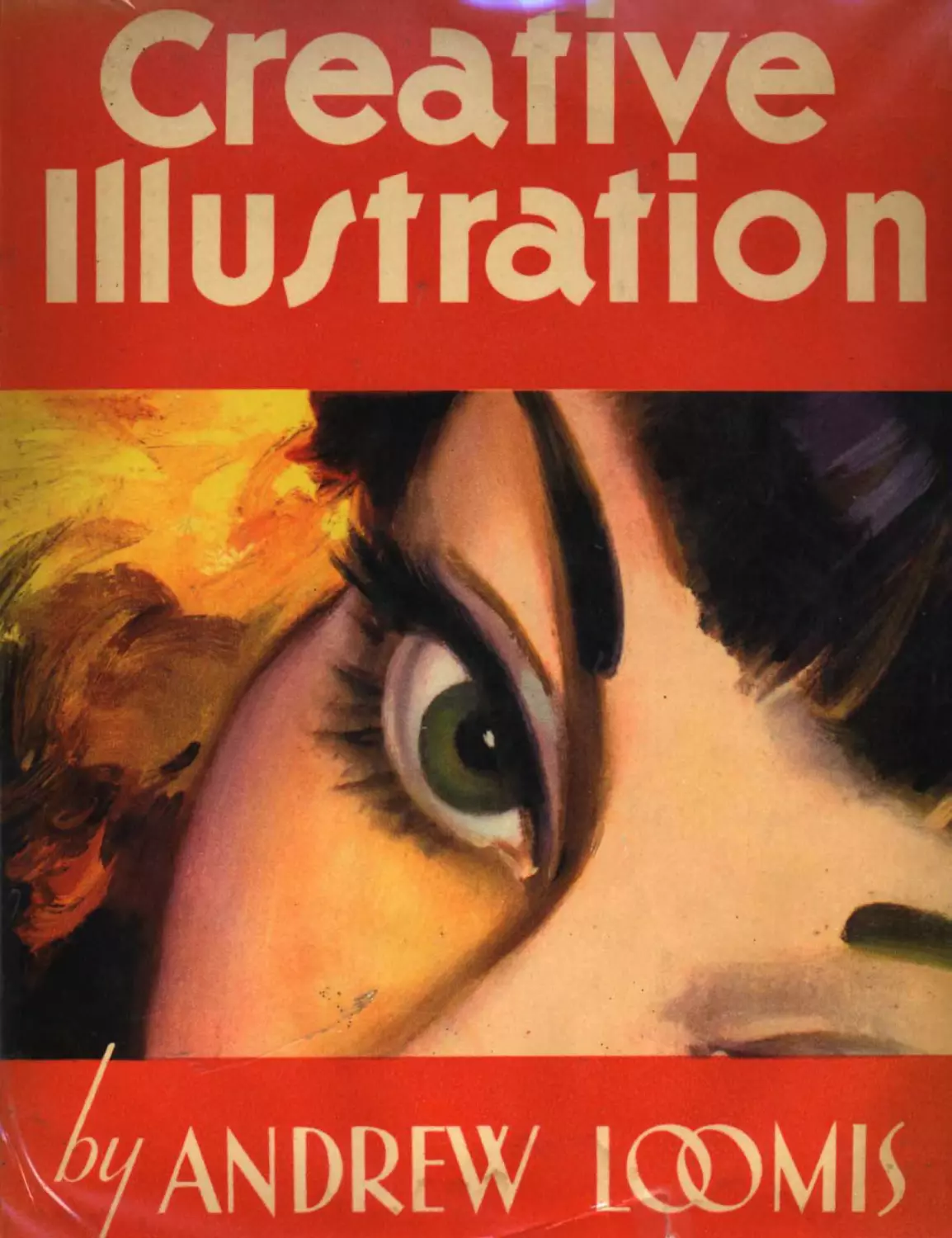
CREATIVE
ILLUSTRATION
Andrew Loomis
THE VIKING PRESS • NEW YORK • 1947
To the furtherance
of our craft of illustrating
as a profession for young Americans,
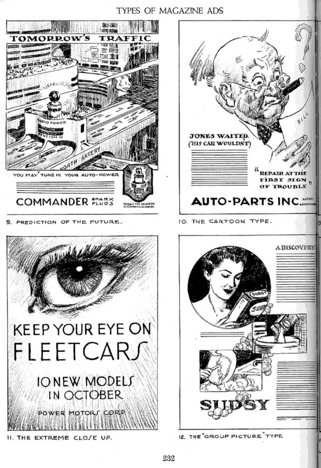
this volume
is respectfully dedicated
ACKNOWLEDGMENT
May I express here my appreciation of and gratitude for
the valuable help given me in the preparation of this vol-
ume by my beloved wife, Ethel O. Loomis.
CONTENTS, INCLUDING ILLUSTRATIONS
(The illustration pages are indicated by italics)
Opening Chat 17
The Form Principle as a Basis of Approach 21
PART ONE: LINE
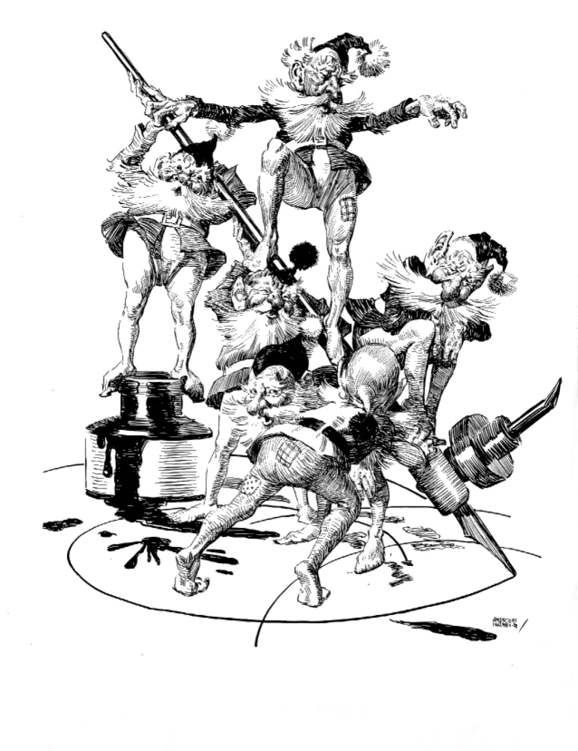
Frontispiece 24
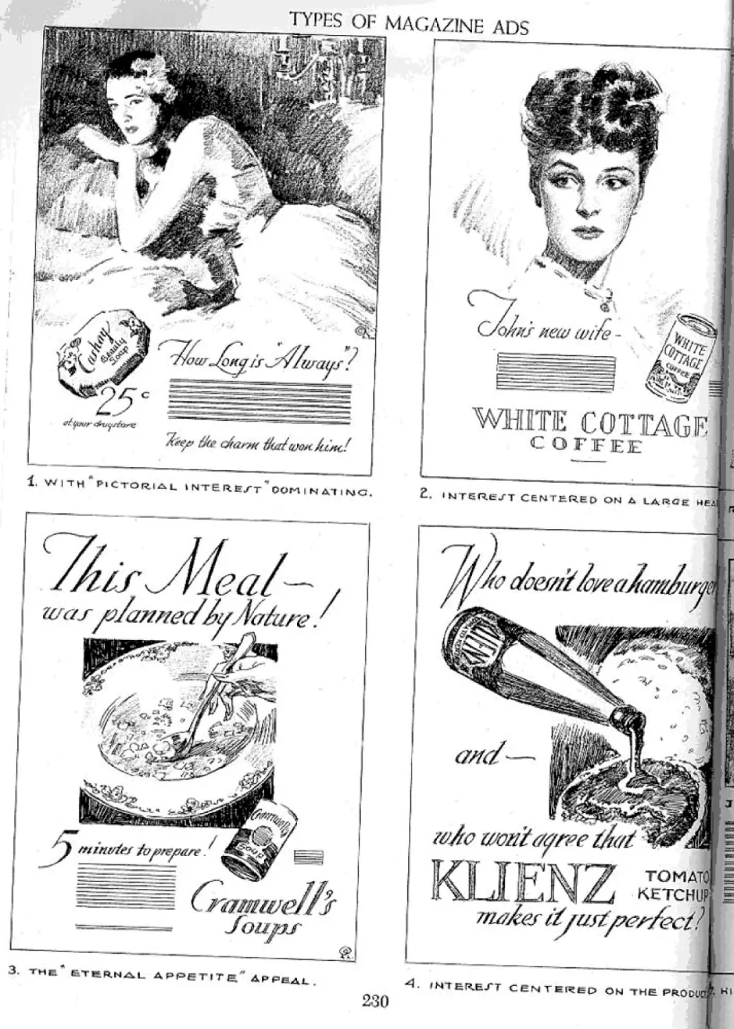
There Are Seven Primary Functions
of Line 25
Line Is More Than Merely “Outline”! 26
Line Is Proportion with Imagination 27
Line Produces Formal Design 28
Line Produces Informal Design 29
Overlapping Line and Areas the First
Principle of Composition 30
Using the First Function of “Line for Itself’
for Composition 31
Composition May Be Based on Letters
and Symbols 32
Composition May Be Based on
Geometric Forms 33
The "Fulcrum-Lever” Principle Applied to
Composition 34
Use Formal Subdivision for Symmetrical
Composition 35
Introducing Informal Subdivision 36
A Demonstration of Informal Subdivision 37
Figure Compositions Based on
Informal Subdivision 38
Informal Subdivision Is Purely Creative,
Not Mechanical 39
Perspective Guide Lines Help Той to
Composition 40
Everything You Draw Is Related to an
Eye Level 41
Eye Level, Camera Level, and Horizon
Mean the Same 42
Find Eye Level of Copy and Make
Figures Coincide 43
Approaching the Subject in Different Ways 44
Perspective Alone May Add Variety 45
Using Line to Produce a Focal Point
in Subject 46
Providing an “Eye Pathway” in Composition 47
Attention Devices 48
Get Attention by Building Contrast
of Line or Shape 49
The Relationship of Line to Emotional
Response 50
Bad Composition Brings Negative Response 51
Various Types of Vignettes 52
A Vignette Is a Design Pure and Simple 53
Simple Line Combines Effectively with
Solid Blacks 54
Combining Pen Line Treatment with
Black Areas 55
Pen Drawing Is Built on a Principle 56
Pen Drawing Is Concerned Mostly with
Shadow 57
Pen-and-ink Procedure 58
Follow the Form with the Pen Strokes 59
Decorative Treatment in Line 60
The Brush Used Like a Pen 61
Dry Brush 62
Adding “Spatter” to Line Mediums 64
Dry Brush and Black Pencil on
Grained Paper 65
Black Ink, Black Pencil, and
Poster White on Coquille Board 66
There Are New Possibilities in
This Combination 67
9
CONTENTS, INCLUDING ILLUSTRATIONS
“Sanguine” on Grained Paper 68
Black Pencil on Grained Paper 69
Drawing Procedure 70
Drawing, Above All Else, Puts You Over 71
Black and White Pencils on Grey Paper 72
Poster White and Black Ink on Grey Paper 73
Charcoal on Grey Paper 74
Dry Brush on Grey Paper with Whites 75
“Scratch Board" 76
Craftint 78
PART TWO: TONE
Frontispiece 80
Thebe Abe Four Essential Properties
of Tone 81
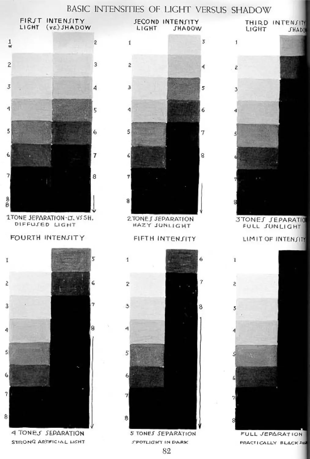
Basic Intensities of Light Versus Shadow 82
The Four Properties of Tone Explained 83
Setting up a Consistent Relationship of
Light to Shadow 84
The Meaning of Key and Value
Manipulation 85
The Four Properties of Tone
Explained (continued) 86
A Simple Lesson in Value Relationships 87
Composition by Tone or Pattern 88
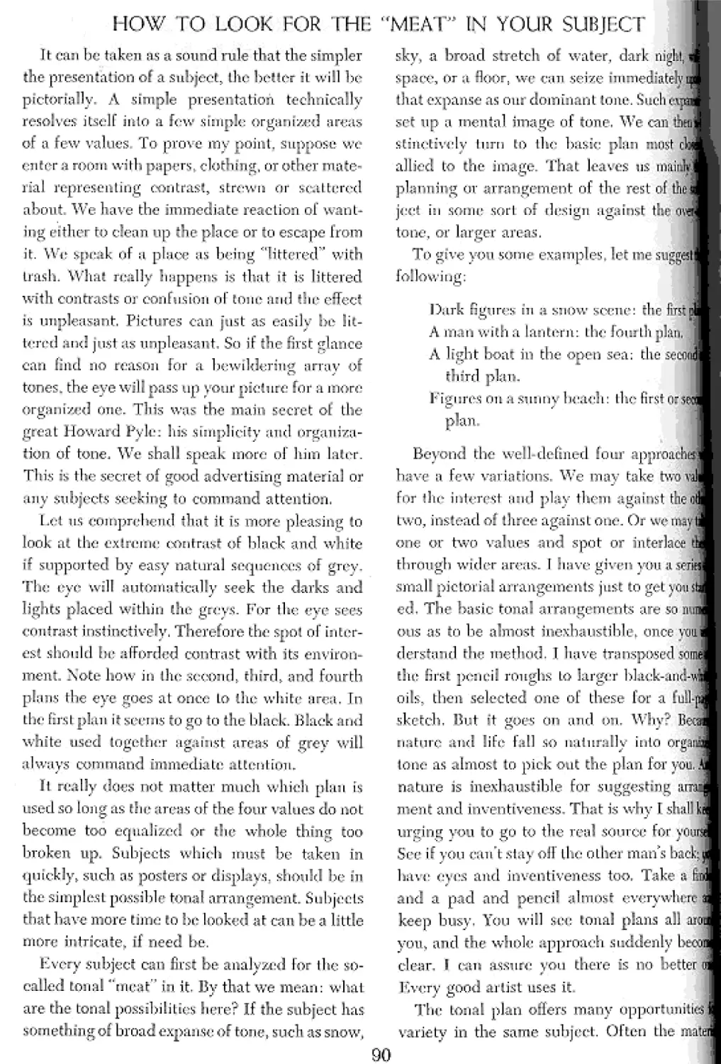
There are Four Basic Tonal Plans 89
How to Look for the “Meat” in Your Subject 90
If It’s Worth Painting, It’s Worth Planning 91
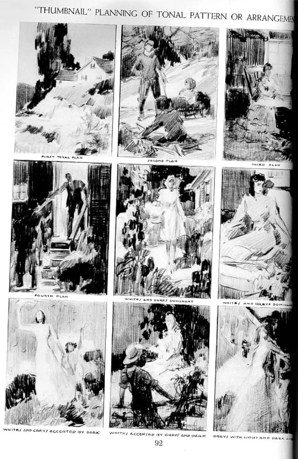
“Thumbnail'' Planning of Tonal Pattern or
Arrangement 92
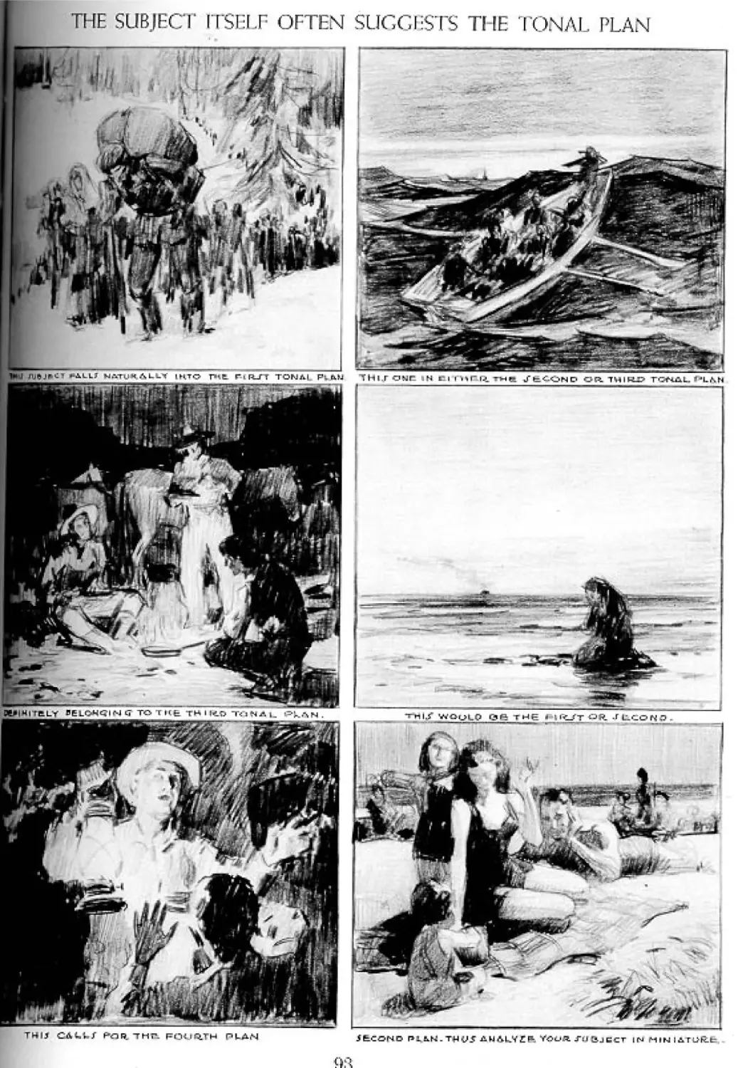
The Subject Itself Often Suggests the
Tonal Plan 93
Four of the Thumbnails Transposed to
Black-and-White Oil 94
The Completed Sketch 95
Suppose We Take a Subject and Work It Out 96
10
Old Mother Hubbard Is Your Problem 97
Technique in Tonal Mediums 98
Formulating an Approach 99
Technical Approach 100
Detail 101
The Treatment of Edges 102
Where to Look for Soft Edges 103
The Lens Sees Too Much 104
The Eye Selects 105
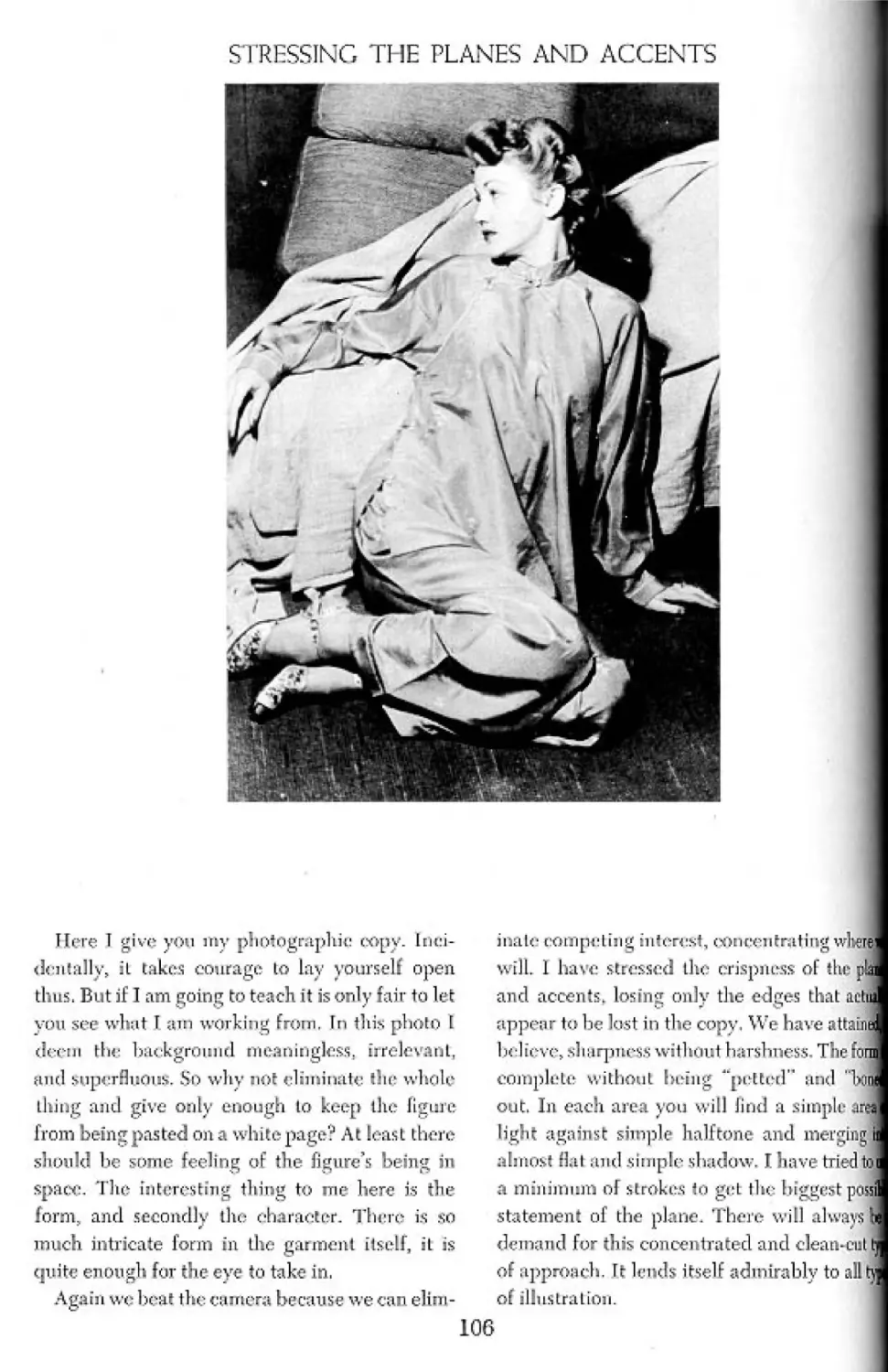
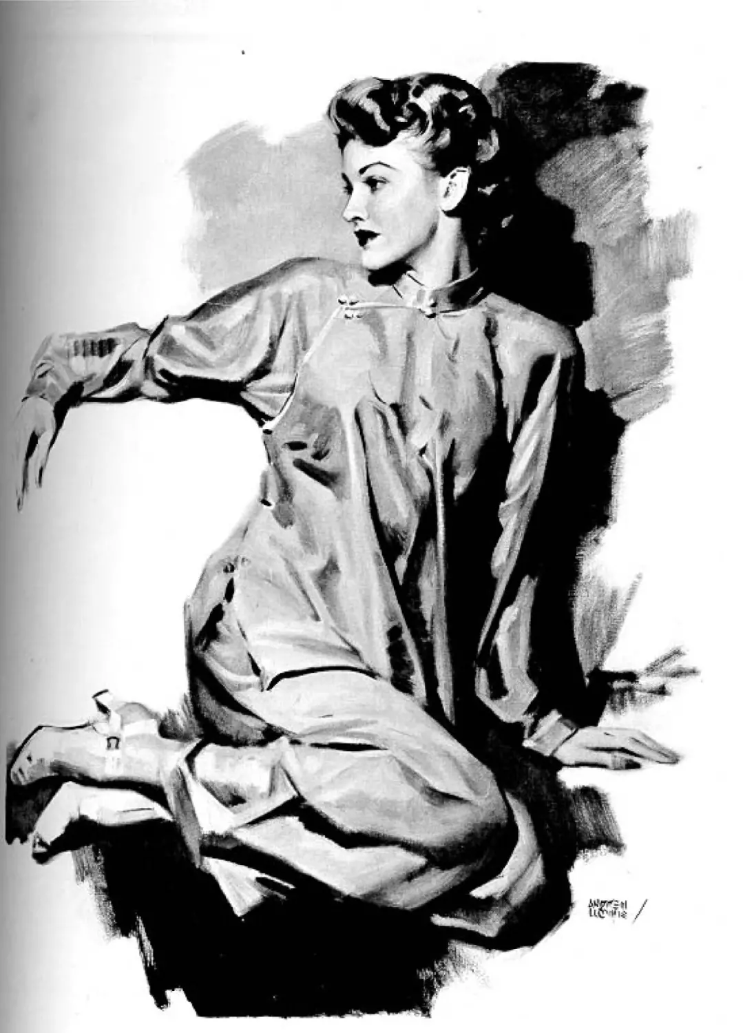
Stressing the Planes and Accents 106
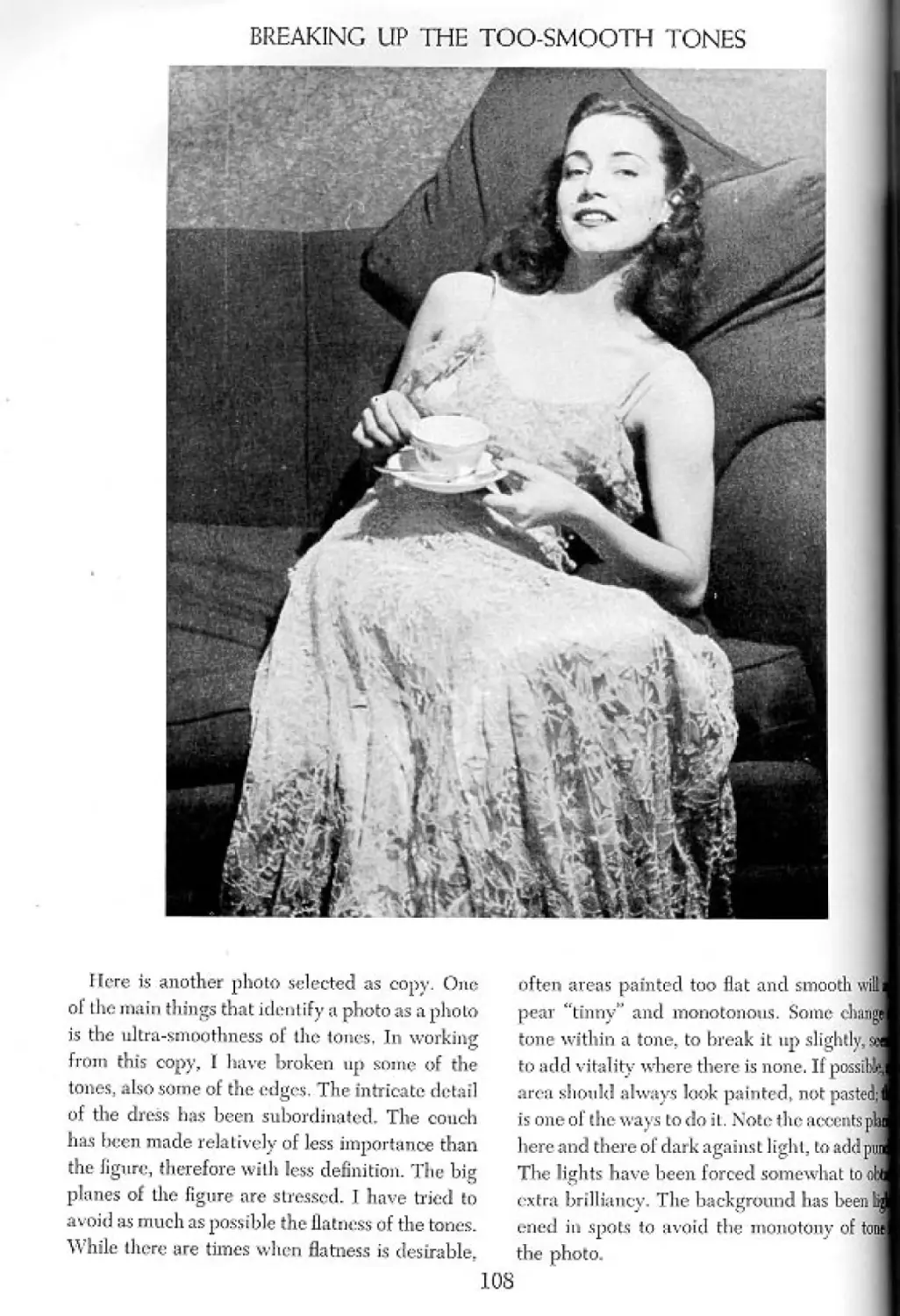
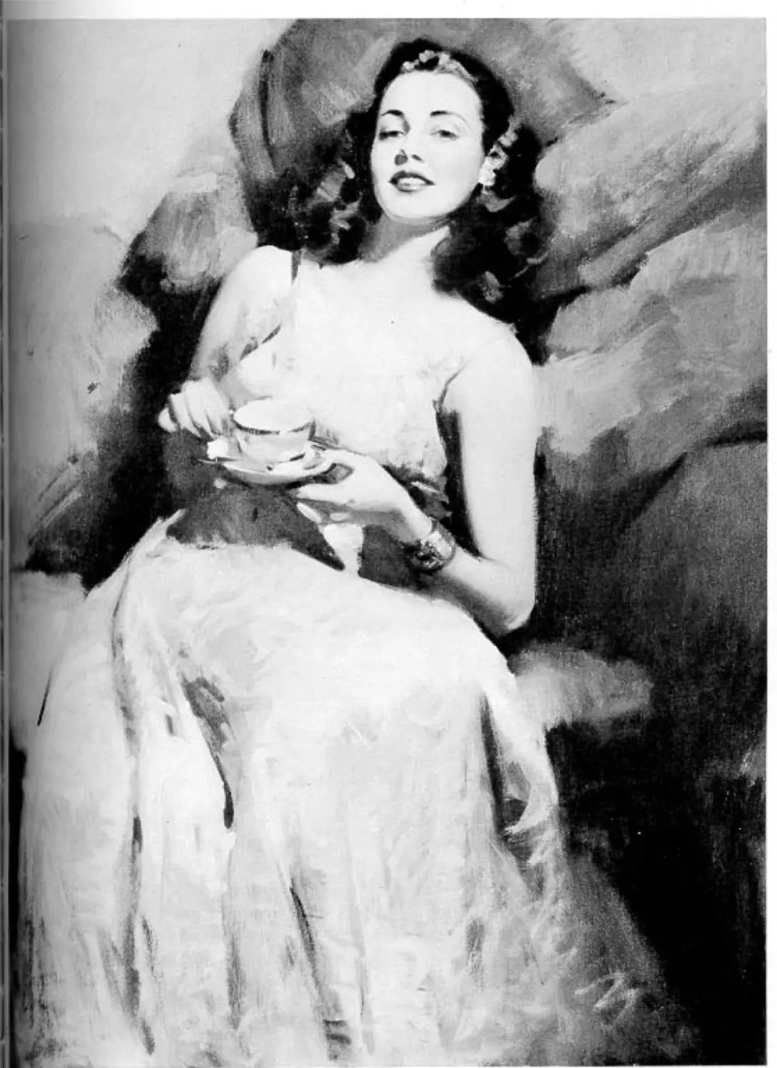
Breaking Up the Too-Smooth Tones 108
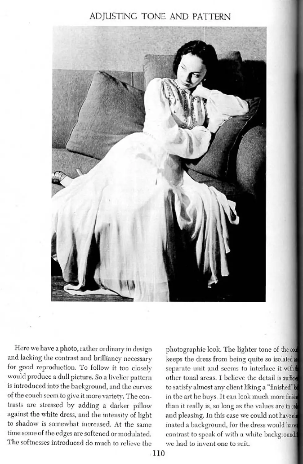
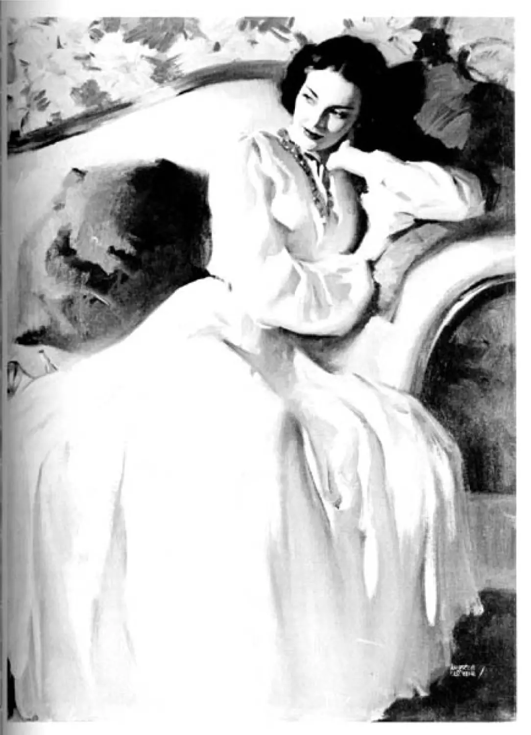
Adjusting Tone and Pattern 110
The “Big Tone” Approach 112
The Direct Approach 114
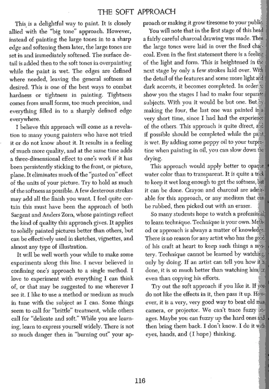
The Soft Approach 116
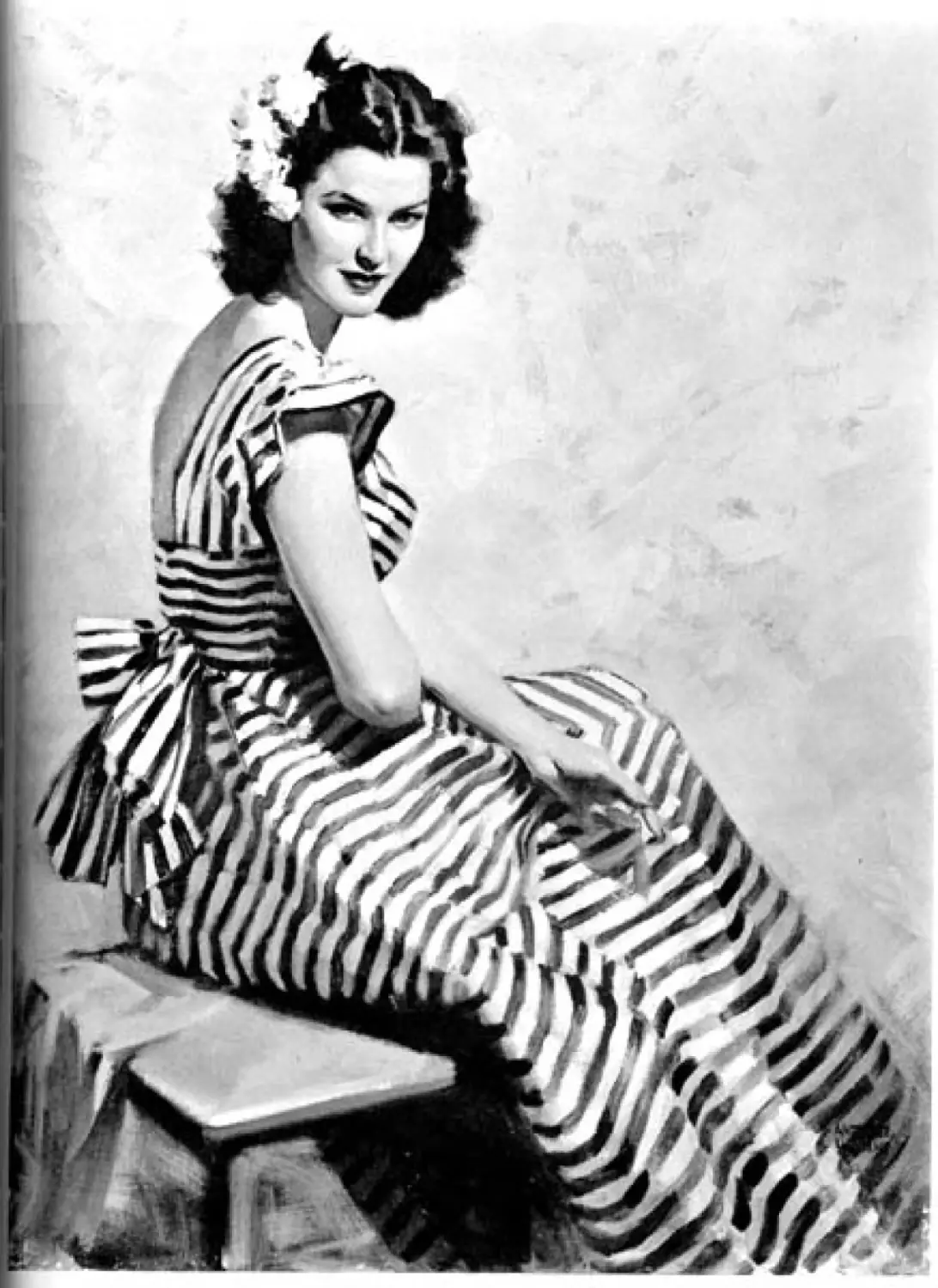
The Brittle Approach 118
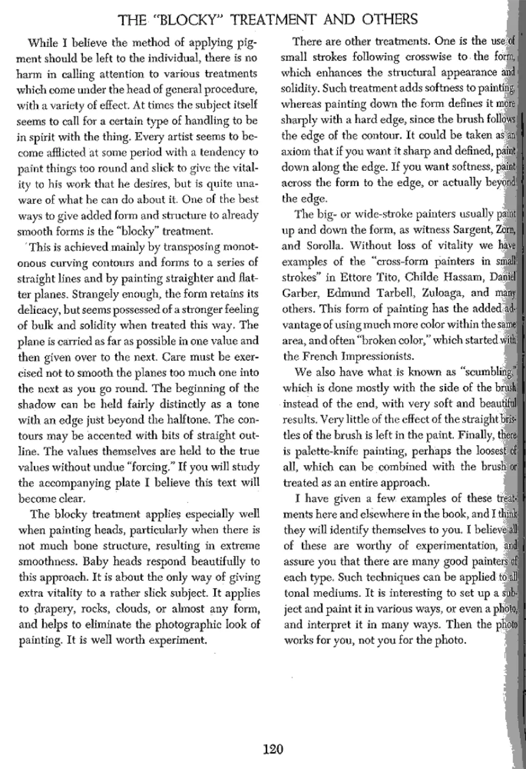
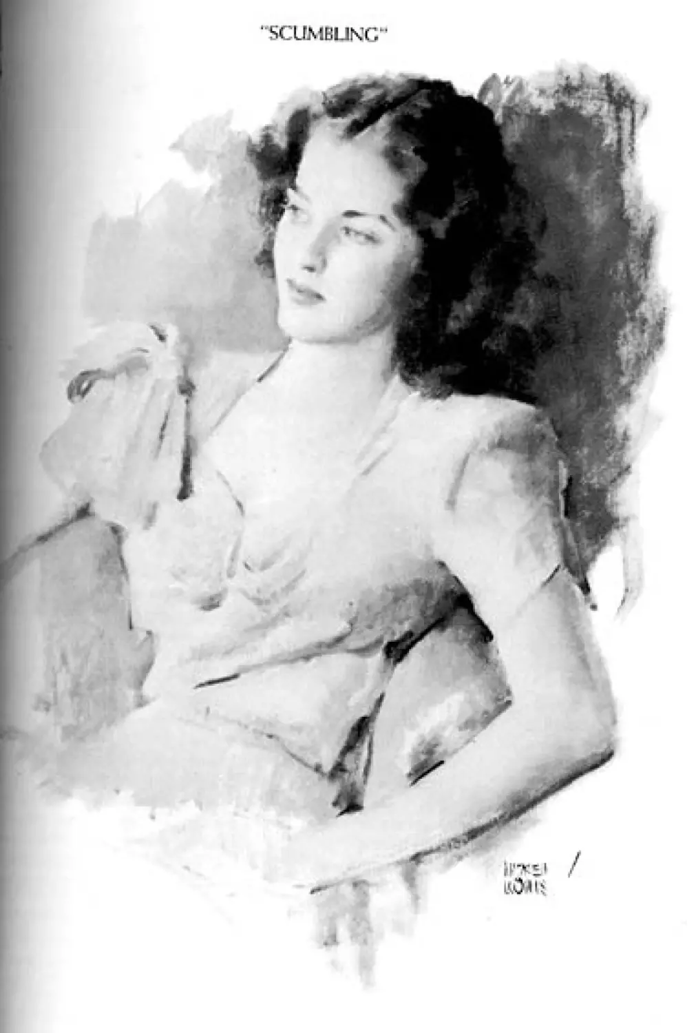
The “Blocky” Treatment and Others 120
The “Blocky" Treatment 121
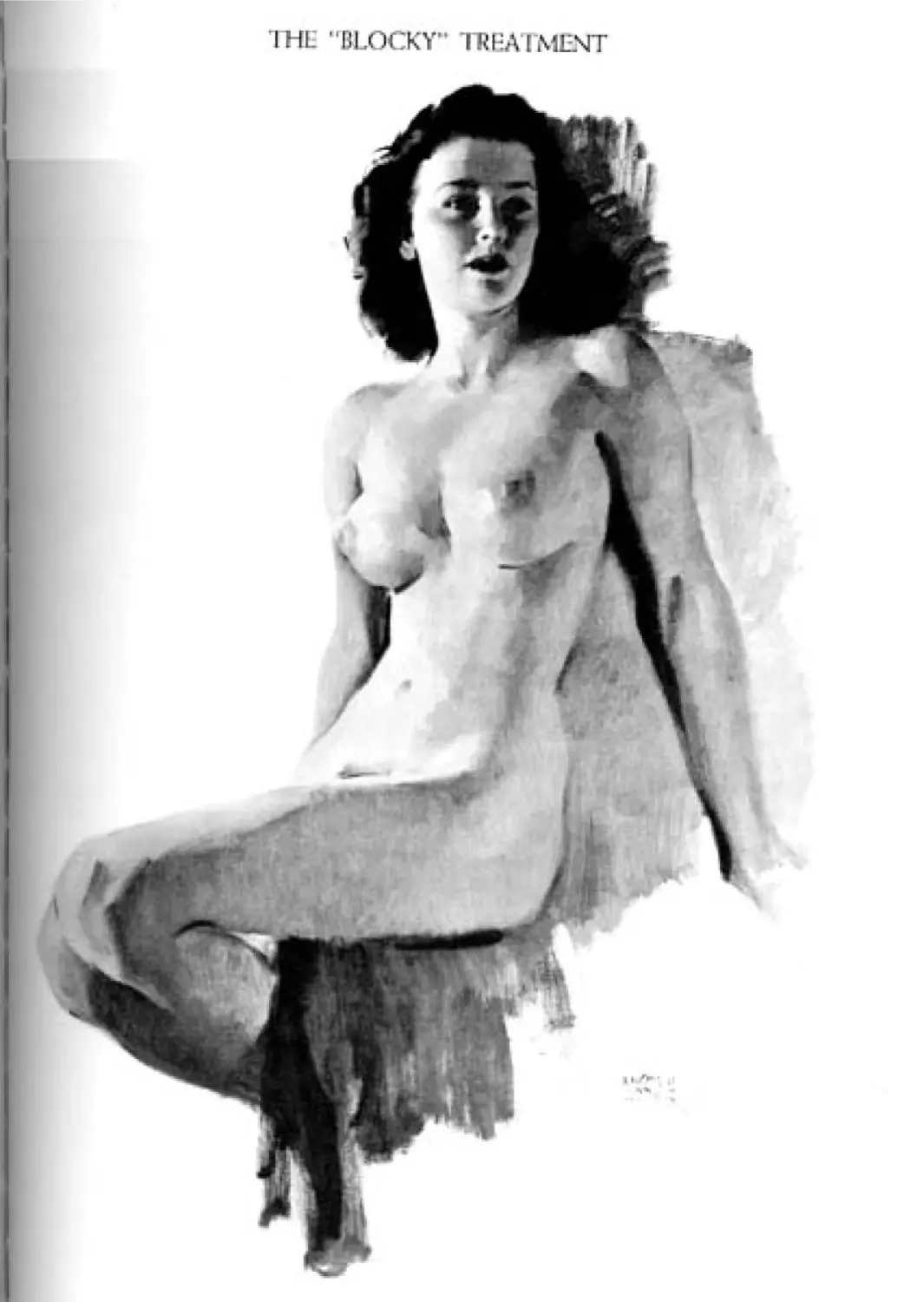
Painting Down or Across the Form 122
“Scumbling" 123
The Tonal Mediums 124
Charcoal as a Tonal Medium 125
Charcoal and Chalk on Grey Paper 126
Grey Paper with Other Mediums 127
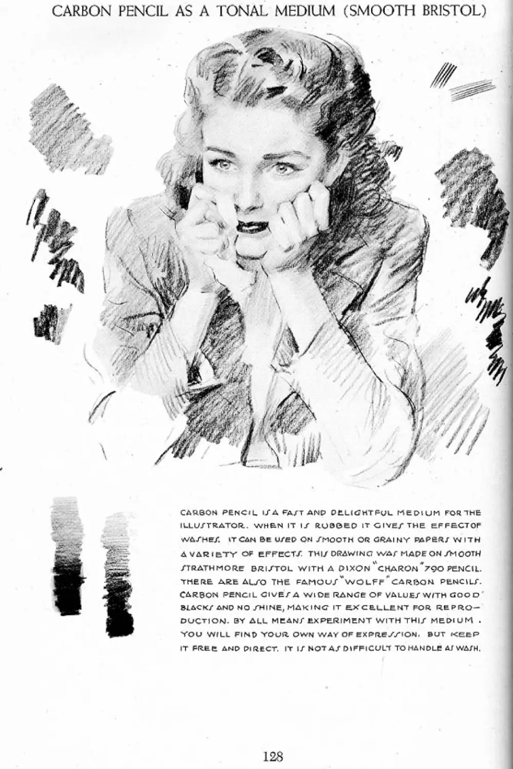
Carbon Pencil as a Tonal Medium
(Smooth Bristol) 128
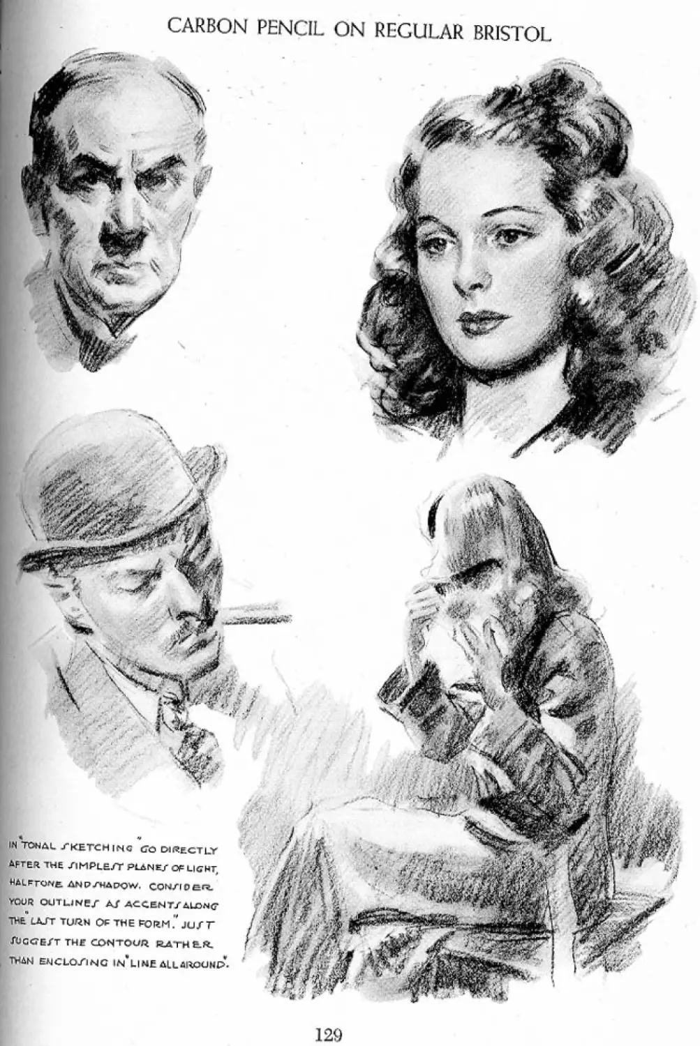
Carbon Pencil on Regular Bristol 129
Carbon Pencil on Illustration Board 130
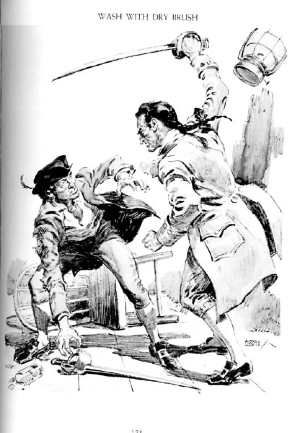
Wash with Dry Brush 131
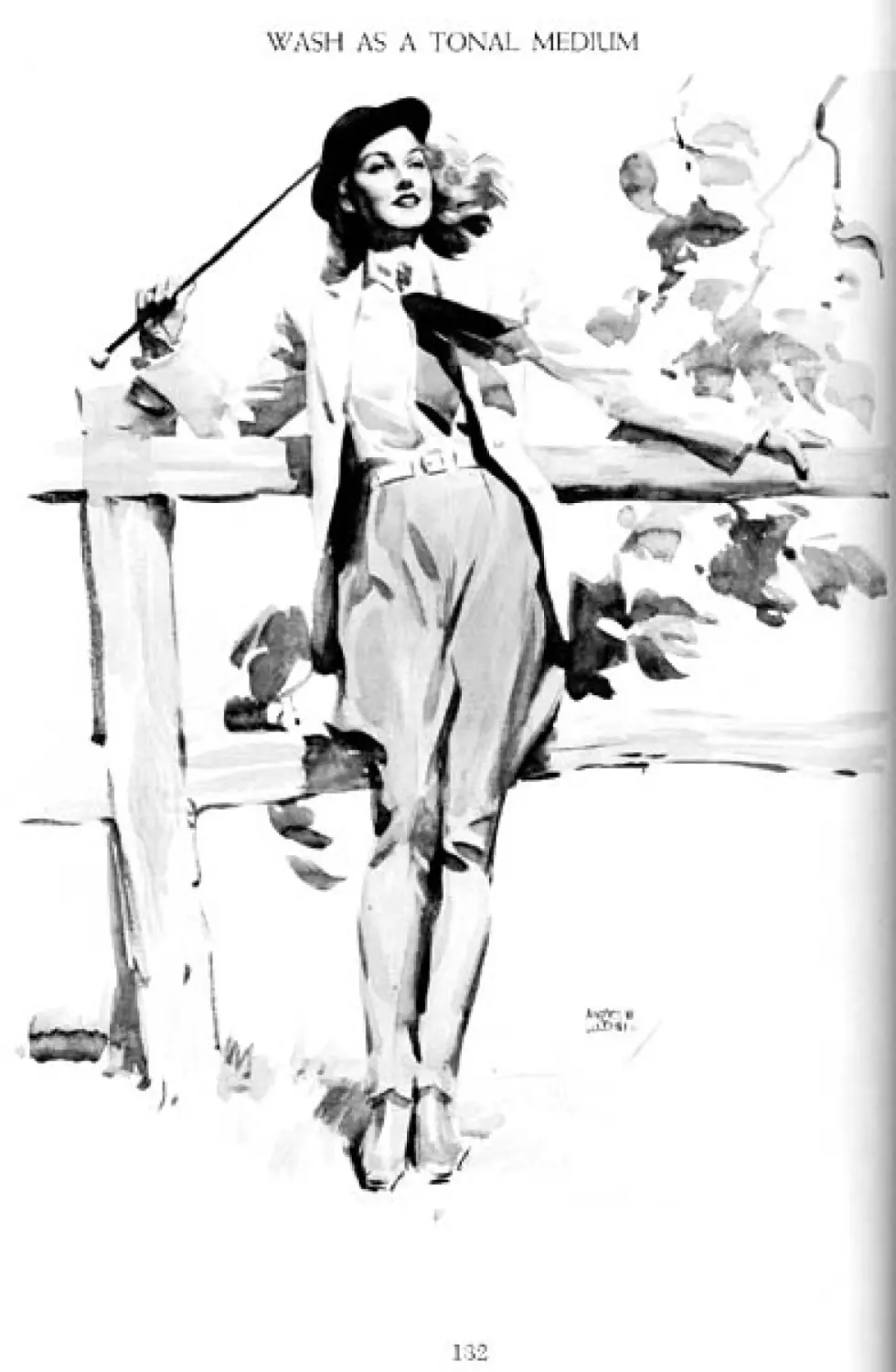
Wash as a Tonal Medium 132
Wash Is One of the Best Mediums
for Reproduction 133
Opaque Water Color asaTonal Medium 134
Thin Black-and-White Oil Scumble 135
Howard Pyle 136
CONTENTS, INCLUDING ILLUSTRATIONS
Comments on Howard Pyle’s Theory Outdoor and Indoor Color 170
of Approach 138 How to Experiment with Color 171
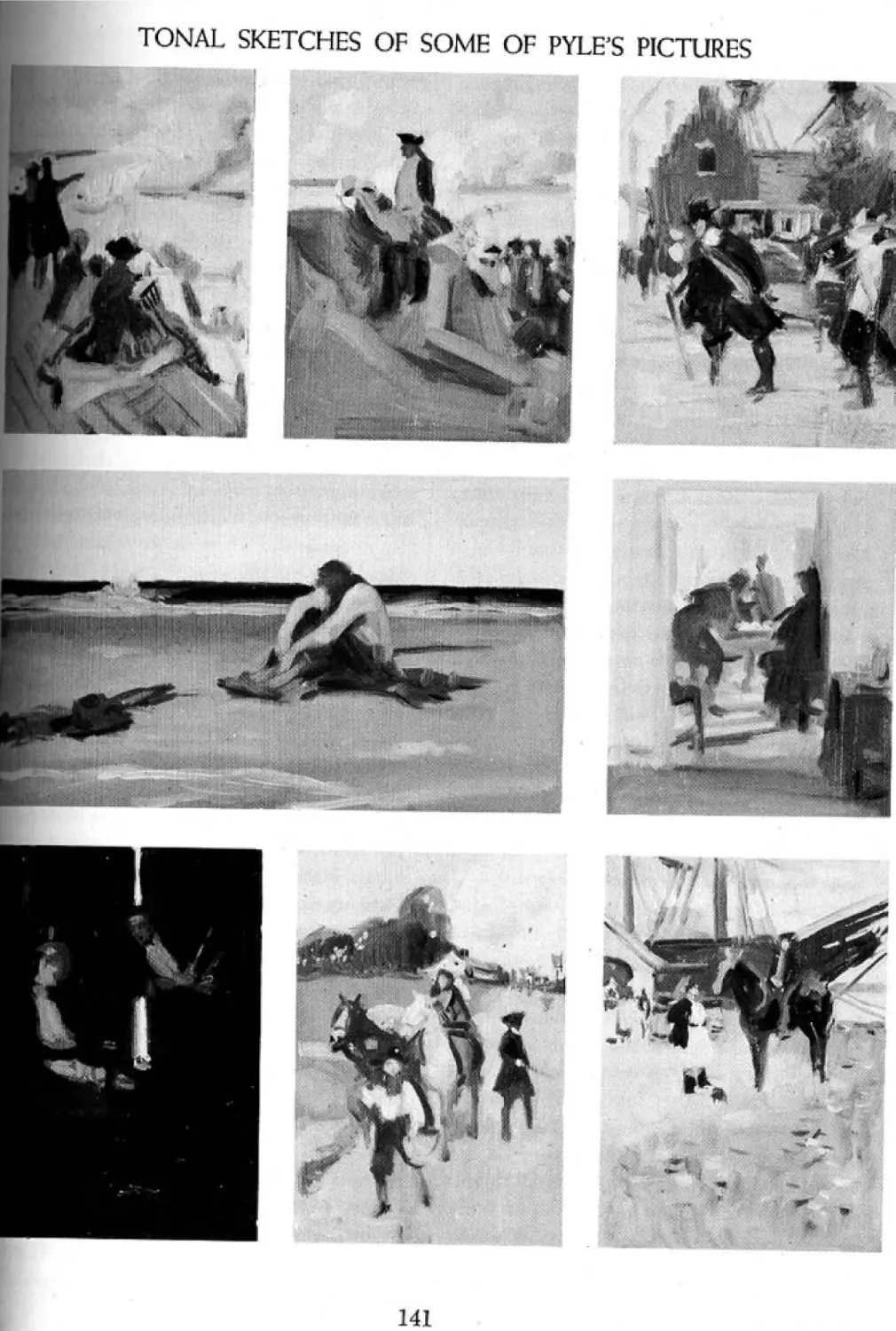
Tonal Sketches of Some of Pyle’s Pictures 141 Experimental Color Roughs Worked Out 172
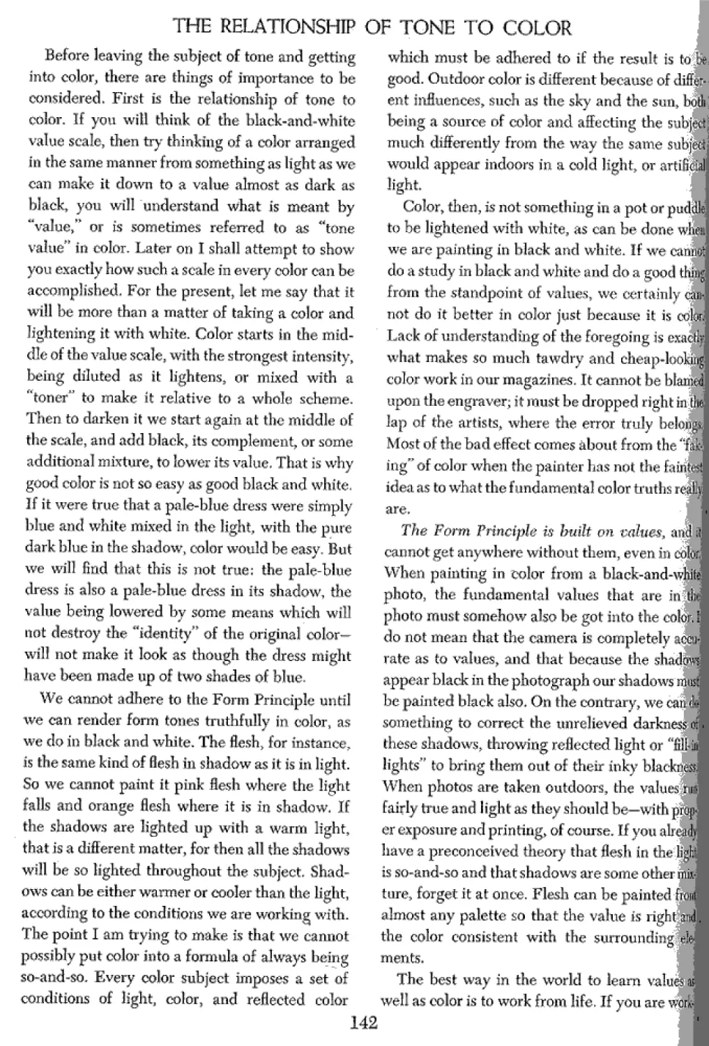
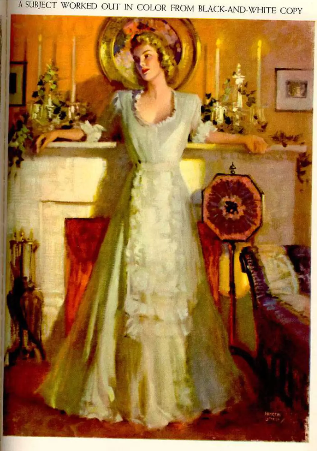
The Relationship of Tone to Color 142 A Subject Worked Out in Color from
The Form Principle Applied 143 Black-and-White Copy 173
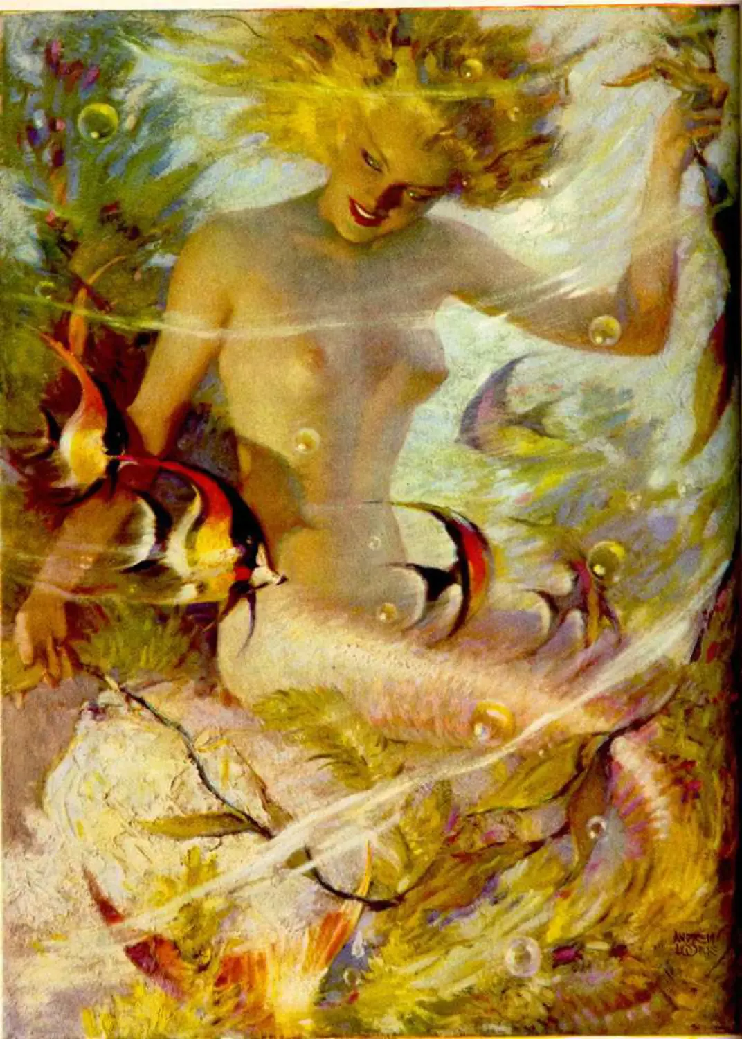
Preparing Samples in Tone 144 What Is Color Charm, and
Submitting Samples PART THREE: COLOR Frontispiece 145 146 How Can We Know It? Should We Eliminate Black from Our Palette? 174 175
A New Approach 147 PART FOUR: TELLING THE STORY
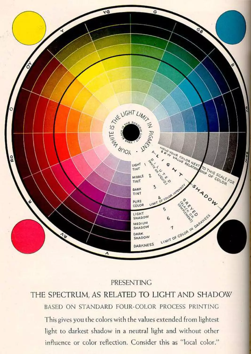
Presenting the Spectrum as Related to Light and Shadow 148 Frontispiece 176
Color 149 There Are Five Essentials 177
All Color Is Relative to Surrounding What Is Illustration? 178
Influence 150 The Essentials of Telling the Story 179
Color Is Strongest in the Light 151 Staging Your Subject 180
Color Is More Than Local Color 152 “Thumbnail” Settings 181
Look for Color on the Edge of Light 153 Howto Get Suggestions from Clippings 182
The Limitation of Color in Pigment 154 Figures Suggested on Tracing Paper 183
Relating Color by Tonal Influence 155 Planning Dramatic Action and Poses 184
Toning the Spectrum or Palette 156 Establish the Action Before Hiring a Model 185
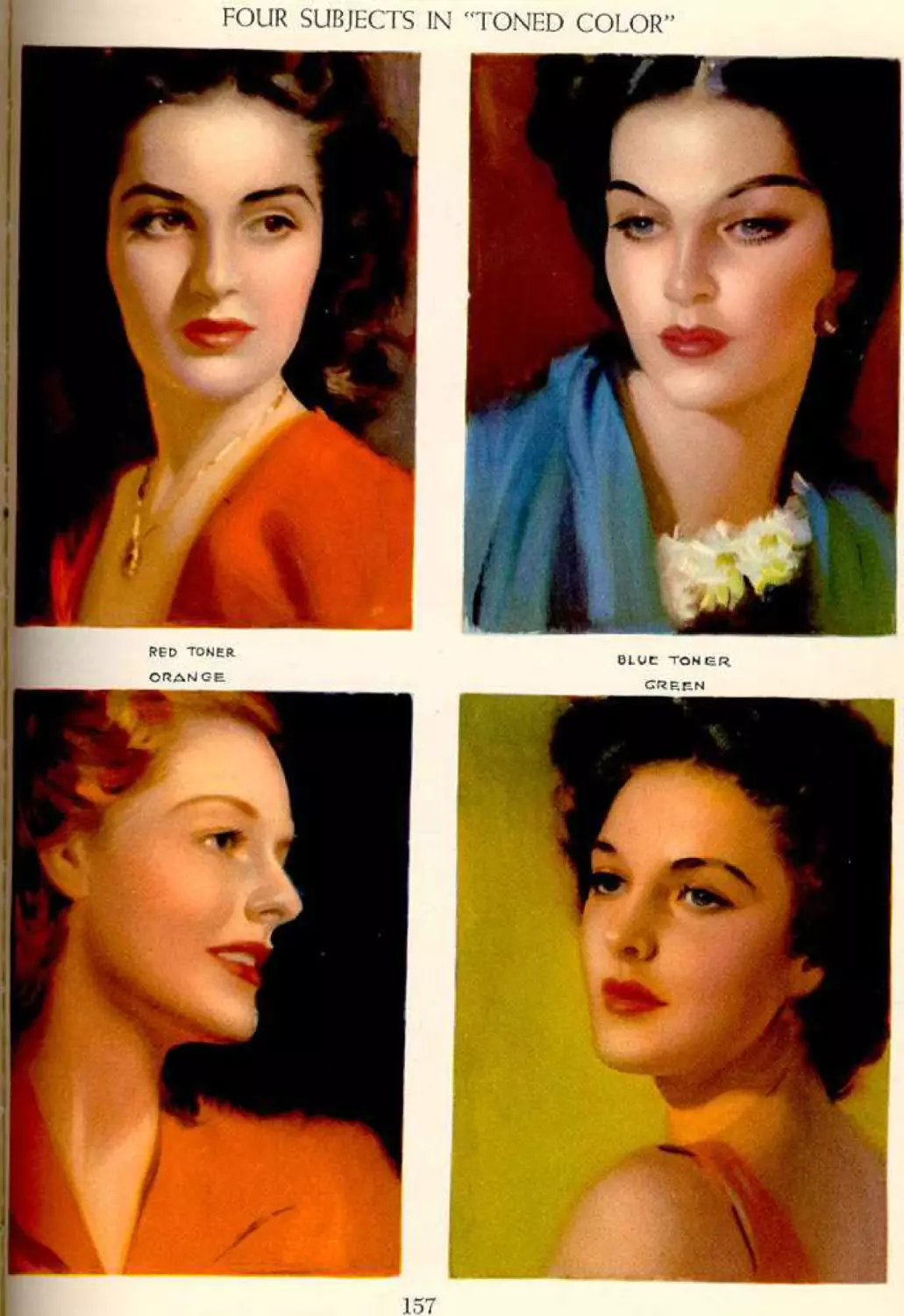
Four Subjects in “Toned Color” 157 The Essential Arrangement 186
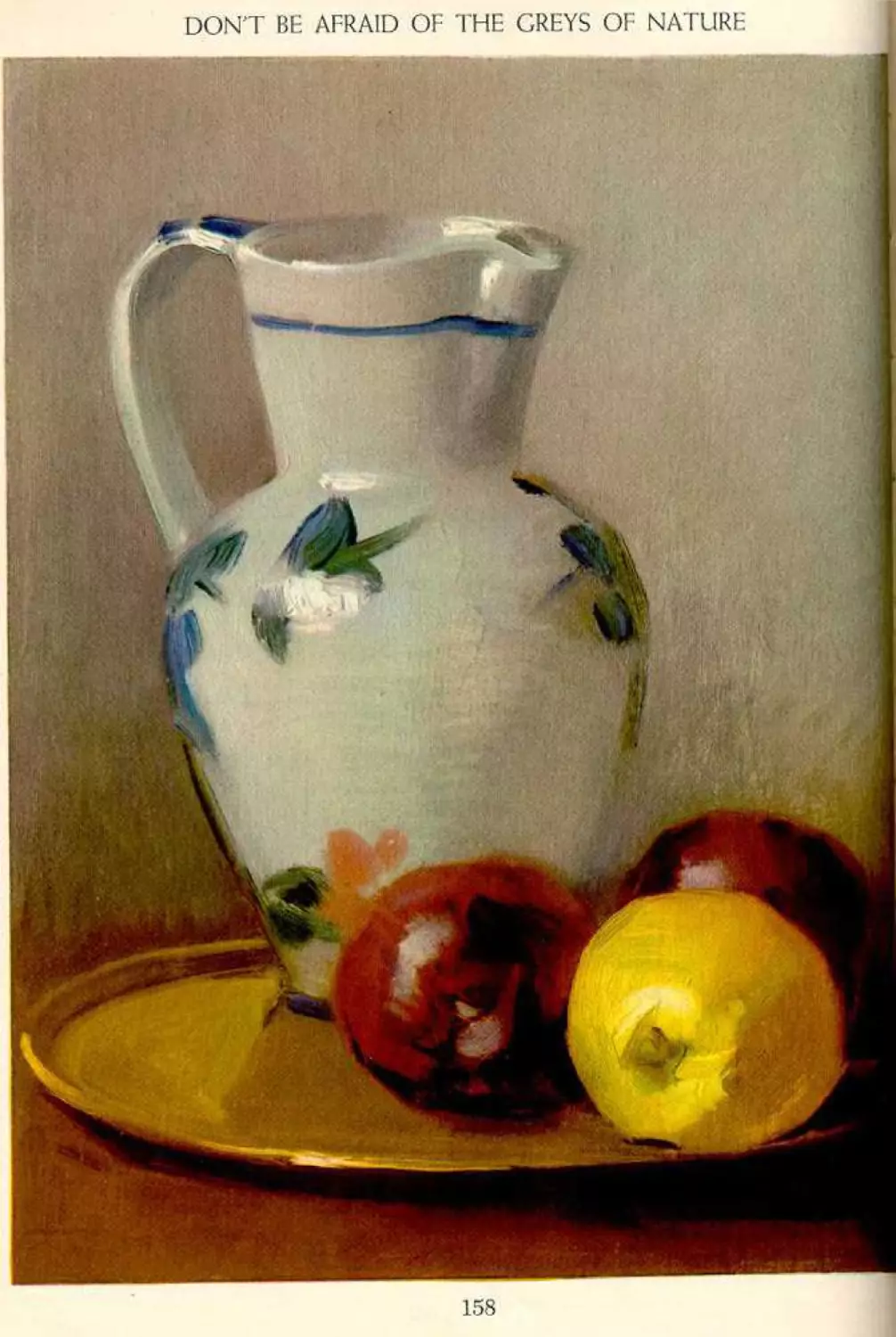
Don’t Be Afraid of the Greys of Nature 158 Arrangements Based on One of the
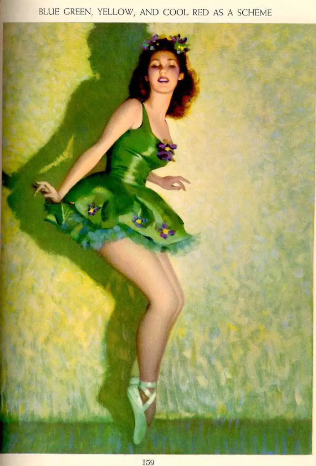
Blue Green, yellow, and Cool Red Previous Roughs 187
as a Scheme 159 Embellishment 188
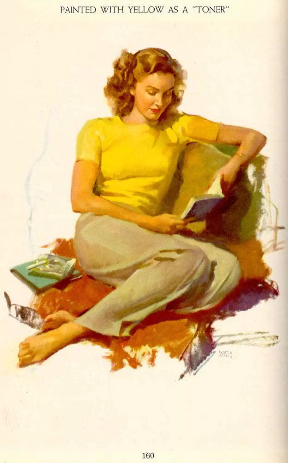
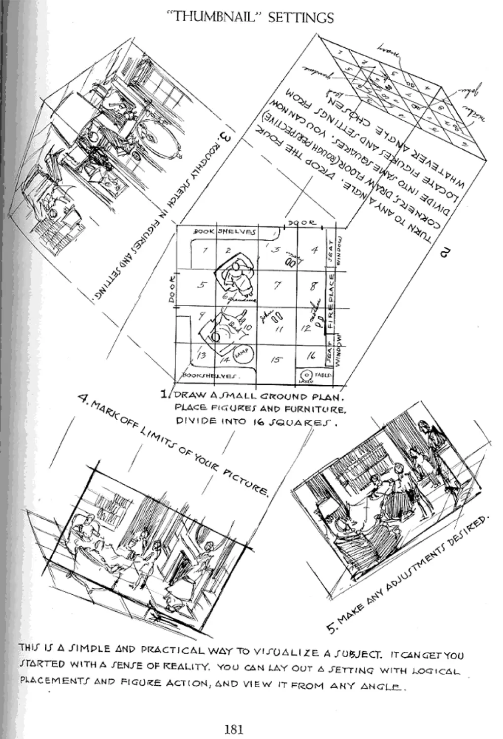
Painted with yellow as a “Toner” 160 Using the Camera to Obtain Working
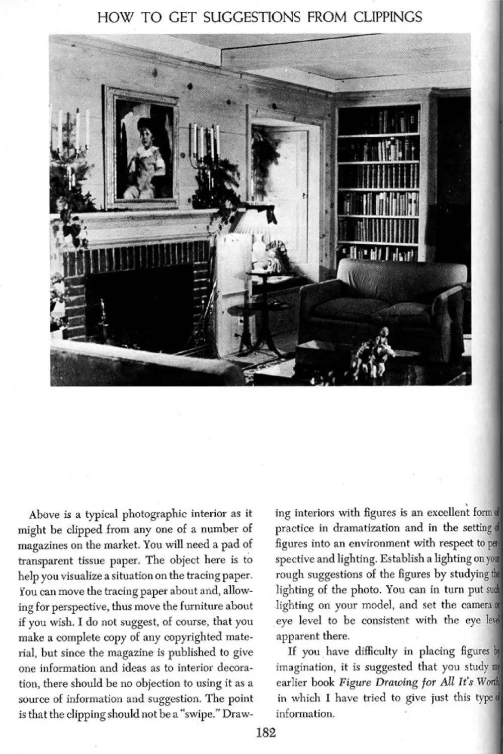
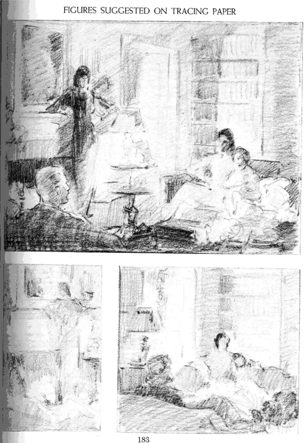
Color Considered as “Tone” in Its Material 189
Natural Relationship 161 The Illustrator’s Scaling Screen 190
Color, Its Function and Charm 162 The Scaling Screen and Camera Distortion 192
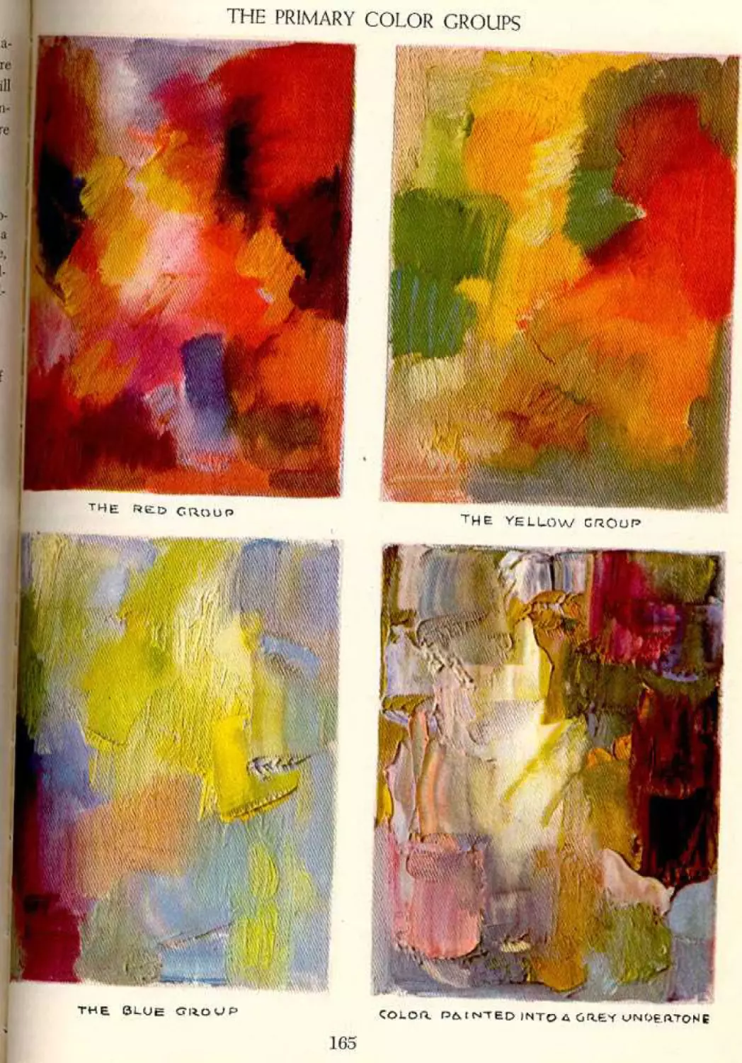
The Primary Color Groups 165 Camera Distortion 193
The Primary Color Groups—Color Shades 166 Drawing to Avoid Photographic Distortion 194
Color Selection and Background 167 Camera Dramatics 195
What to Do When Your Picture Is A Single Lighting Works Out Best 196
Dead in Color 168 Use У our Camera to Catch Emotion and
The Emotional Effects of Color 169 Expression 197
11
CONTENTS, INCLUDING ILLUSTRATIONS
Studying the Character 198 PART SIX: FIELDS OF ILLUSTRATION
There Is No End to Facial Expression and Character 199 Frontispiece 224
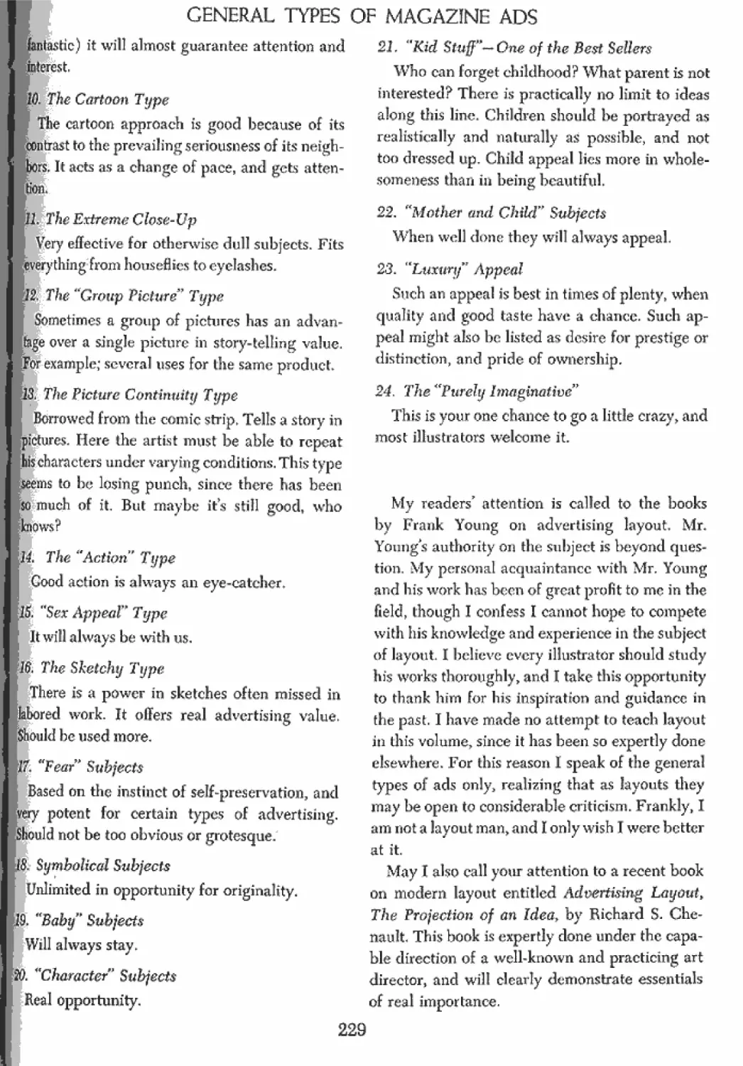
Manufacturing Convincing Emotion The Magazine Ad 226
200
Expressions Tell the Story 201 The Approach to Good Advertising Illustration 227
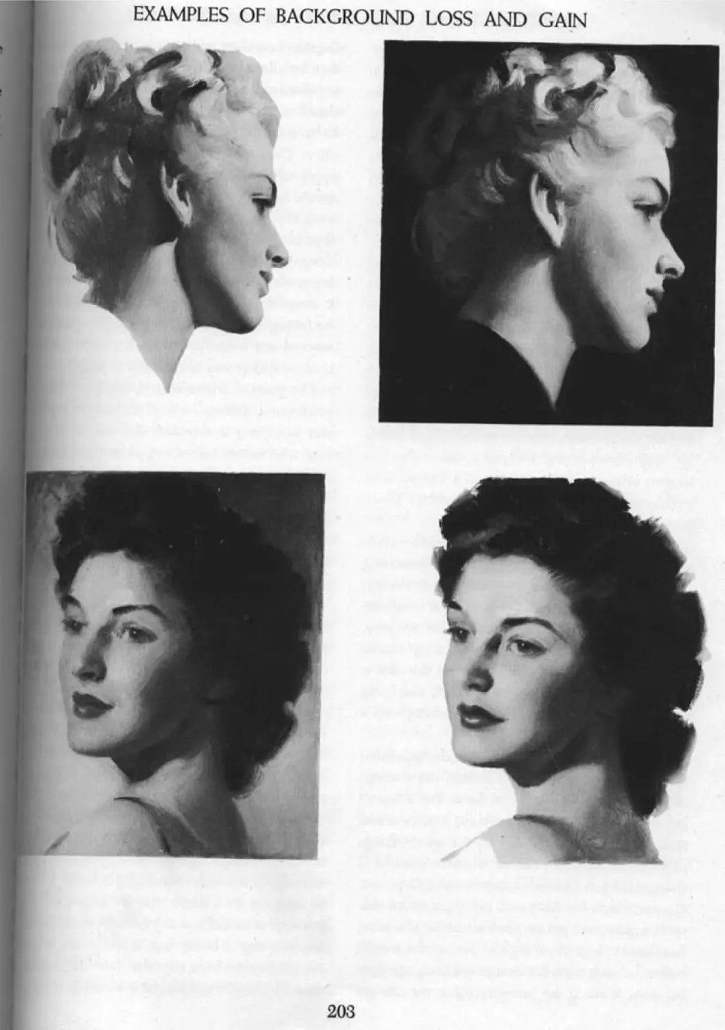
Loss and Cain in Backgrounds 202 Using Your Freedom 228
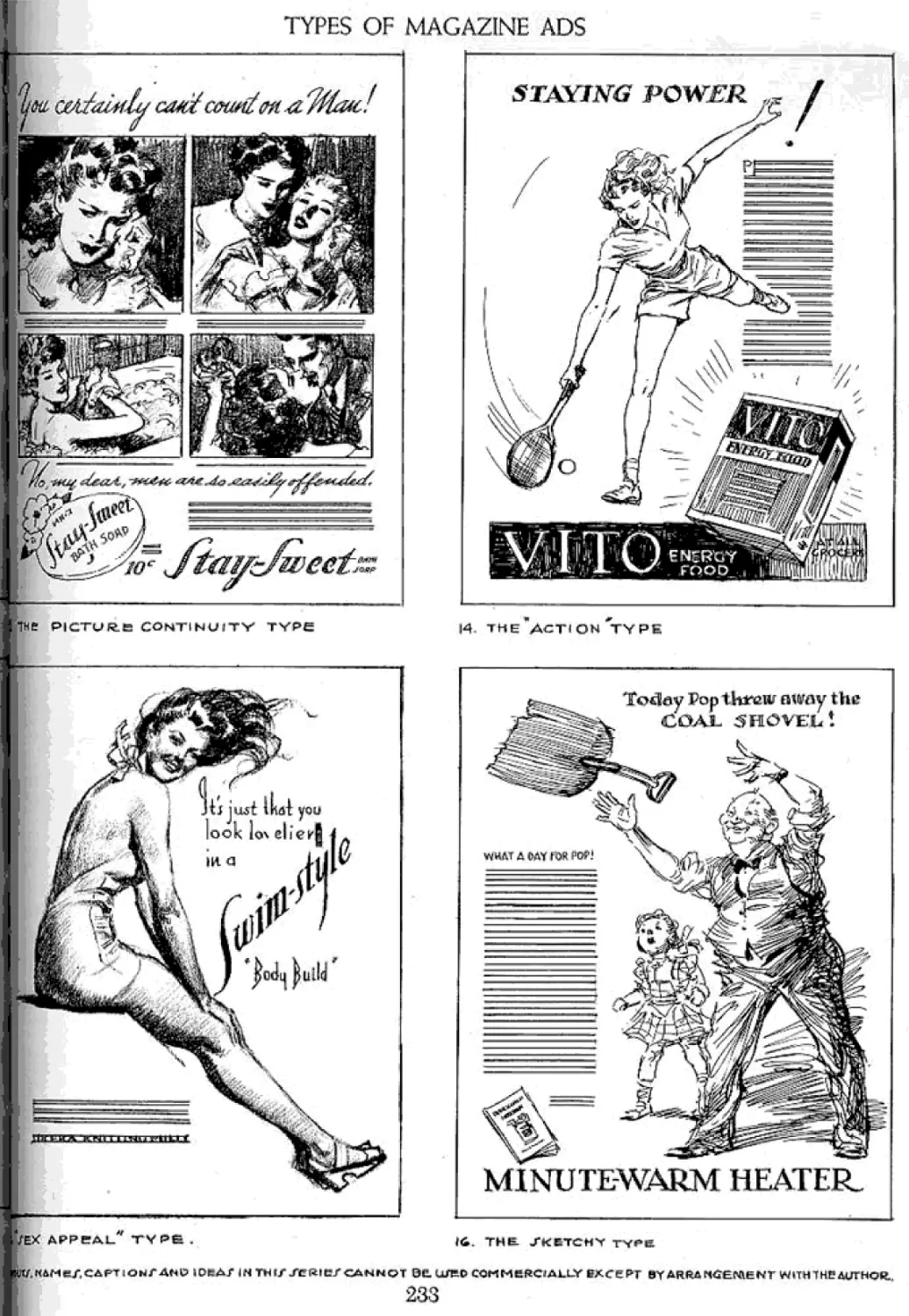
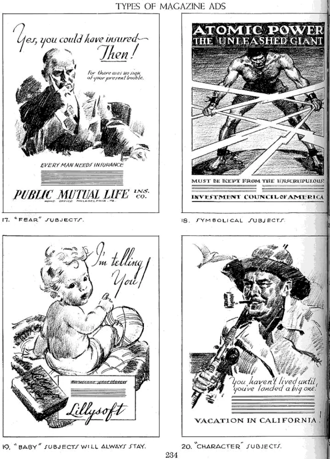
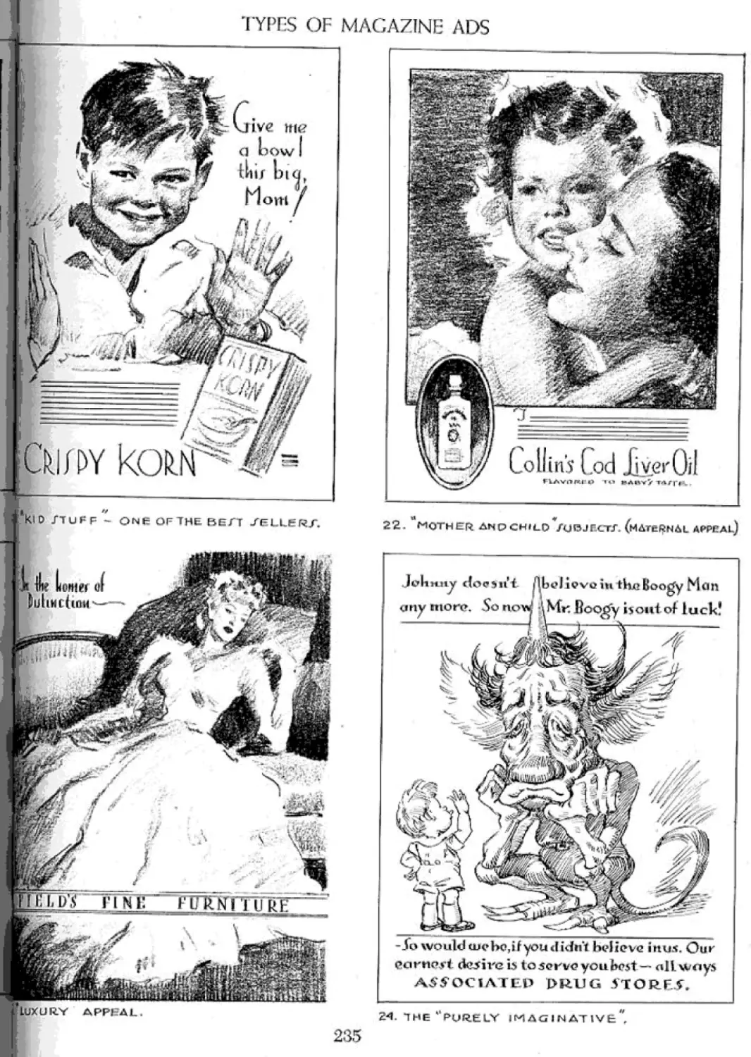
Examples of Background Loss and Gain 203 Twenty-Four Types of Ads 228
What Is Faking, and What Is Imagination 204 Types of Magazine Ads 230
Never Guess When You Can Find Out 205 Relating Your Illustration to the Whole Ad 236
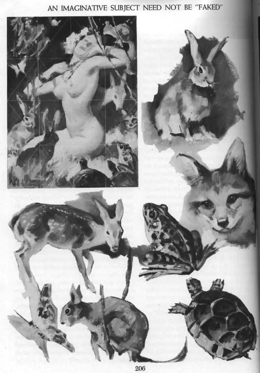
An Imaginative Subject Need Not Be “Faked” 206 Developing the “Co-ordination Sense” 237
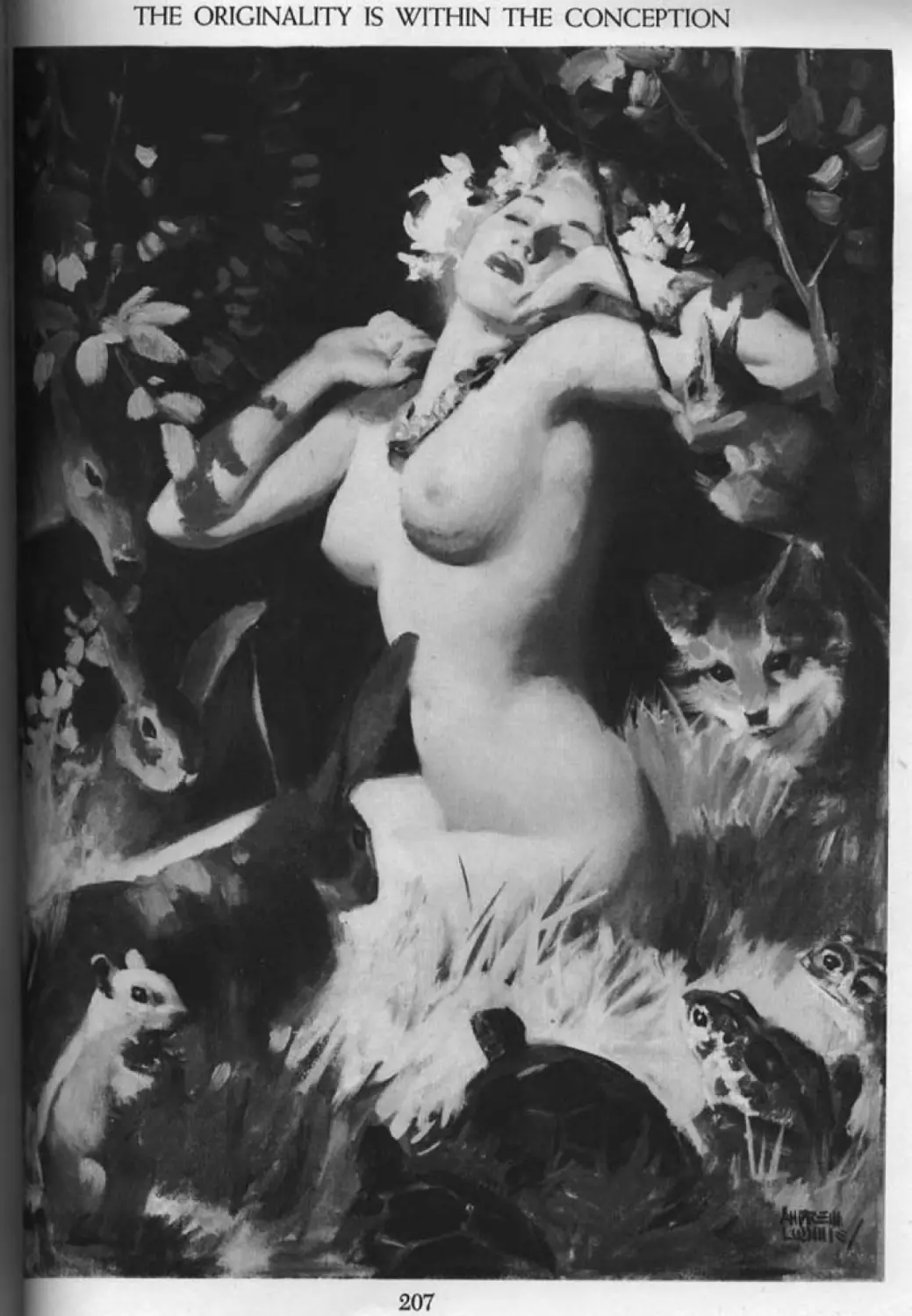
The Originality Is Within the Conception 207 A Typical Magazine Ad Assignment 238
A Typical Agency Layout 239
Rough Compositions for the Picture 240
PART FIVE: CREATING IDEAS Final Arrangement Based on Photos Taken 241
The Finished Advertising Illustration 242
Frontispiece 208 What Is the Future in Magazine
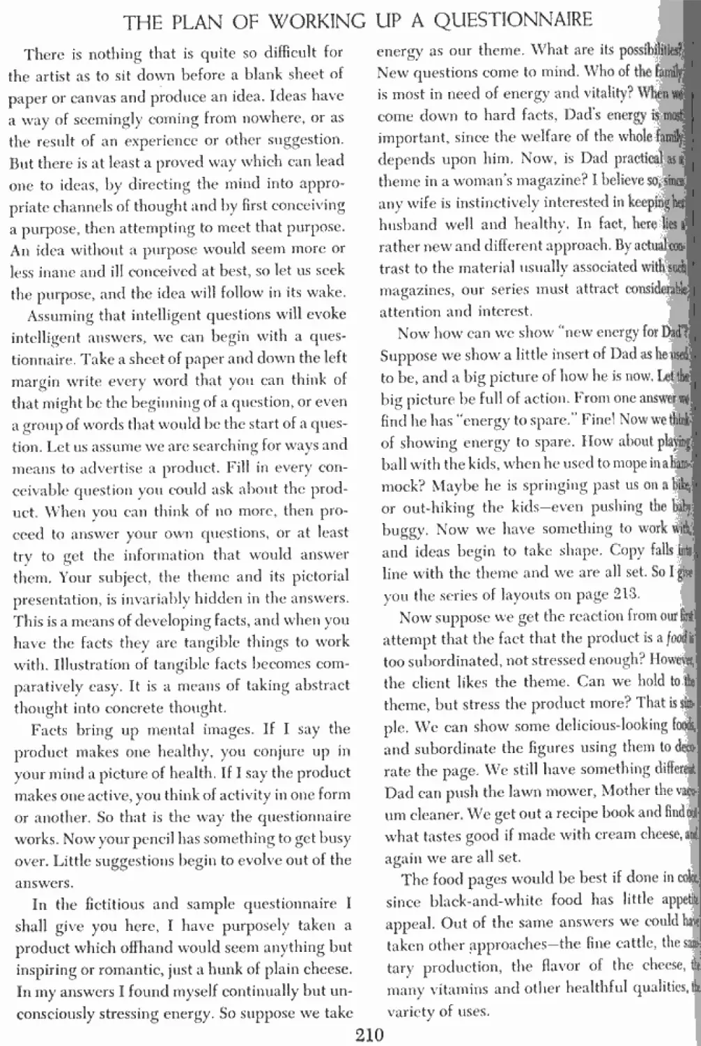
A Logical Method 209 Advertising? 243
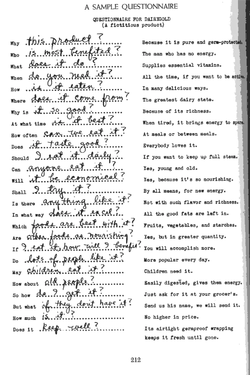
The Plan of Working Up a Questionnaire 210 Better Taste in Magazine Advertising 244
Searching Basic Appeals for Ideas 211 The Outdoor Poster 245
A Sample Questionnaire 212 Hoiv a Poster Is Divided into Sheets 246
Rough Ideas Developed from the Ttypical Poster Arrangements 247
Questionnaire 213 A Typical Poster Assignment 249
A Different Approach from the Same 214 The Idea Roughed Out 250
Questionnaire
Creating Ideas from Basic Appeals Scribble While You Think: 215 Halftones of the Color Roughs The Finished Poster 251 252
Think While You Scribble 216 Display Advertising 253
Your Scribbles Are More Original Displays Are “Point of Sale” Merchandising 254
Than Your Camera 217 Working Up Ideas for Displays 255
Get Used to Sketching from Life 218 Types of Lithographic Displays 256
You Get Something the Camera Cant Give You 219 Working with Display Lithographers 258
Sentiment the Keynote of Illustration Calendar Advertising 259
220
Psychology Applied to Covers and Basic Appeals Applied to Calendars 260
Calendars 221 A Calendar Can Be Anything That Is Good 261
There Is Even Psychology in Comic Ideas 222 Essentials of Good Calendar Illustration 262
Ideas in General 223 Painting for Calendar Reproduction 263
CONTENTS, INCLUDING ILLUSTRATIONS
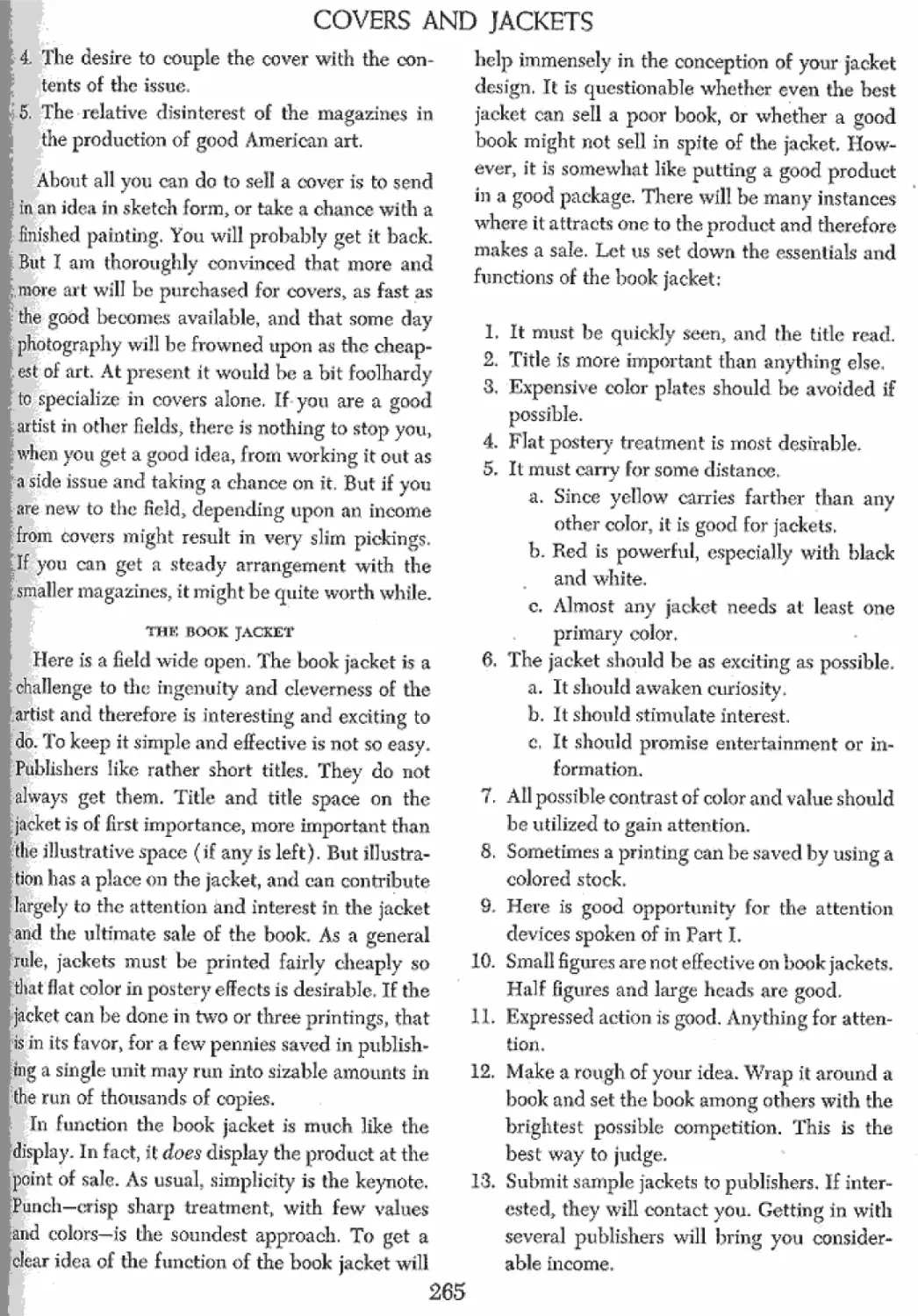
Covers and Jackets 264 PART SEVEN: EXPERIMENT AND STUDY
Some Jacket Arrangements 266 Frontispiece 284
Story Illustration 268 Experiment and Study 286
What Do the Magazines Want? 269 Finding Subjects for Experiment and Study 287
Putting the Fundamentals to Work 270 Your Pencil Can Keep Busy 288
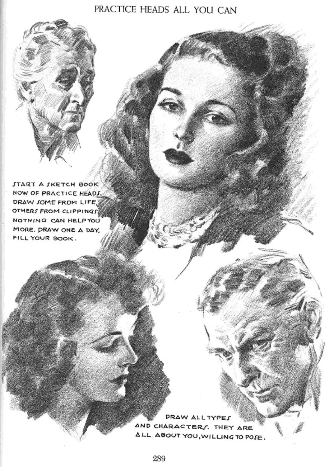
Exciting and Unusual Arrangement 271 Practice Heads All You Can 289
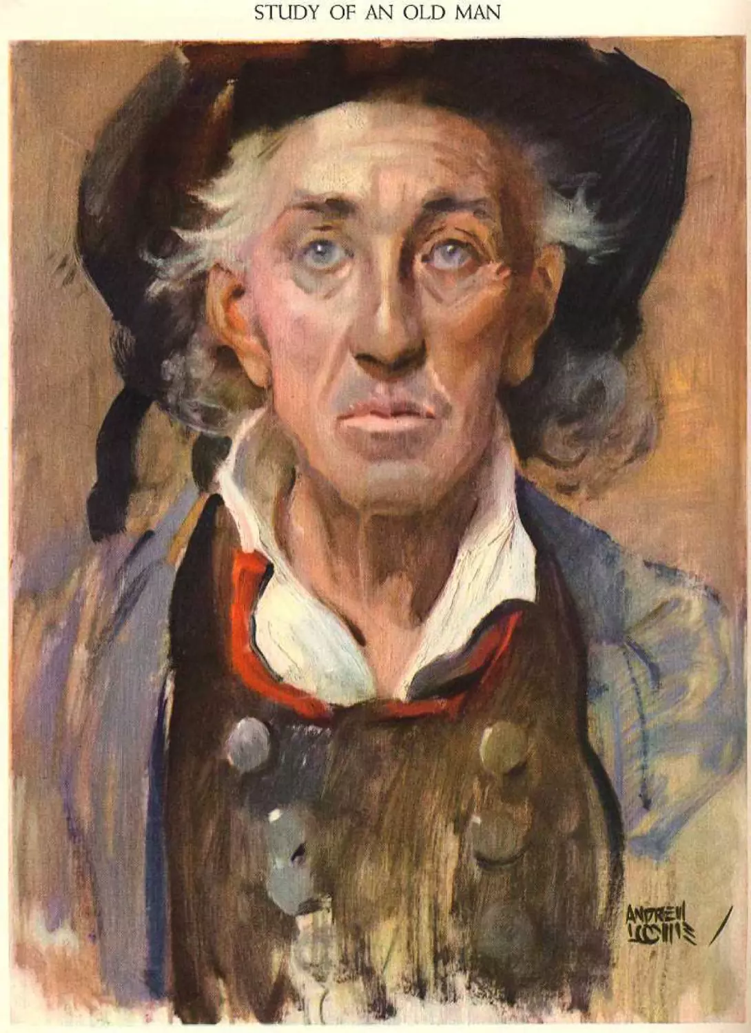
Style and Technique in Story Illustration 272 Study of an Old Man 290
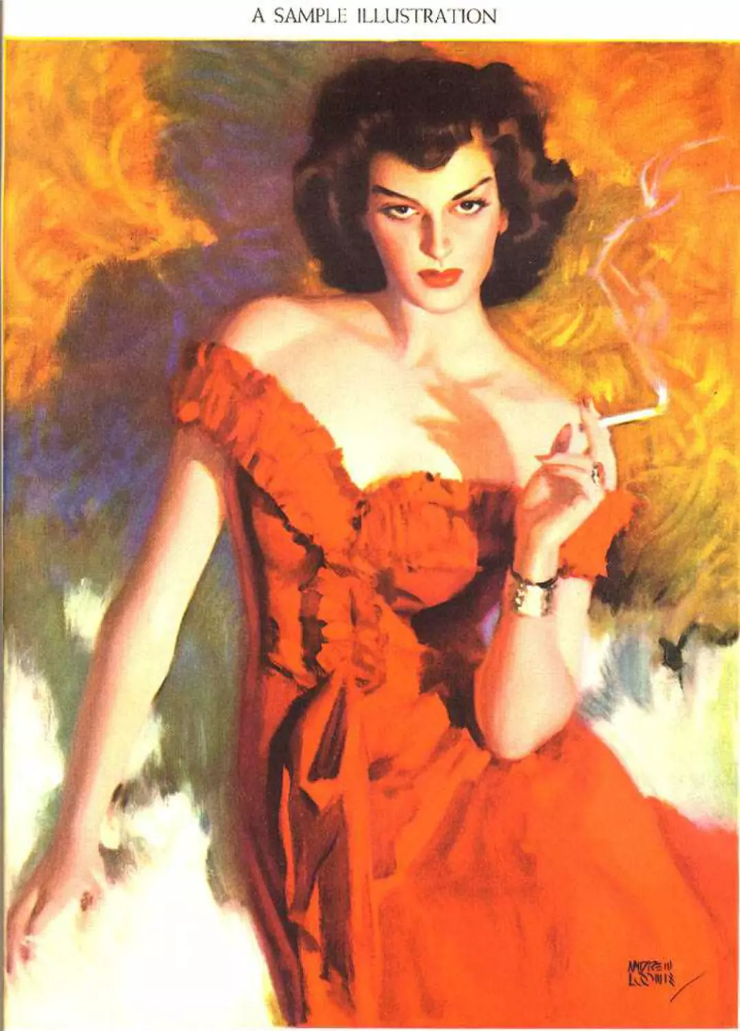
Illustrations That Sell the Story 273 A Sample Illustration 291
Questionnaire for Starting an Illustration 274 Sketching 292
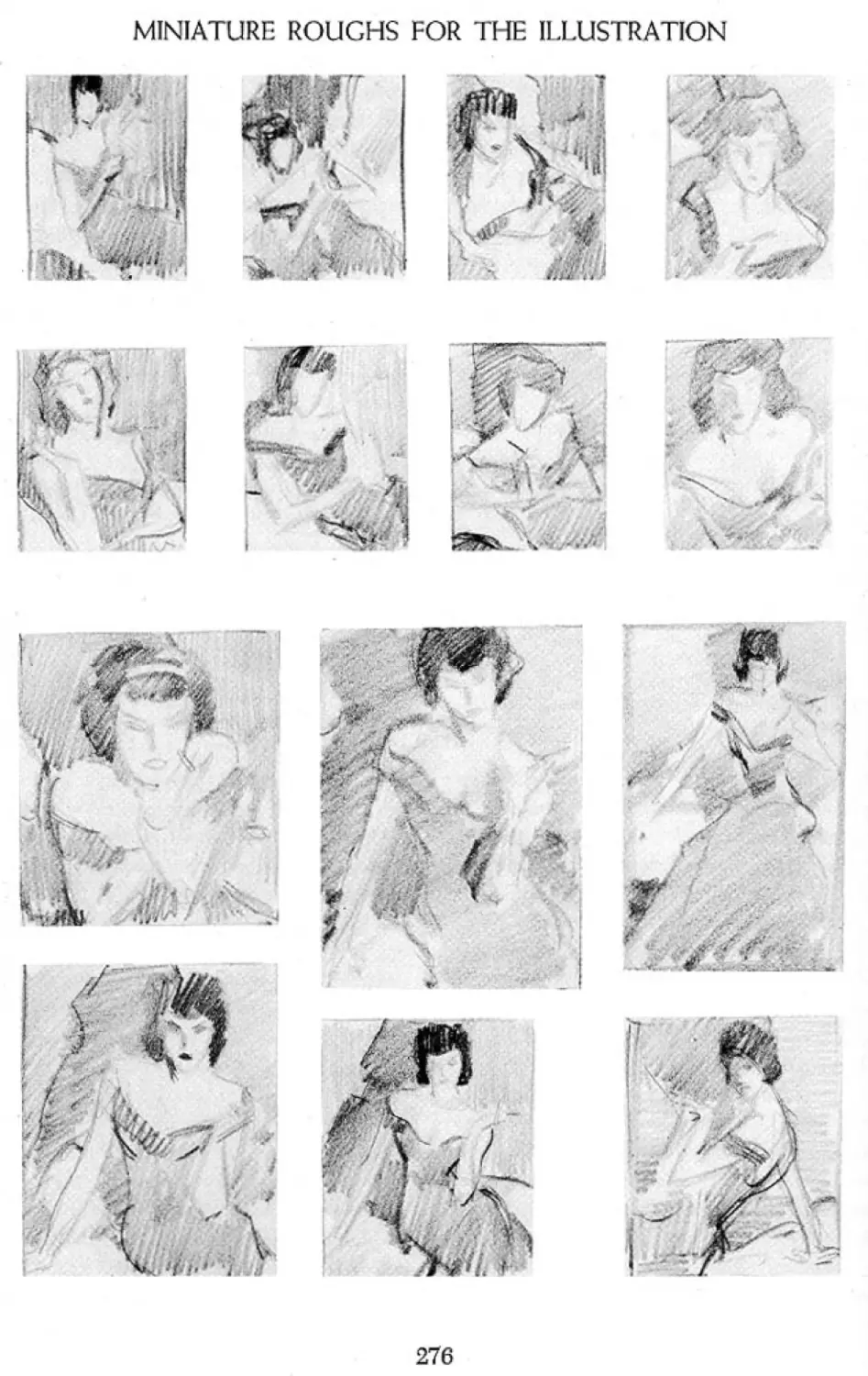
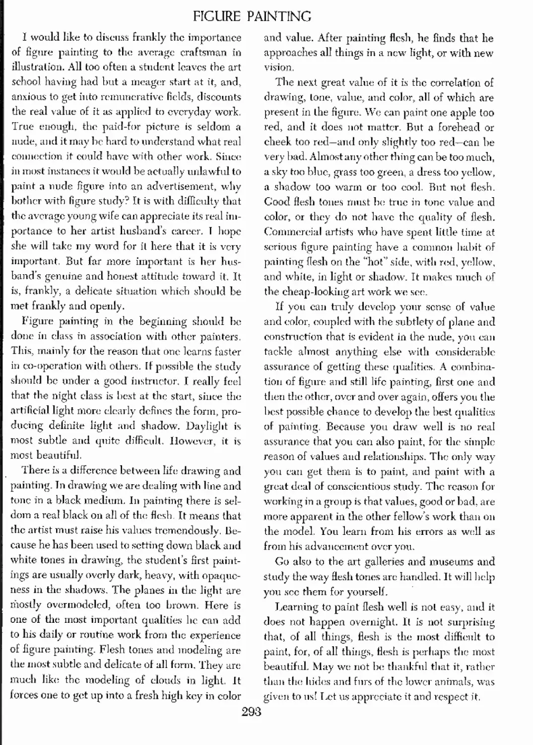
Working Out a Typical Story Illustration 275 Figure Painting 293
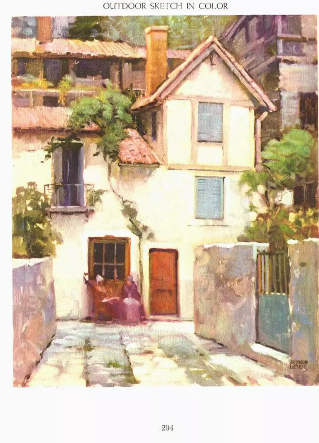
Miniature Roughs for the Illustration 276 Outdoor Sketch in Color 294
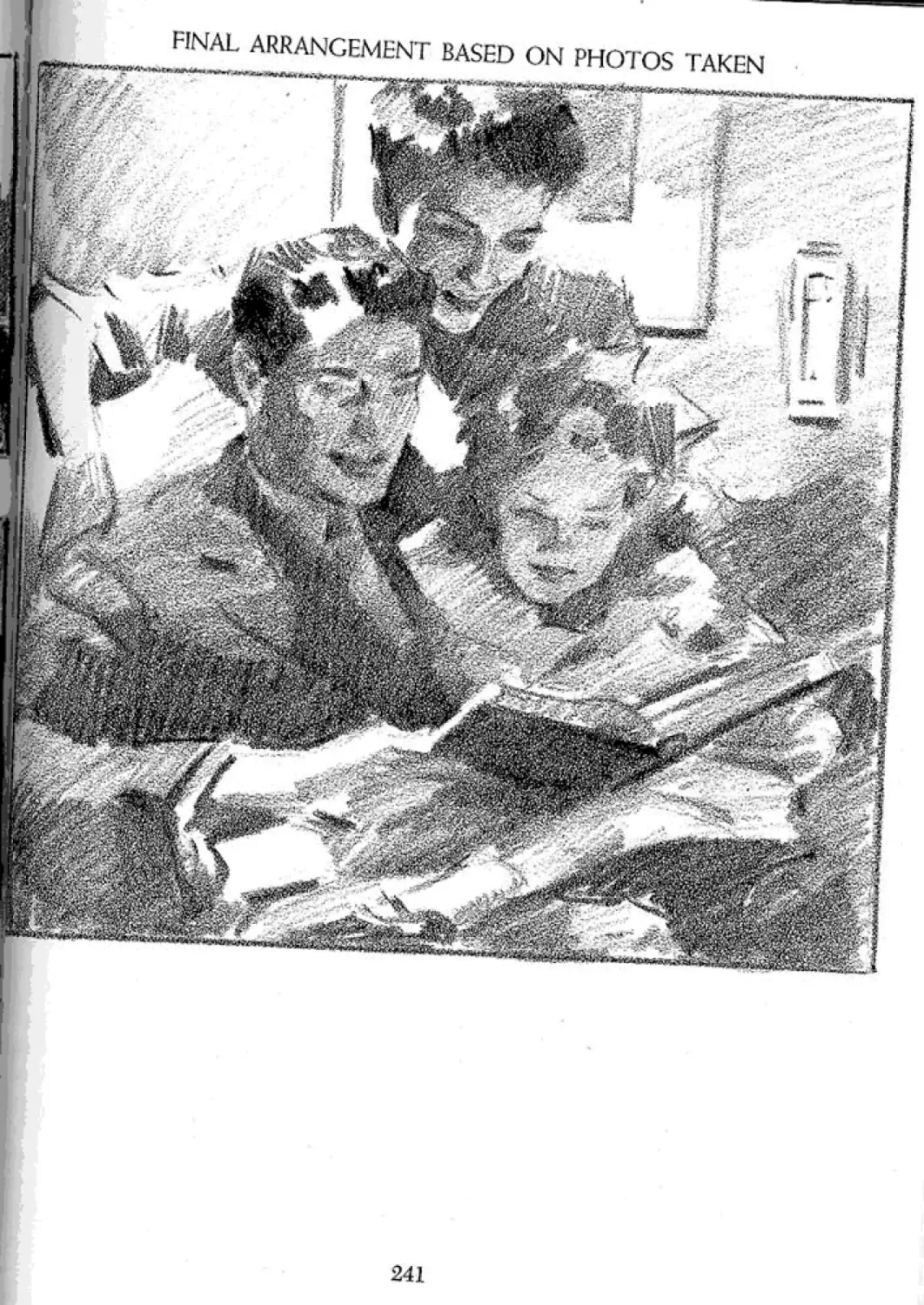
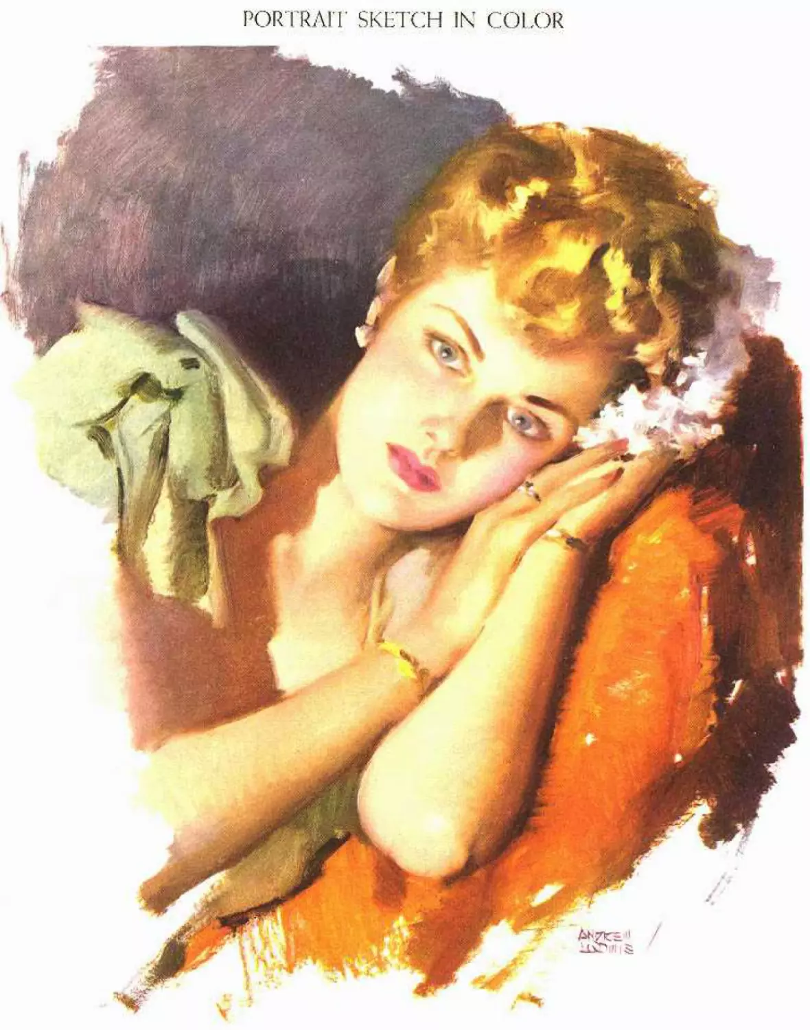
Developing the Actual-Size Rough 277 Portrait Sketch in Color 295
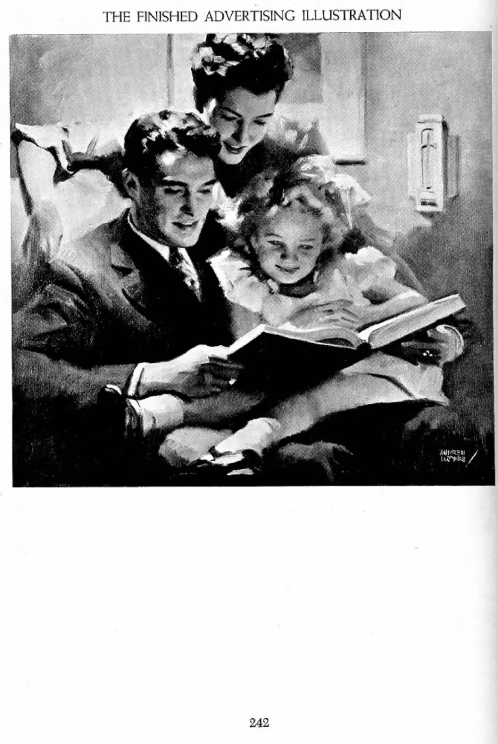
Photo of the Model 278
Study from the Photo 279
The Final Interpretation 280
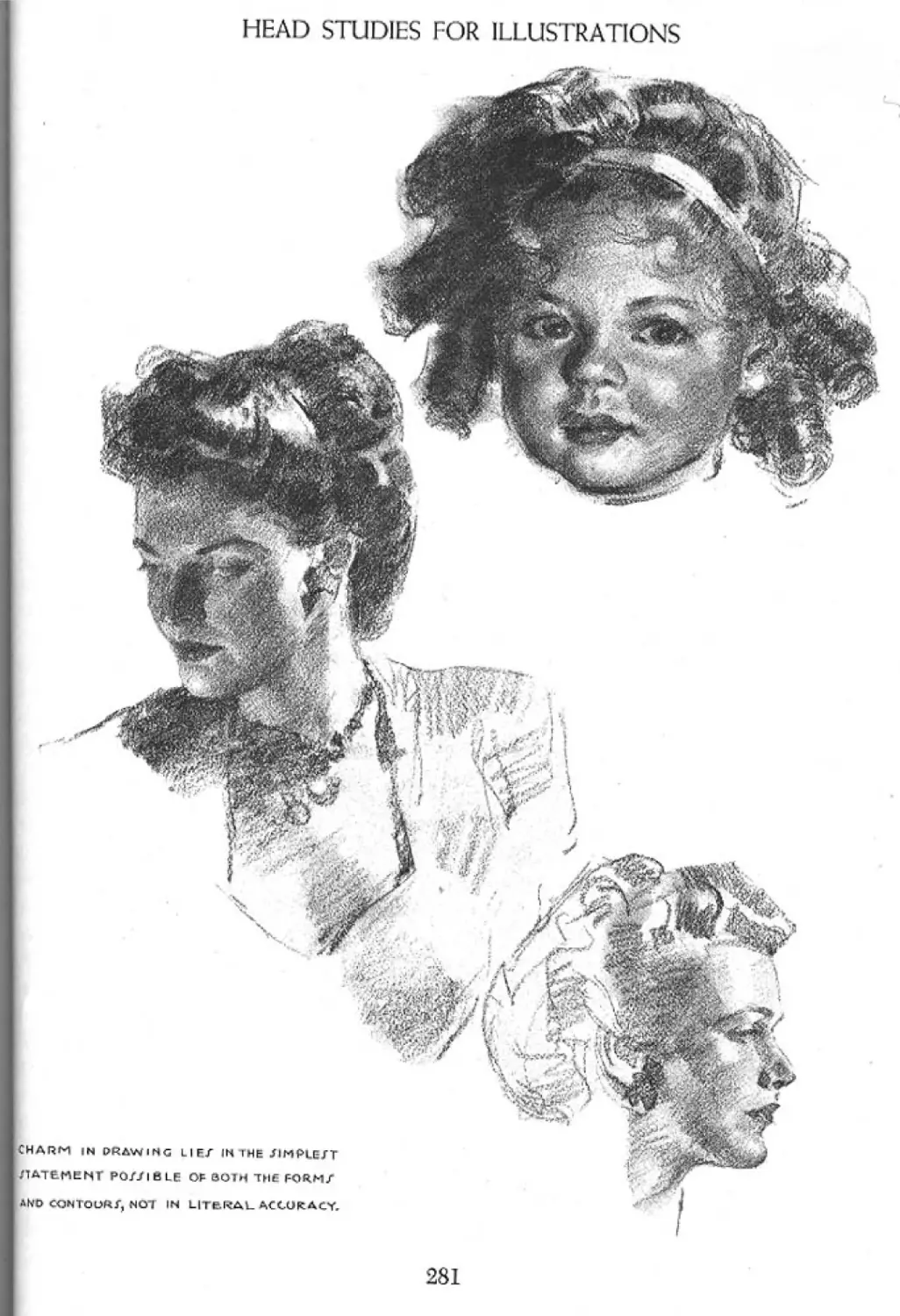
Head Studies for Illustrations 281 Closing Chat 296
Getting into Story Illustration 282 Answers to Queries 299
13
OPENING CHAT
Dear Reader:
With the wonderful response given my earlier
efforts, I believe that through this volume I shall
be greeting many of you as old friends. The ac-
ceptance of my last book, Figure Drawing for All
It’s Worth, has encouraged me to continue, for
there is still much worth-while knowledge in the
field of illustration, beyond the actual drawing of
figures, that can be set forth. It is one thing to
draw the figure well, but quite another to set that
figure into a convincing environment, to make it
tell a story, and to give it personality and dramatic
interest. In short, the figure means little as a good
drawing only. It must accomplish something-
sell a product, or give realism and character to a
story; its personality must so impress the beholder
that he is moved to a definite response emotion-
ally.
My purpose is to present what, in my experi-
ence, have proved to be the fundamentals of illus-
tration. To the best of my belief, such funda-
mentals have not been-organized and set forth
before. So I have attempted to assemble this
much-needed information, trusting that my own
efforts in the active fields of illustration qualify
me to do so. I shall try to make clear the funda-
mentals that apply to the whole pictorial effort
rather than to specific draftsmanship of the figure
or other units. I shall assume that you can already
draw with considerable ability and have some
background of experience or training. Tn this
sense the book will not be built around the early
effort of the beginner, nor is it for those interested
only in drawing as a hobby. It will be for those
having a bona fide desire for a career in art and
tile determination to give it all the concentration
and effort such a career calls for. Success in art is
by no means easy, or a matter of puttering at it in
odd moments. There is no “gift” or talent so great
that it can dispense with the need for fundamental
knowledge; much diligent practice, and hard ef-
fort. I do not contend that anyone can draw or
paint. I do contend that anyone who can draw or
paint can do it better with more knowledge to
work with.
Let us assume, then, that you have ability you
wish to put into practical channels. You want to
know how to set about it. You want to paint pic-
tures for magazine stories and advertising, for
billboards, window displays, calendars and cov-
ers. You want every possible chance for success.
Let us not be under any illusions. At the start I
must admit that there is no exact formula that
can assure success. But there are unquestion-
ably forms of procedure that can contribute a
great deal toward it. Such a formula might be
possible if the character, technical appreciation,
and emotional capacity of the individual were not
so much a part of the ultimate results. For that
reason, art cannot possibly be reduced to exact
formulas devoid of personality. Devoid of per-
sonality, creative art would have little reason for
existence. In fact, the individual expression is its
greatest value, the thing that forever lifts it above
picture-making achieved by mechanical means. I
shall not presume to quarrel with the camera. But
I contend that even with all its mechanical per-
fection, the real value of photography is in the
individual perception of the cameraman and not
in technical excellence alone. If art were only per-
fection of precise detail, the camera would dis-
pense with the need for artists. But until we have
a lens endowed with emotion and individual per-
ception, or having the power of discriminating
between the significant and the irrelevant, the
artist will always dominate the situation. The
camera must accept the good with the bad, take
it or leave it—must reproduce the complete un-
emotional and literal appearance of whatever is
placed before it.
May I impress upon every reader that illustra-
tion is life as you perceive and interpret it. That
17
OPENING CHAT
is your heritage as an artist and is the quality
which will be most sought for in your work. Try
never to lose it or subordinate it to the personality
of another. As far as you and your work are con-
cerned, life is line, tone, color, and design—plus
your feelings about it. These are some of the tools
with which we all work and which I shall try to
enable you to use. You will work with these tools
as you see fit, but my hope is that from this book
you may gain added knowledge of how to use
them.
Throughout my own early career I felt an ur-
gent need for just this kind of help. The need is
still evident, and I have taken the problem upon
myself. My ability as an author can be set aside as
of little importance. We have the common ground
of knowing that the things 1 shall attempt to talk
about are of tremendous importance to both of
us, to our mutual success—since I intend to re-
main as active as possible in the field. I wish you
to succeed as much as I wish to succeed myself,
for the sake of our craft, which is more important
than we are.
If illustration is expression, it becomes a trans-
position of thought. So it is thought transposed to
an illusion of reality. Suppose I speak of a man
with a face as hard as flint. A mental image is con-
jured up in your imagination. However, the image
is not yet sharp and clear. This quality of hardness,
a subconscious interpretation you feel, must be
combined with realism. The result will not be a
copy of a photo nor of a living model. It is a
transposition of your individual conception to a
face. You work with your tools of line, tone, and
color to produce that quality. Devoid of feeling,
you could hardly paint that head.
Drawing for mere duplication has little point
to it. You may do it better with your camera.
Drawing as a means of expression is the justifica-
tion of art over photography. Art directors have
told me that they use photography only because
of the mediocrity of available artists. The demand
for good work far exceeds the supply. Therefore
commercial art has had to lap over into photog-
raphy as the next best bet. Rarely does an art di-
rector prefer a photo to a well-executed painting.
The difficulty lies in getting the painting or draw-
ing that is good enough.
If we are to carry our craft forward, increasing
the volume of good art to anything like the pro-
portionate use of photography or meeting the
indisputable demand, it will not be through
the imitation of photography, nor even through
greater technical ability. It will come through
the greater scope of the imagination on the part
of artists. It will come also through greater tech-
nical freedom leaning away from the merely pho-
tographic, and through greater individuality. To
try to compete with the camera on its own ground
is futile. We-cannot match its precision of detail.
For straight values and local color (which we will
hear more of, later) there is little we can add.
But for real pictorial worth, the gates are wide
open.
You may be certain that the greatest pictorial
value lies in all the things the camera cannot do.
Let us turn our attention to design, looseness and
freedom of technical rendering, character, drama,
inventiveness of layout, the “lost and found” of
edges, subordination of the inconsequential, and
accentuation of the important. Let us incorporate
the emotional qualities so sadly lacking in photo-
graphic illustration. Let our product be as differ-
ent from the photo as our individual handwriting
is from printed type. If we make the drawing, the
values, and the color sound and convincing, from
there on we need not compete. From that point
on there is nothing to stop us, and from that point
on the public actually prefers art to photography.
The drawing, values, and color are only the
stock-in-trade, the jumping-off place. That much
is expected and taken for granted. What we do
beyond these will determine how far we go in
illustration.
Drawing as drawing alone is not too difficult.
Drawing, for the most part, is setting down con-
tour in correct proportion and spacing. Spaces
can be measured, and there are simple ways and
means of measuring them. Any old line around a
contour may be correctly spaced. You can square
OPENING CHAT
off copy, measure by eye, or project it, and get
that kind of drawing. But real drawing is an inter-
pretation, selection, and statement of a contour
with the greatest possible meaning. Sometimes
drawing is not the actual contour at all, but the
one that will express the grace, character, and
charm of the subject. Until the artist begins to
think in line, think of expressing in this way the
things he wants to say, he has not elevated him-
self much beyond his pantograph, projector, or
other mechanical devices. How can he hope to be
creative if he depends entirely upon them? Re-
sorting to their use in place of drawing for self-
expression is a confession of lack of faith in his
ability. He must realize that his own interpreta-
tion, even if not quite so literally accurate, is his
only chance to be original, to excel a thousand
others who also can use mechanical devices. Even
a poor drawing exhibiting inventiveness and some
originality is better than a hundred tracings or
projections.
If I am going to give you information of value,
it must come from actual practice and from con-
tact with the actual field. Naturally I am limited
to my own viewpoint. But, since the fundamentals
that go into my own work are for the most part
the same as those used by others, we cannot be
too far from a common goal. So, I use examples
of my work here, not as something to be imitated,
but rather to demonstrate the basic elements that
I believe must go into all successful illustration.
By showing you the means of expression rather
than the expression itself, Г leave you free to ex-
press yourselves individually.
My approach will strip itself as far as possible
from the theory of imitation as a means of teach-
ing. For this reason the approach must vary con-
siderably from the usual art text formula. We
shall have no examples of Old Masters, for,
frankly, what methods and procedures they used
are virtually unknown. You can see great pictures
everywhere; you probably have your files full of
them. Unless I could tell you how an Old Master
arrived at his great painting, I could add nothing
of value. I cannot presume to give you even an
analysis of his work, for your analysis might be
better than mine. Method and procedure are the
only sound basis of teaching, for without them
creative ability has no chance. I dare not incor-
porate even the work of contemporary illustra-
tors, since each would be infinitely more quali-
fied to speak for himself. I shall leave out all past
performances of my own with the rest, for we are
not as interested in what I have done as in what
you are going to do, working with the same tools.
There is but one course open for me if I am to stay
on solid ground, that of sharing my experience
with you for whatever value it has. You will thus
have the chance to select what is of use to you,
and to discard that with which you do not agree.
The art of illustration must logically begin with
line. There is so much more to line than is con-
ceived by the layman that we must start out with
a broader understanding of it. Whether con-
sciously or not, line enters every phase of pictorial
effort, and plays a most important part. Line is the
first approach to design, as well as the delineation
of contour, and ignorance of its true function can
be a great impediment to success. So our book
will start with line.
Tone comes next. Tone is the basis of the ren-
dering of form in its solid aspect. Tone is also the
basis of a three-dimensional effect of form in
space. A truthful representation of life cannot be
made without a clear understanding of tone. Line
and tone are interdependent, and this relation-
ship must be understood.
To line and tone is added color. Again the re-
lationship becomes inseparable, for true color
depends almost entirely upon good tonal or value
relationship. We may draw an illustration in line
only, and it stands complete pictorially. But the
minute we go beyond line as contour only, we
start to deal with light and shadow, or tone. We
arc therefore plunged immediately into the com-
plex laws of nature, since only by light and
shadow, or tonality, is form apparent to us. The
step from tone to color is not nearly so great,
since the two are closely related.
OPENING CHAT
Granted that we can comprehend the basic
fundamentals of line, tone, and color, there is still
more to encompass. All three must be united to a
pictorial purpose. There arc arrangement and
presentation, even more important than the sub-
ject matter. There is organization of area and
tonal mass or pattern in order to create good pic-
tures. To these ends we shall work.
Beyond the technical rendering comes the dra-
matic interpretation. In the final analysis the il-
lustrator is holding a mirror to life, and expressing
his feelings about it. He may paint a pot of flowers
beautifully, but it can by no stretch of the imag-
ination be called an illustration. Illustration must
encompass emotion, the life we live, the things
we do, and how we feel. So we shall devote a part
of the book to the “telling of the story.”
If we are to illustrate, we must create ideas.
Illustration delves into psychology for basic ap-
peals, to create ideas that must reach into the
personality of the reader, compelling definite
responses. We need to understand the develop-
ment of ideas as the basis of advertising, too, so
that our work may find a market in that field, and
be suited to its special needs. Therefore a part of
the book will be given over to this subject.
Finally, we must separate the various fields into
a variety of approaches, each tuned to its partic-
ular purpose. In each field there is an individual
basic approach which the successful artist must
know. To do an outdoor poster is one thing, and
a magazine ad another. All these points I hope to
make clear.
There is the matter of experiment and study,
which can contribute so little or so much to your
ultimate success. This can assure freshness and
progress in your work as can nothing else; it is
the thing that lifts you out of the rut of daily rou-
tine, and places you head and shoulders above
your associates. It is the biggest secret of success.
I have searched out to the best of my ability
the workable truths. I have organized these into
what I shall call the “Form Principle.” Within this
is the whole basis of approach to the material of
this book. These truths have existed long before
me, and will continue ever after. I have simply
tried to gather them together. They are the things
which are present in all good art, and should be a
part of all that you do. They spring from the laws
of nature, which I believe is the only sound basis
for a book of this kind. So let us get on with our
work.
20
THE FORM PRINCIPLE
AS A BASIS OF APPROACH
No matter what subject the artist uses or what
medium he works in, there is but one solid basis
of approach to a realistic interpretation of life—
to the representation of the natural appearance
of existing forms. I cannot lay claim to being the
first to perceive the truths which underlie this
approach. You will find them exemplified in all
good art. They existed long before me, and will
continue as long as there is light. I shall attempt
only to organize these truths so as to make them
workable for you in study and practice, in every-
thing you do. To the organization of these basic
truths I have given a name: the Form Principle.
This principle is the basis for everything which
will be discussed in this book; and it is my hope
that you will adopt it and use it for the rest of your
lives. Let us start out by defining the Form Prin-
ciple:
The Form Principle is the rendering of form as
to its aspect at any given moment with regard
to its lighting, its structure and texture, together
with its true relationship to its environment.
Now let us see wlrat this means. Any pictorial
effect that will present a convincing illusion of
existing form must do so first by the rendering of
light on that form. Without light, as far as we
are concerned, form ceases to exist. The first truth
of the Form Principle that we are concerned with
is:
It must be determined at once what kind of
light we are working with, for its nature and qual-
ity and the direction from which it comes will-
affect the entire appearance of the form.
If it is impossible to render form without light,
then it follows that the nature of the form becomes
visible because of light. A brilliant light produces
well-defined light, halftone, and shadow. A dif-
fused light, such as the light of the sky on a grey
day, produces an effect of softness and subtle
gradation of light to dark. In the studio the same
relative effects are produced by artificial light for
definition and by the natural north daylight for
the soft gradation.
The direction or position of the light source,
then, determines what planes shall be in the light,
halftone, or shadow. Texture is more apparent in
a direct or bright light than in a diffused light. The
planes of the form are also more apparent in bril-
liant light.
This brings us to the next truth:
The lightest areas of the form will be within
those planes lying most nearly at right angles to
the direction of the light. The halftone planes will
be those obliquely situated to the direction of the
light. The shadow planes will be those planes
lying in or beyond the direction of light so that
the light of the original source cannot reach them.
The cast shadows are the results of the light hav-
ing been intercepted, and the shape of such inter-
cepting form is projected to other planes. In dif-
fused light there is little or no cast shadow. In
brilliant light or direct light there is always cast
shadow.
So you will see that the kind of light immedi-
ately has to do with the approach to your subject
and the ultimate effect. Having less definition, the
diffused or over-all light will be most difficult. For
“snap,” take direct light. For softness and sim-
plicity, use sky light. Direct light produces con-
trast, sky light produces closeness of value.
Direct light produces much more reflected
light, and this is most apparent within the shad-
ow. The amount of reflected light reaching the
shadow will determine its value. Everything upon
which the light falls becomes a secondary source
of reflected light and will light shadow planes in
21
THE FORM PRINCIPLE
the same manner as the original source, being
brightest on the planes at right angles to such
reflected light.
Light can operate in only one maimer. It hits
the top planes squarely and brightly, then slides
around the form as far as it can go. However, in
the shadow, the source being of less brilliancy,
reflected light can never he as light as the original
source. Therefore no area in the shadow can he as
light as the areas in the light.
More art falls apart for this reason than for any
other. Both light and shadow areas must be sim-
plified and painted in the fewest possible values.
The object is to make all the lighted areas hold
together as one group, as opposed to the shadow
areas as another group. If the values of the two
groups are not thus separated and held apart, the
subject is bound to lose solidity and form, no mat-
ter how well modeled and how well drawn. Much
of the reason for pictures’ falling apart is also
because simple light and shadow is not given a
chance. Such relationship is destroyed by insert-
ing several sources of light. Thus where halftone
and shadow should be to give the true character
of the form, it is lost by other lighting, and the
values become a hodgepodge of middle tones,
highlights, and accents. There cannot be a white
in the shadow area. There can hardly be a pure
black in the light area. A safe approach is to make
all the areas in the light a little lighter than you
think you see them, and all the areas in the shadow
a little darker. You will probably come out with a
better thing than the other way round.
All forms within your picture should appear to
be lighted by the same source and be lighted con-
sistently with one another.
This does not mean that light cannot travel in
different directions, such as the light around a
lamp, the light of two windows, reflected lights,
etc. But the light must be a true effect of light,
such as sunlight, sky light, moonlight, twilight,
artificial light, etc., in its real effect and relation-
ship. There is only one way to get this right. Do it
by studying from life the true aspect, or take a
photo which will give it to you. It cannot be faked.
Faked lighting breaks down every other good
quality.
All things represented within a given light
bear a relationship of tone and value to one
another.
If this relationship is not maintained, then the
form cannot be true. Every tiling has its “local”
value, that is, its surface tone appears to be some-
where in the scale from black to white. Bright
light can raise the value, and dim light can lower
it. But the light raises or lowers all other surround-
ing values correspondingly, so that the value of
the subject holds a constant relationship to other
values. It will remain, in any light, so much lighter
or darker than its neighbors. For instance, a man’s
shirt may be so much lighter than his suit. In
any light this relationship holds good. Therefore,
whether in deep shadow or bright light, we can-
not change the value difference between the two.
The object is to raise both or lower both but to
keep the approximate difference. The relation-
ship of things to one another will be the same
always, either in light or in shadow.
A single source of light is best for our purpose
and produces the best effect pictorially. This also
gives us reflected light. We can use a reflector
(usually a white board) to reflect the original
light with beautiful effect. This, when working on
the shadow side.
Relationship of values is more correct in natu-
ral light than in any other.
Sunlight and daylight are the perfect lights for
true rendering of form. You simply cannot beat
them with all the trick lighting possible.
Overmodeling comes from incorrect values.
If, to make the form go round, we exaggerate
the values, we use up the rather limited range be-
tween black and white, so we do not have left
the proper and lower values for the shadow. The
picture becomes dull and lifeless, since we have
used values that do not belong to the light and
could not be in relationship. The opposite is true
when we put lights into the shadows that could
not be, destroying the big relationship between
the whole light and the whole shadow.
THE FORM PRINCIPLE
The big form makes the subject carry and ap-
pear solid, not the incidental surface forms.
Many of the small and intricate forms must be
subordinated to keep the big form solid. Folds,
for instance, can ruin the effect of underlying
form and break it up. Draw only the folds that
express form and the natural drape of the mate-
rial, not every fold just because it is there on the
model or in the copy.
The best pictures run to a few simple values.
This will be taken up later on.
The design makes the picture, not the subject
or material.
Almost any subject can be used with charm
through the help of design and arrangement.
Presentation is more vital than subject matter.
The same form may he presented with great
variety by a careful arrangement of lighting. Just
any light will not do. Il must be the best of sev-
eral experiments.
A landscape beautiful in early morning or eve-
ning light may be dull and uninteresting at noon-
day. A charming head may be ugly in bad light-
ing. The best plan is always to choose the lighting
that tends to big simple form, not form too broken
up in light and shadow.
Light and shadow in itself produces design.
The plainest of subjects can be made artistic
by weaving patterns of light and shadow' through
it.
Value relationships between objects produce
design.
For example, a dark object placed against a
light one, and both against a grey field, would be
design. Units may be placed against close values
or contrasting values, thereby getting subordina-
tion in the first instance and accentuation in the
second. The planning or composition of the sub-
ject is really dealing with the relationships of
the values of certain units as combined with or
opposed to others. This results in “pattern,” and
can be further combined with lighting.
All pictures are fundamentally either arrange-
ments of lights, intervening tones, and darks, or
else linear arrangements.
You cannot avoid making your subject either
a tonal statement or a linear statement. You can
combine both, but you cannot get away from one
of these. If you do not understand tonal relation-
ship you cannot secure a feeling of “existence.”
Line is contour; tone is form, space, and the
third dimension.
Cet this clearly in your mind.
Contour cannot be continuously defined all
around all units and a sense of space be achieved.
Contour becomes lost and found and inter-
laced or woven into other areas in nature. If
the edge is kept hard all around, it cannot avoid
sticking to the picture plane, losing the feeling
of space, or one edge in back of another. Edges
will be taken up in more detail later.
The fundamentals are the same in all mediums.
Each medium has an inherent quality of its
own. Once you master the Form Principle, only
the peculiarities of the medium remain to be
mastered. You will simply have to find out how
to express a sharp edge, a soft edge, light, halftone
and shadow, in the medium, which is a purely
technical matter. But you will render form in
essentially the same way in all mediums.
The darkest part of the shadow appears near-
est the light, between the halftone of the light and
the reflected light within the shadow.
This is called the “ridge” or “hump” by the illus-
trator, and is most important. It keeps the shadow
luminous and the form round.
The Form Principle is the co-ordination of all
factors dealing with line, tone, and color.
This book is laid out on the Form Principle,
since it enters into everything you will ever do, or
see, in the field of illustration. We shall attempt
to clarify its various applications as we go along.
I suggest that you come back to these funda-
mental truths often, for they are the answer to
most of your problems.
So we start with line!
23
PART ONE
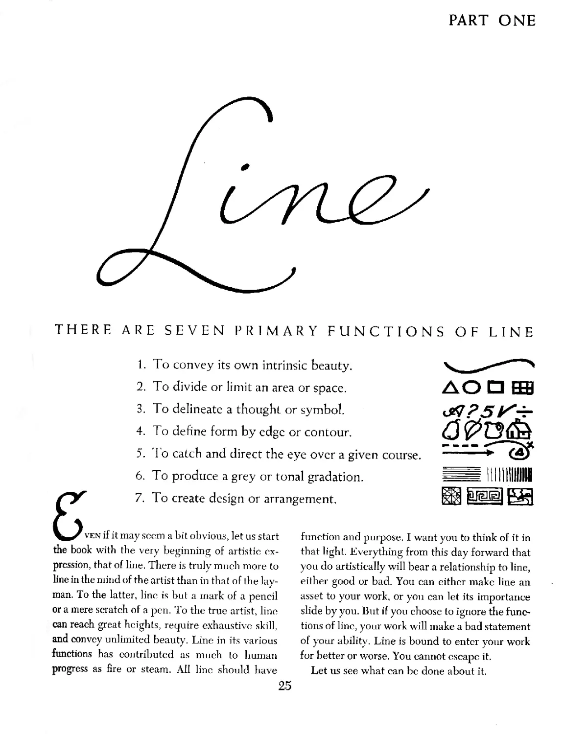
THERE ARE SEVEN PRIMARY FUNCTIONS OF LINE
1. To convey its own intrinsic beauty.
2. To divide or limit an area or space.
3. To delineate a thought or symbol.
4. To define form by edge or contour.
5. To catch and direct the eye over a given course.
6. To produce a grey or tonal gradation.
7.
To create design or arrangement.
ven if it may seem a bit obvious, let us start
the book with the very beginning of artistic ex-
pression, that of line. There is truly much more to
line in the mind of the artist than in that of the lay-
man. To the latter, line is but a mark of a pencil
or a mere scratch of a pen. To the true artist, line
can reach great heights, require exhaustive skill,
and convey unlimited beauty. Line in its various
functions has contributed as much to human
progress as fire or steam. All line should have
function and purpose. I want you to think of it in
that light. Everything from this day forward that
you do artistically will bear a relationship to line,
either good or bad. You can either make line an
asset to your work, or you can let its importance
slide by you. But if you choose to ignore the func-
tions of line, your work will make a bad statement
of your ability. Line is bound to enter your work
for better or worse. You cannot escape it.
Let us see what can be done about it.
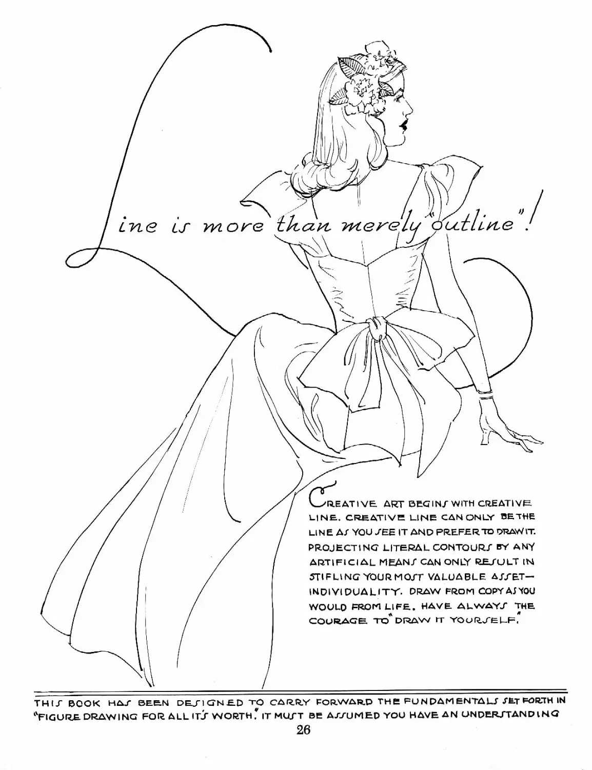
LisLG
Creative art begin/with creative
LINE. CREATIVE LINE CAN ONLY BE THE
LINE Al YOU /ЕЕ IT AND PREFER TO DRAWVT.
PROJECTING LITERAL CONTOUR/ BY ANY
ARTIFICIAL MEAN/ CAN ONLY RESULT IN
STIFLING YOUR MO/T VALUABLE bSf£.T—
INDIVIDUALITY- DRAW FROM COPYAJTOU
WOULD PROM LIFE. HAVE ALWAY/ THE
COURAGE TO* DRAW IT YOuH/ELF,
THU BOOK HAT BEEN DE/IGNED TO CARRY FORWARD TH e FU N PAM ENTA LI ХЁ-Т FORTH IN
^FIGURE DRAWING FOR ALL IE? WORTH.* IT МЦ/Т BE A//UMED YOU HAVE AN UNDERJTAND I NG
26
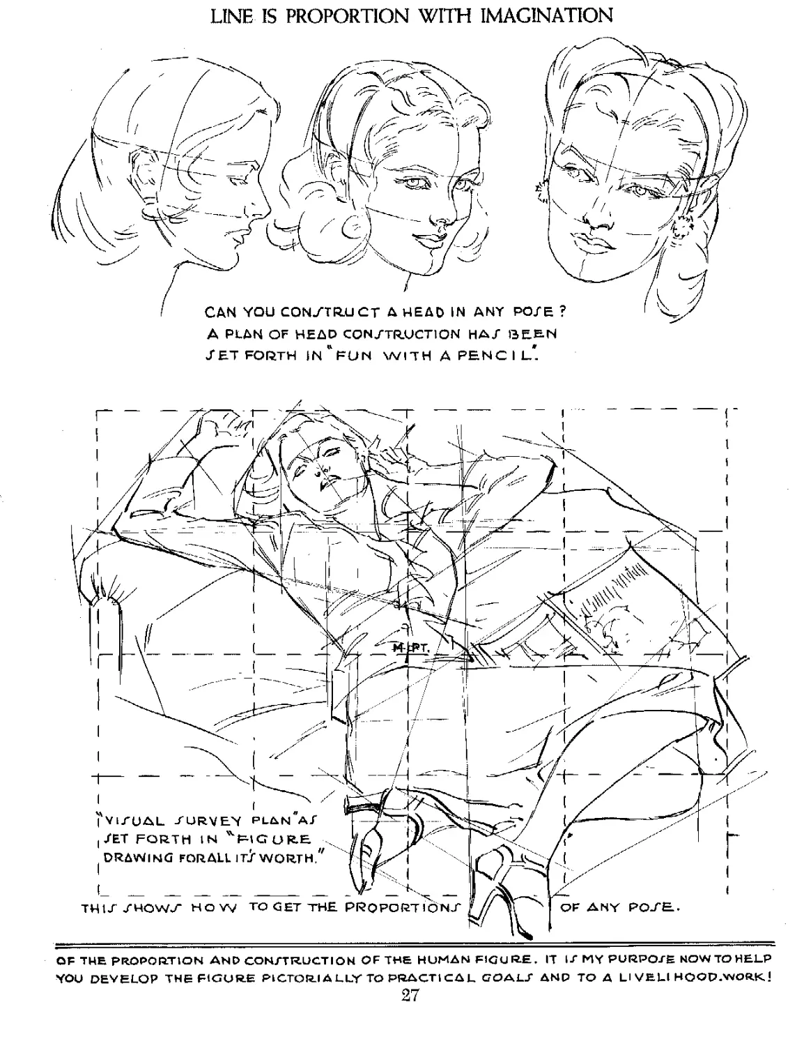
LINE IS PROPORTION WITH IMAGINATION
A PLAN OF HEAD CONSTRUCTION НА/ BE&N
SET FORTH In’fUN WITH APENCIL*.
OF THE PROPORTION AND CON/T RUCTION OF THE HUMAN FIGURE. IT IT MY PURPOSE NOW TO HELP
YOU DEVELOP THE FIGURE PICTORIA LLY TO PRACTi СД L GOALf AND TO A LI VELl HOOD.WORK
27
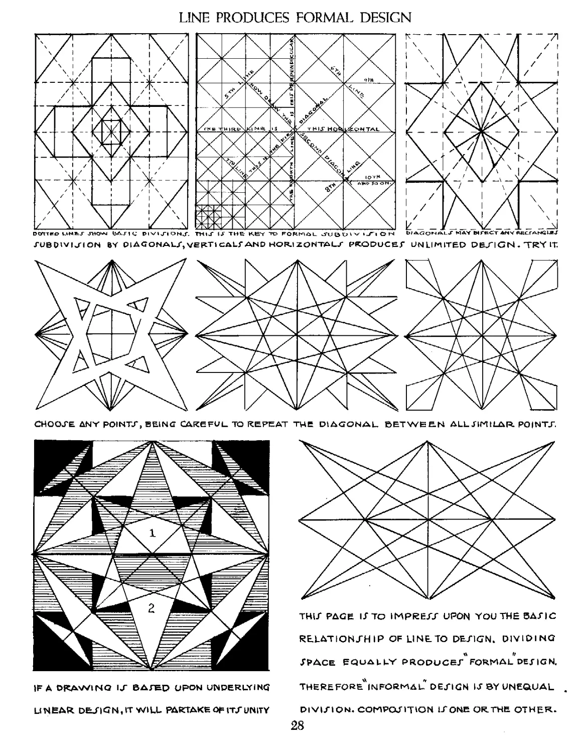
LINE PRODUCES FORMAL DESIGN
DOTTEO LIMtl JHOJJJ ВЛЛ <; mu' THE H.e*Y TO FOfil'lilL JUBrjivI J'l OH Ыдлонльт MAY ЫГеСт ДНТ КЕСГАНйии
XUBPIVIJ-ION BY Ol4GONALr,VEFCTlCALfAND HORIZONTAL/ PRODUCE/ UNLIMITED DEJ"I C N • TRY IT
CHOOSE ANY POINTS, BEING CAREFUL TO REPEAT THE DIAGONAL BETWEEN ALL JIM I LAR. PO|NTJ".
THU PAGE IS To IMPRESS UPON YOU THE BASIC
RELATIONSHIP OF LI NETO DESIGN. DIVIDING
Space equally produce/formaldejign,
IF Д DRAWING IS BATED UPON UNDERLYING
LINEAR. DES|GN,IT WILL PARTAKE OF ITT UNITY
THERE FORE* IN FORM AL DESIGN IS BY UNEQUAL
DIVISION. COMPOSITION 1SONE OR.THE OTHER-
28
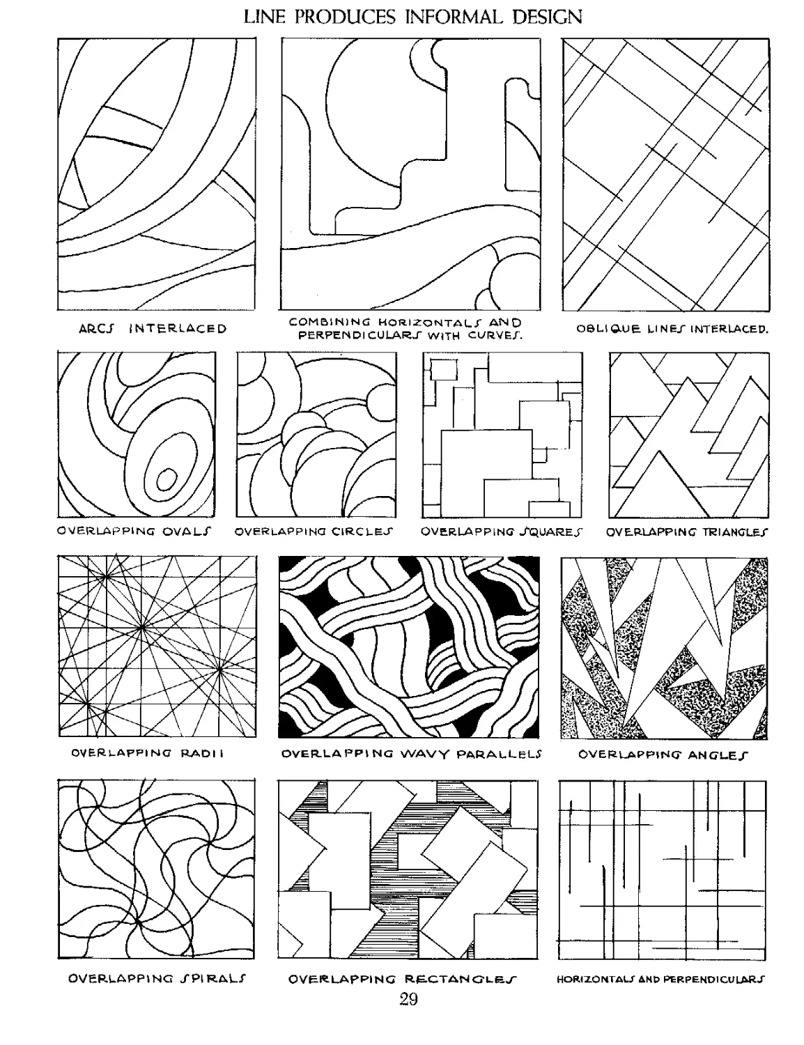
LINE PRODUCES INFORMAL DESIGN
OVERLAPPING TRIANGLE/
OVERLAPPING OVAL/
COMBINING HORIZONTAL/ AND
PERPENDICULAR./ WITH CURVE/.
OVERLAPPING J'QUAREJ’
OVERLAPPING WAVY PARALLELS
OVERLAPPING ANGLE/
OVERLAPPING /PIRAL/
OV&RLApPING RECTANGLE/ HORIZONTAL/ AND PERPENDICULAR/
29
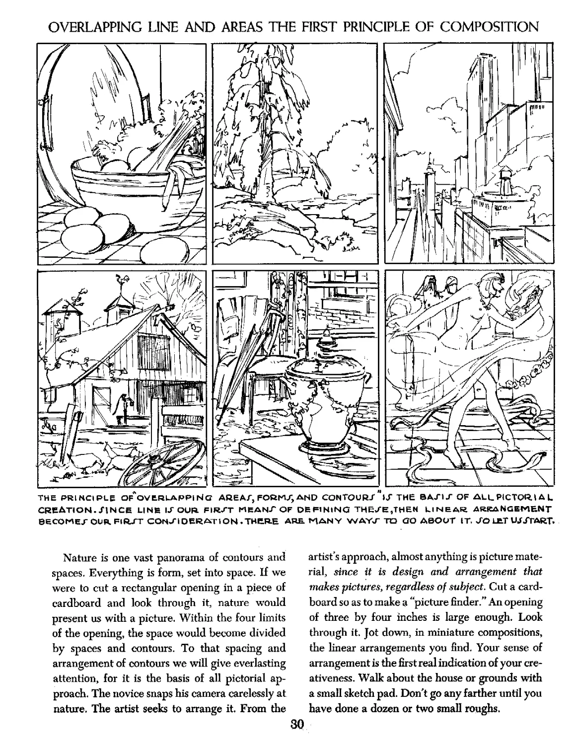
OVERLAPPING LINE AND AREAS THE FIRST PRINCIPLE OF COMPOSITION
THE PRINCIPLE Of'ov ERLAPPI NG AREA/, FORM/, AND CONTOUR/ "»/ THE ВА/1/OF ALL PICTOR.» A L
CREATION./INCE LINE I/OUR. FIR/T MBAN/OF DEFINING THE/E,THEN LINEAR ARRANGEMENT
BECOME/OUR FlR/T CON/1 DERATION .THERE ARE. MANY WAY/ TO GO ABOUT IT. /О LET UJ /TART.
Nature is one vast panorama of contours and
spaces. Everything is form, set into space. If we
were to cut a rectangular opening in a piece of
cardboard and look through it, nature would
present us with a picture. Within the four limits
of the opening, the space would become divided
by spaces and contours. To that spacing and
arrangement of contours we will give everlasting
attention, for it is the basis of all pictorial ap-
proach. The novice snaps his camera carelessly at
nature. The artist seeks to arrange it. From the
artist’s approach, almost anything is picture mate-
rial, since it is design and arrangement that
makes pictures, regardless of subject. Cut a card-
board so as to make a “picture finder.” An opening
of three by four inches is large enough. Look
through it. Jot down, in miniature compositions,
the linear arrangements you find. Your sense of
arrangement is the first real indication of your cre-
ativeness. Walk about the house or grounds with
a small sketch pad. Don't go any farther until you
have done a dozen or two small roughs.
30
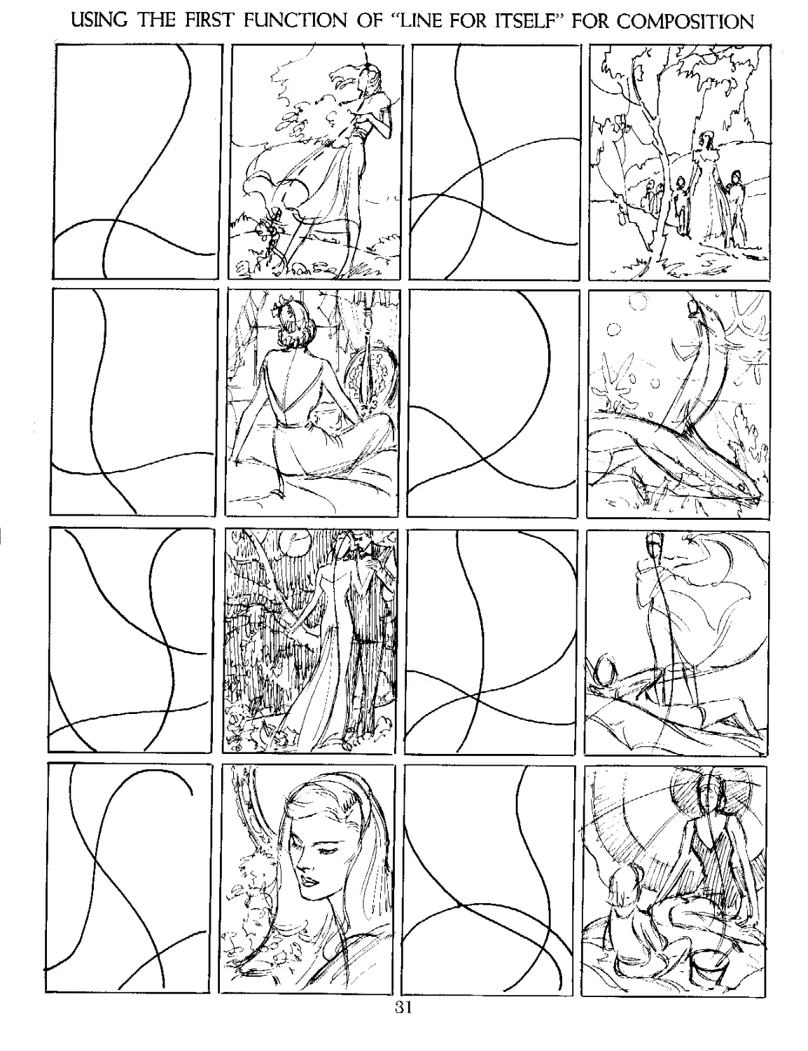
USING THE FIRST FUNCTION OF “LINE FOR ITSELF” FOR COMPOSITION
31
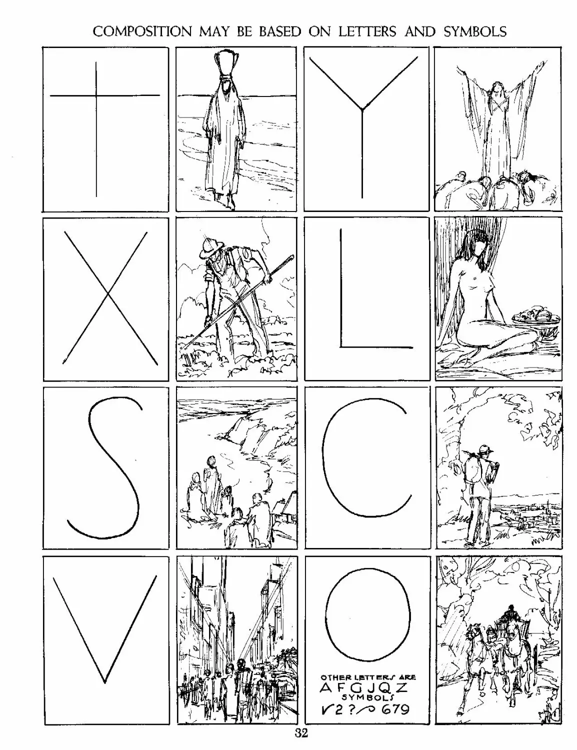
COMPOSITION MAY BE BASED ON LETTERS AND SYMBOLS
32
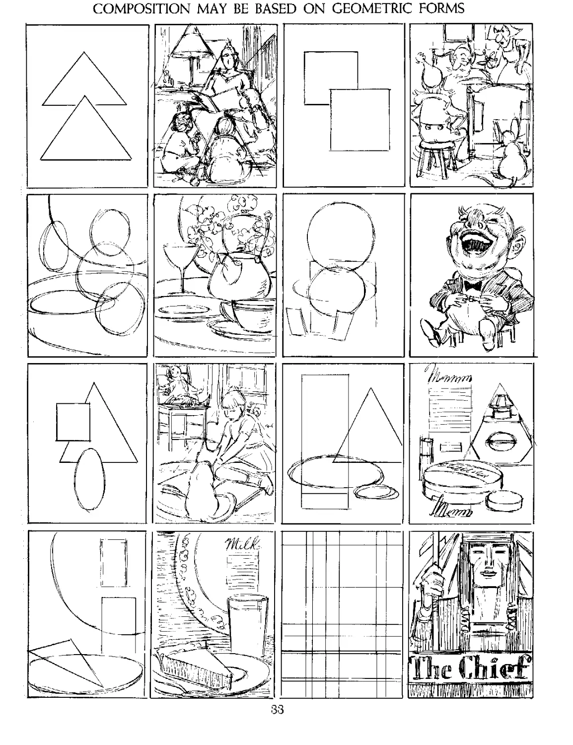
COMPOSITION MAY BE BASED ON GEOMETRIC FORMS
33
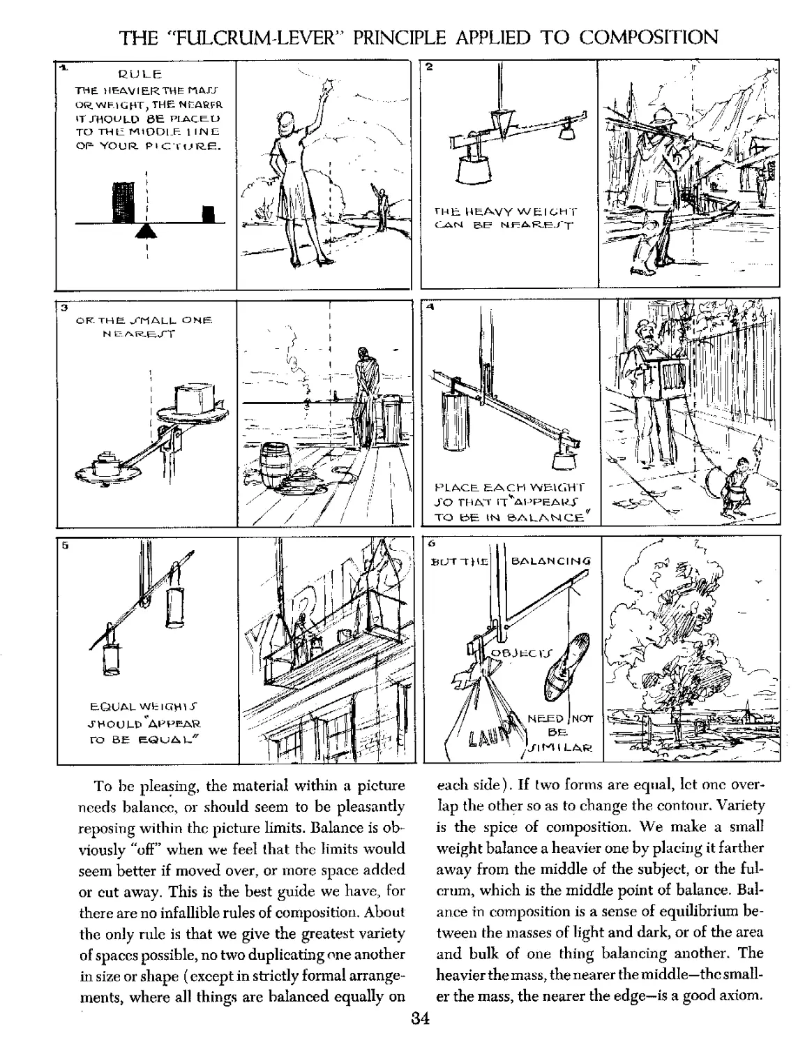
THE "FULCRUM-LEVER” PRINCIPLE APPLIED TO COMPOSITION
To be pleasing, the material within a picture
needs balance, or should seem to be pleasantly
reposing within the picture limits. Balance is ob-
viously “off” when we feel that the limits would
seem better if moved over, or more space added
or cut away. This is the best guide we have, for
there are no infallible rules of composition. About
the only rule is that we give the greatest variety
of spaces possible, no two duplicating one another
in size or shape (except in strictly formal arrange-
ments, where all things are balanced equally on
each side). If two forms are equal, let one over-
lap the other so as to change the contour. Variety
is the spice of composition. We make a small
weight balance a heavier one by placing it farther
away from the middle of the subject, or the ful-
crum, which is the middle point of balance. Bal-
ance in composition is a sense of equilibrium be-
tween the masses of light and dark, or of the area
and bulk of one thing balancing another. The
heavier the mass, the nearer the middle—the small-
er the mass, the nearer the edge—is a good axiom.
34
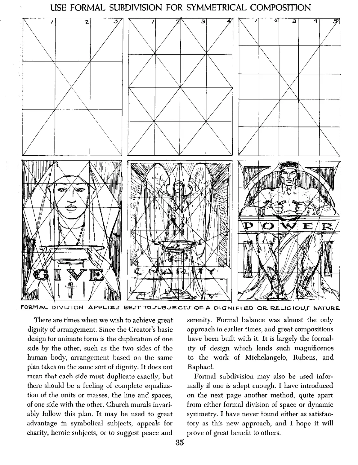
USE FORMAL SUBDIVISION FOR SYMMETRICAL COMPOSITION
FORMAL. DIVISION APPLIED BEJT TO j-UBJECTJ Qp A PIGNlFlED OR. RS.LIG IOUJ" NATURE
There are times when we wish to achieve great
dignity of arrangement. Since the Creator’s basic
design for animate form is the duplication of one
side by the other, such as the two sides of the
human body, arrangement based on the same
plan takes on the same sort of dignity. It does not
mean that each side must duplicate exactly, but
there should be a feeling of complete equaliza-
tion of the units or masses, the line and spaces,
of one side with the other. Church murals invari-
ably follow this plan. It may be used to great
advantage in symbolical subjects, appeals for
charity, heroic subjects, or to suggest peace and
serenity. Formal balance was almost the only
approach in earlier times, and great compositions
have been built with it. It is largely the formal-
ity of design which lends such magnificence
to the work of Michelangelo, Rubens, and
Raphael.
Formal subdivision may also be used infor-
mally if one is adept enough. I have introduced
on the next page another method, quite apart
from either formal division of space or dynamic
symmetry. I have never found either as satisfac-
tory as this new approach, and I hope it will
prove of great benefit to others.
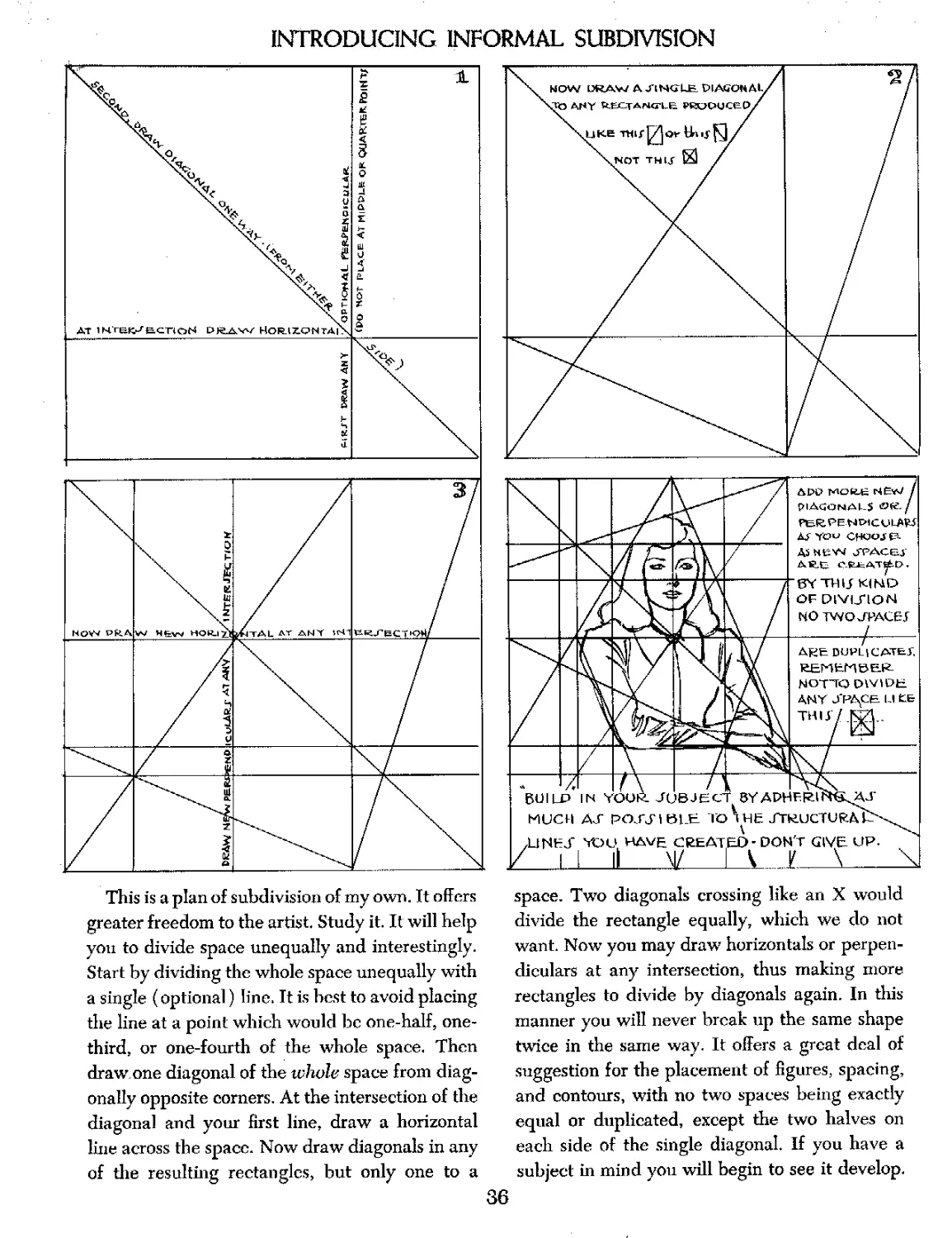
INTRODUCING INFORMAL SUBDIVISION
This is a plan of subdivision of my own. It offers
greater freedom to the artist. Study it. It will help
you to divide space unequally and interestingly.
Start by dividing the whole space unequally with
a single (optional) line. It is best to avoid placing
the line at a point which would be one-half, one-
third, or one-fourth of the whole space. Then
draw one diagonal of the whole space from diag-
onally opposite corners. At the intersection of the
diagonal and your first line, draw a horizontal
line across the space. Now draw diagonals in any
of die resulting rectangles, but only one to a
space. Two diagonals crossing like an X would
divide the rectangle equally, which we do not
want. Now you may draw horizontals or perpen-
diculars at any intersection, thus making more
rectangles to divide by diagonals again. In diis
manner you will never break up the same shape
twice in the same way. It offers a great deal of
suggestion for the placement of figures, spacing,
and contours, with no two spaces being exactly
equal or duplicated, except die two halves on
each side of the single diagonal. If you have a
subject in mind you will begin to see it develop.
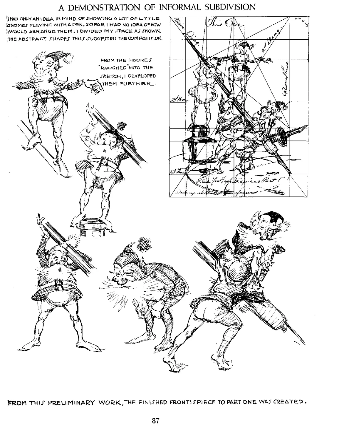
A DEMONSTRATION OF INFORMAL SUBDIVISION
I HAP ONWAN 1DEA IN MIND OP SHOWING A LOT O₽ LITTLE
iffNOMES P LAVING WITH A PEN. SQFAR I HAP NO IDEA OF HOY/
^iwoULD ARRANGE THEM . I DIVIDED MY JPACE AJ SHOWN.
ДНЕ ABSTRACT SHAPET TROS'XUGGEJT ED ТНЕООМРОЯТЮН.
FROM THE FIGXJR.E.J
fcOOGHED^INTO THE
XKBTCH, I DEVELOPED
ЧТНЕМ FORTH &
WROM THU PRELIMINARY work,the finijhed front и piece to part one wat CHEAT ED
37
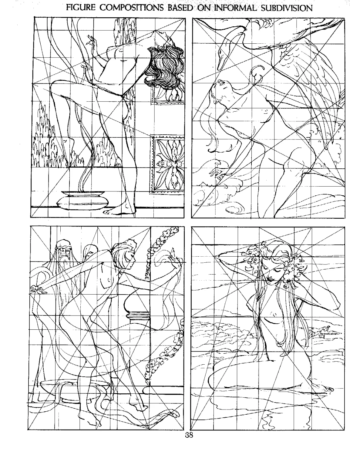
FIGURE COMPOSITIONS BASED W W3RMAL SUBDIVISION
38
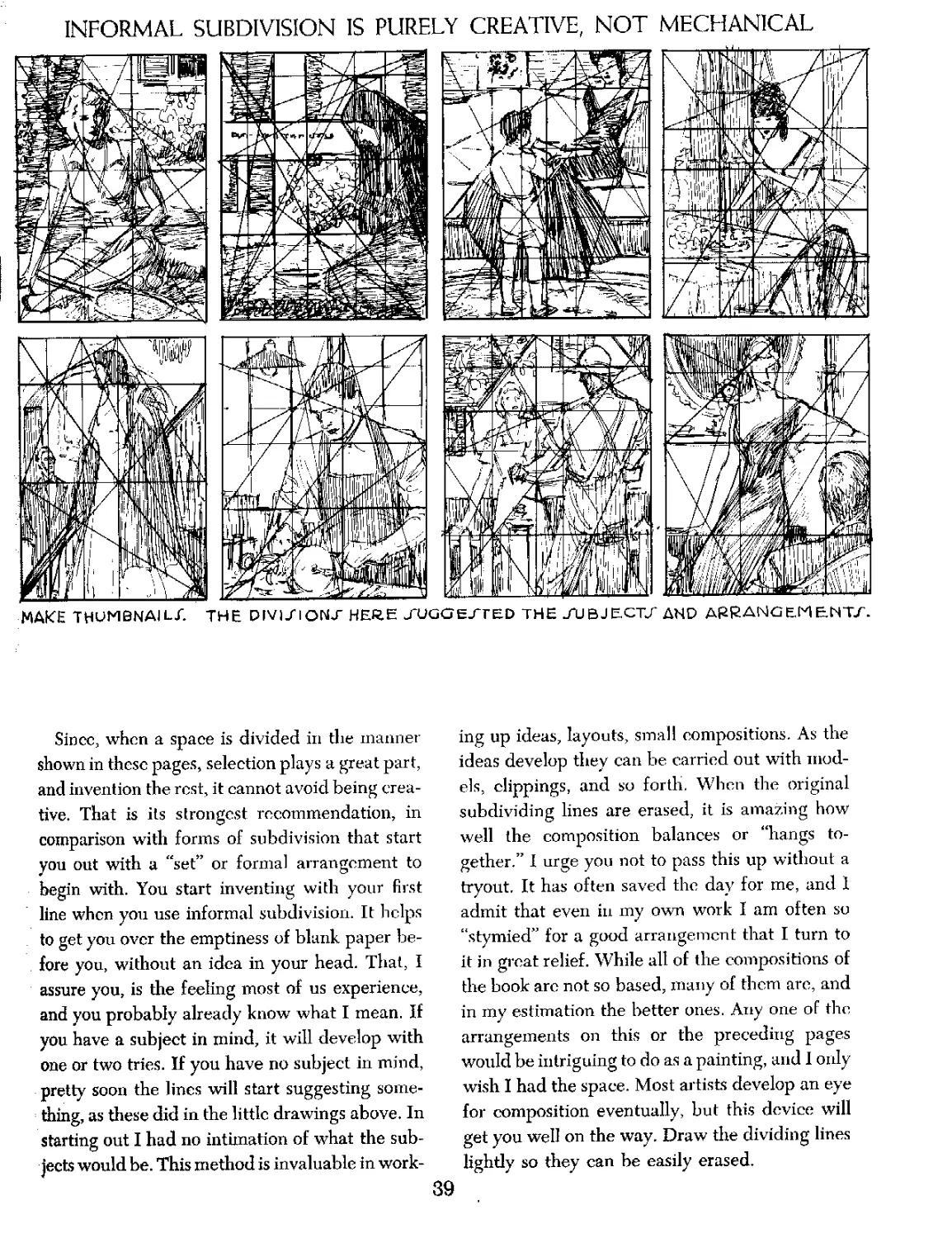
INFORMAL SUBDIVISION IS PURELY CREATIVE, NOT MECHANICAL
MAKE THUMBNAIL/. THE DIVIJ'IONJ' HERE J*UGGEJTED THE -AJBJE.CTZ AND ARRANGEMENTS.
Since, when a space is divided in the manner
shown in these pages, selection plays a great part,
and invention the rest, it cannot avoid being crea-
tive. That is its strongest recommendation, in
comparison with forms of subdivision that start
you out with a "set” or formal arrangement to
begin with. You start inventing with your first
line when you use informal subdivision. It helps
to get you over the emptiness of blank paper be-
fore you, without an idea in your head. That, I
assure you, is the feeling most of us experience,
and you probably already know what I mean. If
you have a subject in mind, it will develop with
one or two tries. If you have no subject in mind,
pretty soon the lines will start suggesting some-
thing, as these did in the little drawings above. In
starting out I had no intimation of what the sub-
jects would be. This method is invaluable in work-
ing up ideas, layouts, small compositions. As the
ideas develop they can be carried out with mod-
els, clippings, and so forth. When the original
subdividing lines are erased, it is amazing how
well the composition balances or “hangs to-
gether.” I urge you not to pass this up without a
tryout. It has often saved the day for me, and I
admit that even in my own work I am often so
“stymied” for a good arrangement that I turn to
it in groat relief. While all of the compositions of
the book arc not so based, many of them arc, and
in my estimation the better ones. Any one of the
arrangements on this or the preceding pages
would be intriguing to do as a painting, and 1 only
wish I had the space. Most artists develop an eye
for composition eventually, but this device will
get you well on the way. Draw the dividing lines
lightly so they can be easily erased.
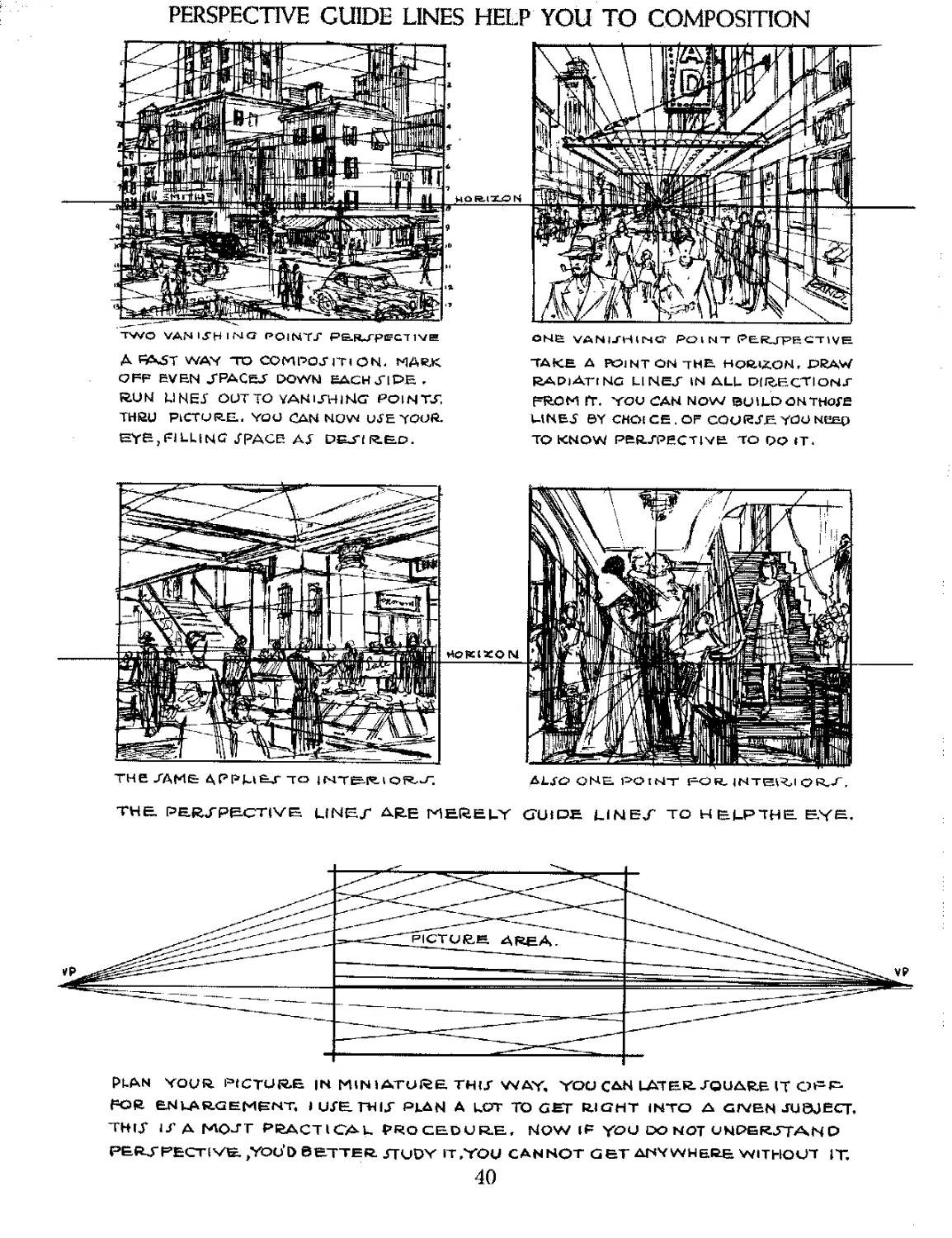
PERSPECTIVE GUIDE LINES HELP YOU TO COMPOSITION
ONE VANISHING- POINT PElRLJFE CT IVH
two vanishing pointt pejurpecTive
A PAST WAV TO COMPOSITION. MARX
OFF EVEN .TRACES’ DOWN! EACH JI PE .
R.U M МНЕТ OUT TO YAH UHI NG* POIN TS.
THRU PICTURE. YOU CAN NOW USE YOUR.
EYB, FILLING TRACE AT DESIRED.
TAKE A POINT ON THE. HQ&iXON, DRAW
RAPlArtNG LINES IN ALL DIRECTIONS
FROM IT. YOU CAN NOW BUILD OH THOSE
LINET BY CHOICE.OF COURSE. YOU NEEQ
TO KNOW PERSPECTIVE TO DO IT.
THE SAME APPH&J" TO 1ГЧТЕ-1Т. I OR.uF,
ALSO ONE POINT FOR. INTEI<I ОЙ.Л
THE PERSPECTIVE LINES ARE MERELY GUIDE LINES TO HELPTHE EYE.
PLAN YOUR. PICTURE |N MINIATURE THIS WAY. YOU CAN LAT EE SQUARE IT OPP
FOR ENLARGEMENT, I USE THIS PLAN A LOT TO GET RIGHT INTO A GIVEN JUOJECT.
THlX IS A MOST PRACTICAL. PROCEDURE, NOW IF YOU DO NOT UNDERSTAND
PERSPECTIVE. /YOU’D BETTER STUDY IT .YOU CANNOT GET ANYWHERE WITHOUT IT.
40
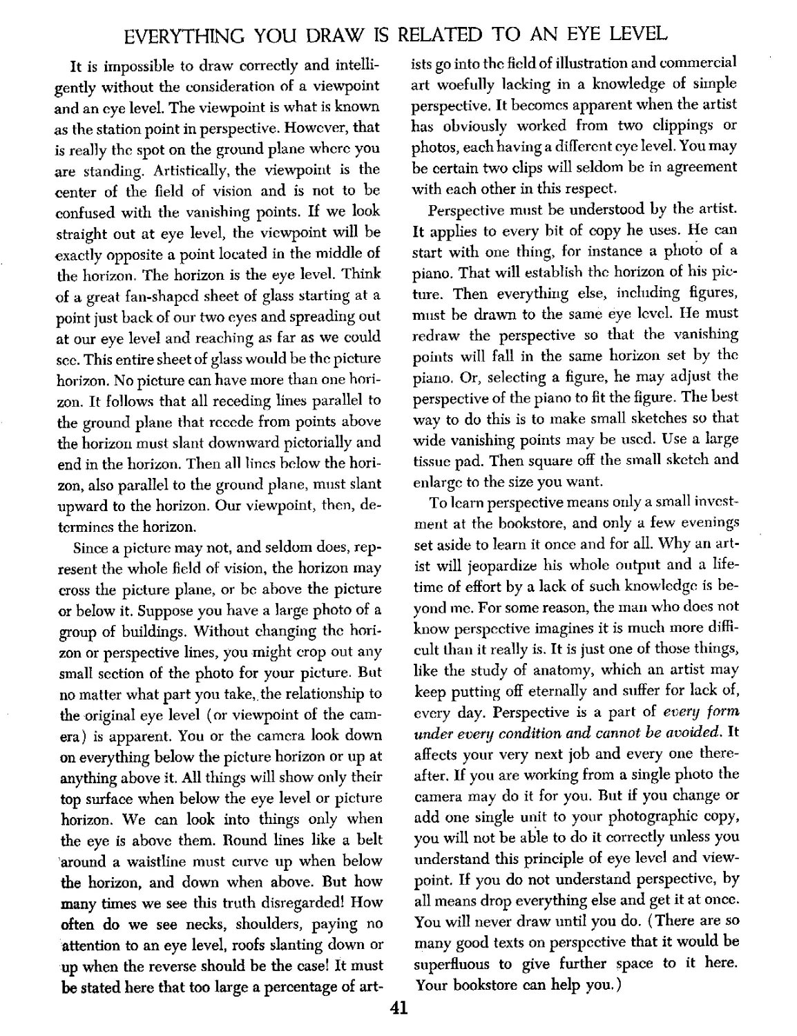
EVERYTHING YOU DRAW IS RELATED TO AN EYE LEVEL
It is impossible to draw correctly and intelli-
gently without the consideration of a viewpoint
and an eye level. The viewpoint is what is known
as the station point in perspective. However, that
is really the spot on the ground plane where you
are standing. Artistically, the viewpoint is the
center of the field of vision and is not to be
confused with the vanishing points. If we look
straight out at eye level, the viewpoint will be
exactly opposite a point located in the middle of
the horizon. The horizon is the eye level. Think
of a great fan-shaped sheet of glass starting at a
point just back of our two eyes and spreading out
at our eye level and reaching as far as we could
sec. This entire sheet of glass would be the picture
horizon. No picture can have more than one hori-
zon. It follows that all receding lines parallel to
the ground plane that recede from points above
the horizon must slant downward pictorially and
end in the horizon. Then all lines below the hori-
zon, also parallel to the ground plane, must slant
upward to the horizon. Our viewpoint, then, de-
termines the horizon.
Since a picture may not, and seldom does, rep-
resent the whole field of vision, the horizon may
cross the picture plane, or be above the picture
or below it. Suppose you have a large photo of a
group of buildings. Without changing the hori-
zon or perspective lines, you might crop out any
small section of the photo for your picture. But
no matter what part you take,, the relationship to
the original eye level (or viewpoint of the cam-
era) is apparent. You or the camera look down
on everything below the picture horizon or up at
anything above it. All things will show only their
top surface when below the eye level or picture
horizon. We can look into things only when
the eye is above them. Round lines like a belt
around a waistline must curve up when below
die horizon, and down when above. But how
many times we see this truth disregarded! How
often do we see necks, shoulders, paying no
attention to an eye level, roofs slanting down or
up when the reverse should be the case! It must
be stated here that too large a percentage of art-
ists go into the field of illustration and commercial
art woefully lacking in a knowledge of simple
perspective. It becomes apparent when the artist
has obviously worked from two clippings or
photos, each having a different eye level. You may
be certain two clips will seldom be in agreement
with each other in this respect.
Perspective must be understood by the artist.
It applies to every bit of copy he uses. He can
start with one thing, for instance a photo of a
piano. That will establish the horizon of his pic-
ture. Then everything else, including figures,
must be drawn to the same eye level. lie must
redraw the perspective so that the vanishing
points will fall in the same horizon set by the
piano. Or, selecting a figure, he may adjust the
perspective of the piano to fit the figure. The best
way to do this is to make small sketches so that
wide vanishing points may be used. Use a large
tissue pad. Then square off the small sketch and
enlarge to the size you want.
To learn perspective means only a small invest-
ment at the bookstore, and only a few evenings
set aside to learn it once and for all. Why an art-
ist will jeopardize his whole output and a life-
time of effort by a lack of such knowledge is be-
yond me. For some reason, the man who does not
know perspective imagines it is much more diffi-
cult than it really is. It is just one of those things,
like the study of anatomy, which an artist may
keep putting off eternally and suffer for lack of,
every day. Perspective is a part of every form
under every condition and cannot be avoided. It
affects your very next job and every one there-
after. If you are working from a single photo the
camera may do it for you. But if you change or
add one single unit to your photographic copy,
you will not be able to do it correctly unless you
understand this principle of eye level and view-
point. If you do not understand perspective, by
all means drop everything else and get it at once.
You will never draw until you do. (There are so
many good texts on perspective that it would be
superfluous to give further space to it here.
Your bookstore can help you,)
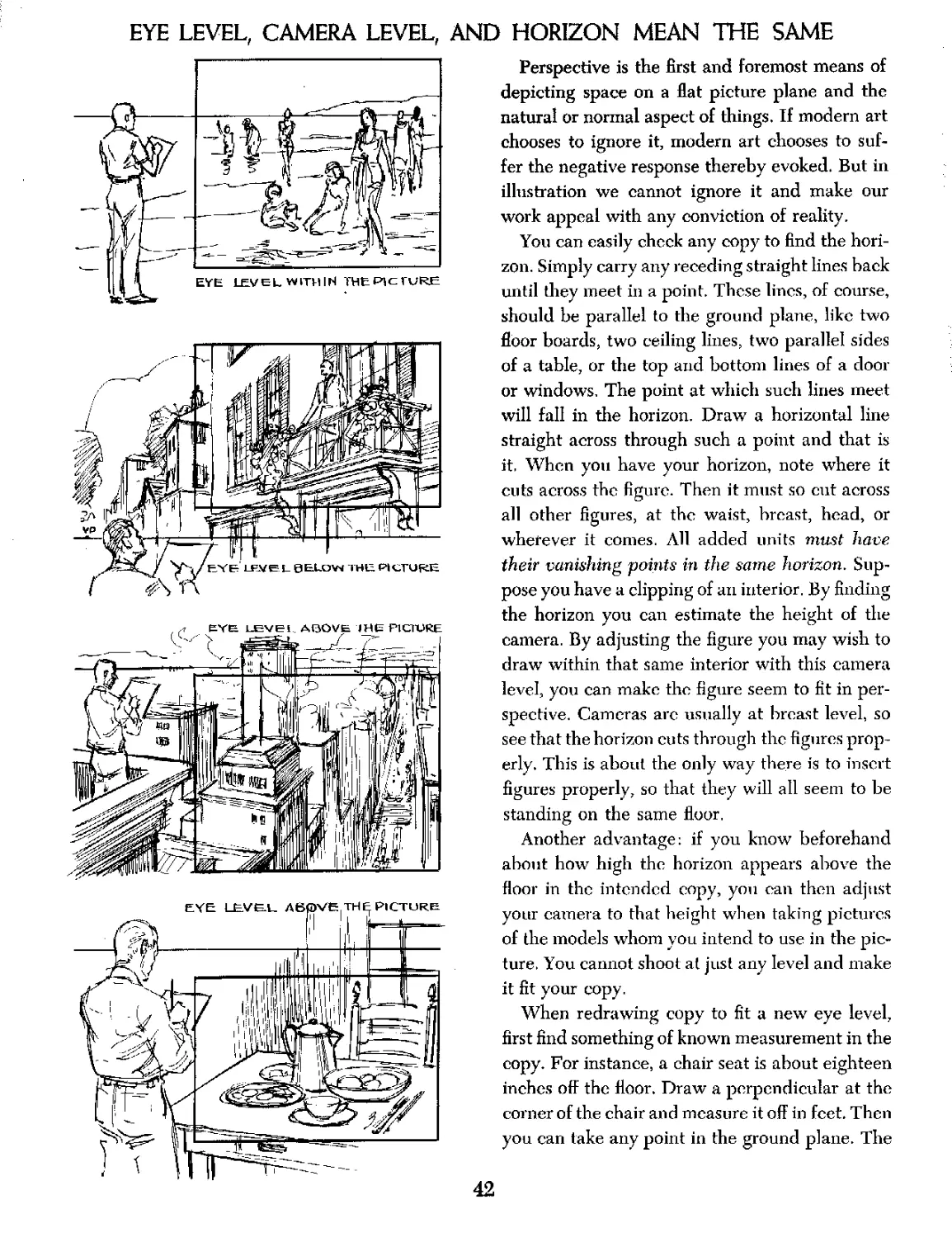
EYE LEVEL, CAMERA LEVEL, AND HORIZON MEAN THE SAME
Perspective is the first and foremost means of
depicting space on a flat picture plane and the
natural or normal aspect of things. If modern art
chooses to ignore it, modern art chooses to suf-
fer the negative response thereby evoked. But in
illustration we cannot ignore it and make our
work appeal with any conviction of reality.
You can easily check any copy to find the hori-
zon. Simply carry any receding straight lines back
until they meet in a point. These lines, of course,
should be parallel to the ground plane, like two
floor boards, two ceiling lines, two parallel sides
of a table, or the top and bottom lines of a door
or windows. The point at which such lines meet
will fall in the horizon. Draw a horizontal line
straight across through such a point and that is
it, When you have your horizon, note where it
cuts across the figure. Then it must so cut across
all other figures, at the waist, breast, head, or
wherever it comes. All added units must have
their vanishing points in the same horizon. Sup-
pose you have a clipping of an interior. By finding
the horizon you can estimate the height of the
camera. By adjusting the figure you may wish to
draw within that same interior with this camera
level, you can make the figure seem to fit in per-
spective. Cameras arc usually at breast level, so
see that the horizon cuts through the figures prop-
erly. This is about the only way there is to insert
figures properly, so that they will all seem to be
standing on the same floor.
Another advantage: if you know beforehand
about how high the horizon appears above the
floor in the intended copy, yon can then adjust
your camera to that height when taking pictures
of the models whom you intend to use in the pic-
ture. You cannot shoot at just any level and make
it fit your copy.
When redrawing copy to fit a new eye level,
first find something of known measurement in the
copy. For instance, a chair seat is about eighteen
inches off the floor. Draw a perpendicular at the
corner of the chair and measure it off in feet. Then
you can take any point in the ground plane. The
42
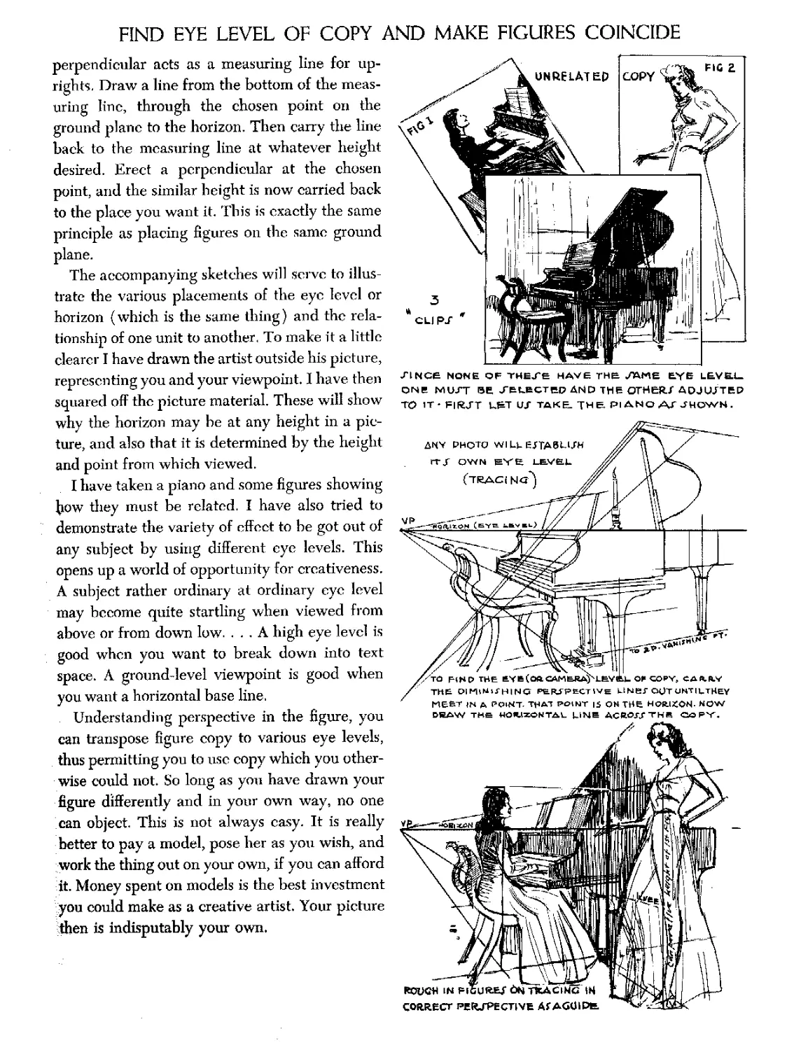
FIND EYE LEVEL OF COPY AND MAKE FIGURES COINCIDE
perpendicular acts as a measuring line for up-
rights. Draw a line from the bottom of the meas-
uring line, through the chosen point on the
ground plane to the horizon. Then carry the line
back to the measuring line at whatever height
desired. Erect a perpendicular at the chosen
point, and the similar height is now carried back
to the place you want it. This is exactly the same
principle as placing figures on the same ground
plane.
The accompanying sketches will serve to illus-
trate the various placements of the eye level or
horizon (which is the same thing) and the rela-
tionship of one unit to another, To make it a little
clearer I have drawn the artist outside his picture,
representing you and your viewpoint. I have then
squared off the picture material. These will show
why the horizon may be at any height in a pic-
ture, and also that it is determined by the height
and point from which viewed.
I have taken a piano and some figures showing
how they must be related. I have also tried to
demonstrate the variety of effect to be got out of
any subject by using different eye levels. This
opens up a world of opportunity for creativeness.
A subject rather ordinary at ordinary eye level
may become quite startling when viewed from
above or from down low. ... A high eye level is
good when you want to break down into text
space. A ground-level viewpoint is good when
you want a horizontal base line.
Understanding perspective in the figure, you
can transpose figure copy to various eye levels,
thus permitting you to use copy which you other-
wise could not. So long as you have drawn your
figure differently and in your own way, no one
can object. This is not always easy. It is really
better to pay a model, pose her as you wish, and
work the thing out on your own, if you can afford
it. Money spent on models is the best investment
you could make as a creative artist. Your picture
then is indisputably your own.
ZINCe None OF THEJ'E HAVE THE /АМЕ Eye L6VE.l_
ONE N1UXT БЕ, /ELECTED AND THE OTHER./ ADJUSTED
TO IT- FIFATT k&T UJ TAKE. THE. PI ANO ATJHOWN.
MEET JN Д POINT, POINT IS QHTHB HQR.ISCON- HOW
DRAW THE МОЧЛХОМТАк. MNB ACJWTHB COPY,
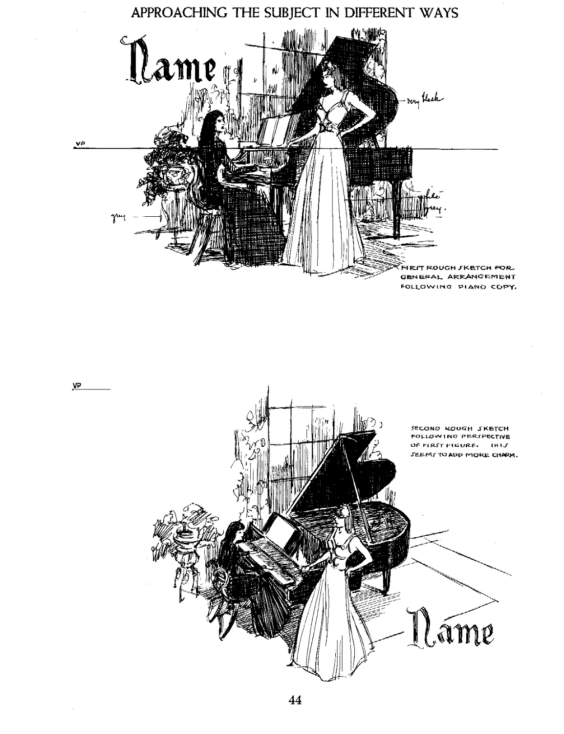
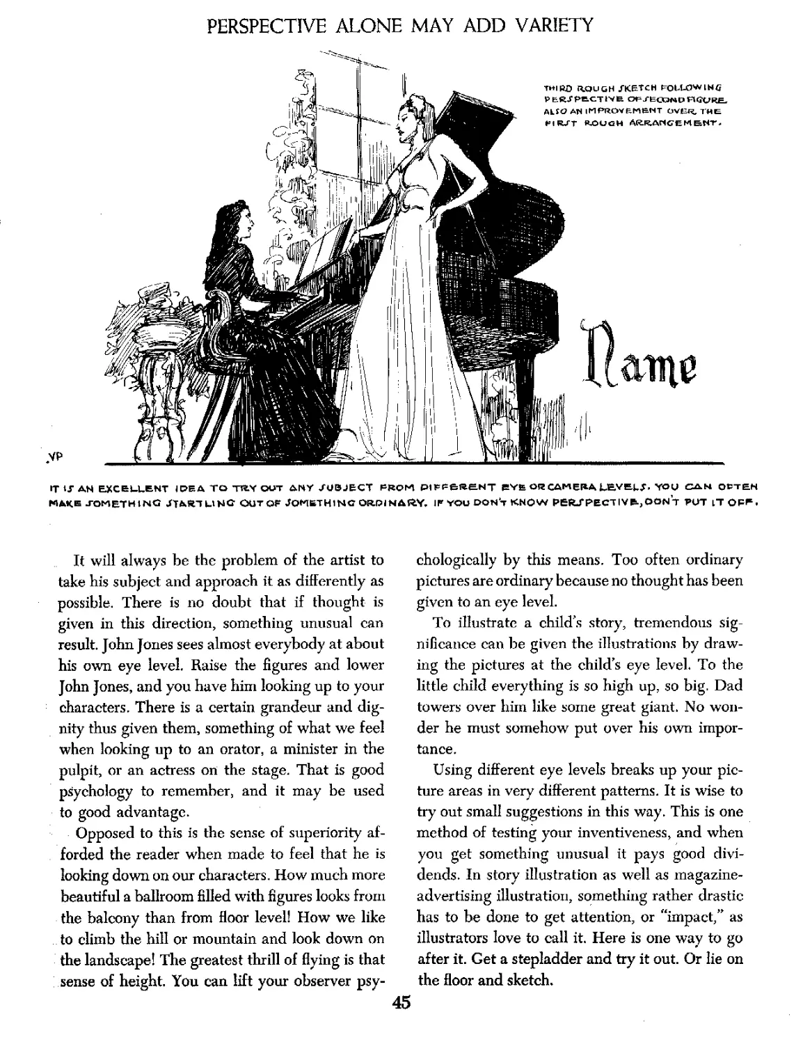
APPROACHING THE SUBJECT IN DIFFERENT WAYS
VP
FOLLOV^inq VM ANb COPY*
44
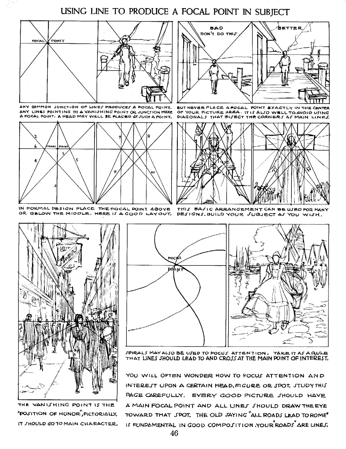
PERSPECTIVE ALONE MAY ADD VARIETY
VP
THIRD RXJUGH /KETCH roLUJWLNfr
P&R/PbCTiVfe CH- rtCOKD HCURE,
ALfQ AN IMPROVEMENT OVER, THE
FlR/T ROUGH АКЕАПСЕИБГСП
IT । J AN EJtCEULENT I PE A TO TBY OUT Л1ЧУ SUBJECT FROM PlFPeRHNT PY£ OR CAMERA LBVE>k/\ YOU CAN QtTEH
MAKE JOMETHtNG /TART MN© OUT OF JOMKTHING ORDINARY. IF YOU DON4 KNOW PERJPECTlVRjOONT PUT LT OFF,
It will always be the problem of the artist to
take his subject and approach it as differently as
possible. There is no doubt that if thought is
given in this direction, something unusual can
result John Jones sees almost everybody at about
his own eye level. Raise the figures and lower
John Jones, and you have him looking up to your
characters. There is a certain grandeur and dig-
nity thus given them, something of what we feel
when looking up to an orator, a minister in the
pulpit, or an actress on the stage. That is good
psychology to remember, and it may be used
to good advantage.
Opposed to this is the sense of superiority af-
forded the reader when made to feel that he is
looking down on our characters. How much more
beautiful a ballroom filled with figures looks from
the balcony than from floor level! How we like
to climb the hill or mountain and look down on
the landscape! The greatest thrill of flying is that
sense of height. You can lift your observer psy-
chologically by this means. Too often ordinary
pictures are ordinary because no thought has been
given to an eye level.
To illustrate a child’s story, tremendous sig-
nificance can be given the illustrations by draw-
ing the pictures at the child’s eye level. To the
little child everything is so high up, so big. Dad
towers over him like some great giant. No won-
der he must somehow put over his own impor-
tance.
Using different eye levels breaks up your pic-
ture areas in very different patterns. It is wise to
try out small suggestions in this way. This is one
method of testing your inventiveness, and when
you get something unusual it pays good divi-
dends. In story illustration as well as magazine-
advertising illustration, something rather drastic
has to be done to get attention, or “impact,” as
illustrators love to call it. Here is one way to go
after it. Get a stepladder and try it out. Or lie on
the floor and sketch.
45
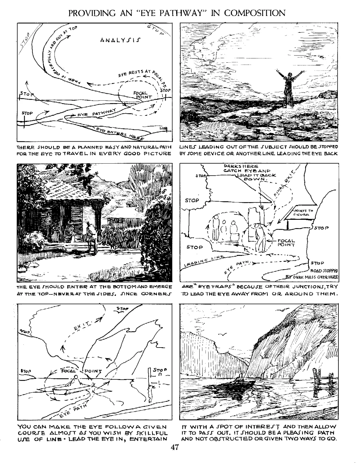
USING LINE TO PRODUCE A FOCAL POINT IN SUBJECT
BUT NEVER FLACE. AFOGAL POINT S Z ACT Uy IN THE CeNTCft
OF YOUR. PICTURE AR£A. IT 4 У AUfO WELLTOAVOID V54NG
DIAGONALS THAT В4УВСТ THE CORNE^J- Д/ MAIN LiNeJ,
any OTMMON JUNOtON OF UNEf РЯОООСЕГ A ^OCAL PQ i Nlt
ANY LlNfcf POINTING TO A VANUHlhG POlNi OR, JUNCTION
Д FOCAL PO((4t. А недр MAy WELL Р(_ДСВ5О AT JTJCH A poi NT,
THf-T ВАДС AfcRANCTEMfeNT CAN UJBD FOR MANY
PE^ICNX.SUIlO your AJSJECT АчГ you wuh.
IN PORTAL P&5IGN PLACE TWE FOCAL POIN1 4©OYE
OR- (3S-LOW THE MICKLE. HERE. U A CQO О kAyOtJT.
ТНЙ VANIJHING POINT 1Г IHE
*pojition of honor." pictorially,
IT SHOULD <R3TO MAIN CHARfcCTEIt
XPIRALJ MAY AL J О BE UJED TO NOCU J" ATT&NT ЮЫ . TAKfe П АГ AQ.UUG
THAT L1NEJ SHOULD LEAD TO AMD CROJTAT THE MAIN POINT OF iNTEftejT.
YOU WILL OFT&N WONDER HOWTO FQCUtf ATTENTION AND
1NTER.EJT UPON A CERTAIN HEAD, PI OU RE OR. JPOT. JTUDY Т«кГ
расгн careful-ly. every good picture, should have
A MAIN FOCAL POINT AND ALL LINEJ" SHOULD DRAW THE EYE
TOWARD THAT ТРОТ. THE. OLD TAYING "ALL ROADJ LEADTOROM6*
IT PUNPAMENTAL IN GOOD COMPOJlTION .YOUR. ROAd/aRE LINEJ",
46
PROVIDING AN “EYE PATHWAY” IN COMPOSITION
LINES LEADING out OF THE SUBJECT ThOULD BE STOPPED
BY TOME DEVICE OR ANOTHER LINE LEA DING THE EYE BACK
there jhould вед plannep ea^y ano natural path
FOR THE EYE TO TRAVEL IN EVERY GOOD PICTURE
THE EYE /HOUL0 ENTER AT THE BOTTOM AND EMERGE
Ar THE TOP— NEVER. AT THe *T I PE x. JTNce COtNER-r
ARC* BYE TRAPS* BECAUSE OPTHEIR J UNCT IО NJ, TRY
TO LEAD THE EYE AWAY FROM! О R. AROu N D THEM .
YOU CAN NTAKE. THE EYE FOLLOW A GIVEN
COURJE ALMOST AXYOUWI5H BY -SKILLFUL
USB OF LlNB * LEAD THE EYE IN, ENTERTAIN
ГТ WITH A SPOT OF INTEREST ANO THEN ALLOW
IT TO PASS OUT. IT SHOULD BEA PLEASING PATH
AND NOT OBSTRUCTED OR GIVEN TWO WAYS TOGO.
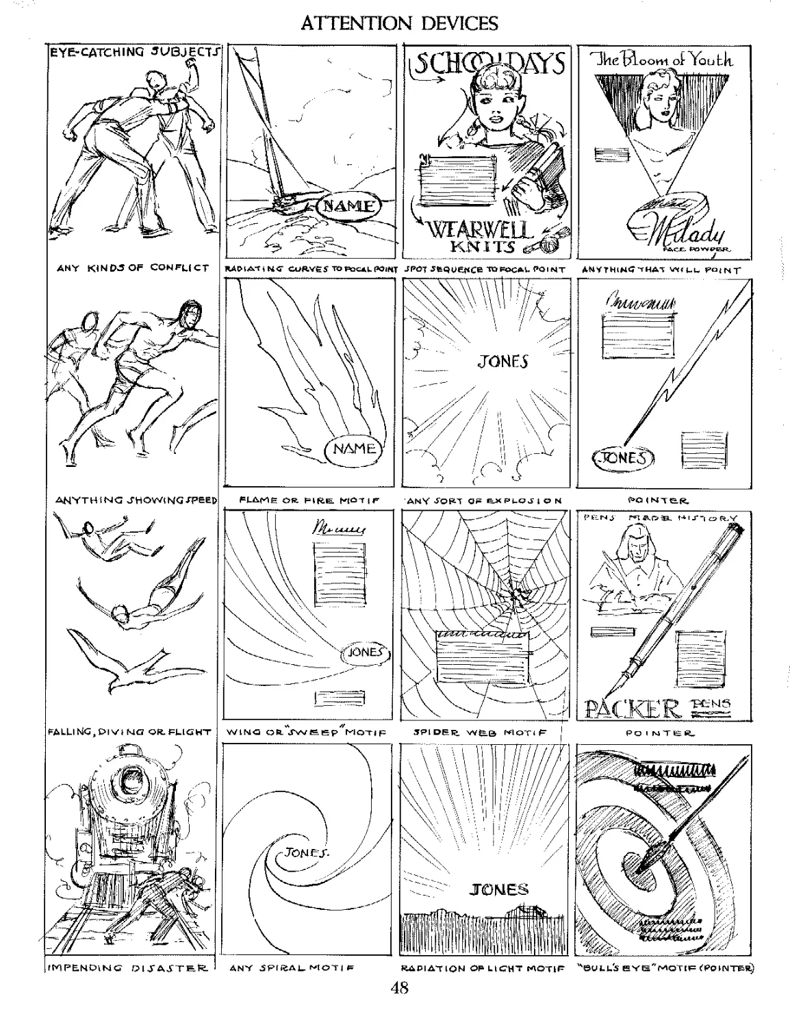
ATTENTION DEVICES
ANY bTOR-T Qf= EJX Pi-QJ 4 О N № < NTe«
ГГИРЕНСНЫСТ O l У AJTEl^
wibia oft. motif
ANY ^PfftALMOTI^
SPl DER, MQTi F ' PO I MTCl^
ЛДР1АТ IQN OF LICHT MOTIF
Hull's eyg/fmoT[f <Pointer)
48
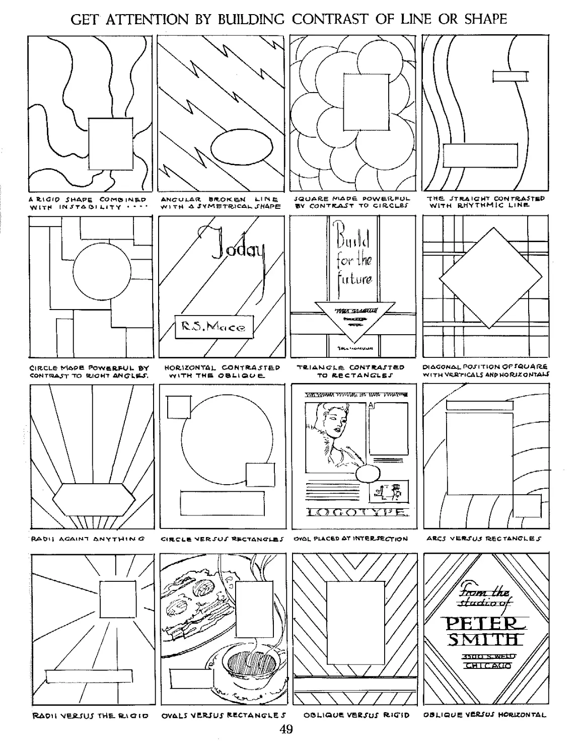
GET ATTENTION BY BUILDING CONTRAST OF LINE OR SHAPE
A fctGtp iHAPE CQMCiMbP SltOK&N LIIX^ JQUARE POW&^FUL THE. STRAIGHT CONTRA^TBf
WITH IN/TAQI 1.ITY * * ’ - WITH A JHAPE BV CONTRACT TO Cl R.CLET WITH RHYTHMIC Ll НЯ
Circle Мар в powerful by
CONTRAJTTO RIGHT ANG'LW.
HQftUCNTAL CONTRAJTBP
^iTH THS OBLIQUE-
T-«.IAKJGkB COHTRAJTfiP
TO RECTANGLE/
DIAGONAL POSITION OFJQOAftB
WITH VERTICALS ANpWOtoZGNTAU
CIRCLE 'W ER JU f RFCTftNG'LEJ'
OVAL PLACED AT INTERJECTION
RAOH YEJtJUJ THB. ft^CMO OVAL! VEJUUJ* fcECTANCLE J
OBLIQUE VEfcJur RJCfD
OBLIQUE YEftJU-Г HORIZONTAL
49
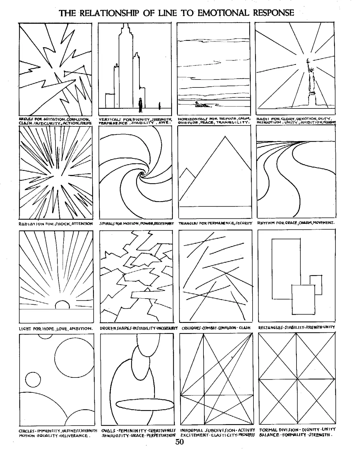
THE RELATIONSHIP OF LINE TO EMOTIONAL RESPONSE
RAVLAT JPN FOR JHOCK^TTENTIOH 5PIRALJ ПЖ НКПЧОН ,ГОШВДЕХ£ПЕ*№*Т TRIA NG LB Г FOR PERMANENCE,/еОЛШУ RNYFUM FOrGRACEГО»АВМ,МОТЕНЕНТ.
&R0KH15HAPEJ ^TABtLiTV-VNCBirAm OBUOUeJ-COMBAT-GWRplOH- CLASH
ШНТ FOR HOPE hLOVE, AMBITION.
RECUNti LE5 -rrtStLH Y-JieEWOTN-UklTY
CIRCLES’ iM^ENJrrf ЛАЯНЕГ/.trmW
MOTION -EQUALITY -DELIVERANCE .
OVALS FEMININITY CEEATlVtNtJJ
5BMSUOJITY GRACE PERPEHJAIWN
IN FOCMAL JUBDl VISION * ACnVITV
EXCITEMENT - ELASTl СПТ’РКаОД#
50
FORMAL DIVIJIQH- OIWITY UNITY
BALANCE• FORMALITY -JTUNarH -
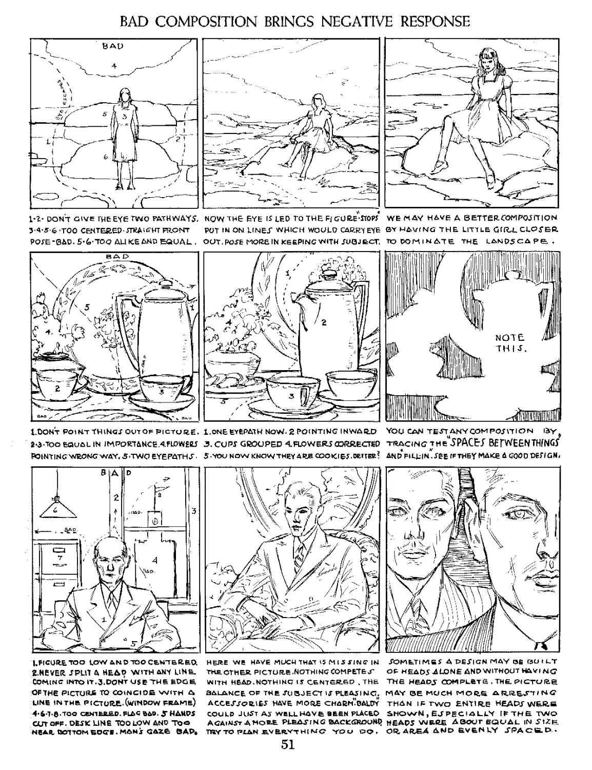
BAD COMPOSITION BRINGS NEGATIVE RESPONSE
don't give TH&EYe TWO PATHWAYS
У 4-S-6-TOO CENTERED* FRONT
POSE-0AD. S’^-TOQ AU KE AND EQUAL .
NOW THE EYE [5 LEO TO THE Fj GURe'stOp/
PUT IN ON LINET WHICH WOULD CAURT EY&
OUT. POSE MOI2EIN KEEPING WITH SUGJ ЕСГ,
WE MAY HAVE Д BETTERCOP1POJITIQN
SY HAVING THE LITTLE CHfLL CLOSER
ЮСЮМ1МД7Е. THE L^ND5 С A P&, ,
l/DONT POINT THINGS OUT OP PICTURE.
Й*ЗЮО EQUAL IN IM PORT ANCEAFLO WEES
pointing wrong way. sjw eyepaths-
1.ONE EYEPATH NoW< 2 PO(NTtNG INWARD
3. CUPS GROUPED <FLOWERS CORRECTED
5-YOU NOW KNOWTHEY ARJB CQOKfBJ.DElTEfc*
YOU CAN TEST ANY COM PCS HI ON liy*
tracing jheu5PACEJ BEfWEENTHfNGy
AND FILLIN^SEE IF THEY MAKE A GOOD DESlGNi
LRCURETOO LOWANDTOOCEWTBR.&Q
£NeVER JPHT A HEAD WITH ANY LINE,
COMING INTO IT.S.DDNT USe TH В EDGE
OFTHe PICTURE TO COINCIDE WITH £b
LINE 11ЧТНЕ PICTURE,.(WINDOW FRAMe)
4* 4-7-©.TOO ceNTEJL&CL FLAG BAD. У HAUDS
CUTOFF. DESK LINE TOO LOW AND TO^>
NEAR ВОТ TOM BOGS . MAN j GAZe BAP*
HERE WE HAVE MUCH THAT *5MlS JING* |Ы
the, other picture .Nothing competent
WITH HEAD.NOTHING IS CENTERED . THH
SDMBTlMfiS Д -DESIGN MAY Ofi C3U t LT
OF HEAOS ALONE AND WITHOUT HAYINC
THE HEAD J OOMPLfeTB , THE. PfCTCJlte
BALANCE o₽ THE SUBJECT IS PLEASING, MAY BE MCJCH ARRESTING
ACCESSORIES HAVE MORE CHARnVoALDY THAN IF TWO ENTIRE HEADS WtRfi
COULD JUST as WELL have SEEN PLACED SHOWN > ESPECIALLY if the two
AGAINST A MORE PLEADING BACKGROUND HEADS WELC£ ABOUT EQUAL iNSlZB
TRY TO PLAN £V&ftY7H[MQ yo ci DO , OR, ARSA AMD E.VEN LY J"PACtD >
51
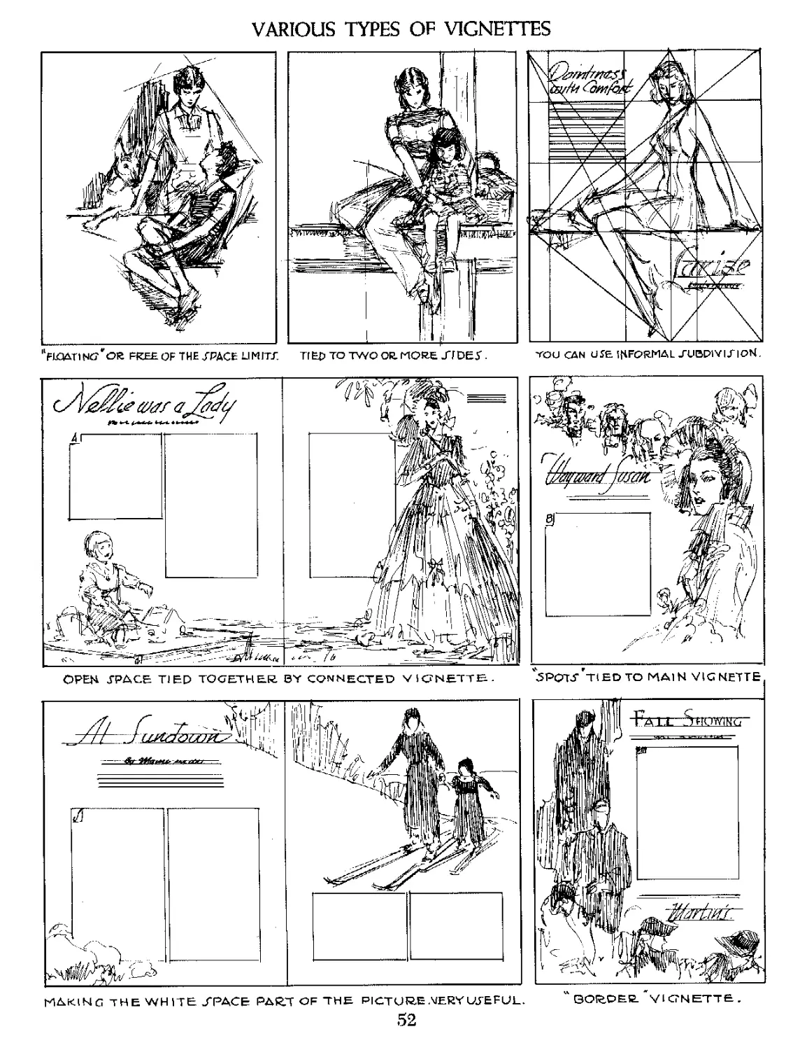
VARIOUS TYPES OF VIGNETTES
"FlCUiTI Nt? ' OR FREE OF THE ТРАСЕ LI M ITT. ТГ E£> TO TWO OR. MORE J7 DET. YOU CAN U SE IfiFORMA L -TUBP1VI -Г I ON.
ОРЕМ .ГРАСЕ TIED TOGETHER, BY CONNECTED VIGNETTE- ’5PQTJ‘'tIED TO MAIN VIGNETTE
MAKING THE WHITE J*PACE PART OF THE PICTURE .MERY UTEFUL. " BORDER ' VIGNETTE .
52
A VIGNETTE IS A DESIGN PURE AND SIMPLE
<DAR.K MATT AOAINJI LIGHT)
ATLANTIC CITY
^relief" vignette
(LIGHT M A J"J" ACTA I NTT DARK)
M E ID I CAL 'RESFAliC H OF AM Гт Ы СЛ
KIlTiWy.l;
''sketchy * VIGNETTE.
ANY JlMPLE МАЛГЕ J" VS. EACH OTHER.
VIGNETTE tied TO product
COMBINATION VIGNETTE. W ITH A JOLID PICTURE AS DOMINANT.
COMBINATION VIGNETTE DOMINATING QV ER. TQUAR.E UN ITj".
VICNETTE TIED TO COPY TRACE
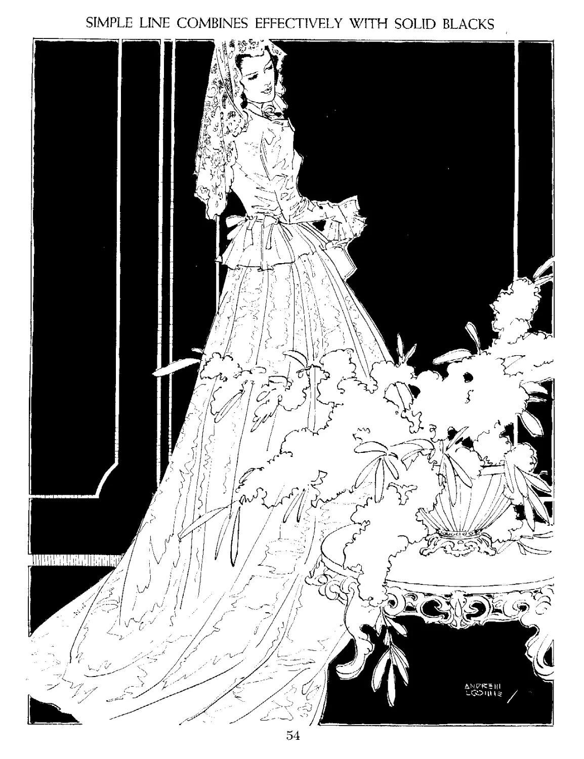
SIMPLE LINE COMBINES EFFECTIVELY WITH SOLID BLACKS
54
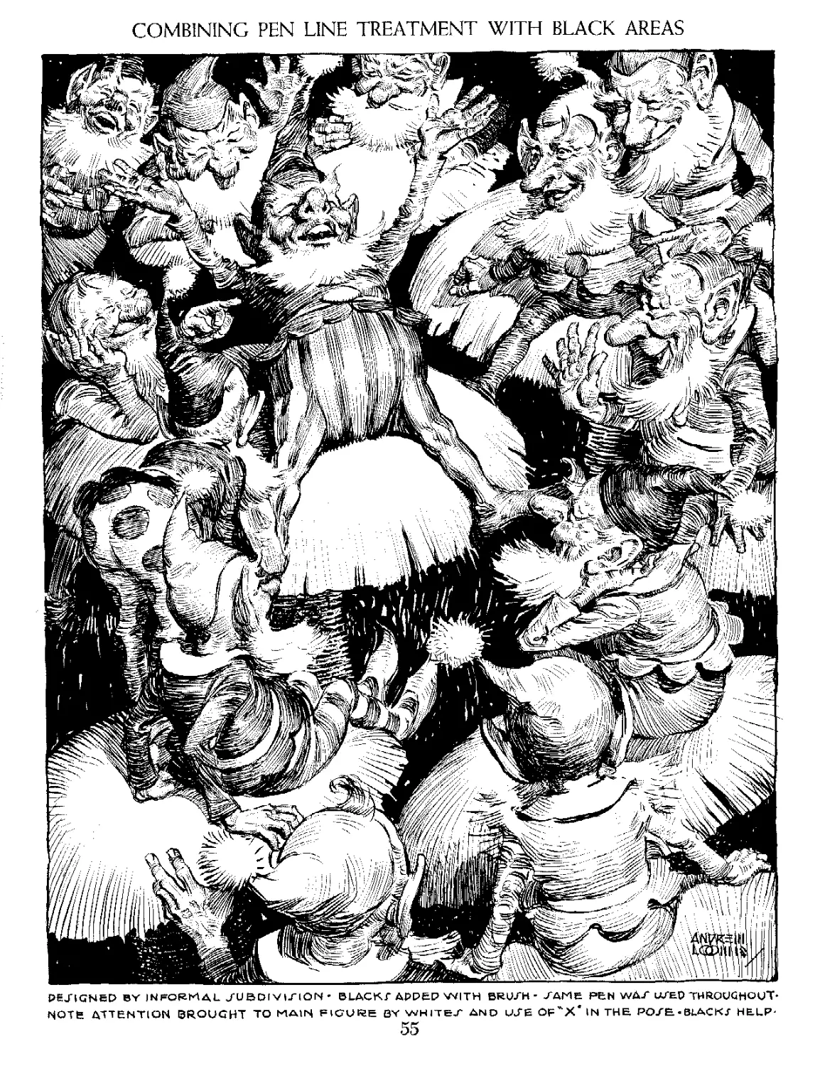
COMBINING PEN LINE TREATMENT WITH BLACK AREAS
PEJTGNED BY INFORMAL JU BDIVIriON - ULACKT APPLE WITH BROTH- JANE PEN WAX UTF-P THROUGHOUT*
NOTfe ATTENTION BROUGHT TO MAIN FIGURE BY WHITE/ AND LATE OF^X* IN THE, POZE.-BLACKJ HELP-
55
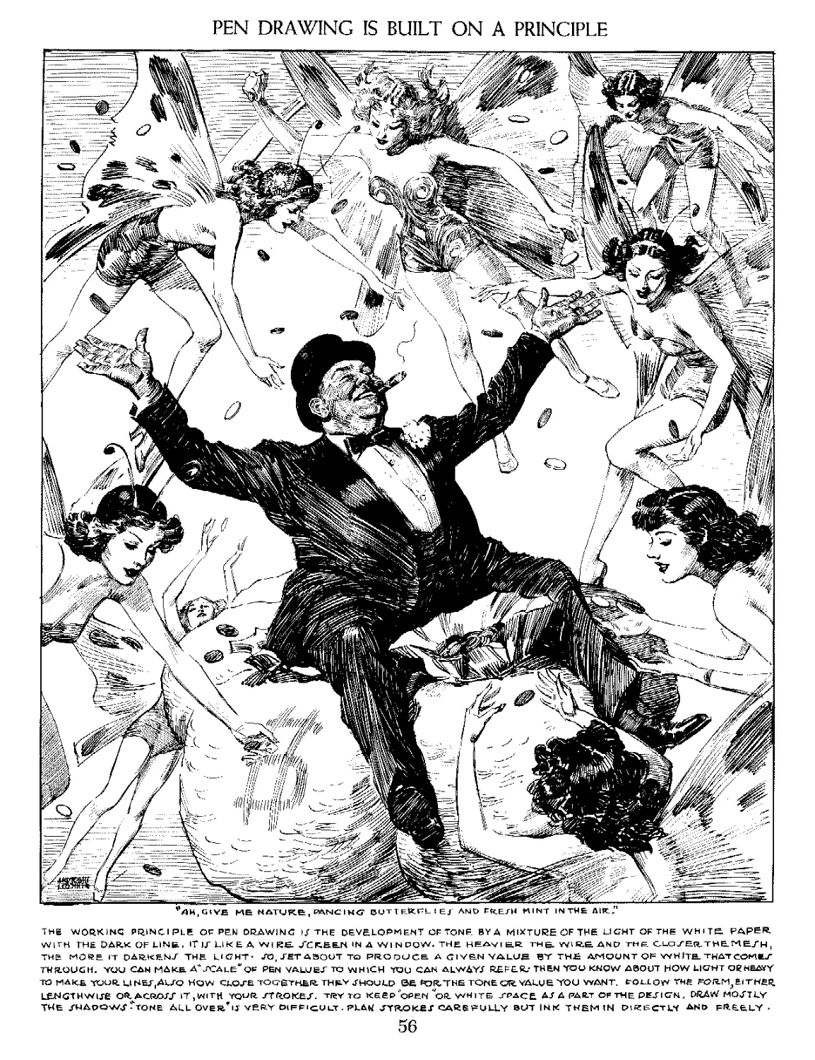
PEN DRAWING IS BUILT ON A PRINCIPLE
ME NATURE, PANCIHG T E-kPL 1 E J AMO PRE/M MINT IN THE Д1К?
THE WORKING PRINCI PLE OF PEN DRAWING I/ THE DEVELOPMENT OF TONE. BY A MIXTURE OF THE LICHT OF THE WHITE. PARER.
WITH THE DARK OF LiNfe P lTlJ"Lk£ Д W| RE. /СГ.ЕЕН IN Д WIN DOW- THE H^AVI E.R THE. Wl R.E. AND rH£ Clu/E^THLME/H ,
THEL МОЙЕ IT DARKEN/ THE. LIGHT* JO, ГЕТABOUT TO PRODUCE A Cl V&N VALUE BY TH£ AMOUNT OF VYHITEl. ТНДТСОМЕ/
THROUGH. YOU CAN MAKE A/JCAlE^QF PEn V ALU EX TO WHICH YOU CAN ALWAYJ REFER,' THEN YOU KNOW ABOUT HOW LICHT Og HEAVY
TO MAKS YOUR. LIHEJ’iALZQ HOW CkO-TE TOQeTHtR. TH|LY JHOULD &E fC»R,THE TONE OR. VALUE YOU WANT. F0LLQW THE FOR.M^El’THER
LEJNGTHWlje OR АСЙОДГ iT , МГЦ vquR JTRQKEX. try to KEEP'open OR WHITE /PACE AJ А PART OF THE РКЛ CM, DRAW MOSTLY
THE JWApOWj-'tONE ALL Over’u VERY DIFFICULT-PUW JTR.OK£X CAREFULLY BUT INk THEM1N DIRECTLY AND FREELY*
56
PEN DRAWING IS CONCERNED MOSTLY WITH SHADOW
•I
RENDERING OF LIGHT AND-TH ADO W. THE
DON'T WOtVIY JO MUCH OVES. JTlCOKE/ AT OVER THE STATEMENT OF GOOD WH ITEJ,GftEYT BLACK
THE GENERALAPPROACH TO PEN DRAWING
1Г THE TAME АГ ALL OTHER MEPIUMi-THE.
ONLY DIFFERENCE 1Г LETT MODELING IN
THE L\GHTT. KEEP THEM VERY /IMPLE.
57
PEN-AND-INK PROCEDURE
J TART WITH A JTR.ONCLY
LIGHTED PlECfe OF
copy-clear, light
AND JHADOW, NOT
GREY AND -fUBTLP .
MAKE A PRELIMINARY R.OUGH^ET T I NQ DOWN THE
ШТВМЕЫТ OF МДЛ ARRANGEMENT IN THE/IN1PL6/T
POJJI0LE TERMf. DO NOT WORRY YET ABOUT TECHNIQUE.
CONCERN YOURJE.LF ИЛТНОЕЯСЫ OF BLACKJ,GR6Yf,WHlTBJ.
TH |f WILL PRODUCE A GUI DE TO VAkU EJ TO BE PUT IN THE
FINAL WORK ANO THe"pATTER.N ^EFFECT OF THБ WHOLE.
GOOD PREPARATION IJ MORE THAN HALF THE BATTLE.
MAKE JTUOiEJ" OF THE HEAD
OR. OTHER. IMPORTANT PART J,
IN ORDER. TO PLAN YOUR ЛТКОКЕУ.
<THITTAVET MUCH GR.I EF ! )
WHEN YOU KNOW WHAT THE VALUED ARE GOING TO BE, IT 15 ЕД51ЕЕ TO PUT THEM DOWN NEXT TIME.
58
FOLLOW THE FORM WITH THE PEN STROKES
тимолу AFTERNOON
59
DECORATIVE TREATMENT IN LINE
COMBINATION PEN LINC ANO BROTH ON WHITE J'MOQTH JTRATH MORE. BRI JFOL. CHANY GOOD EFFECT! ARE
ролл в lb by th и’ согн&нчатюи.тне dejtgn was worked out st ufiNG informal tubdivixion.
60
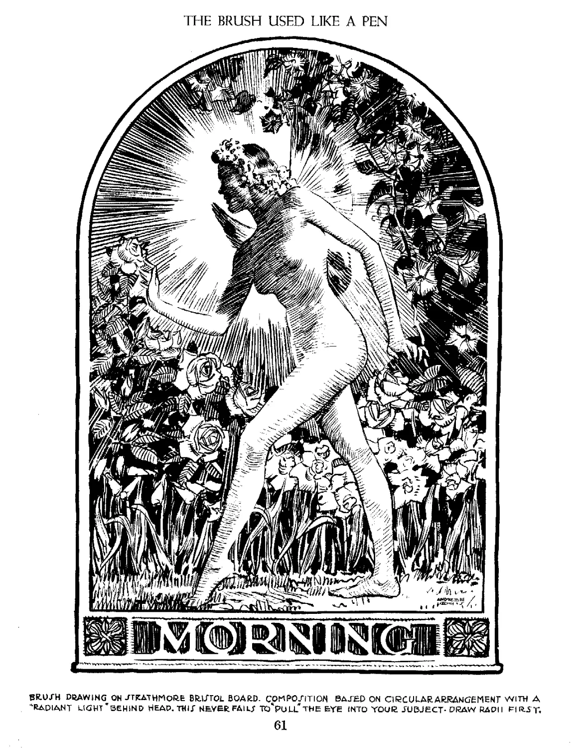
THE BRUSH USED LIKE A PEN
8R.UJH DRAWING ON JTRATHMORE BIWTOL BOARD. COMPO/iTION BATED ON CIRCULAR ARRANGEMENT WITH A
"•RADIANT LIGHT ’ BEHIND HEAP, TWIX NEVER FAlLT TO*PULL THE EYE INTO YOUR SUBJECT- DRAW RADI I F1R.ST,
61
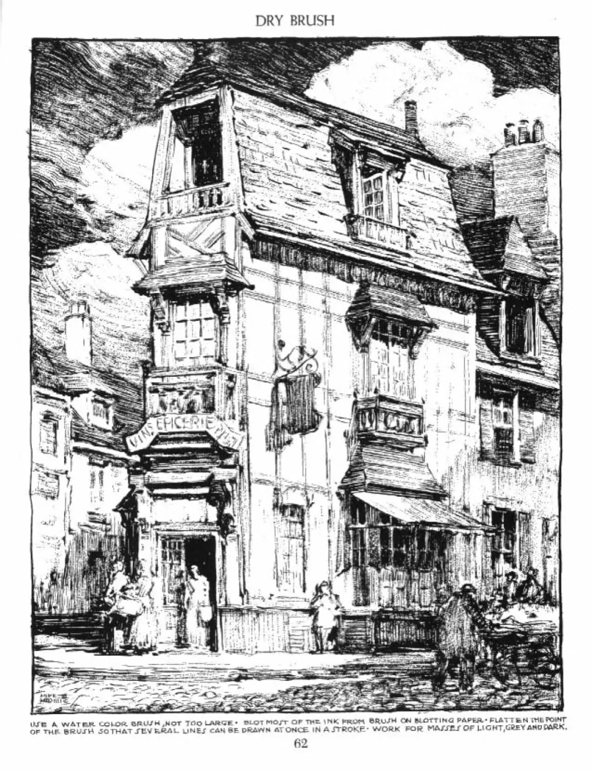
DRY BRUSH
1ЦС ДДМАТГЛ CCjUOR ВРН/Н j^QT T^o LARGE • BLQ7 NO/T OF TWE. ©RUJH ON BL-OTT IH<2 PA PEA - FLATT fc N СПЬ COtNT
OF ТНГ SRUJH 3QTHAT J'tlV fc-RAi_ kJ HE J £AH ЙЕ D-feAvYN AT О HUE- IN AJTROKP’ WORK ₽QR LIGHT,GftEY AHD ЦДЙ.К.
62
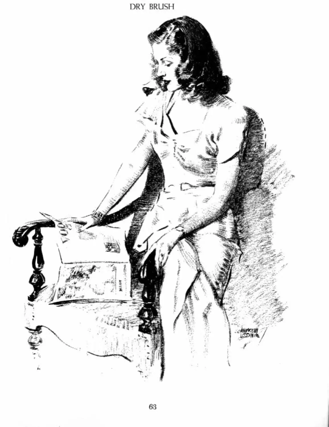
DRY BRUSH
63
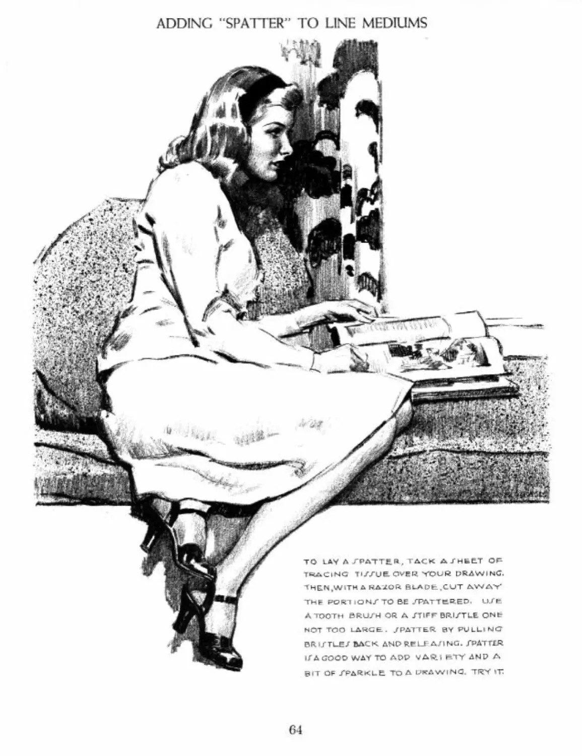
ADDING "SPATTER" TO LINE MEDIUMS
то ЕДУ Л ГРАТТа « , TACK A /HELT OF
TRACING TIZZUE OVER YOUW DRAWING.
THELN.WiTH A KAZOR. BuADt.CUT AWA'Y'
THF PORTiONXTO BE .TftTTtRED. Wt
A TOOTH BRUZH OR A /TIFF BR.I/TLE ONt
HOT TOO LARGE. /РДТТЕ.Л 0Y PULLINC
BRl/TUE/ back ANDRELF АЛ NG. ZpATTIR
I/A (j'OOO WAY TO ADP vARiHTYANPA
BIT OF TPARKLE To A CHAWING TRY IT
64
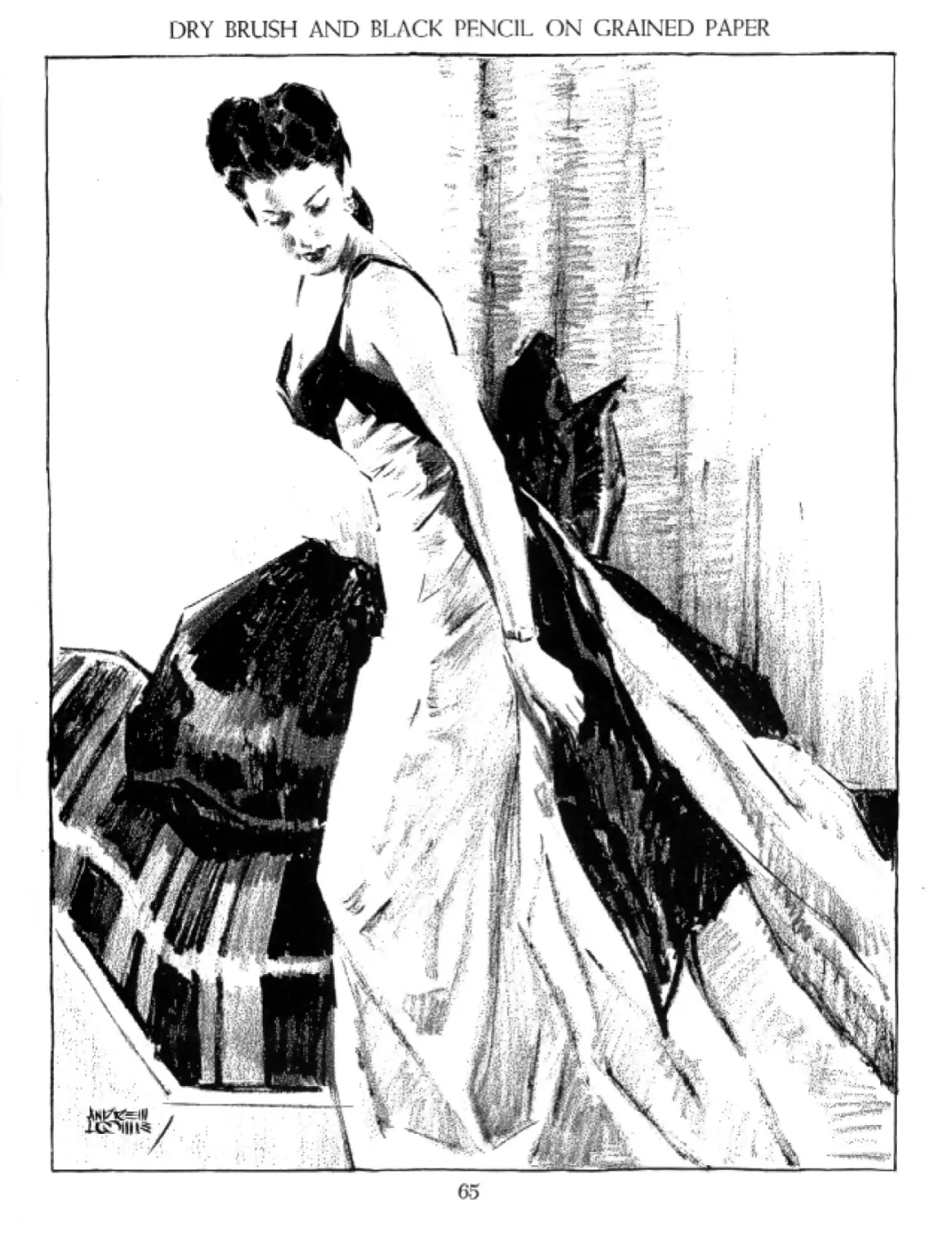
DRY BRUSH AND BLACK PENCIL ON GRAINED PAPER
65
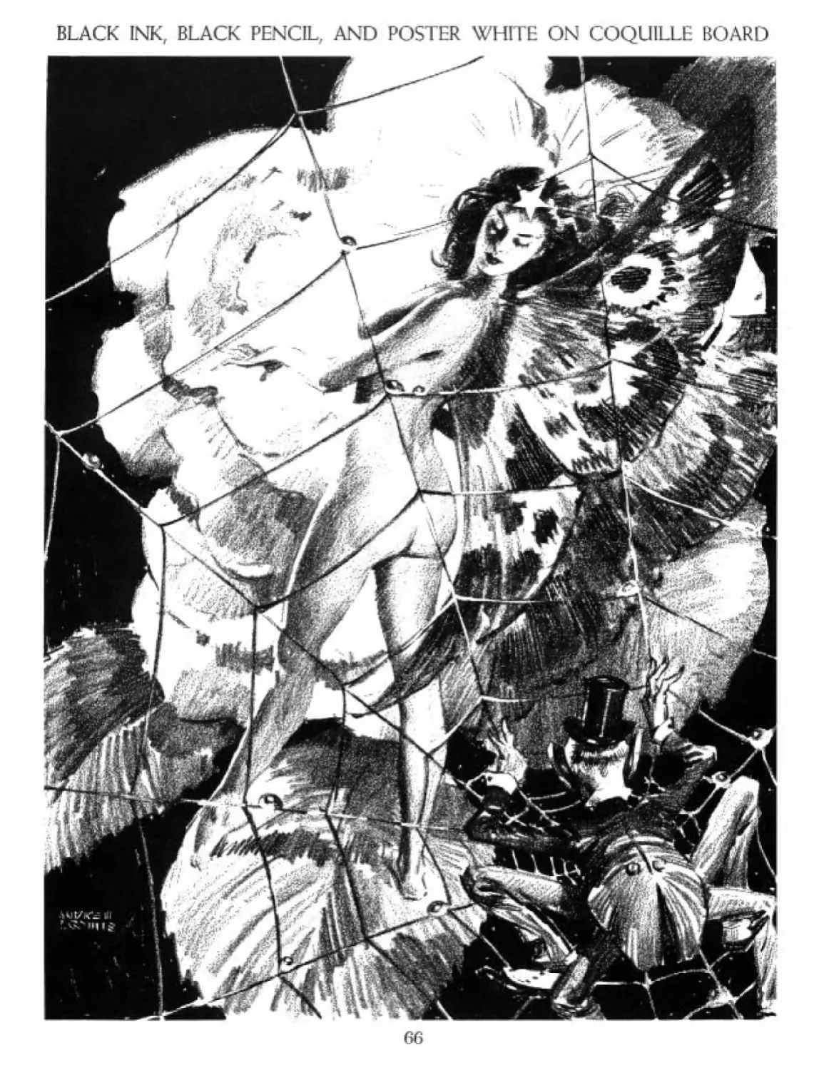
BLACK INK, BLACK PENCIL, AND POSTER WHITE ON COQUILLE BOARD
66
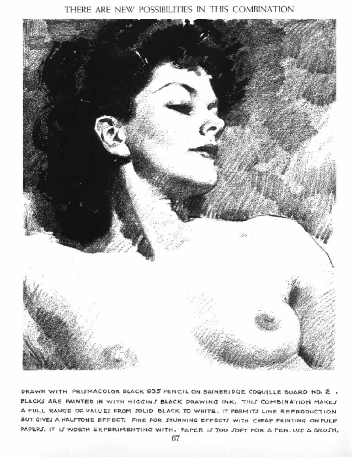
THERE ARE NEW POSSIBILITIES IN THIS COMBINATION
DRiWN WITH PRIJMACOLOR BLACK ©ЭГ PENCIL ON BAINBRIDGE. COQUILLE BOARD HD. 2. -
BLACKJ ARE PAINTED IN WITH HIGGkNJ BLACK DRAWING INK. ТН1/ COMBINATION MAKE/
A FULL RANCf- OP s/ALUEJ PROM TOLlU BLACK TO WHITE. IT PbRMlTJ LINE REPRODUCTION
BUT CIVEJ A HALFTONE PFFECT. FINE FOR JTUHHINC EFFECT/ WITH CHEAP PRINTING ON PULP
PAPER/. IT I/ WORTH EXPeRlMENTINC WITH. PAPER IT TOO /OFT FOR A PEN.WE A BR.U/H.
67
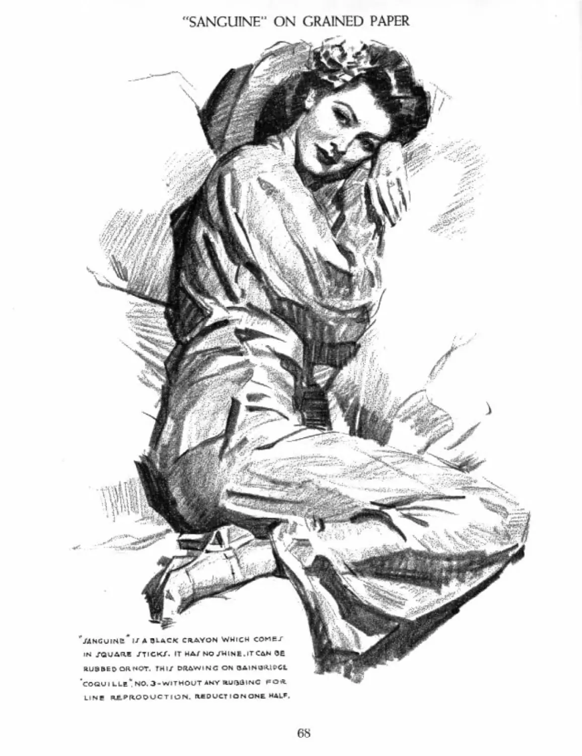
"SANGUINE11 ON GRAINED PAPER
THIJ t>n^iNG ON BAINSjVUVCt
Ll Nf RJt PRODUCTION. ItBDUCTIONONE **4кЛ.
68
BLACK PENCIL ON GRAINED PAPER
DRAWN WITH PRMMACQLOR. BLACK PENCIL ON
BAINBRIDGE COQUILLE THIf PRODUCE/
A HALFTONE EFFECT FOR LINE REPRODUCTION.
DRAW LIGHTLY IN OUTLINE. WHEN IT IJ ГД115-
FACTORY, ADD GREY/ AND PARKJ. DO NOT ERAJE,
69
DRAWING PROCEDURE
THIRD JTAGE.
MODELING OF
PLANEJ-
GET GOOD COPY^BUT-
DONT JIAVUHLY COPY IT.'
THERE ARE MANY WAY/ TO DRAW
DRAW YOUP WAY, PUT MAKE. IT
a logical pkocepure-don't
TRY TO <JO EVERYTHING AT THE
Mme time, all drawing jy
PROPORT ION - IT I Г EITHER JU5T
LINE Oft. THE PEN PER.' OF
LIGHT ON FOP-M. EVERY AREA
HAT ITT OWM PROPERTY nFBEINi;
EITHER IN LIGHT,HALFTONE OR
jyacow. you mujt pea de which •
SECOND /TAGE
REPARATION of
LIGHT ANDJHADOW
»W*4TE«|ALI- COQUiLl£*3 - PrilJ-f-WCCMXJfc BLACK
70
DRAWING, ABOVE ALL ELSE, PUTS YOU OVER
l HAVE LEPTTHII DRAWING INCOMPLETE
_TO IT WH.L/KOW THE PROCEDURE. GET «UP
• *
OP rttAWING CRUTCHEJ ANO MAKE. YOUVELF
DO IT A1_L. THE ONLY WAY ONE GAN DRAW If TQ
PKAW continually, when YOU do it,YOU GAIN
MOMENTUM- IF YOU CH EAT AT IT—YOU LO/E.
71
BLACK AND WHITE PENCILS ON GREY PAPER
ONP OF 7WC OF/T WAVZ TQ MAKE PRELIM I Г+ART JTUOLEX OZE THE TONS OF THE IWi UGHTZ THE PK«CIL if FOAlHC
HALFTONE/ AHO PARK/. wHiiS/ ark U/eo Only FOR, HichLi<?HTZ on. WHITE Aft<AZ. CHARCOAL ano CHALK AQE EQUALLY coop,
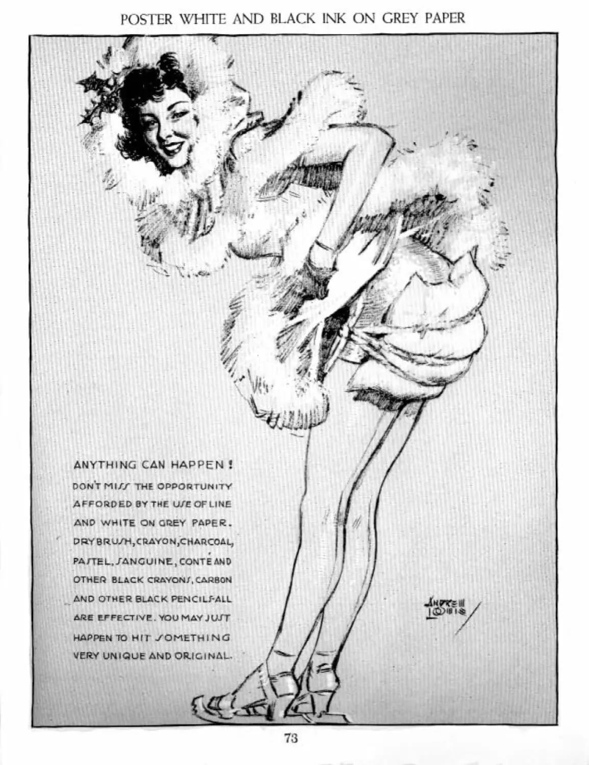
POSTER WHITE AND BLACK INK ON GREY PAPER
73
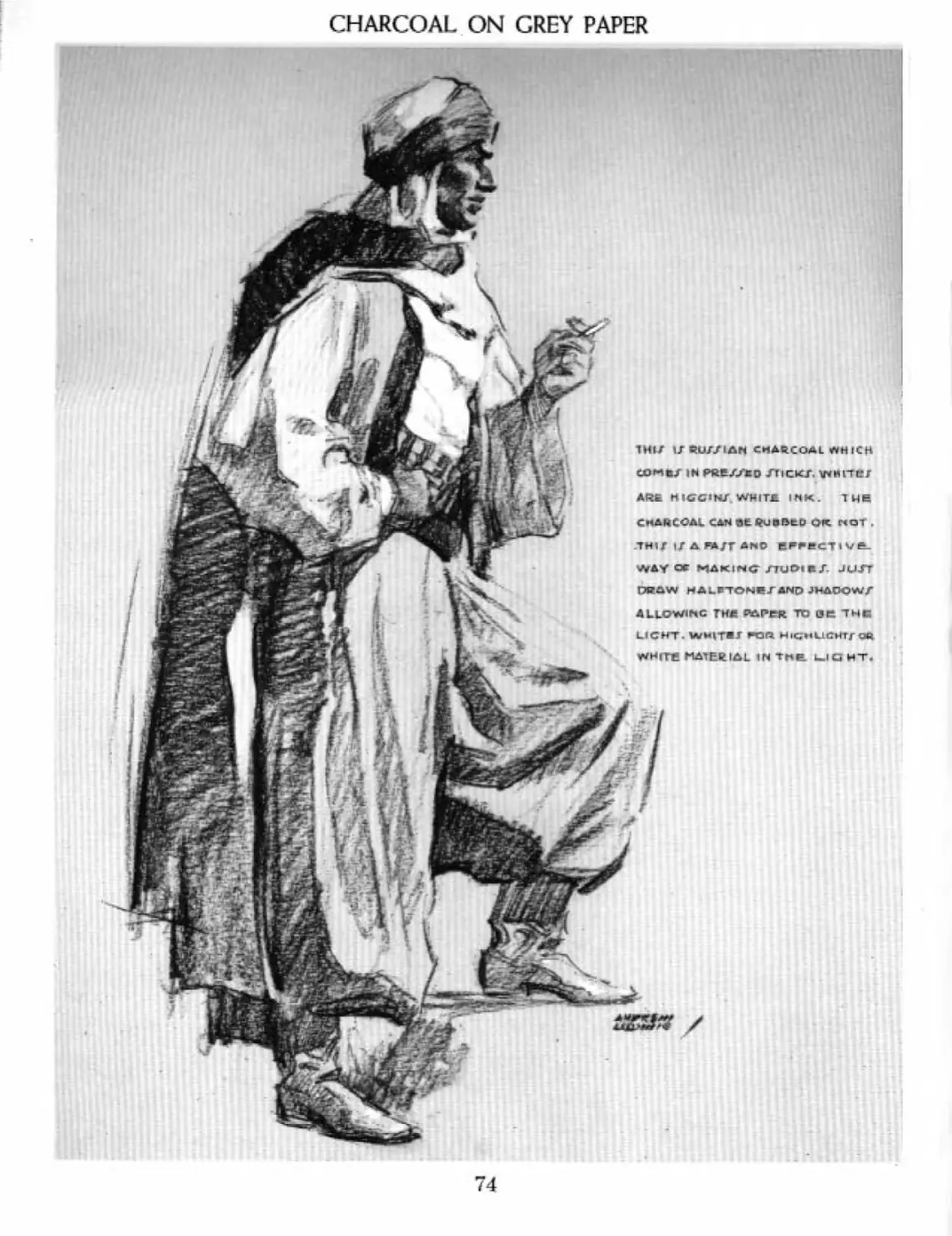
CHARCOAL ON GREY PAPER
1Н1/ URUr/lAN CHARCOAL ЛН1СН
CJOMfc/ IN PfcE/Zeo ХТ1СКЛ VMHlTKJ
A№ HK№NLT V^HITZ. INK. THE
c MAH COAL CAM at Q<J в В to or NOT .
ТН1/ If A FAJT AhO BP^CTiVt.
WAY or MAKING nu&it J. Jurr
DRAW МАкГТОНе/ЛИр JHADOWS
ALLOWS TH* PAPPR TO OR "THCi
LICHT. WHITE* «ft HicjmLlCHTf OR
WHiTfi MATERIAL IN Tne LIGHT.
74
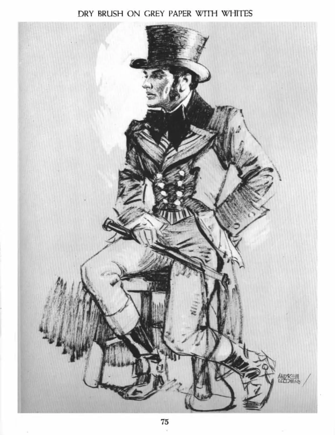
DRY BRUSH ON GREY PAPER WITH WHITES
75
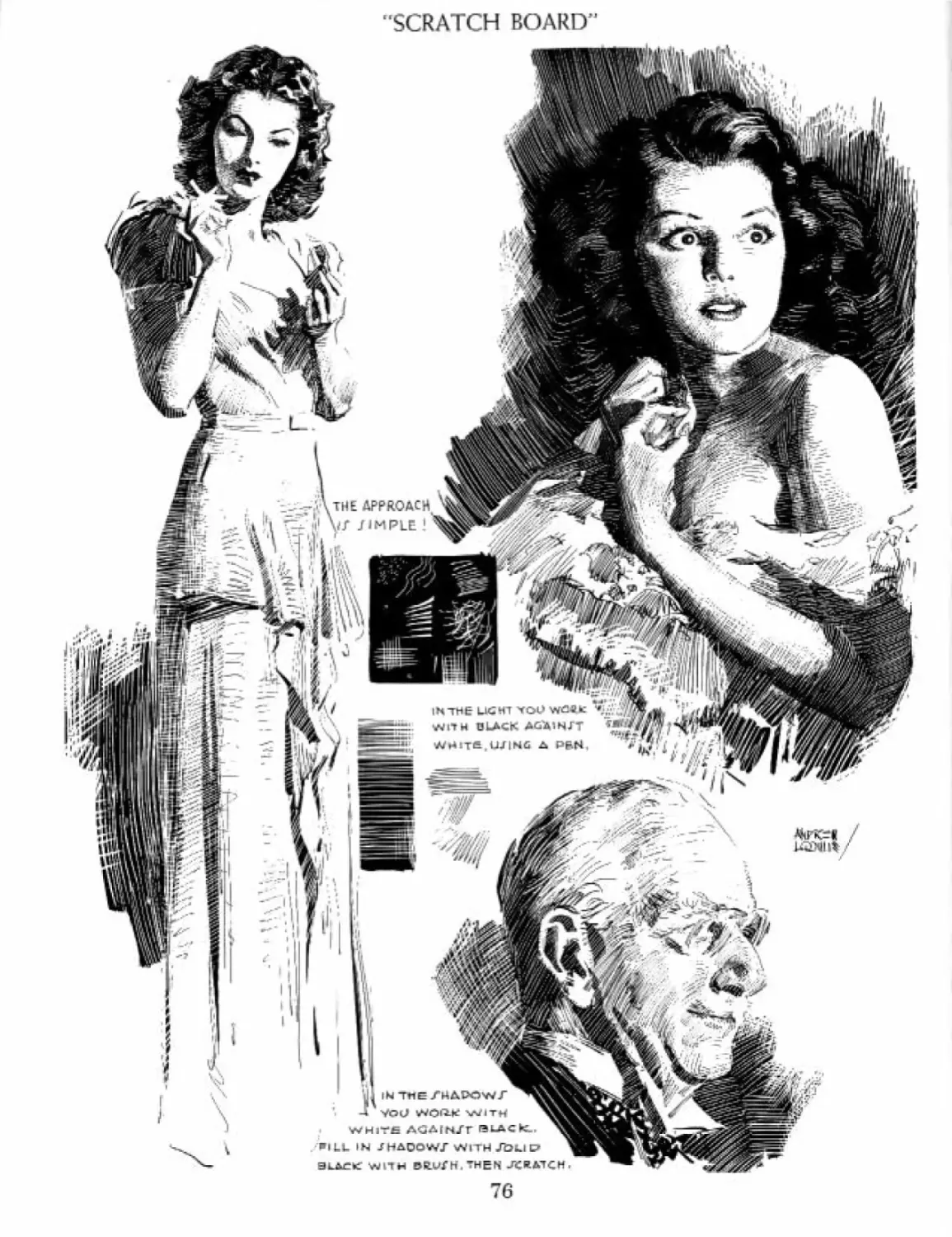
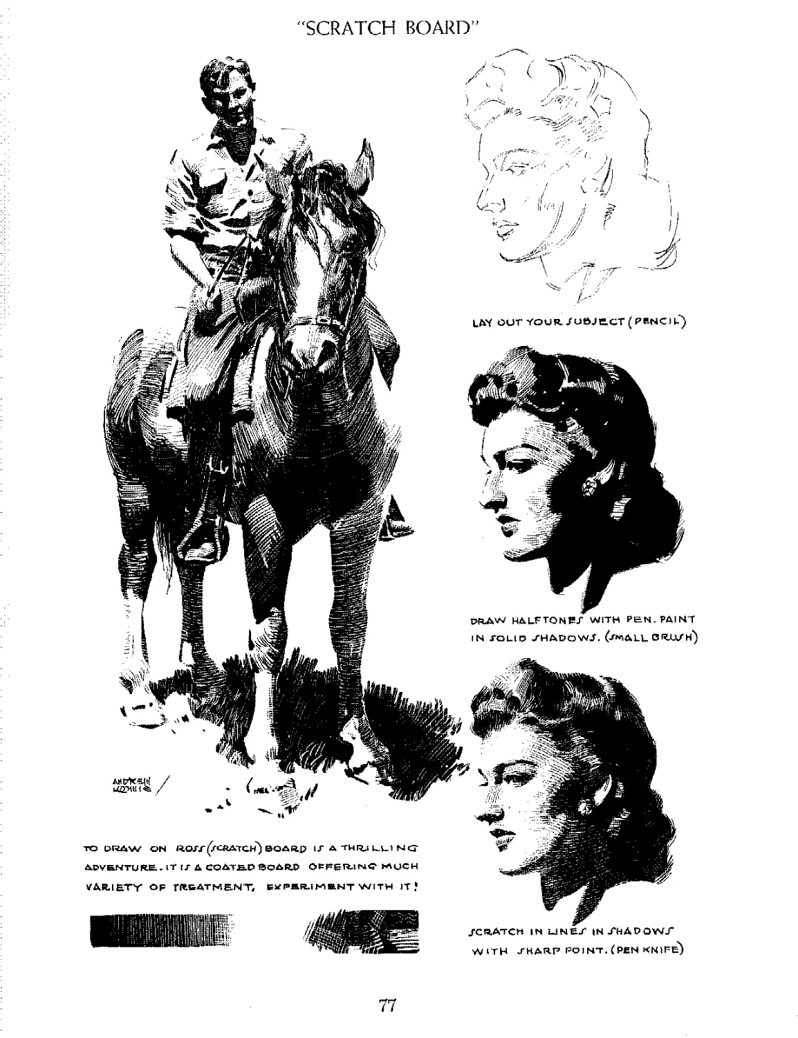
SCRATCH BOARD"
7G
'SCRATCH BOARD”
JCRATCH in UNH/ INAiAPOWT
WITH /НАЯР POJNT. (PEN KNIFE)
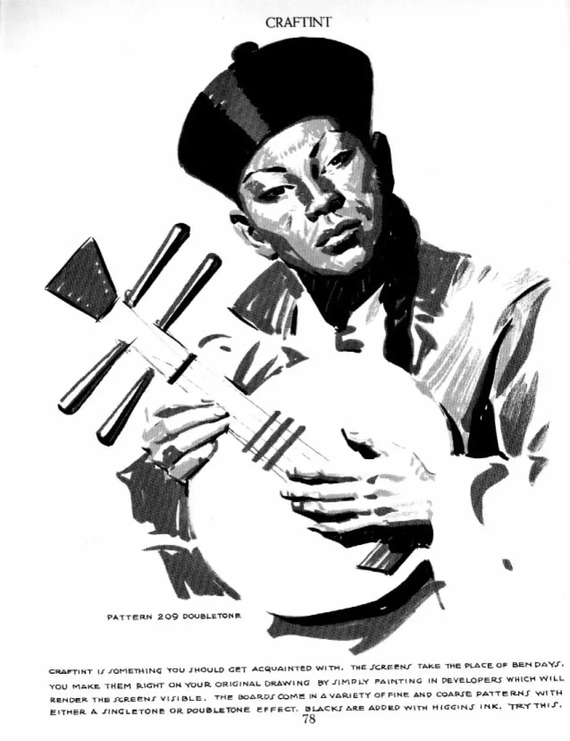
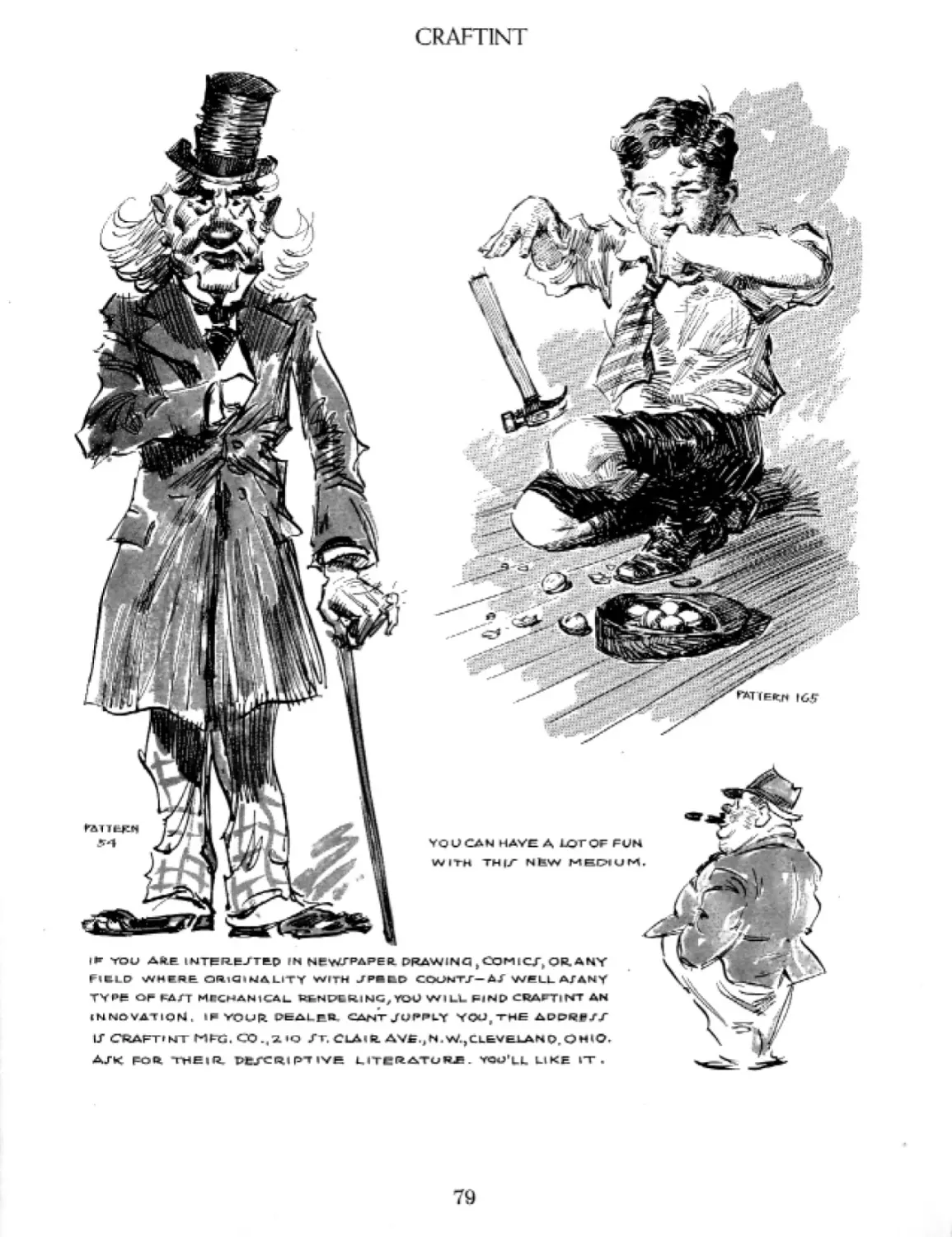
CRAFT1NT
CRATTIHT IS SOMETHING *OU JHOULQ GET AC«UAI N TCP Wl TH. THE JGR.EEW TAKE THE PLACE. O₽ BEN PAYS.
YQU МДКВ, THEM Й.*СНГ OHYOUR ORIGINAL DRAWING &Y SIMPLY PAINTING IN PEYELOP6.RS WHICH WILL
йЕниек TH» лиеемг visible, the boards Come in a variety of fine anp coapse рдттеин S with
EITHER A JINCLETONE OR POUELKTPNE EFFECT. BLACKS ARE ACDfcD WITH HIGGINJ INK. TK'l'TH'J'.
78
CRAFT1NT
I* YOU AR.E 1WTER.EJTEP
F'KLD WHERE ORlQ»M4LITT WrrH JP«BD СООЫТ/-Д/ WELL AMNY
ТУ₽е OF EA/T MECHANICAL RfcNPLRING, fOU WILL f=iNP CRAPTl NT AN
INNOVATION. IPYOUR DEALER CANT J4JPI4Y YOUf THE ADPRf/X
LT CRAFBMT M^G. CO.(2*Q JT. ClAiR. АУЕ.Д W.,CLEVELANOr0НЮ.
ajk гол THEira, pt/cc^i pt ive мтеггдтив£. ton’ll like l-t .
79
РАИТ TWO
Intensity of light in relation to shadow,
IFHERE ARE
2. Relationship of value to al! adjacent tones.
3. Identification, of the nature and quality of fight.
4. Incorporation of the influence of те Лес Led light.
KT^one is the degree of value between white
I. I and black—the lightness or darkness of a
[ value in relationship to oilier values. Tone
jjthi! visual appearance of the mcniient” as af-
fected by light and reflected light on a surface, nr
by lack of light, producing darkness. Everything
h.bJts own or "local value," which can be bright-
tfitd or darkened by light or the lack of it, The
winter is interested on tv in the effect of lisht nr
о
hdaiKS on the local value, and not in the local
toluc itself. So when we speak of tone we mean:
Ww light or dark is it in relation to other tilings?
How light is the face in light as compared with the
face tn shadow and with the background, coat.
and so forth? Thus dark skin in bright light ulight
appear very light, or light skin very dark if in
shadow or silhouetted against bright light. Wc
speak of a dress as light pink, middle grey. or dark
blue. We are speaking then of local value or color
and not of tone. In tone value the same dress
might be any one of the three values according to
the conditions of the moincnt or “influence'’ of
light, shadow, or reflected light. When drawing or
painting, we therefore look for the effect, regard"
loss of what it is known to us to he "locally." Al-
most the only time the local value and the tone
value are the same is in a neutral diffused day-
light.
BASIC INTENSITIES OF LIGHT VERSUS SHADOW
FIR. J Г IMTENJITY
LIGHT MJHADOW
1TONE .SEPARATION -LT VT 5(1,
DIFFU/SD LIGHT
FOURTH INTENSITY
4 TONFJ REPARATION
SIHOnQ ARTIFICIAL LU7HT
FIFTH INTENSITY
S TO NET 5 E PARA I ION
J'PQTLIljWT ih pap.k
JECOND INTENSITY
LIGHT JHAOOW
210 N Г J 5F PA RAT | О N
HAZY JONI IGHT
THIRD IN ГЕМ/1
Light jhai
i
3 TONE J" JE PA RAT К
FULL JUN LIGHT
UM IT OF IN TEN JIT
i ШшКш
FULL J’EP^RATlON
Ряде T I СЛ Li_V El LACK Ti
82
THE FOUR PROPERTIES OF TONE EXPLAINED
tVeJaww that so-called “white’' skin is not really
-u
white. However, it may appear white in a photo.
Wt know it is not black, though shadow can be
very black on flesh in photographs. 'i’Eic camera
। thru is, theoretically, recording tone, the "influ-
ence of the moment ’ It is true that film and paper
I boot always record tune truthfully or as the eye
seci it, but it is tom? nevertheless.
. Wr can take photos or draw and paint pictures
d the same subject in many different sols nF
tallies according to lighting conditions.
So this brings us to the first property of tone.
I. intensify Ы light hi relation to л/iwdou:.
I All light and shadow bears relationship. The
brighter the light the darker tin: shadow appears,
к contmst. The lower the light the more nearly
flw* shadow approaches the value appearing in
the light. In a diffused light, the lights and shad-
mis become diffused also. In a dim hazy light the
mfitsaiid shadows are very close in value. So we
End that the relationship of light to shadow7 de-
pends entirely upon the intensity of light.
On 1 he preceding page are set up basic inlensi-
fes, Now it is true that whatever degree of dif-
Bwenw (here is bet ween the light and shadow will
iflecl all the lights and shadows consistently
fcoughout the subject If the shadow, for exam-
EkI, is Only one tone darker than the light, thru
eifij jjiftdow, barring reflected light, would be
что tone darker than the lone in the light, all
aiv Eh: iwo tones of difference. Then, whatever
V-
Etee we paint in the light,, we must paint the
jhidaw two tones darker, [’he basic difference
goes on te about six intensities, for that is ahotiE
*11 гЪ values we have between black л ml white.
Any* move would hardly show separation in the
^Kge reproduction. On the next page you will
End a subject worked out in four of the .six inten-
sities. On a black night a figure in a searchlight
iron Id appear to liave black or nearly black shad-
uv.xt?iroughoiit. Hut in a diffused light on я cloudy
Bly the same ligno: would have shadows so close
№ value as to be hardly discernible. These, then.
ar<; the extremes n{ the intensities. So there is no
such thing ns a fixed relationship of light to
shallow. Local valve has little to do with it, and
al! belongs to the Form Principle, the "aspect of
the moment, in relationship to its environment.”
2. Ileifl/ion.shjp of etilue to all adjacent tones.
In any given light, all things are so much lighter
or darker than what they appear against, or what
surrounds them. Thus the "patterns’' or areas
within a picture hour a relationship to one an-
other. If one area, for example, is two tones
darker than another, it has a two-tone-darker
relationship. It is this relationship that must be
held. We enn then place them anywhere in the
scale so long as we keep them two tones apart.
I'hii.s we can key all the values high or low and
still maintain the relationship. It is like mi to sol
iu the musical scale, which can be played high up
or low down on the whole keyboard. xAnoihcr il-
lustration migj.it be the :nakingof л liglit or darker
print of a photo, all the values going up or down
together but maintaining (he local relationship to
one another. That is what wc mean by ‘‘key* in a
picture. If such a relationship of one tone to an-
other is not held, then the subject falls apart, loses
al] brilliancy and relaiionship, and becomes what
is known as "muddy" in value. This is the reason
r
lor dullness.
-3. ideiMificalitm of the quality о/ light-
By the kind and relationship nF values the pic-
ture takes no the kind and quality nF light. If the
values are right the subject appears to be in sun-
light, daylight, or night light as the case may be.
You may be certain that the quality of light you
get into the subject goes a long way in making
the picture beautiful and having a "quality of
existence.’ One part of a j^iclure with wrong
values may suggest a strong light—another part,
a diffused light. This sets up an inconsistency with
nature and makes a hodgepodge of your picture.
All lighting must bn consistent throughout, which
means all values must fail within one of the inten-
sities described and also be consistent, fur only
with true values can we paint light.
83
SETTING UP A CONSISTENT RELATIONSHIP OF LIGHT TO SHADOW
THE VALUE/ U/ED BELOW FOR THE LIGHT REMAIN CONJTANT. THADOWJ DROP PED ONE TONE IN El
5TH IN TENSITY—SHADOWS STONES PA
FOR NIGH-KEYED AND DELICATE LIGHT, USE A CLOSE RELATIONSHIP OF LIGHTTOSH
ALL THE LIGHTS AND SHADOWS MUST HAYE A CONSISTENT TONAL SE PA RATI OH EX
WHEN A SHADOW IS OBVIOUSLY LIGHTENED BY REASON OF REFLECTED LIG
84
2» INTENSITY SHADOW/ SETZTONES DARKER
THAN WHATEVER VALUE USED IN THE LIGHT.
3kD INTENSITY- MOW ALL SHADOWS
THREE TONES DARKER THAN VALUE IN Ш
4™ INTENSlTY^JHADOWS 4TONES DARKER.
NOTE THAT LIGHT APPEARS STRONGER AS SHADOWS ARE DARKENEC\THOUGH ACTUALLY!!
MIX A SCALE OP EIGHT VALUES FROM WHITE TO BLACK .FOR. ANY EFFECT OF LIGHT,WE СД
WORK DOWN FROM WHITE TQ DARK. THEREFORE WE CAN ONLY ATTAIN BRILLIANCY BYCON]
FOR. BRILL1 ANCY AND FORCE, USE A FOUR OR FIVE TONE SEPARATION. REMEM
THE MEANING OF KEY AND VALUE MANIPULATION
Alt THS. VALUE/ IN BOTH LIG MT AN D /Н fiOCjW ARE. RAI TED OR LQWE R ED TQ CHANGE THE KEY
WHEN MAIN VALUE J’ ARE AT THE TOP OF THE ЛДЦЕ
ITMAY BE CALLED WORKING IN Д HIGH KEY."
THE TAME RELATIONJTi 1 PT YAY ALL BE DROPPED
ATONE OR TWO - ГНС/ I У CALLfrD A MIDDLE KEY^
HE-.RE WE HAVE INTENTIONAL FORCING OR
RANGE TO INCLUDE THE FULLTCALE.
FORCING OF THE L I GHT AGAIN J Г "PARK
/КЕТСНЕ/ ORTHUMBNAI Lt"BEFORE GOING
AHEAD WITH FINAL WORK. NOTE THE DRAM-
ATIC ep₽£ CT OF THE. LAJT TWO • YOU NEVER
KNOW WHAT POZ/I Bl Lf TIE J LIE IN TCHJR. JCI&-
J E CT UNTIL YOU REALLY EXPERIMENT, IN
other WOR.DJ- it? plain thinking ’ I !
FORCING OF THEDiRK AG&I N/T LIGHT.
StWON/TRATlMG THE EXTENDED VARI ETY
Of TREATMENT OF VALUE/ AT VO U И- DJ/-
PO.'AL WHEN WORKING W 1TH A CORRECT
iAioer/famdinCj of’ key and‘inten/ity!
hOTWO OF THE JTX TR.EATMRNT?ARE ALIKE.
ПИТ I/A REAL REA/QN FQR MAKING /MALL
85
THE FOUR PROPERTIES
1. of fbf in/faence' <>/
/'effected light.
Now when we speak of a basic intensity of
light, we must take into consideration the fact
that shadows, besides, having an intensity rela-
tionship to light ’which puts them so many tones
below, are also subject to other influence- Every-
thing upon which the light shines gives oil some
of that light in reflected light. So shadows cannot
be made to fit any rule entirely. If light is shining
on a white background, naturally some of that
light will reflect into the shadows of objects near
by. So the shadow of the same object in the same
light might be lighter or darker because ot re-
flected light, or according to what the influence
is from its envirooinciii. Nearly all shadows con-
tain some reflected light in any daythut! or natural
light. In artificial light the shadows may appear
quite dark (and photograph as black .) unless we
supply either some reflected light or a so-called
"fill-in" light. But the fill-in light should be soft
and of less intensity, lor we arc really substituting
for the normal effects nature would give us. Sun-
light itself needs no fill-in light to be right and
beautiful, though all kinds о I reflectors are used
in outdoor inotion-picture setups. If the fill-in
light principle is not understood, the result looks
faked and, rather than adding realism and charm,
it may actually detract.
Reflected light, then, is a "plus factor" to the
basic intensity, and must be so understood. Re-
ilected light is really luminosity within the shad-
ow, However, the edge of the shadow nearest the
light will usually keep the intensity relationship.
By taking the reflected light away, the shadow
drops to the basic intensity relationship. So watch
for this. You might look at it this way; "This shad-
ow would have the tonal difference of all the
other shadows, were it not for the particular re-
flected light raising it." Я о some shadows may
catch more reflected light than others within the
same picture. The truth is that if you do not in-
clude the reflected light where it would normally
I
OF TONE EXPLAINED
appear, your form loses solidity and bed
-dead" in the shadow. It appears toohea*y,j
no light and air. Reflected light Uss a way di
ing things appear to be round—to exist и
three - din iciisional aspect.
A certain amount of manipulation of inln
possible when we know what we are rluir.j
purpose is nut Always to catch the elt’ertisl
but rail юг l he most d rai rial i e cl feet possible. I
changes fast when we are sketching. l>uunj
sitting wc may have many varying -elfcctsd
often the sun starts out bright and theskeJ
under way, Wc try to state the efliiet. I'hal
sun goes under and stays under. The onlye
to do is to set the sketch as i tie, for if we on
it will not have the same aspect, nor will j
true to the fundamental approach in values»
a new one, smaller if the time is short, niull
for another sunny day Гог the other. Tliel
moves too, ami the shadows change. So Гея
sketch small and simple and work fast if yoofl
want to get an effect. A barn might be psi
a dozen ways, by manipulation alone. It is я
better to make several small sketches огша
the effects. Then make a careful drawing (j
material. xArmed with these effects, ynu d|
back a nd paint yoi if s u b j e c t at 1 c isure.
Il is permissible to do anything you we
pain t. N ol m<ly stops you - Oj ю can only like я
like what you do. If you base your pictures
basic truths and understanding you will du|
ones. If you sit and putter with effects, allq
yourself to guess rather than going out to Ей
truths vou want, you will do bad ones.
We must understand that nature has в J
wider scale from her brightest light to du
dark than from our xvhitc to black. So we
either seek subjects within our value rsfl
adjust them as best we can. The camera inЫ
a nd-white photography has the same Или
of гчакк1. so photography at least tells uu
how far we can go in the way of value йч
black and white.
B6
A SIMPLE LESSON IN VALUE RELATIONSHIPS
»>**•»* me VAi-uer тон light Та аг the/
You IN VOUR ^W3JE CT.wonK FROMUFE
87
COMPOSITION BY TONE OR PATTERN
Uy this time it must be evident that we can
lender nothing pictorially without making some
sort of a linear statement. Now w<; can also state
that nothing can he rendered in the eii'ect of lisbt
Find shadow without tone. Line becomes tone
eventually when close enough together, and oiic
merges with the other. Tone still has contour,
which is related to line. or area, also related to
line. There is linear feeling in tonal arrangement.
Such area, bounded by contours, being of differ-
ent values becomes "pattern." Pattern is an ar-
rangement, then. of line and tone. In the early
part of the book we based composition on line,
and now we can begin the other way round, bas-
ing it on tone. Tone really represents the volume
aiid mass of Fnrni. and the space between solid
things- Therefore it represents the visible appear-
ance of our environment as revealed to us by light,
ft substantiates the surface or character of what
we see within con tours or edges. This is some-
thing line can not do unless line is made a medium
of tone. We may cull it “shading” meaning fust
turning the form, or we may call it “modeling,” In
its tme tonal aspect and relationship with oilier
things around it. Too many young artists only
'shade" their drawings and paintings, without
getting any real solidity or conviction. Every bit
of so-called shading must fall correctly ini о the
value scale from black to white, or “miss the boat”
entirely, Shadows al! rendered in the same value
can give little more than a so-called embossed
effect, something bulging out a little from the
picture plane, hut with none of th и appearance
of life.
So all things have н value Iwjtween black and
white. All 11 tings have a value according to light
and shadow. All things separate from one another
within our field of vision because of values. So
we can begin with these value shapes, stated as
flatly and simply as possible, and practically de-
void of modeling or surface detail.
Having such simple areas of related values, wo
can later build up the particular character of the
siirface oi' term. This simpIestatemcntis our val।ie
pattern, which will build up the big masses of the
subject, and the flat or general statement of I
picture. We have only about eight separate vail
to work with in all. We shall need at least ли
cir two to round the form, in whatever value
flat tone appear*. Allowing two tones for dj
pattern gives us four patterns. Therefore wen
build pictures with a white pattern, a light™
a dark grey, and a black pattern. That is ;iLd
all we really need; in fact, thal is all there is. м
pattern can be varied one tone without gM
into and mixed up with another pattern. I
Ou the following page we find that byjvgfl
these lour values we get four basic tonal
proaches. In each case one is chosen for the я
cral or background tom: and the three тчгаам
arc placed against it. Each plan will havceJ
visibility and vitality. Any picture or poster™
in this way will have ' punchas far as Ы1
and pattern arc concerned.
It is best to have one ol the four values dJ
inate the others in actual area от spaoir, ll
we can use white as a background, and play I
greys and darks against it with perhaps
white also as apart of pictorial matter. ОгздЯ
have a light grey as the dominant tone, with и
grey, black, and white playing strongly agsJ
it. Either the dark grey or black as the !nj
ground is very telling and powerful ;is a lij
tonal arrangement. Many subjects may bt tn
out in several ways, and many subjects fall nJ
rally into one or another of the four plans.
i present this plan of tonal arrangemefiJa
cause ii seems character istic of fjeginners or я
professional work to be disorganized as to pilM
and values, resulting in a hodgepodge of ncui
tones, or tones so scattered and broken up as я
to have the much-needed impact-
Ic will be seen at a glance what a powerful a
organised effect tonal arrangement can havj
based on one of the above four plans. Sndii
of tone is by no means compulsory, since •veai
have predetermined a subject as being close
value and within a narrow range. But whad
vitality and strength of value is required ort
sired, plus carrying power and contrast, then!
88
THERE ARE FOUR BASIC TONAL PLANS
TMIQ.fr П1ЛН
го^».тн PLAN
I.CRF'fJ AND BLACK ON WHITE,
IBUCK. WHITE.DK.GR.EY ON LT.CP.FY
I use of a basic tonal plan is your best answer,
i The whole theory of pictorial design is organi-
i zatinn of line and tone, and (later) color. The
wines will be more telling if organized into sim-
ple groups that will hold op in mass one against
the other. Scattered and confused small patches
his the opposite effect, of breaking down the car-
tying eflect of tone. Military camouflage makes
। use of this principle.
There are really few subjects which when
thought about will not lend themselves to such
simple arrangement. You can be almost sure that
3. HIACK.WHITE tLT.GREY ON OK.<iREY,
4. GGEYJ AND WH ITE ON В LACK .
if One docs not. then VOU arc hardlv on your wav
г J г
to a good picture. There is an "all busy," or mo-
saic, type of picture, which might be likened to
an Oriental rug in design. Or there might easily
be. in an otherwise simple design, one "busy ' pat-
tern, broken into bits of pattern, stripes, or
patches. This is often desirable and effective.
More pictures are bad because no attempt at tone
organization has been made than for any other
reason. It is to get rid of the weak, washed-out
effects, or the dull, heavy, and muddv use of
values, that this approach is offered.
HOW 'ГО LOOK FOR THE
It can he taken as a sound rule that the simpler
the presentation of a subject, the boiler it will b<-
pictorially. A simple presentation, technically
resolves itself into ;l few simple organized areas
of a few values To prove my point, suppose we
enter a ronin with papers, clothing, or other mate-
rial representing contrast, strewn or scattered
about. We have the immediate reaction of want*
ing either to clean up the place or to escape from
it. Wi! speak of ;i place as being Httracd ' with
trash. What really happens is that it is littered
with contrasts oj confusion of tour arid die effect
is unpleasant. Pictures can just as easily be lib
Lena] and jn.si as unpleasant. So if the first glance
can find :io reason fur a bewildering nrii.iv of
tones, the eye will pass up your picture Гог a morn
Organized rme. This was the main secret of the
great Howard Pyle: his simplicity and organiza-
tion of tone. Wc shall speak more и Г him Inter.
This is the secret of <tood advertising materia] or
any subjects seeking to command attention.
Lot пн comprehend that it is more pleasing to
look al the extreme contrast of lihick and white
if supported by easy natural sequence!? of grev.
'[’he rye will automatically seek the darks and
lights placed within the greys. For the eye sees
contrast instinctively. Therefore the: spot of inter-
est should Ен: йfForded contrast with its environ-
ment. Note Low in the setond, third, and fourth
plans the eye goes at once to tin? white area. In
the first plan it seems to go to the black. Black mid
white used together against areas of grey will
al wu vs command immediate лисп lion.
JT
il nially dues not matter much which plan Is
used so long as the arras of the four values do not
become too equalized or tlir: whole thins; coo
broken up. Subjects which iriust be taken in
quickly, such as posters or displays, should bo hi
the simplest possible tonal arrangement. Subjects
that have more lime to be lucked at can be a little
иiurc intricate, if need be.
Every subject can first be analyzed Гог ihc so-
called tonal "nieat' in it. By that we mean: what
are the tonal possibilities here? If the subject lias
something of broad expanse of tone, such as snowr,
"MEAT" IN YOUR SUBJECT
sky. a broad stretch of water, dark night, Л
spats, nr ;l fltH’jr, ivc си и sei^c й 11 mediately
that expanse as о nr dominant lone. Such слрЛ
set пр и nicnto 1 image of tone. We can the™
slinctivuly turn to ihc: basic plan most dofl
allied to the image. That leaves us mainlyfl
planning or arrangement of the rest of the Я
juri in Я0П1С sort of ilr.sigu against th? оиЛ
tone, or larger areas. I
To give you чеяие e^amph?s, let me snsgesM
followin';: I
Влтк figure’s in a snow scene: the fait Л
A man with a Ian ter u: the fourth jihri. 1 I
A light boat in the open sea: the ±еимД
third plan. I
I ’i iiirrs on a siizii л buacli: ihc'first or5кЯ
plan ]
Beyond the well defined four approach™
k=ve :i few variations. Wc may take
for ihc- iijlrrr.si :iuil ]jkiy ihrm against theofl
Lwo, instead of three agHainsLone. Or we нпул
one or two values and spot or interlace til
through wider areas- T have given yvu asejiel
small pictorial arrangements just lo get ymi sj
cd. The basic tonal arrangements are so mnJ
ous as tn he almost niexbaustiblc. once vuitj
dcrshuid the method. 1 have transposed sflffl
the first pencil roughs to larger blatk-and-™
oils, then selected one of diese for a full-d
sketch. But it goes On and on. Why? Веся
nature and life l;dl so naturally into organa
tone as almost lo pick cut the plan for you. .ч
nature is inexhaustible for suggesting iiual
ment and inventiveness. That is why J shall h
urging you to go to the real scinix:i: for yoniS
Sec if you can’t stay oil the oilier mans bad;]
havi! eyes and inventiveness too. Take a fan
and a pad and pencil alnirjst every when; a
keep busy. You will sei: tonal plans all аяя
you, and the whole approach suddenly Ьгдл
clear, I can assure you there is no betterd
Every good artist uses it.
The tonal plan offers many opportuuilics
xraricty in the same subject. Ol'Lon die mate
IF ITS WORTH PAIN’I ING. ITS WORTH PLANNING
an be changed about in great variety. Suppose
wr have a head and shoulders of я girl to draw.
We can in a small rough get the effect of how the
picture might be built with middle tone, greys
йе1 black, against a very light background. In
.it case wc would naturally give her dark hair.
M l- '.wuld probably light it from the buck, throw-
ing her face into halftone or shadow. We could
drr.N !icr in dark grey bo complete the four gen-
ml values. Suppose we choose a black field. Then
wf might make her a blonde, using the light to
lhejront or three-quarter front. The light and
shadow would produce the greys we want :igniu.sl
the «lark.
Sometimes the areas of pattern can be switched
ibout. The figure might be a light one or dark
niie; w<! can try it out as light against darк or the
inverse. A sky might be bright or dark, or trees,
buildings, and other material might be tried both
ways. What wean: after primarily is striking de-
ri.gn if possible, and it is so much more important
ihtj-ii the subject or material itself. Being a pic-
torial inventor is just as interesting, perhaps oven
шеи .so, than the actual rendering of the subject
wIic-ji we have decided on something. Strangely
enough, if you have really conceived your own
design and subject you will find yourself doubly
StcreSjred hl carrying it out. Having conceived
ft.il becomes relatively simple to work il out with
lights and a model. Bui starting out with no con-
(gjtibfl, or depending upon ‘snapping up" some-
thing as you go along, is mighty poor procedure
and has two strikes against it al the outset. With-
out tlie tonal plan you will find yourself falling
into tin? bad habit of making most of your pictures
alike, even lighting your figures the same way.
depending on the merits of the models face or
figure to gut you by. It cari get very borcsnme to
readers. Design is the best bet. Design is rarely
i complete accident. It has to be balanced, sim-
plifiedor stripped to essentials, and usually tried
in several ways io arrive at the best one. Almost
everything in the way of form can be tied together
or interlaced with other space or form to produce
good, even unusual, design, regardless of its com-
plete or identifying contour. By identifying con-
tour I mean a shape which might identify itself as
a flat silhouette. A hog in silhouette might not be
the most beautiful design as a separate and com-
plete thing. But a hog contour can be most beau-
tiful as a line related io other lines, a shape inter-
mingling with other shapes you will design. Sun-
light and shadow can play across a hog with in-
triguing beauty, as well as value Or color. A couple
ol hogs could be the subject о I a masterpiece.
Tire point is, il is not the hog at all. El is ilia inven-
tiveness and charm with which you portray it.
So many of us attach so much tn I he material
and subject, so little to the design and arrange-
ment of it. We accept .so easily without planning.
We are so eager to find the prettiest model (or
dress, or shoes 1 and then paste her onto some sort
ol II all loss mid try to call il a pi cl uro. J cannot cen-
sor you for il. For it is typical. Bull can point out
that the one hope of producing bettor work is
tli rough the concept ion, not the material. Ono art-
ist told me he thought his work had never really
clicked because he had never run iit i uss quite the
prettiest girl that be thought he might be able to
draw. So I recommended my best model, with no
better luck for him. I had not the heart to tell him
the real reason, for who can be too sure that his
own work is not often wanting in design mid con-
ception? It is not easy, and it demands the utmost
of your time. Design is always there to experiment
with, to allow you to express yourself in your own
way. It is the thing that makes yon or breaks you>
when everything else is said and done.
1 cannot urge you half enough to give thought
and jjlauniog to the merest sketch, the smallest
jol i. At least be certain you know no other or bet-
ter way. If you have not i ried any other way, how
c:aj i уm i be s urc г A page of 11 n 111 ib«ia । Is takes much
less time than you waste with a bad start.
91
THU,MBNA II
TH 15 СЛ<шкГ TOP 7МГ. FntiQjH PLAN JfcCDND PltN.T^yj Yooft/UftjECT IN MIN liTLfct:
Tl IE COMPLETED SKETCH
Old Mother Hubbard
Went to the cupboard
To get her poor dog a bone,
When she got there
The cupboard was bare,
And so will ours be, unless we
do something about it
SUPPOSE WE TAKE A SUBJECT AND WORK IT OUT I
dress, the shadows, or in whatever way we
The first temptation would be to run and bay Л
Mother Goose book. Why? Because we wanlfl
see what somebody else did. We lack any сот Я
dence in ourselves and hope to get some idefl
That’s one way. That is the worst way, the
original way, and the one thing not to do,
Mother Hubbard is just as much yours as 111Л
or anyone else's. Who knows when, hcw.-M
where she lived, and who cares? Mother НиЬЪ’Л
is just so much design, so much character, ar.d Л
much story. If we have to be too authentic^^H
will delve into history, spend a lot of time,
ing in little more than we already have to
with. Maybe we could come out with an autiM
tic dress. But we are not making a picture io Я
or stress a dress. Let us make it to suit us bestfl
only real value is in what we do with it, В
Let us conceive our subject, then look aboutЯ
to find a face which spells Old Mother Hub
as she fits our conception. I have worked oul
airangements. These were without mode
copy, for just now Гт not interested in anyt!
but the design and story. Of the four, I like
last one. It would not be very difficult now ta
a model, and the costume, even the dog, am
ahead. It would be interesting to go on and .
the picture. But the important part is done,
I am not really as concerned here with sho
you л finished job as in showing you how I ч
have approached this commission, were it a
mission. I can just imagine what fun Nci
Rockwell would have with this, and what al
tiful thing he would end up with to showiii.'
Гт sure he would do every inch of it on his 1
That is what made him great Start out by
yourself the same chance,
Get out your pad and pencil and begin. I
Jack Spratt instead of Old Mother Hubbari
any one of a hundred others. But take one!
try it, for perhaps the first time, and make up
mind now that you will do it that way fr
on.
The subject, the simplest nursery rhyme. The
picture, no easy matter. Now, what is your coi>
ception? Yours and mine are going to be very
different. Who was Old Mother Hubbard? What
did she look like? How was she dressed? Where
did she live? How? What was the interior? What
kind of a dog? What is the drama or action? How
can we tell the story?
The first thing Гт going to do is go sit in the
corner and think for a little while. I see a little old
lady with a full skirt, a white kerchief and bonnet,
hobbling about with a cane. She could be ragged
and unkempt or neat and clean. I choose the lat-
ter. The dog is a big dog, a sort of old spotted
hound. In the kitchen I see an old hand water-
pump in die sink. I see crisscross window panes in
the window over the sink, and the open cupboard
alongside. I see her telling the dog there is none
and the old hound seeming to under stand, even
forgive. Yes, there is a lot in the subject. Now,
how do г/ow see it?
Let us think of it in relation to a tone plan. It is
obviously an interior, and that would probably
be grey. At least I see it as grey. So that eliminates
both the white and black as the dominant tones,
throwing us into die second or third tonal plan.
Grey is melancholy like the subject, which helps.
Now, already, here is black and white against
grey, a sound approach. If we dressed her in grey,
then the interior could be dark, or dark shadows
might be introduced. To get a white pattern we
can have the window, her bonnet and apron, a
partly white dog. Maybe something white as an
accessory—a pitcher, a bowl. The black pattern
or spots will be taken care of by the old lady's
Е.
96
OLD MOTHER HUBBARD IS YOUR PROBLEM
nr
TECHNIQUE IN TONAL MEDIU
Technique is a very controversial subject at best
There are perhaps as many viewpoints regarding
technique as there are individuals applying it. It
is not my purpose here to "‘favor” one technical
approach over another, or to attempt to steer you
away from an individual application of mediums,
for therein lies your own personalized style. IF
you do not allow yourself to be too much influ-
enced by some single idol, you will develop your
own technique in spite of yourself: it is bound to
be a part of your personal characteristics just as
is your handwriting. My intent here is to stress
the general method, and die reasoning back of it,
father than to say how it shall be applied. When I
speak of technique here I am thinking of qrrtdfhes
that should be incorporated into good technique;
those qualities being the sound rendering of form
in true values, the consideration of edges and
accents from an artistic point of view, the design
and balance, contrast, subordination and accen-
tuation. If you can achieve these, it will not
matter how you do it.
I wish also to point out certain characteristics
of the mediums themselves, and the inherent
qualities of each which are not always obtainable
in another. It is hardly necessary to go into the
formulas for materials, paint-mixing, and so forth,
since this has been expertly covered by other
writers. The permanence of your materials I do
not consider especially important at this point,
since the problems presented here may be looked
upon as practice and exercise or experiment on
your part.
Most of the elements of good technique lie in
individual interpretation of the qualities of the
mediums. You may use a stick of crayon in any
way you wish, but the values, the proportions, the
contours and edges, are more or Jess limited to
good and bad drawing. Drawing can be really
bad for only one reason: that it fails to carry con-
viction to the beholder.
After all, every drawing is a statement, e
convincing or not. If we do not convince^
not expect interest or response. In the long
there is no real substitute for truth and not
quite so lasting. For that reason I feel quite
tain that realism in the sense of a "‘quality of t
ence will outlast any other form of art, We ।
not convince the beholder that what appeal
him as distortion of truth is right and proper;
tell him the truth as he knows it and glorify it,
he meets you more than halfway.
There is only one way to assure consists
good work. That is consistently thorough prep,
tion. The preliminary visualization or concep
is, I believe, done better without models-
copy. It leaves you freer to express yourself
having formulated, even crudely, your idea
expression, then by all means take every ste
avoid faking or guessing in its final execul
While there may be pride in doing without m
and copy, there is no point in it. If the best ar
invariably prepare the best possible working
terial in the way of working from life* aidec
camera shots and studies, how can the man
fakes and works blindly, hope to compete?
The first matter for your consideration is
development of a thorough approach. Cal] it
tine if you will; I d rather think of it as good h
Start with the tissue pad, but before you hau
too many clippings, see if you cannot visualiz
thing from a standpoint of mass and design,
haps you do not yet know the details or natii
the accessories. But make little suggestion
figures going through the action and some
spotted into interesting masses of white, ।
and black. You can think of something later ।
make up the masses. It may turn out to be a p
of dark or light furniture, a mass of foliagt
what not. But work for your own design. -I
The procedure of copying and finishing a fi
and then trying to fill the spaces left arour
98
FORMULATING
л-ih stunt? snrtof background usually results in
ten her bad arrangement or none at all. It is very
pn^at 14Глс:Югу. Think of an environment, if any is
to be shown, and then find ways to place your
I*Bgnrcs intd-.it. Think of light and shadow per-
wrhig ihui place and falling upon the units with-
in the space.
ft is bet Lor,-actually, to think of the setting bc-
j jore yo-u think of the figure, or of the design or
\Li!;.- that the figure will eventually be a part of.
Suppose wti draw,, from a clip, a bathing beauty
Minding in tinj dead center of white space and
iii. 'ng il ilmost from top to bottom, Then suppose
we start thinking of background. What is there
left (o dtfcbiit fill up the two empty sides with
besch, water, and sky? Naturally as a design it’s
going io bi- a dud. Wc gave design no chance.
Nov suppose we make some patterns of dark
• -it;«toilПу rocks), some greys eventually shad-
byt., W^orsky), and some whites (eventually
cknii). We soon find the spot for the bathing
p .-I Tlie^rteymightbe a wave breaking, the foam
* wiiitspattern, with the girl hi a light or a dark
tail tufall into the design. She might be sitting,
Tying down; a pattern mighi turn into a cape
11-ring, a white spot might be a gull. She might
bclial|ui light and half in shadow. A thousand
Bud one things can happen to make it interesting.
7l;i<mi-hgr । mean by “approach." Give your in-
Kiilivciicss hall a chance and you will create. Or
you can easily stifle it by jumping unthinkingly to
the RwiL-.effort, trusting to luck. If you j'usl find
copy jind reproduce it literally, or oven just sit
d. ’.*!> and copy a photograph yon have taken
juursclf, how can you possibly go the next man
one better? All you can do is possibly to make a
little better copy, and it ends l ight there- You
haven't given your client much io choose from.
Msybeinezt time the other man will copy better
dian pni, and you will be out.
^Efecreativencss is in the planning, pure and
simplix; the rest is good carpenter work. Consider
that always in your approach.
Kg?, next consideration is the rough sketch.
Eval if the client does not ask for one, your final
AM APPROACH
-work will be better if you will fonn the habit of
roughing the idea out first for yourself. After your
thumbnails have !>een planned, after you have
your clips, photos, or studies, make some sort of
a tentative statement of the whole thing as you
want to work it out, This gives you every chance
to improve from the start; it shows up the diffi-
culties, il there are to be any; and changes will not
have to be made on the finished product, perhaps
after hours or days of work. Maybe the figure
should be moved over, or raised or dropped. May-
be the girl sh ould have a <] ress of a di fferent vah ю.
Perhaps thepo.se might be better. You never know
these things until they have been stated. You don’t
make good pictures by changing your mind in the
middle of the procedure. No medium looks as
good worked over as it does when planned and
put down fresh, lo stay that way, It takes a Jong
time to learn this, and some of n$ never will. It is
comparable to the advantages of a well-planned
speech over an impromptu one. Settle all the argu-
ments with your picture before you stretch the
final canvas or before you spoil that nice big sheet
of expensive water-color board. It pay si
If there is time it is better to make a first study
of a figure, then work from rhe study rather than
from the original copy, or from the figure into the
final, I realize this is not always possible. But it
pays out in direelness, freshness, and looseness.
It is hard to make it free and spontaneous the (lj st
lime. We all struggle to get the drawing, values,
form, and design all down at once, and it is quite
impossible to do it every time. It makes more
work, but it makes your best work. So the best
huh it is the thumbnail, the rough), the studies,
then the final. It is a combination others will find
hard to Iwat. If you can make the study in the
.tame medium, so much the better, for you will
have worked out the problems in advance.
As I have indicated, your particular technical
approach, your mannerisms, your style, must be
yOur own; something which cannot be deter-
mined or even guided by anyone else. But we can
discuss some of the means at your disposal, some-
thing of the attitudes toward your work that
TECHNICAL APPROACH
the basis of art, but rather selection, accentuatE5nfi
subordination. Making all things through w
picture equally important is like playing all tSe;
notes of a composition with monotonous and]
equal intensity, without accent or inodulatioiofl
picture rendered in this way never seems to clia
that "Ah-h-h!" It can so easily lack vitalityД
spirit.
Detail can be shown in things close up, btfl
make things recede, form must resolve itself n»fl
into pllane and mass as it goes back. That is tdfl
happens in our vision. We do not see ey::Lsliesfl
ten or twelve feet, nor tiny face wrinkles. V.'e
not see the slight variance of small surface
We see just light, halftone, and shadow. If fl
enough back, we see just light and shadow, ^fl
Much of the error of loo much detail is ooB
mitted thoughtlessly. The artist takes a ekftfl
of a model, and then places that detail Leo fl
back in his picture. Again, it must he realized fl
the camera lens is much sharper than the ?-y£,iB
sharper to a greater depth of focus. This will fl
be believed until you make I he following lirafl
experiment. Mold up one finger at firm s knglffl
front of you. Lock at the fingernail. (low c^B
can you see detail in back of it, while seeing fl
nail? Everything behind it becomes diffu^n
is seen in a double image. Now concentratejnfl
distance behind it, and you will see two fi^B
Closing one eye, you see as lhe camera dnc>. fl
two-eyes cannot focus on two distances
same time. You may think the whole field of
is sharp. To prove it is not, ask a person ta
his hand a few inches to the right or lefts
face. Now concentrate on the center of hi? ।
While looking at the chin, how clearly can
sec his hand? When you are looking at hiia
how clear are the features in his face? The 1
is that that marvelous instrument the eye is
stantly making focal adjustments, and so од
that the whole field of vision appears share
since it is possible for the eyes to coflcenira
only one distance ata time, if a picture си
a point of focal interest, with material outfl
that area, slightly subordinated and slig-itlyi
100
must be incorporated into your style, whatever it
is. The first consideration is that of detail,
TH К PROBLEM OF HOW MUCH DET ML
This is something that you will decide, in the
end, for yourself. It is almost certain that you
will have to begin with the ability to give com-
pleteness or44 finish* to your work when expected
of you. And By nature you may prefer a closely
accurate and finished type of work. There is noth-
ing wrong in working that way, and there will
always be a place for such a method. However,
since photography does the same tiling so well,
I myself prefer art that gets as far away from the
photographic as possible—granting at the same
time that this is not always possible. I shall en-
deavor to give you throughout this book examples
carried out in tach direction, since it is true that
more clients prefer finish than looseness and free-
dom. As you already know, I believe the future
in art lies in individuality of conception, and to
me, greater individuality is expressed by a big
broad interpretation than by being too accurate
and literal. But the early work of any artist know n
for breadth and looseness usually shows that lie
had to master detail before he could subordinate
and eliminate it.
It must be admitted that the step from detail,
once mastered, to looseness and suggestion, is
extremely difficult. It is really much harder to
paint loosely than tightly, for doing it cither way
must carry conviction and truth, if not literal
truth. Tightness begins with being so concerned
with surface that we lose plane and mass, and so
conscious of contour and edge that we do not
soften or lose it. Around form can be so smoothed
in gr adation of lone that it loses all character. One
may see the turning of the form in a series of sev-
eral tones. The better artist models that form in
but two or three planes. The fewer the planes
the broader the work, for breadth of execution
is really breadth of vision. One may see an edge
sharp and defined. Well and good, but he need
not dig out edges that he can't see and sharpen
and define those also. Definition will never be
DETAIL
Kiffuscd nciif-.lhe frame., then the whole effect is
n*l]y : iii .re true than complete detail all over. I
di> not ши»п 1 hut there should be a circle of sharp-
ies surrounded by fuzziness, but that as you go
1зду from the focal point more detail can be
buboncliualcd and more softness permitted with a
J ! rfolly rcalislii! effect. It concentrates atten-
I hi. । Liprut^iud enhances., die detail where you
Гйш il. firtd this in Rembrandt, Velas-
quez» Titian, Gainsborough, Romney, Sargent,
J.-.kins, Alexander, and a host of others. You need
tut Like my word for it. Degas was a master of
twccninition and subordination of detail., plus
ftpeat consideration for design and arrangement
Tie jffijng illustrator can profit by study of his
work. Tylc's work was complete enough, but sel-
dom finicky.
If detail all over the picture is shown as i t would
..:peai close up, then everything is brought for-
. Wfd S the front plane of the picture, or to the
factual surface of the paper or canvas. This is much
-like d telescope or opera glasses in bringing a
fimvard. Technically. then, your picture
becomes a sheet of detail: all things lying right on
it, widhcHLit a feeling of space between the various
distan^si.as wc go back. Unless the detail of the
l acligrcnind is subordinated to the foreground, all
will $вяп to he sticking together in a single plane,
regardless of perspective and diminishing size.
Thr answer is that surface detail should become
su j merged in tone as it goes back. For example,
ihe weave of a sweater is apparent only for a few
feel. After the sweater becomes simple tone.
How important are the weave, the tiny folds, or
toy of die small details. anyway? The big forms
are what we are concerned with. To add detail
that we could not sec is as false as to define con-
i'. irs wt: cannot see. The fact that the camera can
see it more sharply than we can does not make it
one bit better as a picture. We arc painting to
ice an illusion of life as we sec it, not some
iation of mechanical sight. So the farther
the less modeling, die simpler the tone, the
less the planes (meaning less halftone), the less
rtf lection in shadows, the flatter statement of
simple light and shadow. The distance can. be-
come almost poster in effect. Try it, and amaze
yourself with the three-dimensional quality it
gives. This is especially true in outdoor subjects.
There is a clock about ten or twelve feet from
where I sit. f know that grey spot al the top of the
dial is an X and two I's. But the clock really ap-
pears tn have spots о Г grey around the dial. If I
were to paint this setting and pici the numerals
dearly cm the clock I would sacrifice any feeling
of the distance between, and the clock would sit
right up on the front plane, like a watch in my
hand. Yet in most of пцг present-day illuslratiou
this is dorm over and over, and by good men. They
are ] jutting down what they know to be there, but
not as they truly see it. Il is thoughtless and erron-
eous, and easily so proved, once pointed out. The
artist must make ли heroic attempt to disentangle
detail and tone in his own mind and vision. He
mi is l realize that his vision is a thousand times
more beautiful than the camera’s if he will hut
trust it. If he is to obtain that greater beauty, he
must combat the too-gieat detail registered by his
camera rather than abide by it slavishly. It will
Ею better if he learns to trust the camera less and
believe more «тц his own inventiveness and feel-
ing, trying to sen with reason and imagination.
Only in this way can his work soar to heights un-
attainable mechanically.
Perhaps an artist lias not yet reasoned that
there is any goal beyond detail and finish, Then
let him look at the landscape on a misty day and
see the real beauty of subordination. Ixt him
study outdoors in twilight against a flaming sky,
the mystery of moonlight compared to midday.
Let him drape a figure in gauze, look at the ref lec-
tions in water, look beyond falling snow, or even
scrape off his sharp picture with a palette knife,
finding infinitely more beauty than he had before.
There is a door open to all of us. if we will hut
pass through.
101.
THE TREATMENT CT EDGES
Perhaps the most important element in obtain-
ing freedom and looseness is found in the treat-
ment of edges. There is a "lost and found” of
edges as they truly appear in space. But the eye
must educate itself to see it. You may not belive
this quality exists in nature, for it is hardly ap-
parent until you Seek it. There may be obvious
softness of edge, as, for instance, the hairline
around the face, or the fuzzy edge of a fur eape,
but softness docs occur even on hard edges—
edges which really are a line or a hard surface,
like the four sides of a square polished table, Or
edges which arc hard to the sense of touch. Un-
thinkingly we may put them into our work as
something hard all around. That is putting down
what we know is there but not seeing it. Look at
the real iable top and you will find the edges are
different all the way round. The four edges will
pass by some tones that seem to merge with them.
In other places they will stand out sharply in re-
lief. The top may have reflections of light which л
running to the edge, will be sharp, and dark re-
flections which may make the edge undefined. So
edges are a part of the Form Principle, since they
are relative to the surrounding tones and influenc-
ed by their environment. The same edge may he
sharp or soft according to the conditions of the
moment.
Look about you where you are sitting right
now. The first edges you are conscious of are the
ones where there is considerable contrast of value
—light against dark or the reverse. Then"you will
find there are some that are not quite as insistent.
In painting you could start softening these some-
what They are to be quieted down, because they
really arc that way when compared to the strong
Ones. Next, you will find there are edges which
are enveloped by and merged into shadow. You
have to look hard to see them, Finally, I hope
there will be some у о u actually canno t see but will
only know are there. These are the edges to be
lost entirely in painting. It is by studied treat-
ment of the' edges that we get the illusion of
.space.
If we look only for sharpness and delineation.
that is all we are going to sec. How шану of fl
ever really look for softness, for merging iwd
for tones being lost into and enveloped Lysine-
ow? Yet these are the qualities that we revere!
the work of the really great artists. If weft» ши
the sharpness in life, we may see only the shara
ness in great pictures. When we find there кД
softness, we find they also have it. We find the
is a balance of sharpness and softness all the lii
through, neither all hard or all woolly. Опт Л
lures realty differ in quality from the great <ли
not so much in medium and dexterity as in .ijhl
We have not developed that vision to as great a
extent, and mostly because we have faildl
make equal contact with the truth of nature!
self, We do not develop vision if we do not use!
Your camera and your projector are never goil
to develop your vision. They will hang lihl
weight upon it without your even realizing И
this is so. Because the quality of “lost and.fauM
in edges has so much to do with vision and the I
ner feeling of the artist, it cannot be reduced!
formula. But I believe I can guide you to sama
the instances where you are apt to find it if Я
will but look with your own eyes. Let us (Леи
several kinds of soft edges.
1. For the first, let us take the softness pndj
ed by "'halationh of light. Halation is the sfl
ing of light from a particular source oft
surrounding tone, like the blur around al
flame. That halation does exist is proved^
blur produced in a photograph around ;i
source such as a bright window or lamp.
ness like this is obtained by softening the
outside the contour, as, for example, beyra
inside edge of the light of the window..!
want a light to appear brilliant, let a little и
light travel across or into the surrounding I
The edge itself may be held fairly ik-Hnii*
there is a raising of the values touching tlw
In painting we also have what is know
"passage" from one tone to another. An edfe
appear hard and insistent against its nrij
We want accentuation somewhere eke,
Г'
H
102
WHERE TO LOOK FOR SOFT EDGES
I
whiH like Ю Subordinate this edge. This often
happens with the shoulders and arms of a por-
(МТо soften or subordinate such edges we may
1ч mg the two tones closer in value at their meet’
jng, lelting eno tone fade into the larger adjacent
tone gradually. Hie edge may still be held, not
Smeared together. In effect it is like extending the
vdupoFOne tone for a little way into the other.
Forexample, alight background would lie dark-
ened a little when approaching a dark edge or
l^:!-.:ic:tl somewhat when approaching a light
edge This puts less attention on it, but still holds
heedge, without making a garment, for example,
.'лк I kc Fuzzy wool.
2 ’t’hc next kind of soft edge is much more ob-
inus. :’hat is where the material itself is soft and
i ktotnes a mixture of itself with what is behind
•It For example, the edge of a mans beard, a wisp
ofLn the fine twigs of a tree, lace and transpar-
ent nmtcifjals, mist, clouds, spray, and so forth.
3. Thu next kind of edge is soft because of
fusion values, when the edge becomes the same
«lijpjF.tliat value which ii appears against. IF
lity arc quite close anyway, it is safe to lose them
link more. You can use (he sharpness else-
wlkTL'linhere it does more good. This is really
where light appears against light, grey against
[ pey and dark against dark.
4. Where the turn cl the form presents a grada-
jnol lone approaching the value behind it, Ex-
nple: light on hair turning to meet the light.
Tim ahovc four are natural or actual causes of
iostedges. Now let u$ consider deliberate instan-
tfSgpere it enhances the pictorial qualities to
alHenan edge.
5 In cases where two sharp edges occur and
floss, one behind the other, theoretically soften
the еле in back as it meets the front one. Example:
when a line of a hill crosses behind a head, soften
the line of the hill especially where it meets the
head. It need not he miles back of the head; soft-
en even the line of the back of a chair as it meets
the head, or the con lour of any form passing be-
hind another contour. Il keeps them from stick-
ing together.
6. There can be softness and diffusion incor-
porated for purely artistic presentation, to get rid
of harshness and ovci insistenee. A tree in the dis-
tance naturally would be painted with more soft-
ness than one in the foreground, to get it back
where it belongs and to create the illusion of
space. The sense of space is actually more impor-
tant than the tree. Painting both trees sharp
would bring both into the front focus and up to
die picture plane, which is false.
Do not interpret this as meaning you must
paint everything in the front as hard and sharp
and everything in the back as fuzzy and out о Г
focus. There should be a certain consistency of
vision about the whole thing, not as though the
beholder were nearsighted- The changes should
be gradual and subtle, not too obvious. There can
be softness in the close edges too, mingled with
the crispness, and some sharpness in the edges
farther back. The picture should have feeling of
the subtle interlacing” of masses so the different
areas do not separate themselves too distinctly as
would the countries on a map. Following any
edge around should give it "lost and found” quali-
ty, wifh more of the subordination in things at a
distance than those close up. All sharp is bad. All
fuzzy is bad. The beauty lies in playing one
against the other. Study some line art From this
standpoint and it will open your eyes. But mainly
try to see it in life for yourrelF. It is there, but so
subtly that it must be stressed. Nature already has
space, but we have only a one-plane surface to
work upon and must do something almost drastic
to get rid of tilings seemingly pasted on and stick-
ing there. Too much illustration is just that.
IDS
THE
LENS SEES TOO MUCH
1.04
I present here я photo which. I shall endeavor
to paint from in as finished a manner as possible.
I shall try to hold the values and the very smooth
modeling of the form, Frankly, this will be of the
so-called “slick type of painting, which never-
theless holds a place in our craft. The painting
will appeal to a great majority of clients who real-
ly like the slickness. But even here we can beat
*
the mechanical and exact image presented by the
lens. We can at least subordinate the overabund-
ance of detail; especially in the dress, and some-
what simplify and glorify the rest, 't his cotnesa
near to “photographic” painting as I would eni
want to go. I have included it to show that eva
the finished and exact need not lie harsh and Erl
The softnesses save it, I hope. Please notice thi
I have sought no edges that are not there, зл|
have .subordinated many that arc in the copy
Study both closely, area for area. I do not я§
gest that you paint this way; it is but oue wa
You will paint your own way, as yon prefer 1
paint.
I HE EYE SELECTS
People will often unknowingly praise an artist
by telling him, "That looks just like a photo, how
wonderful!" These are sad words to I he conscien-
touscraftsman. Yet as an illustrator we must face
the fact that a large percentage of people are
detail-conscious. that detail pleases thorn. Wc can
give them detail when we have to, even if it hurts
j little. But at least we can choose what detail we
arf going to give, subordinating what we do
nut like. Every photo is full of unpleasant detail,
jr.d every photo has t ho possibilities of something
charming. So we must study hard to decide what
O' *
shall be and what shall not If the values and
planes go in well, if the softness and sharpness are
taken care of, such irrelevant detail will not be
missed. We can beat the camera, because the
camera cannot choose nor subordinate, thank
Heaven.
Note the number of soft edges, without produc-
ing a fuzzy O]1 woolly effect. it will be interesting
to note that you will find softness opposed to
sharpness nil through, not all one nor the other.
This for the young artist who sees everything hard
and brittle.
105
STRESSING THE PLANES AND ACCENTS
Here 1 give yon my photographic copy. Inci-
dentally, il takes courage to lay yourself open
thus. But if I am going to teach it is only fair to let
you see what 1 am working from, in this photo I
deerji the background meaningless. irrelevant,
and superfluous. So why not eliminate the whole
thing and give only enough to keep the figure
from being pasted on a white page? At least there
should lie some feeling of the figure’s being in
space. Ihe interesting thing to me here is the
form, and secondly the character. There is so
much intricate form in the garment itself, it is
quite enough for the eye to take in.
Again wc beat the camera because we can elim-
inate competing interest, concentrating wlwrt
will. 1 have stressed the crispness of the phi
and accents, losing only the edges thal aclui
appear to be lost in the copy. We have attaine
believe, sharpness without harshness. The fan
complete without being "petted" and bo|
out. In each area you will find a simple ana
light against simple halftone and merging’
almost flat and simple shadow. I have tried to I
a minimum of strokes to get the biggest possi
statement of the plane. There will alwaysjb
demand for this concentrated and clean-cut I
of approach. It lends itself admirably to aUty
of illustration.
106
1Й*
jtr W
BREAKING LIP THE TOO-SMOOTH TONES
Here is another photo selected as copy. One
of the main things that identify a photo as a photo
is the ultra-smoothness of the tones. In working
from this copy, I have broken up some of the
tones, also some of the edges. The intricate detail
of the dress has been subordinated. The conch
has been made relatively of less importance than
the figure, therefore with less definition. The big
planes of the figure arc stressed- I have tried to
avoid as much as possible the flatness of the tones.
While there are times when flatness is desirable.
often areas painted too flat and smooth will
pear “tinny" and monotonous. Sonic dwng
tone within a tone, to break it up slightly, se
tn add vitality where there is none. If possible
area should always look painted, not pasted;
is one of the ways to do it. Noto ihc accentspl
here and there of darк against light, to add pu
The lights have been forced somewhat to nt
extra brilliancy. The background has beenli
uned in spots io avoid the monotony of tai
the photo.
108
ADJUSTING TONE AND PATTERN
Here we have a photo, rather ordinary in design
and lacking the contrast and brilliancy necessary
for good reproduction. To follow it too closely
would produce a dull picture. So a livelier pattern
is introduced into the background, and the curves
of the couch seem to give it more variety. The con-
trasts are stressed by adding a darker pillow
against the white dress, and the intensity of light
to shadow is somewhat increased. At the same
time some of the edges are softened or modulated.
The softnesses introduced do much to relieve the
photographic look. The lighter tone of the eon
keeps the dress from being quite so isolated a
separate unit and seems to interlace it with I
other tonal areas. 1 believe the detail is suflxii
to satisfy almost any client liking a “finished* к
in the art be buys. It can look much morefindi
than it really is, so long as the values are in cn
and pleasing. In this case we could not liavew
mated a background,, for the dress would have
contrast to speak of with a white background
we had to invent one to suit.
110
THE "BIG TONE” APPROACH
1 chose to call this approach the “big tone’*
approach, for that is exactly what it is, It could
just as well be named the “pattern approach/*
We shall aim to set down the big tonal patterns of
опт subject as simply as possible. Pattern» after
all, is big-tone effect, one area opposed to another
in value and all working together to produce some
sort of a design. There is really design, either good
or bad, whenever we put areas of variable tones
together. It dawns on us as painters that the effect
of the arrangement of such tones is really more
important pictorially than the subject or the
things we are painting.
Here is another reason for the not-loo-literal
interpretation of nature's complex forms and sur-
faces, but rather the seeking of design through
the material nature presents to us. You can in-
stantly see how this involves taste, selection, and
inventiveness. Such an approach, then» is creative
and not a passive acceptance of fact You are add-
ing the intelligence of vision so sadly lacking in
vour camera.
Sometimes the simple pcstery statement is bet-
ter than the more finished thing, for it is conceived
and executed in truth—truth in the larger sense
rather than a minute inspection of truth. One hig
truth is more understandable than a lot of little
ones (with, perhaps through ignorance or incom-
prehension, some of the more important ones left
out). So close do some of the abstract artists come
to it, yet just missing the elements that might
make them so much greater» an alliance with crea-
tion itself. It does not seem possible that anything
that works out as well as the great natural laws,
which have stood for a few billion years and con-
trol the very universe, could be quite as wrong as
these artists contend. Could it not be a lack of
insight or perception? At least I urge you youq
artists, before you go too far into the abet act aw
incomprehensible, to think hard before you я
card the wealth of material nature has Javishe
upon you. Yon cannot live without light Я
neither can your art
On the opposite page we have taken a siiapl
figure subject. I believe my demonstration v. 1
be perfectly understandable to you. I attempt It
show the power of simple light, halftone, ani
shadow, as allied to the Form Principle. You «i-i
be a good painter going no farther than this, b
getting these tones and simple forms right i
drawing, values, in relationship with one atictha
according to the light, and in relationship with ih
surrounding elements.
It is really so simple that the general lack a
understanding of it is amazing. Most of the diS
culty, I think, arises from the fact that copy is я
seldom made, or models posed, in simple -1Д
aricl shadow. Naturally f f you break up these OrM
inal simple tones, which are the best you couij
possibly have, with a half-dozen other lights,™
have no form left, nor any opportunity to state a
You find yourself trying to duplicate a myriad
meaningless tones to no good purpose. You cq
break up form as easily with lights as you cd
break tip a town meeting with cross-purposes. №
body gets anywhere and the result is nil.
Ahead of anything else, choose simple lighiiij
to start with, if you are ever to paint. You c.r
light your subject from back or front, au
reflect it back if you wish, but use one basic ligfi
whenever possible for the best interpretatuMq
form.
Nature takes care of that, outdoors, We i
things up when we take over inside.
112
115
THE SOFT APPROACH
This is a delightful way to paint. It is closely
allied with the “big tone" approach. However,
instead of painting the large tones in to a sharp
edge and softening them later, the large tones arc
set in and immediately softened. The surface de-
tail is added then to the soft tones in overpainting
while the paint is wet. The edges are defined
where needed, leaving the general softness as
desired. This is one of the best ways to combat
hardness or tightness in painting. Tightness
comes from small forms, too much precision, and
everything filled m to a sharply defined edge
everywhere,
I believe this approach will come as a revela-
tion to many young painters who have not tried
it or do not know about it. It results in a feeling
of much more quality, and at the same time adds
a three-dimensional effect to ones work if it has
been persistently sticking to the front, or picture,
plane. It eliminates much of the "pasted on** effect
of the units of your picture. Try to hold as much
of the softness as possible. A few dexterous strokes
may add all the finish you want. I feel quite cer-
tain this must have been the approach of both
Sargent and Anders Zorn, whose paintings reflect
the kind of quality this approach gives. It applies
to solidly painted pictures better than others, hut
can be effectively used in sketches, vignettes, and
almost any type of illustration.
It will be well worth your while to make some
experiments along this line. I never believed In
confining one’s approach to a single method. I
love to experiment with everything I can think
of, or that may be suggested to me wherever I
see it. I like to use a method or medium as much
in tune with the subject as I can. Some things
seem to call for "brittle” treatment, while others
call for “delicate and soft.*’ While you are learn-
ing, learn to express yourself widely. There is not
SO much danger then in "burning out" your ap-
proach or making it grow tiresome to your public.
You will note that in the first stage of this head
a fairly careful charcoal drawing was made. Then
the large tones were laid in over the fixed char-
coal. Even in the first statement there is a feeling
of the light and foim. This is heightened in the
next stage by only a few strokes laid over. With
the detail of the features and some more light and
dark accents, it becomes completed. In order to
show yon the stages I had lo make four separaffl
subjects. With you it would be but one. But by
making the four, the last one was painted in a-
very short time, since I had had the experience
of the others. This approach is quite direct, аДм
if possible should be completed while the paint
is wet, By adding some poppy oil to your turpen-
tine when painting in oil, you can slow down the
drying.
Tins approach would apply better to opaque
water color than to transparent. It is quite a tridc
to keep it wet long enough to get the softness, but
it can be done. Crayon and charcoal are admir-
able for this approach, or any medium that can
be rubbed, then picked out with an eraser, Я
So many students hope to watch a professional:
to learn technique. Technique is your own. Meth-
od or approach is always a matter of knowledge.
There is no reason for any artist who has the good
of his eraft at heart to keep such things a mys-
tery. Technique cannot be learned by watching,
only by doing. If an artist can tell you how it is.
done, it is so much better than watching him, or
even than copying his efforts.
Try out tire soft approach if you like it. If you
do not like the effects in it, then pass it up. How-
ever, it is a very, very good way to beat old man:
camera, or projector. We can’t trace fuzzy Й--
ages. Maybe you can fuzzy up the hard ones and
then bring them back. I don’t know. I do it там
eyes, hands, and (I hope) thinking.
116
THE BRITTLE APPROACH
When things are in a sharp strong light, Or when
the subject itself seems to call for a certain crisp
or brittle quality, I want you to be able to think
in these terms*Usually this sharpness would Hein
subjects of good contrast, using plenty of good
lights and darks.
Here we have a brunette in a black-and-white
striped dress. The dress is"perky" and the stripes
give it "snap/’ I just can't see this subject painted
in mystery and softness* So we put the black hair
against practically a white, carry the crispness
into the background and all through the dress.
Because the dress is busy in pattern it seems to
ask for simplicity elsewhere, So we do not fill
up the picture with too much other pattern.
Almost all edges are defined here, though if
the dress were a single tone the edge would be
too hard* But the stripes break up the area, pull-
ing the eye within the contours rather than mak-
ing one conscious of them- This was overpain led
quite u lot on dry paint, a method which is the
opposite of the preceding soft approach, and
which adds the very quality of brittleness which
we tried to avoid in the other instance.
Most young artists paint rather to the hard than
to the soft anyway, so this will not need much
explanation* About all you can do with this
approach is to paint up to your edges, and stop—
which most of you do, But it is not without value
and charm when incorporated into the right sort
of subject.
Light and shadow really looks brittle out in the
bright sunlight, and there is 1H> reason for not
painting it so* There are many subjects when
crispness is the aim. So experiment. The most
crisp effects can be obtained by painting lighl
over a dark but dry undertone. Sometimes an old
canvas is perfect for this type of approach. Or yoi
can slain a new canvas with a tone and thin tnr-
pentine and let it dry. Opaque water color is exec!
lent for a brittle or crisp effect. One well-know
artist works his opaque right over regular beav^
board, painting in all the white later with opaque
Pastel has some of the crisp brittle quality wh&
used over toned papers or boards and not rubbed
Il can be done very beautifully and with charm
ing effect. The more rubbing you do with pastel
the more softness, so it is open to either approach
However, pastel being a grainy or chalky me
dium to start with, most of its charm lies in leav
ing the pastel pretty much as it goes down with-
out nibbing. It can get so smoothed out that it
loses Its character entirely aud ends up as a more
or less unidentifiable medium after reproduction.
Any medium should retain some of its own cl .a’-
acter. It should not look like something else,
Remember, crispness seems to apply mostly Я
to bright light. Remember, too, that crispness and 1
softness combine beautifully together, are better]
combined than either by itself. So do not deck
to go all to the hard, ever, because that is rig]
back where you started. We all start out "the hai
way."
Note that this painting is not entirely wither
softness. It needs the Few soft edges to establish'
crispness by contrast.
118
THE "BLOCKY" TREATMENT AND OTHERS
While I believe the method of applying pig-
ment should be left to the individual, there is no
harm in culling attention to various treatments
which come under the head of general procedure,
with a variety of effect At times the subject itself
seems to call for a certain type of handling to he
in spirit with the thing. Every artist seems to be-
come afflicted at some period with a tendency to
paint things too round and slick to give the vital-
ity to his work that he desires, but is quite una-
ware of what he can do about it. One of the best
ways to give added form and structure to already
smooth forms is the “blocky” treatment
This is achieved mainly by transposing monot-
onous curving contours and forms to a series of
straight lines and by painting straighter and flat-
ter planes. Strangely enough, the form retains its
delicacy, but seems possessed of a stronger feeling
of bulk and solidity when treated this way. The
plane is carried as far as possible in one value and
then given over to the next. Care must be exer-
cised not to smooth the planes too much one into
the next as you go round. The beginning of the
shadow can be held fairly distinctly as a tone
with an edge just beyond the halftone. The con-
tours may be accented with bits of straight out-
line. The values themselves arc held to the true
values without undue “forcing.” If you will study
the accompanying plate I believe this text will
become clear.
The blocky treatment applies especially well
when painting heads, particularly when there is
not much bone structure, resulting in extreme
smoothness. Baby heads respond beautifully to
this approach. It is about the only way of giving
extra vitality to a rather slick subject. It applies
to drapery, rocks, clouds, or almost any form,
and helps to eliminate the photographic look of
painting. It is well worth experiment.
There are other treatments. One is the use of
small strokes following crosswise to the form,
which enhances the structural appearance and
solidity. Such treatment adds softness to painting,
whereas painting down the form defines it moft
sharply with a hard edge, since the brush follows
the edge of the contour. It could be taken as ад1
axiom that if you want it sharp and defined, paint
down along the edge. If you want softness, paint'
across the form to the edge, or actually ЬеурД
the edge.
The big- or wide-stroke painters usually paint
up and down the form, as witness Sargent, Zero,
and Sorel la. Without loss of vitality we ШЗД
examples of the “cross-form painters in small
strokes’* in Ettore Tito, Chi I de Hassam, Daniel
Garber, Edmund TarbelJ. Zuloaga, and many
others. This form of painting has the added ad-
vantage of using much more color within the same?
area, and often “broken color,' which started with
the French Impressionists.
We also have what is known as "scumbling,”
which is done mostly with the side of the brush
instead of the cud, with very soft and beautiful
results. Very little of the effect of the straight brit
lies of the brush is left in the paint. Finally, there
is palette-knife painting, perhaps the looses! of
all, which can be combined with the brush or
treated as an entire approach.
I have given a few examples of these treat-
ments here and elsewhere in the book, and I think
they will identify themselves to you. I believe all
of these are worthy of experimentation, aid
assure you that there are many good painters of
each type. Such techniques can be applied to J
tonal mediums. It is interesting to set up a sub
jeet and paint it in various ways, or even a photo,
and interpret it in many ways. Then the photo
works for you, not you for the photo.
120
THE "BLOCKY" TREATMENT
PAINTING DOWN OR ACROSS THE FORM
122
SCUMBLING"
THE TONAL MEDIUMS
Any medium which will produce a scale of values
between black and white may be regarded as a
tonal medium. Such mediums call for a screen or
halftone process to reproduce. When drawing for
reproduction on cheap paper or newsprint, good
contrast is necessary. For the finer papers more
subtle gradation can he achieved by a finer
screen. So if you use a grey stock, or any greys
within the picture, it will be more expensive to
reproduce than the so-called line cuts. The excep-
tions are the Ben Day or C raftin t screen, or a
grained surface like the Coquille board, which
really produces a series of fine black dots which
will reproduce by the line cut process.
There is such a thing as a highlight halftone
which omits an overall screen so that the whites
come up pure white. But this belongs to the half-
tone type.
I shall make a series of subjects to identify the
medium only. I suggest you tty them out. It will
not be accomplished, in a day. Every medium,
though conforming to the basic approach of the
Form Principle, will have its peculiar characteris-
tics. What you should really attempt to do in mas-
tering a medium is to be able first to state your
planes and values correctly. Then learn to make a
sharp or soft edge. Learn to achieve a soft grada-
tion of tone when wanted, or a crisp and blocky
or sculptural effect. Learn toplace accents of light
and dark* That is all there win any medium, but it
is not as easy as it sounds. I think wash and water
color are just about the most difficult mediums of
all, but two of the most beautiful when handled
well. It is odd that most artists start in water color
as first choice* It seems to me that crayon, char-
coal, carbon pencil, dry brush, and similar me-
diums, all offer much simpler opportunity to ex-
press yourself in tone. Then the step to other
types will be much easier* But do what you 1
in the way of mediums: they are all yours Я
periment with, and to help you find yourself.
I do not believe in isolating one medium a
working in that alone for the rest of your care
Proficiency in one helps in another. I believe I
pencil has helped me to
paint,
more
than an
thing else. Certainly it is easier to do a goo
drawing when you can state simple ligh
shadow well in other mediums. Tonal met
of the drawing type al! help mediums consid
as painting* But make up your mind thaa
whole thing is all one, and that with experim
and practice you can say what you are able to й
in any medium. That is the way it should be. J
will broaden your whole scope of pictorial effoi
and not only keep you going longer, but affoi
you unconfined pleasure in your work*
Such versatility is not nearly as amazing as
might appear, when the fundamental things a
applied. It Is really quite thrilling to transpose
subject from one medium to another. Very'of ten
the preliminary work may be done in one Л
dium>when the artist is working with good funeb
mentals, then transposed to another, without anj
conscious effort.
There is no harm in studying the work of other
men in various mediums, even copying it Д for
practice only, of course) if you feel that you can
learn something thereby. But anything you Ar
from life is your own, and I really believe it is by'
far the best plan. You are then developing your
own approach from the start, and it may turn out
to be something most distinctive and original.
Get some tonal mediums and start doing some-^
thing on your own with them, the very bestywj
can. Technique has a way of taking care of itselfa
Your case will be no exception.
124
CHARCOAL AS A COMAL MLDllLM
14 WITH ftW/IAN CHARCOAL QN Z'R«ЛИМОНЕ B^d/TOL, Lav л L'GHT TO*r CvFC!. THE
li AREA, RlSBLG WITH Я2.О, IN МЛ/ZL/ OF CRgV/ AN₽ DARK/. <4 CK OUT LI G * V Wil И
Utt fiftd/fQ CHARCOAL. IJ BOTH 4 _iME&R AND tonal MEDIUM, it 1Г MOJT tFPECTiVft
> /OML UHCAft QUALITIES ЛЧС COMBINED WFTH TONE* r* THE Drawing IJ TOO Av^flP D IT
Jv4* A PHOTOC RAO H1C ЮО* V/HICW THOULD *F AVOIDFP- ITATONAI THAWING*
CHARCOAL AND CHALK ON GREY PAPER
TONAL PROBLEM/ WORKED OUT
Ш A PRELIMINARY CHARCOAL
JTUOY MAY RE/ULT INA MORE.
DIRECT ANO J-PONTAHEOU/ FINAL
PAI NT I NG. "11 PAYJ'TO PLAN IT?
H;, i'fjV
126
GREY PAPER WITH OTHER MEDIUMS
*1
CARBON PENCIL AS A TONAL MEDIUM (SMOOTH BRISTOL)
CARBON PENCIL I/AFA/TANP OtLIdHTFUL MEPIUM FOR THE
ILLU/TRATOR. WHE.N IT I/ RUDOED IT GIVE/THE EFFECTOF
vv6/he/. it Can Be wed On xmootk or grainy paPi=R/ with
AVARltTY OF EFFECT/ TH I/ DRAWING WA/ MAPE ON /И OOTH
/7RATHMORE DRIXTOL WITH A P1XON ^ CHARON *790 PENCIL-
THERE ARE AL/O THE ГАМОЮ/ “wO LFF CAR15QN PENCIL/,
CARSON PENCIL CIVET A WIDE RANGE OF VALUBX W/TH GOO О
BLACK/ ANO NO /HINE, MAKING IT EXCELLENT FOR. RE P RO—
DUCTION. BY ALL MEAN/ EXPERIMENT WITH ТН|/ MEDIUM .
YOU WILL FIND YOUR OWN WAY OF EXPW//ION. BUT KEEP
it free and direct, it ix not a/ difficult to handle aj wajh.
128
CARBON PENCIL ON REGULAR BRISTOL
in TONAL J"KETCH INC C7O DIRECTLY
AFTER. THE /«MPLE/T PLANE/ OF LICHT,
WALPrONE ANPJTIAPOW, OWIOER.
TCOI? OLlTLJNBr AJ ACCENT/ALONG-
THE LAJT TURN OF THE FORM.* JU ST
ftJGCTC/T THE CONTOUR RATH E.R.
ТНДЫ ENCLOriNG IN*LlME ALLAIVMJNP.
129
CARBON PENCIL ON ILLUSTRATION BOARD
CO Актал-ГНЕ Wl.HOUMHC BACK on J-HARP Pfc.TA1L.YOU will FIND rriJ'etTTEn.WtTHOUHT.
130
WASH WITH DRY HRIJSH
I ? I
WASH AS Л TONAL MEDIUM
1 S2
WASH IS ONE OF THE REST MEDIUMS FOR REPRODUCTION
fop. лс>м trreciz
wen <>лрг.[\ nгит
THf/tf 6.RE WORTHY ©p r»OACTI CJE. TO CmJT HOW TO OO IT.
WA/H. PRAWJMG.
WA/H DRAWING U 1HE MOTT JPORTAIYtOUJ ANO DlR£CT
Medium of all. it it therefore the mojt difficult-
wtii you Develop a work ing plan for the medium.
П.Г6А/ЕР OH THE /AMr'form PRINCi PLE OF ALL OTH ER
MEDIUM/ — THE TONE, THE PlaNE AND THEEDCE .
THE ABOVE WILL /HOW HOW TO PRODUCE EACH OF
THE VARlOUJ EFFECT/. |F YOU WILL /njOYTHE/fi
DRAWING/ YOU WILL FIND ТНК EFFE.CTT APPl! & P.
/JUDY YOUR /OBJECTCAREFULLY- WHERE THE MODEL-
ING OR EDGE I/ /OFT WORK INTO A WET/URFACE, WHEN
/harp(attmb CUBE ABOVE) WORK ON A PRY airrace
"аЛИОКЕ INTO WET J/YOF^A/TROKE INTQ PRY 1/CR.I/pI'
/ОМЕ CHANGING CAN 0E done BY/F’OnGING out or by
Aftue DINIC WITH BRU/H ANp CLEAN WATER AND BLOTTING.
*A WA/HFON А РкАНЕ~|Т GOOD PROCEDURE. PONT/riPPLE
WATH JHOULP BE А/ FREE.BROAD AN D DIRECT А/ PO//I SL£ -
133
UPAQUI WATER COLOR AS Л TONAL MEDIUM
THIS BLACK-AND-WHITE OIL SCHMBIJ
HOWARD PYLE
Fortunately I am able to give you, in his own
words, the general theory of approach used by
Howard Pyle, as it was given out to his students.
It hag been copied and handed down from artists
of one generation to another. I must frankly admit
that it has passed through many hands, so there is
nothing to verify its absolute authenticity, but in
substance it is as Pyle himself wrote it down. My
copy was given to me some twenty years ago—I
cannot now recall by whom. Since Pyle has been
revered as the "Father of American Illustration,"
and since he gave this out freely, I believe it is
proper that it should be recorded permanently
for the sake of the craft. There may be very few,
if any, other existing copies by now. There are
but few of his students living. Unless they like-
wise set down his message, it could be lost for-
ever. I feel fortunate in being able thus to pass
on his words, and I assure you that you are equal-
ly fortunate in having them.
AS TO ELEMENTARY INSTRUCTION
AS TO COLOH AND FORM
Light—All objects of nature are made visible
to the sight by the light of the sun shining upon
them. The result is that by means of this we see
the colors and textures of the various objects of
nature.
From this it may he seen that color and texture
are the property of light and that they do not
enter the property of shadow. For shadow is
darkness and in dnrfcness there is neither form, nor
color.
Hence form and color belong distinctly to light.
Shadow—As the object illuminated by the sun
is more or less opaque, so when the light of the
sun is obscured by that object, the shadow which
results is more or less black and opaque, being
illuminated only by the light reflected into it by
surrounding objects.
Л
By virtue of shadow all objects of паСигв^Я
sume form or shape, for if there were no shadow
«11 would be a flat glare of light, color and tex-
ture. .. , But when the shadow appears, the ob-
ject takes form and shape.
If the edges of an object are rounded, then the
edges of the shadow become softened; if Йд
edges of an object are sharp, then the shadow is
correspondingly acute. So, by means of the яяя
ness or acuteness of the shadow, the roundness or
sharpness of the solid object is made manifest3
Hence, it would follow that the province of
shadow is to produce form and shape, and that
in itself it possesses no power of conveying an
impression of color or texture.
I have tried to state these two facts because
they are the foundation of all picture making: for
in the corresponding mimic separation of light
and- dark, the mimic image of Nature is made
manifest. So the function of all art instruction
should be to teach the pupil to analyze nnd Я
separate the lights from the darks, not technical^
but mentally. That which a pupil most needs in
the beginning is not a system of arbitrary rules
and. methods for imitating the shape of an object;
that which he needs to be taught is the habit of
analyzing lights and shadows and of representing
them Accordingly.
1
HALFTONES
L Halftones that carry an impression of tex-
ture and color should be relegated to the province
of light, and should be made brighter than they
appear to be.
2, Halftones that carry an impression of fom
should be relegated to the province of shadow,
and should be much darker than they appear to
be.
This is the secret of simplicity in art. The equa-
tion might be represented thus:
136
HOWARD PYLE
№-. ысйт
(i,e.! texture, quality,
color)
I Highlight—Tint—
1 2
Halftone
B/'
SHADOW
(te. form and solidity)
Halftone—Reflection—
3 S
Shadow
I
I рйи is, as I said, the foundation of technical
Pft And, until the pupil is entirely able to sepa-
rote t/idsi? two «ywdities о/ light and shadow from
mother in /its perception, he should not be
adduced beyond the region of elementary in-
tfrtKtbn—no matter how clever and fetching"
Ais trorkmat/ appear to be. And, during this prog-
ress of instruction tire pupil should be constantly
aged with the assurance that what he is
Being w not mere drudgery but is the necessary
prom? hy means of which—and only by means
of may be able to manifest the beau-
tiful thoughts that lie dormant in hss imagination.
here, in this connection, that the
EumZ? who come to me are always so confused
flsto WSe two qualities of light and shadow, and
tAt ir fiubit of exaggerating the halftones has be-
come so confirmed, that it takes oftentimes sev-
eral years to teach them ana/ysis and simplifies-
tian, yet without this power of analysis and sim-
plification, it is, as I say, impossible to produce
and truly pet feet any work of art, For that separa-
tion is fundamental to the law of Nature, and un-
it/ it becomes a habit of thought, no spontaneous
work of art can he produced.
It is suggested that you read and reread this
many times for your own interpretation. While it
becomes perfectly clear in time, I, by experiment,
have found that it takes a considerable period to
register in one’s mind as to actual practice. That
this is not unusual is verified by Pyle s own state-
ment that it "takes oftentimes several years’" be-
fore it is fully comprehended.
Because of the profoundness of this theory, and
the inexperience of most students in the applica-
tion of it, I shall presume to carry the explanation
of it somewhat further, with due apologies and
with the reservation that such interpretation may
be at fault because of lack of comprehension on
my own part.
137
COMMENTS ON HOWARD PYLE'S THEORY OF APPROACH
Howard Pyle is dead, but he left this treasure
behind him. It is perhaps the greatest bequest,
beyond the wealth in his paintings, that our craft
could have had bestowed upon it. It is part of his
great mind, which has had such a profound influ-
ence upon American illustration. If it may seem
to the young artists of today that illustration has
taken on different trends, let us understand that
the difference dries not lie in any change of the
fundamental thoughts he has here given us. The
things he has observed and set down for us are
without question basic truths, and it is true that
good pictures can be built in no other way. Time
cannot efface those basic truths any more than
time can efface the laws of nature, for they arc
one and the same, If there is any apparent differ-
ence between his work and the present trend, the
difference lies in changes in concept or presenta-
tion rather than in changes of working knowl-
edge. In our day a single head against a white or
tonal flat background may be construed as an
illustration, hut as such it is simply a short cut to
effectiveness, with most of the infinite care, the
greatness of concept ion and execution, character-
istic of his own effort, virtually absent.
There is not much latitude left for the fullest
expression when all the finer qualities of com-
position, tone, and pattern, light, color, and tex-
ture are deleted from illustration. I cannot believe
illustration can hold much expansion, progress,
or betterment without them. Those illustrators
having the ability to express truth, in beautiful
terms of tone, color, and design will always be
the ones sought out, and will stand head and
shoulders above the lethargic camera copyist, or
the mere imitator of his neighbor’s product. Our
interest in Howard Pyle is not For his name or per-
sonal greatness alone, but also for the great things
he stood for. For sheer draftsmanship, keen in-
sight in character portrayal, the sense of the dra-
matic, interpretation of mood, and the ability to
set his figures into an expressive and convincing
environment, it must be honestly admitted that
there is no one to equal him today. None of these
qualities can be dispensed with without detri-
ment to the craft, any more than it would be pos-
sible to omit the basic ingredients of, say,
piece of metal.
Lade of space, pressure of production time,
the need of the startling, the different, of shock-
producing effects, have had their influence^ The
introduction of the candid camera and higher;
sensitivity of film, allowing the camera so niuch-i
more latitude, has also had an effect But ouf
product is no better than his, not even as good.
Such changes have not lessened the validity of
his principles or their value to the artist In fa J.
the good illustrations today are his principles
walking around in new clothes.
Howard Pyle's mind was so analytical, sc easily
capable of grasping truth, that his theory as set
down probably appeared completely obvious to
him. Yet I find that in most cases it is difficult to
grasp the bigness of it in actual practice, even to
hope tn see with anything like the understanding
he speaks of. I admit I have read i t perhaps a hun-
dred times, at various periods of personal prac-
tice, and each time there seems to bo a new glim-
mering of meaning which comes out of the appli-
cation I have made of it Perhaps you will get it
faster than I. For those who do not, I offer here my
guidance as to what was his full intent and mean-
ing. My interpretation is, of course, subject to
argument, and I urge you, if you believe it incor-
rect, to make your own. Or, you may question
whether it needs interpretation at all. But having
worked with students, I know the danger in as-
suming that facts which seem quite obvious to
you as an instructor, with a background of expe-
rience, will be equally obvious to the student. In
fact, he may even believe he understands wfflii
his own effort proves he does not. The dawning
of a truth comes with its actual application, not
the day it is heard. And it enlarges in meaning
with self-discovery of its merits in its application.
His treatise begins with the statement that all
things are made visible by the light of the sub
shining upon them. This is not meant literally, fa
even a cloudy day is lighted by the sun penetrat-
ing the white clouds, but the effect is totally dif-
138
COMMENTS ON HOWARD PYLE’S THEORY OF APPROACH
ferent from that produced by full bright sunlight.
Asti since this is a different quality of light, the
kcaunent of light and shadow will be correspond-
j iii^lv characteristic. These statements of hts we
Irost analyze. Again, he assumes that we are intel-
Hge.it enough to reason that any light produces
iuodeling on form, whether it comes from the sun,
er a candle, or a modem electric bulb. He is speak-
ings big truth in very general terms, and we must
Ucribc to ligh t its various qualities without talcing
'.Bteral exception to his statement.
In the next paragraph be states that color and
fature do not enter the property of shadow.
Taken too literally, that would mean that all shad-
es are devoid of color and texture.. Then all
^shadows would be neutral grey or black and per-
Kly flat. To prove he does not mean it literally,
he speaks of reflected light, and admits that light
bs the property of color and texture. Therefore
^reflected light can project color and texture into
jflie shadow . What I believe he wants us to under-
bnt&dearly is that color and texture arc most
jbrflliant wit/nn the light, and those qualities must
к reduced or subordinated when entering shad-
» г °
ov, since the main function of shadow is not to
fonvey tlics impression of color or texture, but pri-
marily to define form. My contention, then—
which will be taken up later—that color is reduced
Id intensity in the shadow, is backed up by How-
viction to the reader. The local color, in reduced
intensity, is obviously within the shadow. A red
dress is red in either light or shadow, but admit-
tedly is brighter red in the light Also, that shadow
may be influenced in color by the color of reflected
lip.it. as for example the blue of the sky. Howard
Pyle does not question this in his own work, and
h? i-sks us to make a similar analysis,
r'
Since the visual qualities of color and surface
terture are subject to the nature and color quali-
!ic.> of various kinds of light, it follows that both
light and shadow are dependent upon light and
Deflected light, plus their color influence on local
tolftr,' for the pictorial color we interpret. The
fellow or orange light of the late afternoon sun
139
will present a very different color aspect to the
same landscape; than will midday or a grey day.
All things within that light will partake of and
add to their local color the color of the light. The
soil that would bci a neutral grey on a cloudy day
may become red-orange in that light. The hills
and foliage he come golden, and lost in deep violet
shadow, that earlier appeared blue-green against
blue shadow. I believe Pyle intended that we
analyze our subject for these truths and abide
by what we find to be true. He would, lam sure,
encourage us to show all the purity of color with-
in the lieht that is consistent with truth, and
would want us to keep it in the light where it be-
longs. I am equally certain that he would have
u$ see shadow as it appears to us, and consistent
with the color as we see it. Nothing can so dull
our effort as lack of vision coupled with blind
adherence to formula. I would say to any student:
If you cannot see that which is prescribed in a
formula, you either arc not ready for it or, as far
as you are concerned, formula is worthless. For
your vision and interpretation come ahead of
anything else in determining your place in art.
What you do in the beginning confirms neither
the right or wrong of what you stand for, Your
subsequent development and perception will de-
termine that. It is well to give careful attention
to all instruction and give it a fair trial. And it is
well, also, to give your vision every chance, un-
derstanding that you do not reach a solution at
the outset of any problem. You are not in. a posi-
tion to condemn instruction without trial.
Pyle tells us that halftones belonging to the
light should be painted lighter than they appear
to be, while those in the shadow should be painted
darker, This is perfectly h ue. Recognizing the
limited range of value at our disposal as compared
with actual light, we see that it is not possible to
set down the full range of lightness to darkness
that may appear in nature. For the pictorial effect
it is necessaiy, as far as possible, to hold the whole
mass or contrast of light versus shadow, and to
keep them in simple mass relationship. Otherwise
they may become hopelessly lost in our short
COMMENTS ON HOWARD PYLE'S THEORY OF APPROACH
value range. The subject can easily become
"washed out’’ from lack of contrast, or muddy
because the light and shadow are too close in
value- Pyle is saying that we cannot hope to paint
pictures in their true aspect if we disregard this
natural truths Experience convinces us that he is
right. If you do not believe this, try it for your-
self- The overall relationship of light to shadow
is much more true and important than the particu-
lar aspect of a value which, if followed accurately,
would rob us of the feeling of light
Suppose we compare an underexposed nega-
tive and print with a properly exposed pair- The
underexposed set docs not bring the values in the
light out bright enough in the black-and-white
scale, nor the darks low enough; the effect is dull
and lifeless. It therefore lacks proper contrast of
light to shadow.
There is only one point he makes that I have
never been quite able to agree with. This is that
shadows are more or less Opaque, not being in full
light and lighted only by reflected light. My con-
tention is that just the opposite is true. The lights
are opaque and the shadows are transparent. My
argument is that anything tn the light stops the
light and reflects it back at you. The only time
light is transparent is when it can penetrate the
material, such as water or other liquid, glass or
other transparent material. We cannot see past or
beyond the light on opaque objects; our vision
stops at the lighted surface and rests there. The
Opposite is true of shadows. We do see into stag
ows. The shadow is actually in front of the phnu,
having been cast by a turn in the form or by senj
effect of light. One is a perfect balance for иЯ
other, any way you take it. But though they give
the illusion of mystery and darkness, indelinilioii
of surface and form lying deep within it, they are
still the OflZy transparent areas within ajsubjejcL
How I wish, Howard Pyle, you might speak to Я
on this poind I cannot believe that, with the great
mastery you showed in handling the transparency
of shadow in your own work, you intended us to
interpret “more or less opaque” as meanftg that
transparency can be completely omitted. Yow do
not say "opaque,” so at least you leave the drxir
open—which in itself is characteristic of уоД
greatness.
The opportunity to study Howard Pyles won
is limited, since it is becoming increasingly diffl
cult to find. Most of the original work has beg
bought up privately, and even his reproduction
have been purchased for private files. My readfl
may not have the privilege of being familiar wrn
it I do not believe either originals or plates could
be secured to be included here, and I therefen
have made a page of tonal rouglis to give you q
idea of the excellence of his tonal arrangemenfl
Perhaps these may suffice, I apologize for copyia
his work, even roughly.
140
TONAL SKETCHES OF SOME OF PYLE’S PICTURES
141
THE RELATIONSHIP OF TONE TO COLOR
Before leaving the subject of tone and getting
into color, there are things of importance to be
considered. First is the relationship of tone to
color. If you will think of the black-and-white
value scale, then try thinking of a color arranged
in the same manner from something as light as we
can make it down to a value almost as dark as
black, you will understand what is meant by
“value/* or is sometimes referred to as '‘tone
value*’ in color. Later on 1 shall attempt to show
you exactly how such a scale in every color can be
accomplished. For the present, let me say that it
will be more than a matter of taking a color and
lightening it with white. Color starts in the mid-
dle of the value scale, with the strongest intensity,
being diluted as it lightens, or mixed with a
“toner” to make it relative to a whole scheme.
Then to darken it we start again at the middle of
the scale, and add black, its complement, or some
additional mixture, to lower its value. That is why
good color is not so easy as good black and white.
If it were true that a pale-blue dress were simply
blue and white mixed in the light, with the pure
dark blue in the shadow, color would be easy. But
we will find that this is not true; the pale-blue
dress is also a pale-blue dress in its shadow, the
value being lowered by some means which will
not destroy the “identity” of the original color—
will not make it look as though the dress might
have been made up of two shades of blue.
We cannot adhere to the Form Principle until
we can render form tones truthfully in color, as
we do in black and white. The flesh, for instance,
is the same kind of flesh in shadow as it is in light.
So we cannot paint it pink flesh where the light
falls and orange flesh where it is in shadow. If
the shadows are lighted up with a warm light,
that is a different matter, forthen all the shadows
will be so lighted throughout the subject. Shad-
ows can be either warmer or cooler than the light,
according to the conditions we are working with.
The point I am trying to make is that we cannot
possibly put color into a formula of always being
so-and-so. Every color subject imposes a set of
conditions of light, color, and reflected color
142
which must be adhered to if the result is to fe
good. Outdoor color is different because । if differ--
ent influences, such as the sky and the sun, both'
being a source of color and affecting the subject^
much differently from the way the same subjedj
would appear indoors in a cold light, or artificial
Color, then, is not something in a pot or puddly
to be lightened with white, as can be done when
we are painting in black and white. If we cannot
do a study in black and white and do a good thing
from the standpoint of values, we certainly cani
not do it better in color just because it is colori
Lack of understanding of the foi egoing is exactly
what makes so much tawdry and cheap-looking
color work in our magazines. It cannot be bl
upon the engraver; it must be dropped right in the
lap of the artists, where the error truly be Ion
Most of the bad effect comes about from the Так
jug” of color when the painter has not the Faint
idea as to what the fundamental color truths real]
arc.
ТЛй Form Principle is built on values, an
cannot get anywhere without them, even in
When painting in color from a black-and-w
photo, the fundamental values that are ini
photo must somehow also be got into the cok
do not incan that the camera is completely
rate as to values, and that because the shade
appear black in thephotograph out shadows
be painted black also. On the contrary, we cai
something to correct the unrelieved darkna
these shadows, throwing reflected light or "fi_
lights ’ to bring them out of their inky blacknt
When photos are taken outdoors, the values i
fairly true and light as they should be—with pn
er exposure and printing, of course. If you ab w
have a preconceived theory that flesh in the li^
is so-and-so and that shadows are some other ।
tore, forget it at once. Flesh can be painted f
almost any palette so that the value is right and
the color consistent with the surrounding eld
merits.
The best way in the world to learn values fiJ
well as color is to work from life. If you are workl
Mb.';
ail
THE FORM PRINCIPLE APPLIED
К ing in black-and-white paint, from life, you are
I naturally going to have to take those things before
you which are in nature's colors and transpose
. them to black-and-white values. You will find
I with concentration and study that you will do it
will your films and sensitized paper.
II Always look for the lightest thing in the ligh t and
compare it with the darkest thing also in the light,
not i?i?mc shadow. Then look for the lightest thing
in the^shadew and compare it with the darkest
dark of the shadows, In this manner you think of
two groups of values, those in the light as opposed
to those in the shadow. They must not so *over-
lip" as to get mixed up and lost, becoming neither
one nor the other. The lights must hold together
as a whole group, while the group of shadows
should be “stepped down" enough so they also
seem io hang together.
I Every bit of ihe form should instantly identify
j'-sulT as belonging to one group or the other. Con-
Hffiyour halftones always as a part of the light.
1 mean the planes between the brightest light
and the edge of the shadow. If you let those half-
too dark, you cannot hold the whole
light of the picture tpgelher-as opposed lo the
wno№effect of shadow. The same is true of the
shadow. If you let the reflected lights within the
shadow get too light, your picture gets mixed up
again, and loses unity and brilliance» for the over-
all effect of shadow must be lower, or darker, than
lli? overall effect of light. Note that I do not say a
shadow value cannot be lighter in value than
1 something else might be in light. Flesh, for exam-
K pie, may be lighter in the shadow (not much)
than a dark suit would be in the light. But then
В the dark suit against that flesh in shadow would
E be practically black. The relationship of things to
ш-оае another is the same always, either in light or
|«fteefou>. That relationship must be maintained
briW all circumstances.
make this clear, let us suppose you put a
I’white square of paper on a board. Next to it you
pat a grey one two tones darker, and a third two
tones darker than the second. Now, you can put
Ле board in any light, or turn it into shadow, but
you cannot change the basic relationship of the
three squares. Thai is what is meant by the rela-
tionship of things to one another. Now suppose
the three squares were three cubes of the same
value relationship as the three paper squares. You
would then have to take that relationship into
light, halftone, and shadow, since you would be
dealing with solids. All the sides in light would
still be two tones apart, the sides in halftone
would keep the same two tones of separation be-
tween one another, and the shadows would also
still be two tones apart on each cube. Such rela-
tionship would be set into one of the light intensi-
ties as described previously.
The biggest obstacle to good work is the lack of
consistency in these relationships. If you work
from life you will gradually see the truth about
values. Photos, however, especially those in which
a half-dozen sources of light exist, can get woe-
fully mixed up in this respect. In olher than a
single source of light, our cubes could get to be
anything in value and all mixed up for relation-
ship. In the same way, so can heads and clothes
and anything else in our pictures.
You may be certain that relationship of values
will be more correct in a natural source of light
than any other. You may be certain that if you
paint the natural relationship of value between
things you will have a better picture.
So before leaving black-and-white study (in
fact, you will never leave it), try to understand
that form is truth of tone and nothing else. Good
color is also truth of tone rather than brightness
of pigment. There are so many ways to "slick
over’* faults in color work that often they are not
apparent. Set up a still life. Make a small black-
and-white study. Then try it in color. You will
thus understand what I am talking about better
than through any language at my disposal. You
may believe you are good in color and also in
value relationships, hut when you really begin to
see these things as they are in Nature, you will
find many errors in your work. Wo all do. Correct
values can make a picture have that “quality of
existence."
143
PREPARING
I have tried to cover most of the tonal mediums,
and the various effects to be had out of each.
However, I am limited in these to my own ap-
proach, as you will be to yours, If you will really
make the effort to work in as many of them as
possible, you will find that what you do in one
really does help you in another. You will eventu-
ally find yourself doing the same things in any
medium— that is, you will put into each all the
understanding you have of values, drawing, and
other qualities, Your work will take on an individ-
uality all your own, which will he evident in any
medium.
There is room for good pen-and-ink men, and I
am quite sure that this medium is coining back
very strong. There is not half enough good char-
coal work, or carbon-pencil work. There are only
a few really good black-and-white-wash illustra-
tors. Black-and-white oil will always be practical
and desirable. Perhaps you can work in a com-
bination of mediums to produce a new and un-
usual effect. Dry brush is one of the coming me-
diums For newspapers as well as magazines.
One thing I would like to impress continually
upon every leader of this book; There is no espe-
cial way that illustration is supposed to be done.
Occasionally an art director will drag out another
mans work and say to you, "Now, this is it?' After
things are all finished and approved, it is very easy
to say, “Do it like that!" But if you do one that is
liked, someone will be telling the next fellow to do
it your way, I repeat; There is no better way than
the way you do it best, and that is bound to be
your way, with your own taste and ability at
work.
In the preparation of samples, do not base your
work on pictures by other artists. There is noth-
ing wrong in working from almost any photo-
graphic copy for samples as long as these are not
to be sold. The magazines arc full o£ material
which may be used in this way. But it is better to
take your own photos, or use your own model,
and work up samples from these. If you look at
nature you certainly can call whatever you da
your own, and it is by far the best policy.
’LES IN TONE
A few good samples will make a better impr&:
sion than a lot of mediocre ones. Try not to I'.'-i-
two samples very much alike. Two or three ft
rious types of heads are enough, They will show
what you can do. Babies and children alwj i
make good samples. Most art directors hav<i
hard time finding artists who can do them well
Don’t make great big ssamples, with large pfldr
age$ to open on thp art director’s time* Canvi'
portfolio that can be Opened easily by untying
not something that will be done up in yards ofl
craddy brown paper, to clutter up his place. Tliafl
is irritating. If you carry canvases, have th-т-,
framed lightly and neatly. A single piece of conul
gated board tied around them is best.
For subjects* try hard to figure what your prosil
pective client would be most likely to use. Schodl
work, unless applicable to his regular needs, wilfl
not interest him, especially life drawings,
take minute and careful pencil drawings агонии
as samples. Pencil drawings, unless practical for]
reproduction (meaning good blacks, not b<i
shiny) are bud. However, pencil drawings $bm
mitted as layout or compositional work, or
roughs and sketches, are excellent. But use a bifl
fat black-looking pencil if you want to h.ipr^
him. The work should look as if it were^H
easily and fast.
If you use a medium that rubs, be sure it b Led.
or put a sheet of tissue over it. Mat your sample
drawings and make them as neat and clean as posa
siblc. Have your name and address on the bad»
of every sample so that if an art director wish <
hold it, there will be no trouble in finding you,®
in returning it. 1 have seen л man lose out on :.h
order simply because the director forgot who be
was and therefore could not look him up7Etol
expect him to remember homes; he is too busyi
with everything else.
The best market of all is for good drawings of
girls. Character subjects are also good, If you life
to work with square or compositional subj^
include some as samples. If you feel you d)!r
do them well, stick to heads, figures, and vifj
nettes. If interested instill life, draw some food, or
i
SUBMITTING SAMPLES
Wiething packaged—something tliat looks as Я
It were selling a product, not just a vase of flowers,
or fna£, or a few books and some eyeglasses.
A good procedure is to select an actual product
th?:t is advertised and make your own version of
an ihlverlising illustration for it. You can lay out
the whole ad as a rough, using the correct name
plate or logotype. It looks businesslike to an art
[director.
Later in the book we are going into the prepara-
tion of work for the various fields of illustration.
Isuggest you finish the book before you get too
pager to get into actual work, if you are not
already in it.
1 I Шуе always believed that when you are in
hue phase of the commercial type of work, you
.'lifinld have a weather eye out for the next. Per-
haps you are already employed. Keep making
better and better samples, no matter what you
иге doing. They will come in handy and may
boost you along right in your own place, by letting
your employers know what you can do beyond
yw regular job. If you want to be an illustrator,
an can be working at it ail the time in your
драге time, going to school, experimenting with
mt liiunis, practicing all you can. If yon have good
phibils ready when opportunity knocks, you
will go up fast. If you have not taken that extra
lioi. I ile, you will not be thought of as being ready
pi anything more than the job you are doingreg-
I Many men stay in mediocre jobs because they
nave really done little or nothing to get up out
if them. Your samples are salesmen» If you have
hi ini turned down al a place, «how up again in
RX months with some new samples.
I If, in showing your samples around, you find
mat they cause little favorable reaction at the first
> -тта! places, better get rid of them and do some
Kiwoiies. Good work is liked, and bad work dis-
led, in almost all places. Do not keep showing
|rork that has frankly been considered bad by a
jew representative art buyers.
[ Getting in is largely adaptability. Granted you
Bve ability, it is a matter of adjusting that ability
to a purpose. That will be true of everything you
ever sell. I am sure that most young artists, if they
really thought about it, could be much better
salesmen than they appear to be. If you wished to
sell a man a suit of clothes you would not bring
in an ice box. But I have seen aspiring young art-
ists take “a yard of pansies/^ or subjects equally
inappropriate, around to all the important art
directors. There is a place for calendars, fashion
drawings, posters, dramatic illustrations, pretty
girls, foodstuffs and still life, children, or almost
anything you want to do. But make it fit. A good
sample can be wrong or right according to where
it is shown. A bad sample will never be good no
matter where shown.
Try not to work too small, Make the sample
as impressive as is compatible with convenience
in carrying. Tiny heads have little appeal. Make
your sample from one and a half to two times
the probable size of any final reproduction—
larger still in the case of paintings. Present
neither Broadsides nor postcards. Work on good
materials, good Bristol dr illustration board,
never on thin crumply paper, except in the case of
layouts and sketches. These are better on a good
bond layout paper so that they will not be trans-
parent and show one drawing through another,
Sometimes young artists ask whether names
have anything Lo do with getting a start. Most of
the time an artist need not worry about his sur-
name. If you happen to have one that is very dif-
ficult to remember, Adolphus Hockenspieler, for
example, adopt a simple one that is easier for
everybody. Perhaps just a part of it, like ' Dolph
Hocker.” Many artists use a single name, usually
the surname, for this reason.
The point to remember is: Do everything with-
in your power to simplify things for the art di-
rector when you approach him—your choice of
subjects, your work, your attitude, your inter-
view, and even your name if must be. Above all,
do not "talk lip4 your work or your ability, He can
decide about that for himself. You do not sell your
merits—they sell themselves.
Now let us look at color.
145
PART THREE
A NEW APPROACH
LET US, FOR ONCE, APPROACH
COLOR AS ALSO BELONGING
TO NATURE’S GREAT PLAN
THAT ALL THINGS SHALL
EXIST IN AND BE A PART OF
ATMOSPHERE AND LIGHT.
PRESENTING
THE SPECTRUM, AS RELATED TO LIGHT AND SHADOW
BASED ON STANDARD FOUR-COLOR PROCESS PRINTING
This gives you the colors with the values extended from lightest
light to darkest shadow in a neutral light and without other
influence or color reflection. Consider this as “local color."
COLOR
In presenting my readers with the problems of
SOlor, I believe a new approach is necessary. So
nr in my own experience I have found that color
is usually approached in the sense of something
Beached r as some sort of special science. The dif-
Fkibty of such an approach, as far as the student
в concerned, lies in transposing the theory to
t yeryday life, the things about him, and Applying
it in a giacticLil way. We know that all pictorial
is subject to the basic truths concem-
ng tone, light, and shadow. If color is also subject
tiy the natural laws governing tone, light, and
Bttdow, which it unquestionably is, then the only
gfctonai approach to color which can be of real
value must incorporate these principles. In fact,
to appmd: color without encompassing its rela-
Kmship not only to light and shadow but also
n the effect of atmosphere and reflected color, is
p leavers dangling in mid-air, for these things
meet every color that we set clown pictorially,
Eplor ifcso subject to natural laws of light and
Hpromtdmg influence that it cannot be consid-
f?iil separately as a matter of science, tempera-
font, and taste, To do us any good, the study of
dor inust be closely allied to all other funda-
mentals of art. It is so much a part of tone values
31 id design as to be inseparable from them. Color
is thus definitely a part of the Form Principle.
A color may be beautiful to our esthetic sense,
l:n! horrible when placed within our picture. Pic-
torially, a color is beautiful only because of its
rck:unship to other color, and such relationship
Bust № understood. So to pick a color from an
Betite color chart has little practical value, for
the idds arc that it will be totally unrelated and
jiicirnially false.
ECblor can be bought in many hues and shades,
hui without much real value to us at the outset.
We imst first understand that the basis of all
neoolor we shall ever need lies in the three pri-
feries: red, yellow, and blue. Westart with these
149
in their purest possible state. 'Го these we add
white to lighten and produce tints, and black or
other mixture to darken the pure colors. By the
intermixture of red, yellow, and blue, coupled
with black and white, it is possible to produce
almost every conceivable color that will stay in
harmony within our picture. Basically, red, yel-
low, and blue are used to produce every color we
set down, even to the earth colors, burnt sienna,
raw sienna, and the ochres. Now let us look at the
possibilities of the three primaries, plus black
and white. You must understand that in color
printing our white only substitutes for white
paper, that the thinned-out ’ dot on the white
paper of the stronger basic color is the printer’s
only means of getting light tints by the four-color
halftone process. So our tints may not be repro-
duced with absolute accuracy, since our white
may cool the color somewhat more than the white
paper mixture with the pure color. In the case of
water color, where no white is used, the repro-
duction will be more exact.
The three primaries, red, yellow, and blue, by
mixing in pairs produce the secondary colors of
green, violet, and orange. These, with the pri-
maries, give us the six full-strength colors of the
spectrum. They are arranged in sequence in a
circle. Then by mixing each with its neighbor,
we get six more colors, called the tertiary colors.
These are red orange, yellow orange, yellow
green, blue green, blue violet, and red violet. We
now have twelve colors of maximum intensity
and brilliance. Adding black and white we have
our full color and color value scale.
Beginning with the pure color we can add •
white to produce a scries of tints of the pure color,
from full strength to palest tint Beginning with
the pure color we can carry the color down to
darkness, by adding black or by mixing with the
complement, which we will speak of later*
This is where our approach will differ from die
ALL COLOR IS RELATIVE TO SURROUNDING INFLUENCE
FAL/E COLOR
THE /HADOW COLOR.
IN NATURAL LIGHT CAN*
NOT BE A COLOR WHICH
usual one. We will set about to carry any co
r *
through all the steps from the lightest light
utter darkness. This is something of real necess
to the student, but which often, to my knowlcd;
has been grossly ignored. So we come to ourfi
axiom. A color is relative first to the amount
light shining upon it which gives it lightness
darkness. By way of illustration, we may havi
girl in a yellow dress. She may be in a bright li<j
or a low light. She may be in sunlight or shade
Therefore what we use for the color will have
come out of a scale of light to dark with due co
sideration of all other color influence. The dress
CONTAIN/ NONE OFTHE
ORIGINAL. HO VW EVER-
ALL TH A DOW IJ'J’UB-
JECT 7OTHE INFLUENCE
OF OTHER COLOR THAT
MAY BE REFLECTED INTO
IT AND W HIX ING WITH
THE ORIGINAL COLOR.
not just yellow' but tones of yellow grading upai
down. If she were in the shadow', with the bli
light of the sky as the only source of light, v
cmild not possibly paint the dress with only r.
yellow. So we have another axiom. Color is rd
tire to alt surrounding color influence. Suppa
we have color in a warm light. The w'arni cull)
get more intense, and the colors on the cool sk
tend to become more neutralized. In a cool ligl
the tendency is reversed. Nature uses her thre
primaries to produce grey. Yet by the same pro
ess a great number of other colors arc product
ТО IN THE CUBE ATTOt*
A BLUE LIGHT REFLECTED
INTO THE SHADOW WOULD
PRODUCE A GREEN.
TRUE
WITHOUT OTHER COLOR
IN FLUENCE,THE JHADOW
WOULD THEN ВЕТНЕЛМЕ
CO LOR (DA R К E R ) BUT ALTO
REDUCED IN INTENSITY
BY IT J COMPLEMENT ORfcfiEY.
In fact, with the addition of black or white tothes
tonal colors, practically any color or tint imag
inable can be reached. The main object in selec
tion of pigment lies in brilliance and ability t*
mix toward the warm or cool. Since no primar
colors can perfectly do this, we use a “warm nr.;
cool * of each. If the color itself is warm, such a
cadmium red or vermilion, we know' it ciUMio
produce a good purple by mixture with blue
Therefore we must, if a brilliant purple is needed
use a cool red like alizarin crimson with a coo
blue like ultramarine. Always paint your subjtf
as brilliantly as possible, and let the engraver d:
the best he can with it. If you give him dead
color, he can’t make it any better.
All colors as we see them are colors modified b
11
the “conditions of the moment. Warm light give
150
COLOR IS STRONGEST IN THE LIGHT
a greater brilliancy to warm color. It subtracts
brilliancy from a cold color. Lack of light lowers
the tonality.» bright light raises it. We call the
original color of an object the "local color. We
paint local color only in neutral light
U'e must look upon our chart as local or unin-
fluenced color. The shadow colors are representa-
tive of uninfluenced shadows—shadows that do
not have any other color reflected into them. In a
neutral north light your shadows would come
quite close to those represented, provided they
were not otherwise affected by other influence.
This chart at least will give you a practical basis
by which to approach your subject. If you arc at-
tempting to paint in color from black-and-white
copy, it will help a great deal. But in the back of
your mind keep the following truth. All colors be-
come a source of reflected color when in light and
will reflect themselves into lesser light. To this we
add another. All colors in shadow become recipi-
ents of other reflected color and will change ac-
cordingly. This means that you must consider
each plane of the shadow area, and whether it
would catch the color of something else. This not
only makes the units of your picture seem to be-
long together, it also produces harmony between
your color masses. It brings us to another color
truth. An// two colors will be harmonious when
one or both contain some of the other. That is why
our spectrum is harmonious all the way around.
Atmosphere has its effect upon color. Colors as
they recede tend toward the color of the atmos-
phere. On a ‘blue day” they get cooler. On a grey
day they become greyer. On a misty day they’
become tempered and finally lost in the atmos-
phere. Color on a cloudy day is much different
than on a sunny day. But whatever the condition,
nature lends some of its atmosphere to all the
colorsand they thus become related. We will dis-
cuss later how you can take one color or influence
and mix it through all your colors.
We come to another truth. The local color
should never completely lose its identity in the
shadow. For instance, a yellow cube cannot have
FAL/E COLOR.
ТН1Г И NEITHER A
PINK NORAREDCUBE
ONLY Л T RANT PAR E NT
MATERIAL COUl.p HAVE
color like thi/, plattic
CLA//,GELATINE, ETC.
АГ А /ОНО /UB/TANCf
тне COLOR I/ FAUE.
ТН1Г IT A PINKCUBE
COLOR CANNOT BE PURER
OR XIROMGER INTHEJHAO-
OW UNJE//A/IMI LARtOk
OR HAf BEEN REFLECTED
INTO WAT JHADOW.CAUPNG
ADOlTJONAL BRILLIANCY.
TH 1Г IT Д RED CUBE.
THI/ANDTHE PlNKCdeE
LT-AVE NO DOUBT AJ TO
THE COLOR OF (HP/oLlO.
151
COLOR IS MORE THAN LOCAL COLOR
SHOWING HOW BRILLIANCY MAY BE ADDED
BY INTENT* EYING THE COLOR ON THE EDGE
OP THE LI СНГ AREA NEXT TO THE /HAD О W.
Bv MiXiHG LT. AND J HOW
0V INTENSIFYING HFT
LT HFT- SHADOW
/MOWING HOW DIFFERENT WHEN THE HALFTONE
IJMADE BRIGHTER COLOR RATHER THAN BY
/IMPLY M IX I NG THE COLOR INTH E LIGHT
WITH THE COLOR INTHE JHADOW TO MAKE
THE HALFTONE. WE CANNOt" J UTT RUB*
THE LIGHT AND/HADOW TOGETHER AND
PRODUCE ANYTHING BUT PULL COLOR.
BUT /OMEHQW MO/T OFUT /TILL DO IT.
PROVING THE /ДНЕ COLOR APPEAR/ TO
BE BRIGHTER AGAINTT д' GREYED COLOR.
a shadow without some yellow in it. On the other
hand, a pink cube cannot have a red shadow,
since the local color must be consistent in either
light or shadow, IVo color in shadow can hare
brighter color intensity than the same color would
have in the light. We cannot change the identity
of the local color.
In our chart you also find a black-and-white
scale. If in your black-and-white copy the area
you intend to paint is of a certain value, then the
color should be matched somewhere close to that
value, or you will upset the natural sequence of
values which the light gave to the units in your
copy. The color in that instance may be of your
choice but the value is more or less fixed to be in
scale with the rest of your picture, and should be
so considered. The intensity relationship of light
and shadow should be planned as carefully in
color subjects as you would in black-and-white
renderings. Color can be made to fall into ' pat-
tern.'' Л certain value can be repeated with great
variety, holding the value but changing the color.
If the color in the shadow cannot exceed ш
brilliance the local color as seen in the light, then
it follows that the purest and most intense colors
belong to the light. Note the black line in the
chart, dividing the color range into light and
shadow. So the axiom, all colors in their greater
intensity or tints of the pure color should be rde>
gated to the lights and halftones. When reaching,
the shadow these colors are reduced or greyed, or
the color changed by influence of other color
reflecting into the shadow.
It is not necessarily true that the color in th?
brightest light is always the strongest color, Light,
being white, can dilute color, just as can the while
on your palette. In order to reach the high value
we may be forced to lighten the color. Yet on the
next planes, which are the halftone planes, color
may be more intense, being still in light. So then,
the halftones may contain the most brilliant ami
pure color. Color can greatly lose its local color in
highlights, which become the white or color of the
light source. Working directly into or against the
152
LOOK FOR COLOR ON THE EDGE OF THE LIGHT
light forces us to put our most brilliant color in
the shadow; since the lights are so diluted with
light, the shadows are our only chance. But even
here we are working in reflected light against the
dominant light, and much color is apparent,
though not as bright as it would be with the light
behind us.
Here is one of the best ways in the world to
^Kuri brilliancy of color: Keep your color mart
intense on the edges of the lighted areas, where
it merges into shadow. This seems to cast an aura
of additional color over the whole lighted area.
Just taking a local color of the light and rubbing
ilmto a darker color of the shadow (which most
of is do, most of the time) produces no brilliancy.
It g apt to be just color in the light, then mud,
then reduced color in the shadow. This is one of
the least known and least practiced truths.
Blow we come to a surprising fact. Most of the
cofor of nature, we find, is not pure color.
Aside from brilliant Howers, and even there to
sme extent, we find that a color is tempered with
finer color, is greyed or influenced in some way
so tliatit is not an even flat color throughout. That
leaves our purest color for edges, accents, and
other manipulation to enhance the softer greyer
color of nature. For this reason, we cannot paint
nature from. a tube or a pot. We must relate our
color by intermixture, subordinate or intensify
where it is most effective. In fact, we cannot sim-
Д|сору in color. We must, to a large extent, cre-
ate color through the truths nature gives us. An
area of color is much mure true and effective if it
incorporates some of its next-door neighbors. For
instance, rather than a Hat blue, some of the blue
green and blue violet next door can be associated.
Instead of a flat yellow, some yellow orange and
yellow green can invade the flat color. This is an-
other bit of painting knowledge that can enliven
dull work. Since nature is largely grey, dem f be
afraid of natures greys, Brightness is relative. A
color will be brighler against a greyed color than
it will against another bright one. Fine artists say
that (he greys make the picture, meaning that
the greys are the necessary foil for the bright
153
colors to look bright against Grey colors are
“tonal colors.”
Г have stated that the pure colors and pure tints
are to be a part of the light. That is true, but ft
does not mean that all color in the light is pure
color, since not all local color is pure color. All
our tints of the pure colors can be greyed, which
increases our range of color to the skies, meaning
that there can be thousands of variations. For
instance, we have a pure pink. But we may also
convert it to a grey pink, a dusty pink, an orange
pink, a lavender pink, a brown pink, and so on,
and each may be made to run the scale from light
to darkness. A dusty pink dress may have to be
rendered all the way from bright light to deep
shadow and still look like a dusty pink chess all
the way through. This can be done only by correct
values and a careful adjustment of the color evi-
dent in the light, this being carried into the shad-
ow and at the same Mime being lowered in tone by
greys or neutralization.
Since pigment is already limited in brilliancy
compared with transparent or projected color,
tones that are grey in the light offer the biggest
problem. There is only one remedy used by most
good painters to keep their canvases from getting
unwholesomely grey, and that is, if the color in the
light Is grey or greyed, then the color toward
which the grey leans may be intensified in the
halftones and also in the shadow. This amounts to
making the shadow slightly warmer or cooler than
the color in the light. For instance, we may have a
grey white tone in the light. The shadow, then, in-
stead of being a mere black-and-white grey, will
take on more color than the light, being wanner or
cooler. Thus the shadow on white might lean to-
ward the wanner tones of green, yellowish or
orange grey, or lean the other way to the blues
and lavenders, according to the quality of the
light and environment. A warm grey can thus be
painted somewhat cooler in the shadow, or a cool
grey slightly warmer. This phenomenon seems to
exist in nature, possibly due to reflected color
which is not always obvious. At any rate, it adds
life to painting.
THE LIMITATION OF COLOR IN PIGMENT
Lot us иndeistand that, after fill, color is the
most lenient and un formulated of all the funda-
mentals. You have greater liberty here for your
individual feeling than in other departments of
your craft Good color cannot be achieved with-
out intelligent approach; at the same time, good
color» so long as all other things are well, such as
drawing and tonal values, may be achieved and
still be wholly apart from literal fact. Indeed, if
the value is right, it may almost be stated that
the color will not look bad. It is values and tonal
relationships that spoil more color than anything
else. Color is just as certainly correlative of tone
as tone is of line; all three are one and a part of
one another. zUZ the visual effects of nature are
seen us color or as greys that can be produced by
color. Blade and white is man’s invention, and
simply represents the color’s value without the
color. Seeing without color is either lade of per-
ception or actually defective vision.
Since has a greater range of brightness
and darkness than pigment, then color also has
greater brilliance in life than we can reach in pig-
ment Therefore we must work within the value
limitations of pigment, or between white, color,
and blade. There is nothing else we can do about
it. But the limitations are not as bad as they seem,
Once we understand what it is all about. No color
can be made brighter than its full strength. It can
only be made lighter or darker, or less intense by
mixture. It can be made to vary in hue by adding
other colors, warmer or cooler, but nothing yet
known can make it brighter than white paint or
paper unless by actual additional light thrown
upon it Purity of pigment is not the whole objec-
tive of the painter; tone and harmony come first.
Vitality in painting comes from value relation-
ships, not the untouched rawness of pigment.
Contrast between strong colors cannot be the
whole aim, for con hast is greatest when the strong
is pitted against the weak.
It is natural to assume that the picture contain-
ing the largest number of colors will be the bright-
est picture. Unfortunately, color docs not work
out that way. The reason is that all odors com-
bine to produce white in light. In pigment the)
produce grey or brown. So colors tend to neutral
izc and dull one another' unless considered (I) bj
value, (2) by related harmony, (3) by color coi^
trast Pictures built on a few basic values, a light
one or two middle values, and a dark, seldom go
dead. In the second instance, pictures built on
color sequence can hardly go dead. When color is
thus related it cannot neutralize itself. In the third
instance, the picture remains basically alive by
reason of complementary color. A color cannot be
dead against its complement. (See Pages 164-168
for fuller discussion of reh ted color and comple-
mentary color.) fl
It is when a painting becomes a hodgepodge Я
values, colors indiscriminately placed against one
another, all vying with one another for attention,
that tho whole brilliancy is cut down. You may
be sure that one primary plus its neighbors, and
opposed by its complement, will never go dead.
These, supported by greyed colors, with a black
and white introduced, will always be brilliant. Й
is a safendenotto have off three primaries in thdt
pure state in any one picture. Tone one or two ol
them with some of the other. Grey one by adding
a little of its complement (a mixture of the othei
two). Do something so that you do not have a
large mass of each fighting with the others. They
do fight, because none of the primaries in then
original state have any ingredients in common;
We create harmony. Un/il fee produce a pleasing
mixture, the primaries in tfiemseZoes have лч
Color may be related by painting into an alii
over undertone. In the four examples shown, a
yellow, a grey hlue, a red orange, and a green
undertone were used. This principle applies only
to mediums that are wet, so that as we add the
overlaying colors some of the undertone become*)
mixed into them, This produces an influence" on|
all the colors, drawing them into relationship
harmony. It is an excellent plan for makiiiW
thumbnails and small color sketches, and a quick!
and beautiful way of producing harmony. Almost
any color may be painted into the tone, so long as
154
RELATING COLOR BY TONAL INFLUENCE
COLOR PAINTED INTO A WET YELLOW UNDERTONE
SHOWING INFLUENCE C>l= A l3LU₽_-aREY UlWtTVO NF.
SEO ORANGE U/tD Д/ AN UNDERTONE
COlqR PAINTED INTO A WET CiREEN undertone
R tftkes up some ol the undertone. Other good
eflects are obtainable with dry undertone if some
of li e undertone is allowed to show through.
When wc speak of color as “related” we mean
(Lit i t actually contains some of the pigment of the
color or colors it is put with. This is like a blood
relationship among humans. Green is like the son
d yellow and blue, being a half mixture of each.
A blue green is like a child that lias taken the pre-
dominant characteristics of one parent; yellow
green is more like the other. When a group of col-
ors all contain some of one particular color or “in-
fluence," then it is like a group of more distant
relatives. The spectrum is like a family with three
parents. Yellow as the father would have the
orange children from the red wife, and the green
children from the blue wife. Rather complicated,
but so is color.
155
TONING THE SPECTRUM OR PALETTE
PlUZ « E О
puuz blue
J’LUZ GR L FN
PLOT VIOttT
Here is another way to relate all the colors of
your palette. Choose one color of the spectrum.
Mix some of it into every other color. You can
make a very delicate mixture, or up to about one-
third. The more you add, the more you are cutting
down the brilliancy of all the colors which nor-
mally contain none of the color you are adding.
But your color will all retain its “identity, though
brought into closer harmony. The above are about
the limit of mixture. Note in each group one color
stays pure, and so will the colors which contain
the toning color. The opposite colors change. Il
have painted four heads in four schemes to show!
that it is possible to paint flesh in any influence|
Stick to your scheme when you start it. When it'd
all done, you may add a touch or two of pure color!
outside the scheme if you arc so tempted. But
more often you will like it better as it was. Ven
beautiful color may be arrived at in this manner
My examples are only a hint of its possibilities.
159
TONED COLOR
FOUR SUBJECTS IN
SLUt ’OHER
RED TONER
ORANGE
GREEN
DON'T BE AFRAID OF THE GREYS OF NATURE
158
BLUE GREEN, YELLOW, AND COOL RED AS A SCHEME
159
PAINTED WITH YELLOW AS A "TONER”
160
COLOR CONSIDERED AS "TONE" IN ITS NATURAL. RELATIONSHIP
161
COLOR, ITS FUNCTION AND CHARM
Color is very much like a bank account. If you
dip into it too much soon you have none. To the
layman color seems quite limited, just the six pure
colors of the spectrum. He is therefore tempted to
get all six into his subject to get what he thinks
of as "full color,** He dunks in terms of so many
pans or tubes of color, using this one for this and
that one for that. If he runs out of colors then he
goes and buys some more tubes containing some-
thing still different, like a tube of magenta,
maroon, or brown pink. Color is anything but
that. I shall try to point out that color works out
in just the opposite manner.
The most colorful and beautiful paintings often
come from the restriction of color, rather than the
profuse application of it. Let us understand that
the color in the spectrum is really white light
broken down into its elements. Things have color
only because certain surfaces have the power of
absorbing some of the elements, and reflecting
back the others. Were there no color in light,
there could be no color in anything. True enough,
we can buy colors; but these are pigments, which
have in themselves such power of absorption or
reflection. Take away all light and they are color-
less and, so far as we are concerned, could all be
so much black,
So to produce goad color we go to the funda-
mental laws of color, that each of the primaries is
an element of light itself. Since we cannot see
color beyond the spectrum with the naked eye,
such as infra red, Or ultra violet, color is limited
to the three elements that we can see. In pigment,
since it is not actually light, but matter, the inter-
mixture of red, yellow, and blue cannot produce
white, as does light, and so produces sediment.
The colors being neutralized by one another, the
resultis darkness, either in greys, brown, or black.
The tendency then of pigmentary color in mixing
is to reduce in intensity the three primaries. The
secondary mixtures of green violet and orange
arc not quite as strong and bright as the red, yel-
low, and blue of the primaries. The third mixture,
called the tertiaries, becomes even less intense.
Now begin to add one color containing two pri-
maries to anything containing the third primary, |
and the tendency will be toward even less bril' |
liaucy, reaching toward the greys or brown;. ,
rather than making the color appear any brighter.
So in the primaries we really have ail the bril-
liancy there is in pigment. Assuming that we start
with the brightest possible red, yellow, aa^M|
and go from the intermixture of any two of these
around the circle, we lay out the full gamut -if
so-called pure color, with all the brilliancy at oaf
disposal.
Instead of thinking of color as being limited to
the six colors of the spectrum, think of these is
the heads of six great families, like six pioneer sei- ,
tiers who are the foundation of the whole pcipula-1
lion to follow. Some of the strains stay pure, as for
example all colors which have the influence «:
yellow evident, or blue, or any of the s&xAim
become so interrelated that the color becomes &1-Я
most nameless as color, and so other names aw
tacked on for identification, either telling what; 1
they are made of or suggesting something they
look like. Into this group fall yellow ochre, the ;
umbers, burnt sienna, cobalt, manganese, or ceru-
lean blue, rose madder, crimson lake, alizarinЛ
crimson, vermilion, Venetian and Indian red,
gamboge, Mars yellow, and others. These are pig-3
ments which vary from the original primaries I
the spectrum. Then we have such names as taupe; *
chartreuse, beige, sage, maroon, cerise, lavender, I
lemon, and others, which are mixtures which cam i
be approximated in the mixtures of the pi lunatics..!
This great array of names is simply confusing and s
does not belong in the basic theory of color. Color;
as far as we as artists are concerned is simply, red, I
yellow, blue, black, and white. We can start owl
subject with any red, any yellow, or any blue of
our choice, with good and interesting results 1
I lowcver, if we are working for reproduct ion it is
logical that we start with primaries as close в >
possible to those the printer works with. To pa> .
cure uniform results these have had to be stand-1,
ardized, and so are known as standard primaries,^I
They are as given in our standard color 1^И|
on page 148, and will act as a guide for you*]
162
COLOR
Iot mean that you cannot use color in any
wish, or out of any tube with any name
inly wish to point out that the engraver
you only colors that are the result of the
hire of the colors he must work with. If
not mix a color that you are using out of
ее primaries, you can be certain, he can-
?r.
the color of any picture comes from a
ясе of a few primaries, it automatically
es harmony and a basic relationship of
one to another. It can't help it, because all contain
Дугате elements or ingredients, and relation-
ship in color is no different than in a human fam-
№. The traits and characteristics of the orignal
и нее are carried into the offspring,
Ki used the word "few” above because we can
use a little more latitude, if need be, than only
one-red, one yellow, and one blue. While I fully
indorse that procedure, because of the fact that
there is no actual mixture of the ink except in
mibutedots lying in close proximity to one anoth-
er or overlapping one another, the printer’s color
iBDGt quite as neutralized by mixture as our
paints. Therefore we may use two of each pri-
mary, a warm and cool of each. This means one
Bringeach way around die circle. Therefore we
may have a yellow leaning toward the orange as
aeadiiuum yellow, and one toward the green as
a cadmium lemon. For the blue we can use a co-
’till or cerulean or even a little viridian mixed
with blue for the warm blue leaning toward the
green. The other blue leaning toward the violet
YiOLi;i] be an ultramarine blue. The warm red
w:-uH be cadmium red or ver milion and the cool
гя an alizarin crimson. Now, using the double
set of primaries with black and white, almost any
cdur. hue, or tint under the sun can be approxi-
mated, These can run into thousands of variations
and make it unnecessary for the artist even to
worry about anything else. Some of the brilliancy
maybe Inst in reproduction, but it’s better to give
die engraver brilliancy plus, than brilliancy
minus I fe may swear at you a little, but he would
bi madder if you gave him a dull painting and
expected him to pep it up. The only way he can
pep up your picture is to subtract neutralizing
color.
One thing I want to stress is that you cannot
make a subject colorful by using all pure color,
that is, all primary and secondary color. Color is
a plus and minus proposition. We need greyness
and softness as a foil for the brilliant areas. Everv
J
part of the picture should be a part of a whole con-
ception, with the purest and brightest concen-
trated where it will do most good. Note in the
frontispiece of the book that the bright color has
been concentrated about the girl’s bead, and the
other color is softer and more muted by intermix-
ture. To keep forcing all the areas toward the six
spectrum colors sets up competition which in the
end is vying for attention and results in less bril-
liancy for any one area. Then there is no way to
gain any more color. The color can be set down
stronger as color, but often less beautiful. Nature
is seldom one flat bright pure color anywhere. In
Nature, colors are made up of variety all through,
which means warm and cool variations, or colors
broken or blended together. The sky is not one
blue, the ground not one green or brown or grey.
The foliage in the distance is quite different in
color than that dose by. The charm of color lies
in warm and cool variation* in the greyed or
muted color along with the pure and brilliant. If
you can put three reds together they are inorc
beautiful than one red, and this is possible by let-
ting the red lean to the warm and cool within the
same area, ft is the same with every color in the
universe. Note how the color varies in a flower,
and how the color is carried into the foliage and
stem. Note the great varieties of greens we have
in the same subject outdoors. This does not mean
a great array of tubes of color: simply intermix-
ture of what we started with, toward the warm
and cool. I have tried to play warm with cool
color in the frontispiece of Part Three of this book.
This is difficult to make clear to the student and
oftentimes to a dient. Brilliance readies a point
of saturation beyond which there is no more. We
can say that sugar is at its maximum of sweetness
163
COLOR
in its raw state. In the same way, color is at its
maximum of brightness in its raw state. Too much
raw sugar is sickening, it must be balanced with
something else. And so is color. We can bear raw
bright color only so long. As, with edges, charm
lies in the softness contrasted with the sharp, so in
color it is the bright contrasted with the softer and
greyer colors. The greyed and more subtle color
will be associated with good taste, just as it is in
other uses, with now and then a splurge of color
to relieve the monotony.
COLON CONTRAST
For those who do not understand the meaning
of pigmentary complementary color, let me point
out that the primary complement of a color is that
color which is furthest removed from it by mix-
ture, or containing none of the original color. Thus
the complement of a primary would be a mixture
of the other two, They line up as follows:
ГВ1МАНГ
COMPLEMENT
Red Green (yellow plus blue)
Yellow Violet (red plus blue)
Blue Orange (red phis yellow)
The secondary complements are those con-
taining a like strain but farthest removed by mix-
ture. They line up:
secondary
Yellow Green
Blue Green
Blue Violet
COMPLEMENT
Red Violet (both contain blue)
Red Grange (both contain yellow)
Yellow Orange (both contain red)
The secondary complements are even more
beautiful because they are related, and not quite
at die extreme of color contrast.
COLOR HARMONY OR RELATED COLOR
Since we know that we can relate any two col-
ors by mixing some of one with the other, the col-
ors of the spectrum fall into three groups in which
each is related to the other because each contains
some of the same primary. Thus all colors con-
taining yellow arc related by the yellow. The
The same effect is [
duced by painting i 1.1
yellow (wet) unrlertd
or by mixing son® i
low into every other <
or of your palette.
same is true then of each of the other two prif
lies. In their purest stale the related groups
given below. But the colors may be greyed s
more, and as long as they contain a common
gradient they will be related. So the groups;
as follows:
Д
THE YELLOW GROUP
Yellow (the strain)
Yellow Orange
Red Orange
Yellow Green
Green
Blue Green
Plus any greyed color
containing some yellow
This produces a picture in a yellowish key or as
pervaded by a yellow light,
THE BED CROUP
Red (the strain) Red undertone or nJ
Red О ra nge infln cure.
Change
Yellow Orange
Red Violet
Violet
Blue Violet
Plus any greyed color Я
containing some red
THE BLUB GROUP Я
Blue (the strain) Blue undertone оЯ
Blue Green influence.
Green
Yellow Green
Blue Violet
Violet
Red Violet Я
Phis any greyed color
containing some blue
The above as applied to painting means
“color key*' for a picture. So you can paint ш
yellow, red, or blue key with a wide variety ofl
feet. Or for other subjects you can go a step |
thcr and key or influence all your colors with a
single color. For example, blue green iriijj
the dominant strain or influence throughout i
164
THE PRIMARY COLOR GROUPS
THE. SLUE GI1.OUP COkOlX PA I NTED INTO A Ctt&V UN<>e.R.TOHE
165
THE PRIMARY COLOR GROUPS-COLOR SHADES
the color of a moonlight^ubject, meaning not
that all colors are bli^greeii but that they arc
tempered or influenced by blue green. The
effect of such relationship of color is extremely
beautiful. So long as the dominant color is or can
be mixed from the standard primaries* it is per-
fectly possible to reproduce it by the standard
four-color process.
It Follows that to produce harmony and beauty
of relationship of color throughout your subject
you have the choice of relating them by (1) a
common ingredient, (2) mixing into a wet under-
tone, (3) intermixture of the color of one area
into another, (4) painting the subject out of one
of the groups* (5) using as a palette for your sub-
ject any three colors each of which will contain
some of one of the three different primaries. Thus
the three primaries may not need to be pure. You
can take almost any combination you choose, if
one contains yellow* another blue, and the third '
red, in either pure or adulterated state. This re*
suits in what is knowrn as "Triads.” Triads are real-
ly a means of removing color from its pure raw
state. Thus a combination of yellow orange for
one, blue green instead of blue for number two,
and red violet instead of red, would be a "triad.”
You can make a triad of secondary от tertiary col-
ors* you can use one primary with two secondary,
or practically any combination you choose, so
long as they come from mixtures with the three
primaries. If you chose three colors all too close
together in the spectrum wheel, such as blue*
green blue, and blue violet* you would be so limit-
ed as to not have any complementary contrast,
and though the result might still be beautiful
through close relationship, it would appear 4<aP
to the blue” and the color range would be very
short. It would be a beautiful combination in a
fabric* but scarcely enough range for a picture.
This will indicate the very great variety of ap-
proach there can he to color.
What is meant by color shades is of vast impor-
tance and should be clarified here. The shade of
a color is the result of the proportion of its ingre-
dient colors, or a color plus. For instance, yellow
green and blue green are shades of green, t
shade varying only because the proportion
yellow to blue is different* since both shades cc
tain the same ingredients. But there are ma
more shades of green* meaning that red enters t
mixture. We may have olive green* grey gre«
brown greens, sea green—going on almost inde
nitely. These are all composed of the same о
friends, yellow and blue, with various proporth
of red, black, and white. It is obvious that all pi
ments of a given color do not match—we have
great variety and assortment of them, but th
'cannot be inserted harmoniously into a subje
that did not start with them in the original paid
or the three chosen primaries of the picture.G
this clear: There are three primaries of the spe
trum, but you chose your отеп three primaries ft
your picture and paint the whole thing with then
and those three primaries are the parents to a
your color, They are not to be confused with dt
spectrum primaries* since they may contain ad
ingredients of the primaries. They are called pd
maries only because they are the primary bad
to all further mixture. If you will understand th!
you will never have to worry about relating cold
One thing to remember is that pure color 1
brightened only by light itself, not white paid
that is why color belongs to the light. Since it lose
intensity in proportion to the light taken Ыя
it, we must cut down its brilliancy when we afl
painting it in shadow, or it will be false. If yon
picture is bad in color by using a three-color bad
it is not the fault of the color* but of values ard
relationships of the color to light or shadow aj
to reflected light and color.
We must distinguish “local” color as color w
influenced. If we throw an orange light on greJ
or wish to make the green appear in our piebfl
as if it were in an orange light, we must скала
the local color to what it appears by -a6’.:!i$
Orange. Ulis is where color adheres to the Fan
Principle* being color in the "aspect of the nfl
ment” and influenced by its environment. Sji.-ii'J
the light be cool, we would naturally add blncio
the color;
COLOR SELECTION AND BACKGROUND
Tie color of you г picture should be chosen after
f careful deliberation as to the nature of your sub-
ject, If it must reach out and catch the eye with
[Strong color, especially in competition with other
сопл. then it should begin with the primaries or
color in its pure state. Purity and strength stay in
'he <olor longest when it contains fewest ele-
ments. Therefore* when two colors contain the
['same elements, like blue* blue green, green, and
blue violet, all of which contain blue* they may b<a
l ittixed without much loss of brilliancy. Hut when
red or orange starts mixing into them they tend to
become neutralized, and with enough of the com-
pigmentary red or orange, finally turn to browns.
.•V/ cofors wften mfred with their complements
i become brown or grey in proportion to the amount
Л compforntfuirtry added. All equal mixtures
of complements end up as the same brown when
.'I'ircr/ from the same pafotte* for we are arriving
etdft equal mixture of the same yellow, red, and
blue. So, in adding yellow to purple, you make the
total mixture red plus blue phis yellow; and you
are doing the same thing when you add red to
green, for the sum total is then yellow plus blue
' plus red, which adds up to the same thing and the
same color. Therefore all your variety of color lies
‘in unequal mixtures of the pure or plus black or
'.white; and with such understanding color be-
tomes unlimited, with the possibility of hundreds
(.} variations.
Here enters the important element of sim-
plicity. We found with tone that a few simple
values make the best picture; it turns out that
[color acts the same way* for color and tone are
cicely allied. This is the main reason for a simple
palette. How simple it can be has been shown us
by die great Velasquez, and Zorn, Sargent* and
others. Zorn used a vermilion, a blue black, and
;£p.'Mow ochre for many of his pictures with amaz-
ing brilliancy. This means one pure and two
greyed colors. The brilliancy lies in the relation-
ship of value and tone as much as in color. We do
not paint bright by the number of colors, but by
the masses and values.
Consider your subject and its purpose. To catch
the eye it will need startling contrast of color,
which really means a play of complements. As a
general rule posters* covers* and window dis-
plays can be built upon the principle of a primary
against its complement, or using the secondary
complementarics. But again the subject has to do
with the choice of color. Some subjects that are
bright and happy naturally call for bright color.
A picture of an inmate of a concentration camp
would hardly be painted with bright snappy color.
By understanding the mixture of color we can ap-
proach its function. We can make color enter a
key, a mood, or reflect the spirit of the task. Know-
ingrelationship, you will not paint a bright yellow
moon in pure blue skies. Pure or bright color blar-
ing out falsely in relation ship does not increase
the effectiveness of an ad, even if those who do
net understand color believe it does. A beautiful
relationship will always create better response.
Beautiful relationships are none the less brilliant;
it is simply knowing how to arrive at brilliancy.
If your client asks you to follow a sketch that is
raw and ugly in relationship, make him a thumb-
nail of a related scheme where one area partakes
of another* with a single area left pure* and let
him see it. The difference should convince him,
Besides color itself, every color has a value.
Naturally colors close in value will lend to merge,
like a red on a green of about the same value. The
yellows are in the high values* also tints of the
other two, but the purples, reds, browns, and dark
blues all hover about the same low values. So* if
contrast is needed* first see that there is contrast
in value, and then contrast in color will be easily
reached. Backgrounds affording contrast to ma-
terial in front of them must be selected this way.
If the contrast of value is there, the color contrast
need not be greatly separated. Therefore a line of
dark green lettering might be fine on a creamy or
tan background* Most wide expanses of color
should be toned down with complement or grey,
to give other color a chance. "The larger the area,
tire softer the color” is a good axiom. Avoid pri-
mary colors for backgrounds. Keep your bright
colors on your units of interest.
167
WHAT TO DO WHEN YOUR PICTURE IS DEAD IN COLOR
It is important to stress here the fact that color
in a miniature sketch may be quite arresting and
pleasing because it is small, In fact, the smaller
the area, the brighter the color that can be used.
But you may find that in the final work, when the
sketch has been greatly enlarged, the color begins
to get a hit raw, The reason is that the color cones
in the retina of the eye are limited, Wo have Only
so many of each that register the different color
vibrations. The eye when taking in a huge area
of pure color quickly tires, and to defend the color
nerves Lhe opposite color sensation is set up. Stare
at a bright red spot for a minute and then look at
a white sheet. A bright green spot will develop*
If you stare at a blue spot, the image will be yel-
low or orange. In each case it will be the comple-
mentary of the color, or the color which would
tone down or neutralize the original color which
is tiring those nerves* So the longer we look at a
bright color the duller it seems to get. Wc can
learn from this that if we provide rest for the
nerves in associating balancing colors within the
same picture, all the colors will stay bright longer.
We therefore can associate a bright area with
greyed or muted color, or else complementary
color to obtain and hold brilliancy*
When у out picture is dead or unpleasant the
fault is usually too much raw unrelated color,
rather than not enough. It docs not help to try to
pile still brighter or different raw colors into the
thing* A battery of primary and secondary colors
all vying with one another can completely vitiate
the whole color effect, Following are some reme-
dies for bad color.
Try greying all hut two colors or mixing a single
color into all but one or two of the others, and see
what happens* Also look at your subject on the
basis of a simpler tone plan, arranging it into a
pattern of light, middle tone, and dark* If this
cannot be done, your subject may be too broken
up in masses, which is just as important to color us
to tone. Try reducing your whole color scheme to
three or four basic colors from which you will mix
all the rest. Take very bright and raw color out of
your shadows. Get your brightest colors into the
ureas in the light. See that all three primaries do
not appear in thdr raw state within the same pit I
turc. If they are there, that is most of your trouble.
Tone two of them with the third one.
Sometimes introducing a neutral grey, abhd
or while, or any or all of them into a subject other-
wise full of color will snap it up, both from a value."
standpoint and by providing suitable contrast far;
the brilliancy elsewhere. This means that you «:ll
have to sacrifice color in one place for the sake ok
more brilliancy elsewhere.
If the subject persistently refuses to oodkI
around, it means that the values are somewhere;
"out." or that somethin;! could not be in sndi;i
value relationship under the existing conditions..;
It means that the overall relationship of lights
shadow is bad somewhere. Hemember, a
cannot be right until the value is right* AbttQ
member, color cannot be purer and strange- in
the shadow titan the лате color appears to m
the light. Pictures cannot hold up if the l>g- ts^H
cool and the shadows warm on one thing, with tin.
reverse of warm lights and cool shadows on an-
other within the same subject, unless by или.
reason of reflected light and color. You can’t have
a hot shadow on a face that should be lighted by i
the blue of the sky, nor cool under planes that;
should be lighted by the warm reflection of sun-
lit ground. Think always of the possibility of Ии
color of one area shining into and influencing:
another.
Overstatement of modeling or of values thatj
arc in the light will naturally also lower the va?i'.-
of your color and make it appear muddy. See that
the lights are kept: simple in relationship to simpler
shadows, and of consistent intensity throughn.1.
See that reflected lights in the shadows are not
overstated or too light in value, destroying tbe.j
mass effect of the shadow as opposed tothl
light.
О
There are a few instances where the picture is?
at fault because all the color is too grey. The or.-
remedy there is to intensify color at the edges on
wherever else possible. But a more common fault;
is too much color.
168
THE EMOTIONAL
I If you Arc planning a subject that must be
I lived with for a long time, use the soft or tonal
1 ulor unless the picture is quite small* A large and
I very bright picture, after the newness is gone,
. tends to get on one’s nerves. Pictures for repro-
1 'action in advertising and story illustration are
. tn? more or less momentary interest and therefore
E !;= nd themselves to brighter treatment, which is
•proper. Yet even here a quiet, soft, and restful
color scheme may attract attention by deviation
from the usual bright color in company with it
KMurals and pictures for the walls are usually
more pleasing if held in a light high key and
greyed in color.
Psychologists tell us that different colors do
. ii'illy affect us emotionally Some can please
ulnlc others irritate, we being almost allergic
। mentally and physically to some. Reds and yel-
lows seem to excite. Greens, bines, and greys, or
Hhvenders and purples, arc more soothing and
Ик Perhaps the quiet and restful colors of
Nature have a lot to do with resting our frayed
wives by a vacation to the country. Combining
। editing colors with exciting Hue ( Sec Part One),
I in ! restful colors with restful line, becomes per-
feet ^-ordination of line and color. Nature
( r.T.i.'ses tonal greyed colors for the permanent
। things with greys, browns, tans, greens. Her bright
color is fleeting. It is reserved for flowers, skies,
' 'r.ftsefe, insects, the glory of autumn, fruits, and
feathers—things which will not be with us long.
Sere is a great truth for art.
I Let us then think of color as having emotion,
ht lively color into a lively subject, a red on the
№kl on skiis. If it is to be two lovers in the moon-
I light, let the color run to blues, greens, pinks, and
Holet. If peace and quiet, let the color run to
nreys- Imagine Whistler's "Mother” painted in
Light red or yellowl Stop and think how color
iflecls you. Think of the dark greens, blue blacks,
an-l greys of a cloudy day at mid-ocean. Think of
lrif.: fresh greens of spring and the pink of fruit
Blossoms after a long cold winter. Think of the
olden color of ripe wheat, the full glory of the
fight sun after a rain. Think of the red glow of
EFFECTS OF COLOR
hot metal and the bright yellow of a log fire. Cold
is blue and grey and violet like the shadows on
white snow. Then think whether color really af-
fects you or not
Subjects generally cannot be painted all to one
side of the spectrum. Wo need some warmth
to balance the cool, and vice versa. While either
might predominate, we find that one is enhanced
by the other. The play of warm against cool, then,
in color is the source of great charm. This does not
mean hot against cold or the extremes of comple-
mentaries, but something varying the shade of a
color as it covers an area or comes next to another
area. For example, an otherwise flat yellow might
have a play of delicate pinks, greens, pale orange
tints, and even blues and lavenders, introduced
into it to give it great charm. This does not mean
that you put colored spots all over another color*
The value of the original tone must be dosely
matched and the color handled with subtlety. Too
much of the complementary color will tend to
mute the undercolor. If overdone, the purity of
color will go and turn to brown or mud* You can
play like colors together with wonderful effects,
such as warm greens with cool greens, warm reds
with cool reds, and soon. Keep your colors neigh-
borly, or living close to one another in the spec-
trum, and they will not vitiate one another. That
is one reason the color wheel looks so fresh and
bright, because the transition from one color to
another is gradual.
Speaking of transition, there is what is known
as transitional color. That is obtained by placing
colors that normally fall between two colors in the
wheel at the edges between these two color areas.
Suppose we have then an area of red and one of
rather bright yellow in the same picture and
touching each other* Then the edge of the red
would be painted an orange as it touches the
yellow* Thus the transition is made from one to
the other with great beauty instead of harshness.
Color offers the greatest opportunity for the
creative part of you and for the expression of your
individual feelings. There is no law to say* what
you must do, I am suggesting what you cun do.
OUTDOOR AND
Outdoor color varies from indoor color main*
ly in the basic approach. In outdoor sunlight the
light is warm, especially toward the end of the
day. The blue sky reflecting into the shadows
causes them to be generally cooler than the lights.
So for outdoors the effect for the most part is
warm lights and cool shadows. Now, indoors, by
studio skylight, which usually is turned to the
north as the most even and constant or unchang-
ing light, just the opposite is true. The room being
lighted by the cool blue of the sky, the lights arc
cool and by contrast the shadows appear warm.
There should he no hard and fast rules, however,
in either ease, since in certain instances white and
dazzling sunlight may appear quite cool against
shadows reflecting considerable warm light from
the ground. Indoors, we may actually get the sun
or reflection from other warm sources. So the only
thing to do is to follow warm and cool color as
you see it and feel it to be.
We can follow the general idea that warm
lights and cool shadows give an ''outdoor effect,”
while the opposite gives one of indoors. The main
thing is not to paint a girl on the beach in which
painting the color appears to be indoors* Nor
would we paint her sitting indoors with cold blue
shadows for no good reason. If you have an out-
door subject it will help a great deal to make a
quick outdoor study for color. There is no better
way to sense the difference between the two.
To be a good illustrator, you should get this dif-
ference of the qualities of your color into your
work when needed. If you know that the subject
or incident is outdoors, you can contribute a great
deal more conviction and feeling to it if you place
it outside by the color you use.
Subjects indicative of night by all means should
be placed under artificial light to draw or paint
or even photograph. The effect of a close-up arti-
ficial light is very different from daylight or sun-
light. Night light gives a strong contrast of light
to shadow, and this must be carried out in color,
in the proper set-up of values. A night subject
with airy, light, and transparent shadows is most
unconvincing and false. Night subjects indoors
170
INDOOR COLOR
lean, to the warm keys with almost an all-over
effect of warmth. Night subjects outdoors can и
warm lights with deep blues and purples in tH
shadows ел cep t where such shadows are receiV’
ing warm reflected light. Lamplight and fireligbl
are unquestionably warm*
There are too many instances of illustratoif
paying no attention whatever to this phase of
color, whereby much is lost, both to them as ark
ists and to the reader in his response. It must 9
remembered that color has a psychological effect
upon the reader whether he is conscious of it a
not. He has sensed for himself subconsciously the
difference between outdoor and indoor cokr,
perhaps without ever having analyzed it. It is not
hard to prove the truth of this difference between
indoor and outdoor color. One Sunday afternoon
sketching outdoors will convince the artist that
outdoor color is nothing like the color be sees is
his studio. But if he remains ignorant of this truth
he can go on the rest of his life making the saifl
mistakes and not knowing it.
Sunlight has a crispness, not only of light ad
shadow, but of color also, in the play of warm and
cool. The studio light is soft, with gentle merging
of light and shadow, and it pays to get outdoor
and find out more about it. Indoor color has to be
supplied in the local color of things. Yet outdoors,
even the grey things like an old weatherbeata
barn get full of color from the sun, the sky, and
reflected warmth, plus the color they have of
their own. Rocks indoors would never look like
die same rocks outdoors in color unless it were,
on a cloudy day.
Color can be faked, but it must be understood
and worked with intelligently or it can quickly
become a mess* So many artists seem to acquire
a color formula, this for flesh and this for flesh
shadow, and so on. Nothing could be more off the
track. Every subject has its own particular color 1
aspect, and the only way to achieve the truth is
to go get it from the thing itself. If we have to fake j
color from black-and-white photography, we can I
never do it well until we have looked a lot x
life and Nature’s color*
HOW TO EXPERIh
Before starting the final work in color on any
subject, get the habit of setting down the general
or postery statement of it in a very small rough.
No dimension need be more than three or four
inches. Flat tones are better for this than an in-
tricate statement Try out some schemes which
Bfrfee! would be related to the subject matter,
Itii-better to lay out three or four of these. In one
try a tonal color scheme, or all the colors con tain -
Ing a little of one single color. Try one or two of
ЩЕ^Ыог groups, as an experiment. Try reducing
all the colors with a little grey or black, saving
one or two areas to go in pure. You can try one of
strong intensity (See Part Two), or one more
light and airy, according to the subject. Too much
finish and detail here is lost motion. You are sim-
BEthinking of color and general values, and it is
not necessary to go into a lot of extra work in the
way of form and drawing,
Юет up your sketches and step back several feet.
Decide which one seems to fit your problem best.
11 you are undecided between two, take the one
wchcarries best ata distance. When the effect
of £$tnall rough is good from a distance, you can
be quite certain you have the most important ele-
ment worked out. The larger one should carry
well also if you will hold to your masses and sim-
ple statement as much as possible.
If you г final subject, when reproduced, is to be
set on a white page, or surrounded by white mar-
gins, this should also be included in your rough.
With a rough for a story illustration, patches of
light grey should be placed in approximate loea-
tian to simuh te the effect of blocks of tex t or scrip t
d the story. With a rough for a magazine ad, the
general spotting of headings, text, nameplate, and
other dements should be suggested. Thus you
drive for a whole effect in miniature and simpli-
fied statement. This may alleviate much disap-
pointment when the finished thing appears.
Bleed subjects, or those running to the edge of
the page with no margins, should be approxi-
mated against dark tones, since the space beyond
the edge of the magazine page most often appears
dark. Roughs for lithograph displays also are sub-
dT WITH COLOR
ject to this kind of approach, since they are more
often displayed against middle tone or dark than
light. The outdoor billboard always has a white
margin or “blanking space. '
Stating this general effect should not mean
more than a few minutes of work per rough. Even
if you spend a few hours in planning color, it pays
good dividends. If every artist will sell himself to
the point of real enthusiasm toward his subject
by such planning, it will certainly leave its imprint
in his work. Starting anything in the nature of
final work with doubt or misgivings, with curi-
osity as to how another approach might have
worked out, or even with the thought that if
you don’t like an effect it can be subsequently
changed, all tends to produce worked-over and
uninspired results. Too many of these are very
bad for you, and you are really working against
yourself as well as your client.
I give you a page of preliminary color roughs,
carried a step further than the original roughs, on
the page which follows. This would be a second
operation, or a further development of a very first
conception. My thought was to work out some
little figures undersea, and I could have enjoyed
doing any one of them for the final. You will note
l hat I did not confine myself literally to the sketch.
In fact, I wonder if the little sketch is not almost
better than the final? You will find the charcoal
study of the figure in Part Two,
There is nothing so discouraging as to have a
subject returned to you to be “pepped up" in
color, after you have put every bit of brightness
you know how into it. Most of the time dull color
comes from not having planned it. This is the real
advantage of roughs. You know what is going to
work out and what is not. You can change your
roughs to your heart’s content, but be decided
when you approach your final. No one can ever
be sure of an effect of color until he has set it down
and looked at it. Instructions sometimes have a
way of sounding wonderful, but looking awful
when first tried out. If the plan is not going
to work out, find out early and do something
about it.
EXPERIMENTAL COLOR ROUGHS WORKED OUT
WHAT IS COLOR CHARM, AND HOW CAN WE KNOW IT?
Charm in color springs from several sources.
Even ahead of personal taste I should put the
working knowledge of color. First and foremost
comes color relationship, which I believe has been
fairly well worked out here. Now personal taste
comes along. Taste in color seems to develop
from extreme rawness to the more subtle gradua-
tion of color. We start out as children loving
bright red, yellow, and blue, the primaries, as it
is logical to do, because these colors get attention
among the greys of everything else. Then we be-
gin to love the pure tints, or the primaries diluted
with white. So a little girl begins to love pale
pinks, yellows, blues, for her dresses and hair
ribbons, while the boy continues with his full-
strength colors. He likes bright red in his sweat-
ers; and blues, green, and blacks. But he also likes
the little blond girl in her pastel shades. The sec-
ond step in the development of color taste begins
to include '’association,'' or the fitting color for its
purpose. The boy will wear a red sweater but not
a red suit; he now wants tweeds, tans or browns
or dark blue. The girl begins to like plaids, stripes,
and figured material, or something having more
than one color.
Certain color characteristics stay он through
life in line with individual characteristics. A gay
person will like gay colors, a sedate and somber
individual will express himself in greyed or neu-
tral color selection. But assuming that we are
neither all gay, nor completely sedate, most of
us find a logical place for each.
So color charm lies in the appropriate, in rela-
tion to its purpose and its environment. I believe
that much of what seems inherent bad taste in
color is really lack of workable knowledge of the
application and association of color.
Color that is bad is nsuall у only “out of place/*
In simple terms, that means it is dissociated
from and unrelated to its surroundings. The same
color can be made beautiful through relationship
either by changing the surroundings or by mak-
ing a slight adjustment in the color itself. A
color must either be a complement (or close to it)
to its background or contain the ingredients that
are somewhat present in its surroundings. Any-
thing becomes obnoxious when too completely
dissociated from its environment. That is simply
the very foundation of good taste.
Suppose a person says. T like bright red. That
by no means indicates bad taste. But suppose he
says, I like pure red with pure yellow with pure
blue." That would indicate a completely undevel-
oped color sense. Any one of the three can be
beautiful in a rose garden, balanced bij the color
of its environment. Standing alone, they are raw
and completely dissociated. If the brightness of
a color is pleasing to us it indicates it is being seen
in appropriateness and within a proper color set-
ting. If it seems unpleasant, the trouble lies in the
setting, not the color. There is nothing wrong with
bright color, we all love it. But we do not paint
our houses with the same color we like in flowers,
nor would we pick a suit of the same material we
like in a necktie. Wc like a red motor car, but we
abhor the same red as blood. We love a red car-
nation, and hate red flannel underwear.
Learn to trust your instinctive feelings about
color. When you do not like a color, do something
with it until you do. Grey it, tone it, change it;
make a tint of it, change the value. If it is pore
and does not seem blight enough, you can’t make
it any brighter. So grey the colors around it until
it takes on relative brightness.
Charm is not always brilliancy. Charm may lie
in quiet unobtnisivencss. It may lie in variation,
in subtle repetition, and in reserve. Charm in color
is like charm in a person. A loud blatant persOB
is hardly charming, yet a charming person may
have force and conviction in the right place- I
have noticed that persons possessed of seemingly
bad taste in other directions invariably have bad
taste in color. One who dispels all dignity and
convention, who interrupts in conversation, who
leads a generally disorganized life, would paint
in that kind of color.
174
SHOULD WE ELIMINATE BLACK FROM OUR PALETTE?
1 I believe that the use of black on the palette
Depends on the craftsman s ability, There cannot
Ke a rule set up either for or against. When your
Kicture is reproduced, you may be sure that
black plays an important part in the final result.
ДДаск used intelligently as a toning agent can be
Exist wonderful, But the misuse of it can certainly
Produce a dull, lifeless effect,
В First let us understand that black theoretically
I represents darkness and loss of brilliancy. It there-
I fore belongs more to shadow than to light. But
Still there can be greyness in light, and used
| there, its purpose is the silencing of over ins is tent
I color putting it in reserve and relegating it to
Baser importance. Many fine painters have used
black in this way with great success. There are
Ию№ who say black does not exist in life and
E&lure. That is true when speaking of black as a
color. But lack of color, greyness, and darkness
Jws exist in Nature. To say black does not exist
E to say that shadow and darkness does not exist.
If all color were truly that which conies out of our
Babes it would be one thing. But a tube color is
Beldam right in color, value, or tone. Painting is
s;) much subordination as well as brilliancy.
B, The greatest danger of black in the hands of
№k novice is that he makes the value with black
End adds a little color. This produces an effect
Knuth like transparent color washed over a black-
^^Khite photograph. The result is that all his
Eftdows are black, and the same black for every-
I iteng, The good use of black never lets the black
|royerpower the color it is toning, or allows the color
Klose its identity. There must be some color in
Ke shadow, even though it gets very low in tone.
Kanying warm colors deep in shadow is difficult
Bfth black, since the mixture of black may pro-
Buce a certain coldness. In that case, a burnt sien-
hft should be added to the black. However, you
Bill note in our color wheel that the lowest dark
nems to fall into place without obvious change
к color.
It is not my intention here to take issue with the
pure color theorists. Г believe that in art we should
be free to follow the dictates of our vision and
feeling, and if black docs the job better in our
estimation there is no reason for not using it. If
the use of it, after reasonable experiment, seems
to work against one, by all means dispose of it, and
substitute anything else that will work out.
Black considered as darkness, and not color, is
really the opposite of considering our white as
light. The color theorists cannot dispense with
white and reach the needed values. If they can
produce the blacks with color, fine; but neverthe-
less they arc still using black, whether they mix it
themselves by neutralizing strong colors with one
another, or use it ready mixed. The one advantage
of producing the extreme darks with color is that
if we can reach the low value it need not be black.
Color if dark enough will appear black anyway,
I do this whenever possible, but I still may use
the tube black as a toning agent to lower the
value of a color, for you may thus hang onto the
identity of a color longer than you can by mixing
it with other color*
The important thing is not how you do it, but
whether you can do it. If you can reduce a color
without making it another color, throwing a
known color into shadow and making it look like
that same color in shadow, then any way under
the sun you can do it is right.
One thing you cannot do is use the pure strong
color as shadow, simply diluting the color with
white for the area in light. This will always keep
your color false and cheap-looking. Toning color
down through eight values is certainly an impor-
tant part of your equipment and has much to do
with your success as a colorist.
Nature’s color is most beautiful if we can but
see and understand it. You go to her source to
express the truth as you see it. So you are a part
of color also. Now let us take up other important
qualities of good pictures.
175
THERE ARE FIVE ESSENTIALS
L Visualization
2. Dramatization
3. Characterization
4. Arrangement
5. Embellishment
WHAT IS ILLUSTRATION?
There is no better way to approach any task than
to have a clear understanding of what is expected
of you. Just what is the need and purpose of an
illustrator? Let us understand that the primary
function of illustration is to make a graphic inter-
pretation of an idea. The idea to be interpreted
must be thoroughly visualized. A completely
abstract idea can thus be given the semblance of
reality. Therefore a picture without an idea or
defined purpose can hardly be thought of as an
illustration.
The beginning, then, of every illustration is
really a mental procedure on the part of some’
body—an author, a copywriter, or the artist him-
self. Some sort of a mental image is present and
transmitted to the artist, or else one is conjured
up in his own imagination. With his knowledge
of form, light, color, and perspective, he is the
only one in the group who is able to make that
graphic interpretation, though it may be quite
clear in the minds of the others. Therefore, the
illustrator’s true function is to be able to grasp
that image, or create one, and bring it to life, car-
rying through the intent and purpose of the idea.
The illustrator subordinates himself to such pur-
pose, yet lends his creative skill to carrying for-
ward that purpose. It is important that every
young person entering the field of illustration
have the understanding that his job is truly one
of co-operation. Most successful illustrators make
every possible effort to co-operate, and to make
those with whom they arc dealing feel that co-
operation. This is of great importance to your suc-
cess as an illustrator,
THE THREE CROUPS OF XIXUSTJRATTOK
Illustration may be divided into three broad
groups. You may be called upon to do your part in
any one of the groups, and you must be ready.
The first kind of illustration is that which tells
the complete story without a title, text, or any
written message to help. This type you find on
covers, posters using only a trade name, book jack-
ets, displays, or calendars. The client, then, is
depending entirely upon you to put over an idea
or arouse a desired response. Your work will do
the whole job.
The second kind is that which illustrates a title,
or which visualizes and carries forward a catch-
line, a slogan, or some written message used in
conjunction with the picture. Its function is to
lend force to the message. In this group are most
often subjects which carry brief copy for ШвдД
reading time, such as posters, car cards, display
and magazine advertising. The story and picture
function together as a complete unit.
The third kind is that in which the story -яД
by the picture is incomplete, its obvious intention1
being to arouse curiosity, in short, to intrigue the;
reader to find the answer in the text. The third
type of illustration might be called "come on"or
“guess what" pictures. Many advertisements arc
built on this plan, to insure the reading of tin
copy. If the story were completely told it mights
fail in its purpose, and the script or text could;
easily be passed up. Unfortunately, this hap-;
pens too often, and when it does, the fault lies
in the conception of the picture. It may take three-
quarters of a story to get the heroine into the;
hero’s arms, but if the reader is informed of th»
happy result immediately through the illusha-
tion* the whole attempt of the author to maintain
suspense is spoiled. Your picture may be beautk
fully done, but utterly worthless if it gives the
story away. An artist must keep this in mind and
recognize the need of co-operation. A picture
which "tattles" is just as undesirable as a person
who does.
In all art, al! things work together, and so the
essentials of telling the story pictorially all blend
178
THE ESSENTIALS OF TELLING THE STORY
And are dependent upon one another. It is hard to
separate them completely, so wc shall cover them
^Highly at first and go into more detail later.
visualization
H Visualization is building up a concrete image
Hom an abstract one. First we must endeavor to
get all the facts, and then embellish those facts
with our own imagination. After establishing our
|Kibject as belonging to one of the three groups, let
. us find out the point and purpose of what we arc
about to do. Let us discern what the mood and
Kvor of the subject is to be. Is it happy? Is it
Htion, violence—busy, vital? Or is it to be sooth-
inp, restful, relaxing, consoling, or somber in its
Kproach? Our subsequent decisions as to inter-*
Ketation will depend much on what we thus
Ktermine the "big idea" to be. Read or get the
| story before you attempt anything. Find
out what the characters are like, the setting, gen-
ed accessories, and the costumes. In fact, you
I ire but setting the stage for the scene, and looking
IК the characters to play the parts. Can the story
IК told best by the environment and the charac-
I ters in it, or is it something that should depend on
I.gestures and facial expression, necessitating
I Bose ups ' of the characters with probably only
p bit of background? in modern illustration the
Imracterscome firstand the setting next. You can
Ltirt getting busy with some tiny little roughs,
I Efag things out as they suggest themselves. You
tire not hiring models yet, you want to find out
Iwhiit to do with them when you do get them.
J Jll AMATIZ ATION
I Then? is usually a dramatic way to tell a story
|if you will think it out. The first thing we think
ml is likely to be just about what everybody else
Huld think of. To tell it differently, don’t accept
К obvious thing immediately. IF the story itself
is not interesting, perhaps it can be made so by
poses or gestures, expressions and suggestion. You
might get up in front of a mirror and act the thing
out, just as the characters might do. Seldom will
a passive interpretation of character with no
emotion on your part secure more than a passive
response. Every character should be as interest-
ing as possible, and his action planned. Make
some little skeleton poses for gesture and try to
reason out the action of one character with an-
other, and the position on the floor or a setting as
it would be in a good play or movie. The artist
must be an actor at heart if he would make his
characters act in Ins pictures.
Tile eye level chosen will determine much of
the dramatic effect. Shall we look up at them,
down on them, or straight at them? You can jug-
gle these characters about for space in your pic-
ture area, making them fit a good design. Remem-
ber that each character should have an individual
and different pose of some kind. Don’t give two
characters approximately the same amount of
area in your composition if you can help it. Don’t
put уопг characters into the composition in un-
comfortably crowded placement, or at the sides
with a hole in the middle of the picture. The cen-
ter area of your picture is the place of honor, pic-
torially, and should be given to the most impor-
tant character when possible.
Drama is something you feel, and I cannot tell
you how to pose a model. Nor would you want
me to. Dramatization is most creative on your
part and is a chance to express your originality.
Lotus realize that truly to observe and appreciate
the drama of life as it is enacted we must con-
sciously set ourselves apart as observers. We can
be so much a part of it as to miss it entirely. The
farmer sees no drama in his routine, but the play-
wight does. Nellie the shop girl does not know'
she is a character full of subtle drama, but the
author does. Drama is everywhere, and it lies in
naturalness and truth more than in fancy.
179
STAGING YOUR SUBJECT
haps she registers interest in the main character.
A man holds a cigarette lighter for the lady, fin*
gers the cocktail glass—anything but stiff-necked 1
poses. The author or copywriter seldom gives you
anything to go by for dramatization, mainly the]
conversation, and a hint of the setting. But this jsl
real fun for you, if you will get interested enough]
in it. And it all makes "pull” and interest in yoffl
pictures.
cj iahac.terization
Casting the play is an important part of the]
directors job, and it must be of yours, too. You]
try to visualize the characters as vividly as possi-l
ble. Sometimes you will change the character oil
your model to suit the character in your story. Try ]
to hunt up suitable models. It is too easy to use]
the same model two or three times in the samel
subject by just changing from blonde to brunetM
or using a different costume. This is the lazy way,!
anti it is costly in the long run. If you continue to.|
show good characterization it will lend variety to
your work. In the cud it will keep you going when]
your competitor is all through. I never believe in]
trying to make a matron out of an eighteen-year-|
old girl by painting streaks of grey in her hair J
Characterization for the most part is getting world
able facts. What docs an old lady's bony МдД1
really look like? How does she do her hair? What]
are the planes in the jowls of an old hard-fisted]
gambler? You cannot fake these things, and they]
tell so much when they are right There can be]
character in an old shoe, things spread out on a]
table—in fact, all the accessories may tell a story]
of the life that is going on in your subject. If the]
character is tired and worn, the clothes can sug-j
gest it. Don’t be afraid of creases and wrinkles on]
anything but a fashion plate. Make them fall nat-1
urally into place, stressing the form mure than the']
garment Watch for “lost and found” edges. Try!
to interlace the figure with its background wher-j
ever possible so that the contour is not completely!
defined all around. (See The Treatment d
Edges.) This relieves “stiffness” of figures in yodi
composition. Do not make all figures equatyl
important.
180
You are in the position of the motion picture
director, Suppose you lay out a little ground plan
of the setting where the action is taking place-
Suppose it is in a room. Place the furniture, the
doorways, windows, and so forth. If you have se-
lected an interior to follow, draw the ground plan
of that. Then, to get the “feel” of the action,
place your figures in likely spots.
You can turn the ground plan about for a view-
point. Perhaps you want a bit of the fireplace, or
you want to see a face from a certain angle. On
the next page I have laid out such a plan. Then
you can drop or project the floor plan into a little
perspective elevation of furniture, interior, and
figures. It is hardly necessary to go into compli-
cated perspective for such little roughs. By squar-
ing off the floor you can locate the units or mate-
rial.
As the movie director would do, you must de-
cide on what he would call the “camera angle.”
You can try the angles all around and see what
you get. Shift things around at will until an
arrangement you like comes to light. It is a good
plan when you go to the next movie to watch the
pattern compositions constantly changing before
you, and the ph cement of figures, the action and
gestures. Motion pictures are in a very high sense
the same sort of dramatization you are going
after. If you are just sitting there following the
story and constantly looking at the faces you may
miss the whole good it can do you as an illustrator.
You may be sure the director would not let his
characters stand stiffly about as if waiting for a
cue to recite their lines. Hie ease and natural-
ness that the actors display in their roles is half
the battle in making good motion pictures. Watch
what the other characters are doing as the main
character goes along in his part. Characters can
be grouped into units of pattern for your com-
position. Some sort of emphasis may be placed on
certain characters by contrast of value, by lines
leading tlirough other characters, by color, or by
the attention of faces turned toward them. Let
them do natural things. A girl might be taking olf
her gloves or daubing on some lipstick, or per-
"THUMBNAIL" SETTINGS
1Н1/ Lf A JIM PLE AND PRACTICAL WAY TO VI -fQ Д LI ZE A/OBJECT. fT CAN GET YOU
/TAINTED WITH A /ENJE OF KEALlTV. VoU CAN LAYOUT A JETTING WITH LOGICAL
PLACEMENT/ ANO FIGURE ACT(ONf iND VIEW IT FROM AMY ANcTLE_.
181
HOW TO GET SUGGESTIONS FROM CLIPPINGS
Above is a typical photographic interior as it
might be clipped from any one of a number of
magazines on the market. You will need a pad of
transparent tissue paper. The object here is to
help you visualize a situation on the tracing paper,
fou can move the tracing paper about and, allow-
ing for perspective, thus move the furniture about
if you wish. I do not suggest, of course, that you
make a complete copy of any copyrighted mate-
rial, but since the magazine is published to give
one information and ideas as to interior decora-
tion, there should be no objection to using it as a
source of information and suggestion. The point
is that the clipping should not be a “swipe.” Draw-
ing interiors with figures is an excellent found
practice in dramatization and in the setting a
figures into an environment with respect to per-
spective and lighting. Establish a lighting on yoJ
rough suggestions of the figures by studying (k
lighting of the photo, You can in turn put suefc
lighting on your model, and set the camera «
eye level to be consistent with the eye led
apparent there.
If you have difficulty in placing figures liy
imagination, it is suggested that you study и
earlier book Figure Drawing for All It's Wortn.
in which I have tried to give just this typed
information.
182
FIGURES SUGGESTED ON TRACING PAPER
183
PLANNING DRAMATIC ACTION AND POSES
184
ESTABLISH THE ACTION BEFORE HIRING A MODEL
185
THE ESSENTIAL ARRANGEMENT
Themanner in which a picture is conceived will
vary with every artist, hi advertising commissions
the subject often comes to you in layout form,
already visualized by an artist in connection wi th
the agency. These men for the most part are
exceptionally skilled in the general presentation
of an idea. As a general rule, however» they are
interested more in placement and mass, and the
detail or final interpretation of the idea is left to
you. The purpose of the layout or sketch has been
to visualize the idea generally for their own dir nt
to obtain a "go ahead from him before going into
expensive art costs. Also the layout covers the
entire ad, indicating main copy and placement of
all units to appear. Considerable latitude may be
allowed as to poses, clothing» accessories, types,
and dramatization So the work I am hying out
here applies from thu first rough idea, whether
your own or whether turned over to you to be
carried forward.
Arrangement as discussed here can take place
only after the idea becomes definite, supported
by such facts as will lend themselves pictorially.
You will begin to see how all the essentials are
interdependent with one another and are all
directed toward a single purpose It is important
to have the poses fairly well conceived in rough
form, The setting, if any, should also be decided
upon. At this early stage we begin to think about
pattern.and tonal arrangement. Some artists start
with the figures and action, and develop a setting
with them; while some even start with abstract
patterns, adjusting the figure to the pattern. П
matters little how you arrive at good design. You
may go at it differently each time; the important
thing is the conception of your picture. The ar-
rangement and des ign should be considered care-
fully, There is no law governing arrangement; you
must simply do what you think looks best after
irying several arrangements and selecting the one
you feel is most suitable. Personally, I like to start
with a design first and adhere to it as much as
possible.
The one advantage in making an abstract
pattern arrangement first is that it may suggest
so much of the rest of the picture. You get ideas
from these abstractions as you try them out. For
example, you have a dark pattern here, It may
suggest that you use a figure in a dark dress If
the pattern is of a certain shape, it may suggest
some accessory, or some unit to gu in the subject
The pattern may even suggest the lighting, a
arrangement of figures, or shadow, a window, a
hill, or what not, so long as it is an interestig
design. Any subject not limited in the beginning
to certain material or copy should always be
worked out in miniature roughs for tonal arrange
ment. May 1 say that the reason for the lack of.
this essential arrangement in our everyday art is
because it is not sufficiently considered by the
artist He has a thing and copies it and puls some-
thing around it and calls it a job. Admitting all
subjects are not given latitude in this respect, you
can do at least the best you can, if only inw
placement of your material,
The most important element in your work/ind
the thing that moves you ahead fastest, is the coin
ception of your subjects, and it is therefore wprlk
while to give it the time it deserves. You must
exercise your inventive faculty if you would ever-
truly excel. The more jobs you leave it out of,Я
longer the journey,
Thumb through a magazine. Put a check on the
illustrations that seem to appeal to you пцЯ
including photos or anything else. Now go (Я
and with a piece of tracing paper rough in the
mass arrangement evident in the ones you like.
You are really subconsciously partial to good de-
sign and arrangement, and so is everybody eke.
Design is the one way to get away from the crdt-l
nary. We all think we can’t design, but somehow
wc do. Often design comes by seizing upon Я
accidental. We seem to get 'hunches/' and the: ?
are days when we design better. All we can do is
to adapt the units which we have to work with, I
pleasingly as possible.
186
ARRANGEMENTS BASED ON ONE OF THE PREVIOUS ROUGHS
TURNING THE ₽ IGUREf AROUND AS EXPERIMENT,
OEJT because of de Jig n. story concentrated.
THERE If NO DOUBT THAT THE CONCEPTION
:fAJ(JBJ£CT IS QF GREATER IMPORTANCE
ANYTHING ELSE. IT PAYS To SPENO CON-
flOERAOLE TIME OVER ROUGHS UNTIL YOU
ft SI THAT YOU HAVE AGOOO ARRANGEMENT
flW AN EFFECTIVE DRAM AT I TAT ION OF THE
niBJECT. IF YOU CAN SHOW THE FAC E IT «5
UTTER TO DO JO, TRY TO WEAVE THE LIGHT,
187
GREY AND PARK AREAS TOGETHER SO THAT
THE PICTURE I/ BALANCED AND SPOTTED
INTERESTINGLY. THESE ROUGHS ARE FROM
THE LAYOUT PAD AND -SHOW HOW ONE CAN EX-
PERIMENT WITH POSES. IT WOULD NOVY 0E
MUCH EASIER TO PROCEED WITH THE MOOELi
HAVING A CLEAR APPROACH IN MIND. THE.
FIRST ROUGH IS SELDOM JOST RIGHT.
EMBELLISHMENT
Embellishment as applied here is the carrying
forward to completion of the preliminary material
you have worked out You now seek to give your
conception actuality. For your figures, yon will
go to life for character, good drawing, and the
things which lend reality. For the tonal qualities
of form, gp to real form. For the effects of light
and shadow you should look first at existing light
and shadow. Set up your image in real life as far
as possible. The mental image you have been
playing with must be made consistent with truth
if the thing you do is to have that '“quality of
existence” without which your work is bound to
suffer. It is no easier to fake the truth in art than
anywhere else.
Every subject is, of course, an individual prob-
lem, and should be approached for its own possi-
bilities. Some subjects seem to call for a specific
medium, or even a specific technique. Some
should be treated delicately and others with great
vitality. Herein lies the charm of embellishment.
That artist is so much greater who can change
pace, give a mood to his work, treat one thing
tenderly «and another with power and impact.
That is my main reason for devoting so much of
this book to a variety of approach. Yon can keep
your work out of a rut, and ever new and inviting.
Coupled with the variety of mediums and tech-
nique at your disposal, you have different keys
of values, different kinds of light, such as soft, dif-
fused, or brilliant and sharp. You have the strong
intensities of light to shadow, with little reflected
light, or the airy luminosity of the higher relation-
ships, with much lighting of the shadows. You
have pure and intense color schemes, tonal color
schemes, and soft related schemes. You have the
possibilities of line treatment, tone treatment, or
a combination of the two. There is really so much
to work with in the way of approach if we will
but think. If you find yourself working in one
medium only, doing the same things with it every
you badly need to explore the wealth n
day,
things at your disposal. There is enough to speni
a lifetime of experiment. Do not believe yotf
approach is something narrowly limited. It is onty
limited by keeping it so.
When you are fairly well decided upon wbi
you would like to do with a subject, and you haw
spent some good thought over your roughs, th™
get out your camera and work intelligently wiM
it. You can make it work for you in expressiifl
your thoughts, rather than the other way rounfl
of your simply accepting what it tells you.
If you can get your models interested by show
ing them the preliminary roughs and explaining
the story, they will do better work. Let them!
out the idea before you click the shutter. Yom
get enthusiastic support from them by letti
them know how important they are to the succ
of this effort.
I personally prefer the miniature type of ca
era, using the regular 35 mm. film. I like the pi
chromatic or color-corrected types of film. 11
lieve it is best for the artist to learn to take his O'
pictures rather than to depend on the cominerc
variety, because the right lighting is so imp
tant. I do not like to argue with a man who kno
his business in his own field but cannot und
stand that the artist’s approach may be someth
else. I prefer very simple lighting to preserved
form, and it’s hard for those fellows not to w
to insert half a dozen lights. It’s even harder
explain that such copy is nut worth a damn to 1
artist who is form-conscious, and that those ligl
break up the very beauty that a good drawing,
painting depends upon. t
i
Make every effort that is humanly possible J
get all the form you are going to paint, register
in the picture you take. Form is registered tin
when one light shines upon the same area or si
face. Two lights on the same area are bound
destroy the solidity of the planes.
188
USING THE CAMERA TO OBTAIN WORKING MATERIAL
: Anyone working with a camera experiences
[certain disappointment at times when a subject
ilhftt looked so beautiful while you were taking it
Appears quite different in the black-and-white
photn Much of the loss is color and value as the
sees it. Much, too, is lost because the camera
snot see in the same proportions and perspec-
as do the two human eyes. The three-dimen-
sional effect is gone except in the case of a sterc-
ipticon camera. Objects diminish in size by
reason of distance much more acutely in the lens
F
pan to the eye. This will give a feeling of distor-
1 lion, especially if the subject has been taken at
dose range. The values you get are the result of
the actinic qualities of the light and film and may
seem quite different from the way you saw them.
Things that appeared so colorful and brilliant
have a way of going quite dead. Then there is the
overpowering array of sharp detail, which has not
I lhe softness as seen by the eye.
For the foregoing reasons it is much better,
I wk a making black-and-white copy, to choose
KlhingS for a variety of value rather than color,
I That is why your small pattern arrangements
should be well worked out beforehand. Get the
kmd of values in back of and around your model
r"
Кв laid out in your tone plan. Have on hand a very
Kight drape, one of light lone, a middle tone, a
dark tone, and a black. Pin up such drapes behind
our model so that the right values come to the
Blight edges on the model according to your com-
position. If I he head is to be against dark, put it
I against dark in your copy. The values in a head
appear different according to the value they are
Keen against. The same values may appear dark
Rimt light, or light against dark.
В If you intend to show something against a light
ifairce, or as looking into the light, about the only
my you can get good copy without fogging your
I Negative is to throw a strong light on a white back-
Brefiil to keep that light off the figure. A "Fill in"
light of lower intensity can then be thrown on the
figure, keeping it low enough to hold the mass of
the darker values of the figure against the light.
Strong lights placed too close to the model “burn"
your negative to dead white io the print, Move
them back, since you cannot secure such bril-
liancy anyhow, because nothing can be lighter
than the white of your printing paper.
Unless you want very intense contrast of light
and shadow, as for instance some copy for a black-
and-white line drawing, it is usually necessary in
indoor photography to lighten your shadows with
a “fill in” light, daylight, or some manner of re-
flected light. The fluorescent lights are good for
this, since they do not make sharp cast shadow
within the shadow, which does not happen in na-
ture. If your subject is supposed to be outdoors,
bv all means go outdoors to take it. Nature sets
up perfect values and relationships.
Clippings seldom work out from a lighting and
value relationship when von are trying tn asso-
ciate the material from one clipping into another.
Lighting must be consistent throughout a good
picture, and the chances arc slim that two clips
will have anything like the same lighting. This is
the main reason for securing your own “props”
whenever possible. Starting with a clip which has
a distinct lighting, you can always adjust the light-
ing in your photos to correspond when you pre-
pare further material that must appear along with
the material in the dip.
Get the right costume if possible, Material is
very hard to fake, especially folds, as you prob-
ably already know. If it is not passible, get a cos-
tume as near to what you need as you can, at least
so that you won’t have to fake the material, form,
or drape. The pattern of the costume can be
changed more easily than the forms,
it is wonderful practice to take some interiors,
draw them in pencil, and then introduce figures
of your own into the subject. Study the interior
for its lighting and then try to suggest a consistent
lighting on the figures. Tn this way you get the
“feel" of what happens to figures set into a defi-
nite environment under prescribed conditions of
lighting and space.
189
THE ILLUSTRATOR'S SCALING SCREEN
Here is a simple prop for the illustrator who
draws from photos. It is easy to build and of
tremendous help in drawing in good proportion.
Build the screen in three wings or four, at a height
above the average camera shot. It can be made of
beaver board or any light wallboard that can be
painted white. Use thin black lines to mark off the
square feet as shown in the illustration. Such a
screen will also provide a good surface over which
drapes can be thrown or onto which they can be
thumbtacked. Then the drapes may be taken
down and an automatically scaled photograph
taken of the subject. This gives you at once com-
plete information for setting a figure into a com-
position. As we know, every figure should be re-
lated to an eye level. You can always determine
the eye level in your photo by turning one of the
end wings toward the camera. The eye level will
be on a line where the lines of the side wing con-
verge to a point. (See Drawing.) It is simpler
to find the line on the side screen that appears
to be most nearly horizontal,
If your rough or copy determines an eye level,
then set your camera up to a similar height. (See
Perspective, Part I.) It must be clear that the ma*
terial from two photographs having different eye
levels cannot be set into the same picture with-
out adjustment and appear correct. Many art-
ists continue to disregard the simple rule that the
horizon must cut across all similar figures stand-
ing on the same ground plane in the same place,
or at the same distance up on the figure from the
ground level. So if you know the horizon of your
copy would cut across the figure at the shoulders,
then set the camera at the line at the level of her
draw the figure proportionately. Since these ate
laid out in feet, you can also measure approxi-
mately the dimensions of material in your clip-
pings to mrike the figure the right proportion ta
be within such an environment.
For your informal ion, the average chair scat is
eighteen inches off the floor, or one and one half
of our blocks. Table height is about twenty-eight
to thirty inches, or about two and a half squafl
high. A standing girl is about five and one half
blocks and a man six. This will be dear to vou
only if you understand perspective; as I haffl
already warned you, without that knowledge you.
are only handicapping your future opportunities.
All drawing is proportion and measurement
first, and a statement of spaces and contour. The
scaling screen will help you in that, though there
is nothing so good as training your eyes to dis-
tances and relative sizes. With some artists it
comes easily, others take considerable time to get
it, and some unfortunately never are able to cfo
it Hence all the artificial means of pantagraplis,
projectors, and other devices. But with the sealing
screen, you still are doing the drawing and train-
ing yourself at the same time. You can use it with-
out undermining your natural ability or cr ea live-
ness, and therefore it has a place here.
Most artists are fairly good carpenters, but if
you cannot build such a screen yourself, it would
be wise to have one made, which can be doS
quite reasonably. The screen serves other useful
purposes about a studio, such as shutting off the
normal background when you are painting
directly from a model. The drawings on the next
page should clarify the use of this screen. I
The scaling screen amounts to about the samg
thing as squaring off a study for enlargement’as
all artists have been doing since art began. We
have substituted the photo, to a large extent, for
the preliminary studies of the Old Masters, who
perhaps might have used such short cuts also, had
they been available. The main thing is not to
let the camera habituate us to the least posslffl
effort. We must exercise Our drawing sense nr
eventually lose it.
190
shoulders, and make sure it cuts all figures of your
composition relatively. Should a figure be sitting
at a certain distance beneath the horizon, then all
sitting figures would bear the same relation to it.
The squared-off screen now gives you the rela-
tive size of your subject throughout, making it
easy to determine the proportion of one part to
another, The squares may be still further sub-
divided on the photo, and you can lay out a set
of squares on your drawing by which you can
CAMERA DISTORTION
Р1ЛОЙТЮН RESULT I NQ FROM CAMARA BEING TOO CLOSE.
FOCAL DEPTH MUCH TOO SHORT. НОТС SlZEOFHAND.
*
CAMERA MOVED WAY BACK AND SUBJECT ENLARGEO.
HAND/ WERE KEPT IN /ДМЕ, POJTT ION. BETTER?
HE DISTORTION ABOVE IS OBVIOUS. HOWEVER MOST OF UJ, FOR THE JAKE O₽ DETAI LAMO JHAR.PN BJ*Z,
BRK TOO CLOSE. 1NTHE END IT IS BETTER TO SACRIFICE. DETAIL FOR CORRECTNESS OF PRO PORT I ON.
«ftblZeVEN DISTORTION INFACE TO LEFT,WHICH WOULD NOT BE OBVIOUS WITHOUT OTHER PHOTO.
IC6 SEEMS NARROWER, CH IN /HAfiPER.,LES/ HAIR,AND MODELING OF FORM APPEARS “FLATTER*
WHY THE "CLOZE UP "CAMERA (DISTORTS.
AT CLOSE RANGE CAMERA CANNOT SEE РДГГ
LI ME A’, OR THE FULL WIDTH OF H EADfLINgV)
FROM A GREAT ER ptJTANC E THE FULL WIDTH
IS YISl Bl-E . STUDY THIS CLOSELY.
THE DIFFICULT! ЕГ OF DISTORTION LIE
NOT SO MUCH IN THE CAMERA AS LN
NOT KNOWING ITS LIMITATION/.
I AM SORRY TO UPSET TH£ THEORY THAT ANY PHOTO UTRUE. AND EXACT BECAUSE ITS A PHOTO.
193
DRAWING TO AVOID PHOTOGRAPHIC DISTORTION
Perhaps the examples of photographic distor-
tion I have given you may seem a bit exaggerated
and obvious, But I assure you that compared to
the way we sec things in life, there is much yet to
be done in camera lenses. Since the miniature
camera has such a proport innately large lens in
relation to the pictorial film area, it cuts down dis-
tortion greatly. But the examples here were taken
with the best of cameras and lenses of that type,
proving distortion is still possible when working
too close. Tliere is distortion in the average photo
which is not obvious, but which, if followed too
closely, gives that photographic look to your
work. When the squares in your scaling screen do
not register as squares in your photo, it proves
that distortion exists and that this distortion is
affecting the subject as much as the lines on the
scaling screen.
Drawing directly from life will always be the
soundest approach artistically, for it takes on a
quality of proportion you never can get with the
single lens of a camera. I do not know enough
about optics to explain why things at a short dis-
tance from the line diminish faster or get smaller
than they do in the same distance from the eye,
There are such things as telescopic lenses, wide-
angle lenses, and so forth, that are more nearly
true in this respect, but when we have such per-
fect instruments as our own eyes, why should we
not train them to do the work in every case where
it is possible? I grant that at times we must catch
fast movement, expressions, or poses too diffi-
cult to hold long enough to draw. Then let us
use the camera.
I wish to make dear that because a photo was
taken from life, it must not be assumed that it is
a perfect interpretation of life. It is not perfect
from the standpoint of contour, perspective, or
tonal value. If a perfect duplication of what the
eye sees were possible, it still would not be ai t. So
perfect duplication of a photo on the part of the
artist cannot be construed as art. Individual crea-
tiveness must play some part; organization and
design, accentuation and subordination, the qual-
ities of tone and individual technique, and the
emotional qualities, must be present to make it
art. Otherwise we could he content just to go on
clicking shutters. Again 1 want to impress upon
the young artist that ar t is not necessarily a framed
picture hanging in a museum or a private collec-
tion. Art is all around us, for art is the expression,
in one way or another, of individual concept. The
smallest and cheapest commercial drawing can
be art if it has those qualities. Art is not imitation
nor duplication, and that is why the mechanical
camera can never become a means of producing,
art. Art must flow through the camera, not into it;
it starts behind it, not out in front.
I have pointed out these faults of the airnera.
here and elsewhere so that you may watch fori
them and recognize them. I do not quarrel with
its limitations, for there is no question that it is
a marvelous instrument. But I do insist that sinqa
these limitations exist, they should be made)
known to the student. Photographs cannot be!
considered an easy way out of good draftsman-;
ship, nor in any sense a substitution for it. 'inc
camera should be a part of your equipment, {The i
projector is another matter, and I hesitate to en-
dorse it in the same degree, although I сагиюц
dispute its value when exact and minute dupliM
tion of copy becomes necessary. But when it i>
merely a crutch, with so much potential loss of
individuality at stake, I would prefer to see i?
thrown out the window.)
You may be sure every figure will photograph
somewhat shorter and thicker through the middh
than it really is. The proportion of the head and
shoulders at one end of the body and the legs and
feet at the other will not photograph truly in the |
case of a standing figure unless at considerabH
more distance than we usually set the camera. ।
Always remember that the camera is totally iebt i
partial to the good and bad in front of it, with iid j
selection or discrimination. The photograph is!
only a record of an instant. For this it is valuable!
Without a well-developed ability to draw, we
can copy distortion without realizing it, эош
unconsciously add a photographic look whiiA
breaks down other good qualities.
194
CAMERA DRAMATICS
By the time yen arc ready for the aid of the
I camera in dramatic interpretation you have given
every other consideration to your subject, You
have a fairly clear idea uf what you want. You
have an action or gesture in mind, or a particular
I facial expression. Now let us talk about the actual
I dramatic interpretation.
A made] is usually one of two extremes. Either
I she has difficulty in acting at all, or is inclined to
I overact, getting a little grotesque with her dra-
I ratio sense. We may borrow the first principle of
good acting from the dramatic schools. That is
I lhe unwritten law of naturalness. Only natural-
ness can carry conviction, and it marks the best
I nctor. If this principle is true on the stage or
screen,, it is also true in illustration. The action or
emotion should be carried completely through the
figure in the whole pose and not expressed just by
|making faces, or "mugging,” as they call it in
motion pictures.
I There is a good rule in dramatics that the actor
should never look at the audience as long as there
is any action going on, especially when other
ictors are on the stage. The invisible “fourth wall”
separating players From audience lends reality
ID the play; you become lost in the story, totally
unconscious of yourself. If the actor looks at you,
,ou feel a certain self-consciousness, something
like being caught looking into a window of a
place where you do not normally belong. Your
reaction is that the actor is acting at you rather
Ilian being a part of a story wholly separate from
you. So let us make a rule. I/ the reader is not pari
tfthe dramatic action, never let a character look
•toectlij at him.
Now we take the other extreme. Suppose we
want to make a direct appeal to the observer. In
flint case the reverse is true. The character looks
directly at you, with the intention of making you
self-conscious to the appeal in mind. Everybody
remembers James Montgomery Flaggs poster
’Uncle Sam Wants You,” the finger as well as the
eyes pointed straight at you. It was tremendously
effective, Therefore this principle is used in ad-
vertising when character-to-reader attention is
IQFt
demanded. A pretty girl may be handing you a
glass of beer from a poster, a charity appeal might
have a head looking at you, saying, “Will you do
your part?” This is called "direct” appeal.
Overacting is worse than not enough. Agoniz-
ing over a trivial matter, or exploding with joy
over a toothpaste, is just not natural or in good
taste, and the response could be negative. To get
at the most telling dramatic effect, one has sim-
ply to think of what he would do himself or what
any norma! intelligent and well-bred person
would do. There is not one set of manners for life
and another for the stage, screen, or illustration;
they all arc based upon a convincing interpreta-
tion of life. If bad manners are the basis of the
story, then that is something else.
Underacting may be analyzed as “stiffness.”
This actually means rigidity of body, face, and
action. So the next law of good dramatics is utter
relaxation. The only tension present must arise
from the emotional situation in the story. People
are stiff only when dead or f rightened. Hence the
expression of “being seared stiff," or the slang ref-
erence to a corpse as a “stiff.” Never let a model
pose “straight all over”—that is, with head in a
straight line on shoulders that make a T with her
line of vision, no bending of spine, or turning of
hips, and with the weight resting equally on both
feet. If yon have not told her the drama you want,
that is invariably what she will do. Drop a
shoulder, twist her, turn a hip, bend a knee, get
her as relaxed as possible. Sitting poses straight
in a chair with feet and knees together and arms
doing the same tiling on each side can be insuffer-
ably stiff. It's up to you to get that quality out
of the model, and that is the reason for planning
poses in advance.
Act it out as you would on the stage or as if
you were a director, for that is what you really
are. Otherwise you will transmit such stiffness to
your work, and no matter how well you draw and
paint, nobody will forgive you for it. Believe me,
I know. Pay especial attention to the hands: make
them express the emotion of the face, make them
belong in some way to the story.
PART FIVE
A LOGICAL METHOD
1. Evolve interesting questions
2. Answer them effectively
3. Base on desires and appeals
USE YOUR CAMERA TO CATCH EMOTION AND EXPRESSION
197
STUDYING THE CHARACTER
THERE IS NO END TO FACIAL EXPRESSION AND CHARACTER
®DlV £XPJ?ESSlON OTHER THANA NATURAL OR’RE LAJCEP'ONE
mltff PRACTICAL TO USE A CAMERA TO'NAIL ГТ GOWN* NO
НУКСАК HOLO AN IDENTICAL EX PILE SSI ON FOR MORE THAN A FEW
btOSD; DRAWING FACIAL EXPRESSION GOES RIGHT BACKTO
b’FCRM PRINCIPLE'/INCE IT IS FORM IN THt'A/PC CT OF THE
4‘NT* IT AMOUNT/ TO CAREFUL DRAWING OF THE HALFTONE
JH4D0W SHAPES THE SHAPE ITSE LF MUST BE RIGHT THOUGH IT
ктН FILLED IN FREELY. ALL THESE SHAPES SHOULD FALL INTO
Mil AND FIT TOGETHER LIKE THE PI ECGS O₽ A JIG-SAW PUS-
S'SKETCH IN YOUR FIRST CONTOURS VERY LIGHTLY, THEN THE
jUvNSHAPES, EVERY AREA BELONGS DEFINITELY TO Cl) LICHT,
IMI'TONE OR IS) SHADOW. THE VALUE RANG* MOM BLA CK
MIT* If NOTAS GREAT IN PENCIL А/ THE RANGE OF A PHOTO,
(fete YOUR HALFTONE/ LICHT, THUS ALLOW! NG PLENTY OF
EMPHASIS IN THE SHADOW/. KEEP THE WHOt-E MASS OF THE LIGHT ANO
HALFTONE WELL SEPARATED FROM THE SHADOW AS A MA/S. REMEMBER
SHADOWS ARE USUALLY DARKEST AT THE* HUMP ’OR TURN OF THE FORM.
THE CRISPACCENTS OF PARK ARE EVIDENT WHEREVER THE FORM I/
DEEPLY RECESSED A J AROUND THE в YEL* OS AND CORNERS, A KO UNO
THE NOSTRILS, LIP/, AND CREASES. NO TWO FACES ARE ALIKE IN FORMS
AHO THEREFORE THE TONAL SHAPES OR PLANE J OF THE FORM WILL
ALWAYS oe ANEW AND Pl/TfNCT PROBLEM- IF YOU DO NOT STICK TO A
SIMPLE LIGHTING THE FORM OBTS BROKEN UP IN TONE AND WILL
BE MORE DIFFICULT. FORM I/ ALWAYS BEST IN ITS *PURE* SIMPLE,
SOLID, OR‘SCULPTURAL* ASPECT. Д SINGLE LI GHT IS MOST SOLID. IF
SHADOWS ARE TOO BLACK. REFLECT THE SAME LIGHT BACK WITH A
WHITE BOARD. TRY DRAWING1 THE INTERESTING CHARACTER. 'N THE
PRECEDING PHOTOS. OONT STOPTHERE. DRAW MANY FACES ONYOUROW*
1 nn
MANUFACTURING CONVINCING EMOTION
Emotional gesture is a very subtle and individ-
ual thing. It stands to reason that you are not
going to be on hand to catch the genuine uncon-
scious and unaffected emotion very often. It is
something that for the most part is going to be
manufactured to suit lhe occasion. You will find
that a great deal of it must come from yourself,
working through the model and the camera. This
is a technique used by many motion picture direc-
tors. I find out that if you are not self-conscious in
acting things out for lhe model, she in turn will
not he as self-conscious in acting for you. Above
all, do not in any way ridicule or belittle your
models* efforts, if they do not at first succeed in
transmitting the mood and expression, tell them
encouragingly that they "almost have it.” Repeat
the performance again, talking about the feeling
you have about the situation, never about what
they are doing with their features. If you want
the eyebrows lifted do it with your own, saying,
"You arc more anxious, more alarmcd—you are
Mrs. Potter of the story, wondering and fearing
what has happened to her daughter/' It is never
a simple “Raise your eyebrows, please/’
If you have a radio or phonograph about, try
to have some music going akin to the mood you
want. You can also set the emotional tempo by
reading the copy or story aloud. If possible, let
her read it to you. She then instinctively becomes
a part of it
A giggly nervous temperament is characteris-
tic ol so many young girls, and this is the hardest
mood to combat to catch dramatic expression.
Once you let lhe giggling start, it gets worse. The
besl way to make them snap out ol it is to say:
"Now took, Miss So-and-so, this is no funny busi-
ness. It's a matter of bread and butter, a job for
you and one for me, I picked you from a long list
of models because 1 think you have what it takes,
and there isn’t time to start all over with some-
body else. Let's get this thing right. Forgel the
giggles.”
The other type, who cannot smile genuinely
when it is needed, is another problem. Nothing
falls so Hat as an artificial smile, l he best thing
to do in that case is to walk away from your сЯ
era, not letting her know her smile is expreaflj
less. Get a cigarette, offer her one, tell her aw
thing funny. The i nain thing is to transmit a mod.
and it can be easily done. You are really theiidet
and the model is the medium, just as much u
your paints and materials, through wham fa
create drama and characterization. You can't Д
at her with a “dead pan” face and tell her to snulf.
It makes the difference between an average fl
and one with that indefinable spark. Technically,
an expression is nothing more than form with
light, halftone, and shadow on it. But the иш
who will look at your picture sees a face, hi над
and expressive.
Imagination is contagious, mood is contagiofl
and the spirit behind a picture is ninety per efl
of the picture. You can be alert for drama aS Я
time. Watch what people do, watch their hands,
their eyes and mouths, their unconscious pofl
It is amazing, the changes that can come intoI
single face, and how expressions become iraI
ciated with thoughts. It is not a bad plan to make 4
a lot of self-posed expressions in a mirror, and I
shoot them with your camera. Find out wlut
makes one expression dour, another elated, une
horrified, and another frightened All is a subfl
movement ol the facial forms and lines. Try nevn
to draw a face that does not seem to be thinking
something.
Expression is very hard to capture when wqm
ing from life, but if you can keep the sitter in.
spired and interested you can get it. I have я
large mirror on casters that can be set up behind]
me so when 1 am working directly from the
model, she can watch the progress of the painting]
This eliminates the tediousness of the long Innin
of sitting still. This seems especially to interan
men, and elderly people who like lo sit anyway
but at lhe same time like to have something ш
occupy them.
Perhaps this may help to convince you that
you are important to your picture. You are isi
relation to every part of your work. It is the net
result of many things, and most of them are you.
200
EXPRESSIONS TELL THE STORY
201
LOSS AND CAIN IN BACKGROUNDS
Often the question comes up as to whether or
not a background is advisable. Since this concerns
both the camera and the painted subject, a few
suggestions here might help.
There are good arguments on both sides of the
problem, the difficulty being mostly in the deci-
sion as to when a background is better and when
it is not. For the best answer we must look to the
subject itself,
A subject cut out or vignetted against n flat
white background, provided that background is
kept simple and uncluttered by other units, has
a tremendous advantage. White space is often
more telling on a page than tone. It makes a de-
sign of white area to support other design in the
pictorial unit. It isolates the important material
so that it can be seen easily. White space is often
referred to as "breathing space/' It is not often
that on a magazine page, either for story illustra-
tion or for advertising, the artist may be liberal
with white space. In the first place, space is expen-
sive on any page and it is something like asking
a merchant to put but a single product in his
window, when he ha.s fifty to sell But a single
product well displayed in a window would prob-
ably cause more comment and get more atten-
tion than the fifty all displayed together.
An argument against cutting away the back-
ground is that much of the three-dimensional
quality may be lost. The subject gets a "pasted
on" look and sticks to the picture plane without
any feeling of recession. There is no doubt that a
feeling of depth draws the eye into a subject, just
as the eye is instinctively drawn to a mirror, a
window, an open door, or even a hole in the
ground or wall. The subject, if cut out with a
sharp hard contour all around, may make the eye
conscious of the edge at the expense of the form;
a certain cheapness may result when the subject
is taken away from its normal relationship with
its setting. Such harshness may seem out of place
and irritating. A "scissors” type of edge has no
place in art.
It follows, then, that if you keep the two ex-
tremes in mind, much can be done in either case
to seize upon the advantages and to alleviahl
disadvantages. I
The first thing we should look into is thtfl
within the subject which is to be eut out (и
A distinct gain or loss of vitality may be the
expected result if no thought is given these'
ues. if what we arc cutting out is already
with only delicate greys and darks to suppo
whites, the result will be negative on a i
background. Going back to our four baste
plans, we recall that the greatest vitality is i
in the four basic tones. On the next page the
at the top distinctly loses in punch and vital!
being placed against a white background,]
light in itself, the subject drops the lower h
the inuch-nccdcd value scale, having no J.n
blacks for contrast. I should say that the
head has about four times the punch when
placed against the dark background, whivl
creases the attention value and gives depth b
subject.
The head at the bottom of the page will
the reverse. It is soft and grey in its envira
of grey background; distinct gain in vita
evident by placing the same head against
What we have done hen? is the same thing
did in the first instance, that of completin
value range to take in the whole scale from
to white. This becomes middle tone and
against white, whereas the first liecame л
tone and light agaiusL dark. Both, then, ;u
plish the same purpose.
As far as the cut-out, pasted-nn effect is
corned, much can be done by the artist to I
some soft edges, or to carry the white
ground into the subject in some way. Thus
subject can become 'interlaced" with its b
ground as all good vignettes and drawings she
So the subject does determine what cad
done, and knowledge of these facts can ;
ample basis for a good decision. This little
I cm will come up to greet you many times 0
you know how to solve it, you will often be
abled to make a striking thing out of somei
that otherwise would he quite ordinary.
202
EXAMPLES OF BACKGROUND LOSS AND GAIN
203
WHAT IS FAKING, AND
Many students become totally confused by
being told at one time never to fake and at another
to use their imagination. The subject is worth
discussion here, Pictures, to be creative, call for
imagination; yet the things that make pictures
great are their adherence to the laws of Nature
and truth, 1 think the confusion can be cleared up
and a workable basis of approach secured.
Pictures may be conceived from many sources.
Sometimes the subject is something that has been
laid out before us in life that we recognize as being
a subject and one which we would like to do. At
another time a picture may be conceived to fill a
need, with nothing but the imagination to start
with. Sometimes a picture is an occurrence that
can be dramatized and set forth. Or a picture may
be a record of something that to us is beautiful
and worth preserving for all to sec. Sometimes a
picture is a message to reach others where words
fail. Sometimes it might be just a design that has
its own intrinsic beauty. as would a fine piece of
jewelry or other example of craftsmanship. There
is such great latitude in art,
I would say that we Take” things only when
we are starling. It is lhe beginning of the setting
down of the things in our imagination. We are try-
ing to pull somelhing out of a state of nonexist-
ence into actuality. So when we Take” a figure,
it is to a purpose. We are taking the fastest means
of capturing the thing in mind. Once the idea is
established, we should go to real fact, ai id bring
the original conception to life by working from a
live model or other reality.
Whether it is faking or not depends upon what
the artist is going after. He should not attempt
to fake the effect of light on form. But J would
say that if he is trying to work out a pattern and
arrangement, he should not always accept things
as they аге. I fe must decide whether what he is
doing calls for a literal statement of fact or not.
He must look for facts and use them at his dis-
cretion, not just because they are facts. The artist
has the privilege of sifting and sorting the wealth
he has to work with. He cannot use it all, nor does
he want ft all. If we honestly think we can get
WHAT IS IMAGINATION
the effect we want uithout use of mode! or nature,
then by all means 1 say to do it. I believe itrinik
ing most of the preliminary work—ccnnpod^H
sketches and so forth—wiihout material hcflr ] I
believe the finished thing is more likely to
ative. Then we can go get the facts we иен! to
apjdy where we feel the need. We also have ife
means of gathering all lhe facts first, in studies I
from life, photos, outdoor color sketches, pencil
sketches, etc. From lhese we may do the finil
thing without further reference to them, earn-
ing hi our minds what we have learned andsi'ltiag,
it down from the imagination. You wouldnoi I
be faking a figure after the same thing Bad bjfl
worked out from fact, even if you buried your
studies. Either way is perfectly sound.
The point is, if you knowr a thing well enou|
you are not "faking,” A man who knows airplanes
can paint one in the skies and not lie hiking. A
man who knows horses can paint them in ac-hmi.
And if wre know lhe figure, we are not really Id- I
ing. We are setting down the culmination oh
great deal of study, baking is truly bad only when
we do not know what we are doing. If we do ink
know what the form is, we cannot hope to draw
it correctly.
Color may come purely from the imaginalien
and, so long as the value and relationship fl
good, may be even more beautiful than in life.II
do not consider that faking. That is understand™I
color. |
Not long ago a student brought his drawings inI
me and exhibited a great deal of pride over the |
fact that he had “drawn everything out nf мI
head/’ Considering his work from that stauM
point, it would call for considerable praise. Snfl
notwithstanding his heroic attempt to lie what»I
thought was purely original, the drawings wotI
not done well enough to stand up against а рюшI
of really good draftsmanship. He could not ЬшI
to compete with those who are taking every nd
vantage of model and copy, for he could not fafafl
his drawings as being done without help or study
He might even have superior knowledge over tlx
man who used a model, but ii would be inevitably
204
NEVER GUESS WHEN YOU CAN FIND OUT
Kat he would lose out against him. Perhaps a
tf-taught man should be given a groat deal more
edit than a university graduate. But how we
do Ihings is of less importance than the ultimate
buN of what we do. In the final analysis the
Kpdlt lies only in the achievement.
Elbe best artist does not fake if there is any
possible way to avoid it, because lie has learned
tithetruth itself is better than the semblance
truth. We are limited at best in our ability to
pprehend the truth, and why burden our work
№ unnecessary bungling? Drawing from life
does rot make our work any the less original. If
•t lure conceived a pose or even photographed
Kind made sure that conception is well founded
foch the result is none the less our own.
I Someone had told this particular student that
forking from a photo was cheating. I feel that it
a W)more cheating than for a carpenter to work
fam a blueprint. It could only be cheating if the
pli'ito were essentially the property of someone
tin-, Even then it would be more aptly called
iti'.iling. Were ho to trace or directly project the
pole onto his drawing surface, 1 can see some
ms for the charge, but using a photo as a source
II information is parallel to a lawyer’s building
Lilis case from his law books.
I The answer to faking lies clearly in the simple
resolve net to guess when you can find out. You
Bniwt argue against the man who has I he facts
Lt you have not. If the subject is to be a repre-
Ltation of truth, it cannot succeed except by
pg true.
It must be remembered that any picture is an
Vision to a certain extent, but it is an illusion of
hm in space, with an imparted sense of reality,
nit may he the opposite, a thing not concerned
Mi reality, a product purely of the imagination.
Llatter may in a sense have to be faked (if we
nut to use the word), but I prefer to think of
Lt sort of approach as something else. To set
Ln one s thoughts can scarcely be construed as
Lblerfuge. We could paint our conception of
Ltit would be like on the planet Mars. We can
I№t forms without need of censorship. We can
205
invent flora and fauna, textures, or anything else,
without being questioned as to our imaginative
right. The only things we need be concerned
with arc the misstatements, things meant to Ijc
right that through our ignorance are not. We can
idealize, glorify, even distort, in art, completely
within our rights as creative people, if our aim is
individual expression. Whether such liberty is
accepted by others has no bearing on the right
nr wrong of it, for each has his right to his own
taste as much as to his awn religion. Every change
from the orthodox may bring about dispute, and
may lessen the chance of acceptance. But setting
aside commercial considerations, the individual s
right to ereativeness cannot be disputed.
The artist may well think of coupling his imag-
ination with fact, using one or the other to best
advantage. It is certain that ar! lies in the imag-
ination as much as or rnore than il does in fact.
To deal only with fact would be to base our
thinking at the camera level.
If imagination can be cloaked with reality, it
would seem the logical manner of approaching
the realistic-minded, so that through this reality
we may carry them into our imagination. If, on
the other hand, we give something totally impos-
sible to their own imagination, we can hardly ex-
pect acceptance. We then have Ike choice of
working only to please ourselves, or of seeking
some new means of understanding on their part.
There is nothing to stop us, for example, from
such innovations as Gauguin painted on his trop-
ical island, if we are willing to segregate ourselves
from society.
Perhaps Newton's laws were a departure, but
a departure conceived in truth. A steam engine
was unheard of, but based on fundamental fact.
Its merit became a thing of purpose and value.
That is the way I like to think of the right kind
of imagination in art. "Faking" is not the word
for it. Perhaps the best guide is to ask yourself
whether the truth that you feel inwardly is more
than you see visually. When you are convinced
that imagination is greater than fact, by all means
use it.
AN IMAGINATIVE SUBJECT NEED NOT BE "FAKED”
206
THE ORIGINALITY IS WITHIN THE CONCEPTION
207
T1 IE PLAN OF WORKING UP A QUESTIONNAIRE
There is nothing that is quite so difficult for
the artist as to sit down before a blank sheet of
paper or canvas and produce an idea. Ideas have
a way of seemingly coming from nowhere* or as
the result of an experience or other suggestion.
But there is at least a proved way which can lead
one to ideas, by directing the mind into appro-
priate channels of thought and by first conceiving
a purpose, then attempting to meet that purpose.
An idea without a purpose would seem more or
less inane and ill conceived at best, so let us seek
the purpose, and the idea will follow in its wake.
Assuming that intelligent questions will evoke
intelligent answers, we can begin with a ques-
tionnaire. Takea sheet of paper and down the left
margin write every word that you can think of
that might be the beginning of a question, or even
a group of words that would 1м? the start of a ques-
tion. Let us assume we are searching for ways and
means to advertise a product. Fill in every con-
ceivable quest tori you could ask about the prod-
uct. When you can think of no more, then pro-
ceed to answer your own questions, or at least
try to get the information that would answer
them, Your subject, the theme and its pictorial
presentation, is invariably hidden in the answers.
This is a means of developing facts, and when you
have the facts they are tangible things to work
with. Illustration of tangible facts becomes com-
paratively easy. It is a means of taking abstract
thought into concrete thought
Facts bring up mental images. If I say the
product makes one healthy, you conjure up in
your mind a picture of health. If I say the product
makes one active, you think of activity in one form
or another So that is the way the questionnaire
works. Now your pencil has something to get busy
over. Little suggestions begin to evolve out of the
answers.
In the fictitious and sample questionnaire I
shall give you here, I have purposely taken a
product which offhand would seem anything but
inspiring or romantic, just a hunk of plain cheese.
In my answers I found myself continually but un-
consciously stressing energy. So suppose we take
energy' as our theme. What are its posstbilili
New questions come to mind. Who of the fand™
is most in need of energy' and vitality? When wII
come down to hard facts, Dads energy is tnon
important, since the welfare of the wholeЬеЛя
depends upon him. Now, is Dad practical мм
theme in a woman's magazine? I believe so, sha]
any wife is instinctively interested in keepingfan
husband well and healthy. In fact, here lies 11
rather new and different approach. By achmlwl
trast to the material usually associated with зци
magazines, our series must attract etuis idenbh ।
attention and interest.
Now how' can wc show “new energy' for Dacftl
Suppose we show a little insert of Dad as Itoаиш
to be, and a big picture of how he is now, Lt |ЬД
big picture be full of action. From one answer wt"
find he has "energy to spare/ Find Now welhlii
of showing energy to spare. How about phyib|
ball with the kids, when be used to mope inalfl
mock? Maybe he is springing past us OTta^it*
or out-hiking the kids—even pushing the нН
buggy. Now we have something to work wityl
and Ideas begin to take shape. Copy falls infej
line with the theme and we are all set. So I giwl
you (he series of layouts on page 213.
Now suppose we get the reaction from Our 11
attempt that the fact that the product is a/nodi
t<« subordinated, not stressed enough? Howctq
the client likes the theme. Can we hold to th
theme, but stress the product more? That is Я
pie. Wc can show some delicious-looking looi,
and subordinate the figures using them to dra>
rate the page. We still have something diffefll
Dad can push the lawn mower, Mother thevsfl
i irn cleaner. We get out a recipe book and find
what tastes good if made with cream cheese, *id
again we are all set. I
The food pages would be best if done in colx
since black-and-white food has little аррей
appeal. Out of the same answers we could bq
taken other approaches—the fine cattle, thesii»
tary production, the flavor of the cheese,
many vitamins and other healthful qualities, it
variety of uses.
210
SEARCHING BASIC APPEALS FOR IDEAS
If* ii! is the almost universal procedure adopted
M D и bt agencies and creative advertising depart -
hi i Is. Advertisements are based primarily upon
wcliubgy. Human psychology has been put
Bbongh such intensive tests that it becomes un-
>.n wy to question the theory of basic appeals,
plus been proved beyond a doubt that there are
:hi-sent in all of us basic desires and instincts, and
ri.il when we are reached through appeals to
instincts we make certain definite and pre-
j.i, Me responses. No proof is needed that a nor-
"d'/1'num wants to be as attractive as possible,
t я business executive wants efficiency, that
N' t of us want more freedom. Along with the
г'-ngs people like and want, we know the things
-hi;h normally irritate them, or from which they
:i::Jit like to escape. Such things can also be
nftalized upon by suggesting the avenue of
ape—for example, even a partial escape from
i-i.’c-hnld drudgery for the average housewife.
[.On page 215 1 have prepared some examples of
Mideas may be developed from basic appeals.
Jktypc of appeal is selected first, and then you
kegin to think of ways that might express it, This
tin! most direct and positive way to get reader
mouse, and provides a broad approach to orig-
Lili11 and creativeness.
GENERAL APPEALS
Each of these might head a whole column, but
Kyarc given here merely as a jumping-off place
< others.
L The maternal instinct
I The instinct of self-
| preservation
I The instinct of pro-
leflioii
L The desire to five
l Пн? instinct of fear
I Hui desire to be free
bwn pain
lllic desire to possess
8. The desire to attract
9. Love of praise
10. The desire to excel
11. Pride of ownership
12. The desire for atten-
tion
13. The desire to domi-
nate
LI. The desire to
profit
As long as we stick to known qualities of the
man ego, we can’t miss by a very great margin,
211
Perhaps here and there might be a mother who
for some reason does not love her children, But
since the vast majority do, we cannot go wrong
with an appeal which touches upon that love for
tlicui. Any way that such a response can be
secured is almost “sure fire." This is true of so
many basic instincts that no thinking man need
ever say there is no basis of approach for creating
ideas. The air is full of them when subjects are
reduced to plain terms of human behavior.
The variety in hitmans is largely a variety of
experiences and purpose. That we differ in super-
ficial makeup is of no great importance. One wants
to sing, another to dance, and another to make the
music, but all want attention and praise. That a
man does not carry out these desires does not
mean that lhe basic impulse is not there, for one
man may only dream of doing while the other
does it. We have only to look analytically at our
own desires to come fairly close to the other per-
son's. We wish to excel, to shine, and so does he—
perhaps in a different manner, but just as much.
We do not like ridicule nor chastisement, and
neither docs he. We resent too much authority;
lie also. We both have pride. He lives much the
same, eating lhe same things, enjoying the same
tilings, even, in a general way, thinking the same
things, so that any basis of approach that would
create a response in ourselves would very likely
do the same with him.
If we wil] but study carefully our acquaint-
ances, we will have a fairly good cross section of
people al large, A gathering in your home will not
differ greatly from one in mine, except in names
and personalities. As a group they will act pretty
much the same, if an idea appeals to six out of ten,
it very likely will appeal to sixty out of a hundred,
or you can carry it up to thousands with approxi-
mately the same percentage, presuming that all
are typical of normal or average people.
In general, human emotion is fairly consistent.
All of us register, as does a thermometer, the highs
and lows between the extremes of emotion. The
important thing is to draw out the desired emo-
tion by means of basic appeals.
A SAMPLE QUESTIONNAIRE
QUESTIONNAIRE for dajrygold
(A fictitious product)
Why
Who
What
When
Bow
Where
Shall
Which
Does
Should
At what time
Do
But what
How much
Does it
How about
Веснизе it la pure end g i-protsctri
The man who has no energy.
Supplies essential vitamins
All the time, if you want to
In many delicious ways.
The greatest dairy state
Because of its richness-
When tired, It brings energy
At meals or between neale.
Everybody loves it
Will
la there
in what way
Are
ha
If you want to keep up full steaa.
les, young and old
les, because it's so nourishing
By all means, for new energy.
Not with such flavor end richness
All the good fata are left In-
fruits, vegetables, and starchs fl*
les, but in greater quantity
Iou will accomplish more.
Ноге popular every day
Children need it
Easily digested, gives them energy.
Just art for it at your grocer*8.
Send us his name, we will send it.
No higher in pries
Its airtight germproof wrapping
keeps it fresh until gone.
212
ROUGH IDEAS DEVELOPED FROM THE QUESTIONNAIRE
N|EP/ ENERGY, ГО A CONTI N UIT Y If WORKED OUT CE NTER.ED AROUN D DAO? "NEW * V 1ТД LITY
PRODUCT If FICTITIOUS BUT THE APPROACH TO THE IDEA/ 1//OUND. DADJ VITALITY IS
UR IT Y TO THE HOME. WHAT HOUSE WIFE WOULD NOT 3E INTERESTED? OR WHAT MU/BAND?
213
A DIFFERENT APPROACH FROM THE SAME QUESTIONNAIRE
(MOHVUJS
ШЕУ COLO $
dairygold
OTiAM СНЕ&ГеЛйС
214
FOR QUICK FEU eF
FROM /UNBURN
ГНЕ DEZlRE TO PROUT
CREAT ING IDEAS FROM BASIC APPEALS
IT ОГГ my CtoKLINC
GENUINE LAMBSWIIUL
if MATERNAL IN/TIHCT
цршиге
KNOW/.
fw сал ovofd
Cold '
E DEZIRE TO FLEE
freedom from pain
215
THE DE/IRE TO EXCEL
THE DEJ IRE TO POZ/EZZ
SCRIBBLE WHILE YOU THINK: THINK WHILE YOU SCRIBBLE
216
YOUR SCRIBBLES ARE MORE ORIGINAL THAN YOUR CAMERA
017
GET USED TO SKETCHING FROM LIFE
218
YOU GET SOMETHING THE CAMERA CAN’T GIVE YOU
219
SENTIMENT THE KEYNOTE OF ILLUSTRATION
Breakfast food
Hardly is there a man or woman without senti-
ment, even though it be hidden and masked over
in defense. Let us assume that no one s life seems
just a bed of roses. Sentiment is the bulwark that
we lean upon, that makes us able to take the inev-
itable monotony and commonplace of life in its
stride. There is maudlin sentiment, of course, and
sentiment dragged in by the heels. Sentiment can
be used subtly and with tact and be made a Ire-
mendous asset; or it can be like waving the flag
after a bad vaudeville act to get applause that
is not merited by the performance. Sentiment
must ring true to be effective. A search for real
sentiment will bring up treasures.
It follows that certain subjects will align them-
Vacuum cleaners
Medicines
Banks
Motors
Furniture
word for sentiment. For example, a toilet soap
associates itself with glamour, freshness — the
preservation of, or contribution toward, beauty.
Youth, romance, loveliness, then, is the senli-
wc have the sentiment of the home, the maternal
love expressed in clean, fresh and sweet-smelling
dresses for the little girl. Wc have the efficiency
of the home, the economy of labor, a thousand
and one instances where the use of plain soap
expresses sentiment of some kind. Sentiment is
attached to the cigarette through the pretty girl
and romance. Another approach is the instinct of
self-preservation, claiming less irritation to your
throat; the appeal of quality', claiming the best
tobacco, and so on. Selling flour would naturally
lie aligned with appetite appeal, tempting food,
nourishing qualities, and resultant good health.
After a little experience we find that psychol-
ogy is definitely the basis of creative ideas. Recog-
lielongs becomes almost automatic. Our real
problem lies in the presentation. Here are a few
Milk
Romance, allure, seductive-
ness, the sensuous, sex
Health, maternal appeal, ap-
petite, home
Vigor, health, efficiency fill
work, appetite
Efficiency, labor saving, lint
for other things
Freedom from pain, vitallM
instinct of survival
Security, freedom from ш
teotion
Relaxation, efficiency, hofflj
travel, possession,safety
Beauty, design, efficiency,
The list can go on indefinitely. ApproachingI
your subject in this way is simply finding warn
and means to interpret the various appeals. TW
it becomes a matter c>f co-ordinating the pictotitt]
fundamentals to fit the purpose, Coing back ovn
the above list, many thoughts and pictorial sub-
jects will take shape. It would not he a had idti
to make some little roughs of what comes to mini
revampinc; old ideas
Here is a gold mine if approached intelligently
and ethically. There is an old saying that iIk-r
is nothing new under the sun. There will alwajv
be similar situations, similar products, and similar I
approaches. No one need resort to plain “swipes.11
Suppose in an old magazine wc find what weЬн
lieve is basically a good idea. With a new heaAi
line, a new composition or presentation, sudd
revamping is done every day. Good sportsman-l
ship will stop ns from becoming plagiarists. Yd
since life continues in much the same way, then,
is bound to be duplication. Seeing a picture rtf iJ
mother bathing her baby might give us a simile
idea for an illustration. Such a subject could-
hardly be considered anyone's private properly
jcct as originally as possible. V iewed in this way,
old magazines are a great storehouse of ideas, ad
since the subjects have proved themselves worthy
in the past, they probably will be good again.
220
PSYCHOLOGY APPLIED TO COVERS AND CALENDARS
K)ver ideas, unless the subject is quite a gen-
bl otic with possibilities for wide variation,
’•ifi'iild be let alone after having once appeared.
Цюшесше has already shown Grandma blowing
li.njtaic's football, that is a specific incident,
though t up by one particular artist, and any eth-
:inl competitor must regard il as his property,
wqfo be repeated. However, a subject such as a
pl on skiis is so general that the idea itself may
be used time and again.
Bover ideas to be acceptable must be original
b conception, bo timely, and have general ap~
Hl They should reflect popular interests such
и spurts, fashion, and other current activities,
Hid silu।ild invariably display good humor and
nod taste. They should be free from prejudice,
politics, sectarian religion, racial intolerance,
Klty or bad example of any sort. If lhe basis
4 the idea is a prank, it should lie wholesome,
л riant malice or abuse.
fc
Covers may be based on what people like to do,
ibl they would like to be, how they live, and
B1 t[ they love. In some cases covers can be repre-
alive of the spirit of the magazine or even of
icular contents. By Гат diarizing yourself
nth the cover styles of leading magazines you will
Be that they lean to different subjects. While
invariably uses a pretty girl head, another
Hr prefer lhe American scene. And, by the way,
pretty girl heads have been done so many times
Etyuu will have a better chance if you intro-
Lsome new angle or idea into yours.
Covers fall into two broad groups: general
nd and specific incident, All the basic appeals
№ be applied for sentimental response, A cover
nd on a broad psychological appeal has much
поте chance of being accepted than one which
kilt around a specific incident. A lovely mother
В her child, for example, is a subject of broad
nal, while a little girl playing with a lipstick
| Specific incident. There is no basis of objec-
fa to the first, while there might be to the
B, however, you wish to do a "specific inci-
Dl" cover, you can also develop this through
221
use of basic appeals and the questionnaire plan,
For example, we want an idea for a cover of a
boy’s magazine. The questions might start: What
does a boy like to do most? Answer: Build things.
Question: What does he build? Answer: Air-
planes, dams in brooks, huts in trees, rafts, etc.
Suppose we take the hut in the tree. Here is excel-
lent material for experimental work. Or we could
show' lhe boys on a raft playing pirate. Soon we
have a sound idea.
Covers should usually be submitted in sketch
form, since the subject itself may not be accept-
able. Covers are not easy to sell, and that is why
an idea should be submitted in rough form before
any great amount of time and effort has been put
into it. If interested, the magazine will encourage
you; if not, you will soon know. If you see that
the same artist is doing several covers for a maga-
zine, you may be fairly certain he is under special
arrangement or contract and that, therefore, there
is no opening for you*
Color photography for covers has all but
crowded out lhe artist. However, I believe the
chief reason is the dearth of good pictorial offer-
ings. As art really develops in this country, I be-
lieve we will see more and more of lhe artist's
work on magazine covers.
CALENDAR IDEAS
Since I intend to take up calendars as a field for
discussion later on, I believe it will suffice here to
mention lhe important part psychological appeal
plays in calendar art. Calendar subjects are usu-
ally of broad appeal and only seldom use specific
incident. The main reason is thal a specific inci-
dent, a prank, a bit of concentrated action or
story, is very apt to get tiresome after having been
looked at for some months. Suspended action, in
my opinion, is not too good for a calendar. I get
a little tired of the dog retrieving the quail, of
waiting for the bass to be landed, the Indian to fall
off the horse, and so on. There is great room for
improvemen I in calendar illustration. I look upon
it as one of die great opportunities for the artist
of tomorrow.
Sentiment in ay be applied in comics in for-
ward gear or the reverse. We can appeal to sym-
pathy and human understanding, Or WC СЛП mate
light of it, even to the point of ridicule. No one can
prescribe an exact formula for comics, since the
idea, but formula is used, consciously or subcon-
sciously, by the best humorists, and it is all based
on human psychology.
Some tried and true formulas may be listed:
1. Outraged dignity
3. Unexpected oppor-
tunity to get even
9. Flouting convention
Reversing logical
outcome
Slapstick
Getting Out of a pre-
dicament
The pun (play on
words )
14, The gag (funny in-
cident)
10.
11.
]?.
13
3. Making the serious
ridiculous
4. Making the ridicu-
lous serious
5. The weak outsmart’
ing the strong
0. The transgressor
coming to grief
7. Turning the tables
The psychology behind getting a laugh is a
quick twist of the emotions, a surprise maneuver,
a sudden reversal of thought. It has been said by
humorists that there are only about a dozen basic
jokes, and the joker works with new variants of
these. Wisecracks are so familiar that they can
almost all be sorted into types, yet they go on
making fortunes for the wiaecrackors. Much cap-
ital is made of the fact that there is something
funny in seeing the other fellow suffer—perhaps
an outlet for a rather sadistic streak in huroans.
To see a chair break under a person, even if he
gets a splinter in his-posterior, can be uproari-
ously funny to everybody but the owner of the
posterior. To slip and fall dowh in a mud puddle
is nothing short of a side show for the onlookers,
especially if the unlucky victim falls face down.
To bend over and have a seam burst is terrific,
even (hough it happens to a good suit. Once I saw
a man snipping off Christmas neckties at tlie knot,
with everybody loving it but the gentlemen so
snipped. All such tilings arc comic ideas. A laugh
comes from a comic idea,, or u predicament, or
from a twist of the serious to the ridiculous.
THERE IS EVEN PSYCHOLOGY IN COMIC IDEAS |
My personal experience in comic fields is I
most limited, but I number several welt-known j
comic artists among my acquaintances. Strangely ]
enough, I find that the producer of comics is I
rather serious by nature, until called upon to tell j
a Story, whqn the rare ability comes out. I would I
say that the comic field, above all Others, calls for]
individuality and originality. Plain exaggeration j
of drawing is not enough for comedy approach;]
keen observation of human traits and responses is I
importance than the drawing. In fact, some oil
our best comic artists are not good draftsmen at 1
all, and are funnier because they are not. Butl
there is no doubt that characterization can play J
a part in pictorial humor, and I do not believe a|
knowledge of construction, even composition,!
can hurt a good humorist. 1
Comics may be sold direct, or, as in the case oil
newspaper cartoonists, through a syndicate. In I
order to sell a daily strip, several months of the]
strips must be prepared in advance. Some cur- ]
loonisls are kept on salary by the newspapers]
themselves. Others work as free-lance cartoonists, I
selling where they wish. Information ад to ths]
location and names of syndicates may be had by I
writing to newspaper offices.
Many artists treat comics as a sort of side issue, I
because of the highly speculative nature of this I
field. A comic artist must be unusually good to
get Into a syndicate, but if he does,, it can be 1
highly remunerative—even one of the highest-
paying branches of the craft.
Comic drawings should be kept simple, with- |
out a great deal of complicated tone Or modeling |
of form. They should be held mostly to line I
Elaboration tends to reduce the comic flavor
rather than enhance it. The drawings should be
kept “open” and capable of considerable reduo '
Йот There can be various degrees of exaggera-
(ion, though I think it will be conceded that all !
comic drawing should contain some distdutiOJ] От
exaggeration. Otherwise, it remains a serious ;
drawing which, in spite of a humorous idea, is '
likely to be accepted without a smile.
222
IDEAS IN GENERAL
As one becomes experienced in various fields
of illustration, it becomes apparent that ideas arc
often closely related. An idea for a magazine ad
may very well be incorporated into a poster or dis-
play. The variation is in the presentation. Time
is the factor which reallv determines bow an idea
is to be rendered—not how long you can work at
it, but the time which the observer will likely
have al his disposal to take in your idea. Sitting in
art easy chair with reading time virtually unlim-
ited, he will respond to a magazine ad with a great
deal more in it that would be put into a poster
which must be comprehended in a few seconds.
Magazine pictures permit more eJaboralion of
environment, background, and extra interest than
does the poster. The streetcar card has a little
more reading time than the poster, so it can carry
a longer text message than a poster, but still not
so much as the magazine. The illustration for the
streetcar card should be simple and to the point.
The drugstore display may be given anything
from a passing glance to a few minutes, But there
should be simplicity here also.
Any picture idea can he put through the fol-
lowing test to find out if it is practical for its
•purpose i
1, Can it be seen and read within the allotted
time?
. 2. Is its presentation stripped to maximum
> simplicity?
3. Can anything more be taken away without
hurting its effectiveness?
4. Is the idea consistent with the medium in
which it will appear?
Example—For a womans magazine, will
it appeal especially to women?
Example—As a poster, is the appeal uni-
versal?
I! 5. If the idea must sell something, docs il?
i 6. If it must be seen at a distance, does its
detail carry?
7. Would seven people out of ten think it
good?
8. Does the picture itself express the idea, or
must it carry a supplementary explanation?
223
9, Has it been noticed and commented upon
without your calling attention lo it?
10. Can you honestly say it is all your own?
The foregoing test may be considered some-
what severe, but you have the satisfaction of
knowing that if your idea can pass it, you are on
solid ground. It is much better to put your ideas to
the test yourself while there is still time to remedy
defects, than to have the defects come back at
you. Ail ideas must go through the mill of criti-
cism and opinion, whether we like it or not. Criti-
cism is hard to take at best, so it is wise to antici-
pate the unsolicited criticism which seems inevi-
table and be your own severest critic, You can
judge fairly well if criticism from others is un-
biased, or prompted by personal motives. An-
other artist may not be quite as good a critic as a
layman, for it is difficult for an artist not to see
a subject as he would do it himself. Since you
cannot work his way, you should weigh the criti-
cism carefully. He may be giving you some good
pointers. It is best to seek criticism from people
representative of the general public and its taste.
Much early attention which is ordinarily omit-
ted coidd profitably be given an idea. Many of us
could move ahead much faster if we would do
more thinking in advance of the job, rather than
wailing until it is half finished. We can be cur
own “I told you so's,” and it docs not hurt nearly
as much from that source. No matter how good
wc become technically, our conception, ideas,
and presentation are all that will carry us for-
ward,
ft is only natural that we should be concerned
principally with technical execution. But plan-
ning things out carefully is the only way we can
give that technical ability half a chance. You may
think, when a layout is first handed you, that there
is no room left in it for personal ideas; but you will
invariably find there is some way to do it a little
better than expected. If you never get a chance
at creating ideas, create some anyway and show
them to the boss or the client. Someone will even-
tually take notice.
PART SIX
1. The Magazine Ad
2. The Outdoor Poster
3. Display Advertising
4. Calendar Advertising
5. Covers and Jackets
6. Story Illustration
THE MAGAZINE AD
There is suck am overabundance of material ever
present for the study of advertising page arrange-
ment that it seems to me I may safely approach
the subject in a more or less general way. There-
fore I shall confine myself to types of magazine
ads, rather than a host of specific and actual
examples. The basic laws of good arrangement
should always apply. I believe if an artist can pro-
duce good spacing, distribution of mass, balance,
and interest pictorially, he will be able also io
produce good arrangement for the whole page.
Page arrangement really amounts to the setting
of given units into a given space as pleasingly and
interestingly as possible,
For the most part, arrangement is the province
of the advertising agency, and the illustrator has
little voice in such planning. Because other ele-
ments may be present in a layout, such as con-
formity to a series, emphasis on given units, selec-
tion of type faces, etc., it is often best that these
be worked out by the layout men of the agency.
But nevertheless the illustrator who is smart will
not completely divorce himself from page layout.
His illustration must fall into place in the whole
design of the page, which design should be under-
standable to him, and toward which he must be
sympathetic and co-operative. He should take
ad%=antage of the opportunity for good arrange-
ment which the layout oilers him, or, if need be,
do what he can to give better arrangement to a
poor conception.
The success of the illustration lies greatly in
the success of die appearance of the whole ad.
If the reader is intrigued by your illustration into
reading die copy, the illustration takes on added
meaning, and you benefit thereby. If the reader
looks at your picture and skips the rest, the whole
structure falls apart and the ad fails.
So your first approach to good advertising illus-
tration is: "Яош much of the meaning of the text
and purpose of the ad can I transpose to my pic-
226
ture?*’ More often the picture should amplify аш
interpret the text than depend upon the text (o
explain rhe picture. A good illustration can hold
up a poor ad much better than a good ad can hold
up a poor picture, You might think of the pichra
as the show window to the meaning of the ad. Jf
it does not attract, all else fails.
Let us proceed, then, witli a clear idea of whil
your mission is, how you can co-opera tc to ma0
your advertiser’s success your success. Good inter-
pretation is your first law. There are two ways tn!
interpret, the lazy way and die inspired way. The
lazy way is always the easy way, the explicit fol-
lowing of instructions with the least possible
effort: the attitude of only "This is what he а$кЛ
for, so this is what he gets.” This amounts to л
complete subordination of any enthusiasm, цЯ
dividual tty, Dr inventiveness which you may pos-
sess—all qualities of paramount importance to
your success.
The right way is to search deeply for the psy-
chological appeal, the impelling motive, and tk
desired response. If you understand these, й
will help you tremendously. If you have been
asked to portray a mother and child, you are really I
working toward the dec]? and vital maternal ар I
peal. Every quality which makes motherhood
idealistic and beautiful to you should be incor-
porated. It might be easier, even more pleaa I
ant, to call in that petite little nineteen-year-olfl I
blonde who registered the other day and use her
for the mother. But can she typify motherhood
convincingly? The right way is to hunt up a
mother, as “ideal” as possible, and use her witb
her own child if you can. There wilt be a spark
there that may make your picture. If you cawioi
do that, don't haul an oversized doll out of the
cupboard and make it suffice for the baby. Gcti
real baby. Such co-operation is not only fair, but
wise for your own sake. If you are building a repu-
tation, build it solidly and intelligently.
THE APPROACH TO GOOD
| Of second importance to die interpretation of
the text is taking the greatest possible pains to
best possible working material. If a
[price on the final work has been agreed upon, the
[artistshould be willing, if necessary, to pay out at
per cent of it in models, props, photos»
tor other working material. In the long run such an
investment will pay large dividends, much better
[than any other type of investment. If you need to
Erent a dress, do it, rather than fake it. Get other
gtaessorics when possible, for it adds consider-
ЕаЫу to the ultimate value of your work. I have
been this proved over and over. Two artists may
greally be of equal ability. However, one fakes,
iwhile the other conscientiously supplies himself
with the best of everything to work with. The lat-
gterwill win out, every time. Every bit of working
prom life is adding to your general knowledge,
[while every bit of faking keeps you at a standstill,
[fir even1 drags you backward. You cannot learn
[except from observation and study. Even a bit
ofauthentic still life in your subject is also authen-
tic study.
I Your th ini and very important approach to
hood work lies in working out your problem in
Hough or sketch form, even when such sketches
peed not be submitted. Find your troubles before
rosy find you. Л pencil study from your copy, if
won are working from a photo, will be better to
work from in your final stage than the photo it-
Ijelf, You will find yourself working more freely
bad expressively. Much of your pencil study can
Usually be transposed to the final medium with
mod effect As long as the photo hangs next to the
unal work, the final work will appear unfinished
№ comparison, unfortunately encouraging you
Ito match the finish and slickness of the photo-
If, instead, your preliminary work is hang-
^ffiibout you, you arc improving on what you
nut into it rather than what the camera saw.
Г Enlarge by squaring things off. That keeps you
pawing, not tracing. Plan your color before
ranching the final work. Changes are un satis fa c-
raryin any medium. If you have to make a change,
|tet down to as nearly clean a working surface as
ADVERTISING ILLUSTRATION
possible. If working in water color, sponge it
down to the paper. If working in oil? take your
turpentine and a rag, after scraping with a palette
knife, and wipe it down to the canvas. If the under
paint is dry, it can be gone over with fresh paint,
hut it never looks quite as fresh as the first paint-
ing on the canvas. Sargent painted every area in a
single attempt, or wiped it out and tried it again.
Probably much of his directness came from doing
the same head over and over until it was so thor-
oughly fixed in his mind that he could do it in a
great economy of strokes. Light paint will Dever
cover dark paint as effectively as dark over light.
In time the dark will muddy the lighter paint
above it, even if it has not already done so in the
first attempt.
When working under pressure it is always a
temptation to jump right into the final thing, But
my experience has always been that there is no
time saved in the process. Getting something out
of the mire may take much more time than would
have been required to make some sketches and
studies, “Worrying through” a picture is bad busi-
ness. There is enough worry at best, and it should
be planned out well enough so that change of
pose, different costume, or change of models will
never have to be attempted in the middle of the
final work. It is better to admit that you made a
hasty and bad start» and then start over.
I know one illustrator who made a habit of
stretching two canvases for each job. He did all
the experimenting, fussing, and fuming on the
first canvas. When he thought he had it nailed
down, he proceeded to do the thing very directly
on the second canvas. It took one-quarter to one-
half the time. It was the secret of the ever fresh
and spontaneous quality of his work. In reality he
was no more direct and certain at the start than
the rest of us. Instead of slowing him down, this
approach seemed to speed him up, and be thus
capitalized on the credit of being a very direct
and accurate painter. Had I not been a close
friend I might never have known, and since I do
not disclose his name, J feel that he is making a
contribution to us by his good example.
USING YOUR FREEDOM
Unfortunately most artists are really given
more freedom than they take. Fear of being wrong
can stifle ingenuity and spoil initiative. Try to
analyze the intent and purpose of your instruc-
tions. If you wish to deviate from them consid-
F
erably, a telephone call may be all that is neces-
sary. You may be certain that even if your work
is well known „ no art director can possibly visual-
ize just what you are going to do, lie is taking a
chance on you, on the basis of your past work. He
has to. Nor can you, when you take a job, see the
finished thing in your mind exactly as it is going
to be. The reason is that the whole tiring is a
creative process. Little is really going to be said
in advance about pose, costume, etc., unless you
are handed actual photographic copy to work
from. Advertising agencies seldom supply the
artist with anything more than the idea and a lay-
out. Your art director is not expected to supply you
with copy. If he does, find out then and there how
much leeway you have. Copy may be in the na-
ture of suggestion only and not intended to be
followed literally. I well remember an art direc
who had a habit of clipping magazines and pa
Ing the clips into layouts. He would tell the ar
to give him something equally good. One earn
young illustrator, doing bis first job for him, nu
a perfect swipe. He brought it back with the ti
all gone, the deadline al hand, and a frantic
director.
Build up your files of clipped information
as many subjects as you think you will et>er tie
not what you need just now. It takes years
make a good file, and you might as well st
early. As you go along in advertising you v
begin to recognize certain types of ads. Try
we may to be different and original, most adsi
fall into one or more of these types. I have laid<
as examples twenty-four fictitious ads whid
believe cover most of the types. The variance
course would be in the layout and arranges
These may serve as general ideas for appro;
though the ads must not be actually copied,
the same slogans, titles, or catchlines used,
TWENTY-FOUR TYPES OF ADS
1. Wtf h "Pictorial Interest” Dominating
In this type the picture is almost everything.
The illustrator is of primary importance and is
picked for his ability. One half, three quarters,
and, at times, a full page is allotted to him* It is
therefore Ills whole responsibility to tell the story,
to get attention and response. Such an ad is almut
the greatest opportunity for an illustrator that
there is. That is why much of the material of this
book is laid out as it is, for here real responsibility
is going to rest on your broad shoulders.
2. Interest Centered on a Large Head
Here is where character, expression, and the
ability to portray personality come in. A large
head, when well done, makes a good ad.
3. The "Eternal Appetite* Appeal
People will always be hungry. It is our job to
make them hungry for what wc have to sell.
4. Interest Centered on the Product
The purpose of this type of ad is to impress I
actual product on the memory of the public,
offers great variety,
5. Romance
Homance is as eternal as the appetite. It
always be the problem of the illustrator.
<5. Home and Family
Over and over this type of ad appears,
there is always some new angle.
7. Historical—Biographical
Always presenting opportunity for interest, a
thoroughly enjoyed by the illustrator.
5. Before and After’ Subjects
A well-worn but perfectly sound approach.
9, Prediction of the Future
If it can be made convincing {and someth
228
GENERAL TYPES
fantastic) it will almost guarantee attention and
Krterest.
10. Гйе Cartoon Type
f The cartoon approach is good because of its
contrast to the prevailing seriousness of its neigh-
bors. It acts as a change of pace, and gets atten-
№. Tfa? Extreme Close-Up
^№ery effective for otherwise dull subjects. Fits
everything from houseflies to eyelashes.
El2, The “Group Picture ’ Type
Sometimes a group of pictures has an advan-
tage over a single picture in story-telling value.
For example; several uses for the same product.
13. The Picture Continuity Type
Borrowed from the comic strip. Tells a story in
pictures. Here the artist must be able to repeat
Ibis characters under varying conditions. This type
peems to be losing punch, since there has been
SO much of it. But maybe it’s still good, who
Knows?
ш. The "Action” Type
Coed action is always an eye-catcher,
I 1
•15. Sear Appeal” Type
1 It will always be with us.
lift The Sketchy Type
There is a power in sketches often missed in
[labored work. It offers real advertising value.
Should be used more,
К “Fear” Subjects
I Based on the instinct of self-preservation, and
very potent for certain types of advertising.
[Should not be too obvious or grotesque.
uS. Symbolical Subjects
Unlimited in opportunity for originality.
19. "Baby” Subjects
I Will always stay.
20. "Character ’ Subjects
Real opportunity.
OF MAGAZINE ADS
21. “Kid Stuff”— One of the Best Sellers
Who can forget childhood? What parent is not
interested? There is practically no limit to ideas
along this line. Children should be portrayed as
realistically and naturally as possible, and not
too dressed up. Child appeal lies more in whole-
someness than in being beautiful.
22. "Mother and Child” Subjects
When well done they will always appeal,
23. "Lurtir/j" Appeal
Such an appeal is best in times of plenty, when
quality and good taste have a chance. Such ap-
peal might also be listed as desire for prestige or
distinction, and pride of ownership.
24. The “Purely Imaginative"
This is your one chance to go a little crazy, and
most illustrators welcome it.
My readers’ attention is called to the books
by Frank Young on advertising layout Mr.
Yonug\ authority on the subject is beyond ques-
tion, My personal acquaintance with Mr, Young
and his work has been of great profit to me in the
field, though I confess I cannot hope to compete
with his knowledge and experience in the subject
of layout. I believe every illustrator should study
his works thoroughly, and I take this opportunity
to thank him for his inspiration and guidance in
the past. I liave made no attempt to teach layout
in llris volume, since it has been so expertly done
elsewhere. For this reason I speak of the general
types of ads only, realizing that as layouts they
may be open to considerable criticism. Frankly, I
am not a layout man, and I only wish 1 were better
at it.
May I also call your attention to a recent book
on modern layout entitled Advertising Layout,
The Projection of an Idea, by Richard S. Che-
nault. This book is expertly done under the capa-
ble direction of a well-known and practicing art
director, and will dearly demonstrate essentials
of real importance.
229
TYPES OF MAC,AZINE ADS
4. tMTER,&XT CENTERED ON THE PR.OCW' H'
3. THE “ ETER.N A.L A PPE T IT e" ДР Редц ,
in nifnuiiiiriiiiiii
230
TYPES OF MAGAZINE ADS
юмАысе
IfTOftJCAL - ЭЮСЯАРН I CAL.
Л BOV WITH FA.NTA.STIC IDEAS.
8. *GeFOI4€ ANO AFTER 7ив JECV.
231
TYPES OF MAGAZINE ADS
9. prediction of THE future.
10NEW model;
IN OCTOBER.
KE EP YOUR EYE ON
FLEETCAO
II. THE EXTREME CLOZE UP.
Or IH0UKLL
AUTO-PARTS INC.S
IO. ТЧЕ cartoon TYPE.
232
TYPES OF MAGAZINE ADS
J4 THE "детI ОН ту PE
M1KUTE-WARM HEATEEL
JEX APPeAl." TV .
/й. THE. /KETCHT TYPft
jtf.Karier.cAFTioHfAhP ЮСА/ im th it /сРШ/еАмиот Uc. Limo «MMePGJALi-Y t*cePT йтдийлмсегае^т with the? лиг non..
233
TYPES OF MAGAZINE ADS
PUBLIC MU TUA L ш; ж
^ач,г L> <1 p t_ , rt* .
ATOMICPOWER
THE WNBE ASHEQ. G1 AM
MUST BE ЮЭТ FftO&tTilE 111/ЧДСВИNPUJAW!
intv otmhit com: i l of aim v hi < л
IT. AFEiR* /UBJECV.
10, л baby* /uBjecr/ vji ll alwayt .ttaY.
|Q ГУМ SOLI CAL /uejECrr
VACATION IN CALIFORNIA.
20, CHARACTER /OBJECT/.
234
lYITS OF MAGAZINE ADS
22. ’mother anochh.o’/uojf.ctj'. (matepnal appeal)
Luxury appeal.
-Jo would cue be,if you didn’t believe in us. Qur
earnest desire is to servo you best — nil ways
AS £ ОС I AT EP PRUG STORlES.
2*1. the "purely imaginative”,
235
RELATING YOUR ILLUSTRATION TO THE WHOLE AD
Even though you arc not called upon to lay out
the whole page arrangement of a magazine ad, it
is, as I have indicated, of considerable concern
to you. Much depends upon your carrying
through the general scheme of layout as well as
your execution of the pictorial idea. I will en-
deavor to give you a few pointers which may help
in the ultimate result.
If your layout is already “busy” with compli-
cated and space-filling material elsewhere, try
to treat your illustration with as much open space
as possible, keeping the masses simple, or not too
broken up in light and shadow, In planning the
subject, indicate the general masses or patterns
of value on tracing paper and lay it over the
layout. You will find that much can be eliminated.
In a complicated and busy layout the illustration
will look better if almost flat and postcry, with
little or no background, and utilizing the white
space to give the illustration "air." A so-called
“spotty” picture does not belong in a ‘'spotty”
layout. No matter how well done, the effect is
unpleasant and the advertising value lost. Every
illustration should offer contrast to its sumound-
ings to secure attention.
The same is true of the <fgrey” Layout, or one
which contains large areas of small text or type
matter. Unless a somber от “moody” effect is
desired, the illustration should not also be too
grey in appearance. It calls for the largest possible
areas of snappy blacks and whites, against which
the grey of the text will appear beautiful.
If the layout has good open areas of white
space, you are most fortunate. Advertising men
have been hounding their clients for years to see
the advantage in attention value of white space.
But unfortunately space is expensive, and the ten-
dency by the man who is footing the bill is to fill
the space to overflowing. In the long run ho is
paying twice as much, since such an ad is only
half as effective, if even that, White space can
make or break an ad. In such a layout you can go
the pictorial limit, getting at least four good con-
trasting values in your picture.
You can go back to the original four tonal plans
in planning your illustration. If your layout back-
ground is white, play some strong greys and darks
against it, and also carry some of the whites of
the background into the illiistration. If by chance
your layout is to carry an overall grey or black
background, work to the other plans. The point
is to put lights against grays and darks, or the
reverse. Attention to this factor makes all the
difference between an ordinary thing and a truly
outstanding ad.
The material in a photograph must ordinarily
be accepted and put into a layout as is, although
sometimes an enterprising layout man will cutout
the figures or material in a photo as you would a
paper doll, thereby getting away from the grey-
ness or drabness of a subject. But it looks hand
and "pasted on,” and has not the value of a good
sketch от vignette with planned lost and found
edges which would interlace the subject with jts
background, Such interlacing is necessary to give
the unity of effect which is so important.
In delivering your picture, it is well to point out
that you have considered the effect of the whole
arrangement, perhaps taking along some of the
preliminary material by which you arrived at your
presentation. Not having the rest of the layout
around it, your original may possibly appear a bit
overpowering or even a bit weak, and if this is
commented upon, you arc ready with substan-
tial reasons. This situation seldom occurs, how-
ever, for comments usually hinge about the merits
of the picture itself.
If the product appears in the layout but outside
your illustration, try by all means to carry the eye
through your picture toward it, or at least in its
general direction, by providing a route for the eye
to follow through the design of masses, edges, <
lines. This will be greatly appreciated by the a
director. Sometimes the product may be supe
imposed, or so placed that it overlaps into tl
illustration. In that ease, supply suitable contra
in that area to make the product separate in valu
so that it stands forward in relief If the produ
appears within the illustration, make it the poi
of interest by leading all possible lines to it.
DEVELOPING THE ‘'CO-ORDINATION SENSE'
It is admittedly difficult for the artist with
Bittie experience at once to co-ordinate his efforts
Efnlo full swing with lhe advertising or com-
mercial approach. Often the beginner will hear
thr phrase: “We are not looking for high art
Bere-wbat we want is good advertising.” It is
Unfortunate that a separation between art and
advertising exists in the minds of advertisers, for
jt can be conclusively pointed out that all the
progress in art illustration that has been made in
the past twenty years has been in the direction of
Ипе art, A study of the Art Directors Annual, cov-
ering a period, I believe, of more than twenty-five
Bears, will prove it. Advertising is constantly ap-
proaching fine art, and it is my opinion that it has
Eauglit up with and in many cases is surpassing
Enuch of the so-called "fine art” of the country. In
some cases advertisers have singled out the best
[artists in the country from that standpoint, paying
liny price to get their work. No advertiser will ever
object to fine draw ing, good values, arrangement,
[color, and conception. There can be no line of dis-
junction drawn between advertising art and “high
art." Either is only good or bad. The basic dif-
Iferenoe between the two has nothing to do with
paint, medium, or technique. The advertising
[approach leans more to the telling of the story, the
psychology of appeal, attention value, and re-
spuiise. High art may be anything that has its
jbwji intrinsic beauty and is created for no other
I purpose.
Where advertising art may suffer by compari-
son is in the inconsistencies permitted, “Blurbs”
0: “balloons” may be borrowed from the comic
Strip and inserted into a finely executed painting,
with no better result than to become incongruous
hand show extremely bad taste. When taste is sac-
rificed for attention, what good is the attention,
if drawn only to bad taste? Who can display bad
manners anywhere and benefit by the attention
so obtained? Advertising falls short of the mark
wnti anally by the erroneous idea that tight and
toverinsistetit detail makes the best picture. The
efiances are thal such detail will draw attention
J away from the idea and product more than it will
enhance it. Advertising fails with respect to color
when it insists that color lies only in primary or
spectrum color, with one fighting another. In the
end, such an Attempt only publishes, on a grand
scale, the advertiser s inherently bad taste. IF the
advertiser does not believe color lies in tones and
beautiful relationships, let him attend any techni-
color rno\ ie. It is more brilliant than his primaries.
Advertising fails sometimes because the people
who are given authority to plan and order pic-
tures may lack the fundamentals of pictorial
knowledge, and hence may give out directions
that are totally inconsistent with good advertising
art. Oddly enough, the less a man knows, the
more orders be is apt to give. The ablest art direc-
tors, recognizing ability, give it every freedom
possible. They get consistently better results.
Tile best way to get the “feel" of advertising
presentation is to thumb through a magazine.
Take an ad, and on your pencil pad start moving
the units about in a new arrangement. Eliminate
some of the "deadwood” for white space. You
simply make blocks, lines, and white spaces in
miniature pattern in a design of whites, greys,
and blacks. Out of ordinary layouts can come
gems if thought is given to balance and design.
Before long such experiment wifi begin to express
itself in a flair l or good spotting and arrangement
Co-ordination between artist and advertiser
lies in mutual understanding of intent and pur-
pose. He contributes the merchandising theory
and the space as well as a reputable product. You
contribute your understanding of light, form, de-
sign, and dramatic interpretation. It cannot all
come from cither side, and your contribution is
even greater than his? for your particular knowl-
edge is even more difficult to acquire.
The best commercial artist is by no means the
complete “yes” man. But he is willing to listen
and co-operate in every way short of producing
illustrations or art that he feels would actually do
his reputation more harm than good. Rather than
deliberately make a very bad thing, let him have
the courage to refuse the job. When the job means
only the fee, forget it.
237
A TYPICAL MAGAZINE AD ASSIGNMENT
Let us assume that a call has come from the
art director of an advertising agency. We find that
he wants an illustration in black and white for
general use in the magazines. On the next page I
give you a layout in approximation of л typical
agency layout, We assume the layout is to be fol-
lowed for space allotted to each unit. The account
is a company that manufactures heal control
units. Thu headline is to be “Perfect Weather In-
side * We agree that the idea is rather novel and
J
interesting. The psychological appeal is freedom
from cold.” Coupled with this would be love of
home and family, and desire for security and
comfort. We note that the contrast, or “before
and after,” is to be supplied by the small line
drawing of a man in an overcoat subjected to a
blast of cold wind. (The art director tells us that
this line drawing will be handled inside their own
art department.) Thinking further about the psy-
chological angles, we find that ‘freedom from
care/' “desire for relaxation/' and many others,
are implicit in this subject. All of this points to
what we can do with the illustration.
Let us show the father free to give his time to
his little daughter, the mother affectionately hov-
ering over them and interested. It is logical to
entertain the child with a story book in the eve-
ning, when man is most apt to bo home, and when
the outdoors is coldest The busy art director may
not gp into any more detail than to say: “We want
a sweet little family group, all happy and warm.
We want it well done, and we need it in a hurry."
(Everything having to do with advertising is
always in a hurry.) He says he will not need a
comprehensive sketch, but would like to see some
roughs for general composition.
Following you will find the roughs as they
might be submitted, or which a conscientious
artist would make anyway before hiring models.
One of these is selected as coming closest to the
purpose, and the models are called in and photo-
graphed in the poses wanted. Several lightings
are tried out, and many attempts arc made to get
as closely as possible the expressions that will tell
the story.
You will note in the final illustration an attemp
to get away from hard photographic detail Edge
are considered carefully. A back lighting wa
chosen, since it would be logical to light the bool
over ones shoulder, but also it gives us gooc
opportunity for reflection and luminosity 4withii
the shadow. When there is no color to support 5
subject, it depends entirely on values for pietoria
effect Every subject should be studied сагсГиП]
for a good balance of darks, greys', and whites, fo
black-and-white interpretation. The one thing ti
avoid in black and white is a feeling of heaviucs
and darkness, especially in a cheerful subject
Values are so related to mood that sometime!
when not considered in that light, a picture ma;
unfortunately present a mood wholly in epposi
tion to the idea expressed.
Г believe it will become more dear, the farthc
you get in the craft, that the individual fcelini
and personality of the artist is most imparts^
Pictures are so much more than filled-in outlitf
of something, and the only place to find expr$
sion is in the interpretation of the source—whic
means nature, light and form, phis your individ
ual feeling about it «:
So much of advertising has so little pcrsonalilj
$0 much formula. There is such a tendency to im
* 1
tate, so little invention on the part of art direetc
and artist. It is not surprising that often, wit
the extreme tension and pressure all have to wor
under, little thought is turned toward these thing!
The answer is not in your competitor s approad
But so few of us exhibit any courage in strivin
for individual expression. And yet if it never ha
a chance, it never can really come out into th
light!
Let us start believing that our eyes, not on
ears, are as good as the other fellow's. Let us lx
lievc we have as much right to expression as h<
If we do not know what to pvt down, it is becaus
we have not dug deep enough into the subject c
into ourselves. If nothing in the world in teres te
us, we would have no ideas. As long as there i
something that does, we have a basis for expfl
sion of our feelings about it.
238
A TYPICAL AGENCY LAYOUT
......................
Perfect Weofher ]ил<й-
StND FOR Mc££ бСЮкШ*
AKRON THERMOSTATS
CH'iC A»G»£* n« im м ft t*o i_* <r- euftXrt
239
ROUGH COMPOSITIONS FOR THE PICTURE
AFTER CAREFUL CONJT P ERAT (ON OF THE AGENCY LAYOUT WE DELIEYE WEd
MAKE THE /OBJECT PETTER 3Y CROPPINQ, GIVI NG LARGER. HEAP/. AJ GtV^
TOUJ THE FIGURE; face out of THE ad. IT ХЕЕМ/To DRAW THE ATTENTld
AWAY FROM THE PRODUCT, RATHER THAN TOWARD IT. JO WE TRY TURNIN|
THE FIGURE/ AROUND. WE CHECK THU WITH the ART DIRECTOR BY PHONE.OA
/MOWING the rough;, we are now ready to call in model; for phqh
OR JTUDIEJ. HAVING ТНЕ/Е ROUGH/ WILL MAKE THE CAMERAWORK TH|N(j;
OUT OUR WAY INXTEAP OF OUK WORKING FOR THE CAMERA. TRY IT OUT
240
241
THE FINISHED ADVERTISING ILLUSTRATION
242
WHAT IS THE FUTURE IN
It would seem that magazine advertising has
Dine almost everything possible, that we have
lached the [dace where du plication is inevitable
i any approach. But magazine advertising must
j on, and unless we artists can contribute sonic-
king more it would seem that it is destined to go
1 in much the same way.
One of the greatest drawbacks to good taste in
dvertising is the clamor for attention. Types get
eavier and bolder Color gets louder. Space gets
untiled. Space gels more expensive, and as it
oes3 more has to go into it* Every artifice to force
ttentioii is naturally seized upon. It is much like
group of people in a room. Otic talks louder
eud another, forcing the next man to raise his
□iec also. Perhaps someone booitis on the radio,
nd soon everyone is shouting. The quiet digni-
ed person is hopelessly lost A magazine ad
paid be a wonder Ful thing if it could be handled
n the basis of "Let’s everybody be quiet but me,”
| a little boy once said. It reverts to the philoso-
hy that “If everybody insists upon being loud,
Ini can Г do but shout?”
But fortunately the printed word cannot shout,
here is a misguided conception of what boldface
be, gaudy color, blurbs, and script can do. The
by element ol contrast which makes these things
lin attention, can make them inaudible by lack
f contrast when everything else on the page
pouts.” Just as quiet in a room lends distinction
ia single modulated voice, so can simplicity and
race lend attention to a charming presentation,
oldface type eats up the very space an ad must
ive to be fully effective. Clashing color destroys
otli itself and that very quiet and contrast w hich
filliant color demands.
Suppose we have a floor strewn and cluttered
ilh everything under the sun. Wc sweep a
pinru of open space and set an orange or an ap-
IcTn the middle of it. That, to me, is the principle
: focusing attention. If we had dumped a crate
oranges among the rest of the confusion, it
(mid not have gained us one-tenth as much
tent I on.
This is the most difficult fact in the world to
MAGAZINE ADVERTISING?
get over to the advertiser, but the effectiveness of
it, once tried, is proved over and over again. I
think of a Coca-Cola poster with the single word
“Yes” on it, as a single girl figure in it proffers a
bottle of the product. I think of a Campbell Soup
ad showing the head and shoulders of a boy who
holds out a bowl, with the title “More/’ White
space enveloping a bit of bright color—in the first
example, a flat green enveloping a large head. 1
think of a jewelry firm showing a single piece of
jewelry in the middle of a black page. I think of
the simple effectiveness о I the McClelland Bar-
clay Fisher Body ads, which are still advertising
history. 1 could go on with many more instances,
proving that all the boldface and blaring types
of approach never equaled these in selling the
product and the advertisers name.
Since we cannot put neon lights on a magazine
page (even this has been tried, as far as the pic-
torial effect could reach!), it would seem obvious
that shouting and screaming is not the answer.
Granted that contrast is valuable and necessary
when possible, may il not be that the best pos-
sibility left for contrast is good manners against
bad? Can wc not lend distinction through sim-
plicity, sweeping up the clutter of bad advertising
with good white space?
If advertising is to progress, is there much more
that can be done with copy and text? Are there
any superlatives left? Not so many years ago the
magazines produced the bleed page. This allowed
an inch or so more of space on each side. Every-
body seized upon it who could all ord it, for was
it not more space that could l>e filled up? It made
one ad a little larger than another, but to what
purpose? The beauty of the white margin which
gave effectiveness was finally pushed off the page,
so that the ad merged with the carpet. Size, when
crowded, has so little to do with effectiveness. J
call the reader’s attention lo the fact that no mat-
ter how biii or small a face may be on the movie
screen, we are never conscious of its being any-
thing more than the face of a human being. Size
only permits us to see the same thing, in close-up
appearance, from a greater distance. When such
BETTER TASTE IN MAGAZINE ADVERTISING
an effect is an asset, it is valuable in advertisings
But size is always obtained at the expense of mar-
ginal isolation or ‘ breathing space/’ When size
laps over the edges it ceases to function, just as a
man can get too (at for comfort and appearance.
An ad can spill over its space as easily as a fat man
over a chair. Little has been gained by the bleed
page, except to the very smart advertiser who
takes it as breathing space, the extra room being
worth the extra cost. The bleed page is like an
unframe d picture.
If advertising cannot get louder and bigger,
what is left? There is but one answer: better taste.
Better taste in art, copy, and presentation. Adver-
tising has grown out of its old clothes. They will
not do forever. Instead of shunning good art, it
must finally seek it. The tilings that have made die
greatest art will make the greatest ads —the
straightforward presentation of trutli, embel-
lished with imagination and taste, simplicity of
approach, subordination of the trite and irrele-
vant, and the inexhaustible reaching for the ideal.
There arc possibilities fur art in advertising that
have not yet been explored. But such develop-
ments must come from the realm of art itself, not
from the ad man’s desk. The advertiser cannot,
nor ever could, tel) us how to do it. He tries to tell
us what he wants, but he has to take what we can
give him. He is inure limited than we. That is why
we must nut limit our individuality or ability to
J
the things requested of us. We must give him
more than he asks fur.
There is no other course open than to produce
better layout men, better artists, and better copy-
writers, for magazine advertising can never be
anything more than the co-operation of the three.
If possible, wc must strive to eliminate the distinc-
tion between art for advertising and fine art. It
docs not seem quite logical to starve in order to
produce fine art, at the same time keeping aloof
from advertising. Instead cf the "fine" artist’s
“lowering himsrelf ’ to advertising, why should he
not lift it up to the highest possible level? Cannot
the observer enjoy a good thing as much from a
printed page as from an exhibition wall?
Can one doubt the effectiveness if one of our
magazines were to reproduce a Sargent water
color, or one of his amazing charcoal heads?
What, after all, holds advertising on a lower pit>
torial level, hut the art we produce for it?
No, my dear reader, magazine advertising ft
far from having done everything possible. It will
align itself with the best ability we can produce.
When we get good enough, it will stop telling us
what to do. It has its own department of good
taste to dean up, in layout and presentation, bat
that is far less to acomplish than the task which
lies before us. We must put the fundamentals to
work as has never been done before. We must not
regard a year or two in art school as all the study
we need. Such study is only the apprenticeship Io
the individual sludy we will have to do for our-
selves.
Tliere is no doubt that new forms of advertis-
ing may spring up with new inventions, Publicity
is publicity, whether we sing it, say it, picture it,
or act it. Advertising is any way in lhe world to
get people to look or listen.
When we think of an increase in taste as (he
only answer to lhe future of advertising, let us
consider the average motion picture of twenty
years ago as compared with the present. Compare
the acting, lhe presentation, tlic creativeness all
lhe way through. The hero and heroine of yester-
day could not possibly “get by” today, nor could
the producer.
We can look at architecture., industrial design,
engineering—every one has progressed along the
lines of greater simplicity and good taste. Adver-
tising cannot be the unique profession which docs
not need lo change its course.
To prepare for the advertising of tomorrow, dor
not look too much at today s ads, but look rather
at life, nature, form, color, and design. Go to the
only source that can give your work the fine qual-
ities tliat are so needed. Paint heads as if you were
painting a fine portrait, paint form as carefully as
you would sculpt it Look for the beauty of tone
and color that would go into an exhibition paint-
ing. There is no better way.
244
THE OUTDOOR POSTER
relation of reading time to advertising has and vertical arrangement of competing posters.
I?already been pointed out. Nowhere is this con-
I^deration more important than in planning the
। outdoor poster. It is agreed among poster authori-
I lies that ten seconds is the maximum reading time.
I Therefore, the poster must be planned on that
।! basis. Now, ten seconds is very little, and even
I'- that would be quite too long to take ones eyes
|;off the road when driving a car. In order to give
maximum reading time and at the same time
cut down danger to the motorist, two plans for
I poster display are followed when possible. One
I is to place the board at an angle so that it can be
I seen for some distance ahead. This accounts for
I the zigzag arrangement often seen in billboards.
i The other is wherever possible to place the bill-
I board in front of the driver and in such a position
I that the line of vision is in line with the traffic. The
I number of words is cut to the minimum and the
I'posters arr
angement is the simplest possible, de-
signed to carry the maximum distance. Take it as
I an axiom, then, that a poster must be simple, direct
in appeal, and capable of being quickly read.
A large head probably holds first place in poster
planning—or if not a head, then a large single unit
:of some kind. Л single figure, especially if it can
he inserted lengthwise, is good. If half figures arc
used perpendicularly, more figures can be used.
The poster seldom attempts the solid picture run-
ning to four corners, unless the subject is extreme-
ly simple.
Eight words on a whole poster is about all Chat
should be used, including the name of the prod-
uct, and every word that can be further elimi-
nated will he so much to the good. A poster with
but one word is the drcam of every poster man.
Advertising agencies accustomed to preparing
f oopy for magazine advertising often miss badly
in planning posters.
Flat or very simple backgrounds are almost a
necessity. Some sort of a diagonal arrangement is
good, since it contrasts with the usual horizontal
Dropping the top line of the poster background a
little and then letting the pictorial unit reach
above it is also good. This makes a dip in the line
of other posters and is a device for getting atten-
tion. A line of lettering is often used above a post-
er hackground for this reason. The four basic
tonal arrangements given earlier in the book are
almost indispensable to a good poster. Posters
must be clean-cut, sharp, and in good contrast.
The layout of poster sheets on the following
page should be carefully studied, so that you will
not plan, posters with the edges of the sheets cut-
ting through eyes, fingers, or even through a head,
if these can be placed on a single sheet. Do not let
a sheet cut lengthwise through a line of small let-
tering. ff the bill poster is pasting on a windy day
it is almost impossible to match or fit the sheets
together exactly. Every bit you can help the
lithographer in reproducing your design results
in a better job for both of you.
Note that the half sheets may be placed either
at the top or bottom, or above or below the two
larger sheets. This permits a good deal of latitude
in your design, and you should be able to place
your material so that unfortunate cutting through
important elements can be avoided.
Posters are sometimes syndicated, with space
left for imprint of the dealer's name. In that case,
such space must be planned into the original post-
er. Posters, even more than other illustration ma-
terial, need to be planned carefully. You arc usu-
ally asked to make a comprehensive sketch be-
fore making the final, and that is a good thing, for
a good poster is seldom guess work.
There are several more or less "stock1 arrange-
ments of posters which should be familiar to you.
It is really hard to get very far away from them
and still produce a good one. The horizontal
shape of the poster is not easy to fill with good
design, and is different from the usual shape of
any other type of illustration. Experiment with it.
245
HOW A POSTER IS DIVIDED INTO SHEETS
LZSVOOT OF OUTDOOR POSTfeR. JHEETT
H „ - -------
£07 FLAN \oort
tofT&R.
JlMPLfc POS-Ji NCT
1Г pttiJlSU"
KiSbprNCF THE
<$Н££т,г
gjon. Заме»
.УН В
f
L
<
J
I—I
. L..J
^-_,Д
1
PLAN!
VO О POXTl=R
A POJTE.R. CAN JUJT Al EAJILY BE PLANNED RIGHT FOR THE LITHOG
RAPHER AND PAJTER. M/OID HAVING ГНЕЕТГ CUTTHROUGH EYEJ
MOUTHJ, FlNGER-Г ETC. WHICH WOULD LOOK BAD IF JHEETJ* WERE
PARTED SLIGHTLY OUT OF ALIGNMENT, JUCH CUTZ ARE BAD FOR
THE LITHOGRAPHER. IF YOU CANjGET the feature; WITHIN
THE JHEEJ. WATCH THAT THE LATERAL CUTJ DO NOT SEPARATE
OR CUT THROUGH A LINE OFXMALL LETTERING Л H E BETTER, FOG
THE PLATH HAKERjTH В BETTER THE PLATEJ"f PO IT RIGHT,
246
TYPICAL POSTER ARRANGEMENTS
BEST NICKEL
BUY
AQEAJ LEFT FOR CAPTION,Ы ДМ E OR PRODUCT. CAN ISE A TOLlO PICTURE
arrangement between name anq caption, can ce diagonal Either way. catchej eye
--- —- - - -l ..-г.-!-1 1 "” -------> ..
full flavor;
TYPICAL POSTER ARRANGEMENTS
CENTERED INTEREST, LETTERING AT Г10ЕГ,
SUDWEISER^AGED ’
/OBJECT OVER. NAME
FIVE MINUTES TO PREPARE!
I
CAPTION OVERTOP,
248
A TYPICAL POSTER ASSIGNMENT
Let us suppose we have been commissioned to
io an outdoor poster. We will take a fictitious
product and I shall try to carry .it through to coin-
plot ion exactly as I would were it an actual prob-
lem. Suppose we take a soft drink, a lime drink,
ffe will call it "Zip," since 1 know о I no actual
product by that name. Now, if it is a lime drink,
mere may be some people who do not like a drink
ю sour; so the problem might easily be to pro-
iuce an attractive poster emphasizing the point
hat “it is as sweet as you like it." This calls to
hind several captions:
Scycef ss you like it Couldn't ha avoeatcr
№i enough Sweet o# can be
Tlic last one is probably the best. It calls to
niijid a sweet young girl, but since the drink is
panted “Zip," she should have a peppy breezy
jualitv about her too. We must show lhe bo tile
Ind perhaps a glass. It we show her in action,
Ic bottle and glass would have to be separate.
Join order to tic lhe figure directly to the product,
et us show her holding the bottle and perhaps a
learfy filled glass. Since this is not very active,
re will go to the other extreme. She is dressed in
by clothes, has been active by suggestion, and
snow relaxing after exercise on some sort of an
lutdoor lounge,
I should say that she should be looking out and
jailing at you (it will ever be thus). The poster,
icing long in shape compared to height, is ideal,
lien, for lhe subject.
The product name or trade-mark would have to
в incorporated into such a poster. So we will
Jesigu one here, though in a real order it would
peady be worked out. I have never been an
sipei't letterer, and that part has always been
aken care of cither by a lettering man under my
lire or by someone who is buying the poster. So,
gen though some may find my lettering at fault,
will do the best I can, and ask your indulgence
it. that part of it.
I lun e just drawn a few pencil roughs for gen-
pl arrangement, very small. For lack of space,
aid since all but two were discarded. I will not
eproduce them. However, from the two most
249
promising T have worked out two a little more
complete in the size of four by nine inches. These
must be reduced a little to fit our book page size.
From these I have worked out two color roughs.
Since these are for general effect and color choice,
I have made diem as simple in treatment as pos-
sible. Were I to submit an Eictual color sketch, I
would carry it farther and make the sketch ten
by twenty-two and a half inches in size.
Choosing one of the sketches, I now call in a
model and set up the pose the best 1 can. 1 would
either work from life or take photos. I want an
animated smile, and want to nail it down, and
since J have worked out a fairly good color
scheme, I take a photo based on the roughs.
Selecting (he best print, I proceed with the
final work. The painting will be in the proportion
oi twenty by forty-five inches. The reproduction
will he made from this large painting. I now lay
out the poster in charcoal. First I lay out the
sheets. I find that, by using the half sheet at the
top on the left side of the poster, I can bring the
girls face completely within lhe second sheet
down. Also it brings the caption onio the half
sheets at top. Satisfied that everything is going to
work oul For the lithographer, I start the final
painting. The background is painted in first, then
lhe red lounge. The background is a color made
up nf the color in blouse, lounge, and lhe white
shorts. The white shorts have been related with a
little of the other colors.
Thu picture has been completed and the paint
allowed to dry, I now add the lettering and some
final touches to the whole thing to bring it all to
completion at the same time. A white margin was
left around the painting to simulate the blanking
space of white which is around every lithograph
outdoor poster.
There has been a hue and cry against outdoor
posters as defacing the beauty of our cities and
countryside. In the open country they may be
an eyesore, it is true; but just as often they may
screen dilapidated buildings or empty lots heaped
with rubbish. With hotter art they need not be
ugly. It's up to you.
THE IDEA ROUGHED OUT
AGOOD A^RAHG&MENT. HOWEVER THE CjIRl'J LEG U ДРТТО PULL ATTENTION
AWAV FftOM HAM ePLATE,OR OUT OF THE POTTER . Ю WE WILL TRY AGAlH.
6000, ROT MOW THE LEG Г AR.E TOO /O6ORD (MATED. THE AN TWE R LIES BETWEEN THE
TWO SKETCHES, PROBABLY IN PROPPING THE l<NEE OF THE GIR.L IN TOP ROUGH,
AFTER /EVERAL THALLER ROUGH! THEJT SEEMED MOTT PFOMlSiNG AND WERE
DRAWN UP MORE CAREFULLY, REVEALI NG A TECHNICAL DIFFICULTY. IT
would have been bad not to have discovered such error early in
THE WHOLE PROCEDURE,PROVING TH E VALUE OF CAREFUL PLAN N I N G .
FROM THIS POINT ON/THE ARTIST WOULD BEGIN TO THINK OF CO LOR.,STARTING
WITH SOME TINY ROUGHS. WHEN HE GETS A GOOD ONE HE CAN LAY COLOR.
RIGHT OVER THE SELECTED PENCIL ROUGHER MAKE SEVERAL QUICK
ROUGHS OF DIFFERENT SCHEME LARGE ENOUGH TO CARRY ACROSS THE ROOM.
250
HALFTONES OF THE COLOR ROUGHS
THE COLOR ROUGH/ CAN B£ DONE FROM MODEL OR PHOTO, OR. THE Y
MAY BE DONE WITHOUT DATA, IF NOT TO BE JUBM ITTED, JUCH ROUCM/A-T
THE/E ARE FOR THE ARTUT? OWN EXPERIM ENT A ND JATI/FACTION. IT AMOUNT/
TO THE AJJU RANCE THAT ALL IJ WELL fOR OTHERWLrE) t /ATI/Fl ED , HE ИА/ GO
AHEAD WITH THE Fl N AL WORK. /ОСН ROUGH/ J’HOULD BE LOOKED UPON Д/
eQUALLY IMPORTANT AS THE FINAL WORK ANDA PART OF IT, FOR. IT VNILL
INCORPORATE THE BIG THING/ THAT ULTINIATHLY MAKE A GOOD POTTER. ,
251
ГНЕ FINISHED POSTER
Here we have the finished poster, and il could have been any one of a halt-dozen ideas or schemes.
2-52
DISPLAY ADVERTISING
№thocraph cut-outs and displays may be consid-
ered as having somewhat more reading time than
ou id dot posters. However, such reading time is
> not always leisure as in the case of magazine read-
ing. in fact, most displays must be seen when
people are in a hurry, passing windows, shopping
। or lunching or going to and from work. Therefore,
Khe display should be planned for brevity of text,
simplicity of pictorial elements, and directness
of appeal.
I First let us consider the various types of dis-
plays. The most consistently used type is the
11ingle panel, with lettering or message on the
I picture, above or below it. This may be supported
| by an "easel" in back, or be made to hang on the
|mall. Sometimes some sort of a base is used to
Band it on, ami sometimes the actual product t>r
package is displayed upon this base or step. There
pre single-sheet displays and posters made to be
Basted, tacked, or hung up. Such single-sheet
IIfesters are not mounted on stiff board as are all
flibers. (In most cases the mounting is done after
Ье printing.)
I With other types of displays, all sorts of ingen 11 -
ity is used in die-cutting, and in experimenting
with various folding and interlocking devices for
stability. Almost anything can be built of card-
fcard in this manner, often producing a threc-
|Dimensional effect and giving great latitude for
Keativeness not present in other forms of ad ver-
Bing. A figure or group may be cut out and
Raced in front of a background. Displays can bo
ost intriguing and tricky. Intricate die-cutting
В expensive, however, and therefore such die-
, fitting is held to a minimum. Cutting is usually
1 planned for the outer contour, without inside
cuts, such as a space between the elbow and the
I tody. Such holes require separate dies. The dies
: cannot cut extremely sharp points and angles, so
|py serrations and intricate outline should be
Kroided. The die is a steel band which must be
№ or bent around the outline.
Another type of display is the three-wing vari-
ety, set up as you would a three^-wing screen, or
having the wings locked into place by locking
devices. It therefore stands without back support,
and its advantage is that it may be set at the back
of the window or against the wall on a shelf, with
products displayed in front of it. It is usually
planned with the middle panel largest and carry-
ing the main pictorial interest. The side panels
may be used for the products, or for the adver-
tising message.
The "two-phmc” type of display is usually die-
cut on the front plane with some sort of opening
to the back plane, providing a permanent back-
ground for the pictorial matter, since a single-
plane cut-out might appear against any back-
ground, often losing thereby in effectiveness. The
back plane may be pasted onto the front in a box-
like arrangement so that it will fold flat for ship-
ment. Tile effect is that of making the cut-out
material seem to stand out in space, and with
the added rotindeduess of modeling by values, a
very lifelike appearance may be achieved. This
illusion of reality adds so much in attention value
that it merits additional expense in producing
such an effect. A display like this should be made
in miniature and discussed carefully with the
client, who when he sees the enhanced effect is
mure apt to feel that the extra expense is justified.
A very popular type of display is the large cut-
out figure which stands around the store in con-
spicuous places. Artists have nicknamed these the
"Oh, pardon me" type, for people are always
bumping into them and taking them for real peo-
ple. In such a display the legs and feet are a prob-
lem, for a fairly wide and quite solid base must
be provided. Small feet would break off, and the
thing would always be falling over. Long dresses
of course are the best answer, and when you are
not able to use one, the only thing left is to put
something in the way of a background behind the
legs, or just some dark color.
253
DISPLAYS ARE "POINT OF
The greatest value in display advertising is that
it is displayed where the product is sold, and, seen
by the customer, becomes a direct salesman. It
does not need so much "memory value”; rather
it is “on-the-spot” selling. Therefore a good dis-
play should not he general selling, but a positive
person-to-person type of selling. The word “you”
is excellent in displays. Let us say that the objec-
tive can be summed up in these phrases: "Here
it is, buy it”; Try it now”; “Take it with you”;
“It’s good, buy It.”
Often a good display may be built around its
use or application. A huge toothbrush may be
brushing huge teeth, a large lipstick might be
touching full large lips. Large hands may be
applying nail polish on large fingernails. Or we
may show the inevitable pre t ty girl us mg or apply-
ing the product, As in outdoor posters, the large
head seems to be most effective. In fact, anything
may be enlarged to gain attention,
Basic appeals apply to displays as much as to
any other advertising. Sometimes displays arc a
final co-ordination of other advertising into a
direct consumer appeal.
Let me say that in displays the advertising pos-
sibilities and opportunities for the artist are hardly
touched. We have had, of course, millions of dis-
plays. Unfortunately (he full value artistically is
seldom reached. In recent years the lithographer's
customer has been encouraged to buy some of the
best art talent in the country, and for this reason
sonic displays arc beautiful. There is still much
of the garish and gaudy, the cheap and tawdry.
But the field is steadily improving, with better
conception «nd better execution. There is no rea-
son why a display cannot be as fine a work of art
as any museum painting. I am sin e the crudity lies
In the conception rather than in the demand or
interest of the public. Why must the belief persist
that people cannot appreciate good art?
Г am sure that misconception has been a part
of the lithographic field too long. The better
lithographers are proving every day (hat the bel-
SALE” MERCHANDISING
ter art pays, and attracts, and sells. We do net l
need the gaudy stuff to sell.
It cannot be denied that brilliancy of color is
good in a display, but lithographers apparently do
not yet know of “relative brilliancy,” and that it •
is really more brilliant and beautiful than Ли :
everlasting combination of raw primaries. Lithog-
raphers have shied from tonal or greyed colors as
a horse shies from a snake, not realizing that the
support of such color makes the brilliant color
sing. They do not know that pure yellow robs red,
pure red robs blue, and by their very fight ing they
give most of us a negative response amounting to
an acute pain in the stomach. The public is not
sold when nauseated, and some dav there will be
a Jaw against concocting poisonous color for pub-
lic consuluption just as there is against concocting
poisonous food. Both can make one sick. The bur-
den of responsibility falls on you, young artists;
to begin the crusade of good color, 1 think you will
do it. 1 wish I could paste up a huge sign in ever)1
lithograph plant: "If you use one full-strengfk
primary, for Fete'» sake tone the other two.’
That is all it needs. And you can tone them wl
Я bit of the full-strength one. Il is as simple is
that.
There is so much opportunity still left for orig-
inality in displays, Instead of the hard-edged,
pasted-on type of illustration, so much can he
done with quality painting wherein values, soft-
nesses, and beautiful tone all play a part. Why
cannot a display be done hi the manner of a
lovely portrait instead of a pasted-up photo-
graphic thing on which all modeling has been
bleached out for the sake of so-called “clean
color”? Clean color is a delusion—for instance, the
idea that flesh can contain nothing but red and
yellow. Clean color lies in the true value and noth-
ing else. There is no real reason for lithography’s
lagging behind the other fields in art production.
With better art understanding, lithography could
well lead the pack. But many ills must first be
cured. 1
254
WORKING UP IDEAS
Let us suppose we are searching for an idea for
a display. As pointed out, ideas spring from facts
about the product which can be related to psycho-
logical appeal. To make the appeal, we cither
make a promise that will bring satisfaction, we
satisfy a desire, or we seek to alleviate a situation
that is unpleasant Naturally our basic intent is to
interest, the customer in, and to sell, the product.
Fitting the basic appeals to the product, it then
becomes a matter of evolving material that will
carry through the complete puq^ose and intent,
To assure us that our idea and approach is sound
we can list the elements that should be incor-
porated into a good display, and make an analysis
of the material to see if it comes reasonably within
Jtbese requirements. It must be realized that no
matter how beautiful the art work, if the function
of the display fails, all is lost, including our effort
and our client’s investment. Therefore it is well
to cheek with the following requirements when
preparing a display.
ESSENTIALS AND FUNCTIONS OF Л GOOD DISPLAY
L It must establish contact with the purchaser at
the point of sale.
a. It must be seen clearly from the sidewalk
or at considerable distance in a large
store.
b. To be seen and to carry well, it must be
of simple design and good color.
c. It must call the customer’s attention, to
the product.
2. It must conclude a sale, if possible, on the spot.
Therefore:
a. It should contain a convincing sales argu-
ment of some kind.
b. The pictorial cordon t shou Id ampli fy su ch
argument.
c, For required visibility, such pictorializa-
tion should be composed of large units,
stated simply and with good contrast to
background.
8, It should identify the name, package or wrap-
ping, and use. Therefore:
a. It should picture the package somewhere
FOR DISPLAYS
on the display, or be designed to exhibit
tile actual product.
b. If the package is small, it should be shown
enlarged enough to secure attention and
identification.
4. Any sales argument should be based upon a
sound appeal, and the merit of the product
should be made as evident as possible.
a. It is most effective with person-to-person
copy so that customer is personally ad-
dressed.
b. If general appeal is used, make sure that
it is directed to the average person.
c. If the appeal is specifically to one sex,
make sure the appeal is a logical one for
that sex.
5. It must be brief and to the point. Therefore it
should:
a. Assume that the customer is in a hurry,
b. Incite curiosity and interest.
c. Create a desire for the product.
From the above you will note that display
advertising follows in a general way the typical
routine of all good advertising. The main differ-
ence is that instead of striving for an impression
upon the memory, it calls for immediate response.
In the selection of material we should weigh this
carefully. Does it concern the reader specifically
or generally? Let me illustrate the difference in
the two following catch lines “How is your
breath this moment?” This for immediate reac-
tion as opposed to "Takes away unpleasant
breath,” which does not lead the customer to
question his own breath or assume that he needs
the product.
It is good to make the preliminary roughs for
displays on a two- or three-ply bristol so they can
be cut out and setup in miniature. Yon may not
have much to do with the idea and text at first,
but by proving to the dient that you understand
the whole set-up you will become more and more
valuable to him and will be granted the oppor-
tunity to exercise more of your own taste and
Judgment with each commission,
255
TYPES OF LITHOGRAPHIC DISPLAYS
256
TYPES OF LITHOGRAPHIC DISPLAYS
THAT YOUR. HANDS may be lovely
..........Ill J..
рЦцА1й«. undeAJ
HU. Xual .<Z*^
тче iwo PLAHE
pi s P’U^'V
257
WORKING WITH DISPLAY LITHOGRAPHERS
Tn fairness it must be pointed cut that for the
artist the display field is highly speculative- Un-
like the other fields, the lithograph salesman will
rarely come to you at the outset with the order
for the final picture. He is ordinarily competing
with several others, and while he is willing to
spend money to get the final order, he cannot
guarantee you that there ever will he an order
for the final work, since the display may go to
some other lithographer. All competing salesmen
are going to make the best preliminary showing
possible. To outdo one another some will submit
finished paintings, which makes it difficult for the
others. Since the lithographer may have only one
chance in five от ten, he may hesitate to order and
pay full price for a finished painting. Each would
be content to submit roughs if sure that all the
others would follow suit, but until lithographers
get together and agree upon ethical tactics with
one another, this situation will continue. Thus
the salesman is rather up against it. If the sales-
man can land one order out of four, he is indeed
a good one.
On the other hand, there is no reason why the
artist should bear the burden of this speculation
by producing a finished picture that has such odds
against it without any guarantee of a selling price.
Every lithography house accumulates a “morgue*
of unsold paintings, and the paid-out value runs
high. If a salesman can "resurrect” or revamp an
old picture, either yours or his, this is one way
of cutting down sales cost. If a new picture is
needed, he may come to you with any kind of a
proposition to hold his costs down, since he does
not want to hurt his prestige by adding to the
morgue.
1 contend that the fairest arrangement is fifty-
fifty. The artist may gamble half the sale price
with the lithographer. If the job sells, he gets the
other half and sometimes a bonus. If it does not
land the order, he is entitled to half the original
price for his time and labor. Under no circum-
stances should the artist take the whole gamble,
and reputable houses seldom ask him to do so,
If the artist is striving to make a reputation,
such a gamble may be sound from a business
standpoint. Getting a good display reproduced
has a compensating value in publicity for him.
However, if the. artist’s time can be otherwise so
filled that he is not called upon to speculate, then
it is fair that one client should pay as much for his
time as another, with uo special privileges to the
lithographer.
If he works for an agreed price, to be paid in
ful] only if a final painting is made, the artist can
speculate with a preliminary sketch at a reason-
able cost, and this can be submitted with full-size
tinted photostastic copies. In the case of better
artists, even the sketch and the "blow-up” accom-
panying it stand a good chance against other fin-
ished work. Then if the sketch docs not get the
order, it does not represent heavy loss on the part
of either artist or lithographer.
You can hardly blame the lithographer for
wanting finished work if hie can get it, without
going the full limit of cost. Nor can you blame the
artist for not wanting to shoulder the whole gam*
hie by doing a finished painting for nothing if the
order goes elsewhere. You can make your own
deal, but remember that if your work is consid-
ered good enough to submit, then it is too good
to do for nothing. Do not accept a "double or
nothing” proposition, for it does not stack up with
die odds of less than a one-to-four chance of sell-
ing. If the art were the only thing that sells a
display, the odds might he better. But poorer art
than yours might still get the order if it were
coupled up with a better idea, and the idea may
not be the artist's at a IL
I have had instances where the lithographer lias
voluntarily added money to my bill when the
order has been secured, or when some litho*
work purchased in the past turned out to
be a "bell-ringer." It proves that, while struggling
hard to make a profit, they will share it when
they do.
258
CALENDAR ADVERTISING
The theory of calendar illustration is just the
reverse of displays. The appeal is general rather
вдап specific. A calendar must fit almost any prod-
uct. Therefore there is seldom any direct connec-
tion between the picture and product, and unless
specially prepared the picture would not contain
a specific product The product of course could be
generalized, such as beer, bread, or something
sold under many names, or it could be planned
for an industry, such as automobiles, hardware,
dairies, and bakeries- However, the purpose of the
calendar is directed toward good will and con-
tinued patronage, stressing service, quality, and
economy. The object of the calendar is to pro-
mote friendliness and good feeling.
It is important that the illustrator sense the dif-
ference of psychological appeal in the calendar as
compared with other types of advertising. Calen-
dars are coupled with indirect selling, selling the
firm or business rather than a specific product
This is known as “institutional advertising, Since
the same product might be bought at a hundred
places, the calendar assumes importance in the
relationship of dealer to consumer. Or, in the case
Of a calendar advertising a specific product, it
becomes an appeal of the dealer to buy that
product from him. A dealer imprintspace is there-
fore left On nearly every calendar, whether the
advertising is specific or general.
As a result of this difference in approach, calen-
dar illustration leans to general human interest
subjects, ideas that appeal to the emotions, creat-
ing sentimental response. The calendar does not
incite to action, curiosity, or tile urge to buy.
Rather, it creates satisfaction, lends tranquillity,
brings contentment. I do not mean that a calendar
cannot portray action. Sometimes action is very
good, as in calendars depicting sports, or in sub-
jects that are action within themselves. But it
must be remembered that a calendar must be
lived with a long lime compared with other types
259
of illustrations. Suspended action can get mighty
boring when you wait three hundred and sixty-
four days for some trivial thing to happen. It is
something like the effect of a motion picture get-
ting stuck in the projector, with the resultant boo-
ing and catcalls from the audience.
Much of the appeal in calendars is by associa-
tion with present and past life, recalling pleasant
memories, or making a picture “strike home" to
one who has gone through much the same
experience. Calendar pictures may be those which
provide an escape from the monotonous routine
of life into fanciful dreaming. Psychologists point
out that we all have two little worlds to live in,
the world as it is and the world as we would like
it to be. The latter is the one of dreams, ambi-
tions, and the escape from reality. The calendar
illustrator has much to learn from psychology.
Relief from tedium is sure-fire appeal. Make a pic-
ture a manor woman can drcam in, or escape into,
and vou can hardly miss.
I believe this factor accounts for the tremen-
dous popularity of the Max field Parrish calendars
of lhe past He provided the dream castles, blue
skies with billowy clouds, children and lovely
ladies out of another world. But there was another
thing—he gave it all a sense of reality. So we can
make fancy real. We can provide (trips to moun-
tain streams that people love but cannot reach.
We can glory in the outdoors, and the activities
most of us would dream about. We can sail blue
waters with billowy sails, provide adventure, love,
romance, appeal to patriotism, glorify the home
and simple life. We can seek out the things that
would give pleasure, relief, and relaxation. The
pretty girl of the calendar may give a man an
imaginary romance, his “dream girl,rt so to speak.
We can give youth to the old, romance to the for-
gotten, vitality to the weak, broad worlds to the
narrow. Mo wonder calendars go on year after
year as a permanent institution.
BASIC APPEALS APPLIED TO CALENDARS
My feeling, just as with displays, is that the cal-
endar opportunity has hardly been touched. Cal-
endars offer to an even greater degree a channel
for really fine art. Unfortunately, much of it has
been cheap, tawdry, and with maudlin sentiment.
The chief worry of the calendar house will always
be subjects. The next worry is finding artists with
enough ability to do them. When the artist can do
more thinking, better calendars will be with us.
The day of the inane pretty girl holding a pct is
almost over.
Let us look at the green pastures open to us.
Again, the basic appeals hold good. The home,
the soil, children, animals, serenity, security, pa-
triotism, religion, are just a few. In addition to
that approach, there is everything of general and
popular interest, as the Boy and Girl Scouts, com-
munity activities, youth movements, military in-
terest, school, sports, charities, recreation, church,
vocational enterprises, and many others. Almost
any example of valor, generosity, kindliness,
thoughtfulness, faith, confidence, patriotism, cour-
tesy, neighborliness, courage—in short, all the
finer qualities of humans—is good calendar ap-
peal, Simple, homely ideas take on just as much
greatness as more grandiose ones.
I have noted that many individuals tear off the
calendar pad and use that alone. Inquiring why,
I found the answers interesting and revealing.
Here arc some of the reasons. One man remarked
that the picture was so sexy that it reflected back
on his business and personal character. Being a
respected person himself, he wanted nothing to
injure that reputation. Another said, “It s so gaudy
you can’t sec anything else in the room, and I be-
lieve my other things reflect good taste." Another
said, "Why should I use my home as an ad for
sonic garage? If the lettering were not so big, Td
have kept it.” Another said, "I'm sick of bird
dogs.” Still another, "That isn’t the way the out-
doors looks to me, there is something wrong with
the colors." Whatever tlic reason, If they keep the
pad and throw away the picture, the artist, calen-
dar house, and advertiser have all failed. It shows
that there is somewhere a lack of ability, a lack
of good taste, and a lack of understanding. There
is no reason why we should consider the public
as lacking in appreciation and good taste. There
is no proof whatever that there is not apprecia-
tion, but, on the contrary, plenty of proof that
there is. There is proof that the public taste leans
toward sentimentality, but that is nothing against
it. By vote, during the Century of Progress Expo-
sition al Chicago, Breton’s "Song of the Lark,” a
peasant girl with a. sickle at twilight, Whistlers
“Mother,” that grand old lady, and similar sub-
jects led all others in popularity. That means they
would still sell as calendars. It also means that
sentiment need not be dragged in by the heels.
Summing things up, calendar appeal should be
colorful but with some dignity, alive but not
jumping off the walls. There is room for good
taste in subject, sentiment, design, color, and
execution. That is not an easy order,, but ft is wlial
is really needed. You may be certain that truly
good calendar subjects and ideas will find a mar-
ket, Much of the bad stuff you see is used because
there really is not enough of the good to fill the
demand. Calendar houses are combing every
place, all the time, for good material, and only a
small portion of what they find is really good. It
is a mistake to think that pictures turned down for
every other purpose will finally sell as calendars.
While it is true that pictures which would be good
elsewhere might also make good calendars, the
converse is far from true. Calendars offer oppor-
tunities for fine work not always present in other
fields, and for the very finest kind of reproduction
and printing. Good calendar paintings are by no
means cheap in price. Some of the highest-paid
artists are commissioned yearly at top prices to
do the best calendars. Keep your eye on the cal-
endar market
Calendar houses, if a man is good, may offer
exclusive contracts or arrangements. The artist
must decide whether he wants to work that wav.
J
J myself have never liked exclusive arrangements.
£ prefer to keep the door open.
260
A CALENDAR CAN BE ANYTHING THAT IS GOOD
ft 4WW I
J6 N О R.v
DbJIC
JUT WOftQY Д5ОО7 тне Piciuru ЛНЕГ OOTHB fii£JT,
261
ESSENTIALS OF COOD CALENDAR ILLUSTRATION
1, It must create enough of a response that one
will want to look at, hang it, and keep it for
its own sake, as well as for the convenience
of the calendar pad.
2, Its subject and meaning should be clear to
anyone.
3. By preference it should be soothing, relax-
ing, restful, since it must he looked at for a
long time.
4. If it can provide an "escape from boredom/
so much the better.
5. If it contains action, let it be of the lively,
healthy sort intended to release pent-up
energy, nothing to induce emotional unrest.
6. The color should by all means be harmonious
if it is to keep its place on the wait Raw colors
eventually irritate.
7. The sales or merchandising approach should
be indirect.
8. Sentiment should be genuine and convincing
and not overdone.
9. It should not be too seasonal if this can be
avoided.
10. It should show the better human character-
istics.
11. It should not show cruelty, racial prejudice,
malice, or other negative traits.
151 Mode or style should be generalized enough
to be good for some time.
13. It should have full meaning with or without
a title.
14. It should be entirely original, containing
nothing that could be considered as copied
from other work or copyrighted material.
15, Its design should give it carrying power or
attention value across a normal-sized room
or store. This means simplicity.
Calendar subjects may be sold for “calendar
rights” Only, retaining die original. Or the sale
may be outright, the picture becoming the undis-
puted property of the calendar house. Some firms
require a release from the artist of any further
claim. If a calendar has been sold once, it cannot
be sold again for the same purpose.
It is useless to try to "fake" calendar pictures.
You will only get them back. Calendar houses are
too aware of good art and good craftsmanship.
Do not copy any picture of a motion picture star
and expect to sell it as a calendar. Such a project
would require a special release from the subject.
In fact, you cannot use any printed copy as calcn-J
dar copy. Subject and material must be all your
own, so you can release it with a guarantee that
there can be no claims against the calendar house.
Any material submitted should be securely
wrapped and postage paid both ways.
Any color medium may be used for calendar
reproduction. Here is a good market for pastel.
I believe oil is preferred rather than water color,
though I see no reason why a water color would
not be used, if good enough. ; j
The full composition, or picture carried out
to tire four corners or at least with color back-
ground, seems to fare better in selling calendar
people. But this is just an opinion, and I think ill
really depends on subject and execution, no mat-
ter what the subject or medium. Wit and good
humor play a strong part in calendars, though I
know of no calendar house that actually buys
comic drawings.
The calendar, like the poster or display, can
very well adhere to the four basic tonal plans. All
must be seen, and must cany, as far as possible,
and there is no better way to get this quality. You
may find calendars with delicate subjects, but I
believe I am safe in saying that those with good
contrasting values and arrangement stand the
best chance. Related color will always apply be^l
cause it is good color. The calendar people cer-
tainly want vitality, or brilliance, in their subjects,
and at times overstep the limit into bizarre and
gaudy color. One thing is certain: they are not
interested in drab and muddy pictures. These
will inevitably come back unsold. Figure sub-
jects must have some story or meaning, and not
be simply portraits of people. Even finely painted
heads will be returned if they have no sentimental
appeal to the public. Some calendar J rouses have
“line committees” which pass on all subjects.
262
PAINTING FOR CALENDAR REPRODUCTION
Calendar reproduction should be considered in
^different light from reproduction for magazine
pages. The latter must be printed at terrific speed
and dry very fast. The ink cannot contain the
amount of pigment used by the calendar printer;
in fact, it must be diluted to a large extent with
вег tain fillers to make it flow easily and dry fast,
Calendar printing is largely by lithography. In-
stead of the three color plates and black, there
may be six or more colors used, It amounts to a
light and dark of the basic colors, including a light
mey, light brown, and others. Thus a richer effect
of color is possible. The calendar is printed on fine
stock, where the magazine must often use the
run-of-the-mill and cheapest papers*
This concerns the artist and his work consid-
erably. Much more delicacy of color and value
BS possible in calendar illustration. More subtle
gradations and softness of edges may be used.
Tonal qualities of color, or color varied to the
warm and cool, are not the problem to the calen-
dar printer that they are to the calendar printer
rarinter. Ordinarily much more time is spent over
calendar color plates, since it is not a matter of
meeting weekly or monthly closing dates.
In painting for calendars a full palette may be
set, using two yellows, two reds, and two blues,
meaning a warm and cool of each. In fact, there
is hardly any limit in the way of color to the artist;
№e is free to do almost anything he wishes, with
the single exception of too much widely contrast-
ing "broken color?’ "Broken color” means small
patches of varying or contrasting patches of color
hid side by side as did the French Impression-
ists. That is every plate-maker's problem, and it
Every hard to reproduce. The d ifficulty is in arriv-
ing at the identical values*
The artist rarely plans the complete calendar,
including mats, frames or borders* Your picture
bay be put to a variety of purposes, and be
cropped to fit various sizes* For this reason, calen-
dar people like plenty of extra cropping space
around a subject.
The principle of glazing m painting is not too
good for lithographic reproduction. This means
263
transparent glazes of one color over another.
Such an effect is almost impossible, since the color
must be one thing or another in any given spot to
make good plates. Many of the Old Masters are
very difficult to reproduce because the many
coats of varnish give them a very yellow hue,
which must be counteracted by the engraver*
Give your engraver a clean, simple color
scheme, starting with a few colors, and you will
get good reproduction. Your paint may be applied
thickly or thinly and they will get that effect.
Some lithographers go so far as actually to emboss
the paper to give the effect of thick paint, making
it difficult to tell the reproduction from an orig-
inal oil painting.
The one greatest opportunity I see in calendar
illustration is to take the many neglected phases
of American life and develop them. There is so
much that is untouched. Many calendars develop
into a series which has ycar-after-year possibili-
ties. I have two such series which have been going
right along for several years and which get more
interesting all the time* Educational subjects find
a market with schools, banks, and many other
sorts of institutions.
The so-called popular, or pretty, subjects could
very easily give over to things of greater character
and deeper meaning, There are many more sub-
jects to be had, but it is up to the artists to take
the fresh viewpoint to the calendar houses, not
wait for them to come to you.
Check among people all you can as to the kinds
of things that interest them. In this way new ideas
and approaches will become possible* What do
people love to do with their spare time? What
are their hobbies? What do they day dream
about? Deep down are many psychological an-
swers I о the things they really want.
Calendar ideas may be submitted in sketch
form if the calendar house is familiar with your
final work. If not, some proofs or examples of your
finished work should be submitted along with
your sketches. Sometimes an idea may be accept-
able as idea alone, in which case it may be bought
for development by another artist.
COVERS AND JACKETS
The magazine cover field at the present time ap-
pears to me as most wide open for improvement
of any of the art fields. For a good many years
photography has practically usurped this field,
with the result that we have been surfeited with
covers very ordinary in conception and monoto-
nous i 11 execution. Through this period there have
been a few stalwart magazines that have stuck
to the belief that art is better as a magazine cover
than photography. Some have straddled the
fence, some have gone over completed у to the idea
that photography, all in all, does a better job.
However, this is not surprising in view of the de-
velopment of color photography and the errone-
ous belief that photographic detail is superior to
art and its appeal. The fly in the ointment has
been that there is so little to distinguish one color
photograph from another, so little individuality
and personality. One cover could be switched to
another magazine by simply changing the name,
without noticeable difference.
The truth is that all idealism has Ijccn sacrificed
to fact. Instead of the ideal girl, we have one who
looks like an individual belonging to somebody
else, with a definite address, and working for a
definite model agency. She may be on this maga-
zine this month, and or another next month. The
faces become as well known as movie stars’. She
ceases to be your drcam or mine, and becomes
as unattainable as any famous movie star. The
famous Gibson girl of the past was a conception,
not a fact. She belonged to all. The Christy girl,
the Flagg girl, the Harrison Fisher girl, were all
drcam girls of their era, and the public went mad
оvc]' them. Wc cannot go mad over the cover girls
of today—there arc too many, and they are too
obviously picked for their photogenic quality out
of our own ranks, not out of the imagination of
an artist.
Because of the very deluge of photogenitity,
covers are passively accepted, although some
magazines make a heroic effort to get away from
the pretty girl entirely. Most, not knowing what
to do, stick to the photogenic, relying on hats and
whatnots to put them over. The idea of a cover
subject is still present on Only a very few maga-
zines. By “subject" I mean an appealing and story-
telling idea. We may all be grateful to Norman
Rockwell for holding the line, and every indica-
tion points to the fact that what he stands for io
the way of covers is most loved by the public, ft
is granted that all magazines are not interested in
telling stories on their covers, but it is also true
that modern diess and charm could be more beau-
tifully presented in fine art than by photography
What we need most is the artist who can deliver.
1 thoroughly believe that with the advent of bet-
ter artists, the magazines will be quick to seize
upon such ability. I also believe that the very
reason so much photography has been used is the
dearth of comparable production in the way of
art. When as a group wc outshine the camera, we
won’t have to worry about being used. But if
we make photography our goal and limit, we are
going to lag hopelessly behind it. It would be the
best thing that could happen to artists and art
generally if every camera were taken away fora
few years and we were forced to create with our
eyes, hands, and brains. We will never arrive at
art through photography.
As the field stands today, nur opportunity is
limited. The chances of selling a cover are indeed
slim. The reasons as they stand are:
1. Few magazines can depend upon the unso-
licited submission of material.
2. The artists used are generally working close
to the magazine, some by contract.
3. With the necessity of complete speculation,
the use of photography, and the continued use
of a few artists, the average artist is discour-
aged.
264
COVERS AND JACKETS
4. The desire to couple the cover with the con-
tents of the issue.
5. The relative disinterest of the magazines in
the production of good American art.
About all you can do to sell a cover is to send
in an idea in sketch form, or take a chance with a
finished painting. You will probably get it back.
But I am thoroughly convinced that more and
more ail will be purchased for covers, as fast as
the good becomes available, and that some day
photography will be Frowned upon as the cheap-
est of art. At present it would be a bit foolhardy
to specialize in covers alone. If you are a good
ai tist in other fields, there is nothing to stop you,
•when you get a good idea, from working it out as
aside issue and taking a chance on it. But if you
are new to the Held, depending upon an income
from covers might result in very slim pickings.
If you can get a steady arrangement with the
smaller magazines, it might be quite worth while.
THE BOOK JACKET
Here is a field wide open. The book Jacket is a
challenge to the ingenuity and cleverness of the
artist and therefore is interesting and exciting to
do. To keep it simple and effective is not so easy.
Publishers like rather short titles. They do not
always get them. Title and title space on the
jacket is of first importance, more important than
the illustrative space (if any is left). But illustra-
tion has a place on the jacket, and can contribute
largely to the attention and interest in the jacket
and the ultimate sale of the book. As a general
rule, jackets must be printed fairly cheaply so
that flat color in postcry effects is desirable. If the
jacket can be done in two or three printings, that
is in its favor, for a few pennies saved in publish-
ing a single unit may run into sizable amounts in
the run of thousands of copies.
In function the book jacket is much like the
display. In fact, it does display the product at the
point of sale. As usual, simplicity is the keynote.
Punch—crisp sharp treatment, with few values
iand colors—is the soundest approach. To get a
dear idea of (he function of the book jacket will
265
help immensely in the conception of your jacket
design. It is questionable whether even the best
jacket can sell a poor book, or whether a good
book might not sell in spite of the jacket. How-
ever, it is somewhat like putting a good product
in a good package. There will be many instances
where it attracts one to the product and therefore
makes a sale. Let us set down the essentials and
functions of die book jacket:
1. It must be quickly seen, and the title read.
2. Title is more important than anything else.
3, Expensive color plates should lie avoided if
possible,
4. Flat postery treatment is most desirable.
5. It must carry for some distance,
a. Since yellow carries farther than any
other color, it is good For jackets.
b. Red is powerful, especially with black
and white.
c. Almost any jacket needs at least one
primary color,
6, The jacket should be as exciting as possible,
a. It should awaken curiosity.
b. It should stimulate interest.
c. It should promise entertainment or in-
formation.
7. All possible contrast of color and value should
he utilized to gain attention.
8. Sometimes a printing can be saved by using a
colored stock,
9. Here is good opportunity for the attention
devices spoken of in Part I.
10. Small figures are not effective on book jackets.
Half figures and large heads are good.
11, Expressed action is good. Anything for atten-
tion,
12. Make a rough of your idea. Wrap it around a
bock and set the book among others with the
brightest possible competition. This is the
best way to judge.
13. Submit sample jackets to publishers. If inter-
ested, they will contact you. Getting in with
several publishers will bring you consider-
able income.
SOME JACKET ARRANGEMENTS
266
SOME JACKET ARRANGEMENTS
STORY ILLUSTRATION
Illustrators whose work appears in the leading
magazines are a rather small group. It is only fair
to the reader to advise him that he must develop
considerable ability to get into that group. I do
not wish to imply that story illustration is the top
of the ladder, though it must be admitted it is
near it- Nor is it the highest-paid of the illustrative
fields. Since there are but a few magazines of
national circulation, and since each can use but a
comparatively few artists, the group represented
must necessarily be small. I should say that your
chances of becoming a well-known story illus-
trator are about equal to your chances of becom-
ing a well-known author or actor. But the chance
is always there, and somebody does it all the time.
New names are constantly appearing, and old
names drop out. At any rate the magazines are
constantly searching for new ability, and if you
have what they want you will get in.
Most illustrators come up the hard way. For
the most part they have proved their ability in
other fields before they get their first story. Many
have come from the fields of advertising illustra-
tion. since the two are so closely related. Many
work in both fields. It is more often that illus-
trators come up from lesser importance than
dowm from the fields of fine art to illustrate. Yet
some illustrators arc taking their places in the
fields of fine art, and are capable of producing
pictures worthy uf fine art exhibitions. So there
are no rules except that your work must be prac-
tical for what is needed.
The chances are that you will not make the big
magazines in one quick stride. But even if you
never make them, it does not necessarily discount
your ability. Every field demands the best of
ability, and if your chance is not here, it can very
well be there. Few of us know at the start where
our particular talents may lie. The main thing is to
try to be good, and never stop trying.
You may question why the magazines do not
pay as much as advertisers. The answer is that to
the magazine illustration is more in the nature of
production cost, while to the advertiser it is
investment. Frankly, the magazines real income
is from the sale of advertising space. The maga-
zine in the largest sense becomes a medium for j
advertisers. What is done in the magazine itself Л
is to create the largest possible circulation, there-
by giving value to the space sold. If the magazine
fails as a magazine it also fails as an advertising
medium.
The advertiser, on the other hand, is promoting
sales of a product, and the best art work he can
buy is to his advantage. Therefore, since there are
more advertisers than magazines, he must com-
pete with othei's for the artist’s time, which natu-
rally sends the prices up. In this sense the artists 1
compete with one another to get into the maga-
zine section, while the advertisers compete with
one another to get the artist. If and when the
magazines must compete for the artist also, then
bis price will move up. It is the old law of supply
and demand.
Now, yon may question why the artist, if paid
less for magazine illustration, sometimes chooses
to work for the magazine in preference to adver-
tising. The answer is twofold. First, he will be
smart not to have all his eggs in one basket. The
magazine illustration adds prestige in other fields,
and also there is that little matter of pride of
accomplishment entering in. The good artist can-
not measure either his ability or interest in terms
of dollars. All jobs will be his best at any price.
Illustration is a challenge that the artist who is
not afraid of work likes. So much more is left to
him, and he accepts lhe responsibility' with a cer-
tain pride. Perhaps, since his name is allowed to
appear (though pitiably small), he feels that the
public may be a whit more conscious of his efforts
to please them. Perhaps he senses a bit of glory
in his efforts.
268
WHAT DO THE MAGAZINES WANT?
Illustration unquestionably takes more of your
lime, even at a lesser fee. Unlike the advertising
commission, you must, for the most part, do your
Gwn planning, thinking, and execution. About all
you get from the magazine is the manuscript, er
in some cases a rather fantastic rough, or a very
simple layout showing little more than the space
allotted. At best you cannot count upon the assist-
ance that you get from the average advertising
agency in the way of conception. Many maga-
zines request the layout or rough from you. which
shows the importance of being able to create for
yourself; and they request not one situation but
several, to choose from. Some allow you to pick
situations for illustrations, some ask you to take a
given situation. But they usually want some idea
in advance as to what you intend to do. All this
involves time and effort, and much of it is des-
tined for the wastebasket
But since so much is left to you. I suppose that
« why you work so hard at it The opportunity for
$el( expression is infinitely greater. You make
your composition, you select your character's, and
jrou tell the story. You make your own research for
data and material, you assemble it, and make the
most of it. If, when it is al! done, it is good, you
may take full credit.
It may be interesting to know that many art
directors of magazines have served their appren-
ticeship in other fields. The magazines in compe-
tition have given more and more attention to lav-
out and physical appearance. One of the great
aims is variety, or "change of pace,” evident as
cuir thumbs through, to alleviate monotony and
to keep the material ever fresh and inviting. The
general layout of each issue is handled within the
magazine, and you do not see it until published.
Your picture may be cropped, cut out, or changed
as the art dire ctor sees fit. It may be enlarged,
with just the main interest of your picture used; it
may be changed from full color to something else.
In fact, you will never know what may happen.
Sometimes you are delighted. Sometimes you are
greatly disappointed. But you eventually learn
to take it in your stride—or else blow up and quit
To try to tell you exactly what the magazines
want would be little short of mind reading. But
there are general specifications which apply most
of the time, and these can be listed.
1. A beautiful heroine, plus a manly hero.
2. Good characterization all the way through.
3. Strong dramatic interest.
4. Exciting and unusual arrangement
(impact).
3. Strong accent on mode or fashion, good
taste in accessories.
6. Interesting technique but thoroughly un-
derstandable.
7. Variety in medium and individuality of
style.
8. Illustrations that sell the story.
9, Inventiveness of conception.
10. Striking color but in good taste.
Let us approach each of these separately and
discuss them,
THE BEAUTIFUL CUIL OF THE MAGAZINES
Make no mistake ataut it, she is of first impor-
tance. TTiis means a careful study of head con-
struction. It means learning the planes and values
in the head under different lighting. It means to
place the features in the head correctly, as well as
drawing them attractively. The treatment of the
hair is very important, both as to mode of hair
dress and technically. Hair should be painted not
as so many thousand hairs, but as to the forms into
which the hair falls, with just as much thought as
to plane and value as you would put into die forms
of the face.
You will hardly ever find the perfect model for
any heroine. Much idealization will be yours. You
will be called upon to do heads close up, and also
half and full-length figures. You will have to study
the current fashion magazines to keep her dressed
properly to suit any occasion. She should be more
than pretty—she should be both well-bred and
striking. So you will experiment with expression
and gesture. You will probably develop a type
very much your own, try as you may to make your
heroines individual and different. If you came up
269
PUTTING THE FUNDAMENTALS TO WORK
through the advertising school, you will have
been developing pretty-girl types along the way.
When you are successful with the beautiful girl
in advertising, you have gone a long way toward
success in storv illustration.
THE HERO
First of all, he must never be effeminate. That
again means head study* especially the anatomy
of the male head. Regular fellows, lean and mus-
cular, win cut. Clean-cut square jaws, full lips,
heavy eyebrows, prominence of bone at the
brows, well-defined cheekbones, leanness be-
tween cheekbone and nostril, rather deep-set
eyes, make up die ideal type. Yours will vary from
mine, but neither of us will ever make him fat or
round-faced or characterless. When he makes
love, never let his pose be of the flowery matinee-
idol kind. He may even be a bit awkward, but he
crushes her with a good deal of determination.
Dress him stylishly and neatly, but no patent-
leather hair oil. The smooth-shaven face goes best,
but give his jaws enough tone so that he appears
to have a beard, even if smoothly shaven. His ex-
pression is important, If he sits down, don’t put
his knees together, and if he stands, don’t put his
hand on his hip unless with closed fist One bit of
effeminacy and the cause is lost. Study the heroes
of other illustrators* but best look around until
you find that ruggod but cultured type and use
him.
GOOD CHARACTERIZATION
Once in a while you will find a character nearly
perfect, but most of the time you will have to add
your bit Apply your conception of lhe proper
type to the best model you can find. At least have
the values and planes of a head to work from, and
build the character into the model,
STRONG DRAMATIC INTEREST
Study your story. Act it out yourself. Plan it in
little manikin roughs. Even if you cannot act, you
can express yourself through lhe model. In order
to practice dramatic interpretation, get out your
camera arid у опт favorite model and make some
270
camera tests as they do in the movies. Try to inter-
pret the following moods: 1
Fear Hate Suspicion
Anxiety Anger Selfishness
Surprise Coyness Defiance
Adoration Doubt Self-pity
Hope Interrogation Envy
Joy Impending Love
Bewilderment disaster Greed
Frustration Hilarity Conceit
Jealousy Intoxication
Figure out some situations. Decide on the mood
called for. Try to get the model to live the part.
If the model is totally unresponsive and cannot
act, get another. It’s too important to do without^
The last tiling you want to do is to create "dead-
pan" characters.
Just now the magazines are leaning very much
to “close-ups," with the pose and facial expres-
sions telling most of the story. Hie dramatie inter-
est should be as concentrated as possible. If apart
of a figure will tell the story just as well, cut it
down to that. But continue to practice with the
larger scene* setting figures convincingly into
environments of all kinds, for fashions in illustra-
tion are constantly changing.
Much can be done with lighting to enhance the
dramatic. If you have a strong emotional situa-
tion, find ways and means to concentrate the read-
er’s attention on the important character. Much
can also be done by layout or arrangement. By
using a vignette, conflicting interest can be elim-
inated and dramatic force given the pose. The
main character or head can be given the greatest
contrast of background, can even be cut Out
against white paper. Study the dramatic when-
ever you find it. Study real joy* real sorrow, and
various moods as they happen in real life.
The best way to practice is to make small pencil
visualizations of stories you read that have not
been illustrated. If you get something that looks
promising it might be worth while to work it
up into a sample illustration. But make sure it
is an illustration and not just a single figure doing
nothing.
EXCITING AND UNUSUAL ARRANGEMENT
Il is really mote important that the story illus-
trator consider the whole page arrangement than
that the advertising illustrator do so. In fact, the
story illustrator will have considerably more to
do with it, hi planning your miniature roughs,
always deal with the whole page or the spread
of two pages, as the case may be. Blocks of grey
text should be indicated. Some illustrators paste
actual text into a rough to get the effect of type
set around the proposed illustration. I know a
prominent illustrator who paints his rough in
opaque oil right over a page of text matter torn
ent of a magazine, to get the desired effect The
placement of title, blurb, catchime, text, and
white space should all be laid out That the art
director may not follow it does not matter- It is
your business to design a good-looking page.
To make a page different,exciting, and unusual
is by no means easy. But the man who can achieve
this,plus good drawing and color,is the man most
sought after. This is one of the qualities that
makes Al Parker outstanding as an illustrator.
Very often the whites of the paper can be pulled
into the subject. An unusual viewpoint may help.
The selection of accessories is vital. The spotting
of unusual color, the unexpected in pose and ges-
ture, the originality in telling I be story, all play a
part, Make every possible experiment you can
think of. “Impact*' is vitality, and vitality is sim-
plicity with force. The character expressed is im-
portant. You may be sure that if your subject is
complicated, indirect, cluttered, and ambiguous,
it cannot be very exciting. If the characters are
ordinary, without anything unusual in looks, pose,
or costume, no one will be terribly excited. It may
seem that everything has been done, hut such
invention comes from the subject plus the ingenu-
ity in telling the story. No two stories are exactly
alike, nor two situations or characters. For an Al
Parker, there is always a way that is different.
You have linear arrangement, tonal arrange-
ment, color, and the story. They can be juggled
about forever. Anything that is to be new, differ-
ent, and exciting must grow out of these; that is
why they have been made the basis of this book.
Out of tonal arrangement can come many sur-
prises. Suppose we do a whole page all very light,
then (wham!) a little saucy dark hat in the middle
of it. Maybe the whole thing is grey in feeling,
then out pops a concentrated spot of black and
white placed together. Wonderful things can
evolve out of a black gown or eoat, thrown against
brilliant color. Values'can be full of impact and
surprises; in fact, that is where impact for the
most part comes from, especially when tied up
with color, Yom inventiveness nearly always
comes out of the subject and its interpretation»
rather than from stock layout tricks. The stock
tricks usually are the props of the imitators,
ACCENT ON FASHION
In selecting styles for illustrative purposes, an
important consideration is their relation to value
and mass. That a dress is stylish is hardly enough.
It may be a good style» but not a good value or
color for your subject. Y our preliminary composi-
tion and pattern arrangement is more important
than the dress. Do you want a simple tone, or a
husy lone? Do you want it light, middle tone, or
dark? Will you break it up in light and shadow or
keep it almost Hat, with a front or back lighting?
Would stripes or a figured pattern go well, or not?
That is the way to pick a costume. If you want a
figure soil in its environment, then you would
pick a value for the dress dose to what is planned
for the background. If the figure is to stand out
forcibly, then a good contrast would be your se-
lection. The dress will appear twenty times as
attractive if planned to fit the whole scheme. Just
because it came out of a late fashion magazine, or
just because it looks good on the model, is not
enough. But keep I he fashion magazines on your
subscription list. Few of us are good enough to
invent styles.
Practice drawing costumes from fashion maga-
zines» just in soft pencil on layout paper, trying
especially tocatch the drape and smartness. This
will be easier for women than for men.
271
STYLE AND TECHNIQUE IN STORY ILLUSTRATION
Since the magazines are thoroughly conscious
of fashion, it is an important basis for criticism of
your work. Use the simplest terms of the prevail-
ing modes, however, rather than the extremes.
Trimness and neatness will outweigh the highly
ornate. Avoid if possible the "too fussy” in style
which is present in some form every season. It is
usually found in the overomamental, extreme
tightness in conspicuous places, too many ruffs
and ruffles, flounces, loud pattern, and so forth,
Many models lean to extremes. If three-inch heels
are worn, they wear four-inch. IF skirts are short,
theirs are shorter. If hair-dos are high, they go
higher; if hats are wide, they can hardly get in
lhe door. The artist can easily be taken in if he
does not know. The only way he can know is to
find out by the magazines and style exhibitions.
In good magazines and shops you will also find
information about accessories. Everything avail-
able to one illustrator is available to another. The
difference lies in the greater pains one will go to
in the way of research and information.
Hats will always be a problem. The illustrator
will do best by getting advice, for who can pos-
sibly keep up with them? J avoid the use of a hat
at all, wherever possible, since they are subject
to such a great variety of taste.
I believe hair styles should be determined not
entirely by the mode of the moment, but also by
the personalily of the character. A young sweet
thing looks younger and sweeter in a loose soft
hairdress. A sophisticated person looks more
sophisticated in a severe and upswept hairdress.
It is therefore a matter of judgment, and the
model should be willing to adjust her hair dress to
requirements at all times.
TECHNIQUE
Technique is yours. In general, the only time
technique will be complained about will be when
it is too "fussy,” or when a inuddiness of value is
produced. Bad technique is ordinarily the result
of poor grounding in fundamentals, for almost
any application of medium will look good when
the fundamentals are right. Simplicity of tech-
nique is always in a man’s favor, yet it can be so
flat and smooth as to be oppressive, lacking char-
acter and the feeling of medium manipulation
which should always be present. If you cannot
tell what it was done with, you can be fairly cer-
tain that it is not very good. Tricks of technique
should never become more important to you than
good honest craftsmanship. I remember a student
who came to me glowing with enthusiasm. He
thought he had found the key to originality. When
I asked him what the great discovery was, he con-
fided that he had invented a "basket weave" tech-
nique. Leaving him to his own resources was the
kindest thing to do. Unfortunately his drawing,
values, and color were all bad, and without these
his "basket weave ' had no chance. The best way
r-
to get technique is to worry about everything else.
VARIETY IN MEDIUM AND INDIVIDUALITY
IN STYLE
Your medium will have much to do with effects.
Each medium has its own peculiarities under
your individual manipulation. Every medium
holds possibilities for your own original applica-
tion of it. Try never to work in one medium all
the time. Use pencil and crayon for studies if not
for finals. When practicing, try the same subject
in different mediums. In this wav you Rud the
one most expressive.
Magazines are always interested in new treat-
ments of medium so long as they arc practical for
reproduction and effective on the page. There are
untried possibilities of medium combinations, so
the artist should be continually experimenting
with new effects. It is very easy to get into a rut
with too much similarity of treatment, We are not
going to change around much unless we do some-
thing about it, and we can’t experiment loo much
with bona fide jobs. The experiment can be done
separately, then shown as a possibility. You may
get a chance to use it.
If you can t afford models for such experimen-
tation, work from some of the excellent material
in the fashion magazine, Work for effects rather
than faithfulness to copy.
272
ILLUSTRATIONS THAT SELL THE STORY
I low often the illustrator hears people say, “If
I ] like the pictures, I read the story!” That is the
r keynote of the illustrator's job, to sell the story
just as he would any product. You can do it first
I by gaining attention, secondly by awakening curi-
osity, thirdly by the promise of entertainment or
interest in the material you are illustrating. Thus
part of it is visual and part emotional or mental
t That is why illustration must Ъе approached from
more than the technical angle. All factors must
work together to function properly. It is tins fact
[. that thins down the ranks of good illustrators,
Many can draw and paint well, but since the
emotional qualities must be so thoroughly a part
I of practical application, and the imagination must
be set free, the demand upon the artist is great,
I do not think it would be unusual for the good
illustrator to be a fairly good actor, to be able to
write a good yam, or to express himself in other
L creative ways* Because, after all, story illustration
is more completely the individual interpretation
[ and expression of the man than is the case in any
other illustrative field.
The magazine cannot tell you how to make an
| illustration that will sell the story* They can only
sense your ability to do it. No one can tell you.
But if the story is interesting (and sometimes even
when not), then: is bound to be an approach of
г some kind that has never been used in exactly the
L same manner. Even if a few hundred “clinches”
have been used as illustrations, the two clinching
are never exactly alike, nor do they clinch mexact-
l ly l he same way, under the same circumstances,
r Nor do they have to be put on the page in the
r same manner. Something can always be added.
If the subject is trite or a bit hackneyed, there
[ Is always design, spotting and color, types and
^accessories. Movies have been ending with
I clinches since the day they began, yet these are
never completely tiresome if approached with
r finesse and intuition, Any subject under the sun
can be approached interestingly; it all depends on
how much interest the artist himself has in it. A
picture can always be made that will sell the
story,
Inventiveness and conception will always come
ahead of execution. It will forever be impossible
to tell an inventor how to invent. But if he senses
a need and purpose first, this will help carry him
to an idea. Г think a lack of inventiveness may
come more from a lack of the ability to analyze
than from a dearth of ideas, Sometimes inven-
tiveness in illustration does not come from de-
tailed description within the story at all. The illus-
trator analyzes what might have taken place in
the situation in real life that was not made appar-
ent by the author. The author probably tells us
"he kissed her full on the lips,*' and lets it go at
that. The illustrator decides whether he lifts her
face up to him, whether her head is tipped back
or laid on his shoulder, whether she wears a
smart little hat or a beret, and whose face is to
be partly hidden.
If they “clinch” at a railroad station, perhaps
the author did not mention their baggage, nor the
fact that a bag 1$ toppling over or falling in mid-
air. The author may not have described the grin-
ning gateman. That is invention—plausible analy-
sis of the situation to make your conception inter-
esting and original. Originality is not dealing with
facts alone, but building things reasonable out of
the facts. Every story can have a story within a
story. Your illustration is the story you tell about
the story.
STRIKING COLOR AND GOOD TASTE
Al! the things discussed in our Part Three deal-
ing with color may find expression in story illus-
tration. Tonal color schemes have a great place.
Related color can be snappy and do wonders for
a page. But the magazines do not want color for
the sake of gaudiness. Remember, the magazine
is sold closed up. The color does not have to reach
across a ten- or fifty-foot space—only from the lap
to the eyes. Screaming color is woefully out of
place. You would therefore approach a magazine
illustration differently from a bill poster, calendar,
<л* display. Brilliancy is all right, but brilliancy
supported by charming companions of tone and
color.
273
QUESTIONNAIRE FOR STARTING AN ILLUSTRATION
Since good illustration is good analysis, the
following questions may develop an approach,
and help you toward sometlhng effective:
What is the nature of my subject?
Has it a mood? Is it powerful, average, or weak?
Should it be color? If so, should it be bright, or
somber and grey?
Is it indoors, outdoors, day or night? What kind
of light?
Can anything be done with the lighting?
Bright, diffused, dark, shadowy?
For action, what would you do under the same
circumstances?
Can the story be told in more than one way?
What are the choices?
Can you tell anything that the manuscript
omits?
What can you do to enhance each character?
Has die setting character? Can you add some?
What have been the action and circumstances
loading up to the moment illustrated?
What possibilities of emotional contrasts are
there?
Is the situation dependent upon facial expres-
sions?
Which figure is most important? Can this im-
portance be concentrated?
Which of the accessories are most important?
Can you eliminate things of unimportance?
Is it possible to express a feeling of linear or
mass movement in your composition, even though
these in themselves ere static?
Does your subject lend itself to pattern? How
can you arrange it?
What is the dominant thought of your picture?
Can you give it one?
Can the thought be dramatized?
Can you employ geometrical shapes, line, or
informal subdivision here?
Can you create a focal point with line, with
contrast, with direction of gaze, color, or in any
other way?
What about the poses and gestures? Can you
add anything of your own?
‘What pose would the character be likely to
take, considering his character, mode of life, cul-
ture, background, habits, emotions?
What about costume? Is there a chance for
anything that would help you to a. striking effect?
Can the costumes be made a part of an interesting
composition?
Can you embellish the characters by the envi-
ronment, or do they stand up without placing
them against a background?
Can you add to the drama by the .background-
using accessories, neatness, clutter, richness, bare-
ness, or anything else?
Into what category would you put this situa-
tion?
Old, new, cheap, smart, tawdry, unwhole-
some, dean, orderly, unusual, average, cost-
ly, healthy, dirty, vile, wholesome, modern,
Victorian, antiquated, good taste, bad taste,
rural, urban, clear, foggy, dank, musty, fresh,
bright.
If it falls into one Or more of the foregoing, how
can you incorporate those qualities Into it?
Now can you make some small roughs of what
has come to mind?
After hying out your rough, would it be better
if reversed on the page?
Have you reread the manuscript and noted all
the facts?
Will your composition have to be cropped to
fit the page, leaving room for title, text, and blurb?
Will the gutter cut through things of impor-
tance, such as faces?
Have you tried out more than one tonal plan?
Can it be in more than one color scheme?
Can the subjects be stripped of any tiling with-
out hurting the drama, the composition?
If someone else had had this assignment, doi
you think he would have done it just as you have
planned it? Is there no other way?
Have you really planned this independently?
How many examples of others are you following?
Could you just as well put them away and start
over?
Is the artist you are imitating really capable of
better thinking than you arc?
274
WORKING OUT A TYPICAL STORY ILLUSTRATION
At this point it may prove of value to you if we
lake an actual situation and illustrate it. For the
sake of simplicity, although there are several char-
acters in our story, we will build a picture about
the heroine only, assuming that a large close-up
of the girl will have greater impact than would a
whole setting with .several figures. You will recall
I have said that in modem illustration, simplicity
is the keynote; our first problem of this kind will
be handled with more regard for the page effect
than for the complete illustrating of the incident.
We shall assume that the following paragraph is
the one chosen to be illustrated.
She had the allure of ancient Egypt, all the mys-
tery of the Pyramids, lhe sensuousness of a sultry
summer night on the Nile. She belonged to no era;
she was ageless as the Sphinx. Her full lips wore as
scarlet as the gown that bordered her white bosom.
Dark eyes like hers had looked upon the Pharaohs.
The black lines of her brows seemed to reach out
nearly to touch, nt her temples, the wealth of ebony*
black hair that crowned her head. She sal, one shoul-
der drooping, a cigarette poised in her slender fin-
gers. She spoke slowly, evenly, deliberately. “Is there
no Jove beyond marriage?1'
Now, if the above paragraph does not stir some-
thing in your imagination, stick to advertising. I
see a very sensuous, provocative creature, not nec-
essarily Egyptian but of a type that bespeaks the
spirit of Egypt We need not pul her in a boat on
the Nile, nor even ring in the Pyramids or the
stars. We should nol make her just a bobby-socks
modern high school girl with black hair, but a
type, an unusual one if possible, that will catch
the reader with a sort of Oriental beauty. A scar-
let low-cut dress is going to look good on a page.
Her ebony-black hair and white skin add two
important values to the four-value scheme. We
can add a light tone, and more darks and lights to
go with the others. The four-simple-value plan is
most important to us even before we start out,
because it will be the basis of our pattern, and of
the miniature roughs in which we attempt to
arrange the masses.
Our paragraph is quite specific about details,
even to the pose, There are perhaps a thousand
interpretations possible. J hope that yours will be
quite different from mine.
I see the girl, before I begin, with her head
slightly drooped but looking straight at the reader
(one of the rare occasions), because we want that
allure to reach the reader, almost as If he were
the character talking to her. Should we show a
man, she would be unconscious ef the presence of
anyone else. Sensuous eyes, however, are twice as
sensuous turned upon you as upon someone else.
Let us capitalize upon that fact.
Now, the dress was only specifically red, not any
specific material. That helps, for it leaves us to
our own taste so long as our illustration shows a
law-cut dress. If the writer had said velvet, for
example, we might have had to go to no end of
trouble securing a dress of that materia), For rest
assured, if we are concentrating on a single
close-up figure, whatever she wears must not be
faked, since lhe writer has given her dress con-
siderable iinportan ce.
As to her hair style, when we read of a “wealth
of hair/ wc do not think of it as close to the head.
Rather it would be full, loose, and soft about the
face.
On the next page I will proceed to rough out
in miniature some poses and patterns. I would like
to have you do the same, diverging as much as
you possibly can from the way 1 have worked it
out. Juggle lhe four values about. But remember,
the red dress is equal to a dark grey in the black-
and-white scale. Her hair must be very black; the
skit), white. Take a soft pencil and a tissue layout
pad. Keep the first sketches small, Think, think,
think at the very start, and once you get going,
the rest will fall in line.
If you prefer a new subject, select a paragraph
from some story and rough out your version of it.
The only way to learn to illustrate is to start nou)
to call upon your own imagination and inventive-
ness. Story illustration was never learned over-
night.
275
MINIATURE ROUGHS FOR THE ILLUSTRATION
276
DEVELOPING THE ACTUAL-SIZE ROUGH
The preceding page of miniature roughs bus
been done mainly to get at a satisfactory place-
ment of the figure and a spotting of the general
masses. I have made the choice indicated mainly
because of the movement in the design, with all
fines carrying the eye to the head* The while
bosom and shoulders are supported by a dark
shadow, and the bright red dress will come next
to white. Back of the head will come a low tone
and dark shadow, both of which should enhance
the very light and very dark value which will be
in the head itself.
The problem now is to make up an actual-size
rough which would be submitted to the magazine
editor. This could be done in pencil, charcoal, or
colored crayons. When the magazine is thor-
oughly familiar with your work, elaborate roughs
are not as necessary as during your first assign-
ments. Sometimes two or three roughs are asked
for. often of different situations* Normally, these
roughs should be done in color, but for purposes
of this Ixrok, this rough can be illustrated just as
well in black and white.
If the situation, as in this case, has already been
chosen, then it is advisable to call in your model
even for the rough, for you will then be able to
follow up in the final with much the same char-
acter, dress, and SO forth. It is also advantageous
to thus familiarize yourself with the type you are
going to paint; the rough acts as a preliminary
study for yourself as we!) as for the magazine
editor. You can either make the rough direct from
die model or get your camera out and take some
poses. You may find new suggestions when set-
ting up the subject before you that will be better
than any of your first visualizations. It matters
little how you arrive at what you arc going to do,
so long as you eventually make up your mind that
it is the best approach you can think of. But once
you start the final picture, everything should be
well decided, so that there will be no changing of
horses iu in id stream. A color sketch for your own
satisfaction is well worth the time it takes, and for
this I shall make one, even though we do not
reproduce it.
A word should be added here stressing the im-
portance of a model file as well as a file of general
data that is likely to be needed. As an illustrator
yon never know what is likely to conic up, or the
type of story that will be given you to illustrate. I
have found it worth while to take "tests" of mod-
els as would be done in motion pictures, 'fry them
out for dramatic ability and expression. Have
some typical heads, full-length, and costumed
poses on file* Your file should be as complete as
possible, with men, young men, women, young
women* and children. It is expensive to call in a
model and find out after she gets there that her
shoulders are too bony for the evening dress, that
she is knock-kneed in a bathing suit, or that she is
.short and thick-thighed, which the head photo on
file would not indicate. The photographs models
leave on file have usually been retouched, some-
times almost beyond recognition. You should
know what she looks like in front of your camera,
when yon are working with your individual
apparatus.
For the most part, models are disappointing in
one way or another. It seems that no model was
ever meant to be perfect, with both a fine figure
and a fine head. If they are beautiful they may be
unable to act. You may be almost certain that you
yourself will have to contribute much in the way
of imagination to any photographic pose. Where
the model is most necessary is for the contribu-
tion of character, "something for the light to fall
upon,” as one artist put it. Models give you an
indication of form iu light, and color, telling yon
where die planes are, and the relationship of val-
ues. 1 do not believe any artist is so good that he
can dispense with models.
Your data file should contain, mainly, the mate-
rial to be used in backgrounds and settings, since
you cannot copy actual poses of people. Try to
keep up on interior decoration, modern furniture,
current fashions and accessories. But there is also
the life of the past, the small town and farm life,
outdoor material, horses and other animals, cos-
tumes of various periods, stores and shops, night
clubs, sports, and almost every phase of life.
277
PHOTO OF THE MODEL
278
279
THE FINIAL INTERPRETATION
I liave reproduced the photograph posed ac-
cording to my selection in miniature rough. This
young lady was selected mainly Iweause she
appealed to me as being an unusual type. 1 am
deliberately seeking to get away from the stand-
ardized cover girl type» or the so-called photo-
genic model. Iler slanted eyes and brows, die
fullness of her mouth» together with the smooth
nock and shoulders» seemed to coincide with the
authors description. The charcoal study of the
photograph was done mainly to sec if I could
bring out these qualities without literally copying
the photograph. Were this a definite oomiuiKsion»
I would send the charcoal drawing to the editor»
accompanied by comments about what I had in
mind as to the illustration» the color» and anything
else that might make my intentions perfectly
clear.
The art director would in turn submit this to
the other officials of the magazine and return it
to me with their comments as to the possibilities.
This might save a great deal of lost motion. If the
magazine were not in sympathy with my ap-
proach» or had any objections» this would be made
clear before the start of the final work. If the char-
coal study is approved» the illustrator can pro-
ceed with confidence that all is well. This proce-
dure is most practical for all concerned. Each
issue of the magazine has a definite closing date
by which time all work must be satisfactorily
completed. The average monthly magazines clos-
ing date is three months tn advance of publica-
tion. The illustrator should try to have his work
completed ten days before the deadline. It is very
bad to force the magazine to use your work» be-
cause of the shortage of time» when it is unsatis-
factory, For the most part, criticisms from the
magazine are warranted and would not be forth-
coming unless deemed absolutely necessary. The
last thing an art director wants to do is to delay
publication. He will therefore appreciate early
delivery upon your part, which will give him an
opportunity of making changes without causing
delays.
You will find that each magazine has an individ-
uality. The physical appearance of the contents
will be closely allied with the personal likes and
dislikes of the art director. There arc art directors
who seem to have very decided preferences as to
both artists and types of illustration. One may like
the 'closc’up" type of picture showing large heads
and expression. Another may prefer the “full
picture type," showing the characters in a setting.
Any art director strives to produce a variety ol
approach throughout the magazine. This is often
the reason for the cropping of a full-size painting,
for he may not wish to have two similarly treated
subjects dose together. There arc those art direc-
tors who lean toward certain mediums, perhaps
preferring water color to oil; or crayon, charcoal,
dry brush, and similar mediums to the so-called
heavy mediums. It is a good plan at die start to
familiarize yourself as much as possible with the
types of illustrations most generally used by each
magazine, П you have any new or inventive ap-
proach in mind, it is better to submit something
along this line at an early stage rather ttan
attempt to surprise the magazine with an unex-
pected technique on a final assignment.
All in all, die whole procedure should be one
of closest co-operation, Tire art director is just as
eager as you are to give his magazine distinction
by any means possible, but he must know his
ground from start to finish as far as your ability
is concerned. This is why a certain amount of yom
time should be set aside for experiment and study,
so that you can keep your ability and approach
flexible and dynamic. You can keep him informed
of any new ideas you have, and this may often
pave the way to new opportunities if the maga-
zine is willing to experiment with yon.
Since the final interpretation of our subject is
in color, it is necessary to place the picture among
other color plates in this book. The reproduction
of the painting will be found on page 201, entitled
A Sample Illustration I suggest that the reader
review die paragraph which we have taken as oar
problem» and then deride whether, in his judg-
ment» I have caught the dramatic and emotional
280
HEAD STUDIES FOR ILLUSTRATIONS
AhfD CONTOURT, NOT IN LlT&KAL ACCURACY.
aw
CHARM IN DRAWING lift IN THE ЛМР1.Е/Т
ЛАтеМЕПТ PO/JIfJLE OF BOTH THE FORM/
281
TTING INTO STORY ILLUSTRATION
GE
This volume would hardly he complete without
a discussion of how you can got into story illustra-
tion and what preparation you must have. To dis-
cuss it frankly is not meant to be discouraging nor
disillusioning, but to lay before you some of the
undisputed requirements. Seldom does an illus-
trator of magazines get there without art training.
Whether the training is in schools or by dint of
his own hard effort, the training is a necessary
adjunct to his native talent.
It is likely that most of you, as young artists,
even as skilled and trained artists, cherish tliis
ambition. I wish to go on record as stating that
the opportunity is always there. Whether you can
make it a reality depends on many wifs.M
First of all, you will need to be skilled in life
drawing and anatomy, perspective, composition,
and color. But you will also need that rare sense
of the appropriate, and the ability to tell a story
pictorially. Illustration may be thought of as
belonging to two classes: the idealistic, for one,
and lhe interpretation and characterization of life
as it is, for the other. Illustration in the highest
sense is not a matter of drawing pretty girls and
pink hair ribbons. The Second World War has
brought forth much that is new and forceful in the
wav of illustration. Illustration is holding the mir-
ror up to life, and the best of it carries the strong-
est message of life itself. Much of our present-day
illustration cannot but appear insipid as com-
pared with the work of Howard Pyle. He has left
a record of early Americana that excels all others.
That spirit should go on. ft will go on in some of
you, who perhaps are still in your teens, but who
have overpowering ambition and strength of pur-
pose. But it will not come by dreaming. Every
day will have to contribute a small part to your
ultimate goal.
Art is an exacting mistress. Iler rewards are
great, but they are for a chosen few, Yet art is
One of the few vocations where success lies wholly
in the effort and character of the individual-
granted first of all, of course, that he has talent.
There are no .strings lo pull, no favors to be
granted. Art is thoroughly subject to public opin-
ion, other people’s opinion, and one must labor
almost in spite of it Opinions are something that
we get more of with less effort than anything in
lhe world. If anything else is given as freely as
opinions, especially negative ones, I cannot imag-
ine what it can be. Yet we must to a large extent
abide Ьу what others think of our work. They can
make or break us.
Illustration will always be subject lo public
opinion. But opinions need not cause us to break
faith with truth as we see it. And opinion on the
whole is not only apt to be fair, thank Heaven, but
most of the time it proves itself right. Public opin-
ion is far more in accord with present-day illus-
tration than wilh modern art. I have every reason
to believe it will stay that way, for both illustra-
tion and public opinion spring from the same
source, the reaction to life itself.
Therefore it is my plea that illustration be kept
rational, in keeping with good taste a nd the better
things of life. In helping you to chose a path to
illustration, I would beg of you to keep your two
feet firmly grounded in reason and truth as it
appears to you. There arc so many blind alleys,
whetting our curiosity and glowing with specula-
tions that prove to lead to nowhere, that I feel you
should give mu ch consideration before tossingout
the dictates of your own personality and ability.
I contend that art is not imitation nor duplica-
tion of realism, but an expression of die individual,
based on truth* Such a definition is neither narrow
nor confin ing. It is as wide open as the blue skies.
I have staled that you cannot bo a finished illus-
trator in one jump. The main reason is that you
cannel take in life in one glance, one day, or one
year. It is far bettor to seek your development
through the channels that point to your goal than
to try to make one leap to the goal. All commercial
art is illustration, and all of it gives you equal
opportunity to progress. Be content for awhile
with the little jobs, knowing that it is all training
for the big job later on. When you have a chance
to draw a face, a character, a figure, try to think
of it as illustrating one of the best stories in the
bust magazines; do it that well. Do it as though
282
GETTING INTO STORY ILLUSTRATION
your whole future depended upon it Actually,
your whole future could easily depend upon it, for
this very sample might interest another person
with a bigger opportunity to offer, and that might
bring another, and so on. You never know what
a good job may do for you; but a slighted one, a
lazy one, a disinterested one, leaves an impression
hard to shake off.
When your work in other fields becomes notice-
able, the chances arc that somebody will find you.
There are artists' agents constantly on the look-
out for talent, just as there are movie scouts. If
your daily work is not providing you with avenues
pointing toward your goal, there is nothing to do
but make your own opportunity. Take a story
and illustrate it Show your work to others. If tliey
respond favorably, maybe Mary Jones the maga-
zine subscriber might like it I would not submit
illustrations to the top magazines until you have
developed a background of experience and are
making a success in other fields. Send your work
to reputable agents first; they can advise you
intelligently, and even submit your work to the
magazines if it seems promising. Such work may
be sent periodically. You will probably get in
faster through a good agent than by trying to gp
directly to the magazine. However, if something
unusually good is sent to a magazine, they will
contact you quickly enough if they like it.
But you may be sure they are all getting a
deluge of mediocre work submitted by every un-
qualified Tom, Dick, and Harry, and only once
in a very great while does an unheard-of novice
break directly into the magazines. There is no
ritual to be performed; anything can happen. But
a logical step-by-step procedure to your goal is
the best bet in the long run.
I have tried my utmost in this volume to give
you a working basis and suggest the things you
will need. But you will naturally make your own
interpretation of the fundamentals here. The
main object has been to make you think and to
do for yourself, to believe in yourself. There is
only one other course open and that is to go out
and imitate the other fellow. It is granted that
such a course might bring in some return, but it
seems to me that if you are good enough to get
there by imitation, you are certainly good enough
to get there on your own, The imitator is not going
to outlast by very long the imitated. Suppose there
are also five thousand others imitating the same
man you are. Suppose by the time you are ready
your idol has already been imitated to death, the
whole vogue has passed, and someone new is
there in your idol’s place. After your idol is out,
what chance have you?
Young people imitate thoughtlessly. They like
to be led, ratlicr than take responsibility based on
their own perceptions, beliefs, and decisions. But
the young people who forge ahead are those who
take the reins and do their own driving. They
must realize this is their world, not ours in which
they are always to be told what to do. We would
much rather have them do it, giving what assist-
ance wc can, than to do it for them. It is not imi-
tating when you work with line, tone, and color,
and produce form. It is not imitating to work from
a photo you have conceived and posed. Nor is it
imitating when you are practicing. It is imitating
when you tack a successful job by another artist
on your drawing Iward and copy it for profes-
sional use. It is imitating when you try to sell
something you have not in any way created.
There is a vast difference.
If you are really ready for the magazines, you
will not have to worry. You will get in. Worry just
about getting ready, so you can then worry about
staying in when you get there. But worry can be
lots of fun, when its over something wc love to
do anyway!
283
PART SEVEN
EXPERIMENT AND STUDY
There is no greater impetus to a successful career
in creative illustration than experiment and
study. In the earlier years of actual professional
practice, I would recommend a continuance of
school study in the night classes, You will find that
after having some practical experience in the field
you will learn twice as fast. You are more enlight*
ened as to what you want, and perhaps your weak
points have begun to show up. But whether an art
school is available or not you can set up an organ-
ized routine of further study for yourself. Л good
way is for a group of commercial artists to set up
a class by themselves, calling in models and draw-
ing and painting them. If such a class cannot be
organized, then set up a space at home where you
can work evenings, Saturday afternoons, or Sun-
days,! do not mean that you should not take time
out for relaxation, but the faster you get over the
ground in developing yourself, the sooner you
are going to get there. There is a course of study
for each individual, and sometimes he can lay
out such a course for himself Ijetter than someone
else can proscribe it for him.
There is one thing not to do, and that is simply
to drift along with the daily routine, making no
extra effort. You will soon find yourself middle-
aged, having done nothing more than routine
jobs, and being little farther along than you were
years ago. The extra effort is the difference be-
tween the great mass of mediocre artists and the
comparatively small group of very good ones.
It will take a great deal of concentration and
determination to get over the first hump. If you
do not really know anatomy, that is a good place
to start. It can be done at home in a few evenings
a week. Perspective is another thing that you
might as well get at and learn. It will not take
long. Practicing composition is something you
need not go to school for. Practicing pen and ink,
crayon, and charcoal can all be done in leisure
time. Color should be practiced in the daytime,
in good light. No light is nicer than Sunday mom-
286
ing, !>oth indoors and out. It’s a shame to shut it
out to sleep. If Sunday is your golf day, then play
only eighteen holes and work Sunday afternoon
or every other Sunday. If Sunday is yotir church
day, then no artist will suffer by developing his
semi. Work Saturday afternoon. It’s up to you and
the Missus when you will study, and if she is not
enthusiastic, try painting her and the kids. It does
not matter how you work it out, but it is impor-
tant that you do work it out.
Set up subjects for still life. They are not boring
al all when you rcally begin to see tone and color
design. Make outdoor sketches while the young-
sters wade and Mother reads a magazine. Put
your sketch box in the car and go out and try it.
PAinting from life is refreshing after a harrowing
week on the job. It stimulates you to good color
and freshness in your work. You will find that
shadows are light and airy, that the blue of the
sky rcally gets into them. You get away from the
reds, browns, and oranges that we all seem to use
when faking. Seldom do wc find an artist who -
fakes in delicate greys and cool colors. In fact,
these soft tones and colors rarely enter the mind
of the artist until he has come to know the beauty
of them. In the studio, color is thought of in terms
of tubes and pots; when you look for the same\
colors in nature they do not seem to be there. J
Nature looks quite dull at first, but when you set
down her tonal and greyed colors you are sur-
prised to find that they are much more beautiful
than the contents of the pots and tubes.
So many of us never take the trouble to really J
got acquainted with old Mother Nature, and then J
we wonder why our progress is so slow. She is the 1
one real source, and the more you neglect her, the
farther you stray from home. Most of us do not
take the trouble to go sketching, feeling that
where we live there is nothing in the way of a sub-
ject. That can hardly be true. Even a back alley |
of a slum can be wonderful material if seen with j
an artists eyes.
FINDING SUBJECTS FOR
River towns, mill towns, old towns, even prairie
towns, always present material. There is bleak
drama as well as exciting drama, and it is all
part of the American scene. Those funny rococo
houses are great subjects. Art does not have to be
pretty?* Pretty art has troubled this country too
long already. Artists are seeing for the first time
America as it is, and some wonderful things are
being done.
I do not mean that we deliberately set out to
paint the grotesque and ugly. The point is that
all things have form, tone, and color and it is
quite amazing what that form and color might
look like in paint. I think that having the ultra
and super of everything thrown at us so long has
rather blinded us to the beauty of the common-
place. Il makes us think that everything must be
polished and shiny and new. Beauty is more apt
to lie in character. Just the old bams on a farm
have character.
Values, tone color, design' All have charm,
whether they occur in Peoria or on Fifth .Avenue.
That little patch of garden back of Joe Welch's
old house takes on tremendous meaning in New
York. Americans are becoming more and more
aware of the significance of our national back-
ground—that we are nil a single people with dif-
ferent addresses.
There is no valid reason why you cannot study
un your own, benefit by it, and enjoy it. Set up
that bunch of on i flowers. See if you can paint it
loosely and artistically. Sketch funny Mrs. Hig-
gins, who you always thought was quite a sketch
anyway. Moke a pencil study of that gnarled old
tree you have admired down on Sawyer Avenue
where the cars turn. Take a look at the children
next door in terms of planes, color, and personal-
ity. They are probably as real kids as any ever
painted. Horses, dogs, cats, old folks, snow, bams,
interiors, buddings, mines, lumber yards, canals,
docks, bridges, boats, vegetables, fruits, bric-a-
brac, country roads, wooded hills, skies, the old
swimming hole. There are subjects galore if you
will recognize them and try them out. This is all
material for learning and material for the future,
EXPERIMENT AND STUDY
This is something no art school can give you, and
it’s closer to real art than anything you can get.
If that front lawn needs mowing, get up early
and do it, but don’t let it rob you of your chance
to study. Anyway, it is not enough reason for not
studying. Keep a sketch pad and a sharpened soft
pencil in your pocket. Get used to noting things
quickly and setting them down. That is where
pictorial ideas come from. The merest notation
may later become the basis of a great picture—
you never know.
It seems strange that most of us need to be sold
on the world we live in. We do not know how
good it is until we are in danger of losing it. The
average artist is living in such a wealth of material
that he cannot see it. He is too close. Main Street
may not mean much to you, but it does to the
Sc/urdm/ Evening Posf if it is seen with sympa-
thetic and understanding eyes. The world wants
vision and interpretation of the life it lives, and
our life is just as vital to us as the life of the
French court and nobility, or the life depicted by
Gainsborough, was to painters of those eras. Poor
Velasquez, living in sunny Spain with all its color,
its winding streets, its blue Mediterranean, had to
stay in die house and paint noblemen. He died
young, probably needing fresh air. He must have
squirmed at times and been ghastly sick of it. But
he left us masterpieces.
Subjects are in the mind of the artist, the quick
eye, and the interested hand. Were there a great
.canvas called * Sunday Afternoon in the Park,”
painted in any small town in the ’eighties, people
would swarm to see it today. It would make any
magazine if well done. Think of the quaint cos-
tumes, the life of our grandfathers made vivid
today! The same thing will be true in the year
2000 a.ix, which is really not very far off. People
will be just as interested then. The American life
of today and what is left of yesterday will soon
disappear. Catch it while you can. We are com-
ing very definitely into a new era. So work hard,
young artist, with your eyes open.
If you have no subjects to paint, you are going
about blindfolded or totally unconscious.
287
YOUR PENCIL CAN KEEP BUSY
NOTHING I/ QUITE ГО PLE4JANT AX TO TREND AN EVEN INC? WITH A PENCIL
AMP A DOQ. IF BRUNO )X JLEEPY HE IX A GOOD MOpEL. BLOCK IN BIG FORMf
FIRXT AND THEN WITH THE TIDE OF THE LEAD LAY 1ГЧ TH E. HALFTOHEfAND DA К KJ".
288
PRACTICE HEADS ALL YOU CAN
/ТАЯТ A /KETCH 3OOK
NOW OF PRACTICE HEADX
DRAW /ОМЕ FROM LIFE i
OTHER/ FROM CLlPPIKCrr^
NOTHING can helpyou
MORE. PRAW ONE A DAY,
FILL YOUR ©OOK.
F DRAW AL L TYPE f
AND CHARACTER. THEY
All Двоит you .willingto po/e
289
STUDY OF AN OLD MAN
A SAMPLE ILLUSTRATION
SKETCHING
It is important that the artist fix firmly in his
mind the basic difference of altitude in a sketch
as compared with final work. Logically consid-
ered, a sketch is a search for information that will
he transposed later on to the final thing. It is the
“nailing down” of essentials that you deem impor-
tant. Every sketch should have a definite some-
thing that you are going after. A sketch presup-
poses action, mass arrangement, light, shadow,
and color, without intricate detail. If you are
searching (or potent detail, you would think of
such preliminary work as a study.
A sketch may be for design or arrangement
alone, and the decison as to a color approach.
Such a sketch is a “color composition."
Tn commercial work there is what is known as a
“comprehensive sketch.” Such a sketch might be
quite finished. Usually it is the actual size of the
intended reproduction (except in the case of dis-
plays and posters). The purpose here, of course,
is to give the client a fairly accurate idea of what
you intend to do with the subject, its color ar-
rangement and general effect. Snell a sketch is
usual! v done from the material that would he used
in the final work, and its purpose is to clear up
any difficulties or objections that otherwise might
carry over into the final work.
Make up your mind as to the intent and pur-
pose of the sketch. Here is tile real joy of sketch-
ing. In a sense you cast off the meticulous labor
for an uninhibited expression of the thing in mind.
Wo know more about an artist from his sketches
than from his finished work. That is the reason
sketches arc often more interesting and beautiful,
being of simpler statement and far more expres-
sive. After having made such an analysis and
statement, the final work is much more apt to
carrv the emotions of the artist into it.
r’
In the biggest sense, sketching is an experiment
with the pictorial material, searching out the usa-
ble fads and assembling them for effect. You are
meeting and getting acquainted with your sub-
ject. The mental conception of a subject is always
abstract. We cannot know what the visual effect
will be until we Set it down. “Seeing a picture in
the minds eye” is a bit more picturesque as a
phrase than it is in actuality. We do not truly see
the thing until wc have mastered the problems
attached to it.
So many effects of life and nature are fleeting.
So we make “notes.” Hie camera has helped to
catch many of the changeable aspects of life. But
the camera cannot supplant the vivid mental im-
pression one needs to produce a good picture. By
actually coming to grips with the subject, you are
drawing upon your taste and selection, and you
arc filled with an inward excitement over whal
the subject contains. The whole conception is
more apt to be creative and original by starting
with your own first interpretation rather than
with a photo.
The time element in sketching is important.
Nature changes so fast wc have not time to be-
come absorbed in little things. That is why so
many fail completely in the ability to make a
sketch from life. But suppose the drawing is a bit
out? A sketch is no I a demonstration o( the things
you can do with time. Big shapes, big tones, big
relation si lips are what you are afler. If you want
to carry away the? detail, take along your camera:
that J s what it is for. But the detail will no I make
the final work any better as a picture. The tonal
color and mass will be better than anything your
camera can capture.
The ability to make a good and even fast sketch
will make a better artist of you in the end. Sketch-
ing should not be neglected nor underestimated.
Tfie main value lies in the freshness and spon-
taneity it will eventually give you.
Sketching should be done in almost every me-
dium, under every kind of circumstances, and of
all к ind.s of subjects. If you would illustrate, you
will prepare yourself to draw anything, and every-
thing. That is nol so difficult as it sounds, for
everything is simply line, tone, and color. Form
is always expressed in plain light, halftone, and
shadow.
Your sketching outfit can bring you more real
pleasure than any other pari of your equipment,
especially if you sketch with a purpose.
292
FIGURE PAINTING
I would like to discuss frankly the importance
of figure painting to the average craftsman in
illustration. All too often a student leaves the art
school having had but a meager start at it, and,
anxious to get into remunerative fields, discounts
the real value of it as applied to everyday work.
True enough, the paid-for picture is seldom a
nude, and it may be hard to understand what real
connection it could have with other work. Since
in most instances it would be actually unlawful to
paint a nude figure into an advertisement, why
bother with figure study? It is with difficulty that
the average young wife can appreciate its real im-
portance to her artist husband’s career. I hope
she will take mv word for it here that it is verv
J
important. But far more important is her hus-
band’s genuine and honest attitude toward it. It
is, frankly, a delicate situation which should be
met frankly and openly.
Figure painting in the beginning should be
done in class in association with other painters.
This, mainly for lhe reason that one learns faster
in co-operation with others. If possible the study
should be under a good instructor, I really feel
that the night class is best at the start, since the
artificial light more clearly defines the form, pro-
ducing definite light and shadow. Daylight is
most subtle and quite difficult. However, it is
most beautiful.
There is a difference between life drawing and
painting. In drawing we are dealing with line and
tone in a black medium. In painting there is sel-
dom a real black on all of the flesh. It means that
the artist must raise his values tremendous!v. Be-
У
cause he has been used to setting down black and
white tones in drawing, the student’s first paint-
ings are usually overly dark, heavy, with opaque-
ness in tire shadows. The planes in the light are
mostly overmodel cd, often too brown. Here is
one of tire most important qualities he can add
to his daily or routine work from the experience
of figure painting. Flesh tones and modeling are
the most subtle and delicate of all form. They are
much like the modeling of clouds in light. It
forces one to get up into a fresh high key in color
and value. After painting flesh, he finds that he
approaches all things in a new light, or with new'
vision.
The next great value of it is the correlation of
drawing, lone, value, and color, all of which are
present in lhe figure. We can paint one apple too
red, and it does not matter. But a forehead or
cheek too red—anti only slightly too red—can be
very bad. Almost any other tlting can be too much,
a sky too blue, grass too green, a dress too yellow,
a shadow' too warm or too cool. But not flesh.
Good flesh tones must be true in tone value and
color, or they do not have the quality of flesh.
Commercial artists who have spent little time at
serious figure painting have a common habit of
painting flesh on lhe ‘’hot” side, with red, yellow,
and w'hile, in light or shadow. Tt makes much of
the cheap-looking art work we see.
If you can truly develop your sense of value
and color, coupled with the subtlety of plane and
construction that is evident in the nude, you can
tackle almost anything else with considerable
assurance of getting these qualities. A combina-
tion of figure and still life painting, first one and
then the other, over and over again, offers you the
best possible chance to develop the best qualities
of painting. Because you draw well is no real
assurance that you can also paint, for the simple
reason of values and relationships. The only way
you can get them is to paint, and paint with a
great deal of conscientious study. The reason for
working in a group is that values, good or bad, are
more apparent in lhe other fellow s wrork than on
the model. You learn from his errors as well as
from his advancement over you.
Go also to the ait galleries and museums and
study the way flesh tones arc handled. It will help
you sec them for yourself.
Learning to paint flesh w'ell is not easy, and it
does not happen overnight. Il is not surprising
that, of all things, flesh is the most difficult to
paint, for, of all things, flesh is perhaps the most
beautiful. May we not be thankful that it, rather
than the hides and furs of the low'cr animals, wras
given to ns! Let us appreciate it and respect it.
293
Oil I DOOR SKI ГСП IN COLOR
291
PORTRAIT SKETCH IN COLOR
CLOSING CHAT
1т is with a feeling of regret that I come to the
closing pages of this effort. It is something like
the parting of father and son. We have been close
companions, this book and I, over a period of
manv months. I can scarcely leave it—and yon—
without touching upon a few of the more personal
things that are bound to make up your life as
an artist and illustrator.
First of all, may I impress upon you the impor-
tance of developing the ability to make decisions.
Hardly a day goes by that you do not have to
decide something. Making decisions is the high-
road to crcativencss. Every bit of art that you do
is a collection of little decisions. From the single
plan of approach to a single subject, to the whole
plan of approach to your ultimate goal, and the
carrying through of that plan, all is decision. Il
is obvious that the artist must be agreeable and
co-operative in order to succeed, but there is
such a thing as being a little too much of a “yes ’
man. Yon can easily get so used to following direc-
tions and instructions that you cease to exercise
J
your best faculties. There are many proper and
legitimate ways of projecting your personality
into the things you do, while still continuing to
meet the demands of your assignment. By real
analysis, you will find the average assignment
wide open to crealiveuess. 1 should say that if
you have a job that never allows a decision or
opinion on your part, get out of it, for yen can
only move upward by adding something of your
individuality to any job.
Perhaps it is just as bad to want to do every-
thing in your way and yours alone. There may be
very sound and practical reasons for certain in-
structions which happen to “go against the grain”
with you artistically. Often it is the other way
round, since the instructions may have been pre-
pared by those who really have no sense of the
artistic, and who would be agreeable to change
if the practical reasons from the artists viewpoint
were tactfully pointed out. Art buyers as a rule are
not artists, and it is up to the artist to sell his
knowledge and good taste wherever possible.
You can give the buyer what he wants, and still
be giving him what he should have. You would
not sell a man a bad anything just because he did
not know it was bad.
If you find that you seern to antagonize your
clients repeatedly, it is better to get a representa-
tive, or work through an agent who knows how
to deal with art buyers. Artists arc not always
good salesmen. Bad salesmanship can stand in
the way of your progress. If you fail, it should be
because of your work, not because of lack of
salesmanship. If art work is good, somebody can
always sell it.
The essence of good salesmanship on the pad
of the artist is the evidence of real enthusiasm
over the job. If yon like to work for a man, tell
him so. But never criticize the ideas of a buyer,
r"
That buyer may end up as the art director of the
agency or magazine that later on you might want
most to sell. Again, every man is entitled to his
ideas; the fact that you do not always agree, docs
not necessarily make the idea unsound,
у
It is so easy, after a prolonged struggle, for the
first successes o{ a young artist to “go to his head.”
Often this can be a great and unsuspected detri-
ment to success, I have vet to sec the artist who is
infallible. The way up is long and slow, but the
trip down can be like greased lightning. I have
always contended that the man who is big on the
outside must be equally big inside. People are
sensitive the world over. No one is big enough to
belittle the other fellow, Il cuts deep, and the
wound is lasting. In my day I have seen many of
the little [cllows overtake and pass the big ones,
making the “big shots” cat their words. There is
an old saying in Hollywood, “Be nice to people
on the way up, for you may meet the same people
on the way down?’
296
CLOSING CHAT
I spoke of making decisions. There are many
kinds. On the negative side there are lazy ones,
intolerant ones, procrastinating ones, impatient
ones, indifferent ones, inadequate ones, and im-
pulsive ones. Then there arc those that contribute
so much; There are those blessed with humility,
determination, thoughtfulness, intelligence, and
perseverance. There can be lhe decision each day
to make that day count in some way toward your
big goal. Art lakes so much time thal waste of
precious time is costly, You must not just try to
find time for study, you must somehow make it.
And, in art, study can never stop. You will find
sketches galore in the studio of the good man,
with the paint quite fresh. The mediocre artists
sketches arc old and dusty. I have seen so many
middle-aged artists still hoping, whose samples
are frayed at the edges, and thumb-marked with
lime. Sometimes it has been a matter of years
since they sat down and actually did something
to give; their hopes any promise. They are plod-
ding their lives away at something they hate, and
doing nothing about it. These are lhe men who
never seem to have had a chance. The truth is,
they never seized a chance.
There is a difference in working “at" a thing,
or working “for ’ it, We can really study, or we
can putter. The “for'1 should be definite before
you sit down. You are working for a better knowl-
edge of anatomy, perspective, values, or some
definite objective. You are training your eye for
proportion, or lo sec the lost and found of edges,
you are developing your vision and technique for
more looseness and expression. If you do not seek,
how can you possibly find? If you feel that vou
are making many errors, that is good. That you
can sense them is so much better than if you
could not.
11 is most natural to seek advice on important
questions. But do not get the habit of going to
others for your decisions. So manv artists have
written to me for decisions that neither f nor any-
one else could possibly make for them. “Shall I
lake up art?” "Would I be a better illustrator or
poster artist?” “Should I work in oil or water
297
color?” “Should I quit a steady job to draw and
paint?” One ehap actually wrote, "Shall I get a
divorce and have the freedom to follow' up my
art?” Many ask if they arc too old to begin, what
cilies to work in, where do you got work, and how
much do you get?
May I say that most advice is conscrvative.
Most people do not want to shoulder the respon-
sibility of another's choice, success, or failure.
Asking for advice seldom brings the advice you
want. Too often advice is negative. Nobody wants
to make your decision, and nobody ever will.
I cannot recommend one art school over an-
other, for several reasons. One is that it is impos-
sible to be familiar with the courses and instruc-
tors of every school. It is manv years since I
attended anv art school, and since then each mav
У ‘
have changed and probably has a completely new
personnel. To recommend a school I would have
to be familiar with your work, sympathetic with
your particular ambitions, and probably knowing
something of your personality, character, perse-
verance, and adaptability, It is too much to ask,
and 1 do not feel qualified to answer.
Seek the school which shows evidence of the
things voti would like lo do. A school cannot make
you a good student, but you can be a good student
in any school. School is mainly the opportunity for
you to work things out for yourself under the best
of conditions, with space, models, and instruc-
tion .supplied- But you will still have to do your
job. It may be a bit harsh, but true, thal the aver-
age school is much butler than the average stu-
dent, and it would be butler il lhe school could
pick the student, rather than the student the
school. Some schools require entrance examina-
tions, and if so, you need not worrv about the
school.
T wish it were possible to list places to sell your
work. But your experience will probably be some-
thing like mine. After winning an art school schol-
arship with a figure painting, my first job was to
paint a ketchup bottle. I found there was a lot
more to painting a ketchup bottle,for advertis-
ing than I ever dreamed. Then one day I painted
CLOSING CHAT
a Santa. Clans. An art director saw it, told some-
one who was looking lor talent about it. It got me
a try out in a studio. That led to other work, which
opened up further opportunities. That is about
the way it works out. You cannot be good in art
in this country very long before someone begins
to take notice. And vou can sec to it that vour
work is noticed, by sending it about.
If you intend writing me, us so many have done?,
I must apologize here for not being able to answer
more than a fraction of vour letters. Mv routine
work demands most of my time, and I do not be-
lieve in form letters or secretarial answers. J have
tried to steer you to the best of my ability in this
book, and, though I tremendously appreciate per-
sonal contact with my readers, 1 find it impossible
to make personal answers to their queries. For
this reason Г have set up Апкюйг» to Qtteries in the
back of this book. Perhaps you can find your
answer there, or at least it may indicate where
the decision must be your own, I shall, however,
appreciate letters, especially those that do not
request advice in personal matters, which in the
long run will be better if worked out by yourself.
The most important thought I wish to leave
with you, aside from making big and little every-
day decisions, is the great worthiness of our craft.
If you succeed in it, the world holds high respect
for your accomplishment. There seems to be a
certain reverence for good art in all walks of life.
Just because art is made for industrial or commer-
cial use, there need be no stigma attached to it.
The fine artist works for a living also, and his pic-
tures may be reproduced and sold for profit. I can
see little difference between painting a portrait
for a fee and painting anything else for a fee. Such
difference lies only in the skill of the artist, and
there is nothing to limit skill in commercial art.
For this reason commercial art has bv far the
J*
greatest future, since it is open to greater and
greater ability; whereas in the fields of fine art
there has been such perfection as to leave a
very narrow margin to be surpassed. 1 believe
this is the real reason for the trend of fine art today
to diverge from the idealistic toward the spectac-
ular, from the tangible to the abstract. This is the
only door that scorns to be open.
Let us теш ember the influence exerted upon
the average individual by pictures. From the cra-
dle he learns to love them. Pictures of от к? kind or
another do much to shape the pattern of everyday
life. Pictures suggest the clothes people wear, the
interiors they live in, the things they buy. Pictures
visualize the present, the past, and the future. Still
more, art brings to life the nonexistent, enables
the eye to see the product of the imagination. Art
can be fact or fiction, personal or impersonal,
truth or distortion, dynamic or static, concrete or
abstract, fundamental or flamboyant. . . it's what
vou make it. Where else in the world is there less
J
limitation?
Let us as artists, then, fed that wre have a trust.
Let us be sincere, if for no other reason than to
give our craft character. Let us choose to repro-
duce beauty rather than the sordid, if only to ele-
vate the standards of beau tv. If we seek an audi-
J
ence to our way of expression, let us make the
things we have to say worth while. When we have
a choice, let us build, not tear down. If we are
endowed with the vision to encompass beauty, let
ns he grateful, but not selfish about it. To live and
work only to please one’s self, using art as a means
of display for uncontrolled temperament and un-
disciplined license, for divorcing oneself from the
normal and ethical standards of life, to my mind
is wrong. Art belongs to life, and essentially to the
coin mon, everyday man.
Art is essentially giving. Ability of high order is
rare. The successful may well rejoice that they
few, among the many, have been given the eves
that see, the hand to sot down, the perception to
grasp, and the heart to understand, the big truth.
What we take, in, we can strive to give back in
greater perfection. It seems to me that this would
not be possible without patience, humility, and
respect for life and mankind.
298
ANSWERS TO QUERIES
1. I would not advise the student just out of art school
to set up an immediate free-lance studio. Gel a steady
job, if possible, in an art department or organization, You
will need a period of practical application of your work.
Work among other artists. One learns from another.
2. Begin to work to a specified delivery' date as soon as
possible. Do not Id work dally along. Finish one thing
before you start another,
3. Please do not ask me to hunt np books for you. Most
art books can be purchased by proper inquiry from a
book dealer, who carries lists of publications and pub-
lishers. You can go to the library and have books looked
up for you. Art magazines also usually have a book
service.
4. Do not ask me what books to read. Read all you can
afford to buy. Start now to build a library' of your own.
Do not be satisfied with any one book to cover a subject.
5. Do not send me checks or money orders» since the
author has nothing to do with lhe sale of his books. Write
direct to lhe publisher.
6. Please do not ask me to supply you with informa-
tion concerning art materials. Art supply dealers are
listed in most art magazines. Every city has them. Spe-
cific materials can be located by inquiry’ of a good dealer.
7. What school? You must decide. Art schools are ad-
vertised in art magazines and listed under vocational
training elsewhere. Send for the prospectus.
8. What course? You must decide.
9. What mediums? You must decide. Try them all. All
are practical except pastel. Even this can be used if fixed
and shipped carefully. Use a pastel (not charcoal)
fixative.
10. What city to work in? You must decide. New York
and Chicago are the largest art centers. Every city has
possibilities.
IL You cannot copy pictures from the magazines and
sell them. All printed pictures carry a copyright. Espe-
cially do not copy pictures of movie stars or other indi-
viduals. You must have a release or written permission.
12. Names of models appearing in my books cannot
be given out,
13. There is no specific price for model time. She may
work at any price agreeable to both parties, unless other-
wise specified by her agent or agency. Model fees should
be paid at once, without waiting for publication.
14. An art diploma is not needed in commercial and
illustrative fields.
15. Either you or a purchaser may set the price.
Sketches should be paid for if they have been ordered
299
a ltd submitted, whether accepted for final work or not.
Sketches may be included in the final price. Price for
final work should be agreed upon before work is started.
16. If your sketch is given to another artist for com’
pletion of the final work, you should be paid for the
sketch. This should he deducted from die final price paid
to the second artist and paid to you.
17. Request writ ten orders for your work, duly author-
ized by a responsible signature. It is within у dur right.
1Я. Changes or corrections of a nature not in the orig-
inal request or understanding, and changed through no
fault of yours, should be paid for, Corrections made lo
bring the work up IO a required or worthy stun din'd
should be at the artists expense. If changes or corrections
arc simply a matter of opinion, such expense, if any extra,
should be agreed upon before changes are made. Do not
bill a client for Hxtra fees unless w agreed, Stick to your
original price if yon possibly can, for this may have been
quoted elsewhere.
19- И you have made a finished picture on order and
it is rejected> it is fair to ;isk for an adjustment, i( not the
full price, aueording to your time and expense. If you are
a well-known and established artist, your client is ex-
pected to be familiar enough with your work to give you
a bona fide guarantee of payment, whether accepted in
turn by his client or not. Ordinarily the artist should make
any reasonable concessions- Пе should consider eft re fully
whether the work truly represents his best. If not., he
should do it over at the original price without extra foe.
All artists have a few do-Overs. If tl le client is reputable
and fair, his future business is worth tbc extra effort, and
he will not be without appreciation of your fairness. He
cannot pay you twice for the same job. If lie will not give
you the second chance to redeem yourself, then be should
pay a fair price for the expense and effort you have gone
to. If he wants у Ou to do il Over without changing orig-
inal instructions, you should do so at no extra fee. But
doing it over to fit new circumstances, through no fault
of your own, should be paid for at a price agreeable and
understood previous to the Rind execution.
20. Never sue a client without having a previous bona
fide order and an agreement as to price, also evidence
that you have satisfactorily delivered equally important
work to other clients. Your work is likely to be passed on
by a competent jury, usually artists of note. It is better to
forget it if you are certain the work has not been, and
will not be, used. Maybe it really is too bad to accept- At
any rale, if you sue and win, you may be sure you are
through, at least with that client. Few good artists have
Jaw suits over (heir work. Iu the case of long or extended
work, that is different. If part of the work was acceptable
and used, that should be paid for. If a centrad was made,
your client should be held liable.
ANSWERS TO QUERIES:
31, Advertising illustration normally pay* a higher
price than story illustration,
22. Do not sign an Indefinite or lifelong agreement
witli imy i-cptcseiHative or agent or broker of any kind.
You may be paying for the rest of your life on everything
yon Ho, whether it is secured by that agent or nut, It must
be specified that you pay a commission only on such work
as that agent has sold for you, and for a limited period.
If all is satisfnetiuy you can renew the agent, while if it
is not you can go elsewhere.
23. Tlw agent’s commission should not exceed 25$<-, A
lesser rate may be expected as you become well known,
since it will be less difficult to sell you.
24. A fine art dealer’s commission is miy thing you mu-
tually agree upon. Some go as high a? fiOVL
25. You cannot, without postal authority, send nude
phntos through the mail. Any published imdus must pass
CMMiomhip, unless unquestionably considered as art sub-
jects, or used in conjunction with art text.
26. All work submitted on speculation should be ac-
CWinpimJed by return postage nr fees. No magazine Will
be liable ter return or loss.
27. The author docs not select the illustrator.
28. You cannot force anyone to publish your work,
even if paid for.
2У. Please do not tak ШС for addresses r:: any kind.
30. Please do not ask for nrigiTtel sketches and paint-
ings. .since I cli tutor possibly meet the number of requests,
31. Please do not ask for autographs. While J am
pleased, 1 honestly have not time to repack and mail your
books. For this accept my apologies and sincere rcgrets.
32. I cannot possibly sell your work for you on com-
mission, diji buy pictures, nor can I hire artists or repre-
sent them.
83, Please do not send me your work fot persona]
criticism and appraisal. I have given you everything I can
in the book, and cannot extend such service to tay read-
ers. tinmgh it is much to шу regret.
34. Fl ease da not ask for letters of introdtioHon or rw-
CHHinatafutiun, If ynur work is good you won’t need them,
I hesitate to deprive an artist friend of time, for that is
what he values most. If I would not do it, I cannot ask
hi in to give you time. Some day you will understand.
35, I wish it were possible te give you personal inlet-
views, but I sun in the same boat ns тпу artist friend.
When working tn a filled schedule, there just is not time.
The artist has sold hit time and it belongs to к is clients,
It is not his to give.
36, The Itmc given to this book has been given st con-
siderable expense and loss of other work. I can think of
nothing more that J could tell you personally. 1 urge you
to get in that boat of yours and row it with ah your night.
Don't ask Гог personal decisions. You will find it is better
to make them vuurself and see them through,
* <7
37. Whatever your problem, there has been the same
problem over and over for everybody else. Some have
licked it, so can you.
38. Г do not conduct any classes nor try to give indi-
vidual instruction, because I want to remain active in
the field as long as i can. I could start a school, I suppose,
but I'd ruther paint. When I’m ready to quit the field,
their 1 hope to feel that I have earned my right to what
lime £s left to work for die sheer pleasure of it. The fun
will always be in the doing, and I'd much rather he a
student always.
39. I do appreciate letters, especially those that do
not ask me to make decisions.
4Q, In closing, I wish to assure you that in art there is
truly a reward waiting for all who have the courage it
demands.
300