/


Текст
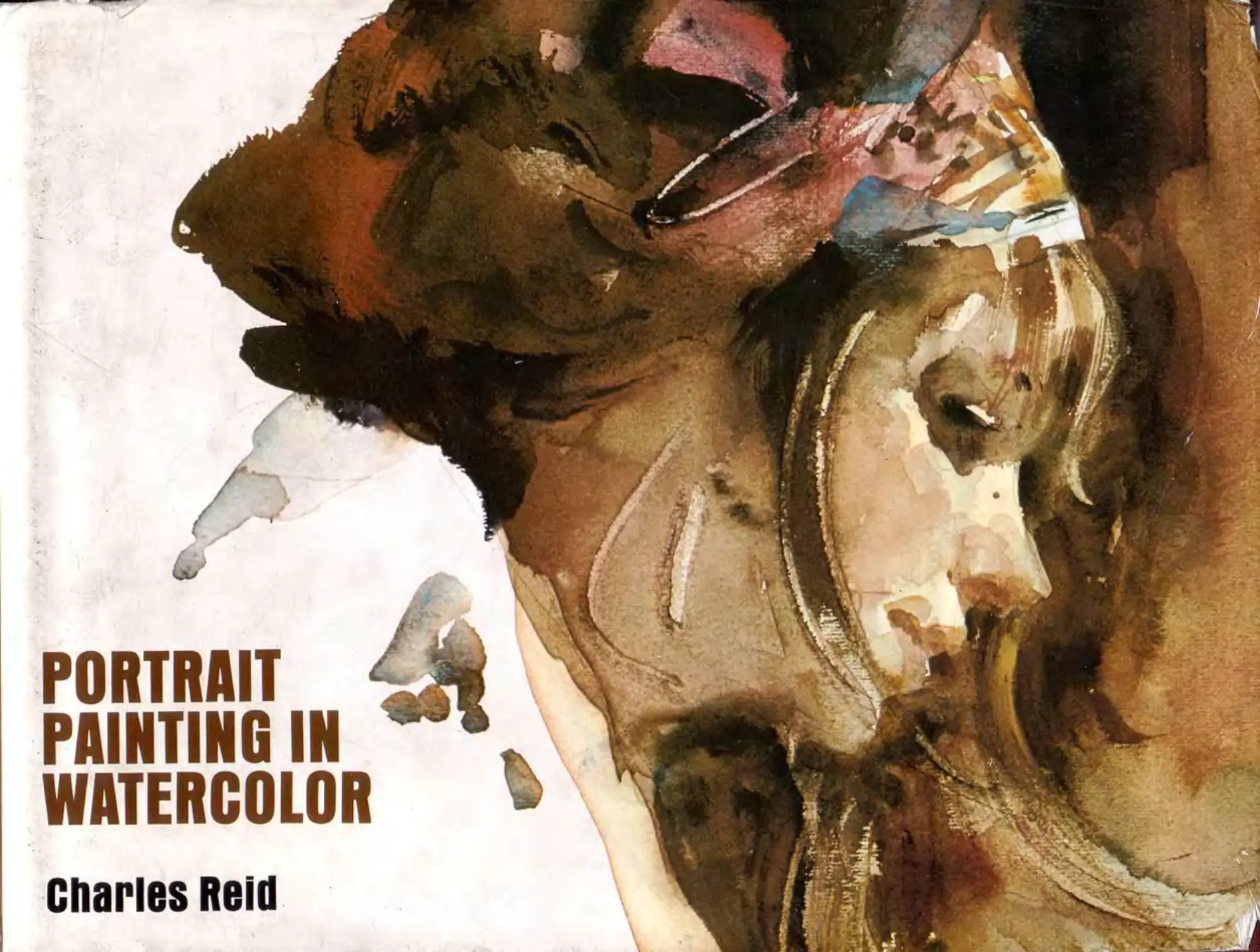
                    PORTRAIT
PAINTING IN
WATERCOLOR
Charles Reid

PORTRAIT
827.50
USA
PAINTING IN
WATERCOLOR
Charles Reid
In this book, Charles Reid guides the reader through a
complete, step-by-step tour ol the watercolor materials and
methods needed to create expressive, masterful portraits.
Ke begins with the basics, including which paints to use:
how to choose your brushes; which papers are best for
sketching; and how to set up and position your drawing
board. Reid then presents 25 informative, beautifully illus-
trated demonstrations that incorporate such techniques as
mixing washes and over-washes, wet-in-wet, dry brush,
lifting out, and using more than one value.
He goes on to show the reader how to paint the
basic head form; the eyes, nose, mouth, and ears; light
hair and dark hair; hands in general and hands in de-
tail. In following these demonstrations, the reader will
learn how to use simple light and dark washes to indi-
cate the shadows and highlights that describe the
features; where to look for these light and dark areas
when the head is in three-quarter, side, front, back,
and rim lighting situations; and how to use scratching,
feathering, and hard and soft edges to create textures.
By the time he reaches the complete, full-color por-
trait demonstrations—showing how to paint children,
young men and women, and older men and women—
the reader has mastered the basic techniques of the
medium, and is ready to incorporate them into suc-
cessful portrait painting in watercolor.
160 pages. 11 x в’/д. Over 150 black and white illustra-
tions. 42 Color Plates. Index.
WATSON-GUPTILL PUBLICATIONS
PORTRAIT
PAINTING IN
WATERCOLOR
PORTRAIT
PAINTING IN
WATERCOLOR
Charles Reid
WATSON-GUPTILL PUBLICATIONS/NEW YORK
This book is for Judy and Peggy
and for my father,
who wanted me to be an artist.
-irst published 1973 in the United States and Canada by Watson-Guptill Publications,
1515 Broadway, New York, N.Y. 10036
Reid, Charles, 1937-
Portrait painting in watercolor.
Bibliography: p.
1. Portraits. 2. Water-color painting—
Technique. I. Title.
ND2200.R44 751.4'22 72-13569
ISBN 0-8230-4192-1
Dislributed in the United Kingdom by Phaidon Press Ltd.,
Musterlin House, Jordan Hill Road. Oxford 0X2 8DP
may be reproduced or used in any form or by any means—graphic,
electronic, or mechanical, including photocopying, recording, taping,
or information storage and retrieval systems—without
written permission of the publishers.
Manufactured in Japan
3 4 5 6 7 8/99 98 97 96 95 94
Acknowledgments
If this book is good, it's due to the efforts of my edi-
tor Lois Miller and the designers of the book,
James Craig and Robert Fillie.
I'd also like to thank Don Holden for his contin-
ued help and encouragement.

Contents
Quick Sketch. 12"x12", Fabriano
paper. This is a very quick sketch,
and I made no attempt whatsoever to
develop any detail. I relied on light
sections in the hair, nose and
forehead to carry the picture. I left
the white shirt untouched in certain
sections and allowed the shadow
areas and the areas of similar value
to blend together. This type of sketch
is very good exercise and fun todo,
and I finished it in about three
minutes. I never worry whether
something like this will come off or
not. I do it and put it aside and start
again. Later, if it looksgood, I keep it.
If it's a failure I just turn it over and
work on the other side.
Occasionally, I think it's good for any
artist to work this way. It helps you
avoid treasuring your work and
feeling that it’s too precious. And I
think it's good to avoid judging a
picture right away. Do a painting and
put it aside. Your eye will be much
fresher later.
Introduction, 10
Materials, 12
The Head
1.	Head in Three-Quarter Lighting, 16
2.	Head in Side Lighting, 20
3.	Head in Front Lighting, 24
4,	Head in Back Lighting, 30
5.	Head in Rim Lighting, 34
6.	Basic Head Form, 38
The Hands
13.	Basic Hands, 94
14.	Hands in Detail, 98
Portraits in Black and White
15.	Child, 104
16.	Young Woman, 109
17.	Young Man, 115
18.	Older Man with Beard, 121
19.	Dark Complexion, 126
The Features
7.	Eyes, 44
8.	Nose, 50
9.	Mouth, 56
10.	Ears, 60
The Hair
11. Light Hair, 82
12. Dark Hair, 86
Portraits in Color
20.	Selecting Color, 134
21.	Mixing Color, 136
22.	Girl with Headband, 138
23.	Oriental Child, 141
24.	Bearded Lobsterman, 144
25.	Child in Sunlight, 147
26.	Full Figure, 150
Bibliography, 153
Index, 155
Introduction
For me. watercolor is a spontaneous and sugges-
tive medium, and I find using it an exciting adven-
ture.
I've heard several "myths" about painting with
watercolor, and I disagree with them all. For ex-
ample. I've heard it said that you can't make any
corrections or changes with this medium—that you
have to be "right’' the first time. This just isn't true!
I've found that my corrections and changes often
"make” a painting, and I hope you'll see for your-
self what I mean as you follow the demonstrations
in this book.
Another misconception about this medium is
that it's much harder to paint people than to paint
other subjects with watercolor. Again, I disagree!
Watercolor is ideal for spontaneous, informal por-
traits, and it's certainly possible to paint highly
"finished" portraits with watercolor. I'd rather go
to oil or acrylic for my “formal" portraits, but this is
a very personal preference. I simply find it helpful
and interesting to switch back and forth between
watercolor and oil.
I can’t stress enough the importance of knowing
how to draw before you learn how to paint por-
traits. Drawing is beyond the scope of this book,
but in the Bibliography I've listed several fine
books on drawing heads, hands, and figures,
which you might want to study if you have doubts
about your drawing.
For the demonstrations in this book, I’ve painted
each step on a separate sheet of paper—to make
the "lessons" as clear as possible—so you'll prob-
ably find minor variations as you progress from
one illustration to the next. I think these slight dif-
ferences from one step to another should actually
be helpful to you. They'll show you that watercolor
is anything but an exact science, and that each
painting is a new experience! I plan my composi-
tions carefully, and I begin with accurate drawings,
but I don't use any exact system once I start to
paint. I like things to just happen.
For me. this approach creates the excitement
and adventure that are so much a part of painting
with watercolor. In the following demonstrations, I
hope you'll share this sense of adventure with me.
10 PORTRAIT PAINTING IN WATERCOLOR
Sketch Class, 8’'x14"', Fabriano paper. This is just a
very quick note ol one of the men who was working in
our sketch group. There are mistakes and poorly done
areas, but I think a painting such as this is valuable in
developing an ability to put down what you see directly
and spontaneously. Even if the painting doesn't come
off as a whole, there might be one or two sections that
do work.

Materials
About the only unpleasant aspect of painting with
watercolor is going out to the art store to buy the
necessary materials. Good watercolor brushes,
paper, and colors are very expensive. The only
thing I can say about this is that good materials are
an excellent investment. Try to steel yourself
against the expense, knowing that you just can’t
do your best work if you use poor materials.
Brushes
There are two main types of brushes, oxhair and
sable.
Oxhair brushes don't form the fine point that’s
necessary to do the important detail work in paint-
ing a head, for example. On the other hand, an ox-
hair brush would be fine for the early demonstra-
tions in this book, while you're just becoming
familiar with the general techniques of watercolor
painting.
Sable brushes are the best, but they come in
varying qualities. You should buy as good a brush
as you can possibly afford. The three sable
brushes I suggest are a 1" flat, a Number 10
round, and a small, Numbers or Number 4 round.
The numbering of brushes seems to differ from
one manufacturer to another. For example, the
Winsor & Newton Number 8 is approximately the
same size as the Grumbacher Number 10; the
smaller sizes differ correspondingly. Investigate
the differences yourself, and choose the brushes
you feel most comfortable with.
It’s very difficult to do a good painting with a
brush that’s become tired and soggy, so you
should always try to use one that comes to a good
point. Save your old brushes for background areas
and use your good brushes for precision work.
I think good watercolor paper is very important. By
"good,” I mean a paper that’s fairly soft and ab-
sorbent. Cheaper papers tend to be hard, often re-
pel the paint, and sometimes seem to have an oily
film that doesn't really take the color well. But
again, you can certainly use a cheaper paper until
you have a good idea of how watercolor works.
When you use expensive paper, you may find
that you’re afraid of it—that you don't want to ruin
it—and this may make for very tentative and timid
efforts. Try to accept the fact that you are going to
ruin some very good paper and that it’s just part of
learning to paint! Whenever you can, work on both
sides of a sheet of watercolor paper (apparently
there is a right and a wrong side, but I’ve never
found out which is which).
Watercolor paper comes in various weights and
textures. The textures run from very smooth,
called hot-pressed, to rougher textures, called
cold-pressed (moderately irregular) and rough
(which means really rough). I'd suggest that you
useafairly smooth texture like hot-pressed, al-
though later on you should experiment with both
rough and smooth paper and see which you really
like best.
Hot-pressed, cold-pressed, and rough papers
come in weights running from the very light 72 lb.
to the medium weight 140 lb. to the very heavy 300
lb. The weight of a particular paper means the
number of pounds that a ream (500 sheets) of that
paper weighs. The paper is normally the standard
Imperial size—22" x 30". The 72 lb. paper is really
too thin and light for watercolor work, unless you
don't plan to make any mistakes. The heavier pa-
per, such as 140 lb. or—even better—300 lb. takes
12 PORTRAIT PAINTING IN WATERCOLOR
more punishment. The 300 lb. paper is especially
good to use. You'll find you can make all the cor-
rections you want on it without fear of its buck-
ling-becoming wavy.
Paintbox and Palette
Since you'll probably do most of your watercolor
work indoors, it doesn’t really matter what you
carry your paints and brushes in. However, a fish-
erman's tackle box or a carpenter's tool box
makes a very handy containerfor all of your equip-
ment. Both types of boxes have small compart-
ments that are excellent for holding paint tubes
and brushes, and the large compartment beneath
is a good place for your palette and water con-
tainer. I'd suggest that you buy a plastic tool box
because it won't rust. You'll probably find a good
one at your local discount house.
I use an enamel butcher’s tray when I work in my
studio and a folding metal palette when I work
away from my studio. The butcher's tray makes an
excellent studio palette. It has a large area for mix-
ing washes, and it lasts forever. If you buy a folding
palette, be sure it has a large enough mixing area
and plenty of room for your colors around the
edge. Don't buy a palette that has ready made
cakes of dry color on it—buy one that’s meant for
tube colors. And don’t buy a plastic one. They
don't last and it's difficult to mix pigment and water
on them.
Easels
I’ve never used an easel for my watercolor paint-
ing, because I find them more trouble than they're
worth. An easel is just one more thing to carry and,
when I'm carting around a drawing board, paper,
and a paintbox, I already have plenty to carry. In
my studio, I use two folding chairs as my easel. I sit
on one, set the other opposite me, prop my draw-
ing board against the back of it, and use the seat to
hold my palette, brushes and water jar. When I
work outside, I usually prop my board against a
handy rock or simply set it on the ground and
kneel in front of it.
Some artists prefer to sit in a chair and place
their paper and board on the floor in front of them.
The advantage of painting in this position—so far
from the paper—is that you can't really "tighten
up” on your work; you've got to swing your arm
and you tend to be much freer with your painting.
If you're working in a studio, I'd suggest that you
use an adjustable drawing table—one that you can
fix in a horizontal position when you want to paint
standing up and adjust all the way to vertical when
you want to sit and paint.
Try to find the place and the painting position
most comfortable for you. As you become more in-
volved with watercolor painting, you’ll certainly de-
velop your own method of placing your drawing
board and paper.
Colors
I'll go into a complete discussion of color in the
chapters on Selecting Color and Mixing Color. For
the black and white projects in this book, you
should buy either ivory black or Payne's gray.
When you buy these—and all of your colors—I
suggest that you buy tube paints, rather than dry
cakes of color. Perhaps this also falls into the
realm of personal preference—it may be quite pos-
sible to do excellent paintings with cake colors—
Texture. 4"x6", Bristol paper. I took advantage of the
hard surface of the Bristol paper to create some special
effects here. For example, notice the very high-keyed
cast shadow under the nose. This was originally much
darker, but I dropped some water into the shadow and,
as the area dried, the water left a rather etched effect.
Instead of describing the nose with the usual dark
value, I indicated its presence by leaving the hard
boundaries around the cast shadow. While the hair was
still wet, I blotted it with a tissue to create texture. I
suggested the sweater and, as the area dried, I
scratched out some texture with my fingernail. I also
used my finger to blot the mouth and create a very
effective texture.
MATERIALS 13
but I think you'll find it much easier to put the right
amount of color on your palette when you use soft
tube color. And be sure that you buy transparent
watercolor paints, not gouache. Gouache is
opaque watercolor, and it can’t be used for trans-
parent watercolor painting.
Miscellaneous
Your drawing board should be fairly steady and
should provide a good, solid surface to paint on.
As I mentioned earlier, I often work with my board
in a vertical position, although I’ve heard that this is
considered very unusual. Wet washes run when
the board is vertical, and I think you’ll see many of
these "runs" in the illustrations in this book. I don't
find "running" bothersome, but perhaps you will,
and it might be better for you to work with your
board in a horizontal or diagonal position.
When I go to a sketch class or work in my house,
I carry a fairly small drawing board—either a stand-
ard. commercial pine drawing board or a piece of
Masonite or plywood—about 16" x 20". Pushpins
don't penetrate Masonite, but you can carry a role
of masking tape to attach your paper to the board.
I always have a kneaded eraser, pencils, and a
razor blade in my box. An eraser should be used
very carefully. Never use a hard, office type eraser
and, even when you use a soft eraser such as a
kneaded, be careful not to overdo your corrections.
If you scrape the surface of the paper, it will be-
come rough, it won't hold the paint as well as it
should, and the rough texture of the erased area
will show through your paint.
Use a 2B office pencil. It's fairly soft, but not too
soft. Hard pencils tend to dig up the paper and, al-
though they make very nice light lines, I think you'll
find yourself bearing down as you try to develop
your drawings. Very soft pencils, such as 4B or 6B,
tend to leave very dark lines that become both-
ersome at the painting stage.
Razor blades are very useful for scratching out
light areas when a painting is dry. You can also use
razor blades to scratch out when your painting is
wet, but be careful not to dig up the paper. It's also
possible to overuse razor blades and ruin a paint-
ing. Just a few highlights are necessary in any
painting, and too much scratching out will create
a very unpleasant, “too busy” effect.
I also use the tip of my brush handle and my fin-
gernail to scratch out light lines while washes are
still wet. I think you'll notice that I've used both
these methods to scratch out strands of hair in
some of the demonstrations.
For water containers, I use plastic jars—the kind
that margarine comes in. They fit nicely into my
paintbox and they don’t break. An Army canteen
and a matching cup also make a very good water
carrier and container.
I use pushpins to attach my paper to my drawing
board—unless I'm using a Masonite board. In that
case, I keep a roll of 1" masking tape handy to fas-
ten my paper to the board.
Finally, I always carry a box of facial tissues.
They're extremely helpful in many ways. They're
excellent for blotting brushes and for blotting
areas of paintings that are too wet and are getting
out of control. I also use them to scrub out mis-
takes and to soften edges that have become too
hard. I think facial tissues are a necessity in any
watercolor kit, but you may find that paper towels
work just as well.
14 PORTRAIT PAINTING IN WATERCOLOR
Standing Girl. 4"x8", Bristol paper.
As you can see here, it's possible to
paint a portrait without really
showing the face. You can simply
capture the subject's particular
attitude. I’m sure you've seen
someone walking down the street
and known who that person was
before you could really see any
features. Attitude is a very important
part of a portrait, and you should try
to capture this as well as the specific
features.
The Head
1
Head in
Three-Quarter
Lighting
In the five demonstrations that follow, you'll be us-
ing just two values—one light and one darker—to
represent lights and shadows on a highly simpli-
fied head form. Naturally, you won't always have
such simple value problems: many of the heads
you paint will be in fairly complicated and diffused
lighting situations. Even in these simple exercises,
however, remember that the head is a solid, egg-
shaped form, and be sure that all of your shadows
indicate this.
Later on. in the sixth demonstration, we'll intro-
duce a third value, or halftone. But. in the begin-
ning. remember that simple shadow shapes can be
your best friends and, whenever possible, pose
your model under a single, fairly definite light
source. A single light source will develop the
simple shadow shapes I'll be talking about.
In this demonstration, we'll assume that the light
is coming from the left, so the shadow will be on
the right side of the face. For our purposes, the
"right" side of the face will always mean your
right, and "left" will always meanyowleft. As you
sketch outlines in pencil, remember that the pencil
lines are just a general guide. Get used to working
broadly and freely with your brushstrokes, and
don’t try to fill in the outline carefully.
As you prepare your washes, squeeze a gener-
ous supply of black paint onto your palette. Don’t
be stingy—give yourself enough pdf nt to do many
practice heads. If the paint dries between ses-
sions. you can dampen it with water to make it
workable again. To make your pigment lighter, dip
your brush into the water supply and shake it to get
rid of the excess water. Then dip the brush into the
edge of the pile of pigment on your palette and
draw some of the paint out onto the working area
of the palette. Work the dampened brush and the
pigment together to make a "puddle." If this
puddle is still too dark, dip your brush back into the
water supply, shake it. and work it into the puddle
again.
For this exercise, you'll need a good sable wa-
tercolor brush that "points" well; a Number 8 or
Number 9 will be fine. You’ll also need a palette, a
water jar. a tube of ivory black, an НВ. 2A. or 2B
pencil, a drawing board, and pushpins. For paper,
use a good quality hot-pressed watercolor paper
with not too much texture. The size of the paper
isn’t very important. You can cut a full sheet into
eight pieces, and you can use both sides if it’s
fairly heavy—at least 140 lbs. Remember to wait
until the first attempt is dry before you work on the
other side.
When you're ready to begin Step 1. pin your pa-
per to your board, place a pushpin in each corner,
and sei your palette and water supply in a conven-
ient place. You can work standing, with the board
held horizontally, or you can sit, with your board
held at an angle.
16 PORTRAIT PAINTING IN WATERCOLOR
Three-quarter Lighting: Step 1. With your pencil,
sketch in a simple oval, about 4" or 5" high. Don't labor
over it. Next, sqeeze some black paint onto your pa-
lette. and, as I've already described, make a fairly light
wash that's still noticeably darker than the white paper.
Then, with a loaded brush, make broad strokes within
the oval. Don't worry if some strokes go outside the
pencil outline.
Three-quarter Lighting: Step 2. Allow the first wash to
dry. Then dip your brush in the water jar, give ita shake,
and go back to your pile of black pigment. This time,
make a much darker puddle than the value you used in
Step 1. but use enough water to keep it from being pure
black. With one or two good, definite strokes, paint a
strip about 1" wide down the entire right (your right)
side of the face.
Three-quarter Lighting: Step 3. Now for a very simple
indication of the eye on the shadow side of the face.
The shadow strip you made in Step 2 should still be wet.
Load the brush with the same dark value and, starting
about a third of the way down the dark strip, make a
horizontal jog out into the "face,'' stopping when
you're almost to the middle. You have now indicated
the shadow under the eyebrow.
HEAD IN THREE-QUARTER LIGHTING 17
Three-quarter Lighting: Step 4. Next is the shadow
side of the nose. You probably have enough paint on
your brush, so reloading shouldn't be necessary. Start-
ing where you left off with the eye indication, make a
downward stroke that slants slightly toward the right.
The nose becomes broader toward the tip, and the
shadowshould widen here to reflect this. All noses dif-
fer, but let's make this one about one-third the length of
the face.
Three-quarter Lighting: Step 5. Reload your brush
with the same value. Give it a shake to remove excess
paint before you go back to the paper. Frorp the end
of your last stroke, make a very short jog downward
and to the left. This indicates the bottom plane of
the nose. Now make a diagonal, downward stroke
to the right, to connect the bottom plane with
the main shadow stroke you made in Step 2.
Three-quarter Lighting: Step 6. The mouth is just
short of halfway between the nose and the chin, closer
to the nose. Starting where the connecting stroke you
just made meets the main shadow, make a horizontal
stroke to the left. The length of this stroke depends on
how wide you want to make the mouth. At the end of the
stroke, press down on your brush to make the stroke
wider. Then lift your brush directly off the paper.
18 PORTRAIT PAINTING IN WATERCOLOR
Three-quarter Lighting: Step 7. Now comes the
shadow under the lip. Starting back at the main
shadow, below the mouth on the right, make a sepa-
rate, curving stroke to indicate the underside ot the
lower lip. This stroke is not as long as the mouth indica-
tion, but it should be a bit wider.
Three-quarter Lighting: Step 8. Towrap this up, indi-
cate the second eye form with a short, full stroke on the
left side of the face, opposite the first eye shadow.
Make this a very simple short stroke, not an attempt at
the actual eyelids, etc. In this illustration, I've added the
ears, to make the head more complete. You can block
in the ear on the left side of the face with one stroke of
your first light wash. As the finishing touch, you can
make one or two shadow indications for the darker right
ear form, and we're done!
HEAD IN THREE-QUARTER LIGHTING 19
2
Head in
Side
Lighting
Our first demonstration was concerned with the
most common lighting situation. Most commercial
portrait artists use three-quarter lighting. This
doesn't mean, however, that three-quarter is the
best and most desirable lighting situation. Each
lighting situation has its own particular merits, and
we'll explore these as we get deeper into the sub-
ject of painting portraits.
In this demonstration we'll deal with side light-
ing, the easiest of all the various lighting situations
to represent. Side lighting creates fewer shadow
shapes than three-quarter lighting and doesn't re-
quire the rather subtle value changes that are nec-
essary in front, back, and rim lighting.
For this exercise, you'll need the same materials
that you used in the first demonstration, including
the fairly smooth, good quality watercolor paper.
Pin a piece of paper to your board. (In the previous
demonstration, 1 suggested cutting a full sheet of
paper into eight parts, so this piece should be
roughly 6" x 8".)
If you feel more confident with a pencil guide,
rough in an oval about 5" high before beginning
Step 1. You might also find it helpful to mark very
lightly, with a Number 2 pencil, the position of the
eyes, nose tip, and mouth. Remember that your
pencil sketches should be only the roughest guide
for the brush. Since you are not painting shadows
on a particular head, it doesn't matter if you make
the nose too long or the chin too short. You'll cer-
tainly make pencil sketches in the more advanced
exercises, but here, with very simple ovals, they
aren't really necessary.
To begin, prepare a light wash from the ivory
black and water. If you have a pile of dried paint on
your palette, let the palette sit in water for a few
minutes, with the paint at least partially sub-
merged. This should soften it up nicely and make it
workable. Otherwise, squeeze out a fresh pile of
paint. Remember, you can't judge the value of the
wash on your palette until you are quite experi-
enced. so it's a good idea to have a separate piece
of paper handy to test your washes. Keep in mind
also that your wash will dry lighter—so don't make
your puddle too light.
20 PORTRAIT PAINTING IN WATERCOLOR
Side Lighting: Step 1. After mixing the paint and water
into a fairly light value, load your brush from the puddle
and give it a good shake. Brush in an oval, using broad,
free strokes. Don’t worry if the wash isn’t even—some
areas may be darker than others, but it doesn't matter.
(At this point, you can also indicate both ears, with two
simple strokes.) Let the wash dry.
Side Lighting: Step 2. Now, prepare a shadow wash
that’s much darker than the light wash; use a bit more
pigment and a bit less water. Next, take a well-loaded
brush, give it a good shake, and start blocking in the
forehead area on the right with a downward, diagonal
stroke that goes about a third of the way down the
length of the face and covers about one-third of its
width. Then, make a very short jog to the left to describe
the general construction of the nose bridge where it
meets the eyebrow.
Side Lighting: Step 3. Now comes the nose. Reload
your brush, and. from the nose bridge, make a diagonal
stroke to the right about one-third the length of the
head. At the tip, make another very short diagonal jog in
the opposite direction. To describe the bottom plane of
the nose, use this darker value to indicate the ear in
shadow on the right side of the face.
HEAD IN SIDE LIGHTING 21
Side Lighting: Step 4. Now tor the area above the
mouth. Starting at the bottom plane of the nose, make a
diagonal stroke to the right, just as you did for the nose
and the forehead; but, this time, make it very short-
say, about half a nose length. You're now at the mouth,
anda very short jogtoward your left will indicate the un-
derside of the upper lip. Notice that I've used my
shadow wash to lenghthen the shadow along the right
side of the face.
Side Lighting: Step 5. The lower lip comes next. It
might well be catching some light, so cut back your
brush to the right from the underside of the upper lip to
leave a light area. Then make a shadow under the lower
lip with a short diagonal stroke to your left. Finally,
make a simple stroke that curves outward to the right
and back down around the bulge of the chin.
Side Lighting: Step 6. For your finishing touches,
show the shadow areas in the left ear and eye. the left
portion of the nose, and the left corner of the mouth.
Note that these small shadow areas are little more than
large dots. Make no attempt to be accurate with these
shapes. All you want at this point is a generalization, to
give an idea of a simple, solid-looking head.
22 PORTRAIT PAINTING IN WATERCOLOR
Side Lighting. 8"x10", Fabriano paper. This started
out as a sketch of my daughter, but the likeness is way
off. Although it was a failure in terms of likeness, I was
interested in the light coming from either side of the
subject, and I was intrigued by the very sculptural
quality that a head in this kind of lighting can have. It’s
possible to develop the greatest amount of form with
this kind of lighting. We see the darkest sections in the
front planes of the face, while the side planes catch the
light in varying degrees.

3
Head in
Front
Lighting
Front lighting is difficult to represent, because it
does not create simple shadow shapes to clearly
show the construction of head. Instead of relying
on simple shadow shapes, we must describe the
head with small shadow shapes and halftones, or
the values which lie between lightsand shadows.
Halftones require much more subtle treatment
than the simple statements of light and shadow
which you made in the first two demonstrations.
However, since we're still dealing with very
basic head forms, we'll rely as much as possible
on the small shadow shapes and keep our use of
halftones to a minimum. Later, when we’re in-
volved with more "finished” heads, halftones will
play a much larger part; but, for now, we'll stay
with basics and develop a simple, solid head with
small shadow shapes.
For this exercise, stick with the the materials
you’ve been using. You’ll also need a box of tis-
sues. Pin a new piece of paperto your board. We’ll
assume that the light is coming from the front and
slightly above the head, so there'll be shadows on
both the right and left side planes, as well as under
the features.
Front Lighting: Step 1. By now you should be more
adept at painting simple ovals, so a pencil guide
shouldn’t really be necessary. Squeeze out a small
amount of the black pigment, mix a puddle of fairly light
wash, and make a simple oval shape about 5” high. Al-
low it to dry.
24 PORTRAIT PAINTING IN WATERCOLOR
Front Lighting: Step 2. Mix your shadow wash—with
more pigment, less water this time—and block in the left
side plane. Notice how the contours of the shadow fol-
low the shape of the forehead. Work broadly, but keep
in mind the placement and shapes of the forehead,
eyes, cheeks, and chin as you work in those areas.
Front Lighting: Step 3. Now, repeat the same proce-
dure on the right side of the head. For now. stick with
the same shadow shapes on both sides of the head.
Later, you'll see that the side planes of the face usually
differ from each other and are rarely both indicated with
the same shadow shapes.
Front Lighting: Step 4. Now come the bottom planes
of the eyebrows, nose, and mouth. These are not as
prominent in front lighting as they are in overhead light-
ing, but they’re still quite definite. Starting one-third of
the way down either side shadow (I’ve started on the
left), make a horizontal stroke directly across the face,
stop just short of the hallway point, and make a short
jog downward.
HEAD IN FRONT LIGHTING 25
Front Lighting: Step 5. Rinse out your brush and give it
a good shake. Pass the damp brush downward through
the stroke you made in Step 4 to indicate the side ol the
Front Lighting: Step 6. Repeal Steps 4 and 5, starting
from the shadow on the other side of the face. Ob-
viously, the eyes are much more complicated than this;
but you've made a good start in indicating the structure
of the eyeball and socket.
Front Lighting: Step 7. With one stroke, make a
simple, dark, triangular shape about two-thirds of the
way down the center of the face. This indicates the bot-
tom plane of the nose.
26 PORTRAIT PAINTING IN WATERCOLOR
Front Lighting: Step 8. The upper lip has a definite
shape and can't really be shown with a simple line
across the face. To indicate the mouth, start a fairly
broad stroke in the middle of it. As you move to one side
and then to the other, make the stroke narrower imme-
diately, and put less pressure on the brush. At the cor-
ners of the mouth, press the brush down and lift it
directly off the paper.
Front Lighting: Step 9. Quickly blot the whole center
section of the mouth with a tissue to lighten it.
Front Lighting: Step 10. To finish, make a short stroke
under the mouth.
HEAD IN FRONT LIGHTING 27

Joe. (Left) 10"x10", Fabriano paper. This is a painting
ol a very good friend. I was particularly intrigued by the
very strong overhead light and I really went overboard
in allowing my shadows to become blurred and lost,
relying on the lew light-struck areas to carry the
picture. I left the initial wash, which I usually use to
describe my light areas, very high in key. I wanted the
slightly washed-out, cold effect that the strong
Standing Figure. (Right) 8"x10", Fabriano paper. In
this case, the head didn't interest me as much as the
pattern that the light created when it struck the girl's
shoulder blade and the front of her shoulder. Most of
the figure and background are in shadow, and you can
see just the barest indication of light as it skims around
the head and describes the boundary of forehead, nose
and mouth. Although the values in this background are
much darker than the values in the figure, I often use
the same value in both areas, and I occasionally use
some ol the same colors. I enjoy experimenting with
values. I'm never sure just how I'll paint a subject until l
experiment. When I work in oil I constantly change my
values. When I work in watercolor, I sometimes make
three or four studies such as this, experimenting with
dark values in one and light values in another. Each
time you change a value, you create a different effect, it
I had made the background darker in this painting, the
feeling would be totally different.

4
Head in
Back
Lighting
When the light source is somewhere behind the
head, the situation is called back lighting. With the
light at the right side, and only slightly behind the
head, the shadow pattern is similar to that in
Sketch A. If the light is almost directly behind the
head but slightly off to the right, the head looks
something like Sketch B. When the light is directly
behind the head, there is a simple, dark silhouette,
with little or no rim light showing, as in Sketch C.
(We'll discuss rim lighting in the next exercise.)
For this exercise, we'll assume that the head is
lighted as in Sketch A, with the light on the right
side and only slightly behind the head. In this back
lighting situation, most of the face remains in
shadow; these shadow shapes are quite descrip-
tive of the head as well as rather simple to paint.
As you mix a light wash, and then a much darker
shadow wash for this exercise, remember to check
your values on another piece of paper. This way,
you won't overwork the washes on your painting
by restating values. Also, remember to dip your
brush in your water supply and give it a shake be-
fore you load it with a new value—in this case, your
shadow value, Make your strokes decisive and
broad and block in your shadows fairly quickly, so
that you'll be able to soften and "grade" certain
areas. You'll see what I mean as we go along.
Again, you'll use your ivory black, a Number 8
brush, a jar of clean water, your sheets of good
quality, fairly smooth watercolor paper, a palette,
pushpins and drawing board, and a Number 2 of-
fice pencil.
30 PORTRAIT PAINTING IN WATERCOLOR
и
Back Lighting: Step 1. Paint a fairly light oval, about 6"
high, including one stroke for each ear. Allow it to dry.
Then, with your pencil, make a line across the face
about one-third of the way down. This is the line of the
eyes. Directly under it, draw a triangular shape for the
nose. Note that the sides of this triangle are made up of
two curving lines, and that the bottom is about two-
thirds of the way down the face. Indicate the mouth with
a line halfway between the bottom of the triangle and
the bottom of the head form.
Back Lighting: Step 2. With a dark shadow wash, start
blocking in the shadow shapes. (I usually start blocking
about two-thirds of the way across the forehead, on the
right, or lighter, side of the face.) After you block in the
shadow on the forehead, continue the stroke down on
the right, making a dark shape beside the nose to indi-
cate that part of the eye socket on this side is in
shadow. The top plane of the cheek is probably catch-
ing some light, so narrow your stroke in toward the
nose and leave this area untouched by shadow wash.
Broaden again for the bottom plane of the cheek. Then
narrow your Stroke and curve it to the right for the area
above the upper lip—around the rounded thrust of the
teeth—which is probably also catching light. Curve
your stroke inward and downward toward the chin in a
single, broad line.
Back Lighting: Step 3. Block in the shadows in the left-
center section, leaving a light strip about % " wide along
the left boundary of the face. Work quickly and mass in
the shadows, starting with the forehead and the top of
the nose. Fill in the left side of the nose, working down
toward the tip, and make a small jog to the right when
you get there. Then, roughly indicate the contours of
the upper and lower lips and the curve of the chin. Don't
worry if these contours aren't correct. This should be
just a facsimile of a face.
HEAD IN BACK LIGHTING 31
Back Lighting: Step 4. Now draw the shadow wash
out further toward the left side of the head. You should
have enough paint and water in your brush to do this
without going back to the paint supply on your palette.
Drawthis shadow right out to the edge of the head and
indicate the contour of the ear.
Back Lighting: Step 5. Now to suggest reflected light
within the shadow. The shadow should still be wet for
this step. Rinse your brush in your water supply and
give it several good shakes to make it just damp. Then
start a downward zigzag stroke at the top of the light
strip on the outer left side of the head. (See the sketch
at the right on this page.) Allow the shadow wash to
flow out in a slightly lighter value along this strip. This
lighter area suggests reflected light and gives the head
a feeling of bulk and three-dimensional form. You might
have to repeat this process several times, and the area
of reflected light will become lighter and lighter with
each of your strokes. Remember that you're using your
brush as a sponge: you're no longer putting paint on.
you're taking paint off.
To suggest reflected light within the shadow, place a
damp brush at the top of the light strip at the left, and
draw the brush downward in a zigzag stroke.
Back Lighting. (Right) 8"x10". Fabriano paper. This
model was sitting in front of a window and most of the
light was coming from behind. However, the light was
so strong that there was a great deal of reflected light in
the room, and I showed this with very high-keyed
shadows. Only the cheekbone and the side of the eye
were affected by the light, but I cheated a bit and added
some light-struck sections on the nose and above the
mouth to make the form more interesting. There's also
a very tiny spot of light on the lower lip. Although I
indicated the very subtle darkening in the mouth area,
it's these light-struck sections of the mouth that
actually show that it's there.
32 PORTRAIT PAINTING IN WATERCOLOR

5
Head in
Rim
Lighting
The differences between back lighting and rim
lighting are very subtle, and the effects of both
lighting situations are quite similar. When there is
at least one light behind the head and a secondary
light coming from one or both sides of the head,
we see a definite rim of light around the border of
the dark shadow. This secondary light brings out
subtle value changes in the front of the face, and
the problem of shadows becomes more compli-
cated. In the sketch below, notice how much form
we see when there are two lights behind and one
on either side of the head.
In this case—and whenever you ’re try ing to de-
termine the overall, or "big” shadow value—squint
as you look at the subject. When you use this trick,
the complicated small forms disappear and you
seethe big, simple shape of a dark silhouette with
a light rim around it. One of the greatest problems
students have is seeing too much, rather than too
little. Perhaps I could say that a student sees too
many of the "wrong” things—too many of the
unimportant details.
For this exercise, we’ll use the rim lighting situ-
ation in the sketch—with two lights behind, and
one on either side of the head. Don’t worry about
all the small forms you might see in the shadow
that covers the front of the face. You’ll need the
same materials you've been using: ivory black, a
Number 8 watercolor brush, pieces of good qual-
ity, fairly smooth watercolor paper, water jar and
water, pushpins and drawing board.
34 PORTRAIT PAINTING IN WATERCOLOR
Rim Lighting: Step 1. You should be able to paint the
first, light-valued oval without an outline, so pencil work
isn't necessary before you start painting, Mix a fairly
light wash on your palette and paint a simple oval about
5" high. Now. make two short, diagonal strokes about a
third of the way down the head to indicate the ears. Al-
low this wash to dry.
Rim Lighting: Step 2. Mix up a darker wash on your
palette, using more of the black pigment, this time with
less water. Give your brush a good shake after cleaning
it in the water supply, and shake it again after loading it
from the darker puddle. As I've already discussed, most
of the face is a simple dark value, so, beginning about
'A" Irom the top of the light oval, start blocking in the
shadows. Work broadly, making bold strokes, first
downward in the center, then branching off to the sides.
Rim Lighting: Step 3. Try to visualize and roughly indi-
cate the construction of the eye sockets and cheek
bones as you block in this area. As you work out toward
the side boundaries of the shadow, remember that they
are the boundaries of the front plane of the face and
roughly indicate those contours. Next, block in the
shadow sections of both ears, leaving a rim of light. You
should now have a rim of light completely surrounding
the face.
HEAD IN RIM LIGHTING 35
Rim Lighting: Step 4. While this front plane shadow is
still wet, rinse out your brush, give it a good shake, and
start softening some of the boundaries between the
shadow and the light rim with zigzag strokes. Where
you soften an edge really depends on the particular
head and the exact postion of the lights behind and be-
side it. In this demonstration, I've softened all the bot-
tom and side planes but this is only an arbitrary deci-
sion. When you're painting an actual head, observe
where the shadows on these forms seem to soften and
where they appear harder.
Rim Lighting: Step 5. To finish your head, soften the
lower boundary of the chin. The neck stops the light
from reaching this area, leaving it in shadow. Remem-
ber that the areas you soften between the shadow and
the light rim should actually appear lighter than the light
rim itself. You can make them lighter by blotting them
with a tissue, or by mopping them with a clean, damp
brush. As a final touch, blot the side planes of the nose
with a brush that's just damp, not really wet. Make this
just a subtle indication—we don't want to complicate
the face!
Blue Head. (Right) 12"x12", Fabriano paper. This
subject had very delicate and lovely skintones, and I
spent most of my time just mixing up the right
complexion values on my palette. I did paint the entire
head with a light wash first and allowed it to dry before I
added my shadows. In this dim lighting situation,
however, I could have used the white paper alone to
indicate the light-struck areas. Notice that I hardly
stated the eye. There's just a subtle indication to show
that it's there.
36 PORTRAIT PAINTING IN WATERCOLOR

6
Basic
Head
Form
So far, you've been painting basic head forms with
two major values: light and shadow, But, when you
softened an edge between light and shadow, you
created a third, or middle, value. Because it's sup-
posed to be a value somewhere between light and
shadow, this middle value is sometimes called
"halftone."
In this demonstration, we' re going to give more
emphasis to the middle value or halftone. I’d like to
stress, however, that the two original values, light
and shadow, are still of prime importance. If you
confuse your shadows by making them too light or
too busy (with lots of small value changes within
these shadows) or if you clutter your I ights up with
values that are too dark, you'll destroy the simple
form of the head. Keep this in mind, and as you
work on your middle tones, don’t let them destroy
your simple lights and darks.
Naturally, when you’re working with a specific
model, the shadows created will vary in width and
length, depending on the contours of the head, as
well as on your lighting situation. You won't always
find the same pattern of hard and soft edges. Here,
we’ll just do a very generalized head, but the prin-
ciples of halftone we deal with in this exercise
should be adapted for, and applied to, any head
you choose to paint.
This time, we'll assume that the light is coming
from above and to the right of the head. You'll
need your Number 8 watercolor brush, a palette, a
tube of ivory black, water jar and clean water,
pieces of watercolor paper, pushpins, and drawing
board. Always keep tissues handy, to lighten,
soften, or lift out wet washes.
Basic Head: Stepl. For the sake of variety, we’ll doa
three-quarter-view head. This is really the same basic
oval. It's just a bit flatter on one side, a little more curved
on the other. Mix your usual light wash and block in an
oval 5"' high, similar in shape to the one illustrated.
Don't worry too much about making an exact copy of
my oval.
38 PORTRAIT PAINTING IN WATERCOLOR
Basic Head: Step 2. Nowfor the neck. While the first
wash is still good and wet. start about 1 /2" in from the
chin, and make a rectangular shape about 2" wide and
Basic Head: Step 3. Mix up your shadow value on your
palette. After getting rid of excess moisture with a
shake of the brush, start blocking in a dark shadow strip
about 1" wide along the left side of the face. At what will
be the eye area, make a slight jog to the right and stop,
to indicate the eye socket. Then, with a much thinner
stroke (about й" wide), continue to follow the left
boundary of the oval around to the neck. Notice that
this strip becomes very narrow below the eye and then
widens again at the neck.
Basic Head: Step 4. While this shadow strip is still wet,
draw it out to make the bottom plane of the nose. This is
a simple triangle shape, and one corner of the triangle
blends with the shadow strip.
BASIC HEAD FORM 39
Basic Head: Step 5. Now, reload your brush from the
shadow puddle, give it a shake, and move on to the
mouth. Once again, start at the shadow, which should
still be wet. and brush the shadow shapes out into the
light area. Indicate the upper tip with a general shadow
shape about 17«" long. The top plane of the lower lip
catches light and creates a shadow under it; so don't
really touch the lower lip itself, but make a shadow un-
der it about %" long. The shadow under the lower lip is
quite wide where it joins the main shadow, but it nar-
rows as it proceeds out into the light area.
Basic Head: Step 6. Your shadow should still be wet
when you do this step. Don't pul in any new shadows
now. but "connect" the ones you have with your light
areas, to make a third, or middle, value. For this general
diagram, leave about 1" at the top of the shadow strip
"hard." Rinse your brush, give it a good, hard shake,
and place it in the shadow above the eye. Now. soften
the lorehead by drawing your brush oulward’and
slightly upward about 1" into the light area. Prepare
your brush again, and soften the edge of the stroke you
just made. Repeat this procedure until you have a
smooth gradation from light to shadow. A tissue is
handy here to blot the end of the stroke—to make it light
enough and to get rid of excess water. Now. use the
same procedure on the shadow of the cheek and the
top section of the nose.
Basic Head: Step 7. At the mouth, you want to show
that the lips curve around the dental arch of the teeth.
One way to do this is to lighten and soften the edge of
the lips as I've done in my illustration. Rinse your brush,
shake it. and draw it right up through the mouth in a
diagonal stroke. Again, you can blot this area with your
tissue. (You'll have to experiment. All this lakes prac-
tice. The first few times you try, you probably won't get
the effect you want, so be patient.) Finally, soften the
shadow under the mouth, using the same procedure.
You should now see a very definite combination of hard
and soft edges.
40 PORTRAIT PAINTING IN WATERCOLOR
Basic Head: Step 8. Now for the right eye. In the light
area, use your shadow value to paint an oval about 1W
long and 1" high. Rinse and shake your brush and
lighten the middle section of the eye to show the round
form of the eyeball and give the eye afeeling of bulk. If
necessary, blot this mid-section carefully with a tissue
to lighten it. Note that there are hard edges on either
side of the eye and soft edges in the middle. Now, con-
tinue the middle, light area of the right eye down
through the top plane of the cheek. This area is about
3/<" wide directly under the eye, but it widens as you ap-
proach the bottom plane of the cheek.
Basic Head: Step 9. Toend your project, reload your
brush, shake it out and, starting at the right corner of
the mouth, make a very short stroke upward toward the
cheek. Now, rinse your brush, give it a very good
shake, and allow this dark area to flow upward, to show
the bottom plane of the cheek. Work this middle value
down into the lower cheek, toward the upper lip, and
intothe shadow below the lower lip. Then, indicate the
right ear very simply, with an oblong shape. Note that
the ear in this illustration is quite light, because I've
blotted it with my tissue to keep it fairly light and unim-
portant. We'll worry more about the ears later.
BASIC HEAD FORM 41

Seated Model. 10"x10", Fabriano
paper. The very simple lighting on
this head created a very nice feeling
of bulk and form. The model had very
fair complexion, and the tones were
extremely cool. The shadows were
mostly cerulean blue, except for the
nose, which was quite warm. I
actually exaggerated the coolness of
the shadows in the eyes and around
the mouth, just as I exaggerated the
warmth ol the nose, to make the
color in the head a bit more
interesting.
The Features
7
Eyes
The top two sketches of eyes are incorrect. The
upper and lower lids should never be drawn as
identical shapes. The three lower sketches will
give you an idea of the variations in shape found
between the upper and lower lids.
In the previous demonstrations, as you studied the
overall construction of the head, I stressed the im-
portance of showing that the head has bulk and
form—a lesson that you should always keep in
mind. Unfortunately, however, it's much easier to
think form when you’re working on a generalized
head than when you're painting a specific head.
When it comes to painting the head of a particular
person, you'll have a strong tendency to forget all
about overall bulk and mass and to concentrate in-
stead on the particular features that you think will
give you a likeness.
However, a good likeness actually depends
more on the construction of the particular head
than it does on the small shape changes found in
an eye or mouth. This is a vital point, and I wish I
could somehow cement it solidly into your mind:
but it’s a very difficult concept to practice, and only
through experience, with its tears and frustration,
will you finally understand!
As you start painting particular features in this
exercise, try to stick with the feeling of bulk and
mass that you've been practicing. Although you’ll
be putting in eyelids and eyebrows this time, con-
tinue to strive for a general impression of form and
three-dimensional bulk.
In this demonstration, you’ll be working on the
right eye (the eye on the right, from your point of
view), on a three-quarter view of the head, illumi-
nated by a single light source from slightly above
and to the right.
As you begin Step 1. note the shape of the eye
I’ve drawn. Notice the rather angular shape of the
left side of the upper lid. Remember that the shape
of the eye is never general. Its curves always have
a specific shape, depending on the particular
model you're using and on the position of the eye
in relation to you. An eye viewed from the front nat-
urally appears to have a different shape than does
an eye in three-quarter or side view. And, most im-
portant, remember that the upper and lower lids
never have identical shapes. They are never identi-
cal almonds or ovals; the upper lid normally over-
laps the iris, which usually seems to be “sitting”
on the lower lid. In the sketch at the left, I’ve drawn
some "good” and "bad” eye shapes.
You’ll be using the same materials: ivory black,
Number 8 watercolor brush, 6" x 8" watercolor pa-
per, water jar and clean water, pushpins and draw-
ing board. This time, you’ll be making some light
pencil indications again, so have your 2B graphite
pencil handy.
One final point before starting. For demonstra-
tion purposes, you’ll be doing features by them-
selves in the following projects. However, when
you're actually painting a complete head, always
consider the features in relation to each other and
to the head as a whole—never by themselves.
44 PORTRAIT PAINTING IN WATERCOLOR
Eyes: Step 1. Lightly sketch in an eye about 1W long
and 94" high at its highest point, using the shape in my
illustration as an example.
Eyes: Step 2. Mix up a light wash, pass it over the
whole area of your drawing, and allow it to dry. Then,
mix up your shadow wash.
Eyes: Step 3. Starting about 94" above the upper lid, in
a line parallel to the left boundary of the iris, make a
diagonal shadow stroke downward. Notice that I've
painted right over the left boundary of the eye.
EYES 45
Eyes: Step 4. While your dark strip is still wet, begin to
soften the edges. Allow the wash to flow out at the nose
bridge to indicate a front plane between the top plane of
the nose and the top plane of the forehead. Also, allow
some darker wash to flow out into the eyeball and under
the lower lid. It’s important that you don't worry about
the actual boundaries of the eye, but, instead, try to
show the big planes of the eyeball and the adjacent
Eyes: Step 5. Continue to draw your shadow "out." In-
dicate the shadow on the upper lid simply, with a long
stroke that runs the entire length of the upper lid. Blot
this stroke lightly just above the iris to lighten this area
andtoshowthat the eyeball and upper lid "come out at
us" at this point.
Eyes: Step 6. While the wash is still wet, blot and
lighten the lower left, or inside corner of the eye. After
you blot, you might have to draw more shadow out into
the light and restate the specific boundary of the corner
of the eye. Now comes the important large oval plane
on the right side of the eye (your right). Again, make a
simple, diagonal dark stroke, beginning above the up-
per lid and stopping just below the right corner of the
eye. Finally, soften the upper boundary of this diagonal
stroke with a damp brush and blot it if necessary. You
should now have the feeling of the contour of the eye-
ball.
46 PORTRAIT PAINTING IN WATERCOLOR
Eyes: Step 7. Now tor the eyebrow. Hopefully, the
darker wash is still damp, since you want to put some
sott edges on the eyebrow. Use almost pure pigment
here, and start at the left, thicker end of the eyebrow,
where the edges should be soft. As the eyebrow curves
around the side plane of the forehead, your stroke
should become lighter and thinner, Here, you might try
drybrush to suggest the lightening and thinning, as well
as to suggest the texture of the eyebrow. Finally, block
in a simple oval for the iris, with the value you used in
the upper lid. (In many cases, you might want to use the
same value in all three areas—iris, upper lid, and eye-
brow.) I’ve left a small dot untouched in the iris, as a
highlight. Remember—never make highlights too large
or important. Leave them out rather than overdo them.
Note that some boundaries of the iris have blended with
adjacent areas and softened. Never fill in a hard oval
here: let the iris "bleed" out into the eye in places,
keeping the tissue handy to control the "bleed."
Eyes: Step 8. The iris should still be damp. Using a
touch of pure pigment—almost no water—"drop" in the
dark pupil, still leaving the highlight untouched. Next,
block in a darker strip on the upper lid. As a rule, the
upper lid is always darker than the lower lid. since it
formsa bottom plane and casts a shadow on the eye-
ball. (Eye make-ups that women might use should not
concern you here. They are exceptions to a rule that
usually applies.) I’ve also madea simple curving line as
a general indication of the fold directly above the eye.
When you paint a particular eye, however, give special
attention to the shape of this fold. Finally, restate some
of the darks around the eye. For this final step, allow the
previous washes to dry, so you can see exactly what
needs more definition and restatement. Never try to
worka new wash over one that is still damp. In my final
sketch, there are many "lost”and "found" edges, and
the eye has definition without looking hard.
EYES 47

Vicky. (Left) 8"x10". Fabriano paper. This is one of
those paintings that turn out to be quite a good likeness
even though I'm not overly concerned with a likeness. I
did it in a sketch class, and a very strong light was
shining on the model. This girl has very definite
features—lovely eyes and a very strong, aquiline nose. I
painted the head in two values, washing in the light
value first and—after this dried—blocking in the darker
value very simply. Finally. I added the dark accents
around the eyes, which are quite prominent. When a
subject has prominent eyes, it's very important to stress
them and to let other areas, such as the mouth in this
case, become secondary. Here, I let the eyes and the
hair dominate the painting.
Doris. (Right) 12"x12", Fabriano paper. This model
had very strong features, and I found it quite simple to
capture the likeness. She was sitting still, which also
helped a great deal. The strength of the particular
features—the very characteristic mouth and the definite
eyesand nose—in connection with the simple shadow
shapes created by the strong lighting situation made
the head quite simple to do.
»
8
Nose
Each feature has its own set of painting problems,
and the nose is no exception. As portrait painter
John Singer Sargent once commented: "A defini-
tion of a portrait is that there is something wrong
with the nose." Although describing shape accu-
rately with light, dark, and middle values is a prob-
lem common to painting all the features, one as-
pect of this problem is somewhat unique to
painting the nose: subtle value changes are also
necessary to indicate shape in the part of the nose
that is in light.
Like the head, the nose is made up of specific
planes: those facing the light are naturally the
lightest; those turned partially away from the light
are a bit darker; and those planes turned com-
pletely away from the light are in shadow. As you'll
see, the shadow area of the nose is easy enough to
block in. However, this dark area does-'t com-
pletely explain the nose, and we must go out into
the light area with middle light values to develop
the full construction.
As you do this, guard against making these
"light" indications too dark, or you'll destroy the
form of the nose, as well as the form of the entire
head. In this demonstration, put in only the most
necessary middle values. No stroke should be
made that isn’t vital. I’m not sure who said it. but
the statement. “It's what you leave out, not what
you put in. that counts," certainly applies here!
As you go along, you'll also see cases in which
highlights and accents are used. These are at op-
posite ends of the value range: highlights are the
lightest lights, accents are the darkest darks. How-
ever, they have one thing in common: they should
both be used sparingly and with great discretion.
It's like using salt in cooking: just the right amount
can be marvelous; too much, and you’ve ruined
the dish.
Again, we'll use a good, strong, single light
source that makes shadow shapes obvious. We'll
assume that the light is coming from above and to
the left. Hopefully, you've done enough drawing to
know what shapes to look for. Each nose is differ-
ent, of course, and you'll have to study specific
subjects carefully to observe the particular shapes
of their noses. Here, we have a three-quarter view
of the nose, above eye level, so we see some of the
major bottom planes.
Before you begin Step 1. notice that I've
sketched in the lower section of the nose as a
simple oval in my illustration. Using this basic oval
as a foundation, I then describe the specific
shapes of the particular nose I'm painting. Always
start this way, with a general shape, such as a cyl-
inder or an oval; then you'll have a point of depar-
ture for your specific shapes.
Try the following experiment and I think you'll
see what I mean. Pretend you’re looking down at
an umbrella, and try to draw the series of points
around the rim, just as you would see them. I think
you'll find it difficult to do this very accurately.
Now, draw a circle first, and using this circle as a
foundation, draw the series of points. Do you see
that this technique makes it much easier to draw a
respectable-looking umbrella?
Back to the nose. Note the variety of shapes in
the illustration for Step 1. There are angles, curves,
and straight lines. Always look for—and draw—a
variety of shapes. No form is made of curves alone;
there are almost always some angles and straight
lines, too!
You'll need your Number 8 watercolor brush,
your tube of ivory black paint, a palette, water jar
and clean water, pieces of 6" x 8" watercolor pa-
per. a drawing board and pushpins, and a Number
2 pencil.
50 PORTRAIT PAI NTING IN WATERCOLOR
Nose: Step 1. Sketch in the nose, using the method I
just discussed. In my sketch, I've included some of the
surrounding features, but don't worry about these sur-
rounding areas—they merely help to give us an idea of
the position of the nose on the face. Note that I've
sketched in the boundaries of the bottom plane of the
nose. This will give you a guide when you block in this
area with your darker values.
Nose: Step 2. Now, lay a washover the nose and the
surrounding areas. I've left one small dot of white paper
untouched on the front plane of the nose. This will be
the highlight. Remember that highlights should always
be very small and that one or two highlights on a head
are plenty.
Nose: Step 3. Now, your shadow shapes. In this case,
the bottom plane of the nose and the cast shadow un-
der the nose are the most important dark areas. After
mixing up a shadow puddle on your palette, load your
brush and give it a good shake. (The first light wash
should be dry by now). First, block in the left eye. which
silhouettes the light-struck nose. Watch your pencil
guidesand make your shadow shape carefully, noting
the outer boundaries of the left eyebrow and cheek
and, more important, making sure the boundary of the
front plane of the nose is right. It's very important that
you catch the subtle angles and curves of any shape
you're drawing or painting, and this is certainly true in
the case of the nose! Stop the stroke just short of the
nose tip,
NOSE 51
Nose: Step 4. Now for the bottom plane of the nose.
The entire underside of the nose can be described with
a simple, oblong shadow stroke. Then with the same
wash, paint the cast shadows under the nose. These
cast shadows continue right down and connect with
the mouth. (Always tie in as many of your shadow
shapes as you can: avoid leaving bits and pieces oi
shadows spread aimlessly about.) Finally, give the
briefest indication of the right eye socket, to make the
nose "project" out from the face.
Nose: Step 5.1 've carried the bottom plane shadow of
the nose a bit further, articulating the definite small
shapes on either side of the nose tip. Normally. I’d do
this when I first put in the bottom plane (Step 4), but
here, I want to stress the importance of starting with
big, simple shapes before getting involved with small
forms. I've also carried the mouth a bit further, just to
show how much mileage we can get out of the cast
shadow under the nose. You can also use the same
shadow wash to describe the mouth and the shadow
under the left cheek.
Nose: Step 6. Now, the right nostril. Indicate this with a
bit of pigment that's almost pure black. (Remember that
shadows almost always have some reflected light in
them; so never make them black. The nostril, on the
other hand, is an accent: almost no reflected light
reaches into areas like the nostril.) Notice that the origi-
nal shadow seems lighter by comparison. Notice also
that some of the edges around the nostril are softened
and lost where they blend with the adjacent shadows.
This makes the nostril seem to be part of its surround-
ings. whereas a hard-edged, dark area would appear
isolated and unconnected.
52 PORTRAIT PAINTING IN WATERCOLOR
Nose: Step 7. To complete this exercise, add the very
subtle middle values on the light side of the nose. Re-
member not to make them too dark, or they'll look like
shadows, and the nose will "flatten out." (Compare the
sketch on the right to the illustration for this step, and
you’ll see that the middle values in the sketch are really
too dark.) Middle values describe the specific construc-
tion of the nose areas that are in the light, and they are
very important and necessary in painting a finished
head. However, there is a danger that if you try to make
all the subtle value changesyou see the result will be an
overworked and tired area. So. for now, concentrate on
simple lights and simple darks and put in only a min-
imum of necessary middle lights.
The middle values are too dark here. The nose has
"flattened out." and the result looks overworked.
NOSE 53

Anne.(Left)8"x10", Fabriano paper. The subject here
wasa very pretty girl, but I'm airaid that doesn't show
up in this sketch. Rather than trying to do a nice picture
of my subject. I was more interested in painting what
happens when a strong light shines down and brings
the planes into very harsh relief. The lightness of the
shadows helps create the feeling of luminosity that I
like. On the other hand, the high key in both the light
and shadow areas is more typical of sunlight than of
artificial nighttime lighting. Shadows in sunlight are
always much higher in key than shadows in an indoor
situation, simply because outside reflected light is
much more obvious than inside reflected light.
Model in Profile. (Right) 12"x12", Fabriano paper. In
painting a prof ile—which is certainly the easiest way to
paint a head—it'svery important to articulate the major
shapes, and very careful drawing is necessary Of
course, it's also important to capture the character of
the model, and I tried to describe the rather hard quality
in this particular face. Compare the blurred edges
around the eyes and under the nose with the very
definite hard edge in the forehead and along the nose.
Always try to create a contrast of hard and soft edges,
and never let all of your edges be equal in hardness or
softness. If all of your edges are too hard, the head will
look"cut out and pasted down" and. if they're too soft,
you'll lose the definition of the head.

9
Mouth
Now. to the mouth. The painting problems here are
the same as those of painting the other features:
shape is still one of the first considerations, and the
planes are important in showing the structure of
the mouth. Also, be sure you have a good variety
of hard and soft, or "lost and found," edges. One
way to achieve a "lost" edge is to put two areas of
similar value next to each other. The boundary be-
tween two similar values will obviously be much
less noticeable than an edge between a light and a
dark value.
Take a look al the illustration for Step 6. and I
think you'll see what I mean. In the upper lip, we
have a fairly dark value, and above it we have
much lighter skin tones. Compare this fairly large
value contrast or "found" edge, with the contrast
between the lower lip and the skin tone below it.
The lighter lower lip is very close in value to the
skin tones next to it, and a "lost" edge or bound-
ary is created between the two areas.
In Step 6. as you describe the area of the mouth
around the dental arch of the teeth, try to give the
lips and the entire mouth a feeling of roundness
and form. Always remember that the line of the
teeth produce a rounded form and that the lips
must indicate this by appearing to go around it.
The sketch at the right illustrates this point.
When you mix your washes for this exercise, re-
member that there is no harm in making your
shadow values fairly dark. As you've seen, washes
dry lighter, and, when you draw shadow areas out
into light areas to make middle values, you auto-
matically lighten the shadow.
This time, the light source is somewhere above
the model. This means that you'll have shadows
on your bottom planes, middle lights on your front
planes, and light areas on your top planes.
Your materials remain the same: your Number 8
watercolor brush, a tube of ivory black (or Payne's
gray), a water jar and clean water, pushpins and
drawing board, palette, and watercolor paper.
56 PORTRAIT PAINTING IN WATERCOLOR
Mouth: Step 1. Sketch in the mouth. We’re doing more
or less a Iron! view here, and I've tried to draw an "aver-
age mouth." (Naturally, there is no such thing!) Pay
particular attention to shape. Never assume you know
the shape ot the mouth or of any other feature. Come to
thedrawing board with a clear mind and an observant
eye. Always ask yourself: how does the upper lip com-
pare to the lower lip? Is it thinner or fatter? See how
much curvature there is to the upper lip. As a general
rule, the upper lip is a much more involved shape than
Mouth: Step 2. Now comes your first light wash. Mix a
wash just as you've done before, and cover the entire
mouth area and some of the surrounding areas, loo.
I’ve left a small section of untouched paper on the lower
lip to indicate a possible highlight. You won't always
have highlights, but. when you do. make sure they're
not too big! This one seems too big, so I'll make it
smaller as we go along.
Mouth: Step 3. Now tor your shadow shapes. On your
palette, mix up a fairly dark wash—better too dark at this
stage than loo light. Alter loading your brush, start al
either corner ol the mouth. Usually, there is a crease in
the skin at the mouth corner, so start your stroke off
wider here and then narrow it immediately at the begin-
ning of the lips (this depends, of course, on the shape of
the particular mouth you're painti ng). Make the stroke
wider again as you approach the middle of the mouth.
As you can see, I 've stopped my stroke short ol the cen-
ter of the upper lip and repeated the procedure on the
other side, leaving an untouched middle section to indi-
cate roundness around the dental arch.
MOUTH 57
Mouth: Step 4. Rinse your brush and give it a good
shake. Working quickly (you don't want the shadow
wash you did in Step3 todryi). connect the two sides of
the mouth at the middle, allowing the shadow to flow
intothe area you left untouched in Step 3. Notice that
the middle area is still lighter than the two sides. Nolice
also that the two sides have become lighter because
their washes have been drawn out into the light. Next,
draw your shadow down into the lower lip from either
corner of the mouth, leaving the middle section un-
touched.
Mouth: Step 5. Now, draw the values on either side of
the lower lip into the middle area, repeating the process
you used for the upper lip. Notice that I've allowed
some of the darker areas of the lips to flow out into sur-
roundingskin areas. (Never allow the mouth to appear
isolated and unconnected to its surroundings.) One of
these soft edges occurs under the lower lip, and is the
beginning indication of a bottom plane under the lower
Mouth: Step 6. Now, the final touches. The main thing
to do here is restate areas that need emphasis and
darkening. To darken the upper lip, repeat more or less
the procedures you used in Steps 3 and 4. On the right
side. I've allowed some of the dark upper lip shadow to
travel down into the lower lip, to avoid leaving a hard,
continuous division between the upper and lower lips.
Remember to keep the leeling of connection and inter-
relationship between areas by using "lost" and
"found" edges. The hard division between the lips in
the middle area is lost as you soften the edges and you
can make the left side even more indistinct than the
right side. If you make an area too vague, always wait
for it to dry. or almost dry, and then add a final touch of
darker value to the edge.
Cast Shadow. (Right) 10"x10". Fabriano paper. In this
overhead lighting situation. I generalized the cast
shadow created by the head. As a general rule, you
should be sure that cast shadows express the
particular form on which they lie. Here, however, there
is such specific form in the face that the generalized
cast shadow seems to work, Notice that I carefully
articulated the planes of the face, although I used only
one value in the shadows. You can see that I was very
careful to capture the quality of this particular model's
58 PORTRAIT PAINTING IN WATERCOLOR

10
Ears
The ears are very important features and should
never be carelessly drawn or painted. A poorly
drawn ear is often the mark of an amateur. You
should take just as many pains with the ear's
shape and construction as you take with any other
feature. Always observe carefully, and try to cap-
ture, the particular construction of this rather com-
plicated form.
One common mistake is to make the inner fold at
the top of the ear the same shape as the top of the
outer boundary. I've drawn the sketch below to il-
lustrate this error. In the correctly drawn ear on the
right, notice that the top of the inner fold is quite
straight, while the outer boundary is curved. This is
a general rule, although you might sometimes be
hard-pressed to see a difference between these
two shapes. Even if the two shapes look exactly
the same, I’d vary them, since I don't feel there
ever should be two parallel lines, equal curves, or
similar angles, on the human form.
It's probably safe to say that nothing in nature is
exactly symmetrical. This is a very important point
to remember. When you draw a curve, look for an
angle to contrast with it; when you have a straight
line, look for a curve or an angle for contrast.
For this demonstration, we'll do the ear in side
view, so we can see as much of its form as pos-
sible. We’ll assume that the light is coming from
the front and also from slightly behind the head.
When you're painting a particular ear, study the
outer contours and the inner areas until you see
their exact structure.
In this exercise, hard and soft edges will be vital
in showing the construction of the ear, and I'll keep
mentioning them, because I want you to see all
they do for the ear you paint! Remember, too, that
your wash has to be damp when you soften an
edge, so always soften edges as you go along,
rather than completing the whole area and then
softening.
In Step 6, I’ll use two techniques: wet-in-wet and
dry-brush. Wet-in-wet is extremely useful in mak-
ing soft, lost edges. It consists of adding a second,
wet wash to the wash that is already on your paper.
before the first wash is dry. When you use wet-in-
wet, be sure that neither wash is too wet, or you'll
destroy the effect. When drybrush is indicated,
simply load your brush straight from the paint tube,
mixing it with little or no water, and apply your dry
strokes to plain paper or dried washes.
60 PORTRAIT PAINTING IN WATERCOLOR
Ears: Step 1. Look first at the outer shape of the ear.
Notice that the lop is a simple curve that becomes
straighter as it starts down at the back. Some ears can
be described by a simple curve along the back edges,
others by almost straight lines, and still others by a
much more complicated system of curves and angles
(like the one we're drawing here). Sketch in the inner
shapesvery lightly. You want only alight "blueprint'' as
a guide when you block in lhe inner shadow shapes.
Ears: Step 3. Begin blocking in lhe inner shadow shape
under lhe foldthat runs along the top of the ear. There
is usually more distance between the top fold and lhe
inside ol the ear near lhe skull, so start with a fat
shadow shape on the left, and narrow it as your stroke
reaches this large inner space. (This large inner form
doesn't always go directly up to the top of the ear flap
as I've indicated here, but there is always some form
which makes up the inner ear area.) Back to your
shadow shape. Notice that it widens then gradually
thins again as it starts down the right side of the ear.
EARS 61
Ears: Step 4. Now for some edge-softening. Rinse out
your brush, give it a good shake, and soften the lower,
inside edge of the large shadow shape before it nar-
rows. The soft edge describes the crevice in the inner
ear form. I've also softened the outer edge of the
shadow strip on the right, after painting this strip almost
three-lourthsof the way down the ear. Now back to the
front of the ear. With your shadow wash. indicate a very
narrow spot on the left, under the original shadow
shape, then the very large indentation that is typical of
almost all ears. In this case. I’ve shown the indentation
as a "teardrop" shape.
Ears: Step 5. More softening takes place as you use
your damp brush to lighten and soften the inner edge of
the dark teardrop shape. Darken the area above the ear
to indicate hair and to create some background that will
offset the lighter sections of the ear. It doesn't matter if
the softened area on the right side of the ear is still wet
and you get a soft, "lost." edge between this shadow
section and the background. See how the hard and soft
edges, both within the ear and around the outside, help
to show the particular construction on the right side of
the ear.
Ears: Step 6. Below the lobe, which is quite light, add
the surrounding dark tones. Don't work into light or
fairly light areas, and don't add too much detail, or
you'll destroy the feeling of your light area. Alteryou've
established your surrounding darks, let some of the
darker values flow out into the light bottom lobe as
subtle middle values. Blot these middle values so they
don't become too dark or too large. Now use your dark-
est dark to indicate the center section of the ear, using
wet-in-wet to keep the edges soft. Finally, add some
drybrush for hair, and a middle value along the head, to
contrast with the light "Пар" below and along the front
edge of the ear.
62 PORTRAIT PAINTING IN WATERCOLOR


a friend ol mine who was working al his easel at the
lime. He's quite proud of his build, which is really
excellent, so it was tun to catch him in this rather
unheroic pose. Notice how I painted the stripes in the
trousers. I used different values and made some stripes
darker than others. I also blotted some of the stripes to
relieve the monotony. I used the stripes to help describe
the form of the legs. Notice the darker value on the back
of the upper leg.
Light and Shadow, (right) IO"xl4". Fabriano paper.
This model was sitting against a white wall. After I
washed in my lights. I started blocking in the shadows in
the lace and then went on to the hair. I articulated the
form in the face quite carefully, and l really tried to
capture a good feeling of the model's characteristic
leatures. As I blocked in the shadows on the figure. I
allowed them to bleed out into the background Io
create the same colors and values in both areas. After
allowing these areas to set for a few moments. I added a
very small dark area wet-in-wet to separate the neck
from the background. A dark separation like this should
be very soft and unimportant, so don't wait too long Io
add it. Be sure you get a good blur in this kind ot
shadow area. Remember that details in shadow should
always be much less definite and much less distinct
than details in light.

66 PORTRAIT PAINTING IN WATERCOLOR
Old Man. (left) 8"x10", Fabriano paper. This head had
a very interesting pattern, with the light working across
the nose and catching the right eye. The right eye is
actually the lightest section in the head. I usually keep
the light areas that are surrounded by shadow darker
than light areas that are in the main light section of a
head; but I'm always willing to break a rule to help a
painting. This time, by making the light area within the
shadow the lightest section of this painting, I made this
area the center of interest.
Martini, (right) 8"xl0". Fabriano paper. I did this
painting from a pencil drawing that I'd made on the
spot. I didn't worry about my colors here. I was more
interested in capturing the feeling of this rather stark
and lonely figure emerging from a murky background.
Although some artists do very involved paintings from
sketches, I don't often work from them because I don’t
feel sketches give me enough information to do a
satisfactory painting. But so much of this picture was
understated and unsaid that the sketch certainly made
an adequate reference.


Blonde Model, (left) 8"x14", Fabriano paper. Here,
the front of the face is in light and, beyond the light-
struck areas of the face, there is a much darker
background. I usually paint the background very dark,
but here I used very subtle values adjacent to the light-
struck sections of the face to bring out those light
areas. I think it's a very good idea to paint what you see.
but you should also be willing to make any changes that
might strengthen your picture.
Resting, (right) 12"x14", Bristol paper. This painting
doesn't seem particularly successful to me. I think the
problem was that it’s difficult to paint a head that’s not
upright. As with a reclining figure, the proportions and
forms of the head seem to change when it's held at
such an angle. Some areas flatten out while others
lengthen.
PORTRAIT PAINTING IN WATERCOLOR 69

ol one of the artists who works in our sketch group.
Here, to capture the feeling of strong light shining down
on the subject, I used definite shadows and left the
background high in key—actually higher in key than
seemed right at the time. Adding dark values to a
background can destroy the feeling of light and
atmosphere in a painting. Try to find a value that's just
dark enough to offset your light values, but not so dark
that it will destroy the feeling of light and atmosphere
that's so important in any painting.
Karen, (right), 12"x14", Fabriano paper. This model
was quite nervous, and she was sitting very stiffly. Her
head was held back, and the tendons in her neck came
into sharp relief. I like to find the particular aspect of
each painting that makes it worthwhile. I always look for
theoffbeat gesture, feature, color, etc., that separates
one painting from another and adds some particular
interest to it. This girl had very blonde hair, and I used a
combination of cadmium yellow pale and a tiny bit of
yellow ochre towash in the light sections. Then I blotted
the area with my tissue. Blonde hair is difficult to paint
because it's often darker than it appears. Even in this
very blonde hair, there were some very dark areas. It's
also important not to overwork the light areas in a
painting such as this. Try to keep the very high-keyed
sections—in this case, the very blonde hair-
uncluttered by small value'changes. Too many small
value changes in a light area will destroy the feel! ng of

Sarah, (left) 10"x10", Bristol paper. Painting children
is extremely difficult for the obvious reason—they won't
stay still. Because of this, I think watercolor is an
excellent medium to use in painting children. It allows
you to make statements much more directly and quickly
than oil does. Of course, this is a generalization, and
some artists whoare very adept at sketching in oil will
probably disagree with me. It’s also important—and
helpful—to make a good drawing first, as well as to
accept the fact that your model probably won't return to
exactly the same position when you get to the painting
stage. If your drawing is good enough, and you study
your subject well, you can certainly do an acceptable
painting even when the subject isn't absolutely
stationary. For this painting, I used the television set to
keep my daughter as still as possible. Although a child's
expression may be rather vacant when you use this
trick, it's a good way to keep your subject in one place.
Gabrielle, (right), 10"x14", Fabriano paper. This
model was in a more difficult lighting situation than
most of those in this book. Notice the very light strip
along the far side of the face. This is the main light area
and white paper—or a very light preliminary wash—can
be used to describe such a light section. The reflected
light that we see in the side of the head facing us
created a problem. You should always show the
difference between reflected light and your main light:
the reflected light should never be as light as your main
light. In this painting, I first covered the whole head with
a very light wash and allowed it to dry. Next, leaving the
strip down the far side of the head untouched, I blocked
in the rest of the head with a fairly light shadow value.
Again, I allowed the wash to dry and finally. I added my
darkest darks. As a rule, I try to avoid this "shadow
withinshadow" situation. Shadows should be simple in
value—that is. there should be as few value changes as
possible in shadow areas. In this case, however, I had
no choice, and the shadow side of the head is fairly
involved.


Model in Red Background, (left), 8"x10". Fabriano
paper. I've always had trouble painting red
backgrounds, probably because I prefer the cooler
colors. The shadow on the face bled more than it
should have because I used too much water in the
shadow wash. You can see this in the area where the
nose meets the background. The balloon was created
because there was too much water in the shadow wash
under the nose, and the water spread out into the
background. Usually I'd restate the background, but I
liked the glossed edge here. Notice, however, that I did
restate the darker hair near the mouth and that I left
definite boundaries in some areas while I softened
other boundaries. It's not necessary to state an entire
boundary—you can merely articulate certain sections
of it. It'svery important not to separate each area of a
painting from the adjacent areas. Of course, some
separation is important but. when areas are similar in
value, it's a good idea to soften the division between
Violinist, (right) 10"x12". Fabriano paper. This was
done from a photograph of a boy intent on playing his
violin. I was mainly interested in the pattern that the
light made on his white shirt. I also tried to catch the
raking light striking the violin and the small area around
the ear. There was also a suggestion of light on the
nose. To me, such a painting is an interesting study ol
the effect of light on a subject, and the business of
catching this effect is one ol the most intriguing parts of
painting.


Tuesday Night, (left) 10"x14", Fabriano paper. The
model had very sharp features, enhanced by the strong
single light source. Note the carefully developed
shapes in the nose, for example. The nose is actually
the most important feature in this particular sketch, and
I gave the shapes within it particular attention. I left the
lights very high in key, but suggested a slightly darker
value on the light side of the nose. This value change
was necessary to show the construction, but I was very
careful not to let it become too dark, or I would have
destroyed the feeling of light and form in the head.
Eye Shadow, (right) 10"x14", Fabriano paper. This
girl had a very sensitive and delicate face. I tried to
enhance it by surrounding her with dark values, framing
the light-struck face with the dark background and hair.
There are really no value changes in the face, but the
definite shadows and cast shadows around the eyes,
nose, and mouth create all the form necessary.


Debbie. I4"x14", Fabriano paper.
This painting was done from a slide
and I must admit it's overworked. I
photographs because I find myself
working too hard. I have too much
time to try to fix up bad areas. Here, I
added indications and value
changes in areas that really should
have been left alone. The subject
was sitting in very strong sunlight,
which was coming through a window
behind her. The slide was filled with
luminosity and I would have loved to
have captured it in the painting.
The Hair
11
Light Hair
The two tricks to painting hair successfully are un-
derstatement and soft edges. In painting hair, the
desire to keep working—trying to capture the illu-
sive texture—is always there. And there is also the
difficult business of making some soft, lost edges.
However, it’s much better to make a broad state-
ment, indicating only the major planes you see in
the hair, and then to go on to the rest of the face
without any further work on the hair. When the
head is almost finished, you ’I I have a better idea of
what finishing touches the hair needs. When your
hair washes are dry, you can add a few judicious
drybrush strokes, as well as any necessary re-
statement of shadows.
Remember that hair has a soft texture and that
softening edges is one way to describe this texture
accurately. Be particularly careful not to make a
hard, precise line where the hair meets the face. A
hard edge makes the hair look like a wig. You
should haveasubtle, irregular transition between
hair and skin. This transition is easiest to make
when you're painting blonde hair. It's more difficult
with dark hair and light skin, but the transition must
still be made as soft and subtle as possible.
In this demonstration, we’ll deal specifically with
painting short, light hair, but the principles we dis-
cuss will apply to any areas of hair you paint. The
only technique that will change is the particular
one you use to describe different hair textures:
short, coarse hair needs more drybrush, while
long, fine-textured hair should be handled with
more overwashes and a bit less drybrush. Dry-
brush, however, is important in light-struck areas,
as you’ll see in the next demonstration.
For materials, use ivory black, a Number 8 wa-
tercolor brush, water jar and clean water, water-
color paper cut into 6" x 8" pieces, a drawing
board, pushpins, and a Number 2 office pencil.
We’ll assume that the light is coming from the right
and above, so we'll have a shadow on the left side
of the face and hair.
82 PORTRAIT PAINTING IN WATERCOLOR
Light Hair: Step 1. Concentrate on good outside
shapes as you sketch in the boundaries of the top part
ot the head. Draw lightly, and be ready to restate a
shape without erasing if you can make it more descrip-
tive of the hair and head. Mix up a middle wash—not as
light as your usual first value—and start washing in the
hair and the left side of the face. Naturally, some light
areas must be left untouched, but as a general rule, re-
member not to separate shadow areas according to
lighter and darker values in the beginning,
Light Hair: Step 2. While this wash is still wet. draw it
out into the right, or light, side of the hair and face. No-
tice that I’ve left some areas of the hair untouched and
that the white paper is visible. Note also the hard edge
in the middle section of the hair, with soft, lost edges on
either side. Where you leave white paper and hard
edges naturally depends on the particular hair you're
painting.
Light Hair: Step 3. Before this wash dries, scratch oul
tion, notice that the darker, hard edge I mentioned has
softened. This was unintentional, and I'll have to restate
this area when the wash dries.) Don’t do anything more
until the whole area is dry. (If you were doing a portrait,
you would now go on to work on the rest ofthefaceand
come back to the hair later.) The only thing you might
do now is blot some areas that have become too dark;
but remember that all of your washes will dry lighter, so
don't blot loo much.
Light Hair: Step4. When everything isdry, put in your
darker darks. The blonde hair we're painting here has
some areas in shadow next to the skin on the left side,
so state that darker side plane of the face.
Light Hair: Step 5. Now. working quickly, allow the
shadow on the side plane to merge into the hair. Noth-
ing is precious here; if you lose the light section of the
hair on the shadow side, don’t worry: you can always
lift it out with a tissue. Reload your brush and, working
toward the right, add more darks. Leave as much white
paper as possible, but, again, don't worry if you cover
some of it up with your strokes. Use more and more dry-
brush as you work here. Blot some of the darker areas
on the right: don't let this section become darker than
the shadow side.
Light Hair: Step 6. Now, the linal—and really the most
difficult—step. The difficulty arises with that desire to
' 'over-finish. ’ ’ What you need is some judicious dry-
brush work! You don't want the drybrush to be black,
but it should be nice and dark. Leave the light areas al-
most untouched, with just the barest amount of dry-
brush work. Don't go into your shadows except to
restate the darks where necessary. For this restate-
ment, use overwash and, when this is dry, add one or
two strokes of drybrush. Now add some background
tone to offset the lighter hair values. While the back-
ground is still wet, scratch into it to suggest the short
hair strands. You can use a razor blade, brush tip or
your fingernail. Don't overdo this scratching into wet
areas; too much can ruin your picture. Notice the soft
edges both on the inner and the outer boundaries of the
84 PORTRAIT PAINTING IN WATERCOLOR
Smiling Model. 12"xl6'', Fabriano paper. This
particular model seemed to have a perpetual smile. Bui
I think it wasn't actually a smile—it was just the way her
face was made. Her eyes were very heavily made up
andlcouldn'treallyseeirisorthe whites of the eyes. To
show the eye, I merely made a dark indication and
blotted it slightly so it wouldn't be loo dark. She had
very bleached blonde hair that was almost as white as
her very high-keyed flesh tones. I used the same color
and values both in the shadows and in the hair, using
wet-in-wel for some of the darker indications at the top
and sides of the head. Notice that I scratched out with
my fingernail to indicate some of the light-struck
strands of the hair.
LIGHT HAIR 85
12
Dark Hair
Now, for dark hair. As I mentioned in the previous
demonstration, the principles of painting hair are
the same, no matter what the color, value, or tex-
ture. This time, you'll be painting long, dark hair,
and you should try to indicate a fine, smooth tex-
ture. In the illustration for Step 4, notice the soft
edges around the hairline, where the hair meets
the skin. I'd rather see you achieve this effect than
create a flashy texture in the hair.
You'll be using drybrush again in this exercise,
as well as scratching out light strands with your fin-
gernail, brush tip, or razor blade. Remember that
you can only "scratch out” in areas that are still
damp; be sure not to overdo the scratching, or
your result will be too “busy ." You could also use
opaque white to suggest strands, but I'd rather that
you avoid opaque color until you've mastered
transparent color. Opaque white can become the
"answer” to every mistake, and when it's used as
a crutch, it seldom results in good pictures.
As you block in the hair mass, you might want to
simulate the ends with a technique called "feather-
ing." To do this, lift your brush gradually, as you
end each stroke.
When you're waiting for a wash to dry, try to do
something besides fiddle with your picture. Get up.
stretch your legs, read a book. You'll come back
with a fresh perspective, and the stage you’re at
might look fine to your fresh eye.
Since you're painting long hair, sketch in the
whole head. Sketch in the face generally, with just
the barest indication of the features. I want you to
concentrate on the hair, not the face. The light
here is coming from the right, slightly behind the
head.
86 PORTRAIT PAINTING IN WATERCOLOR
Dark Hair: Step 1. There are several approaches Io
take, once you've sketched in your subject. You could
wash in just the face and wait for it to dry; or you could
wash in the whole head and the hair area and wait lor
both to dry before going any further. It doesn't matter
which approach you choose: the results will be the
the hair and face and allowed it to dry. For the lightest
areas, you can leave some white paper untouched, and
you can also blot them with a tissue to lift out the lights.
DARK HAIR 87
Dark Hair: Step 2. Since the hair is black, start right off
with black paint. Have just enough water in your mix-
ture to make the paint move. This dark wash should not
be drybrush, and there should be no build-up of pig-
ment. The wash should be dark, but always trans-
parent—not opaque. It's important that you try to arrive
at the right value as early as possible. You can correct
mistakes in watercolor, but you shouldn’t rely on over-
washes to correct your values.
88 PORTRAIT PAINTING IN WATERCOLOR

Dark Hair: Step 3. Continue to wash in your darks as
you work down the left side. Feather the endsol the hair
mass. (My first wash wasn't absolutely dry in the neck
area, so some softening took place on the left when l
painted in the hair. This was accidental, but it works
well!) On the right, wash in the same dark wash, but blot
it with a tissue to lighten the area, because it is effected
by light. Atthetopof thehead. use some drybrush, but
don’t overdo it—just a few strokes. Now. wait for the
whole thing to dry.
DARK HAIR 89
Dark Hair: Step 4. Now, restate your darks. If you
started with a good, rich, dark wash this will be just an
emphasis of your darkest accents. I liked the soft edge
on the left side of the neck, so I didn't let this area get
too hard. Finally, scratch out a few light strands. Use a
little dark background to make lighter strands stand
out. Around the outside of the head, you can use dry-
brush to suggest softness. Notice that I haven't outlined
the face with my darkest darks; some hair areas right
next to the tace are slightly lighter. This allows the face
to "breathe.' Hard boundaries all the way around the
face would have isolated it.
90 PORTRAIT PAINTING IN WATERCOLOR

Chris. 8"x10", Fabriano paper. This is a very quick
sketch. Compare the very soft edges in the hair on the
far side of the head to the much harder edges where the
hair meets the light-struck sections ot the cheek and
forehead. This is a good example of using harder edges
tobring an area forward and using softer, more blurred
edges to make another area appear to recede.
DARK HAIR 91

John. 10"x12". Fabriano paper.
This was done in a sketch class while
the subject was working on a
paintingot his own. Most ot the head
was actually in shadow, and only the
nose and a little bit of the lorehead
were affected by the overhead light. I
wanted to create the impression of
the head in shadow in contrast to the
while shirt. Notice that I scratched
out the rims of his glasses with a
razor blade and left some of the
white paper in the hair to show the
effect of the light.
The Hands
13
Basic Hands
Drawing hands has always been difficult for me,
and I still get into trouble when I do it. Because of
my own difficulties, I feel that hands are the hard-
est part ot the figure to draw. I strongly suggest
that you find a good book specifically on drawing
hands. I've included titles of several such books in
the Bibliography in the back of this book.
Since the principles of drawing are beyond the
scope of this book. I won't go into detail as you
sketch a hand for this demonstration. However, I'd
like you to keep in mind that the top boundary of
the arm, the wrist, and the first finger can usually
be described by one long, curving line (see Step
4). Obviously, this principle won't always work, but
there is usually some way to indicate the relation-
ship between the fingers and the arm—so watch
for it.
For Step 1,1 suggest that you use a 2B graphite
pencil. Try not to use an eraser: erasing tends to
disturb the surface of soft papers, and you can
never completely "lose” a line when you correct
with an eraser. Try drawing lightly at first, and
don’t worry about restating boundaries.
94 PORTRAIT PAINTING IN WATERCOLOR

Basic Hands: Step 1. Begin with a single line to de-
scribe the arm, the wrist, and the outer boundary of the
first linger. Retrace and extend this line to indicate the
second finger. Then continue the same line around the
tips of the second and third fingers, showing only the
indentation between these two fingers. Now. go back to
the first finger and continue your line around the tip and
along the inside boundary until it meets the boundary of
the second finger. Make a small dot to indicate the out-
side boundary of the fourth linger. Then go back and
extend the lower boundary of the lower wrist upto meet
this dot and continue the line around to complete the
fourth finger. Finally, sketch a simple oval to indicate
the back of the hand, and draw another light oval along
the line where the knuckles will be.
Basic Hands: Step 2. Wash in your sketch of the hand
with your lighl wash. Notice that I've tried to improve
the shapes a bit with this wash. The drawing we just did
is very general, lacking the particular small shapes that
are normally important in drawing (he hand. But l don't
want you to worry too much about these small shapes,
since this exercise is really just a beginning stage in
learning to paint hands.
BASIC HANDS 95
Basic Hands: Step 3. In this case, the wrist is bent
downward and the light is coming from the right side:
the area below the wrist is bent away from the light and
is actually in shadow. Mix up a dark gray on your
palette, load your brush with the dark wash, and give it
a good shake. Then block in a simple, rectangular
shape on the lower wrist area. Notice that the boundary
of your shadow next to the hand should have an out-
ward-curving. not an angular, shape.
Basic Hands: Step 4. While this wash is still wet, go on
to the back of the hand, which is turned only slightly
away from the light. Use a middle value here. Starting
along the curving line your drew earlier to show the
knuckles at the top of the hand, wash in a value that 's
lighter than your shadow wash—but not too much
lighter! You want definite, obvious planes on this basic
hand. It would be better for this wash to be too dark
than too light. I've made a rather wavy boundary along
the knuckle line to suggest the bones in the knuckles.
96 PORTRAIT PAINTING IN WATERCOLOR


Basic Hands: Step 5. The back ot the hand is a wedge-
like term, and the fingers are attached to the wider end.
Since the light is coming from the right, this wider area,
where the fingers meet the mainpart ot the hand is the
lightest area. Don't touch this section with your middle
wash; instead, goon to the fingers. The fingers are al-
most parallel to the back of the hand, so they don't
catch much light. Starting with the first finger, block in a
middle wash between the first, lower, joint and the base
of the knuckle on each finger. Then draw some of the
wash toward the back of the hand .almost connecting it
to the shadow shape there. (Be careful not to destroy
the light front plane of the knuckles.) The whole wash
seems a bit dark in my illustration, so I'll blot it with a
Basic Hands: Step 6. Now you have a very basic hand
that has form and mass. Add a few thin shadow indica-
tions at the bottom planes of lhe fingers and at the tips
of the second and third fingers. Make these shadow in-
dications very casual, leaving them broken here and
there and varying their thickness. Finally, make a
simple thumb silhouette, first with your light wash and
then with some shadow wash. This isn’t really neces-
sary, but it helps make the hand look a bit better.
BASIC HANDS 97
14
Hands in
Detail
In this demonstration, we'll continue to paint
simple I ight and dark shapes; but we' 11 also go a bit
further and concentrate not only on the large
planes that give the hand form but also upon the
smaller shapes that give the hand character. How-
ever, as you've seen in earlier demonstrations, the
student usually has to decide whether to concen-
trate on the big, simple shapes that indicate mass
and volume or on the small planes and wrinkles
that give the subject personality and character. My
advice is still to make your development ot big,
simple forms first on your list. A generalized head
or hand that has overall dimension will always be a
valid form whereas a head or hand that lacks gen-
eral form and is merely a confused jumble of de-
tails will almost always be a failure.
The hand I’ve drawn for this demonstration is a
bit more complicated than the sketch we did for
the previous exercise: I've indicated more relation-
ship between the fingers, the wrist, and the arm.
But I think you'll manage if you recognize these
relationships and continue to think of the fingers
as an extension of the wrist. As you sketch, re-
member that hands are very graceful, and use
graceful, flowing lines. It's important not to start
out with a tightly clutched pencil and a tortuous,
stilted line.
In Step 4, I've added more accents than we used
in the previous exercise, but I’ve continued to un-
derstate the small forms. As you complete this
step, see how much detail you can add without
losing the simplicity that's so important. If you're a
"detail person," add wrinkles to your heart's con-
tent—but be sure they don’t overcome the simple
form and graceful action of the hand.
We'll assume that the light is coming from
above, so the major shadow shape will be on the
underside of the hand. Continue with the same
materials you’ve been using all along.
98 PORTRAIT PAINTING IN WATERCOLOR
Hands in Detail: Step 1. Draw the hand, using the
same method outlined in Demonstration 13. I've left this
step incomplete to show you that the wrist lines extend
to form the outer boundaries of the first and fourth fin-
gers. Begin with a flowing line that will give you a foun-
dation for the specific terms you' II develop later. Don't
start out with the specific shapes.
Hands in Detail: Step 2. Now complete the drawing.
I've developed more definite shapes, but the flowing
lines are still very important. In your usual light value,
wash in the hand and try to develop some of the impor-
tant small forms ol this particular hand. Notice that I
haven't stayed religiously within my boundary lines.
Notice too how formless the hand looks at this stage,
without shadow shapes.
Hands in Detail: Step 3. Mix up your dark wash, and
simply block in the shadow on the underside of the
hand. Try to get as much mileage as you can out of this
shadow shape. Let it go into areas which are not quite
in shadow but are still darker than middle lights. In other
words, generalize as much as you can with the many
areas in lhe vicinity of the shadow that are close to the
shadow in value. Before your wash dries, soften some
areas where the boundary between light and shadow is
subtle, at the forward edge of the shadow. Notice how
this soft edge describes the "fleshy" areas in the
thumb, leaving the more "bony" areas to be described
by a harder edge.
Hands in Detail: Step 4. Now for lhe shadow under the
first finger and the fleshy area at the base of that finger.
A very hard edge separates the top plane of the thumb
from the underside of the first finger area. The first joint
of the thumb is bent, so the top knuckle is in shadow.
Once again, generalize with your shadow shape, allow-
ing some shadow to flow onto the top knuckle of the
thumb. This value difference between the two sections
of the thumb shows that the thumb is bent—an obvious
statement, but a good example of how planes of light
and shade can show the relative positions of forms.
Leave a small light area at the end of the thumb to indi-
cate that part of the fingernail is in light. Don't try to be
too accurate here. Now. you can add more detail with
small shadow shapes, but remember—keep it simple!
100 PORTRAIT PAINTING IN WATERCOLOR
\ \
\ \


Shirt with Pattern. 8“x8", Fabriano
paper. This picture is very stark, with
light hitting only certain areas in the
head and shirt. The rest of the
areas—the hair and the shadows of
the face and shirt—are completely
lost. To relieve the monotony of this
rather stark picture. I quickly
developed some of the patterns in
the shirt. Although this was a very
quick sketch and I really didn't get
very involved with the pattern, I think
something like this could be carried
much further, with large, simple
areas used in conjunction with much
more involved pattern areas.
Remember not to paint all of a
picture the same way. When you use
detail in a pattern, try to relieve that
detail and pattern with broad, simple
Portraits
in Black
and White
15
Child
In this exercise, we'll start using the ideas we've
explored in earlier demonstrations. Much of the
material will be repetitious, but I feel that repetition
is one of the keys to learning, so bear with me it I've
covered some of this before.
My daughter posed for this demonstration and
she worked hard at it. If you have children, you'll
probably find them reluctant subjects. The novelty
of posing will soon wear thin for them, especially if
you paint a lot—so don't feel guilty if you use pho-
tographs for reference. I used some Polaroid shots
myself for this project.
One point about using photographs: at least for
me, they don’t give life to the subject, and I tend to
labor over my painting when I work from a photo.
You can avoid these problems if you use photos as
a reference but try to work from life as much as
possible. (You might also try painting children
when they're watching television. They might look
a bit vacant, but they usually stay still as statues if
they're involved in a program.) Using photographs
as your only reference is very difficult, so if you do
paint a good portrait completely from a photo, be
Preliminary Sketch.
This time, as always, I've tried to use a natu ral,
"unposed" pose. I think the most commonplace
posesare usually the most interesting. Try to make
your subject look just as he or she would if he were
just sitting and thinking. As you get into the busi-
ness ot painting people, you4l start to think about
gestures and to watch the way people sit and
stand. As you get into the habit of recording poses,
a sketchbook will come in handy. Even if your
drawings don't mean anything to anyone else,
they can be a good source of ideas for poses and
gestures for you. If you learn to paint people as
they really are—and not as they look when they’re
posing—you'll be in good shape.
I’ve decided to paint the arms and hands, as well
as the head, this time. This makes the problem a
little more difficult but also more interesting. The
light is coming from the right, so the left side of the
figure will be in shadow. The materials for this
demonstration will be the same as those we’ve
been using right along.
In my preliminary sketch, notice that, although
my drawing seems spontaneous and sketchy, I’ve
considered two important elements: shape and
form. I've drawn elipses, or ovals, around the head
to help create the feeling of three-dimensional
form. Remember that the head is a rounded form
and that the features should describe this round-
ness. When you draw features, never place them
on a straight line opposite each other without first
establishing the form and mass ot the head with
your elipses. As I've said, drawing is very impor-
tant, and this will be especially true in the following
demonstrations; so please borrow or buy a good
book on drawing. (Check the Bibliography in the
back of this book.) The time you spend on drawing
will pay off!
104 PORTRAIT PAINTING IN WATERCOLOR
Child: Step 1. After you've completed your basic
sketch, cover the skin areas, the hair, and some back-
ground with a light wash, and allow it todry. Now, mix
up a dark wash—and makesure it's dark enough! You'll
use this wash for many of your shadow areas, and you
should avoid restating it; so it's better to make it too
dark than too light. Although the hair is blond, it's quite
dark in many areas; so cover most of it with this wash
and leave only a few light areas untouched. Go directly
to lhe shadow side of the hair, the shirt, and the arms.
Be careful of contours here, and try to make the
shadow descriptive of the shapes on which it lies. Don't
get too involved with folds, bul block in some of the
folds of the shirt that are in shadow. More important,
notice that all the shadows, regardless of how light or
dark the area, are blocked in with the same wash for
CHILD 105
Child: Step 2. Before this wash has a chance to dry.
soften some edges and make some middle values.
Starting with the hair, lighten the top section with a
damp, clean brush. (Remember to give your brush a
good shake after you rinse it! In this case, there was a
bit too much water in my brush, and the shadow on the
forehead was disturbed.) Without going back to the wa-
ter supply, use the paint you picked up on your last
stroke to add some middle tones to the light side of the
hair. State lhe middle tones on the front planes of the
left cheek and soften the front of the nose. Even with all
this softening, many hard edges will remain and some
new ones will be created. Don’t worry about this. Soft-
ening every edge will just make your watercolor look la-
bored-over and "flabby." Notice how dark the left arm
seems. I've used the same value in this arm that I used
in my shadow area. Before it dries. I'll blot it with a tis-
sue to bring it up to a lighter value.
106 PORTRAIT PAINTING IN WATERCOLOR

Child: Step 3. A lot has happened! I think the picture
looks too washed-out with light, subtle skin tones and a
light shirt. So let's throw caution to the winds and make
adark shirt and add some darker background. Now the
skin tones will be a light silhouette against fairly dark
surroundings. Add some darks in the hair on the shadow
side of the head to make the left side of the face lighter
by comparison and create a feeling of reflected light in
the shadows. The eyes are looking down; the right eye
is hardly noticeable, since it's completely in shadow.
From experience, I know it's harder to paint an eye in
shadow, so let's merely state a darker socket area and
put off the problem of painting it until later. Any feature
in shadow must be more subtle and less important than
a feature that is in the light. I feel it's often better to leave
out or barely indicate features that are in shadow, but
often this isn't possible—it depends on the lighting
situation and how detailed and "finished'' lhe picture
is going to be. Notice how fluid the painting is at this
stage.
CHILD 107
Child: Step 4. With the finishing touches, we'll be
done. Add lhe barest indication for the eye in shadow-
just enough loshow it's there. (I had Io blot thiseye out
several times, wait for the paper to dry each time, and
try again, until I got it right!) Now, harden some areas
and try to make some features more definite. Lift out a
few areas of the hair in shadow to suggest reflected
light. Some dry brushstrokes and some folds added to
the shirt—and we're finished! I'm always afraid I've
gone too far, over-hardening and over-defining. It's
better to leave a picture understated than to work at it
too long, or the result might bea haggard, tired paint-
108 PORTRAIT PAINTING IN WATERCOLOR

16
Young
Woman
In this demonstration, we'll have two important
lights shining on the subject. As you know, I’ve
been stressing the importance of using a single
light source to create one simple shadow and one
simple light area. This lighting situation is always
valid and is always the easiest way to show form.
On the other hand, it's not always the most inter-
esting way to illuminate the subject. By now, you
should be ready to try something a bit more adven-
turous.
In this case, we'll still have some definite shadow
shapes to work with, because one light will come
from either side of the head to create a shadow
shape almost in the middle of the face. This light-
ing situation is similar to the one in the demonstra-
tion on Rim Lighting, p. 34, except that the shadow
won't cover the entire front of the face this time.
The main light will come from the left side; the sec-
ondary light will come from the right and slightly
behind the head. This secondary light creates a
smaller area of light on the right side of the face
than the main light does on the left. The left side
will be almost completely out in the light, while the
right side will be partially in light and partially in
shadow.
We’ll concentrate on structure here, and I'll try
to show you how light and shade can create the
three-dimensional form of the head. We'll try to
create the feeli ng of the skull beneath the surface
details—such as the eyes and mouth—that we nor-
mally see. Of course, in some lighting situations
it's impossible to see this structure. This is true, for
example, when we have a diffused light coming
from the front. In this case, we see practically none
of the bone structure but only the features. There's
nothing wrong with this situation, and some paint-
ers handle it very well; but unless you know the
structure, the features you paint will often appear
to be floating in a void. In this demonstration, we'll
almost forget about the features in an attempt to in-
terest you in structure.
As you make your preliminary sketch, keep it
loose and spontaneous; the featu res are going to
be vague. Concentrate only on their positions in
relation to each other and to the head as a whole
Preliminary Sketch.
YOUNG WOMAN 109
Young Woman: Stepl. Wash in the entire head, in-
cluding the neck, with a light wash. Allow this to dry.
1 to PORTRAIT PAINTING IN WATERCOLOR


Young Woman: Step 2.Now mix up a much darker
tone. You'll bedrawing parts of this dark wash out into
the light, so start with a darker wash than you think is
necessary. (Remember that your wash will dry lighter
than it seems when you first apply it.) Load your brush,
give it a good shake, and start washing in the hair. Con-
tinue the shadow on to the right side of the face without
interruption, and don't make a distinction between the
hairand the skin in this shadow area. Be conscious of
the planes here. This darker wash should go around the
area above the lip. stopping about three-quarters of the
way around to the left. The dental arch causes this area
abovethe lip to form a side plane that catches the light
on the left. II your wash is loo dark, be ready Io go back
to your water jar and rinse out some of the darker color.
Blot or shake the brush to get rid of excess moisture,
then go back to the paper.
YOUNG WOMAN 111
Young Woman: Step 3. Allow this second wash to dry.
It's possible to continue working on some areas without
a pause, but I think it would be easier to take a break
and allow everything to dry. Now. the left eye is quite
dark, so mix up an even darker wash than you mixed for
Step 2 and block it in. Then restate the shadow on the
right side of the face, using one connected stroke. Your
brush shouldn't leave the paper as it follows the front
plane of the cheek down around the contour of the lip
and back to the undersection of the mouth. This wash
should be your final large, dark wash, although you'll
need a few smaller, darker accents. Try to make this
large shadow area dark enough and as accurate in
contour as possible.
112 PORTRAIT PAINTING IN WATERCOLOR


Young Woman: Step 4. Now brush the dark shadow
shape in a few places, working it down to the chinline
and the neck with a damp brush. Notice that I've re-
stated the hair and allowed it to blend with the middle
value in the right side of the forehead. I've also drawn i n
a shadow shape under the nose to Indicate the cast
shadow which will help make the nose project from the
face. I think you can see that the main shadow on the
right side of the face has become lighter as I worked it
out into these areas. If you didn't start out with a dark
enough shadow, this process of lightening will destroy
any feeling of shadow, and you'll have to restate it. If
you did start with a dark enough wash, there's no prob-
lem; just be sure the face is dry before you make your
restatement.
YOUNG WOMAN 113
Young Woman: Step 5. Now, for the final step. The
right eye is quite dark, so give this another wash. Be
careful to show the form of the eyeball here. The dark-
est dark should be near the nose bridge; the eye area
becomes slightly lighter across the eyeball, then quite
dark again just before you reach the small light-struck
area on the far right side of the face. Now harden up
some edges and soften others. You can see a good ex-
ample of edge variety on the left side of the face in this
illustration. Restate the dark accent on the cheekbone
on the right side of the lace to show the bony structure
of the face. Notice that, except for the eye area, this
small accent is the darkest shadow area. The edge of
this accent should be quite hard before it meets the
small light-struck section of the cheek. Restate more of
the background and add a tew minor details. Now we
have a face that's quite featureless; but try to think of
this demonstration as an exercise, rather than as a
guide to a finished painting.
114 PORTRAIT PAINTING IN WATERCOLOR

17
Young
Man
Preliminary Sketch.
In this demonstration, we'll use a slightly different
approach: this time, lighting will be a major factor
as we begin painting the head. I feel that painting
light is as important as painting a likeness or a
characterization, and I always strive for a feeling of
light in my paintings. The effect of sunlight on a
head or figure never fails to' 'grab' ’ me. The large
and small patterns that result from sunlight striking
a cheek or an ear can be the whole point of a paint-
ing for me. In this exercise, we’ll try to capture the
feeling of sunlight using only light and dark values.
Color is also very important, but here, let's see
what we can do with black and white!
Our subject will be a young man, looking to the
right (the painter’s right), with the sun behind him.
Most of his face will be in shadow, but there’ll be
some light striking his ear. cheek, and hair, and
we’ll leave the white paper untouched in these
light sections. In Step3, notice where I've placed
my darkest shadow areas. As a rule, you'll find the
shadow is darkest along the line where it meets the
light area, because this strip is usually on a plane
that does not catch either reflected or direct light.
In this case, for example, the shadow on the
front plane of the face is catching reflected light,
the side plane is in direct light, and the strip be-
tween is darkest. This strip does not face the
source of the reflected light, nor is it turned to
catch the direct light.
In this view, with so much of the head in shadow,
it's very important that you don’t allow your darker
darks and your lighter areas of reflected light to
confuse the overall value of the shadow area. No-
tice in Steps 4 and 5 that we still have the overall
feeling of shadow on the front of the face, and that
no shadow area is as light as the main light area.
(We’ll make this very important distinction be-
tween light and shadow by covering all the shadow
areas with a medium wash in Step 1; we’ll leave the
white paper under the main light areas un-
touched.)
Notice also the features that I’ve added in Step
5. They’re subtle: they must not be too dark, or
they'll look more like holes in the head than like
eyes, nostrils, or mouth. The features must be just
dark enough and no darker. I'd strongly advise
that you make the features hardly noticeable,
rather than take a chance that they' II be too dark. If
you study many heads in shadow, as I have for this
book, you'll see what I mean.
When you paint teeth in shadow, remember to
paint right over them with your shadow wash. In
some cases, you might blot them a bit to make
them slightly lighter than their surroundings, but
never use opaque white or leave the white paper
under them untouched. The same goes for the
whites of the eyes. In both cases, you can offset
these features by adding a few darker accents. In
Step 5, for example. I’ve added some subtle darks
on each end of the mouth.
Your materials will be the same as usual. Be sure
your brush is still in good shape, after all the dem-
onstrations (I hope) you’ve been doing! It should
still point nicely. You can test it by giving it a shake
and running it along the palm of your hand.
young MAN 115
Young Man: Step 1. On your palette, mix up a fairly
dark value—darker than the first washes you normally
mix, but not as dark as your usual shadow value. Load
your brush, shake out the excess moisture, and block in
the big dark areas. I often establish my final shadow
value in this first wash; this involves some very subtle
work, using both wet-in-wet and lifting out lighter areas
while they're still wet. For this demonstration, we' II es-
tablish the lighter values now and add the darker areas
when this shadow wash dries. The hair is also quite in-
volved, so for now, don't do much to it. Remember to
leave the light-struck section of the cheek and ear un-
touched, as well as the light-struck section of the neck.
116 PORTRAIT PAINTING IN WATERCOLOR

Young Man: Step 2. Now soften the edge that sepa-
rates light and shadow on the cheek to show the
rounded form of the cheek. Notice that the edges on
the cast shadow remain harder. Then, on to drybrush to
show the hair. It’s important not to overdo this dry-
brush, so don't get too involved—just make a start and
save the finishing touches for later.
YOUNG MAN 117
Young Man: Step 3. Put in some darker hair values
near the ear and forehead and, while they're still wet.
scratch out some lighter strands. With a darker strip of
wash, restate the edge plane that runs up the cheek.
Try to make this strip quite dark, since it will be diluted
and lightened as you soften edges and make the neces-
sary gradations on either side of the edge plane. I’ve
started adding some background to offset the light-
struck sections in the hair and back of the neck. The
subject is smiling, so lhe dental arch is turned back
slightly to form a partial side plane. Add a little darker
wash here and along lhe nose—another plane that’s
turned slightly away from the reflected light Establish
lhe large construction ol the mouth area before you pul
in lhe lips, and develop the planes of lighter and darker
values around the eyes before you put in the lids.
118 PORTRAIT PAINTING IN WATERCOLOR

Young Man: Step 4.11's difficult to show you a gradual
transition into this step and the final step. We did the ba-
sic work in Step 3, but the finishing touches in these fi-
nal steps will bring the picture together and give it real-
establishing the structure and simple planes of the
head. In this step, don’t let anything destroy these
simple planes as you add more detail to the eyes, nose,
that you' II allow your interest in detail and character-
ization to destroy the simple planes and the form of the
YOUNGMAN 119
Young Man: Step 5. Creates feeling of teeth by adding
some subtle darks on each end ot the mouth. The
whites of the eyes don’t really show up in this particular
head, so don't worry about them. Scratch out some hair
strands and add more drybrush, both in the hair and
skin. After your basic values and edges are established,
you can add very careful drybrush work to suggest tex-
ture and todarken a few areasthat need help. Drybrush
is also helpful to soften edges, but don’t overdo it. I’ve
used a little dry brush on the edge of the cheek, where it
emerges into the light. This step has more of an impres-
sion of detail, since I’ve used more drybrush, but it’s still
quite broad and simple. It’s not the detail thal makes
this head effective; it’s the simple planes of light and
shadow that make it work.
120 PORTRAIT PAINTING IN WATERCOLOR

18
Older Man
with Beard
In this demonstration, our subject will be an older
man with light hair and a beard, with a simple direct
light shining on the front of his face. This light will
bring out the many small planes that describe and
give character to the features of older people. In
the proper lighting situation, these planes make
painting older people both fun and easier than
painting most younger people. (One exception to
this is men from their twenties on: their strong,
salient features make them relatively easy to
paint.) Children are more difficult to paint because
they have smoother faces, and their features are
not as developed or apparent as those of older
people. And problems also arise in painting
women of all ages! Obvious planes of light and
shadow can make their featu res appear' 'craggy,''
and a much more delicate and less obvious ap-
proach is desirable—with more subtle light and
dark planes indicating the smaller features.
Older men, however, provide the painter with an
excellent opportunity to develop the small planes
that give the head "character," and their obvious
features are really quite easy to paint. Because of
this, I think this demonstration will be fun—and a
bit simpler than some of the preceding exercises!
For this demonstration, you'll be softening many
of your shadow edges before they dry, to show the
rounded shapes of the cheeks, forehead, etc. Re-
member neverto soften all of your hard edges sys-
tematically. Try to retain some of the prominent,
definite structure in this subject’s face. Some
"blurs" will bean asset to the painting, of course,
but don't let too many areas of your shadow wash
blend with the wet background. If you over-soften,
the structure will be lost and the face will look like a
marshmallow. Remember also to make your
shadow shapes dark enough. Try very hard not to
be timid about your shadow washes, oryourshad-
ows will be too light!
I've heard painters say that the background of a
painting is more difficult to paint than—and cer-
tainly as important as—the head itself, and I think
these are two good points for you to keep in mind.
Painting the background in the right value is as im-
portant as painting the face in the right value: a
background that's too uniform or too dark “kills”
the atmosphere—the feeling of “air"—in the pic-
ture; and a background that's too light won't offset
the subject properly. So, as you complete the head
in this exercise, try to work in on both areas—head
and background—at the same time, with equal
thought and effort.
Continue to use the same materials you've been
using right along. Sketch in the head, using your
2B pencil. We have a profile here, and the featu res
are quite easy to “catch hold" of.
OLDER MAN WITH BEARD 121
Older Man: Step 1. Mix up a normal light to fairly light
wash. Load your brush, give it a good shake, and wash
in the face and background. Don't work on the areas of
the hair and beard that are effected by the direct light.
In the illustration, notice that the side and back sections
of the hair are included in this light wash.
122 PORTRAIT PAINTING IN WATERCOLOR

Older Man: Step 2. Now for some darks. Mixupadark
wash on your palette, load your brush, and give it the
customary hard shake. Start out with some very defi-
nite, "blocky" shadow shapes on the forehead. Don’t
paint over what will be the hair area around the temple
and above the ear, Restate the background adjacent to
the face to offset the light silhouette of the face against
the darker background. State some very definite darks
around the eyesand nose, keeping the painting fluid as
you control the areas where the wet background and
the wet shadow wash blend. I've left most of the dark
statements on the forehead and around the eye and
cheek as I originally stated them, doing no softening
here, so you can see exactly how directly you should
work. On the nose, however, I 've started softening the
mid-section, where the nose normally flares out a bit
toward the cheeks.
OLDER MAN WITH BEARD 123
Older Man: Step 3. Now, work back and forth between
background and head, as you finish "washing in" both.
In my illustration, notice the areas in the hair, the eye-
brows, and the lower cheeks that I’ve blotted with a tis-
sue. I did this to create the lighter values in the hair
areas and also to make soft transitions between skin,
hair, and background. Soften many of the hard edges in
your shadow shapes, but remember to leave some of
them hard. You can see the contrast of hard and soft
edges quite clearly in this illustration.
124 PORTRAIT PAINTING IN WATERCOLOR

Older Man: Step 4. barken the background and
"tighten’' up the head. Scratch out the rim ot light that
runs down the front of the nose. I've added glasses, but
notice that I haven’t rendered the rims completely: I've
just suggested them. I've also scratched out some
highlights on the glasses with my razor blade, as well as
some strands of hair, which catch the light. Again, don't
overdo it with your razor blade! Consider shapes care-
fully here. For example, the nose isn't just any nose, it’s
a specitic nose. The hardening and softening of the
boundary between the light-struck rim and the side
plane shadow shows the conformation of this particular
nose. I hope you’re aware of the subtlety in an area like
this. It really makes a difference!
OLDER MAN WITH BEARD 125
19
Dark
Complexion
In this demonstration, we'll paint a subject with a
dark complexion, under a fairly strong light
source. Our problems here won't differ greatly
from those we've had in previous exercises: the
only important difference will be in the contrasts
between light and middle values. In a light com-
plexion, the light values are quite close to the
middle values, with the major contrasts occurring
between the light and the shadows. However, in a
dark complexion, the middle values tend to be
much darker than the light areas and are usually
closer to the shadow in value. In other words, the
greatest contrasts in a light complexion occur be-
tween the shadows and the lights, while, in a dark
complexion, the greatest contrasts occur between
the lights and the middle values.
As you block in your light, middle, and shadow
values, be sure you understand the reason for giv-
ing a particular area a shadow, middle, or light
value: the value of the area depends on the posi-
tion and strength of the light source—or sources—
as well as on the structure of the head. Never drop
in lights or darks without a reason. I've included
the sketch on p. 127 to show you why certain
areas of this particular head should be light in
value. The very light areas on the head will indicate
where the "corners" of the planes (the edges
where one plane meets another) are catch Ing the
light. In a light complexion, we might simply high-
light these corners; and, since we should under-
play highlights, it's very likely that we'd make these
corners only slightly lighter than the adjacent
plane of light. However, in a dark complexion,
these lighter corners are much more obvious—and
we’ll make them significantly lighter than the adja-
cent light plane.
Remember also that an abrupt transition from
skin to hair will make the hair look like a wig. In
Step 4, when you restate the areas of the hair in
light, don't paint right down to the point where the
hair meets the skin. Keep your darks in the central
hair areas, so that you develop a gradual transition
from skin to hair. In the illustration for Step 4, no-
tice that I've worked my dark wash around from the
light side of the hair to the shadow side of the face
and then worked it into the side plane of the head
that is in shadow.
As you restate your shadow areas, hardening
and softening edges, try to avoid any sense of
hardness or a metallic look—and be sure your
boundaries are as accurate as you can make
them. Move slowly as you "find” your boundaries,
and take your time deciding where they'll be. In
Step 4. for example, notice that I've added a dark
value with a more definite edge under the chin to
give this area more definition. Near the right eye.
you can see a much less obvious example of find-
ing edges, where I've started to define the bound-
ary of the head in shadow.
In the same illustration, notice that I've picked
upthe beginning of the jawline under the right ear.
The trick here is to avoid working with one contin-
uous dark outline around the face. Instead, pick up
a dark here and there, and gradually work in dark
areas around the face. You'll eventually connect
these areas as you finish the head.
I've already stressed the importance of develop-
ing the structure of and area before adding the de-
tails. In Step 4 again, notice that I haven't worried
aboutthe whites of the eyes: I've painted right over
the area they'll be in and stressed the form of the
eyeballs and sockets. Use this principle as you
work on the mouth, too: keep the form of the curve
of the teeth in mind, and don't draw the lips with a
126 PORTRAIT PAINTING IN WATERCOLOR
straight, dark line. This model has a prominent
tooth line, and the upper lip doesn’t project very
much; so there’s no dark shadow below the upper
lip (although this lighting situation could create
such a shadow, if the upper lip projected tar
enough).
When you complete Step 4, the form of the head
should be well established, and your job in Step5
will be to complete the head without doing damage
to the three-dimensional form you've developed.
As you add more darks to the hair and continue to
define the boundaries, try to create the impression
of very dark hair without painting it as a flat, dark
mass. In my illustration for Step 5, take a look at the
soft edges and the value variations in the hair. The
lighter areas among the darks are subtle, but if you
look closely, I think you’ll see them.
In this final step, you'll also add detail to the
eyes. Again, work slowly and remember that the
iris must always appear to be part of the eye as a
whole. Never indicate an iris with just a big, black
circle. (Notice that I've added soft edges around
the iris of each eye.) As a rule, you should try to
add a bit more detail to the eye that's out in the
light, or closer to you. whichever the case may be.
You'll also see that I've scratched out some high-
lights on the nose and around the right eye in Step
5. Use this technique very carefully: try not to dig
into the paper, but gently remove the paint from
the surface.
This will be our last demonstration using grays. I
hope you've learned something about using val-
ues and handling paint. In the following demon-
strations, we’ll add another dimension to our paint-
ing by using color; but the principles you've
learned so far will still be extremely important.
very dARk Hues-
OoR Lightest Ix/htt <vilt
fat -fuxwt он Some, of t-hae.
CoQuerS
I've indicated the "corners" of planes here with very dark lines. These will be the lightest
areas of the face. They're catching the light and, in a dark complexion, they're lighter than
the adjacent planes of light.
DARK COMPLEXION 127
Dark Complexion: Step 1. Make your preliminary
drawing and cover it with a light wash. Although we're
dealing with a dark complexion, your first wash should
be just about the same value as the lirst wash you'd mix
for a light complexion. Naturally, there's no single light
value that stands for light sections on all complexions:
we're generalizing here to find a light value that will
work in most situations.
128 PORTRAIT PAINTING IN WATERCOLOR

DARK COMPLEXION 129
Dark Complexion: Step 3. While your shadow shapes
and hair areas are still damp, allow your darks to flow
out into some of the areas that you left untouched in
Step 2. Continue to leave untouched the areas that will
be your lightest lights: the nose, the area above the up-
per lip, the top plane of the right cheek, a spot on the
forehead, and the lower lip. Form the bottom plane of
the lower lip by extending the shadow that runs down
the left side of the face. Allow these middle values to
130 PORTRAIT PAINTING IN WATERCOLOR

Dark Complexion: Step 4. In these final steps, you'll
do more work on both your lights and middle lights; but,
by now, they should be generally the way you’ll want
them in the final stage. Back to your palette: mix up a
rich, dark value and restate the shadow shapes and the
darker values in the hair. On the mouth, add a few dark
accents to indicate the division between the lips. Begin
with the darker accent at the right corner. Then, in the
center of the mouth, add an accent that's not quite as
dark as the one you used at the corner. Leave the lower
lip as a lighter value. Indicate the form of the eyeballs
and sockets with dark accents at the corners.
DARK COMPLEXION 131
Dark Complexion: Step 5. Now that you've indicated
the form of the eyes, all you have to do is add the eye-
lidsand irises. Begin by filling in the entire right iris with
a middle value. Then, while this wash is still wel, add a
very small black dot at the top. using wet-in-wet. Next,
indicate the lower lid with a lighter strip. (You might also
scratch this out or dampen the paper and lift it out with
your brush to create a lighter value.) Now, darken the
bottom plane of the right eye, to help keep the feeling of
the rounded form within the socket. Use the same
procedure on the left eye. but add a bit less detail here.
Notice that I've softened the cast shadow under the
nose and added a dark accent for the nostril. I've also
used a darker wash on the right side plane of the face,
leaving the right ear and the front plane of the cheek as
a light value. Finally, darken the plane under the lower
lip to make the mouth appear to project.
132 PORTRAIT PAINTING IN WATERCOLOR

Portraits
in Color
20
Selecting
Color
134 PORTRAIT PAINTING IN WATERCOLOR
We've finished with grays, thank goodness! We'll
do the remaining demonstrations in color, and
they should be more fun.
In addition to being fun to work with, color also
provides us with another tool to use in creating
three-dimensional form. As you may already
know, cool colors—blues, blue-greens, and pur-
ples—tend to “go back" or recede, making the
cooler areas of a painting appear distant. On the
other hand, warm colors—reds, oranges, and yel-
lows—tend to "come forward," making the
warmer areas of a painting appear closer to the
viewer. This means that we can use cool colors in
areas that we want to appear distant, and warm
colors in areas that we want to come forward.
Naturally, this is a simplified explanation of the
use of color. Sometimes, we’ll find a warm area in a
distant spot and a cool area close to us. For ex-
ample. the ears tend to be warm, while the area
around the mouth is usually rather cool. We'll get
into the specifics of where to use what color as we
go through the following color demonstrations.
For now, I'll list a variety of tube watercolor
paints I think you should try. These are my per-
sonal preferences: if you've developed a palette
you like, you should certainly stick with It. Color
selection is personal, and we all have different
ideas of what makes good color.
However, the colors I list here may appeal to
you, so do try them! I've suggested them with ease
of handling in mind: you'll find that many colors
are hard to work with when you're mixing flesh
tones, and that other colors may be simple enough
to handle, but don't result in very exciting flesh
tones. It will also be easier for you to follow the
color demonstrations if you use the same colors I'll
be talking about to mix your washes.
Cadmium red light. My "basic" red. It's really the
only red I use to mix flesh tones. I 've used cad-
mium red medium and cadmium red dark a few
times without good results. In all honesty. I prob-
ably didn't give these darker reds a fair chance,
but, as far as I'm concerned, they just didn't result
in good flesh tones.
Alizarin crimson. This color is very strong. It has a
very great tinting power and tends to dominate a
mixture if the other colors aren 't also very strong.
Alizarin is a must for mixing rich darks in darker
complexions, clothing, hair, and backgrounds.
Have it on your palette, but be careful when you
use it in lighter complexions.
Cadmium orange. I don't use this color very often
and I rarely use it as an important part of a flesh
combination. But a touch of orange can be useful
in pepping up a light area that's too cool and
washed-out, and it can sometimes breathe life into
a light flesh tone.
Cadmium yellow lemon or cadmium yellow pale.
Both excellent yellows. They're the only cadmium
yellows you really need. I find cadmium yellow me-
dium too "hot," but many artists like it very much.
Hooker's green. The most useful green. Some art-
ists prefer to mix up their own greens with blue and
yellow, and you can get by without a tube of green.
Personally, I like to have it ready-mixed, and I al-
ways have Hooker's green on my palette.	I'm concerned, these colors are necessary to any
Sap green. This is weaker than Hooker’s green, Again, you can get by easily without this color, but 1 use it quite often.	watercolor palette. Raw sienna. This is a darker version of yellow ochre. It’s very useful in the shadow areas of flesh
Viridian green. This is a very basic green in oil painting, but 1 find it too cool and metallic for wa- tercolor.	tones. Burnt sienna. 1 don't use this color in flesh tones, but 1 do use it a great deal in other areas. It mixes
Cerulean blue. This is a very useful color and one that finds its way into all of my complexions. 1 like its subtle, delicate mixing qualities. It's very easy to handle and it doesn't dominate a mixture.	well with blues and greens and can make some fine darks, as well as some handsome grays. Raw umber. This is a darker version of raw sienna, and you can get along without it.
Phthalo (phyhalocyanine) blue. This is the oppo- site of cerulean blue. It's much darker, richer, and stronger. Like alizarin crimson, it has great tinting powers and will dominate any combination if it’s not used carefully. It’s necessary for mixing rich dark colors. 1 use it often with alizarin crimson; these two strong colors are an even match. As you gain experience, you can use Phthalo blue in place of cerulean blue in very subtle, lighter areas. It's a beautiful blue when it's used well.	Burnt umber. This color is a must. It's the darkest earth color: it comes out of the tube just a bit lighter than black. 1 use it a great deal in my darkest areas when 1 paint a head. It mixes well with blues and greens: burnt umber and any of the blues make a very nice gray. Black. 1 don't use black much, but 1 always have it handy. 1 don't agree with the idea that one shouldn't use black, but do feel that it can be over- used in a dark. It seems that, when students want
Ultramarine blue. 1 always used this as my dark blue until 1 discovered Phthalo blue. It's easier to handle, since it's not as strong as Phthalo; but, on the other hand, it has a certain harshness that 1 don’t care for.	to make something darker, they automatically think of using black. Unfortunately, black doesn't mix well with many colors and, unless you know what you're doing, I'dsuggestyou use burnt um- ber as your basic dark. As you’ll see, 1 usually sug-
Yellow ochre. 1 use this color a great deal to mix flesh tones, and 1 interchange it with my light cad- mium yellows. Yellow ochre is a weak and subtle yellow that mixes easily. This and the siennas and umbers listed below are the earth colors. As far as	gest mixing Phthalo blue with alizarin crimson, burnt sienna, or burnt umber to make the darkest darks. Experiment with black, and observe its characteristics for yourself.
SELECTING COLOR 135
21
Mixing
Color
Now that I’ve suggested a palette of colors, I'll dis-
cuss the various mixtures of those colors I'll be us-
ing for the following full color portraits. I'll discuss
mixing only flesh tones here, because I think that's
the area that troubles students most.
Naturally, there's no single way to paint flesh
tones: complexions differ from one subject to an-
other. But it’s certainly possible to generalize to
some extent, so I'll outline some general combina-
tions you can use to paint light and dark com-
plexions. I don’t say these are the only mixtures to
use—the colors you use will be your mark as an
artist—but start by using these colors and then ex-
periment with your own mixtures.
I generally use these basic colors for mixing
flesh tones: cadmium yellow pale, cadmium yellow
light, cadmium yellow lemon, yellow ochre, raw
sienna, Hooker’s green, sap green, Phthalo blue,
and cerulean blue. For the lightest complexions, I
use cadmium red light mixed with cadmium yellow
pale or cadmium yellow light. I occasionally mix
yellow ochre with my cadmium red light for light
complexions. Whether you use a cadmium yellow
or yellow ochre depends on your own feeling
about the complexion. I think the cadmium yellow
creates a fresher complexion tone, but yellow
ochre is easier to handle.
Just remember that a little bit of any yellow goes
a long way when you're mixing it with red: start
with a very small amount of yellow, and see what
happens. Remember also that the combination on
your palette will look different when it's applied to
white paper, so be sure to test each new mixture.
The first result probably won't be satisfactory and
you'll have to continue mixing. It’s impossible for
me to give you any more specific instructions on
mixing: I can't tell you exactly how much red you
should mix with exactly how much yellow. Mixing .
takes a great deal of experience, so just experi-
ment with various ratios of red to yellow. (When
you finish adding one color, be sure to rinse your
brush before you add another color.)
Now, let's try some of the various combinations
you can mix for light and dark complexions.
136 PORTRAIT PAINTING IN WATERCOLOR
Cadmium Yellow Lemon and Cadmium Red Light.
Here. I mix cadmium yellow lemon with cadmium red
light. Notice that I place these colors about an inch
apart. Then I go back to the water supply, rinse my
brush, and. with a damp brush, come back and draw
the two colors together to create a fairly light com-
plexion tone. Actually. I 've used a bit too much water in
this particular swatch and the result is a bit too light.
Cadmium Yellow Light. Cadmium Red Light, and
Sap Green, instead ol using cerulean blue this time, i
substitute sap green. The result is quite different: this
combination is much mellower. The green is much bet-
ter in a complexion that's on the yellow side, while blue
is much better in a fair complexion.
Yellow Ochre and Cadmium Red Light, in this case. I
substitute yellow ochre for the cadmium yellow. The re-
sult is very similar tothe first swatch, and I'm sure it's
impossible to tell the difference between the two
blended areas. It's quite sate io say that you can use a
cadmium yellow or yellow ochre interchangeably
Raw Sienna. Cadmium Red Light, and Phthalo Blue.
Now we're getting into dark complexions. Here, t use
phthalo blue instead of cerulean blue, raw sienna in-
stead of cadmium yellow, and less water to mix these
colors together. The result is much darker than the pre-
vious swatches.
Yellow Ochre, Cadmium Red Light, and Cerulean
Blue. Now I add a third color-cerulean blue—to my
combination. It's usually necessary to cut the intensity
of the yellow-red combination and, as you'll see in the
following demonstrations, many areas of the face are
very cool. Notice what happens here when the blue is
mixed with ttie yellow-red combination. We can see the
warm color slowly changing and becoming much
cooler.
Raw Sienna. Cadmium Red Light, and Hooker's
Green. Finally. I substitute Hooker s green for the
phthalo blue. I still use cadmium red and raw sienna for
my two warmer colors. We'd use these last two mix-
tures for dark-complected people and tor shadows in
light complexions.
MIXING COLOR 137
22
Girl with
Headband
138 PORTRAIT PAINTING IN WATERCOLOR
Now I'll combine the principles and techniques of
using and mixing color to show you how to paint a
full color portrait. My subject will be a girl, mostly in
shadow, with the light coming from behind and to
the right.
This is a good lighting situation to work with
when you're using color. As a rule in this back
lighting situation, the shadow areas have many
color changes but few value changes, while the
light areas have fewer color and more value
changes. Keep this rule in mind. Although you'll
find many exceptions to it, I think it’s safe to say
that shadows in this lighting situation are simple in
terms of value, without a jumble of value changes.
Of course, other lighting situations do create ex-
citing color changes in the areas in light. But in this
exercise, there aren’t many color changes in the
light areas, and most of the action—as far as color
is concerned—will take place in the shadow areas.
Whenever you paint a color portrait, try to cap-
ture the particular complexion of your subject. Re-
member that colors vary from one face to another:
some complexions are very cool and seem quite
gray, with very little red or yellow in them, while
other complexions are warm and appear very red
or very yellow. Generally, I've also found that the
middle section of the head—the ears, cheeks, and
nose—tend to be warmer than the forehead and
the chin.
The procedure I’ll use here is the one I generally
use in painting color portraits, with minor vari-
ations that depend on the lighting situation, the
subject, and my desire to experiment. I'll take
some time to make my sketch fairly accurate. I'll
use a basic oval as my foundation and I'll use el-
lipses to indicate form and the placement of the
features. I’ll use the same materials we've used all
along, and the palette of colors I suggested in
Demonstration 20.
Preliminary Sketch.
Girl: Step 1.1 mix my initial wash with three colors: cadmium red light, cadmium yel-
low pale (you could use yellow ochre), and a touch ol cerulean blue (or sap green).
The result ol adding this third, coo/color tothe wash will be a rather subtle transition
between the warm and cool areas on the lace. I blockin the leltsideof the nose, the
left cheek, and both eye areas.
Girl: Step 2.1 extend my first wash to cover the left side of the face and neck, paying
attention to the contours of the nose, the upper and lower lips, the chin, andthe neck.
(Noticethal a "balloon" has developed in the neckand that an area of the left cheek
is too dark. I’ll ignore these bothersome mistakes for now. They'll probably be hardly
noticeable on thefinished head.) Now I mix a puddle of cerulean blue on my palette,
load my brush and shake it, and start washing in shadows wet-in-wet. I work upward
fromthe warm wash, drawing the cooler color to the left temple, across the forehead,
and around to the right eye socket. I leave a small finger of light jutting into this
shadow, as the beginning of a light rim on the top plane of the nose.
GIRL WITH HEADBAND 139
Girl: Step 3. Without pausing, I work the cool wash down into the lower cheeks, the
mouth area, the chin, and the neck. Then I mix some cool color into my basic warm
wash and block in the shadow on the right side of the lace. This area is not as close to
usasthe left side of the face, so it should be cooler than the closer areas. When the
washes on the lace are just damp. I start blocking in the hair, using burnt umber and
burnt sienna mixed with cerulean blue. Then I use undiluted cadmium red to begin
blocking in the headband. (Notice that, even with pure pigment, someol the red has
bled into the hair. I'll fix it later.)
Girl: Step 4.1 complete the headband, hair, and shirt, occasionally blotting those
areas with a tissue to lighten them, to suggest texture, and to soften edges. Now I try
to suggest the eyes while I keep them soft and indistinct. I begin with light brown
washes and slowly work toward the area where I 'll place my darkest dark. For this
very dark accent, I use pure burnt umber with a touch of cerulean blue, and I make
only a very small dot. I darken the complexion by restating the dark rim along the
nose and suggesting shadow on the front plane of the face. Then I add a dark accent
at the light corner of the mouth. While the headband is still wet, I scratch out some
highlights. When the washes on the face are dry, I darken them to make the planes
more definite.
140 PORTRAIT PAINTING IN WATERCOLOR
23
Oriental
Child
Preliminary Sketch.
My subject this time is a Japanese boy, under a
rather strong side light. The right half of his face is
in shadow, while the left half is in the light.
I'll use the same colors here that I've used all
along: the only real difference in my procedure will
be that I'll use the colors in different proportions.
My first wash will be darker than one I’d mix for a
light complexion, because I’ll need slower range
of values in the shadow areas. However, the areas
of the face that are in the light won’t really be much
darker than those of a light complexion. To me, the
complexion of Oriental people doesn’t seem much
darker than that of white people: I think the more
obvious difference between the two races is in the
construction of the features.
There are some interesting shapes in this head.
For example, the right ear is quite prominent, and
I’ve tried to develop the interesting shape in my
preliminary sketch. Notice also the difference be-
tween the shapes of the right and left sides of the
head. The lower right cheek is definitely angular,
while the left side is described by a gentle curve.
The nose, which is rather flat, also needs a lot of
attention. Take a look at the sketch below and
you'll see what I mean. The "wings” above the
nostrils are important and should be carefully de-
lineated. When I paint in the nose, I’ll first cover it
with a dark overwash to describe the side plane of
the tip of the nose on the shadow side. Then, I’ll
lighten the front plane of the wing on the shadow
Side and add the darker nostrils to bring the whole
nose area into focus. The nostrils shouldn’t be as
dark as the eyes, or they' II look like two holes in the
face, so I'll use burnt sienna and burnt umber for
the nostrils—not black or Payne’s gray.
In my finished painting, I’d like you to notice that
there are more value changes in the light areas
than in the shadows, which are painted with just
one value. The shadows here aren’t really more
colorful than the light areas, although I've added
some rather strong red (probably too strong) un-
der the nose and in the right ear. I think it’s a good
practice to go a little overboard in some areas and
make a good, strong statement of color. Even if
you do this in a very small area, it might help you to
get out of the habit of using bland color.
When you work wet-in-wet, as I will for this paint-
ing, remember to use enough pigment. Even if you
use too much and strong color contrasts show up,
it’s all right. The contrasts may look too obvious at
first, but they’ll probably blend with the rest of the
wash as it dries—and color contrasts will add ex-
citement to your paintings! It’s much better to use
strong color in your first steps than to have a weak,
washed-out look.
ORIENTAL CHILD 141
Oriental Child: Step 1.1 mix up a rich wash of cadmium red light, raw sienna, a very
little bit ot cerulean blue, and sap green (I could also have used Hooker’s green). I
want only a very small amount.of cool color in this first wash, since I want it to have an
overall feeling of warmth. You can see that red is the dominant color. As I work out
toward the boundaries, I add more cerulean blue on the right side of the head, and
more sap green on the left. (Again, I could have used Hooker's green.) I work quickly,
wet-in-wet, using more pigment as I add cool colors to my puddle. The light is coming
fromthe upper left, so, before my first wash dries, I blot the upper left side of the face
lightly with a tissue.
Oriental Child: Step 2. I mass in the hair, using almost pure burnt sienna and
Payne's gray, with a little phthalo blue. The face has al ready dried,andahard edge is
developing as I add the hair. This is fine on the left side, but I want a soft edge in the
shadow; so I clean and shake my brush and work it up into the hair to soften and lift
out the hard edge, I use almost the same mixture on my shadow shapes, but I substi-
tute Hooker's green for sap green to make an even darker wash. Working down the
middle of the head. I wash in my shadows broadly, developing the shapes of the
eyes, nose, mouth, and chin. Now I add more cool color—primarily cerulean blue—to
my puddle and wash in the right side of the face. Reflected light makes this area a bit
lighter than the center of the face, but not as light as the main light areas. While my
shadow wash is still very wet, Irunaclean. damp brush down the right side plane to
soften the division between the shadow and the areas of reflected light.
142 PORTRAIT PAINTING IN WATERCOLOR
Oriental Child: Step 3. Starting at the left eye, I soften the edge of the shadow
across the eye form, leaving the hard edge at the nose bridge. Then. I draw the wash
down into the cheek and continue all the way down to the chin to show the front plane
of the cheek and to describe the high cheekbones. Quickly, l go back to the nose and
soften the border between light and shadow. I work down to the tip of the nose, leav-
ing the hard edge of the cast shadow under it. I soften and lighten the inside area of
the lips, but I leave a hard edge on the top border of the section of upper lip that's out
in the light. This subject has a pronounced "flap" of skin at the corner of his mouth,
so I draw the dark wash down and join it up with the middle values on the left to indi-
cate this. I add some background, using red to mellow my Hooker's green, and then
adding some raw sienna and burnt sienna to the greenish wash. Before lhe eye areas
are dry—when they're just damp—I add the suggestion of the eyelids and irises, us-
ing plenty ot pigment.
Oriental Child: Step 4. Now I try to give more definition to some areas and some
features, while I retain the soft, "lost” quality in other areas. (First, I finish the back-
ground, to keep the whole picture going at the same pace.) I paint the boy's white
T-shirt, which gives the picture a pattern and design by contrasting strongly with the
darker values of the head and backgrou nd. I restate the hair, adding darker values in
some areas and scratching out some strands. Next, I work into the eyes with a wet
brush, lifting out a light strip where the lower lid is catching some light. I develop the
mouth’, leaving the darkest area at lhe left corner and breaking the division between
the lips at several places. I work quite hard to define the chin and the darker area
below the lower lip, putting in darks and blotting them with a tissue until the values
areright. Finally. I add some shadow areas tothe T-shirt, using lighter shadows here
because the shirt itself is light.
ORIENTAL CHILD 143
24
Bearded
Lobsterman
Preliminary Sketch.
In this demonstration, I'll use transparent washes
initially; when they dry, I'll go into drybrush, apply-
ing pure pigment over the dried washes.
The first principle I hope you'll keep in mind here
is this: after you've established your large masses
of light and shadow, solved your drawing prob-
lems, and developed some good color, you can
carry a picture just as far as you wish in terms of
texture and detail. To many people, detail is the
most impressive part of a good representational
painting, but this has always seemed wrong to me.
Even amateur artists can develop marvelous detail!
I think the trick really lies in the preliminary consid-
erations: good drawing, good values and pattern,
and good color. When you’ve solved these basic
problems, the sky’s the limit on the amount of "fin-
ish" you can add. (Remember, of course, that de-
tail must always be developed with the whole pic-
ture in mind. Detail must never take over and
destroy the good pattern and value range you've
developed.)
The second point I hope you’ll remember is that
you must not finish a picture to the same degree in
all areas. To make some detail work, other areas
must be generalized and only suggested. Andrew
Wyeth isamasterat handling highly finished paint-
ings beautifully. If you have an opportunity to see
an original by Mr. Wyeth, I think you’ll see what I
mean. At first, the whole painting will appear de-
tailed, with every blade of grass rendered care-
fully, but if you really examine the painting, you'll
find many generalized "lost” areas, where there is
no detail. The finished areas work so beautifully
with the lost, generalized areas that we have the
impression that the whole picture is highly ren-
dered.
My friend Henley, who’s a lobsterman on Mon-
hegan Island, Maine, is the subject of this demon-
stration, and I'm using photographs as reference. I
took these pictures of Henley while he was pulling
traps on what / thought was a very cold day in Feb-
ruary. (I'm sure he found it quite mild.) I wish I
could say that I did the painting from life, but it was
far too cold for me. and there's no room on a lob-
ster boat for painting. I was especially interested in
the raking light that's coming from the left. It’s hard
to fakeaspecific light like this without a great deal
of experience, so this is a case where I think it's
perfectly legitimate to use a photograph. Besides,
if Winslow Homer worked from photographs, so
can I!
The light is coming from the left, behind the sub-
ject, and most of the head is in shadow; so I'll start
right out with my shadow wash in Step 1. As a rule,
I try to go overboard with color when I begin to
block in my shadow washes. When I block in my
light wash in Step 2, I'll be ready to wipe it out with
a tissue if it looks too dark or too strong. Don't be
afraid to useatissue liberally for blotting and wip-
ing out. I use one often in a painting like this. I'm
not after a spontaneous, wet watercolor look here,
and I won't worry about overworking the painting.
144 PORTRAIT PAINTING IN WATERCOLOR
Bearded Lobsterman: Stepl. I use mostly red, with a touch of raw sienna, behind
the hair. Skipping the ear itself. I use the same colors untill approach the eye area.
Here, I rinse my brush and dip it into cerulean blue mixed with just a bit of water.
Since I'm going to use wet-in-wet later. I brush almost pure pigment into the eye area.
I add more red and raw sienna to the original shadow puddle on my palette and brush
in some warmer color on the cheek. I'm working quickly, to make sure I get good
blends. Now, I add more cool color around the mouth area. Since I'm going to restate
these shadows, I don't worry loo much if the warm-cool contrasts are too great at this
Bearded Lobsterman: Step 2. The background at the front of the face is very close
in value to many of the shadows on the face. So I paint in the background along this
area and allow it to blend with the shadows on the nose and in the beard area. I'm
careful to keep a fairly lirm edge around the eye. since this area is more obviously
separated from the background. I'll wait tor the eye area to dry before I put in the
background here. I work into the beard, using wet-in-wet. Some of the beard near the
jawline is struck by light, so I'm careful to leave most of this area untouched. I use
some drybrush in the beard, being careful not to overdo it. I begin to wash in the light-
struckarea ol the skin. This is where a little cadmiumorange comes in handy: I add it
to my very light wash for a very light area that still needs strength. (You might also try
some cadmium yellow.) I start the hat. using cadmium red mixed with a little cadmium
orange and burnt sienna. The red alone would be a little too raw.
BEARDED LOBSTERMAN 145
Bearded Lobsterman: Step 3. Now, I begin to bring things together. I allow my
washestodryso lean see where Island. I add more background and start to define
the nose and beard. I darken the beard with wet-in-wet. using cerulean blue, some
burnt umber, and burnt sienna. It’s hard to be exact here. I add the yellow loul-
weather jacket, and I place some of the important shadow shapes on the jacket when
the first yellow wash is dry, using cadmium yellow light, mixed with a little orange.
(Cadmium yellow medium might also work well here.) For the shadows. I use some
raw sienna, some raw umber, and a touch of cerulean blue.
Bearded Lobsterman: Step 4.1 add my finishing touches now. As I said earlier, you
can carry your final step just as far as you wish (but there is a stage at which—de-
pending upon your abilities—you can reach a peak and start back downhill; so you
should be ready to wipeout!) Don't let your picture harden as you approach the end.
Keep some big blurs, like the areas I’m leaving in the hat and beard. As you start to
scratch out in your final steps, don’t indiscriminately pick away with your razor blade.
Notice that the light-struck sections of this beard have a particular placement, which
gives the beard form. Always be sure that your cast shadows describe the form on
which they lie. For example, the cast shadow on the neck describes the round cylin-
der-like form of the neck. Notice the values in the shadows and in the cast shadows.
They’re dark enough Io show that they' re shadows, but light enough to appear lu-
146 PORTRAIT PAINTING IN WATERCOLOR
25
Child in
Sunlight
In this demonstration, I'll discuss sketching a child
with watercolor. The subject is my son Peter.
Again, I’ll use sunlight to help me create a feeling
of the structure of Peter’s head. Without strong
light and shade to help indicate form, a sketch like
this wouldn’t be possible.
A picture like this can succeed or fail on several
different levels. It doesn't have to be a perfect like-
ness in the literal sense: I'd consider a sketch suc-
cessful if it caught even a fleeting impression of the
particular subject, whether that were accom-
plished in the overall shapes and construction or in
a particular stance or gesture.
As you can see in the illustration for Step 3, this
painting is much broader than the one I did for the
previous demonstration. I’m not the least con-
cerned with detail here. Instead. I want to create a
feeling of light and atmosphere: I want an impres-
sion of this boy and the sunlight shining on him. In
the last demonstration, we were concerned with a
Preliminary Sketch.
completely different kind of watercolor, and fresh-
ness wasn't really as important as the character of
the particular subject. I hope you can see the dif-
ference between these two approaches.
Don't feel locked into using the colors I use in
these demonstrations: experiment with these and
other colors on your own. You might find that the
colors I've suggested are fine, but I hope you'll try
some others, too.
CHILD IN SUNLIGHT 147
Child in Sunlight: Step 1.1 wash in the light values, covering the whole face. I want a
fresh complexion, so I mix quite a bit of cadmium yellow lemon with my cadmium red.
Although I don't often use cadmium orange, I do try it occasionally in a light, fresh
complexion such asthis, and I'll add a bit of it here. The main light is coming from the
right, so I lighten the area around the left eye by blotting it lightly with my tissue. Al-
though I'm putting wet washes next to one another, I’m not too worried about the
bleeding that will take place.
Child in Sunlight: Step 2. When my first washes are dry, I start adding some browns
to the front section of the hair, using burnt umber. Then I mix up a warm shadow wash
of cadmium red light and yellow ochre. I want this wash to be quite dark, so I use very
little water. (You could use raw sienna instead of the ochre.) I start blocking in the
shadows, and I indicate the cooler, reflected light by adding cerulean blue wet-in-wet
to make a good blend.
148 PORTRAIT PAINTING IN WATERCOLOR
Child in Sunlight: Step 3. As I work, I hold off on adding the background areas adja-
cent to the light sections of the face until those sections are dry. I want crisp edges on
the boundaries that face the light, but the boundaries in the shadow areas should
blend and blur. My boundaries on the left side aren't correct, so I wipe them out with a
tissue. As areas in the light become dry, I restate edges and forms. These are definite
shadows on the left side of the face, so I add a darker wash. I think you can see how
fluid my painting is at this stage. This is really why I don't do a more careful prelimi-
nary drawing! Ilikethefeelingthatl'm not bound by exact outlines. This ismywayof
working, however, and you might well prefer to work with more careful guidelines.
Child in Sunlight: Step 4. I’m concerned here that the head is not resolved. The
shadows really need to be darker and more def inite—but I've destroyed so many pic-
tures by adding another shadow wash! I might gain more definition if I add one here,
but I also might lose the freshness that's so important. Although some watercolor
paintingscan be corrected and reworked without being damaged—in fact, correc-
tions and reworkings might occasionally be assets—some paintings demand that
"premier coup" look that you can only get with just one or two Iresh transparent
washes. In this sketch, I've managed to leave the head alone, but I've overworked the
jacket. Can you see that the jacket looks "tired" in comparison to the face?
CHILD IN SUNLIGHT 149
26
Full Figure
Preliminary Sketch.
For this final demonstration, I had planned to do a
very finished, involved figure, but I must admit that
finished, involved figures aren't really my style.
And there's actually no point in doing something
very involved for a demonstration, because finish-
ing touches would make up most of the work, and
these are extremely difficult to demonstrate. So
this final painting will be like most of the paintings
in this book: in a sense "unfinished.” But I hope
that by seeing paintings in this state, you' II observe
and learn more of what goes into painting portraits.
This will be a painting of my wife Judy, sitting in
strong sunlight. I’ve always had a great deal of
trouble painting members of my family, because
I've always tried to get a particularly good likeness.
I think the more a painter worries about likenesses,
the harder they are to come by. When I'm painting
a model or one of my friends, I relax and don’t
worry about a likeness, and the likeness seems to
happen anyway! So I can certainly say that you
should never worry about likeness—just concen-
trate on doing a good painting!
In this case, however, the final painting does
look like Judy. Notice in Step 4 that I've tried to
create a feeling of strong sunlight and that I've
concentrated on the form of the head, rather than
on the specific details. I think a good likeness de-
pends more upon the development of the overall
form of a particular head than on the small details.
In the final painting, there aren't really any details
in the face, but the painting looks like the subject
because the structure has been carefully observed
and blocked in. (Of course, it’s much easier to de-
scribe structure when the subject is under a strong
light source. It's much harder to make these broad
decisions when the light is very subtle or when
several sources of light confuse the simple
planes.)
In my preliminary drawing, as in all of my draw-
ings, I'll concentrate on gesture, rather than on the
specific features, and try to describe the particular
way this model is sitting. I'll try to place the features
accurately—to correctly indicate the relative dis-
tances from the forehead to the eyes, the eyes to
the nose, and the nose to the chin, etc.—but, more
important, I'll try to describe the relative sizes and
shapes of the features and the head as a whole,
without pinning down the specific details of a par-
ticular area.
I think some areas of the final painting are over-
worked. But I want you to see that mistakes don't
really ruin a painting, and some of the blurs and
poor areas actually create a feeling of involvement
that a beautifully done, flawless watercolor might
lack. Edgar Degas said that a painting looks like a
battle—but a battle that the artist has won!
150 PORTRAIT PAINTING IN WATERCOLOR
Full Figure: Step 1. At this stage, I'll mass in the basic colors and establish the colors
that will dominate the painting. I begin with the face, which is quite light because it's
in strong sunlight. Then I wash in the hair with burnt sienna and cerulean blue, using
a great deal of pigment. (The face wash wasn't quite dry, and some of the hair color
ran into it. I'll blot this with a tissue.) While the neck isstill damp. I wash in the sweater
with phthalo blue, alizarin crimson, and burnt sienna, allowing the colors to blend on
thepaper. It doesn't really matter which colors I use here, as long as they're dark.
Full Figure: Step 2. The sweater is still wet as I add the background, and you can see
that the two areas blend together. (This is a very good idea when you place two very
similar values next to each other. Just use plenty of pigment and keep shaking the
excess moisture out of your brush to keep such areas rich and dark.) I use a tissue to
wipeout and soften some areas, including the light-struck lower right portion of the
figure. Notice the number of soft edges at this stage; lhe painting is very fluid and
FULL FIGURE 151
Full Figure: Step 3.1 complete the background, keeping a great deal of softness
throughout the picture. I leave the area of the hands untouched for now, along with
an area on the ground, because these will be the lightest areas of the picture. (I used
abit too much water in my clothing mixtures, and the sweater has become too light.
I'll restate it at a later stage.) I carefully articulate the more definite shadow shapes in
the face, trying to indicate the major planes of light and shadows and not worrying
about the details.
Full Figure: Step 4.1 bring the face into focus, adding a minimum of detail around
the eyes and mouth, and allowing the eyes to play a secondary role to the lights and
shadows. I add some light wash to the hands and restate the clothing, leaving it
slightly higher in key than I would normally make it to indicate that the figure is bathed
in light. I scratch out some details on the clothing with my fingernail and a brush
handle and use a tissue to wipe out some highlights on the light-struck sections of the
knees and upper legs. I restate the grass using greens, mixed with blue and raw
sienna, scratch out some texture with my fingernail and a brush handle, and add
more texture by spattering.
152 PORTRAIT PAINTING IN WATERCOLOR
Bibliography
Blake, Wendon, Acrylic Watercolor. New York:
Watson-Guptill, 1970.
Barcsay, Jeno, Drapery and the Human Form.
Budapest, Hungary: Corvina Publishers, 1958.
Bridgman, George B., The Seven Laws of Folds.
New York: Bridgman Publishers, 1942.
Foster, Joseph K., Raphael Soyer: Drawings &
Watercolors. New York: Crown.
Hogarth, Paul, Creative Pencil Drawing. New
York: Watson-Guptill, 1964.
Hogarth, Paul, Drawing People. New York:
Watson-Guptill, 1970.
Hoopes, Donelson F., Eakins Watercolors.
New York: Watson-Guptill. 1971.
ists. New York: Watson-Guptill, 1972.
Hoopes. Donelson F., Winslow Homer Water-
color. New York: Watson-Guptill. 1969. London:
Barrie & Jenkins. 1969.
Kaupelis, Robert, Learning to Draw. New York:
Watson-Guptill, 1969.
Kent, Norman, 100 Watercolor Techniques.
ed. by Susan E. Meyer, New York: Watson-
Guptill, 1966.
McCord, David, Andrew Wyeth. (Pub. by Boston
Arts Museum) NYGS, 1970.
Mongan, Agnes, Andrew Wyeth: Dry Brush &
Pencil Drawings. New York: NYGS, 1966.
Moses Soyer. Intro, by Alfred Werner. Cranbury,
New Jersey: A. S. Barnes, 1970.
Pellew, John C„ Painting in Watercolor. New
York: Watson-Guptill, 1970.
Werner, Alfred. Degas Pastels. New York:
Watson-Guptill, 1969. London: Barrie & Jenkins,
1969.
BIBLIOGRAPHY 153
Charles Reid was born in Cambridge, New York. He stud-
ied art at the University of Vermont at Montpelier and the
Art Students League of New York. His paintings have won
prizes from the National Academy of Design, The Institute
of Arts and Letters, The American Watercolor Society,
Allied Artists, and The Society of Illustrators. In 1983 he
was elected a member of the National Academy of Design.
Mr. Reid's other books include Figure Painting in Water-
color, Flower Painting in Watercolor, Painting What You
(Want to) See, and Pulling Your Paintings Together. His
paintings reflect the same search for new and better ways
of presenting ideas that is evident in his books.
Charles Reid lives in Connecticut with his wife, Judith,
and their two children.
Jacket design by James Craig and Robert Fillie
WATSON-GUPTILL PUBLICATIONS